Buckle Up: 5 Architects and Firms Are Taking the Driver’s Seat in Vehicular Design
CategoriesArchitecture

Buckle Up: 5 Architects and Firms Are Taking the Driver’s Seat in Vehicular Design

Browse the Architizer Jobs Board and apply for architecture and design positions at some of the world’s best firms. Click here to sign up for our Jobs Newsletter.

Building design is rarely the sole focus of architecture. Being an architect involves exploring the depths of innovation and pushing the boundaries of human experience. For architects, delving into alternative design fields often promises new challenges, the expansion of knowledge and the further development of an array of skills. There are many fields architects have historically branched into (the first that comes to mind is product design). Yet, in the past decade or so, architects have increasingly turned their attention toward a new field of inquiry. Drawing on a long, symbiotic relationship between architecture and engineering, more and more contemporary architects are dipping their toes into transportation design. 

From the seas to the skies, architects have brought their unique perspectives and innovative ideas to the table, creating iconic transportation designs that will be remembered for years to come. This collection celebrates the art of transportation design by showcasing five firms that have tackled the unique design challenges of vehicles. From Norman Foster and his slight obsession with all things motorcar to Zaha Hadid Architects’ mesmerizing braided exoskeletons, the level of creativity, innovation and technical skills on display is nothing short of inspirational. So buckle up and enjoy these incredible feats of design and engineering. 


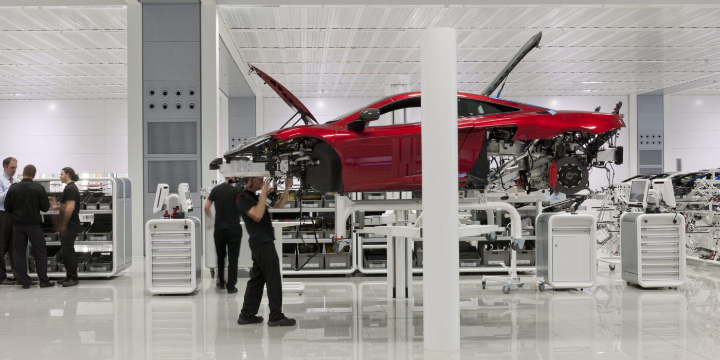
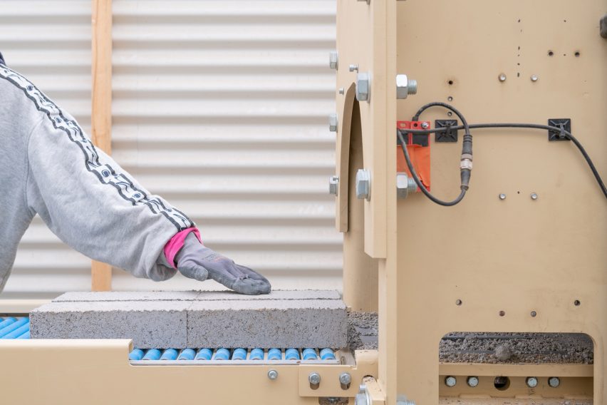
McLaren Production Centre by Foster + Partners, Woking, United Kingdom

Foster + Partners have an illustrious relationship with transportation design, having collaborated on many incredible vehicles and vessels over the years, their portfolio is stacked with not only vehicles but airports and stations alike. It’s no surprise really that the team at Foster + Partners has regularly dipped into the motor industry, as founder Norman Foster is well-known for his enthusiasm for cars. Recently the renowned architect put his self-proclaimed obsession on display when curating ‘Motion. Autos, Art, Architecture’ for the Guggenheim Bilbao’s epic exhibition, which linked the history of the automobile with the evolution of modern art.

While the practice have been involved in the design of many yachts, The Alen Yacht in particular is one of Foster + Partners most recent designs. At 68-foot the boat is perhaps not the biggest yacht you’ll ever see but that doesn’t mean it isn’t incredibly lavish, featuring elegant social spaces, a comfortable primary suite, and ample entertaining areas in an open-plan layout allows the luxury vessel to accommodate up to twelve guests. The fast and agile yacht boasts a beautiful interior with a refined palette of materials that emphasize the sense of motion and adventure at the heart of the yacht’s design. The furniture is artfully arranged to follow the curves of the white leather walls making clever use of the space available. It is apparent that throughout the yacht’s design, every detail has been thoughtfully considered and impeccably detailed.


Zaha Hadid Architects have always been known for their relationship with breathtakingly organic forms, and their foray into yacht design is no exception. Before her death, the late Dame Commander, Zaha Hadid, partnered with German shipbuilder Blohm+Vohs for three years, creating a family of seafaring vessels featuring mesmerizing braided exoskeletons. Now, Italian maker Rossinavi is set to celebrate ZHA’s next dive into the industry with its introduction of the electrifying Oneiric.

Oneiric is a 145-foot (44-meter) electric catamaran that is powered through artificial intelligence. Its cutting-edge design, inspired by the rolling waves of the ocean, features a single continuous line that rises from the aluminum hull, spirals up and around three photovoltaic-integrated levels, and undulates into the other hull. The ship’s exterior boasts branching curves that merge and diverge in the hull while the stern slopes down like a giant swimming platform, creating a seamless connection between the water and the yacht edge.

The yacht’s interior is just as fluid, with integrated furnishings blending into adjacent planes and walls, meeting ceilings through uninterrupted coved surfaces. The main cabin offers breathtaking 180-degree views and sunlight is prevalent through the addition of skylights. The interiors are finished with lightweight, eco-friendly materials to reduce drag, and the yacht is powered by photovoltaics during daylight hours. The onboard AI monitors energy consumption and provides navigation recommendations based on environmental impact, allowing Oneiric to complete a day trip on electric power alone with minimal carbon and noise emissions. Rossinavi has calculated that Oneiric can handle over two-thirds of a transatlantic voyage with solar power. The yacht can even charge land-based appliances while docked.


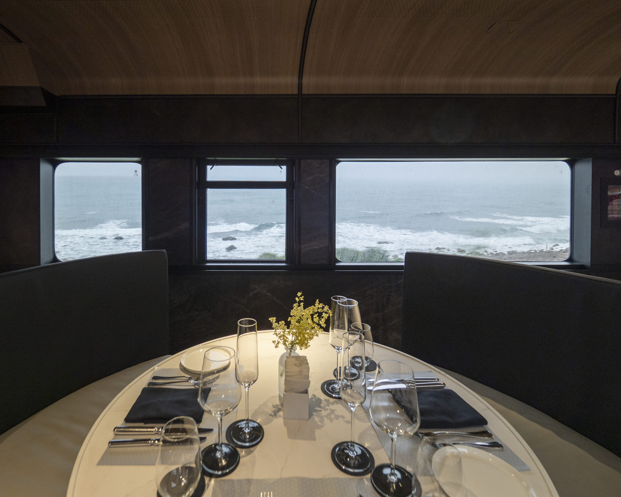
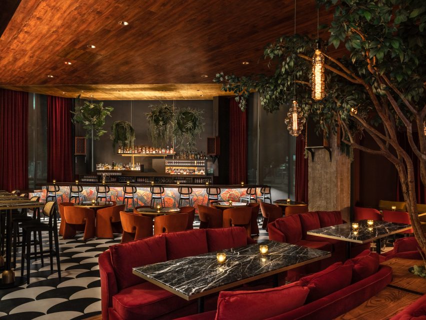
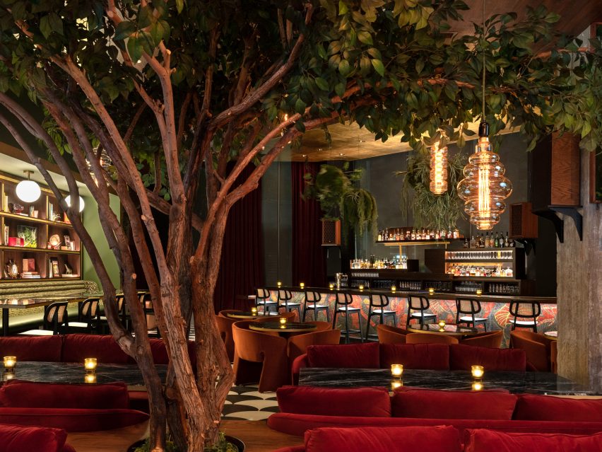
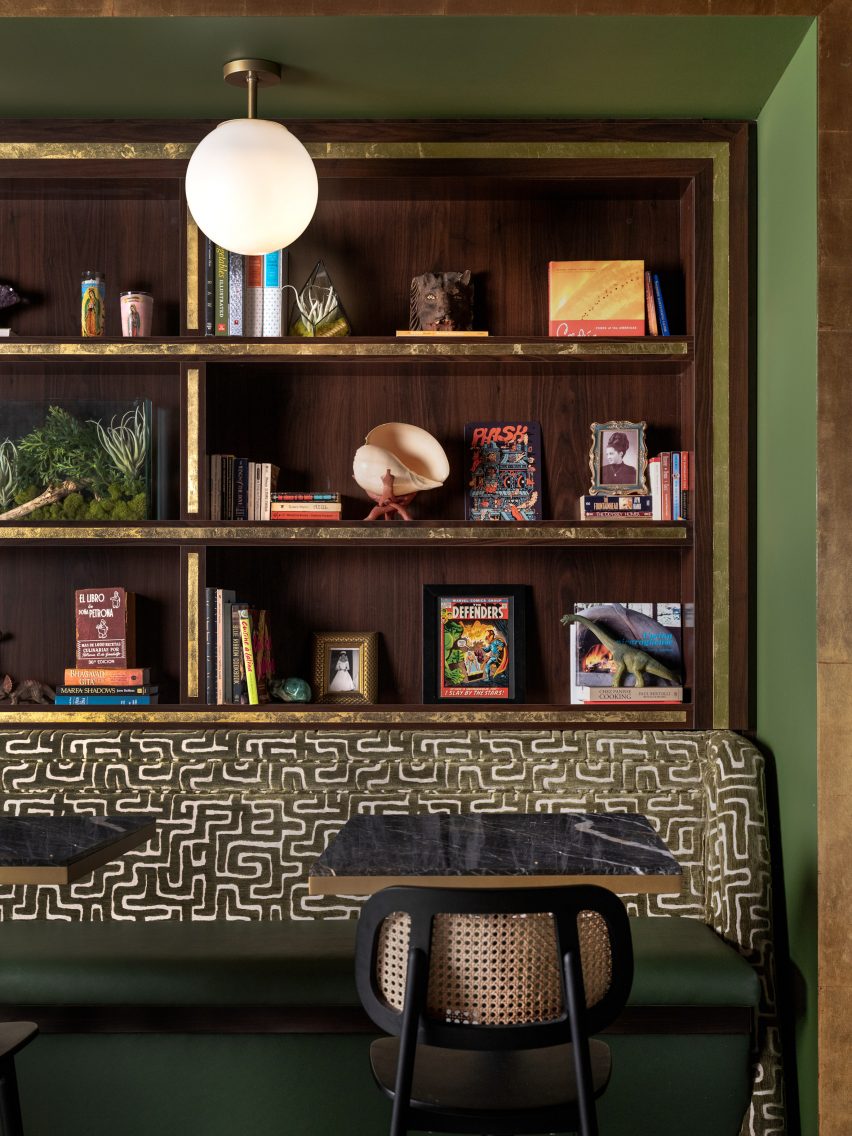
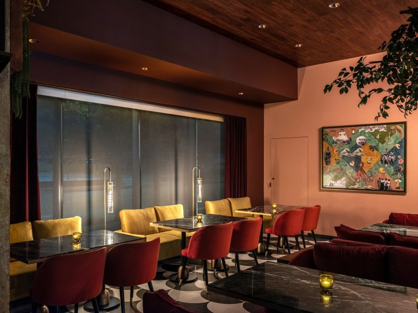
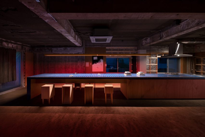
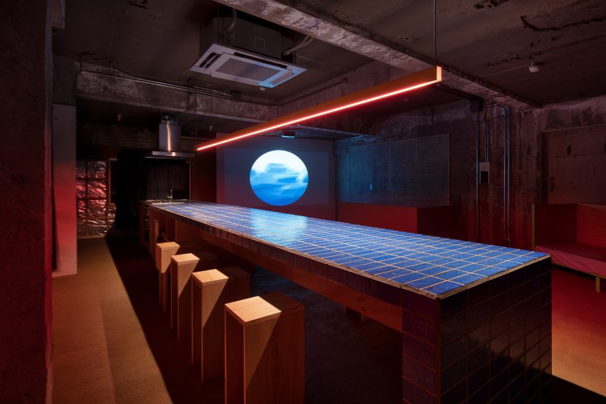
The Moving Kitchen by J.C. Architecture, Taiwan | Photographs by Kuo-Min Lee
Popular Winner, 10th Annual A+Awards, Transport Interiors

The Moving Kitchen is an excellent example of what we can do with our existing or outdated transportation inventory. Designed by the talented architecture firm J C Architects, the restaurant is housed in a semi-retired 70-year-old train that has been salvaged from retirement and transformed into a moving luxury resturant. The dynamic dining experience seats 54 people and takes its guests on a culinary journey both through the culinary delights and through the scenic beauty of Taiwan.

The concept behind the Moving Kitchen was to merge the flavors of traditional Taiwanese cuisine with the breathtaking views of the island. A multidisciplinary team of designers, chefs, and restaurant operations experts worked tirelessly to bring the vision to life and the result is an unforgettable dining experience that seamlessly blends the taste of Taiwan with the scenic beauty of the island.


Bjarke Ingles Group is renowned for their innovative designs and boundary-pushing ideas. From creating the iconic headquarters of Google to the thought-provoking Danish Refugee Museum, the adept team of architects and designers have proven time and time again that they are not afraid to tackle challenging projects in their own unique way.

Often entering the realm of transportation, BIG have brought their skills to bear on several new and exciting modes of transportation. Yet, unlike many of their peers who opt for superyachts and luxury vehicles, the unpredictable BIG took aim at the electric bicycle. The Biomega OKO is a stylish e-bike made up of clean lines and an efficiency to be envied. Designed and developed by KiBiSi, under the leadership of Bjarke Ingles the bike flipped the often over complicated electric bike model and stripped it back to bare essentials, without compromising on function or aesthetics. 

The perfectly balanced, sleek cycle is fitted with a battery in the middle bar and a motor in the front wheel hub. The Biomega OKO is made of carbon fiber and weighs in at a mere 44 pounds, making it one of the lightest electric bicycles on the market at the time. With its energy-efficient operation, the Biomega OKO is not only regarded as a joy to ride, but its eco-friendly design is admirable. The Biomega OKO may be utilitarian in it’s looks but it is truly a seamless example of transportation design.


Germane Barnes

Germane Barnes is an architect and academic whose work explores the intersection of design alongside technology. The groundbreaking architect recently collaborated with motor giant Lexus on a unique project for Design Miami/ that aimed to encapsulate and present the next generation of the automaker’s evolution. The installation, titled “ON/,” is inspired by Lexus’s LF-Z Electrified Concept car and embodies the human-centered, future-oriented approach to design and craftsmanship that the brand and Barnes share.

The immersive installation features a precisely scaled three-dimensional sculptural rendition of the concept car suspended just above the ground and illuminated with embedded LED lighting. The display also includes furniture designed by Barnes and his team specifically for the installation, providing areas for rest and reflection. The entire installation is unified by a unique lighting scheme that allows for engagement from users around the world through an online, interactive virtual model. Participants created their own lighting designs for the display, and Barnes and his team selected a number of the user-generated designs to showcase onsite, encouraging interaction and collaboration while highlighting the creative vision of entries from around the world.

Browse the Architizer Jobs Board and apply for architecture and design positions at some of the world’s best firms. Click here to sign up for our Jobs Newsletter.


Reference

Bar with painted mural by Carissa Marx
CategoriesInterior Design

Gin Design Group completes The Lymbar restaurant in Houston

Houston-based Gin Design Group has combined various mid-century references at a local restaurant, which celebrates its chef’s family history and is “a tribute to all grandmothers”.

Located at The Ion business centre in Midtown Houston, The Lymbar‘s design was heavily influenced by the upbringing of chef David Cordúa, whose menu is based on Latin-Mediterranean cuisine.

Bar with painted mural by Carissa Marx
The Lymbar’s bar features a mural by Carissa Marx influenced by the colours of the chef’s family home

The 4,000-square-foot (370-square-metre) establishment is named after Lymbar Drive, the street where Cordúa’s grandparents settled in Houston from Nicaragua.

It was designed by Gin Braverman of Gin Design Group, who was the chef’s childhood babysitter.

The Lymbar dining room
Tones used for the plush furniture were taken from the bar mural

“The Lymbar is my grandmother’s house,” Cordúa said. “The house stayed in our family, and it’s where we perfected our family’s hospitality.”

“It’s a tribute to all grandmothers,” he added of the restaurant, which is intended to feel both elevated and cosy, achieved through warm lighting, deep red curtains and plush furnishings.

A life-like tree in the middle of the dining room
Greenery is introduced by a life-like tree in the centre and globe-shaped planters above the bar

“We wanted to capture the bustle of a hotel lobby, the polish of a private club and the hospitality of the Cordúa family in the design,” Braverman said.

“Mixed with a confluence of Latin American, Lebanese and Mediterranean textures and art layered over a backdrop of classic mid-century materials such as warm woods, earthy colors and lush greenery.”

Shelving above banquette seating
The shelving above the banquette seating displays mementos from the chef’s childhood

The colour palette for the interiors was drawn from the Cordúa family home.

Orange, red and olive hues were used as a starting point for a mural painted on the front of the bar by local artist Carissa Marx.

Dining tables and a collage by Vernon Caldera
Artworks in the space in include a collage by Vernon Caldera, while the scalloped floor pattern was hand-painted by Carissa Marx

Influenced by the work of Brazilian modernist Roberto Burle Marx, no relation to Carissa, the mural then informed the tones chosen for the lounge-style furniture.

Marx also hand-painted a black and white scalloped pattern across the concrete floor.

Red velvet curtains and warm lighting
Red velvet curtains and warm lighting evoke the appearance of a hotel lobby

Other nods to mid-century design in the restaurant include the shelving at the main bar, which was inspired by Gio Ponti’s Planchart Villa in Venezuela.

The shelves display a collection of nostalgic objects and mementos from Cordúa’s childhood.

Greenery is introduced through a life-like tree that sits at the centre of the dining area and large globe-shaped planters above the bar created in collaboration with locally based Nicaraguan artist Vernon Caldera and The Flora Culture.

Caldera also helped to curate The Lymbar’s art collection, and one of his collages hangs in the dining room.

Private dining room
A private dining room is decorated entirely in a red-purple shade

The restaurant’s open kitchen is framed by a concrete counter and faceted breeze blocks that incorporate lighting. There’s also a private dining room decorated entirely in a red-purple shade.

Gin Design Group focuses on hospitality interiors primarily in the Houston area. The studio recently completed a barbershop in the Southside Place neighbourhood, which features a radial layout and a hidden cork-like bar.

Open kitchen
The open kitchen is framed by a concrete counter and faceted breeze blocks that incorporate lighting

Other restaurants to open in the city over the past year include cosy Japanese spot Uchiko Houston and lively smokehouse Loro Heights – both designed by Michael Hsu.

The photography is by Leonid Furmansky.


Reference

World’s Best Design Details: Bendheim’s Bespoke Glass Façades
CategoriesArchitecture

World’s Best Design Details: Bendheim’s Bespoke Glass Façades

Architizer’s A+Awards Best Firm categories allow design firms of all sizes to showcase their practice and vie for the title of “World’s Best Architecture Firm”. Start an A+Firm Award Application today. 

Architecture is shaped by form, transparency and light. Today, glass is one of the key materials specified to control what we experience inside a building, from views and daylight to heating and cooling. Glass has been used for thousands of years, holding both practical uses and cultural meaning. A major turning point came with the advent of the float glass process,  invented by Sir Alastair Pilkington in 1952, which used a molten tin bath to produce a continuous ribbon of glass. Now, architects are working with manufacturers to rethink conventional building envelopes and construction techniques.

Bendheim is one of the world’s foremost resources for specialty architectural glass. Founded in New York City in 1927, the family-owned company offers in-stock and custom glass varieties for interior and exterior building applications. In the early 1980s, Bendheim began its Architectural Glass division with new tempering and lamination processes to transform hundreds of decorative glass varieties into safety architectural glass products. Bendheim now maintains production facilities in New Jersey and a Design Lab in New York City. The following projects showcase Bendheim’s products in architecture across the United States, from residential to cultural projects.


Devon Energy Center

By Pickard Chilton, Oklahoma City, OK, United States

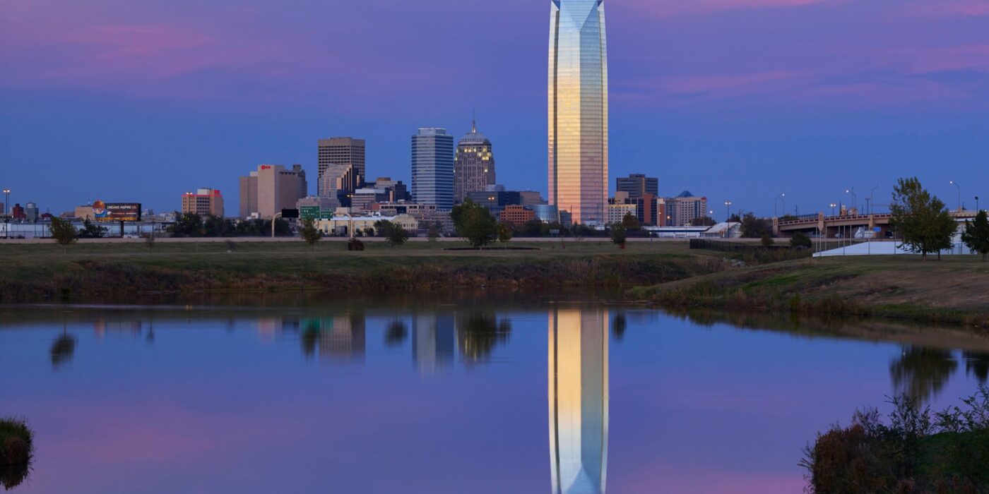
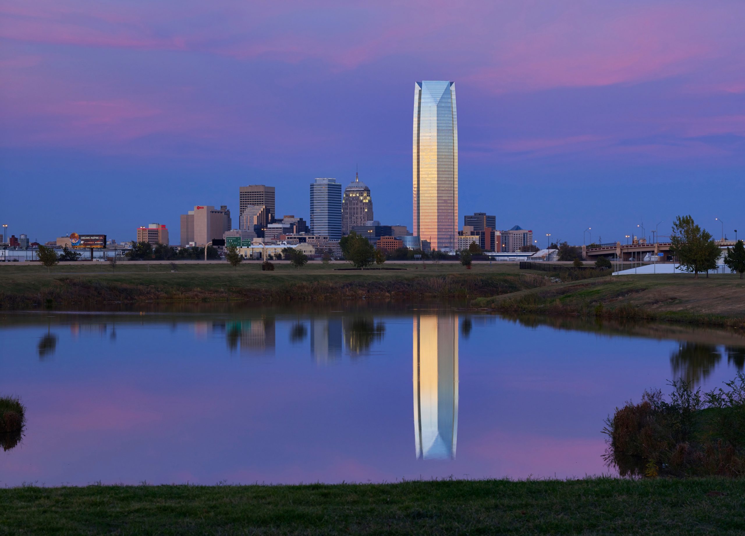
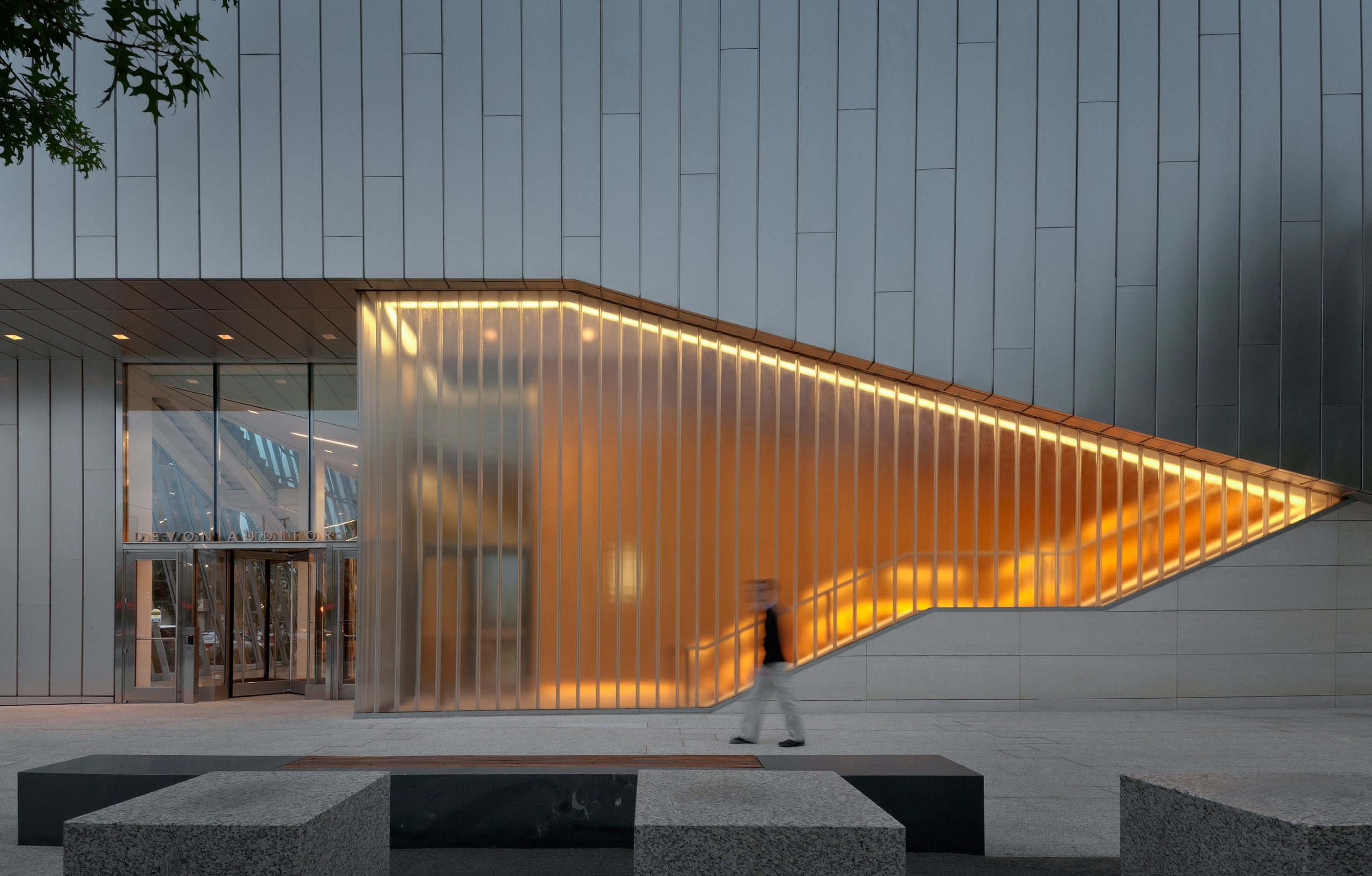
The Devon Energy Center was designed to create a focal point for the company and the city by integrating civic-scaled spaces. The headquarters consolidates Devon’s Oklahoma City-based workforce into a single facility. Rising fifty floors, the tower’s unique three-sided footprint allows it to be viewed from all of greater Oklahoma City. The curtain wall is composed of state-of-the-art continuous floor-to-ceiling glazing and a highly articulated mullion system.

Defining an urban edge between business and arts districts, the auditorium is a prominent, multi-use venue designed to support private and public events. Bendheim was brought on with double-glazed, solar channel glass to create feature exterior walls with angle cuts at the entrance. The SF-60 framing system was utilized for setting the glass.


Shaw Center for the Arts

By Schwartz/Silver Architects, Baton Rouge, LA, United States

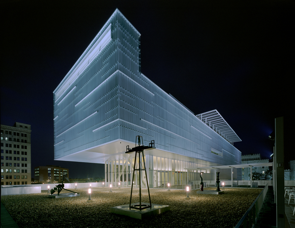
Made to house Louisiana State University’s Museum of Art, this project also included studio art facilities, a regional performing arts facility with a 320 seat main stage, a hundred-seat black box theater, and a dance recital theater. An historic older building, the “Auto Hotel,” houses classrooms, offices, curatorial spaces, and a gallery for the LSU School of Art. The innovative Bendheim channel glass rainscreen creates a highly recognizable façade, while protecting the building and the works of art it houses from the elements.

The façade features approximately 40,000 square feet of the channel glass. Most of the flanges face outward, adding texture to the building. There are 2-inch gaps between the channels, and the glass rainscreen sits approximately 6 inches off a layer of waterproof aluminum. The resulting varied texture emulates the shimmering surface of the nearby Mississippi River. The unique flange-outward design adds visual complexity, while preventing wind and rain from accessing the metal panels behind the channel glass.


Swiss Embassy Residence

By Rüssli Architects AG, Washington, DC, United States

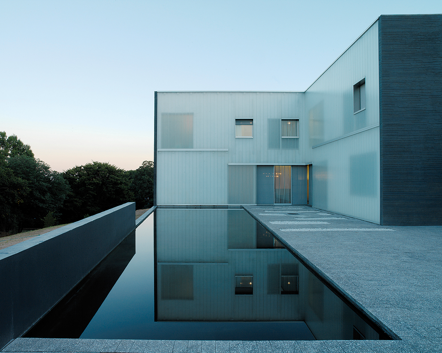
Looking out with a view to the Washington Monument, this residence was made as a multifunctional microcosm of living and working space as well as rooms for official receptions and for the staff. The strictly geometrical structure of the Swiss Embassy is a cross-shaped volume on a massive, rectangular base. The outer sides of the cross, which are part of the base too, and the the resulting exterior spaces are allocated to adjacent areas.

Bendheim’s U-profile channel glass, contrasting with slate-trimmed grey concrete, produces a crisp, clean effect in this cross-shaped design. The complex features 10,000 square feet of tempered, low-iron, sandblasted, solar textured channel glass. The Swiss Embassy residence operates at high levels of efficiency, consuming half as much energy as a typical building structure. The project also conforms to the LEED Silver green building standard.


Institute of Contemporary Art

By Diller Scofidio + Renfro, Boston, MA, United States

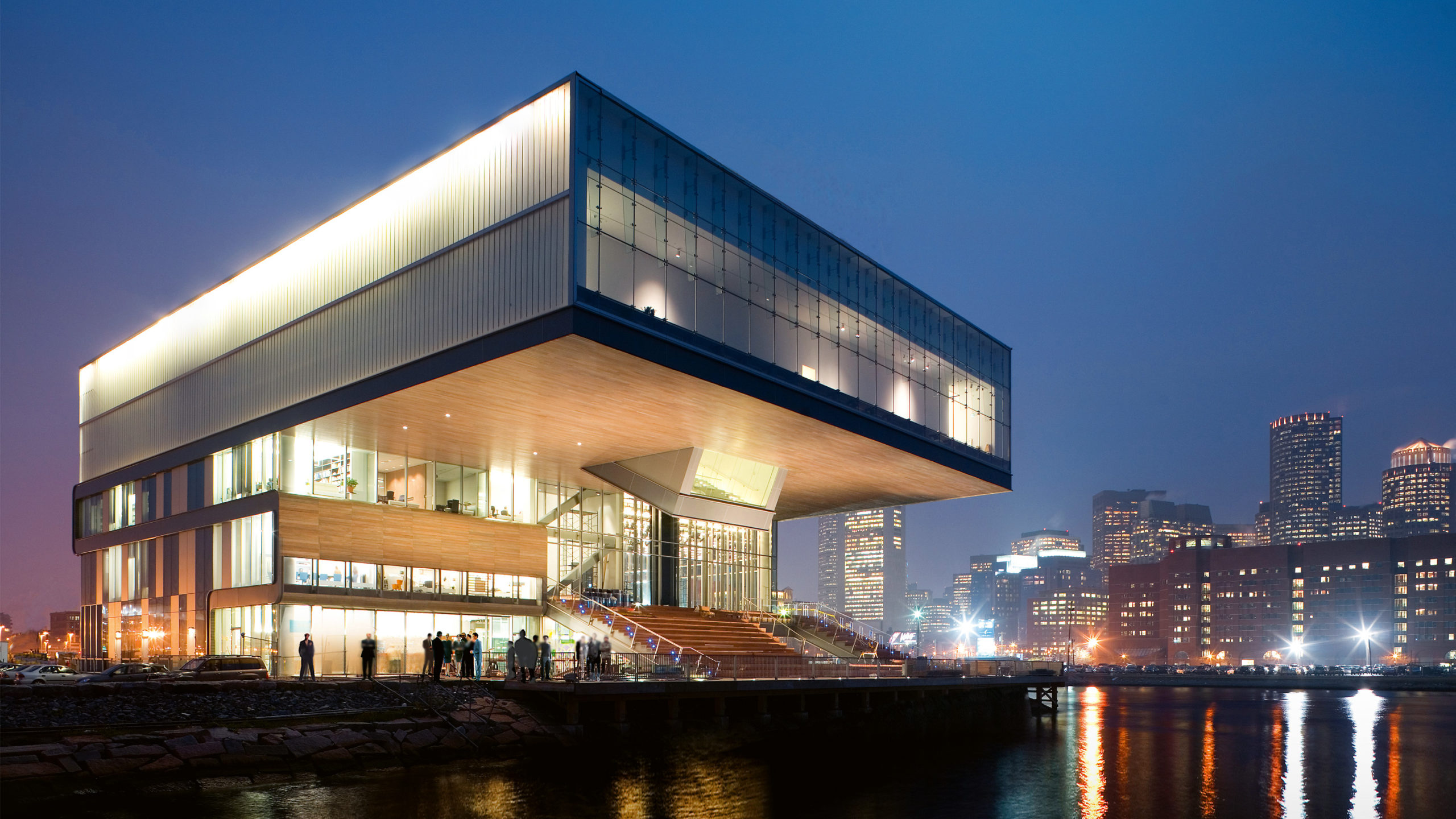
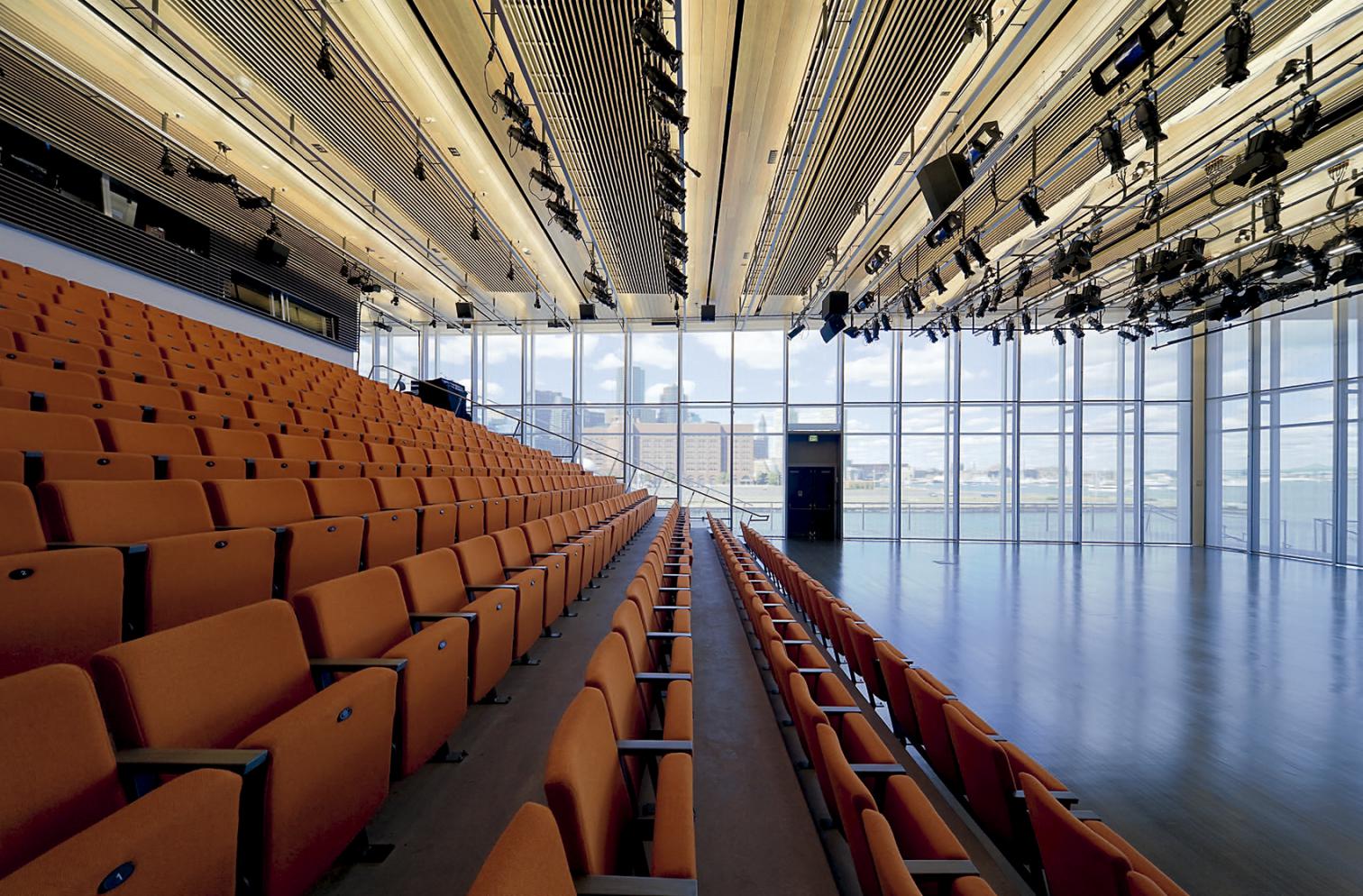
The ICA was the first museum to be built in Boston in 100 years. The 65,000 square foot building includes temporary and permanent galleries, a 330 seat multi-purpose theater, a restaurant, bookstore, education/workshop facilities, and administrative offices. The site is bound on two sides by the Harbor Walk, a 47-mile public walkway at the water¹s edge reclaimed from Boston’s industrial past. The ICA offers the city some of its ground floor footprint in exchange for rights to cantilever over city property with a 18,000-square-foot gallery illuminated by an uninterrupted skylight.

A 504 Rough Cast channel glass façade envelopes the upper level of the Institute of Contemporary Art on three sides. The glass rainscreen is functional, protecting the building from harmful moisture damage, as well as being aesthetically pleasing. The glass is illuminated from the top, allowing the entire upper level to glow at night and to act as a beacon over the harbor.


C-Glass House

By deegan day design, Marin County, CA, United States

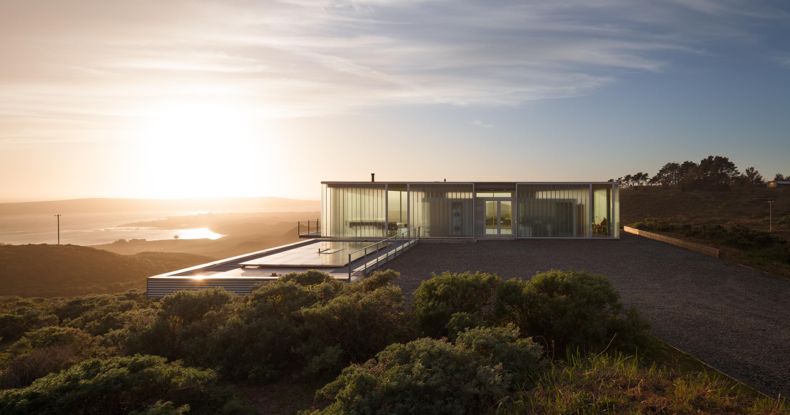
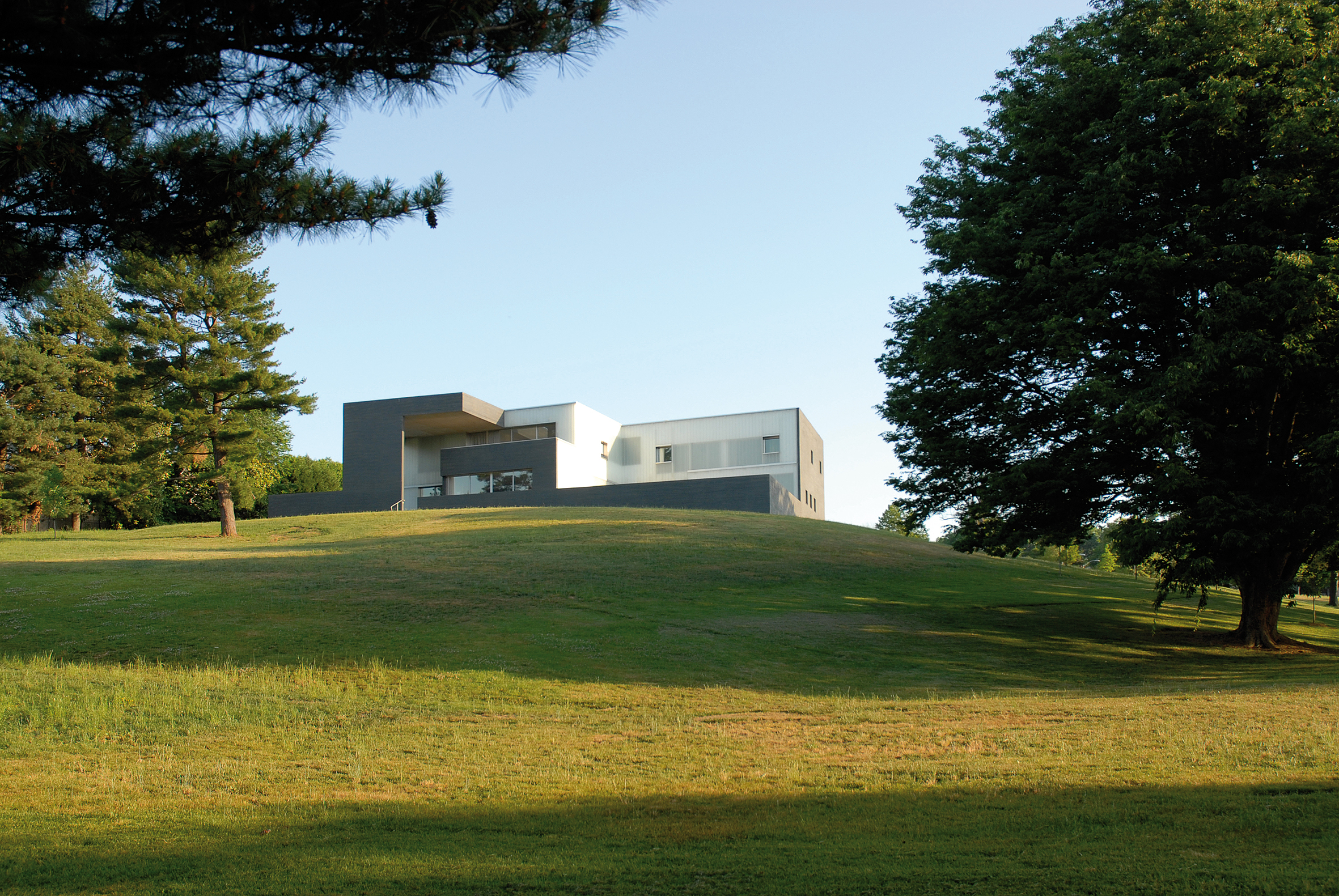
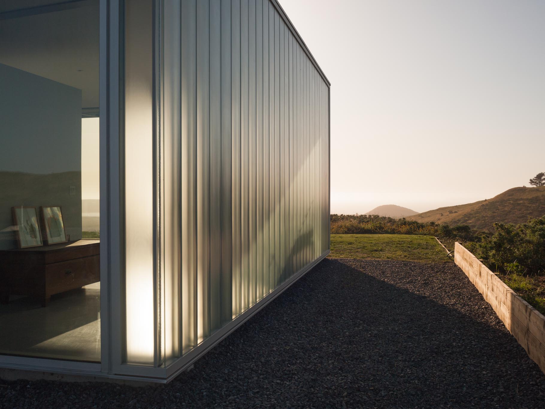
The C-Glass House is an elegant retreat in northern California. Set on a spectacular site, the residence opens to a panoramic view of Tomales Bay and the open ocean, while bracing against winds from multiple directions. C-Glass House brokers between the Leica-like precision of high modern glass houses and the cinematic wireframe of the Case Study generation. The home was also inspired by artists’ explorations of glazed enclosures as much as it is to the precedents of Johnson and Mies.

The C-Glass House opens up to a panoramic vista but also modulates and reflects back on architecture’s evolving role in the American landscape. Affixed in Bendheim’s SF-60 framing system, solar textured channel glass defines the house’s exterior, creates privacy, and diffuses the strong Californian sunlight. Captured at the top and bottom, the tempered channel glass spans the height of the house, seamlessly turning corners without the need for extra metal supports.


Visual Arts Building, University of Iowa

By Steven Holl Architects and BNIM, Iowa City, IA, United States

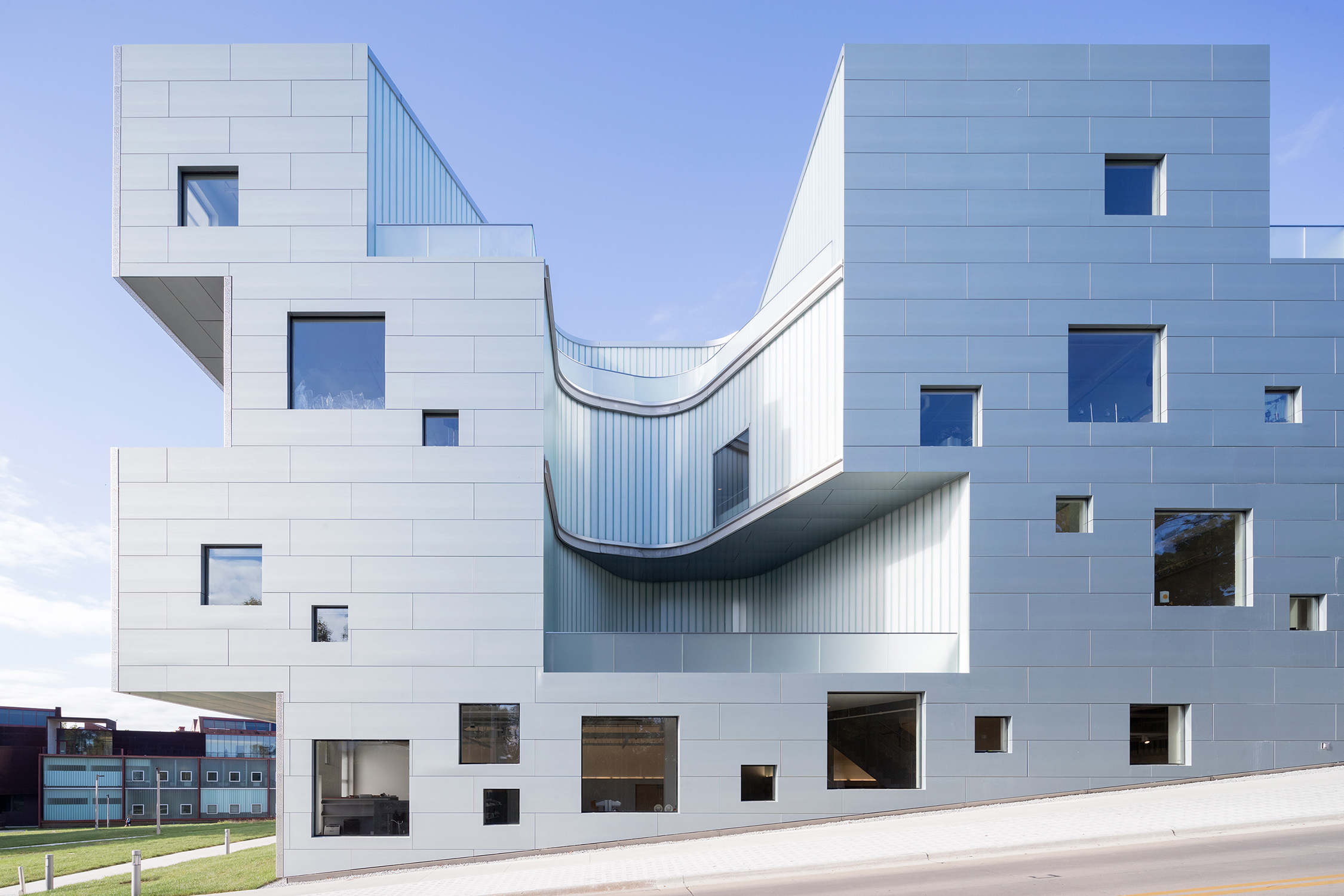
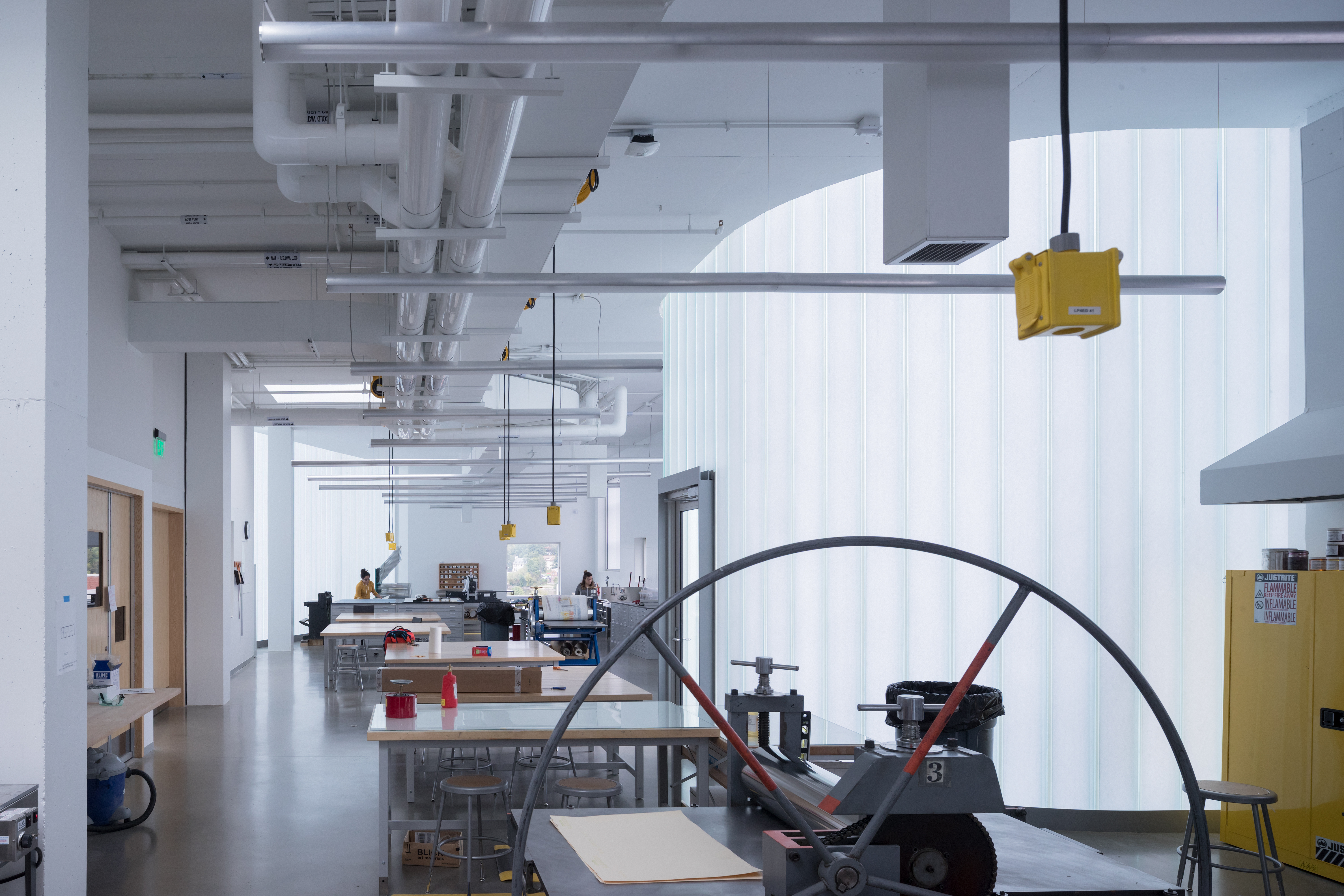
SHA and BNIM designed the new Visual Arts Building for the University of Iowa’s School of Art and Art History. It provides 126,000 square feet of loft-like space for all visual arts media, from ancient metal-smithing techniques to the most advanced virtual reality technologies. The building replaces an original arts building from 1936, which was heavily damaged during the 2008 flood of the University of Iowa campus. Seven vertical “centers of light” are carved out of the building’s volume filling the interior with natural light and ventilation.

Channel glass by Bendheim soars at 20 foot heights throughout the project. The combination of Bendheim’s 504 Rough Cast™ channel glass texture with translucent insulation inserts delivers ideal daylight, as if filtered through a translucent cloud. With no glare requiring shades or other window treatments to block it, classrooms, studios, and lounge spaces are flooded with natural light that appears to have no direct source. The idea was to create evenly dispersed light that would make the best possible atmosphere in which to work and create.

Architizer’s A+Awards Best Firm categories allow design firms of all sizes to showcase their practice and vie for the title of “World’s Best Architecture Firm”. Start an A+Firm Award Application today. 

Reference

Pink, orange and green rotating partition walls in a concrete apartment by AB Rogers
CategoriesInterior Design

Rotating panels define spaces in artist’s studio by Ab Rogers Design

Ab Rogers Design has completed an artist’s studio and residence in Kanazawa, Japan, featuring a series of fluorescent partition walls that can be rotated to transform how the space is used.

Called Fishmarket, the multipurpose creative and living space was designed for Japanese artist Hiraki Sawa, who lives in London but regularly visits his home city of Kanazawa.

Pink, orange and green rotating partition walls in a concrete apartment by AB Rogers
Ab Rogers Design introduced rotating walls that define spaces

Sawa met Ab Rogers in 2019 when the pair were both working on projects for the Wonderfruit music festival in Thailand.

At the time, they were both living in east London and over the course of several conversations decided to work together on what Rogers calls the “co-being space” in Kanazawa.

Fluorescent rotating partition walls revealing a freestanding bathtub in a concrete apartment by Ab Rogers Design
The interior was stripped back to its shell

Named after the duo’s shared love of fish, the former commercial space was converted into a place for Sawa to stay while in Kanazawa, as well as a place to host workshops around design, culture and food.

Rogers’ studio stripped the interior back to its industrial shell before adding foil-backed insulation to some of the walls and introducing interventions including the rotating plywood walls.

Pink fluorescent partition wall in an industrial apartment with concrete staircase to the side
The fluorescent partition walls are made from plywood

“We didn’t want to make it cosy or glossy, we wanted to work with the bones of what was there,” Rogers told Dezeen.

“We tried to let the light in as much as possible while keeping it raw and creating these interventions, these objects in space.”

Yellow, pink, orange and green rotating partition walls zoning a bedroom in a concrete apartment by Ab Rogers Design
The walls were painted in different colours to add character

The insertion of the four movable partitions on the building’s second floor allows this open space to be transformed into three smaller multipurpose zones.

Pivoting doors conceal the bathroom and enable the bedroom to become a workshop for making art, a place for viewing it or a social space for gatherings.

Each panel is painted in a different fluorescent highlighter hue to bring a sense of vibrancy and character to the otherwise pared-back space.

“I love fluorescent colours because they’re really alive and dynamic,” Rogers explained. “When daylight hits them they become electrified and they transform into something else.”

Long kitchen island bench topped with blue tiles in a dimly lit industrial apartment
The kitchen is located on the upper floor

A concrete staircase ascends to another open space where a monolithic nine-metre-long workbench functions as a kitchen, a worktop and a table for cooking, eating and sharing.

“The kitchen can be used as a kitchen but it’s also adaptable depending on what actions are being performed in the space,” Rogers explained.

“If you put a plate on it, it becomes a restaurant,” he added. “If you put a computer on it then it’s an office and if you put a sewing machine on it then it becomes a workshop for designing or making textiles.”

Long kitchen table topped with blue tiles with red strip lighting overhead in an unfinished industrial apartment
A long tiled bench provides space for food preparation and dining

All of the materials used in the project were sourced locally and chosen for their affordability. Building regulations also dictated some of the design decisions, such as the need to line certain walls with plywood panels.

Rogers never visited Kanazawa, so Sawa was responsible for solving problems on-site and finding materials to turn his ideas into reality.

Toilet and sink on a wooden bench in an industrial bathroom with fluorescent green wall by Ab Rogers Design
Some walls were lined with plywood panels

The project evolved over time with lots of back and forth between the client and designer. According to Rogers, this organic process produced an outcome that embodies both of their visions.

“I love these small projects where you have a strong affiliation with the client,” said the designer. “This symbiotic way of designing through a conversation is really fluent and means you’re always building ambition.”

Fluorescent green rotating wall at the top of a concrete staircase
The studio was previously a commercial space

Rogers works across fields such as health, culture, retail, hospitality and housing.

Previous projects by the multidisciplinary design studio include a cancer treatment hospital clad in glazed red terracotta and a space-efficient apartment with a floor area of just 19 square metres.

The photography is by Takumi Ota.

Reference

Photo of the exterior of the Finnish Design Shop logistics centre in Turku by Avanto Architects
CategoriesSustainable News

Finnish Design Shop creates forest-set logistics centre

Avanto Architects and Joanna Laajisto have designed a logistics centre for retailer Finnish Design Shop that features warm timber, a foraged-food restaurant for staff and visitors, and views of the surrounding forest.

Located on the outskirts of Turku, west of Helsinki, the logistics centre is the hub for storage, management and dispatch of products from the Finnish Design Shop, which says it is the world’s largest online store for Nordic design.

The company needed a new logistics centre after a period of high growth, but founder and CEO Teemu Kiiski also aimed for it to be a meaningful place for employees and visitors.

Photo of the exterior of the Finnish Design Shop logistics centre in Turku by Avanto Architects
The Finnish Design Shop logistics centre is located in the Pomponrahka nature reserve in Turku. Photo is by Kuvio

Employees of the logistics centre can enjoy plenty of light and forest views as well as warm timber environments and a restaurant run by Sami Tallberg, an award-winning chef who specialises in foraging.

The Finnish Design Shop had first explored whether it could convert an existing building in the Turku area, but, finding nothing suitable, chose to build on a site in the Pomponrahka nature reserve, where the surrounding forest would provide a calming work environment and reflect the appreciation for wood in Nordic design.

To undertake construction there responsibly, the Finnish Design Shop says the builders saved as many trees as possible and landscaped the area with natural forest undergrowth and stones excavated from the site.

Photo of the entrance interior to the Finnish Design Shop hub with light pouring through glass curtain walls and chairs displayed in shelves that reach high up the glazing
The entrance features glass curtain walls that connect the interior and exterior. Photo by Kuvio

Avanto Architects designed the 12,000-square-metre building to blend into the forest as much as possible — a challenge given its massing, a product of the warehouse layout.

The layout was created beforehand by specialist consultants to maximise the efficiency of operations, which are carried out by robots in an automated system.

Photo of a showroom featuring furniture by Nordic designers in pale woods and natural colours
The centre includes a showroom. Photo by Mikko Ryhänen

The architects opted for a dark facade with a vertical relief pattern that becomes visible on approach and echoes the tree trunks in the surrounding woodlands.

“The pattern forms a more human scale to the large facade surfaces,” Avanto Architects co-founder Anu Puustinen told Dezeen. “We also used warm wooden accents in the main entrance vestibule, balcony and windows.”

Photo of the wild food restaurant at the Finnish Design Shop hub in Turku
There is also a restaurant that specialises in foraged food. Photo by Mikko Ryhänen

The architects gave the office spaces large windows so the employees could enjoy frequent views of the forest and lots of light, and included a balcony for access to the outdoors on the first floor.

The entrance to the centre is through the showroom, which features glass curtain walls that showcase the use of the building and a long, straight staircase made from two massive glulam beams.

Photo showing views of a warehouse floor through large windows in an office corridor
The first-floor offices have a view of the warehouse floor. Photo by Kuvio

The interior was designed by Laajisto and her studio, who aimed to make the space feel well-proportioned and comfortable despite its size and to create a good acoustic environment by liberally applying sound-absorbing materials.

She kept the colour and material palette neutral and natural, with lots of solid pine and ash wood to continue the forest connection, but used furniture from the Finnish Design Shop in bright colours to punctuate the space.

“The aim was that every aspect in the interior should be done well and beautifully,” Laajisto told Dezeen. “Attention to detail was embraced in things that typically are overlooked, such as doors, plumbing fixtures and electrical hardware selections and applications, acoustic ceiling panels and ceramic tiles.”

The project is the first logistics building in Finland to be certified BREEAM Excellent, the second highest level.

Photo of an open office area with slatted pale wood room dividers and soft furnishings in neutral colours and turquoise
Special attention has been paid to creating a good acoustic environment with sound-dampening materials. Photo by Mikko Ryhänen

Kiiski, who positions the company as the opposite of multinational e-commerce players such as Amazon, aimed for the new centre to be the most socially and environmentally sustainable online store.

“The values that life in the Nordic countries is based on include transparency, equality and respect for nature,” said Kiiski. “It would have been impossible to create this company and our new logistics centre without unwavering respect for these values.”

Wood-panelled kitchen corner
Wood is featured throughout the interior

He believes that global online shopping can be socially and environmentally sustainable when issues in supply chains, logistics and operations are addressed.

“Many studies show that online shopping can have a lower carbon footprint as compared to in-store shopping,” said Kiiski. “This is due to the more efficient logistics in e-commerce and the fact that in-store shopping usually involves private transport.”

“We want to push the whole industry towards a more sustainable future,” he continued.

Photo of a timber-framed glass office door with warm light and a beige beanbag with throw rug in one corner
The hub is meant to offer employees a healthy and humane working environment. Photo by Mikko Ryhänen

Past work by Avanto Architects includes the Löyly waterfront sauna in Helsinki, which has a multifaceted exterior that visitors can climb, and the Villa Lumi, a house with a sculptural white staircase.

Laajisto’s previous projects include office interiors for service design company Fjord and the Airisto furniture collection for Made by Choice, which was inspired by Scandinavian holiday culture.

Reference

Interior of bag store in Malaysia with marble cabinetry
CategoriesInterior Design

Biophilic design informs moss-covered installation at luxury bag store

Creative studio Spacemen looked to biophilic design principles to construct a tree-like installation covered in moss, which forms the centrepiece of a flagship outlet for luxury leather brand Braun Büffel in Malaysia.

Described by Shanghai-based Spacemen as a store that straddles an art gallery and a laboratory, the studio wanted to create an interior that would attract a younger audience and serve as “an abstract oasis” in Putrajaya’s IOI Mall.

Interior of bag store in Malaysia with marble cabinetry
Spacemen designed the store interior for bag brand Braun Büffel

Central to this design is an oversized, organic-shaped sculpture clad in preserved flat moss, ball moss and lichen that is suspended from an illuminated disc in the middle of the shop.

A rounded table clad in the same plants was positioned directly below to complete the installation. It also doubles as a plinth for Braun Büffel leather bags, which are displayed sparsely across the store like museum artefacts.

Organic-shaped moss-covered installation that recalls a sprouting tree
It is characterised by a central moss-covered sculpture

The sculpture takes cues from biophilic design – a concept that encourages a closer connection between humans and nature when creating interior spaces.

“The form was designed to seem as though it is sprouting from the ground towards the ceiling – towards the sun – hence why we integrated the membrane lighting ceiling above it, just like how it would grow out of a beaker in a mad scientist’s lab towards natural light,” explained Spacemen founder Edward Tan.

“We envisioned an otherworldly concept akin to something out of a Hollywood sci-fi movie,” he told Dezeen.

Green onyx feature wall with handbags displayed on its shelving
A green onyx feature wall was placed at the back of the store

Tan said that Spacemen adopted a “maximal minimalism” approach when creating the store interiors, in an attempt to challenge the neutral shapes and colours often associated with luxury.

Throughout the shop, lime plaster walls and bright white terrazzo floors are interrupted by various ornate display units and shelves magnified by floor-to-ceiling mirrors.

This cabinetry is made from decadent slabs of swirly orange onyx and jade marble, some of which are topped with glass vitrines that reveal small leather goods.

Spacemen placed a green onyx feature wall at the back of the store, which sits behind furniture including a bespoke curved bench created from the same material as well as a custom oak armchair.

Waiting area in store by Spacemen with bespoke furniture
Bespoke seating creates a waiting area for customers

Explaining the decision to incorporate biophilic design into the Braun Büffel outlet, Tan said, “I think with the pandemic, people have taken to appreciating nature a lot more than before.”

“This is especially true for people living in big cities where they live in apartments and are confined to office cubicles all the time, and do not have access to nature and greenery as much as they should.”

“Therefore it has become a new form of luxury to be able to afford lush greenery and gardens indoors,” he concluded.

Green and orange marble and onyx cabinetry within store interior by Spacemen
Green and orange hues add colourful accents to the space

Other retailers featuring similar designs include a store in Seattle for beauty brand Glossier with a mossy mushroom-covered mound and a Celine boutique in Paris that is characterised by large expanses of brass and marble.

The photography is by David Yeow Photography.


Project credits:

Interior design: Spacemen
Moss artist: Ohsum Mossum

Reference

A stack of Gent Waste Bricks designed for the Design Museum Gent
CategoriesSustainable News

Municipal waste used to form brick for Design Museum Gent extension

Architecture studios Carmody Groarke and TRANS Architectuur Stedenbouw have collaborated with material researchers to develop a brick made from local construction waste, which will be used to build the new wing of the Design Museum Gent.

The Gent Waste Brick was designed together with circular economy specialist Local Works Studio and materials manufacturer BC Materials to be low-carbon, reportedly carrying just one-third of the embodied carbon of a typical Belgian clay brick.

A stack of Gent Waste Bricks designed for the Design Museum Gent
The Gent Waste Brick is made from recycled concrete and glass

The brick is made from 63 per cent recycled municipal waste sourced from Ghent, which was collected from a local recycling centre for demolition concrete and glass.

These recycled materials are mixed with lommelzand sand from the Belgian municipality of Lommel and bound together with hydraulic lime and ground calcium carbonate.

Gent Waste Brick designed for the Design Museum Gent
The pale grey tone of the brick was informed by the colour of local buildings

The bricks are cured in a humid environment for two weeks and then left to air-dry rather than being fired, reducing the amount of energy needed to manufacture them.

Instead, the material gets its strength through a process known as mineral carbonation, which involves the calcium carbonate in the brick reacting with carbon dioxide in the surrounding air.

“The carbonation will continue forever on the facade, making the blocks stronger and stronger over the years,” TRANS Architectuur Stedenbouw told Dezeen.

“This fabrication process, coupled with the use of recycled composites, results in a brick with 0.17 kilograms of CO2e per kilogram – just one-third the embodied carbon of a Belgian clay-fired brick.”

Production process of the Gent Waste Brick
The bricks are cured in a humid setting and left to dry naturally

Designed for the external facade of Design Museum Gent’s new wing, the Gent Waste Brick has a pale grey colour that references the colour of other civic buildings local to the city and was certified for building use in September 2022.

“The team have worked closely alongside the Design Museum Gent to produce a highly crafted, bespoke material object that embodies the culture and ethos of the institution, challenging the material qualities and aesthetic properties of a traditional brick and adding to the lineage of design objects displayed and cared for by the museum,” said Carmody Groarke.

Render of the Design Museum Gent extension
The bricks will be used for the Design Museum Gent extension. Image by Carmody Groarke, TRANS Architectuur Stedenbouw and RE-ST

Design Museum Gent is organising workshops for local residents to take part in making some of the bricks that will be used in the extension’s construction.

“The bricks will be manufactured on a brownfield site in Ghent using a clean simple production process, which could easily be replicated in other urban settings,” said Carmody Groarke. “There are no resultant emissions, by-products or waste.”

Other brick alternatives featured on Dezeen include Kenoteq’s unfired K-Briq, which is made of 90 per cent construction waste, and masonry blocks made from algae-based cement by Prometheus Materials.

The photography by Cinzia Romanin and Thomas Noceto unless stated.

Reference

Call for entries to BE OPEN’s Better Energy by Design competition
CategoriesSustainable News

Call for entries to BE OPEN’s Better Energy by Design competition

Promotion: creative think-tank Be Open has launched an international competition inviting students and graduates to come up with innovative ways of advancing sustainable energy systems.

The Better Energy by Design competition is open to students, recent graduates and young professionals from across the globe who specialise in the fields of art, design, architecture and media.

In launching the competition, Be Open hopes to raise awareness of the UN’s 17 Sustainable Development Goals (SDGs) – namely the seventh goal (SDG7), which aims to ensure that everyone has access to affordable and clean energy.

Participants are tasked with devising new technologies and designs that will advance SDG7 by speeding up the move towards low-carbon energy infrastructures.

Call for entries to BE OPEN’s Better Energy by Design competition
The competition aims to spotlight the UN’s 17 Sustainable Development Goals

“It is agreed by the world’s leaders that SDG7, calling for affordable, reliable, sustainable and modern energy for all by 2030, lies at the heart of all of the SDGs, and without progress on SDG7, it will be impossible to achieve the 2030 Agenda,” said Be Open.

“We strongly believe that creativity is integral to the shift to a sustainable existence,” the foundation continued. “To attain the UN’s SDGs, we need to think outside of the box.”

Call for entries to BE OPEN’s Better Energy by Design competition
Entrants are tasked with designing low-carbon energy systems

Submissions are free of charge, and must be based on one of three themes: Powered by Renewables, Save More Energy or Reducing the Energy Gap.

Entrants have the choice of entering individually or as part of a team. If entering as part of a team, each individual within the team may also submit their own project, in addition to the team project.

Those who wish to take part must submit their entry online via the competition website by 31 January 2023.

Call for entries to BE OPEN’s Better Energy by Design competition
Cash prizes ranging from €2,000 to €5,000 are available for winners

An international jury will make 50 honourable mentions out of all submissions before selecting first, second and third prize winners, who will be awarded €5,000, €3,000 and €2,000, respectively.

There will also be a Be Open’s Choice prize worth €3,000 – the winner will be chosen by the foundation’s community members out of 50 honourable mentions.

A further Public Vote prize worth €2,000 will be awarded, based on a majority vote from votes cast online.

Call for entries to BE OPEN’s Better Energy by Design competition
The competition is open to students and recent graduates who specialise in creative fields

Better Energy By Design is just one of a series of competitions that Be Open has run over the past four years, with each competition focusing on a specific SDG in a bid to further the UN goals.

To submit an entry, or to find out more about the competition, visit the Better Energy By Design website.

Partnership content

This article was written by Dezeen for Be Open as part of a partnership. Find out more about Dezeen partnership content here.

Reference

Split image of seaweed from the sea and tiles
CategoriesSustainable News

Seoul Design Award seeks projects that facilitate “sustainable daily life”

Promotion: Seoul Design Award is seeking entrants who have designed projects that solve everyday problems in sustainable ways for its annual design prize.

Submissions to this year’s Seoul Design Award, which is free to enter and has a top prize of KRW 50 million (£31,500), are set to open in March 2023.

The awards will be given to designers “whose projects have contributed to a sustainable daily life that aims for a harmonious relationship between people, society and the environment”.

Split image of seaweed from the sea and tiles
The award considers sustainable designs from across the world

Designers can submit any design from the past five years that was built to solve everyday problems – from reducing food waste to conserving energy.

The projects can be submitted by an individual or group and will be judged based on five core values, including sustainability, public and shared, creativity and innovation, participation and cooperation, and inspiration and influence.

Previously known as the Human City Design Award, this year’s Seoul Design Award will be open for entries from 14 March to 28 June 2023. Now in its fourth edition, the 2023 edition of the award will expand to include 25 accolades.

“Over the past three years, design projects that have been awarded the Human City Design Award have addressed everyday problems such as environmental pollution, regional inequality, the gap between the rich and the poor, and discrimination against the socially underprivileged,” said the organisation.

“Ahead of 2023, the Human City Design Award will change its name to the Seoul Design Award in order to pursue the sustainability of daily life beyond the city.”

Split image of the Goyohan Taxi project
One of the projects that received an award in 2021 was the Goyohan Taxi

In 2021, which was the last edition of the award, the top prize in the safety and security category was won by Goyohan Taxi – a taxi service run by hearing-impaired people that was created by South Korean designer Song Min-Pyo to make travelling easier for those with hearing loss.

The project included a mobile device that aims to improve methods of communication between passengers and taxi drivers with a voice-to-text conversation app, which enabled passengers to communicate their destination, preferred drop-off point and choice of payment method.

An honourable mention in the 2021 selection was awarded to Gardens in the Air by Spanish design studio Nomad Gardens.

The project involved recycling water from air conditioning units to irrigate planting on the exterior of a building in Seville, Spain.

Gardens in the Air was designed to reduce Seville’s heat island effect and provide drinking water to the 70 species of birds in the surrounding area.

Plant boxes on the exterior of a white building
Gardens in the Air reuses water from air conditioning units

One of the finalist projects of the 2020 award was Sururu Da Mundaú by Brazilian manufacturer Portobello, a decorative tile made from recycled mussel shells.

According to Portobello, the Sururu Da Mundaú tile makes use of the 300 tonnes of mussel shells produced every month in Mundaú, Brazil, which would otherwise be discarded as waste.

Portobello worked with local artisans on the project, which the Seoul Design Award recognised as demonstrating “the value of cooperation and innovation”.

The project also created a range of new community activities by encouraging local citizens to participate in the tile making.

For more information on the awards or to apply, visit its website.

Partnership content

This article was written by Dezeen for the Seoul Design Award as part of a partnership. Find out more about Dezeen partnership content here.

Reference

Shanghai Subway Line 14 Yuyuan Station by XING DESIGN
CategoriesArchitecture

8 Adventurous Ways Architects Innovated in Interior Design in 2022

Architizer’s 11th Annual A+Awards is open for entries! With a Final Entry Deadline of January 27th, 2023, the clock is ticking — get started on your submission today.

The exterior experience of a building — marveling at a remarkable structure in the midst of a busy skyline, for instance — differs wildly from the interior experience. Crossing a threshold into an internal space is a transformative act. With it, the environment becomes intimate. The senses are enveloped by the spatial and material surroundings; the architect’s intent is suddenly palpably personal.

As these A+Award-winning projects demonstrate, the best interior schemes deftly position the user, both practically and emotionally. From stations, theaters and cafés to places of worship and residential structures, take a look at eight ways architects are innovating interior design and creating immersive schemes that scintillate and astound.


1. Stylizing Ceilings

Shanghai Subway Line 14 Yuyuan Station by XING DESIGN, Shanghai, China

Jury Winner, 10th Annual A+Awards, Transport Interiors

Shanghai Subway Line 14 Yuyuan Station by XING DESIGNShanghai Subway Line 14 Yuyuan Station by XING DESIGN
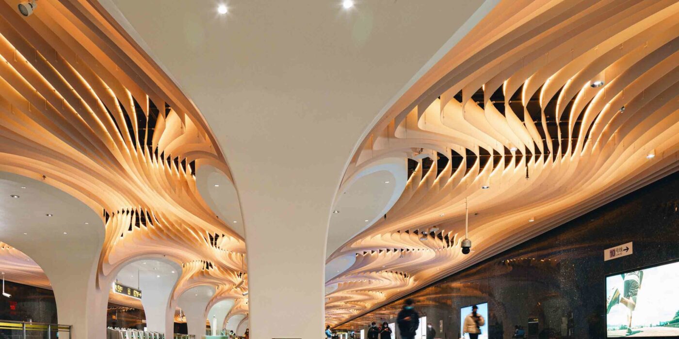
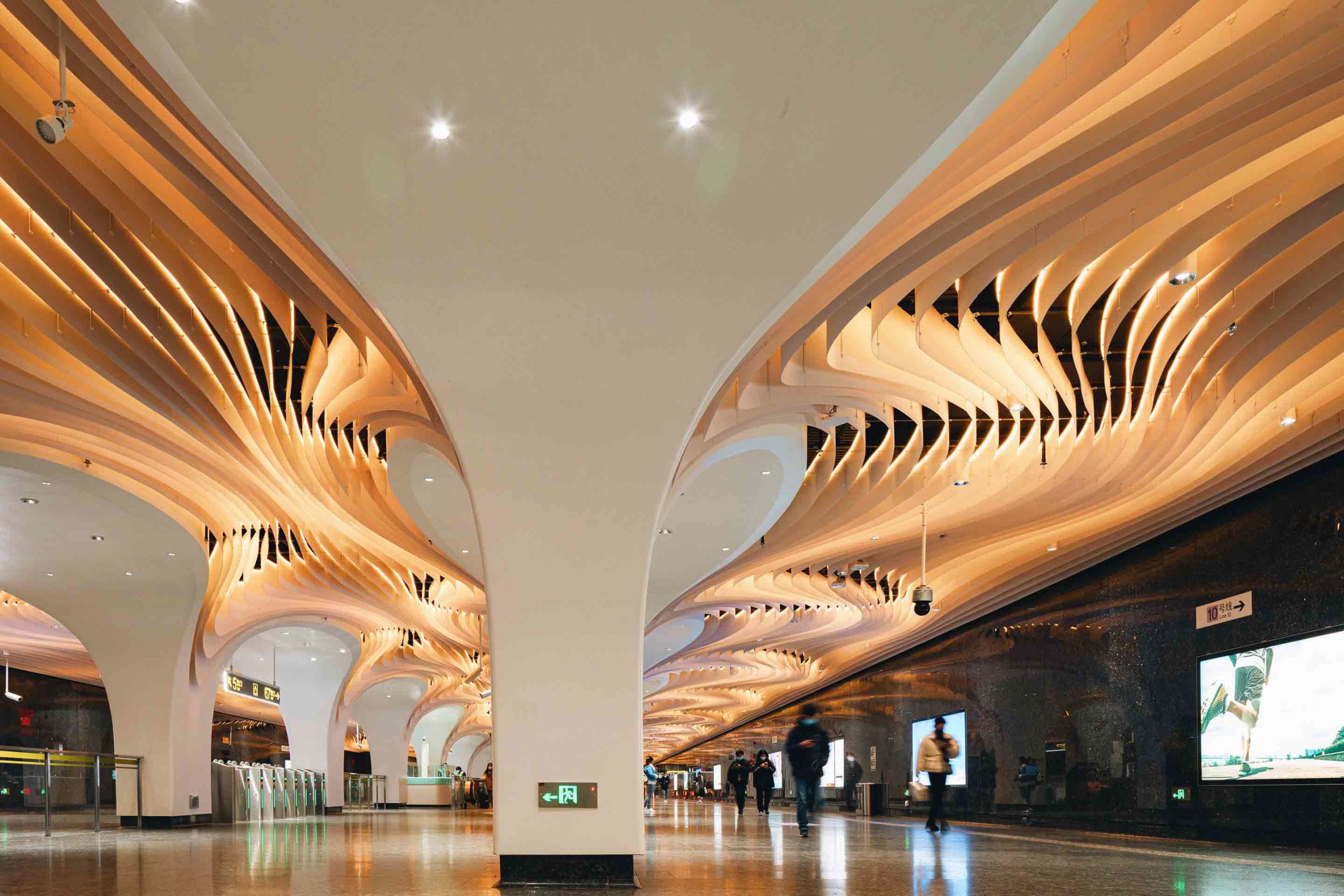
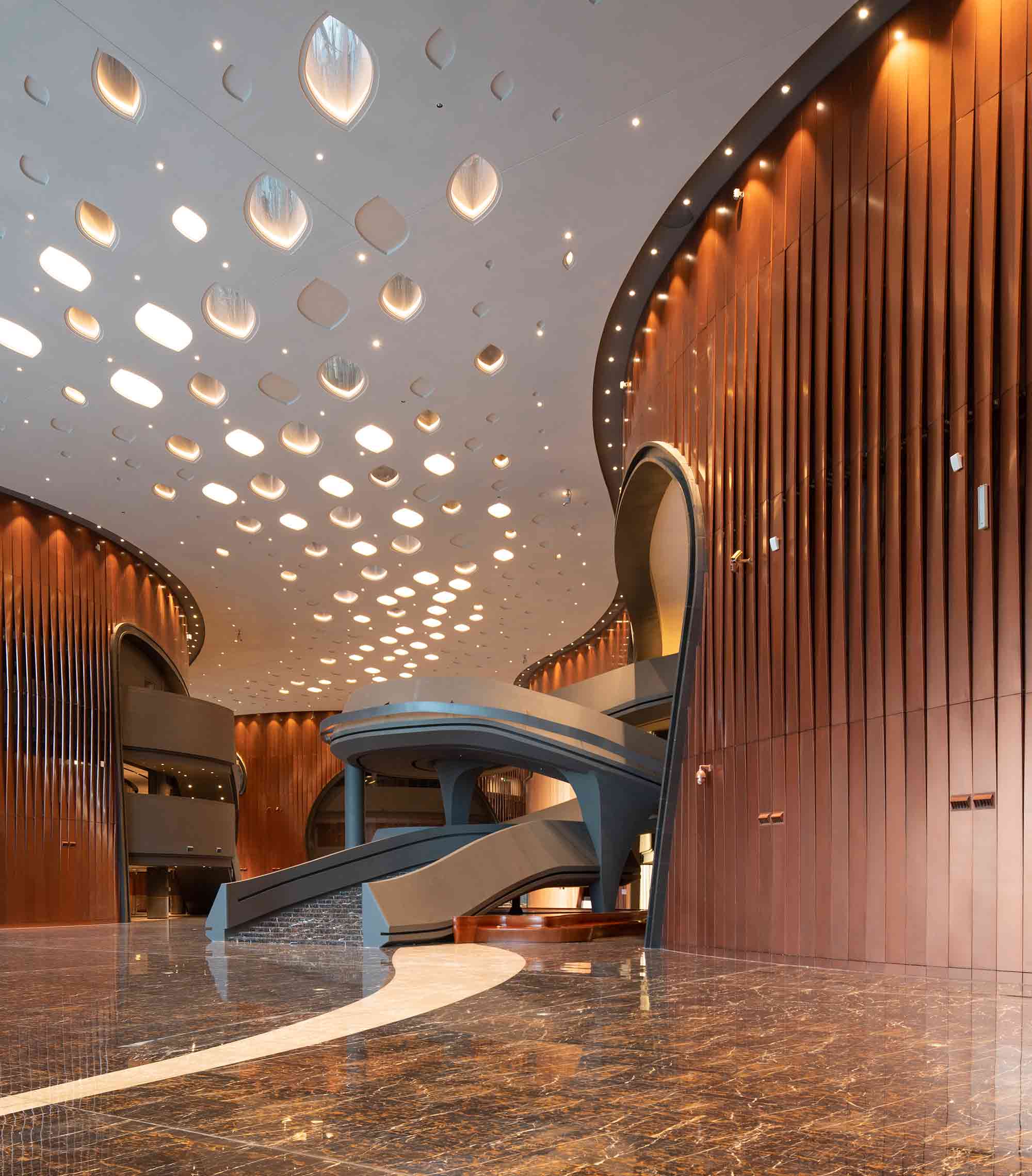
Concealed underground, Yuyuan Station is Shanghai’s deepest transport hub. Elevating the experience of this subterranean space came with its challenges. Essential elements of the site, including the walls, columns and flooring, could not be altered. Nevertheless, the architects delivered an immersive scheme that consumes the senses of its users.

A liminal passing place and the gateway to the suburb, the remarkable design embodies both the transience of the space and the topography of the landscape above. Tens of thousands of aluminum panels ripple across the ceiling and around the arches in a complex geometry of waves that echo the Huangpu River, which runs over the metro line. LED lights illuminate the unique undulations of the canopy. Like the passers-by below, the rhythmic ceiling courses in a multitude of diverse routes.


2. Transforming Translucent Materials

Santa Maria Goretti Church by Mario Cucinella Architects, Mormanno, Italy

Jury Winner, 10th Annual A+Awards, Religious Buildings & Memorials

Santa Maria Goretti Church by Mario Cucinella Architects
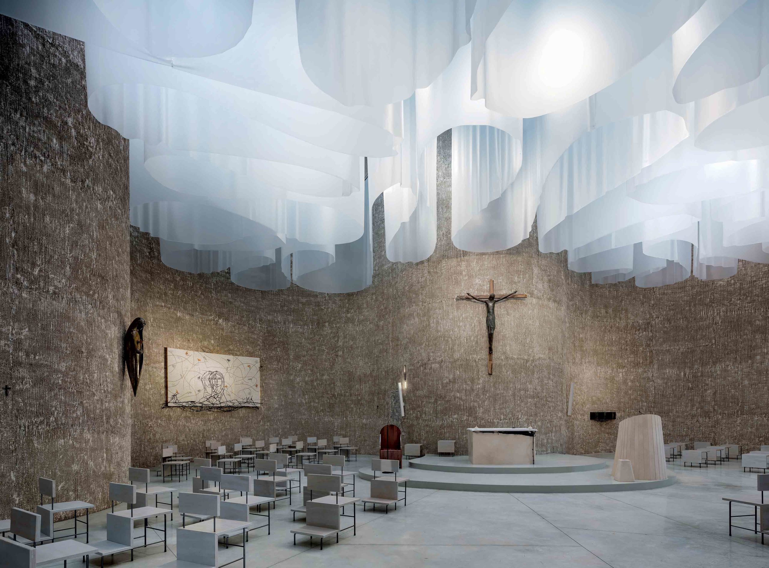
Revising religious architecture can be an imposing task, one that calls for reverence in the same breath as reinvention. This contemporary church in the Calabrian region of southern Italy negotiates that careful dance between tradition and innovation. While its organic, cross-shaped plan is inspired by some of the country’s most impressive Baroque churches, the interior is something of an inversion of the ornate domed designs of its predecessors.

Instead of exposing the structure’s towering scale, the ceiling is filled with a series of translucent veils that fall in soft curved forms. While the design may be a radical departure from historic typologies, it remains steeped in religious language. Natural light, a Christian symbol of holiness, hope and wisdom, cascades down through the church and is cradled in the folds of the drapes. The result is atmospheric ebbs and flows of illumination that reference natural phenomena like the Northern Lights.


3. Utilizing Unobtrusive Divisions

Nil Dos House by Valentí Albareda Studio, Gràcia, Spain

Jury Winner, 10th Annual A+Awards, Residential Interiors (<3000 sq ft)

Nil Dos House by Valentí Albareda StudioNil Dos House by Valentí Albareda Studio
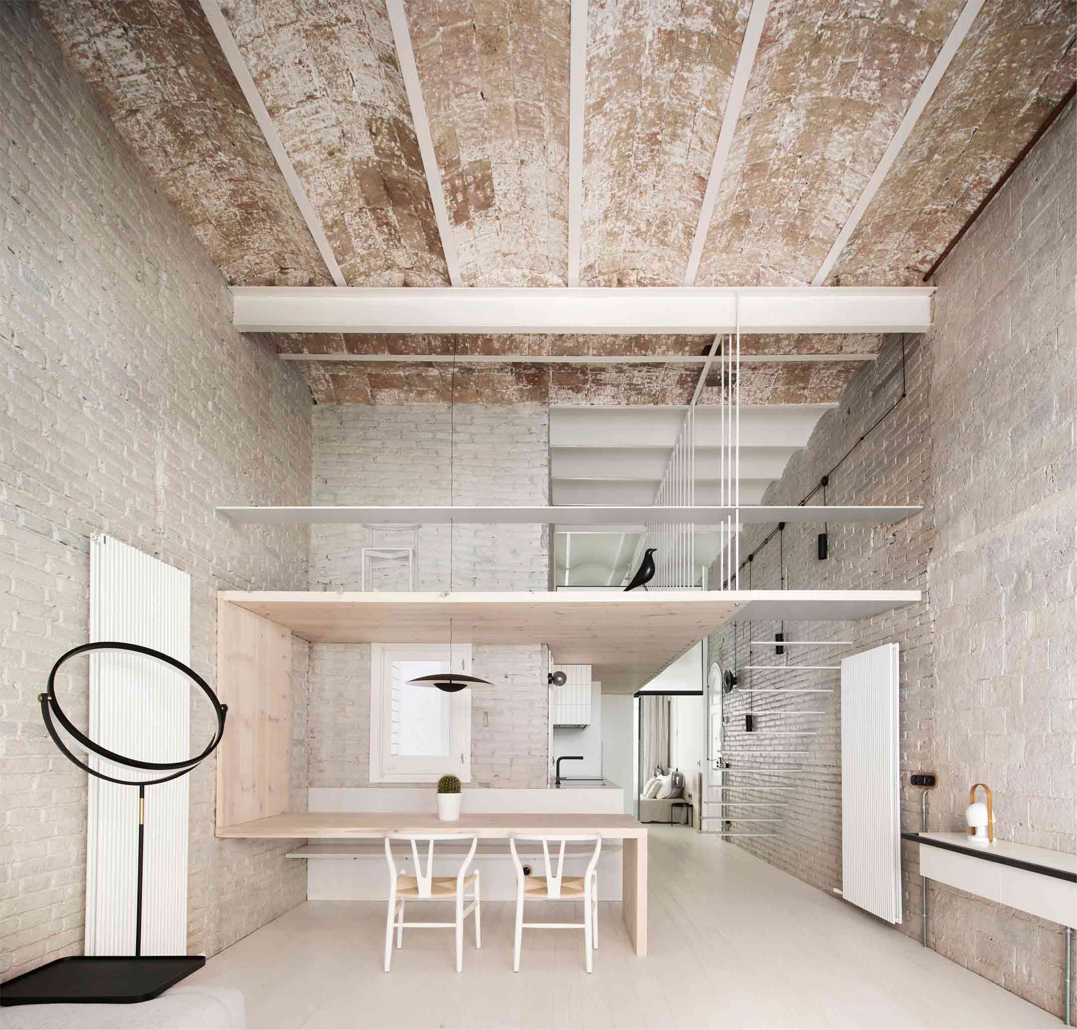
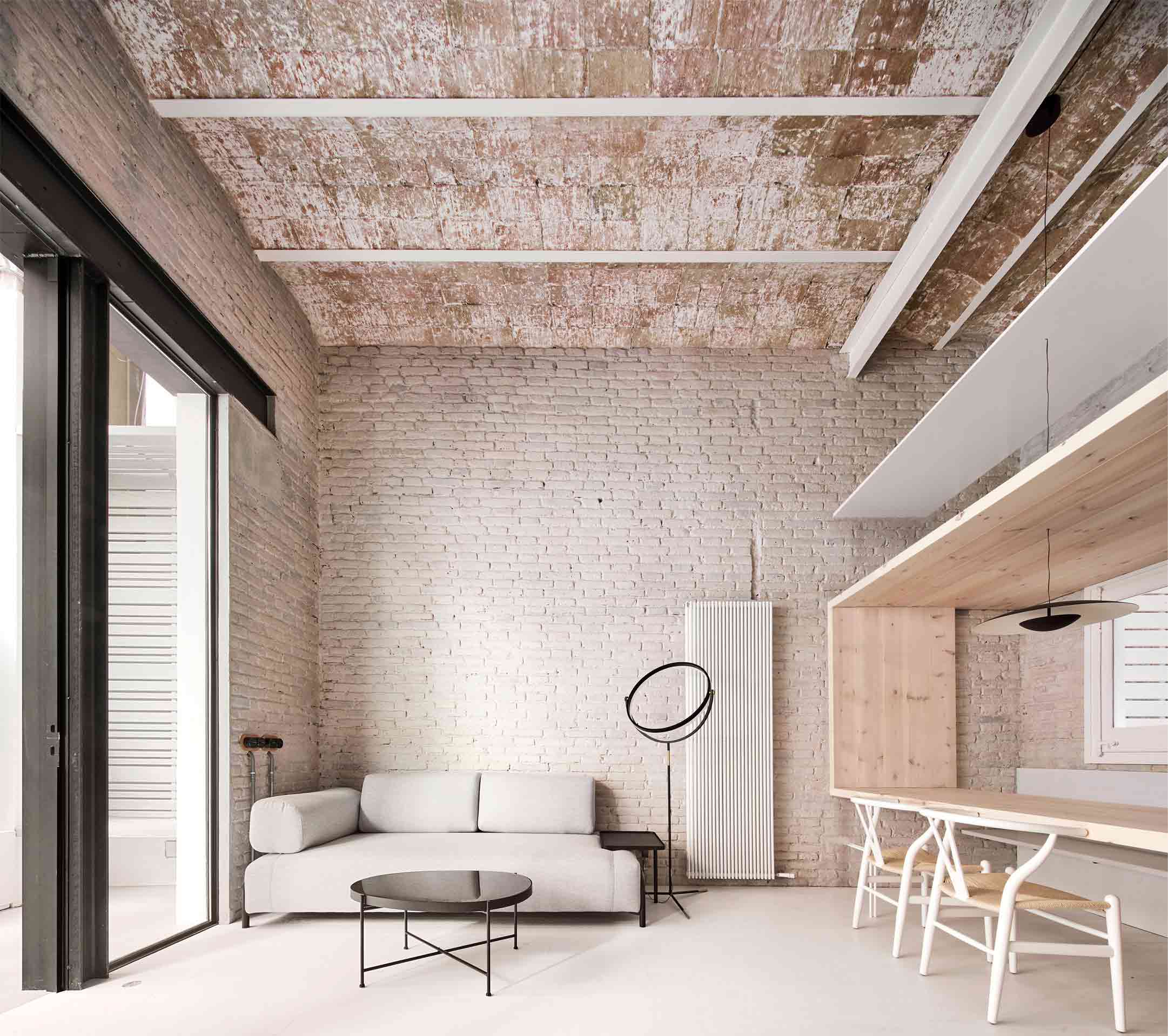
In another life, this building in Spain’s Catalan region was a warehouse. Once a dark space of industry, it’s now been sensitively transformed into a modern light-filled residence. However, traces of the structure’s history still take center stage thanks to considerate spatial organization.

Encased by an exposed brick ceiling and original whitewashed brick walls, the impressive double-height living space is imbued with its industrial roots. An ingenious light wood frame acts as an unobtrusive room divider, simultaneously zoning the kitchen and forming a tabletop, as well as providing a floor for the loft above. While the scheme accommodates modern living, the absence of opaque barriers places meaningful emphasis on the original form and fabric of the building.


4. Merging Past and Future

CoCo Tea Coffee Juice shop in Shiquan Street by OYTT Design, Suzhou, China

Popular Choice Winner, 10th Annual A+Awards, Restaurants (S <1000 sq ft)

CoCo Tea Coffee Juice shop in Shiquan StreetCoCo Tea Coffee Juice shop in Shiquan Street
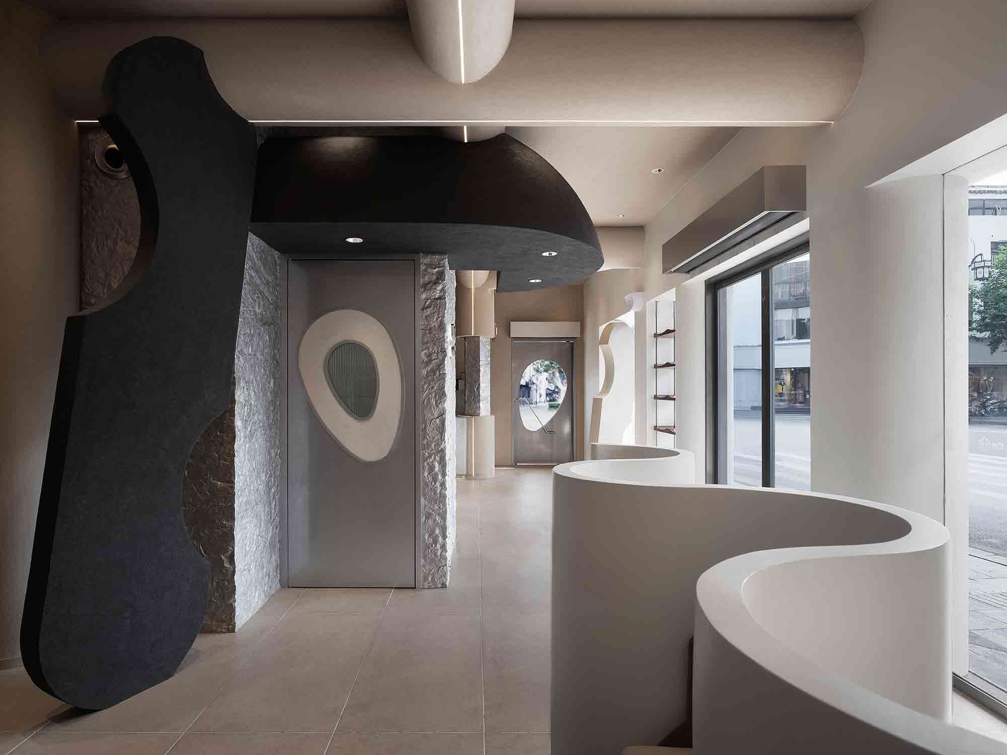
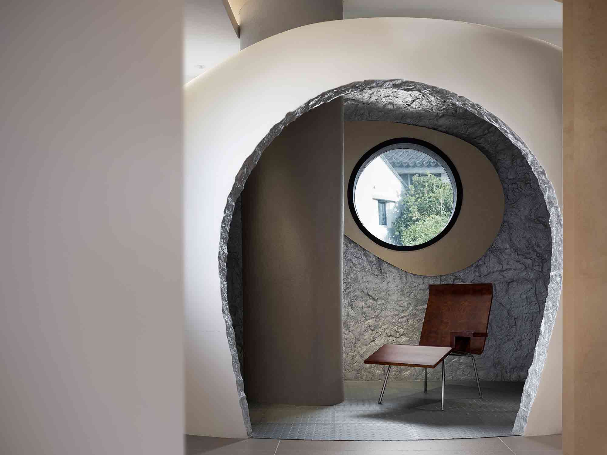
Situated in the Chinese city of Suzhou, this pioneering café was inspired by the concept of returning to the origin of life. The interior is an unexpected convergence of old and new, responding to the historic street outside while reimagining commercial typologies through a futuristic lens.

The space is framed by curvaceous forms and undulating lines that merge the distinction between walls and ceiling. The effect is a cocooning embrace that channels the topography of caves and the ancient environment, emphasized by punctuations of rugged exposed rock and mottled, organic paint effects. However, these natural emblems are skillfully translated into a contemporary vocabulary, from the sleek architectural staircase to the surprising apertures. Past and future convene in a fascinating conversation, at once forward-looking and mindful of what came before.


5. Experimenting With Solid Surface Patterns

Zhengzhou Grand Theater by The Architectural Design and Research Institute of HIT, Zhengzhou, China

Popular Choice Winner, 10th Annual A+Awards, Hall / Theater

Zhengzhou Grand Theater by The Architectural Design and Research Institute of HITZhengzhou Grand Theater by The Architectural Design and Research Institute of HIT
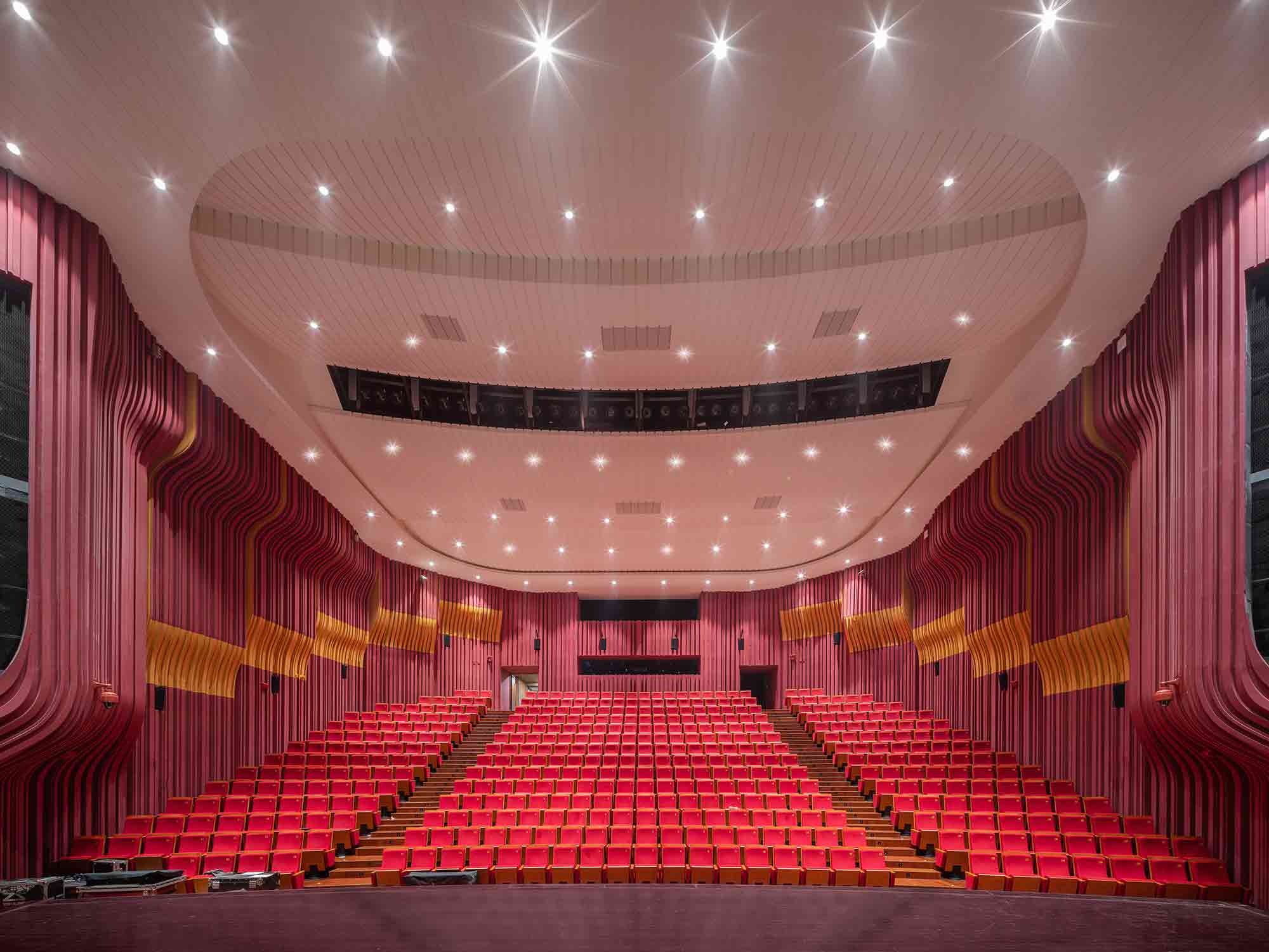
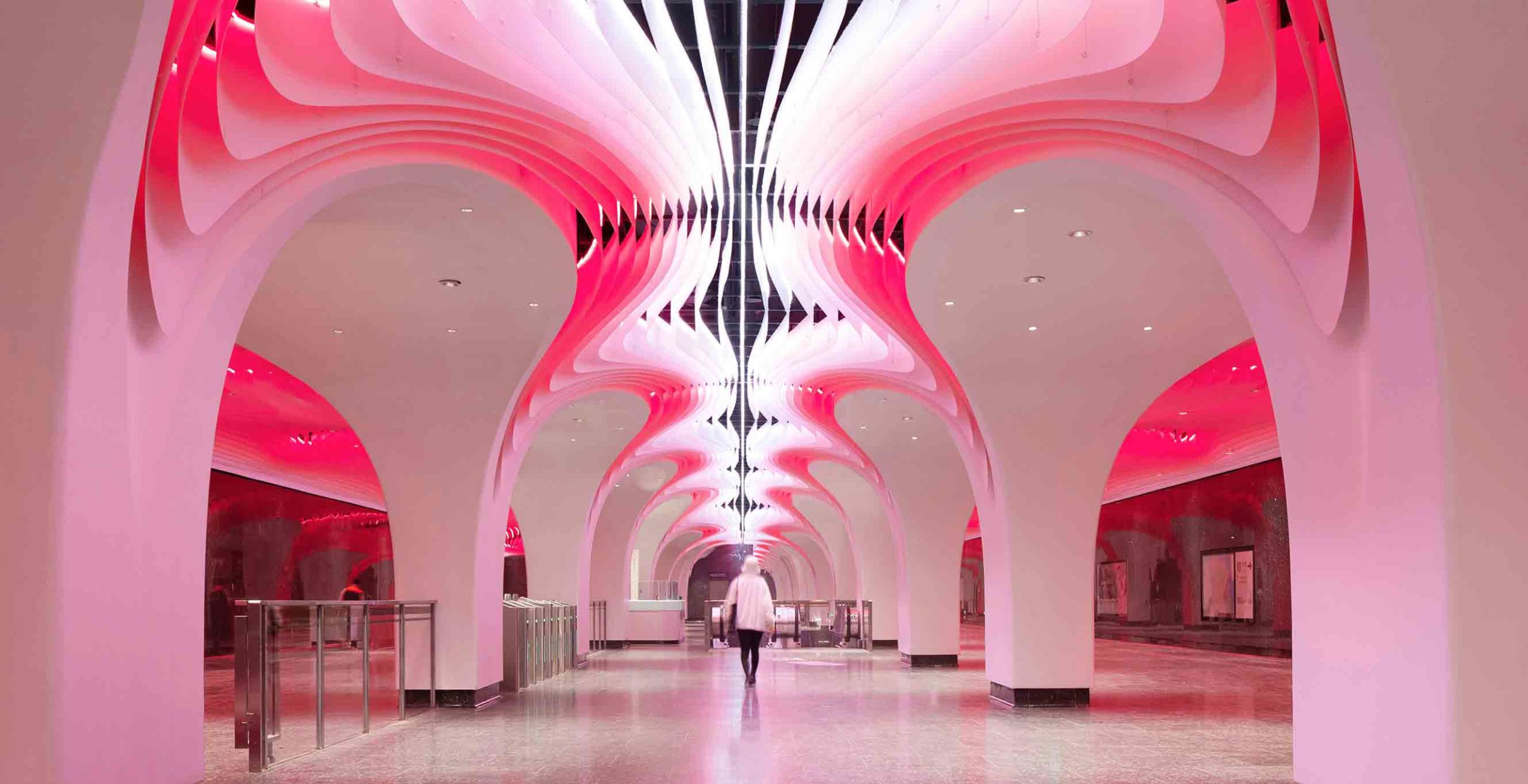
A performance complex of impressive proportions, the Zhengzhou Grand Theater encompasses four large venues with distinct architectural characters. In one hall, the walls ripple with a daring solid surface design in pink and orange hues. Narrow, repetitive channels envelop the room, resembling the interior architecture of a living, breathing organism, while the carefully considered contours were crafted to meet high acoustic standards.

While the stage is the focus within the halls, the gaze is guided upwards in the lobby and corridors. Droplet-shaped motifs adorn the ceiling; the intricate design combines engraved shapes with perforated apertures. These unusual skylights illuminate a path between the venues, as well as reducing the roof’s weight and construction costs.


6. Internalizing the Outdoors

Fort 137 by Daniel Joseph Chenin, Ltd., Las Vegas, Nevada

Jury Winner, 10th Annual A+Awards, Private House (XL >6000 sq ft)

Fort 137 by Daniel Joseph Chenin, Ltd.
Fort 137 by Daniel Joseph Chenin, Ltd.
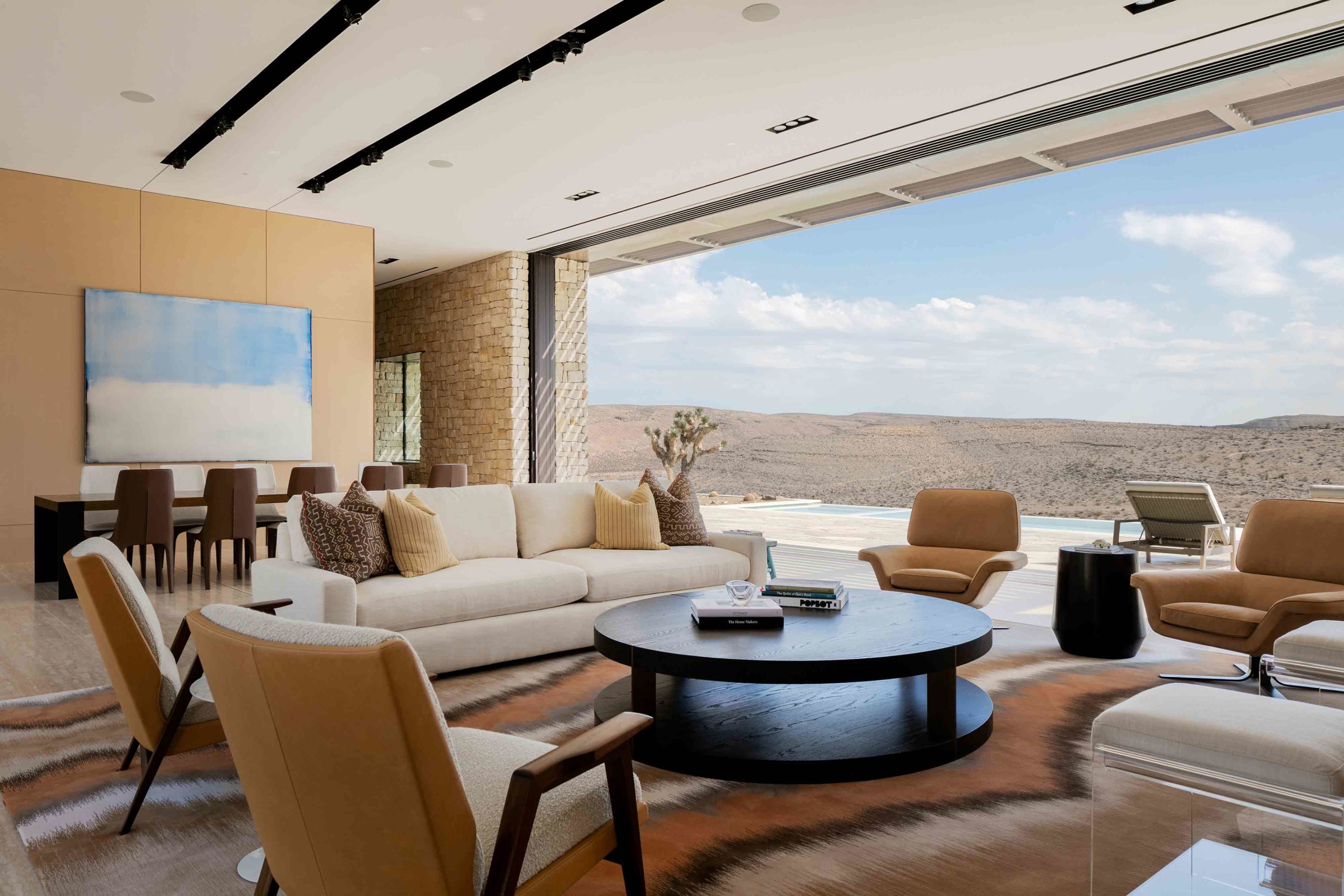
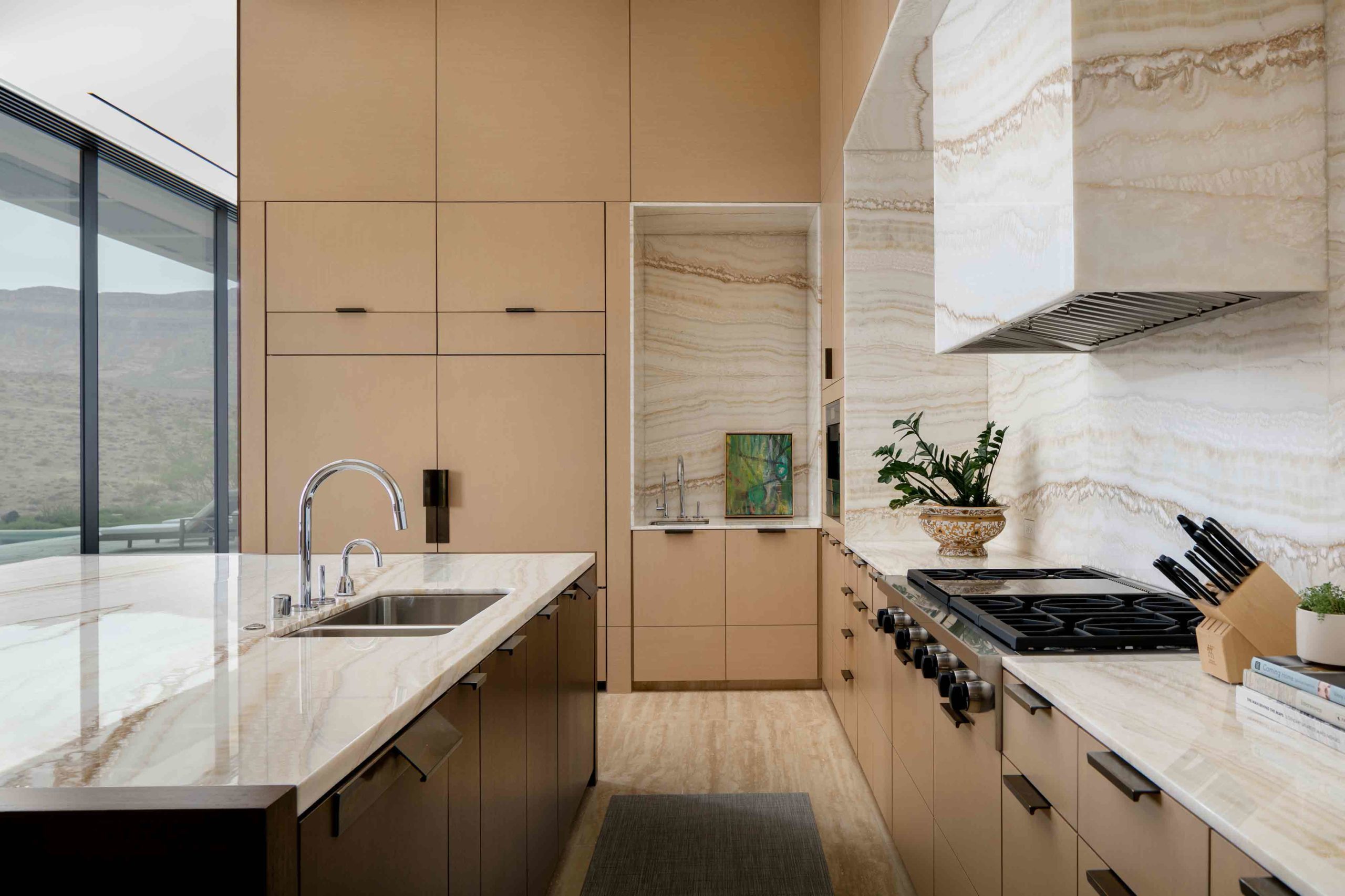
Nestled in the arid Nevada desert, this residence reads as an extension of the topography, both externally and internally. Retractable walls of glass, which span across two different aspects, peel away in the main living and dining zone, erasing the boundary between natural and built environments. Exposed rock excavated from the site lines the walls of the living spaces and orients the home within the same tactile language as the rugged terrain.

The color palette throughout the interior is earthy and warm, a combination of cream, peach, terracotta and deep brown that blurs with the desert. In the kitchen, veined surfaces across the countertops and backsplash mirror the relief of the landscape outside in the same sand hues, internalizing the outdoors with stunning effect.


7. Articulating Unusual Arches

SOMESOME Bar & Restaurant by MARS Studio, Beijing, China

Jury Winner and Popular Choice Winner, 10th Annual A+Awards, Bars & Wineries

SOMESOME Bar & Restaurant by MARS StudioSOMESOME Bar & Restaurant by MARS Studio
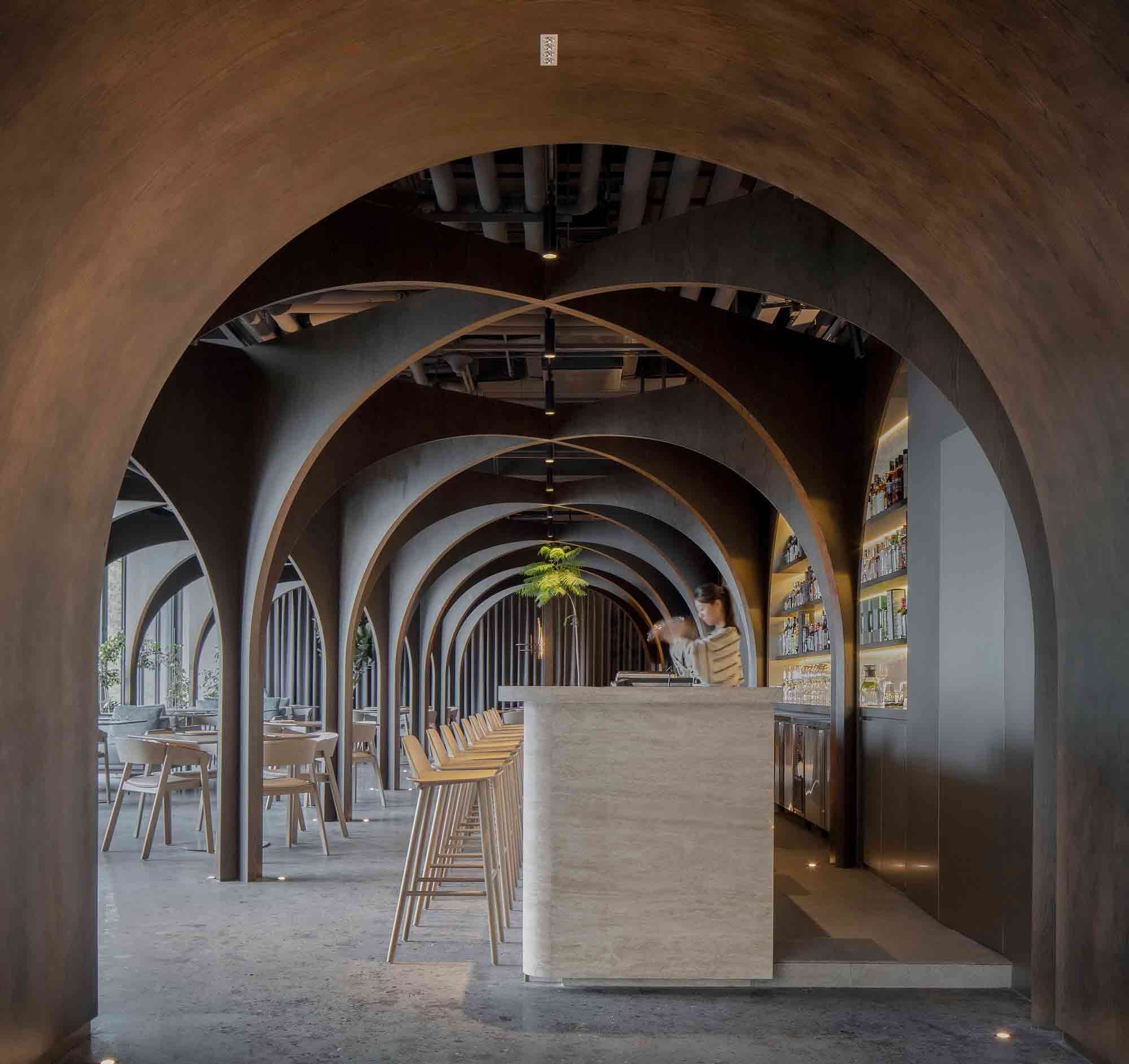
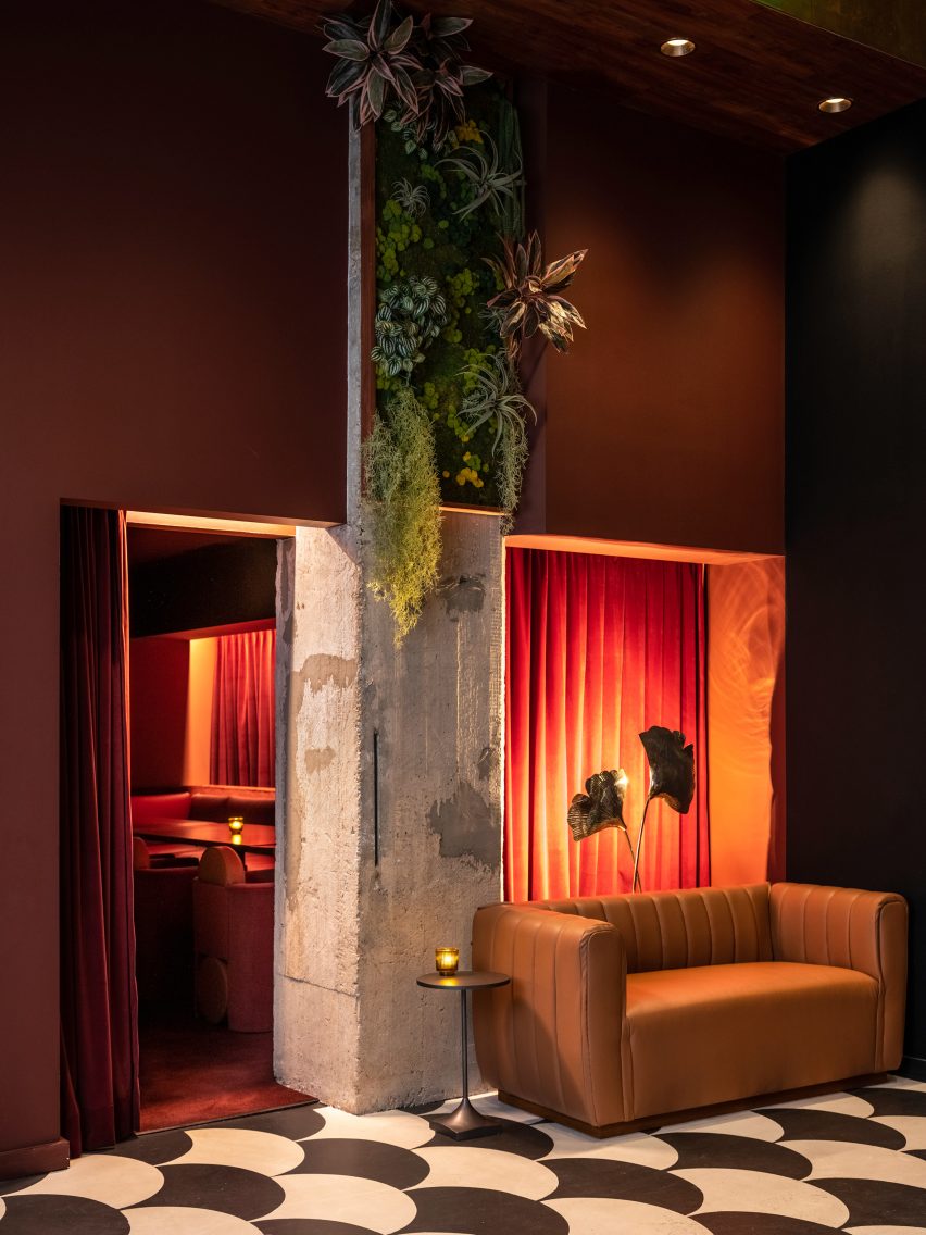
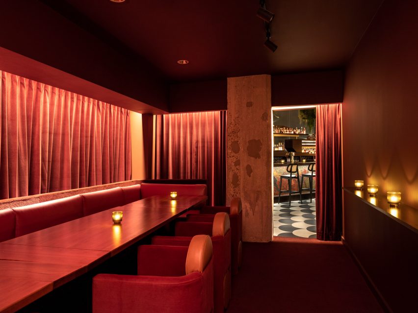
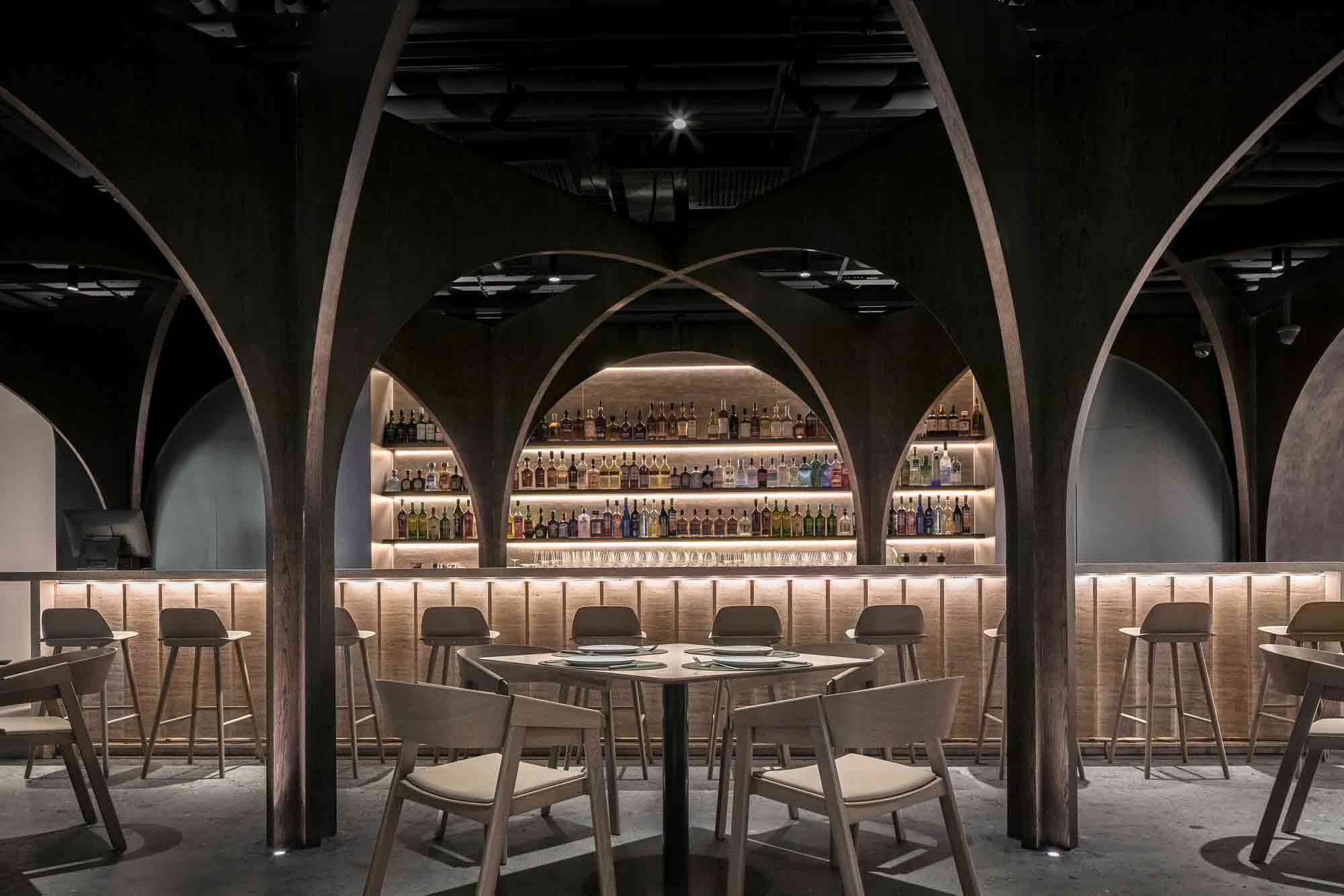
This visually striking bar and restaurant in Beijing eschews right angles and straight lines. Approaching the curved threshold to this daring space is like delving into a warren. The arched entrance draws the eye down through a cocoon-like portal defined by dark, earthy colors.

Inside, warped surfaces shape the unconventional hospitality scheme, offering an atmospheric spatial journey from start to finish. A complex arrangement of archways creates a sinuous pathway between the tables, bar and glass-fronted outlook. Their intersecting forms serve as elaborate picture frames, revealing unexpected internal and external perspectives to the restaurant’s patrons. The design succeeds in embodying diverse qualities — a large, open interior where air can flow freely, at once segmented into intimate rooms of experience.


8. Innovating Installations

550 Madison Lobby by Gensler,  Manhattan, New York

Popular Choice Winner, 10th Annual A+Awards, Commercial Interiors (<25,000 sq ft)

550 Madison Lobby by Gensler550 Madison Lobby by Gensler
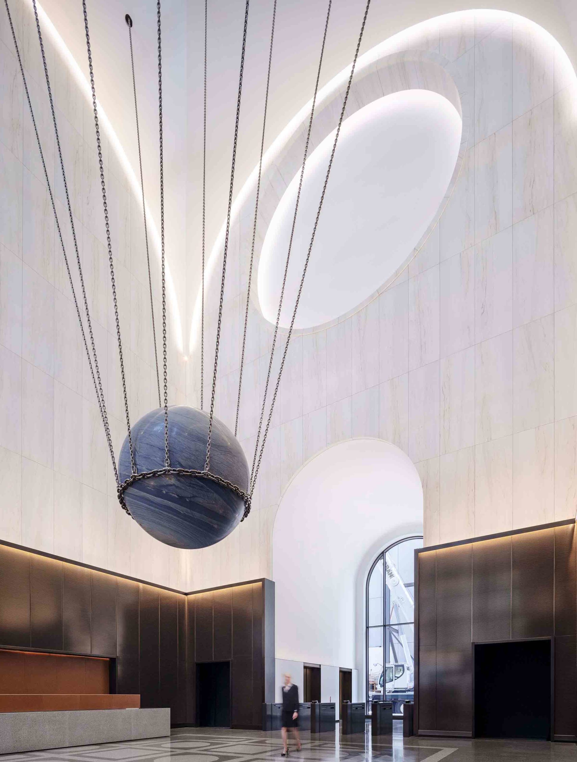
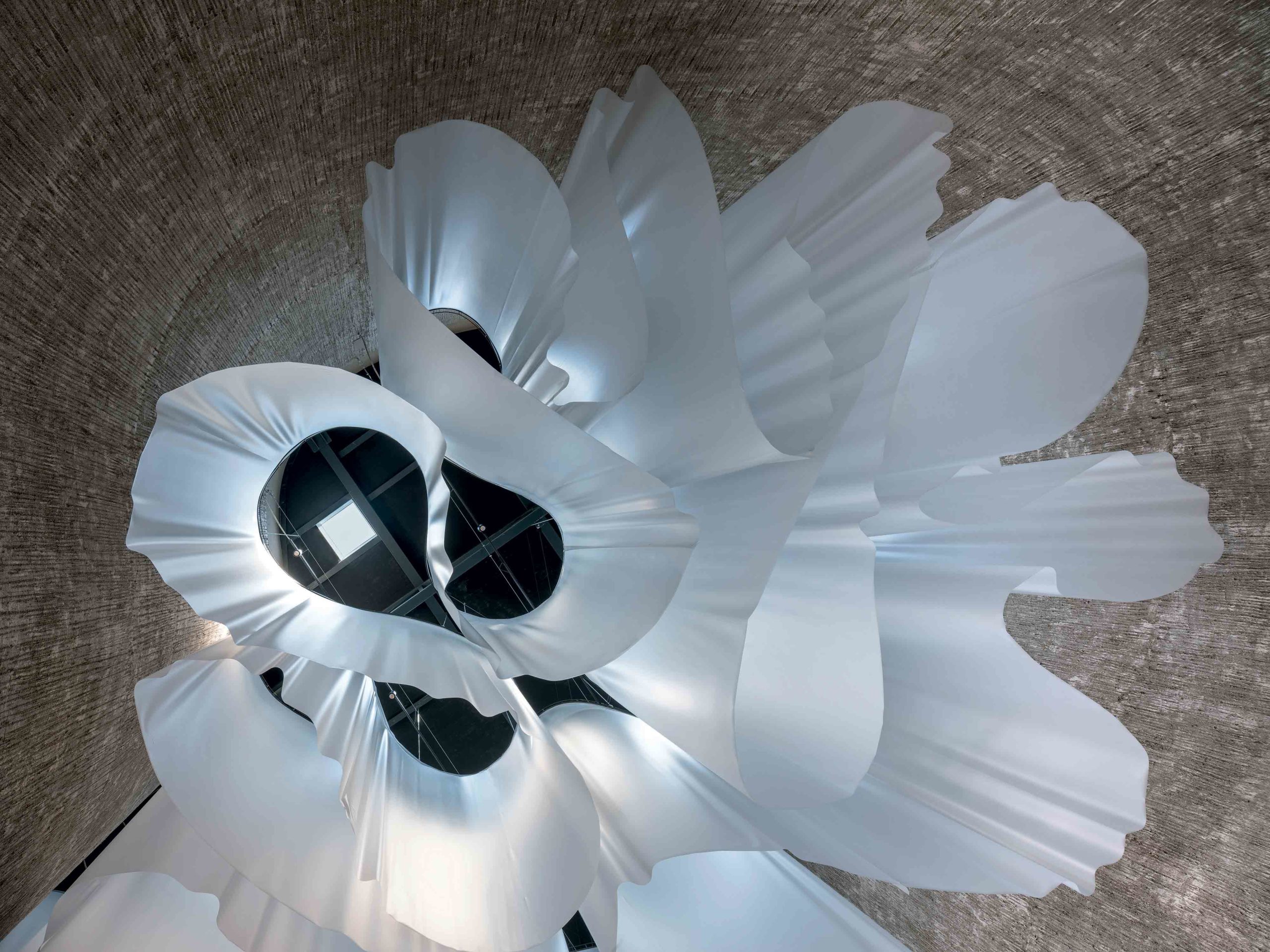
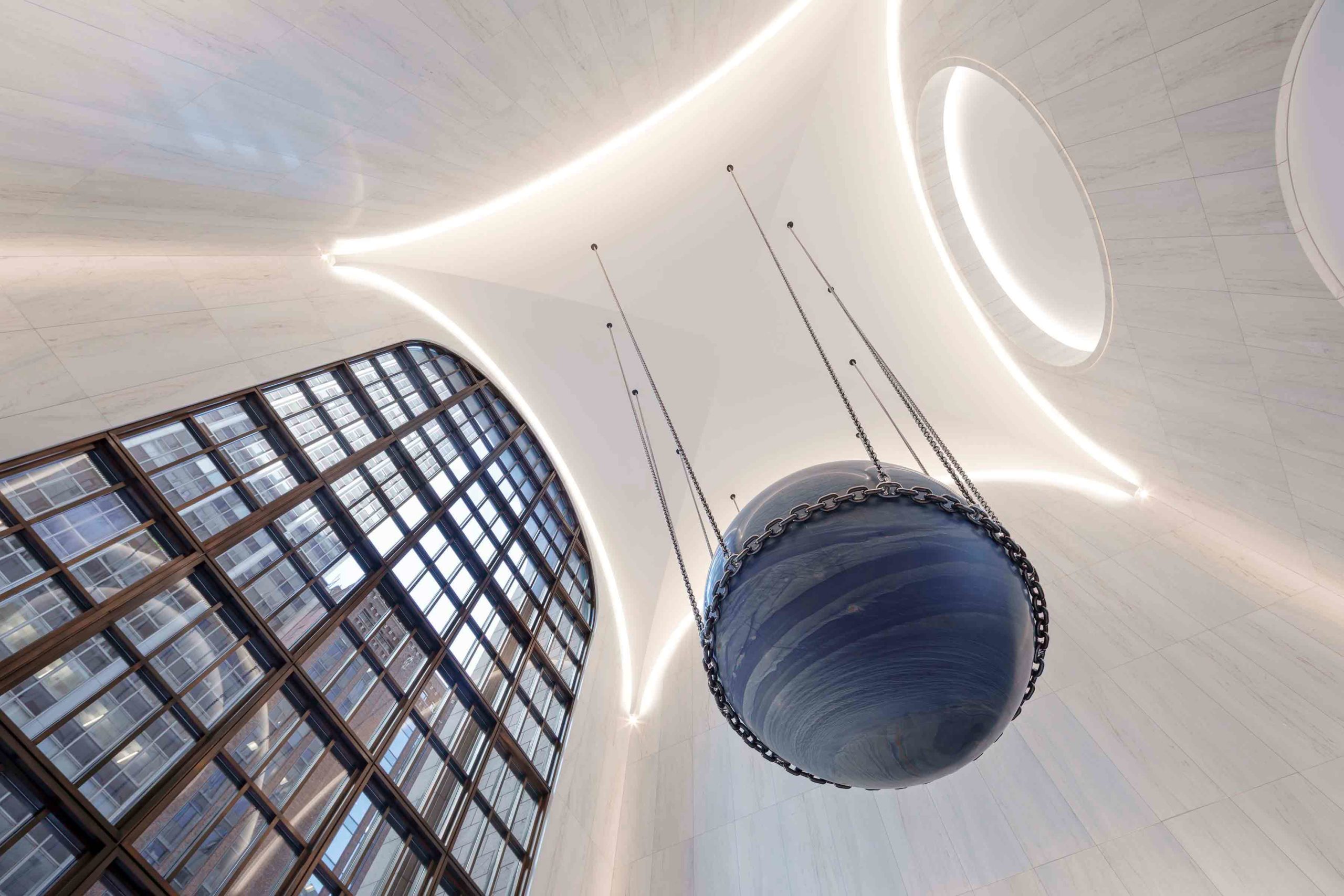
Dating back to 1984, the lobby of this postmodern building in New York City underwent a contemporary update by architectural firm Gensler. While remaining respectful of the scheme’s heritage materials and capacious proportions, the towering, triple-height ceiling now arches softly around the space. The convex lines of the engraved oculus emphasize the vaulted barrel design, accentuated by the illuminated perimeter, which imparts a celestial, almost weightless effect.

The spherical motif reappears in the remarkable art installation suspended from the ceiling by Alicja Kwade. Called Solid Sky, the presence of the 24-ton marble orb is profound — it presides over the lobby with a quiet intensity, much like its namesake. Visually, the installation anchors the dramatic space and establishes a line of sight to the outdoor garden beyond.

Architizer’s 11th Annual A+Awards is open for entries! With a Final Entry Deadline of January 27th, 2023, the clock is ticking — get started on your submission today.

Reference