The New Maximalist: When More is More in Interior Design
CategoriesArchitecture

The New Maximalist: When More is More in Interior Design

Architects: Want to have your project featured? Showcase your work through Architizer and sign up for our inspirational newsletters.

How do color, decoration and whimsy come together in modern design? Architect Ludwig Mies van der Rohe became known around the world for his seemingly simple buildings and the phrase “Less is More,” a mantra he adopted throughout his life. In turn, that phrase would come to define a generation of minimalist, modern design. As Pat Finn noted, more than 60 years after this famous statement, it seems that ornament still carries a hint of taboo. So what place does maximalism have in our everyday life?

Across architecture and interior design disciplines alike, maximalism is a reaction against minimalism, a move towards an aesthetic of excess. The philosophy is summarized as “more is more.” More color, more decoration, and the desire to celebrate the intricacies and complexity that come with them. Taking a dive into the Architizer library, the following projects represent how designers are creating maximalist interiors today. They represent multiple scales, material choices and wide-ranging geographies around the world. In turn, they show how interiors are becoming ever more playful, inclusive and inspiring.
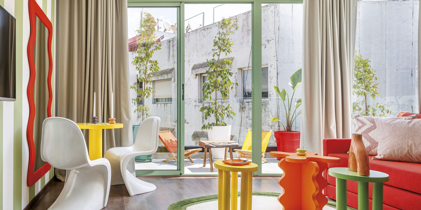

BasilicÔ

By Studio CAYS, Casablanca, Morocco

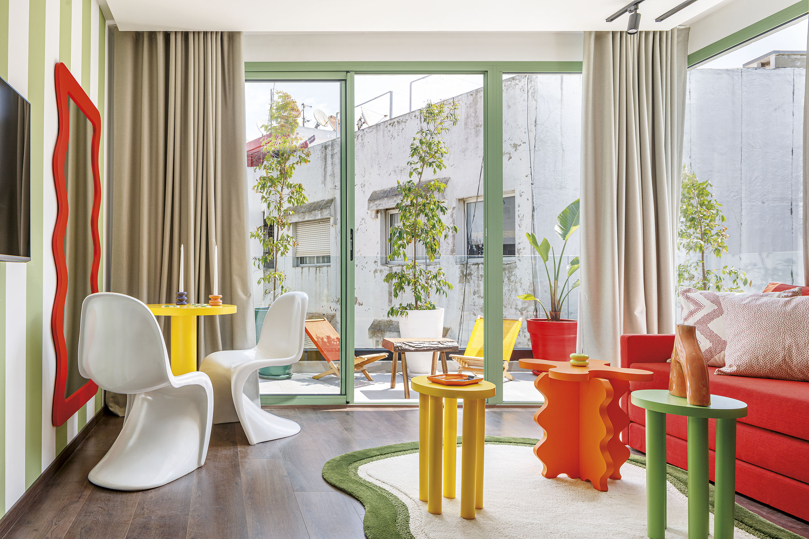
The BasilicÔ was made to create an attractive and magnetizing place to explore. The design team wanted to imagine the impact colors can have on the occupant experience, creating an environment that stimulates the senses. As they explained, polychromy and morphology combine to create a maximalist aura. The BasilicÔ project revolves around a floral theme through which several types of apartments emerge: The CoquelicÔt, the MimÔsa, the TournesÔl, the MartagÔn and the TulipÔ.

Together, the different apartments form a “bouquet” within the building to brings vitality and freshness to raw concrete walls and subdued corridors. Each of the apartment themes has its own character which stems from a common floral personality. The differences result in different shapes, colors and materials which are reflected through wall panels and furniture.
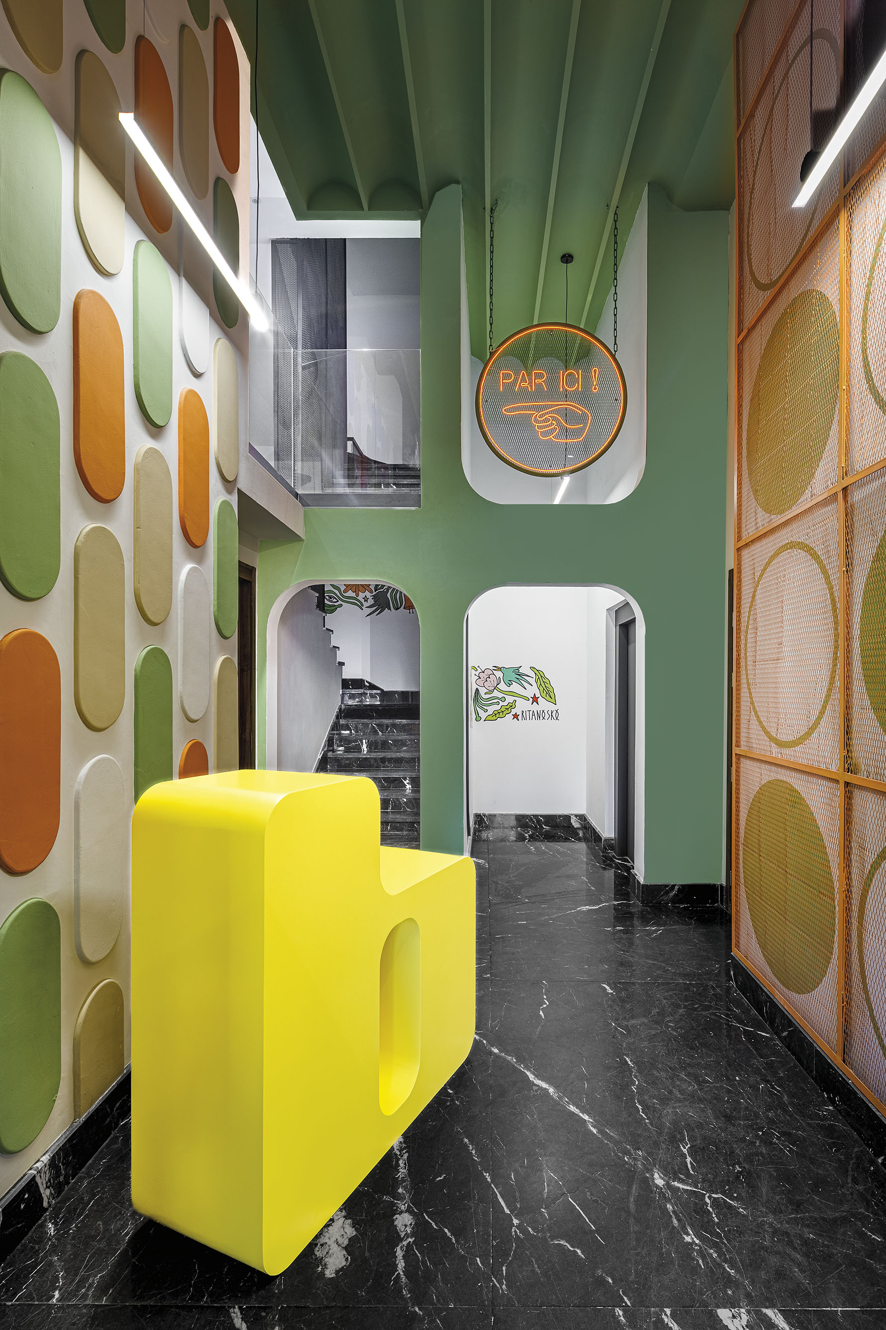

Dream La Miro

By Wutopia Lab, Jiangsu, China

In Dream La Miro, Wutopia Lab wanted to create a place of joy for the Duoyun Bookstore. The fairytale parent-child bookstore was opened at Dream Town in Yancheng, Jiangsu. When the client showed the team the IP they had introduced, namely the three animated films created by Italian artist Cristina Làstrego: Mirò the Cat, The Circus and The Creation, they were moved by the magnificent scenes and the imagination created by the artist.

The result is a fairy tale bookstore that uses the origin of life as a base inspiration combined with elements from the other animations. Wutopia Lab chose the ark as the theme, with the yellow outside and red inside sailing ship docked in the harbor of the book sea. All the fairy tales about the Miro store of Duoyun Bookstore start from here. The team didn’t want the interior design to be boring or simple. The tent, ark, mountain and forest all became means by which they tried to break out a typical style façade.


LIÒN

By COLLIDANIELARCHITETTO, Rome, Italy

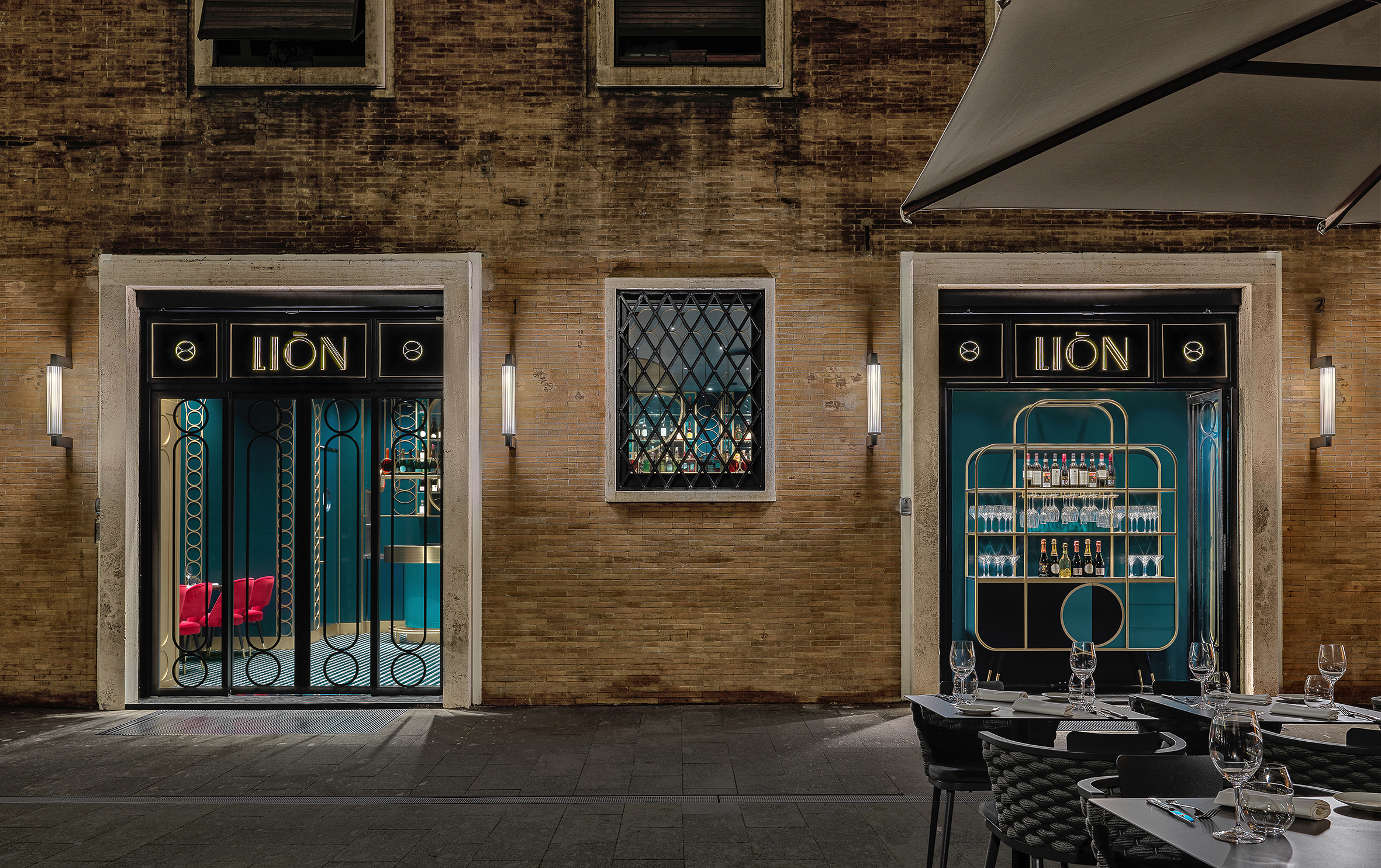
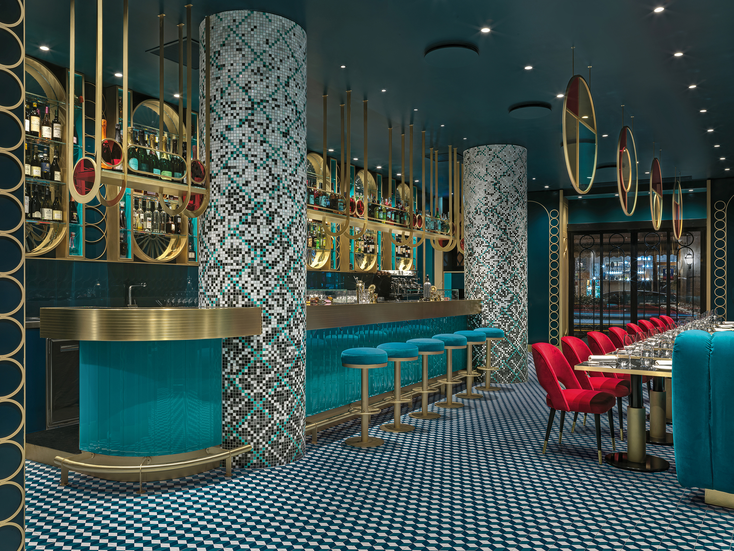
LIÒN is a restaurant and cocktail bar in the heart of Rome — halfway between the Pantheon and Piazza Navon. The project features bold lines and saturated colors in a maximalist style, contrasting with the austerity of the Palazzo that encompassed it. The idea was to give back to the city fragments of the Dolce Vita. Soft lights and mirrored surfaces envelope a sophisticated restaurant, whose terrace overlooks Largo della Sapienza.

LIÒN unfolds on two levels: the ground floor, encapsulating the restaurant, is completely projected on the outside through large windows outlined by a thick travertine frame. The basement, which is accessed via a marble staircase embellished with brass details, houses the service rooms, the kitchen and the wine cellar. The circle became the matrix of the dynamic elements, with soft and sinuous lines, which characterize the interiors, from the subtle and arched friezes that envelop the space, to the deep three-dimensional lozenge screen.
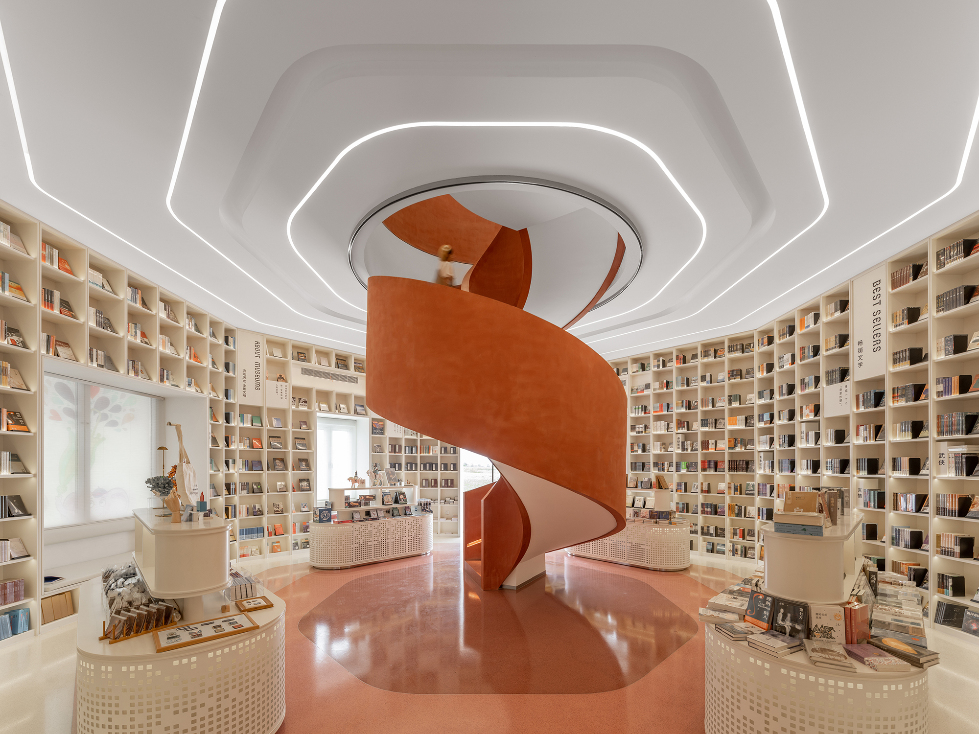
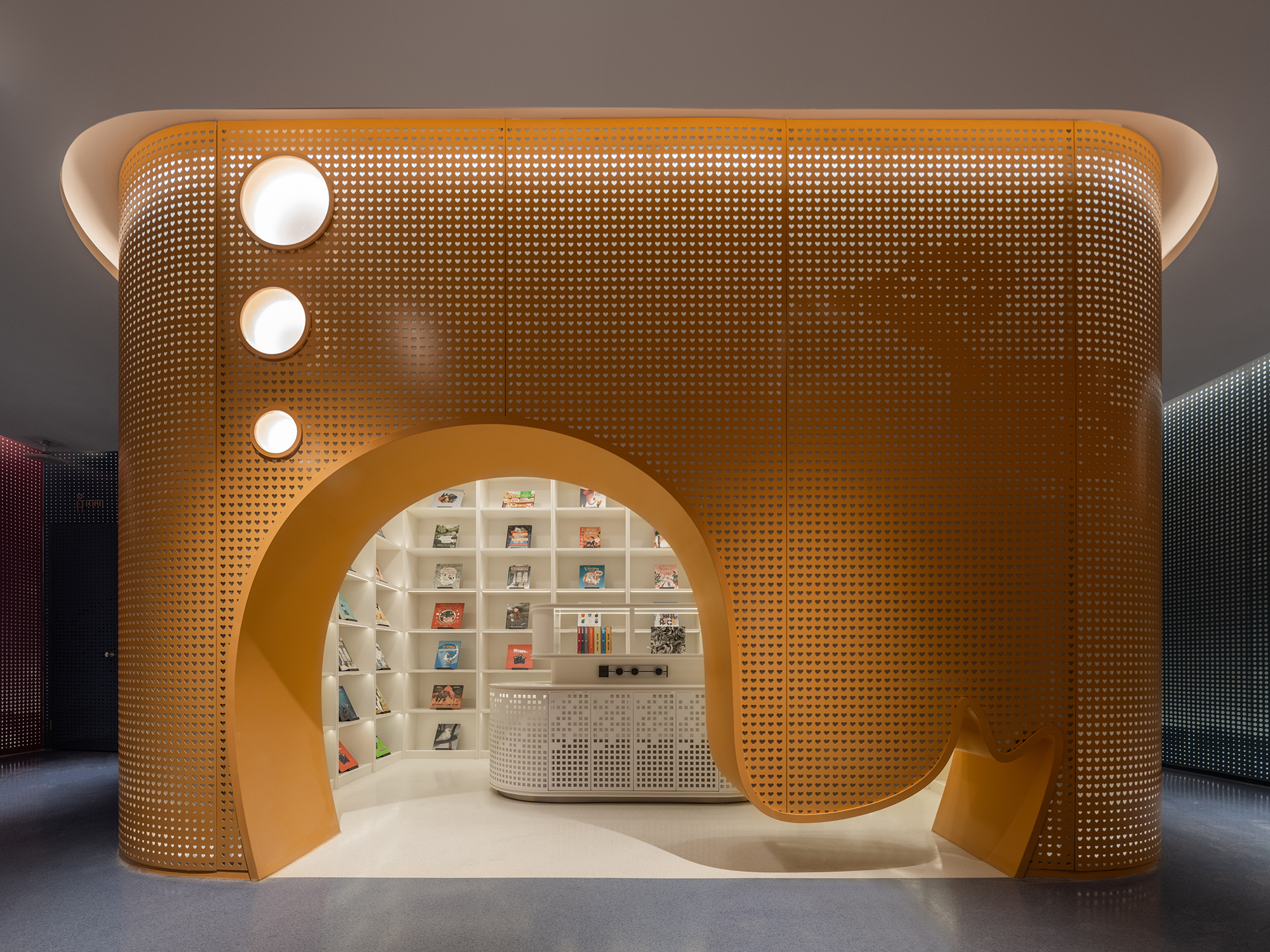

The MIXc Kunshan

By X+LIVING, China

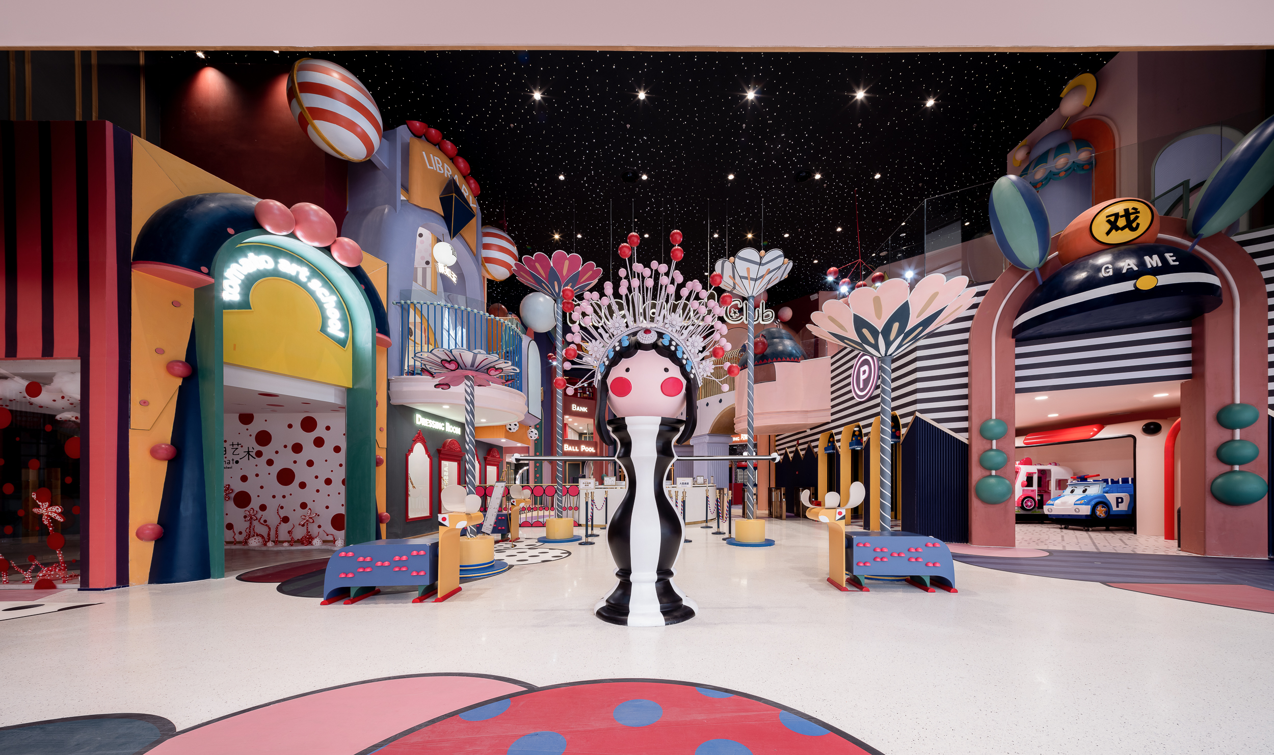
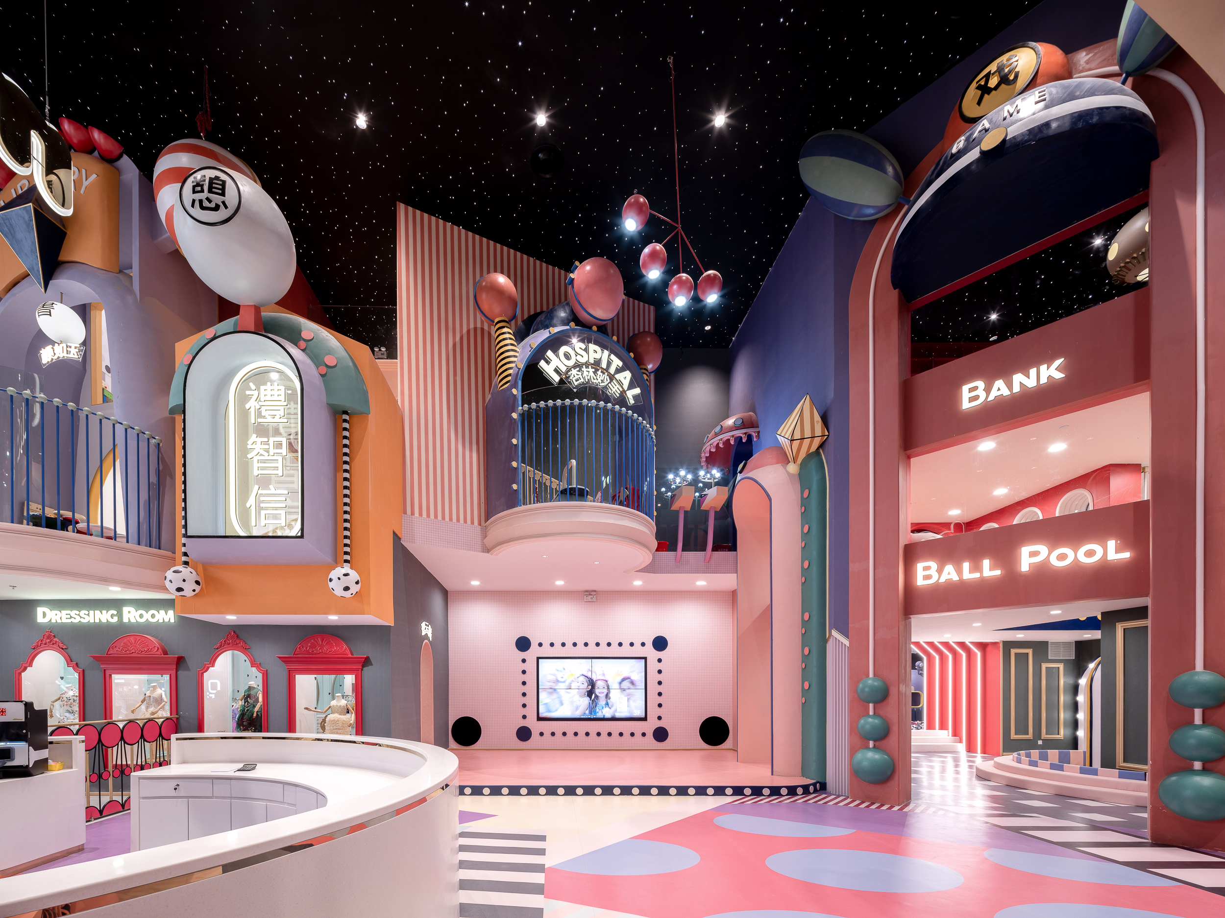
MIXc Kunshan was designed by X+LIVING to create a commercial space with an innovative strategy. The team set out to transform a public space on the third floor of a mall into a children’s section with a unity of aesthetics and theme. The result was a reimagining of public space in shopping malls. The project is located in Kunshan, Jiangsu Province, an important birthplace of Kunqu Opera. It has the nickname of “the mother of Chinese Opera”.

With the vision of creating a multifunctional experience venue that integrates parenting, leisure and education, the design team blurred the physical boundary between the public area and the retail stores through a coordinated facade design. In order to strengthen the cultural identity of the project, the team used Kunqu Opera as the origin of the design concept, and replaced the traditional aesthetic form with interesting design techniques to create a dreamlike, maximalist wonderland.


Barberia Royal

By ROW Studio, Ciudad de México, Mexico

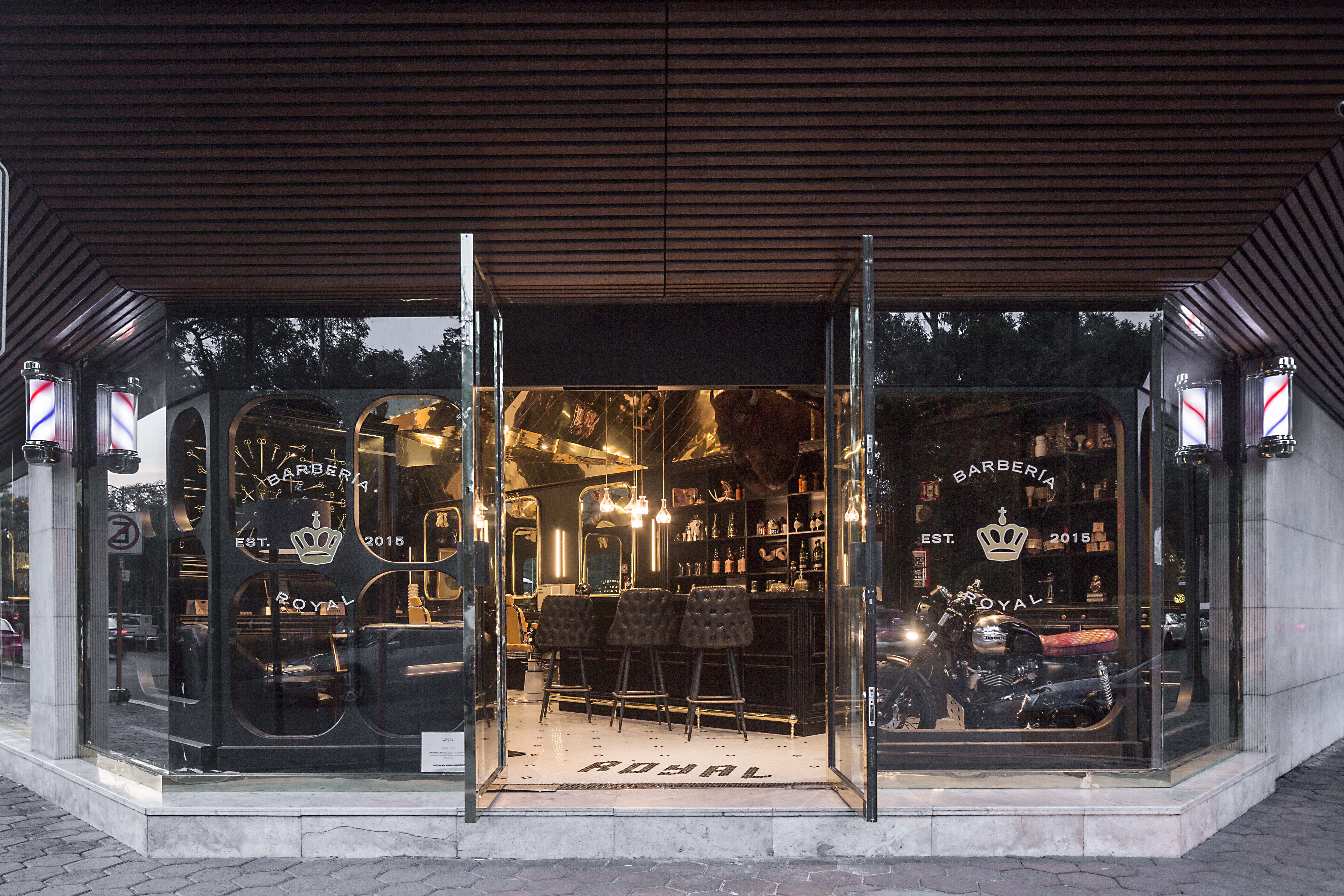
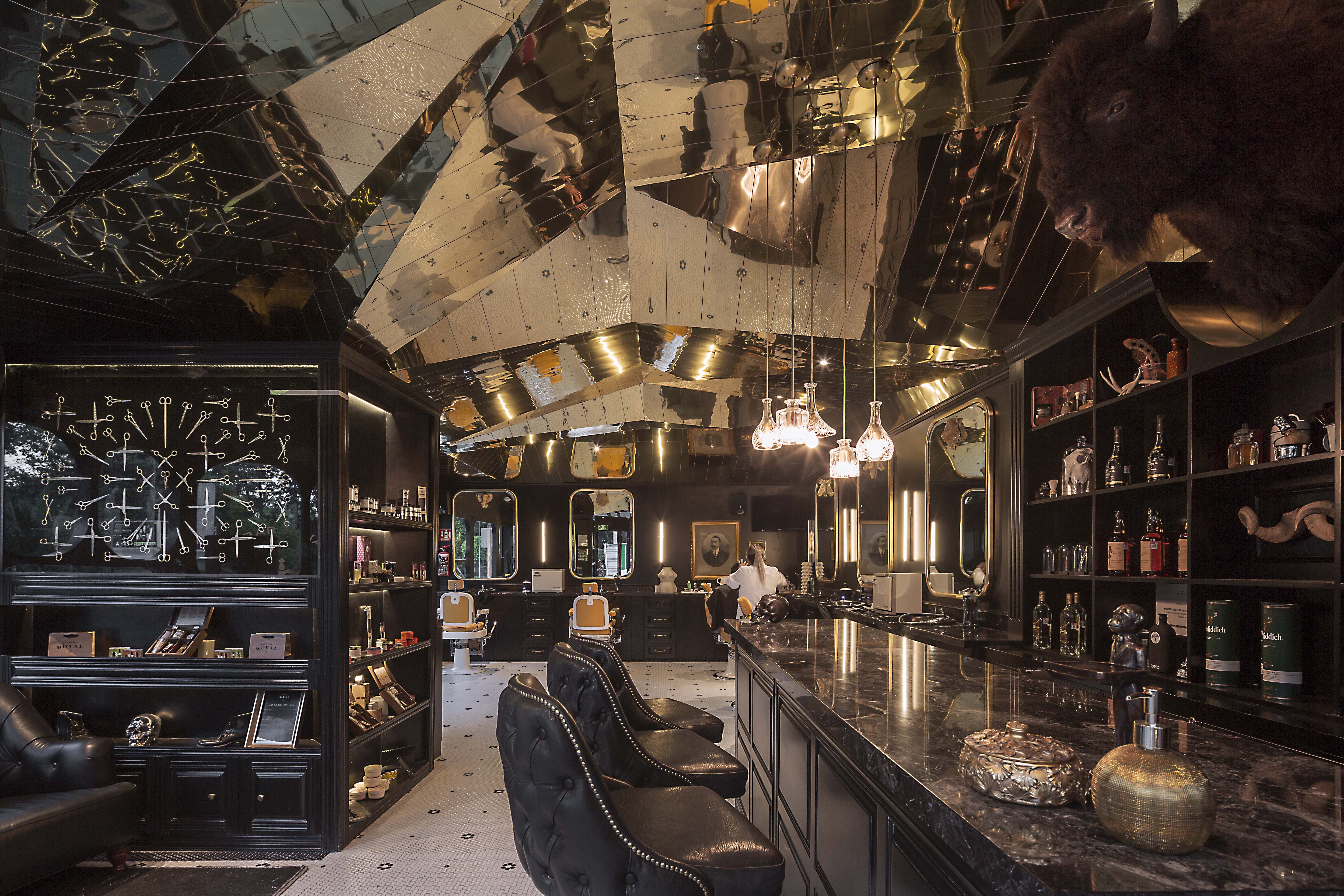
Barberia Royal is a barbershop that offers services in an incredible location of Mexico City. ROW Studio wanted to incorporate the bits and pieces of a previous proposal that was under construction on the site for a different barbershop that was never finished, recycling mismatching moldings and other wooden elements. They put the pieces together almost randomly, fitting them in a contemporary form that still references the traditional symbols of European royalty.

The lower half of the space includes colors and materials linked to the long standing heritage of traditional barbershops, including black and white hexagonal tiles floor with a flower pattern and the Royal name greeting all the patrons at the entrance. In contrast, the ceiling is shaped with an intricate faceted surface that adapts to the changing heights of the space and the structural elements of the building finished with a laser-cut golden anodized aluminum surface.


SUNDAYS

By FLAT12x, Krung Thep Maha Nakhon, Thailand

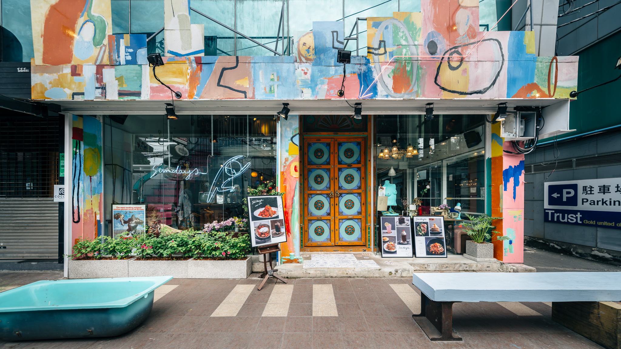
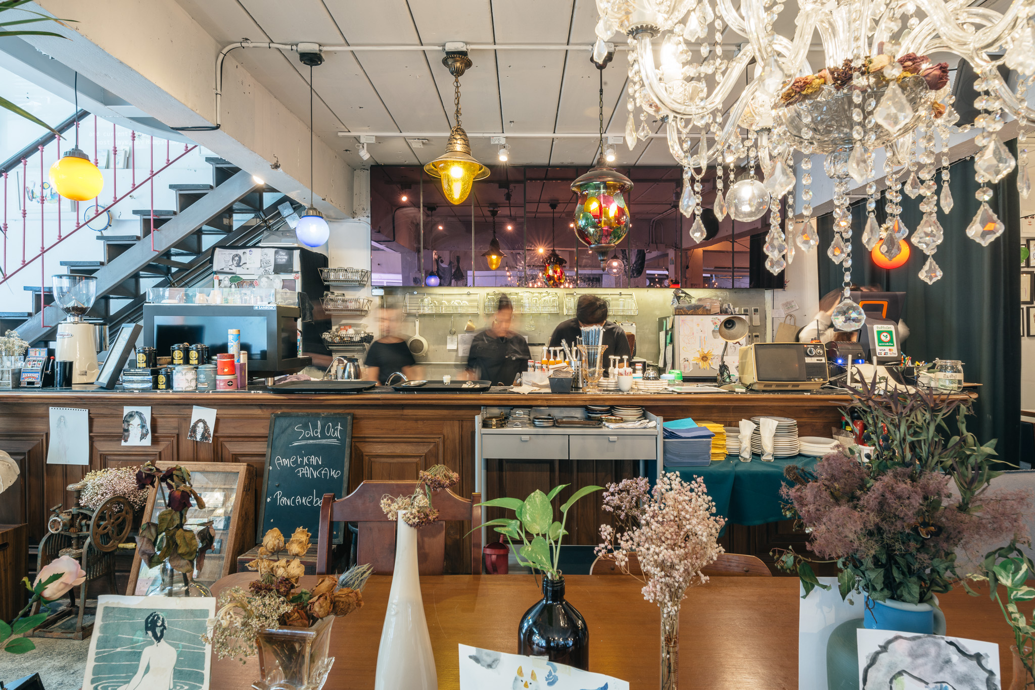
Sundays is the one-off restaurant illustrating design that is hand-crafted and built from the mindset of believing that arts can make things better. The maximalist restaurant was designed to integrate architecture, interior, graphic design and the arts in Bangkok, Thailand. Although surrounded by generic pubs and restaurants, Sundays was made to stand out. The restaurant offers customers striking experiences of what art can do to other things.

Ten pieces of drawings classically covering the unwanted old fridges or the flower bouquets that are pinned upside down to make the old structure of the building a little bit nicer. Roaming through unexpected drawings and paintings alongside with exquisite mixture of decoration styles, the restaurant expresses strong physical connection between the building to the room. Echoing this, the graphic design of the shop epitomizes the brand identity through signage and packaging of all foods and beverages.


Metal Rainbow

By Wutopia Lab, Suzhou, China

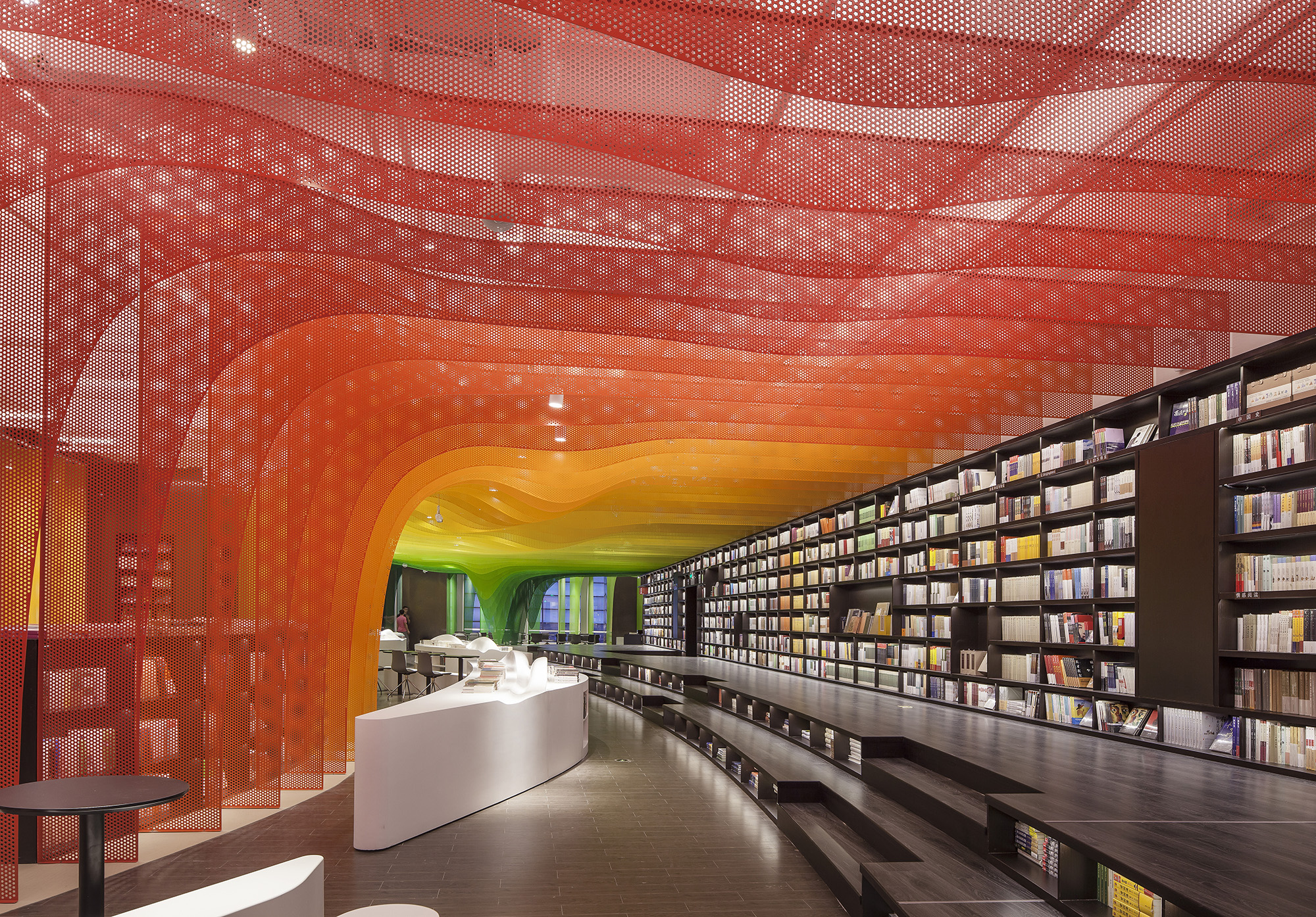
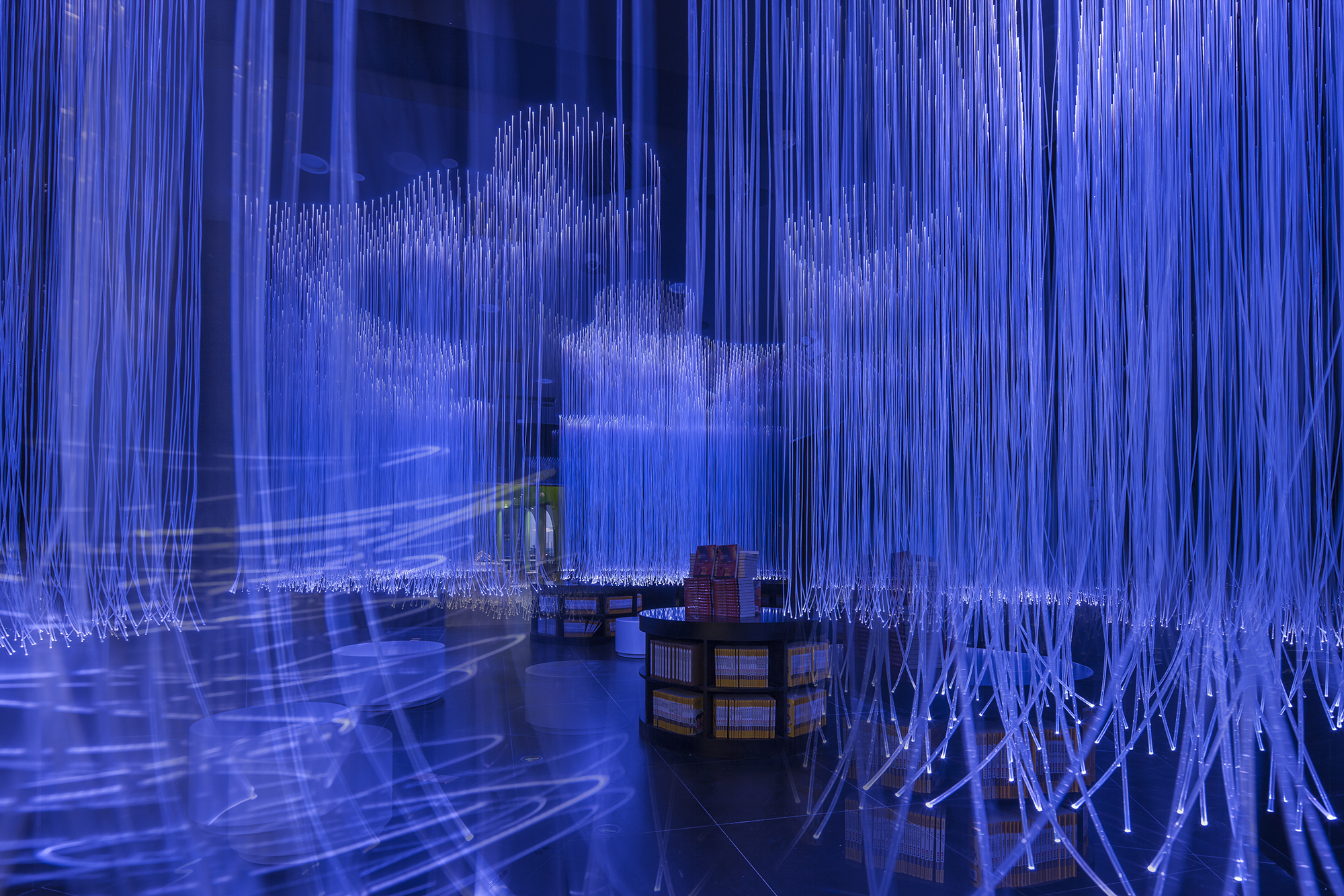
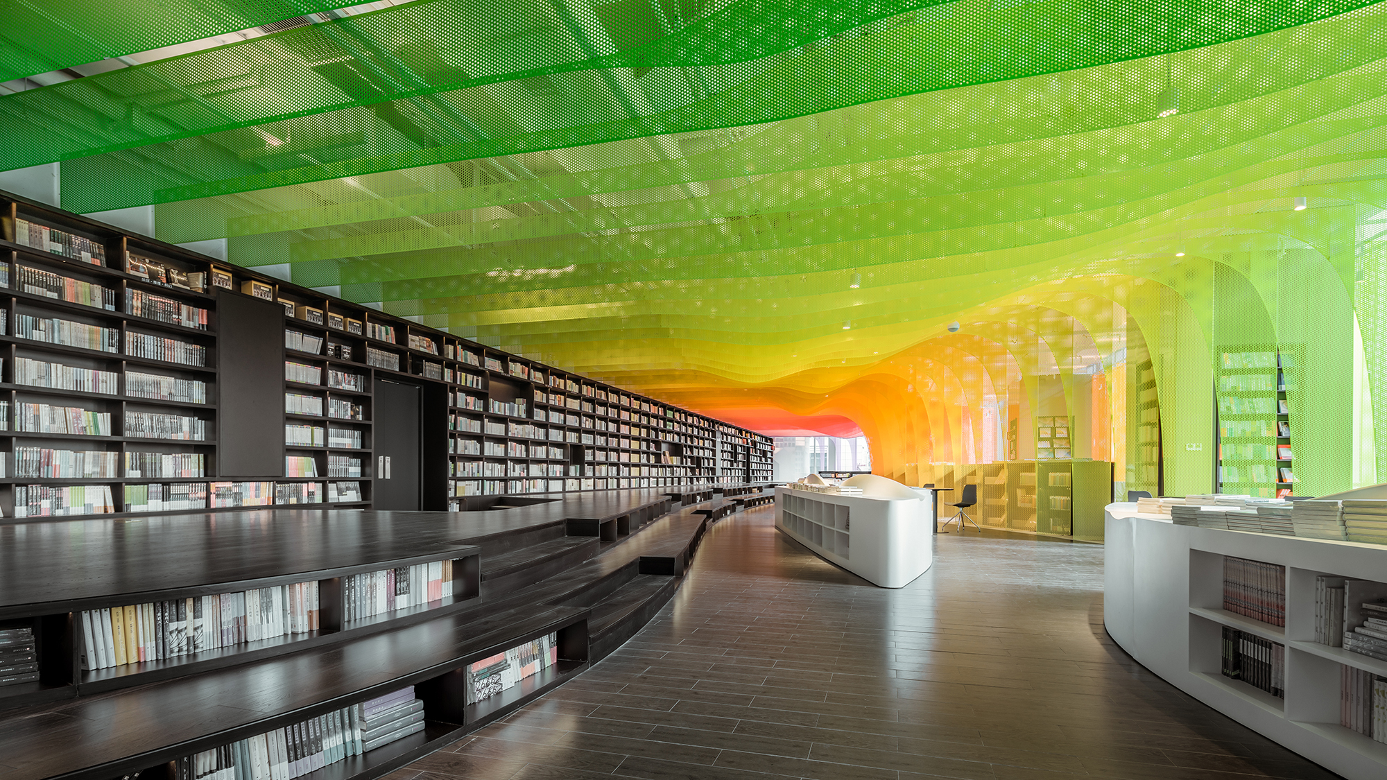
The Zhongshu Bookstore bookstore is divided into four main zones and several subdivided zones. Aiming to create a colorful new world by using symbolism, the architect gave a unique character to each zone: The Sanctuary of Crystal for new arrivals; The Cave of Fireflies for recommendations; The Xanadu of Rainbows for reading room; The Castle of Innocence for children books. As an entrance, ‘The Sanctuary of Crystal’ is a space full of books and nothing else. Using glass bricks, mirrors and acrylic, ‘The Sanctuary of Crystal’ is a shining white space, drawing customers into the heart of the store.

After a relatively narrow space, ‘The Xanadu of Rainbows’ is a large and open space. Thanks to the large windows, natural lights can pour inside. Being the most prominent space, ‘The Xanadu of Rainbows’ provides a variety of experience. Taking advantages of different heights of shelves, steps, and tables, the architect created a hyper-maximal and abstracted landscape of cliffs, valleys, islands, rapids and oases. There are also thin perforated aluminum sheets in gradient colors simulated as rainbows installed in the bookstore.

Architects: Want to have your project featured? Showcase your work through Architizer and sign up for our inspirational newsletters.

Reference

Taiga by Park + Associates
CategoriesArchitecture

A Table With a View: 7 Ways Architects Are Upselling Restaurant Design

Architizer is thrilled to announce the winners of the 11th Annual A+Awards! Interested in participating next season? Sign up for key information about the 12th Annual A+Awards, set to launch this fall.

As the chef’s adage goes, you eat with your eyes first. Beyond the confines of the plate, a restaurant’s spatial character is the vital ingredient that underlies every meal. While crispy basil leaves and elegant reels of tagliatelle can conjure up fields of sun-dappled groves beneath a Tuscan sun, so too can the undulating curves of a vaulted ceiling or carefully articulated patterns of light.

The unique power of architecture in the hospitality sphere is something the architects of these winning restaurants from the 11th A+Awards know well. From pioneering approaches to sustainability to striking cultural invocations and immersive visual storytelling, each offers an extraordinary new riff on traditional restaurant typologies. Add one part impeccable spatial planning to one part design innovation and mix well — here are seven ways architects are revolutionizing the eatery.


1. Evoking Distant Terrains

Taiga by Park + Associates, Singapore

Popular Choice Winner, 11th Annual A+Awards, Restaurants (S <1000 sq ft)

Taiga by Park + Associates Taiga by Park + Associates
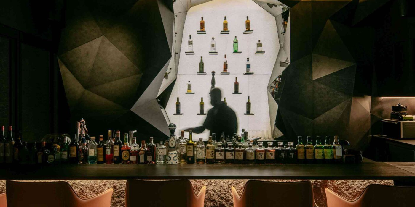
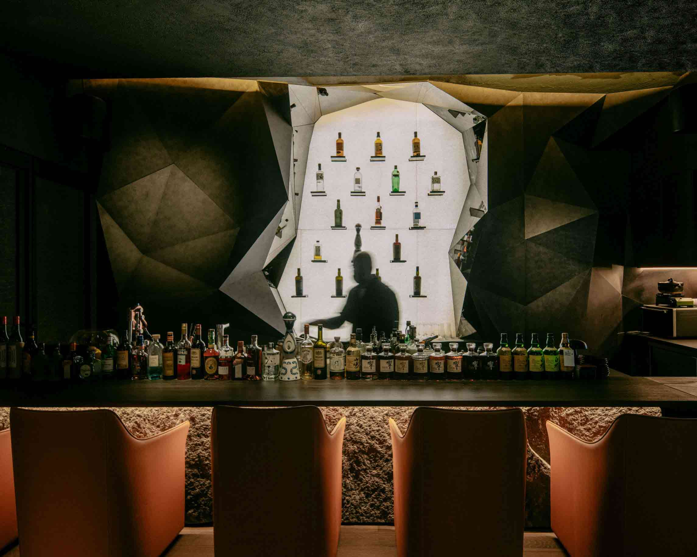
While it may be nestled amid the bustling cityscape of Singapore, this astonishing Japanese restaurant channels the topography of the chef’s native Kochi Prefecture, over 3,000 miles away. A diptych relief painting of a tumultuous rock formation conceals the eatery’s entrance. Stepping through the parted canvas is like stepping into the mountain itself — diners negotiate twists and turns as they navigate the architectural ‘foothills.’

The cocooning, cave-like dining space is texturally rich and immersive. Rugged split-face granite is emboldened by downlighting, while the backlit saké bar is flanked by a glowing onyx rock formation articulated in a graphic 3D surface design. Throughout, metallic finishes glisten as though the restaurant were hollowed out from a mineral vein.


2. Revising the Vernacular

Shanshui Firewood Garden by Mix Architecture, Yibin, China

Popular Choice Winner, 11th Annual A+Awards, Sustainable Hospitality Building

Shanshui Firewood Garden by Mix Architecture Shanshui Firewood Garden by Mix Architecture
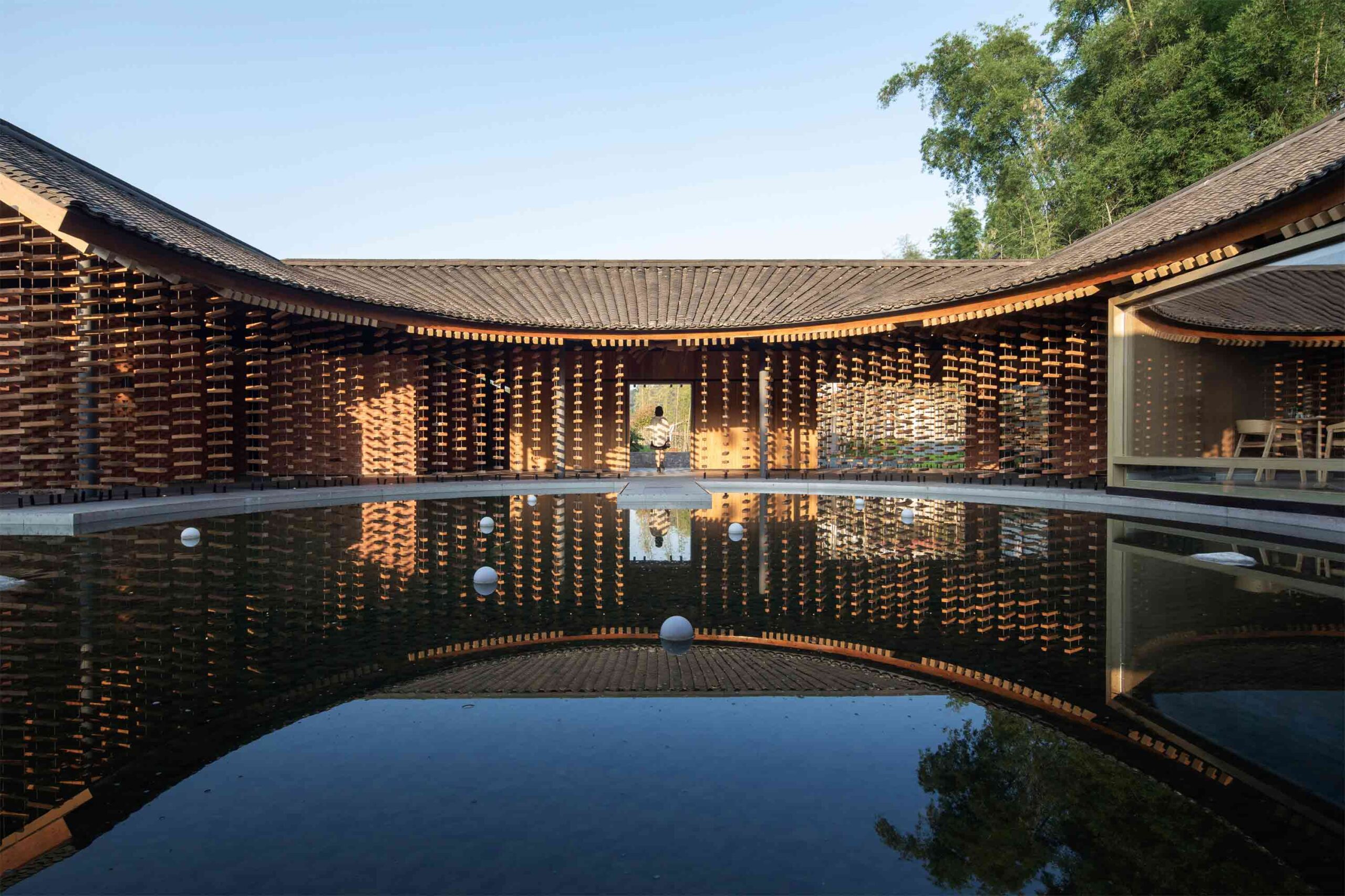
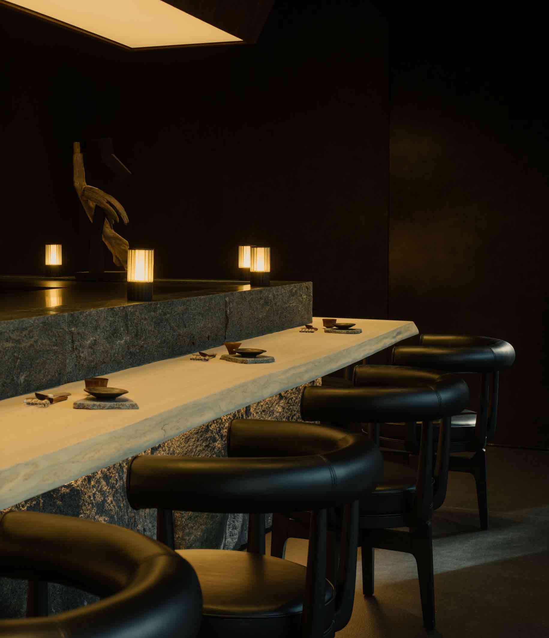
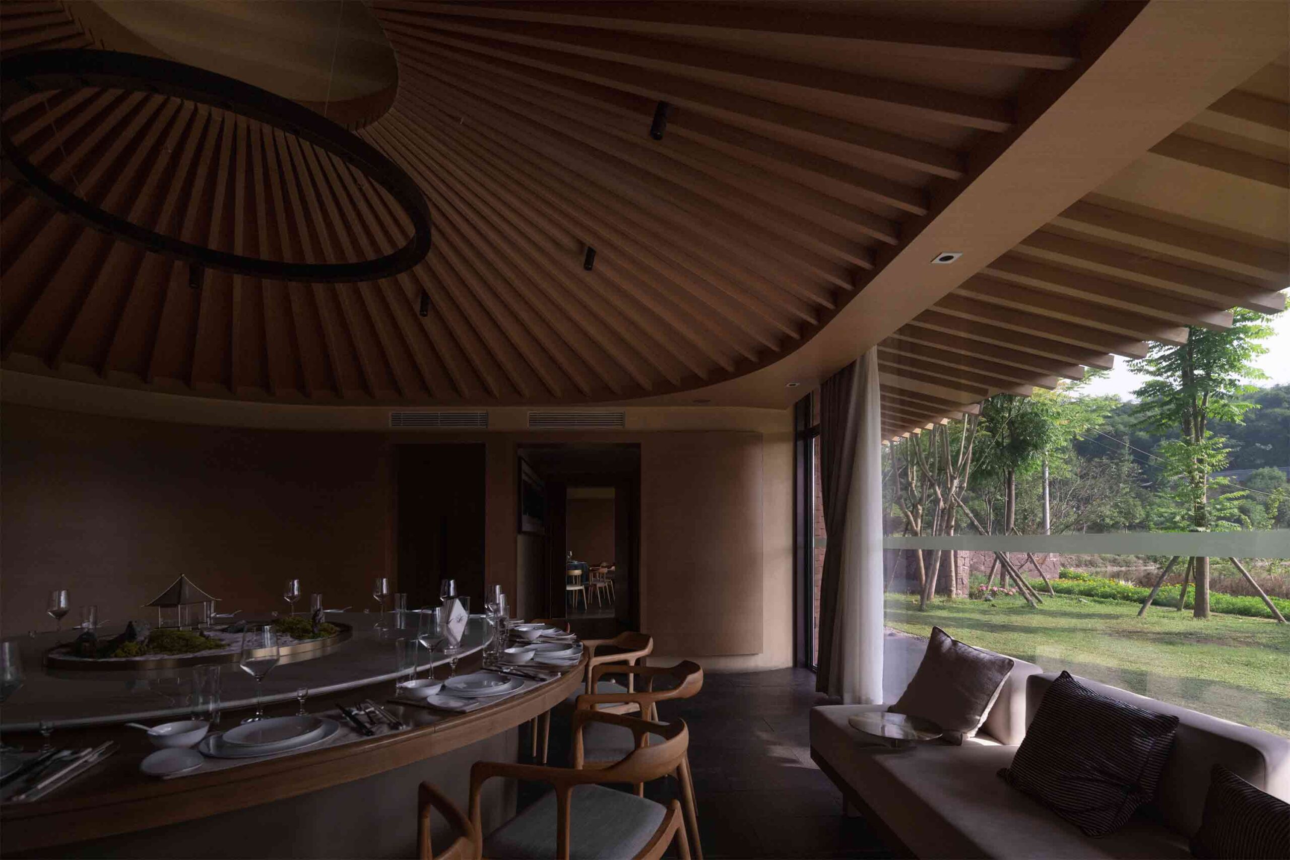
This extraordinary restaurant in rural Sichuan province takes inspiration from the region’s architectural vernacular. Traditional low, far-reaching eaves offer ventilation and shelter from the elements, while a central courtyard pool blurs the boundary between organic and built landscapes. Curved lines define the interior dining space, which is dissected into more intimate zones, each offering a glimpse of a different rural outlook.

The structure itself comprises red sandstone blocks from the mountains of Sichuan, hewn into usual fish scales, while firewood, the backbone of the area’s agricultural life, is entwined throughout the design. One of its most powerful iterations is the hanging curtain of suspended timber blocks, which encases the structure in a magnificent porous skin. These familiar local materials are skillfully reimagined in unfamiliar ways.


3. Experimenting With Timber Tectonics

Prime Seafood Palace by Omar Gandhi Architects, Toronto, Canada

Popular Choice Winner, 11th Annual A+Awards, Restaurants (L >1000 sq ft)

Prime Seafood Palace by Omar Gandhi Architects Prime Seafood Palace by Omar Gandhi Architects
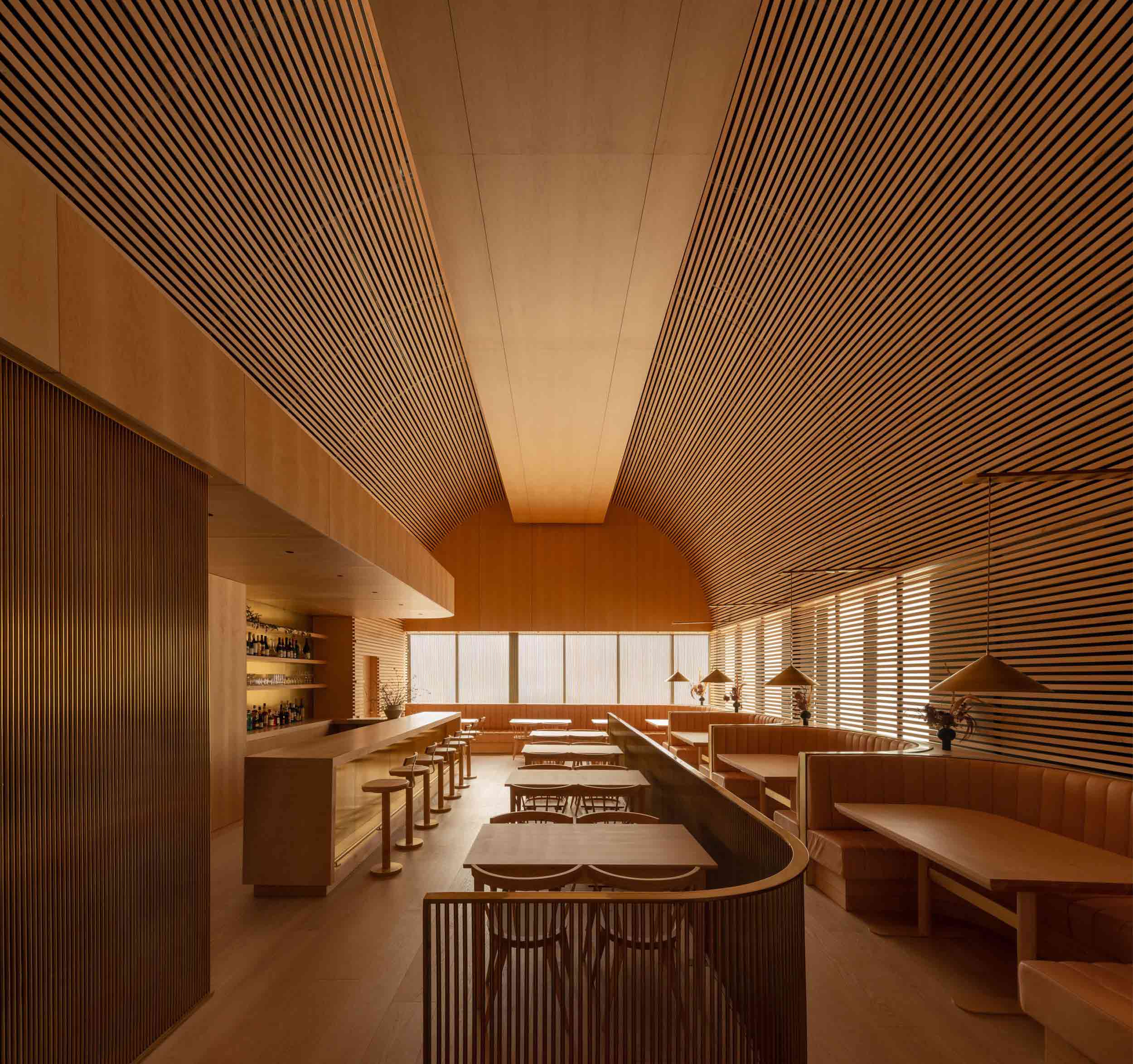
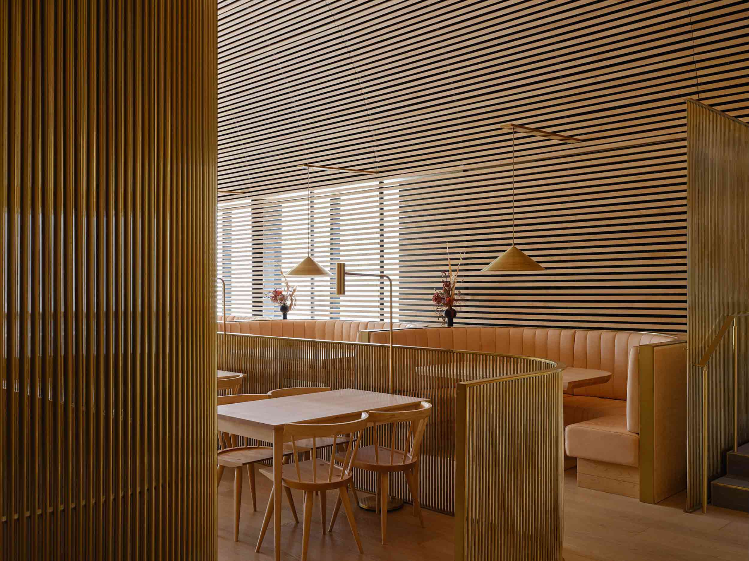
Bold in its monochrome execution, this Toronto restaurant was conceived as a mesmerizing timber cathedral. Rather than being shaped by the transient whims of interior trends, the architects opted for an evolving natural material palette that would patina and shift with the passage of time.

Enveloping slats line the vaulted barrel ceiling, extending down over the apertures across one aspect of the dining zone. The effect is a soft diffusion of natural light. Wood here is employed as a protective layer from the city outside — it softens the visual and acoustic experience, carving out an ethereal space at arm’s reach from the hustle and bustle.


4. Celebrating Salvage

Project Big Top by Multitude of Sins, Bangalore, India

Jury Winner, 11th Annual A+Awards, Sustainable Interior Project

Project Big Top by Multitude of Sins Project Big Top by Multitude of Sins
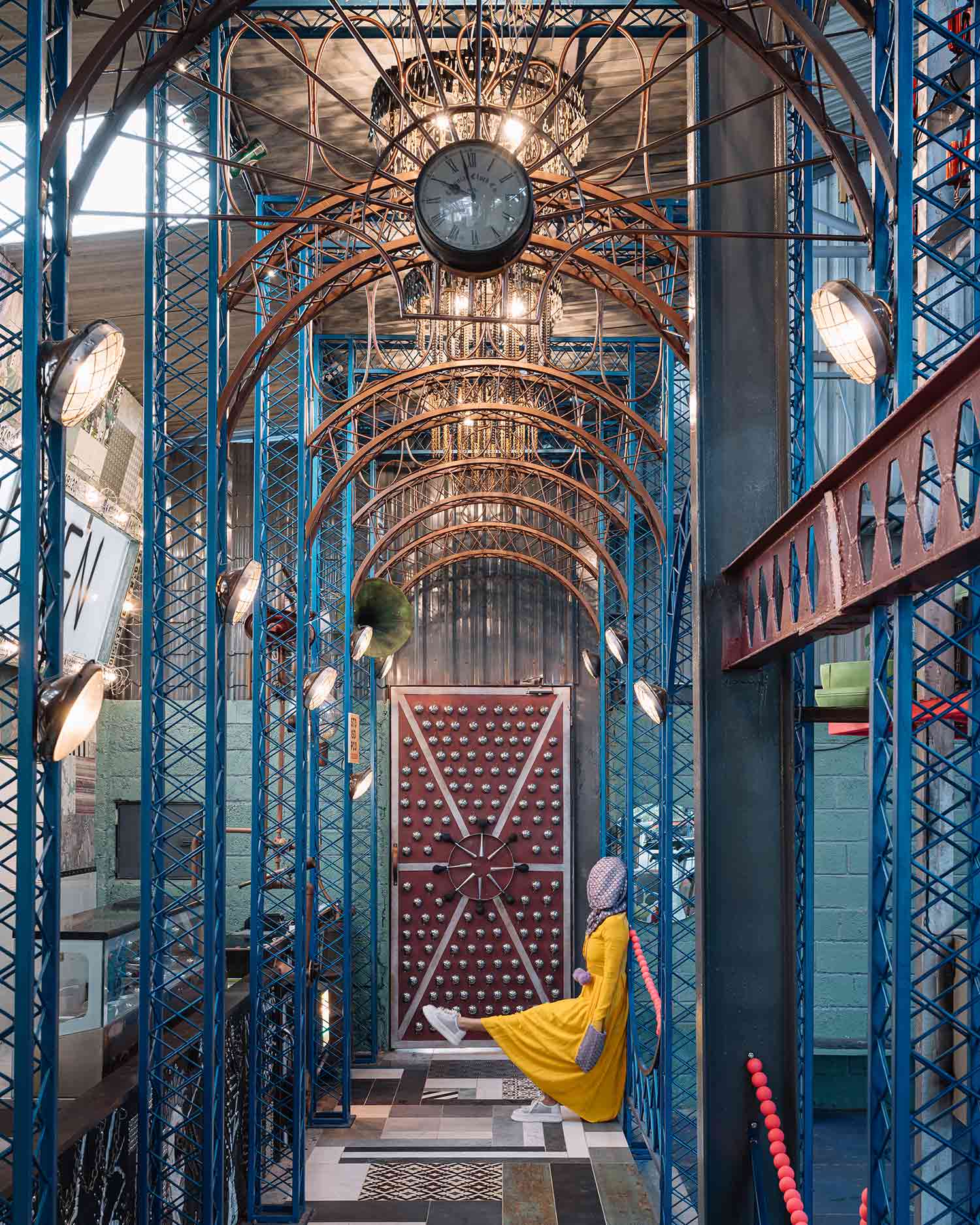
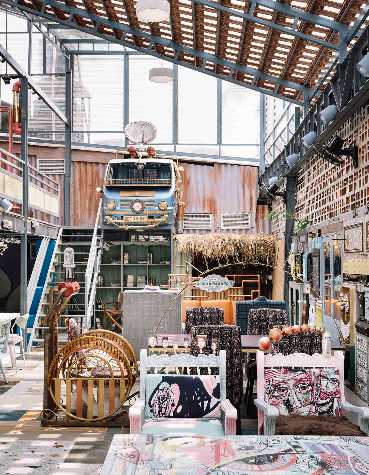
While many in the industry pay lip service to sustainability, this whimsical restaurant in Bangalore is a true celebration of reuse. 90% of its material fabric comprises recycled and salvaged elements, resulting in a playful, architectural patchwork of curios. Inspired by the spectacle of the circus, the entrance is framed by a ripple of teal arches crafted from scrap metal, while chandeliers shaped from bike chains and metal filings hang overhead.

In the main two-story dining area, a wall of discarded electronics, fixtures and furnishings forms an elaborate collage of waste. The result of this magnificent mismatched interior is two-fold. On the one hand, the fantastical space is an artistic hub of escapism, yet on the other, it subtly reinforces a powerful environmental message.


5. Honoring the Rural Landscape

Steirereck am Pogusch by PPAG architects, Turnau, Austria

Jury Winner, 11th Annual A+Awards, Restaurants (L >1000 sq ft)
Jury Winner, 11th Annual A+Awards, Sustainable Hospitality Building

Steirereck am Pogusch by PPAG architects Steirereck am Pogusch by PPAG architects
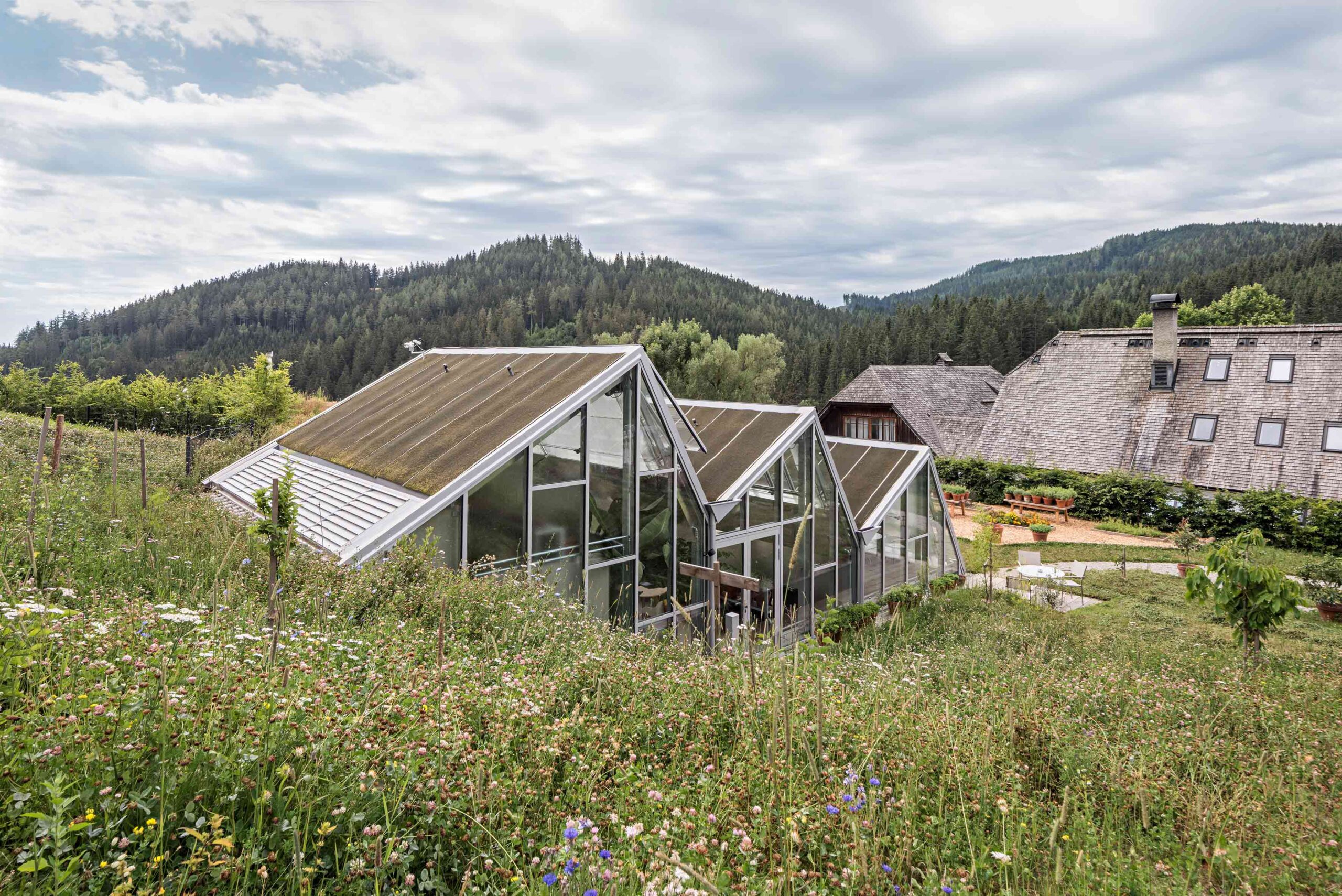
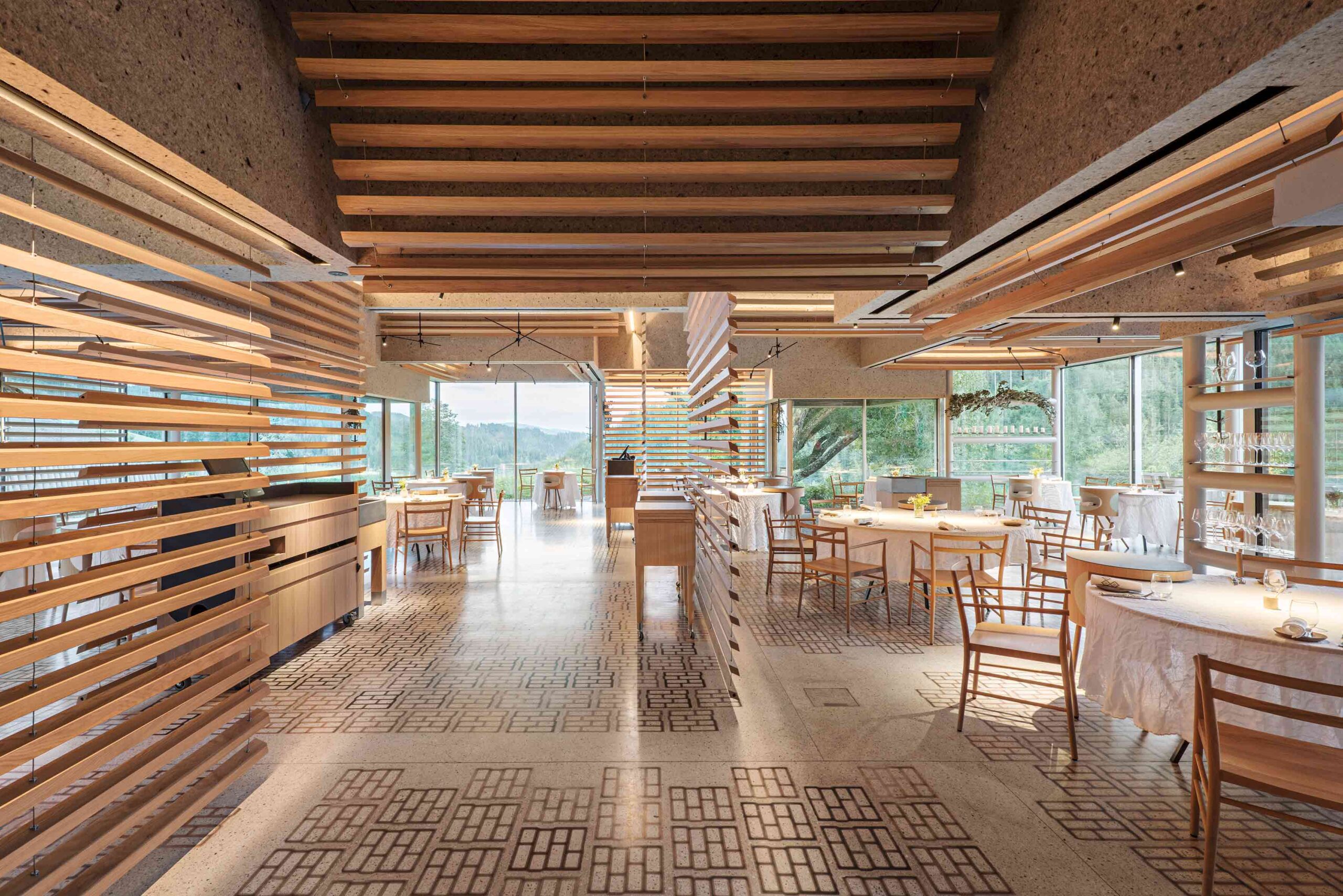
Sequestered in the Austrian Alps, this pioneering restaurant complex is rooted in its rural mountain locale. The various buildings, some old, some new, form a self-sufficient culinary village that encompasses dining areas, prep kitchens, staff zones, guest accommodation and a kitchen garden. Across the estate, the verdant landscape is never far from view. In one of the restaurants, swaths of glazing encircle the space. Slatted timber dividers create permeable divisions between tables, ensuring the breathtaking outlook takes center stage.

One of the complex’s newer interventions is a pioneering glass structure — a hybrid greenhouse and living space. Ingeniously, the atmosphere symbiotically supports residents and plant life. The structure is stepped into the incline of the hillside, respectful of the rhythms of the existing terrain.


6. Fusing Nostalgia and Futurism

Super Paradise Beach Club by Omniview Design, Mykonos, Greece

Popular Choice Winner, 11th Annual A+Awards, Popular Choice Winner

Super Paradise beach club by Omniview Design Super Paradise beach club by Omniview Design
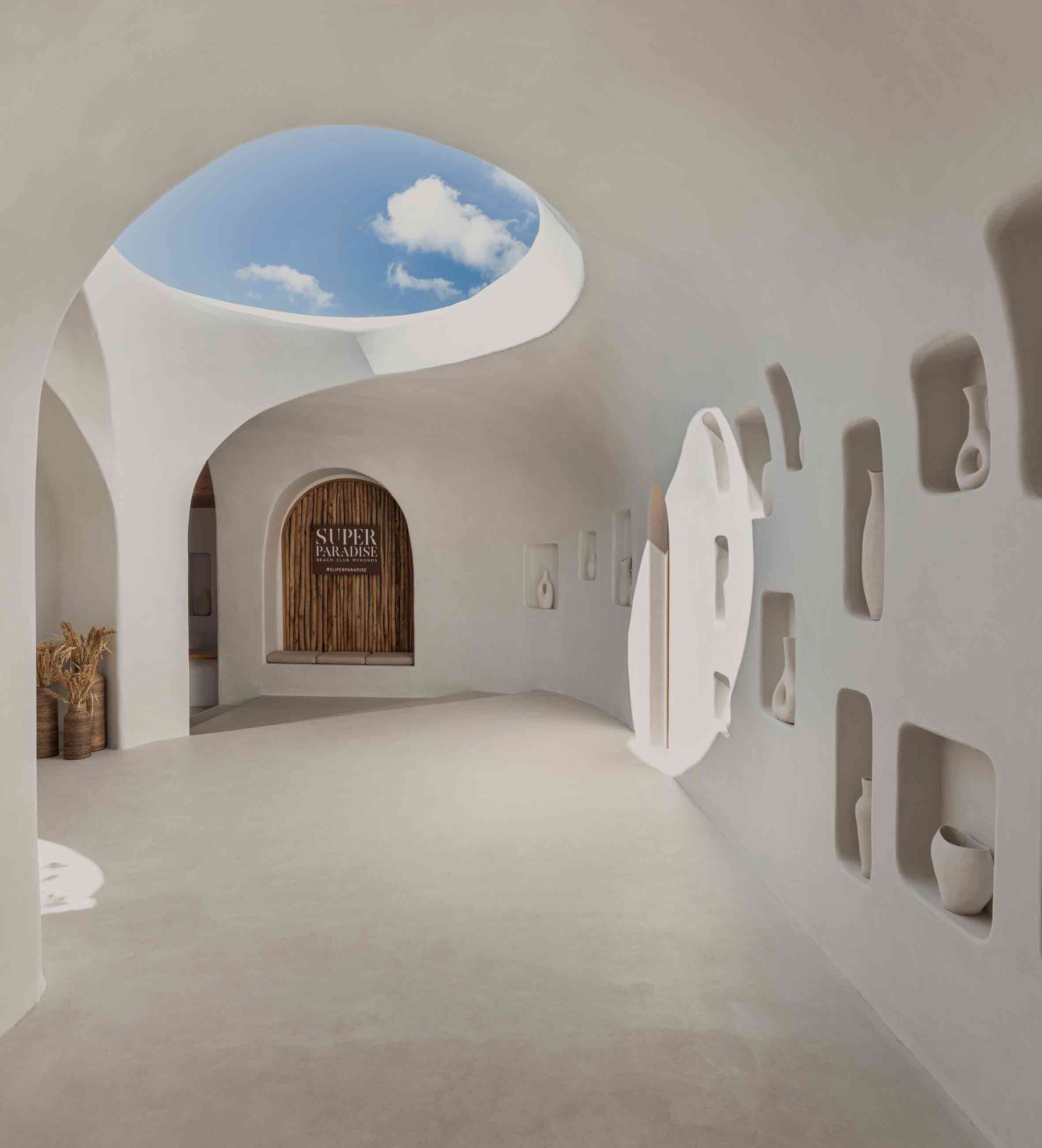
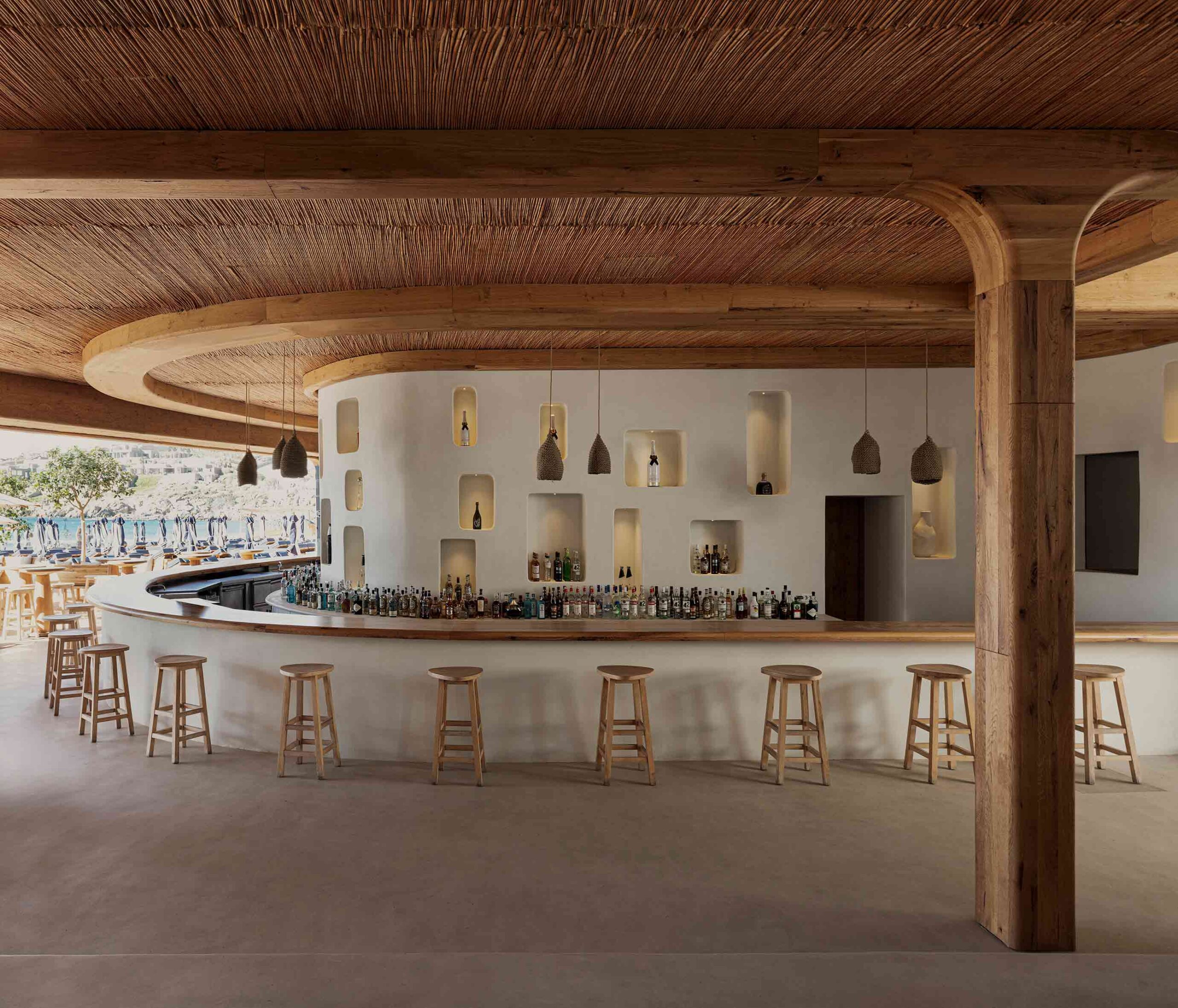
The artful revival of this historic beach bar on the Greek island of Mykonos has resulted in a fascinating collision of architectural languages. The unembellished whitewashed walls and rustic, traditional materials including wood and bamboo hark back to the Cycladic vernacular. Historic emblems play out across the scheme — hollows inset into the walls create display nooks around the bar and entryway.

However, the handling of these elements is strikingly futuristic. Complex, curvilinear geometries orchestrated by state-of-the-art technology result in flowing lines that appear otherworldly. The project reads as a fusion of timelines, merging to create an enigmatic space that defies categorization.


7. Architecturalizing Nature

Ling Ling by Sordo Madaleno, Mexico City, Mexico

Jury Winner, 11th Annual A+Awards, Restaurants (S <1000 sq ft)

Ling Ling by Sordo Madaleno Ling Ling by Sordo Madaleno
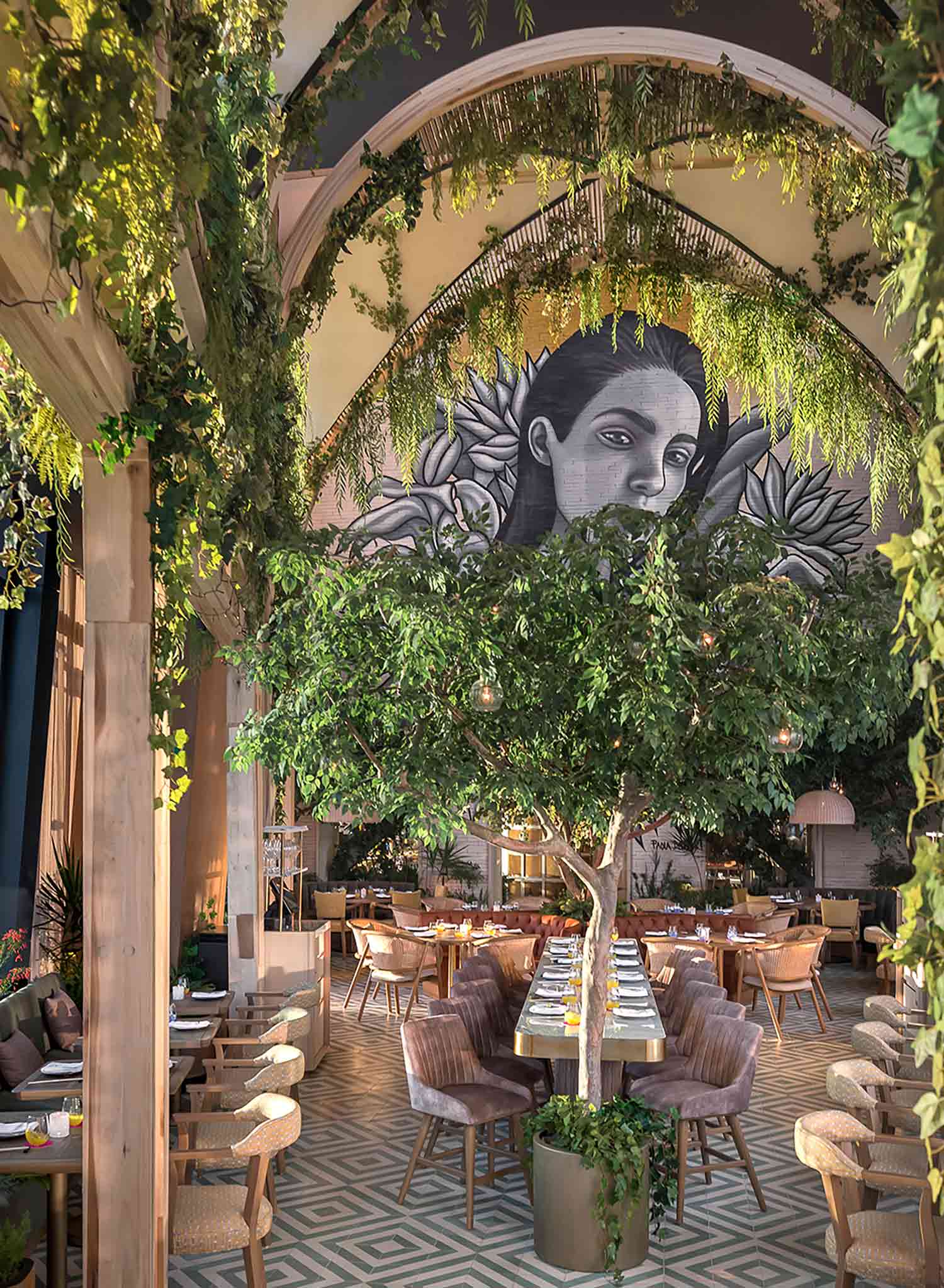
Poised at the top of one of Mexico City’s highest skyscrapers, this extraordinary restaurant subverts expectations. Floating over the city, a flourishing garden unfurls, taking its design cues from the terraces and courtyards prevalent in Mexican architecture. In the triple-height dining zone, a lofty portico structure intertwined with greenery creates a biophilic cathedral of sorts.

In the inner bar and salon, the spatial proportions contract. An innovative vaulted timber framework hangs above patrons. Crafted using intricate stereotomy techniques, the layers of wood ebb and flow in undulations. Trunk-like columns rise to form a canopy overhead, as though, inexplicably, an architectural forest had taken root on the 56th floor.

Architizer is thrilled to announce the winners of the 11th Annual A+Awards! Interested in participating next season? Sign up for key information about the 12th Annual A+Awards, set to launch this fall.

Reference

Store with concrete breezeblock displays and metal cans on the ceiling
CategoriesInterior Design

“Fashion meets art and design” at Pittsburgh boutique by NWDS

Global team NWDS took a spontaneous approach to designing the Tons fashion boutique in Pittsburgh, which contains a mix of modest materials and iconic furniture pieces.

The Tons store in the city’s East Liberty neighbourhood occupies a long, narrow building with its shorter side facing the street.

Store with concrete breezeblock displays and metal cans on the ceiling
The Tons store features a variety of “mundane” materials, including concrete breezeblocks and metal cans

Formerly an atelier, the two-storey structure was reimagined by NWDS to create a light-filled destination “where high-end fashion meets art and design”.

“Inside is a spacious and light-filled interior that now hosts a multifunctional venue designed to meet the needs of a modern-day sartorialist equally interested in fashion, art, and culture,” said the group.

Seating area beside clothing display
In the lobby, new apparel collections are displayed below a tapestry-like artwork

Designing the interiors of the 400-square-metre space involved dividing up the floor plan into several distinct areas that all flow together, but serve different purposes.

Throughout the various retail and office areas, a selection of unexpected materials were combined and layered.

Walls splashed with white paint
Some of the walls are splashed or streaked with white paint

Immediately through the glass front door is a lobby where new collections are presented.

Here, product displays were built from concrete breeze blocks, while the upper walls above the clothing rails were dressed in transparent plastic curtains.

Glass panels partition different retail areas
Glass panels are used to partition different retail areas

The ceiling above was covered with metal tubes of different lengths and diameters, and gives way to a double-height space where tall tapestry-like artworks by Sasha Brodsky hang over opposite walls, and white paint was seemingly dragged across another.

“There was a lot of spontaneity and many design decisions taken on site: some surfaces were uncovered and left in an unfinished state, and some were splashed with white paint,” NWDS said.

Frank Gehry Wiggle Chair next to clothing displayed on rails
A selection of iconic furniture designs can be found around the store, including Frank Gehry’s Wiggle Chair

Further along, fitting rooms are lined up behind black and white streaked partitions to one side, facing a room defined by glass panels that hosts monobrand products.

Towards the back, a lounge area that also displays shoes is reached by descending a short flight of stairs, which run parallel to a raised, built-in seating area.

Built-in seating area in front of shoe display room
A built-in seating area at the back of the store overlook the sunken shoe room

The lower floor level in this space results in a higher ceiling, which NWDS took advantage of by extending a mural the full height behind a wall-mounted shoe display.

A staircase at the very back leads to the upper storey, where retail displays and office areas for store employees sit side by side, and a photography studio is in full view.

“Inside Tons, the client space and the workspace are blended,” said NWDS.

“Buyers and managers have their work desks right next to the sale rails on the first floor, and store visitors are welcome to take a peek at the fashion photo shoot happening right there at Tons.”

Upper-floor rooms partitioned by artworks and glass balustrades
The unfinished aesthetic continues across the upper storey, where retail and offices spaces are blended

Throughout the store are a selection of iconic furniture pieces that continue the theme of unexpected materials and functionality.

They include metal-mesh Hi Tech armchairs by Piero Lissoni, a Mate chair by (A+B) Dominoni, Quaquaro that doubles as shelving, and Frank Gehry‘s compressed cardboard Wiggle Chair for Vitra.

“An interior comprising modest materials is a backdrop for high-end Italian furniture pieces, a collection carefully curated by the NWDS team,” said the designers.

Photography studio viewed from across a double-height void
An open photography studio allows shoppers to watch shoots as they happen

NWDS was established in 2013 as a team of architects, designers, curators and researchers from cities including New York, Tbilisi, Moscow, Paris, Berlin, Yerevan, Lisbon and Dubai. The group’s projects span residential, retail, hospitality, culture, exhibition design and more.

Other recently completed boutiques that feature unusual materials include the Boyy flagship in Milan, which reveals layers of the store’s history, and a Parisian jewellery store featuring rippled sheets of acrylic.

The photography is by Ekaterina Izmestieva and Alexandra Ribar.


Project credits:

Design concept: NWDS
Supervision and project management: Brnz Bureau
Lighting design: Natalia Markevich
Art: Sasha Brodsky

Reference

A Virtual Tour of the Design Set to Redefine Rural Healthcare in Nepal
CategoriesSustainable News

A Virtual Tour of the Design Set to Redefine Rural Healthcare in Nepal

Commissioned by Nepal’s Ministry of Health & Population, this new 18,000 square foot public medical facility is located in the Jumla District, an area characterized by its inaccessibility and poverty.

Sited along the Karnali River and named after the natural hot springs, the hospital signifies a renewed emphasis on health in a region where advanced healthcare services have been historically limited due to the rugged terrain. Crafted from rammed earth using local soil and labor, the new hospital will embody sustainability, affordability, and respect for local ecology.

Comprising three interconnected volumes that encircle a healing garden with native plantings, the hospital offers panoramic views of the Karnali River valley. This low-carbon and passive solar building hosts emergency, out-patient, and administrative departments on the west side, ensuring easy access. On the eastern side, the in-patient department, surgery, and maternity ward nestle, providing the needed privacy.


Read More About the Project

Project: Tatopani Hospital
Firm: Building Bureau
Finalist, 11th Annual A+Awards, Unbuilt Sustainable Non-Residential Project

Reference

Travelling design gallery in Berlin by Vanessa Heepen
CategoriesInterior Design

Forma is a nomadic design gallery popping up around Berlin

Contemporary German furniture designs are displayed alongside vintage pieces at this travelling gallery that multidisciplinary designer Vanessa Heepen has launched in Berlin.

Rather than having a permanent home, Forma will take over different locations across the German capital.

Travelling design gallery in Berlin by Vanessa Heepen
Forma’s first exhibition was held in a building next to the Spree river

The gallery’s inaugural exhibition, titled The Room I Walk the Line, was recently on show on the ground floor of a mixed-use building in Friedrichshain, nestled in between fragments of the Berlin Wall on the banks of the river Spree.

“To be honest, the area is not where I would typically choose to open a gallery,” Heepen told Dezeen. “But when I first saw a picture of it on a real estate website, I was deeply touched by its huge windows, red columns and by the water, of course.”

Two stools in a concrete room
It featured German designers including Nazara Lázaro (left) and Studio Kuhlmann (top right)

A trained interior designer, Heepen largely left the space in its found state but worked with her team to create a simple mahogany bar counter and storage unit for the gallery.

She also asked “soft architecture” studio Curetain to create a white latex screen for the corner of the gallery.

As part of the exhibition, this served as the backdrop for a tall white spectator shelf by Stuttgart-based Freia Achenbach, along with a graphic white stool by local designer Nazara Lázaro.

Travelling design gallery in Berlin by Vanessa Heepen
This wiggly coat stand was mong the vintage pieces featured

Other pieces in the exhibition included a pigmented concrete chair by Carsten in der Elst and hanging metallic stars by Studio Kuhlmann, both from Cologne, as well as a translucent shelf by Berlin’s Lotto Studio.

Forma also sourced a number of vintage pieces from Moho – a 20th-century furniture showroom in Prenzlauer Berg – among them an embossed metal cabinet and a wriggly coat stand.

One of Heepen’s main motivations for founding the gallery was to carve out a space for showcasing design-led furnishings in Berlin, which she says is something of a rarity in the German capital.

“It is a discursive topic, and people have always been unsure about the success of it,” she explained. “After Forma’s first edition, I am glad to say it was hugely successful”.

Chair and transluscent shelf in Forma gallery
Contemporary design pieces included a translucent shelf by Lotto Studio

The designer is currently on the hunt for Forma’s next location and will let the new setting inform her selection of furnishings.

“I’m always open to something new that occurs within the process,” she said. “I hold on to my vision, but I am also open to taking a detour.”

Travelling design gallery in Berlin by Vanessa Heepen
Also featured was a pigmented concrete chair by Carsten in der Els

Elsewhere in Berlin, Swiss architecture firm Herzog & de Meuron is currently constructing a major new museum for modern art.

The building’s design came under fire at the end of last year, when it was discovered its complex air conditioning system would result in the venue using four times as much energy as a nearby museum from the 1800s.

The photography is by Matthias Leidinger

The Room I Walk the Line was on show at Mühlenstrasse 63 in Berlin from 15 June to 15 July 2023. For more exhibitions, events and talk in architecture and design, visit Dezeen Events Guide.


Reference

Living room of City Beach residence
CategoriesInterior Design

Design Theory updates mid-century coastal home in Perth

In the City Beach suburb of Perth in Western Australia, interiors studio Design Theory has updated a tired house from the 1960s while remaining true to the rich palette of natural materials in the original design.

The young client wanted a home where she could entertain friends and live with her dogs in a durable, easy-to-clean, pet-proof home with a reworked plan making space for three bedrooms and two bathrooms.

Living room of City Beach residence
Design Theory has renovated a 1960s house in Perth

“The brief was, on the surface, simple: to update the home while keeping its considerable mid-century charm,” said Design Theory.

“While its strengths lay in its architectural form and south-facing windows, our innovative approach to the project was essential in bringing contemporary functionality and sustainability to the fore,” the studio added.

“By specifying with our client’s lifestyle in mind and considering every detail, she feels relaxed to use the house the way she wants to.”

Living room of home in Perth by Design Theory
Carpet tiles bring tactility into the sunken lounge

Once the project was underway, Design Theory quickly discovered that the structure was largely rotten and had suffered significant termite damage, so extensive restoration work was required.

“We established an early rationale to restore base-building elements in keeping with the original architecture and interior elements,” the studio said.

“Joinery, finishes and furniture would be new, informed by mid-century design. This allowed the home to evolve yet respect the heritage of this special building.”

Kitchen of City Beach residence
Yellow mosaic tiles feature across the kitchen counter

Otherwise, the house only needed sensitive restoration and a light touch to bring it up to date, according to the studio, due to its prescient emphasis on natural light, fresh air and modern, unpretentious living.

“Our design cues were taken from the era of the house’s original design, a time of humbler, honest materials and restrained detailing,” said Design Theory co-founder Lisa Reeves.

“Where cabinetry needed restoration, it was updated in respectful ways, always with a nod to what may have come before us.”

Hallway of house in Perth by Design Theory
Design Theory introduced Blackbutt timber details to the interior

The material palette celebrates warm, earthy materials: exposed brick in terracotta tones, native Blackbutt timber and a cork-like Forbo Marmoleum on the floors.

In the sunken lounge area, carpet tiles bring an added element of comfort and a distinctive gridded visual effect.

The heavy use of richly toned timber and brick is balanced by the white of the painted wall sections, the grid-like window frames and low-hanging pendant lighting.

For the kitchen counters and the bathrooms, simple mosaic tiles continue the textural theme, while referencing the home’s early-60s origins.

“We embraced a quintessentially West Australia landscape-inspired palette of Eucalyptus greens, warm timbers and sunset oranges,” the studio said.

Study of City Beach residence
Forbo Marmoleum flooring was added for textural interest

In the kitchen, subtle detailing on the cabinetry such as the full-width handles adds visual interest without grabbing undue attention, while an orange range cooker adds a retro touch.

The client acquired several pieces of vintage furniture along with the house, which Design Theory was keen to retain and restore.

Bathroom in Perth house by Design Theory
Mint green tiles feature throughout one of the two bathrooms

As a counterpoint to these mid-century elements, contemporary furniture in gently curving forms softens the rigorous lines of the original architecture and prevents the interiors from feeling like a period pastiche.

Key pieces of hardware such as original door furniture and pendant lighting were also refurbished and reinstated, “lending an authenticity to the home’s new life”, according to the studio.

Mosaic bath tub in Perth house by Design Theory
The built-in bathtub is also made from multicoloured mosaic tiles

Other residential projects in Perth that have been featured on Dezeen include a family home formed from arched panels of precast concrete and a wood-and-brick extension for a couple of empty nesters.

The photography is by Jack Lovel.


Reference

Kitchen interior of Cloudy Outlines apartment by Note Design Studio
CategoriesInterior Design

Note Design Studio enriches Cloudy Outlines aparmtent with curvy stucco

Note Design Studio has updated this formerly characterless apartment in Stockholm to feature bespoke Douglas fir joinery and curvy stucco ceilings designed to suggest cloud formations.

Although the Cloudy Outlines apartment sits within a building dating back to 1842, Note Design Studio says the interior had been stripped of any historic charm and “traces of craftsmanship” during previous renovations.

Kitchen interior of Cloudy Outlines apartment by Note Design Studio
Douglas fir joinery appears throughout the Cloudy Outlines apartment

It also had a poor layout, with a living area that could only be accessed via a dark, lengthy corridor snaking around the back of the apartment while the remaining rooms were awkwardly shaped and difficult to furnish.

The studio decided to redesign the home from scratch, knocking down all of its internal walls to form a more cohesive floor plan.

Interior of Cloudy Outlines apartment by Note Design Studio
The apartment’s corridor was repositioned to allow for more natural light

The corridor was repositioned to run parallel to the building’s window-lined facade and, as a result, is now flooded with natural light.

Rooms were classically finished with white-painted walls and Douglas fir flooring.

Dining room interior of Cloudy Outlines apartment by Note Design Studio
Curved stucco gives the ceilings a soft, cloud-like quality

Billowy stucco moulding was added throughout to give a soft “cloudy” quality to the ceilings and provide a contrast with the “rationality and material robustness” of the apartment, the studio explained.

“With the previous interior and finishes removed, a new holistic design was developed with a limited amount of design principles, all with a timeless ambition,” Note Design Studio said.

In the kitchen, Douglas fir was used again to create simple cupboards and a striking circular cover for the extractor fan.

The countertop, on the other hand, is overlaid with a sleek metallic finish.

Hallway of Stockholm apartment by Note Design Studio with wooden door
Furnishings in pastel hues disrupt the otherwise neutral colour scheme

All of the apartment’s doors, as well as its window sills, are also made from Douglas fir.

The material palette only deviates slightly in the bathroom, which features grey-tile surfaces and flecked terrazzo-like flooring.

Bedroom interior of Cloudy Outlines apartment by Note Design Studio
The stucco effect can also be seen in the bedroom

The Cloudy Outlines apartment is one of several residential renovations that Note Design Studio has completed in the Swedish capital, where the firm is based.

Among them is Habitat 100 – an apartment littered with references to the Swedish Grace movement – and the Mantelpiece Loft, which is distinguished by its colour-block bedrooms.

The photography is courtesy of the studio.

Reference

Food-waste tea house
CategoriesSustainable News

Mitsubishi Jisho Design creates food-waste teahouse in Venice

Tokyo-based Mitsubishi Jisho Design has made a teahouse from food-waste-based materials at the Venice Architecture Biennale.

Architects Takaaki Fuji, Hiroya Inage and De Yuan Kang from Mitsubishi Jisho Design designed the teahouse for the Time Space Existence exhibition held by the European Cultural Center during this year’s Venice Architecture Biennale.

Food-waste tea house
Mitsubishi Jisho Design created a tea house for the Venice Architecture Biennale

The teahouse was named Veneti-An – a combination of the words Venetian and An, which means a small hut in Japanese and is often used in names of  teahouses.

It was designed to offers visitors a place to experience a Japanese tea ceremony and reflect on how people connect following the Covid pandemic.

“The point of this exhibition is to explore, to use it as a lab, to make people think,” said De Yuan Kong said.

“It’s all about creating conversations.”

Pavilion made from cardboard and food waste for Time Space Existence exhibition
It was constructed with food-waste joints

The tea house was built from varied of materials made from food waste including coffee grounds and pasta, who are common foods in Venice.

Along with 7,165 paper tubes and 128 cork floor panels, it includes 74 coffee-ground-made panels and 2,324 joint components made from discarded pasta. According to the architects, the pasta-based joint components produced by Fabula are as durable as concrete.

“I feel that the exterior material in architecture is limited,” said Fuji.

“Our intent is to explore new technologies in construction, which could result in stronger regional identities and expression.”

Pasta being moulded into architectural components
Pasta was moulded to form the joint components

The angle of the struts that make up the pavilion was set at 45 degrees. This was determined by the city’s latitude to further connect it to the city.

“By adapting the joint shape to the latitude of the place where it is placed, a distinctive identity is created in the form, as well as a teahouse that optimally lets in or shields it from sunlight in response to the local environment,” said the architects.

Cardboard and food waste chairs
The pavilion will be disassembled into pieces of furniture after the exhibition

Veneti-An is waterproof as its components were treated with a silicon-based liquid by Japanese silica coating producer SilicaGen.

The team will measure and record changes to the materials used during the six month exhibition as part of its research on sustainable materials, responding to the overall biennale’s theme – Laboratory of the Future.

To build the pavilion, the architects packed the components, a total weight of 255.5 kilograms, into seven 87-litre suitcases and took them from Japan to Italy.

Following the biennale, the teahouse will be dismantled and rebuilt into pieces of furniture.

“Neither 100 per cent manufactured nor 100 per cent self-built, it is a piece of furniture that allows for modification and addition of a personal touch,” said the designers.

“The dimensions of the parts were determined on the premise of turning into furniture, or perhaps it would have been better to describe it as furniture transformed into a teahouse for the exhibition’s duration only.”

Time Space Existence exhibition at Venice Architecture Biennale
It forms part of the Time Space Existence exhibition

The tea house is located in Marinaressa Gardens alongside a concrete emergency housing prototype developed by the Norman Foster Foundation and Holcim as part of the Time Space Existence exhibition.

The group show presents work by architects, designers and artists from 52 different countries in venues across the city. Also as part of the show SOM and Princeton University used AR to construct a self-balancing arch.

The photography is by Yuta Sawamura.

Time Space Existence takes place from 20 May to 26 November 2023 at various locations across Venice, Italy. See Dezeen Events Guide for an up-to-date list of architecture and design events taking place around the world.

Reference

Aerial views of roof terraces. Photo by CHUTTERSNAP via Unsplash
CategoriesArchitecture

Is Demand Set to Grow for Architects Specialized in Green Roof Design and Renovation?

Architizer is thrilled to announce the winners of the 11th Annual A+Awards! Interested in participating next season? Sign up for key information about the 12th Annual A+Awards, set to launch this fall.

Rooftops have traditionally been the domain of mechanical equipment, line-drying laundry and the occasional playground for kids. Panoramic views and good weather make the perfect setting for sunset drinks (bars, restaurants and hotels got it right!), but expansive areas of residential building rooftops remain underused around the world. These spaces are waiting to be transformed into pleasant outdoor environments — and not necessarily for lucrative purposes. The benefits of transforming rooftops extend not only to residents but to entire cities at large.

Aerial views of roof terraces. Photo by CHUTTERSNAP via Unsplash

Roof terraces aerial view. Photo by CHUTTERSNAP via Unsplash.

In densely populated areas where scant land is available, underused roofs offer the opportunity to expand green urban areas, promoting urban biodiversity, improving the well-being of city dwellers and reducing negative environmental impact. With green roof technology, rooftops no longer accumulate heat during the day, creating the so-dreaded heat island effect. Instead, they retain rainwater and capture CO2 and pollutants. Turning rooftops into pleasant outdoor spaces accessible to building residents is an effective use of otherwise wasted built space and offers the opportunity to replace lost habitats.

Improving the Quality of Life for City Dwellers

Architects, developers, builders, landscape architects/designers and product manufacturers are the ideal team to create cohesive, functional and sustainable buildings that improve city dwellers’ quality of life. Architectural examples worldwide demonstrate that the effort to counter the overpopulation of urban areas and the scant green spaces is global. They differ, however, in the architectural vocabulary, which, in each case, facilitates the integration of buildings into their specific context, taking into account cultural, climatic and economic factors.

90-unit housing development in Saint-Ouen, France by Atelier du Pont

90-unit housing development in Saint-Ouen, France, by Atelier du Pont. Photo by Takuji Shimmura. 

Take, for example, Atelier du Pont  90-unit mixed-use building in Saint-Ouen, near Paris, France, which draws inspiration from the city’s industrial heritage. The project offers private open spaces at various levels and a shared community garden, a gathering spot for the building’s residents.

The building’s overall massing of staggered concrete “boxes” maximizes natural daylight, while brightly colored metal balconies provide private outdoor spaces. On the sixth floor, a community garden offers open space for residents to grow their own organic vegetables and socialize. As open spaces in cities dwindle, rooftops and terraces open a world of opportunities.

Avalon Bay Urban Housing Landscape by Todd Rader + Amy Crews Architecture Landscape Architecture LLC

Avalon Bay Urban Housing Landscape by Todd Rader + Amy Crews Architecture Landscape Architecture LLC, New York City, NY

Meanwhile, our next case study brings us to the New York City, where Todd Rader + Amy Crews designed the landscapes at Avalon Bowery Place in the heart of the concrete jungle, where scant land is available. The new landscapes root the project in the urban context and provide open space for the building’s residents and the neighborhood.

The project includes three landscapes at the ground level and two on building rooftops. While the ground-level landscapes unify the complex through visual connection and material selection, the roof terraces are physically isolated landscapes in the sky, where they enjoy sunny exposure and participate in the aerial archipelago formed by the landscape of city rooftops.

Nieuw Bergen development in Eindhoven, The Netherlands

Nieuw Bergen by MVRDV, Eindhoven, The Netherlands

Finally, let’s take a look at The Nieuw Bergen — a multi-unit housing development in Eindhoven, the Netherlands. Its design responds to an urban strategy tool that the architects, MVRDV, have been developing and implementing in cities on the way to sustainable densification. This strategy establishes environmentally friendly and dynamic living conditions for residents. The sloped roofs maximize sunlight for the buildings and the public spaces at street level, resulting in significant energy savings. The diverse roofscape of solar panels and greenery complement the area’s architectural character of new and existing buildings.

So, given all of the clear urban benefits demonstrated by the private initiatives explored in these examples, what would it look like to implement green roof design at an urban scale? Well, one European city has already recognized the broader benefits of mandating this architectural upgrade and is exploring ways to provide impetus for designers to incorporate green roofs in their plans.

Barcelona Living Terrace Roofs and Green Roofs Initiative

Following the example of other European cities, Barcelona has been promoting environmentally conscious initiatives, offering sustainable solutions to reduce pollution and increase access to green areas (internationally, Barcelona’s popular superblock concept has received a lot of coverage). Now, the Living Roofs and Green Covers initiative highlights the social and environmental benefits of green roofs and, since 2017, has been the platform to launch the Green Roof Competitions to promote the creation of green rooftops in privately owned residential buildings.

Initiatives like this one are paramount to raising environmental awareness. According to the Guide to Living Terrace Roofs and Green Roofs published by the City of Barcelona in 2014, it is estimated that 67% of the surface area of roofs in Barcelona (1,764.4 hectares) could be landscaped. If this could ever be achieved, the temperature in the city would drop by approximately two degrees, the green area per resident would more than double and the levels of air pollution would be considerably lower.

The Expansion of the Green Roof Market

The surface area that city building roofs cover is vast, and the social and environmental benefits of greening these surfaces are considerable. Building owners invest in green roofs, designers dream up the plans, and city authorities play a major role in spreading the practice. Choosing between living in the suburbs close to nature and living in the city near work is no longer necessary. Building residents are looking for homes with outdoor access, especially since the pandemic.

Aware of the increasingly popular demand, the real estate industry sees multi-unit residential buildings with partially or entirely planted rooftops as an architectural trend that adapts to a contemporary lifestyle. But how fast is the green roof market expanding? Studies indicate that the global green roof market has been steadily growing at a rate of 17% since 2020 and is expected to grow at this same rate through 2027. Limitations for this growth? Unfavorable climate conditions and maintenance requirements.

Architizer is thrilled to announce the winners of the 11th Annual A+Awards! Interested in participating next season? Sign up for key information about the 12th Annual A+Awards, set to launch this fall.

Reference

Humble Roots: 6 Contemporary Architecture Projects Grounded In Vernacular Design
CategoriesArchitecture

Humble Roots: 6 Contemporary Architecture Projects Grounded In Vernacular Design

The latest edition of “Architizer: The World’s Best Architecture” — a stunning, hardbound book celebrating the most inspiring contemporary architecture from around the globe — is now available. Order your copy today.  

Architects often strive for innovation and seek to push the bounds of design into uncharted territory. But there is much to learn from the ground already trodden. Revisiting the typologies of the past through a contemporary lens can yield exciting, fresh perspectives.

Vernacular architecture is a product of its locality. It’s a patchwork of design languages, native materials and building traditions informed by centuries of lives before us. This distilled knowledge is part instruction manual, part storybook — it summons rich cultural tales and imparts the blueprints for building on unique, regional terrain. Evoking the vernacular is a form of time travel — a way of colliding the past and present.

These six A+Award-winning projects each draw inspiration from historic, localized design and reimagine the vernacular spirit for the 21st century.


Komera Leadership Center

By BE_Design, Rwinkwavu, Rwanda

Popular Choice Winner, 11th Annual A+ Awards, Community Centers
Jury Winner, 11th Annual A+ Awards, Architecture +Community
Jury Winner, 11th Annual A+ Awards, Architecture +For Good
Jury & Popular Choice Winner, 11th Annual A+ Awards, Architecture +Low Cost Design

Komera Leadership Center by BE_Design
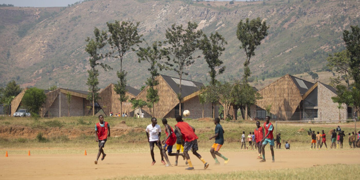
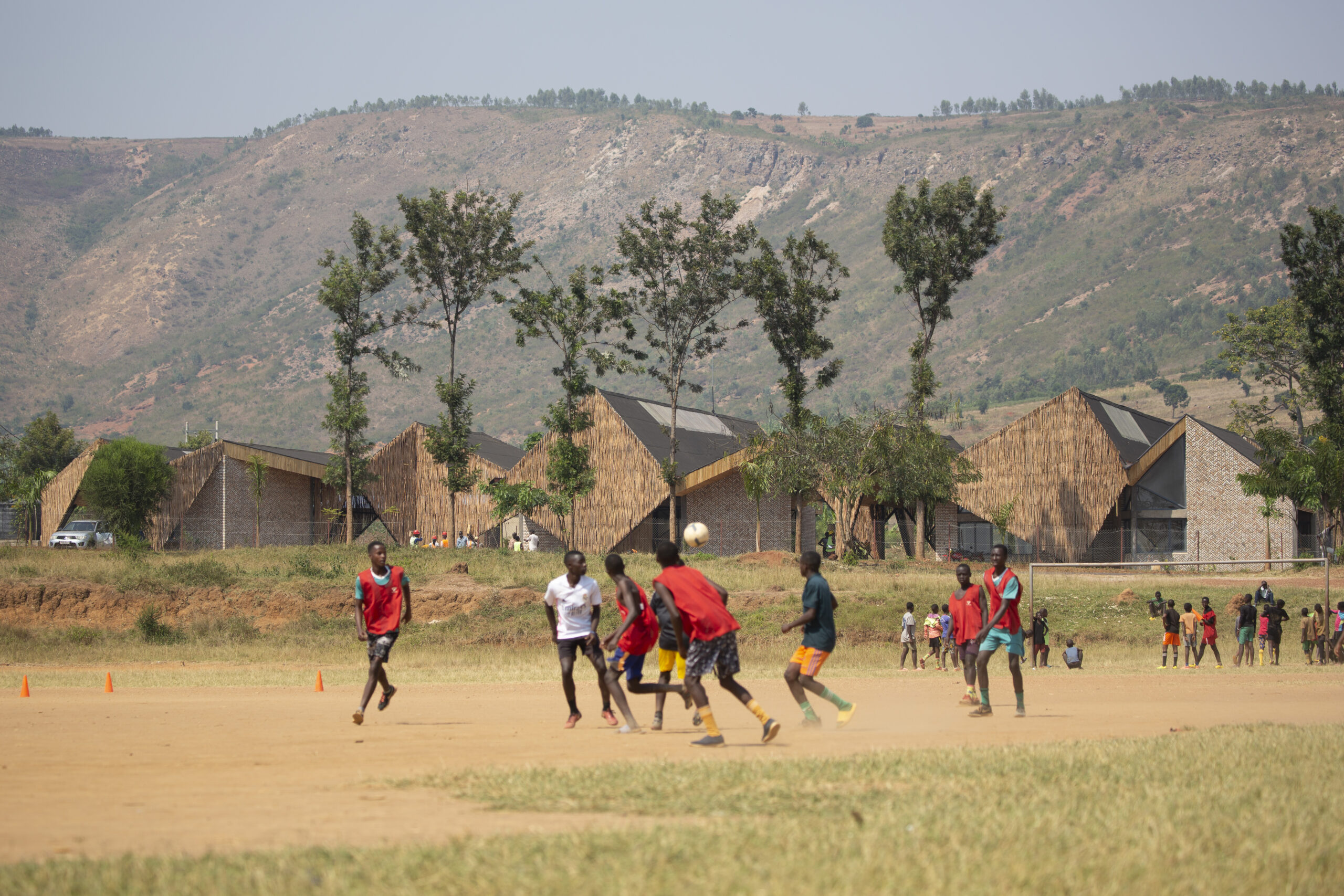
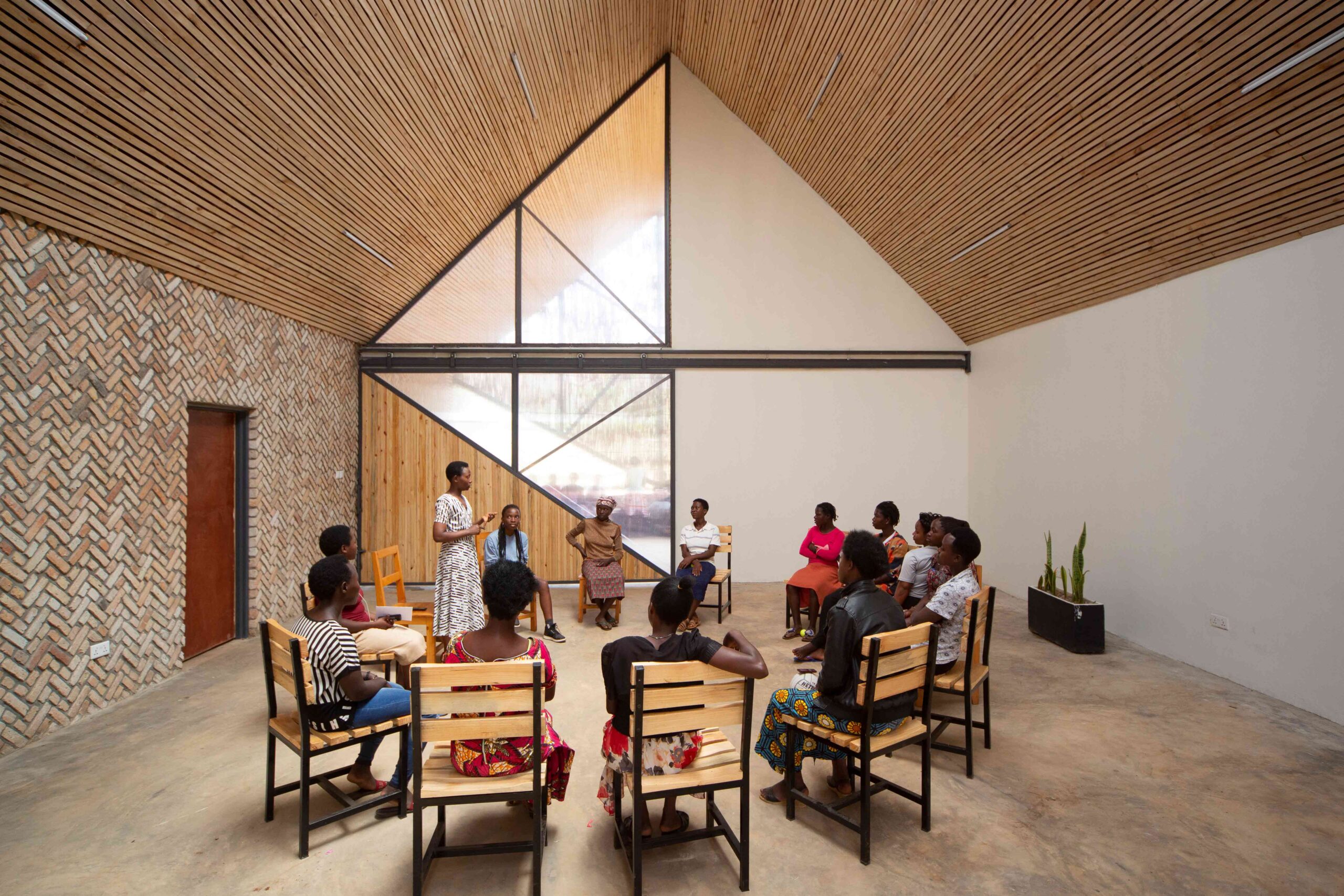
This remarkable women’s community and health center in Rwanda’s rural eastern province is as dynamic in its design as it is in its plight. Set against a mountainous backdrop, the building itself is an architectural topography of angular peaks, shaped from patterned brickwork and woven eucalyptus screens. This graphic silhouette was inspired by the region’s traditional imigongo art, which emphasizes bold, geometric shapes. Deeping rooted in the cultural landscape, the vernacular art form has become a powerful symbol of resilience thanks to its resurgence in recent decades.

At the core of the center is a succession of airy, vaulted halls. Hinging translucent panels segment the spaces and offer impressive multifunctionality. When closed, they carve out three classrooms for more intimate teaching and mentorship. When the panels are retracted, the interior transforms into a vast meeting hall for large community gatherings and events.


Super Paradise beach club

By Omniview Design, Mykonos, Greece

Popular Choice Winner, 11th Annual A+ Awards, Bars & Wineries

Super Paradise beach club by Omniview Design Super Paradise beach club by Omniview Design
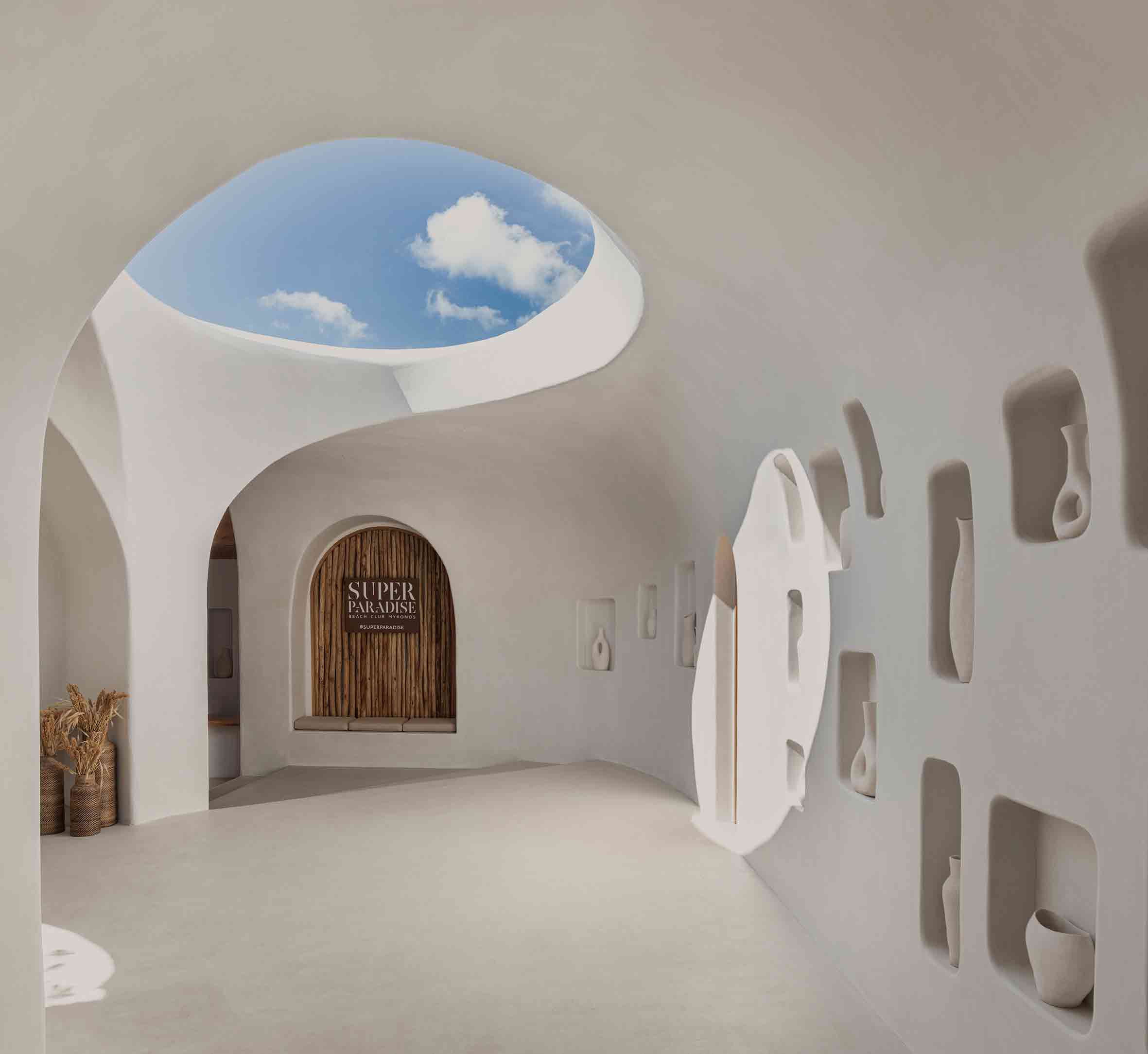
The landscape of Mykonos is bristling with new development, however, this enigmatic beach bar harks back to the Greek island’s architectural roots. Its crisp white form, articulated in organic, flowing lines, is reminiscent of the Cycladic vernacular. Allusions to historic motifs are playfully incorporated — recessed pockets in the walls have been reincarnated as presentation spaces for the work of local artists, as well as storage nooks for the bar.

Traditional materials abound throughout the scheme, yet their handling is deftly modern. The project’s curvilinear geometry, seamless and sophisticated in its finish, is a product of cutting-edge design technology. The result is an aesthetic the architects call future retro. It’s a space that straddles different temporal plains, and in doing so, finds itself somewhat timeless.


The Kaleidoscope

By Inrestudio, Quang Binh Province, Vietnam

Jury Winner, 11th Annual A+ Awards, Low Rise (1 – 4 Floors)

The Kaleidoscope by Inrestudio The Kaleidoscope by Inrestudio
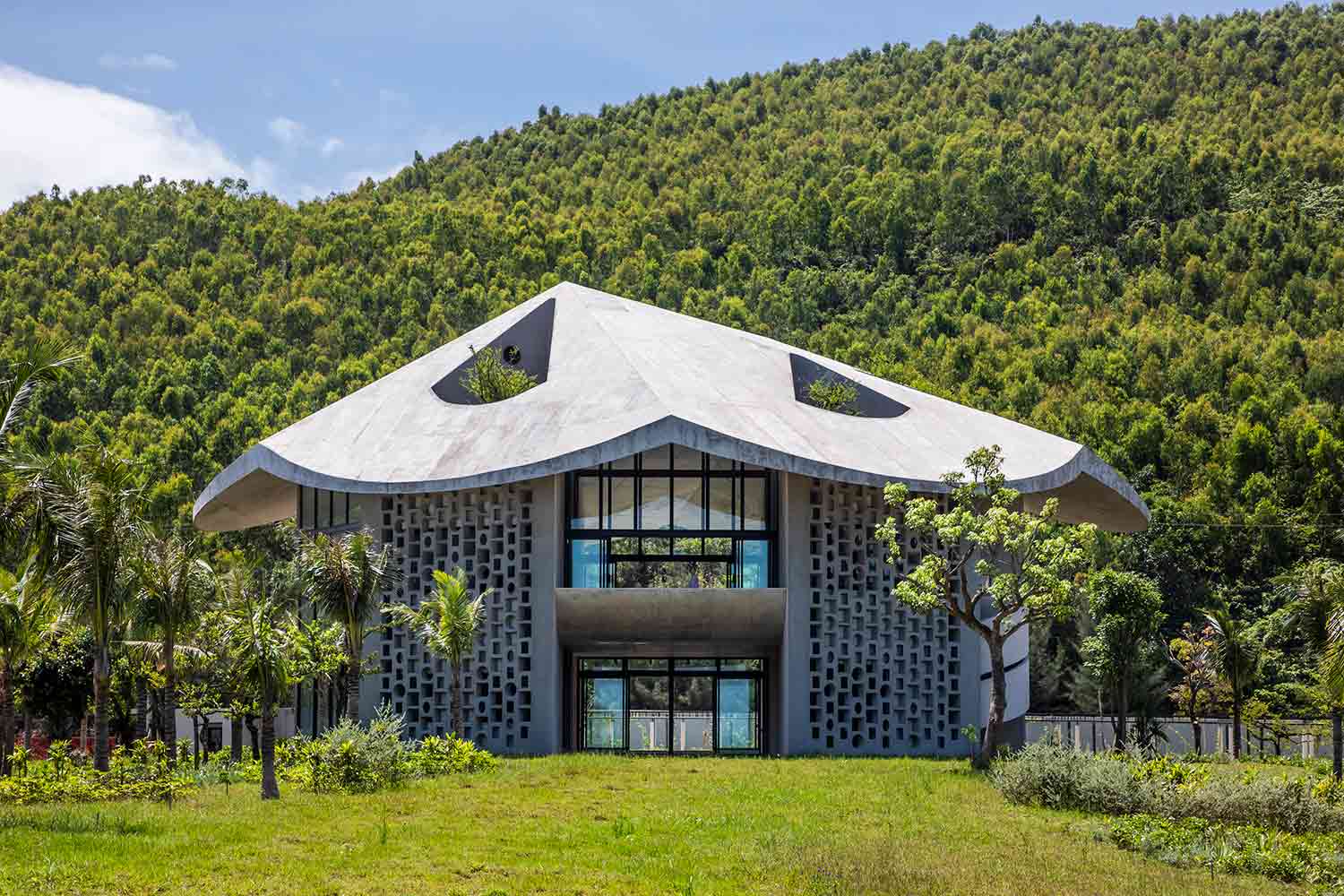
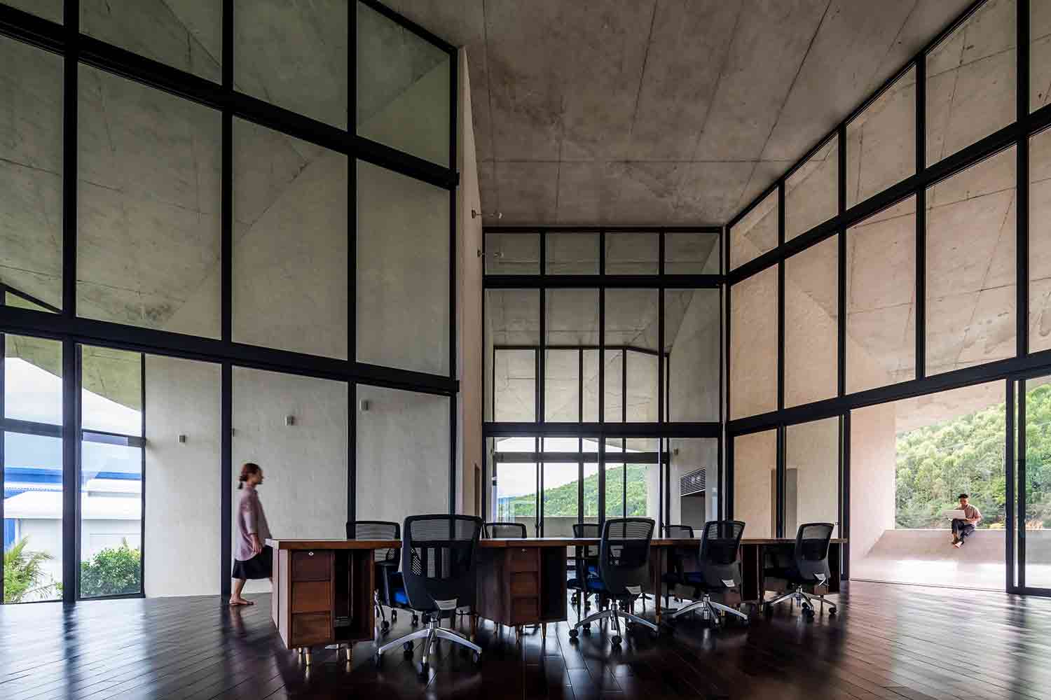
Constructed on a remote factory site in central Vietnam, this pioneering live-work project has a wonderfully whimsical inspiration. Capped with a conical roof, the building was modeled after a traditional Vietnamese farmer’s hat, known as a nón lá. Vernacular fashion is something of an unconventional architectural influence, yet the unusual form was mindfully chosen.

The surrounding region is known for its fiercely hot winds in the dry season. Consequently, the structure’s walls are placed perpendicular to the undulating roof periphery, creating channels of natural ventilation throughout the building. Intricate perforated block walls, a common design feature in tropical regions, help to moderate the extreme temperatures too. Constructed by a diverse team of experienced craftspeople and inexperienced farmer-builders, the project itself facilitated a valuable exchange of regional construction knowledge.


Marlboro Music Reich Hall

By HGA, Marlboro, Vermont

Jury Winner, 11th Annual A+ Awards, High Education & Research Facilities

Marlboro Music Reich Hall by HGA Marlboro Music Reich Hall by HGA
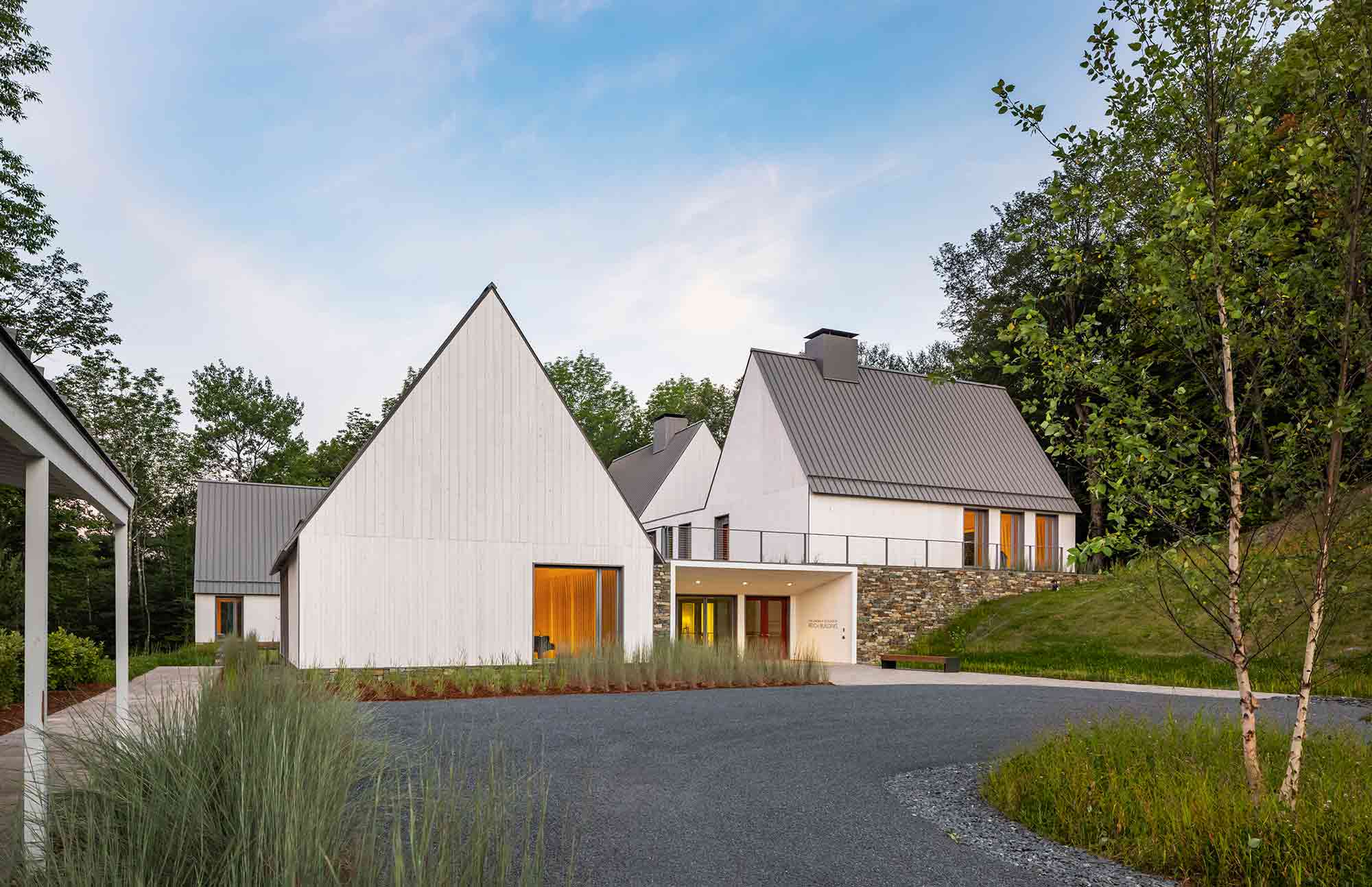
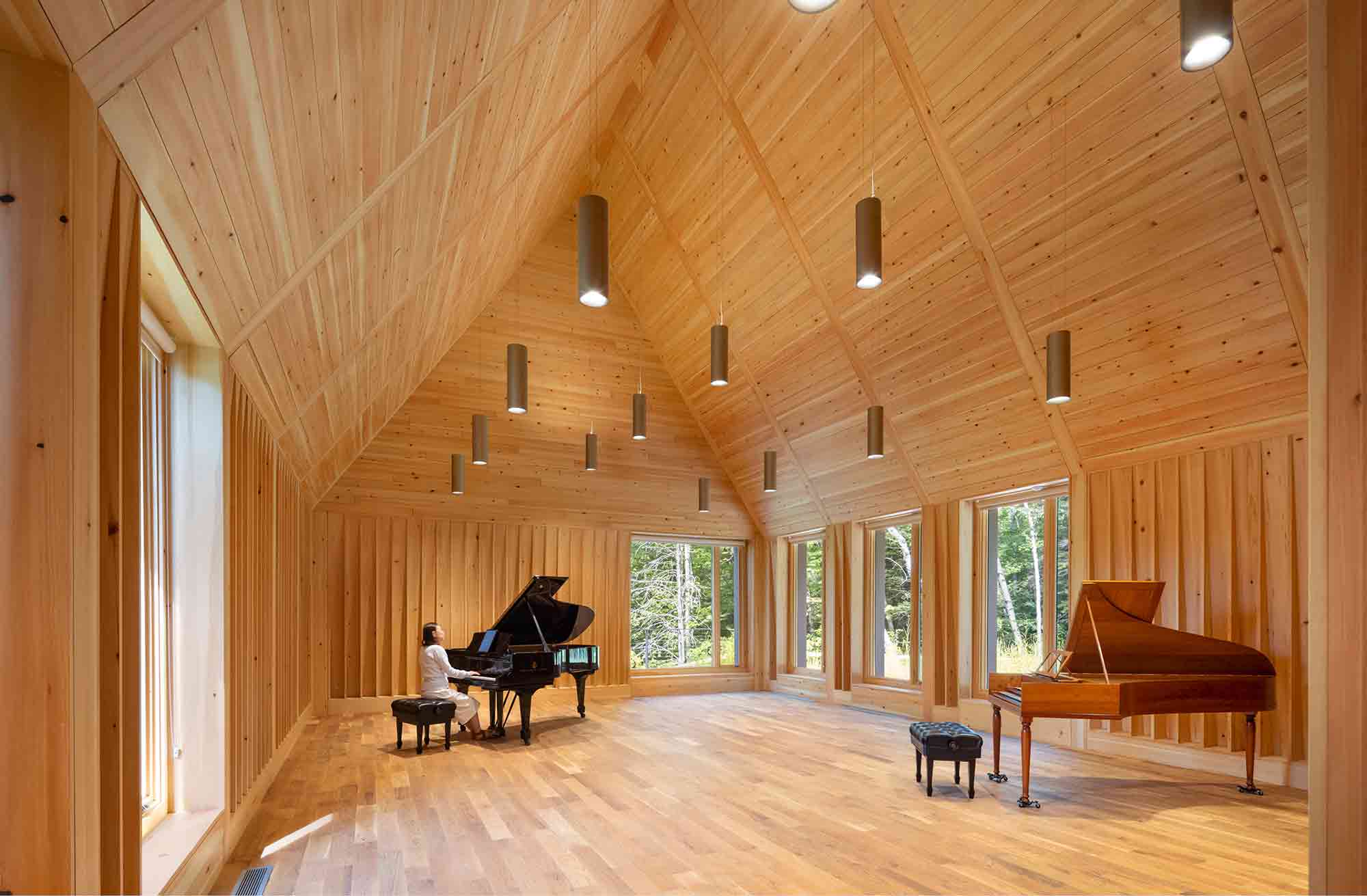
Nestled on the historic Marlboro College campus in the foothills of Vermont’s Green Mountains, four newly constructed gabled volumes stand harmoniously amid a collection of centuries-old former farm buildings. With its rectangular box structures and pitched roofs, the Reich Hall complex is a stunning modern iteration of a historic Cape Cod cottage. This classic vernacular has been sensitively reimagined with crisp, minimalist lines and contemporary vertical cladding.

Respectful of the site’s organic terrain, the stepped forms follow the natural incline of the hillside. Inside, the new lofty rehearsal spaces are enveloped in warm-hued wood to clarify the acoustics. Vast, floor-to-ceiling windows merge the stripped-back interior with the rugged mountains and woodlands beyond. The project’s simplicity pays homage to the architectural past, while celebrating the vitality of the landscape.


Locust Grove Event Pavilion

By de Leon & Primmer Architecture Workshop, Louisville, Kentucky

Jury Winner, 11th Annual A+ Awards, Pavilions

Locust Grove Event Pavilion by de Leon & Primmer Architecture Workshop Locust Grove Event Pavilion by de Leon & Primmer Architecture Workshop
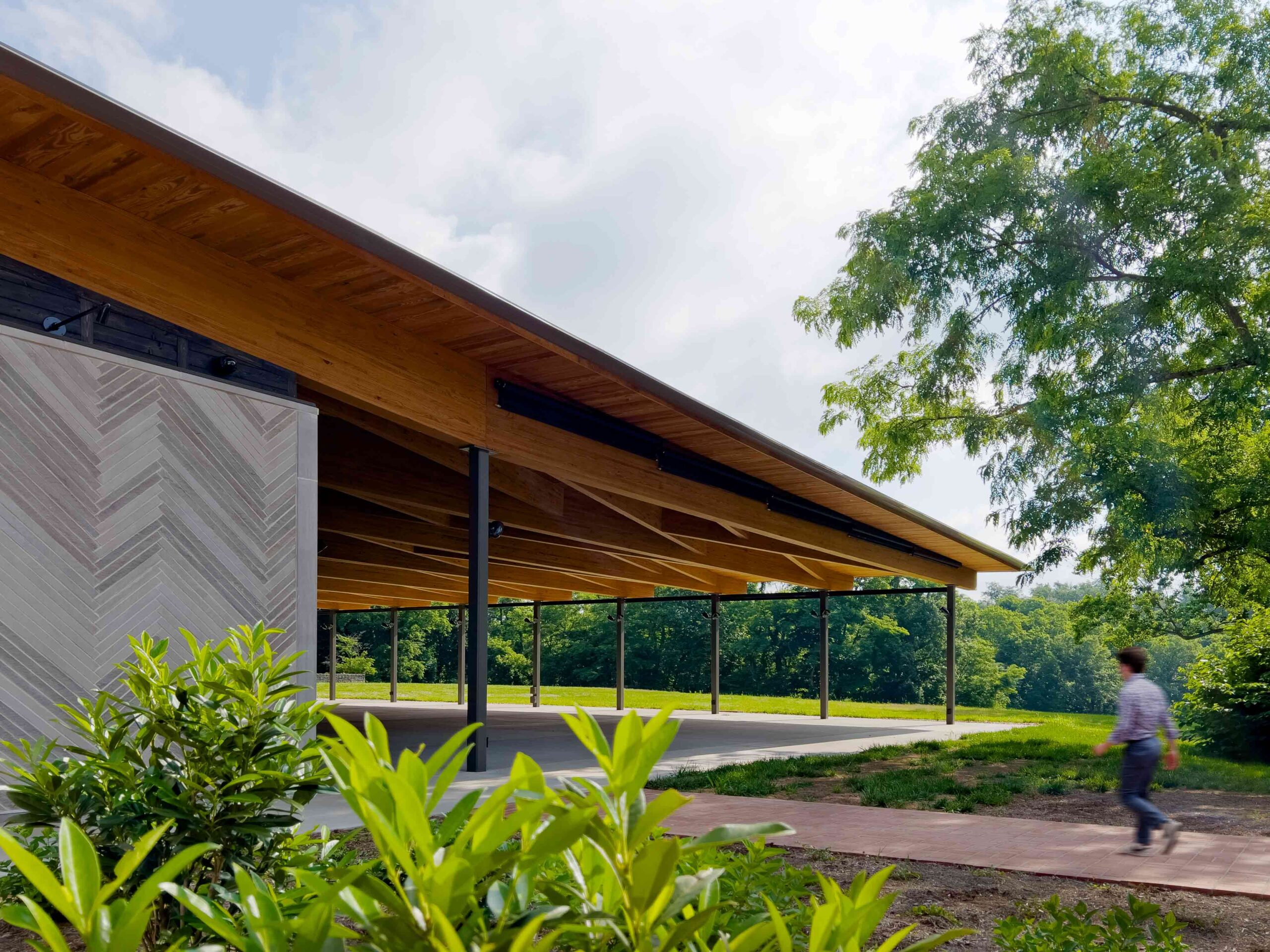
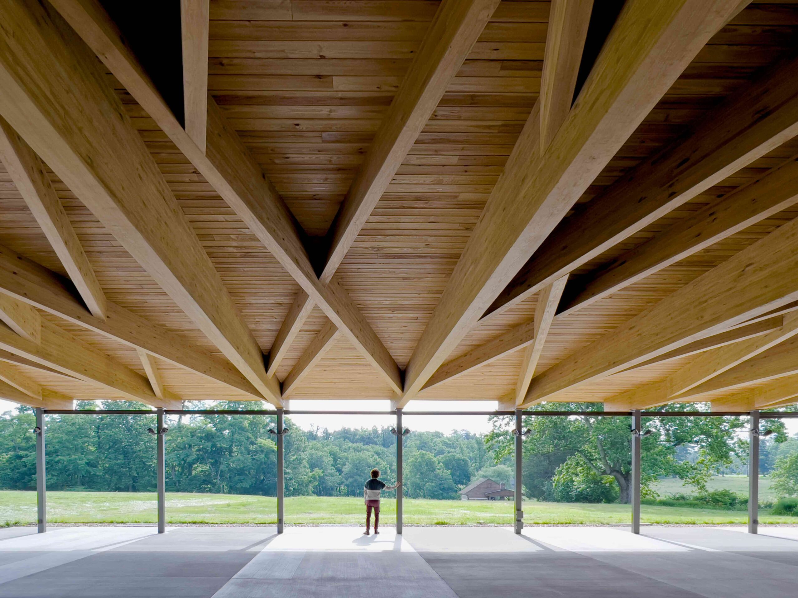
Located on the grounds of Locust Grove, an 18th-century agricultural estate and National Historic Landmark, this experimental pavilion is an artful interpretation of the surrounding acreage. The structure was conceived as a sweeping, large-scale porch, an exaggerated feature of the nearby Georgian farmhouse. In keeping with its vernacular inspiration, the pavilion has been masterfully positioned to frame picturesque views across the grounds. The project is anchored in stone and timber, reinforcing the material connection with the property’s historic buildings.

The pavilion is a porous space, simultaneously offering shelter yet open to the elements. Fittingly then, domestic symbolism is balanced by articulations of the external environment. The structure’s roof is coffered with a tangle of glulam beams, an allusion to the sinuous bark of the surrounding black locust trees, the farm’s namesake. Meanwhile, restrooms and storage spaces are concealed within volumes clad in a herringbone limestone skin. The undulating design recalls the repetitive stonework of the historic ha-ha walls that delineate the estate.


Hub of Huts

By NOA, Trentino-South Tyrol, Italy

Popular Choice Winner, 11th Annual A+ Awards, Spa & Wellness

Hub of Huts by NOA Hub of Huts by NOA
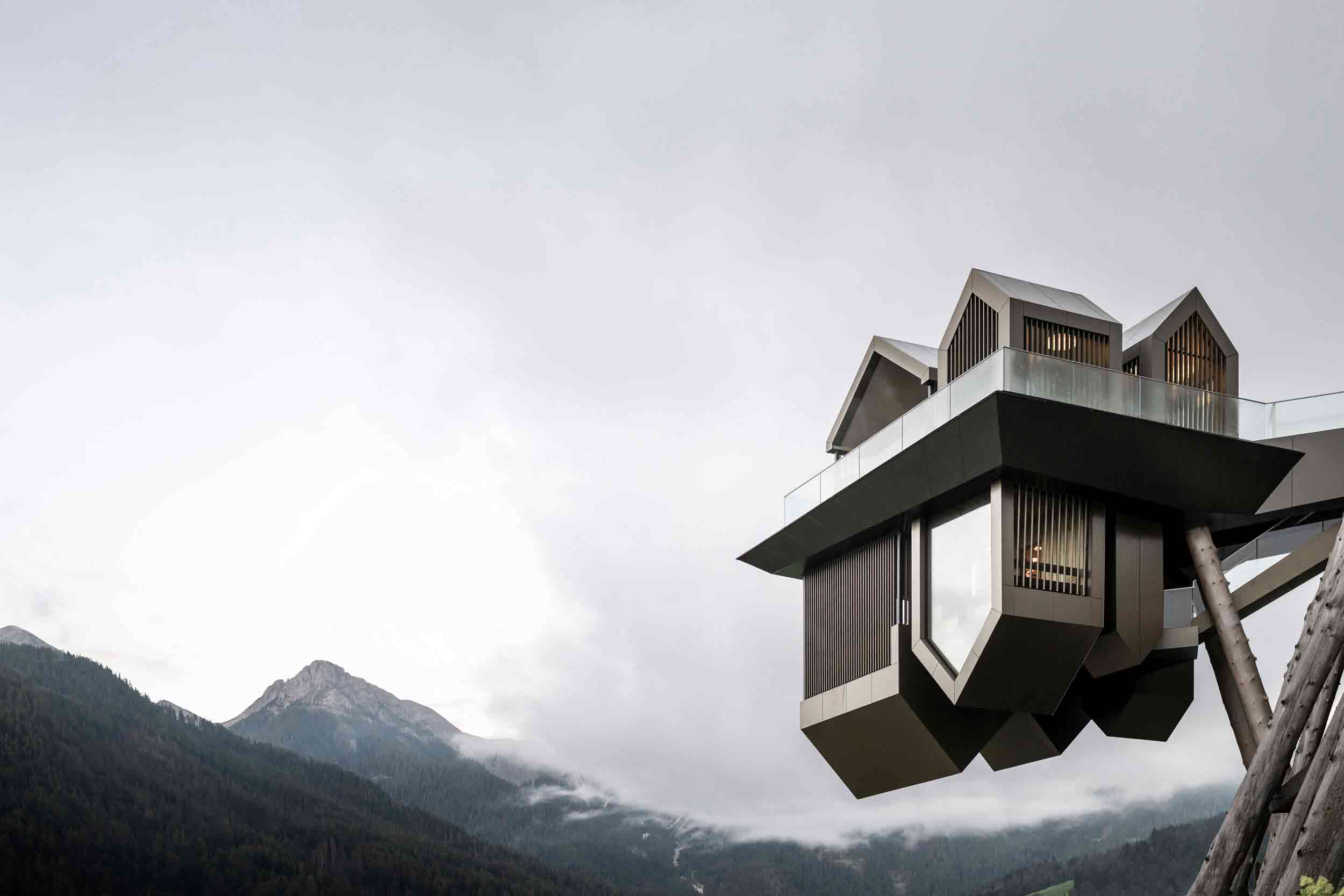
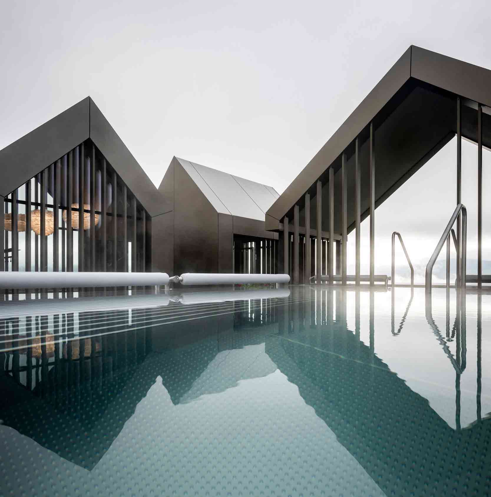
At first glance, this wellness complex manifests as a floating village, reflected in a covert mirror line in the clouds. Looming in mid-air, the extraordinary cantilevering structure subverts perception. The project was envisaged as a traditional Italian hamlet in the mountains, pared back to its simplest gabled form — and turned on its head. These simplistic silhouettes conjure up childlike notions of shelter and protection, though their purpose is two-fold.

While the open upper-level cabins house two jacuzzis, outdoor showers and a changing room, the inverted lower level hides the swimming pool’s water purification system and the sauna’s tiered seating, along with other amenities. The complex is fantastical in appearance, yet the cabins’ light brown aluminum panels channel the hues of the surrounding valley. It’s at once a masterpiece forged in the mountains and a product of an otherworldly realm. Here, the humble vernacular form has been elevated to dazzling new heights.

The latest edition of “Architizer: The World’s Best Architecture” — a stunning, hardbound book celebrating the most inspiring contemporary architecture from around the globe — is now available. Order your copy today.  

Reference