Ten kitchens with breakfast bars designed by architects
CategoriesInterior Design

Ten kitchens with breakfast bars designed by architects

Kitchens with breakfast bars feature in today’s lookbook, which showcases ten interiors from Dezeen’s archive.


Breakfast bars are multi-functional, bar-height counters where people can perch on bar stools to socialise or dine.

An informal alternative to the dining table, they can also be used for working from home, helping to make the kitchen a multi-purpose space that can be in use all day long.

Breakfast bars often make efficient use of space, combining with kitchen islands or peninsulas to provide storage and prep space.

This Dezeen Lookbook is the latest to feature design ideas for kitchens. Others explore kitchens with islands, light-filled kitchens, terrazzo kitchens and green kitchens.

Here are 10 examples of breakfast bars selected from Dezeen’s archive.
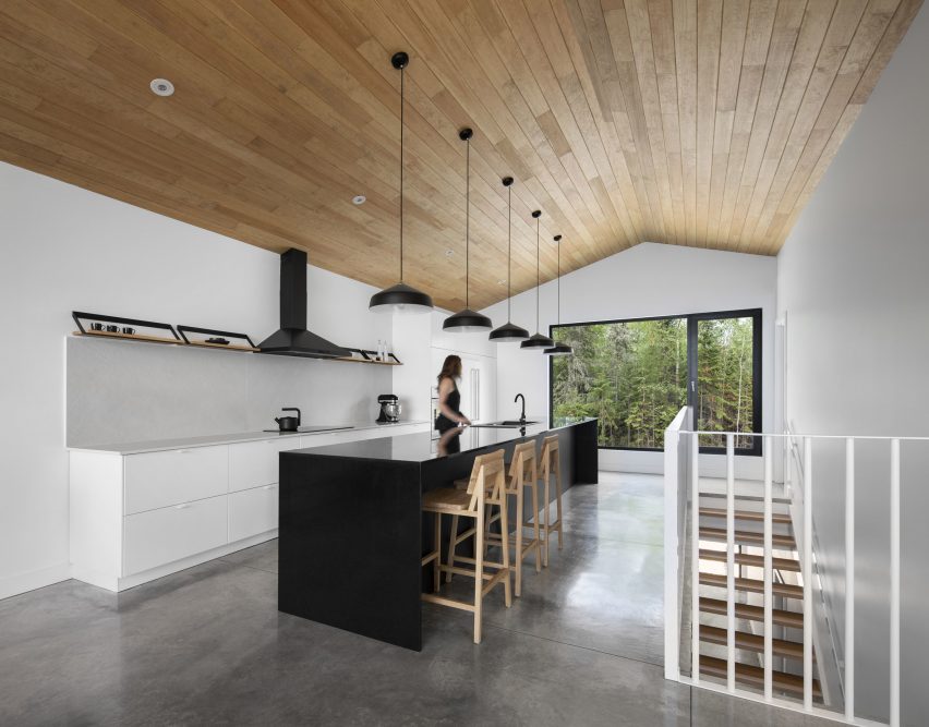

Dining space at Le Littoral by Architecture 49

Le Littoral, Canada, by Architecture49

The upstairs living space at this holiday rental in Québec by Architecture49 features a long, narrow galley kitchen with an island that doubles as a breakfast bar.

Backing onto a staircase, this offers guests emerging from the ground-floor bedrooms a convenient point to stop for coffee before heading to the living and dining area beyond.

The long, black island features a niche that allows stools to be partially tucked away to increase circulation space.

Find out more about Le Littoral ›

Angular kitchen table

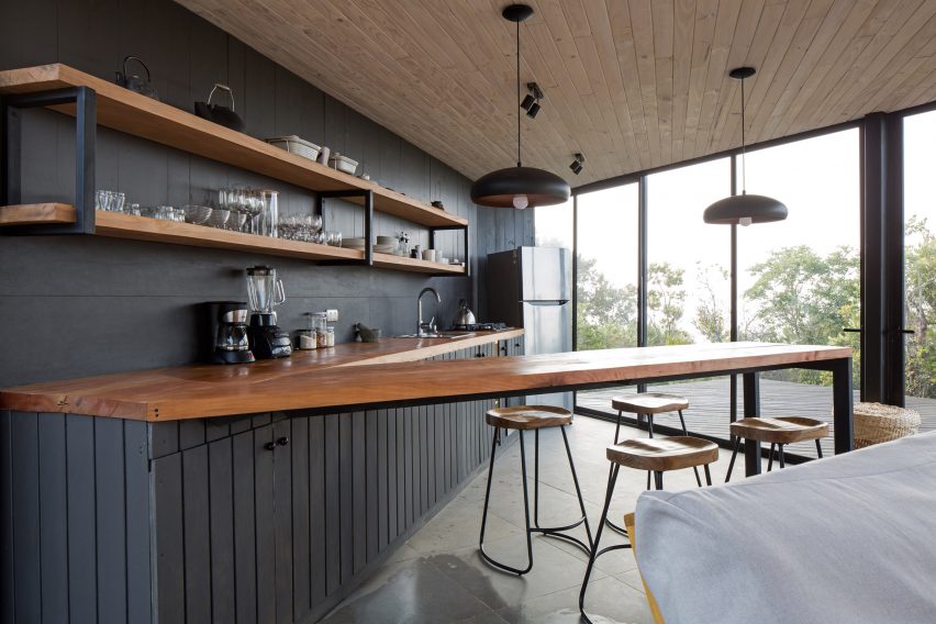
Holiday home, Chile, by 2DM Arquitectos

The open-plan kitchen of this angular home in Chile by 2DM Arquitectos features a V-shaped worktop, with the narrow peninsula serving as a breakfast bar.

The worktop is made of chunky, oiled hardwood while the bar stools have matching tractor-style hardwood seats.

Find out more about the holiday home ›
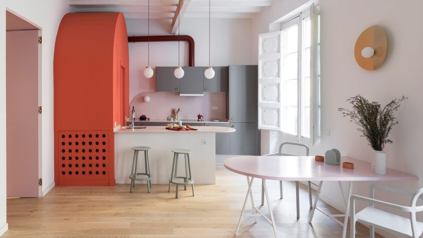

Apartment in Born, Spain, by Colombo and Serboli Architecture

Colombo and Serboli Architecture installed a playful open-plan kitchen with a round-ended peninsula as part of its conversion of an old apartment in Barcelona’s El Born district.

The terrazzo worktop overshoots the narrow rendered plinth, creating a breakfasting area furnished with two Revolver bar stools designed by Leon Ransmeier for Hay.

Find out more about Apartment in Born ›
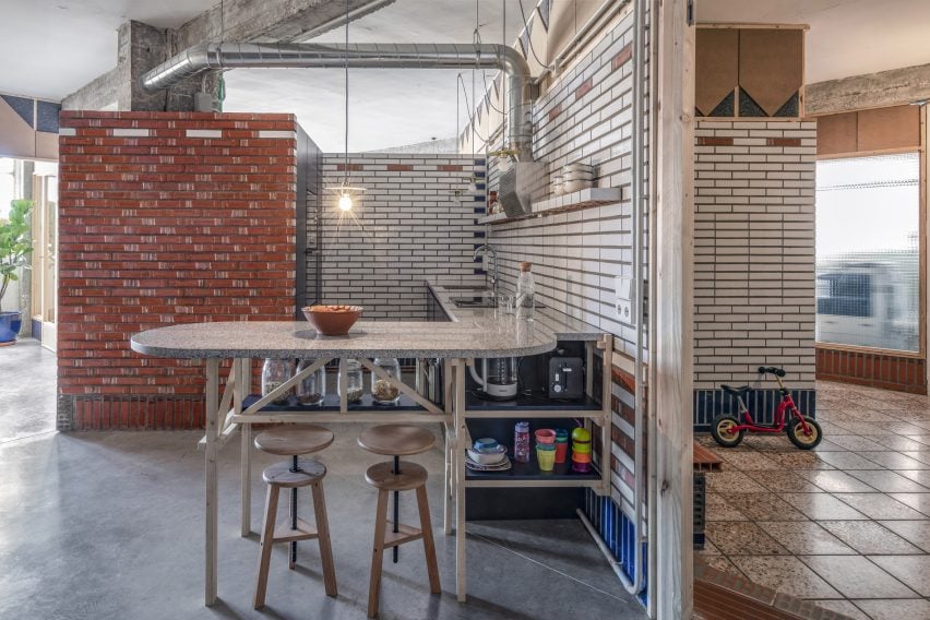

Kitchen of La Nave apartment in Madrid by Nomos

La Nave, Spain, by Nomos

The terrazzo-topped peninsula in this open-plan kitchen in Madrid rests on a complex frame constructed from pine struts. This holds an open storage shelf – a typical feature in traditional Spanish kitchens, which often feature open shelving concealed by curtains instead of drawers and cupboards.

Two wooden artists’ stools with adjustable-height seats provide seating at the bar. The raw, open-plan apartment is in a former workshop in Madrid and was designed by Spanish architect Nomos.

Find out more about La Nave ›
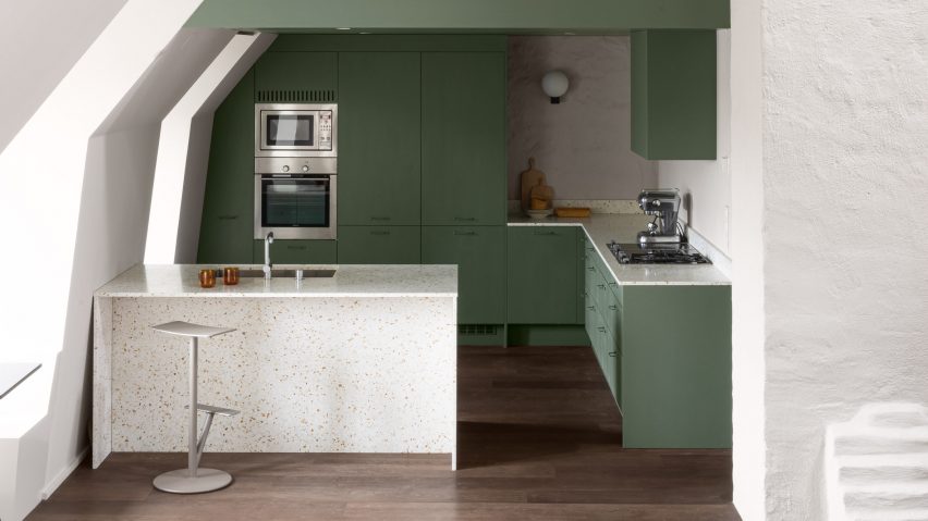

Mantelpiece loft, Sweden, by Note Design Studio

Note Design Studio created this loft apartment in Stockholm, inserting a mezzanine into the double-height space beneath a soaring mansard roof.

The compact kitchen is tucked beneath a bedroom and features a breakfast bar set into a terrazzo peninsula that also features a sink, allowing a single breakfaster to wash up their crockery without leaving the Sequoia bar stools designed by Torbjørn Anderssen & Espen Voll for Magis.

Find out more about Note Design Studio ›
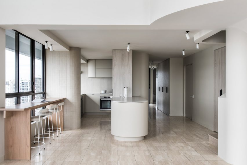

Penthouse M by CJH Studio

Penthouse M, Australia, by CJH Studio

CJH Studio’s redesign of the interior of this penthouse in Gold Coast, Australia features a breakfast bar that is placed against a window to make the most of the view.

The narrow, freestanding bar is made of wood, adding a touch of warmth to the neutral tones of the kitchen, which features beige wall tiles and travertine flooring.

Find out more about Penthouse M ›
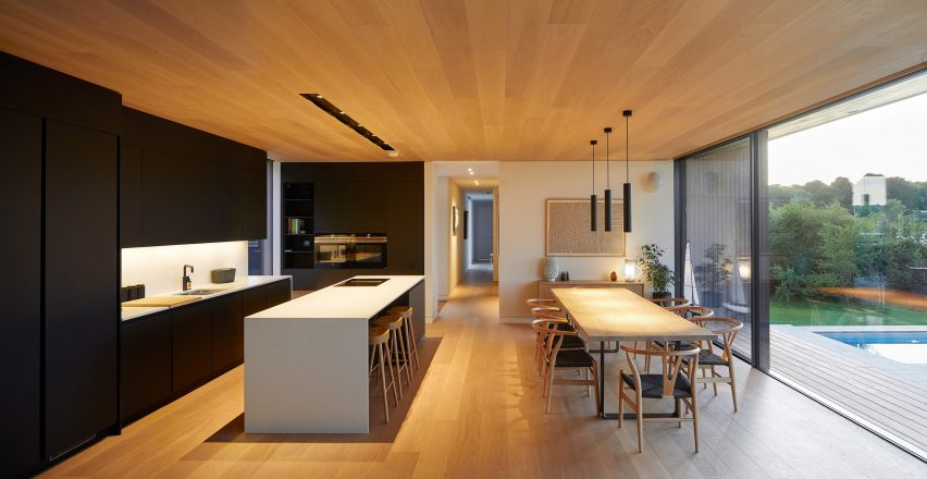

Island Rest holiday home in Isle of Wight designed by Ström Architects

Island Rest, UK, by Ström Architects 

Island Rest, a low-slung holiday home on England’s Isle of Wight by Ström Architects, features a kitchen island deep enough for a row of bar stools to tuck underneath.

Made of white solid-surface material, the breakfast bar contrasts with the black kitchen and offers a more informal option than the huge wooden dining table behind, which is set with eight classic Wishbone chairs designed by Hans J Wegner for Carl Hansen & Søn.

Find out more about Island Rest ›
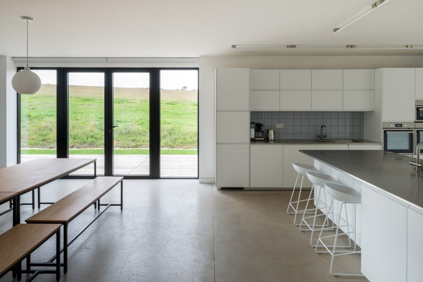

Interior of DU18 by Turner Works

Holiday home, England, by Turner Works

Architect Turner Works converted a barn in Devon, England into a holiday home featuring an open-plan kitchen and diner overlooking a wildflower meadow.

The unusual kitchen layout features storage, prep space and appliances arranged along a wall plus a substantial island set at 90 degrees, forming a T-shape.

A shallow breakfast bar has been carved into one end of the island, which has a stainless steel counter above white storage units. The adjoining dining area features a double-length table with refectory-style seating.

Find out more about the holiday home ›
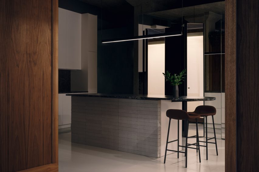

Rue de la Gauchetière by Future Simple Studio

Family apartment, Canada, by Future Simple Studio

This apartment renovation in Montreal by Future Simple Studio has an asymmetrical kitchen consisting of units arranged against an angled wall plus a tongue-shaped island, which doubles as a breakfast bar.

The island is topped with polished granite and clad in white-painted cement blocks. The worktop cantilevers at one end, creating enough space for two Form bar stools designed by Simon Legald for Normann Copenhagen.

Find out more about the family apartment ›
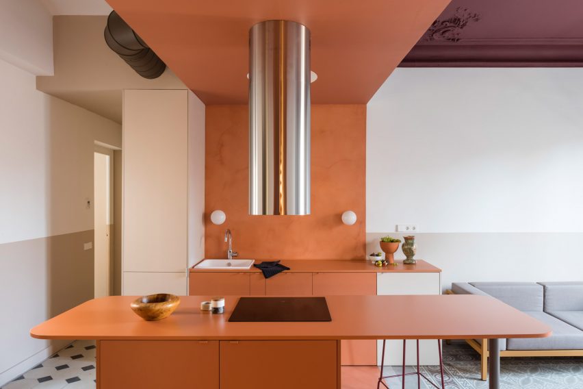

Orange Barcelona apartment

Klinker apartment, Spain, by Colombo and Seboli Architecture

Colombo and Serboli Architecture updated this Barcelona apartment to include a compact open-plan kitchen made of russet-painted MDF.

One half of the short, broad island hosts a hob, which is ventilated by a dramatic stainless-steel extractor, with storage set below the counter.

The other, free-floating half of the island serves as a breakfast bar with room for two. It is supported by a steel column in one corner and features plenty of legroom beneath.

The apartment is too small for a dining table so the breakfast bar acts as the main eating space.

Find out more about Klinker Apartment ›


This is the latest in our series of lookbooks providing curated visual inspiration from Dezeen’s image archive. For more inspiration see previous lookbooks showcasing peaceful bedrooms, calm living rooms and colourful kitchens.

Reference

Dezeen presents cafe bar designed by Michael Young at Design Shanghai
CategoriesInterior Design

Dezeen presents cafe bar designed by Michael Young at Design Shanghai

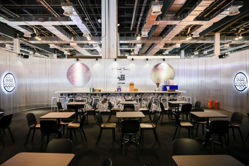
Dezeen has partnered with Design Shanghai to present a cafe and bar designed by Michael Young at the 2021 edition of the trade show, which opened in Shanghai this week.


The cafe and bar is located at booth K207 in Hall 2 at Design Shanghai 2021, which takes place at the Shanghai World Expo Exhibition and Convention Center in Shanghai, China, until 6 June.

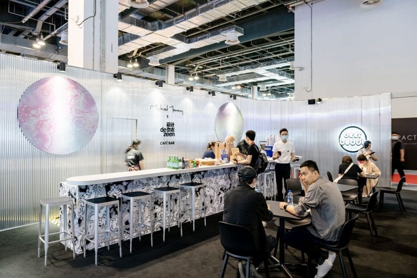
The space features grey corrugated walls with splashes of colour and is furnished with previews of furniture pieces designed by Young that will be launched later in the year.

Michael Young x Dezeen cafe and bar at Design Shanghai
Dezeen has partnered with Design Shanghai to present a cafe and bar designed by Michael Young

According to Young, the concept for the space is loosely based on a bar he created last year at his office in Shekou, Shenzhen.

“I ended up with an opportunity to create a bar last year beneath our studio but with only a few weeks to build the concept I decided to throw in anything I could get hold of – samples, prototypes and things from the studio that we have collected from around the world,” the Hong Kong-based British designer told Dezeen.

“I basically scavenged the studio together like a magpie so it became a real beer shack and a place that was not designed but created organically.”

The bar has grey walls
The bar features ribbed walls with splashes of colour and pattern

Citta Design has contributed pieces of Young’s new Acre Chair for the New Zealand brand, which will be launched in Auckland in September. The space is also furnished with new editions of Young’s Stool 4a for EOQ Design, which will be launched in December.

The bar is being used to launch Young’s new drinks brand Beer Buddy, which developed a new pilsner called House for the event.

The beer brand is specifically designed to connect creatives at events, trade shows and gatherings around Asia. Drinkers can scan a QR code on the beer packaging to connect with other creatives attending the event.

It is serving Beer Buddy
Young is launching his new Beer Buddy drinks brand at the bar

The dark grey exterior walls of the space are decorated with swirling patterns based on the graphics on the Beer Buddy cans and bottles.

Colourful versions of this pattern have been used to add splashes of colour to the interior walls and enclose private seating areas.

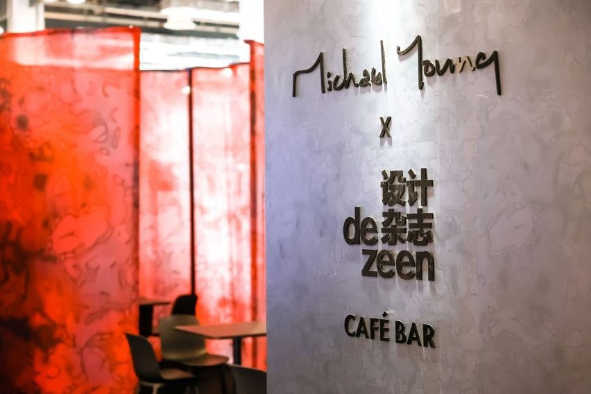
The space is co-branded with Young’s studio logo and the Chinese version of Dezeen’s logo. The walls also feature the QR code for people to follow Dezeen’s official WeChat account, which features news and features about the latest architecture, design and interiors written in Simplified Chinese.

Michael Young x Dezeen cafe and bar at Design Shanghai
The interior and exterior of the bar features swirling patterns based on the Beer Buddy packaging

Dezeen is a media partner for Design Shanghai 2021.

The show presents over 400 local and international brands across eight different sections alongside a programme of installations, exhibitions and the return of its annual talks programme, which this year explores the topic of regenerative design.

Design Shanghai takes place from 3 to 6 June at the Shanghai World Expo Exhibition and Convention Center. See Dezeen Events Guide for an up-to-date list of architecture and design events taking place around the world.

Reference

Ten space-saving peninsula kitchens designed by architects
CategoriesInterior Design

Ten space-saving peninsula kitchens designed by architects

This lookbook highlights ten examples of peninsula kitchens, which have the functionality of kitchen islands but are a more space-saving solution.


Named after the geological feature, a kitchen peninsula is a spur that juts out from the wall or work surfaces, creating a three-sided surface. Peninsulas are often additionally used as breakfast bars for casual dining.

Peninsulas offer a space-saving solution for kitchens that don’t have enough floor space for a free-standing kitchen island. They are also useful in kitchens with irregular layouts since they can be asymmetrical or placed at jaunty angles.

They can also be used to create a useful staging post between the food preparation area and the dining area.

This is the latest roundup in our Dezeen Lookbooks series providing visual inspiration for the home. Previous kitchen-related roundups include kitchens with islands, galley kitchens and kitchens with breakfast bars.


Caldrap in Barcelona, Spain, by Nook Architects

Caldrap in Barcelona, Spain, by Nook Architects

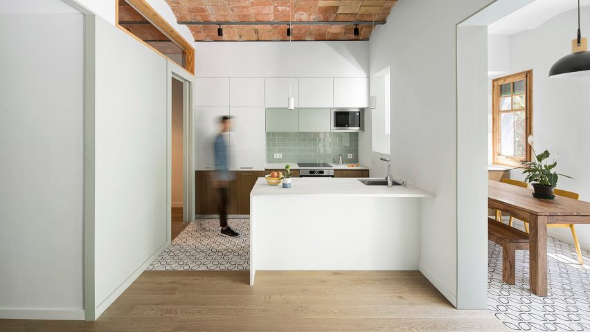
Nook Architects remodelled this 67-square-metre apartment in Barcelona to accommodate a family of three. A marble peninsula counter abuts the half-wall that divides the kitchen and the dining area.

A sink is sunk into the countertop at one end, and the marble surface overhangs to create a breakfast bar. Patterned tiles demarcate the kitchen area, which sits below a ceiling of traditional Catalonian brick vaults.

Find out more about Caldrap ›


Golden Lane flat renovation in London, UK, by Archmongers

Golden Lane flat renovation in London, UK, by Archmongers

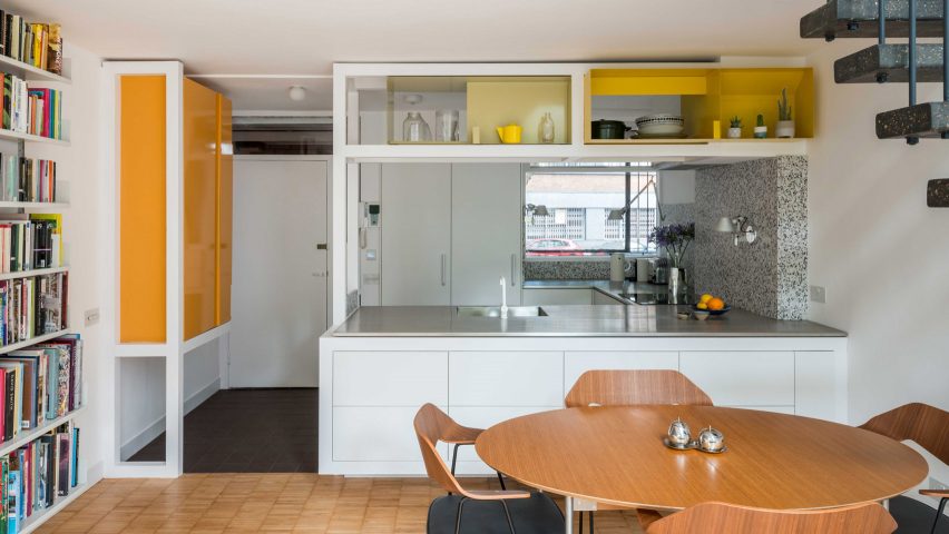
Archmongers reinstated modernist design elements for this 1950s flat renovation in London’s Golden Lane estate. Chunky white-painted wooden frames separate the kitchen and dining areas, adding high shelving above the peninsula kitchen.

The white kitchen cabinets are topped with steel while grey terrazzo picks out the counter end and splashback.

Find out more about Golden Lane flat renovation ›


Reception House in Higashiyama in Nagoya, Japan, by Yuki Mitani and Atsumi Nonaka

Reception House in Higashiyama in Nagoya, Japan, by Yuki Mitani and Atsumi Nonaka

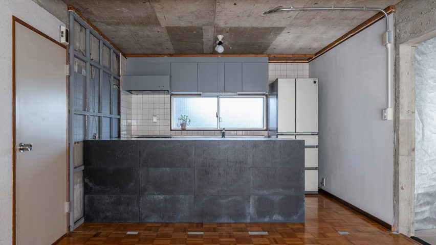
Architects Yuki Mitani and Atsumi Nonaka redesigned their kitchen to create a more social space when they remodelled their own home. A peninsula kitchen counter creates extra counter space, while allowing the hosts to chat with their guests as they prepare meals.

The rental flat came with no finishes, just raw concrete walls, so the architects played up to this and clad the counter with panels of industrial-looking zinc.

Find out more about Reception House in Higashiyama ›


Botaniczna Apartment in Poznań, Poland, by Agnieszka Owsiany Studio

Botaniczna Apartment in Poznań, Poland, by Agnieszka Owsiany Studio

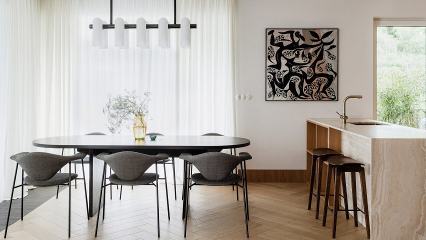
A bronze tap complements the creamy marble of this peninsula counter for an open-plan kitchen diner in a Polish apartment. Agnieszka Owsiany Studio designed the space to be as calming as possible for a couple with high-pressure jobs in medicine.

Wooden shelves are built into one side of the counter, which overhangs slightly so it can double as an informal breakfast bar with saddle-style bar stools ›.

Find out more about Botaniczna Apartment ›


Apartment in Born in Barcelona, Spain, by Colombo and Serboli Architecture

Apartment in Born in Barcelona, Spain, by Colombo and Serboli Architecture

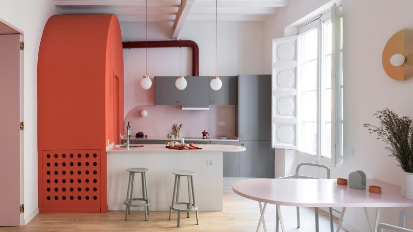
A curved countertop projects to form a breakfast bar in this colourful flat renovation by Colombo and Serboli Architecture for a woman working in the fashion industry.

The countertop abuts a bright coral arched volume that hides a guest bathroom. A polished metal tap curves over the sink on the kitchen side and two grey Revolver Stools from Hay can be drawn up to turn the surface into a breakfast bar.

Find out more about Apartment in Born ›


St Lawrence in Toronto, Canada, by Odami

St Lawrence in Toronto, Canada, by Odami

Canadian studio Odami opened up the previously enclosed kitchen of a dated 1980s apartment in Toronto. The peninsula kitchen adds more worksurfaces while creating a line of sight with the dining area.

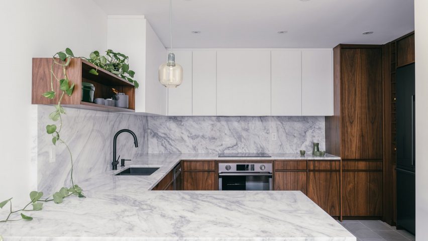
Matching grey marble countertops and splashback contrast with the dark wood cabinetry and a matt black sink and tap.

Find out more about St Lawrence ›


Tsubo House in London, UK, by Fraher & Findlay

Tsubo House in London, UK, by Fraher & Findlay

Architecture practice Fraher & Findlay introduced a Japanese aesthetic during the renovation and extension of this Victorian-era house in London.

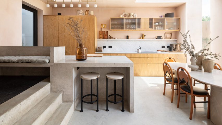
The kitchen features pink plaster walls and a peninsula-style polished concrete counter that also serves as a breakfast bar and continues up a short flight of steps to form a bench seat.

Find out more about Tsubo House ›


Cabinette in Valencia, Spain, by Masquespacio

Cabinette in Valencia, Spain, by Masquespacio

A row of retro-futuristic stools with tiered fringing from Spanish studio Masquespacio’s Déjà-Vu collection line up below the bar of this peninsula kitchen in a co-working space in Valencia.

The studio designed the space in homage to French director Jacques Tati’s 1960s film Playtime. The kitchen area features baby-blue tiling and strips of neon underlighting.

Find out more about Cabinette ›


308 S apartment in Brasilia, Brazil, by Bloco Arquitetos

308 S apartment in Brasilia, Brazil, by Bloco Arquitetos

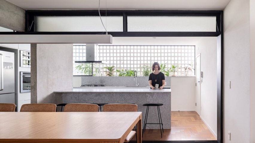
Bloco Arquitetos reconfigured this 1960s apartment in Brasilia, adding translucent sliding doorways that can be pulled across to separate the kitchen and the dining area.

The peninsula kitchen with its marble counter abuts a concrete divider wall and allows the kitchen and dining room to become one large entertaining space when the doors are open.

Find out more about 308 S ›


La Nave in Madrid, Spain, by Nomos

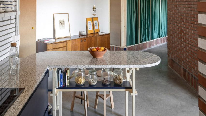
Spanish architecture studio Nomos converted an old workshop into a home for two of its partners. The original pipes and brickwork are still visible in the kitchen, which has a rounded peninsula counter supported by a wooden frame.

Nomos built the custom timber elements out of pine, including the frame and the bar stools. A blue-painted shelf under the counter doubles as a handy spot to store breakfast cereals and cookbooks.

Find out more about La Nave ›


This is the latest in our series of lookbooks providing curated visual inspiration from Dezeen’s image archive. For more inspiration see previous lookbooks showcasing peaceful bedrooms, wallpapered interiors and colourful kitchens.
Reference

CategoriesLandscaping

A Rooftop Lounge And Garden Surrounded By Brick Walls Was Designed For This Home

ODDO architects have designed a contemporary home in Hanoi, Vietnam, that’s surrounded by taller buildings and includes rooftop courtyards.

Due to rapid urbanization and the lack of public spaces, the architects designed a home that includes outdoor spaces.

A contemporary home with rooftop courtyards surrounded by brick.

The lower level of the home has a white exterior, while the upper level consists of multiple brick volumes, some with overhanging plants, adding a greenery element to the space.

A contemporary home with rooftop courtyards surrounded by brick.

The roof area is covered by open gardens where the family may grow their own vegetable and fruits.

A contemporary home with rooftop courtyards surrounded by brick.

The rooftops also include space for relaxing in the busy city.

A rooftop terrace surrounded by brick.

Outdoor lighting included in the design of the rooftops enables the space to be used at night. It also adds light to the neighborhood as it can pass through the walls and openings.

Outdoor lighting makes this rooftop terrace light up like a lantern.
A modern home with painted brick lower level, and textured brick upper level.

Inside the home, the interior has been kept open with glass ceilings, creating a bright living space.

A contemporary home with glass ceiling and built-in planters.

The living room opens up to the kitchen and dining area, which include custom planters built into the design of the home.

A contemporary home with glass ceiling and built-in planters.

Other rooms in the house have sliding doors that open to green spaces, hiding the city beyond.

A sliding glass door opens the bedroom to green space.
Photography by Hoang Le photography | Architects: ODDO architects (Mai Lan Chi Obtulovicova, Marek Obtulovic, Nguyen Duc Trung)

Source link