Linehouse designs coastal living for Cape Drive residence in Hong Kong
CategoriesInterior Design

Linehouse designs coastal living for Cape Drive residence in Hong Kong

Chinese studio Linehouse has designed the interiors of Cape Drive Residence in Hong Kong to respond to the surrounding coastal views.

Located on the south side of Hong Kong Island, the three-floor home is a short walk from the beaches of Stanley and Chung Hom Kok and has panoramic ocean views to the east and west from its elevated position.

“The design harnesses a costal essence through materiality, light and an easy flow, seamlessly connecting the interior and exterior spaces,” Linehouse explained.

Linehouse Cape Drive residence
The home is located on the south side of Hong Kong Island with expansive ocean views

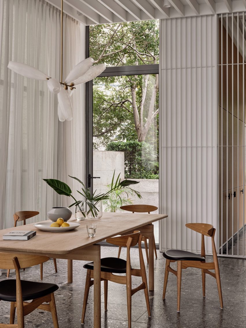
An open living area on the ground floor connects to the kitchen and dining space while an internal courtyard was inserted between theses areas and includes a centralised tree and surrounding seating.

The living area extends to the main terrace with full-height windows that frame the expansive ocean views.

Clad in stone, the terrace forms a sunken seating area with pockets of greenery surrounding it, which shelters the sea wind.
Linehouse Cape Drive residence
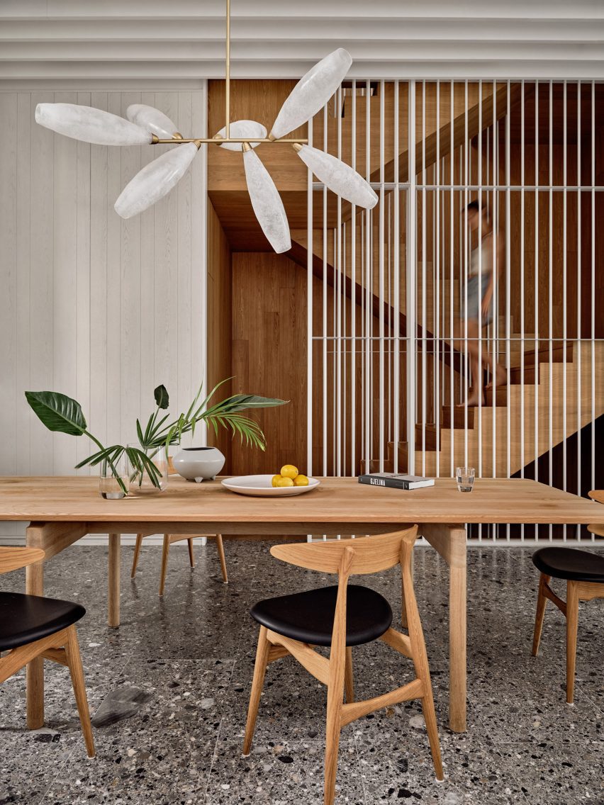
A timber staircase framed by a shuttered screen connects all three floors

White timber louvers were used as a continuous ceiling plane in the living area which also extends to the terrace as a canopy.

“The design of the home reflects the relaxed and laidback lifestyle of a beach setting,” said the studio. “Warm tones, tactile surfaces and textures, a clean and simple material palette, and a seamless flow between inside and out.”
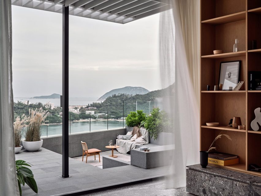
Linehouse Cape Drive residence
An outdoor terrace was clad in stone with a sunken seating area

“Cape Drive Residence offers the fitting backdrop for coastal living,” it continued.

A warm oak timber staircase was punctuated by a shuttered screen that runs vertically through all levels of the home while arranging more private areas such as bathing and dressing.

The whitewashed timber material of the screen echoes the coastal location and reflects light through the spaces.

A white metal rod screen can be slide open at each level, offering transparency and light through different spaces.
Linehouse Cape Drive residence
An internal courtyard was inserted between the dining and kitchen area

Bedrooms, a second living area and a study were placed on the upper two levels, all with coastal views.

The same whitewashed timber material used on the shuttered screen was adopted to form storage, seating and shelving in these private spaces, providing a textural contrast to the hand-raked plaster walls.

The bathrooms add a fresh moment of colour into the space, using patterned tiles handmade in Portugal by Elisa Passino.
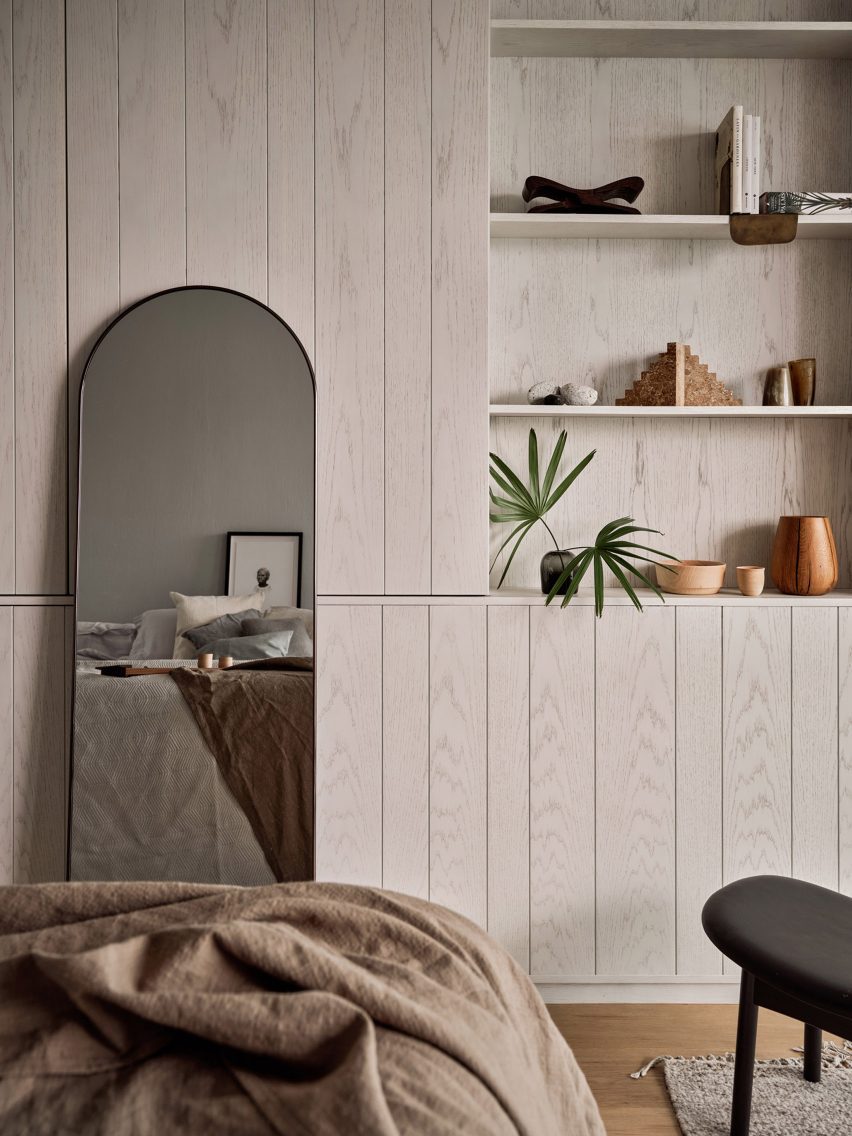
Linehouse Cape Drive residence
Shelving and storage spaces were created from whitewashed timber material

Linehouse was founded by Alex Mok and Briar Hickling in 2013 and the duo went on to win emerging interior designer of the year at the 2019 Dezeen Awards.

The studio has recently completed a guesthouse in Hong Kong that evokes the comfort of home and a Mediterranean restaurant in Shanghai with natural, tactile materials.

The photography is by Jonathan Leijonhufvud.


Project credits:

Design: Linehouse
Design principal:
Briar Hickling
Design team: Ricki-Lee Van Het Wout, Cindy Pooh

Reference

White Arkitekter designs stormwater pond with winding pathway
CategoriesArchitecture

White Arkitekter designs stormwater pond with winding pathway

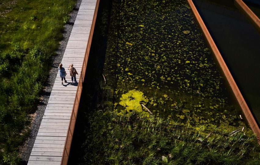
Swedish practice White Arkitekter has completed the Exercisfältet Stormwater Pond in Uppsala, Sweden, providing water purification and flood protection while also creating a biodiverse landscape for local residents.

The pond is located in Exercisfältet, a former military training area that has recently been subject to a large amount of development that has reduced water infiltration.

Stormwater pond by White Arkitekter
The pond is located in a former military training area

Instead of treating the pond as a purely infrastructural project, White Arkitekter took the opportunity to create a biodiverse environment around the pond to “celebrate the joy of being part of nature”.

“With all the new demands on public spaces that come with climate adaptation, it’s very important that landscape architects engage creatively with technical requirements,” lead architect Charlotta Råsmark told Dezeen.

Exercisfältet i Stockholm
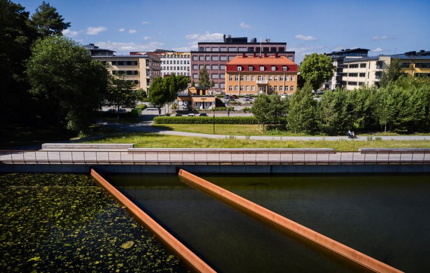
A concrete wall provides flood protection

“We need to create spaces that can be problem solvers and places for beauty, pleasure and enjoyment at the same time,” she continued.

To the north, the pond’s “city side” follows the line of the new housing blocks with a concrete wall providing flood protection.

Pathway in Stockholm
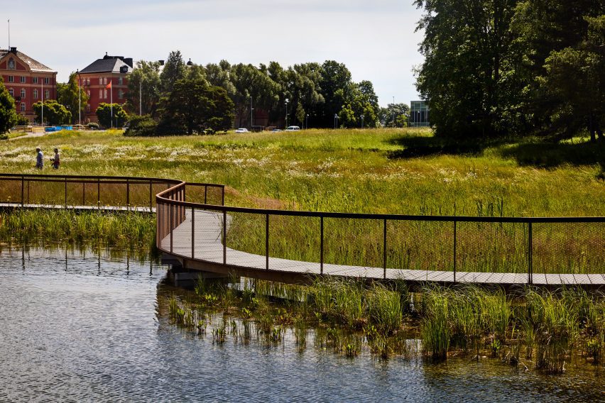
The pond is wrapped by a wooden pathway

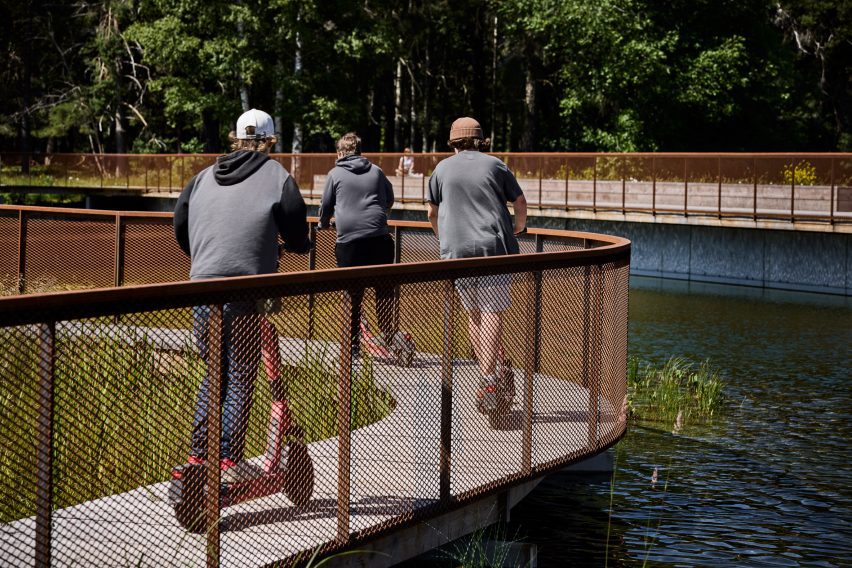
Opposite, the south-facing “nature side” follows the undulating forms of the landscape, and the whole pond is wrapped by a winding wooden pathway with a weathered steel balustrade.

Untreated wood and steel were used for the walkways, both to minimise the leakage of chemicals into the water and to blend in as much as possible with the surrounding landscape from afar.

View of Stockholm pond
Green spaces surround the pond

The pond itself was made as small as possible to maximise the green space for recreation around it, as well as providing space onto which the water level can safely rise in the event of heavy rainfall.

“To stop the rapid decline of biodiversity, we need to make more space in urban areas for ecosystems that many people find messy and unattractive; the city greenery can’t only be about tidy lawns and borders,” Råsmark said.

“But a messy ecosystem in a city context must also be welcoming to the average city dweller and that’s where the importance of clearly visible design comes in,” she continued.

The pond has been designed to accommodate the ongoing development of the surrounding area, becoming part of a larger green belt stretching from the centre of Uppsala to lake Mälaren to the south.

Stormwater pond in Stockholm
The pathway has a weathered-steel balustrade

The Stormwater Pond at Exercisfältet has recently been longlisted in the mixed-use project category of Dezeen Awards 2023.

In China, studio eLandscript took a similar approach to integrating the ecological and the urban, combining the creation of a stormwater pond with a new wetland park on the site of a former power station.

The photography is by Måns Berg.

Reference

MR Studio designs Hong Kong gym to “transport visitors to another world”
CategoriesInterior Design

MR Studio designs Hong Kong gym to “transport visitors to another world”

In Hong Kong’s fast-paced Central District, local practice MR Studio has modelled this fitness studio on a futuristic Martian dwelling to offer members an escape from their busy lives.

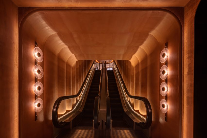
Gym Town‘s entryway and reception are finished entirely in an an earthy shade of orange, chosen to reflect the colours of Mars, while moody black workout areas were designed to allow visitors to focus on their individual health goals.

Entrance escalator of Gym Town in Hong Kong by MR Studio
Gym Town is entered via a dramatic escalator

“We wanted to create a unique and immersive experience for gym-goers,” MR Studio founder Myron Kwan told Dezeen. “The concept of Mars was chosen to represent escapism and a sense of adventure.”

“Inspired by Elon Musk’s vision of colonising Mars, we wanted to create a space that felt futuristic and cutting-edge.”

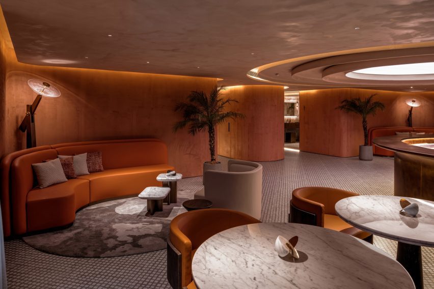
Lobby and reception of Gym Town
The gym’s reception doubles as a lounge

The studio created a bespoke sculptural lighting piece that can be seen from the street to create a sense of intrigue about the gym.

From the entrance, members are taken up to the lobby by an escalator. In a bid to make this ascent feel like an event, MR Studio turned the space into a tunnel-like “portal” that provides a sense of voyage.

Seating area in Hong Kong gym by MR Studio
Bespoke lights were modelled on satellite dishes

Around the escalator, the walls undulate to create a series of vertical ridges, designed to add depth and visual interest while suggesting walls that have buckled under the heat of the red planet.

“By using the tunnel-like form, we wanted to create a visually striking feature that would set the tone for the entire space,” Kwan said.

“The tunnel creates a sense of anticipation and excitement as guests enter,” he added. “The design itself aims to transport visitors to another world.

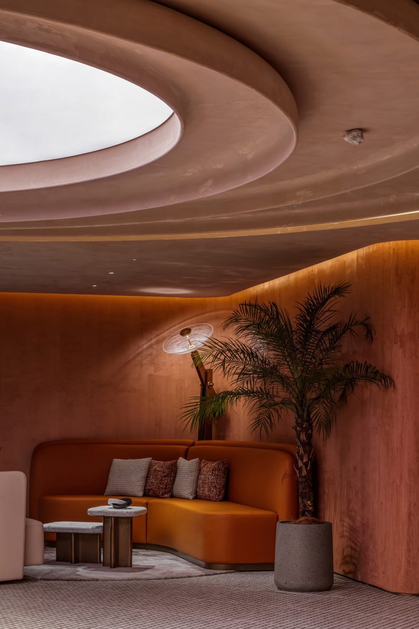
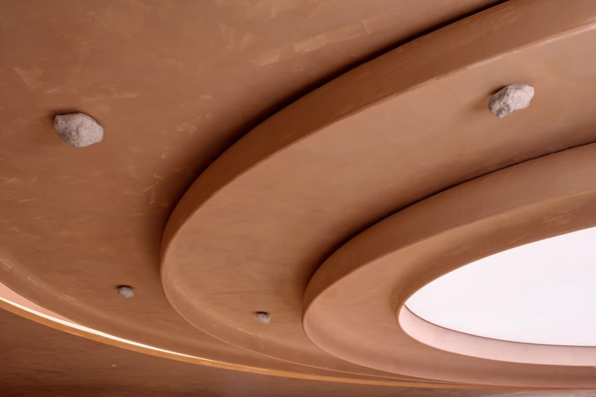
Skylight in Gym Town lobby
Decorative rocks are fixed to the ceiling

The escalator delivers members into a large reception area, arranged as a lounge with various seating areas.

One of the challenges of the project was the absence of natural light, which MR Studio addressed with a feature ceiling light.

Composed of concentric circles with an illuminated core, it suggests both a natural skylight and the crater-studded terrain of Mars.

Curves and circles feature heavily throughout Gym Town, from wavy walls and rounded furniture to lights inspired by the form of a satellite dish.

“Custom-made table lamps adorned with sleek metal finishes and cracked glass details capture the silhouette of high-gain antennas used in space exploration,” the studio explained.

The room is centred on a semi-circular brass-wrapped reception desk, which doubles as a bar during events or after-hours gatherings.

Bathroom inside Hong Kong gym by MR Studio
Rooms get progressively darker

The walls here feature the same dusty red-orange finish as the entrance tunnel, while decorative rocks are fixed to the ceiling.

“Envisioned as a modern Martian house, the space is painted in a textured monochromatic palette of tangerine, referencing the iconic red planet’s signature colour and rough terrain,” said Kwan.

“It adds vibrancy and warmth to the space, creating a visually intriguing element that complements the overall design theme.”

Workout area inside Hong Kong gym by MR Studio
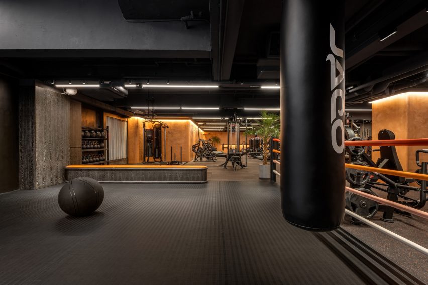
The workout areas are finished in muted black and grey tones

Progressing into the changing rooms, workout areas and studios, the colour palette shiftsto more sober greys and blacks.

“To encourage members to fully devote to their fitness routines, the workout area is grounded in an organic and unpretentious style,” the studio said.

Overview of workout areas inside Gym Town
Orange accents delineate different areas

Gym Town has been shortlisted in the health and wellbeing interior category at this year’s Dezeen Awards.

Also in the running is the dusty-pink welfare centre of a boys’ school in Melbourne and a pediatric clinic in Seattle with “no blank walls”.

The photography is by Steven Ko.


Reference

Beata Heuman designs colour-drenched Hôtel de la Boétie in Paris
CategoriesInterior Design

Beata Heuman designs colour-drenched Hôtel de la Boétie in Paris

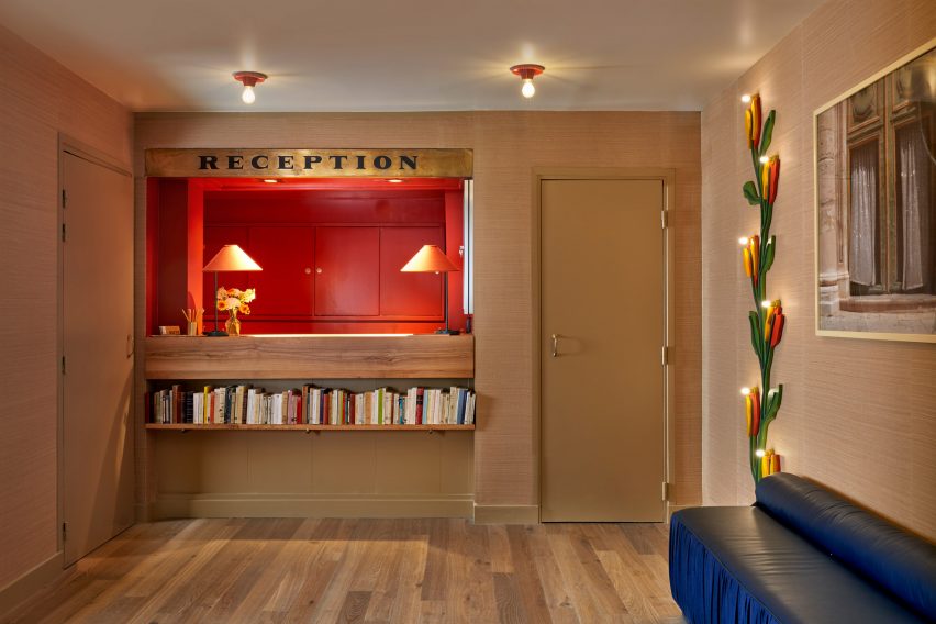
Saturated greens and blues contrast pale pink sheets and playful flower details at Hôtel de la Boétie in Paris, which Swedish designer Beata Heuman created to be “a bit like a stage set”.

Set in a 19th-century building, the 40-room hotel in Paris’ 8th arrondissement was designed with Heuman‘s signature colourful interior style.

Lounge at Hôtel de la Boétie
Beata Heuman’s Dodo Egg Light hangs in a lounge area at Hôtel de la Boétie

While it was a renovation of an existing hotel, the designer was able to make large changes to the interior as the building had been altered numerous times since it was completed.

“The building didn’t have any original features left and has been re-configured over the years,” Heuman told Dezeen. “We spun off the simplicity of the bones that were there, working with strong, simple ideas.”

Reception area at Hôtel de la Boétie
The hotel’s reception area has a warm red colour

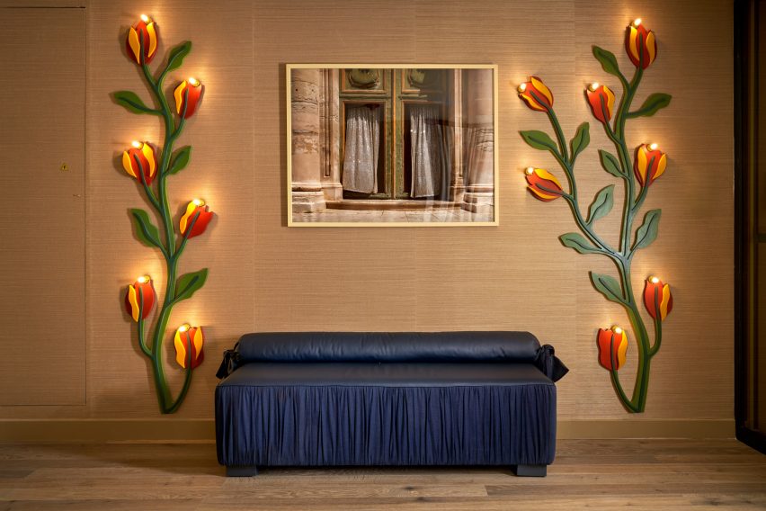
Guests are met by a reception room with a vibrant, bright-red nook for the front-of-house staff and two lamps designed like winding red-and-yellow flowers. A dark-blue leather seat complements the room.

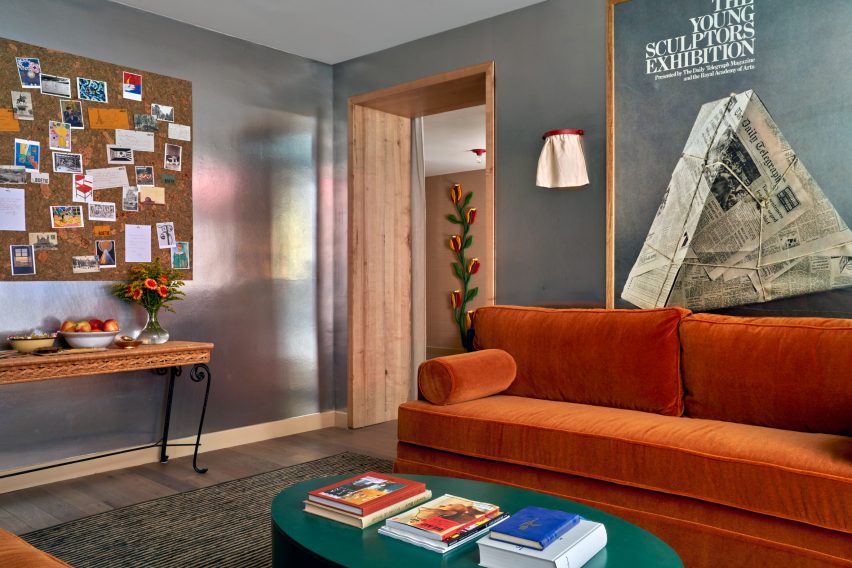
Next to the reception area, Heuman created an all-silver lounge that was designed to have a theatrical feel and is brightened by an orange velvet sofa and a forest-green coffee table.

Silver lounge space at Hôtel de la Boétie
Guests can relax in a silver lounge area

The colour palette was very deliberately chosen by Heuman, who thought about the wider impact it would have on the space.

“It’s about contrast and balance,” the designer said. “When you work with rich colours my instinct is to off-set that using simpler materials around it to complement and enhance.”

Bedroom with patterned headboard
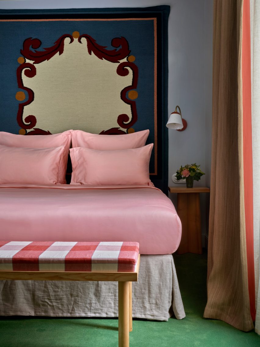
Woven headboards create striking centrepieces in the bedrooms

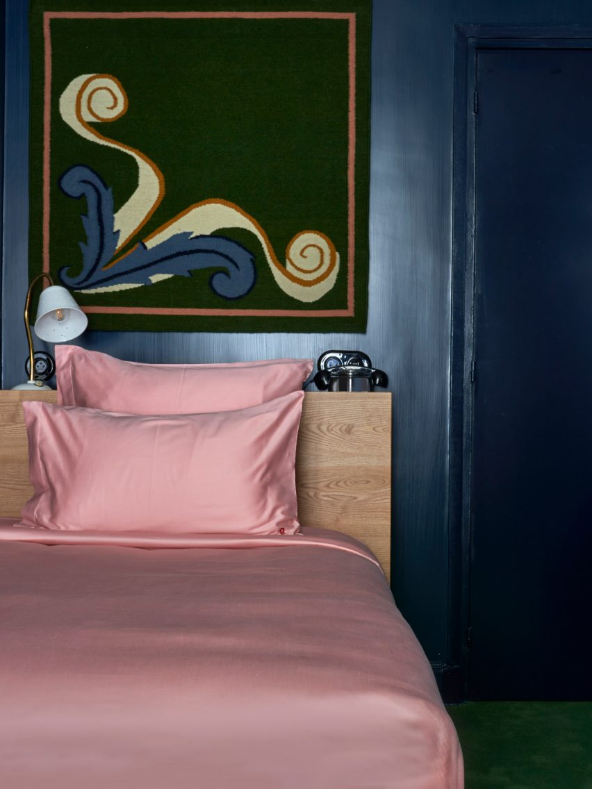
The bedrooms have a saturated colour scheme, with lower-level floors that feature dark blue walls, which change to shades of brown on the ascending floors.

The two top levels have pale, airy blue hues, with classic French cast-iron balconies providing views of central Paris from the top floor.

A grassy green carpet was used throughout the hotel to create a vibrant contrast to the blue and brown hues.

Bathroom at Parisian hotel
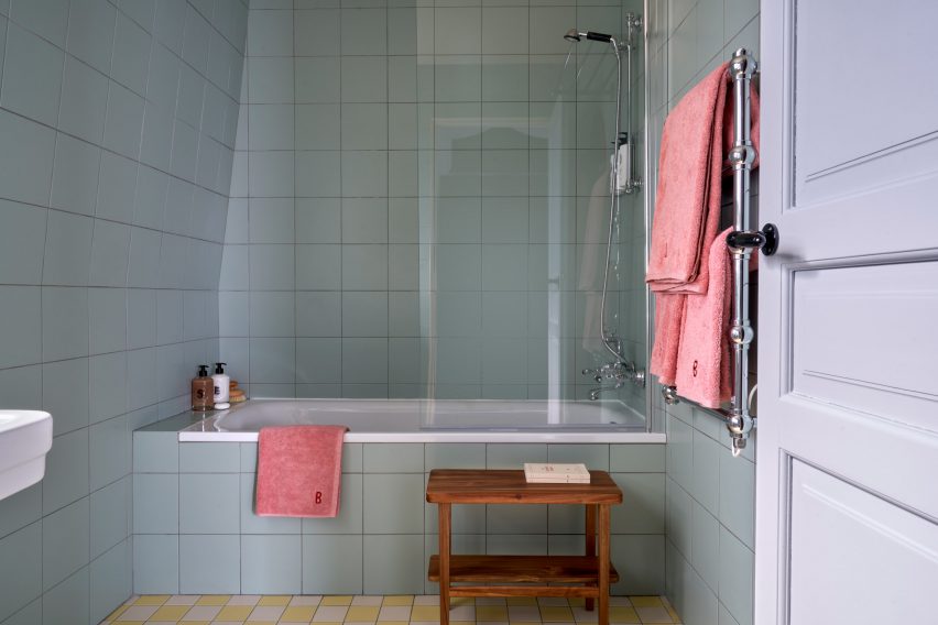
The bathrooms feature pale pastel colours

Some bedrooms have been decorated with oversized headboards that were woven as rugs and then upholstered, creating an unusual and eye-catching centrepiece.

These were informed by the inlaid marble floor of the Medici Chapel in Florence and sit above the solid-ash beds, which have been made with pale-pink satin sheets that add to the vibrant feel of the room.

In the bathrooms, Heuman used pale blue and green pastel hues juxtaposed with pink towels to give the rooms a luxurious retro feel, while checkerboard-patterned tiles in yellow and green add a fun touch.

Pink satin sheets on bed in Paris hotel
bedrooms on the lower levels have dark-blue walls

The designer also used her own products to decorate the hotel, including her Dodo Egg Light – an egg-shaped light with green fittings designed to resemble planet leaves.

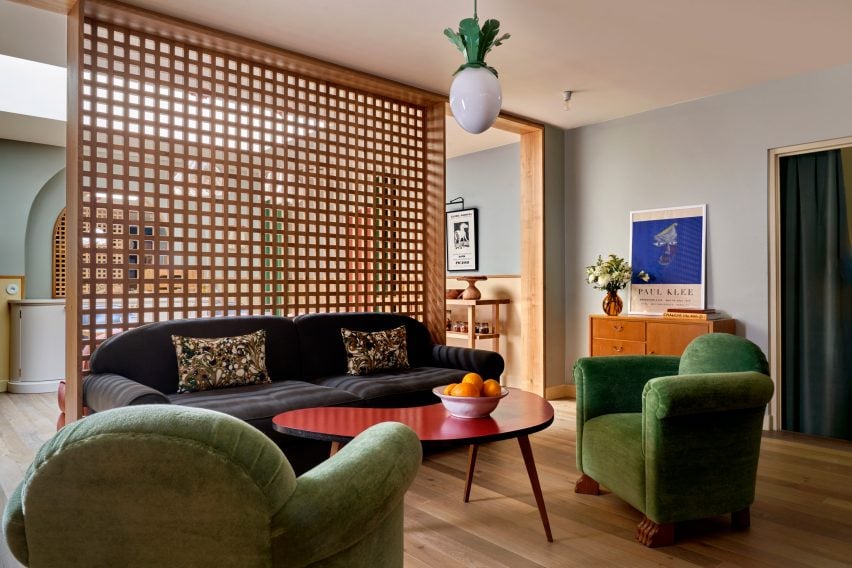
This decorates one of the ground floor lounge areas, which also features posters for art exhibitions by artists Pablo Picasso and Paul Klee.

The designer used mainly natural materials for the hotel, including wood and brass.

“The solid ash furniture used in all the rooms have a humble quality which anchors the more theatrical elements of the schemes such as the headboards, ensuring the expression stays true to the nature of the building,” she said.

Interior of Hôtel de la Boétie
Heuman aimed to use natural materials throughout the space

Heuman also created the branding for the hotel, which was made for French hotel group Touriste.

“A hotel is about having an experience for a day or two, which means that we have been able to explore a concept and a mood to a greater extent,” Heuman said.

“We can treat it a bit like a stage set, which is not the approach I would take when it comes to someone’s home.”

Reception at Parisian hotel
Flower lamps decorate the reception area

The project fulfilled a long-time dream for the designer, who had previously never designed a hotel and works more on private home interiors.

“I’ve been wanting to do a hotel for ages and it has been a fantastic experience,” Heuman said.  “I am drawn to the theatrical, although that is often not appropriate for a residential setting.”

“A hotel is an experience for a few nights, therefore you can exaggerate and do more of a ‘look’,” she added. “In a residential project the design is centred around the personal preferences of an individual client.”

Previous hotels by Touriste include Hotel Les Deux Gares in Paris, which has an interior that was created by British designer Luke Edward Hall. Also in Paris, local studio Uchronia created a colourful Haussmann-era apartment as a “chromatic jewellery box”.

The photography is by Simon Brown.

Reference

Lars Beller Fjetland designs “100 per cent recyclable” aluminium bench
CategoriesSustainable News

Lars Beller Fjetland designs “100 per cent recyclable” aluminium bench

Norwegian designer Lars Beller Fjetland explains how his fully recyclable Bello! bench created for Hydro aims to showcase the possibilities of extruded aluminium in this exclusive video produced by Dezeen.

Designed in collaboration with Shapes by Hydro – a knowledge hub created by aluminium producer Hydro – the bench is made from nearly 90 per cent recycled and 100 per cent recyclable aluminium, according to the designer.

“I wanted to make something that was extremely robust, and for me, aluminium was the answer,” Beller Fjetland told Dezeen. “It has all these amazing properties that make it a super durable material, especially when you introduce it in an anodised finish.”

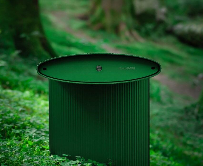
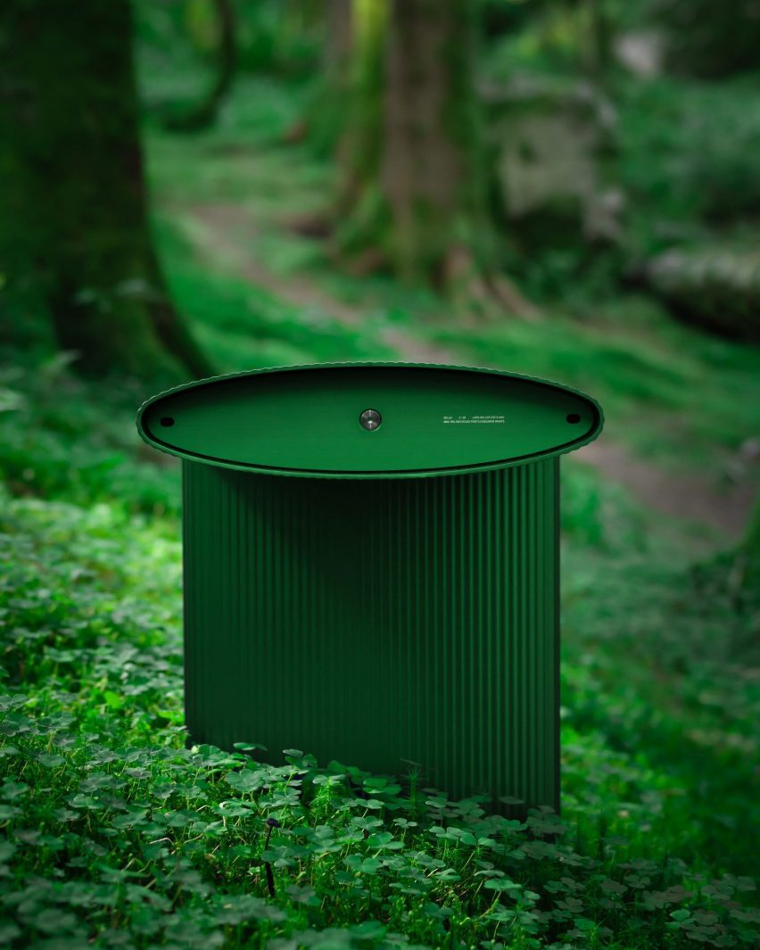
Bello! bench by Lars Beller Fjetland in the new forest green colour situated in a forest
Beller Fjetland and Hydro have introduced a new forest green colour for the bench

Beller Fjetland and Hydro recently presented the latest colourway of the bench in forest green during the Material Matters Fair during London Design Festival, where Beller Fjetland spoke to Dezeen about the collaboration.

He cited forest landscapes as a source of inspiration when creating the vibrant green seat.

“I was just walking in the forest and contemplating aluminium as a material, and I was thinking about having a light impact or a low footprint in nature,” Beller Fjetland said.

“Green just felt really fitting. It can also be a cliche, in a way, to think about green, but I think for us it really works.”

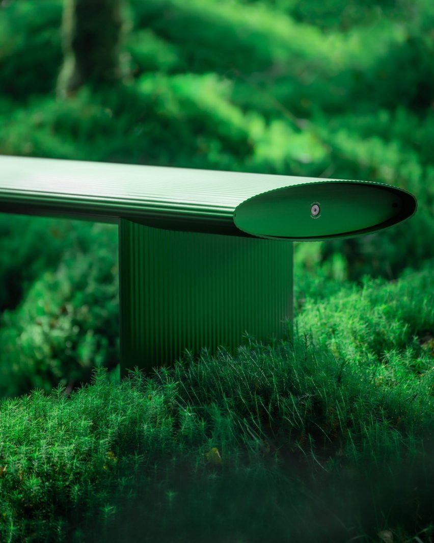
Close of the ridged finish of the Bello! bench by Lars Beller Fjetland
The bench can be modified to integrate tables, lamps or chargers for use in public places

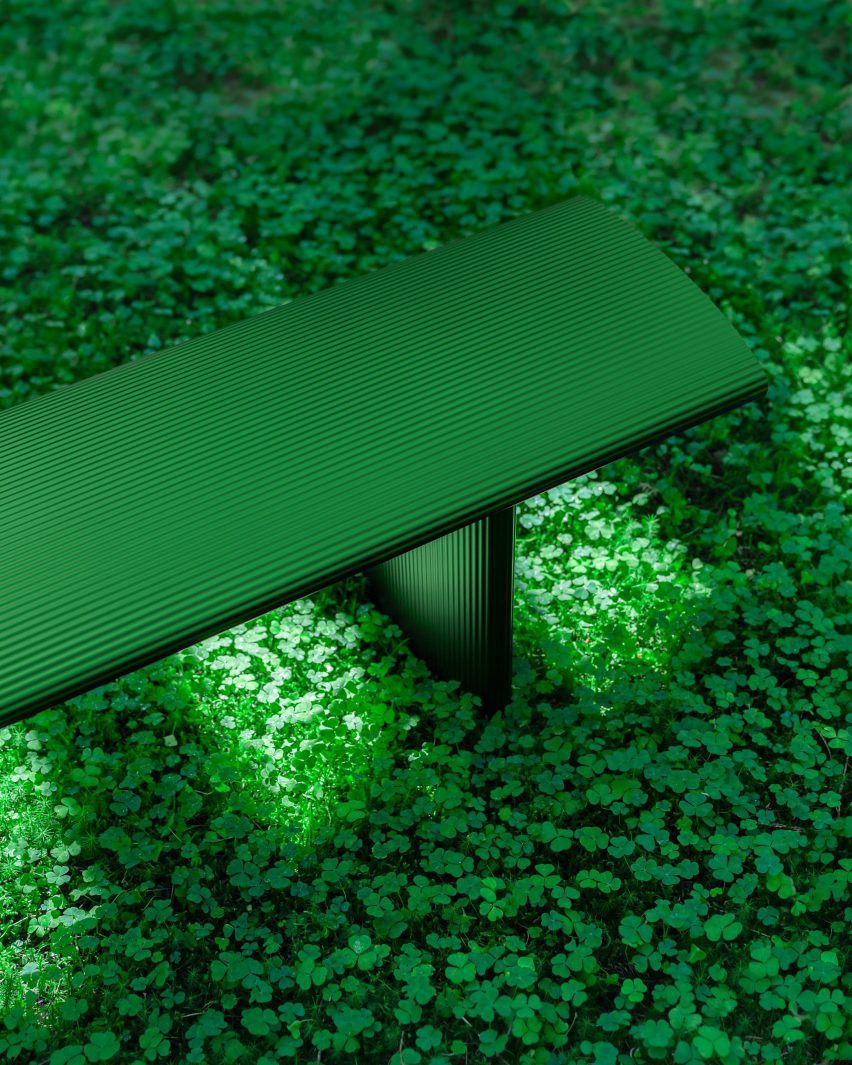
The bench is characterised by its ridged surface, which Beller Fjetland explained was informed by the shape of penne rigate pasta.

“One of the things we discussed was how can we make the concept of extrusions accessible for as many people as possible,” Beller Fjetland explained in the video.

“That’s where I started to think about the analogy with the pasta, because the manufacturing technique is surprisingly similar.”

The bench is manufactured using a similar extrusion process to how dried pasta shapes are formed. For the Bello! bench, molten metal is poured through a moulded opening to create a ridged surface.

“You’re pushing the material through a die, which creates a form and, visually, it looks like a penne rigate or a rigatoni pasta,” Beller Fjetland explained.

Close up of the ridged finish of the Bello! bench by Lars Beller Fjetland in the new forest green colour
The bench’s texture is informed by the shape of penne rigate pasta

The bench, which was designed for both inside and outdoor use, features a hard-wearing finish making it suitable for high-traffic settings such as public transportation hubs.

“What is interesting with aluminium is that it is a material that has an inherent value in itself, which kind of makes circularity way easier,” Beller Fjetland said. “There’s an incentive there to actually recycle the material, because it has a monetary value.”

“The beautiful thing is that the energy needed to recycle aluminium to make new material is very low. It makes me believe that recycled material doesn’t have to be a compromise,” he continued.

Partnership content

This video was produced by Dezeen for Shapes by Hydro as part of a partnership. Find out more about Dezeen partnership content here.

Reference

El Departamento designs glasses store as a “challenging visual exercise”
CategoriesInterior Design

El Departamento designs glasses store as a “challenging visual exercise”

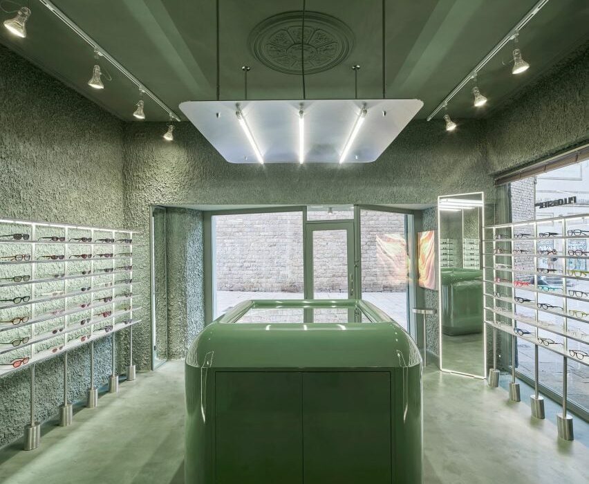
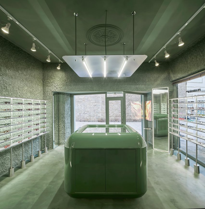
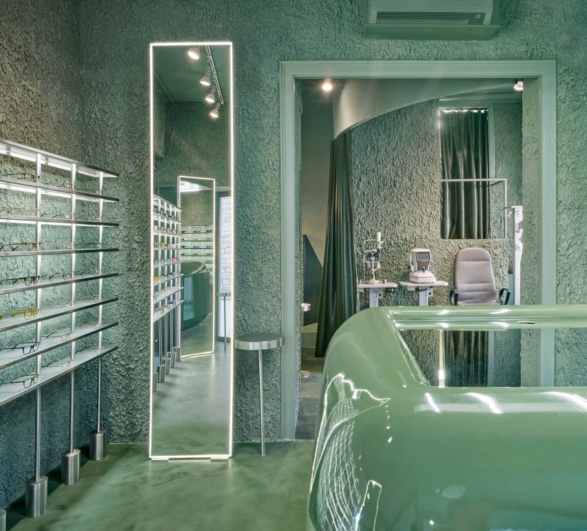
Slight variations in tone and texture differentiate surfaces inside the PJ Lobster glasses store in Barcelona, which Spanish interiors studio El Departamento has finished entirely in green.

The shop in the El Born district features walls, floors and stuccoed ceilings all covered in soft, tranquil tones of seafoam green, creating an immersive experience designed to challenge the eye.

Central counter inside PJ Lobster eyewear store
The PJ Lobster store in Barcelona is finished entirely in green

“The human eye is able to distinguish more different shades of green than any other colour,” El Departamento told Dezeen. “That’s because, deep inside us, we’re still hunters from the prehistoric era.”

“So that’s what we wanted to aim for here, not to hunt anything but to recover the challenging visual exercise of exploring a wide range of greens.”

Central mirrored counter inside eyewear store in Barcelona by El Departamento
A glossy counter stands at the centre of the shop

The practice was also influenced by Charles and Ray Eames’s short film Powers of Ten, which explores the scales of the universe.

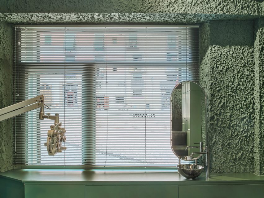
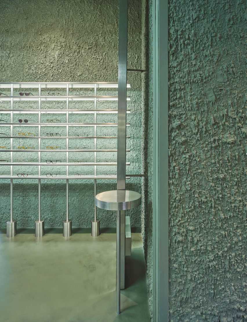
This informed El Departamento’s study of different textures within the store “from macro to micro”, from the small-grained velvety micro-cement on the floor to the rough textured plaster that was applied to the wall by hand to achieve the right level of thickness.

“We wanted to get to the last step, just before a texture becomes a topography,” the studio said. “It was done manually, carefully and step by step to achieve the perfect state.”

Eye examination room inside PJ Lobster eyewear store
The examination room is located at the rear of the store

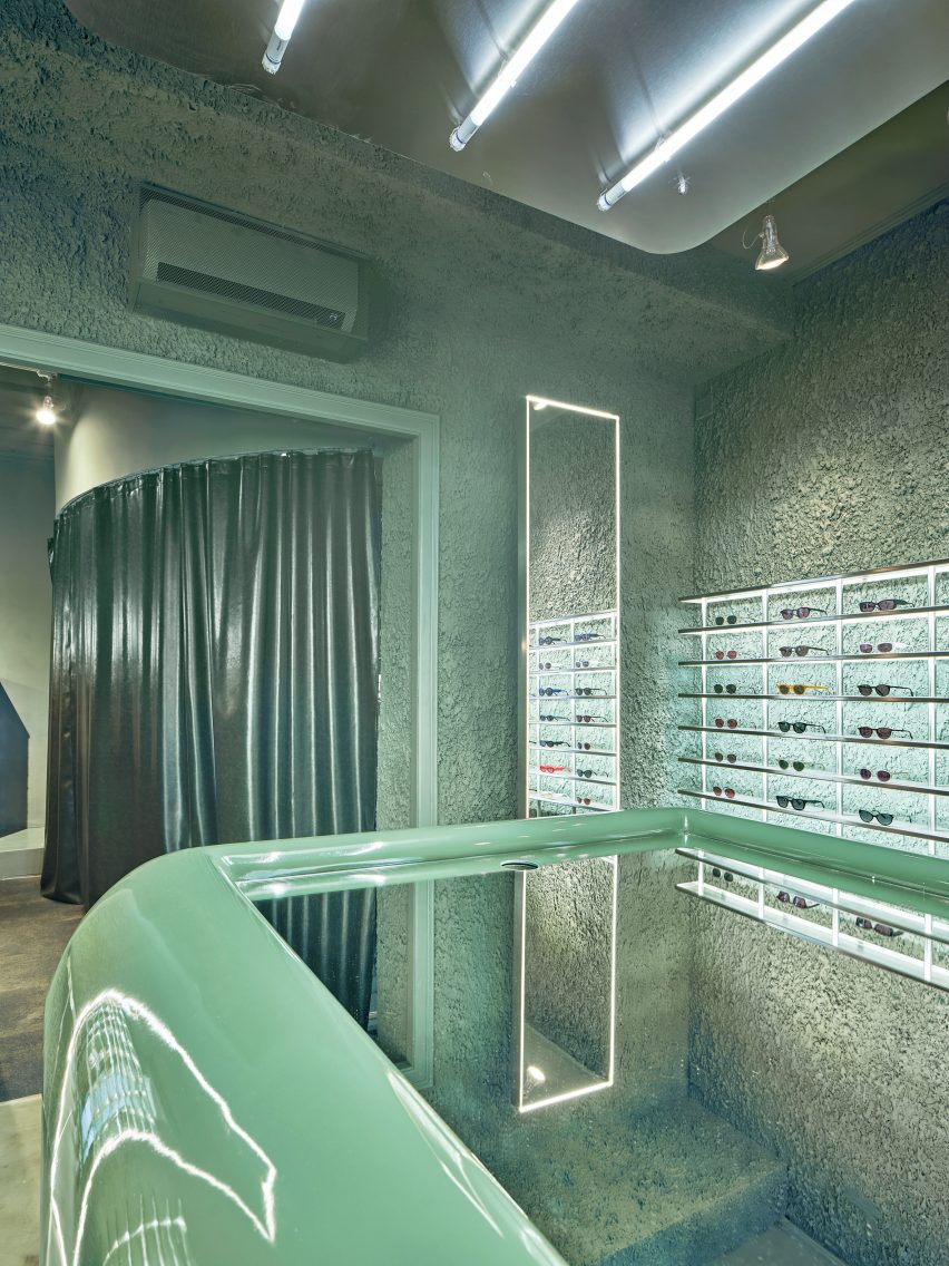
Stainless steel is another key player in the store, used to create banks of display shelving that frame each pair of glasses, with the soft sheen of the metal creating a striking contrast with the deliberately blobby texture of the walls behind.

Another textural juxtaposition is provided by the large, capsule-like counter at the heart of the store with its high-shine gloss finish and mirrored top.

Further back in the store is an area dedicated to visual examinations, delineated by a shiny pleather curtain and a softer carpeted floor.

The result, according to El Departamento, is “a vibrant space that swings between the soft and the hard, the rough and the velvety”.

Shelving inside eyewear store in Barcelona by El Departamento
Glasses are displayed on stainless steel shelves

The studio has been collaborating with PJ Lobster since the eyewear brand was founded in 2018 under the name Project Lobster, helping the company to expand from an online business into real-life stores.

With this latest outpost, El Departamento wanted to encapsulate the evolution of the brand and its products.

PJ Lobster eyewear store in Barcelona by El Departamento
The examination room is hidden behind a shiny pleather curtain

“We wanted to show that the brand has matured,” the studio said. “We tried to show somehow the organic evolution of the brand by giving this space a more technical and precise atmosphere, where the wide range of textures speaks of the precision levels of the products.”

Other monochrome eyewear stores include Lunettes Selection in Berlin, which is enveloped by mint-green floor-to-ceiling cabinets, and Melbourne’s Vision Studio where cool-toned industrial materials such as aluminium and concrete are paired with grey marble surfaces.

The photography is by José Hevia.

Reference

Mcmullan Studio designs garden room as “restorative haven”
CategoriesArchitecture

Mcmullan Studio designs garden room as “restorative haven”

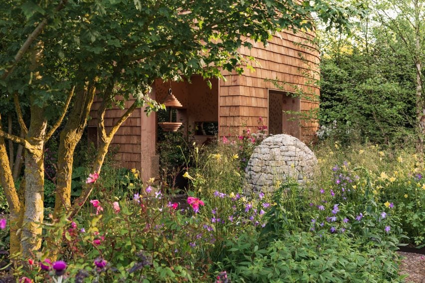
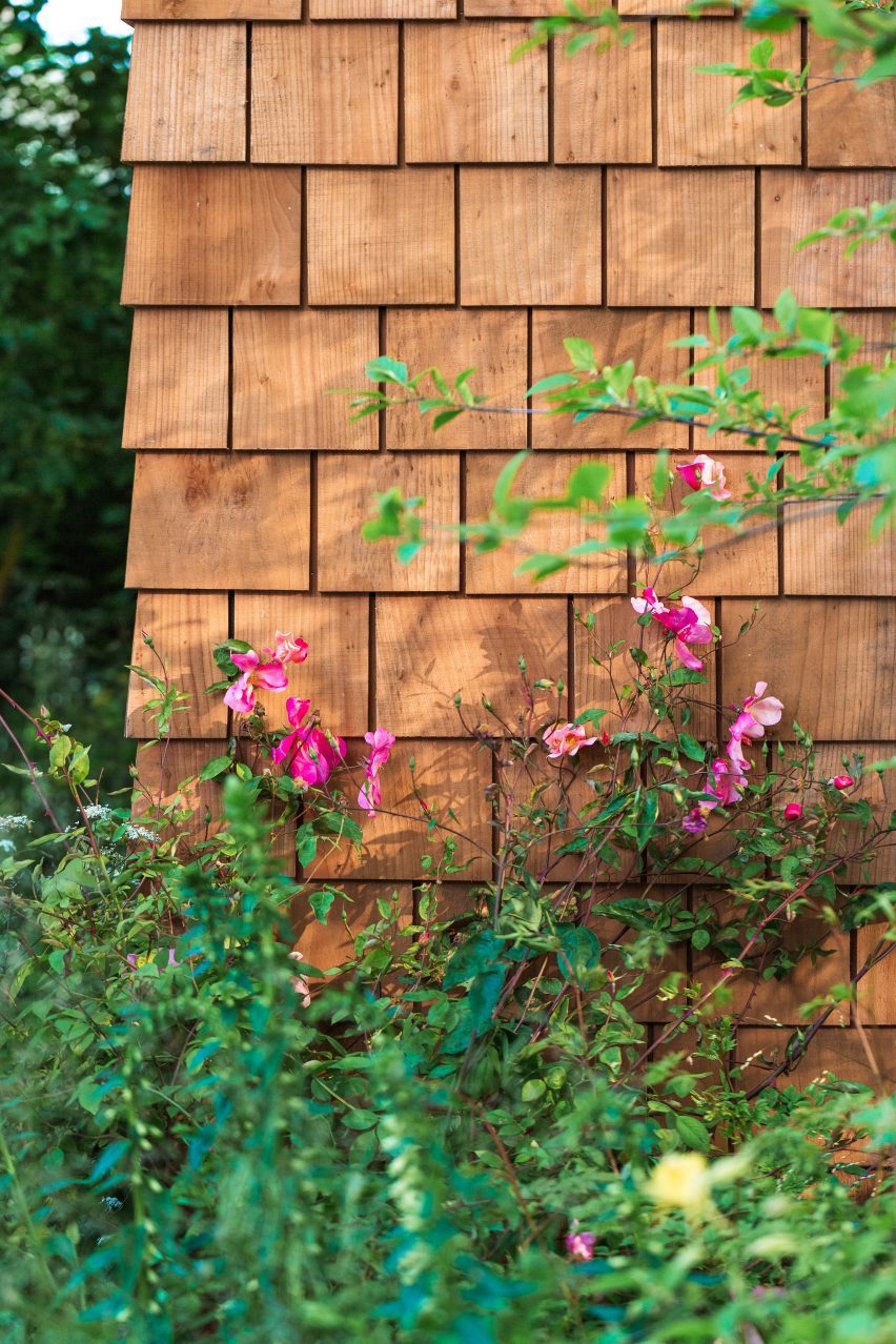
Wooden shingles clad this pod-like garden room by London practice Mcmullan Studio, which has been created for spinal-injury charity Horatio’s Garden.

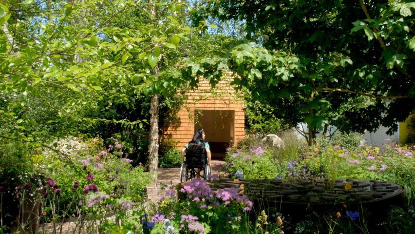
The small space was conceived by Mcmullan Studio as a “beautiful, immersive, restorative haven” for patients with spinal injuries at a hospital in Sheffield.

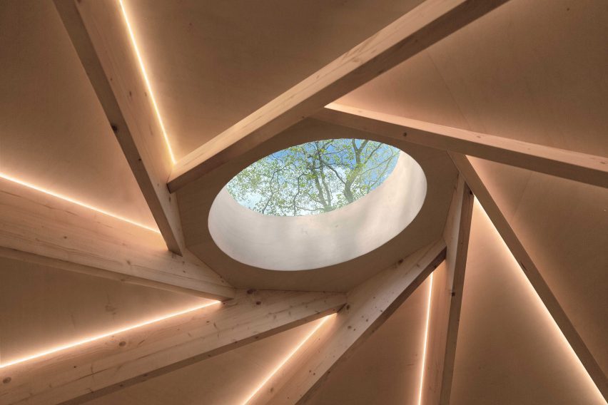
It has large openings and a central circular skylight to create a close connection to the outdoors, informed by the Japanese concept of forest bathing.

Garden room for Horatio's Garden by Mcmullan Studio
Mcmullan Studio has created a garden room for Horatio’s Garden

“Our design addresses the issue of monotony and lack of stimulation experienced by patients who are confined to staring at hospital ward ceilings, particularly those who cannot move or lift their heads due to spinal injuries,” director Andrew Mcmullan told Dezeen.

“We all know how good being in nature can make us feel,” he added. “We have known it for centuries. The sounds of the forest, the scent of the trees, the sunlight playing through the leaves, the fresh, clean air — these things give us a sense of comfort.”

The wooden pavilion was originally created for Horatio’s Garden‘s exhibit at the 2023 RHS Chelsea Flower Show in London, for which Mcmullan Studio worked with landscape designers Harris Bugg Studio.

Wooden shingles
It is clad in wooden shingles

The pavilion is now being transported to the Princess Spinal Injuries Centre in Sheffield as a permanent space for the charity, due to open in 2024.

The garden room’s skylight sits at the centre of a reciprocal roof – a twisting circle of interlocking beams that requires no central support, allowing the interior to be as open and unobstructed as possible.

“Apart from the technical aspects, the reciprocal frame also has intrinsic beauty. The nest-like character of this structure creates a visually intriguing and comforting atmosphere,” described Mcmullan.

“The structure frames a glazed rooflight that invites daylight into the space while providing ever-changing views of the overhanging tree canopies,” he added.

Reciprocal roof inside Horatio's Garden pod
It has a reciprocal roof

Wooden finishes have been used inside and out, with space for seating and a bed beneath the central skylight and a pattern of circular ceramics mounted on the walls.

Ease of transportation was central to the structure’s design, allowing it to be easily lifted as a single unit for its transportation from London to Sheffield.

Exterior of Garden room for Horatio's Garden by Mcmullan Studio at the 2023 RHS Chelsea Flower Show
It was on show at the 2023 RHS Chelsea Flower Show. Photo by Jim Stephenson

Once in place, it will be accompanied by two additional garden rooms and a larger communal garden building, all of which will also be designed by Mcmullan Studio.

Other garden rooms featured on Dezeen include an artichoke-shaped workspace by Studio Ben Allen and a writer’s shed by WT Architecture.

The photography is by Lucy Shergold unless stated otherwise.

Reference

Mistovia designs eclectic Warsaw apartment as “elaborate puzzle”
CategoriesInterior Design

Mistovia designs eclectic Warsaw apartment as “elaborate puzzle”

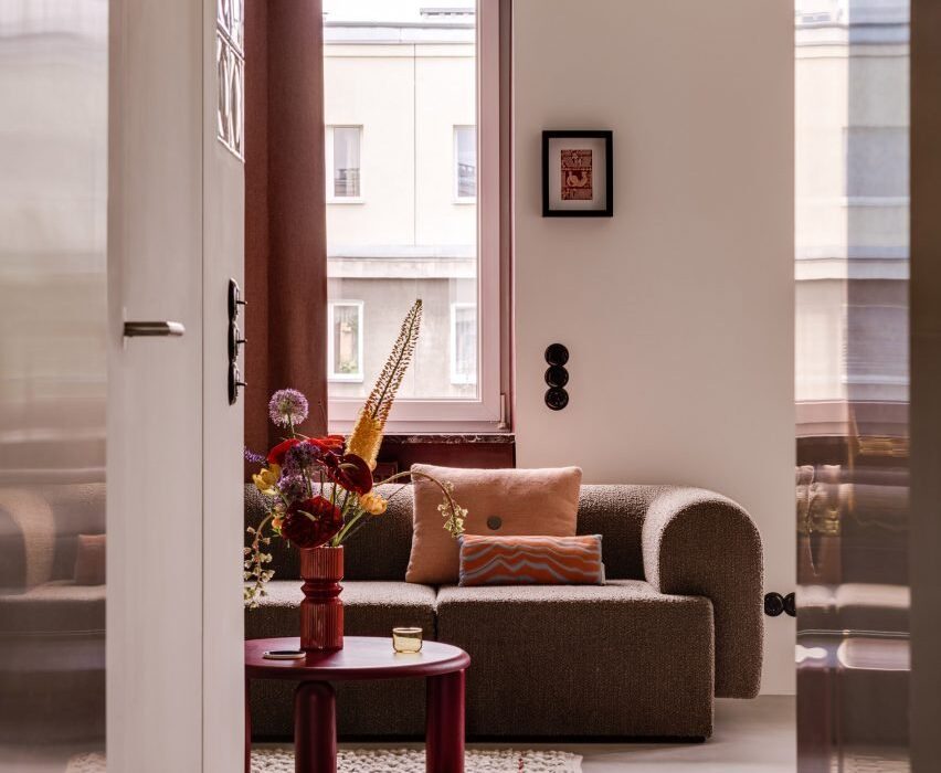
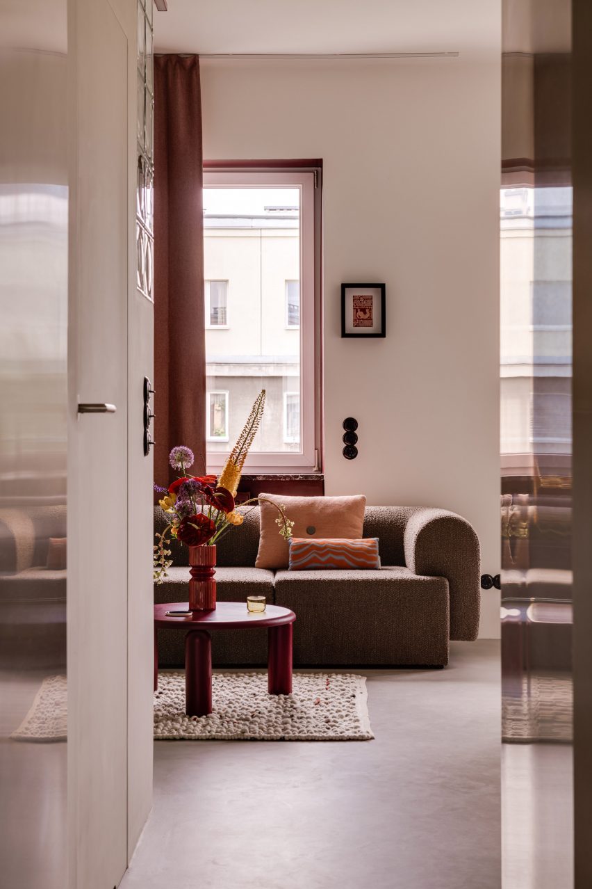
Walnut burl and terrazzo accents are combined with chunky statement furniture in this apartment in Warsaw, which Polish studio Mistovia has renovated for an art director and her pet dachshund.

Located in the city’s Praga Północ neighbourhood, the 45-square-metre flat is set within a 1950s estate designed by Polish architects Jerzy Gieysztor and Jerzy Kumelowski.

Interior of apartment renovation by Mistovia
The Warsaw apartment was renovated by Mistovia

Mistovia devised an eclectic material and colour palette when updating the interior, which the studio describes as an “elaborate puzzle” of contrasting patterns.

“The apartment is based on several dominant ‘cubes’,” said Mistovia founder Marcin Czopek. “Each of them has a different function, accentuated by various patterns through the use of veneer or colour.”

Swirly grey wood panels in the living space
Panels of swirly grey wood veneer feature in the living space

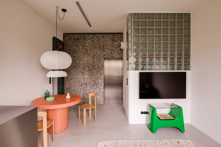
The living room is defined by a wall panelled in swirly grey wood veneer– originally designed by Memphis Group founder Ettore Sottsass for Alpi in the 1980s – while the bathroom is obscured behind a wall of glass blocks.

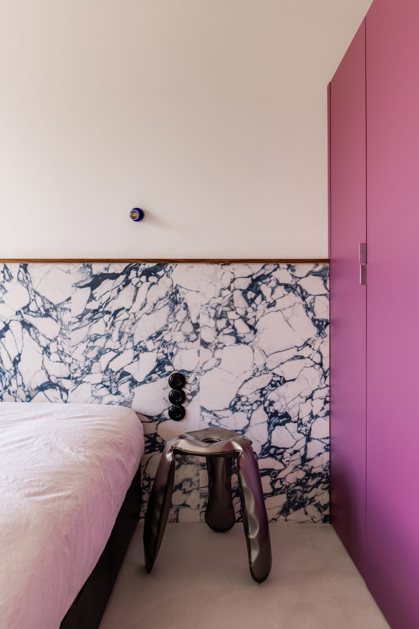
The kitchen is now connected to the lounge to create one open-plan space, filled with statement pieces including a misshapen vase and the molten-looking Plopp stool by Polish designer Oskar Zieta, set against the backdrop of floor-to-ceiling walnut-burl cabinets.

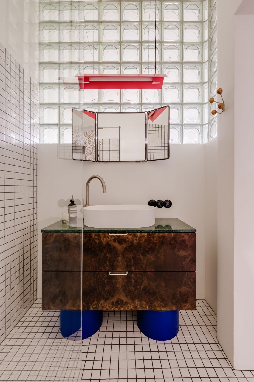
Tortoiseshell cabinet with cobalt legs in the bathroom
A tortoiseshell cabinet defines the bathroom

Terrazzo was used to form chunky black-and-white legs for the kitchen’s window-side breakfast bar as well as an entire burnt-orange table in the dining area.

“A muted base – bright, uniform micro cement flooring and walls with a delicate texture – allowed for the use of geometric forms, rich in interesting structures and bold patterns,” Czopek said.

Designed for an art director and her dog, the apartment features a similarly striking bathroom.

Here, gridded monochrome tiles and glass-brick walls are paired with a statement standalone sink, featuring squat cobalt-blue legs that support a tortoiseshell cabinet crowned by a triptych mirror.

Purple and marble accents designed by Mistovia
The single bedroom includes purple and marble accents

A purple wardrobe complements the rectilinear marble headboard in the apartment’s singular bedroom, adding to the boxy geometry of the home.

Also in Warsaw, Polish studio Projekt Praga incorporated mid-century elements and pops of colour into a dumpling restaurant while local firm Noke Architects referenced the high waters of Venice in a bar complete with sea-green floors and skirting tiles.

The photography is by Oni Studio


Reference

Plantea Estudio designs Veja store “to look like we didn’t do anything”
CategoriesInterior Design

Plantea Estudio designs Veja store “to look like we didn’t do anything”

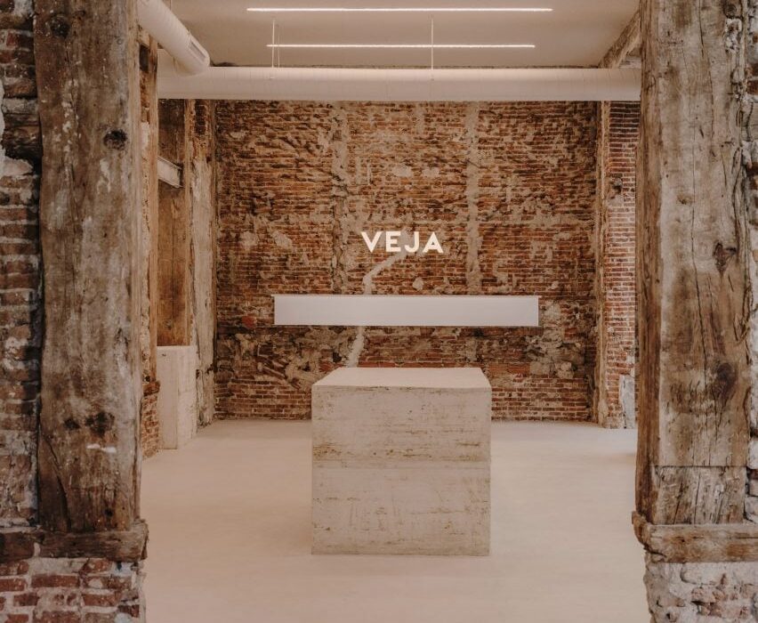
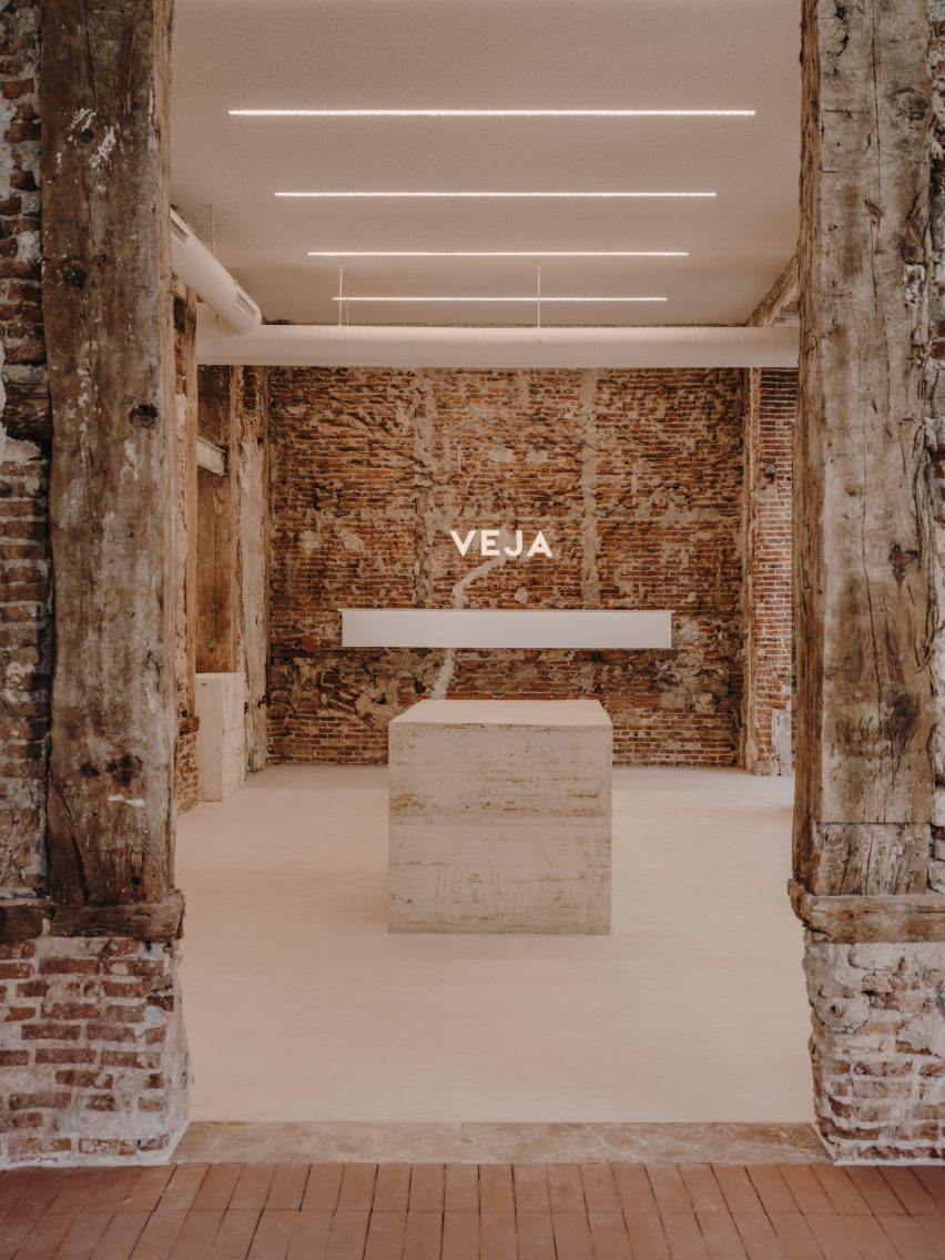
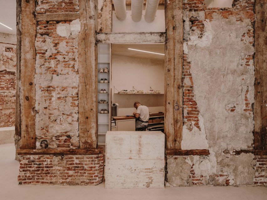
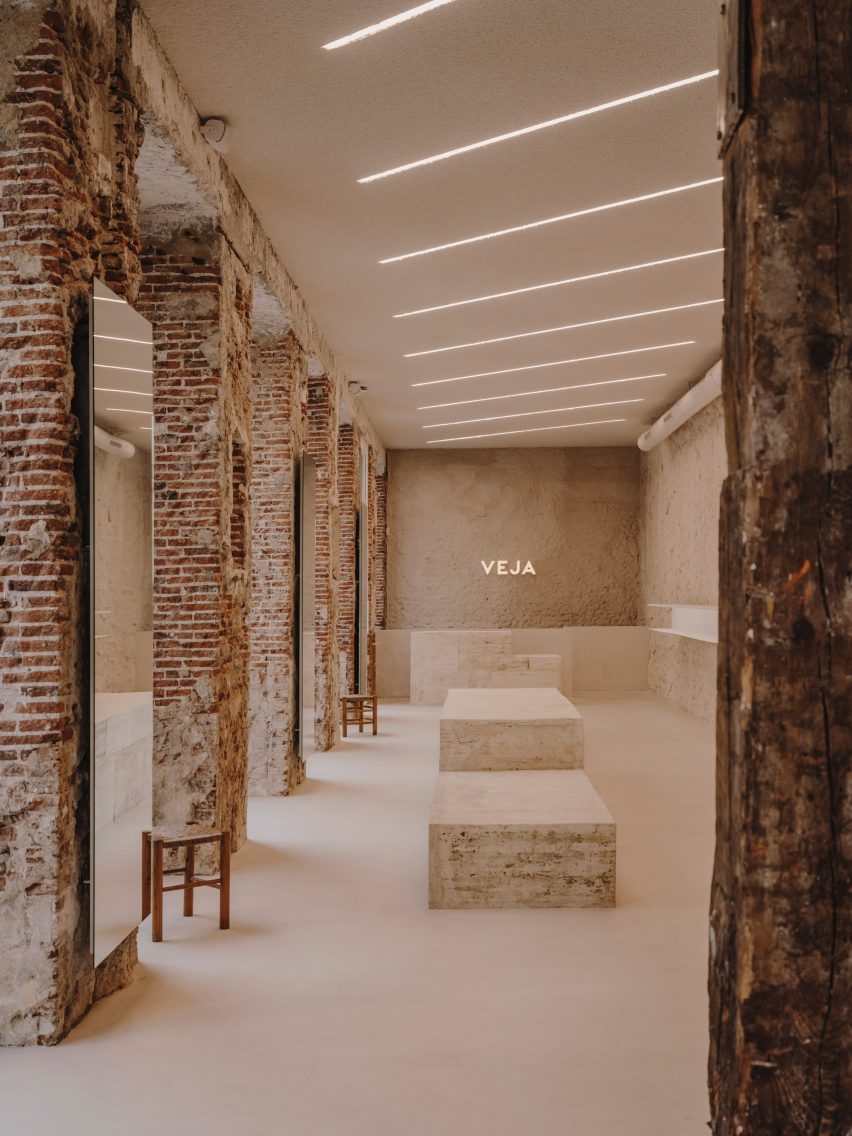
Raw finishes and brutalist interventions feature in footwear brand Veja‘s first dedicated shop in Madrid, complete with an in-house shoe repair workshop and interiors designed by local firm Plantea Estudio.

The retail space is housed in a building in the centre of Madrid, which has functioned as a shop, a restaurant and a bank office since its construction around the turn of the 20th century.

Entrance of Veja store in Madrid
Plantea Estudio has completed Veja’s Madrid store

By the time Veja took on the space, it had been stripped back to a shell and the team at Plantea Estudio immediately saw the potential in the raw, rough interior.

“That kind of brick structure brings you to the origins of architecture, to a temporal language,” the studio said. “It comes from always and goes forever, it will never be out of time or fashion.”

“For us, there was no better option than to work from there, to leave it exposed.”

Concrete display plinths in shoe store by Plantea Estudio
Monolithic concrete blocks serve as displays

The decision to work with the existing architecture rather than introducing unnecessary new materials also mirrors Veja’s idea of having in-house repair shop, encouraging customers to fix rather than simply replace their run-down trainers.

However, the shell required much more active intervention from Plantea Estudio than the store’s unfinished interior suggests.

Mirror reflecting image of man working on shoe repair in Veja store in Madrid
The shop also houses a repair workshop

“We had to work a lot for it to look like we didn’t do anything,” the studio said. “We brought the structure to its best version.”

Plantea Estudio made the windows taller and brought the internal openings back up to their original height. The internal walls were cleaned up, exposing more of the brick and removing countless additions and coverings that remained from previous fitouts.

Main retail space in shoe shop designed by Plantea Estudio
Graphic strip lights are integrated into the ceiling

Where the materials were low-quality and couldn’t be removed, Plantea Estudio spray-coated the walls in a mix of plaster and Perlite mortar, “which accentuates the irregularity of the base”.

The floor was coated uniformly with cement mortar, creating a continuous surface throughout the interior while providing a contrast with the chunky cobblestones laid in the entrance hall.

The building’s functional pipes and pinewood supports were left exposed while the ceilings are clad in roughly textured sound insulation and embedded with graphic rows of strip lighting.

To form display areas, benches and counters, Plantea Estudio opted for stepped blocks of concrete – a favourite material of the brutalist movement – cast in situ using moulds made from old wooden boards.

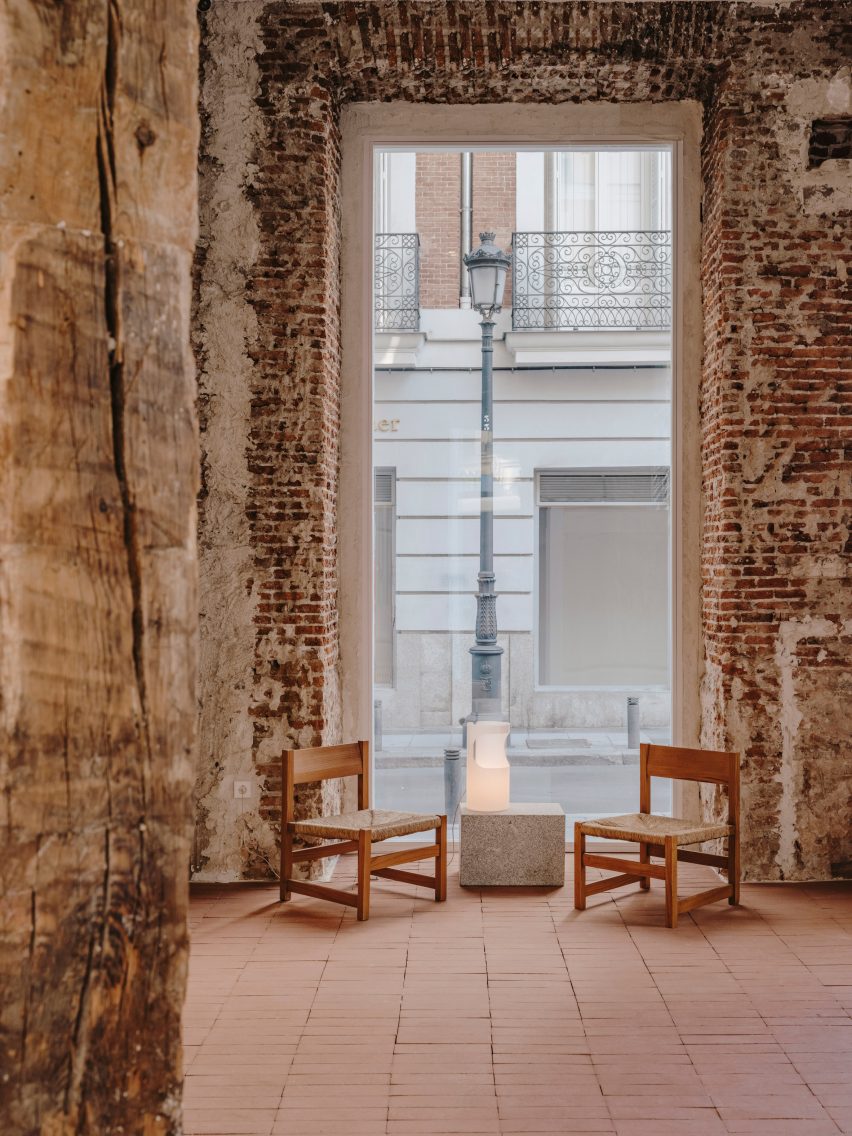
Two chairs in front of a tall window in Veja store in Madrid
Vintage Joaquim Belsa armchairs were used to furnish the space

As a clear contrast to the heavy solidity of these pieces, the store’s shelving is made of folded sheets of white-lacquered steel.

“The main collection is displayed on these steel shelves, illuminated by a light that’s brighter than the general light in the store,” the studio said.

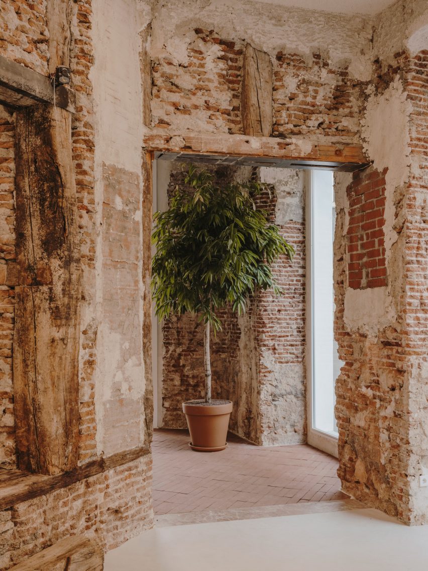
Ficus tree near entrance of shoe shop designed by Plantea Estudio
A ficus tree stands near the entrance

The space is accentuated by large-format mirrors, applied to the building’s brick pillars, where Plantea Estudio says they work at “multiplying the cross views”.

A large ficus tree marks the entrance while furniture was sourced from vintage design retailer Fenix Originals and includes 1960s armchairs by Catalan designer Joaquim Belsa.

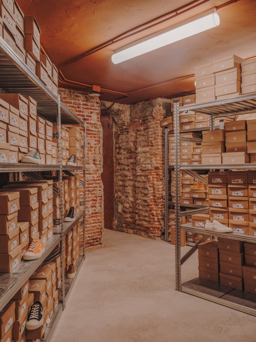
Storage shelves holding shoes in Veja store in Madrid
Simple metal shelves provide additional storage

Plantea Estudio, which was founded by brothers Luis and Lorenzo Gil in 2008, has completed a number of interior projects in the Spanish capital.

Among them is the neutral-toned Hermosilla restaurant, as well as a bar serving wine and small plates, where a cosy red “cave” room is hidden behind the main dining space.

The photography is by Salva López.


Reference

Keiji Ashizawa designs “home-like” The Conran Shop in Hillside Terrace
CategoriesInterior Design

Keiji Ashizawa designs “home-like” The Conran Shop in Hillside Terrace

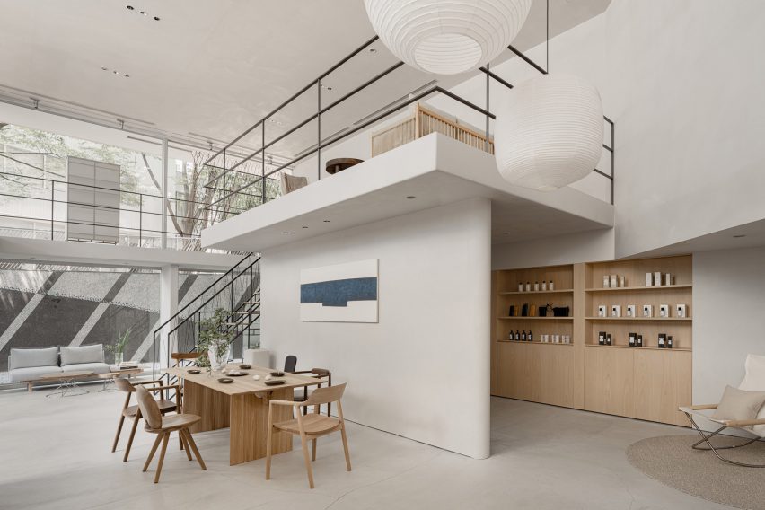
Designer Keiji Ashizawa has devised the interiors of The Conran Shop Daikanyama in Tokyo, which is located inside a building by architect Fumihiko Maki and spotlights products from Japan and Asia.

The latest outpost from British retailer The Conran Shop is located in the modernist Hillside Terrace in Daikanyama, a quiet area close to the Tokyo city centre.

The complex was designed by Pritzker Prize-winner Maki and constructed between 1967 and 1992.

Tokyo Conran Shop in Daikanyama
The Conran Shop Daikanyama was designed to resemble someone’s home

Ashizawa aimed to take the existing architecture of the two-storey building into consideration when designing the interior of The Conran Shop.

“Since the existing space had great potential, we knew that the work had to be put into elevating what was already there – thinking about the proportions of the space, the dry area and so on,” he told Dezeen.

“Although it is inside a well-known architecture, there were elements where we thought we could bring change to the inside.”

Interior of The Conran Shop Daikanyama
It features pieces by Japanese and Asian designers

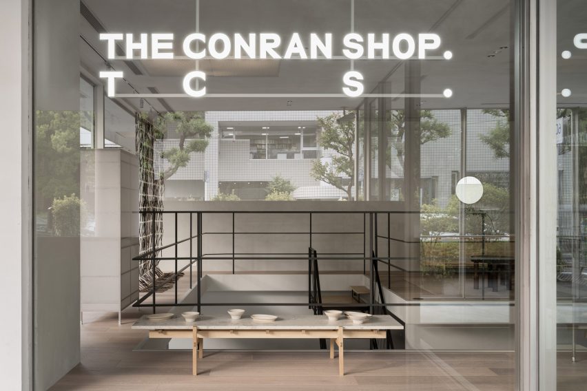
These changes included turning one glass section into a solid wall.

“Glass walls were used extensively as part of the architectural concept so that the store space could be viewed through the layers of glass,” Ashizawa said.

“While building the store, we decided that there wouldn’t be a problem in making a section of the glass wall become a solid wall, considering its serenity as a space and its relationship with the street.”

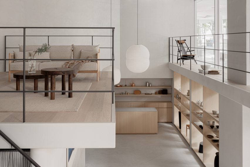
Mezzanine in Conran store
A mezzanine showcases a sofa and other living room furniture

The designer created the 200-square-metre store to look like someone’s home, in a nod to the peaceful nature of the surrounding area. It features a large atrium on the ground floor, connecting it to an adjoining courtyard.

“Daikanyama is a very calm neighbourhood in Tokyo, where we wished to design a store where people could feel relaxed and away from the stimulation of the city,” Ashizawa said.

“We intended to create a space for people to stay for a long period of time and feel the space.”

Exterior of Tokyo interior store
The store is located in the iconic Hillside Terrace complex

The interior design was also based on The Conran Shop’s three keywords – plain, simple and useful – CEO of The Conran Shop Japan Shinichiro Nakahara told Dezeen.

The store’s product selection also places a special focus on Japanese and Asian design.

“Specifically for The Conran Shop Daikanyama, the selections were focused on objects from Asia, including Japan,” Nakahara said.

“The process of [founder] Terence [Conran] travelling around the world, finding and buying items in each place by himself, has not changed,” he added. “Many of the objects selected by the Conran team in Japan have a sense of craftsmanship.”

“We created the space by imagining a situation in which such objects would be displayed alongside each other. For example, the details of the objects are reflected in the interior design.”

Staircase in Japanese interior store
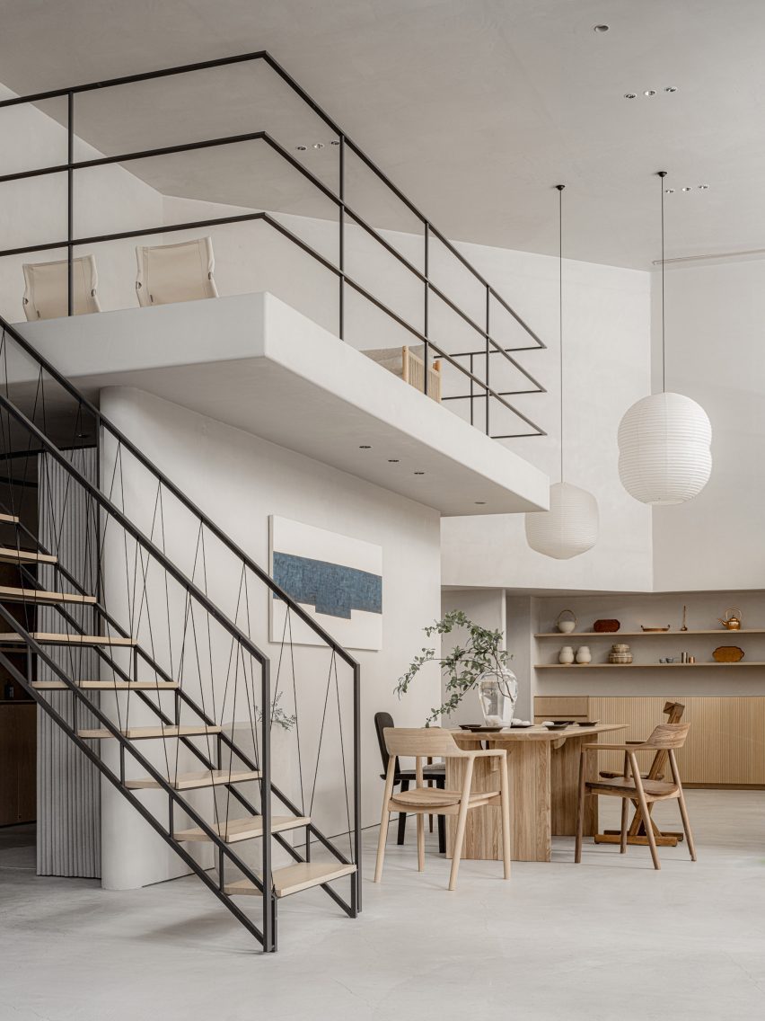
It features a staircase with a handrail made from black paper cords

The interior uses materials that are common in Japan including concrete, steel, wood, plaster, Japanese stone and paper.

“The use of Japanese paper in interior design is an element that is distinctively Japanese,” Ashizawa explained.

“Shoji screens are an important element in creating a Japanese-style room but I realize that they can also be well used in both functional and aesthetic ways in a modern space.”

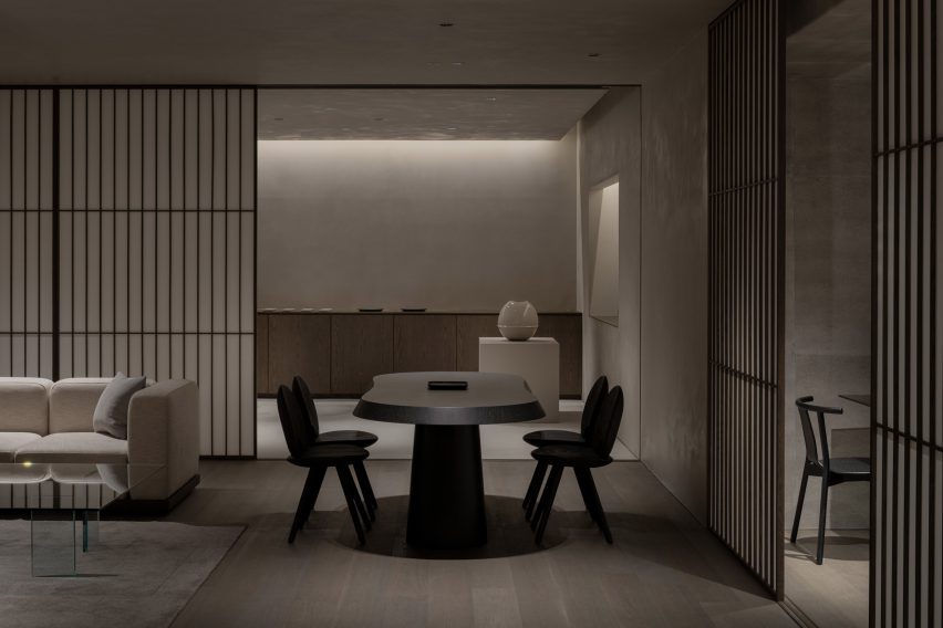
Basement floor in Conran Shop Daikanyama
Concrete walls and shoji screens were used for the interior

The studio also used Japanese paper that had been dyed in a grey hue as wallpaper to give the space a “soft and contemporary feel.”

“Since we weren’t building an actual house but rather a home-like Conran store, the materials were thoughtfully instrumented to achieve a balance,” Ashizawa said.

The ground floor of the store holds furniture, homeware and apparel, and also has a mezzanine floor that is accessible by a staircase featuring a handrail made from black paper cords.

Gallery-like interior by Keiji Ashizawa
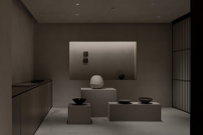
A gallery-like space is located on the basement floor

Ashizawa designed the basement floor, which functions both as an additional shopping area and a gallery space, to have a calmer atmosphere.

“Filled with natural light, the ground floor uses colours that bring grandeur and a sense of calmness,” he said.

“The basement floor is toned to create a more private feeling. We respected the natural colours of the materials as much as possible, while also considering the harmony with the objects on display and in the gallery.”

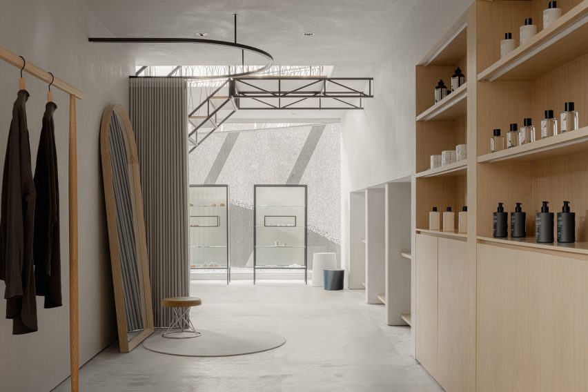
Clothes in Conran Shop Tokyo
The store has a neutral colour palette and wooden details

The Conran Shop Daikanyama also has an adjoining bar where visitors can enjoy teas such as sencha and macha.

Ashizawa has previously worked on a number of other projects in Tokyo, including the Bellustar Tokyo “hotel in the sky” and the Hiroo Residence.

Reference