Eight pared-back and elegant Scandinavian kitchen designs
CategoriesInterior Design

Eight pared-back and elegant Scandinavian kitchen designs

For our latest lookbook, we’ve collected eight peaceful kitchens with Scandinavian design details, in homes including a chalet in Belgium and a forest retreat in Sweden.

Plenty of wood and stone, minimalist details and practical solutions make these eight interiors from across the world good examples of Scandinavian kitchen design.

As well as being stylish, the pared-down interiors make for functional, clutter-free kitchens where it is easy to find and use all the items needed to make a meal in a relaxing atmosphere.

This is the latest in our lookbooks series, which provides visual inspiration from Dezeen’s archive. For more inspiration see previous lookbooks featuring outdoor showers, interiors with exposed services and Milanese homes with eye-catching material palettes.


Minimal interiors of forest retreat designed by Norm Architects
Photo by Jonas Bjerre-Poulsen

Forest Retreat, Sweden, by Norm Architects

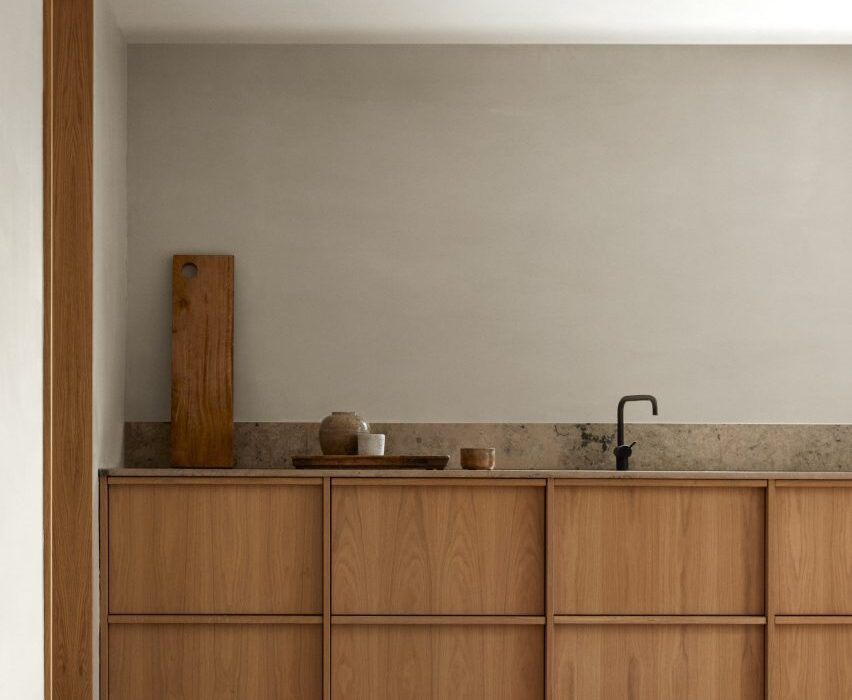
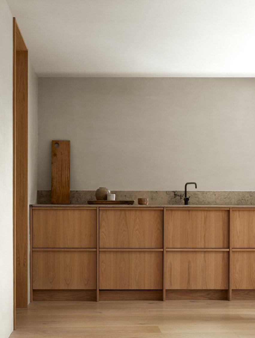
Architecture studio Norm Architects designed this kitchen in a traditional Swedish timber cabin using oakwood to create a warm feel.

Its discrete handleless low-lying cupboards have plenty of storage space, while a stone splashback is both decorative and functional. A black tap adds graphic contrast.

Find out more about Forest Retreat ›


Kitchen and living room in Villa E by CF Møller Architects
Photo by Julian Weyer

Villa E, Denmark, by CF Møller Architects

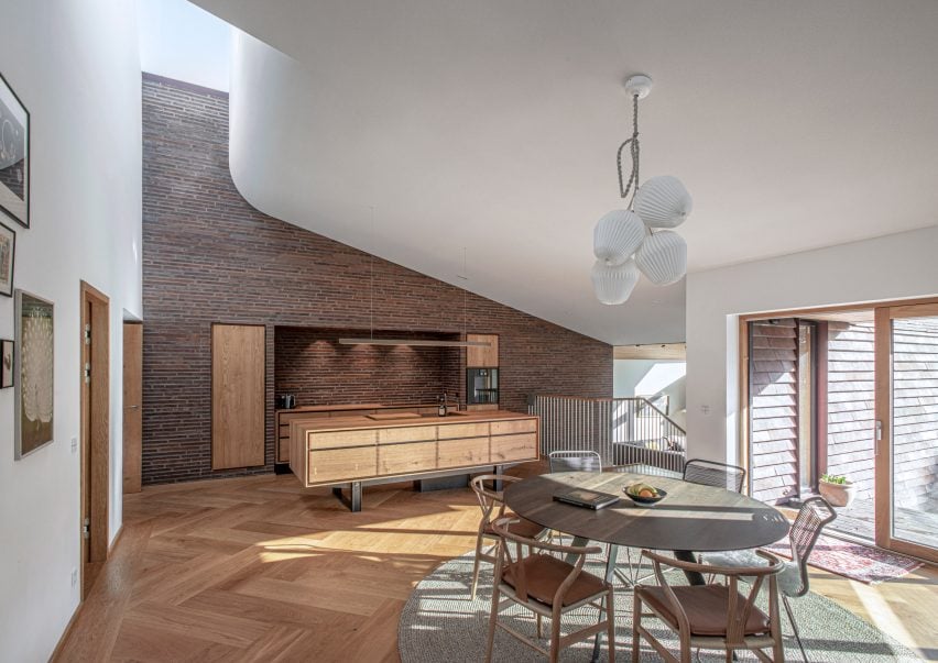
A carved lightwell brings light into this sundrenched kitchen in a villa in Denmark. The brick tiles that clad the kitchen wall give the room a tactile feeling.

The floor of the open-plan kitchen is made from herringbone parquet, a style often seen in living room that here gives the kitchen area a more luxurious feel.

Find out more about Villa E ›


Kitchen by Westblom Krasse Arkitektkontor
Photo by Jesper Westblom

Stockholm apartment, Sweden, by Westblom Krasse Arkitektkontor

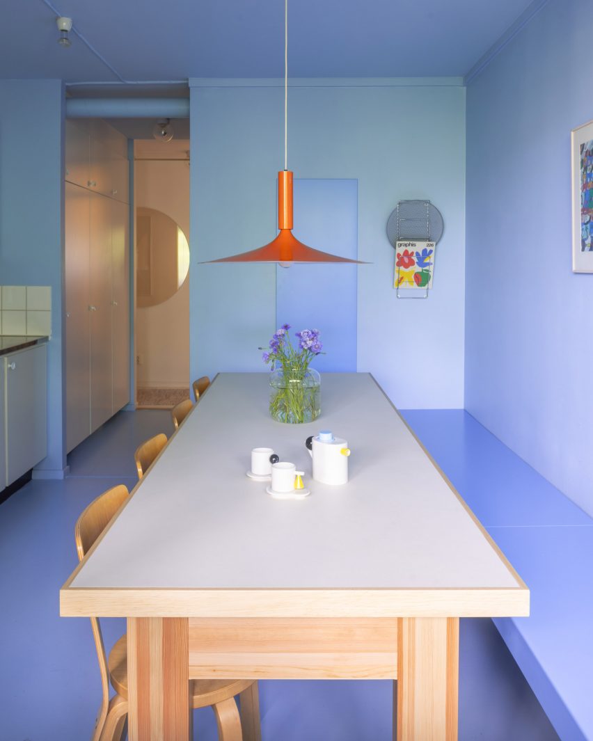
This Stockholm flat might be the exception that proves the rule when it comes to Scandinavian kitchen design – that it has to be designed using discrete colours and materials.

Instead, local studio Westblom Krasse Arkitektkontor chose a pale lilac hue for the kitchen, which nevertheless features wooden details in the form of a table and chairs. An orange pendant light contrasts nicely with the monochrome kitchen.

Find out more about Stockholm apartment ›


Vipp V2 kitchen
Photo by Anders Schønnemann

Vipp Pencil Factory, Denmark, by Vipp

Danish homeware brand Vipp used one of its own modular kitchens for Vipp Pencil Factory, a pop-up supper club in Copenhagen.

The dark-brown wood, commonly used in Scandinavian kitchens, contrasts against the grey concrete walls of the former pencil factory and is complimented by glass cabinets and a marble benchtop.

Find out more about Vipp Pencil Factory ›


Habima Square apartment by Maayan Zusman
Photo by Itay Benit

Habima Square apartment, Israel, by Maayan Zusman

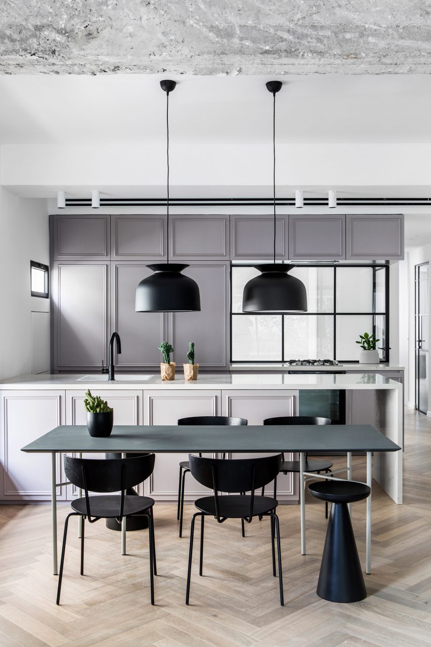
Local designer Maayan Zusman renovated this apartment in Tel Aviv using plenty of Scandinavian brands and details, including lamps by Gubi and chairs by Ferm Living.

A pared-back colour palette and Crittal windows that let the light in also give the kitchen a slightly industrial feel.

Find out more about Stockholm apartment ›


House BL, Belgium
Photo by Jeroen Verrecht

Chalet, Belgium, by Graux & Baeyens Architecten

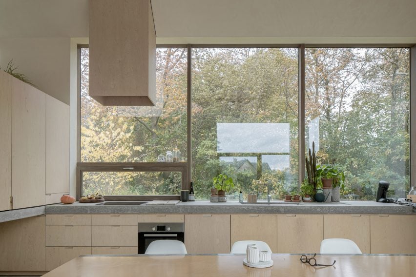
This 1960s chalet in Belgium features light-filled living spaces, including a wood-and-stone kitchen that has plenty of storage spaces and large windows that open up towards a lush garden.

Even the kitchen fan has a plywood cover to ensure it matches the rest of the space.

Find out more about the Belgian chalet ›


Saltviga House by Kolman Boye Architects
Photo by Johan Dehlin

Saltviga House, Norway, by Kolman Boye Architects

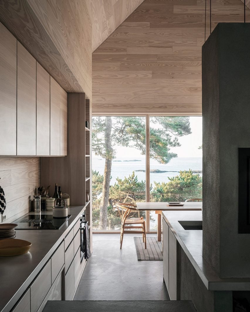
Nicknamed the “house of offcuts” because it has a facade made of offcuts of wooden flooring material, this weekend retreat in Lillesand, Norway, has a kitchen with a view.

The Scandinavian kitchen design is underlined by the use of Danish furniture brand Carl Hansen & Søn’s classic CH24 Wishbone chairs, which have been placed around a wooden dining table.

Find out more about Saltviga House ›


The Hat House by Tina Bergman
Photo by Jim Stephenson

The Hat House, Sweden, by Tina Bergman

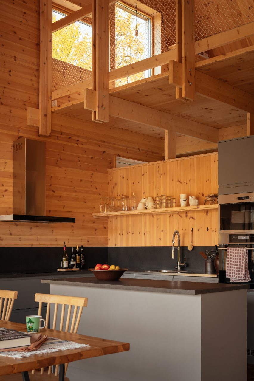
Located in the forested landscape of Tänndalen in western Sweden, The Hat House has a traditional Swedish kitchen with an entirely wood-lined interior.

To save space, a small floating shelf was used to provide open storage, rather than cupboards. Contrasting dark black and grey colours were used for the splashback as well as the kitchen island.

Find out more about The Hat House ›

This is the latest in our lookbooks series, which provides visual inspiration from Dezeen’s archive. For more inspiration see previous lookbooks featuring outdoor showers, interiors with exposed services and Milanese homes with eye-catching material palettes.

Reference

Matter designs recyclable plastic-free remembrance poppy
CategoriesSustainable News

Matter designs recyclable plastic-free remembrance poppy

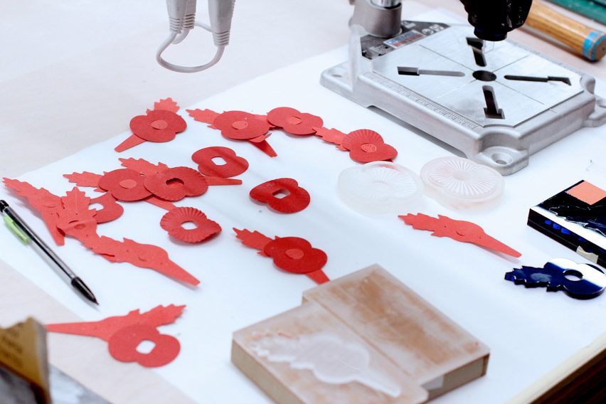
Design consultancy Matter has redesigned the Royal British Legion remembrance poppy to be created entirely of paper made from coffee cup waste and recycled wood fibres, the first change in the flower’s design for 28 years.

According to Matter, the paper poppy will reduce carbon emissions by 40 per cent compared to the previous design, which had a paper leaf and petals held in place by a plastic stem and black circular centre.

Remembrance day paper poppies by Matter
The remembrance poppy has been redesigned to be made entirely from paper

Matter’s redesign aims to remain true to the original recognisable poppy but replaces all plastic elements with paper. The entire poppy can be recycled at home via household recycling collections.

It has been designed to be produced on a high-speed assembly line without the need for adhesives, with crease details on the paper’s surface that help to give the poppy a 3D shape.

The plastic-free poppy can be fastened by a pin or inserted into button holes and aims to encourage more people to support this year’s Poppy Appeal, an annual charity campaign organised by the Royal British Legion that raises money for veterans and their families experiencing injury, hardship or bereavement.

Red and green bespoke paper for the remembrance poppy
The paper was made from recycled materials

It will be available alongside remaining stocks of the previous poppy in the lead-up to Remembrance Day on 11 November.

“We didn’t want to simply reduce single-use plastic but to eliminate it completely, and we didn’t want to replace plastic parts with expensive and complicated bio-based plastics,” said Matter director John Macdonald.

“Paper offered a single-material solution that could be easily recycled, as well as offering a bold, elegant approach for the next generation of poppies.”

Matter created the poppy in collaboration with paper manufacturer James Cropper, which has made the paper for remembrance poppies since 1978.

James Cropper developed two bespoke papers for the new design, Poppy Green and Poppy Red, made from a combination of 50 per cent recycled fibres from the production of coffee cups and 50 per cent from recycled wood fibre.

Dismantled paper poppies on a desk
The plastic-free poppy will be available for this year’s Poppy Appeal

“We’re proud to have designed a plastic-free poppy that will enable people to show their support for our Armed Forces community in a more sustainable way,” said Gary Ryan, executive director at The Royal British Legion.

“Matter has played a fundamental role in reducing the environmental impact of the new poppy whilst maintaining the iconic poppy design that the public can wear with pride.”

Earlier this year, former Apple designer Jony Ive revealed his redesign of the Red Nose Day nose for UK charity Comic Relief, which saw the iconic clown-style nose reimagined as a foldable paper sphere. In Australia, start-up Hoopsy has created a pregnancy test made from 99 per cent paper.

The photography is courtesy of Matter.

Reference

Álvaro Siza designs mural for Space Copenhagen Porto restaurant
CategoriesInterior Design

Álvaro Siza designs mural for Space Copenhagen Porto restaurant

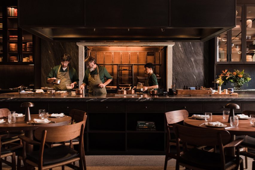
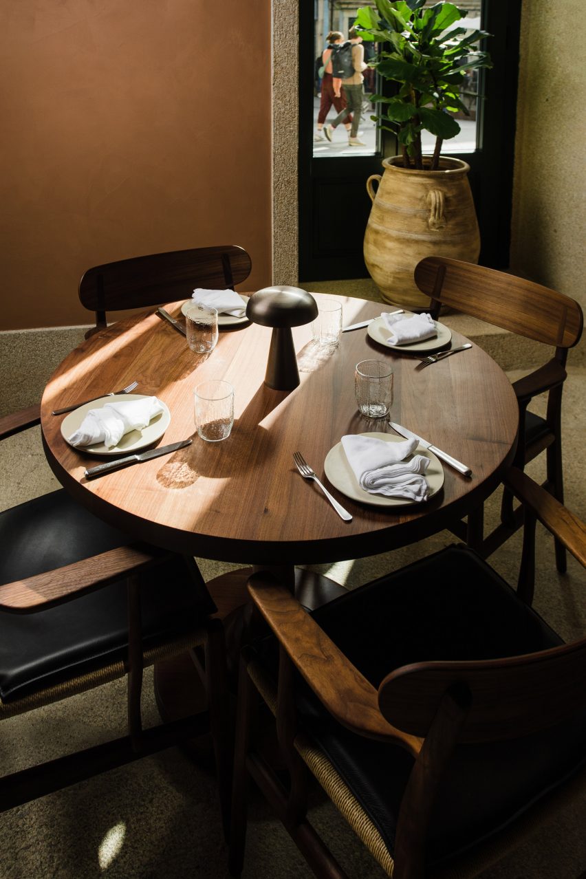
A ceramic mural by Álvaro Siza is at the heart of this rustic restaurant interior in Porto, Portugal, designed by Space Copenhagen.

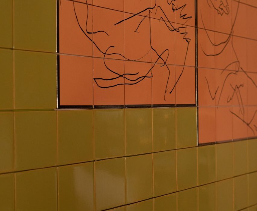
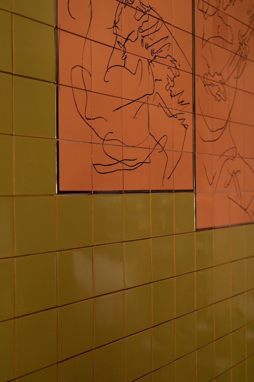
Located in a renovated 16th-century building in Porto’s Largo de São Domingos area, the Cozinha das Flores restaurant features a mural designed by the Pritzker Architecture Prize-winning Portuguese architect.

Hand-painted mural designed by Álvaro Siza
Pritzker Prize-winner Álvaro Siza designed the mural

“Whilst Siza has created many pieces of non-architectural works worldwide, he had never created something of this kind for his hometown of Porto,” Space Copenhagen founders Peter Bundgaard Rützou and Signe Bindslev Henriksen told Dezeen.

“Given Siza’s prominence and contribution to Porto life, having him manifest this into a mural depicting his perception of the city was beyond our expectations.”

Open kitchen in Cozinha das Flores restaurant
Cozinha das Flores is located in a 16th-century building in Porto, Portugal

Sketches of figures playing musical instruments stand out in black against contrasting lime green and burnt orange tiles, which was completed by ceramic tile company Viuva Lamego.

“When asked to imagine a piece for Cozinha das Flores, he [Siza] depicted the recurrent theme of musicians, representing time well spent; fun, relaxed moments; a medley of emotions; and people joined by arts and culture,” said the studio.  

“The specialist craftspeople used a traditional technique of hand painting the scaled-up facsimile of a sketched image from paper onto the tiles, painted dot by dot.”

Plastered wall and wooden table in Porto restaurant interior
The studio used green and orange tones throughout the interior

The green and orange hues of the tiles appear elsewhere in the interior. Green cushions top the built-in oak seating bench that runs along the wall below the mural, while doorways were painted dark green.

The colour palette was unified with coppery plastered walls and warm lighting. 

“We introduced plastered walls in earthy warm tones and a conscious use of light to enhance and saturate,” the studio explained. 

Green door and wooden table in Porto restaurant
The focus on the local area is reflected in the studio’s design choices

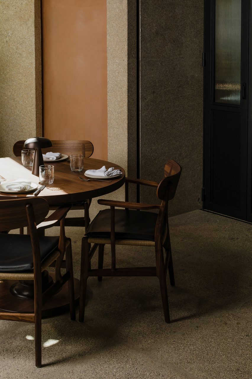
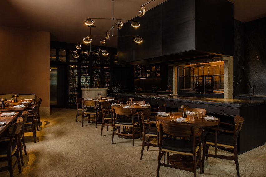
Natural materials like stone, marble, brass and oak were used throughout the interior. The seating was arranged around an open kitchen, which has dark grey quartzite stone surfaces and wooden cabinets

Under the direction of Lisbon-born chef Nuno Mendes, the restaurant aims to celebrate the ingredients, wine and culture of northern Portugal.

Wooden tables and chairs in Porto restaurant
Space Copenhagen’s approach involved collaborations with local craftspeople

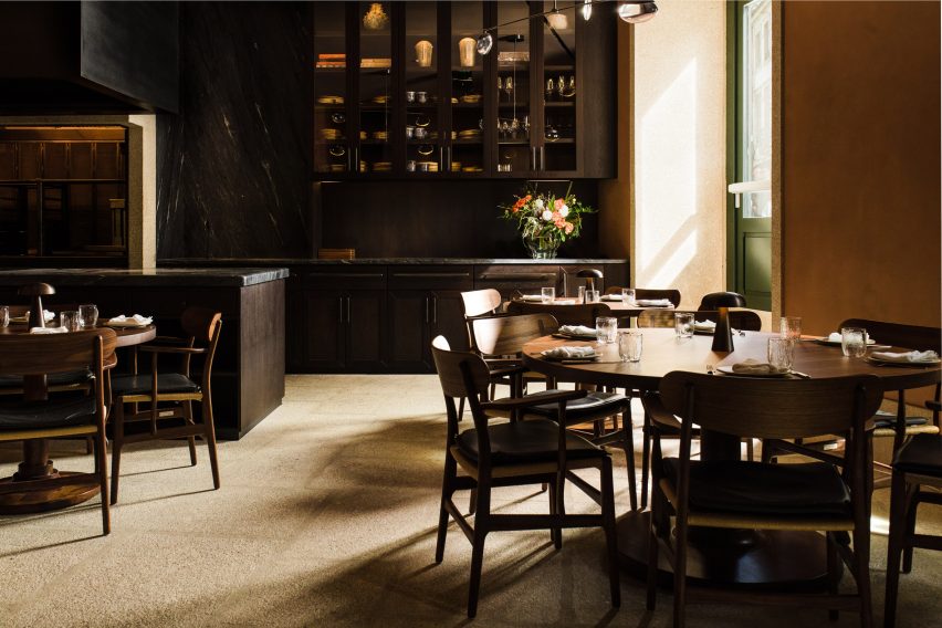
The warm, earthy hues chosen by Space Copenhagen were informed by the restaurant’s food, as well as the building and area in which it is located. 

“The historical building structure that frames the restaurant and bar provided the base palette, which we have built upon,” said Space Copenhagen. 

“Aged stone and dark-stained wood were our existing starting points. All elements are associated with the city of Porto”, they added. 

Round wooden table in Porto restaurant
Materials were sourced from across Portugal

Throughout the project, the studio prioritised regional materials and collaborated with a variety of local architects, artists and craftspeople. Woodworkers from northern Portugal crafted the dark wood furnishings and fittings.  

“All stone, wood, metal and tiling has been sourced from regions in Portugal using a proximity criterion as priority,” said the studio. “All the millwork has been made by local artisans.”

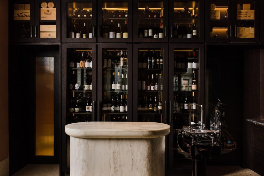
Wine cabinet in Space Copenhagen restaurant design
Natural materials like stone, marble, brass and oak feature throughout the interior

Cozinha das Flores, and its adjacent 12-seater bar, Flôr, are amongst five heritage buildings that make up the Largo project, set to open later this year. 

Other local projects by Siza include his 1963 Boa Nova Tea House, which was transformed into a seafood restaurant for Portuguese chef Rui Paula in 2014. Previous projects by Space Copenhagen include the renovation of the Mammertsberg restaurant and hotel in Switzerland and the Blueness restaurant in Antwerp.

The photography is by Luís Moreira and Matilde Cunha. 

Reference

Sheft Farrace designs loft in LA’s art deco Eastern Columbia building
CategoriesInterior Design

Sheft Farrace designs loft in LA’s art deco Eastern Columbia building

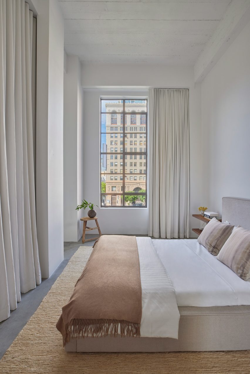
Architecture studio Sheft Farrace has renovated a loft apartment in Los Angeles’ iconic Eastern Columbia building, subtly incorporating colours from the art deco exterior into the minimalist interiors.

The studio renovated the loft while drawing details from the exterior of the 13-storey building in Downtown Los Angeles, known for its highly detailed turquoise facade and clock tower, which was designed by Claud Beelman and completed in 1930.

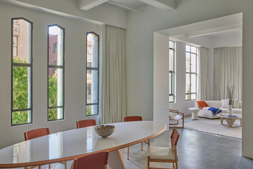
Dining room and living room
Sheft Farrace chose to divide up the loft, yet retain visual connections through framed openings

It was converted into lofts in 2006, and local studio Sheft Farrace was recently tasked with renovating one of the condos for a young creative from Kazakhstan.

“Uninspired by the unit’s original 2006 layout and interiors, the owner wanted it to feel like a brand new space — so Sheft Farrace approached it as a blank canvas,” said the studio, led by Alex Sheft and John Farrace.

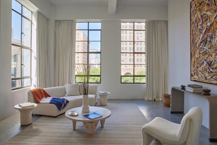
Living room
The pared-down decor contrasts the building’s colourful exterior

The apartment has tall ceilings, and their height is accentuated by the building’s long narrow windows and floor-to-ceiling drapery.

Rather than keep the open floor plan, the studio chose to divide up the space to help define areas for different functions.

Bedroom with tall ceiling and drapery
The ceiling height is accentuated by tall windows and floor-to-ceiling drapery

However, the visual connections between the kitchen and dining room, and the living room and bedroom, are retained by large framed openings used in place of doors.

“Every space has its own character, based on what time of day it is and how the natural light comes in through the full-height windows,” said Sheft Farrace.

For the most part, the home is decorated in a much more pared-down style than the building’s opulent exterior, primarily with soft neutral hues and sparse furnishings.

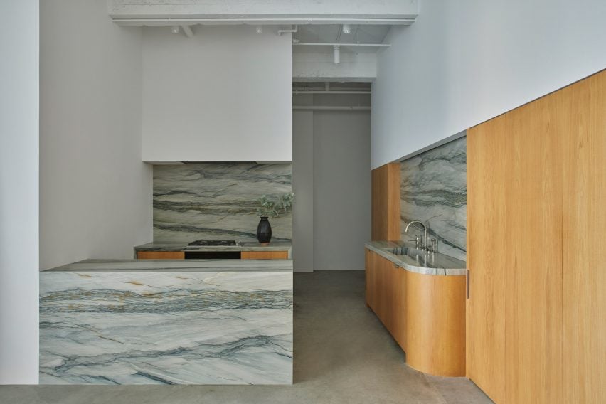
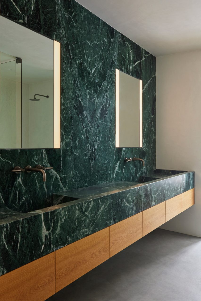
Certain material choices in the kitchen and bathroom tie much more closely to the colourful facades, including white oak, Verde Aver marble, and Florida Brush quartzite to echo the orange, green and blue exterior tiles.

Kitchen with white oak and Florida Brush quartzite
Materials like white oak and Florida Brush quartzite in the kitchen nod to the art deco exterior

The curved corners of the kitchen counters and elongated cabinet hardware also evoke 1930s design.

“Upon first glance, it’s stylistically in stark contrast with the historical building that it’s within, but throughout the space are subtle nods to the art deco exterior and ultimately, it feels like it belongs,” Sheft Farrace said. “We felt honored to have contributed a small chapter to the long and storied history of a Los Angeles landmark.”

Bathroom lined with Verde Aver marble
In the bathroom, Verde Aver marble was also chosen to reference the historic tiled facades

Downtown Los Angeles has dramatically transformed from a no-go zone to a popular and thriving neighbourhood over the past 20 years.

This shift is partially thanks to the opening of cultural institutions like Frank Gehry’s Walt Disney Concert Hall and Diller Scofidio + Renfro’s The Broad museum, as well as a spate of high-end hotels.

The photography is by Yoshihiro Makino.

Reference

Elly Ward designs own restaurant Edit using reclaimed materials
CategoriesSustainable News

Elly Ward designs own restaurant Edit using reclaimed materials

Architect and restauranteur Elly Ward has opened the low-impact restaurant Edit in London, drawing inspiration from its vegan, minimal-waste menu to create an interior filled with reused and recycled materials.

Ward collaborated with her husband Joe Morris of architecture studio Morris + Company on the project, which was designed using low-intervention methods.

“It’s been designed to be as circular as possible, which is the whole philosophy of the restaurant,” she told Dezeen.

Interior of Edit restaurant
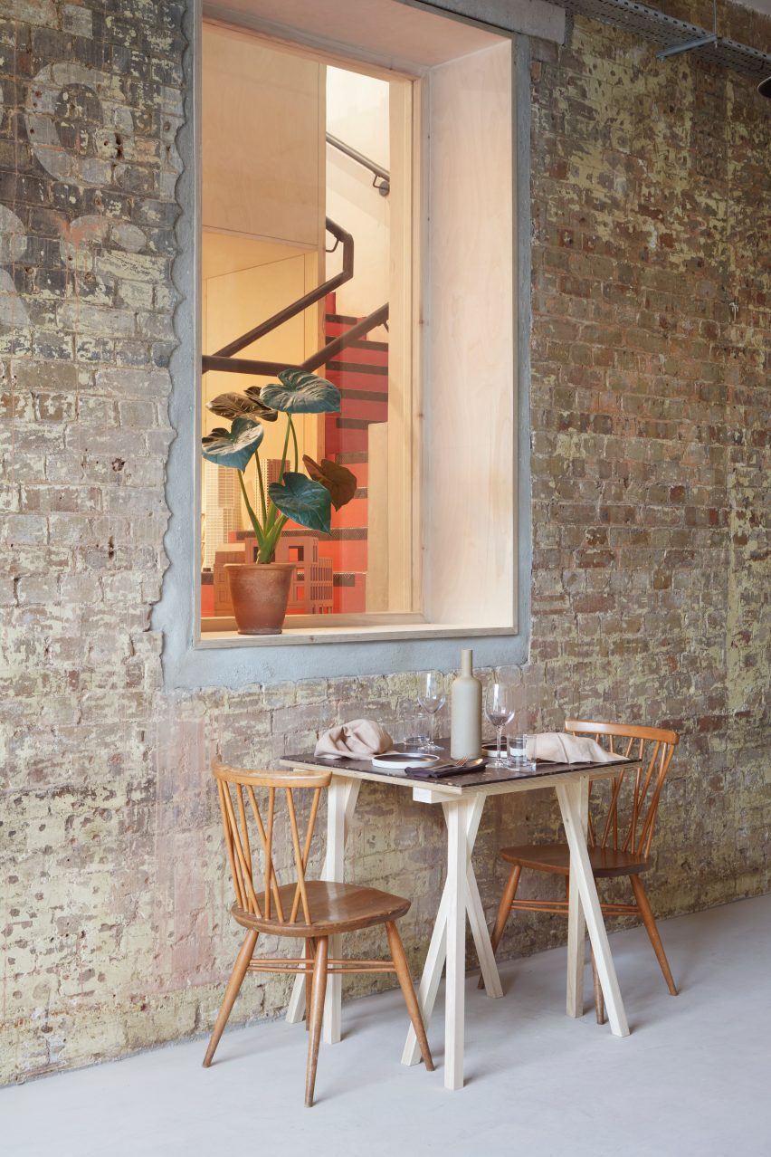
The Edit restaurant features exposed brick walls

Edit is located in a former factory and warehouse building in east London and connected to the adjacent Morris + Company architecture office.

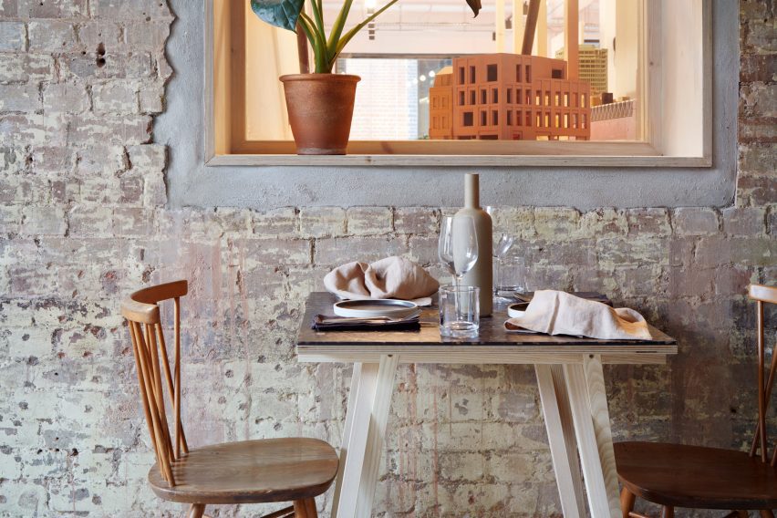
Visitors to the restaurant can view the studio’s models through a large glass door, adding a decorative touch to the space.

This door and a window into the office were two of the main changes Ward made to the existing space, which she has transformed using recycled and reclaimed materials.

Window in Edit restaurant
A window connects the interior with the adjacent architecture studio

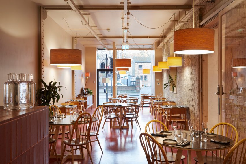
The building’s brick walls – including a former exterior wall that still features old advertising text – were retained alongside the warehouse’s cast-iron columns and beams, forming the structural fabric of the 197-square-metre restaurant.

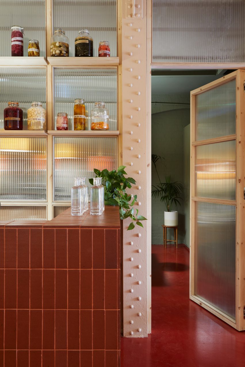
Ward added lightweight screen partitions that slot between the existing structures, including a wall made from wood and recycled polycarbonate that divides the main dining area from a smaller private dining room.

Polycarbonate wall with wooden shelves
A polycarbonate screen with wood shelving divides the space

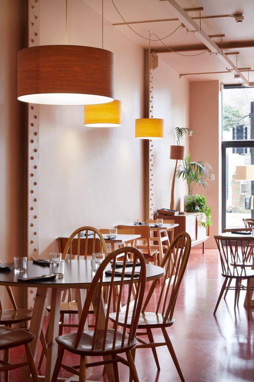
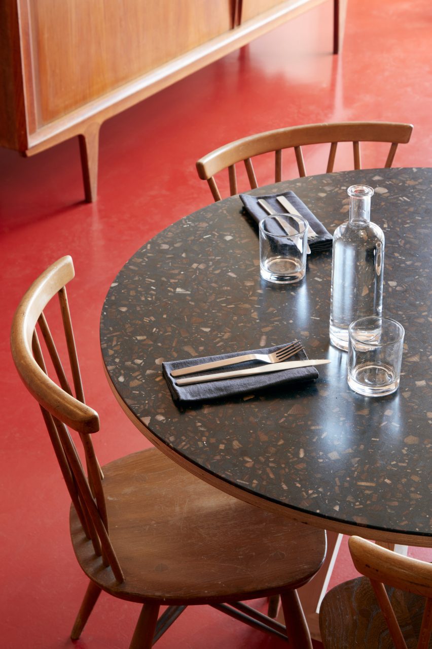
A warm red floor, made from screed topped with a water-based resin, matches the floor in the architecture office next door and contrasts the textured brick wall that Ward and Morris painstakingly unveiled from underneath layers of paint.

At the rear of the space, the duo clad a wall in salvaged maroon terracotta tiles, which merge into the bar counter. These were among the many recycled materials that Ward used for the project.

“I call them my wonky tiles because they’re like the wonky fruit and wonky veg of the industry that gets thrown away because it’s not a perfect carrot,” she said.

Furniture in Edit restaurant
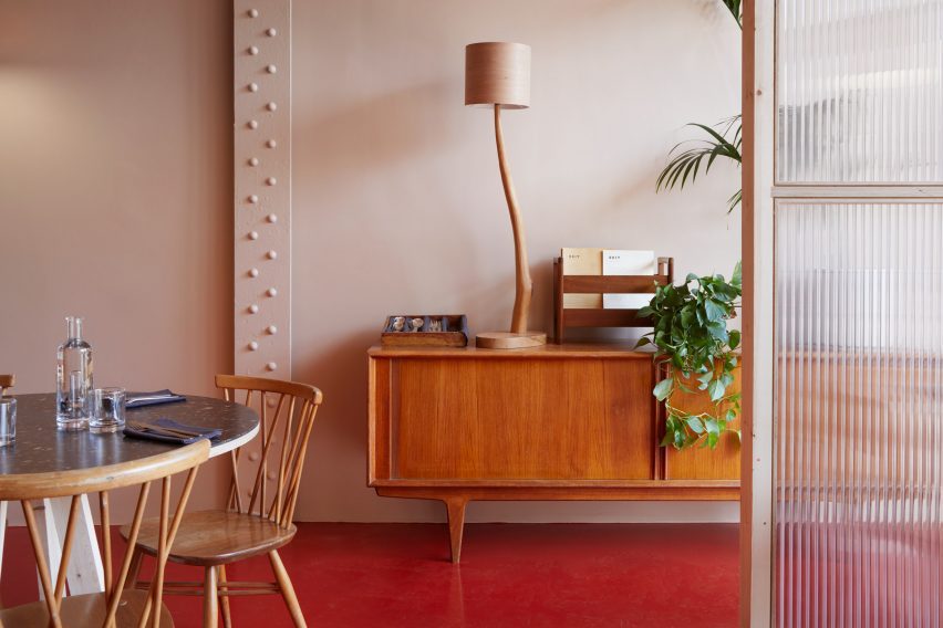
Elly Ward filled the restaurant with vintage furniture

The architect also reused the copper from an existing bar in the restaurant, which now clads the sinks in the bathroom.

“It’s all about diverting waste from waste streams,” Ward said.

“When you’re building something new, you have to get things,” she added. “If you can’t buy recycled or reclaimed, you have to look for renewable materials, things that would have otherwise gone to waste but you’ve made into something else.”

“It’s almost a checklist of ‘how circular can you be?'”

Wooden chairs in London restaurant
A red floor creates a warm atmosphere

Ward also sourced vintage Scandinavian school chairs to provide seating in the restaurant and complemented them with her grandparents’ wooden chairs and vintage Ercol seats.

The accompanying tables have tops made by British company Foresso using waste wood chips set in a plant-based resin, creating an effect similar to wooden terrazzo and adding textural interest to the room.

Resin and wood tabletop
The tabletops are made from recycled wood and resin

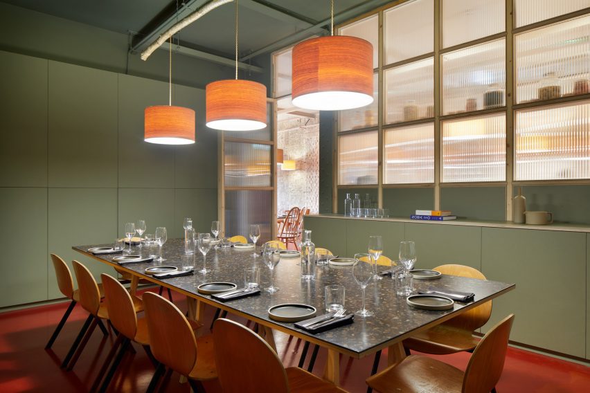
The lighting in the space was handmade by British artist Peter Lanyon using wood salvaged from trees that were trimmed back in a local woodland in Devon. Pieces include a “chandelier” made from a piece of hazelwood with hanging lampshades made from cherrywood veneer.

Throughout the restaurant, the colour palette adds a sense of warmth. While the main room has a red hue, Ward chose a calming green colour for the smaller private dining room.

Private dining room in Edit restaurant by Elly Ward
Lamps made from wood decorate the private dining room

“We started with the red; it’s obviously such a strong colour,” Ward said. “I’m somebody who’s quite into colour and I’m not really afraid of it but I didn’t want it to be a ‘pop’ kind of place.”

In the bathroom, the red hue is tempered by the decorative natural cork that clads the walls in both the main space and the toilet cubicles.

“It’s all waterproof and actually really good for humid, damp environments and you can wipe it clean,” Ward said.

Edit restaurant in London
Restaurant guests can admire architectural models while they eat

To Ward, there’s a connection between the food and architecture industries that she wanted to underline in Edit’s design.

“I did a deep dive into the food industry and found out a lot of stuff about provenance and how a lot of the things we’re looking at in the architecture world about circularity and sustainability are kind of echoed in the food industry,” she said.

“I wanted the design to match that philosophy.”

Other vegan restaurants with decorative interiors include Humble Pizza by Child Studios in London and Sydney vegan cafe Gumbuya.

The photography is by Jack Hobhouse.

Reference

Layer designs Croft system to power vehicles with hydrogen
CategoriesSustainable News

Layer designs Croft system to power vehicles with hydrogen

Benjamin Hubert’s studio Layer has worked with US start-up Croft to design a system of products for retrofitting vehicles to run on green hydrogen.

The Nanoplant and Nanocartridges are the first prototypes from Croft, which is currently raising funds for the project, and enable users to produce their own solid-state hydrogen to power cars, trucks and other heavy-duty vehicles.

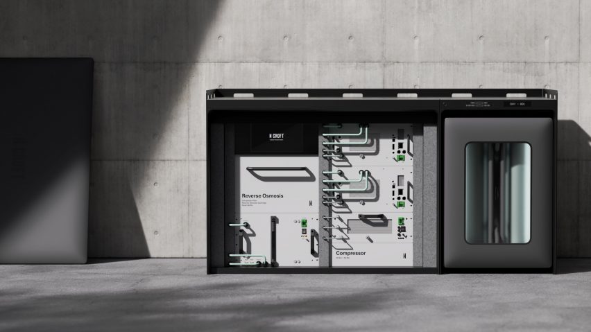
With an appearance similar to a large home battery, the Nanoplant uses electricity and water from the mains supply to carry out electrolysis — the splitting of water into hydrogen and oxygen.

Rendering of technology products, with a grey-green cannisters at the front in a small cart, a rectangular grey machine in the middle and a pick-up truck at the back edge of the frame
The Croft system features a Nanoplant and cartridges for powering retrofitted vehicles with hydrogen

The hydrogen obtained in this process is known as “green hydrogen” because, if it is produced using renewable energy, it creates no greenhouse gas emissions. This is in contrast to “blue hydrogen”, which is produced from natural gas and creates some emissions.

The Nanoplant contains a pull-out drawer with room for four Nanocartridges, which store the hydrogen by sticking it to the surface of a proprietary particulate. According to the brand, this method stores the hydrogen densely and at low pressure, making it a safe solution that also gives more power and range than electric batteries.

According to Layer, Croft is “dedicated to creating a blueprint for an enduring, scalable, green-hydrogen economy” and offers its technology at a much lower cost than other hydrogen storage solutions on or near the market.

Rendering of the Nanoplant with front surface removed, showing interior machinery connected with tubes and displaying switches and buttons
The Nanoplant produces hydrogen by splitting it from water through electrolysis

The studio says the product is best suited for larger vehicles in environments with little fast-charging infrastructure, and that heavy-duty pick-up trucks for farming, forestry, construction and other industries are the first target.

“Batteries are great to decarbonise smaller passenger vehicles that get used in gentle, predictable ways with access to good charging infrastructure,” Hubert told Dezeen.

“However, lots of mobility applications don’t match that description, and there, we need a power source that is denser than batteries and has fewer dependencies on infrastructure,” he added.

“Hydrogen stores significantly more energy in less space and with less weight than batteries, and it’s much easier to use hydrogen in environments with weak grids or where charging otherwise isn’t available.”

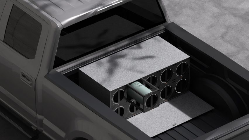
Rendering of the bed of a pick-up truck with modules for holding Croft hydrogen Nanocartridges
The technology is said to be best for heavy-duty vehicles like pick-up trucks

Hubert said that, at least in the short term, hydrogen would be a complement to electric vehicle technology, not a competitor.

“It’s a great complementary solution to batteries, and as with all things, it’s important to pick the right tool for the right job,” he continued.

To retrofit a vehicle with the technology, Croft removes most of the components of the power train and replaces them with its hydrogen storage system, a fuel cell, electric motors and other components, while reprogramming the vehicle’s onboard computer to utilise them.

Layer led the design and engineering of the Nanoplant and Nanocartridges, endeavouring to make them straightforward and easy to understand while also giving them an aesthetic that would communicate robustness and technological prowess.

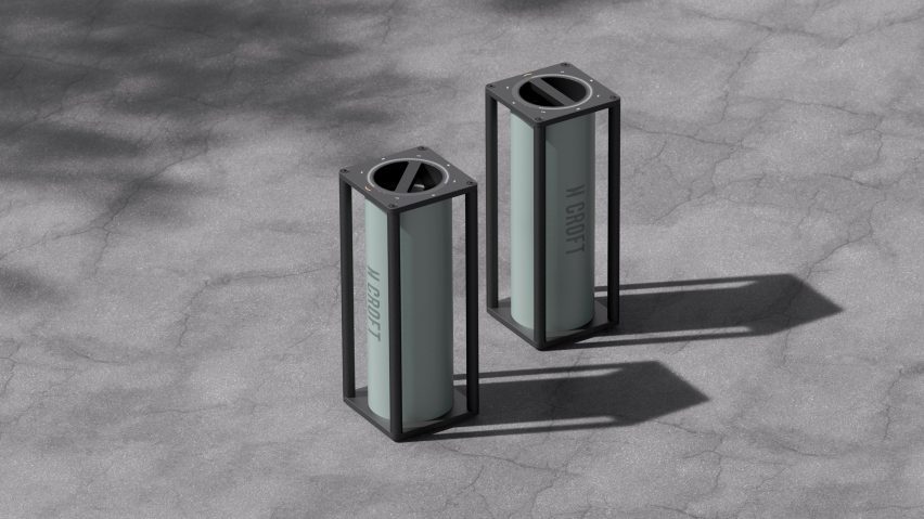
Rendering of two pale grey-green cannisters with Croft printed on the side, contained in rectangular frames and with a circular indicator dial on the top surface
The Nanocartridges store hydrogen in a solid state and at low pressure

The Nanoplant is modular and infinitely expandable — additional Nanoplant modules can be connected horizontally, each with the capacity for four Nanocartridges.

Each module has a minimal user interface on its front that counts down the time left to complete the recharge, and there is also a hose module for on-board charging. The drawer containing Nanocartridges can also double as a cart for transporting them to the vehicle.

The Nanocartridges weigh 14 to 16 kilograms and have four side handles, creating a cubic frame that can be easily gripped and stacked. A circular indicator on the top surface shows the cartridge’s remaining hydrogen capacity.

Rendering of an arm refuelling a truck with hydrogen from a hose as they would at a petrol pump
The system includes a hose for on-board charging

According to Layer, each cartridge has a range of 20 to 80 miles depending on the size of the vehicle and how hard it works.

“In addition to rapid fueling, cartridges also allow operators to carry additional fuel with them or receive rescue fuel if an asset gets stranded in the field, two features that today’s battery vehicles lack,” said Hubert.

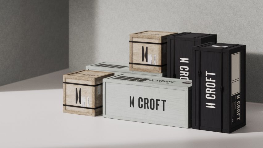
In addition to its product design work, Layer created the brand identity for Croft, including the brandmark and packaging.

Rendering of wooden crates in shares of natural, pale mint green and black marked with the Croft logo and brandmark
Layer also designed the brand identity and packaging for Croft

The brandmark is based on an abstracted letter “H”, which has been stylised to also look like a road vanishing into the distance. It will be used in many ways, including debossed into products, applied as a micro-pattern to create texture, and as a call to action on interaction points.

Layer has been embracing emerging technologies, and has recently also worked on the Ledger Stax hardware wallet for storing cryptocurrency and the Viture One video streaming glasses.

Reference

Harvesting the Skies: 6 Modern Architectural Designs that Revitalize Rainwater Management
CategoriesSustainable News

Harvesting the Skies: 6 Modern Architectural Designs that Revitalize Rainwater Management

Judging for the 11th A+Awards is now underway! While awaiting the Winners, prepare for the upcoming Architizer Vision Awards, honoring the best architectural photography, film, visualizations, drawings, models and the talented creators behind them. Learn more and register >

The history of rainwater harvesting stretches back millennia, with evidence of its practice in ancient civilizations such as Mesopotamia, Egypt and Rome. A testament to human ingenuity, these early societies recognized the importance of capturing and storing rainwater to ensure a stable water supply, especially in arid regions. As cities grew and centralized water systems developed, rainwater harvesting took a back seat, only to be revived in the face of modern challenges.

Today, as the world grapples with the impacts of climate change and increasing water scarcity, architects and engineers are revisiting the potential of rainwater harvesting in contemporary design. This sustainable water management solution serves to conserve resources and alleviate the burden on overtaxed municipal systems, reduce energy consumption and mitigate flood risks.

Advancements in technology and materials have paved the way for innovative rainwater harvesting systems, ranging from simple rooftop catchment setups to complex, large-scale integrated systems. Green rooftops, permeable pavements and landscape design elements such as bioswales and rain gardens are increasingly employed in urban environments to maximize rainwater capture and infiltration. While the rise of green building certifications like LEED and BREEAM, architects are incentivized to incorporate rainwater harvesting into their designs, further propelling its adoption.


The Independent

By Rhode Partners, Austin, TX, United States
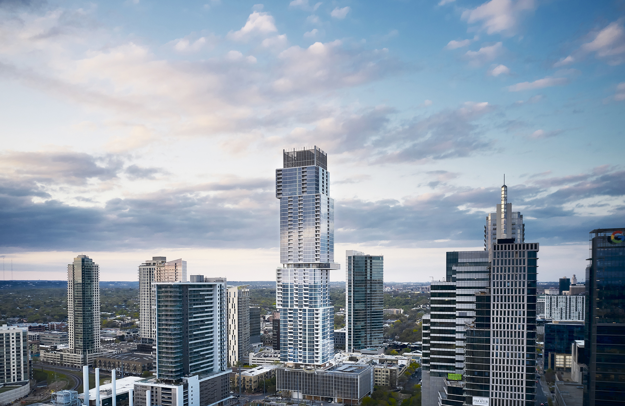
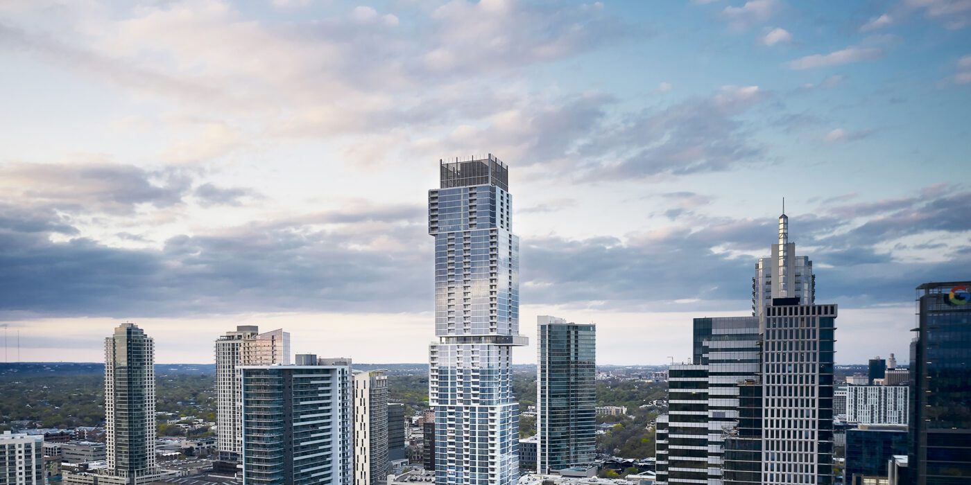
The Independent by Rhode Partners, Austin, TX, United States Photograph by Nick Simonite
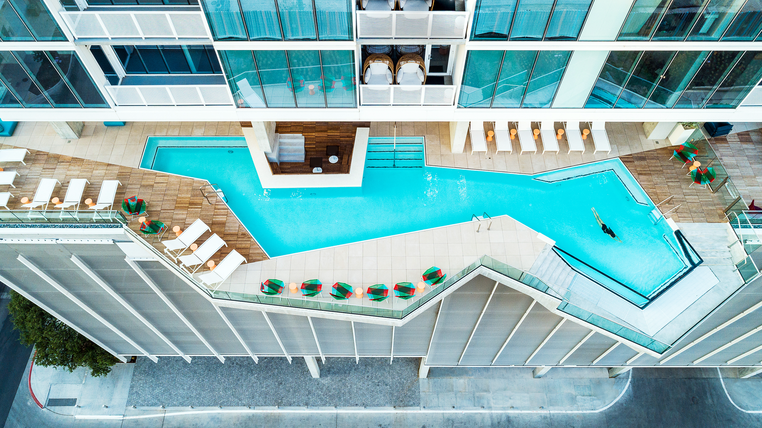
The Independent by Rhode Partners, Austin, TX, United States. Photograph by Patrick Wong

The Independent is an architectural marvel by Rhode Partners. The eco-conscious building reigns supreme in Austin’s Seaholm District as the city’s tallest LEED Gold Certified tower. This 688-foot skyscraper playfully teases gravity with its cantilevered blocks and a levitating infinity pool, while its floor-to-ceiling glass windows offer stunning city panoramas. A vertical neighborhood of 363 units, The Independent boasts 12 competitive, luxury condo amenity spaces across two floors spanning 20,000 square feet that cater to the high expectations of the tower’s residents.

At the same time, the architects endeavored to meet high levels of sustainability. Tucked within its stainless-steel mesh crown, a colossal liquid damper tank ensures stability against high-altitude winds while the pièce de résistance, a cutting-edge rainwater harvesting system and a 75-kilowatt solar power system, make this eco-friendly titan an iconic fixture in Austin’s skyline.


Fort 137

By Daniel Joseph Chenin, Ltd., Las Vegas, NV, United States

Popular Choice Winner, 10th Annual A+Awards, Residential > Residential Interiors (>3000 sq ft)
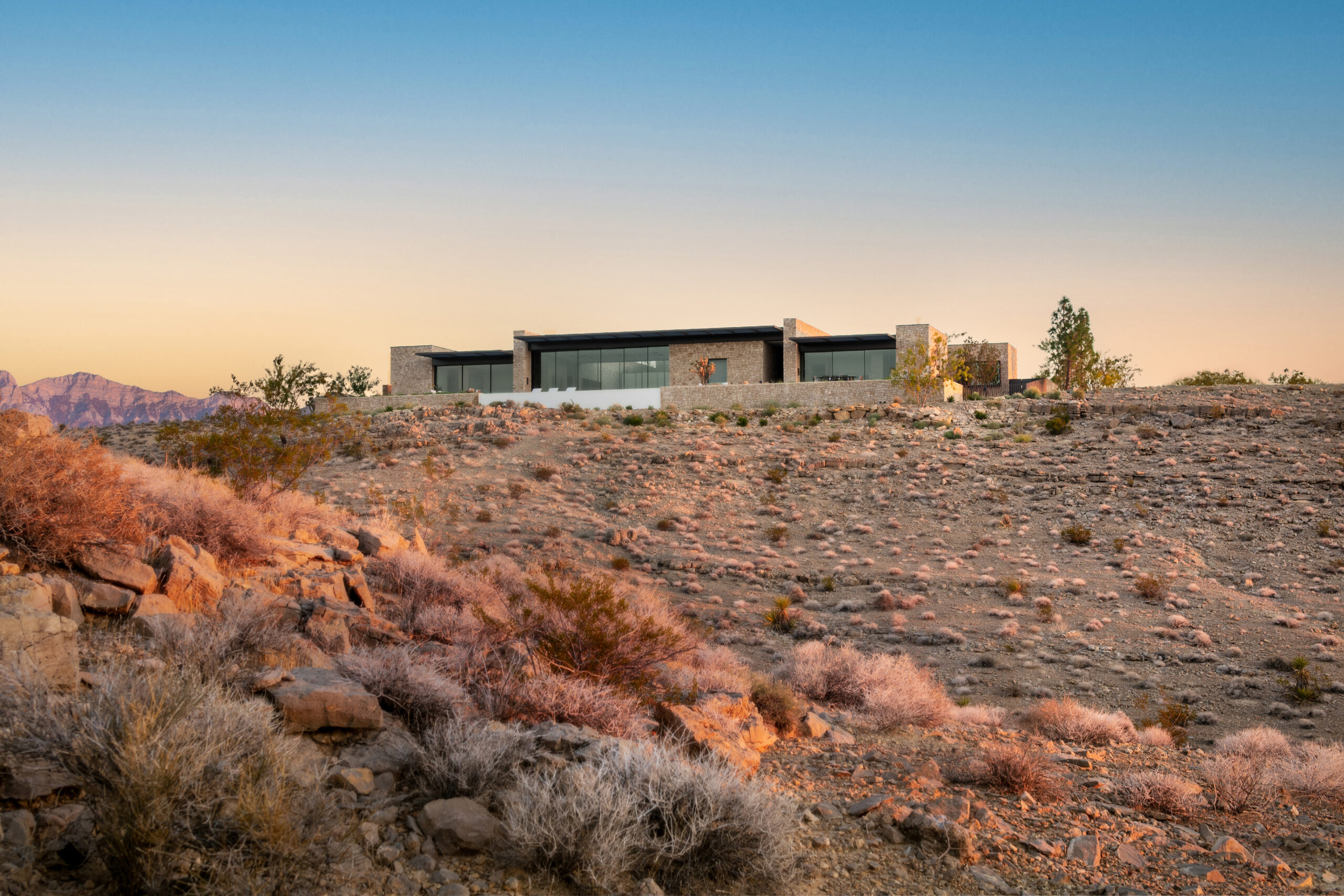
Fort 137 by Daniel Joseph Chenin, Ltd., Las Vegas, NV, United States. Photographs by Stetson Ybarra

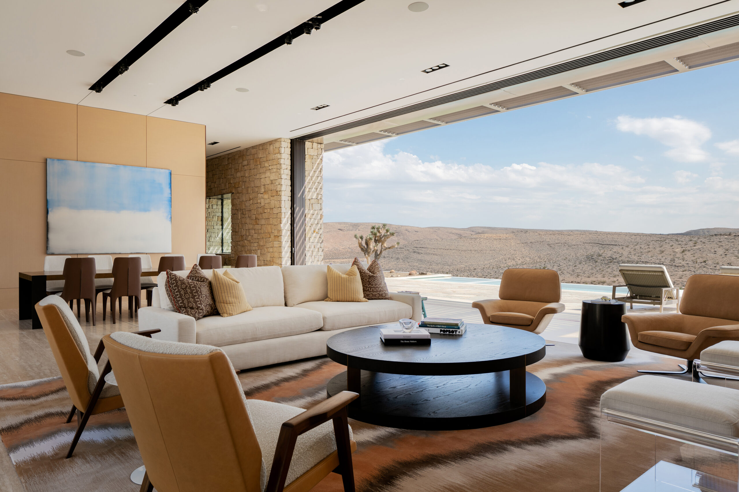
Nestled in the pristine Las Vegas Valley, this eco-conscious residence serves as a base camp for a family of nature-loving scientists. Drawing inspiration from historic fort structures, the house boasts a compact, clustered design, with each volume meticulously placed to optimize views and combat desert climate challenges.

Embracing the landscape, panoramic glass doors extend living spaces, enabling cross-ventilation and daylighting. Louvered roof overhangs provide summer shade and allow winter light penetration. A curated palette of native materials, such as weathered steel, hot rolled steel, reconstituted oak and limestone, ensures the residence ages gracefully alongside its environment.

Crucially, a state-of-the-art rainwater harvesting system elevates the home’s sustainability, conserving precious resources in the parched region. This architectural gem reduces its carbon footprint and exemplifies harmonious coexistence with nature by employing sustainable strategies like passive cooling, daylighting, thermal mass, and photovoltaic panels.


Rain Harvest Home

By Robert Hutchison Architecture, JSa Arquitectura, Temascaltepec de González, Mexico
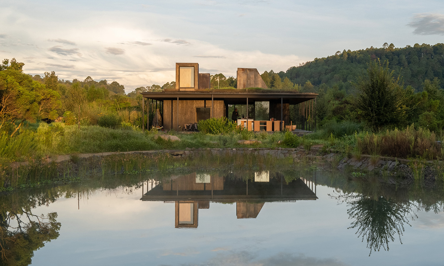
Rain Harvest Home by Robert Hutchison Architecture, JSa Arquitectura, Temascaltepec de González, Mexico. Photo Credit Robert Hutchison
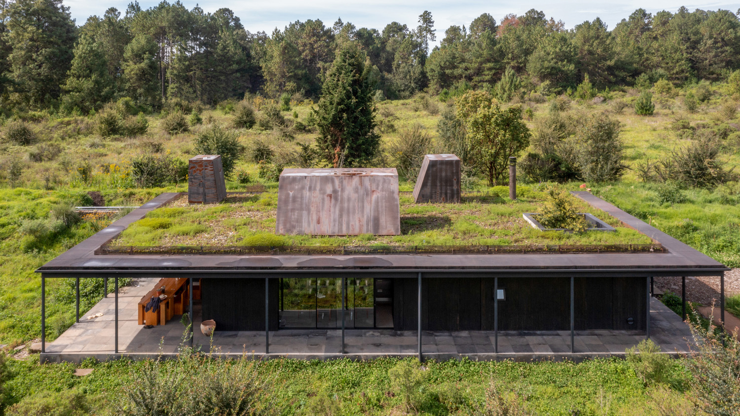
Rain Harvest Home by Robert Hutchison Architecture, JSa Arquitectura, Temascaltepec de González, Mexico. Photograph by Jaime Navarro

Rain Harvest Home, a collaborative creation by Robert Hutchison Architecture and JSa Arquitectura, is an experiential abode in the mountains west of Mexico City. Comprising three porous wooden structures, the residence embraces the landscape and embodies a regenerative design that addresses water scarcity in the region. Each building collects rainwater, supplying the home with 100% of its water needs year-round through an on-site reservoir and treatment system.

As part of the visionary 450-acre La Reserva el Peñón development, Rain Harvest Home exceeds the requirement to harvest rainwater for 60% of its water needs. Walking trails between the buildings double as bioswales, while the site also boasts a bio-agriculture garden, emphasizing the family’s commitment to living in harmony with nature.


House in the Countryside

By Herreros Arquitectos, Artà, Spain
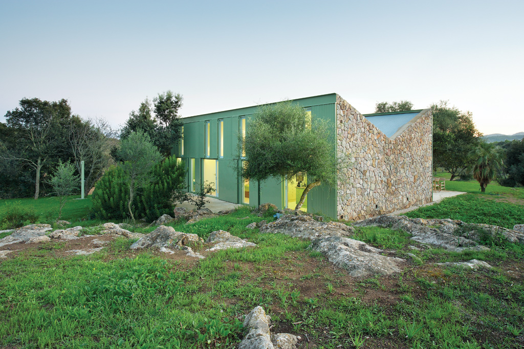
House in the Countryside by Herreros Arquitectos, Artà, Spain. Photographs by José Hevia

House in the Countryside, a project by Herreros Arquitectos in Artà, Spain, brilliantly transforms a former shepherd’s refuge into a charming occasional-use residence. The design replicates the original structure symmetrically, preserving its intelligent orientation, ventilation and water collection facilities. The dry-constructed outer wall fosters a dialogue with the local climate through independent systems of openings and shutters.

The interior retains the original compartments, each housing a single primary object defining its function. The inverted roof facilitates natural cross-ventilation that is adjustable to create an ideal climate. Notably, the rainwater harvesting system is preserved and optimized, with the dual-slope roof directing water to the original gutter and cistern, upholding the spirit of the initial construction.


U House, Ericeira

By Jorge Graca Costa, Ericeira, Portugal
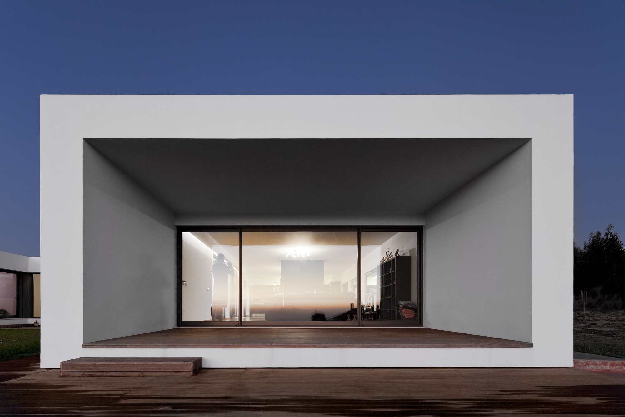
U House, Ericeira by Jorge Graca Costa, Ericeira, Portugal. Photographs by Fernando Guerra, FG + SG

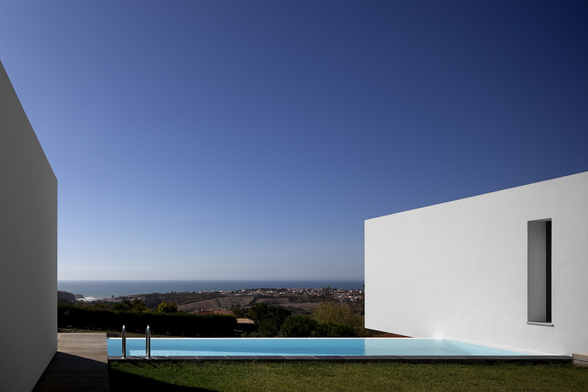
U-House, perched atop a hill in Ericeira, Portugal, is a sustainable residence designed by architect Jorge Graca Costa for a professional surfer and his family. Inspired by traditional Mediterranean courtyard houses, the structure protects against the region’s windy climate while offering captivating views of San Lorenzo Bay.

A dense mesh of trees surrounds the 300-square-meter home, and its layout frames the bay view and moderates the courtyard’s climate. A grassy area, decked patio, and non-chlorinated pool heated by solar and biomass energy create a harmonious outdoor space.

Sustainability is integrated seamlessly into the design, combining eco-friendly features without sacrificing aesthetics or functionality. The house is constructed with cork insulation and benefits from passive design for natural heating and cooling. Solar panels are used for floor and water heating, with additional support from biomass heating. The microclimate environment created by the patio and chemical-free pool further contributes to the eco-friendly design.

Rainwater harvesting plays a crucial role in the home’s sustainability; a pre-existing well is used for collecting rainwater for irrigation purposes. With numerous green features, the U-House boasts an A+ energy rating from the National Energy Agency, showcasing the success of blending architecture with prescriptive performance design in a comfortable, livable space.


Tucson Mountain Retreat

By D U S T, Tucson, AZ, United States
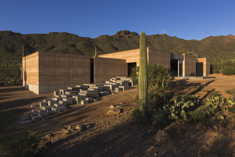
Tucson Mountain Retreat by DUST, Tucson AZ, United States. Photographs by Jeff Goldberg

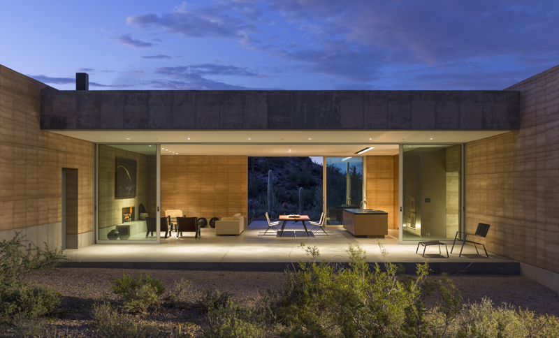
The Tucson Mountain Retreat in the Sonoran Desert is a thoughtfully designed home that minimizes environmental impact while maximizing connections to the mystical landscape. The house is constructed primarily of Rammed Earth, an eco-friendly material with excellent thermal mass properties. The design comprises three distinct zones for living, sleeping, and music recording/home entertainment, which can only be accessed by stepping outside and traversing the desert landscape. This separation ensures acoustic isolation and continuous interaction with the natural surroundings.

A 30,000-gallon rainwater harvesting system supplies water for all household uses, while solar heat gain is reduced by orienting the house along an east-west axis and minimizing openings on the east and west facades. South-facing patios and deep overhangs provide unobstructed views, passive heating, and cross-ventilation. When the floor-to-ceiling sliding glass doors are opened, the house and desert merge into one seamless, boundless space.

Judging for the 11th A+Awards is now underway! While awaiting the Winners, prepare for the upcoming Architizer Vision Awards, honoring the best architectural photography, film, visualizations, drawings, models and the talented creators behind them. Learn more and register >
Reference

North Arrow Studio designs a playful, birdhouse-like ADU in Austin
CategoriesArchitecture

North Arrow Studio designs a playful, birdhouse-like ADU in Austin

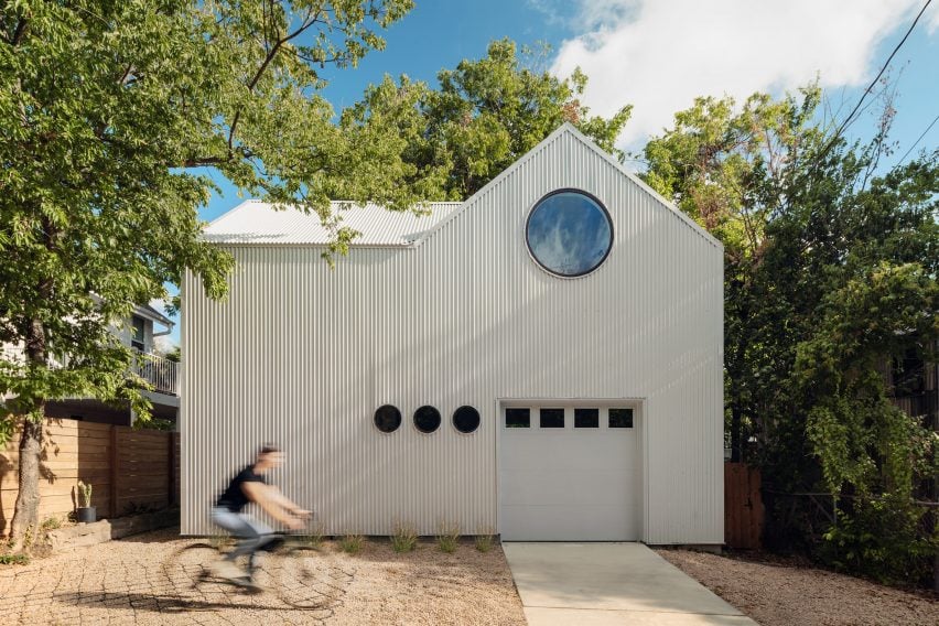
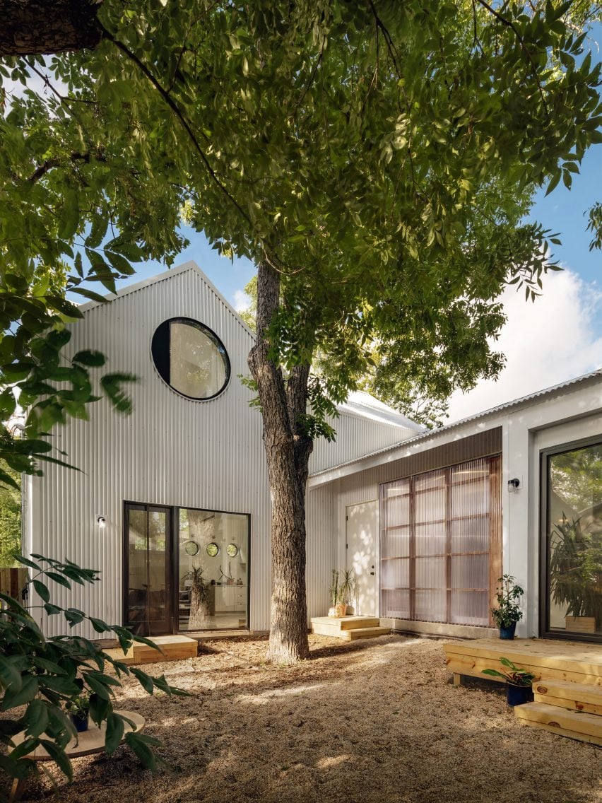
North Arrow Studio has completed a compact, corrugated metal accessory dwelling unit in East Austin’s Chestnut neighbourhood featuring a custom, circular pivot window that is reminiscent of the round opening in a birdhouse.

Aptly named the Birdhouse, the 900-square foot (84-square metre) ADU shares a narrow 5,900-square metre (550-square metre) lot with a 1939 single-storey house and three large protected pecan trees.

Corrugated metal accessory dwelling unit with a circular window
The Birdhouse is an accessory dwelling unit in East Austin

North Arrow Studio’s principal architect Francisco Arredondo described the two-bedroom, two-bath house as “simplicity carried to the extreme”.

“There’s simplicity in the footprint, the massing, and the material palette throughout,” Arredondo said. “But it’s also a smart little house that makes me smile.”

Corrugated metal structure by North Arrow Studio placed around trees
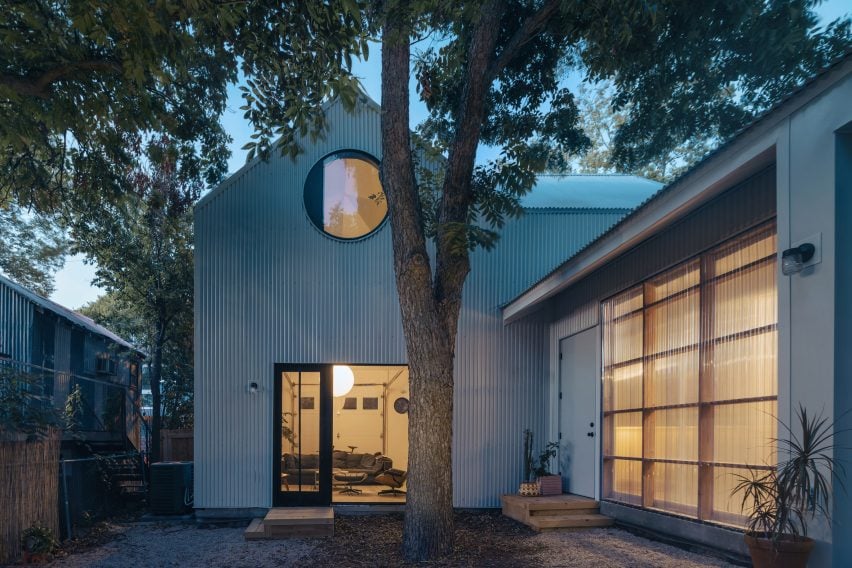
It is strategically placed around trees to create a courtyard

The home was strategically placed around the trees to create a courtyard between the main house and the ADU while providing privacy for the separate living quarters.

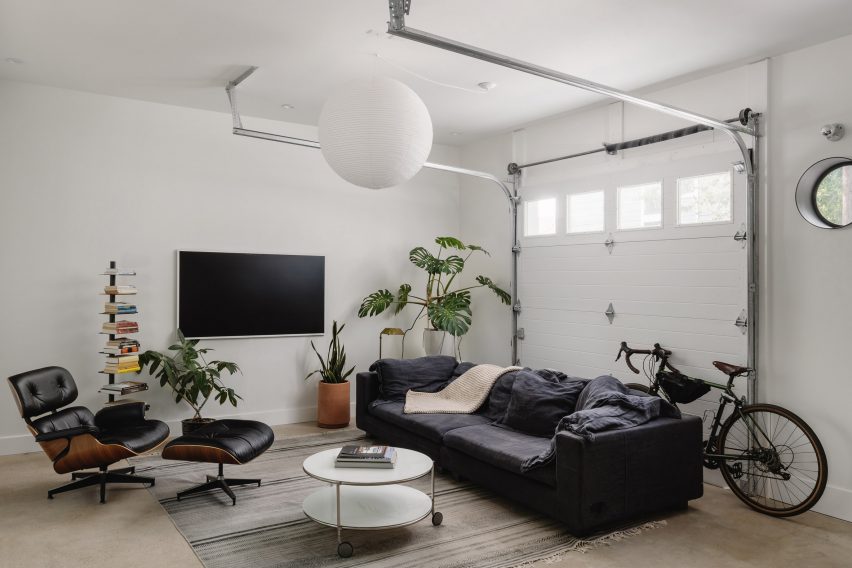
The L-shaped plan features a bedroom, bathroom, kitchen and living room featuring a roll-up garage door on the ground floor, all wrapped around an external pecan tree.

White walls of ADU with roll-up garage door
A roll-up garage door features in the living room

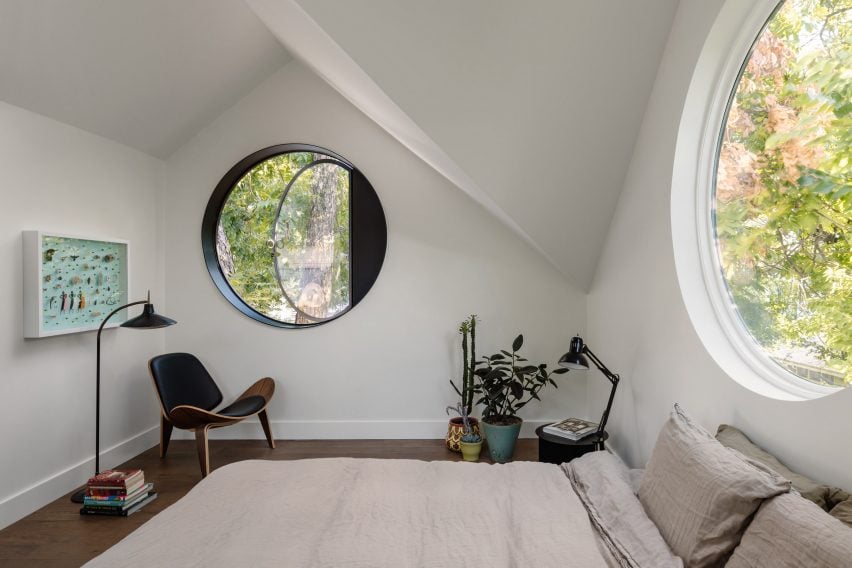
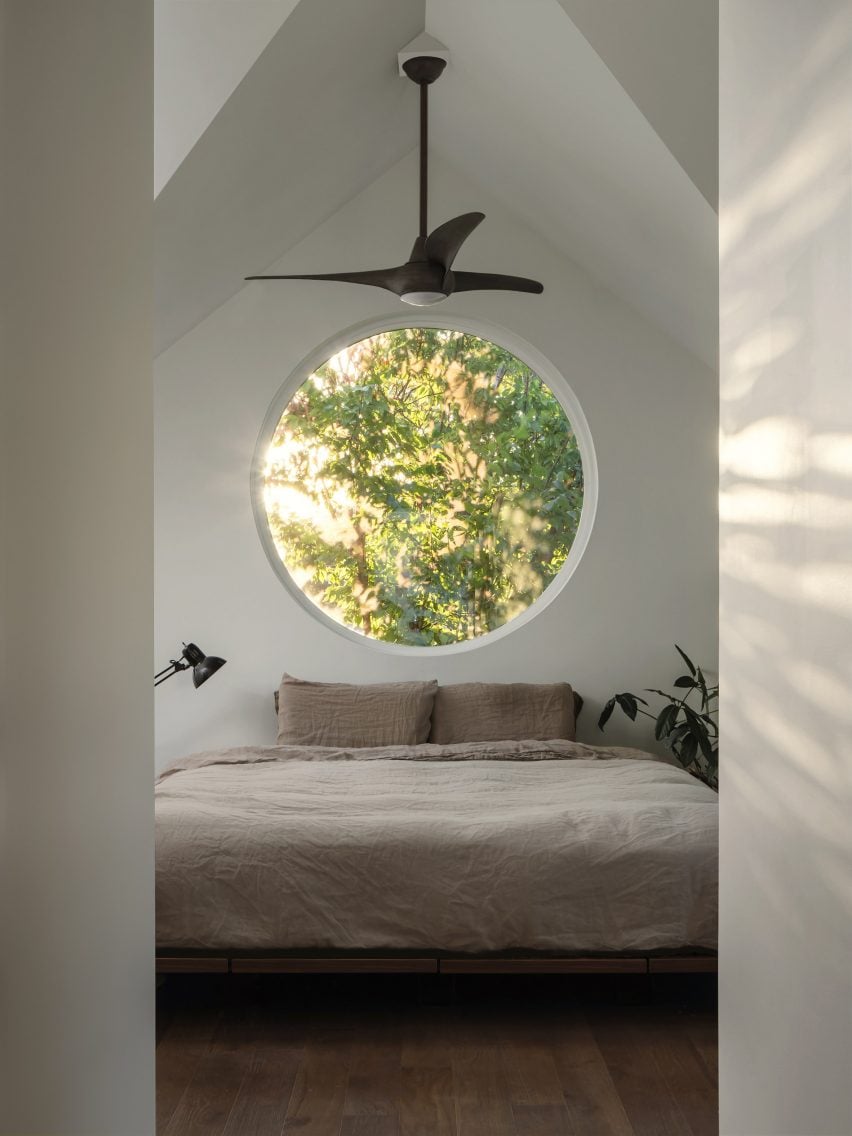
Upstairs, the main suite sits within the vaulted ceiling of the double-gabled form. Four five-foot (1.5-metre) diameter circle windows sit under each gable and use the surrounding tree canopy for privacy.

“They create a resemblance to a traditional birdhouse and bring a sense of whimsy to the design,” the studio said.

Circular pivot window in gabled roof
The main suite sits within the vaulted ceiling of the double-gabled form

One of the custom-fabricated steel windows serves as the required egress for the room.

“We began with a pivot design and worked our way towards a final swing design that opened up to the pecan tree’s canopy,” the team explained.

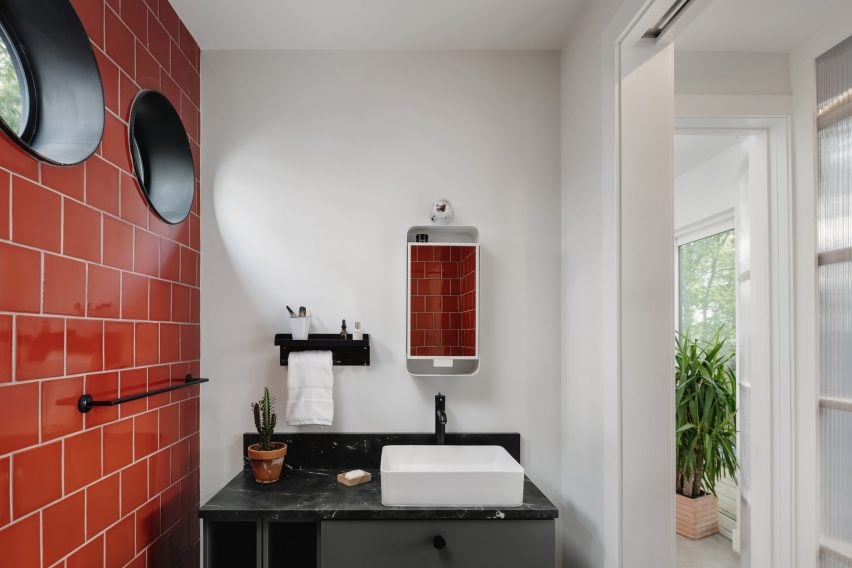
Bathroom with red tiles and small circular windows
The rounded-window motif carries throughout the house

The rounded-window motif carries throughout the house with miniature custom steel circle windows.

“Strategically selected walls are curved to soften edges and draw you into the spaces,” the studio said. “Interior finishes are simple and restrained apart from a few accent walls that give life to each room.”

Neutral colours in bedroom of ADU
Neutral colours decorate the living spaces

The monotone ADU is wrapped in light corrugated metal that “is a nod to the many metal sheds and accessory buildings already found throughout the neighborhood, but with a modern and playful twist”.

The soft, rounded edges and neutral colour complement the existing house and provide an accent along the alley, and the metal runs up the walls and becomes the roof material as well.

In the courtyard, a curved polycarbonate wall brings light into the hallway and creates a softly glowing, semi-transparent effect.

Corrugated metal was selected for its sustainability and resilience as the envelope is 100 per cent recyclable, repels sun and heat in Texas summers and is durable and low-maintenance, according to the studio.

Corrugated metal structure with circular openings and a gabled roof
Corrugated metal wraps the structure

“Working with a tight budget and constrained footprint can be very helpful in creating a story for the design,” the studio said. “The constraints begin to guide you and lend opportunities to be creative with traditional materials and spaces in ways that typically wouldn’t be considered.”

In 2014, North Arrow Studio created a stilted home in the Texas Hill Country that references Mies Van der Rohe’s glass Farnsworth House.

The photography is by Chase Daniel.


Project credits:

Builder, developer, owner: Brita Wallace, Digs ATX
Styling: Ben Newman Studios

Reference

Studio Plenty designs Byron Bay diner to feel like “a warm hug”
CategoriesInterior Design

Studio Plenty designs Byron Bay diner to feel like “a warm hug”

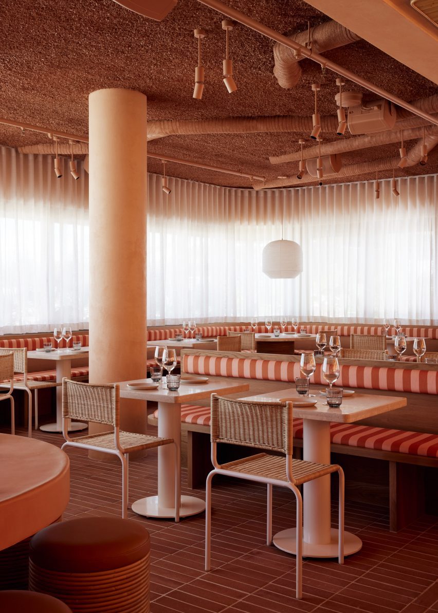
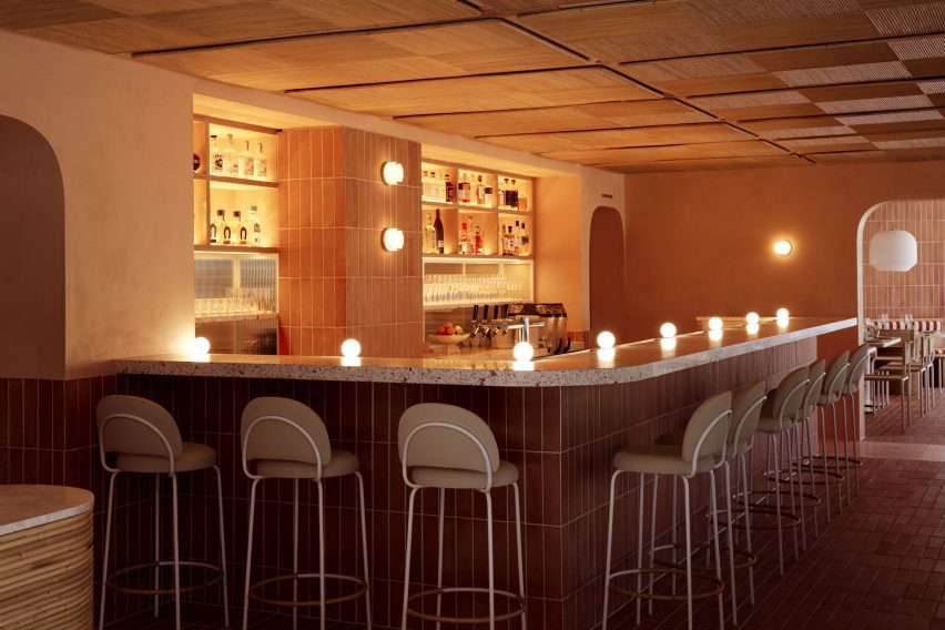
Asian diner chain Light Years has renovated its restaurant in the Australian surf town of Byron Bay, with interiors conceived by local practice Studio Plenty in collaboration with home-grown artists and designers.

The team behind Light Years wanted its flagship eatery to mirror the playful visual identity established across its three other venues on Australia’s East Coast while refining and elevating their aesthetic.

Overview of dining room in Light Years Asian Diner
Studio Plenty has renovated the Light Years diner in Byron Bay

“We were asked to reimagine the Byron Bay restaurant, taking cues from its sister diners but with greater restraint in composition,” Studio Plenty founder Will Rathgeber told Dezeen.

“We were looking to achieve something refined without letting go of the relaxed culture behind the brand, with satisfying colours and patterns, and playful shapes and materials.”

Dining room of Byron Bay restaurant by Studio Plenty
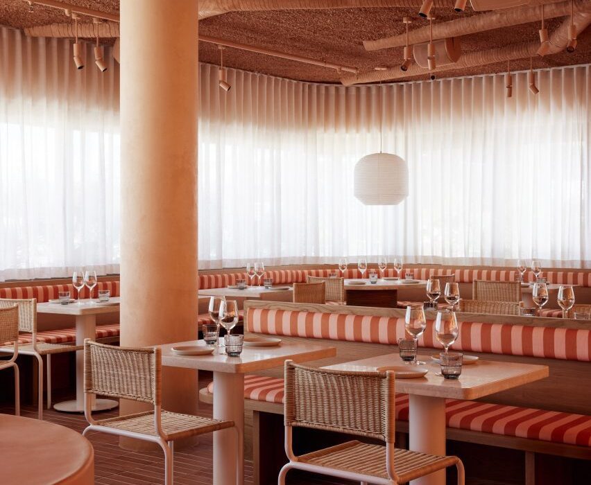
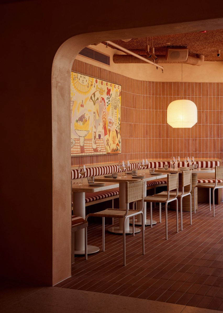
Terracotta tiles were used to finish the walls and floors

Soft corners and gently curving walls help to create a sense of intimacy, according to Rathgeber, while the restaurant’s colour palette of soft pink and terracotta tones “embraces you like a warm hug”.

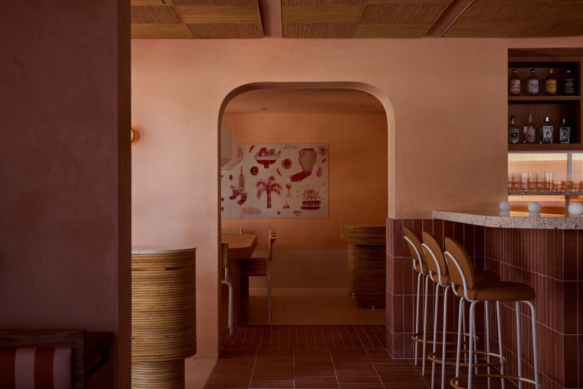
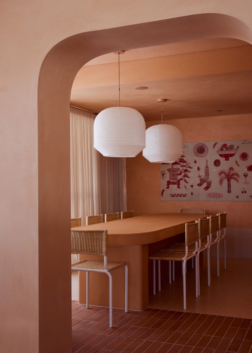
Underpinning the playful feel of the eatery is a careful focus on the practicalities, with arched openings and material thresholds helping to define three distinct spaces – the main dining room, a curved bar with counter seating and a private dining area for larger groups.

Arched opening leading through to private dining area in Light Years Asian Diner
Arched openings separate the restaurant’s different dining areas

The restaurant’s material palette incorporates handmade terracotta tiles with a rustic brushed finish and a rusty colour that is also picked up in the restaurant’s floors and the Fibonacci terrazzo bar counter.

In the main dining room, the ceiling was treated with an acoustic spray to absorb sound while contributing to the earthy, vernacular look of the diner thanks to its bumpy texture.

Wooden reception desk of Byron Bay restaurant by Studio Plenty
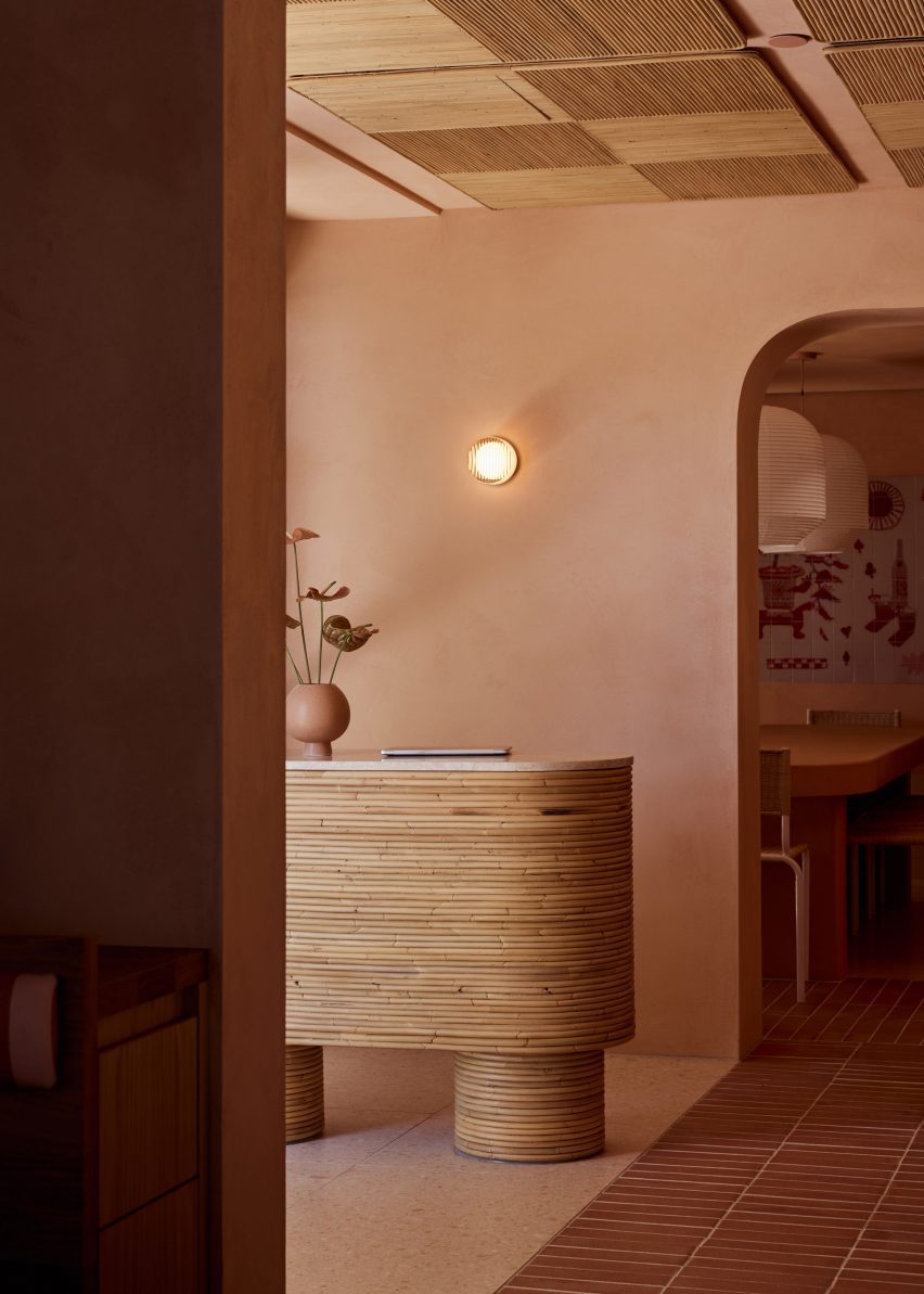
Rattan acoustic panels cover the ceiling near the entrance

Since the acoustic spray does not adhere to pipes, Studio Plenty specified a motorbike exhaust wrap for the pipes to achieve a harmonious ceiling plane.

In the bar area, ceilings are clad in rattan acoustic panels by local product designer and interior stylist Sarah Ellison, who also worked with Studio Plenty to design the restaurant’s custom furniture including the chunky tables and bistro-style chairs.

Artist collective Studio of the Sun created two colourful murals for the restaurant, with one featuring playful illustrations laser-printed onto a section of glossy white tiles.

“The client was committed to a locally focussed project, hence approaching Studio Plenty to design the restaurant and Sarah Ellison and Studio of the Sun to collaborate,” said Rathgeber.

Bar of Light Years Asian Diner
A curved terrazzo bar provides counter seating

Rathgeber founded his Byron Bay practice in 2020 after cutting his teeth working for architecture firms Woods Bagot and Jackson Clements Burrows in Melbourne.

“We believe happiness is achieved through sensible design, not excess,” he explained of his studio’s ethos. “We have an appetite for rational design and an obsession with functionalism.”

Private dining area of Byron Bay restaurant by Studio Plenty
The private dining area is defined by a Studio of the Sun artwork

Elsewhere in Byron Bay’s bustling bar and restaurant scene, Australian studio Pattern has designed the interiors for an eatery serving South America-style small plates and cocktails.

Its patchy grey surfaces and concrete fixtures were designed to reflect the “raw beauty” of late-night eateries in Mexico.

The photography is by Jessie Prince.

Reference

Pushing the Envelope: 6 Innovative Façade Designs in Higher Education Buildings
CategoriesSustainable News

Pushing the Envelope: 6 Innovative Façade Designs in Higher Education Buildings

Judging for the 11th A+Awards is now underway! While awaiting the Winners, prepare for the upcoming Architizer Vision Awards, honoring the best architectural photography, film, visualizations, drawings, models and the talented creators behind them. Learn more and register >
A building’s façade is like the skin that does not only allow the building to breathe but also allows it to see and converse with its context and users, responding to many social, environmental and historical factors, such as climate, building identity, program, interior-exterior relationships and user experience, among other considerations. Through this collection, the innovative façade designs of a number of higher education buildings are shown, with more responsibility falling on the façades of this building typology for the way they are expected to show and not only teach students about architectural design and the values of the educational organizations they represent.


Architecture Faculty in Tournai

By Aires Mateus, Tournai, Belgium

Photo by Tim Van de Velde Photography

Photo by Tim Van de Velde Photography

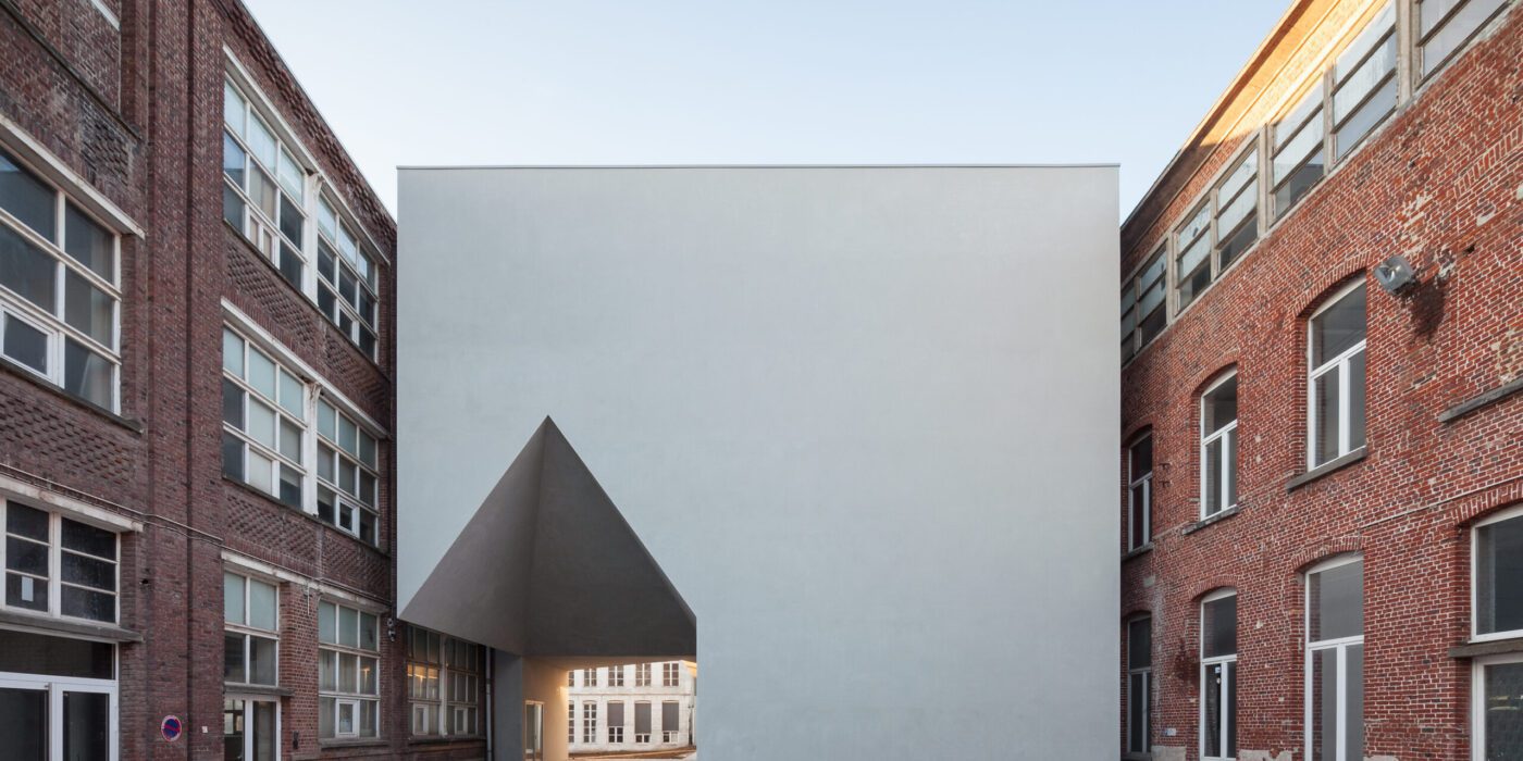
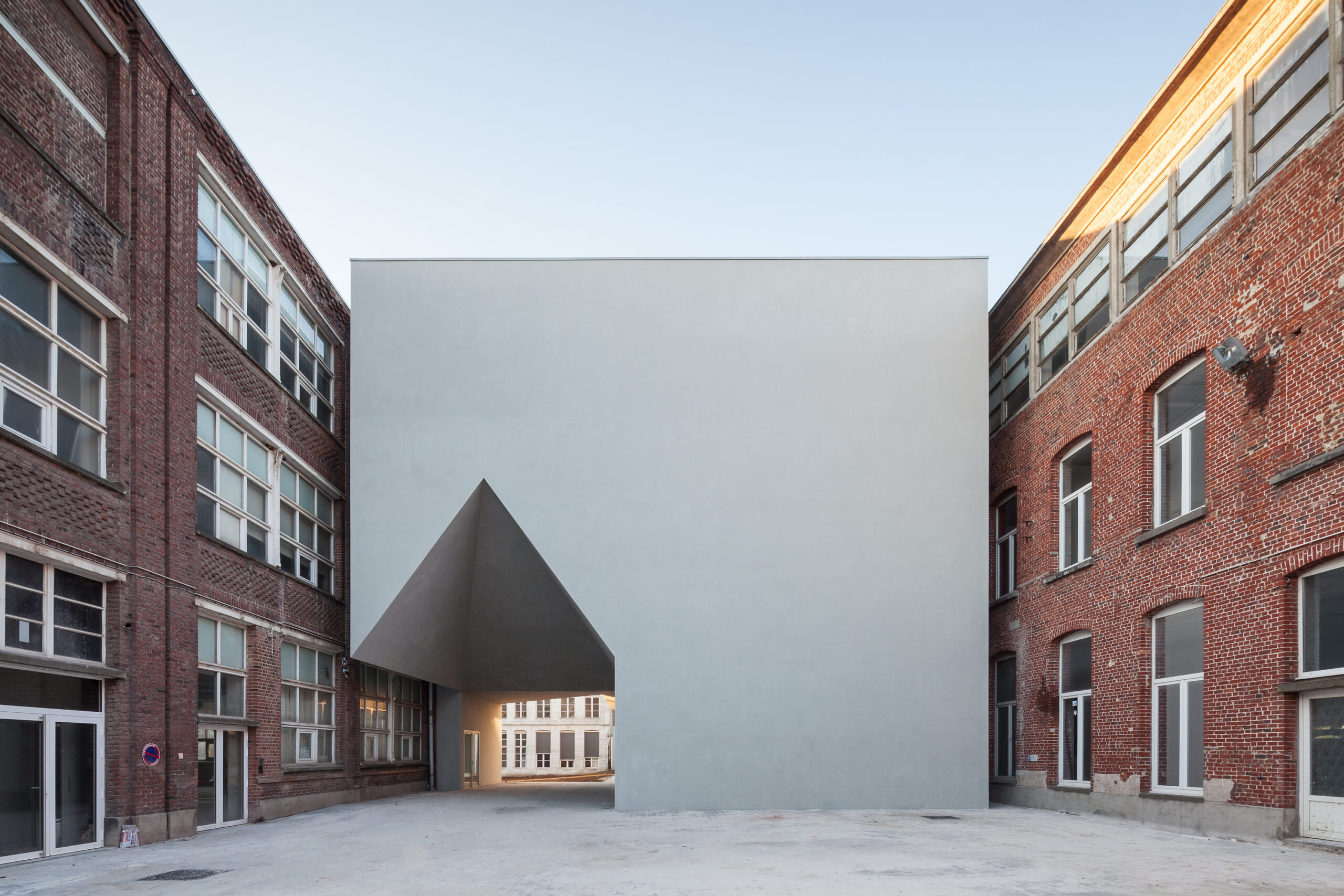
The new Architecture Faculty in Tournai building has its form shaped by the surrounding historical city block, both used and getting used by the adjoining buildings that manage to coexist, despite the difference in their identities and time periods. Designed to connect the existing structures together through a set of vertical and horizontal circulation elements while housing different interior spaces for architectural education, the building evokes the architectural heritage of the city through its use of iconography.

The completely solid main elevation, constructed out of concrete and steel and covered with sanded plaster and grey paint, diverts the attention to the neighboring buildings and allows the new building to comfortably fit into the context, boldly subtracted with a distinctively house shaped three dimensional volume that accentuates the entrance and welcomes users.

Photo by Roberto Ortiz Giacoman and Jorge Taboada

Photo by Roberto Ortiz Giacoman and Jorge Taboada

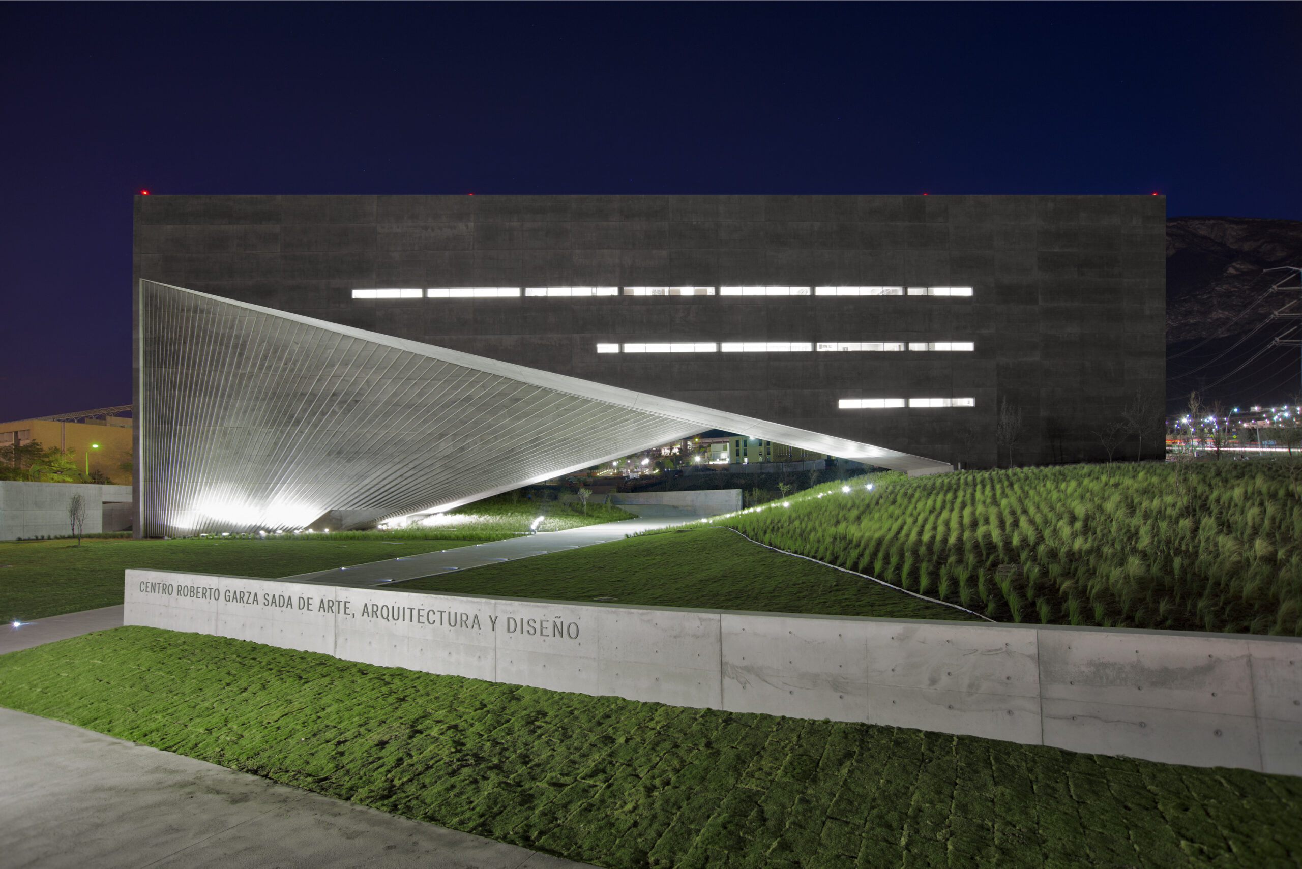
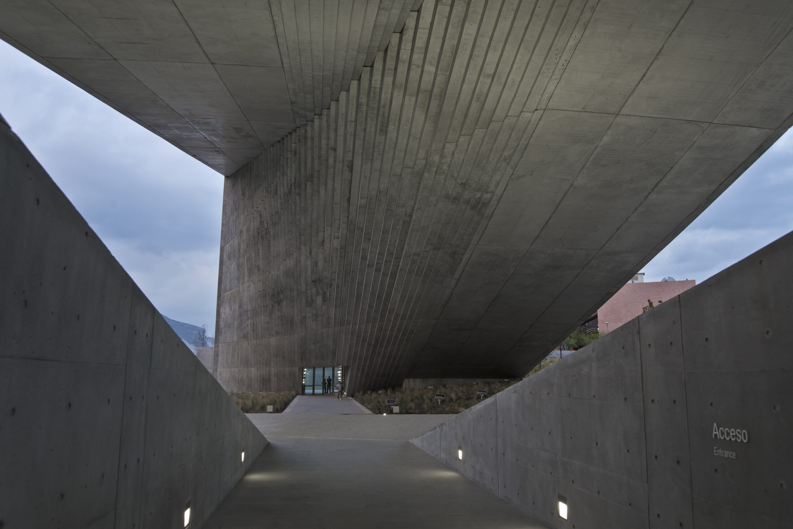
The façade of this majestic concrete building is three-dimensional, changing directions between the vertical and horizontal planes and artfully mastering the relationship between the building’s interior and exterior while blurring the lines between both, framing the ‘Sierra Madre’ mountain range and opening up the building to the sky and the surrounding landscapes.

The three-dimensional volume that is called “The Shell” almost looks like a solid shape from a distance, especially for the way it spans a distance as long as 80 meters and the way its concrete panels seamlessly align across the building’s several sides and faces. The design of “The Shell” would have not been possible without its innovate structural design, utilizing a principle called composite action where concrete works alongside the structural steel to carry the weight of the building and its materials.


Masdar Institute

By Foster + Partners, Abu Dhabi, United Arab Emirates

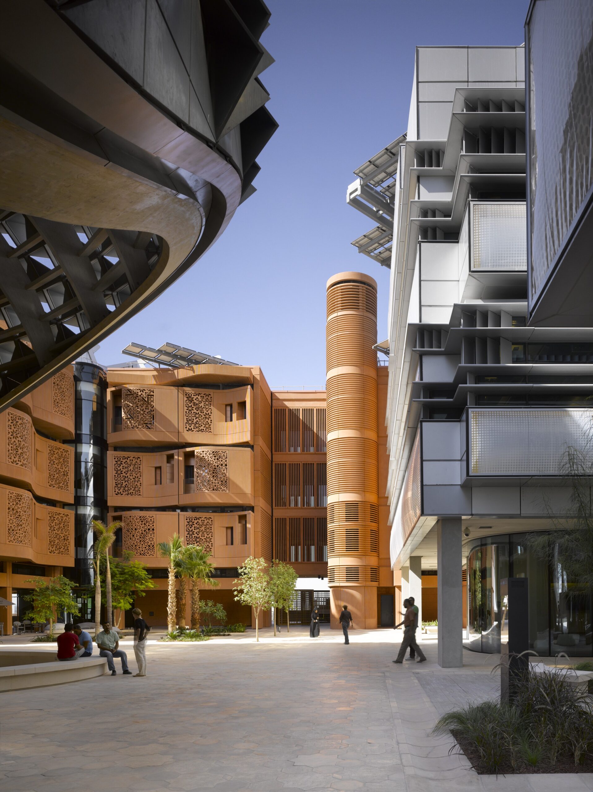
The façade design of the residential buildings at the Masdar Institute offers a modern interpretation of Al Mashrabiya, which is a traditional Islamic architecture element where turned wood is used to produce latticed patterns adorning oriel windows facing that face the streets, for shading and privacy. For materials, the façades are constructed out of sustainably developed glass-reinforced concrete and colored with local desert sand to integrate the building with the context, with the buildings being completely powered by solar energy. Through an alternation of the façade elements between recession and protrusion and proper building orientation, the building is not only self-shading but is also sheltering of the neighboring buildings and the pedestrians at street level.


Scottsdale Community College Business School And Indigenous Cultural Center

By Architekton,Scottsdale, AZ, United States

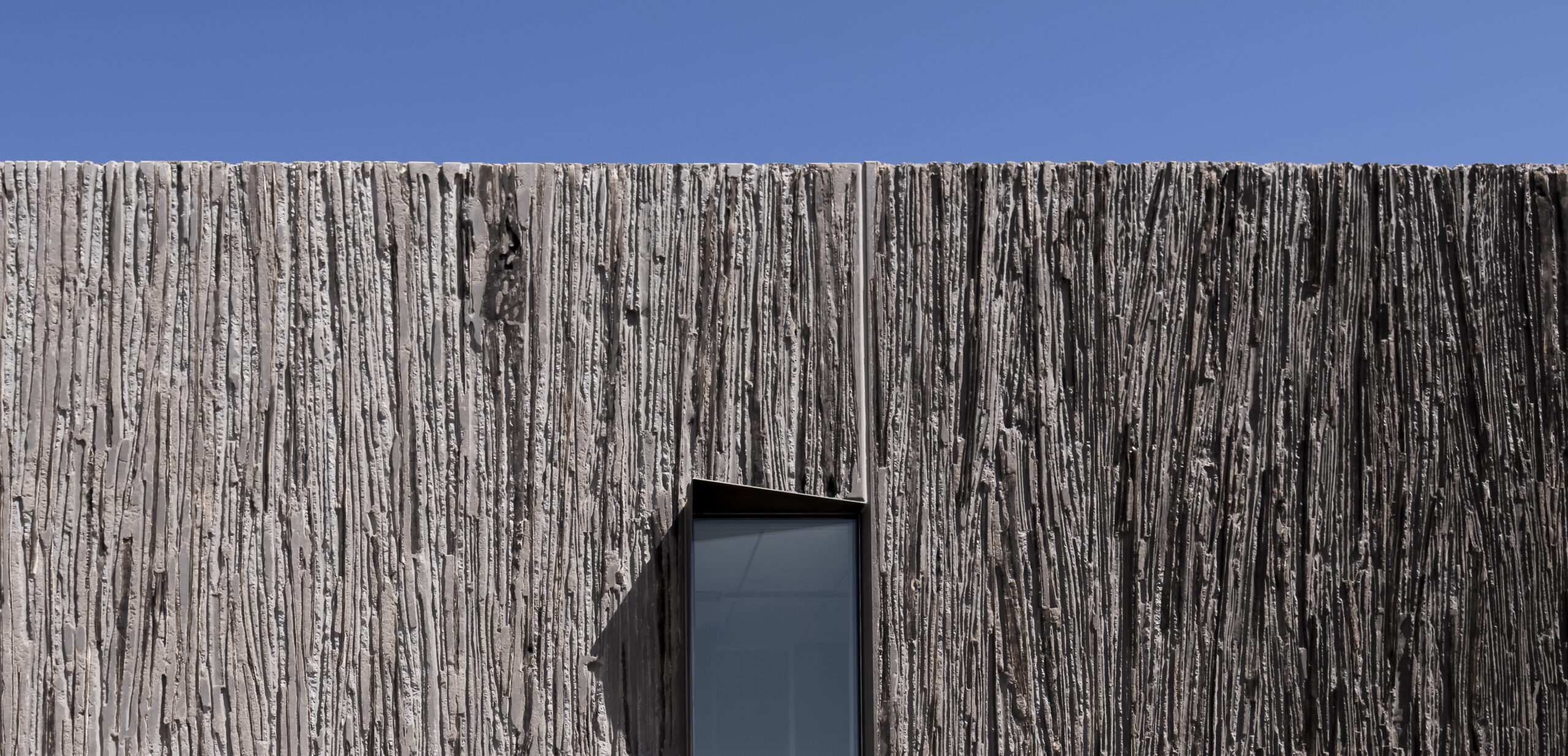
Built on the land of the Salt River Pima Maricopa Indian Community (SRP-MIC) in Arizona, the building rose from the ground holding traces of the native saguaro cactus, in a notion that celebrates the indigenous community’s connection to their land. Technically speaking, the façade design utilized imbedding saguaro ribs into concrete tilt panels, organized into the formwork during construction and protected against concrete by pouring sand into the ribs.

After the panels were cast, the architectural team and the contractor determined the final appearance of the building by deciding which saguaro to burn, remove or conceal. The design of the façade allowed the building, which also houses the Business School, to visually converse and connect with the context and the adjacent east Red Mountain, while also teaching visitors about the native history of the community who views the saguaro as a symbol of life.


Faculty of Architecture and Environmental Design

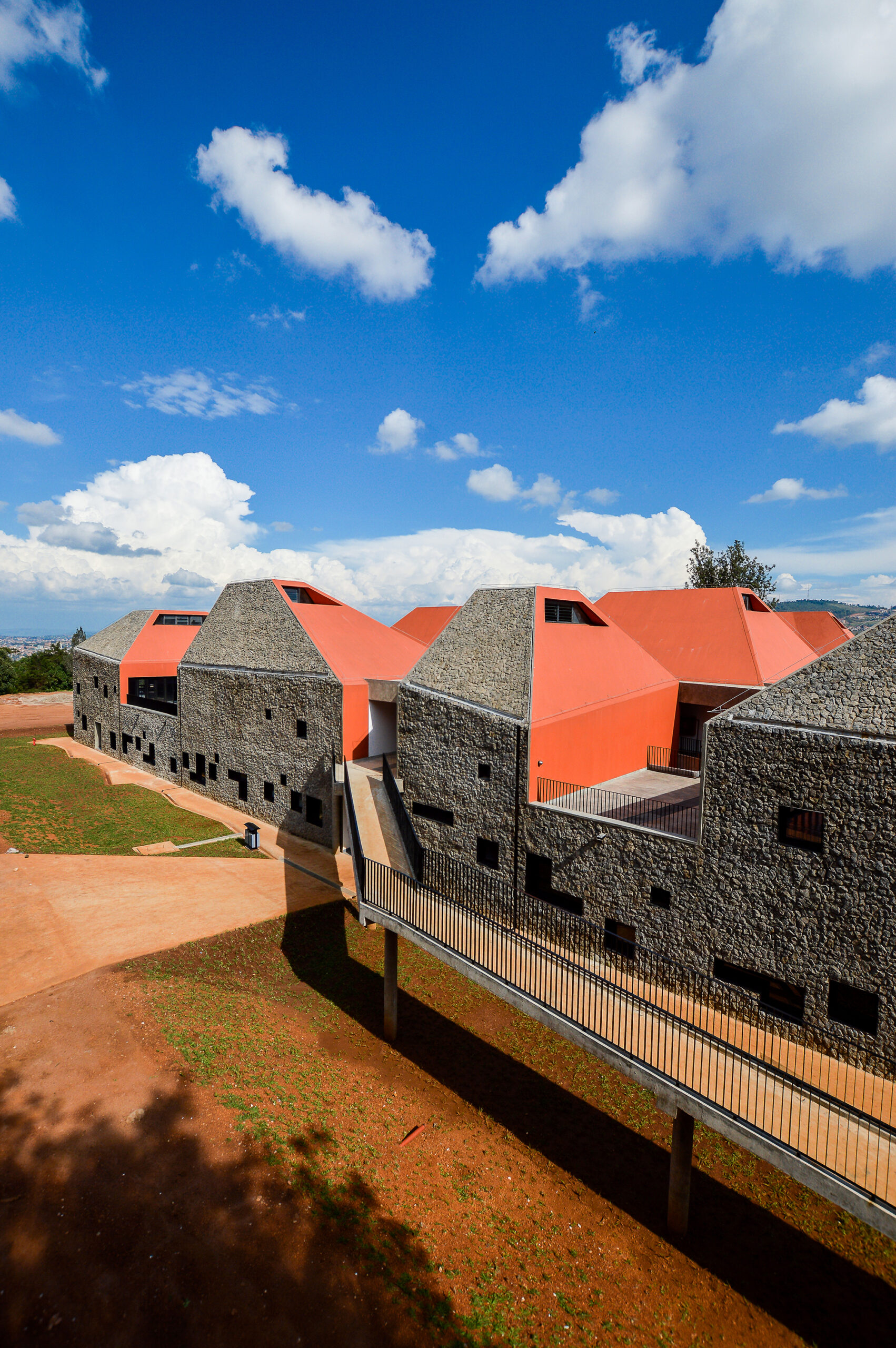
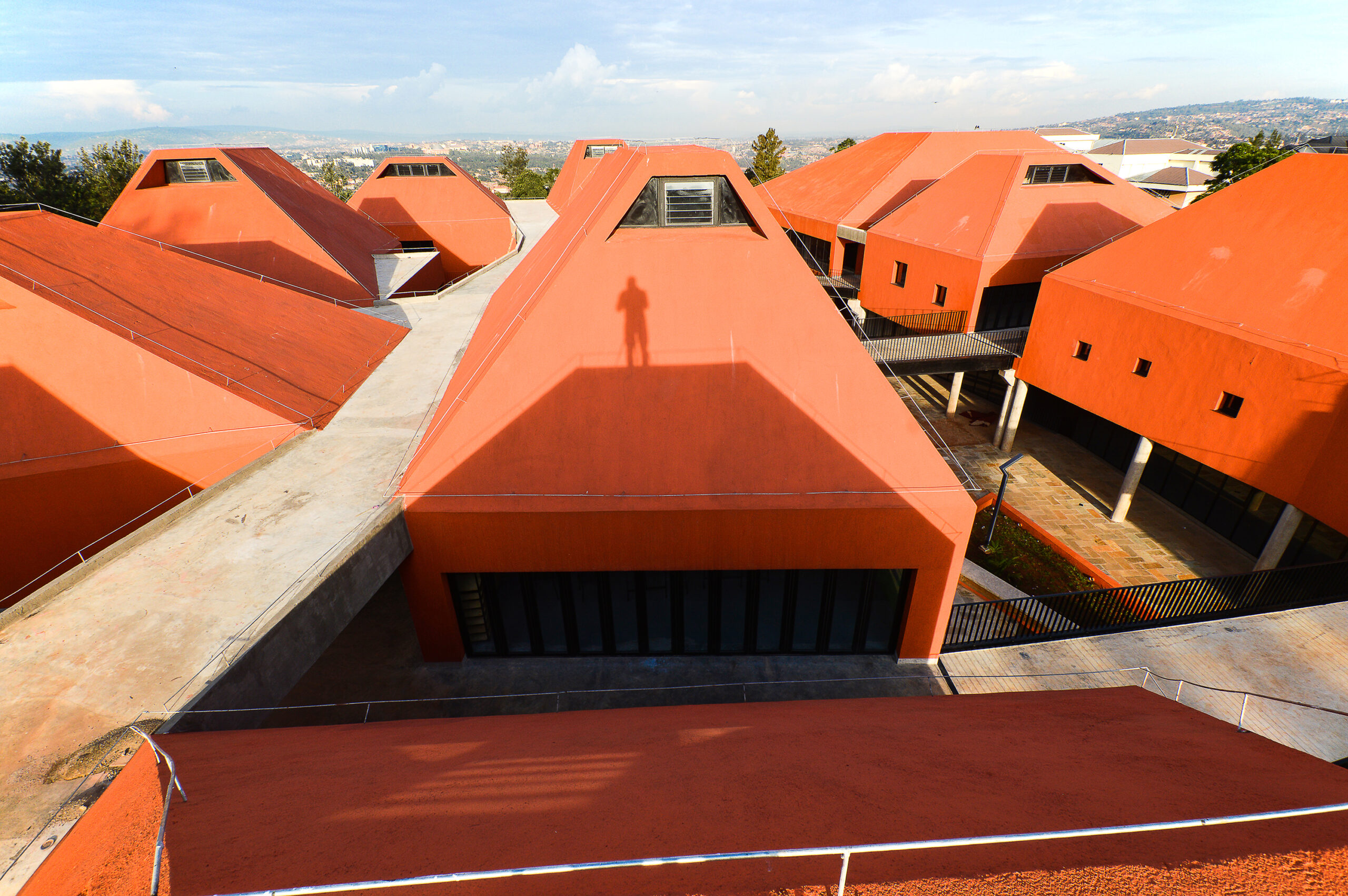
By Patrick Schweitzer et Associés Architectes, Kigali, Rwanda

For design of the new Faculty of Architecture and Environmental Design in Kigali, the architectural team drew inspiration from the surrounding landscape and topography, reflected on the thirteen distinctively shaped prism volumes that house the classrooms and design studios. The façade design further emphasized the distinctiveness of the prism shapes, alternating in materials between the local lava rocks and rammed earth on the exterior side of the prisms and a striking orange color on the interior sides.

The use of the former represents Earth and the later represents Fire, as part of the four natural elements that guided the design conception, alongside Water represented in the inner gardens and Air in the building’s circulation. The design of the openings on the building’s exterior aimed to maximize the use of natural sunlight to reduce running costs and create more pleasant interiors, with the project serving as a pedagogic tool that shows and not only tells students how to design.


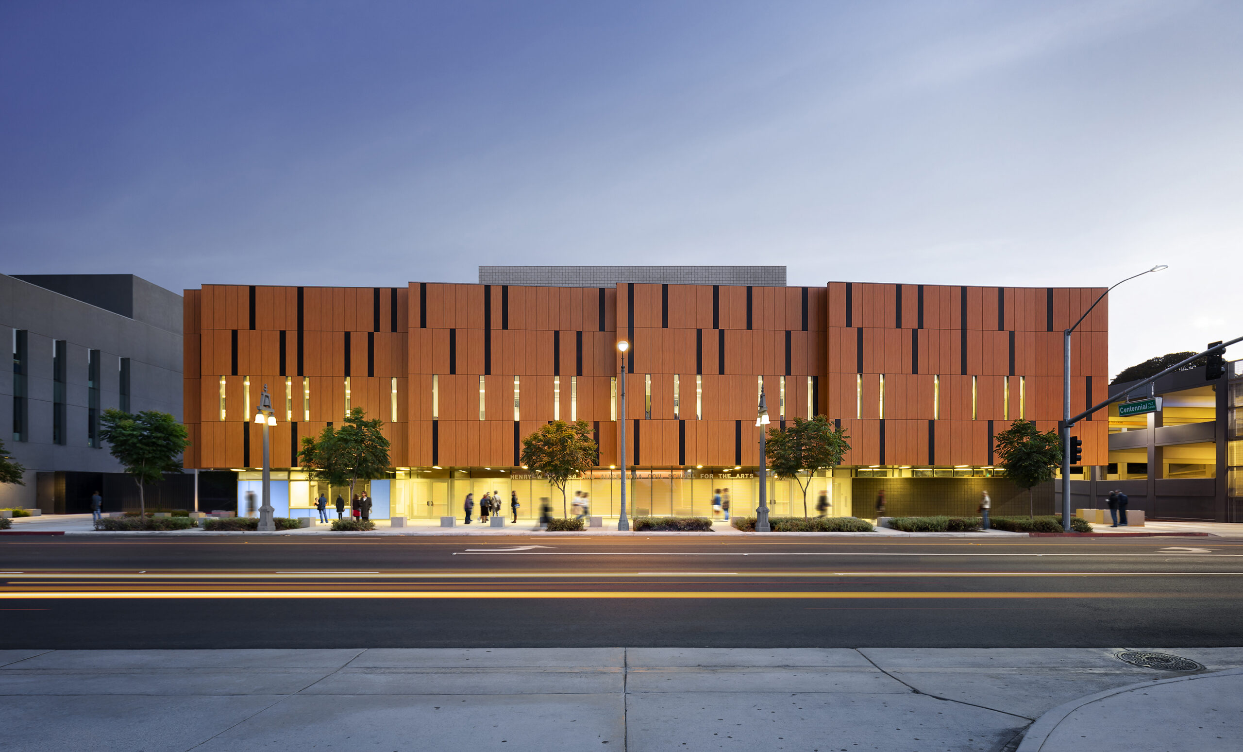
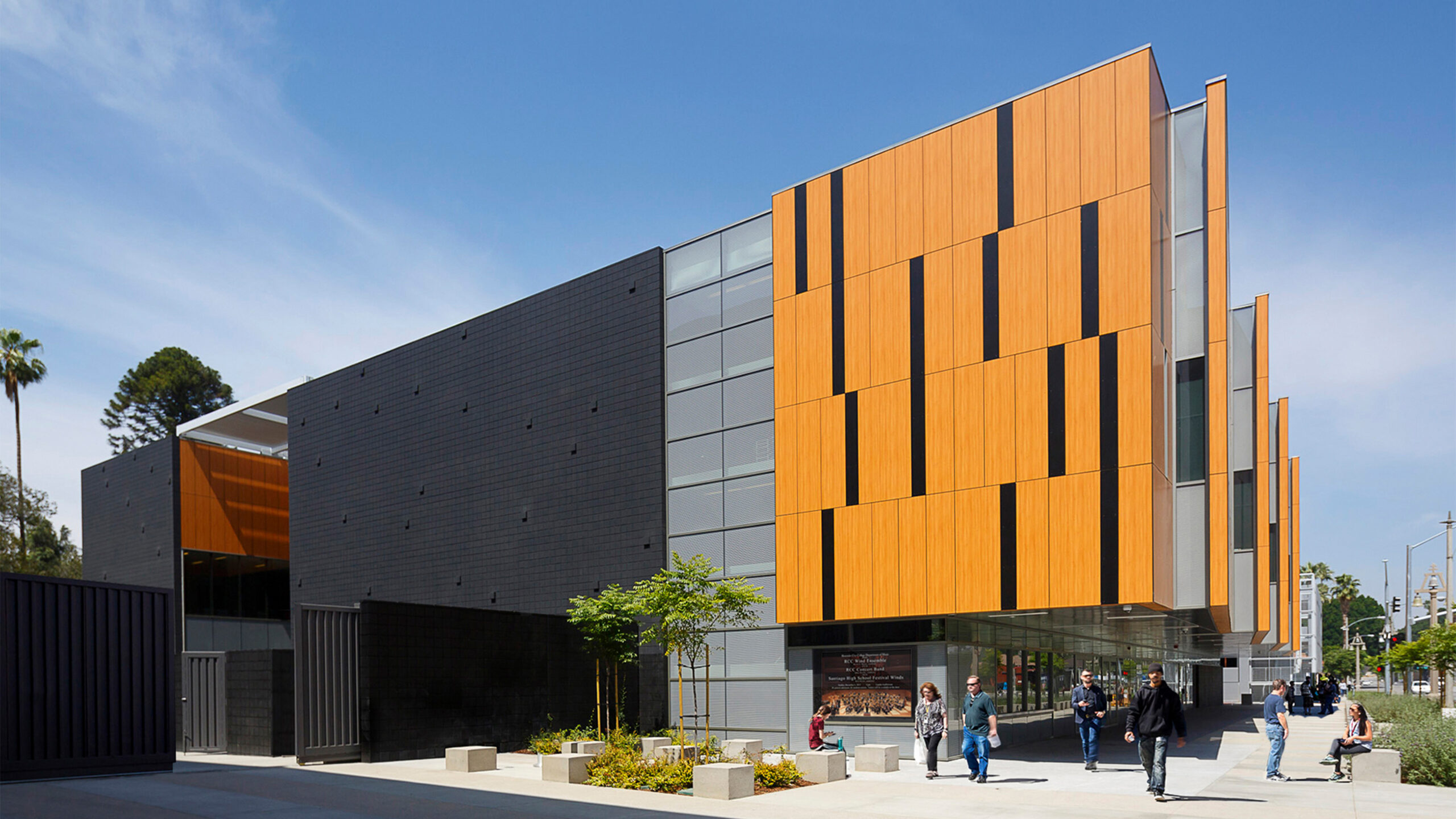
Coil School for the Arts, Riverside Community College

By LPA, Riverside, CA, United States

The music that plays inside the new Coil School for the Arts could be seen reflected on the façade design of the main elevation, constructed out of phenolic wood panels that evoke the craftsmanship of wooden music instruments, with a pattern that is inspired by the sheet music notations. In response to the desert climate of the area and the building program’s acoustical requirements, heavy concrete grouted masonry was used as the main construction material of the LEED Silver certified building, with openings kept minimum on the building’s exterior and the building mass pushed back at street level to create a sheltered outdoor lobby where visitors can gather. On the southeast façade, an intimate courtyard is designed for students for gatherings and informal concerts, shaded with a trellised structure that filters out the noise from the street and the harshness of the sun.

Judging for the 11th A+Awards is now underway! While awaiting the Winners, prepare for the upcoming Architizer Vision Awards, honoring the best architectural photography, film, visualizations, drawings, models and the talented creators behind them. Learn more and register >
Reference