Dezeen’s top 10 sustainable transport designs of 2022
CategoriesSustainable News

Dezeen’s top 10 sustainable transport designs of 2022

After a year that saw designers come up with numerous ideas for how to decarbonise transport, we round up 10 of the most interesting as part of our review of 2022.

Transport accounts for around a fifth of global carbon dioxide emissions and has the highest reliance on fossil fuels of any sector, according to the International Energy Agency.

Ranging from concepts to products set for mass manufacture, the designs featured in this list seek to reduce emissions from cars, planes, boats or motorbikes and to boost cycling.

Read on for Dezeen’s top 10 sustainable transport designs of 2022:
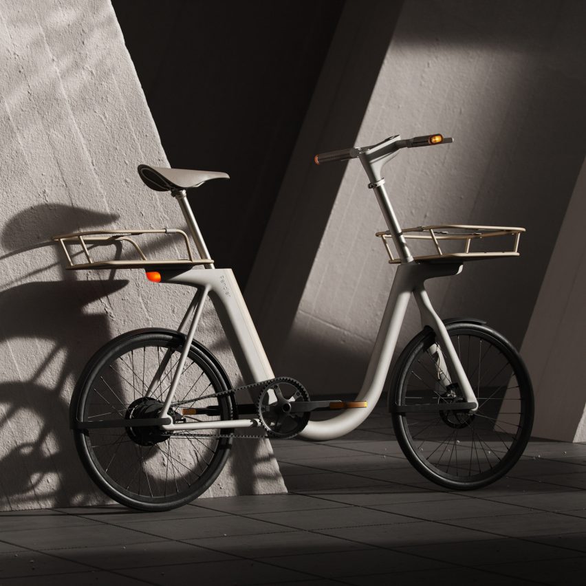

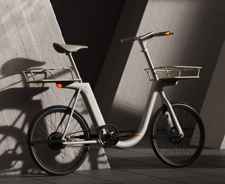
Pendler e-bike concept by Layer design studio
Image courtesy of Layer

Pendler by Layer

This concept electric bike from design studio Layer, which aims to tackle the pain points of urban commuting, has a distinctive U-shaped frame, a concealed motor and detachable timber accessories.

Designed with a “crafted” aesthetic, the Pendler is intended to provide built-in solutions to the challenges associated with city cycling, such as storage, fitting the bike on public transport and navigating traffic.

Find out more about Pendler ›


A Multi-Utility Farming Vehicle in a wheat field with a drone flying above
Image by Madhav Dua

Arrival Multi-Utility Farming Vehicle by Madhav Dua

Indian designer Madhav Dua came up with an idea for a multifunctional, customisable electric tractor that would make modern tools more affordable to Indian farmers, making agriculture more efficient.

It also features solar panels that provide energy to a mobile electricity reserve that could be used to power farmers’ homes.

The concept won first place in Dezeen’s Future Mobility Competition, a global design contest powered by electric vehicle brand Arrival.

 Find out more about Arrival Multi-Utility Farming Vehicle ›


X Shore 1 electric boat
Photo courtesy of X Shore

X Shore 1 by X Shore

In a bid to bring electric boats to a wider audience, Swedish company X Shore launched this model that it says is priced competitively with fossil-fuel vessels.

To reduce costs, the 6.5-metre-long boat was made light and efficient enough that it only needs a single battery to run, also reducing its carbon footprint.

Find out more about X Shore 1 ›


Lightyear 0 on a desert road
Photo courtesy of Lightyear

Lightyear 0 by Lightyear

Dubbed the “world’s first production-ready” solar-powered car when launched this year, the Lightyear 0 is an electric car that has photovoltaic panels covering its roof, bonnet and boot to charge its battery while driving.

In an interview with Dezeen, the chief executive of the Dutch startup Lightyear Emanuele Cornagliotti predicted that solar cars will be “normal within 20 years”.

Find out more about Lightyear ›


The Domus trimaran, the "world's first zero-emission superyacht", features in today's Dezeen Agenda newsletter
Image courtesy of Van Geest Design and Rob Doyle Design

Domus by Van Geest Design and Rob Doyle Design

While X Shore was exploring how to make electric boats more affordable, yacht design studios Van Geest Design and Rob Doyle Design were working on a concept for a luxury trimaran that is “truly zero-emission”.

The 40-metre Domus would be powered by a combination of hydrogen fuel cells, hydro generation and solar energy.

UK architecture studio Zaha Hadid was also looking at electric yachts this year, presenting its concept for the photovoltaic-covered Oneiric at Milan design week.

Find out more about Domus ›


Man cycling in front of a tram in Milan, illustrating a news story about the planned Cambio cycling network in Milan
Photo by Mikita Yo

Cambio by the city of Milan

A key aspect of decarbonising transport is encouraging people to take more of their journeys by bike, with many cities coming up with plans to become more cycling-friendly after the coronavirus pandemic.

Among them is Milan, which in early 2022 committed to constructing the Cambio network of 24 cycle highways by 2035 based on data about the daily movements of its residents. These will be accompanied by dedicated bicycle parking stations, physical and digital wayfinding displays and low-impact lighting.

Find out more about Cambio ›
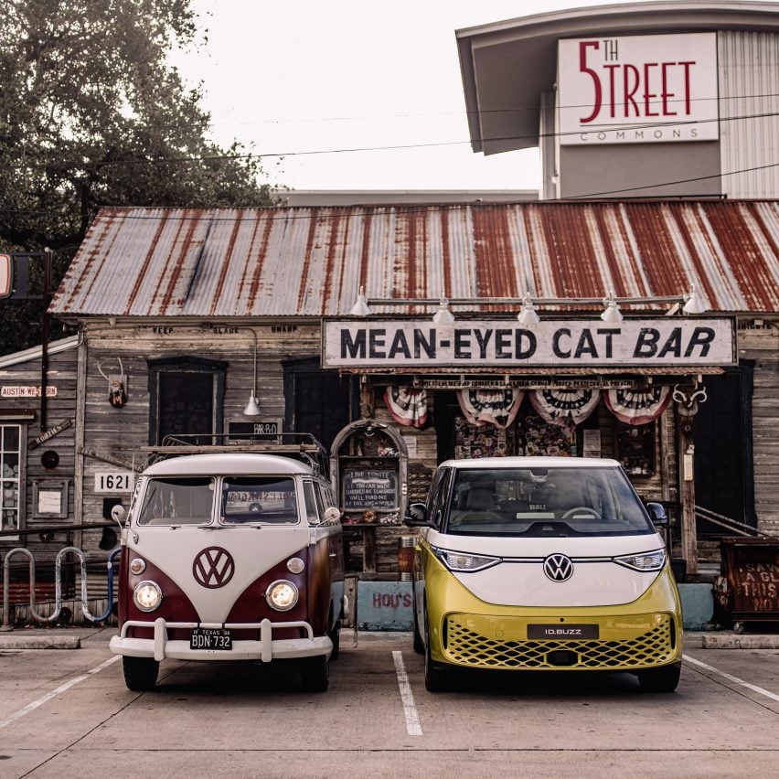

Volkswagen ID Buzz next to a vintage VW van in a parking lot
Photo courtesy of Volkswagen

ID Buzz by Volkswagen

Electric vehicle launches came thick and fast in 2022, and among the most interesting was the ID Buzz by Volkswagen.

The van is an electrified update of the German carmaker’s famous T1 Transporter camper van, which became associated with the hippie movement of the 1960s and 70s, and has the same flat front and a similar V-shaped face as the original.

Find out more about the ID Buzz ›


Industrial origami motorcycle
Photo courtesy of Stilride

SUS1 by Stilride

Swedish startup Stilride this year unveiled the Sport Utility Scooter One (SUS1), an electric scooter built using an unusual origami-like process that reduces the amount of material used, limiting the environmental impact of manufacture.

While conventional scooters consist of a tubular frame and a plastic body, the SUS1’s chassis is constructed by taking a single sheet of stainless steel and cutting and folding it.

Find out more about SUS1 ›


Cake anti-poaching bikes
Photo courtesy of Cake

Anti-Poaching bikes by Cake

Another interesting example of an electric motorcycle seeking to cut carbon emissions is the anti-poaching series from Swedish brand Cake.

The solar-charged bikes were created specifically for use by rangers in the South African bush, allowing them to quietly approach illegal animal poachers thanks to the lack of engine noise while also negating the need for polluting petrol deliveries by truck or helicopter.

Find out more about Cake Anti-Poaching bikes ›


Rolls-Royce EasyJet hydrogen test engine
Photo courtesy of Rolls-Royce and EasyJet

Hydrogen jet engine by Rolls-Royce and EasyJet

Aviation is a major contributor to global transport emissions, and while there are still doubts over whether it will ever be practical to fuel planes with hydrogen, 2022 saw the world’s first test of a commercial jet engine powered by the non-carbon-emitting element.

British airline EasyJet and engineering company Rolls-Royce used renewably-made hydrogen to power a converted Rolls-Royce AE 2100 aircraft engine.

The technology is still in its infancy, but Rolls-Royce chief technology officer Grazia Vittadini called the test “an exciting milestone”.

Find out more about this hydrogen jet engine ›

Reference

AIA Estúdio designs cave-like interior for clothing store in Rio de Janeiro
CategoriesInterior Design

AIA Estúdio designs cave-like interior for clothing store in Rio de Janeiro

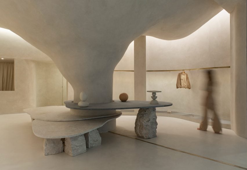
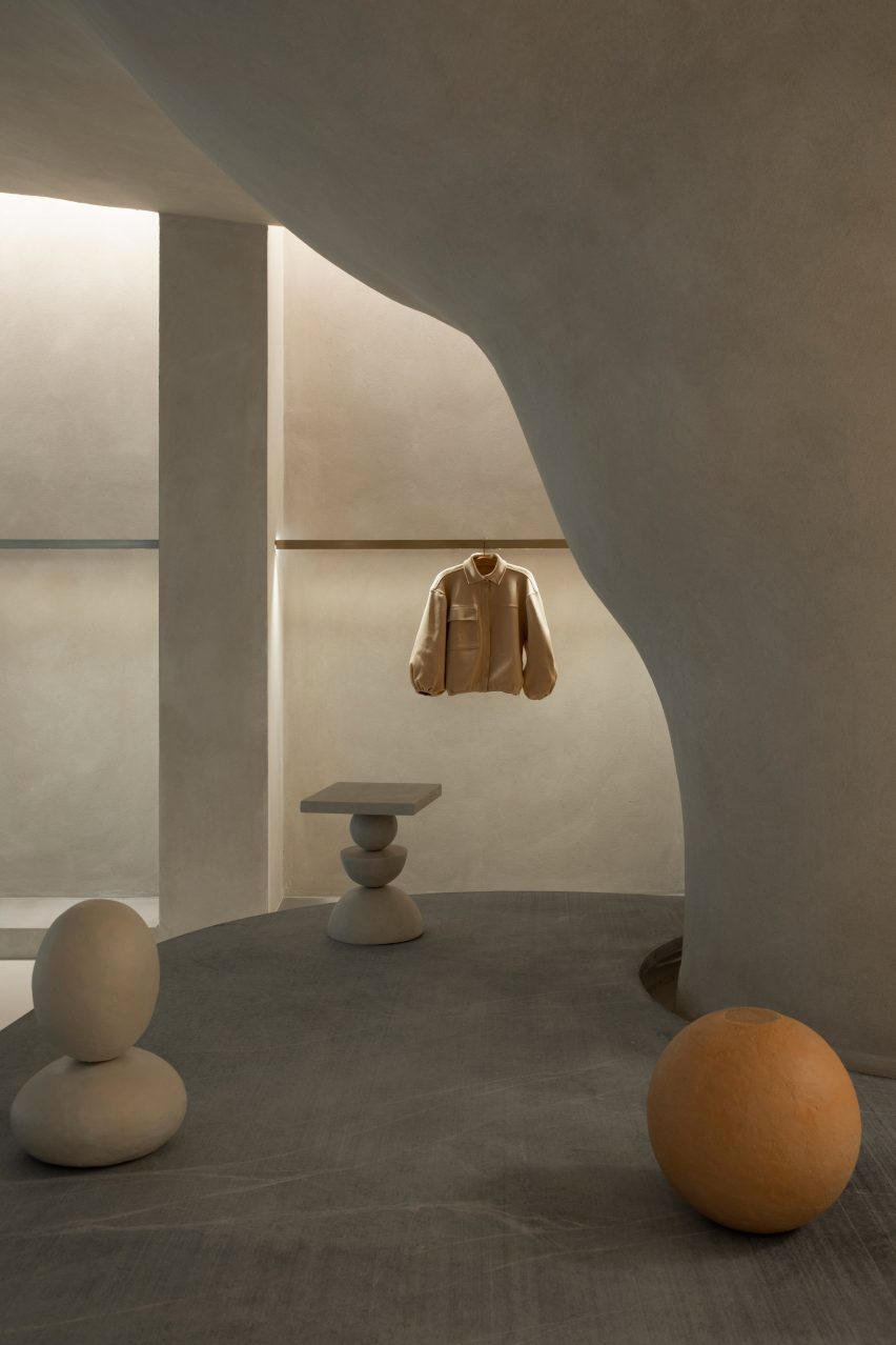
Organic shapes and stone-like surfaces characterise the interior of the Haight clothing store in Rio de Janeiro, which was designed by interior and landscaping design practice AIA Estúdio.

A large pillar with a rough, textured surface dominates the 110-square-metre shop interior, expanding as it ascends before merging into the ceiling to create a cave-like space.

Haight clothing store by AIA Estúdio
A pillar transforms into a cave-like structure

“Its height starts small and in the back part it ends higher in a nonlinear form, just like a cave,” AIA Estúdio founder Alice Tepedino told Dezeen.

“The infinite and diverse processes of erosion that form cliffs, caves, stalactites, sands, stones and the movements of water with its tracks and shapes led to our creative process being part of the concept developed for the store’s spatiality.”

Haight clothing store by AIA Estúdio
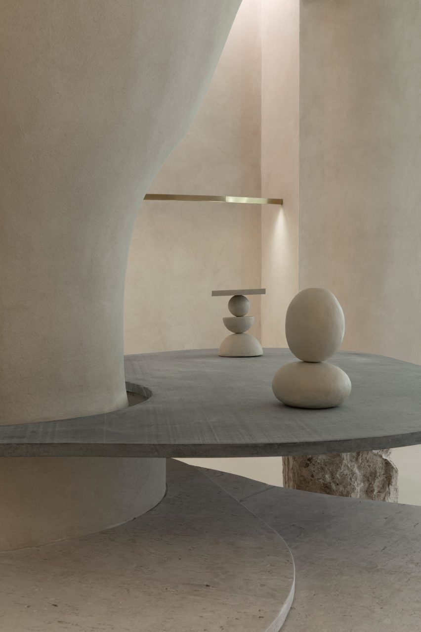
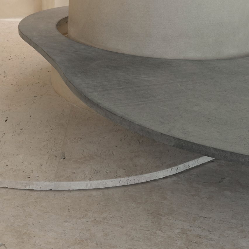
Stone slabs around the pillar are used to display objects

Rather than being a cumbersome obstacle, the pillar helps organise the shop’s circulation and movement of shoppers, according to the studio.

“It is from the occupation around the pillar that the space fluidity is achieved. This disposition is enhanced by curved lines that define the path inside the store,” said Tepedino.

Haight clothing store by AIA Estúdio
Curved stone plates balance on rocks

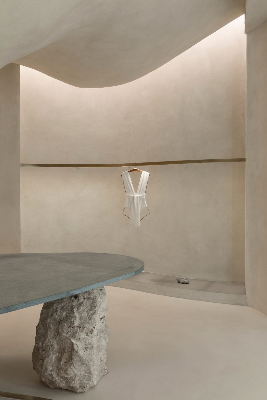
Slabs of soapstone and Bahia beige marble encircle the pillar at different heights and are propped up by Bahia beige marble rocks that create a display surface and a place for shoppers to sit.

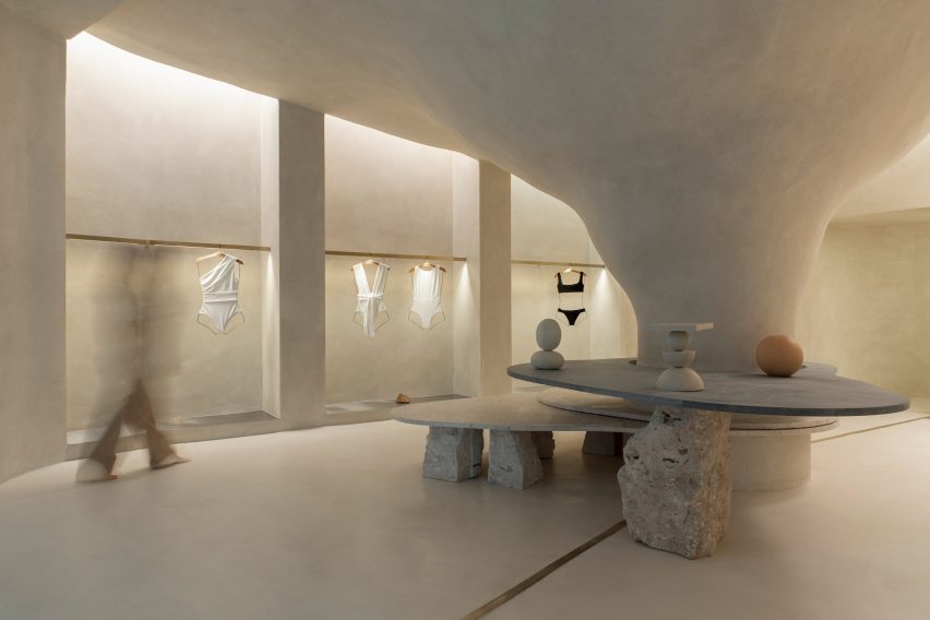
On the perimeter walls, niches with stainless steel bases display Haight’s clothing on brushed-brass rails.

The metallic surfaces and straight edges of the niches contrast with the organic shapes and materials in the centre of the shop, which is located in the Shopping Leblon retail centre.

Tepedino used indirect lighting in the niches to illuminate the space, mimicking cracks in cave walls where sunlight can seep through.

Interior of the Haight clothing store
Clothing is displayed on brushed-brass rails

“The exhibition interspace was thought of as a cut in the walls, an operation emphasised by the transition of materiality,” said Tepedino.

“Inside, there are exhibition racks in brushed brass, which, with their more solar aspect, contribute to subtly warming up the store’s ambience, together with the soapstone and its greyer tone.”

Haight clothing store by AIA Estúdio
The bottoms of wall niches are lined with steel

Tepedino’s design is the first of Haight‘s stores to be located inside a shopping centre, which prompted the designer to approach the project in a different way.

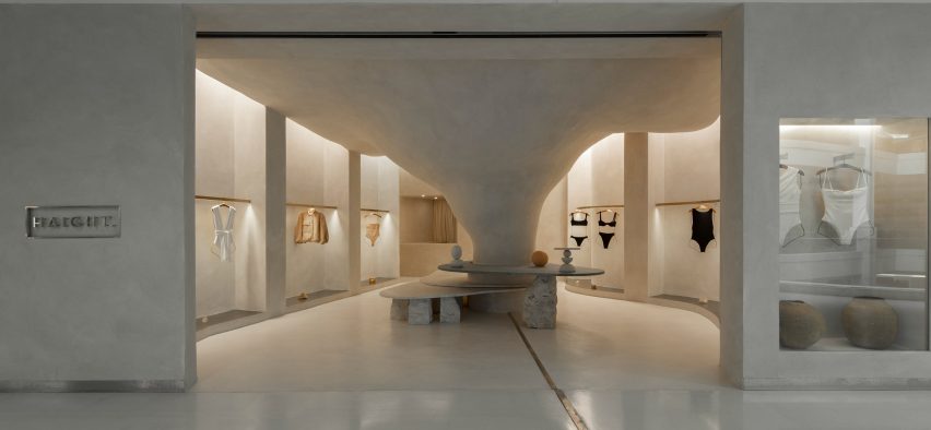
The entrance to the shop is a large opening that provides open access from the shopping centre to the nature-inspired shop interior.

Exterior of the Haight clothing store
It is the first Haight store to be located in a mall

“The design adopted a contrasting strategy between the store and mall, which, despite the rigid and controlled environment, offers opportunities such as the possibility of not having a door,” said Tepedino.

The brand’s conceptual basis is related to natural landscapes but when you are inside the mall, you find a language that is the opposite of Haight’s conceptual basis, with artificial elements and cold materiality.”

Stone surfaces at the Haight clothing store
Natural materials and surfaces were used throughout the shop interior

“Once you’re inside the store you get disconnected from the artificial atmosphere of the rest of the building,” Tepedino continued.

The project has been shortlisted in the small retail interiors category of Dezeen Awards 2022, alongside a surfaces showroom in Helsinki with colourful terrazzo-like walls and an oxblood red shop interior with walls decorated with Victorian-style balusters.

The photography is by Maira Acayaba.

Reference

YOD Group designs Terra restaurant interior to “mirror its surroundings”
CategoriesInterior Design

YOD Group designs Terra restaurant interior to “mirror its surroundings”

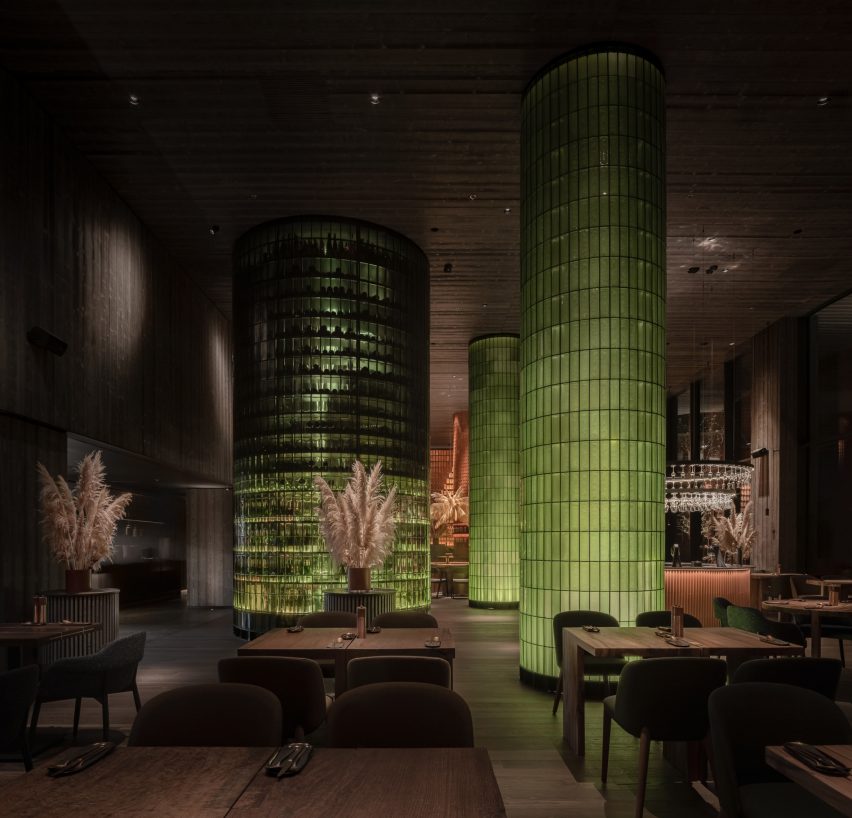
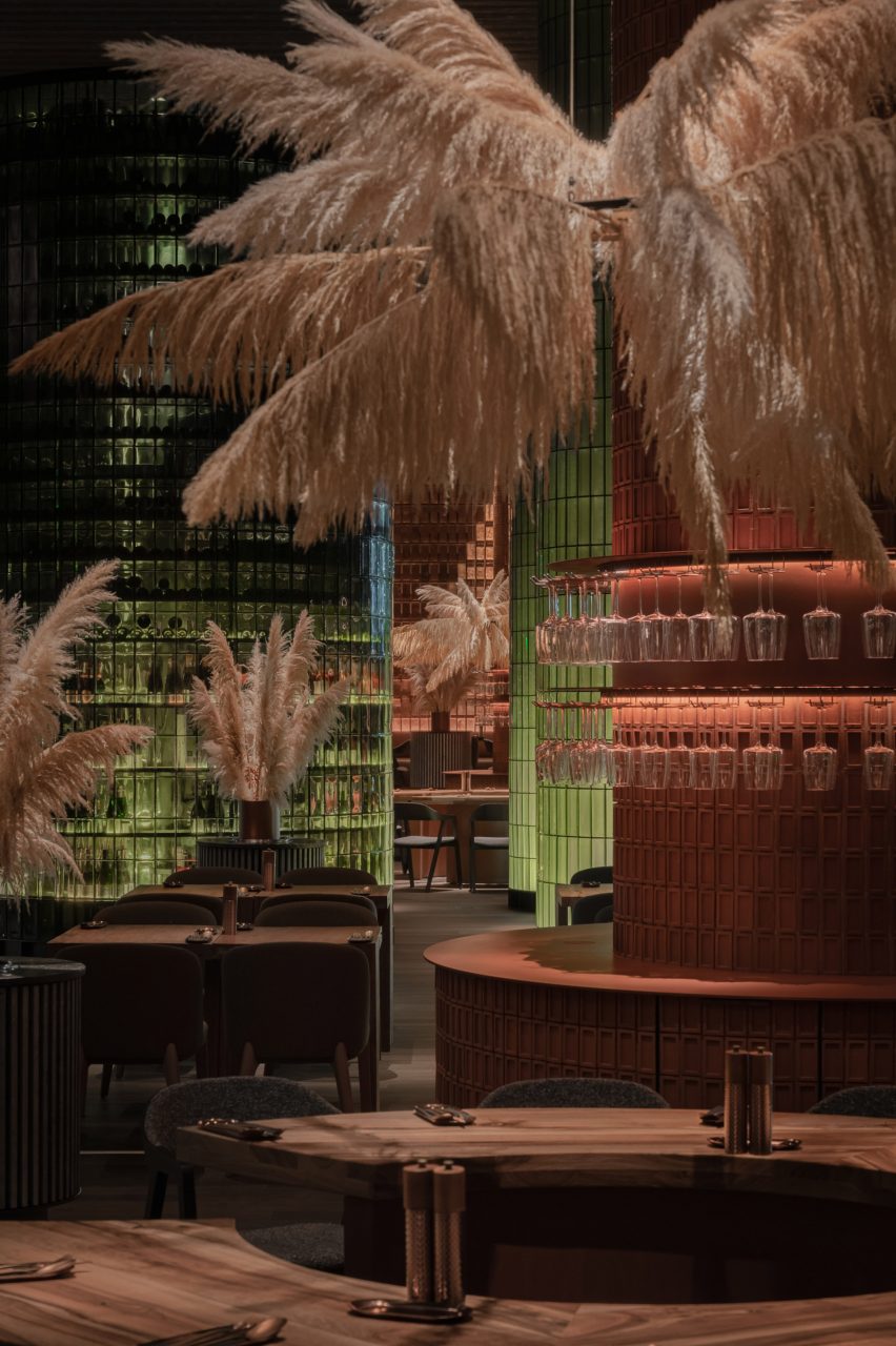
Ukrainian design studio YOD Group dressed this restaurant interior in Vynnyky with terracotta tiles and slabs of green glass to reflect the earthy landscape outside.

Called Terra, the eatery features a colour and material palette that takes cues from the rolling hills and a lake that border the restaurant. It was completed in February 2022, just before Russia’s invasion of Ukraine.

Terra restaurant
YOD Group designed Terra’s interior to reflect the landscape outside

YOD Group created the interior across a single hall, which features clusters of plush, low-slung armchairs and sofas arranged around both meandering and rectilinear dark wooden tables.

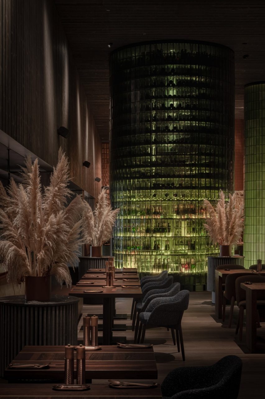
These seating areas are interrupted only by large rounded columns clad in glass bricks, which are illuminated from the inside to create a watery green glow designed to echo the nearby lake.

Terracotta tile column
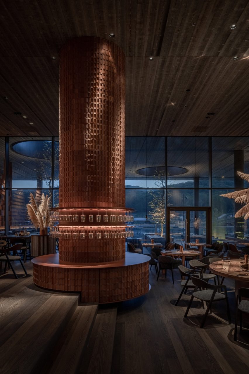
Waiter stations are clad in terracotta tiles

The largest of these columns houses a curved wine cellar within an internal spiral staircase, while the transparent glass reveals the ghostly silhouettes of stored wine bottles.

Textured terracotta tiles make up rounded waiter stations, which were designed to mirror the earthiness of the restaurant’s exterior setting.

The stations also nod to the Ukrainian tradition of covering furnaces and fireplaces with tiles, according to YOD Group.

Curved wine cellar by YOD Group
A curved wine cellar includes an internal staircase

“We aimed to extract colours, textures and impressions from the landscape to translate them into the interior design language,” explained the studio.

“Like the eyedropper tool in Photoshop, but on a real-life scale, we designed the space to mirror its surroundings.”

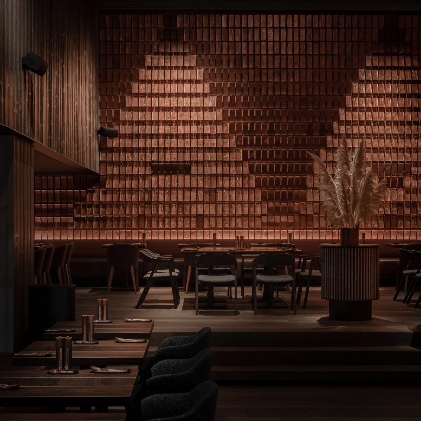
Another wall is covered in adjustable copper-hued glass slabs that feature decorative markings made by imprinting local grasses on their surfaces.

The moveable wall is intended as a metaphor to symbolise the way reeds sway in the wind, said YOD Group.

“Guests can not only touch the glass slabs but also interact with them and change the pattern on the wall, becoming co-creators of the design.”

Copper-hued glass slabs
Copper-hued glass slabs can be moved across a large wall

Bouquets of pampas grass are interspersed throughout the interior, in a nod to the restaurant’s lakeside terrace where visitors can dine outside.

Terra is shortlisted in the restaurant and bar interior category of the 2022 Dezeen Awards, which announces its winners later this month.

Terra restaurant
Pampas grass decorates the restaurant

Last year, the category’s winning eatery was another restaurant in Ukraine – Yakusha Design’s Istetyka in Kyiv, which has an interior characterised by rough concrete, polished stone and smooth steel.

YOD Group also designed a coffee shop in Ukraine’s capital that features pixel-like mosaics in a hole-in-the-wall-style bar.

The photography is by Yevhenii Avramenko.


Reference

BC designs Francis Gallery LA to celebrate Korean art and culture
CategoriesInterior Design

BC designs Francis Gallery LA to celebrate Korean art and culture

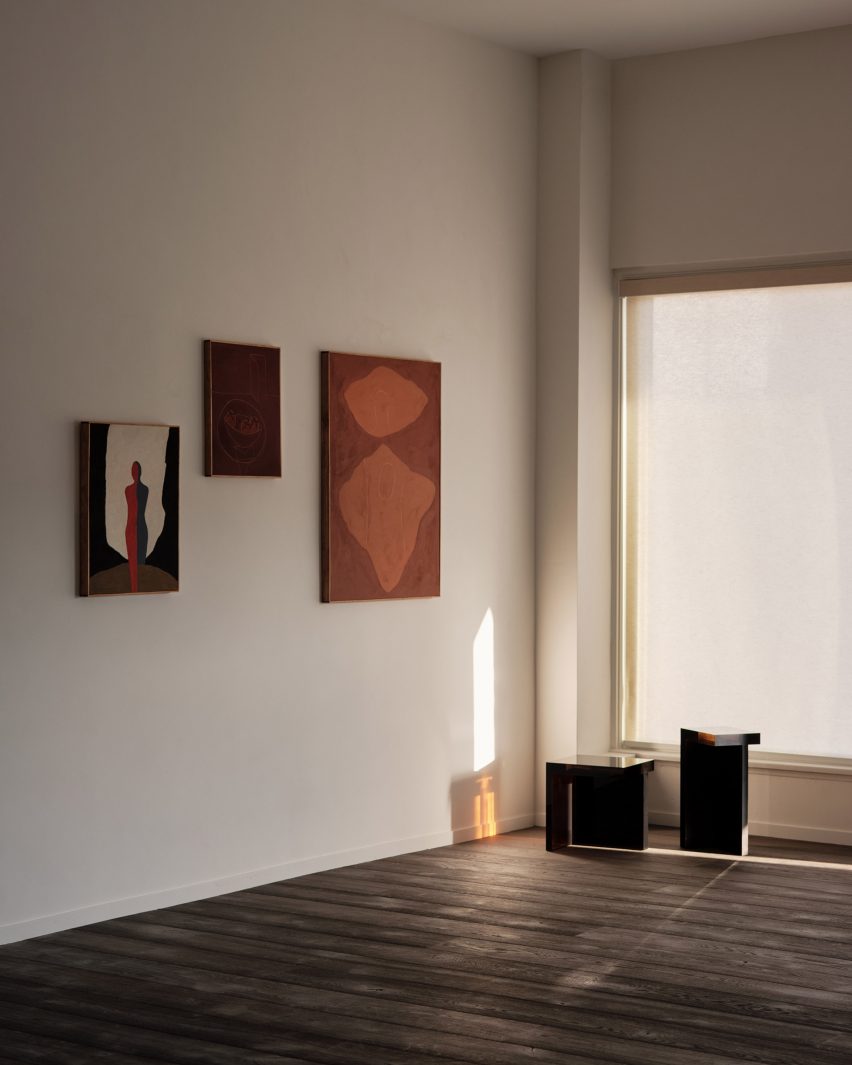
Gallerist Rosa Park has opened a space in Los Angeles to showcase the work of Korean artists and designers, with interiors by local studio BC intended to reflect the country’s visual culture.

Francis Gallery LA is Park’s second location and is an expansion of her original gallery in Bath, UK – both presenting the work of emerging Korean artists.

Dark walls at Francis Gallery LA
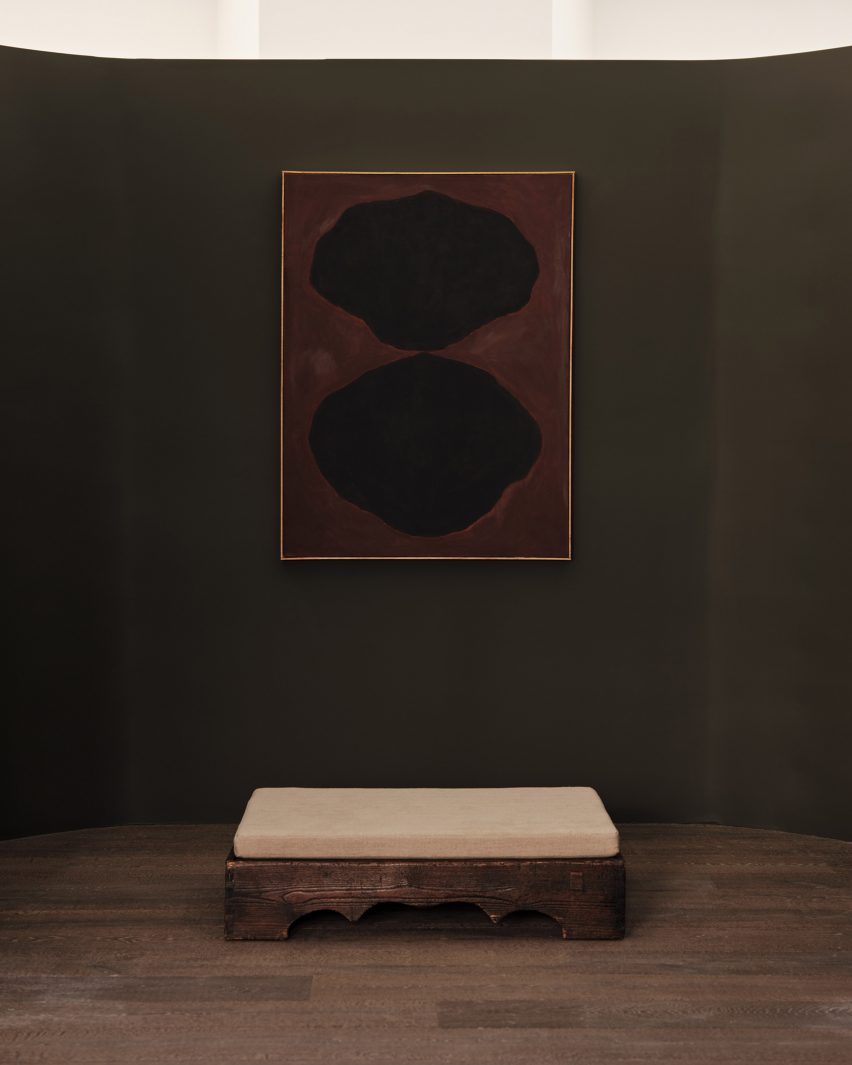
Places of worship informed the interiors of the gallery on Melrose Avenue

Situated on Melrose Avenue in West Hollywood, the new space was designed with Lindsey Chan and Jerome Byron, founders of LA-based BC.

The duo preserved the building while transforming the inside with references to traditional Korean architecture and art.

Paintings hung on walls
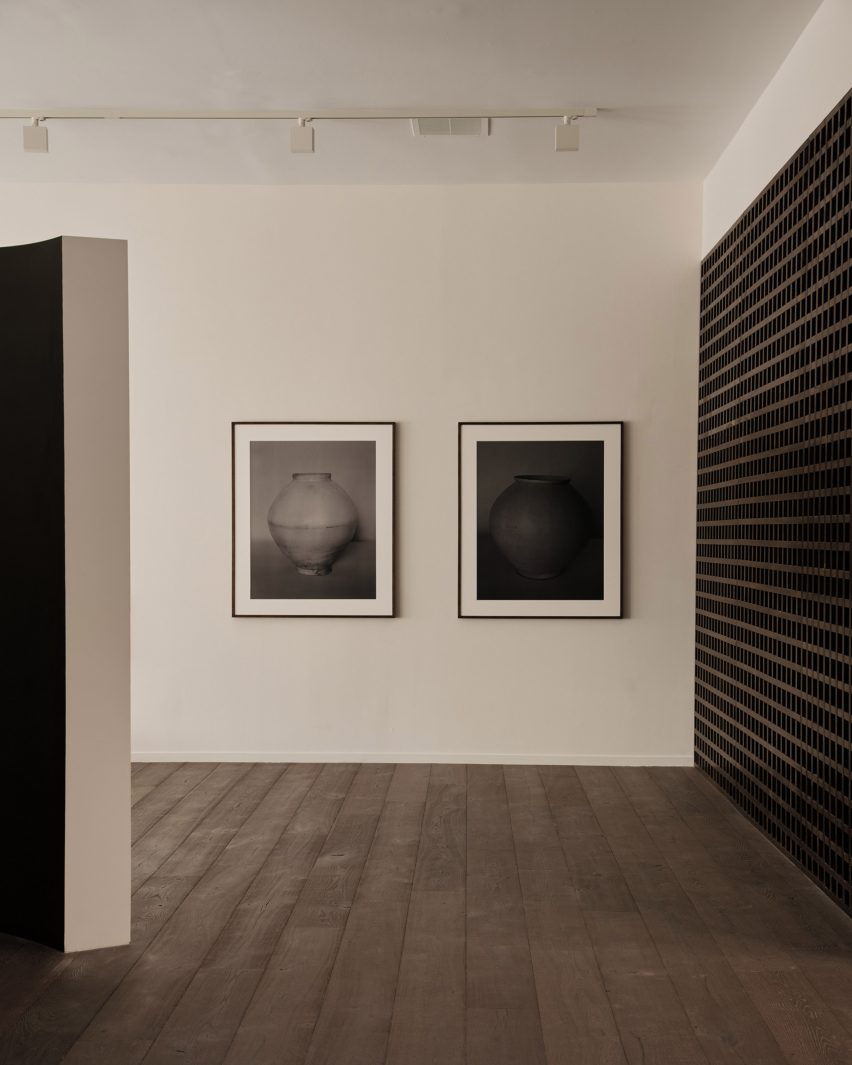
The inaugural exhibition displays the work of six artists, including photography by Koo Bohnchang

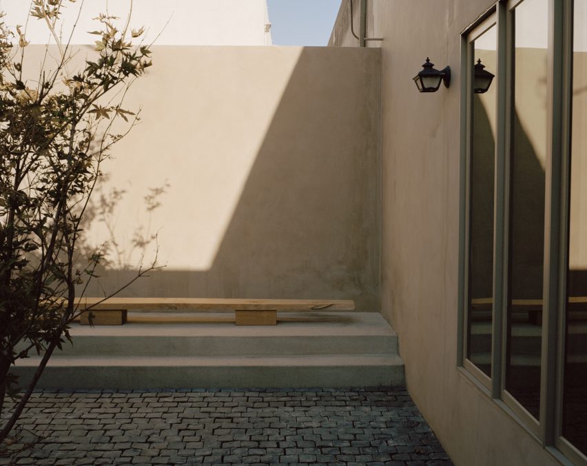
These include a curved partition wall influenced by a moon jar and a contemporary re-interpretation of a hanok courtyard.

“The space was conceived to pay homage to Korean art and design in subtle ways – whether it was in the curve of a partition wall, the colour palette of the interior paints, or the profile of a low bench in the courtyard,” said Park.

Corner view with window
BC designed the gallery to be pared-back yet warm

Places of worship like chapels and monasteries were also referenced in the design. These were accentuated by the use of “humble materials” and pared-back forms.

Although minimal, the intention was to ensure the gallery still felt warm and inviting, as well as provide an appropriate setting for the pieces on show.

Resin stools
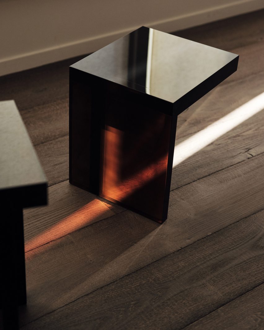
Rahee Yoon’s translucent acrylic blocks are among the works on show

“I think this emotional connection to a space, to a work, is central to what I’m doing with Francis,” Park said.

“It was of great importance to me that the space acted as the ideal framework to house works that I hope will move people.”

The inaugural exhibition at Francis Gallery LA is titled Morning Calm, on view until 7 January 2023, and features the work of six artists of Korean descent.

Bo Kim, John Zabawa, Koo Bohn Chang, Nancy Kwon, Rahee Yoon and Song Jaeho are all at different stages in their careers.

Stones VI by John Zabawa
An abstract painting by John Zabawa hangs on a dark wall

Their painting, photography, sculpture and ceramics all explore Korean identity in an international context and offer insights into the artists’ cultural heritage.

“With Los Angeles being home to the largest Korean community in the United States and Park having roots in both Seoul and LA, the debut show seeks to explore the nuanced connections between the two places,” said a statement from the gallery.

Courtyard with low bench
References to Korean architecture at the gallery include a contemporary interpretation of a traditional hanok courtyard

LA’s art scene has grown exponentially over the past decade, and the city is now home to many new galleries and exhibition spaces.

Well-known names that have opened their own locations there include Hauser & Wirth and The Future Perfect, while others like Marta are using modernist buildings like Neutra’s VDL II House to exhibit.

The photography is by Rich Stapleton.

Reference

Cun Panda designs escape room with tree at its centre
CategoriesInterior Design

Cun Panda designs escape room with tree at its centre

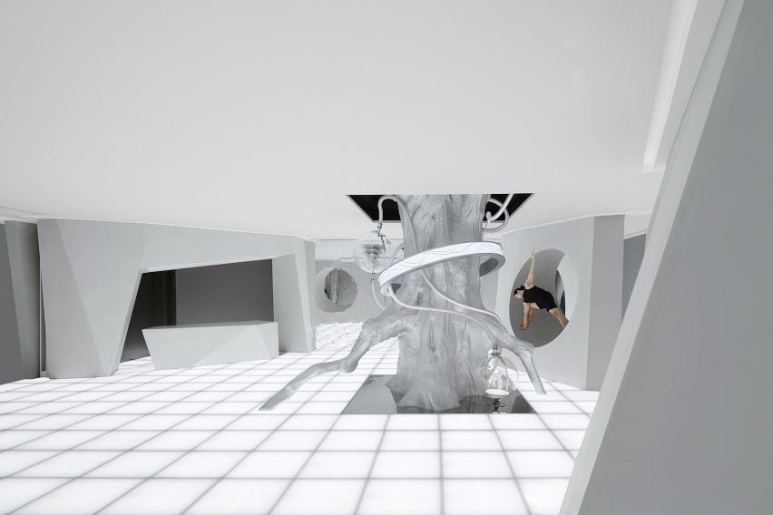
Chinese studio Cun Panda has created a flexible space for immersive game company Qian Hu Zhi Wu in Xiamen, China, that features a silver-foil-clad tree, acrylic seats and mirror installations.

The local game company runs 14 escape rooms in China. Cun Panda’s design for its latest space measures 330 square metres and was designed with a focus on flexibility to enable a number of gaming narrations to take place.

“We aim to create a space that can tell stories,” the studio said. “The design injects extraordinary imagination and creativity into the space that integrates art and immersive experience.”

Entrance exhibition space at Qian Hu Zhi Wu, Xiamen
A series of rock-like formations surround the central tree installation

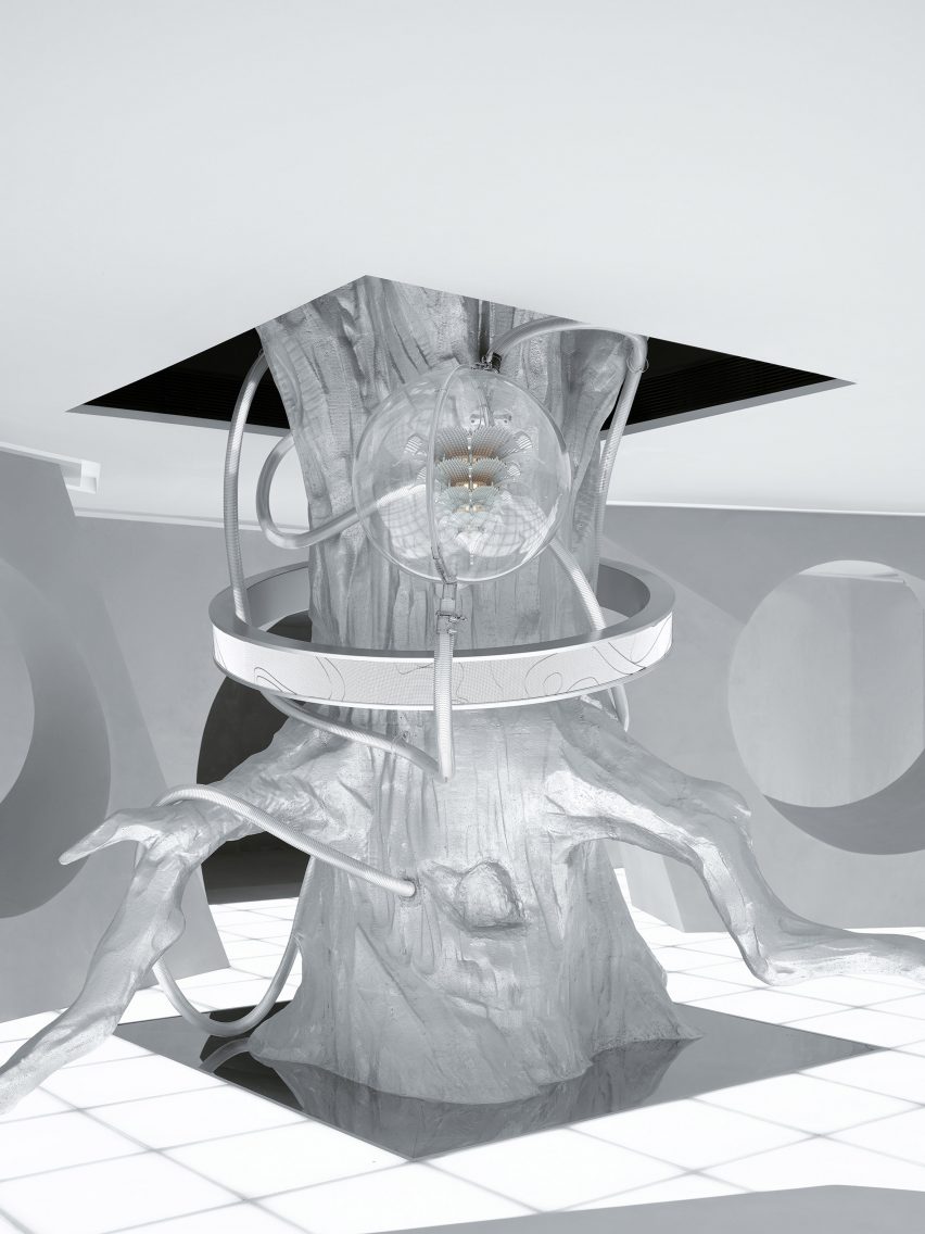
At the entrance of the space, a giant tree made of resin and covered in silver foil stretches through the ceiling to form the centre piece of the space. Added light installations were designed to look like satellites and planets circling the tree, giving the piece a futuristic feel.

The tree is surrounded by a series of rock-like formations, which were informed by Stonehenge.

“Stonehenge is taken as the prototype to open the interlaced space leading to the new world and build a dimension door of virtual and real,” explained the studio.

Resin tree covered in silver foil
Light installations have been added to the silver tree

The rock-like sculptures in the space have round holes to create clear sightlines inside the escape room, where the lit-up floor is the main light source and creates a variation of shadows.

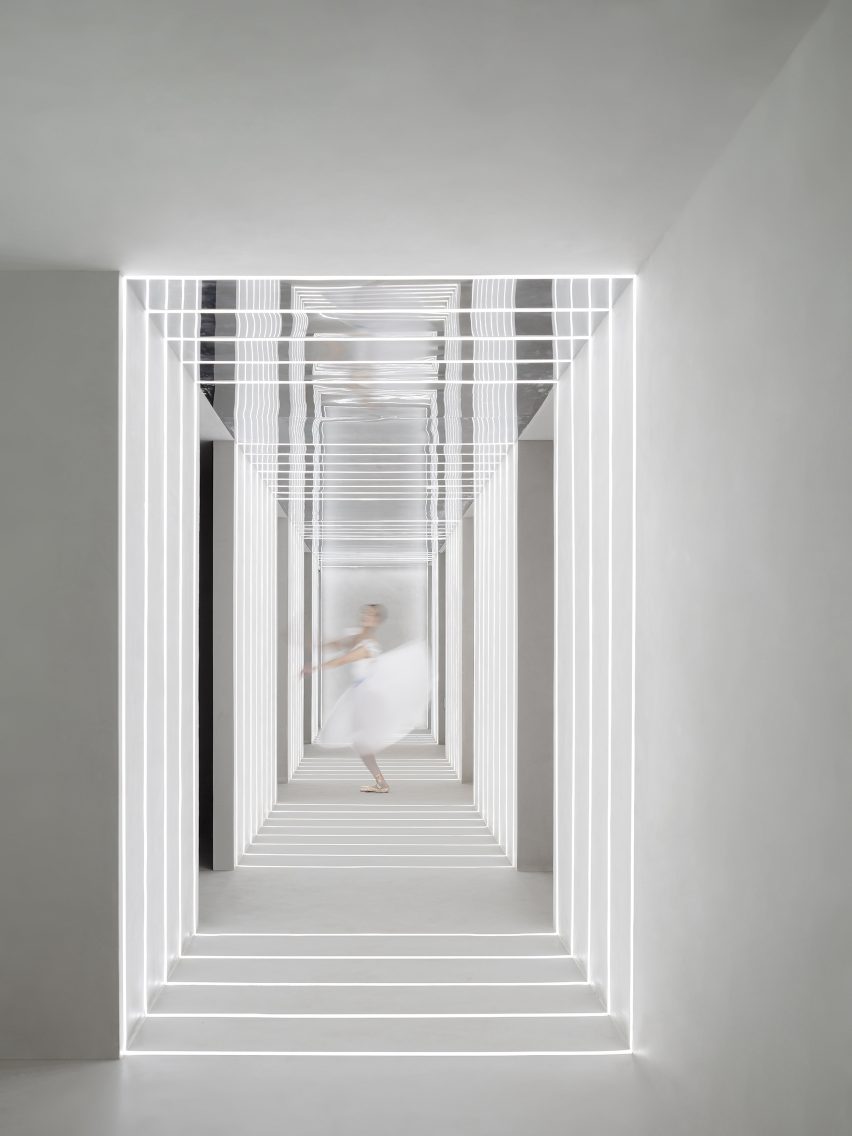
Next to the entrance space, a narrow corridor connects the game room with a storage room, dressing room, and makeup areas. Stripes of lights and a mirrors installation on the wall and ceiling were designed to create an infinite sense of space.

Waiting area at Qian Hu Zhi Wu, Xiamen
Green moss and black sand add a sense of nature inside a white room

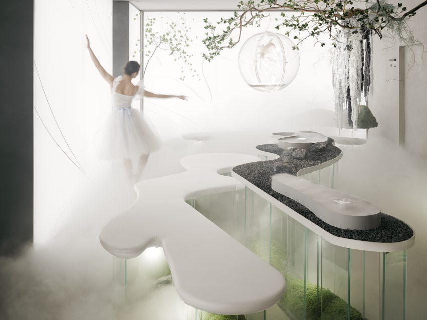
In another room, sand-dune shaped seats are supported by transparent acrylic to create a floating effect, revealing green moss and black sand in the otherwise completely white space.

Here, another tree breaks through the wall into the space and connects to the main tree installation. The white wall is lit up by LED lights and printed with shapes of sand dunes.

Corridor at Qian Hu Zhi Wu, Xiamen
Stripes of lights and mirrors create a visual illusion

Cun Panda was founded by Xuanna Cai and Jiacheng Lin in 2019 and has offices in Beijing, Shanghai, Kunming and Xiamen.

Other recent interiors from China include timber and travertine reading room by Atelier Tao+C and Fatface Coffee shop by Baicai, both shortlisted in this year’s Dezeen Awards.

The photography is by Xinghao Liu.

Reference

Offhand Practice designs second-hand bookshop to mimic greengrocer
CategoriesInterior Design

Offhand Practice designs second-hand bookshop to mimic greengrocer

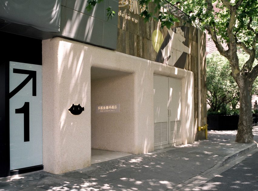
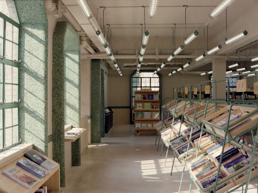
Used books are displayed in supermarket-style crates at the Deja Vu Recycle Store in Shanghai, which local studio Offhand Practice has designed to counter the “shabby” image associated with second-hand shops.

The store, which also carries pre-owned fashion, is located on the first and second floor of a three-storey building on Shanghai’s buzzy Anfu Road.

Exterior of Deja Vu Recycle Store in Shanghai
The Deja Vu Recycle Store is located in Shanghai’s Anfu Road

On the interior, Chinese architecture studio Offhand Practice hoped to create a relaxed shopping environment despite the large number of goods on offer, which includes more than 2,000 pieces of clothing.

With this aim, the studio set out to mimic the experience of going to a greengrocer by displaying clothes and books on shelves typically used to hold fruits and vegetables, while giving all products equal prominence regardless of price.

Mosaic-tiled hallway in store interior by Offhand Practice
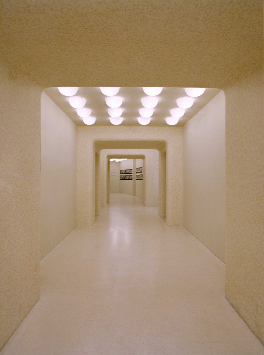
A long gallery-like corridor leads to the staircase for the first floor

“Picking up books in the way of picking up vegetables and fruits gives a feeling of enriching the spiritual basket,” Offhand Practice explained.

On the ground floor, the studio recessed the building’s entrance and framed it in cream-coloured mosaic tiles to create a small shelter while making the towering facade feel more welcoming.

Supermarket-style shelves holding books in Deja Vu Recycle Store
Second-hand books are displayed in supermarket-style crates

One of the main challenges for the studio was to encourage passersby to walk through the building’s ground floor – consisting of a long corridor bookended with space for mechanical, electrical and plumbing (MEP) equipment– and climb the stairs to reach the Deja Vu Recycle Store.

This was achieved by turning the corridor into a kind of gallery, showcasing the process of refurbishing second-hand goods.

“Taking advantage of the narrowness, we identified spatial depth through layers of opening,” the studio explained.

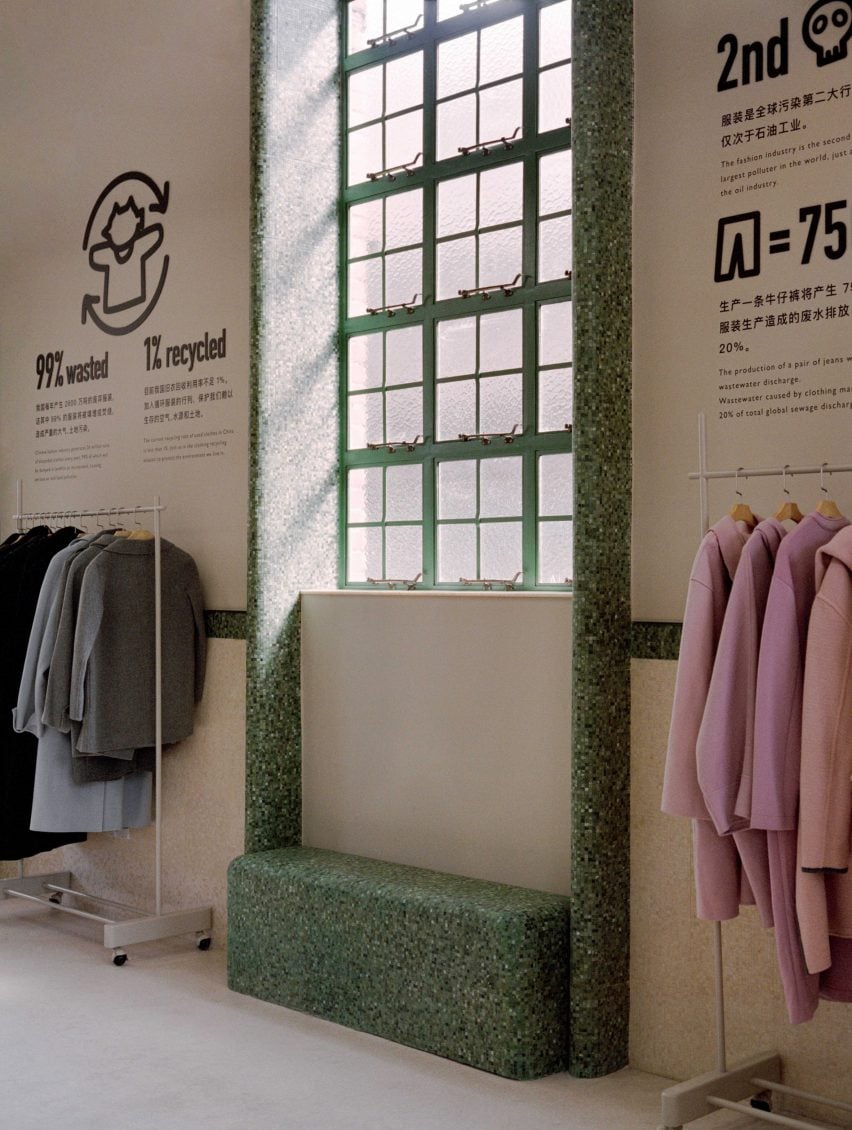
Books are displayed on the building’s first floor and clothing on the second. Both levels have an open-plan layout with circulation routes defined by shelving and clothes rails.

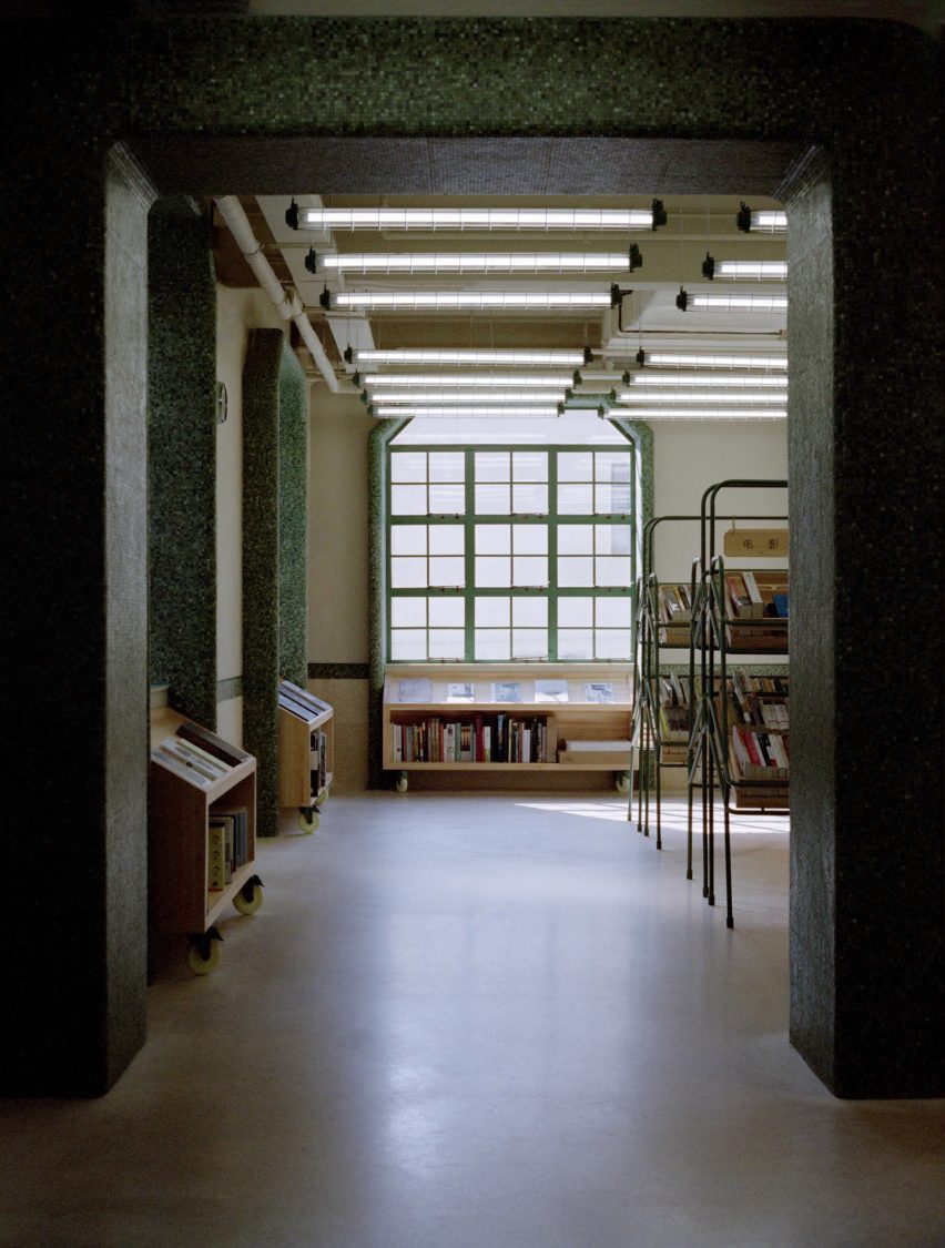
Mosaic tiles made from stone off-cuts were used to form decorative wainscoting in the same creamy beige colour as the facade, which channels 1970s Shanghai interiors.

Contrasting green tiles were used to frame the generous window openings revealed during the building’s renovation, and to form integrated window seats.

Mosaic-framed window in Shanghai store by Offhand Practice
Green mosaic tiles were used to frame the building’s windows

Natural pine was used to form the cashier counter, shelves and book crates to add a sense of warmth to the interior.

Offhand Practice said it designed the store to break with negative preconceptions around second-hand stores being “dull, disorganised and piled with shabby objects”.

“Deja Vu Recycle Store breaks the stereotypical image of a second-hand store and erases the ritualistic impression of a traditional bookstore full of full-height bookshelves,” the studio said.

Green mosaic tiles covering arch in Deja Vu Recycle Store in Shanghai
The tiles were also used to emphasise arches and other architectural details

The store was recently been shortlisted for large retail interior of the year at the 2022 Dezeen Awards.

Other projects in the running include a surrealist pop-up shop designed by Random Studio for fashion brand Jacquemus and a concept store that Schemata Architects has created for an outdoor brand in South Korea.

The photography is by Hu Yanyun.

Reference

Ten furniture designs made from sustainable materials
CategoriesSustainable News

Ten furniture designs made from sustainable materials

Dezeen Showroom: a stool made from wood sourced through sustainable forestry and a 3D-printed chair made from recycled fishing nets are among the latest furniture designs on Dezeen Showroom that use sustainable materials.

Designers and brands are continually improving the sustainability of their designs in an attempt to lessen the negative impact on the environment, from the production and manufacturing stages to the longevity and lifecycle of the final product.

Included in this selection are products designed to follow circular economy principles, where parts can be replaced, repaired and recycled to increase the lifespan of the materials.

Also featured are furniture pieces made from recycled materials, including PET plastic bottles, cardboard and coffee waste.

From tables made from washed up sea plants to chairs with castor oil-based bioplastic seats, here’s a selection of the latest furniture designs made from sustainable materials on Dezeen Showroom.


Three wooden Fels stolls by OUT around a wooden table

Fels stool by OUT

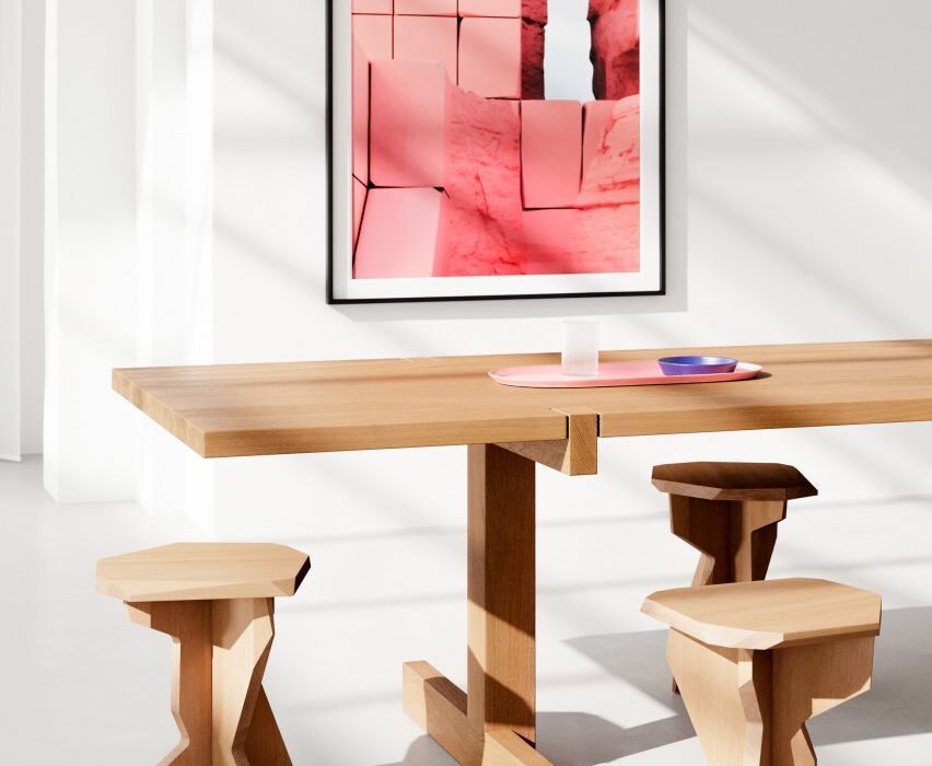
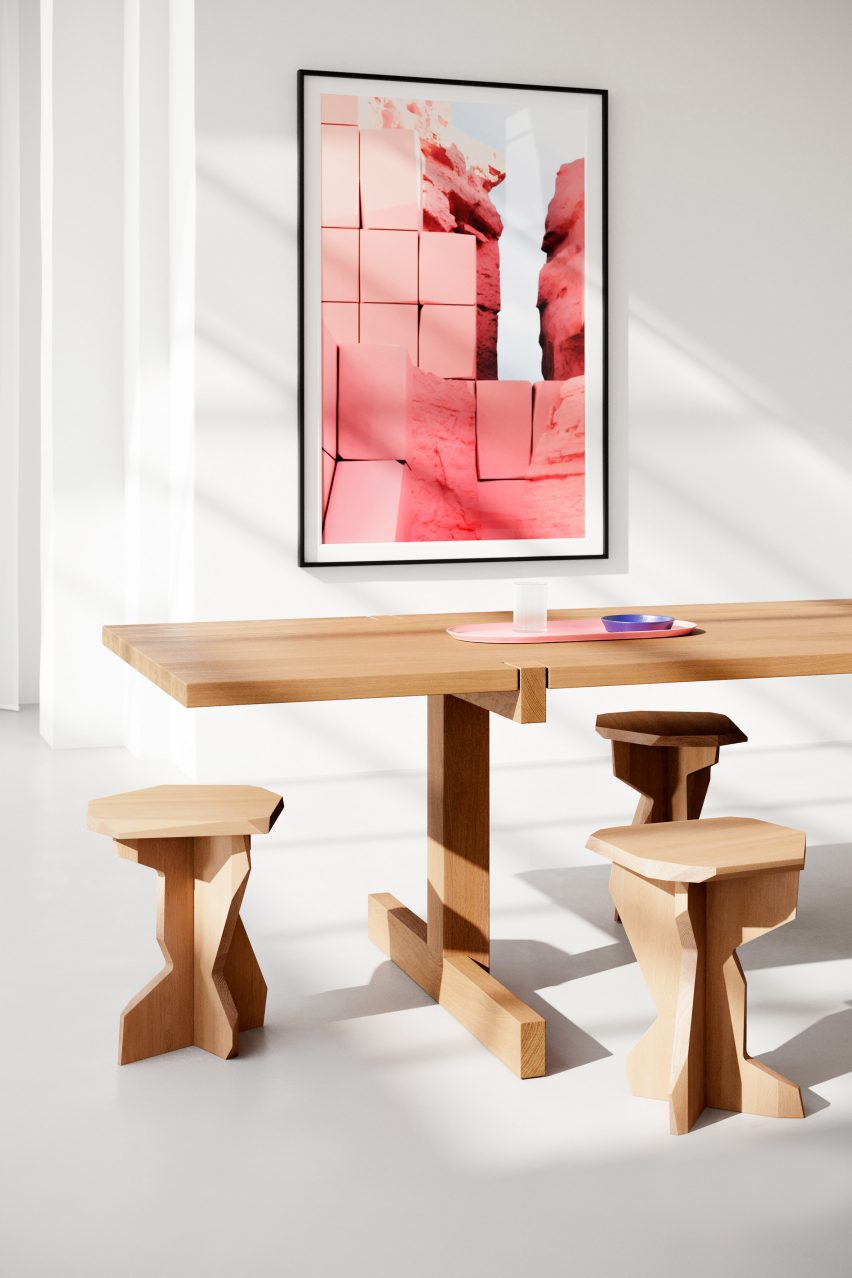
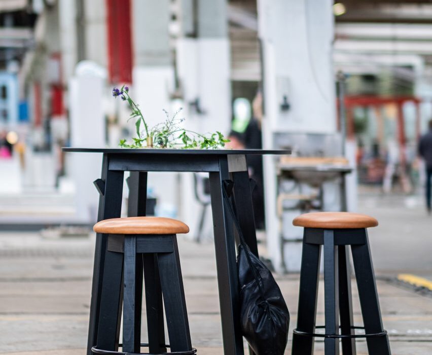
Fels is a sculptural stool created by Berlin-based brand OUT, which is made from wood obtained through sustainable forestry.

The materials are forested in Germany and Austria at a rate that maintains the environment’s biodiversity and productivity, then handcrafted into Fels stools in Germany.

Available in a natural wood finish or in a range of bright colours, Fels has a jagged profile designed to give the appearance of carved stone.

Find out more about Fels ›


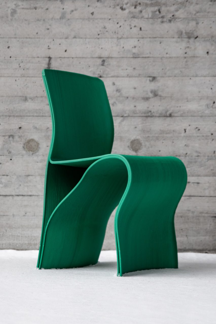
Kelp Collection chair by Interesting Times Gang

Kelp Collection chair by Interesting Times Gang

The Kelp Collection chair by Swedish studio Interesting Times Gang is made from recycled fishing nets, which gives it a bright green colour.

The fishing nets are combined with recycled FSC-certified wood fibres to create the furniture’s bio-composite material, which is 3D printed to create the chair’s curving form.

Interesting Times Gang designed the chair to bring awareness to the eradication of kelp forests due to unsustainable fishing practices and rising sea temperatures.

Find out more about Kelp Collection ›


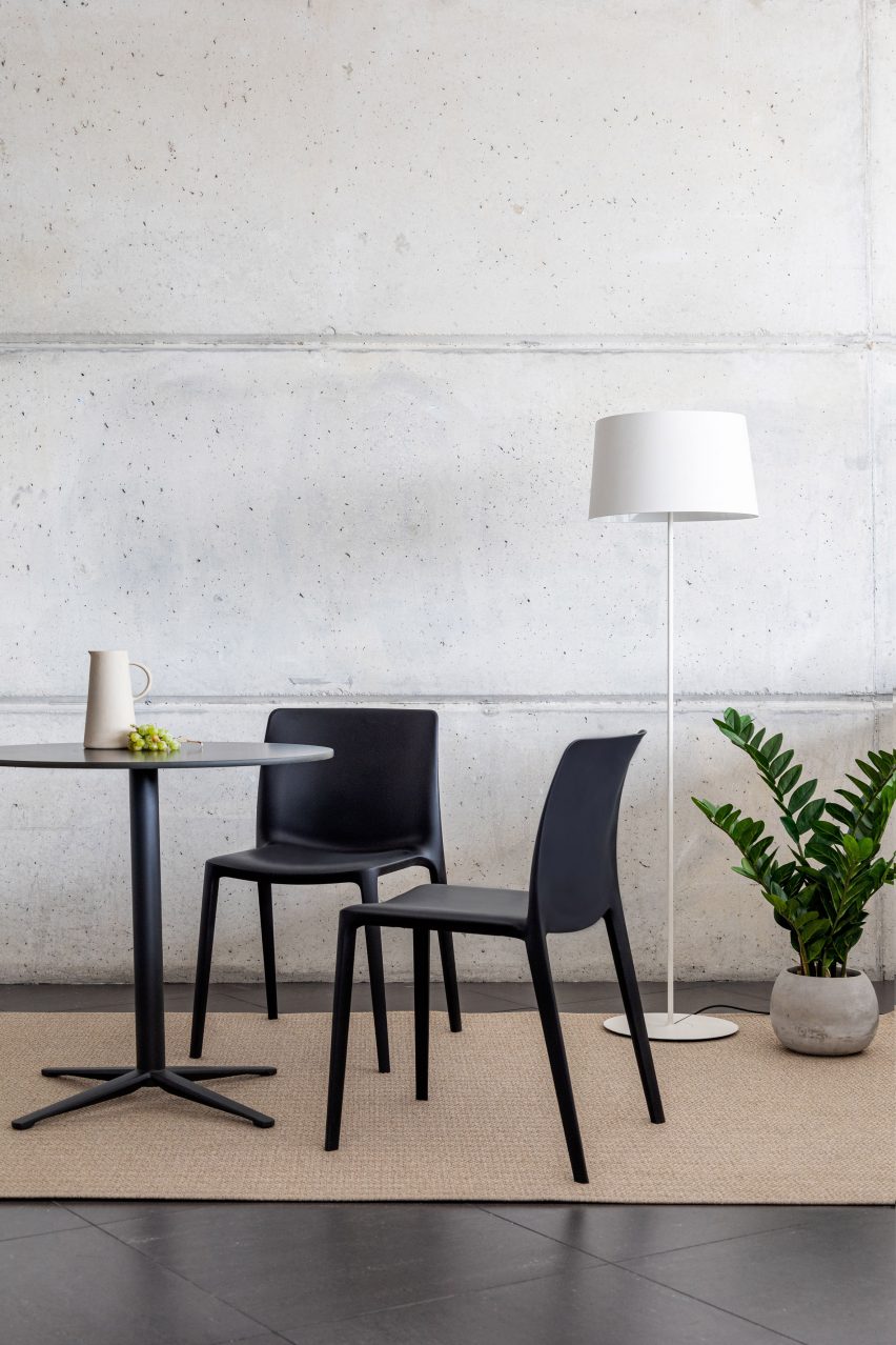
Two black Fluit chairs by Actiu next to a table, plant and lamp

Fluit chair by Archirivolto Design for Actiu

Created by Italian studio Archirivolto Design in collaboration with furniture brand Actiu, Fluit is a lightweight chair designed for both indoor and outdoor settings.

Around 80 per cent of the chair’s material is polypropylene plastic recycled from the agricultural food sector, while the remaining 20 per cent is recycled fibreglass which increases its strength.

Find out more about Fluit ›


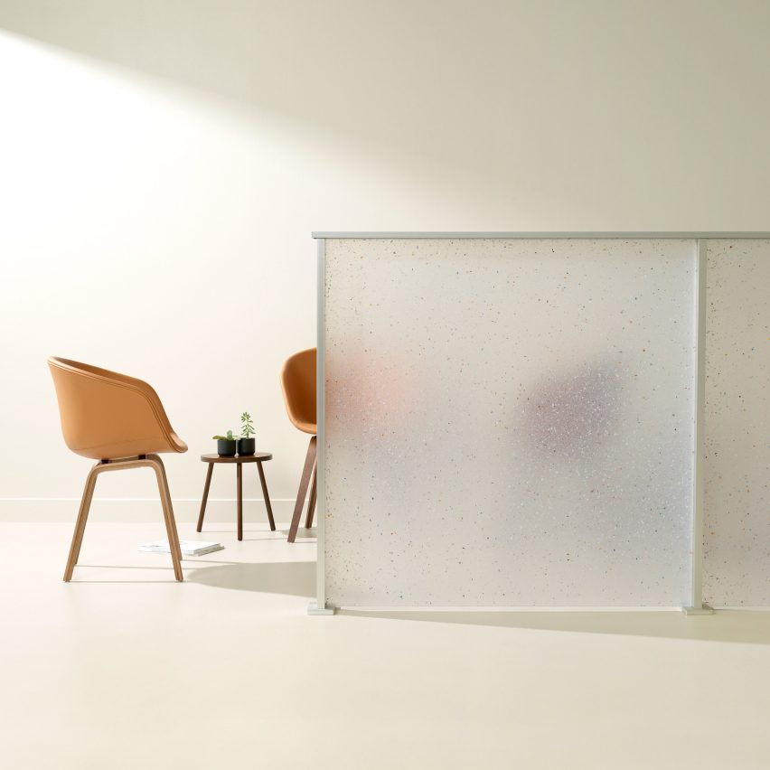
Flek Pure by 3form used as a partition wall with chairs behind

Flek Pure by 3form is a completely recycled architectural material

Flek Pure is a recycled material created by architectural material manufacturer 3form to resemble terrazzo.

The material is made from 100 per cent recycled materials sourced from 3form’s in-house factory waste. The terrazzo look comes from pelletised trimmings of the brand’s resin products.

Available in a range of translucent colours, Flek Pure can be used to produce privacy partitions, room dividers, accent pieces and exterior walls.

Find out more about Flek Pure ›

Brown Bowl table by Mater with a plant on top

Bowl table by Ayush Kasliwal for Mater

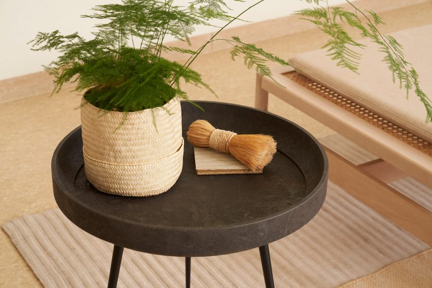
Danish furniture brand Mater has released Bowl, a table made from the brand’s Mater Circular Material which combines fibrous industrial waste with recycled plastic.

Mater developed the composite material with the aim of progressing their existing furniture collection from being sustainable to circular.

Bowl is available in two versions – one made from coffee shell waste and the other from sawdust. Plastic waste from bathroom fittings brand Grohe is recycled and acts as a binder.

Find out more about Bowl ›

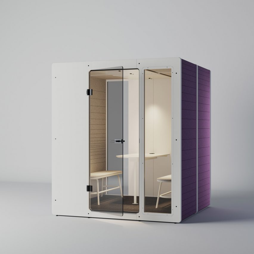
White and purple Chatpod 700 by Impact Acoustics with seating inside

Chatpod 700 by Jeffrey Ibañez for Impact Acoustic

Made from recycled materials, Impact Acoustic created the Chatpod 700 booth to provide a quiet meeting space for up to four people.

The booth’s structure is made from recycled cardboard and pressed sawdust. Recycled PET bottles are used to create the acoustic cladding and the felt-like interior finish.

Find out more about Chatpod 700 ›

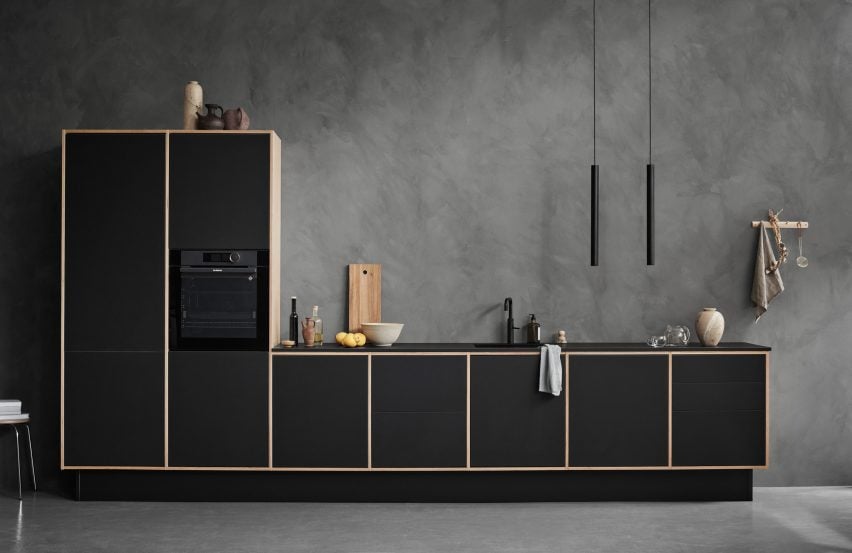
Birch and black LoopKitchen by Stykka in a concrete room

LoopKitchen by Stykka

LoopKitchen by Danish startup Stykka is a kitchen with a circular design intended to increase its lifecycle.

The kitchen is made from replaceable birch plywood parts with optional Forbo linoleum fronts available in over 20 colours.

Users can replace parts of the kitchen as they get worn, broken or if they would like a new colour. Stykka then reuses or recycles the used parts.

Find out more about LoopKitchen ›


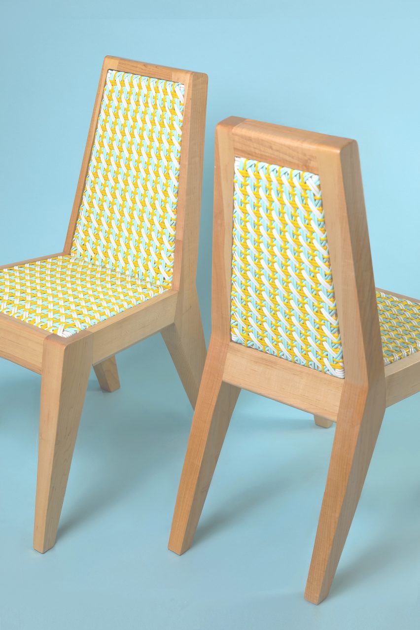
Two Dina chairs by Beit Collective with yellow and blue woven seats and backrests

Dina chair by Adam Nathaniel Furman for Beit Collective

Adam Nathanial Furman has designed the Dina chair for Beit Collective, a colourful interpretation of traditional Lebanese “Khayzaran” chairs.

Instead of the traditional use of cane, Dina’s woven seat and backrest are made from durable castor oil-based bioplastic.

Find out more about Dina ›


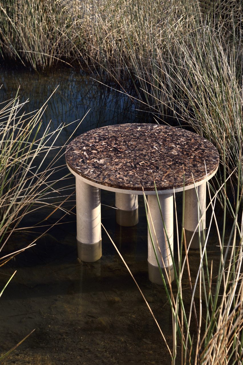
Round Oceanides table by Alex Mint in a grassy wetland

Oceanides table collection by Alexia Mintsouli for Alex Mint

Oceanides is a collection of tables made from marble and the sea plant Posidonia Oceanica, designed by Alexia Mintsouli for UK studio Alex Mint.

By upcycling Posidonia Oceanica leaves that are washed up on the shore into tabletops, Alex Mint aimed to create a more eco-friendly furniture piece.

Find out more about Oceanides ›


Black and natural wood Cross Bar chairs by Takt at a high table

Cross Bar chair by Pearson Lloyd for Takt

Design studio Pearson Lloyd created the Cross Bar chair for Takt with replaceable elements that can be repaired or recycled, extending the chair’s lifecycle.

The chair is available in three finishes of oak and can be optionally upholstered in a choice of eco-labelled textiles.

Find out more about Cross Bar ›

Dezeen Showroom

Dezeen Showroom offers an affordable space for brands to launch new products and showcase their designers and projects to Dezeen’s huge global audience. For more details email [email protected].

Dezeen Showroom is an example of partnership content on Dezeen. Find out more about partnership content here.

Dezeen is on WeChat!

Click here to read the Chinese version of this article on Dezeen’s official WeChat account, where we publish daily architecture and design news and projects in Simplified Chinese.

Reference

Tiny Timber: 6 Small-Scale Retail Designs With Beautiful Wooden Interiors
CategoriesArchitecture

Tiny Timber: 6 Small-Scale Retail Designs With Beautiful Wooden Interiors

How can architecture be a force for good in our ever-changing world? During Future Fest, we’re pose this question to some of the world’s best architects. We’re hosting daily virtual talks from September 12th to 30th, which are 100% free to attend.  Check out the full schedule!

Shops can provide impressive shopping experiences even with limited floor areas. Instead of using shiny and luxurious materials that crowd the space, wood can easily bring intimacy and coziness to compact spaces. This collection includes six examples of retail designs that smartly employ wood in small store spaces. They demonstrate the possibility of timber-clad interiors, revealing how wood can evoke a range of atmospheres from quiet calmness to bright warmth to intimate mystery and more.


Mi Pan

By Concentrico, Mexico City, Mexico

Popular Choice Winner, 10th Annual A+Awards, Retail

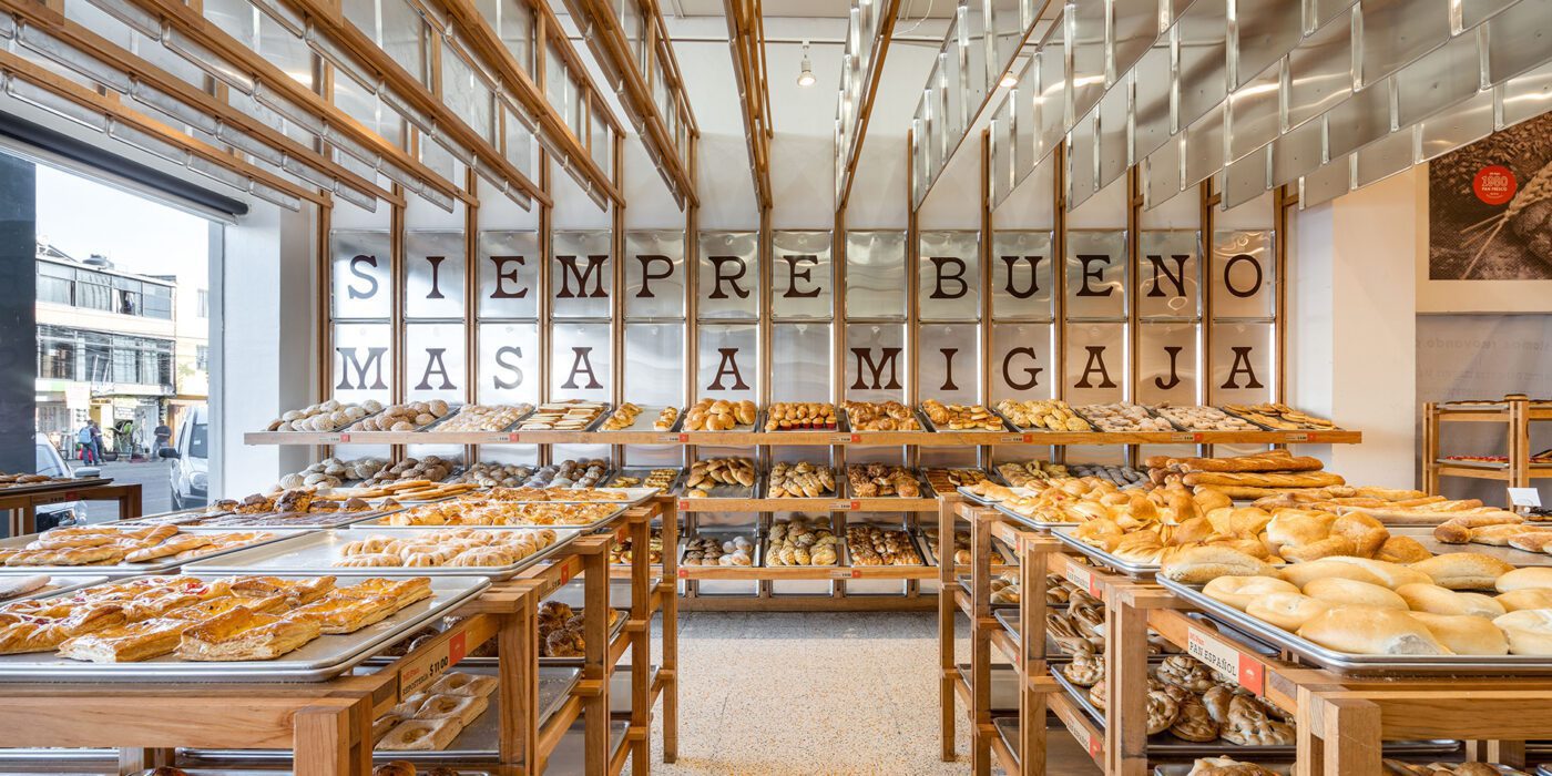
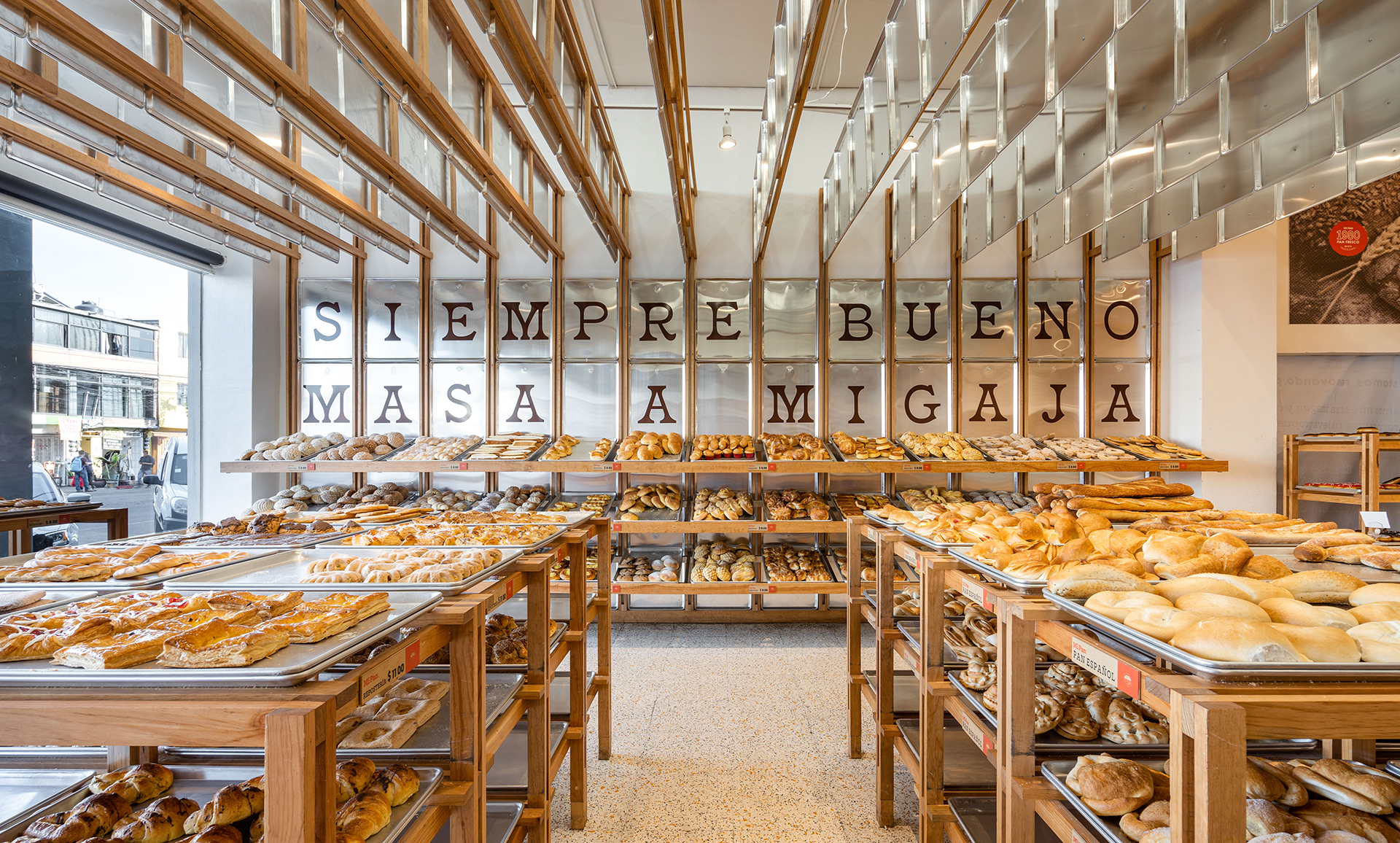
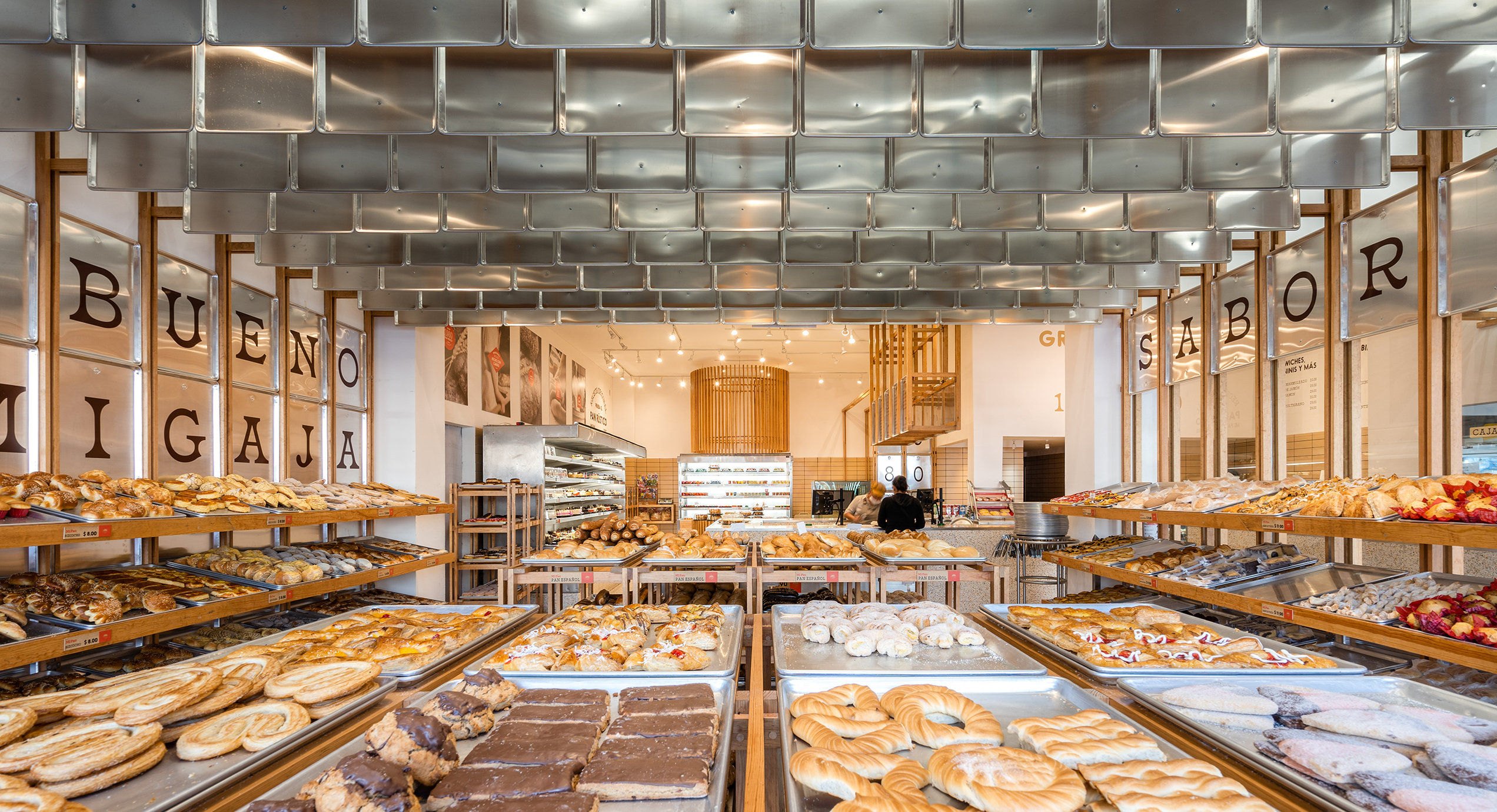
mi pan_interior_1mi pan_interior_2The bakery Mi Pan celebrates bakers’ hard work in making delicious bread. Metal trays reoccur on the shelves, wall cladding and ceiling decorations. These are the same type of tray used for bread production, reminding people of the heart of Mi Pan – the kitchen.
Instead of regular shelves, the design team uses trays and timber frames to hold freshly-baked bread. The trays emphasize the fact that the bread comes straight out of the kitchen as they are ready. Timber frames extend onto the walls and ceiling, breaking the boxy space into rhythmic fragments. The trays that hang from the ceiling hide cables from customers’ sight while making the bakery cozier by lowering the space.


Haregino Marusho

By Tsutsumi And Associates, Yokohama, Japan

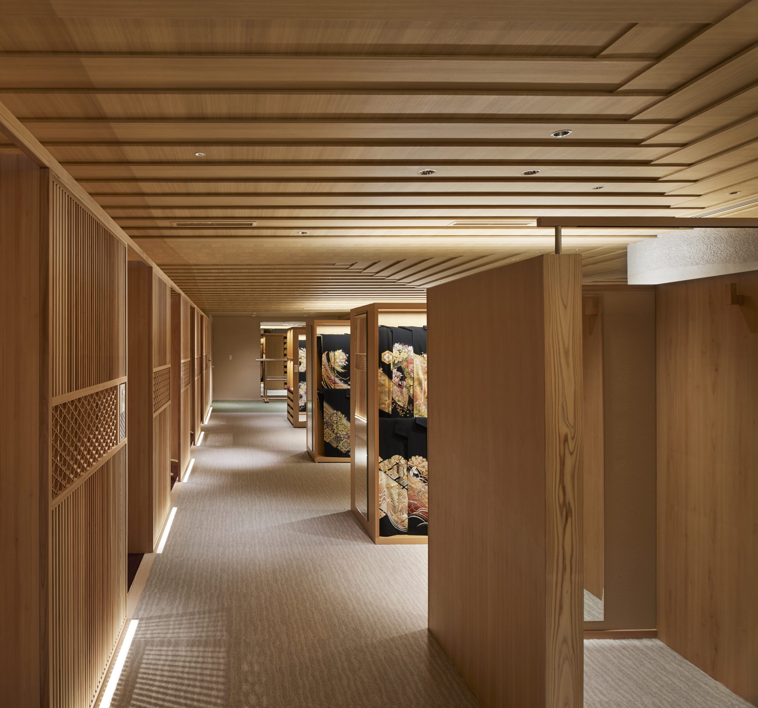
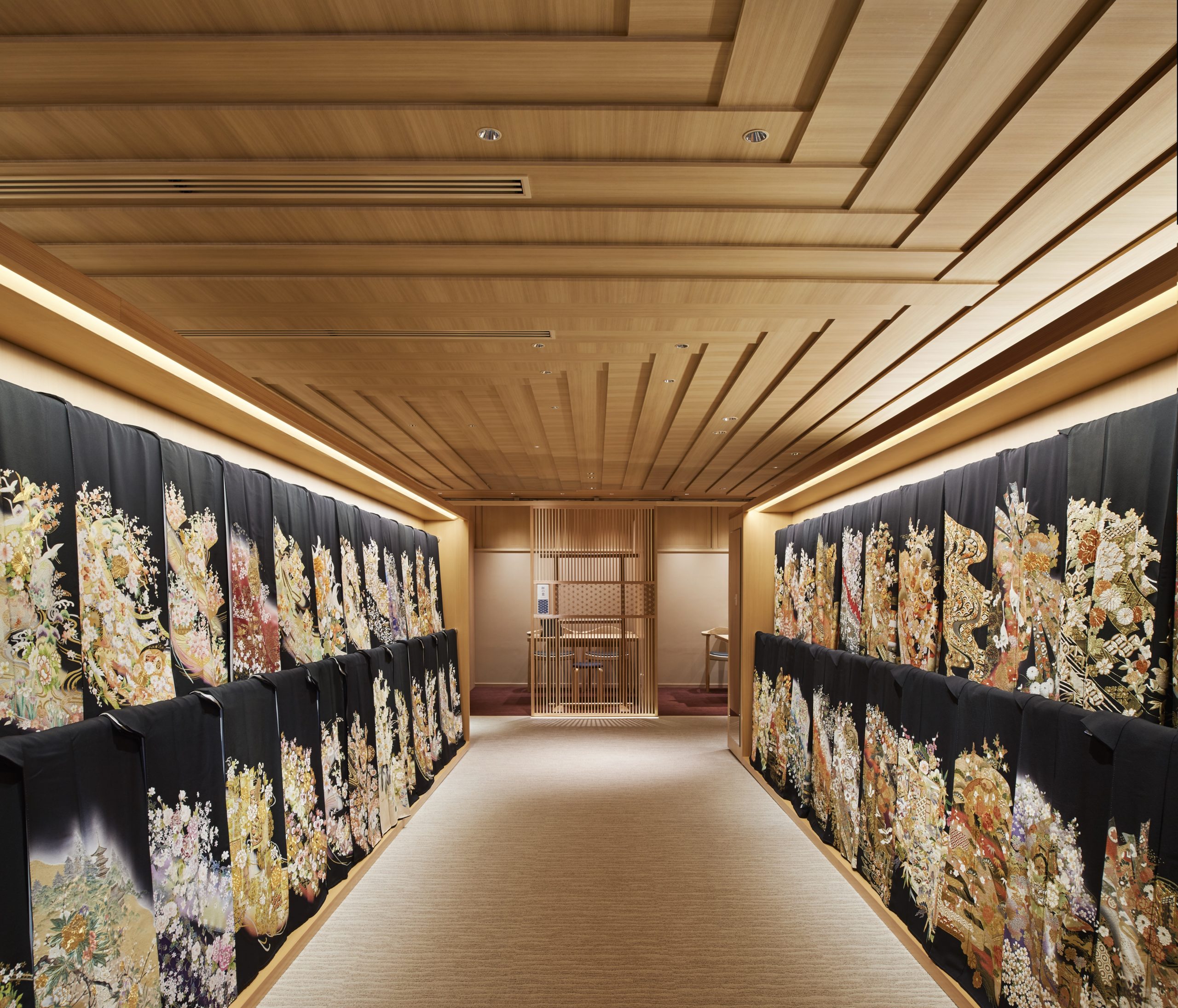
haregino marusho_interior_1haregino marusho_interior_3The design team refurbished the floor of the wedding Kimono in the traditional Japanese clothing shop Haregino Marusho and themed it with wood. Many spatial components, including display shelves, partitions and the ceiling, are in warm-color wood of similarly soft patterns. The space becomes an elegant wooden display box that does not take any spotlight from the kimono fabrics.
The ceiling panels are cut strategically to create a layering effect that resembles the Kasane (layering) of the Kimono. They also bring subtle changes in the ceiling height, making the monochromatic space more interesting to wander through.


Blackhills Cafe

By Mora + Suksumek, Lat Phrao, Bangkok, Thailand

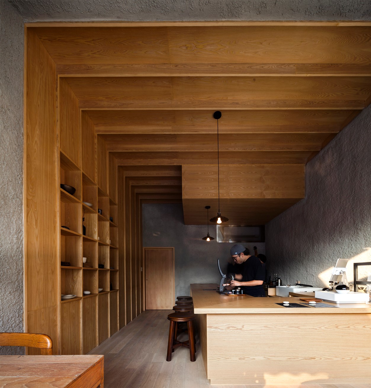
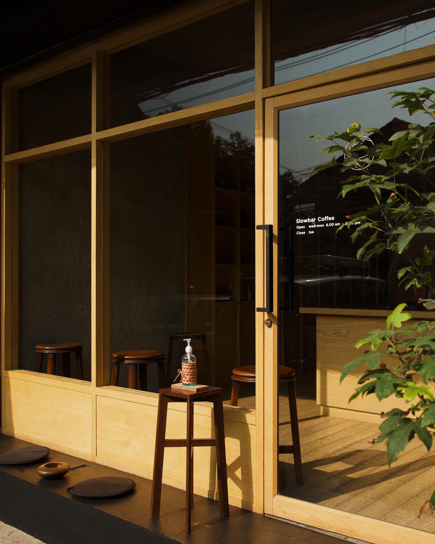
blackhills cafe_interior_1blackhills cafe_frontIn the coffee bar Blackhill, smooth wooden surfaces are put in conjunction with rough concrete surfaces. They together create a zen space for enjoying a moment away from the busy central Bangkok. In contrast to the colorful urban environment outside, the materials used in the coffee shop are limited to only wood and concrete. The simplicity of the design makes it almost a meditative space.
The coffee shop has a large, glazed front that welcomes late afternoon sunlight into the shop. Natural light gets through the open-plan interior. A few seats are available by the window and by the counter. Sunset, the visual and smelling experience of coffee-making are presented all at once.


Tsubomi House (Tokyo Bud House)

By FLAT HOUSE, Tokyo, Japan

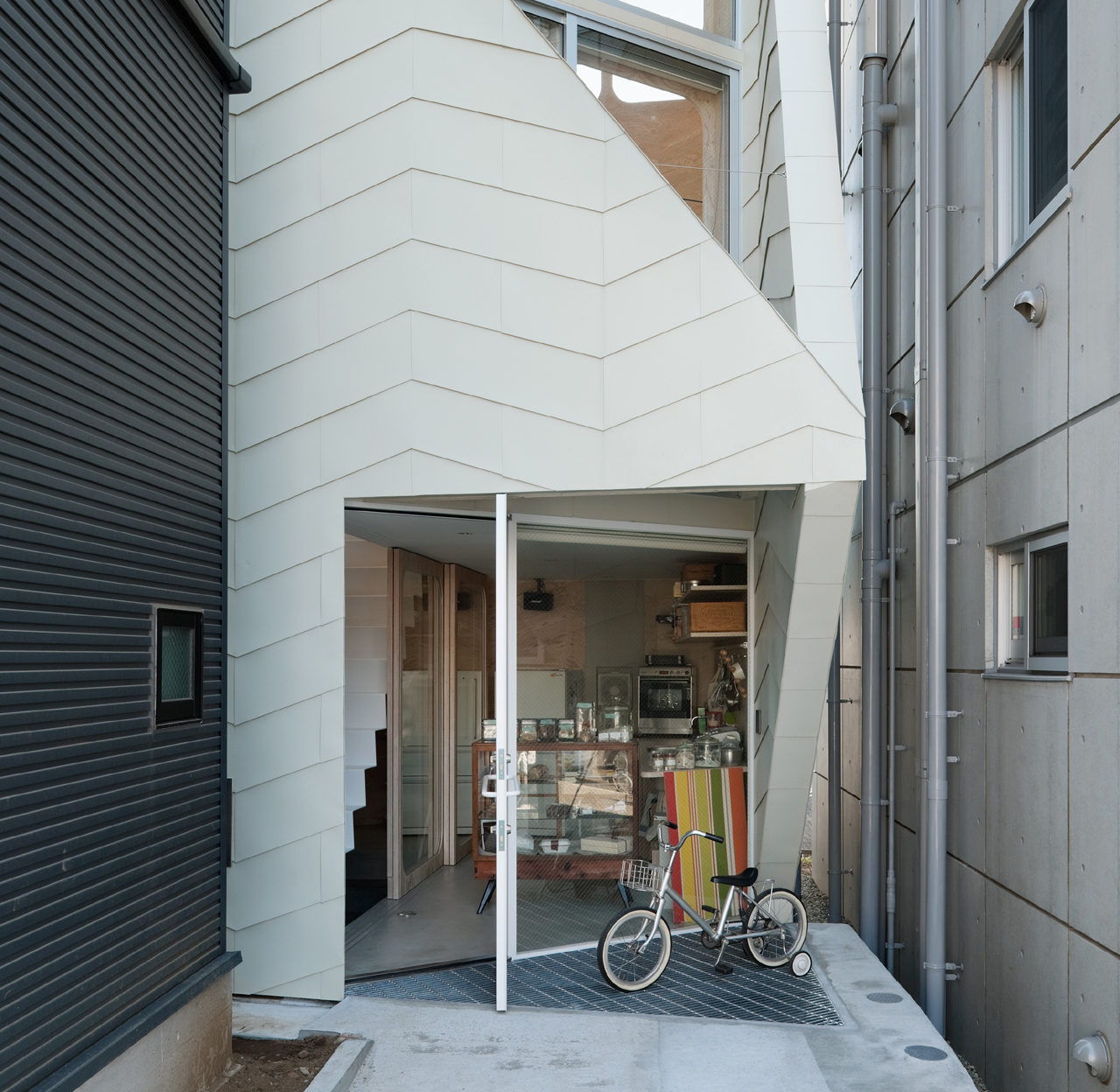
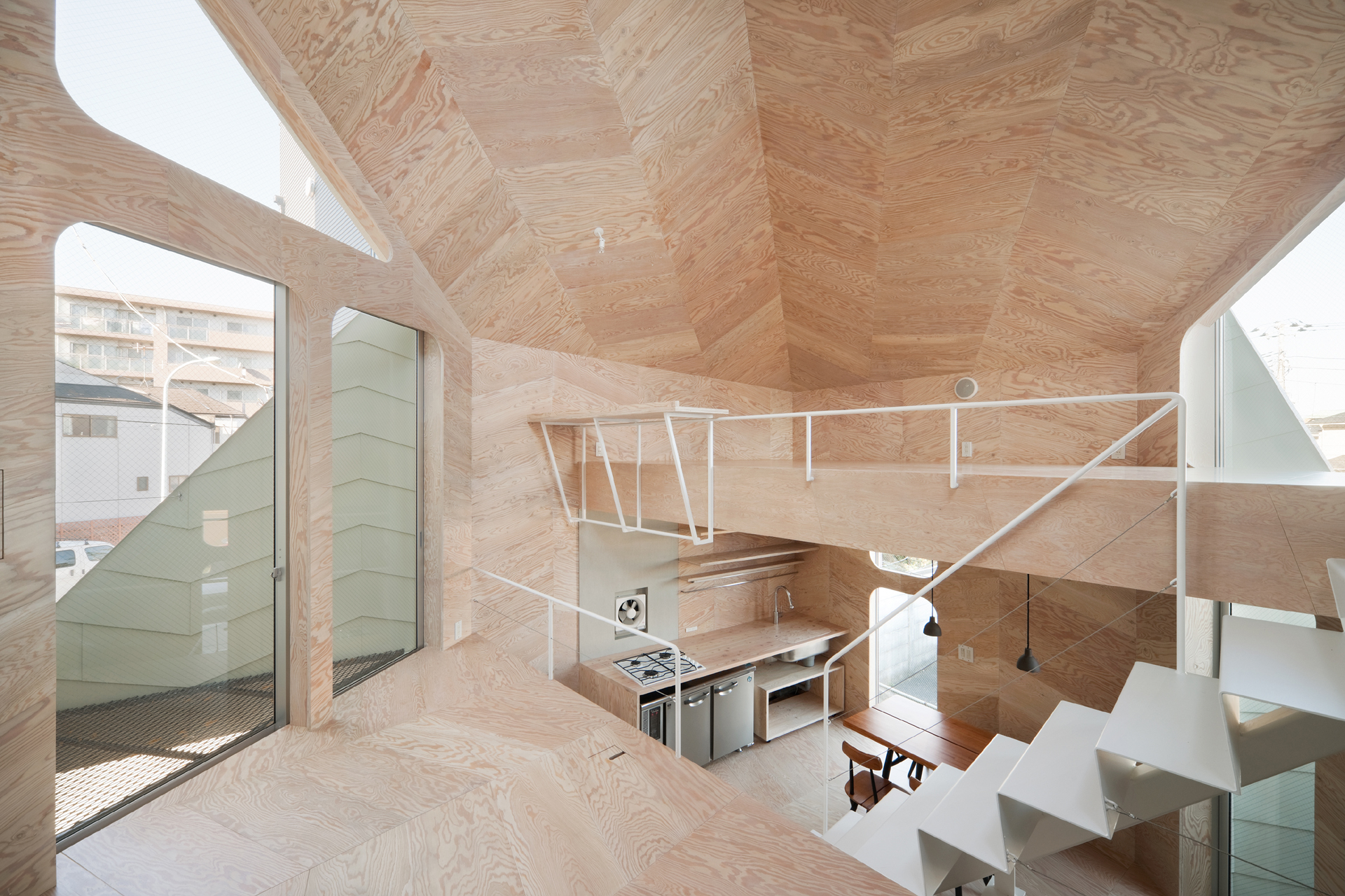
This small house has a footprint of only 280 square feet, yet it accommodates a biscuit shop and the shop owner’s family. Tsubomi House has seven different levels with no solid partitions between them. Each level is half a story higher/lower than the next one. Without walls separating each functional area, residents can move quickly from one space to another.
The interior finishing is largely in plywood which produces a gentle reflection of light. Natural light, therefore, comes in through openings on different levels and travels in the whole space. Paired with ivory steel, the light-color plywood makes the compact interior bright and continuous.


Sandra Weil Store

By Zeller & Moye, Mexico City, Mexico

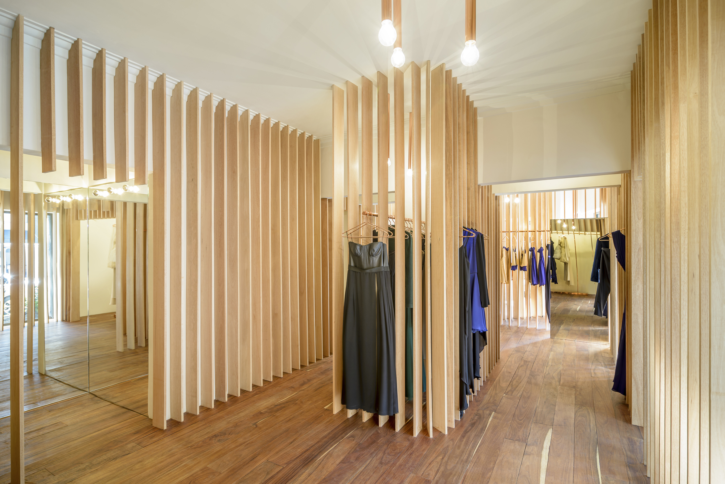
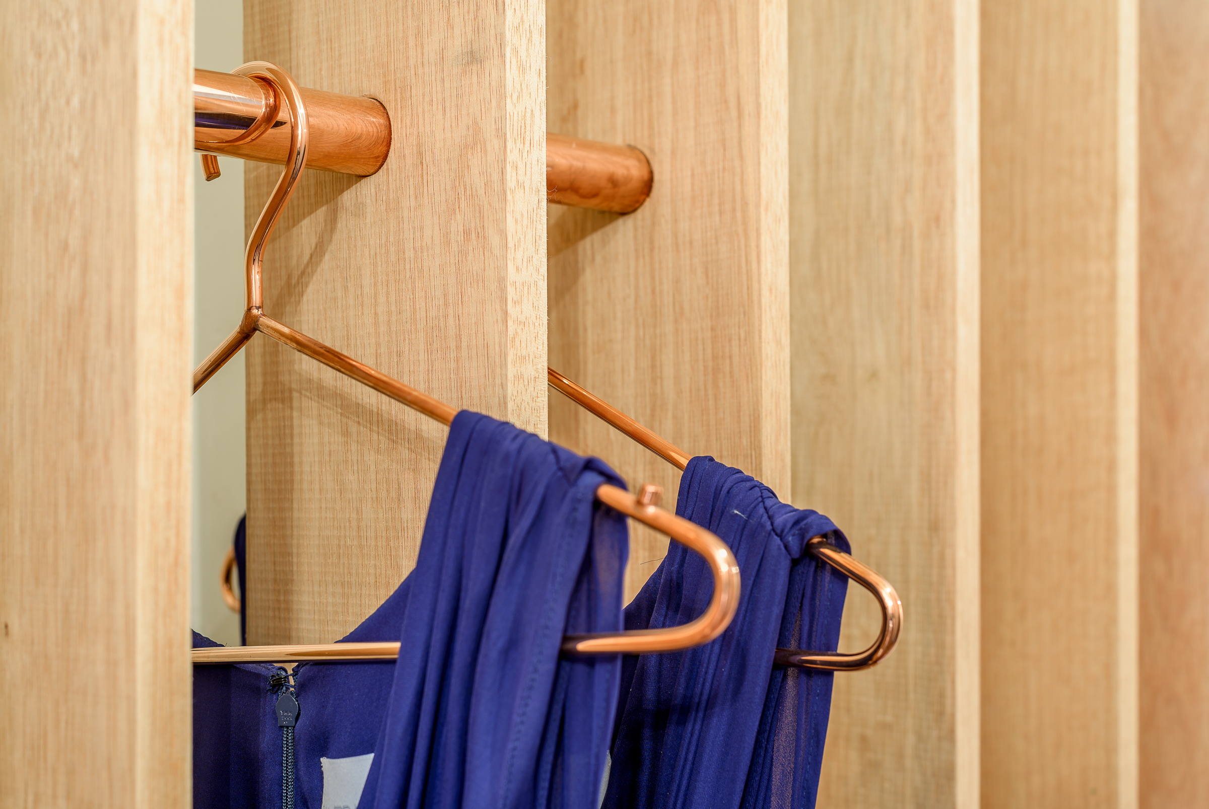
sandra weil_interiorsandra weil_detailInstead of presenting the garments all at once, Sandra Weil Store’s design gradually reveals the collections as customers walk around. Floor-to-ceiling slats made of local tropical wood stand in line with equal intervals between them. They form rhythmic partitions that are visually permeable only from certain angles. This allows a comfortable level of privacy in the shop without cutting the small store space into tiny fragments.
Garments hide between the slats, not showing themselves fully until the customer is in front of them. Meanwhile, the light and view change as well from one rack to another. The shopping experience in Sandra Weil is all about exploration.


RE x SUGAR

By CHINA ONDO Studio, Nanjing, China

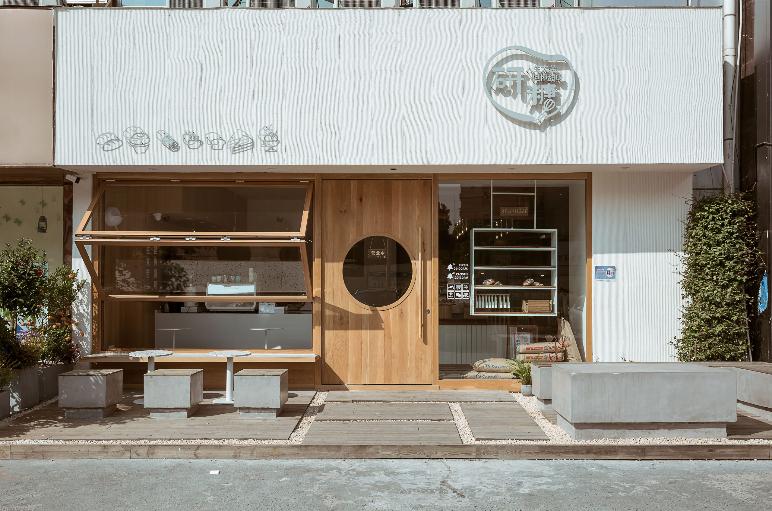
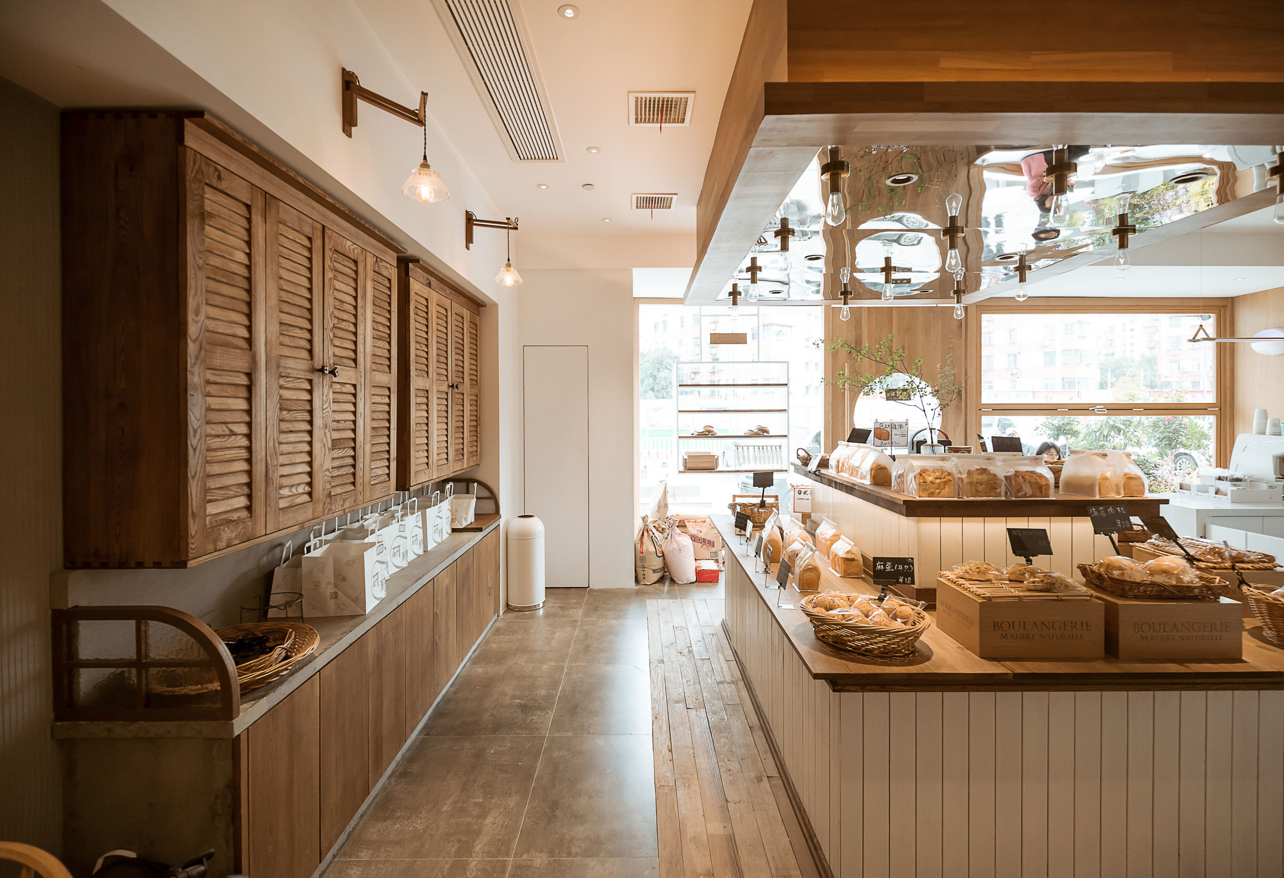
re sugar_frontre sugar_interiorThis community bakery uses large areas of warm-color timber to create a relaxing atmosphere. Like Blackhills Café, RE x SUGAR also has a transparent shop front that embraces the sunlight. A large folding window connects indoors and outdoors while the window sills become seats.
Woods of different textures create a harmonic yet interesting space. Some wooden surfaces are smooth, for example, the front door, walls, window frames and chairs. Cupboards, the display area of bread and the floor around it are covered in rather rough and pattern-intensive wood.

How can architecture be a force for good in our ever-changing world? During Future Fest, we’re pose this question to some of the world’s best architects. We’re hosting daily virtual talks from September 12th to 30th, which are 100% free to attend.  Check out the full schedule!

Reference

Chzon studio designs airport departure hall to reference Parisian life
CategoriesInterior Design

Chzon studio designs airport departure hall to reference Parisian life

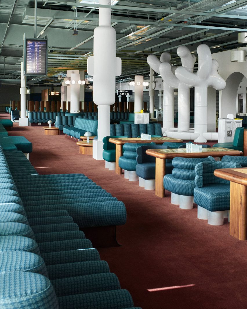
French design agency Chzon studio has added archways and fountains that reference iconic Parisian monuments to a departure lounge at the Charles de Gaulle Airport in Paris.

Chzon studio redesigned the boarding gate area in Terminal 2G with the aim of creating a dynamic representation of Paris’ design and history in a typically utilitarian area of the airport.

Photograph showing airport departure lounge with green seating and wooden chess tables
The vast space is punctuated by white columns and sculptural installations

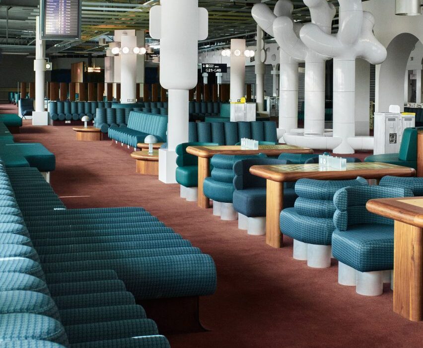
The 1,300-square-meter space is populated by rounded seating in dark blue and green upholstery, which takes aesthetic cues from the 1960s and 1970s, arranged in benches, booths and pairs.

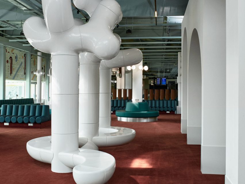
To zone the space and instill privacy, the studio added partitions and expressive white sculptures by artist studio Les Simonnets, which double as alternative bench seating.

Photograph showing airport departure lounge with green bench seats and large tree-like rounded white sculptures
References to Paris are made at varying scales throughout the space

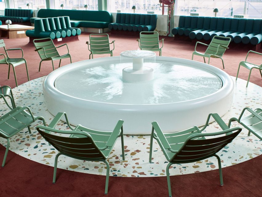
The studio made reference to iconic Parisian monuments by installing archways that nod to the Arc de Triomphe, as well as a fountain that is reminiscent of the water feature in the Jardin du Luxembourg and surrounded by green metal chairs similar to those found in Paris’ parks.

Rows of wooden tables have been inlaid with chess boards in another reference to the parks of Paris. Passengers can use these as workspaces, to eat at, or to play games on while waiting for flights.

Photograph showing airport departure lounge with green chairs, white fountain and terrazzo flooring
The miniature fountain is a focal point within the terminal

As well as designing some of the lighting for the interior in-house, the studio also sourced and installed antique lighting and other decorative objects from the city’s St Ouen flea market, including giant wall lights and aluminium sunshades.

To keep the space relevant to its function, Chzon also made references to aeroplane design by employing metallic details, patterned finishes and reclining plane-style seats designed by Italian architect and furniture designer Osvaldo Borsani.

“[The design] dramatises the boarding lounge while keeping the passenger informed,” Dorothée Meilichzon, founder of Chzon studio, said of the interior design.

“The departure lounge becomes a smooth transition between the Paris that we are leaving and the plane that is going to take off.”

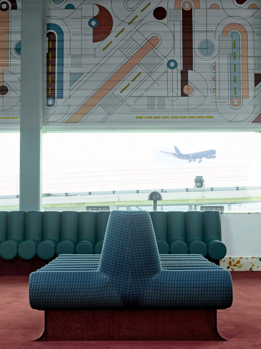
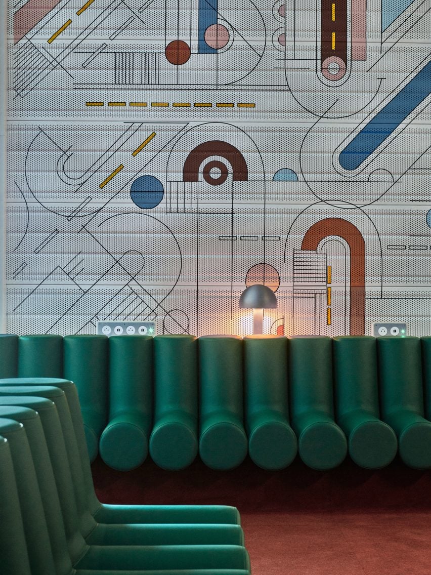
Photograph showing airport departure lounge with abstract mural above windows and green seating
The mural is applied to perforated sheets and wraps around the walls above the windows

The space also features a mural inspired by the work of French painter Sonia Delaunay that sits above the windows, which overlook the runways and allow views of planes taking off and landing.

This fresco also references symbols used in airport signage and carries similar rounded motifs to the ones present in the retro-style seating and lighting.

Photograph showing airport departure lounge with green bench seats and abstract mural behind
Rounded elements in furniture, lighting and decor reference the design of the 1960s and 1970s

Charles de Gaulle Airport, also known as Roissy Airport, is the French capital’s principle airport.

Other airport-related projects published on Dezeen include the cosy remodelling of an airport in Colorado, USA by Gensler and an airport that contains the world’s tallest indoor waterfall by Safdie architects.

Images are courtesy of Chzon studio

Reference

Louise Hederström designs furniture from building waste materials
CategoriesSustainable News

Louise Hederström designs furniture from building waste materials

Swedish designer Louise Hederström has worked with furniture brand Swedese to use leftover wood and plywood from a Cobe-designed building to create furniture for its public spaces.

Hederström‘s project Rephrased Matter, which was on show as part of the annual design festival Southern Sweden Design Days, saw the designer work together with Swedese to create a collection of furniture for the atrium, restaurant and meeting rooms in developer Skanska‘s Hyllie Terrass building.

Two stools and a table made from waste materials
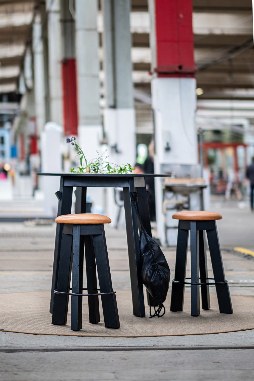
Above: Louise Hederström’s designs were on show at Southern Sweden Design Days. Top image: a prototype of her stool for Skanska. Photo is courtesy of Hederström

The furniture will be made from materials such as plywood and wooden beams that were used during the construction of the building, which was designed by Danish studio Cobe, and would otherwise have been burned.

Hederström, who approached Skanska together with Linus Davidsson, sales representative at Swedese, said they will instead use the waste material from the building site for both “big and small projects.”

Materials used for furniture designs by Louise Hederström
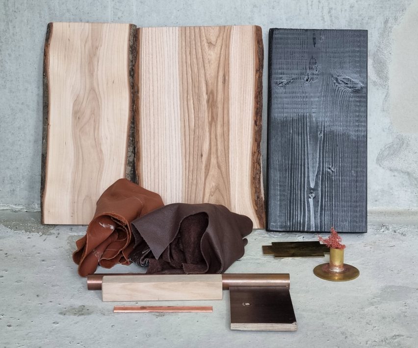
Waste materials and leftover materials were used to construct the furniture. Photo is courtesy of Louise Hederström

The first item is set of stools and a table that will be used in the building’s atrium. They were made from wooden latches and plywood used on the site to cover elevator shafts and as temporary staircase banisters.

“We don’t really know yet, but that’s also the part of the process – we see something, we save it and we and the latches was really something that was easy to see that this is possible to work with,” Hederström told Dezeen.

Stool on show at Southern Sweden Design Days
Hederström worked together with furniture company Swedese

The time-consuming process of designing furniture from scrap materials requires a lot more preparation than working with virgin wood does.

“You have to have time to collect the material, you have to store it and dry it,” Hederström explained. “It’s a longer process, and we’re learning by doing.”

For the stools Hederström combined waste wood with leftover materials from Swedese, as the padding and fabric material needed was not available from the building site itself.

Instead, the stools have a filling made from leftover sheepskin from Swedese’s production, covered by leather seats that are made from leather with minor imperfections that meant the company was unable to use them for other furniture.

A steel ring used in Swedese’s furniture production and made from 80 per cent recycled metal holds the stool’s wooden legs together.

Table made from leftover wood
A table made from wood matches the stools

The current collection also includes a table made from the same wood and plywood pieces, and Hederström also plans to use the wooden latches to create a long sofa that will sit in the central atrium.

For her, having to use already-cut wood and other materials in existing conditions was a welcome challenge, rather than a disadvantage.

“I like the challenge that you have a material to have to work with,” she said.

“So with the stool, I wanted to change the dimensions of course, but I wanted you to still feel the connection to the material and understand its construction, how it holds together.”

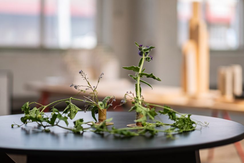
Hederström will also use wood from elm trees that have had to be felled because of Dutch Elm disease, while leftover materials from Swedish furniture and design companies will be used to create accessories for the interior of the building.

Materials used for accessories in Hyllie Terrass
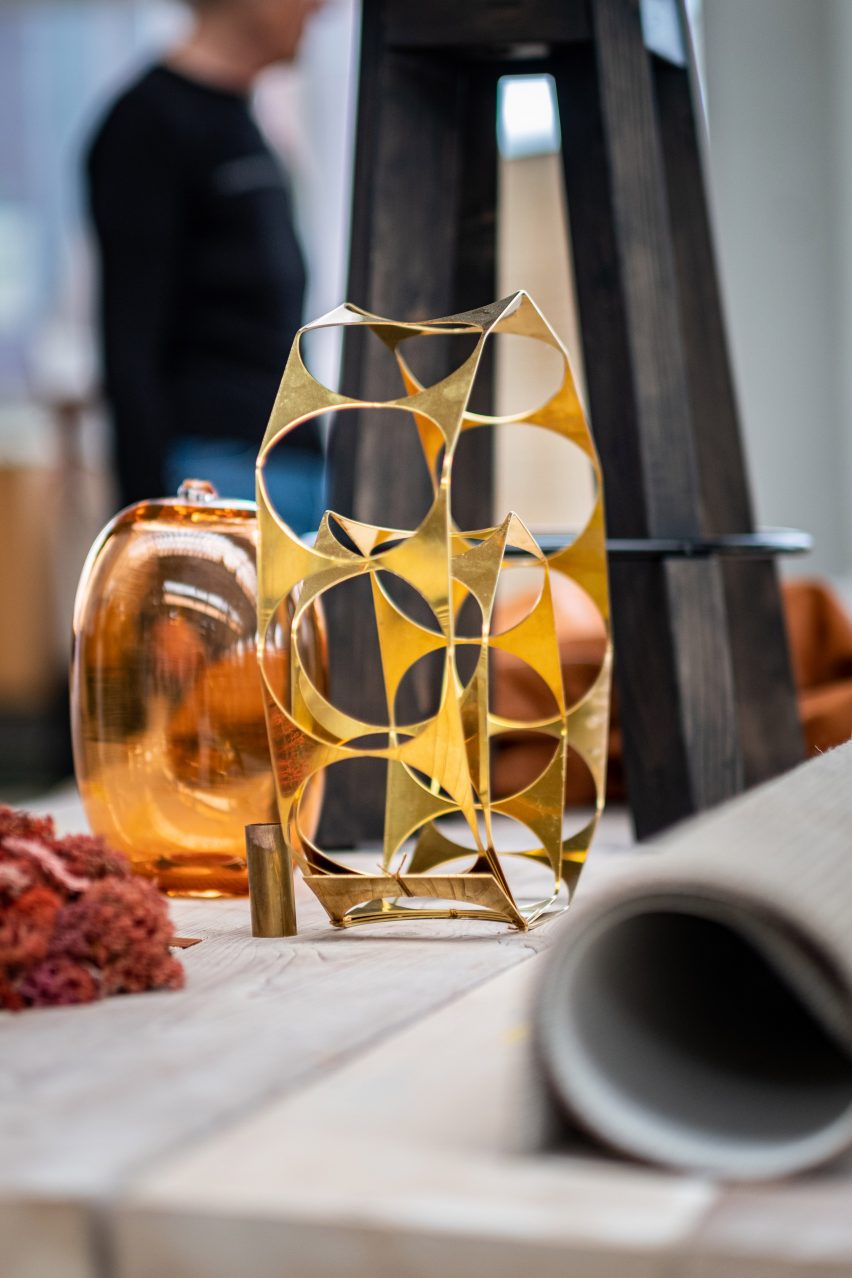
Other leftover materials will be used to create accessories

Hederström hopes that the initiative, which Skanska said it hopes to also expand to other buildings, will become more commonly used when constructing new buildings.

“I hoped that it would open their eyes, but also, I think that when they count and see ‘we have 1,000 metres of wood that we just throw away’ they can also say ‘let’s save it for next building’,” Hederström said.

“They can rethink their way of planning. And I think it was an eye-opener, that they realise that this is something that we could use. Especially when the world is a bit upside down, we have to take better care of material resources.”

Hyllie Terrass, the building that the furniture will be used in, was designed by Cobe for Skanska and is part of a pilot program for NollC02 buildings, which Skanska says will have net-zero emissions over their entire life cycle. It will be ready for occupation in spring 2023.

Hederström has previously made a concrete bench and traffic barrier using waste, while Swedese recently worked with graduate Mika Lindblad on a furniture collection designed without upholstery.

The photography is by Daniel Engvall unless otherwise stated.

Southern Sweden Design Days took place from 19 to 22 May 2022 in Malmö, Sweden. See Dezeen Events Guide for an up-to-date list of architecture and design events taking place around the world.

Reference