Portal House by Svima features brass details and curved oak ribbons
CategoriesInterior Design

Portal House by Svima features brass details and curved oak ribbons

Brass ribbons line the asymmetric portals that connect the kitchen and dining room of this Toronto residence, renovated by local architecture and art studio Svima.

The Portal House was designed for a couple who had wanted to refresh their home for 10 years, but have very different aesthetic tastes.

Portal House by SvimaPortal House by Svima
Two portals connect the renovated kitchen and dining areas of this Toronto home

Toronto-based studio Svima found a compromise by combining his desire for “tenebrous minimalism” and her love of “bright French country kitchens” into the design.

The resulting “denlike cosiness” pairs dark oak across the lower half of the ground-floor spaces and clean white surfaces on the upper half.

Brass-edged asymmetric portal looking into a kitchenBrass-edged asymmetric portal looking into a kitchen
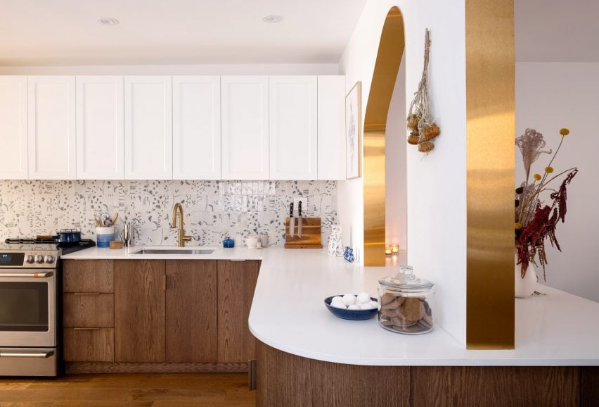
The curved, asymmetric portal over the deep counter acts as a pass-through

The snaked kitchen layout is tight, so Svima curved the corners of cabinetry and counter surfaces to steal extra space for circulation.

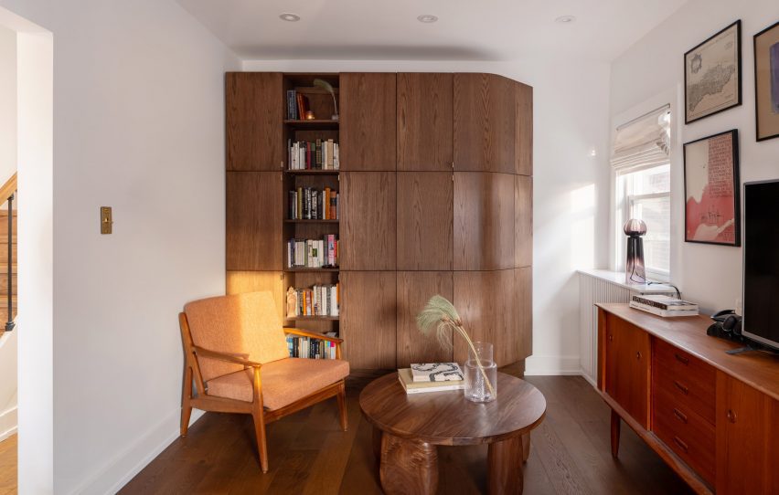
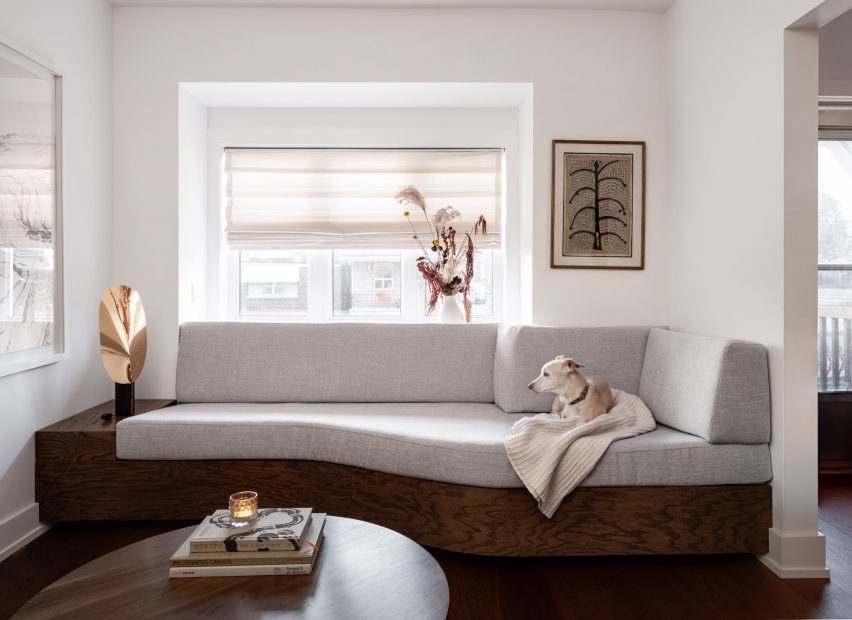
This theme continues to the living room millwork: a bookcase is filleted at the corner and meets the wall at an angle, while a built-in sofa beneath the window also softly angles inward.

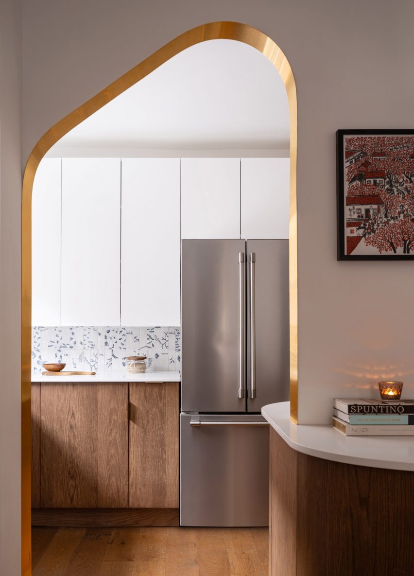
Open doorway with brass edges looking into the kitchenOpen doorway with brass edges looking into the kitchen
The other portal, mirrored in shape, forms a doorway between the two spaces

“The design hinges on ‘ribbons’ flowing through the space, guiding the motion through the rooms,” said Svima.

“The ribbons curve in areas where sharp corners would not fit, or would stop the flow of movement.”

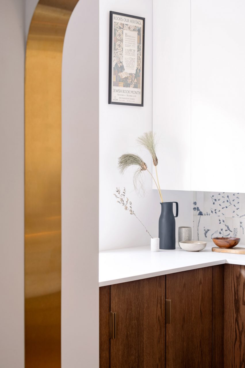
Detail of a brass-lined portal with a kitchen counter behindDetail of a brass-lined portal with a kitchen counter behind
Brass edges around the portals were artfully installed to perfectly fit the curved drywall

In the kitchen, the curved oak doors were handmade by a cabinetmaker who created a special jig to kerf-bend the oak into a radius.

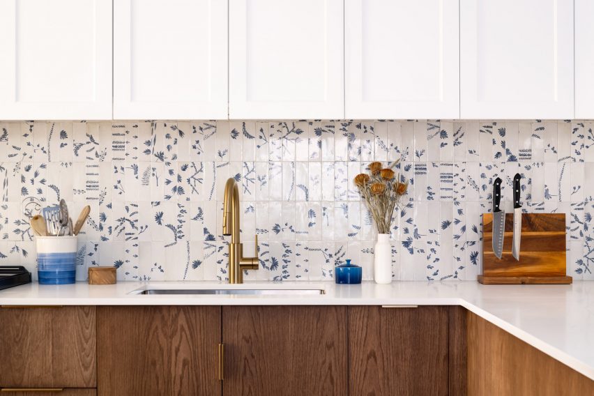
Tiles that offer a contemporary take on Dutch Delft porcelain form the backsplash, adding small touches of blue to the otherwise neutral space.

Kitchen with white upper cabinets, blue and white tiled backsplash, and dark oak lower cabinetsKitchen with white upper cabinets, blue and white tiled backsplash, and dark oak lower cabinets
To add touches of colour to the dark oak and bright white palette, tiles influenced by Delft porcelain were added to the backsplash

Two portals provide connections between the kitchen and adjacent dining room, both with a mirrored asymmetric shape and edged in brass.

One acts as a doorway, while the other over the deep counter is used as a pass-through for food, drinks and tableware.

“It was an artful process for the contractor to lay the brass into the wall, as it had to fit into the curved drywall perfectly with no tolerance for error,” the architects said.

The living room, located at the front of the house, was furnished with mid-century pieces such as a chair, a coffee table and a media console.

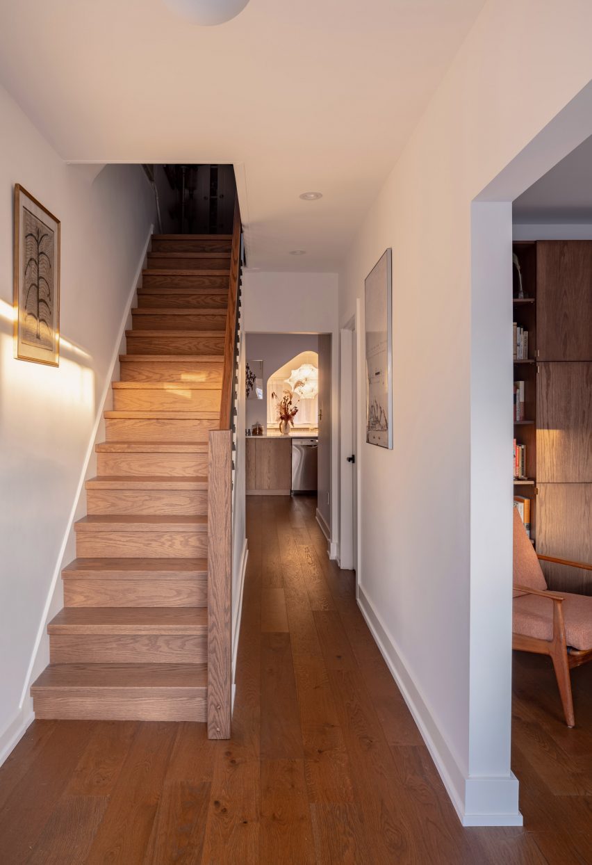
Hallway with dark oak flooring and a staircaseHallway with dark oak flooring and a staircase
Dark oak flooring throughout the home’s ground floor matches the other millwork

The closed and open shelving unit organises the family’s books and possessions, and its shape allows more light to enter from a side window.

Opposite, the built-in sofa helps to resolve an awkward space under a bay window and orients the sitter towards the TV to one side.

Living room featuring a dark oak storage unit with a filleted sideLiving room featuring a dark oak storage unit with a filleted side
In the living room, the curved kitchen cabinetry is translated as a storage unit with a filleted side

“The custom sofa sweeps into the space to provide seating at precisely the right sideways angle for viewing the media unit, for lounge reading, and for gathering,” Svima said.

The floors throughout the home match the other millwork, grounding the spaces with a rich dark hue.

A built-in sofa under a living room bay windowA built-in sofa under a living room bay window
A built-in sofa under the living room’s bay window similarly features softly curved angles

Svima, founded by architects Anamarija Korolj and Leon Lai, is not the only studio that’s had to get creative with a tight Toronto floor plan.

When Studio Vaaro overhauled a house in the city, the firm created a series of volumes with minimally detailed millwork to form kitchen cabinetry, the staircase and a feature bookcase in the living room.

The photography is by Scott Norsworthy.

Reference

Growth Environment: Architect’s Role in Modernizing Farming Practices and Smart Agriculture
CategoriesArchitecture

Growth Environment: Architect’s Role in Modernizing Farming Practices and Smart Agriculture

The judging process for Architizer’s 12th Annual A+Awards is now away. Subscribe to our Awards Newsletter to receive updates about Public Voting, and stay tuned for winners announcements later this spring.   

In the realm of agrarian economies, a crucial revolution is unfolding, connecting food education, production and transformative agricultural practices. Tackling hunger and malnutrition demands strategic investments in development and research, paving the way for advanced technologies to reach farmers and enlighten the wider public. Concurrently, global challenges like climate change, population growth, conflicts and resource depletion accentuate threats to food security, underscoring the need for urgent innovation and adaptation.

Within this landscape, smart agriculture technology is emerging in visionary projects. This transformative approach integrates advanced technologies into agricultural landscapes, inspiring architects to craft living laboratories rooted in precision farming. Moving beyond physical infrastructure, architects are envisioning collaborative spaces that foster research and education.

As the principles of circularity and sustainability take root in the industry, the harmonious relationship between food production and the environment is coming into sharp focus. Embarking on this journey, the convergence of innovative technologies, circular practices and community engagement is the key to a more resilient, sustainable and interconnected future.

Architectural Transformations: RIO ECO2 Venture and Smart Agriculture

Rio Eco2 Venture

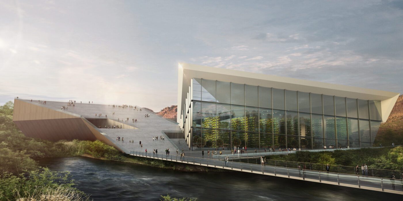
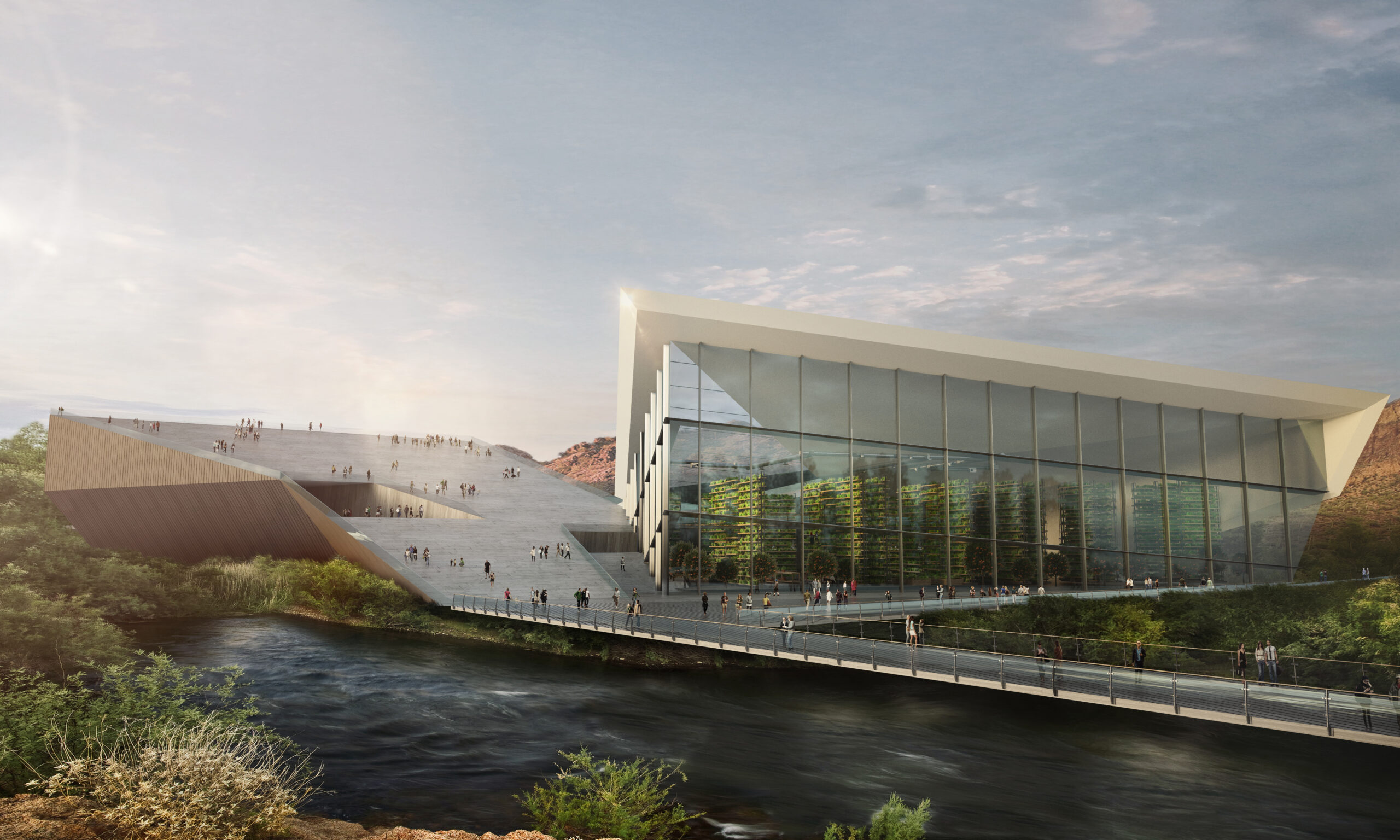
RIO ECO2 Venture by KRAUSE Architecture/Interior, Phoenix, Arizona | Concept.

Smart agriculture technology in architectural design undergoes a concrete manifestation in projects like the RIO ECO2 Venture. This transformative approach integrates advanced technologies into the landscape of agricultural spaces. Architects draw inspiration from such endeavors, conceptualizing structures that embrace precision farming, serving as living laboratories. By incorporating sensors and IoT devices, these structures facilitate data-driven decision-making concerning soil conditions, crop health and climate factors.

In the spirit of the RIO ECO2 Venture, vertical farming facilities emerge as intricately designed hubs with controlled environments, utilizing automation and robotics for tasks like planting and harvesting. The visionary designs prioritize energy-efficient greenhouses, integrating renewable energy sources and smart irrigation systems, exemplifying a commitment to optimizing resource usage.

Rio Eco Venture

RIO ECO2 Venture by KRAUSE Architecture/Interior, Phoenix, Arizona | Concept

Architects extend their vision beyond physical infrastructure to create collaborative spaces that inspire research and education. This synthesis of architectural ingenuity and smart agriculture technologies, mirrored in projects like RIO ECO2 Venture, gives rise to environments that harmonize innovative farming practices with sustainable architectural design, fostering efficiency, productivity and environmental consciousness.

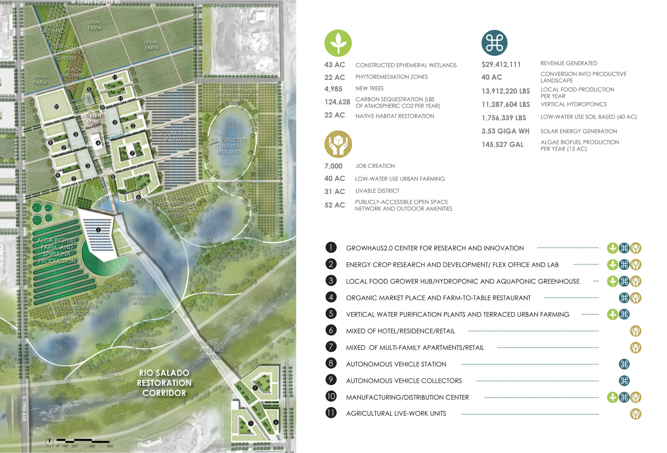
ECO2, a visionary 213-acre self-sustaining development, tackles the challenges of rising temperatures and water scarcity through sustainable food technology, serving as a beacon of innovation and underlining the critical importance of food and water security. Beyond its role as an educational center and community strengthener with a holistic Net Positive approach, ECO2 stands as a model for Arizona’s future, adeptly embracing technology, repurposing land for sustainability, and seamlessly integrating urbanity with agriculture.

Rio Eco2 Venture

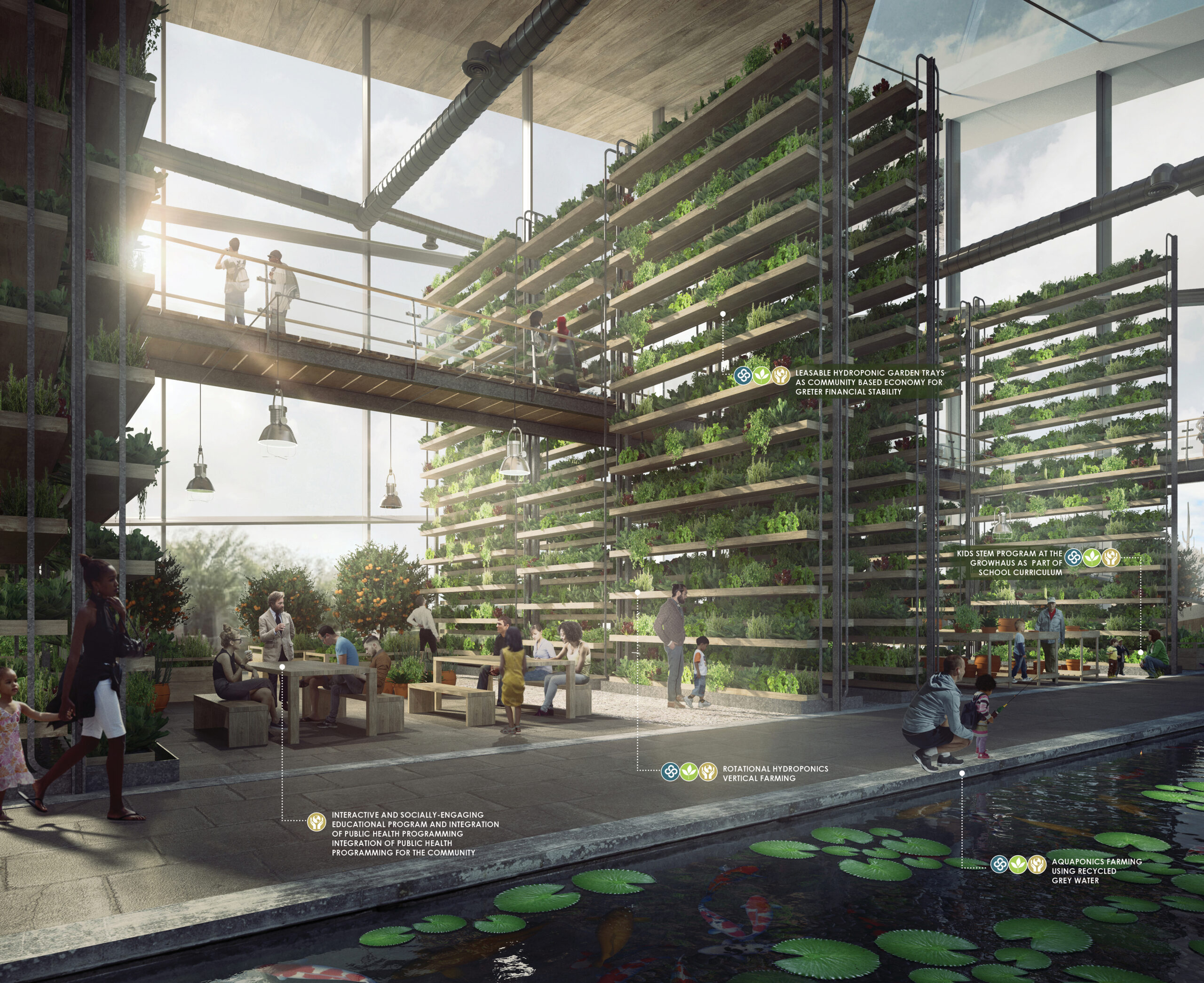
RIO ECO2 Venture by KRAUSE Architecture/Interior, Phoenix, Arizona | Concept

The community-driven GrowHaus 2.0 within ECO2 is a testament to this foresight, fostering distribution, production and education while addressing climate change and enhancing food access. As ECO2’s comprehensive plan champions the coexistence of agriculture and development, emphasizing sustainability, water reuse, and acknowledging the impact of increasing heat, it harmoniously integrates smart agriculture technologies. ECO2 stands at the forefront, symbolizing the convergence of innovation and circular food supply chains, pursuing a more resilient, sustainable and interconnected food system.

Agrotopia: Pioneering Circular Food Systems and Sustainable Architecture

Designing modern agricultural facilities with a focus on circular food supply chains is a visionary pursuit that harmonizes sustainable principles with innovative technologies. Architects and planners create closed-loop systems in these facilities, turning waste into valuable resources to prioritize resource efficiency. These designs prioritize community-supported agriculture and regional resilience, embracing local sourcing and distribution networks. The integration of precision agriculture technologies ensures optimal resource utilization, minimizing waste and environmental impact. In the quest for sustainability, the incorporation of urban farming and vertical agriculture maximizes land efficiency and shortens supply chains.

These facilities are conceived as modular, adaptable spaces constructed with sustainable materials and powered by renewable energy sources. Water recycling systems and efficient irrigation practices are seamlessly woven into the designs, while smart packaging solutions aim to reduce excess waste. Engaging communities through educational spaces within the facility fosters awareness and understanding of the circular food supply chain model.

As the principles of circularity and sustainability take root in the conceptualization of modern agricultural facilities, tangible exemplars like Agrotopia, Europe’s largest rooftop greenhouse, showcase the transformative marriage of visionary design and sustainable urban agriculture.


Agrotopia is a cutting-edge research center for urban food production, situated on the roof of the REO vegetable and fruit auction in Roeselare, Belgium. The innovative 102,257 square foot (9,500 square meters) building features striking faceted glass façades, a monumental entrance staircase and multifunctional spaces, exemplifying the future of sustainable urban agriculture.
With a focus on intensive space utilization, circular energy and water use, Agrotopia serves as a transparent sculpture of glass and steel, standing out against the city skyline. The building houses high-tech research facilities for cultivating fruits and vegetables, with an educational route for the public. The building’s unique design includes a double-height façade conservatory for innovative vertical cultivation, utilizing rainwater from the roof for irrigation.

Agrotopia embraces circular practices, utilizing rainwater for irrigation, cleaning and reusing residual water, and incorporating municipal residual heat from a nearby waste incinerator. The greenhouse is a model of circular symbiosis with the city, representing the forefront of sustainable urban food production and architecture.

Innovation in Design: Architectural Solutions for Smart Agriculture’s Impact on Food Production

The harmonious integration of smart agriculture into architectural design, exemplified by projects like RIO ECO2 Venture, is a testament to the synergy between technological advancement and environmental consciousness. Beyond physical structures, visionary designs such as RIO ECO2 Venture are catalysts for collaboration, research and education, engendering efficiency and heightened environmental awareness.

In the realm of circular food supply chains, exemplified by Agrotopia, the marriage of visionary design and sustainable urban agriculture takes center stage. Agrotopia’s circular practices and space efficiency position it as a leading model in sustainable urban food production.

This symphony of innovation and circularity concludes with a resonant echo, championing resilience, sustainability and interconnectedness. The aspiration is to achieve a harmonious equilibrium between food production and the environment, recognizing the crucial need to transform agriculture for sustained productivity and address issues of hunger and malnutrition. Investing in development and research plays a pivotal role in making new technologies accessible to farmers, contributing to a broader goal of educating the wider public and ensuring a more sustainable and equitable future.

The judging process for Architizer’s 12th Annual A+Awards is now away. Subscribe to our Awards Newsletter to receive updates about Public Voting, and stay tuned for winners announcements later this spring.   

Reference

The World’s First Horror Film Was All About Modern Architecture. Change My Mind.
CategoriesArchitecture

The World’s First Horror Film Was All About Modern Architecture. Change My Mind.

Architizer’s new image-heavy daily newsletter, The Plug, is easy on the eyes, giving readers a quick jolt of inspiration to supercharge their days. Plug in to the latest design discussions by subscribing. 

It is inevitable. At some point in the school year, a student in my AP Literature class will ask the dreaded question: what is “Modernism?” Usually, this happens in the afternoon before a full moon…

I try to keep it general. In literature and the visual arts — the representational arts, let’s say — modernism was an attempt to find new forms of artistic expression to meet the needs of a rapidly changing world where old certainties and trust in institutions were falling away. Often, this meant disrupting verisimilitude and drawing attention to the constructed-ness of the art object. As the caption of Magritte’s iconic painting declares, Ceci n’est pas une pipe! A painting of a pipe is not a pipe; it’s a painting.

Even though modern art seems “weird” to casual museum-goers, there was a method to the madness. Modern artists rejected representational conventions in pursuit of honest expression. Counterintuitive as it might seem, they wanted to bring art closer to life. This meant breaking the spell of illusion that had defined Western art since the Renaissance.

What kind of truth, though, does modern art speak to? Many kinds, to be sure, but I think they can be separated into two main buckets. (Or coffins to stick with the horror theme). On the one hand, you have the analytic tradition represented by Cubism, which, especially in its early years, involved a deconstruction of the picture frame. What you see in a Cubist painting is the underlying architecture of the composition. As with Brutalist architecture, the key gesture of Cubist art is to lay bare the object’s structure and not smooth it over with surface details.

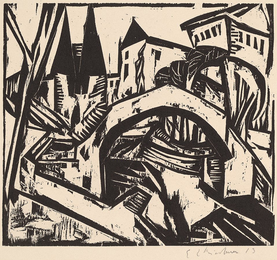
A print by German Expressionist artist Ernst Ludwig Kirchner titled “River Bank at Elisabeth, Berlin” (1912). The jagged lines and collapsed perspective anticipate the visual style of “The Cabinet of Dr. Caligari” (1920). National Gallery of Art, CC0, via Wikimedia Commons

On the other hand, there is Expressionism. Influenced by psychoanalysis, Expressionists sought to represent the irrational elements of subjective experience. Artists like Edvard Munch and Ernst Kirchner created wildly distorted landscapes, portraits, and urban street scenes that were charged with emotion. Many of these artists were especially interested in capturing the alienation and loneliness of urban life.

So how does architecture fit in? It is perhaps not surprising that the analytic vein of modernism was more readily applicable to the design of buildings than Expressionism was. In architecture, the word “modernism” is today synonymous with the rationalist utopianism of Gropius, Mies, and figures like this. However, this is not the whole story…

Modern architecture as we know it had an evil twin — one that died in childhood, but still haunts us today. In the 1920s, there was such a thing as Expressionist architecture. It never really flourished — that is, not until much later when it was picked up by contemporary architects like Daniel Liebskind — but it existed in Germany, the Netherlands, and a few other areas in Northern Europe.  Distortion, fragmentation, and the expression of strong emotion were the key features of this type of architecture. Like the rationalist modernism we know and love, Expressionist architecture rejected tradition, but it did not do so in a Platonic pursuit of harmony. No — this architecture was not bound by anything but the architect’s imagination.

Let’s take an example. In Dornach, Switzerland, one can visit The Goetheanum, which is the headquarters of the anthroposophy movement. Anthroposophy is a form of mysticism, or more precisely, gnosticism. Its adherents believe that, through certain meditative techniques, people can gain direct knowledge of the spiritual world. Rudolf Steiner founded the movement in the early 20th century. Steiner also designed the headquarters, a flowing, bat-like structure made entirely of cast concrete.

The building still appears radical today, in an era when we are used to seeing sculptural architecture. But think about how it must have appeared to the citizens of Dornach when it was erected in 1928. Many of the design decisions, such as the chimney stack that seems to have been hastily molded out of clay by a gigantic hand, would have been totally incomprehensible to people used to architecture that followed programmatic conventions. The uneven windows still bother me when I look at them long enough.

Here’s another good example: the Het Schip apartment complex  in the Spaarndammerbuurt neighborhood of the Netherlands. The name means “The Ship” and I guess it looks sort of like a ship. Sure. This was designed by architect Michel de Klerk and erected in 1919.

With its brick façade and tiled roof, at first blush this building doesn’t seem totally out of place with its context in Amsterdam. However, the proportions are bizarre — unsettlingly so, as if the building was designed by an alien who had read a description of Dutch architecture but had never actually seen it. Inside, the situation is even stranger. Looking up from inside the tower, one finds a riot of intersecting wooden support beams. There seems to be no regularity, symmetry, or even method to the arrangement of the beams. There isn’t even that sort of irregular fractal harmony one finds in the work of Antoni Gaudi. It just feels wrong, albeit in an interesting and stimulating way.

The madness of Het Schip is more apparent on the interior. Here is the view inside the central tower. ArjandbRijksmonument 3961 Huizenblok Het Schip Amsterdam 23CC BY-SA 3.0 NL

As stand alone objects, Expressionist buildings from the 1920s are really cool. One should not interpret my description of their weirdness as a dismissal of the structures in themselves. Every city needs discussion pieces, and expressive, sculptural architecture helps give definition to otherwise homogeneous urban environments. In our century we call this the “Bilbao Effect.”

Nevertheless, in the 1920s, the emergence of Expressionist architecture must have troubled some onlookers. Was this what the future would look like? Would built environments be just as disorderly and mercurial as the human mind? What would it even feel like to live — not just in an Expressionist building — but in an Expressionist city?

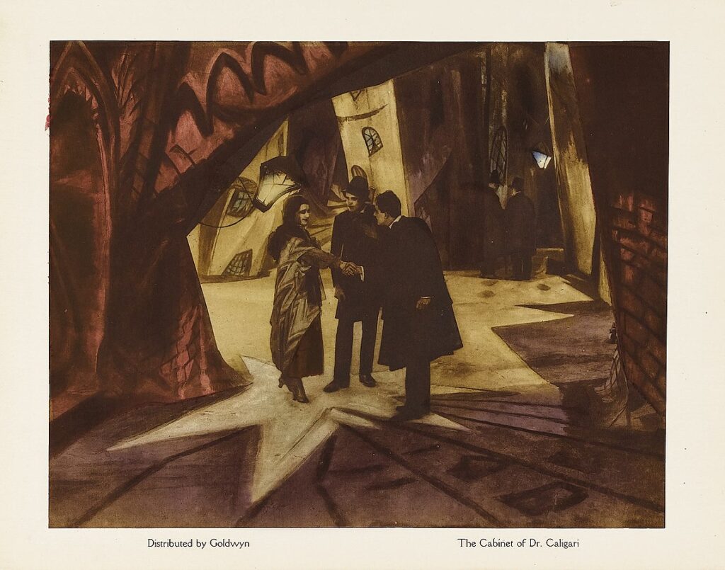
These questions seem to have been taken up by the art direction team of The Cabinet of Dr. Caligari, the 1920 German silent film that Roger Ebert once called “the first true horror movie.”

Lobby card of “The Cabinet of Dr. Caligari,” showing the twisted and distorted architectural forms of the set design. Goldwyn, Public domain, via Wikimedia Commons

The Cabinet of Dr. Caligari is one of the most studied and discussed films of all time. The film tells the story of a power-hungry hypnotist who manipulates a sleepwalker into committing a series of murders. The screenwriters, Hans Janowitz and Carl Mayer, were pacifists, like many Germans at that time. Janowitz had served as an officer in World War One, where he witnessed the nihilistic chaos and destruction of that conflict up close. The screenwriters both claimed that the film was intended as an allegory for the way authority was wielded during the Great War, with the older generation coercing the young to kill and die on their behalf.

In his landmark 1947 book From Caligari to Hitler, film theorist Siegfried Kracauer argues that the film is more complex than even its screenwriters understood. It does not just put forward a critique of irrational authority; it also shows how, in the 1920s, the German people craved this type of authority on a subconscious level. Kracauer points to the twist ending of the film, which the studio forced the screenwriters to add against their will. In the end, it turns out that Dr. Caligari was not actually a mad hypnotist, but rather the director of a mental hospital. The hypnotism and the murders never happened. They were simply a fantasy concocted by one of the inmates.

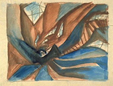
A conceptual preliminary sketch of the set design by Walter Röhrig. 1919. Note the fragmentary windows and staircase. Public domain via Wikimedia Commons

At some level, Kracauer argues, this inmate wanted to be hypnotized and ordered around by an external authority. This type of control would liberate him from the burden of his freedom. Kracauer believes this type of sentiment was  widely shared among the German people in the confusing and chaotic postwar period. He argues that cinema has a special ability to reflect collective sentiments, as it is a collaborative medium with no sole author.  By looking at German cinema from the 1920s until the rise of Hitler, Kracauer claims, one can observe the dreams, fears, and aspirations of a population that was in the process of rejecting democracy and embracing violent totalitarianism.

Kracauer’s reading of The Cabinet of Dr. Caligari, which emphasizes the unconscious forces at work in the narrative, is most powerfully expressed in the film’s radical set design, which was deeply influenced by the work of Expressionist painters such as Kirchner. Ebert described the world of the film as “a jagged landscape of sharp angles and tilted walls and windows, staircases climbing crazy diagonals, trees with spiky leaves, grass that looks like knives.” Black paint was used to create disorienting shadows in both the exterior and interior scenes. The proportions of everyday objects, like chairs, tables, and windows, are radically at odds with what one would expect. To use a German word, they are unheimlich: familiar yet strange and somehow sinister.

Model of The Cabinet of Dr. Caligari (1920) film set: Alan’s Living room during the scene of the murder. Reconstruction by set designer Hermann Warm. Note the exaggerated height of the back of the chair. For some reason, this has always been a creepy detail for me. Displayed at the Museum of Film and Television Berlin, Deutsche Kinemathek, SunOfEratFilmmuseum Berlin – Caligari ModelCC BY-SA 4.0

In short, the built environment of the film represents the world of the psyche. In here, it is hard to orient oneself, and there might always be killers lurking in the shadowy corners. As in a Kirchner painting, there is powerful honesty in the film’s lack of realism. But one thing must be acknowledged: this is not a city anyone would want to live in. Perhaps our inner lives are stormy and chaotic — we are, after all, creatures of desire and habit. But this does not mean our houses, apartments, and city streets need to express this aspect of ourselves. If anything, they should be designed to nudge us out of the darkness and into the light. 

Image: Still from The Cabinet of Dr. Caligari. CC BY-NC-SA via Norwegian Digital Learning Arena.

Architizer’s new image-heavy daily newsletter, The Plug, is easy on the eyes, giving readers a quick jolt of inspiration to supercharge their days. Plug in to the latest design discussions by subscribing. 

Reference

Beyond Resolutions: 24 Intentions Architects Should Revisit Throughout 2024
CategoriesArchitecture

Beyond Resolutions: 24 Intentions Architects Should Revisit Throughout 2024

Evelyn Lee is a Start-up Advisor in the Tech Space, Angel Investor, Founder of Practice of Architecture, and Host of the podcast Practice Disrupted. She is a prominent speaker on architectural practice evolution, technology integration, and diversity in AI, dedicated to guiding the profession into new horizons.

At this point, we are well into 2024, and sure, you could say we are past creating resolutions, strategies and goals for the new year. I prefer to set an intention for the year but to remain constantly on the lookout for opportunities. In the fast-evolving architectural landscape of today, architects face the challenge of adapting traditional practices to meet the demands of a dynamic and competitive industry.

To succeed in this environment, architects must simultaneously embrace change and innovation, foster collaboration and prioritize the sustainability of their businesses, careers, and practices. Here are 24 opportunities that architects can consider as we navigate the complexities of the year ahead.

Imagining New Ways to Practice

It is one thing for architects to raise their fees with the pace of inflation, but to truly raise our fees to be able to pay and have benefits that, say, compete with Tech salaries, we have to rewrite the business model. This entails venturing into uncharted territories, positioning oneself and the firm as knowledge leaders, and considering the possibility of new products and services.
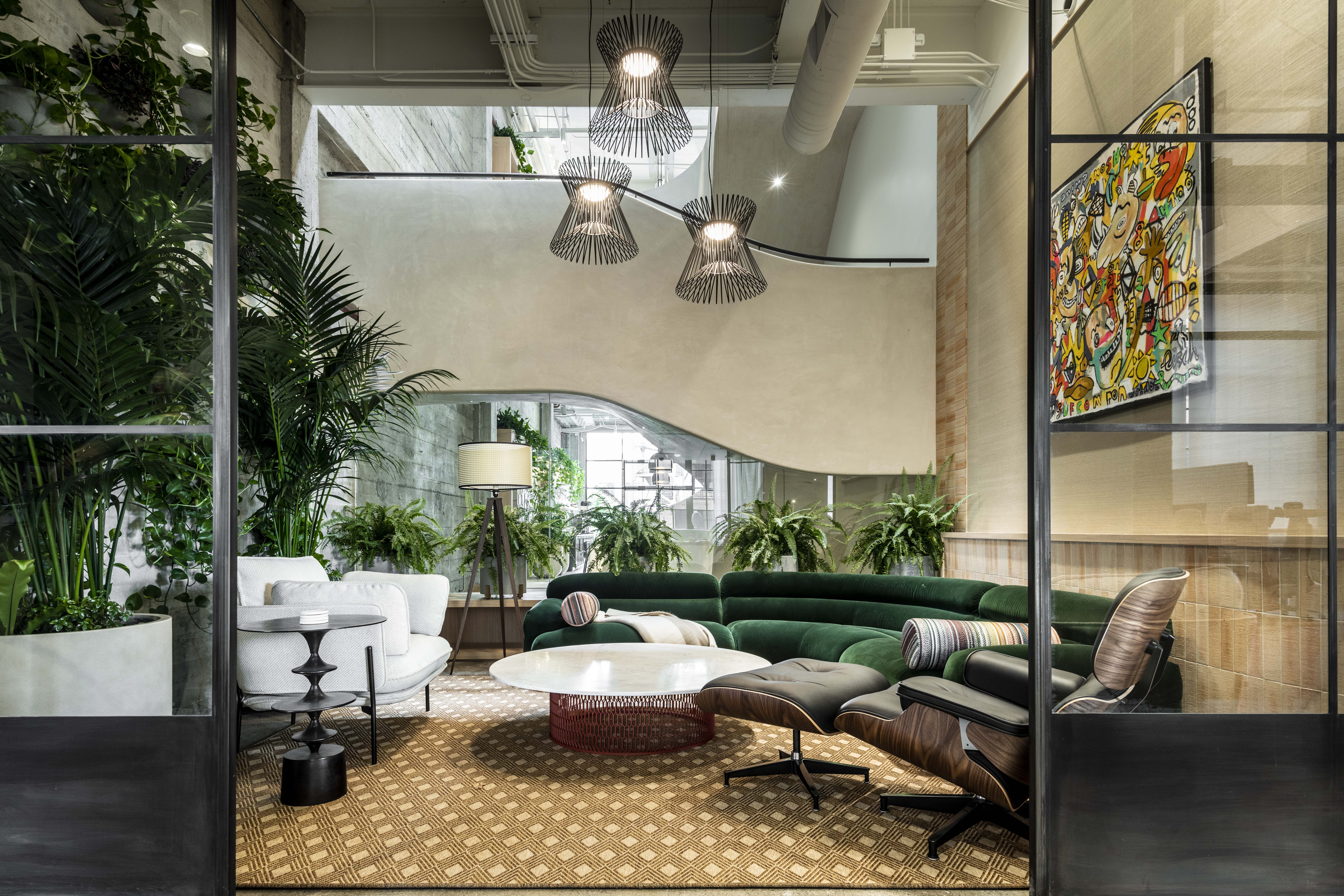
Bay Area Research Company by SkB Architects, California | Jury and Popular Choice Winner, 11th Annual A+Awards, Commercial Interiors (> 25,000 sq ft)

1. Break free from tradition with innovative business models:

Architects should explore novel business models that align with changing market dynamics and client preferences. This could include offering additional products and services that support the entire lifecycle of a building or looking for ways to engage the client sooner before deciding whether or not they need a building. Going beyond buildings, we will place ourselves to build more of the buildings we want to build within our community.

2. Venture into uncharted territories, making architecture more inclusive:

I’ve often felt like an outsider in the profession, even though I have my license and remain engaged in professional membership organizations. We must find a way to invite those who found others back into the profession. Take a moment to track down those you went to school with who find themselves outside of architecture and remind them what they loved so much about architecture in the first place. They could be in a position to be a client or, at the very least, an advocate.

3. Build community connections with strategic outreach:

Establishing meaningful relationships with potential clients, especially within the community, lays the foundation for successful collaborations and future projects. Strategic outreach efforts are crucial in building these relationships, as they facilitate communication, understanding and alignment of values. Participating in community events allows architects to showcase their work and demonstrates their commitment to and investment in the communities they serve.

4. Become thought-leaders in the built environment:

By actively engaging in thought leadership activities, architects can influence the direction of the profession and contribute to meaningful change. Publishing articles in industry journals, blogs or mainstream media outlets allows architects to share their insights, expertise and innovative solutions with a broader audience. This elevates the architect’s profile and enriches the architectural discourse, inspiring others and sparking new ideas.

Boosting Business Operations

One of the key ways to increase cash flow within the firm is to prioritize business operations. Efficiency and agility are paramount for the success and longevity of architectural practices. Architects should optimize their business operations to adapt to changing market demands and ensure the firm’s sustainable growth, even through hard times.
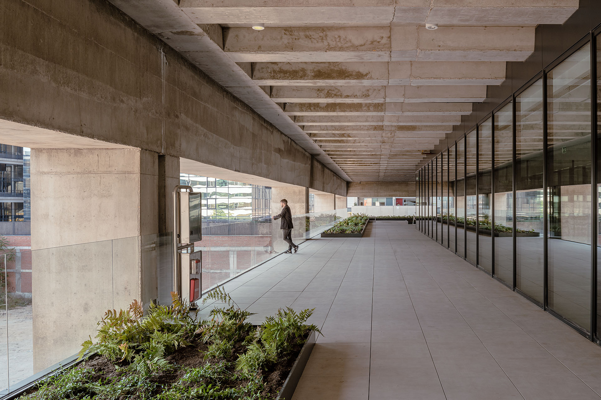
Polaris North Offices by b720 Fermín Vázquez Arquitectos, Madrid, SpainPopular Choice Winner, 11th Annual A+Awards, Office – Mid-Rise (5-15 Floors)

5. Streamline practices with automation:

Automation tools can streamline repetitive tasks such as document management, scheduling and project tracking, allowing employees to focus on more value-added activities. This not only reduces the burden of administrative tasks but also frees up time for employees to dedicate to creative and strategic aspects of their work, fostering a more fulfilling and rewarding work experience.

6. Master the art of finance and planning:

Understanding financial principles and strategic planning is crucial for every member of an architectural firm, as it directly impacts the overall success and sustainability of the practice. Employees can maximize their impact and contribute to its growth and prosperity by aligning their efforts with the firm’s goals and objectives. This shared understanding fosters a collaborative and goal-oriented culture within the firm, where every individual is motivated to perform at their best to achieve collective.

7. Foster confidence with improved control over business outcomes:

Through strategic planning, architects can enhance business outcomes by aligning project objectives with firm goals. Quality assurance processes ensure consistency and reliability in project delivery, bolstering client satisfaction and the firm’s reputation. Architects foster transparency and accountability by tracking project metrics and providing regular updates, building trust with clients and stakeholders. This proactive approach leads to successful project outcomes and strengthens long-term relationships.

8. Allocate resources efficiently for sustainability:

In today’s business world, sustainability and flexibility go hand in hand, so using resources wisely is crucial. That means spending money wisely and investing in the right tools and tech to do the job. Ensuring a team’s talents match the projects they’re working ensures that everyone works at their best. Valuing agility sets architects up for long-term success in a changing world, ensuring they’re adaptable to challenges or opportunities and giving them a competitive edge in the market.

Cultivating Culture

Creating a positive and inclusive work culture is vital for attracting and retaining top talent in architectural firms. Architects should foster a supportive environment where every team member feels valued and empowered to contribute.

|
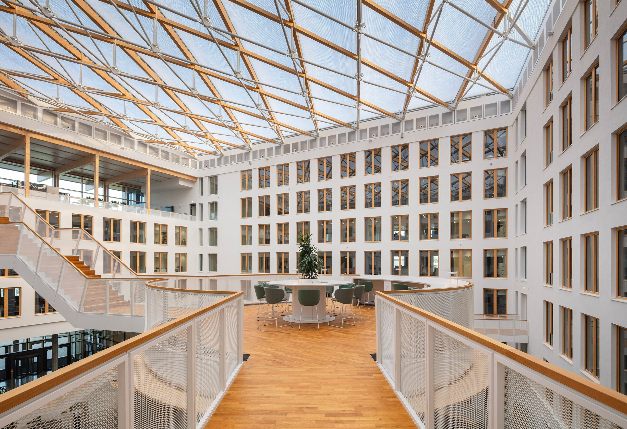
EDGE Suedkreuz Berlin by TCHOBAN VOSS Architekten GmbH, Berlin, Germany | Jury Winner, 11th Annual A+Awards, Office – Mid-Rise (5-15 Floors)

9. Promote transparency, ensuring every voice is heard:

Cultivating open and transparent communication fosters collaboration and belonging among team members. Regular team meetings, feedback surveys and check-ins with managers provide avenues for sharing updates and addressing challenges collectively. Actively listening to diverse perspectives informs decision-making and promotes inclusivity. By creating a respectful environment where all voices are heard, teams can harness collective wisdom to drive positive change.

10. Build a community that extends beyond office borders:

Architects can expand their circle and build community by connecting with peers and industry folks outside their office walls. This might mean hitting up networking events, joining pro groups or getting involved in mentorship gigs where they can swap ideas and advice. By mingling with others in the field, architects can gain new perspectives, stay in the loop with industry trends, learn from seasoned pros and boost their careers and share their insights.

11. Create spaces of belonging for career development:

Giving your team chances to grow and learn keeps them engaged and committed. That could mean hooking them up with mentors who can share their wisdom, covering the cost of courses to keep skills fresh or offering leadership training to help them level up. When you invest in your team’s development, you show that you value them and give them the tools they need to advance their careers within the company. A culture where everyone’s always learning and growing together is a win-win for everyone involved.

12. Respect work-life balance:

Firm owners should ensure the well-being of their team members and encourage them to maintain a healthy work-life balance. Offering amenities like yoga classes or gym memberships can improve their physical and mental well-being. However, alternatives like subscriptions to wellness apps like Calm can also be supportive. Additionally, providing resources for counseling or stress management workshops demonstrates a commitment to supporting their mental health needs.

Developing People and Creating Better Policies

Investing in the growth and development of employees is not just good practice; it’s essential for the long-term success of architectural firms. By providing opportunities for learning and advancement, firms can empower their employees to expand their skills, take on new challenges, and contribute more effectively to the firm’s goals.

Chengdu Co-Innovation and Cooperation Center by LAGUARDA.LOW ARCHITECTS, Chengdu, ChinaPopular Choice Winner, Commercial – High Rise (16+ Floors) 

13. Grow people with flexible workplace policies:

Architecture firms demonstrate their commitment to supporting their employees’ success and well-being by prioritizing flexibility, ultimately fostering a more engaged and productive workforce. This could involve providing remote work options, flexible scheduling or additional time off to accommodate personal or professional needs. This flexibility enhances job satisfaction and work-life balance and empowers architects to manage their time effectively and pursue growth opportunities.

14. Celebrate diversity for unique perspectives:

Diversity brings a wealth of perspectives, enhancing problem-solving and design in architectural teams. Embracing diversity in all its forms fosters creativity and innovation within architectural firms. This may involve promoting diversity in hiring practices, establishing diversity and inclusion committees, or hosting cultural awareness workshops celebrating different backgrounds and experiences.

15. Make equity a standard, ensuring fair opportunities:

Architects should prioritize fairness and equality in hiring, promotion, and project allocation to ensure all team members have a level playing field. This involves implementing inclusive recruitment practices and unbiased promotion processes to attract and retain talent from diverse backgrounds. Similarly, project allocation should be based on merit and skill, fostering an environment where everyone has equal opportunities to contribute and advance.

16. Prioritize employee mental health and well-being with nurturing policies:

Recognizing the crucial connection between employee well-being and productivity, firm leaders should implement policies prioritizing physical, mental and emotional health, including providing comprehensive health insurance coverage and employee assistance programs. Policies that promote mental health awareness and support such as counseling services or mindfulness workshops, are essential for maintaining employee morale and productivity.

Elevating How Teams Work Together

Effective collaboration and project management are critical for delivering successful architectural projects. Fostering collaboration empowers team members and cultivates trust and transparency in project management processes and employee experience.
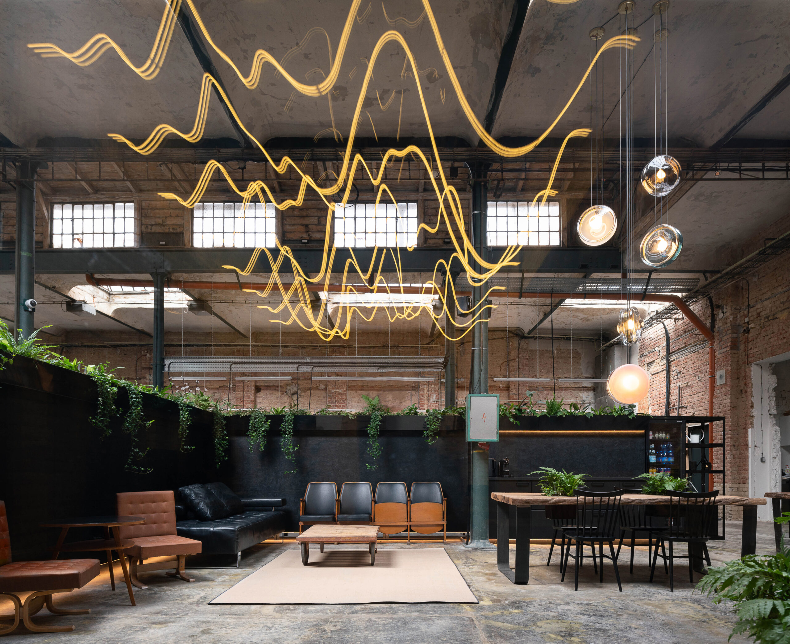
Kabelovna Studios by B² Architecture, Hlavní město Praha, Czechia | Popular Choice Winner, 11th Annual A+Awards, Commercial Interios (<25,000 sq ft)

17. Encourage collaboration for empowerment:

Creating high-performing teams is essential for architectural firms to achieve project success and innovation. This involves establishing clear team agreements that outline expectations, goals and communication norms, allowing for more flexible work arrangements that accommodate individual preferences and needs. By empowering team members to have a say in how they work and collaborate, architects can boost morale, productivity and creativity.

18. Inspire future leaders with professional development:

Strategically implementing professional development opportunities ensures managers have the skills and knowledge to lead and manage teams effectively. Mentorship programs, leadership training workshops and industry certifications give managers the tools and insights to navigate complex challenges and drive team success. By investing in their professional growth, firms empower managers to take on greater responsibilities and make informed decisions that contribute to their overall success.

19. Build trust with transparent management structures:

Creating a culture of trust through feedback is vital for advancing careers within architectural management, enhancing individual performance, strengthening team dynamics and bolstering collective growth. By implementing regular performance reviews and upward feedback mechanisms, architects provide managers with constructive input on their leadership style and professional development, building trust. Providing clear pathways for progression ensures managers are supported to advance within the firm.

20. Value empathy and human connection in leadership:

As licensed professionals entrusted with safeguarding the health, safety and welfare of the public, architects are responsible for embracing empathy as a core value in their interactions with team members, clients and stakeholders. Understanding and valuing the perspectives and experiences of others is essential for success. This involves actively listening to concerns and feedback, celebrating achievements and offering support during challenging times.

Exploring new tools and AI

Technological advancements, including artificial intelligence (AI), are transforming the architectural profession or will transform while we stand on the sidelines. Architects should embrace new tools and technologies to streamline processes, enhance efficiency and assist in delivering innovative design solutions.
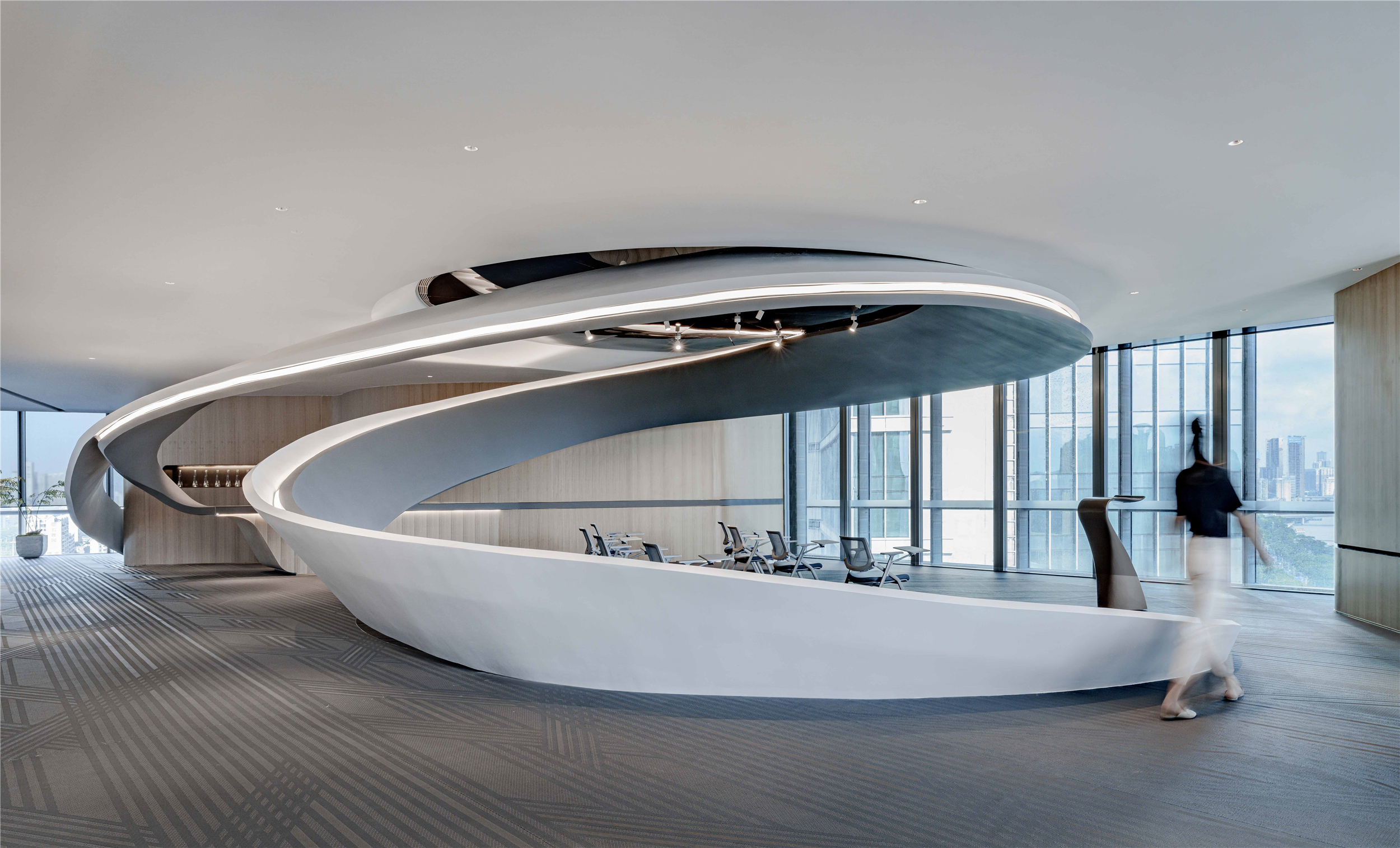
Stream Office by Kris Lin International Design, Zhuhai, ChinaJury Winner, 11th Annual A+Awards, Architecture +Workspace

21. Stay ahead with AI in business and practice management:

Artificial intelligence offers innovative solutions that can revolutionize various aspects of architectural firms, from project management to client interaction. While architects should keep a keen eye on emerging AI tools, they must also consider their involvement in the development process. By actively participating, architects can ensure that AI solutions are tailored to their needs, positioning them for success in an increasingly AI-driven world.

22. Discover AI’s potential to enhance efficiencies:

By leveraging AI-powered solutions, architects can automate repetitive tasks and gain valuable insights into project performance and market trends. This saves time, minimizes errors, enables data-driven decision-making and fosters innovation. Additionally, AI-driven analytics tools provide employees with personalized learning and development opportunities, empowering them to grow and advance within the firm.

23. Leverage technology for improved service delivery:

Architects can draw inspiration from industries such as retail and hospitality, where innovative technology and streamlined processes have significantly improved the client experience. By adopting similar approaches, such as implementing client portals and utilizing VR/AR technologies, architects can offer clients transparent communication and immersive design experiences. Prioritizing customer feedback and satisfaction enables architects to continuously effectively tailor solutions to meet client’s needs.

24. Merge human creativity with AI speed for a new architectural era:

Merging human creativity with AI speed represents a transformative shift in architecture, unlocking new possibilities and advancements, accelerating design iterations. By leveraging AI technologies, architects can devote more time to creative exploration and pushing the boundaries of traditional design paradigms. Facilitating rapid prototyping and informed decision-making, the synergy between human ingenuity and AI advancement promises to revolutionize architectural design. (There I said it — AI can help with the design process.)


As architects work through 2024 and beyond, it’s clear that today’s world calls for a fresh approach to practice, business, culture, people and even projects. Do we have to embrace everything all at once? No, we are all a part of a complex, broken system that carries no easy fix, but as you can see from above, there are themes across the areas where a focus on being a good human can do a lot to move the profession forward.

As we tackle the challenges and seize the opportunities we face today, let’s stay committed to pushing boundaries, embracing diversity, and working together to create firms and design spaces that enrich everyone’s lives. Together, we can shape a future where architecture reflects society’s values and inspires future generations.

Architizer’s Tech Directory is a database of tech tools for architects — from the latest generative design and AI to rendering and visualization, 3D modeling, project management and many more. Explore the complete library of categories here.

Reference

Tech for Architects: 7 Top BIM Tools for Architectural Design
CategoriesArchitecture

Tech for Architects: 7 Top BIM Tools for Architectural Design

Architizer’s Tech Directory is a database of tech tools for architects — from the latest generative design and AI to rendering and visualization, 3D modeling, project management and many more. Explore the complete library of categories here.
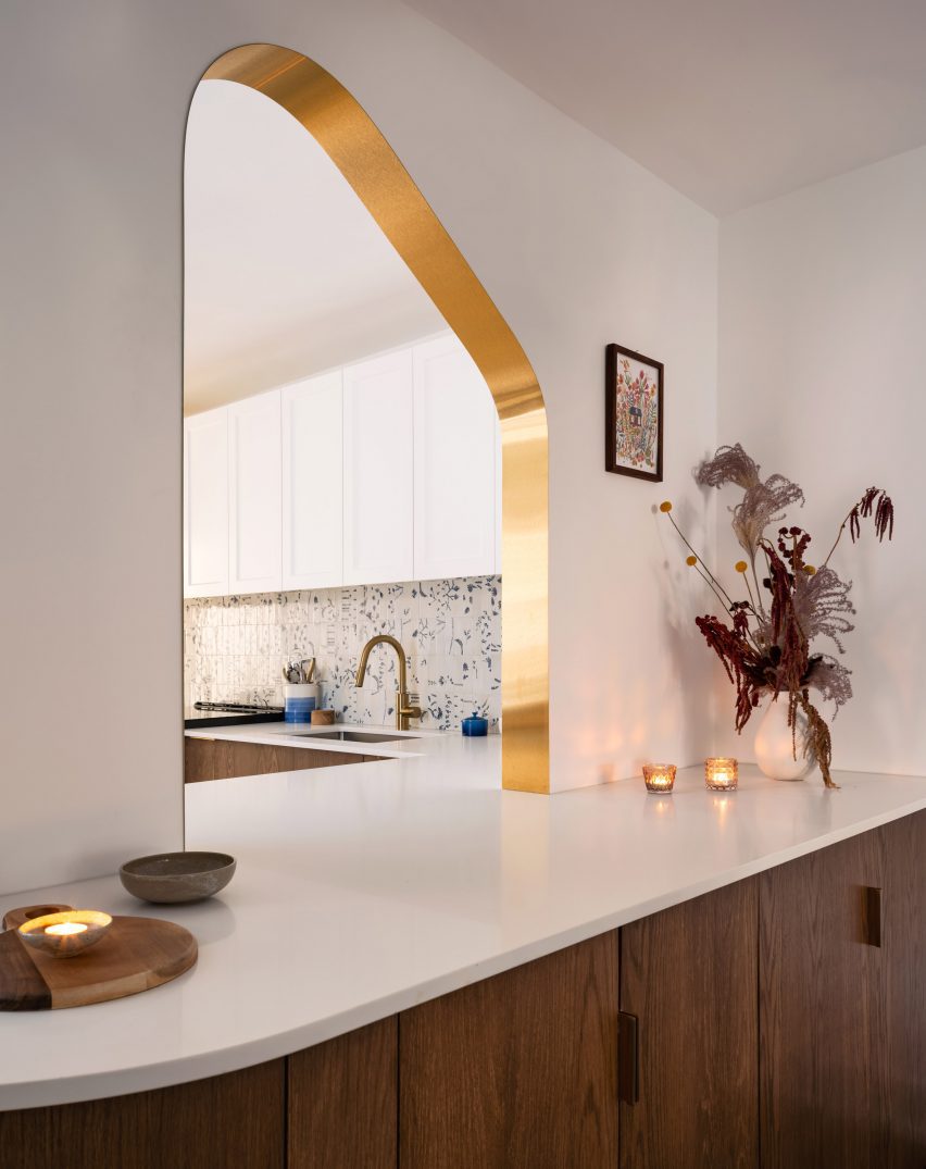
For the past decade, the term “BIM” has come to dominate, fundamentally shaping how architectural practices operate. BIM design software surpasses traditional 3D modeling programs by incorporating digital models with different data sets, such as material specifications, finishes and even MEP (mechanical, electrical, and plumbing) systems. In other words, a wall designed in a BIM environment goes beyond the typical “3D extrusion”, carrying information that can be utilized throughout the duration of a design project — from inception to completion and even for future maintenance.

Initially invented in the 1980s, BIM is an all-in-one software package that includes features from digital representation to architectural visualization, data-driven design, construction documentation, and more. It is a piece of technology that greatly encourages collaborative architectural practices, offering a holistic approach to design projects.

Without further ado, here are the top seven BIM tools that unlock unprecedented capabilities in architectural design.


Best BIM Tool for Parametric Design

alt="Revit Screenshot"Admittedly, the most famous BIM software for architects is Revit, developed by Autodesk. It offers a comprehensive set of tools for designing, documenting and managing building projects. Central to Revit’s functionality is its parametric modeling capabilities, allowing architects to create intelligent 3D models that capture both the geometry and data of building elements. Supported by Autodesk, Revit also has an array of third-party plugins and libraries, providing architects with additional features.


Best BIM Tool for Real-Time 3D Modeling

alt="Archicad Screenshot"ArchiCAD is a BIM software specifically tailored for architects and designers. Its core strength lies in its intelligent virtual building model, which integrates both the visual and data aspects of a project. This model-based approach allows architects to efficiently explore design alternatives, simulate building performance, and generate accurate construction documentation. Additionally, ArchiCAD includes features such as BIMx for interactive 3D presentations and Open BIM for interoperability with other software platforms.


Best BIM Tool for Concept Design

Vectorworks is perhaps the most versatile BIM software for architecture. It has a simple and straightforward interface, which allows architects to effortlessly turn a sketch into a fully realized design. Vectorworks provides powerful tools for creating 2D and 3D designs, offering a flexible and intuitive platform for designers to bring their ideas to life. With features such as robust modeling capabilities, intelligent object libraries, and advanced rendering options, Vectorworks enables architects to develop their own tailored BIM workflow, without compromising their creative process.


Best BIM Tool for Beginners

alt="Renga Screenshot"Renga is an architectural design and BIM software developed by ASCON Group. It offers a user-friendly interface and powerful tools such as parametric modeling, real-time rendering and an extensive object library as well as many interoperability options with other BIM software. Its comprehensive workflow as well as wide variety of assets that can handle routine tasks like calculating schedules or making cost estimations marks it as the perfect tool for architects to dive into BIM technology.


Best BIM Plug-in Tool for iPad

Codesign is a BIM plug-in tool for iPad. It seamlessly bridges the gap between pen, paper and BIM. Specifically used for concept design, Codesign offers tools such as rapid sketching, interactive 3D modeling as well as data-driven design — all through an iPad screen. It also includes features such as importing site context in order to sketch and iterate zoning and usage options. Finally, it incorporates AI generative capabilities, where architects can simply input their sketch or model followed by a text prompt to seamlessly visualize their designs.


Best BIM Plug-in Tool for Rhino

VisualARQ is an architectural design software that boosts Rhino’s capabilities by adding dynamic documentation tools and architecture object styling capabilities. It includes features such as Freeform Modeling – which converts any freeform geometry into an informed object — parametric design, an extensive object library, dynamic documentation, architectural visualization capabilities and finally, Grasshopper integration.


Best BIM Tool for Sustainable Design

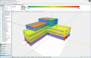
alt="Babi Screenshot"Founded in 1972, Vabi is a plug-in software solution for BIM developed in the Netherlands, which advances simulation 3D models for energy and comfort within buildings. Its features include Vabi Assets that enable the calculation and management of energy labels as well as Vabi Elements that allow architects to facilitate simulations of heating loss or cooling load calculations. Finally, the Vabi EPA tool is used for feasibility studies to speed up the inspection processes for both residential and non-residential buildings.


How to Better Leverage BIM Tools in Architecture

The following tips and considerations will help you maximize the potential of BIM tools in architectural design, as well as avoiding common pitfalls associated with this fast-emerging technology.

Invest in Training: It is true that BIM is regarded as a rather complex software, oftentimes difficult to integrate with already established architectural design workflows. Consequently, it is important for any architect or architecture firm to familiarize themselves with features, tools, and best practices to maximize their efficiency and productivity. Either through hiring a BIM specialist, taking a course or diving into tutorials, it is important for architects to develop standardized templates, libraries and workflows to maintain consistency across projects. This includes naming conventions, layering systems, and file organization to streamline collaboration and project management.

Start Early with BIM: When using BIM for projects, it is important to introduce the software early in the design process, in order to reap its full benefits. By utilizing it for conceptual modeling to explore design ideas and make quick iterations, enables architects to progress more seamlessly to detailed design and documentation. In addition, using BIM software from the start of a project, will allow for better collaboration amongst other stakeholders. Using features such as cloud-based sharing, version control, and real-time editing will ensure clear communication and coordination between architects and engineers from idea to construction.

Utilize Parametric Modeling: BIM’s most powerful asset is pairing traditional digital modeling with design and construction data. The wide range of parametric modeling capabilities in BIM tools allows architects to create intelligent building components that can be easily modified and updated throughout the design process, leading to effortless design iterations. Nevertheless, architects need to be aware of the data they incorporate into their designs and maintain accurate and up-to-date information about building elements to support their decision-making in their projects.

Architizer’s Tech Directory is a database of tech tools for architects — from the latest generative design and AI to rendering and visualization, 3D modeling, project management and many more. Explore the complete library of categories here.

Reference

Sustainable Practice: The Miller Hull Partnership’s “Regenerative Porch”
CategoriesArchitecture

Sustainable Practice: The Miller Hull Partnership’s “Regenerative Porch”

Architects: Want to have your project featured? Showcase your work through Architizer and sign up for our inspirational newsletters.

Front porch living is a staple activity in many parts of the world; this culture of chatting with passersby, catching a fresh breeze and watching over the neighborhood was long viewed as a cultural mainstay of the southern United States. In addition to contributing to more socially-oriented communities, porches were historically important design features to help inhabitants cope with warmer weather (and a signature element of the New Urbanism movement). As the advent of air conditioning revolutionized the way architects and the broader population alike responded to heat, the porch became less integral to home design; however, today, several firms are making a strong case for its revival.

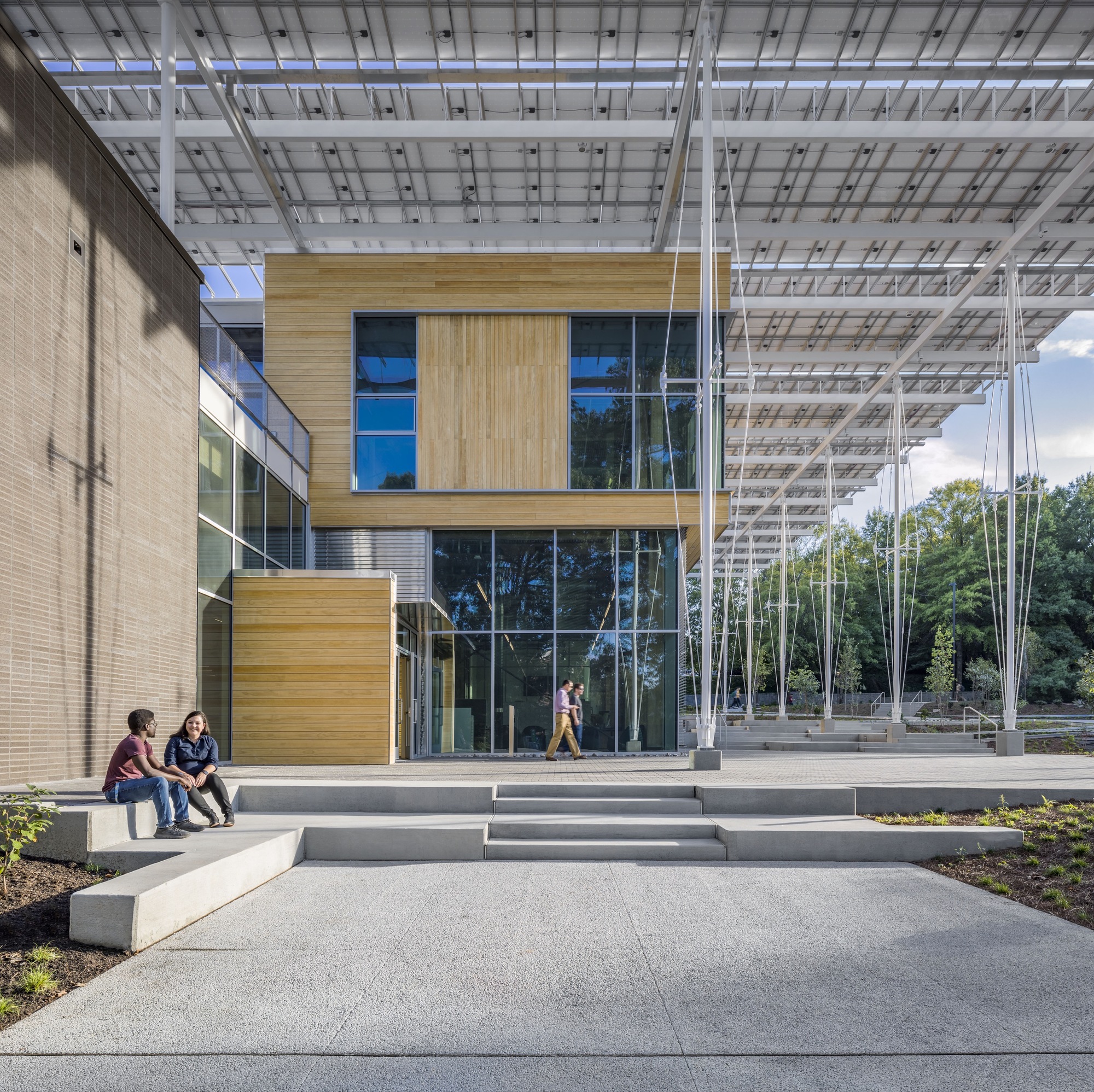
Architects have a responsibility to protect the public’s health, safety and welfare. Between climate change and increasingly extreme weather conditions, this charge also encompasses more sustainable and resilient design. For the Kendeda Building in Atlanta, the team at The Miller Hull Partnership (who took home the jury accolade for Best Sustainable Firm in the 10th Annual A+Awards) set out to create a model architecture that could foster environmental education and research. The resulting building doubles as a forum for community outreach, grounding approaches to sustainability and resiliency within the campus and beyond — all hinging on a clever evolution of the “porch” concept.
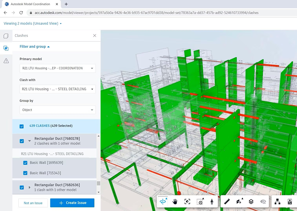
Located in the heart of Atlanta, The Kendeda Building was designed to make a statement. Created for the Georgia Institute of Technology, the building’s design also became an expression of its value system. These ideas are shown on display both inside and out, from the massing to material choices like mass timber. Working with Lord Aeck Sargent, a Katerra Company (LAS), the team at Miller Hull wanted to demonstrate that rigorous design and sustainability go hand-in-hand.
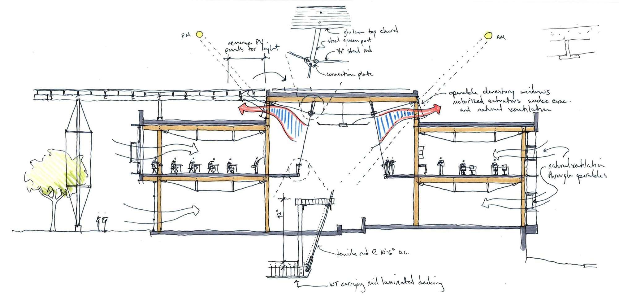
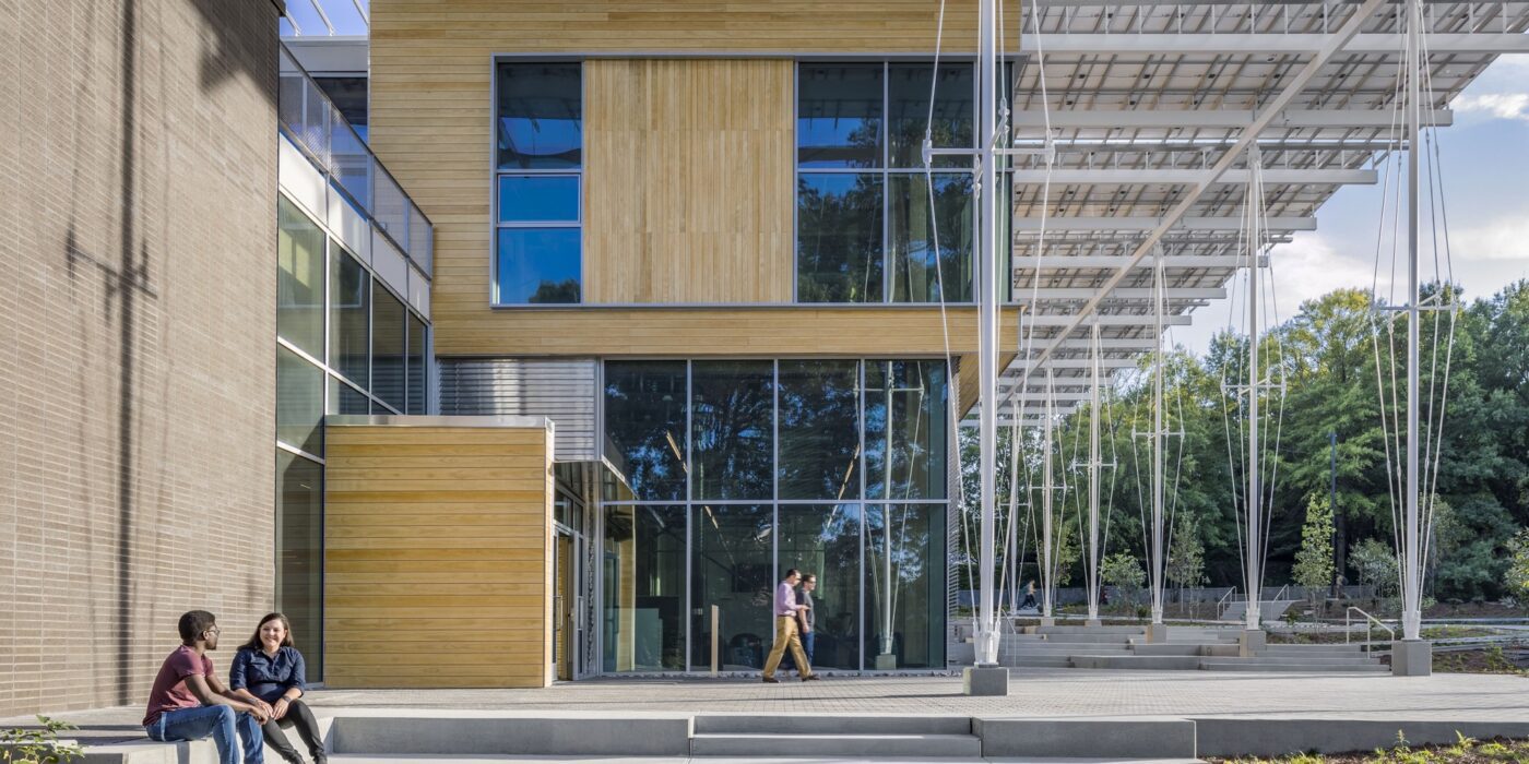
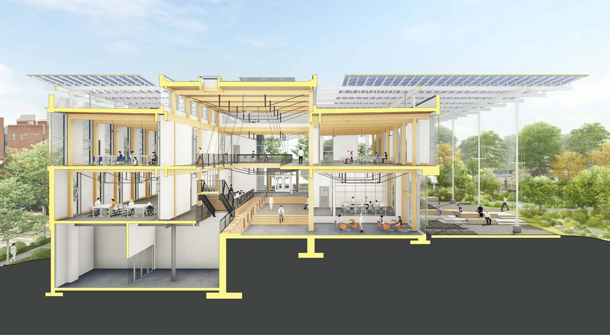
The concept of The Kendeda Building is inspired by the vernacular southern porch. Taking this element and expanding it from the residential to the civic scale, the team imagined a “regenerative porch” that could create a cool microclimate on the surrounding site. The resulting structure invites visitors inside to rest, learn and to look up as they learn about the space around them. Inside, the building continues the concept of learning by example through the design itself. As the team explained, gravity and lateral elements are left exposed creating a visual register of the structural forces at work.
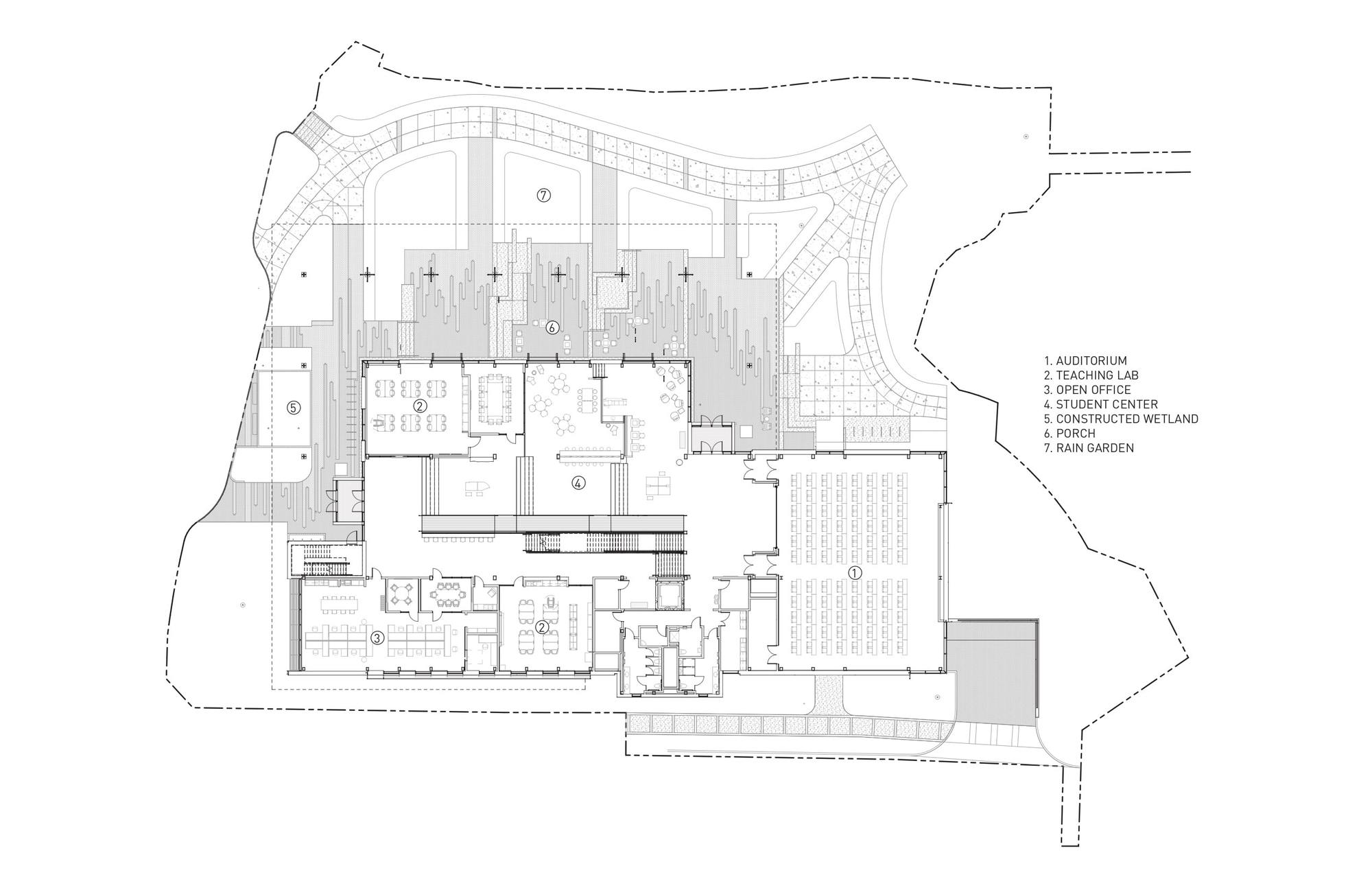
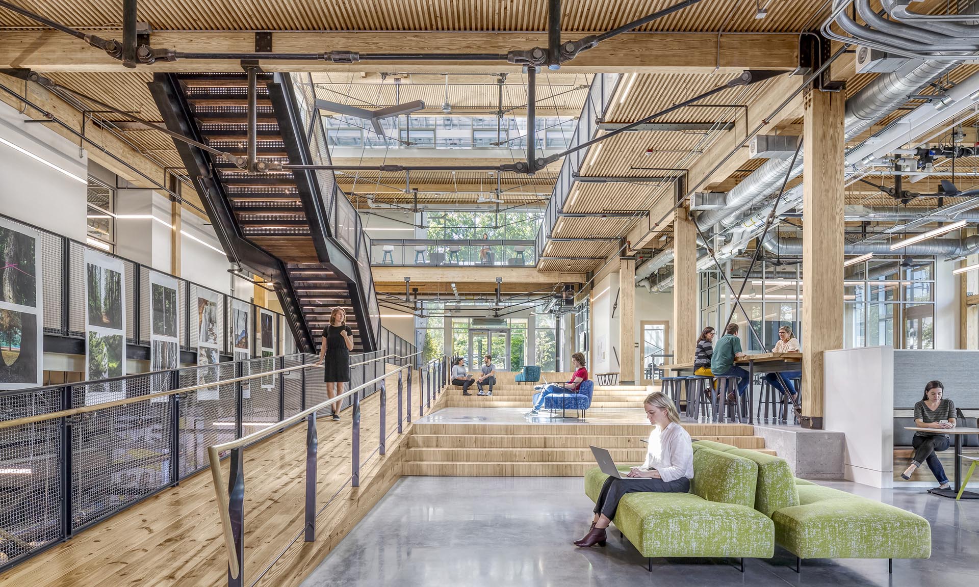
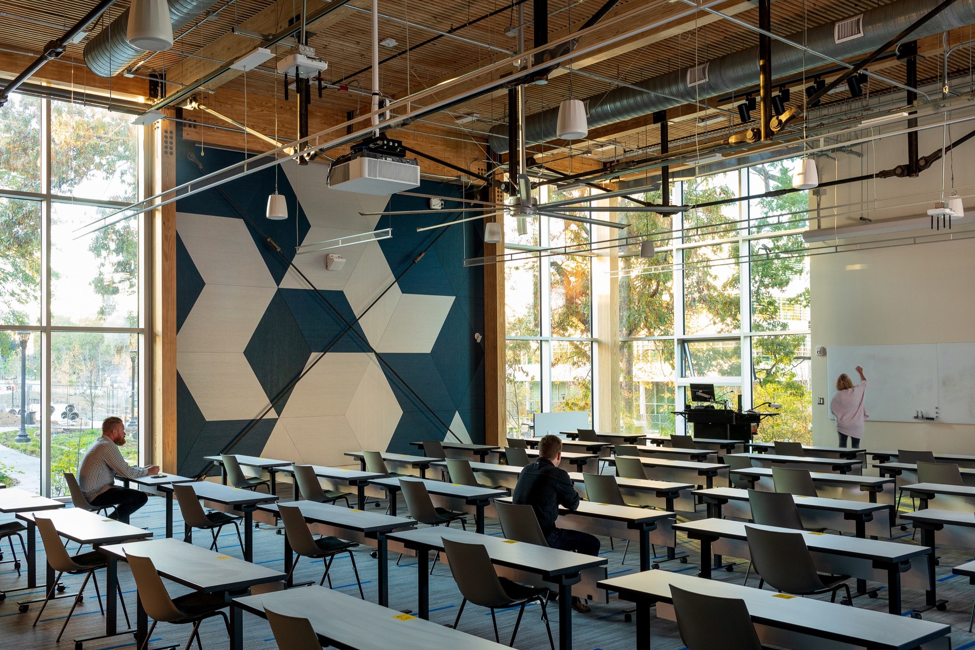
The Kendeda Building hosts a variety of learning spaces to welcome all students and disciplines from campus. Traditional classrooms as well as laboratory space and meeting rooms fill the building. Each space has generous daylighting, operable windows and is free of Red List chemicals. Indoor environmental quality was the primary driver in the design of these spaces to support learning. The Kendeda Building is Georgia Tech’s first timber building since its earliest load bearing masonry and timber structures from the 1880s. Climate smart mass timber was selected for its significantly smaller embodied carbon footprint, compared to concrete and steel systems.
The design of the Kendeda Building demonstrates that ‘Living Buildings’ are possible in even the most demanding climates. The Living Building Challenge is one of the world’s most rigorous performance sustainability certification standards for buildings. It was assumed Living Buildings could never be built in the hot and humid climate of the southern United States, especially Georgia, where swampy summers typically necessitate the use of high amounts of energy to keep buildings cool.
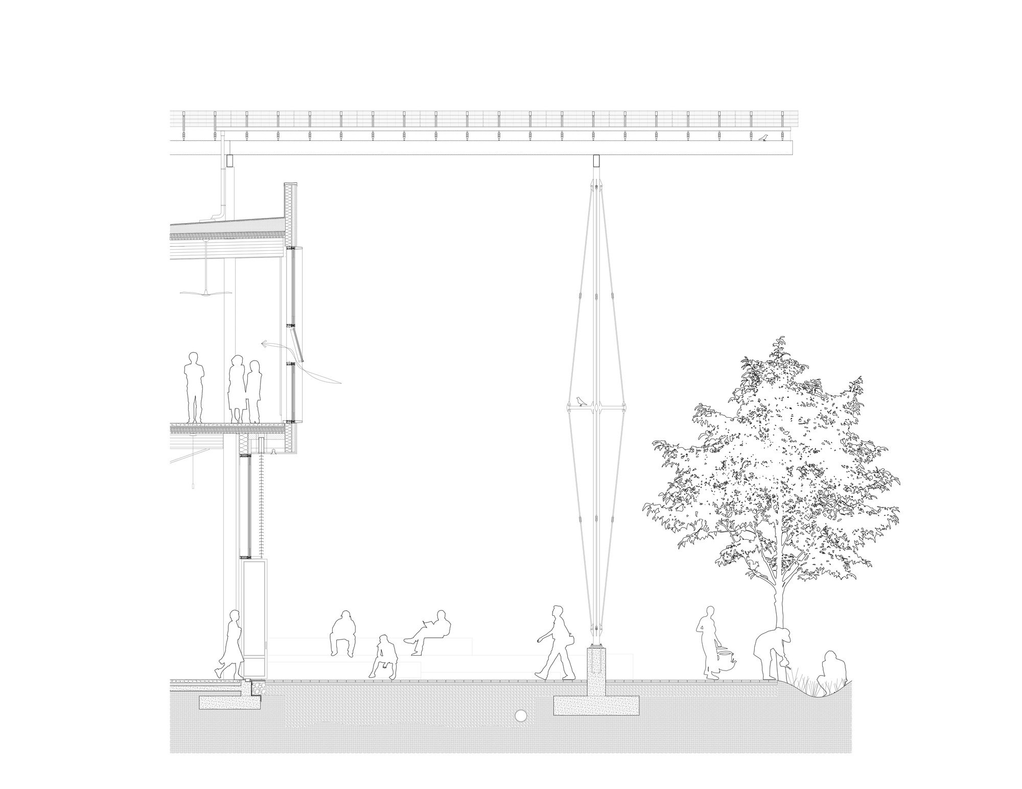
“People thought that a building like Kendeda could work in other places – California. Arizona, maybe. But certainly not Georgia,” says Shan Arora, Director of the Kendeda Building for Innovative Sustainable Design.

Yet, the project achieved full Living Building Certification in 2021 after proving its net positive energy and water performance during its year-long occupancy period. At the heart of this was the “Regenerative Porch” — a structural system and PV canopy that generates more than 100% of the building’s energy demand and captures enough rainwater to meet 100% of the water used in the building. At the same time, the design blurs interior and exterior conditions while providing weather-protected outdoor classroom space. As the first Living Building of its kind in the Southeast US, the project set a new standard for design.
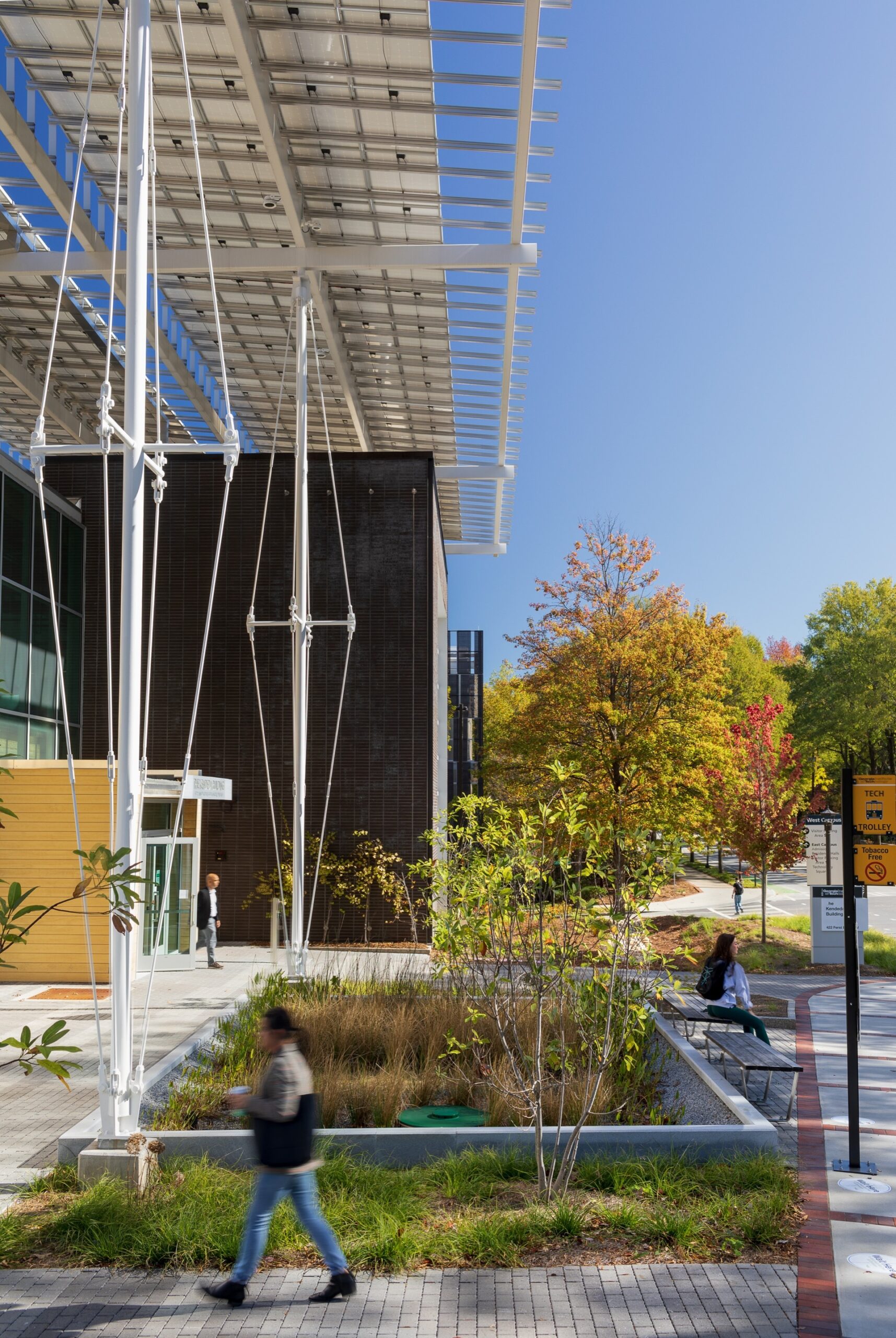
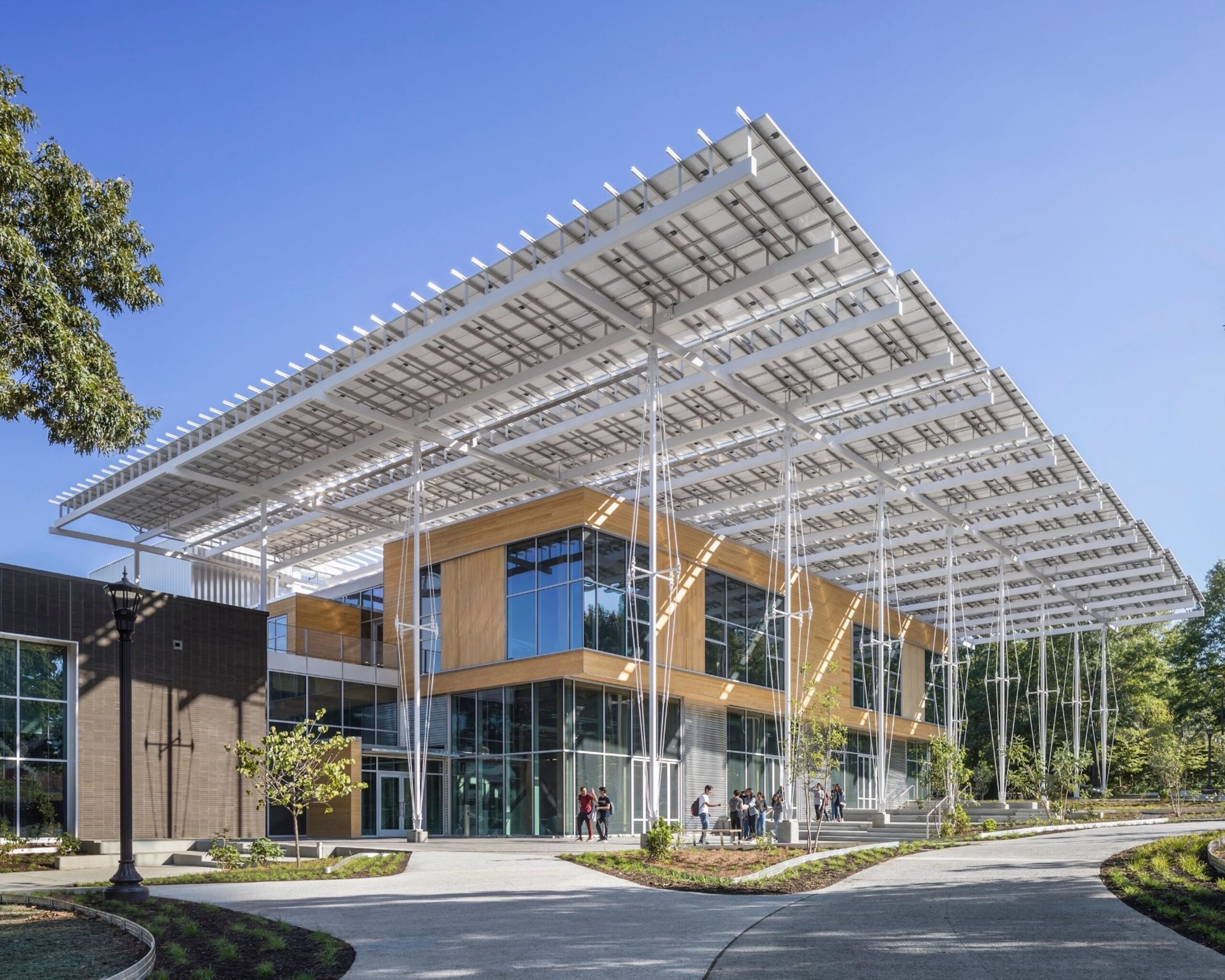
The Kendeda Fund provided ongoing funding to support programs in the building that engage local Atlanta communities beyond the university. The atrium, lecture hall, roof garden, and multipurpose room were all designed to be made available for community events. As the team outlined, Georgia Tech’s mission is to maximize the impact of the building by exposing as many students as possible to the project. After learning in a building expressing such a strong position on resiliency and sustainability, the hope is that they will take those values with them into the future.
Architects: Want to have your project featured? Showcase your work through Architizer and sign up for our inspirational newsletters.

Reference

Architectural Details: Why Metal Is the Perfect Material for Dynamic Educational Projects
CategoriesArchitecture

Architectural Details: Why Metal Is the Perfect Material for Dynamic Educational Projects

As designers imagine the future of educational buildings, the values and materials of today will inform school environments for decades to come. With priorities around durability, longevity, cost-efficiency, and ease of installation, metal plays a starring role in high-traffic education spaces.

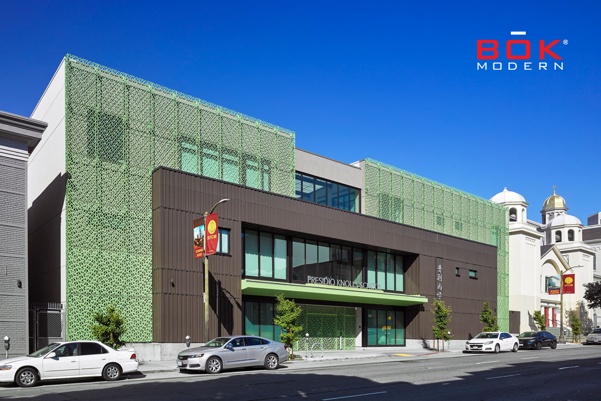
For its renewability, durability, and ever-evolving versatility, architectural metal offers long-term solutions that bring beauty, reliability and safety to schools. At Presidio Knolls School in San Francisco, and the Seattle Academy of Arts and Sciences in Seattle, Washington, leading metal manufacturer BŌK Modern’s solutions have set a new standard for how educational spaces are designed and experienced.

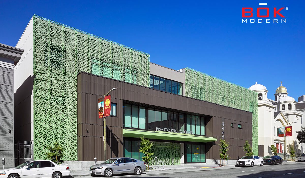
Presidio Knolls School. Photo by Ken Gutmaker

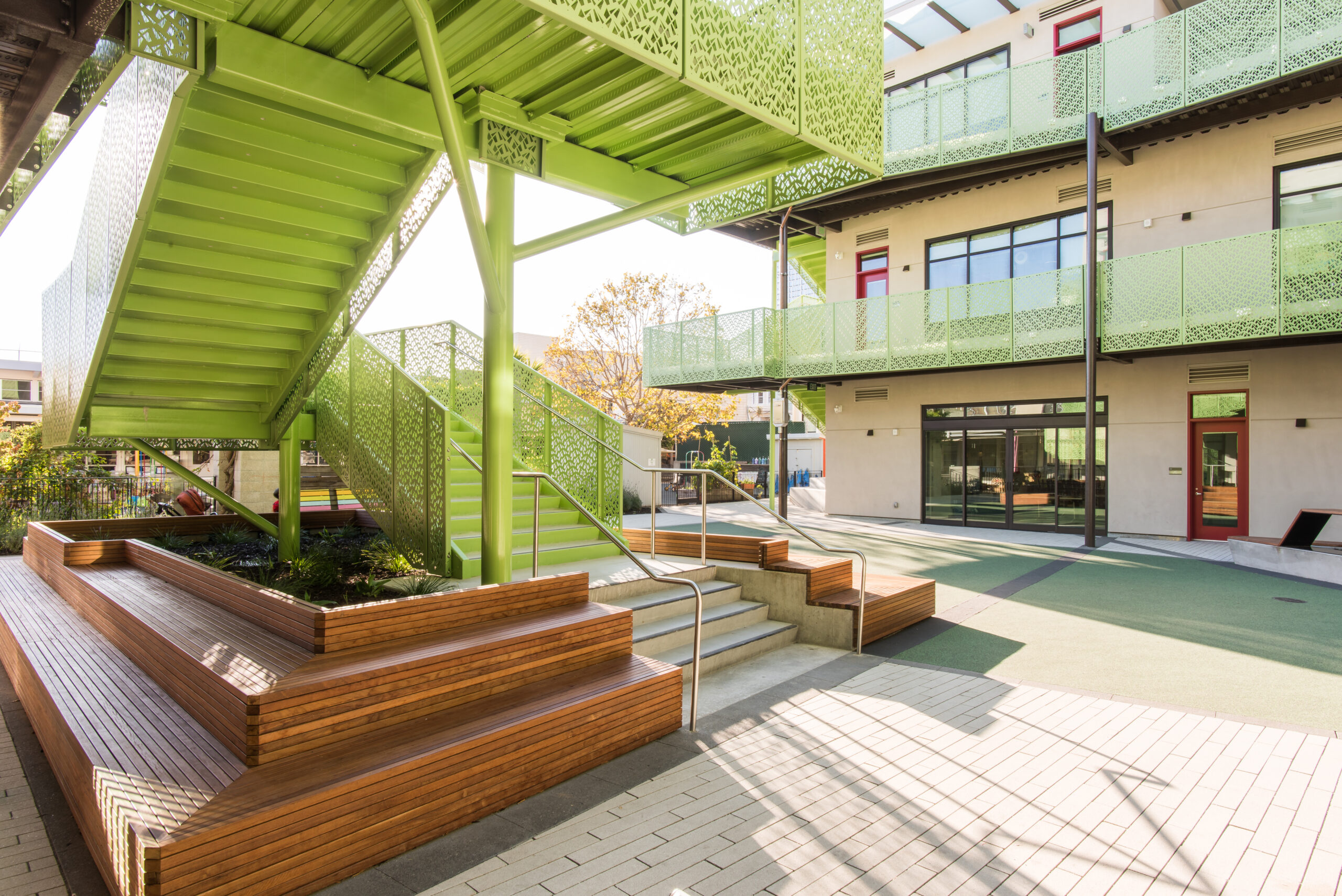
Nestled in San Francisco’s SoMa District, Presidio Knolls School is a serene escape from the bustling city. Studio Bondy Architecture was tasked with renovating the PKS campus, including two historic buildings and the main U-Wing building containing the interior courtyard.

The team wanted to design a new public-facing identity while creating a safe, enduring environment for kindergarten through eighth-grade students. They called on BŌK Modern to design custom metal treatments for the building’s exterior façade, front gate, interior stairs, and balcony guardrails to strike that balance.

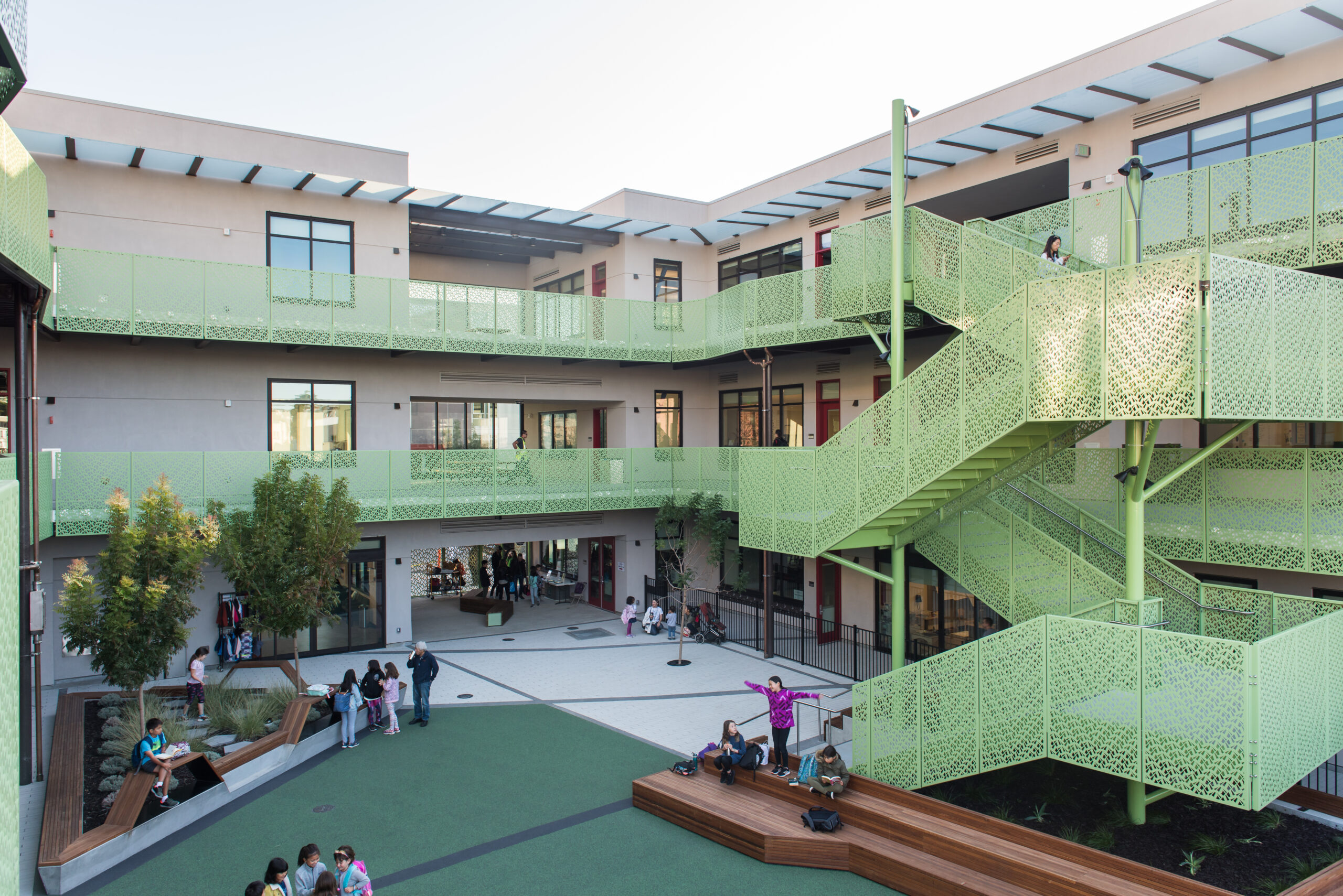
Presidio Knolls School. Photo by Kevin Quach

The distinctive element of the façade and interior courtyard is the perforated metal screen used across all solutions. The pattern is based on a Chinese ice-ray design, a common motif in wood lattice window designs in the Ming and Qing Dynasties,” says Laura Rambin, Principal at Studio Bondy Architecture. “On the street-facing façade, the pattern decreases in density as it rises to the third story of the building, giving a feeling of lightness. Within the interior courtyard, the pattern creates dynamic shadows and has the effect of standing in a bamboo forest.”
Presidio Knolls School. Photo by Kevin Quach

Designing patterns for kid-centric environments can be challenging, so BŌK and Studio Bondy Architecture carefully selected a pattern that didn’t prohibit climbing but naturally discouraged them from doing so. The custom ice-ray design also has holes too small for toes and feet to fit, and narrow vertical openings prevent anyone from crawling through.

Seattle Academy of Arts & Sciences. Photo by Rachel Godbe

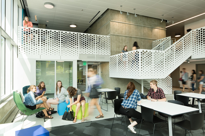
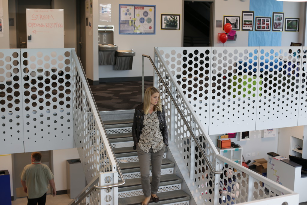
In the common areas of the Seattle Academy of Arts and Sciences’ new STREAM building, The Miller Hull Partnership tapped BŌK Modern to collaborate on guardrails, stairs, and louver covers for the school’s interior. The fun and open patterning, combined with a consistent look, helped to unify the space for students and faculty alike.

Seattle Academy of Arts & Sciences. Photo by Rachel Godbe

Turning structural staircases into textural focal points, BŌK Modern fabricated their panels from 14GA steel with a primer and powder-coated finish for durability. Specified in the A26 pattern across all solutions, the finished products elevate the staircases beyond essential elements of the complex while letting the student’s art installations shine.

Providing architects and designers with endless possibilities to create engaging and resilient educational environments that can withstand the test of time, architectural metal provides sustainable, cost-saving solutions that will be part of a school’s identity for decades to come. Inspiring creativity and enhancing learning, BŌK Modern’s educational projects embrace metal materials as catalysts for resilient structures and compelling design.

To see more architectural case studies and learn more about how metal could be utilized in your next project, visit BŌK Modern’s website.

Credits & Key Information

Presidio Knolls School

  • Architect / Designer: Studio Bondy Architecture
  • Contractor: Plant
  • Construction Photography: Ken Gutmaker and Kevin Quach
  • Location: San Francisco, CA
  • Product Type: Wallscreen, Stair Guardrail, Gate, Balcony Guardrail

Seattle Academy of Arts & Sciences

  • Architect / Designer: Miller Hull General
  • Contractor: GLY Construction
  • Photography: Rachel Godbe
  • Product Type: Stair Guardrail, Balcony Guardrail, Louver Cover
  • Location: Seattle, WA

Reference

Eight mid-century home renovations that embrace contemporary details
CategoriesInterior Design

Eight mid-century home renovations that embrace contemporary details

From a modernist villa in Beverly Hills to a flat in one of Brasília’s iconic Superquadra apartment blocks, the mid-century renovations in this lookbook are a masterclass in updating a period home while retaining its distinctive character.

Originally constructed in the post-war period between 1945 and 1969, mid-century homes have proved enduringly popular due to their prescient emphasis on natural light, clean lines, open floor plans and humble materials such as wood, stone and concrete.

The renovations below see many of these original features retained and restored, supplemented with contemporary additions such as double-height ceilings and furniture by the likes of Tadao Ando and Mario Bellini.

This is the latest in our lookbooks series, which provides visual inspiration from Dezeen’s archive. For more inspiration see previous lookbooks featuring art deco homes, sunny yellow interiors and serene bedrooms with striking natural views.


Mid-century renovation of City Beach residence in Perth by Design Theory
Photo by Jack Lovel

City Beach Residence, Australia, by Design Theory

Australian studio Design Theory looked to preserve the “considerable mid-century charm” of this home on the coast of Perth during its renovation (top and above), remaining true to the rich palette of natural materials found in the original design.

Contemporary furniture and lighting with gently curving forms were chosen to soften the rigorous lines of the original architecture and prevent the interiors from feeling like a period pastiche.

Find out more about City Beach Residence ›


Brandaw Residence, US, by 180 Degrees Design + Build and CBTWO Architects
Photo by An Pham

Brandaw Residence, US, by 180 Degrees Design + Build and CBTWO Architects

A new double-height living room with a pitched roof and full-height glazing was added to modernise this 1960s home in Phoenix, creating sightlines up and out towards nearby Camelback Mountain.

Modernist touches remain on the interior in the form of plentiful wood panelling alongside finishes and furnishings in muted primary colours ranging from teal to mustard-yellow.

Find out more about Brandaw Residence ›


Mid-century renovation of Hampstead House by Coppin Dockray in London
Photo by James O Davies

Hampstead House, UK, by Coppin Dockray

This house in Hampstead was originally designed by British architect Trevor Dannatt in 1960 as London’s answer to the post-war Case Study Houses built by the likes of Richard Neutra and the Eameses in California.

When renovating and extending the property for a growing family, local studio Coppin Dockray contrasted vintage and contemporary furniture for a “domestic, lived-in” feel, with pieces ranging from a Togo chair to Mia Hamborg’s Shuffle table for &Tradition.

Find out more about Hampstead House ›


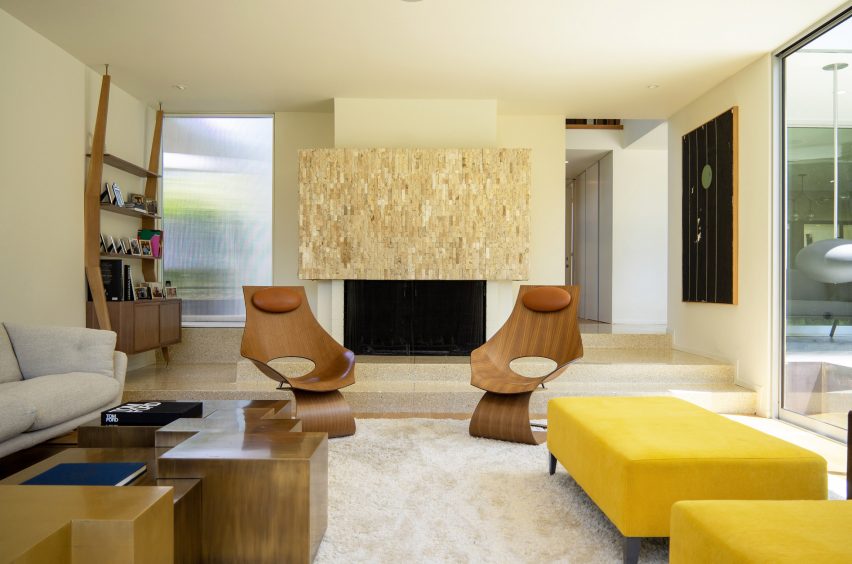
Beverly Hills villa, US, by Heusch
Photo by Gerhard Heusch

Beverly Hills villa, US, by Heusch

Historical images helped architecture firm Heusch to restore this Beverly Hills villa to its former glory and reverse some of its “unfortunate transformations” over the years.

Existing terrazzo floors on the ground floor were restored and complemented with fluted glass details and dark timber furnishings, both new and old, including Ando’s cantilevered Dream Chairs and a bookshelf by Italian architect Augusto Romano from the 1950s.

Find out more about Beverly Hills villa ›


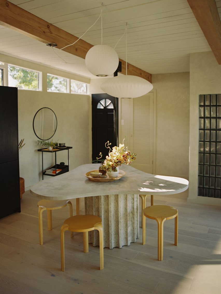
Mid-century renovation of Palermo house, US, by OWIU
Photo by Justin Chung

Palermo house, US, by OWIU

California studio OWIU retained several original elements during the renovation of this 1955 home in LA’s San Rafael Hills, among them the glass-block walls and wooden ceiling beams, which were exposed from under false ceilings and sanded down to reveal their natural colour.

These were contrasted with more neutral contemporary elements such as pale oak flooring and walls coated in Venetian plaster, with assorted lights by Isamu Noguchi and George Nelson – one of the founding fathers of American modernism.

Find out more about Palermo house ›


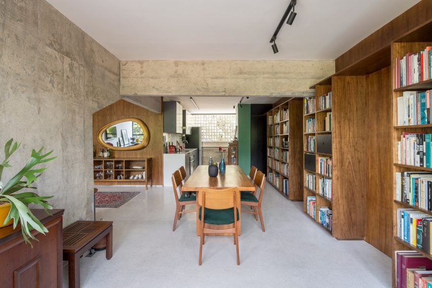
308 Apartment by Debaixo do Bloco Arquitetura
Photo by Joana France

Brasília apartment, Brazil, by Debaixo do Bloco Arquitetura

This apartment is located inside Brasília’s historic Superquadra 308 Sul, the first “superblock” apartment complex constructed as part of architect Lucio Costa’s 1957 master plan for the new Brazilian capital.

Local studio Debaixo do Bloco Arquitetura cut open the building’s exposed concrete walls, opening up its layout to meet the needs of a modern family while preserving period details such as the building’s distinctive white breeze-block screens and its granilite flooring.

Find out more about Brasília apartment ›


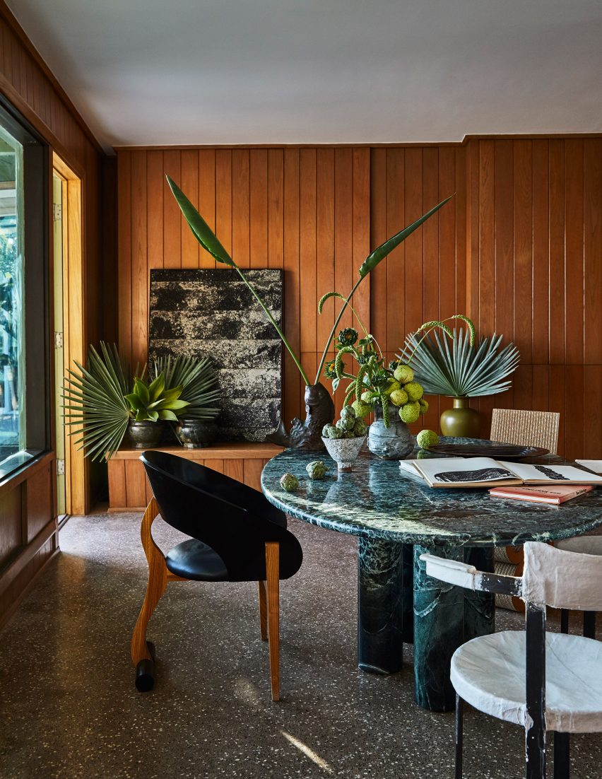
Mid-century renovation of Malibu Surf Shack, US, by Kelly Wearstler
Photo by Ingalls Photography

Malibu Surf Shack, US, by Kelly Wearstler

When interior designer Kelly Wearstler turned this 1950s beachfront cottage in Malibu into a bohemian retreat for herself and her family, she retained the original wood-panelled walls and selected finishes that were “hand-crafted, rustic and raw” to match the existing material palette.

The interiors feature abundant planting, alongside an eclectic mix of period-agnostic furnishings including a 1980s green marble table by Bellini, paired with a plaster-covered Caféstuhl chair by contemporary Austrian designer Lukas Gschwandtner.

Find out more about Malibu Surf Shack ›


Golden House, US, by SHED Architecture and Design
Photo by Rafael Soldi

Golden House, US, by SHED

Seattle architecture firm SHED had to make several aggressive interventions when renovating this 1950s building in nearby Shoreline, which was originally constructed as a family home but had previously been divided up to serve as a retirement home.

Working around the existing post-and-beam structure, the studio updated the interior to maximise views of the Olympic Mountains and Puget Sound while enlarging the kitchen and reorganising it around a central island.

Find out more about Golden House ›

This is the latest in our lookbooks series, which provides visual inspiration from Dezeen’s archive. For more inspiration see previous lookbooks featuring art deco homes, sunny yellow interiors and serene bedrooms with striking natural views.

Reference

Seamless Integration: The Revitalization of 712 Fifth Avenue Lobby
CategoriesArchitecture

Seamless Integration: The Revitalization of 712 Fifth Avenue Lobby


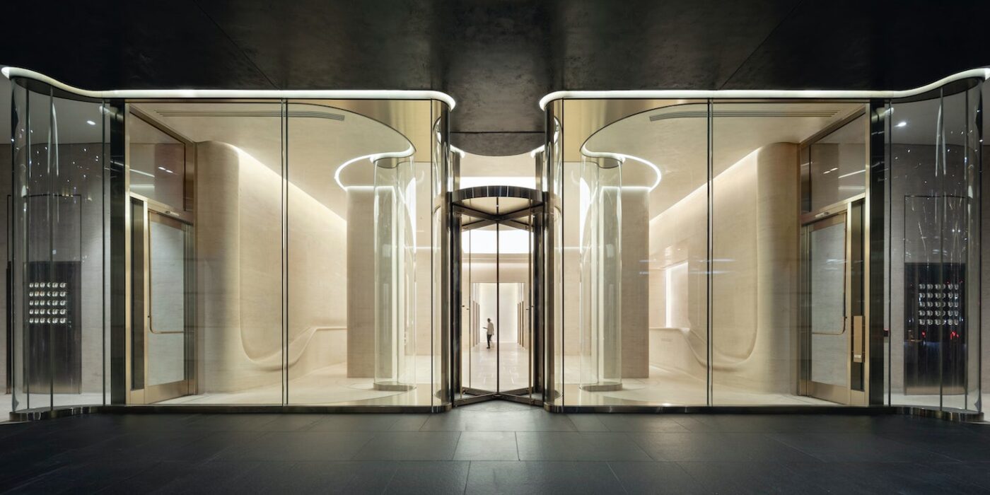
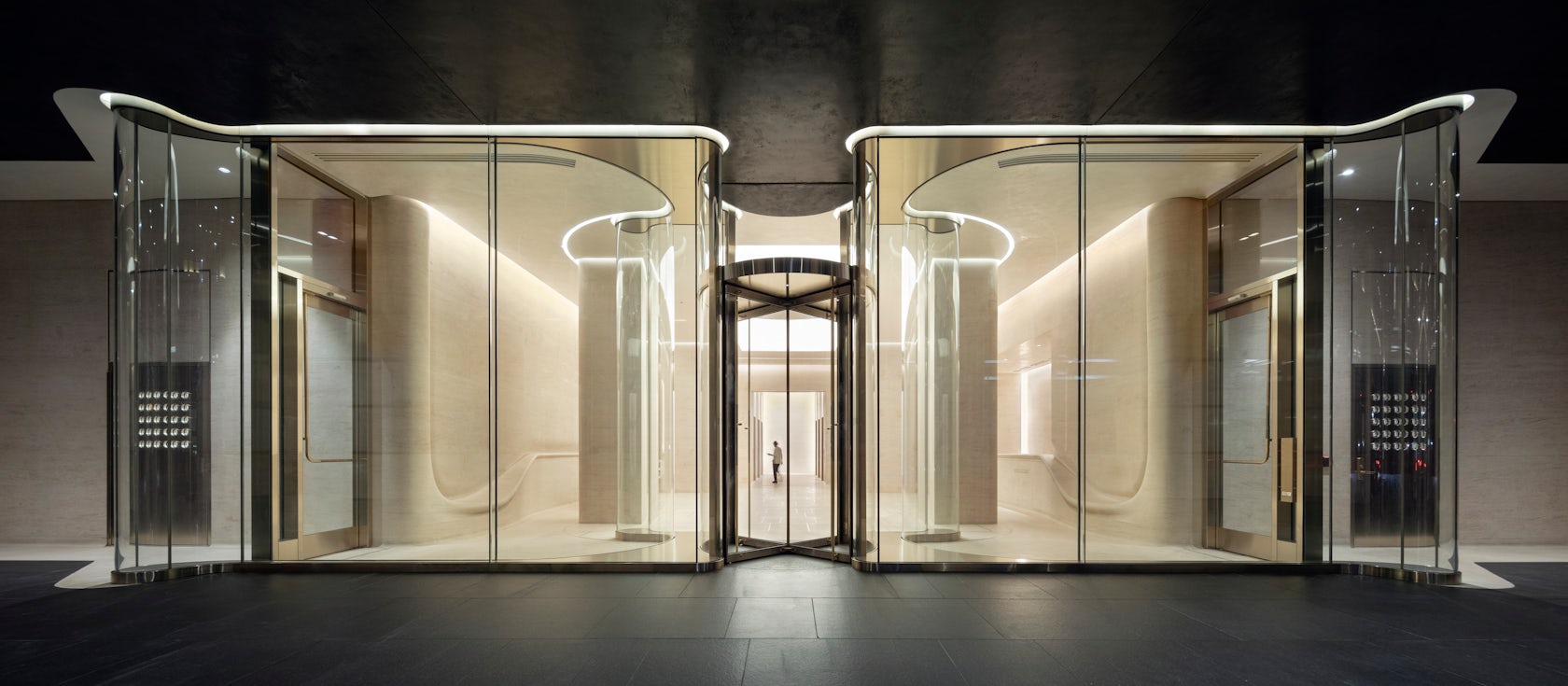
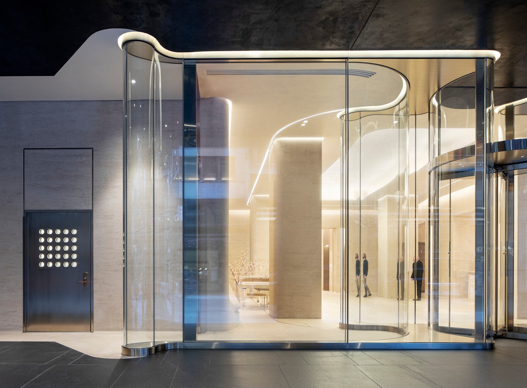
712 Fifth Avenue Renovation – Returning to one of our projects more than 30 years later, we were challenged with how to reimagine the entry and lobby to a prestigious postmodern building. This led to bigger questions; how do we engage with the discourse of history today? And how do we discuss postmodernism through built work? Our response was to generate a fundamental dialogue between glass, stone, and human occupation; to utilize advanced modern technology to fabricate the materials in a way that is both futuristic yet grounded in traditional historic construction methodologies; and to change everything without changing anything.

Architizer chatted with Hugh Trumbull, Design Principal at Kohn Pedersen Fox (KPF), to learn more about this project.

Architizer: What inspired the initial concept for your design?

Hugh Trumbull: Without changing the program or layout of the space, we countered the original proposition of placing ornate objects within a room with the concept of making space that integrate people and room.

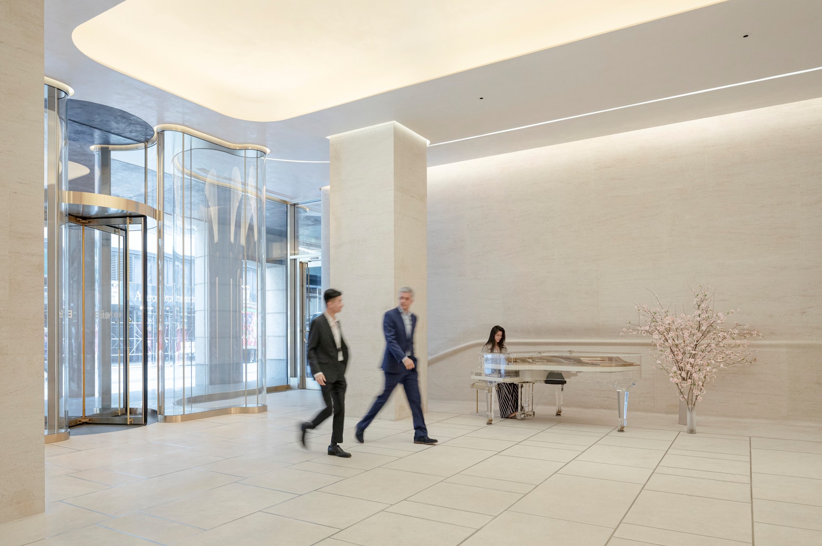
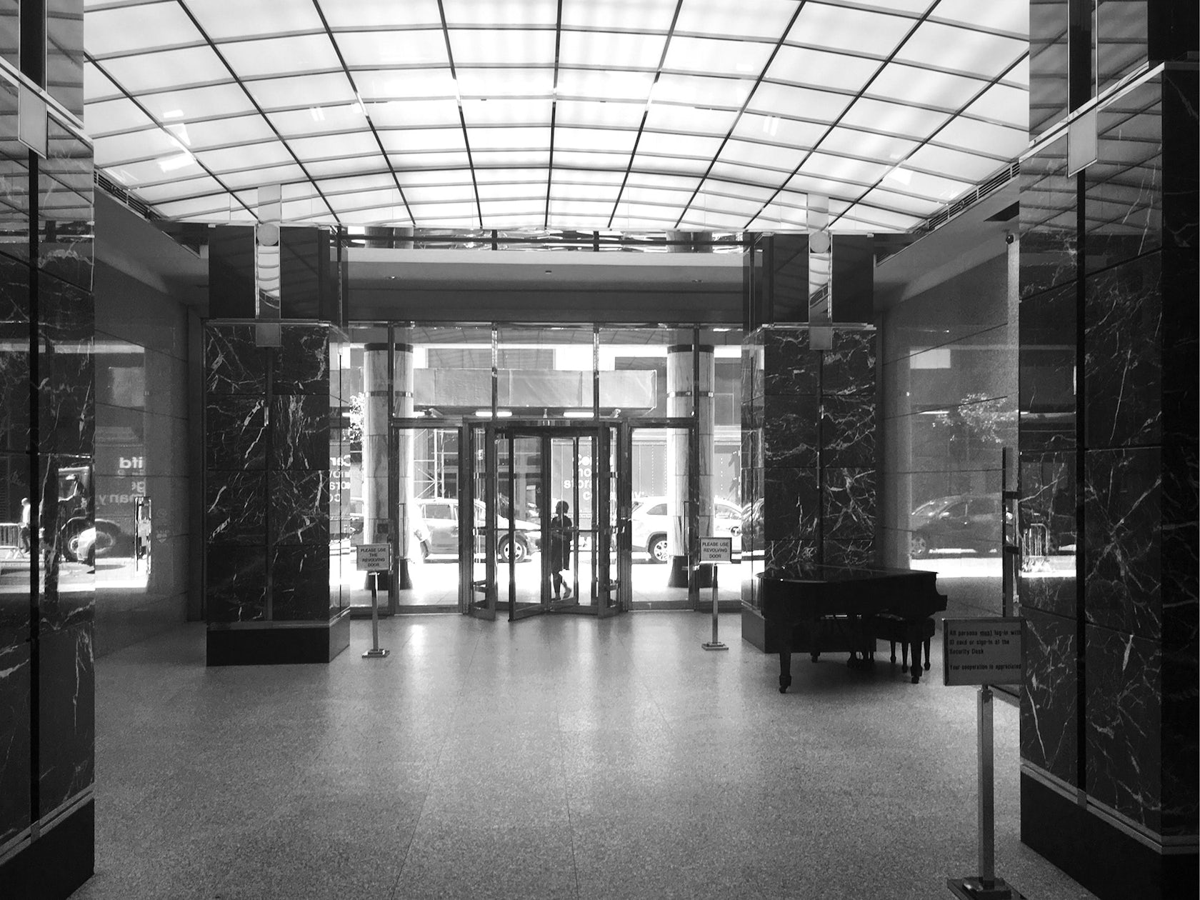
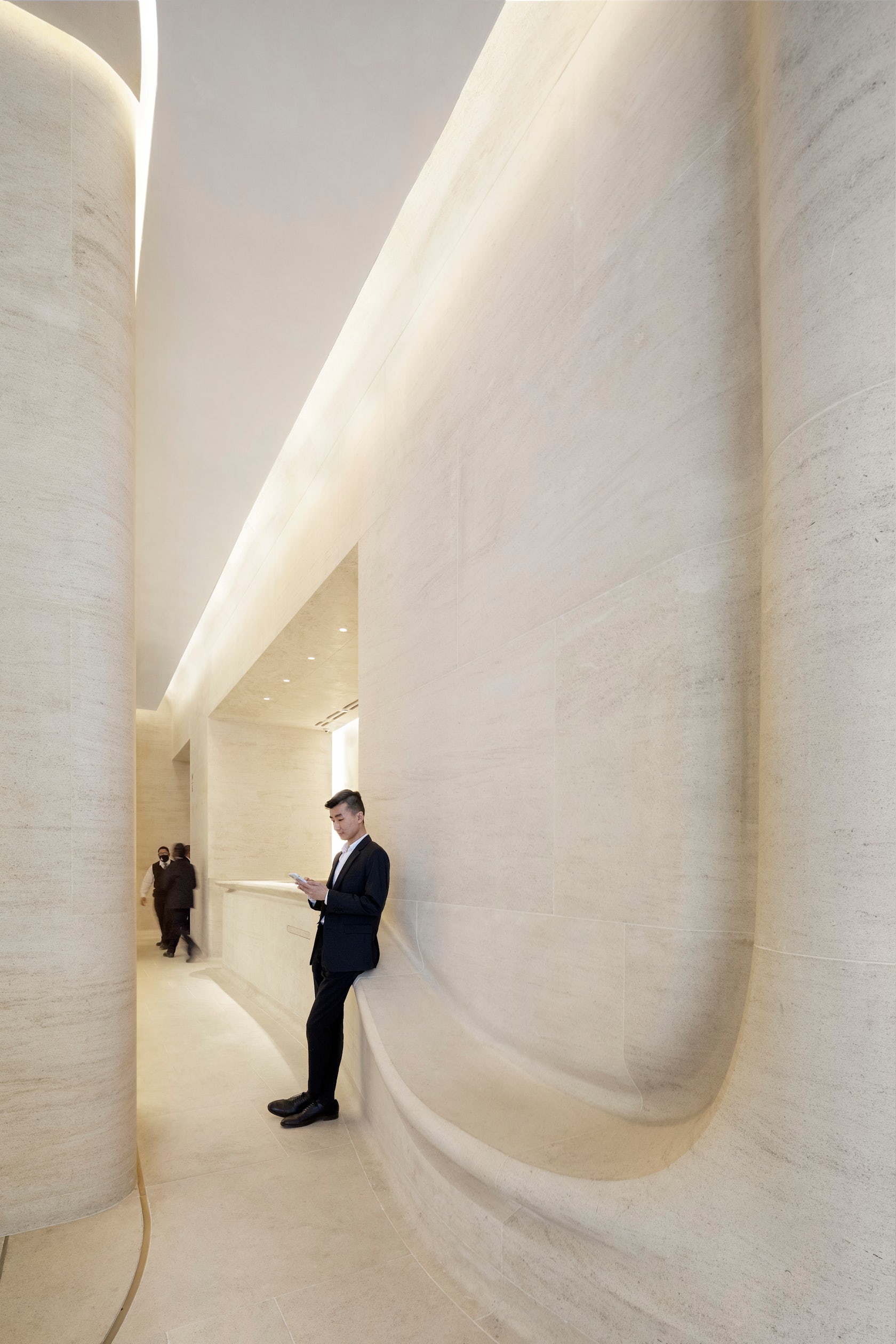
Originally, the lobby was designed with postmodern ornamental columns clad in many types of stone, objects within a grey granite room. The object-ness of these elements restricted the ease of movement in and out of the building.

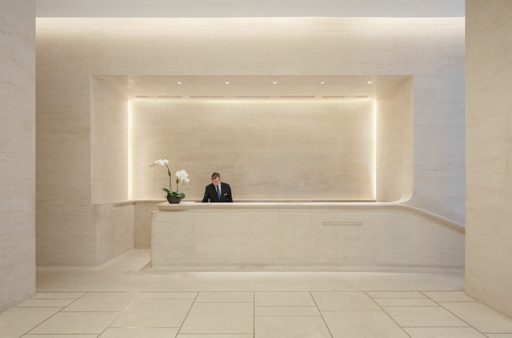
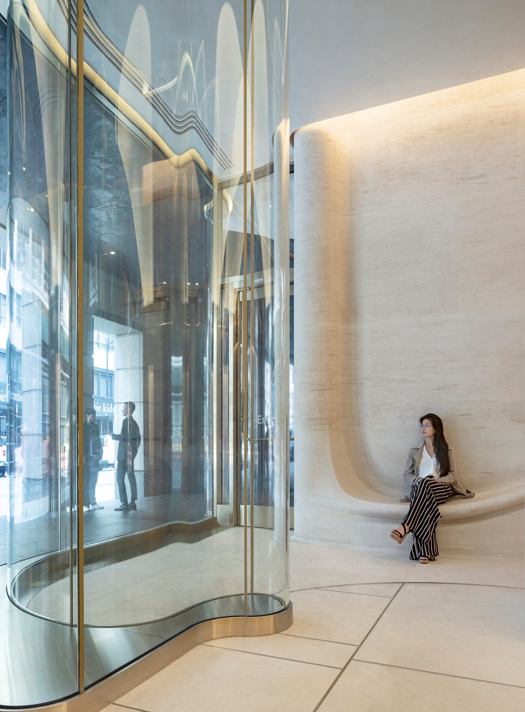
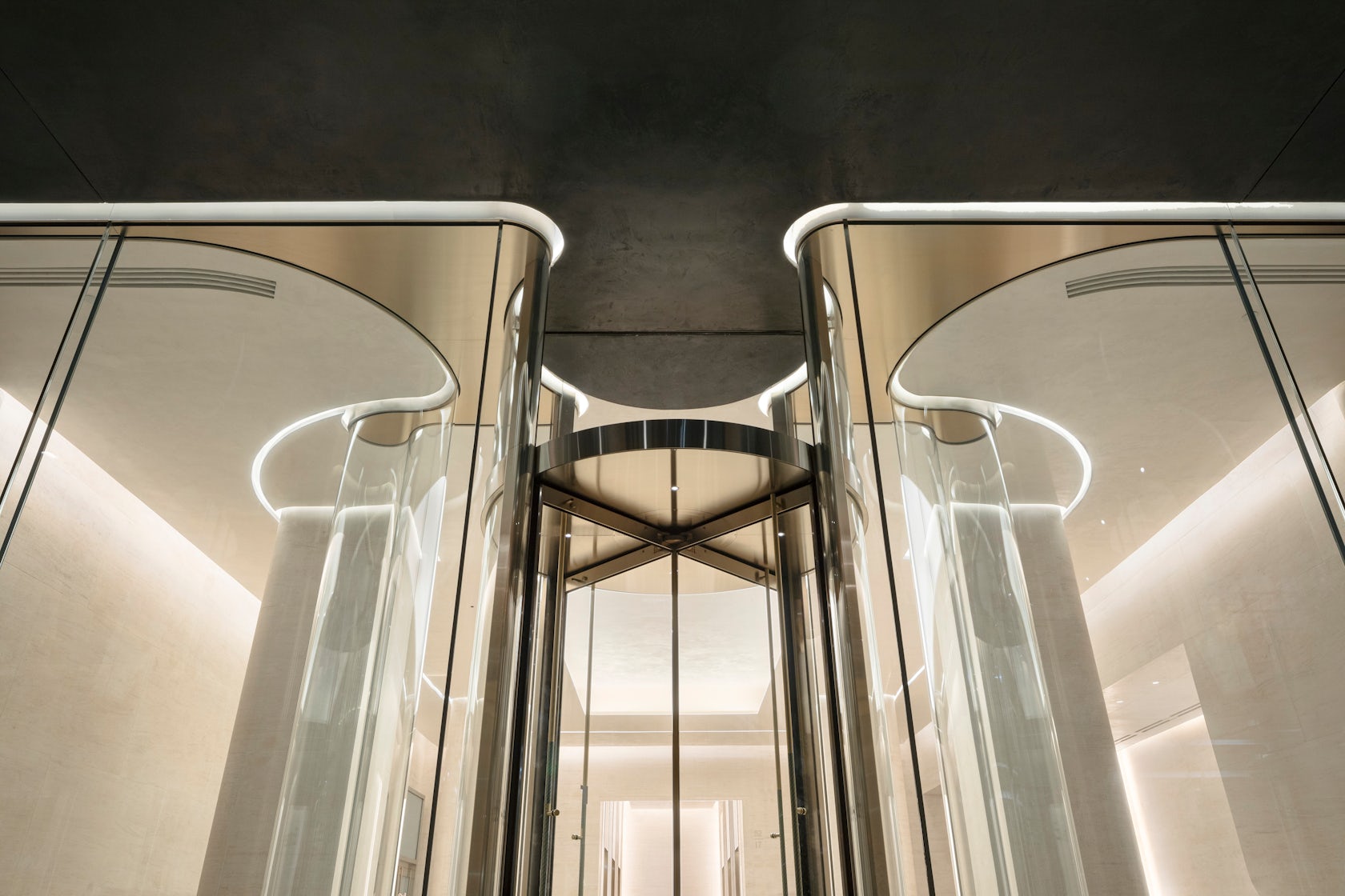
Our new proposition embraced a more tactile approach. The columns and wall are unified with one material, a soft welcoming stone detailed in a curving shape so that its vein and form are its sole ornament. Walls seamlessly transform into benches and a reception desk, inviting people to interact with one another and the architecture. At the entry, the sinuous structural glazing promotes a clear view and a seamless, organic flow in and out of the space.

© Kohn Pedersen Fox Associates

© Kohn Pedersen Fox Associates

This project won in the 10th Annual A+Awards! What do you believe are the standout components that made your project win?

We’re thrilled that our work has been recognized in the A+ Awards. There are so many beautiful components of this project, but I think the way they work together is what makes this project truly stand out. The combined effect of the sinuous glass wall and unified stonework creates a clean and elegant space that simultaneously feels light yet solid. And I think the use of advanced technology to manipulate classical material is particularly successful.

© Kohn Pedersen Fox Associates

© Kohn Pedersen Fox Associates

What was the greatest design challenge you faced during the project, and how did you navigate it?

By engaging in advanced technical fabrication for the stone and glass, we were able to engage in a dialogue between the future and the past and examine the postmodern condition in a new way.

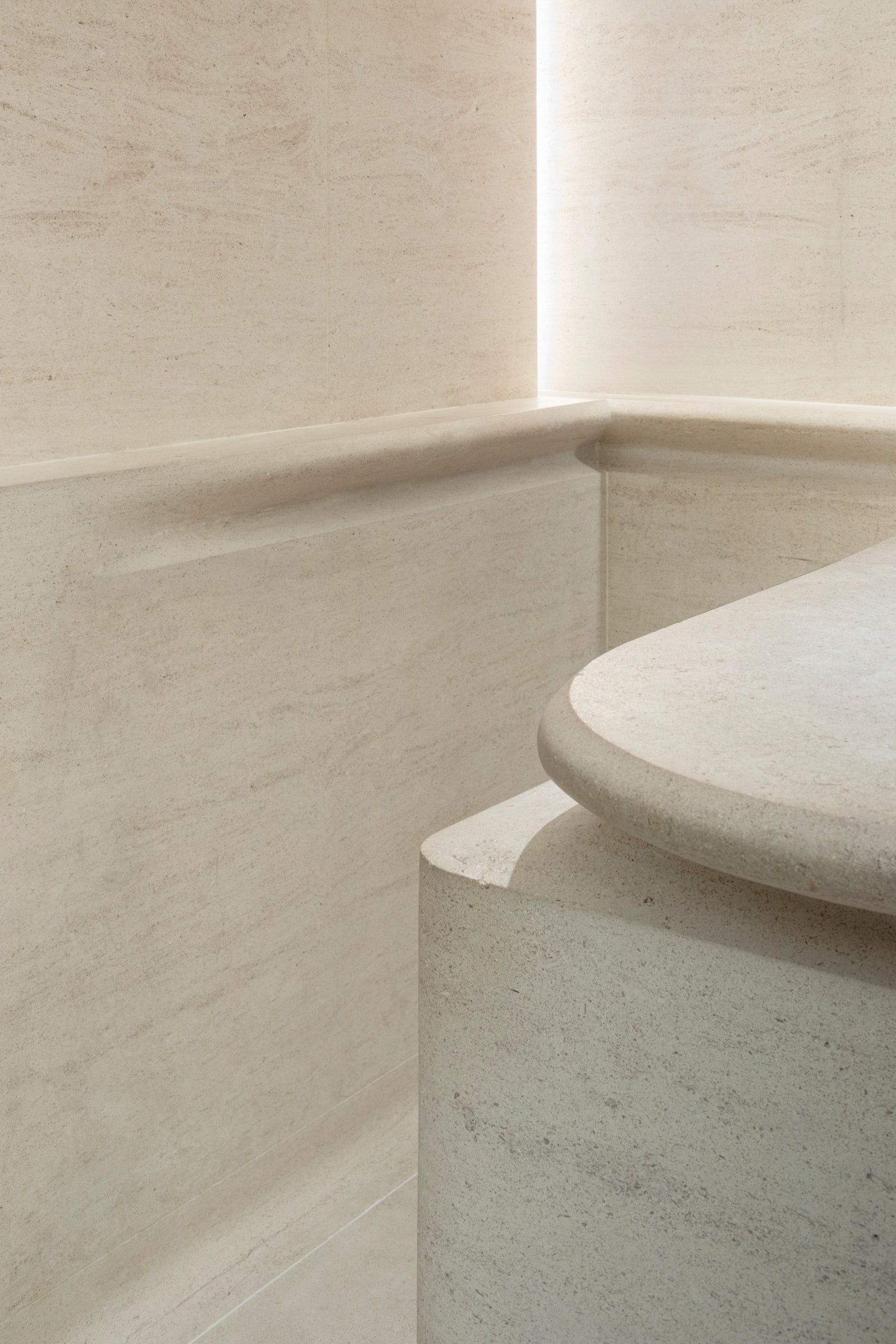
For the stone, the challenge was the fabrication of very large pieces. We utilized modern CNC milling techniques, yet also relied on age-old craftmanship of stereotomy found in medieval gothic construction. To ensure a seamless grain flow from one stone to the next, pieces were rotated ever so slightly in three dimensions.

For the glass, the challenge was to build a high-performance double wall cavity that utilized the inherent structural capabilities of large curved panels while simultaneously defining an artful threshold that immerses the user into the architecture. The 14- foot-tall panels encase a mechanically isolated conditioned space that mitigates temperature differentials and humidity.

© Kohn Pedersen Fox Associates

© Kohn Pedersen Fox Associates

How did the context of your project — environmental, social or cultural — influence your design?

An interesting aspect of the context is that we were returning to work on a building that our firm designed. I think that touches on a really powerful idea, that buildings need to evolve and change with the cities around them, and it is up to architects to help achieve this goal. When presented with the project, we had to determine how we wanted to interact with the style today, and how to make this a more usable space without undermining the integrity of the original building. Because of the postmodern aesthetic, albeit fairly minimal version of postmodern work, this was a loaded problem full of historical references and thought history.

© Kohn Pedersen Fox Associates

© Kohn Pedersen Fox Associates

What drove the selection of materials used in the project?

We selected Magny Le Louvre limestone for the interior as a continuation of the tower’s Indiana limestone exterior. We wanted the interior to offer a sophisticated take on stone and give people the opportunity to touch and engage with it directly.

For the exterior wall, we shaped glass to create an immersive experience for the user as they pass through. They become part of the building as they enter or exit, and that process is completely visible, though distorted, to others passing by or pausing in the lobby. We also removed metalwork to unify the experience between the spaces.

© Kohn Pedersen Fox Associates

© Kohn Pedersen Fox Associates

What is your favorite detail in the project and why?

It’s always hard to pick a favorite anything when it comes to one’s own project, but one the things I think came out best here is this dialogue between materials that we’ve created. I think the way both the stone and glass are shaped and formed ergonomically enables the project to achieve its goal of serving as a point of engagement with users. Similarly, I think the contrast we’ve created between these materials – the solidity of the sedimentary veined stone and the transparency of the sculpted glass. Notably, both materials are created from sand, linking them in an essential way.

© Kohn Pedersen Fox Associates

© Kohn Pedersen Fox Associates

How important was sustainability as a design criteria as you worked on this project? 

Sustainability is a key aspect of all of our firm’s work. In this case, as a renovation project, we were starting out with an existing structure. We upgraded mechanical systems in the lobby to be more efficient, and we designed the new a high-performing façade for the entry.

© Kohn Pedersen Fox Associates

© Kohn Pedersen Fox Associates

How have your clients responded to the finished project?

We’ve been fortunate to work with a great and truly supportive client, Paramount Group, on this project. Since we first brought them our design concept all the way through construction and project completion, the Paramount team believed in our vision and remained dedicated to seeing it through. It has also been exciting to see the positive reaction from the building’s tenants as they experience the new space.

© Kohn Pedersen Fox Associates

© Kohn Pedersen Fox Associates

What key lesson did you learn in the process of conceiving the project?

Creating an architectural dialogue with the past, present, and future, though challenging and ever-evolving, is a great foundation for developing new designs, particularly within existing projects.

© Kohn Pedersen Fox Associates

© Kohn Pedersen Fox Associates

How do you believe this project represents you or your firm as a whole?

I think our work on this project represents KPF’s commitment to the evolution of cities and urban spaces. By reimagining this space, working within its constraints and addressing its challenges, we have enhanced the usefulness of this entire office building and met the needs of its current users. And, as a renovation, this project also reflects a commitment to sustainability and which is a core aspect of our work.

Team Members

Design Principal: Hugh Trumbull / Managing Principal: Richard Nemeth / Project Manager: Greg Mell / Team: Chris Dial, Xi Chen, Alex Lightman, Parker Russo

Consultants

AECOM Tishman (Construction Manager) / ETMA (Stone Fabricator) / Front Inc. (Facade Consultant) / Wilkstone (Stone Installation)

Photographer credit: Michael Moran / OTTO

Products and Materials

Magny Le Louvre limestone, Cristacurva glass

For more on 712 Fifth Avenue Renovation, please visit the in-depth project page on Architizer.

712 Fifth Avenue Renovation Gallery

Reference

Factory Reset: These Architects are Giving the Industrial Typology a Much-Needed Update
CategoriesArchitecture

Factory Reset: These Architects are Giving the Industrial Typology a Much-Needed Update

Architizer is thrilled to announce the winners of the 11th Annual A+Awards! Interested in participating next season? Sign up for key information about the 12th Annual A+Awards, set to launch this fall.

Designing industrial buildings, particularly factories, is usually a process that is dominated by the complicated functional and logistical requirements that limit architects creatively, overpowered by the technical specifications of the machinery and the production lines that occupy the entirety of the building space and leave little space for the form to develop beyond the functional limitations.

That being said, one would ask, What comes first? Form or Function?

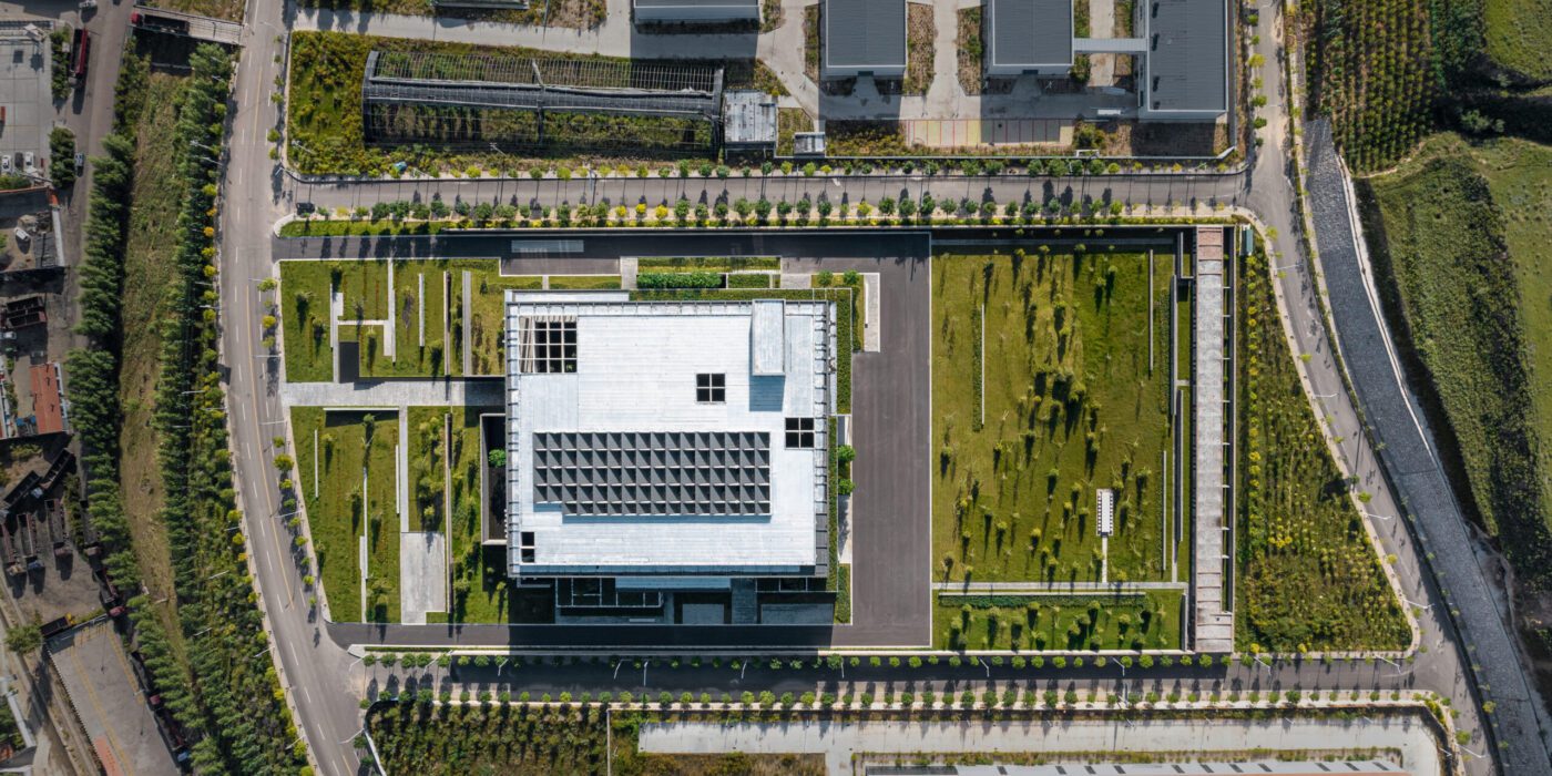
Site Overview of Project

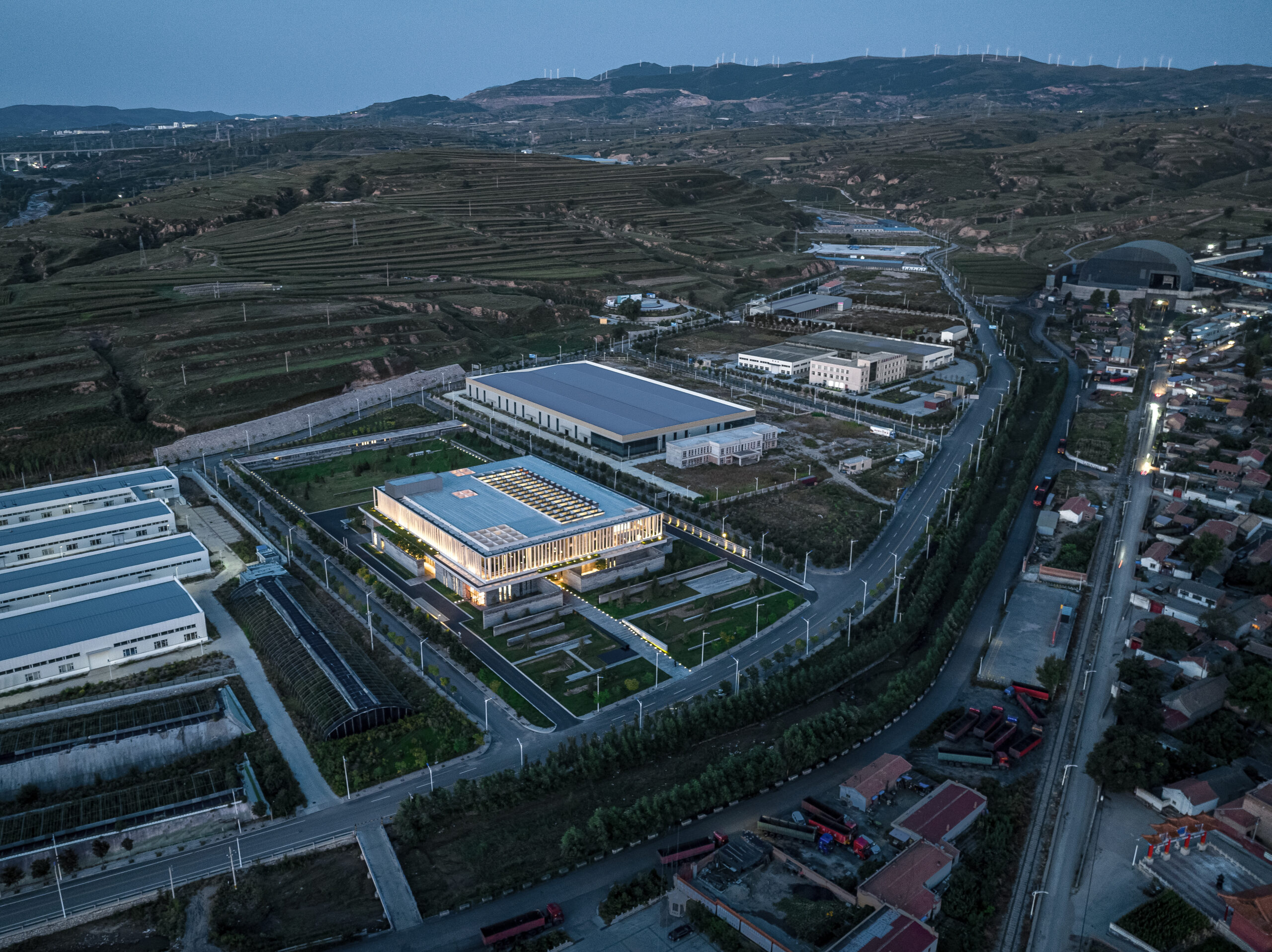
The Oatmeal Factory in Ningwu, Shanxi province by JSPA Design.

This question has been the topic of hot debate among architects throughout history, with contrasting perspectives among the modernists and postmodernists, among others. During the late 19th and the 20th century, particularly within the field of industrial design, architects believed that “form follows function,” as expressed by architect Louis Sullivan, which indicated that the function of the building is what generates its form and guides its design process. For Frank Lloyd Wright, that design principle has been misunderstood, because, “Form and function should be one, joined in a spiritual union.”

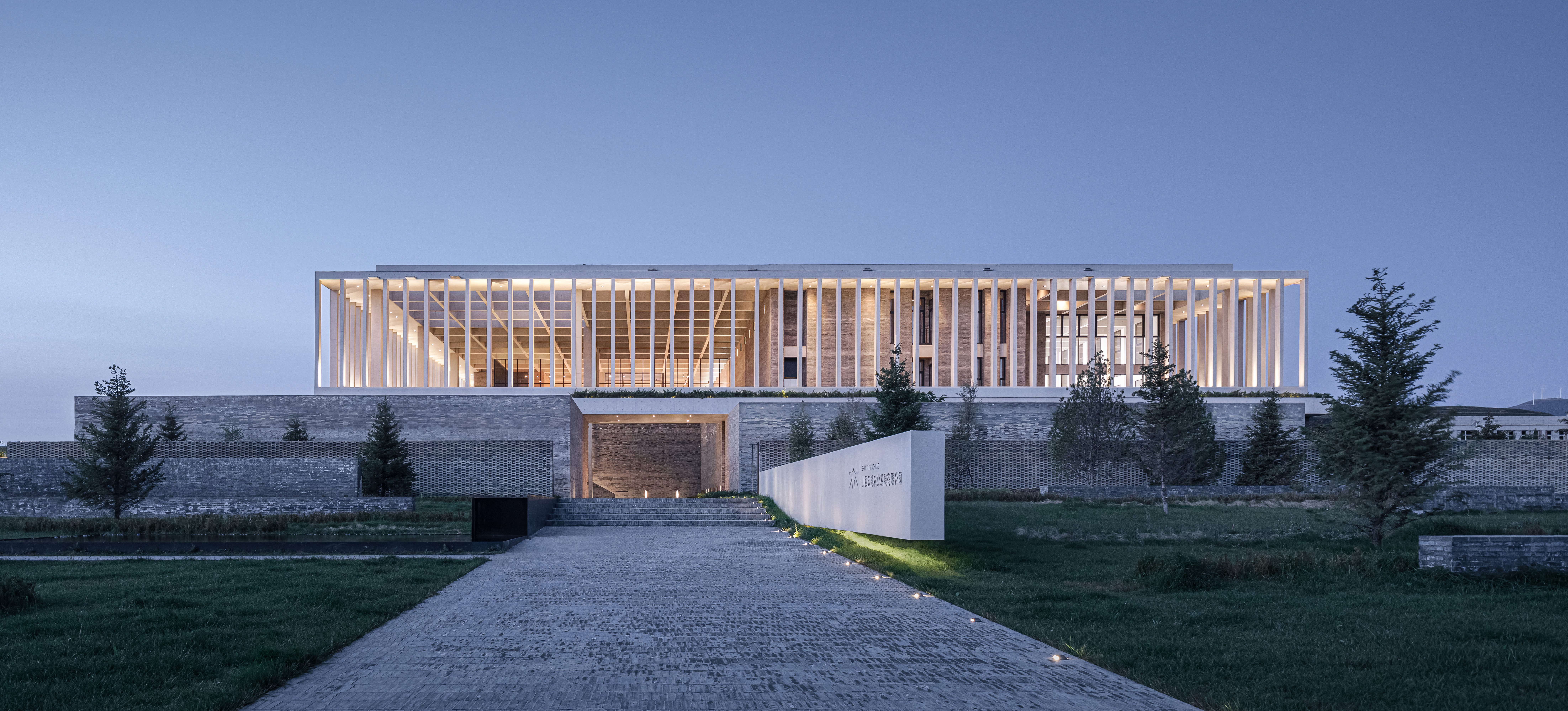
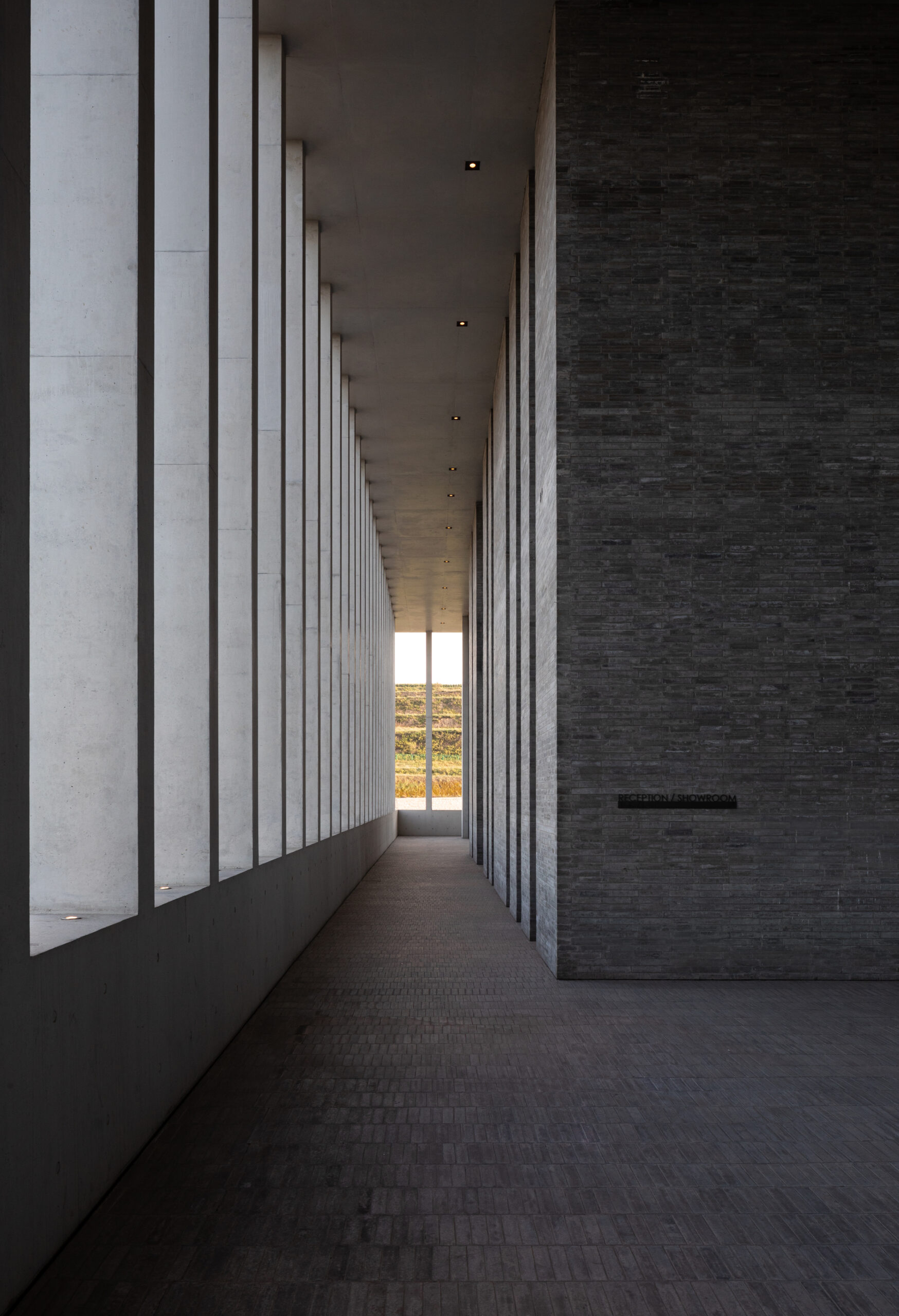
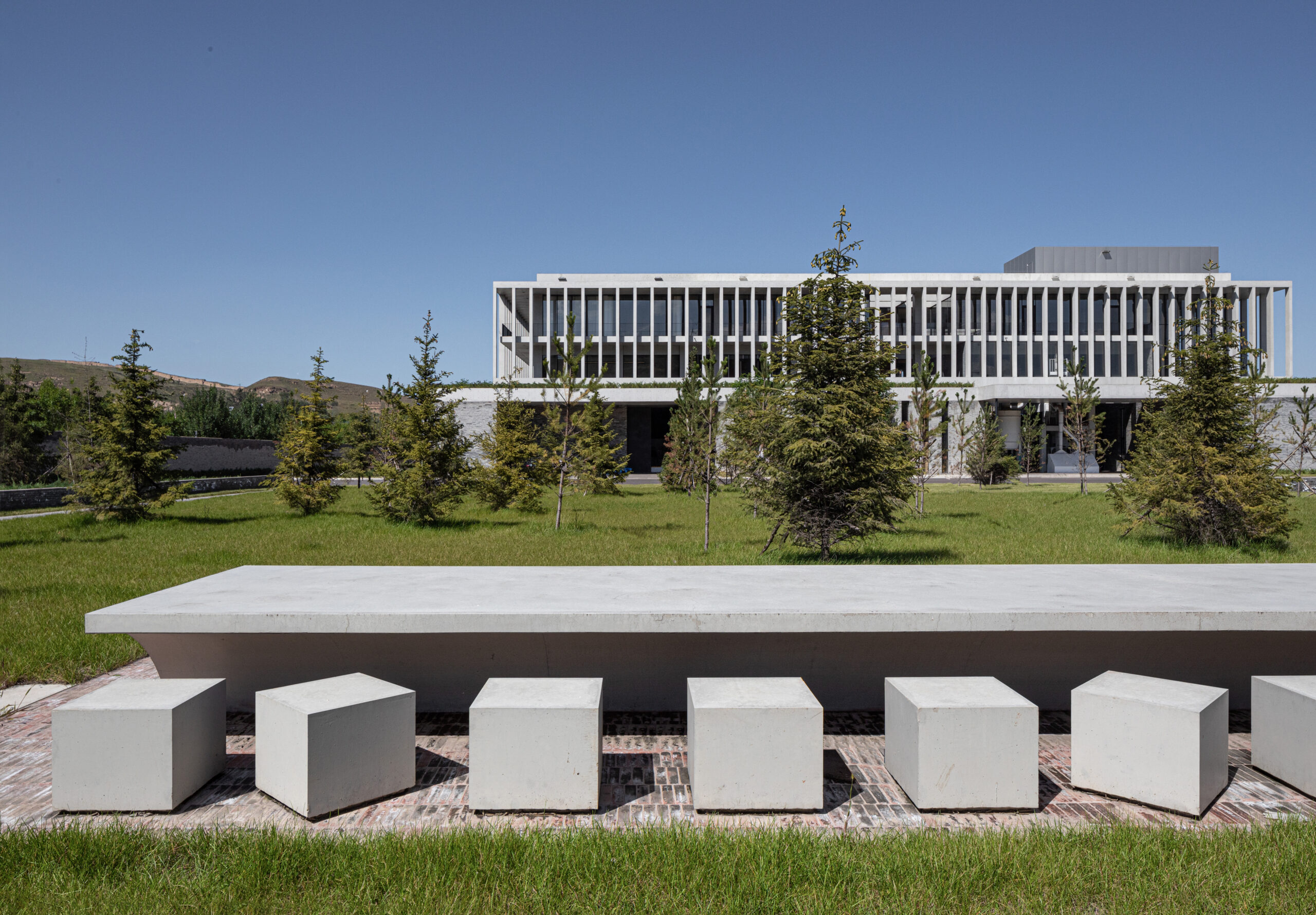
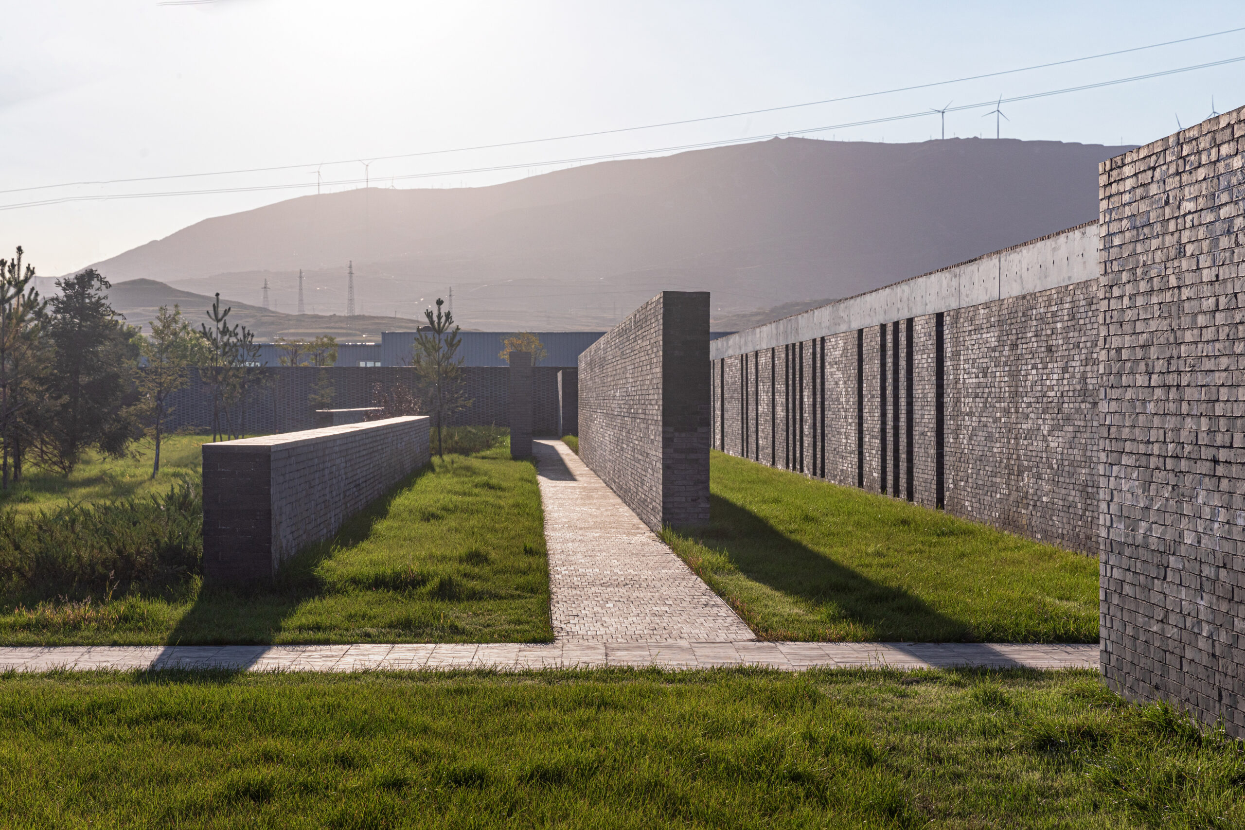
When studying the design of the Ningwu Oatmeal Factory in Shanxi, China, which was both the Jury Winner and won the Popular Choice vote during Architizer’s 11th Annual A+Awards, one could argue that JSPA Design was inspired by Wright’s principle. This is especially evident in the way they eloquently strike the balance between both, breeding what could be described as a spiritual union between form and function. The design shows a high level of attention to the factory’s user experience, the selection of materials and the relationship with the site. In short, JSPA Design conceived of a home for production processes that is more than just a factory; the Ningwu Oatmeal Factory is a building that produces a lot more than just oatmeal.

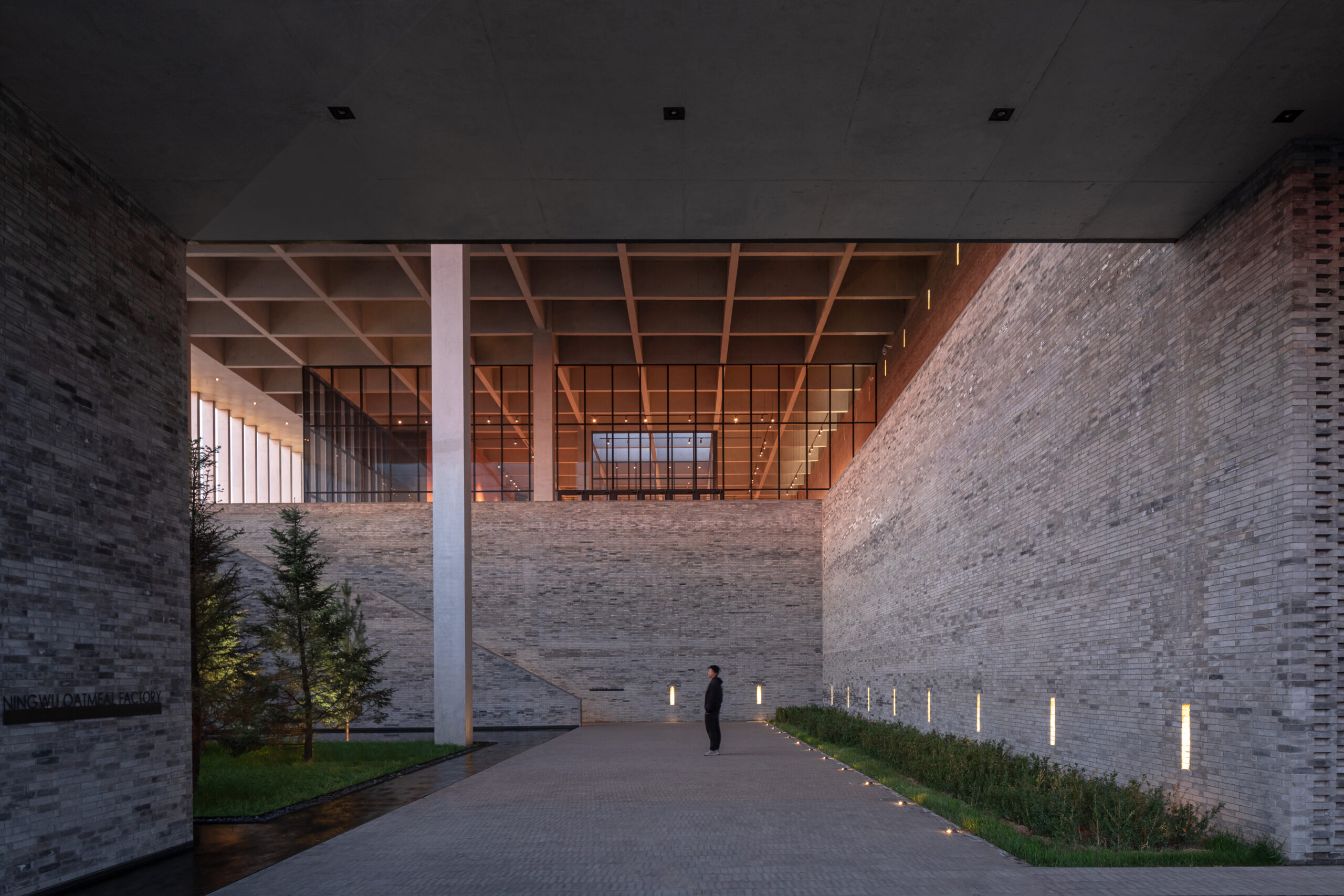
The main entrance to the factory emphasized by the use of brick walls.

The Beijing-based French design studio produced a design that strokes the right balance between the complicated functional requirements and the humanization of the work environment, juggling the different design components while also introducing an interesting user experience that invited the public into the building while redeeming the integrity of the factory’s different operations.

From the outside, the surrounding context was challenging to work with, with the factory being located within dry and arid industrial landscapes punctured with coal mines on their outskirts. In response to this context, the design team chose to orient the building inwards, introducing a variety of horizontal and vertical boundary-demarcating elements that fostered a crisp and clean indoor environment, experientially detaching the building from the outside while enhancing the user experience and orchestrating an interesting walkthrough across the complex’s different sections. Meanwhile, visitors are spatially separated from staff for safety and logistical reasons.

An overview of the factory’s industrial context.

From an environmental perspective, the building’s relationship with the outdoors is further regulated through a network of patios and gardens that invite sunlight to enter the factory’s various spaces. These design provisions enrich the quality of the indoor environment, allowing floods of northern light to illuminate the central production space through a sequence of skylights.

A cross section through the main production space showing the skylights and the production machinery.

By using grey bricks as the main construction material, the designers establish a more materialistic connection with the surrounding context. By harnessing local construction methods to erect a series of brick walls that became the prominent design feature, the material amplifies the building’s relationship with the site and the surrounding landscapes.

Similar to the flow of production lines that transform raw oat into flour products, a variety of brick walls organize the circulation flows through the factory, starting at the entrance and leading each user group to their designated section, while also organizing entry and exit to the building, the delivery of materials and the loading of products. For the visitors, the ground floor serves as an opaque passage, with the brick walls concealing the technical spaces from the public that are lead instead to the first floor where the public spaces are located, including a café, a shop and a garden.

Brick walls guide the different users groups through the factory.

At the factory’s entrance, the public are greeted with a seating area and kids pools, mediating the relationship between the inside and the outside and softening the edge that separates the functional from the social sections of the factory. Brick makes a gradual and smooth appearance at the entrance, first appearing on the benches, before moving to the fences, and then extending vertically and becoming a series of walls that soon become the factory.

The seating area in front of the main entrance that acts as part of the public spaces of the factory.

The bricks walls that organize movement through the landscape aligned with the factory walls.

Despite how the brick walls have acted as boundary demarcating elements that organized the factory’s spaces, circulation and relation with the site, this project is an excellent example of architecture that blurs the line between form and function, with each fundamentally playing a role in shaping the other, without one necessarily needing to precede the other.

One of the interior gardens of the factory that regulate the relationship with the outside, demarcated by the brick walls .

The design team strategically chose key places to expose and conceal the factory’s different spaces, as well as varied sites where the factory is either connected or disconnected from the outside. Other binaries include rhythmic alternations between soft and hard, experiential and technical; and outward-reaching and inward-turning (click here to see plans, sections and more details from the A+Award-winning project). The sum of these complex calculations is proof that factory design need not be entirely automated. It shows that there is always a space for humans to intervene and be present within industrial sites.

Architizer is thrilled to announce the winners of the 11th Annual A+Awards! Interested in participating next season? Sign up for key information about the 12th Annual A+Awards, set to launch this fall.

Reference