Brazilian Firm Brings Passive Design Principles to New Production Facility
Judging is now underway for the 10th Annual A+Awards Program! Want to earn global recognition for your projects? Sign up to be notified when the 11th Annual A+Awards program launches.
Aldous Huxley said that “springs and landscapes have a serious defect: they are free” and that “love for nature does not provide work for any factory.” Well, sorry to contradict the famous writer and philosopher but the new industrial complex for Nice — the Italian multinational leader in Smart Home, Security, Home & Building Automation solutions, designed by M CA – Mario Cucinella Architects in Limeira, Brazil — proves exactly the opposite: namely, that an industrial building can concretely combine productivity, social and technological innovation, research and environmental sustainability.
All images courtesy of MC A Mario Cucinella Architects
Nothing could be further from the apocalyptic and sooty atmospheres of Friz Lang’s film Metropolis (1927) in which the machines of productive dehumanization devoured the lives and identities of workers, reducing them to an automated mass swarming beneath the ground.
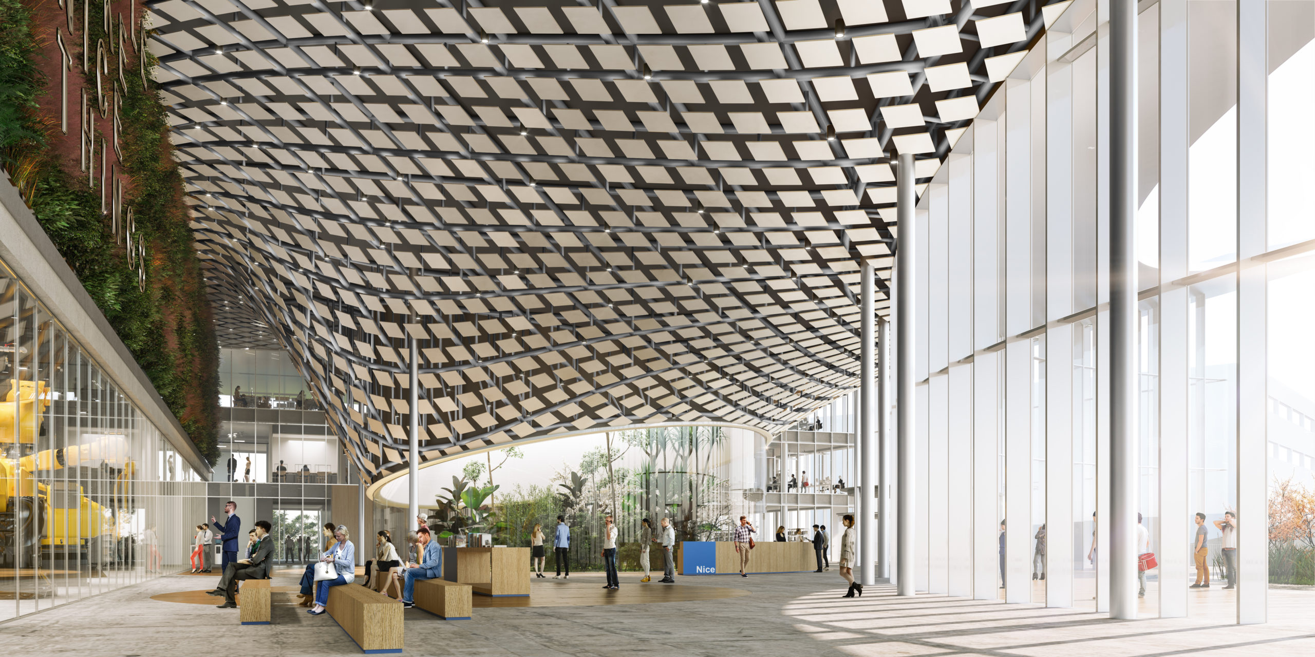
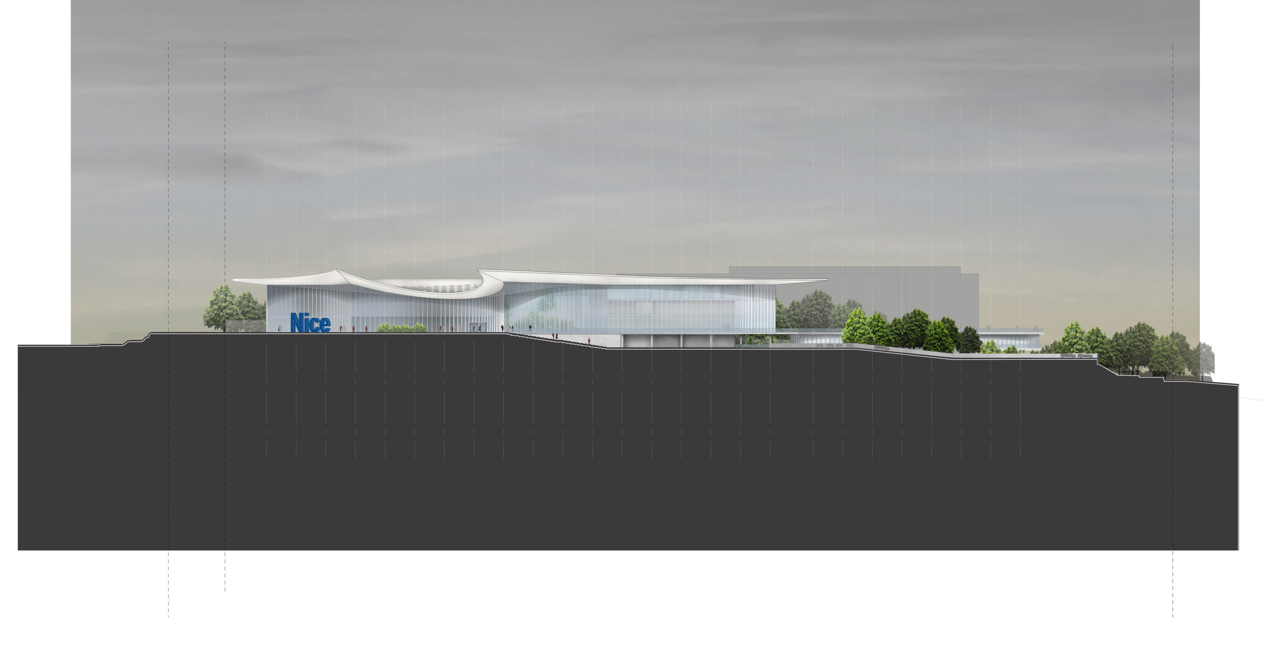
On the contrary, here, the building’s iconic roof appears like a large tropical leaf floating on light pillars, evoking the idea of an almost “maternal” architecture that is protective and enveloping, its organic forms in tune with the natural ecosystem. Unusually, equally strong themes of production efficiency and quality of work are combined with the strong emotional impact of this architecture.
 The intervention is, on the one hand, a manifesto of cutting-edge technology aimed at increasing productivity according to a sustainable business model. Meanwhile, on the other, this is an architecture of social commitment to promote the professional growth of the local community by leveraging constant training and innovative work experiences.
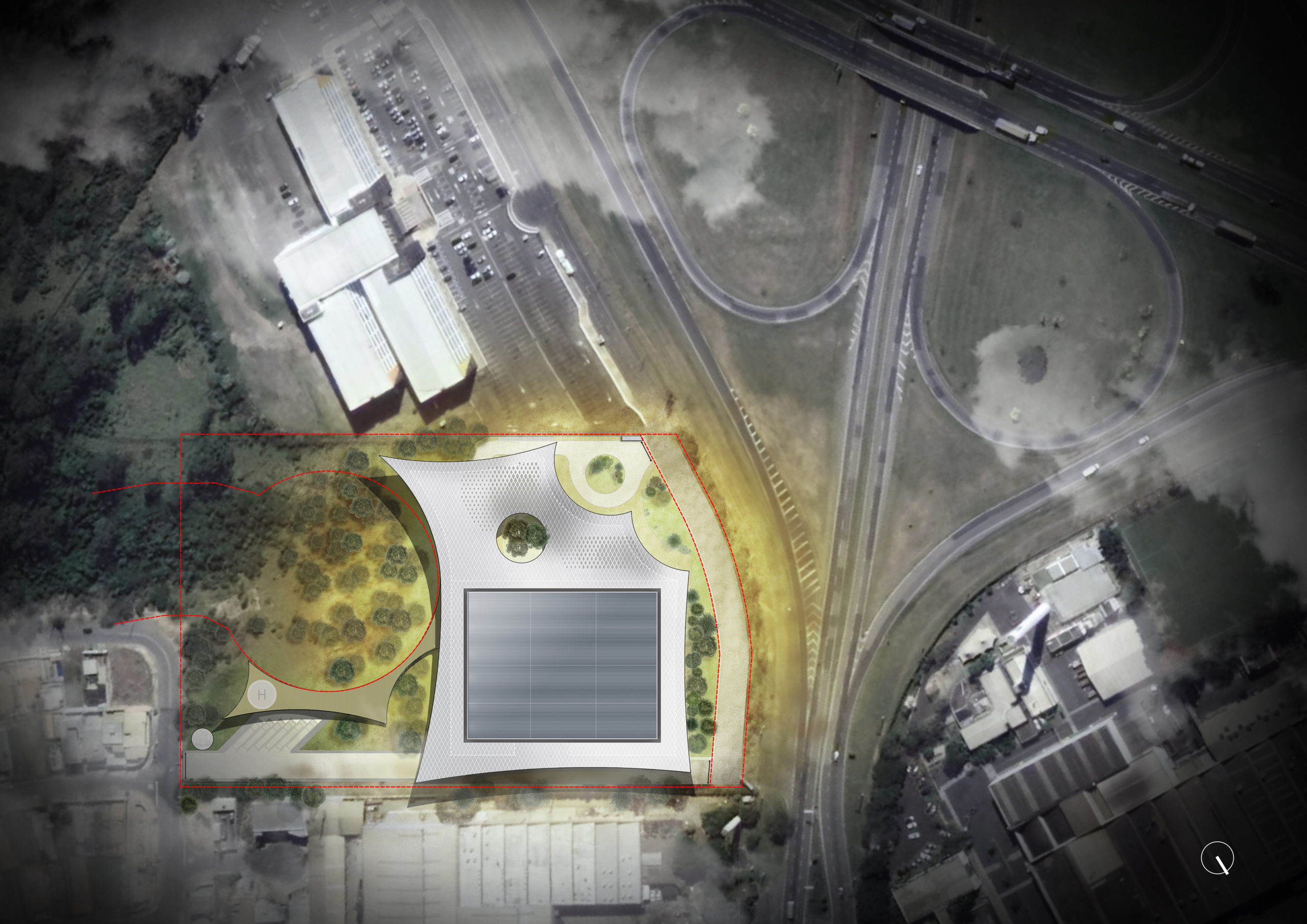
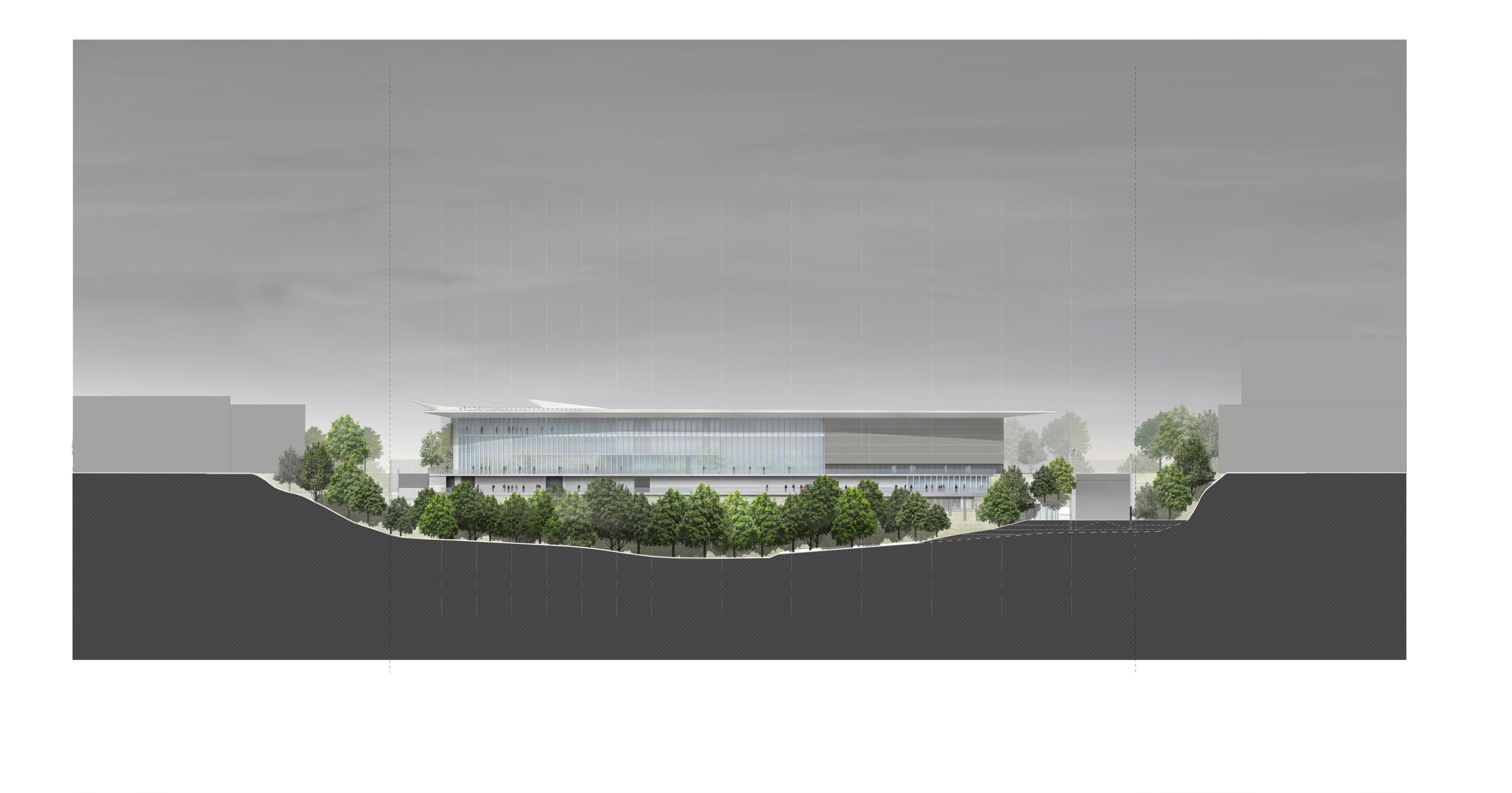
The complex, covering an area of about 215, 278 sq ft (20,000 sqm) in a forest rich in underground water sources, houses the headquarters of the group with two floors of offices, common areas, showrooms, service and training areas. The production facilities, located at the back, are connected to the central atrium by a large window from which visitors can directly observe the industrial process.
 Also at the back, a system of suspended paths, immersed in nature, connects to the building that houses services for employees, such as the gym and the inevitable “churrasqueira.” The working environment is a bit like a home, where it is also pleasant to spend moments of relaxation and socializing.
The building has been designed to reduce energy consumption and toxic emissions through the use of active and passive measures that, thanks to the favorable local climatic conditions, allow the systems to operate completely off-grid for some periods of the year.
 In general, the use of natural ventilation is possible for two thirds of the year, thanks to openable facade elements and the integration of mobile openings in the atrium patio that transform it into a giant “ventilation chimney”. The production area, thanks to the combination of thermal mass and natural ventilation, is operational all year round without the need for cooling or heating; showrooms and offices benefit from a mixed system that encourages natural ventilation while reducing overall cooling loads.
The roof, as well as a strong characterizing element of the project, is also an important passive device that provides shading to the large glass fronts during the hottest hours, reducing by 47% the incident radiation and avoiding the risk of overheating. 43 055 sq ft (4,000 sq m) of photovoltaic panels installed on the roof cover the electrical load of the entire building and potentially allow the systems to work off-grid during sunny days.
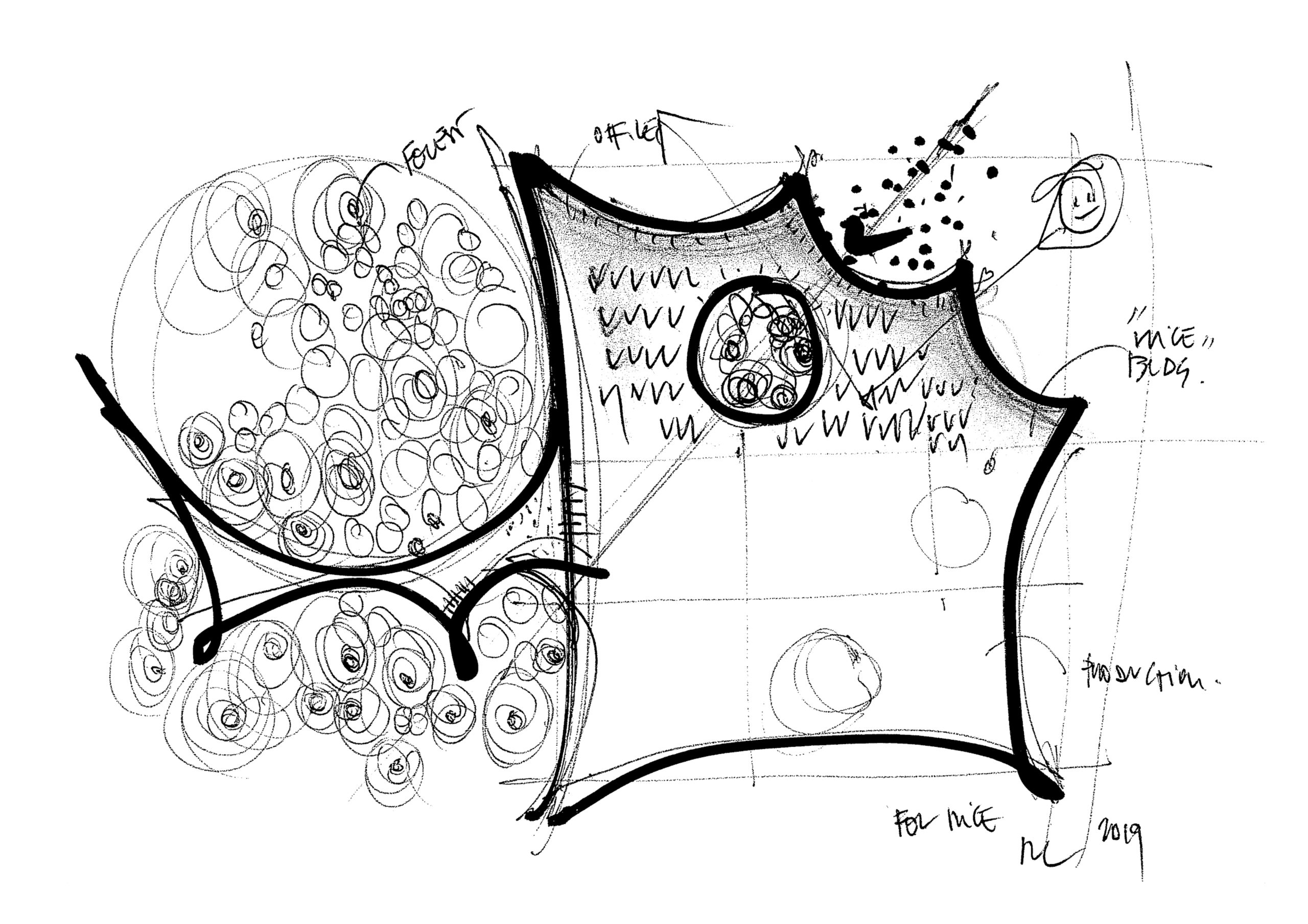 The landscape design is an equally important part of the intervention and is functional to increase the rich local biodiversity. The project proposes a playful interpretation of the variety of the Cerrado biome, the second largest in Brazil, ranging from grassy glades, to savanna, to forest formations, represented here in different expressive languages along the outdoor paths, inspired by local wild species and native vegetation. Small ponds and water basins mitigate runoff and direct rainwater to a large basin at the bottom of the area; a 2, 120 cubic foot (60 cubic meter) tank stores water to reuse for irrigation.
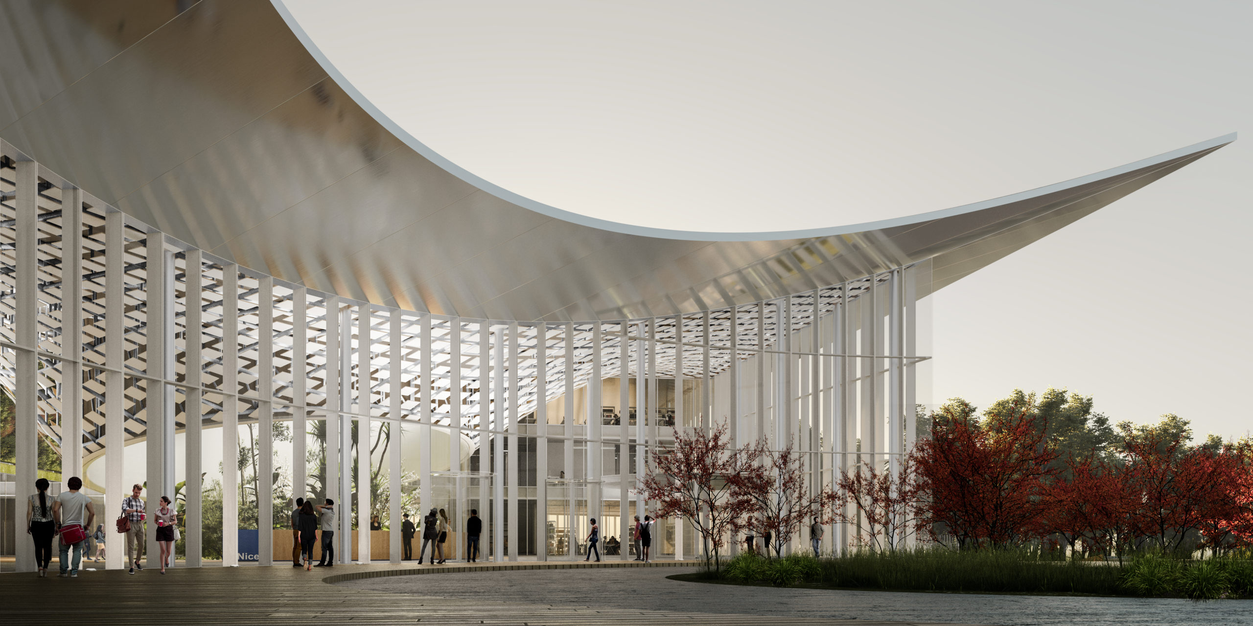
Image courtesy of MC A – Mario Cucinella Architects
Mario Cucinella, founder and creative director of MC A, states that “sustainability is a founding element of making architecture. Looking back at history, we have always needed a relationship with matter, and the energies brought into play were those of the climate: the sun, the wind, the light. The project re-establishes a symbiotic relationship between the architectural structure and nature, interacting with the landscape and reinterpreting the traditional Brazilian architectural elements and encouraging the use of all its passive characteristics.”
Love for Mother Earth — “our mother and sister who governs us and sustains us” as St. Francis of Assisi said — permeates the work, suggesting a broader reflection on the concept of sustainability that extends not only to environment but also to society and economy. MC A’s building encompasses a cultural approach in which ecology and industry coexist beyond hierarchies and commonplaces.
Judging is now underway for the 10th Annual A+Awards Program! Want to earn global recognition for your projects? Sign up to be notified when the 11th Annual A+Awards program launches.

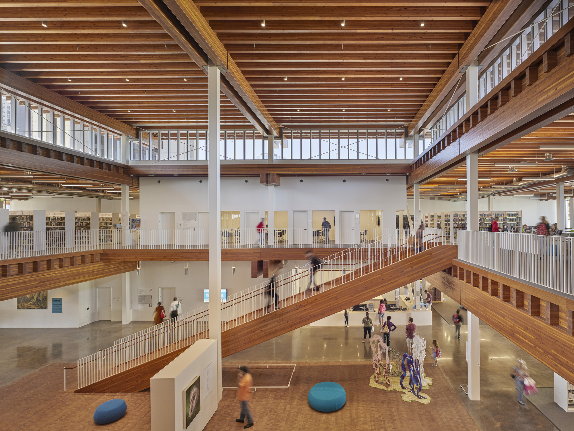
 The first Long Beach library was founded in 1896 in a room adjoining the City Council office. Three years later the library moved into City Hall next to Pacific Park, and in 1909, a new Carnegie library opened near the location of the present Main Library. In 1915 Pacific Park was renamed Lincoln Park.
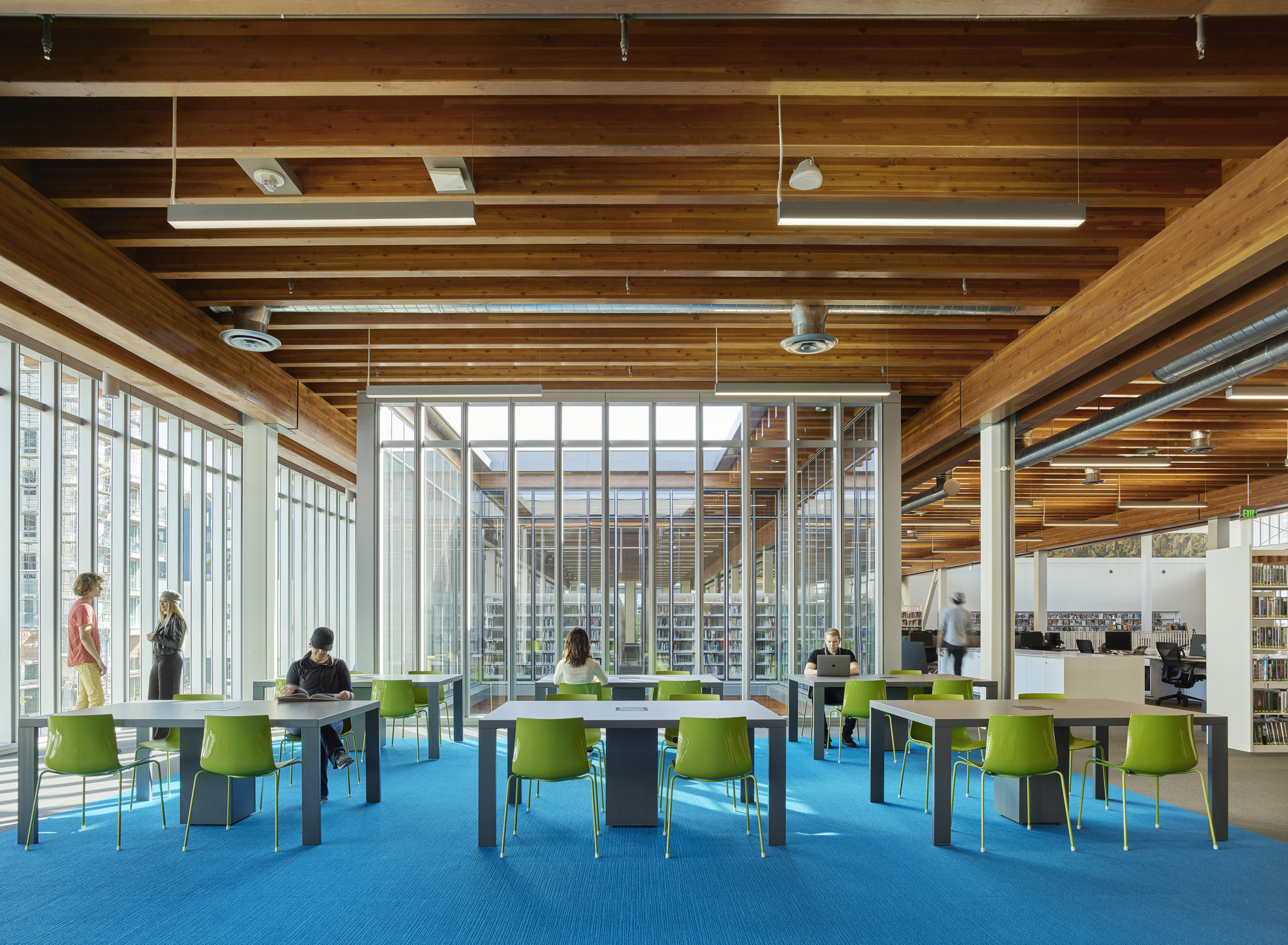
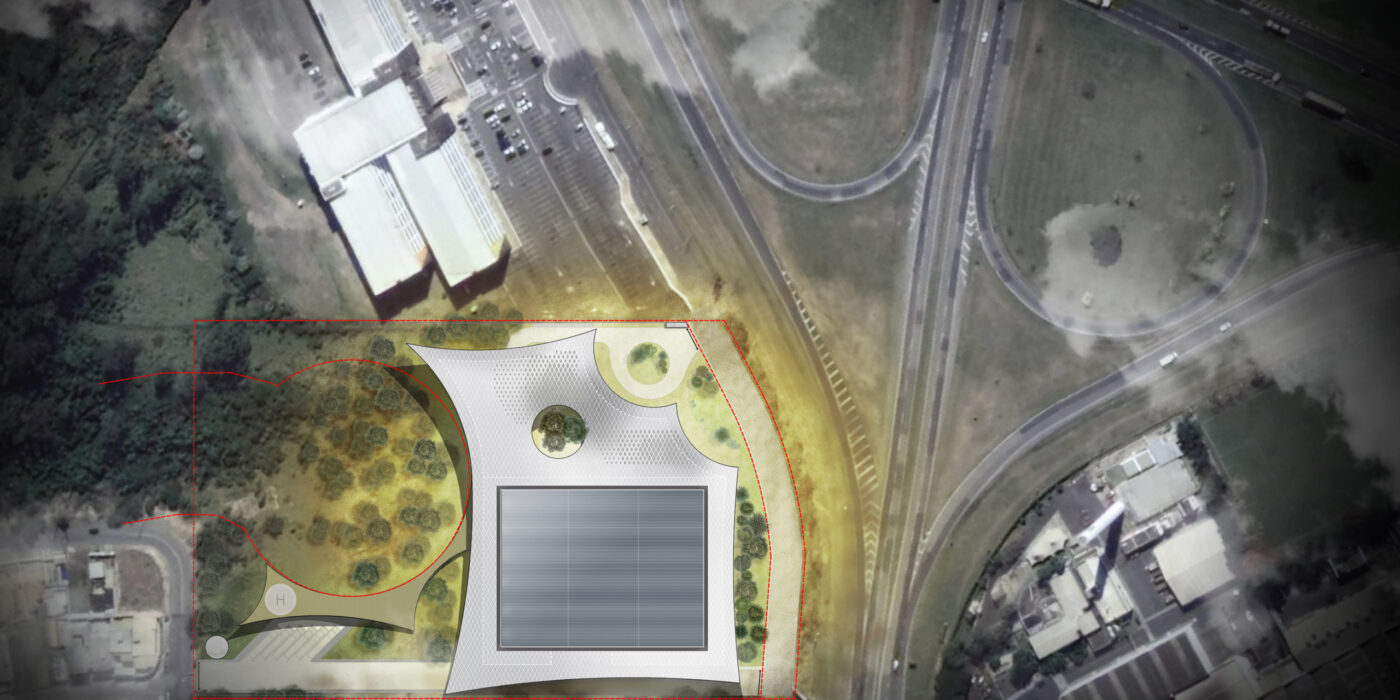
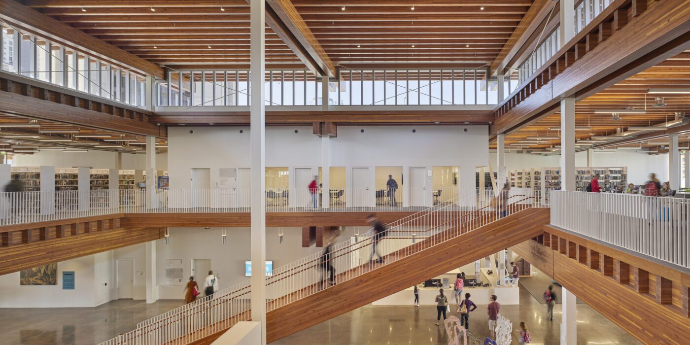
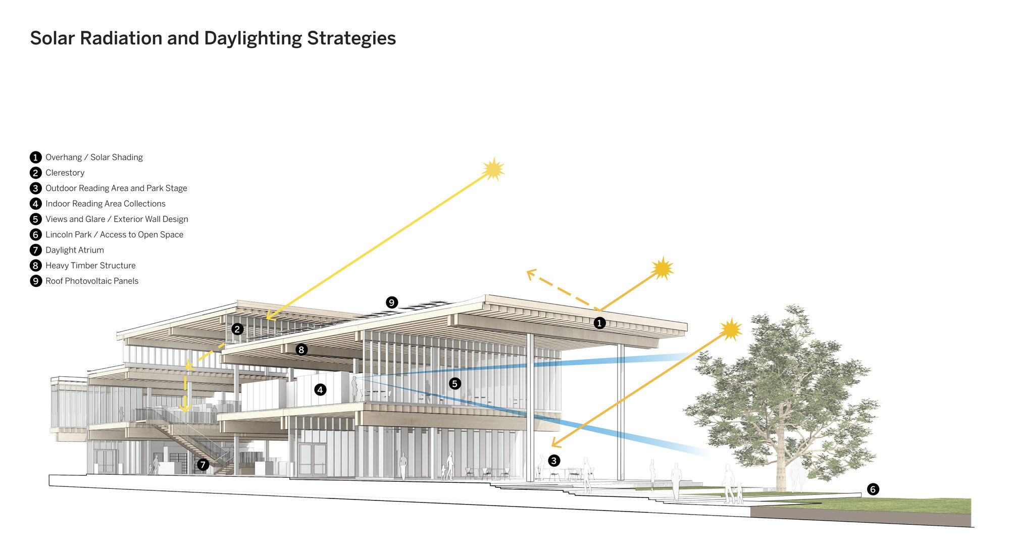
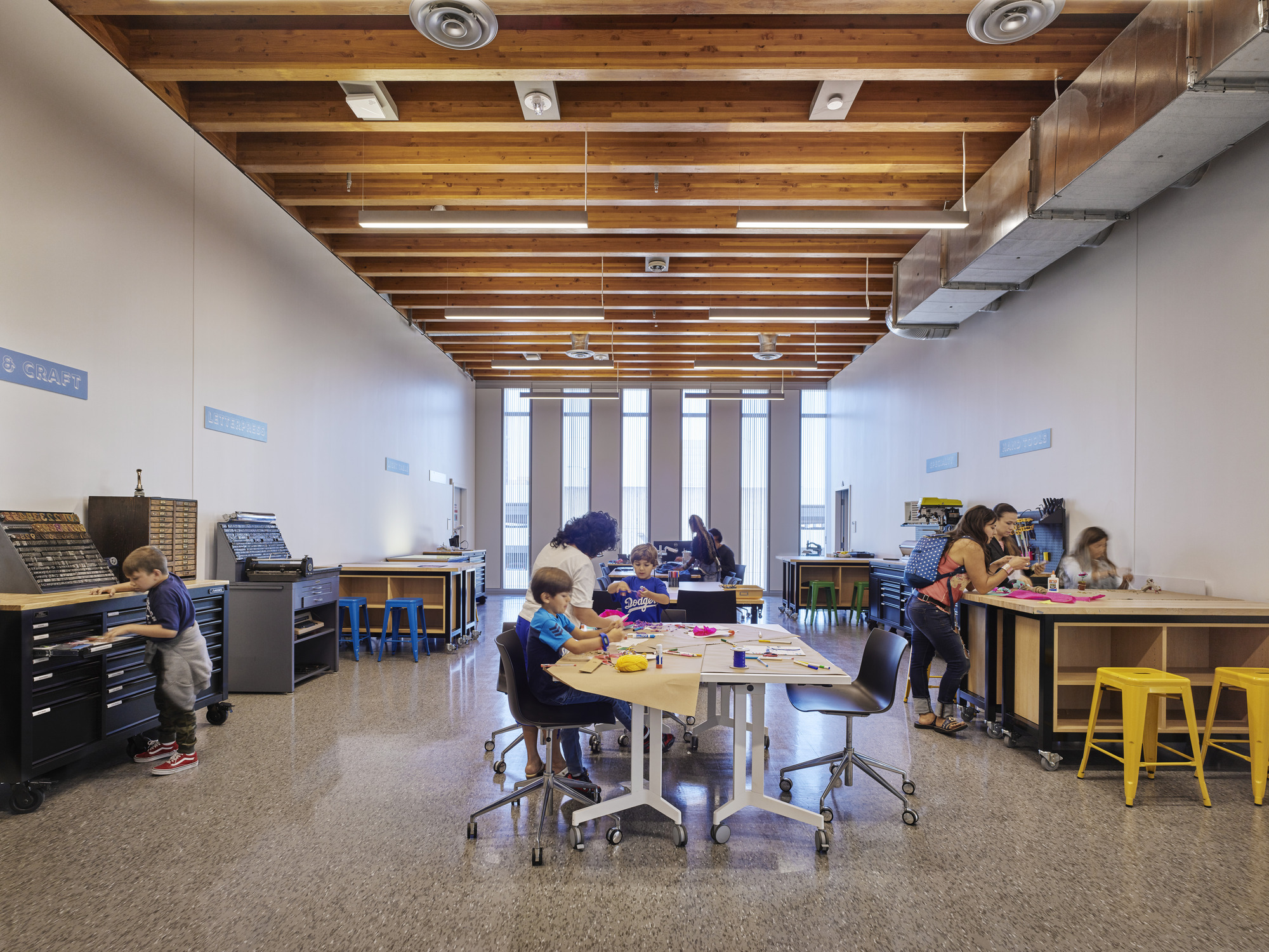 With its name that pays homage to the famed athlete and Long Beach native, the Billie Jean King Main Library is adjacent to Lincoln Park, a local landmark. The library was imagined as a pavilion within the new park, welcoming people inside from all parts of the city. It was made to serve as a traditional library and a modern, technology-focused hub for the community. SOM outlines that while there was a tight budget, the open interiors incorporate multi-use, flexible spaces that allow visitors of all ages to participate in solo and collaborative activities.
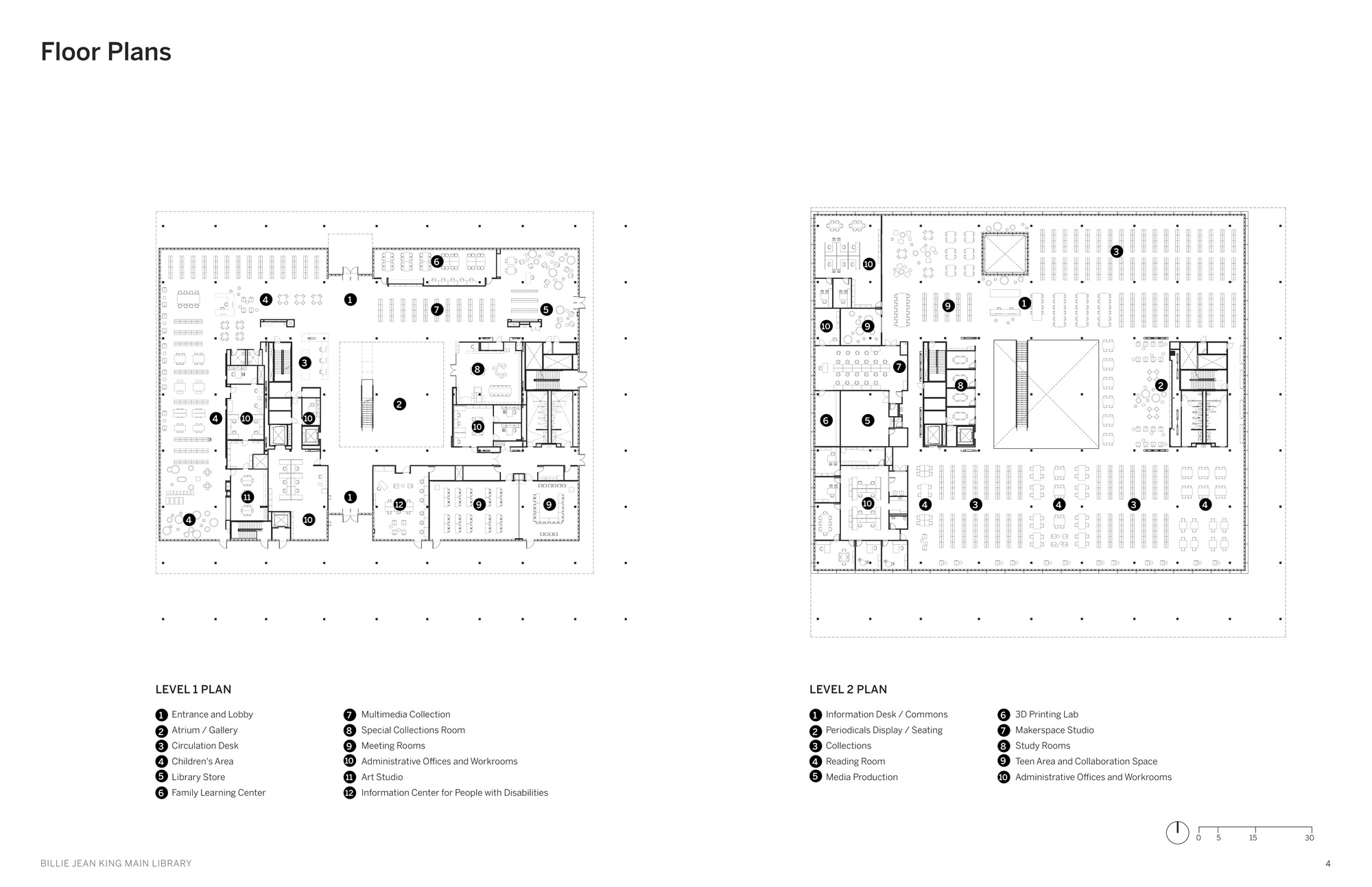
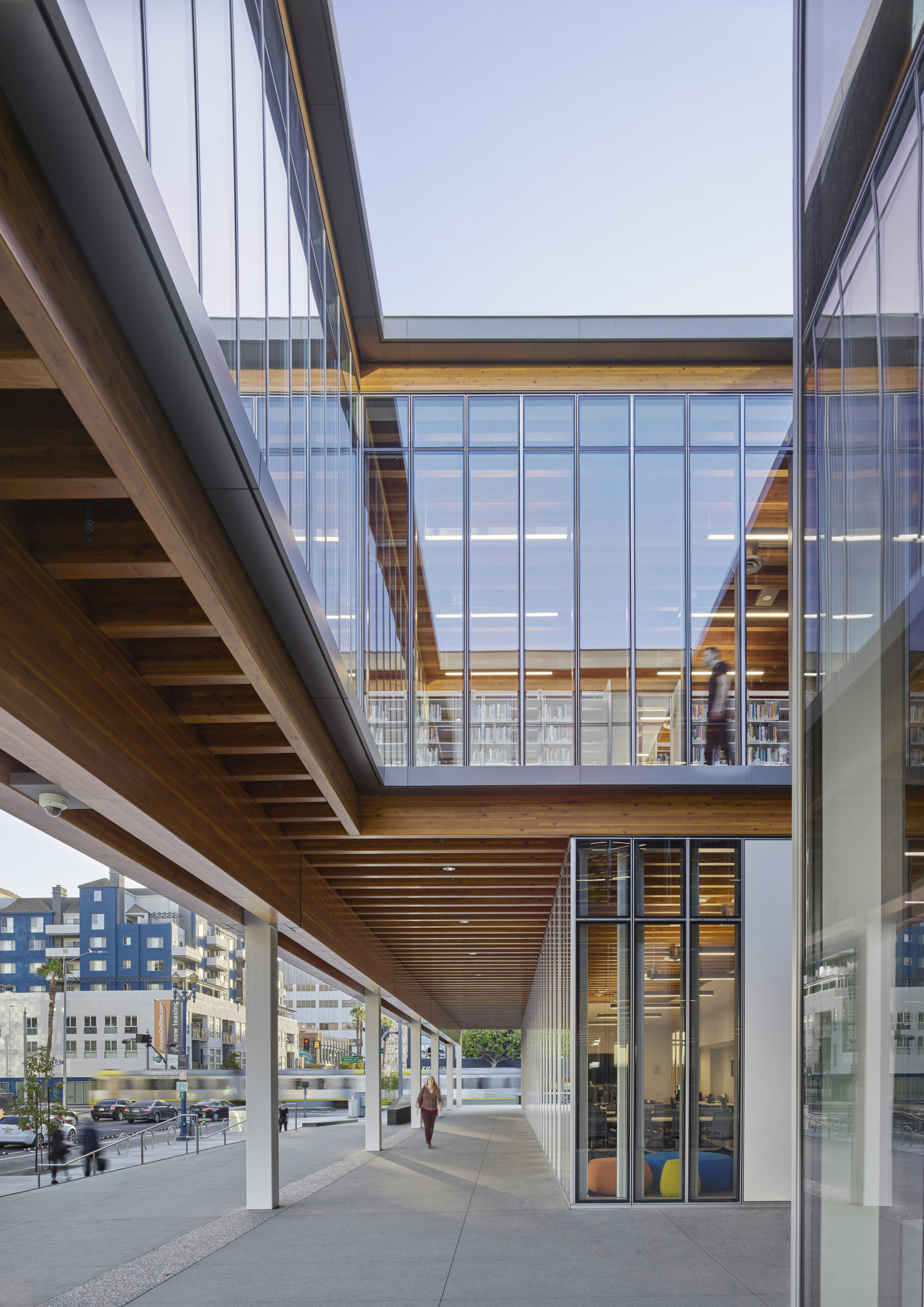 The library offers a rich program of activities, in which reading and browsing book stacks are only a part of the experience. For instance, the main level features sizeable open spaces dedicated to children’s literature and activities organized by age. Each space is designed for social interaction, play and learning, while computers, book collections and quiet reading areas are available for use on the second level.
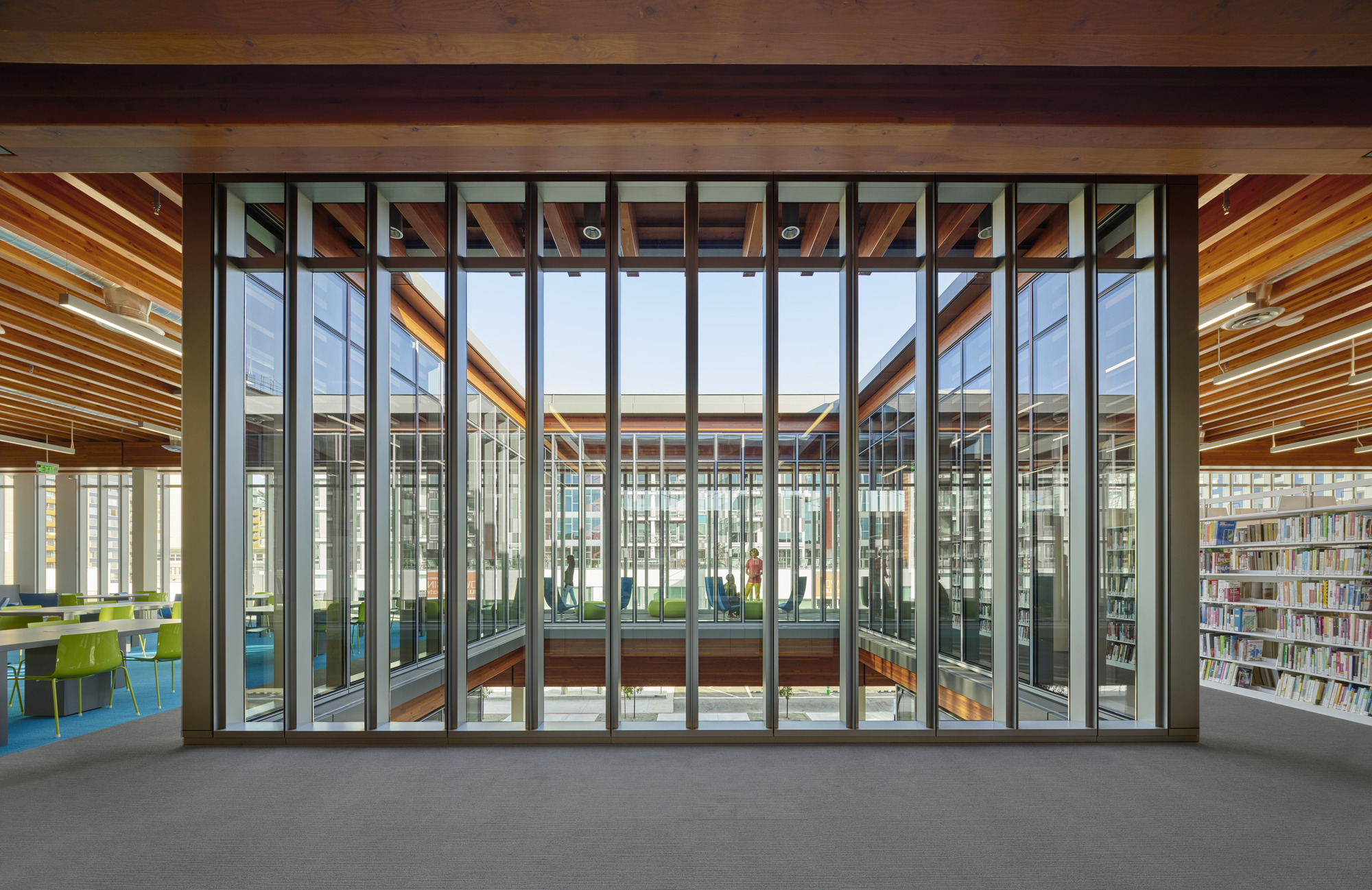 The building is one of the few in Southern California that utilizes a heavy timber structural system, composed of renewable timber reinforced with steel and concrete where needed. Each material is employed in a hybrid system to optimize its respective properties. The library’s superstructure consists of glue-laminated timber girders and joists with plywood decking, highlighting the warmth and character of the building.
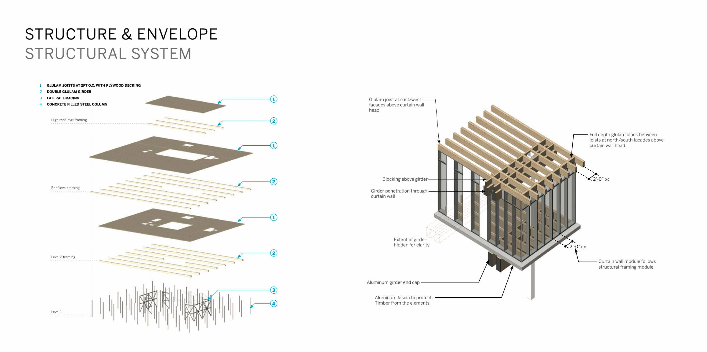
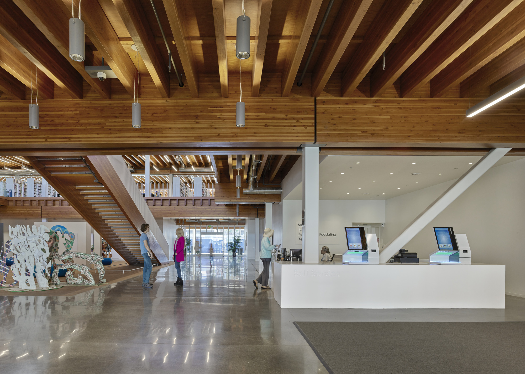 By using timber, a lightweight material, the library could be built atop the existing structure of an underground concrete parking garage. Saving most of the extant concrete structure also allowed the design team to significantly cut down on material waste; the design reduces embodied carbon by 61 percent, compared with erecting a new parking garage and a conventional concrete building. “Our goal was to leverage the power of clear ideas, natural materials, and Southern California sunlight to create a bright, beautiful, and beloved new place for the people of Long Beach” noted Paul Danna, Design Partner.
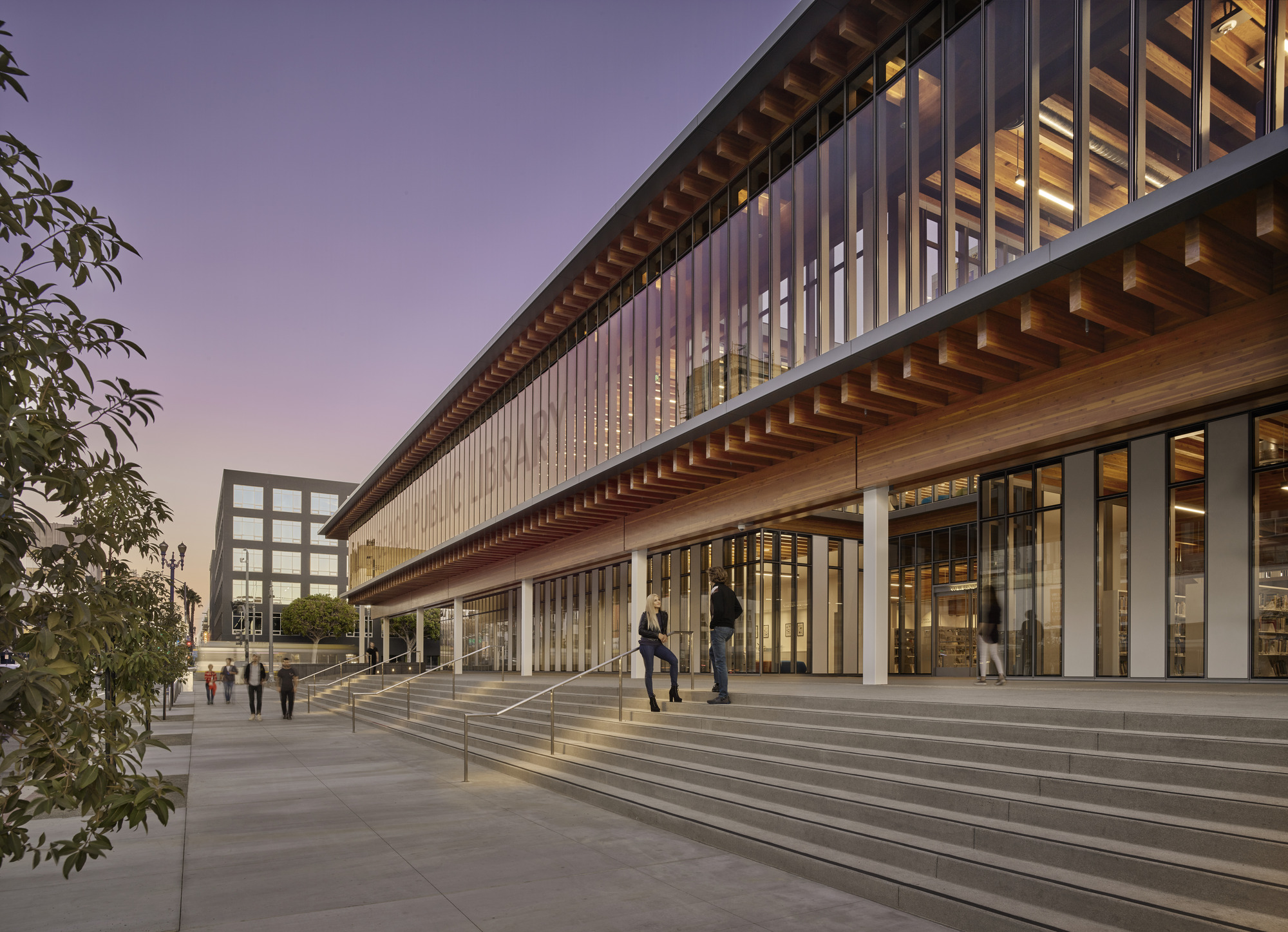 After its completion, the Billie Jean King Main Library received LEED Platinum certification. The Library also won the Gold Award for the Best Social Infrastructure Project in 2016 and the Excellent Structural Engineering Excellence Award from the Southern California Structural Engineers Association in 2020.
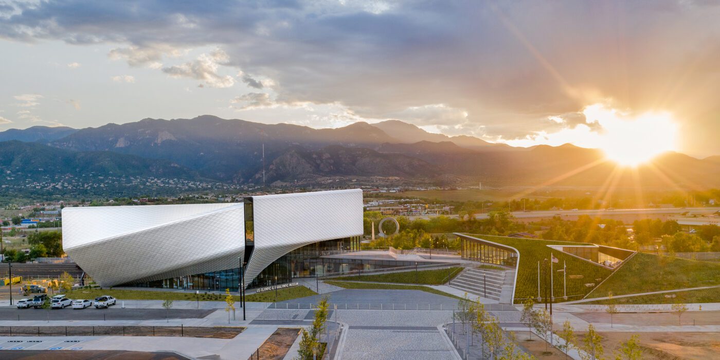
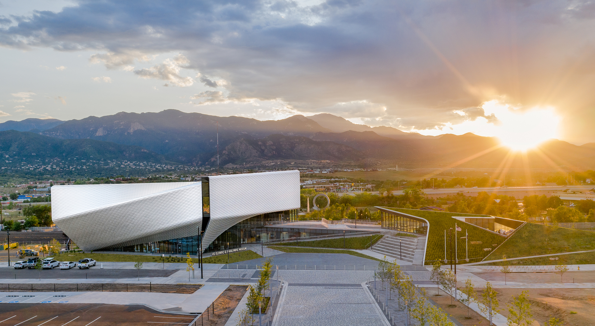
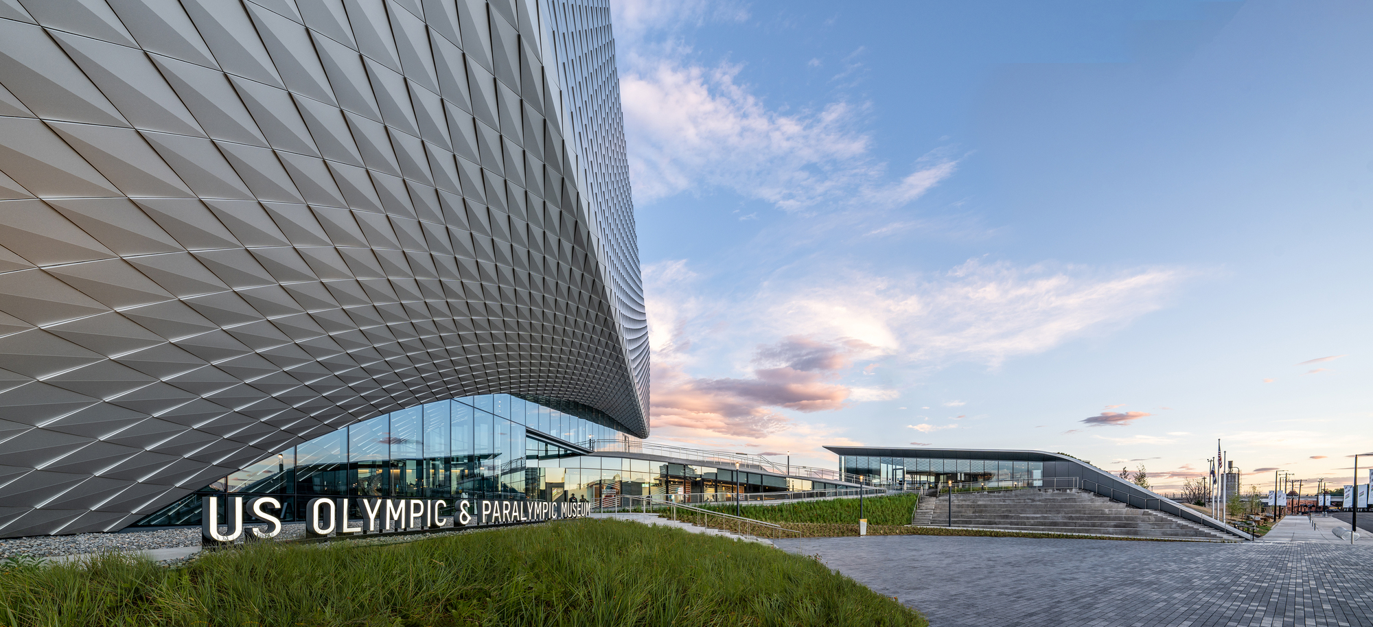 Ten years in the making, the United States Olympic and Paralympic Museum (USOPM) opened in 2020 as the first building of its kind to pay tribute to Olympic and Paralympic movements. The 60,000 square foot design features galleries, a state-of-the-art theater, event space and café, and was inspired by the energy and grace of Team USA athletes and the organization’s inclusive values.
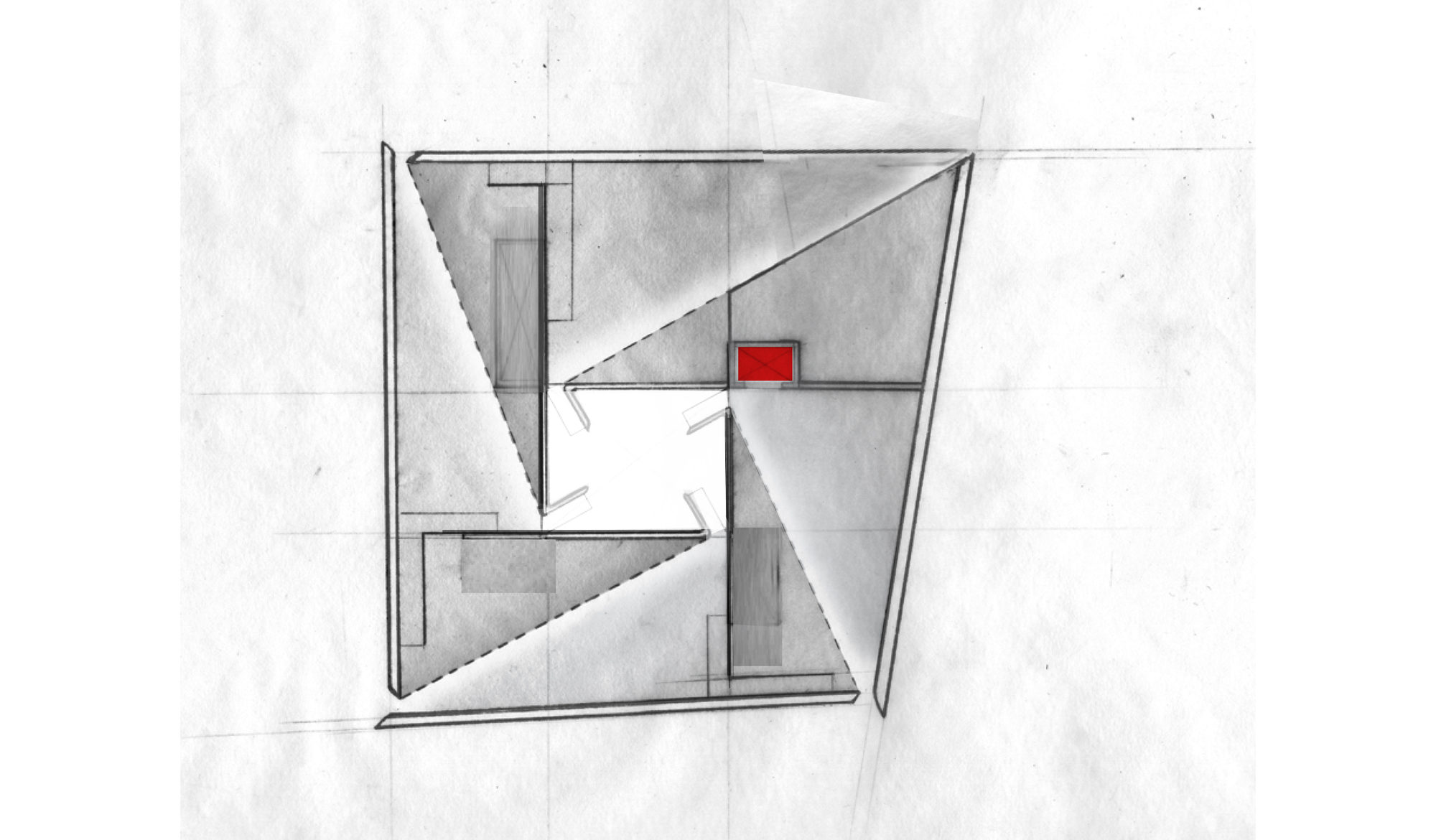
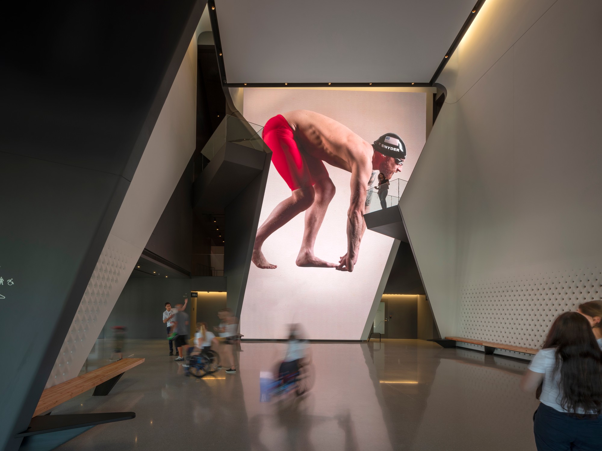
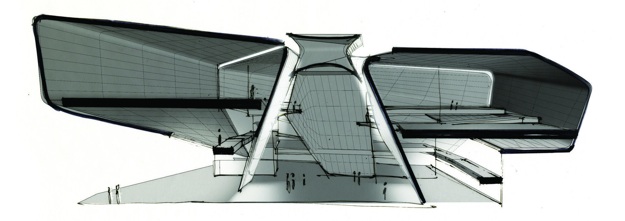 From the earliest stages of design, the team consulted Team USA athletes, including Paralympic athletes and persons with disabilities, to ensure the most authentic and inclusive experience. Ramps guide visitors down a gentle-grade downhill circulation path that enables easier movement. These ramps have been widened to 6 feet to accommodate the side-by-side movement of two visitors including a wheelchair.
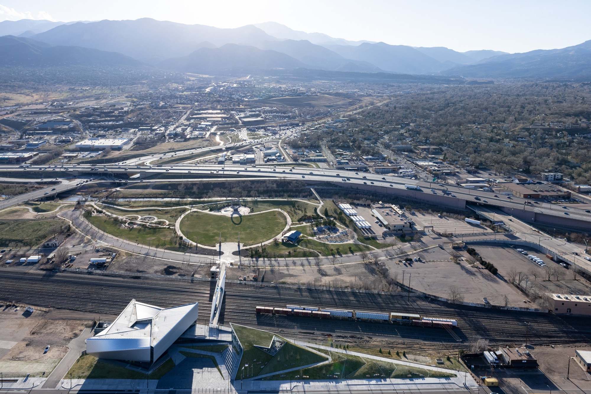
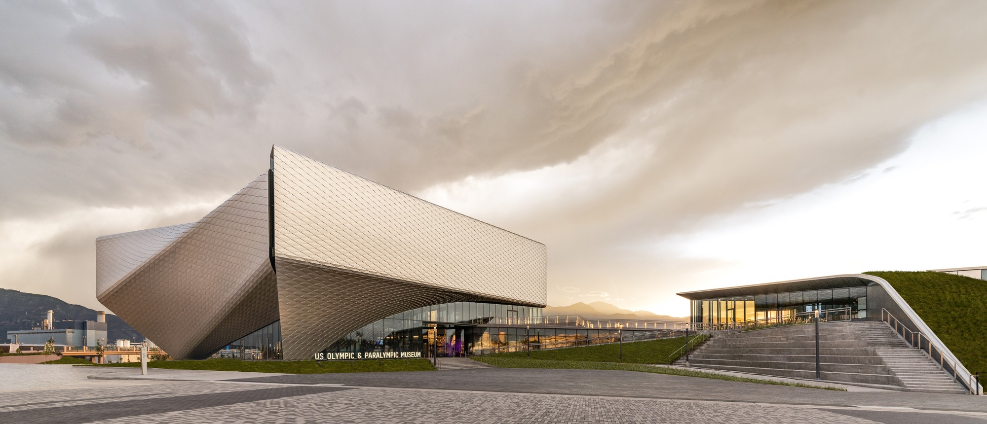 Outside, a terraced hardscape plaza is at the heart of the museum complex, with the museum building to the south and the café to the north. In addition, the Park Union Bridge is a 250-foot curved steel structure that floats above an active railyard. Two interlocked loops, stretching from either side of the railyard, connect the museum and America the Beautiful Park.
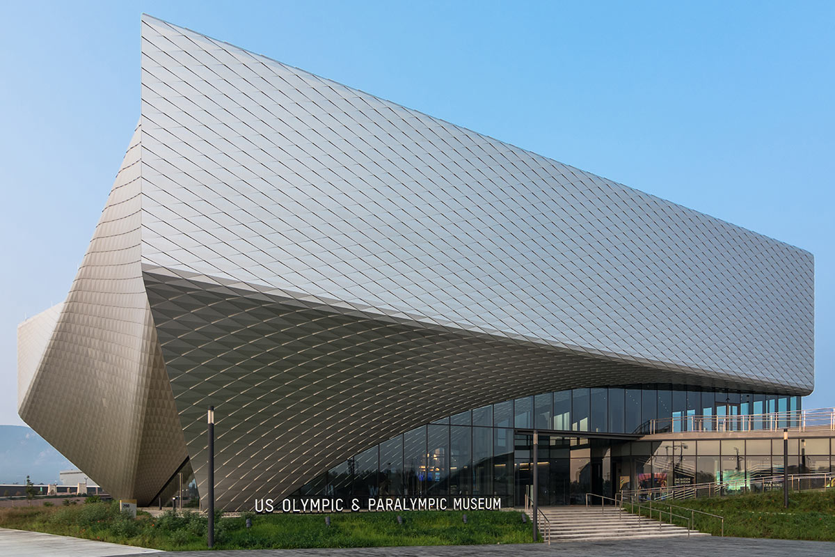
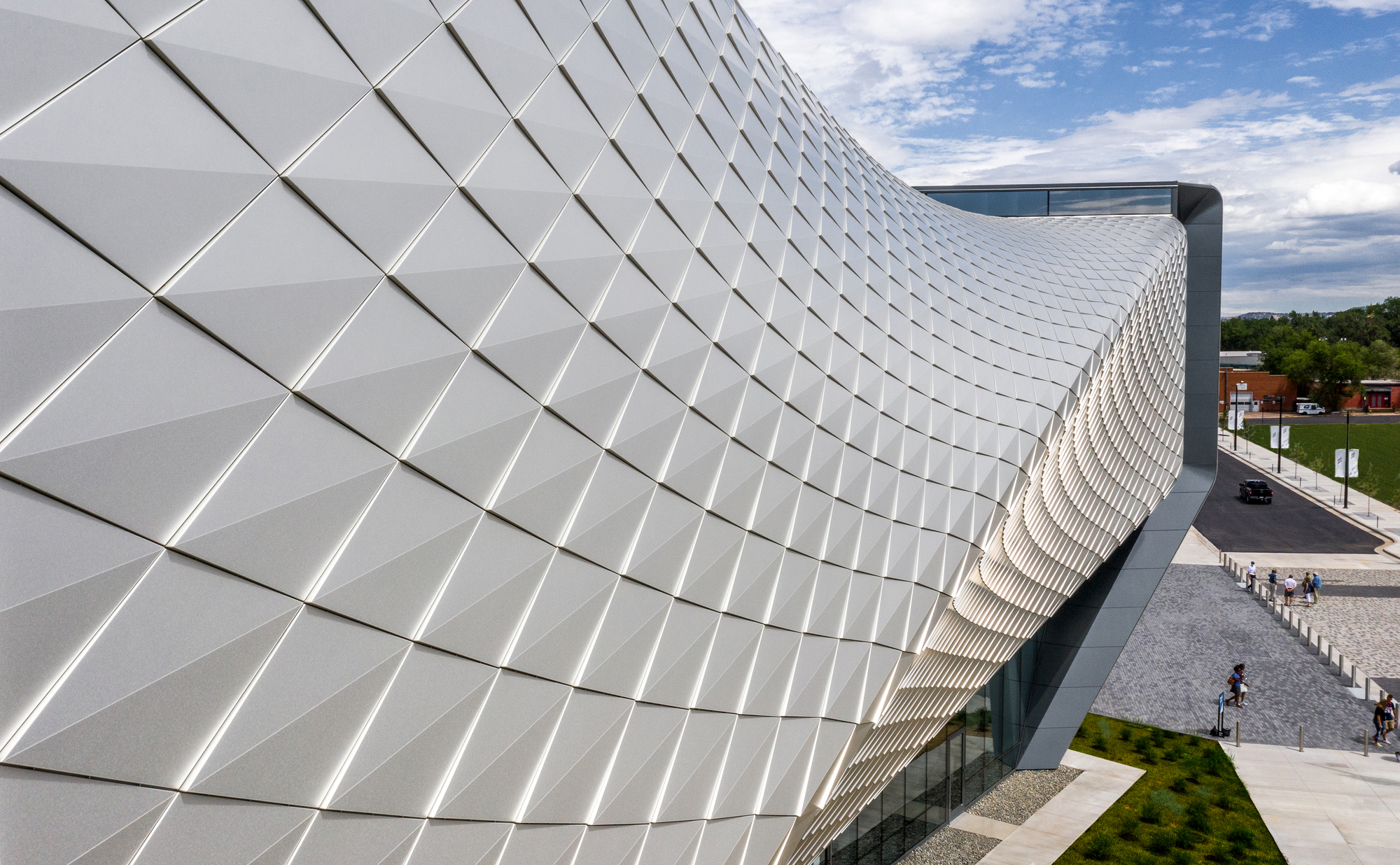 Diller Scofidio + Renfro worked with Lorin Industries on the aluminum panels, as well as MG McGrath and Oldcastle BuildingEnvelope on the curtain walls. Bringing the vision of the building’s exterior to life, the teams wanted to create a building structure and overall exterior visual effect that encapsulated the passion, dedication, and endurance of an Olympic athlete. To achieve this, a system of custom metal panels with integrated gutters wrap the double-curved geometry of the façade.
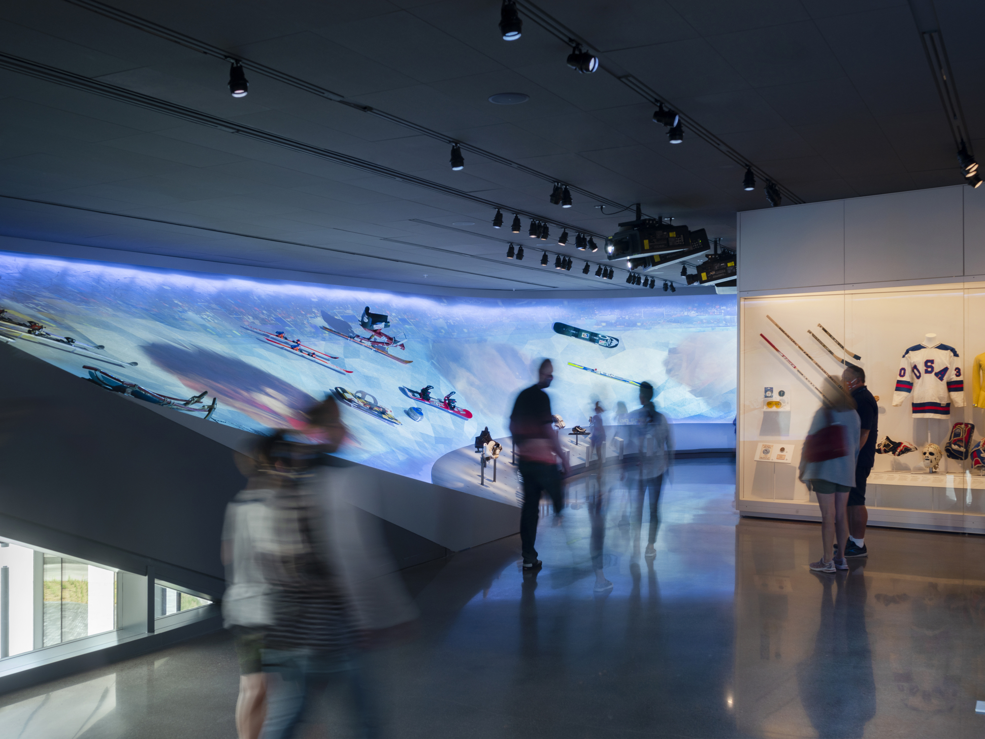 Lorin pioneered the coil anodizing process, which protects the aluminum while also improving its aesthetic properties and durability. The panels are 100% recyclable helping to meet the project’s LEED requirements. Lorin’s anodized stainless finish is created by an electro-chemical process that builds an anodic layer from the aluminum, molecularly bonding it to the surface. It protects aluminum from oxidation, scratching, and other hazards far better than natural oxidizing, and it requires minimal upkeep while resisting scratches and finger prints. Even with its light weight, coil anodized aluminum has an exterior surface hardness second only to diamond and is therefore unmatched in abrasion resistance and durability.
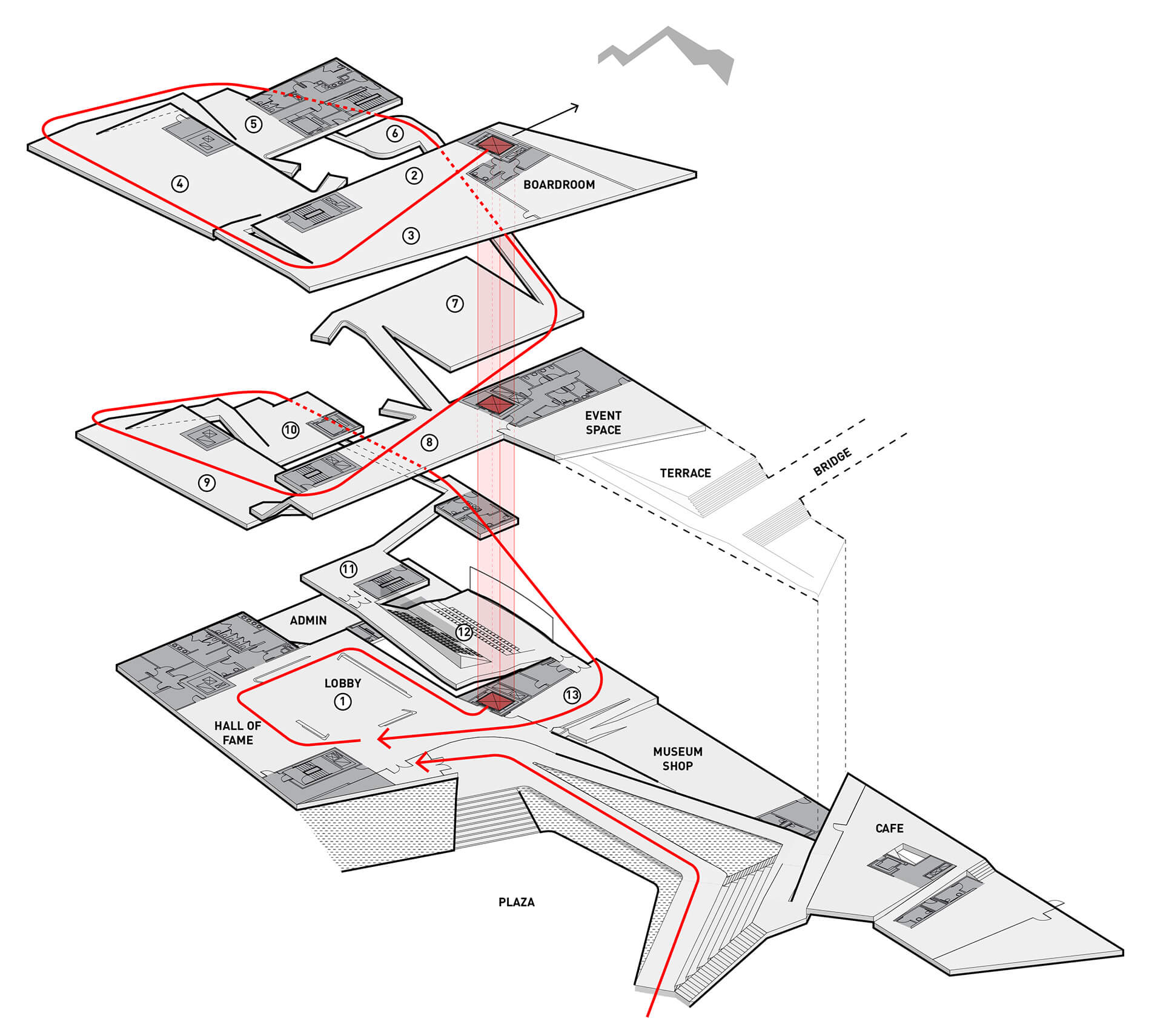
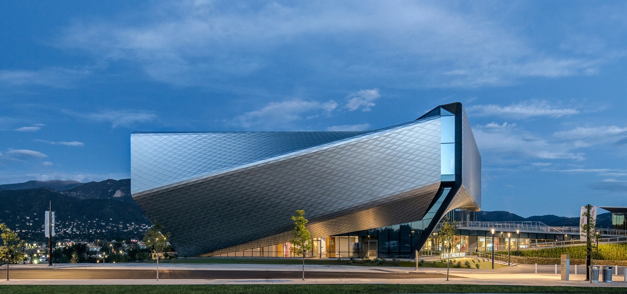 Putting Team USA athletes at the center of the museum experience, the design team created a museum that’s as functional and accessible as it is beautiful. The design rises with the primary structural systems consisting of a steel frame superstructure, drilled shaft caisson foundations, and cast-in-place concrete lateral cores. From this, the exterior shell further accentuates the dynamism of the building concept and purpose, with each metallic panel animated by the extraordinary light quality in Colorado Springs, producing gradients of color and shade that give the building another sense of motion. If great architecture reflects a common purpose and creates rich experiences, this is certainly the case in DS+R’s United States Olympic and Paralympic Museum.