Studio Becky Carter creates “distinctly New York” interiors for Cecchi’s
Brooklyn-based Studio Becky Carter has pulled varied references, from Bauhaus luncheonettes to comedic characters, for the interiors of a bistro in Manhattan’s West Village.
Art deco dining rooms, 1960s Milanese architecture and “a distinctly New York feel” are all evoked at Cecchi’s, the first establishment from veteran restaurant maitre d’ Michael Cecchi-Azzolina.
Studio Becky Carter was given creative control to produce an environment that felt distinctively New York, but also presented a departure from the typical bistros.
“My style is retro-futurist, so I take strong cues from historic design narratives and process them through the lens of an imagined future society,” Carter told Dezeen. “When people enter Cecchi’s, I want them to feel like they’ve stepped into old-school, underground, NYC exclusivity, only this time everyone is invited.”
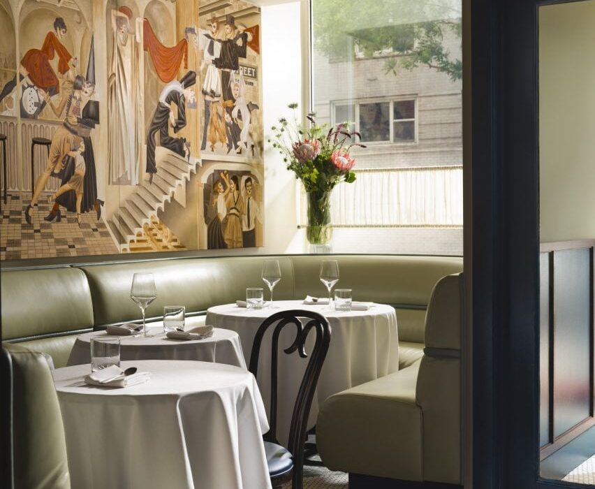
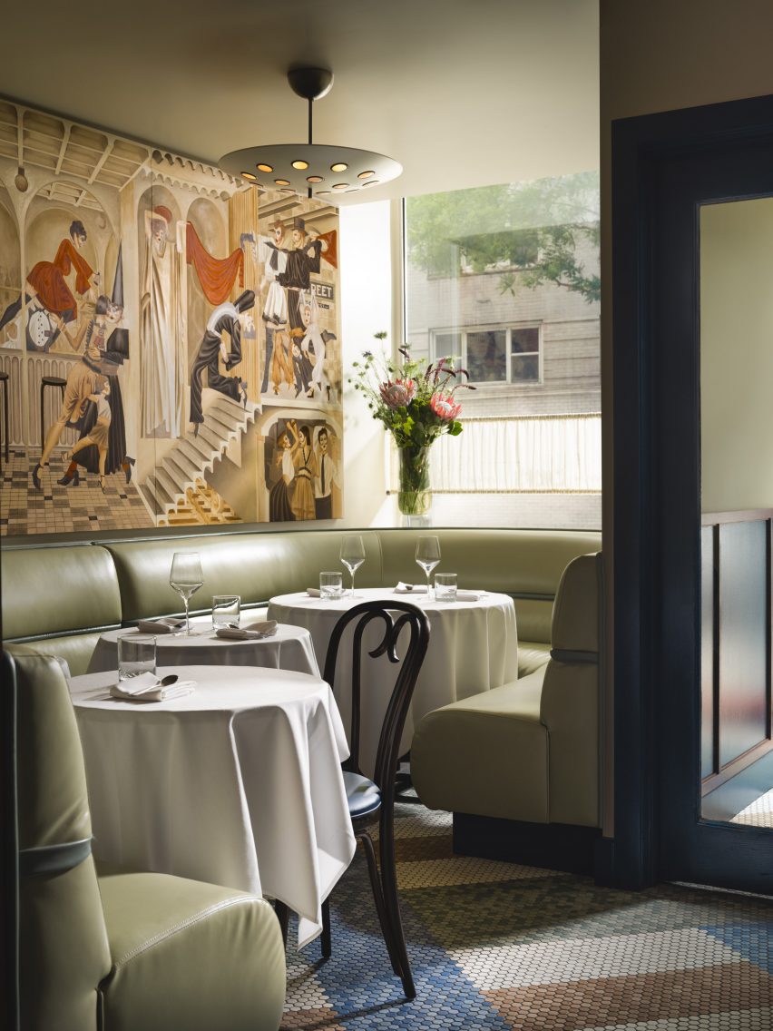
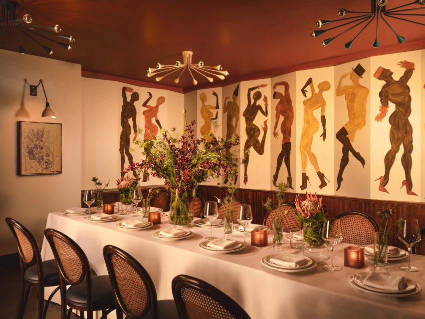
A starting point for the design was the whimsical murals of artist Jean-Pierre Villafañe, who was brought on early in the process to create scapes for the restaurant’s walls.
His “transportational” depictions of lively party scenes helped to inform the colour palette for the rest of the space, a mix of reds, blues and tonal browns.
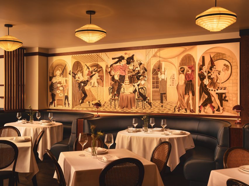
Some of the dancing figures appear as historic European comedic characters, so Carter also looked to these for influences.
The spheres placed within dividing screens, for example, are reminiscent of those found on a Pierrot costume, a figure in French pantomime theatre, while mosaic floor tiling at the entrance is adapted from Harlequin patterns.
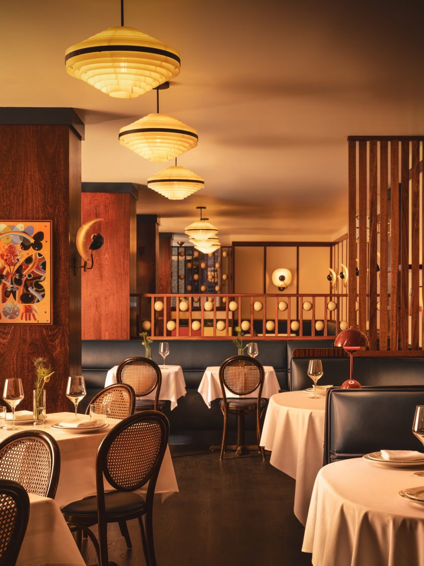
“The beautifully finished spheres are just so tactile,” said Carter.”I can’t not touch them every time I’m in the restaurant.”
The long, narrow space posed several challenges, such as the lack of natural light towards the rear and large structural columns that interrupted the flow.
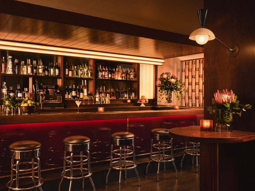
Carter’s approach involved dividing up the restaurant into multiple areas, demarcated by the wood-wrapped columns, louvred dividers and built-in seating – all at different heights to allow visual connections across them.
At the entrance, pistachio green leather banquettes occupy the bright window niches, then the mood shifts to darker and cosier as guests venture further inside.
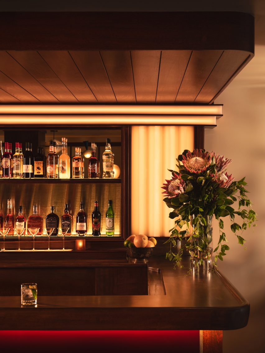
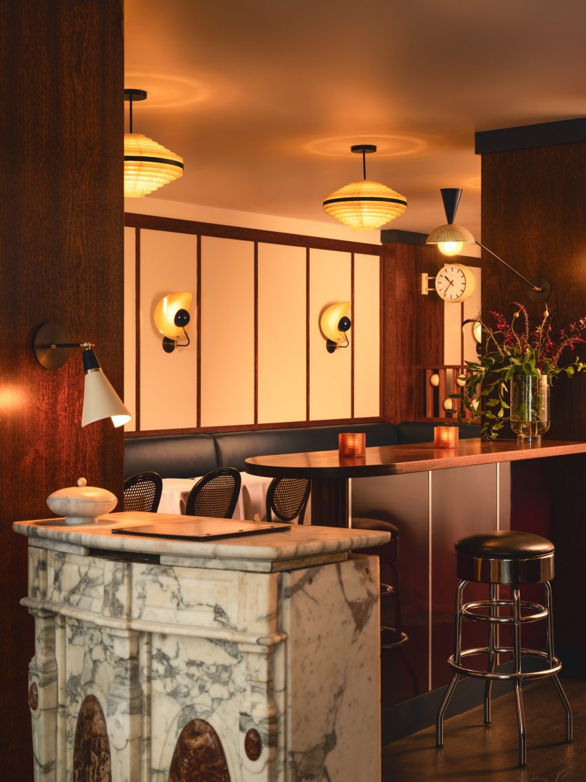
Several elements from the space’s previous iteration as Café Loup were retained or refinished as part of the new design, including the mahogany bartop and the restored caned bistro chairs.
The marble lectern that serves as the host stand and a chrome cash register were also saved, while 1970s Czech lighting was introduced overhead.
White tablecloths lend to the classic, old-school atmosphere, while contemporary details like custom wall sconces and the burgundy lacquered bar front add a more casual twist.
“Michael envisioned the servers being able to pull up a chair and have a conversation about the menu in a convivial manner, and the style was to reflect this,” Carter said.
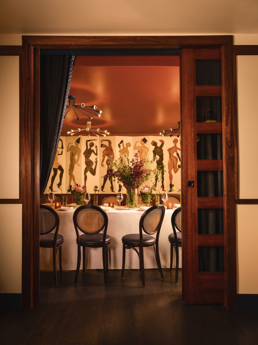
A private room for parties at the back features another Villafañe mural, as well as a rust-coloured ceiling and sci-fi lighting.
Overall, Cecchi’s offers a fine-dining experience that still feels approachable, warm and not too serious.
Carter founded her eponymous studio in 2016 and has completed a mix of residential and hospitality spaces on both coasts.
Other recently completed restaurants in the US that feature retro-futurist interiors include 19 Town, a Chinese eatery in Los Angeles by Jialun Xiong, while new openings in the West Village include the worker-owned Donna designed by Michael Groth.
The photography is by Joseph Kramm.

