Neuhäusl Hunal divide open-plan apartment using curved glass walls
CategoriesInterior Design

Neuhäusl Hunal divide open-plan apartment using curved glass walls

Czech architecture studio Neuhäusl Hunal has renovated a prefabricated apartment in Prague, turning it into an open-plan home and workspace for sculptor and glassworker Vladimír Bachorík.

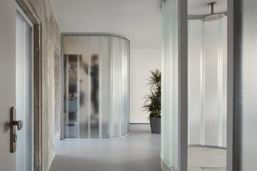
Neuhäusl Hunal opted for curved translucent glass partitions in place of doors to divide the interior spaces and create a sense of openness and fluidity.
Neuhäusl Hunal renovate apartment in Prague using curved glass partitionsNeuhäusl Hunal renovate apartment in Prague using curved glass partitions
U-profiled glass partitions divide the interior spaces

In order to maximise floor space, the studio removed all non-load-bearing elements, leaving just a single load-bearing concrete wall that cuts through the living and workspaces.

Three U-profiled glass partitions were then used to enclose a cloakroom, storage space and kitchen, while the remaining floor space can be used flexibly.
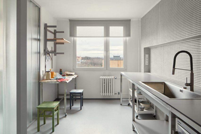
Kitchen workspace in Prague apartment by Neuhäusl HunalKitchen workspace in Prague apartment by Neuhäusl Hunal
An existing load-bearing concrete wall separates the living and work spaces

A centralised, curved bathroom, raised by a small platform for waste management, is similarly enclosed by translucent glass panels and protrudes into the main space.

The bathroom interior was lined extensively with white ceramic tiles and features a walk-in shower.

Meanwhile, matching ceramic tiles were also used in the kitchen, which doubles as a work area for the artist.
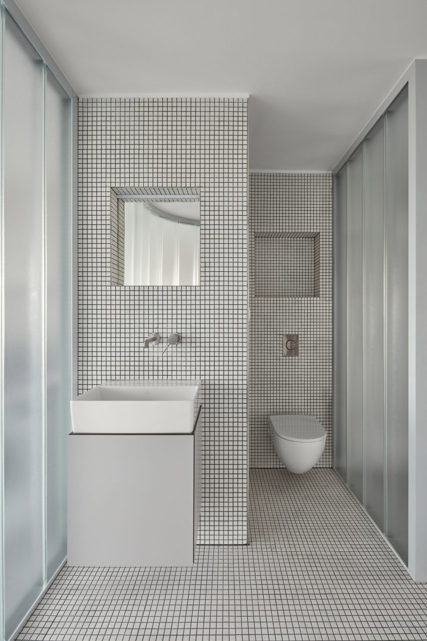
Tiled bathroom designed by Neuhäusl Hunal in PragueTiled bathroom designed by Neuhäusl Hunal in Prague
White mosaic tiles line the kitchen and bathroom

“To design the maximally open and flowing space without doors, infrastructure, besides statics, was a key constraint, which defines the location of the single-almost-enclosed space: the bathroom,” studio architect and founder David Neuhäusl told Dezeen.

“Therefore we emphasized [the bathroom] as the most prominent element in the apartment to create a strong spatial experience,” Neuhäusl continued.

The interior material palette was defined by the stripped concrete wall as well as the translucent panels and ceramic tiles, set on a background of white plaster walls and grey-toned rubber flooring.

Metal furniture and shelving was used throughout the minimalist interior, with cubic plinths used to display Bachorík’s glasswork around the space.
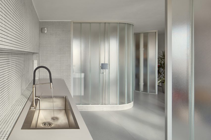
Neuhäusl Hunal renovate apartment for sculptor in the Czech Republic Neuhäusl Hunal renovate apartment for sculptor in the Czech Republic
Existing windows draw daylight into the interior spaces

Daylight shines through the existing windows at either end of the apartment and penetrates the glass partitions to create a brightly lit interior, while carefully positioned strip lights and spotlights provide artificial lighting.

“These translucent glass blocks of high order ensure the penetration of light and create identity of the apartment,” Neuhäusl explained.

“Their materiality and character naturally refer to the client’s lifelong work. They can be naturally composed in curves to formulate the softly shaped partitions.”
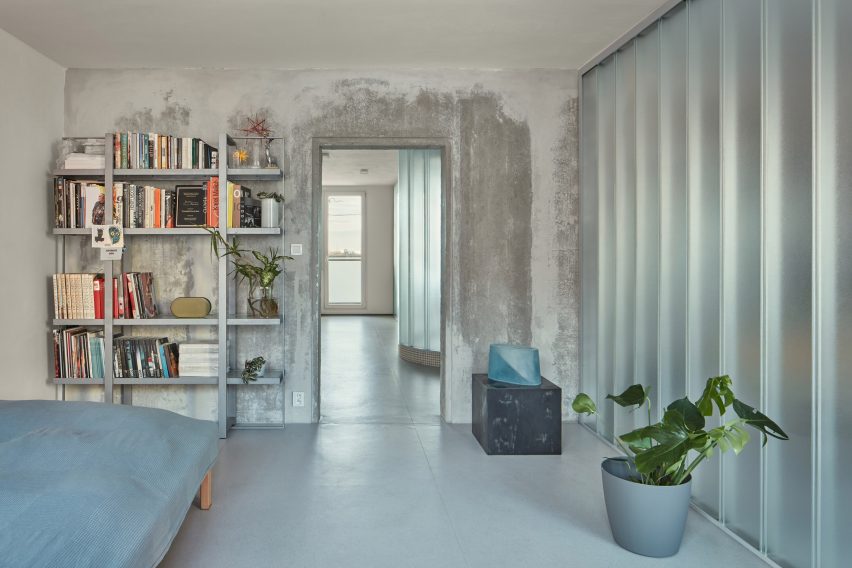
Curved glass partitions divide bedroom interior of Sculptor's ApartmentCurved glass partitions divide bedroom interior of Sculptor's Apartment
Metal furniture is used throughout the space

Neuhäusl Hunal is an architecture studio founded by David Neuhäusl and Matěj Hunal in the Czech Republic.

Other projects recently completed in the Czech Republic include a winery topped with a sweeping concrete roof and an angular black extension to a neo-gothic church.

The photography is by Radek Úlehla.

Reference

Glass blocks divide Eye Eye optical store by Best Practice Architecture
CategoriesInterior Design

Glass blocks divide Eye Eye optical store by Best Practice Architecture

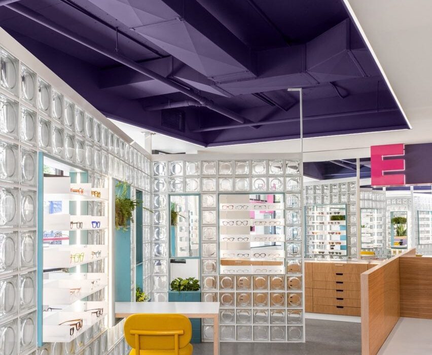
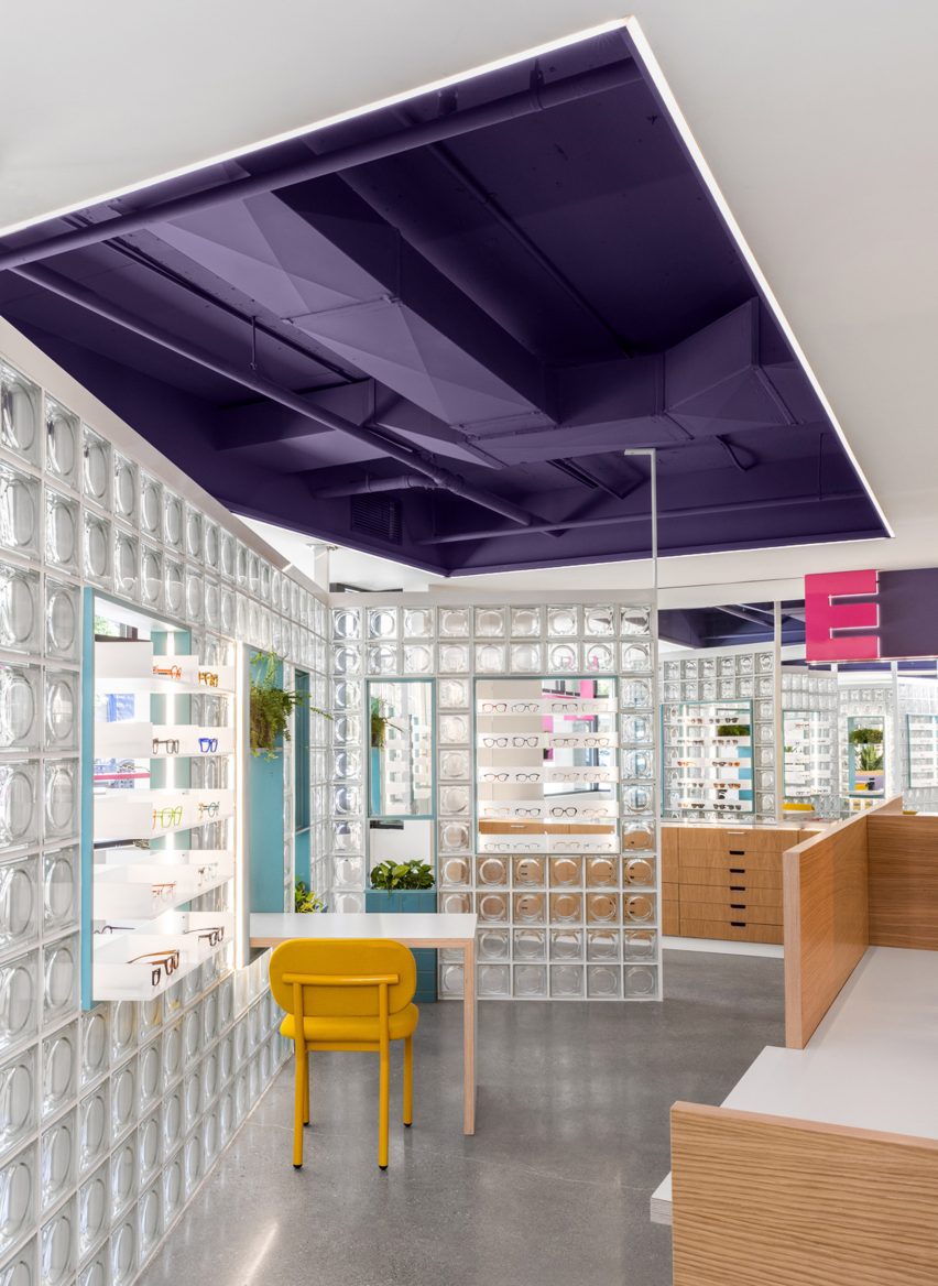
Local studio Best Practice Architecture has used punchy colours, glass bricks and dichroic glass inside an optometry store in Seattle’s Leschi neighbourhood.

For Eye Eye‘s second location, founder Will Pentecost got back in touch with Best Practice Architecture, which had completed the brand’s first brick-and-mortar store back in 2015.

Eye Eye retail space with cutout ceiling to add extra height
Cutouts in the low ceiling add extra height to the Eye Eye retail space

Unlike the inaugural space, the new store does not benefit from tall ceilings and a strong street presence.

So the architects had to get creative to turn the “drab” commercial building into a fun and inviting environment.

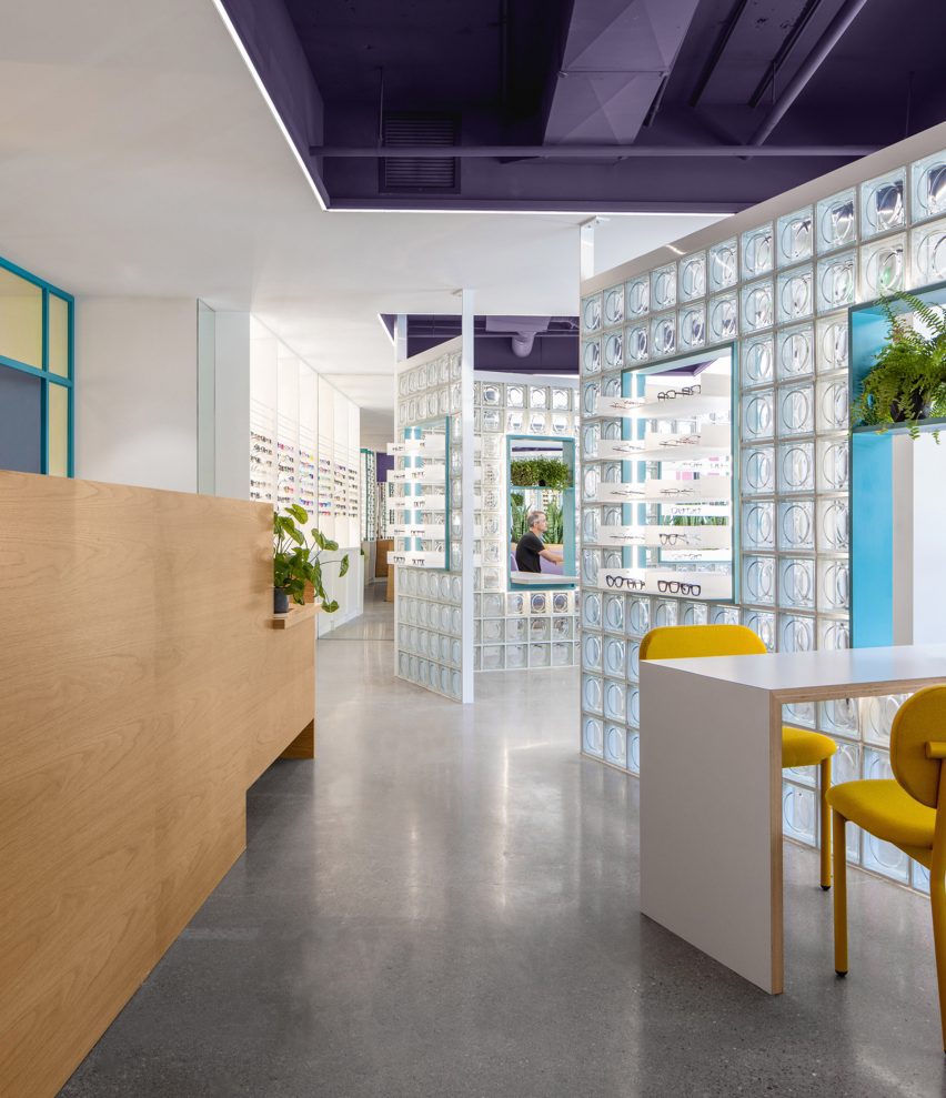
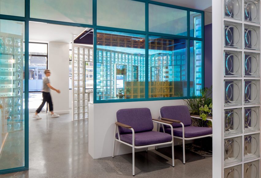
Glass block partitions divide the store
Glass block partitions are angled to create a more dynamic space

“The client gave Best Practice free range to transform the interior with only three requests: include glass blocks, use lit signage, and incorporate design language from the original location without being too repetitive,” said the studio.

The retail area is situated at the front of the space, facing the street through large windows, while the examination rooms and staff facilities can be found at the back.

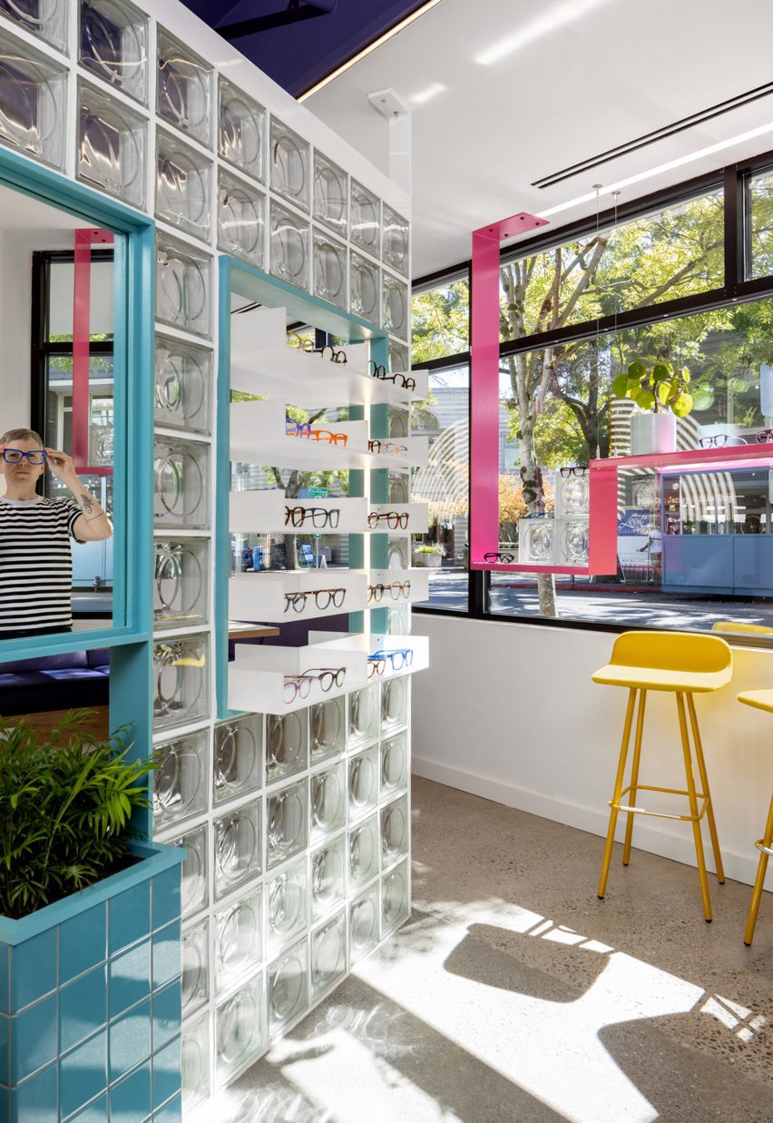
Glasses displayed on shelves with the glass block partitions
Niches in the partitions contain mirrors and product displays

The specified glass blocks are used to divide the store, forming angled walls with openings that feature mirrors, product displays and furniture that spans both sides.

“Carefully placed to create an interesting circulation flow and contrast with the orthogonal layout, the clever design provides both form and function, welcoming filtered daylight deep into the space while accommodating basic retail needs,” said Best Practice.

Purple banquette beneath illuminated graphic of concentric arcs
A purple banquette is tucked in a corner for casual consultations

Cutouts in the low ceiling add extra height and expose ductwork that is painted purple – a hue that’s repeated in the upholstery of a banquette tucked in the corner for consultations.

More purple covers the walls in the examination reception area, which is separated from the store by a screen of dichroic glass that changes colour depending on the angle from which it’s viewed.

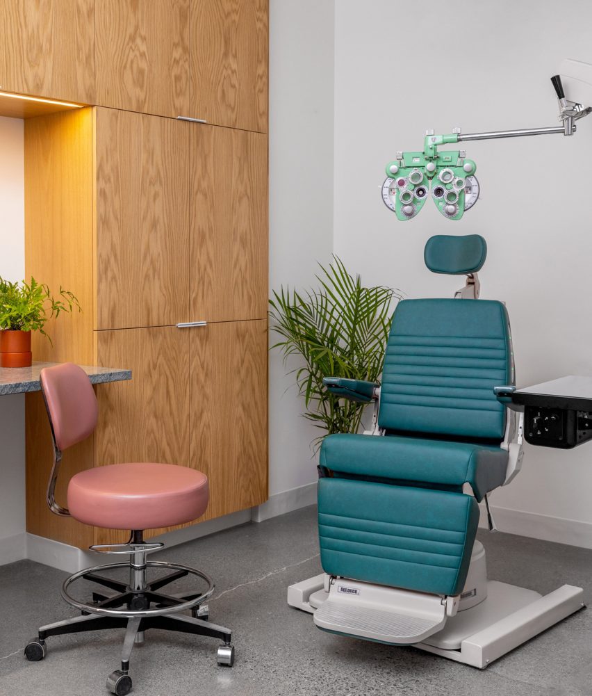
The glass blocks appear again as a partition between the clinic reception and the exam rooms behind, which are outfitted with custom medical equipment and wood cabinetry.

Signage that echoes the original Eye Eye branding is also installed in the retail space, including a concentric circle that echoes vintage eye tests and two large “E” letterforms.

Dichroic glass partition
A dichroic glass screen separates the retail space from the examination area

“With this new space, Best Practice brings Eye Eye’s vision to life once again through an exploration of materiality, the patient experience, and a fresh take on a commercial space,” said the studio. “It’s an eye care clinic reimagined.”

Founded in 2011 by Ian Butcher, Best Practice Architecture has completed a variety of projects in and around its home city of Seattle.

Exam room at Eye Eye
Exam rooms are outfitted with custom medical equipment and wood cabinetry

These range from updating a historic bungalow and transforming a storage shed into backyard studio, to designing a men’s footwear store.

The photography is by Rafael Soldi.


Project credits:

Architect: Best Practice Architecture
Design team: partner in charge: Kailin Gregga; partner/principal architect: Ian Butcher; lead designer/project architect: Sarah Smith
Contractor: Metis Construction
Graphics and branding: Drew Hamlet
Custom signage: Western Neon
Custom casework: Creoworks

Reference