A row of houses on set of Don't Worry Darling
CategoriesInterior Design

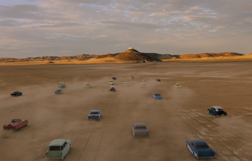
Don’t Worry Darling set designed as a “debaucherous take on the 1950s”

A row of houses on set of Don't Worry Darling

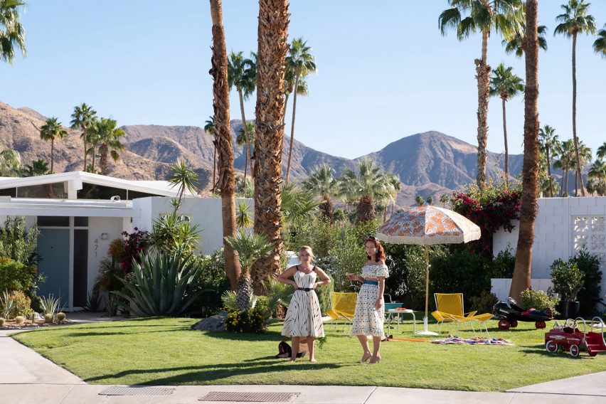
Production designer Kate Byron used vintage “treasures” and referenced key modernist architecture to create the set of psychological thriller Don’t Worry Darling, which was shot in California’s Palm Springs.

Byron drew on the architecture and interior style of the many modernist buildings that dominate the landscape in the desert city to create Victory – a fictional, utopian 1950s-style society where the film takes place.

A row of houses on set of Don't Worry Darling
Katie Byron referenced modernist architecture for the film

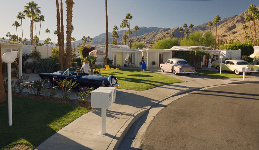
“We wanted to build a playful and debaucherous take on the 1950s, when there was this illustrious progressive, mid-century modern movement happening,” Byron told Dezeen.

“The world of Victory is supposed to be alluring, it’s supposed to be beautiful and sultry and sumptuous and opulent.”

Two characters on a film set on grass lawns
It was shot in Palm Springs, a Californian city famous for its modernist architecture

Directed by actor and director Olivia Wilde, Don’t Worry Darling follows fiery couple Alice and Jack – played by British actor Florence Pugh and musician and actor Harry Styles – as they go from living in an idealistic paradise to a troubled world fraught with secrets, control and manipulation.

The characters move across a quintessential Palm Springs backdrop of low-slung buildings with clean lines by architects including Richard Neutra, Harold Bissner Junior and Albert Frey.

A character standing in a modernist house
Kaufmann House was one of the filming locations

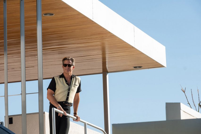
Several scenes, such as a cocktail party hosted by the leader of Victory which took place in Neutra’s Kaufmann House, were shot in real modernist buildings, while the home of protagonists Alice and Jack was built in a Los Angeles studio.

“We’re really lucky in California to have access to this architecture and in my history of being an architecture student and a production designer, I’ve gotten to visit a lot of these houses in person,” Byron said.

“I was interested in Neutra, but also Frey was a huge inspiration for us because of that playful wholesomeness that he embodied,” she said.

A woman vacuum cleaning
Alice and Jack’s house is filled with locally sourced props

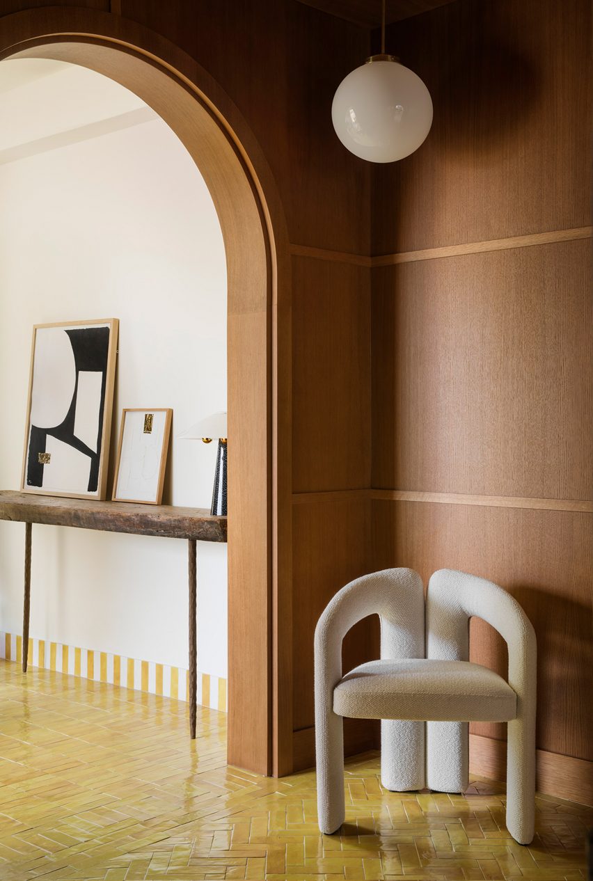
Byron, who studied architecture at University of California, Berkeley, threaded more subtle modernist details into the interiors of Don’t Worry Darling through devices such as colour.

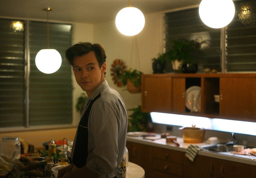
“A colour we used quite a bit was Frey’s favourite colour – this Frey blue – which is like a robin’s-egg blue that he puts in all of his buildings,” explained Byron.

“There’s also a colour that Kaufman House has quite a bit of; Neutra put this really, really, really dark brown that almost feels black, but it has this warmth to it,” she continued. “We weaved that throughout the film as well.”

A woman cleaning a bathroom
Byron used lots of glass and mirrors throughout the set

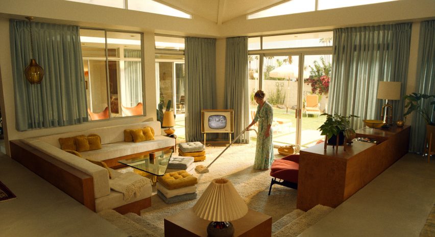
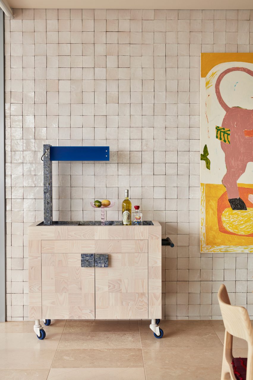
Byron sourced vintage products from shops and prop houses in LA for Alice and Jack’s home, which recalls “cookie-cutter” houses – rows of identical homes found in idyllic depictions of 1950s suburbia.

Much of the furniture seen was built from scratch, in part because the film was shot during the autumn of 2020 when many vendors were unavailable or had long lead times as a result of the coronavirus pandemic.

“When you’re in Palm Springs, they just have these antique stores and even in thrift stores and Facebook marketplace you can find really special things,” the designer recalled.

“That’s also one of the most amazing things about Los Angeles – there are infinite prop houses here so we shopped quite a bit at all the local prop houses,” she continued.

“The television in Alice and Jack’s house is from this vendor called RC Vintage, which is just like a treasure trove place of antique electronics.”

Harry Styles on set of Don't Worry Darling
Much of the furniture was made from scratch

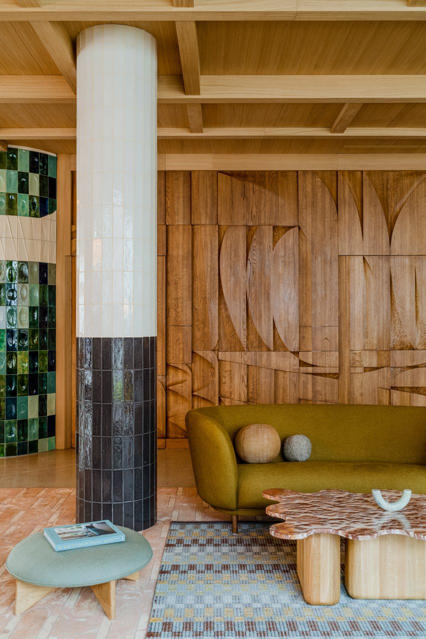
Other smaller references were embedded into Byron’s material choices, primarily glass, stone and brick.

Meanwhile, the designer paid homage to Neutra’s storage cabinets, which the production team filled with items such as business cards, cleaning supplies and photographs of Alice and Jack to make the set feel more real for the actors.

“Keeping with Neutra as our design inspiration, the house is designed with a lot of storage in mind – we wanted all of this stuff to be cleanly kept behind doors,” Byron said.

Cars driving through a desert
The desert setting is designed to look like a utopia

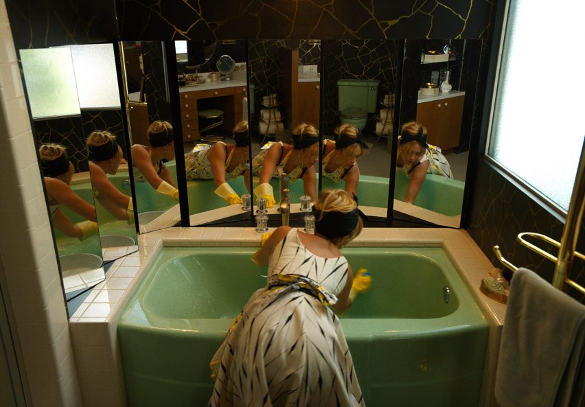
Byron hoped that by incorporating playful elements throughout the set she could “subvert” the sense of normalcy in Victory and play with the audience’s expectations of a thriller.

“The thriller follows a formula often, and I thought it could be really great to just subvert that,” she said.

“I think the level of play helps viewers feel like they want to be there and if it wasn’t for the playful aesthetic, I think we would be expecting something to go wrong,” she added.

Don’t Worry Darling is not the only film that draws on a key architectural movement to inform its set. Wes Anderson’s Isle of Dogs film sets were heavily informed by metabolist architecture, while Black Panther’s “voluptuous” sets recalled works by architect Zaha Hadid.

The photography is courtesy of Warner Bros.


Reference

Ten living spaces that don't relegate tiles to the bathroom
CategoriesInterior Design

Ten living spaces that don’t relegate tiles to the bathroom

Ten living spaces that don't relegate tiles to the bathroom

Our latest lookbook rounds up 10 living spaces that take tiling from practical to decorative, applying it to everything from bars and fireplaces to entire statement walls.

Tiles in the modern home are often consigned to the bathroom or kitchen, where their durable finish can protect walls from water damage.

But a growing cohort of designers are using the surfacing much like they would rugs or wallpapers, as a means of bringing colours and patterns into living spaces.

Whether made from ceramic, stone or concrete, this can help to imbue an otherwise cosy interior with a much-needed sense of depth and dimension.

This is the latest in our lookbooks series, which provides visual inspiration from Dezeen’s archive. For more inspiration see previous lookbooks featuring maximalist interiors, kitchens with polished granite surfaces and brutalist interiors with a surprisingly welcoming feel.


Bar area of Dream Weaver penthouse designed by YSG
Photo is by Prue Ruscoe

Dream Weaver penthouse, Australia, by YSG

Spanish tapas bars informed the design of this penthouse in Sydney, which belongs to a couple of empty nesters.

In the open-plan living space, this reference was translated into an entire wall of glossy off-white tiles, providing the backdrop for a custom bar trolley made from white ash and blue granite.

Find out more about Dream Weaver penthouse ›


Conde Duque apartment by Sierra + De La Higuera
Photo is by German Sáiz

Conde Duque apartment, Spain, by Sierra + De La Higuera

Vibrantly glazed tiles help to define the different zones in this apartment in Madrid, with green used in the kitchen, red and blue in the bathrooms and yellow in the living areas.

The traditional Moroccan zellige tiles are characterised by their tonal and textural variations, with imperfect surfaces that are moulded by hand.

Find out more about Conde Duque ›


Puro Hotel Stare Miasto Kraków by Studio Paradowski
Photo is by Pion Studio

Puro Hotel Kraków, Poland, by Paradowski Studio

Polish practice Paradowski Studio mixed and matched different kinds of tiling throughout this lounge, covering everything from the floor to the columns to an entire wall, designed by artist Tomasz Opaliński based on the modernist mosaics of the 1970s.

To soften up these hard, glossy surfaces and add a sense of warmth, the studio added plenty of textiles plus a stained oak bas-relief, which a couple of doors.

Find out more about Puro Hotel Kraków ›


Green-tiled bar
Photo is by Joana França

São Paulo apartment, Brazil, by Casulo

A bar clad in glossy green tiles forms the centrepiece of this living room, contrasted against the matt black slate on the floor.

Brazilian studio Casulo repeated this same material palette in the bathroom and kitchen of the São Paulo apartment, which the owners bought at a closed-door auction without seeing its interior.

Find out more about São Paulo apartment ›


Yurikago House by Mas-aqui
Photo is by José Hevia

Yurikago House, Spain, by Mas-aqui

Hydraulic tiling helps to create a sense of continuity across the various different floors and half-levels of this apartment, designed by architecture studio Mas-aqui.

The natural tonal variations of the reddish-brown ceramics help to create a sense of depth and texture despite using only one material.

Find out more about Yurikago House ›


Interiors of Hotel Les Deux Gares in Paris
Photo is by Benoit Linero

Hotel Les Deux Gares, France, by Luke Edward Hall

Chevron marble floors, striped pink-satin armchairs and chintzy duck-egg blue wallpaper create a riotous clash of patterns and colours in this lounge by British designer Luke Edward Hall.

“I really wanted this space to feel above all joyful and welcoming and alive, classic but a little bonkers at the same time,” he explained.

Find out more about Hotel Les Deux Gares ›


House in Girona, Barcelona by Arquitectura-G
Photo is by José Hevia

Reforma de una Vivienda en Ensanche, Spain, by Arquitectura-G

Barcelona practice Arquitectura-G removed a series of dividing walls from this apartment to let more light into the plan and relied on changing levels and flooring to denote different areas.

Here, the transition from the hallway to the lounge is signified by a zig-zagging junction between the gridded grey tiling and the neutral-toned carpet, which is made from coarse sisal plant fibres.

Find out more about Reforma de una Vivienda en Ensanche ›


Fireplace in Passeig de Grácia apartment by Jeanne Schultz
Photo is by Adrià Goula

Passeig de Grácia 97, Spain, by Jeanne Schultz

A pink stone fireplace with chequered tiling served as the starting point for the renovation of this old Barcelona apartment, with doors, window frames and ceiling mouldings throughout the home painted in a matching shade of green.

Designer Jeanne Schultz also introduced minimal yet characterful modern furnishings to keep the focus on the building’s period features, which also include traditional Catalan vault ceilings and wooden parquet flooring.

Find out more about Passeig de Grácia 97 ›


Point Supreme Athens apartment
Photo is by Yiannis Hadjiaslanis

Ilioupoli apartment, Greece, by Point Supreme

Originally popular in the 1970s, when they were used to cover verandas and porticos in holiday homes throughout Greece, these glazed terracotta tiles were salvaged from storage so they could be used to cover the floor of a one-bedroom home in Athens.

Formerly a semi-basement storage space, the apartment is located at the bottom of a typical Athenian polykatoikia – a concrete residential block with tiered balconies.

Find out more about Ilioupoli apartment ›


Casa AB by Victor Alavedra
Photo is by Eugeni Pons

Casa AB, Spain, by Built Architecture

When Built Architecture renovated this 19th-century Barcelona apartment, the Spanish practice retained the traditional mosaic flooring laid throughout most of its rooms, including the hallway, bedroom, living and dining room.

The spaces between the tiling were filled with oak floorboards to match the custom oak cabinetry the studio installed to run longways through the apartment like a spine, dividing up the private and communal areas.

Find out more about Casa AB ›

This is the latest in our lookbooks series, which provides visual inspiration from Dezeen’s archive. For more inspiration see previous lookbooks featuring maximalist interiors, kitchens with polished granite surfaces and surprisingly welcoming brutalist interiors.

Reference

To Make Sure Neutral Architectural Surfaces Don’t Fall Flat, Just Add Texture
CategoriesArchitecture

To Make Sure Neutral Architectural Surfaces Don’t Fall Flat, Just Add Texture

To Make Sure Neutral Architectural Surfaces Don’t Fall Flat, Just Add Texture

At their best, blank white walls can make a room feel large and airy; on the other hand, expansive blank planes can also lend themselves to clinical or boring atmospheres. And while vibrant colors and bold patterns can inject some personality into spaces, they might not always be an option for homes and offices that are dimly light, narrow or cramped.

In such cases, where neutral tones like white and beige are preferable, adding texture to walls and ceilings can add movement and depth to a monochrome space. Subtle textural protrusions won’t take up much space yet will leave a strong impact. More and more architects are incorporating corrugations, curved profiles, shallow folds and more to add intrigue to greyscale walls and ceilings.

Images by Jonathan Leijonhufvud Architectural Photography

Nanchang Insun International Cinema by One Plus Partnership Ltd, Wuhan, China

Taking inspiration from the black font over white pages in books, the studio transformed the cinema into a heavily textured space. The different panels on the walls are reminiscent of the flipping of pages of masterpieces written by scriptwriters. In the lobby, visitors come across cashier tables that resemble giant stacks of paper — in reality, they are made of Corian.

Panels with slim triangular blocks are suspended from the ceiling to resemble a curtain of flipping paper. Even the columns in the space have been painted and textured to continue the black and white theme. The only thing breaking up the monotony of black and white is a series of green cylindrical spotlights that are put together in an abstract composition.

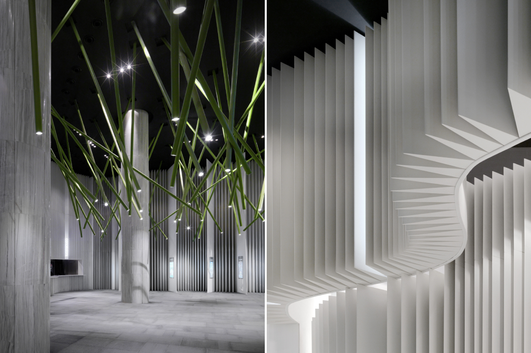
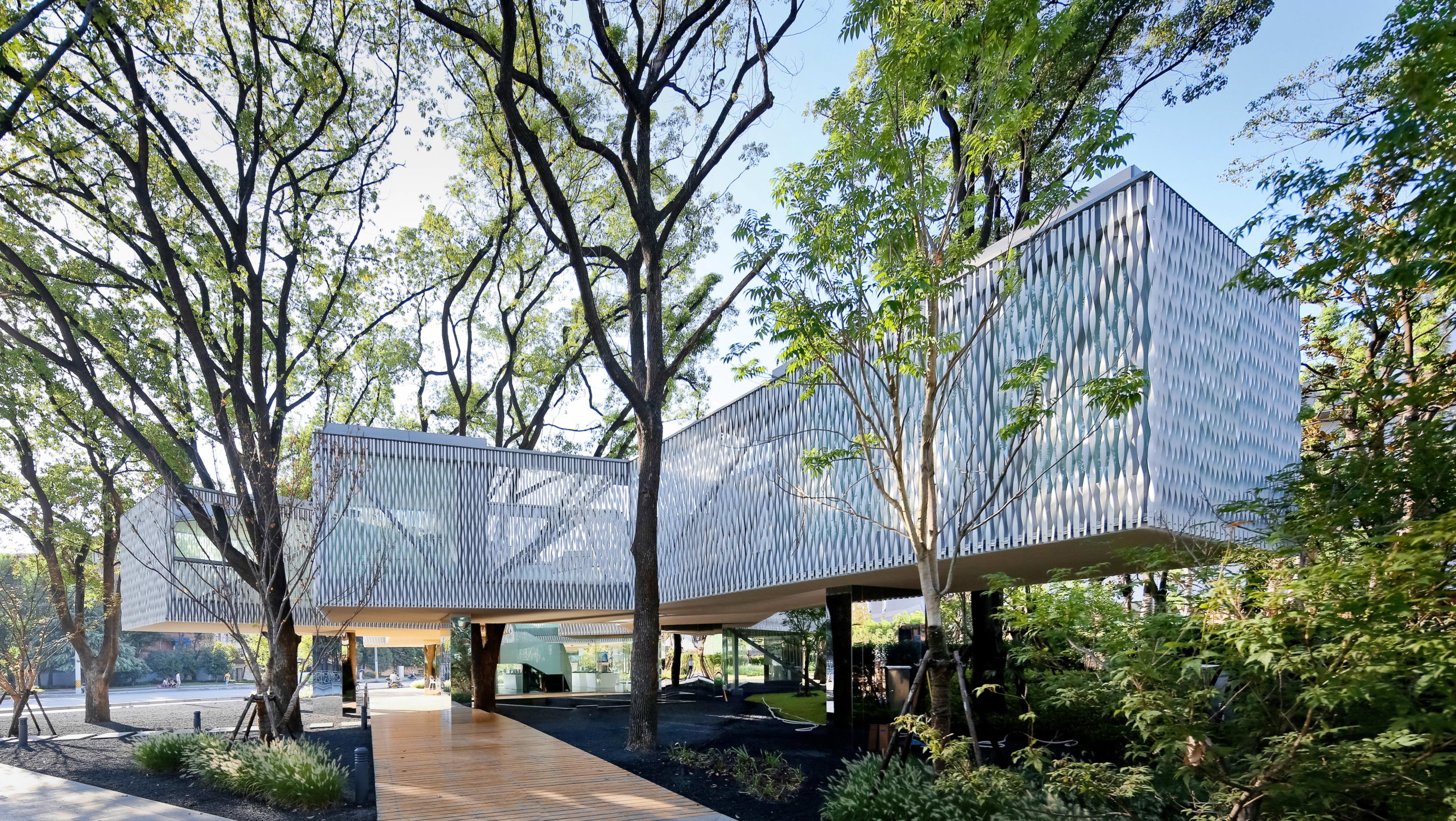
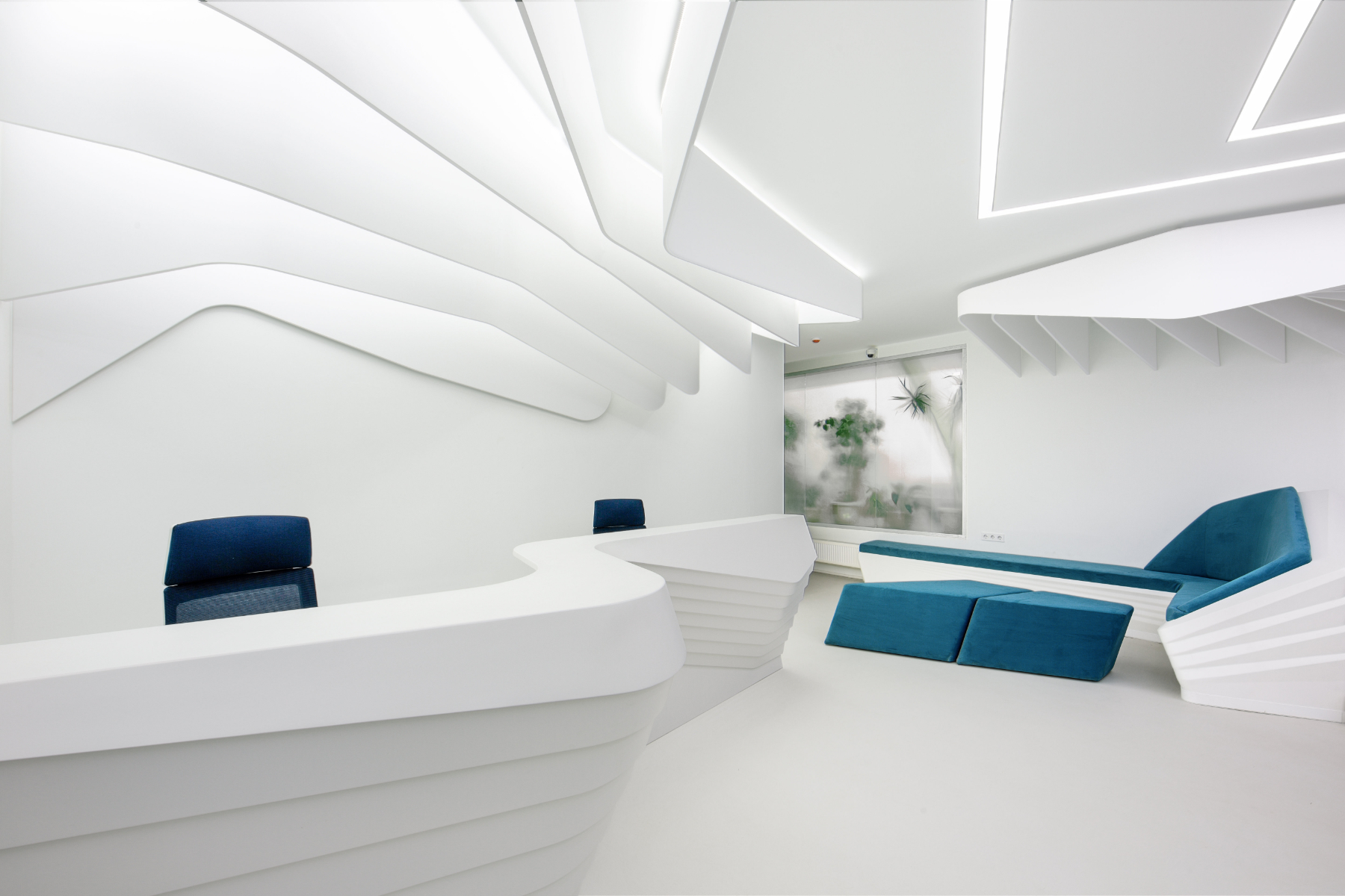
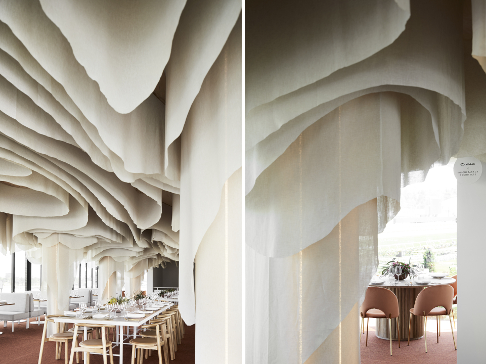
Huaxin Business Center by Scenic Architecture, Shanghai, China
Jury Winner, 2014 A+Awards, Office Building – Low Rise (1-4 Floors)

The aim of the project was to maximize green cover and protect the six trees present on site. This is achieved by elevating the main mass above the ground to leave more room for green spaces below. The four blocks of the building are connected by open bridges. On the upper level, the spaces holding important functions are covered in twisted aluminum strips on the outside. These strips add translucency to the walls and help establish connectivity with nature beyond. The thin panels, much like light strips of paper floating and twisting with the wind, give the building a very tactile quality and heighten the experience as people walk around and try to peek at the trees beyond.

Images by Sharyn Cairns

Paperbark by KOICHI TAKADA ARCHITECTS, Melbourne, Australia

The restaurant offers a zero-waste menu with locally foraged Australian produce that is designed to inspire and delight. The space reflects this awareness of nature and slow movement. It is inspired by the Victorian Dandenong Ranges and the organic lines of the native paperbark tree. Repurpose biodegradable fabric is used to create the contoured ceiling installation. The subtle tones and softness of the installation help people form an emotional connection with nature while they dine and thereby create more awareness around conservation.

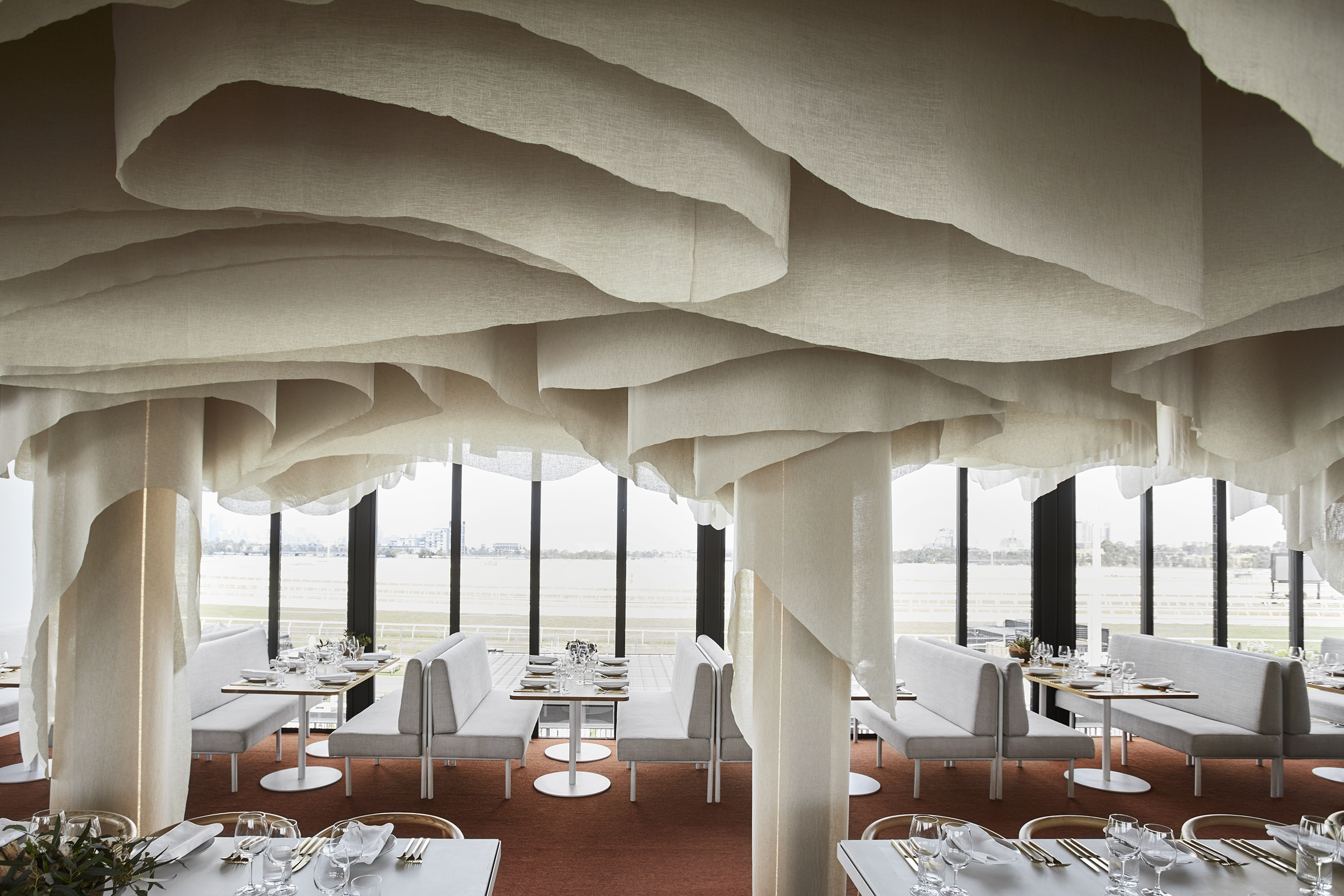
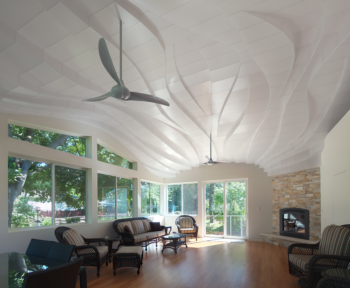
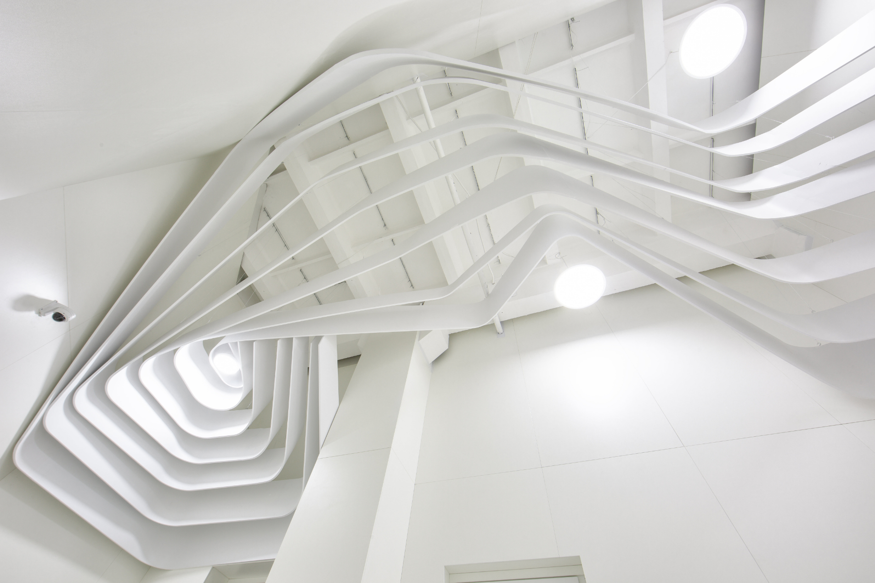
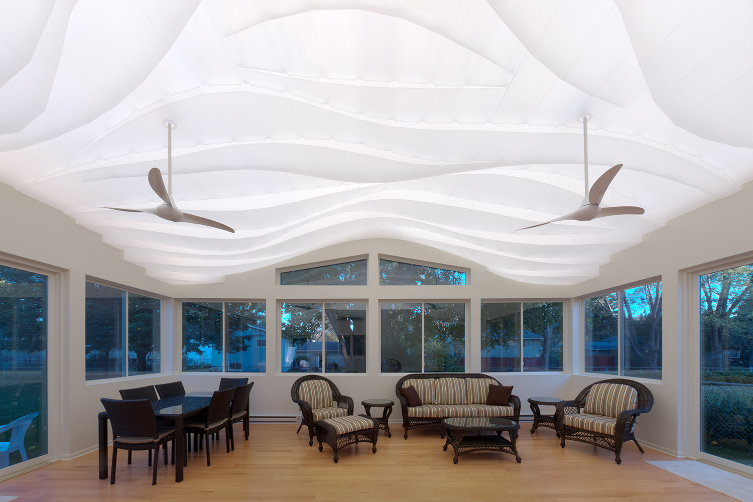
“Light Arrival” Yorkshire Ceiling by Flynn Architecture & Design, Crystal Lake, Illinois

Fluid lines on the ceiling of the sunroom help soften the rectangular edges of this space. Instead of going the digitally designed route, the ceiling is hand sculpted using translucent contoured panels that cover low-voltage LED strip lights for a diffused glow. During the day, when the lights are turned off, the shadows created by sunlight add more dimension to this three-dimensional installation. Fans suspended from this ceiling feature a similar curved profile.

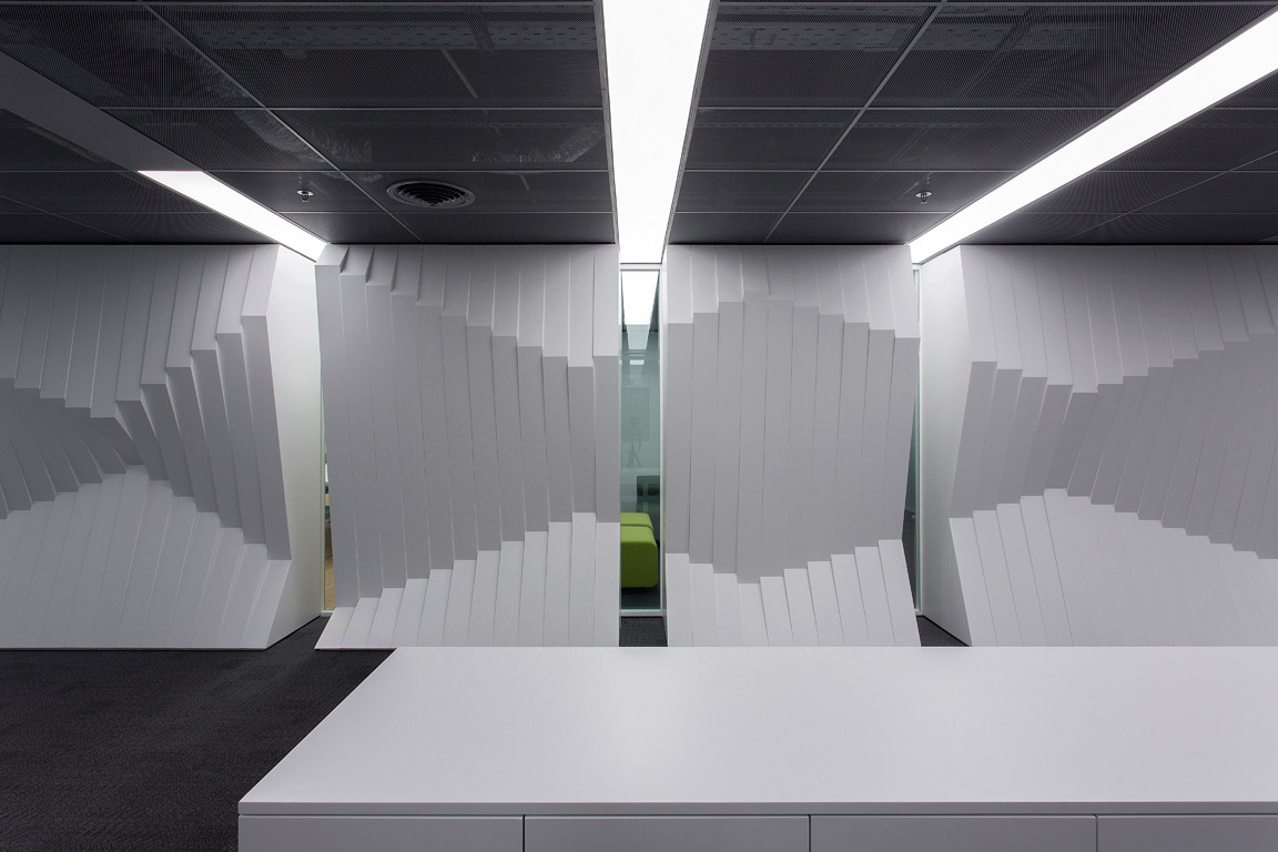
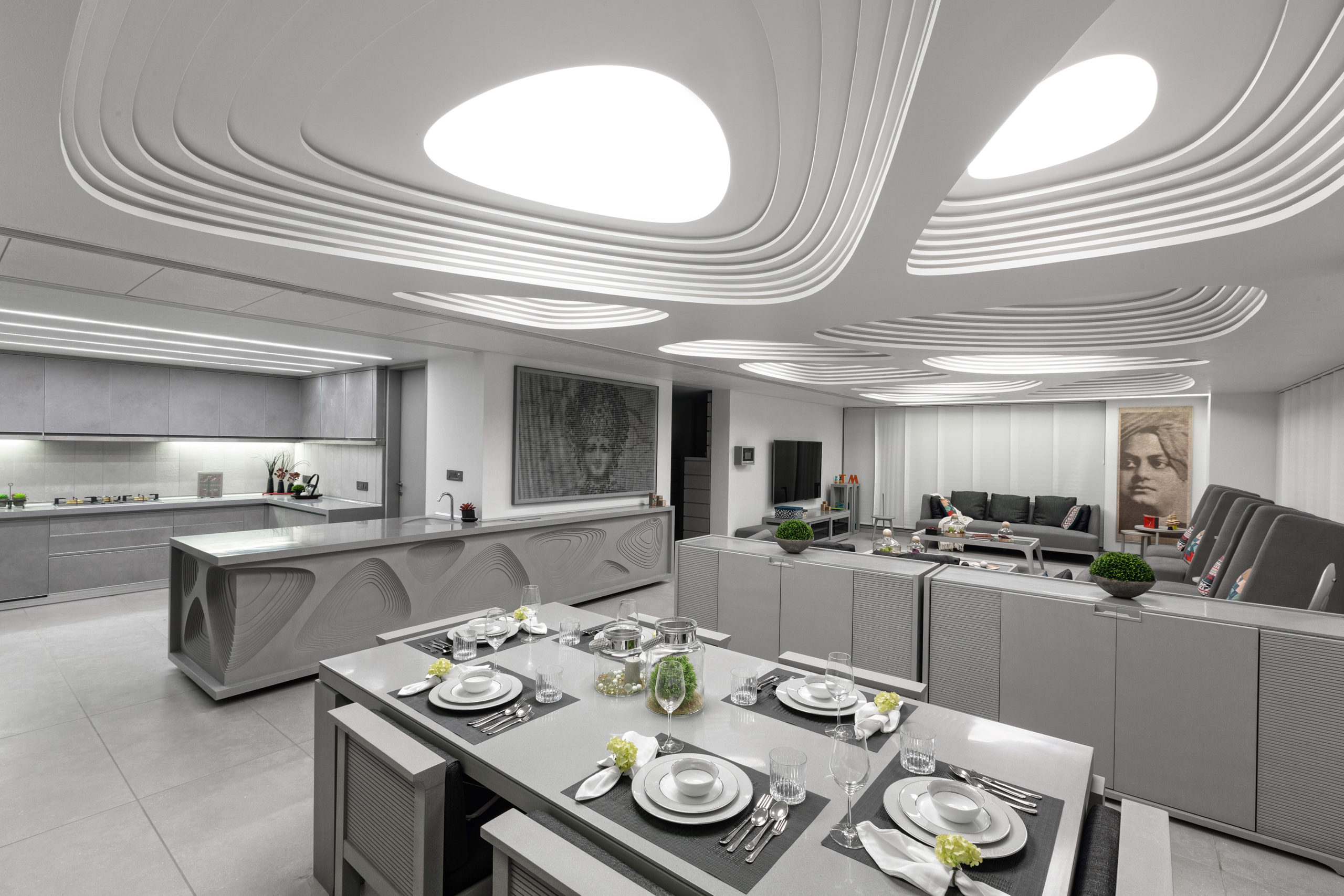
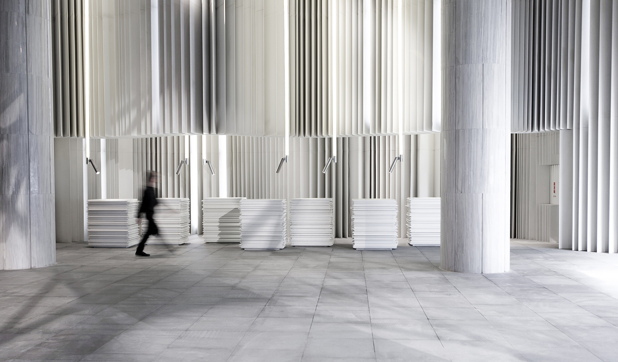
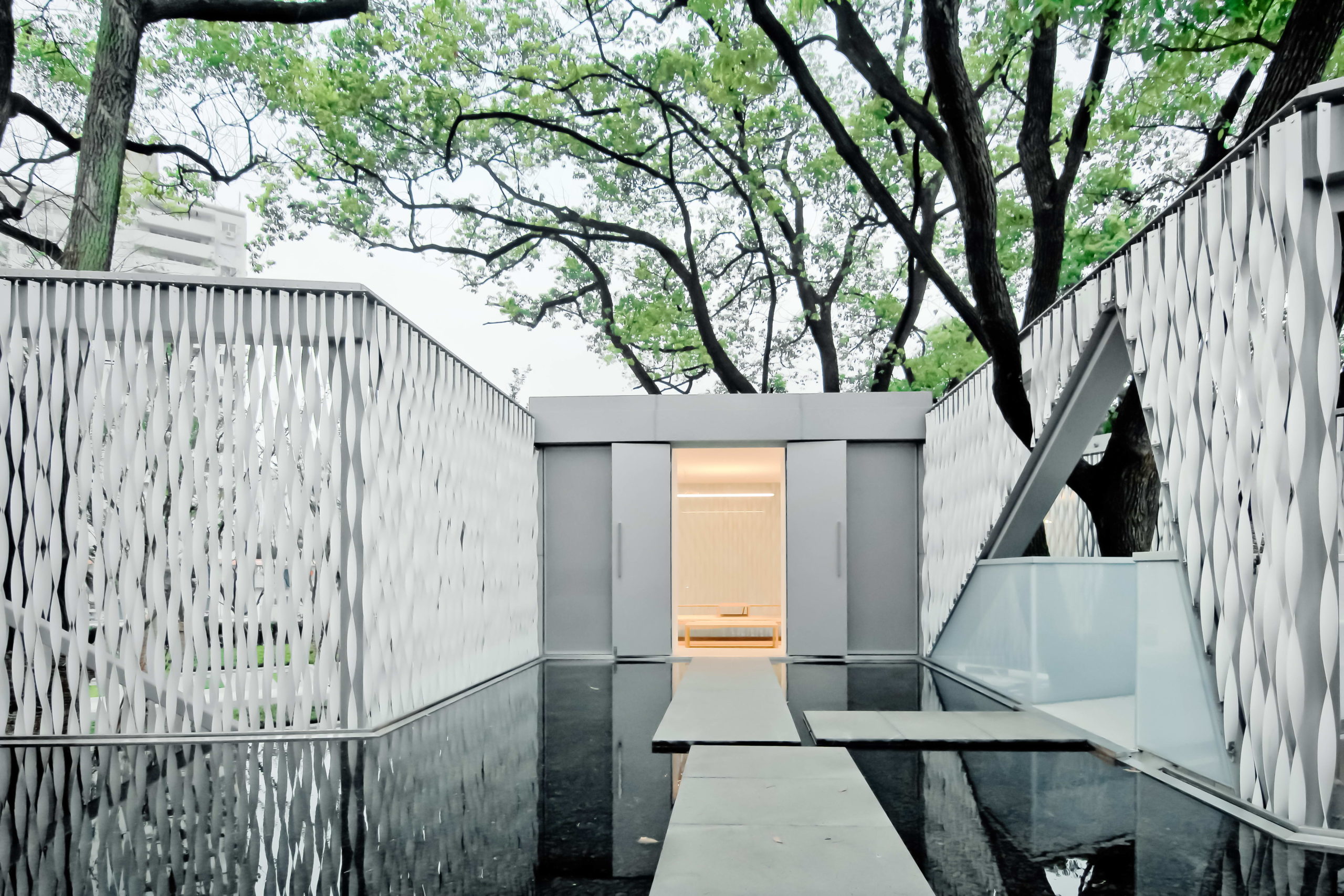
Norwegian embassy in Athens by gfra, Athens, Greece

Unlike traditional origami, the art of kirigami uses small cuts in paper along with folks to create intricate, three-dimensional patterns. The Norwegian embassy in Athens uses this technique to imitate mountains reflecting in the fjord waters. Lights placed above this wooden structure enhance the folds and make this the focal point of the overall space.

Images by Alik Usik and Serhii Nikiforov

Tween Coexistence by Dmytro Aranchii Architects, Kyiv, Ukraine

Curved and bent strips of white shape all elements of this space — right from the ceilings to the reception desk. This technique also helps the furniture to blend into the walls, visualizing fluid circulation. The waiting area contains a large reception desk and an L-shaped sofa that blends in with the stairs leading to the interior spaces. On the ceiling, one can see two distinct patterns: one that originates in the reception area and another that continues along the transition to the inner spaces.

Images by Anil Patel

1102 Penthouse by Apical Reform, Ahmedabad, India

Much like a handcrafted contour model, planes with gradually decreasing cutouts are layered on top of one another to create the ceiling. Similar cutouts are used to embellish the kitchen island and console. The entire space is decorated in a neutral palette of grey and white to create a calming atmosphere. The staircase leading to the terrace is also composed using folded strips of metal similar to the forms of kirigami sculptures. Despite its lightness, it still holds a strong presence within the space.

Images by Jun Murata

N STRIPS by Jam, Osaka, Japan

This project is a renovation of a multi-tenant building that holds living areas and office spaces. The previous blank façade of the building is transformed into an eye-catching display with the help of white fins. This was done to add more privacy as the plot across from it is meant to have an apartment building built on it in the future. Furthermore, the louvers help conceal any unevenness in the external walls as well as the new pipes installed. The extrusions also create constantly changing shadows throughout the day.


Reference

Ten calm interiors with natural clay wall finishes that don't need painting
CategoriesInterior Design

Ten calm interiors with natural clay wall finishes that don’t need painting

Ten calm interiors with natural clay wall finishes that don't need painting

In this special lookbook sponsored by natural finishes brand Clayworks, we’ve selected 10 interiors from our archives that feature walls finished with the brand’s clay plaster.


Clay finishes are a healthy, breathable alternative to paints or wallpaper on internal walls and ceilings. Naturally pigmented and free of toxic ingredients, they are made of natural materials, do not require painting and are compostable.

Clayworks‘ plaster finishes are manufactured in Cornwall, England. Here are 10 homes, restaurants and offices that showcase their products.


Porteous’ Studio, Edinburgh, by Izat Arundell

Design studio Izat Arundell converted this former blacksmith’s workshop in Edinburgh into a compact apartment with a muted material palette.

Clay-based plaster was applied to the walls to create a calm tone, with a simple palette of stone and wood used to create an overall natural feel.

Find out more about Porteous’ Studio ›


Birch and Clay Refugio, London, by Rise Design Studio

As its name suggests, this renovated and extended London flat called Birch and Clay Refugio makes extensive use of clay finishes.

The kitchen features light grey plaster walls, while a calming light grey-green shade was used for the master bedroom and a light pastel pink in the children’s bedroom.

Find out more about Birch and Clay Refugio ›


Sticks n Sushi, London, by Norm Architects

This London sushi restaurant by Danish studio Norm Architects was designed to have a series of spaces each with its own atmosphere.

Light clay finishes were used in the larger, more open restaurant spaces, with darker tones applied to create a more intimate feel in the private dining areas.

Find out more about Sticks n Sushi ›


Clay walls in Devon Passivhaus

Devon Passivhaus, Devon, McLean Quinlan

This low-rise Passivhaus home by McLean Quinlan is set behind a red-brick wall that obscures the textured interiors and art-filled hidden courtyard.

The studio aimed to create a “serene” environment inside the home by pairing rough sawn oak flooring with clay plaster walls and charred wood cabinetry.

Find out more about Devon Passivhaus ›


Dulong store, Copenhagen, by Norm Architects

Norm Architects combined natural materials to create a calm finish for this jewellery showroom in Copenhagen, which was informed by modernist artists’ studios.

The studio used a light clay plaster with a smooth finish as the backdrop for the store that has oak flooring and travertine furniture.

Find out more about Dulong store ›


Barbican apartment, London, by Takero Shimazaki Architects

Takero Shimazaki Architects was informed by a client with strong ties with Japan for the interiors of this apartment in central London’s Barbican estate.

Throughout the flat, the studio aimed to balance Japanese architectural language with the concrete structure of the brutalist Barbican complex. Walls finished with clay were combined with tatami mats and numerous timber finishes.

Find out more about Barbican apartment ›


Hoof cafe, Ras Al Khaimah, UAE, by Bone

Design studio Bone used rustic clay plaster for the walls of this cafe in the United Arab Emirates as part of its design that aims to recall horse stalls.

Named Hoof, the spartan cafe was furnished with blocky hand-brushed steel counters to contrast the naturally finished walls.

Find out more about Hoof cafe ›


Clay wall in bathroom

Highgate home, London, by House of Grey

Interiors studio House of Grey chose the furnishings and finishes of this London home with the health of its occupants and the health of the planet in mind.

Along with custom-designed timber furniture and a bed upholstered using coconut husk fibres, the home’s walls are finished with natural clay.

Find out more about Highgate house ›


Leaf House, London, by Szczepaniak Astridge

Designed to be a peaceful retreat in south London, this loft extension contains a master bedroom focused on a wooden bath with views across London.

Japanese interior design, as well as sustainability, was important for the choice of materials used in the loft, which has clay covering its roof and walls.

Find out more about Leaf House ›


Clay House, London, by Simon Astridge 

Architect Simon Astridge uses layers of coarse clay to line the walls of this one-bedroom apartment on the top floor of a Victorian mid-terraced property in London.

Appropriately named Clay House, the material was used to give an unfinished appearance to the walls and ceilings of the open plan living space and create a calm atmosphere in the bedroom.

Find out more about Clay House ›


This is the latest in our series of lookbooks providing curated visual inspiration from Dezeen’s image archive. For more inspiration see previous lookbooks showcasing green kitchen interiors, peaceful bedrooms, calm living rooms and colourful kitchens.

This lookbook was produced by Dezeen for Clayworks as part of a partnership. Find out more about Dezeen partnership content here.

Reference