Plot Twist  —  Generative AI May Actually Encourage Architects to Draw MORE
CategoriesArchitecture

Plot Twist  —  Generative AI May Actually Encourage Architects to Draw MORE

Plot Twist  —  Generative AI May Actually Encourage Architects to Draw MORE

Keir is an AEC Domain Expert operating at the intersection of architecture practice, sustainable development and software design. With over 15 years in practice, he has crafted high-quality projects across various sectors, including education, health, housing, and workplaces. He helps Architects, Clients and Startups thrive in an ever-changing industry. Connect on LinkedIn.

A new week, a new way for Generative AI to blow our minds.

Images generated from text prompts have now filled my news feed; they have swiftly ascended the viral ladder, caused heated debates and gained ‘meme status.’ When these arresting visuals started appearing, it felt like each novel experimentation demanded our close attention: “What has this inexplicable new tool done now?!”

Yet modern attention spans are increasingly short, and bold imagery can quickly become ubiquitous. Our sense of wonder is easily replaced by boredom and ambivalence.
Incredibly, the development of Generative AI actually appears to be evolving faster than our agitated modern attention spans. Just as I was beginning to become nonplussed by the latest hybridization of Batman X The Simpsons, I discovered sketch-to-render.

Most people are familiar with models that use simple text prompting, where you describe everything about a composition using words only. Much can be achieved with these tools, but when it comes to exact composition and configuration, you are working at the model’s behest. However, fewer architects are aware that you can now combine an image with a text prompt to further your creative control.

While these are enormously promising developments, it has been hard to understand exactly how an architect might be able to use these tools. How can we use them to augment the design and visualization processes we are already doing? In architecture, we work in the gritty reality, not the synthetic imagination of AI. Planning and construction is a messy business that requires precision solutions.

Yet, sketch-to-render is a different kind of approach and takes user control to the next level again, utilizing an additional step in the generation feature called Control Nets, which allow for far greater control over how an image is constructed and where the trained model will go to work on a composition. Think of Control Nets as a framework or bounding box within which the AI will go to work — it puts you in the driving seat of the model’s explorations.

Sketch by author (of NWLND’s “Refuge” project), render produced in Prome AI

Sketch-to-Render

This is a 20-minute process and the idea here is to go straight from primitive line work to vivid render.

Midjourney can produce incredibly high quality and vivid imagery, but offers limited control over the exacting composition of the subject matter. For fields like architecture, the ability to fix the areas within an image around which the model will iterate is absolutely essential for actual tool adoption and use.

There are now various methods to combine generative image tools with ‘fixed’ image subjects and composition to give more exacting control over a single viewpoint and to then iterate ideas on top.

Here are some good emerging methods that are worth experimentation:

  1. Control Net: A Stable Diffusion model that creates an abstract segmentation using a preprocessor and then combines this with a text prompt. The install is complicated for regular users and the software needs a powerful computer. If you can’t run this locally due to hardware, you can now do it on the cloud, where the Stable Diffusion with ControlNet is now being hosted by various providers.
  2. PromeAI: The easiest interface that I’ve tried for sketches, complete with preset filters and styles.  Its mostly free baseline features are powerful and worth a play. The workflow is simple just login, upload a sketch or hidden line view, add text description prompts and off you go.
  3. Veras: This works directly within the viewport of everyday software interfaces (SketchUp/Rhino/Revit). It is simple and easy to use and is frictionless because it’s a 3D CAD plugin. The more detail and surface materials you can add, the better it will do at recognizing components.

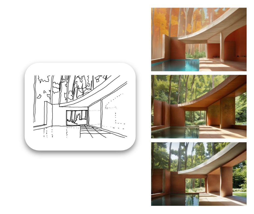
Example of varied rendered outputs produced from the original sketch

Sketch-to-Render-in-Context

This is a more complex process and takes about 30 minutes once you understand how to do it.

The direct sketch-to-render tools are great to use, but having experimented with them in detail, I felt they were best suited to interior design work only. When it comes to external envelope and massing, we always need to place our ideas in context and render with appropriate scale, visualizing the buildings and landscapes within which they sit.

Then, I discovered the idea of using two control nets together: one for a process called “in-painting” and the second for the sketch proposal. There is quite a bit of trial and error to get the workflow right, but it’s made possible by running Stable Diffusion with ControlNet model on your local machine and is repeatable for any photo and sketch combo (provided you can draw).

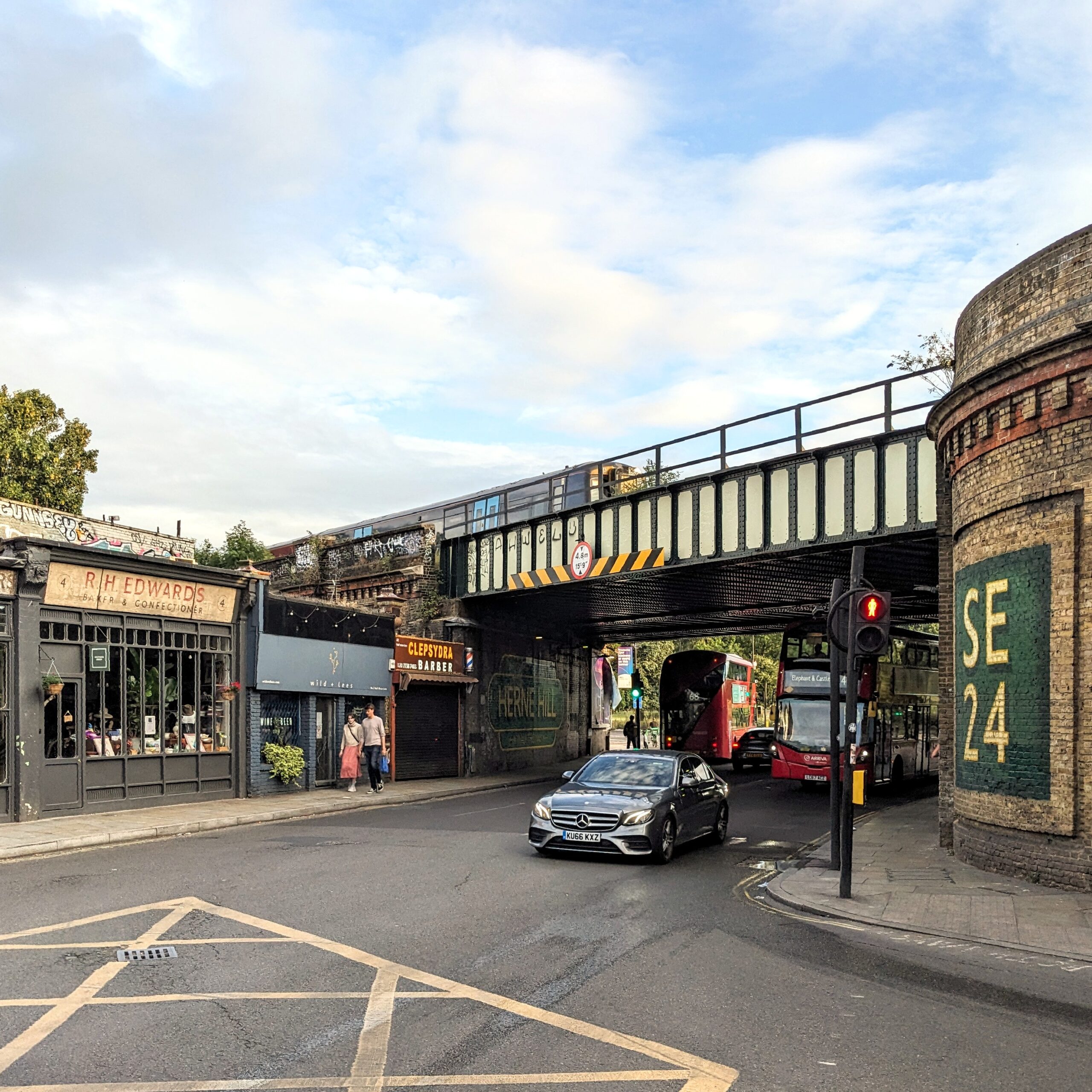
Photograph taken by author of an imaginary development site while on a cycle ride home

The aforementioned simple “sketch-to-render” process works with one ControlNet active. However you can now use Stable Diffusion with a second ControlNet at the same time which can be used for a process called  “in-painting” and this allows you to tell the model exactly which parts of a source image you want to experiment with and which you want to leave exactly as they are.

What I love about this application of Generative AI is that it relies solely on your direction and discretion as a designer and what you do with the pen. It takes out the “middle-man” of painstaking digital modeling of an idea and goes straight to vivid imagery. This is rendering without the hours of boring 3D modeling.

In a world where you can get straight to a high-quality render with just a site photo, a sketch and an ability to describe your idea in the form of an effective prompt, you immediately bypass the need to build detailed 3D models of initial concept ideas.

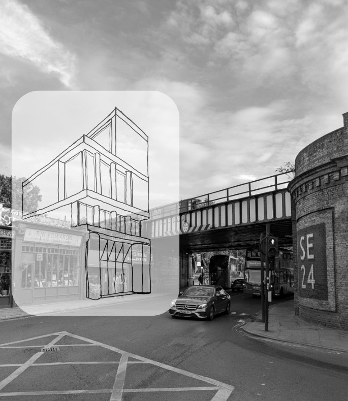
Design sketch by author, drawn quickly directly on top of original photograph.

Arguably, most major practices working with developers have to run projects with a high degree of waste. Options are tested, digitally modeled in 3D, rendered, photoshopped and  perhaps mocked up quickly in foam or card model for a client to review.  Then we respond to comments, requests for changes, new constraints, new information and a continuous process of change occurs.

Throughout this design process, each rendition must be exhaustively conceived, drawn and modeled before it can be vividly represented in context; this means much of the previous work is discarded or inevitably thrown away almost immediately. Quick iteration tooling could massively reduce the waste and grunt work associated with the process we call “optioneering.”  This term is not used affectionately in practice because it can feel so non-linear, but unfortunately some form of option testing is always required to discover a design and each option requires lots of time and energy.

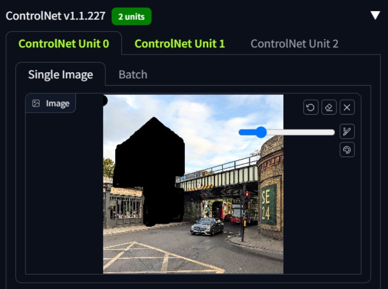
Screenshot produced by author showing process of in-painting using Stable Diffusion with 2no ControlNets – the black area tells the model which part of the image to experiment upon

In a race to produce powerful concept imagery for a new feasibility study or competition, someone who can draw their ideas well is going to beat 3D modeling in turnaround time and speed of iterations using a tool like this .

Soon, clients will be getting rendered ideas in a matter of days from a commission, not weeks. Their expectations about what is possible in a given time frame are going to change — and quickly.

There remains loads of space for improvement, but the foundation is there for a very different approach to design and visualization that could be really empowering for architects (and clients too).

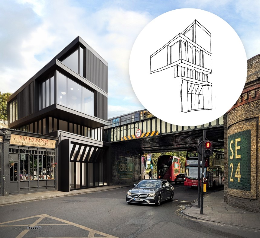
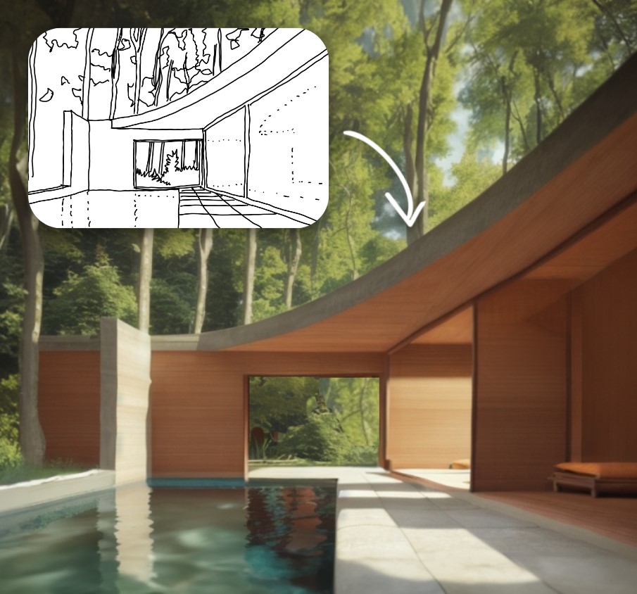
Final Image produced by author using Stable Diffusion with two ControlNets for an imaginary project in Herne Hill, London. The image was produced in less than an hour including sketching time.

My first attempt is a bit rough but demonstrates the enormous potential here; imagine how powerful this will be for early stage feasibility work. I definitely don’t love the outcome, but it’s some version of what I was thinking in the sketch. I would still be happy to present this image to a client as an early study at feasibility stage to give them a more vivid sense of a project’s massing and scale alongside a set of 2D drawings before developing the preferred option in fine detail myself.

In the example shown, I would estimate the model achieved about 50% of my line intentions and about 20% of my material intent on the façades. However, the perspective, massing, lighting, context placement, reflections and sense of scale are all bang on — and all this is done with a general purpose, open-source model.

As this technology continues to improve, specialized architecture models will be trained on data sets that focus specifically on façade and architectural composition. Different architectural styles and materiality options will be made possible and they will be far better at understanding façade componentry such as floor zones, balustrades, windows, curtain walling and columns. The models will need to learn “archispeak” which will now be expressed using text prompt inputs and require architects to say what they actually mean in simple language.

As these models improve we will be able to discern discrete elements within the design concept, identify them as an architectural building component and then refine them directly with prompts as we work. We will be able to apply different prompts to different parts of the image, add people, change the lighting and mood — designing over and over in a live render environment — without modeling anything, all potentially driven from a sketch idea.

There will be many more experiments to come… and when Midjourney can do ControlNets too, it will probably feel like “game over” for much of the traditional 3D model and rendering that we do currently.


Keir is an AEC Domain Expert operating at the intersection of architecture practice, sustainable development and software design. Connect on LinkedIn.

With thanks to:

Ismail Seleit who was the first person I saw demonstrate this idea.

@design.input who put out a great video that helped to describe each step of the process.

Hamza Shaikh for pointing me at ControlNet in the first place when I got frustrated with Midjourney.


Architizer’s new image-heavy daily newsletter, The Plug, is easy on the eyes, giving readers a quick jolt of inspiration to supercharge their days. Plug in to the latest design discussions by subscribing. 


Reference

MA House by Timothee Mercier from Studio XM
CategoriesInterior Design

Eight airy interiors that draw on Mediterranean living

MA House by Timothee Mercier from Studio XM

With summer in full flow, we have gathered eight residential and hotel interiors for our latest lookbook that each has a breezy and cooling Mediterranean style.

Mediterranean interiors can often be defined by their minimal, paired back aesthetic that focuses on creating bright, airy and cool living spaces that offer an escape from the heat of the sun.

White-washed walls, exposed brick and stone or terracotta floors typically serve as the basis for these interiors with furniture made from natural materials.

From hotels in Greece built into caves to a home in a former ruin in France, here are eight interiors that are influenced by the Mediterranean.

This is the latest in our lookbook series, which provides visual inspiration from Dezeen’s archive. For more inspiration see previous lookbooks featuring Barbie-pink interiors, rustic interiors and Wes Anderson-style interiors.


MA House by Timothee Mercier from Studio XM
Photo is by Simone Bossi

MA House, France, by Timothee Mercier

Architect Timothee Mercier of Studio XM converted this former ruined farm building in Vacluse, France into a home that aimed to honour the original features of the building.

The interior of the home was blanketed in white, covering its walls and exposed stone surfaces. The space was sparsely decorated with light wood furnishings and natural materials to give the interior a Mediterranean feel.

Find out more about MA House ›


Casa A690 by Fino Lozano
Photo is by César Béjar

Casa A690, Mexico, by Delfino Lozano

Named Casa A690, this three-storey building dates back to the 1970s. It was renovated by Mexican architect Delfino Lozano who looked to combine Mediterranean and Mexican aesthetics.

“We use the term Mexiterraneo to describe the materials and feeling we try to give our projects, in which we interpret the Mediterranean architecture – simple, pure materials – and mix it with our Mexican traditional architecture,” said Lozano.

Find out more about Casa A690 ›


Berlin summer loft by Loft Szczecin
Photo is by Karolina Bąk

Berlin summer loft, Germany, by Loft Szczecin

Polish studio Loft Szczecin looked to historic Mediterranean architecture when overhauling the interior of this apartment in the suburbs of Berlin.

The brick walls of the home were painted white while the floors of the interior were finished with old bricks that were sourced from industrial demolitions across Poland. Throughout the apartment, doors were removed to create more of an open-plan interior.

Find out more about Berlin summer loft, ›


Pura Comporta by Falcão de Campos
Photo is by Fernando Guerra

Pura Comporta, Portugal, by Falcão de Campos

In Portugal, Lisbon studio Falcão de Campos implemented a Mediterranean-informed interior scheme throughout this triple-pitched roof beach house.

White walls were paired with minimal architectural detailing and finishes to achieve a Mediterranean look. A natural-toned rug was used to zone the living area, while a 10-person wooden table occupies the dining area of the home.

Find out more about Pura Comporta ›


Saint Hotel by Kapsimalis Architects
Photo is by Giorgos Sfakianakis

Saint Hotel, Greece, by Kapsimalis Architects

Greek architecture studio Kapsimalis Architects transformed a series of former homes, barns and cellars on the island of Santorini into a hotel with rooms in caves.

The interior was designed to match the all-white exterior of the hotel. Each of the rooms features an almost all-white finish with the exception of their poured concrete floors and furnishings.

Find out more about Saint Hotel ›


Summer house on the mountain by Kapsimalis Architects

Summer house, Greece, by Kapsimalis Architects

Large arched openings add character to the open-plan interior of these Santorini apartments, which were designed by Kapsimalis Architects.

Throughout the space, small, wood-framed windows pierce the walls and furniture was organised sparsely.

Find out more about summer house›


Las 3 Marías by Bajet Giramé and Nicolas Burckhardt
Photo is by José Hevia

Las 3 Marías, Spain, by Bajet Giramé and Nicolas Burckhardt

Terracotta tile floors, large arched openings and bi-folding glass doors blend the boundaries of the interior and exterior at this Spanish holiday home, which was designed by Bajet Giramé and Nicolas Burckhardt.

Much like homes found across the Mediterranean, white stucco covers its walls and Valencian terracotta tiles run through both the interior and exterior.

Find out more about Las 3 Marías ›


Woorak House in Palm Beach, Sydney designed by CM Studio
Photo is by Prue Ruscoe

Woorak House, Australia, by CM Studio

CM Studio looked to bring a coastal, Mediterranean feel to the interior of this home in Australia through the use of a paired back interior palette and natural materials such as wood, stone and paper.

In the dining room, a wooden table, chairs and bench were placed beside a glazed corner of the home beneath exposed beams that run through the home.

Find out more about Woorak House ›

This is the latest in our lookbook series, which provides visual inspiration from Dezeen’s archive. For more inspiration see previous lookbooks featuring Barbie-pink interiors, rustic interiors and Wes Anderson-style interiors.

Reference

Interiors of Flaine holiday apartment, revamped by Volta
CategoriesInterior Design

Ten Bauhaus interiors that draw on the principles of design school

Interiors of Flaine holiday apartment, revamped by Volta

A hotel that pays tribute to early German modernism and an apartment within a ski resort designed by architect Marcel Breuer are among the projects collected in our latest lookbook, which explores interiors informed by the Bauhaus.

The most influential art and design school in history, the Bauhaus’ was established in Germany in 1919 and although it closed just over a decade later continues to influence interior designers today.

Work produced by students and teachers during the school’s 14-year history, centred on founder Walter Gropius’ ethos that art and craft should marry to create a new architecture.

The below projects feature distinctly Bauhaus elements including chrome tubular chairs, geometric shapes, primary colours and abstract textiles.

This is the latest in our lookbooks series, which provides visual inspiration from Dezeen’s archive. For more inspiration see previous lookbooks featuring living rooms that use warm neutrals to create a cosy ambience, bedrooms with wardrobes that are disguised as walls and contemporary living rooms in Georgian and Victorian homes.


Interiors of Flaine holiday apartment, revamped by Volta
Photo is by Arthur Fechoz

Cassiopeia Apartment, France, by Volta

Tasked with reviving the “Bauhaus spirit” of this apartment set within a Breuer-designed ski resort, architecture studio Volta added soft furnishings in mustard yellows and royal blues, referencing the colour palette of movement.

Armchairs with steel frames that resemble Breuer’s Wassily Chair have also been used to decorate the living room.

“The Bauhaus movement was predominant in the design of the project,” said the studio. “It has influenced its history, its choice of materials and its furniture. The challenge was to revive its influences in a contemporary context.”

Find out more about Cassiopeia apartment ›


De Maria by The MP Shift
Photo is by Nicole Franzen

De Maria, US, by The MP Shift

Design studio The MP Shift wanted De Maria, a contemporary American restaurant in Manhattan’s Nolita neighbourhood to look like an artist’s studio, complete with white brickwork and pink-tinted plaster.

The studio paid tribute to Bauhaus and 1970s Soho style by adding sofas upholstered in tan-coloured leather, orb-shaped pendant lamps and simple pieces of art with triangular shapes.

Find out more about De Maria ›


Nadzieja restaurant designed by Agnieszka Owsiany Studio
Photo courtesy of Agnieszka Owsiany Studio

Nadzieja, Poland, by Agnieszka Owsiany Studio

Design influences from the Bauhaus collide with Israeli flavours at Nadzieja, a restaurant in Poznań, Poland designed by local studio Agnieszka Owsiany Studio.

Filled with brown-leather chairs with tubular steel frames, high granite ivory counters and spherical pendant lights, the eatery has a bright and warm interior that draws parallels with the large number of Bauhaus buildings found in Tel Aviv.

Find out more about Nadzieja ›


Schwan Locke hotel Munich by Fettle
Photo is by Edmund Dabney

Schwan Locke Hotel, Germany, by Fettle

Influenced by the work of proto-Bauhaus association Deutsche Werkbund, design studio Fettle wanted the interiors of aparthotel Locke to be at once nostalgic and distinctly contemporary.

Its 151 apartment rooms feature a combination of light timber, raw plaster, chrome, steel and mohair materials set against a colourful yet muted pink and green backdrop.

Find out more about Schwan Locke hotel ›


A living room with a geometric rug
Photo courtesy of Kasthall

Quilt by Ellinor Eliasson

In this living room, Swedish designer Ellinor Eliasson’s tufted rug acts as a centrepiece and gives the space a warm and richly textured look.

The graphic, modernist rug recalls the work of renowned Bauhaus weaving workshop teacher Anni Albers, who is best known for her textiles and recognisable lines, colours and forms.

Find out more about Quilt ›


Members' Club areas divided by metal shelving
Photo is by Andrew Joseph Woomer

Soho House Nashville, US, by Soho House

At the Soho House in Nashville, guests can enjoy a taste of the city’s musical heritage while uncovering the building’s industrial past as a knitting mill.

Designed to feel warm and rich, much like the rock and roll, jazz and blues music that Nashville is known for, the accommodation features bespoke lamps, brassy industrial finishes and plenty of tubular decor to create an industrial interior that still feels modern.

Find out more about Soho House Nashville ›


53 West 53 by Andre Fu 36B
Photo is by Stephen Kent Johnson

53 West Apartment, US, by André Fu and AFSO

Architect André Fu and his Hong Kong studio AFSO referenced the geometric designs of the Bauhaus school for 53 West Apartment, a model unit set within architect Jean Nouvel’s New York tower block.

The two-bedroom apartment is peppered with sculptural pieces of furniture such as a room divider comprised of dark wood and rods, which compliments the existing walnut doors and oak floors and cabinets.

Find out more about 53 West Apartment ›


RP House by Estudio BG
Photo is by Fran Parente

RP House, Brazil, by Estúdio BG

Inside this stripped-back two-storey residence called RP House, black steelwork, bare walls and simple white volumes stacked on top of each other come together to create a sparse yet light-filled Brazilian home.

São Paulo studio Estúdio BG said that the design referenced the principles of repeatability and standardisation advocated by designers of the Bauhaus.

“This 1920s movement was characterised by the replication of design in an industrial format,” the studio said. “The simple geometric volume, the elimination of decorative elements and the use of the roof as terraces reinforce the principles adopted in the project.”

Find out more about RP House ›


Dome House by Pavlina Williams
Photo is by Krista Jahnke

Palm Springs Dome House, US, by Pavlina Williams

Los Angeles-based architect Pavlina Williams added multiple windows and knocked down several walls in her renovation of this Californian house, transforming it from a gloomy residence into a desert sun trap.

In the open-plan living area, a caramel leather Wassily Chair by the Hungarian architect and designer Breuer sits alongside a spiral stainless-steel staircase that leads up to a loft.

Find out more about Palm Springs Dome House ›


KaDaWe department store in Berlin
Photo is by Derek Hudson

KaDeWe, Germany, by India Mahdavi

French architect India Mahdavi borrowed from the Bauhaus’ preoccupation with strong graphic lines and shapes in her renovation of department store KaDeWe by adding sweeping black, white and grey stripes of Santa Margherita to the floor of the womenswear section.

Elsewhere in the 2,000-square-metre shopping space, pink carpeting is set off against triple-tiered, brass clothes rails and olive green and dusty pink velvet curtains.

Find out more about KaDeWe ›

This is the latest in our lookbooks series, which provides visual inspiration from Dezeen’s archive. For more inspiration see previous lookbooks featuring bathrooms where the sink takes centre stage, homes with arched openings that add architectural interest and bookshops designed to enhance the browsing experience.

Reference