vincent van duysen’s tile-clad residence in southampton draws from traditional farmhouses
CategoriesArchitecture

vincent van duysen’s tile-clad residence in southampton draws from traditional farmhouses

HBH Residence by Vincent Van Duysen


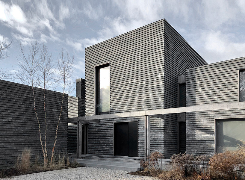
Belgian architectural firm Vincent Van Duysen has built a private residence on the lush coastline of Southampton in New York. Surrounded by wetlands and large oak trees, the architecture reflects the archetypal composition of a traditional farmhouse in the form of a cluster of volumes. Seeking a timeless material palette that emphasizes the careful composition of angled and vertical surfaces and highlights their shadows cast under the unique light, the architects chose traditional local materials such as typical wooden barn siding, cedar shingles, and bespoke fired clay tiles to cover the entire façade and roofs.
vincent van duysen's tile-clad residence in southampton draws from traditional farmhouses
the residence is clad in bespoke fired clay tiles | all images by Joseph D’Arco


reinterpreting traditional typologies against a unique backdrop


The site is enveloped by protected wetlands with a specific color and vegetation palette. Large oak trees dominate the access road to the property, creating a tranquil and natural environment. At the same time, the region is characterized by a very special light throughout the year, creating strong shadows and contrasts.


Against this unique natural background, the architecture by Vincent Van Duysen (find more here) is defined as a group of structures that house different functions of the program and consist of a main house and outbuildings. The design approach reflects the archetypal composition of a traditional farmhouse and residential structures that form an integral part of the cultural heritage of the region.
vincent van duysen's tile-clad residence in southampton draws from traditional farmhouses
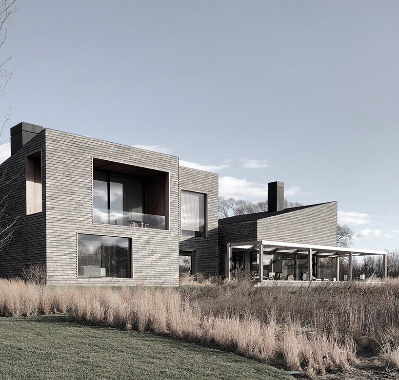
the materiality of the project emphasizes the careful composition of angled and vertical surfaces


exterior and interior merge into one overall experience


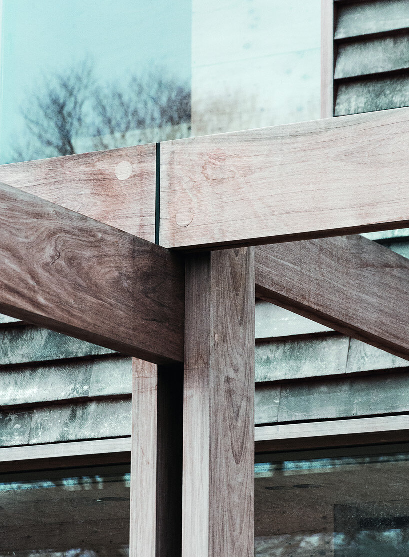
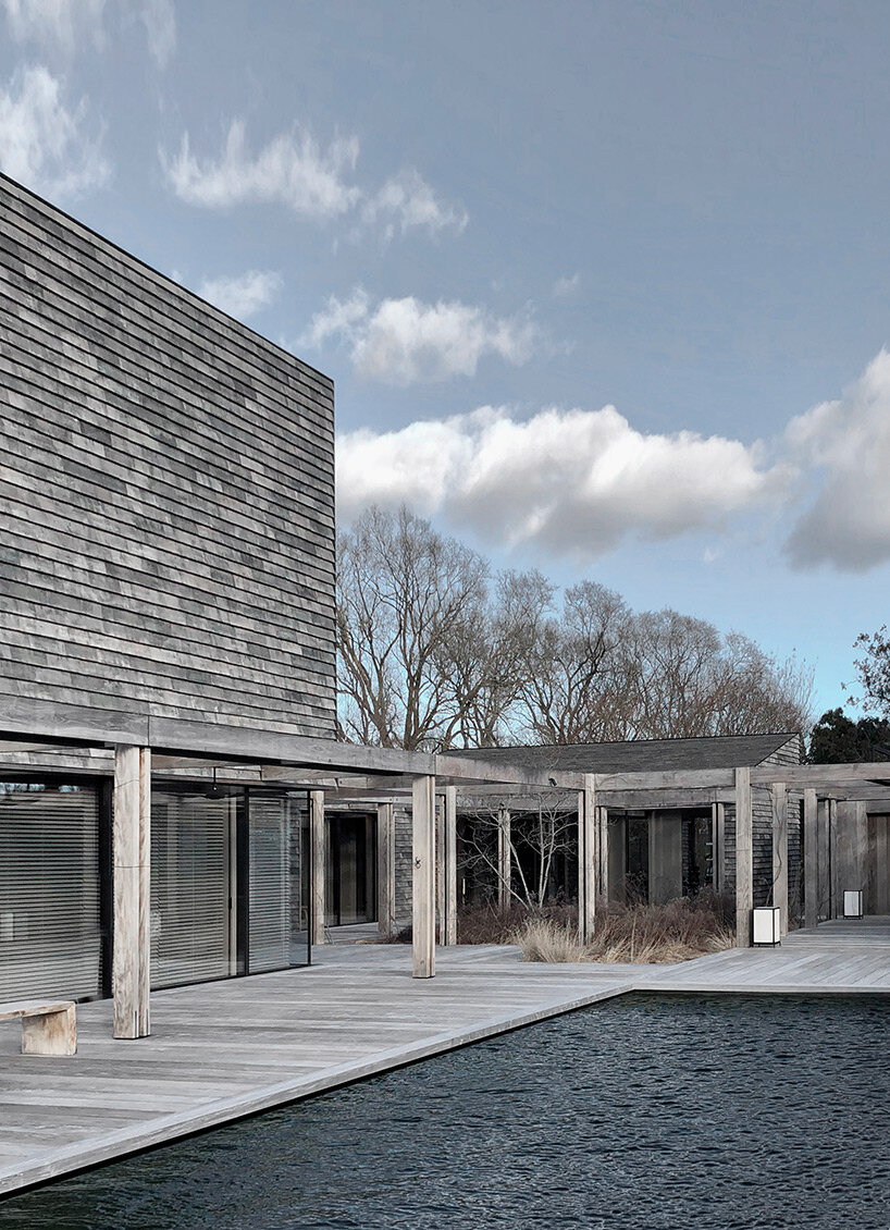
From the lush driveway, occupants pass through one of the buildings to a central courtyard. The interaction of the different volumes around the central courtyard is unified by a wooden pergola and an extended wooden terrace on a higher level, which connects and encloses all the outdoor and public areas around the house. These terraces were conceived as a pure extension of all interior spaces. In the summer, the exterior and interior spaces merge into one overall experience, ensuring interactivity between the different parts of the program.


The public areas dominate the first floor in a careful sequence of spaces and atmospheres, always emphasizing an important axis or an interesting viewpoint of the landscape. Secondary functions are located in the outbuildings, while the higher floors house the more private and exclusive areas with the master bedroom and master suite, as well as the children’s rooms. All of these rooms feature higher ceilings that capture and frame nature through generous pocket windows set into the walls.
vincent van duysen's tile-clad residence in southampton draws from traditional farmhouses
the interaction of the different volumes around the central courtyard is unified by a wooden pergola


An important aspect of this project is the tectonic expression of the architectural volumes. It was crucial to create a timeless but contemporary material palette, but also to find a material that would highlight the careful composition of the volumes and the hierarchy between oblique and vertical planes, while emphasizing the tactility of the surfaces and the way they cast shadows under the unique light.


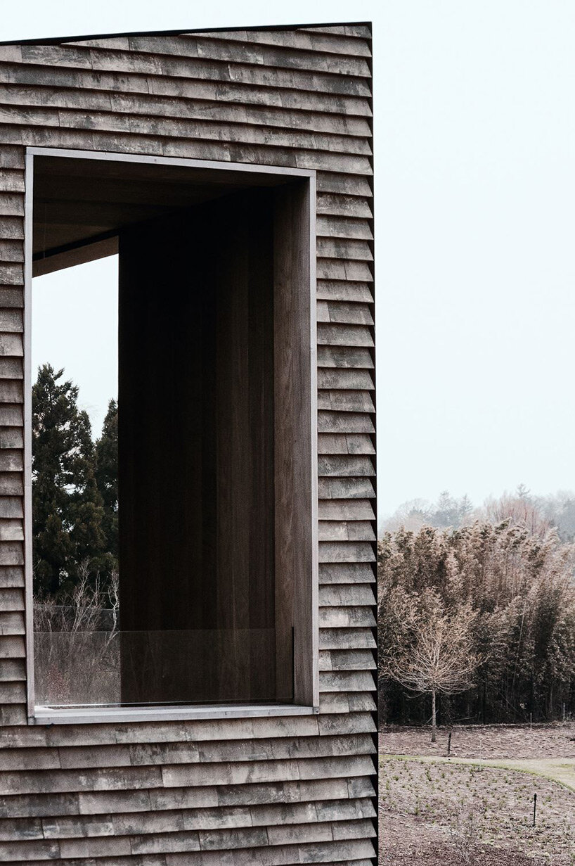
With an eye to the traditional materials of the region, such as the typical wooden barn siding or the cedar shingles, fired clay tiles were carefully selected for the entire façade and roofs to reflect the local architectural heritage in a contemporary way. This highly textured and tactile material, combined with naturally aged ipe wood and dark metal, completes a very powerful yet sober material palette that blends in with its surroundings.
 

vincent van duysen's tile-clad residence in southampton draws from traditional farmhouses
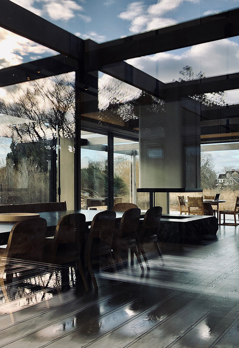
view of the interior of the HBH residence
vincent van duysen's tile-clad residence in southampton draws from traditional farmhouses
detail of the façade 

vincent van duysen's tile-clad residence in southampton draws from traditional farmhouses
detail of the wooden pergola


project info: 


name: HBH Residence
architects: Vincent Van Duysen
in collaboration with: STELLECO
interior design: Atelier Christian Liaigre
landscape design: Piet Oudolf
area: Southampton, NY, US

myrto katsikopoulou I designboom

jan 31, 2023


Reference

Keiji Ashizawa draws on “whiteness of tofu” for Saga Hirakawaya eatery
CategoriesInterior Design

Keiji Ashizawa draws on “whiteness of tofu” for Saga Hirakawaya eatery

Japanese designer Keiji Ashizawa paid homage to the food on offer when designing the Saga Hirakawaya tofu restaurant, which hopes to revitalise a depopulated community in Japan.

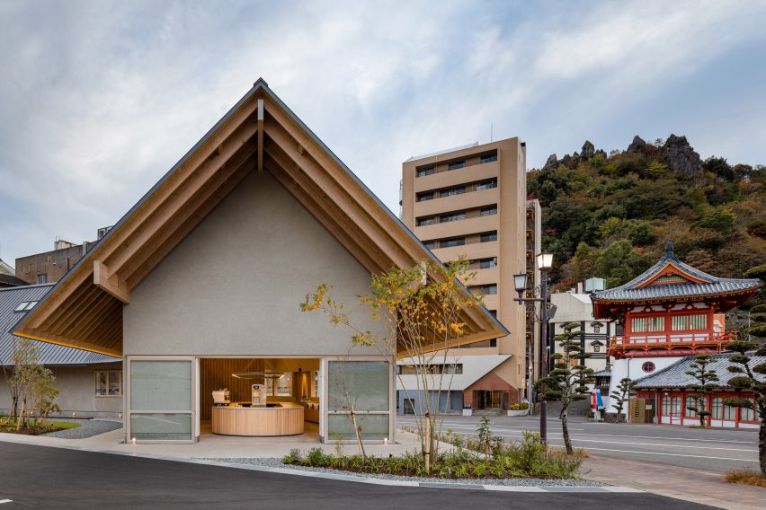
Located in the hot spring resort Takeo Onsen in Japan’s Saga prefecture, the curved restaurant was designed to blend in with the surrounding environment, including a historical tower gate.

Outside the Saga Hirakawaya tofu restaurant
The Saga Hirakawaya restaurant is located next to a historical tower gate

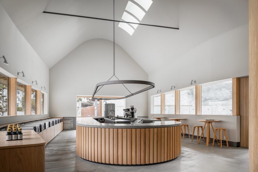
“Tofu, a food culture rooted in the region of Saga prefecture, is the main ingredient of this restaurant,” Ashizawa told Dezeen. “Since tofu is a simple food, we chose materials with a sense of simplicity such as wood, concrete and walls finished in plaster to bring out the texture in the materials.”

“With a background of wishing to use local materials, wood was used for the entrance, windows and undersurface of eaves to match the wood from Ariake, a furniture brand based in Saga.”

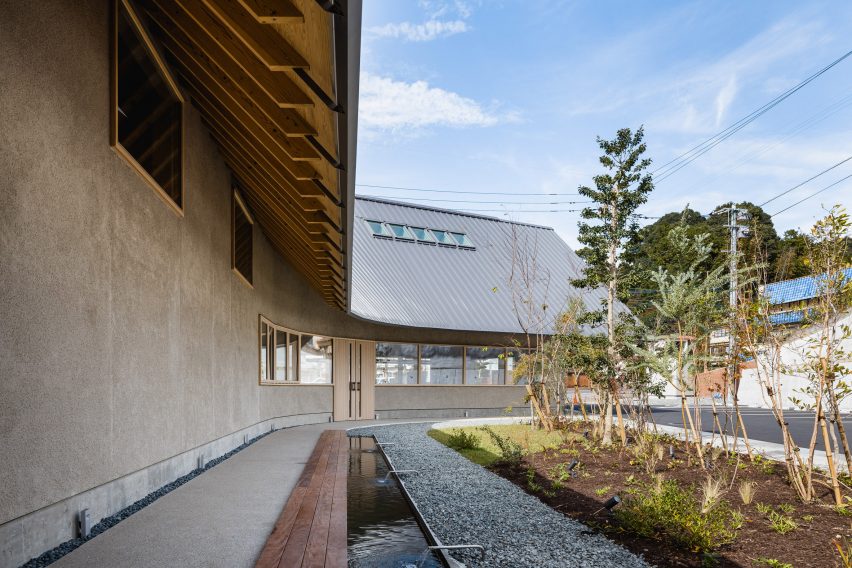
Foot bath outside tofu restaurant
Volcanic ash was used for the plaster

The studio also used shirasu – a type of volcanic ash from Mount Sakurajima in Kyushu – as a plastering material for the building’s exterior walls.

Saga Hirakawaya has a curved design forming a semi-open interior courtyard, which holds a foot bath with hot spring water that aims to encourage the restaurant’s customers to eat and stay outside the establishment for longer.

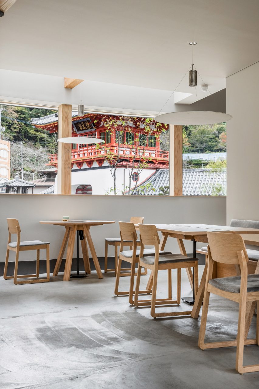
Wooden furniture inside Saga tofu restaurant
Wooden furniture matches the pared-down interior

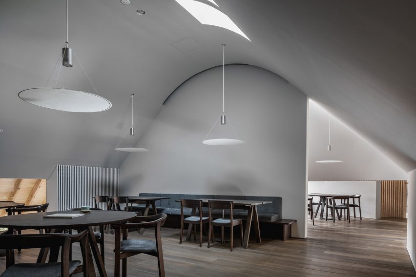
Inside the 435-square-metre restaurant, the interior matches the exterior with pale grey walls that nod to the food on the menu.

“As the ceiling and walls are curved, pale colours are used to extend the light beautifully in the restaurant, complemented by the use of grey colours on the walls and floors,” Ashizawa said. “It also signifies the whiteness of the tofu.”

The restaurant’s ground floor houses a shop selling tofu-based products and sweets, while the first floor is home to a restaurant serving onsen yudofu – a type of tofu made using hot spring water.

An open atrium connects the shop and restaurant, which both feature large windows.

Central counter at Saga Hirakawaya restaurant
The ground floor houses a shop

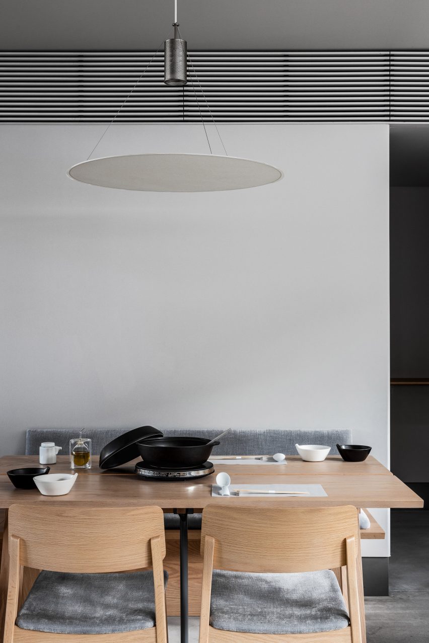
Circular lamps made by local paper manufacturer Nao Washi hang over the tables while the wooden furniture was made by furniture brand Ariake, which manufactures in Saga prefecture.

The decision to open the Saga Hirakawaya restaurant in Takeo Onsen was made by its owner, who was born and raised in the area and wanted to help revitalise the community, which has suffered from a population decline.

Washi paper lamp about table in restaurant
Paper lamps hang over tables

“Depopulation is inevitable in rural areas of Japan,” Ashizawa said. “But in order to revitalise a region, it is important to attract people to the area through tourism.”

“The client decided to create a restaurant serving onsen yudofu, believing that the region’s unique culinary culture could be an incentive to visit the area for sightseeing.”

Dining space in Saga tofu restaurant
A restaurant space is located on the first floor

“We deeply sympathise with the client’s hope to make the most of the wonderful location in front of the historical tower gate of Takeo Onsen, an important cultural asset, and to combine it with the region’s unique food culture to attract tourists from both inside and outside of Japan, contributing to the revitalisation of the area,” he added.

Other recent projects by Ashizawa include a Blue Bottle Coffee shop in Kobe and a mid-century-modern-informed residence in Tokyo.

The photography is by Ben Richards.


Project credits:

Architect: Keiji Ashizawa Design
Project architect: Keiji Ashizawa, Kentaro Yamaguchi, Tsubasa Furuichi
Construction: Yamakami Inc
Furniture: Hirata Chair/Legnatec
Lighting: Saito Shomei/Nao Washi

Reference

THAD draws on contours of nearby mountains for visitor centre in China
CategoriesArchitecture

THAD draws on contours of nearby mountains for visitor centre in China

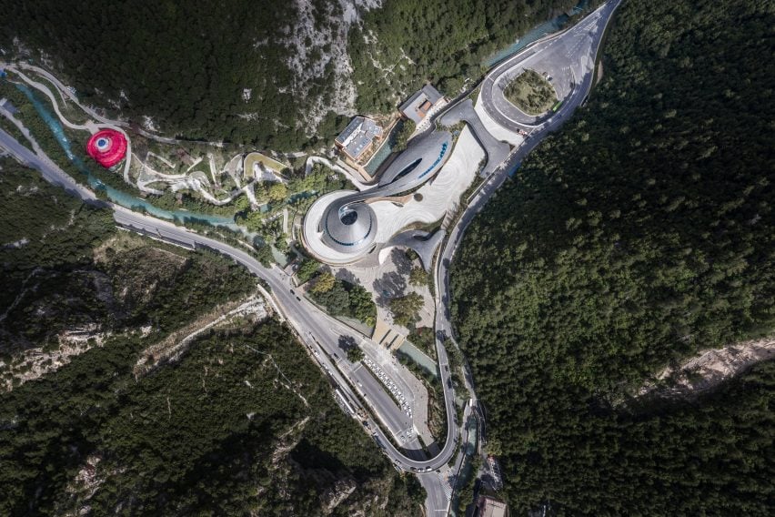
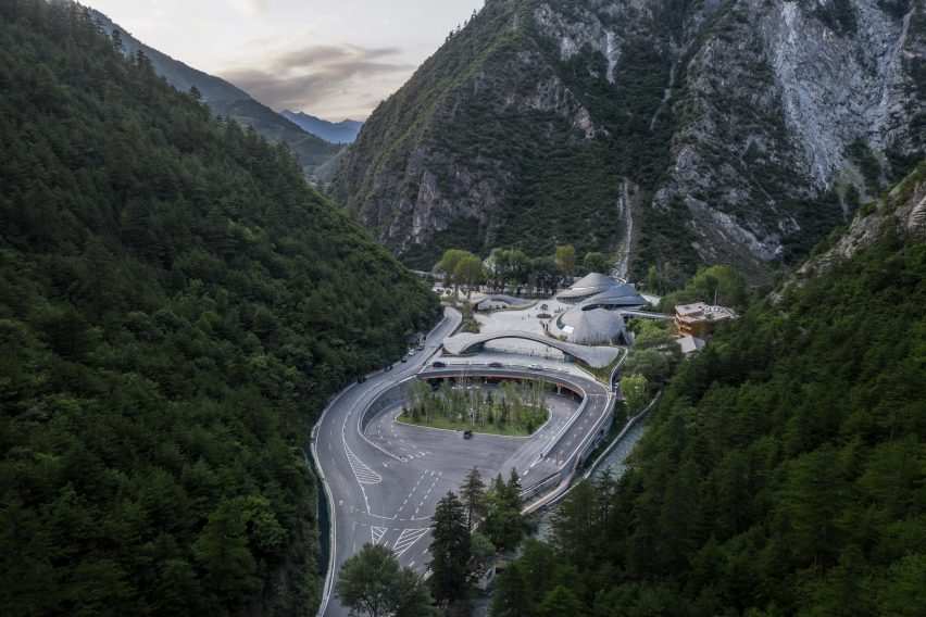
Spiralling tiled roofs informed by the contours of the surrounding mountains cover the Jiuzhai Valley Visitor Centre in Sichuan Province, China, designed by The Architectural Design and Research Institute of Tsinghua University.

Located at the entrance to the UNESCO World Heritage-listed Jiuzhai Valley National Park, the centre provides a new exhibition space, visitor centre and offices as part of the area’s reopening following an earthquake in 2017.

Aerial image of the Jiuzhai Valley Visitor Centre
Jiuzhai Valley Visitor Centre was designed by THAD

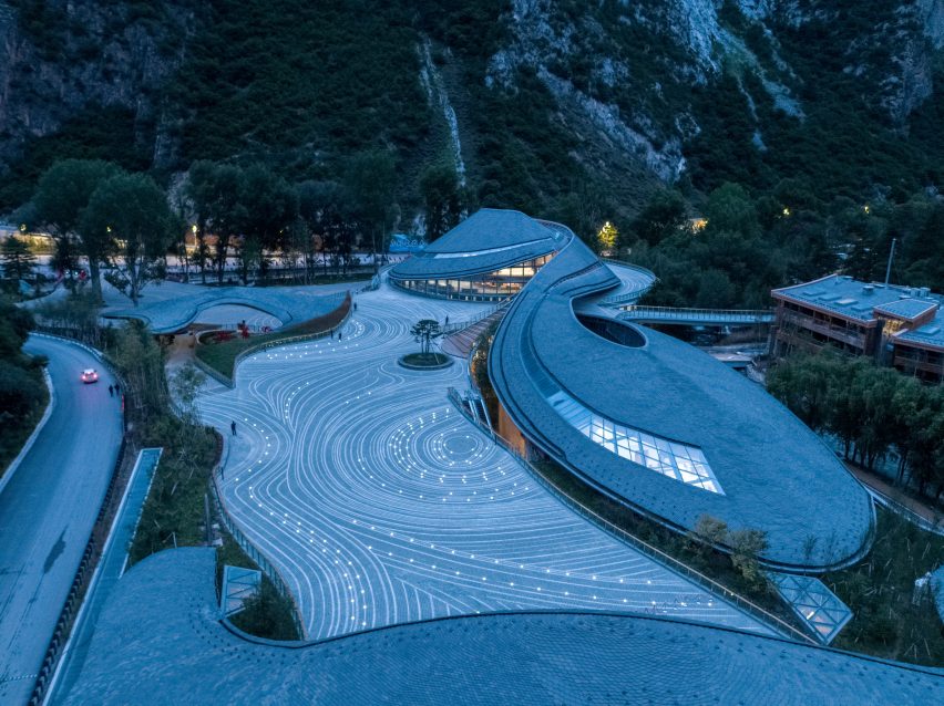
Designed to sit harmoniously in the landscape both in terms of its earthquake resilience and visual appearance, The Architectural Design and Research Institute of Tsinghua University (THAD) created a cluster of low-lying volumes organised around a central plaza paved with a contour pattern.

“The project explores how artificial construction can be accommodated in natural scenic spots,” said the practice.

Image of Jiuzhai Valley Visitor Centre between the feet of mountains
The building is nestled within a mountain valley

“The aerodynamic architectural language moves through the narrow site smoothly, concealing the visitor centre with a sprawling and smooth curved form which spatially echoes the surrounding mountains,” it continued.

Taking advantage of a six-metre difference between the level of the entrance and the park, the centre was split to create separate access routes for vehicles and pedestrians, reducing the risk of congestion from the large number of tourists visiting the site.

Image of Jiuzhai Valley Visitor Centre and its swirling roof forms
It has a swooping curved design

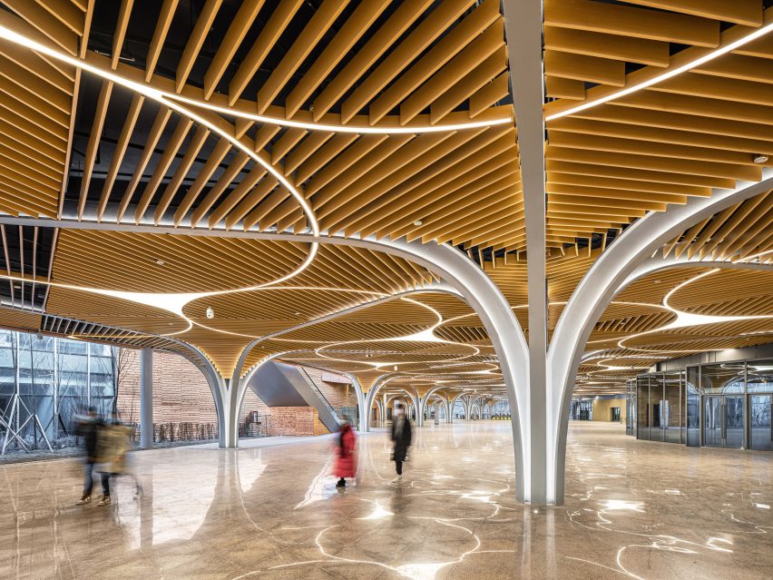
The pedestrian plaza is elevated atop 36 branching steel columns above the tourist transport centre, where a fast drop-off area leads into a brightly-lit entrance hall and up to the level of the park via lifts and stairs.

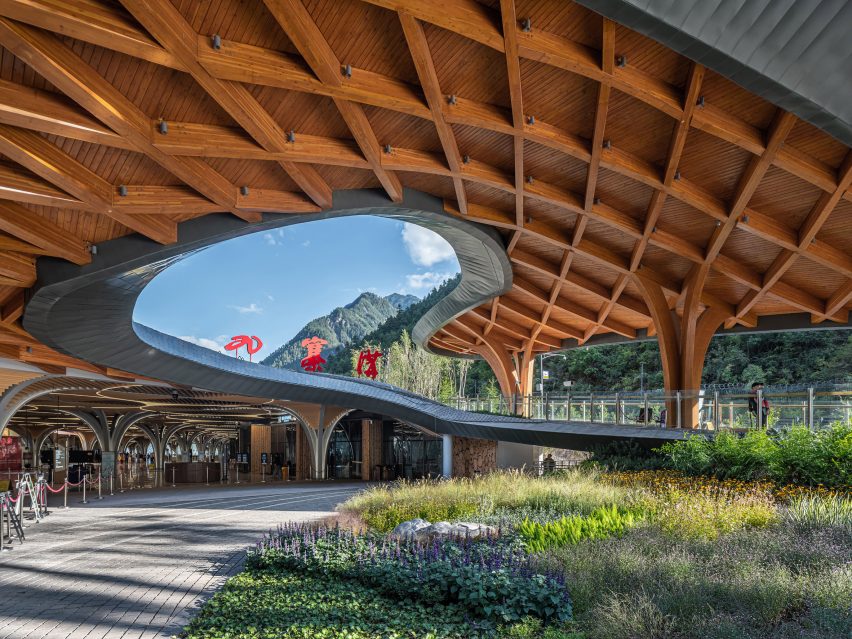
At ground level, visitors enter under a gently arching wooden gateway, passing the curving Intelligence Management Centre to reach the circular Exhibition Centre, where an entrance hall and small exhibition provide an introduction to the park.

The landscaping leading into the park was informed by the Tibetan concept of lingka – a tradition that involves camping in parks – with a winding path between the existing pine trees leading to a bright red flag tent.

For the structure and materials, THAD contrasted traditional finishes such as slate, wood and paving at ground level with more contemporary steel and stone for the lower-level spaces.

Image of a curving wooden canopy at Jiuzhai Valley Visitor Centre
Parametricism was used to create its roof forms

“Parametric design technology is applied for a combination of local features and modern techniques,” said the practice.

“Tourists not only experience a gentle transition space before entering and exiting the national park, but also a distinctive space full of local culture,” it continued.

Interior image of a brightly lit space with steel columns at the visitor centre
Branching steel columns line a pedestrian plaza

Previous projects by THAD responding to a similarly sensitive landscape include an undulating shelter designed by the practice to cover the historic Peking Man cave and protect the archaeological site from weathering.

In 2019, the design and research institute referenced caved dwellings and used stacked stone and concrete to build the campus of Yan’an University in China.

Reference

Matteo Thun draws on Czech art heritage for design of The Julius Prague
CategoriesInterior Design

Matteo Thun draws on Czech art heritage for design of The Julius Prague

Italian architect Matteo Thun looked to the work of Czech artists Alphonse Mucha and František Kupka for the interior design of this Prague hotel, which features pastel colours and natural materials.

Located in an art deco building in the city centre, The Julius Prague has apartment suites with kitchenettes as well as smaller hotel rooms that were designed to have the feel of a home-away-from-home.

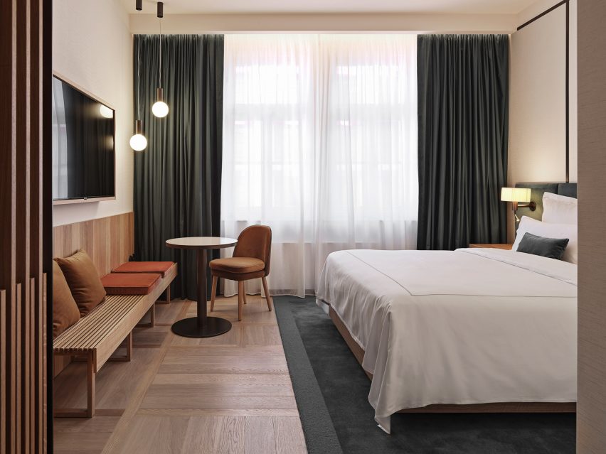
A hotel room at The Julius Prague
Matteo Thun used soft colours for the guest rooms at The Julius Prague

“In exploring new forms of living, we had to think about how to create that home-away-from-home feeling – providing privacy and independence, whilst also offering flexible communal spaces such as co-working areas, meeting rooms, and open lounges,” Thun told Dezeen.

“The rooms are designed as apartments, and the public areas are conceived as an extension of the rooms.”

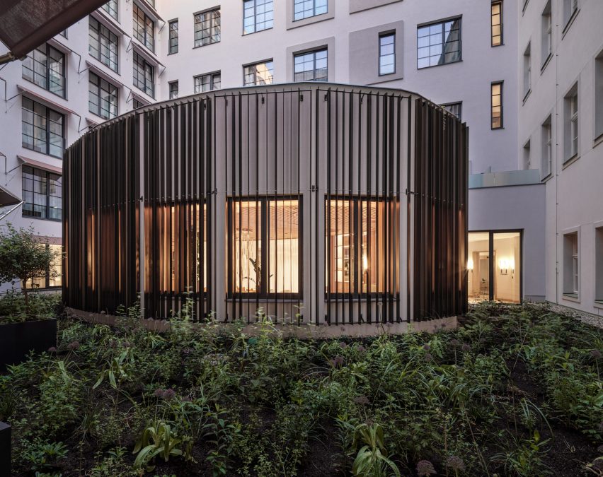
Conservatory in courtyard of Czech hotel
Rooms overlook a central courtyard

The interior design of the colourful hotel was influenced by the way in which Czech Art Noveau painter Alphonse Mucha and Czech abstract painter František Kupka used colours.

Mucha’s soft, pastel hues were used for the guest rooms, many of which overlook a central courtyard with a light-filled conservatory, while Thun looked to Kupka’s brighter colour palette for the communal areas.

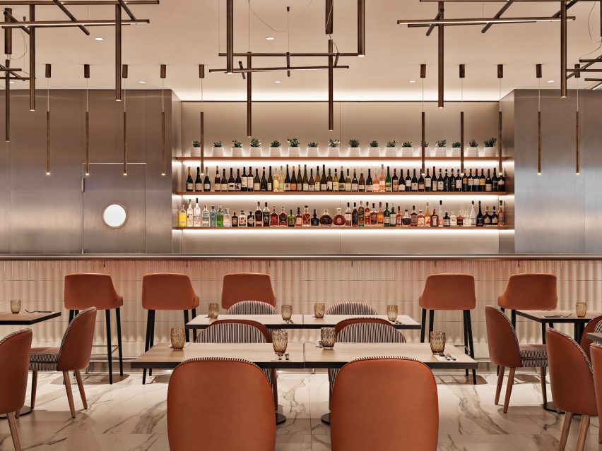
Restaurant with rust-coloured chairs
The hotel’s lighting was informed by bohemian glass work

“Inspired by Mucha’s work, we selected a pared-back palette and pastel hues for the guest rooms, working with natural materials and soft textiles to create a calming and welcoming atmosphere,” Thun said.

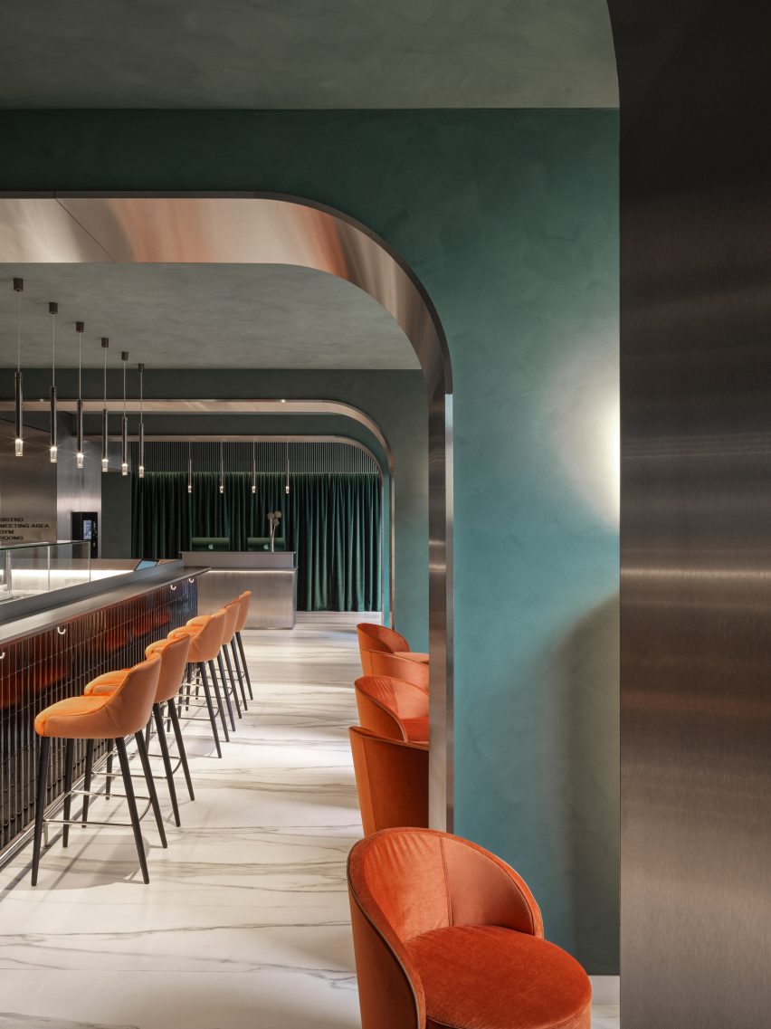
“Meanwhile in the communal areas we chose a more vibrant colour palette, drawing on Kupka’s abstract pieces, for a more energetic atmosphere,” he added.

“For lighting, we were inspired by the bohemian art glass work, emitting a warm ambient glow.”

Green walls and orange chairs in hotel restaurant
More vibrant colours were used in the communal areas

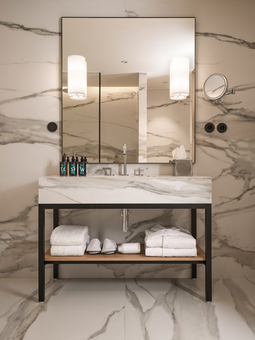
Tactile natural materials were used throughout the hotel, including in the bathrooms, which are clad in a striking marble-effect ceramic tile.

“We used ceramic tiles with a marble effect from a leading Italian tile producer for the floorings of the public areas and the kitchens and bathrooms of the residences,” Thun said.

“We love to work with natural materials and have used oak-flooring for the serviced residences, featuring spacious living environments with open kitchen and generous smart-working spaces,” he added.

“Throughout The Julius, custom-made furniture and pieces ensure every space arouses curiosity.”

Bathroom interior at The Julius Prague
Bathrooms were clad in ceramic tiles with a marble effect

The Julius Prague is the first hotel from the Julius Meinl family, a gourmet-food retailer and manufacturer based in Vienna that Thun has previously worked with.

“We have enjoyed a rewarding relationship over the last 15 years and their flair continues to be invaluable in channelling design towards authentic, novel and inspirational projects,” Thun said.

A wall with small potted plants and a bench
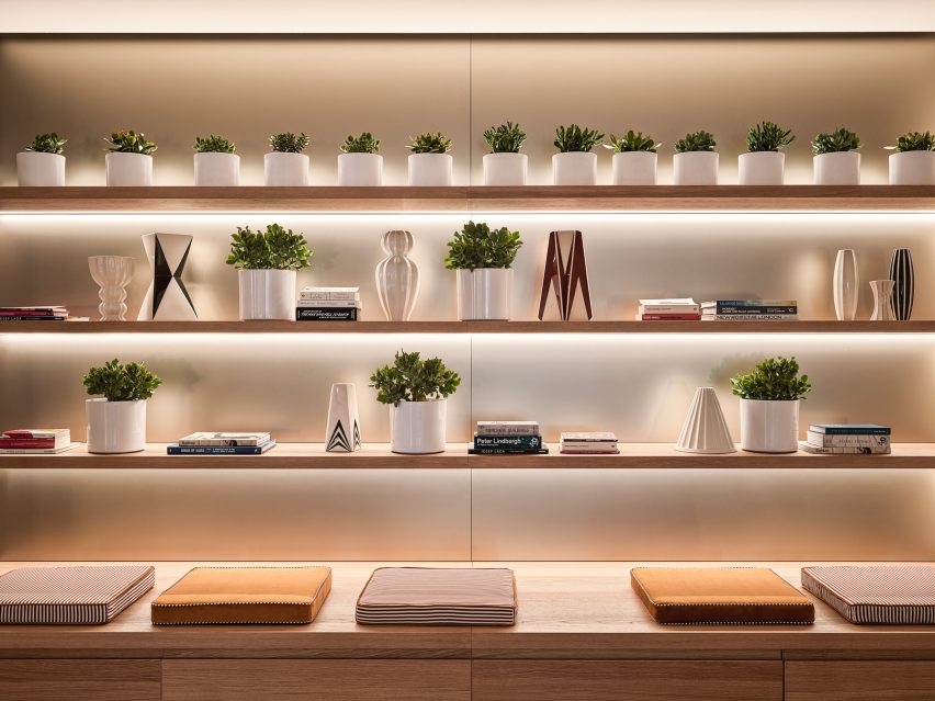
The hotel was designed as a “home-away-from-home”

“In this case we have contributed our experience to their first hospitality project, designing a timeless scheme in tune with new expectations: a contextually aware nomadic way of living,” he added.

Other recent projects in Prague include a pop-up market with a turquoise scaffolding design and a spa with curved-cement walls and glass detailing.

The photography is by Gionata Xerra.

Reference