Ten Mexican holiday homes characterised by earthy hues
CategoriesInterior Design

Ten Mexican holiday homes characterised by earthy hues

From a brutalist dwelling nestled in a pine forest to a beachy weekend retreat with a rooftop swimming pool, our latest lookbook features 10 holiday homes across Mexico.

While known for their often vibrant colours, Mexican interiors also include many examples of more muted designs. These earthy hues are often created through the use of natural and local materials, such as wood and stone.

Holiday homes are located all over the country, which has a varied landscape and is famous for its escapist destinations. Here are 10 Mexican holiday homes that combine pared-back colour palettes with getaway-style luxury.

This is the latest in our lookbooks series, which provides visual inspiration from Dezeen’s archive. For more inspiration, see previous lookbooks featuring metal furniture, breakfast nooks and living spaces with swings.
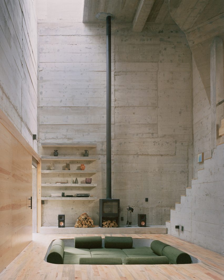

Built-in couch in concrete homeBuilt-in couch in concrete home
Top and above: photos by Rory Gardiner

Casa Alférez, Alférez, by Ludwig Godefroy

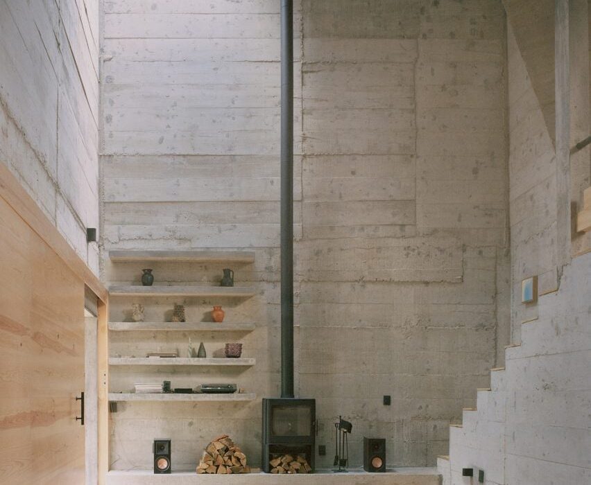
This holiday home is a brutalist dwelling clad in board-formed concrete and located in a pine forest in the country’s Alférez region.

French architect Ludwig Godefroy, who is Mexico City-based, added a conversation pit to the cathedral-like living area, which features a spindly double-height fireplace.

Find out more about Casa Alférez ›
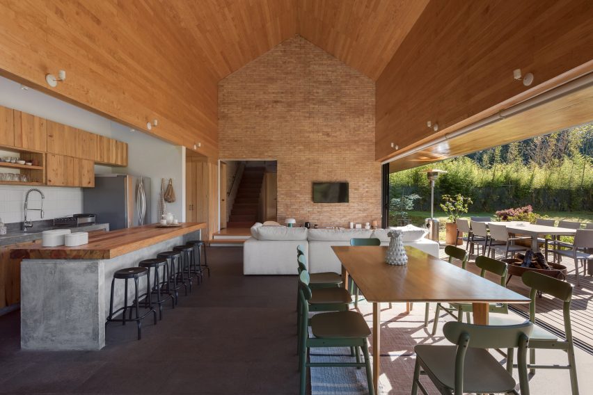

Gardenia HouseGardenia House
Photo by LGM Studio

Holiday home, San Simón El Alto, by Estudio Atemporal

Local architecture office Estudio Atemporal designed a weekend retreat in San Simón El Alto village with an oversized gabled roof.

Inside, the studio created a statement brick wall in the angular, open-plan living space defined by timber and concrete accents. Generous glass doors lead to a covered outdoor patio.

Find out more about this holiday home ›
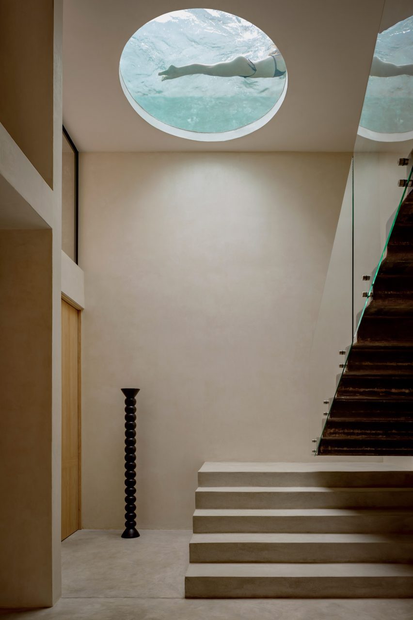

Villa CavaVilla Cava
Photo by César Béjar

Villa Cava, Tulum, by Espacio 18 Arquitectura

Neutral tones and textures define this house in Tulum that was informed by cenotes – ancient sunken water-filled limestone pits and caves found across Mexico’s Yucatán Peninsula.

Espacio 18 Arquitectura carved a circular window into one of the home’s ceilings, which reveals a rooftop swimming pool. Blue-coloured light filters through the opening, emphasising the cavernous atmosphere.

Find out more about Villa Cava ›
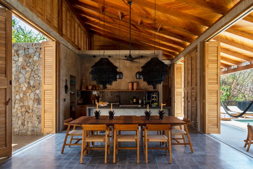

Interior design by Gala Sánchez-ReneroInterior design by Gala Sánchez-Renero
Photo by Diego Padilla Magallanes

La Extraviada, Mazunte, by Em-Estudio

Architecture firm Em-Estudio stepped a pair of concrete residential volumes down a rocky hillside overlooking the coastal town of Mazunte, Oaxaca.

Called La Extraviada, the holiday home includes an eclectic kitchen and dining space flanked by floor-to-ceiling timber shutters that open onto a terrace with a swimming pool.

Regional materials, including guapinol wood and local stone obtained from nearby quarries, feature throughout the earthy-hued project.

Find out more about La Extraviada ›
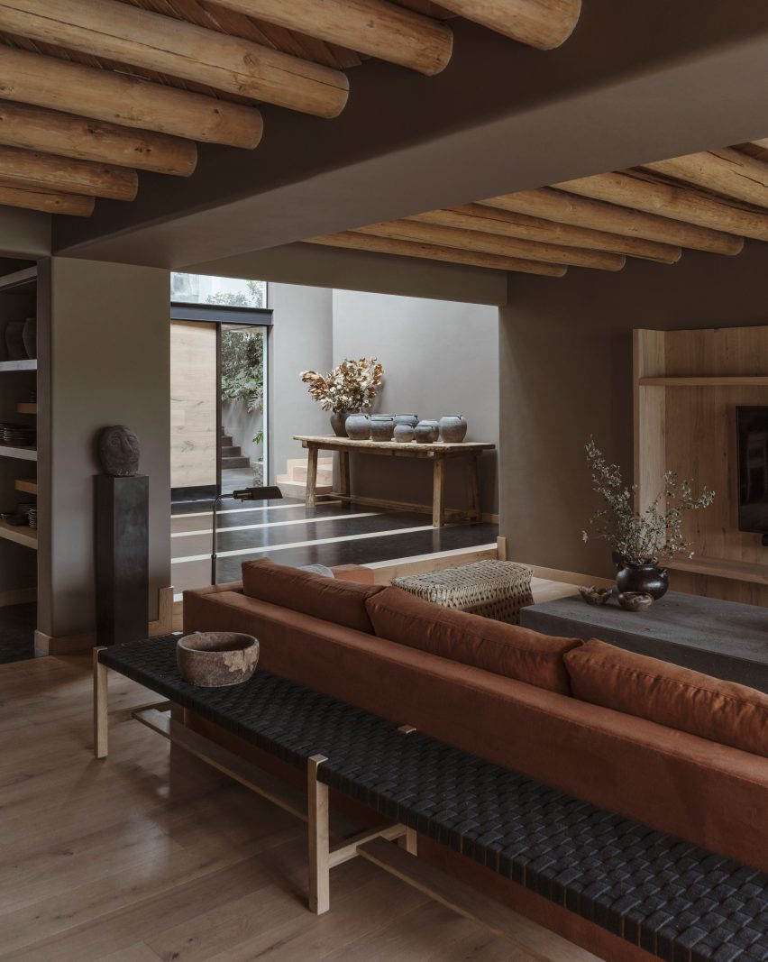

Lounge with red sofa, Casa Tres Árboles in Valle de Bravo by DireccionLounge with red sofa, Casa Tres Árboles in Valle de Bravo by Direccion
Photo by Fabian Martinez

Casa Tres Árboles, Valle de Bravo, by Direccion

Architecture studio Direccion took cues from “monastic” sanctuaries when renovating this weekend retreat in Valle de Bravo.

The open-plan living space includes exposed warm-toned wooden ceiling beams, which contrast against dark-painted walls. A soft-red sofa adds a rare pop of colour to the otherwise muted interiors.

Find out more about Casa Tres Árboles ›


Los Terrenos by Tatiana BilbaoLos Terrenos by Tatiana Bilbao
Photo by Rory Gardiner

Los Terrenos, Monterrey, by Tatiana Bilbao

Mexican architect Tatiana Bilbao added a multifunctional ceramic screen to the interior of Los Terrenos – a holiday home in Monterrey with mirrored glass facades that reflect the surrounding wooded site.

“[The screen] works as solid and permeable floor, a screen partition, a structural wall, and as a semi-open wall that allows ventilation and sunlight to bathe the interior spaces,” explained Bilbao’s eponymous studio.

Find out more about Los Terrenos ›
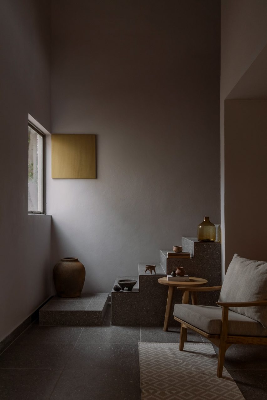

Tonalli House staircaseTonalli House staircase
Photo by Ansatz

Tonalli House, Jalisco, by Moises Sánchez 

This stucco-clad holiday home was punctuated with strategic openings and takes cues from architecture commonly found in Mexican villages, according to its designer Moises Sánchez.

Sánchez created an understated interior palette referencing the nearby architecture surrounding Lake Chapa, where the home is located. For example, the blocky terrazzo staircase doubles as a stepped plinth for sandy-coloured ornaments.

Find out more about Tonalli House ›
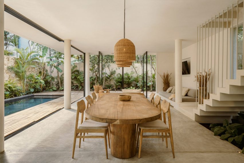

CO-LAB Design Office made the house out of concreteCO-LAB Design Office made the house out of concrete
Photo by César Béjar

Casa Areca, Tulum, by CO-LAB Design Office

Local studio CO-LAB Design Office created Casa Areca to merge with its lush Tulum setting.

The open-plan ground floor includes pivot doors and retractable glass walls, which enable the social area to flow into the jungle-like garden. Creamy walls and polished concrete floors were paired with local tzalam wood, jute accents and ceramic vases filled with hand-selected wild grasses.

Find out more about Casa Areca ›
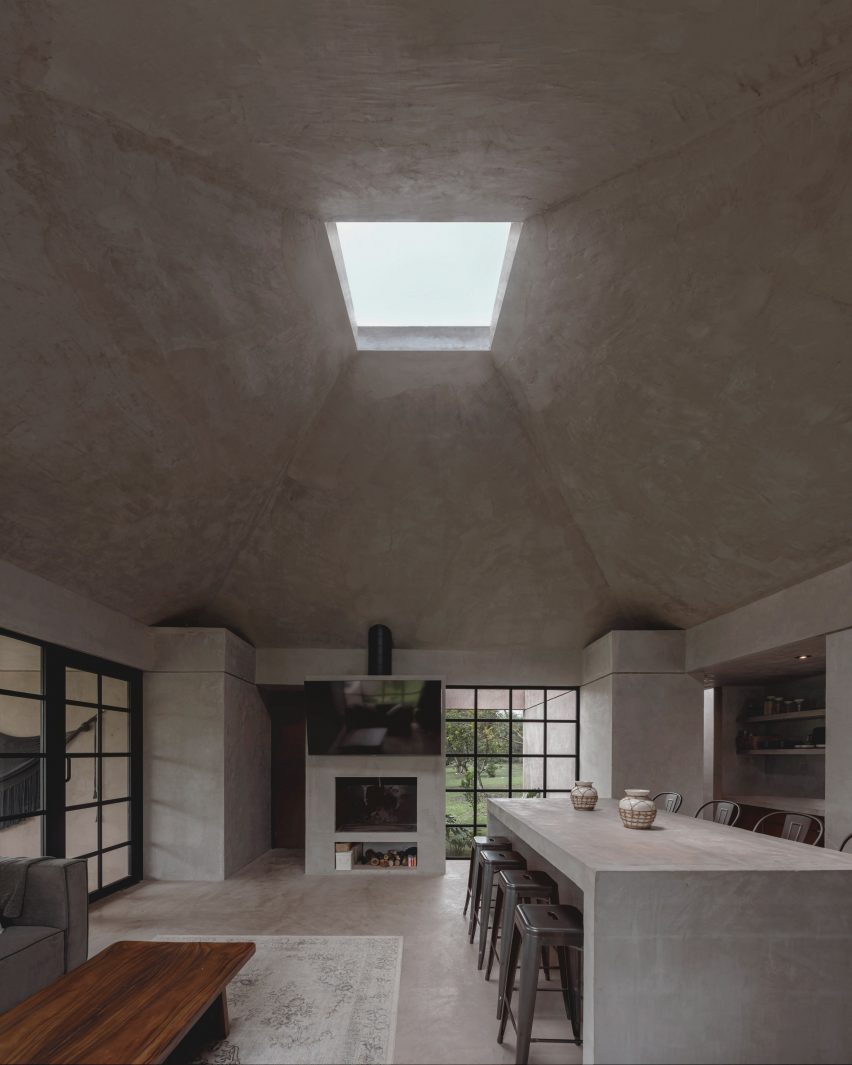

Living space of El AguacateLiving space of El Aguacate
Photo by Dove Dope

El Aguacate, El Barrial, by Práctica Arquitectura

El Aguacate – or “The Avocado” – is a holiday home in El Barrial village made almost entirely out of concrete.

Práctica Arquitectura topped the main living area with a tall pyramidal roof featuring a boxy skylight. The studio added a built-in fireplace and alter-like dining table to the space – also made from smooth concrete.

Find out more about El Aguacate ›
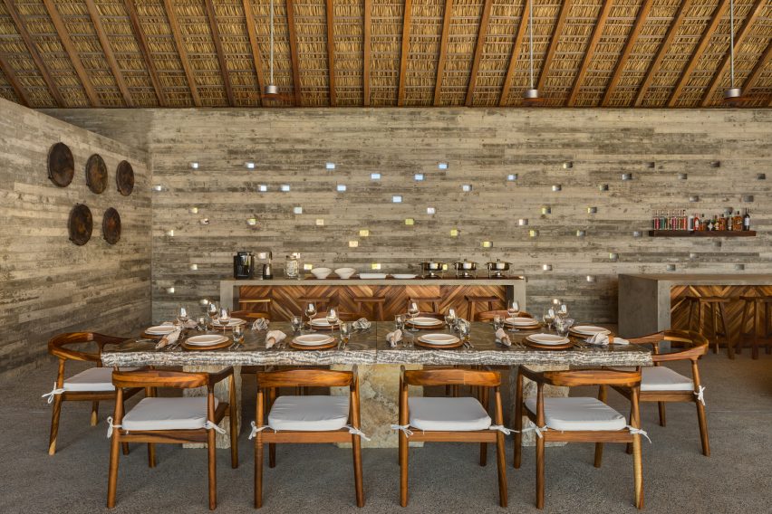

A large table in the shady dining areaA large table in the shady dining area
Photo by Rafael Gamo

Casa Cova, Puerto Escondidio, by Anonimous

When designing Casa Cova in Puerto Escondido, Mexican studio Anonimous took cues from pre-colonial architecture.

Inside, the central living space is kept cool by a traditional thatched roof made of dried palm leaves, called a “palapa.” Tiny square openings were also cut into some of the walls, creating “a dynamic light pattern from dusk till dawn”.

Find out more about Casa Cova ›

This is the latest in our lookbooks series, which provides visual inspiration from Dezeen’s archive. For more inspiration, see previous lookbooks featuring metal furniture, breakfast nooks and living spaces with swings.

Reference

Post Company imbues Mollie Aspen hotel interiors with earthy hues
CategoriesInterior Design

Post Company imbues Mollie Aspen hotel interiors with earthy hues

New York studio Post Company has designed warm, wood-filled interiors for a boutique hotel in Aspen, Colorado, which offers a pared-back take on the Arts and Crafts style.

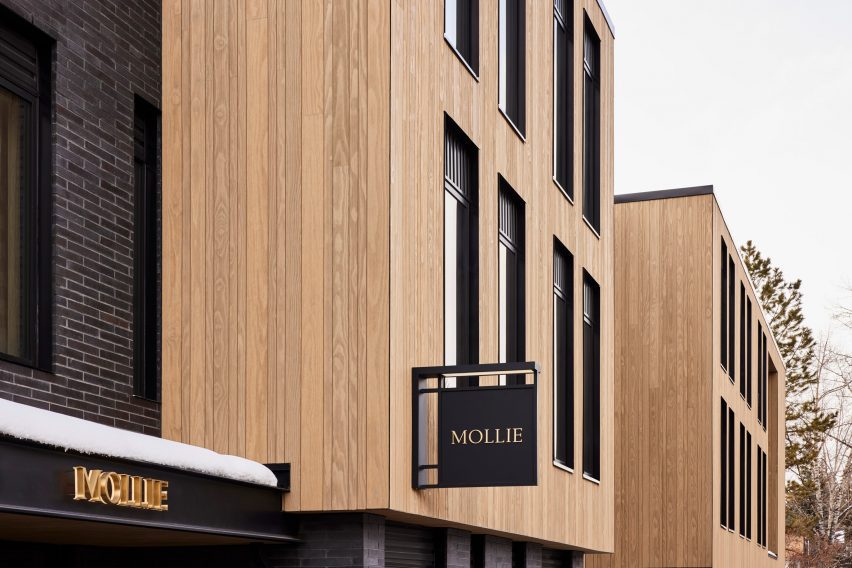
Mollie Aspen occupies a new timber-clad building designed by CCY Architects and developed and operated by HayMax in the mountain city’s downtown area.

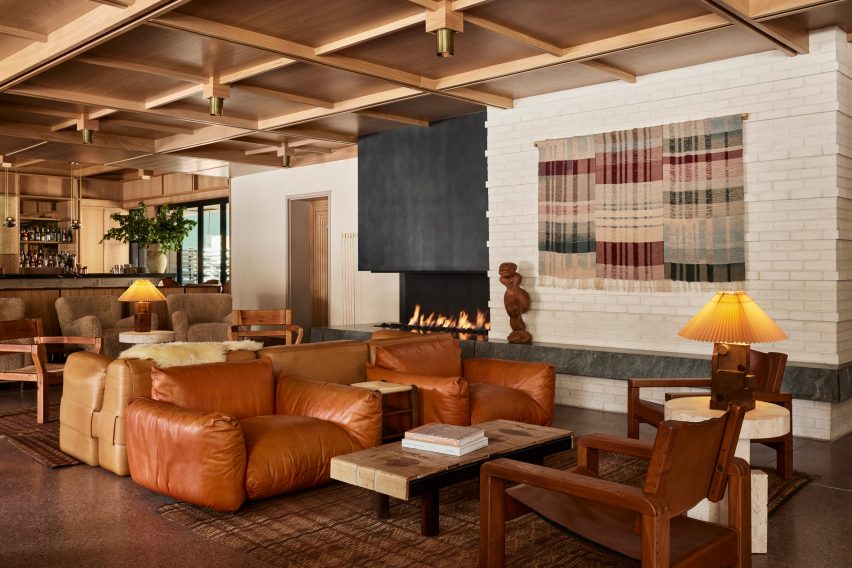
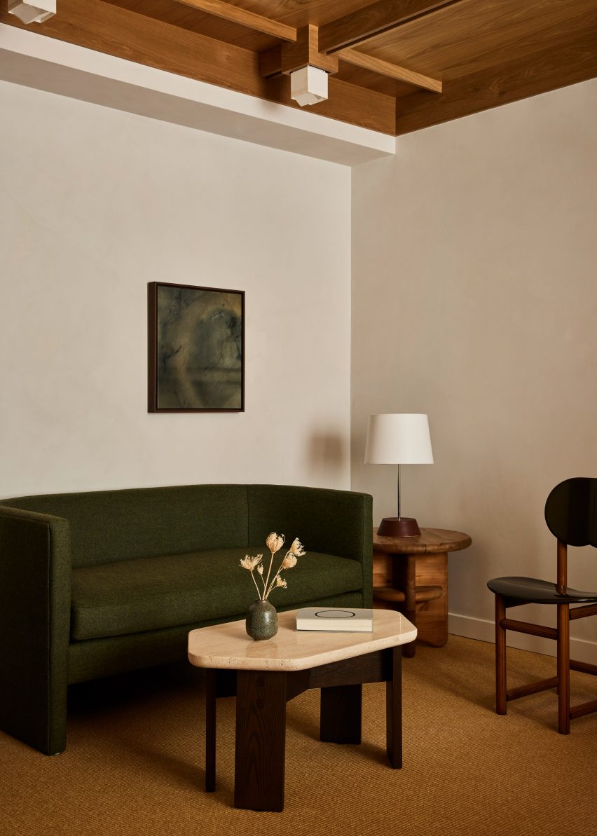
Lobby lounge at Mollie Aspen with earth-toned furniture and a gridded wood ceilingLobby lounge at Mollie Aspen with earth-toned furniture and a gridded wood ceiling
With an open fireplace as a backdrop, the lobby lounge at Mollie Aspen features earth-toned furniture and a gridded wood ceiling

Post Company was tasked with creating the interiors for the 68-room hotel, combining contemporary Scandinavian and Japanese design elements for a serene take on Rocky Mountain luxury.

“Mollie is designed for those with a natural curiosity and appreciation for connection and offers visitors a unique, welcoming respite in the bustling mountain town,” said the hotel’s team.

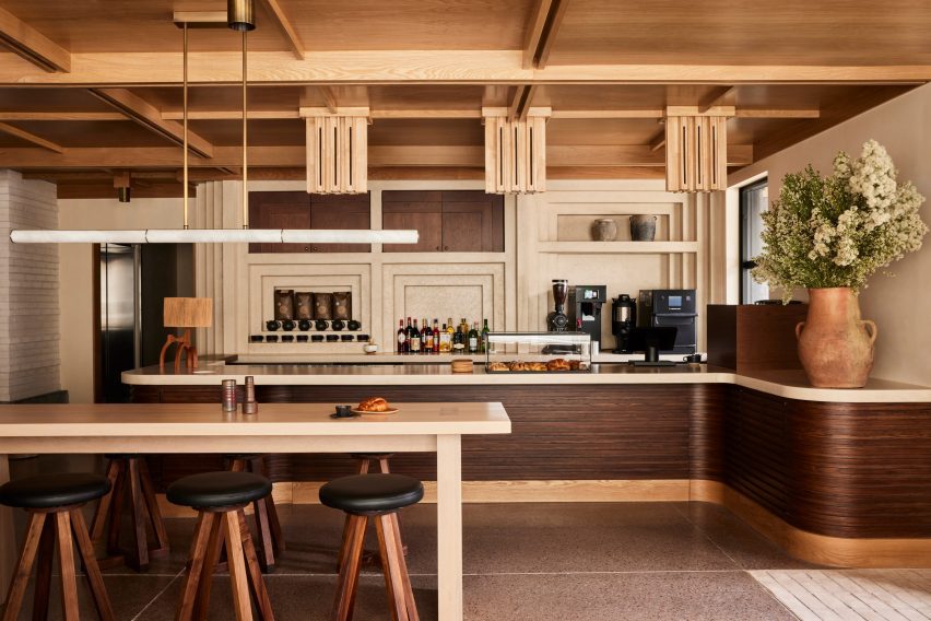
All-day cafe in the Mollie Aspen lobby All-day cafe in the Mollie Aspen lobby
An all-day cafe in the lobby serves pastries and beverages from a walnut-wrapped counter

An abundance of wood can be found throughout the different spaces, with numerous varieties creating a layered effect of different colours and grain patterns.

The timber is crafted into elements like gridded wall and ceiling panels with built-in lighting, which evoke an Arts and Crafts aesthetic, as well as fluted counterfronts and a range of furniture pieces.

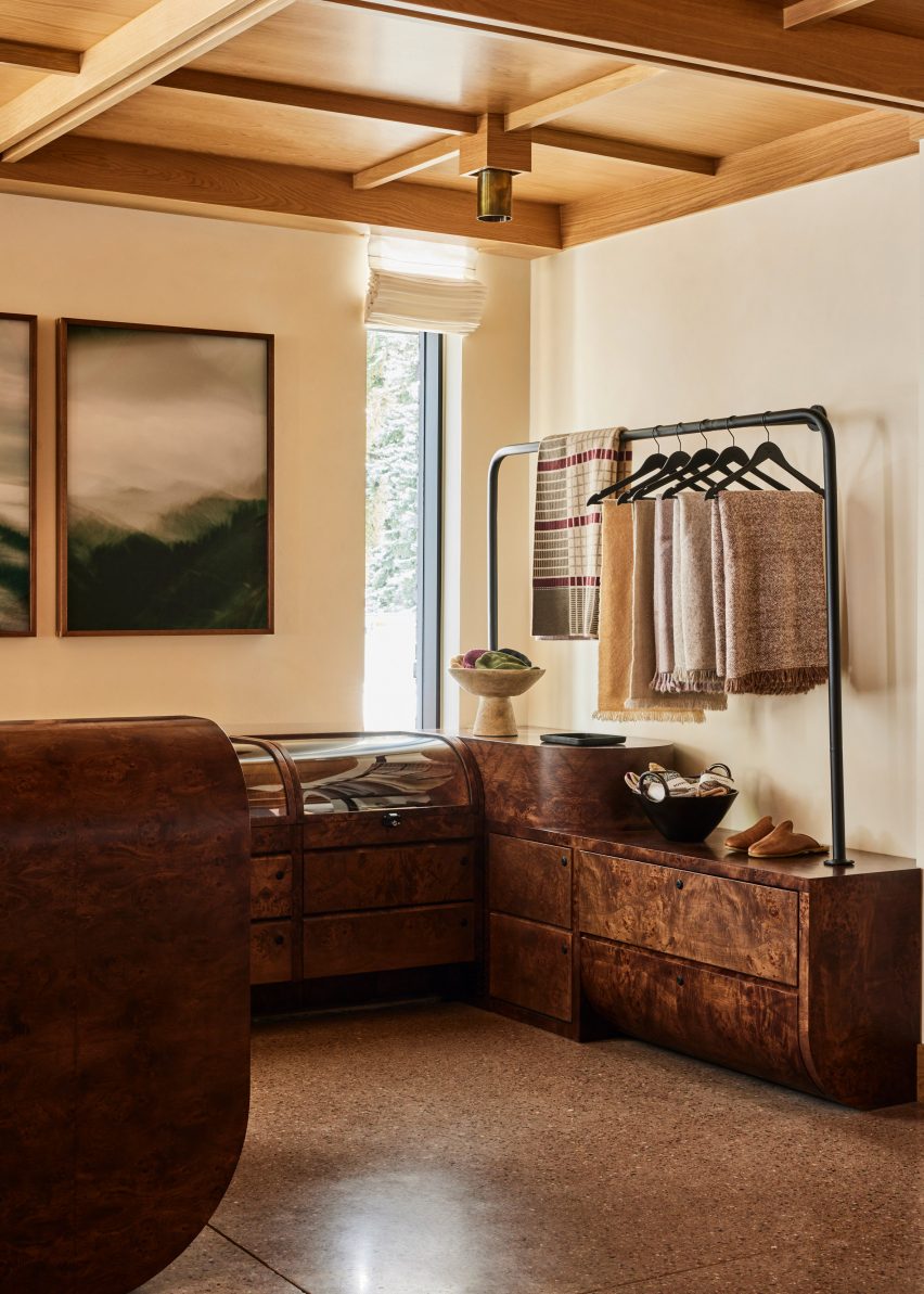
Burl wood counters and displays in a retail spaceBurl wood counters and displays in a retail space
Burl wood counters and displays present goods in the hotel’s retail space

The majority of the materials used in Mollie’s construction were sourced from the Western United States to reduce waste, according to the team.

Meanwhile, other accents like earthen ceramics, hand-dyed textiles and sand-casted brass add to the cosy atmosphere.

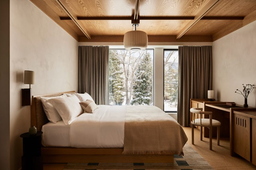
Guest room with neutral decorGuest room with neutral decor
Guest rooms offer an even more pared-back take on the neutral decor palette

“These materials are incorporated throughout the hotel to mimic the area’s rough-hewn mountains while large windows frame views of the surrounding landscape and bring an abundance of light into the hotel,” said the team.

The lobby lounge is designed as a cosy gathering space for guests and the public, with a large open fireplace providing a backdrop.

Beige plaster walls and textured carpet in a guest roomBeige plaster walls and textured carpet in a guest room
Beige plaster walls and textured carpets complement the wood ceilings in the guest rooms

Chunky leather, velvet and boucle sofas and armchairs in a range of earthy hues form comfy conversation nooks.

At one end of the room, the black-topped bar spans the full width and is illuminated by a row of globe-shaped pendant lights suspended from thin brass bars.

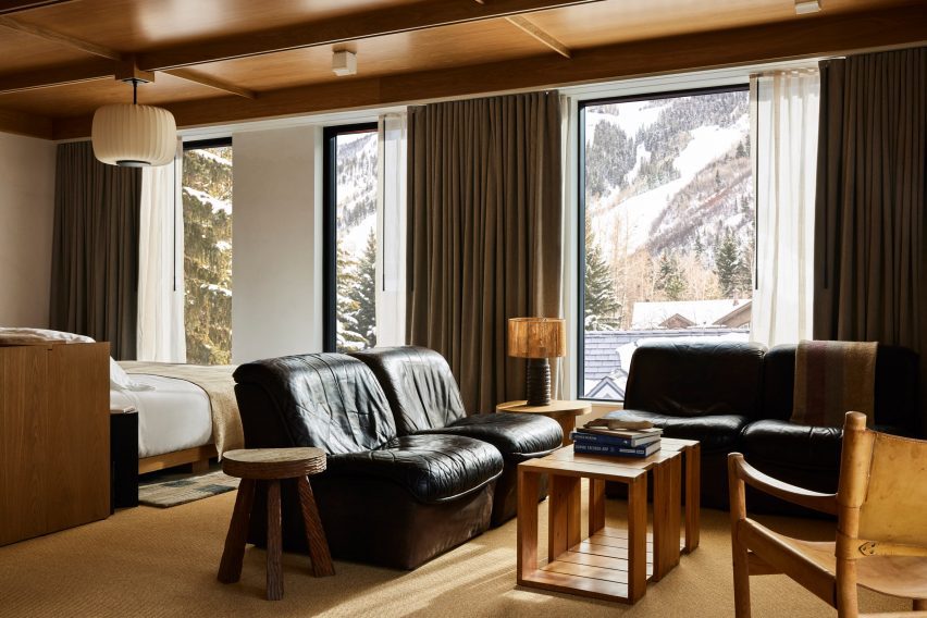
Guest suite with black leather furniture and snowy mountain viewsGuest suite with black leather furniture and snowy mountain views
Black leather furniture in the larger suites offers a contrast to the other furniture pieces and snowy mountain views

A repeated geometric pattern across the pale counter front is also found on door panels leading to other hotel areas.

An all-day cafe at the opposite end of the lobby serves pastries and an assortment of beverages from a walnut-wrapped counter, and the restaurant

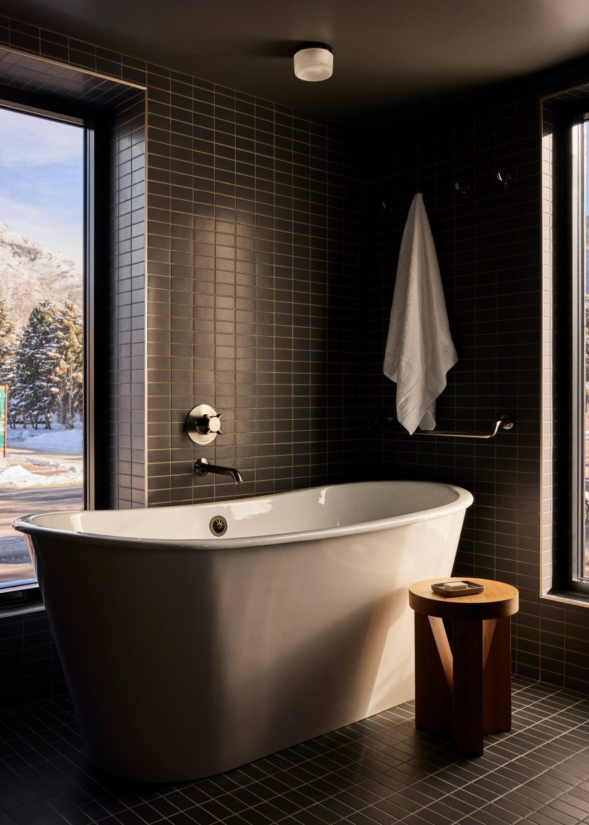
Bathroom with dark green tiles and freestanding white bathtubBathroom with dark green tiles and freestanding white bathtub
Dark green tiles in the bathrooms match the spruce trees outside

In the adjacent retail space, burl wood counters and displays with curved edges, some of which are topped with glass vitrines.

On the third floor is a roof terrace with a bar and a spa pool set to open in Spring 2024, while a fitness facility and flexible meeting space are located at ground level.

The guest rooms continue the soft, neutral palette in a more pared-back style.

Beige plaster walls, textured carpets and green-grey curtains complement the wood ceilings and built-in furniture, while black leather chairs add contrast.

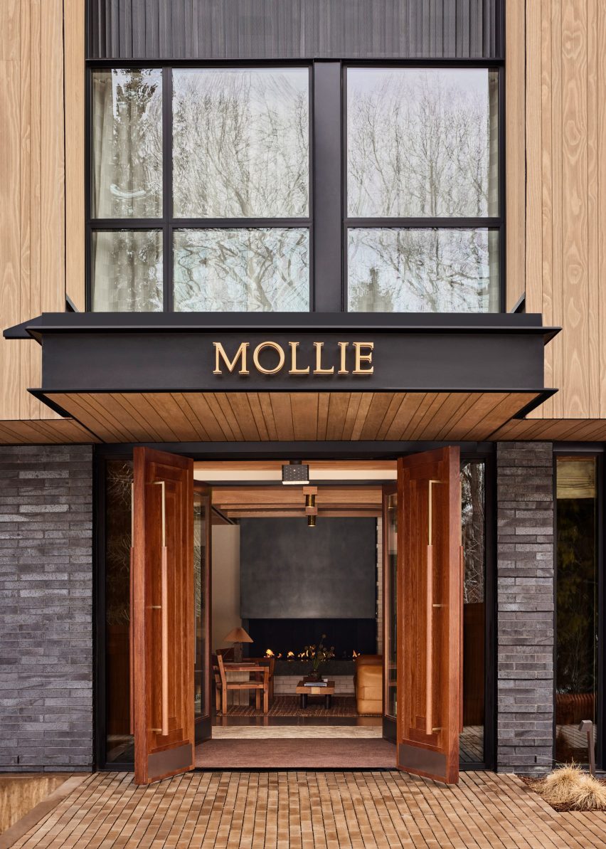
Mollie Apsen entrance with logo on the entrance canopyMollie Apsen entrance with logo on the entrance canopy
Mollie Aspen is located within a newly constructed building by CCY Architects

Dark green stacked tiles that line the bathrooms match the spruce trees outside and freestanding tubs beside the windows allow guests to enjoy the view while soaking.

“Guests are left with a sense of Aspen’s cultural and recreational history, providing a lens to appreciate its contemporary personality and influence,” the team said.

Mollie Aspen's wood-clad exteriorMollie Aspen's wood-clad exterior
The building was constructed largely from materials sourced from the Western US

Aspen is a renowned destination for winter sports and affluent vacationers, and CCY Architects has designed several private residences in and around the town – among them an extension to a Victorian house, a residence nestled in a grassy valley and a retreat that overlooks the dramatic mountainous scenery.

Formerly known as Studio Tack, Post Company’s previous hotel projects include the Anvil Hotel in Wyoming, The Sandman in California, and Scribner’s Catskill Lodge in New York.

The photography is by Nicole Franzen.

Reference

Eight earthy kitchens where terracotta tiles add warmth and tactility
CategoriesInterior Design

Eight earthy kitchens where terracotta tiles add warmth and tactility

For this lookbook, we’ve collated eight kitchens from Dezeen’s archive that use terracotta tiling to bring a sense of warmth into the functional space.

Terracotta – meaning baked earth in Italian – technically refers to any object made from fired clay. But most commonly, the term is used to describe pottery made from a porous type of earthenware clay that is high in iron oxides, giving it a rusty reddish brown colour.

Unlike ceramic stoneware or porcelain, terracotta is fired at lower temperatures so it does not vitrify – meaning the clay retains a coarse, organic texture and isn’t waterproof unless it is glazed.

Used as a backsplash or flooring, this can bring some much-needed colour and texture into the kitchen while helping to create a connection to the outdoors.

This is the latest in our lookbooks series, which provides visual inspiration from Dezeen’s archive. For more inspiration see previous lookbooks featuring accent walls, bookshelves and sunken baths.


Budge Over Dover house in Sydney designed by YSG
Photo by Prue Ruscoe

Budge Over Dover, Australia, by YSG

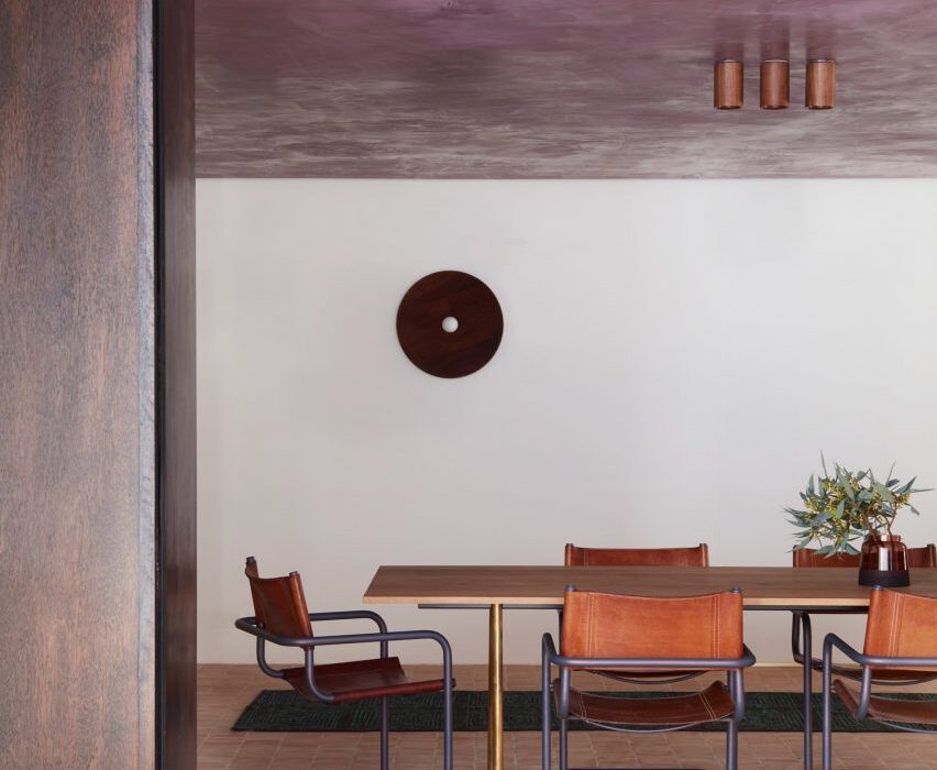
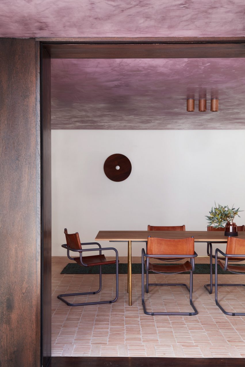
Australian studio YSG used narrow terracotta tiles to “draw the outside in” to this house in Sydney, spilling from the floor of the garden patio onto the adjacent kitchen and dining area, which can be opened up to the exterior using sliding glass doors.

The rough clay is paired with shiny aubergine-coloured plaster and travertine in the sunken living room beyond, creating a contrast between raw and polished surfaces.

Find out more about Budge Over Dover ›


Dining area in Farley Farmhouse by Emil Eve Architects
Photo by Mariell Lind Hansen

Farley Farmhouse, UK, by Emil Eve Architects

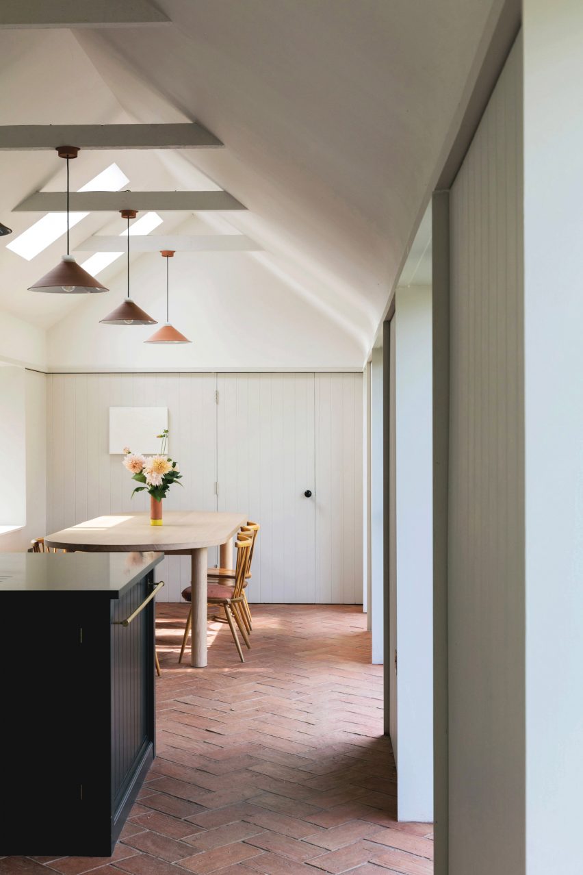
When Emil Eve Architects added a gabled kitchen to a farmhouse in Wiltshire, the British studio set out to mirror the material palette of the existing home by adding arrowhead terracotta tiles to the extension’s exterior.

Inside, matching rectangular tiles were laid in a herringbone pattern on the floor while a row of clay pendant lights hang from the wooden roof beams.

Find out more about Farley Farmhouse ›


Hygge Studio by Melina Romano
Photo by Denilson Machado

Hygge Studio, Brazil, by Melina Romano

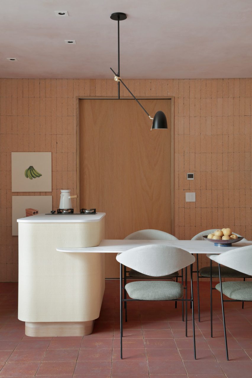
Terracotta flooring and tan brick walls lend a “rustic charm” to this São Paulo apartment, designed by Brazilian designer Melina Romano.

The tiles spill out across the entire home including the bedroom and lounge, which is framed by a screen made of decorative perforated cobogó blocks.

Find out more about Hygge Studio ›


Photo by José Hevia

Las 3 Marías, Spain, by Bajet Giramé and Nicolas Burckhardt

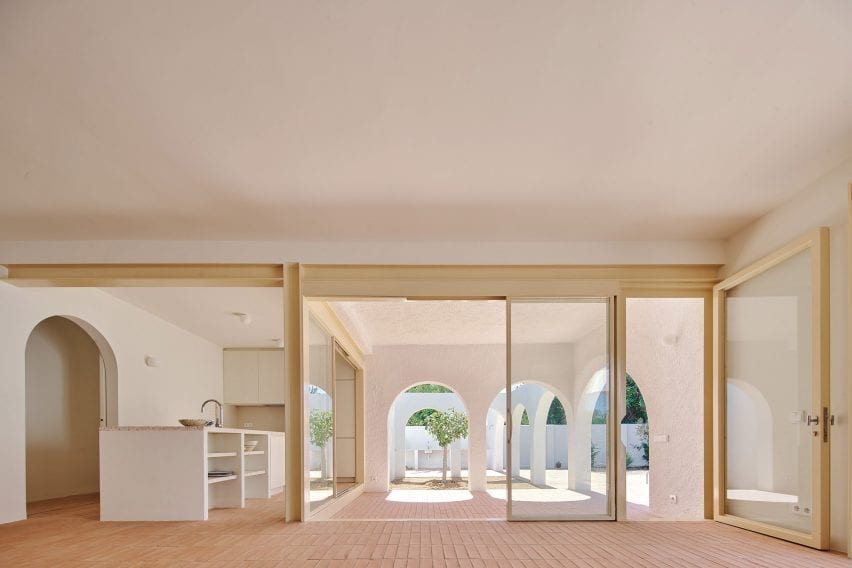
All-over terracotta flooring was one of the ways that Spanish studio Bajet Giramé found to connect the kitchen of this 1960s holiday home to its generous backyard, alongside the addition of generous arched openings and perforated steel doors.

“We ended up working on the whole plot, treating both house and garden as a playful matrix of varied interconnected rooms,” the studio told Dezeen.

Find out more about Las 3 Marías ›


Interiors of La Odette apartment by Crü
Photo by Adrià Goula

La Odette, Spain, CRÜ

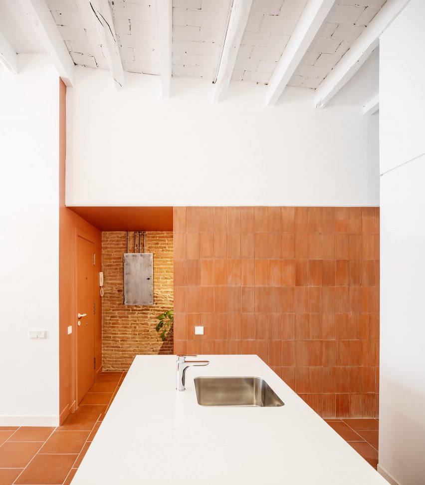
To create a bright, open floor plan inside this apartment in a Barcelona housing block that dates back to 1877, Spanish studio CRÜ tore down most of the internal petition walls

Instead, the kitchen is now delineated by a statement wall clad in terracotta tiles – left over from the flooring and turned back-to-front to reveal their ribbed underside.

Find out more about La Odette ›


Kitchen of West Bend House in Melbourne, designed by Brave New Eco

West Bend House, Australia, by Brave New Eco

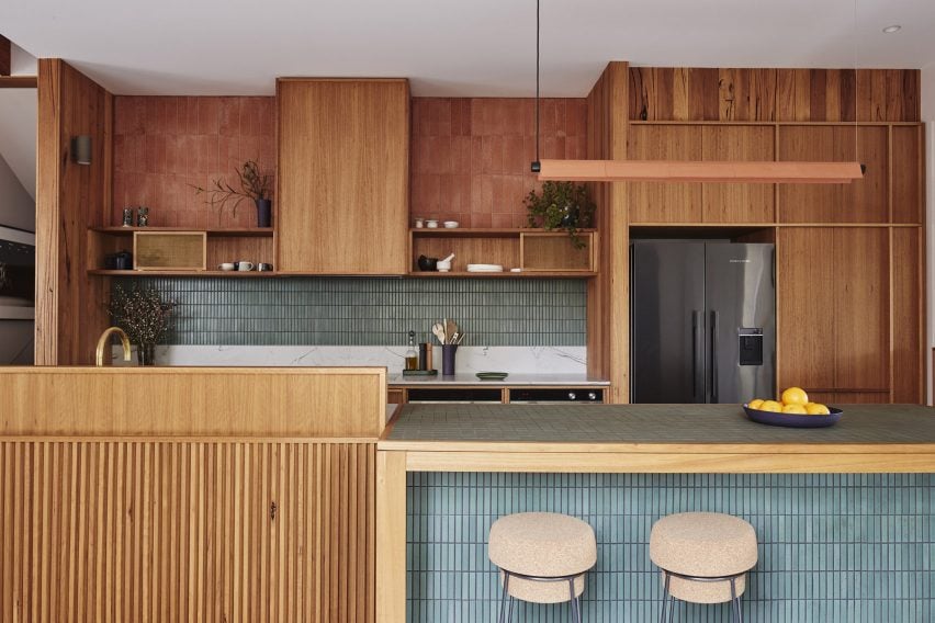
Three kinds of tiling provide textural interest inside the kitchen of this “forever home” in Melbourne, with sections of rustic terracotta contrasted against a backsplash of teal-glazed ceramics.

Corrugated tiles were also folded around the pendant light above the island that illuminates the work area, courtesy of Australian lighting brand Southdrawn.

Find out more about West Bend House ›


Como Taperia by Ste Marie
Photo by Conrad Brown

Como Taperia, Canada, by Ste Marie

Both the seating area and the open kitchen of this Spanish tapas bar in Vancouver were lined with terracotta, in a nod to the brick chimneys of Barcelona’s industrial Poble Sec power station.

Other Catalan references can be found in the restaurant’s cobalt blue accents – informed by the paintings of Joan Miró – and various abstract details that nod to the work of architect Antoni Gaudí.

Find out more about Como Taperia ›


Conde Duque apartment by Sierra + De La Higuera
Photo by German Sáiz

Conde Duque apartment, Spain, by Sierra + De La Higuera

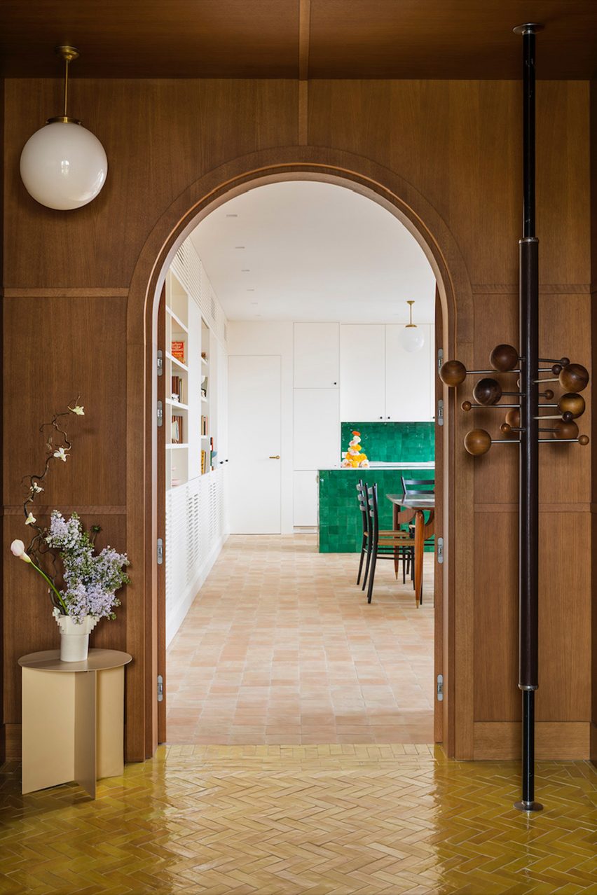
Different spaces in this open-plan apartment in Madrid were defined by traditional Moroccan zellige tiles, with glossy yellow and green glazes and organic handcrafted surfaces.

To balance out these flashier surfaces, terracotta was used to ground the kitchen and dining area, paired with plain white walls and custom timber joinery.

Find out more about Conde Duque apartment ›

This is the latest in our lookbooks series, which provides visual inspiration from Dezeen’s archive. For more inspiration see previous lookbooks featuring accent walls, bookshelves and sunken baths.

Reference

Isern Serra uses earthy material palette for Andrés Reisinger office
CategoriesInterior Design

Isern Serra uses earthy material palette for Andrés Reisinger office

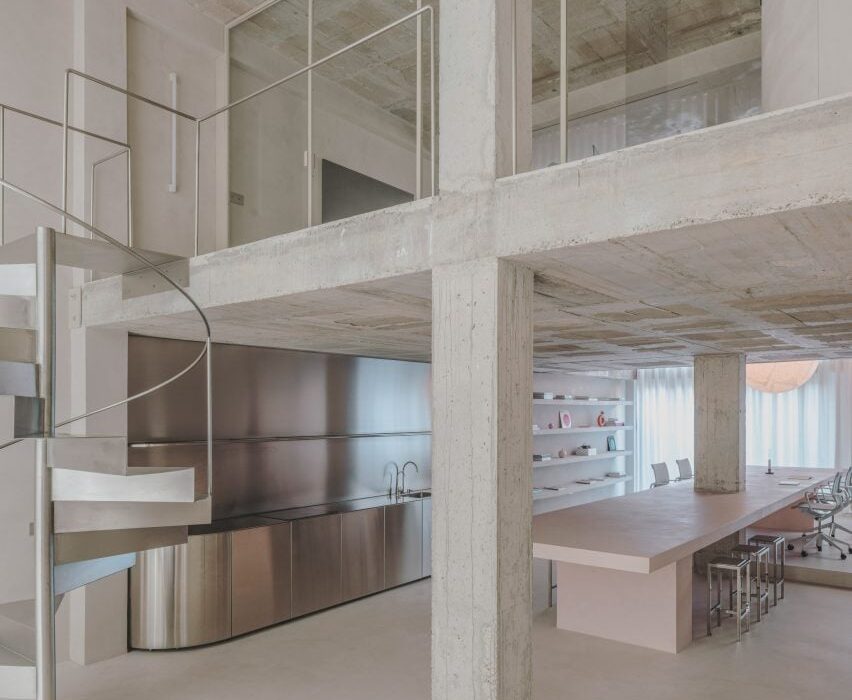
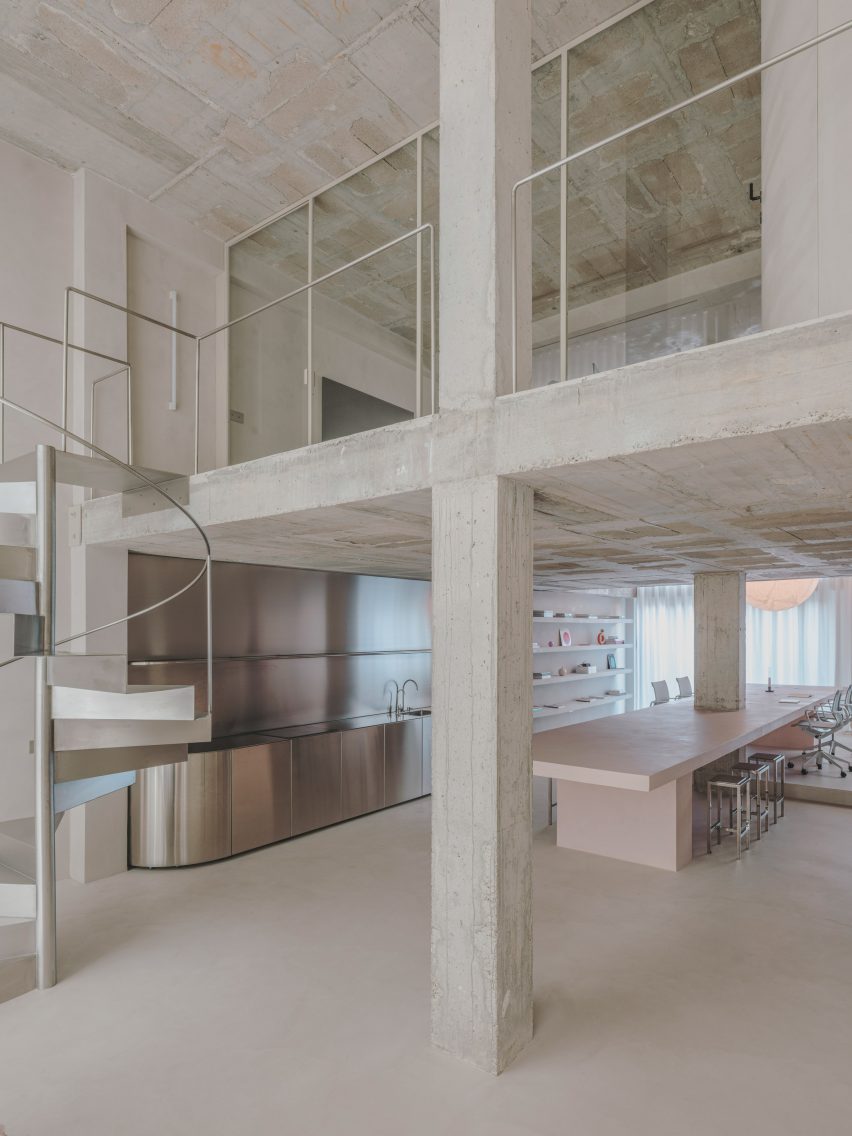
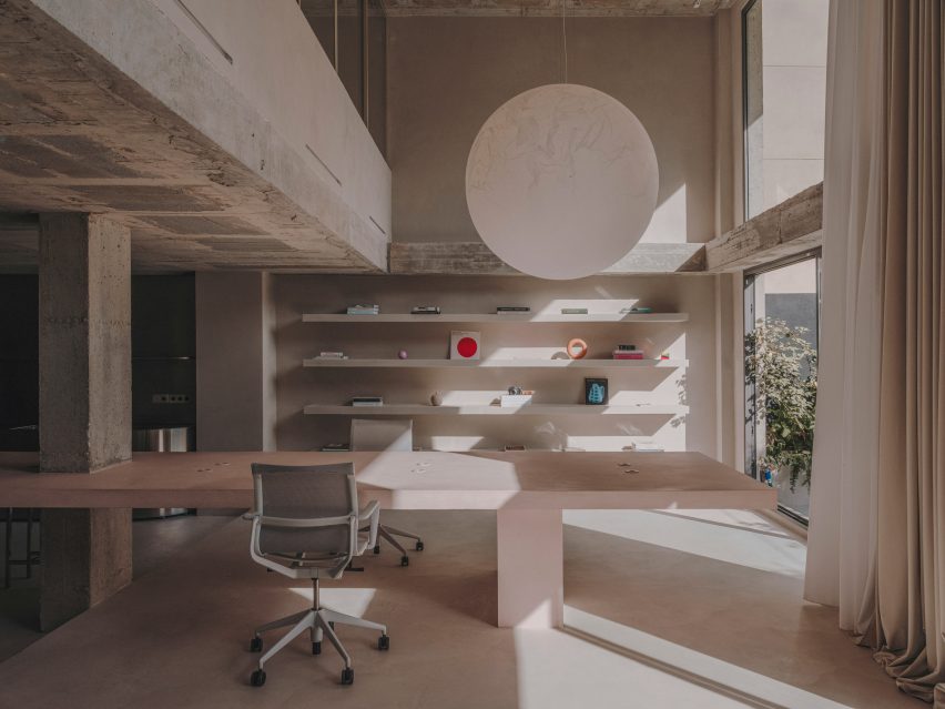
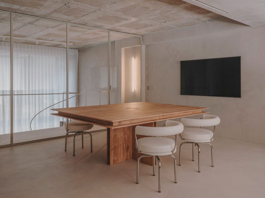
Spanish architecture and interior design studio Isern Serra kept to a material palette of concrete, quartz and stainless steel to create this pared-back office for Reisinger Studio

Located in the Poblenou neighbourhood in Barcelona, digital artist Andrés Reisinger’s studio is surrounded by several other creative’s offices and is designed to reflect the artist’s minimalist, dreamlike style.

The ground floor of Andrés Reisinger's office
The Studio Reisinger office is designed to reflect the artist’s minimalist aesthetic

“The concept behind the interiors of my studio was to create a space that complements and doesn’t compete with the uplifting spirit of my work,” Reisinger told Dezeen.

“I wanted the studio to be like a canvas, with a kind of identity that I could play with,” he added. “The space is inspired by my work’s aesthetic, with seemingly surreal details amidst the light and bright studio.”

An office by Isern Serra
Isern Serra left its raw concrete pillars intact

Purchased as an empty shell, the Barcelona-based team decided to leave parts of the original space intact such as the concrete pillars while the ceiling was left exposed.

Natural tones and textures were introduced through paint and flooring to create an airy and monochromatic yet soothing feel.

A kitchen by Isern Serra
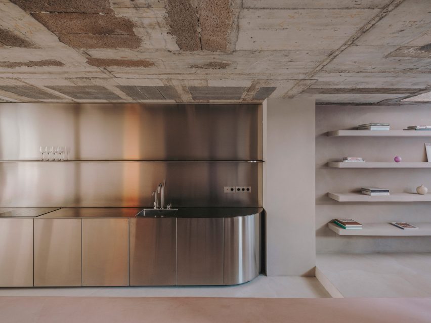
A stainless steel kitchen is on the ground floor

“First the colour and texture of the walls were chosen,” Isern Serra told Dezeen. “They are finished with a quartz-based paint in the form of a paste,” he added.

“A natural finishing of micro-cement for the flooring was chosen to have the same tone and textured effect,” Serra said.

A dining table inside Andrés Reisinger's office
A concrete table can be used for dining and working

The team then went about filling the space with office equipment and furnishings, paying close attention to sourcing locally made items that reflect the sculptural work of Reisinger Studio.

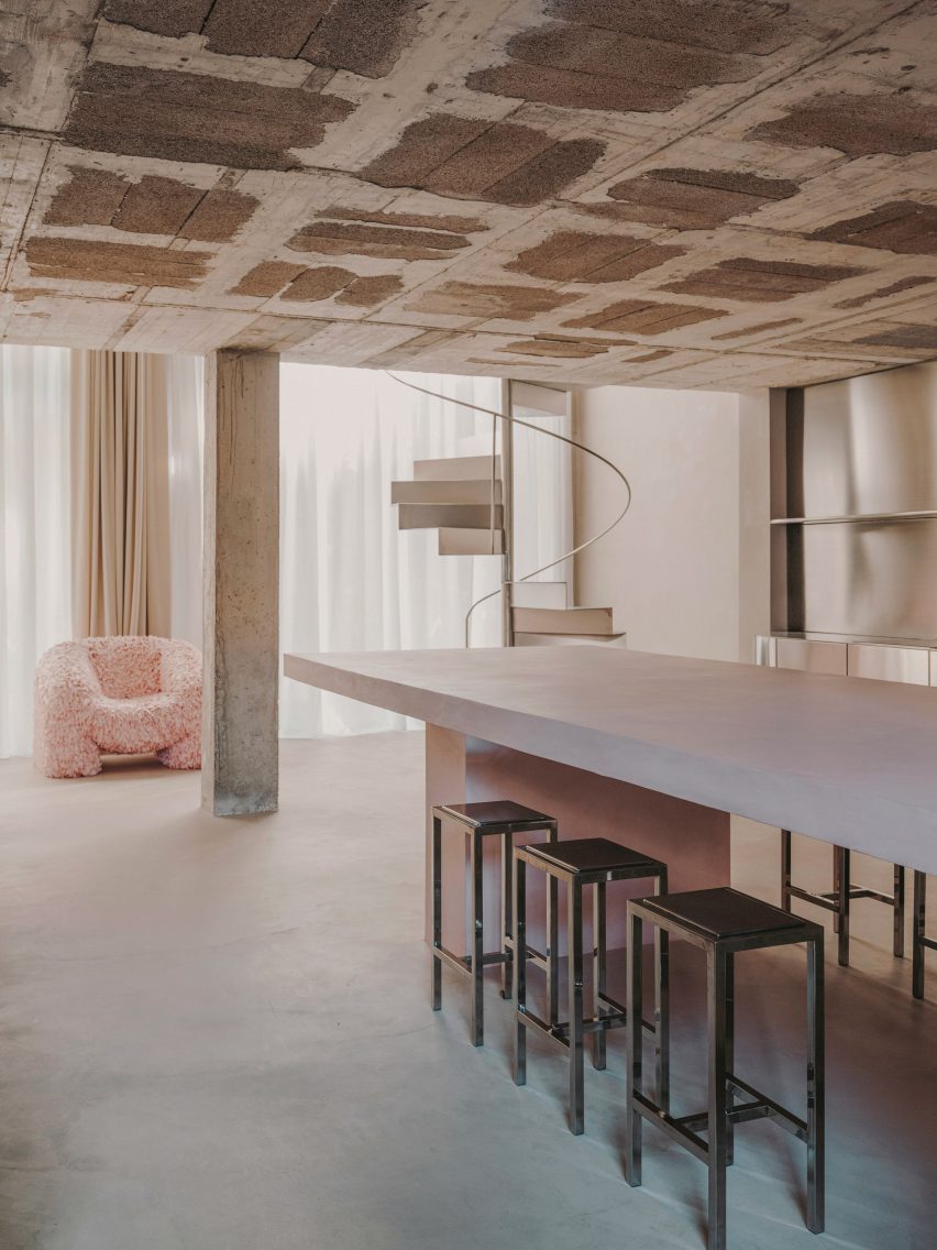
A large concrete table, which functions as a workspace and dining table was made on-site and stands in the middle of the studio.

It was produced in a hue that sits between millennial pink and beige – a colour that has become synonymous with Reisinger’s work. A similar shade can be seen throughtout Reisinger and architect Alba de la Fuente’s virtual residence Winter House.

Around the table is a set of chrome metal stools custom-made by designer Julia Esque that complement the stainless steel staircase which curls up the floor above.

Also in the area below the mezzanine, is a kitchen made entirely of stainless steel that features an integrated hydraulic push-to-open storage system.

An office interior by Isern Serra
A millennial pink colour palette was used throughout

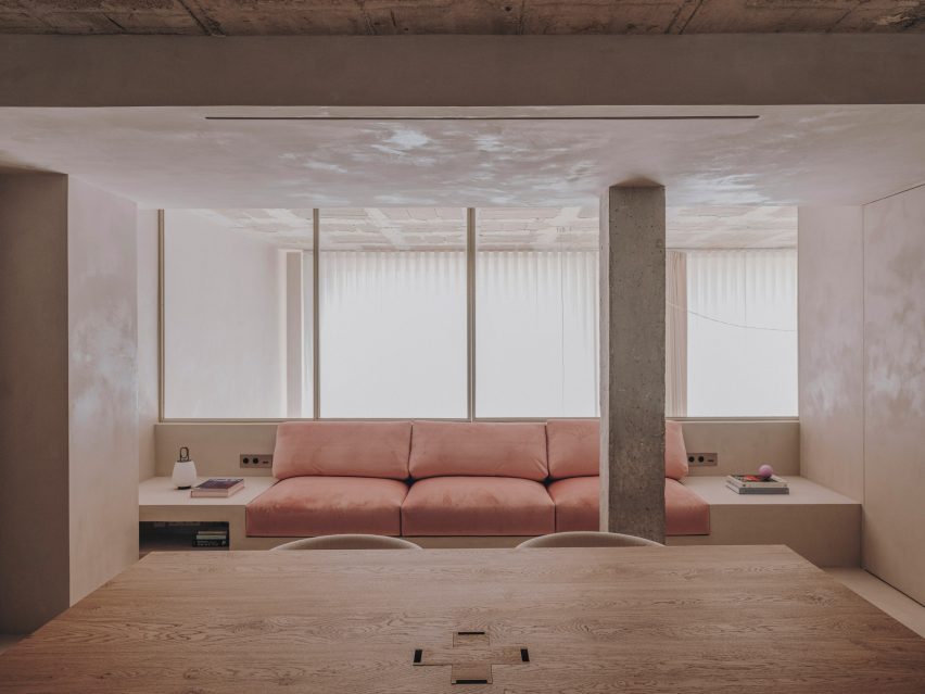
On the upper floor, which is fronted by glass, Andrés Reisinger has a private office with a wooden desk for meetings. Plush pink seating here adds a touch of warmth. A separate shower and toilet are also situated on this floor.
“The goal was to create a space that would inspire, rather than distract, from the work being produced,” explained Reisinger.

“I imagined the studio as a blank canvas, a place where my team and I could come to experiment, evolve and grow our ideas and projects.”

The interior of an office by Isern Serra
The office has a separate meeting room

Argentinian designer Andrés Reisinger founded Reisinger Studio in 2018. The artist is best known for the Hortensia chair, a bulbous pink armchair made with CGI that went viral on Instagram.

He also made headlines for his collection of “impossible” virtual furniture, which sold for $450,000 at auction.

The photos are courtesy of Reisinger Studio.

Reference

Ten earthy bedrooms that use natural colours and textures
CategoriesInterior Design

Ten earthy bedrooms that use natural colours and textures

In our latest lookbook, we highlight 10 bedroom interiors that introduce earthy colour palettes and natural materials to evoke a sense of calm and tranquility.

Warm tones of earthen brown and light neutrals were used alongside colourful pops of terracotta and leafy greens on soft furnishings, headboards and decorations to create a peaceful atmosphere in these bedrooms.
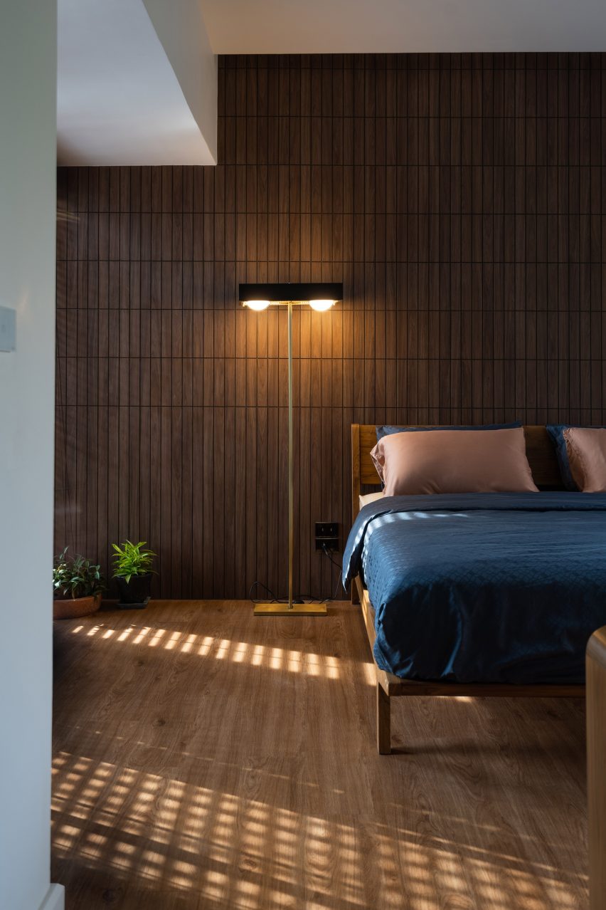
Stone surfaces, timber panelling, linen fabric, accents of clay and limewash finishes add subtle textures to the interior spaces.
This is the latest in our lookbooks series, which provides visual inspiration from Dezeen’s archive. For more inspiration see previous lookbooks featuring jewel-toned hotel interiors, kitchens with marble surfaces and biophilic homes.


Brown bedroom in house in Mexico City by Chloe Mason Gray
Photo by Fabian Martinez

Colonia Condesa House, Mexico, by Chloé Mason Gray

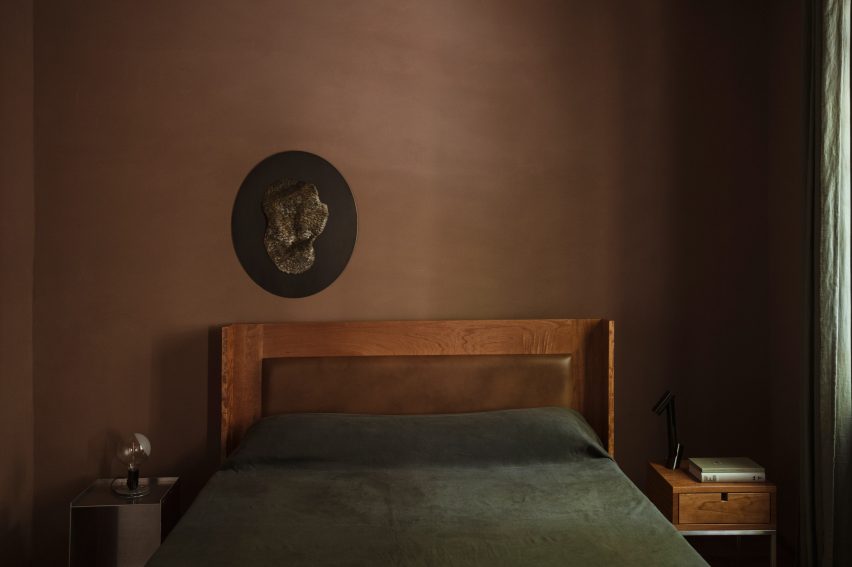
For the renovation of this mid-20th century house in Mexico City, local interiors studio Chloé Mason Gray embraced the lack of natural light coming into the space by introducing dark, earthy colours and textures.

The walls of the primary bedroom were coated in brown plaster, and the space was finished with a brown leather headboard and linen furnishings in deep shades of forest green.

Find out more about Colonia Condesa House ›


Interior of Casa Maiora by Studio Andrew Trotter in Puglia
Photo by Salva López

Casa Maiora, Italy, by Studio Andrew Trotter

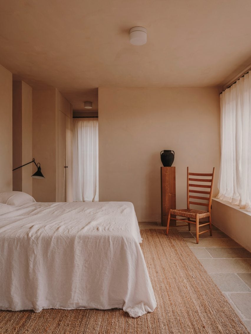
Designed to mimic the surrounding landscape, Italian architecture practice Studio Andrew Trotter created this villa in Puglia with sandstone and limestone walls coated in a pink lime wash.

Stone floors complement the warm-toned walls while in the bedrooms, locally-sourced wooden antique furniture and large woven rugs add hints of deeper earthen shades.

Find out more about Casa Maiora ›


Bedroom interior of Dumbo Loft by Crystal Sinclair Designs
Photo by Seth Caplan

Dumbo Loft, USA, by Crystal Sinclair Designs

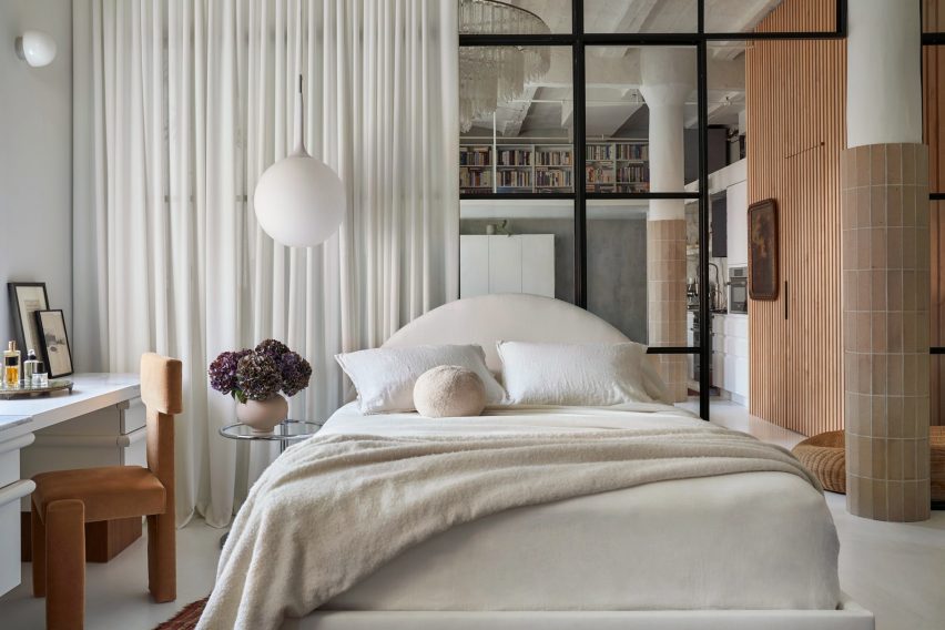
New York interiors studio Crystal Sinclair Designs punctuated the pale white backdrop of this bedroom in a Brooklyn loft apartment with caramel shades of brown and natural textures.

A yellow-brown velvet chair, rustic tiles that wrap around the lower half of structural columns, and a wooden batten wall help to make the space cosier and more inviting.

Find out more about Dumbo Loft ›


De Beauvoir Townhouse by HÛT
Photo by Emanuelis Stasaitis

De Beauvoir Townhouse, UK, by HÛT

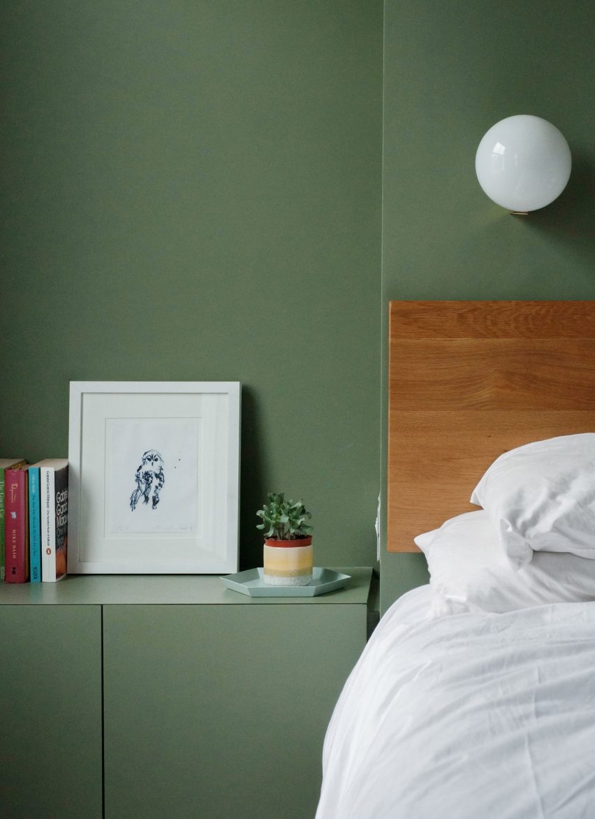
As part of the overhaul of a home in London, British architecture studio HÛT finished the surfaces and joinery in the main bedroom in sage green, nodding to the use of green shades in the kitchen and living room downstairs.

According to the studio, the muted green colour was chosen for its timelessness and longevity, as well as for its visual appeal when paired with exposed timber.

Find out more about De Beauvoir Townhouse ›


Interior of Hygge Studio by Melina Romano
Photo by MCA Estúdio

Hygge Studio, Brazil, by Melina Romano

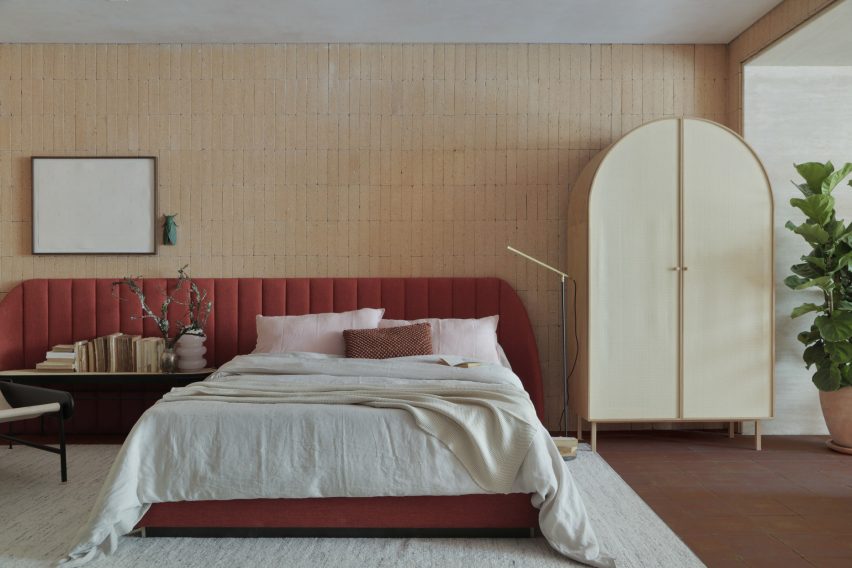
Brazilian designer Melina Romano used a myriad of earthy colours, textures and decorations to achieve a modern interior with “rustic charm” in this São Paulo apartment.

Terracotta flooring and creamy brick walls were complemented with comfy furniture and soft furnishing in earthy tones, including the rust-coloured bed frame and elongated headboard in the bedroom.

Romano also added a tropical leafy plant, branches speckled with lichen and insect-shaped wall art to the space.

Find out more about Hygge Studio ›


Custom bed in Twentieth house by Woods and Dangaran
Photo by Joe Fletcher

Twentieth, USA, by Woods + Dangaran

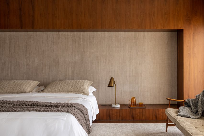
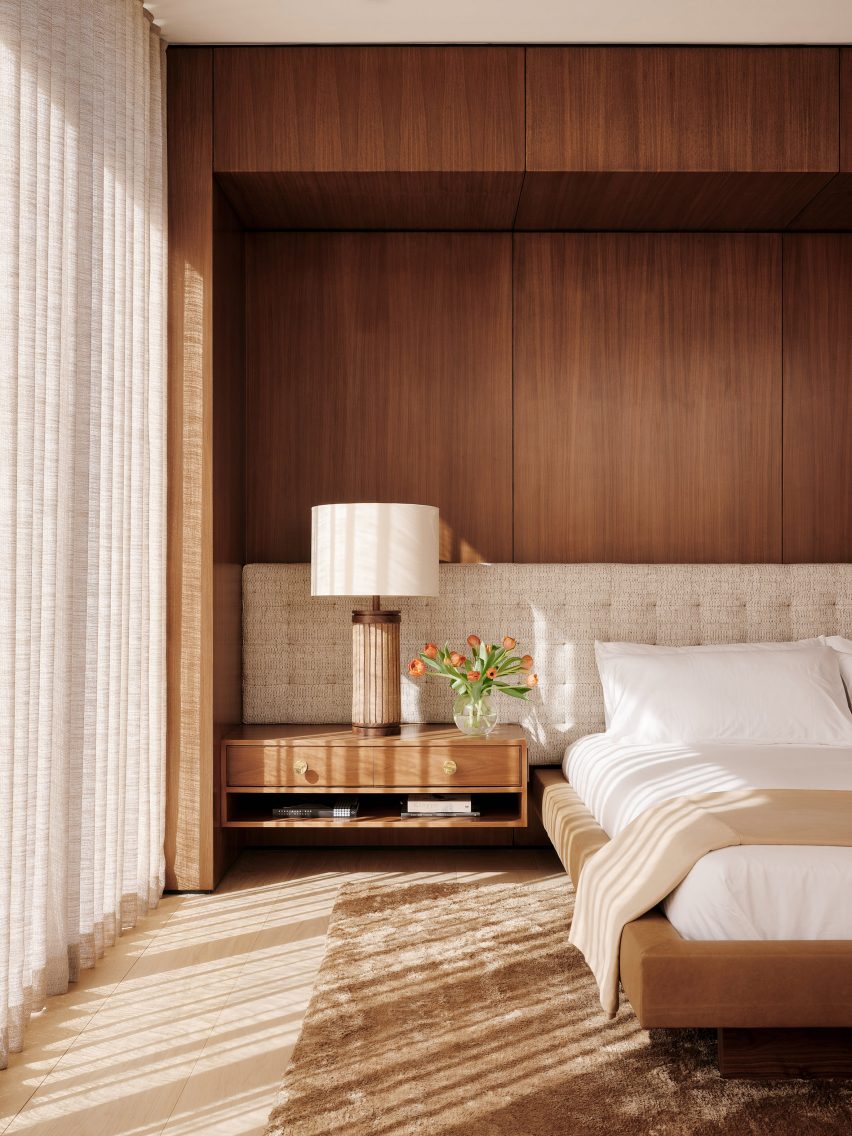
Wood panelling, vintage furnishings and earthy-brown colours characterise the interior spaces of the Twentieth house in Santa Monica by Los Angeles studio Woods +Dangaran, which was built around an olive tree.

The primary bedroom was designed to feel flush and luxurious, with a Mehraban silk shag rug, brass fixtures and a custom bed recessed into a wooden surround.

Find out more about Twentieth ›


Bedroom in Flat#6 by Studio MK27
Photo by Fran Parente

Flat #6, Brazil, by Studio MK27

Also featuring a custom-made wooden bed surround is this bedroom designed by local architecture and design practice Studio MK27.

The practice added tactile rugs, blankets and fabric wall panels in various shades of brown and light neutrals to contrast with the basalt stone flooring in the São Paulo apartment.

“Natural light warms up every piece and every corner, letting the woods, the velvets and the stones speak louder,” said Studio MK27.

Find out more about Flat #6 ›


Escondido Oaxa Hotel by Decada Muebles
Photo by Undine Pröhl

Escondido Oaxaca Hotel, Mexico, by Decada Muebles

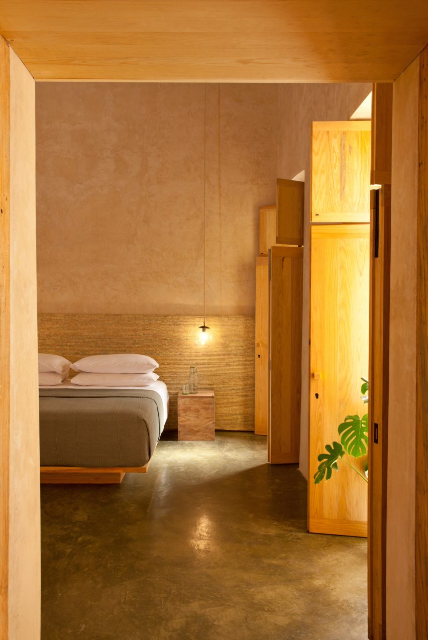
Interiors studio Decada Muebles finished the bedrooms of this boutique hotel in Oaxaca City with woven palm leaf headboards and sabino wood furniture pieces made by local artisans, including side tables, bed frames and shutters.

Alongside the wood accents, stucco walls help to add warmth and texture to the space and create a relaxing place for vacationers to stay.

Find out more about Escondido Oaxaca Hotel ›


The Palace Gate by Tala Fustok
Photo by Michael Sinclair

The Palace Gate Apartment, UK, by Tala Fustok Studio

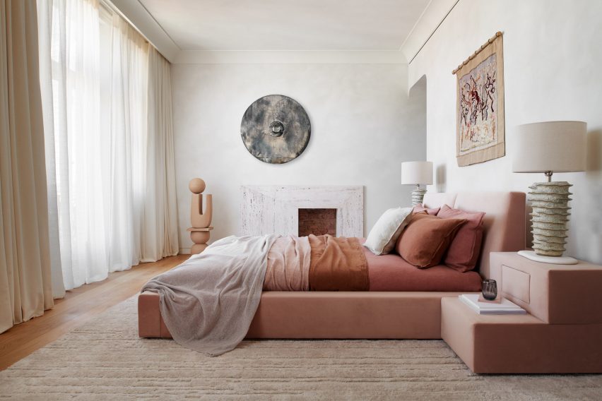
Local interior design practice Tala Fustok Studio transformed this west London apartment into a “calm sanctuary” with a mixture of stone textures, earthy fabrics and a soft-warm colour palette.

The centrepiece of the bedroom is a 1960s-style velvet bed in a dusty pink hue. Decorative items surrounding it include a wall tapestry, a modern stone fireplace and an organically-shaped ceramic statue.

Find out more about The Palace Gate Apartment ›


Lom Haijai by Studionomad
Photo by Supee Juntranggur

Lom Haijai, Thailand, by Studionomad

Lom Haijai is an apartment block in Bangkok designed by architecture practice Studionomad, which features trees growing through the facade’s louvres.

Each bedroom in the apartment block has a Juliet balcony that looks over an internal courtyard. Wooden flooring and wall panelling add to the nature-inspired theme of the design.

Find out more about Lom Haijai ›

This is the latest in our lookbooks series, which provides visual inspiration from Dezeen’s archive. For more inspiration see previous lookbooks featuring jewel-toned hotel interiors, kitchens with marble surfaces and biophilic homes.

Reference