SODA explores office-to-residential conversions with Roco in Liverpool
CategoriesInterior Design

SODA explores office-to-residential conversions with Roco in Liverpool

London studio SODA has converted a 1970s office block in Liverpool city centre into a residential building that  includes co-working and wellness facilities.

The adaptive reuse project sees the 10-storey block, which spent decades as an office for HM Revenue and Customs, transformed into rental homes managed by operator Livingway.
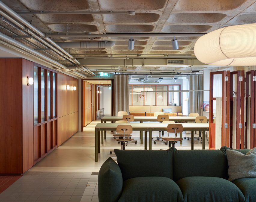
Ground floor of Roca living in Liverpool by SODAGround floor of Roca living in Liverpool by SODA
Communal spaces take up most of the ground floor

Roca contains 120 one- and two-bedroom apartments, plus two floors of co-living-style amenities for residents. These include workspaces, a large kitchen, cinema room, gym and treatment rooms and a planted roof terrace.

Russell Potter, co-founding director at SODA, believes the project can serve as a model for office-to-residential conversions in city-centre locations.
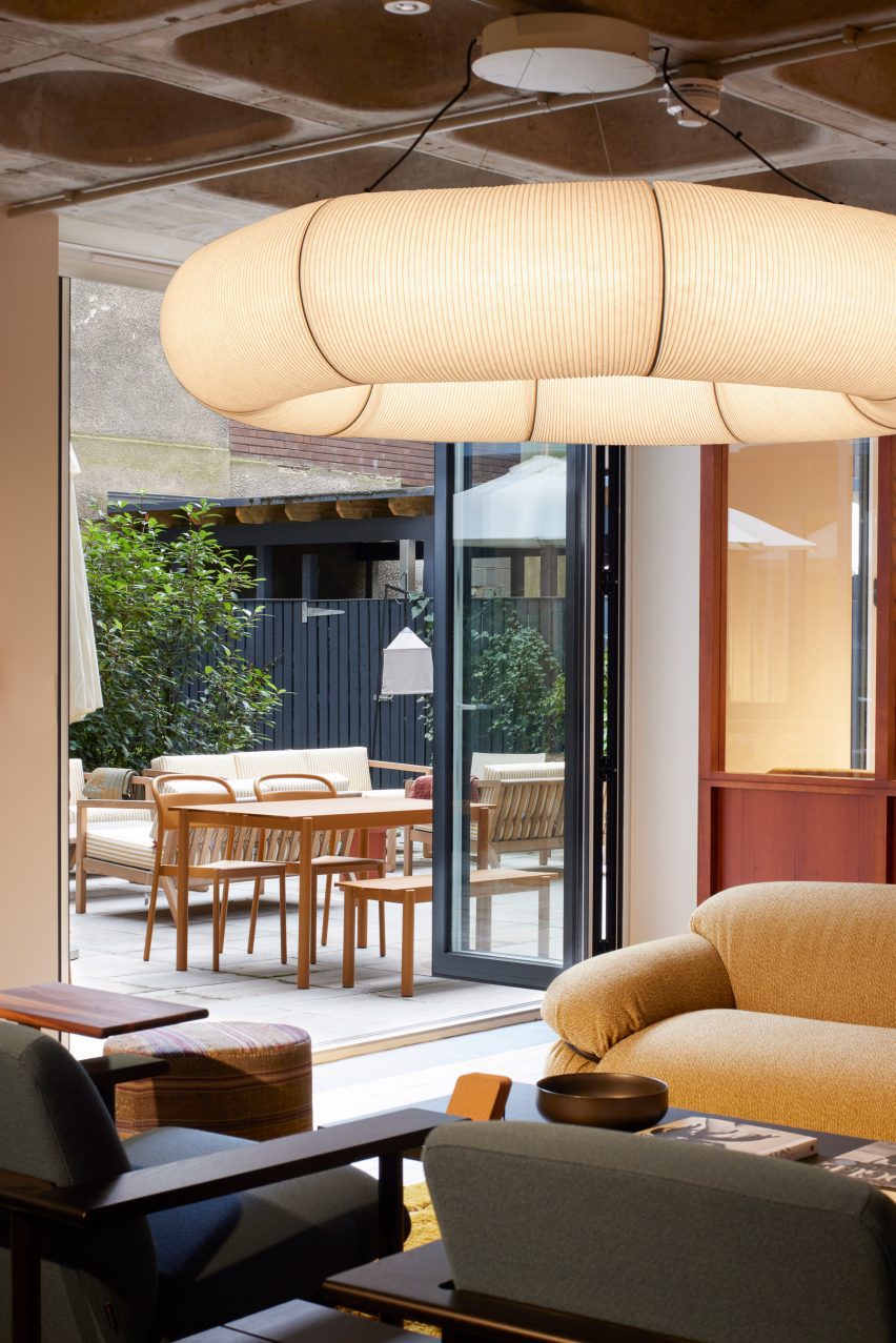
Lounge in Roca living in Liverpool by SODALounge in Roca living in Liverpool by SODA
The design includes mix of flexible lounge and workspaces

“The leaps that office design has made over the past decade or two have meant that certain period properties from the 1960s and 70s are perhaps not the most desirable from a commercial point of view,” he told Dezeen.

“But if they occupy prime city-centre locations, they can offer amazing opportunities to adapt and re-use, to reinvigorate city centres with genuinely flexible and crafted spaces.”
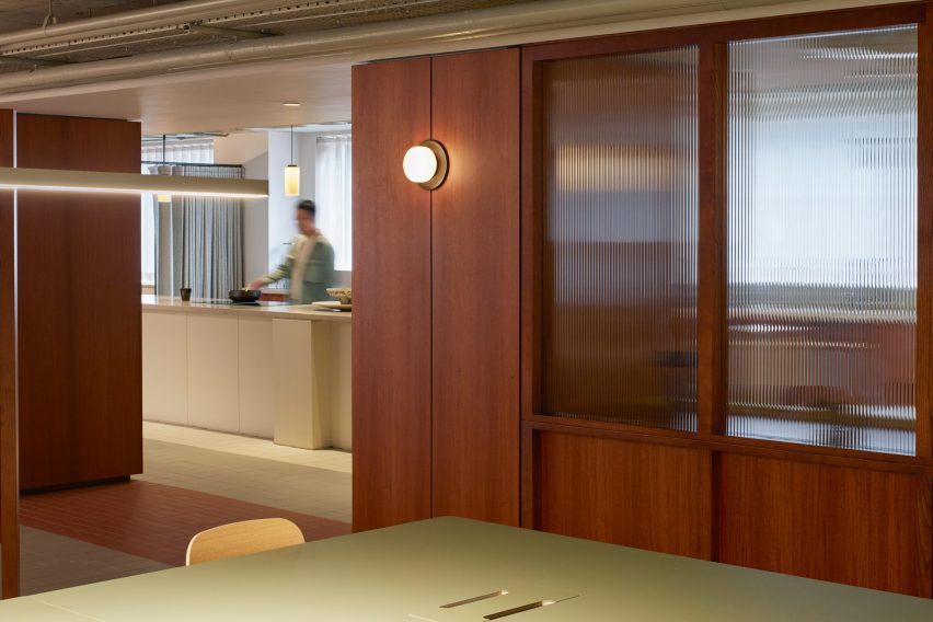
Desk in Roca living in Liverpool by SODADesk in Roca living in Liverpool by SODA
A timber “activity wall” provides surfaces, seating and storage

Livingway’s model is a version of co-living. By offering Roca residents access to communal spaces, in addition to their apartments, it aims to foster a sense of community.

Many of these shared spaces can be found on the ground floor. Here, various work, lounge and dining spaces are organised around a timber “activity wall” that provides surfaces, storage and seating.
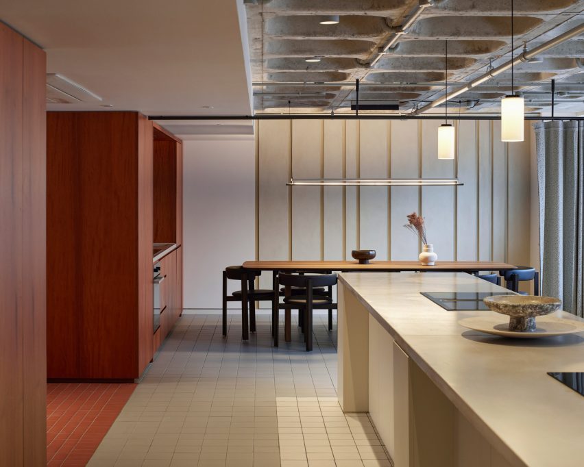
Kitchen dining room in Roca living in Liverpool by SODAKitchen dining room in Roca living in Liverpool by SODA
A communal kitchen is often used for cooking classes and demonstrations

Other interior details, such as folding screens, curtains and fluted glass windows, allow the space to be casually divided into different activity zones when required.

Sometimes these spaces host workshops or classes, allowing residents to engage with local businesses.

“We’re introducing an element of communal activity to act as a hub at ground floor, in a similar fashion to what’s been happening in other co-living arrangements,” said Potter.

“It means you have the opportunity to create a genuine sense of community within a city centre.”
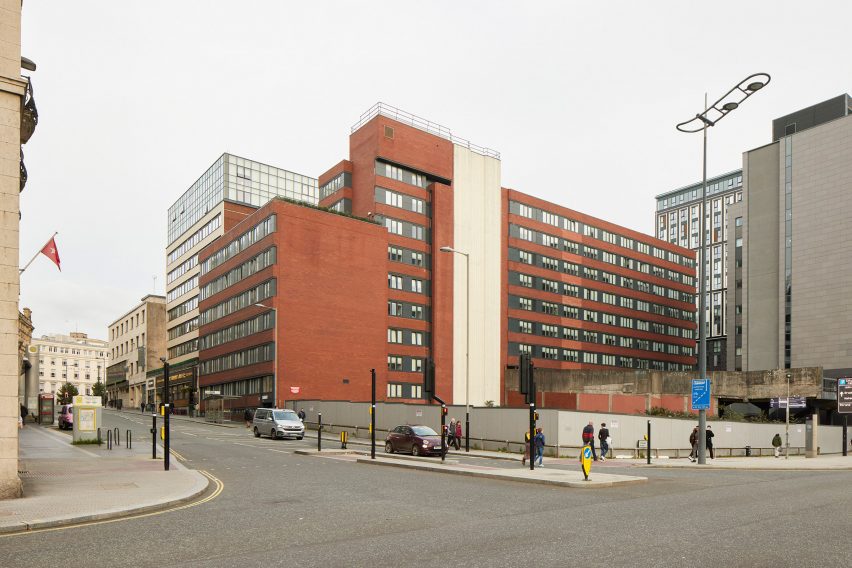
Former office building in LiverpoolFormer office building in Liverpool
The building was previously an office block

On the apartment floors, the existing floorplates made it possible to create larger homes than typical co-living units, arranged on opposite sides of a central corridor.

Apartments come fully furnished, with bedrooms and bathrooms separate from the living areas.
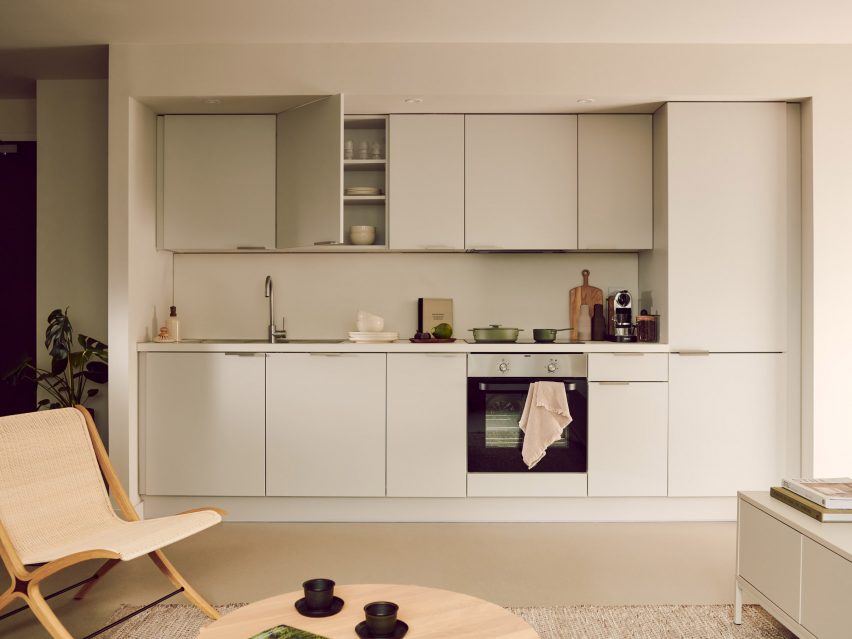
Apartment kitchen in Roca living in Liverpool by SODAApartment kitchen in Roca living in Liverpool by SODA
The renovation provides 120 apartments in total

“Office buildings typically have slim floor plates with decent floor spans and high proportions of glazing-to-floor area, so make ideal opportunities for residential conversion,” Potter explained.

“Likewise, floor-to-ceiling heights don’t tend to pose an issue for residential,” he added. “Typically, commercial floor heights are higher than what you expect in residential, meaning that you get better aspects of light into the spaces.”
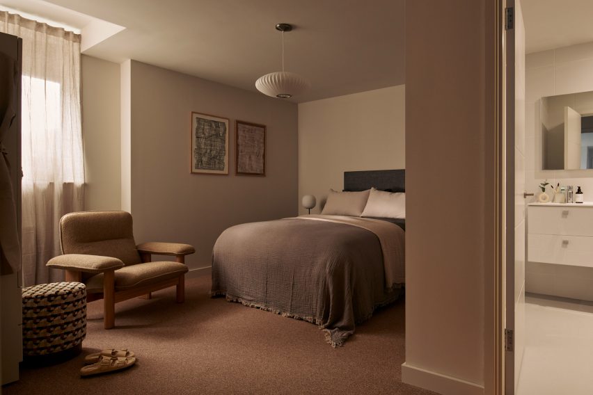
Apartment bedroom in Roca living in Liverpool by SODAApartment bedroom in Roca living in Liverpool by SODA
The apartments are larger than is typical for co-living

Livingway offers five of these units as hotel rooms, available for short stay. But guests don’t have access to all of the communal facilities; most are reserved for residents.

Technology plays an important role in the building management. An app allows residents to book certain rooms or sign up for workshops and classes, while digital locks allow access to be controlled.
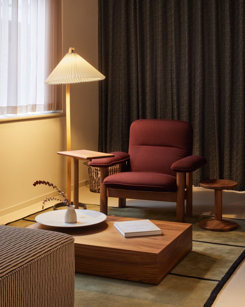
Red armchair in Roca living in Liverpool by SODARed armchair in Roca living in Liverpool by SODA
The communal spaces feature colours and patterns that reference the 1970s

The interior design approach reflects the building’s 1970s heritage, with furniture and finishes that don’t shy away from colour and pattern.

Standout spaces include the cinema room, an all-red space featuring large upholstered chairs, tubular wall lights and art-deco-style mouldings.

Across the rest of the ground floor, the exposed concrete waffle-slab overhead brings an industrial feel that contrasts with the warmth of the wood surfaces and soft furnishings.
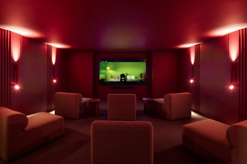
Cinema room in Roca living in Liverpool by SODACinema room in Roca living in Liverpool by SODA
Standout spaces include a cinema screening room

The homes feature a more subtle palette, with muted tones rather than white, to allow residents to bring their own personalities into the design.

A similar level of care was brought to the outdoor spaces. These include an informal courtyard on the ground floor and the seventh-floor roof terrace, which incorporates a trio of hot tubs.
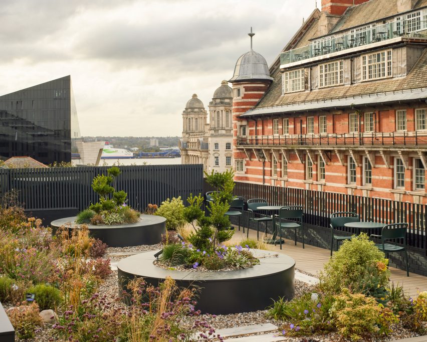
Roof terrace in Roca living in Liverpool by SODARoof terrace in Roca living in Liverpool by SODA
A planted roof terrace includes three hot tubs

The project builds on SODA’s experience of designing shared spaces. The studio has designed various spaces for workplace provider The Office Group (TOG), including Liberty House and Thomas House.

The collaboration with Livingway came about after the company reached out to the studio via Instagram.

“It is amazing to see what a beautiful result has been produced and how much our residents truly enjoy calling Roco their home,” added Samantha Hay, CEO for Livingway.

The photography is by Richard Chivers.

Reference

UK’s “most sustainable” neighbourhood receives planning approval
CategoriesSustainable News

UK’s “most sustainable” neighbourhood receives planning approval

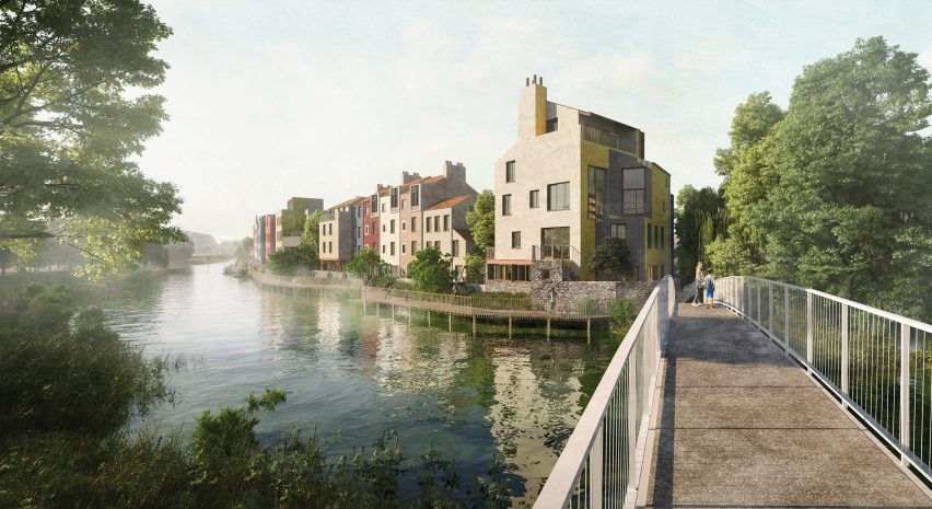
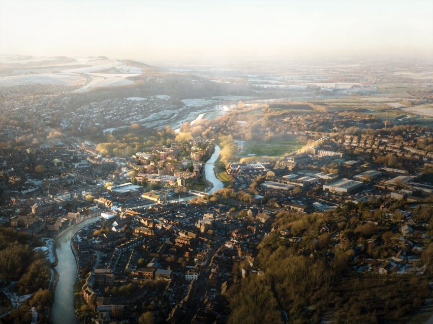
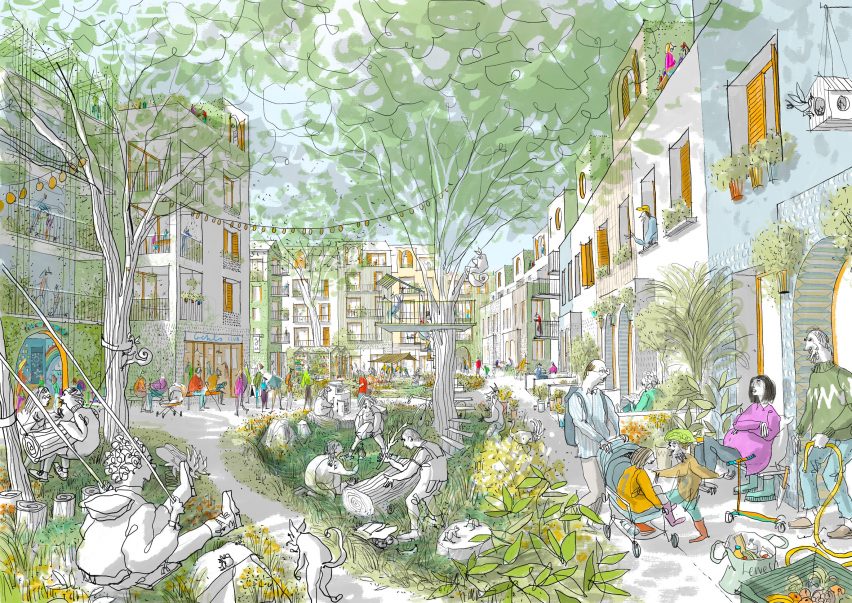
Development company Human Nature has received planning approval to transform a former industrial site in Lewes into a sustainable 685-home neighbourhood that will be the UK’s largest made from timber.

The Phoenix, which was granted planning permission last week, will be built from engineered timber and be the most sustainable neighbourhood in the UK, according to Human Nature.

The Phoenix sustainable neighbourhood by Human NatureThe Phoenix sustainable neighbourhood by Human Nature
The buildings in the Phoenix development will have engineered timber structures

“One year after proposals were announced for the transformation of a 7.9-hectare brownfield site into the UK’s most sustainable neighbourhood, the Phoenix development has today been granted planning permission, taking the visionary project a step closer to reality,” said Human Nature.

“When complete, it will be the UK’s largest timber-structure neighbourhood and a blueprint for sustainable placemaking and social impact that can be deployed at scale.”

Sustainable neighbourhood in Lewes by Human NatureSustainable neighbourhood in Lewes by Human Nature
It will be located on a former industrial site

Located in the South Downs National Park, the Phoenix will contain energy-efficient homes, public space and healthcare, retail, hospitality and industrial space, all constructed from engineered timber including cross-laminated timber.

It will be the largest structural timber neighbourhood in the UK by number of units, Human Nature’s head of sustainable construction Andy Tugby told Dezeen.

The buildings will range from two to five storeys tall and be clad in prefabricated panels made from locally sourced timber and biomaterials such as hemp.

Sustainable development in Lewes by Human NatureSustainable development in Lewes by Human Nature
A riverside walk will feature in the neighbourhood. Image by Carlos Penálver

Industrial structures on the site will be repurposed to house most of the community spaces, including a canteen, event hall, taproom, fitness centre, workspace and studios.

The Phoenix’ homes will be designed to be energy efficient and powered by renewable energy sourced from on-site photovoltaic panels and an off-site renewable energy facility.

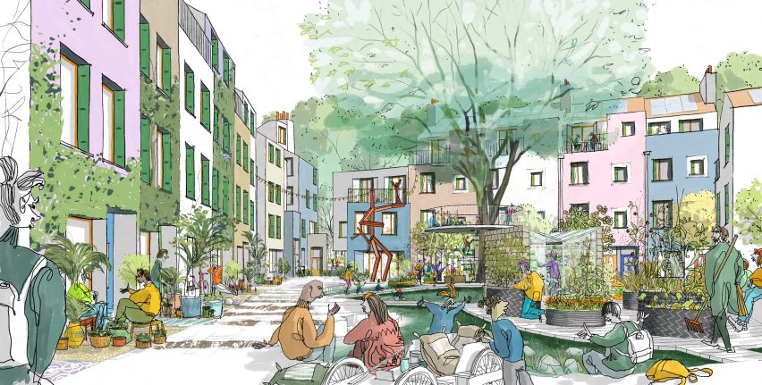
Aiming to create a place for all generations and for people with mixed incomes, 30 per cent of the 685 residences will be affordable homes – 154 of which will be built to the government’s Local Housing Allowance rates and the remainder built as part of the First Homes scheme.

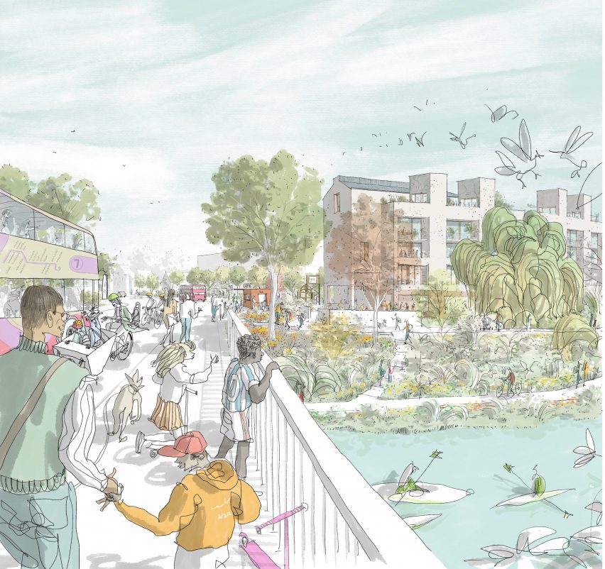
The Phoenix will be designed as a walkable neighbourhood that prioritises people over cars, with a mobility hub providing electric car shares, car hire, electric bike services and shuttle buses to help encourage a shift away from private vehicle use.

Public squares, gardens, community buildings and a riverside pathway that stretches the length of the site will provide space designed for interaction between residents.

Timber structure neighbourhood by Human NatureTimber structure neighbourhood by Human Nature
The development will contain energy-efficient homes

The Phoenix masterplan was designed by Human Nature’s in-house design team with UK architecture studio Periscope and Kathryn Firth, director of masterplanning and urban design at Arup.

Developed designs for the scheme will be made in collaboration with UK architecture studios Archio, Ash Sakula, Mae Architects, Mole Architects and Periscope and engineering firms Expedition Engineering and Whitby Wood.

Drawing of a park surrounded by buildingsDrawing of a park surrounded by buildings
The Phoenix aims to provide sustainable housing to people with a range of income brackets. Image by Carlos Penálver

Human Nature is a development company based in Lewes that was founded by former Greenpeace directors Michael Manolson and Jonathan Smales.

Other timber developments published on Dezeen include a zero-carbon housing scheme in Wales by Loyn & Co and Henning Larsen’s plans for Copenhagen’s first all-timber neighbourhood.

The images are by Ash Sakula, courtesy of Human Nature, unless stated.

Reference

Oskar Kohnen fills London office with mid-century modern furniture
CategoriesInterior Design

Oskar Kohnen fills London office with mid-century modern furniture

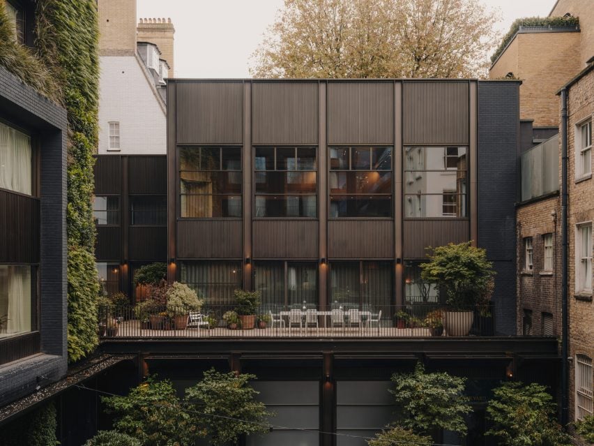
London studio Oskar Kohnen has outfitted a Mayfair office with mid-century modern furniture and contemporary pieces, which “are so well curated that no one would ever dare to throw them away”.

Spread across three floors, the office is housed within a rectilinear building in London’s Mayfair neighbourhood with a gridded facade.

Mayfair office by Oskar Kohnen Mayfair office by Oskar Kohnen
Oskar Kohnen designed the office in London’s Mayfair area

“It has a townhouse feeling,” studio founder Oskar Kohnen told Dezeen of the office, which he designed for developer Crosstree Real Estate.

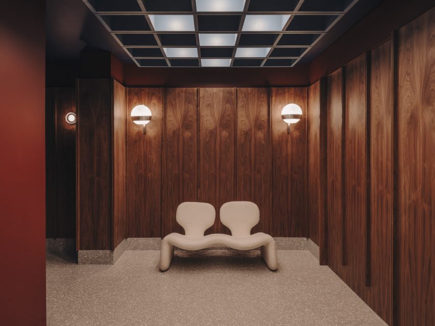
At its ground level, Kohnen clad the entrance hall with dark-stained wooden panels and added sconce lights to subtly illuminate the space.

Djinn sofa by Oliver MourgeDjinn sofa by Oliver Mourge
A cream Djinn sofa was placed in the entrance hall

An amorphous Djinn sofa, created by industrial designer Olivier Mourge in 1965, was placed in one corner.

“We worked a lot with vintage furniture, and as for the new pieces we sourced, we hope they are so well curated that no one would ever dare to throw them away,” said Kohnen.

Living room-style space with an L-shaped sofaLiving room-style space with an L-shaped sofa
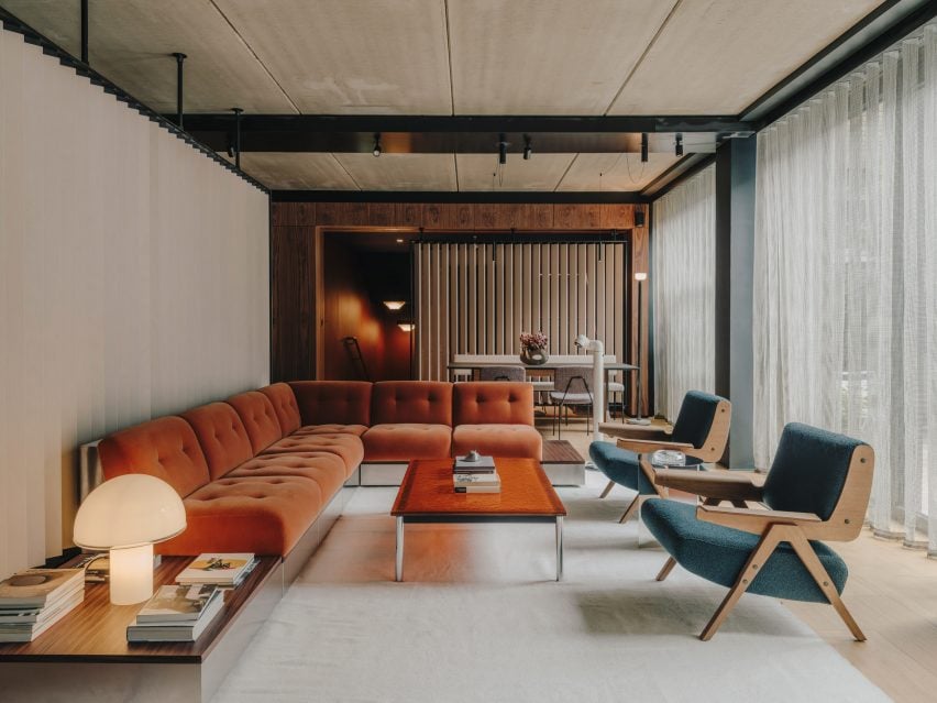
The first floor features a living room-style space

“Warm and inviting” interiors characterise a living room-style space on the first floor, which was created in direct contrast to the industrial appearance of the exterior.

An L-shaped velvet and stainless-steel sofa finished in a burnt orange hue was positioned next to white-stained brise soleil screens and a bright resin coffee table.

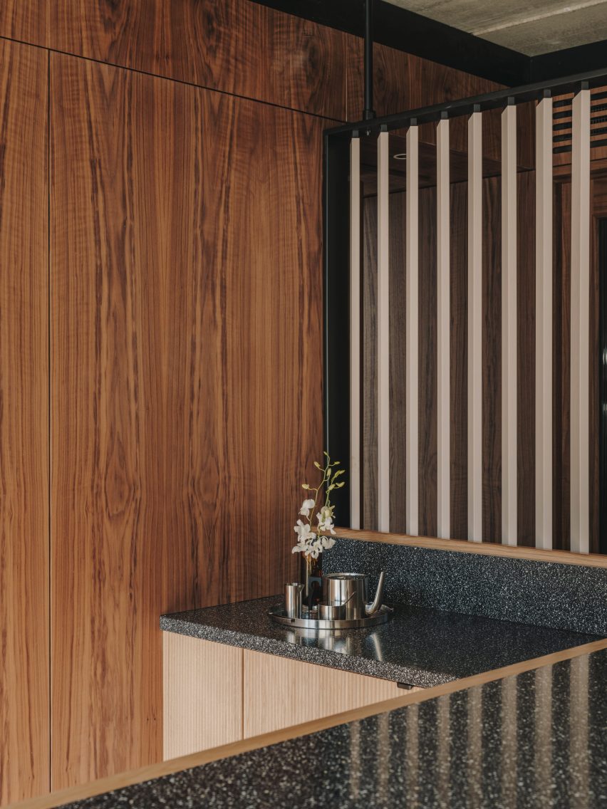
Kitchen with terrazzo worktopsKitchen with terrazzo worktops
Terrazzo accents were chosen for the kitchen

“The social spaces have an earthy and calm colour palette – yet they are lush and dramatic,” explained Kohnen.

A pair of low-slung 1955 Lina armchairs by architect Gianfranco Frattini also features in this space, while floor-to-ceiling glazing opens onto a residential-style terrace punctuated by potted plants.

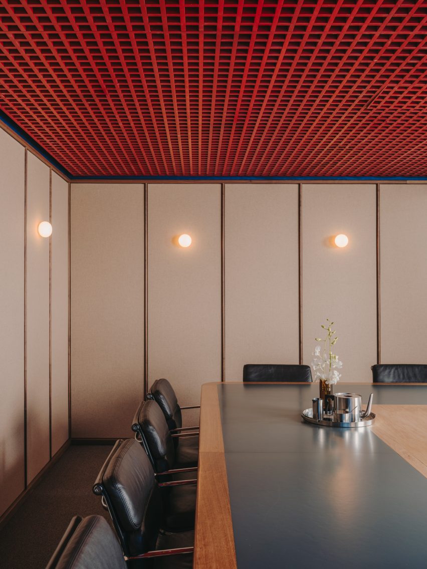
Bright gridded ceiling in a meeting roomBright gridded ceiling in a meeting room
Oskar Kohnen added a bright gridded ceiling to one of the meeting rooms

Similar tones and textures were used to dress the rest of the rooms on this level.

These spaces include a kitchen with contemporary terrazzo worktops and a meeting room with a red gridded ceiling that was set against cream-coloured panels and modernist black chairs.

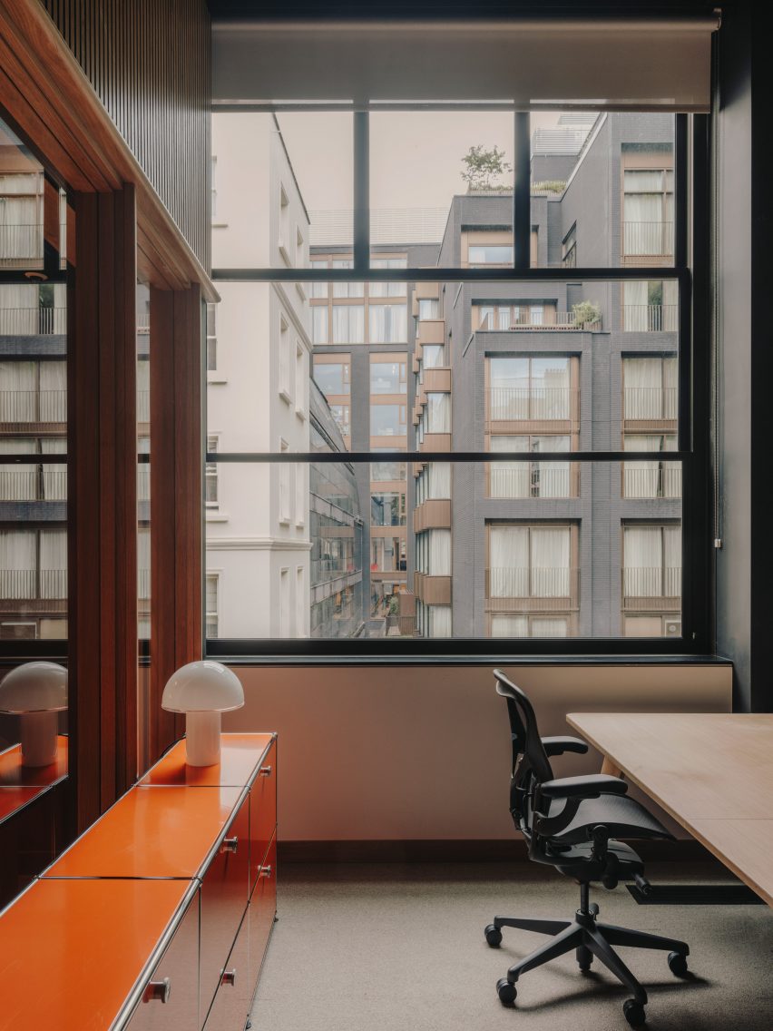
The second floor holds the main office, complete with rows of timber desks and an additional meeting room-library space characterised by the same reddish hues as the low-lit entrance hall.

“The idea was to create an office space that had soul to it and would offer a more personal take on a work environment, rather than the usual corporate spaces we are so familiar with in London,” Kohen concluded.

Desks within the main office areaDesks within the main office area
The second floor holds the main office

Founded in 2011, Kohnen’s eponymous studio has completed a range of interior projects, including a mint-green eyewear store in Berlin and a pink-tinged paint shop in southwest London.

The photography is by Salva Lopez.


Reference

The UK’s new biodiversity net gain rules explained
CategoriesSustainable News

The UK’s new biodiversity net gain rules explained

New planning legislation that aims to boost biodiversity in development projects will come into effect in England in January. Here, Dezeen explains what architects need to know.

What is biodiversity and why does it matter?

In this context, biodiversity usually refers to the variety of all species living within a certain area or ecosystem, including plants, animals, insects, bacteria and fungi.

Each species in an ecosystem has its own impact on the environment, affecting the availability of clean water and air, soil condition, pollination and other food sources and resources. Variety is necessary to keep all these elements in balance, maintaining a stable and resilient world for humans to survive in.

Many parts of the world are experiencing rapid biodiversity loss as a result of phenomena caused by human activities, such as pollution, climate change and habitat destruction. A Queen’s University Belfast study published earlier this year found that 48 per cent of the world’s animal species are experiencing population decline. The Worldwide Fund for Nature claims we are witnessing the sixth mass extinction event in the Earth’s history.

“We live in a time of mass extinction, where an alarming number of species are disappearing and where the impoverished ecology of the planet is having a detrimental effect, not only on our climate emergency, but also on pollination and in the production of food,” Adam Architecture director Hugh Petter told Dezeen. “It is a powder keg.”

Adam Architecture’s work includes Nansledan, an extension to the British city of Newquay that is being designed for the Duchy of Cornwall. The studio says it will surpass the new biodiversity net gain rules by adding “habitat ‘units’ of around 24 per cent and an increase in hedgerow ‘units’ of around 48 per cent”.

What are the new rules?

Construction can be a major cause of direct biodiversity loss, and the new planning rules for England aim to address that. They mandate that new developments deliver a “biodiversity net gain” – that is, a measurably positive impact on biodiversity compared to what existed before.

Specifically, the legislation requires developers to deliver a biodiversity net gain of 10 per cent. To calculate this, the UK government has produced a formula called the “statutory biodiversity metric” for counting what it terms “biodiversity units”, which are gained through work to create or improve natural habitats and lost through building.

As they strive to meet the 10 per cent requirement, developers must prioritise enhancing biodiversity on-site. If they cannot meet the threshold on the site being developed, they will be allowed also to make biodiversity gains on other plots of land, including by purchasing biodiversity units from other landowners.

As a last resort, they must buy “statutory biodiversity credits” from the government, which will use the money to invest in habitat creation. Biodiversity gains delivered must be maintained for a minimum of 30 years by whoever owns the land, bound by legal agreements.

Once planning permission is granted for a project, the developer must submit an evidenced biodiversity gain plan to the local planning authority (usually the council), which will approve it or refuse it. Development can only start once the biodiversity gain plan is approved. If the developer then fails to act in line with their biodiversity gain plan, the planning authority may take enforcement action.

Guidance on the new legislation, including a step-by-step guide to compliance, is available on the UK government’s website.

When do they come into effect?

The legislation was initially intended to come into effect for large developments of more than 10 dwellings in November, but that was pushed back to January 2024.

Smaller sites will also be subject to the new rules from April 2024, while major infrastructure projects will have to comply from late November 2025.

Some sites, such as small custom-built housing developments, will continue to be exempt.

What do architects and landscape architects need to know?

Architects and landscape architects will likely play a leadership role in ensuring that projects deliver on biodiversity requirements, working with ecologists and the authorities.

The most important thing, says Petter, is to understand the importance of biodiversity loss as an issue.

“The more architects can take a proper interest in the subject, the better placed they will be to work with the spirit of the new legislation and to think of imaginative ways that the minimum standards can be exceeded,” he said.

“It is crucial to engage with an ecologist as soon as possible,” added RSHP sustainability lead Michelle Sanchez. “It is also beneficial to evaluate the site as soon as you gain access.”

“This enables you to develop your designs based on the existing level of biodiversity, tailoring your strategy to local flora and fauna you particularly would like to support,” she said.

One thing to bear in mind is that the new rules aim to prioritise avoiding biodiversity loss in the first place.

“Avoiding biodiversity loss is the most effective way of reducing potential impacts, and it requires biodiversity to be considered at early design stages,” the guidance states.

To gain planning permission for a project that does cause biodiversity loss but proposes strategies to replace it, developers will need to explain, with evidence, why avoidance and minimisation is not possible.

Will this actually help to boost biodiversity?

The rules will mark the first time biodiversity enhancement has been a planning condition in England. According to University of Oxford researcher Sophus zu Ermgassen, it represents “one of the world’s most ambitious biodiversity policies”, but the exact impact is not yet certain.

But Sanchez is broadly optimistic. “Developers were not inclined to consider biodiversity enhancement in the past,” she told Dezeen.

“Only on projects attaining sustainability certificates such as BREEAM would biodiversity targets be discussed. Even then, it would sometimes more regarded as a tick-box exercise rather than an opportunity to make the building better and more appealing and to reduce the environmental impact that architectural projects have on the planet.”

However, she has warned in an opinion piece for Dezeen that a 10 per cent net gain on its own “is not enough to be able to reduce the negative impact that our way of life has had on biodiversity”.

The photo is by Free Steph via Unsplash.

Reference

Wooden elements “take centre stage” in Studio Frantzén restaurant
CategoriesInterior Design

Wooden elements “take centre stage” in Studio Frantzén restaurant

Scandinavian and Japanese influences come together at Studio Frantzén, a restaurant in London’s Harrods department store designed by Joyn Studio.

Stockholm-based Joyn Studio created the sleek interiors for Studio Frantzén – the latest restaurant opened by chef Björn Frantzén.

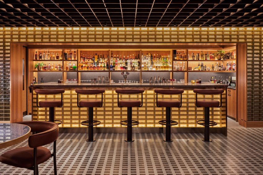
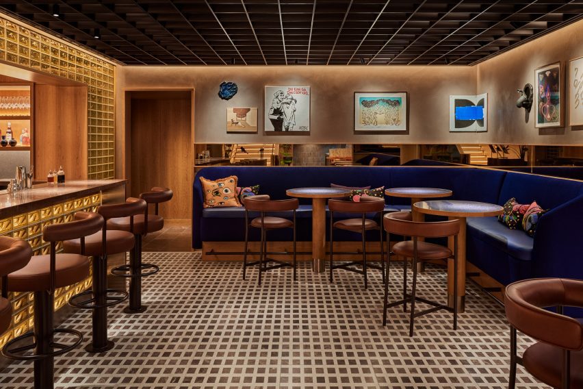
Back-lit glass brick bar at the Studio Frantzén restaurantBack-lit glass brick bar at the Studio Frantzén restaurant
Top: visitors enter via a domed reception area. Above: the bar is characterised by back-lit glass bricks

The two-storey eatery is arranged across a main restaurant and bar on the fifth floor, as well as on an additional mezzanine and rooftop terrace on the sixth floor of Harrods.

In stark contrast to the department store’s famed Edwardian baroque terracotta facade, Studio Frantzén features a contemporary palette that takes cues from both Scandinavian and Japanese design – a trend known as Japandi.

Bar at Harrods by Joyn StudioBar at Harrods by Joyn Studio
Studio Frantzén is located across two levels at Harrods

Visitors enter the restaurant at a domed reception area, which references Scandinavian churches and forest chapels, according to the studio.

The curved walls were clad with blocky cherry wood while illustrations of Nordic animals by Ragnar Persson decorate the ceiling and a Swedish wooden Dala horse was perched on the welcome desk.

“Undoubtedly, wood takes centre stage in this restaurant,” Joyn Studio founding partner Ida Wanler told Dezeen.

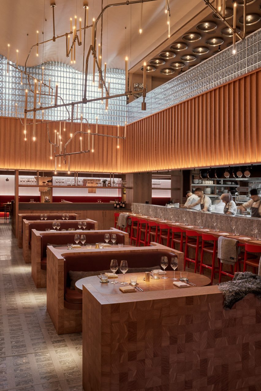
Main restaurant with bespoke timber seating by Joyn StudioMain restaurant with bespoke timber seating by Joyn Studio
The main restaurant is composed of two dining halls

The reception area gives way to a “glowing” bar composed of stacks of glass bricks bathed in amber light, which is mirrored by a ceiling of gridded copper.

Informed by traditional Japanese izakaya – a type of casual watering hole serving snacks – the large main restaurant is composed of two dining halls with bespoke geometric terrazzo and marble flooring.

Bespoke timber seating illuminated by a chandelierBespoke timber seating illuminated by a chandelier
One features bespoke timber seating

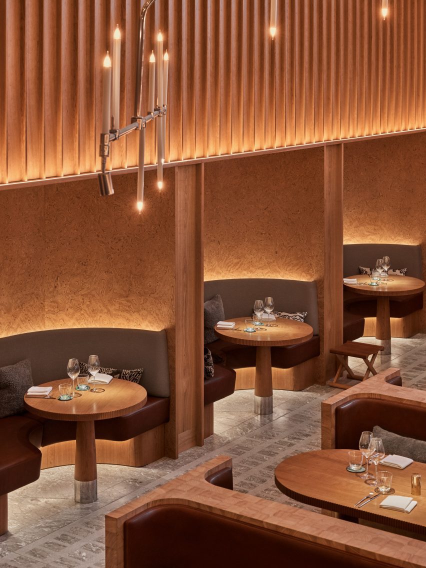
One hall features an open kitchen and Joyn Studio-designed chunky seating booths and sofas carved out of end-grain wood. This was sourced from a large Hungarian pine tree, cut into cubes and then glued together piece by piece.

This double-height space is illuminated by a spindly oversized chandelier by Swedish studio Front.

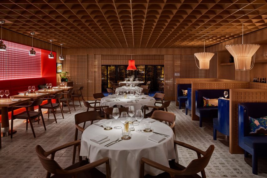
Gridded ceiling within dining hallGridded ceiling within dining hall
The other follows the same gridded geometry as the bar

The other dining hall, tucked around the corner and connected to a wine cellar, follows the same geometry as the bar.

Sliding timber doors and a gridded wooden ceiling are interrupted by ultramarine benches in booths and delicate, ribbed paper lampshades.

“To create a distinctive Nordic dining experience with Asian influences within a historic London building, we delved into the architectural and design legacy of the early 20th century,” explained Wanler.

“Inspired by the journeys of our predecessors to the far east, where they assimilated influences and pioneered a style known as Swedish Grace, we embraced the resonances between traditional Japanese and Nordic architecture and craftsmanship,” she continued.

Mezzanine level by Joyn StudioMezzanine level by Joyn Studio
Mirrored artwork by Caia Leifsdotter was included in the mezzanine

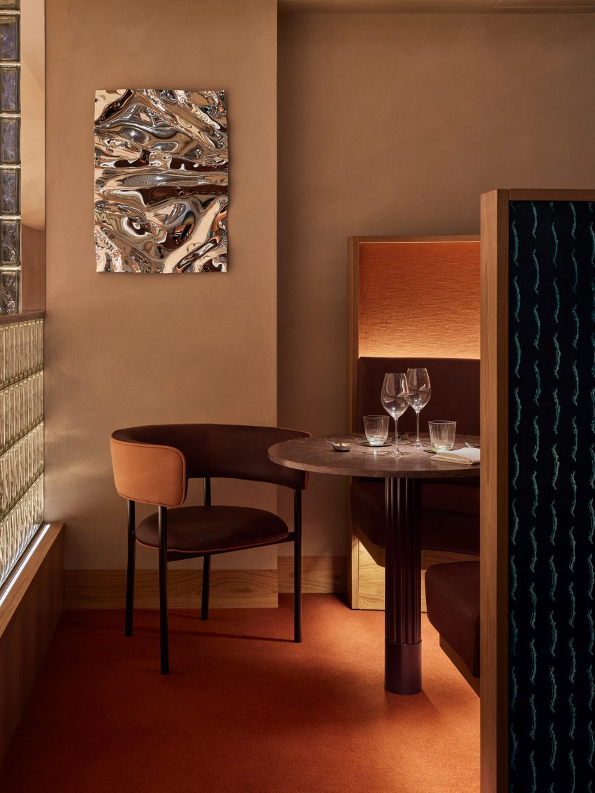
On the upper floor, the mezzanine includes three intimate dining booths accentuated by a burnt orange carpet and a wall-mounted Psychedelic Mirror by designer Caia Leifsdotter.

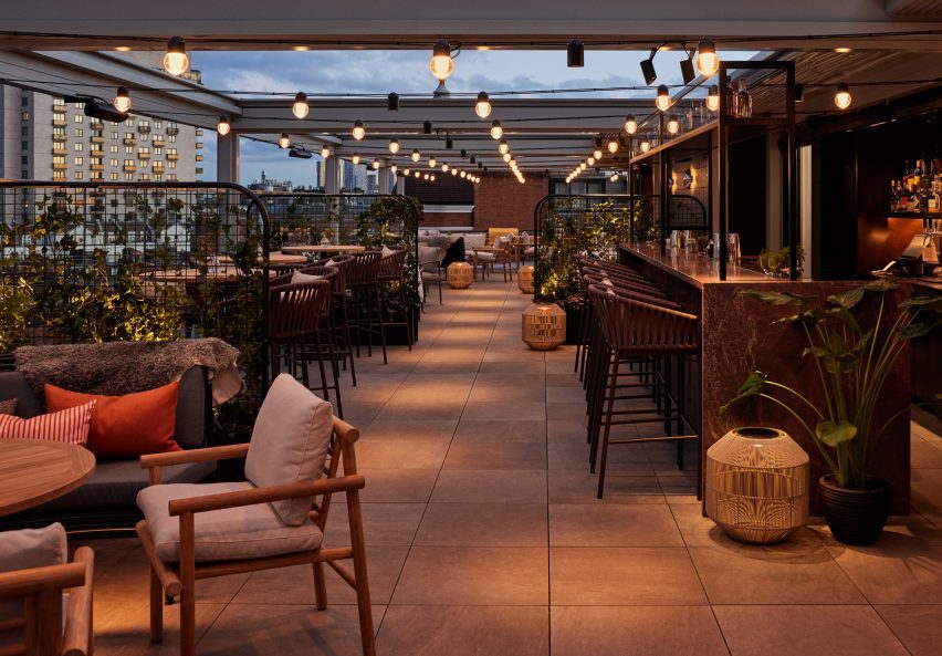
Characterised by marble, rattan and wooden accents, the rooftop terrace offers expansive city views.

Rooftop terraceRooftop terrace
The rooftop terrace offers views of London

“Aiming to infuse creativity into the traditional luxury context of Harrods, we envisioned a relaxed and comfortable ambiance with sparks of richness created in unexpected ways,” said Wanler.

In 2022, Joyn Studio was longlisted for the title of emerging interior design studio of the year at the Dezeen Awards.

Elsewhere at Harrods, fashion house Prada recently opened a green-hued pop-up cafe that referenced one of Milan’s oldest patisseries.

The photography is by Åsa Liffner.


Reference

Cake Architecture draws on Bauhaus principles for Hoxton bar
CategoriesInterior Design

Cake Architecture draws on Bauhaus principles for Hoxton bar

Cake Architecture has renovated A Bar with Shapes for a Name, an east London cocktail bar featuring “utilitarian” interiors.

A Bar with Shapes for a Name owes its title to the yellow triangle, red square and blue circle that are emblazoned on its facade in a nod to the primary colours and understated geometry commonly associated with the Bauhaus.

Tall tubular chairs at A Bar with Shapes for a Name by Cake ArchitectureTall tubular chairs at A Bar with Shapes for a Name by Cake Architecture
Tall tubular chairs feature on the ground floor

When creating the bar’s minimalist interiors, Dalston-based Cake Architecture took cues from the influential German art and design school that was established in 1919 and advocated for an emphasis on functionality, among other similar principles.

Located at 232 Kingsland Road in Hoxton, the cocktail bar was renovated by the studio to serve as a multipurpose venue.

Reddish plywood barReddish plywood bar
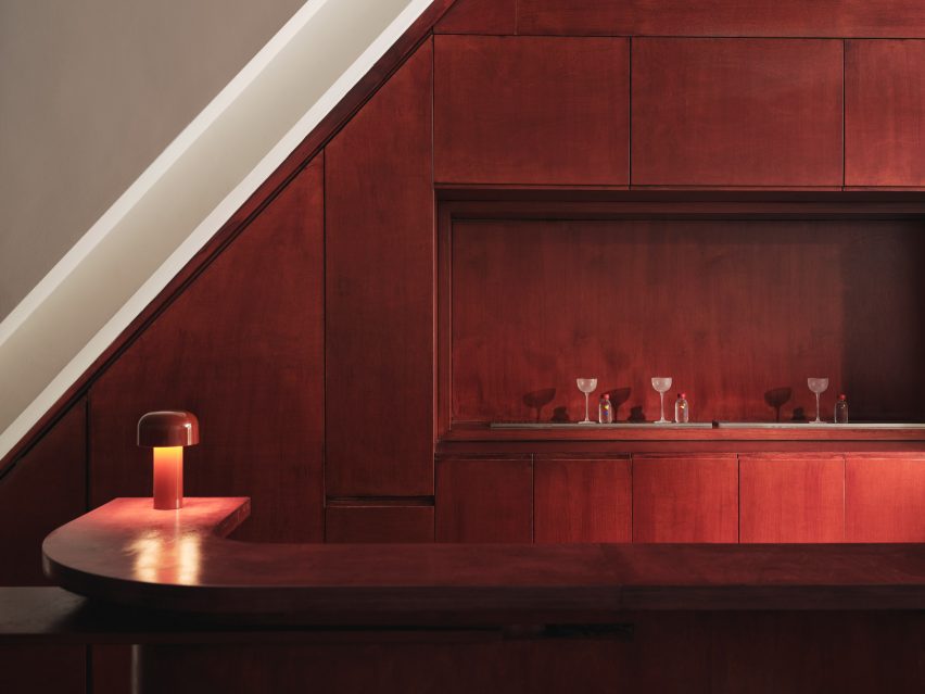
Cake Architecture created a smooth ground-floor bar from reddish plywood

Cake Architecture doubled the bar’s capacity by adding a basement, which acts as a “kitchen-bar” room, and refurbished the ground floor’s existing seating area as well as a classroom-style space that offers a location for rotating events or workshops.

“These spaces have specific functional requirements and we selected colours and materials to suit,” studio director Hugh Scott Moncrieff told Dezeen.

Rectilinear light installation within bar by Cake ArchitectureRectilinear light installation within bar by Cake Architecture
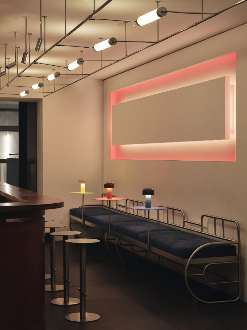
It was positioned opposite a rectilinear light installation

Upon entering the bar, visitors are greeted by the main seating area or “showroom”, which was designed to be warm and inviting.

Tall tubular chairs finished with neutral rattan were positioned around chunky geometric tables made from birch ply stained to a rich, reddish-brown hue.

Glass-topped central table in the basementGlass-topped central table in the basement
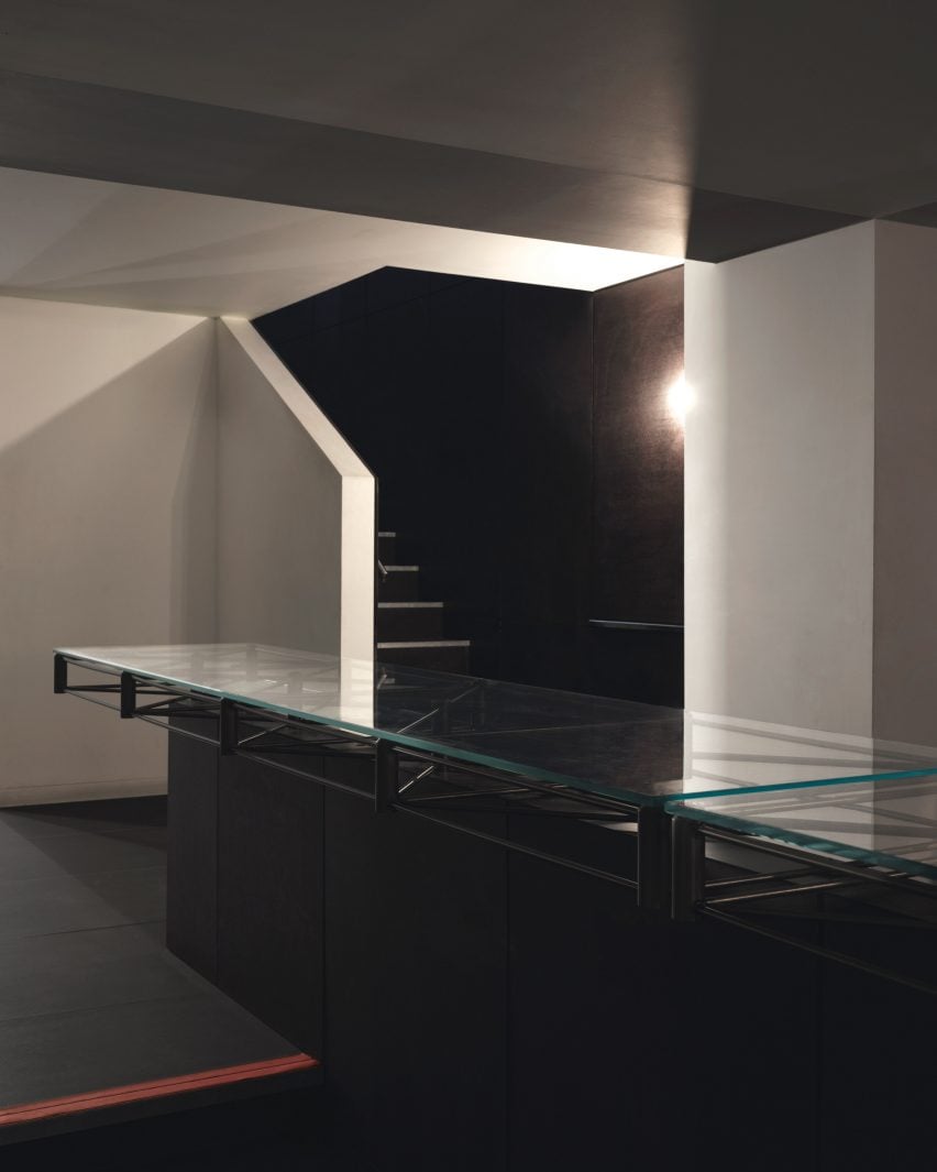
The renovation included the addition of a new basement

The team also used the same timber to create the space’s curving bar, which is illuminated by a squat, cordless table lamp by lighting brand Flos.

Opposite the bar, a glowing rectilinear light installation by photographer Steve Braiden was fitted to the wall underneath bench-style seating reminiscent of early Bauhaus furniture designs.

Close-up of the steel, glass-topped tableClose-up of the steel, glass-topped table
A steel, glass-topped table sets an industrial tone

“We looked in particular at projects by the Bauhaus founder Walter Gropius,” reflected Scott Moncrieff.

“Gropius is a master of this elegant zoning through the application of colour and form,” he added.

Steel-framed tables in the classroomSteel-framed tables in the classroom
The “classroom” includes steel-framed tables

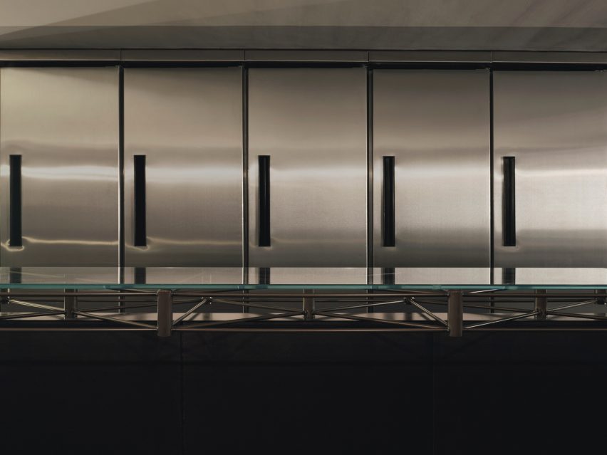
Downstairs, the low-lit basement was created to house additional seating as well as “all of the crazy machinery they use to prepare the drinks,” the designer said.

The basement is characterised by a bespoke central table by Cake Architecture and furniture designer Eddie Olin.

Sculptural, colourful lampSculptural, colourful lamp
Red, yellow and blue accents define a sculptural lamp

Consisting of a steel frame that “floats” over a central leg, the table was topped with a glass surface and its base was clad in phenolic-coated plywood to match the floor and walls.

“This new basement is predominantly a production space – so the palette reflects this with hardwearing, utilitarian and industrial materials,” said Scott Moncrieff.

A thick, felt curtain in ultramarine adds a pop of colour to the otherwise pared-back space.

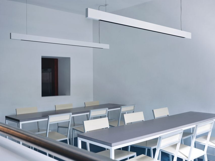
With its pale blue walls and Valchromat-topped, steel-framed tables, the ground-floor “classroom” pays homage to the Bauhaus as an educational institution.

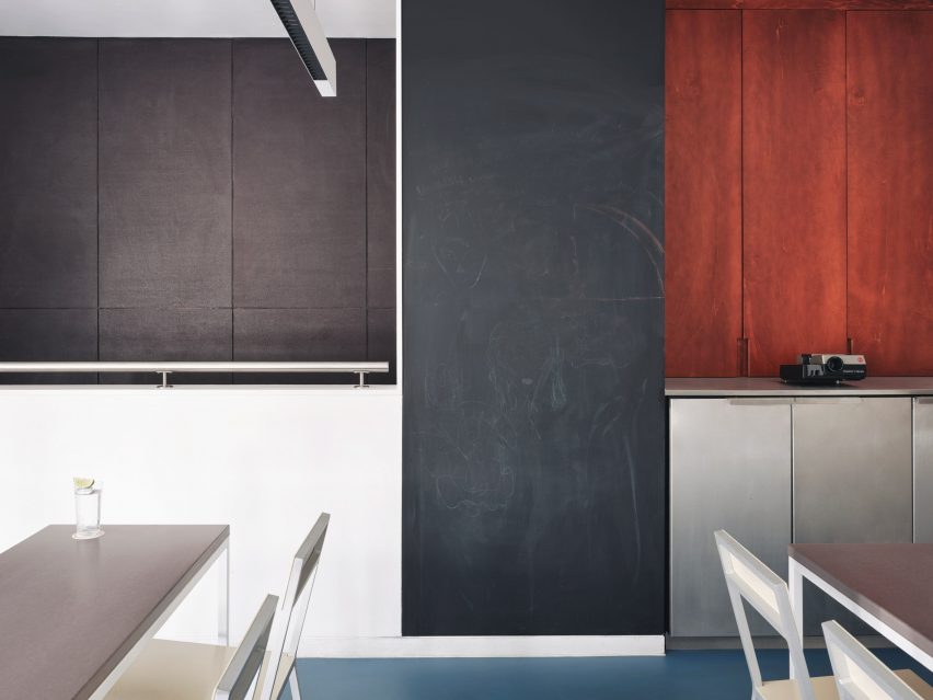
Tall blackboard in the classroomTall blackboard in the classroom
A tall blackboard provides space to learn in the classroom

Brighter blue vinyl covers the floors while a sculptural lamp featuring red, yellow and blue circles echoes the bar’s logo.

A tall blackboard and overhead strip lighting add to the classroom feel of the space, which is used for various group events.

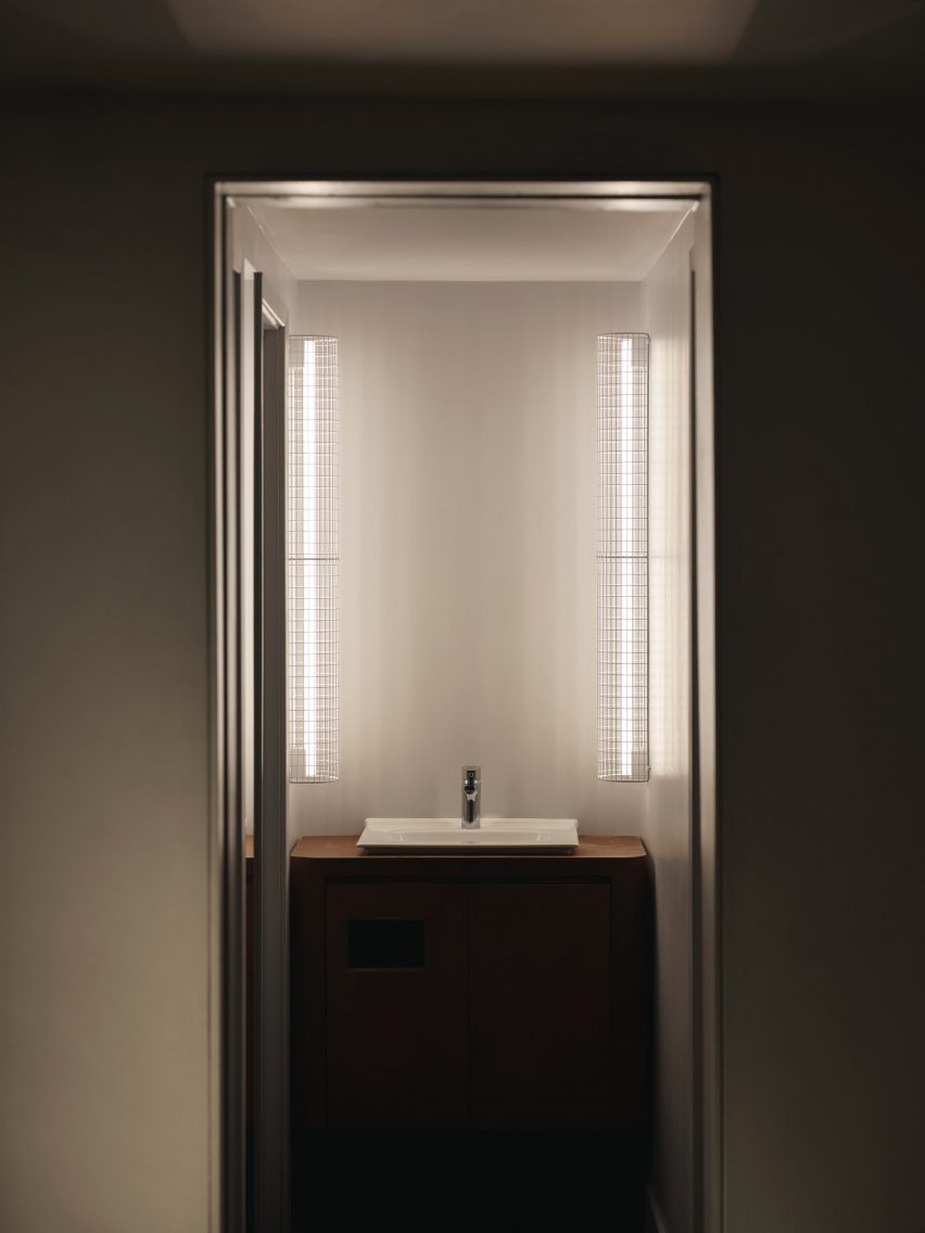
Illuminated bathroom sinkIlluminated bathroom sink
Thin vertical lights frame the bathroom sink

Cake Architecture worked closely with the bar’s founders Remy Savage and Paul Lougrat when creating the interiors, which were primarily informed by the duo’s way of working.

“The team has a conceptually driven ethos drawn from the theory and practice of Bauhaus embedded in everything they are doing. We found that incredibly exciting,” explained Scott Moncrieff.

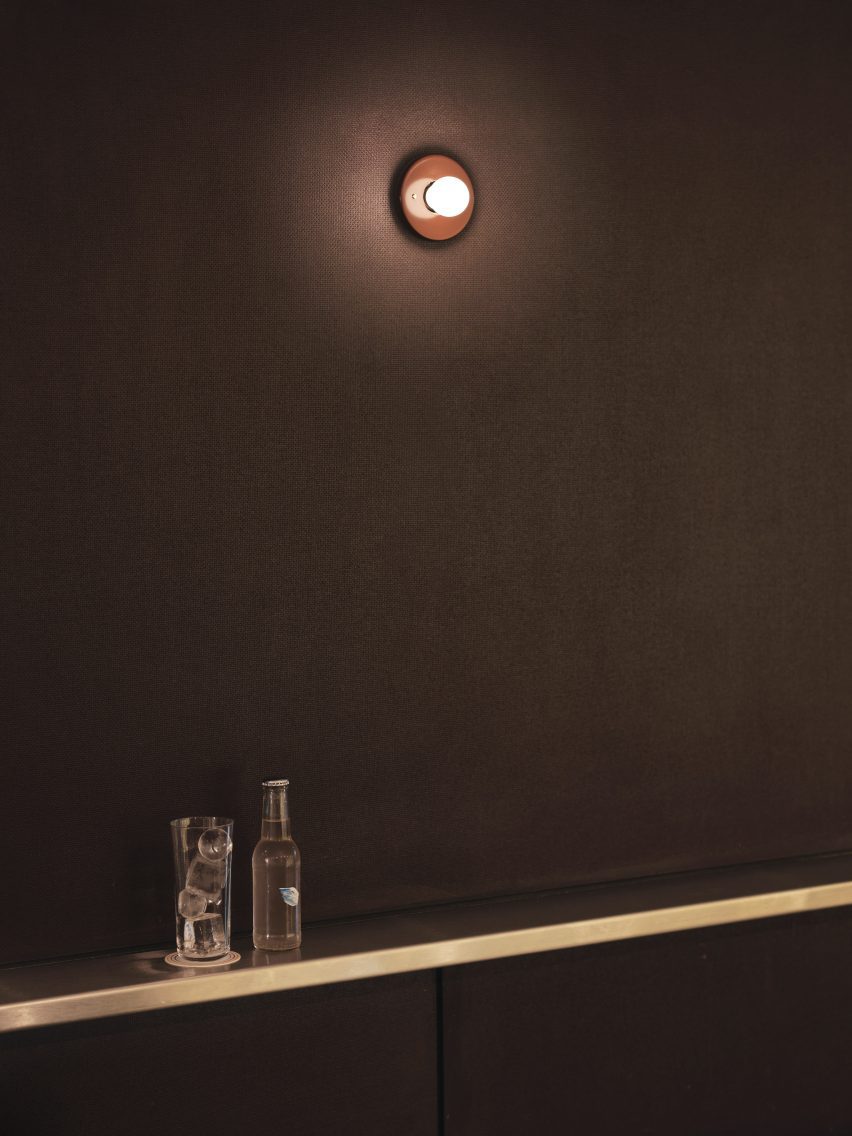
Sconce lighting on the wallSconce lighting on the wall
A Bar with Shapes for a Name is located on London’s Kingsland Road

“The Bauhaus phrase ‘party, work, play’ was pertinent to some early ideas and this carried through all our design discussions,” noted the designer.

“The space enables these three things. Separately as individual functions and simultaneously as a representation of the overall atmosphere of a bar!”

Cake Architecture previously worked with interior designer Max Radford to create a curtain-wrapped speakeasy in London’s Soho. The studio also designed a workspace for London agency Ask Us For Ideas in the same part of the city.

The photography is by Felix Speller


Reference