Interior of brutalist Cantabrian Maritime Museum restaurant in Spain by Zooco Estudio
CategoriesInterior Design

Zooco Estudio unveils Cantabrian Maritime Museum restaurant

Interior of brutalist Cantabrian Maritime Museum restaurant in Spain by Zooco Estudio

Madrid-based Zooco Estudio has created a striking restaurant within the Cantabrian Maritime Museum in Santander, Spain, that celebrates the building’s brutalist architecture.

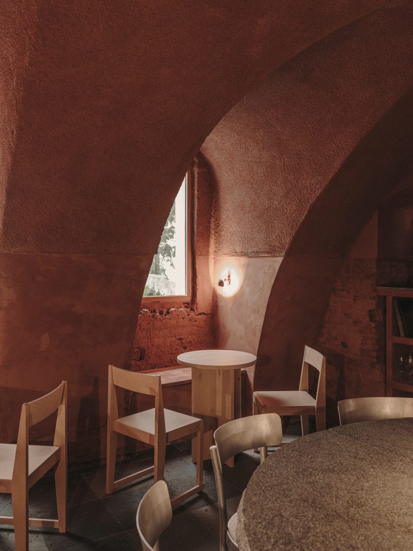
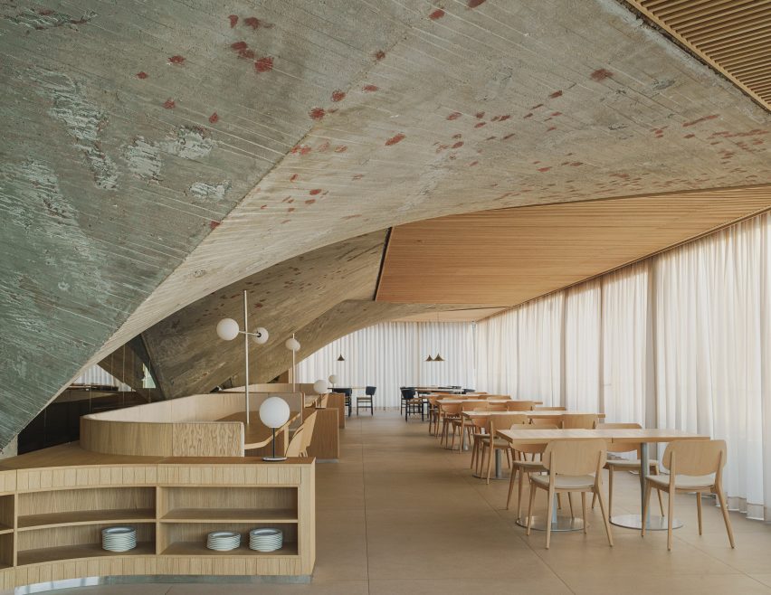
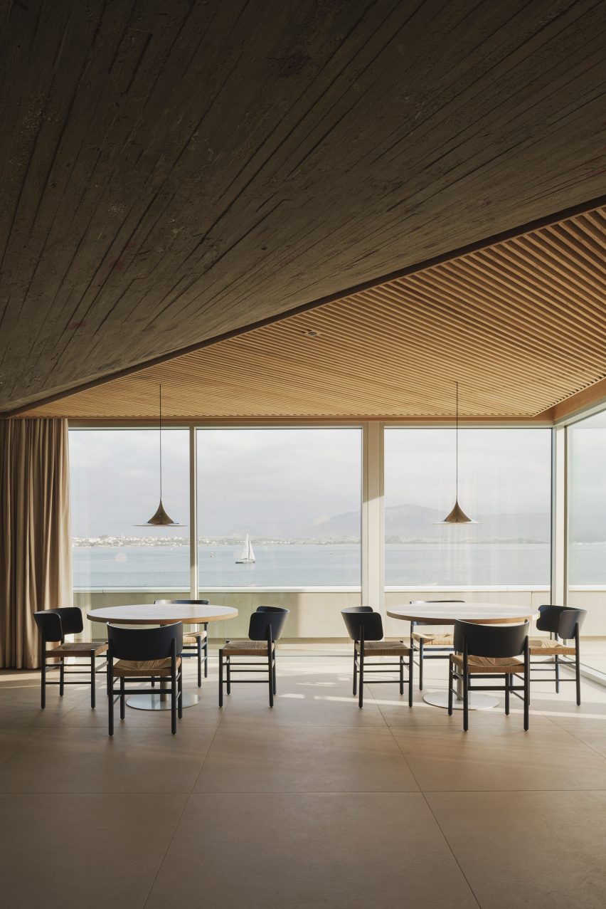
The restaurant is set within a dramatic vault of concrete paraboloids that were unearthed during the renovation, while a slatted timber ceiling pays homage to the area’s shipbuilding legacy.

Interior of brutalist Cantabrian Maritime Museum restaurant in Spain by Zooco EstudioInterior of brutalist Cantabrian Maritime Museum restaurant in Spain by Zooco Estudio
Zooco Estudio added a restaurant to the second floor of the Cantabrian Maritime Museum

Overlooking the tranquil waters of Santander Bay, the restaurant is located on the second floor of the landmark Cantabrian Maritime Museum, which was designed in the mid-1970s by architects Vicente Roig Forner and Ángel Hernández Morales.

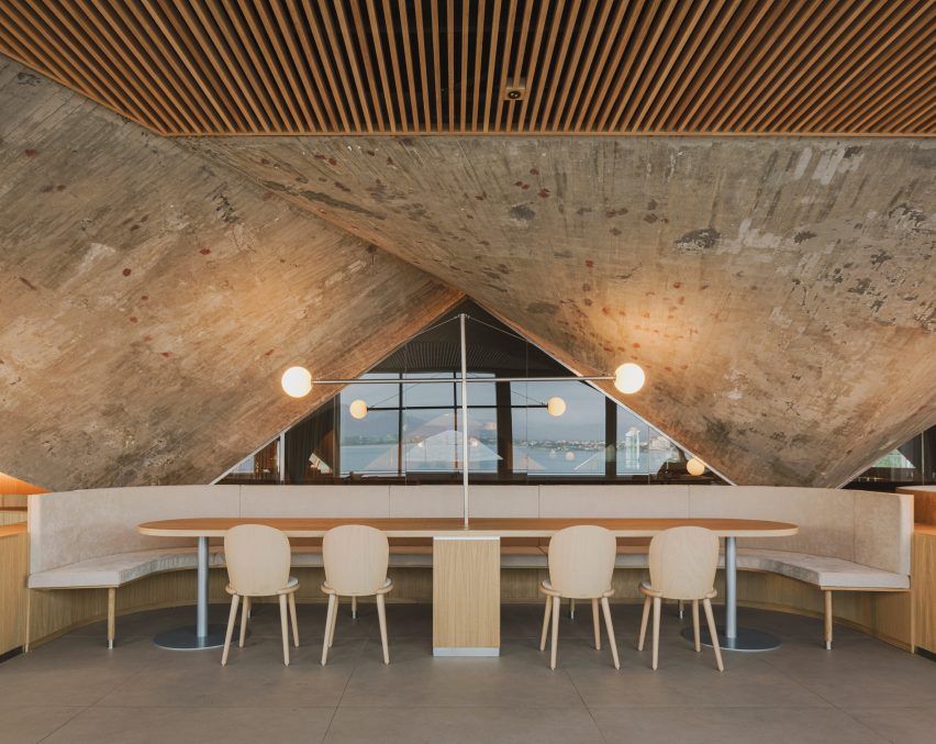
The paraboloids were an original fixture of the structure and supported the roof of what was once the museum’s patio.

Interior of brutalist Cantabrian Maritime Museum restaurant in Spain by Zooco EstudioInterior of brutalist Cantabrian Maritime Museum restaurant in Spain by Zooco Estudio
Oak details were designed to contrast the restaurant’s concrete arches

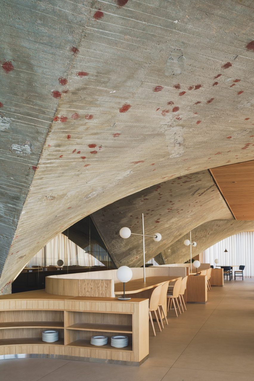
The studio focused on restoring the historic fabric of the space and reviving the paraboloids, which had been concealed for around 20 years, as “a vestige of the past”.

“In 2003, the building was renovated and as part of this intervention, the paraboloids were covered with a new roof and the space between them and the perimeter of the building was closed with glass, generating a covered space where there was previously a terrace,” Zooco Estudio co-founder Javier Guzmán told Dezeen.

“We wanted the concrete paraboloids to be the absolute protagonists of the space and by removing the paint and the coating, the paraboloids are visible again and regain their full prominence.”

Interior of brutalist restaurant in Spain by Zooco EstudioInterior of brutalist restaurant in Spain by Zooco Estudio
The renovation exposed the raw concrete surface of the paraboloids

The previous renovation also altered the dimensions of the space and reconfigured the volume as a square.

To promote symmetry, four additional concrete triangles were added to balance out the original paraboloids in the brutalist restaurant.

Timber ceiling panels and concrete paraboloids inside a brutalist restaurantTimber ceiling panels and concrete paraboloids inside a brutalist restaurant
Slatted wooden ceiling panels bridge the gaps between the arches

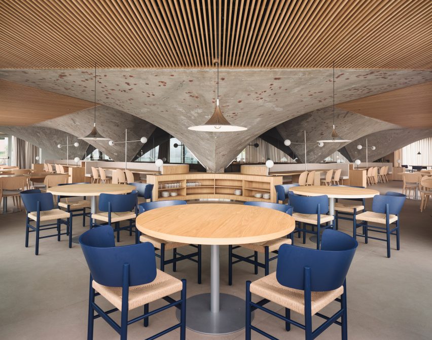
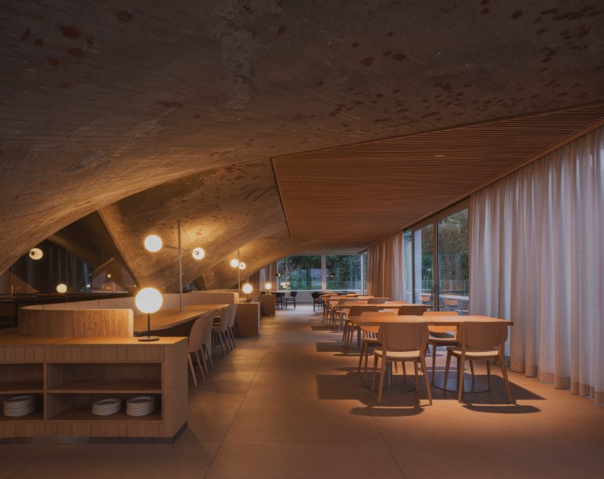
Overhead, a false ceiling of slatted timber panels frames the concrete arches.

The studio designed theses triangular boards to reference the arrangement of timber across the hull of a boat, a nod to the museum and the area’s nautical past.

The panels also serve the purpose of concealing the restaurant’s mechanical systems.

“The wooden slats bring warmth and friendliness to the space while allowing us to solve all the technical needs for air conditioning, heating and lighting, leaving them hidden,” Guzmán said.

“In this way, we ensure that all these elements do not interfere with the dialogue of concrete and wood, which are presented as continuous and clean elements.”

Dining tables overlooking views of the Santander bayDining tables overlooking views of the Santander bay
Walls of floor-to-ceiling glazing offer views across the bay

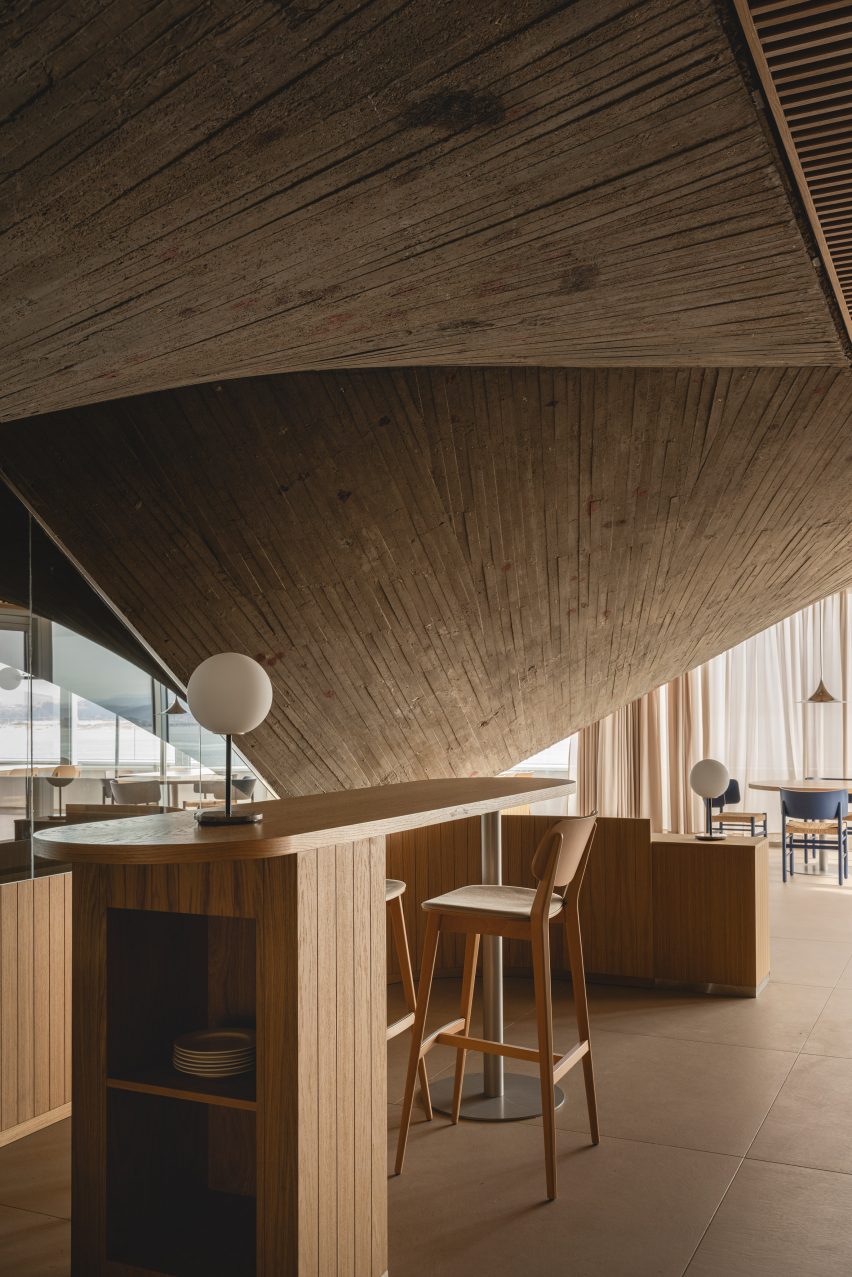
The interior layout was largely dictated by the low arches of the elliptic paraboloids that dominate the brutalist restaurant.

“The geometry of the existing structure conditions the space, because its height in its lower part is impractical, so a large bench is arranged around the entire contour that allows us to take advantage of that space and organise the distribution of the rest of the floor plan,” added Guzmán.

Concrete paraboloid and dining tables inside brutalist restaurant in Spain by Zooco EstudioConcrete paraboloid and dining tables inside brutalist restaurant in Spain by Zooco Estudio
Grey porcelain floors mirror the concrete paraboloids

Like the ceiling panels, the interior finishes and furnishings allude to the maritime history that the building commemorates.

“The use of wood and steel for all the furniture is reminiscent of the materials used in shipbuilding – the furniture has slight curvatures that are reminiscent of the aerodynamic shapes of boats,” explained Guzmán.

“Likewise, the lamps are inspired by the masts for ship sails.”

Dining tables at Cantabrian Maritime Museum restaurantDining tables at Cantabrian Maritime Museum restaurant
Zooco Estudio also designed the restaurant’s curved timber furniture

Another key change was the replacement of the perimeter glass wall.

The inclined glazing was swapped for vertical glass, a decision that reclaimed external space for the patio, which stretches the length of the restaurant and overlooks the harbour below.

“When we are inside, the feeling is the same as when we are inside a boat, there is only water around, and that is why we used clean glass from floor to ceiling, generating a perimeter terrace as happens on boats,” said Guzmán.

Terrace at Cantabrian Maritime MuseumTerrace at Cantabrian Maritime Museum
The terrace features green curvilinear outdoor furniture

Other projects by Zooco Estudio include a renovated house in Madrid and a co-working space with a kids’ play area in California.

The photography is by David Zarzoso.


Project credits:

Architect: Zooco Estudio
Construction:
Rotedama Constructora SL
Lighting: Zooco Estudio
Furniture: Zooco Estudio

Reference

Y27 House by Estudio Estudio with an inbuilt studio
CategoriesInterior Design

Estudio Estudio unveils “architectural treasures” in Mexico City house

Y27 House by Estudio Estudio with an inbuilt studio

Arched doorways and a rooftop studio feature in the Y.27 House, which has been overhauled by architecture firm Estudio Estudio in a way that honours the historic building’s original character.

Located on a 195-square-metre site in Mexico City’s Hipódromo Condesa neighbourhood, the project serves as a full-time residence for a client who is a social entrepreneur and collector of Mexican craftwork.

Y27 House by Estudio Estudio with an inbuilt studio
The house been overhauled to honour the historic building’s original character

Originally built in the 1930s, the stucco-clad dwelling had endured years of neglect, said local firm Estudio Estudio.

The design team set out to revamp the home’s interior, aiming to restore its original charm while enhancing its functionality.

Revamped home interior design
Estudio Estudio set out to revamp the home’s interior

The project involved removing walls, reconfiguring the layout and making structural improvements, in addition to adding new finishes. Moreover, a small storage room on the roof was replaced with a 43-square-metre studio building.

“The main goal was to unveil the hidden architectural treasures beneath layers of past modifications, meticulously restoring them to their original state to reveal the essence of the time,” the team said.

Kitchen entered via an arched doorway
In the rear, one finds a kitchen

“Architectural interventions aimed to preserve the authentic character of the house, rejuvenating ornamental elements while avoiding unnecessary embellishments.”

Rectangular in plan, the home has a mix of communal and private spaces spread across three levels. Curves and arches – many of them original – create a “harmonious flow”.

Rounded skylight that illuminates a staircase
Curves and arches create a “harmonious flow”

On the ground level, the layout “seamlessly integrates daily living requirements”. The front portion holds an entry hall, garage and office, while in the rear, one finds a kitchen, dining area, service rooms and a patio.

At the heart of the ground floor is an airy living room with a 5.9-metre-high ceiling. A tall shelving system with a metal-and-wood ladder acts as a focal point.

Tall shelving system
A tall shelving system acts as a focal point in the airy living room

A gently curved, skylit staircase leads to the first floor, where the team placed a primary bedroom, two bedrooms and a family room.

Atop the building is the new studio, which was constructed using pine. In addition to the studio, the building contains an onsen room with a barn-style door.

Barn-style door
The building contains an onsen room with a barn-style door

The studio opens onto a terrace with terracotta flooring. Rainwater is collected on the roof and channelled to a reservoir below.

“The roof terrace serves as a space to gather but also works as a rainwater collector, where rain travels throughout the house into a water reservoir and filter system beneath the back patio,” the team said.

Throughout the home, the team used earthy materials and neutral colours. The lighting design – created in collaboration with lighting expert Luca Salas – is meant to balance “ambiance, functionality and aesthetics”.

Notable finishes include oak parquet flooring and closets faced with cotton-canvas. Oak was used for window frames, kitchen cabinets and other elements.

Pisos de pasta flooring
Pisos de pasta flooring features in the kitchen

In the kitchen, the team took a sample of existing checkered tiles, made of pigmented concrete, to a local craftsman, who then replicated them.

This style of flooring – called pisos de pasta – is very common in older homes in Mexico City and southwest Mexico, said Estudio Estudio.

Stucco-clad building
The stucco-clad dwelling had endured years of neglect

Overall, the house is meant to balance historic elements with a contemporary lifestyle.

“This house proudly stands as a harmonious blend of past and present, inviting residents to embark on a captivating journey of refined and simple ways of living,” the team said.

Other projects in Mexico City’s Condesa district include a renovated house by Chloé Mason Gray that embraces its lack of natural light, and an apartment block covered in small, wooden squares that were inspired by vegetable crates.

The photography is by Zaickz Moz Studio.

Reference

Entrance of Veja store in Madrid
CategoriesInterior Design

Plantea Estudio designs Veja store “to look like we didn’t do anything”

Entrance of Veja store in Madrid

Raw finishes and brutalist interventions feature in footwear brand Veja‘s first dedicated shop in Madrid, complete with an in-house shoe repair workshop and interiors designed by local firm Plantea Estudio.

The retail space is housed in a building in the centre of Madrid, which has functioned as a shop, a restaurant and a bank office since its construction around the turn of the 20th century.

Entrance of Veja store in Madrid
Plantea Estudio has completed Veja’s Madrid store

By the time Veja took on the space, it had been stripped back to a shell and the team at Plantea Estudio immediately saw the potential in the raw, rough interior.

“That kind of brick structure brings you to the origins of architecture, to a temporal language,” the studio said. “It comes from always and goes forever, it will never be out of time or fashion.”

“For us, there was no better option than to work from there, to leave it exposed.”

Concrete display plinths in shoe store by Plantea Estudio
Monolithic concrete blocks serve as displays

The decision to work with the existing architecture rather than introducing unnecessary new materials also mirrors Veja’s idea of having in-house repair shop, encouraging customers to fix rather than simply replace their run-down trainers.

However, the shell required much more active intervention from Plantea Estudio than the store’s unfinished interior suggests.

Mirror reflecting image of man working on shoe repair in Veja store in Madrid
The shop also houses a repair workshop

“We had to work a lot for it to look like we didn’t do anything,” the studio said. “We brought the structure to its best version.”

Plantea Estudio made the windows taller and brought the internal openings back up to their original height. The internal walls were cleaned up, exposing more of the brick and removing countless additions and coverings that remained from previous fitouts.

Main retail space in shoe shop designed by Plantea Estudio
Graphic strip lights are integrated into the ceiling

Where the materials were low-quality and couldn’t be removed, Plantea Estudio spray-coated the walls in a mix of plaster and Perlite mortar, “which accentuates the irregularity of the base”.

The floor was coated uniformly with cement mortar, creating a continuous surface throughout the interior while providing a contrast with the chunky cobblestones laid in the entrance hall.

The building’s functional pipes and pinewood supports were left exposed while the ceilings are clad in roughly textured sound insulation and embedded with graphic rows of strip lighting.

To form display areas, benches and counters, Plantea Estudio opted for stepped blocks of concrete – a favourite material of the brutalist movement – cast in situ using moulds made from old wooden boards.

Two chairs in front of a tall window in Veja store in Madrid
Vintage Joaquim Belsa armchairs were used to furnish the space

As a clear contrast to the heavy solidity of these pieces, the store’s shelving is made of folded sheets of white-lacquered steel.

“The main collection is displayed on these steel shelves, illuminated by a light that’s brighter than the general light in the store,” the studio said.

Ficus tree near entrance of shoe shop designed by Plantea Estudio
A ficus tree stands near the entrance

The space is accentuated by large-format mirrors, applied to the building’s brick pillars, where Plantea Estudio says they work at “multiplying the cross views”.

A large ficus tree marks the entrance while furniture was sourced from vintage design retailer Fenix Originals and includes 1960s armchairs by Catalan designer Joaquim Belsa.

Storage shelves holding shoes in Veja store in Madrid
Simple metal shelves provide additional storage

Plantea Estudio, which was founded by brothers Luis and Lorenzo Gil in 2008, has completed a number of interior projects in the Spanish capital.

Among them is the neutral-toned Hermosilla restaurant, as well as a bar serving wine and small plates, where a cosy red “cave” room is hidden behind the main dining space.

The photography is by Salva López.


Reference

Interior of Gota bar in Madrid designed by Plantea Estudio
CategoriesInterior Design

Plantea Estudio creates cosy cave-like room within bar Gota in Madrid

Interior of Gota bar in Madrid designed by Plantea Estudio

A red “cave” hides behind the main dining space of this wine and small plates bar in Madrid designed by interiors studio Plantea Estudio.

Located on the ground floor of a neoclassical building in Madrid’s buzzy Justicia neighbourhood, Plantea Estudio designed Gota to appear “dark, stony and secluded”.

Interior of Gota bar in Madrid designed by Plantea Estudio
Gota sits on the ground floor of a neoclassical building in the Justicia neighbourhood

Guests ring a bell to enter the 70-square-metre bar, and are then welcomed into a dining room enclosed by thickset granite ashlar walls. While some of the walls were left exposed, others have been smoothly plastered over and washed with grey lime paint.

The floor was overlaid with black volcanic stone tiles that the studio thought were suggestive of a “newly discovered terrain”.

Interior of Gota bar in Madrid designed by Plantea Estudio
A counter in the first dining space is inbuilt with a record player

A bench seat runs down the left-hand side of the bar, accompanied by lustrous aluminium tables and square birchwood stools from Danish design brand Frama.

Guests can alternatively perch on high stools at the peripheries of the room, where lies a slender stone ledge for drinks to be set down on.

Interior of Gota bar in Madrid designed by Plantea Estudio
Shelving displays wine bottles, vinyls, and other objects

More seating was created around a bespoke chestnut counter at the room’s centre; its surfacetop has an in-built turntable on which the Gota team plays a curated selection of music.

Behind the counter is a storage wall where wine bottles, vintage vinyl records and other music-related paraphernalia are displayed.

Gota bar in Madrid includes red cave-like room
A cave-like dining room hides at the bar’s rear

An open doorway takes guests down a short corridor to a secondary cave-like dining space, which boasts a dramatic vaulted ceiling and craggy brick walls. It has been almost entirely painted red.

“It’s relatively common to find this kind of vaulted brick space in the basements of old buildings in Madrid – this case was special because it’s on the ground floor with small openings to a garden,” the studio told Dezeen.

“It was perfect for a more quiet and private area of the bar,” it continued.

“The red colour is an abstract reference to the brick of which the cave is really made, and also a reference to wine.”

Gota bar in Madrid includes red cave-like room
The space is arranged around a huge granite table

At the room’s heart is a huge 10-centimetre-thick granite table that’s meant to look as if it has “been there forever”, surrounded by aluminium chairs also from Frama. Smaller birch tables and chairs custom-designed by the studio have been tucked into the rooms corners.

To enhance the cosy, intimate feel of the bar, lighting has been kept to a minimum – there are a handful of candles, reclaimed sconces and an alabaster lamp by Spanish brand Santa & Cole.

Gota bar in Madrid includes red cave-like room
Red paint covers the space’s vaulted ceiling and brick walls

Established in 2008, Plantea Estudio is responsible for a number of hospitality projects in Madrid.

Others include Hermosilla, a Mediterranean restaurant decked out in earthy tones, and Sala Equis, a multi-purpose entertainment space that occupies a former erotic cinema.

The photography is by Salva López.

Reference

Haight clothing store by AIA Estúdio
CategoriesInterior Design

AIA Estúdio designs cave-like interior for clothing store in Rio de Janeiro

Haight clothing store by AIA Estúdio

Organic shapes and stone-like surfaces characterise the interior of the Haight clothing store in Rio de Janeiro, which was designed by interior and landscaping design practice AIA Estúdio.

A large pillar with a rough, textured surface dominates the 110-square-metre shop interior, expanding as it ascends before merging into the ceiling to create a cave-like space.

Haight clothing store by AIA Estúdio
A pillar transforms into a cave-like structure

“Its height starts small and in the back part it ends higher in a nonlinear form, just like a cave,” AIA Estúdio founder Alice Tepedino told Dezeen.

“The infinite and diverse processes of erosion that form cliffs, caves, stalactites, sands, stones and the movements of water with its tracks and shapes led to our creative process being part of the concept developed for the store’s spatiality.”

Haight clothing store by AIA Estúdio
Stone slabs around the pillar are used to display objects

Rather than being a cumbersome obstacle, the pillar helps organise the shop’s circulation and movement of shoppers, according to the studio.

“It is from the occupation around the pillar that the space fluidity is achieved. This disposition is enhanced by curved lines that define the path inside the store,” said Tepedino.

Haight clothing store by AIA Estúdio
Curved stone plates balance on rocks

Slabs of soapstone and Bahia beige marble encircle the pillar at different heights and are propped up by Bahia beige marble rocks that create a display surface and a place for shoppers to sit.

On the perimeter walls, niches with stainless steel bases display Haight’s clothing on brushed-brass rails.

The metallic surfaces and straight edges of the niches contrast with the organic shapes and materials in the centre of the shop, which is located in the Shopping Leblon retail centre.

Tepedino used indirect lighting in the niches to illuminate the space, mimicking cracks in cave walls where sunlight can seep through.

Interior of the Haight clothing store
Clothing is displayed on brushed-brass rails

“The exhibition interspace was thought of as a cut in the walls, an operation emphasised by the transition of materiality,” said Tepedino.

“Inside, there are exhibition racks in brushed brass, which, with their more solar aspect, contribute to subtly warming up the store’s ambience, together with the soapstone and its greyer tone.”

Haight clothing store by AIA Estúdio
The bottoms of wall niches are lined with steel

Tepedino’s design is the first of Haight‘s stores to be located inside a shopping centre, which prompted the designer to approach the project in a different way.

The entrance to the shop is a large opening that provides open access from the shopping centre to the nature-inspired shop interior.

Exterior of the Haight clothing store
It is the first Haight store to be located in a mall

“The design adopted a contrasting strategy between the store and mall, which, despite the rigid and controlled environment, offers opportunities such as the possibility of not having a door,” said Tepedino.

The brand’s conceptual basis is related to natural landscapes but when you are inside the mall, you find a language that is the opposite of Haight’s conceptual basis, with artificial elements and cold materiality.”

Stone surfaces at the Haight clothing store
Natural materials and surfaces were used throughout the shop interior

“Once you’re inside the store you get disconnected from the artificial atmosphere of the rest of the building,” Tepedino continued.

The project has been shortlisted in the small retail interiors category of Dezeen Awards 2022, alongside a surfaces showroom in Helsinki with colourful terrazzo-like walls and an oxblood red shop interior with walls decorated with Victorian-style balusters.

The photography is by Maira Acayaba.

Reference