Bentley curates Scandinavian architecture and design travel experience
CategoriesInterior Design

Bentley curates Scandinavian architecture and design travel experience

Promotion: in 2023 Bentley Motors launched an architecture and design-centred travel experience around Scandinavia, with highlights that included a stay at Wingårdhs’ forest hotel in Sweden and a tour of BIG’s studio in Copenhagen.

The Extraordinary Journey Scandinavia tour was one of a series of curated travel experiences presented by Bentley in 2023, offering the opportunity to explore attractive destinations from behind the wheel of its luxury cars.

The five-day, four-night tour started in Stockholm, where guests were collected from the airport in a chauffeured Bentley and taken to their first night’s stay in the world-renowned Ett Hem hotel.
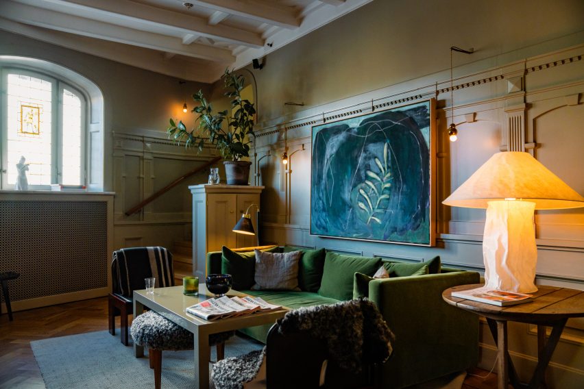
Photograph of a sitting room at the Ett Hem hotel in StockholmPhotograph of a sitting room at the Ett Hem hotel in Stockholm
The first night’s stay was at Stockholm’s Ett Hem hotel

With interiors created by designer Ilse Crawford, the hotel is known for merging luxury with a feeling of home, with spaces that encourage guests to relax and mingle as if at a manor house.

The hotel hosted a welcome reception, dinner in the library and a nightcap for the small party of guests on day one to get to know each other.

On day two, attendees took the wheel of one of several Bentley models on offer and began the journey south through Sweden’s forests, with Scandinavia’s finest architecture and design destinations guiding the way forward.
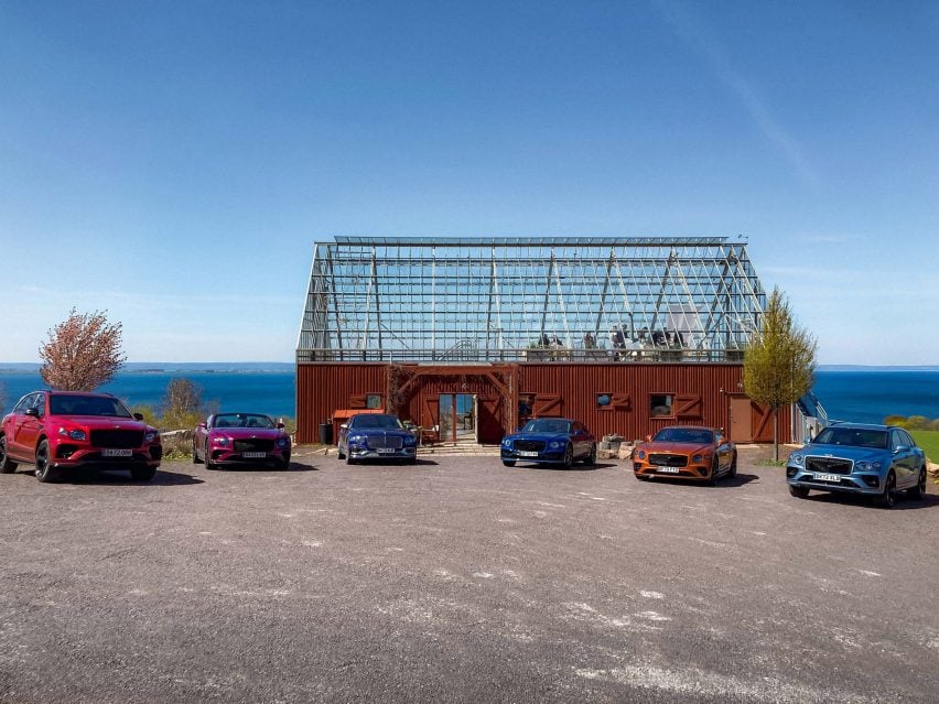
For lunch on day two, attendees stopped at NaturehouseFor lunch on day two, attendees stopped at Naturehouse
For lunch on day two, attendees stopped at Naturehouse

For lunch, the tour stopped at Naturehouse, a sustainability-focused lakeside spa by Tailor Made Arkitekter that merges the forms of a barn and a greenhouse, before continuing to reach the Trakt Forest Hotel in Småland in the afternoon.

Designed by Wingårdh architecture studio, the hotel features just five suites that are raised high into the treetops on stilts, giving guests the chance to feel immersed in nature.

The suites are “a true representation of Bentley’s design values of sustainability, materiality, and innovation” said the brand, and guests had the opportunity to relax in the sauna or hot tub before joining the hotel owners Sandra and Mattias Sälleteg at a drinks reception.

The evening also included dinner in a forest near the hotel, which was made by Michelin star chef Niklas Ekstedt and celebrated natural ingredients coming together “to create something greater than the sum of its parts”.

Photo of Wanås Hotel and Sculpture ParkPhoto of Wanås Hotel and Sculpture Park
Lunch on day three took place at Wanås Hotel and Sculpture Park

Day three saw the group continue the drive south through Sweden’s forests and stop for lunch at Wanås Hotel and Sculpture Park, built around two converted stone barns with interiors by Kristina Wachtmeister.

They then drove on through Malmö and across the Öresund Bridge, the longest bridge in Europe, connecting Sweden and Denmark, before switching to chauffeured transport once again for the final stretch of the journey to Copenhagen.

With accommodation at the Nimb Hotel in Tivoli Gardens, guests had ample opportunity to explore Copenhagen, including dinner at a world-renowned Nordic restaurant and then a city tour hosted by the Danish Architecture Centre.
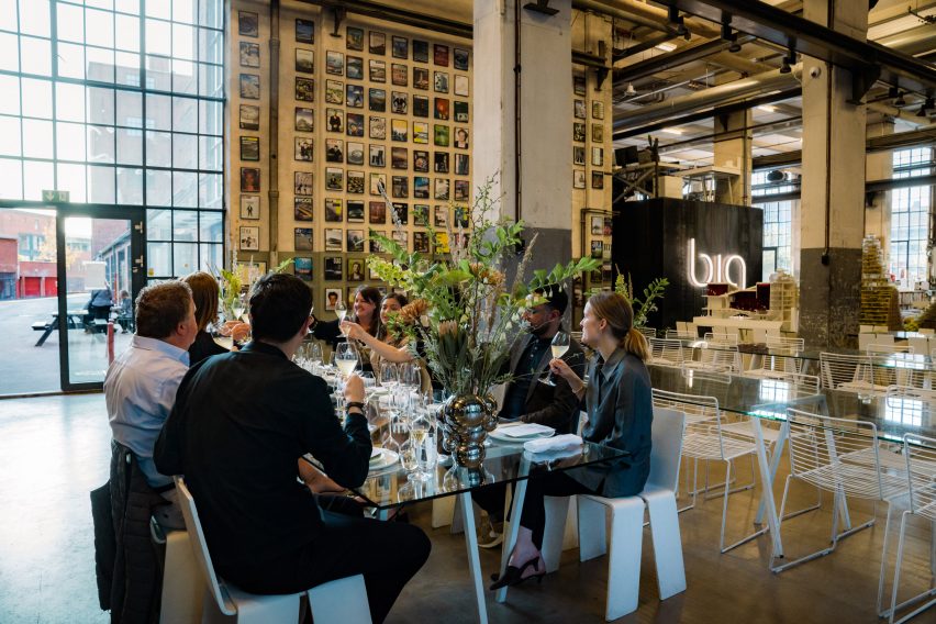
Photo of a big group of people having lunch and sharing a toast at BIG's studioPhoto of a big group of people having lunch and sharing a toast at BIG's studio
Day four included a tour and lunch at Bjarke Ingels Group’s studio

There was also a tour of Bjarke Ingels Group’s studio, hosted by a member of the team who gave insights into their creative practice. Lunch was also held within “the beating heart” of the office.

Bentley‘s Extraordinary Journey continues in the UK in 2024 with a programme where attendees will experience a scenic route starting at Crewe, the home of Bentley Motors, to The Macallan Estate in Speyside, Scotland. The UK programme runs from 19 to 22 August and 2 to 5 September.

For more information and to register interest, visit the Bentley website.

Partnership content

This article was written by Dezeen for Bentley as part of a partnership. Find out more about Dezeen partnership content here.

Reference

Samsung’s flagship New York store offers immersive smart home experience
CategoriesSustainable News

Samsung’s flagship New York store offers immersive smart home experience

Samsung’s flagship experience store in New York City, which has been captured in this exclusive video produced by Dezeen, has been designed to enable visitors to envision living in a smart home.

Located in Manhattan’s Meatpacking District, the Samsung 837 store is described by the brand as an “interactive playground” and allows visitors to interact with Samsung’s latest connected home devices.

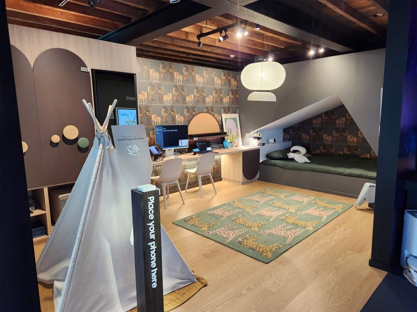
Located on the second floor, the SmartThings Home section allows visitors to test its connected products in a simulated smart home environment.

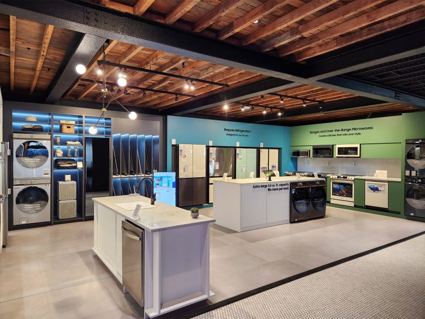
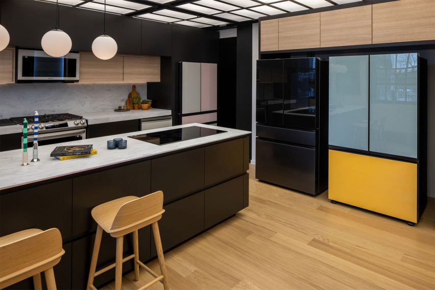
The section features a connected kitchen where products, such as Samsung’s Bespoke Refrigerator, are on display, allowing users to test its touchscreen capabilities.

The SmartThings Home section in Samsung's flagship New York store
The SmartThings Home on the second floor allows visitors to test Samsung’s latest smart products

The store also features a gaming lounge in which visitors can use consoles to play games in real-time.

Additionally, the SmartThings Home section includes a children’s bedroom, which features a projector where visitors can experience watching movies in bed.

Samsung children's bedroom
The children’s concept bedroom features a projector to watch films

Samsung customers can download its SmartThings app to connect and monitor all of their smart home devices in one place. Users can monitor their energy consumption in a bid to reduce their energy bills using the SmartThings Energy activation within the app.

Also exhibited in the space is Samsung’s Bespoke service, which allows visitors to customise Samsung products to suit their individual style, including custom colour combinations and finishes.

Samsung bespoke refrigerators
Samsung’s bespoke refrigerators can be customised to fit a user’s individual style

Samsung uses the flagship experience store to host a variety of talks and events throughout the year. Recently, Dezeen partnered with Samsung to host a live panel discussion in the flagship store, exploring the topics of technology and sustainability.

The talk was moderated by Dezeen’s US editor Ben Dreith and featured a panel including Barent Roth, Matthew Spencer and Claudia Santos, who discussed how connected homes can enable more sustainable lifestyles.

Partnership content

This article was written by Dezeen for Samsung as part of a partnership. Find out more about Dezeen partnership content here.


Reference

‘moonpass lookouts’ in idaho offer an elevated forest experience
CategoriesArchitecture

‘moonpass lookouts’ in idaho offer an elevated forest experience

‘moonpass lookouts’ by airbnb superhost kristie wolfe 


Kristie Wolfe is a renowned figure in the Airbnb community, celebrated for her skills in creating some of the world’s most unique and captivating properties. Over the past decade, she has established herself as an Airbnb superhost, garnering thousands of five-star reviews for her inventive accommodations. Wolfe’s portfolio includes off-grid hobbit holes, Hawaiian treehouses, and even potato-shaped abodes. The superhost has now turned her attention to ‘MoonPass Lookouts’. Nestled in the enchanting woodland of Wallace, Idaho, this project offers an unparalleled opportunity to connect with nature and history while embarking on a unique elevated lodging adventure.

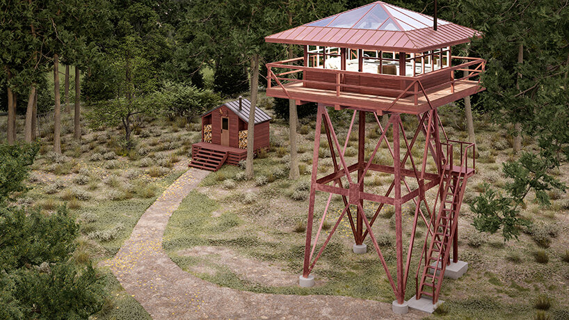
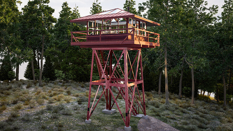
these fire lookout lodging towers in idaho offer an elevated and immersive forest experience
all renderings © Karl Kevin Lacorte


five custom-built towers offering total immersion and privacy 


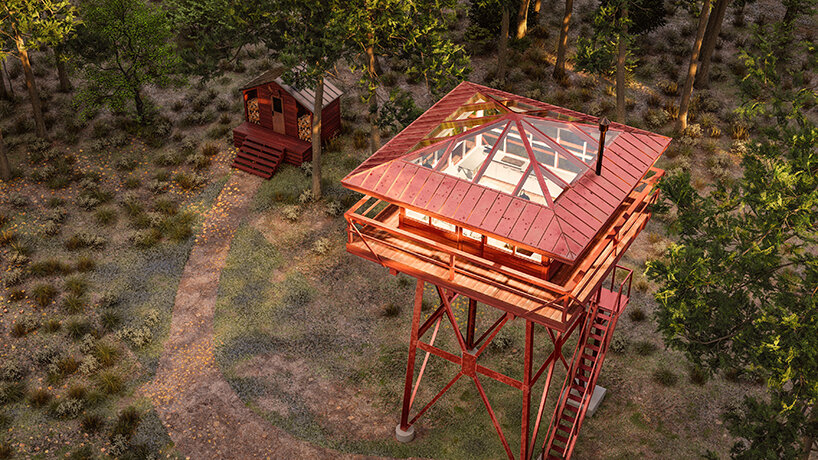
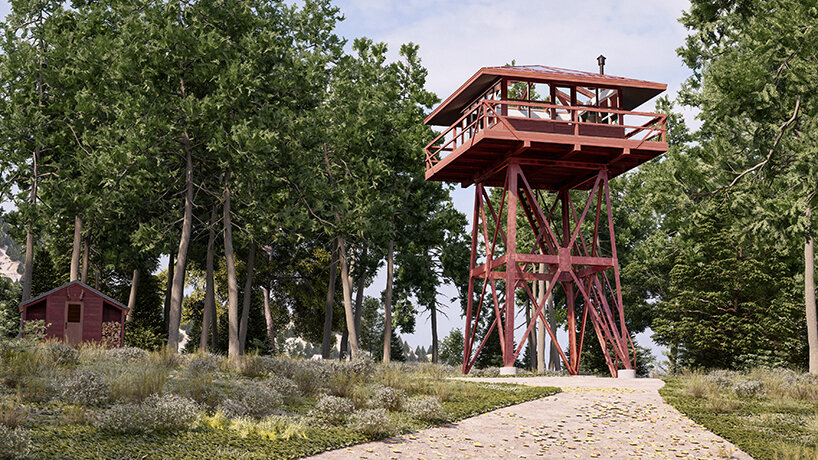
Set on a sprawling 222,577 sqm property, Kristie Wolfe’s (see more here) latest work takes shape as five custom-built fire lookout towers, soaring 9 meters in the air, and a museum. Each tower has a smart glass roof for stargazing without light pollution and on warmer days, the glass can turn opaque and block out 99% of UVA rays. Complementing the glazed top are 360-degree windows offering uninterrupted views of the natural world without compromising guests’ privacy; Wolfe notes that all towers are effectively spaced apart for maximum solitude amid the woodland setting. As an added perk, guests can enjoy the forest sounds through a custom-built amplifier for greater immersion. 


Lodging amenities include a fully-equipped kitchen, a wood-burning stove, a full-sized bed and bathroom, and a private sauna. Lastly, the towering hotel is pet-friendly, allowing visitors to bring their furry friends to their ‘MoonPass Lookouts’ adventures.

these fire lookout lodging towers in idaho offer an elevated and immersive forest experience
‘MoonPass Lookouts’ offers total privacy amid the forestscape


from hiking and fishing to historical tours 


When it comes to adventures, the getaway offers a range of adrenaline-pumping and leisurely activities. These include hiking along the nearby Pulaski trail; traversing the renowned Hiawatha trail on two wheels; fishing at Placer Creek or the hotel’s onsite pond; taking scenic snowy rides on a Snowcat in winter; and finally, indulging in a historical experience by visiting the city of Wallace, Idaho. Speaking of history, the city holds significance as the starting point of the Great Fire of 1910, also known as the ‘Big Burn’, which remains one of the largest forest fires in U.S. history. As part of the ‘MoonPass Lookout’ property, guests will have the opportunity to explore The Fire Lookout Museum, which showcases the history and impact of this devastating event.

these fire lookout lodging towers in idaho offer an elevated and immersive forest experience
each structure is custom built


One of the notable figures from the Great Burn is Ed Pulaski, a hero who led his firefighting crew to safety in a mine shaft. You can embark on a beautiful 5-mile hike from our MoonPass property to visit this mine shaft, paying homage to Pulaski’s bravery and the event’s historical significance. Adding to the unique experience, our fire lookout towers stand as reminders of the past against this historical backdrop. Including the fire museum and rich historical context add an educational element to your unforgettable journey at ‘MoonPass Lookouts’. As you explore, you can learn about the past and appreciate the heroic efforts that shaped the region,’ writes Wolfe. 

these fire lookout lodging towers in idaho offer an elevated and immersive forest experience
the getaway offers a range of nature-infused activities


book your stay at ‘moonpass lookouts’ via indiegogo 


Currently, ‘MoonPass Lookouts’ is raising funds on its Indiegogo crowdfunding platform. Availability is limited, and priority to booking is based on access level and length of stay. By supporting the campaign early and opting for a more extended stay, visitors will be eligible for early access (once the campaign ends and the hotel stay reservation date portal is available). Reservations have no expiration date, so if you’re unsure of your dates right away, you can book your stay date in the future. To secure your position as a future guest at ‘MoonPass Lookouts’, support the Indiegogo campaign where you can learn more about booking and prices. 


Reference

Ergon Agora East Re-Interprets the Supermarket Experience
CategoriesArchitecture

Ergon Agora East Re-Interprets the Supermarket Experience


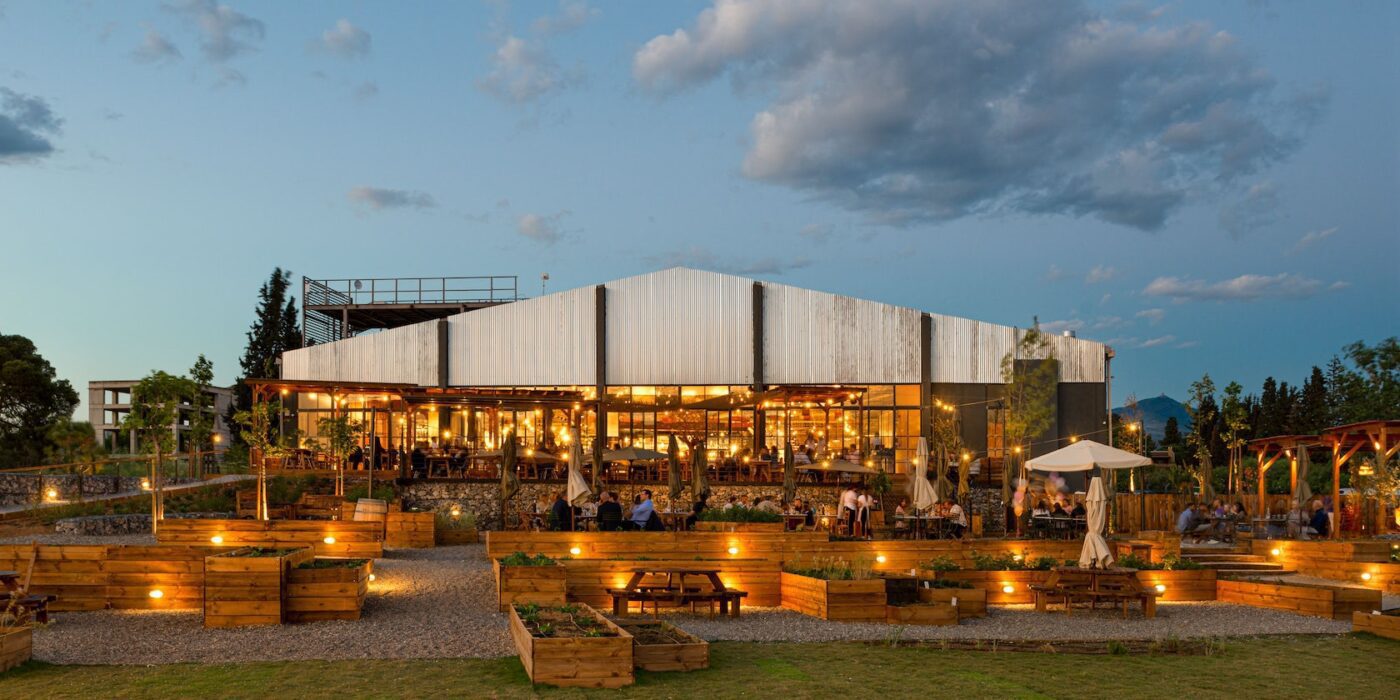
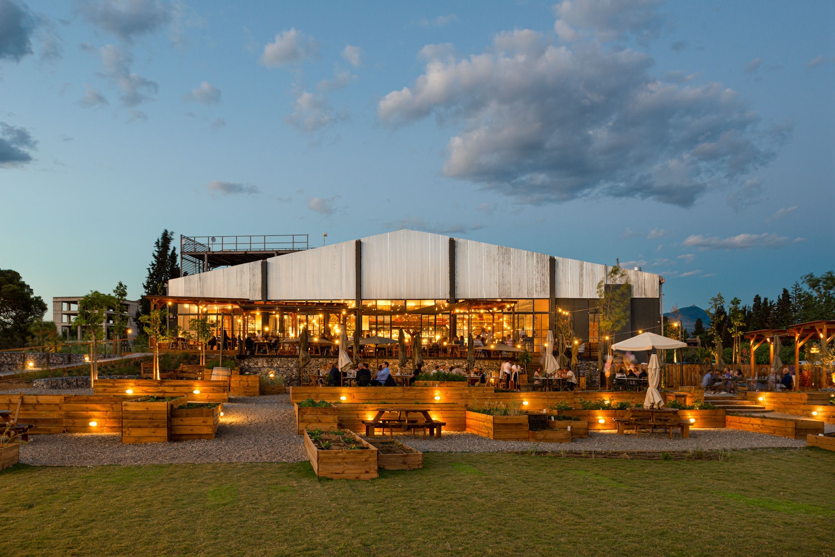
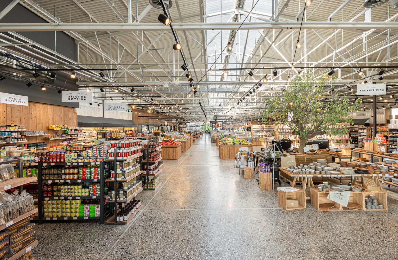
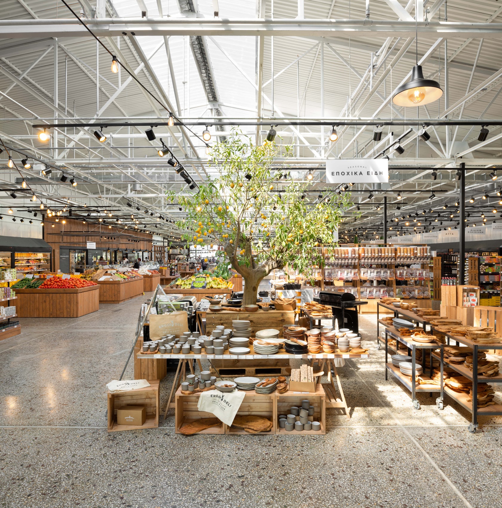
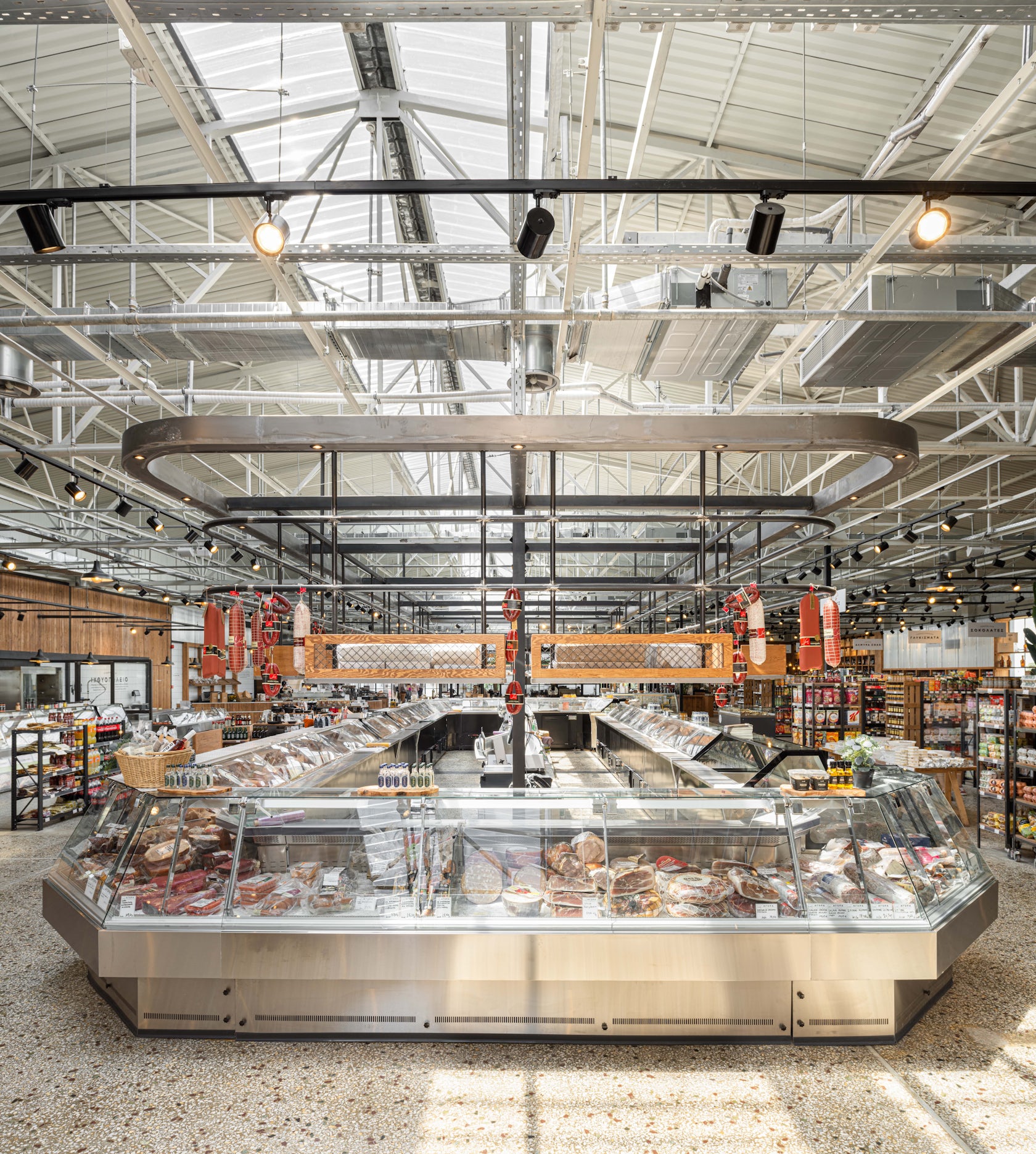
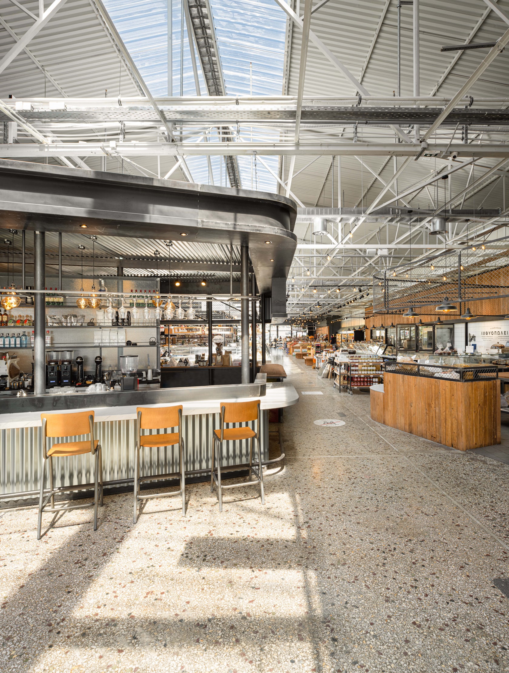
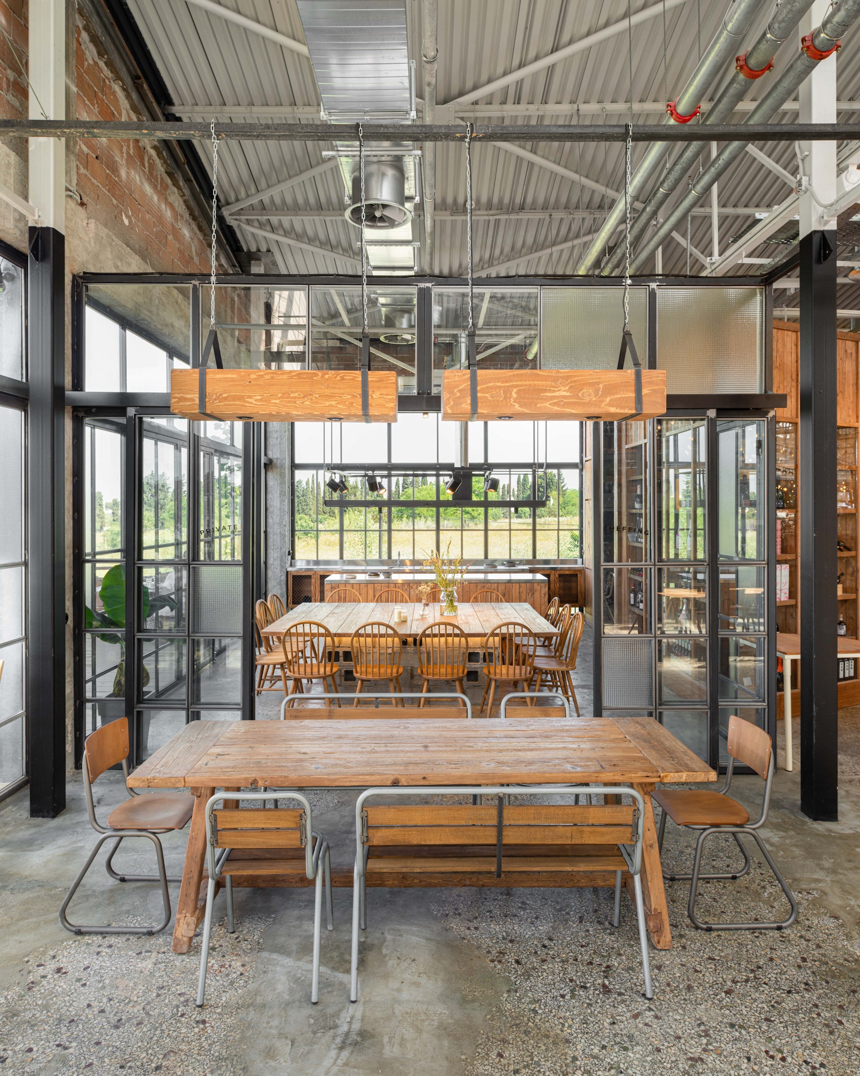
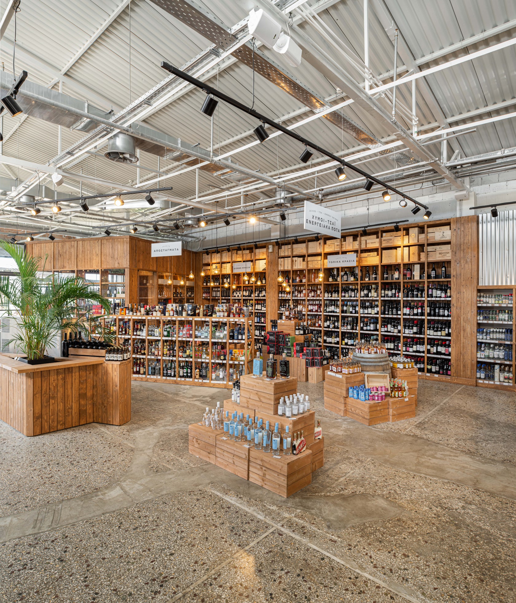
Ergon Agora East – The challenge was to re-interpret the common supermarket experience, by introducing a new vocabulary of materials and forms. An additional challenge was to intervene in an existing, old industrial shell and create a new, modern and of high-quality space.

Architizer chatted with Tasos Georgantzis, Managing Director at Urban Soul Project, to learn more about this project.

Architizer: What inspired the initial concept for your design?

Tasos Georgantzis: ERGON already has a visual identity in terms of spatial design so we had in our hands a range of elements to shape Agora’s identity. This identity is based on greek materiality, tradition, architecture colours and forms. This identity is always the starting point in every ERGON project. Specifically in this case, we were inspired by our own experience in markets, both open and closed. We wanted to design a space that combines different uses, for different hours and different age groups.

© Kimberley Powell

© Kimberley Powell

© Kimberley Powell

© Kimberley Powell

This project won in the 10th Annual A+Awards! What do you believe are the standout components that made your project win?

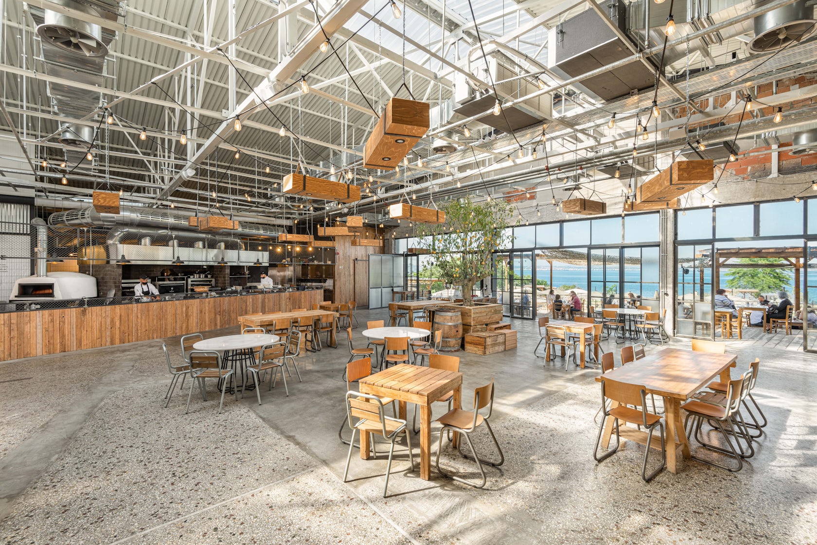
ERGON Agora East is innovative for two reasons: not only it proposes a new way to design a supermarket but also proposes a way to re-use an existing industrial shell. Regarding the second point, the changes made to the building were subtle but significant: the roof was opened in order for the daylight to enter the building, and also with the opening of the southwest side the building becomes integrated with its environment. ERGON Agora’s design is minimal, respects the existing structure and creates a new narration using old materials.

© Kimberley Powell

© Kimberley Powell

© Kimberley Powell

© Kimberley Powell

What was the greatest design challenge you faced during the project, and how did you navigate it?

The greatest challenge in ERGON Agora East design process was the request to fit in one space different uses, define a hierarchy among them and achieve to keep them connected, not separated. ERGON Agora East is at the same time a super market, a winery, a restaurant, a bakery and a garden.

© Kimberley Powell

© Kimberley Powell

© Kimberley Powell

© Kimberley Powell

© Kimberley Powell

© Kimberley Powell

© Urban Soul Project

© Urban Soul Project

Consultants

Electromechanical Study: Charalambos Charalambidis / Metalwork: Damon Sidiropoulos / Woodwork: Aris Iliadis / Landscape Design: FYTRON, Urban Soul Project

For more on Ergon Agora East, please visit the in-depth project page on Architizer.

Ergon Agora East Gallery

Reference

Locally Sourced Materials Define the Tomo Experience
CategoriesArchitecture

Locally Sourced Materials Define the Tomo Experience


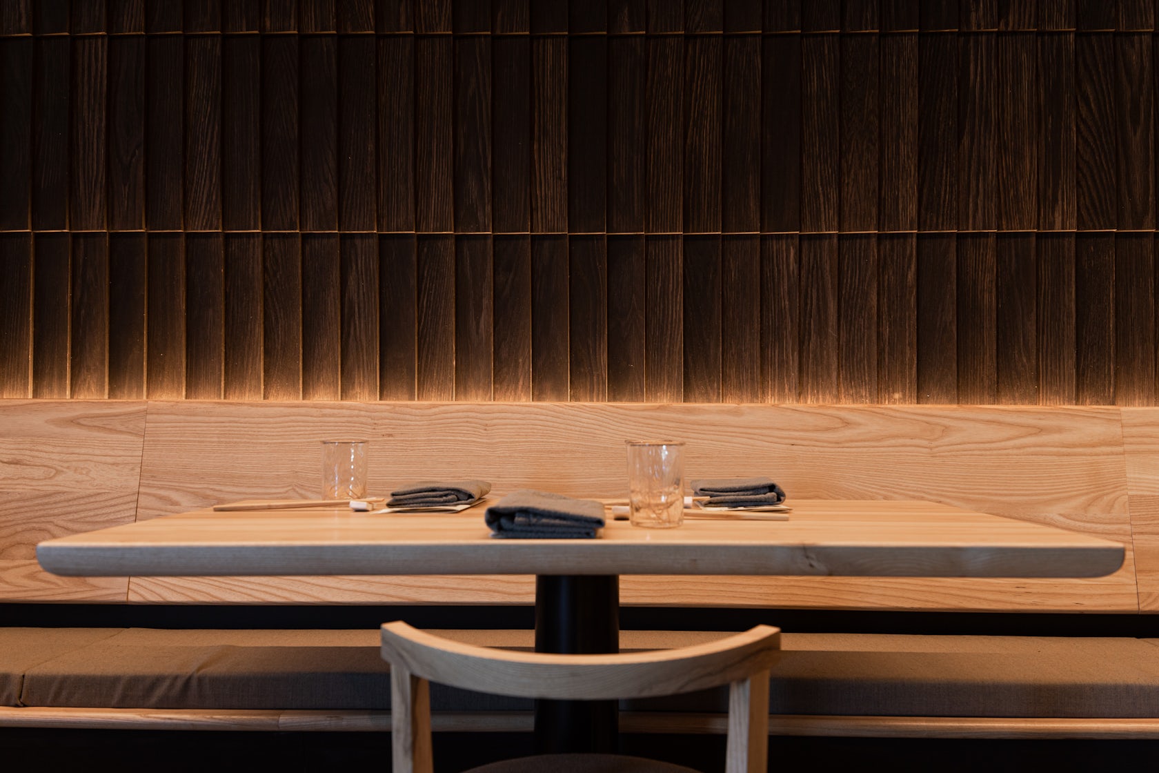
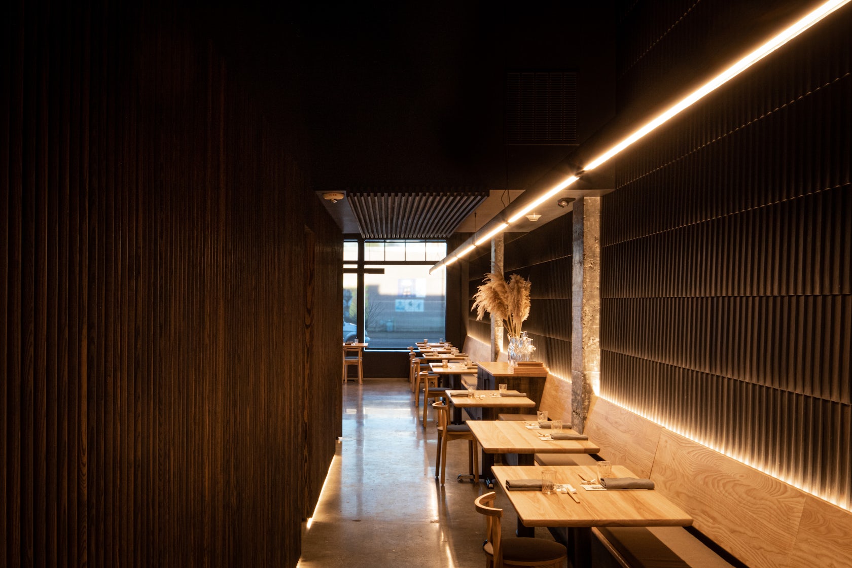
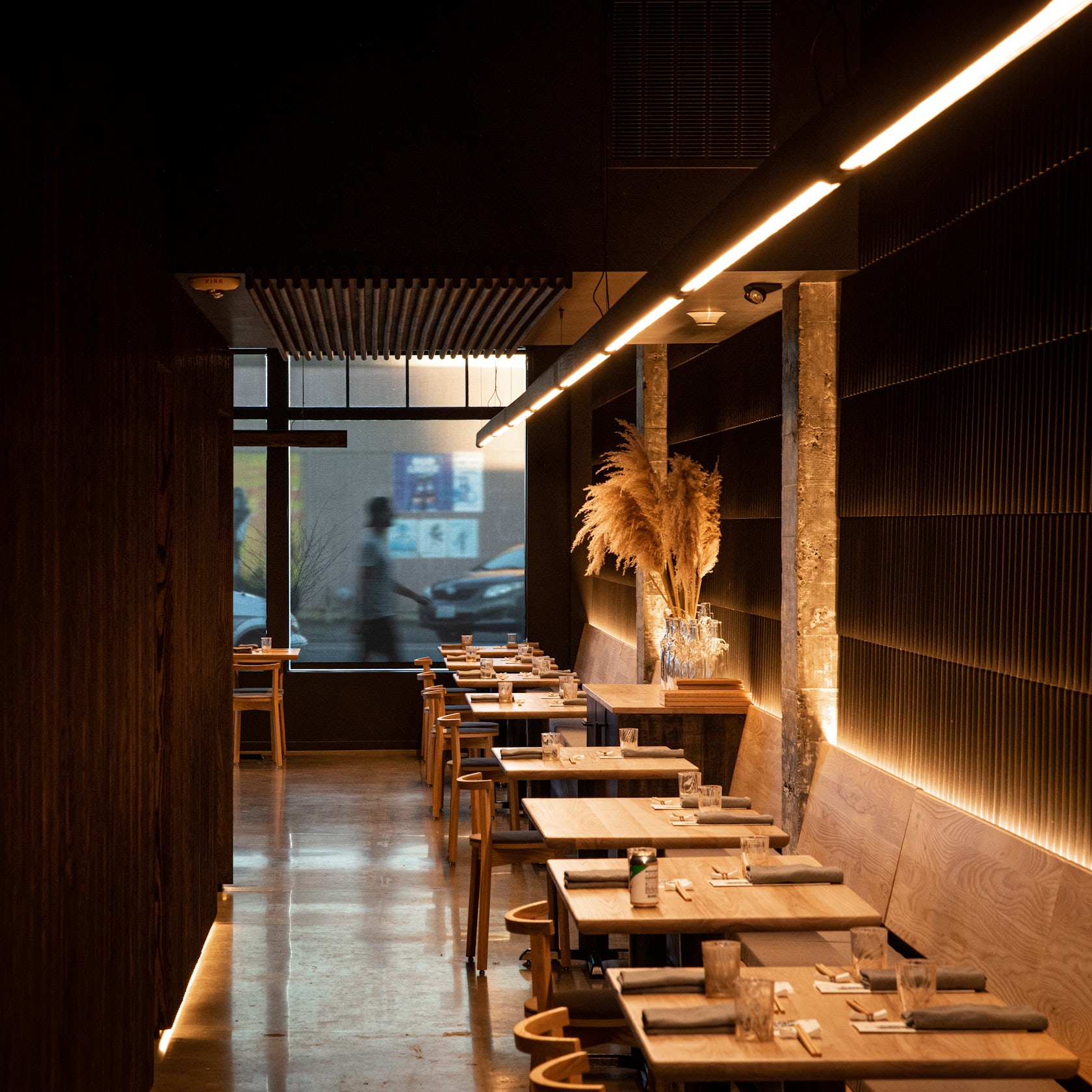
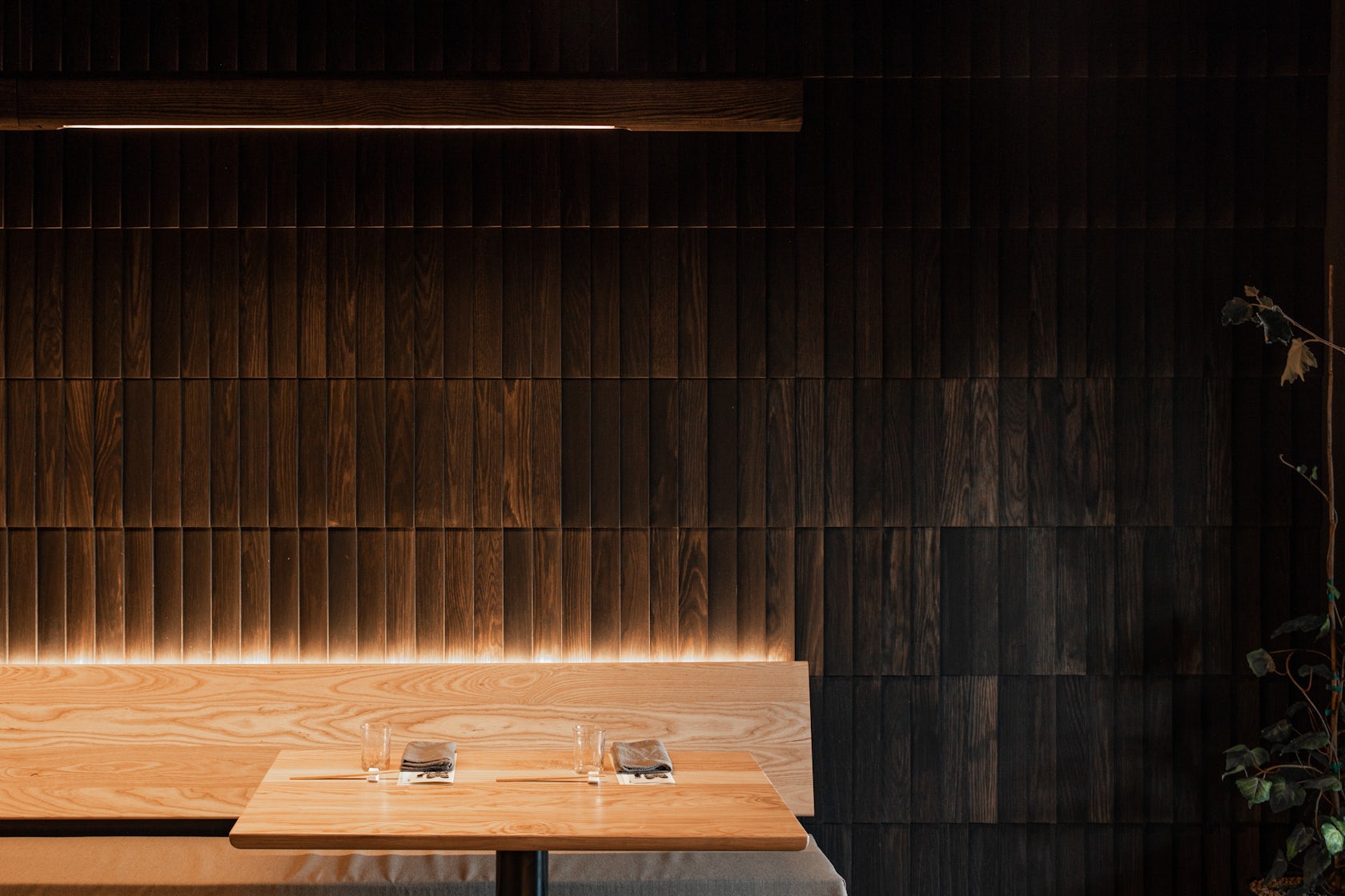
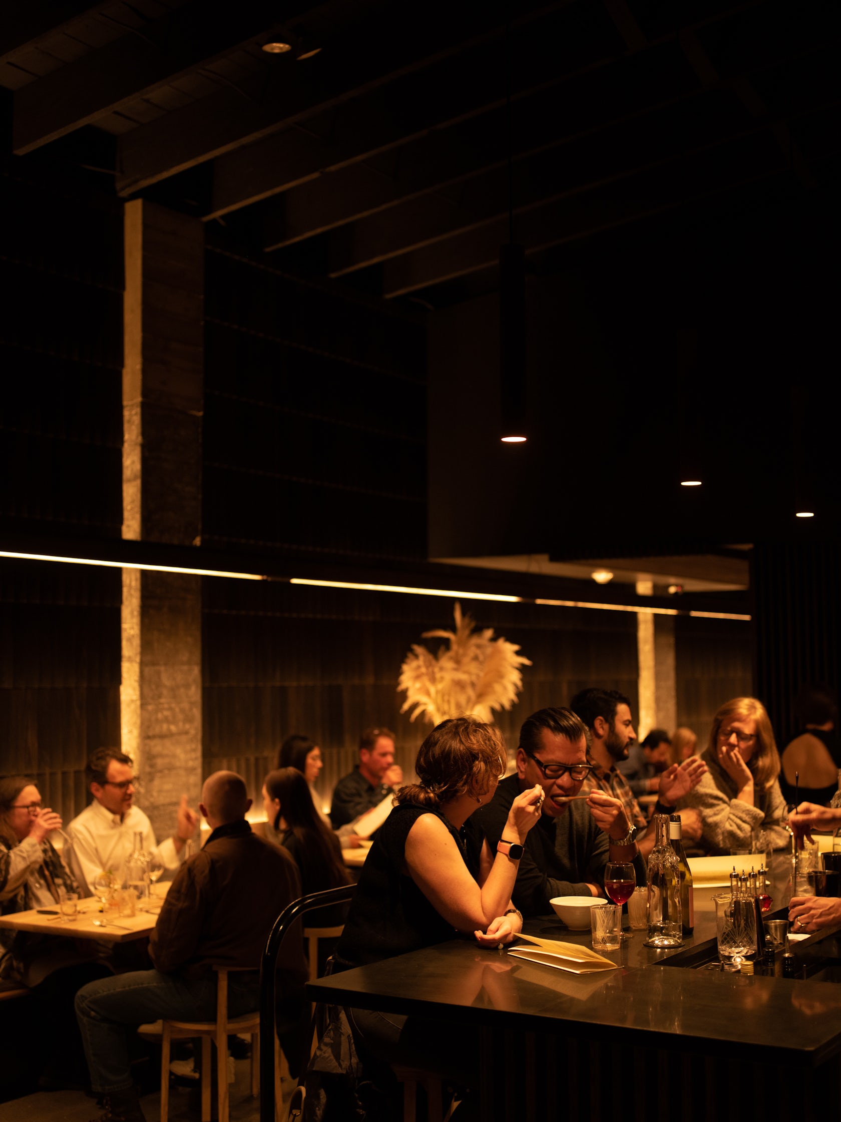
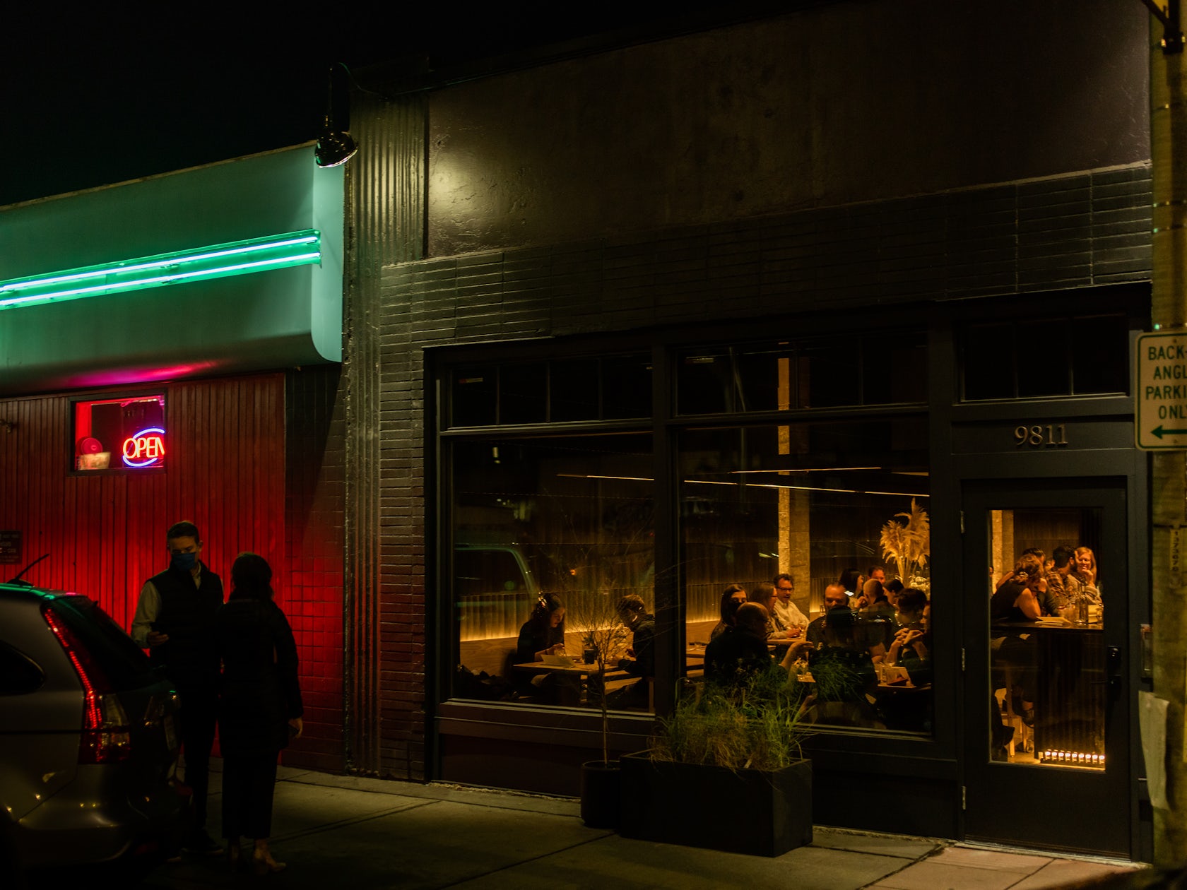
Tomo – is a restaurant in White Center, just south of Seattle, WA. The client named the restaurant after his grandmother, Tomoko, and the Japanese word “tomodachi”, meaning ‘friend’. Embracing these warm roots, wood became the centerpiece of the space. Nearly every piece of the interior was created locally, bringing down the carbon footprint of the project, and amplifying the local economic impact. The 80’ wooden light fixture, pendant lighting, bench seating, chairs, bar stools, tabletops, slatted wall panels and shake cladding were custom designed and fabricated by our team just five miles away.

Architizer chatted with Seth Grizzle, Founder & Creative Director at Graypants, Inc., to learn more about this project.

Architizer: What inspired the initial concept for your design?

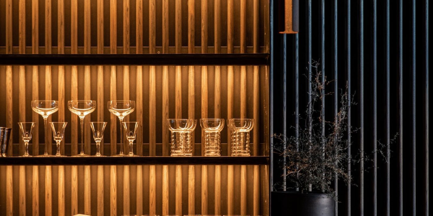
Seth Grizzle: Our initial concept was inspired by the idea of a space to enjoy great food without the trappings or stiffness of traditional fine dining. We wanted to create a lot of warmth, so wood is a centerpiece of the space: Referencing shou sugi ban, much of the interior wood has been stained a deep ebony, while oak shingles arranged like scales clad a wall running the length of the space, and contrast the strict geometry of the vertical ash slats that wrap the opposing walls.

This project won in the 10th Annual A+Awards! What do you believe are the standout components that made your project win?

I think what stands out about Tomo is that nearly every piece of the interior was created locally, bringing down the carbon footprint of the project, and amplifying the upfront, local economic impact of the project. The 80’ light fixture, pendant lighting, bench seating, chairs, bar stools, tabletops, slatted wall panels and shake cladding were custom designed and fabricated by our team just five miles away. As well, nearly all of the lighting is directly integrated into the architectural elements–the wall panels, the bench seating, the bar shelves– the lighting is felt but not seen.

What was the greatest design challenge you faced during the project, and how did you navigate it?

The space is narrow and deep, posing a risk of feeling cold, tight and confining. Code restrictions meant fixed walls, plumbing and bathrooms. With these lines already drawn in the space, we worked with softening elements; wood, integrated light, a neutral pallette to create a dining experience that is refined but not extravagant, and elevated by light.

How did the context of your project — environmental, social or cultural — influence your design?

The context highly influenced the project. The client chose Tomo’s neighborhood, White Center, very deliberately as it has been on a slower path to economic growth and becoming more inviting to visitors. As a chef with a long list of accolades, and a community curious to learn his next endeavor, the client deliberately rejected the idea of another anticipated restaurant within the city of Seattle, in hopes of speeding the trajectory growth in White Center with a space to enjoy great food without the trappings or stiffness of traditional fine dining. With the design, the team responded by creating a space remarkable enough to feel like a destination–a place worth traveling to- for both food and ambiance.

What is your favorite detail in the project and why?

One of my favorite elements in the project is a custom, handmade 80-foot linear wood fixture that traces the entire length of the restaurant. The layout of the restaurant invited a reference to an evening in one of the endless alleyways of Japanese cities; the custom fixture beautifully connects this space without cluttering it.

How have your clients responded to the finished project?

We loved seeing that since opening, the restaurant has immediately begun outperforming their projections, with a booked solid calendar bringing hundreds of people to the neighborhood every single evening.

How do you believe this project represents you or your firm as a whole?

Tomo is a reflection of Graypants’ emphasis on the interplay between light and architecture. They always inform one another, and in Tomo, the lighting is felt much more than seen. With the exception of the linear fixture, which is very visible even as it is quite understated.

Is there anything else important you’d like to share about this project?

The cost per square feet of this project is, conservatively, 35 percent below the benchmark, largely due to the team’s ability to make simple, touchable materials feel chic in a monochrome palette. The team used a design/build approach for the project, fabricating much of the primary design elements such as fixtures and furnishings, cutting out suppliers and shortening the timeline significantly.

Team Members

Seth Grizzle, Bryan Reed, Caleb Patterson

Consultants

Fin Design Shop

For more on Tomo, please visit the in-depth project page on Architizer.

Tomo Gallery

Reference

“COP27 was a deeply depressing experience”
CategoriesSustainable News

“COP27 was a deeply depressing experience”

The COP27 conference was made a miserable affair by its dreadful architecture as much as the disheartening tenor of the discussions and debates, writes Smith Mordak.


No! I don’t want to read another opinion piece on how COP27 was a disappointment and “we must” do better. I know. We all know. Attending COP27 was a deeply depressing experience. I heard nothing I hadn’t heard a million times before and even though I’d have been drunk under the table if I’d taken a sip every time someone said “breakthrough”, I heard nothing of any actual breakthroughs.

I’m not saying that no action on climate change is happening, or that there isn’t powerful thinking opening up universes of possibilities for better futures going on all around us – there are! But until these international forums give themselves permission to consider transformative social and economic policy, we’re not going to get anywhere.
I’d have been drunk under the table if I’d taken a sip every time someone said “breakthrough”

One anecdote to make this point if you’ll bear with me: at a panel in the Buildings Pavilion, one of the attendees asked for ideas from the panel for retrofitting the mobile homes of low-income residents in the US.

The panel bent over backwards to try to address this within their remits. Their frankly preposterous answers included things like creating district-wide projects that might convince investors that they can clinch a worthwhile profit from the scale of the work, showing investors that they can get a higher rental income from green buildings, and the “uberization” of construction. Nobody said anything about tackling the crippling poverty constraining these people’s access to resources (from food to insulation), or the redistribution of wealth (financial wealth and housing wealth) that could address this.

So long as we’re only allowed to use the tubes of paint marked “return on investment” or “profit motive” our vision of the future is monochrome. COP27 delegates were acting as if there wasn’t a rainbow of solutions to choose from. Hand me a gorgeous bright “equity” and some effervescent “deliberative democracy” and I’ll paint you a kaleidoscopic future. Meanwhile, is there anything worth learning from COP27?

Maybe it’s because I’m an architect, but the surprise take-home for me was a rekindled fervour for the importance of designing healthy, comfortable spaces. I attended the conference as part of the RIBA delegation during the second week, joining round tables and speaking on panel debates in the “Blue Zone”. What I experienced was that the COP27 campus of temporary buildings was not conducive to the expansive imagining and radical collaboration needed for a transition out of the climate crisis.

The COP27 campus of temporary buildings was not conducive to expansive imagining and radical collaboration

On the one hand, I hate to pile on the requirements: not only do we need to worry about energy use, water consumption, whole-life carbon, and, and, and, but now I’m also saying we need to design spaces that will facilitate the conversations needed for climate action – that’s a bit much isn’t it? It is a lot, but on the other hand, isn’t this what we’ve been training for? Advocates of “Good Design” have been arguing for impacts on learning outcomes in education settings, for productivity in office buildings, on health outcomes in hospitals and so on for a long time.

There’s a wealth of literature out there. I’ve seen John Zeisel’s Inquiry by Design inhabit numerous bookshelves in video call backgrounds over the last couple of years. Since the WELL Building Standard launched in 2014, more and more clients and design teams have focused attention on the ways that the buildings we design can enhance our health and wellbeing.
I’m not sure what the designers of the COP27 site had on their bookshelves, and I doubt they were given the scope and time and resources to go beyond a minimum viable conference centre. This is not a dig: we’ve all done less than our best work for difficult clients in difficult circumstances. But it’s still worth learning from a bad experience.
The complex consisted of several large temporary buildings: the brood that might ensue from a love affair between a wedding marquee and an airport hangar. Difficulty navigating the site was the first stressor. The buildings all looked the same with almost identical supergraphics and in a layout that didn’t appear to align with the maps.
I went on Google Maps while I was on site to help me get my bearings where the printed isometrics let me down and could see that the spot had recently been a bare bit of desert. Microphones from the various pavilions were competing with the thunderous aircon, each other, and various videos on loop.

The existential threat of the climate crisis provides enough doom and panic without turning the screws through the design of our negotiating spaces

Pavilions had numerous doors but no ceilings. My acoustician colleagues would have cried. The lighting was also challenging, with most pavilions opting for the slightly dressed-up cousin of the site light, oriented directly at the stages and audiences like every cartoon of an interrogation. It was too cold, and my portable VOC monitor (okay, my nose) detected high levels of off-gassing from the carpets, furniture, and the inhabitable 3D pdfs that passed for pavilions. Thanks to the Australian pavilion that kept us in coffee, I know it was the smellscape and not caffeine withdrawal maintaining a continuous low-grade headache.

All of this is to say it was always going to be a challenging few days, but the built environment didn’t help to manage this – instead, it added to my levels of discomfort and stress. The existential threat of the climate crisis provides enough doom and panic without turning the screws through the design of our negotiating spaces.

Many of us headed to COP armed with statistics of how bad things are today, together with bundles of reports setting out how we have the solutions for reducing carbon emissions, energy use, and resource use. We were met with what we’re always met with: “tell me how this is going to make me money and we’ll talk”. Well, we’re not going to profiteer our way out of climate change, I’m sorry.

It’s clear we need to be having a different conversation. Is it naive to suggest that a different space might help us have that different conversation? Am I clutching at straws or grasping the nettle?

There’s a lovely (and sometimes not so lovely) comments section below. If you know of examples of projects where a space has been created to facilitate working together to imagine social justice or transformative futures, please share it! What was done differently and how were the outcomes different?

Smith Mordak is a multi-award-winning architect, engineer, writer and curator and the director of sustainability and physics at British engineering firm Buro Happold.

The photography is by Kiara Worth via Flickr.

Reference

Ten bookshop interiors designed to enhance the browsing experience
CategoriesInterior Design

Ten bookshop interiors designed to enhance the browsing experience

A second-hand bookstore styled like a greengrocer and an outlet modelled on old libraries are among the projects collected in our latest lookbook, which explores bookshop interior designs.

Architects and designers across the globe have created bookstores with striking interiors that offer more than just a place to buy things.

From a hall of zigzagged staircases in China to a yellow-hued grotto in east London, here are 10 bookshop interiors that provide immersive and unusual browsing experiences.

This is the latest in our lookbooks series, which provides visual inspiration from Dezeen’s archive. For more inspiration see previous lookbooks featuring brutalist interiors, light-filled atriums and walk-in wardrobes.


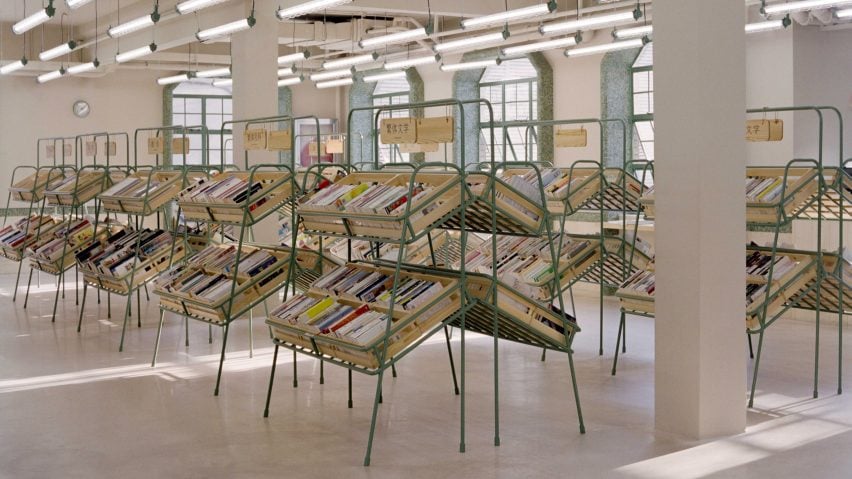
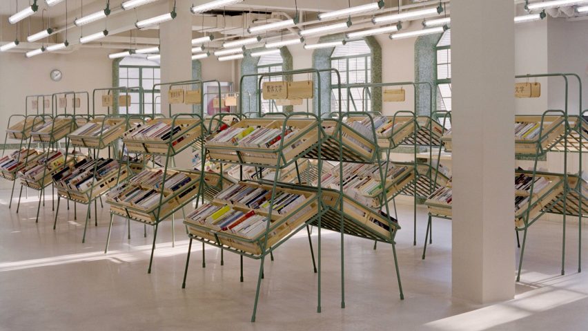
Supermarket-style shelves holding books in Deja Vu Recycle Store in Shanghai by Offhand Practice
Photo is by Hu Yanyun

Deja Vu Recycle Store, China, by Offhand Practice

Chinese architecture studio Offhand Practice designed a second-hand bookshop in Shanghai to mimic the interior of a greengrocer by displaying items in familiar supermarket-style crates.

Created to counter the “shabby” image commonly associated with second-hand retailers, Deja Vu Recycle Store features a light interior defined by stone off-cut mosaic tiles and natural pine.

“[The project] breaks the stereotypical image of a second-hand store and erases the ritualistic impression of a traditional bookstore full of full-height bookshelves,” said Offhand Practice.

Find out more about Deja Vu Recycle Store ›


Stone sculpture in wood-panelled bookstore
Photo is by Jonas Bjerre-Poulsen

New Mags, Denmark, by Norm Architects

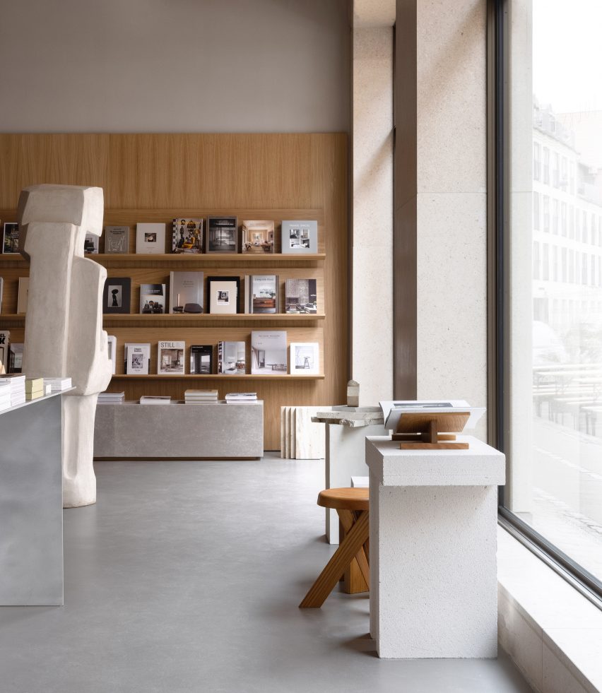
Coffee table book distributor New Mags commissioned Norm Architects to design the interior of its flagship store in Copenhagen, which nods to the serenity of old libraries.

Natural oak panels were used to create towering display walls for books. Various publications are also presented on stone plinths that echo a looming, organically shaped stone sculpture by local artist Josefine Winding.

Find out more about New Mags ›


Chongqing Zhongshuge Bookstore by X+Living
Photo is by Shao Feng

Chongqing Zhongshuge Bookstore, China, by X+Living

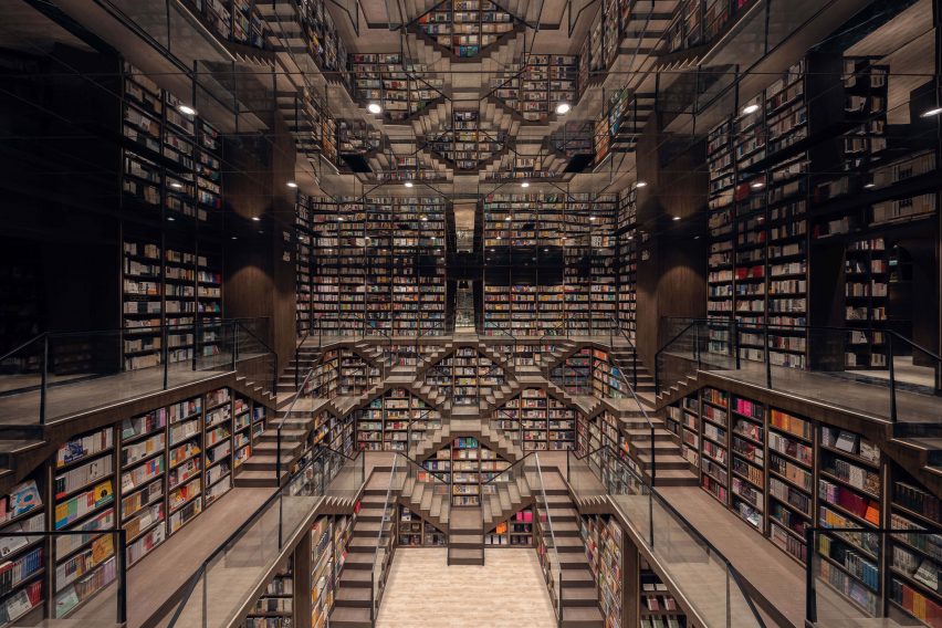
A maze of intricate staircases, amplified by a mirrored ceiling, forms a dramatic backdrop for this bookshop in Chongqing by Shanghai-based studio X+Living.

Thanks to their wide treads, the stairs double as reading nooks for customers, while the overall stepped outline created in the central space intends to reference Chongqing’s urban skyline.

Find out more about Chongqing Zhongshuge Bookstore ›


Bookshop in Italy
Photo is by Žiga Lovšin

Book Centre Trieste, Italy, by SoNo Arhitekti

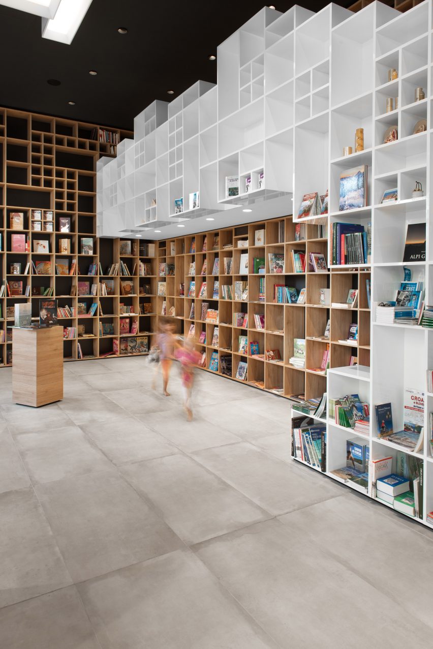
Another store interior that takes cues from its setting, this Trieste bookshop features boxy shelving that was informed by the diamond brick patterns of the nearby Trieste National Hall.

Slovenian studio SoNo Arhitekti repeated this motif on the shop’s two sofas, which have grid-patterned upholstery. It also reserved space for chunky display podiums and a children’s reading corner.

Find out more about Book Centre Trieste ›


Interiors of They Said Books shop, designed by Lado Lomitashvili
Photo is by Nakanimamasakhlisi

They Said Books, Georgia, by Lado Lomitashvili

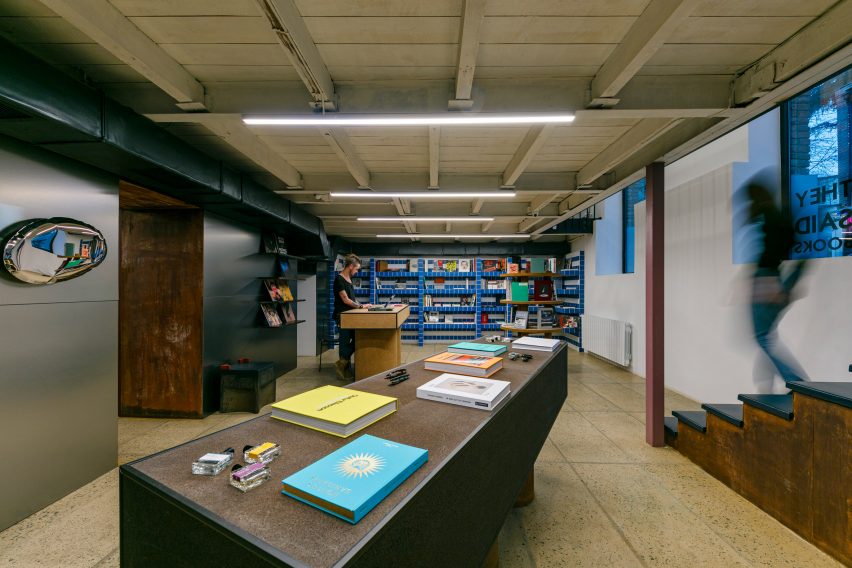
They Said Books is a bookshop-cum-cafe in Tbilisi with an interior characterised by Tetris cube-style shelving, yellowed terrazzo tiles and bubble-shaped reflective wall sculptures.

Georgian designer Lado Lomitashvili created the store, which is housed inside a 1930s building, to support the “cultural development” of the country’s capital city.

Find out more about They Said Books ›


Pulse On cinema and lobby
Photo is courtesy of Pulse On

SFC Shangying Cinema Luxe, China, by Pulse On

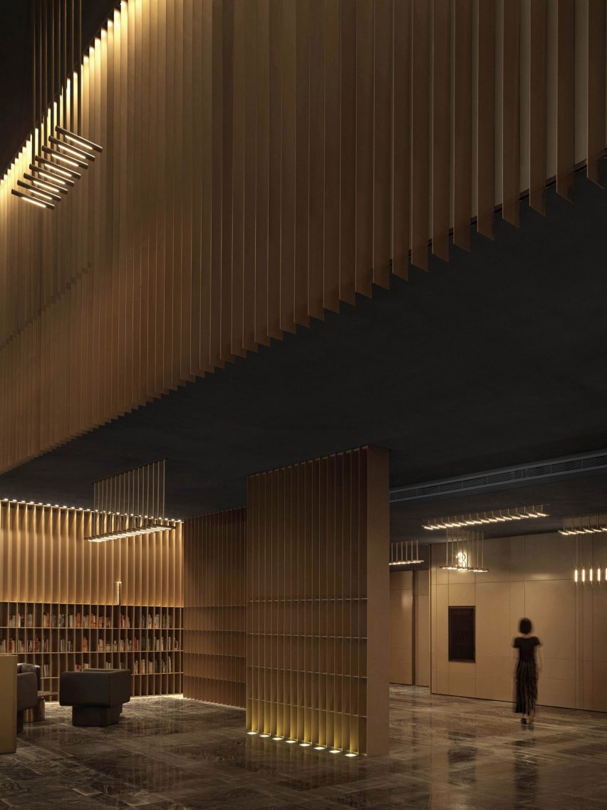
Hong Kong-based firm Pulse On was informed by the strings of musical instruments when designing the delicate interior of this Shanghai bookshop, which is also the lobby of a cinema.

Thin metal slats extend vertically from floor to ceiling to create bookshelves, while integrated lighting bathes various seating areas in a soft glow.

“We wanted to create a zen resting space for the guests through the mix of ‘strings’ and ‘books’,” explained the designers. “All of this boils down to simplicity and purity of lines – no highly-contrasting colours are used.”

Find out more about SFC Shangying Cinema Luxe ›


Libreria bookshop
Photo is courtesy of SelgasCano

Libreria, UK, by SelgasCano

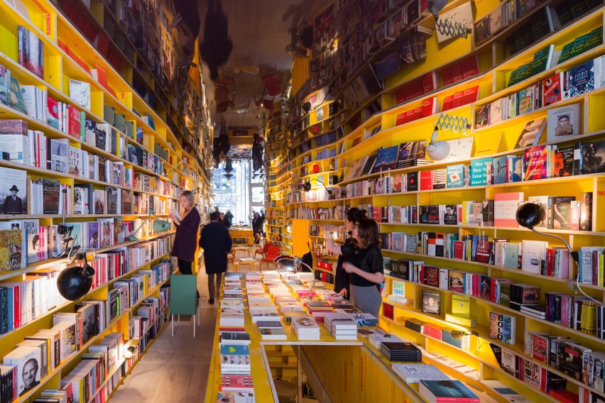
Author Jorge Luis Borges’ 1940s tale The Library of Babel informed the winding, cavernous interior of Libreria, a London bookshop designed by Spanish studio SelgasCano.

Handmade shelves were crafted in irregular shapes by artists from the Slade School of Fine Art using unfinished recycled wood. They house the store’s many books, which are arranged thematically rather than categorised traditionally, in order to encourage “chance encounters while browsing”.

Find out more about Libreria ›


Wutopia Lab Books in Clouds
Photo is by CreatAR Images

Duoyun Bookstore, China, by Wutopia Lab and Office ZHU

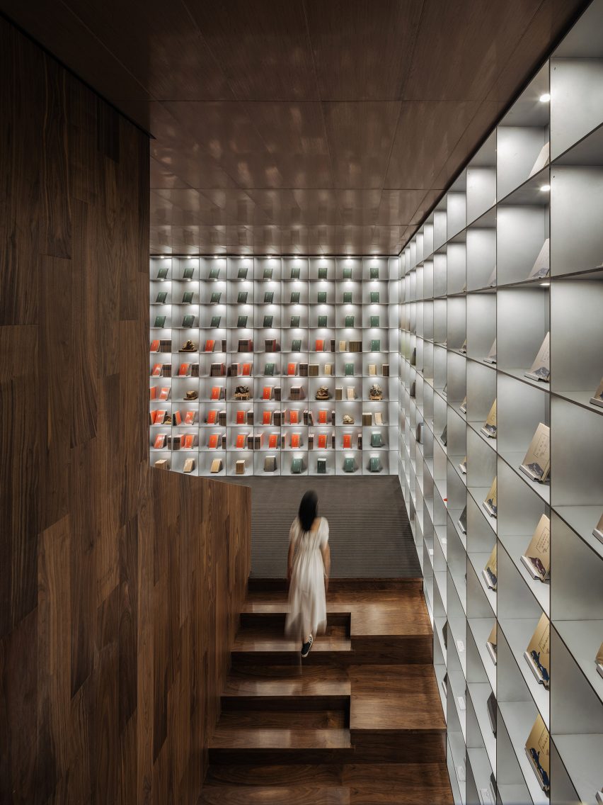
Five different colours delineate the zones inside this Huangyan bookstore, which includes reproductions of rare books exhibited in a tall, wood-panelled stairwell.

Duoyun Bookstore was designed by Wutopia Lab and Office ZHU to feature layers of perforated metal on its facade – a move that saw two disused buildings renovated to create the shop.

Find out more about Duoyun Bookstore ›


MUDA Architects bookshop
Photo is by Arch-Exist

Xinglong Lake Citic Bookstore, China, by MUDA Architects

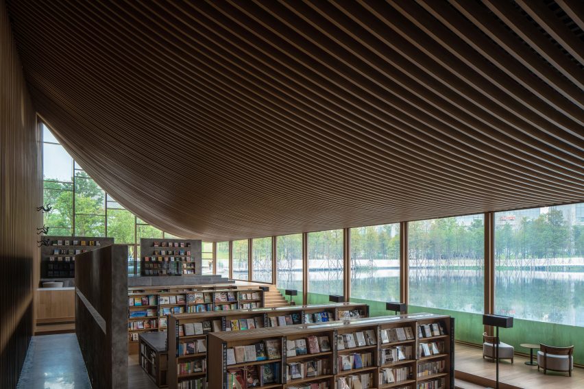
Chinese studio MUDA Architects topped a lakeside bookstore in Chengdu with a roof shaped like an upturned book that creates a sweeping ceiling on the interior.

Large rectilinear windows are positioned at the edge of the lake to offer views of the surrounding scenery, while the glass extends beneath the waterline to create a peaceful and immersive setting for reading.

Find out more about Xinglong Lake Citic Bookstore ›


Sao Paulo bookshop
Photo is by Fernando Guerra

Livraria Cultura, Brazil, by Studio MK27

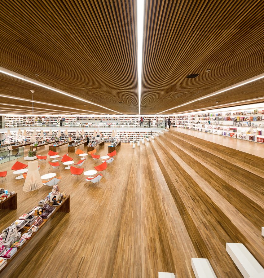
The Livraria Cultura – or Culture Bookshop – was designed by Studio MK27 in Brazil’s São Paulo to be “a bookstore of the 21st century” that encourages social interactions.

A vast double-height room is defined by wooden bleachers that span the 21-metre width of the space, where customers are invited to stay and read or meet up even after they have bought their books.

Find out more about Livraria Cultura ›

This is the latest in our lookbooks series, which provides visual inspiration from Dezeen’s archive. For more inspiration see previous lookbooks featuring colourful living rooms, decorative ceilings and deliberately unfinished interiors.

Reference

Will Architects Prioritize Passenger Experience in the Post-Pandemic World?
CategoriesArchitecture

Will Architects Prioritize Passenger Experience in the Post-Pandemic World?

Have your say in which architects will take home Architizer’s prestigious A+Awards: Public Voting opens this spring. Interested in next year’s program? Subscribe to our newsletter for updates.  

Traveling is an exhilarating endeavor. Whether it be by bus, train or air, successful travel requires stamina, organization and the ability to adapt. When traveling by plane, the initial leg of the journey often causes stress. From document checks to security lines, the entire airport process can feel arduous; however, when you touch down at your destination, the exhausting journey begins to feel worthwhile.

With the added complexities of the pandemic, flying feels more like a burden than it does a favorable experience. The excitement to board a plane is replaced by a fierce worry that something will go wrong. Today, passengers are greeted with long lines, rigorous document controls and a heightened stressful atmosphere. It is hard to predict when the return to normalcy will be — or if that will ever happen — but what is certain is that stress goes hand-in-hand with travel. Will the pandemic change the ways in which architects design transport interiors? Can architecture act as a mediator between stress and calm? Can it facilitate relaxed movement while not compromising practical requirements?

The check-in and administrative side of air travel are likely not to change, and airport security checks will likely remain long and unfavorable; however, once headed to the gate, the energy in the airport can shift. The second leg of the journey can be more relaxing, and architects can have a hand in that.

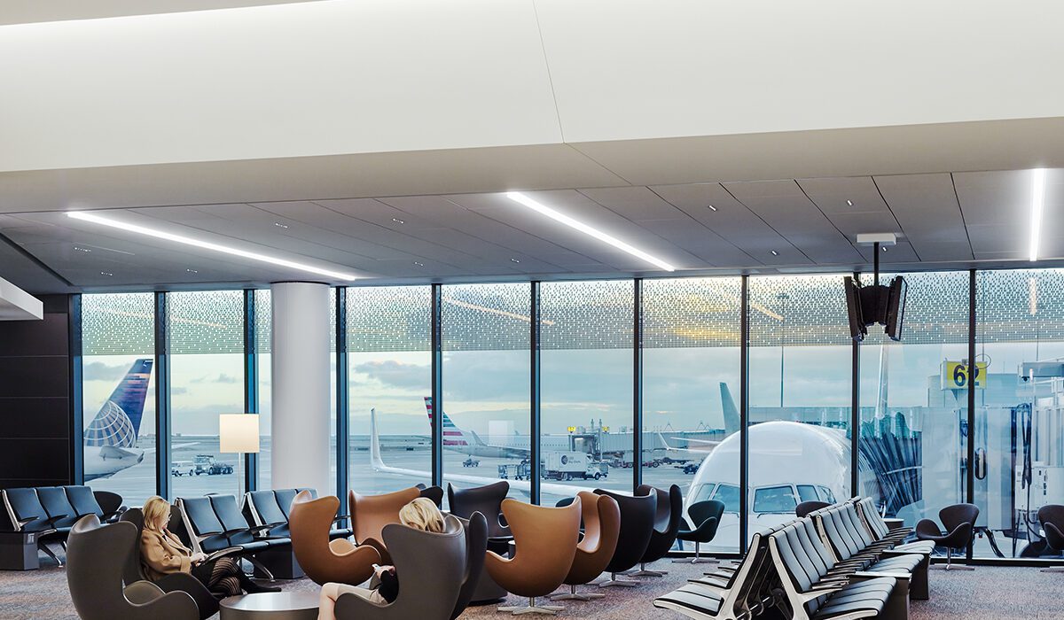
San Francisco International Airport, Boarding Area E by Gensler, San Francisco, CA, United States. Popular Winner, 2015 A+Awards, Transportation – Airports. © Joe Fletcher Photography

One way to help alleviate travel-related anxiety is through access to outlets. As society turns to digital solutions, passengers are required to arrive at the airport with their documents ready to go and as a result, many rely on their personal electronics to store travel documents. From boarding passes, immunization proof, to test results, electronic devices have become essential for air travel – especially during the COVID-19 pandemic. Most airports were built before the digital era and as a result, are only equipped with a mere number of accessible outlets. Airports travel will likely continue within this digital realm and aviation architects are beginning to catch on and ensure their designs are fitting of the times.

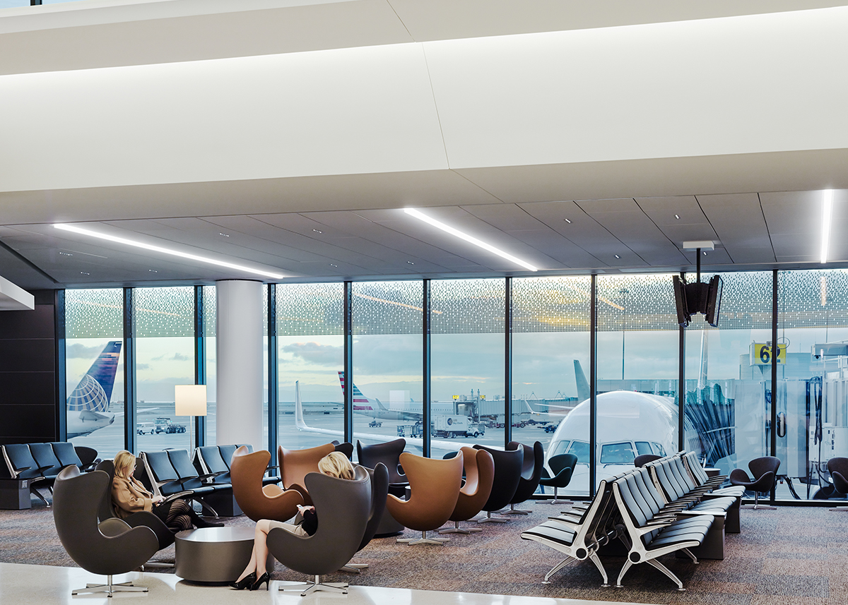
San Francisco International Airport, Boarding Area E by Gensler, San Francisco, CA, United States. Popular Winner, 2015 A+Awards, Transportation – Airports. © Joe Fletcher Photography

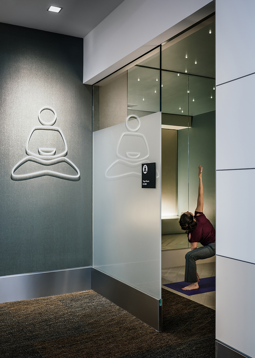
While aviation architecture continues to evolve, some designs were ahead of their time. Take San Francisco International Airport, Boarding Area E renovation for example. Back in 2014 design team, Gensler was commissioned to transform the airport’s Boarding Area E into a travel oasis — and they did just that. The design features passenger spaces that are not typically found in most airports. From private dressing rooms to yoga centers, this airport terminal truly encourages its passengers to unwind and take a moment for themselves.

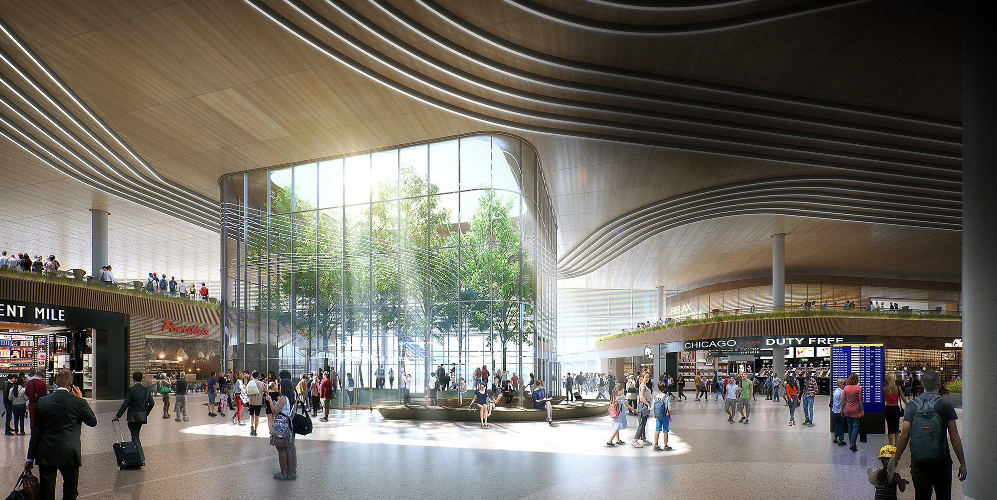
O’Hare Global Terminal by Skidmore, Owings & Merrill (SOM), Concept.

Meanwhile, the recently conceptualized Chicago O’Hare Global Terminal design revives the city’s spirit while prioritizing the passenger’s experience. In a collaborative effort by SOM, Ross Barney Architects and Arup, the team designed a terminal that incorporates atypical airport spaces: the outdoors. The gate’s dining, shopping and entertainment options reflect Chicago’s dynamic art and culinary scene. Meanwhile, passengers can unwind inside or outdoors. An open-to-the-sky concourse garden offers guests a chance to connect with the outdoors before boarding their plane. Surrounded by trees and hammocks, this atypical use of the outdoors facilitates relaxation by offering passengers a chance to breathe after making it past the stressful check-in and security lines.

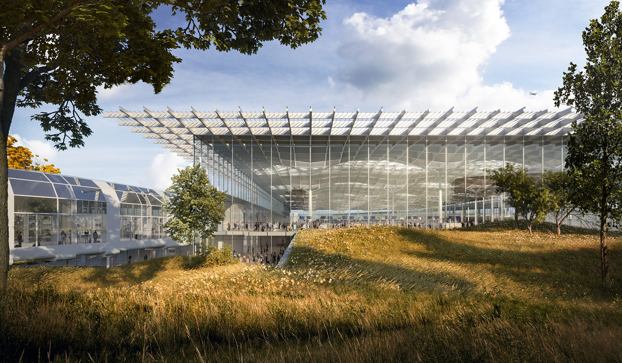
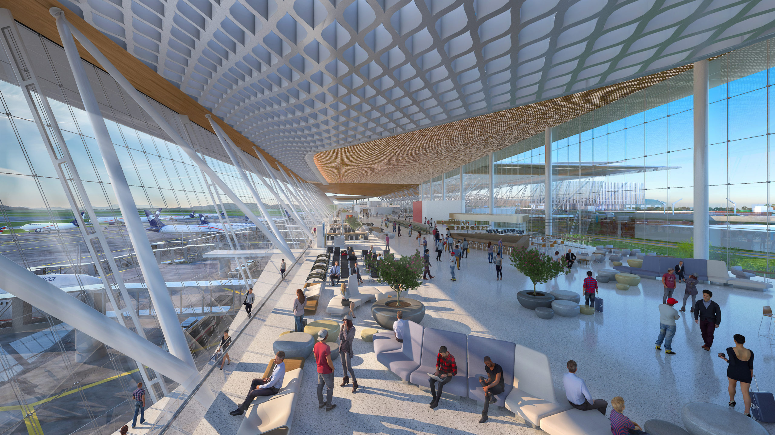
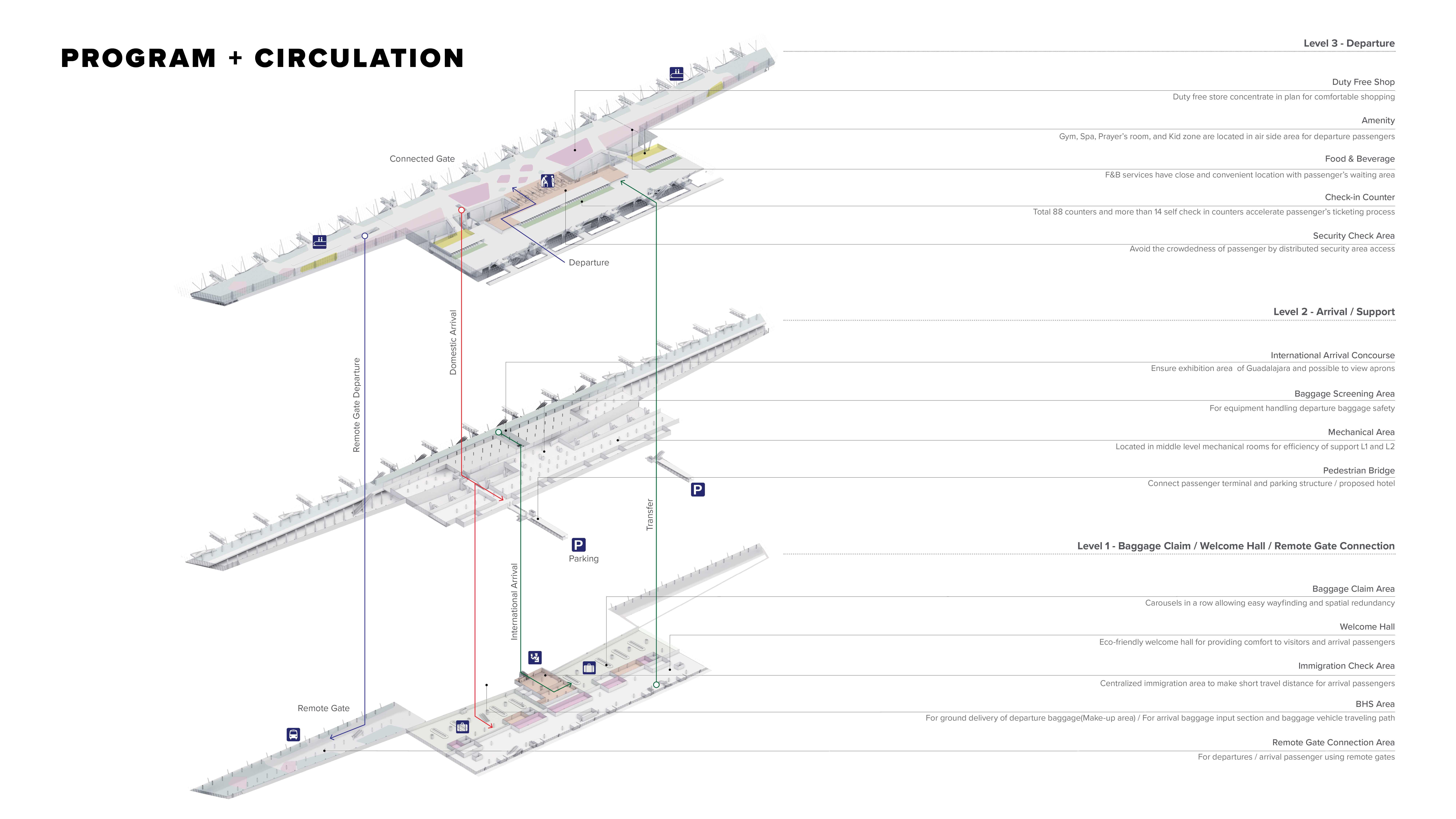
Guadalajara International Airport, Terminal 2 Concept by CallisonRTKL. Finalist, 2021 A+Awards, Transportation – Unbuilt Transportation

The Guadalajara International Airport Terminal 2 design concept equally promotes passenger experience. Conceptualized by CallisonRTKL, this design enhances the local Mexican culture and cuisine. Interior gardens, comfortable waiting lounges, pet care centers and family facilities – this airport was conceptualized to cover any and all possible passenger requests. The arts are also celebrated in this design. Virtual art galleries and live performance spaces house local dancers and offer passengers a chance to unwind through visuals displays.

Most airports were built before the digital era and prior to the COVID-19 pandemic. Upgrading and renovating old terminals and airport spaces is a massive undertaking and costs a pretty penny. But the pandemic has offered a moment to pause, and as large-scale projects start up once again, we see a shift in aviation architecture practices and a newfound prioritization towards enhancing the passenger experience. Ultimately, such shifts in design practices will help mitigate travel-related stresses and encourage passengers to relax whilst waiting to board.

Have your say in which architects will take home Architizer’s prestigious A+Awards: Public Voting opens this spring. Interested in next year’s program? Subscribe to our newsletter for updates.  

Reference