Cold Shadows: Explore 5 Thrilling Examples of Nordic Noir Architecture
CategoriesArchitecture

Cold Shadows: Explore 5 Thrilling Examples of Nordic Noir Architecture

Architizer’s new image-heavy daily newsletter, The Plug, is easy on the eyes, giving readers a quick jolt of inspiration to supercharge their days. Plug in to the latest design discussions by subscribing. 

From Vaxholm to Geiranger, the Westfjords to Lapland, the countries categorized as Nordic are vast and varied. In Northern Europe, untamed, rugged terrain is plentiful, as are lush boreal forests and the glittering Aurora Borealis. In this part of the world, the environment is in constant battle with itself. Scenic fjords and crystalline lakes freeze and thaw throughout the year while the winters dark and the summers light fight for total dominance. Here, life and death hang in the balance of a few degrees. It is a place where beauty and brutality coexist, resulting in a landscape that is as stark as it is stunning.

When we think of Nordic Noir, we think of television and cinema with complex existential themes, where justice, morality and the human condition are succinctly layered with melancholy and introspection. Thrillers and crime dramas are the heart of the genre. However, more than the gripping narratives of unlikely detectives and elaborate dragon tattoos, it is the distinct aesthetic found in the northern regions that feature in Nordic Noir that often plays such a crucial role in storytelling. The opposing characteristics found in both urban and rural settings across these nations are unique and exhilarating; the extremes of light and shadow on bleak, icy landscapes provide wonderful contradictions that create atmospheric tension that is perfect for enthralling mysteries.

Unsurprisingly, It’s not only cinematographers who have taken note of the beauty that lies in the striking duality of the Nordic region. Architects, too, have been exploring how these extreme yet beautiful landscapes can offer the perfect backdrop for breathtaking buildings that are rich in contrast and emotion. These five examples expertly highlight how architecture is as much about its environment as it is about its composition.


Tungestølen Tourist Cabin

By Snøhetta, Veitastrond, Norway
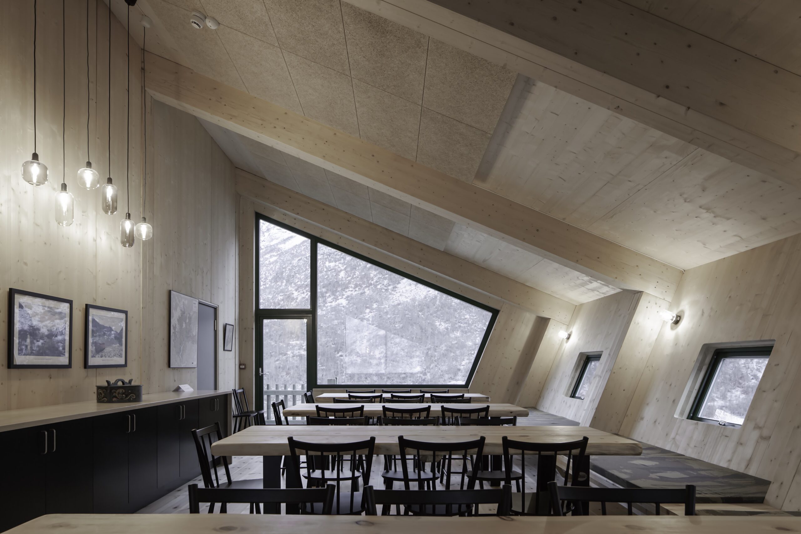
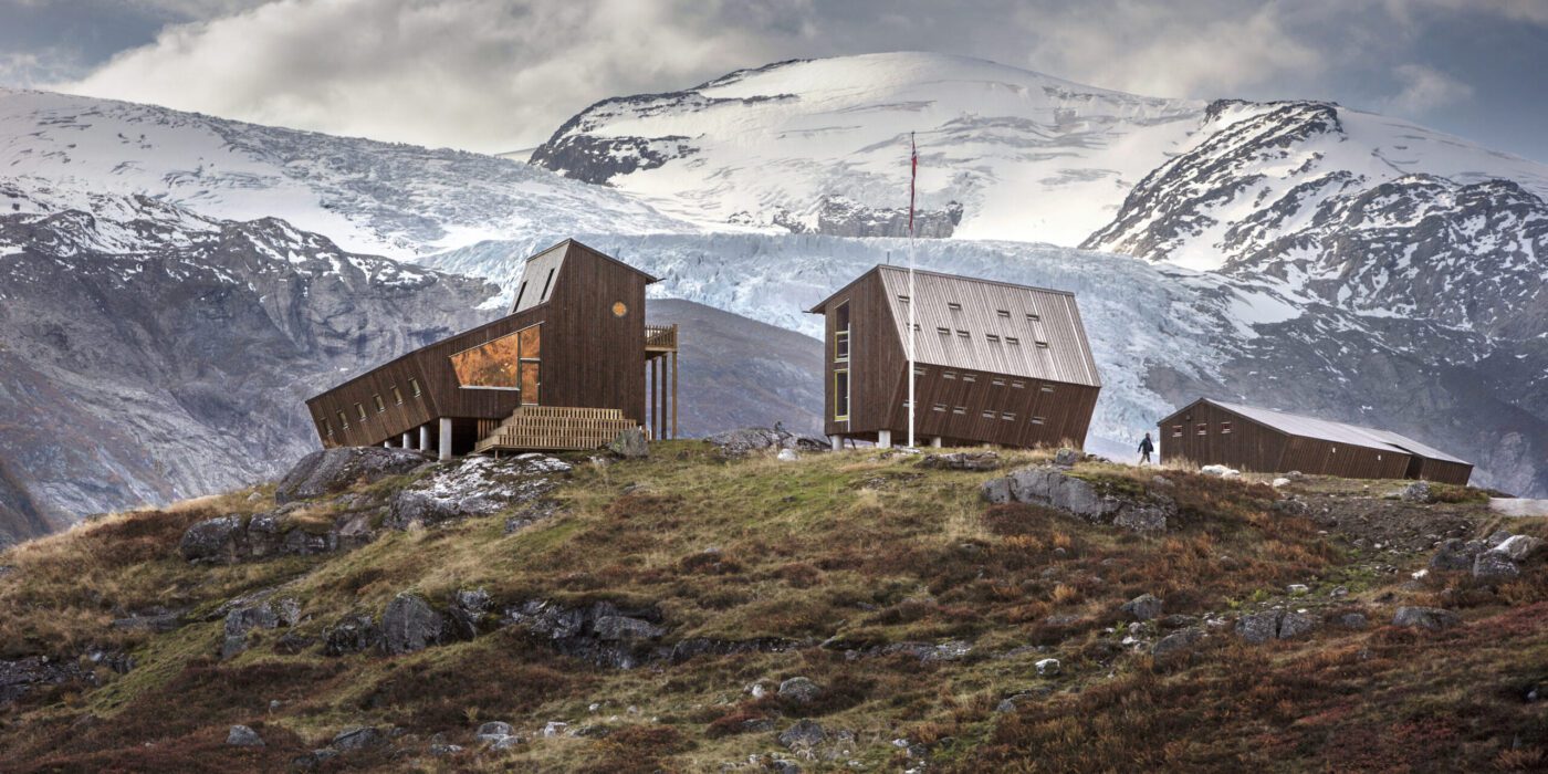
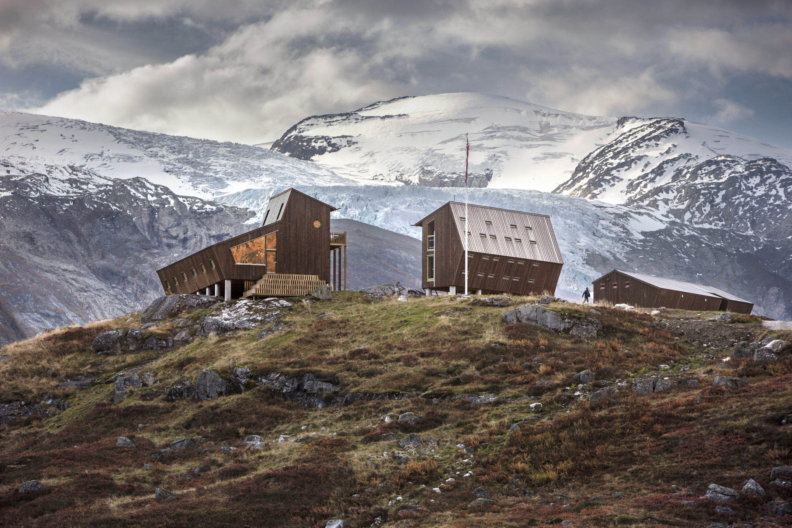
Tungestølen Tourist Cabin by Snøhetta, Veitastrond, Norway. Photographs by Jan M. Lillebø and Ketil Jacobsen

Nordic architecture and Snøhetta go hand in hand. The visionary firm is local to the region and are experts in crafting buildings that honor and complement this challenging landscape. In the aftermath of Cyclone Dagmar in 2011, the Tungestølen Tourist Cabin, a cherished spot for glacier hikers in Norway, was destroyed. Thanks to diligent fundraising, the popular spot has been reborn from the devastation through the collective will of Luster Turlag and the Veitastrond community.

Snøhetta’s winning design reimagines the refuge with a series of modern pentagonal and oblique cabins that stand in vivid contrast to the wild, natural landscape surrounding them. The cabins, featuring robust wooden frames and panoramic windows, marry minimalist interiors with the dramatic landscape beyond, bringing the Nordic Noir sensibility of stark beauty and atmospheric tension to the place of respite while creating a haven for people of all ages and hiking experiences.


Project Ö

By Aleksi Hautamaki and Milla Selkimaki, Kemiönsaari, Finland
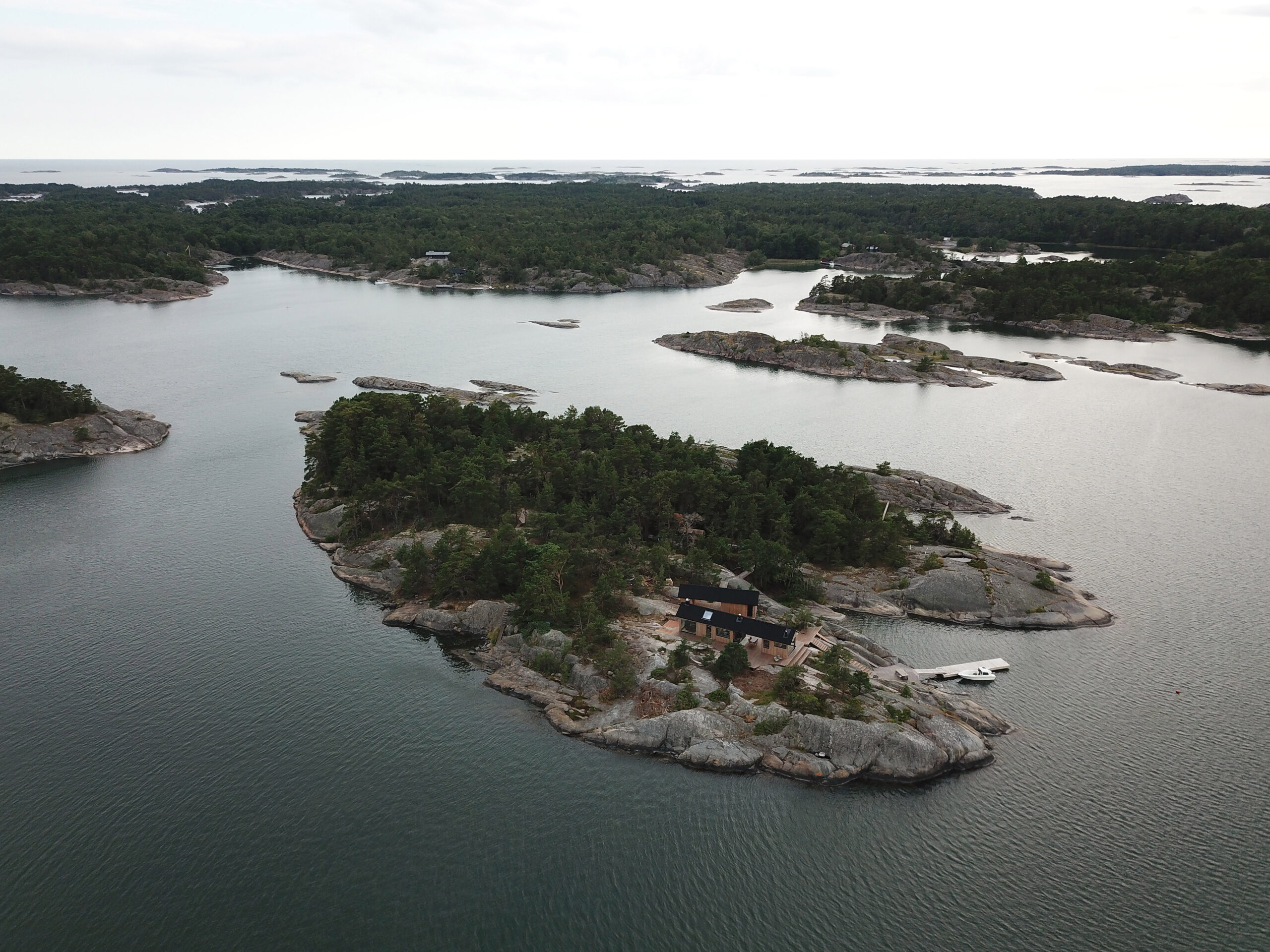
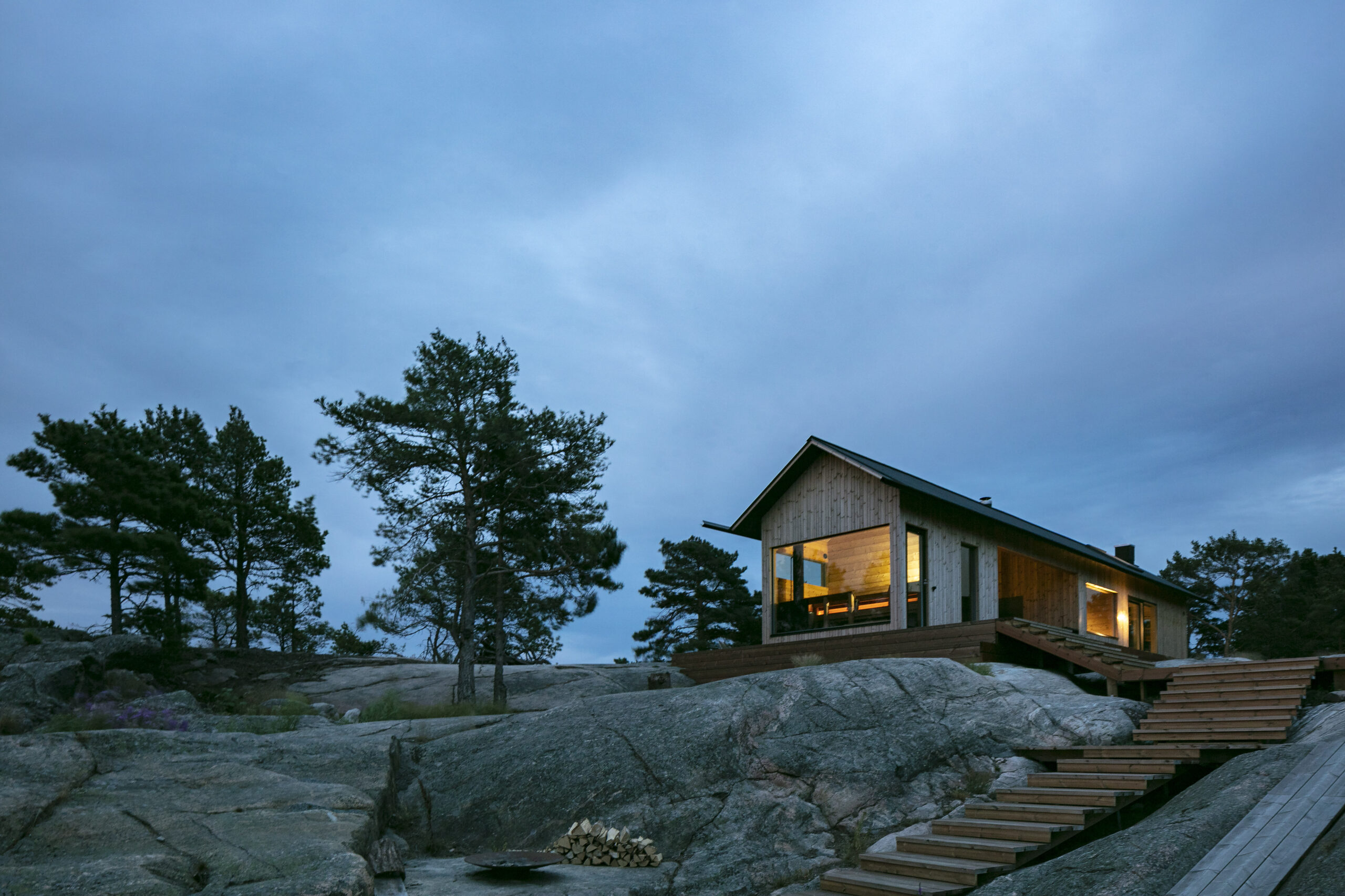
Project Ö by Aleksi Hautamaki and Milla Selkimaki, Kemiönsaari, Finland. Photographs by Archmospheres

Project Ö, where “Ö” means ‘an island’ in Swedish, sits on the edge of the Archipelago National Park. This 5-acre island has been transformed into a self-sufficient retreat that marries traditional Finnish aesthetics with the thoughtful minimalism characteristic of Nordic Noir. The main cabin and sauna, alongside a workshop, pay homage to their heritage through gabled roofs, extended eaves and vertical cladding while embracing modernity with large windows that frame the surrounding natural beauty.

The vision was to have all things necessary with as little space as possible. All individual spaces have been designed to be as compact as possible without compromising functionality and comfort. The two buildings are just 70 square meters in total, yet they comfortably sleep ten adults if required. By harnessing solar power and utilizing filtered seawater, the island is totally self-sufficient, becoming a shining example of the possibility of sustainable lifestyles even in the harshest environments.


Manshausen 2.0

By Snorre Stinessen Architecture, Steigen, Norway
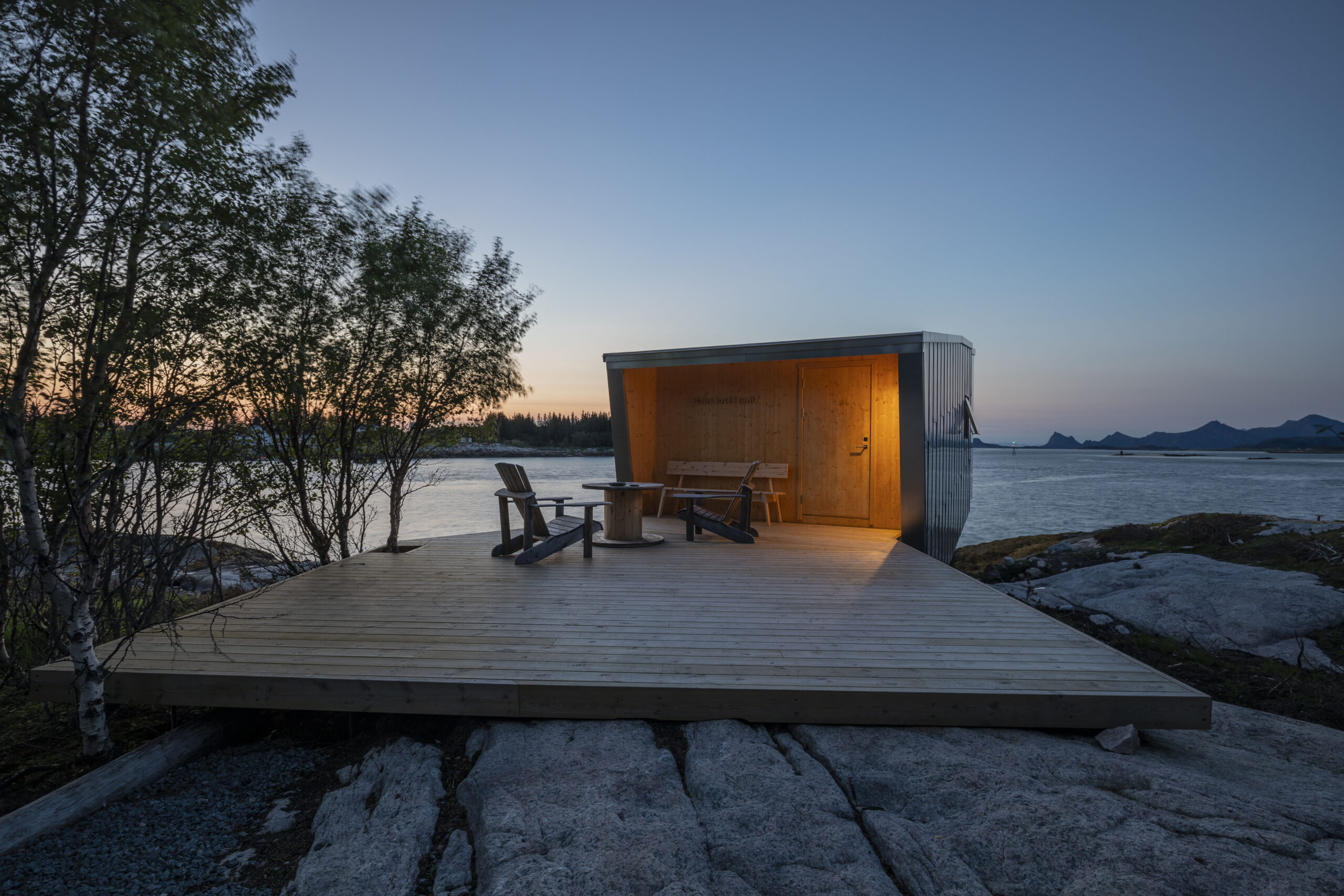
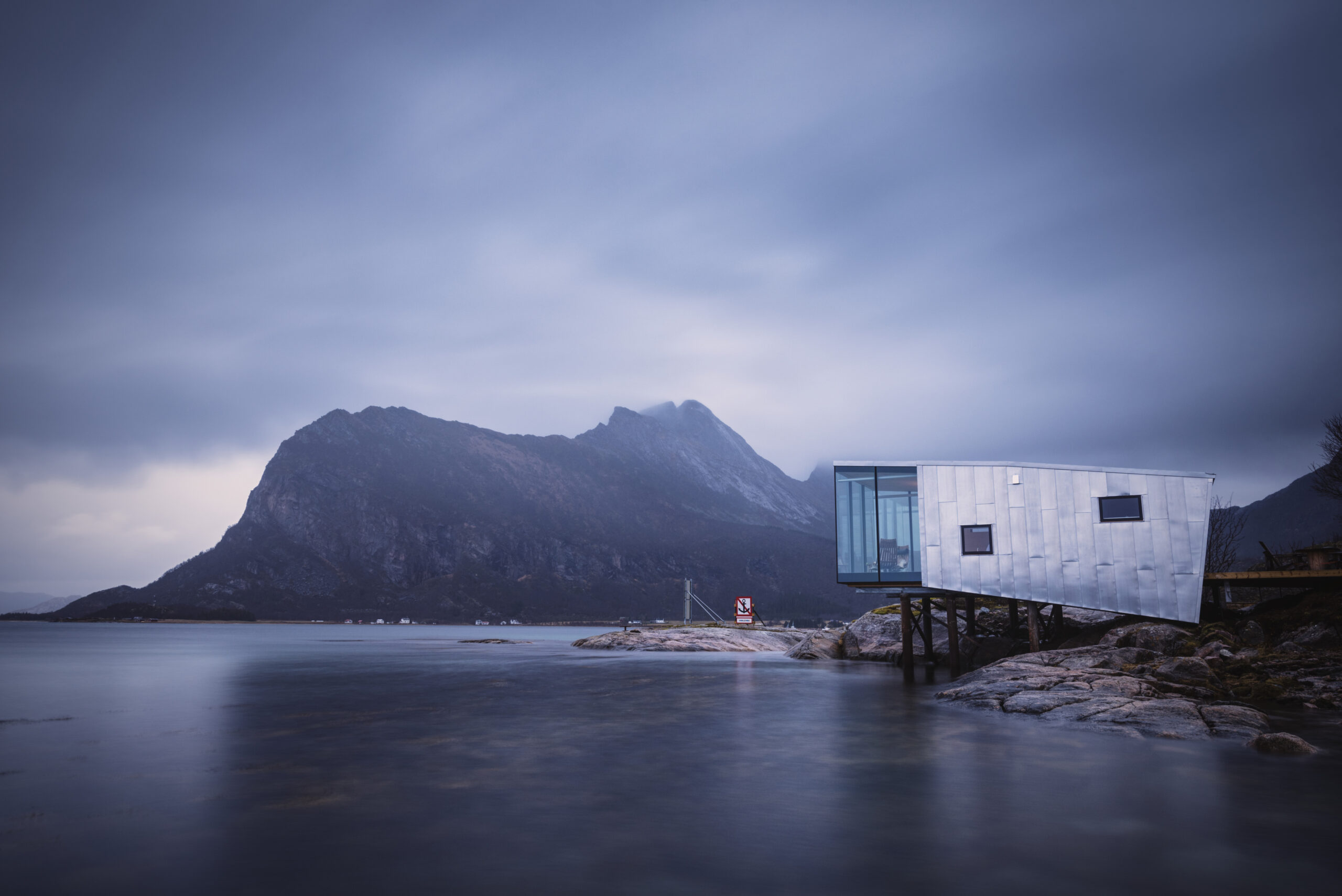
Manshausen 2.0 by Snorre Stinessen Architecture, Steigen, Norway Photographs by Adrien Giret.

The frozen waters in the Steigen Archipelago are a place where the warmth of human habitat contrasts with the brisk natural world. Manshausen 2.0, an extension of the Manshausen Island Resort, introduces cabins and a sauna that harmonize with the breathtaking landscape that was historically a trading post for the fishing industry.

Each of the cabins, inspired by Finnish design, had to be built a certain height above the water to protect against high tide and predicted sea level rise. The structures are elevated on iron rods drilled into the rock and anchored with steel reclaimed from the island. The cabins utilize durable materials like aluminum cladding that is excellent at resisting the salinity of sea air. They are crafted to withstand the extreme weather conditions of their surroundings.

While guest hunker down indoors, the cabin’s long, narrow structure allows for expansive windows that capture the changeable rugged landscape. A welcome feature against the warm, minimalist interiors. This extreme contrast is part of the appeal at Manshausen, offering a heightened experience to guests who are continuously engaged with the changing landscape while cocooned safely in the cozy cabin.


House on a Meadow

By PAVE Architects, Finland
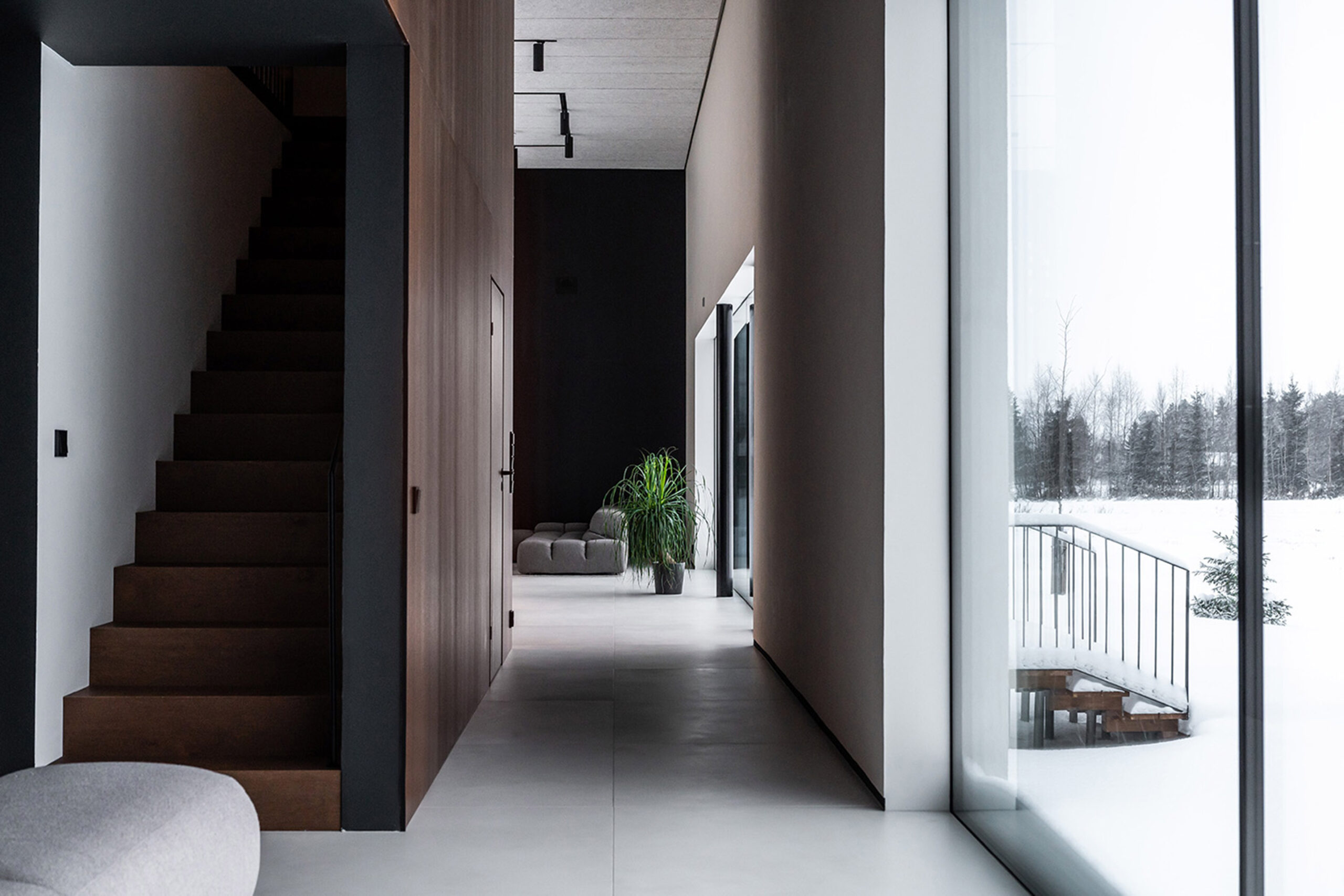
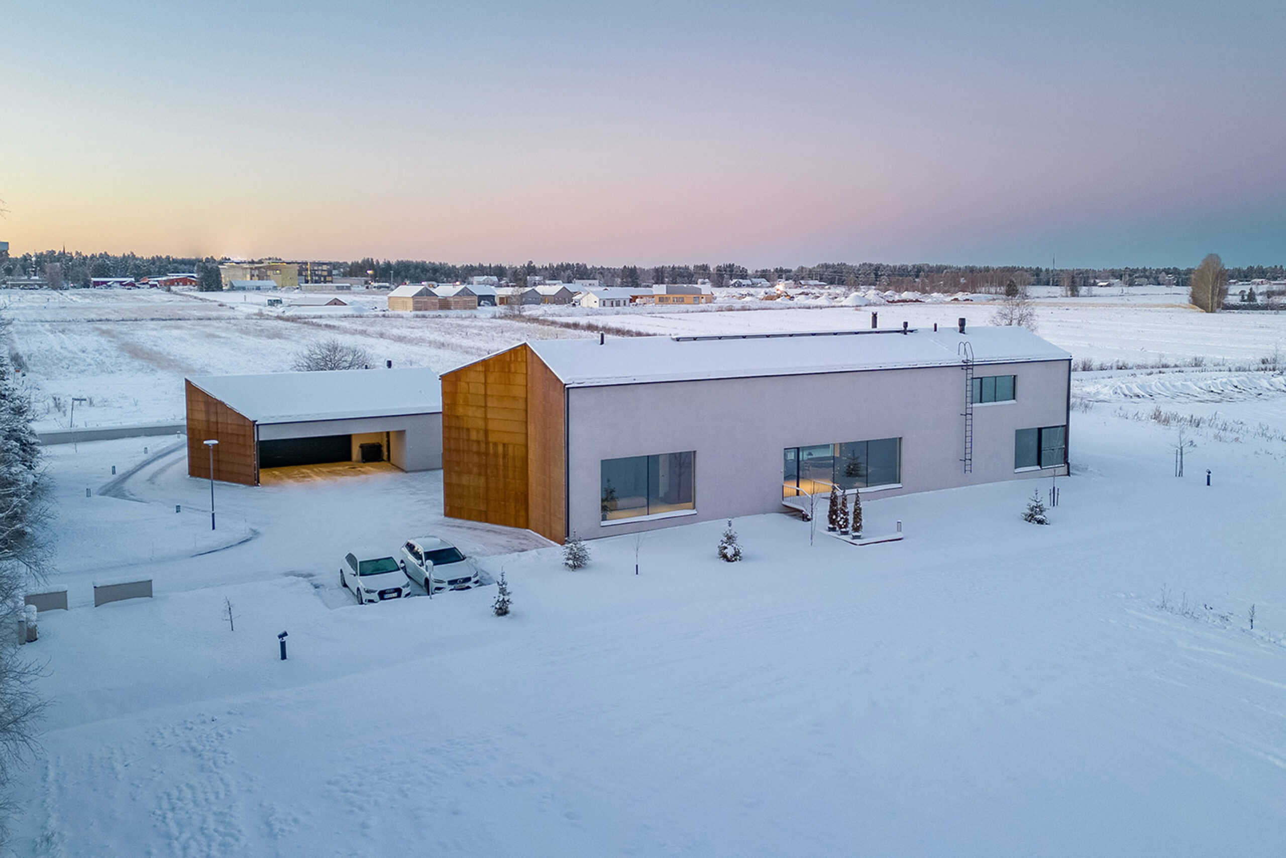
House on a Meadow by PAVE Architects, Finland

The House on the Meadow reflects the industrial spirit of its surroundings. The unusual building was once an old horse farm, and its rural position was once the backdrop of the owner’s childhood farm work. The plot is bordered on all sides by a field and meadow landscape, giving it a strong feeling of solidarity when blanketed with snow. Yet, there is a gracefulness in the narrowness of the three buildings that make up the property, and the façade materials make the main house simple and almost elegant — plastered down each long face and slender corten steel plates to each end.

Inside, the home is modern and sophisticated, with a simple pallet of black, white and darkened timber. Light plays a pivotal role within the House on the Meadow. Northeast-southwest view axes, particularly prominent in the kitchen-living room space, harness natural light to create ambiance and the brightness and shadow within the building shift with the day and are emphasized by the contrasting color pallet.


Skjern Å

By Johansen Skovsted, Skjern, Denmark
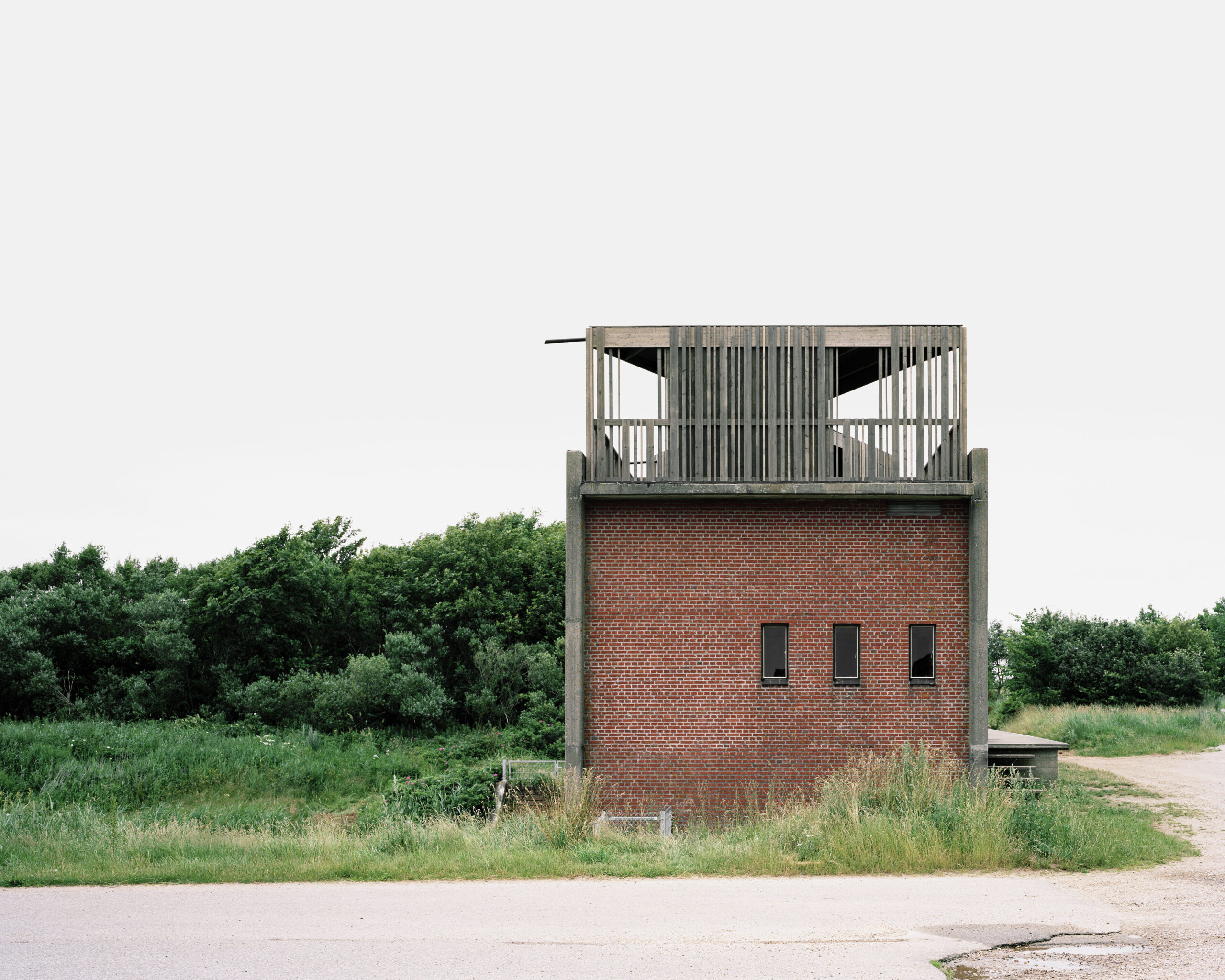
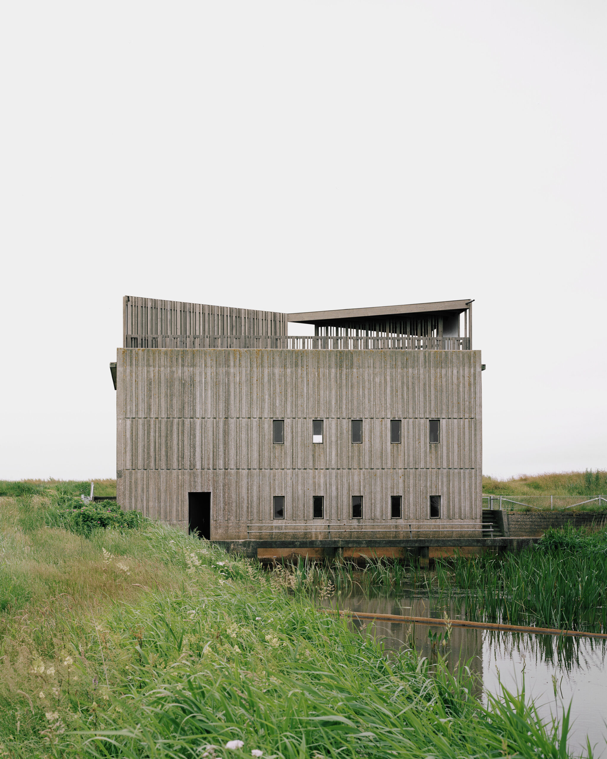
Skjern Å by Johansen Skovsted, Skjern, Denmark. Photographs by Architekturfotograf Rasmus Norlander

Johansen Skovsted architects transformed functional structures into storytelling monuments. The remodeled trio of pumping stations in West Jutland reflect their complex environmental and historical context.

Johansen Skovsted’s approach to the renovation respects the original purpose of these buildings—industrial structures designed for machinery rather than human habitation—while introducing a human-centric tactility and a sense of place. In adapting these pumping stations, the architects embraced the character and history of the site, opting for a design that blends seamlessly with the valley. Instead of imposing modernity, they sought continuity, allowing the buildings to continue to tell their story. The extensions and the new interior building elements are mainly simple wooden constructions and reiterate the dimensions and rhythm of the original pump stations’ concrete relief to comfortably merge with their surroundings.

Architizer’s new image-heavy daily newsletter, The Plug, is easy on the eyes, giving readers a quick jolt of inspiration to supercharge their days. Plug in to the latest design discussions by subscribing. 

Reference

Architectural Gems: Explore the Stunning Winners of the 6th “Best of LaCantina” Competition!
CategoriesArchitecture

Architectural Gems: Explore the Stunning Winners of the 6th “Best of LaCantina” Competition!

Architizer is excited to reveal the champions of one of the year’s most inspiring architectural design contests!

Returning for its sixth year, the renowned Best of LaCantina Design Competition attracted submissions from innovative architecture and design firms across the United States. Each participant seamlessly incorporated LaCantina’s exquisite doors and windows into their projects in inventive ways. Although the entries varied in location, building type and scale, they all shared a commonality: The ingenious integration of LaCantina products, fostering a seamless connection between indoor and outdoor spaces, accentuated by using beautiful and durable materials.

Taking the coveted Best in Show title this year is the Society Hotel in Bingen, Washington, designed by Waechter Architecture. As part of their winnings, the firm will enjoy an all-expenses-paid trip for two to the 2024 AIA Conference, covering both travel and accommodation. Be sure to stay tuned for an in-depth exploration of their award-winning project, which will soon be featured on Architizer!

Without further ado, delve into each winning design from this year’s competition — projects that truly embody “The Best of LaCantina.”


Best in Show and Best Commercial Project: Society Hotel by Waechter Architecture, Bingen, Washington

Photos by Lara Swimmer

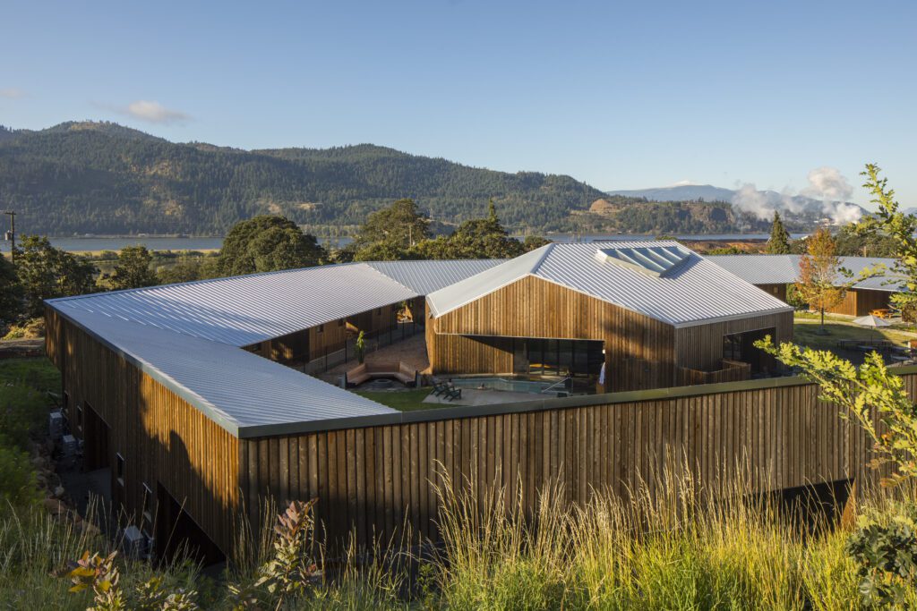
Located in the Columbia River Gorge National Scenic Area, The Society Hotel offers stunning views of the river, surrounding hills and basalt outcroppings. The program includes the adaptive reuse and conversion of a former schoolhouse and gymnasium, twenty new cabins and terraces linked by a covered pathway, and an iconic, freestanding spa.

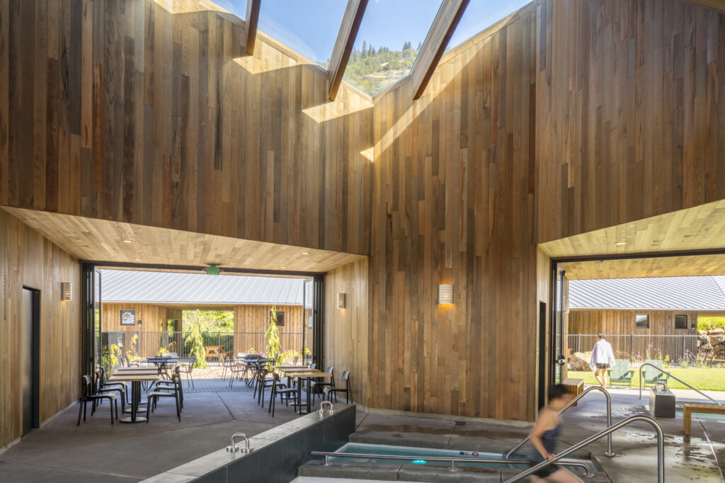
The spa employs a similar material palette of striated cedar as the surrounding cabins, yet has a distinctly volumetric form. Avoiding a singular front entrance, the building opens onto each side of the ring with dynamic apertures and floor-to-ceiling folding doors by LaCantina. Within, the structure expands upward to a large skylight, which washes light over a series of pools below. Four “hollow” piers shape this collective space while containing more private areas, including changing rooms, a sauna, a kitchen and two massage rooms.

Through its composition and pairing of historic and new architecture, the Society serves as a model for how buildings can reconcile the needs of a sensitive site, visitors and the local community, and maximize connection to the surrounding landscape.


Best Urban Residential Project: Wilson Lane Residence by Michael Belisle Design, Bethesda, Maryland
Consulting Architect: Will Cawood; Interior Design: Renato Parisotto; Lighting Design: Quinn Murph

Photos by Anice Hoachlander, Hoachlander Davis Photography

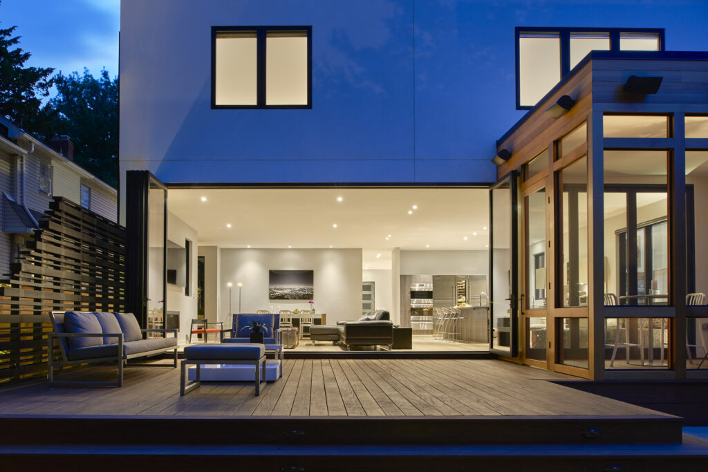
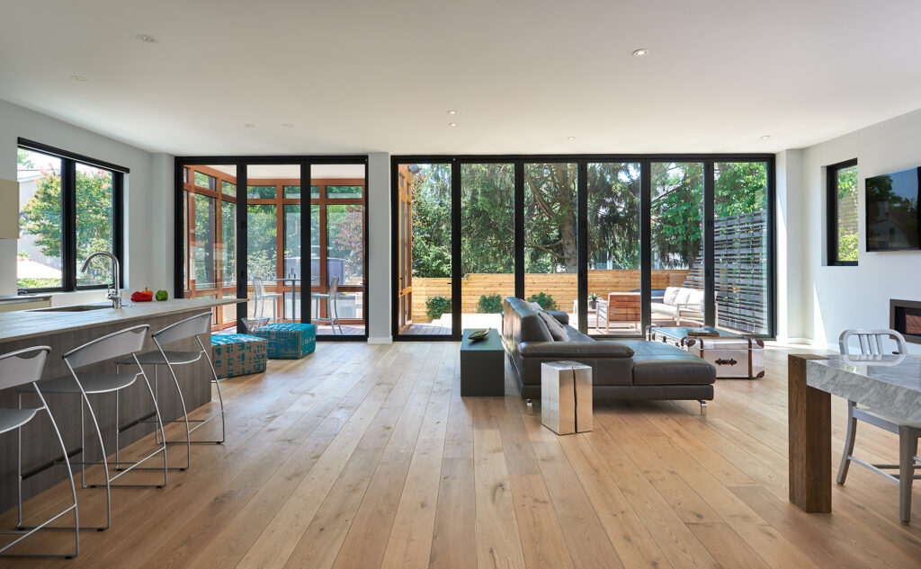
Wilson Lane Residence sits on a small urban lot within walking distance to downtown Bethesda, Maryland. The client desired to be close to the city center and wanted something drastically different form the more conventional housing styles in the area. The house was designed for entertainment, with open interior spaces, well-conceived exterior spaces and an abundance of natural light.

LaCantina’s Aluminum Outswing 3 and 6 Panel doors allowed for the interior to merge with the exterior, literally and figuratively: in the open position, the family room, deck and patio merge seamlessly; in the closed position they frame a view of the exterior with minimal obstruction.


Best Suburban Residential Project: Two Gables by Wheeler Kearns Architects, Glencoe, Illinois

Photos by Kendall McCaugherty

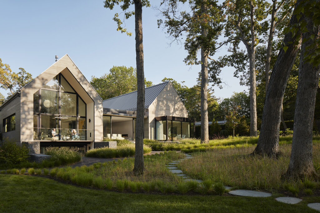
Located on a one-acre wooded ravine site north of Chicago, the house is strategically positioned within existing trees on the site to take advantage of the picturesque views. Twin gabled volumes — one for sleeping and one for living — are connected by a glazed breezeway that fuses house and landscape. The home, situated upward and slightly angled away from the street, creates an eccentric approach that delays frontal views and enhances privacy.

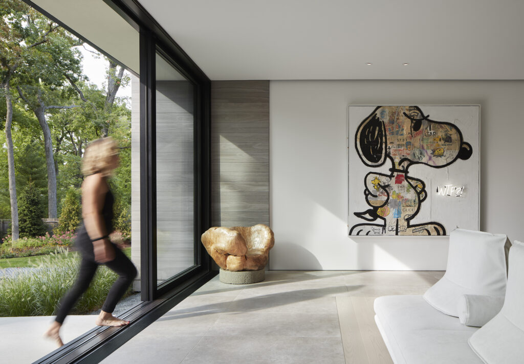
The frontal procession presents the flanking gabled volumes as solids, composed of warm gray Accoya siding, zinc colored standing seam roofing, punctuated by deeply inset windows. LaCantina Doors were utilized to address unique challenges within the project by incorporating thermally broken construction and optimizing the scale of units. They also enhance visibility and create spacious open areas when the units are opened.


Best Rural Residential Project: Ranch Poolside Retreat by Cabana Concepts / Imagine Beyond, Murrieta, California
Designed by Imagine Beyond; Installed by Cabana Concepts

Photos by Cabana Concepts

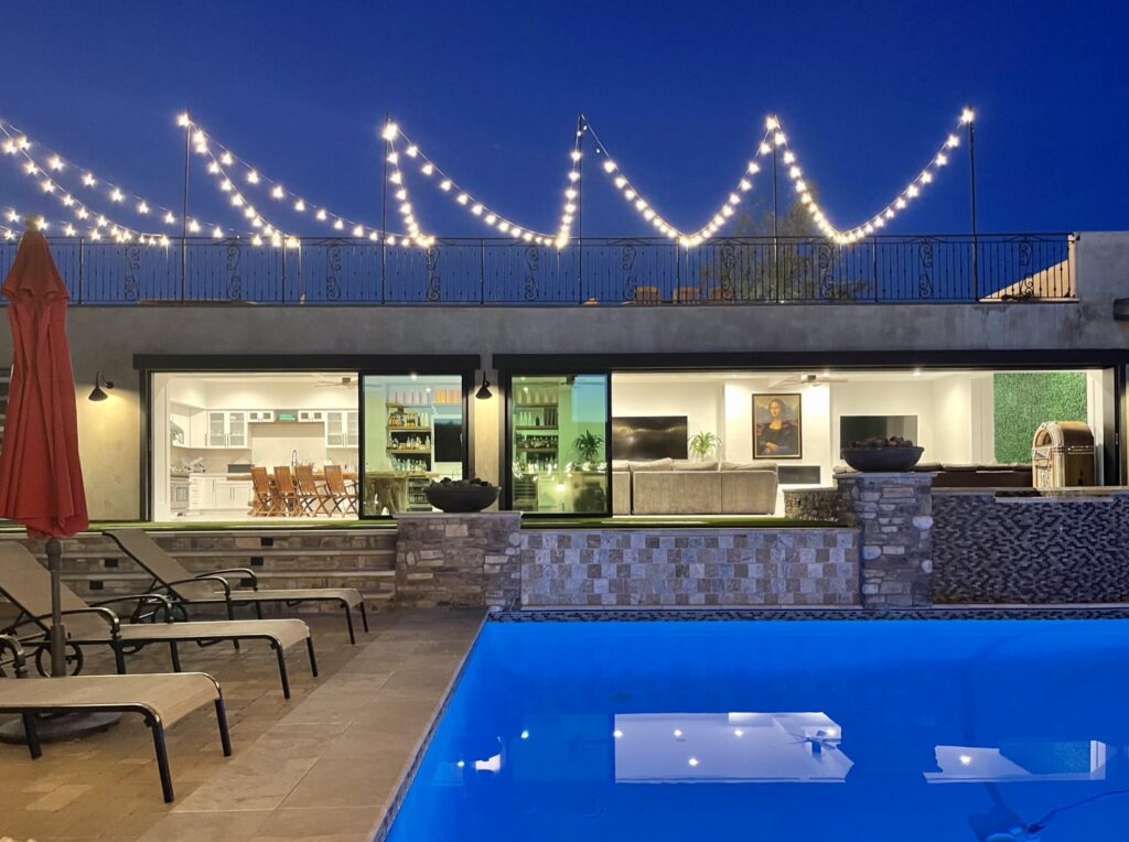
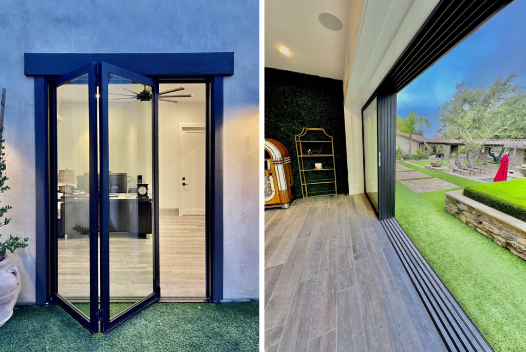
Cabana Concepts and Imagine Beyond completed a new poolside retreat for a ranch house, in Murrieta California, featuring a rooftop sunset deck designed for entertaining over 100 guests. The retreat can sleep up to 12 and includes a full kitchen, bar, office, garage, laundry and craft room. The property features a range of sliding, folding and swing doors by LaCantina, all unified by a beautiful finish: Bronze anodized aluminum equipped with flush bottom tracks and black hardware.


Most Innovative Project: Topanga Canyon Hunting Cabin by MSP Design Inc., Topanga, California

Photos by Mason St. Peter

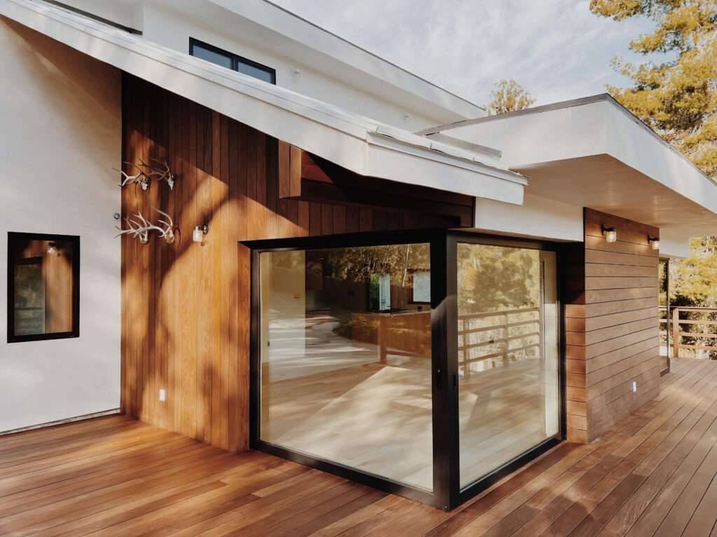
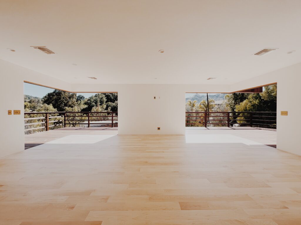
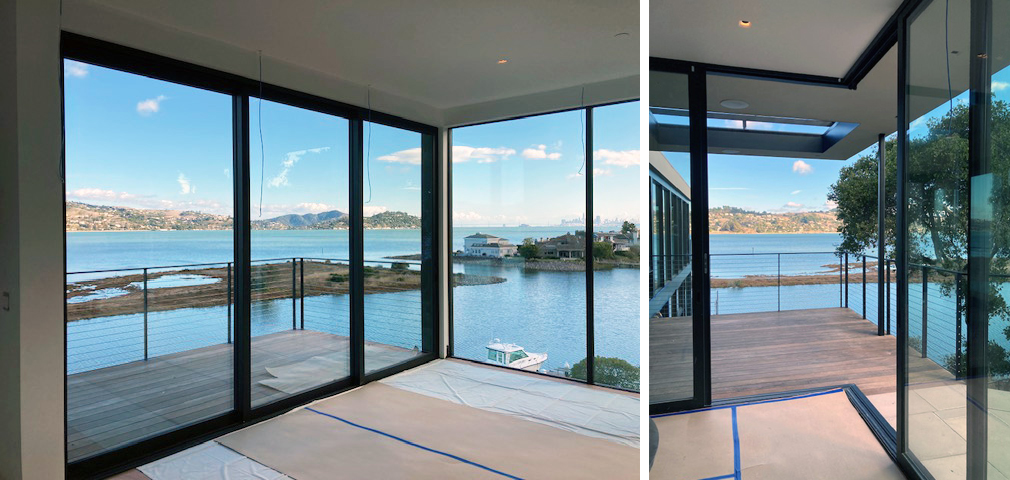
The Topanga hunting cabin features indoor-outdoor living, featuring two open corners aided by LaCantina double pocket doors, an open plan and a large wraparound deck. What was once literally a room, added onto a room, added onto a room, added onto a room with a stairway to another room above is now a very simple and elegant 2-bedroom-2-bath, open living home, that welcomes the outside in and embraces it.


Best Compact Project: Swift Cabin by Ment Architecture LLC, Cougar, Washington

Photos by Luke and Mallory Leasure

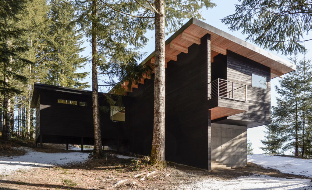
This linear cabin stretches out along the length of a site that overlooks a reservoir in southwest Washington, with spectacular views of Mt. St. Helens beyond. A shed roof allows for a vast array of solar panels for this off-grid cabin, which power the main cabin, a custom-designed sauna building and a garage for the family boat.

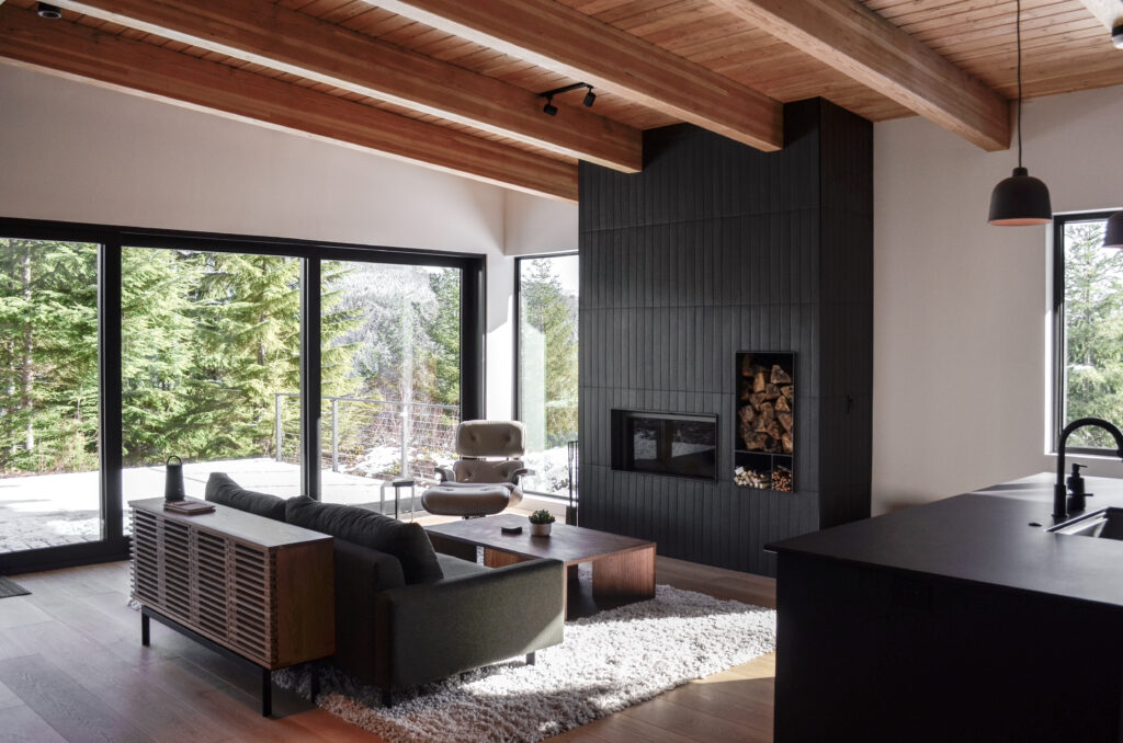
A warm interior palette is defined by exposed Douglas fir glulam beams and tongue and groove decking at the ceiling, along with warm wood floors and exterior charred wood cladding wrapping through to the interior. The large deck can be enjoyed by walking directly from the living room through a 12-foot-wide opening featuring LaCantina sliding doors.


Best Renovation Project: Waverly Residence by Sasquatch Architecture, Portland, Oregon
Interior Design by Kami Gray Interiors

Photos by Crosby Dove

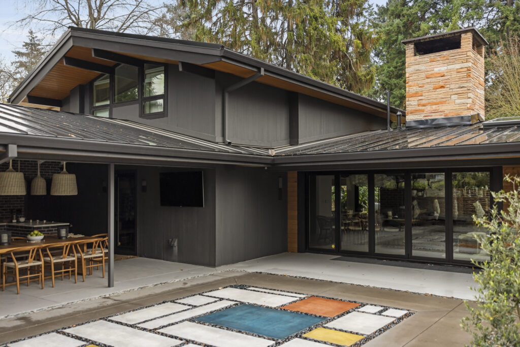
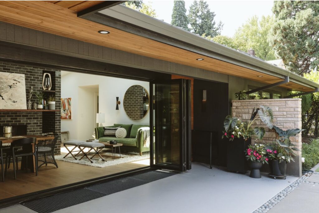
Located in the Waverly neighborhood in Portland, Oregon, the existing midcentury modern home went through an entire remodel on both the interior and exterior. The interior was transformed with updated floor plans and new finishes by Kami Gray. On the exterior, Sasquatch Architecture designed all of the windows and doors to be replaced and resized, while new paint, cedar soffits and siding were added to warm up the exterior of the home.

The standout feature is a new 16′ wide La Cantina bifold door, seamlessly connecting the interior and exterior. With careful attention to detail, the architects blended the old with the new, creating a timeless and elegant space bringing the beauty of nature inside and enhancing the home’s overall charm.


Best Unbuilt/Planned Project: Contemporary Respite by Sutton Suzuki Architects, Mill Valley, California

Renderings by Sunny Render Studio, photos by Sutton Suzuki Architects

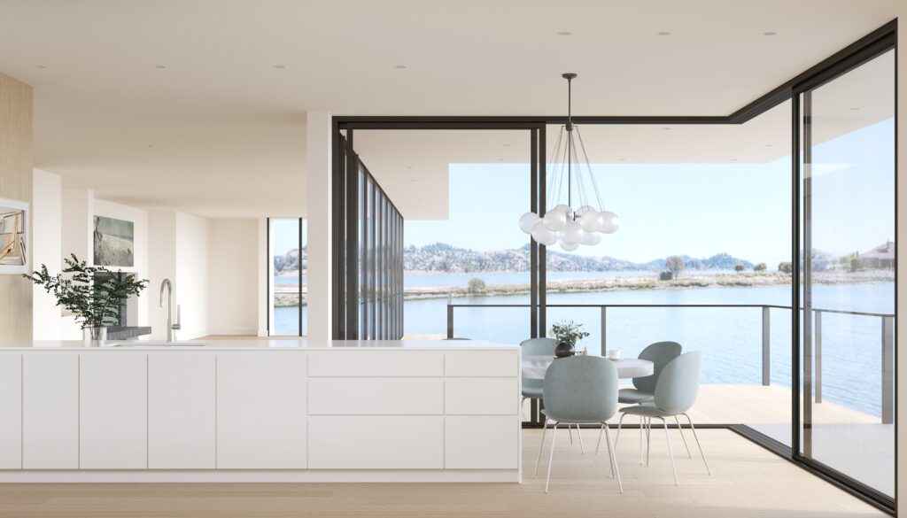
Perched above a sleepy inlet of the San Francisco Bay, this now contemporary home was originally built in 1966. Over the years a number of insensitive additions were built, resulting in a maze-like home disconnected from the surrounding natural beauty. After an extensive remodel and addition of square footage, the home now offers floor to ceiling glazing and a number of water-facing decks where the owners can watch pelicans fish and nature unfold. The flow between rooms is ideal for entertaining, providing a mix of open spaces and cozy corners. Neutral finishes with hints of blue evoke the nearby water and offer a calm respite from the world beyond.

LaCantina’s Zero Post Corner System increases the sense of spaciousness from the kitchen into the slender side yard. When the project is complete, it will be hard to tell whether one is inside or outside, and each respective space will feel doubly as large.


These eight award-winning projects show just a glimpse of the incredible architecture and interiors made possible with the help of LaCantina’s versatile range of contemporary doors and windows. See more amazing case studies like these and learn more about the systems behind them over at LaCantinaDoors.com.

Reference

Kustaa Saksi creates vivid tapestries to explore “reality and illusion”
CategoriesInterior Design

Kustaa Saksi creates vivid tapestries to explore “reality and illusion”

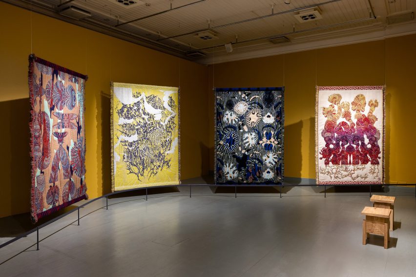
Multidisciplinary designer Kustaa Saksi has unveiled In the Borderlands, an exhibition of jacquard textiles at the Helsinki Design Museum, which includes a piece featuring scenery generated by AI software.

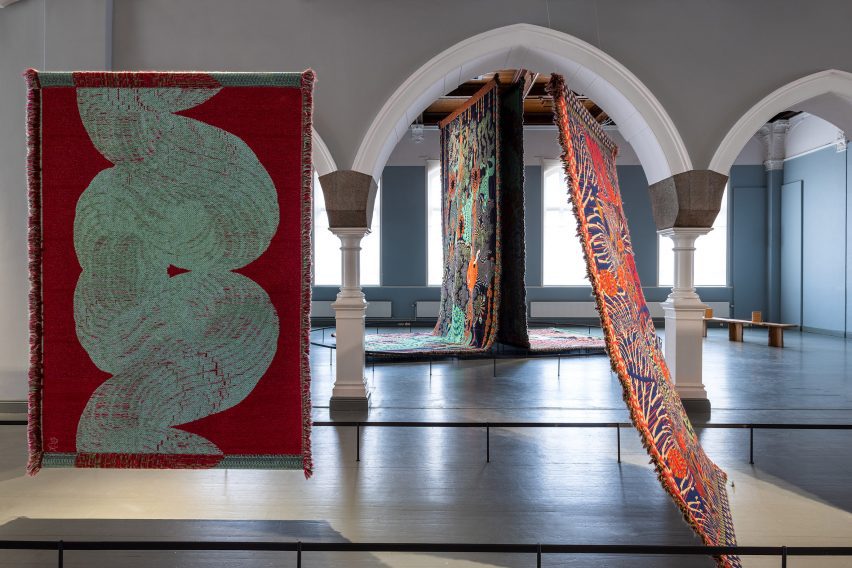
Conceived as objects that straddle both art and design, Saksi’s large-scale textiles were hung from the ceilings and arranged across various rooms within a gallery at Helsinki’s Design Museum.

Ideal Fall tapestries
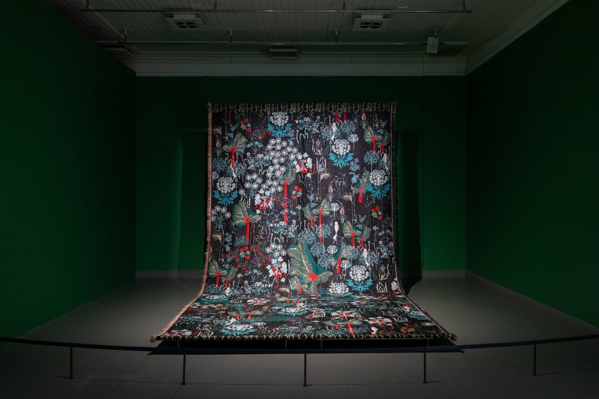
Ideal Fall is a duo of tapestries featuring AI-generated imagery

To create his pieces, the designer uses jacquard weaving – a technique invented in 1804 where patterns are woven with yarn using a loom to create a textile, rather than printed, embroidered or stamped onto fabric.

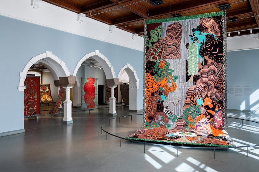
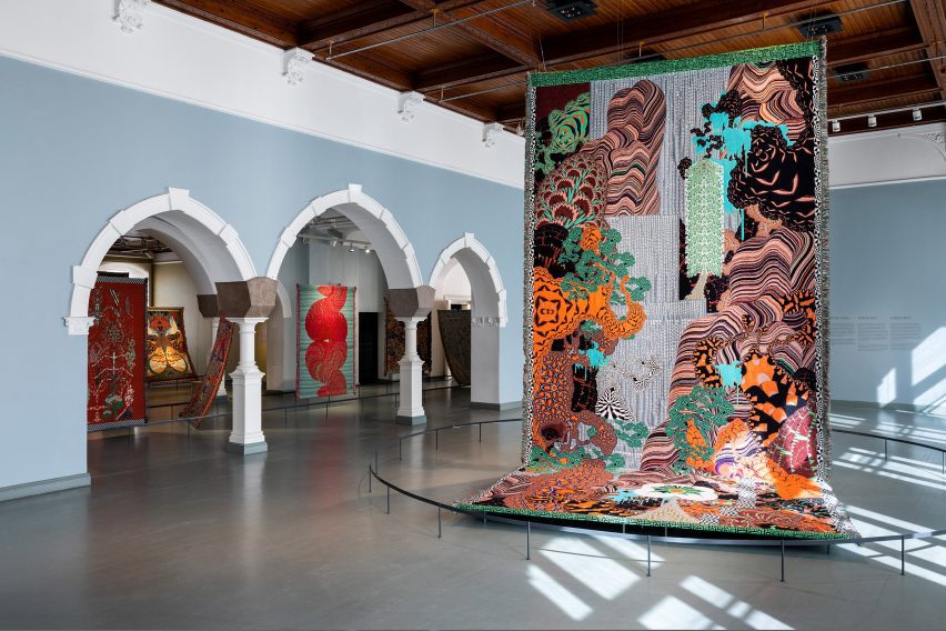
Ideal Fall is a single oversized tapestry featuring bright and abstract forms depicting waterfall- and plant-style forms.

Large-scale colourful textiles by Kustaa Saksi
Kustaa Saksi also created a series exploring migraines

Saksi created the colourful textile using AI software, which he instructed to generate images that would depict “ideal” scenes of nature. The designer then picked his favourite suggestions and used the imagery as a stimulus for the tapestry’s patterns.

“The exhibition explores moments between reality and illusion, which are the starting point for many of Saksi’s works,” said the Design Museum.

Dramatically lit tapestry at Helsinki Design Museum
The tapestries were suspended from the ceiling at the Design Museum

Migraine Metamorphoses is another series of textiles featuring similarly bold designs, which Saksi created to refer to the various phases of migraines – intense headaches that the designer has suffered since the age of seven.

According to the museum, the soft texture of the textiles intends to “mitigate the painful subject matter”.

Colourful textiles
Monsters and Dreams is a series informed by stories about hallucinations

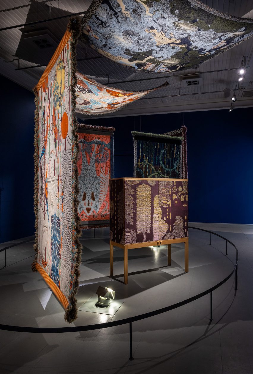
Often influenced by the boundaries between dreams and imagination, Saksi’s first-ever tapestry series was also on show at the Design Museum.

Called Monsters and Dreams, it is characterised by striking patterns that take cues from hallucinations experienced by one of the designer’s family members. These textiles were draped across or hung from the ceiling of a single room with dark blue walls, which had been painted to enhance the pieces’ dramatic theme.

Saksi has created his pieces in collaboration with Dutch studio TextileLab since 2013.

“The jacquard technique can be referred to as one of the early precursors to the computer,” said the Design Museum.

“It was the first mechanised technique which enabled the transfer of information about a particular pattern to a weaving machine with the help of a punched cylinder, to eventually become a piece of textile.”

In the Borderlands exhibition by Kustaa Saksi
The exhibition is on display in Helsinki until mid-October

Throughout the gallery, the textiles were illuminated with controlled levels of lighting in order to preserve their appearance, according to the museum.

In the Borderlands is on display until 15 October as part of the museum’s 150th-anniversary programme. Elsewhere at Helsinki Design Week, designer Didi NG Wing Yin presented a series of amorphous timber furniture while last year’s edition of the event featured projects including plant-based textiles.

The photography is by Paavo Lehtonen.

Helsinki Design Week takes place from 8 to 17 September 2023 in Helsinki, Finland. See Dezeen Events Guide for an up-to-date list of architecture and design events taking place around the world.

Reference