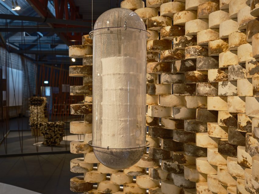
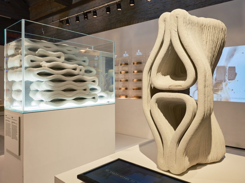
Barbican’s Unravel exhibition explores the subversive power of textiles
CategoriesInterior Design

Barbican’s Unravel exhibition explores the subversive power of textiles

Curator Lotte Johnson discusses the transformative power of textiles in this video produced by Dezeen for the Barbican’s latest exhibition.

Titled Unravel: The Power and Politics of Textiles in Art, the exhibition examines how textiles have been employed to explore themes spanning power, oppression, gender and belonging.

It features over 100 works that make use of textile, fibre and thread from over 50 artists from across the globe, spanning from the 1960s to the present day.

The exhibition explores how artists have used textiles to express their lived experience

The exhibition is designed to challenge the perception of textiles being solely domestic or craft practices and instead features textile works that relate a story of resistance and rebellion as well as pieces that present narratives of emancipation and joy.

Johnson explained that textiles offer a meaningful medium to express personal and political issues due to their tactile nature and intimate connection to daily life.

“Textiles are one of the most under-examined mediums in art history and in fact history itself,” Johnson said. “They are an intrinsic part of our everyday lives. When we’re born, we’re shrouded in a piece of fabric. Everyday we wrap ourselves in textiles,” she continued.

“They’re really this very intimate, tactile part of our lives and therefore perhaps the most intrinsic, meaningful way to express ourselves.”
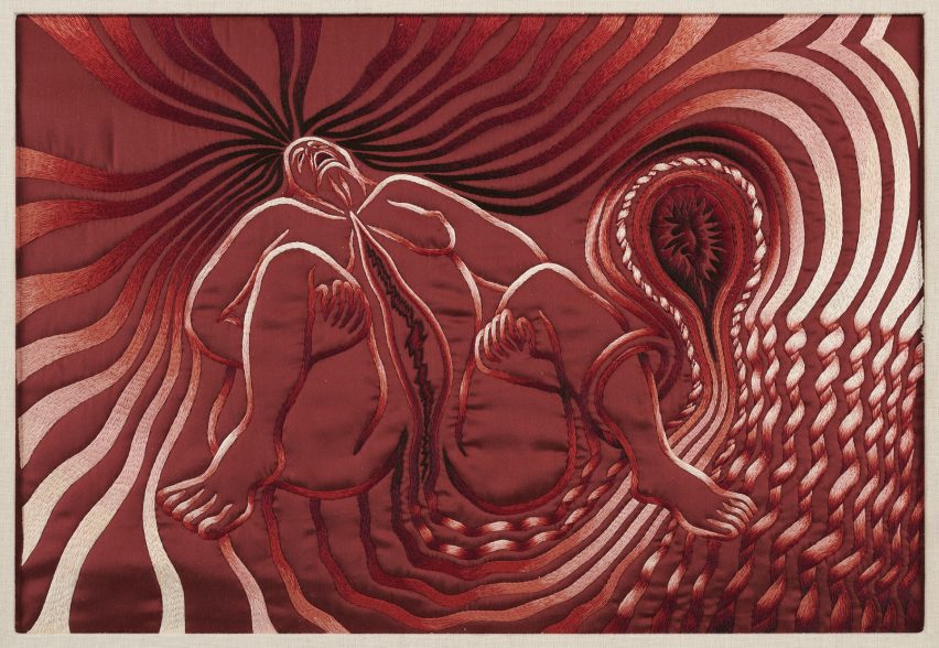
Judy Chicago Birth ProjectJudy Chicago Birth Project
Feminist artist Judy Chicago’s Birth Project depicts birth as a mystical and confrontational process

The exhibition is structured into six thematic sections. The first, called Subversive Stitch, presents works that challenge binary conceptions of gender and sexuality.

The section includes feminist artist Judy Chicago’s Birth Project, which vividly depicts the glory, pain and mysticism of giving birth, as well as a piece from South African artist Nicholas Hlobo, which, despite initially appearing as a painting, is made using ribbon and leather stitched into a canvas.

Another section of the exhibition is titled Bearing Witness, which brings together artists who employ textiles to confront and protest political injustices and systems of violent oppression.
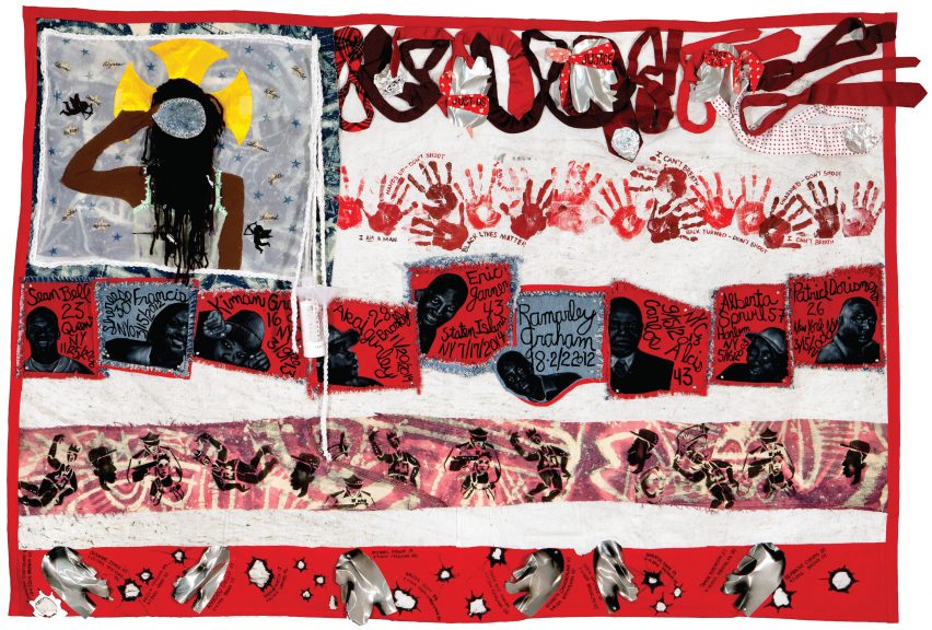
Teresea Margolles tapestry Teresea Margolles tapestry
Artist Teresa Margolles creates collective tapestries that trigger conversations on police brutality

Included in this section are tapestries by Mexican artist Teresa Margolles that commemorate the lives of individuals including Eric Garner and Jadeth Rosano López.

Garner was an African-American man killed in 2014 by NYPD police officer Daniel Pantaleo, who put Garner into a chokehold during arrest. López was a seventeen-year old-girl assassinated in Panama City.

Margolles used fabric that had been placed in contact with the victims’ deceased bodies and collaborated with embroiderers from their respective local communities to create the tapestries.

The Wound and Repair sections includes work from American artist and activist Harmony Hammond’s Bandaged Grid series, in which layered fabric is used to evoke imagery reminiscent of an injured body.
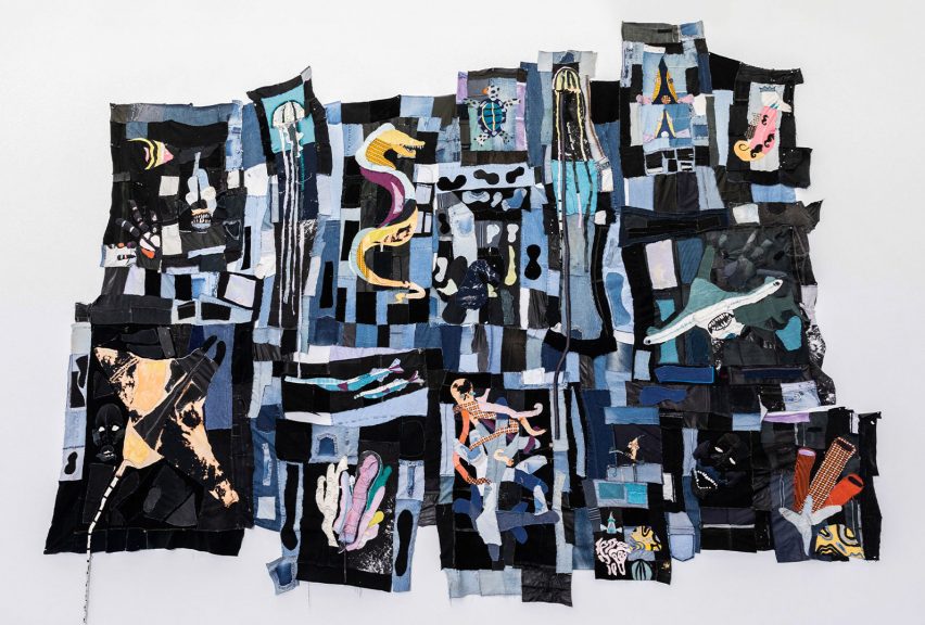
Tau Lewis tapestryTau Lewis tapestry
Tau Lewis’ fabric assemblages offer new narratives of black histories

While violence and brutality are key themes examined in the exhibition, it also showcases how textiles can be used to create narratives of hope. The final, most expansive section of the exhibition is titled Ancestral Threads, which encompasses works created to inspire a sense of optimism and reconnect with ancestral practices.

“This section not only explores artists processing exploitative and violent colonial and imperialist histories, but also celebrates the artists who are re-summoning and relearning ancient knowledge systems to imagine a different kind of future,” Johnson explained.

Canadian multimedia artist Tau Lewis’s work titled The Coral Reef Preservation Society is a patchwork assemblage of recycled fabrics and seashells including fragments of textured denim.

The work pays homage to the enslaved women and children thrown overboard in the Middle Passage, the historical transportation route used during the Atlantic slave trade. These women and children have been reimagined as underwater sea creatures to transform the narrative into one of regeneration.
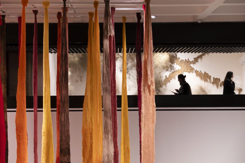
Vicuña revives the art of the quipu in her installation Quipu Austral

A large installation by Chilean artist Cecilia Vicuña titled Quipu Austral is situated towards the end of the exhibition. The installation takes the form of billowing ribbons hanging from the ceiling.

Vicuña references quipu, a form of recording used by a number cultures in Andean South America. Quipu was a ancient writing system which used knotted textile cords to communicate information.

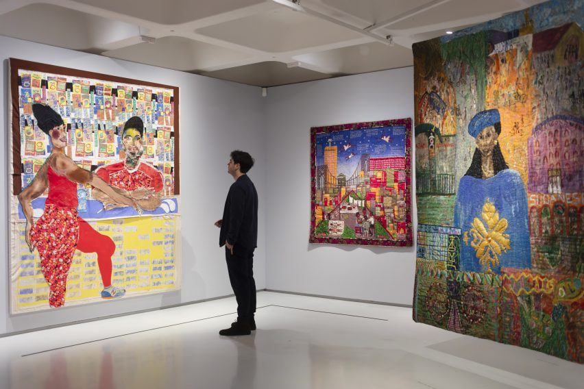
Other sections in the exhibition include Fabric of Everyday, which explores the daily uses of textiles, as well as Borderlands, which examines how textiles have been used to challenge ideas around belonging.

These sections feature works such as Shelia Hicks’ colourful woven bundles and Margarita Cabrera’s soft sculpture cacti crafted from reclaimed US border patrol uniforms.
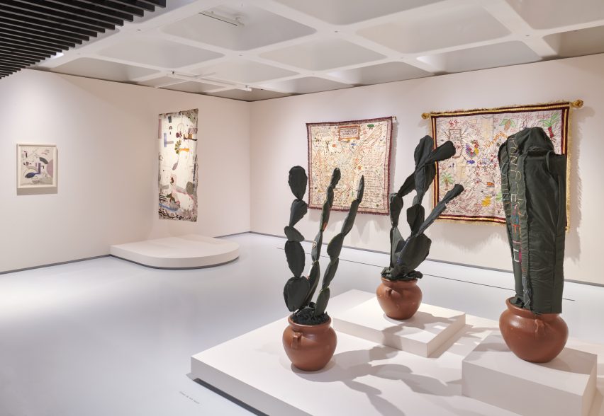
Mexican-American artist Margarita Cabrera uses reclaimed border patrol uniforms in her work

“We hope that people might come out of this exhibition feeling invigorated and moved by the stories of resilience and rebellion embedded in the work but also hope and emancipation,” Johnson said.

“I hope that the show might inspire people to pick up a needle and thread themselves and use it to express their own lived experience.”

The show is a partnership between the Barbican and the Stedelijk Museum in Amsterdam and was co-curated by Barbican curators Johnson, Wells Fray-Smith and Diego Chocano, in collaboration with Amanda Pinatih from the Stedelijk.

Unravel: The Power and Politics of Textiles in Art is at the Barbican Centre until 26 May 2024. See Dezeen Events Guide for an up-to-date list of architecture and design events taking place around the world.

Partnership content

This video was produced by Dezeen for the Barbican Centre as part of a partnership. Find out more about Dezeen’s partnership content here.

Reference

SODA explores office-to-residential conversions with Roco in Liverpool
CategoriesInterior Design

SODA explores office-to-residential conversions with Roco in Liverpool

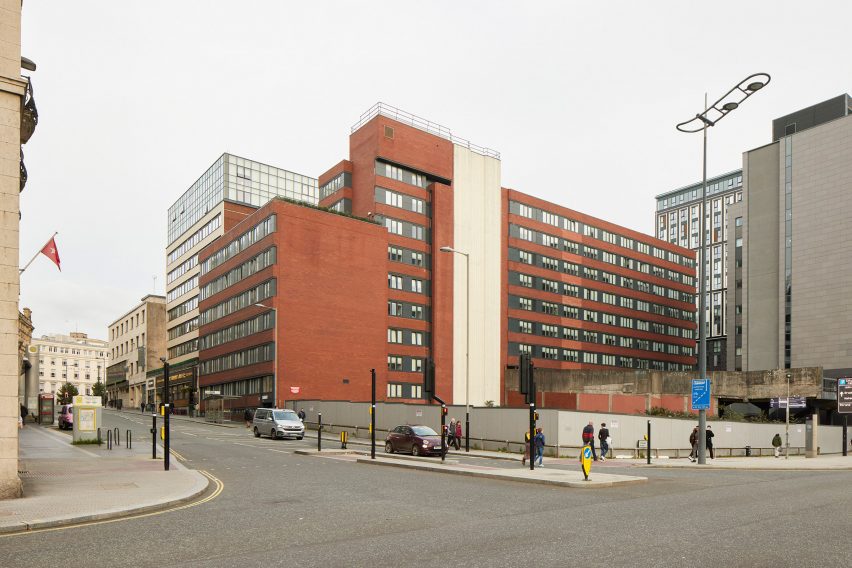
London studio SODA has converted a 1970s office block in Liverpool city centre into a residential building that  includes co-working and wellness facilities.

The adaptive reuse project sees the 10-storey block, which spent decades as an office for HM Revenue and Customs, transformed into rental homes managed by operator Livingway.

Ground floor of Roca living in Liverpool by SODAGround floor of Roca living in Liverpool by SODA
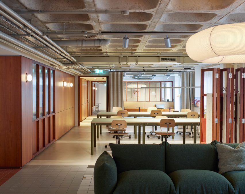
Communal spaces take up most of the ground floor

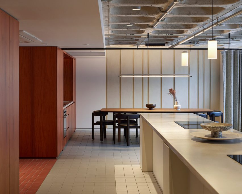
Roca contains 120 one- and two-bedroom apartments, plus two floors of co-living-style amenities for residents. These include workspaces, a large kitchen, cinema room, gym and treatment rooms and a planted roof terrace.

Russell Potter, co-founding director at SODA, believes the project can serve as a model for office-to-residential conversions in city-centre locations.

Lounge in Roca living in Liverpool by SODALounge in Roca living in Liverpool by SODA
The design includes mix of flexible lounge and workspaces

“The leaps that office design has made over the past decade or two have meant that certain period properties from the 1960s and 70s are perhaps not the most desirable from a commercial point of view,” he told Dezeen.

“But if they occupy prime city-centre locations, they can offer amazing opportunities to adapt and re-use, to reinvigorate city centres with genuinely flexible and crafted spaces.”

Desk in Roca living in Liverpool by SODADesk in Roca living in Liverpool by SODA
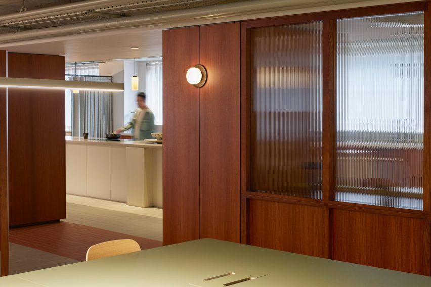
A timber “activity wall” provides surfaces, seating and storage

Livingway’s model is a version of co-living. By offering Roca residents access to communal spaces, in addition to their apartments, it aims to foster a sense of community.

Many of these shared spaces can be found on the ground floor. Here, various work, lounge and dining spaces are organised around a timber “activity wall” that provides surfaces, storage and seating.

Kitchen dining room in Roca living in Liverpool by SODAKitchen dining room in Roca living in Liverpool by SODA
A communal kitchen is often used for cooking classes and demonstrations

Other interior details, such as folding screens, curtains and fluted glass windows, allow the space to be casually divided into different activity zones when required.

Sometimes these spaces host workshops or classes, allowing residents to engage with local businesses.

“We’re introducing an element of communal activity to act as a hub at ground floor, in a similar fashion to what’s been happening in other co-living arrangements,” said Potter.

“It means you have the opportunity to create a genuine sense of community within a city centre.”

Former office building in LiverpoolFormer office building in Liverpool
The building was previously an office block

On the apartment floors, the existing floorplates made it possible to create larger homes than typical co-living units, arranged on opposite sides of a central corridor.

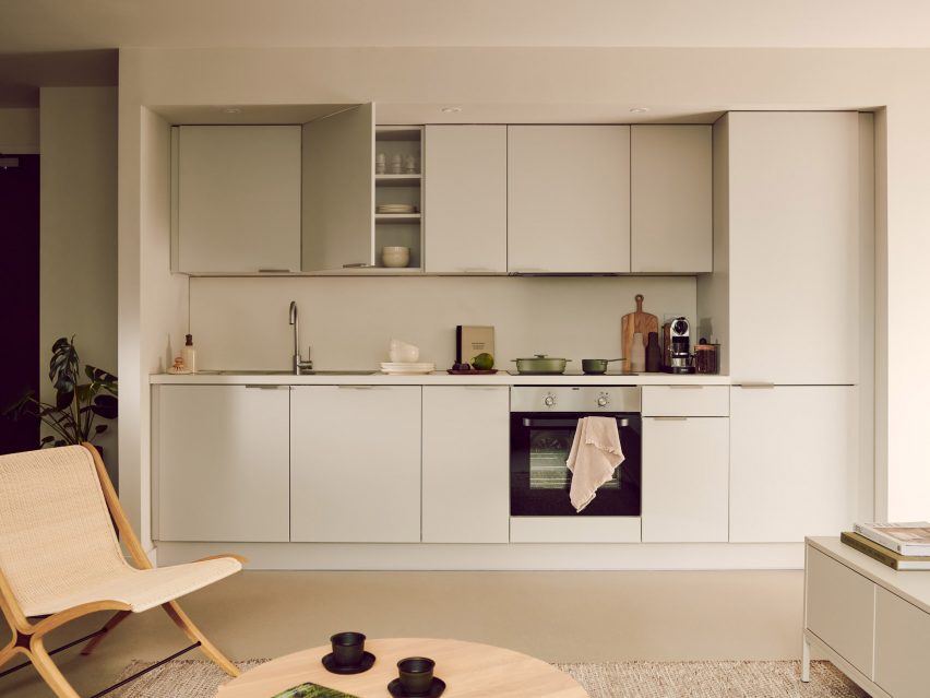
Apartments come fully furnished, with bedrooms and bathrooms separate from the living areas.

Apartment kitchen in Roca living in Liverpool by SODAApartment kitchen in Roca living in Liverpool by SODA
The renovation provides 120 apartments in total

“Office buildings typically have slim floor plates with decent floor spans and high proportions of glazing-to-floor area, so make ideal opportunities for residential conversion,” Potter explained.

“Likewise, floor-to-ceiling heights don’t tend to pose an issue for residential,” he added. “Typically, commercial floor heights are higher than what you expect in residential, meaning that you get better aspects of light into the spaces.”

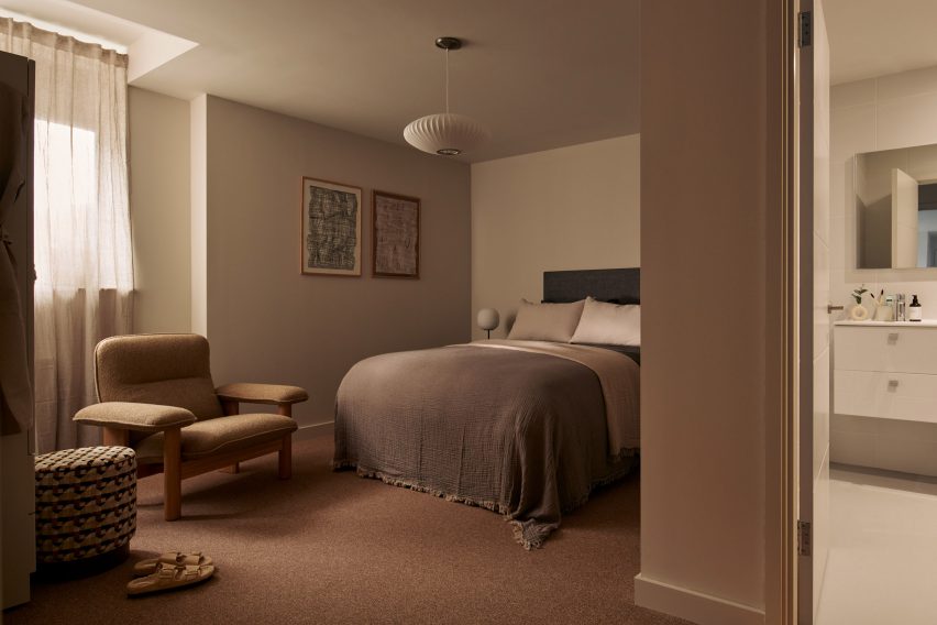
Apartment bedroom in Roca living in Liverpool by SODAApartment bedroom in Roca living in Liverpool by SODA
The apartments are larger than is typical for co-living

Livingway offers five of these units as hotel rooms, available for short stay. But guests don’t have access to all of the communal facilities; most are reserved for residents.

Technology plays an important role in the building management. An app allows residents to book certain rooms or sign up for workshops and classes, while digital locks allow access to be controlled.

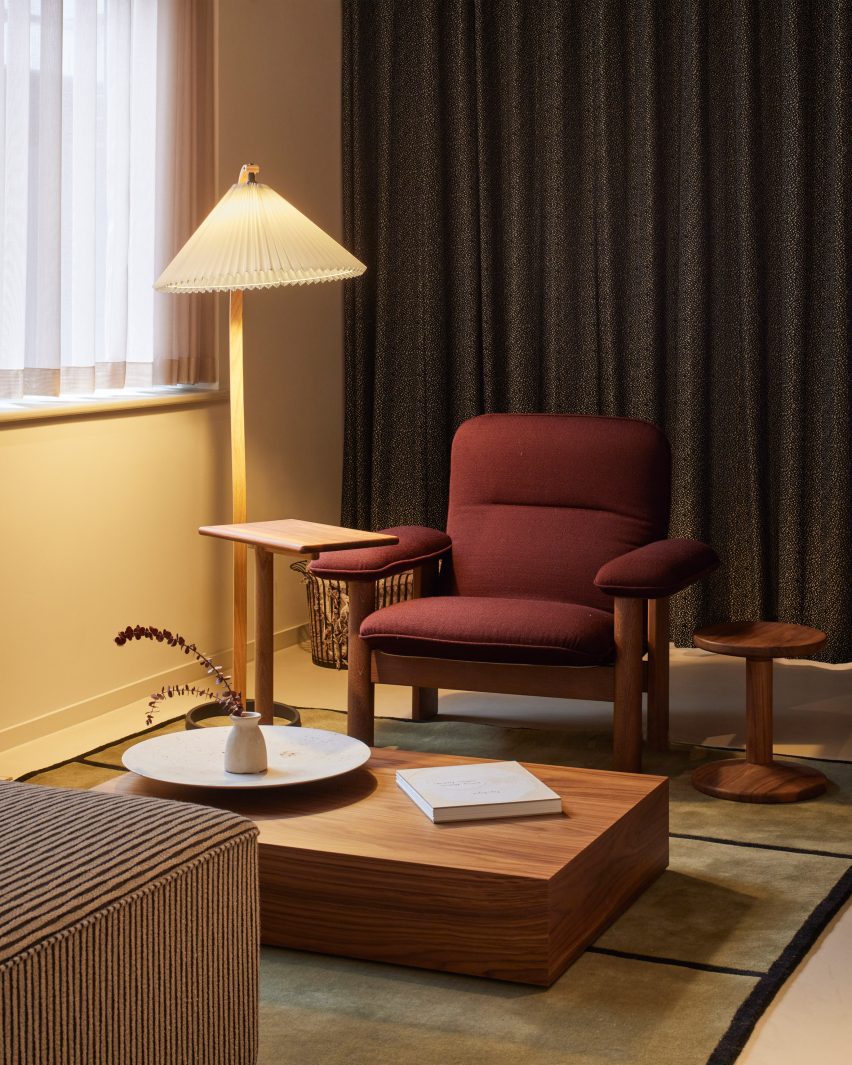
Red armchair in Roca living in Liverpool by SODARed armchair in Roca living in Liverpool by SODA
The communal spaces feature colours and patterns that reference the 1970s

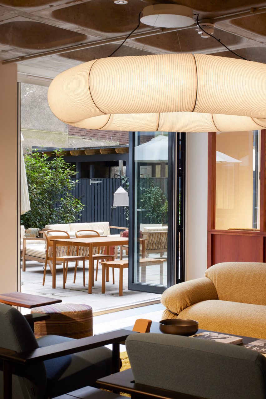
The interior design approach reflects the building’s 1970s heritage, with furniture and finishes that don’t shy away from colour and pattern.

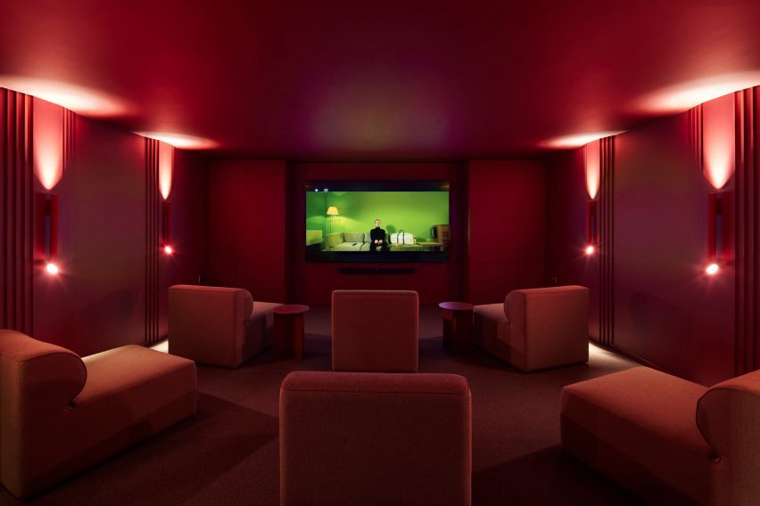
Standout spaces include the cinema room, an all-red space featuring large upholstered chairs, tubular wall lights and art-deco-style mouldings.

Across the rest of the ground floor, the exposed concrete waffle-slab overhead brings an industrial feel that contrasts with the warmth of the wood surfaces and soft furnishings.

Cinema room in Roca living in Liverpool by SODACinema room in Roca living in Liverpool by SODA
Standout spaces include a cinema screening room

The homes feature a more subtle palette, with muted tones rather than white, to allow residents to bring their own personalities into the design.

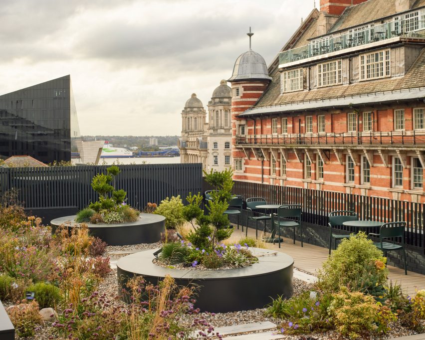
A similar level of care was brought to the outdoor spaces. These include an informal courtyard on the ground floor and the seventh-floor roof terrace, which incorporates a trio of hot tubs.

Roof terrace in Roca living in Liverpool by SODARoof terrace in Roca living in Liverpool by SODA
A planted roof terrace includes three hot tubs

The project builds on SODA’s experience of designing shared spaces. The studio has designed various spaces for workplace provider The Office Group (TOG), including Liberty House and Thomas House.

The collaboration with Livingway came about after the company reached out to the studio via Instagram.

“It is amazing to see what a beautiful result has been produced and how much our residents truly enjoy calling Roco their home,” added Samantha Hay, CEO for Livingway.

The photography is by Richard Chivers.

Reference

Tropical Modernism exhibition explores “the politics behind the concrete”
CategoriesInterior Design

Tropical Modernism exhibition explores “the politics behind the concrete”

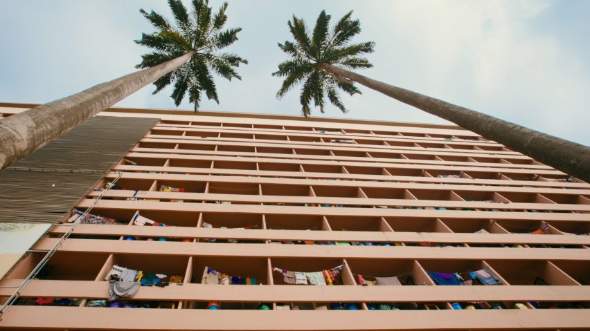
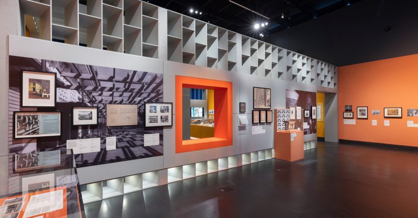
London’s Victoria and Albert Museum has launched its Tropical Modernism exhibition, which highlights the architectural movement’s evolution from colonial import to a “tool of nation building”.

According to the Victoria & Albert Museum (V&A), the exhibition aims to examine the complex context, power dynamics and post-colonial legacy of tropical modernism – an architectural style that developed in South Asia and West Africa in the late 1940s – while also centralising and celebrating its hidden figures.

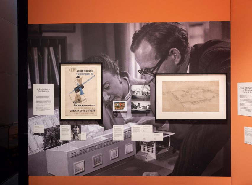
Archival Image in Tropical Modernism exhibition at the V&A LondonArchival Image in Tropical Modernism exhibition at the V&A London
London’s V&A museum has opened a major exhibition exploring tropical modernism

“Tropical modernism is experiencing something of a modish revival as an exotic and escapist style popular in verdant luxury hotels, bars and concrete jungle houses,” the exhibition’s lead curator Christopher Turner told Dezeen.

“But it has a problematic history and, through an examination of the context of British imperialism and the de-colonial struggle, the exhibition seeks to look at the history of tropical modernism before and after Independence, and show something of the politics behind the concrete,” he continued.

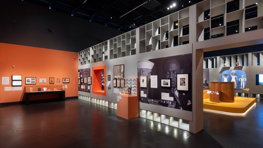
Installation shot of Tropical Modernism exhibition at the V&A LondonInstallation shot of Tropical Modernism exhibition at the V&A London
The exhibition traces the evolution of tropical modernism within a South Asian and West African context

The exhibition follows the V&A’s Tropical Modernism exhibition at the 2023 Venice Biennale, which revealed the team’s precursory research on tropical modernism in a West African setting.

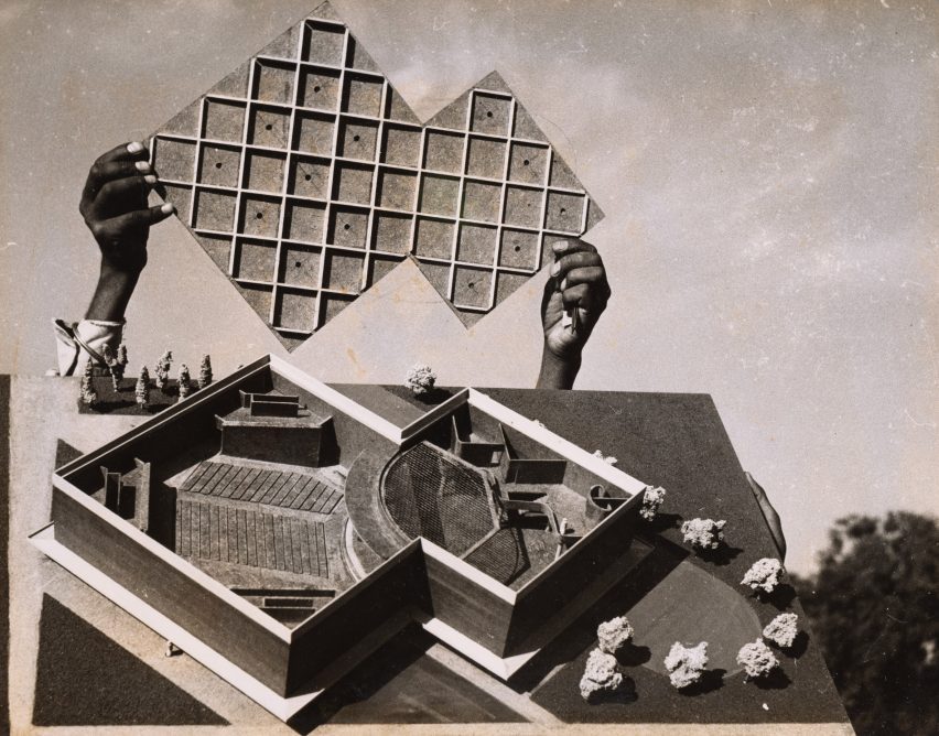
For the in-house iteration of the exhibition, additional architectural models, drawings and archival imagery have been introduced to interrogate tropical modernism in India alongside the African perspective.

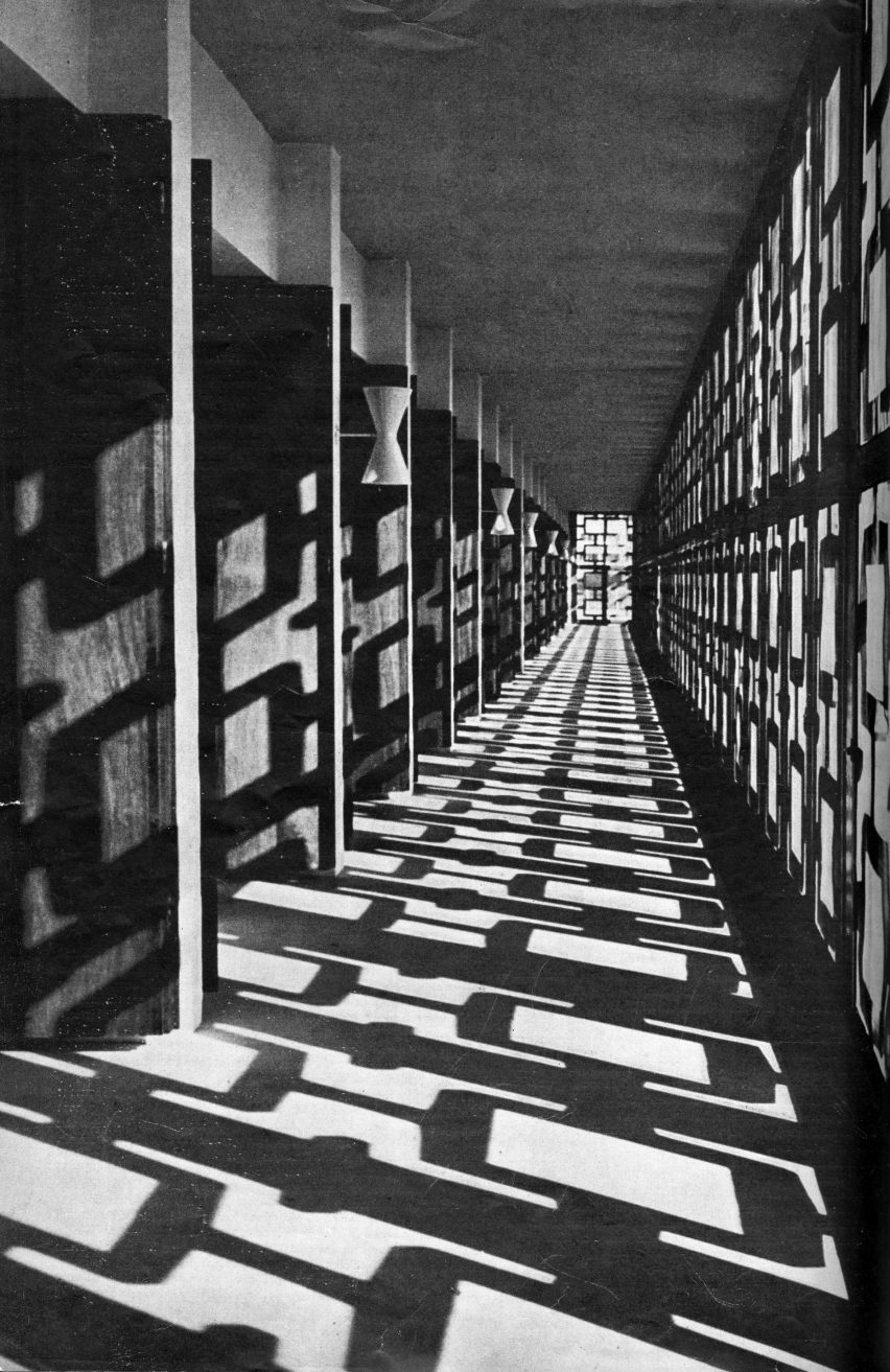
Exhibition materials line a series of rooms within the V&A’s Porter Gallery, divided by brightly coloured partitions and louvred walls referencing tropical modernist motifs.

Installation shot of Tropical Modernism exhibition at the V&A LondonInstallation shot of Tropical Modernism exhibition at the V&A London
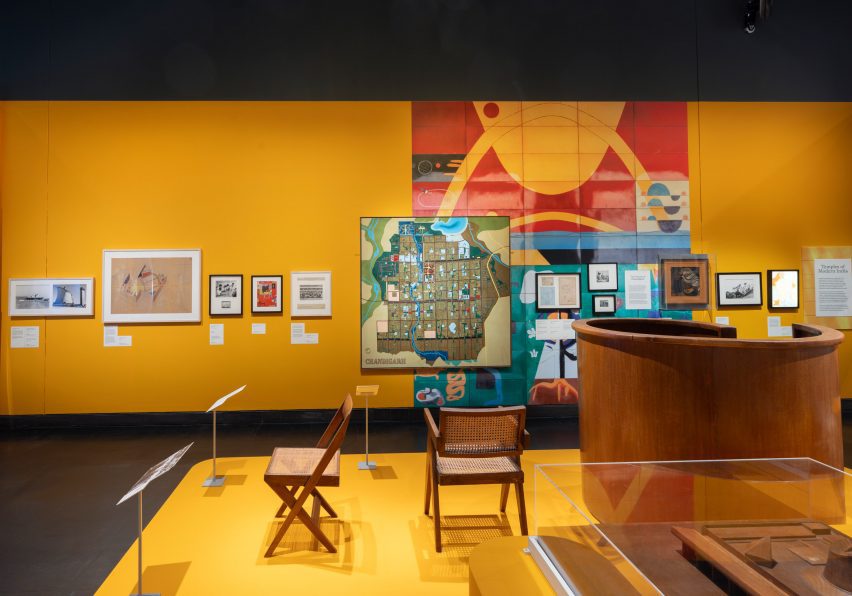
Archival imagery, architectural drawings and physical models line the gallery rooms

The exhibition begins by tracing tropical modernism back to its early development by British architects Jane Drew and Maxwell Fry. Stationed together in Ghana from 1944, Drew and Fry adapted international modernism to the African climate, proposing functional over ornamental design.

Drew and Fry would also become part of the Department of Tropical Studies at the Architectural Association (AA), which exported British architects to the colonies from 1954 in a bid to neutralise calls for independence.

Installation shot of Tropical Modernism exhibition at the V&A LondonInstallation shot of Tropical Modernism exhibition at the V&A London
The exhibition aims to centralise local professionals who have gone widely unrecognised for their contributions to the movement

The exhibition continues by spotlighting local Ghanaian figures who worked with Fry and Drew, noting the power shifts that were taking place behind the scenes to reappropriate the architectural style for an emerging era of colonial freedom.

Influential political leaders Jawaharlal Nehru in India and Kwame Nkrumah in Ghana are the exhibition’s key personas, framing the evolution of tropical modernism from conception to regionalisation.

Installation shot of Tropical Modernism exhibition at the V&A LondonInstallation shot of Tropical Modernism exhibition at the V&A London
Gallery rooms are divided by brightly coloured partitions informed by tropical modernist motifs

“The heroes of our exhibition are Nehru and Nkrumah, the first prime ministers of India and Ghana,” Turner explained. “Tropical modernism, a colonial invention, survived the transition to Independence and was appropriated and adapted by Nehru and Nkrumah as a tool of nation building.”

“Nkrumah, who sometimes sketched designs for the buildings he wanted on napkins, created the first architecture school in sub-Saharan Africa to train a new generation of African architects, and this institution has partnered with us on a five-year research project into tropical modernism.”

Archival image of University College Ibadan used in Tropical Modernism exhibition at the V&A LondonArchival image of University College Ibadan used in Tropical Modernism exhibition at the V&A London
According to the V&A’s research, tropical modernism shifted from its western Bauhaus roots towards a localised vernacular styles

Through a host of physical models and artefacts, the city of Chandigarh becomes the exhibition’s narrative focal point for tropical modernism in India.

Under prime minister Jawaharlal Nehru, Chandigarh was the first large-scale modernist project, recruiting Drew and Fry along with French architect Le Corbusier to plan the ideal utopian urban centre.

As with Nkrumah – who saw how the Africanisation of architecture could become a symbol of progress and change – the exhibition also aims to highlight Nehru’s ambitions for a localised modernism drawing from the Indian vernacular, rather than the Western Bauhaus style.

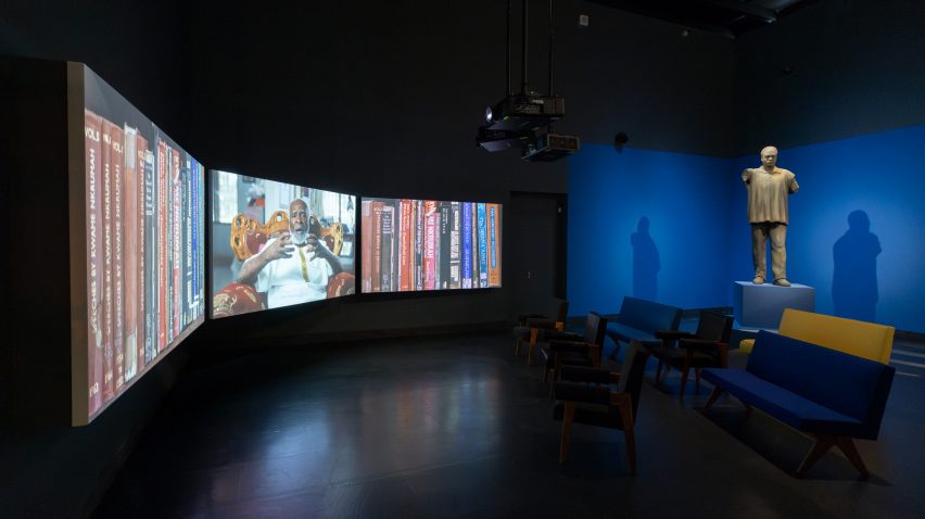
The display culminates in a video featuring 16 key tropical modernist structures, interspersed with interviews and footage explaining the social and political context behind each building’s realisation.

“We made a three-screen 28-minute film, shot in Ghana and featuring panoramic portraits of over a dozen buildings, cut with archive footage from the time and interviews with architects like John Owusu Addo and Henry Wellington, and Nkrumah’s daughter, the politician Samia Nkrumah,” said Turner.

Archival image of Maxwell Fry and John Noah used in Tropical Modernism exhibition at the V&A LondonArchival image of Maxwell Fry and John Noah used in Tropical Modernism exhibition at the V&A London
The exhibition aims to address gaps in the museum’s African and South Asian studies

According to Turner, the exhibition begins to address gaps in the V&A’s collections and archives pertaining to architecture and design in the global south.

“Archives are themselves instruments of power, and West African and Indian architects are not as prominent in established archives, which many institutions have now realised and are working to address,” Turner explained.

“Tropical modernism was very much a co-creation with local architects who we have sought to name – all of whom should be much better known, but are excluded from established canons.”

Installation shot of Tropical Modernism exhibition at the V&A LondonInstallation shot of Tropical Modernism exhibition at the V&A London
The display will inhabit the V&A’s Porter Gallery until 22 September 2024

Bringing tropical modernism back into contemporary discourse was also important to the V&A as a timely investigation of low-tech and passive design strategies.

“Tropical modernism was a climate responsive architecture – it sought to work with rather than against climate,” Turner said.

“As we face an era of climate change, it is important that tropical modernism’s scientifically informed principles of passive cooling are reexamined and reinvented for our age,” he added.

“I hope that people will be interested to learn more about these moments of post-colonial excitement and opportunity, and the struggle by which these hard-earned freedoms were won.”

Image of video used in the Tropical Modernism exhibition at the V&A LondonImage of video used in the Tropical Modernism exhibition at the V&A London
A 28-minute video captures footage of remaining tropical modernist structures at the end of the exhibition

The V&A museum in South Kensington houses permanent national collections alongside a series of temporary activations and exhibitions.

As part of London Design Festival 2023, the museum hosted a furniture display crafted from an Alfa Romeo car by Andu Masebo and earlier in the year, architect Shahed Saleem created a pavilion in the shape of a mosque at the V&A as part of 2023’s Ramadan Festival.

The photography is courtesy of the Victoria & Albert Museum.

Tropical Modernism: Architecture and Independence will run from 2 March to 22 September 2024 at the V&A Museum in London. For more events, exhibitions and talks in architecture and design visit the Dezeen Events Guide.

Reference

Christian + Jade explores the Weight of Wood at 3 Days of Design
CategoriesInterior Design

Christian + Jade explores the Weight of Wood at 3 Days of Design

Danish design studio Christian + Jade has created an exhibition in collaboration with wood flooring manufacturer Dinesen that explores the density of wood and its significance and history as a commodity.

The Weight of Wood exhibition, which takes place at the Dinesen showroom as part of Copenhagen festival 3 Days of Design, was the result of a year-long research project commissioned by the brand’s recently founded Dinesen Lab.

Photo of Weight of Wood exhibition
Weight of Wood is an exhibition by Christian + Jade

Dinesen Lab invited Christian Hammer Juhl and Jade Chan, founders of Christian + Jade, to take part in a residency in which local artists were asked to work with wood harvested by the company to produce a research project and explore the weight of wood.

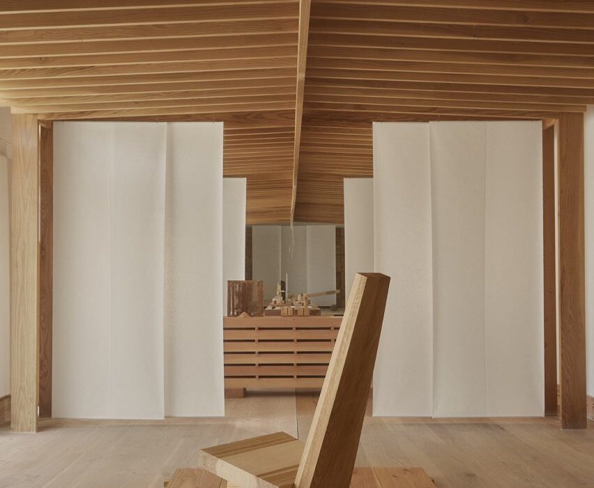
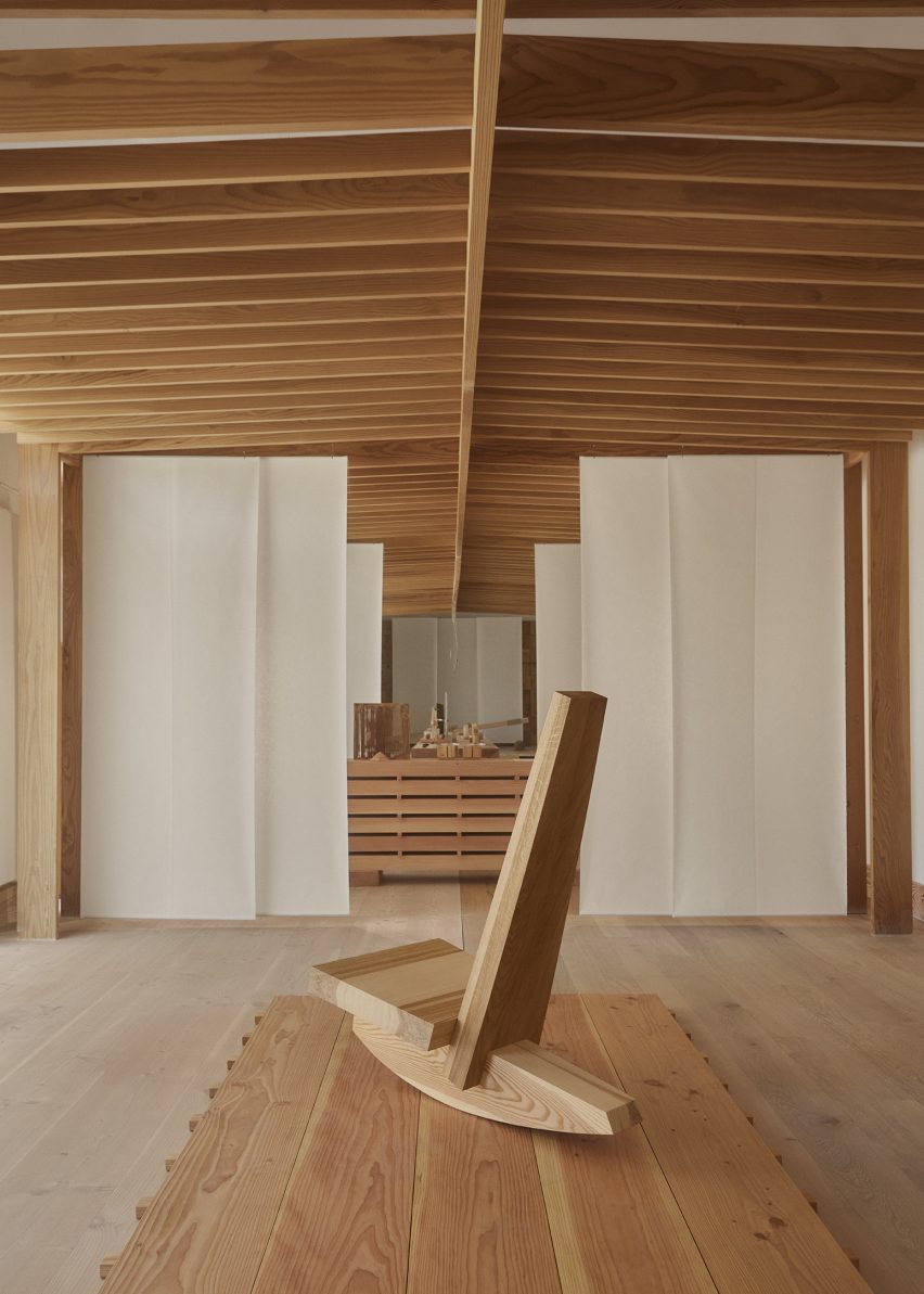
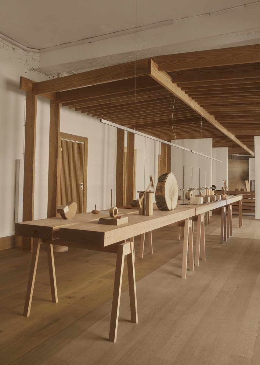
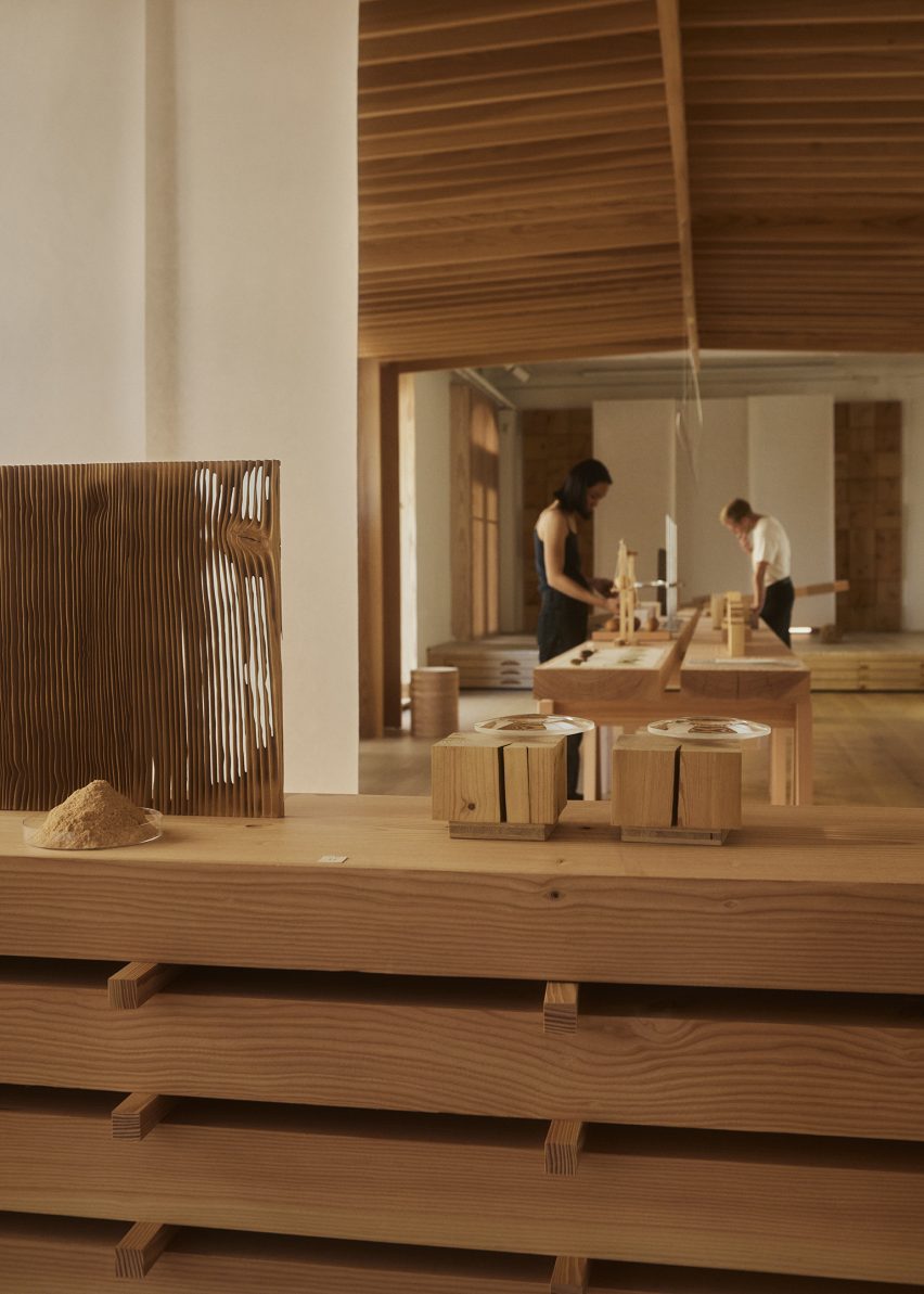
The Weight of Wood installation is located within a large exhibition space at the brand’s showroom in Copenhagen. This was divided into a series of smaller rooms via sheets of textured paper hung vertically from a wooden pavilion.

Photo of an installation at the Weight of Wood exhibition
It takes place at the Dinesen showroom

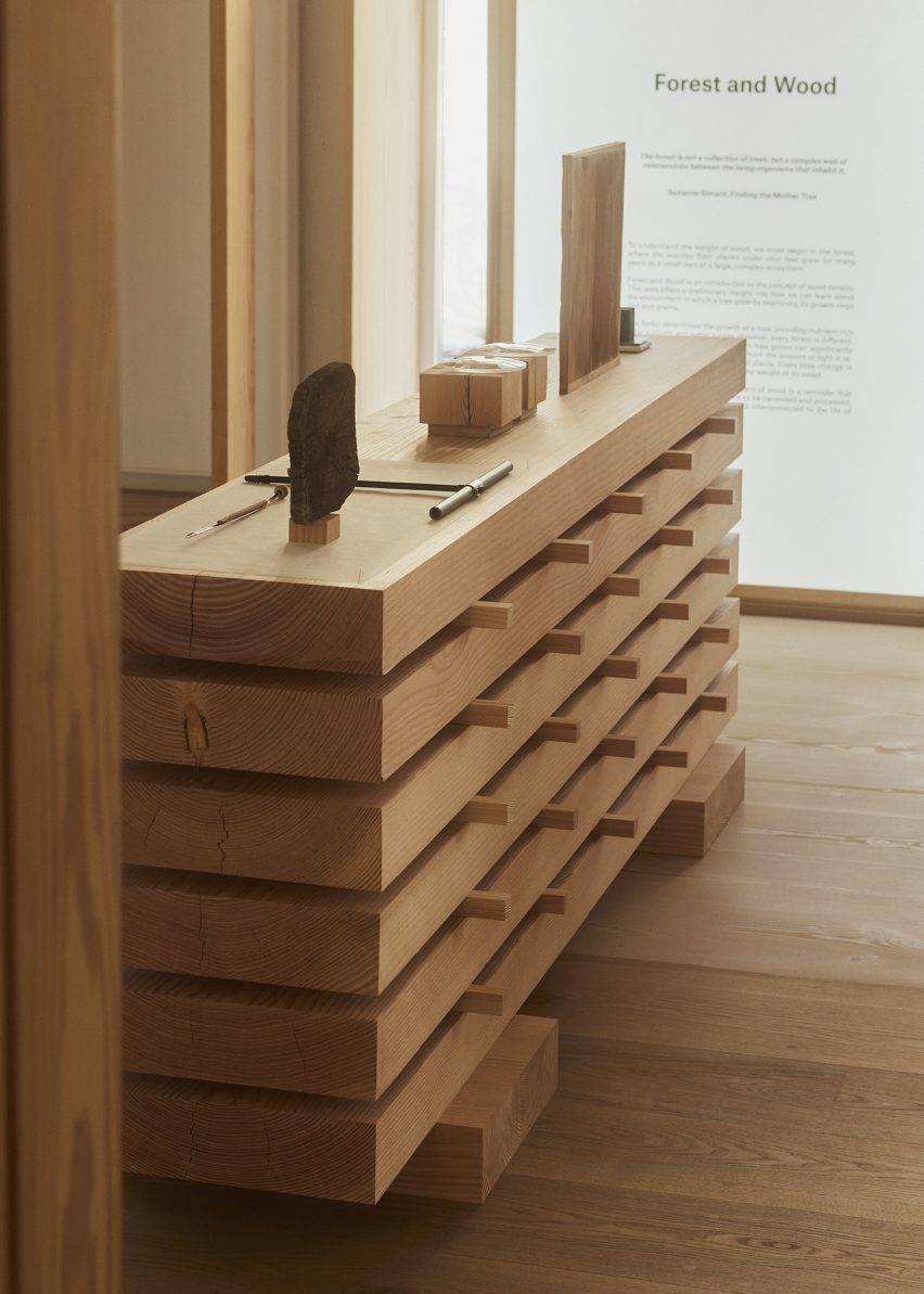
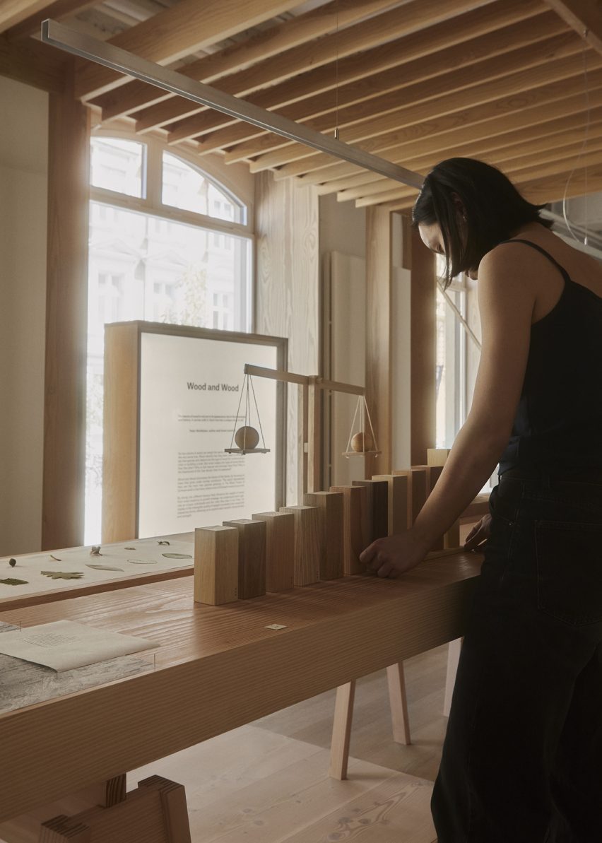
Each of the smaller rooms separates the exhibition into three different parts titled Forest and Wood, Wood and Wood, and Human and Wood.

Throughout the exhibition space, wooden tables hold a number of experiments and interventions completed by Christian + Jade using different types of wood that were harvested by Dinesen.

“We were fascinated by the idea that no two pieces of wood weigh the same, not even if it comes from the same tree trunk,” the studio explained at a preview of the exhibition. “This was really what sparked our interest in this project.”

Photo of Weight of Wood
The exhibition explores the ways in which wood has been commodified

“Through this exhibition, we have tried to work with this idea in various scales,” the studio founders added. “It sort of presents a design methodology, combining different pieces of wood with different densities.”

“What we have created is not only a series of furniture but also a rocking horse, a rocking chair and lots of small experiments that visualise this intangible quality of wood, which is the weight of wood.”

A collection of different-sized cubic wooden volumes were presented in the exhibition, made from 11 different species of wood including beech, cherry, Douglas fir and elm. Each of the pieces of wood weighs 250 grams and conveys the different densities of wood through volume and size.

A seesaw placed at the rear of the exhibition space featured a base made from Douglas fir and topped by a seat constructed from equal parts Douglas fir and oak. As a result of oak having a higher density than Douglas fir, the seesaw will always lean towards its oak-constructed side.

Photo of a wooden scale at Weight of Wood exhibition
The designers used Dinesen’s wood for their experiments

“We chose three different furniture archetypes that require weight and balance in their function – the seesaw, the rocking chair and the rocking horse,” Chan said.

“So in designing or reimagining the furniture, we’ve worked with four of Dinesen’s main wood species; that is Douglas fir, oak, pine and ash.”

Photo of the exhibition
The exhibition was divided into three parts

“The seesaw is an example of one of the simple principles that we apply – the pivot point is made using Douglas and the seat is made using oak and Douglas,” Chan added.

The rocking horse was constructed from 87 per cent Douglas fir and 13 per cent ash. Because of its Douglas fir-heavy construction, the horse always tilts towards one side, which provides it with a unique movement.

Photo of the exhibition
The exhibition included a rocking horse, seesaw and rocking chair

Chan concluded the preview of the Weight of Wood exhibition with a poem by H P Dinesen, a relative of the company founders:

“To those who love the tree, those who may be fighting the tree, the one who plants the tree, the one who fells the tree, the poet who praises the tree, and the one who simply settles with enjoying the tree.”

Also at this year’s 3 Days of Design, Nemo Lighting unveiled a light designed by architect Le Corbusier and a lamp by architect Charlotte Perriand and Takt launched a fully disassemblable sofa that can be replaced and recycled.

The photography is by Claus Troelsgaard.

Weight of Wood is on show as part of 3 Days of Design 2023, from 7 June to 9 June 2023. See Dezeen Events Guide for information about the event, plus a list of other architecture and design events taking place around the world.

Reference

Dezeen In Depth explores the sustainability of mass-timber buildings
CategoriesSustainable News

Dezeen In Depth explores the sustainability of mass-timber buildings

Image of a forest being logged by Maksim Safaniuk

The third edition of our monthly Dezeen In Depth newsletter features a dive into why the sustainability of mass-timber buildings can’t be taken for granted. Subscribe to Dezeen In Depth now.

Architects are increasingly using mass timber in the hopes of creating net-zero buildings but carbon assessments are missing key sources of potential emissions, researchers tell Dezeen in this feature from our Timber Revolution series which ran throughout March.

The standard method for determining a building’s overall carbon footprint is a whole-building life-cycle assessment (LCA) that breaks down emissions at every stage – from the sourcing of raw materials to their ultimate disposal.

These calculations tend to indicate significantly lower emissions for timber structures compared to those made entirely out of concrete and steel. But experts warned that LCAs only tell part of the story. Read the feature ›

Aerial render of W350 Plan by Nikken Sekkei
Building tall with timber “does not make sense” say experts

This month’s newsletter also features an opinion piece from architecture critic Aaron Betsky which argues David Chipperfield did not deserve to win the 2023 Pritzker Architecture Prize and an exclusive interview with urbanist Carlos Moreno who responds to the “shocking” conspiracy theories surrounding his 15-minute city concept.

The lead image is by Maksim Safaniuk via Shutterstock.

Dezeen In Depth

Dezeen In Depth is sent on the last Friday of every month and delves deeper into the major stories shaping architecture and design. Each edition includes an original feature article on a key topic or trend, an interview with a prominent industry figure and an opinion piece from a leading critic. Read the latest edition of Dezeen In Depth or subscribe here.

You can also subscribe to our other newsletters; Dezeen Agenda is sent every Tuesday containing a selection of the most important news highlights from the week, Dezeen Debate is sent every Thursday featuring a selection of the best reader comments and most talked-about stories and Dezeen Daily is our daily bulletin that contains every story published in the preceding 24 hours on Dezeen.

Reference

One Drawing Challenge Winner Explores Enduring Truths at the Heart of a Classic Book Beloved by Architects Worldwide
CategoriesArchitecture

One Drawing Challenge Winner Explores Enduring Truths at the Heart of a Classic Book Beloved by Architects Worldwide

The winners of Architizer’s Fourth Annual One Drawing Challenge have been revealed! Interested in next year’s program? Subscribe to our newsletter for updates. 

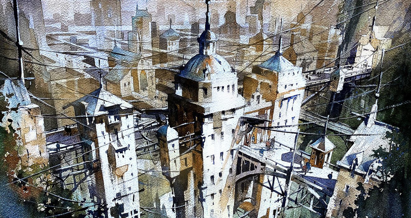
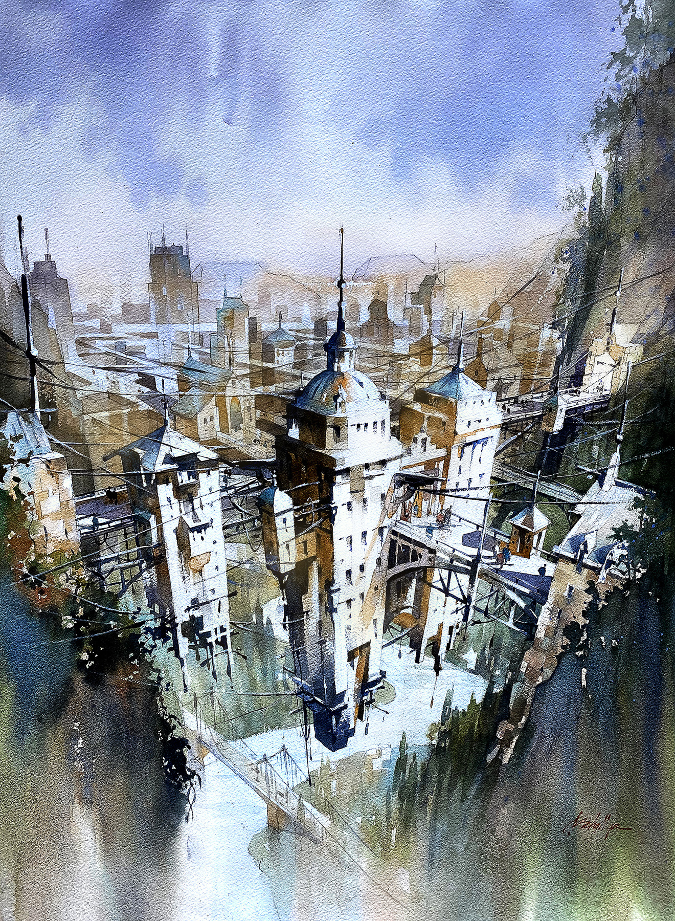
Italo Calvino’s Invisible Cities is officially more than 50 years old; yet, its enduring appeal is attested to by the special place reserved on most architect’s bookshelves for the Italian fables. For young architecture students and experienced practitioners alike, the book remains a source of inspiration and a constant reminder of the infinite possible experiences inherent to any place. This year’s One Drawing Challenge Non-Student Winner, Thomas Schaller, is one of those architects.

While at first glance, the city in his painting appears to be reflecting on a body of water, longer gazing reveals that the buildings grow both up and down. As the fine artist explains, “This drawing tells the story of Octavia, a city suspended above the Earth by a spider’s web of cables and wires. Interpretations are limitless, but in my interpretation, the inhabitants of Octavia depict the central truth about humanity – connections are profound – but tenuous, just as is our grasp on life itself.” The razor’s edge distinction between precarity and strength is at the core of the urban experience.

Expertly oscillating between the precision of fine lines, seen in details like the bridge and cables, and the more atmospheric and reflective qualities of diffused pigments, the image is mind-bending: not only in terms of subject matter but also in terms of technique. Schaller’s use of his medium, therefore, amplifies the thematic subject matter at the heart of the image.

To learn more about his conceptual and creative processes, Architizer’s Architecture Editor, Hannah Feniak, was delighted to chat with Thomas, who delved into topics such as the relationship between architecture and fine art, and the inspiration for his winning entry. Keep scrolling to see process sketches by the award-winning architectural artist!

Hannah Feniak: Congratulations on your success with the One Drawing Challenge! What sparked your interest in entering the competition, and what does this accolade mean to you?

Thomas Schaller: First, I want to say a very big “Thank You” to everyone at Architizer who designed and hosted this competition and exhibition. It is a great honor for me to even be included. I appreciate all your hard work. And I am in awe of the incredible work entered. Congratulations to all.

From the time I could see, drawing has been fundamental to who I am. As a child, I drew to try to make sense of the worlds I saw both around me and within my imagination. To this day, I am never without a sketchbook and a pocket full of sketch pencils in order to keep a kind of “visual diary” of the ideas in my head as well as to record my impressions of the world we all inhabit. And so, I am thrilled that this competition even exists.

It is my belief that drawing is the most effective and direct connection between the visual image and the human need to record, express, and create. While I rely on traditional pencil and paper, I have no opposition whatsoever to any means, method, or technological tool anyone uses to draw. But for the human mind to open the windows upon the landscapes of perception, creativity, and imagination, drawing is the most effective, enjoyable and expressive way to do so.

HF: What were the primary challenges of conceiving your work, from forming the idea to the creation process?

TS: Like many, I worship the iconic work, Invisible Cities by Italo Calvino. It was written in the early 1970s but its themes of exploration, the clash of the real and the imagined, the built and the unbuilt, the plausible and the impossible, dreams, memories and the human condition are simply timeless. The book’s protagonist — an adventurous interpretation of Marco Polo — travels a dreamscape of a world visiting cities built of memory and dreams and offers endless insights into the nature of cities and the very fabric of human life here on Earth.

One of the cities visited is Octavia, described in the book as suspended high above the Earth between two rocky mountain peaks by a tenuous spider’s web of cables and wires. Countless metaphors and analogies can be drawn. One of course is the dependence of any city on a healthy infrastructure of roads, bridges and lines of communication, etc. But another more broad theme is the “infrastructure” of humanity itself. Our very real need to congregate, to form groups for safety, sanity and survival was, for me, the takeaway and the theme of my drawing.

Especially after coming through two years of pandemic, the themes of human interaction and the need for interconnectivity were at the forefront of my mind as I designed this work. We can take our society’s survival for granted, but if we fail to care for and nurture one another, as well as the very planet upon which all societies depend, we can learn just how frail and fragile our infrastructure may truly be.

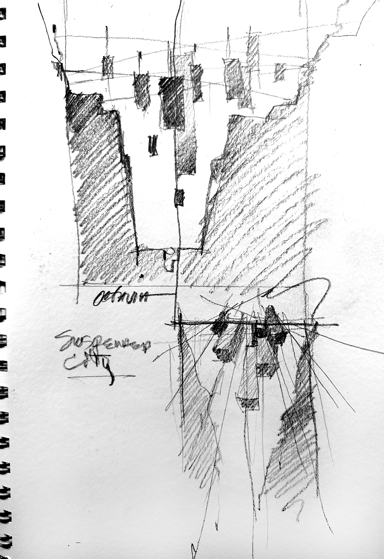
Preliminary sketch for the winner entry courtesy of the artist

HF: You trained as an architect but now have a successful international career as an architectural watercolor artist and author. How do you think the medium itself contributes to the scenes that you depict — in particular, in your winning entry?

TS: In my earlier days, I felt that I had to choose between my wish to become a visual artist and my desire to become an architect. In time, I became both, but my career interests operated on separate tracks, divided by an arbitrary and faulty belief that each had separate aims. It has taken many years for me to understand that these interests,  as well as many others, could be successfully merged into a single creative energy. The key to this for me was in realizing that all things — all ideas, all people, all places, all atmosphere and negative space itself has a kind of architecture. There is a shape and a volume to everything seen and unseen, real or simply imagined. And so anything can be studied, modeled and drawn. If I concentrate on drawing what I “see” rather than what I “look at” — drawing genuine emotional experiences rather than simple visual observations, the landscapes for creativity become boundless.

HF: Your winning entry was inspired by Italo Calvino’s classic, Invisible Cities. Are your other architectural paintings and drawings as conceptual as “Octavia – Suspended City”?

TS: Repeat readings of Invisible Cities helped me to form the cornerstone of what would become my “artistic voice”. I am more aware of contrasts than anything else as I move through the world. By that I mean of course the clash of dark and light, but also ideas about what is real or simply imagined, the man-made and the natural environments, warm and cool tonalities, vertical, horizontal, and diagonal energies, and thoughts about time — what is past, present, or yet to be.

As polarities meet and find some kind of resolution — or not — this is what my work is always about, trying to find a resolution on paper of two or more things in opposition. And so yes, such conceptual work is exactly what I have been long most interested in exploring.

HF: What first drew you to watercolor as a medium for depicting the built environment?

TS: As a choice of medium, watercolor is a perfect fit for me. It has the ability to be either very precise or completely abstract, controlled or wild. The use of watercolor is a study in edges: hard and explicit, or soft and ephemeral. Watercolors can at once be subtle and suggestive or bold and explicit.

I think of watercolor too as a “subtractive” process in that we begin with a piece of white paper, 100% in light. And we proceed to subtract away some of this light as we go. The transparent nature of watercolor enhances our potential to study light. And in the end, the parts of our work that are not painted can be as powerful and full of meaning as those which are painted.

And the connection to drawing itself cannot be ignored. I actually consider what I do with watercolor as drawing, but I draw with shapes of value and tone rather than with lines.

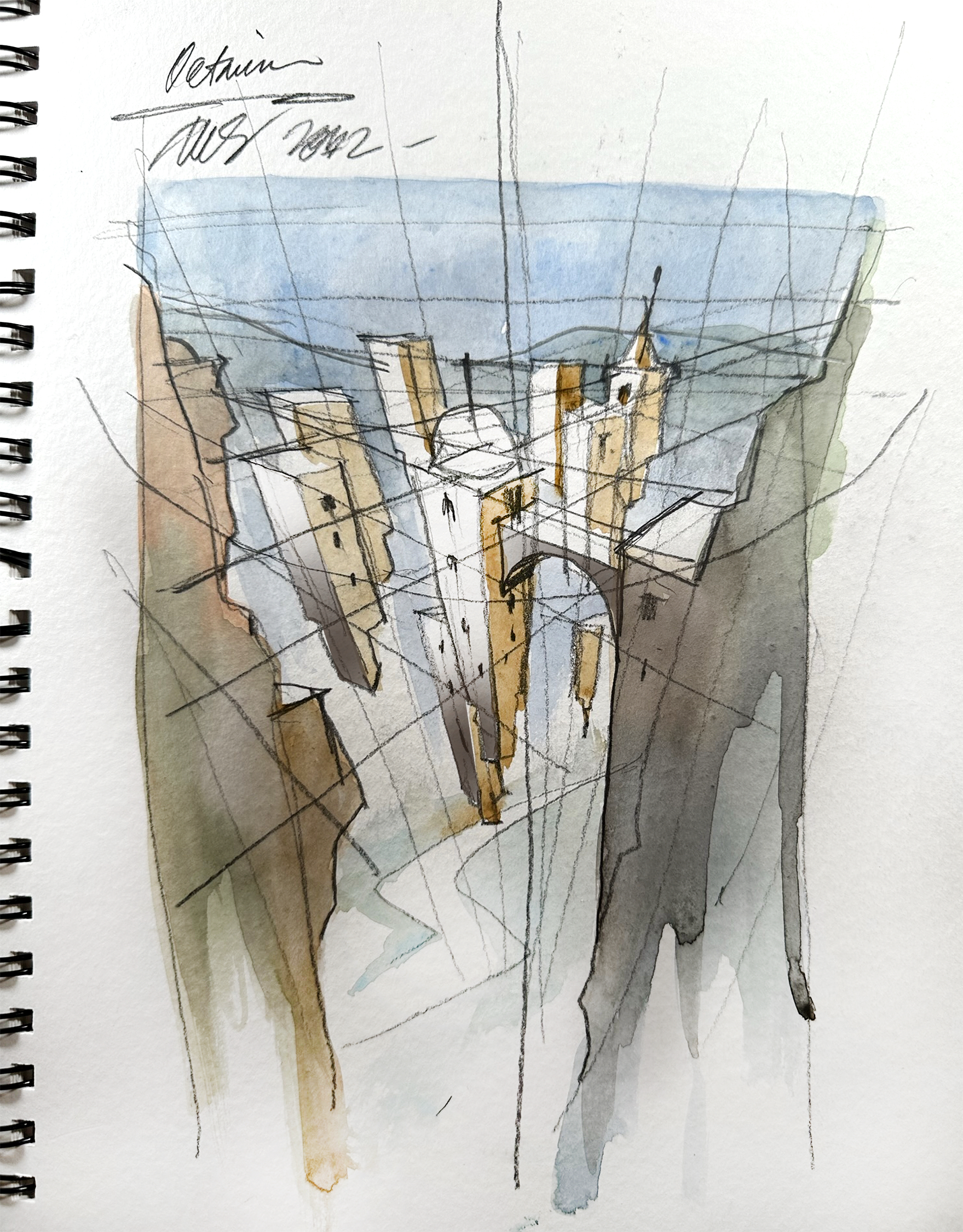
Planning the concept and colors for the winner entry, image courtesy of the artist

HF: My next question is somewhat related to the preceding one: How did the process and workflow of creating your drawing compare to traditional architectural drafting?

TS: As stated, watercolor is a form of drawing to me. But rather than depicting ideas of space and form with a line, we do so by using shapes of tone and value, shadow and light, and color. But line-based sketching and more precise architectural drawing are always an element in what I do as well. These are time-honored and beautiful means of expression which I hope never to abandon. In my work, I try to merge the precise with the suggested, the implied with the stated, and so while I wander quite far from my more precise architectural roots, they are always there as a kind of north star shading any wild flights of fancy with at least a note of plausibility.

HF: What one tip would you give the other participants looking to win next year’s One Drawing Challenge?

TS: Oh my … “ advice”. I always say that the best advice I have is to take very little advice. This is a glib non-answer I realize but there’s something in it. What I mean is that as we all try to improve and advance in our careers and our own sense of achievement, it becomes all-too easy to compare our work or measure ourselves against our colleagues or others whose work we admire. This is natural, but should be avoided as much as possible.

I am nowhere near the artist I hope to be some day, but I only started to make noticeable improvements when I trained my ego to be a bit more self-reliant and less “noisy”. It’s too easy to live on social media and if we succumb to the flattery or the uninformed critiques we hear online, we are doomed. I think we should take any feedback onboard, process it quickly and move past it.

Genuinely, I celebrate the accomplishments of my colleagues. But I understand that another’s win does not equal my loss. And anything I might achieve does not diminish any other’s work. While you can never draw or paint like anyone else, neither can anyone else draw or paint like you.

And so rather than by seeing the world always by looking outward, spend as much time exploring the worlds you see by looking inward. And listen. There is your voice telling you what you need to do and where you need to go. We already have within us all we need to do most anything we wish to do. So if we trust that voice and learn to hear it more clearly, it will lead us in the direction we should be traveling.


Interested in seeing more work by Thomas Schaller Fine Art? Peruse his portfolio and connect with the artist through your preferred channel:

> www.thomaswschaller.com
> www.facebook.com/thomaswschaller
> www.twitter.com/twschaller
> www.instagram.com/thomaswschaller

The winners of Architizer’s Fourth Annual One Drawing Challenge have been revealed! Interested in next year’s program? Subscribe to our newsletter for updates. 


Reference

Design Museum exhibition explores “surrealism and why it matters now”
CategoriesInterior Design

Design Museum exhibition explores “surrealism and why it matters now”

Curator Kathryn Johnson explains the story behind surrealism and its impact on design in this video Dezeen produced for the Design Museum about its latest exhibition.

Titled Objects of Desire: Surrealism and Design 1924 – Today, the exhibition features almost 350 surrealist objects spanning fashion, furniture and film.

The exhibition, which was curated by Johnson, explores the conception of the surrealist movement in the 1920s and the impact it has had on the design world ever since.

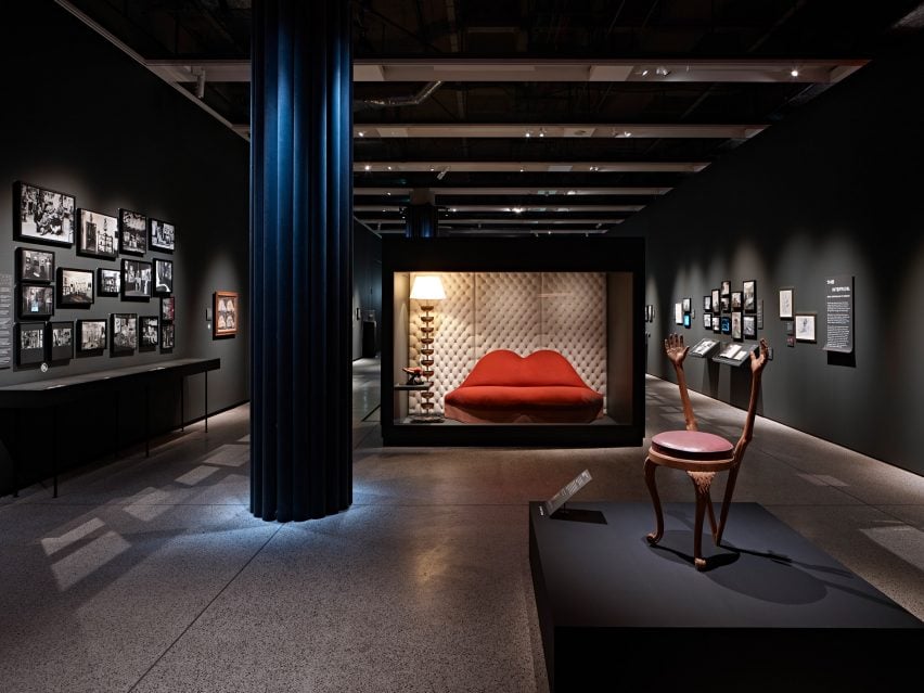
Salvador Dalí's Mae West Lips sofa on display in the exhibition
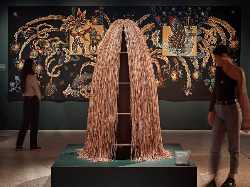
The exhibition features nearly 350 pieces of art, design, photography, fashion and film

It features some of the most recognised surrealist paintings and sculptures, including pieces by Salvador Dalí, Man Ray and Leonora Carrington, as well as work from contemporary artists and designers such as Dior and Björk.

“Surrealism was born out of the horrors of the first world war, in a period of conflict and uncertainty, and it was a creative response to that chaos,” Johnson said in the video.

“It saw in the fracturing of the world an opportunity to shake things up, to do things differently, to think differently, and to acknowledge the subconscious and its importance for our everyday lives.”

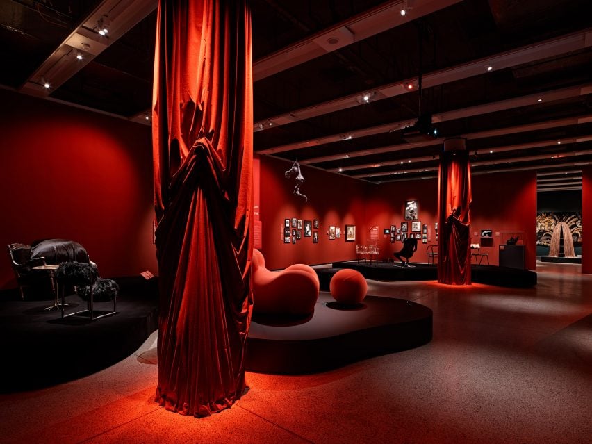
Chairs, sofas, red curtains and other objects displayed within the exhibition
The exhibition explores the beginnings of the surrealist movement in the 1920s

The exhibition explores surrealism’s impact on contemporary design, with nearly a third of the objects on show dating from the past 50 years.

“We want to start a conversation about what surrealism is and why it matters now,” Johnson said.

The name of the exhibition references the importance of the concept of desire within the movement. In the video, Johnson explained that the surrealist movement began with poetry, with French poet and author André Breton penning the first surrealist manifesto.

Breton described desire as “being the sole motivating force in the world” and “the only master humans should recognise.”

Visitors viewing surrealist artwork displayed in the exhibition
The exhibition’s name refers to the importance of the concept of desire within the movement

The exhibition is segmented into four themes. It begins with an introduction to surrealism from the 1920s and explores the influence of the movement on everyday objects, as well as its pivotal role in the evolution of design throughout the twentieth century.

Another part of the exhibition explores surrealism and interior design, since early protagonists of the movement were interested in capturing the aura or mystery of everyday household objects.

Objects on display include Marcel Duchamp’s Porte-Bouteilles, a sculpture made from bottle racks, and Man Ray’s Cadeau/Audace, a traditional flat iron with a single row of 14 nails.

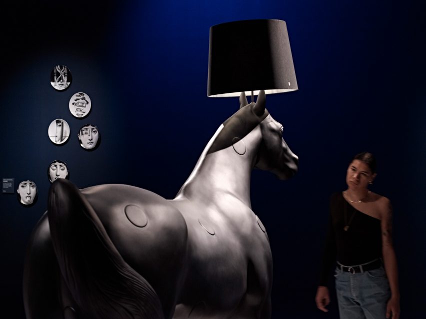
Close up of the Horse Lamp created by design studio Front in the exhibition
Early surrealists were interested in capturing the mystery of ordinary household objects

The exhibition moves along to the 1940s, where designers started using surrealist art for ideas to create surprising and humorous objects. Items borne from this include Sella by Achille and Pier Giacomo Castiglioni and Jasper Morrison’s Handlebar Table.

A key section of the exhibition includes a spotlight on surrealism’s significance in the UK, documenting the partnership between Salvador Dalí and the British poet and art patron Edward James, whose collaboration resulted in some of the most notable works of surrealism such as the Mae West Lips sofas and the Lobster Telephone.

Salvador Dalí's Lobster Telephone
The exhibition features a number of pieces by Dalí including the Lobster Telephone

Another section of the exhibition examines surrealism and the body in relation to the human form, sexuality and desire.

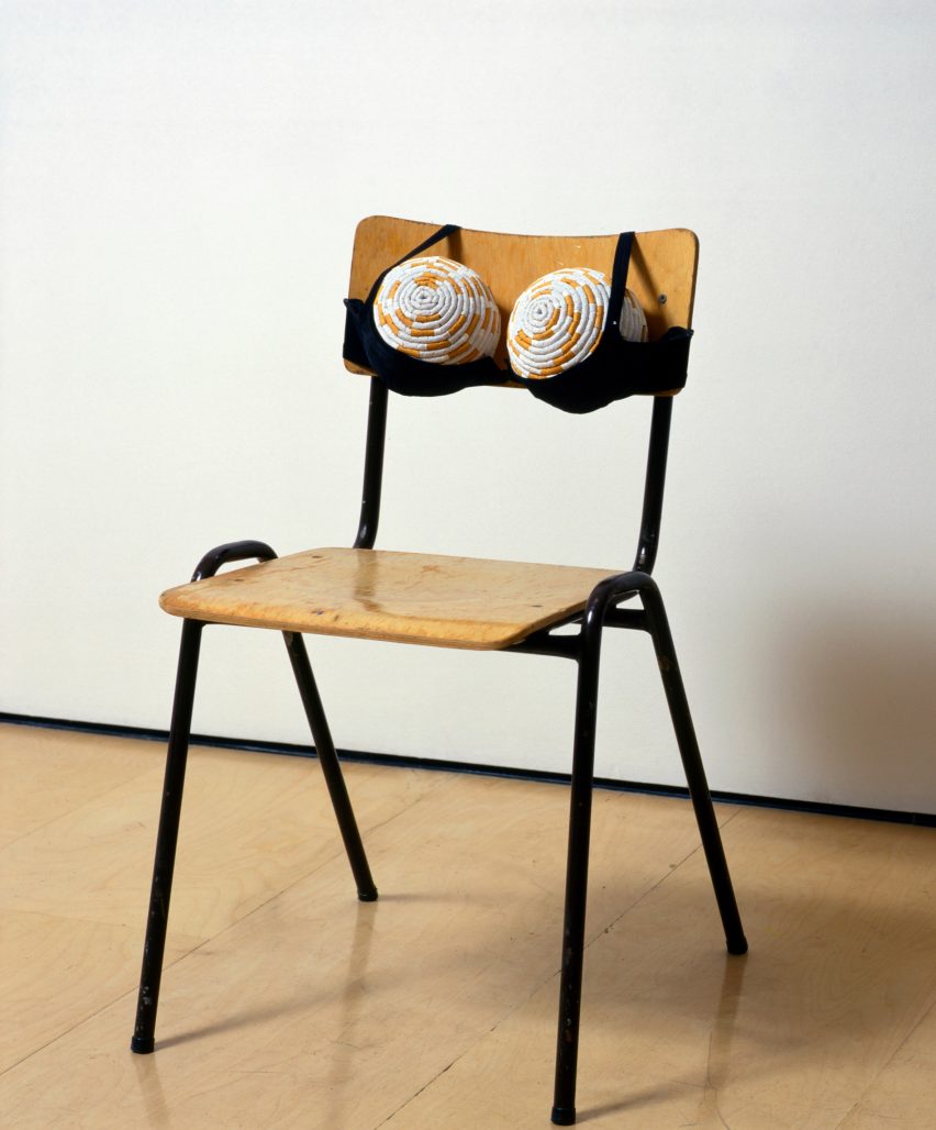
Included in this section are Sarah Lucas’ Cigarette Tits, in which the language of tabloids is used to expose stereotypes of female sexuality, and Najla el Zein’s Hay, which highlights the sensory pleasures provided by everyday materials.

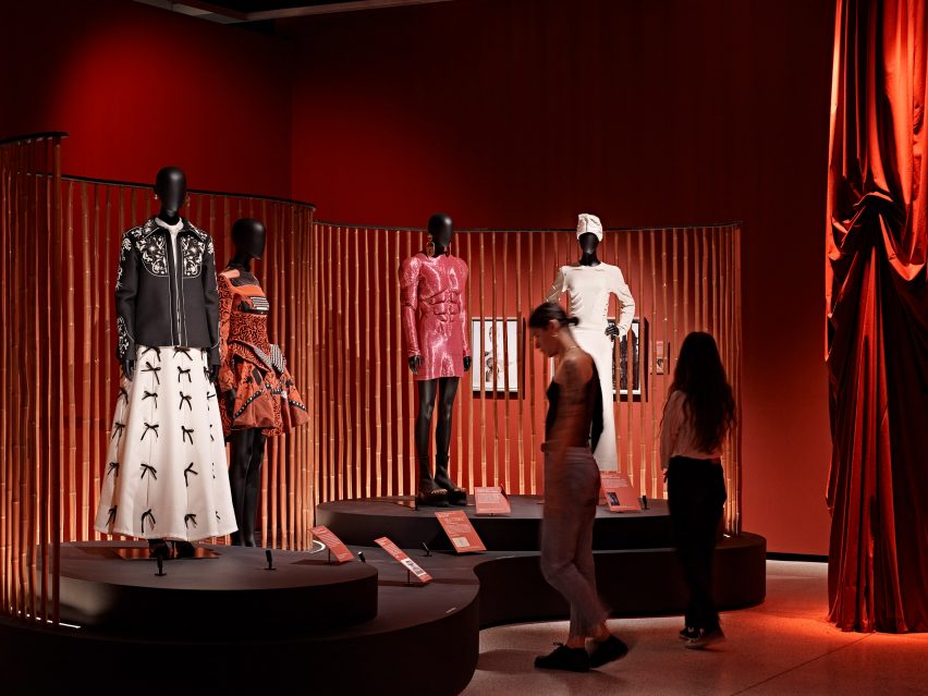
Photographs, vintage magazine covers and fashion items are on display to show the impact of surrealism on the fashion industry starting from the 1930s.

Visitors looking at four mannequins wearing fashion inspired by surrealism
The exhibition features fashion and objects exploring the human form, sexuality and desire

According to Johnson, “surrealism attracted more women than any other movement since romanticism.” As a result, she wanted to ensure there was a wide representation of female artists and designers in the exhibition.

“I think that was partly because of concerns about the body, about sexuality, and how the domestic were key themes of surrealism from the beginning,” she said.

“But those themes were approached in a very original and critical way by the women associated with the movement – some of whom would not have considered themselves surrealists but were in dialogue with those ideas.”

A chair with a bra upholstered to the backrest
Surrealism attracted more women than any other movement since romanticism, according to Johnson

The final section of the exhibition looks at the surrealist preoccupation with challenging the creative process itself and how this resulted in original works of art and design.

According to Johnson, contemporary designers are still using ideas from early surrealism, such as welcoming chance into the creative process, or using techniques like automatism.

“The surrealists try to write and draw without thinking, and we see in the exhibitions and studies where they are drawing in an automatic way. But now, of course, contemporary designers have other tools to use to try and bypass the known and the conventional,” Johnson said.

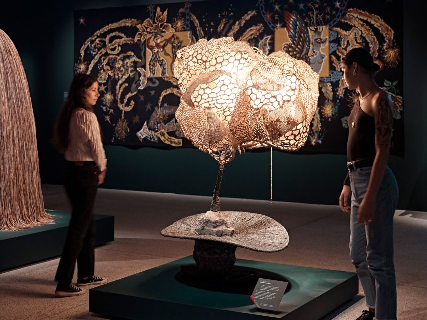
Visitors looking at a surrealist light sculpture
The exhibition is on show at the Design Museum until 19 February 2023

An example of this in the exhibition is Sketch Chair by design studio Front, which was produced using motion capture technology to translate the movement of drawing in mid-air into a 3D-printed form.

“The surrealists knew that changing the mind would change the material world and we’re now at this frightening but thrilling juncture where we’re creating a computerised intelligence that can be creative,” Johnson said.

Objects of Desire: Surrealism and Design 1924 – Today opened at the Design Museum on 14 October 2022 and is on show until 19 February 2o23.

Tickets are available at designmuseum.org/surrealism.

Partnership content

This video was produced by Dezeen for Design Museum as part of a partnership. Find out more about Dezeen’s partnership content here.

Reference

Tallinn Architecture Biennale explores food “literally and metaphorically”
CategoriesSustainable News

Tallinn Architecture Biennale explores food “literally and metaphorically”

An edible building envelope and curved mycelium bricks feature in the curatorial exhibition at this year’s Tallinn Architecture Biennale in Estonia, which explores the future of architecture through the lens of food.

Named Edible; Or, the Architecture of Metabolism, the exhibition physically and metaphorically investigates the relationship between architecture and food at varying scales.

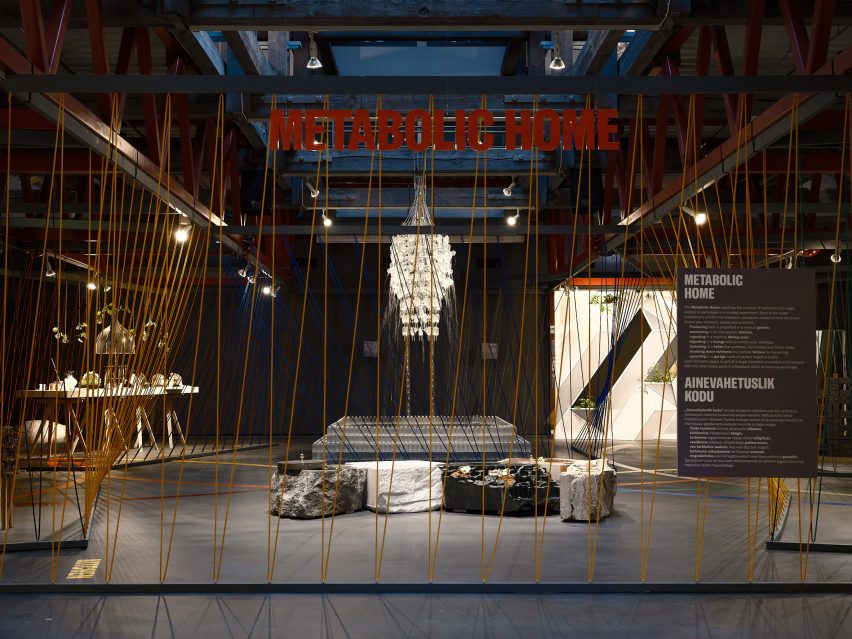
The Metabolic Home installation at Tallinn Architecture Biennale
The curational exhibition has opened at Tallinn Architecture Biennale

It was opened to the public on 7 September at the Museum of Estonian Architecture in Tallinn, marking the beginning of Tallinn Architecture Biennale‘s (TAB) sixth edition.

Curated by architects and academics Lydia Kallipoliti and Areti Markopoulou, it responds to this year’s theme, which also goes by the title Edible; Or, the Architecture of Metabolism.

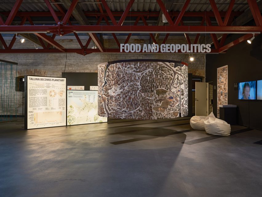
Geopolitics exhibit at Edible; Or, the Architecture of Metabolism
It explores the architecture through the lens of food

The curational exhibition is divided into four sections over two floors, with installations by designers, architects and scientists.

They examine everything from how natural processes such as consumption, growth and decay can be transferred to the built environment, to how we design our global food production networks and infrastructure.

“We’re approaching the notion of food both literally and metaphorically,” Kallipoliti told Dezeen during a tour of the exhibition.

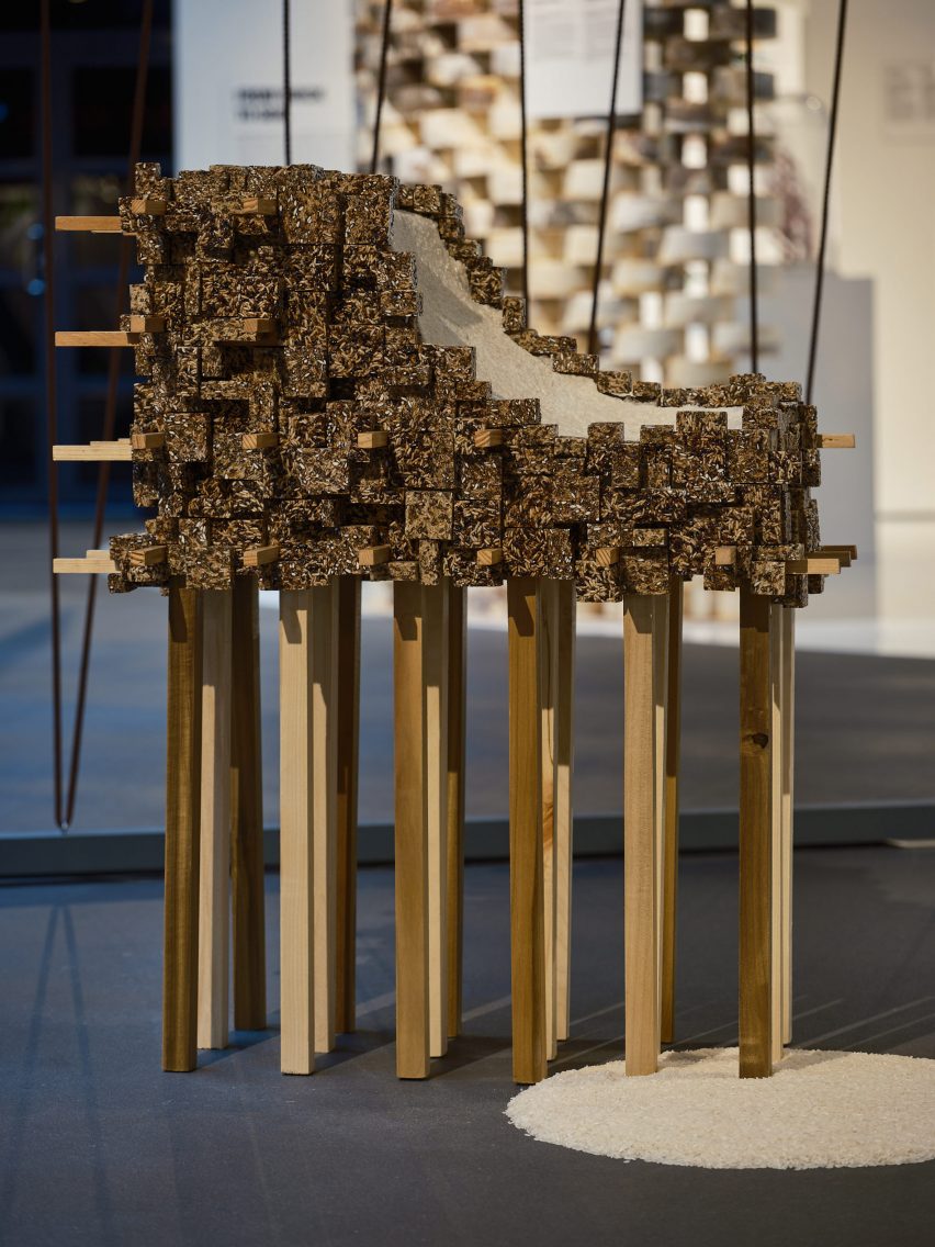
edible facade prototype at TAB 2022
Among the featured products are an edible facade prototype

While some of the installations are conceptual, the curators highlighted that others are available for use now to help the architecture industry and built environment become more sustainable.

“Through these interrogations in different projects, [we] explore how architecture can extract less resources and become a kind of major factor of decarbonisation,” Kallipoliti added.

“We think of everything as real and possible for implementation very quickly. It’s not the technology that is unavailable, it is really about changing the way that we think and operate.”

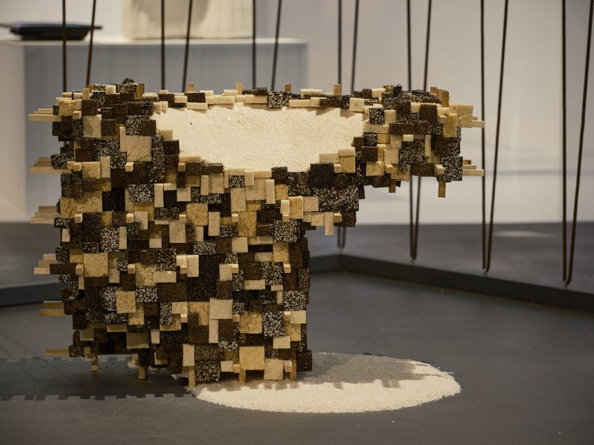
Edible Puffed Rice Clusters prototype
The Edible Puffed Rice Clusters are designed to attract biodiversity to urban areas

One of the four sections, which also forms the centrepiece of the exhibition, is named the Metabolic Home.

Here, curators Kallipoliti and Markopoulou have brought together seven different exhibits that each represents a domestic space, staged as part of a “living ecosystem”.

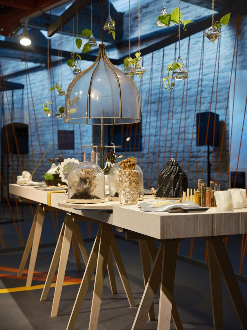
Immersive dining table prototype at Tallinn Architecture Biennale
One exhibit reimagines the traditional dining table

Highlights include the “living room”, where an edible and biodegradable building envelope designed by architecture research group Terreform One is displayed.

Named the Edible Puffed Rice Clusters, the pixelated-looking panels are formed from puffed rice. They are intended as a low-cost building material that can be used as a building facade that small mammals, insects and birds can consume.

Cookware by Hayley Eber and Mae-Ling Lokko
It features cutlery designed to slot on a user’s fingers

Backed with insulating foam backing and easily replaced, the aim is for these panels to attract different organisms and help boost biodiversity in urban areas.

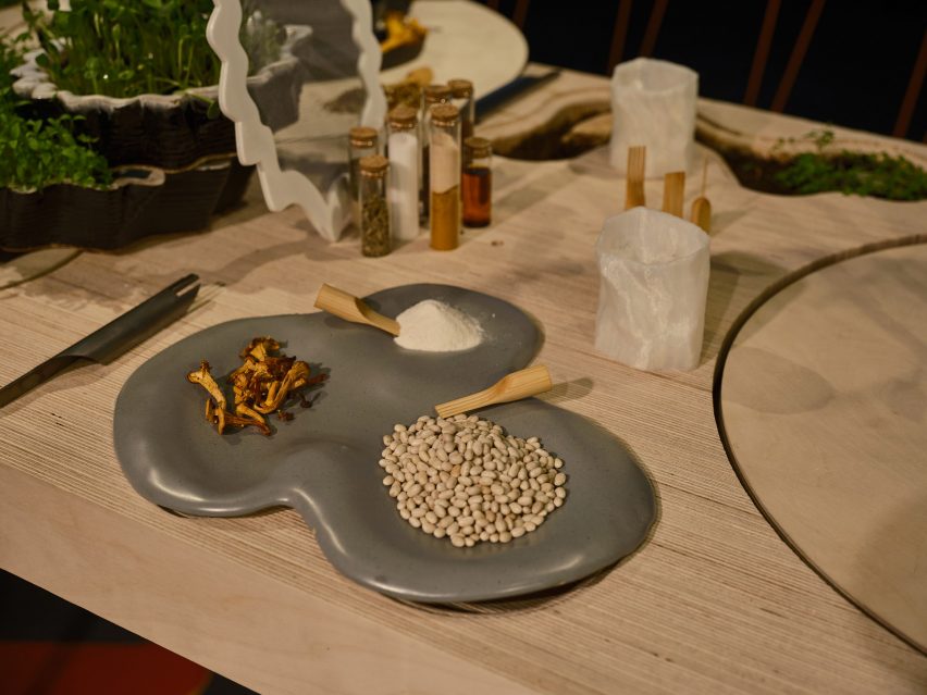
Opposite the panels is an installation that represents a dining room. It reimagines the traditional banquet table as a platform for diners to engage with the food production process.

Everything's On the Table at TAB 2022
A table was designed to encourage diners to engage in the food production process

Named Everything’s On the Table, it features unusual cutlery that slots onto users’ fingers and amorphous and immersive cookware developed by Hayley Eber and Mae-Ling Lokko.

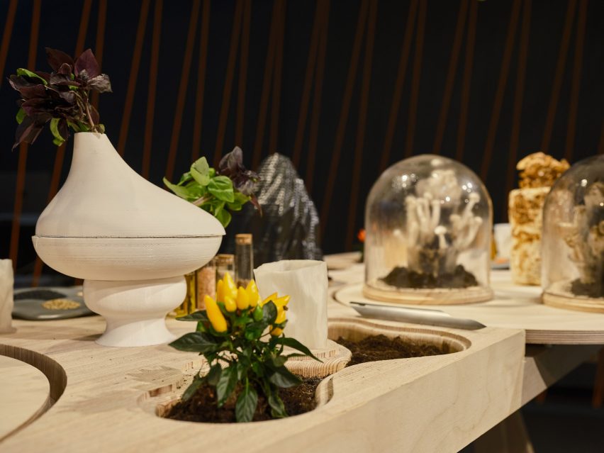
The prototype table itself incorporates planters while hanging overhead are test tubes and vessels intended for users to harvest and cultivate their own food and waste.

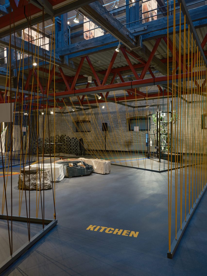
Interior of the Museum of Estonian Architecture during TAB 2022
The centrepiece of the exhibition is the Metabolic Home

Other standout exhibits in the show include those in the From Bricks to Soil section, which displays a number of building material prototypes that are compostable, some even edible.

This includes curved bricks that design studio Myceen has crafted from mushroom mycelium – a biodegradable fungal material. Beside them, a glass chamber lined with condensation conceals a growing mushroom that will one day be turned into one of these blocks, demonstrating the production process.

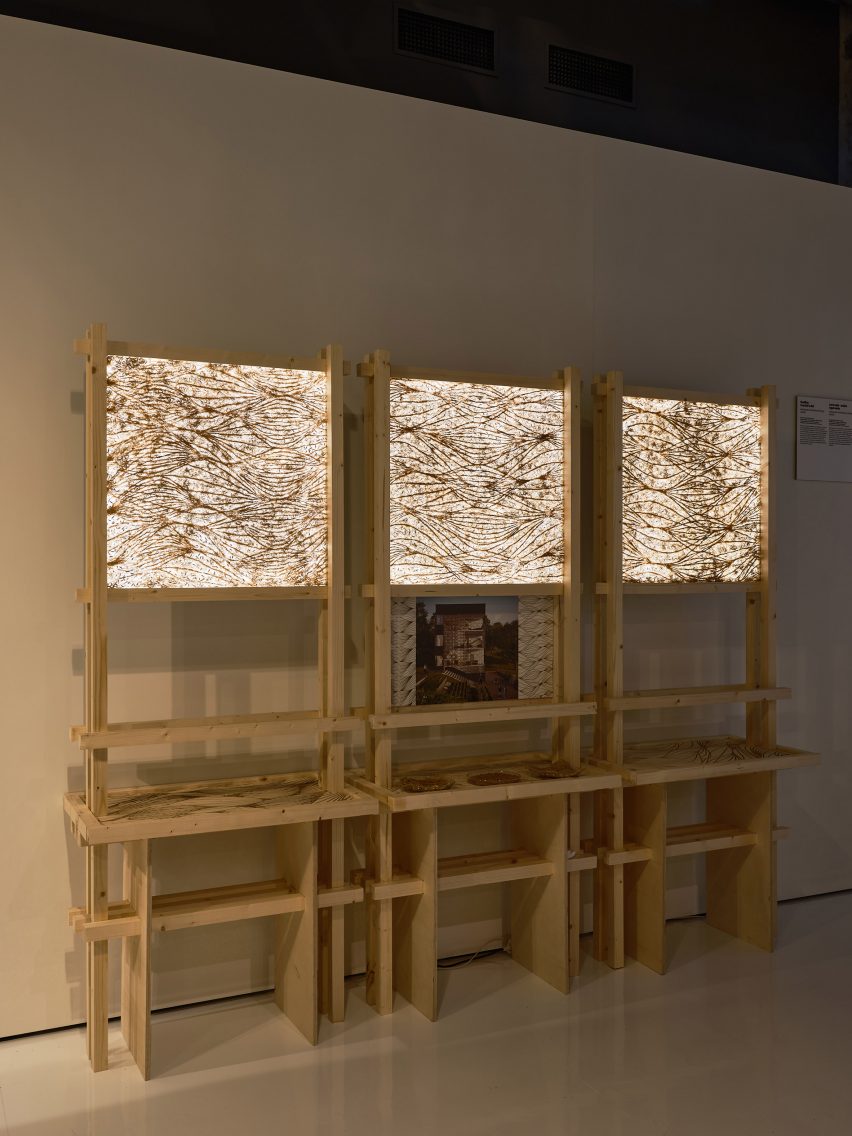
Rootskin panels
Rootskin is a building material made from vegetable roots

Beside these bricks are a series of ornate panels of Rootskin, a product developed by researchers at IAAC using robotics and vegetable roots that is hoped to one day be used as a building material.

In this section, visitors to the exhibition can also see fish swarming around a Yfaloid – an artificial reef prototype that Topotheque Design Research Studio has immersed in a fish tank for the purpose of the exhibition.

The Yfaloid structures are cast from concrete using digital fabrication and vary in size and complexity. The idea is that they mimic natural coral environments and can be used in areas with damaged reef ecosystems to encourage sea life to thrive again.

According to Markopoulou, the exhibition is hoped to encourage action from the general public and policymakers as well as creatives.

Mycelium bricks and vessel containing growing mushrooms
Mycelium bricks by Myceen are on display

“We believe that we are now at a critical moment and that there is not much time for anybody to just think about it and discuss it, we really need to act,” Markopoulou told Dezeen during the opening.

“We hope that some of this work raises awareness to everybody. We don’t want to speak only to the design community, we want to involve decision makers, we want to involve citizens being individuals, the industry, and we hope that this would actually open up possibilities of how certain things could be done differently in our urban environments and in our built environment.”

Yfaloid artificial reef prototype
Topotheque Design Research Studio is exhibiting its artificial reef prototype Yfaloid

Outside of the Museum of Estonian Architecture, a pavilion has also been installed as part of this year’s TAB that was developed in line with this year’s theme.

Named Fungible Non-Fungible Pavilion, the pavilion was built by studio Iheartblob from physical versions of NFT objects that were minted by the community. It is intended to promote the ideas of decentralisation and slowness in architecture.

Tallinn Architecture Biennale takes place from 7 September to 20 November 2022 at various locations across Tallinn, Estonia. See Dezeen Events Guide for an up-to-date list of architecture and design events taking place around the world.

The photography is by Tõnu Tunnel.

Reference