Proctor & Shaw design London home extension with zinc roof
CategoriesArchitecture

Proctor & Shaw tops London home extension with serrated zinc roof

Proctor & Shaw design London home extension with zinc roof

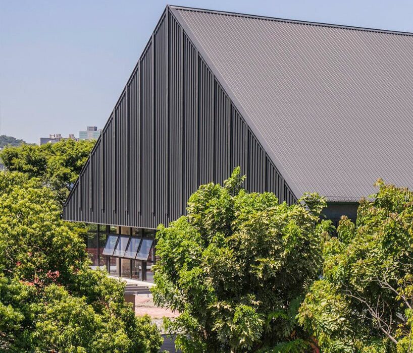
Architecture studio Proctor & Shaw has topped a home extension with a steeply-angled roof clad with red pigmented zinc in East Dulwich, London.

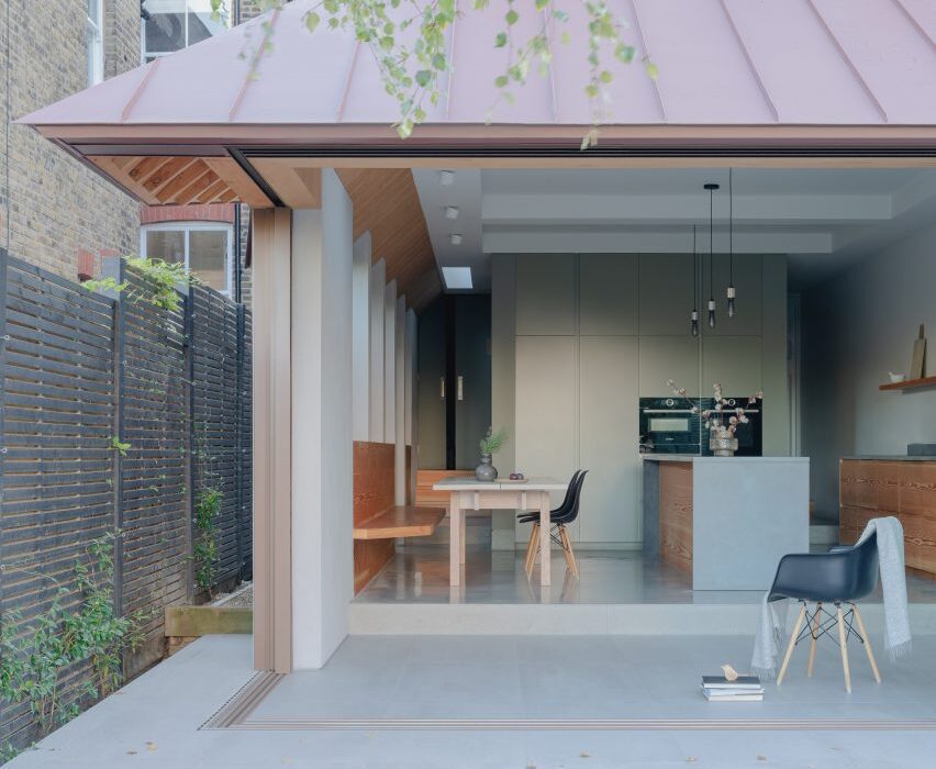
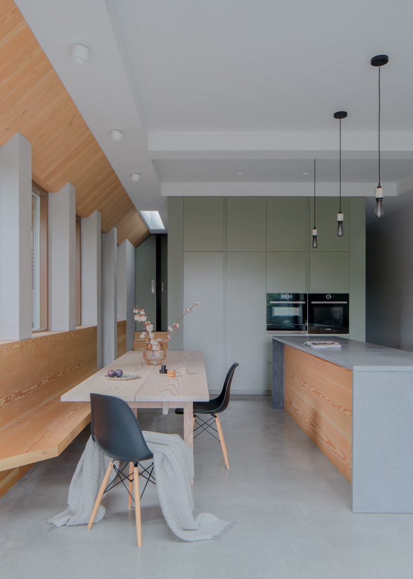
Home to a family of seven, Proctor & Shaw designed the project as an extension to an existing Edwardian house, extending the ground-floor kitchen and dining room.

Proctor & Shaw design London home extension with zinc roofProctor & Shaw design London home extension with zinc roof
Proctor & Shaw has designed a serrated roof edge for a London home extension

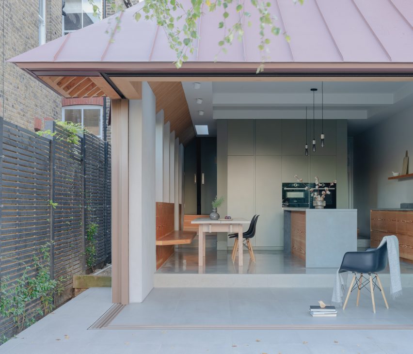
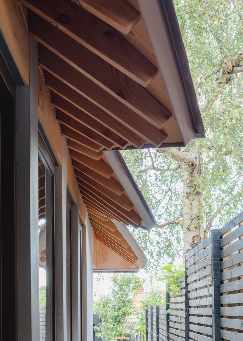
In order to restrict potential onlooking from neighbours, the studio crafted a unique serrated-edged roof with exposed rafter tails to run alongside the extension – enhancing both privacy and daylight access.

“From the side, the serrated edge blocks oblique views from the principal first-floor neighbouring windows,” Proctor & Shaw director John Proctor told Dezeen. “It is designed to be pulled back (with the shortest overhang) at the mid-window point to allow the maximum amount of light directly from above.”

Serrated roof edge designed for Edwardian house extensionSerrated roof edge designed for Edwardian house extension
The unique roof design features exposed rafter tails lined with Douglas fir

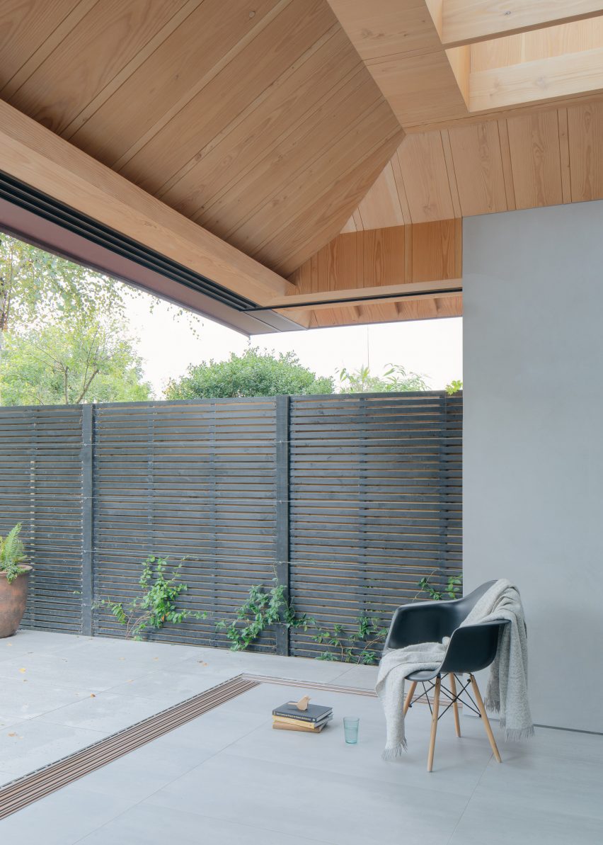
A newly built porcelain-tiled living space sits adjacent to the kitchen and dining room and is also sheltered by the roof’s large overhangs.

Deep skylights punctured into the roof draw daylight into the space below, while sliding doors seamlessly connect the interior with an outdoor patio.

View from newly built living space in London home extensionView from newly built living space in London home extension
Deep skylights draw daylight into the newly built living space

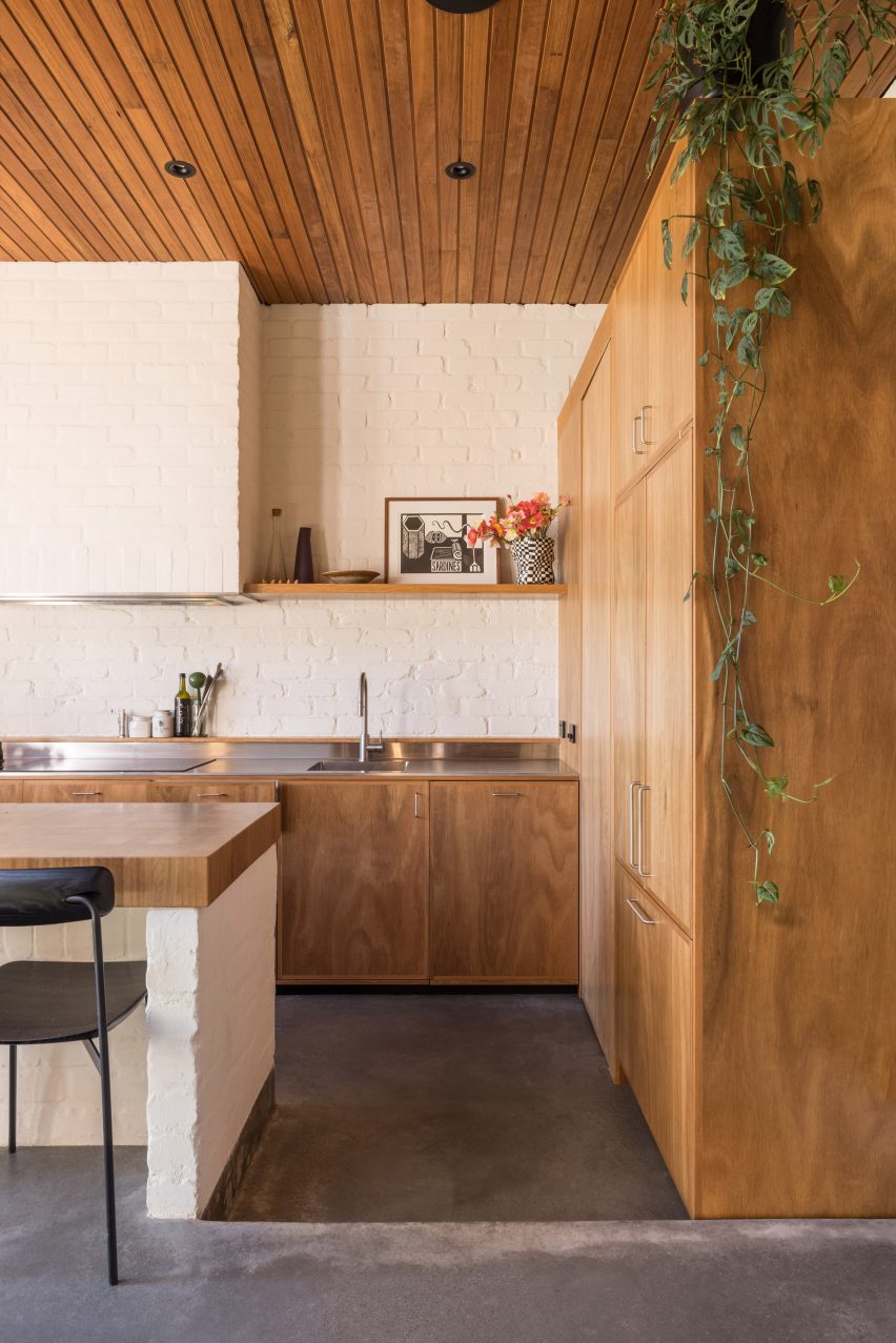
The interior space is defined by kitchen units and seating lined with warm-toned Douglas fir, which are contrasted by cool-toned concrete flooring and countertops.

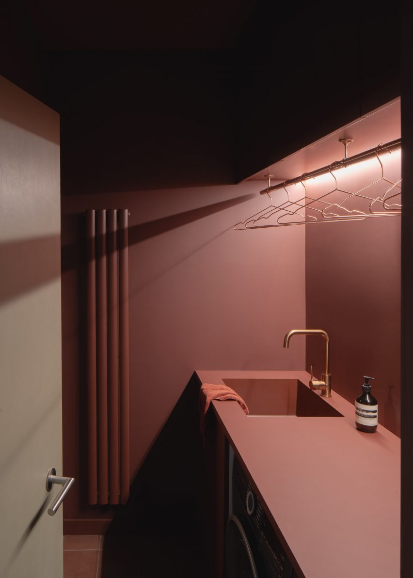
A centralised services unit nestled behind the kitchen provides a bathroom and utility space defined by bold, pink-hued walls and matching floor tiles.

Built into a sloping site, level changes pose as thresholds – dividing the open-plan interior and exterior spaces.

Externally, metal steps lead down to the landscaped garden, which comprises a paved outdoor kitchen, seating area and outbuilding, designed in collaboration with Barbara Samitier Garden Design.

London home extension with Douglas fir interiorLondon home extension with Douglas fir interior
The kitchen and dining room have a largely concrete and wooden interior

According to the studio, drainage from the gutter-less zinc roof, as well as the home’s existing pitched roof, is provided at ground level to allow for a finely detailed roof edge.

“[The gutter-less roof] required careful navigation of regulatory requirements for rainwater drainage, which was ultimately achieved with the side roofs being kept small,” Proctor said.

Services unit within Proctor & Shaw's home extensionServices unit within Proctor & Shaw's home extension
The services unit is defined by bold-coloured walls

Other London home extensions completed by Proctor & Shaw include a glazed extension added to Sky Lantern House and a micro-apartment with a translucent “sleeping cocoon”.

The photography is by Nick Deardon.


Project credits:

Architect and interior designer: Proctor & Shaw
Structural engineer: Constant Structural Design
Landscape designer: Barbara Samitier Landscape and Garden Design
Contractor: R & D Nunes (trading as Yorkland Stone)
Building control: Cook Brown Buildings Control Ltd

Reference

Exterior of Larch Loft extension
CategoriesInterior Design

Whittaker Parsons crowns London mews house with “bolthole” extension

Exterior of Larch Loft extension

Using a combination of copper, larch and structural insulated panels, architecture firm Whittaker Parsons has added an additional storey to a contemporary mews house in Stoke Newington to house a bedroom suite.

Originally built in 2005, the property belongs to a couple with two older children, who have lived here for the last decade.

Exterior of Larch Loft extension
Whittaker Parsons added an additional storey to a London mews house

The family asked Whittaker Parsons to provide more space with the addition of a loft, as well as to revamp the lower floors including the studio on the second floor, which was reconfigured to create a well-proportioned workspace complete with its own library.

Daylight floods the new third storey, bouncing off lime-plastered walls while carefully positioned windows provide views of tree canopies and across rear gardens from window seats and the bespoke bed.

“We set out to design a beautiful, healthy, serene retreat, in which the homeowners could immerse themselves in the beauty of natural materials, a bolthole in the middle of north London,” Whittaker Parsons told Dezeen.

Larch staircase leading up to Larch Loft extension in London
The extension is accessed via a larch-clad staircase

With efficiency and quality in mind, the studio used prefabricated structural insulated panels (SIPs) to construct the additional storey, with the aim of minimising waste and saving time.

“Compared to standard timber construction, it is simpler to control the quality of onsite workmanship and achieve a more robust, air-tight building envelope,” the team explained.

Larch Loft extension in London by Whittaker Parsons
Generous windows provide views of the surrounding area

Externally, the extension is set back from the street elevation and finished in materials that mirror the surrounding architecture, including black-stained timber cladding, brick slips and patinated copper to tie in with the copper facade on the second floor below.

Internally, the triangular arrangement of the larch beams was developed to work with the load path of the existing building and the irregular form of the loft.

“The intention was to make visible and celebrate the structural effort that went into creating this new space,” Whittaker Parsons explained.

Man sitting on window seat of London extension by Whittaker Parsons
Integrated window seats provide a place to rest

The practice created a tranquil master bedroom with a larch-clad and lime-rendered interior, bespoke larch bed frame and walk-in wardrobe made from low-formaldehyde furniture board.

As the unsealed lime plaster wall finish cures, the lime will absorb almost as much carbon as was emitted in its production, the studio claims.

“Lime render is a calming tactile material, characterful and soft,” said Whittaker Parsons. “It is a low-carbon alternative to gypsum plaster. It’s also a hygroscopic material, so it naturally moderates the moisture level in the bedroom.”

Used alongside the render, white oiled larch panelling spans the spaces between the exposed larch beams, improving acoustic absorption.

“Often in bedrooms, the ceiling is the most important yet neglected surface,” the studio said. “The larch adds a sense of warmth, calm, and character to the space, creating an articulated ceiling at the top of the house – almost a reward for climbing all those stairs.”

Custom larch bed by Whittaker Parsons
Whittaker Parsons also created a custom larch-wood bed for the interior

In the adjoining skylit shower room, fluted travertine tiles line the walls, enveloping the shower area and complementing the travertine floor tiles.

“The roof light to the shower oversails the fluted travertine tiles, creating the impression that one is showering outside under the sky,” said Whittaker Parsons.

The basin, splashback and vanity unit are formed from unsealed Calacatta Rosato marble, which according to the studio provides a lower-carbon alternative to fired tiles.

Marble bathroom in Larch Loft extension
The vanity in the adjoining bathroom is formed from Calacatta Rosato marble

Overall, Whittaker Parsons says the project is “exceptionally low-carbon”, with the bulk of its embodied emissions coming from the triple glazing, thermal insulation and a single steel beam used to create the opening for the staircase.

Founded by Matthew Whittaker and Camilla Parsons in 2015, Whittaker Parsons has completed a number of projects in the British capital including The Naked House, which was longlisted for sustainable interior of the year at the 2021 Dezeen Awards.

View from bathroom to bedroom in Larch Loft extension
The marble is paired with fluted travertine tiles

Other sustainably-minded extensions in London include Low Energy House in Muswell Hill, designed by local studio Architecture for London founder for its founder Ben Ridley.

The photography is by Jim Stephenson.

Reference

Photo of Cerveny Kostel
CategoriesArchitecture

Atelier-r refreshes neo-gothic church with angular black extension

Photo of Cerveny Kostel

Czech studio Atelier-r has refreshed the Red Church in Olomouc, the Czech Republic, adding an angular matte-black extension and public spaces informed by neo-gothic design.

The renovated church, along with the added black volume, holds an information centre and cafe as well as an events venue designed to host small concerts and exhibitions.

Photo of Cerveny Kostel
The church was extended by Atelier-r

Built in 1902, the original church was closed to the public and has been used as a private storage space for the library next to the site for the past sixty years.

Despite its poor condition, Atelier-r aimed to open up the listed building for public use, opting to partially reconstruct the church and add an extension that reflects the existing structure’s neo-gothic style.

Exterior photo of Cerveny Kostel
The extension is an angular structure

“The building itself was preserved as a whole but in a very poor condition,” studio founder Miroslav Pospíšil told Dezeen. “We had to do a complete makeover with maximum effort to retain the original elements.”

“We designed the renovation with deep respect to the neo-gothic atmosphere of the place,” he added. “First, it was necessary to strengthen the foundations, mend the damp and salty masonry, repair the stucco and plaster, and tidy up and fill the gaps in the facade cladding,

“The floors were a complete redo, including the layers all the way down to the terrain base.”

Photo of the library at Cerveny Kostel
The extension contains a library

Due to damaged trusses, the studio entirely reconstructed the roof of the church, cladding it in copper squares that resemble the concrete tiles of the original roof.

Modern decorative elements created by local sculptor Jan Dostal were added to the roof to replace the original damaged features.

Photo of the church
The extension connects directly to the 20th-century church

“The original roof was clad in asbestos cement tiles, but it is a very fragile material and most of them were damaged by falling ice from the church tower,” said Pospíšil.

“So we decided to use copper tiles of the same size as the original ones,” he continued. “Copper’s colour changes gradually to a dark grey colour, which will be very similar to asbestos cement tiles in a couple of years.”

Inside the church, exposed brick structural elements stand out against white walls, while a large ring-shaped lighting fixture is suspended over rows of chairs. A raised platform at the end of the building holds a sculptural arrangement of staggered bookshelves.

To hold additional spaces, including a reception and a cafe, Atelier-r added a new structure between the church and library, connecting it to both existing buildings with glazed walkways.

Photo of the interior
The shape of the extension was informed by the form of the church

Surrounded by a patio area with outdoor seating, the building features a roof and walls made from black aluminium and has an angular form informed by the geometry of the church.

“The crystal-like mass of the annex responds to the neo-Gothic form of the church; it derives from its geometric shape, volume, and layout, ” said Pospíšil. “The floor plan is a cut-out of the part of the church floor plan, only moved outside of the original platform.”

Interior image of the library
The interior has a pink concrete floor

Entering through a glass door set within walls of full-height glazing, guests are met by a double-height cafe and reception space finished with a pastel pink concrete floor.

To one side of the room, a tall accent wall featuring shelves filled with old books acts as the centrepiece of the space, while a glass lighting fixture by Lambert & Fils hangs over the dining tables.

Photo of a reception desk
A reception desk was constructed from pink concrete

“The elegant and minimalist glass elements float in the air, suspended on the nylon ropes high above the visitors’ heads,” said the studio. “If you look at them from specific angles, they reflect the houses in the street or the church.”

At the back of the space, a pink concrete reception desk reflects the angular form of the building and sits beneath a bespoke lighting feature that follows the shape of the desk.

Photo of Cerveny Kostel
The interior was designed in collaboration with Denisa Strmiskova Studio

Designed in collaboration with local interior design practice Denisa Strmiskova Studio, the interior spaces across the new and existing building feature chairs made from walnut wood, as well as coffee tables that draw upon the traditional design of the church.

A storage space branches from the main hall, featuring a wall of black lockers and a cloakroom set behind a blocky pink counter.

An additional accent wall of shelves is arranged around the large opening to the space, providing further storage for the old books from the library.

Photo of the church
The original rooms of the church were renovated

Other renovated churches recently featured on Dezeen include a cathedral in Manhattan that Ennead Architects has refreshed with a copper dome and a community hub added to a 19th-century church.

The photography is by BoysPlayNice.

Reference

Exterior of Victorian house in Melbourne
CategoriesArchitecture

Matt Gibson adds sculptural extension to Victorian Melbourne home

Exterior of Victorian house in Melbourne

Australian studio Matt Gibson Architecture + Design has transformed a Victorian home in Melbourne’s suburbs with a faceted extension clad in black metal.

Located in the suburb of South Yarra, the house on St Martins Lane has been expanded with a three-storey rear extension to better accommodate the needs of the family living there.

Exterior of Victorian house in Melbourne
Matt Gibson Architecture + Design has extended a Victorian home in Melbourne

The house occupies a long, thin site at the end of a row of Victorian terraces that are surrounded by low-rise warehouses and townhouses.

To preserve the heritage of the home, Matt Gibson Architecture + Design has retained several of its original elements including its street-facing Victorian facade.

Exterior of St Martins Lane extension in Melbourne by Matt Gibson Architecture + Design
It has a faceted form clad in black metal

“[The house is] a case study in vertical family living on a confined site,” explained the studio.

“[It addresses] issues of densification and growing population demand whilst adaptively reusing and retaining key heritage fabric.”

Faceted black extension to white-brick house
A new entrance has been created on the adjacent lane

As part of the project, Matt Gibson Architecture + Design shifted the home’s main entrance from the street edge to a cobbled lane that runs down the side of the plot.

This new entry point sits towards the centre of the site and is marked internally with a glazed stair that bridges the existing house to the sculptural extension.

Monochrome kitchen by Matt Gibson Architecture + Design
The old part of the house has been updated with a new kitchen

“The stair has full view of the laneway, activating it and providing a level of security and community connection,” said Matt Gibson Architecture + Design.

The placement of this staircase also divides the home into two wings – one old and one new.

Inside, the old part of the house has been updated with a new kitchen and a main bedroom suite, while the extension contains a living space, two bedrooms, a study and cascading terraces.

The two wings are distinguished externally by their contrasting material finishes, including white-painted brick and intricate wooden filigree on the old Victorian house, and the faceted black laser-cut metal facade of the extension.

Interior of St Martins Lane extension in Melbourne by Matt Gibson Architecture + Design
The extension contains the living space

Perforations in the metal make reference to the original architecture of the house and allow light and ventilation into the bedrooms while providing privacy.

A sliding gate reveals a path of mossy stones that lead from the cobbled lane to an enclosed porch of black metal and marble. The porch gives views through to the living space and garden beyond and contains a monolithic door that opens into a tiled hallway featuring the main staircase.

Enclosed garden
There are a series of outdoor spaces

The ground floor is given over to generous communal spaces. This includes a kitchen of blackened wood and dark marble in the old part of the house and a bright living room in the new wing with a sculptural concrete stair leading to a basement library.

Both the kitchen and living room are bookended by enclosed outdoor spaces with green borders.

Roof terrace in Melbourne
A rooftop deck crowns the home

On the upper floors of the home are the family’s bedrooms and the outdoor terraces overlooking the trees beyond the site. A warm wood-panelled stair from the second floor leads to a roof deck that crowns the extension.

“Through arranging the building vertically there is an increase in outdoor space coverage to now over 50 per cent of the site area,” said Gibson. “Previously [it was] 10 per cent.”

Matt Gibson Architecture + Design was founded in 2003. The studio has completed several other refurbishments and extensions across Melbourne, including a home with courtyards and glazed bridge and a redbrick extension with glazed undercroft.

The photography is by Shannon McGrath.

Reference

Open-plan kitchen and dining room with concrete flooring, wood kitchen island with seating and wood storage cupboards
CategoriesInterior Design

Emily Sandstrom builds Sydney home extension from recycled materials

Open-plan kitchen and dining room with concrete flooring, wood kitchen island with seating and wood storage cupboards

Australian architect Emily Sandstrom has transformed a run-down 1930s bungalow in Sydney by adding an extension that was partly built from demolition materials.

Sandstrom aimed to restore the home, which had been left untouched for decades, and celebrate its original features including picture rails and ceiling mouldings.

Open-plan kitchen and dining room with concrete flooring, wood kitchen island with seating and wood storage cupboards
The extension has a U shape with glass doors that let in light

The architect demolished a small rear kitchen, outhouse and sunroom and reused the bricks and materials from the demolition to construct a 45-square-metre U-shaped extension, which accommodates an open-plan kitchen and dining space.

Two large sliding glass doors open out to a courtyard and let natural light into the kitchen extension.

Rear garden of a bungalow with brick steps leading to a patio and home extension
Demolished bricks were reused to build the extension

The U-shaped extension and courtyard were designed to provide a connection between indoor and outdoor entertainment areas.

According to Sandstrom, concrete flooring and overhanging eaves help to passively heat the home in winter and cool it in summer. Solar panels were also added to the home, meaning no additional heating or cooling systems were needed.

Kitchen with concrete flooring, wood ceiling and a large kitchen island with seating
Sandstrom aimed to create a connection between indoor and outdoor entertainment spaces

“The U shape in combination with the wide and curved eaves provides passive heating to the home during the winter months and shade during the summer,” Sandstrom told Dezeen.

“This in combination with a concrete floor for thermal mass, double glazing and high windows located for cross ventilation, means there is no need for additional heating and cooling systems.”

A large island with a countertop made from recycled Australian hardwood is the focal point of the kitchen, where a step down in floor level separates the “work zone” on one side of the island from the rest of the room.

“The kitchen was a particular focus in the design, and a strong central point of the home,” said Sandstrom.

Kitchen with concrete flooring, white brick walls and wood cabinets
A change in floor level separates the kitchen from the dining space

Informed by Japanese design and bathing rituals, the bathroom features a sunken bathtub that sits below floor level.

Timber decking covers the floors and conceals the drainage points for an overhead shower. Glass sliding doors lead to a small garden with an additional outdoor shower.

“[The bathroom] was designed to achieve an atmosphere of calm and seclusion, and the design captures many different outlooks into the garden and directs the eye away from the less ideal views,” said Sandstrom.

Bathroom with sunken bath, blue tiled walls and a window overlooking a garden
The bathroom features a sunken bathtub that overlooks a garden

Throughout the home, the architect removed carpets to uncover the original floorboards and restored original features, including stained glass windows, ornate ceiling mouldings, dark timber doors, trims and architraves.

Newly added joinery was designed to preserve the home’s skirting boards, picture rails and ceiling mouldings, as well as maintain the original scale and layout of the rooms.

A bedroom with wood floors and dark timber window frames and picture rails
The home’s original features such as ceiling mouldings and picture rails were maintained

Other homes recently completed in Australia that have been featured on Dezeen include an oceanside residence in Sydney that was transformed to suit a family of five and a home in Melbourne with interiors finished in timber, terracotta and rich jewel tones.

The photography is by Rohan Venn.


Reference

triangular metal roof crowns elevated assembly hall in taiwan school campus extension
CategoriesArchitecture

triangular metal roof crowns elevated sports hall in taiwan school extension

triangular metal roof crowns elevated assembly hall in taiwan school campus extension

Office aaa attaches ‘Shui Yuan Assembly Hall’ in Taiwan school


Office aaa undertook the design of ‘Shui Yuan Assembly Hall’, a 2-story building on the north side of the campus in Hsinchu City, Taiwan. Occupying 1,894 sqm, the scheme hosts two badminton courts, a performance stage, and three multi-purpose classrooms. The site of the building is situated on the boundary line between Hsinchu City and the suburbs, surrounded by a picturesque landscape.


The design team raised the main building on colorful columns, thus creating a semi-outdoor playground below. This high-ceiling pilotis enables a smoother transition from the courtyard to the sports field, allowing for visual communication between the spaces. A vast triangular metal roof crowns the sports hall attachment, generating a generous space inside. triangular metal roof crowns elevated assembly hall in taiwan school campus extension

all images by Yu-Cheng Chao, unless stated otherwise


office aaa’s sports hall captures the picturesque surroundings 


The architects at office aaa sought to create a protected space that at the same time frames a sweeping view of the surrounding greenery. Thus, a large amount of glazing surrounds the building, forming a well-lit and protected arena. 

Construction-wise, the raised structure follows the original configuration of the school complex, connecting the yard directly to the main building through an external staircase. The stair is encased by a red mesh which visually matches a red A-shaped column at the corner of the building and adds some vibrant splashes to the otherwise muted palette. This column rises and penetrates the slab above, holding the roof in place.


‘The structural system and column spacing are optimized for the function of different spaces. The classrooms have small spans and are constructed with a simple concrete frame; the 2nd floor is a thick solid concrete slab with lattice beams to provide a bigger span lifting the stage and courts above; the big angled roof supported by slanted steel beams, the angle has been strategically designed to accommodate the flight path of badminton balls,’ explain the architects. The symbolic column, triangular roof, and red staircase become the key features of ‘Shui Yuan Assembly Hall’. 

 triangular metal roof crowns elevated assembly hall in taiwan school campus extension
vast triangular metal roof tops the sports hall attachment

 triangular metal roof crowns elevated assembly hall in taiwan school campus extension
image by Tze-Chun Wei | red grid wraps the external staircase

Reference

A stack of Gent Waste Bricks designed for the Design Museum Gent
CategoriesSustainable News

Municipal waste used to form brick for Design Museum Gent extension

A stack of Gent Waste Bricks designed for the Design Museum Gent

Architecture studios Carmody Groarke and TRANS Architectuur Stedenbouw have collaborated with material researchers to develop a brick made from local construction waste, which will be used to build the new wing of the Design Museum Gent.

The Gent Waste Brick was designed together with circular economy specialist Local Works Studio and materials manufacturer BC Materials to be low-carbon, reportedly carrying just one-third of the embodied carbon of a typical Belgian clay brick.

A stack of Gent Waste Bricks designed for the Design Museum Gent
The Gent Waste Brick is made from recycled concrete and glass

The brick is made from 63 per cent recycled municipal waste sourced from Ghent, which was collected from a local recycling centre for demolition concrete and glass.

These recycled materials are mixed with lommelzand sand from the Belgian municipality of Lommel and bound together with hydraulic lime and ground calcium carbonate.

Gent Waste Brick designed for the Design Museum Gent
The pale grey tone of the brick was informed by the colour of local buildings

The bricks are cured in a humid environment for two weeks and then left to air-dry rather than being fired, reducing the amount of energy needed to manufacture them.

Instead, the material gets its strength through a process known as mineral carbonation, which involves the calcium carbonate in the brick reacting with carbon dioxide in the surrounding air.

“The carbonation will continue forever on the facade, making the blocks stronger and stronger over the years,” TRANS Architectuur Stedenbouw told Dezeen.

“This fabrication process, coupled with the use of recycled composites, results in a brick with 0.17 kilograms of CO2e per kilogram – just one-third the embodied carbon of a Belgian clay-fired brick.”

Production process of the Gent Waste Brick
The bricks are cured in a humid setting and left to dry naturally

Designed for the external facade of Design Museum Gent’s new wing, the Gent Waste Brick has a pale grey colour that references the colour of other civic buildings local to the city and was certified for building use in September 2022.

“The team have worked closely alongside the Design Museum Gent to produce a highly crafted, bespoke material object that embodies the culture and ethos of the institution, challenging the material qualities and aesthetic properties of a traditional brick and adding to the lineage of design objects displayed and cared for by the museum,” said Carmody Groarke.

Render of the Design Museum Gent extension
The bricks will be used for the Design Museum Gent extension. Image by Carmody Groarke, TRANS Architectuur Stedenbouw and RE-ST

Design Museum Gent is organising workshops for local residents to take part in making some of the bricks that will be used in the extension’s construction.

“The bricks will be manufactured on a brownfield site in Ghent using a clean simple production process, which could easily be replicated in other urban settings,” said Carmody Groarke. “There are no resultant emissions, by-products or waste.”

Other brick alternatives featured on Dezeen include Kenoteq’s unfired K-Briq, which is made of 90 per cent construction waste, and masonry blocks made from algae-based cement by Prometheus Materials.

The photography by Cinzia Romanin and Thomas Noceto unless stated.

Reference

Casa Nano exterior Tokyo
CategoriesInterior Design

Bosco Sodi unveils remodelled Tokyo residence as Casa Wabi extension

Casa Nano exterior Tokyo

Studio Wasabi Architecture and Satoshi Kawakami Architects have created a home and artist residency in Tokyo for Mexican artist Bosco Sodi, founder of the arts foundation Casa Wabi in Mexico.

Occupying a corner plot in the Sendagi district of Tokyo, Casa Nano 2.0 is a renovation of a postwar house constructed in the late 1950s.

Casa Nano exterior Tokyo
Casa Wabi founder Bosco Sodi has unveiled a home and artist residency in Tokyo

“The house has a very simple facade system to protect the windows, a system called amado, where you can slide some metal windows and close them when there is a typhoon,” said Studio Wasabi co-founder Rafael Balboa.

The 68-square-metre home has a simple facade with a gabled roof and ridges that jut out to create small awnings.

Japanese home interior with cedar beams
The home renovated a post-world war two home in Tokyo

“For the exterior, we only applied one material – which is called Excell Joint – so it looks similar to the original house in order to make it more natural and coherent with the neighbourhood,” said Balboa.

Studio Wasabi worked with Satoshi Kawakami Architects to completely revamp the interiors for use as an extension of the Casa Wabi artist residency in Puerto Escondido, Mexico or as a home for founder Bosco Sodi and his wife interior designer Lucia Corredor.

Cedar beams and floating staircases tokyo home
The home’s original cedar beams were maintained in the redesign

After sponsoring 13 Mexican artists in the original Casa Nano at another location, Sodi needed more space and decided to move the residency into a larger space – Casa Nano 2.0.

The architecture studios worked with Sodi and Corredor to open up the space, creating an open-concept kitchen, adding furniture and moving the original staircase.

Floating steel staircase
In order to open up floorplan, the architecture studio included a floating staircase

The first floor of the two-storey, cedar-framed structure is concrete, and the second storey’s floor is made of cedar.

The designers and construction company Washin Architects kept all of the old cedar beams and columns, as well as the windows from the original house to preserve the essence of the original building.

Japanese windows with shelves and bench
The original windows were maintained

“For us, it was also very important to be able to have blackout windows so we kept the original pocket metal windows of the facade of the old house to be able to close the windows completely,” explained Corredor.

The team had to move the original staircase to open up the ground floor, so a floating steel staircase was placed against the wall at the middle of the structure, suspended from the existing beams.

Japanese home with natural wood beams
There are three living spaces on the second floor

“This house, besides being part of the art residence of Casa Wabi, was designed to fit our family needs,” said Corredor.

Storage space was another important factor in the design process, so the architecture studios created a shelf unit that hangs from the existing beams that stretch around the entire house.

Japanese home with shelving and open window
A shelving system surrounds the home

On the second floor, three separate spaces were included to accommodate a family of five. The primary bedroom has a simple layout and connects to a small terrace.

A central living area has a bench with a small reading nook and the seating area was furnished with a vintage French sofa from the 1950s and an old wood table from a local flea market.

Japanese sliding doors
The spaces are divded by sliding panel doors

The bunk bedroom at the end of the second floor was built for the kids or as another area spot an artist in residence and has access via a ladder to a small outdoor terrace.

The three spaces are divided by Japanese paper sliding doors with overlaying glass thick enough to maintain privacy and let the light flow into the space.

Read: Five Casa Wabi pavilions include Álvaro Siza ceramics studio and Kengo Kuma chicken coop

The doors and built-in furniture as well as the ceiling of the second floor were made using Lauan wood.

Corredor used furniture from the previous residence and items that were locally sourced to furnish the home.

“We brought all the furniture we already had in the former Casa Nano,” she said.

“Like our old wood table that we found in the flea market in UENO and our beloved Noguchi lamp to give warmth and light to the space.”

Front door on Japanese home
The home’s exterior blends into the style of the neighbourhood

Casa Nano 2.0 will continue with its residency program, inviting four Mexican artists every year, each for a period of one month.

“Japan has been life-changing for the artists that have been already,” Sodi said.

“As it was for me when I was invited to an art residence in Tokyo almost 20 years ago.”

Casa Wabi’s headquarters in Puerto Escondido was designed by Japanese architect Tadao Ando and features yearly pavilions by international architects including a red brick chimney by Mexico City-based architect Alberto Kalach and a ceramics workshop by Portuguese architect Álvaro Siza.

The photography is by Nao Takahashi. 

Reference

Exterior image of Groote Museum
CategoriesArchitecture

Merk X references nature for renovation and extension of Groote Museum

Exterior image of Groote Museum

Dutch studio Merk X has renovated the 19th-century Groote Museum at Amsterdam Zoo, combining the reinstatement of its original features with the addition of a new basement and contemporary accents informed by natural forms.

Designed in 1854 by Johannes van Maurik, the building historically acted as a member’s hall and museum for the zoological society Natura Artis Magistra or Artis, which closed in 1946 prior to the entire structure being closed in 2011.

The renovation by Merk X, which has been shortlisted in the civic and cultural interiors category of Dezeen Awards 2022, stripped away previous alterations before restoring and upgrading the building to house a new natural history museum.

Exterior image of Groote Museum
Merk X renovated Amsterdam’s Groote Museum

“The design process is characterised by two complementary approaches: to restore and to update,” said the practice.

“After a long period of neglect, this national monument has regained the transparency that formed architect Van Maurik’s two guiding principles: air and happiness,” it continued.

Across the original building’s two storeys, structural elements have been strengthened and original features, such as a striking double staircase in the rotunda, were altered to meet modern safety requirements with the addition of a higher balustrade.

Interior image of a ballroom with a green chandelier at the Groote Museum
It restored the building’s original features

Beneath, a basement was dug out by placing the original building on a steel table during construction, providing a new entrance route as well as much-needed additional space for back-of-house facilities, cloakrooms, lockers and bathrooms.

On the first floor, an elongated gallery space has been fitted with an additional staircase to improve circulation, designed to double as seating for public events, and a connecting bridge to link the east and west sides of the building.

The climate control and security of display areas have also been improved, with the glass vitrines that surround both levels of the gallery strengthened.

“Necessary interventions accommodating the expected influx of visitors have been fitted almost imperceptibly, including the structural strengthening of the exhibition halls and their galleries,” said the practice.

Interior image of a double staircase at Groote Museum
The studio inserted a new basement beneath the building

Alongside the restoration of historical details, Merk X drew on the nearby zoo’s nature to introduce a terrazzo floor, wall paintings, metal screens and lighting that reference trees and plants.

“A richly decorated terrazzo floor and a sculptural lamp inspired by organic forms such as chestnuts and acorns visually connect the entrance with the ground floor,” said the practice.

“Whether old or completely new, every facet of the Groote Museum has been given its place in this spectacular new composition,” it continued.

Image of a new staircase in a gallery space at the Groote Museum
It is a 19th-century building

Other projects featured on the civic and cultural interior shortlist of Dezeen Awards 2022 include the transformation of a former cow shed into a library space by Crawshaw Architects and the world’s first multi-storey skate park in Folkestone by Holloway Studio.

Photography is by Filip Dujardin.

Reference