fria folket organizes house in sweden around an extensive library
CategoriesArchitecture

fria folket organizes house in sweden around an extensive library

Library House by Fria Folket


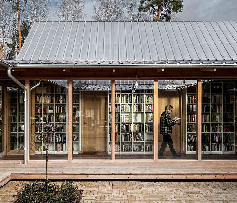
Architectural studio Fria Folket has designed ‘Library House’ for a ceramist and a lawyer with an extensive book collection. Located on the edge of a sparse pine forest by Lake Voxsjoen in Sweden, the building is organized around a library that frames a small courtyard and is designed to provide spaces for comfortable living, working, and creative activities.

‘Having different needs and rhythms and at the same time enjoying each other’s company and presence – the couple wanted a house where they could find peace to work individually without entirely screening each other off.’ lead architect Hanna Michelson explains. 

emerging from a swedish forest, fria folket's house is organized around an extensive library
the building is organized around a library that frames a small courtyard | all images courtesy of Fria Folket


a library that acts as the heart and bloodstream of the project


In response to the couple’s wishes, Fria Folket (find more here) composed a house with a centrally located library in the form of a book gallery. The north, east and west facades are closed off from the surroundings with a few carefully selected views, while the south side opens onto the lake.


Four gabled buildings complement the central library, each solving its own specific part of the program in accordance with the adjacent area. The east building houses the cooking and gardening areas, while the south building serves as the arts and crafts area. The western building covers law, science, and music, and the northern building houses the areas for rest and recreation, meditation, and self-development. By linking the volumes together – both thematically and systematically – the library acts as the heart and bloodstream of the project.

emerging from a swedish forest, fria folket's house is organized around an extensive library
the small courtyard in the heart of the residence


following the course of the sun


The four houses are arranged in the order of the sun’s course, with the beginning point of the house, that is, the entrance, coinciding with the beginning point of the day in the east. Moving through the house, the sun finally rests in the north, just like the house.


The degree of privacy follows the same loop. From the most social rooms, hallway and kitchen, to the most private rooms at the end of the circle. The clockwise movement is encouraged by the arrangement of the windows, which give a view of the surroundings when you walk clockwise, while counterclockwise you see the closed bookshelf walls. Four doors, one in each corner of the book gallery, provide access to the courtyard from all parts of the house, making it easy to move between inside and outside.

emerging from a swedish forest, fria folket's house is organized around an extensive library
four gabled buildings complement the central library, each solving its own specific part of the program


simple materials complement the library’s broad color spectrum


The strong square boundary provided by the bookshelves and the transparency of the glazed enclosure of the courtyard reinforce the impression that the library transcends the climate envelope, making the courtyard an open-air reading space – A space defined by its purpose rather than its physical boundaries.


Given the library’s broad color spectrum, the interior materials are spare and simple. From the blonde palette of white, whitewashed pine and natural pine, the ceramic tile floor stands out with its warm brick-red color. In the pursuit of sustainability, the home was adapted to the family’s existing furniture to reduce the need for new purchases and replacements. For example, the iconic Ikea ‘Billy’ bookshelf played a key role in determining the dimensions of the home, as it houses the existing library.

emerging from a swedish forest, fria folket's house is organized around an extensive library
the four houses are arranged in the order of the sun’s course


To reduce the ecological footprint, the walls and roofs were built without plastic and insulated with flax fiber, as is common in the area. The facade is clad in untreated pine from a local sawmill, and the concrete-free foam glass foundation was made from recycled glass.


Rainwater from the roof is collected in an underground tank that supplies water to the greenhouse. Following old Nordic building traditions, one of the studios was constructed in such a way that it can be separated from the rest of the house in terms of heating. This provides the opportunity to downsize the house when the temperature drops. A certain rhythm permeates the house, as the grid of the structure is reflected in the load-bearing glass partitions, which were made by a local window carpentry store. ‘Like bar lines in a sheet of music, the mullions divide the bookshelves like beats in a bar.’ the architects share.

emerging from a swedish forest, fria folket's house is organized around an extensive library
given the library’s broad color spectrum, the interior materials are spare and simple

emerging from a swedish forest, fria folket's house is organized around an extensive library
glass openings connect the interior to the courtyard which serves as an open-air reading space

Reference

Ten L-shaped kitchens with extensive countertop space
CategoriesInterior Design

Ten L-shaped kitchens with extensive countertop space

The latest lookbook in our series exploring kitchen layouts highlights 10 examples from Dezeen’s archive that have two connected countertops that form an L-shaped layout.

L-shaped kitchens are organised in the shape of the letter L usually with a long row of cabinetry adjoined to a slightly smaller projecting section. However, in some instances, the countertops can be equal in length.

Appliances, sinks and cookers are usually placed on opposite sides of the kitchen with ample storage and workspace around and between. In larger spaces, islands can be incorporated into the design between the L-shaped counters to provide additional space.

The L-shape is of the most common kitchen layouts along with U-shaped kitchens, one-wall kitchens, island kitchens, galley kitchens and peninsula kitchens.

This is the latest roundup in our Dezeen Lookbooks series providing visual inspiration for the home. Previous kitchen-related posts feature breakfast bars, compact kitchens and kitchens with skylights.


l-shaped by baumhauer

Farmhouse, Switzerland by Baumhauer

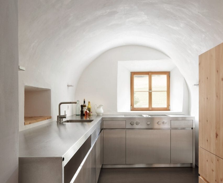
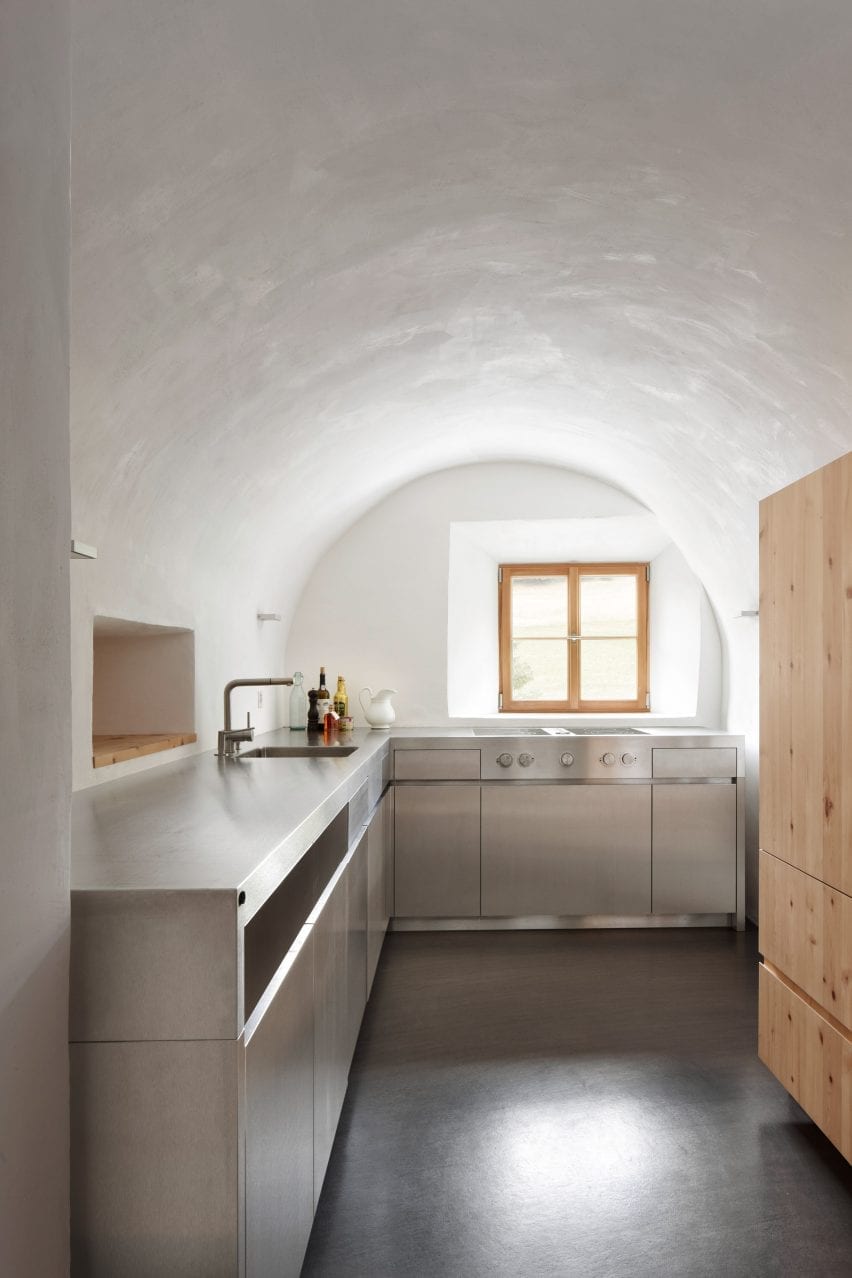
Fitted in a vaulted space within a traditional farmhouse, this L-shaped kitchen uses clean lines to contrast with the historic nature of the building.

The kitchen consists of two stainless steel counters with stainless cabinetry with drawers, cupboards and appliances fitted below.

One arm of the L contains a cooker positioned directly in front of a framed window to give the residents views across a Swiss valley while they are cooking. The other counter has a sink embedded opposite a serving hatch that punctures the thick stone wall between the dining and kitchen space.

Find out more about Farmhouse ›


plywood kitchen by Sanden+Hodnekvam Arkitekter

Cabin at Rones, Norway by Sanden+Hodnekvam Arkitekter

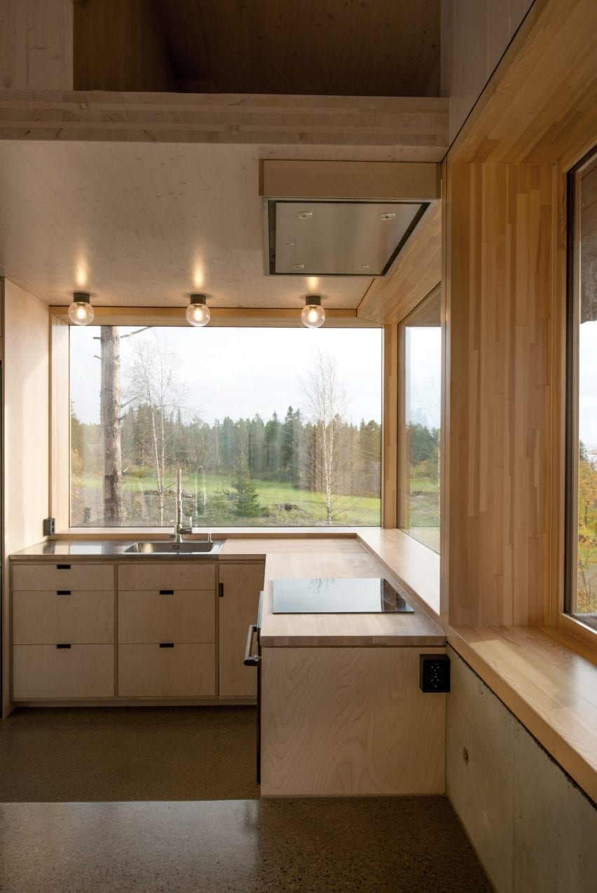
Fitted against a wrap-around corner window, this birch plywood kitchen designed by Sanden+Hodnekvam Arkitekter includes an L-shaped row of base cabinetry.

A steel sink that incorporates a large drainer was placed at the centre of the row of units, while an electric cooker was placed on the other.

The cabinetry and drawers below have a minimalist look with units aligned flush with the kitchen’s wooden countertops and featuring cut out handles.

Find out more about Cabin at Rones ›


L-shaped kitchen by hayhurst and co

London flat, UK by Hayhurst and Co

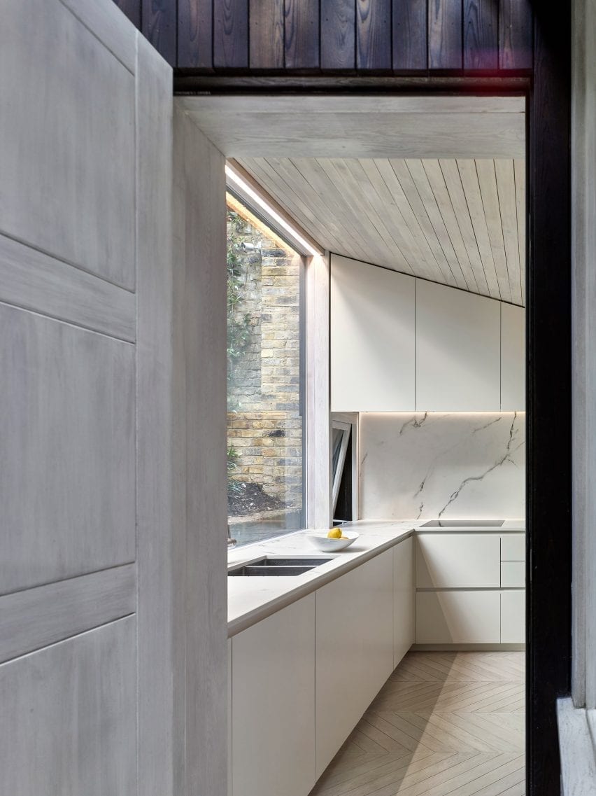
This kitchen at the rear of a London flat was built beneath a part-sloping wood-lined ceiling that follows the topography of the garden.

A row of white floor units topped with a marble countertop with an embedded sink was placed below a large full-width window that looks out to the sloping garden. The counter extends along the kitchen’s wall to form an L that contains an electric hob.

Find out more about London flat ›


l-shaped kitchen by vaughn mcquarrie

Oneroa House, New Zealand by Vaughn McQuarrie

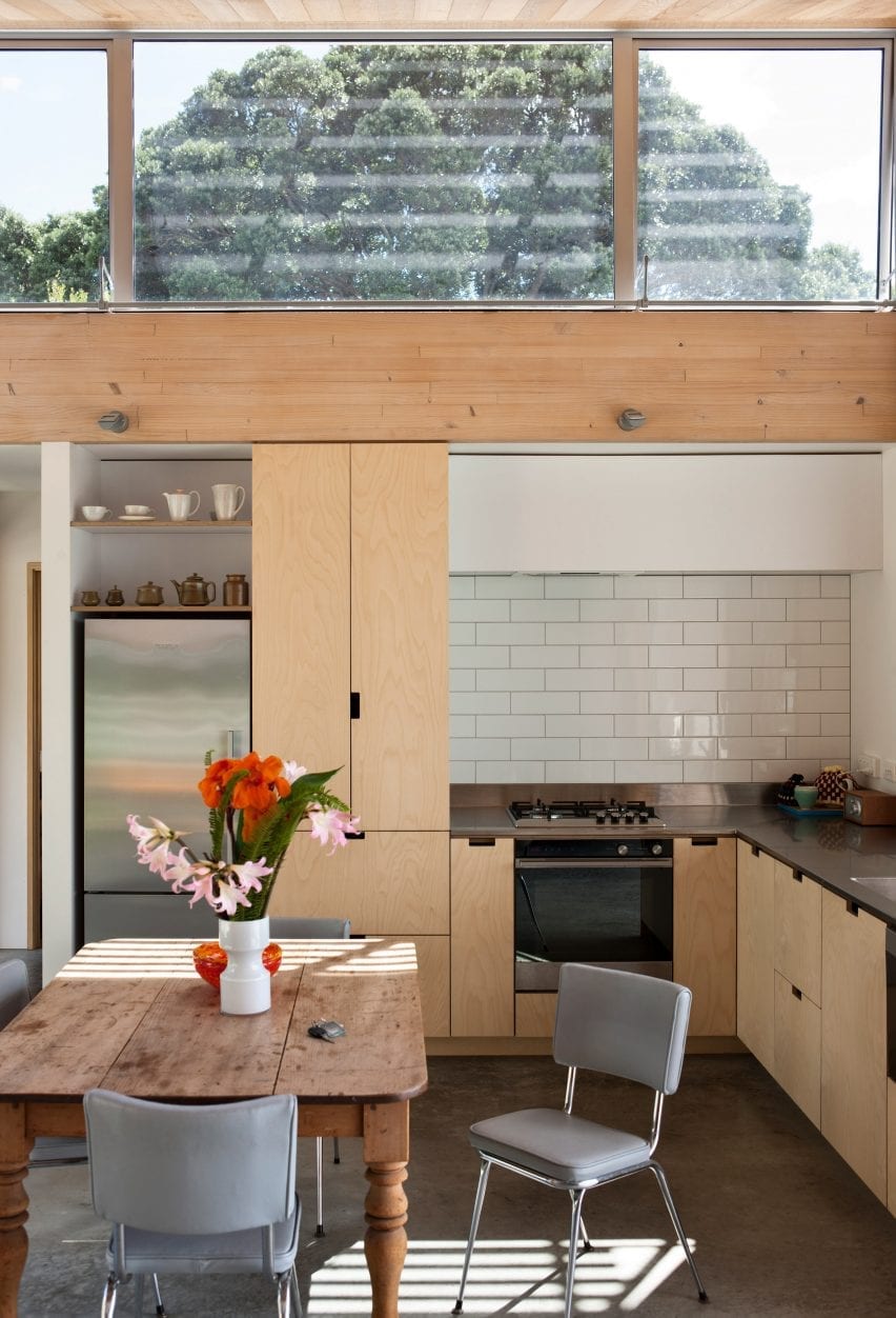
This timber New Zealand home overlooking the Hauraki Gulf uses materials chosen for their texture and robustness.

The open-plan kitchen-diner sits beneath a mono-pitched roof with north-facing clerestory windows.

Plywood kitchen units line two of the walls with the sink positioned next to a large window with views across a bay.

Find out more about Oneroa House ›


Ikea customised kitchen by Reform

Stine Goya headquarters, Copenhagen by Reform

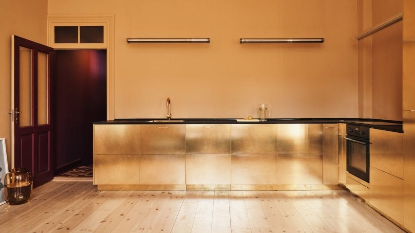
This communal kitchen at fashion brand Stine Goya’s headquarters runs along two walls of a room that has butter-yellow walls and light timber floors.

Danish brand Reform updated IKEA cabinets with brass doors and handles to create a metallic look. The counters are topped with a contrasting black laminate countertop that matches the black appliances.

Find out more about Stine Goya headquarters ›


green stained kitchen by Carmine Van Der Linden and Thomas Geldof

Belgian apartment, Belgium by Carmine Van Der Linden and Thomas Geldof

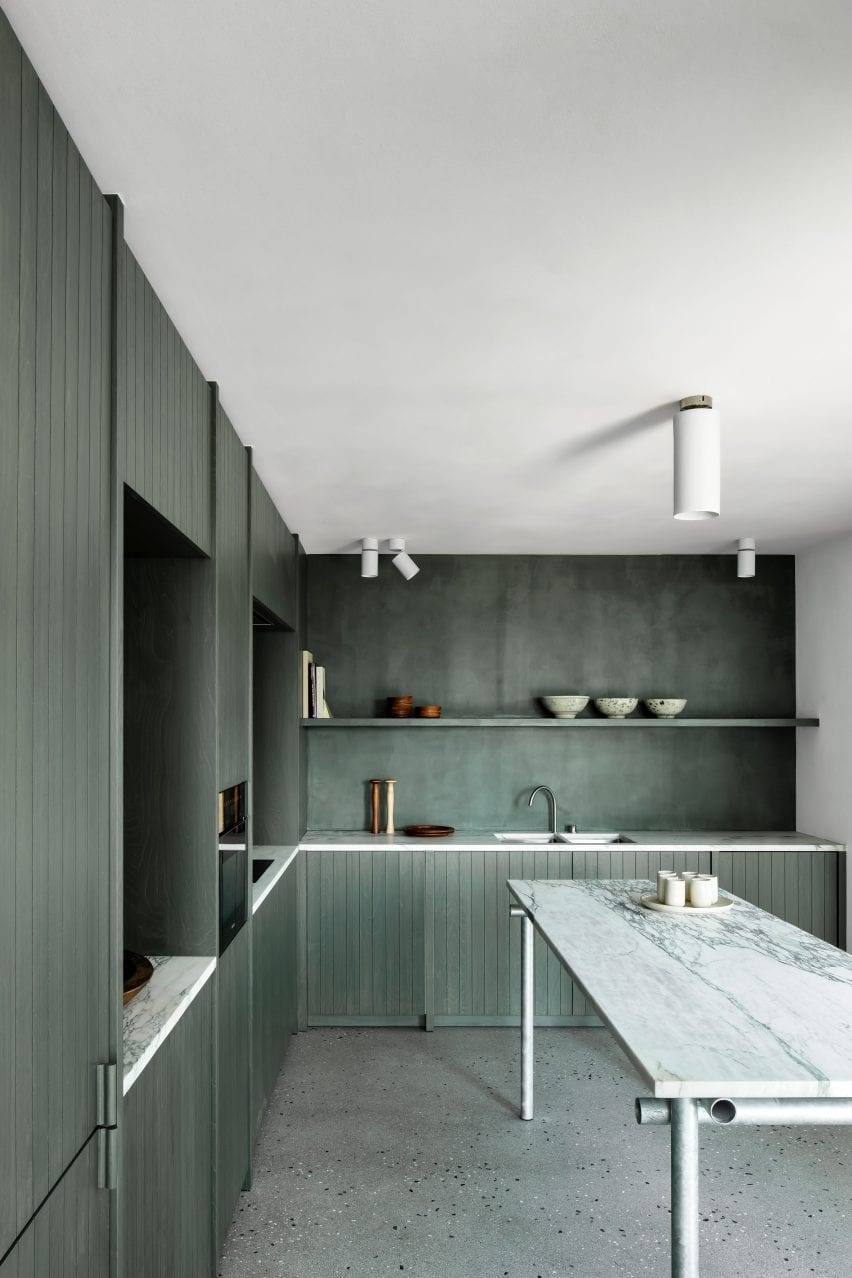
Carmine Van Der Linden and Thomas Geldof stained the birch cabinetry in this L-shaped kitchen a seaweed green to connect the space with its coastal surroundings.

Alga Marina marble was used for the kitchens countertops to add a neutral contrast to the deep green.

Find out more about Belgian apartment ›


l-shaped kitchen by karin matz and francesco di gregorio

Föhr apartment, Germany by Francesco Di Gregorio and Karin Matz

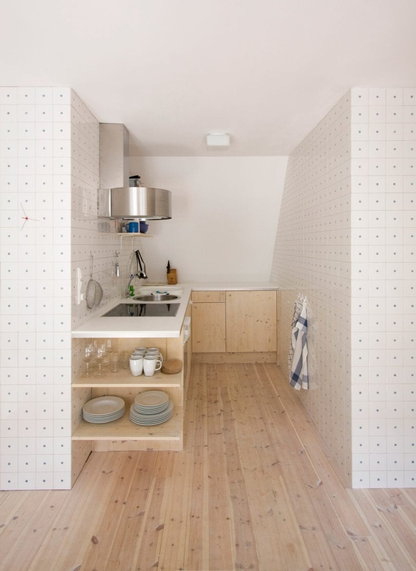
Francesco Di Gregorio and Karin Matzhay converted the hayloft of a thatched roof farmhouse on the island of Föhr in Germany into this apartment.

Its L-shaped kitchen is tucked away against the sloping roof, between a bathroom and bedroom. The architect duo lined the walls with thousands of ceramic tiles, each drilled with a singular hole to reveal a blue dot to form a sea of polka dots.

Wooden base cabinetry blends with the apartments wood flooring and houses the kitchen’s appliances and storage. Because of its small footprint, a circular sink, electric stove and oven were organised beside each other within the longer countertop against the tiled wall.

Find out more about Föhr apartment ›


L-shaped kitchen by Lagado Architects

Workhome-Playhome, The Netherlands by Lagado Architects

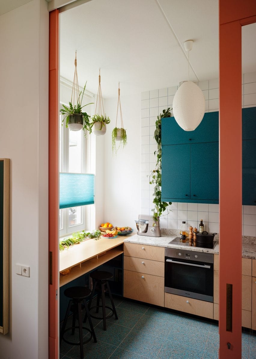
Ashwood cabinetry, burnt-orange niches, blue terrazzo floors and teal hued cupboards fill this L-shaped kitchen in Rotterdam.

A wall of squared white tiles frames teal coloured overhead cabinetry that is suspended over a sink, stovetop and granite worktops.

Teal cabinetry complements the kitchen’s blue terrazzo floors, which marks the area from the light wood floors in the living space. A breakfast bar in front of a window becomes an extension of the work area and can be used as additional prep space.

Find out more about Workhome-Playhome ›


L-shaped kitchen by ras arquitectura

Corsega Apartment, Spain by RAS Arquitectura

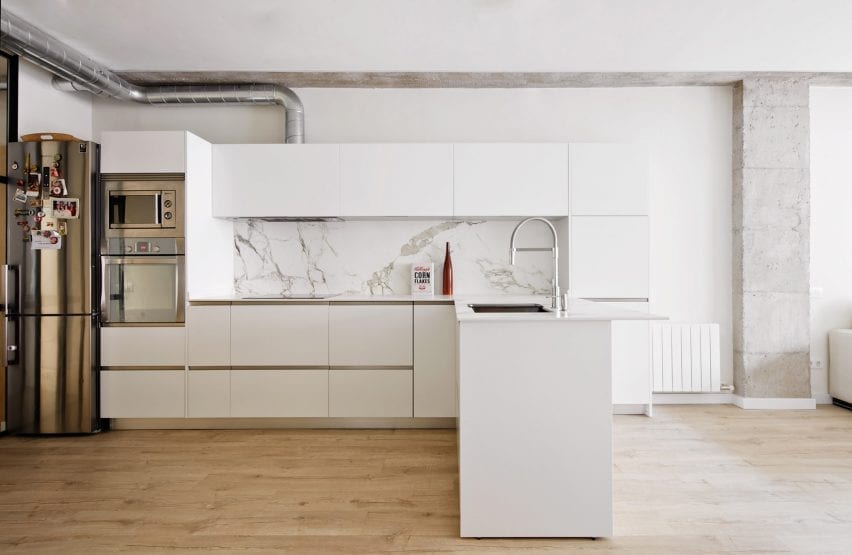
This simple kitchen combines bright white cabinetry, steel appliances, grey-veined marble and exposed pipework.

Overhead cabinetry surrounds a veined marble splashback and extends across the countertop, which extends into the room and doubles as a breakfast bar.

A steel oven and microwave were fitted within the cabinetry at the end of the kitchen, tying together with the metallic handle and exposed extractor fan piping.

Find out more about Corsega Apartment ›


L-shaped kichen by Denizen Works

Extension One, UK by Denizen Works

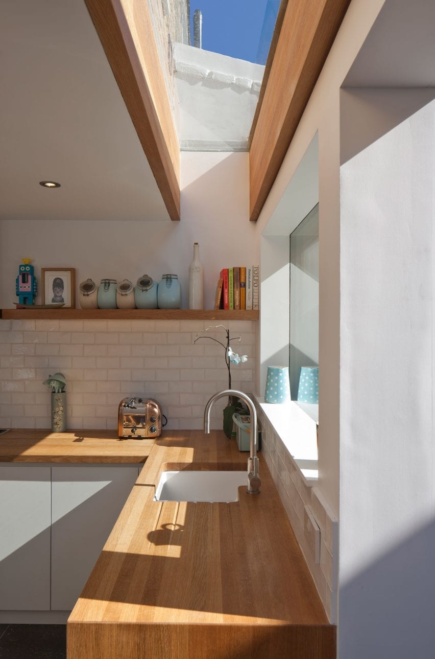
An oak countertop wraps around white cabinetry in this residential extension by Denizen Works. A white-tiled splashback wraps around the L-shaped countertops below a chunky oak shelf and rectangular window that overlooks the garden.

The studio added a large L-shaped skylight supported by large oak beams above the counter containing the sink.

Find out more about Extension One ›


This is the latest in our series of lookbooks providing curated visual inspiration from Dezeen’s image archive. For more inspiration see previous lookbooks showcasing colourful interiors, calm living rooms and colourful kitchens.

Reference