Ludwig Godefroy prioritises garden for “timeless” family home in Mexico
CategoriesArchitecture

Ludwig Godefroy prioritises garden for “timeless” family home in Mexico

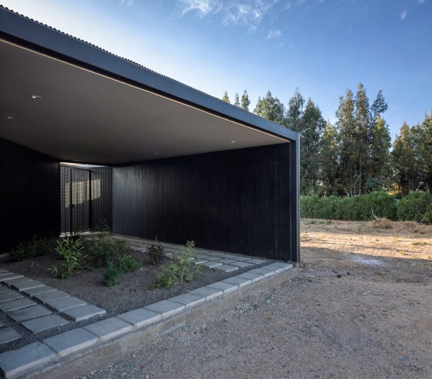
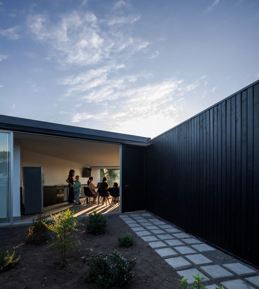
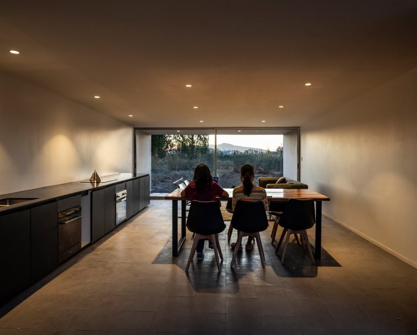
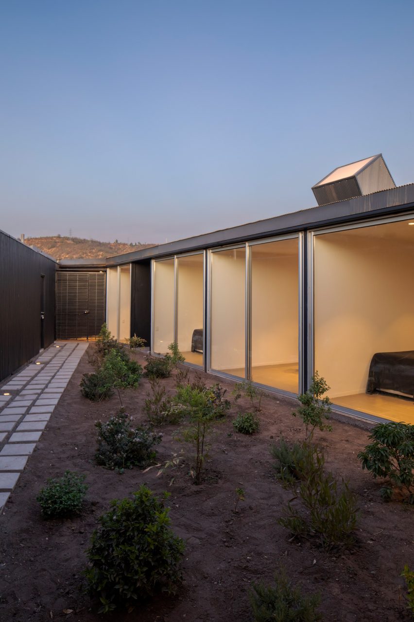
Mexico-based architect Ludwig Godefroy has completed the renovation of a”simple” house and studio in Mexico for himself and his family that is integrated with an adjacent garden.

Godefroy and his partner renovated a former residence, focusing on the home’s orientation towards the site’s pre-existing greenspace.
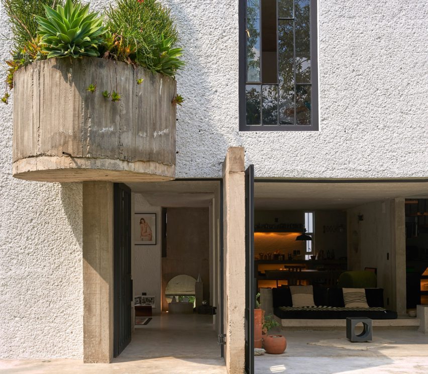
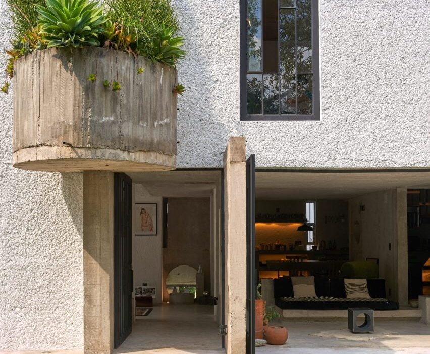
A large semi-circle planter attached to the exterior of a house
Ludwig Godefroy has completed a house and studio for himself and his family in Mexico

“Casa SanJe is a very simple project,” said Godefroy. “The main idea behind the project was to reconnect the house with its garden, opening large windows everywhere on the ground floor. In and out are always connected in this house.”

Almost half of the square site is dedicated to the garden, while the other half contains the architect’s residence.
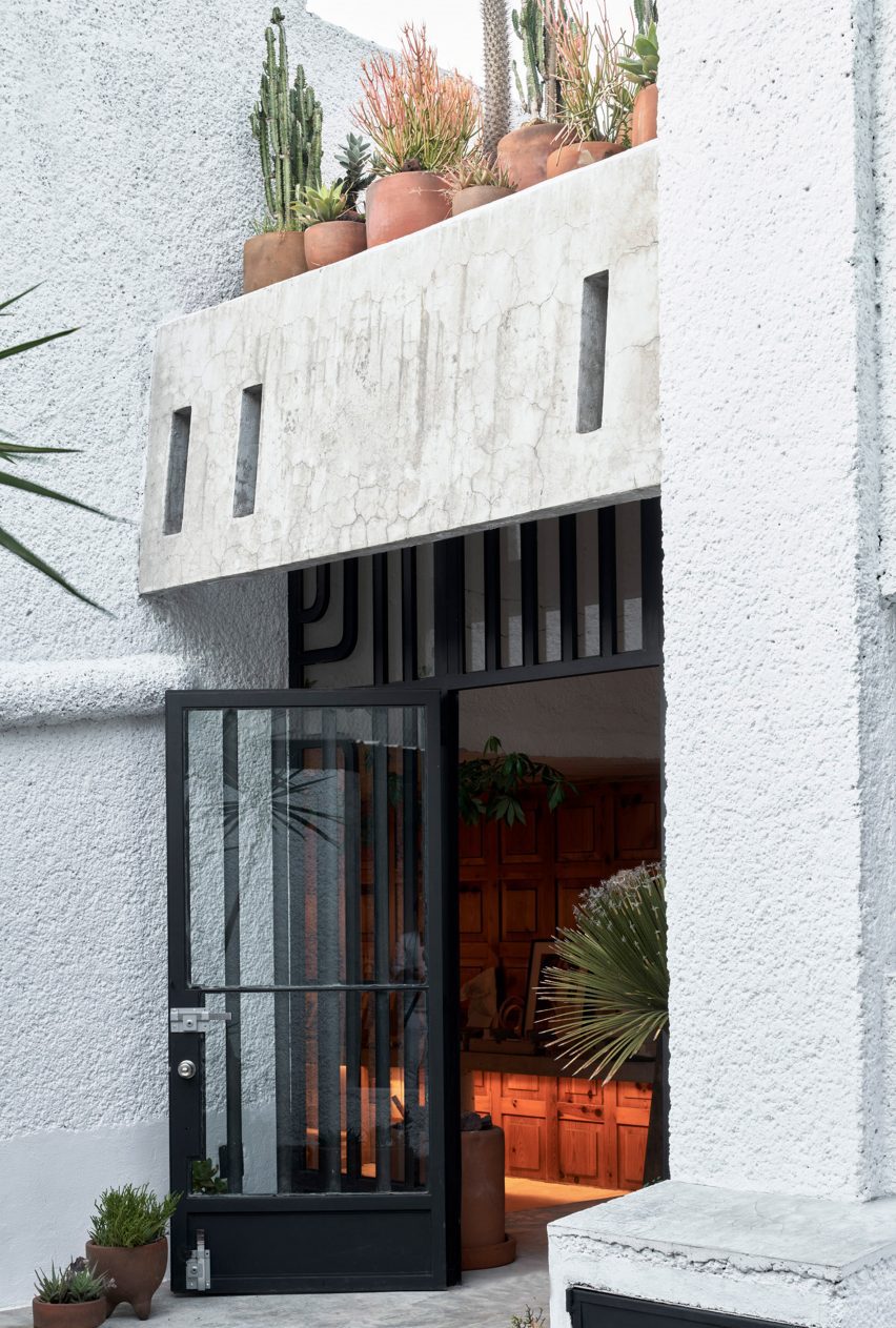
The entrance to a house with a gate door
It is organized around the site’s substantial garden

“Casa SanJe was an ordinary Mexican house from the ’80s, without any style, a simple house with tiles on the floor and texturized plaster finishing on the walls,” said Godefroy.

The architect replaced the former materials with concrete, wood and tezontle – a red volcanic stone – to “calm down the atmosphere of the house”.
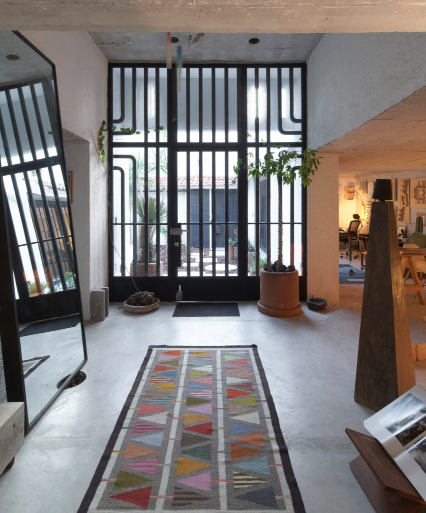
A large wrought iron door
Godefroy renovated a house originally built in the 80s

The ground level of the home contains two entrances protected by iron doors.

A car park sits adjacent to the building’s first entrance, which is accessed through a patio populated with stone, planting beds and a concrete and brick sculpture.
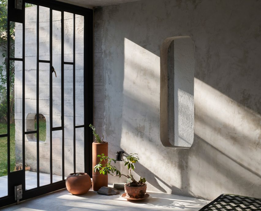
A rectangular cut out in a wall
The ground floor contains large windows and doors that open directly into the garden

A second entrance is located further into the garden and leads to a vestibule space at the centre of the ground-level plan.

The interior program circulates around the vestibule, with the kitchen, dining area and living room located opposite the architect’s studio and library.
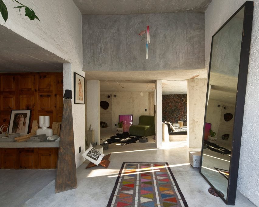
The entrance to a home with a mirror and sculptural elements
It is made of concrete with wood and stone elements

The kitchen and studio spaces were pushed along the back wall of the house, with slim windows placed periodically among cabinets and shelves.

On the side opposite, Godefroy installed large doors and windows that open the living room directly into the garden.
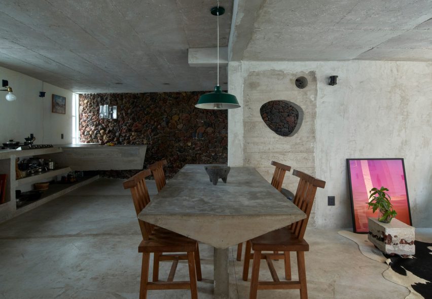
A dining table made of concrete
Furniture like a dining table and shelving was also made of concrete

Much of the interior furniture was made of caste concrete, like the living room sofa, the dining table, side tables, kitchen shelving and an island. And some are built directly into the floor.

Godefroy’s studio also contains concrete shelving and a concrete desk that runs along the wall.
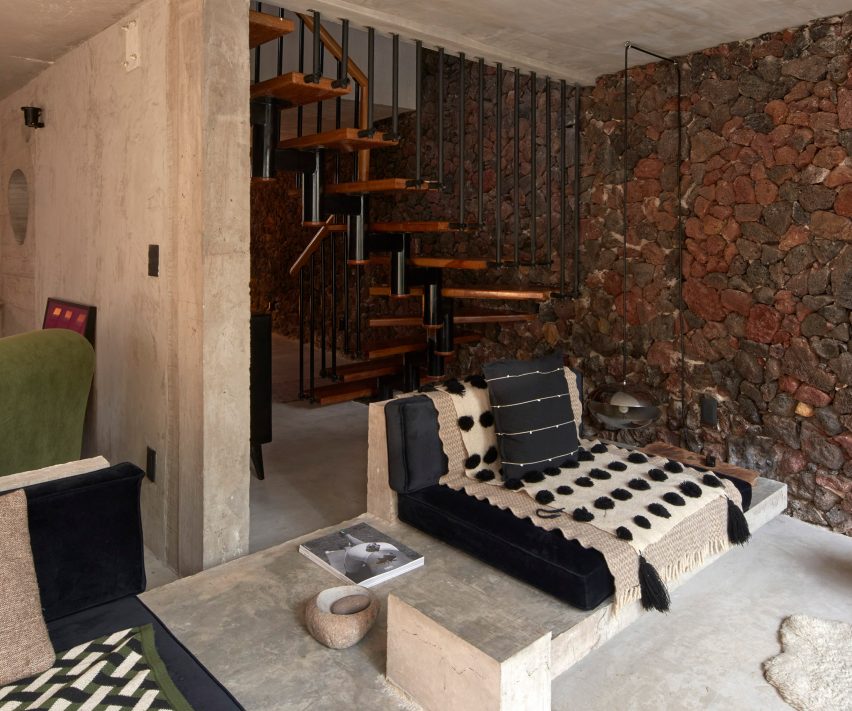
A living room with a wall of exposed stone and a concrete couch
A wall clad in volcanic stone rungs along the back of the house

In the same space, a wall was clad in warm wood panels, while a vaulted ceiling sits above the architect’s desk. A chimney sits adjacent.

Like some of Godefroy’s previous projects, geometric openings were cut into interior walls.

An exposed wall made of red volcanic stone runs along the back wall of the house.

Located between the kitchen and living room, a wooden staircase leads to the second floor, which contains bedrooms and a primary bath.
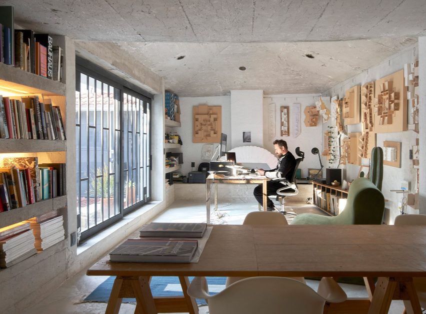
Casa SanJe by Ludwig Godefroy
The architect’s studio opens onto the entrance patio

The primary bath contains a sunken, circular cutout in the floor, with multiple shower heads for bathing.

In one corner, a spigot drops water onto a stepped feature.
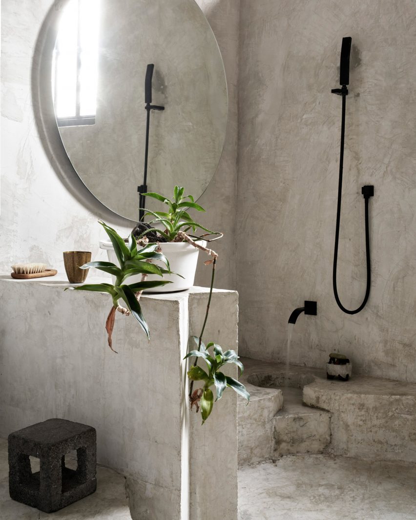
A bathroom with a circular cut out in the floor
An upstairs bathroom features a circular, sunken floor

Concrete was used for the ceiling, walls and floor.

Native plants were placed throughout the house, with a large semi-circle planter made of concrete placed above the house’s entrance.

“We wanted the space to become timeless, out of any trend or decoration, just made out of simple material, able to get old instead of getting damaged under the action of time,” said the architect.

Godefroy recently completed a number of projects in and around Mexico City, including a brutalist cube-shaped home and a hotel that recalls the design of an Oaxacan temple.

The photography is by Edmund Sumner.

Reference

2LG Studio brings colour and personality into London family home
CategoriesInterior Design

2LG Studio brings colour and personality into London family home

Ornately corniced ceilings were preserved and painted pastel inside this detached Edwardian house in southeast London, which local firm 2LG Studio has renovated for a returning client.

Set in the leafy residential area of Forest Hill, the house on Sunderland Road belongs to a couple who needed space for their three young children to grow and play.

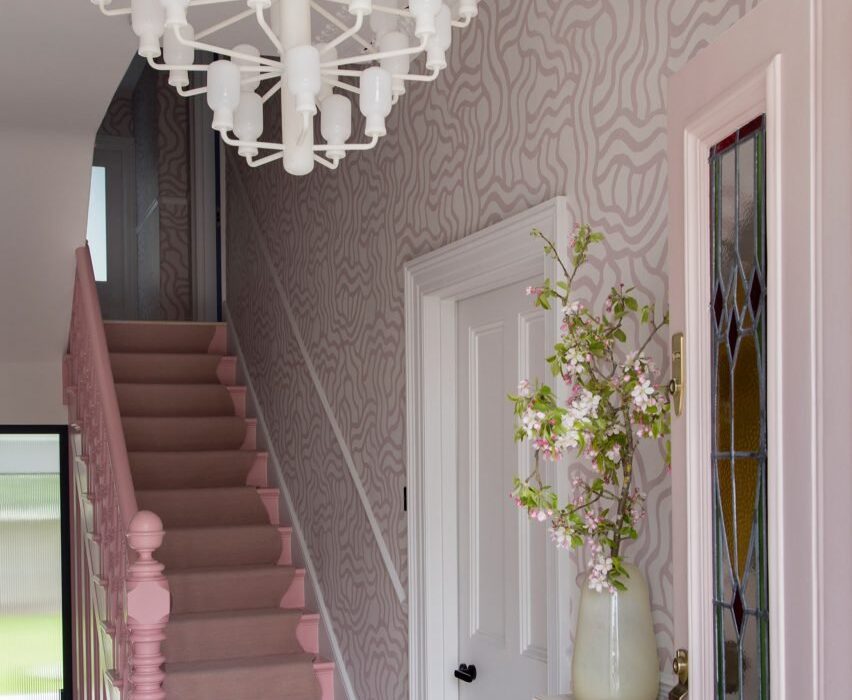
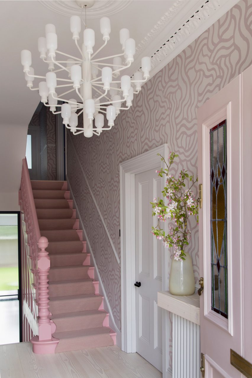
Hallway of Sunderland Road house
2LG has completed Sunderland Road house in Forest Hill

“Having designed this couple’s previous home, we had a strong sense of their tastes and wanted to evolve that for them in this house,” 2LG Studio founders Jordan Cluroe and Russell Whitehead told Dezeen.

“We wanted to bring out their characters by emboldening their love of colour and finding ways to build pattern and joy into the materiality of the home,” the duo added.

“The intent here was to respect the period elements of the building, whilst reflecting the modern style of the family who live there.”

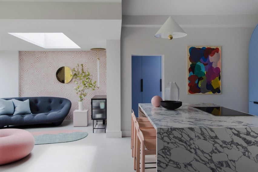
Open-plan living room and kitchen in London house by 2LG
Hand-printed wallpaper by Custhom Studio features in the lounge and hallway

Throughout the house, playful elements are in balance with a more serious aesthetic.

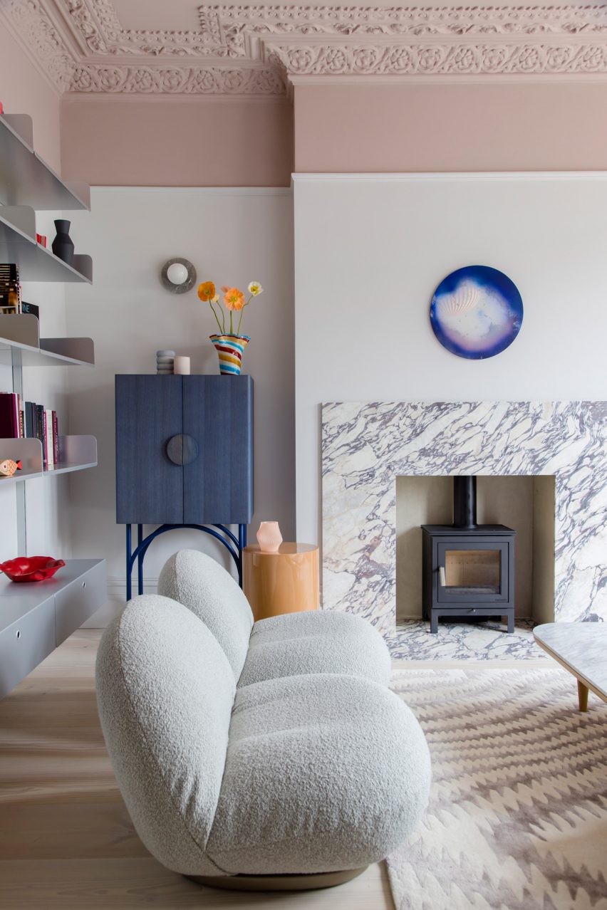
Instead of treating the home’s elaborate ceiling mouldings separately – as tradition dictates – 2LG Studio applied a colour-block philosophy and painted them in the same pastel tones used across the upper walls and ceilings.

The studio drew on a range of references for the interior, from 1980s colours to Italian design elements such as marble and Murano glass lighting, all the way to the Scandinavian influences seen in the natural materials and minimalist approach to furnishing.

Kitchen and dining room of Sunderland Road house
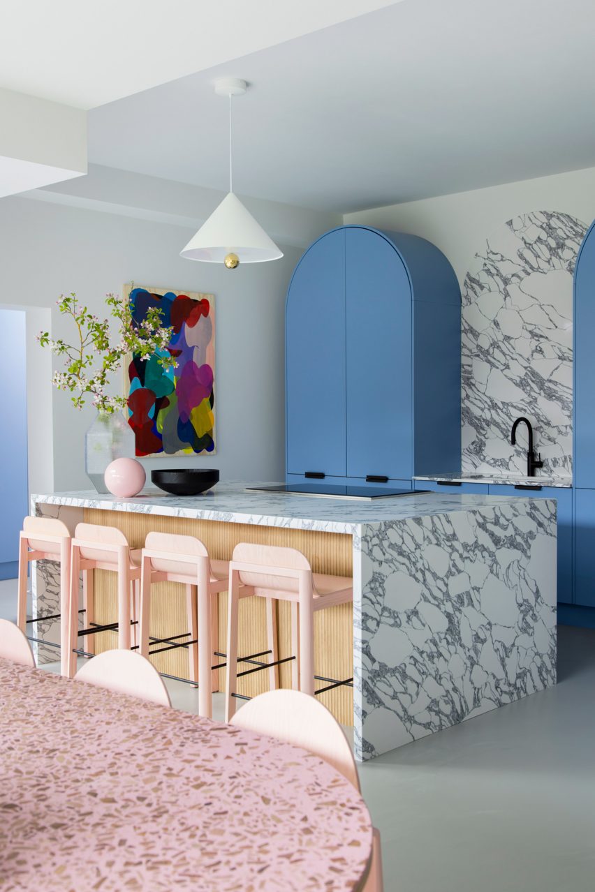
The kitchen is defined by sky-blue cabinetry and marble countertops

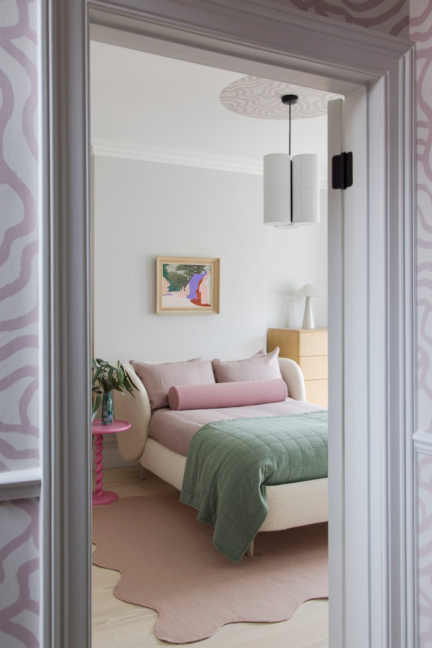
Creating impact in the entrance hall is a hand-printed wallpaper, designed by 2LG Studio with long-term collaborator Custhom Studio and used here in a bespoke calamine-pink colourway that’s repeated in the connecting spaces throughout the house, as well as in the rear living area.

“It creates a welcoming, human feel as soon as you enter,” the design team said.

This ballet-slipper colour is paired with a brighter candy pink, bringing calm and warmth to the overall scheme.

Lounge of Sunderland Road house
2LG painted ceilings, mouldings and upper walls in pastel colours

Pink-heavy palettes have become a signature for 2LG, also reflected in the natural pink undertones of the extra-wide Douglas fir floorboards that feature throughout the house alongside a grey poured-resin floor in the kitchen.

“The floorboards set the tone with a nod to Scandi minimalism, adding a natural soul throughout that unites the bolder elements,” said 2LG Studio.

In the kitchen, sky-blue cabinetry is used alongside marble countertops and splashbacks, with arched forms uniting the two finishes while pink elements such as bar stools pop against this calm backdrop.

“The colours are a key part of the atmosphere and identity of this house,” said 2LG. “The blues gets deeper and bolder as you move upstairs into the study and the family bathroom.”

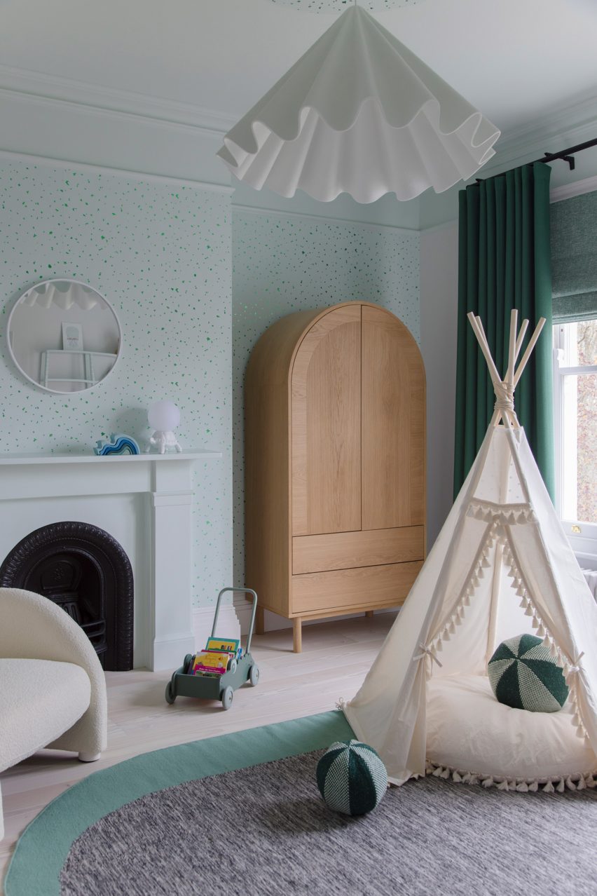
“Primary red details give structure to the colour palette in the living room. Pastel green in the baby’s room is serene and fresh, warmed up with a mix of wood tones and creams.”

Bedroom of house in London by 2LG
Pink details feature throughout the home’s interiors

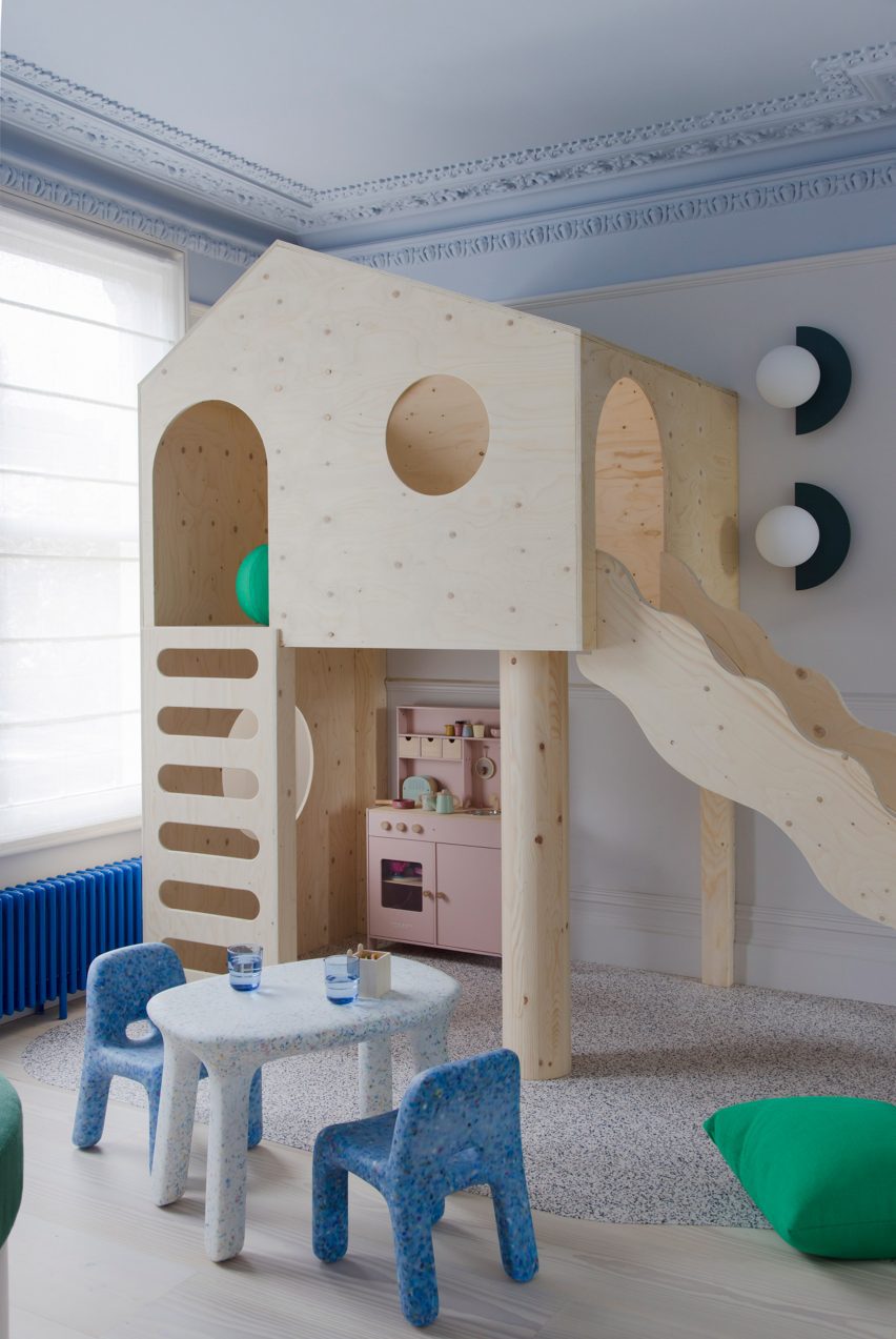
The project features bespoke joinery including a playhouse on stilts in one of the kids’ rooms alongside existing 2LG pieces such as the Luca bedhead in the loft bedroom and the Tilda sofa, both designed for London furniture company Love Your Home and upholstered here in Kvadrat x Raf Simons fabric.

“The fitted elements of the furniture give a sense of coherent design and function to the spaces whilst the classic design pieces bring a curated gallery feel, not unlike a contemporary luxury fashion store,” said 2LG Studio.

Children's bedroom of house in London by 2LG
2LG designed custom joinery including a stilted playhouse

Various recycled materials provide textural interest throughout the house, among them the recycled plastic wall lights in the living room by Spark and Bell.

2LG Studio also added a pink Foresso top made using waste wood chips and resin to the dining table, while the bespoke bathroom cabinet was made using leftover Douglas fir floorboards with recycled plastic details by UK company Smile Plastics.

Children's bedroom in Sunderland Road house
Pastel green was used to finish the baby’s room

Since Cluroe and Whitehead founded their design practice in 2014 under the name 2 Lovely Gays, the studio has completed a number of residential projects in the British capital.

Among them is the couple’s own home and office – to which they recently added a garden pavilion with a “touch of Beetlejuice” – and an equally colour-led renovation of a period property in the Heaver Estate conservation area.

The photography is by Megan Taylor.

Reference

The Mint List brings mid-century influences to north London family home
CategoriesInterior Design

The Mint List brings mid-century influences to north London family home

Interior design studio The Mint List has brought light, space and warmth to this Edwardian house in London with multiple extensions, a hidden playroom and plenty of tactile materials.

The renovated end-of-terrace house in Kensal Rise belongs to a film-industry couple that wanted a cosy family home with mid-century elements, in particular referencing the work of designers Charles and Ray Eames.

North London house by The Mint List
The Mint List has renovated and extended an Edwardian house in north London

“The clients had a leaning towards mid-century style but they didn’t want that to overwhelm the scheme,” The Mint List founder Camilla Kelly told Dezeen.

“The Eames House was a good mid-century reference in terms of encompassing warm, repurposed textures, a sense of scale and an abundance of light.”

North London house by The Mint List
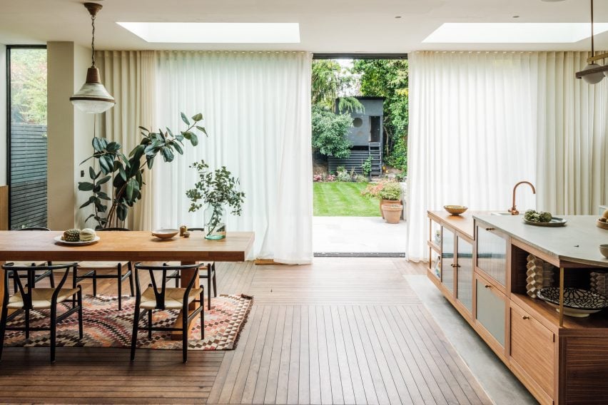
A new rear extension houses the home’s kitchen and dining space

The brief was to open up this formerly dark and “unremarkable” home and create an improved sense of flow.

As well as adding two bedrooms and a small study in the newly converted loft, The Mint List created a rear extension to house the kitchen-dining space and absorbed the property’s former garage into the house, providing a mudroom, pantry and playroom.

North London house by The Mint List
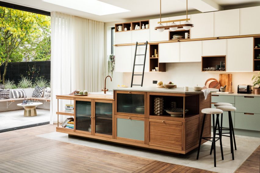
The custom-built kitchen island has two levels

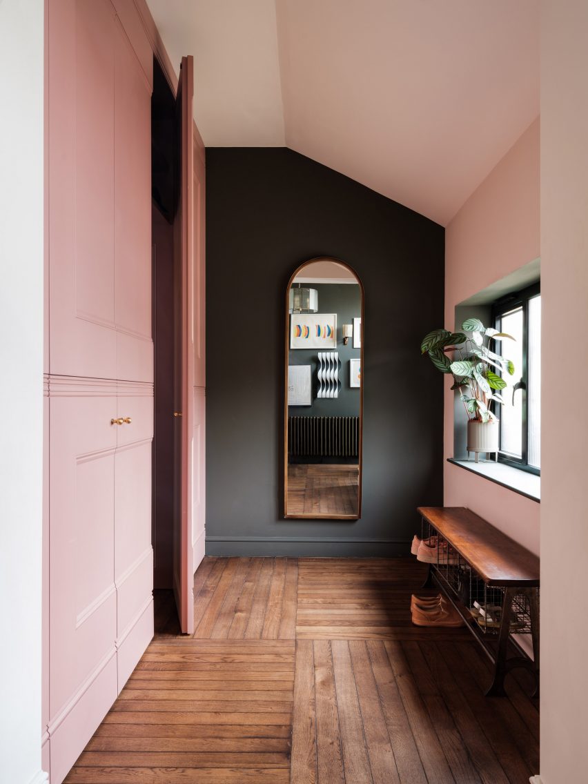
The playroom is cleverly concealed behind a bank of new storage in the hallway, which has also been enlarged by opening it up into the former porch.

“There was huge importance given to light in the design,” said Kelly. “Wherever possible, we created tall windows benefiting from the south-facing aspect.”

North London house by The Mint List
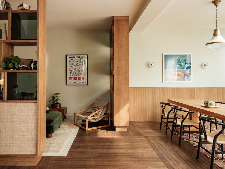
Bookshelves act as room dividers to form a hybrid library and snug

The house is full of custom-designed features and finishes at the request of the client.

The floor uses unusually slim lengths of oak, laid at right angles to each other in huge grids, while the thresholds were distinguished with slender fins of brass that add subtle visual interest.

North London house by The Mint List
The children’s playroom is hidden inside a wall of storage in the hallway

Drawing on the design language of mid-century furniture, the kitchen was completely custom-built for the space with a clean-lined, yet playfully asymmetric design.

“We centralised the assembly and used high windows on either side of the cabinets to emphasise the cubic nature of the design,” said Kelly. “The asymmetric cubes that form the cabinets were built using walnut, with cream-painted doors for the covered storage.”

The material mix includes walnut veneer, reeded glass, olive-coloured door fronts and antique brass detailing, as well as concrete and reclaimed iroko wood worktops.

“I’m averse to keeping things all in one colour,” the designer said. “It’s a missed opportunity to bring texture, colour and character to a space.”

North London house by The Mint List
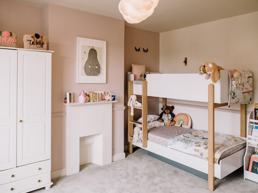
The children’s bedroom is located on the first floor

The kitchen island was designed to account for the owners’ love of entertaining, with a section of the worktop raised to bar height to draw guests away from the cooking area.

“The island is even more asymmetric, with different levels, drawers, shelves and openings that served to show how the geometry of a design can sometimes be off-kilter and still look neatly intentioned, as long as it sits correctly within the scale of the space,” Kelly said.

North London house by The Mint List
A small study now occupies the loft alongside a primary bedrooms suite

The curved bar provides a visual link to the rounded steps that lead down into the kitchen area, as well as to other curved elements throughout the house.

“I like to include some curves in my projects through room openings, joinery and countertops,” Kelly said. “They help to soften spaces and improve flow from one area to the next.”

North London house by The Mint List
The main bathroom is held in pale blue and green tones

Adjoining the kitchen is a hybrid library and snug, which is partially enclosed with oak shelving finished in glass and raffia, that double up as room dividers and nod to the Eames House in California.

“We didn’t want this to be a dead space,” Kelly said. “It’s a quiet spot where you can curl up with a book or listen to music. And when the couple is entertaining, this is a soft space where you come to catch up with someone.”

Four bedrooms are spread across the home’s upper levels, including a shared children’s bedroom with bunk beds on the first floor and two added bedrooms in the converted loft.

North London house by The Mint List
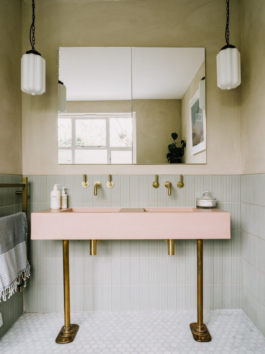
A baby pink sink provides a pop of colour

Since founding The Mint List in 2011, Kelly has completed a number of interior projects in London.

Among them are the headquarters of music management company Everybody’s in Highbury, which she kitted out with mid-century-style movable furniture.

The photography is by Dave Watts.

Reference

Paire House by Rodolfo Cañas provides shelter for a Chilean family
CategoriesArchitecture

Paire House by Rodolfo Cañas provides shelter for a Chilean family

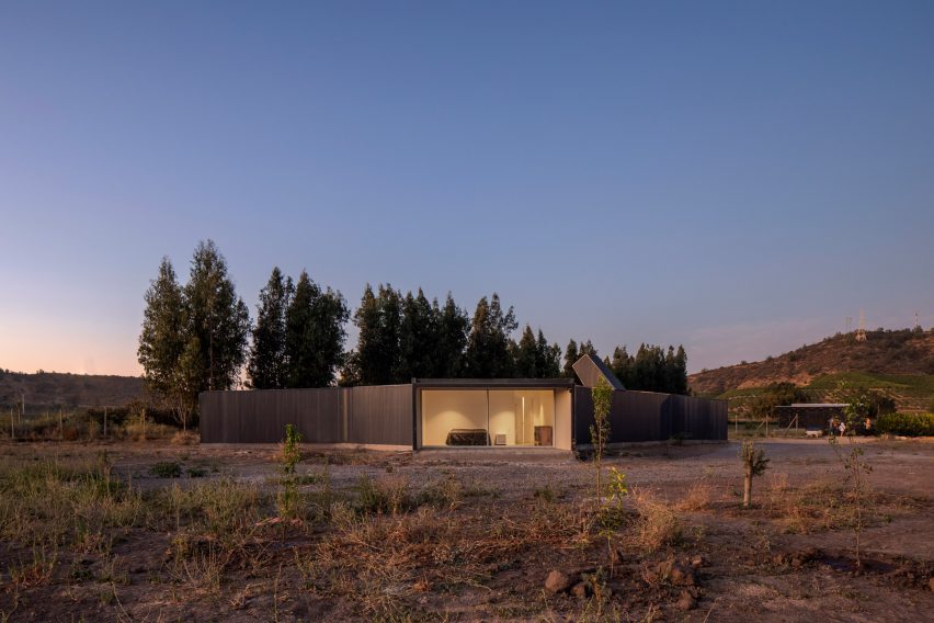
The tale of Jonah and the Whale informed the design of this house in Chile, which architect Rodolfo Cañas shaped around two gardens.

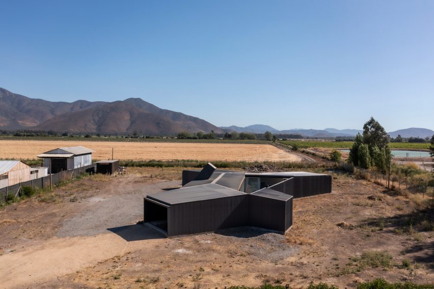
In the rural town of Pomaire, less than an hour southwest of Santiago, Cañas designed the single-family home to shelter its inhabitants from the elements and the surroundings.

Paire House and rural surroundings viewed from above
Viewed from above, the Paire House looks like an abstract body with limbs that stick out in different directions

The architect likened the shielding quality of the house to the whale that swallowed the prophet Jonah in the biblical story.

“In some ways, the Paire House can be comparable to the whale that protected Jonah during the storm,” said the architect. “In a rural, dry, rugged environment and also close to a highway with a heavy traffic flow, this house works as a container; a protective body, which separates its inhabitants from the hostile environment and makes them look towards a more sheltered interior.”

Entrance through a garden under a canopy
Entry to the home is via a shaded garden

Viewed from above, the house is shaped like an abstract human body with four limbs that protrude at different angles.

Two parallel circulation routes – one public and one private – and a desire to orient rooms towards specific views dictated this unusual layout.

Living room opens on to enclosed garden
A second enclosed garden sits at the centre of the house

Entrance to the property is via a garden to the north, which is shaded by a canopy and landscaped to funnel visitors towards one gate, and the residents to another.
“This forms the cut between the rugged exterior and the sheltered interior of the house,” said Cañas. “It is a covered garden and considers a more controlled natural lighting in order to generate the cut coming from the outside.”

Kitchen and dining room
An open-plan kitchen, dining room and lounge occupies one of the building’s “legs”

The “body” of the house contains a row of four bedrooms that all face an enclosed garden through floor-to-ceiling glass doors.

Guests pass through the garden on their way to the living spaces, while the family can traverse an interior corridor that passes behind the bedrooms.

Bedrooms facing onto garden
Bedrooms face the central garden through floor-to-ceiling glass doors

Light is brought into this passageway via a skylight that protrudes at an angle above the low roofline.

Overlooking the central garden, an open-plan kitchen, dining and lounge area occupies the building’s southwest “leg”.

The primary suite is located in the other, facing southeast. Both open onto terraces that face carefully chosen views of trees in the foreground and hills in the distance.

“The trees are a little misleading when you’re inside, hinting that the outside is wooded and less hostile than it really is,” Cañas explained. “Meanwhile, the nearby hills speak of the real context: a wild and dry environment.”

Paire House at dusk
The home’s layout was dictated by a desire to orient rooms towards particular views

Off the central outdoor space, close to the entry, is another small appendage that contains a games room.

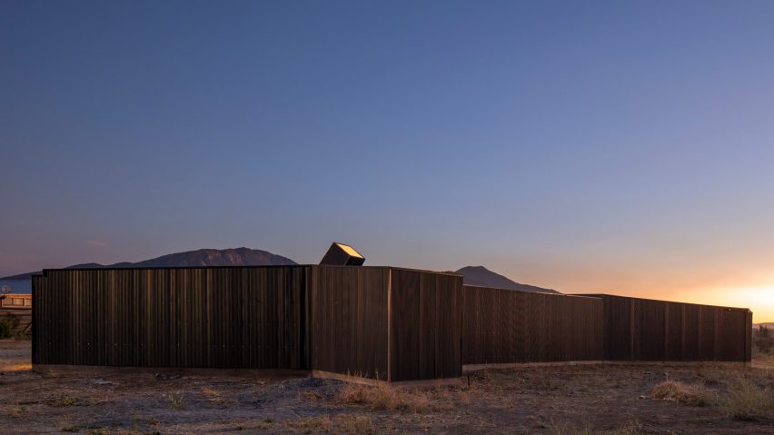
Largely devoid of windows, the exterior walls and internal gardens are wrapped in blackened wood, while interior spaces are minimally decorated and furnished.

Paire House at dusk
The home is clad almost entirely in blackened wood

Charred timber appears to be a popular choice of cladding material for Chilean houses.

Other examples of its use in the country include a home sheathed entirely in blackened pine, an angular mountain cabin and a beach residence comprising stacked volumes.

The photography is by Aryeh Kornfeld.


Project credits:

Architect: Rodolfo Cañas
Builder: Mauricio Fuenzalida
Drawings: Samuel Riveros

Reference

An app helps to capture family stories
CategoriesSustainable News

An app helps to capture family stories

Spotted: Stories have always been a part of human culture, but the way we interact with them has changed dramatically in recent years. With the advent of social media, we now consume stories more passively than ever before, scrolling through photos and videos without really connecting with the people behind them. Startup Remento is working to change that. Its storytelling platform encourages users to share personal stories and connect with loved ones on a deeper level. 

The app provides conversation prompts to inspire the sharing of stories from every member of the family. The prompts include questions about a grandparent’s childhood home, to the context of images from wedding photos. The prompts are then selected and customised on the app, after which family conversations can be recorded. An interactive playback allows users to showcase stories from these sessions. These can then be shared and reminisced about at a later time.

The company’s co-founder and CEO Charlie Greene came up with the idea for Remento after recording various interviews with his mother after she was diagnosed with cancer. “The conversations our family recorded after we learned my mother had cancer changed our relationship forever. As she reflected on photos and answered questions about her early years for her grandchildren to one day watch, I learned more about her life than I ever could have imagined,” she explained.
Social media continues to change, and so is the way we interact with it – with growing concerns about its impact on our mental health and relationships. Springwise has spotted several related innovations including social media tools that help the public assess viral posts, and an app teaching people to trust the news again. 

Written By: Katrina Lane

Reference

Bolza family turns 1,000-year-old castle into Hotel Castello di Reschio
CategoriesInterior Design

Bolza family turns 1,000-year-old castle into Hotel Castello di Reschio

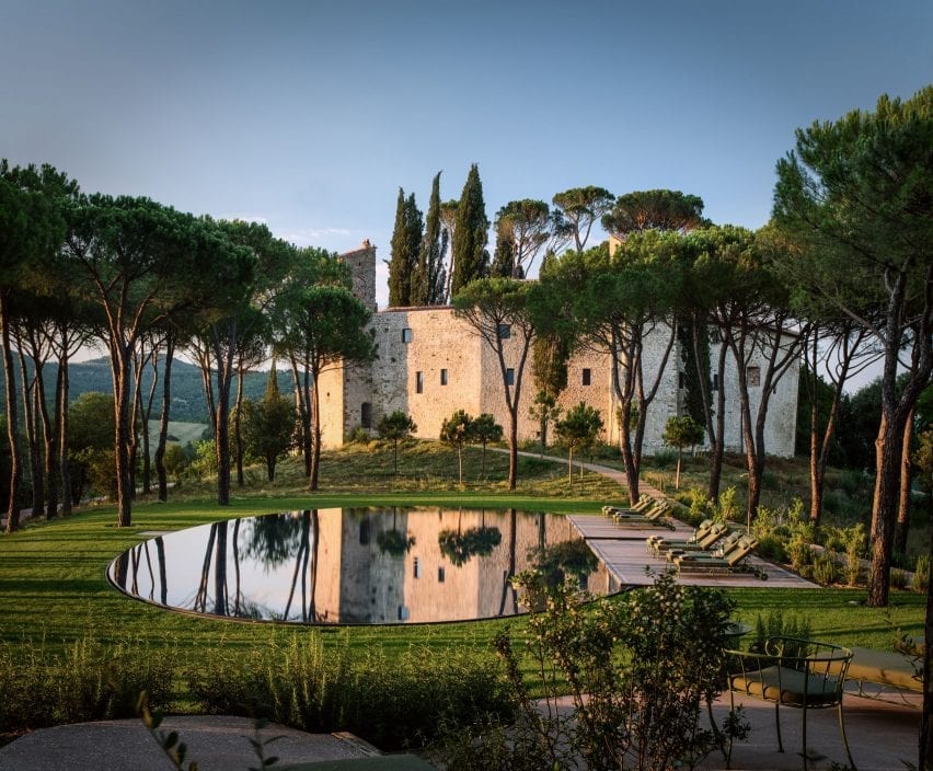
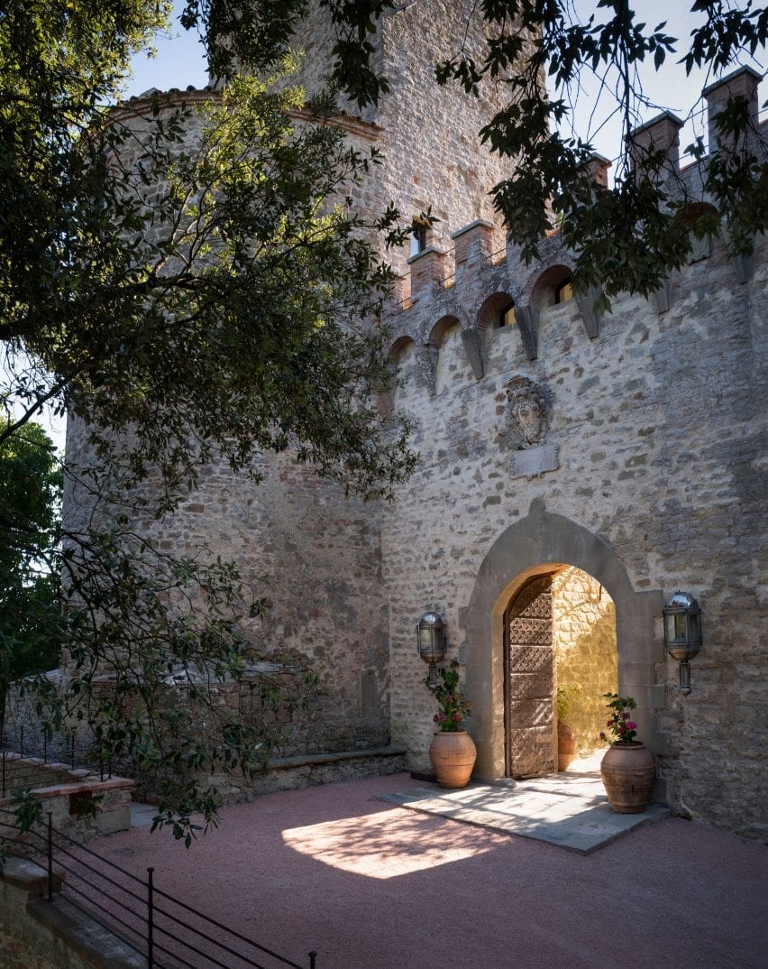
A 10th-century castle in the Umbrian hills has been restored and transformed into a hotel by Count Benedikt Bolza and his family, who created custom furniture for its 36 suites, restaurant and spa.


Welcoming its first guests in spring 2021, Hotel Castello di Reschio comprises 30 suites within the historic castle.

Swimming pool at Castello di Reschio
Hotel Castello di Reschio sits on a 3,700-acre estate in the Umbrian countryside

The hotel sits within the sprawling Reschio estate, which was acquired by Count Antonio Bolza in 1994, lies on the border between Umbria and Tuscany and is dotted with farmhouses.

The crumbling buildings were slowly restored into private homes by his son Benedikt and daughter-in-law Donna, before they turned their attention to the site’s impressive 1,000-year-old castle and surrounding structures.

Hotel Castello di Reschio in Umbria
The 10th-century building was restored by Count Benedikt Bolza and his family

The family lived in the stone “castello” for a decade while they worked to protect and restore the architecture, then create interiors that respect the ancient building while offering modern comforts.

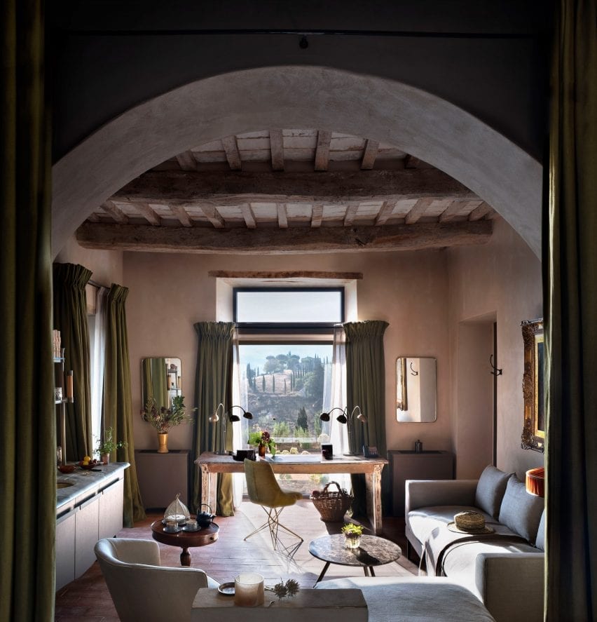
In total 30 suites were built within the castle itself, with some rooms having views of the central courtyard garden, while others look out over the rolling hills.

A further six suites were built next to the parish church.

Mud room at Hotel Castello di Reschio
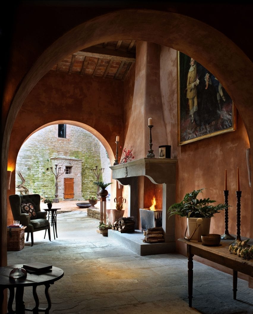
Original features were retained, like the stone fireplace in the mud room

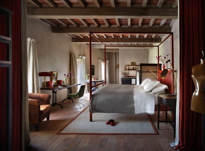
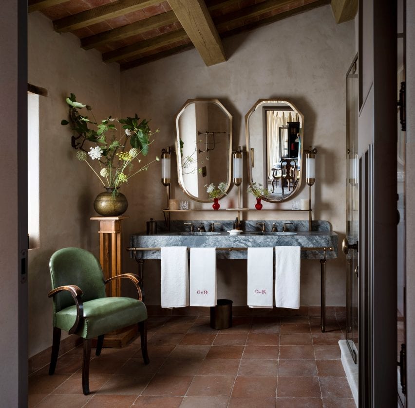
All of the rooms were decorated with terracotta-brick or wooden floors, hand-stitched linen curtains, Italian fabrics, and locally crafted marble and brass vanities.

Benedikt Bolza also designed and crafted bespoke beds and lighting for the hotel via his own furniture brand, BB for Reschio. These are mixed with portraits, photos and other curios sourced from local antique markets.

One of the Hotel Castello di Reschio's 36 guest rooms
Bolza designed beds and lighting for the rooms

“Benedikt has embraced an organic approach to the design, championing local craftsmanship and creating thoughtful, whimsical spaces that are filled with comfort and wit, while artfully nodding to the fascinating characters who once resided within the castle walls,” said the family.

The Tower Suite, which is entered over the castle’s gateway and spread over five levels, boasts two bedrooms, a living room, study, and roof garden with an open-air bathtub.

Guest bathroom
Local materials were used to create the bathroom vanities

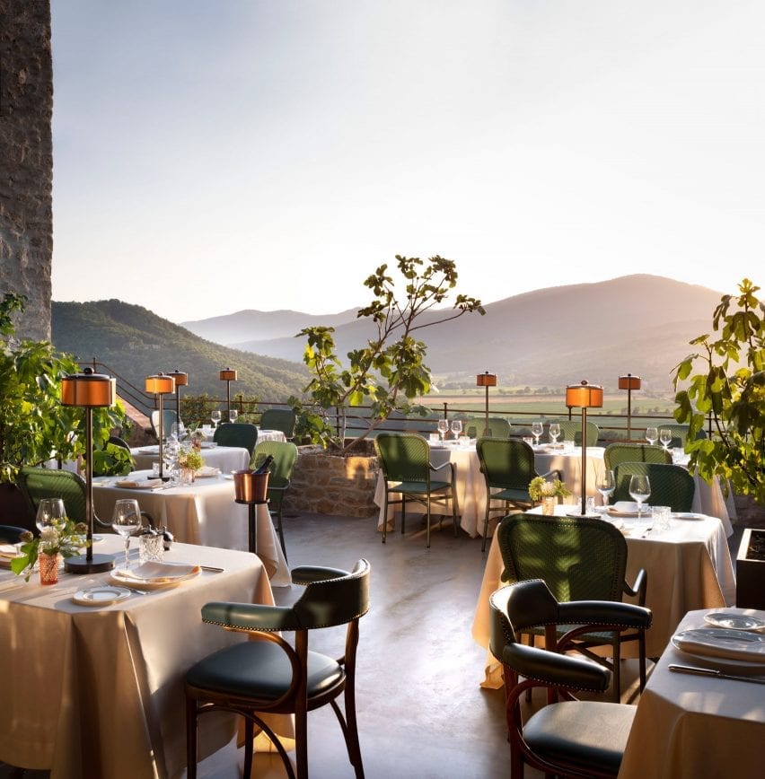
Dining options for guests include the Ristorante Al Castello, located in the castle’s western ramparts and serving Italian dishes made with produce grown on the estate.

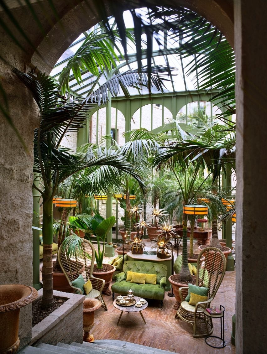
The verdant Palm Court is a new structural addition modelled on iron-and-glass Victorian conservatories, which is intended as a space for reading, conversation or enjoying cakes and cocktails from the adjacent bar.

Hotel Castello di Reschio’s 36 rooms have views of the castle courtyard or the Italian hills

Another alternative is Il Torrino, the converted watchtower that serves light fare and drinks, and overlooks an oval swimming pool.

The hotel spa is situated in the vaulted stone cellar, where hammams, saunas and plunge pools are atmospherically lit by shards of sunlight through the arrow slits and windows.

Palm Court
The Palm Court, a new addition, is modelled after Victorian conservatories

Guests seeking a more active experience can explore the estate on foot or bicycle, or take horse-riding lessons at the Equestrian Centre.

Many of the region’s historic towns and cities are also a short drive away, for those who wish to explore further afield.

Ristorante Al Castello
Guests can watch the sunset from the Ristorante Al Castello

Castles and ancient buildings across Italy have been converted into guest accommodation while maintaining their original charm and character.

Another example, also in Umbria, is a 12th-century watchtower that was reconstructed and turned into a holiday retreat.

Reference