Glossier Boston store features pastel green mouldings
CategoriesInterior Design

Glossier Boston store features pastel green mouldings

Decorative architectural mouldings are recreated in pastel green to frame openings at the Boston store for the cosmetics brand Glossier.

Designed by the company’s in-house team, the permanent Glossier Boston location on the city’s bustling Newbury Street follows a pop-up at the Seaport in 2019.
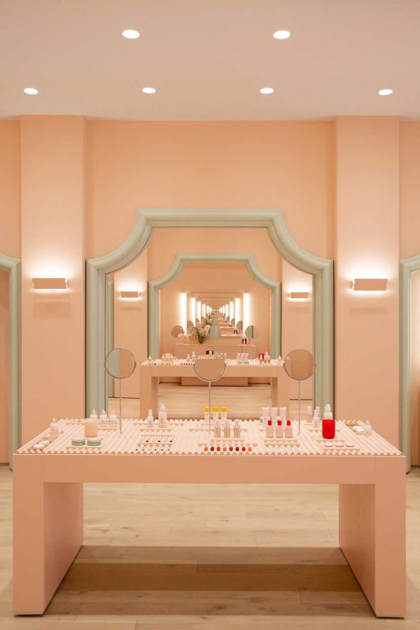
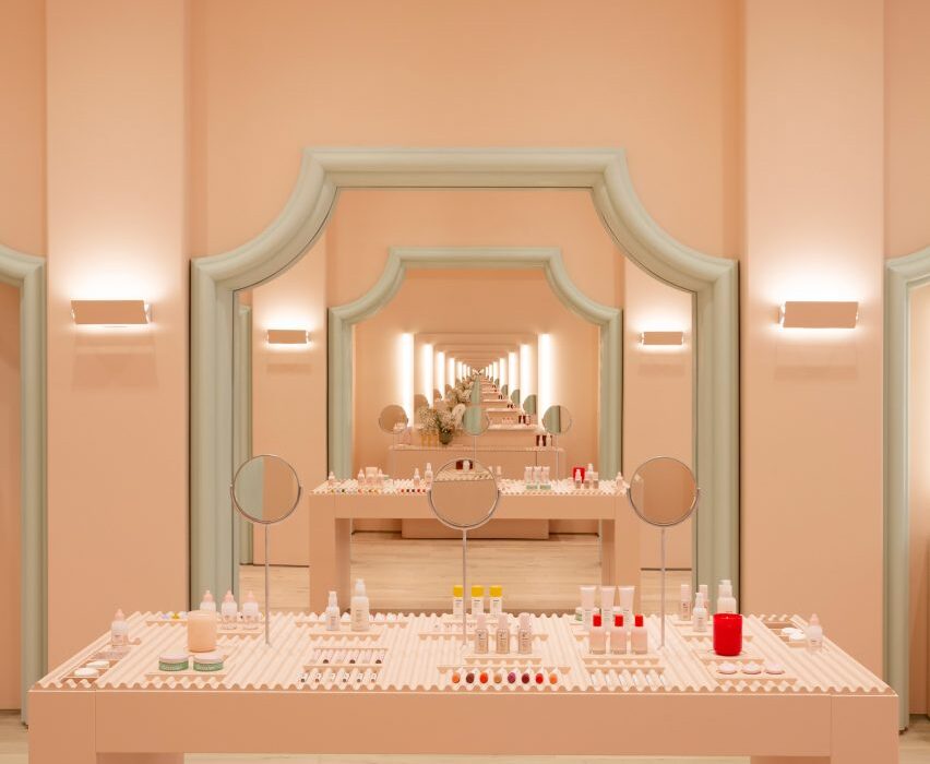
Infinite mirror reflections in pale pink Glossier store
Mirrors positioned to face one another create infinite reflections at the Glossier Boston store

For the space, the designers took influences from historic local architecture and Boston’s status as a college student hub, with Harvard University and MIT located just over the Charles River in Cambridge.

“With our 10th Glossier location, we wanted to bring something special to the city that honors its metropolitan and scholastic personality,” said the team. “Our influences for Glossier Boston’s design include collegiate fashion and the decorative characteristics of Boston’s local architecture.”
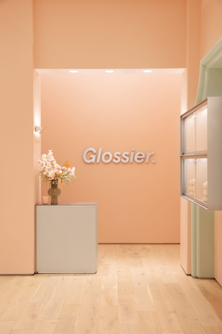
Glossier logo affixed to pale pink wall
The brand’s signature pink hue covers the walls

They also cited the “blush pink stucco, verdant green stone and verdant plant life” of the nearby Isabella Stewart Gardner Museum, which is modelled on a Venetian palazzo, as a source of inspiration for the store interior.

Glossier’s signature Millennial pink shade covers the walls, while cased openings are framed with stylised versions of architectural mouldings found on neighbouring buildings.
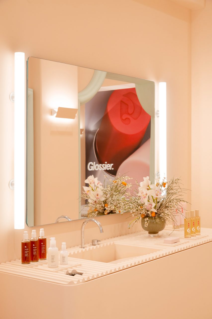
Product display in front of large mirror
Products are displayed on wavy trays

Mirrors are positioned to face one another in order to create infinite reflections of customers testing makeup and skincare products.

The merchandise is displayed on the wavy trays, cylindrical displays and rectangular tables found in many of Glossier’s stores.
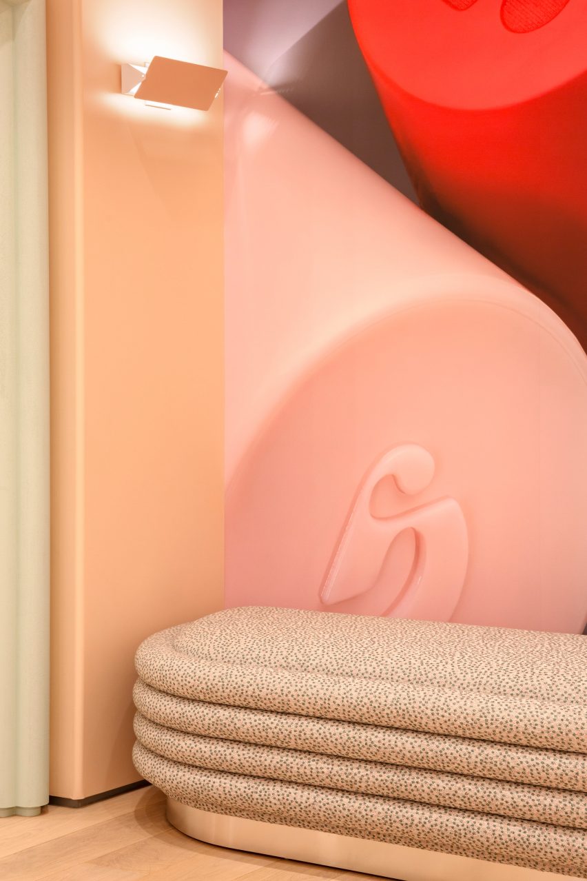
Soft seating
The store is Glossier’s 10th permanent retail location

Pale wood floors contribute to the soft colour palette, while bright lighting is designed to be flattering.

On the exterior, the tall windows and brass doors are surrounded by marble panels and bronze detailing.

These details contrast the pale hues inside.

“There is also a large step-back from the curbside, filled with lush trees that invite visitors to connect and hang out,” the team said.
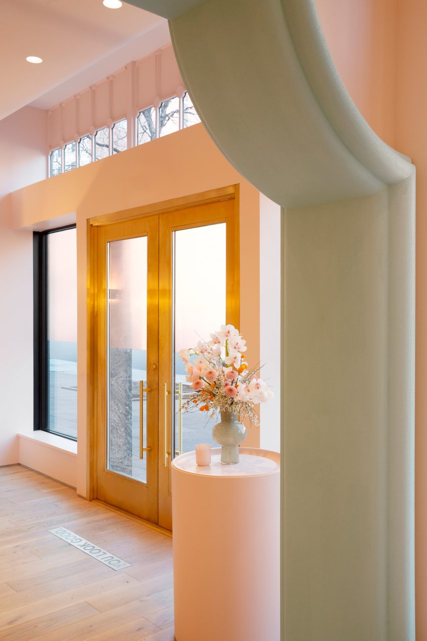
Brass doors
Stylised versions of historic architectural mouldings frame cased openings

When Glossier launched in 2014, it became known for its pop-up stores that opened across the US.

The temporary spot that the company installed in Seattle, which was filled with plant-covered mounds, was named small retail interior of the year at the 2020 Dezeen Awards.
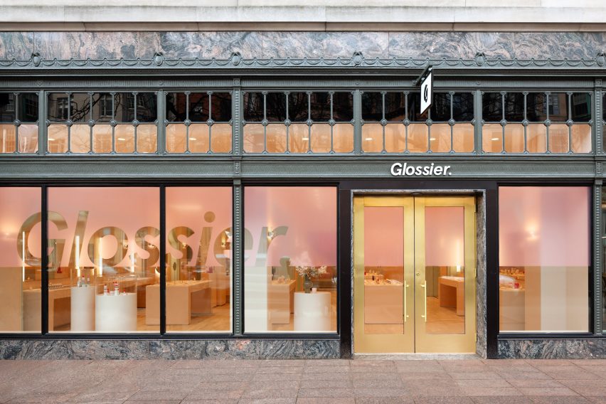
Glossier Boston store exterior
The store’s marble and bronze exterior contrasts the interior colour scheme

The brand has since opened permanent locations in cities including Seattle, Los Angeles and London.

All of these share a similar aesthetic and colour scheme, with subtle differences that nod to the specific location and context.

The photography is by Brian W Ferry.

Reference

Dezeen Debate features “robust and luxurious” arched townhouses
CategoriesArchitecture

Dezeen Debate features “robust and luxurious” arched townhouses

The Arches DHaus

The latest edition of our Dezeen Debate newsletter features a row of townhouses by The DHaus Company featuring brick-clad arches. Subscribe to Dezeen Debate now.

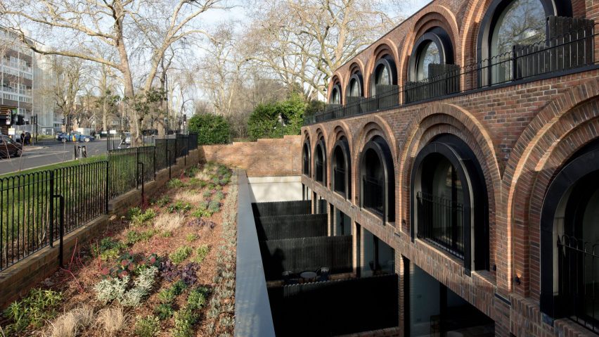
Architecture studio The DHaus Company has finished a row of brick-clad townhouses within the Dartmouth Park Conservation Area in north London called The Arches.

The homes, which replace a derelict petrol station, are named after the arches that form the facade of each house.

Most commenters adored the project. One loved “the colonnade-like feel”, while another labelled it “breathtaking and inspiring”. Yet another said that while the home was “robust and luxurious” they questioned “the scale decision”.

Exterior of Cabin Anna in the Netherlands by Caspar Schols
Caspar Schols creates reconfigurable Cabin Anna in Dutch park

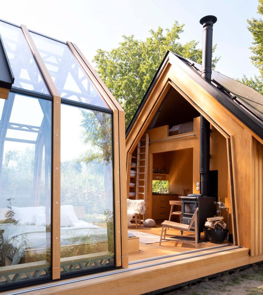
Other stories in this week’s newsletter that fired up the comments section include a modular cabin in the Netherlands by Caspar Schols and an opinion piece by Aaron Betsky questioning the decision to award David Chipperfield this year’s Pritzker Architecture Prize. We also looked at the Tamedia Office Building by Shigeru Ban as part of our Timber Revolution series.

Dezeen Debate

Dezeen Debate is sent every Thursday and features a selection of the best reader comments and most talked-about stories. Read the latest edition of Dezeen Debate or subscribe here.

You can also subscribe to our other newsletters; Dezeen Agenda is sent every Tuesday containing a selection of the most important news highlights from the week, Dezeen Daily is our daily bulletin that contains every story published in the preceding 24 hours and Dezeen In Depth is sent on the last Friday of every month and delves deeper into the major stories shaping architecture and design.

Reference

Dezeen’s Pinterest roundup features nine sauna’s in touch with nature
CategoriesInterior Design

Dezeen’s Pinterest roundup features nine sauna’s in touch with nature

Saunas are trending on Pinterest and Dezeen has featured some of the best, including a floating sauna in Stockholm and a three-storey, outdoor sauna in the USA. Follow Dezeen on Pinterest and read on to discover the projects.

Pinners have been attracted to Dezeen’s sauna board. The most popular saunas are inspired by their natural surroundings and have cosy and relaxing interiors.

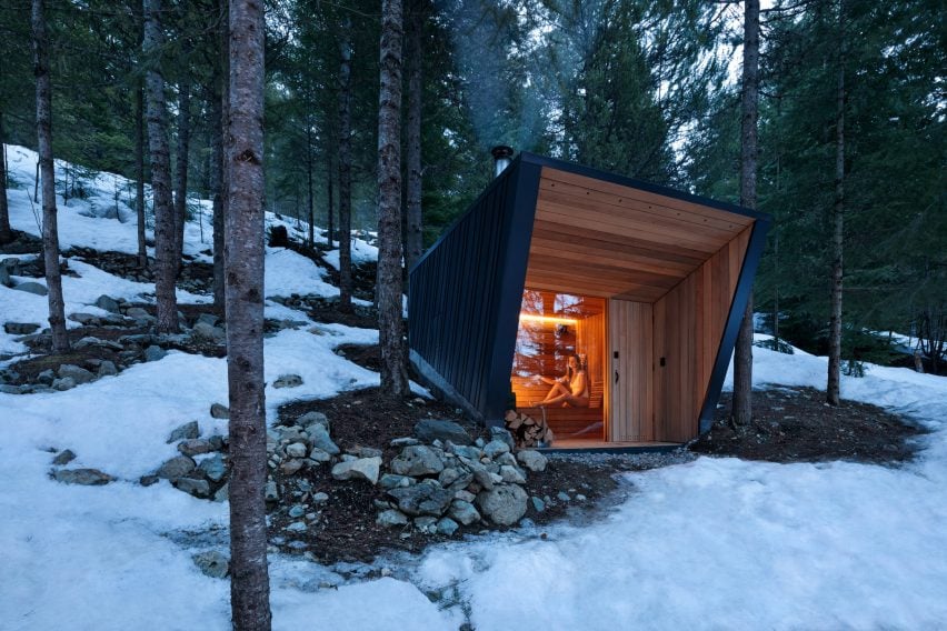
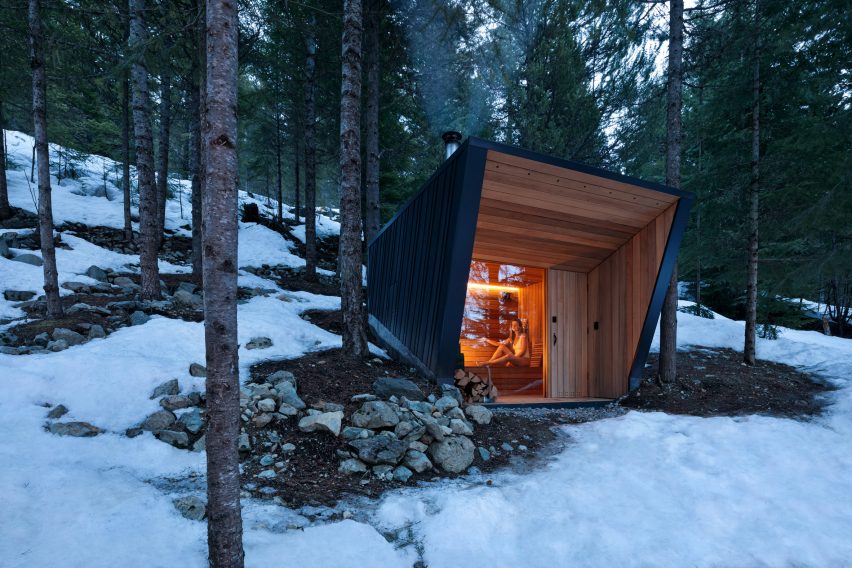
An out-building sauna in Canada, up a slope behind the main cabin, stood out due to its miniature size and unique shape.

Scroll down to see nine popular projects pinned on Dezeen’s Pinterest and browse our sauna Pinterest board to see more.


A detached sauna structure

Ambassador Crescent, Canada, by BattersbyHowat Architects

This detached sauna, built on the property of a mountainside home in Whistler, British Columbia, was designed by Vancouver-based studio BattersbyHowat Architects.

Clad in standing seam metal, the small sauna mimics the design of the nearby holiday home.

Find out more about the Ambassador Crescent ›


A floating sauna

The Big Branzino, Stockholm, by Sandellsandberg

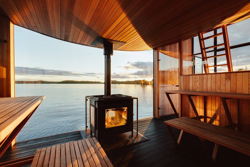
Pine planks clad the exterior of a floating sauna by Swedish studio Sandellsandberg, which they designed to blend in with the surrounding forests.

For the interior, the studio used red cedar and added a fireplace, meaning that the central space can be heated for overnight trips when not used as a sauna.

Find out more about The Big Branzino ›


A red and orange sauna

Bademaschinen, Norway, by ACT! Studio and Borhaven Arkitekter

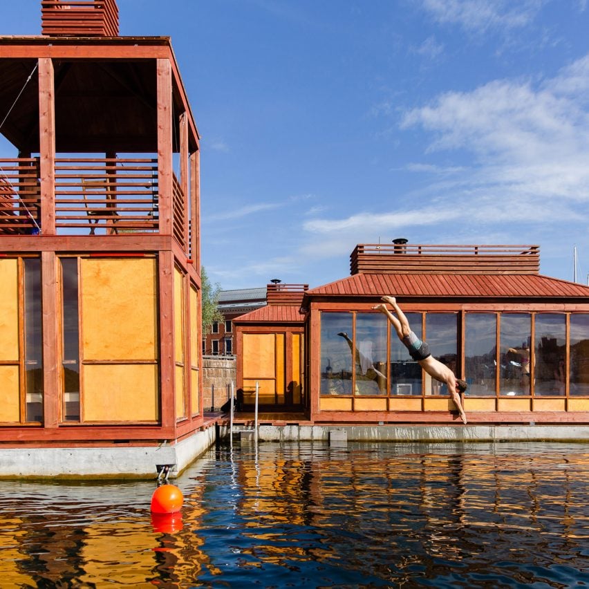
ACT! Studio and Borhaven Arkitekter designed a collection of floating red and orange buildings in Oslo harbour to be a playful and relaxing space sauna.

For the project, the studio covered the floors with red vinyl. Birch plywood was used for the walls, tiered seating and changing rooms.

Find out more about Bademaschinen ›


Löyly by Trolle Rudebeck Haar

Löyly, Switzerland, by Trolle Rudebeck Haar

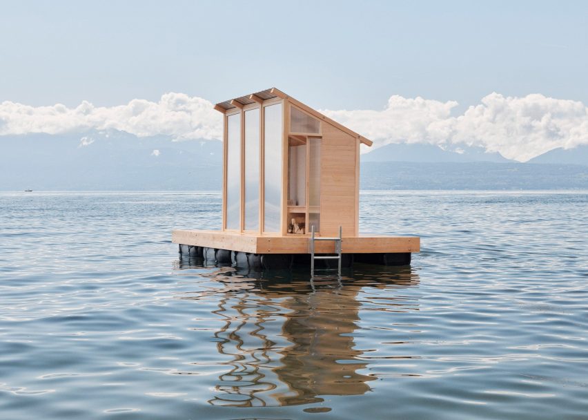
Graduate Trolle Rudebeck Haar designed another floating sauna in Switzerland to fit up to three people. It has a sloped roof, wooden stove, bench, translucent glass windows and an exterior deck.

Löyly sits on a floating pontoon deck which allows it to be placed on any water with low-wave motion.

Find out more about Löyly ›


A black timber sauna

Saunaravintola Kiulu, Finland, by Studio Puisto

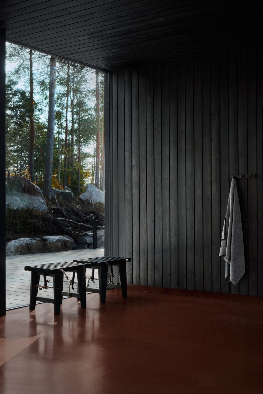
Simple and traditional materials such as black wood and red epoxy flooring were used by Studio Puisto to create a sombre and crisp atmosphere for this sauna at a lakeside wellness centre in the town of Ähtäri, Finland

Located in its own independent wooden cabin, the studio added a large window with the aim of connecting with the surrounding environment.

Find out more about Saunaravintola Kiulu ›


A three-storey outdoor sauna

Sauna Tower, USA, by BarlisWedlick

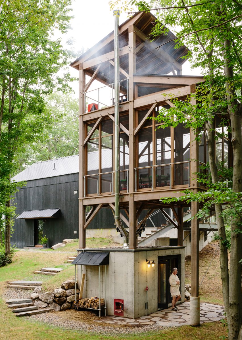
This treehouse-style, three-storey outdoor sauna in New York’s Hudson Valley was designed by American studio BarlisWedlick.

A concrete sauna acts as the base for stacked-timber platforms made from Alaskan yellow cedar, topped with a viewing platform.

Find out more about the Sauna Tower ›


Arctic Sauna pavilion

The Arctic Sauna Pavillion, Finland, by Toni Yli-Suvanto Architects

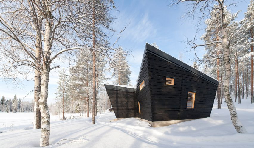
The surrounding natural environment inspired the design of the Arctic Sauna Pavilion by Tony Yli-Suvanto Architects in Lapland, Finland.

Inside, both bathing and relaxation take place in the same space, in accordance with an ancient arctic tradition. The walls of the building tilt outwards in the local custom to prevent the timber wall construction from getting wet.

Find out more about The Arctic Sauna Pavillion  ›


A sauna installation

Atmosphere, Australia, by Studio Rain

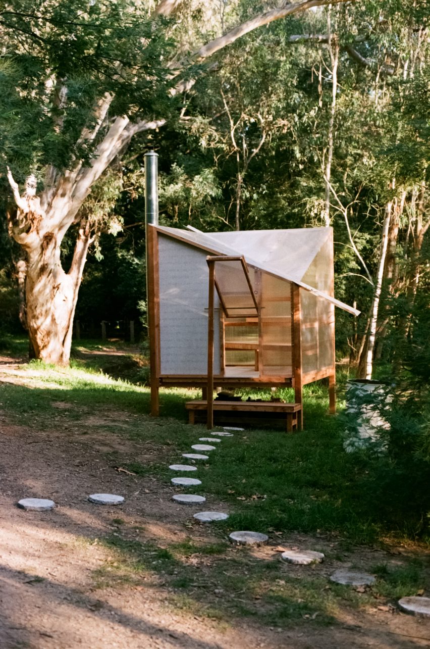
Studio Rain created a temporary sauna that is prefabricated and off-grid. Polycarbonate panels clads the walls and ceilings and it is heated by a wood-burning stove.

Made of reclaimed timber, it can be built, disassembled and reused without the need for any equipment.

Find out more about Atmosphere  ›


House and sauna in Cambridge by Neil Dusheiko Architects

Dark Spa, UK, by Neil Dusheiko Architects

This spa was built in the garden of a renovated Victorian semi-detached home by Neil Dusheiko Architects. Inside the spa, the studio added a Japanese soaking tub, sauna, shower, gym and relaxation room with a fold-down bed.

With walls clad in Sapele timber and black slate flooring, the Dark Spa is intended to be “silent and mysterious”, the studio told Dezeen.

Find out more about the Dark Spa ›

Follow Dezeen on Pinterest

Pinterest is one of Dezeen’s fastest-growing social media networks with over 1.4 million followers and more than ten million monthly views. Follow our Pinterest to see the latest architecture, interiors and design projects – there are more than four hundred boards to browser and pin from.

Currently, our most popular boards are retail interiors and staircases.

Reference

Dezeen Agenda features Norwegian cabin clad with 12,000 offcuts
CategoriesArchitecture

Dezeen Agenda features Norwegian cabin clad with 12,000 offcuts

Saltviga House by Kolman Boye Architects

The latest edition of our weekly Dezeen Agenda newsletter features a weekend retreat with a facade made from wooden flooring material. Subscribe to Dezeen Agenda now.

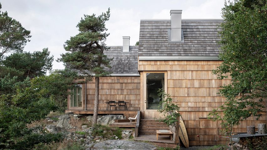
Stockholm-based studio Kolman Boye Architects has designed a weekend retreat in Lillesand, Norway, with an exterior made from offcuts of wooden floor material.

Studio founders Erik Kolman and Victor Boye came up with the concept after they learned that Danish floor brand Dinesen had a large haul of leftover wood available for use.

“It’s about using what’s available, of trying to find beautiful materials without clicking ‘order’ on a computer,” said Boye.

Portrait of Rafael Viñoly
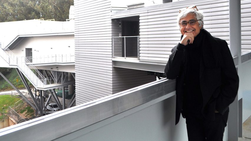
Uruguayan architect Rafael Viñoly dies aged 78

This week’s newsletter also included a minimalist renovation of a mews house in London by Trewhela Williams, an interview with the “grandfather of mass timber” Hermann Kaufmann and the passing of Uruguayan architect Rafael Viñoly.
Dezeen Agenda

Dezeen Agenda is a curated newsletter sent every Tuesday containing the most important news highlights from Dezeen. Read the latest edition of Dezeen Agenda or subscribe here.
You can also subscribe to our other newsletters; Dezeen Debate is sent every Thursday and features the hottest reader comments and most-debated stories, Dezeen Daily is our daily bulletin that contains every story published in the preceding 24 hours and Dezeen In Depth is sent on the last Friday of every month and delves deeper into the major stories shaping architecture and design. 

Reference

Dezeen Pinterest roundup features eight warm restaurant interiors
CategoriesInterior Design

Dezeen Pinterest roundup features eight warm restaurant interiors

Restaurant interiors with natural finishes have been popular on Pinterest this week, including a beach club restaurant in London and a Japanese restaurant in Canada featuring paper lanterns. Follow Dezeen on Pinterest and read on to find out more about the projects.

Pinners have been predominantly drawn to the Dezeen’s boards that feature restaurant interiors. The most popular have soft, warm lighting schemes and make use of natural materials and wooden furniture.

A sushi restaurant in Dubai stood out due to its black tiles, grey plaster and dramatic lighting.

Scroll down to see eight popular projects pinned on Dezeen’s Pinterest and browse our restaurants Pinterest board to see more projects.


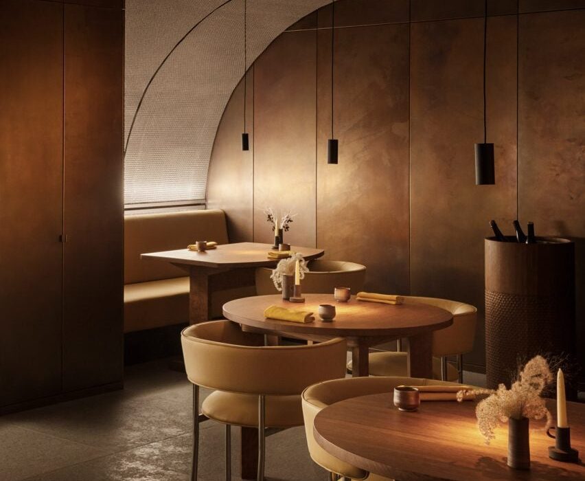
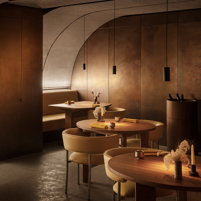
Ikoyi restaurant interior

Ikoyi restaurant, UK, by David Thulstrup

Copenhagen-based designer David Thulstup carried out a complete renovation of the interiors of London’s Ikoyi restaurant.

Informed by spices from sub-Saharan Africa, he created a warm and earthy colour palette featuring a variety of materials including copper and oak.

Find out more about the Ikoyi restaurant ›


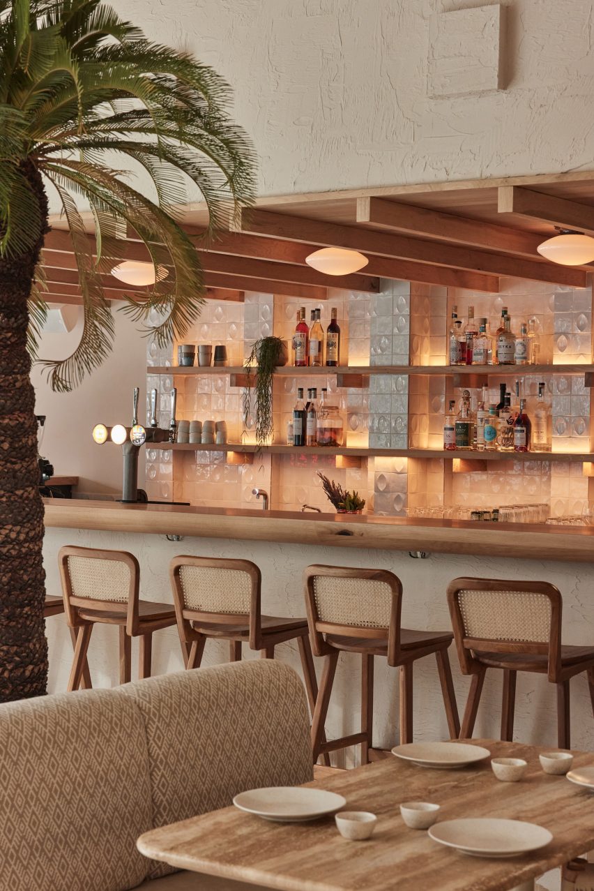
Milk Beach Soho restaurant by A-nrd

Milk Beach Soho, UK, by A-nrd

Natural materials feature in this eatery designed by London design office A-nrd to resemble an Australian beach club.

The restaurant’s seating is made from timber and rattan, while sandy-hued Palladian terrazzo covers the floor.

Find out more about Milk Beach Soho ›


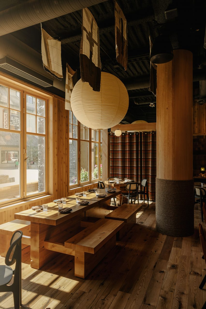
Paper lantern above bench seating

Hello Sunshine, Canada, by Frank Architecture

Japanese design elements like paper lanterns and ceiling-hung textile artworks feature in the interiors of the Hello Sunshine bar and restaurant in Alberta, Canada.

The studio incorporated plaid curtains, stone and wood to suit the restaurant’s mountain location.

Find out more about Hello Sunshine ›


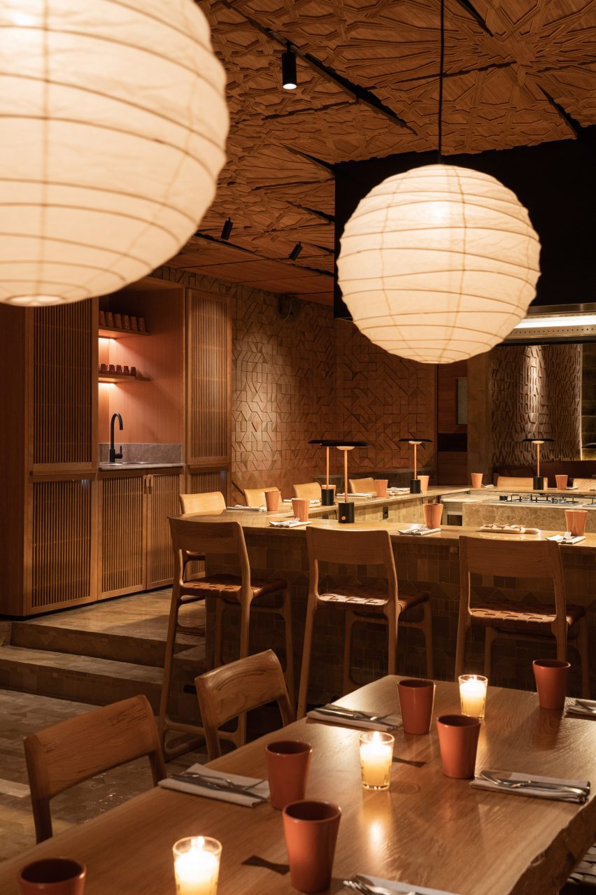
The interiors of a Moroccan restaurant

Sahbi Sahbi, Morocco, by Studio KO

Influenced by female chefs and Morrocan cuisine, Studio KO used earthy colours and natural materials like wood to create a warm and inviting space for guests at Sahbi Sahbi (above and top).

Finer details include rust-coloured ceramic urns, clay pots and pans and orange-brown paint used for an alcove above a sink.

Find out more about Sahbi Sahbi ›


Saga Hirakawaya restaurant, Japan, by Keji Ashizawa

Saga Hirakawaya restaurant, Japan, by Keji Ashizawa

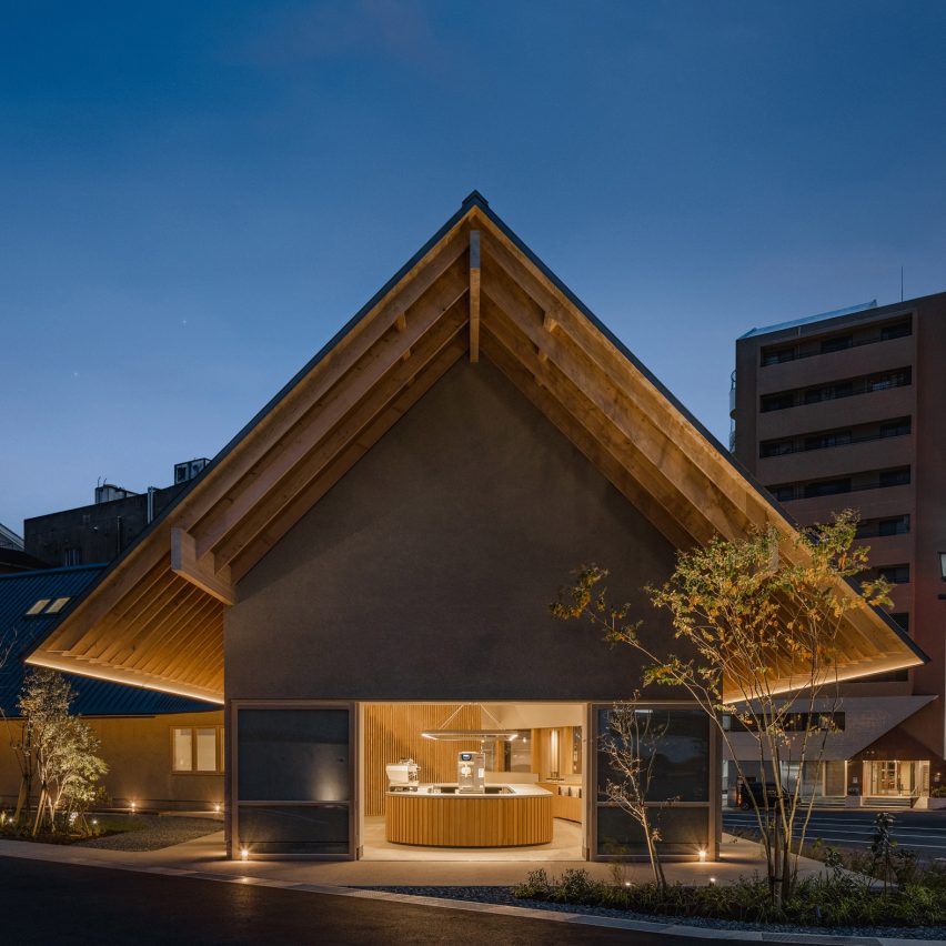
Materials “with a sense of simplicity” including wood and concrete were used to create minimalist interiors for a tofu restaurant in Japan’s Saga prefecture.

Wood was used for the entrance, windows and undersurface of eaves to match the wood from Ariake, a furniture brand also based in Saga. To complement its stripped-down interior, Japanese designer Keji Ashizawa added wooden furniture and pale grey walls.

Find out more about The Saga Hirakawaya restaurant ›


Bao Express restaurant in Paris by Atelieramo

Bao Express, France, by Atelieramo

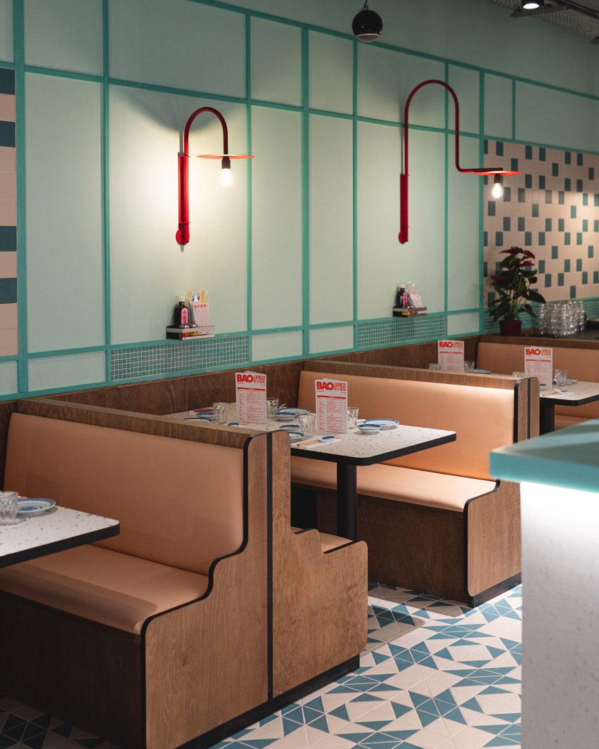
Traditional Hong Kong diners informed the design of Bao Express, Paris.

To recreate the 1970s Hong Kong urban atmosphere, the studio included celadon-green walls and curvaceous wooden booths. Pastel colours and neon lights also feature.

Find out more about Bao Express ›


Restaurant interior with table settings and lights

Bacchanalia London, UK, by Martin Brudnizki Design Studio 

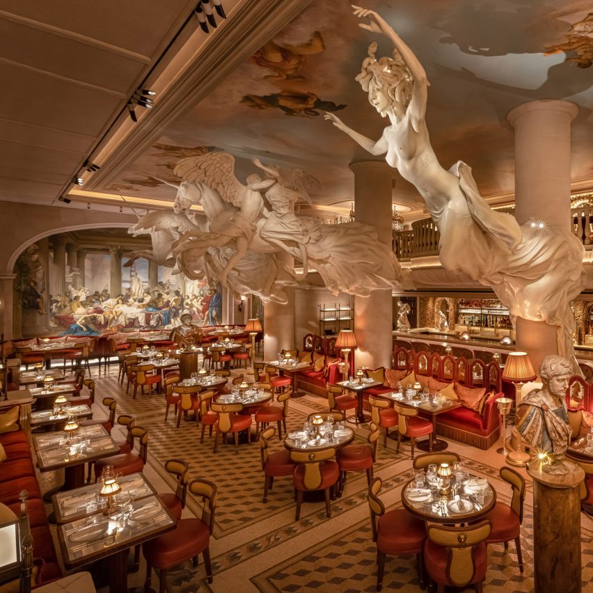
Martin Brudnizki Design Studio was informed by classic Greek and Roman mythology when designing the interiors of this London restaurant.

Sculptures more than 2,000 years old can be found at the bar and five specially-commissioned monumental statues by Damien Hirst dominate the main dining room.

Find out more about Bacchanalia London ›


Origami sushi restaurant in The Dubai Mall by VSHD Design

Origami, Dubai, by VSHD Design

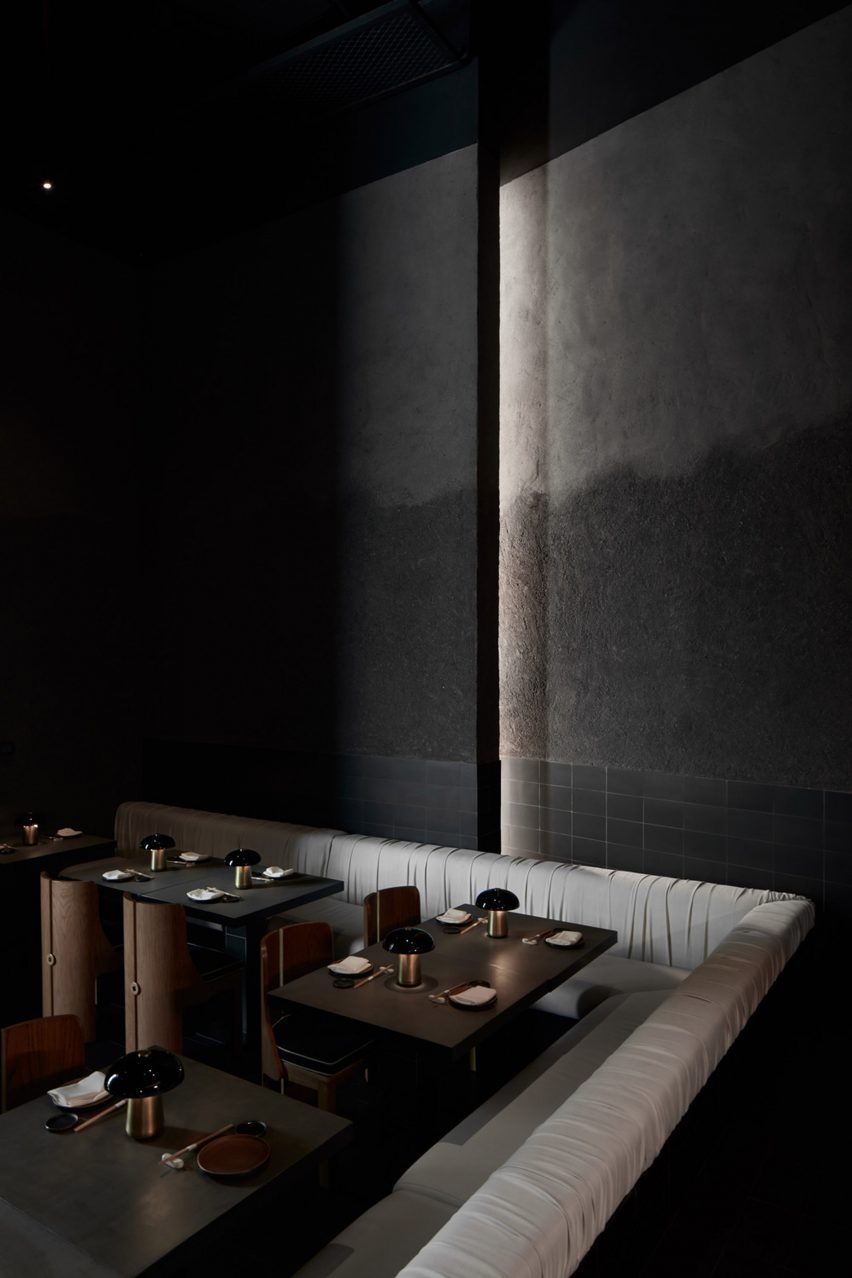
A moody and dark interior was created for a sushi restaurant in The Dubai Mall, United Arab Emirates.

To replicate the atmosphere of Japanese underground sushi bars, VSHD Design used textured grey plaster, matte-black tiles and dramatic low lighting.

Find out more about Origami ›

Follow Dezeen on Pinterest

Pinterest is one of Dezeen’s fastest-growing social media networks with over 1.4 million followers and more than ten million monthly views. Follow our Pinterest to see the latest architecture, interiors and design projects – there are more than four hundred boards to browser and pin from. Currently, our most popular boards are Apartments and Concrete houses.

Reference

Mammertsberg by Space Copenhagen pays homage to historic features
CategoriesInterior Design

Mammertsberg by Space Copenhagen pays homage to historic features

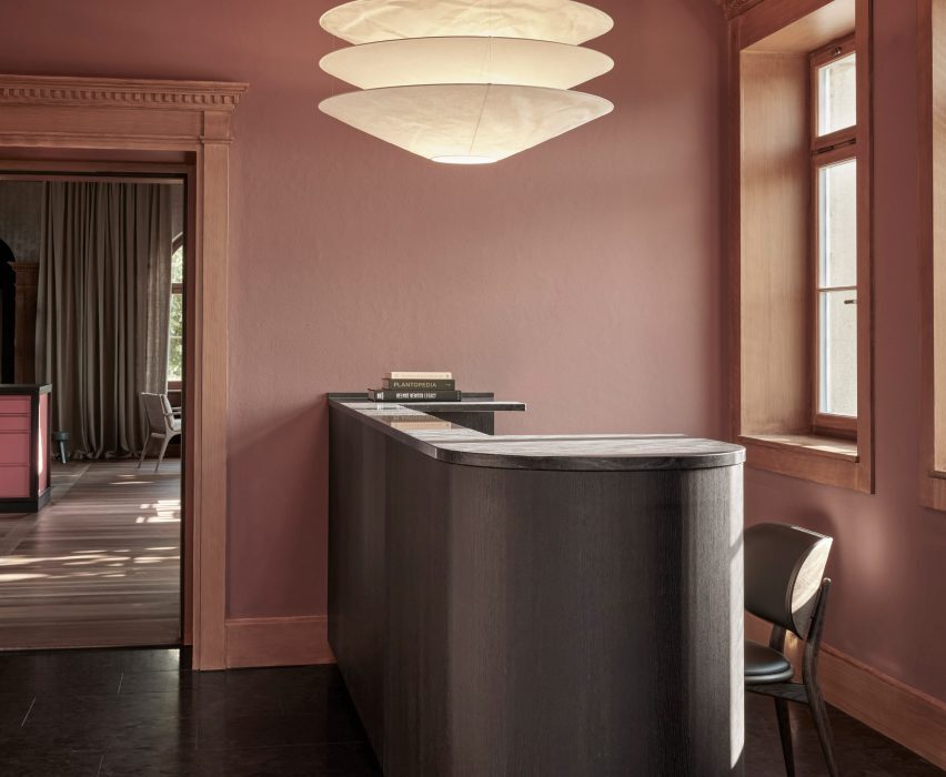
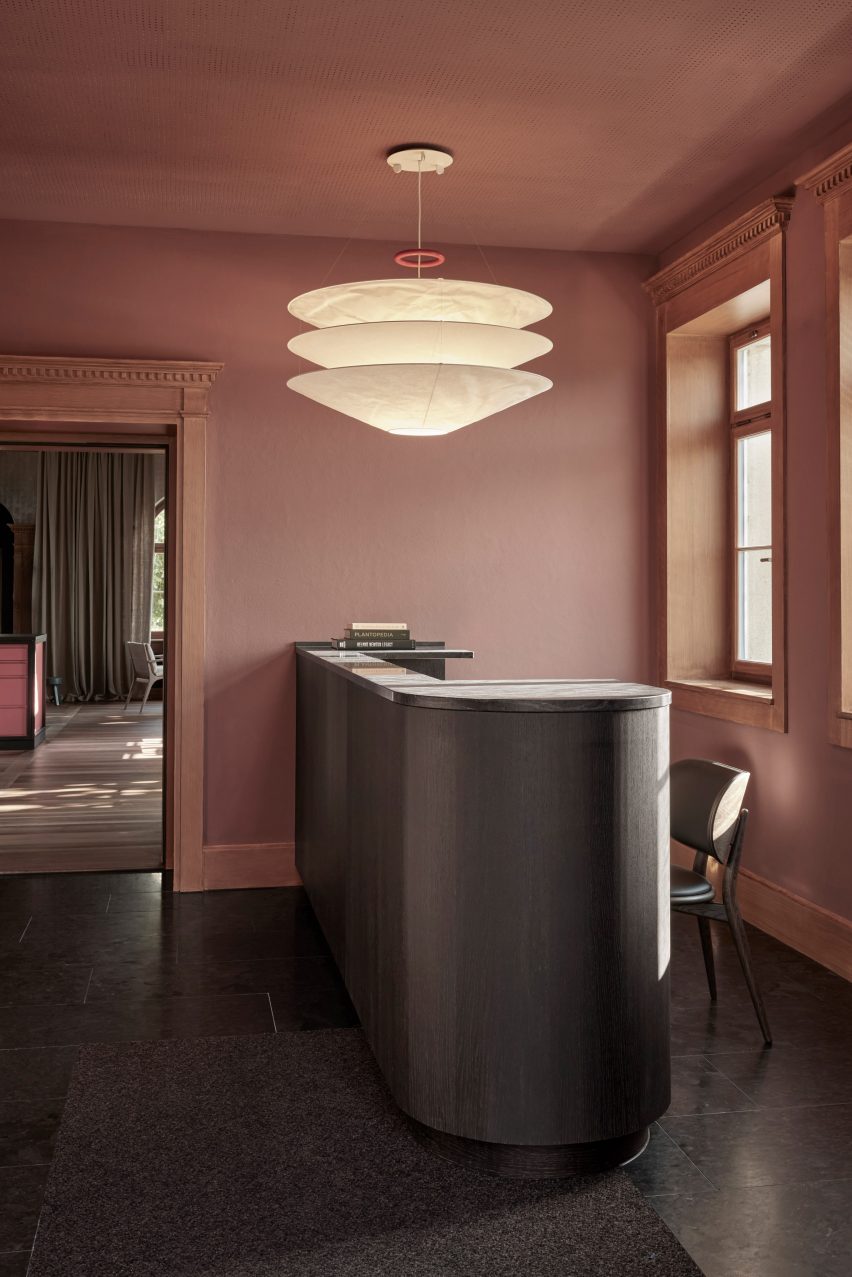
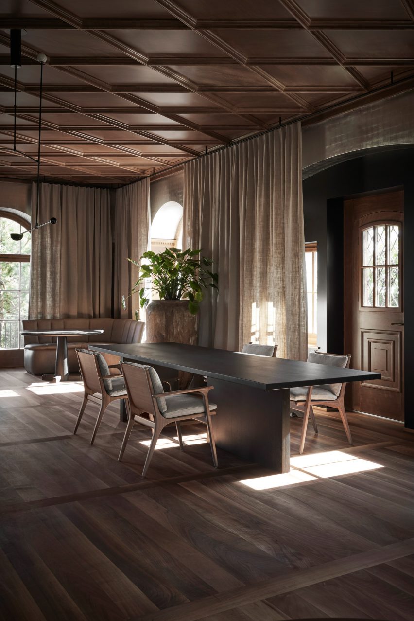
A sculptural spiral staircase, floor-to-ceiling windows and panelled walls have been paired with contemporary furnishings in Space Copenhagen’s renovation of a restaurant and hotel in Switzerland.

Called Mammertsberg, the combined hotel and restaurant is housed within a 1911 villa that overlooks the Alps mountain range in Freidorf, Switzerland.

Lobby of Mammertsberg hotel
Top: a spiral staircase takes centre stage in Mammertsberg. Above: Space Copenhagen has renovated the Swiss hotel and restaurant

Danish design studio Space Copenhagen focused on the restaurant and lounge, which were totally refurbished to transform the interior from its previous status as a Swiss-food restaurant.

Meanwhile, the adjacent six hotel guest rooms were given a light refresh.

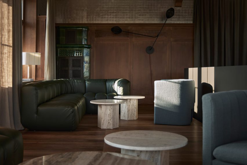
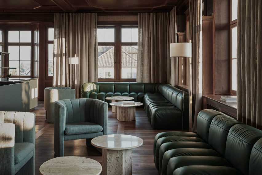
A lounge area interior by Space Copenhagen
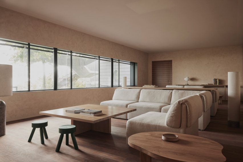
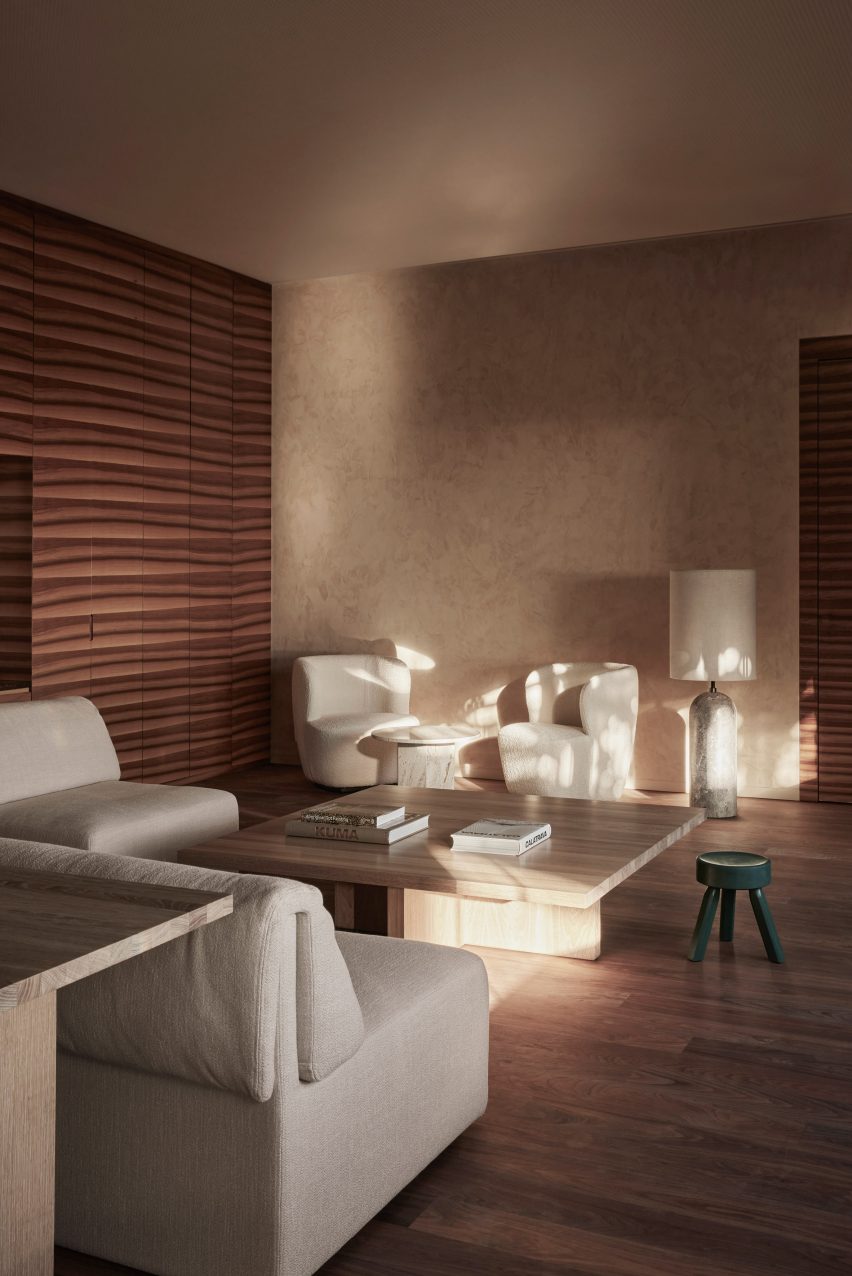
Contemporary furniture was added to the lounge

“We embraced the idea of keeping key historic, listed, and structural features, defining for the building and its architectural heritage,” Space Copenhagen told Dezeen.

“For the transformation towards something new, it felt important to add a diverse mix of furniture, lighting, materials, art and books, all of which could have been collected slowly over time,” the studio added.

The interior of Mammertsberg restaurant
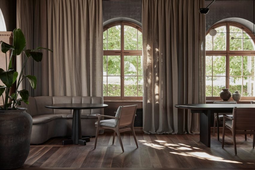
Linen curtains frame the large windows

Due to the building’s historic status, Space Copenhagen faced certain refurbishment restrictions, which resulted in the studio adapting its design around existing features within the property.

These included a large central staircase by architect Tilla Theus that connects the restaurant on the ground floor to the bar and lounge on the first floor.

The ground floor of the Mammertsberg
Natural materials were used throughout the interior

In the 42-seat fine-dining restaurant, which serves up locally sourced dishes, the studio embraced the high ceilings and large windows by adding floor-to-ceiling curtains in tactile, heavy linen.

“The building overlooks the impressive landscape and alpine scenery that characterises Switzerland and this inspired our design choices and approach,” said Space Copenhagen.

“It felt natural to treat the house as a large country home from which to enjoy the surrounding nature; offering guests the opportunity to contemplate and recharge.”

The interior of a restaurant in Switzerland
The restaurant has a walnut and linen colour palette

The surrounding nature was referenced in the material and colour choices, with solid oak tables in varying shapes and sizes dotted throughout the restaurant and lounge.

Elsewhere in the Mammertsberg restaurant, Scandinavian chairs were upholstered in subdued colour tones such as walnut and light linen, while petrol blue leather was added for contrast.

“We wanted to create a warm and inviting scene to balance the vibrant dishes while simultaneously seeking a high level of detailing, quality, and refinement in the curation of materials and furniture pieces,” explained Space Copenhagen.

“We worked with a new approach to solve the layout for the restaurant. Being a small restaurant allowed us to create a sense of familiarity with a variety of different tables – round, square and longer styles – all with different configurations and possibilities.”

A guest room inside the Mammertsberg
Six guest rooms were given a light refresh

The project also involved updating Mammertsberg’s guest rooms. Each of the six rooms was individually decorated to feel like someone’s private residence, with sculptural lighting and soft furniture to encourage rest and relaxation.

According to the designers, the limited time frame meant that finer details such as adding new finishes were prioritised over a larger overhaul.

A neutral coloured guest hotel room
Each hotel suite is individually furnished

“We couldn’t change the polished stone floors in certain public areas such as the restrooms, bathrooms and guestrooms,” Space Copenhagen said.

“We solved this by applying a different finish which honed them as much as possible towards a more matt and subdued hue, settling into the overall colour and material palette.”

Space Copenhagen was established in Denmark in 2005 and is best known for its restaurant interior design projects.

Among them is the Blueness restaurant in Antwerp, which is decorated with bespoke furnishings and Le Pristine, a restaurant that the company renovated with a moody aesthetic.

The photography is by Joachim Wichmann.

Reference

Dark Matter garden studio by Hyperspace features pivoting door
CategoriesArchitecture

Dark Matter garden studio by Hyperspace features pivoting door

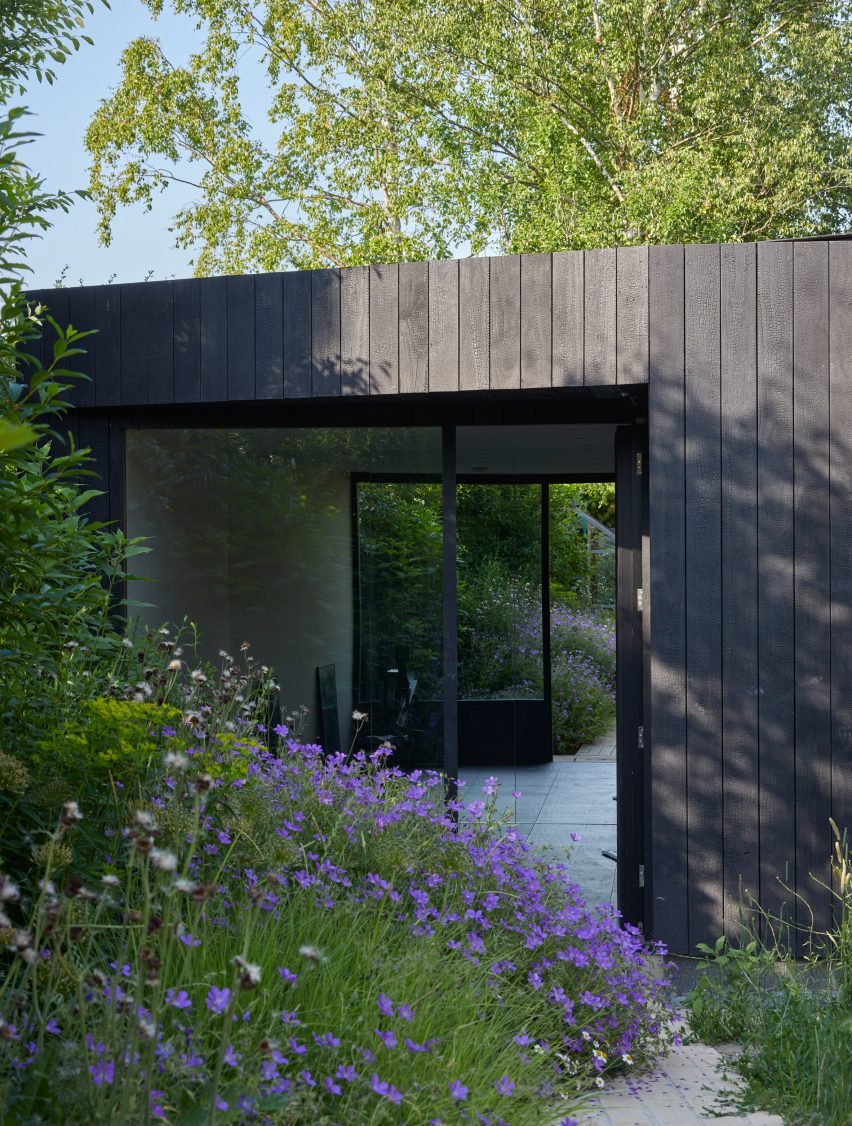
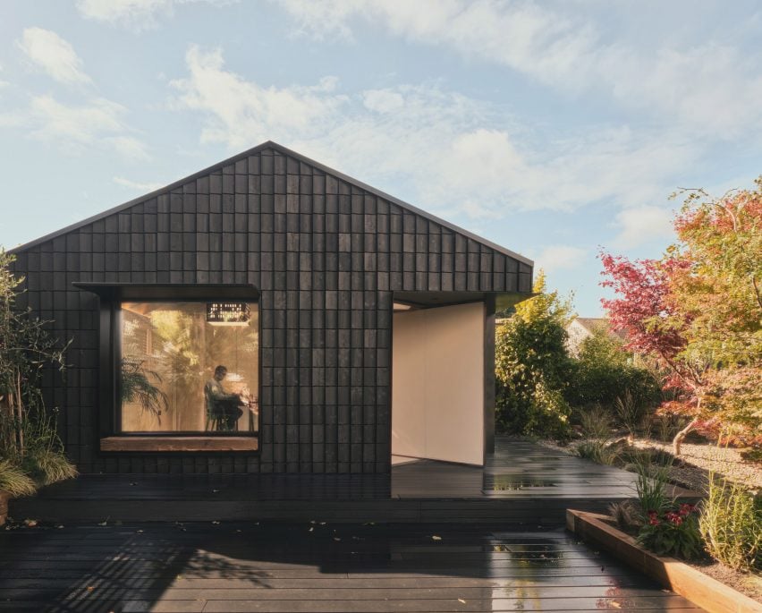
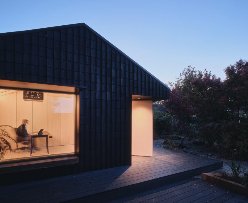
London-based architecture studio Hyperspace has created a garden studio in Hertfordshire, England, featuring a pivoting door and a charred-timber facade that doubles as an insect hotel.

Hyperspace converted a suburban garage to create the work-from-home studio called Dark Matter.

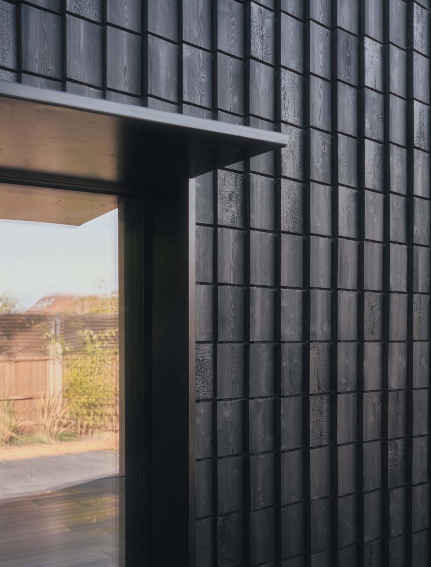
The building’s name refers to its facade, formed of 850 pieces of charred wood. The process, called Shou Sugi Ban, prolongs the life of the wood by making it more resistant to moisture.

Charred timber facade of Dark Matter garden studio by Hyper
The garden studio was created by converting a former garage

Gaps were left in between these wooden shingles to provide natural habitats for insects, with the aim of promoting biodiversity in the garden.

They act “as a giant bug hotel for insects to hibernate in”, according to Hyperspace founder Olli Andrew.

Andrew designed the studio to provide the client, design recruitment consultant Wayne Euston-Moore, with a spacious and tranquil workspace.

Entrance to Dark Matter garden studio by Hyper
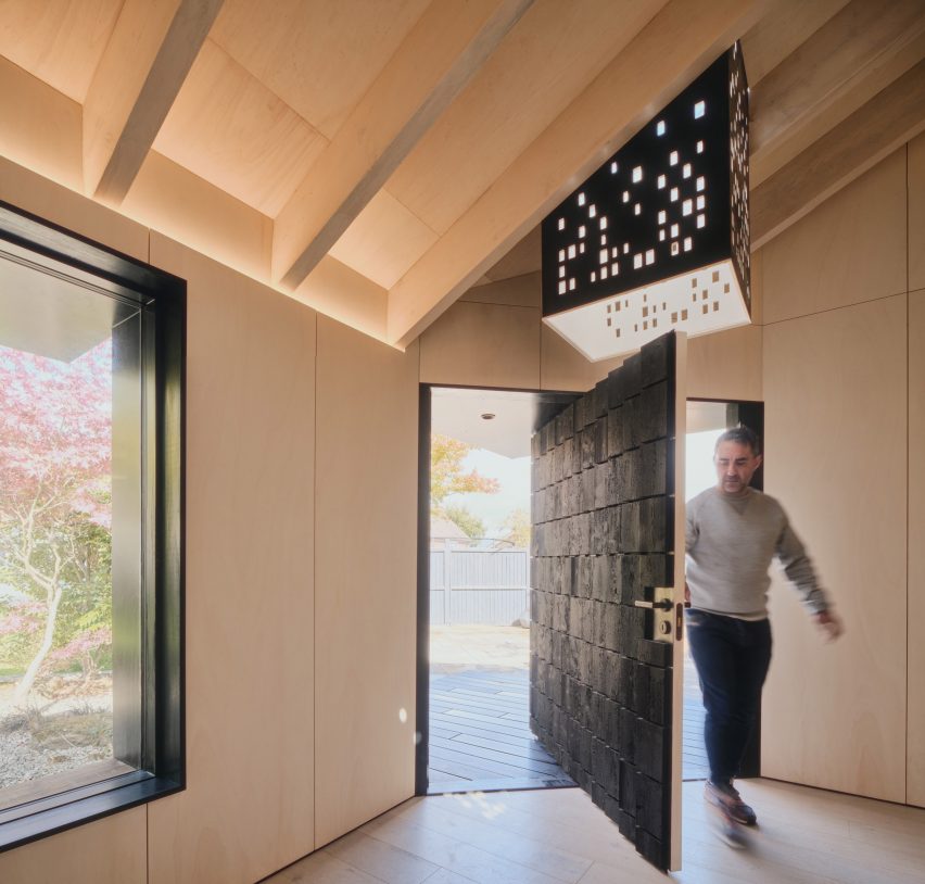
An extra-wide pivoting door forms the entrance

The ambition from the outset was to go beyond the simple, glass-fronted box that forms most garden studios.

The pivoting door follows this approach. Located on an angular cutaway at the building’s corner, this double-width element create a sense of drama from arrival.

Pivoting door
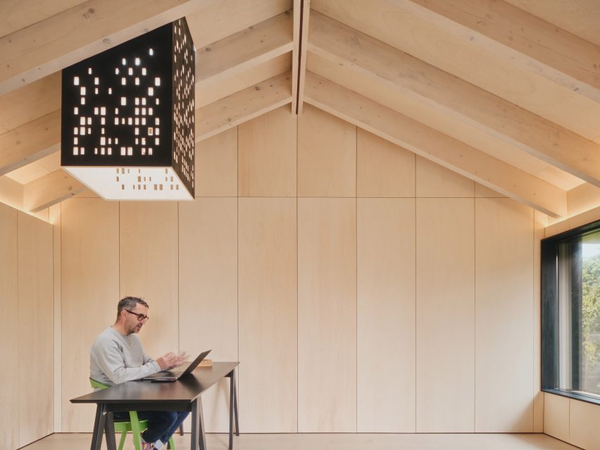
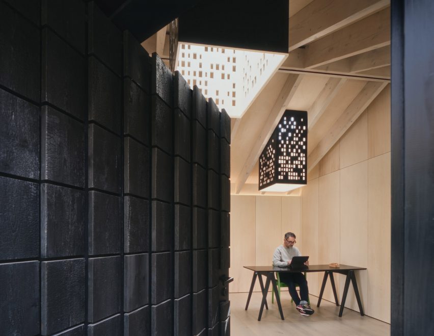
Two perforated “light chimneys” help to animate the interior

The building also features two “light chimneys” dotted with perforations.

Extending down from skylights in the roof, they create dynamic light reflections intended to mimic dappled sunlight through a tree canopy.

“Outdoor garden studios don’t need to be generic boxes,” said Andrew.

“This project’s beauty is in the craft, space and light. And with its connection to nature, it’s an inspired place to work.”

Light chimney and desk in Dark Matter garden studio by Hyper
Plywood panels line the interior walls

The design reuses almost all of the materials from the original garage structure, including the timber beams from the dismantled hip roof. Anything leftover was diverted to another Hyperspace project, to keep waste to a minimum.

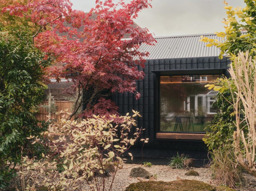
A corrugated metal roof was supported on white oiled timber rafters, while the interior walls are now lined with poplar plywood panels.

Charred timber shingles
Charred timber shingles clad the exterior walls

To improve the building’s energy performance, Andrew chose triple-glazed windows and skylights while he added insulation formed of wood fibre, wool and recyclable foil-based blankets.

“To reduce embodied carbon, the majority of materials were procured from within a 10-mile radius,” said Andrew.

“Steel and concrete use was kept to a minimum, with only one steel flitch plate and less than one square metre of concrete.”

Dark Matter garden studio by Hyper
Windows have deep sills, so can double as informal seats

The studio is minimally furnished, helping to enhance the sense of space. A simple table in the corner offers a view out through windows facing both north and east.

These windows both feature deep sills and minimal overhanging canopies, giving the studio’s occupant an alternative to place to sit and work.

Night view of Dark Matter garden studio by Hyper
The facade provides nesting space for insects

“It provides an amazing headspace which is inspiring yet calm,” Euston-Moore said. “It feels like you’re in a perfectly insulated space yet connected to the outside with ample natural light.”

Other recent garden studio designs include Michael Dillon’s low-cost architecture studio in Kent and a writer’s hut in Dublin designed by Clancy Moore Architects.

The photography and film are by Simon Kennedy.

Reference

Dezeen Agenda features water-filled windows that heat and cool buildings
CategoriesSustainable News

Dezeen Agenda features water-filled windows that heat and cool buildings

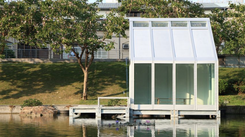
Water-filled glass house

The latest edition of our weekly Dezeen Agenda newsletter features windows filled with water that can help to heat and cool buildings. Subscribe to Dezeen Agenda now.

British startup Water-Filled Glass has developed panes of glass filled with water that use sunlight to power a “crazy” energy-saving heating and cooling system.

Water-Filled Glass (WFG) aims to use the patented technology, which it estimates can reduce energy bills by 25 per cent, to make heavily glazed buildings more sustainable.

Twelve architecture projects to look forward to in 2023

Other stories in this week’s newsletter include a roundup of architecture projects to look forward to in 2023, Sony’s reveal of its first-ever electric car and an attack on Oscar Niemeyer’s government palaces in the Brasília riot.

Dezeen Agenda

Dezeen Agenda is a curated newsletter sent every Tuesday containing the most important news highlights from Dezeen. Read the latest edition of Dezeen Agenda or subscribe here.

You can also subscribe to Dezeen Debate, which is sent every Thursday and contains a curated selection of highlights from the week, as well as Dezeen Daily, our daily bulletin that contains every story published in the preceding 24 hours on Dezeen.

Reference

Dezeen Agenda features architects and designers doing sustainable work
CategoriesSustainable News

Dezeen Agenda features architects and designers doing sustainable work

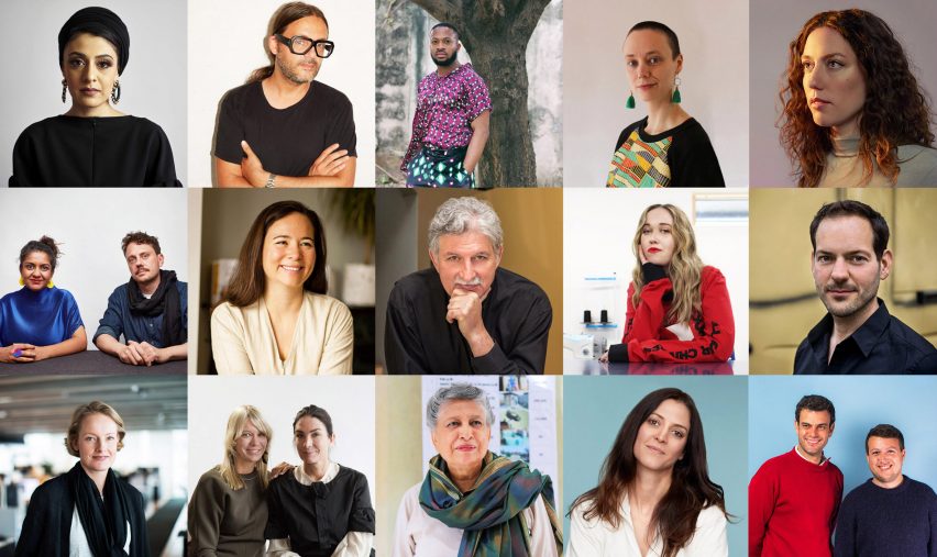
People to know on Earth Day

The latest edition of our weekly Dezeen Agenda newsletter features architects and designers who are pushing the boundaries of sustainable design. Subscribe to Dezeen Agenda now!

Architects and designers have a key role to play in reducing carbon emissions, pollution and waste.

In celebration of Earth Day, which falls on 22 April every year, we compiled a list of 50 individuals and studios that are doing pioneering work – from architects exploring timber construction to designers thinking radically about circularity.

City Hall building in Kharkiv
Norman Foster “to assemble the best minds” to rebuild Ukrainian city of Kharkiv

Other stories in this week’s newsletter include Norman Foster’s plan for the “rehabilitation” of Kharkiv, Thomas Heatherwick’s tree-covered sculpture design for Buckingham Palace and an exclusive interview with British artist duo Langlands & Bell.

Dezeen Agenda

Dezeen Agenda is a curated newsletter sent every Tuesday containing the most important news highlights from Dezeen. Read the latest edition of Dezeen Agenda or subscribe here.

You can also subscribe to Dezeen Debate, which is sent every Thursday and contains a curated selection of highlights from the week, as well as Dezeen Daily, our daily bulletin that contains every story published in the preceding 24 hours on Dezeen.

Reference

R for Repair London exhibition features “sympathetic” repairs to objects
CategoriesInterior Design

R for Repair London exhibition features “sympathetic” repairs to objects

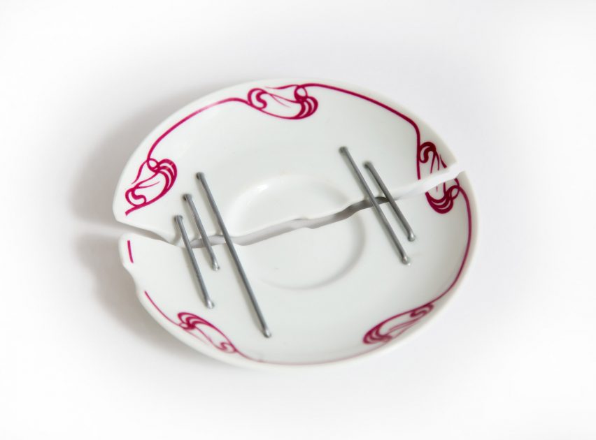
A rattan cast created to protect the damaged wing of a toy puffin and a fractured plate held together with steel staples feature in R for Repair, an exhibition of repaired objects presented at the V&A museum as part of London Design Festival.

Curated by Jane Withers and Hans Tan, the exhibition is the second edition of R for Repair, and follows the first iteration of the show that was held in Singapore last year.

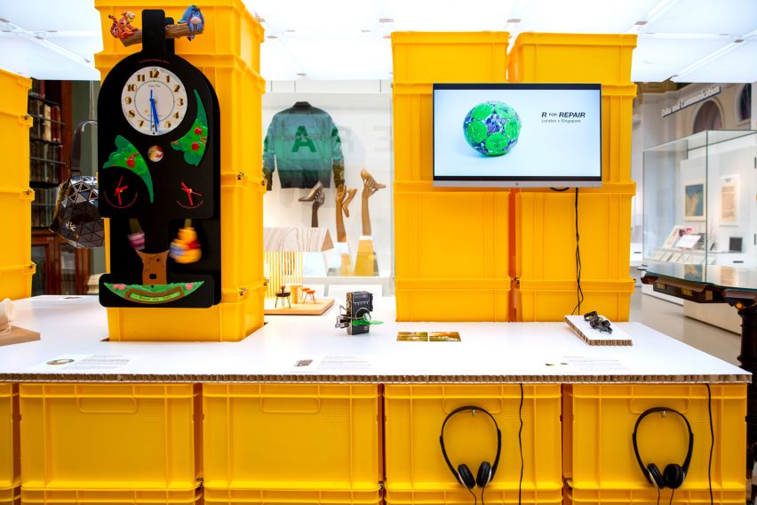
R for Repair
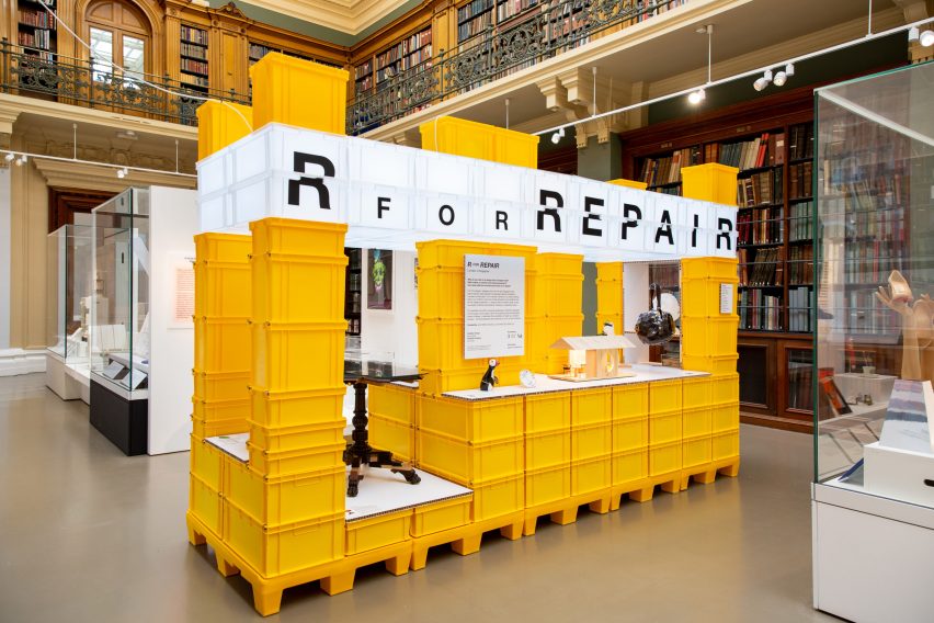
R for Repair is on display at the V&A in London

The show presented at London’s V&A museum includes 10 damaged objects repaired by 10 different designers from Singapore or the UK. They are displayed alongside three repaired objects from the original exhibition.

Responding to an open call, members of the public were invited to contribute sentimental but broken objects to the project. Designers chosen by Withers and Tan then repaired the objects in various creative ways.

Repaired toy puffin
Ng Si Ying repaired a toy puffin by creating a rattan cast for its wing

Designer Ng Si Ying created a cast and belt out of rattan and thread for Graham Secrets, a toy puffin owned by UK-based Oli Stratford, which was a gift from the owner’s parents on his 30th birthday.

Originally made by Danish silversmith and designer Kay Bojesen in 1954, the object was damaged by Stratford’s cat. Ying created a cast for the puffin’s wing in Singapore using an intricate weaving technique.

Antique sewing chest
Rio Kobayashi used Japanese joinery to adapt an antique sewing chest

“We wanted to pair designers who would be sympathetic to the owner’s emotional attachment and what are often quite moving stories behind the objects and why the owners treasure them, but might also have an unexpected take on the object and add new layers of meaning, enriching this evolving narrative of ownership,” Withers told Dezeen.

“We also looked for designers who might bring interesting techniques and unexpected experimentation to the repairs.”

Repaired sewing chest
The chest now has space to display drawings and paintings

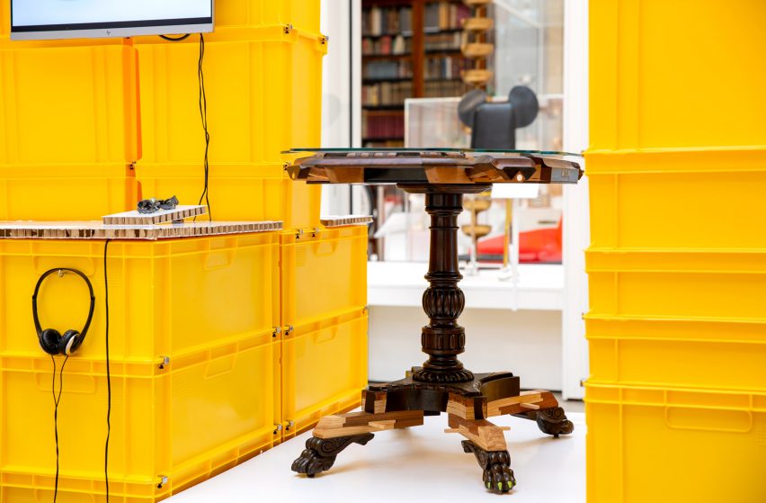
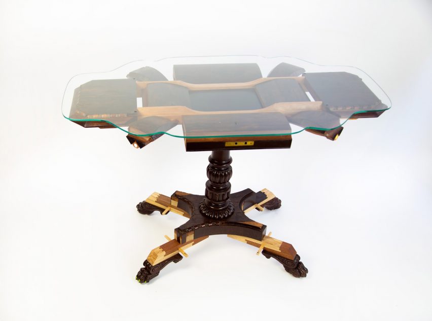
Another object repaired for the 2022 edition of the exhibition is an 18th-century antique sewing chest owned by Eleanor Suggett Stephens in the UK, which she inherited from her grandmother.

Suggett Stephens discovered that the chest contained previously unseen sketches and watercolour paintings by her grandmother, who wanted to be an artist but never achieved her dream.

Doll's house
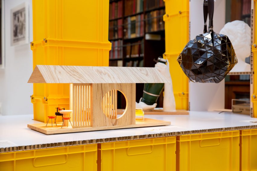
Other objects include a repaired doll’s house by Studiomama

London-based designer Rio Kobayashi used traditional Japanese joinery techniques to raise the furniture’s feet, and also created a large tabletop designed to display and celebrate the secret artwork.

Kobayashi used walnut, ash, cherry, sapele, paint and glass to repair the chest, which Suggett Stephens said “represents that creative dream which never happened for [my grandma] and reminds me how fortunate I am to have a career in the arts.”

Plate by Studio Dam
Studio Dam put a broken plate back together with staples

Other objects in the exhibition include a porcelain dinner plate that broke down the middle and was repaired with steel staples and epoxy glue by Studio Dam in Singapore.

British owners Karen Birkin and screenwriter Andrew Birkin, brother of actor Jane Birkin, submitted the plate for repair with an entirely open brief. Andrew Birkin quipped that Studio Dam could make a spaceship out of it.

In response, the multidisciplinary studio took visual cues from Stanley Kubrick’s film 2001: A Space Odyssey, which Andrew Birkin worked on early in his career.

Studio Dam was informed by juci, a traditional Chinese porcelain repair technique that involves the use of metal staples.

V&A exhibition
At the V&A, the objects are presented on bright yellow boxes

“On one hand, the primary motivation was to bring creativity to repair through design,” explained Tan, discussing the exhibition.

“At the same time, we thought having designers and objects from two countries would add a dimension to the project as a design and cultural exchange.”

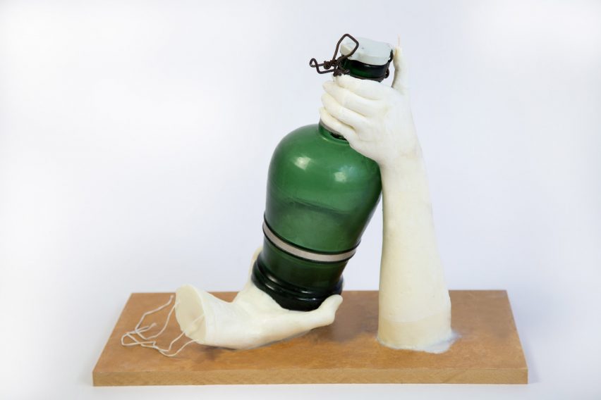
Repaired glass bottle
Tzen Chia playfully repaired a glass bottle for an anonymous owner

Withers also added that the exhibition intends to celebrate the process of repair and encourage the idea of giving possessions a second life.

“I think it is important to broaden the discussion around repair and explore the psychological as well as functional dimension,” concluded Withers.

“To understand why we keep things and how that can inform the design of products. How can things be designed with repair in mind so they improve with age?”

As London Design Festival kicks off in the capital, see other installations that are part of the event, such as a collection of rotating stone chairs by Sabine Marcelis.

The photography is by Zuketa Film Production

R for Repair is on display at the V&A in London from 17 September to 2 November. 

London Design Festival 2022 takes place from 17-25 September 2022. See our London Design Festival 2022 guide on Dezeen Events Guide for information about the many other exhibitions, installations and talks taking place throughout the week.

Reference