Napa Valley Residence by NICOLEHOLLIS
CategoriesArchitecture

Feel the Burn: 6 Strategically Scorched Buildings That Celebrate Shou Sugi Ban

Napa Valley Residence by NICOLEHOLLIS

The latest edition of “Architizer: The World’s Best Architecture” — a stunning, hardbound book celebrating the most inspiring contemporary architecture from around the globe — is now available. Order your copy today.  

Fire can cause unfathomable destruction, yet when its power is harnessed, it can be a source of extraordinary creativity too. Shou sugi ban, originally known as yakisugi, is an ancient wood-burning technique developed in Japan centuries ago. The surface of the wood is exposed to a flame and charred, rendering it a striking charcoal black. Far from merely decorative, the practice preserves and fortifies the wood — the carbon surface layer forms a natural defense against the elements, wood rot and insect damage, as well as acting as a fire retardant.

Prized for its dual protective and aesthetic qualities, this time-honored material treatment is now utilized all over the world. While it’s commonly seen across exterior wood siding, its applications are wide-ranging and extend to interior paneling, furniture, decking and other architectural elements. At the 11th A+Awards, architects embraced the burn with contemporary twists on this storied technique. From firehouses to restaurants and residences, discover the exceptional new spaces rising from the ashes…


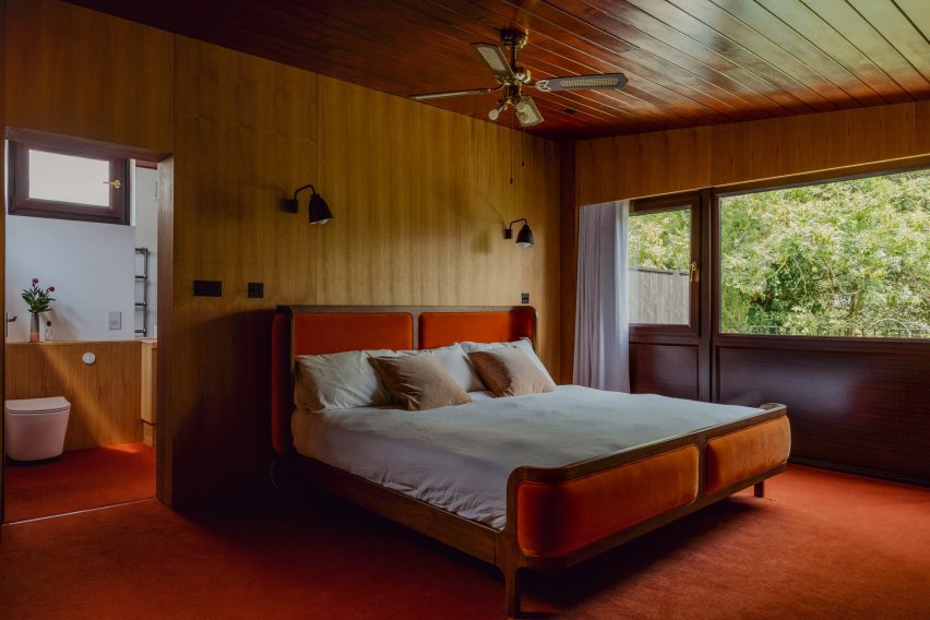
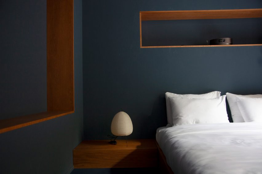
By NICOLEHOLLIS, Napa, California

Popular Choice Winner, 11th Annual A+Awards, Residential Interiors (<3000 sq ft)

Napa Valley Residence by NICOLEHOLLIS Napa Valley Residence by NICOLEHOLLIS
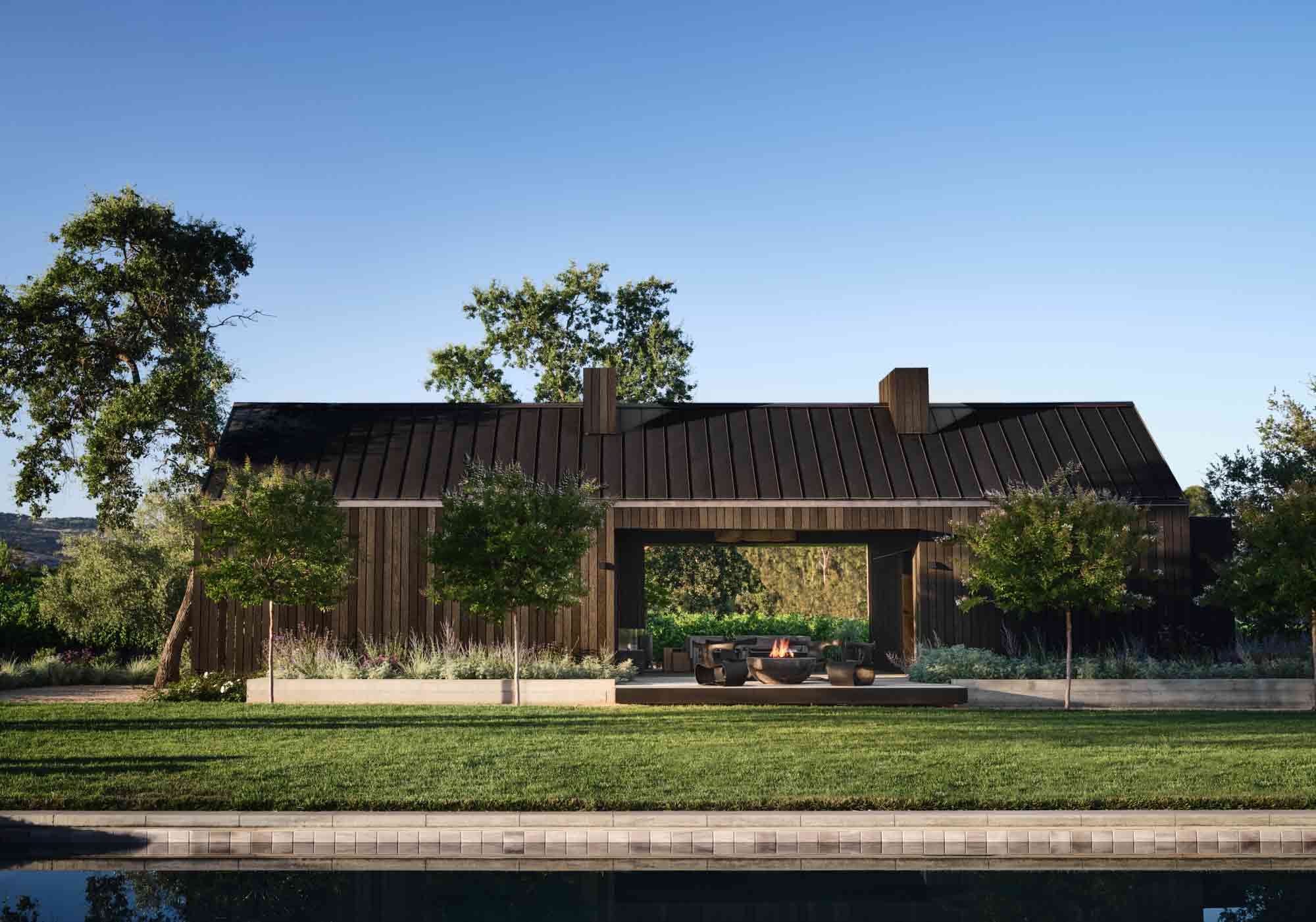
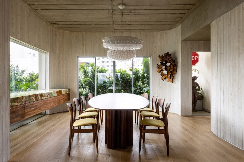
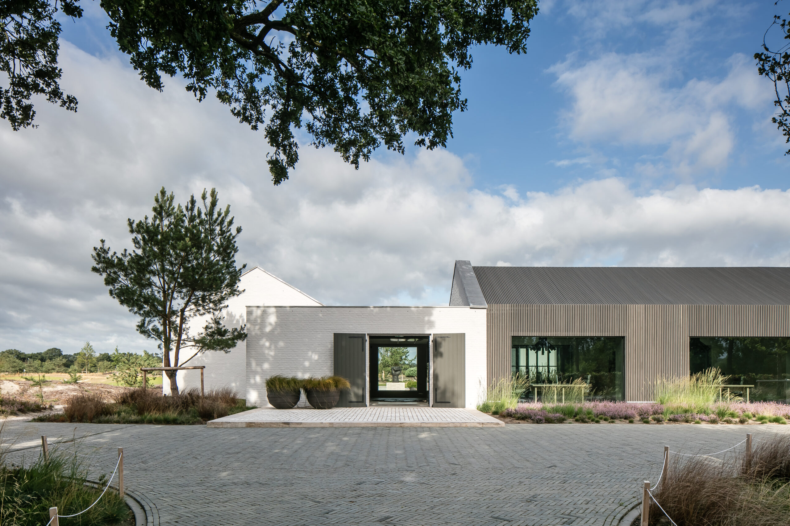
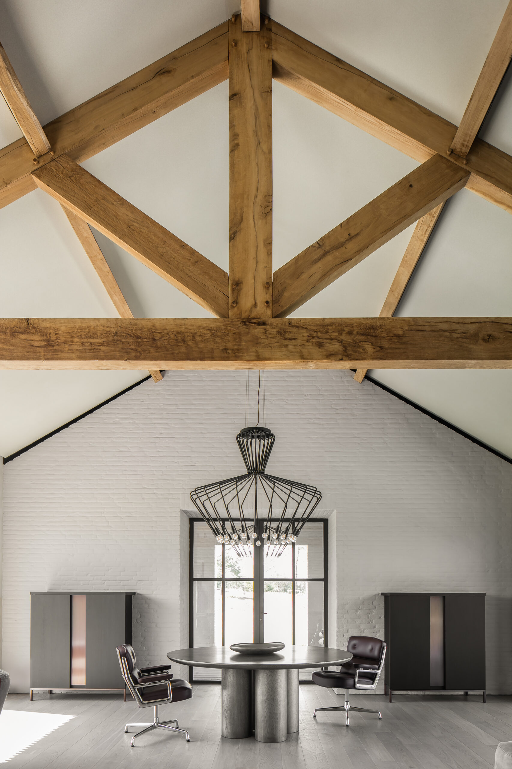
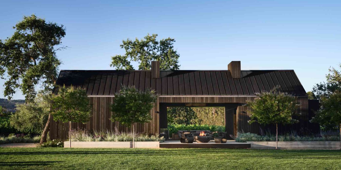
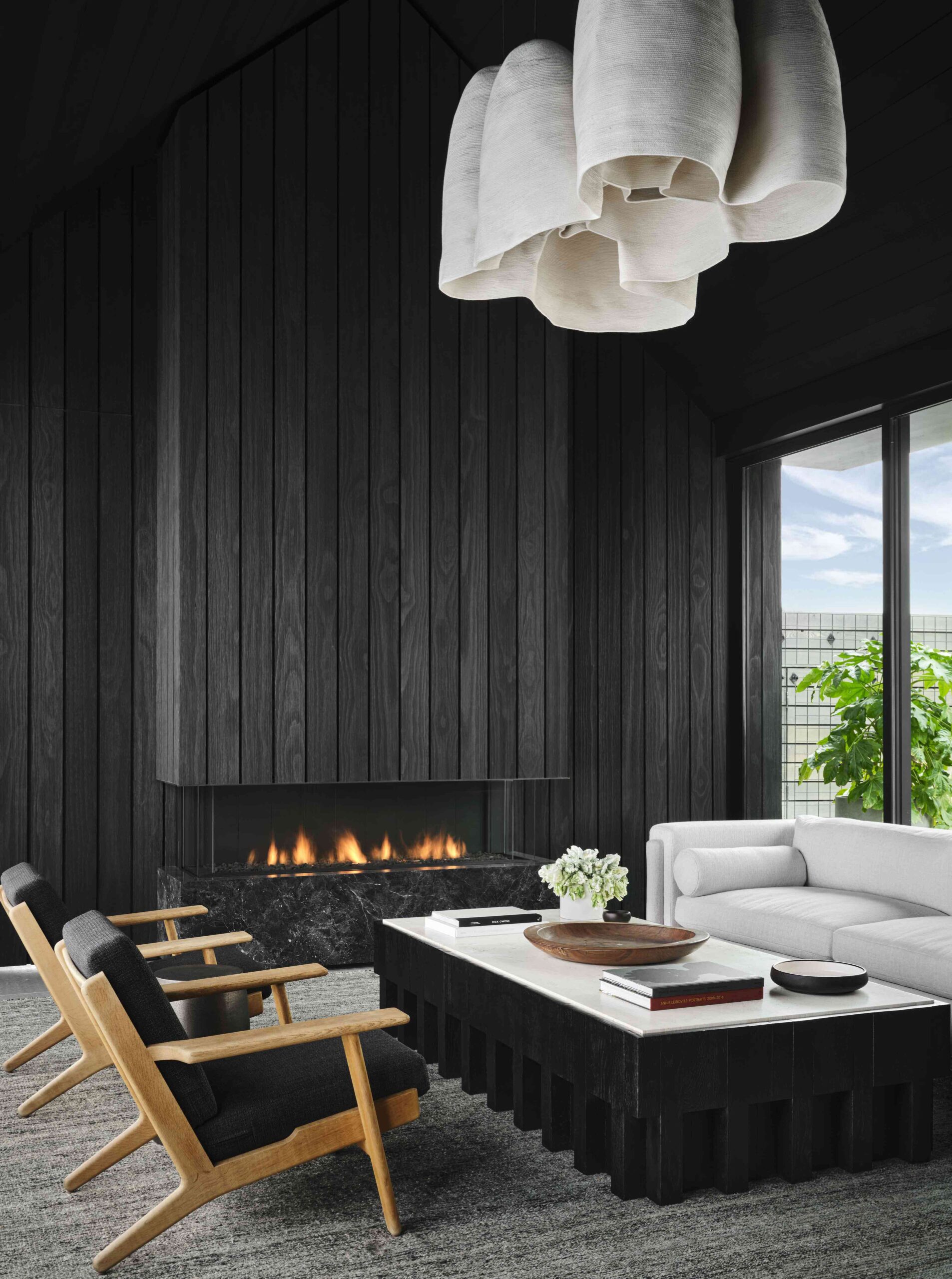
Sequestered in Napa Valley’s verdant wine country, this daring guest house combines a natural material palette with dark and dramatic hues. From a distance, the structure reads like an agricultural barn, its charred wooden cladding seemingly patinated and matured into the rural landscape. Yet up close, it’s a different story…

The exterior shou sugi ban siding seeps inside this remarkable retreat. The charcoal living areas feel striking modern, yet they’re deeply rooted in the organic environment, complemented by raw wood furnishings and light fixtures crafted from thick cotton. Conceived as a flexible space for hosting and entertaining, multifunctionality is built into the bold design. At the back of the lounge, the blackened wall panels can conceal or reveal a built-in kitchenette thanks to an innovative triple-folding door system.


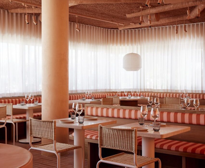
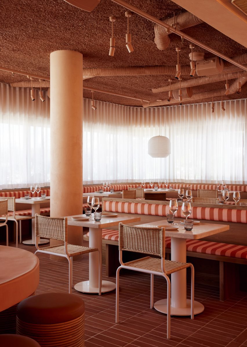
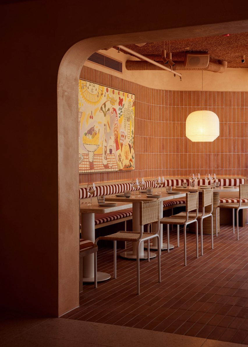
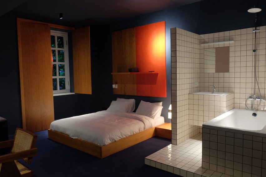
By Design Opera Architects, Tijuana, Mexico

Special Mention, 11th Annual A+Awards, Restaurants (S <1000 sq ft)

Kemuri by Design Opera Architects Kemuri by Design Opera Architects
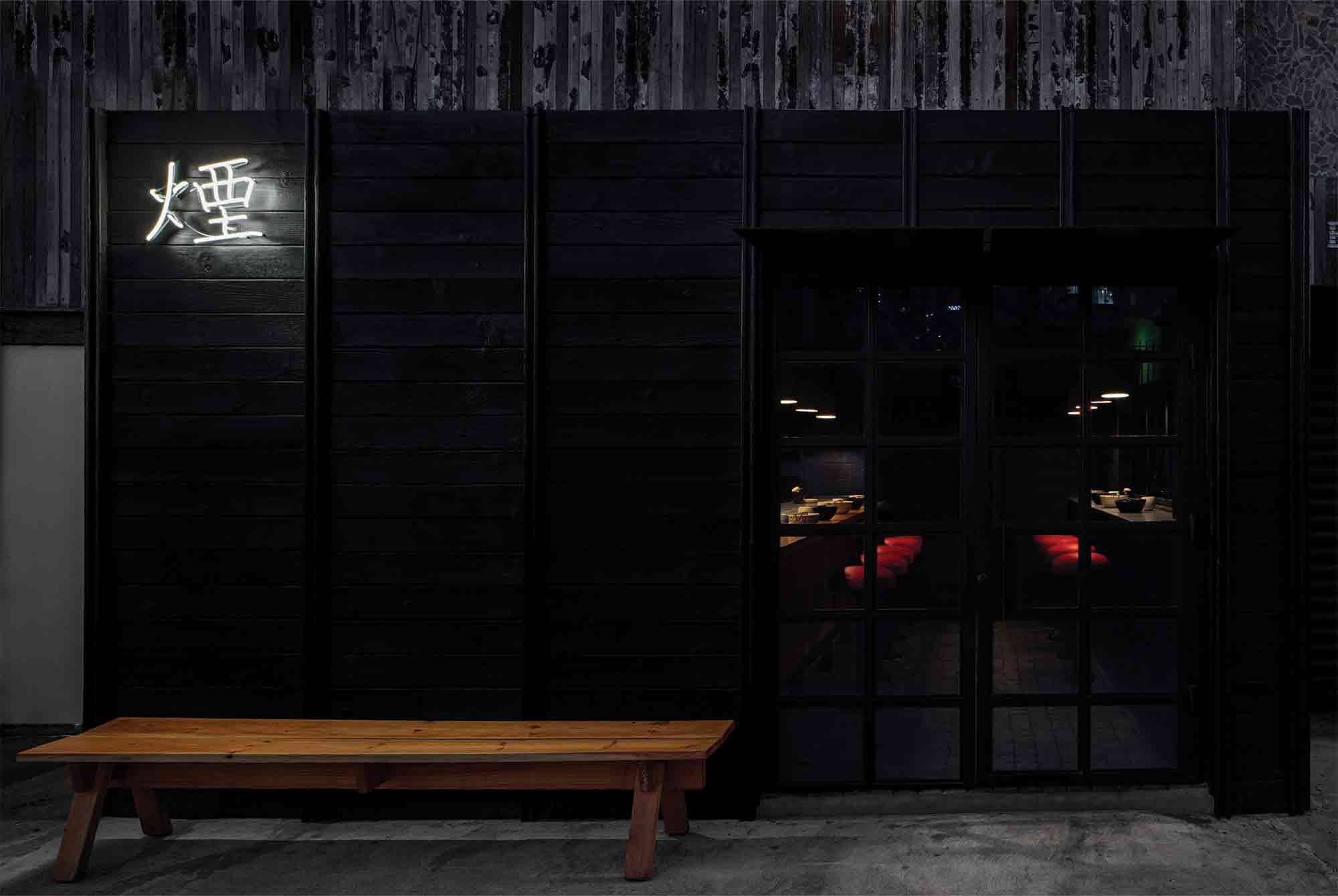
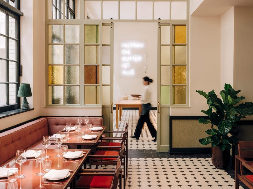
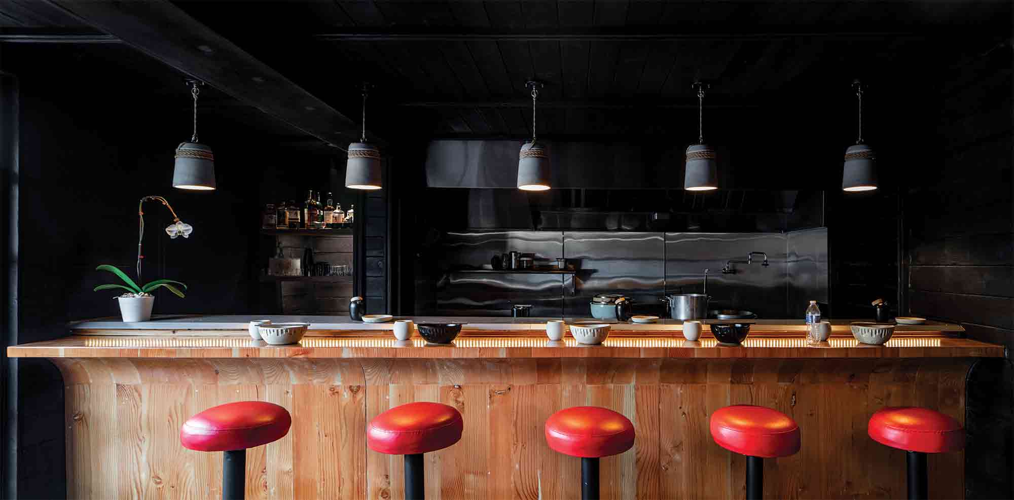
This extraordinary new restaurant in an up-and-coming Tijuana neighborhood seeks to transport the culinary and architectural traditions of Japan onto the streets of Mexico. Inspired by the chef’s passion for culinary smoking, shou sugi ban siding offers an eloquent, material articulation of this cooking technique, while paying homage to the restaurant’s cultural heritage.

Inside, black wood-clad walls envelop patrons and create an intimate, cocooning atmosphere. The restaurant’s exceptional material details summon the topography of historic Japan. Cobblestone flooring conjures up the ancient, meandering streets of Ichinenzaka and Ninenzaka, while the exposed grain of the cypress butcher-block bar evokes the country’s native woodland terrain. 6,700 miles away from its roots, a palpable inner world unfurls.


By Laney LA, Inc., Concept

Jury Winner, 11th Annual A+Awards, Unbuilt – Private House (L >3000 sq ft)

SQ Residence by Laney LA, Inc. SQ Residence by Laney LA, Inc.
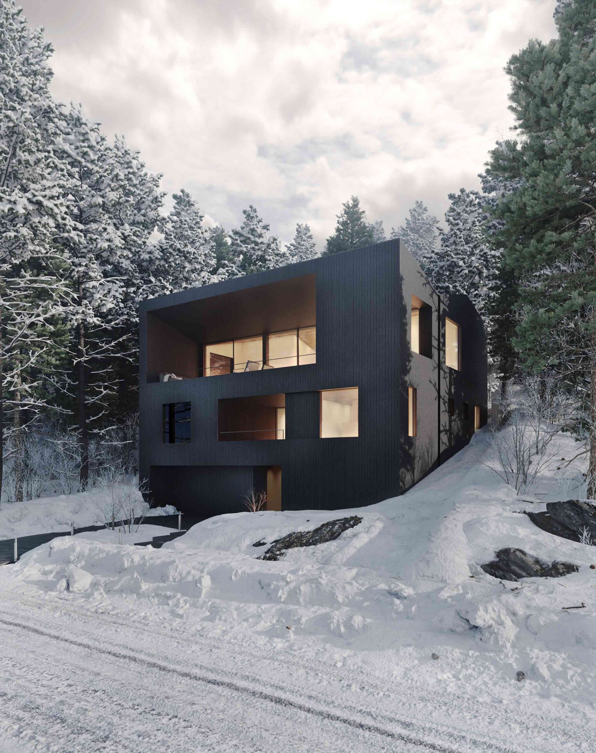
Rising like a boulder on a wooded incline in Lake Tahoe, this ambitious concept envisages a monolithic residence that’s at one with its natural surroundings. A shell of charred cedar siding encases the home, a skin that will shift and weather in tandem with the adjacent trees. Meanwhile, vast apertures frame snapshots of the domestic spaces within.

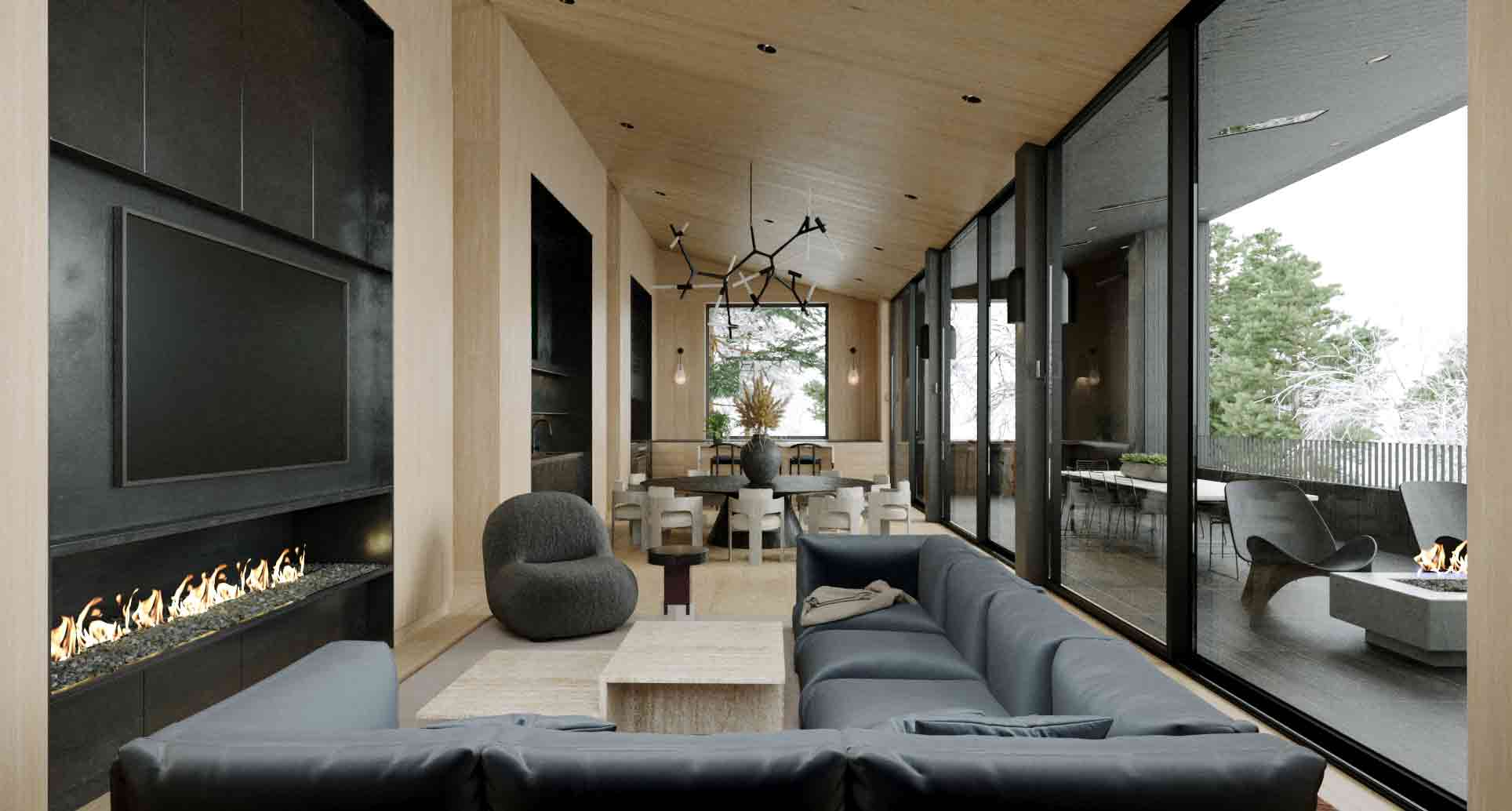
An evocative interplay of dark and light takes center stage throughout the floor plan. A swathe of glass divides the external covered deck, clad in shou sugi ban, with the pale oak walls of the main living space. Patagonia granite defines the kitchen surfaces, another tactile anchor that cements the home’s positioning as an architectural extension of the mountain.


By IwamotoScott Architecture, Burlingame, California

Finalist, 11th Annual A+Awards, Architecture +Small Projects

Geode ADU by IwamotoScott Architecture Geode ADU by IwamotoScott Architecture
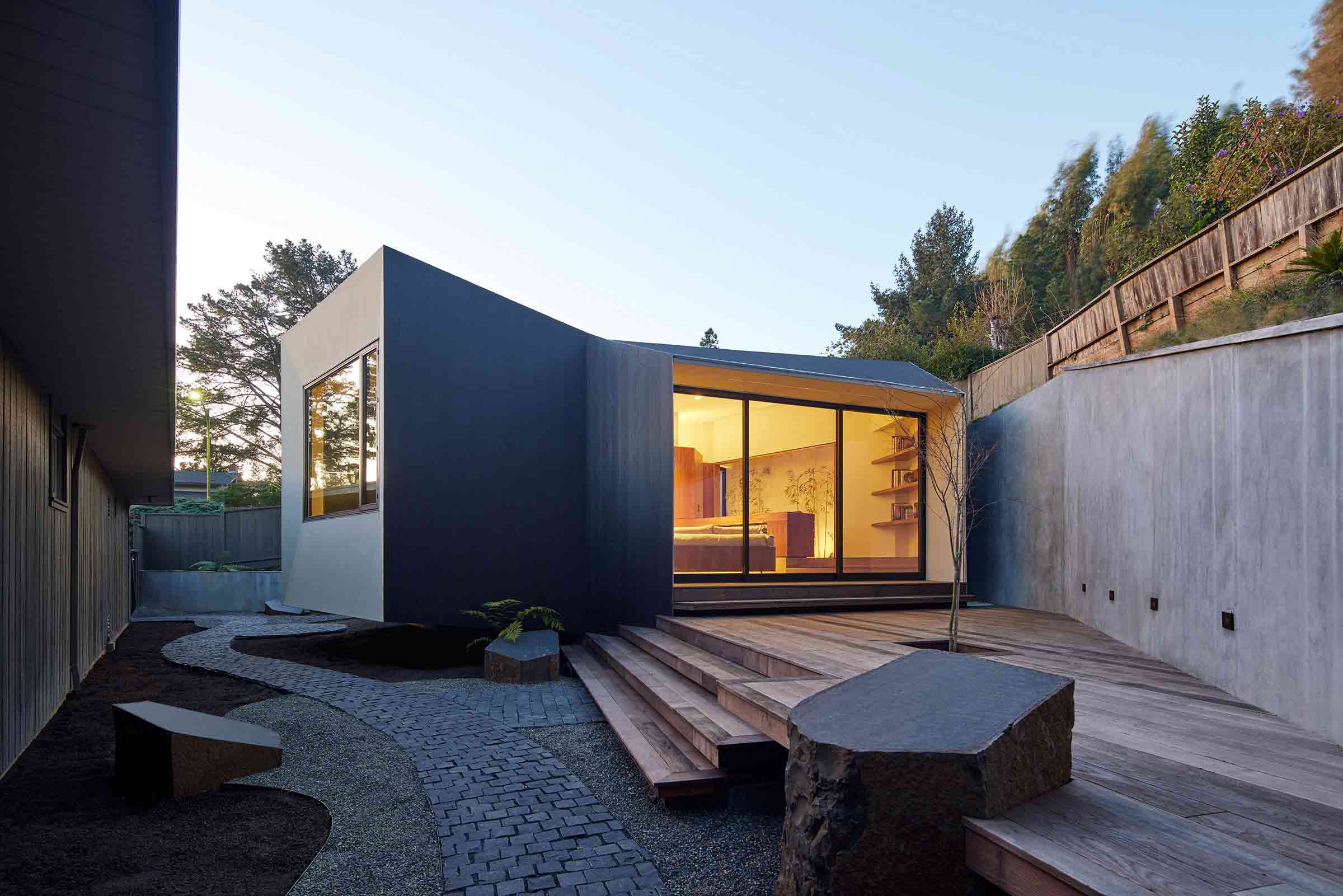
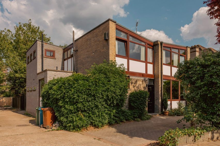
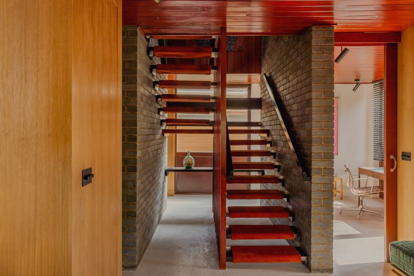
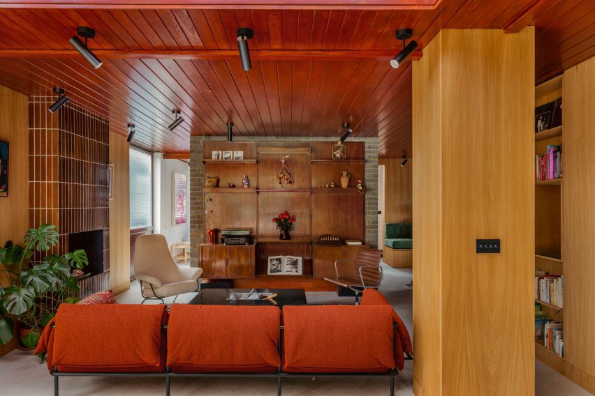
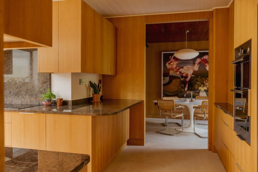
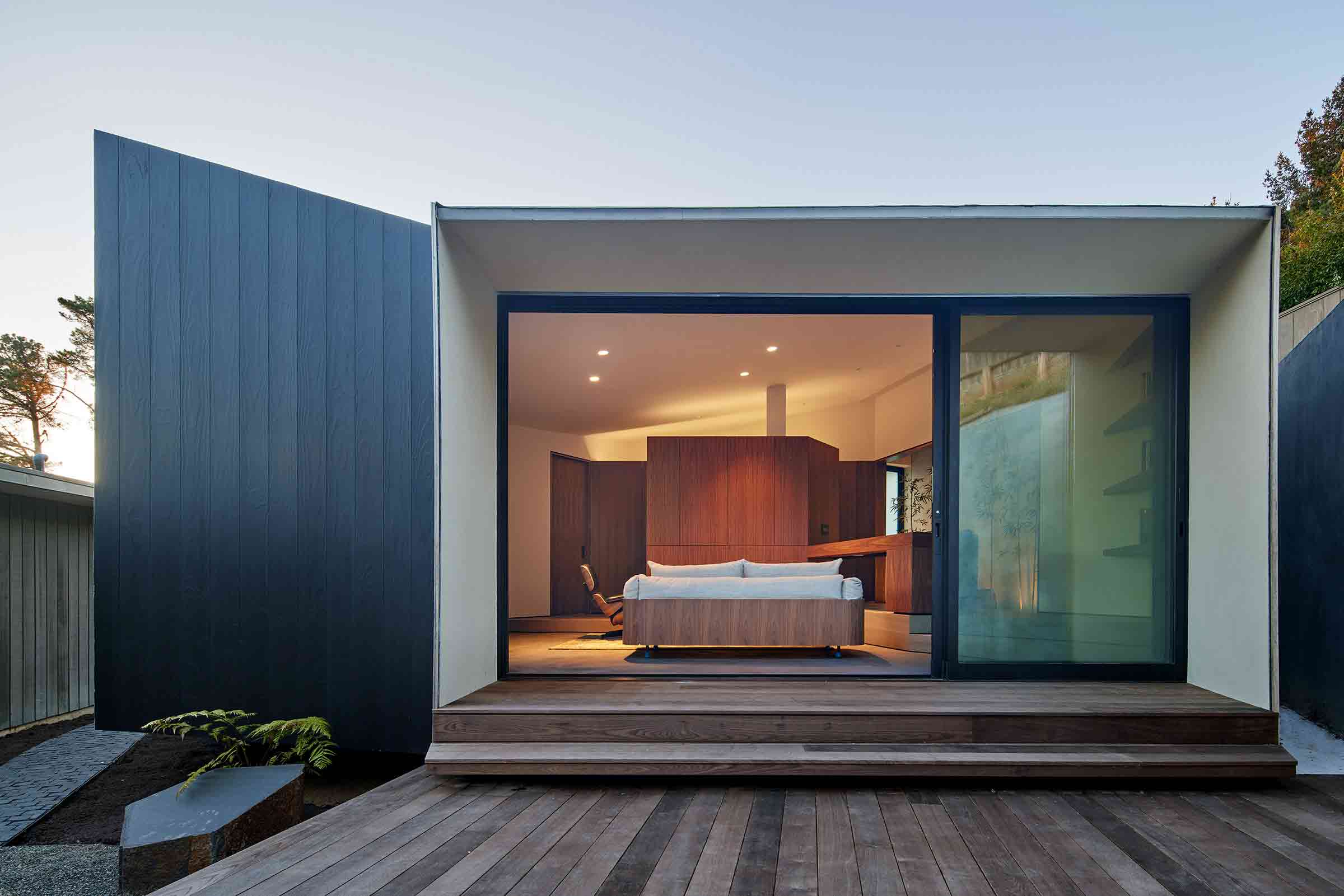
This compact ADU was designed as a guest studio and writing retreat that would fit snuggly alongside the site’s main dwelling. At once a “place apart” from the primary property and quietly referential of its mid-century modern architecture, the result is a striking, sculptural space that makes a big statement across a small square footage.

The 1950s butterfly roof has been artfully reinterpreted to maximize the site’s views. One wing follows the slope of the neighboring bank, while the other angles the roofline upward, lifting a section of the building above the ground. Viewed as a two-dimensional line, it’s an inversion of the gabled roof of the main Eichler house. Sleek shou sugi ban siding contrasts with white stucco across the cantilevered face and overhang, imparting an effortlessly contemporary edge.


By OPN Architects, Marion, Iowa

Special Mention, 11th Annual A+Awards, Government & Civic Buildings

Marion Fire Station No. 1 by OPN Architects Marion Fire Station No. 1 by OPN Architects
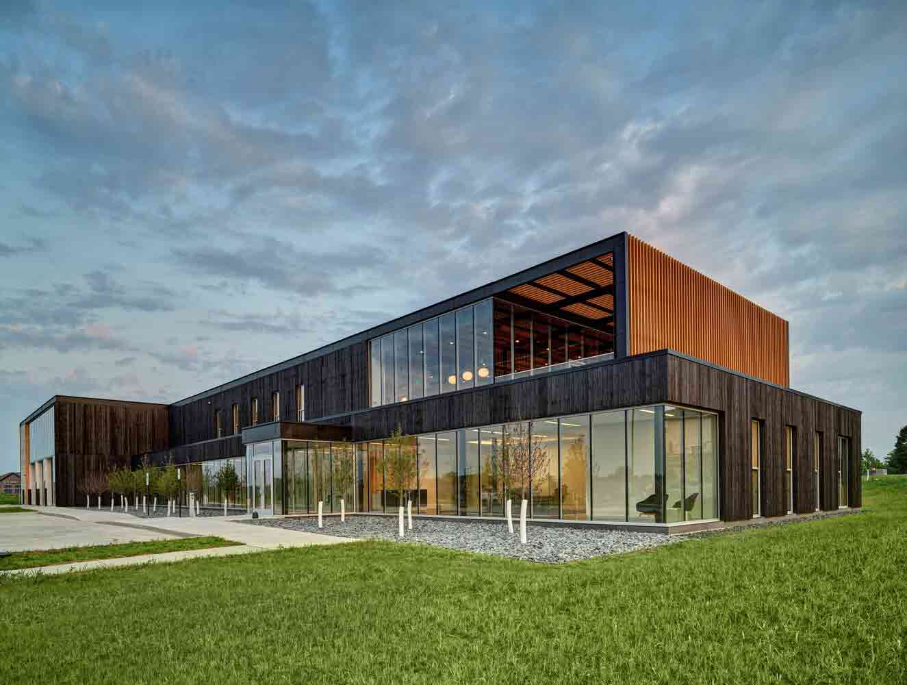
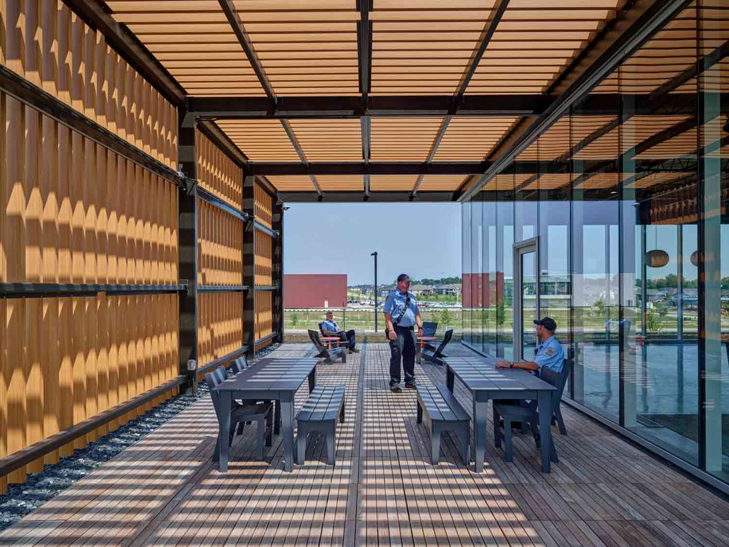
The first responders that staff this innovative new fire station in Iowa are all too familiar with the devastating effects of fire. However, the building’s tactile façade somewhat subverts the narrative of destruction. Clad in rich, charred timber, the structure demonstrates the creative potential of fire too, when utilized in a controlled environment.

Organic materials are just one facet of the station’s pioneering biophilic design. In a bid to support firefighters’ physical and mental health, pockets of connection with the natural world have been skillfully inserted throughout. A series of terraces are framed by trellises that let dappled sunlight filter in, while a green roof punctuates the voids between living and sleeping zones. This thoughtful scheme expands the firehouse’s life-saving infrastructure to address the well-being of first responders too.


By Measured Architecture Inc., Mayne Island, Canada

Popular Choice Winner, 11th Annual A+Awards, Sustainable Private House

Shor House by Measured Architecture Inc. Shor House by Measured Architecture Inc.
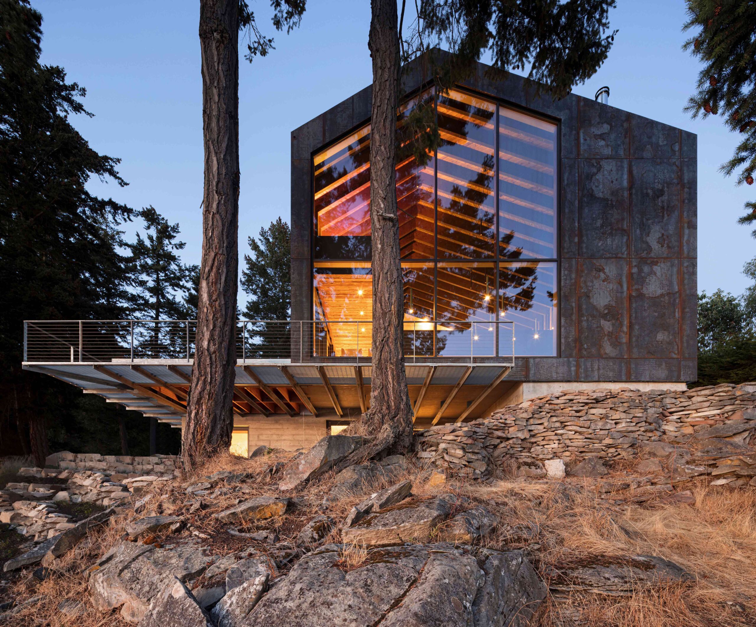
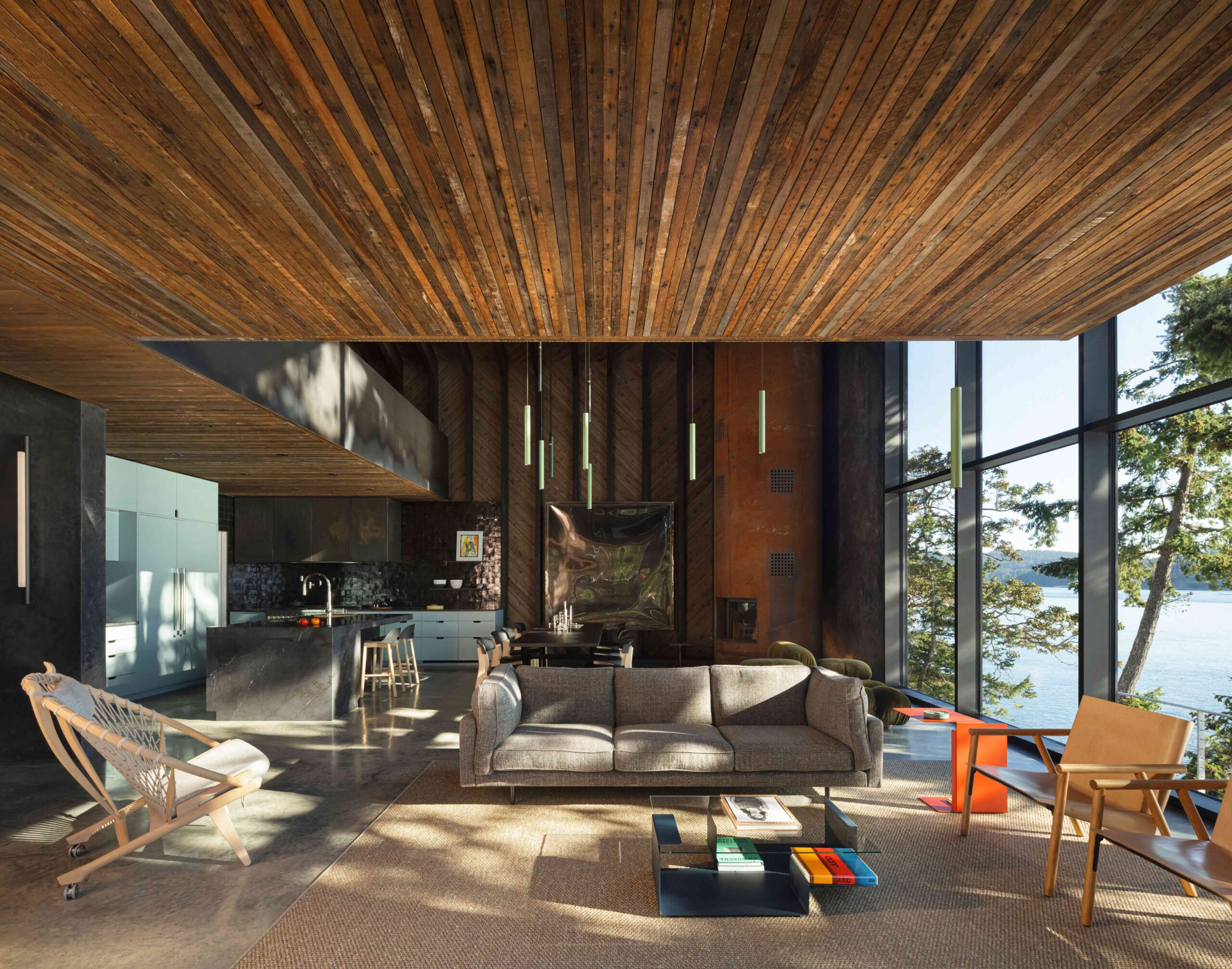
A magnificent architectural melting pot, this astonishing residence perched on the shoreline of Mayne Island takes its cues from the principles of alchemy: transforming discarded materials into something rare and valuable. By salvaging the wood from the house and barn that originally stood on the plot and reassembling these elements in a striking, modern form, the project sets out a blueprint for truly sustainable construction.

Glimmers of the past structures are still visible across the weathered internal cladding and floorboards. Where new timber was required, it was treated with shou sugi ban, the scorched surface analogous to the home’s dark corten steel exterior. The blackened surface not only imparts character to the younger wood, but also seals the grain from moisture and insects. Here, materials and techniques of the past intermingle in an exciting new iteration.

The latest edition of “Architizer: The World’s Best Architecture” — a stunning, hardbound book celebrating the most inspiring contemporary architecture from around the globe — is now available. Order your copy today.  

Reference

Zero House in Stanmore, London
CategoriesInterior Design

Mid-century Zero House in London imbued with “Kubrick feel”

Zero House in Stanmore, London

Timber ceilings and a fireplace clad in mahogany tiles feature in this London house, which its owners have renovated to honour the dwelling’s mid-century roots and nod to the colour palette of Stanley Kubrick films.

Located in north London’s Stanmore, Zero House belongs to recording artists Ben Garrett and Rae Morris, whose former home in Primrose Hill is the Dezeen Award-winning Canyon House designed by Studio Hagen Hall.

Zero House in Stanmore, London
Zero House in Stanmore was built between 1959 and 1961

Unlike their previous dwelling, Garrett and Morris updated Zero House themselves but adopted the same mid-century palette when creating its interiors.

“The house was built between 1959 and 1961 by a Hungarian architect,” said Garrett, who explained that the original design was informed by Californian Case Study Houses such as Charles and Ray Eames’s 1949 home and design studio.

Brick and timber details within mid-century renovation
The two-storey dwelling was renovated by its owners

“It’s a great example of a number of imaginative mid-century domestic houses dotted around metro-land,” he told Dezeen. “Our main aim was to freshen it up relatively in keeping with the time but not to feel like we were living in a total time capsule.”

The pair maintained the matchbox timber ceilings that run throughout the two-storey home, which were stained with a dark reddish tone alongside stained wooden doors.

Floor-to-ceiling tiled fireplace in Zero House
Slim mahogany tiles clad the floor-to-ceiling fireplace

Slim mahogany tiles clad the floor-to-ceiling fireplace in the living room, which features the same micro-cement flooring found at Canyon House and opens out onto a lush garden.

Garrett and Morris also maintained the home’s many exposed brick walls and inserted geometric timber shelving that displays eclectic ornaments including amorphous vases and a colourful set of nesting dolls.

Timber-clad kitchen
The kitchen was panelled in light-hued timber

Reeded 1970s-style glass was used to form various windows including a rectilinear opening in the kitchen that illuminates minimal timber cabinetry topped with grainy surfaces.

The pair transferred the tubular Marcel Breuer chairs and Tulip dining table by Eero Saarinen from their former home, as well as the same “heinous digital artwork” that decorated their previous living space.

Dark brown bedroom interiors in Zero House
Darker tones create a “horror film” feel upstairs

Upstairs, a moody mahogany carpet darkens the main bedroom, which features the same timber wall and ceiling panels as the communal areas.

“There’s a lot of dark reds and browns in the house,” said Garrett.

“We leaned into the horror film slash Kubrick feel of the upstairs and made a few more austere choices this time,” he added, referencing the late filmmaker, whose credits include the 1980 supernatural horror movie The Shining.

Coffee-hued cork was chosen to clad the exterior of the bathtub and the surrounding walls while another walk-in shower interrupts the dark wooden theme with bright orange tiles and deep white basins.

Zero House also holds a timber-panelled recording studio, which is located in a separate low-slung volume at the end of the garden and can be reached via a few stepping stones.

Bright orange walk-in shower
Bright orange tiles were chosen for a walk-in shower

Garrett and Morris left the structure of the property largely untouched. Instead, the duo chose to focus on dressing its mid-century interior.

“We didn’t have to be clever with this house as the space is abundant and the flow and design were incredibly well thought out in the early 60s,” he said. “So it was more of a cosmetic thing.”

Recording studio in Zero House
There is a standalone recording studio in a shed at the back of the garden

Other recent mid-century renovation projects saw Design Theory update a coastal home in Perth from the 1960s while Woods + Dangaran added a koi pond among other elements to a Los Angeles dwelling built by architect Craig Ellwood during the same decade.

The photography is by Mariell Lind Hansen.

Reference

Photo of the exterior of the Fender flagship store, showing the outside of the
CategoriesInterior Design

Klein Dytham Architecture gives Fender flagship store a welcoming feel

Photo of the exterior of the Fender flagship store, showing the outside of the

Klein Dytham Architecture has aimed to counter rock music snobbery with its design for guitar brand Fender’s Tokyo flagship store, which is meant to feel welcoming to people who might feel judged in other guitar stores.

The Fender store sits across the bottom four floors of the glass-walled Ice Cubes building, a 12,000-square-metre space in the neighbourhood of Harajuku that was formerly home to an H&M store.

It is the world’s first flagship store for the 77-year-old American brand, which is one of the most recognisable names in guitars and is particularly known for electric models like the Stratocaster.

Photo of the exterior of the Fender flagship store, showing the outside of the
The Fender flagship store is located in Harajuku, Tokyo

For the project, Fender asked Klein Dytham Architecture to create a space that would counter the perception of guitar stores as being intimidating, particularly for women and newer players.

It hoped the store would offer a sophisticated and immersive retail experience that would encourage leisurely browsing and communicate the brand’s heritage.

Klein Dytham Architecture answered the brief with a store design it sees as creating “a destination of discovery”, with gallery exhibits, an event space, a cafe and a “care bar” for repairs.

Photo of the first floor of the Fender Tokyo flagship store, showing many guitars displayed on curving light wood display stands
The main browsing area on the first floor features display stands made of curved wood

The first floor houses the main browsing area, which features undulating wood benches and display units that are meant to echo the curves and materials of a Fender guitar. These contours are further mimicked in the lighting above.

The area also has custom plectrum-shaped tables where staff can place guitars they have removed from the display to show customers. Clothing racks holding the F is for Fender streetwear collection sit among the guitars.

The second floor, which was realised in a soft grey palette, is primarily an exhibition space called the Artists Gallery.

Photo of a gallery-like space displaying large photos and a video of musicians and their guitars, as well as guitars in transparent display cases
The second floor is the main gallery space

Here, large-scale photos and video shows famous musicians in action, each one alongside a transparent display case housing their Fender of choice.

There are also displays dedicated to Japanese- and American-designed Fenders respectively, and a sound-proofed Amp Room where customers can test run guitars and amps.

On the darker and moodier third floor, another exhibition space — the Master Builders Gallery — focuses on the work of specific craftspeople, while two VIP rooms and a custom shop are furnished with comfortable couches and provide a setting for discussing bespoke builds.

Also on this floor is a colourful display of 400 guitar finish samples that fills the length of one wall.

Photo of a dark grey room with big couches and armchairs in the foreground and a library of colourful material and component samples along the back wall. On the side wall, a sign reads Fender Custom Shop
The third floor includes the Fender custom shop

The final floor is the basement, which houses an event space, cafe and the Fender care bar, and where Klein Dytham Architecture endeavoured to create a cosier feel with a plectrum-shaped rug and benches.

Tying the floors together is a spiral staircase with a hall-of-fame-style photo gallery on the interior, as well as a three-storey-high vertical LED display on the glass facade outside that will be used for Fender-related content.

Photo of a room with light-coloured walls, red cushioned bench seating and displays of acoustic guitars in the centre of the room, and racks full of guitar accessories at the back. Near the back wall, a man stands behind a counter with a display of guitar parts behind him and talks to a woman who is leaning on the front of the counter
The basement includes an event space and a care bar

“Conceived as a hub and clubhouse for all things Fender, this project takes the notion of a flagship store and experiential retail to beyond the next level,” Klein Dytham Architecture co-founder Mark Dytham told Dezeen.

Dytham started the practice with fellow Royal College of Art graduate Astrid Klein in Tokyo in 1991. Some of their recent work includes the PokoPoko clubhouse for the Risonare Nasu hotel in rural Japan and a Cartier store with an intricate wooden facade in Osaka.

Photography by Nacása & Partners.

Reference

Dining room
CategoriesInterior Design

Eight welcoming wood-panelled dining rooms with an organic feel

Dining room

For our latest lookbook, we’ve selected eight dining rooms from the Dezeen archive where wooden panelling was used to create cosy, earthy environments with an organic feel.

From South America to Europe, these wood-panelled dining rooms serve as focal points in the interiors and create social spaces for residents and guests.

Whether they’re made from timber, pine or plywood, the wooden finishes on these statement walls and ceilings have been used to create welcoming environments with peaceful atmospheres.

This is the latest in our lookbooks series, which provides visual inspiration from Dezeen’s archive. For more inspiration see previous lookbooks featuring homes with focal point wardrobes, statement headboards and homes with pergolas.


Dining room
Photography is by Fran Parente and image production is by Victor Correa

ER Apartment, Brazil, Pascali Semerdjian Arquitetos

This apartment in São Paulo has an exposed concrete ceiling and uses natural materials, such as walnut, bronze, onyx and stone in its furnishings and finishes.

Pascali Semerdjian Arquitetos used vertical timber cladding, local art and furniture by Brazilian architects and designers Oscar Niemeyer and Claudia Moreira Salles in the dining room to make the space “deeply Brazilian and vividly cosmopolitan”.

Find out more about ER Apartment ›


Photo of a dining room and stairs
Photography is by Eric Petschek

Carroll Gardens Townhouse, US, Starling Architecture and Emily Lindberg Design

Starling Architecture and Emily Lindberg Design combined two units in a Brooklyn townhouse to create this family home. The townhouse features Belgian white oak on the flooring and along the corridor, stairs, mudroom, kitchen and dining area.

The New York-based studios used neutral tones to decorate the five-story house. In the dining room, wooden cabinets and decorative lamellas match the floor and ceiling.

Find out more about Carroll Gardens Townhouse ›


River Thames engraving in Dragon Flat by Tsuruta Architects
Photography is by Tim Croker

Dragon Flat, UK, Tsuruta Architects

Artificial intelligence (AI) was used to design the patterns engraved on plywood panels that decorate the dining room of the Dragon Flat in London’s Notting Hill. Tsuruta Architects used a CNC router – a computer-controlled cutting machine – to engrave a pattern of the River Thames on the wall.

The architecture studio also updated the two-level maisonette to include a walk-in wardrobe and tatami room, which features an engraved design on its panelled walls.

Find out more about Dragon Flat ›


Wood-panelled dining hall
Photography is by David Grandorge

Homerton College, UK, Feilden Fowles

Homerton College at the University of Cambridge includes a dining hall by London architecture studio Feilden Fowles made from concrete, timber and 3,200 faience tiles.

The building, which was constructed with chestnut-laminated timber frames and clerestory windows, features a larger eating space, a smaller eating room, the kitchen and staff amenities.

It was designed to celebrate handcrafting techniques and contemporary construction and engineering.

Find out more about Homerton College ›


House in El Peumo, Chile by Cristian Izquierdo Hehmann
Photography is by Roland Halbe

House in El Peumo, Chile, Cristián Izquierdo Lehmann

This house, designed by Cristián Izquierdo Lehmann, centres around an open-plan kitchen and dining room with a vaulted ceiling that is used for cooking, dining and socialising.

A minimalist decor compliments the dramatic ceiling, with red stools used for dining and a bookcase lining the wall.

Located in El Peumo, Chile, the house was clad with laminated pine and features concrete floors and large windows for the owners to enjoy the green exterior.

Find out more about House in El Peumo ›


Another Seedbed Brooklyn

Another Seedbed, US, Future Projects

The Another Seedbed loft in Williamsburg, Brooklyn, serves as both a home and performance space for its owner. To function as both, the space is predominately open, with hidden rooms located around the apartment.

Warm pine walls mark the dining space, which features a complementary red angular table and wooden sculptural chairs.

Other walls in the loft are covered in hand-troweled earthen clay plaster, blue penny-round tiles and floor-to-ceiling shelving.

Find out more about Another Seedbed ›


Stone Creek Camp by Anderson-Wise Architects
Photography is by Art Gray

Stone Creek Camp, US, Andersson-Wise Architects

US-based Andersson-Wise Architects designed the Stone Creek Camp in Big Fork, Montana, as a family retreat of cabins and cottages.

While it is wood-clad, the kitchen and dining area does not feature traditional panelled walls. Instead, one wall is made from wooden logs that have been assembled to create an unusual wall with a highly textured surface.

The ceiling was clad in wooden panels that match the floorboards in the home.

Find out more about Stone Creek Camp ›


Cabin Geilo, Norway by Lund Hagem
Photography is by Marc Goodwin

Geilo Valley Cabin, Norway, Lund Hagem

Panelled with blackened timber, this Norwegian ski cabin shelters residents from harsh weather conditions and offers panoramic views of the Geilo Valley. The cabin’s exterior concrete walls have also been tinted black to reflect the interior panels.

The walls and ceiling of the dining room use the same timber cladding, matching the kitchen island to create a cosy, coherent atmosphere.

“The dark tone allows the nature outside to come closer and creates a darkness that contrasts with the white winter landscape,” said the project’s architects Lund Hagem.

Find out more about Geilo Valley Cabin ›

This is the latest in our lookbooks series, which provides visual inspiration from Dezeen’s archive. For more inspiration see previous lookbooks featuring homes with focal point wardrobes, statement headboards and homes with pergolas.

Reference

Four works from Loewe Foundation Craft Prize exhibition 2023
CategoriesInterior Design

“I sometimes feel like I fell into doing fashion” says Jonathan Anderson

Four works from Loewe Foundation Craft Prize exhibition 2023

Loewe creative director Jonathan Anderson set up the brand’s annual craft prize to decode the “chintz” and “pastiche” associations of the discipline, he tells Dezeen in this interview.

Luxury fashion house Loewe recently announced the sixth winner of its annual craft prize at NYCxDesign, which celebrates applied arts and innovation in modern craftsmanship.

A spiky egg sculpture by Japanese ceramicist Eriko Inazaki was selected for the 2023 award from more than 2,700 entries.

“It became chintz”

Anderson established The Loewe Foundation Craft Prize in 2016 in an effort to honour the brand’s 19th-century origins as a leather-making craft collective.

Speaking to Dezeen at the awards ceremony for the prize at The Noguchi Museum in Brooklyn, he explained he also wanted to redefine contemporary understandings of artisanal production.

“I think from the ’80s onwards, [craft] had become this thing which was linked to mid-century, it was pastiche,” said Anderson.

“In Britain, for example, there was a lot of money put into crafts and the Arts Council to boost this idea of making, and then it became maybe chintz at some point.”

Four works from Loewe Foundation Craft Prize exhibition 2023
The winning sculpture by Eriko Inazaki (front) was displayed among an exhibition of shortlisted projects at NYCxDesign. Photo courtesy of Loewe

“The reason why I set the prize up was to try to sort of decode that,” he told Dezeen. “It was like it wasn’t marketed right. The work was there, but the platform was not there.”

Young creatives are now becoming interested in craft once again, he suggested.

“I think younger people are starting to realise that, as much as it’s interesting being a contemporary artist, it can be just as interesting to be a rug maker or to make ceramics or to work with wood,” said Anderson.

“It’s a less sort of diminished form of the arts.”

“I am probably a shopaholic”

Before being appointed by Loewe in 2014, Anderson founded his eponymous label, JW Anderson.

Although differentiated by what Anderson describes as an “angst” at JW Anderson and a “heightened perfection” at Loewe, the two brands share an emphasis on art, design, craft and interiors.

His collections at Loewe often incorporate elements of applied arts – bringing in collaborators and craftspeople, such as metal artist Elie Hirsch who created solid copper and pewter jackets for its Autumn Winter 2023 collection.

Loewe also presented a collection of decorated wooden chairs during Milan design week that were created by global artisans.

“Art for me is always going to be a language no matter what brand I’m in,” he said. “Because I think this is a way for me to kind of explain to the consumer, what I love, or things that I’m fascinated with.”

Photo of a Loewe store by Jonathan Anderson
Anderson works with the internal architectural team to design stores. Photo by Adrià Cañameras

The Northern Irish designer’s love of craft and art extends to the conception of store interiors for both of his brands.

JW Anderson recently unveiled its first flagship store in Milan during Milan design week, designed by Anderson in collaboration with 6a Architects.

“I sometimes feel like I fell into doing fashion but ultimately the interior part is what I love the most,” he said.

“The thing I love about interiors is, it is a singular kind of environment. Whereas fashion is like a transient period that goes in different environments. I quite like with interiors the control that you can have within space.”

He described his love of shopping for items to appear in stores.

“I think I am probably a shopaholic,” he said. “I could be at an auction or be in a gallery and I’ll be like, ‘oh, that’s perfect for Korea or that’s perfect for…’.”

“I think it just adds this element and a pleasingness for a consumer to go in and to a store and to see an original Rennie Mackintosh chair.”

Anderson feels that for Loewe, the design of stores is sometimes more important than fashion shows.

“I think stores can be more than just like these commercial vehicles,” he said. “I think, for me, the store is just as important as doing a show. It’s sort of even more important because they have to last longer.”

“I’m in a very lucky position at Loewe where I decide everything,” he added. “I have an internal architectural team, but I decide every artwork, I decide every door handle, every fixture.”

However, that does not tempt Anderson to cross over from fashion into interiors permanently.

“I enjoy it because it’s probably more like a hobby,” he said. “It’s something that distracts me from what I do as a day job, but I do it because of the stage of Loewe or JW Anderson.

“But I would never see it as something where I would be like, ‘oh, I’m going to be an interior designer’,” he continued. “There are other people out there that are actually really good at it. I think I’m good at it to an extent, but I change my mind too quickly. I would like it for like a day and then I would want to redo it again.”

The portrait is by Scott Trindle.

Reference

Winning a Dezeen Award "made me feel like anything is possible"
CategoriesInterior Design

Winning a Dezeen Award “made me feel like anything is possible”

Winning a Dezeen Award "made me feel like anything is possible"

With just three weeks until Dezeen Awards entries close, last year’s winners detail the positive outcomes of winning and encourage other studios to enter.

One studio said that winning a Dezeen Award was “a thrilling, rewarding and inspiring experience” while another said it created “new relationships with retailers, media and customers”.

“Winning a Dezeen Award has considerably raised my profile and helped me secure further collaborations,” said a studio that won for their consumer product design.

Dezeen Awards 2023, in partnership with Bentley Motors, is open for entries. There are only three weeks left to submit your project before midnight London time on 1 June and avoid late entry fees.

Read on to see what last year’s winners had to say:

British company MysteryVibe won for their a sex toy designed to help with erectile dysfunction

Sex toy company MysteryVibe, which won wearable design of the year for its vibrator aimed at tackling erectile dysfunction, considered winning a Dezeen Award “the ultimate honour”.

“It’s the ultimate honour for us to be recognised for all the hard work over many years that has gone into improving the health and happiness of people across the globe,” said the studio.

“The award resulted in press coverage and media attention in publications that we wouldn’t normally be featured in.”

Japanese startup studio Quantum won Dezeen Awards 2022 overall design project of the year

Japanese firm Quantum won product design of the year and design project of the year for its lightweight foldable wheelchair and told Dezeen that winning last year offered the practice new clients and media exposure, and encouraged other studios to also enter.

“We have received more inquiries from new clients and media who had heard about us winning the award,” said Quantum. “It also resulted in being selected as a part of the permanent collection of the museum Designmuseum Danmark.”

Architecture practice Studio Bua won residential rebirth project of the year for its Icelandic artist’s studio and residence and agreed that winning has led to new opportunities.

“It has positively affected our previous client relationships and it helps when acquiring new clients,” said Studio Bua. “We did see an increase in followers on our social media and clients have mentioned it after they saw that we posted about it.”

Designer Kathleen Reilly playfully rests her winning designs on her trophy

“It made me feel like anything is possible and I saw my future career as an artist and designer a lot more clearly,” said designer Kathleen Reilly, who won homeware design of the year for Oku, a knife informed by chopstick rests.

“As a result of winning, I have managed to secure a new collaboration, as well as several press articles and new relationships with retailers, media, and customers.”

“The wooden board which comes with Oku is now being made with Karimoku, Japan’s leading furniture manufacturer, and we are looking to launch this new collaboration this year.”

Studio G8A Architecture’s Dezeen Awards trophy pictured in front of a scale model of the winning factory

The team at Dutch practice Olaf Gipser Architects won housing project of the year for their apartment block with planted balconies and their win has served as motivation for future projects.

“We display our Dezeen Awards 2022 trophy at our office close to the entrance and next to a 1:200 scale wooden model,” said Olaf Gipser Architects.

“It reminds us of our achievements and recognitions and gives us all extra motivation to keep on going towards our goals.”

Office G8A Architecture, which won for its stainless steel manufacturing factory designed in collaboration with Switzerland-based Rollimarchini Architects, told Dezeen that winning gained the studio international validation.

“Winning a Dezeen Award can be described as a thrilling, rewarding and inspiring experience,” said G8A Architecture. “It helped us gain international recognition, reaching new clients and new talent for our team.”

Practice Atelier Boter’s trophy and certificate are displayed on the shelves in their office

Taiwanese architecture studio Atelier Boter won small workspace interior for its glass-fronted community hub and also has its trophy on display in the office.

“We put the trophy on the shelf together with all the books we gain inspiration from – it is a shelf we only place things that we’ve filtered through, as it is what falls in sight every time we walk into our studio,” said Atelier Boter.

“Winning a Dezeen Award is certainly an important encouragement to us as a small studio and it reassures us that we are doing the right thing,” added the studio.

Dezeen Awards 2023

Dezeen Awards celebrates the world’s best architecture, interiors and design. Now in its sixth year, it has become the ultimate accolade for architects and designers across the globe. The annual awards are in partnership with Bentley Motors, as part of a wider collaboration that will see the brand work with Dezeen to support and inspire the next generation of design talent.


Reference

Overview of dining room in Light Years Asian Diner
CategoriesInterior Design

Studio Plenty designs Byron Bay diner to feel like “a warm hug”

Overview of dining room in Light Years Asian Diner

Asian diner chain Light Years has renovated its restaurant in the Australian surf town of Byron Bay, with interiors conceived by local practice Studio Plenty in collaboration with home-grown artists and designers.

The team behind Light Years wanted its flagship eatery to mirror the playful visual identity established across its three other venues on Australia’s East Coast while refining and elevating their aesthetic.

Overview of dining room in Light Years Asian Diner
Studio Plenty has renovated the Light Years diner in Byron Bay

“We were asked to reimagine the Byron Bay restaurant, taking cues from its sister diners but with greater restraint in composition,” Studio Plenty founder Will Rathgeber told Dezeen.

“We were looking to achieve something refined without letting go of the relaxed culture behind the brand, with satisfying colours and patterns, and playful shapes and materials.”

Dining room of Byron Bay restaurant by Studio Plenty
Terracotta tiles were used to finish the walls and floors

Soft corners and gently curving walls help to create a sense of intimacy, according to Rathgeber, while the restaurant’s colour palette of soft pink and terracotta tones “embraces you like a warm hug”.

Underpinning the playful feel of the eatery is a careful focus on the practicalities, with arched openings and material thresholds helping to define three distinct spaces – the main dining room, a curved bar with counter seating and a private dining area for larger groups.

Arched opening leading through to private dining area in Light Years Asian Diner
Arched openings separate the restaurant’s different dining areas

The restaurant’s material palette incorporates handmade terracotta tiles with a rustic brushed finish and a rusty colour that is also picked up in the restaurant’s floors and the Fibonacci terrazzo bar counter.

In the main dining room, the ceiling was treated with an acoustic spray to absorb sound while contributing to the earthy, vernacular look of the diner thanks to its bumpy texture.

Wooden reception desk of Byron Bay restaurant by Studio Plenty
Rattan acoustic panels cover the ceiling near the entrance

Since the acoustic spray does not adhere to pipes, Studio Plenty specified a motorbike exhaust wrap for the pipes to achieve a harmonious ceiling plane.

In the bar area, ceilings are clad in rattan acoustic panels by local product designer and interior stylist Sarah Ellison, who also worked with Studio Plenty to design the restaurant’s custom furniture including the chunky tables and bistro-style chairs.

Artist collective Studio of the Sun created two colourful murals for the restaurant, with one featuring playful illustrations laser-printed onto a section of glossy white tiles.

“The client was committed to a locally focussed project, hence approaching Studio Plenty to design the restaurant and Sarah Ellison and Studio of the Sun to collaborate,” said Rathgeber.

Bar of Light Years Asian Diner
A curved terrazzo bar provides counter seating

Rathgeber founded his Byron Bay practice in 2020 after cutting his teeth working for architecture firms Woods Bagot and Jackson Clements Burrows in Melbourne.

“We believe happiness is achieved through sensible design, not excess,” he explained of his studio’s ethos. “We have an appetite for rational design and an obsession with functionalism.”

Private dining area of Byron Bay restaurant by Studio Plenty
The private dining area is defined by a Studio of the Sun artwork

Elsewhere in Byron Bay’s bustling bar and restaurant scene, Australian studio Pattern has designed the interiors for an eatery serving South America-style small plates and cocktails.

Its patchy grey surfaces and concrete fixtures were designed to reflect the “raw beauty” of late-night eateries in Mexico.

The photography is by Jessie Prince.

Reference

Resimercial Architecture: Workplaces that are Designed to Feel Like Home
CategoriesArchitecture

Resimercial Architecture: Workplaces that are Designed to Feel Like Home

Resimercial Architecture: Workplaces that are Designed to Feel Like Home

Browse the Architizer Jobs Board and apply for architecture and design positions at some of the world’s best firms. Click here to sign up for our Jobs Newsletter.

While you may not be familiar with the term, “resimercial design” is something we see frequently but very rarely take the time to analyze. From the comfy couches in the office lounge to the cozy rugs and ambient lighting in the conference room, resimercial design is all about bringing the comforts of home into the workplace (that’s resi-mercial, get it?). By prioritizing employee wellbeing, this design philosophy not only enhances the aesthetics of a workspace but also boosts productivity and overall job satisfaction. It’s a win-win situation that incorporates natural light, comfortable furniture and elements that evoke a sense of homeliness, such as warm lighting, soft textiles and plants, alongside seamless technological integration. This fusion approach has captured the attention of employers looking to create a dynamic and appealing work environment.

As companies strive to attract and, just as importantly, retain top talent, resimercial design has become an increasingly popular choice for optimizing workspaces. Combining the best residential and commercial design strategies, these six resimercial spaces are great examples of the welcoming and comfortable environment at the forefront of modern office design.


The Vibes

By Infinitive Architecture, Hồ Chí Minh, Vietnam

Jury Winner, 2022 A+Awards, Coworking Space

Photographs by Infinitive Architecture

The Vibes by Infinitive Architecture is an office building that perfectly combines bioclimatic design with resimercial elements. With various open spaces and lush greenery, this building provokes tranquility and relaxation in the middle of a bustling city. The multi-zoning masterplan of the coworking space is developed to centralize the garden space to promote natural views.

The building is naturally ventilated, and the workplace areas receive ample natural light from the outdoor intersections, while the bamboo skin that makes up the façade also features integrated percussion balls that produce interactive vibration sounds in light breezes, adding a unique sensory experience to the office spaces. The Vibes is a remarkable example of how understanding the human experience when undertaking tasks can create a sustainable, comfortable and creative work environment that prioritizes employee wellbeing.


Venture X

By Studio+, Naples, FL, United States

Popular Winner, 2022 A+Awards, Coworking Space

Photographs by Seamus Payne

Venture X, Naples, is a coworking space that merges the comforts of home with the productivity of a professional office environment. Designed with a resimercial approach, the space features luxurious finishes and stylish furniture, making it feel more like a bougie apartment than a traditional office.
Gone are the drab cubicles and empty white walls. In their place are living gardens, moss walls and botanical table art that provide a beautiful, verdant backdrop to the coworking space.

The furniture is carefully chosen to complement the design aesthetic, with fabrics, finishes and materials all speaking the same design language. Venture X, Naples, is a coworking space that breaks the mold of traditional office design, offering a resimercial approach that promotes wellness, creativity and productivity in equal measure.


The Coven

By Studio BV, Saint Paul, MN, United States

Photographs by Corey Gaffer Photography

A coworking space that empowers women and non-binary individuals, The Coven is a space designed for inclusivity and comfort. Its flagship location in St. Paul, MN, was developed to encourage collaboration, creativity and community. The goal was to transform a dark, historic space into a bright and empowering environment that reflects the organization’s mission. The reception and open lounge area take advantage of the high ceilings and natural light, with bespoke features that reflect the historic character of the building.

Upholstered in soft blue fabric, the custom reception desk provides a cozy welcome. Color and material choices reflect the individuality of the members and guests, with unexpected pops of color and unique design elements that create a sense of personality and identity. A custom wall tile application in the coffee bar featuring The Coven’s mantra of “do the most good” serves as a bold and empowering statement. The space features murals, weavings, paintings, tapestries and other curated objects created by local female artists that express diversity and community, bringing a real sense of home decoration to the spaces.


Smart Design Studio

By Smart Design Studio, Alexandria, Australia

Jury Winner, 2021 A+Awards, Office Interiors <25,000 sq ft

Photographs by Romello Pereira

Smart Design Studio is a sustainable and sculptural building that fits seamlessly with the brick warehouses of this inner-city conservation area. It embodies the essence of industrial buildings in its aesthetics, functionality, economy and innovation.

The readapted industrial building houses a purpose-designed studio for tenants, Smart Design Studio, that combines traditional workplace design with a hint of resimercial design. On the upper level, a mezzanine overlooking the light-filled space encapsulates and comforts with soft furnishings and a familiar living room. Having multiple areas that can provide what workers need is an excellent way of meeting the needs of individuals.


GoodRx Headquarters

By RIOS Santa Monica, CA, United States

Jury Winner, 2021 A+Awards, Office Interiors >25,000 sq ft

Photographs by Jasper Sanidad

GoodRx Headquarters has undergone a stunning transformation from a start-up to a vibrant and inclusive workspace in the heart of Los Angeles’ tech scene. The combination of commercial and residential elements has been masterfully utilized to create a warm, inviting, and functional space. The design approach incorporates aspects of urban planning to accommodate GoodRx’s growing workforce, with social programs creating private moments in vast warehouse spaces.

The use of upcycled materials and an industrial palette adds an earthy, raw quality that’s visually striking and tactile. The space includes unique features, such as a speakeasy, a doctor’s room and a meditation and yoga facility, providing opportunities for employees to come together and connect. Overall, the GoodRx Headquarters embodies resimercial design, creating a welcoming, community-focused workspace that reflects the company’s evolving mission.


Office Brabant

Studio Piet Boon, NB, Netherlands

Jury Winner, 2020 A+Awards, Office Interiors – Low Rise 1-4 Floors

Photographs by Thomas de Bruyne

Studio Piet Boon was tasked with designing a Dutch office space that is both timeless and functional. The resulting structure draws inspiration from traditional farms in the surrounding area while incorporating a modern interpretation of a barn space, creating a one-story office that feels like a comfortable and inviting residence.

The main spaces of the building feature pitched roofs and brick walls adorned with coal-black wooden slats that open up the interior to the surrounding gardens. The use of brick ‘boxes’ with flat roofs connects the three distinct areas of the building, while the Fitness Center and Spa occupy a separate building that encloses a symmetrical patio with a tranquil water feature for privacy.

The building’s shape and large windows provide panoramic views of the surrounding golf course, while the windows overlooking the patio create a more intimate and cozy feel. The interior is designed with natural stone and light wooden floors, creating a harmonious blend of indoor and outdoor living. Soft, unsaturated colors are used throughout the building, and the plastered walls highlight the natural color of the wooden beams. With a focus on creating a warm and welcoming environment that seamlessly blends work and relaxation, this Dutch office space embodies the principles of resimercial design.

Browse the Architizer Jobs Board and apply for architecture and design positions at some of the world’s best firms. Click here to sign up for our Jobs Newsletter.

Reference

A lobby interior inside Blueberry Nights hotel
CategoriesInterior Design

Blueberry Nights hotel makes “people feel like they’re inside a movie”

A lobby interior inside Blueberry Nights hotel

Georgian architect Sandro Takaishvili has converted an apartment building in Tbilisi into a hotel, with interiors informed by his love of cinema and movie projectors in all 16 rooms.

Taking over three storeys above a restaurant in the capital’s Vera neighbourhood, the Blueberry Nights hotel features a theatrical colour scheme, Japanese furnishings and moody lighting.

A lobby interior inside Blueberry Nights hotel
Blueberry Nights is a 16-room hotel in Tbilisi

“The design of the hotel is the culmination of my entire life’s consumption of film,” the hotel’s co-founder Sandro Takaishvili told Dezeen.

“My intention is to make people feel like they’re inside a movie, where everything feels slightly familiar but otherworldly at the same time,” said the architect, who previously worked as a set designer, filmmaker and photographer.

A hallway interior inside a hotel
Its design references films by renowned film directors

The hotel was named after My Blueberry Nights – a film by Hong Kong director Wong Kar-Wai – and incorporates visual references to the work of other renowned directors including Stanley Kubrick.

The main lobby was designed to look and feel like a cosy cinema foyer, complete with dark blue carpeting, walnut wood furniture and seating upholstered in velvet. Guests can check in at a large reception desk fronted in plexiglass that was inspired by retro-futuristic films.

The interior of a room in a Tbilisi hotel
The guestrooms are sparsely decorated with lights from Japan

“From the moment guests step through the doors, a moody cinematic journey begins with dark blue carpets, downlights and a soft soundtrack of noir movie dialogues playing in the lobby,” Takaishvili said.

As part of the renovation, Takaishvili transformed the building’s attic into two extra guestrooms, for a total of 16 rooms.

The bedrooms were designed to evoke the visual style of David Lynch, with custom-made low-slung beds and walnut-veneer cabinets. Room dividers punctured by large circular openings were used to mark different zones within the rooms.

The warm wooden furniture is offset by splashes of red – in the form of vintage phones, artwork and window shutters made from medium-density fibreboard (MDF) – as well as the white tiles used in the tiny en-suite bathrooms.

A cinematic-themed hotel room
Wooden furniture in the hotel rooms was locally produced

Other bedroom decor includes lamps with Noguchi-style paper shades, which Takaishvili imported from Japan, and teak-and-cane chairs by architect Pierre Jeanneret, which were sourced from London.

“The paper lights give off a soft luminescent effect that creates a cosy ambience,” the architect explained.

“Some of the simple geometric forms that I used definitely have a mid-century influence but I wasn’t trying to be trendy. I just wanted to achieve a cinematic effect without resorting to obvious movie gimmicks.”

A selection of films on a rattan chair
The architects added vinyl players and records in each room

One wall was left blank in each room so that guests can watch movies via a smart projector, while music can be played via a selection of vinyl records.

Other interior projects in Tbilisi include a bookstore-cum-cafe by Georgian designer Lado Lomitashvili and the Stamba Hotel, which occupies the former headquarters of a Soviet printing press.

The photography is courtesy of Blueberry Nights.


Reference

Fireside lounge of Château Royal hotel
CategoriesInterior Design

Irina Kromayer designs Château Royal to feel “authentic” rather than retro

Fireside lounge of Château Royal hotel

Interior architect Irina Kromayer has overseen the design of Berlin’s Château Royal hotel, creating a series of eclectic spaces that reference the heyday of the German capital at the turn of the 20th century.

The 93-room Château Royal is located in the heart of Mitte, on a street parallel to Unter den Linden boulevard and close to the iconic Brandenburg Gate.

Fireside lounge of Château Royal hotel
Château Royal has 93 rooms (top image) as well as a fireside lounge (above)  

The hotel comprises two buildings dating from 1850 and 1910, as well as a newer building and roof extension designed by David Chipperfield Architects.

The renovation project, led by Kromayer with support from Swiss architect Etienne Descloux and interior designer Katariina Minits, aims to reflect the periods during which the heritage-listed buildings were constructed.

Wooden staircase in guest room of Berlin hotel by Irina Kromayer, Etienne Descloux and Katariina Minits
Built-in joinery features in all the guest rooms

“Our design goal was to provide the traveller with an ‘authentic’ experience of being in Berlin, using materials and colours that traditionally stand for the city’s heyday,” Kromayer told Dezeen.

Oak panelling, art nouveau tiles, sisal carpets and hardware in brass and nickel were incorporated into the scheme based on the finishings commonly found in Berlin’s historic buildings.

Sitting area and bathroom of guest room in Château Royal hotel
This was informed by the storage walls of traditional West Berlin apartments

Kromayer designed much of the furniture herself – as well as in collaboration with Porto-based German designer Christian Haas – in order to achieve a seamless merging of contemporary and classic details.

“We didn’t want the hotel to be retro but rather to feel classic so we simplified things into less decorative shapes,” she explained.

In addition, vintage pieces were sourced from all over Europe to give a lived-in “patina” to the interior and explore a more sustainable approach to furniture sourcing.

Seating area of guest room in Berlin hotel by Irina Kromayer, Etienne Descloux and Katariina Minits
Loupiotte pendant lights emphasise the building’s high ceilings

The pendant lights for the guest rooms were created in collaboration with Berlin-based manufacturer Loupiotte and are intended to emphasise the building’s high ceilings.

Made from Japanese paper and brass, the lamps are based on a 1920s design from Josef Hoffmann, one of the co-founders of the Wiener Werkstätte art movement.

The hotel’s custom-made wooden beds feature headboards crafted from Viennese wickerwork. Kromayer also created outdoor lanterns that reference traditional Berlin street lights and include unique glass panels made by artist Paul Hance.

Built-in joinery found in each of the bedrooms was informed by the partition walls with integrated storage, which are typical of traditional West Berlin apartments.

Blue-tiled guest bathroom of Château Royal hotel
Glazed blue tiles can be found in the guest bathrooms

Paintings by early 20th-century artists associated with the expressionist and new objectivity movements influenced the hotel’s bold colour scheme, which is applied across surfaces including tiles and upholstery textiles, along with curated artworks.

The interior features colourful glazed bricks and tiles similar to those found in Berlin’s underground stations, as well as stained glass and coloured marble.

Stained glass backsplash to bar in Berlin hotel by Irina Kromayer, Etienne Descloux and Katariina Minits
Stained-glass panels brighten up the hotel bar

The hotel bar is made from tin – a material Kromayer says was widely used at the turn of the century but is rarely found in contemporary German interiors. Nickel and chrome bathroom fixtures were chosen to reference the modernist and Bauhaus design movements.

Alongside its guest rooms, which include 13 suites and an apartment, Château Royal also accommodates a lobby, bar, restaurant, private dining room, fireside lounge and winter garden.

Dottir restaurant inside Château Royal hotel
A Karl Holmqvist artwork hangs inside the hotel’s Dóttir eatery

Built-in carpentry used throughout the public areas helps to create a sense of consistency with the bedrooms, while vintage furniture, rugs and lamps made for the hotel by KL Ceramics add to the eclectic feel of the spaces.

The hotel’s restaurant, called Dóttir, features upholstered oak seating by Bauhaus designer Erich Dieckmann. Artworks including a neon piece by Karl Holmqvist bring character to the ground-floor eatery.

Other recent renovation projects from Berlin include a pistachio-toned revamp of one of the city’s oldest cinemas and a hotel housed inside an abandoned women’s prison.

The photography is by Felix Brueggemann.

Reference