Erik Bratsberg fills Persona restaurant with tactile materials
CategoriesInterior Design

Erik Bratsberg fills Persona restaurant with tactile materials

Interior designer Erik Bratsberg has created unique artwork for the interior of the Persona restaurant in Stockholm, which also features asymmetrical terrazzo and patinated brass details.

Bratsberg, who worked in finance before moving into interior design, wanted the fine dining restaurant in Stockholm’s upmarket Östermalm neighbourhood to have a warm and welcoming feel.
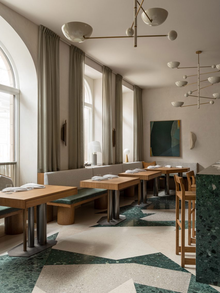
Terrazzo floor at PersonaTerrazzo floor at Persona
Persona is located in Stockholm’s Östermalm area

“The inspiration is drawn from a mix of personal experiences, subconscious imprints from admired styles, particularly mid-century Italian design, and a desire to integrate a homely warmth into a hospitality environment,” he told Dezeen.

“The design philosophy centres around creating a timeless, inviting space that enhances the dining experience while maintaining a sense of personal touch and intimacy.”
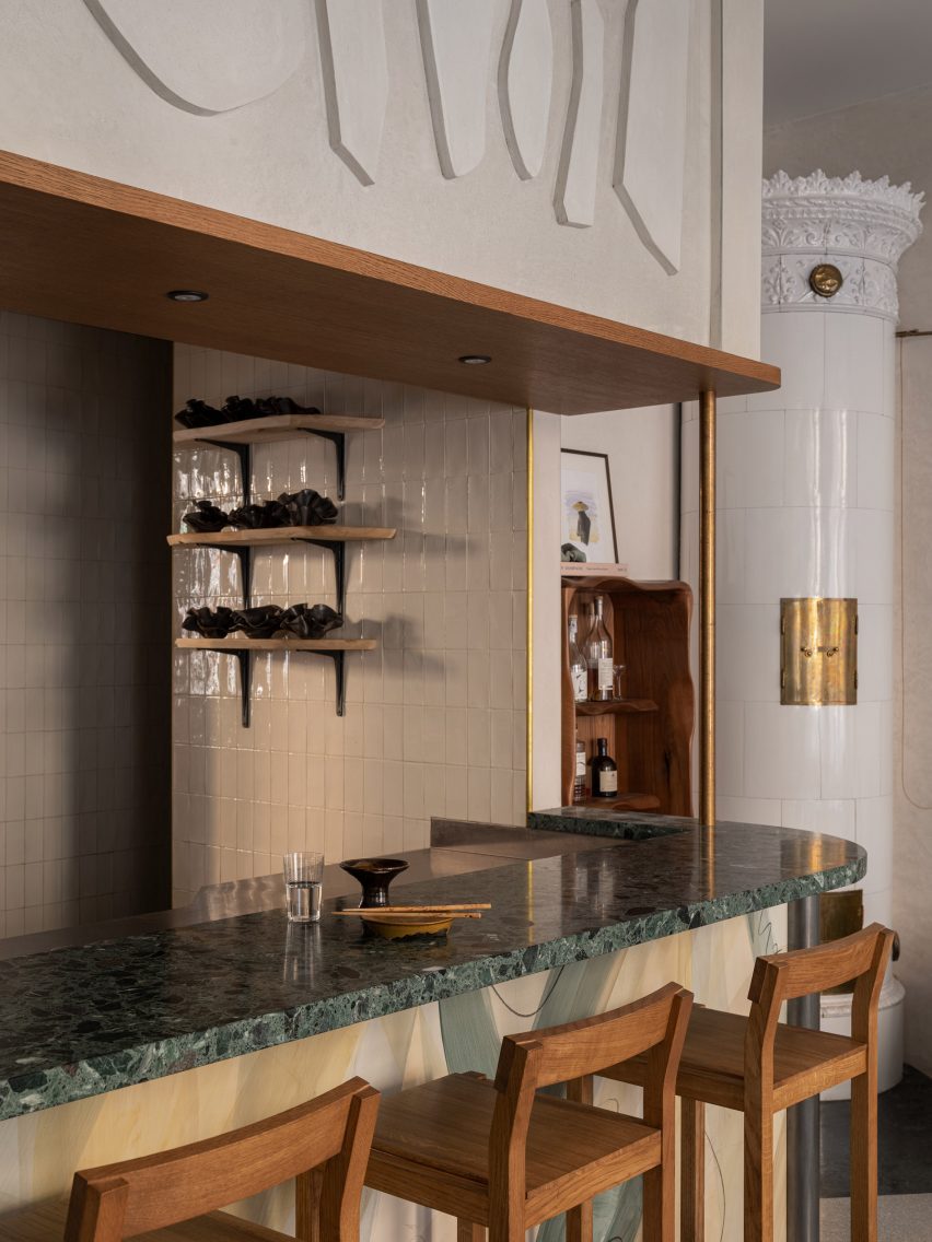
Bar in Stockholm restaurantBar in Stockholm restaurant
Green tones feature throughout the interior

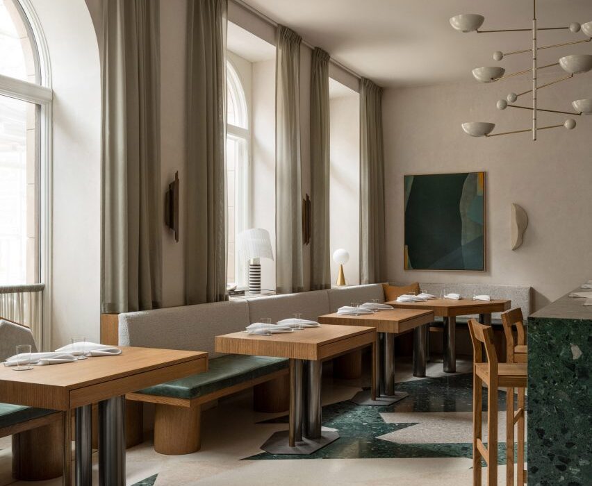
Green hues are used throughout Persona‘s 120-square-metre interior, complementing its cream-coloured walls and numerous wooden furniture pieces and panelling.

“Green is my go-to when I want to arouse a sense of calmness and comfort,” Bratsberg explained.
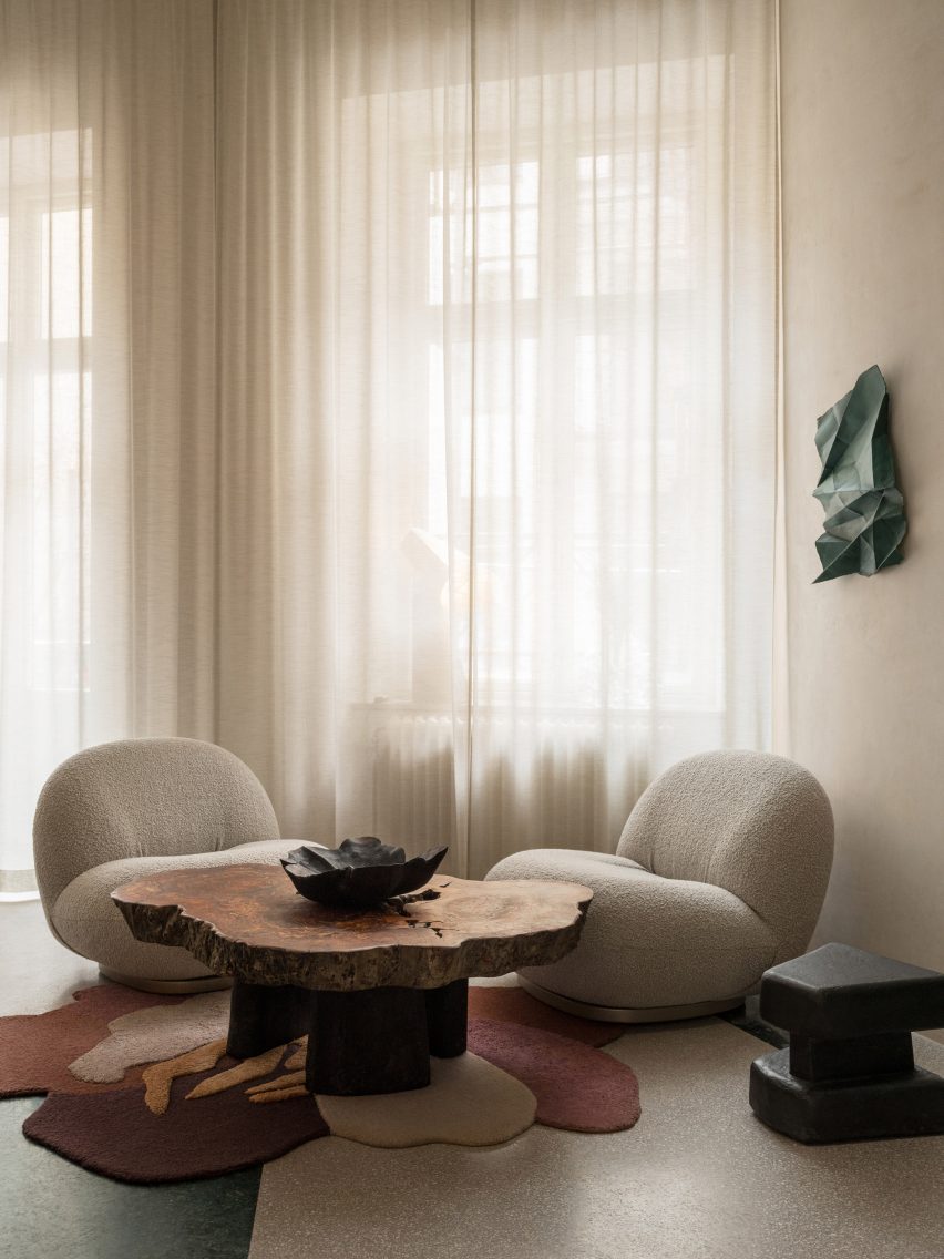
Soft white chairs in front of curtained windowSoft white chairs in front of curtained window
Designer Erik Bratsberg used furniture pieces with rounded and organic shapes

“It’s a tertiary colour, a mix of a cold and a warm colour, which allows it to go well with both warmer and colder hues and materials – a yin and yang of colours somehow,” he added.

“Green also brings the mind to nature and I guess my love for green relates to the joy of seeing the leaves back on the trees after a long Swedish winter.”
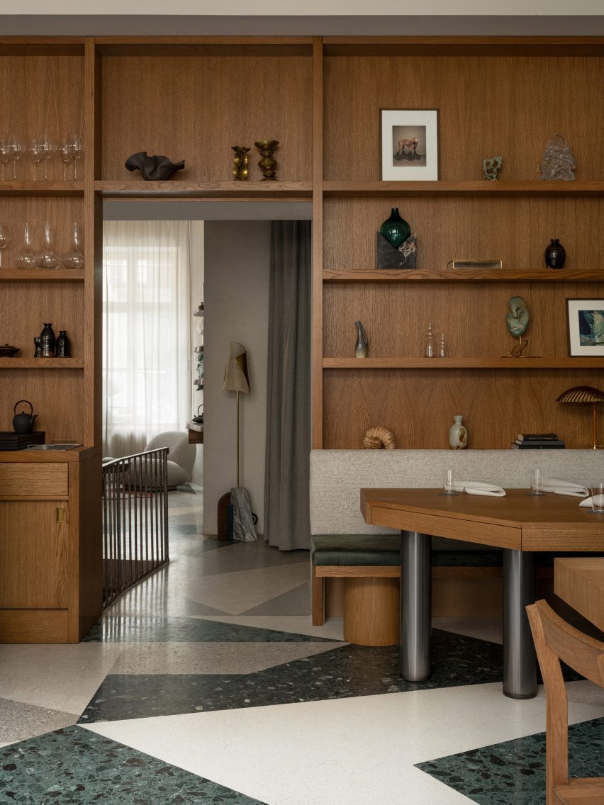
Wood-panelled wall in Östermalm restaurantWood-panelled wall in Östermalm restaurant
“Honey-tinted” oak shelving is filled with crockery and art

The restaurant, which feels more like a living room than an eatery in parts, also features plenty of natural materials such as stone and wood, which are interspersed with terrazzo and brass to create tactile interest.

This material mix was chosen to evoke a sense of “casual elegance”, Bratsberg said.

“For the floor I played around with the possibilities of terrazzo, using shades of green and warm greys and whites forming an asymmetrical pattern,” the designer explained.

Bratsberg clad the walls of the Persona restaurant in an off-white plaster with a mottled surface, designed to contrast the “silky honey-tinted oak” used for the wall shelving and tables.

“Patinated brass together with details in yellow ochre acts as an accent,” Bratsberg added. “Sheer curtains, patinated leather and textured textiles round it all off.”
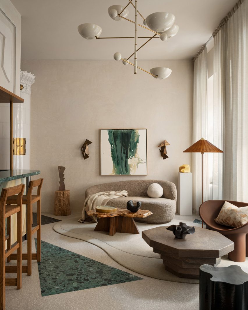
Living-room like corner in Persona eateryLiving-room like corner in Persona eatery
Bratsberg created his own artworks for the restaurant

Custom-made abstract artworks also decorate the interior. Bratsberg made these himself from watercolour paintings that he had made, which were then screen-printed onto acoustic panels.

“In my multidisciplinary practice I strive to interrelate my art, design and interior work – why not make a lamp into sculpture, or a bar front as a painting, or a plain wall a relief?” Bratsberg said.
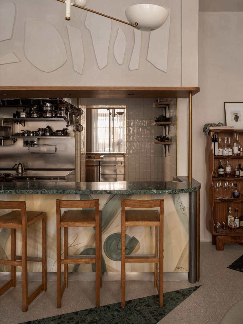
Jagged shapes decorate Stockholm restaurantJagged shapes decorate Stockholm restaurant
Cut-out geometric details add extra interest to the bar

Also notable in the interior is the variation of shapes, with the angular tables and counters contrasting against round and jagged lamps, cut-out geometric details and smaller tables made from organically shaped burl wood and stone.

“Perfectly straight lines and symmetry bring order and calmness for the eye, but never have I been particularly intrigued by squares and straight lines,” Bratsberg said.

“On the other hand, too much asymmetrical geometries and organic shapes can bring the feeling of disorder. But balancing the two – as with many opposites or contrasts – can create an interesting harmony,” he added.
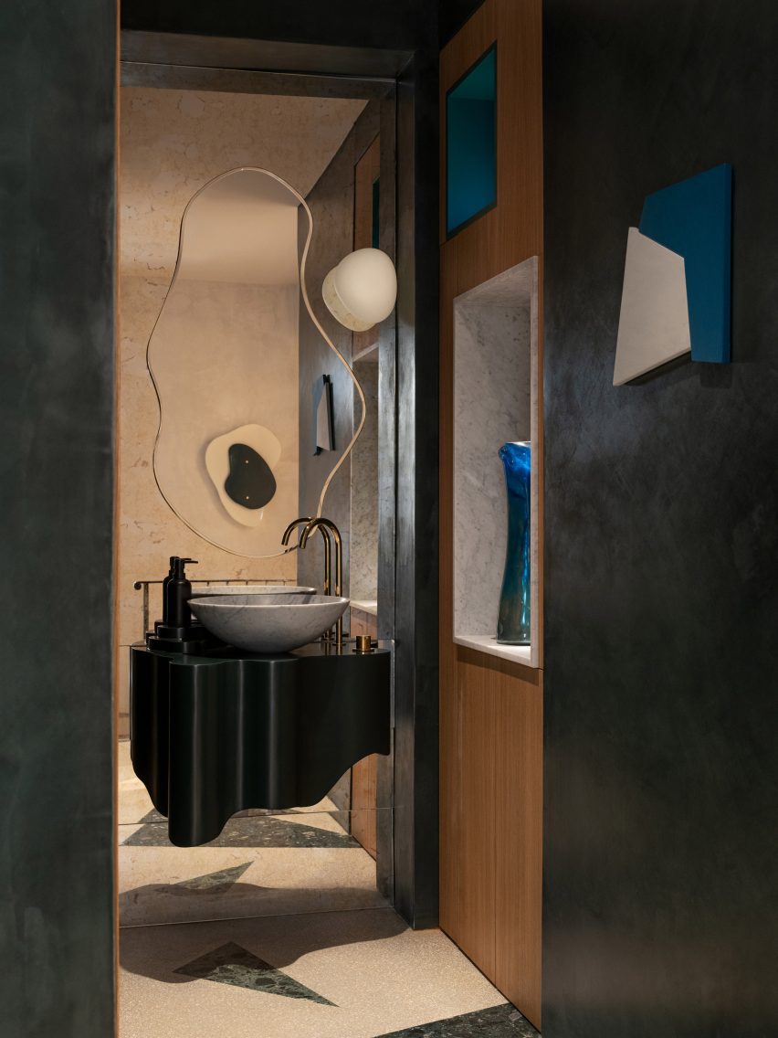
Bathroom of Persona restaurantBathroom of Persona restaurant
The bathroom features undulating mirrors and a mix of different shapes

In the bathroom, undulating mirrors match a wavy sink and are juxtaposed against square wall niches and angled, jagged cut-out wall decorations.

“Forms, lines, colours and materiality speak to us in mysterious ways, but an interior without any sculptural form and asymmetries is like a language without exclamation marks, gestures or emotional expression to me,” Bratsberg concluded.

Other Stockholm restaurants with interesting interiors featured on Dezeen include an “unexpected” restaurant in a historic food hall and a decadent Italian restaurant located in a former cinema.

The photography is by Erik Lefvander.


Reference

Oskar Kohnen fills London office with mid-century modern furniture
CategoriesInterior Design

Oskar Kohnen fills London office with mid-century modern furniture

London studio Oskar Kohnen has outfitted a Mayfair office with mid-century modern furniture and contemporary pieces, which “are so well curated that no one would ever dare to throw them away”.

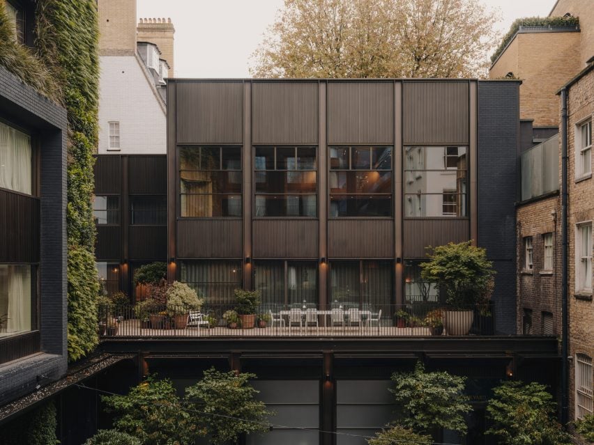
Spread across three floors, the office is housed within a rectilinear building in London’s Mayfair neighbourhood with a gridded facade.

Mayfair office by Oskar Kohnen Mayfair office by Oskar Kohnen
Oskar Kohnen designed the office in London’s Mayfair area

“It has a townhouse feeling,” studio founder Oskar Kohnen told Dezeen of the office, which he designed for developer Crosstree Real Estate.

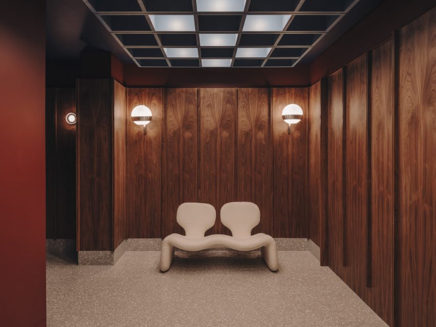
At its ground level, Kohnen clad the entrance hall with dark-stained wooden panels and added sconce lights to subtly illuminate the space.

Djinn sofa by Oliver MourgeDjinn sofa by Oliver Mourge
A cream Djinn sofa was placed in the entrance hall

An amorphous Djinn sofa, created by industrial designer Olivier Mourge in 1965, was placed in one corner.

“We worked a lot with vintage furniture, and as for the new pieces we sourced, we hope they are so well curated that no one would ever dare to throw them away,” said Kohnen.

Living room-style space with an L-shaped sofaLiving room-style space with an L-shaped sofa
The first floor features a living room-style space

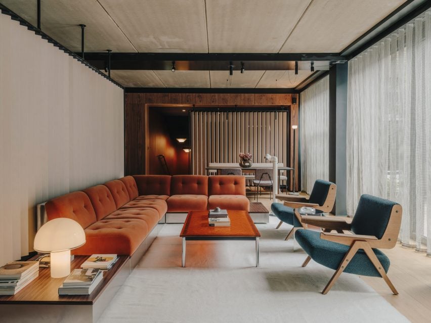
“Warm and inviting” interiors characterise a living room-style space on the first floor, which was created in direct contrast to the industrial appearance of the exterior.

An L-shaped velvet and stainless-steel sofa finished in a burnt orange hue was positioned next to white-stained brise soleil screens and a bright resin coffee table.

Kitchen with terrazzo worktopsKitchen with terrazzo worktops
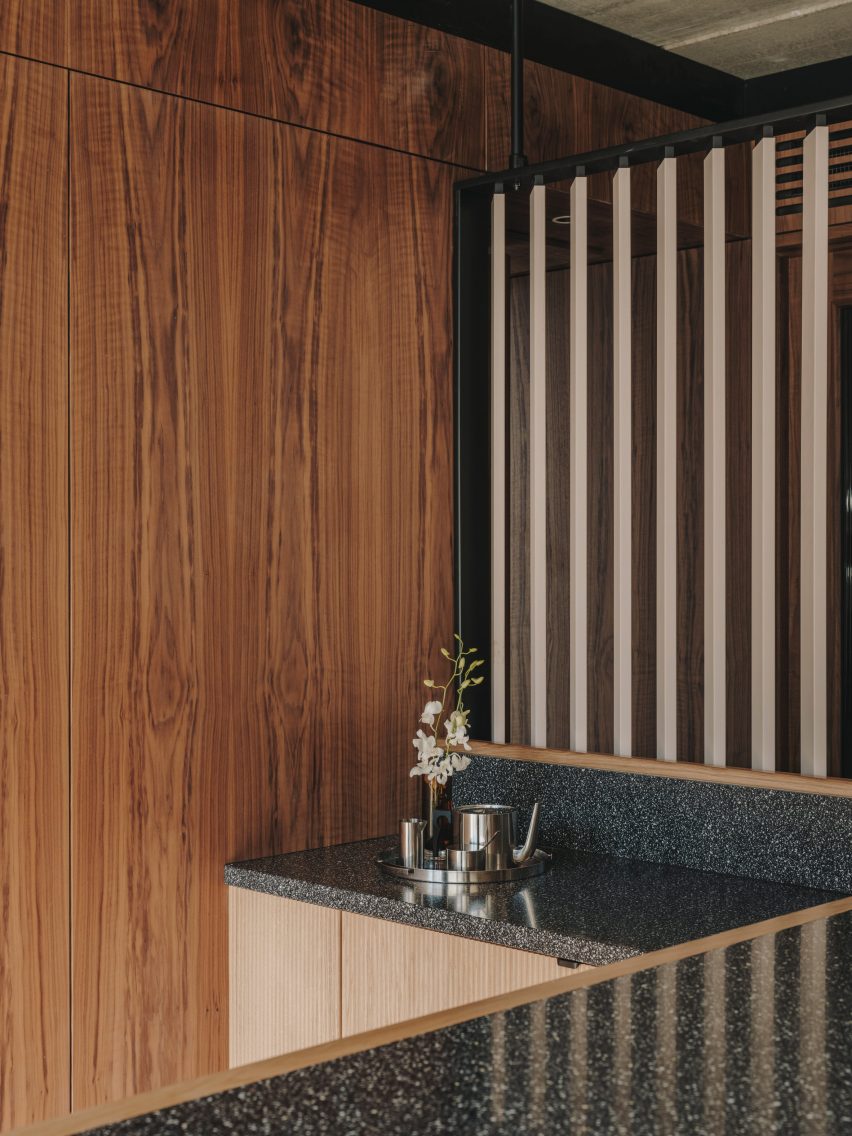
Terrazzo accents were chosen for the kitchen

“The social spaces have an earthy and calm colour palette – yet they are lush and dramatic,” explained Kohnen.

A pair of low-slung 1955 Lina armchairs by architect Gianfranco Frattini also features in this space, while floor-to-ceiling glazing opens onto a residential-style terrace punctuated by potted plants.

Bright gridded ceiling in a meeting roomBright gridded ceiling in a meeting room
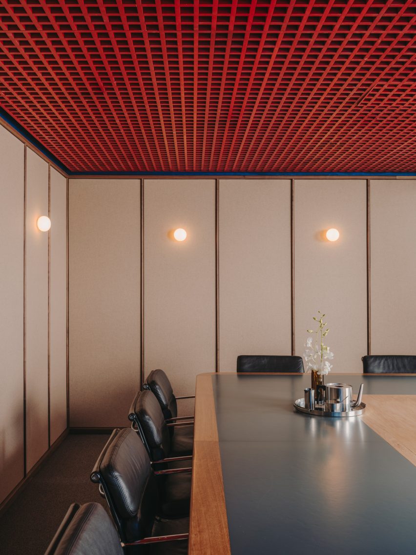
Oskar Kohnen added a bright gridded ceiling to one of the meeting rooms

Similar tones and textures were used to dress the rest of the rooms on this level.

These spaces include a kitchen with contemporary terrazzo worktops and a meeting room with a red gridded ceiling that was set against cream-coloured panels and modernist black chairs.

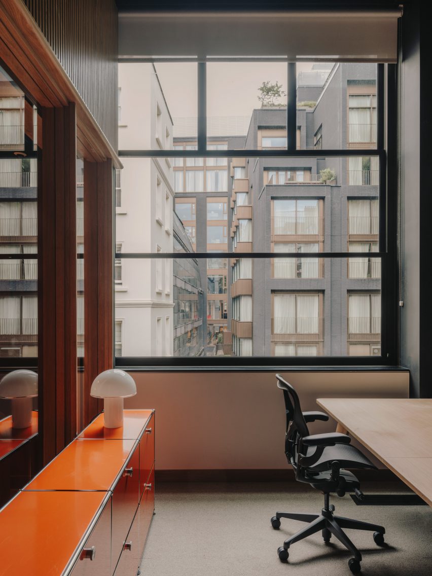
The second floor holds the main office, complete with rows of timber desks and an additional meeting room-library space characterised by the same reddish hues as the low-lit entrance hall.

“The idea was to create an office space that had soul to it and would offer a more personal take on a work environment, rather than the usual corporate spaces we are so familiar with in London,” Kohen concluded.

Desks within the main office areaDesks within the main office area
The second floor holds the main office

Founded in 2011, Kohnen’s eponymous studio has completed a range of interior projects, including a mint-green eyewear store in Berlin and a pink-tinged paint shop in southwest London.

The photography is by Salva Lopez.


Reference

Tara Bernerd fills Maroma hotel in Mexico with artisanal elements
CategoriesInterior Design

Tara Bernerd fills Maroma hotel in Mexico with artisanal elements

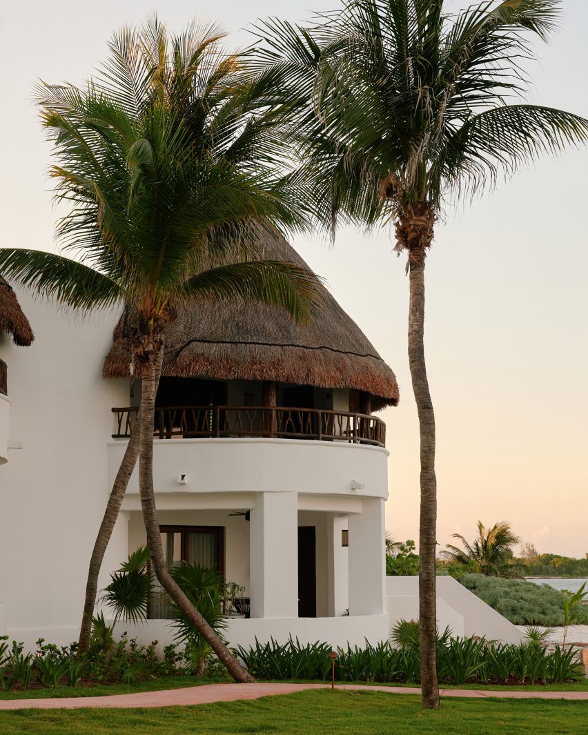
Interior designer Tara Bernerd worked with local artisans when dressing the cavernous rooms at the Maroma hotel in Riviera Maya, Mexico, which were renovated to reflect hacienda-style living.

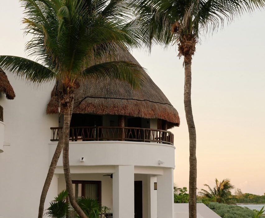
Housed within white stucco volumes arranged on a coastal plot between lush jungle and the Caribbean sea, the longstanding Maroma, A Belmond Hotel was renovated earlier this year but retained much of its traditional-style architecture.

Maroma hotel in Riviera Maya, MexicoMaroma hotel in Riviera Maya, Mexico
The Maroma hotel is housed within rounded stucco, palapa-topped volumes

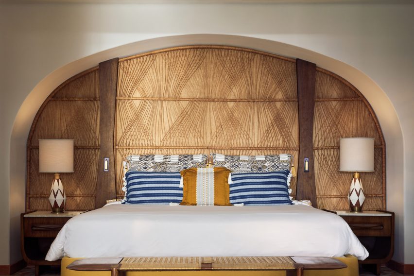
Bernerd and a team of local artisans conceived the eclectic interiors to reflect the palapa-topped structures, creating a range of bespoke curved furniture and ornaments.

“The buildings themselves are organic in shape and form and were originally positioned in response to the sacred Mayan geometry,” she told Dezeen.

“We sought to retain and enhance the beauty of the hotel’s original character.”

Guest room with a rounded alcoveGuest room with a rounded alcove
Tara Bernerd sought to reflect this “Mayan geometry” in the interior design

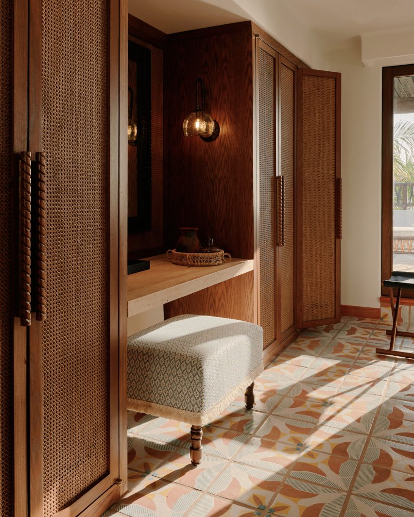
Among the custom pieces are over 700,000 tiles hand-painted and crafted by ceramicist José Noé Suro using clay from Mexico’s Jalisco region.

The tiles cover the floors in all of the 72 guest rooms, which are characterised by rattan wardrobes and amorphous timber furniture pieces – 80 per cent of which were hand-carved.

Rattan wardrobes at MaromaRattan wardrobes at Maroma
The guest rooms are characterised by rattan accents and blown glass

Artisan Max Kublailan blew bulbous glass sconce lights, which feature throughout the rooms and are reminiscent of glowing gemstones.

“It was a joy working with the local artisans who brought our designs to life and the process was more like a conversation between artisan and designer, with each inspiring and on occasion challenging the other,” reflected Bernerd.

Guest bathroom at MaromaGuest bathroom at Maroma
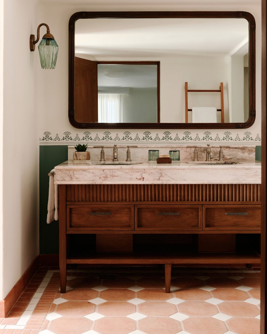
Eclectic design choices were also made for the guest bathrooms

The entrance to each guest room also features individual ceramic, painted signs informed by traditional Lotería cards, which are used to play a similar game to bingo in Mexico.

“We built up the layers of design within the spaces, with rich pops of colour being brought in through the tiled or mosaic floors, the use of decorative tiles in the walls and dado rail as well as cushions and fabrics,” explained Bernerd.

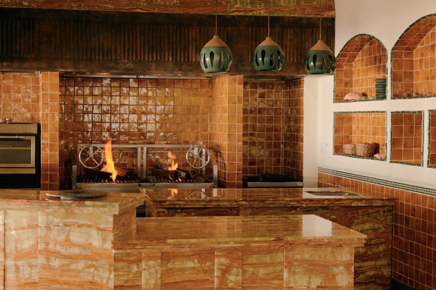
Open kitchen clad in ceramic tilesOpen kitchen clad in ceramic tiles
An open kitchen clad in glazed ceramic tiles features in one restaurant

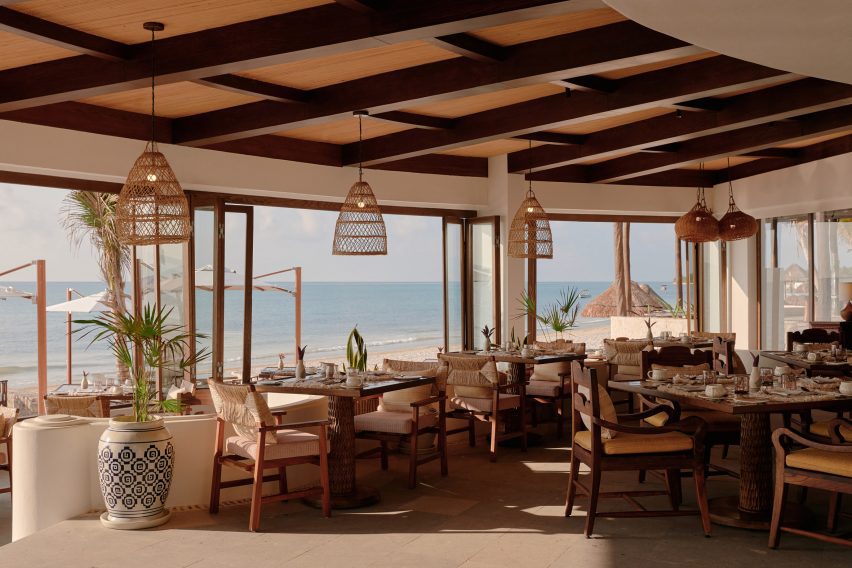
Maroma’s two restaurants follow a similar design, with accents such as rattan pendant lights and tables featuring textured legs that give the appearance of tree trunks.

An open kitchen clad entirely in caramel-hued glazed ceramic tiles was tucked into a corner of the Woodend eatery while Casa Mayor includes clusters of hand-painted plant pots.

Painted pots and rattan lampshades in Casa MayorPainted pots and rattan lampshades in Casa Mayor
The other restaurant includes painted potted plants and oversized rattan lampshades

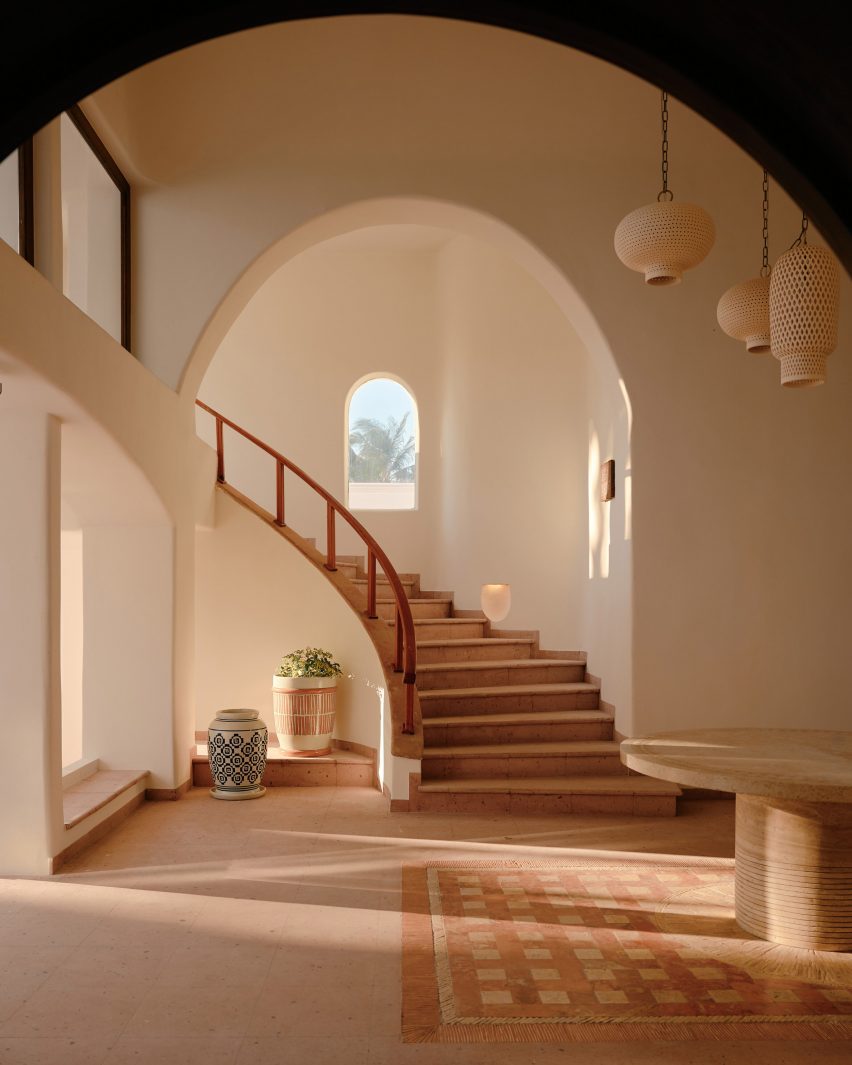
Throughout the hotel, cavernous alcoves were also dressed with custom interiors made up of stone, clay, wood and natural fibres.

“Location and layout were key and I am especially proud of how we have managed to reimagine previously under-utilised areas and have created a balance between unique, dramatic spaces and cosier, slightly hidden areas,” said Bernerd.

Traditional Yucatán doors with dense timber frames and chandeliers made from clusters of seashells were chosen to respond to Maroma’s setting.

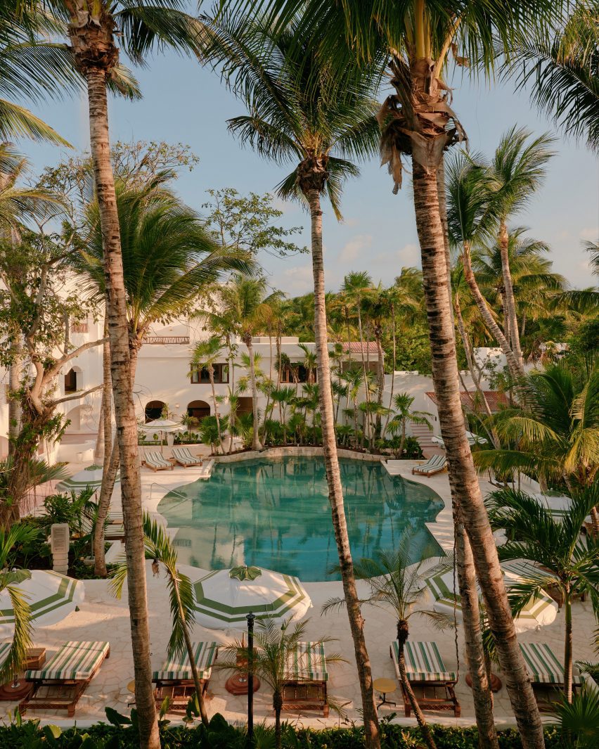
The hotel’s central swimming pool was renovated with Sukabumi turquoise tiles handmade from volcanic stone to emulate the cenotes – water-filled sinkholes formed by the collapse of limestone – found in the Yucatán Peninsula.

Cavernous corridor with a curved staircaseCavernous corridor with a curved staircase
Cavernous corridors reflect the hotel’s architecture

“In essence, we wanted to create something that was effortlessly serene and had the feeling of a chic home,” said the designer.

“So we also drew inspiration from traditional hacienda-style living to create a relaxed, almost residential vibe throughout the resort and evoke a sense of connection, unity and flow between all of the public area buildings,” she concluded.

Cenote-style swimming poolCenote-style swimming pool
The central swimming pool was informed by cenotes

The British designer is the founder of the London-based architecture and interiors office Tara Bernerd & Partners.

Elsewhere in Mexico, local firms Productora and Esrawe Studio designed a San Miguel de Allende hotel with planes of green tile. Architect Alberto Kalach added a series of vaulted, brick arches to a resort in Oaxaca.

The photography is courtesy of Belmond. 


Reference