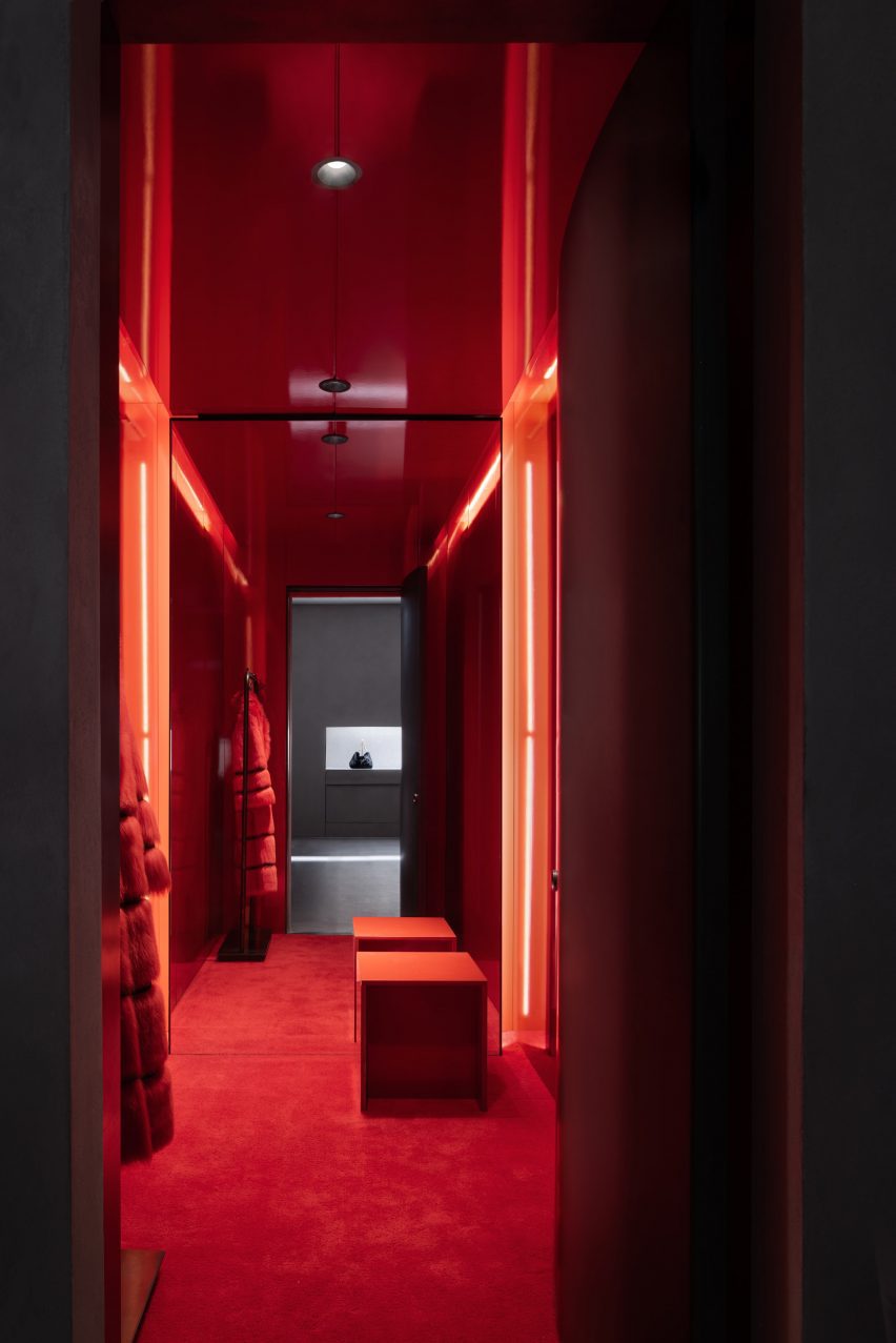
StudioTwentySeven opens “monumental” flagship gallery in Tribeca
CategoriesInterior Design

StudioTwentySeven opens “monumental” flagship gallery in Tribeca

Collectible design gallery StudioTwentySeven has taken over a huge space in a Tribeca textile building, creating a warm and serene environment to present museum-sized, limited-edition pieces.

The gallery’s New York City flagship at the corner of Church and Leonard Streets covers 7,000 square feet (650 square metres) across the ground floor of a 1901 neoclassical building by architect Henry J Hardenbergh.
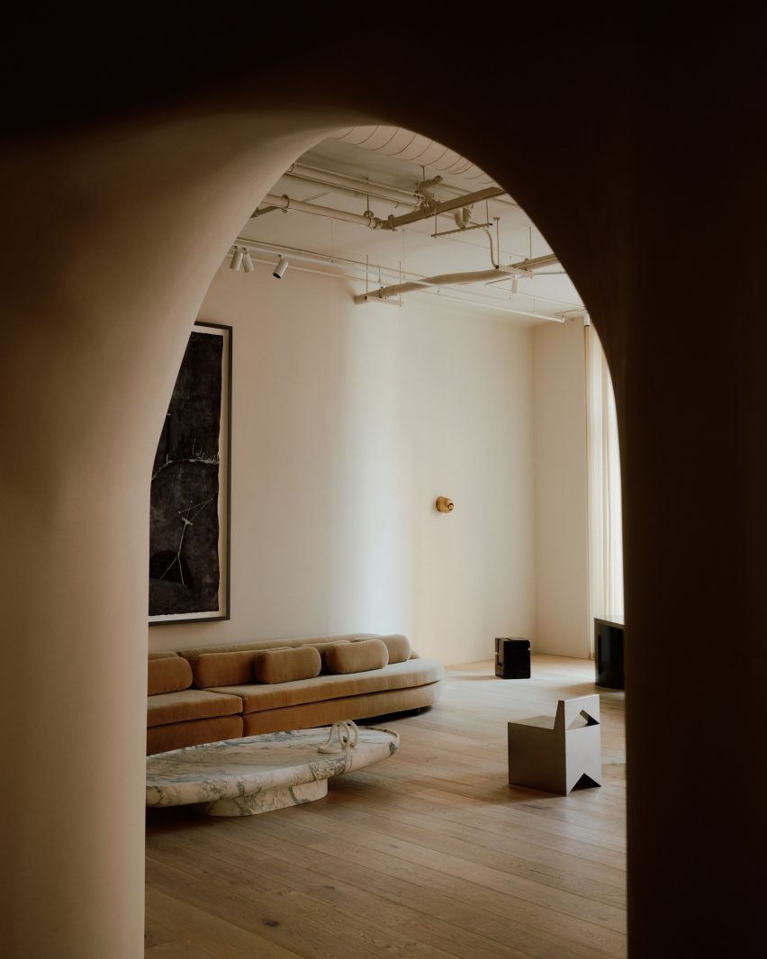
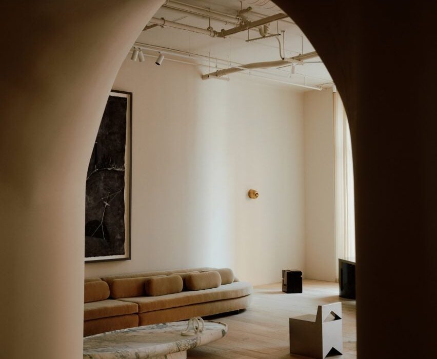
Double-height gallery space viewed through arched openingDouble-height gallery space viewed through arched opening
StudioTwentySeven founders Nacho Polo and Robert Onsuka introduced curved walls and archways to the interior of their flagship gallery

Formerly Jean-Georges Vongerichten’s Restaurant 66, the grand space benefits from double-height ceilings and eight 16-foot-tall windows on two sides, overlooking the mirrored Anish Kapoor sculpture squashed beneath Herzog & de Meuron’s “Jenga Tower”.

StudioTwentySeven founders Nacho Polo and Robert Onsuka, who started their venture in Miami in 2018, chose this location for the New York flagship for its “monumental scale” and ability to showcase huge sculptural works.
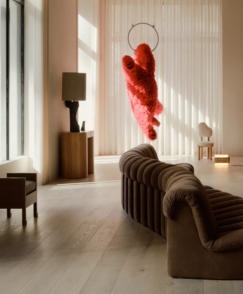
Gallery with hanging bear sculpture by Italian artist Paola Pivi in the backgroundGallery with hanging bear sculpture by Italian artist Paola Pivi in the background
The double-height ceilings allow large-scale pieces to be displayed, like a hanging bear sculpture by Paola Pivi

“The building’s elaborately carved facade, and its stone entry staircase leading to beautifully restored original triple doors, set the tone for what clients of StudioTwentySeven will experience inside – a space that is sophisticated yet genuinely welcoming,” said the duo.

Led by Polo, the renovation of interiors involved the introduction of curved walls and a rotunda, along with an archway fitted with a 12-foot-tall, hand-carved chestnut door.
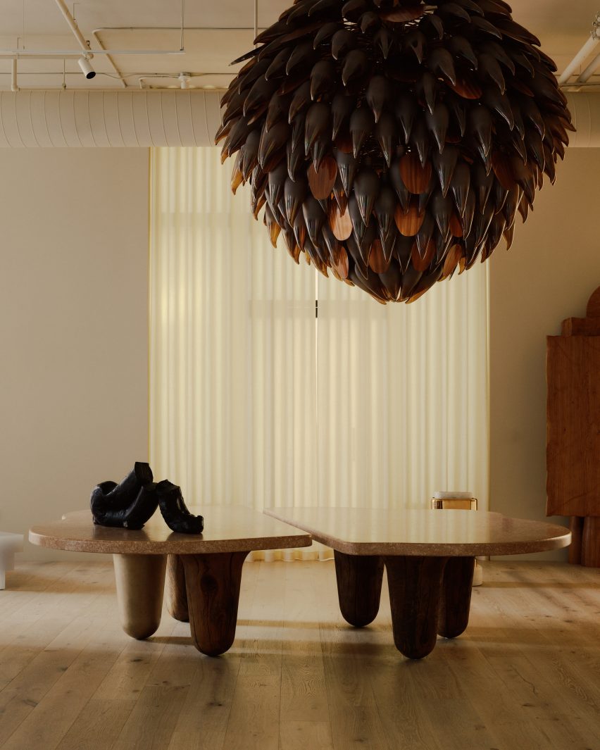
Giant bronze and glass chandelier above an organic-shaped dining tableGiant bronze and glass chandelier above an organic-shaped dining table
A giant bronze and glass chandelier hangs above an organic-shaped dining table

The team worked with lighting specialists L’Observatorie to design a custom system that imbues the space with a warm atmospheric quality, complementing the pieces on display.

A massive bronze and glass chandelier comprising hundreds of individual petals is suspended above an organically shaped French oak and waxed bronze dining table.

Pale oak floors run throughout the gallery, in places separated from the walls by glowing bands of light, and sheer curtains diffuse the abundance of natural light that enters during the day.

Other architectural details include a tall fireplace shaped into the hand-plastered walls and a chestnut-lined library hidden behind a pair of discreet doors, designed to “create moments of surprise”.
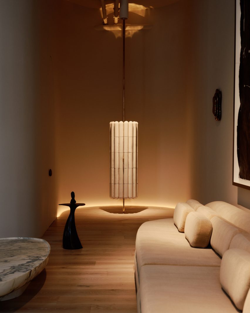
Dimly lit rotunda for displaying collectible designDimly lit rotunda for displaying collectible design
The founders also created a rotunda space for displaying specific pieces

For the gallery’s opening in February 2023, several museum-sized works from Polo and Onsuka’s private collection were installed in the space.

These include a hanging bear by Italian artist Paola Pivi, which had to be transported from the Aspen Art Museum in a special truck, and a bronze sculpture titled Owl and Boy by Japan-based Otani Workshop.
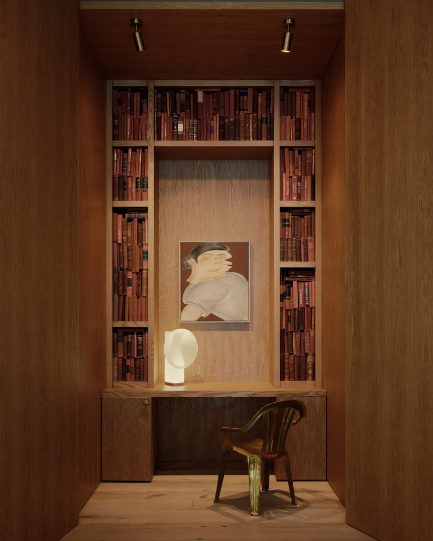
Hidden library lined in chestnutHidden library lined in chestnut
“Moments of surprise” include a hidden library lined in chestnut

Polo and Onsuka, who were judges for Dezeen Awards 2023, also have gallery spaces in Miami’s Little River and London’s Mayfair – open by appointment only.

Their new flagship in Tribeca joins a multitude of collectible design galleries in the Downtown NYC neighbourhood, like R & Company and Egg Collective, where expansive former industrial lofts provide ideal settings for presenting furniture, lighting and art.

The photography is by William Jess Laird.


Reference

Kith Women Flagship in Soho combines walnut and pink marble
CategoriesInterior Design

Kith Women Flagship in Soho combines walnut and pink marble

American fashion brand Kith has returned to the location of its first Manhattan flagship to open a women-dedicated store, in which olive trees grow up through display podiums.

The inaugural Kith Women Flagship in Soho opened last December at 644 Broadway, the same historic landmark building where the brand debuted its Manhattan retail offering in 2011.

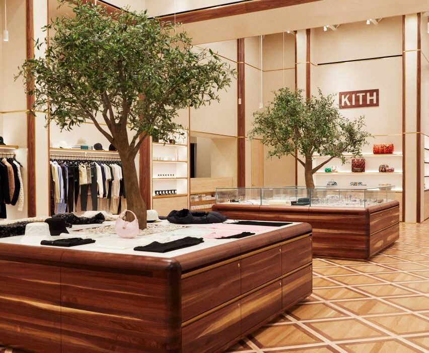
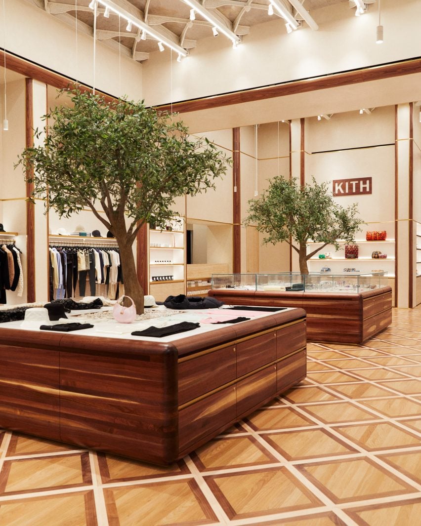
Custom-built walnut podiums with olive trees growing through the centreCustom-built walnut podiums with olive trees growing through the centre
Custom-built podiums run through the middle of the Kith Women flagship store in Soho

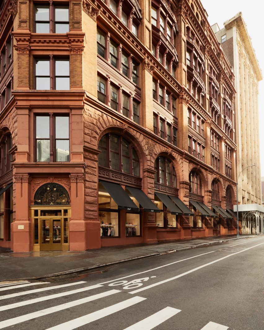
Previously the Manhattan Savings Institute Bank, the red sandstone and brick structure’s exterior features wrought iron gates at the entrance and set the tone for the materials palette inside.

Kith founder and creative director Ronnie Fieg designed the interiors to include signature elements of the brand’s retail concepts, but with adjustments to acknowledge its context.

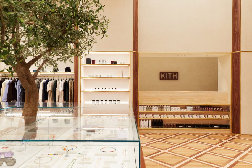
Kith Women store with apparel and accessories displayed in walnut and brass-trimmed nichesKith Women store with apparel and accessories displayed in walnut and brass-trimmed niches
The main room displays apparel and accessories in walnut and brass-trimmed niches

“The ambiance exudes modern elegance with its warm and calming aura, constructed with materials like Venetian plaster, travertine, and rosa aurora [marble],” said the Kith team.

The spacious main room benefits from tall ceilings and an open floor plan, and presents Kith Women in-house and multi-brand ready-to-wear apparel against Venetian plaster and Kith monogrammed suede wallpaper.

Footwear room with shoes presented on travertine shelvesFootwear room with shoes presented on travertine shelves
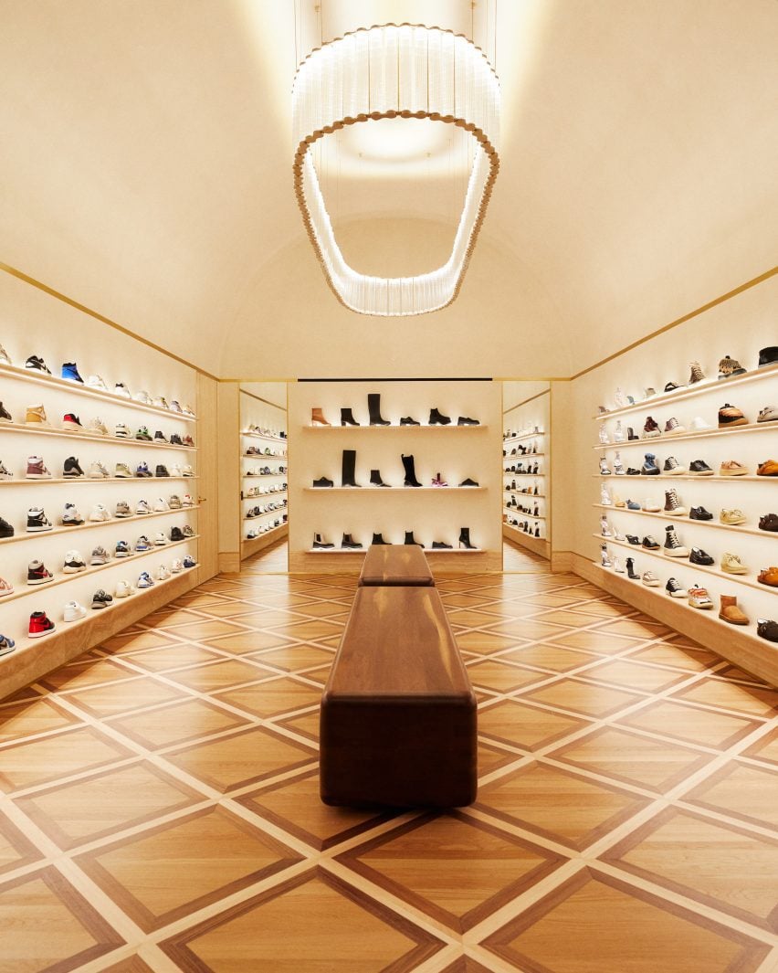
In a room dedicated to footwear, shoes are presented on travertine shelves

Clothing is displayed on rails installed in walnut and brass-trimmed niches around the perimeter, with accessories like hats and bags placed on shelves above.

A row of square walnut podiums runs through the middle of the room, each with an olive tree growing up through the centre of its pink marble surface.

A cafe and flower shop featuring mosaic floors and a fluted marble service counterA cafe and flower shop featuring mosaic floors and a fluted marble service counter
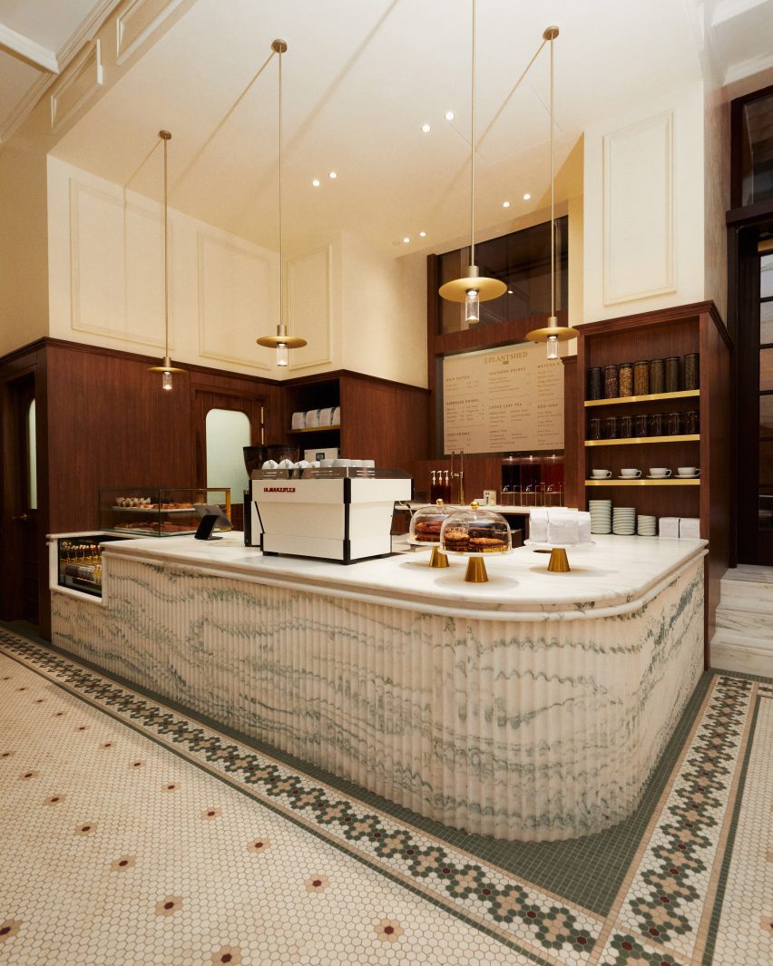
A cafe and flower shop is run in partnership with PlantShed, and features mosaic floors and a fluted marble service counter

Custom-built by Brooklyn-based woodworker Mark Jupiter, these units contain drawers for product storage, and alternating ones are topped with glass vitrines for showcasing jewellery and other small accessories.

Oak flooring is laid in a grid pattern transversed by walnut strips, and the darker wood also lines the fitting rooms.

Footwear has a dedicated room, in which shoes are displayed on shelves with integrated lighting that run from one end to the other.

“Entering the footwear space, you will find a grand arched plaster ceiling, travertine shelves, and a custom chandelier from Italy by Viabizzuno,” the team said.
Cafe in a courtyard behind historic wrought iron gatesCafe in a courtyard behind historic wrought iron gates
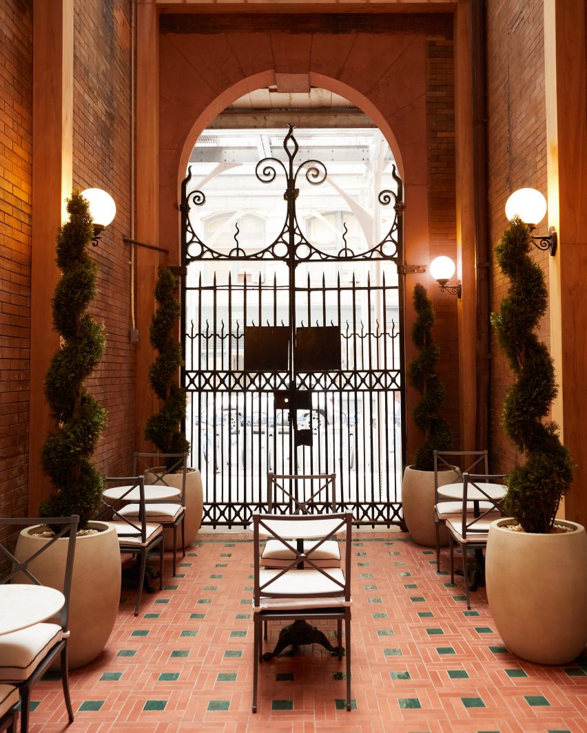
The cafe leads out to a courtyard behind the historic building’s wrought iron gates

In the final room is a cafe run in partnership with New York-based flower and plant shop PlantShed, which serves light bites and drinks and offers custom floral arrangements.
The space features a mosaic tiled floor, walnut wall panelling, a service counter with a fluted pink marble front and floral displays on stepped stone plinths.

The cafe leads out to a courtyard area behind the building’s impressive iron gates, which furnished with cafe tables and chairs in between topiary plants shaped into spirals.

Exterior view of red sandstone building at 644 BroadwayExterior view of red sandstone building at 644 Broadway
Kith Women is located at 644 Broadway, the same building where the brand opened its original flagship retail space in 2011

Feig also designed Kith’s recently opened Williamsburg store, located in the 25 Kent Plaza office building where the brand also has its corporate offices.

The company had previously worked with design studio Snarkitecture on its retail spaces around the world, including outposts in Miami, Los Angeles and Paris.

The photography is courtesy of Kith.

Reference

UNStudio unveils Huawei flagship store with “petal-like” facade
CategoriesInterior Design

UNStudio unveils Huawei flagship store with “petal-like” facade

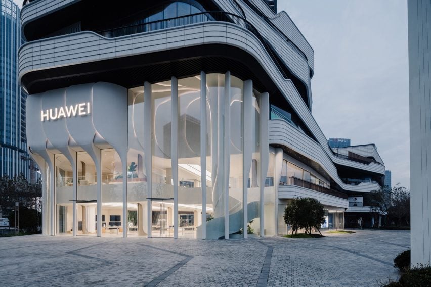
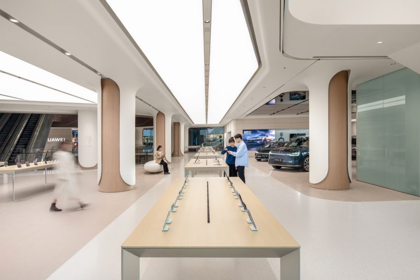
Dutch firm UNStudio has revealed a two-storey flagship store for Chinese technology company Huawei in Shanghai with a facade clad in ivory-coloured petal-like forms.

Drawing from Huawei’s global operating system, named Harmony, UNStudio‘s design aimed to generate biophilic associations between the brand and its technology by integrating organic geometric shapes throughout the scheme.

Facade of UNStudio Huawei flagship store in ShanghaiFacade of UNStudio Huawei flagship store in Shanghai
UNStudio has completed the Huawei flagship store in Shanghai with a petal-like facade

“Among the many interfaces found in retail nowadays, the flagship store we have created for Huawei in Shanghai is one that blends interactive experiences, technology and community creation,” UNStudio founder and principal Ben van Berkel said.

“The new store reimagines modern retail spaces as inviting environments that promote a sense of community and provide a contemporary venue for consumers and visitors to meet, share and innovate,” he continued.

Southern facade of UNStudio Huawei flagship store in ShanghaiSouthern facade of UNStudio Huawei flagship store in Shanghai
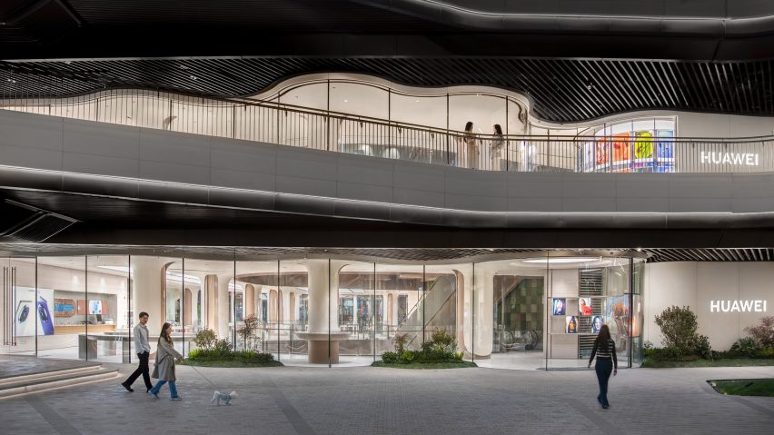
The store’s southern facade integrates undulating floor-to-ceiling glazing. Image courtesy of Huawei

The store’s double-height frontage is defined by a series of overlapping elements that the studio described as “petal-like”, which fold together to form a raised band across the facade glazing.

Each ivory-coloured ‘petal’ weaves down to meet the ground as ‘stems’, configured to hide the structural mullions between glass panels and create the sense of a frameless facade.

Soft lighting was also integrated between the petal edges to illuminate the store’s exterior at night.

Internal tree column in UNStudio Huawei flagship store in ShanghaiInternal tree column in UNStudio Huawei flagship store in Shanghai
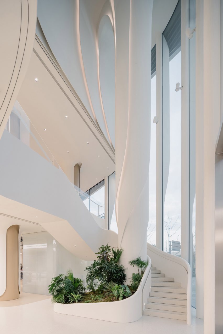
A spiralling column was positioned as a visual marker within the central atrium

Positioned directly behind the facade, a spiralling column named the Tree of Harmony continues the organic geometries internally.

The column was positioned to the side of the central atrium as a focal point for visitors and is wrapped by stairs that lead to the upper mezzanine floor.

To further the store’s biophilic character, the southern facade was finished with undulating glazing and seating that folds around the building’s curves.

Display zones in UNStudio Huawei flagship store in ShanghaiDisplay zones in UNStudio Huawei flagship store in Shanghai
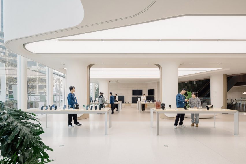
The studio used neutral and clean internal finishes to complement the ivory-coloured store frontage

Internal finishes were kept warm and neutral to match the facade’s clean tones and extensive white overhead lighting.

The studio used wood and glassfibre-reinforced cement for the store’s ceilings, floor and columns, while product tables and furniture were also made from wood and natural-toned materials to add to the organic feel of the space.

According to UNStudio, the store integrates high-performance materials and prefabricated, detachable finishes to increase the building’s longevity, while the quality of the air inside the store is monitored by climate control technology.

“Huawei TKL flagship store re-crafts Huawei’s innovative technology into a design aesthetic,” UNStudio partner Hannes Pfau said.

“It seamlessly creates a unified facade and interior narrative, while using high-performance, certified and recycled materials.”

Display zones in UNStudio Huawei flagship store in ShanghaiDisplay zones in UNStudio Huawei flagship store in Shanghai
A central product display avenue spans the length of the store

The store has a central product display avenue that spans the length of the ground floor, with two further experiential zones interspersed for increased user interaction.

A Signature Experience zone will host featured events and exhibits, while the Consumer Full Scenario Experience zone lets visitors use and test Huawei products.

Undulating glazed facade in UNStudio Huawei flagship store in ShanghaiUndulating glazed facade in UNStudio Huawei flagship store in Shanghai
Undulating floor-to-ceiling glazing was used for the store’s southern facade

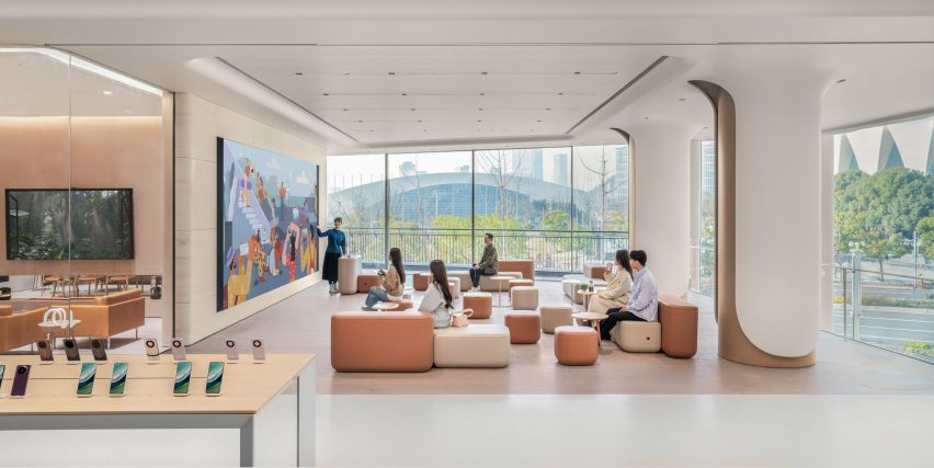
Both floors were designed with open and flexible spaces in which the store can host lectures, activities and classes.

To complete the store’s functional offerings, UNStudio also created a minimalist interior cafe to blend with the rest of the store for customers awaiting after-sale services.

Open gathering spaces in UNStudio Huawei flagship store in ShanghaiOpen gathering spaces in UNStudio Huawei flagship store in Shanghai
The store hosts flexible spaces to be used by the community

UNStudio was founded in Amsterdam in 1998 by Van Berkel and Caroline Bos.

The studio has also recently completed the Booking.com headquarters in Amsterdam and the YG Entertainment headquarters in Seoul featuring metallic surfaces and geometric forms.

The photography is by Wen Studio unless otherwise stated

Reference

Halleroed references Swedish Grace for Toteme flagship store
CategoriesInterior Design

Halleroed references Swedish Grace for Toteme flagship store

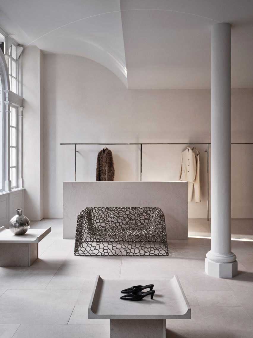
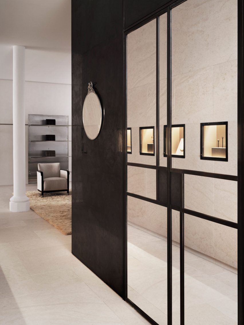
Stockholm studio Halleroed has designed fashion brand Toteme’s flagship store in London, which features a sculpture by artist Carl Milles and a steel sofa by designer Marc Newson.

Halleroed designed the store, located on Mount Street in the upmarket Mayfair area, together with Toteme founders Elin Kling and Karl Lindman. The duo wanted its third flagship to feature nods to the brand’s heritage.

“We like the idea of keeping certain elements that we find in our Swedish heritage,” Lindman told Dezeen at the store’s launch event.

“It can be by using certain vintage pieces, or like in [the brand’s Mercer Street store] in New York, we had a collaboration with Svenskt Tenn,” he added. “It’s about lifting this notion of Scandinavian design or Swedish design.”

Interior of Totême store in LondonInterior of Totême store in London
A metal sofa by Marc Newson is among the sculptural details in the store

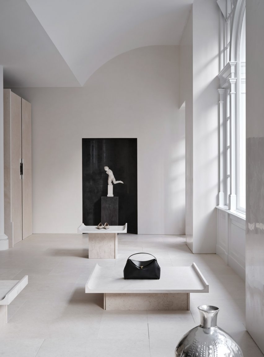
Halleroed drew on the space itself when designing the interior, focussing on how the light falls.

“We were inspired by the space itself with beautiful original windows letting the daylight in,” Halleored co-founder Ruxandra Halleroed told Dezeen.

“The upper part of the windows was partly hidden, which was a shame, so we redesigned the ceiling with a half vault towards the front to show the full height of the windows.”

Totême London storeTotême London store
A piece by sculptor Carl Milles sits by the entrance

The design also references the work of Italian architect Carlo Scarpa as well as the Swedish Grace movement.

“We were also inspired by the Swedish Grace period – around 1920-30s – that has an elegant and pure design, something we think works well for Toteme as a brand,” Halleroed co-founder Christian Halleroed told Dezeen.

“Also the work of Carlo Scarpa we find interesting, more as a mindset on how to work with details and textures to create a subtle elegance and luxury.”

Cube inside fashion store in MayfairCube inside fashion store in Mayfair
A black mirrored cube features at the rear of the store

Kling and Lindman wanted to keep the feel of “very posh” Mount Street where the store is located, while also underlining the space’s minimalist feel.

To do so, a lot of effort was put into the colour palette and different textured materials used for the flagship store.

“We worked with an off-white palette in different tones and different textures,” Ruxandra Halleroed said.

“The textures are as important as colour and materials. For walls, we have a glossy, off-white stucco, ceiling in same colour but matte. The floor is in a beige, honed limestone with a so-called Opus pattern.”

Milles sculpture inside Totême storeMilles sculpture inside Totême store
Halleroed chose to redesign the store’s ceiling to reveal its windows

In the middle of the Toteme shop, Halleroed created a stone-clad cube that holds shelves, vitrines and niches filled with artworks.

“The volume in the middle is clad with the same limestone, but in three different textures: honed, bush hammered and spiked texture, combined with oxidised dark brass,” Christian Halleroed said.

The store also features a square black volume in the back made from high-gloss stucco and dark brass.

Beige and white interior of London fashion storeBeige and white interior of London fashion store
The minimalist interior has a beige, white and black colour palette

To contrast the minimalist interior, the store is decorated with multiple artworks, including a sculpture by Milles and Newson’s intricately woven steel Random Pak Twin sofa, which Lindman found online.

“He’s a slave to auction houses,” Kling told Dezeen.

“So he found it and sent it to me and I loved it, and we also have a Marc Newsom piece in every store,” she added. “So we thought, ‘this one’s for the Mount Street store’. At that time we only had the signed contract, nothing else.”

Sign outside Mount Street storeSign outside Mount Street store
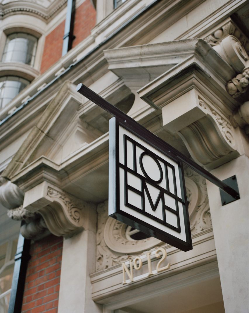
The store is located on Mount Street in central London

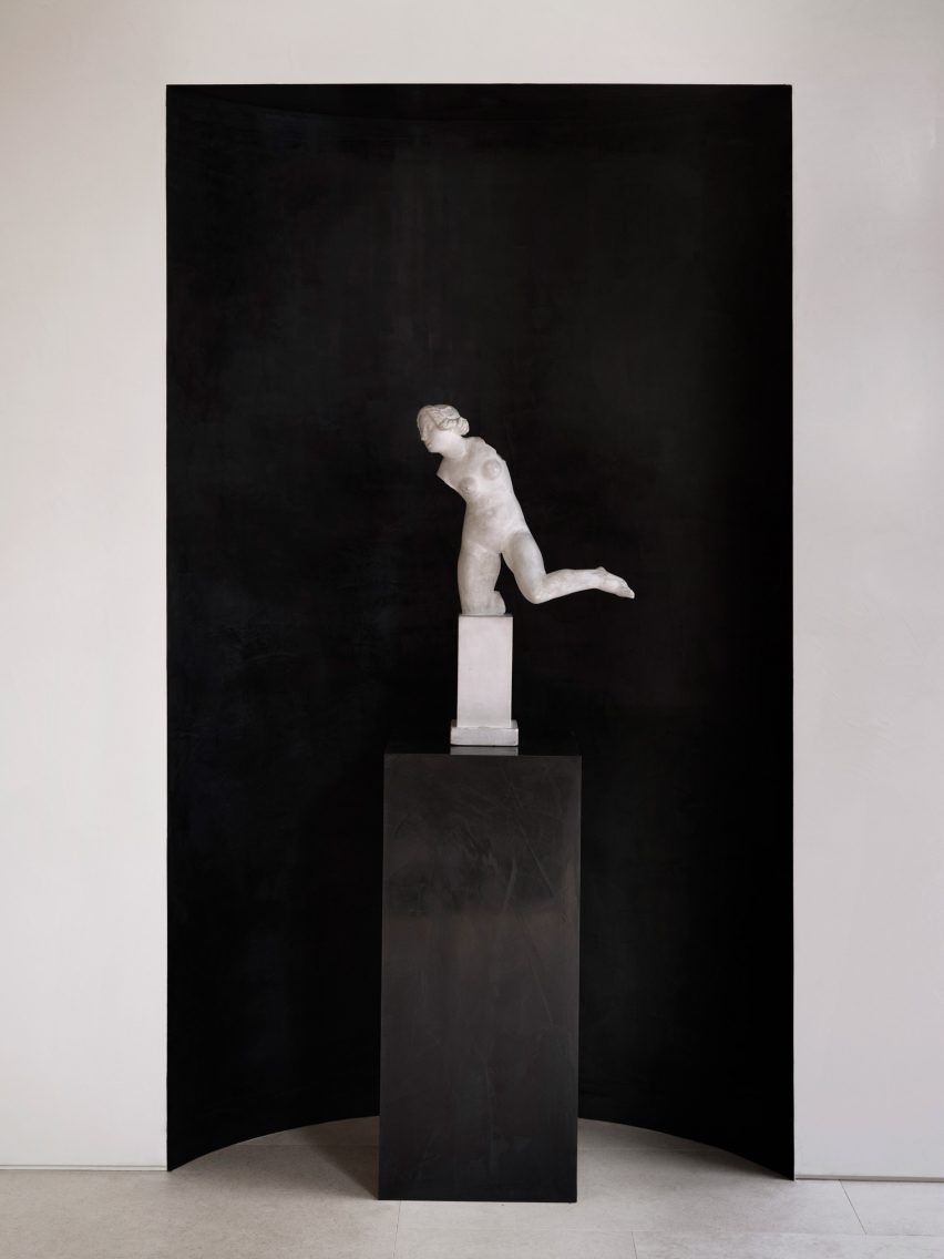
The two founders and Halleroed decided on the gypsum Milles sculpture for the Toteme store together, with Halleroed designing a custom niche to place it in that is made from black high-gloss stucco to contrast the pale artwork.

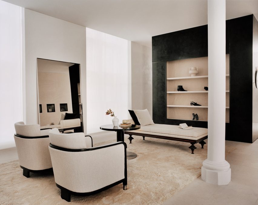
Halleroed also added vintage Swedish Grace furniture to the store, including armchairs and a coffee table by furniture designer Otto Schulz, a daybed and a mirror in pewter made for the Stockholm Exhibition 1930.

The studio has designed a number of other store interiors, including a Paris boutique for French brand L/Uniform and an Acne Studios store in Chengdu that aimed to combine the futuristic and primitive.

Reference

Samsung’s flagship New York store offers immersive smart home experience
CategoriesSustainable News

Samsung’s flagship New York store offers immersive smart home experience

Samsung’s flagship experience store in New York City, which has been captured in this exclusive video produced by Dezeen, has been designed to enable visitors to envision living in a smart home.

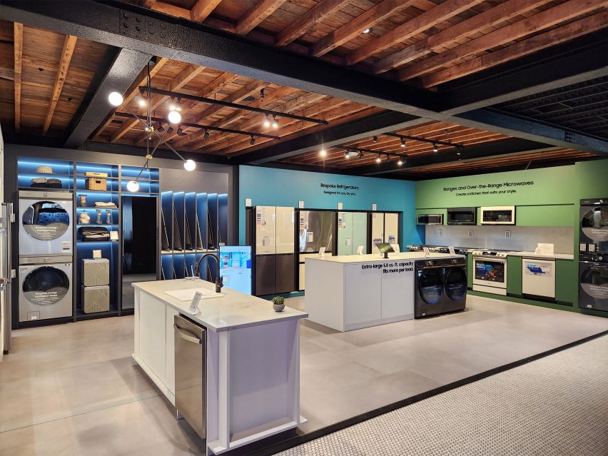
Located in Manhattan’s Meatpacking District, the Samsung 837 store is described by the brand as an “interactive playground” and allows visitors to interact with Samsung’s latest connected home devices.

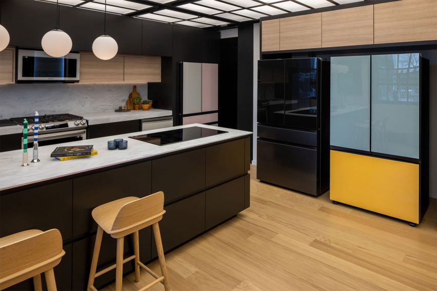
Located on the second floor, the SmartThings Home section allows visitors to test its connected products in a simulated smart home environment.

The section features a connected kitchen where products, such as Samsung’s Bespoke Refrigerator, are on display, allowing users to test its touchscreen capabilities.

The SmartThings Home section in Samsung's flagship New York store
The SmartThings Home on the second floor allows visitors to test Samsung’s latest smart products

The store also features a gaming lounge in which visitors can use consoles to play games in real-time.

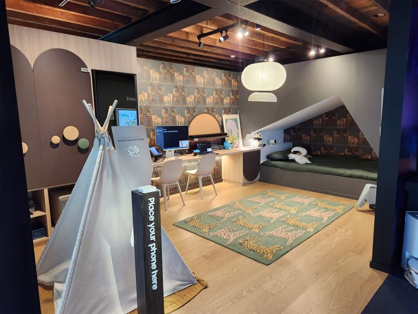
Additionally, the SmartThings Home section includes a children’s bedroom, which features a projector where visitors can experience watching movies in bed.

Samsung children's bedroom
The children’s concept bedroom features a projector to watch films

Samsung customers can download its SmartThings app to connect and monitor all of their smart home devices in one place. Users can monitor their energy consumption in a bid to reduce their energy bills using the SmartThings Energy activation within the app.

Also exhibited in the space is Samsung’s Bespoke service, which allows visitors to customise Samsung products to suit their individual style, including custom colour combinations and finishes.

Samsung bespoke refrigerators
Samsung’s bespoke refrigerators can be customised to fit a user’s individual style

Samsung uses the flagship experience store to host a variety of talks and events throughout the year. Recently, Dezeen partnered with Samsung to host a live panel discussion in the flagship store, exploring the topics of technology and sustainability.

The talk was moderated by Dezeen’s US editor Ben Dreith and featured a panel including Barent Roth, Matthew Spencer and Claudia Santos, who discussed how connected homes can enable more sustainable lifestyles.

Partnership content

This article was written by Dezeen for Samsung as part of a partnership. Find out more about Dezeen partnership content here.


Reference

Klein Dytham Architecture gives Fender flagship store a welcoming feel
CategoriesInterior Design

Klein Dytham Architecture gives Fender flagship store a welcoming feel

Klein Dytham Architecture has aimed to counter rock music snobbery with its design for guitar brand Fender’s Tokyo flagship store, which is meant to feel welcoming to people who might feel judged in other guitar stores.

The Fender store sits across the bottom four floors of the glass-walled Ice Cubes building, a 12,000-square-metre space in the neighbourhood of Harajuku that was formerly home to an H&M store.

It is the world’s first flagship store for the 77-year-old American brand, which is one of the most recognisable names in guitars and is particularly known for electric models like the Stratocaster.

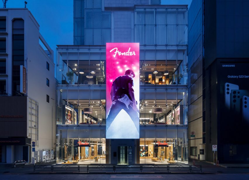
Photo of the exterior of the Fender flagship store, showing the outside of the
The Fender flagship store is located in Harajuku, Tokyo

For the project, Fender asked Klein Dytham Architecture to create a space that would counter the perception of guitar stores as being intimidating, particularly for women and newer players.

It hoped the store would offer a sophisticated and immersive retail experience that would encourage leisurely browsing and communicate the brand’s heritage.

Klein Dytham Architecture answered the brief with a store design it sees as creating “a destination of discovery”, with gallery exhibits, an event space, a cafe and a “care bar” for repairs.

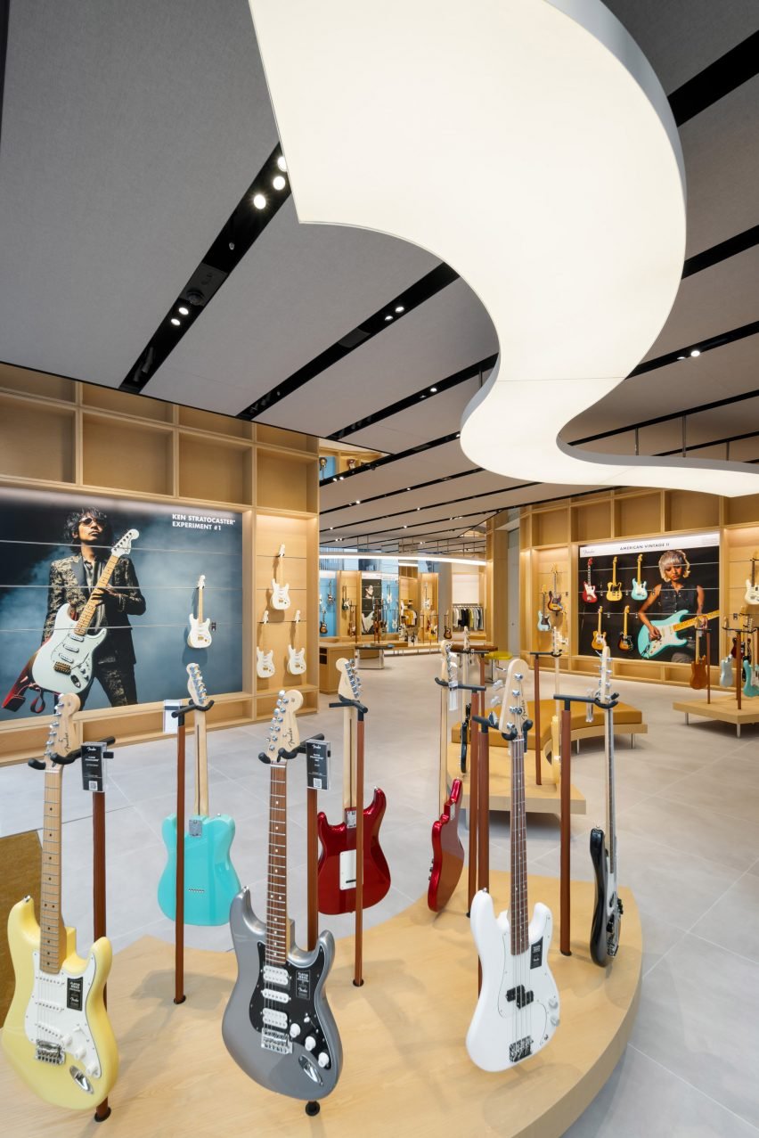
Photo of the first floor of the Fender Tokyo flagship store, showing many guitars displayed on curving light wood display stands
The main browsing area on the first floor features display stands made of curved wood

The first floor houses the main browsing area, which features undulating wood benches and display units that are meant to echo the curves and materials of a Fender guitar. These contours are further mimicked in the lighting above.

The area also has custom plectrum-shaped tables where staff can place guitars they have removed from the display to show customers. Clothing racks holding the F is for Fender streetwear collection sit among the guitars.

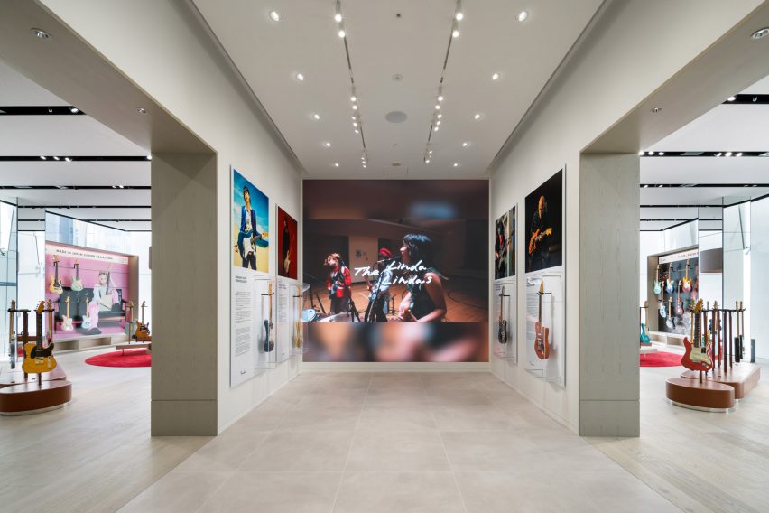
The second floor, which was realised in a soft grey palette, is primarily an exhibition space called the Artists Gallery.

Photo of a gallery-like space displaying large photos and a video of musicians and their guitars, as well as guitars in transparent display cases
The second floor is the main gallery space

Here, large-scale photos and video shows famous musicians in action, each one alongside a transparent display case housing their Fender of choice.

There are also displays dedicated to Japanese- and American-designed Fenders respectively, and a sound-proofed Amp Room where customers can test run guitars and amps.

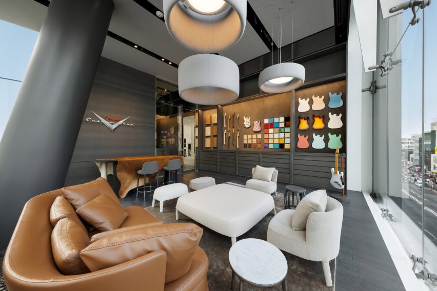
On the darker and moodier third floor, another exhibition space — the Master Builders Gallery — focuses on the work of specific craftspeople, while two VIP rooms and a custom shop are furnished with comfortable couches and provide a setting for discussing bespoke builds.

Also on this floor is a colourful display of 400 guitar finish samples that fills the length of one wall.

Photo of a dark grey room with big couches and armchairs in the foreground and a library of colourful material and component samples along the back wall. On the side wall, a sign reads Fender Custom Shop
The third floor includes the Fender custom shop

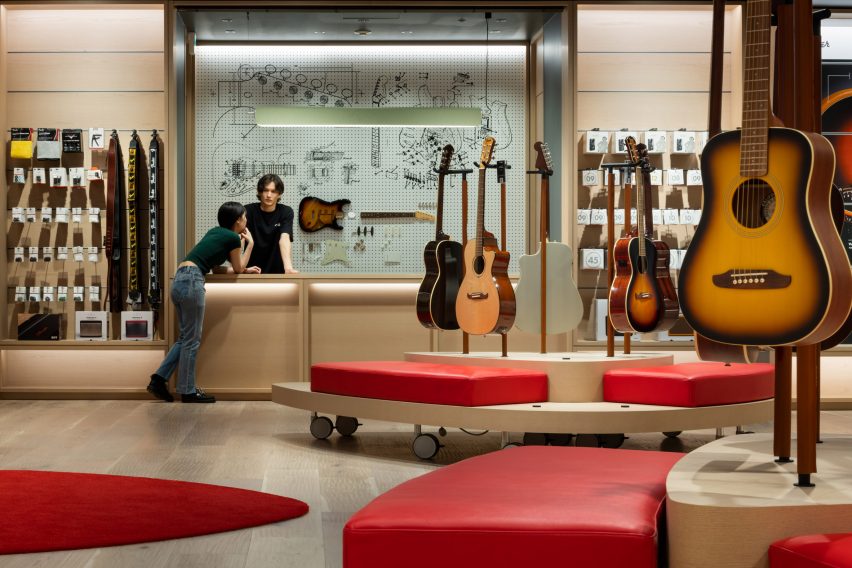
The final floor is the basement, which houses an event space, cafe and the Fender care bar, and where Klein Dytham Architecture endeavoured to create a cosier feel with a plectrum-shaped rug and benches.

Tying the floors together is a spiral staircase with a hall-of-fame-style photo gallery on the interior, as well as a three-storey-high vertical LED display on the glass facade outside that will be used for Fender-related content.

Photo of a room with light-coloured walls, red cushioned bench seating and displays of acoustic guitars in the centre of the room, and racks full of guitar accessories at the back. Near the back wall, a man stands behind a counter with a display of guitar parts behind him and talks to a woman who is leaning on the front of the counter
The basement includes an event space and a care bar

“Conceived as a hub and clubhouse for all things Fender, this project takes the notion of a flagship store and experiential retail to beyond the next level,” Klein Dytham Architecture co-founder Mark Dytham told Dezeen.

Dytham started the practice with fellow Royal College of Art graduate Astrid Klein in Tokyo in 1991. Some of their recent work includes the PokoPoko clubhouse for the Risonare Nasu hotel in rural Japan and a Cartier store with an intricate wooden facade in Osaka.

Photography by Nacása & Partners.

Reference

Boyy flagship in Milan reveals layers of the store’s history
CategoriesInterior Design

Boyy flagship in Milan reveals layers of the store’s history

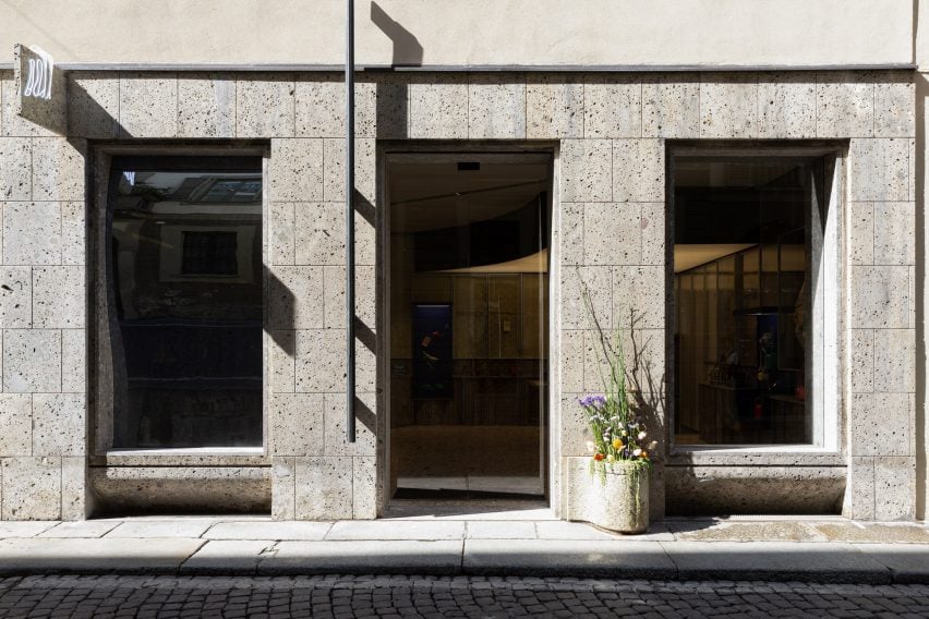
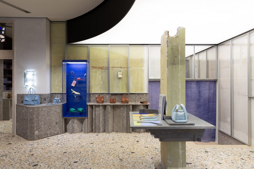
Danish artist Thomas Poulsen, also known as FOS, has revamped the flagship store of accessories brand Boyy in Milan, keeping time-worn surfaces left over from the site’s former fit-outs.

This marks the third time that FOS has refreshed the space on Via Bagutta since 2021, as part of the artist’s plan to create a dynamic “evolving” store.

Interior of Boyy flagship store in Milan designed by FOS
FOS has redesigned Boyy’s flagship in Milan

In its first incarnation, the Boyy flagship had funhouse-style mirrors, walls draped in faded pink fabric and cobalt-blue carpets emblazoned with everyday objects.

This colour scheme was inverted for the second iteration of the store featuring blue walls and bubblegum-pink carpet. Elements of both of these schemes now remain in the store’s third and final form, which was left purposefully unfinished.

Interior of Boyy flagship store in Milan designed by FOS
Unpanelled sections of the wall reveal the store’s past fit-outs

“This space was an experiment in formulating a shared language for how Boyy could develop as a brand,” FOS explained.

“We started by creating an installation – the first rendition – then used that experience to create a second installation, and finally built upon the combined experience to create this final permanent space that we have now arrived at.”

“We always envisioned the third rendition as the final act,” added Boyy co-founder Jesse Dorsey.

Interior of Boyy flagship store in Milan designed by FOS
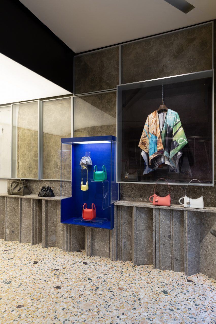
Accessories are displayed inside illuminated glass vitrines

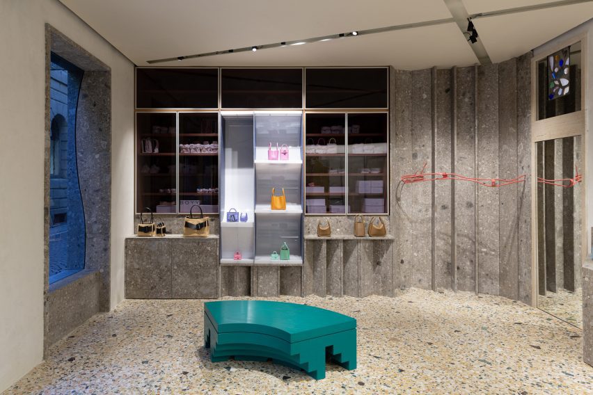
The Boyy flagship now has walls panelled with the same grey ceppo stone that clads the store’s facade.

Some areas were left without panelling, revealing the aged, fabric-lined walls left behind by a previous occupant – a 50-year-old antique shop that sold quaint Americana-style objects for the home.

Blue fabric can also be seen hanging in the rear corner, saved from FOS’s second overhaul of the space.

These swathes of time-worn fabric were enclosed inside aluminium window frames, as were some of the store’s display units.

Elsewhere, Boyy’s selection of shoes and handbags can be showcased in several illuminated glass vitrines or on the ledge that runs around the periphery of the store.

Interior of Boyy flagship store in Milan designed by FOS
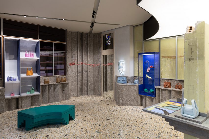
The store has been finished with terrazzo flooring

FOS also created a display shelf around a crumbling structural column that sits in the middle of the floor plan.

A couple of tiered, sea-green bench seats were dotted throughout the store as decoration, complementing the flecks of greens stone that are found in the terrazzo floor.

Interior of Boyy flagship store in Milan designed by FOS
Curved benches provide seating throughout the store

Milan is home to an abundance of visually striking retail spaces.

Others include the Moschino flagship, which was designed to reference the history of ancient Italy, and the Off-White store, which is decked out with natural materials like Patagonia granite.

Reference

JUJU Studio creates flagship for Miss Circle in New York
CategoriesInterior Design

JUJU Studio creates flagship for Miss Circle in New York

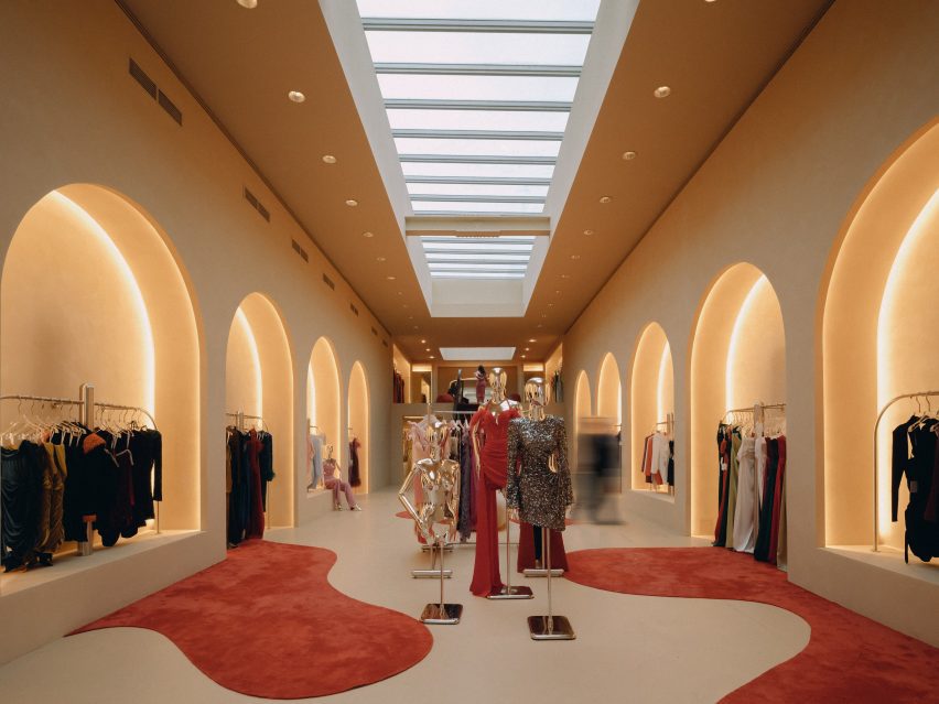
Pools of red carpet spill across the floor of this women’s fashion boutique designed by JUJU Studio in New York City.

For fashion brand Miss Circle, New York-based JUJU Studio created the interiors of its 2,600-square-foot (242-square-metre) store on West Broadway in SoHo.

Rows of arched colonnades displaying garments on both sides of the store
The Miss Circle flagship in occupies a long, narrow space designed by JUJU Studio

The space has a long, narrow footprint, so studio founder Jing Ju devised a variety of display techniques for the brand’s womenswear garments.

“Unlike typical fashion retail spaces, the Sensorial Flagship Store is inviting and relatable, encouraging customers to engage with the brand in a fully stimulating way,” said the studio.

Minimal sliding counter
At the front of the store, a sliding counter can be used for multiple purposes

The majority of surfaces are finished in beige plaster, providing a neutral backdrop for more dramatic moments.

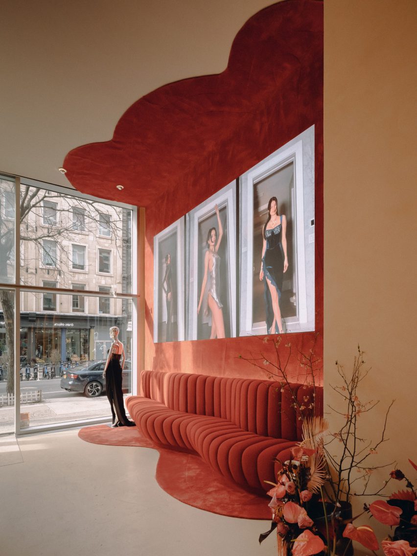
These include areas where red carpet appears from the walls in fluid forms and spreads across the floor to look like pools of liquid.

Carpet on walls, floor and ceiling beside the entrance
Red carpet extends from the floor to the ceiling beside the entrance

“The smooth yet durable surfaces add texture and visual interest to the space, while the beige hue creates a sense of lightness and spaciousness,” the studio said.

“This helps to create an accommodating atmosphere in the closed retail environment, where customers are likely to take their time browsing through the store’s selection of clothing and accessories.”

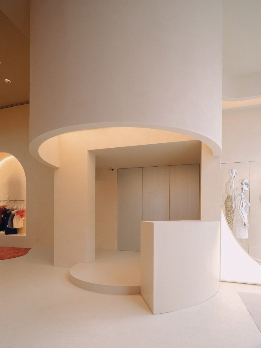
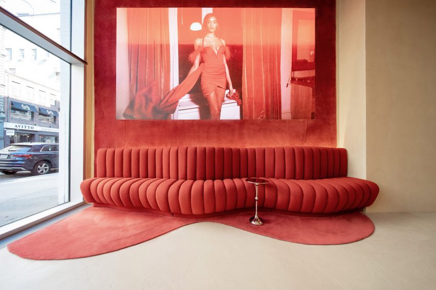
Ribbed red seating and carpet on the wall
Matching the carpet is a curvaceous red sofa

At the front of the store, carpet also extends up the wall behind a curvaceous sofa of the same colour and seeps onto the ceiling.

A sliding counter can be used for checking in guests during events, or for displaying accessories at other times.

View of the store from the front
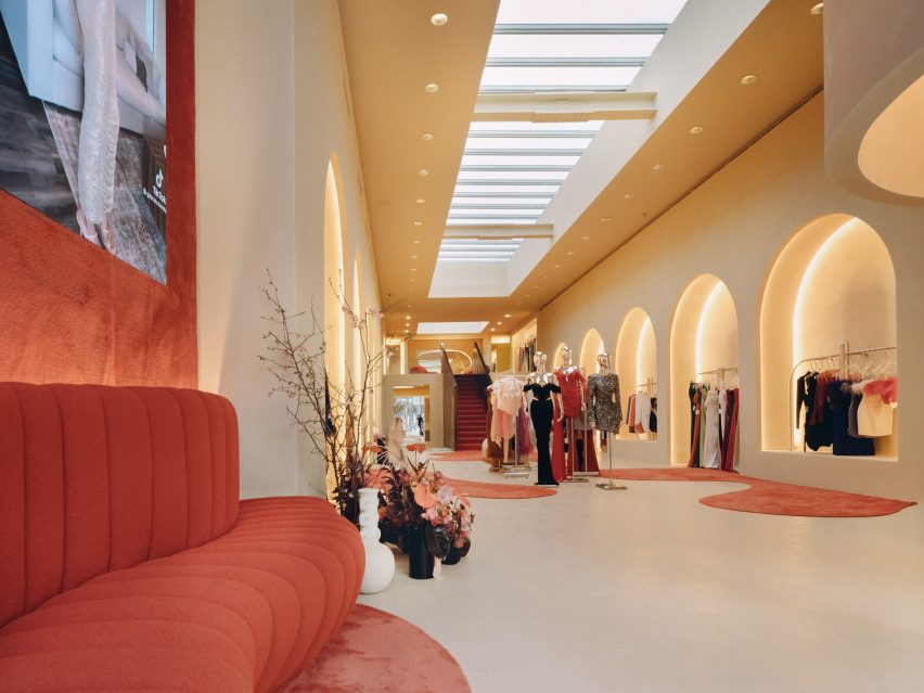
Garments are displayed in niches formed by arched colonnades on either side of the store

“The sleek and minimalistic design of the counter complements the overall aesthetic of the store and demonstrates a thoughtful and efficient use of space,” said the studio.

Along both sides of the store are arched colonnades, with cove-lit niches that each display a selection of clothing designs.

More outfits are presented on chrome railings and mannequins in the centre of this double-height space, above which a long skylight is positioned.

Towards the back of the boutique is a carpeted staircase that leads up to a mezzanine level, where the fitting rooms are located.

Red furniture in the fitting room area
Fitting rooms and a lounge area for customers is located upstairs

Red satin furniture, designed by Thehighkey, forms a seating area for customers to relax beneath another skylight, while plenty of mirrors are provided for those trying on garments.

“The warm lighting adds to the overall golden atmosphere, and the use of red provides a poetic and romantic sensation, making for a truly captivating experience,” the studio said.

Store exterior on West Broadway
The Miss Circle store is on West Broadway in SoHo

SoHo is renowned as a shopping destination for both fashion and furniture, and new stores are always appearing in the neighbourhood.

Recent openings include a Khaite flagship with a tree planted in the centre, an outpost for Road to Awe that includes red fitting rooms and a lofty Moroso showroom.

The photography is by David Luo and Justin Missner.

Reference

Khaite flagship store designed as a “tribute to the cultural legacy of SoHo”
CategoriesInterior Design

Khaite flagship store designed as a “tribute to the cultural legacy of SoHo”

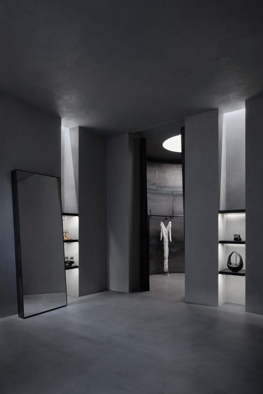
American fashion brand Khaite has opened its flagship store in SoHo, New York City – a cement-trowelled and steel-lined interior with an evergreen tree planted into its shop floor.

The store was designed by Khaite‘s founder and creative director, Catherine Holstein and her husband New York-based architect, Griffin Frazen.

Interior image of the Khaite store
The Khaite flagship store is located in SoHo, New York City

It occupies a Corinthian column-fronted building in SoHo, capped with Italianate cast-iron modillion cornices, designed by German architect Henry Fernbach in 1871.

Holstein and Frazen wanted to encapsulate the cultural legacy of the SoHo location with the area’s connection to the founding of the brand.

Interior of the Khaite store
It was designed by Khaite’s founder and her husband

“Every element of KHAITE is shaped by New York, and we set out to make this space a tribute to the cultural legacy of SoHo,” said Holstein.

“When I moved to New York twenty years ago, this block of Mercer was my entry point to the city, and SoHo is where KHAITE was born. Our first design studio was just down the street.”

Interior image of the Khaite store in SoHo
The couple looked to encapsulate the legacy of its location

The entire 371 square metre ground floor of the store was dedicated to retail space while the building’s basement was reserved for back-of-house workings as well as a private meeting area.

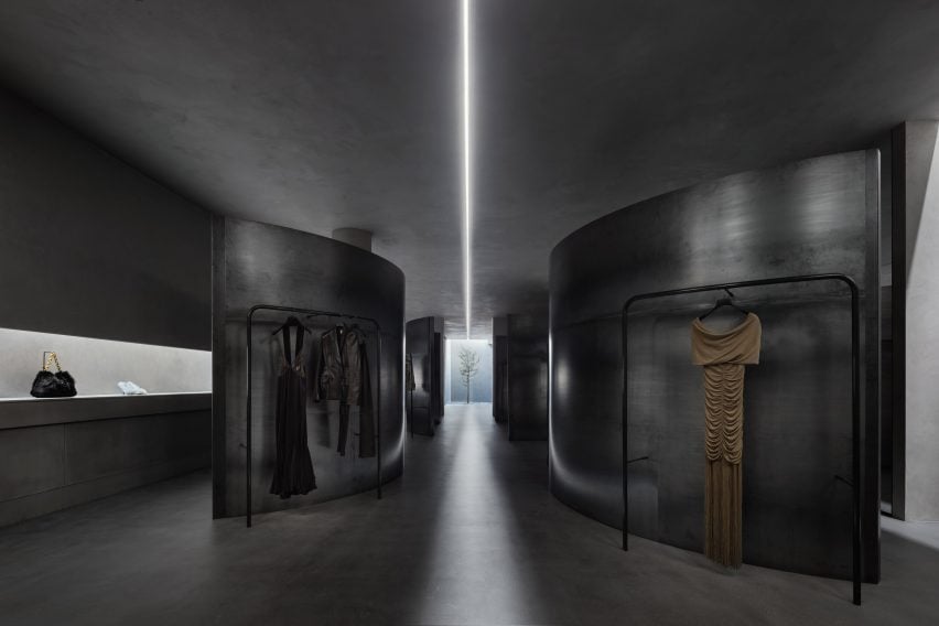
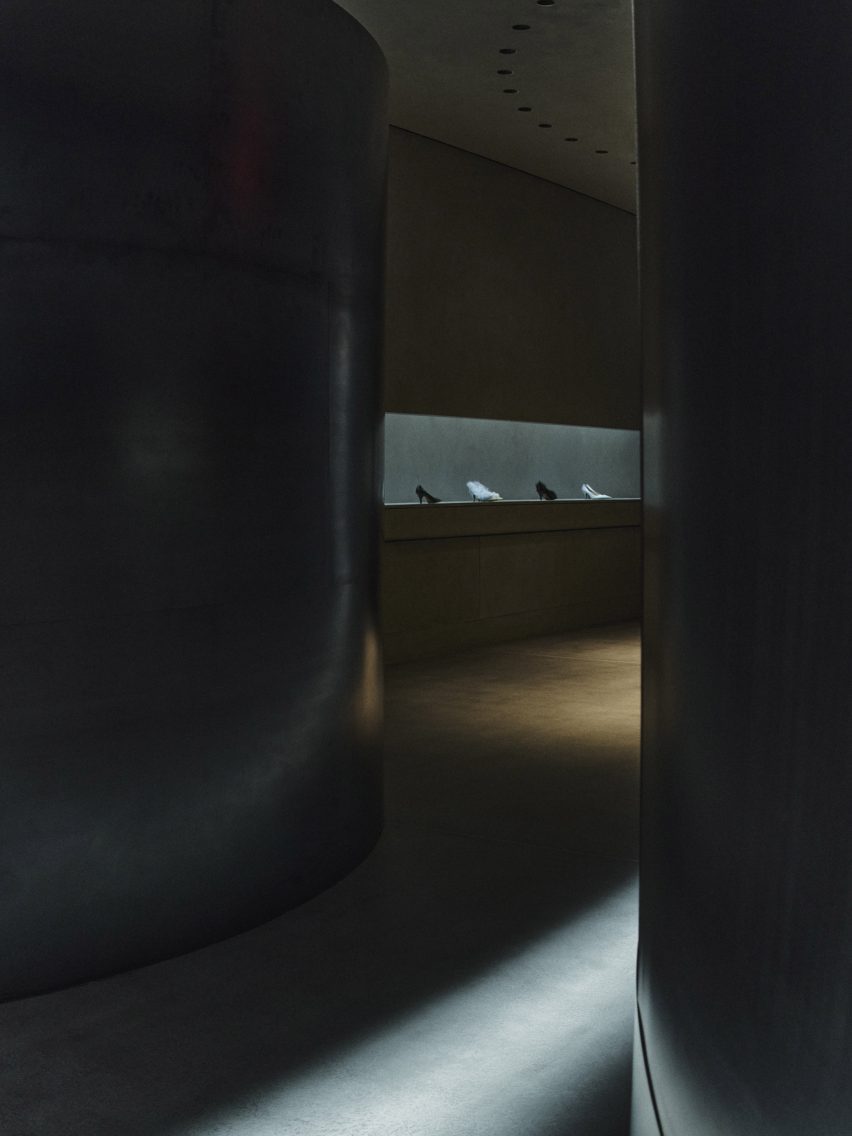
Holstein and Frazen’s approach saw the store clad in city-characterising materials such as steel, glass, poured concrete, troweled cement and plaster, which bring an industrial and monolithic look to the space.

Photo of the Khaite store
Cement, concrete and steel were used throughout the store

Four curving steel partition walls meander through the length of the retail space and are used to conceal and frame Khaite’s ready-to-wear collections that are displayed on curved display rails.

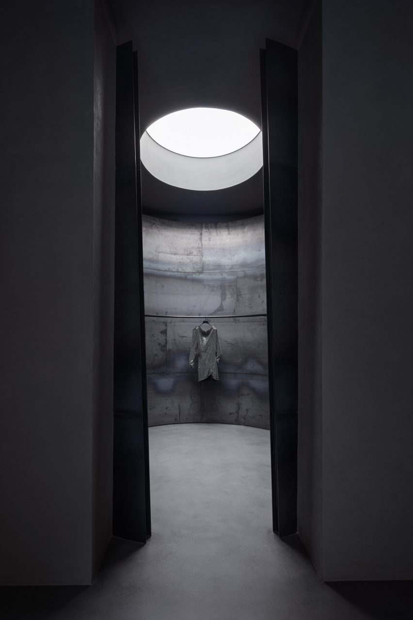
The four steel walls are visually separated by a channel of light from one of two skylights at the rear of the store that was exposed during its renovation.

A focal feature of the store is an evergreen Bucida Buceras tree, which was named the Shady Lady and planted into the floor beneath the rear skylight.

As light enters and flows into the space from the skylights the rough and textural quality of the cement-trowelled walls is revealed.

Photo of the interior of the Khaite store
Skylights were uncovered during its renovation

“The design was conceived in terms of material – choosing the right materials and working with them in the right way to satisfy the programmatic requirements,” said Frazen.

“We leaned into elemental qualities like natural light, preserving the scale and openness while creating intimate spaces.”

Photo of a tree in the store
A tree was planted into the floor of the store

“We embrace the change of materials like steel and concrete just as you would leather and cashmere, honoring them by allowing them to wear in gracefully,” said Frazen.

“Each piece has unique textures, and rather than polishing away or painting over them, we preserved imperfection.”

Photo of the concrete store
It has an industrial look

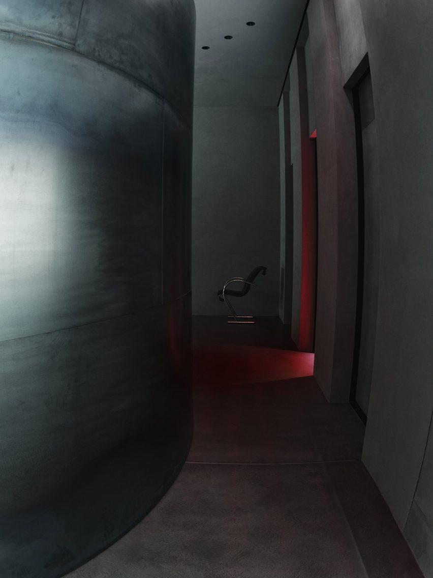
Three fitting rooms were designed to contrast the brutalist details of the store and were blanketed in a deep red, fitted with plush red carpeting and warm lighting.

Minimal furniture was placed throughout, such as a Sing Sing chair by Japanese designer Shiro Kuramata that sits beside a twisted, low-lying shelf used to display the brand’s accessories.

Interior image of a red fitting room
The basement contains back-of-house operations

Before opening to the public, the store was used as the setting for Khaite’s Autumn Winter 2023 show which was presented in February.

Nearby in SoHo, design agency Aruliden completed a store interior for fashion brand Jonathan Simkhai that incorporated cut-out shapes from Simkhai’s clothing into partitions and furniture.

Design firm Crosby Studios teamed up with AR technology company Zero10 to create a pop-up store also in SoHo that allows people to try on virtual clothes.

Reference