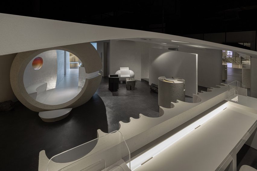
Formoral is a skincare store that resembles a “desert planet”
A spherical gateway and otherworldly light reflected through glass prisms feature in this skincare store in Hangzhou, China, which local interiors studio Lialawlab has designed around the theme of retro-futurism.
Created for independent skincare brand Formoral, the concept store is laid out across a 120-square-metre retail unit in the city’s GDA Plaza shopping mall.

The store is made up of a “series of spatial scenes” based on the theme of retro-futurism – meaning the future as envisioned in the past.
“The space was decorated using no colour; only different textures in similar colours were used to highlight the space level,” Lialawlab‘s chief designer Liya Xing told Dezeen.
“It was envisioned as a contrasting yet unified whole, which breaks the homogeneity of physical retail spaces in modern cities and explores the deep relationship between nature and the artificial.”
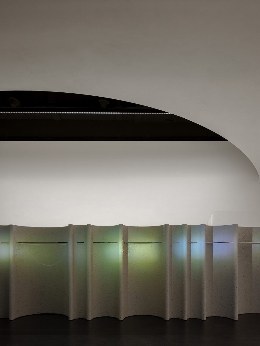
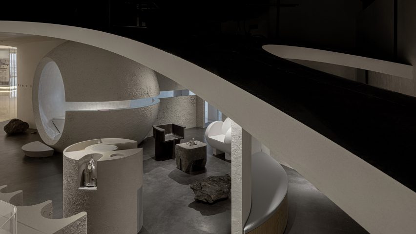
The studio created the Formoral store as a desaturated space with large structures, columns and counters finished in highly textured, grey paint.
“The austere finishes echo the brand’s affinity with nature while highlighting the image of a primitive desert planet,” explained Lialawlab, which was founded by Liya Xing alongside Haifeng Luo.
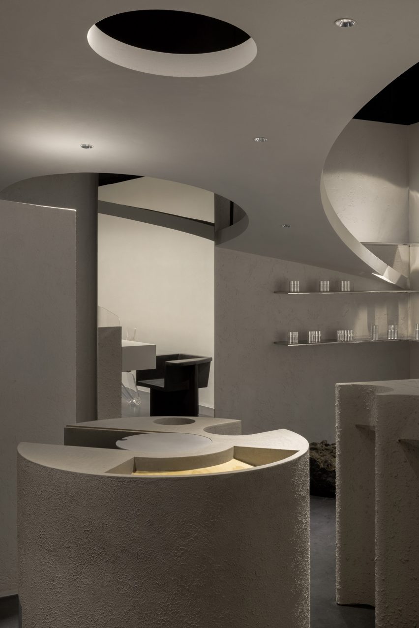
The studio organised the layout to accommodate the store’s various functional areas and make a clear distinction between its public and private spaces.
In the foyer, a sculptural service desk welcomes customers in from the shopping mall while opposite, a large spherical structure that Lialawlab refers to as a “rising planet” serves as a gateway into the private spaces of the store.
The inside of the structure is lined with bench seating and connects to a tunnel clad with matte silver foil and aluminium plates.
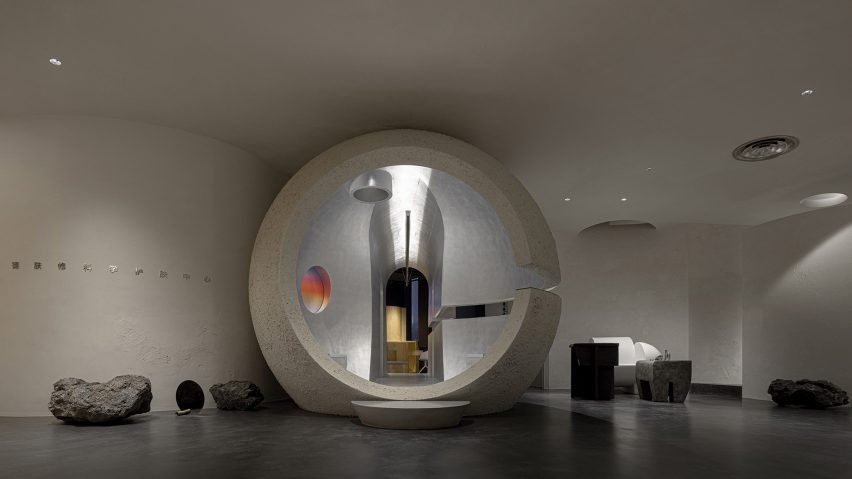
“To trigger people’s desire to explore the space, we carved out a 200-millimetre-wide gap at the height of 1.25 meters of the massive sphere and the tunnel,” said the studio.
“The gap is complemented with mirrored material, allowing customers to stay, wonder, stare and rest.”
Two cabin doors along the tunnel lead to Formoral’s eight functional zones including product displays, spaces for skin testing, events and demonstration as well as an office and break room for employees.
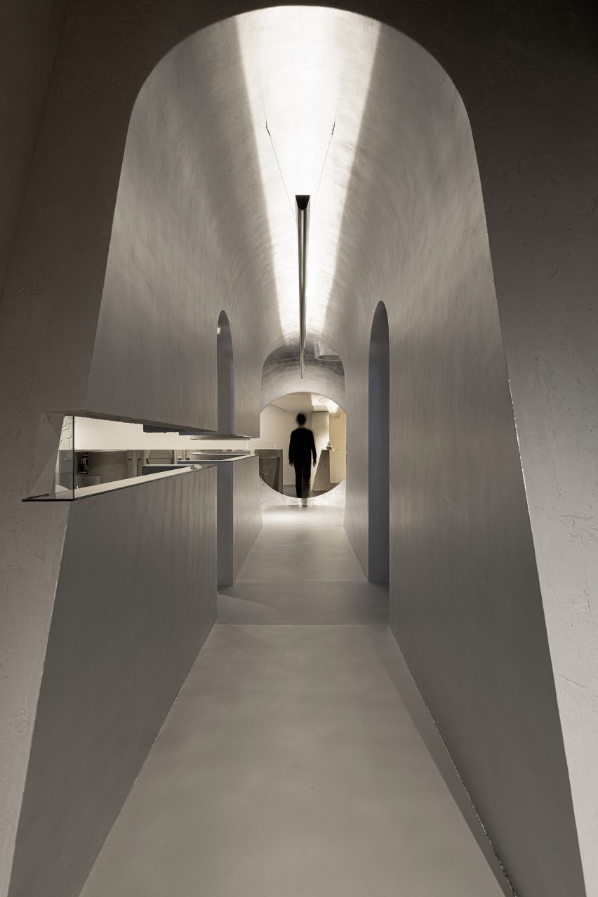
To contrast with the grey interior, the designers reflected and refracted light through prisms and gradient-index neon glass that throw patches of rainbow-coloured light onto the walls.
The studio also included coloured lamps and lanterns and a round window in the spherical structure, which is covered with a colour gradient film.
Although the store’s ceilings are 4.6 metres high, only 2.8 metres of this space is actually useable due to the mechanical, electrical and plumbing services installed on the ceiling structure.
The designers skillfully overcame this problem by creating a sloped dropped ceiling, which is 2.75 metres tall at its highest point and skims the top of the spherical structure in the foyer.
At its lowest point of 1.25 metres, it meets the wall to create a smooth, seamless transition.
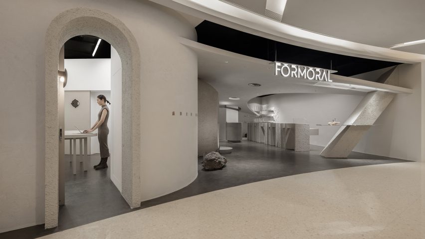
To avoid costly repositioning of the services, Lialawlab created an arc-shaped opening with a six-metre radius above the reception desk.
“The ceiling effectively extends the reception to the public realm, achieving a balance between functionality and form,” the studio explained.
Elsewhere, Irish studio Kingston Lafferty Design recently created “otherworldly” interiors within a skin clinic in Dublin, using a palette of plaster, marble, terrazzo and stainless steel.
Photography is by Feng Shao.

