Entrance of Yukinohako snow-powered cool store
CategoriesArchitecture

Kei Kaihoh Architects forms snow-cooled rice warehouse from local cedar

Entrance of Yukinohako snow-powered cool store

Japanese studio Kei Kaihoh Architects has completed a timber-framed storage facility in Joetsu City that offers rice farmers a way to refrigerate their harvest without relying on gas or electricity.

Instead, the Yukinohako facility is naturally cooled using snow – an abundant local material in this mountainous part of Niigata Prefecture, surrounded by ski resorts and terraced rice paddies.

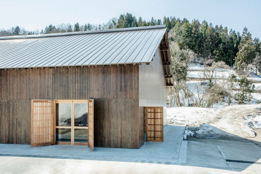
With the aim of creating a model that could be cheaply and easily replicated across the prefecture, Kei Kaihoh Architects constructed the two-storey structure using local cedar instead of reinforced concrete or mass timber, which would have to be shipped in.

Entrance of Yukinohako snow-powered cool store
Yukinohako is a natural refrigerator powered by snow

The studio hopes that Yukinohako, which is Japanese for “treasure chest of snow”, can encourage locals to find a new appreciation for snow and its natural cooling abilities, rather than just seeing it as a burden.

“If inexpensive snow rooms can be realised, farmers will be able to easily build snow rooms in both new construction and renovations, increasing momentum for snow utilisation rather than snow removal,” Kei Kaihoh Architects said.

“By doing so, we can love snow, which has been an obstacle to people’s lives, costing them money and effort to dump it into the ocean, and was not well-liked by the local population.”

Window in cedar building by Kei Kaihoh Architects in Joetsu City, Niigata Prefecture
The gabled building is constructed from local cedar

Yukinohako replaces a reinforced concrete warehouse cooled by an emissions-intensive air conditioning system, which was damaged by a fire during renovation works in 2017.

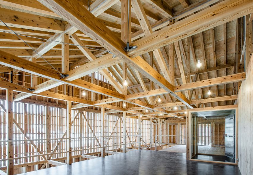
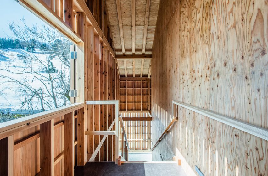
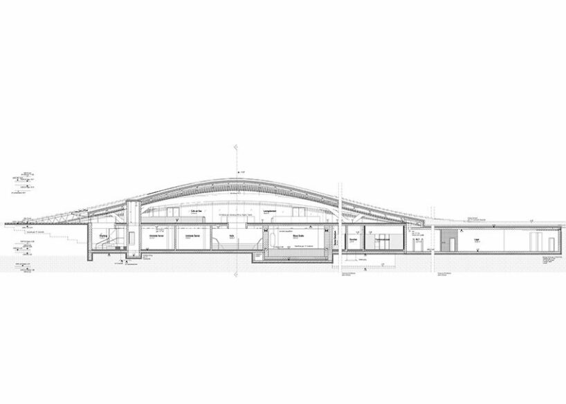
The gabled building stretches over two storeys and is held up by a system of braced timber columns that are supported by auxiliary beams.

This allowed Kei Kaihoh Architects to use local small-diametre cedar wood rather than having to ship in mass-timber members.

Double-height warehouse inside Yukinohako snow-powered cool store
A double-height storage space is at the heart of the facility

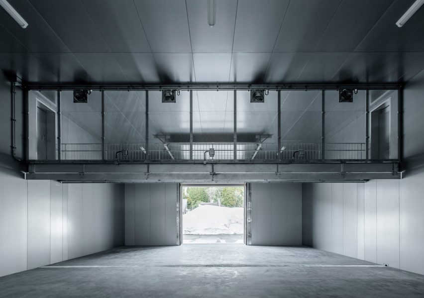
At the centre of the building is a double-height, 159-square-metre warehouse, which takes over the majority of the ground floor. It sits alongside a small temperature-control room and a reception.

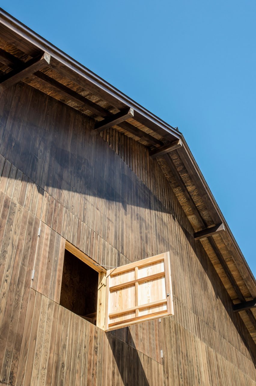
The storage space itself is split in two, with one side holding up to 90 tonnes of snow that is piped into the building using an automatic snow blower and an inlet on the east side of the building.

The other side can accommodate around 30 pallets or one tonne of rice and 200 kilograms of vegetables.

Break room inside warehouse by Kei Kaihoh Architects in Joetsu City, Niigata Prefecture
The break room is located on the second floor

In order to maintain airflow, the two halves of the space aren’t separated by a wall but by steel containers filled with snow, while an auxiliary fan on the ceiling circulates cold air from the snow into the food store.

A maintenance bridge runs across the double-height space to provide an overview of the warehouse and connects to a break room on the second floor.

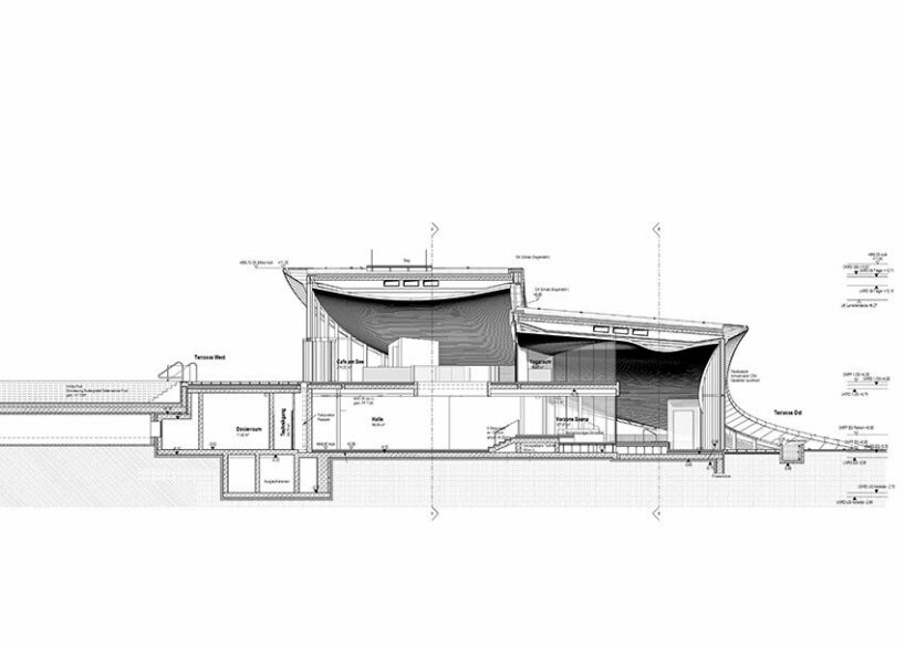
To ensure the interior stays as cool as possible, Kei Kaihoh Architects installed insulation panels across the walls and ceilings of the warehouse, creating an air-tight envelope.

Even the forklift trucks used to transport palettes of rice are powered by batteries instead of engines to avoid emissions and reduce the need for mechanical ventilation.

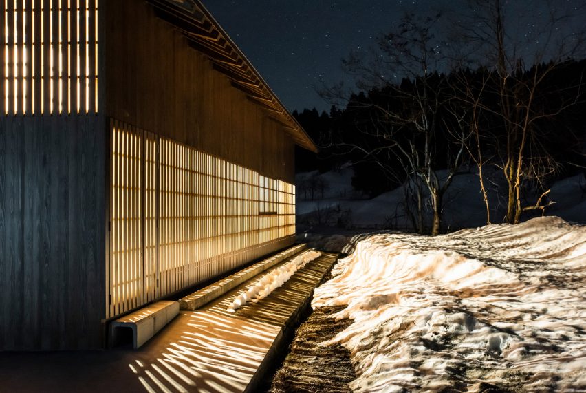
The studio also constructed an external corridor that runs along three sides of the building, creating a double facade to prevent solar radiation from reaching the inner insulated wall.

Taken together, Kei Kaihoh Architects says these measures help to keep the warehouse at a consistently low temperature while generating a fraction of the emissions as a traditional air conditioning system.

Timber walkway inside Yukinohako snow-powered cool store
A covered walkway runs along the building on three sides

“In low-temperature warehouses, the storage method involves the constant use of electric air conditioners to keep the temperature at 10 to 20 degrees Celsius,” Kei Kaihoh Architects told Dezeen.

“On the other hand, at Yukinohako, the temperature is kept at zero to five degrees with only the cold air of snow and the humidity is kept high.”

Aside from providing a covered walkway around the building in winter, the external corridor also provides a space to enjoy views of the surrounding nature.

Timber-framed walkway in warehouse by Kei Kaihoh Architects in Joetsu City, Niigata Prefecture
Openings frame views of the snowy scenery

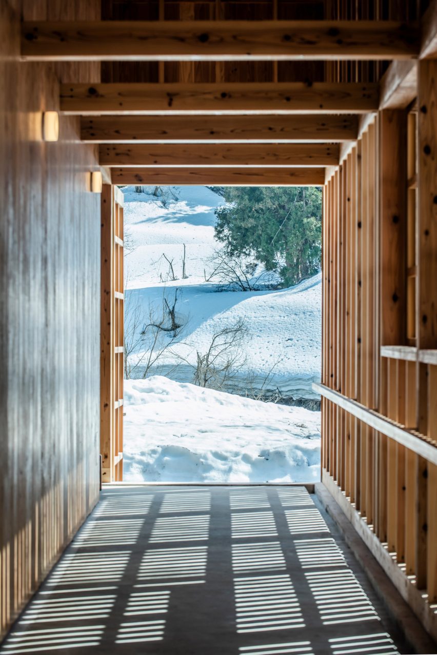
Strategic openings in the facade frame views of the snowy landscape while slatted sections allow light to filter in alongside the sounds of the Oguro River, which rushes along the back of the warehouse.

“We aimed to create a place where people could take pride in farming in the snow country,” the studio said.

The building’s timber structure was pre-cut and assembled at a nearby factory before being sent to the site, catering for quick and easy construction despite the region’s heavy snowfall.

Nighttime exterior shot of light spilling out of Yukinohako snow-powered cool store by Kei Kaihoh Architects in Joetsu City, Niigata Prefecture
Slatted sections allow light and sound to filter through

“The processing and storage of prefectural cedar timber is done in Joetsu City, minimising transportation costs and fuel consumption,” the studio said.

To protect the wood from water and inclement weather, the building’s exterior walls are finished in a glass coating, which Kei Kaihoh Architects says was also used in Kengo Kuma’s Japan National Stadium.

Yukinohako has been shortlisted in the sustainable building category of this year’s Dezeen Awards alongside a girls’ school in India made from local sandstone and Waugh Thistleton Architects’ mass-timber Black & White office building in London.

The photography is by Soichiro Suizu.

Reference

Plot 10 children's centre in London
CategoriesArchitecture

Arched forms enliven Central Somers Town children’s centre

Plot 10 children's centre in London
Inverted brick arches crown the Central Somers Town children’s community centre near King’s Cross, London, created by local studio Adam Khan Architects.

The project forms the home of Plot 10, a community children’s play project established in the 1970s that previously occupied a series of self-built timber structures on the site.

It sits adjacent to an apartment block, also designed by Adam Khan Architects and completed with matching arched motifs.

Plot 10 children's centre in London
Adam Khan Architects has created Central Somers Town children’s centre

Adam Khan Architects was tasked with creating the buildings as part of the Central Somers Town masterplan, developed by architecture studio DSDHA.

The aim is to provide community facilities and housing for one of the London Borough of Camden’s most deprived areas.

Both buildings are finished in London brick, concrete and red metalwork, and are enlivened by arched forms chosen to evoke a variety of references.

Facade of Central Somers Town children's centre in Camden
It is the home of community children’s play project Plot 10

“We like architecture that is rich in associations and open to being interpreted by people in multiple, diverse ways and by people of diverse backgrounds and levels of interest and engagement,” founder Adam Khan told Dezeen.

“If you see a palace, a mosque or a sandcastle, that’s fine. If you’re keen on eighteenth-century Parisian hôtel particuliers you’ll notice some affinities. Or, if you live locally you’ll already be familiar with arched openings giving glimpses into planted courtyards,” he added.

Central Somers Town children's centre by Adam Khan Architects
It is decorated with arched motifs. Photo by Lewis Khan

In order to provide privacy to the children’s centre, Adam Khan Architects sandwiched the building between two external play areas that are wrapped by brick walls.

Where the centre faces directly onto the street, the studio positioned a series of arched “shopfront” windows that provide an opportunity to display children’s work while obscuring the play areas from view.

Brick-clad housing by Adam Khan Architects
The project also includes a block of social housing

“A hierarchy of openings, glimpses into courtyards and deep window reveals quietly satisfy the many and stringent safeguarding and privacy demands, whilst projecting welcome and vitality,” explained the studio.

Inside, the “creative improvisation” that has characterised Plot 10’s history informed a double-height space for “free-form play” across a variety of scales, developed through exploratory workshops with the organisation.

Exterior of Central Somers Town housing by Adam Khan Architects
The arched motifs also feature in the housing

In the corner of the building, a timber toilet block is topped by a more private, glazed room, overlooking the play areas below.

On the roof, a crown of inverted brick arches surrounds a playing field, with the parapet framing views out across the surroundings.

“It is difficult to self-build or improvise big, high-excitement structures, so we built two big towers that provide exciting high-level play – including wheelchair-accessible play at higher levels, which is unusual,” explained Khan.

“Then, we made a strong timber armature framing the rest of the playground, allowing easy slinging up of swings, ropes and theatre drapes,” he continued.

Rooftop playing field
There is a rooftop playing field. Photo by Lewis Khan

In the adjacent residential block are 10 social-rented apartments. Each one is triple-aspect, with day-lit hallways, large windows and generous balconies.

The arched motifs of the children’s centre are subtly reflected in an arched entranceway and the gentle wave-like form of a concrete canopy where the apartment block faces the street.

Social housing at Central Somers Town
The block contains 10 apartments

Elsewhere in the Central Somers Town development, Hayhurst & Co created the Edith Neville Primary School, which features a landscaped playground.

Other arched buildings recently featured on Dezeen include a row of six brick-clad townhouses in London and a Mexican holiday home by CO-LAB Design Office.

The photography is by David Grandorge unless stated otherwise. 

Reference

Republique apartment by Hauvette & Madani features red kitchen
CategoriesInterior Design

Wine-red kitchen forms centrepiece of apartment by Hauvette & Madani

Republique apartment by Hauvette & Madani features red kitchen

Interior design studio Hauvette & Madani has made a sumptuous wine-red kitchen the focus of this otherwise neutral apartment in Paris.

The Republique apartment is set within a typical Haussmann-era building in the French capital’s 11th arrondissement and belongs to a family with two children.

From the outset of the renovation, the clients called for the home to orbit around a “spectacular” atmospheric kitchen.

Republique apartment by Hauvette & Madani features red kitchen
A wine-red kitchen is the focal point of the Republique apartment

Hauvette & Madani responded by using a striking colour scheme, rendering all of the kitchen’s linoleum cabinets and its curved breakfast island in a wine-red colour. The same shade was also applied to the ceiling but in a glossy lacquer.

“We wanted a dark but joyful colour and ended up deciding on this substantial red,” founders Samantha Hauvette and Lucas Madani told Dezeen. “We also love the fact [the colour’s] eccentricity matches the rest of the calm and soft apartment.”

Living room interior of Republique apartment by Hauvette & Madani
Spaces are connected by travertine-framed doorways

Lustrous decorative elements such as an aged-mirror splashback and brass light were also introduced to the space, and a support column was wrapped in stainless steel.

The room’s original wooden flooring was overlaid with travertine and Emperador marble tiling.

Living room interior of Republique apartment by Hauvette & Madani
Shades of beige can be seen throughout the living room

A travertine-framed doorway looks through to the adjacent living room, where walls were painted an oatmeal beige, matching a bean-shaped velvet sofa from French brand Pierre Augustin Rose.

A pair of wriggly-edged oak coffee tables and a terracotta-coloured edition of French designer Pierre Paulin’s Ribbon chair were also used to dress the space.

The dining room next door is centred by an oval travertine table, around which steel-framed leather seats have been arranged. At the rear of the room is a tall white dresser inset with oak-lined niches where ornaments or artworks can be displayed.

A Murano glass chandelier hangs from the ceiling, where ornate moulding was carefully preserved.

Dining room interior of Republique apartment by Hauvette & Madani
The nearby dining room has a travertine table at its centre

The project also saw Hauvette & Madani refresh the parents’ bedroom, which now features 1930s-style lighting and a bespoke oak headboard. This winds around the back of the room and has arched cut-outs that accommodate bedside tables.

A walnut-wood vanity cabinet and vintage Italian mirror were also fitted in its en-suite bathroom.

Bedroom interior of Republique apartment by Hauvette & Madani
A bespoke oak headboard was installed in the parents’ bedroom

Often considered the heart of the home, the kitchen is where architects and designers enjoy getting playful with colour.

Other examples include the kitchen inside Sans-Arc Studio’s Plaster Fun House, where a pink terrazzo breakfast island contrasts duck egg-blue cabinetry.

And the kitchen within this Belgian apartment by Carmine Van Der Linden and Thomas Geldof features birch wood cupboards that were stained a murky hue of green.

The photography is by Yannick Labrousse

Reference

Photo of Parconido Bakery Cafe
CategoriesInterior Design

Sukchulmok adds curved brick forms to rooftop of Parconido Bakery Cafe

Photo of Parconido Bakery Cafe

Curved forms and arched openings feature in this cafe, which Seoul studio Sukchulmok has added to an existing building in South Korea’s Gyeonggi-do province.

Named Parconido Bakery Cafe, the cafe is made from red bricks and features playful curved shapes and rounded walls designed to create an illusion-like effect.

Photo of Parconido Bakery Cafe
Parconido Bakery Cafe was designed by Sukchulmok

“The space, created through one rule, was designed to give a sense of expansion and the experience of an optical illusion image,” lead architect Park Hyunhee told Dezeen.

Arranged across three floors including a rooftop level, the cafe was designed by architecture studio Sukchulmok to resemble European public squares in reference to the client’s time spent in Italy.

Photo of the rooftop at Parconido Bakery Cafe
The studio topped the roof with curving brick volumes

“The client who spent his youth living in Italy is a clothing businessman, opening the cafe as a business expansion to provide people with a space for peaceful rest,” said Park.

“These two aspects naturally reminded me of the image of the European square, where people are huddled together talking on a sunny day between red brick buildings and stone pillars.”

Photo of Parconido Bakery Cafe
The design drew references from nostalgic memories of Italy

On the rooftop level and terrace, the outdoor dining spaces are punctuated by clay brick columns with arched connections and walls with U-shaped openings.

Built around steel frames that extend into curved forms above the brick walls, the curved elements are coated in bricks cut to two-thirds of their original thickness to lighten their weight.

Interior photo of the Seoul cafe
The walls and floors have curved edges

A long stainless steel table with a curved underside, along with circular stools and planting, is shaded by a removable canopy made from green, orange and white fabrics.

Curved walls lined with white tiles join with the tiled floor and ceiling to create rooms with rounded forms on the interior levels of the cafe.

The rooms are covered in small tiles of travertine limestone, selected for its use in the fountains of European squares.

Kitchens are built into recesses in the curved walls, while wooden elements, including wall panels and pipes that line a portion of the ceiling, add a feeling of warmth to the interior.

Throughout the spaces, uniquely designed seating areas and bespoke circular furnishings provide spaces for dining.

Photo of the interior of the cafe
The interior was covered in different textural materials

Comprising twelve different designs, the cafe’s set of furniture was designed to exhibit a variety of shapes, textures, and materials, including leftover finishing materials, wood, overlapping pipes, and concrete castings.

“Although they have slightly different shapes and textures, the pieces of furniture are all in harmony with the space and show good synergy with space as an object,” said Park.

Photo of a kitchen
The cafe’s curved edges all have a radius of 600 millimetres

To maintain a sense of uniformity, the studio based the design of each element, including the walls, columns and furniture, around a circle with a constant radius of 600 millimetres.

“A radius of 600 millimetres was used as an act of connecting spaces that were not monotonous,” said Park. “It was simply based on the idea that the distance from the height of the door and window to the ceiling finish is 600 millimetres.”

Photo of Parconido Bakery Cafe
Furniture was specially designed for the interior

Other South Korean cafes recently featured on Dezeen include a bakery with a curved courtyard designed to act as an “artificial valley” and a Seoul cafe with a vertical farm.

The photography is by Hong Seokgyu.

Reference

Two holiday residences in Fira by Kapsimalis Architects
CategoriesInterior Design

Eight cave-like interiors that celebrate curved forms

Two holiday residences in Fira by Kapsimalis Architects

A spa with a spherical swimming pool and holiday homes with sloping plaster walls feature in our latest lookbook, which showcases eight cavernous Greek interiors.

Cave-like interior designs are becoming increasingly popular, as seen in the Gilder Center by Studio Gang – a recently completed museum extension in New York with a large grotto-like atrium.

In Greece, which is known for its caves, there is a wide variety of cave-like architecture either built from existing geological structures or designed to mimic these natural dugouts. Thick, curved walls are often chosen to protect interior spaces from the country’s Mediterranean climate.

As the weather becomes warmer in the northern hemisphere, here are eight cave-like interiors from Greece that are defined by their curved shapes.

This is the latest in our lookbooks series, which provides visual inspiration from Dezeen’s archive. For more inspiration see previous lookbooks featuring homes with striking bookshelves, outdoor showers and offbeat bakeries.


Two holiday residences in Fira by Kapsimalis Architects
Photo is by Yiorgos Kordakis

Summer houses, Santorini, by Kapsimalis Architects

Local studio Kapsimalis Architects converted two underground caves at an old property in Santorini into summer houses with bright white facades.

Inside, the homes are characterised by smoothed-out interiors finished with earthy-hued plaster, while arched doorways and niches nod to the property’s history.

Find out more about these summer houses ›


Interior of house on the island of Nisyros
Image is courtesy of Greg Haji Joannides

Sterna Nisyros Residences, Nisyros, by Greg Haji Joannides

Designer Greg Haji Joannides renovated the interior of an earthquake-damaged house on the island of Nisyros using historic photographs as a guide.

On the ground floor, wide brick archways create an open-plan layout that allows the space to double as an exhibition site for artists in residence.

“The inspiration behind this design was to keep as much as possible of the original way the Nisyrians would build houses,” Joannides told Dezeen. “They would use the ground floor as a storage or working space.”

Find out more about this island house ›


Wooden Cave by Tenon Architecture
Photo is by Spyros Hound Photography

Wooden Cave, Trikala Korinthias, by Tenon Architecture

Wooden Cave is a timber-clad suite that forms part of Hyades Mountain Resort – a hotel in the mountainous village of Trikala Korinthias.

Tenon Architecture split the suite into two sections that intend to mirror the appearance and experience of entering a cave. The front half features ashy black tiles arranged in a linear formation, while the rear half is made from almost 1,000 pieces of curved hand-cut spruce.

“This division intends to create a clear distinction between the hard, ‘protective’ shell and the curved, ‘inviting’ interior, reminiscent of the form of a cave,” explained the architecture studio.

Find out more about Wooden Cave ›


Curved interior of hotel in Santorini
Photo is by Giorgos Sfakianakis

Saint Hotel, Santorini, by Kapsimalis Architects

Kapsimalis Architects converted a cluster of former homes, barns and cellars in Santorini into the Saint Hotel – the volumes of which are arranged in a stepped formation down a sea-facing cliffside.

Inside, smooth cavernous walls were finished in white plaster that creates a subtle backdrop for minimal fittings and amorphous furniture.

Find out more about Saint Hotel ›


House interior in former stable on Greek island
Photo is by Sylvia Diamantopoulos

Retreat in Tinos Island by Ioannis Exarchou

Retreat in Tinos Island is a 100-year-old stable that was transformed into a cosy holiday home for two by architect Ioannis Exarchou.

Exarchou set large stones and thick tree branches into the dwelling’s ceiling, clad the walls in smooth white plaster and covered the floors in coloured concrete.

“My main objective was to retain and preserve the cavernous unique feeling of the space,” the architect told Dezeen.

Find out more about Retreat in Tinos Island ›


Santorini holiday home by Kapsimalis Architects
Photo is by Yiorgos Kordakis

Holiday home, Santorini, by Kapsimalis Architects

The cave-like subterranean spaces and vaulted rooms within this Santorini holiday home were renovated by Kapsimalis Architects to retain the building’s existing architecture.

The studio worked to simplify the complex interior layout, which features a labyrinthine arrangement of spaces that are brightened by all-white plaster walls.

Find out more about this holiday home ›


Euphoria spa in the Euphoria retreat by decaARCHITECTURE
Image is courtesy of DecaArchitecture

Euphoria Spa, Mystras, by DecaArchitecture

Carved into the base of a mountain in Mystras, Euphoria Spa is made up of differently scaled elliptical spaces that are connected by a web of catacomb-style passages.

One of these areas contains an indoor spherical pool that is characterised by a dark central structure that can be accessed via curved archways.

“Floating in the centre of this dark orb there is a sense of being suspended in the void of a platonic volume, but also a sense of womb-like calmness,” said DecaArchitecture.

Find out more about Euphoria Spa


Santorini apartment
Photo is by Julia Klimi

Holiday apartments, Santorini, by Kapsimalis Architects

Arched niches and grey cement plaster floors create neutral living spaces within these four holiday apartments, which were built near Santorini’s highest point.

The complex’s terraces and retaining walls were formed from rocks excavated from the site to create a continuity between the architecture and the surrounding mountains.

Find out more about these apartments ›

This is the latest in our lookbooks series, which provides visual inspiration from Dezeen’s archive. For more inspiration see previous lookbooks featuring homes with striking bookshelves, outdoor showers and offbeat bakeries. 

Reference

Hotel lobby of Emily Resort in Ukraine
CategoriesInterior Design

Thermory wood cladding forms backdrop to Grand Emily Hotel in Ukraine

Hotel lobby of Emily Resort in Ukraine

Promotion: design agency YOD Group has designed the interior for the Grand Emily Hotel Lobby and Terra restaurant near Lviv, opting for Thermory’s rustic wood cladding throughout.

The hotel, which was completed this year despite Russia’s invasion of Ukraine, is located in the Ukrainian town of Vynnyky near Lviv. The hotel and restaurant form a part of the Emily Resort that YOD Group has designed with a natural, tactile aesthetic.

Hotel lobby of Emily Resort in Ukraine
YOD Group used Thermory products at the Emily Resort in Ukraine

Its aesthetic was achieved using a mix of natural and natural-looking materials, including material manufacturer Thermory‘s range of Drift cladding.

This saw YOD Group awarded the best interior project in the Thermory Design Awards Grand Prix competition, which was held by Thermory for its 25th anniversary.

Thermory wood cladding above welcome desk
The agency created the interior for the Grand Emily Hotel Lobby

In the Grand Emily Hotel Lobby, the Thermory thermally modified Drift cladding is used across the walls.

It was selected for its worn, rustic appearance, which is intended to evoke reclaimed wood without sacrificing quality or durability.

Tree suspended in Thermory wood-clad atrium
Thermory’s Drift cladding was used throughout

Selected in shades of Black Pearl and Smoked Brandy, the cladding provides the lobby with “touchable surfaces” that form a natural backdrop to the space.

“We aimed to get the visual lightness and tell the story about the morning breeze that passes on the lake surface and combs the reeds,” said YOD Group designer Volodymyr Nepiyvoda.

Interior of the Grand Emily Hotel Lobby in Ukraine
The wood gives the interiors a natural aesthetic

“We created this emotion by the structure of the boards that we used for the wall covering of the hall,” added Nepiyvoda.

The cladding also forms a suitable yet contrasting backdrop to a large sycamore tree that is suspended through the Grand Emily Hotel Lobby, forming its centrepiece.

Hammock in wood-lined Grand Emily Hotel Lobby
YOD Group’s aim was to give the hotel “touchable surfaces”

“We rejected the idea of a massive chandelier in the atrium in favour of a strongly meaningful installation,” explained Nepiyvoda.

“A tree means connection with roots and family values, growth, and development, strong bar, and flexible branches. It connects the earth and space.”

Terra restaurant interior by YOD Group
YOD Group also designed the resort’s Terra restaurant

Over in the Grand Emily Hotel’s Terra restaurant, Thermory Drift Cladding has also been used.

YOD Group used the material to help blur the boundary between the restaurant interior and a terrace outside that is lined with American sweet gum trees.

Terra restaurant terrace by YOD Group
The Thermory wood is also used in the adjoining terrace

According to Nepiyvoda, it is designed to encapsulate the landscape of western Ukraine.

“We reflect all of that in the interior of Terra restaurant,” they said. “Vast expanses, rich colours, textures and flavours, generous nature, lust for life, and existential joy.”

To find out more about Thermory products and how they are used, visit the brand’s website.

Partnership content

This article was written by Dezeen for Thermory as part of a partnership. Find out more about Dezeen partnership content here.

Reference

atmosphere master siteplan
CategoriesArchitecture

atmosphere spa forms under arched terrain in the mountainous alpine scenery

atmosphere master siteplan


1/7

atmosphere master siteplan

atmosphere master siteplan

atmosphere ground floor plan

atmosphere ground floor plan

atmosphere first floor plan

atmosphere first floor plan

atmosphere longitudinal section A-A

atmosphere longitudinal section A-A

atmosphere longitudinal section B-B

atmosphere longitudinal section B-B

atmosphere cross-section

atmosphere cross-section

atmosphere axonometric view

atmosphere axonometric view

project info:


name: ATMOSPHERE by Krallerhof
designer: Hadi Teherani Architects GmbH | @hadi.teherani

client: Altenberger GmbH & Co.

KG principal: Hadi Teherani

partner in charge: Sebastian Appl

project leader: Patrick Hesse

head of design: Kaveh Najafian

3D development for construction: Kaveh Najafian, Patrick Hesse

architecture & design development: Patrick Hesse, Kaveh Najafian, Aysil Sahin, Neda Tahouri, Ludwig Ebert

interior design: Hadi Teherani Architects

head of interior design: Nicola Sigl

interior concept design & design development: Nicola Sigl, Paulina Pucliowska, Nayanika Bahia

competition & concept design: Kaveh Najafian, Patrick Hesse, Amir Khazan, Hamidreza Edalatnia Landscape

concept: Hinnerk Wehberg

location: Leogang, Austria


designboom has received this project from our DIY submissions feature, where we welcome our readers to submit their own work for publication. see more project submissions from our readers here.


edited by: christina vergopoulou | designboom


Reference

Architects are Making Heroes of Hexagonal Forms
CategoriesArchitecture

Architects are Making Heroes of Hexagonal Forms

Architects are Making Heroes of Hexagonal Forms

Architects: Want to have your project featured? Showcase your work through Architizer and sign up for our inspirational newsletter. 

From molecules to beehives to large basalt columns, the hexagonal shape is commonly found in both organic and inorganic objects. The shape is also considered one of the most efficient ways of covering a surface, given that a hexagonal grid uses the least amount of separating walls. Using nature as inspiration, architects are now designing with hexagonal forms in both horizontal and vertical planes.

Some embrace these six-sized shapes as a foundation for planning and others to create decorative walls. The hexagon allows radial organization as well as flat surfaces. A honeycomb-like grid can also be built upon or broken down into a triangular grid, while a hexagonal shape also lends itself to a larger number of external surfaces. While not the most conventional form, some architects have shown how the shape can be used to plan and transform spaces.

Images by Jaime Navarro

Liverpool Insurgentes Department Store by Rojkind Arquitectos, Mexico City, Mexico

When expanding, a department store in Mexico City has to reconsider the traditional big-box model in order to attract more traffic and make a bolder statement. To do so, Rojkind Arquitectos created a façade that interacts with the environment around and lets passersby look into the building. The new scheme includes a network of differently sized hexagons that overlap, combine and open up to create a pattern that looks like it is animated. Made using fiberglass, steel, aluminum and glass, the arrangement plays with transparency to create translucent walls in spaces as well as large openings to show parts of certain stores.

Images by Zhang Chao

HEX-SYS by OPEN Architecture, Guangdong, China

Given the need for short-term real estate show spaces, the firm conceptualized a sustainable typology that can grow to adapt to different programs; it can also be dismantled after use or transported and assembled again. The form takes inspiration from traditional Chinese wooden building systems. The system comprises 430 square feet hexagonal cells that can be arranged into different configurations based on the program. The inverted umbrella-like roofs also collect rainwater for use on-site. Within the cells there are three typologies — transparent, enclosed and peripheral cells — to cater to different functions.

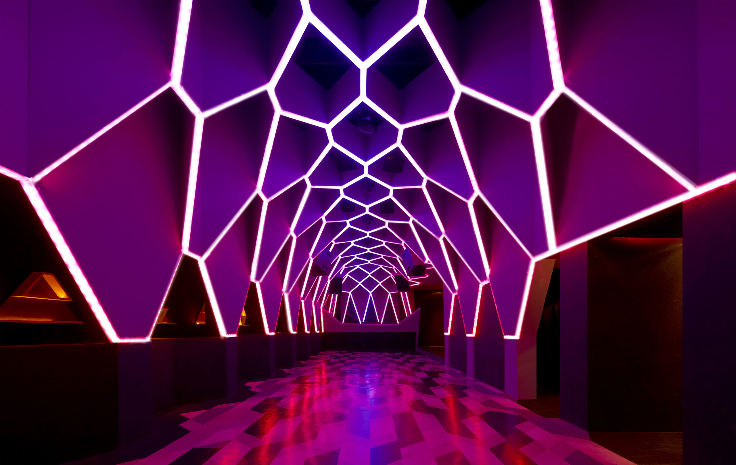
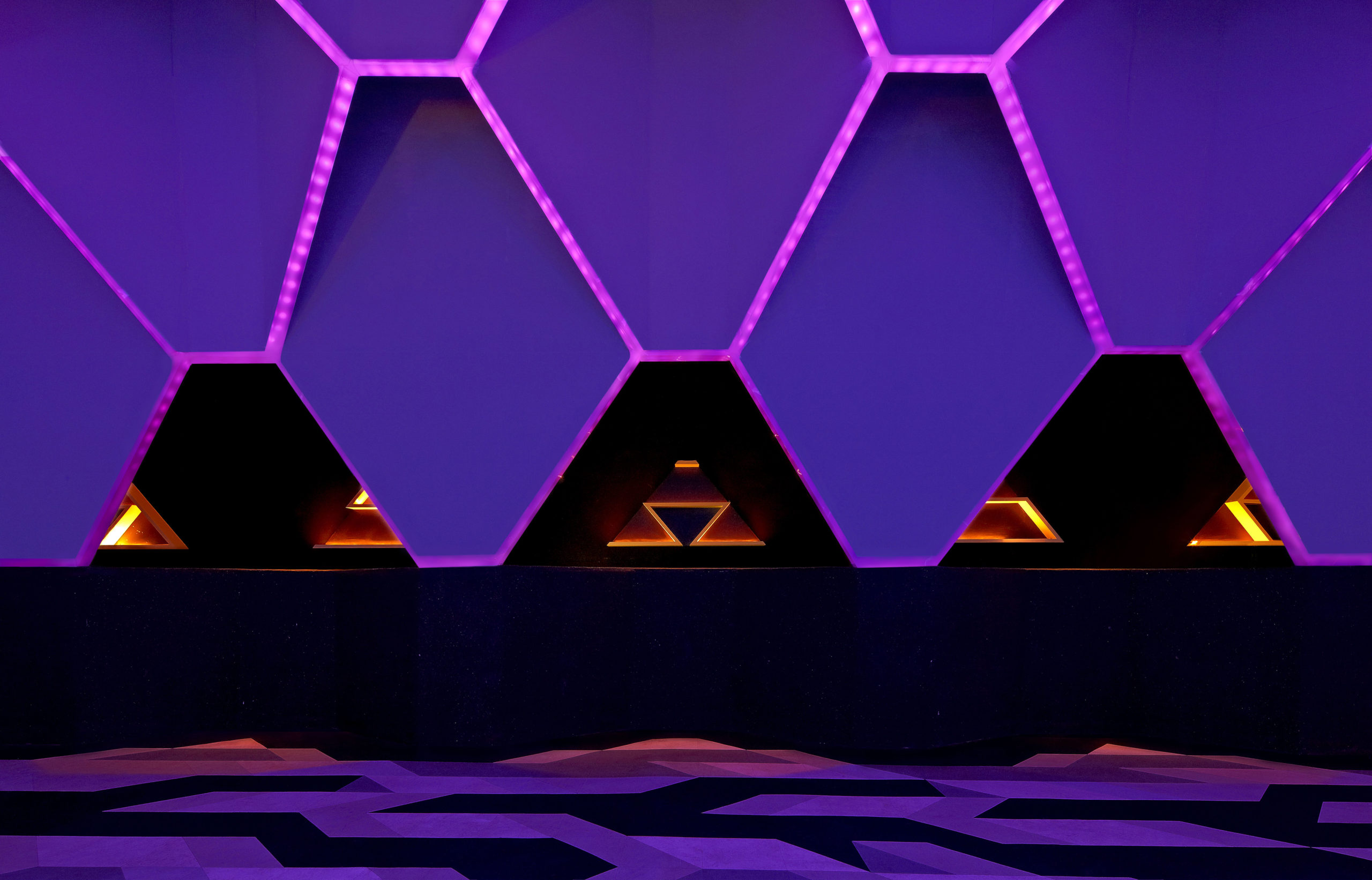
Josefine/ Roxy Club by Fred Mafra, Belo Horizonte, Brazil

Fred Mafra moved away from regular hexagons to a more elongated version to create dramatic walls for this nightclub. The shape is also used in different versions and sizes along with other prismatic elements throughout the two fools of the club. The 100+ hexagons not only hide the structural framework supporting them but also act as an illuminating element. The embedded LED system is connected to a video pixel mapping program that helps change the colors of these lights.

Image by Sergio Gomez

Image by Iwan Baan

Orquideorama by plan:b, Medellín, Colombia

Much like a tree, this project is a series of hexagonal canopies that contain a central module with six other modules growing from it. Its spread makes it seem like an organic design despite its geometric nature. The central module stands on a twisted column that expels hot air and funnels rainwater. The system allows repetition, growth and the ability to build around the trees on the site to avoid damaging them. The layering of wooden strips also gives it lightness and transparency.

Images by Purnesh Dev Nikhanj

Hexalace by Studio Ardete, PB, India

The building’s unique façade was a way to exercise creatively when the restrictive plan prevented the team from doing so. In addition to being a showstopper, the exterior also serves as a buffer from the extreme climate. The façade comprises a 3-inch later of concrete with hexagonal cutouts to create shaded balconies and windows. Over this base is a network of white hexagonal frames that act as balcony railings in certain parts of the surface. The introduction of plants on these balconies adds pops of color to this system and makes the concrete slab come to life.

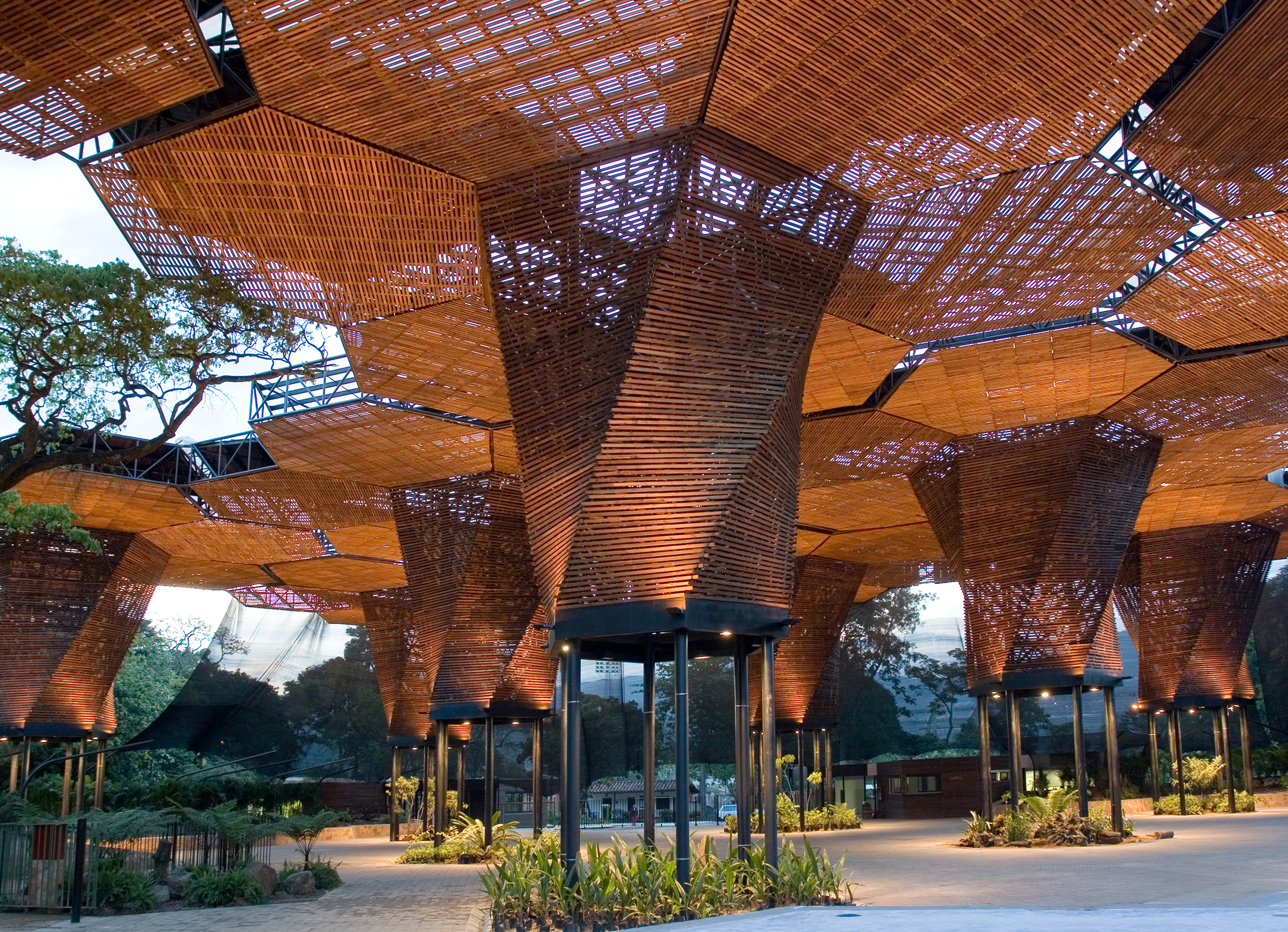
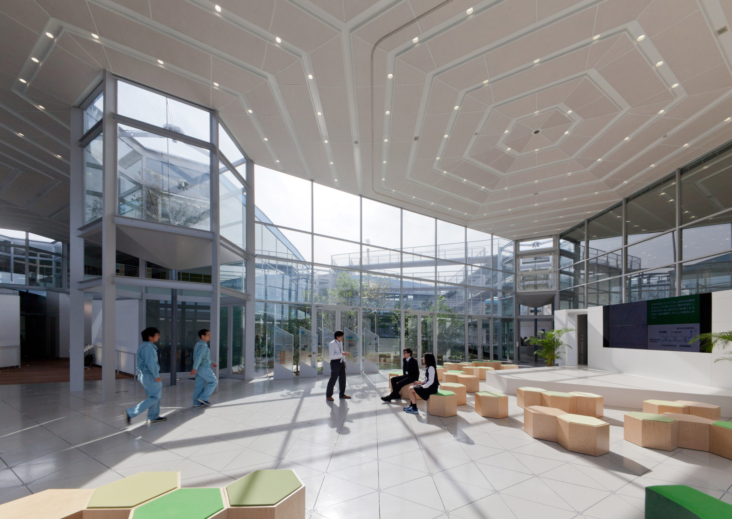
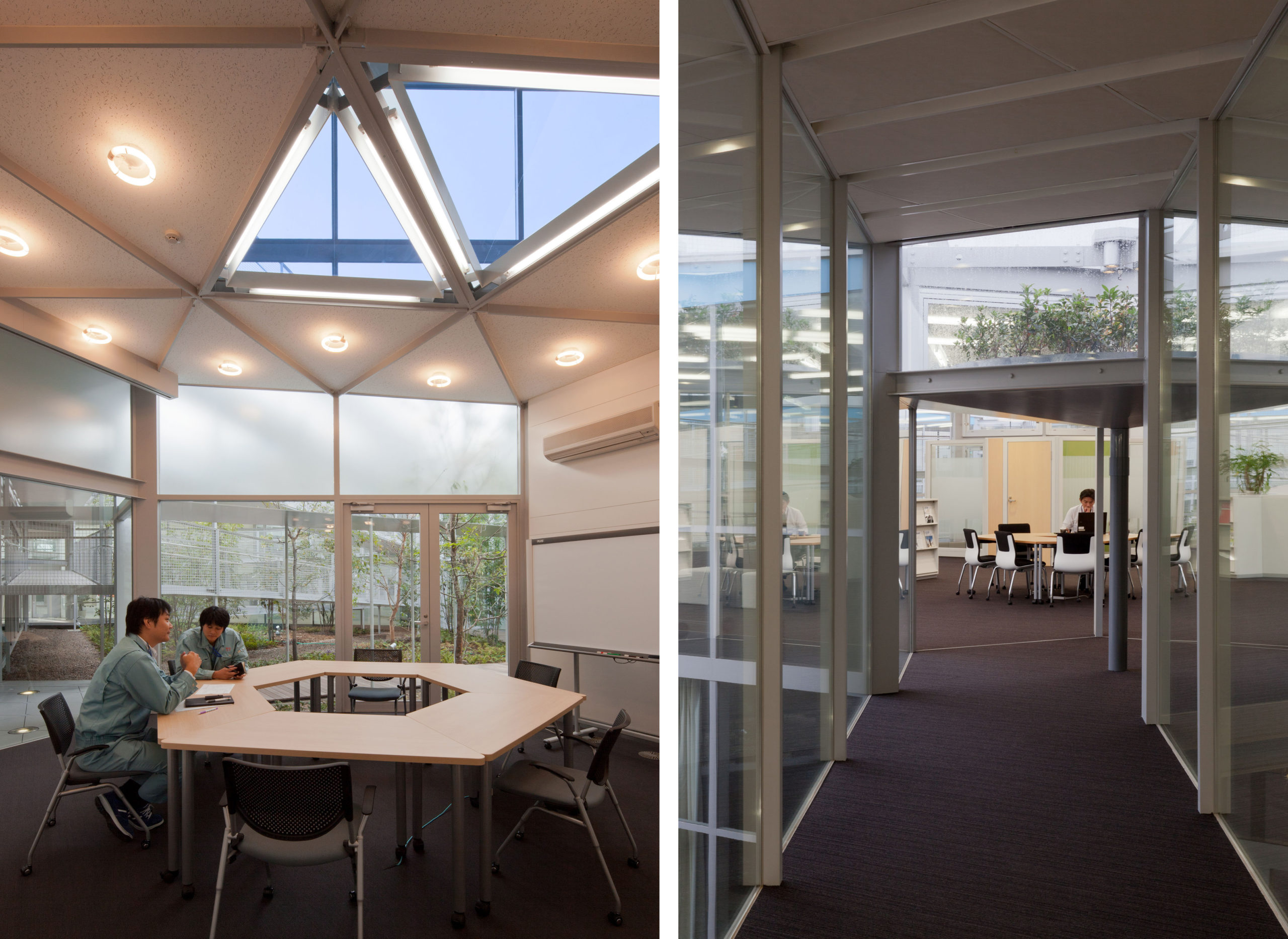
Aron R&D Center by Osamu Morishita Architect & Associates, Aichi, Japan

The brief was to create a space that acts as a research lab and also promotes new ideas. Drawing inspiration from the cloud and virtual networks, the studio envisioned a hexagonal grid that facilitates the easy connection of internal spaces. This framework allows users to transform interior spaces according to their needs. The 27 hexagonal towers placed on equally spaced vertices in the grid act as green pockets and introduce light and fresh air into the interior spaces. Additionally, the building features a solar energy system, heat reservoirs, passive cooling systems and rainwater collection mechanisms. The hexagonal form is also replicated in furniture throughout the building.

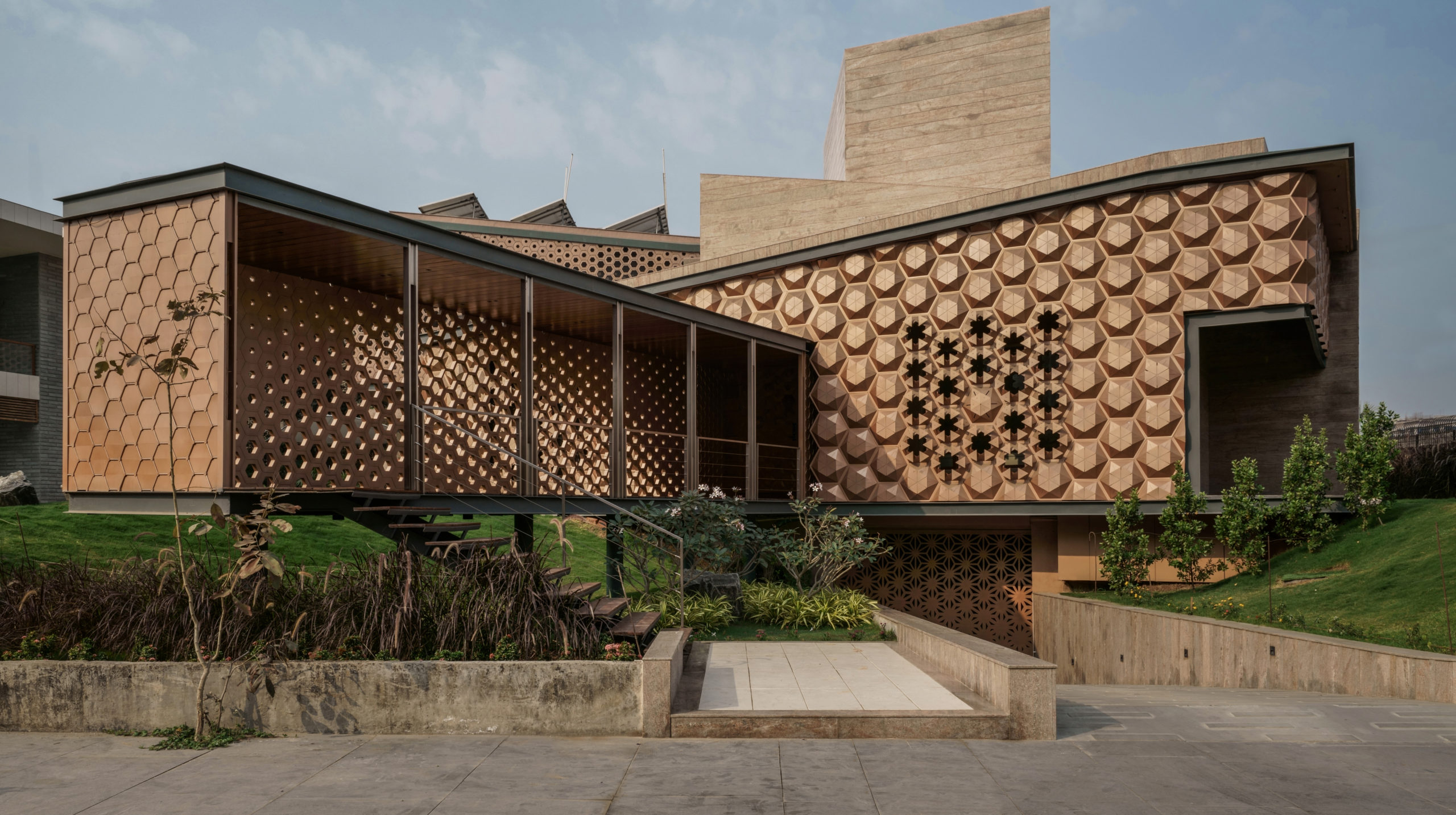
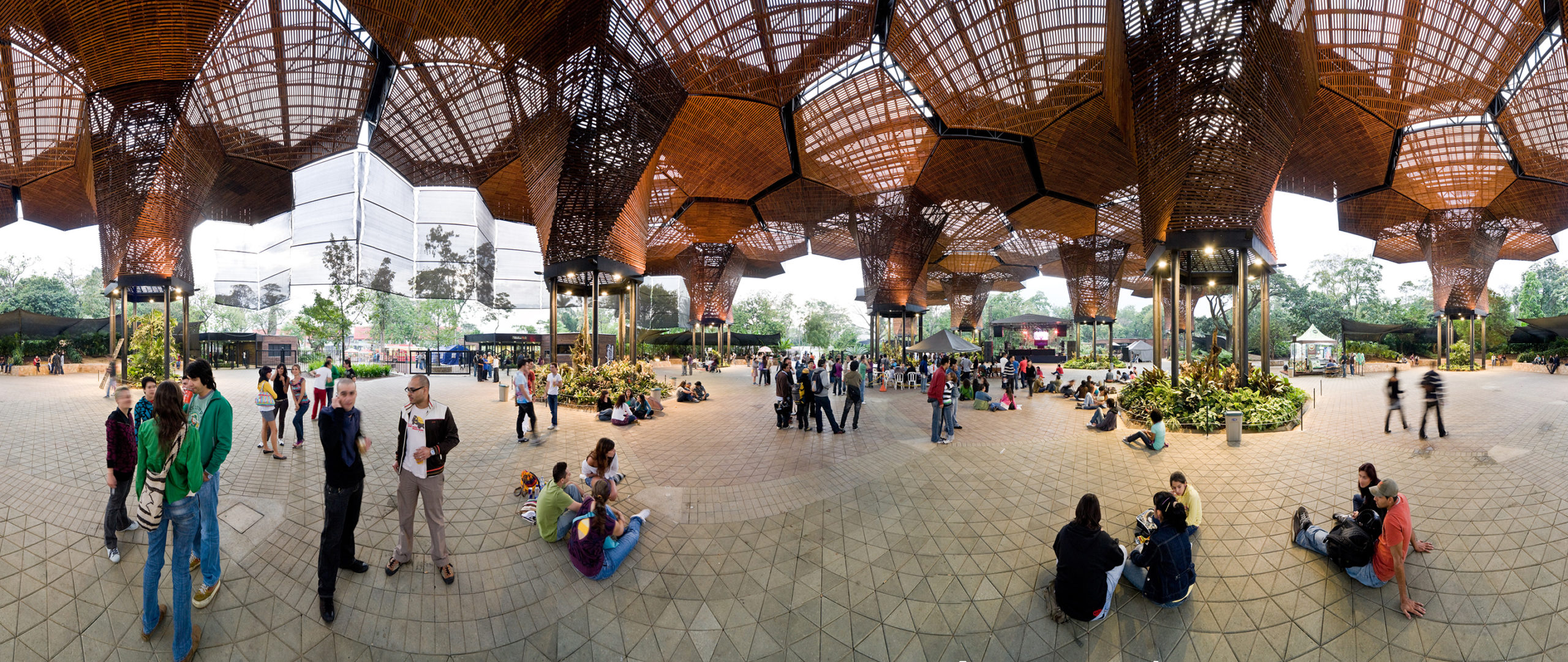
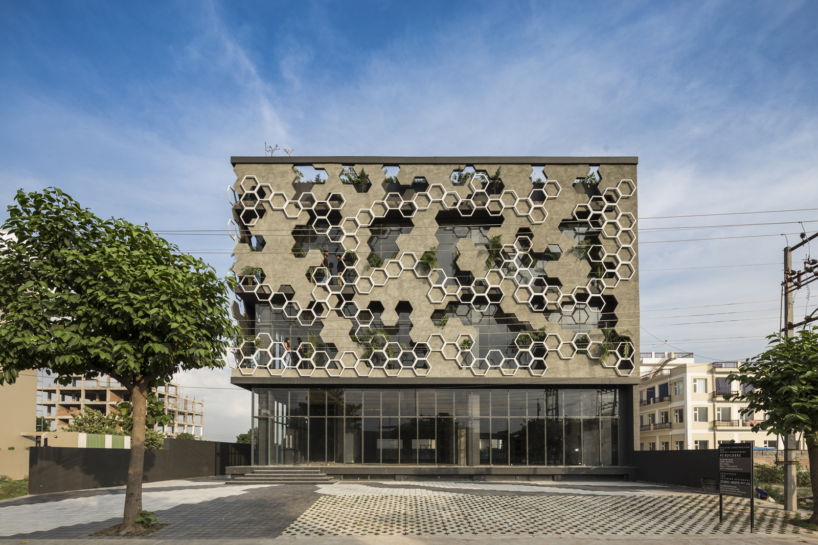
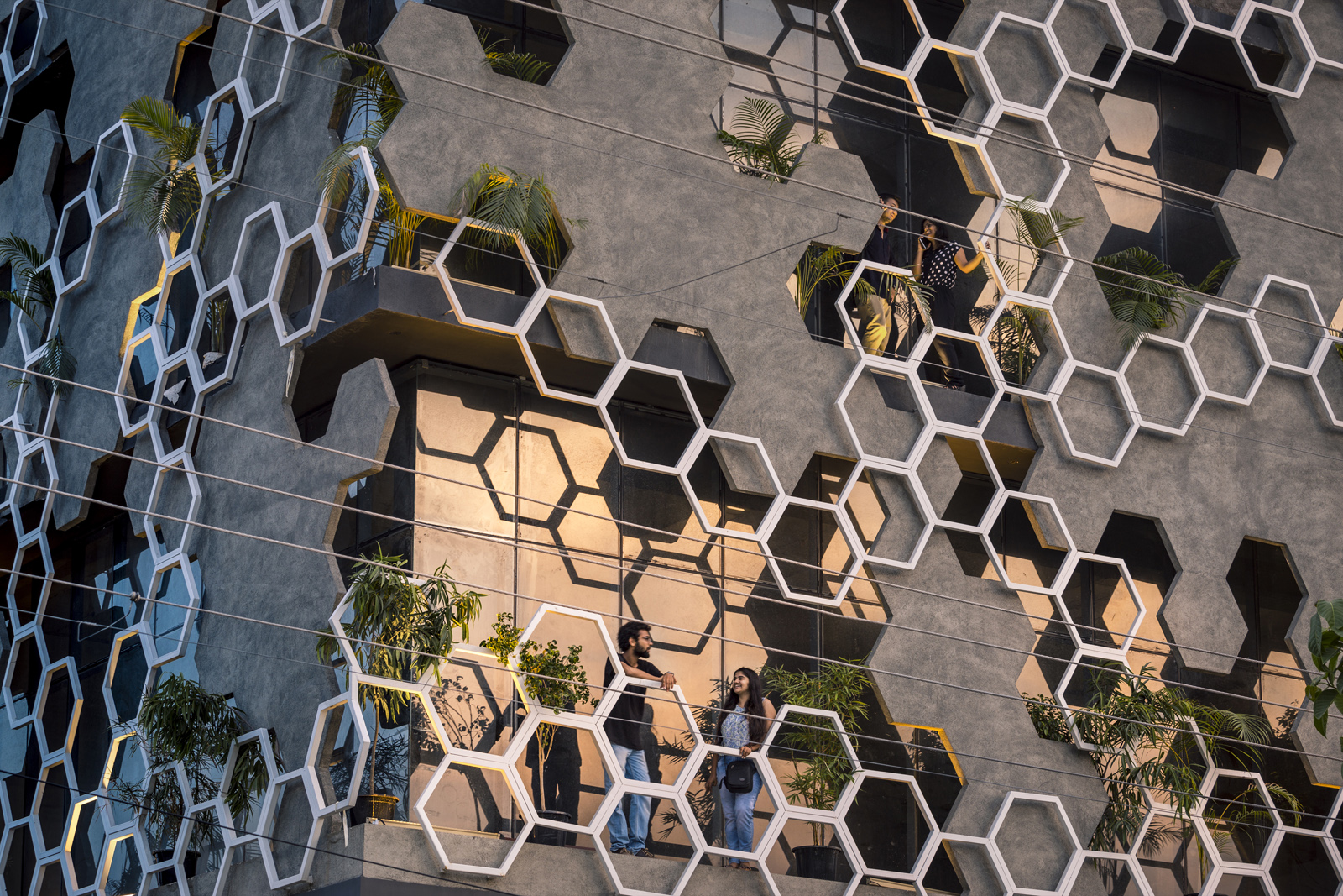
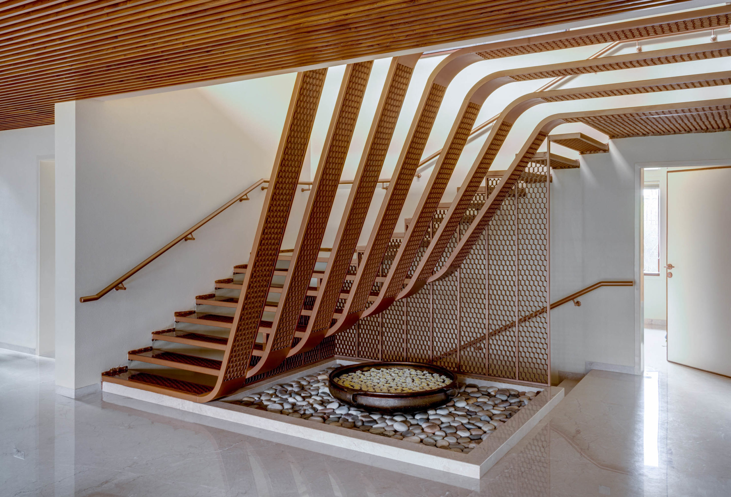
Hive by OPENIDEAS ARCHITECTS, Surat, India

A variety of different hexagonal patterns strategically placed on the walls of this home turn it into a sensorial delight. The sun’s path and climate were some of the governing factors in this design. The v-shape opening up towards green spaces as well as a green oof that provides thermal insulation are just two such examples. The star of the show is a solar-sensor-based honeycomb façade. Some hexagons in the 3D lattice automatically open and close to maintain ideal thermal conditions within the home. To complement these walls, hexagonal patterns at different scales are also incorporated on other exterior surfaces across the home.

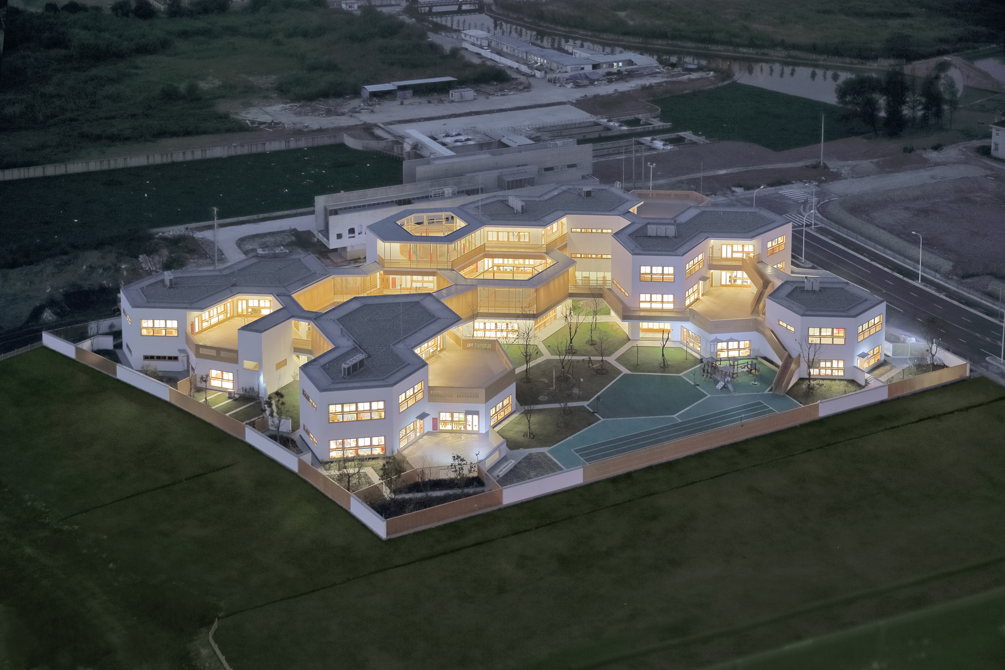
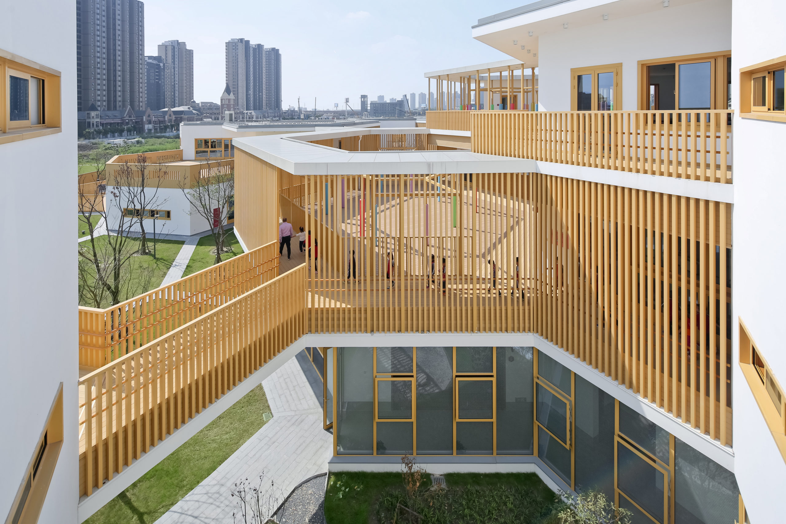
East China Normal University Affiliated Bilingual Kindergarten by Scenic Architecture, Shanghai, China

The courtyard is a very significant element in traditional Chinese architecture. It stands as a space for the family to gather and connect and also brings in fresh air and light into the home. The firm wanted to provide this element of comfort and a connection with nature to the children in this kindergarten. Following the sun’s path, the team added hexagonal shapes to the western side to maximize natural light within. A honeycomb pattern follows along the site with a series of courtyards and terraces breaking up the mass. The greater number of surfaces in every independent module also helps bridge the connection between the interior and exterior throughout the structure.

Architects: Want to have your project featured? Showcase your work through Architizer and sign up for our inspirational newsletter. 

Reference

BNIM's Customized Glass Façade Inspires New Forms of Art Making
CategoriesArchitecture

BNIM’s Customized Glass Façade Inspires New Forms of Art Making

BNIM's Customized Glass Façade Inspires New Forms of Art Making

Judging is now underway for the 10th Annual A+Awards Program! Want to earn global recognition for your projects? Sign up to be notified when the 11th Annual A+Awards program launches. 

Art and design are defined by how we experience the world and express ourselves. The spaces for creation and ideation shape what we make, and in turn, can provide the platform for making new works of art. When BNIM designed the Fine Arts + Design Studios (FADS) building at Johnson County Community College (JCCC) in Overland Park, Kansas, they brought together multiple disciplines into a single, carefully crafted facility. The result is an open architecture that allows students, faculty and staff to explore what expression means to them.

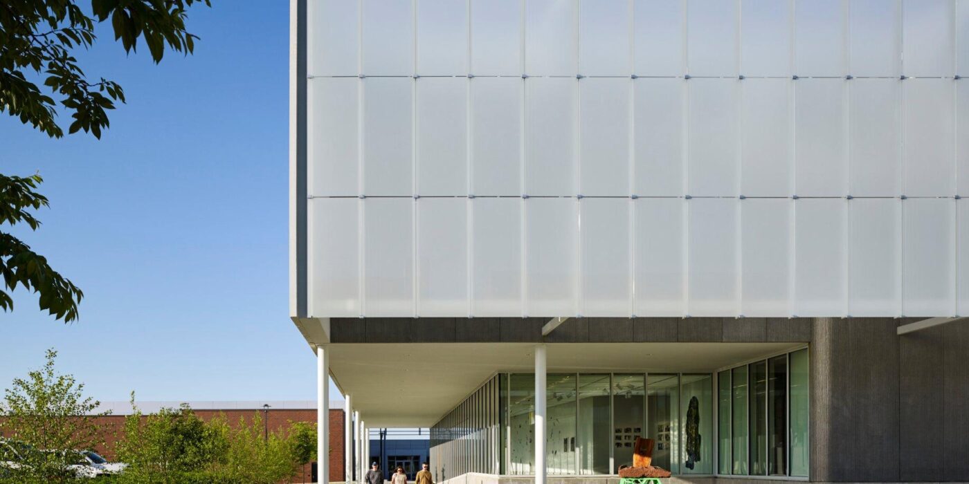
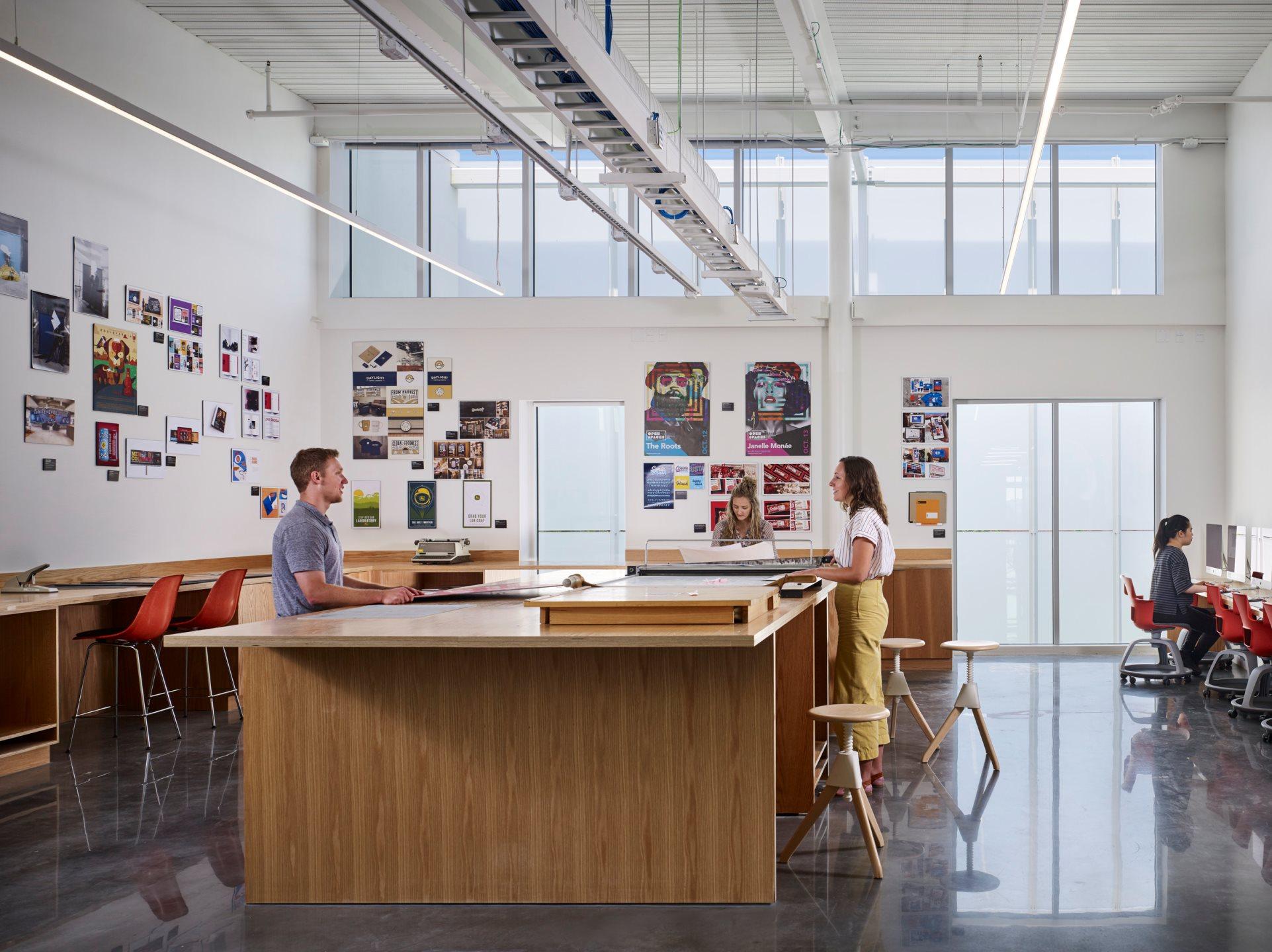
At the heart of the FADS building is the idea of bringing diverse ideas and art practices together. The building was made to exemplify the notion of learning by doing, drawing together disciplines that were previously dispersed across campus: graphic design, sculpture, ceramics, metals, painting, drawing, photography and filmmaking. The architecture was designed to provide a framework for new synergies and enhanced collaboration and, in doing so, inspire creativity and new forms of art making.

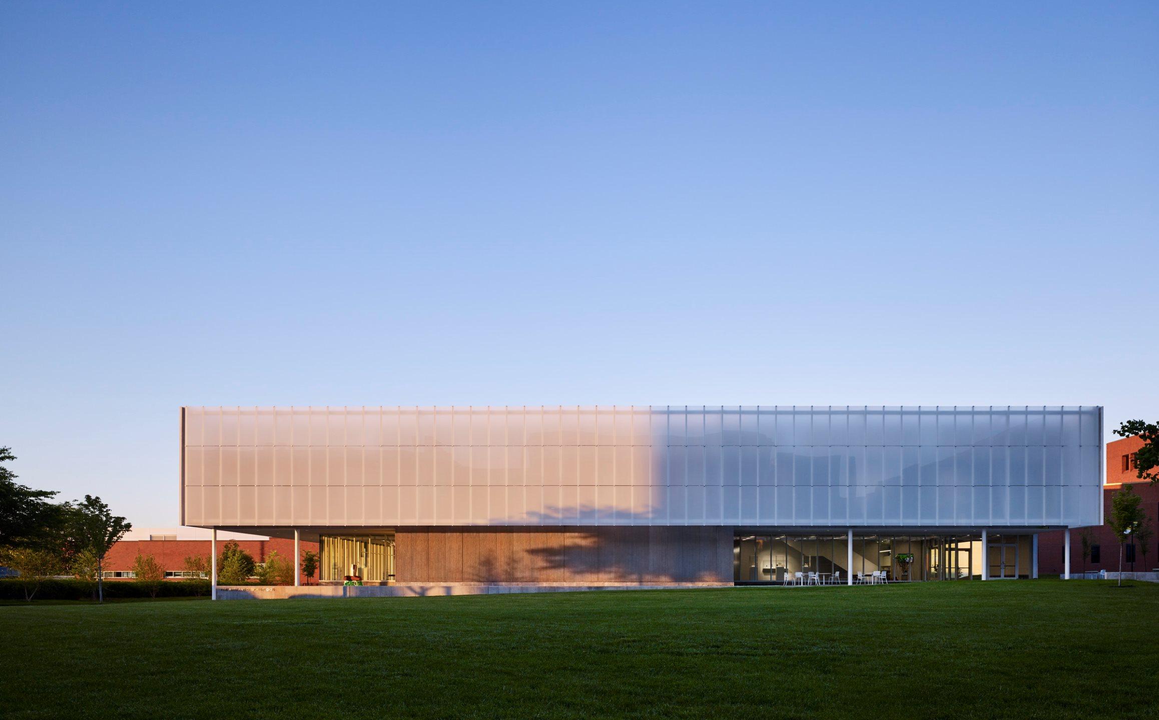
The FADS building was completed with Clark & Enersen, who provided programming and equipment planning, as well as mechanical, electrical and structural engineering for this building. In turn, they were selected for a range of services for priority projects identified in Johnson County Community College’s 2016 Master Plan. A goal of the facilities master plan was to reinforce campus neighborhoods by promoting adjacencies. The FADS building brings these ideas to life and contains the arts programs that were formally housed in the Arts & Technology building, along with filmmaking and graphic design.

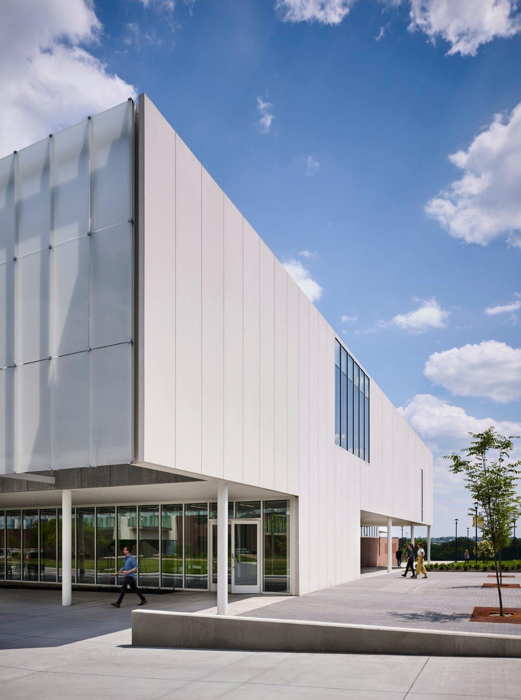
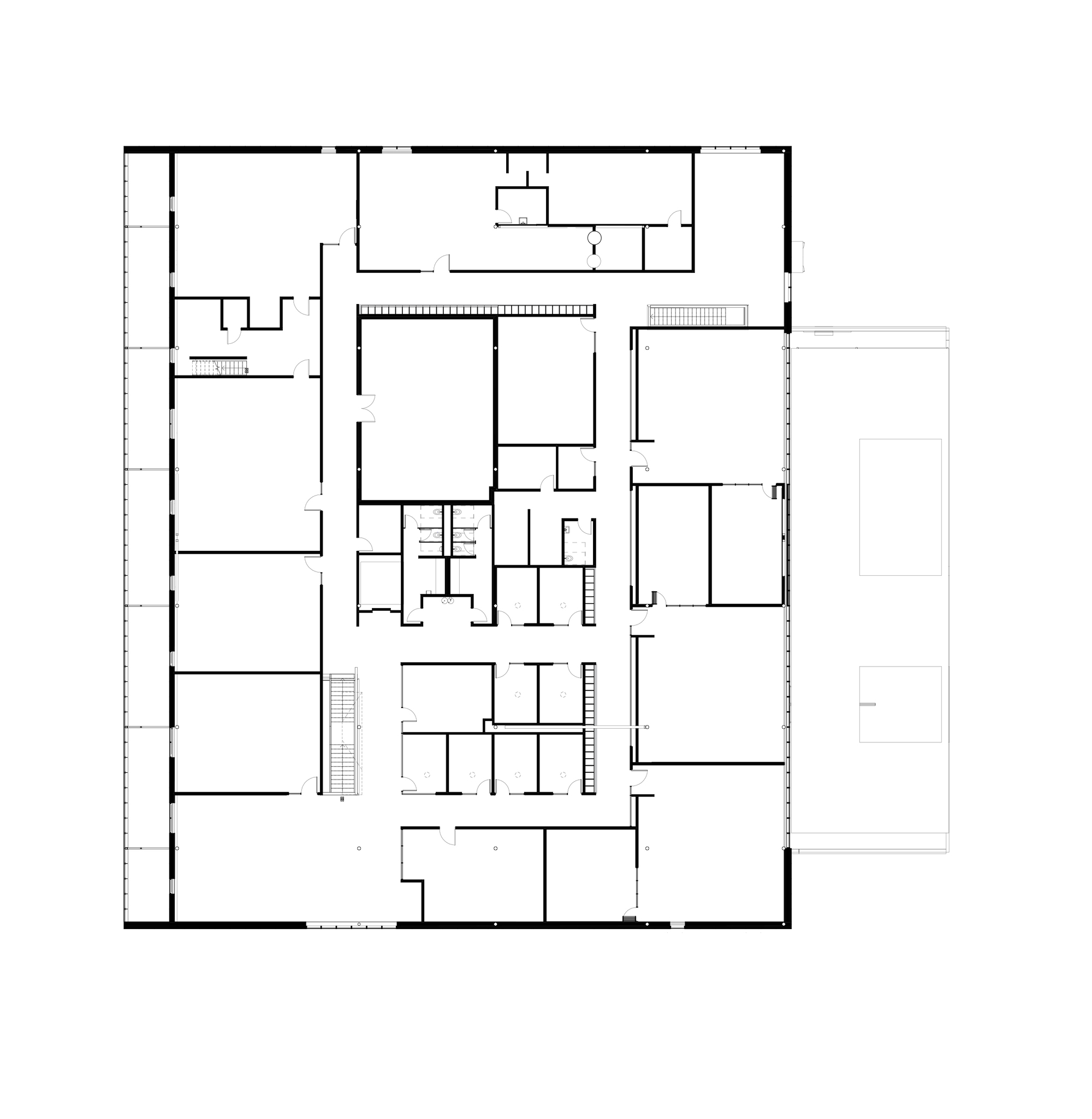
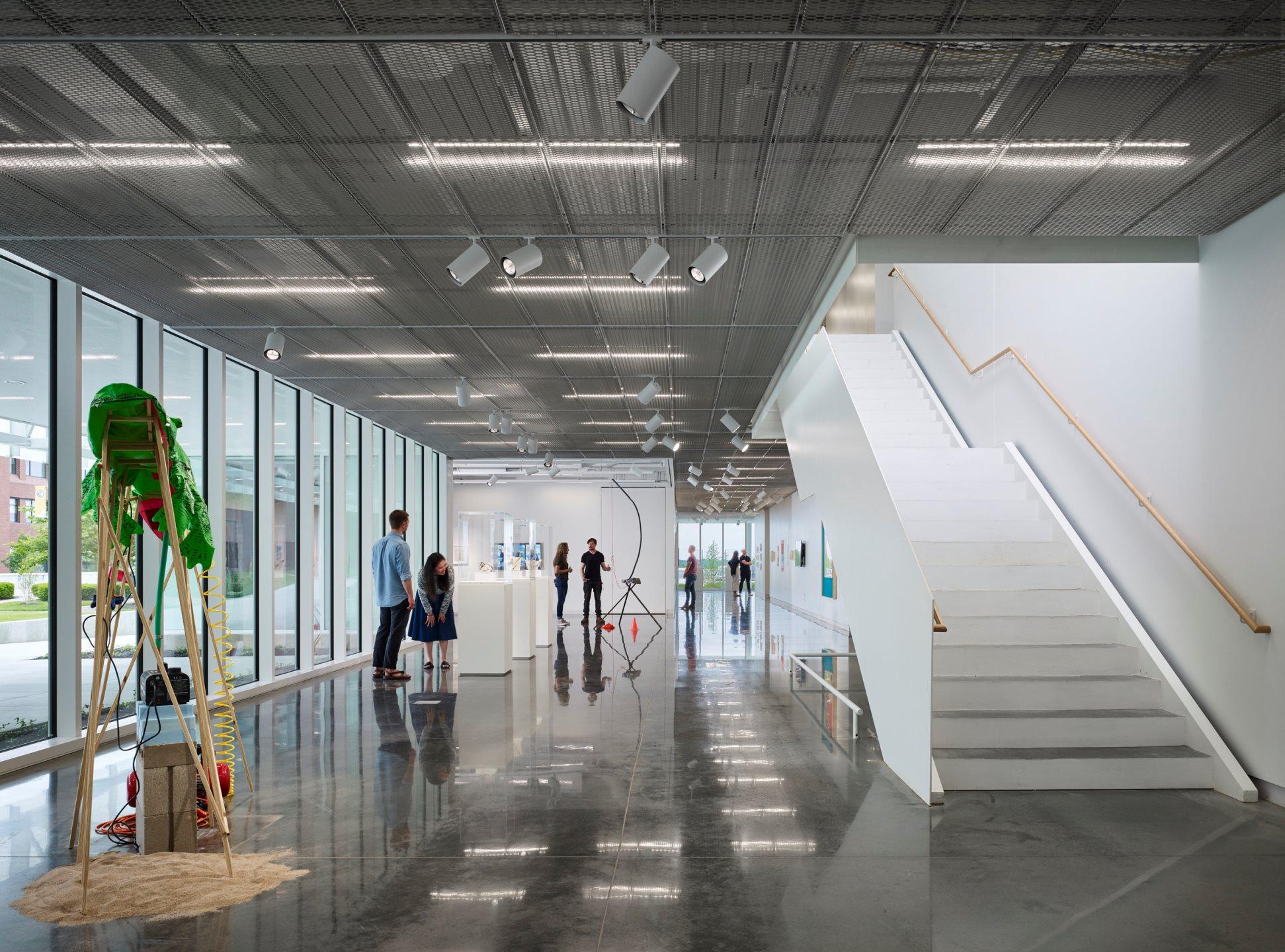
As the design team notes, the FADS building included classrooms and studio space, material storage, multi-use common spaces, as well as display and collaboration spaces throughout building corridors. Fueling a desire to create, FADS includes these hallway gallery spaces and a covered outdoor courtyard, which functions as a year-round workspace for student and faculty artists alike.

In addition to providing collaboration spaces, the design features flexible and vibrant interior studios. The project was sited to provide intimately scaled exterior spaces for the creation and display of art, and to integrate and strengthen campus connections.

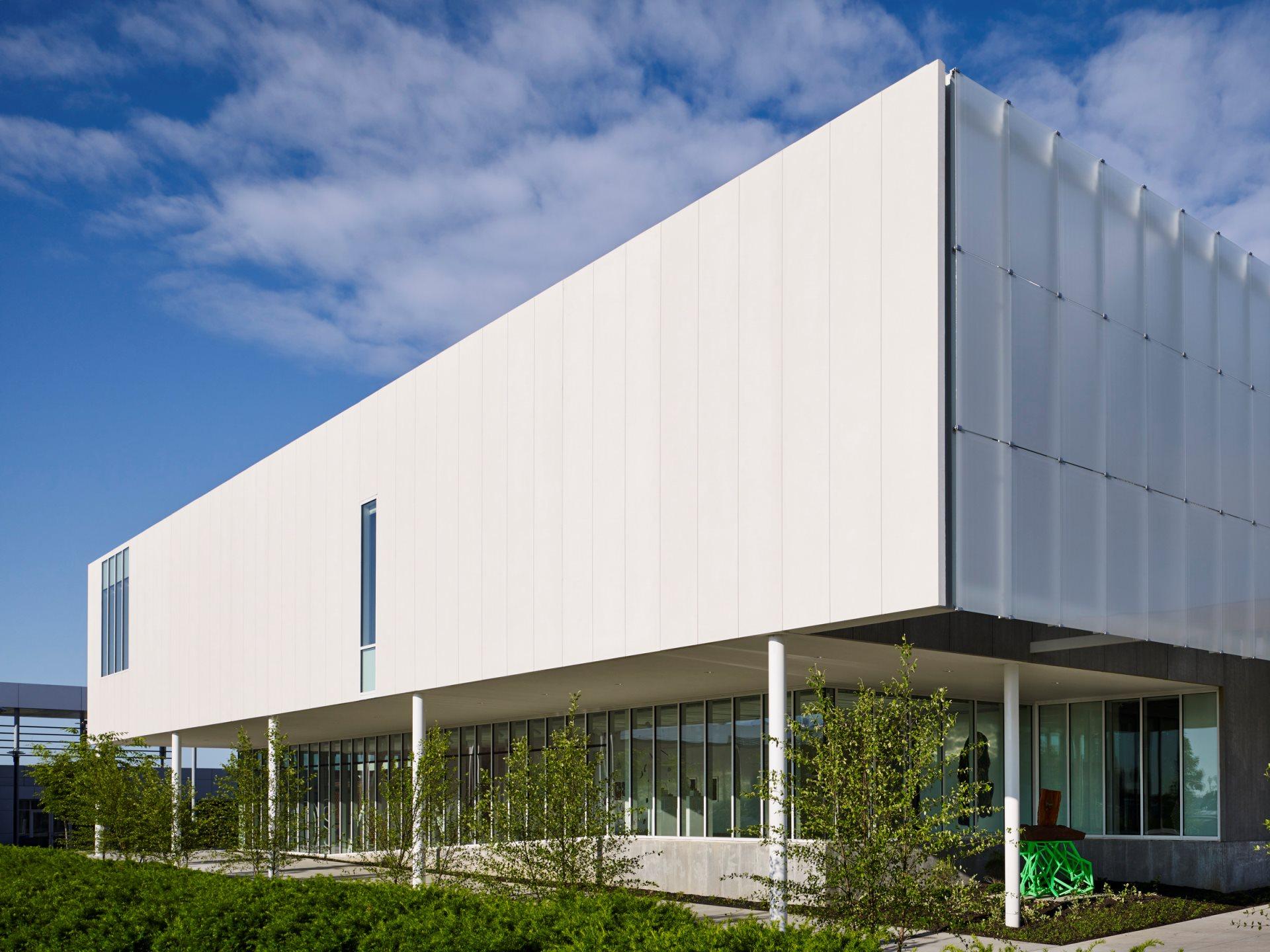
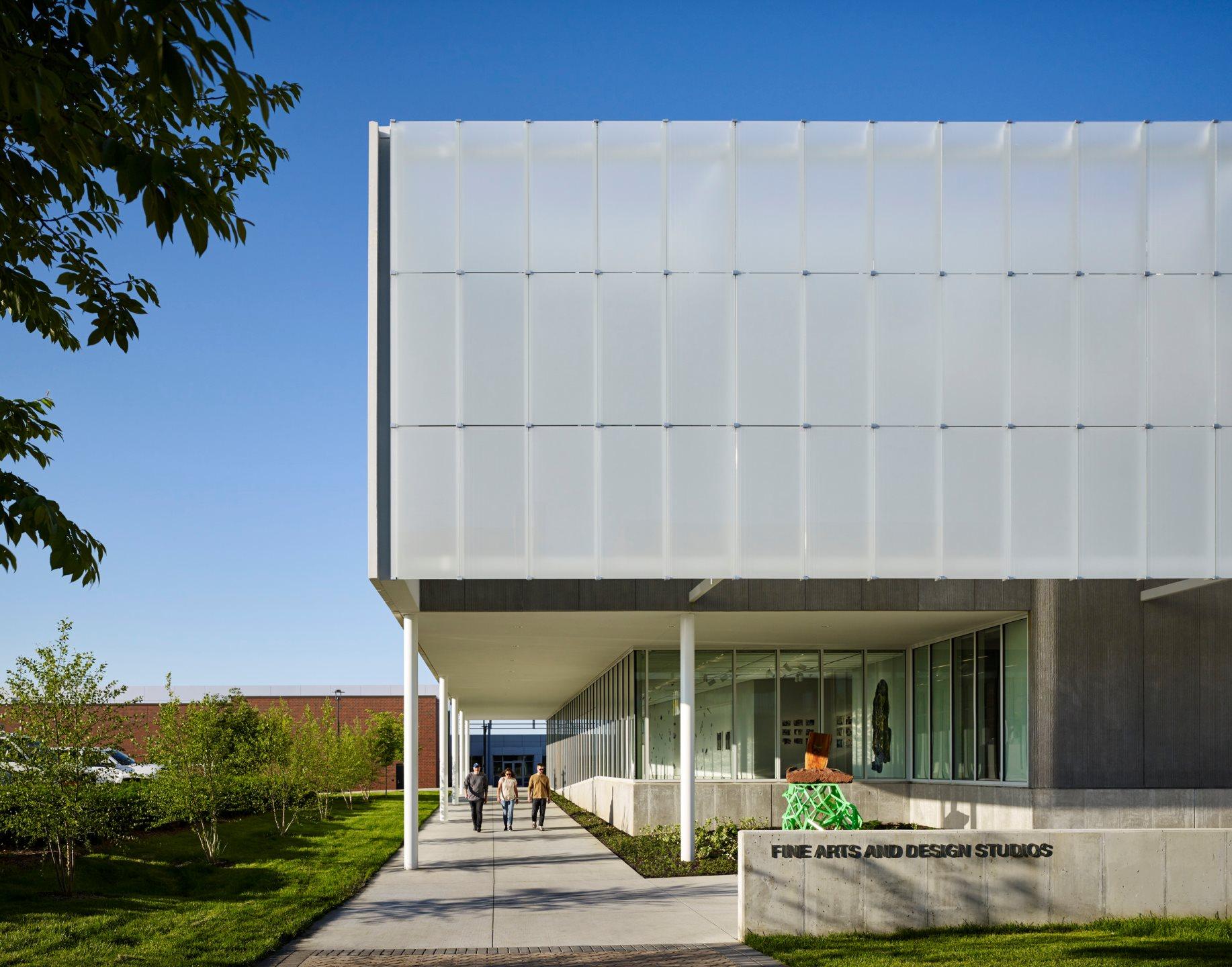
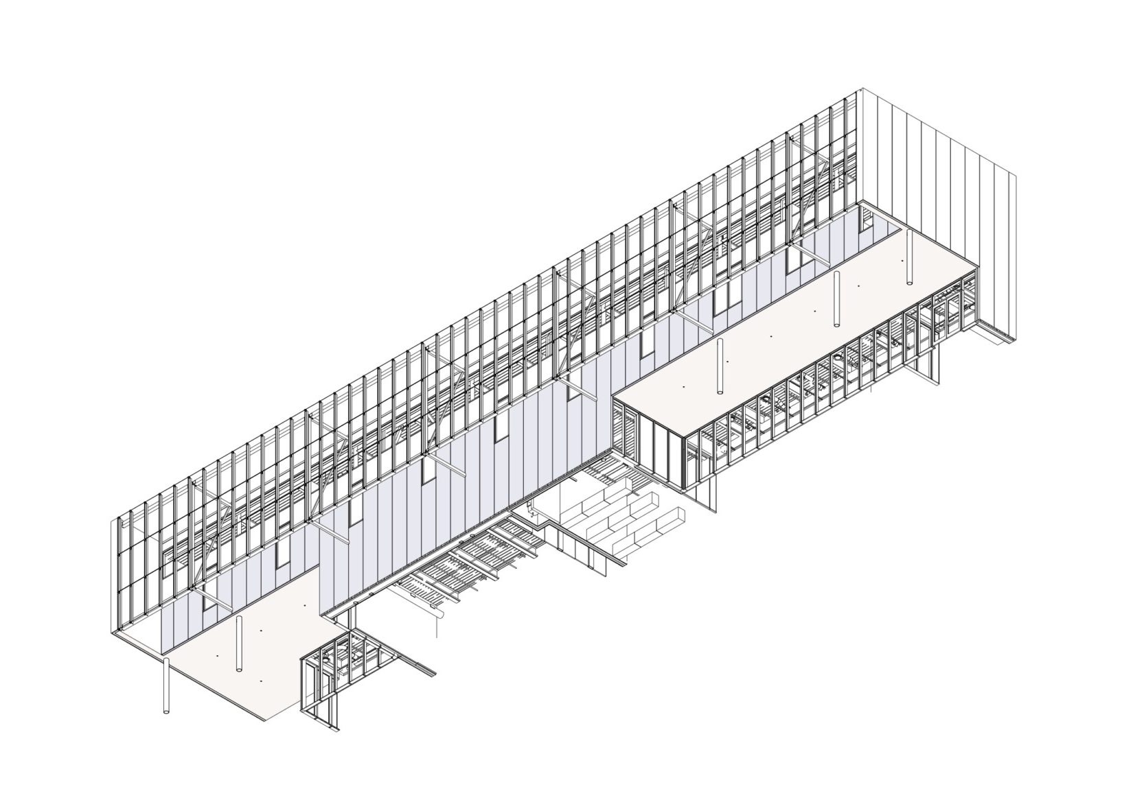
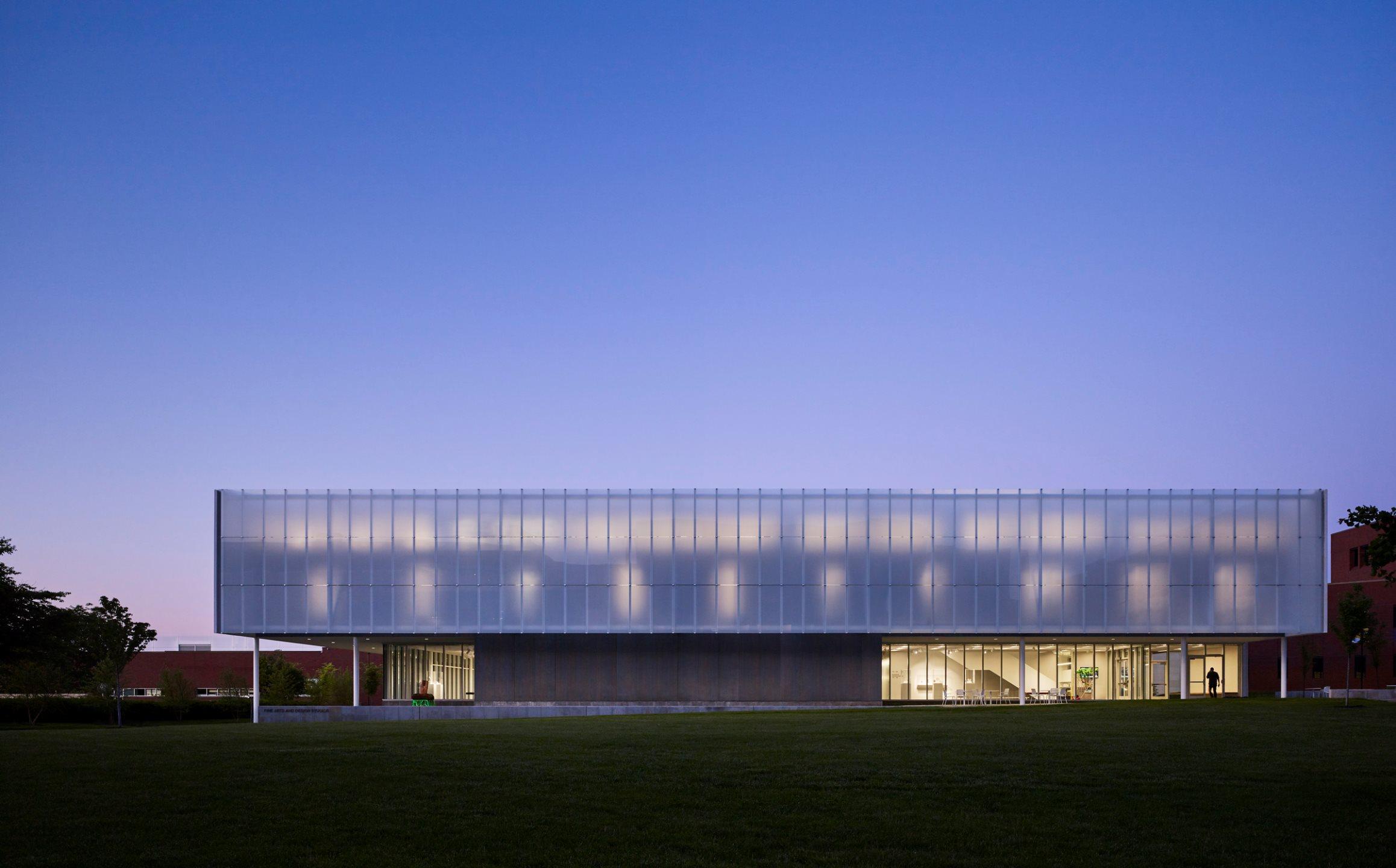
BNIM’s design features a rectangular volume lifted off the ground by a concrete podium and pilotis. In turn, the building volume is offset by acid-etched and ceramic-fritted glass panels. They worked with architectural glass and systems manufacturer Bendheim to bring the glass panels to life.

The customized, ventilated glass façade features a 170-foot-wide façade with Bendheim’s Lumi Frit Surface 1 fritted glass. It acts as a screen that filters soft, glare-free daylight into the studios through second-story windows, while creating a white aesthetic during the day. The glass also reflects sunlight to a shimmering white effect. Bendheim sampled multiple Lumi Frit patterns and surface options to test and evaluate for optimal diffusion and projectability.

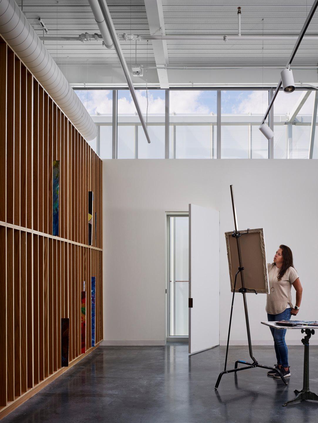
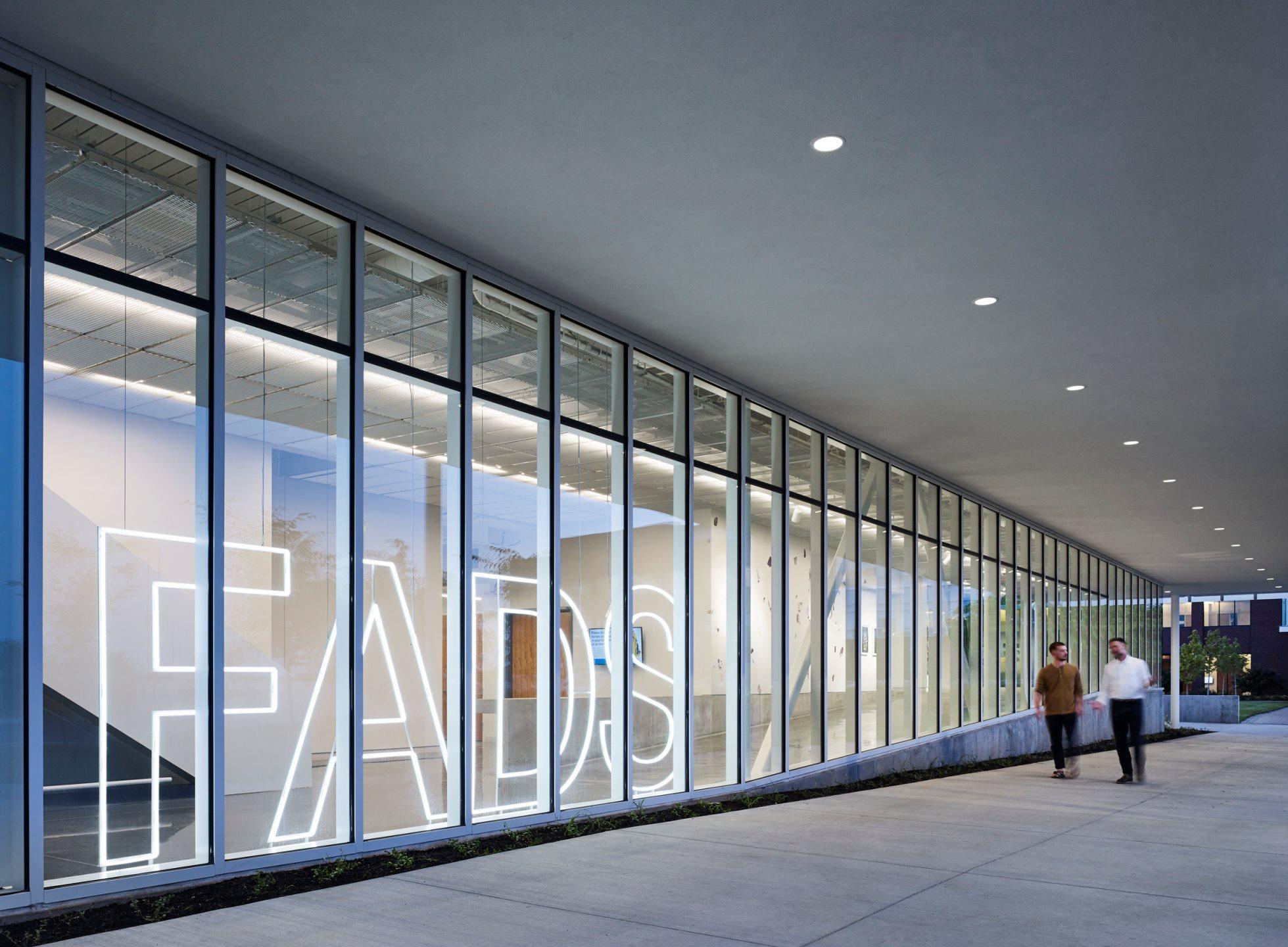
Just steps away from the Midwest Trust Center, the Wylie Hospitality and Culinary Academy, and the Nerman Museum of Contemporary Art, the Fine Arts & Design Studios (FADS) facility was made to anchor a new arts neighborhood on campus. The FADS strengthens these connections and provides space to reimagine how art is made.

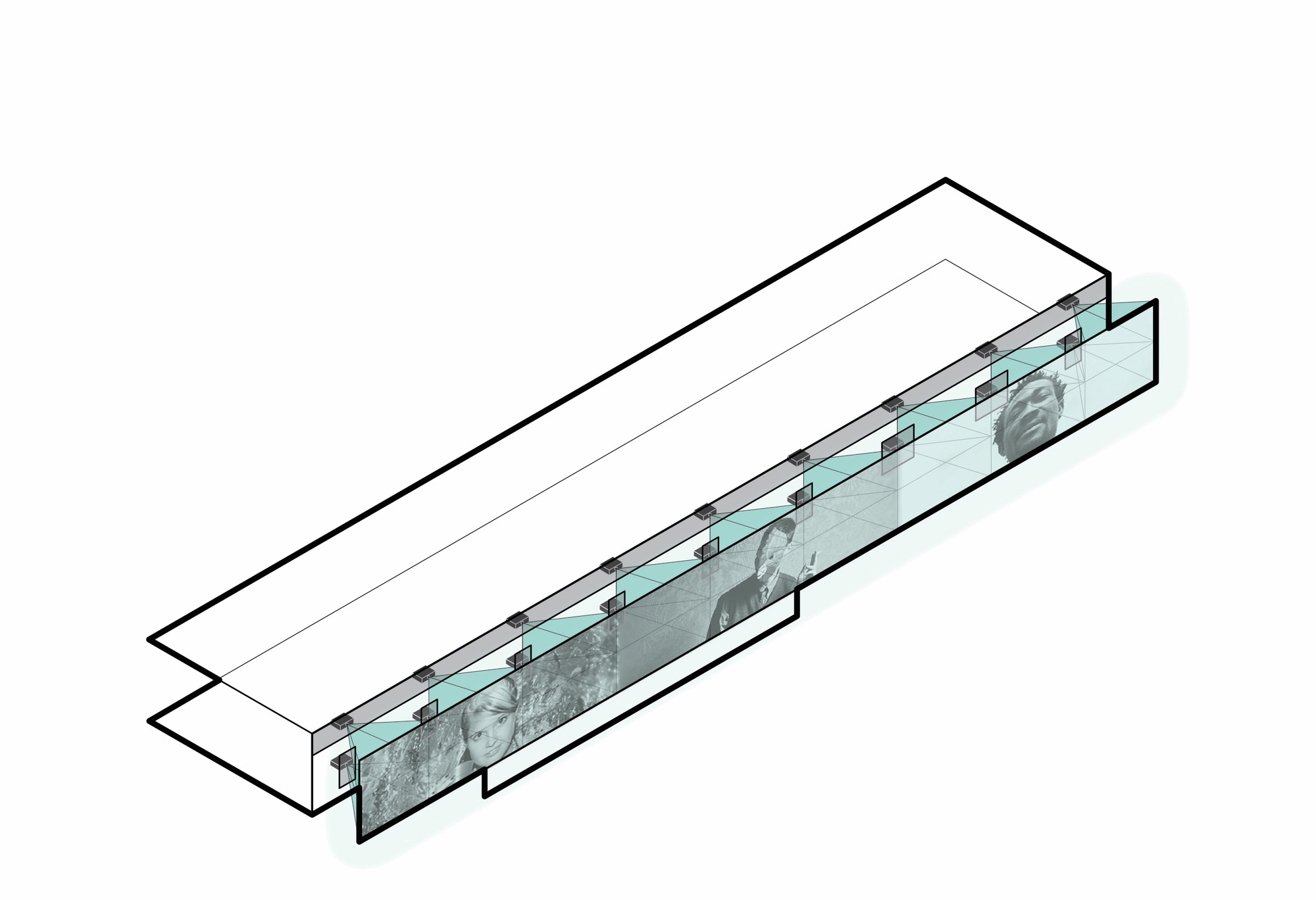
“In the fine arts are these silos of specialties, but the trend is to break through those silos,” says Fine Arts Professor Mark Cowardin. “Painters are embracing more materials, and sculptors are working with ceramics and drawing. We want that sort of cross-pollination, not only with our students but with our professors. We are encouraging a creativity zone where we can build on our reputation and present to our students the opportunity for innovation.”

Judging is now underway for the 10th Annual A+Awards Program! Want to earn global recognition for your projects? Sign up to be notified when the 11th Annual A+Awards program launches. 

Reference