NOMAL’s Joomak revitalizes abandoned house in Palbok-dong
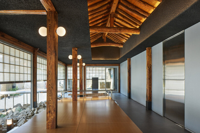
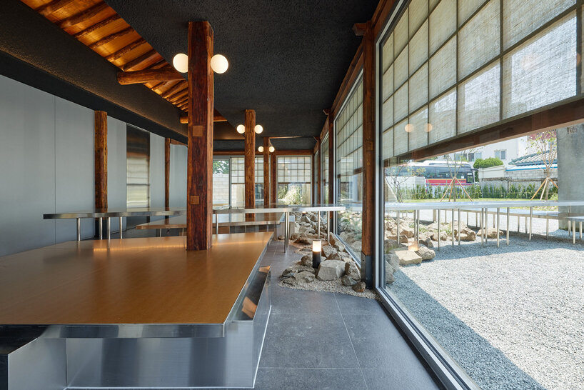
NOMAL studio’s project, Joomak, revitalizes the landscape of Palbok-dong in Jeonju, Korea, addressing the challenges of neglected industrial zones and structures. The once-thriving industrial area faced a decline during the 1990s, resulting in abandoned factories and neglected spaces. The project is part of the ‘MBC Empty House 3’ initiative that aims to regenerate four old disused houses in Palbok-dong. The design transforms one of the old structures into a modern restaurant, incorporating elements of traditional hanok architecture and a spatial layout resembling a Joomak, a term for a traditional Korean tavern.
renovation project preserves existing structural elements
The design team at NOMAL prioritizes the preservation of the building’s historical integrity, emphasizing existing structural elements and traces integral to the town’s long-standing village landscape. For the hanok, a meticulous process involves the removal of the roof to prevent structural collapse. The deteriorated wood structure undergoes reinforcement by enveloping the lower section with metal and infilling it with concrete. To meet contemporary load requirements and enhance roof performance, modern materials are employed in place of traditional roof tiles.
the project transforms an old structure into a modern restaurant, integrating traditional hanok elements
open layout blurs the boundaries between inside and outside
The project is centered around the concept of openness. Various design elements intentionally blur the distinction between indoor and outdoor spaces, creating a symbolic representation of an external environment within the interior. Utilizing metal for exterior walls and extending it to the kitchen and main hall, along with an opening directly connecting the roof frame with the interior ceiling, conveys the internal hall as a symbolic external space akin to a traditional joomak. Additionally, floor-to-ceiling windows facing the landscape further dissolve the delineation between the inside and outside, ensuring a visually open atmosphere within the relatively narrow space. The conversion of the adjacent vacant lot into a green patio enhances the ‘Joomak’s’ front yard prominence. This project initiates the process of revitalizing Palbok-dong through urban regeneration.
NOMAL preserves the building’s historical integrity and existing structural elements
deteriorated wood structure is reinforced, enveloping the lower part with metal and infilling it with concrete
the project’s core concept revolves around openness, blurring lines between indoor and outdoor spaces
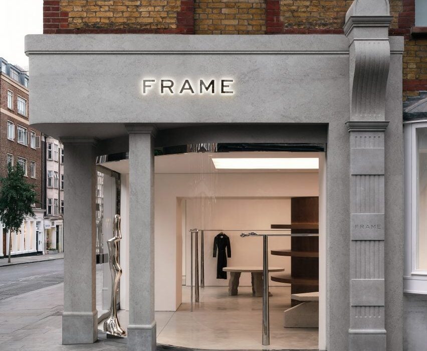
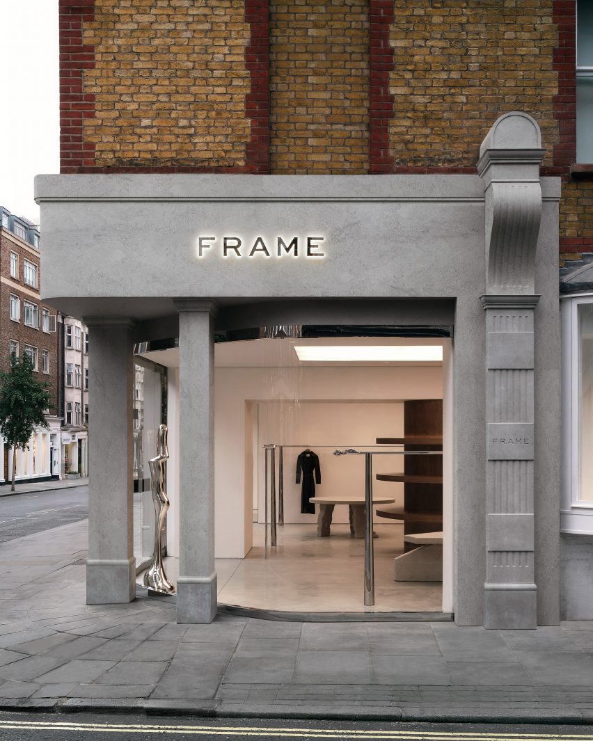
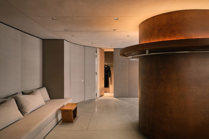
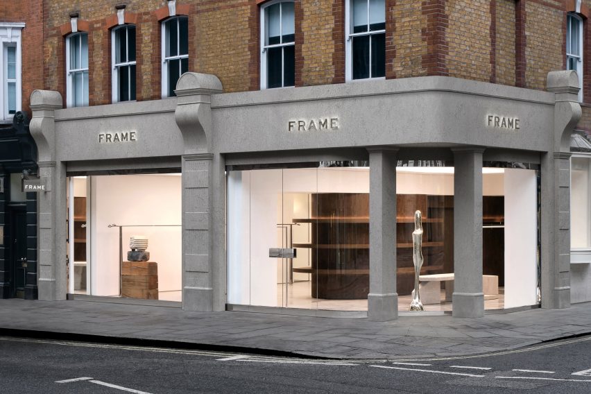
French interior design Studio FB and the co-founder of fashion brand Frame, Erik Torstensson, have designed a California-informed store for the brand in London.
The store’s concept draws from the brand’s Californian origins as well as European influences, which is reflected in the lighting, furniture and materials.
Studio FB designed a minimalist store for Frame
“The Californian universe with these modernist architectures with a free plan, skylights and the opening of spaces to the outside was our inspiration basis,” Studio FB told Dezeen.
“We imagined this new concept design layout as open as possible, which can be compared to a gallery.”
The store is arranged round a large central pillar
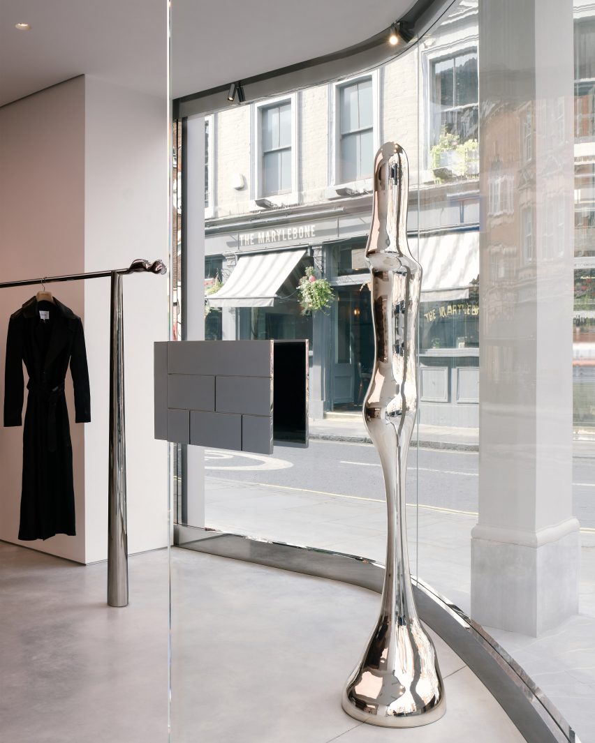
To create a greater connection with the street, the studio redesigned the facade by adding a curved, full-height glazed wall, which was set behind the original piers.
“We designed a long-curved glass like a contemporary insert which contrasts radically with the classic London pillars preserved,” said the studio.
The studio aimed to create a gallery-like atmosphere
Within the store, the studio aimed to mimic the atmosphere of an art gallery with a polished concrete floor serving as a base for a central pillar constructed from stained birch wood veneer.
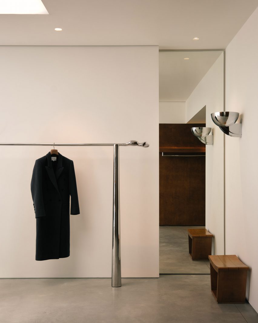
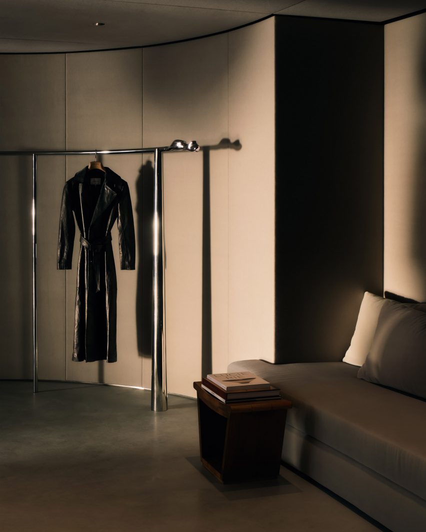
The store’s rails were custom-designed with a distinctive hand-moulded abstract-shaped end-piece serving as the highlight
With in the fitting room, the ceiling, walls and doors were upholstered in fabric by textile company Kvadrat.
Custom-designed rails were created for the store
“The rounded central wooden element was designed as a sculptural object, which gives a residential feeling from the 50s,” the studio explained.
“The backspace invites the cabins and lounge area becomes more intimate all-in fabric and brings sophistication to the space. Pieces of furniture and artwork sublimate the atmosphere,” the studio continued.
“The general atmosphere is similar to an art gallery with raw materials such as concrete on the floor and white walls.”
The stores changing areas have fabric walls
FB Architects and Torstensson worked together to acquire artwork and collectable design pieces to reinforce the gallery atmosphere.
“It was a thorough process to ensure the most unique response possible to Frame,” said the studio.
“Erik had a precise vision of his brand, so we exchanged a lot together on many artistic fields to build the brand’s architectural DNA.”
A sculpture by Serbian visual artist Bojan Šarčević crafted from wood and limestone sits in the display window. Also in the store are two original 1950s Gio Ponti stools, crafted from wood and textiles.
The store was decorated with wall-mounted fixtures designed by French lighting designer Jean Perzel, as well as geometric fixtures created by French architect Pierre Chareau, to create a soft and gentle lighting ambience.
Artworks feature throughout the store
Torstensson used AI as a sketching tool to design custom objects for the space, such as large brutalist stone tables and chrome custom-made sculptures that were then realised by architecture studios including Bucktron Studio Sweden.
“I’ve been learning and expanding my skills with AI for the last year, it creates a superpower when it comes to speed, as it allowed me to generate the visual concept at a greater pace and scale,” said Torstensson.
“This creates exciting results and provides a new outlook on design. I simply use it to visualise my initial ideas in greater detail in order to bring my ideas to life.”
The store is Frame’s second in the UK
Other retail interiors recently featured on Dezeen include a stationery store interior made from white-oiled wood by Architecture for London and a store interior for Ms MIN in Shanghai, China, by Neri&Hu.
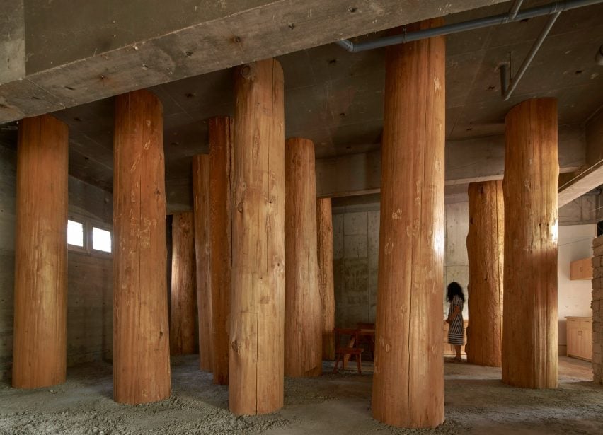
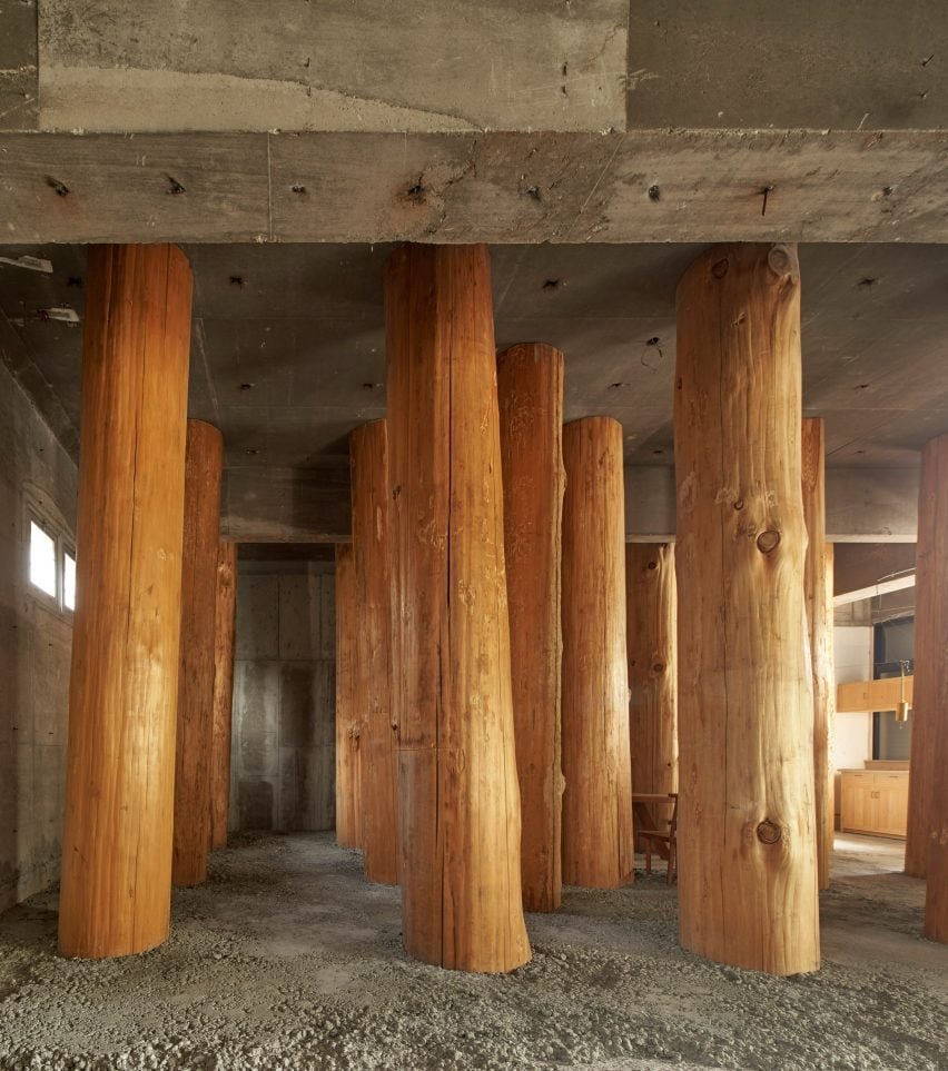
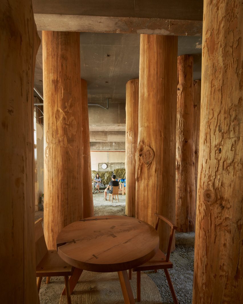
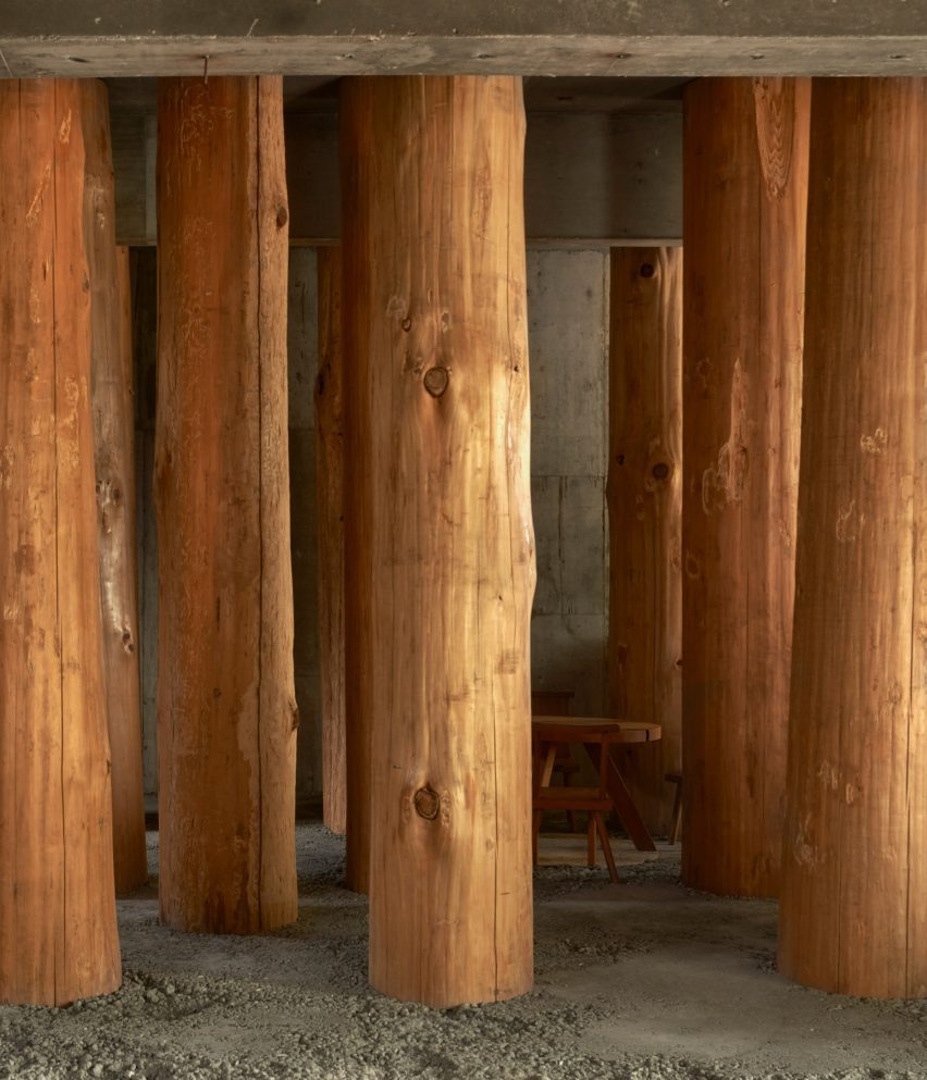
Columns made from thick wooden logs fill this office in Nagoya City, Japan, created by local studio Tomoaki Uno Architects at the base of a former apartment block.
Named Forest Office, the small workspace was commissioned by a client who simply requested that “something interesting” be created within half of his office space.
It was Tomoaki Uno Architects‘ second commission by the client, with the first being a sky-lit dwelling nearby named Ogimachi House.
Tomoaki Uno Architects has created Forest Office in Japan
“There were no specific requirements for [the project],” studio founder Tomoaki Uno told Dezeen.
“As someone who usually works within functional constraints, this was an exciting opportunity for me,” he continued.
Drawing on the site’s natural surroundings and a nearby shrine, Tomoaki Uno Architects prioritised natural materials and rough finishes to create an atmospheric, multipurpose space.
The workspace is filled with columns made from thick wooden logs
“I had long been inspired by the unique atmosphere I felt every time I walked along the approach to Ise Shrine,” said Uno.
“I knew that the irregular rows of large trees had a strong influence on this feeling. Therefore, I thought about using thick logs as a metaphor and seeing if I could recreate something similar,” he continued.
A table is nestled at the centre
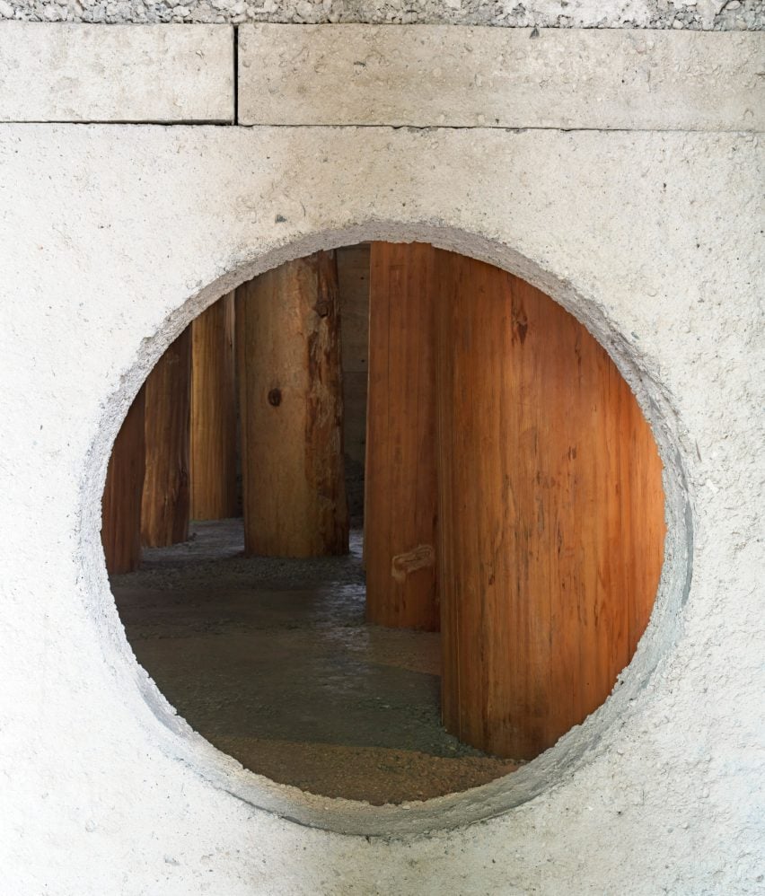
Inside, the concrete of the existing structure has been left exposed. It is teamed with a new floor and wall with a circular opening, both made of concrete with a rough aggregate.
Large wooden logs, stripped of their bark and spaced equally in a grid, are set into the concrete floor to create the feeling of being in a forest.
Due to their size, the trunks had to be brought into Forest Office horizontally, before being hoisted into position and cast into the concrete floor.
One of these trunks could not fit in the planned location, and all of them ended up being slightly tilted and displaced during construction, which Uno embraced as “serendipity”.
The columns are set into the rough concrete floor
“In a nutshell, this is a question of how to deal with nature,” said Uno. “Whether consciously or not, architects are constantly being questioned in every aspect of how they approach nature and their thoughts,” he continued.
“I explored unbuilt boundaries with this project, and I wanted to confirm that the presence of the spirit felt in nature is the origin of architecture.”
A wall with a circular opening has been added
A kitchenette and bathroom occupy one corner of Forest Office, while a small table and chairs nestle between the large trunks at the centre.
Tomoaki Uno Architects was founded by Uno in Nagoya in 1990. Its previous projects include a concrete home with an Aztec-informed pyramid and a minimal concrete home illuminated by dramatic light wells, both of which are also located in Nagoya.
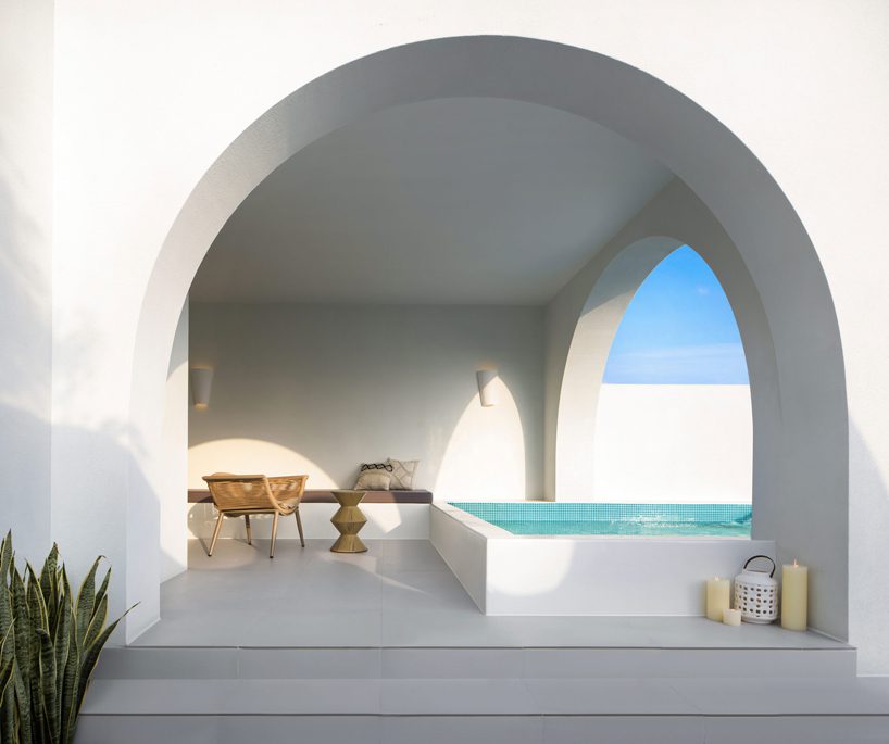
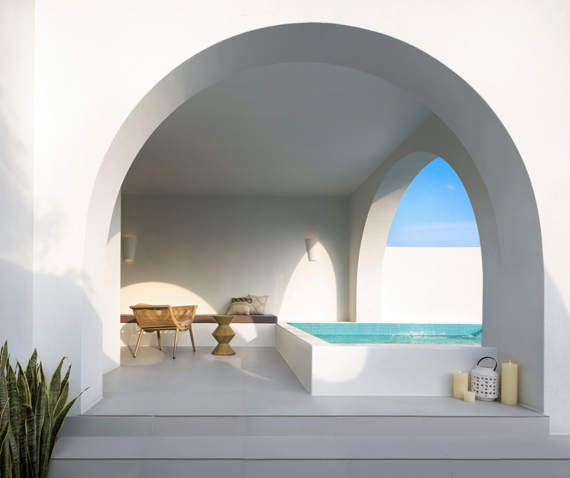
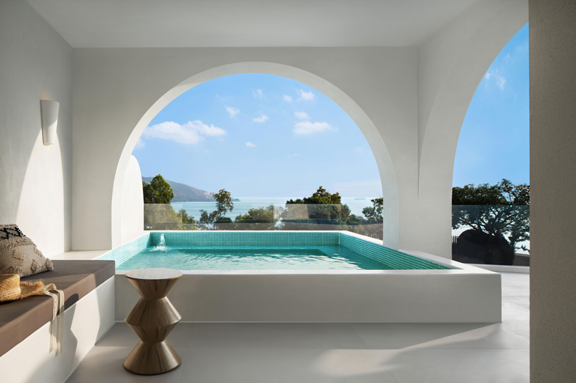
Miyue · Blue & White Cliffside Resort by GS Design
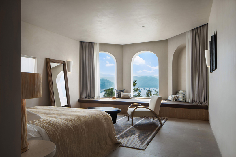
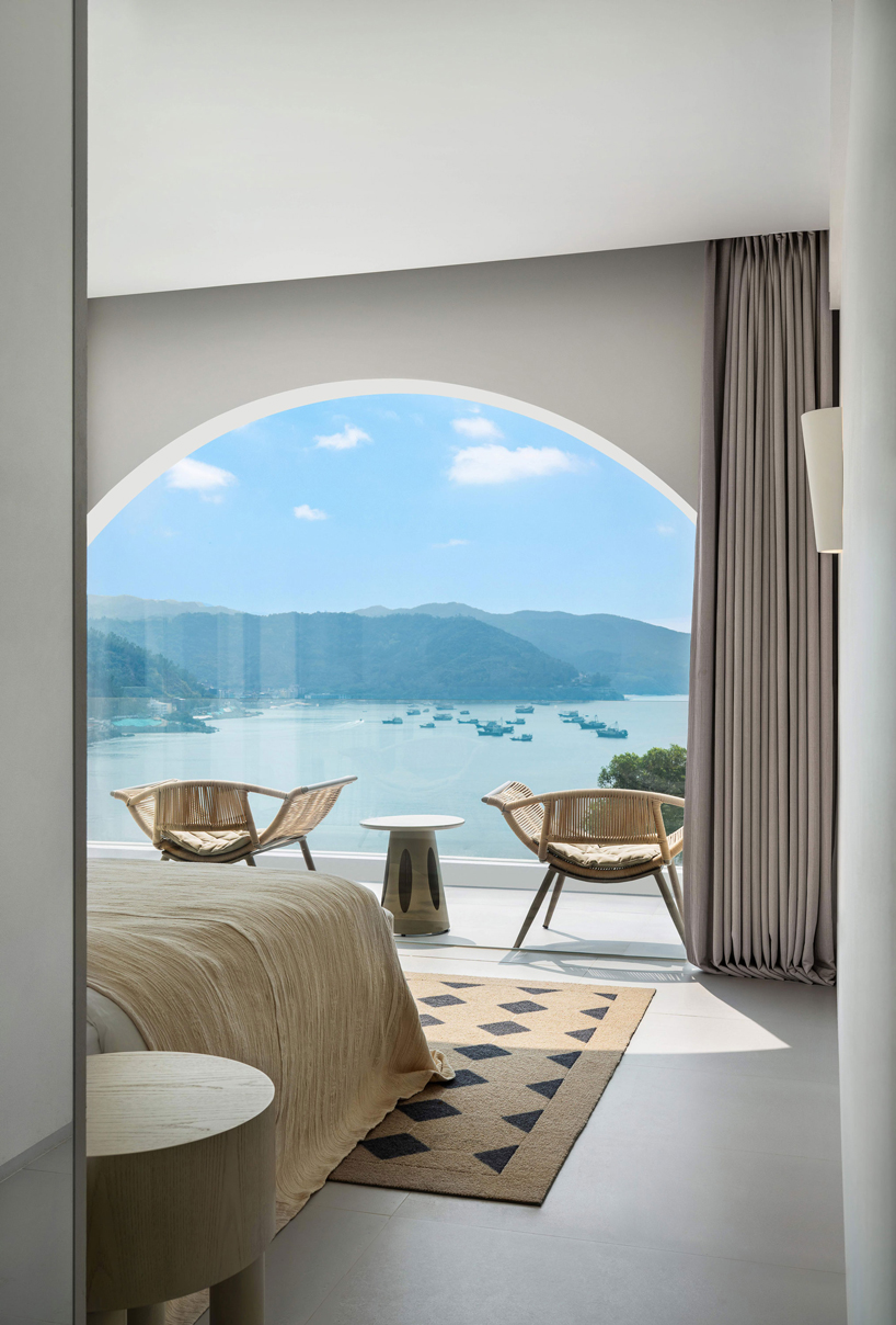
GS Design realizes the ‘Miyue · Blue & White Cliffside Resort‘ on the south coast of China, redefining the concept of ‘elegant vacation’ and focusing on ‘spatial experience’. Located amidst mountainous views in Shenzhen, the hotel incorporates a predominantly white color palette throughout, creating an aesthetic clarity that complements the expanses of blue sea and sky surrounding the structure. The architectural practice composes a series of elegantly minimalist spaces in a warm, uncluttered style, and with subtle materials that reflect the natural environment. The accommodation unit arranges 25 rooms with a unique interior design and character. The core element of each room is the formation of various caves, baths, and arches which provide framed views of the landscape.
all images by GS Design
a sensory experience of urban vacation
Architectural practice GS Design focuses on the ‘spatial experience’ of the composed resort exploring the architectural potential in color, light, and texture forming a ‘pioneering model of urban vacation’. Redefining the term ‘elegant vacation’, the design integrates the building with the surrounding environment ‘unlocking the relationship between physical space and perceptual experience behavior’. The material selection of the public zones applies natural bamboo and wood allowing the natural landscape to become part of the interior. Pure white sets as the main tone of the entire building contrasting the framed blue sea and sky.
The rugged cave baths ensure direct contact with the outdoor area securing privacy and transparency. The terrace bubble pool reflects the ever-changing shadowplay during the day. Through the visual, tactile, and auditory sensory experience and the design team’s constant and progressive exploration to connect daily life and leisure, the hotel shapes a contemporary urban vacation retreat.
the hotel incorporates a predominantly white color palette throughout the structure
formed arches provide framed views of the landscape
each room enjoys unique outlooks of the mountainous scenery
white hues and subtle materials complement the framed expanses of blue sea and sky
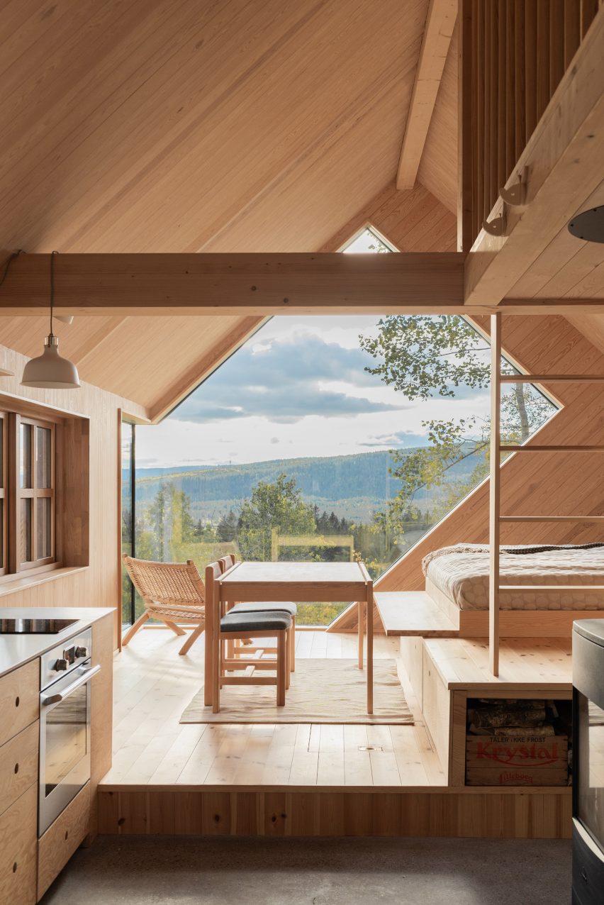
From Norway to New Zealand, this lookbook explores rural cabins with cosy living areas that are animated by natural materials and views out over wild landscapes.
Cabins are a popular building typology with architects all around the world. Typically built from wood, the little shelters are ideally suited as peaceful retreats in remote locations.
Their small size and the use of organic materials such as wood helps these structures to blend in with natural surroundings, while also creating warm and calming living spaces for inhabitants.
As demonstrated by this roundup, little else is needed to make a cabin cosy, and keeping their interiors pared-back retains focus on the main event – the views out to nature.
This is the latest in our lookbooks series, which provides visual inspiration from Dezeen’s archive. For more inspiration see previous lookbooks featuring interiors with statement carpets, earthy bedrooms with natural colours and hotel interiors enriched by jewel tones.
Photo is by James Brittain
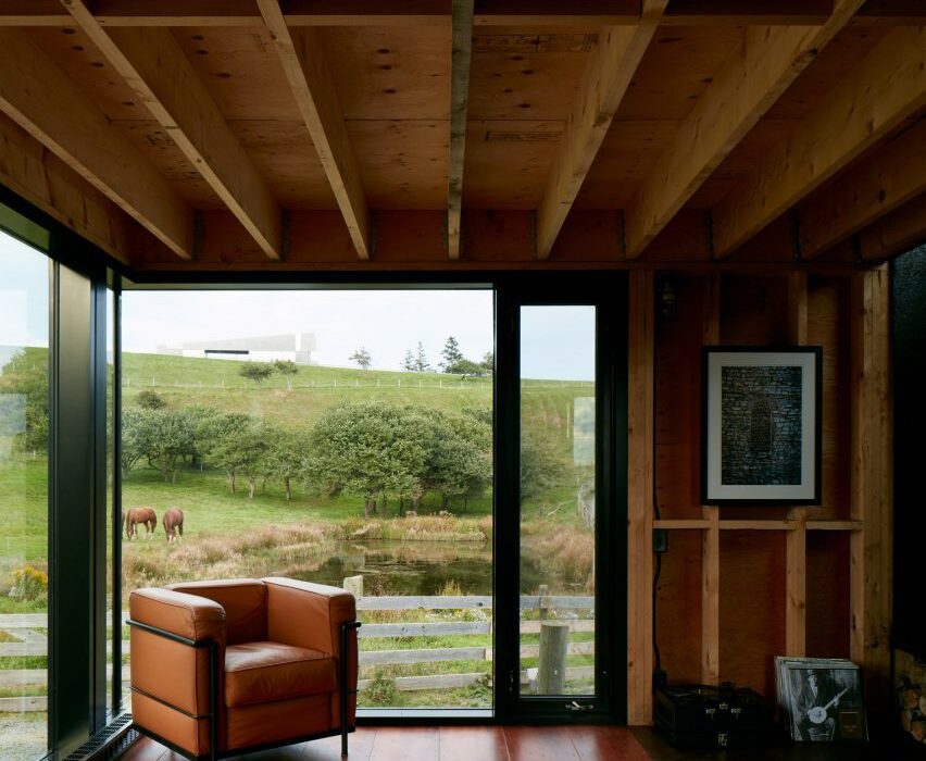
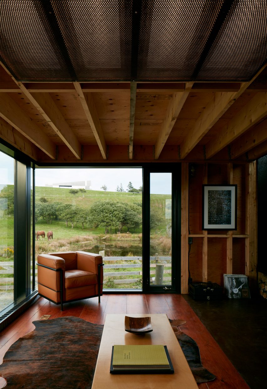
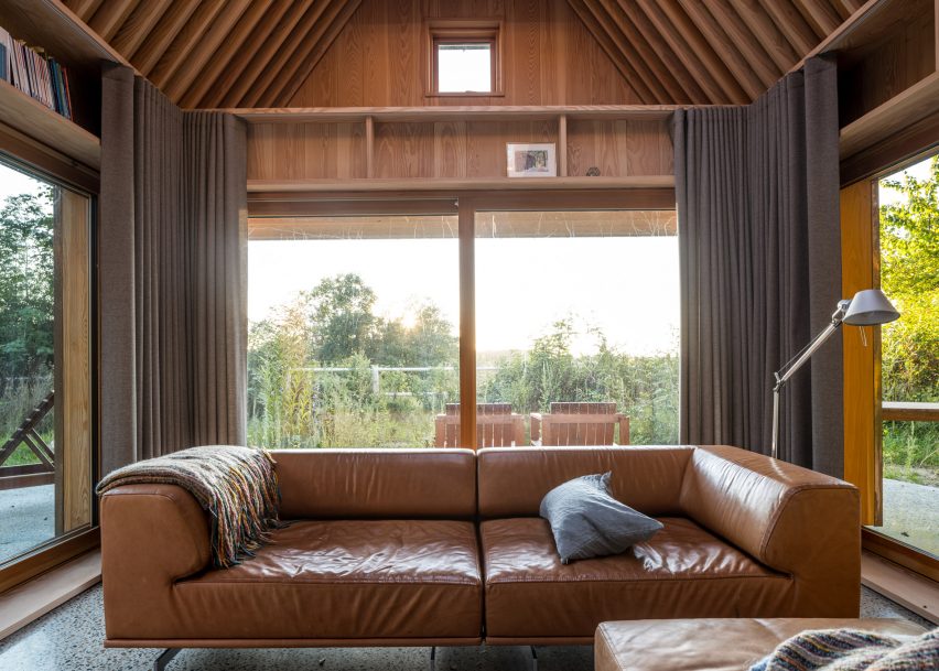
Enough House, Canada, by Brian MacKay-Lyons
Dark-stained floorboards complement the light and exposed timber beams and columns of this cabin on a farmstead in Nova Scotia.
Its living room has large windows for looking out over the rustic landscape but retains a sheltered feel with low ceilings, a soft rug and comfy leather furniture such as the 2 Fauteuil Grand Confort armchair by Le Corbusier.
Find out more about Enough House ›
Photo is by Tom Bird
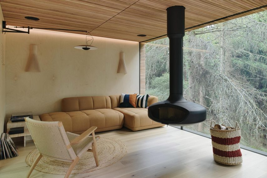
Looking Glass Lodge, UK, by Michael Kendrick Architects
A black fireplace is suspended from the ceiling of this sitting area, located in the Looking Glass Lodge in East Sussex.
The room has a pared-back design filled with woven furnishings and wooden surfaces, helping to ensure the focus stays on the floor-to-ceiling glazing.
According to its designer Michael Kendrick Architects, the studio’s aim was to give the cabin “a sense of transparency and belonging within its setting”.
Find out more about Looking Glass Lodge ›
Photo is by Jim Stephenson
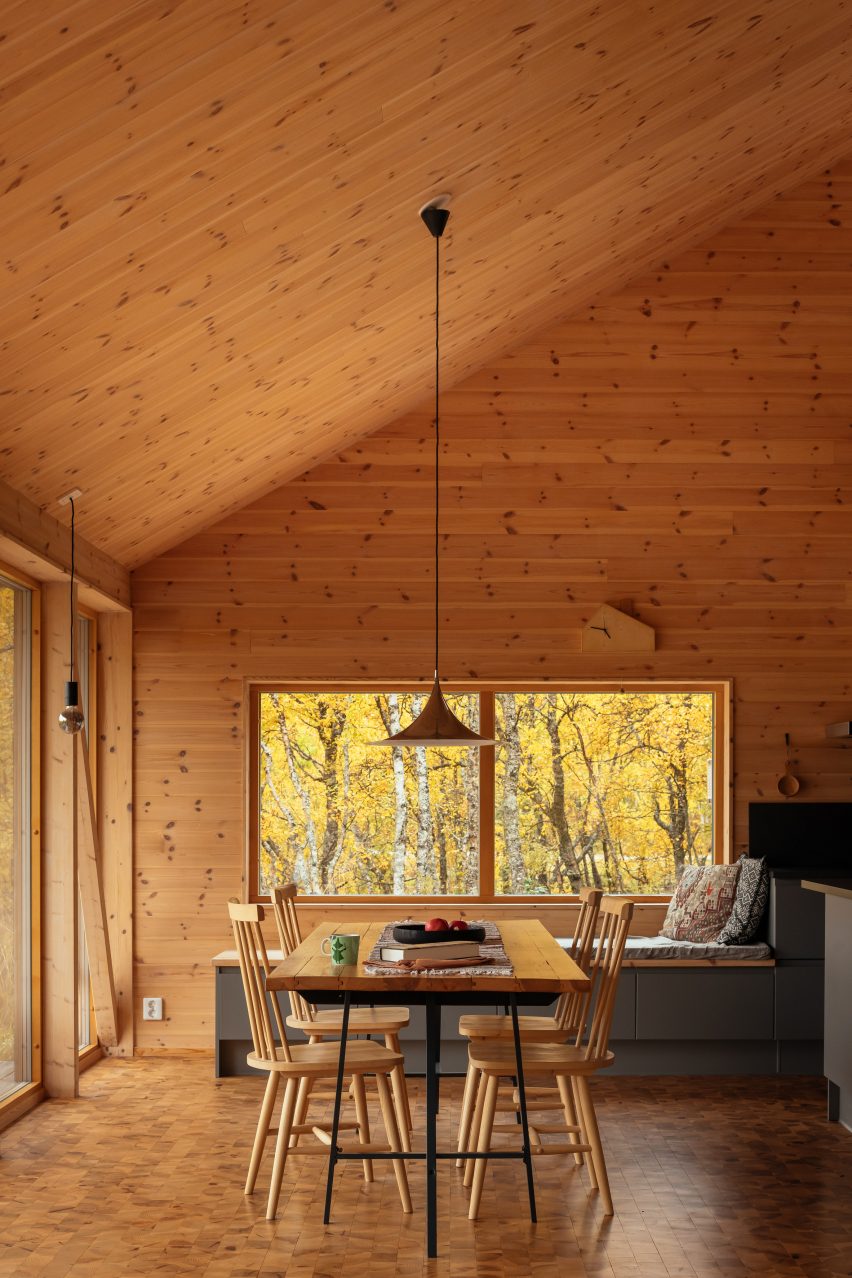
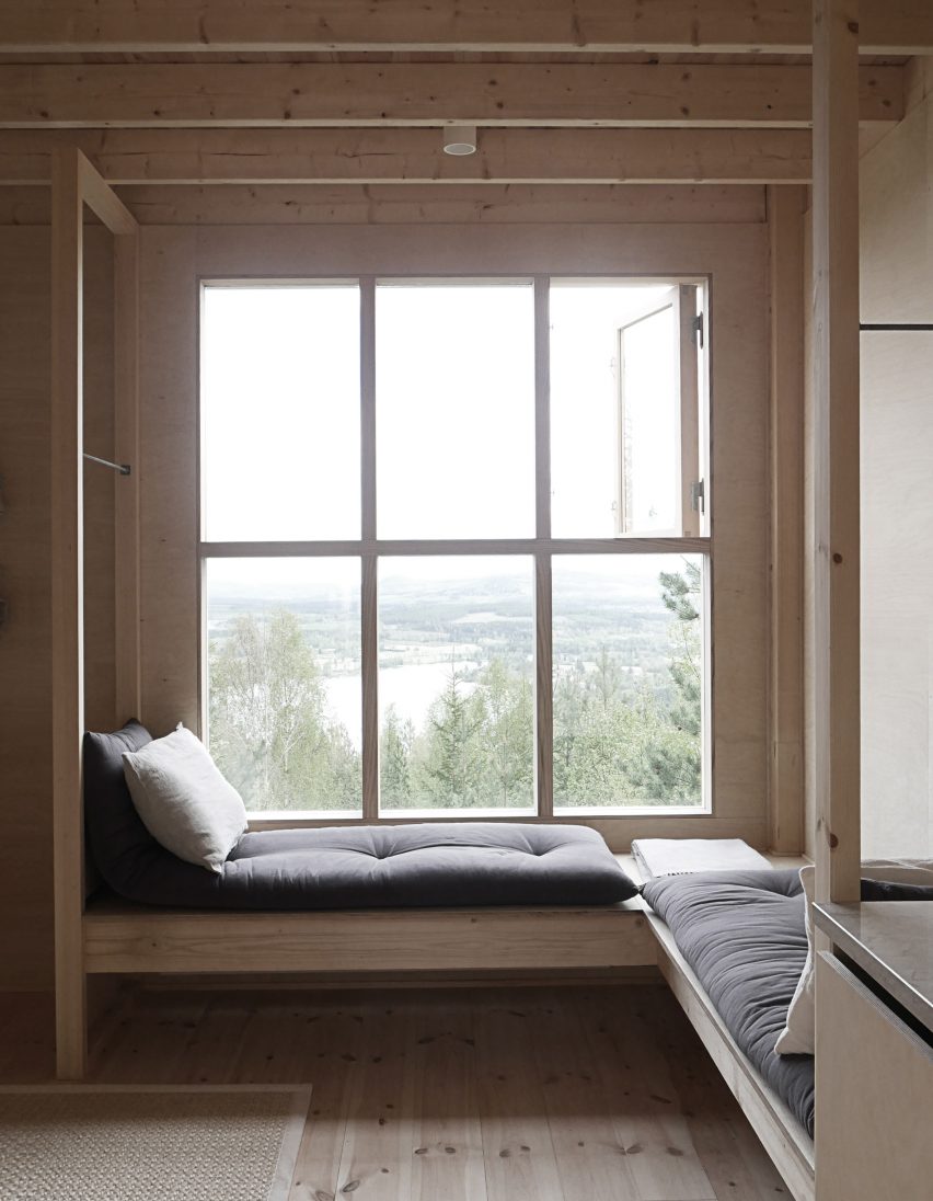
The Hat House, Sweden, by Tina Bergman
Despite its tall ceilings, The Hat House’s living-dining space has been made to feel snug with its warm material palette dominated by different woods.
These include spruce panels on the walls and end-grain spruce blocks for the floor. A cushioned window seat allows the owner to immerse themself in the view.
Find out more about The Hat House ›
Photo is by Rob Maver
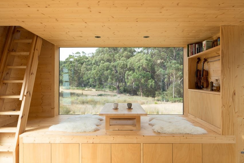
Bruny Island Cabin, Australia, by Maguire + Devin
Baltic pine lines almost every surface of this off-grid cabin in Tasmania, designed by Maguire + Devin with references to traditional Japanese houses.
Nearly every piece of furniture forms a part of the building’s frame, creating a minimalist and uncluttered interior. This includes a raised seating area, positioned beside a pane of glass and finished with a low-lying table and rugs for sitting.
Find out more about Bruny Island Cabin ›
Photo is by Stephen Goodenough
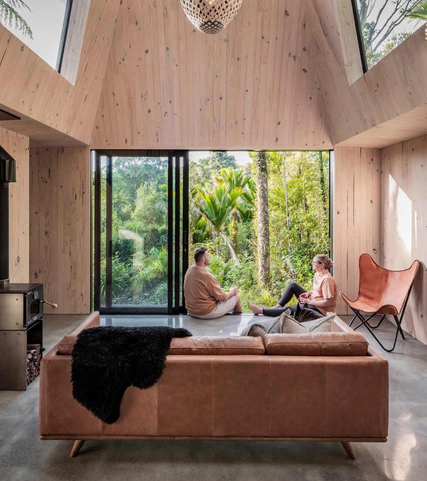
Biv Punakaiki, New Zealand, by Fabric Architecture
Hidden within the rainforest in the coastal village of Punakaiki, this holiday cabin has large spans of glazing that aim to immerse occupants in the landscape.
Furnishings are few and far between to prevent distracting from the view, but a homely feel is created through the warm and exposed timber structure and mid-20th-century furnishings including a leather butterfly chair.
Find out more about Biv Punakaiki ›
Photo is by Jordi Huisman
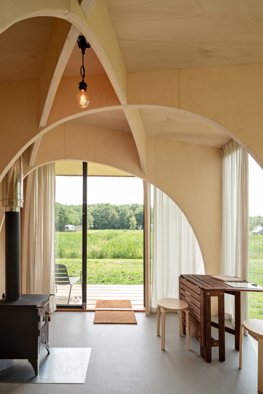
Forest Cabin, Netherlands, by The Way We Build
Arches made of poplar give a chapel-like character to this tiny mobile cabin, located on a campsite in the Robbenoordbos forest in the Netherlands.
Its compact living area is deliberately simple, furnished with just a writing desk and a wood burner for warmth and offering visitors a meditative space to “rejuvenate close to nature”.
Find out more about Forest Cabin ›
Photo is by Marcos Zegers
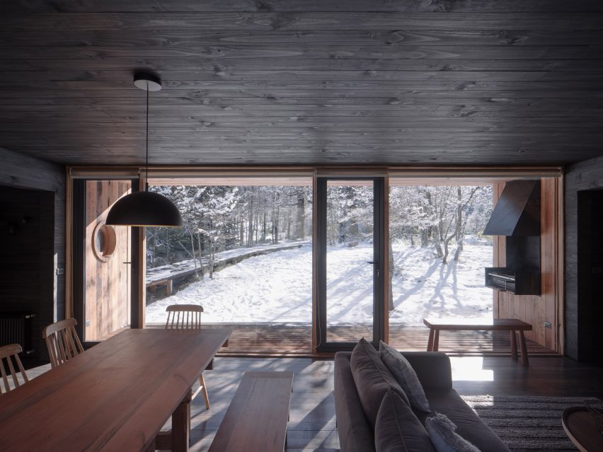
House by the Cautín River, Chile, by Iragüen Viñuela Arquitecto
Iragüen Viñuela Arquitectos opted for dark-stained wood for the interior lining of this ski cabin in Chile, creating a moody yet cosy living area where the outside views take centre stage.
“The interior of the house, completely covered in black wood, allows a great contrast with the white winter and green summer landscape, and offers an atmosphere of introspection and calm according to the vocation of shelter,” said the studio.
Find out more about House by the Cautín River ›
Photo is by Tom Auger
Cabin Nordmarka, Norway, Rever & Drage
An angular corner window animates the unadorned living room of Cabin Nordmarka that Rever & Drage recently completed in Norway.
The green and blue tones of the forested surroundings form a colourful backdrop to the elevated space, which is characterised by light timber planks and matching furniture.
Find out more about Cabin Nordmarka ›
Photo is by Rasmus Hjortshøj, Coast
The Author’s House, Denmark, by Sleth
Landscape studio Sleth designed this writer’s cabin to blend in with its natural setting on the outskirts of Aarhus.
Douglas fir planks line the living room, creating a cosy retreat for the owner while echoing the surrounding trees. Bookshelves at the base of its gabled profile help reduce the height of the room, making it feel even more snug.
Find out more about The Author’s House ›
Bergaliv Landscape Hotel, Sweden, by Hanna Michelson
This compact wooden cabin nestled in the treetops of a Swedish mountain is one of four designed for the Bergaliv Landscape Hotel.
Like many other cabins on the list, the interior is simply finished. This draws attention to a wooden L-shaped bench and window seat, designed for visitors to get lost in the views out over the landscape.
Find out more about Bergaliv Landscape Hotel ›
This is the latest in our lookbooks series, which provides visual inspiration from Dezeen’s archive. For more inspiration see previous lookbooks featuring interiors with statement carpets, earthy bedrooms with natural colours and hotel interiors enriched by jewel tones.
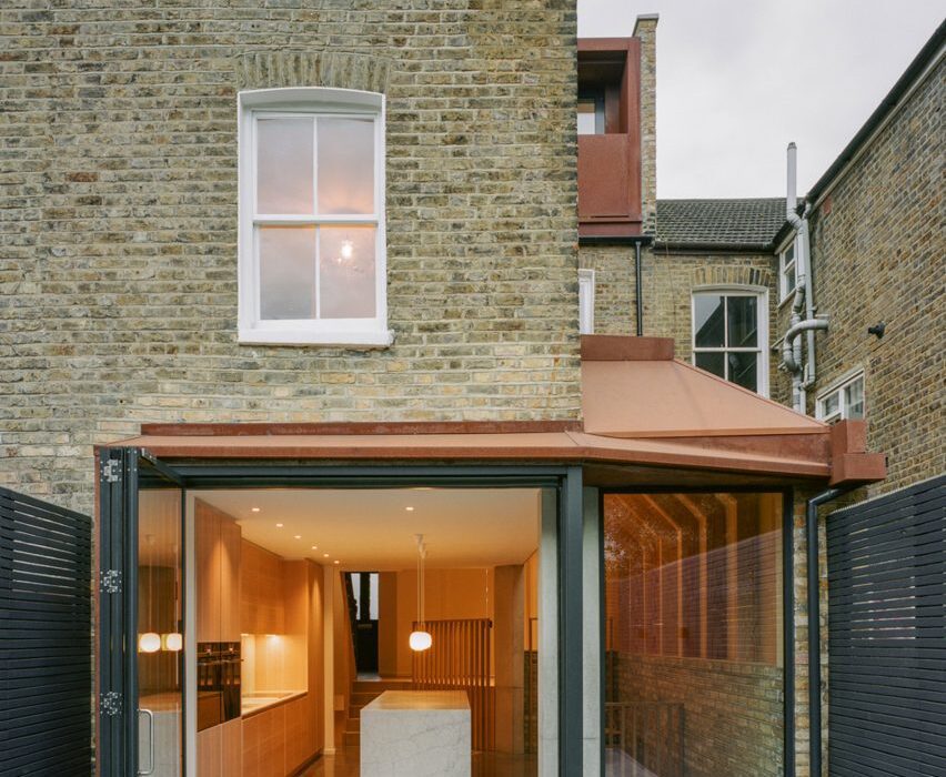
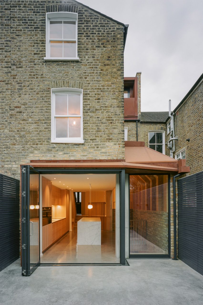
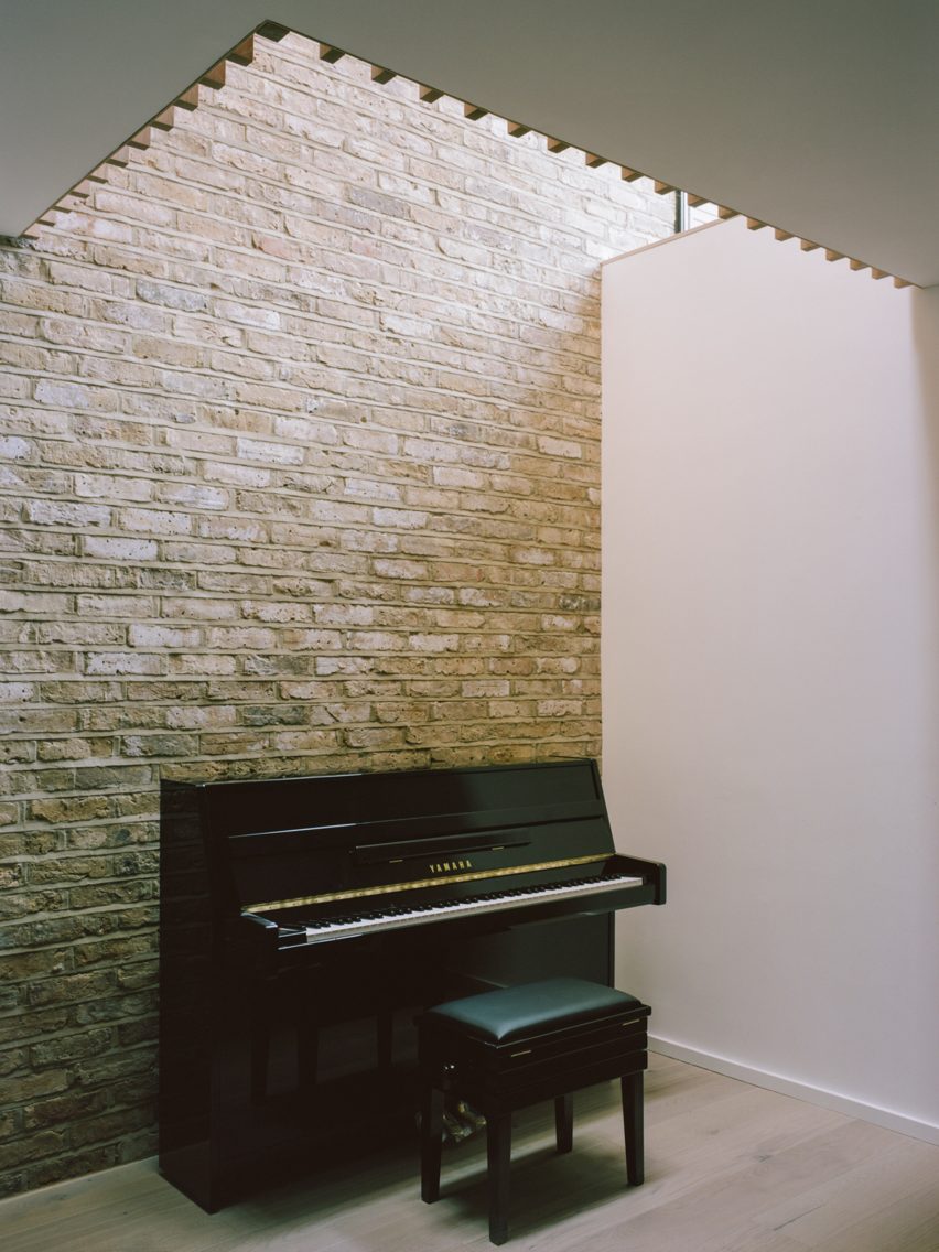
Matthew Giles Architects used white oak joinery and different floor levels to break up the open-plan ground floor of this redesigned and upgraded six-bedroom house in Wandsworth, London.
The Victorian terraced house belongs to a young family that wanted to create a home that was more suited to entertaining and having relatives stay over.
A small rear extension was added
Originally a four-bedroom house, London practice Matthew Giles Architects was asked by the owners to add two bedrooms and a basement for services and storage.
The family wanted to enhance the connection between inside and outside, as well as improve the light flow and visual connections throughout the house.
To create extra space, the architects added a side-return and a small rear extension with a Corten steel roof, a loft extension and a basement floor. These additions increased the internal floor area from 155 square metres to 216 square metres.
Light and neutral tones define the home
“With a small courtyard garden at the rear, the size of the ground floor extension was designed to strike a balance between internal space gained and loss of garden,” Giles told Dezeen.
“Although modest, the ground floor extension acts as a tool for enhanced light flow throughout the ground and basement levels. The vaulted side extension provides much-needed height to create a sense of light and space.”
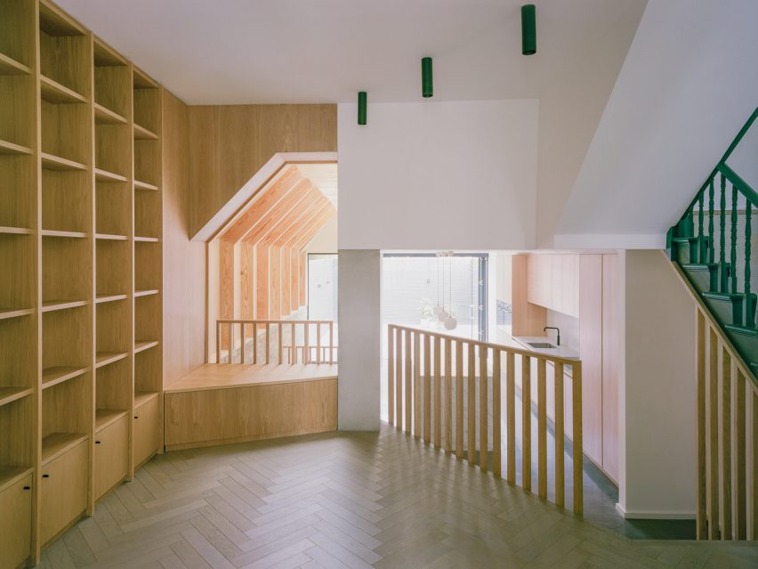
A reading nook has been created on the ground floor
The interior is finished with a neutral palette of raw materials such as timber, stone, concrete, timber and brick.
On the ground floor, at the front of the house, a new parquet flooring draws the eye through the lobby towards the light from the garden at the rear. Varying floor levels have been used to divide the narrow space into three distinct zones.
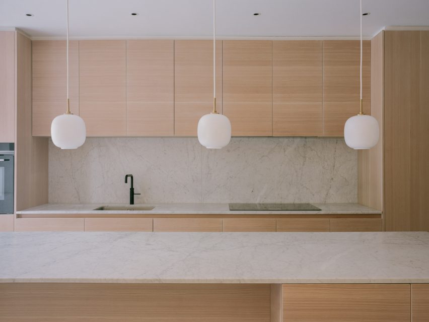
White marble surfaces were used in the kitchen
The first is an entrance area that faces onto the street, the second serves as a reading nook with white oak joinery and railings, and the third is a sunken kitchen and dining space that looks out over the garden through full-height glass doors.
The kitchen features Douglas Fir timber cranked beams, timber cabinetry, white Carrara marble surfaces and exposed London stock brickwork that covers the sidewall.
“The kitchen acts as a point around which other activities flow,” said the studio. “The exposed beams create an enhanced light quality and sense of order when looking along the length of the house towards the garden and framing views as you move through the house.”
Polished concrete floors were installed in the kitchen and dining area and on the adjoining external terrace to help blur the boundaries between inside and outside.
Parquet flooring adds texture to interior spaces
“The design has been executed so that in all areas there is an intimate connection with nature,” explained the architects. “Seated within the lofty, vaulted dining space the view out is framed by two in-situ cast concrete columns that are filleted to broaden the view.”
The basement houses a playroom area, a new ensuite bedroom and a utility room that is brightly lit by openings in the floor above and a capping skylight. The skylight also creates a visual connection between the playroom and the kitchen.
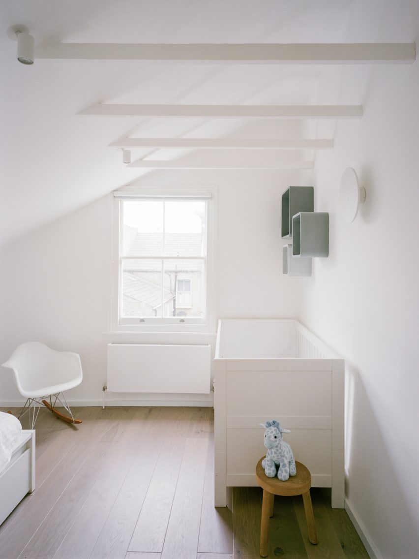
Neutral tones also feature upstairs
“This sectional approach adds a sense of drama,” said the practice. “The shadows drift down the brickwork wall and clouds are framed in the skylight two storeys overhead.”
The restrained colour and material palette is continued in the upstairs bedrooms and bathrooms with the addition of Tadelakt polished plaster in the bathroom.
A skylight floods the basement with natural light
Matthew Giles founded his practice in 2020 after 12 successful years in collaboration with architect Tom Pike.
As half of Giles & Pike, he completed a number of residential projects across the capital, including a stepped glass extension to a house in Putney, the conversion of a Victorian workshop into a home and a timber-clad residence designed for a tiny plot.