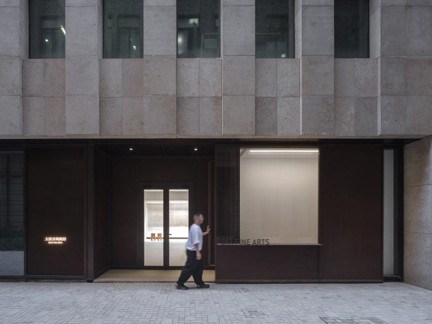
Neri&Hu highlights simplicity and functionality at Shanghai art gallery
Chinese studio Neri&Hu has designed a contemporary art gallery for Ota Fine Arts in Shanghai with a focus on the “sublime beauty of the banal”.
The gallery sits on the ground floor of a mixed-use tower at Rockbund, a development amidst the historical Bund in Shanghai along the Huangpu River, where a series of restored colonial art deco buildings are located.


“The primary design challenge was to utilise the areas along the facade for both storage and display, blurring the distinction between functional and experiential space,” explained Neri&Hu.
“This deepened threshold condition found on both facades defines the visitor’s arrival sequence and journey within.”
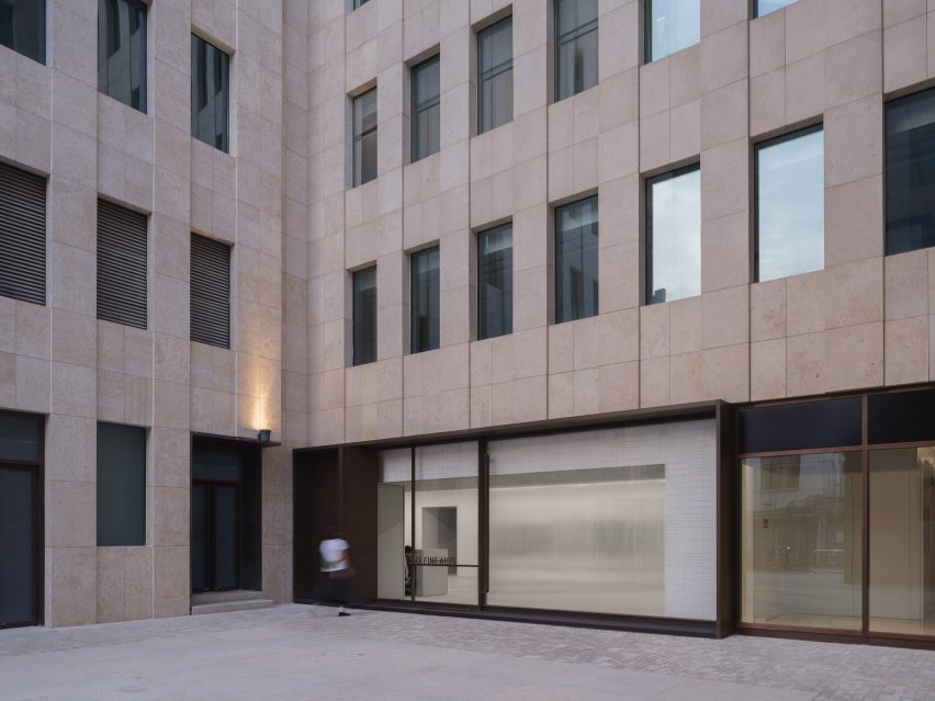

The facade of the gallery was framed in aged steel, with portions of solid metal and large glass panels arranged to form a window display for the artworks.
Handmade ivory tiles line the inner side of the window in a subtle woven pattern, serving as a neutral backdrop for the art pieces.
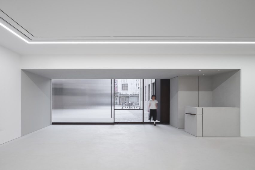

An oversized sliding door marks the entry to the gallery on the eastern facade. When opened, the entrance of the gallery is revealed, with the outer sliding door framing the window display next to it.
When closed, the door slides back to its original position and allows the full-height glazed window to be exposed.
The western facade features a warehouse-sized door that can be fully opened using a custom-designed handle. This allows large artworks to be delivered directly from a designated parking area into the gallery.
Neri&Hu also added fluted glass to the exterior, which glows in the evening to illuminate the adjacent Rockbund courtyard and add elegance to the functional facade.
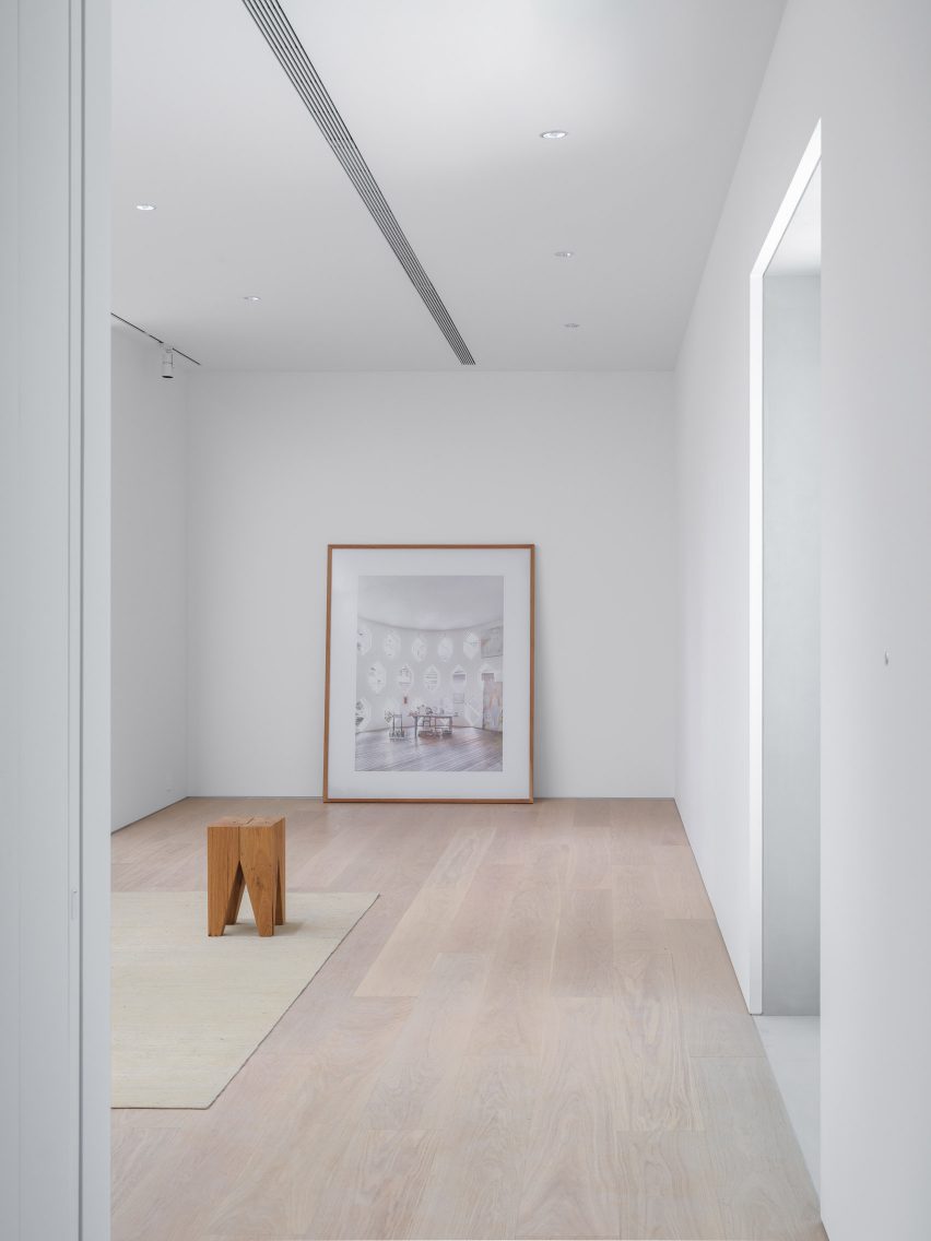
Inside the gallery, the 350 square-metre space is divided into two zones – a 150-square-metre main public viewing gallery and a private zone that houses VIP rooms and office space.
The pared-back, white VIP rooms feature contemporary furniture pieces with custom-made white tiles and a stained oak floor and were designed to create a relaxing environment, in which the attention can be focused on the art itself.
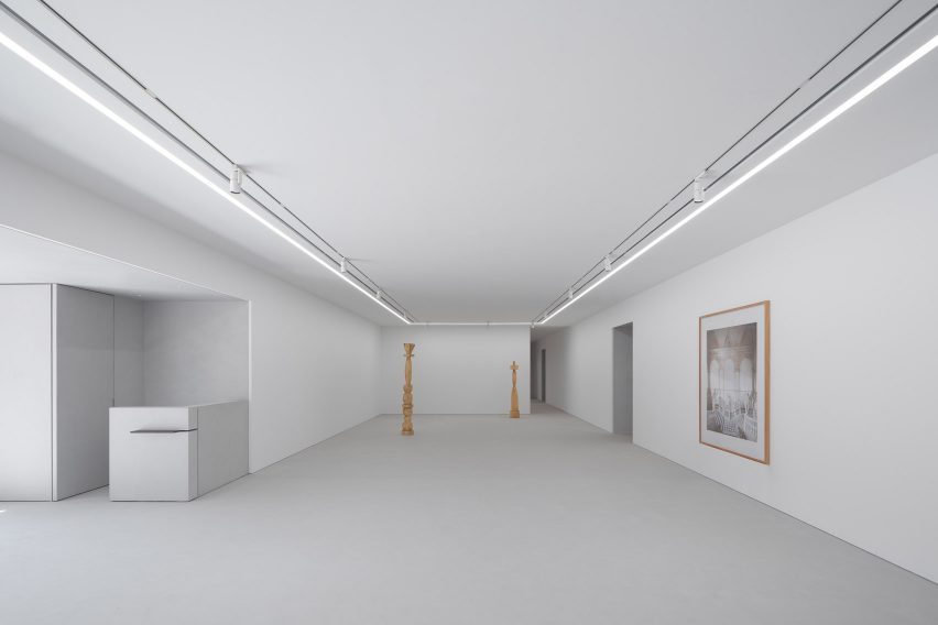

“The project’s understated material palette and overall conceptual underpinning lies in the juxtaposition of old and new, raw and refined, ordinary and spectacular,” said Neri&Hu.
“We hope one can appreciate the sublime beauty of the banal, as much as the brilliance of contemporary art,” it added.

Neri&Hu was founded by architects Lyndon Neri and Rosanna Hu in 2004 in Shanghai.
Other recent projects completed by the studio include the Sanya Wellness Retreat hotel on the Chinese island of Hainan and a fashion boutique with fabrics and marble screens.
The photography is by Zhu Runzi.
Project credits:
Partners-in-charge: Lyndon Neri, Rossana Hu
Associate-in-charge: Jacqueline Min
Senior interior designer-in-charge: Phil Wang
Design team: Rovi Qu
FF&E procurement: Design Republic
Contractors: ETQ Project (Shanghai) Limited

