Moooi furnishings “tell a different story on every floor” of Art Legacy Hotel
CategoriesInterior Design

Moooi furnishings “tell a different story on every floor” of Art Legacy Hotel

Father and son architect duo Luís and Tiago Rebelo de Andrade explain how they furnished Lisbon’s Art Legacy Hotel entirely with Moooi products in this video produced by Dezeen for the Dutch furniture brand.

Lisbon practice Rebelo De Andrade designed the interiors of the five star Art Legacy Hotel, located in the Baixa-Chiado district in the city’s centre.

The hotel is notable for its exclusive use of Moooi products and rooms with bold primary colour schemes.
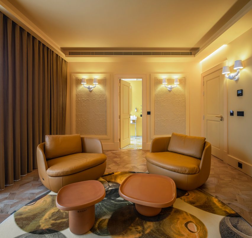
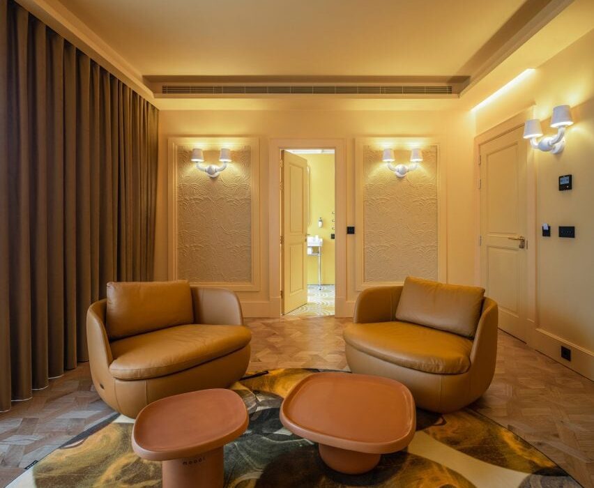
A suite with a yellow colour scheme in the Art Legacy Hotel in LisbonA suite with a yellow colour scheme in the Art Legacy Hotel in Lisbon
Art Legacy Hotel is a five star hotel in Lisbon

“Hospitality is always about image and stories,” said Luís Rebelo De Andrade, founder of the studio, in the exclusive Dezeen video interview. “We wanted the guests, when they come to this hotel, to have a completely unexpected experience.”

“So, we proposed to our client that we make a hotel with only Moooi products, to give it a very strong identity.”

Moooi’s products were used throughout the hotel, including carpets, furniture, lighting, wall coverings and art pieces.

“Moooi is everywhere in the building,” said Tiago Rebelo De Andrade, who is partner and principal architect at the studio and Luís Rebelo De Andrade’s son. “When you enter the hotel, all the colours, all the textures, all the furniture from Moooi helps us to tell a different story in every floor.
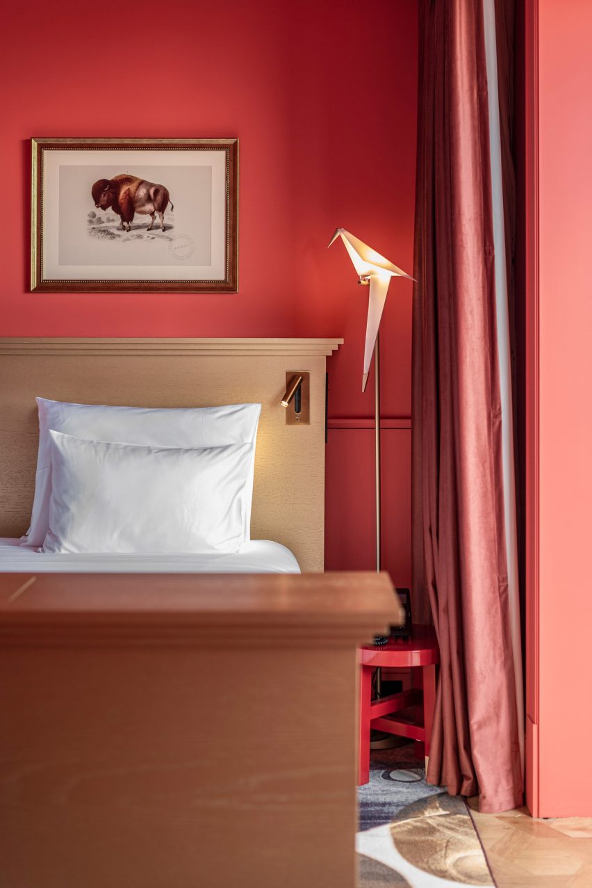
A room with a red colour scheme and Moooi lighting in the Art Legacy HotelA room with a red colour scheme and Moooi lighting in the Art Legacy Hotel
Rebelo De Andrade furnished the Art Legacy Hotel entirely with Moooi products

The project is a renovation of a historical office building. Alongside overhauling the hotel’s interior, Rebelo De Andrade also redesigned its facade.

According to Tiago Rebelo De Andrade, Moooi’s blend of modernity and classical references suited the studio’s approach to designing the hotel’s interiors.

“Moooi is classic but in a way that can also be modern,” he said. “It’s a modern-classic building.”
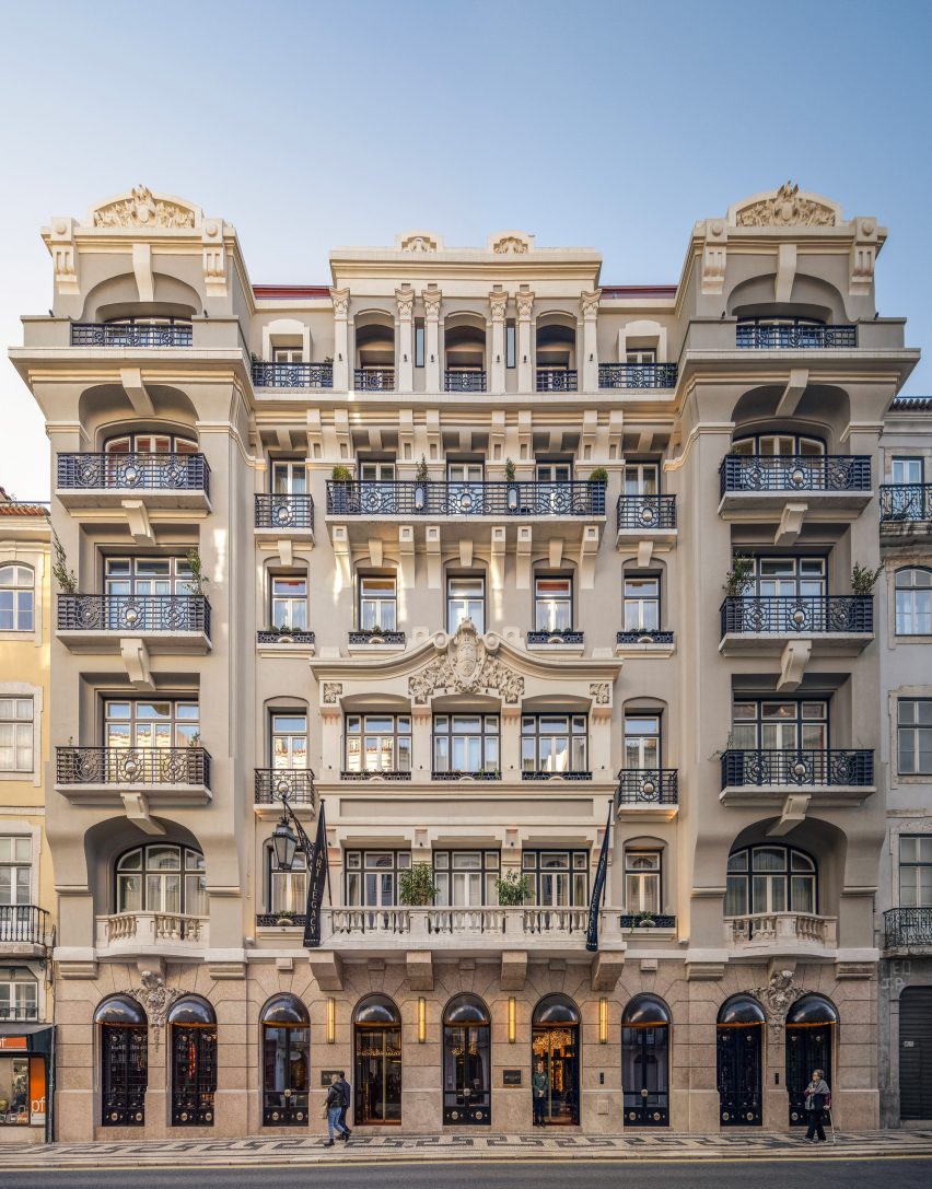
The facade of Art Legacy HotelThe facade of Art Legacy Hotel
Art Legacy Hotel is a renovation of a historic building in Lisbon’s centre

Luís Rebelo De Andrade decided to partner with Moooi on the hotel’s interiors after visiting the brand’s Museum of Extinct Animals exhibition at Milan design week in 2018.

Each room in the Art Legacy Hotel has either a blue, red, yellow or green colour scheme, with matching wall coverings, furniture and tiling in the bathrooms.

“When I first met Moooi’s products, I felt that it uses a lot of primary colours,” he said. “So I used primary colours in a very strong way in the hotel. They are colours that provoke you.”
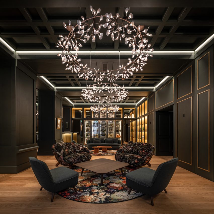
Lobby of Art Legacy Hotel in LisbonLobby of Art Legacy Hotel in Lisbon
Moooi’s lighting, furniture, wall coverings and carpets are used throughout Art Legacy Hotel

In the video interview, the duo also discussed their working relationship.

“My son, he provokes me,” said Luís Rebelo De Andrade. “We had to educate ourselves on how to work together.”

“I offer my experience, he offers his youth in projects,” he continued. “So I think it’s a good mix.”
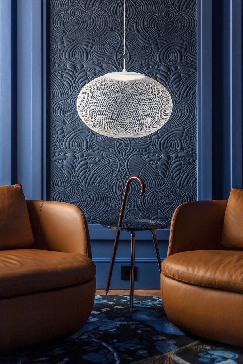
A room with a blue colour scheme and Moooi furnishings in Lisbon's Art Legacy HotelA room with a blue colour scheme and Moooi furnishings in Lisbon's Art Legacy Hotel
Rebelo De Andrade used primary colour schemes in Art Legacy Hotel’s rooms

“It’s difficult because it’s a father and son relationship,” added Tiago Rebelo De Andrade. “We are always arguing, but at the end of the day, we drink a bottle of wine so that we can make peace with each other.”

Other recent projects from Moooi include the IDEO-designed Pallana suspension lamp, made up of adjustable ring lights, and the rope-like Knitty Chair designed by Nika Zupanc.

The photography is by João Guimarães.

Partnership content

This video was produced by Dezeen for Moooi as part of a partnership. Find out more about Dezeen’s partnership content here.

Reference

India Mahdavi enlivens Rome’s Villa Medici with bold geometric furnishings
CategoriesInterior Design

India Mahdavi enlivens Rome’s Villa Medici with bold geometric furnishings

Architect India Mahdavi has updated six rooms within Rome’s 16th-century Villa Medici to feature an array of contemporary and colourful furniture.

The intervention comes as part of a three-year project called Re-enchanting Villa Medici, which was launched in 2022 to amplify the presence of contemporary design and craft within the Renaissance palace.

India Mahdavi revamps Villa Medici in Rome
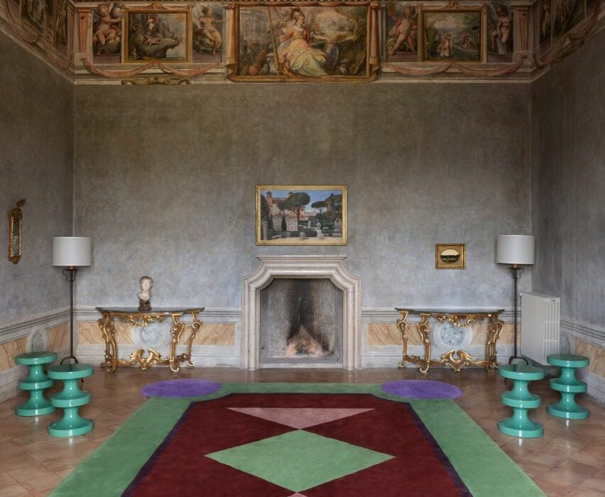
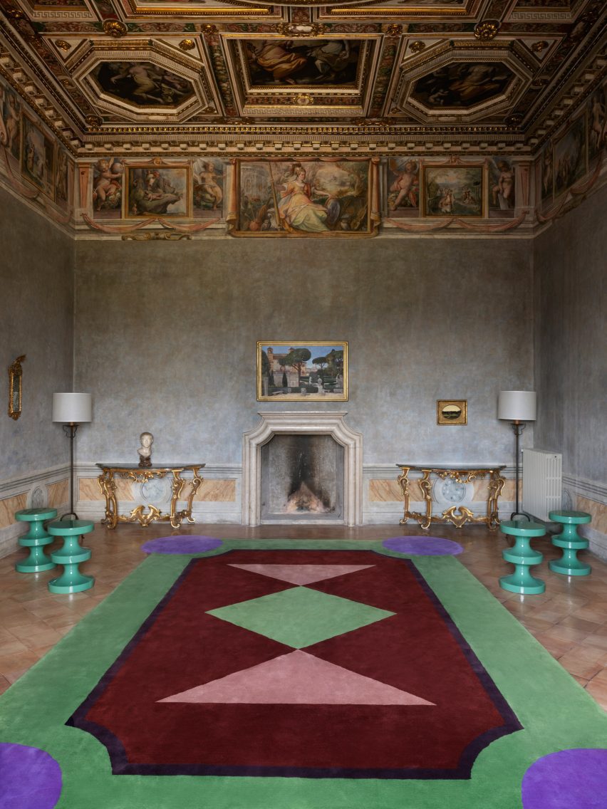
India Mahdavi has furnished six rooms inside the Villa Medici including the Chamber of the Muses (above) and the Lili Boulanger room (top image)

While the first phase of the project saw fashion brand Fendi revamp Villa Medici’s salons, Mahdavi was asked to freshen up rooms on the building’s piano nobile or “noble level”, where the main reception and the bedrooms are housed.

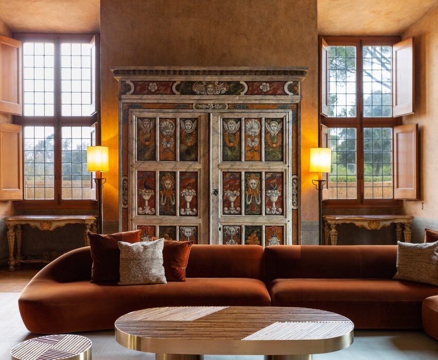
She worked on a total of six spaces including the Chamber of the Elements, Chamber of the Muses and Chamber of the Lovers of Jupiter, which once served as an apartment to Cardinal Ferdinando de Medici.

India Mahdavi revamps Villa Medici in Rome
Several of Mahdavi’s Bishop stools were integrated into the design

The three other rooms – titled Debussy, Galileo and Lili Boulanger – were formerly used as guest quarters.

In the Chamber of the Muses, which is topped with a dramatic coffered ceiling, Mahdavi inserted sea-green editions of her Bishop stool alongside an enormous hand-tufted rug by French workshop Manufacture d’Aubusson Robert Four.

Its geometric design features green, purple, red, and rosy pink shapes, recalling the flowerbeds that appear across the villa’s sprawling gardens.

India Mahdavi revamps Villa Medici in Rome
Chairs were reupholstered with eye-catching raspberry-hued velvet

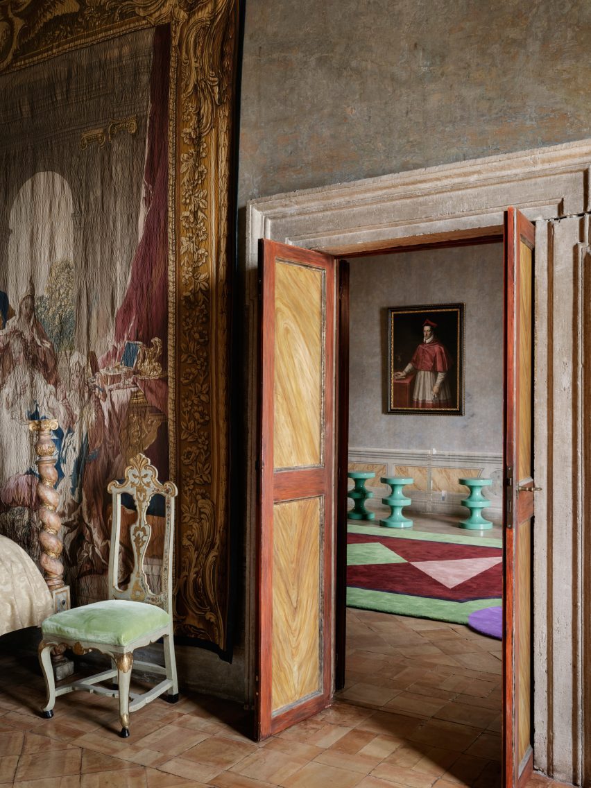
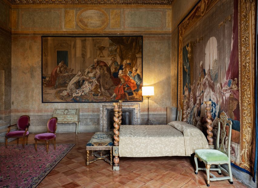
Only subtle alterations were made to the Chamber of the Elements and Chamber of the Lovers of Jupiter, where Mahdavi has repositioned an existing bed to sit against an expansive wall tapestry.

Some of the chairs here were also reupholstered in raspberry-hued velvet.

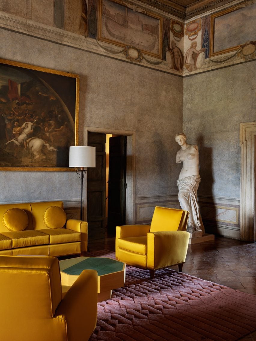
A cluster of bright yellow sofas and armchairs sourced from the French conservation agency Mobilier National was incorporated into the Lili Boulanger room, named after the first female composer to take up residence at the villa.

The furnishings sit on top of a blush-pink rug by French manufacturer La Manufacture Coglin and are accompanied by octagonal tables designed by Mahdavi.

India Mahdavi revamps Villa Medici in Rome
The Lili Boulanger room has a grouping of bright yellow sofas and armchairs

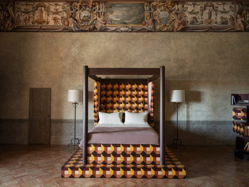
A Renaissance-style four-poster bed was added to the room named after astronomer Galileo Galilei, who reportedly visited Villa Medici twice in his lifetime.

The bed’s tiered wooden base and headboard were inlaid with graphic, berry-toned marquetry by cabinetmaker Craman Lagarde. The pattern, which also appears on the curtains that enclose the bed, takes cues from the design of the villa’s flooring.

India Mahdavi revamps Villa Medici in Rome
A grand four-poster bed is inlaid with berry-tone marquetry

A similar bed can be seen in the room named after French composer Claude Debussy. But this time, the marquetry done by French furnituremaker Pascal Michalon is executed in more “acidulous” colours that Mahdavi said reminded her of Debussy’s piano piece Clair de lune.

Mahdavi has lent her distinctive colour-rich aesthetic to a number of significant venues. Recent examples include the lavish London restaurant Sketch, to which she added sunshine-yellow and golden furnishings.

The photography is by François Halard.


Reference

Fendi introduces modern furnishings to Rome’s historic Villa Medici
CategoriesInterior Design

Fendi introduces modern furnishings to Rome’s historic Villa Medici

Italian fashion brand Fendi has teamed up with the French Academy in Rome to refresh six salons inside the Villa Medici – a 16th-century Renaissance palace set amongst sprawling gardens in the heart of Rome.

The villa has been home to the French Academy in Rome since 1803, and today is used by the French art institute to host creative residencies and public art programmes.

Petit Salon, home of the French Academy in Rome
Fendi has introduced new furnishings to Rome’s Villa Medici

The building’s salons had not been significantly modified in some 20 years, leading the academy to initiate a revamp in the hopes of establishing a better connection between the centuries-old rooms and contemporary design.

Fendi was brought on board to consult on Villa Medici’s interior scheme alongside Mobilier National – France’s national furniture collection and conservation agency.

The project also saw the academy call in French architect Pierre-Antoine Gatier to restore some decorative features of the Grand Salon, while conservation specialist Bobin Tradition carried out preservation work on the building’s existing wall hangings.

Salon des Pensionnaires in Villa Medici, home of the French Academy in Rome
Umbrella pine trees informed the shape of the table in the Salon des Pensionnaires

Fendi’s artistic director of couture and womenswear Kim Jones worked with Silvia Venturini Fendi, the brand’s artistic director of accessories and menswear, as well as Mobilier National to curate a selection of modern French and Italian furnishings for the salons.

Many of the pieces were pulled from Fendi Casa, the brand’s homeware collection, and chosen for their ability to slot in amongst the building’s existing heritage pieces and classical artworks.

Salon Bleu, home of the French Academy in Rome
Noé Duchaufour-Lawrance’s tables for the Salon Bleu mimic ancient Roman paving slabs

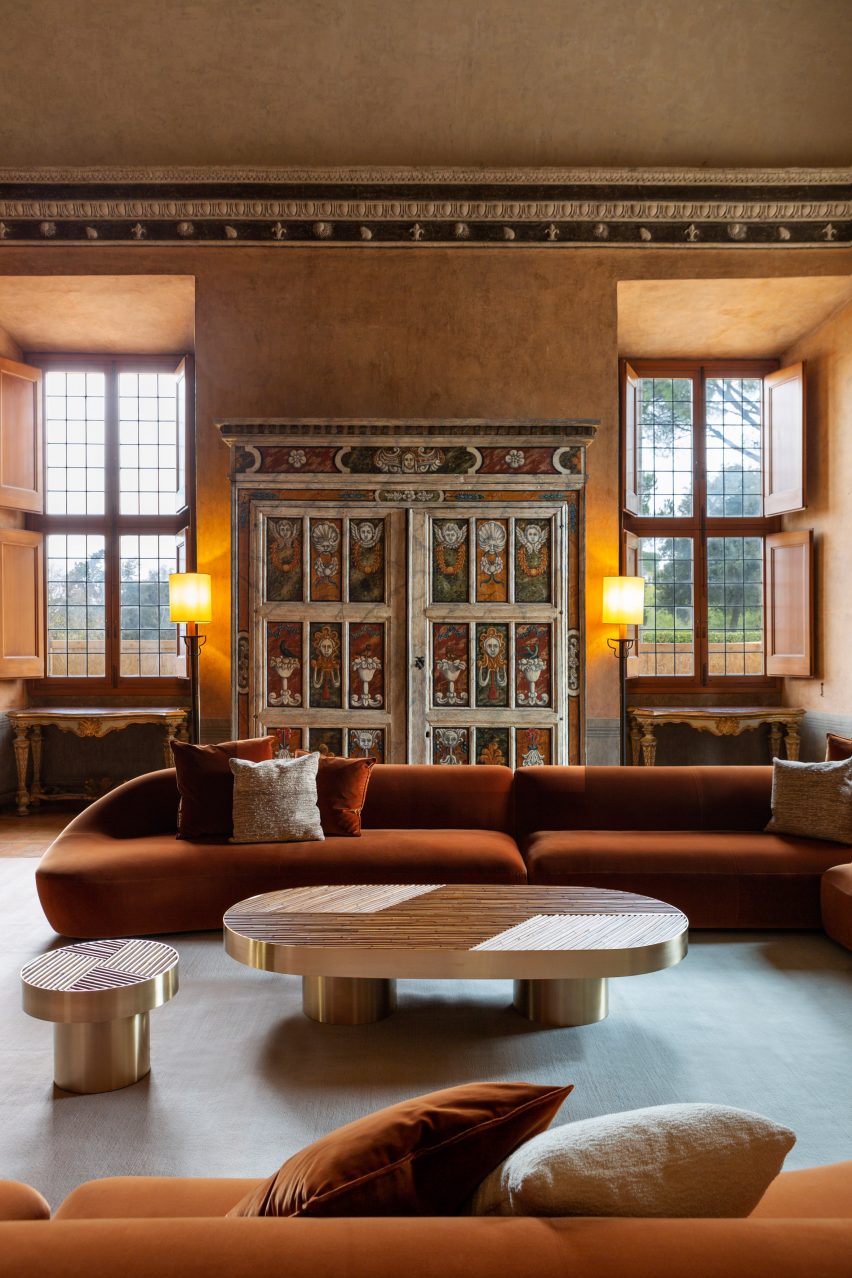
The focal point of the Petit Salon is now a huge modular sofa by Milan-based designer Toan Nguyen, upholstered in a rust-orange fabric that matches the colour of the walls.

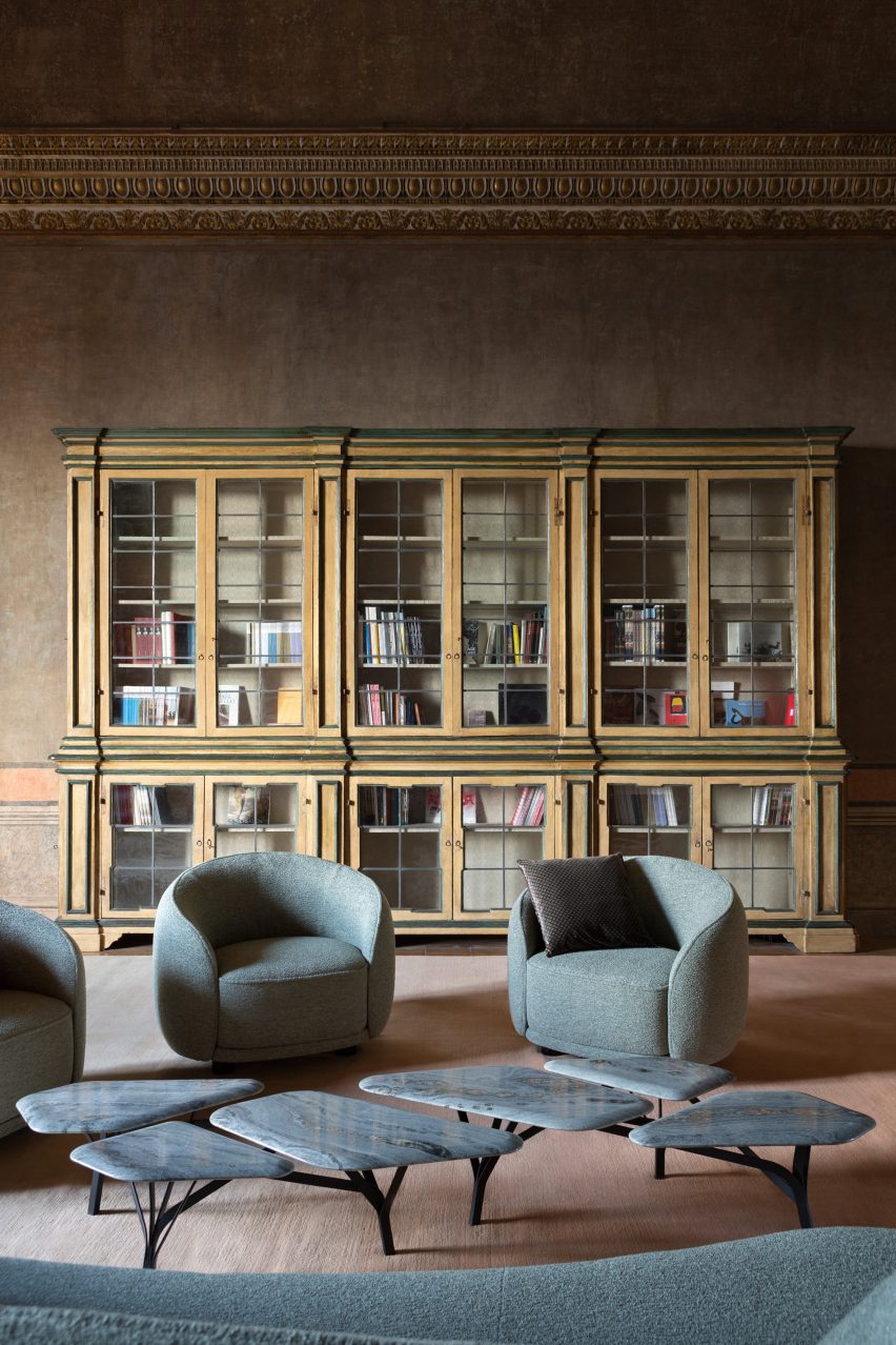
Over in the Salon des Pensionnaires is a table by French designer Noé Duchaufour-Lawrance. This is supported by spindly black legs, which resemble the branches of Rome’s ubiquitous umbrella pine trees.

The slightly moodier feel of this room is complemented by grey-blue sofas and armchairs by Italian designer Chiara Andreatti.

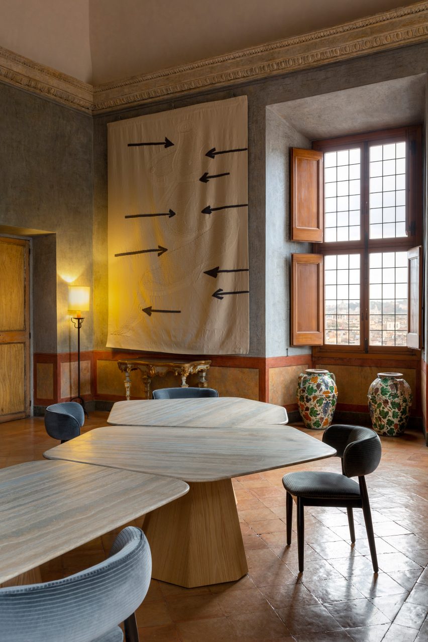
Duchaufour-Lawrance was also responsible for crafting the tables found in the villa’s Salon de Lecture and Salon Bleu, shaped to look like the time-worn paving slabs of the Appian Way – one of the oldest roads that lead to Rome.

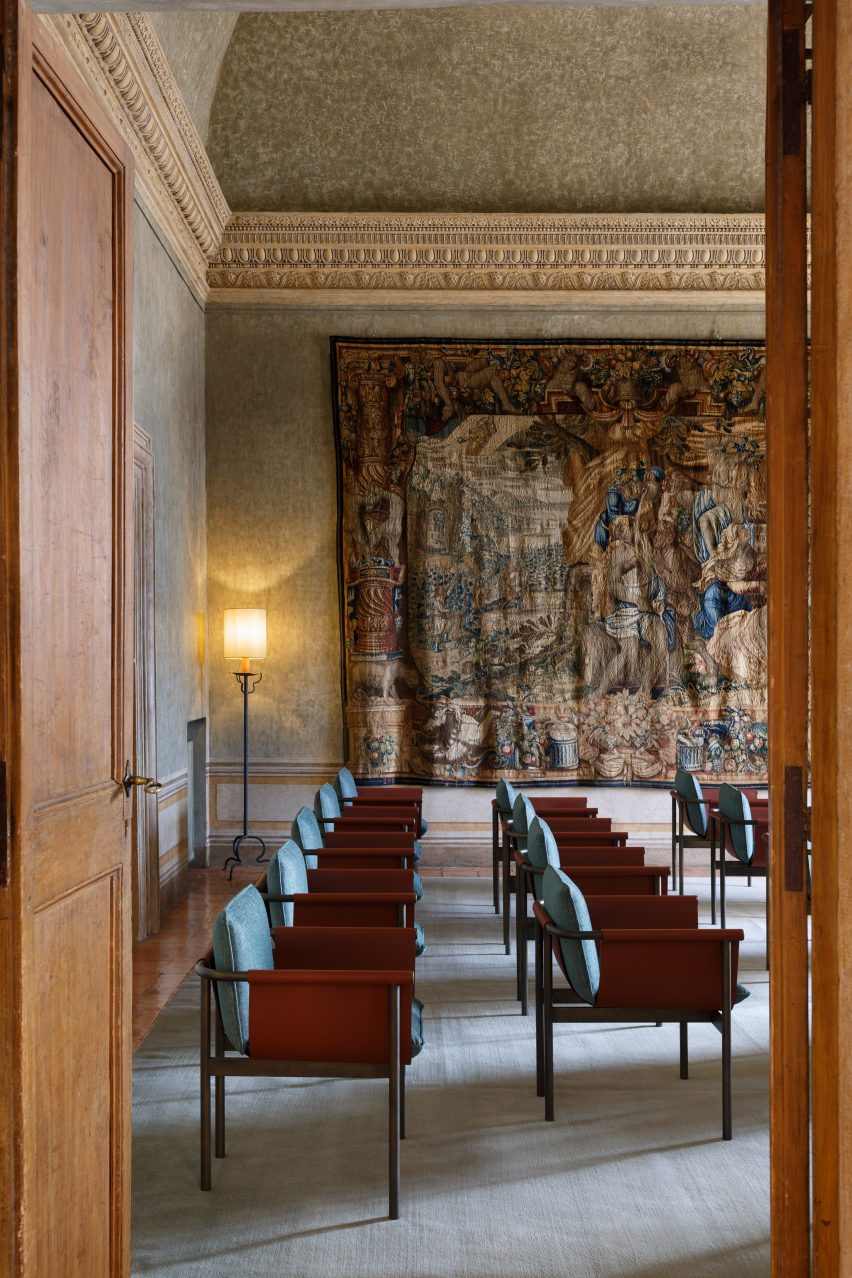
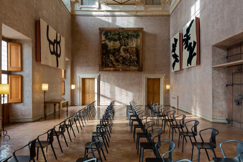
The Grand Salon houses rows of the sinuous Belleville chair, created by French design pair Ronan and Erwan Bouroullec for Vitra.

Salon de Musique in Villa Medici, home of the French Academy in Rome
Contemporary chairs were added to the building’s Salon de Musique

Both here and in the other salons, Fendi and Mobilier National introduced tapestries from well-known artists including Louise Bourgeois, Sheila Hicks and Sonia Delaunay.

Acoustic panels by Devialet were tucked behind selected artworks to discreetly enhance the sound quality inside the villa.

Grand Salon, home of the French Academy in Rome
Seats by the Bouroullec brothers line the Grand Salon

Over the past few years, high-end fashion designers have become increasingly involved with interior design projects.

In London, Roksanda Ilincic and Bella Freud applied their respective styles to two separate penthouse apartments, while Jasquemus founder Simon Porte Jacquemus has devised a summery interior scheme for a restaurant in Paris.

The photography is by Silvia Rivoltella.


Reference

The Future of Architecture: Stylish Home Furnishings With Lighter Ecological Footprints
CategoriesArchitecture

The Future of Architecture: Stylish Home Furnishings With Lighter Ecological Footprints

 The A+Product Awards is open for entries, with a Main Entry Deadline of June 24th. Get started on your submission today! 

Environmental ethics has been increasingly the concern of the built environment industry. When constructing buildings and styling interiors, more and more attention is paid to sustainably sourcing and recycling materials. Eco-friendly design does not limit products to just a few looks, nor does it compromise their functionality. These four beautiful A+Awards winning products will add tasteful texture to your designs while lessening the environmental impact of your project.

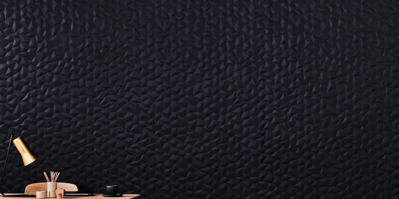
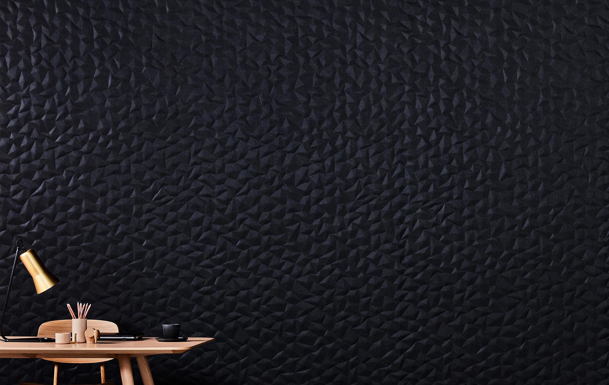
The Embossed Acoustic Panel Series from Woven Image, distributed in the USA by Kirei
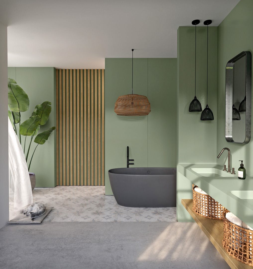
Winner, 2021 A+Product Awards, Acoustics

Acoustic panels are useful not only for workplaces and auditoriums but in domestic scenarios as well. Whether in a home office or a family theater, acoustic panels make sounds and voices sharper by reducing undesirable reflections on hard surfaces. They also insulate your room from external noises.

The Embossed Acoustic Panel Series by Woven Image offers high-quality acoustics together with a range of choices for styling. There are three types of patterns to choose from: the linear, simplistic ZEN, the rhythmic GEM, and the origami-inspired ION, each comes in 12 colors.

The panels are made from over 60% recycled PET and fiber while manufactured in a carbon-neutral production facility that utilized solar energy. The product has a low VOC emission rate of 0.023mg/m²/hr and a good Noise Reduction Coefficient of 0.75. It is also easy to trim that a utility knife can cut it through. The subtle light and shadow created by the 3D patterns make the panels an addition to interior styling.

Silestone® Sunlit Days by Cosentino Group
Winner, 2021 A+Product Awards, Hard Surfacing, Tiles and Stone

Quartz surfaces are popular in home designs for their stone-like appearance, high versatility, durability and accessibility, especially when compared to natural stones like granite and marble. They are cast from a mixture including small pieces of quartz, resins, pigments, etc. Bonded by resins, the finished surface comes sealed and flat, making them easy to clean. The mixture is made in a way that allows it to be colored as needed, ensuring that owners will not have to make compromises on home styling. AT present, Quartz surfaces from the Silestone® Sunlit Days series are available in white, light grey and red, blue, and green in low saturation. The soothing colors and clean shapes give interiors a modern looking.

Quartz surfaces have the appearance of stones but are more eco-friendly than natural stones. The Sunlit Days series provide carbon-neutral quartz surfaces that incorporate extra strategies to cut the material’s carbon footprint. The production uses 99% reused water, 100% renewable electric energy and a minimum of 20% recycled raw materials in its composition. Furthermore, the brand has committed to offsetting GHG emissions through the Voluntary Carbon Market. Being environmentally aware does not limit our choice of furnishing and surface texturing to synthetic materials that comprise recycled resources. Instead, natural materials can also be consumed sustainably.

Brace by Davis Furniture
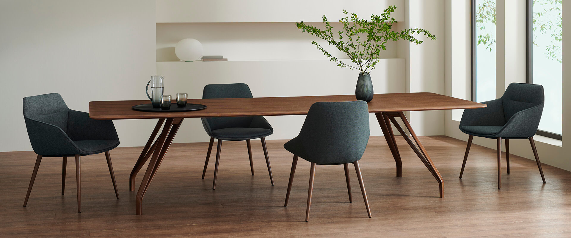
Winner, 2021 A+Product Awards, Contract Furniture

Brace from Davis Furniture is one of this kind. Each Brace table is made from a tree at the end of its lifecycle, leaving plenty of time for the material to store carbon during its growth. Furthermore, the brand has committed to planting two saplings for each tree they harvest. In this way, the sourcing is sustainable and the European forest is never overly exploited by the product’s production.

The solid wood table comes in various sizes and shapes to accommodate a range of events. For example, a long, rectangular table can be perfect as a home office desk while a small, round one can serve an intimate meal for two people, etc. The sleek table top is supported by the iconic legs. Each leg splits into two as it goes up, creating a slim triangular space within itself. More than 50 types of selectable coatings on each Brace table allow the table different colors and textures that best suit the home design. The design celebrates the uniqueness of the natural material with the technological precision of modern design.

Koroi Side Table by MAJA
Winner, 2021 A+Product Awards, Residential Furniture

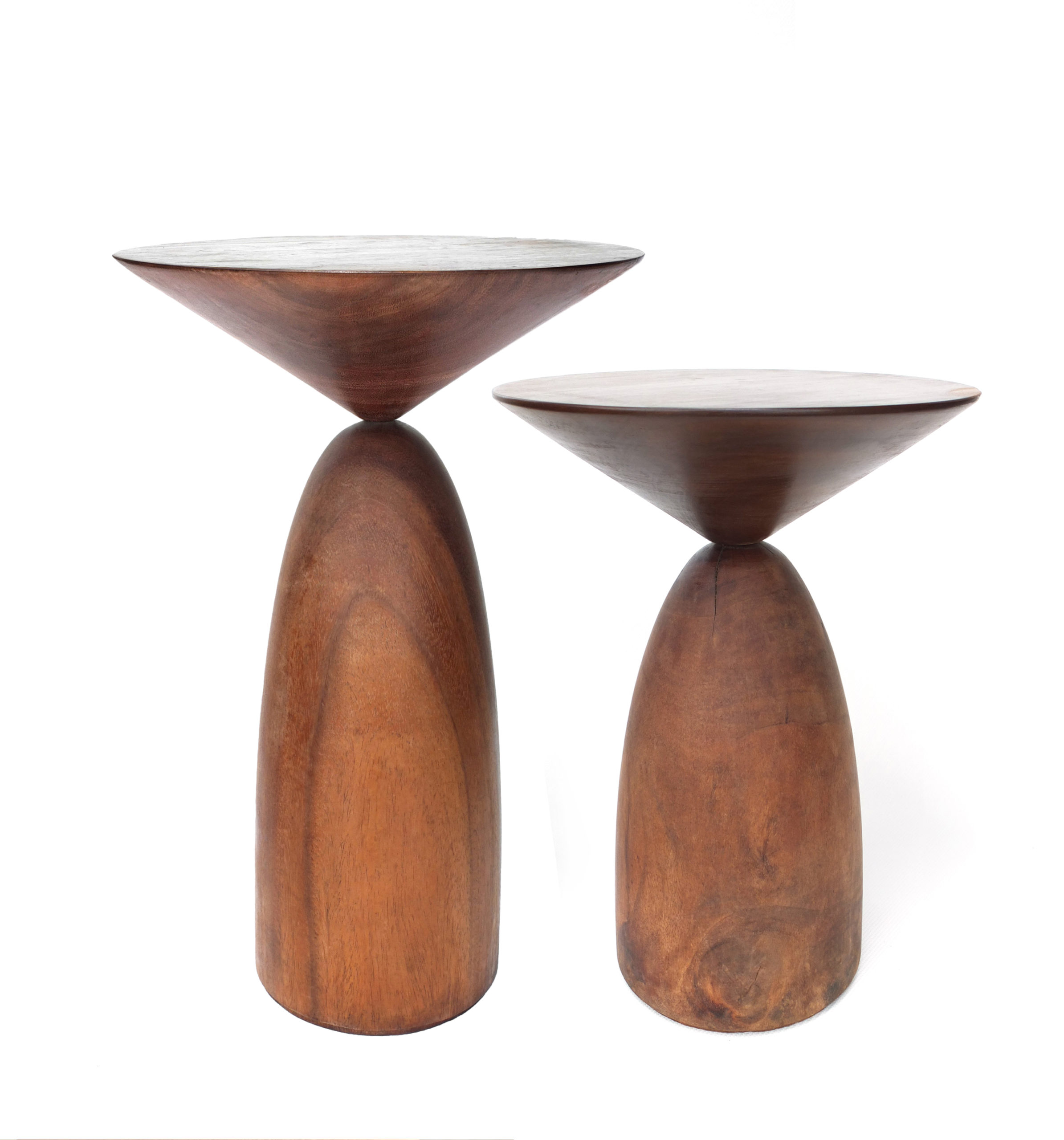
The Koroi Side Table also embraces the characteristics of natural materials. Each Koroi Side Table is handcrafted from solid wood by artisans in Bangladesh with a resource-efficient approach. Burls, deep cracks and other features of the tree remain visible from the smoothened surfaces. Comprising two geometric forms, the design of Koroi sets a subtle balance between fragile and sturdy. Althought the connection between the two parts looks delicate — precarious, perhaps — the piece’s solidity is guaranteed by the thick wood. The two parts are cut at opposing grains, giving them contrasting textures and different reflectiveness.

 The A+Product Awards is open for entries, with a Main Entry Deadline of June 24th. Get started on your submission today! 

Reference