Layer rethinks bed design with Mazzu disassemblable mattress
CategoriesSustainable News

Layer rethinks bed design with Mazzu disassemblable mattress

British design studio Layer has aimed to bring sustainability to mattress design in a collaboration with Chinese start-up Mazzu, creating a modular, foamless product made up of textile-covered springs.

The Mazzu Open mattress was designed to have the comfort of a traditional sprung mattress while being adaptable, repairable and easy to pack down when moving house, so as to prolong the product’s life.

The design features row upon row of individually textile-wrapped pocket springs, which sit sandwiched between a base “matrix” and a cushioned topper to hold them in place.
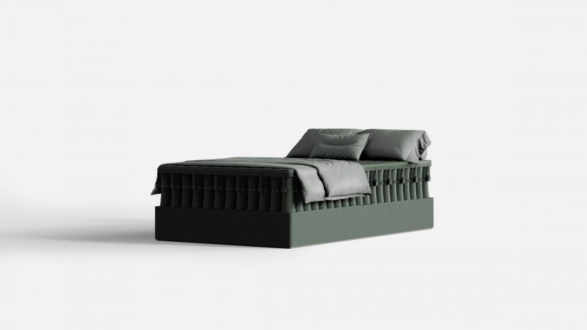
Image of an army green bedImage of an army green bed
The Mazzu Open mattress is foamless and made up of modular, textile-covered springs

All its components are either recyclable or biodegradable, and no glue was used in the construction of the mattress.

The structure — left open at the sides for a distinctive, utilitarian look — also has the benefit of being hygienic, according to the studio, as users can check the inside of the mattress and take it apart to clean every element.

The modular design of the mattress means buyers can treat the springs like “pixels”, choosing between three levels of firmness for each point in the matrix to create a support pattern of their choosing. This also allows couples to customise their own side of the bed.
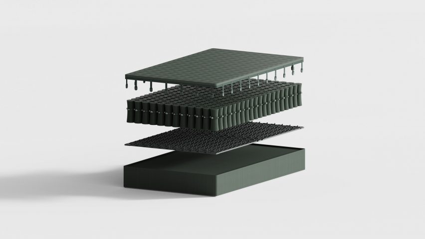
Exploded image of the Mazzu Open mattress, showing a base layer, a matrix layer, a layer of springs stacked into a mattress shape and a cushioned top layerExploded image of the Mazzu Open mattress, showing a base layer, a matrix layer, a layer of springs stacked into a mattress shape and a cushioned top layer
The springs are held in place by a grid layer

Additional spring modules and a different base and topper can be added to change the size of the mattress, and the whole kit can compress down to around 80 per cent of its size when disassembled.

The mattress comes in a reusable packaging system, also designed by Layer, that sees it divided into small components and split across several cartons, each weighing less than 10 kilograms. The spring modules compress from 250 millimetres to 50 millimetres in height as part of this.

Layer founder Benjamin Hubert told Dezeen that the studio tried to tackle multiple problems with current mattresses in one go with Mazzu, ranging from the impracticability of transporting them to the lack of customisation.
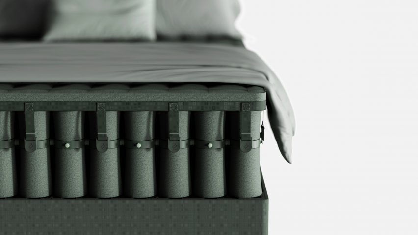
Close-up of a bed with an open mattress made of textile-covered springs stacked densely togetherClose-up of a bed with an open mattress made of textile-covered springs stacked densely together
The mattress has an open structure that gives it a unique aesthetic

“They are too bulky once you unpack them and they ‘inflate’ from their compressed shipped form,” said Hubert. “They contain huge amounts of foam, which is next to impossible to recycle, and for the most part you can’t pack them down again for storage or transport.”

The studio wanted to avoid using polyurethane foam, a common mattress material, because as well as being difficult to recycle, it is energy intensive to produce and generates volatile organic compounds (VOCs) that are harmful to health.

The material is technically recyclable, but most mattresses do not reach the scarce recycling facilities, and they are often discarded before their time. In the UK, for instance, around 6.4 million mattresses are thrown away each year — about one for every ten people — and only around 14 per cent of them are recycled.

Instead of foam, the Mazzu Open mattress’s hourglass-shaped springs are shrouded in a two-tone 3D-knit polyester sleeve. The other materials used are steel for the springs, ABS plastic for the connection system and wool for the topper. The wool is biodegradable, while all the other materials are recyclable.
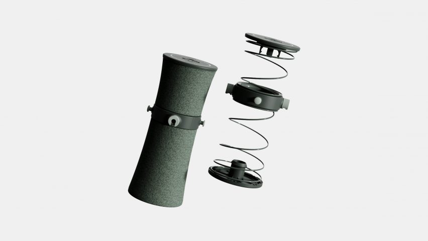
Image of a spring with plastic connectors, and on the left-hand side of it, a textile-covered cylinder in the same size and shapeImage of a spring with plastic connectors, and on the left-hand side of it, a textile-covered cylinder in the same size and shape
The metal springs are wrapped in a 3D-knit textile

Hubert describes Mazzu as “leading the way” in delivering sustainable, high-performance bedding, and says the companies worked together for three years through the pandemic.

They went through many iterations of the mattress design in that time, as the studio tried to find a connection solution that would be both simple and comfortable.

“We must have tried about 20 different connection techniques,” said Hubert. “We had to find an optimum size that could be calibrated to fit all the standard mattress sizes too — not easy given there are a lot of international sizes.”
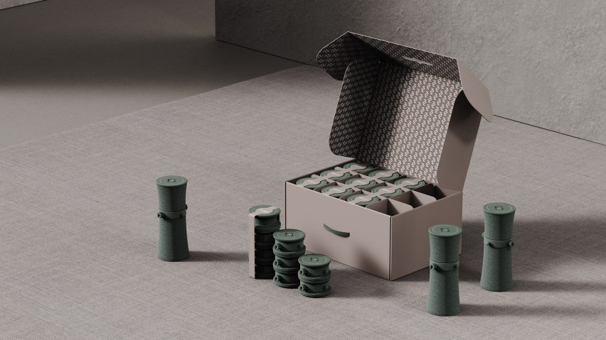
Image of an open carton storing a number of green coloured discs, which are shown in their popped-up, slightly hourglass-shaped cylindrical form outside of the boxImage of an open carton storing a number of green coloured discs, which are shown in their popped-up, slightly hourglass-shaped cylindrical form outside of the box
The springs compress to one-fifth of their full height for transport and storage

“The system needed to be highly cost-effective by using the least amount of parts and the simplest connection feature,” he continued. “The design of the connection systems changed dozens of times as we tested strength, ease of use, noise and comfort — we had hundreds of springs in the studio at times!”

Other recent designs from the London-based design studio have included sustainable dog toys for Canadian company Earth Rated and a green hydrogen vehicle retrofitting system for US start-up Croft.

Mazzu and Layer launched the Mazzu Open mattress at the German furniture fair IMM Cologne, which was held from 14 to 18 January. See Dezeen Events Guide for an up-to-date list of architecture and design events taking place around the world.

Reference

Eight homes where mid-century modern furniture adds a stylish touch
CategoriesInterior Design

Eight homes where mid-century modern furniture adds a stylish touch

Pieces by designers Charles and Ray Eames and Isamu Noguchi are on show in this lookbook, which features homes with eye-catching mid-century modern furniture.

Mid-century furniture, which often has simple lines and a sculptural feel, adds a modernist touch to these homes, which range from period properties to newly built and renovated houses.

Among the interiors showcased in this lookbook are iconic architect Le Corbusier’s own home and a residence in London’s upmarket Mayfair area that has been filled with mid-century modern and art deco details.

This is the latest in our lookbooks series, which provides visual inspiration from Dezeen’s archive. For more inspiration see previous lookbooks featuring perforated brick-walls, budget home interiors and immersive saunas in peaceful settings.


Mid-century modern home Mid-century modern home
Photo by Mariell Lind Hansen

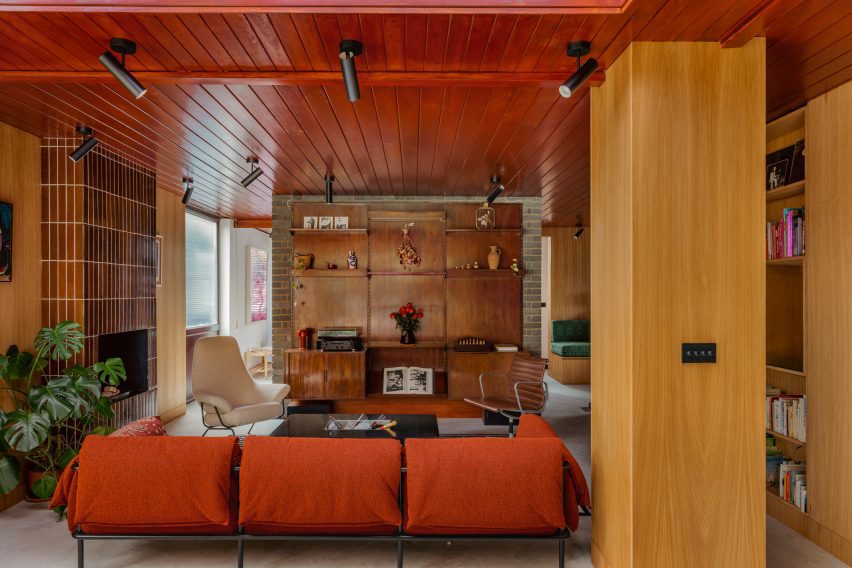
Zero House, UK, by Ben Garrett and Rae Morris

Owners Ben Garrett and Rae Morris updated Zero House, which was informed by Californian Case Study Houses, themselves in a way that would honour its mid-century roots.

The living room features a striking floor-to-ceiling fireplace clad in tiles, as well as a number of furniture pieces in warm colours. Among them is a classic Eames office chair in a dark-brown leather colour that matches the wooden panelling that decorates the room.

Find out more about Zero House ›


Hudson Woods house by Magdalena KeckHudson Woods house by Magdalena Keck
Photo by Jeff Cate

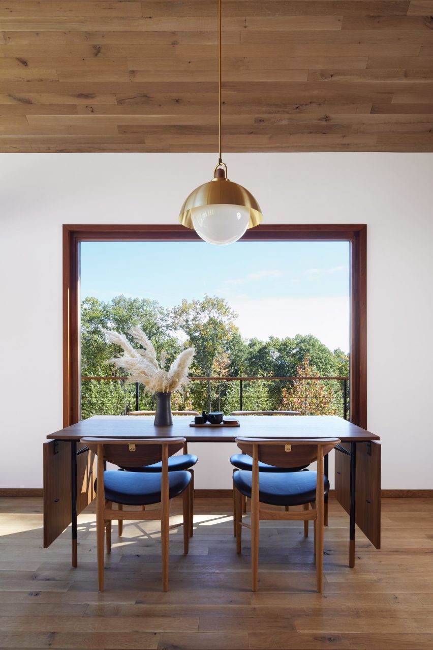
Hudson Woods home, US, by Magdalena Keck

Located in upstate New York, this holiday home has an interior that fuses Danish and Japanese design. A dinner table and chairs by designer Finn Juhl are among the Danish pieces used in the house, where they look both functional and elegant.

A simple lamp with a gold-coloured shade above the table adds a decorative touch and matches the brass fastenings at the backs of the chairs.

Find out more about the Hudson Woods home ›


Interior of Madrid apartmentInterior of Madrid apartment
Photo by Polina Parcevskya and Julie Smorodkina

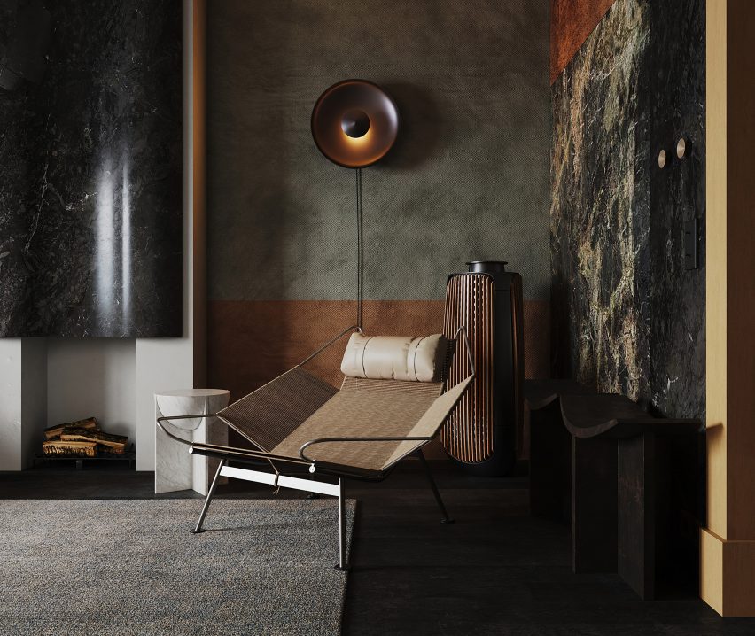
Radikal Klassisk, Spain, by Puntofilipino 

The interior of this Spanish apartment in a former bank building has a moody, interesting colour palette and features richly textured materials including terrazzo, clay-rendered walls and marble tiles.

In contrast, the furniture is streamlined and unfussy, including a sculptural lounge chair by Danish designer Hans J Wegner in the living room.

Find out more about the Radikal Klassisk ›


City Beach residence in Perth by Design TheoryCity Beach residence in Perth by Design Theory
Photo by Jack Lovel

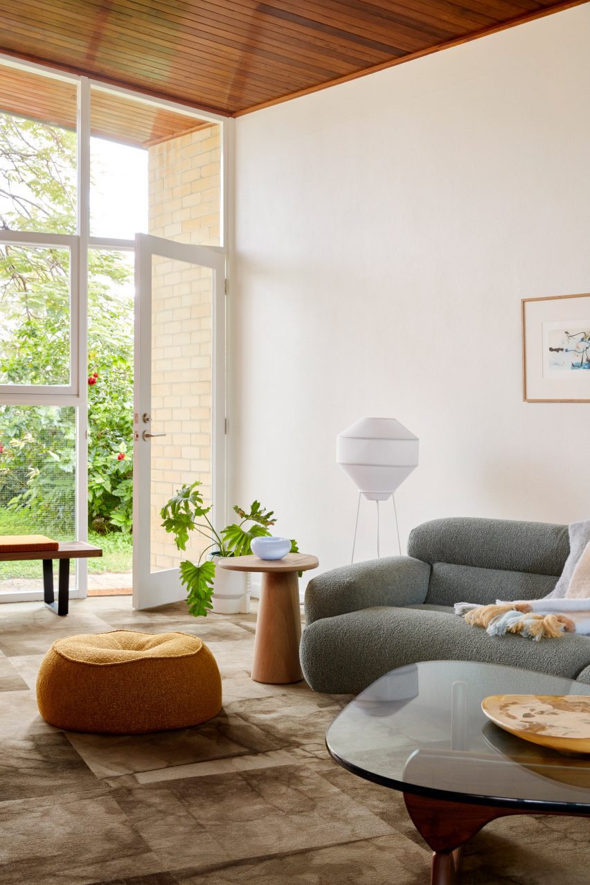
City Beach House, Australia, by Design Theory

American artist and designer Noguchi’s iconic coffee table, made from a heavy glass tabletop that rests on two undulating wooden legs, has pride of place in the living room of City Beach House.

The interior, created by Australian studio Design Theory, responds to the design and natural material palette of the house itself, which is from the 1960s.

Find out more about City Beach House ›


White home in Sweden by Asa Hjort ArchitectsWhite home in Sweden by Asa Hjort Architects
Photo by Jim Stephenson

Hallen, Sweden, by Åsa Hjort Architects

This newly built home in the southern Swedish region of Österlen has a blocky geometric design and large windows that provide views out across the Baltic Sea.

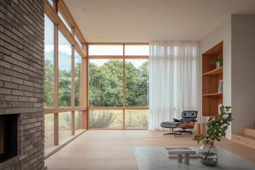
An Eames lounge chair adds a comfortable resting space in one of the rooms, where its dark hues contrast against sheer white curtains and pale wood flooring.

Find out more about Hallen ›


Moore HouseMoore House
Photo is by Joe Fletcher

Moore House, US, by Woods + Dangaran

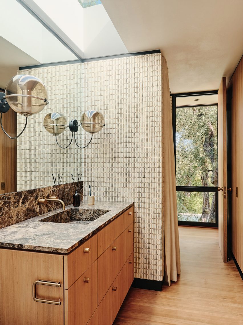
A pair of vintage globe-shaped pendants by Dutch designer Frank Ligtelijn light up the bathroom in this 1960s California home designed by architect Craig Ellwood.

The bathroom also features a dark Emperador marble countertop and a wall clad in Japanese porcelain tiles.

Find out more about Moore House ›


Mid-century modern interior by Child StudioMid-century modern interior by Child Studio
Photo by Felix Speller and Child Studio

Mayfair residence, UK, by Child Studio

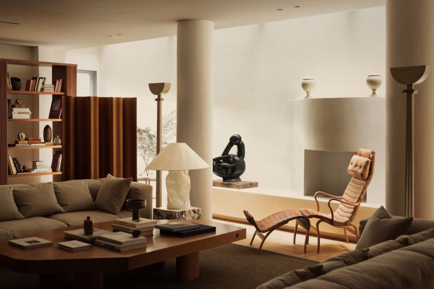
The “Pernilla” lounge chair by Swedish designer Bruno Mathsson is among the many mid-century modern furniture pieces on show in this London apartment.

Local practice Child Studio told Dezeen that the spacious lounge that houses the chair was informed by the grand salon in fashion designer Yves Saint Laurent’s Paris home.

Find out more about the Mayfair residence ›


Le Corbusier's studio apartmentLe Corbusier's studio apartment

Studio apartment, France, by Le Corbusier

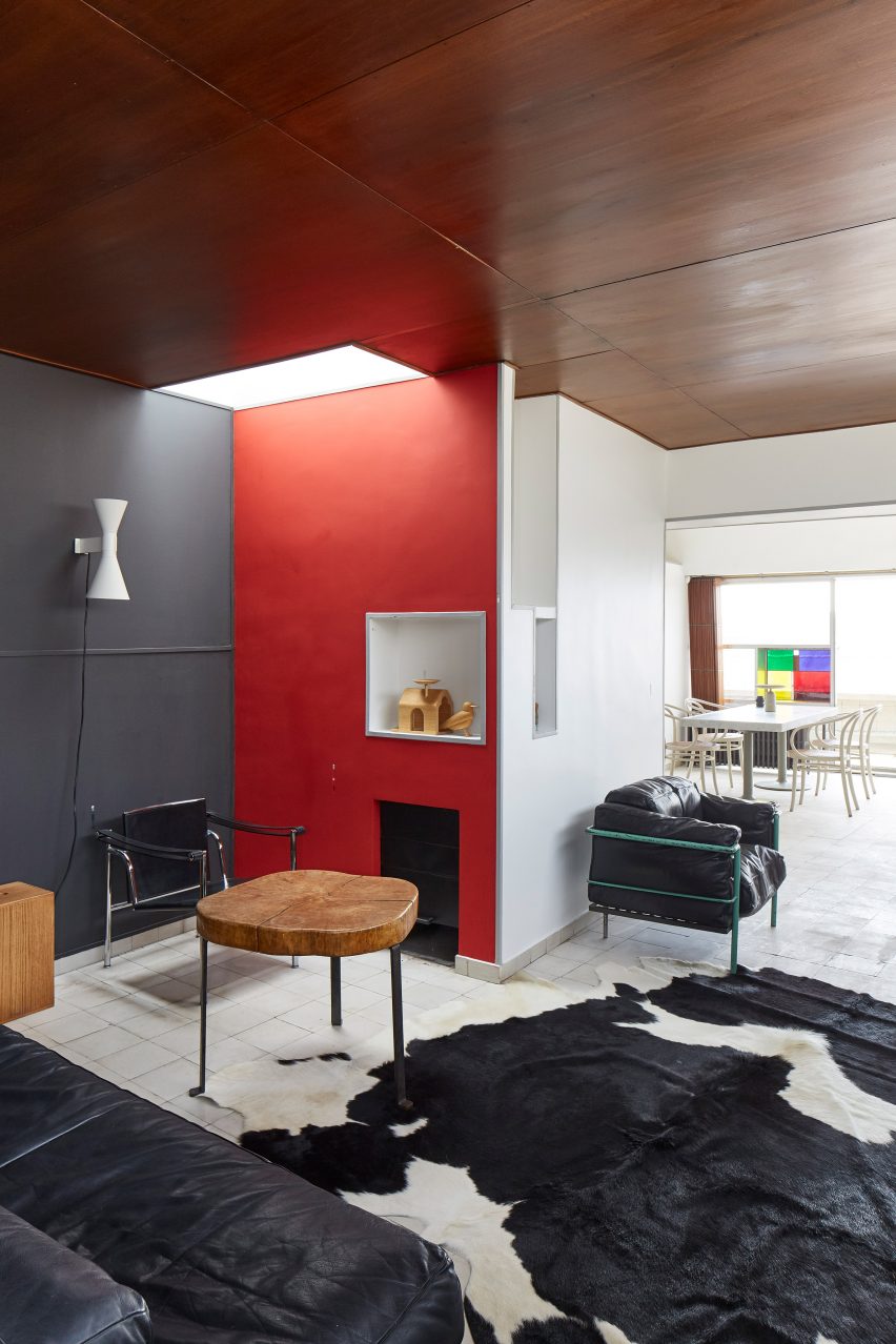
Le Corbusier’s apartment in his Immeuble Molitor apartment building in Paris, where he lived for more than three decades, reopened to the public in 2018.

Visitors to the modernist flat can admire mid-century modern furniture pieces including a black leather edition of the designer’s signature LC2 lounge chair, which sits next to a cowhide rug at the entrance of the apartment.

Find out more about Le Corbusier’s apartment ›

This is the latest in our lookbooks series, which provides visual inspiration from Dezeen’s archive. For more inspiration see previous lookbooks featuring perforated brick-walls, budget home interiors and immersive saunas in peaceful settings.

Reference

Space Projects creates Amsterdam store with thatched hut for Polspotten
CategoriesInterior Design

Space Projects creates Amsterdam store with thatched hut for Polspotten

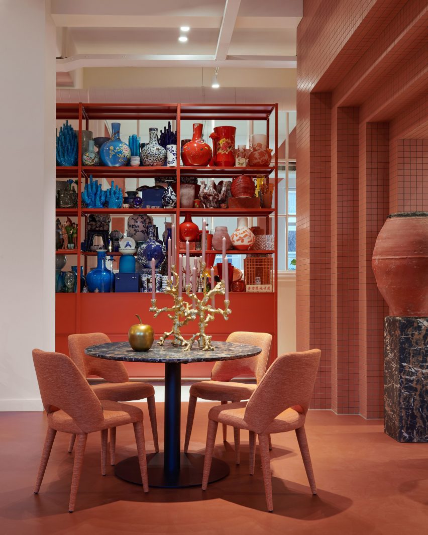
A curvilinear thatched hut has been paired with terracotta-hued tiles at the Amsterdam store for homeware brand Polspotten, which was designed by local studio Space Projects.

The studio created the store to straddle a shop and an office for Polspotten, a furniture and home accessories brand headquartered in the Dutch capital.

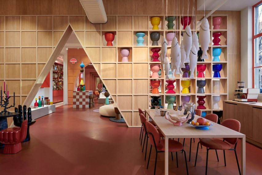
Triangular archway in the Amsterdam Polspotten storeTriangular archway in the Amsterdam Polspotten store
Visitors enter the Polspotten store via an oversized triangular entranceway

Characterised by bold angles and arches, the outlet features distinctive terracotta-coloured walls and flooring that nod to traditional pots, Space Projects founder Pepijn Smit told Dezeen.

“The terracotta-inspired colours and materials refer to the brand’s first product, ‘potten’ – or pots,” said Smit, alluding to the first Spanish pots imported by Erik Pol when he founded Polspotten in the Netherlands in 1986.

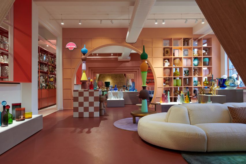
Plush cream sofa within Amsterdam homeware storePlush cream sofa within Amsterdam homeware store
The interconnected spaces are delineated by cutouts

Located in Amsterdam’s Jordaan neighbourhood, the store was arranged across a series of open-plan rooms, interconnected by individual geometric entryways.

Visitors enter at a triangular opening, which was cut away from gridded timber shelving lined with multicoloured pots that mimic totemic artefacts in a gallery.

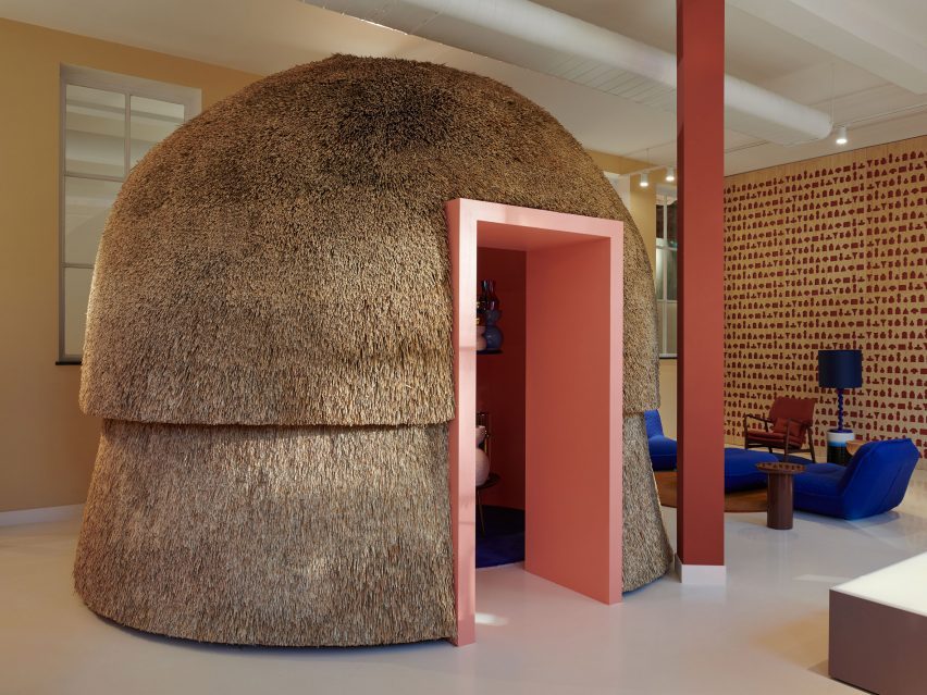
Curvilinear thatched hutCurvilinear thatched hut
A curvilinear thatched hut provides a meeting space

The next space features a similar layout, as well as a plump cream sofa with rounded modules and sculptural pots stacked in a striking tower formation.

Travelling further through the store, molten-style candle holders and Polspotten furniture pieces were positioned next to chunky illuminated plinths, which exhibit amorphously shaped vases finished in various coral-like hues.

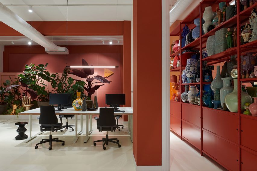
Accessed through a rectilinear, terracotta-tiled opening, the final space features a bulbous indoor hut covered in thatch and fitted with a light pink opening.

The hut provides a meeting space for colleagues, according to the studio founder.

“The thatch, as a natural material, absorbs sound as well,” explained Smit.

Clusters of pots next to a circular tableClusters of pots next to a circular table
The store provides an art gallery-style space for homeware

Next to the hut, Space Projects created an acoustic wall illustrated with “hieroglyphics” of Polspotten products, which references the gallery-like theme that runs throughout the outlet.

“The store was inspired by Polspotten’s use of traditional techniques combined with a collage of their reinterpreted archetypes,” said Smit.

Office space at PolspottenOffice space at Polspotten
It is also used as an office space

Elsewhere in Amsterdam, Dutch practice Studio RAP used 3D printing and algorithmic design to create a “wave-like” facade for a boutique store while interior designer Linda Bergroth created the interiors for the city’s Cover Story paint shop to streamline the redecorating process for customers.

The photography is by Kasia Gatkowska.

Reference

Anne-Sophie Rosseel creates colourful furniture that kids can assemble
CategoriesSustainable News

Anne-Sophie Rosseel creates colourful furniture that kids can assemble

New York-based interior designer Anne-Sophie Rosseel has created a sustainable children’s furniture collection that locks together for easy assembly.

Called the Interlockables, the collection includes tables, seating and storage for children and is the debut collection from Rosseel‘s House of RoRo brand.

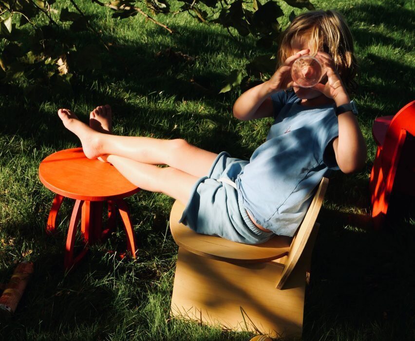
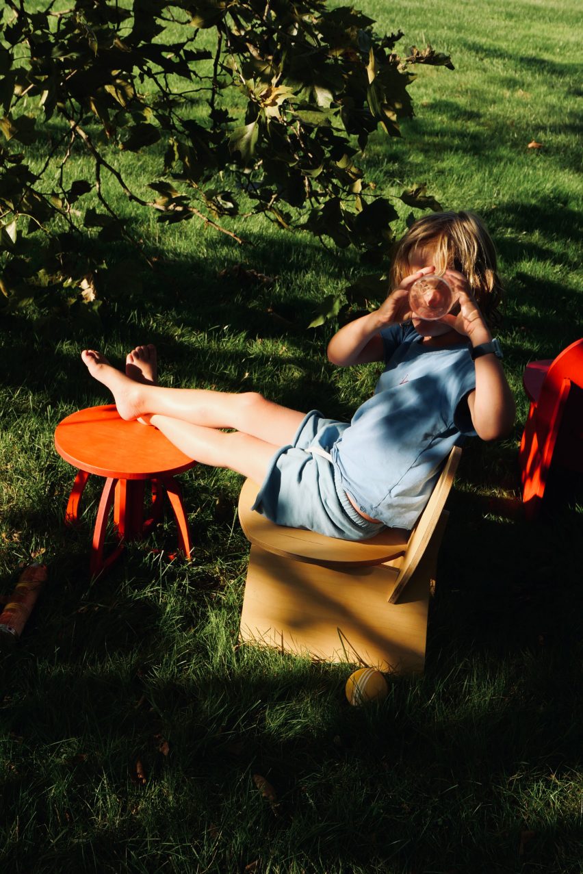
A child sitting underneath a tree with their foot on a stool
Interior designer Anne-Sophie Rosseel has created a collection of children’s furniture

“Inspired by children and their ability to grow and learn at an astonishing speed, the collection consists of multifunctional and versatile children’s furniture that is sustainable, playful, and practical,” said the team.

“The designs are unselfconscious and simple in their use of materials, provoking a feeling of delight.”

A table in the sunlight
The collection is made of natural materials and dyes

Primarily made of Birch plywood and finished with non-toxic, plant-based dyes, the collection consists of furniture made of geometric shapes just slightly askew.

“I was looking for ways to combine toy storage with functional furniture that would look good in our home while reducing the clutter,” said Rosseel.

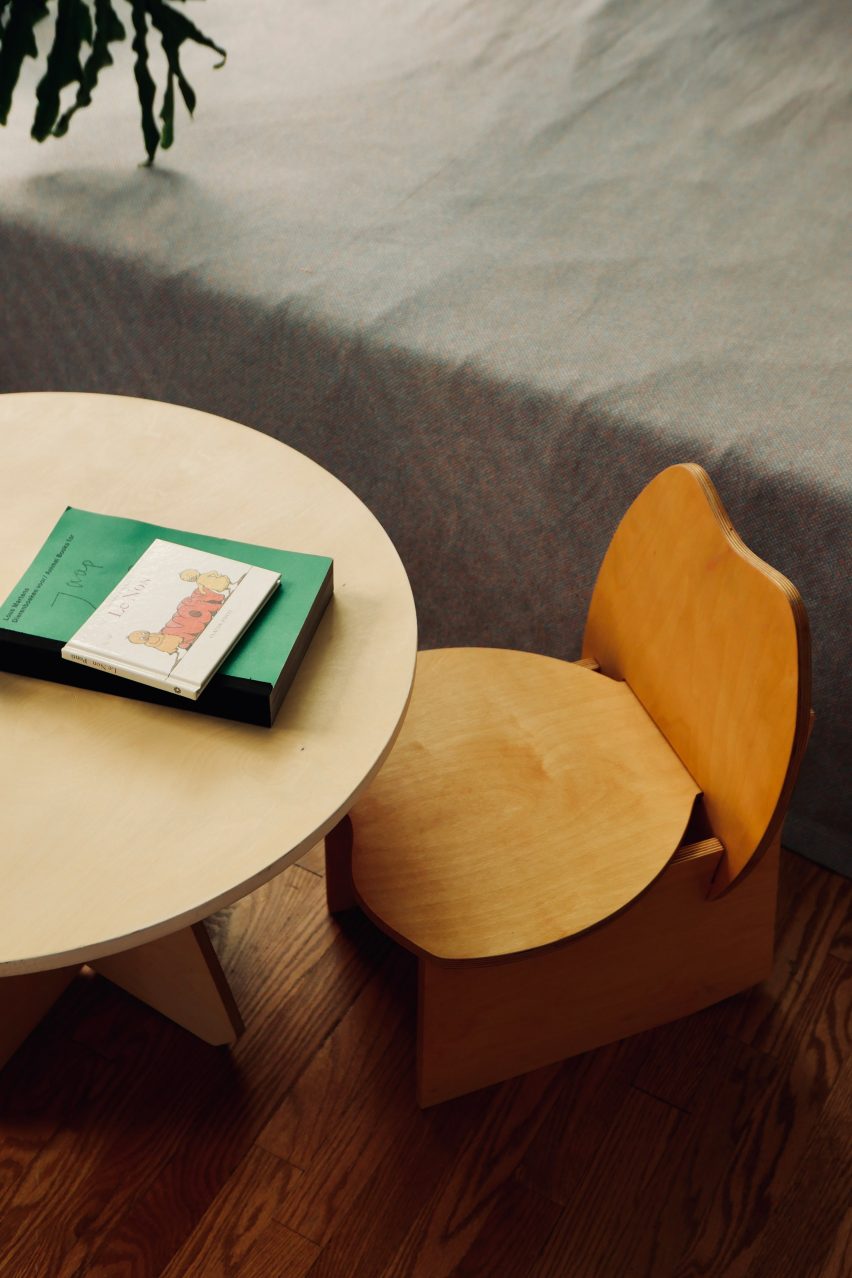
A wooden table and chair for children
The furniture comes flat-packed and locks together so that children can assemble them, with the help of a guardian

“Kids grow fast and if I was going to make a product, I wanted it to be as sustainable as possible and not have it end up in landfill after 2 years.”

The furniture comes flat-packed and slides and locks together so that children – with the help of a guardian – can assemble the pieces.

A blocky rocky chair
The collection includes chairs, tables and storage

The pieces were designed to be gender-neutral and not age-specific, with some elements that can be adjusted as a child grows.

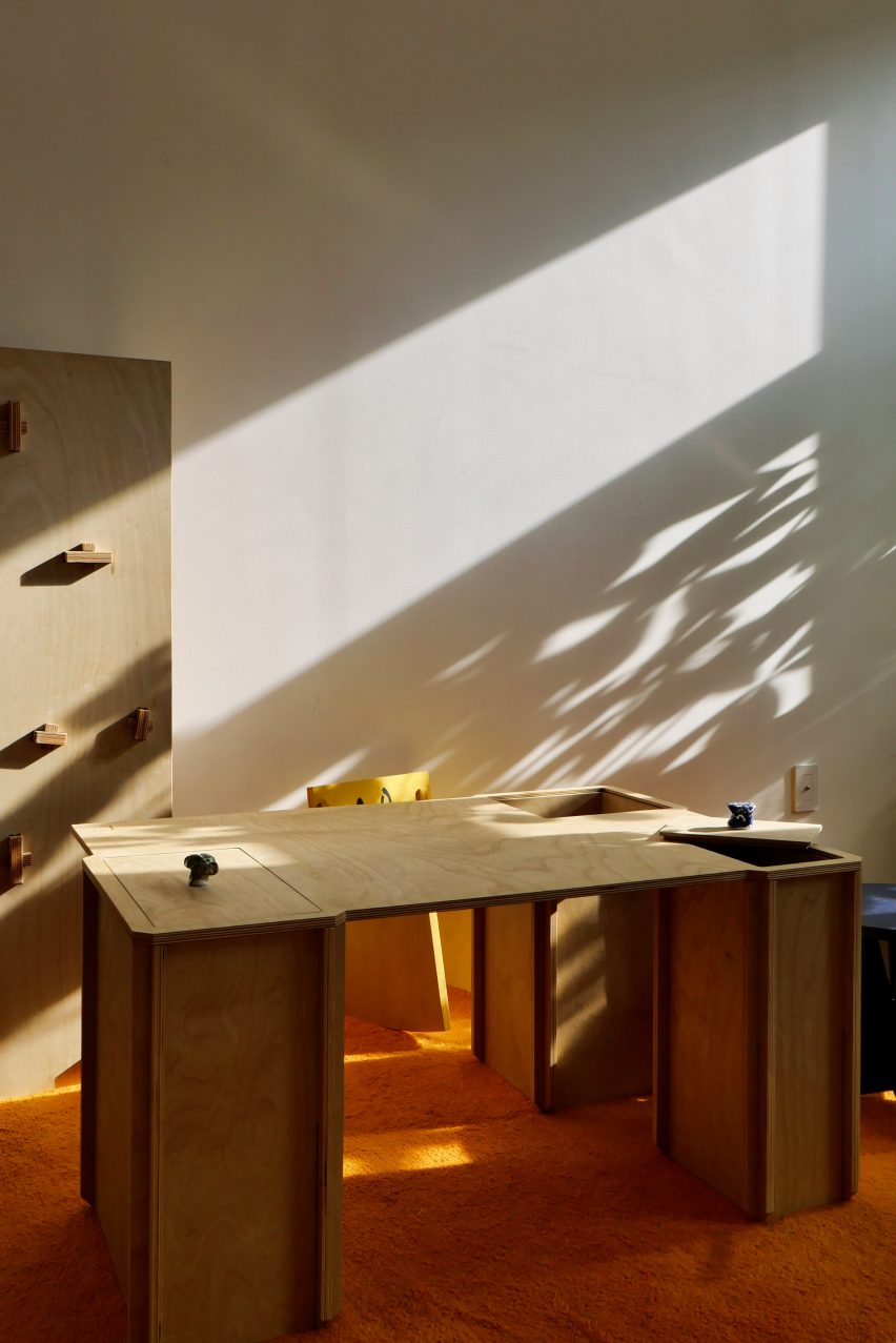
The Box Table rests on rectangular legs that double as storage containers, which are accessed with removable panels on the table’s countertop.

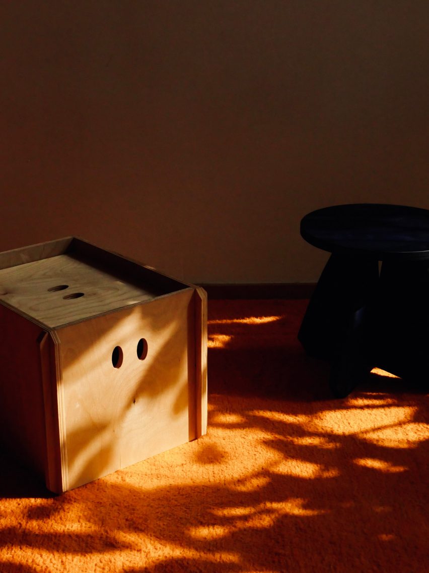
A stool with small eyes cut into it
The pieces are sustainably sourced and manufactured in Canada out of birch plywood

Once a child outgrows the table, the countertop can be removed and the boxy legs converted into nightstands or side tables.

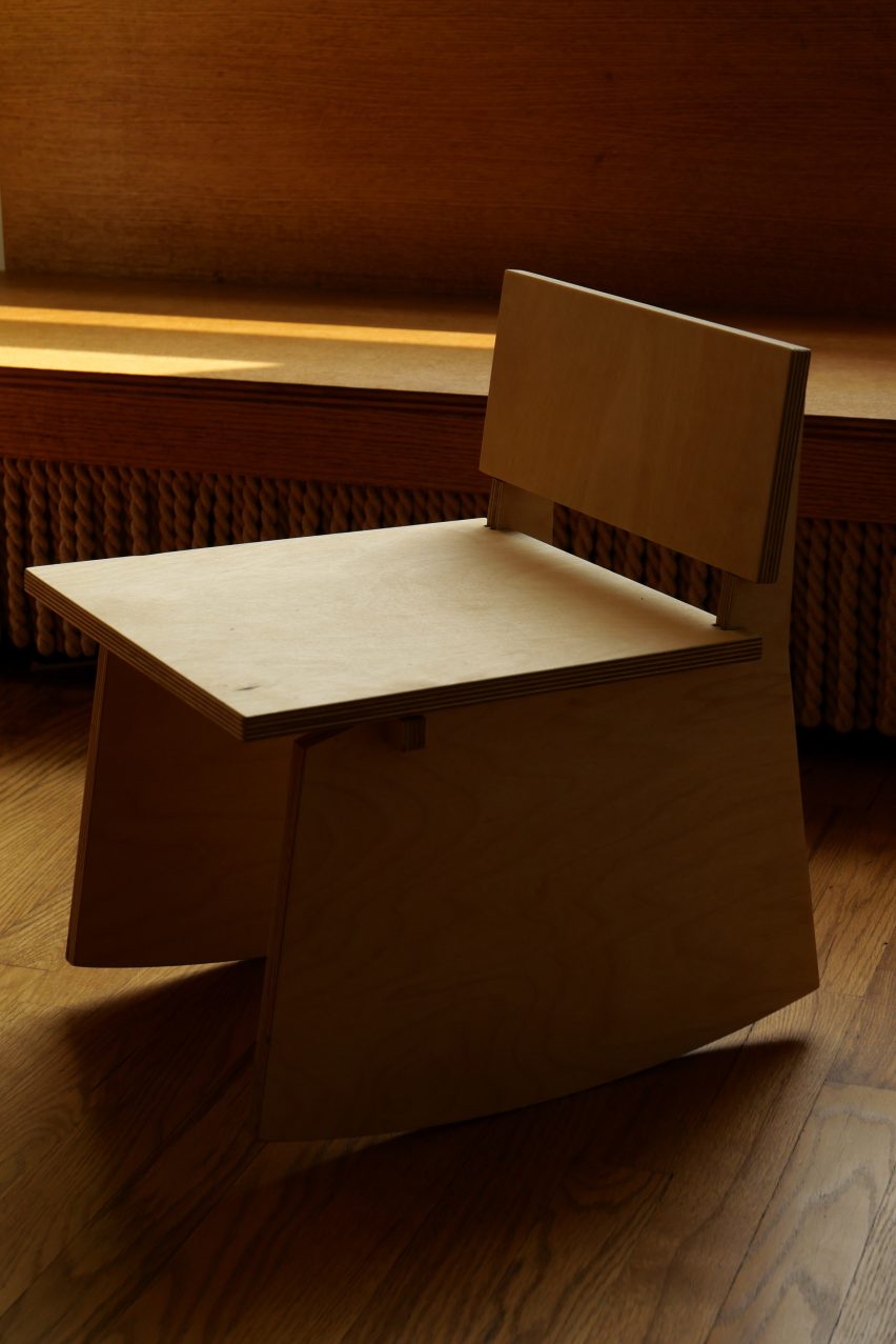
The Raymond Rocker chair fits flat-pack in a pizza-sized box and features slightly curved legs for “the child that doesn’t like to sit still”.

Artisanal dyer Audrey Louise Reynolds created a series of stains for the collection made out of plant-based pigments including mushrooms, flowers, mica and moss.

The dyes include a natural oil stain and five bold colours, although they will change seasonally and custom colours can be requested.

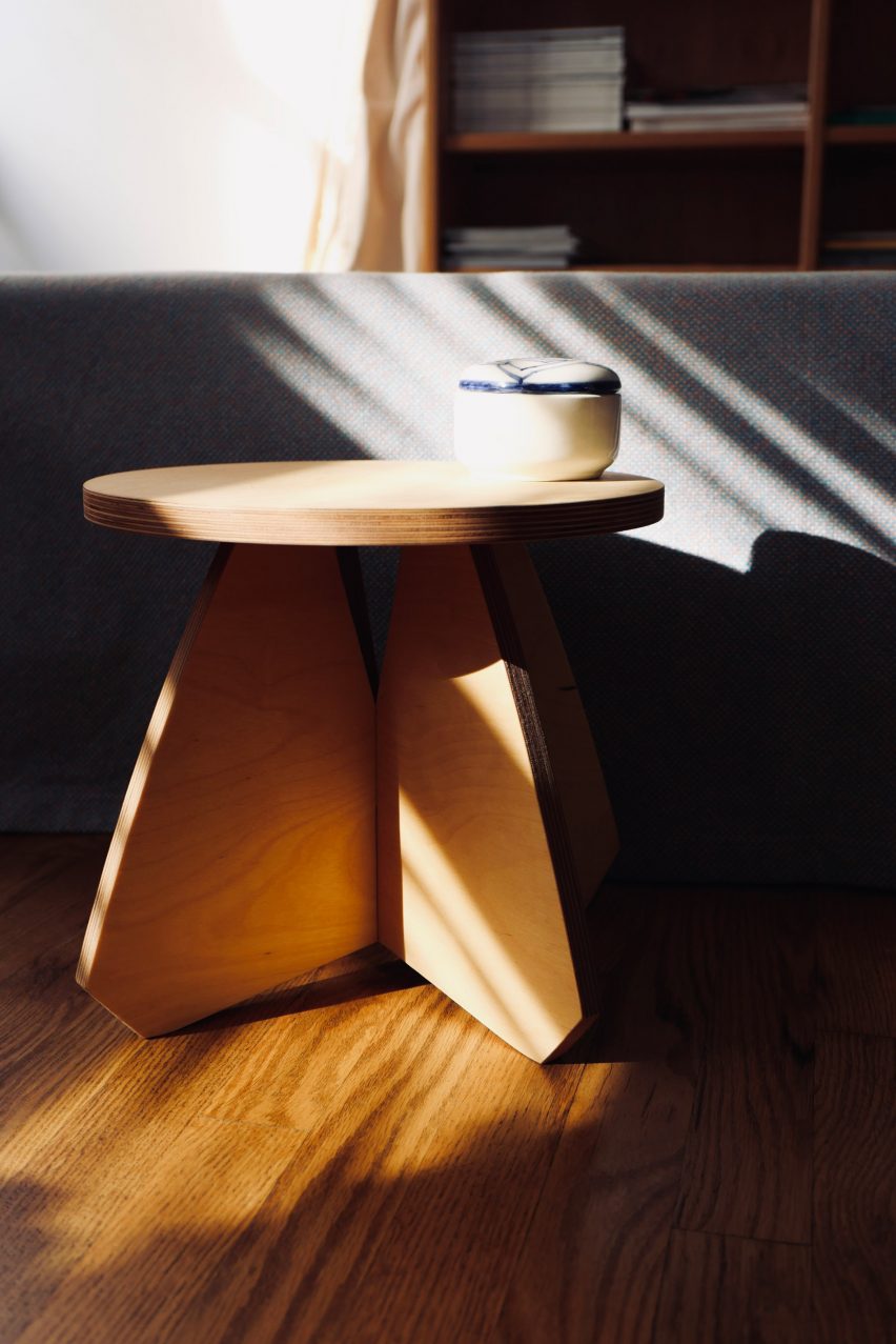
A small side table with wide legs
They are made of playful, geometric shapes

The pieces are ethically sourced and manufactured in Canada, with leftover scraps from CNC cuts reperused into “small toy wood pulls or puzzles”.

A pair of permanent sticker sketchy “eyes” comes with each purchase to be applied to the furniture at will.

Anne-Sophie Rosseel is a Belgian-born New York-based interior designer. She founded Rosseel Studio before launching House of RoRo in 2023.

Other furniture designed for children includes sloping wooden chairs that encourage “active sitting” by Studio Lentala and playful stools made of olive pits by Eneris Collective and NaifactoryLAB.

The photography is courtesy House of RoRo.

Reference

Eight living rooms featuring low-slung furniture and seating
CategoriesInterior Design

Eight living rooms featuring low-slung furniture and seating

Low-back sofas and armchairs play a key role in our latest lookbook, which explores how low-slung furniture can make living rooms feel more relaxed and less formal.

When lounge furniture sits low to the ground, it can make a big difference to the mood of the room.

Low-back seats are typically more generous in width, so the sitting position doesn’t have to be as upright. This means sofas can sometimes feel more like beds.

This type of furniture works well in open-plan interiors, as it can divide up the space without making different areas feel too separate. But it can also be used to soften rooms that are heavily decorative.

Read on for eight examples, including a London loft renovation and a California home.

This is the latest in our lookbook series, which provides visual inspiration from Dezeen’s archive. For more inspiration, other recent lookbooks feature colourful bedrooms and kitchens with tiled worktops.


Lounge windows in St John Street warehouse apartment by Emil Eve Architects
Photo is by Mariell Lind Hansen

St John Street, UK, by Emil Eve Architects

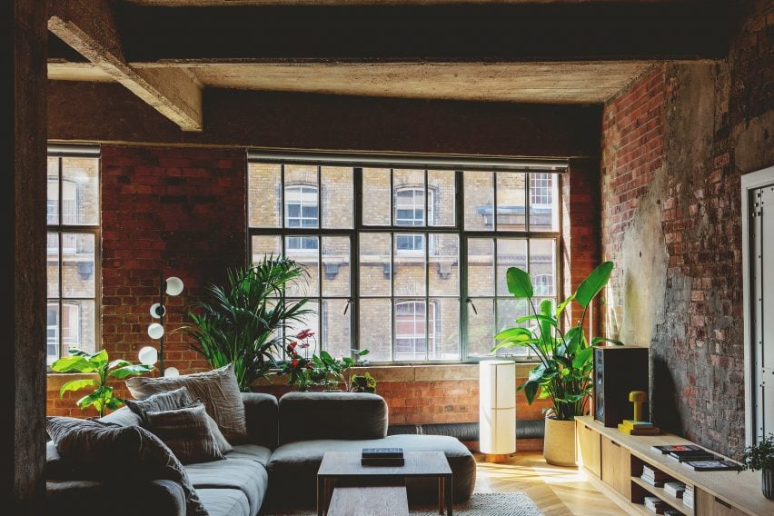
The aim behind this renovation of a former warehouse space in London’s Clerkenwell neighbourhood was to make it feel more comfortable without losing its industrial character.

A low-slung, L-shaped sofa helps to create that mood in the living space. Other furniture elements are also set low, allowing the exposed brickwork walls to be the key focal point.

Find out more about St John Street ›


Vasto gallery by Mesura apartment interior
Photo is by Salva López

Casa Vasto, Spain, by Mesura

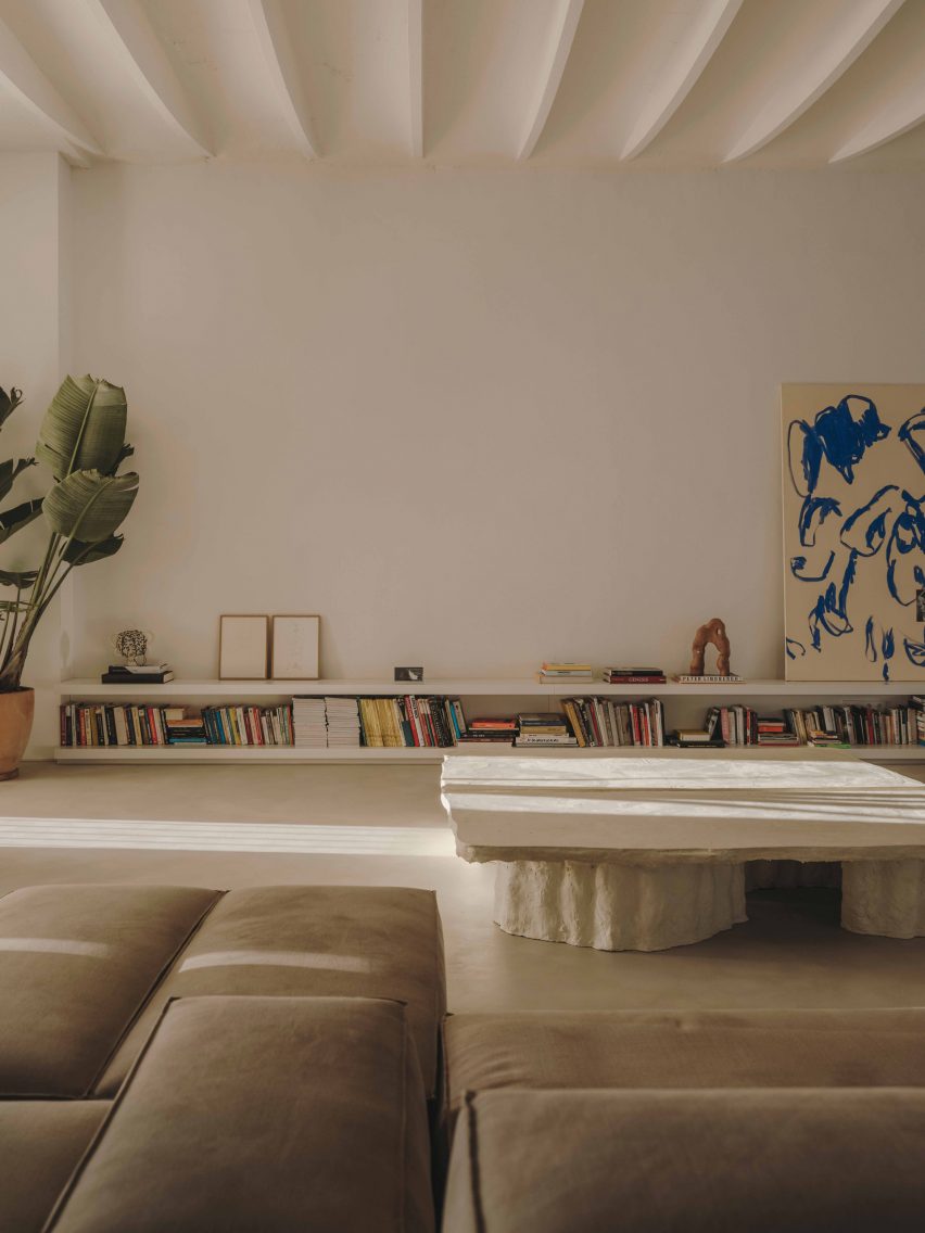
This converted factory apartment in Barcelona’s El Poblenou neighbourhood doubles as a gallery, so it plays host to an ever-changing roster of collectable art and design pieces.

Low-lying furnishings help to enhance the apartment’s high, vaulted ceilings, creating an optimal setting for display.

They include a modular sofa system that can be arranged in different ways and an equally low coffee table made out of construction waste.

Find out more about Casa Vasto ›


Minimalist living room inside House by the Sea by Of Architecture
Photo is by Lorenzo Zandri

House by the Sea, UK, by Of Architecture

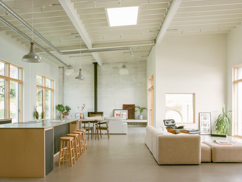
The open-plan ground floor of this seaside house in Cornwall includes two lounge spaces. One is designed as a snug, with a high-back sofa and a hearth, while the other has a more casual feel.

The sofa in this second space is a modular L-shaped piece, upholstered in beige marl fabric.

Its low back helps the space feel connected with the adjacent kitchen and allows views across to the expansive sliding windows, which offer a view of Newquay’s picturesque Pentire Steps beach.

Find out more about House by the Sea ›


Sausalito Outlook by Feldman Architecture
Photo is by Joe Fletcher

Sausalito Outlook, USA, by Feldman Architecture

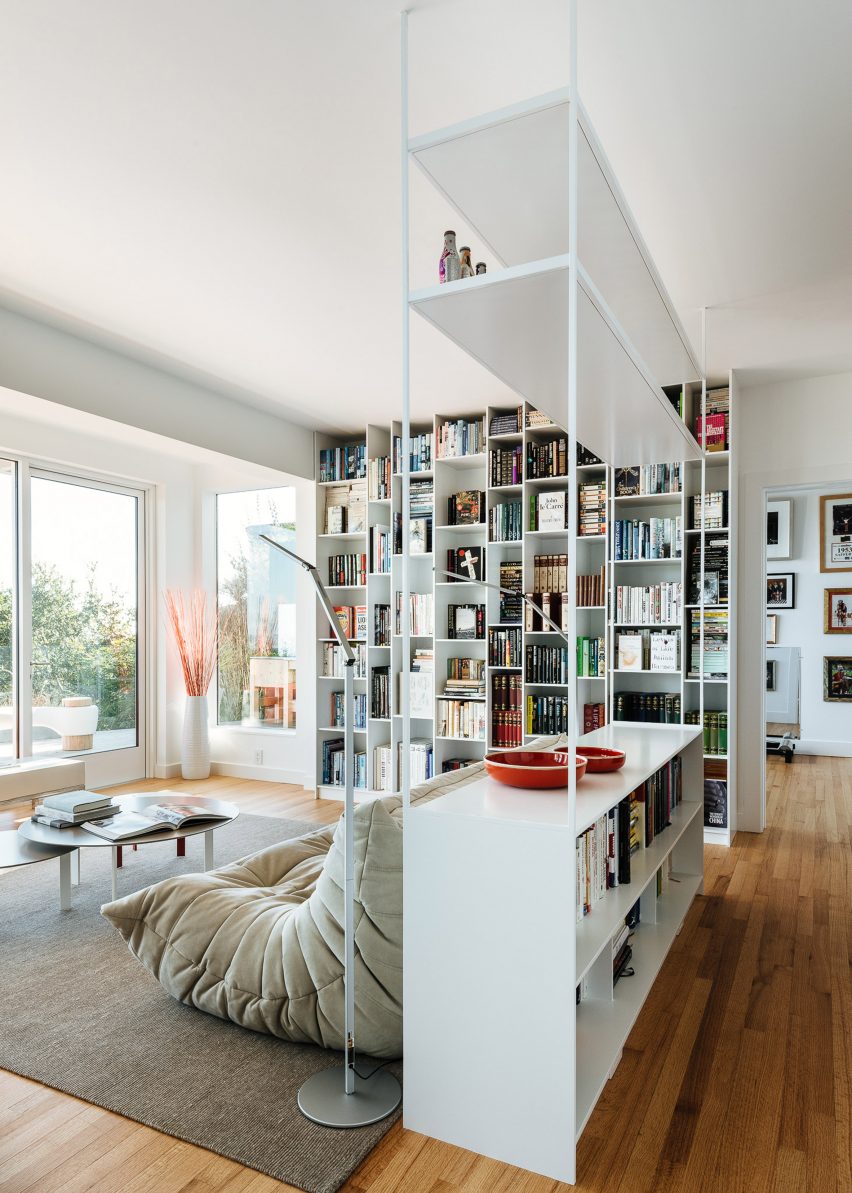
The living room of this renovated 1970s house on San Francisco Bay features an iconic low-slung seating design that was launched around the same time.

Designed by Michel Ducaroy in 1973 and produced by Ligne Roset, the Togo chairs and sofas look like slouchy, oversized cushions, but their foam filling is surprisingly supportive.

Here, they create two seating areas that can be used for reading, watching television or looking out at the sea view.

Find out more about Sausalito Outlook ›


Family lounge in Twentieth house by Woods and Dangaran
Photo is by Joe Fletcher

Twentieth, USA, by Woods + Dangaran

Generous, low furniture pieces are a recurring theme in this three-storey house in Santa Monica, which was designed to be practical for day-to-day life and able to host parties and gatherings.

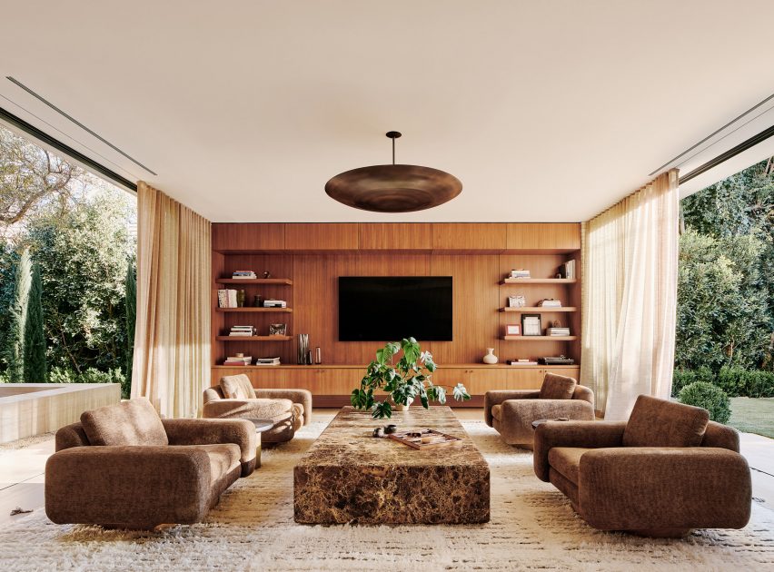
The most striking example is a set of four club chairs with swivel bases, organised around a polished stone coffee table in one of two ground-floor living rooms.

Find out more about Twentieth ›


Exterior of NZ10 Apartment in Spain by Auba Studio
Photo is by José Hevia

NZ10 Apartment, Spain, by Auba Studio

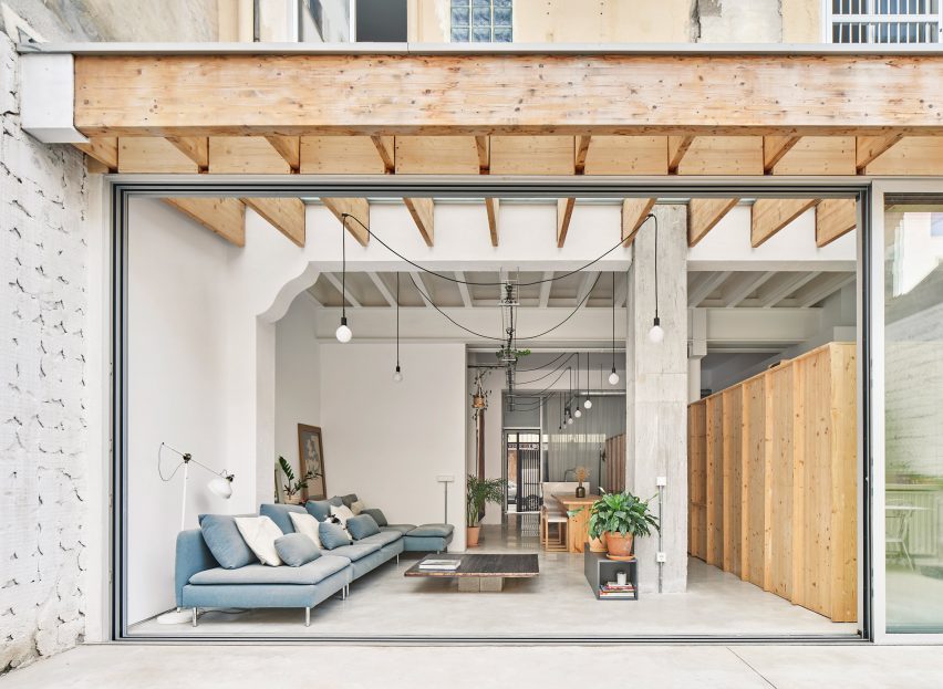
Low-back furniture can work well in rooms that connect indoors with outdoors, where the atmosphere is typically less formal. This apartment in Palma de Mallorca is a prime example.

Located in a converted bakery, the home features full-height sliding doors that connect a rear lounge space with patio terrace. The room is furnished with a casual, low sofa that extends all the way along one side.

Find out more about NZ10 Apartment ›


Canal Saint-Martin apartment by Rodolphe Parente
Photo is by Giulio Ghirardi

Apartment Canal Saint-Martin, France, by Rodolphe Parente

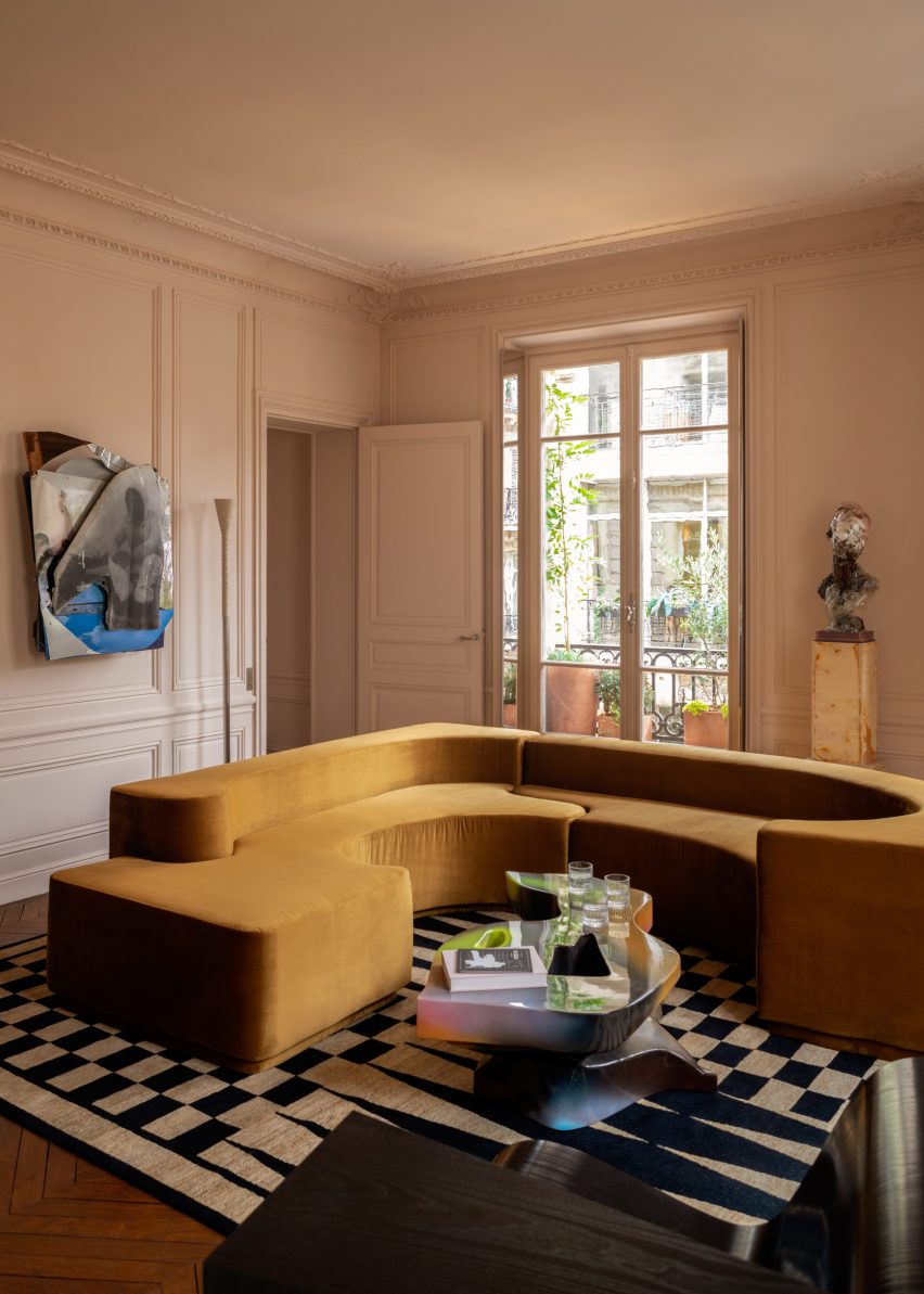
The living room of this renovated Haussmann-era apartment in Paris centres around a sculptural vintage sofa, upholstered in mustard-yellow velvet.

The piece has a formal, geometric shape that complements the building’s period details, while its low shape offers a contemporary feel that is echoed by other playful artworks and furnishings in the room.

Find out more about Apartment Canal Saint-Martin ›


Low-slung sofa in Sag Harbor 2
Photo is by Read McKendree

Sag Harbor 2, USA, by KOS+A

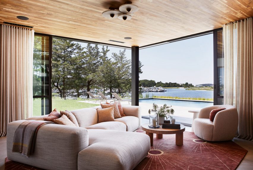
Sunset views were a priority for the owners of this waterfront house in the Hamptons, the popular retreat destination for New Yorkers.

The waterfront facade is largely glazed to maximise views, so it made sense to choose unobtrusive furniture. For the family lounge, this meant a low-slung L-shaped sofa and a curved club chair.

Find out more about Sag Harbor 2 ›

This is the latest in our lookbook series, which provides visual inspiration from Dezeen’s archive. For more inspiration, other recent lookbooks feature colourful bedrooms and kitchens with tiled worktops.

Reference

Minus launches subscription furniture with ambition to go “beyond zero”
CategoriesSustainable News

Minus launches subscription furniture with ambition to go “beyond zero”

Norwegian brand Minus is looking to disrupt the interior design industry by offering carbon-negative furniture on a subscription basis.

Minus debuted its first furniture collection, designed by Oslo studio Jenkins & Uhnger, at the biennial Designers’ Saturday event in the Norwegian capital.

The ambition is to go “beyond zero” by creating timber products that are carbon-negative across their lifespan. This led the brand to develop a rental service model.

“We started Minus to realise an optimised value chain for both production and consumption,” said Kristian Notland Harnes, the brand’s CEO and co-founder.

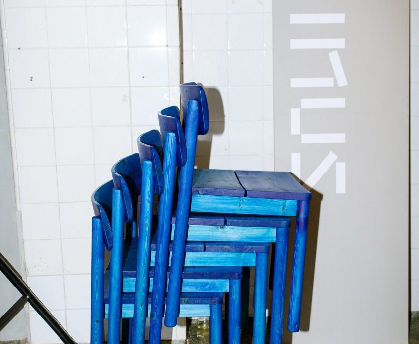
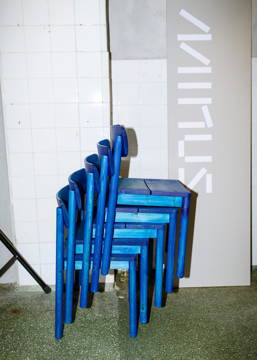
Minus Chair in blue stacked up at Minus Furniture exhibition in Oslo for Designers' Saturday
Minus staged an exhibition for Designers’ Saturday in Oslo

The strategy, he told Dezeen, is to design with “a 100-year perspective”.

This means taking responsibility for a product after it has left the factory, ensuring it stays in use as long as possible and is recycled at the end of its life.

“In the western world, a chair generally lives for 10 years,” Harnes said. “If the wood takes 100 years to grow, there is an imbalance there. It’s 90 per cent deforestation.”

“It’s about material control,” he added. “That leads us to subscription because it enables us to take responsibility for the material lifespan.”

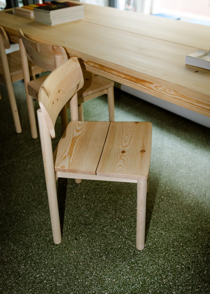
Minus Chair and Table with natural wood finish at exhibition in Oslo for Designers' Saturday
The brand produces its furniture in pine wood

Minus’s first product, the Minus Chair, was launched as part of the Norwegian Presence exhibition in Milan last year and has since been longlisted for a 2023 Dezeen Award.

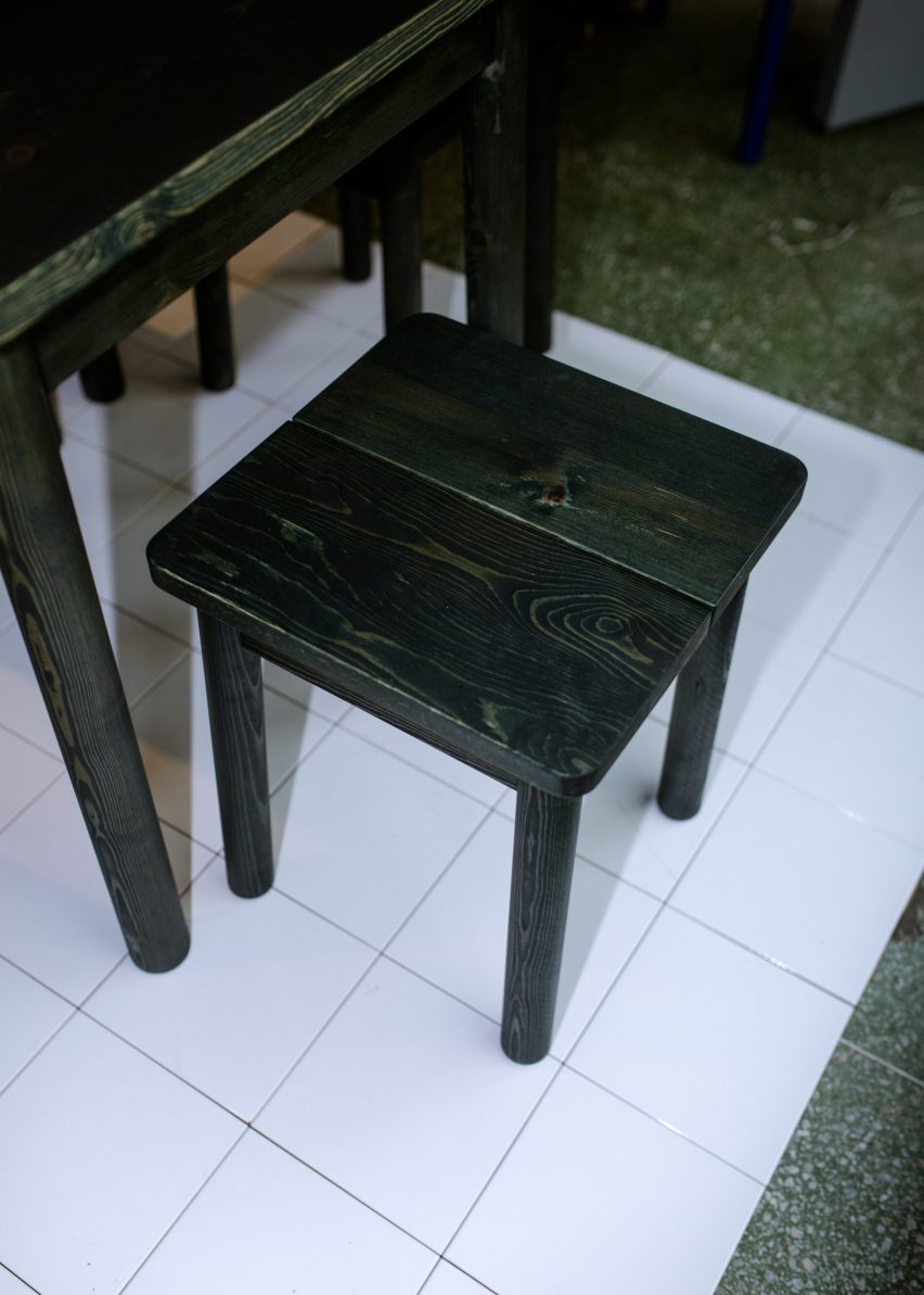
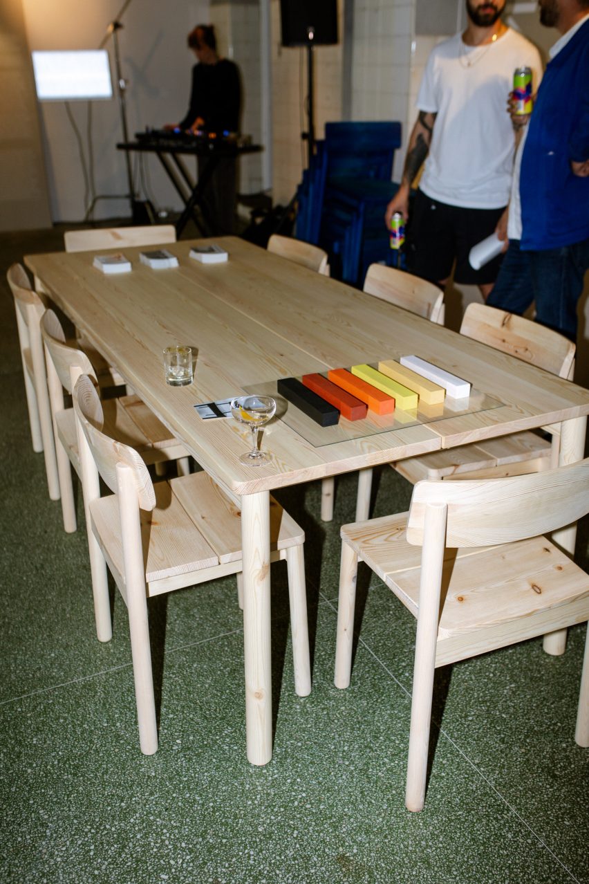
The brand has now added a stool, a bench and a table to its collection, all produced in pine wood.

When the pieces are no longer serviceable, Minus says it will take them back and convert them into a charcoal-like substance called biochar, stabilising the carbon contained in the timber and preventing it from being released into the atmosphere.

The result is a kind of fertiliser that can be added to soils to help them sequester more carbon.

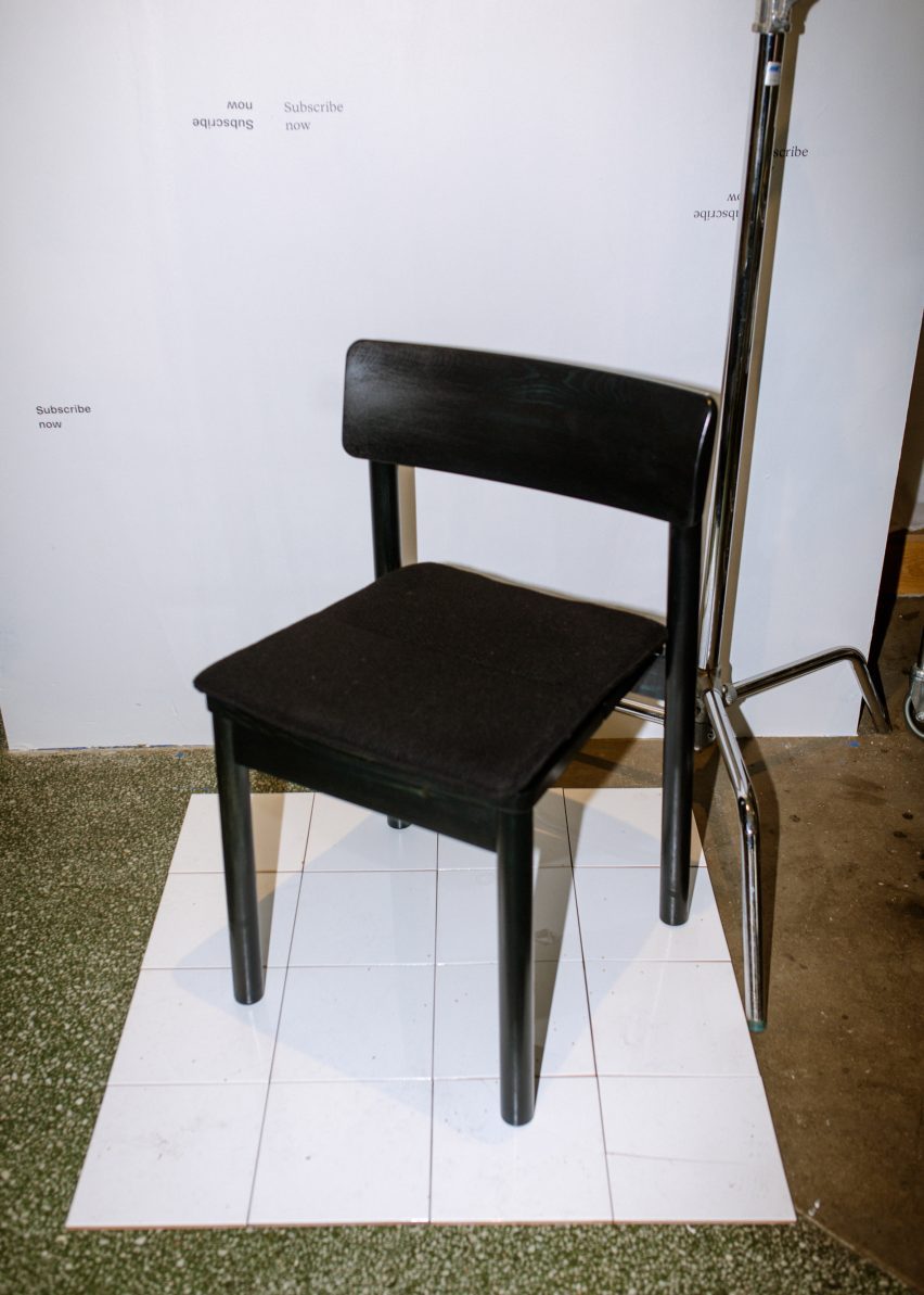
Minus Chair in black
The furniture is designed for both subscription and sale

According to Minus’ calculations, the chair produces -2.6 kilograms of carbon dioxide equivalent (CO2e) emissions throughout its life when rented or 1.9 kilograms when purchased outright, compared with an industry standard of 27 kilograms.

Minus plans to offer all of its products for sale or subscription, although the subscription model is currently still in the trial phase and only available to select businesses.

“Customers initially sign a 30-month subscription period, which basically covers our production cost,” said Harnes.

“The price falls 30 per cent every three years, giving you an incentive to keep the furniture longer. It is also possible to subscribe to used chairs at a lower price.”

Minus Stool in black
The products are designed to be carbon-negative across their full lifecycle

Designers Thomas Jenkins and Sverre Uhnger played a key role in shaping Minus’ manufacturing operations.

With a brief to “design the most environmentally friendly chair possible”, they took a holistic look at how the production process could be adapted to minimise energy use and make optimal use of materials and resources.

This led Minus to adopt a decentralised approach. Instead of setting up a single production facility, the company manufactures in various factories and sources timber from as close to those locations as possible.

The furniture, meanwhile, is designed to require as little machining as possible, with few curves and no unnecessary details. The goal was to make the designs highly efficient but still functional and attractive.

By being involved from the project’s outset, Uhnger and Jenkins were able to impact the carbon footprint across every aspect of Minus’ business.

“Quite often it’s too big of an investment for a manufacturer or the brand to change all these aspects for one product or one product range,” Uhnger said.

“Therefore it is almost easier for a start-up to make real change than the bigger brands.”

Minus Furniture exhibition in Oslo for Designers' Saturday
The inaugural collection includes a chair, table, bench and stool

Customers can choose to leave the furniture unfinished or have it treated with linseed oil. Colour can also be added, with either a paint or lacquer finish.

“We wanted to offer different ways of purchasing the chair and different finishes, all with different levels of CO2 consumption, and allow the customer to make the choice themselves,” Jenkins told Dezeen.

“It’s a way of challenging and disrupting the industry, just as much as our work on the production side.”

The products are deliberately oversized to make them more robust, which also means they can be sanded down and/or retreated if they get marked or dented in the future.

Minus Bench
Customers can choose the level of finish they want based on its carbon footprint

Jenkins said that “emotional durability” was also an important consideration. The designs are very simple, but they do have some defining characteristics.

Flat surfaces are made up of two pieces, meaning they can be made from standard-sized planks while legs are cylindrical.

The chair also features a double-curved backrest – a playful element that makes it comfortable from different angles.

“One of the key aspects of circularity is keeping the product in use in its original form for as long as possible,” said Jenkins. “We need people to still want to use these products for 20, 30, 50 or even 100 years.”

Wood chippings
Minus’ process includes converting waste wood into biochar

Minus launched its collection in a pop-up exhibition for Designers’ Saturday, which took place in Oslo from 8 to 10 September.

Here, the company showcased new black and blue stain finishes for the Minus chair as well as seaweed-based bio-foam seat cushions by its partner brand Agroprene.

Minus plans to further improve its processes over the next 12 months, with the belief it can bring the CO2e of each chair down to as low as -15 kilograms.

One challenge the brand faces is that it can’t back up its claims with an environmental certification, as the end-of-life benefits of biochar are not considered within Environmental Product Declarations (EPDs) and there is no guarantee they will ever be.

Agroprene foam
Minus is partnering with Agroprene to offer bio-foam cushions for its chairs

Yet Harnes is confident of its effectiveness, pointing to research stating that the production of biochar can stabilise 50 per cent of the carbon in biomass such as pine.

The brand has big ambitions for the future but needs to build its audience in order to make that happen.

“Getting the contract business going is a very important part of the Minus project succeeding,” said Jenkins. “Then we can start looking at bigger projects. We want this to be sourced by local councils for schools.”

The photography is by Kristianne Marøy.

The Minus exhibition was on show as part of Designers’ Saturday from 8 to 10 September 2023. See Dezeen Events Guide for more architecture and design events around the world.
Reference

Eight furniture pieces and products made out of sustainable materials
CategoriesSustainable News

Eight furniture pieces and products made out of sustainable materials

Dezeen Showroom: 3D-printed room dividers made from food waste and mycelium are among recent sustainably-designed products on Dezeen Showroom.

In order to address growing environmental concerns within the furniture and wider design industries, brands are opting to make their products using renewable, recyclable and reclaimed materials, and processes with circular principles in mind.
We’ve rounded up eight recently released furniture pieces made from recycled materials, including waste plastic from abandoned fishing nets, electronic waste from the tech industry and materials derived from the process of making paper.
From a bar stool made from coffee shells to a recycling bin made out of post-consumer plastic, read on to see our selection of the latest furniture designs made from sustainable materials on Dezeen Showroom.


Superpop tables by Paolo Cappello for Miniforms

Superpop tables by Paolo Cappello for Miniforms

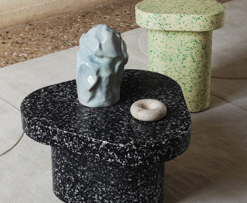
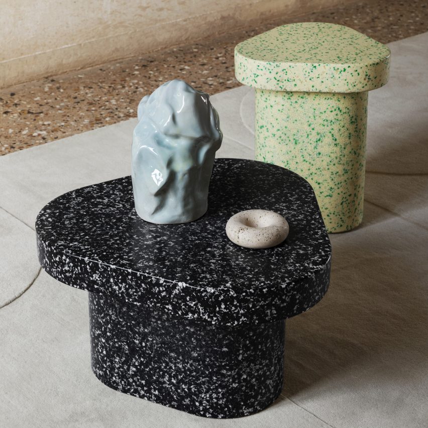
Miniforms’ Superpop tables – created in collaboration with Italian designer Paolo Cappello – have a rounded rectangular form and a speckled finish reminiscent of terrazzo.

The pieces are made from recycled plastic, which creates the mottled pattern. They are lightweight and durable enough for use either indoors or outdoors and can be recycled further at the end of their lifespan.

Find out more about Superpop ›


Veggro collection by Interesting Times Gang and OBOS

Veggro collection by Interesting Times Gang and OBOS

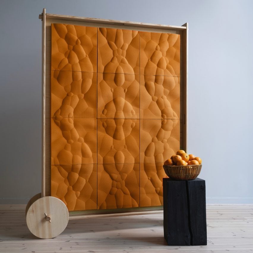
Design studio Interesting Times Gang worked with cooperative homebuilder OBOS on a duo of screens called Loom and Jugoso.

Loom has a pale finish and is made from mycelium, whereas mustart-hued Jugoso is made out of orange rinds. Both are created using 3D-printing techniques and have biomorphic patterns representing the natural materials they are made from.

Find out more about Veggro ›


Eternity high stool by Space Copenhagen for Mater

Eternity high stool by Space Copenhagen for Mater

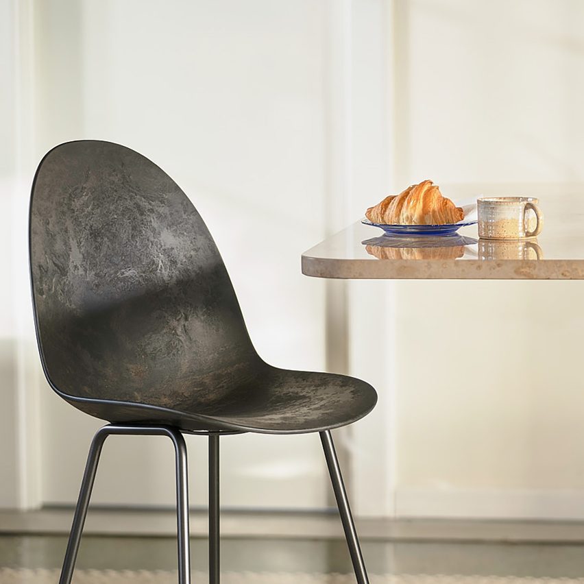
Danish furniture brand Mater has created its Eternity high stool in collaboration with designers Space Copenhagen, which is made from Matek – the brand’s patented circular waste material.

The material contains both e-waste and coffee shells leading to the stool’s characteristically dark colour. It can be upholstered with Kvadrat’s Re-wool material,  which is made from 45 per cent recycled wool.

Find out more about Eternity ›


Alted H01 tile by Berta Julià Sala for Alted Materials

Alted H01 tiles by Berta Julià Sala for Alted Materials

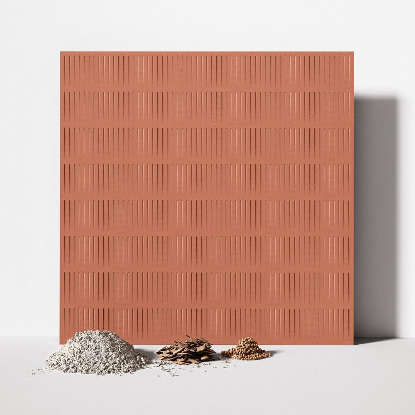
Spanish brand Alted Materials worked with product designer Berta Julià Sala on a range of tiles made from cellulose waste, a byproduct of the paper industry. The tiles are also coated with a water-based sealant distilled from waste vegetables.

Alted H01 tiles come in three grooved patterns and various earthy colourways. The material allows the tiles to be recycled circularly, preventing material from ending up in landfill as is the case with traditional construction materials.

Find out more about Alted H01 ›


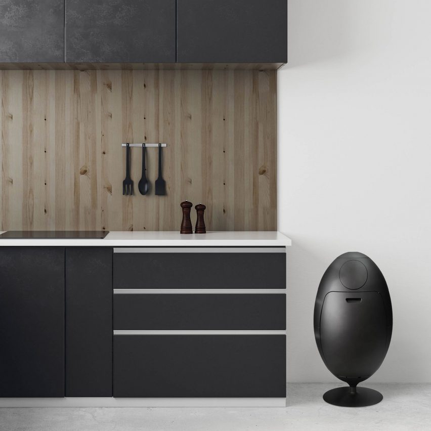
Matt black Ovetto bin in kitchen

Ovetto waste bin by Gianluca Soldi for SoldiDesign

Italian design brand SoldiDesign has released an egg-shaped waste bin named Ovetto that is both made from recycled materials and is designed to contain them in different compartments for easy disposal.

The bins are made from post-consumer recycled ABS and polypropylene in different amounts depending on its colour. The matt black Ovetto bin is made from 100 per cent recycled content.

Find out more about Ovetto ›


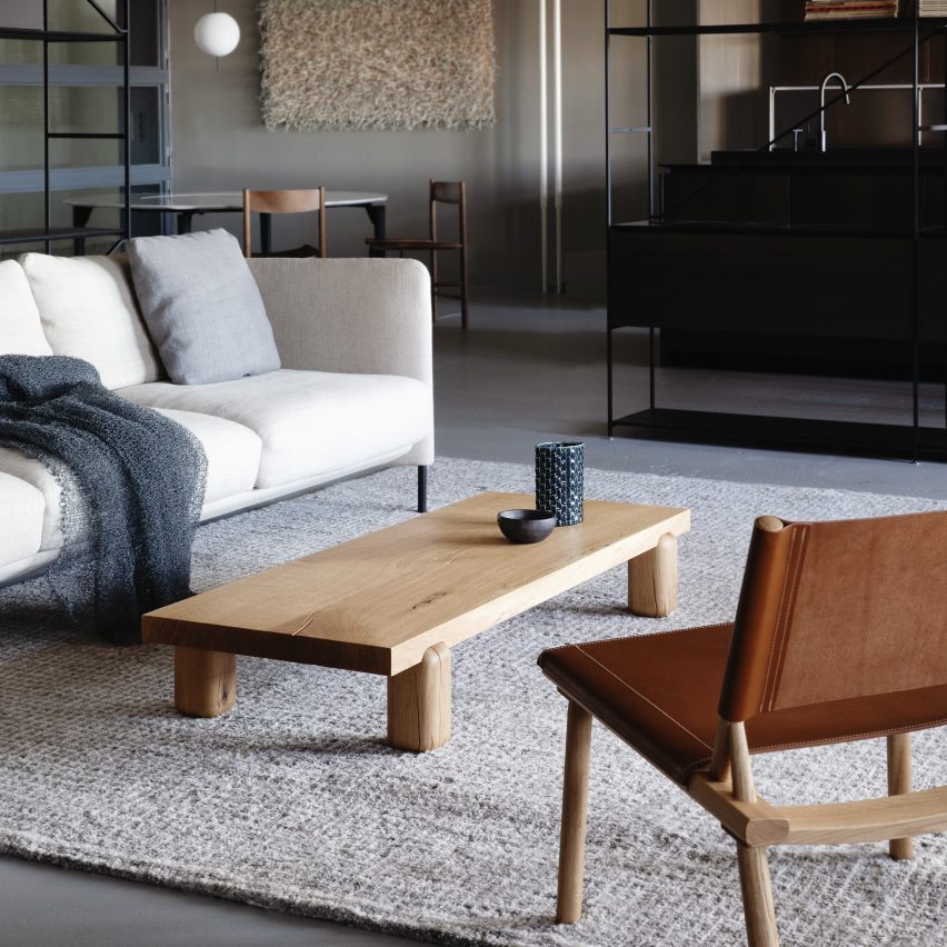
Wooden coffee table in living room

Centenniale coffee table by Joanna Laajisto for Nikari

The Centenniale coffee table was made for Finnish brand Nikari by architect and designer Joanna Laajisto out of 100-year-old wood.

The table’s angular top is supported by contrasting chunky, rounded legs. It can be made from solid oak or ash wood, and emphasises the importance of utilising existing renewable materials.

Find out more about Centenniale ›


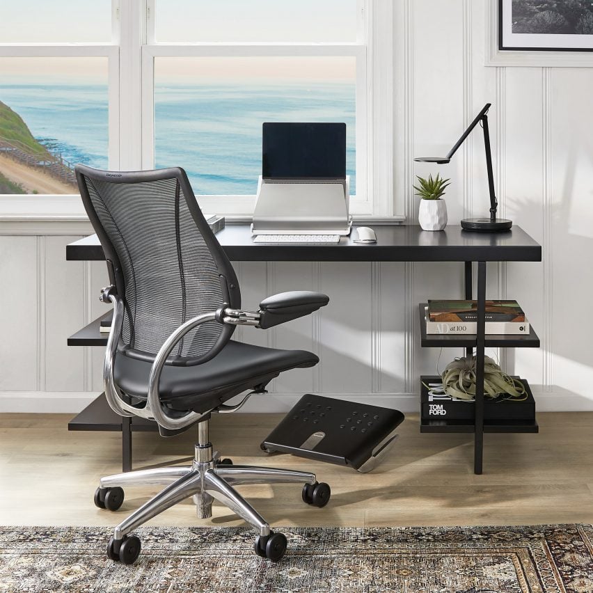
Black task chair by Humanscale

Liberty Ocean chair by Humanscale

Office furniture brand Humanscale used up to one kilogram of plastic derived from disused fishing nets for its Liberty Ocean task chair.

The chair represents the next evolution of the brand’s classic Liberty chairs. It shares the same ergonomic technology and comfort as the other chairs in Humanscale’s catalog but is made from sustainably-conscious materials.

Find out more about Liberty Ocean ›


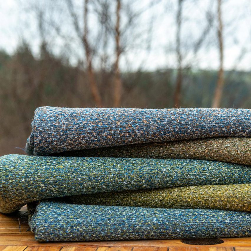
Stack of earthy coloured materials on outdoor table with trees in background

Gaia recycled upholstery fabric collection by Skopos

British brand Skopos has created a collection of materials made out of recycled textiles and post-consumer plastic waste.

Gaia mimics the appearance of textured wool boucle and comes in a selection of 21 earthy colourways.

Find out more about Gaia ›

Dezeen Showroom

Dezeen Showroom offers an affordable space for brands to launch new products and showcase their designers and projects to Dezeen’s huge global audience. For more details email [email protected].

Dezeen Showroom is an example of partnership content on Dezeen. Find out more about partnership content here.

Reference

A circular subscription service for office furniture
CategoriesSustainable News

A circular subscription service for office furniture

Spotted: Following the COVID-19 pandemic and the rise of hybrid work models, companies need more flexibility than ever to scale their physical presence up or down as circumstances change. But as companies optimise their offices to fit changing working practices, there is a nagging problem: furniture.  

Danish startup Nornorm has developed a new model for circular office furniture – one that is based on subscription rather than ownership. Under the startup’s system, companies pay a monthly fee that starts at €3 per square metre (with a startup fee of €12 per square metre). 

At the start of the process, the company provides a floor plan and information on functional needs and personal style, and with this input, Nornorm creates a bespoke furniture solution. Before final sign-off, the company is provided with a 3D model of the re-configured workspace so they can add or remove elements as needed. 

Once the design phase is over, Nornorm installs the furniture at the company’s office – but this is not the end of the collaboration. Companies are free to alter their design at any time, scaling up or down as circumstances require. If a change is requested, Nornorm will deliver any additional furniture required and disassemble any items that are no longer needed. Companies are also free to cancel their subscription at any time, in which case all their furniture will be collected and re-used with another business. To minimise waste and extent the lifespan of each item, any retired furniture is repaired and refurbished for use elsewhere.

Throwaway culture is leading to increased waste, and that includes our furniture. Springwise has spotted many innovations tackling this issue in the archive, including customisable and dynamic cork-based furnishings and a marketplace for second-hand furniture.

Written By: Matthew Hempstead

Reference

Vestre launches “world’s first” furniture made from fossil-free steel
CategoriesSustainable News

Vestre launches “world’s first” furniture made from fossil-free steel

Street furniture brand Vestre and designer Emma Olbers have produced a piece of furniture using fossil-free steel that was made without creating carbon emissions.

The Tellus bench is made from steel forged by Swedish steelmaker SSAB in its converted blast furnace, which uses green hydrogen instead of coal for heat, and so emits no carbon dioxide.

Vestre, which aims to be recognized as the world’s most sustainable furniture company, says it is the first furniture manufacturer in the world to use the fossil-free steel. Steel is one of the brand’s prime targets for slashing its carbon emissions.

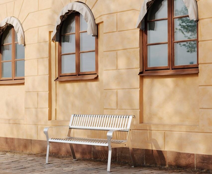
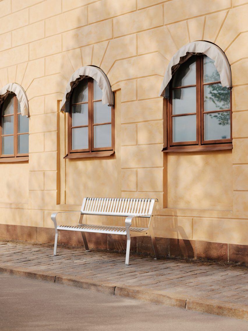
Photo of a lightweight steel bench on the street of a European city against an old building
The Tellus bench is the world’s first item of furniture made from fossil-free steel

“Early estimates show that converting all our steel to fossil-free could reduce our overall footprint by around 60 percent,” said Vestre chief sustainability officer Øyvind Bjørnstad.

For designer Olbers, the goal was to lower emissions even further by using as little material as possible to make the bench. Even though SSAB’s alloy is forged without coal, there are still carbon emissions elsewhere in the value chain, such as from mining and transport, so every gram of material still has some carbon cost.

“An outdoor bench for public environments must also withstand a lot of wear and tear,” Olbers said. “We have striven to use as little material as possible but still maintain the strong construction.”

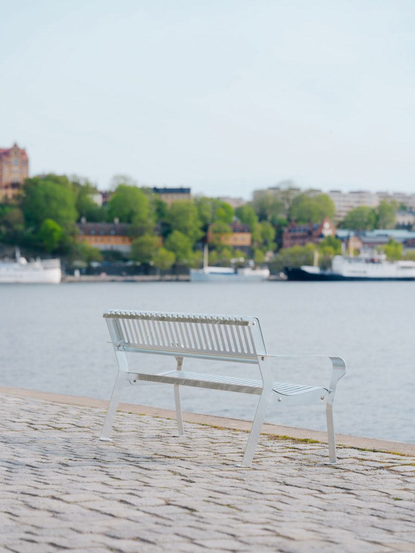
Photo of the Tellus bench by Vestre on a sandy shoreline overlooking the water
Emma Olbers designed the bench so it would use as little material as possible

Aesthetically, Olbers wanted the bench to have a “metal feel” but also look inviting, so she gave it wide armrests that would invite repose while providing enough space to rest a coffee cup.

Tellus is intended for parks and other public spaces, and can be ordered in any classic RAL colour. The bench is titled after one of the alternative names for planet Earth.

Vestre came to work with the fossil-free steel following a long-time partnership with SSAB. Bjørnstad describes the companies as having a “tight dialogue” on several sustainability projects.

Photo of the Tellus steel bench in a lush, green public park
The bench is designed for public spaces such as parks

The Norwegian brand brought in Olbers because of the designer’s dedication to sustainable practices, which Bjørnstad said involves being highly scientific and rigorous in her approach.

The Swedish designer’s previous work includes the Now or Never – 1kg CO2e exhibition at this year’s Stockholm Furniture Fair, in which she visualised the carbon emissions of common materials.

The iron and steel industries currently account for around five per cent of total global green house gas emissions. SSAB first announced its plans to make steel free of fossil fuels in 2016 and made its first batch of the alloy last year.

The material has exactly the same properties as traditional steel but is produced using a process called Hydrogen Breakthrough Ironmaking Technology (HYBRIT), in which green hydrogen is burned instead of coal and coke.

Photo of the Tellus bench armrest and seat in detail
The pattern in the steel sheet helps to minimise the amount of material used

Green hydrogen is obtained via the electrolysis of water, which splits the water molecules into hydrogen and oxygen and emits no greenhouse gases.

SSAB is planning to convert all of its factories in Sweden, Finland and the USA to HYBRIT and phase out its other steel products by 2045.

Doing so could reduce the total CO2 emissions of Sweden by around ten per cent and Finland by approximately seven per cent, SSAB has estimated.

Close-up photo of the Tellus bench backrest showing screw detail
Fossil-free steel has the same properties as traditional steel

Vestre’s previous sustainability efforts include introducing CO2 emissions product labelling and reusing its old fair stands for new installations.

Its production facility in Norway, completed by BIG in 2022, is described by the brand as the most environmentally friendly furniture factory in the world, with Passivhaus strategies, solar panels and geothermal wells.

Photography is by Einar Aslaksen.

Reference

A marketplace for second-hand furniture
CategoriesSustainable News

A marketplace for second-hand furniture

Spotted: Resale in fashion has risen in popularity in recent years, and now curators and sellers are taking inspiration from that model to create a burgeoning second-hand furniture market. As demand from shoppers for sustainable home furnishings grows, Berlin-based Cocoli’s online marketplace makes it easy to find high-quality bargain furniture.  

The company’s name means Community for Conscious Living, and its resale platform provides expert-reviewed second-hand, showroom, end-of-stock, and vintage furniture or home furnishings from both private sellers and well-established brands. Cocoli partners with companies like Wayfair, Sofacompany, and Kave Home to keep products out of landfill by selling them for up to 70 per cent less than the original price.  

Cocoli started with around 200 items for sale. In less than two years, the company has expanded its range of products to 350,000, which will continue to grow as it expands its network of sellers. Individuals wishing to sell on the marketplace fill out an application form. The in-house experts then check items for authenticity, quality, and condition before listing the product online. Sellers do not pay transport fees, and prices include the service fee Cocoli collects for inspecting the product and organising shipment.  

The company recently closed a round of seed funding that raised €3 million. The financing will be used to improve automation of technologies, general expansion of the company, and monitoring of the company’s climate footprint.  

Creative solutions abound in the homewares industries. In the archive, Springwise has spotted waste materials such as wood and general production waste being turned into beautiful new pieces of furniture and other materials.

Written By: Keely Khoury

Reference