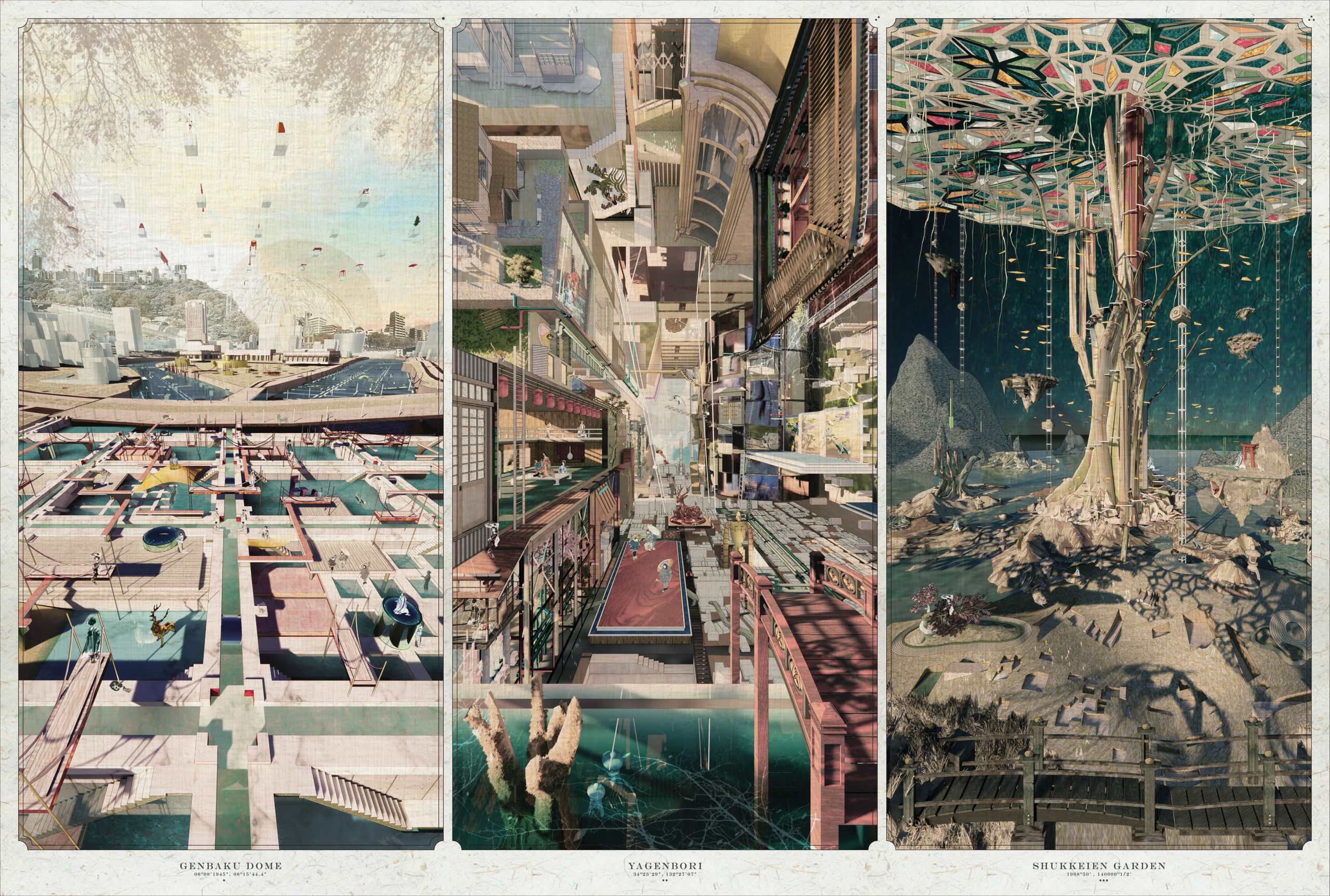
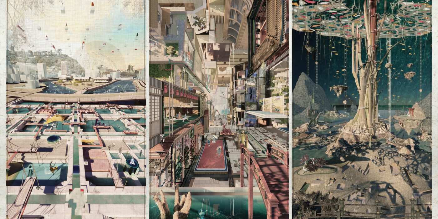
Upon first look over the minute details of One Drawing Challenge Student Winner Victoria Wong‘s award-winning triptych appears to revel in the medium itself. A drawing that harnesses the powers of digital processes, it certainly requires close looking to grasp the changing perspectives, intertwining scenes and layers of time that are compounded in each of the three scenes. One would be forgiven for assuming that the University of Michigan student set out to explore the aesthetic possibilities of digital sketching, 3D modeling and the various uses of other graphic software.
Yet, while Victoria demonstrates mastery of these techniques, they only tell one part of the story behind the drawing. At a fundamental level, before the composition and execution of these ideas, Victoria set out to explore the boundaries between designing, modeling and post-production. In this way, she approaches her subject matter, the site of Hiroshima, through a kaleidoscopic lens that incorporates Japanese aesthetic theory, contemporary music, and photographing imperfections in daily life. In this sense, the end goal was actually to overcome the hurdles of focusing on the technicalities of the design itself to instead foreground the emotive dimensions of a place, unlocking creative possibilities.
“Suggested by Lebbeus Woods, architecture is essentially an internalization of society yet an externalization of ourselves,” Victoria explained. “Through investigating the decay and death of artifacts and events, Into the Void illustrates the new collisions of regrowth and reshaping our relationship with different agencies.”
Architizer’s Architecture Editor invited Victoria to expand on conceptualization of her winning triptych. In the conversation that follows, the designer, who will be starting at Perkins&Will‘s Dallas studio this May, offers insights into her creative process and the underlying themes of her thesis project.
Hannah Feniak: Congratulations on your success with the One Drawing Challenge! What sparked your interest in entering the competition and what does this accolade mean to you?
Victoria Wong: Thank you, Hannah and your team, for hosting and curating! Also, congratulations to all the winners. I came across the One Drawing Challenge several years ago and appreciated Architizer showcasing a wide variety of entries so the public can appreciate those drawings. The simplicity of one image accompanied by storytelling has also been compelling. Regarding this accolade, it’s an honor to conclude my time as a student by sharing my thesis with the architecture community.
POSSIBILITIES.
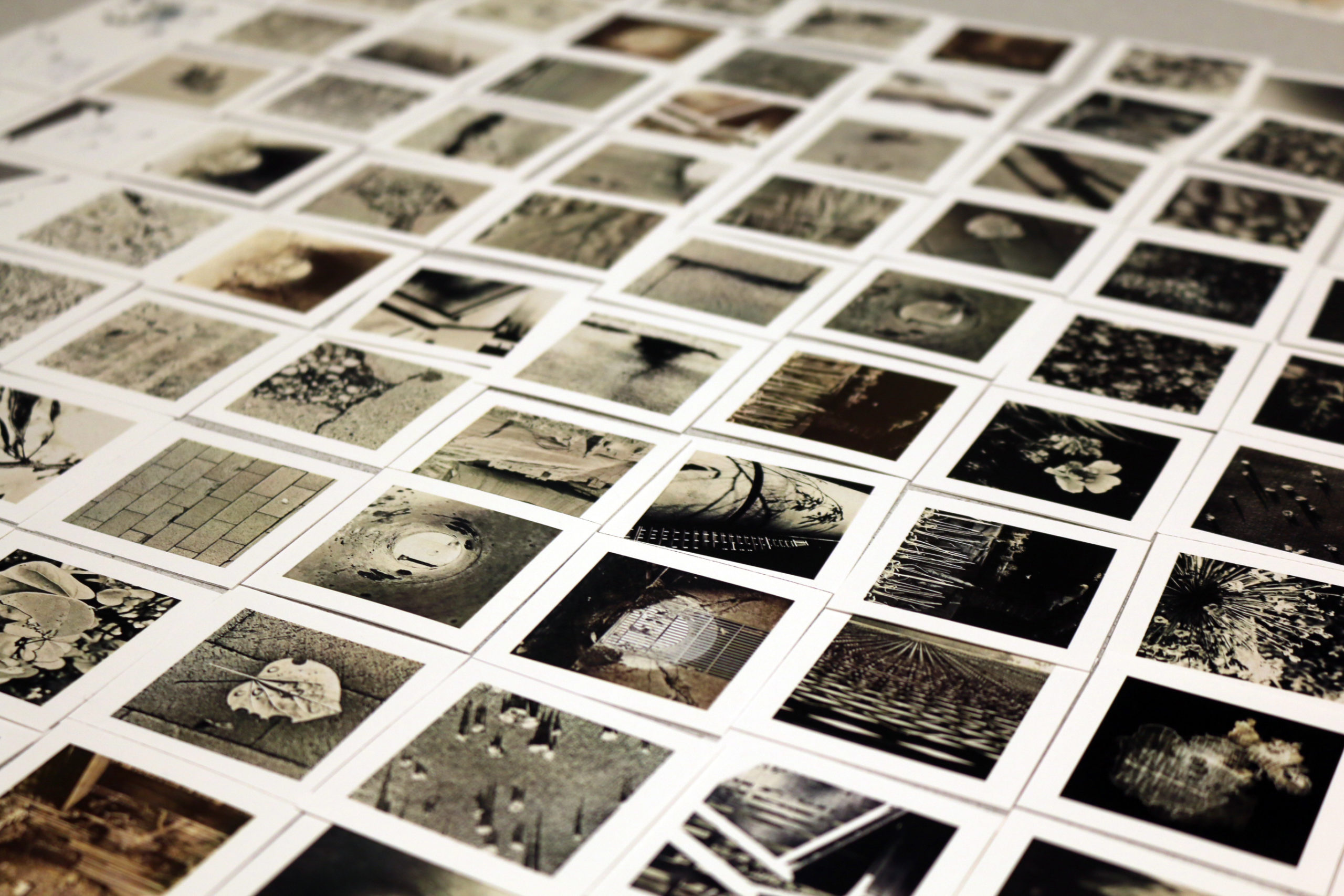
Photo Study: The starting point of Victoria’s winning entry was idea curation. To this end, she sought to understand her subject matter through taking photos and analyzing music.
HF: What were the primary challenges of conceiving your work, from forming the idea to the physical process of creation?
VW: The triptych serves as the final scenes of my thesis, “Into the Void: Fragment Time, Space, Memory, and Decay in Hiroshima.” It was about a six-month study of various Japanese aesthetic theories of imperfections, including life and death, decay and rebirth, shadow and lights, etc. Since the topic is very conceptual, I took a non-traditional route to build my understanding of the matter by photographing the imperfections in daily observance and analyzing contemporary music after the first round of research.
The major challenge was translating multiple layers of Hiroshima’s research and new information into the final scenes while acknowledging the historical, cultural and natural aspects of the site. There is a delicate balance in respecting the gravity of the past while proposing a parallel timescape that accepts and appreciates imperfections and the scarring. Another challenge was to showcase the idea through an appropriate medium; in this case, the stages are oversaturated yet harmonizing to counter argue our understanding and concept of “void.”
The final production was relatively short once I decided what to highlight and how to narrate my thesis. All elements in the triptych were modeled digitally, thus requiring very little post-production work. I specifically enjoyed the production process of this triptych; it was an experiment in challenging how much the post-production process can be minimized. The boundary between designing, modeling and post-production is blurred. The strategy of ‘manipulating’ the illustrations fulfilled my curiosity in examining if the creation of an image can be as interesting as the design and the story behind it.
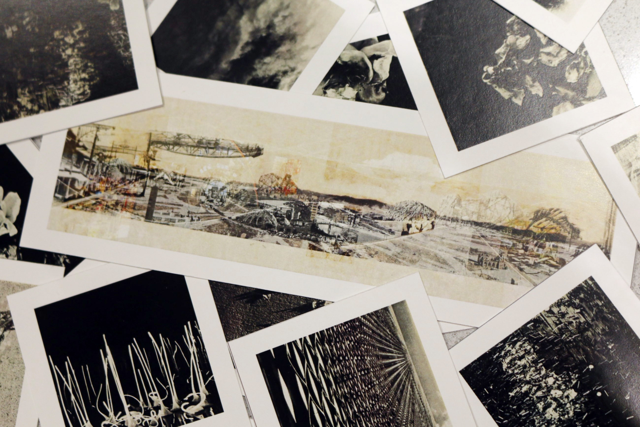
Photo Study: A zoomed-in showing one of the panoramic views that was described in the text that Victoria was working with.
HF: Could you describe why you gravitated towards these specific illustration techniques?
VW: I usually gravitate towards two types of illustrations: imaginative and informative. The creative illustration reveals how the space feels instead of the technicality of the design, i.e. the mood palette, while the informative illustration showcases relationships in all scales, from connectivities of agencies to architectural detailing to a building’s contextual relationship with its site or cityscape on a larger scale. This triptych lays between the two categories. It is a relatively new way of seeing illustrations for myself, but it seemed fitting for this theme.
For example, the middle panel conveys the “void in culture” by depicting an afternoon at Yagenbori, previously known as one of the largest red-light districts in Japan. It is currently at its sunset stage and losing its identity as the cradle of Geisha. To capture its story and depict the diversity of the area, I chose to collapse multiple perspectives and timescapes into a one-point perspective allowing time and space to condense into one scene where layers of imagination coexist. The duo-perspective illustrates different timelines in the scene. When the panel is viewed ‘top-down,’ it tells the story of the current days; when it is viewed ‘forward,’ it illustrates the past events. Other floating devices and elements demonstrate futuristic connections bridging the two. The timeline, scale, and space are distorted in ways where elements from different eras are reorganized and coexist in the same world.
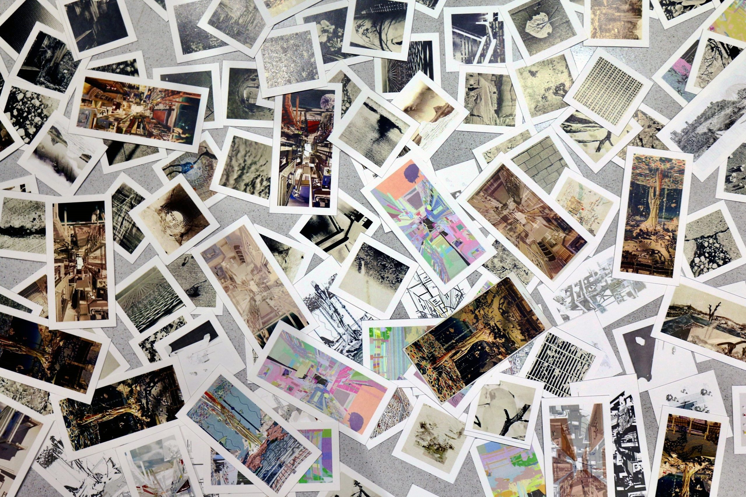
Mini Prints of Testing Images
HF: Your piece explores Japanese aesthetic theories through the city of Hiroshima’s past, presents and future. Do you have other drawings that are as conceptual as this? In terms of format, have you explored the narrative potential of the triptych format in the past?
VW: This is my first time creating a triptych, but I have always gravitated towards illustrations with a sense of humor and leaving room for imagination. The project started with a trio of panoramic collages using historic photos from WWII to re-visualize the same three Hiroshima sites shown in the triptych. They depict a parallel timeline in which human and non-human agencies got to reclaim the ruins and transform them into their habitat instead of reconstructing how the sites were before they were annihilated. In terms of format, I am currently researching a couple of other sites that follow the same trail of investigation and presentation format besides Hiroshima. They both have their challenges – historically, environmentally, culturally, and politically– and I’m excited to see where this way of investigation will affect our views towards scarring that are shared between generations and to inform architects of alternative possibilities.
HF: How did the process and workflow of creating your drawing compare to traditional architectural drafting?
VW: While technology certainly helps people visualize and communicate ideas, I’m attracted to the simplicity of pen and paper when thinking through ideas. During covid, when our mobility was primarily restricted, I started exploring digital sketching. The medium is different, but the general technique remains unchanged. While my ideas begin with analog and digital sketching, 3D modeling and other graphic software are productions and experimental tools that elevate my understanding of design. On the one hand, I enjoy how forgiving digital platforms are, yet making mistakes is the best part of experimenting.
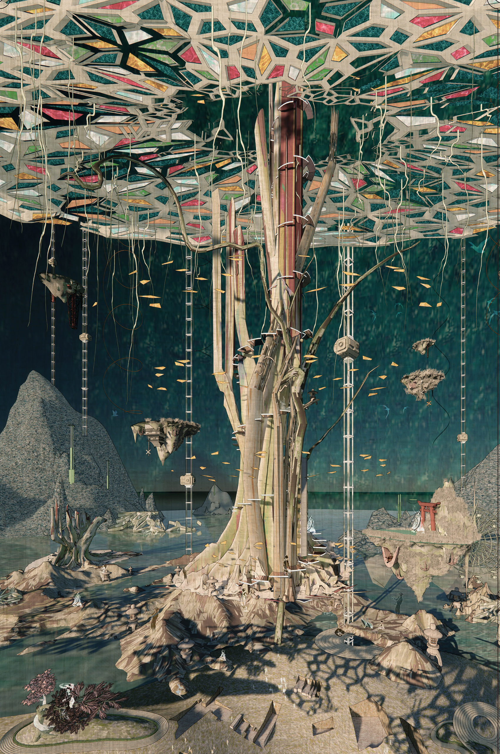
Detail of the final product: 1/3 of the triptych.
HF: What one tip would you give other students looking to win next year’s One Drawing Challenge?
VW: Go wild and explore your imagination. There is no right or wrong answer to creating an excellent image as long as the message is conveyed. I’m excited to see how people depict their logic and systematically translate it into a visually pleasing drawing. Have fun, and enjoy the process!
Thank you, Hannah and your team, for hosting and curating! Also, congratulations to all the winners. I came across the One Drawing Challenge several years ago and appreciated Architizer showcasing a wide variety of entries so the public can appreciate those drawings. The simplicity of one image accompanied by storytelling has also been compelling. Regarding this accolade, it’s an honor to conclude my time as a student by sharing my thesis with the architecture community.
Interested in seeing more work by Victoria Wong? Peruse her portfolio and connect:
> https://www.linkedin.com/in/vwongwt/
> https://www.instagram.com/vw.archive/
The winners of Architizer’s Fourth Annual One Drawing Challenge have been revealed! Interested in next year’s program? Subscribe to our newsletter for updates.






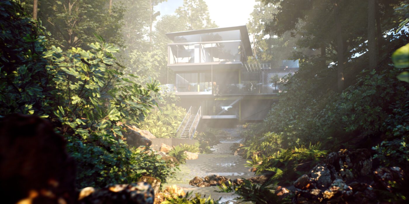
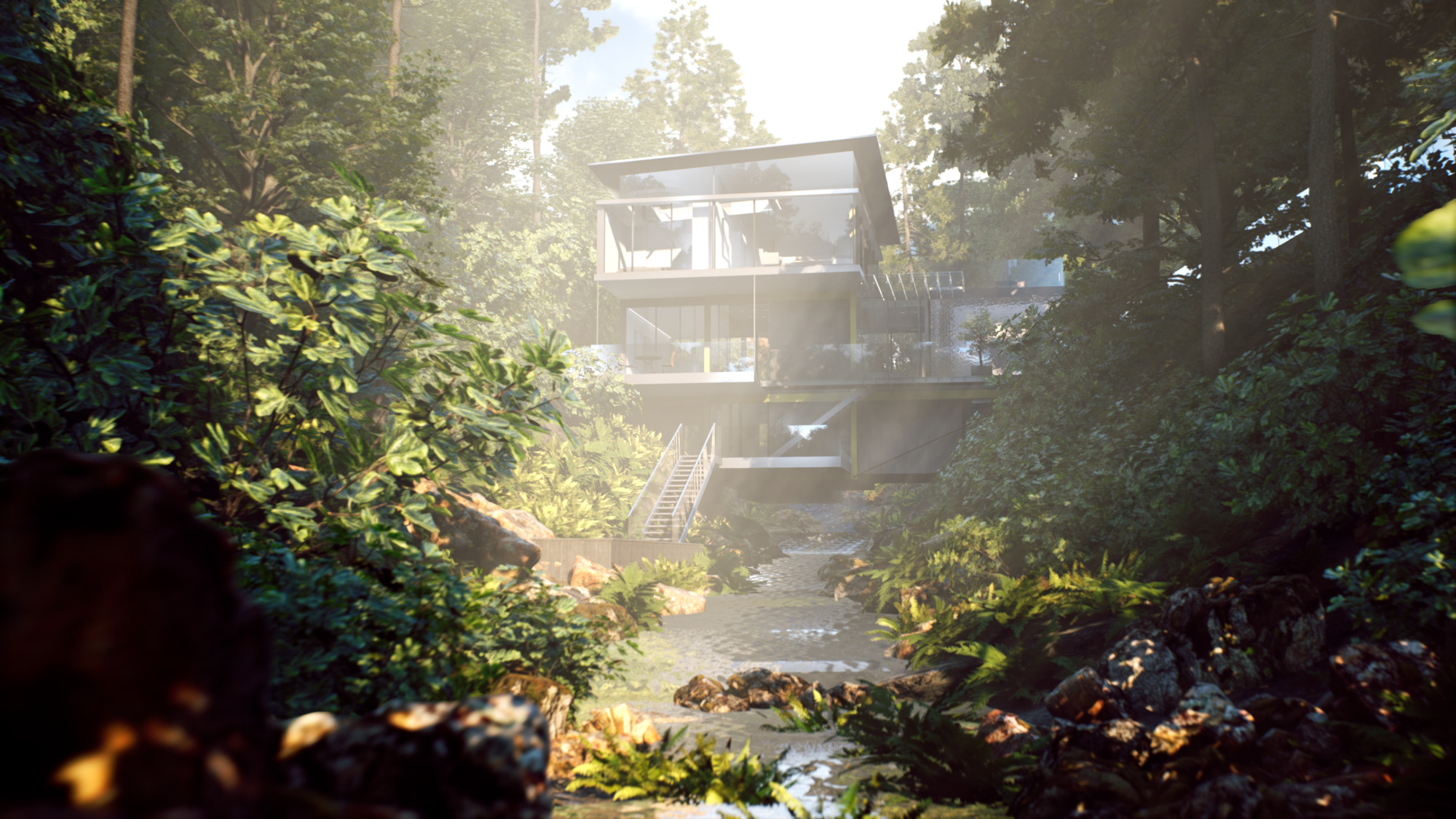 While the gaming and entertainment industry were early adopters of VR, it has been used across project types in architecture. The Suspension House was created by Kilograph to work with the natural environment around it, rather than fighting against it. To illustrate this relationship, their Virtual Reality experience portrays the house in nature’s many states. The user is taken on a trip through different key locations as the weather time of day changes. They created hand-sketched storyboards and a cinematic trailer rendered in real-time in Unreal Engine.
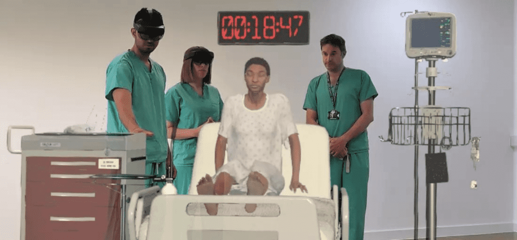
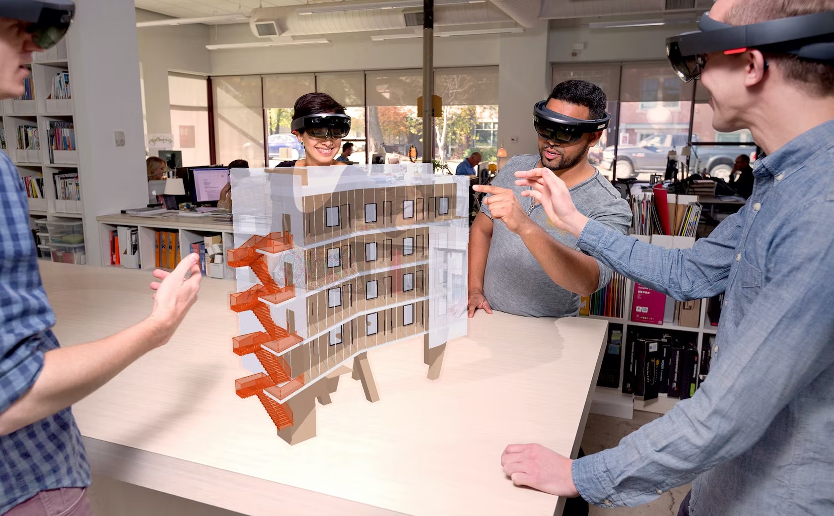 Mixed Reality (MR) integrates both VR and AR. It blends real and virtual worlds to create complex environments where physical and digital elements interact in real time. Here, both kinds of elements and objects are interacting with one another, and it usually requires more processing power than VR or AR. Mixed reality is gaining traction alongside wearable technology to create immersive environments in a whole new way.

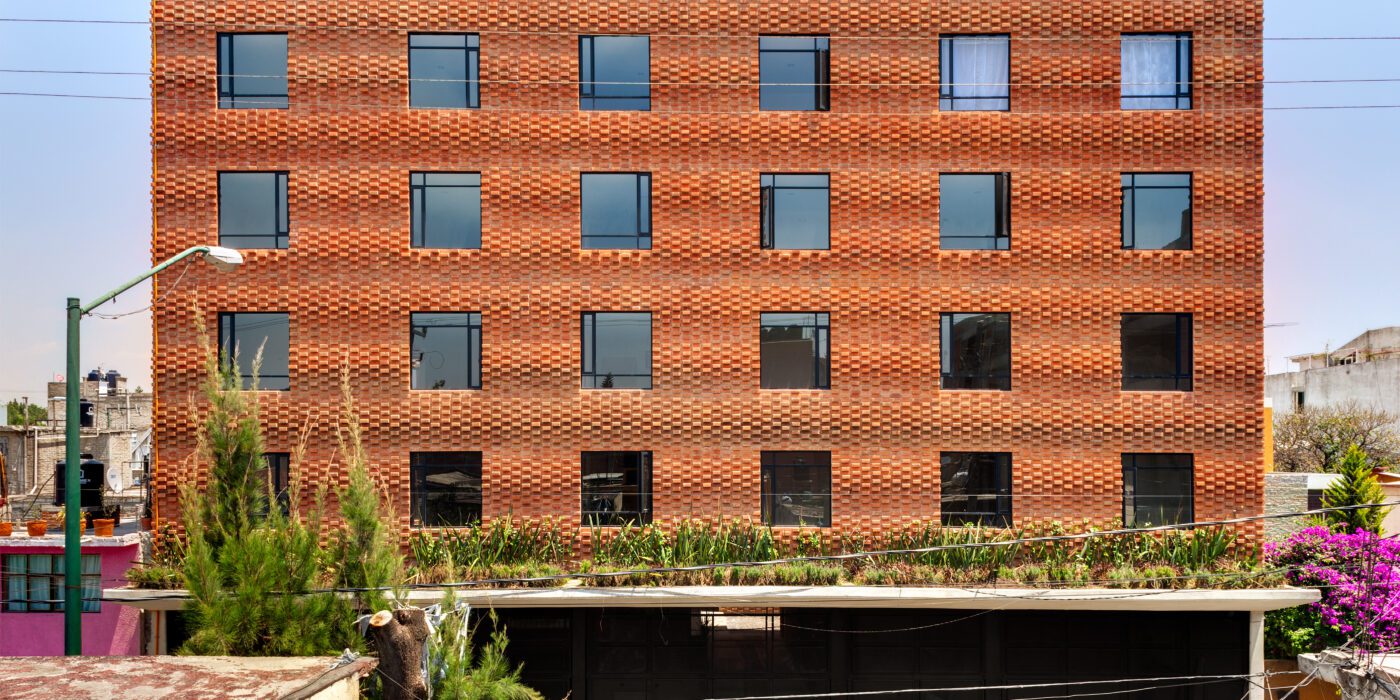
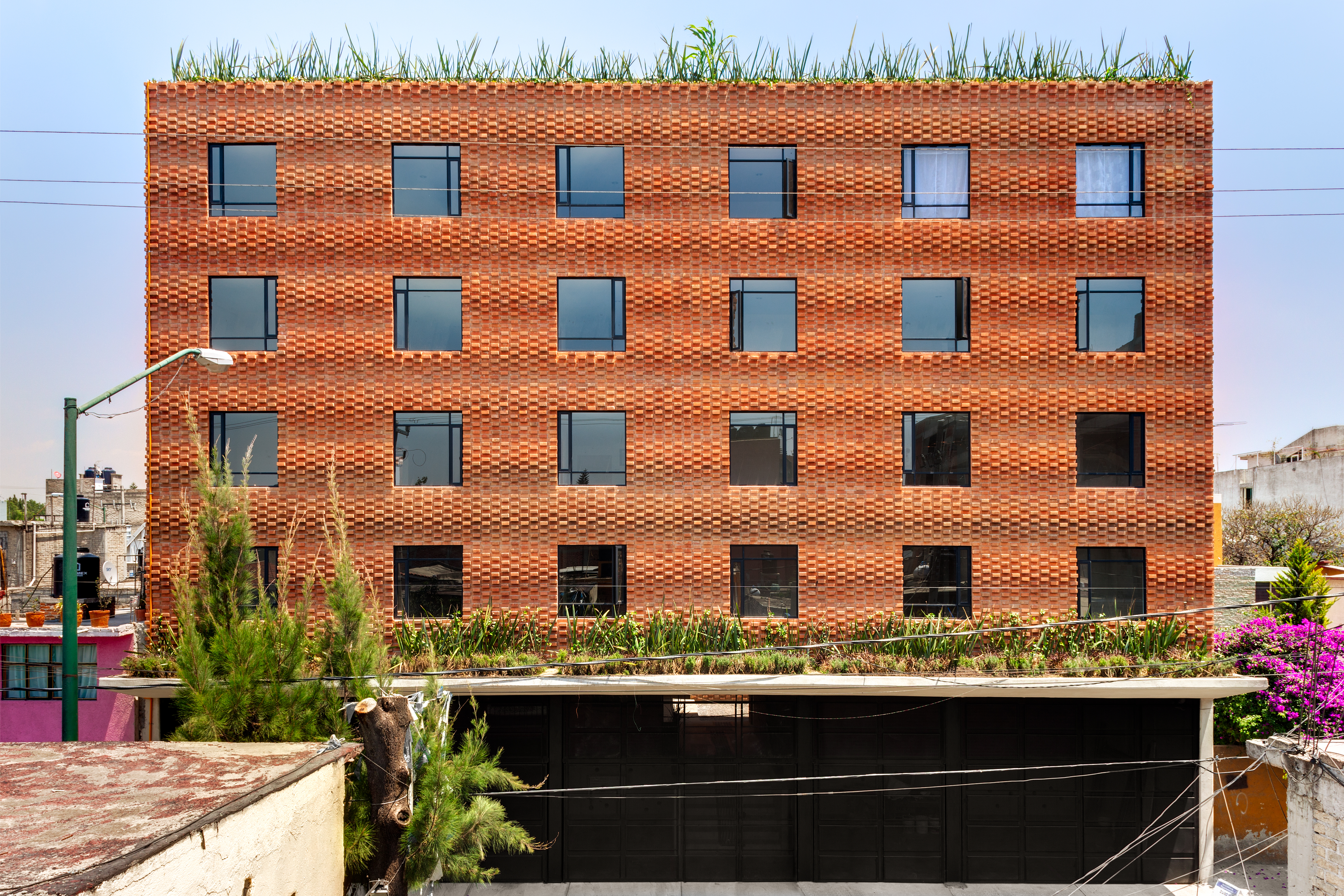
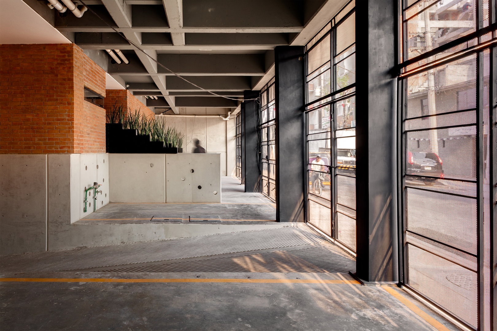 Addressing a high demand for social housing in Mexico City, this project is located on a rectangular plot with its shortest side facing the street. The 42 units are placed in three towers, generating interior courtyards for views and natural ventilation for each apartment, connecting them with vertical cores and bridges above the patios. The masonry brick walls play an important role on the project as they are part of the structure and re-interpret the traditional brick wall, blurring the boundary between structure and ornament. With the use of a single unit; red mud artisanal brick, the team was able to create walls that respond to light and shadow.
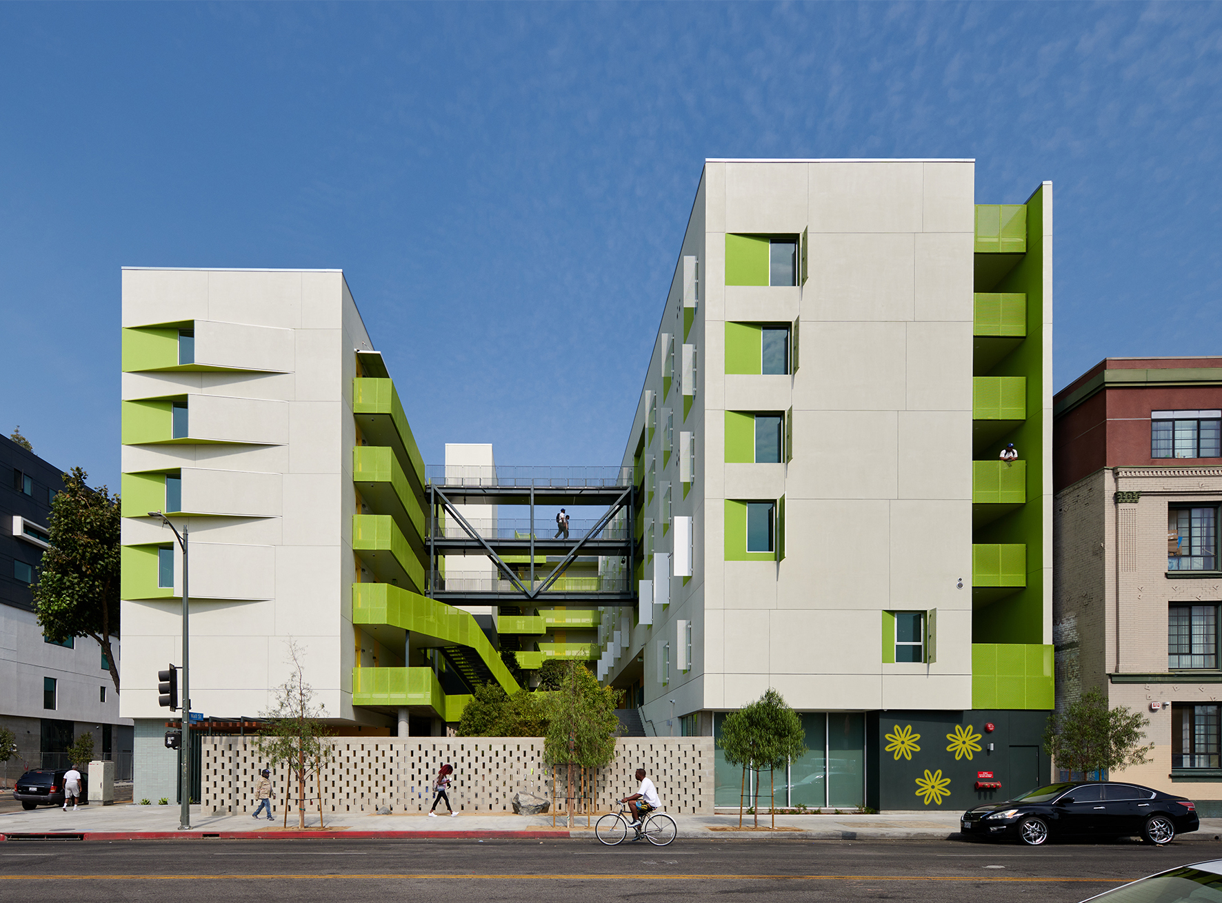
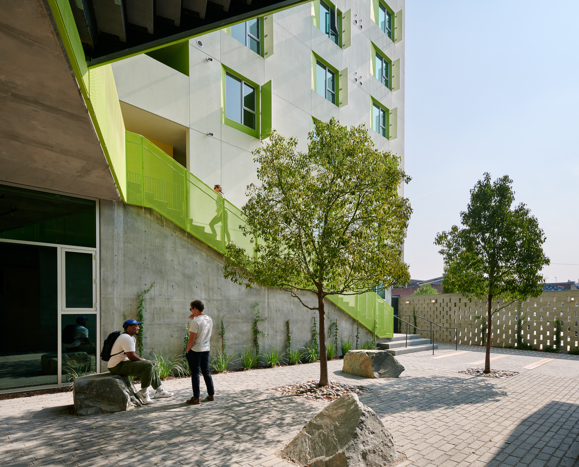 At the heart of the Flor project was an effort to try and stabilize the lives of people in the city. As permanent supportive housing, the project features large windows, units with a micro kitchen, and each with their own doorbell to reinforce a sense of respite and privacy. Tree-canopied courtyards and indoor and outdoor activity spaces encourage social interaction to add a sense of wellbeing and community.
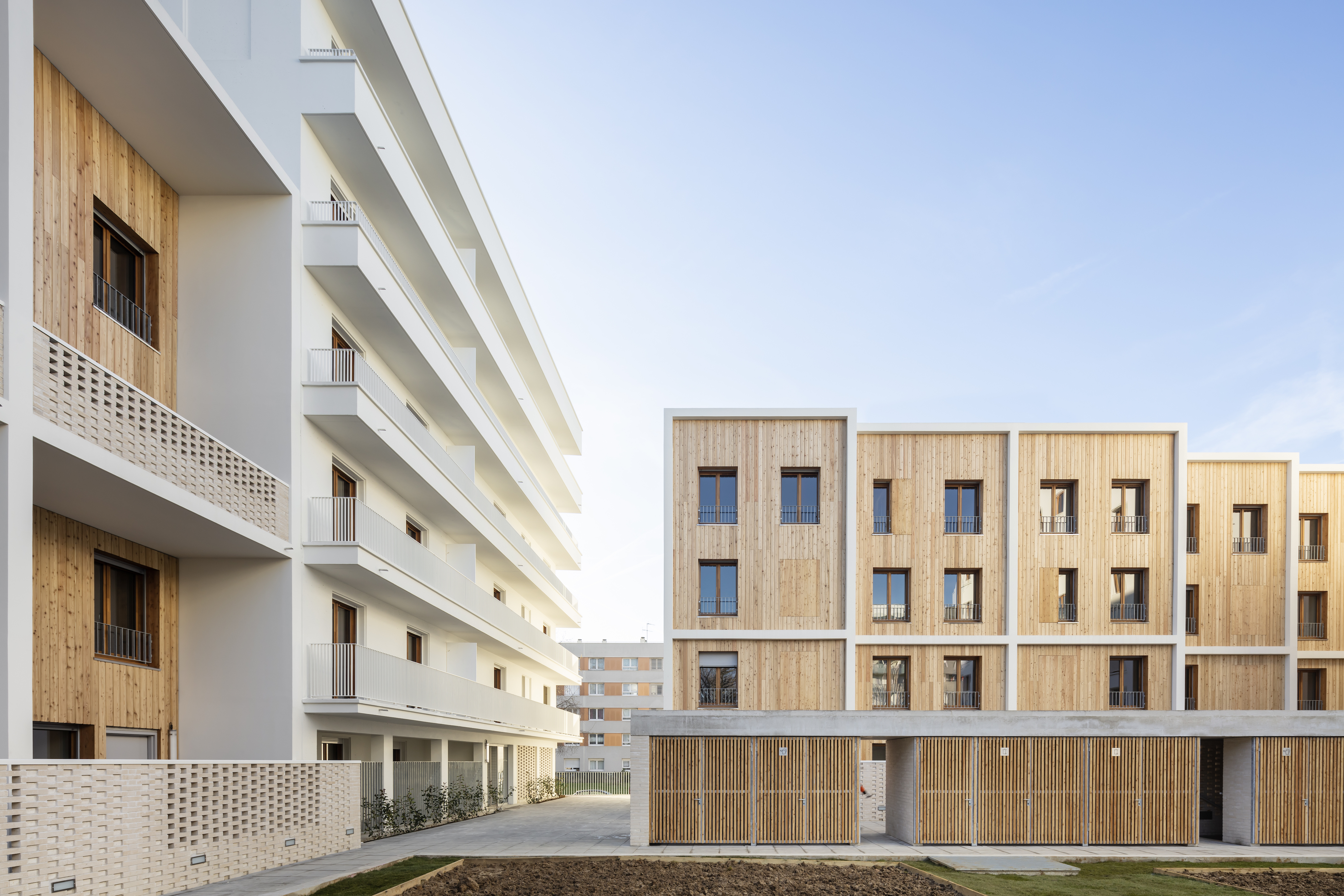
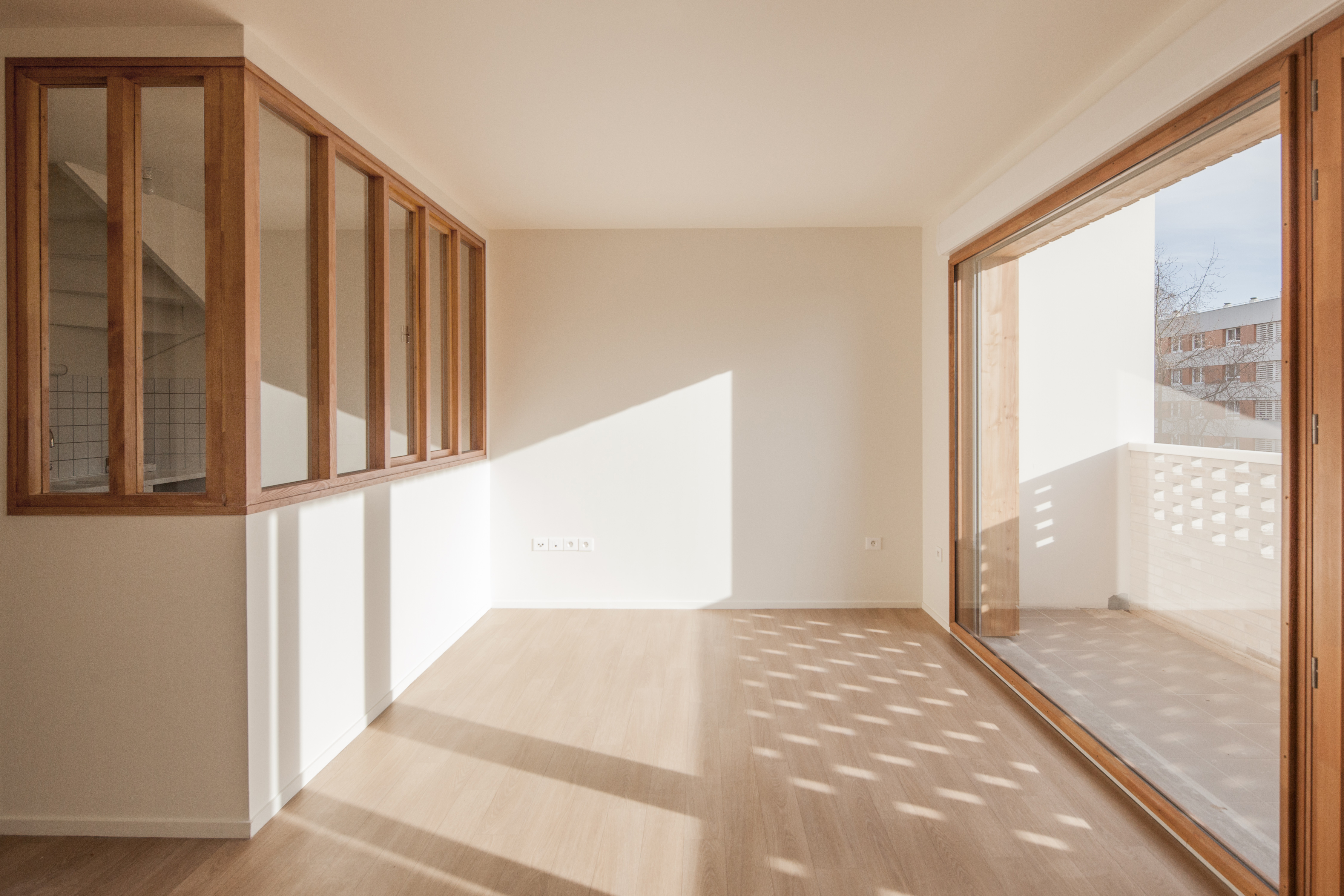 For La Courneuve, two buildings and 18 duplex units were designed to provide a diversity of housing. A meticulous architectural style contributes to the regeneration of the Cité des 4000. Built in 1956 by the Ville de Paris, this large-scale operation was designed as an estate composed of blocks sited alongside each other. This siting principle generated undefined and unused free spaces, preventing the appropriation of public spaces which are wasted. The regeneration aimed to suppress the effect of uniform and impersonal blocks to give, once again, meaning to the public space with a true landscape and human dimension. The proposal gives a new identity to the neighborhood while integrating this diversity previously missing at all scales of the project.
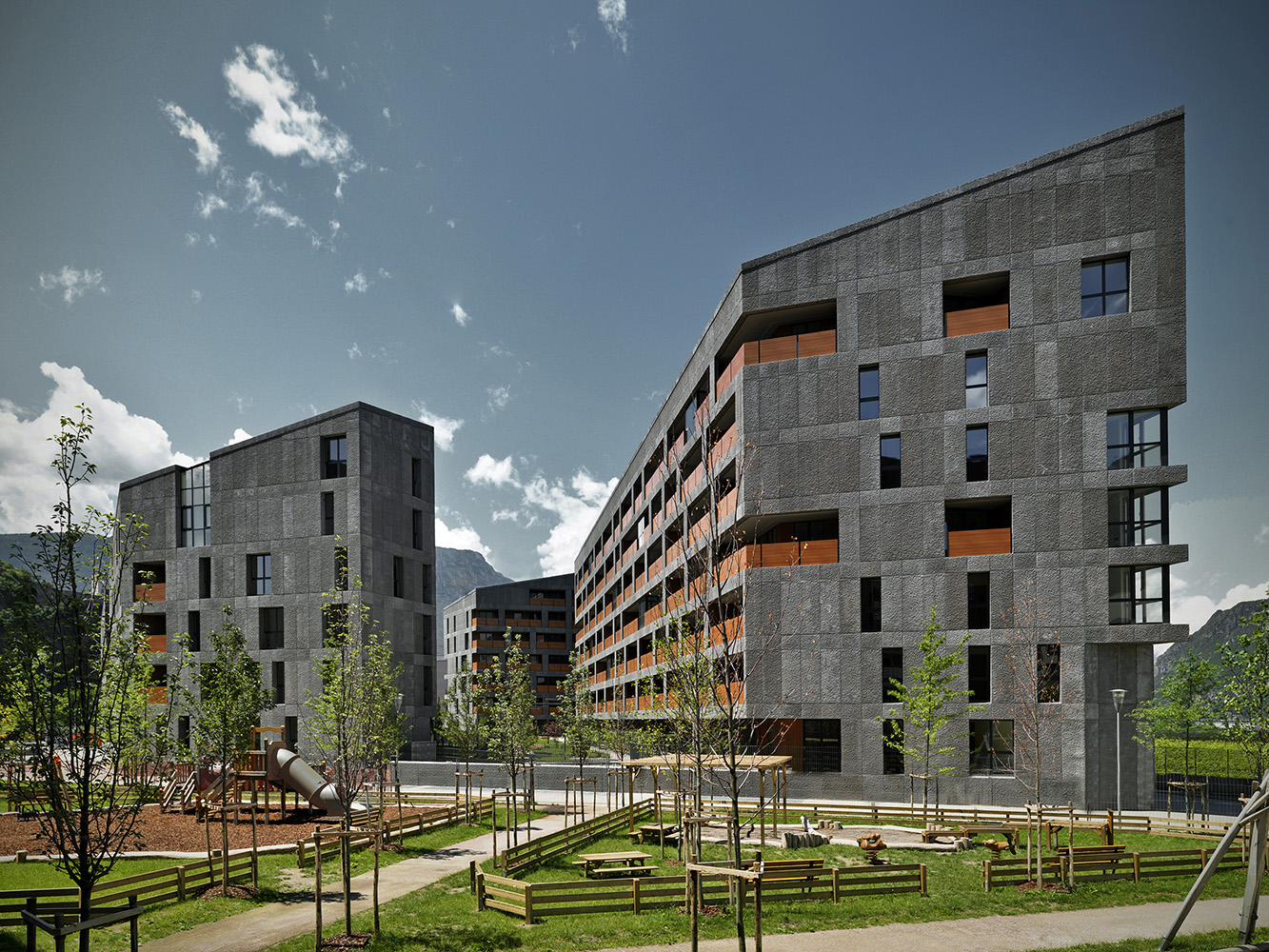
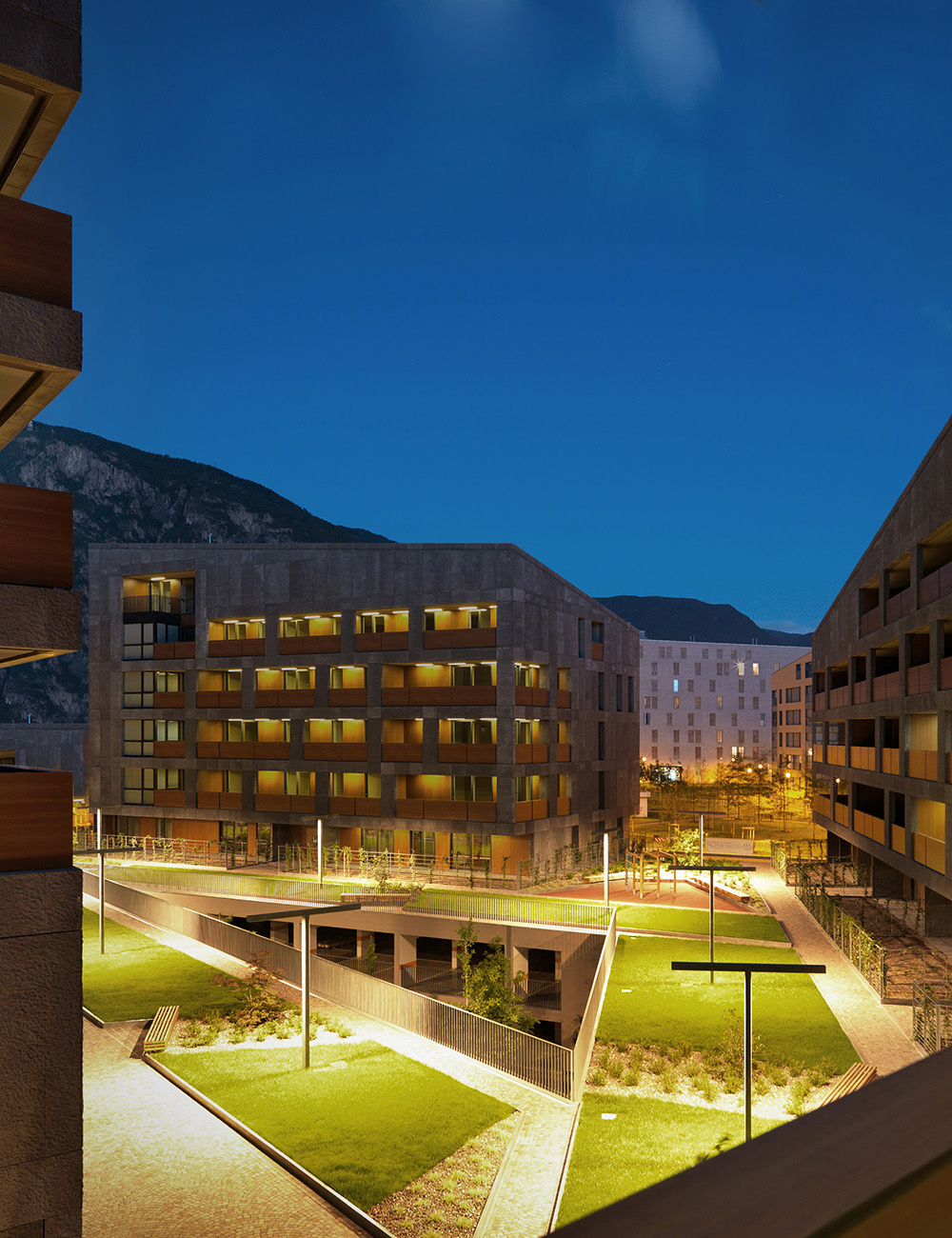 CasaNova was an exploration that began with a competition publicly announced by the Social Housing Institute based on a Detailed Plan for the residential expansion. This is a tool the municipal administration had to face the need of social housing with a settlement pattern clearly recognizable in the peripheral context. The plan provided the creation of blocks, the “castles”, made of three to four buildings located around an open tree lined court. Following the numerous plan restrictions, the building emphasizes the unity of the plot by working on the concept of block and by identifying a single kind of construction for the front.
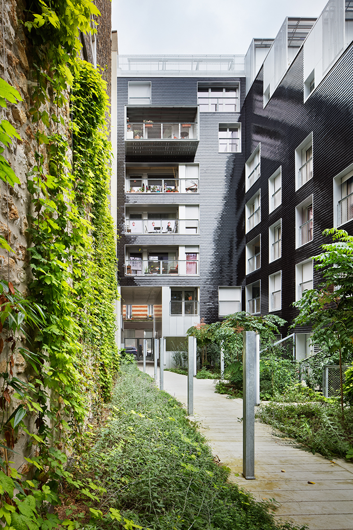
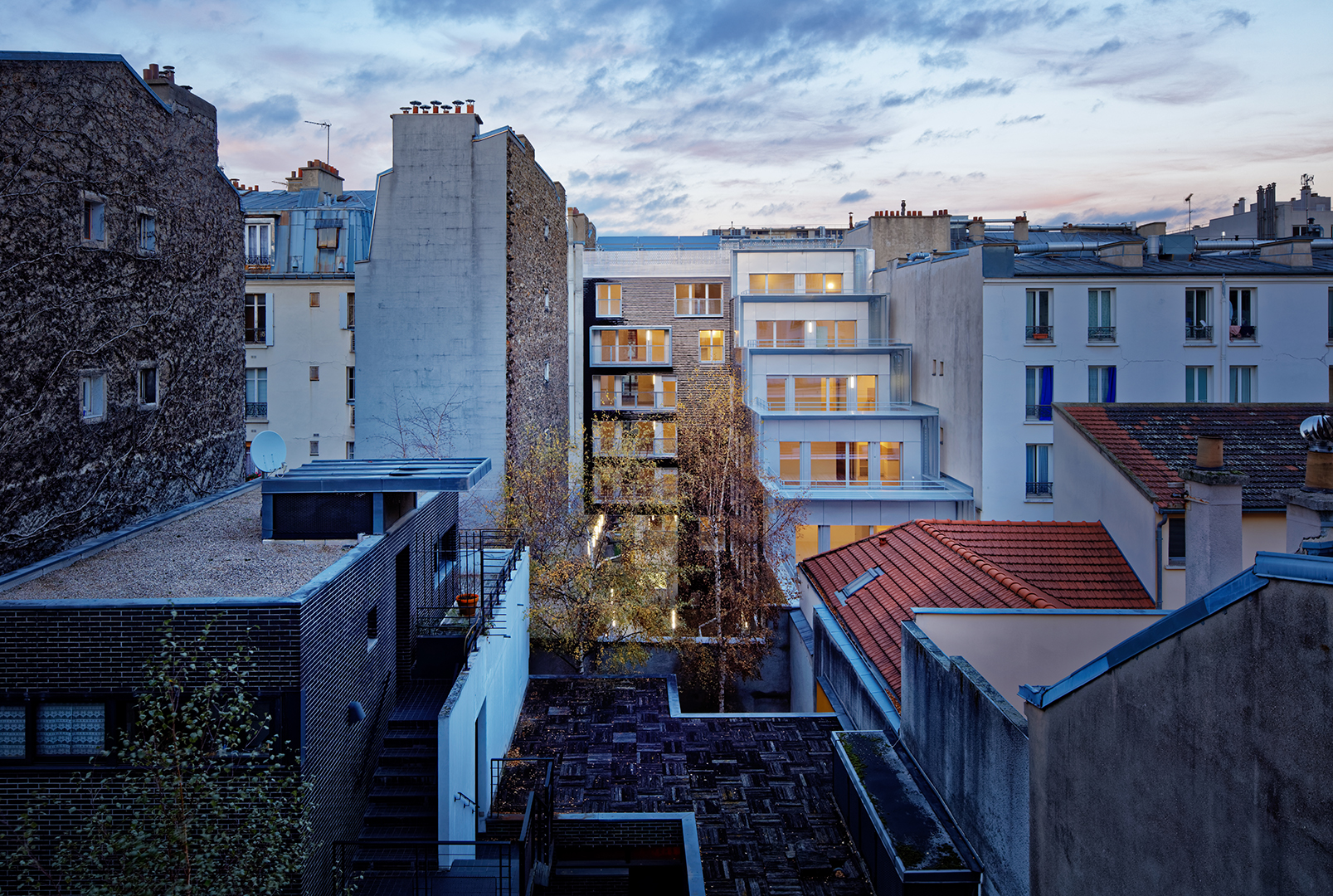 For this innovative project in Paris, the team wanted to embrace the neighborhood. Close to avenue de Flandre and just a stone’s throw from the canal de l’Ourcq, rue de Nantes is a fairly traditional Parisian street of Haussmann and inner-suburb buildings. The project gently inserts itself into a narrow parcel bordered by dense, adjoining housing. On the street side, it extends the building streetscape in a simple manner. On the garden side, the staggering from the 1st to the 6th floors creates large, private, south-facing terraces and allows for an unencumbered view of the sky. The “L” shape and the general volumetrics allowed for the creation of a true, collective garden at the ground level, planted with tall trees.
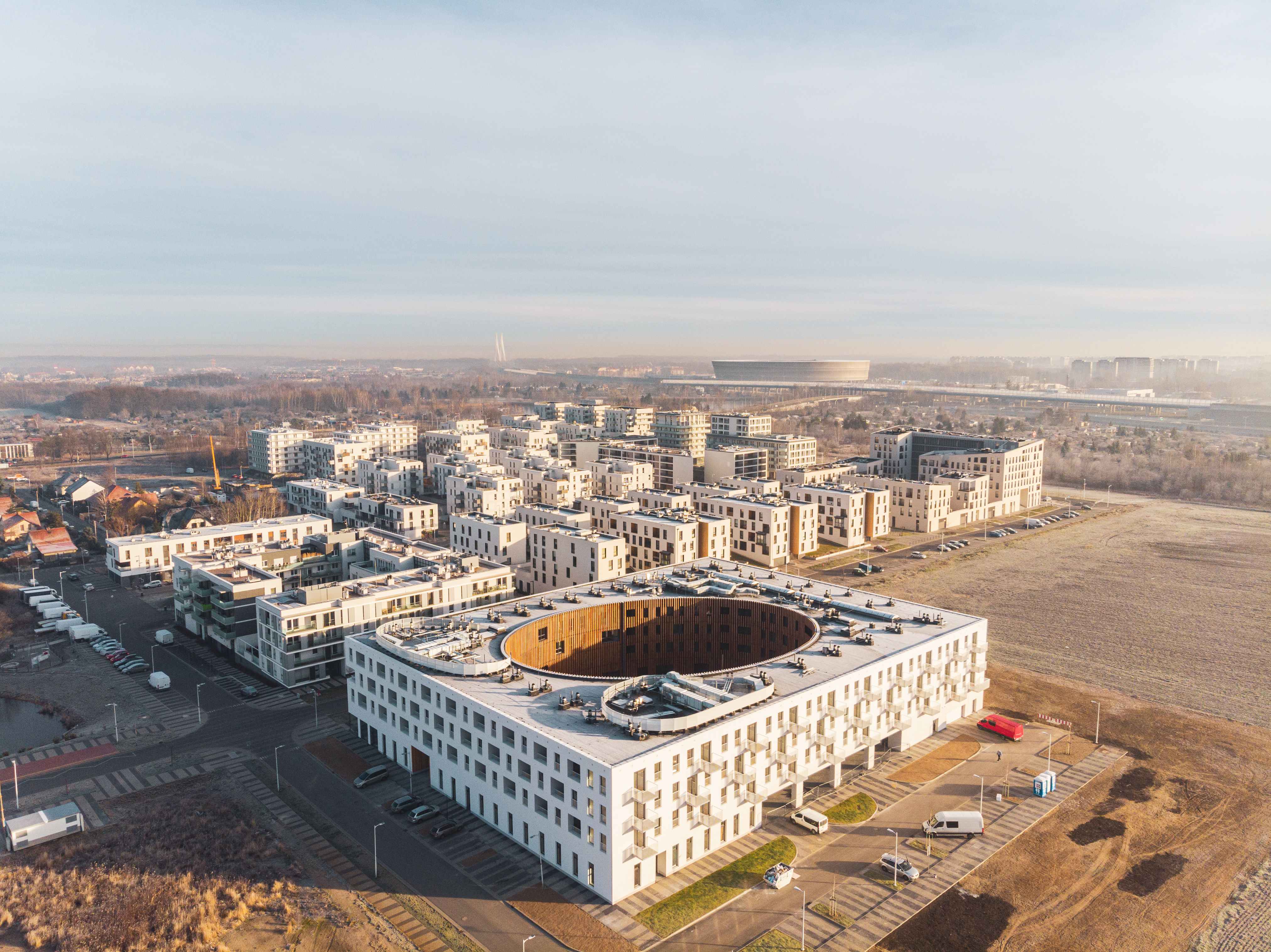
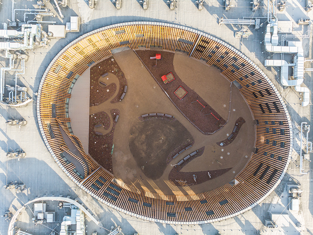 Looking to the future, multigenerational house is a social housing located in Wrocław, Poland. The building design combines three functions for three generations: flats with a care service for the elderly and the people with disabilities, flats for rent dedicated for the young and families, and a nursery school on the ground floor. House generates 117 apartments with different typologies. The building is part of the model housing estate Nowe Żerniki, where local architects collectively tried to respond to the growing housing problems and poor spatial quality. One of the initial assumptions of the project was to create a facility conducive to the integration of all its residents and users, so the multigenerational house was designed as a quarter.
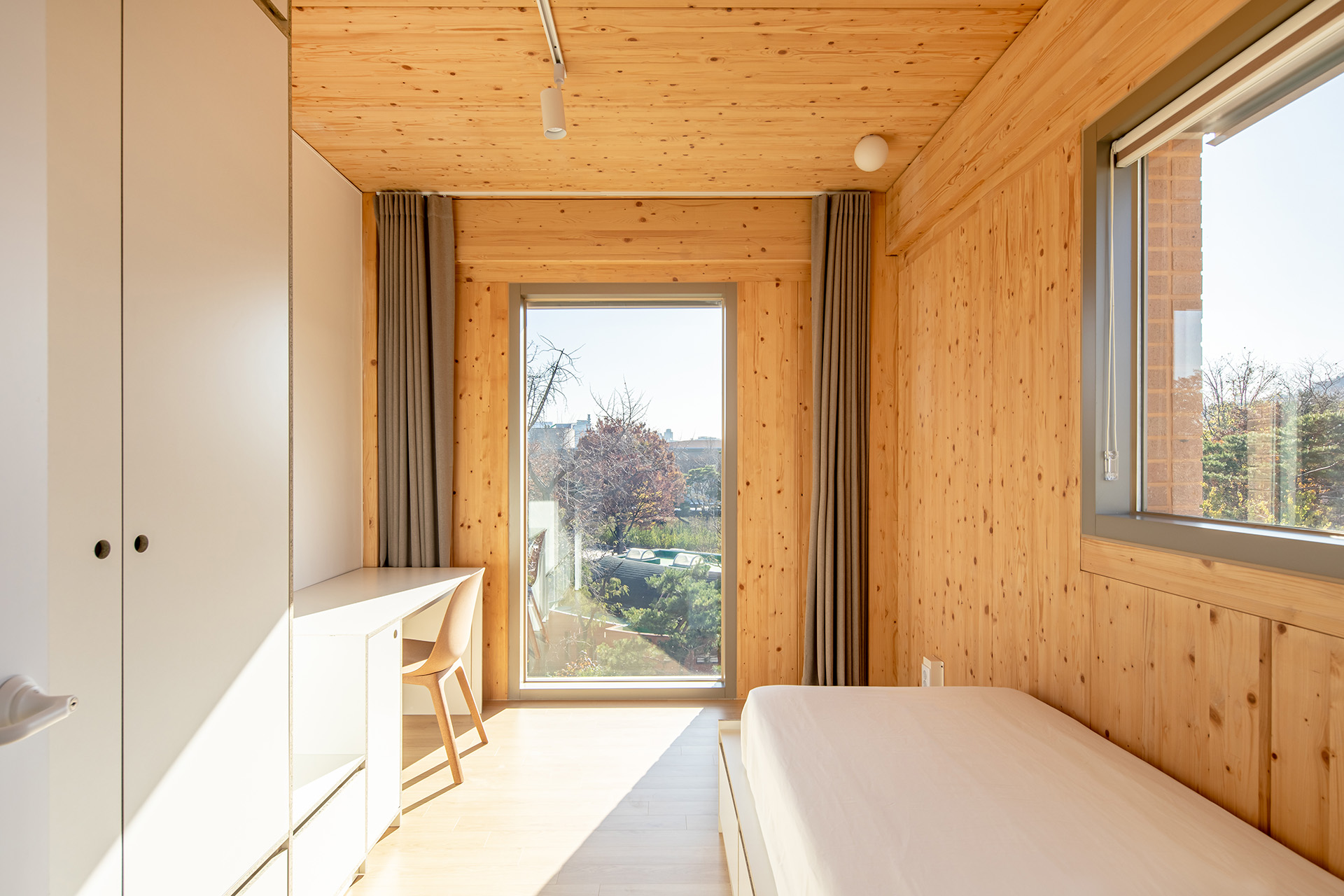
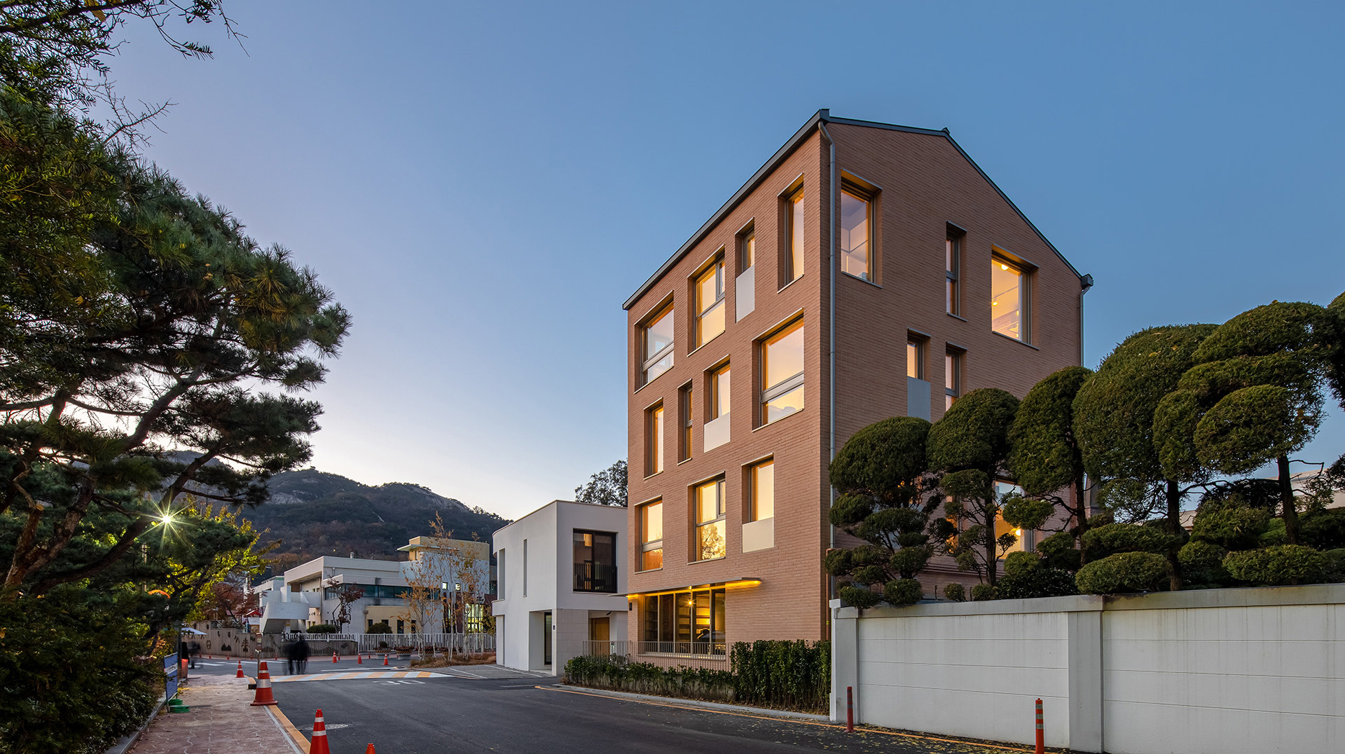 The ‘”Gungjeong Social Housing’ project was carried out for a new residential space experiment for the millennial generation of Korean society. For the younger generation in Korea, residential space is turning into a private space and, at the same time, a community space in loosely solidarity with people of similar tastes. They are seeking the possibility of living and sharing various convenient spaces together because of the expensive housing costs in Seoul. In this project, community lounge cafes will be planned for use by residents on the first and second floors, while the remaining three floors will have a shared house that can accommodate a total of 11 people. Four people reside on each floor, and there is a shared kitchen with a high ceiling on the top floor.
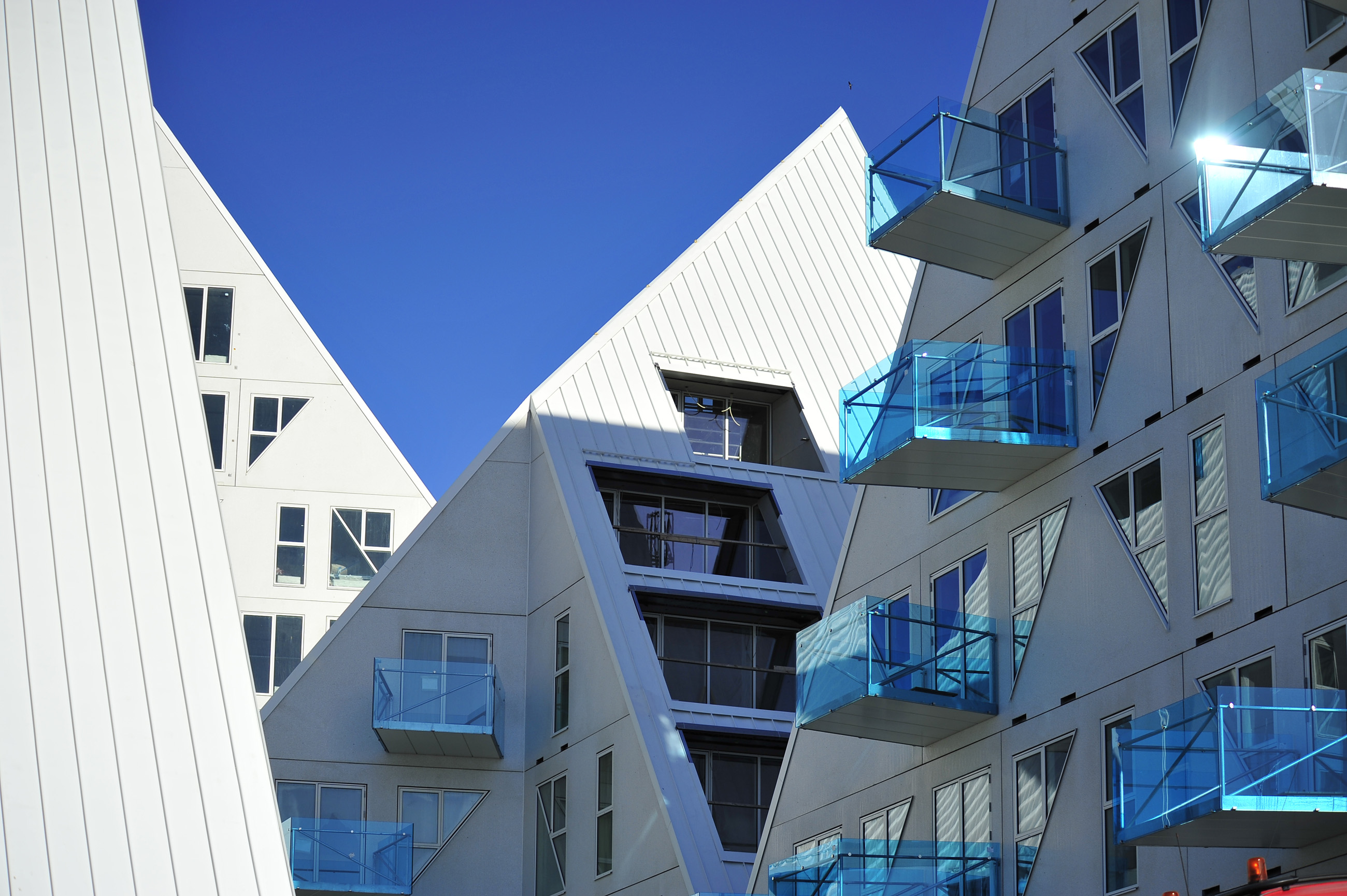
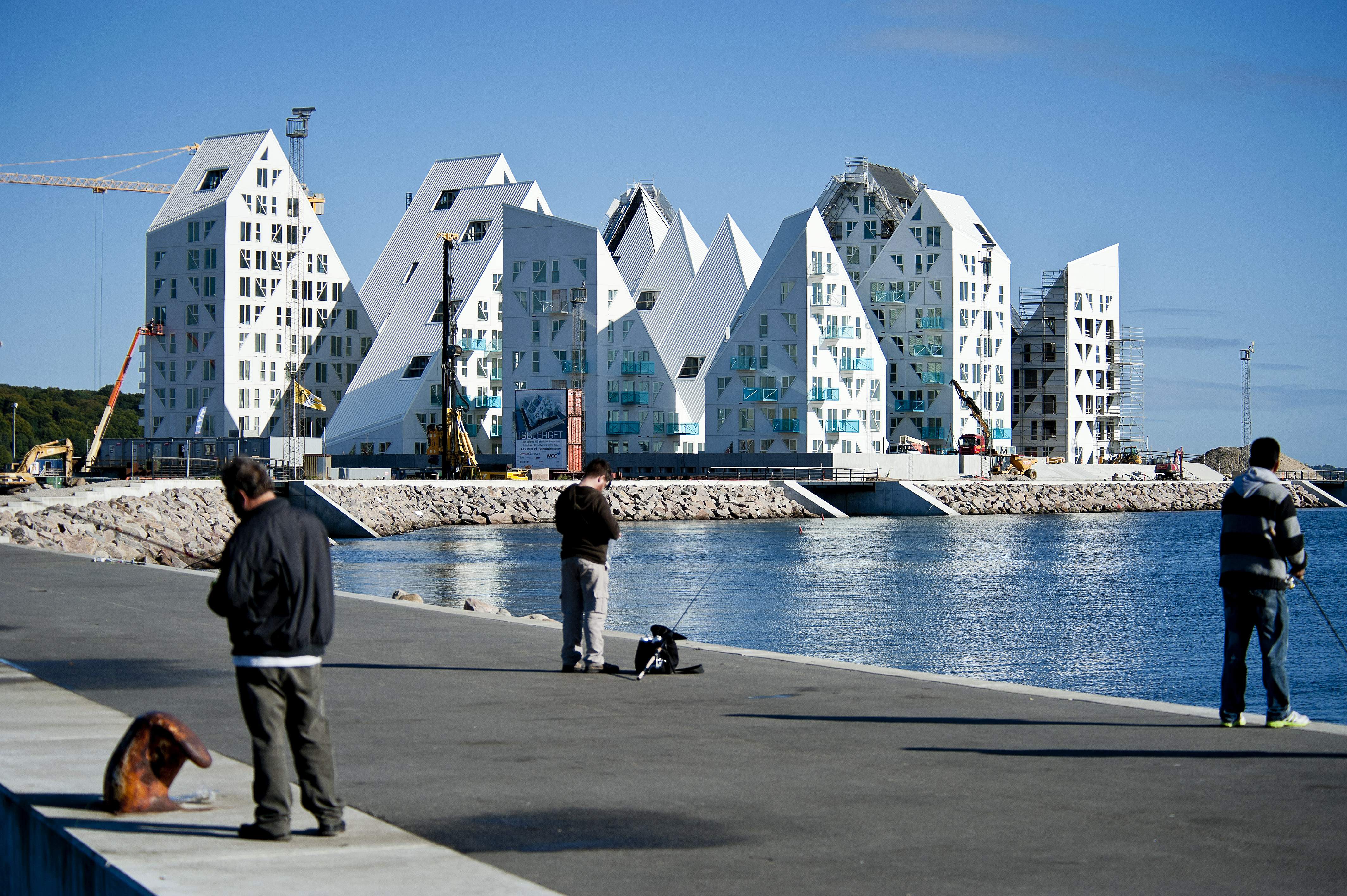 Creating a new urban model, the Iceberg development aimed to create an opportunity for Denmark’s second largest city to develop in a socially sustainable way by renovating its old, out-of-use container terminal. Looking to the future while creating a distinct district, the area is comprised of a multitude of cultural and social activities, a generous amount of workplaces, and a highly mixed and diverse array of housing types. The Iceberg Project was designed to work within the goals of the overall city development. A third of the project’s 200 apartments are set aside as affordable rental housing, aimed at integrating a diverse social profile into the new neighborhood development.



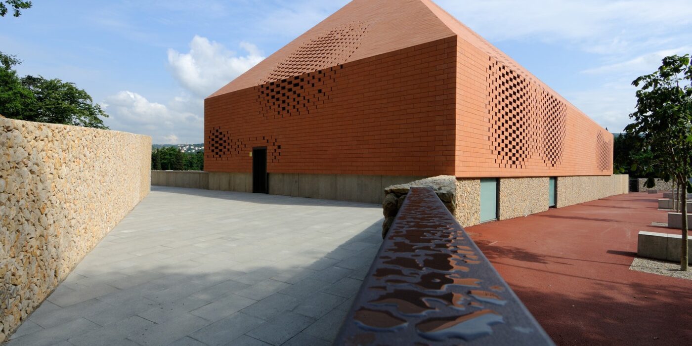
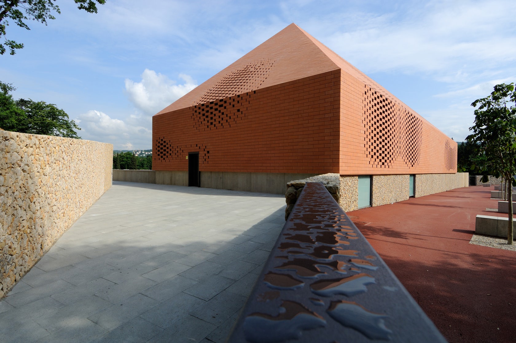
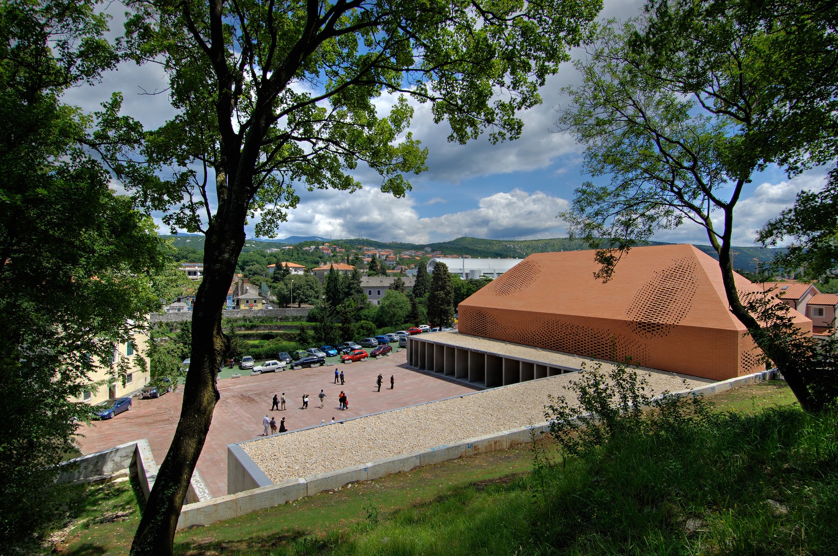 Sited in one of the most important pilgrimage sites in Croatia, this Great Hall was designed alongside the Pope’s visit to Rijeka. Housing cultural activities of the monastery, the project also creates a new major entrance for the pilgrims and a large public walk. A pixel-ized terracotta volume was designed to filter light inside the structure while a columned portico forms a new public square outside.
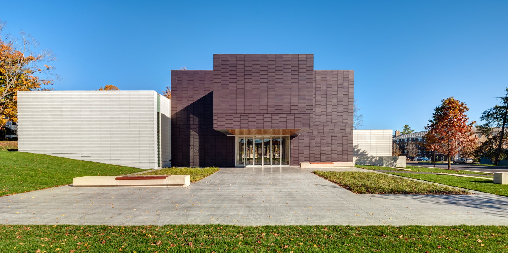
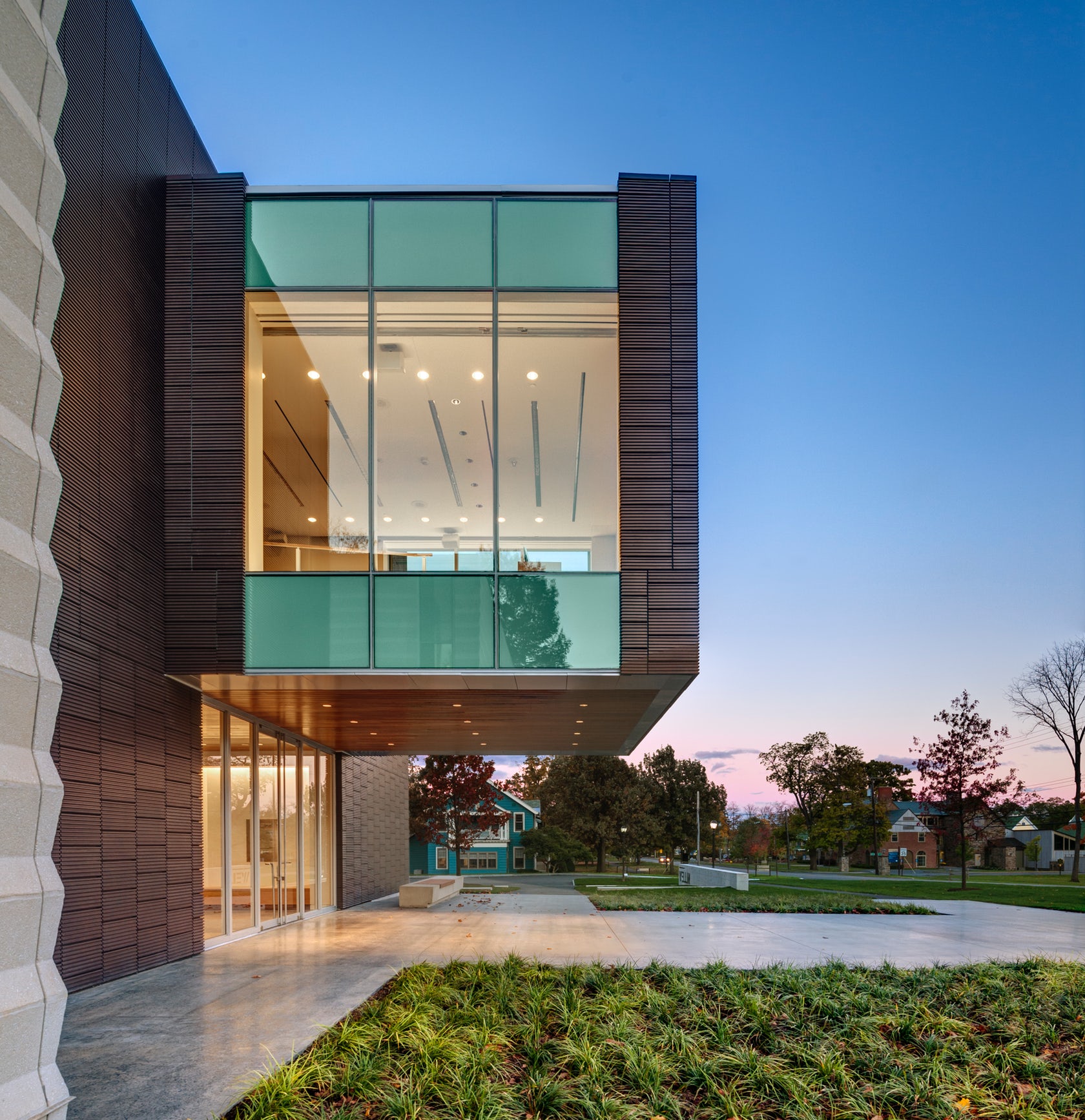 Located on the Hamilton College campus, the Wellin Museum of art was designed as part of a new arts quad. The building includes admin offices, seminar rooms, galleries, and a monumental two-story glass archive hall. Dark terracotta cladding was used along the central volume to reinforce its role programmatically and organizationally.
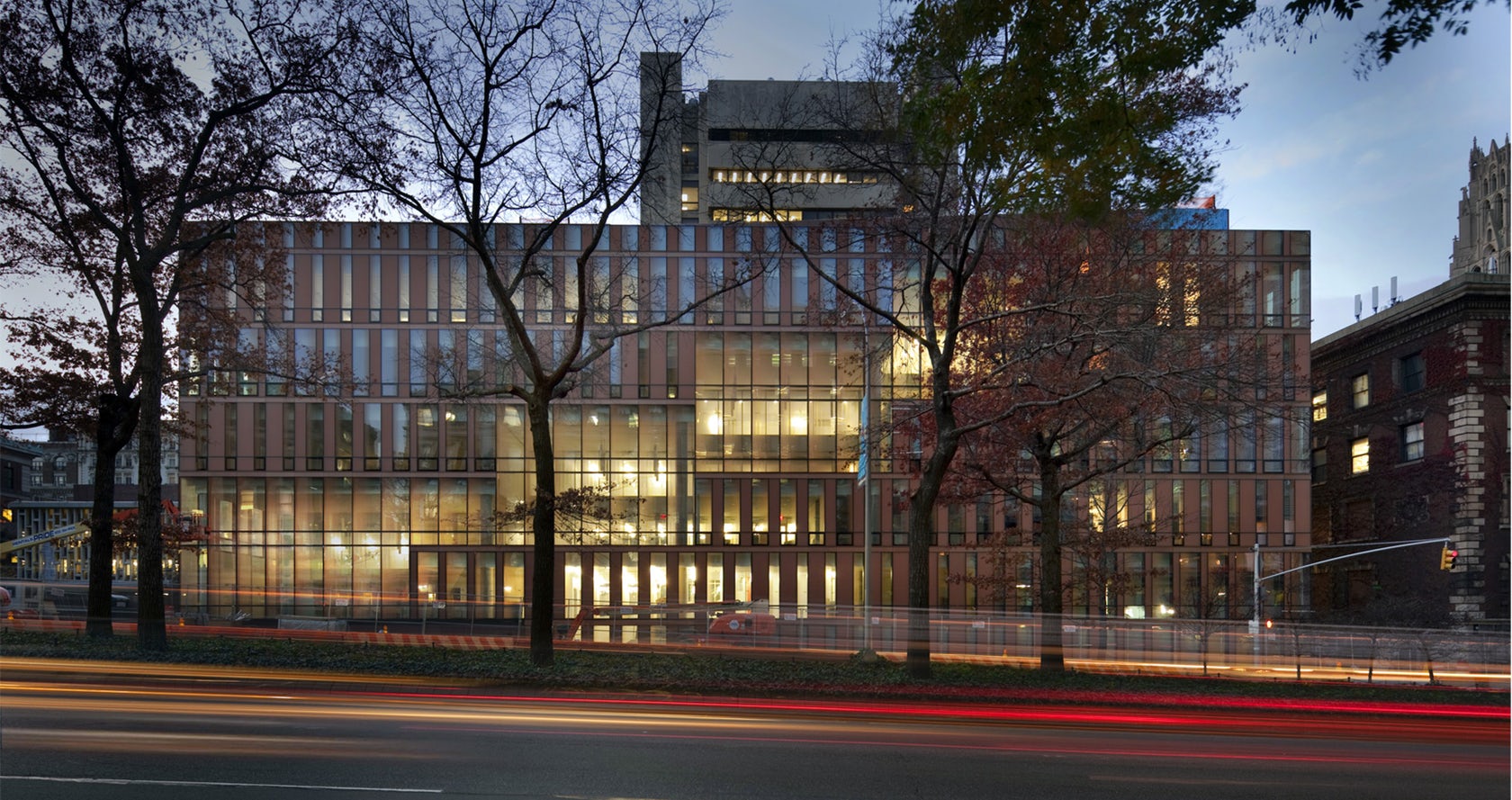
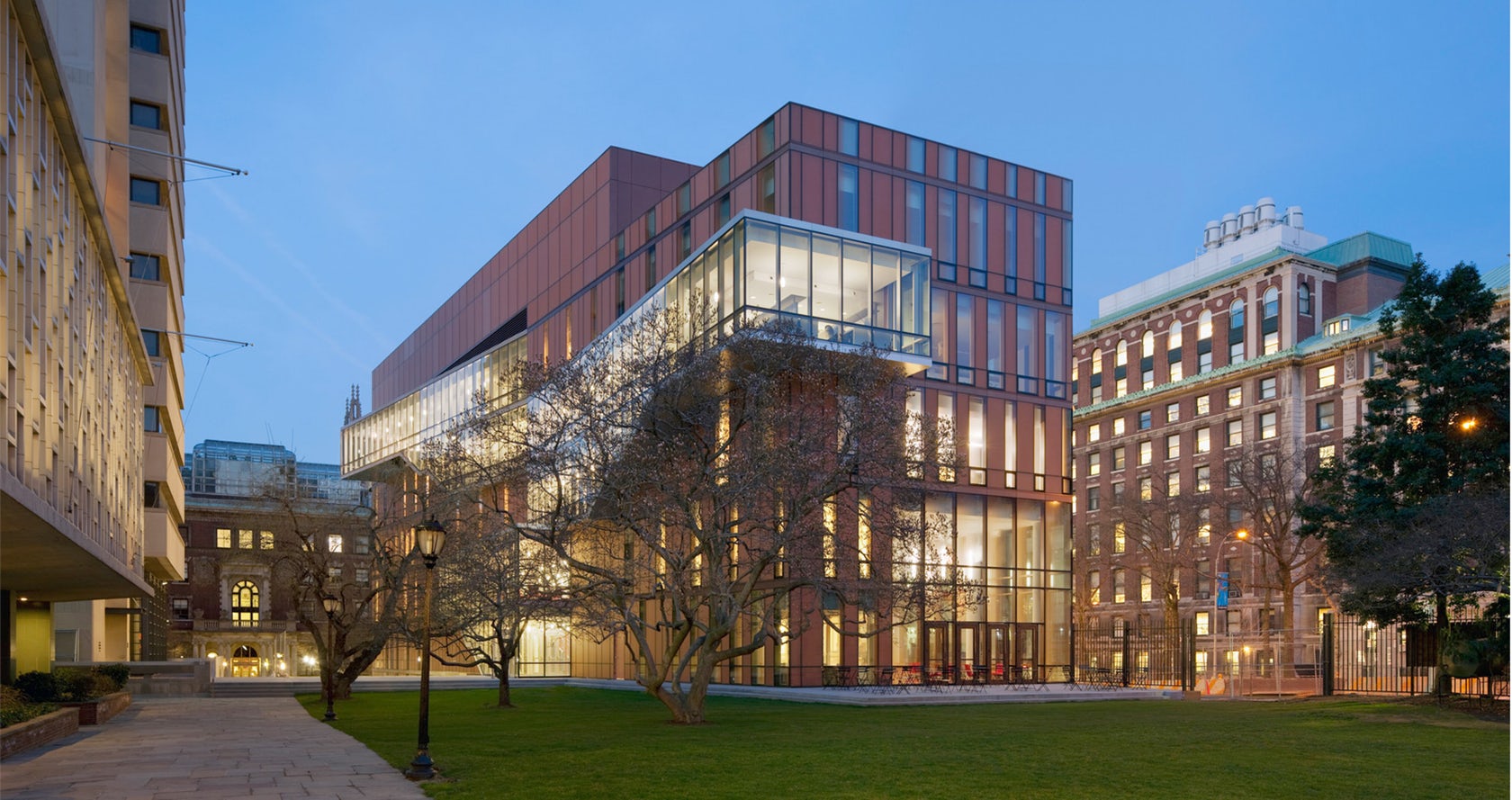 Located at Barnard College, the Diana Center includes a gallery space, a library, classrooms, dining, and a black box theater. A slipped atria links spaces vertically and becomes connected through ascending stairs. Luminous terracotta glass panels were used throughout the building envelope. Surrounded by a campus defined by brick and terracotta, the Diana translates the static opacity of masonry into a luminous curtain wall.
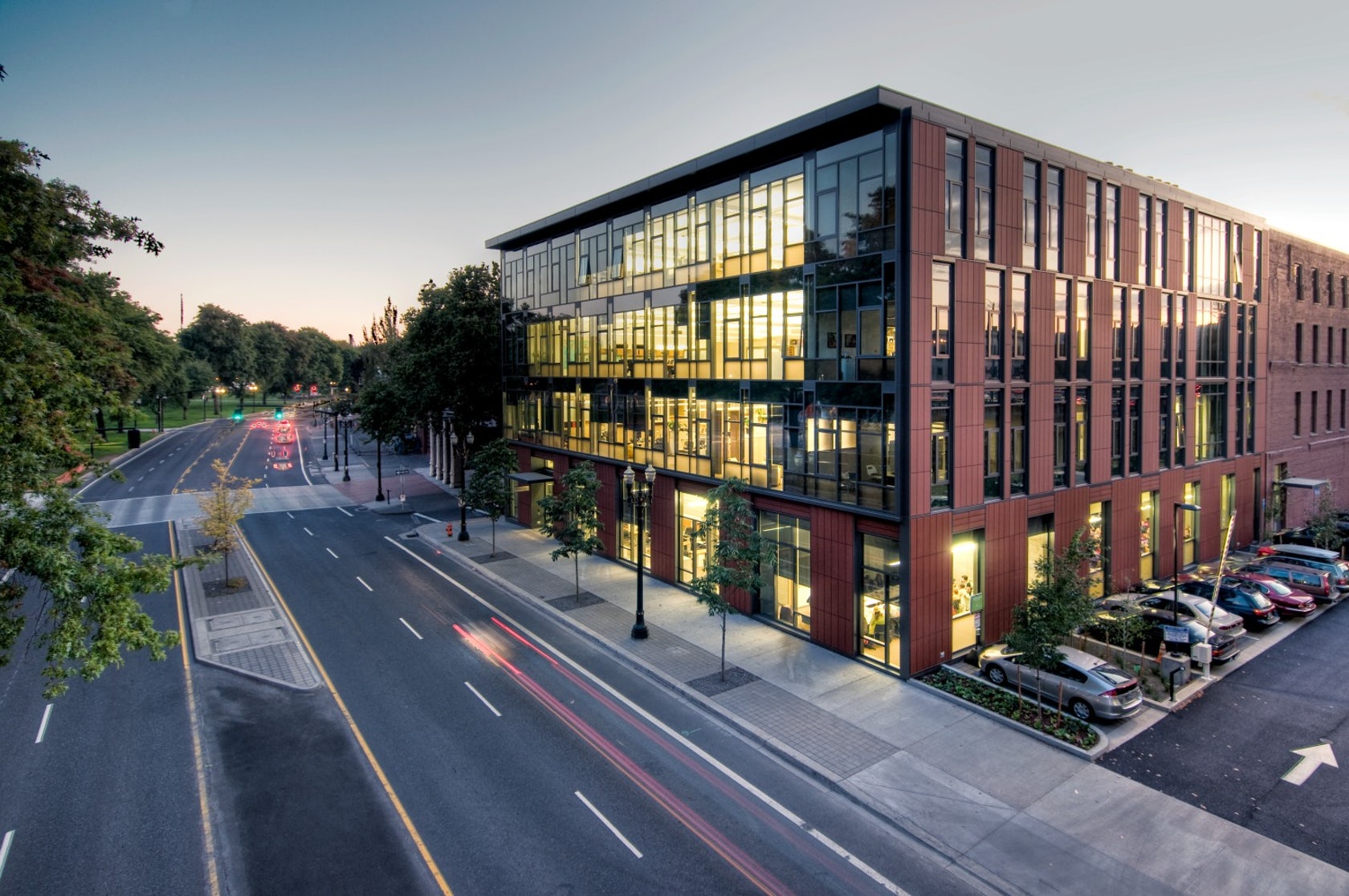
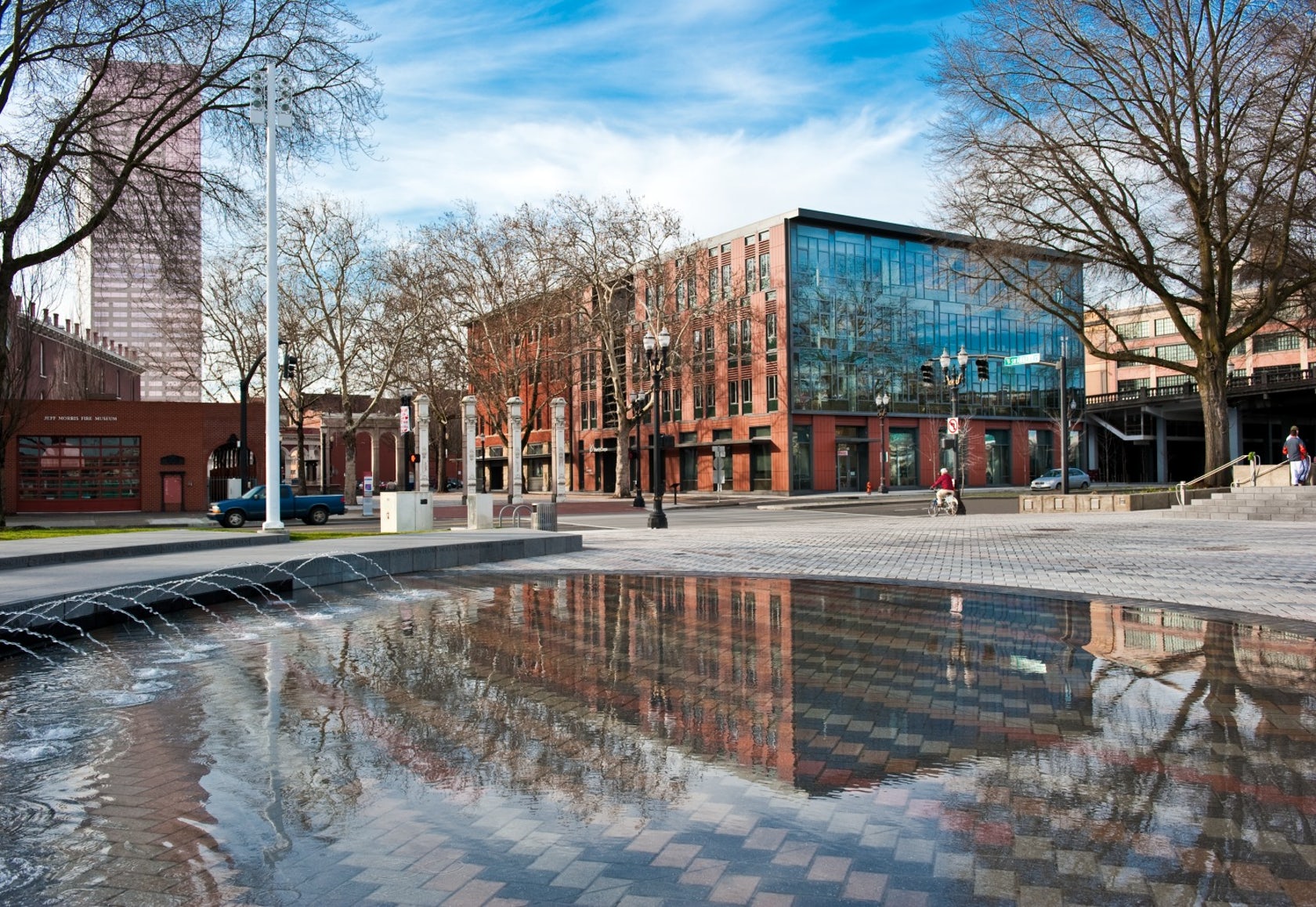 The Mercy Corps building was built to exemplify a sustainable, community-focused approach while encouraging visitors to engage with contemporary issues. Doubling the size of the historic Portland Packer-Scott Building, the landmark project combined a green roof, with resource-friendly landscaping and a glass and terracotta envelope.
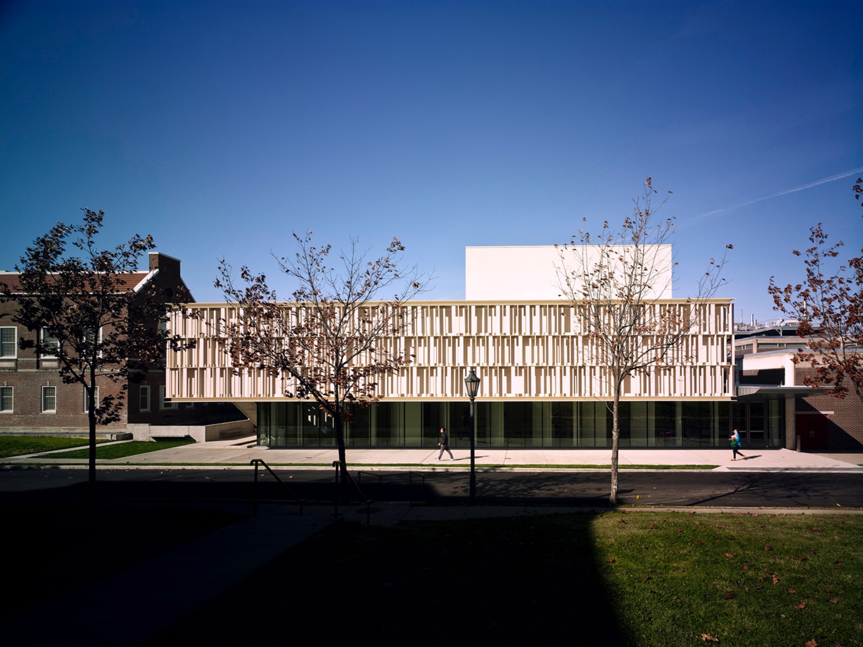
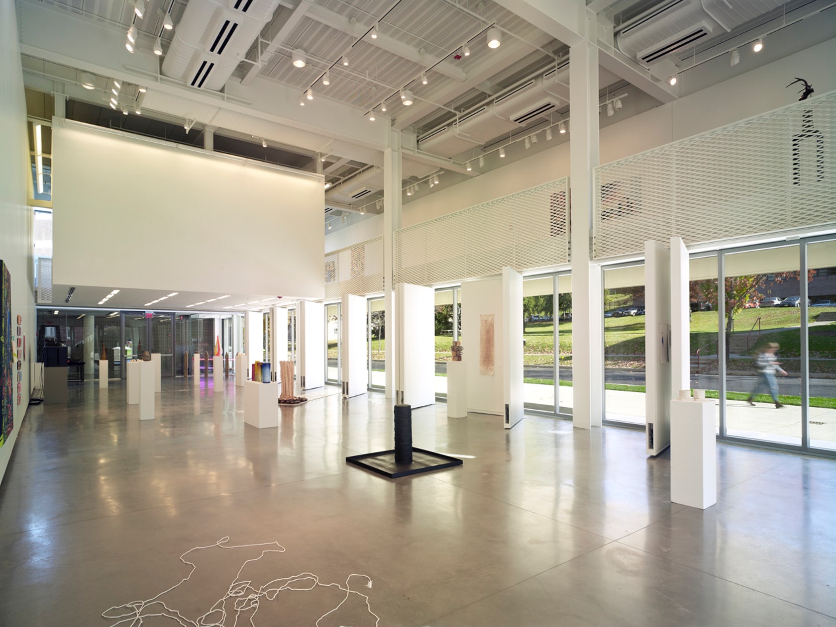 The terracotta tube façade for this ceramics pavilion screens both rain and solar heat, while its staggered pattern was inspired by pottery racks. The Art Pavilion was created as a “ceramic vessel” holding both light and art. The design was inspired by the region’s history of manufacturing ceramics, and incorporates the unglazed, hollow tubes with an off-white pigment.