Exterior of the Arario Gallery in Seoul by Schemata Architects
CategoriesArchitecture

Schemata Architects embraces rough material finishes for gallery in Seoul

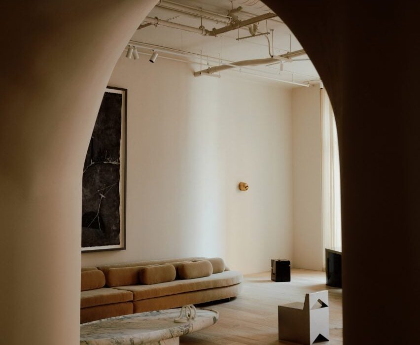
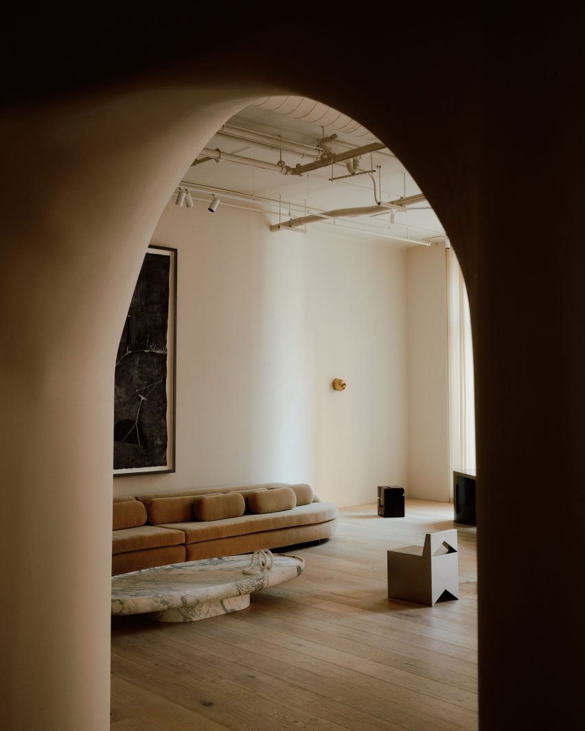
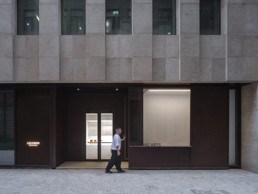
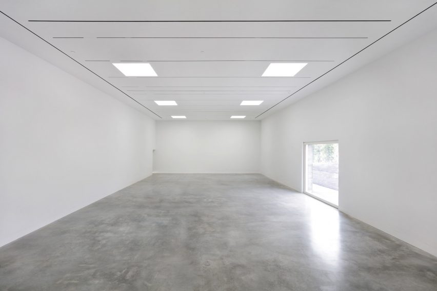
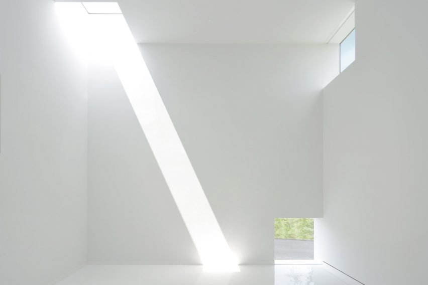
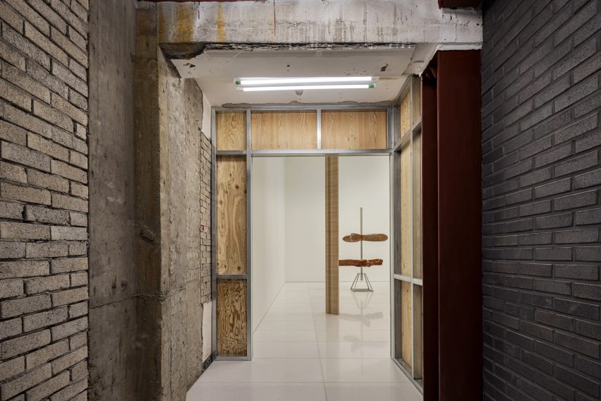
The rough finishes of an existing concrete and brick structure are contrasted by white exhibition spaces at Arario Gallery in Seoul, completed by Japanese studio Schemata Architects.

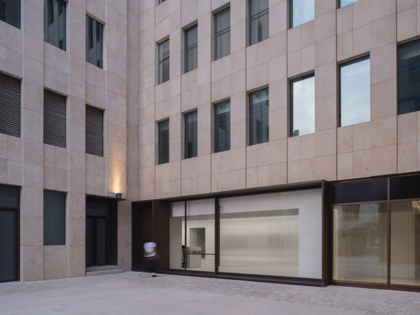
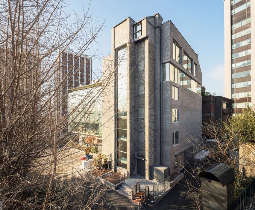
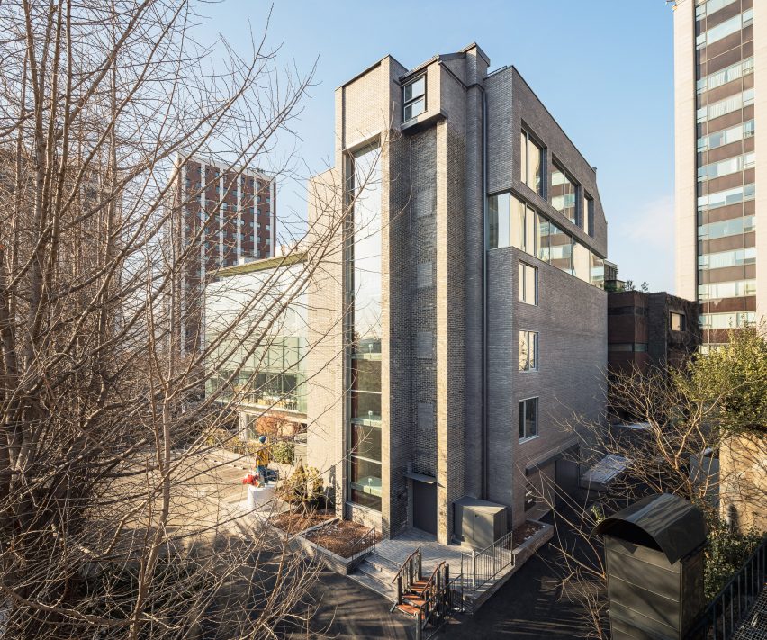
The gallery is located at the rear of the Space Group Building, a modernist icon in South Korea that houses the Arario Museum.

Designed by architect Kim Swoo-geun, the grey-brick, heritage-listed building was completed in the 1970s and converted into the museum in 2014.

Exterior of the Arario Gallery in Seoul by Schemata ArchitectsExterior of the Arario Gallery in Seoul by Schemata Architects
Arario Gallery sits alongside the grey-brick Space Group Building

Alongside this building is a glazed extension from the 1990s by architect Jang Se-yang, a student of Swoo-geun, as well as a traditional South Korean home, or hanok, which was relocated to the site when it reopened in 2014.

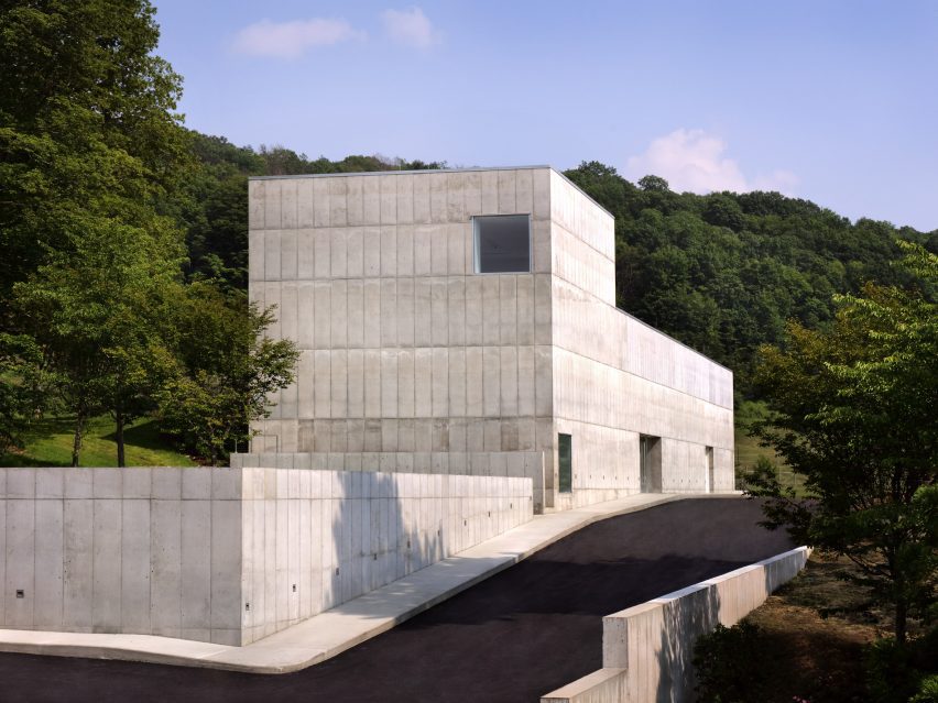
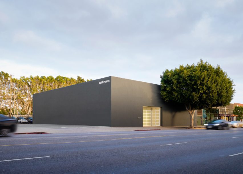
Amid this architectural backdrop is a brick and concrete structure added to the site in the 1980s, which Schemata Architects was tasked with converting into the Arario Gallery.

“It was a great challenge for me, a Japanese architect, to work on the third building – excluding the hanok – especially after seeing the perfect contrast between the two buildings already created by the master and the disciple,” said Schemata Architects Principal Jo Nagasaka.

Interior of the Arario Gallery in Seoul by Schemata ArchitectsInterior of the Arario Gallery in Seoul by Schemata Architects
The gallery spaces are contained in white rooms

Looking to create a space that “looks unchanged on the outside”, the studio retained the building’s structural frame and dark brickwork, originally chosen to complement the Space Group Building.

“In this context, we thought that inserting another unique feature into the landscape would not be appropriate,” explained Nagasaka.

White gallery interior with grey brick floorsWhite gallery interior with grey brick floors
Brickwork extends across the floor of the basement

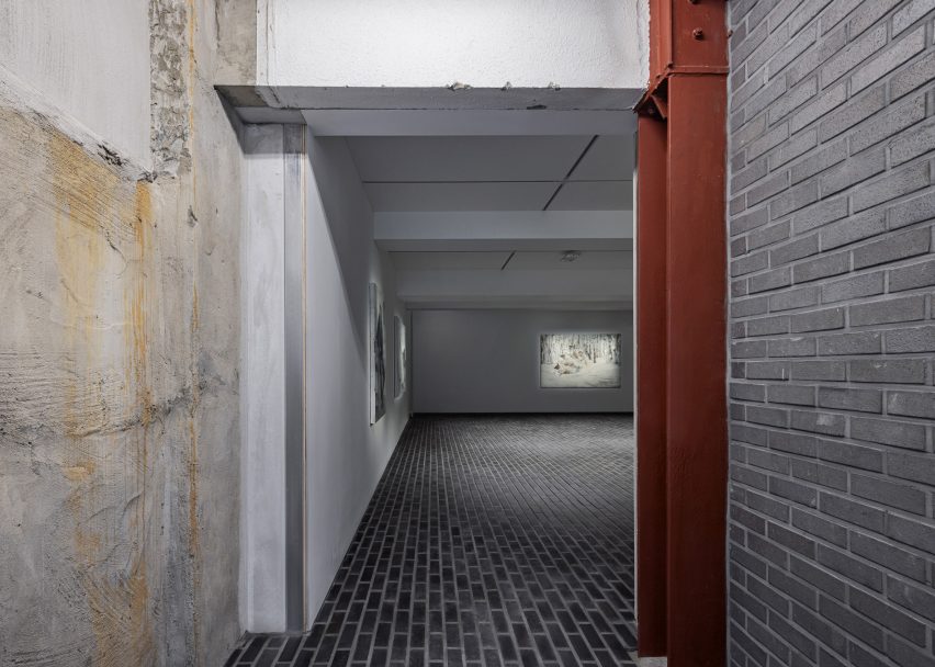
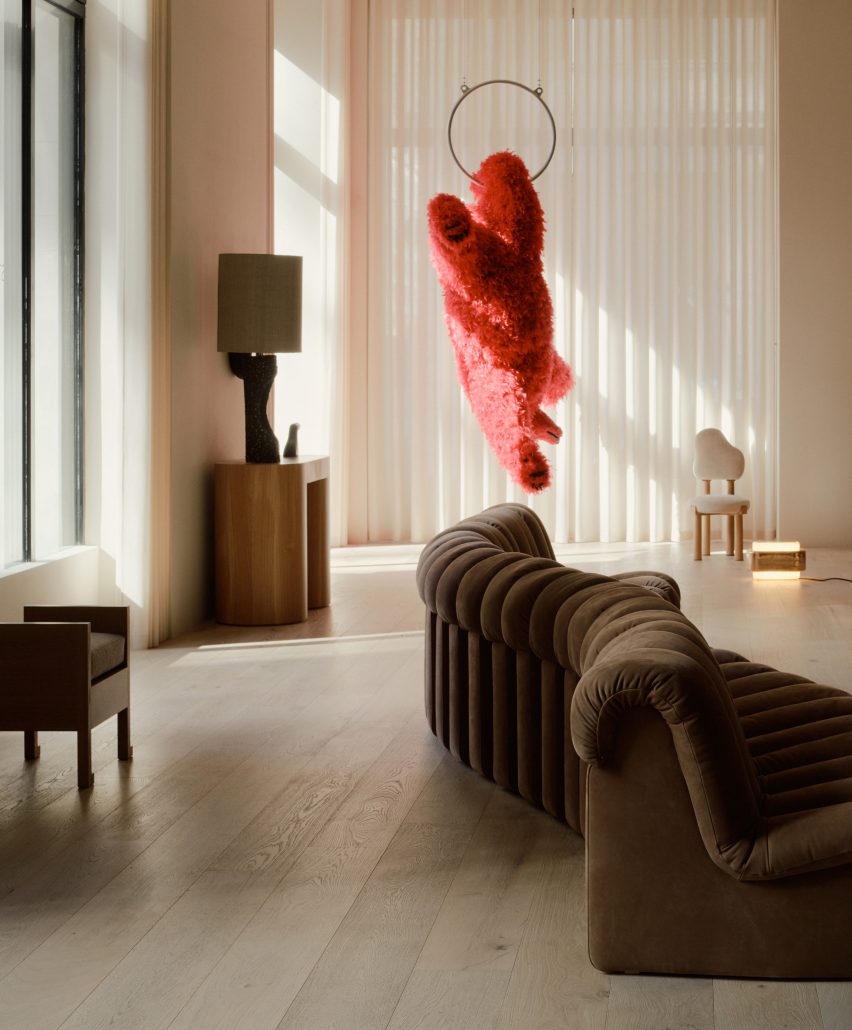
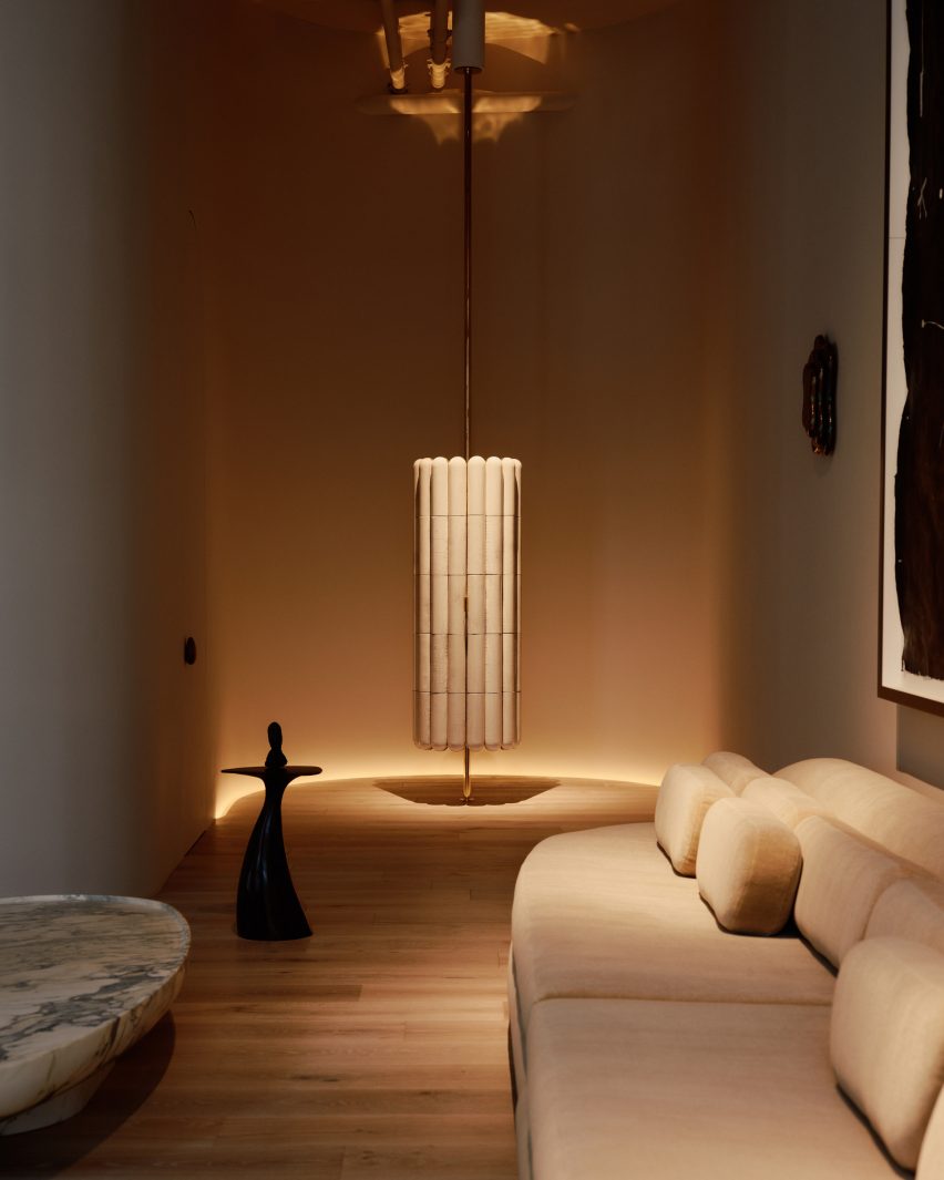
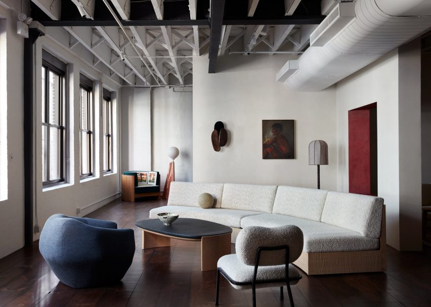
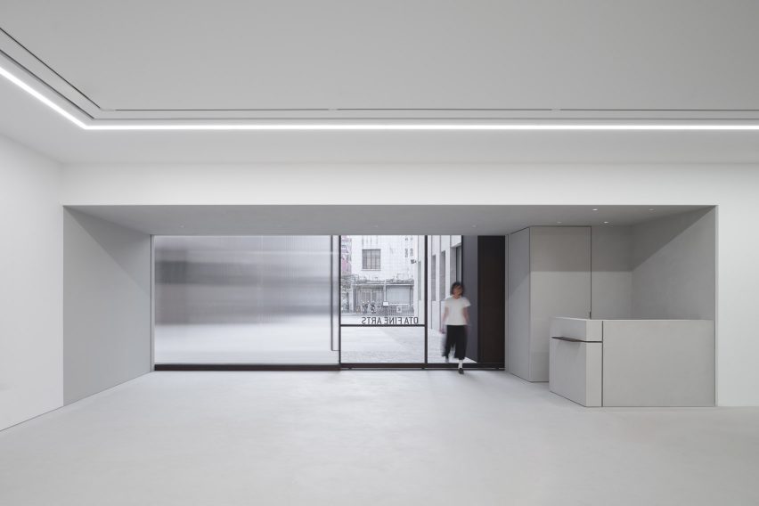
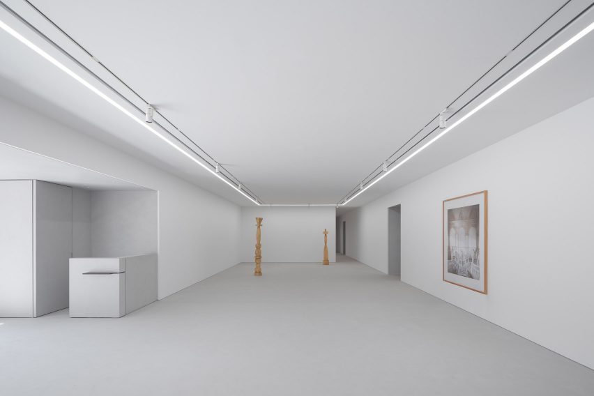
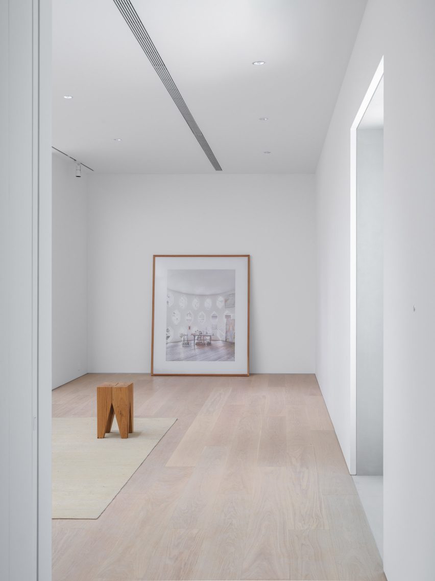
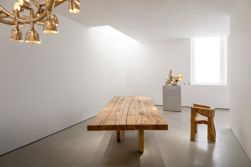
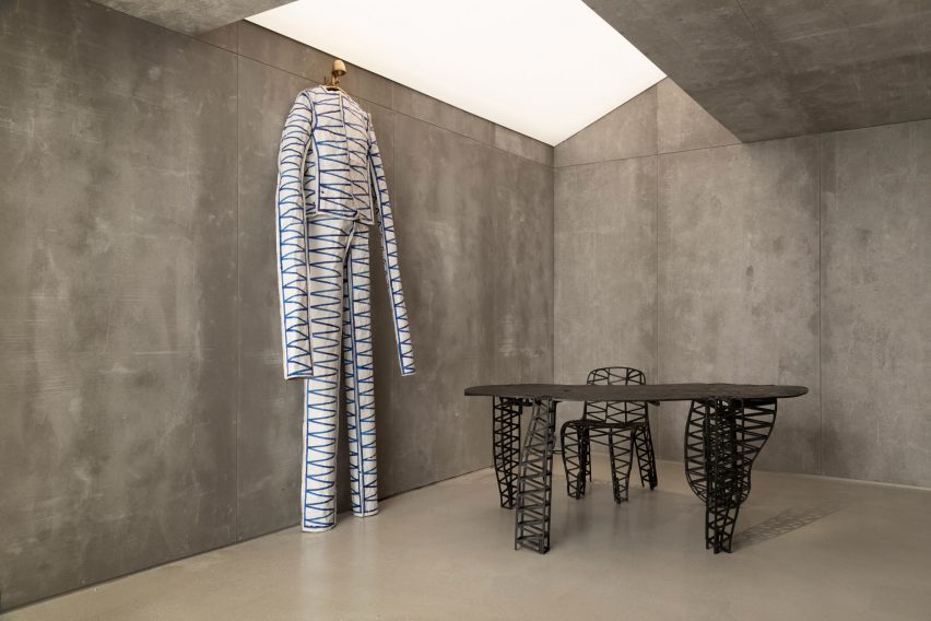
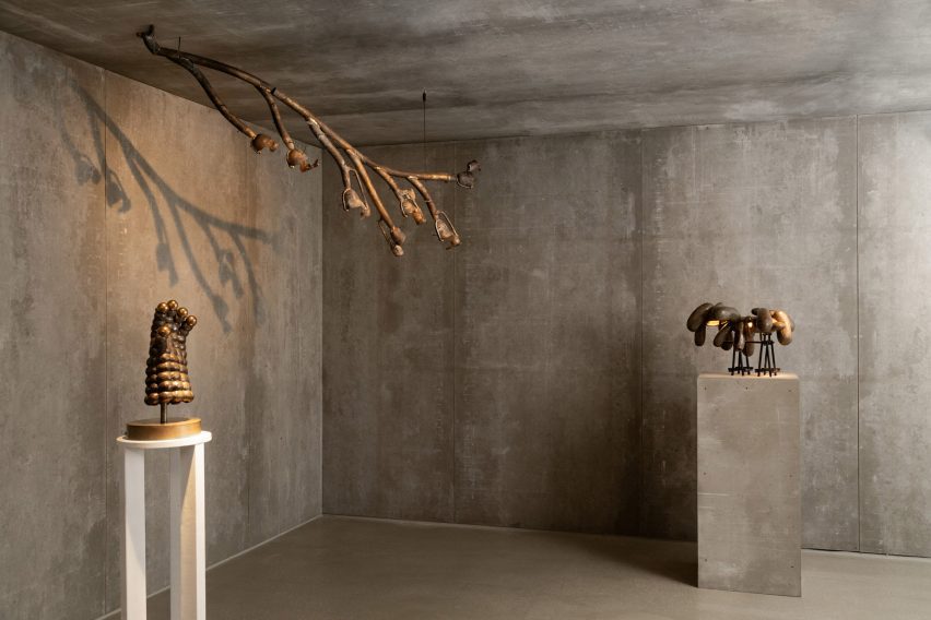
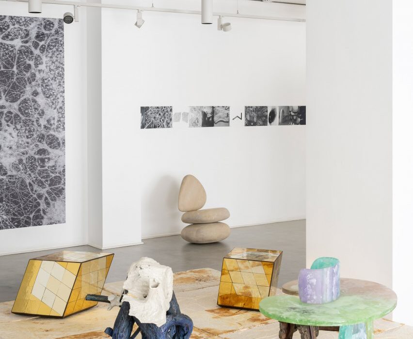
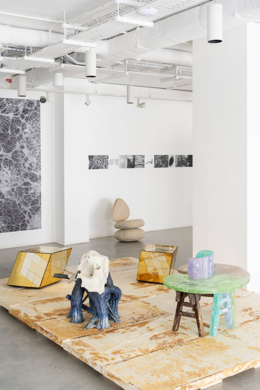
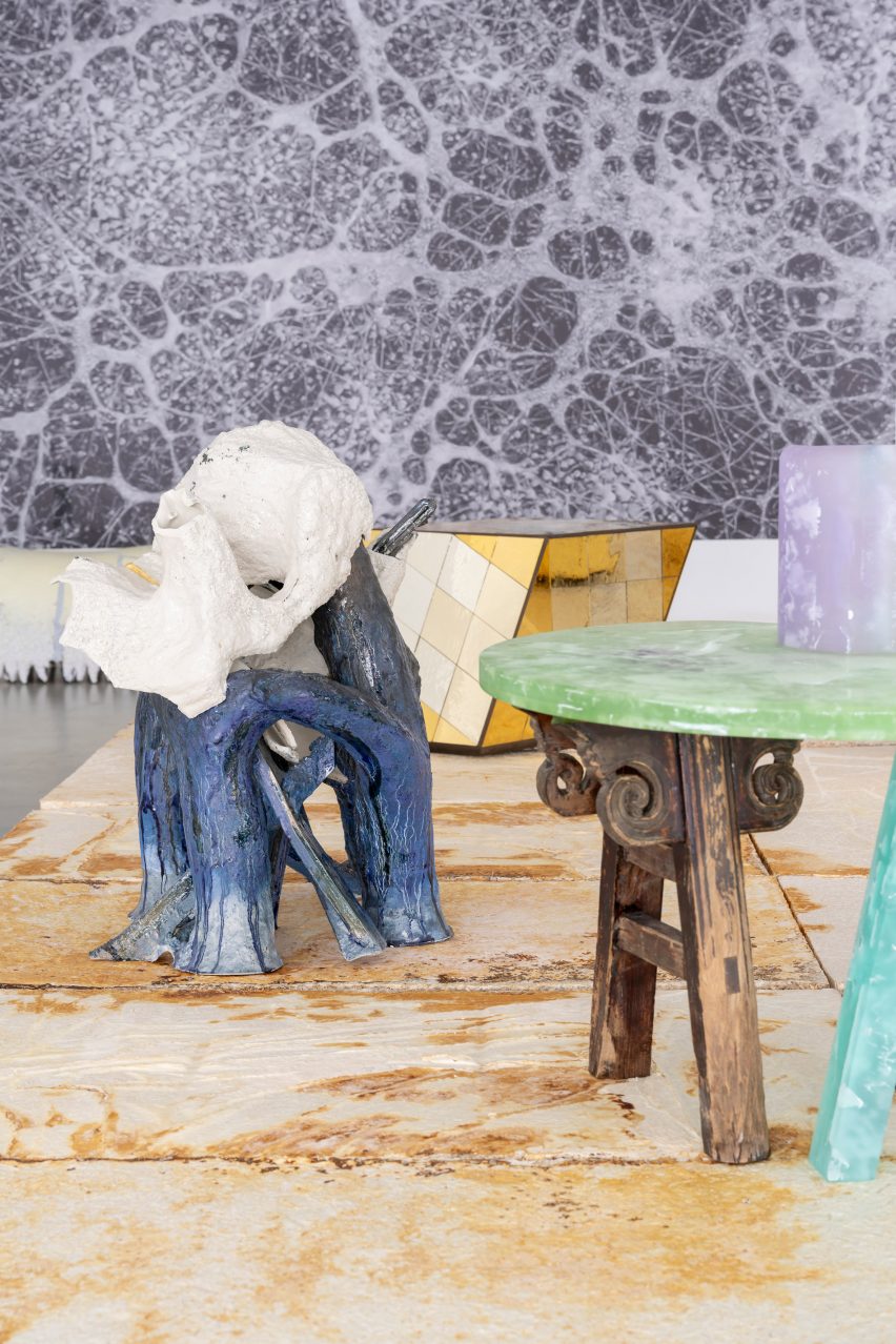
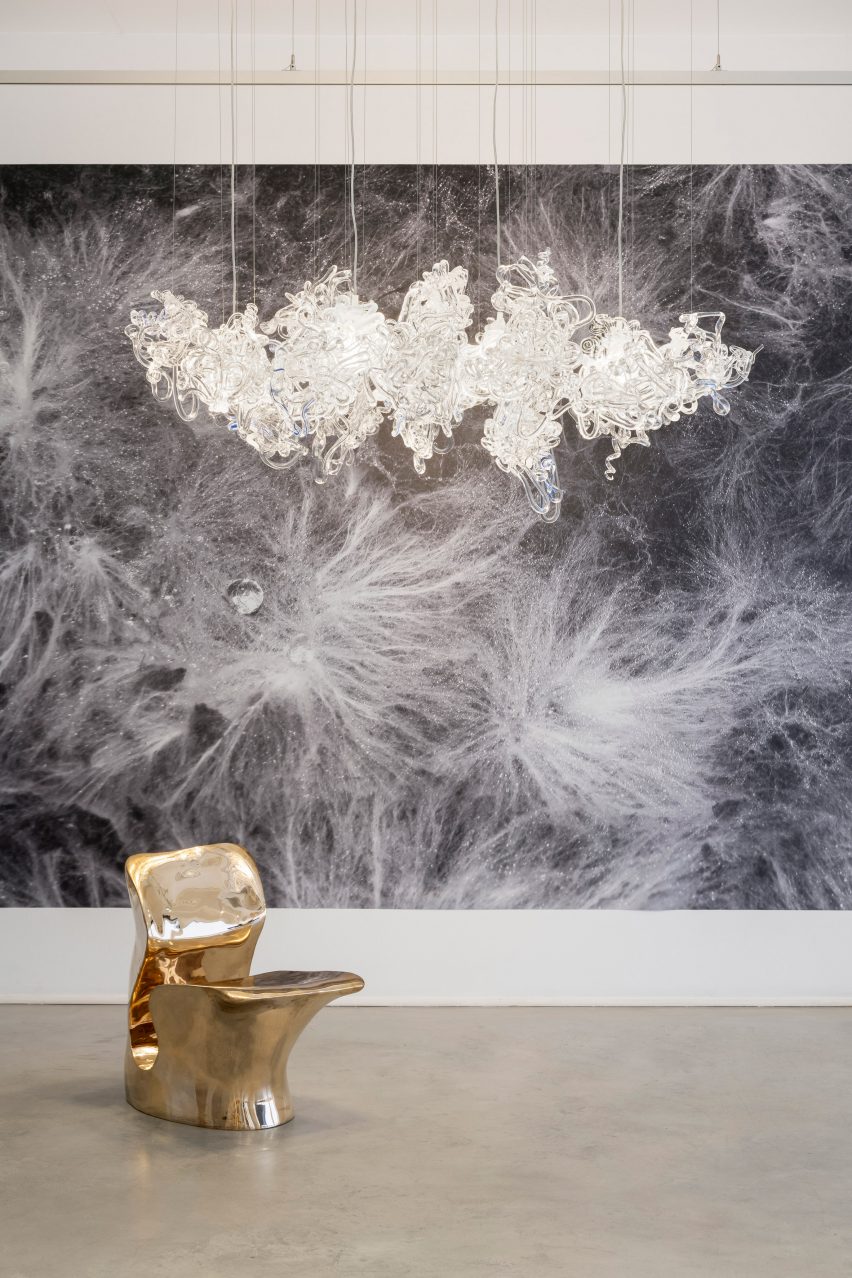
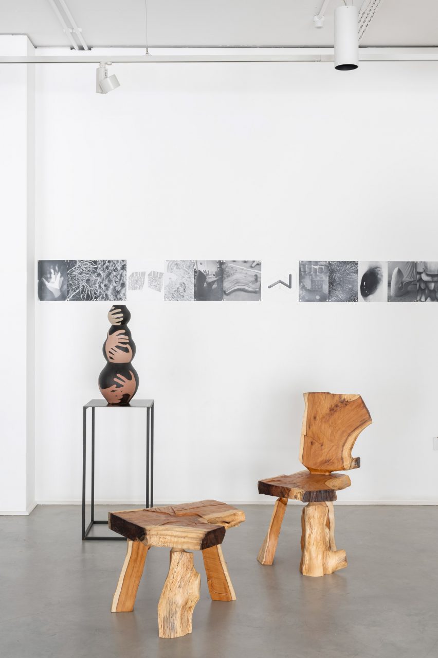
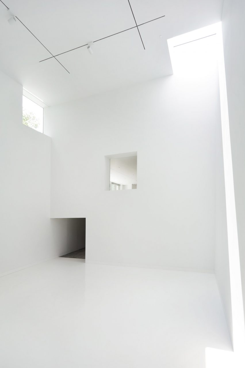
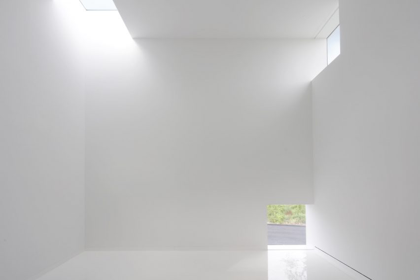
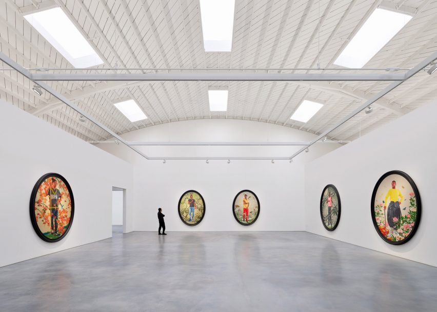
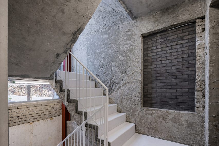
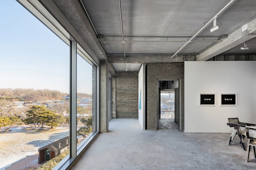
Organised across four floors and a basement level, the white-walled gallery spaces sit alongside the existing staircase, lift, service and storage areas, where the structure’s rough material finishes have been left exposed.

In these more industrial-feeling spaces, walls have been made using plywood on metal frames. Teamed with metal doors and white metal balustrades, they deliberately stand out against the “skeleton” of the existing building.

In the basement, the dark grey brickwork of the adjacent museum is mirrored in a brick floor that extends throughout the space.

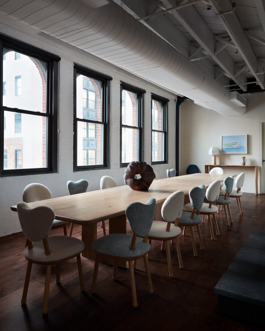
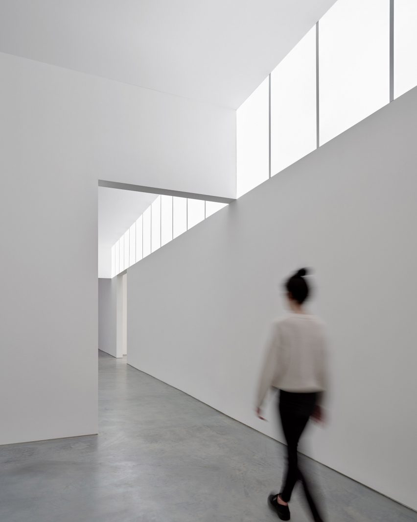
On the third floor, sections of the exterior wall were removed to create a full-height glass wall in the VIP area. This looks out towards the nearby Changdeokgung Palace and a surrounding park, also visible through windows in the stairwell.

Concrete stairwell with white stairsConcrete stairwell with white stairs
White metal accents highlight new additions to the Arario Gallery

“In this way, we established repetitive patterns where visitors would emerge from the white cube into a skeleton space and see the palace beyond as they ascend to the upper floors,” said Nagasaka.

Lounge area in Seoul by Schemata ArchitectsLounge area in Seoul by Schemata Architects
Large windows in the Arario Gallery overlook Changdeokgung Palace

Schemata Architects is a Tokyo-based studio, Founded in 1998 by Nagasaka after he graduated from Tokyo University of the Arts.

Its previous projects include a public bathhouse in Tokyo finished with turquoise tiles and a hillside guesthouse and bar for a home on the coast of an island in the Seto Inland Sea.

The photography is by Yongjoon Choi.


Reference

Double-height gallery space viewed through arched opening
CategoriesInterior Design

StudioTwentySeven opens “monumental” flagship gallery in Tribeca

Collectible design gallery StudioTwentySeven has taken over a huge space in a Tribeca textile building, creating a warm and serene environment to present museum-sized, limited-edition pieces.

The gallery’s New York City flagship at the corner of Church and Leonard Streets covers 7,000 square feet (650 square metres) across the ground floor of a 1901 neoclassical building by architect Henry J Hardenbergh.

Double-height gallery space viewed through arched openingDouble-height gallery space viewed through arched opening
StudioTwentySeven founders Nacho Polo and Robert Onsuka introduced curved walls and archways to the interior of their flagship gallery

Formerly Jean-Georges Vongerichten’s Restaurant 66, the grand space benefits from double-height ceilings and eight 16-foot-tall windows on two sides, overlooking the mirrored Anish Kapoor sculpture squashed beneath Herzog & de Meuron’s “Jenga Tower”.

StudioTwentySeven founders Nacho Polo and Robert Onsuka, who started their venture in Miami in 2018, chose this location for the New York flagship for its “monumental scale” and ability to showcase huge sculptural works.

Gallery with hanging bear sculpture by Italian artist Paola Pivi in the backgroundGallery with hanging bear sculpture by Italian artist Paola Pivi in the background
The double-height ceilings allow large-scale pieces to be displayed, like a hanging bear sculpture by Paola Pivi

“The building’s elaborately carved facade, and its stone entry staircase leading to beautifully restored original triple doors, set the tone for what clients of StudioTwentySeven will experience inside – a space that is sophisticated yet genuinely welcoming,” said the duo.

Led by Polo, the renovation of interiors involved the introduction of curved walls and a rotunda, along with an archway fitted with a 12-foot-tall, hand-carved chestnut door.

Giant bronze and glass chandelier above an organic-shaped dining tableGiant bronze and glass chandelier above an organic-shaped dining table
A giant bronze and glass chandelier hangs above an organic-shaped dining table

The team worked with lighting specialists L’Observatorie to design a custom system that imbues the space with a warm atmospheric quality, complementing the pieces on display.

A massive bronze and glass chandelier comprising hundreds of individual petals is suspended above an organically shaped French oak and waxed bronze dining table.

Pale oak floors run throughout the gallery, in places separated from the walls by glowing bands of light, and sheer curtains diffuse the abundance of natural light that enters during the day.

Other architectural details include a tall fireplace shaped into the hand-plastered walls and a chestnut-lined library hidden behind a pair of discreet doors, designed to “create moments of surprise”.

Dimly lit rotunda for displaying collectible designDimly lit rotunda for displaying collectible design
The founders also created a rotunda space for displaying specific pieces

For the gallery’s opening in February 2023, several museum-sized works from Polo and Onsuka’s private collection were installed in the space.

These include a hanging bear by Italian artist Paola Pivi, which had to be transported from the Aspen Art Museum in a special truck, and a bronze sculpture titled Owl and Boy by Japan-based Otani Workshop.

Hidden library lined in chestnutHidden library lined in chestnut
“Moments of surprise” include a hidden library lined in chestnut

Polo and Onsuka, who were judges for Dezeen Awards 2023, also have gallery spaces in Miami’s Little River and London’s Mayfair – open by appointment only.

Their new flagship in Tribeca joins a multitude of collectible design galleries in the Downtown NYC neighbourhood, like R & Company and Egg Collective, where expansive former industrial lofts provide ideal settings for presenting furniture, lighting and art.

The photography is by William Jess Laird.


Reference

Dining table with eight round-backed chairs, and a light fixture above
CategoriesInterior Design

Pierre Yovanovitch opens design gallery in New York City penthouse

French designer Pierre Yovanovitch has opened his first US showroom and gallery in Manhattan’s Chelsea neighbourhood, displaying over 80 pieces from his own furniture brand.

Recognisable designs including the iconic Bear Chair fill the 10,000 square feet (930 square metres) of gallery and office space on the penthouse level of 555 West 25th Street.

Dining table with eight round-backed chairs, and a light fixture aboveDining table with eight round-backed chairs, and a light fixture above
Pierre Yovanovitch chose a penthouse in a pre-war building for his New York gallery

This business expansion offers a permanent base for Yovanovitch and his team in New York, and allows customers and clients from his largest retail market to see the Pierre Yovanovitch Mobilier products first-hand.

“Having worked on residential projects in the US since the beginning of my practice in 2001 and with two successful furniture collection debuts (2017 and 2019) in New York, the opening of my first gallery space in America and new official New York headquarters, is a long-awaited realization for me,” said Yovanovitch.

Room with exposed ceiling beams, whitewashed brick and dark wood floorsRoom with exposed ceiling beams, whitewashed brick and dark wood floors
The exposed ceiling beams, whitewashed brick and dark wood floors are all typical of a New York loft

Inside the pre-war building, the gallery unfolds through a series of partial rooms that flow into one another without doorways or thresholds.

Throughout, exposed ceiling joists and ductwork are paired with dark wood flooring and whitewashed brick, typical of a New York loft space.

Furniture pieces styled like a living roomFurniture pieces styled like a living room
The gallery is laid out as a series of residential-style vignettes, which flow into one another

The largest display area centres around a sculptural fireplace, with a smooth plaster form that curves outward towards the base.

Furniture is oriented around the hearth, including a gently arced sofa and a chartreuse-toned resin coffee table, accompanied by the fluffy wing-backed Clifford armchair.

Wooden dining table with glass light aboveWooden dining table with glass light above
Yovanovitch curated a selection of artworks to accompany his furniture pieces

A variety of lounge and dining room vignettes showcase the products in suggested combinations with one another in residential-style layouts.

Other designs on show include the new Callis Table Lamp, the Roze Dining Table, the Arthur Sofa and the Artemis Rug.

Living room vignette facing a fireplaceLiving room vignette facing a fireplace
A variety of signature furniture and lighting designs are on display alongside new pieces

All are made in collaboration with specialist craftspeople and are “created with longevity and exceptional quality in mind” according to the brand.

“The brand pays homage to Yovanovitch’s Provencal roots, in particular the region’s natural light, rich and varied natural materials and colourways of the surrounding nature, as well as the historic commitment to craft associated with the region,” said a statement from the gallery.

The wide array of furniture and lighting pieces are presented alongside a selection of contemporary art curated by Yovanovitch – including works by Camille Henrot, Wolfgang Tillmans and Alicja Kwade – in an attempt to tie the gallery in with Chelsea’s status as an arts destination.

“It seems only fitting to open my first gallery location in the epicenter of New York’s art scene,” he said. “Not only is contemporary art central to my design practice, the neighborhood’s architectural history serves as reflection to my approach of revitalising historic spaces to fit a contemporary design aesthetic.”

Long dining table with blue and white upholstered chairsLong dining table with blue and white upholstered chairs
All of the Pierre Yovanovitch Mobilier products are “created with longevity and exceptional-quality in mind”

The New York gallery opening follows the debut of the brand’s new Paris showroom, which began welcoming visitors to a street-level space in the Marais neighbourhood from October 2023.

This move from the previous location in the 2nd arrondissement also strategically places Pierre Yovanovitch Mobilier amongst the city’s art galleries.

Sculptural fireplace accompanied by Pierre Yovanovitch's iconic Bear ChairSculptural fireplace accompanied by Pierre Yovanovitch's iconic Bear Chair
A sculptural fireplace anchors the largest area, accompanied by Yovanovitch’s Clifford chair

Yovanovitch founded his design practice in 2001 after working for fashion house Pierre Cardin. His interior design work has ranged from the salmon-pink and butter-yellow gift shop at Villa Noailles and ski hotel Le Coucou in France, to the high-end Hélène Darroze restaurant at The Connaught in London and ski hotel Le Coucou.

Earlier this year, the designer created a set with moving elements for Verdi’s Rigoletto at the Basel Opera.

The photography is by Stephen Kent Johnson.

Reference

Neri&Hu Ota Fine Arts gallery
CategoriesInterior Design

Neri&Hu highlights simplicity and functionality at Shanghai art gallery

Chinese studio Neri&Hu has designed a contemporary art gallery for Ota Fine Arts in Shanghai with a focus on the “sublime beauty of the banal”.

The gallery sits on the ground floor of a mixed-use tower at Rockbund, a development amidst the historical Bund in Shanghai along the Huangpu River, where a series of restored colonial art deco buildings are located.

Neri&Hu Ota Fine Arts galleryNeri&Hu Ota Fine Arts gallery
The entrance of the gallery features an oversized sliding door

“The primary design challenge was to utilise the areas along the facade for both storage and display, blurring the distinction between functional and experiential space,” explained Neri&Hu.

“This deepened threshold condition found on both facades defines the visitor’s arrival sequence and journey within.”

Neri&Hu Ota Fine Arts galleryNeri&Hu Ota Fine Arts gallery
The facade of the gallery is framed in aged steel to contrast the contemporary gallery

The facade of the gallery was framed in aged steel, with portions of solid metal and large glass panels arranged to form a window display for the artworks.

Handmade ivory tiles line the inner side of the window in a subtle woven pattern, serving as a neutral backdrop for the art pieces.

Neri&Hu Ota Fine Arts galleryNeri&Hu Ota Fine Arts gallery
A warehouse-sized door can be fully open on the west facade for easy transport of large art pieces

An oversized sliding door marks the entry to the gallery on the eastern facade. When opened, the entrance of the gallery is revealed, with the outer sliding door framing the window display next to it.

When closed, the door slides back to its original position and allows the full-height glazed window to be exposed.

The western facade features a warehouse-sized door that can be fully opened using a custom-designed handle. This allows large artworks to be delivered directly from a designated parking area into the gallery.

Neri&Hu also added fluted glass to the exterior, which glows in the evening to illuminate the adjacent Rockbund courtyard and add elegance to the functional facade.

Inside the gallery, the 350 square-metre space is divided into two zones – a 150-square-metre main public viewing gallery and a private zone that houses VIP rooms and office space.

The pared-back, white VIP rooms feature contemporary furniture pieces with custom-made white tiles and a stained oak floor and were designed to create a relaxing environment, in which the attention can be focused on the art itself.

Neri&Hu Ota Fine Arts galleryNeri&Hu Ota Fine Arts gallery
The interior of the gallery has a neutral and simplistic tone

“The project’s understated material palette and overall conceptual underpinning lies in the juxtaposition of old and new, raw and refined, ordinary and spectacular,” said Neri&Hu.

“We hope one can appreciate the sublime beauty of the banal, as much as the brilliance of contemporary art,” it added.

Neri&Hu Ota Fine Arts galleryNeri&Hu Ota Fine Arts gallery
Clean white rooms are intended to highlight the art piece

Neri&Hu was founded by architects Lyndon Neri and Rosanna Hu in 2004 in Shanghai.

Other recent projects completed by the studio include the Sanya Wellness Retreat hotel on the Chinese island of Hainan and a fashion boutique with fabrics and marble screens.

The photography is by Zhu Runzi.


Project credits:

Partners-in-charge: Lyndon Neri, Rossana Hu
Associate-in-charge: Jacqueline Min
Senior interior designer-in-charge: Phil Wang
Design team: Rovi Qu
FF&E procurement: Design Republic
Contractors: ETQ Project (Shanghai) Limited

Reference

Gallery shop interior designed by Akin Atelier in Sydney Modern
CategoriesInterior Design

Akin Atelier houses Gallery Shop at Sydney Modern in “translucent bubble”

Curved resin walls define this retail space, which architecture studio Akin Atelier has created for the Sydney Modern extension at the Art Gallery of New South Wales.

Designed by Akin Atelier with surfboard designer Hayden Cox, the Gallery Shop is located in the entrance pavilion of the gallery that was recently completed by Pritzker Architecture Prize-winning studio SANAA.

The retail space is conceived as a “translucent bubble” within the entrance area, the studio said, and it aims to challenge the typical commercial experience in a museum shop.

Gallery shop interior designed by Akin Atelier in Sydney Modern
Akin Atelier has created the Gallery Shop at Sydney Modern

“The shop captures natural light throughout the day, bringing dynamic reflections and refractions of the city while holding people, objects, and books within its centre,” Akin Atelier told Dezeen.

“[It] showcases products to passers-by through the lens of the resin walls – gently maximising the identity of the space while preserving the architectural experience of the new building.”

The Gallery Shop comprises two resin walls that curve around its displays, with a gap between the two of them forming the entry point.

shop interior designed by Akin Atelier in Sydney Modern
It has curved walls made from a resin

The installation is placed in the northwest corner of the entrance pavilion, to the left-hand side of its entrance, meaning that its distinctive resin walls are visible from the street.

Its walls are constructed of 29 modules formed of 12 tonnes of resin. According to the studio, the resin is a type of “bio-resin” manufactured to incorporate biological matter.

resin walls of retail space at sydney modern
It sits within the building’s entrance pavilion that was designed by SANAA

“It is composed of a minimum 26 per cent biological matter,” said the studio.

“[This reduces] the amount of embodied carbon as well as reducing toxicity during the manufacturing process.”

The distinct tonal gradient of the bio-resin was achieved by hand pouring layers of colour into custom moulds – a process that took 109 days.

Meanwhile, its glossy translucency was achieved through hand sanding followed by seven rounds of hand polishing.

Gallery Shop interior designed by Akin Atelier
The translucent material allows natural light through the space. Photo by Tim Salisbury

The resin’s earthy hues reference the sandstone used in the original Art Gallery of New South Wales, while its gradation is a nod to the layered nature of Sydney’s bedrock of sandstone.

“The handmade nature of resin casting and finishing allowed for experimentation across colour and form while addressing the patinated qualities of the outside environment,” explained Akin Atelier.

Gallery shop interior designed by Akin Atelier in Sydney Modern
Two curved walls enclose the shop

Inside the Gallery Shop, adjustable resin shelves line the curved walls, housing books and publications. Stainless steel is used for display plinths, providing a contrast to the warm tones of the resin.

The project has been shortlisted in the small retail interior category of the Dezeen Awards.

Akin Atelier also recently used tactile materials such as onyx, plaster and travertine to form the interiors of a branch of the womenswear store Camilla and Marc in Melbourne.

The photography is by Rory Gardiner unless otherwise stated. 

Reference

Sculpture by Frederik Molenschot made from recycled airbags
CategoriesInterior Design

Frederik Molenschot presents sculptures at Carpenters Workshop Gallery

Sculptures crafted from recycled BMW airbags and oak railway sleepers feature in artist Frederik Molenschot’s Atlas 2000 exhibition, which is on display at Carpenters Workshop Gallery in Paris.

Marking the Dutch artist’s first solo exhibition, Atlas 2000 features hand-sculpted works that are directly influenced by natural landscapes, Molenschot said.

The show’s title refers to the visual diary the artist has created since his studies at Design Academy Eindhoven in 2000.

Sculpture by Frederik Molenschot made from recycled airbags
Buoy Airbag is a sculpture made from recycled BMW airbags

Spread across the minimalist ground floor at the Paris branch of Carpenters Workshop Gallery, the sculptures were crafted from various materials and range from functional to abstract.

Buoy Airbag is an amorphous, pale blue-hued hanging sculpture created from recycled airbags sourced from BMW vehicles.

Sculptures at Carpenters Workshop Gallery
Frederik Molenschot’s debut solo show is on display at Carpenters Workshop Gallery

“The piece delves into the intricate connection between cargo transport and climate change, with recycled airbags symbolising a melting arctic ice rock floating in the sea,” the artist told Dezeen.

“I want to explore how luxury materials are used and how they become what they are,” he added. “[So] I processed the used airbags in a ‘couture’ way, to get a very high-quality finish.”

Bronze LED light sculpture
Gingerblimp is a bronze LED light sculpture

Molenschot also designed Gingerblimp, a bulbous bronze LED light sculpture characterised by a silver patina and a gold-brushed interior.

The artist explained that the sculpture is a playful take on ginger root from the natural world and also nods to the manmade blimps that form part of New York City’s annual Thanksgiving Day Parade.

Furniture made from recycled oak
Recycled oak railway sleepers were salvaged to create furniture

Recycled oak railway sleepers were salvaged to create a chunky dining table and chair, which were named Bridge Beat to “pay homage to the captivating structure of bridges”.

Also part of this series is a black bronze desk and chairs formed from gridded lines arranged in triangular formations.

“Each material was selected purposefully, offering unique properties and textures that complement the conceptual aspects of the artworks,” explained Molenschot.

“Every piece is hand-sculpted in our studio.”

Oversized clothing and bronze furniture by Frederik Molenschot
Molenschot also created oversized clothing

According to Molenschot, the pieces’ forms vary as much as their material palettes. In one corner of the gallery, a bobbly bronze glove was positioned underneath a branch-shaped textured lamp while oversized clothing also features in the exhibition.

“This solo show holds a special place in my heart, as it represents my entire artistic journey since my time at the Academy,” reflected Molenschot.

“It’s an invitation to explore my vision of our world. My ‘atlas’ is a compendium of research, pictures, designs, and sketches that have shaped me as an artist.”

Sculptures in Carpenters Workshop Gallery
The exhibition runs until mid-September

Known for his large-scale bronze sculptures, Molenschot has been represented by Carpenters Workshop Gallery since 2008. The galley, which also has locations in London and the US, previously exhibited an all-denim furniture show by designer Harry Nuriev.

The late fashion designer Karl Lagerfeld also debuted his first sculpture exhibition at the Paris branch.

Atlas 2000 is on display at Carpenters Workshop Gallery from 1 June to 16 September 2023. See Dezeen Events Guide for an up-to-date list of architecture and design events taking place around the world.

Reference

Furniture and art pieces at the Growth and Form exhibition at Gallery Fumi
CategoriesInterior Design

Gallery Fumi marks 15th anniversary with Growth + Form exhibition

To celebrate 15 years of Gallery Fumi, the London gallery is hosting the Growth + Form exhibition of “functional art”, featuring sculptural furniture and lighting with organic forms.

The Growth + Form exhibition includes new works by 16 of the 28 past Gallery Fumi exhibitors, responding to themes of transformation, regeneration and biological growth patterns.

Furniture and art pieces at the Growth and Form exhibition at Gallery Fumi
The Growth + Form exhibition celebrates Gallery Fumi’s 15th anniversary

It was designed by architectural designer Leendert De Vos and curated by design historian Libby Sellers, who invited former exhibitors back to showcase new pieces in a group display.

The exhibition title and theme were informed by the On Form and Growth book by Scottish biologist D’Arcy Wentworth Thompson, which analyses the mathematical harmony of growing shapes in biology.

Sculptural furniture at the Growth and Form exhibition
Pieces in the exhibition were informed by biology

Responding to this biological starting point, furniture and lighting with organic shapes and natural materials can be seen throughout the exhibition.

Danish artist Stine Bidstrup created a sculptural chandelier titled Light Entanglements, made up of twisting clusters of hand-blown glass.

Chandelier and chair at Gallery Fumi
Light Entanglements is a chandelier made from hand-blown glass

Different lengths of painted sticks were combined to create Marmaros Metamorphosis II, a circular decorative wall piece with a textured, tufted-like surface by sculptor Rowan Mersh.

“Revisiting the very beginning of his career when Mersh used cheap materials to experiment with techniques, in this work using lacquered coloured sticks, he creates forms with the details and skill level he currently attains when using precious materials,” said Gallery Fumi.

Furniture at the Growth and Form exhibition at Gallery Fumi
Seating crafted from a single yew log is featured in the exhibition

As the gallery celebrates its 15th anniversary, Sellers likened its growth to the formation of crystals – the material traditionally associated with 15-year anniversaries.

“Grown from small particles into a solid form of geometric beauty, crystal is both a poetic metaphor for Gallery Fumi’s own development over the last 15 years and an opportunity to explore the creative affinity between science, art, and the intricate nature of constructions,” said Sellers.

“After all, is this not a definition of design? The meeting of knowledge, form-making, material exploration and beauty?” Sellers added.

“The works are vibrant and active – sprouting, swirling, twisting, turning – transferring material and form into objects of beauty.”

Crystal table lamp at the Growth and Form exhibition at Gallery Fumi
Wegworth created a crystal salt vase for the exhibition

Also on show was a wooden cabinet covered in hand-painted shingles by Berlin-based designer Lukas Wegwerth, who also created a crystal salt vase titled Crystallization 183.

“Crystallization 183 was identified by Sellers as most significant for the exhibition, as not only is the 15-year anniversary traditionally celebrated with crystal, but the process of growing the crystals is a poetic metaphor for Fumi’s growth as a gallery,” Gallery Fumi said.

Wall art and stone chair at the Growth and Form exhibition at Gallery Fumi
The wall sculpture Marmaros Metamorphosis II has a tufted texture

Other pieces on display include a sculptural copper floor lamp with a stone base by London design studio JamesPlumb and a chair by British designer Max Lamb crafted from a single yew log.

“Tapping into the creative affinity between science and art, the pieces created for the show will display fluid organic forms, natural materials and geometric structures,” said Gallery Fumi.

Furniture at the Growth and Form exhibition at Gallery Fumi
The exhibition is on display from 7 to 30 September

Other designers showing work include US sculptor Casey McCafferty, Italian designer Francesco Perini, design studio Glithero, Chinese material designer Jie Wu, German ceramic artist Johannes Nagel, Finnish artist Kustaa Saksi, British artist Leora Honeyman, Spanish artist Saelia Aparicio, British artist Sam Orlando Miller, design studio Study O Portable and furniture design studio Voukenas Petrides.

Gallery Fumi was founded in 2008 by Valerio Capo and Sam Pratt. It has previously showcased work including a Jesmonite lighting collection by British designer Lara Bohinc and a limited-edition bench by JamesPlumb made using medieval dying techniques.

The photography is courtesy of Gallery Fumi.

The Growth + Form exhibition is on display at the Gallery Fumi in London, UK, from 7 to 30 September 2023. See Dezeen Events Guide for an up-to-date list of architecture and design events taking place around the world.


Reference

Travelling design gallery in Berlin by Vanessa Heepen
CategoriesInterior Design

Forma is a nomadic design gallery popping up around Berlin

Contemporary German furniture designs are displayed alongside vintage pieces at this travelling gallery that multidisciplinary designer Vanessa Heepen has launched in Berlin.

Rather than having a permanent home, Forma will take over different locations across the German capital.

Travelling design gallery in Berlin by Vanessa Heepen
Forma’s first exhibition was held in a building next to the Spree river

The gallery’s inaugural exhibition, titled The Room I Walk the Line, was recently on show on the ground floor of a mixed-use building in Friedrichshain, nestled in between fragments of the Berlin Wall on the banks of the river Spree.

“To be honest, the area is not where I would typically choose to open a gallery,” Heepen told Dezeen. “But when I first saw a picture of it on a real estate website, I was deeply touched by its huge windows, red columns and by the water, of course.”

Two stools in a concrete room
It featured German designers including Nazara Lázaro (left) and Studio Kuhlmann (top right)

A trained interior designer, Heepen largely left the space in its found state but worked with her team to create a simple mahogany bar counter and storage unit for the gallery.

She also asked “soft architecture” studio Curetain to create a white latex screen for the corner of the gallery.

As part of the exhibition, this served as the backdrop for a tall white spectator shelf by Stuttgart-based Freia Achenbach, along with a graphic white stool by local designer Nazara Lázaro.

Travelling design gallery in Berlin by Vanessa Heepen
This wiggly coat stand was mong the vintage pieces featured

Other pieces in the exhibition included a pigmented concrete chair by Carsten in der Elst and hanging metallic stars by Studio Kuhlmann, both from Cologne, as well as a translucent shelf by Berlin’s Lotto Studio.

Forma also sourced a number of vintage pieces from Moho – a 20th-century furniture showroom in Prenzlauer Berg – among them an embossed metal cabinet and a wriggly coat stand.

One of Heepen’s main motivations for founding the gallery was to carve out a space for showcasing design-led furnishings in Berlin, which she says is something of a rarity in the German capital.

“It is a discursive topic, and people have always been unsure about the success of it,” she explained. “After Forma’s first edition, I am glad to say it was hugely successful”.

Chair and transluscent shelf in Forma gallery
Contemporary design pieces included a translucent shelf by Lotto Studio

The designer is currently on the hunt for Forma’s next location and will let the new setting inform her selection of furnishings.

“I’m always open to something new that occurs within the process,” she said. “I hold on to my vision, but I am also open to taking a detour.”

Travelling design gallery in Berlin by Vanessa Heepen
Also featured was a pigmented concrete chair by Carsten in der Els

Elsewhere in Berlin, Swiss architecture firm Herzog & de Meuron is currently constructing a major new museum for modern art.

The building’s design came under fire at the end of last year, when it was discovered its complex air conditioning system would result in the venue using four times as much energy as a nearby museum from the 1800s.

The photography is by Matthias Leidinger

The Room I Walk the Line was on show at Mühlenstrasse 63 in Berlin from 15 June to 15 July 2023. For more exhibitions, events and talk in architecture and design, visit Dezeen Events Guide.


Reference

Concrete building with vertical protrusion and square windows
CategoriesArchitecture

Monolithic New York museum pavilion features “perfect cube” gallery

Spanish architects Alberto Campo Baeza and Miguel Quismondo have collaborated to create the Robert Olnick Pavilion for the Magazzino Italian Art museum in Cold Spring, New York.

The concrete-clad pavilion is the second structure on the campus of the museum, which is dedicated to promoting Italian art and design in the United States.

Quismondo, who designed the first building on the site, worked with Baeza to expand the gallery capabilities of the institution.

Concrete building with vertical protrusion and square windows
Alberto Campo Baeza and Miguel Quismondo designed the Robert Olnick Pavilion in New York

The pavilion is partially submerged into a sloping green hill, with entrances on either side of the building at the top and bottom of the grade.

It has a monolithic concrete facade with little detail, punctuated at points by simple square windows. At the top of the hill, the structure has a vertical element that gives the whole building an L shape.

Within this space a double-height gallery was conceived of as an isotropic room that is a “perfect cube”, according to the architects. Windows were placed at each corner to create a sundial effect when light from outside enters.

White interior room with light streaming through square windows
The architects included a perfectly cubic room that functions like a sundial with strategically placed windows

“We built the Robert Olnick Pavilion like a poem: a white cube traversed by light,” said Baeza.

“The main space will embody the beauty of the artwork it exhibits, and with an isotropic design that carves an opening into every corner, each detail will be touched by magnificent sunlight.”

“Not unlike the excitement of birth, it is with great anticipation that we deliver this second building to the museum.”

Polished concrete floors and white ceilings
The interior features polished concrete floors and white ceilings

The building has two floors and a mezzanine, with a long first floor that stretches the length of the structure and holds a variety of programming spaces, terminating at a glass end wall that overlooks a sunken courtyard.

The primary floor holds the two main galleries, one in the long end of the building and another housed in the double-space element created by the vertical element at the top of the grade.

“The pavilion has a humble layout that highlights industrial materials such as concrete to facilitate a conceptually strong and aesthetically neutral environment to compliment the postwar and contemporary Italian art and design it will exhibit,” said the museum.

White room with beams of sunlight
The galleries will hold art by Italian creatives

Between the two gallery spaces is a mezzanine level that is accessed from the door at the top of the slope. This space holds a cafe with a seating area that extends outdoors.

All the interiors are stark white, in line with the minimalism of the facade. Polished concrete flooring and seamless overhead lights were designed to add to the smoothness of the interior.

White light in white gallery space
The structure has two floors and a mezzanine

The museum plans to launch its first exhibitions in the fall, featuring the work of Italian designers and artists such as painter Mario Schifano and architect Carlo Scarpa.

Baeza and Quasimondo has been working with museum founders Nancy Olnick and Giorgio Spanu for more than twenty years, and designed the pair’s home, which was Baeza’s first US project, in 2003.

Other projects by Baeza include a sports complex in Madrid designed to be a “box of light” and a white-walled minimalist house in Monterrey, Mexico.

The photography is by Marco Anelli

Reference

Converted car showroom
CategoriesArchitecture

Johnston Marklee converts historic Los Angeles car showroom into gallery

A vaulted ceiling punctured with skylights features in a 1940s auto dealership that architectural studio Johnston Marklee has converted into a bright home for the Roberts Projects art gallery.

Roberts Projects chose the local studio to transform the brick and cinder-block building into its new home as it moved from Culver City to the mid-Wilshire district, which has seen an influx of art galleries in recent years.

Converted car showroom
Johnston Marklee has converted a Los Angeles car showroom into an art gallery

The architects conceived a total overhaul of the 10,000-square-foot (929-square-metre) former auto dealership, which was built in 1948 and features an arched, 30-foot-high (nine-metre) ceiling.

For many years, the building housed a Chrysler-Plymouth dealership known as the “Auto Dealer to the Stars”, as it drew celebrity clients such as actors Fred Astaire, Lucille Ball and Bob Hope.

Gallery renovation by Johnston Marklee
Roberts Projects acquired a historic building in the area

“We searched for a space for over four years and felt this building was ideal due to the raw talent of the structure, incredible ceiling height and great location,” said Roberts Projects co-owner Julie Roberts.

The exterior of the building – which once featured large stretches of glass for the display of cars – was replaced with solid walls in grey stucco, which suits the “gallery’s minimalist aesthetic”, the gallery said.

Solid grey stucco walls
The exterior was replaced with solid walls in grey stucco

Marking the entrance are a glazed garage door and an existing ficus tree.

“The elemental facade and building mass will integrate the new gallery into the cultural landscape of the arts and architecture across the city,” Johnston Marklee founding partner Sharon Johnston said.

Johnston Marklee conceived a total overhaul of the car showroom

Inside, the building houses four exhibition spaces, offices, study areas and a reception with a bookshop.

Throughout the building, “cavities of light” reveal architectural elements and enhance the viewing experience, the architects said.

Glazed garage door by Johnston Marklee
A glazed garage door marks the entrance

The main exhibition space sits under the vaulted ceiling, which was given a fresh layer of paint.

Here, skylights usher in daylight. In other areas, illumination is provided by “clearstories” made of panels uplit by LEDs.

Concrete flooring and bright white walls lend to the gallery’s austere character. Furnishings include pieces by Alvar Aalto, Gijs Bakker and Jean Prouvé. Shelving is made of birch plywood.

Illuminated shop area of Roberts Projects gallery
Illumination is provided by “clearstories” made of panels

In the office area, the flooring consists of red-tinted concrete with exposed aggregate, which is original to the space. The concrete was polished and given a terrazzo-like appearance.

The gallery’s new home was inaugurated with an exhibition of colourful portraits by renowned US painter Kehinde Wiley, whom Roberts Projects has represented for over two decades.

“This new space is the next chapter in our long history of being at the forefront of the Los Angeles art scene,” said gallery co-owner Bennett Roberts, who said that LA is in the midst of a “creative renaissance”.

“With access to outstanding exhibitions year-round, dedicated collectors, and creative energy from those who call this city home, Los Angeles is poised to be one of the most important creative hubs for years to come,” he added.

Red-tinted concrete flooring in the office area
In the office area, the flooring consists of red-tinted concrete with exposed aggregate

The opening of Roberts Projects’s new home follows a period of continual growth for the city’s arts scene.

Galleries such as Hauser & Wirth and The Future Perfect have recently opened venues in Los Angeles, and an annual edition of the Frieze Art Fair was introduced here in 2019.

Other art-related buildings in Los Angeles include a new home for auction house Phillips that was designed by local studio Formation Association, and the recent completion of a 20-year renovation and expansion of the Hammer Museum that was overseen by Michael Maltzan Architecture.

The photography is by Eric Staudenmaier.


Project credits:

Architecture: Johnston Marklee
Lighting design: Buro Happold
Furnishings consultant: Ellen Brill

Reference