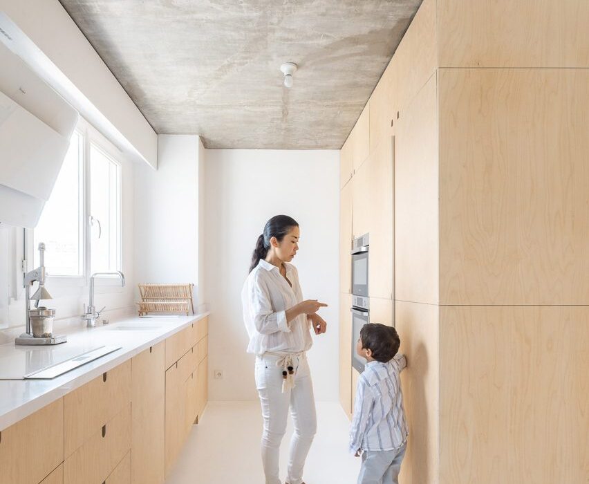
Fourteen space-efficient galley kitchens
For our latest lookbook, we’ve rounded up 14 galley designs by architects and designers that create space-saving and efficient kitchens.
A galley kitchen features two parallel rows of units separated by a passage. It is named after the food preparation area on ships, which are traditionally narrow, cramped spaces called galleys.
Galley layouts are often when space is limited since they offer a high proportion of storage and preparation surfaces compared to circulation space, or when the kitchen area is long and narrow.
They are also efficient since the cook can quickly and easily move between tasks.
They are one of the most popular kitchen layouts. The basic galley layout can be expanded by the addition of an island between the two runs of units.
This is the latest roundup in our Dezeen Lookbooks series providing visual inspiration for the home. Previous kitchen-related posts include compact kitchens, breakfast bars, terrazzo kitchens and kitchens with islands.
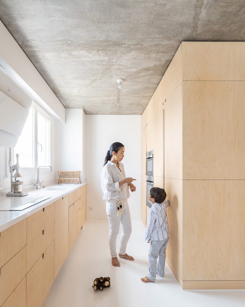
Sacha, France, by SABO Project
The kitchen in this Parisian apartment is a hybrid of two popular layouts, being part galley and part one-wall.
A counter runs the length of the kitchen diner and features a galley area at one end, where a wall-mounted oven and a refrigerator are housed in full-height units. The entire kitchen features birch plywood cabinetry.
Find out more about Sacha ›
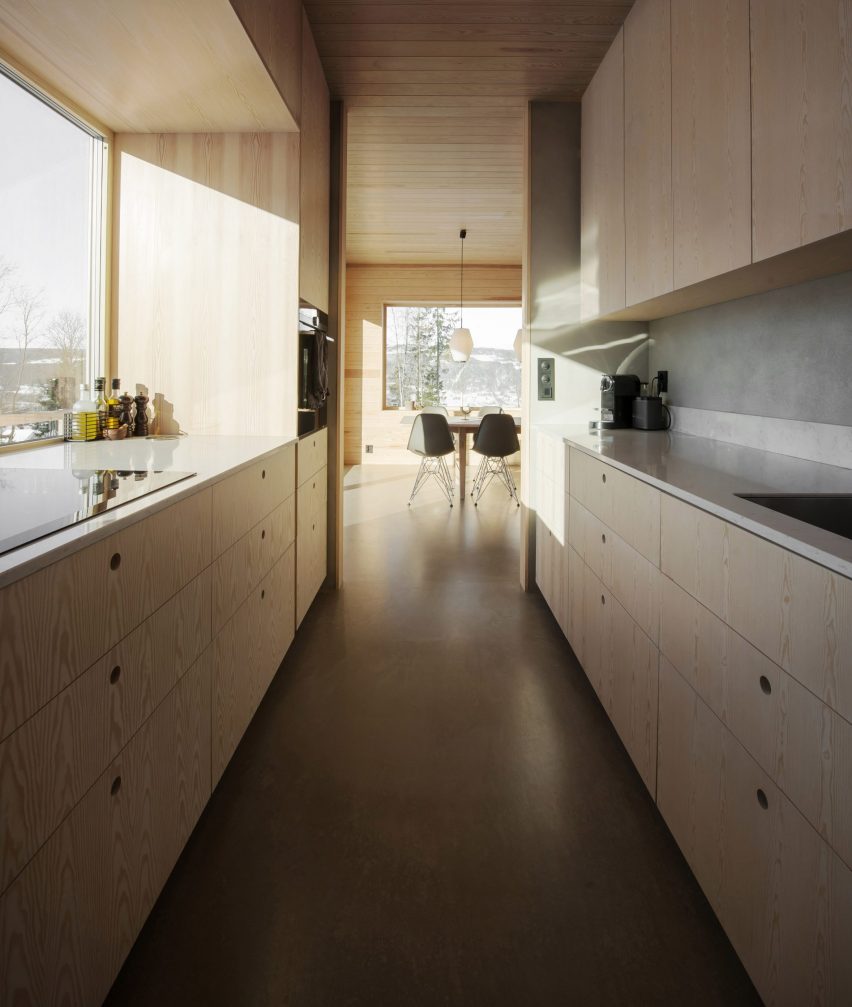
House in Red Concrete, Norway, Sanden+Hodnekvam Arkitekter
Rough concrete floors were combined with pine panelling and cabinetry in this classic galley kitchen in Norway.
Galley kitchens usually place the sink in front of a window with the hob on the windowless side but here the layout has been flipped, with spectacular mountain views proving a distraction for anyone working at the stove.
Walls are clad in pine panelling or rendered in cement to match the floor.
Find out more about House in Red Concrete ›
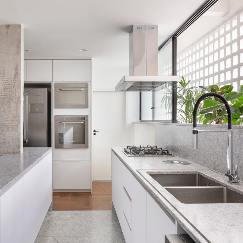
308 S Apartment, Brazil, by Bloco Arquitetos
This apartment in Brasília was built in the 1960s by architect Lucio Costa and landscape architect Burle Marx. It was remodelled with an open-plan design that exposes its concrete structure.
Its kitchen is organised at the front of the home and combines white cabinetry with granite work surfaces. The run of cupboards that faces the dining area doubles as a breakfast bar.
Find out more about 308 S Apartment ›
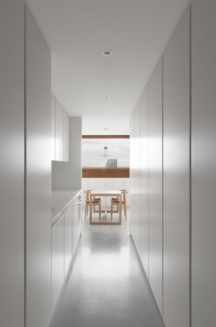
Barbican apartment, UK, by John Pawson
The minimalist overhaul of this one-bedroom apartment in the brutalist Barbican estate in London saw designer John Pawson replace the original warren-like plan with a geometric, broken-plan arrangement.
This includes a galley kitchen slotted into a passageway that leads to a small dining area.
Full-height, handless cupboards conceal appliances and belongings along one wall. The other houses a small countertop with a sink and hob, with more full-height storage to one side.
Find out more about the Barbican apartment ›
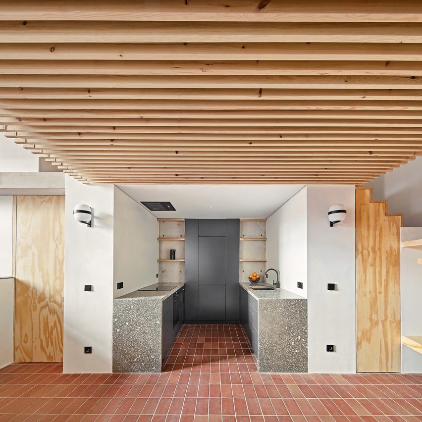
Yurikago House, Spain, by Mas-aqui
A recessed kitchen on the ground floor of the multi-levelled Yurikago House sees flecked grey terrazzo countertops paired with terracotta floor tiles.
The end wall provides shelving on either side of a full-height unit that conceals a fridge-freezer.
Find out more about Yurikago House ›
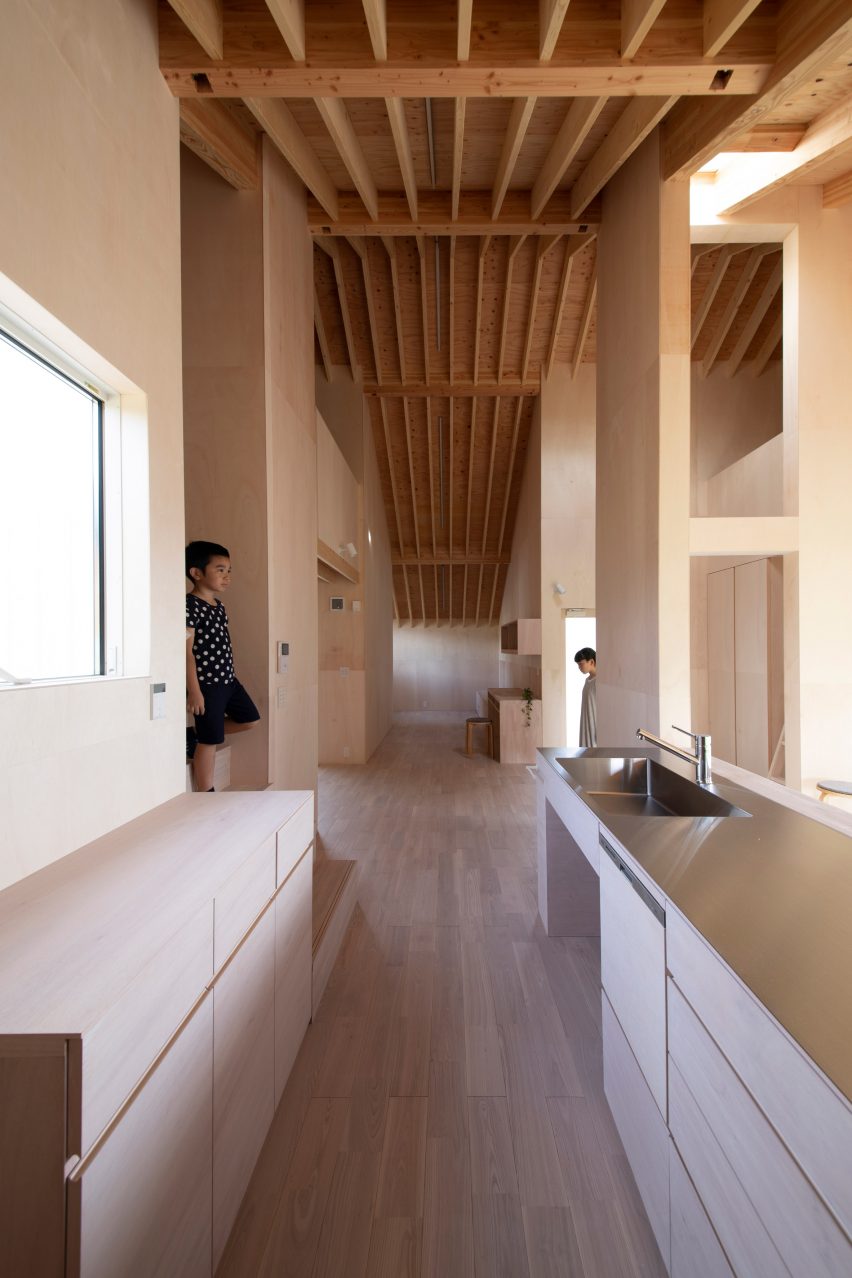
Kasa House, Japan, by Katsutoshi Sasaki + Associates
This unusual cross-shaped house in Kariya, Japan by Katsutoshi Sasaki + Associates features an equally unusual kitchen.
The galley occupies one arm of the cross and consists of a stainless-steel countertop with a generous integrated sink on one side and timber cabinets on the other.
The wall behind the sink is open, providing a serving hatch for the small dining area area beyond.
Find out more about Kasa House ›
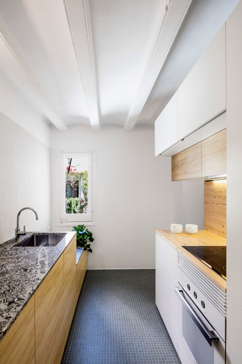
La Carmina, Spain, by RÄS studio
The unusual space-saving layout of this Barcelona apartment conversion by RÄS studio features a square structure inserted into the living space that houses a bathroom and storage.
The gap between the cube and an internal wall has been used to house a compact galley kitchen that is separated from the dining area by the bathroom.
The asymmetrical kitchen has one polished granite counter, which is split in height to allow a small window to open inwards. The splashback is clad in mosaic tiles, as is the floor.
The other counter has a pine surface and splashback.
Find out more about La Carmina ›
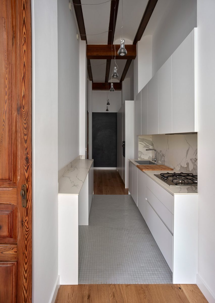
Valencian townhouse, Spain, DG Arquitecto Valencia
A narrow passageway in this Valencian townhouse is not quite wide enough even for a full galley kitchen. Instead, one run of units is shallower than usual and doubles as a breakfast bar.
Countertops are of marble while the floor is finished in mosaic tiles.
Find out more about the Valencian townhouse ›
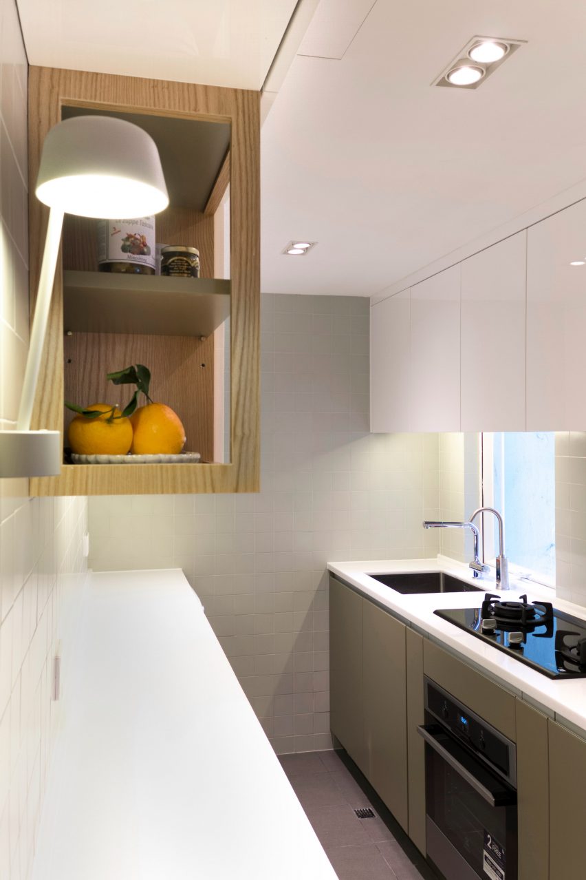
Flat 27A, Hong Kong, by Design Eight Five Two
Smart storage solutions, concealed cabinetry and custom-built furniture fill this kitchen in Hong Kong’s Kowloon Bay area.
A muted green colour covers the cabinetry below worksurfaces, with white cupboards on the walls and overhead spaces providing more storage.
Find out more about Flat 27A ›
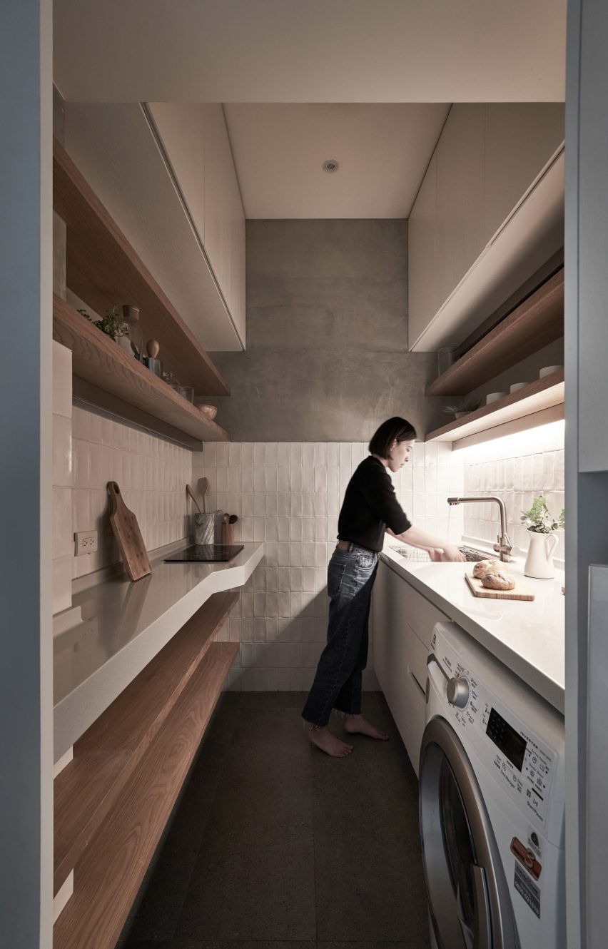
17.6-square-metre flat, Taiwan, by A Little Design
This former piano studio in Taipei measures just 17.6 square metres and 3.4 metres in height.
Its kitchen is tucked alongside the entrance hall, between two load-bearing walls. It packs a lot into its tiny footprint with storage reaching to the ceiling on both sides, open shelving and even a washing machine. A counter down one side juts out to accommodate a small electric hob.
Find out more about the 17.6-square-metre flat ›
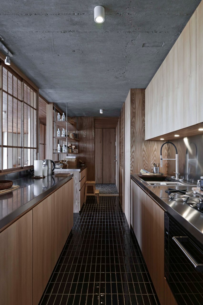
Shakespeare Tower apartment, UK, by Takero Shimazaki Architects
Also located within London’s Barbican Estate, this apartment merges brutalism with elegant Japanese details.
It features a mainly wooden interior, with gridded timber panels used as screens to partially conceal the kitchen.
The concrete on the ceiling was left exposed and contrasts against the wooden cabinetry, while stainless steel was used across all work surfaces. Black glazed subway tiles decorate the floors.
Find out more about the Shakespeare Tower apartment ›
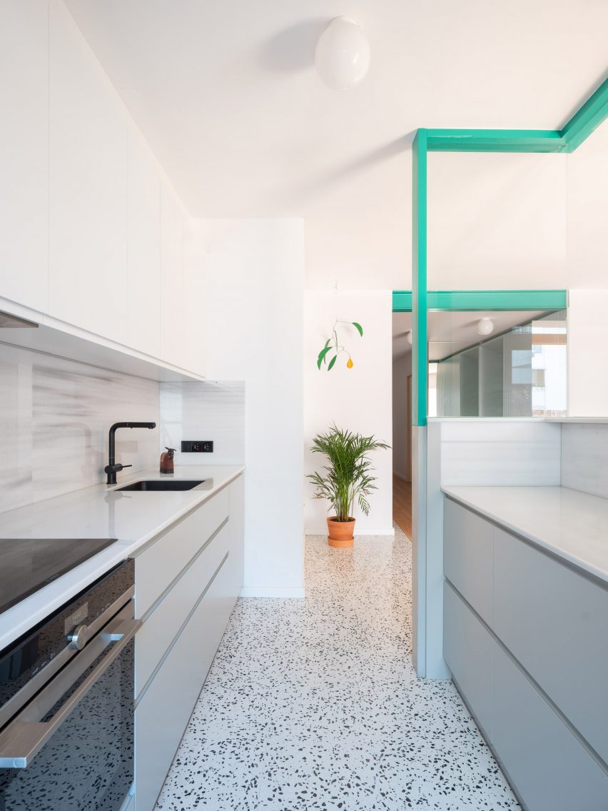
Galla House, Spain, by Cavaa
Pops of colour were incorporated from other areas of the home in this kitchen designed by architecture studio Cavaa.
The studio fitted the kitchen behind a half wall with a glazed partition that stretches to the ceiling and visually connects the kitchen with the living area.
The cabinetry was finished with a light grey that links the storage solutions to its bluish-grey terrazzo floor that zones the area.
Find out more about Galla House ›
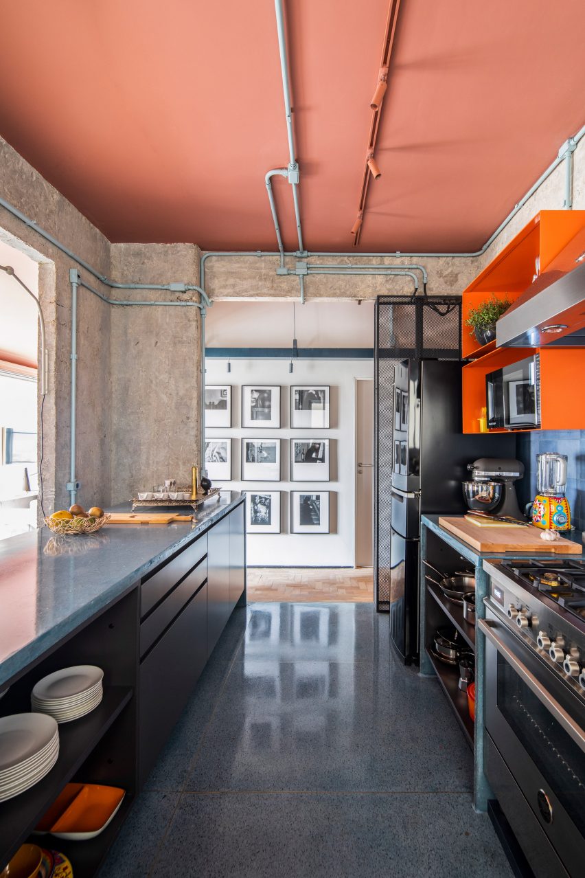
RF Apartment, Brazil, by SuperLimão
Located within the modernist Saint Honoré Building in Sao Paulo, designed by Brazilian architect Artacho Jurado, this kitchen takes an industrial look and combines it with bold colours.
Large blue glazed tiles cover the floor, reflecting light across the space. Terracotta paint was applied across the ceiling and strip lighting, while the electrical wiring that wraps around concrete walls was painted a pale blue.
Find out more about RF Apartment ›
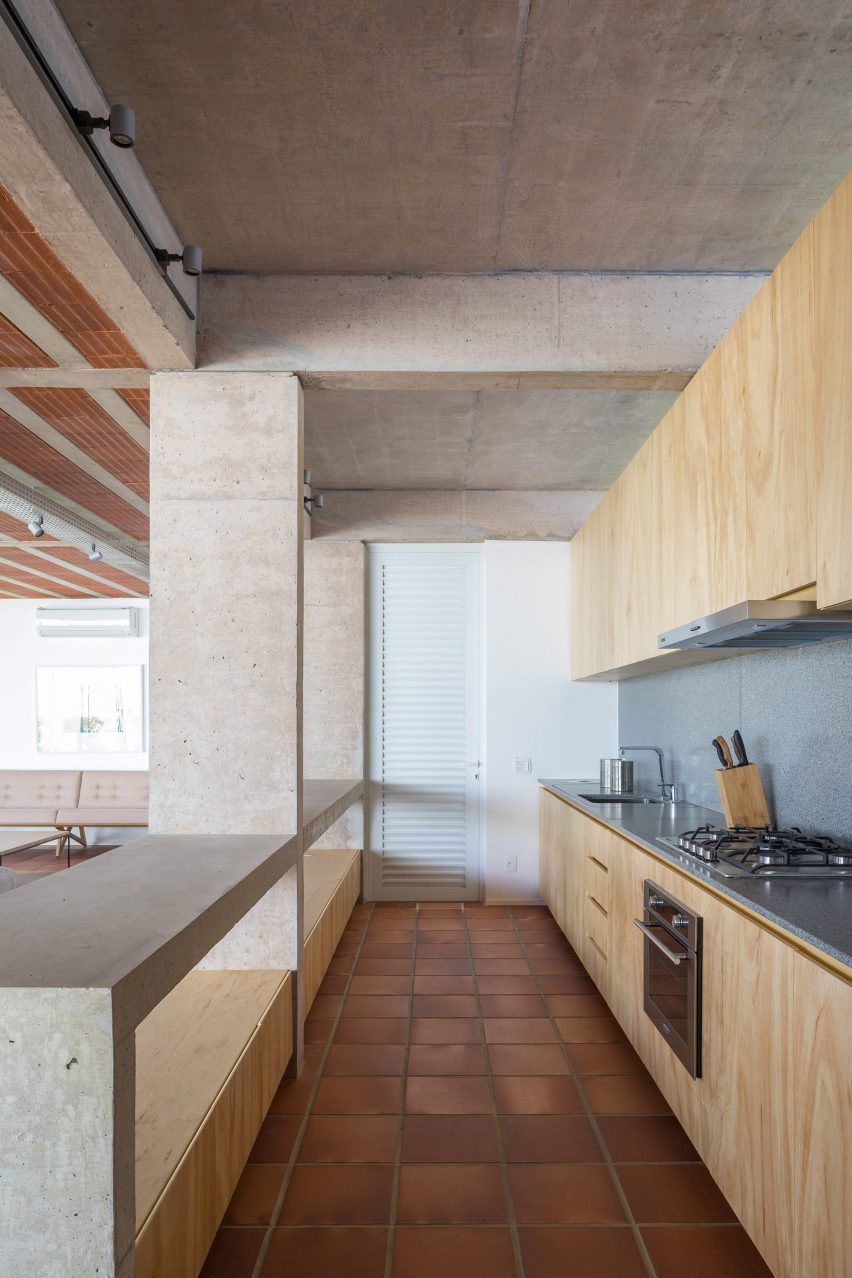
Portico House, Brazil, by Bloco Arquitetos
The open-plan kitchen of this house in Brasília by Bloco Arquitetos has a mixed palette that includes timber, terracotta and concrete.
The key design statement is the cast-concrete counter that divides the kitchen from the living and dining area and turning a supporting column into a feature.
The counter doubles as a breakfast bar and offers a limited amount of storage in low-rise cupboards.
The other side of the kitchen is more conventional, featuring a one-wall run of timber-fronted units plus a counter and splashback of speckled grey surfacing material.
Find out more about Portico House ›
This is the latest in our series of lookbooks providing curated visual inspiration from Dezeen’s image archive. For more inspiration see previous lookbooks showcasing peaceful bedrooms, wallpapered interiors and colourful kitchens.

