Martin Brudnizki draws on “gritty glamour” for Broadwick Soho hotel
CategoriesInterior Design

Martin Brudnizki draws on “gritty glamour” for Broadwick Soho hotel

Interior architect Martin Brudnizki has used Italian maiolica tiles and bespoke furniture from India to give London’s Broadwick Soho hotel an eclectic look.

The eight-floor hotel was designed by Martin Brudnizki Design Studio (MBDS) to evoke the history of Soho – the London neighbourhood that surrounds it.

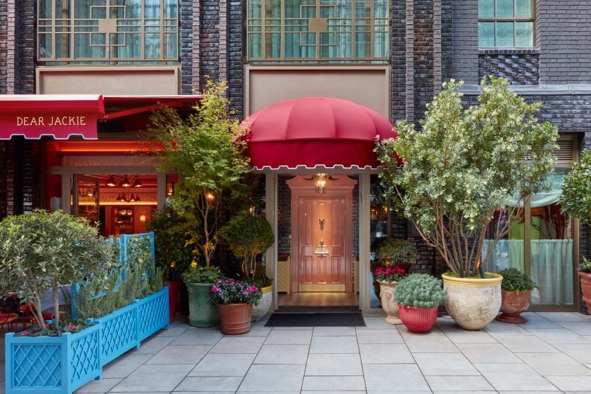
Exterior of Soho hotel
The hotel is located on Broadwick Street in London’s Soho area

“Inspired by ‘gritty glamour’ and the diverse history of Soho, MBDS’s design influences range from 1970s disco pop elements to British eccentricity,” studio founder Martin Brudnizki told Dezeen.

The hotel was also influenced by “the strong women who frequented Soho during the 1960s and 70s such as Mary Fedden, Molly Parkin and Muriel Belcher.”
Bar at Broadwick Soho
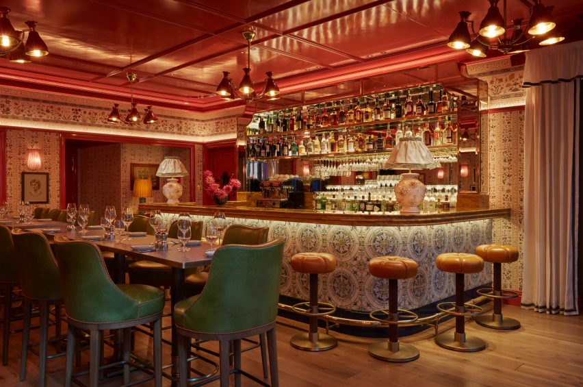
Maiolica tiles decorate the restaurant bar

Broadwick Soho is comprised of  57 rooms, which Brudnizki decorated in opulent colours and patterns. For the downstairs Italian restaurant, Dear Jackie, Brudnizki sourced materials and accessories that nod to its cuisine.

“A split-level restaurant, the communal dining takes centre stage with long counter-style tables featuring 1970s Formica tops and Memphis-inspired chandeliers suspended from coral lacquered ceilings,” he said.
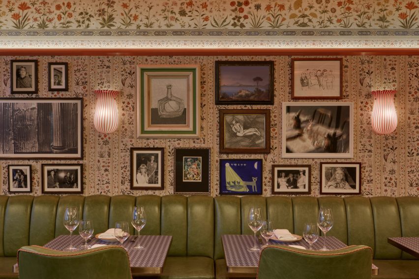
Bar Jackie by Martin Brudnizki
Floral patterns cover the walls of the restaurant

“The bar features maiolica tiles in traditional southern Italian patterns,” Brudnizki added. “This compliments the maiolica wall covering adorned with Sicilian folk motifs of grapes and flowers.”

The handpainted ceramic tiles for the bar were developed by the studio itself together with a family business in Sicily.
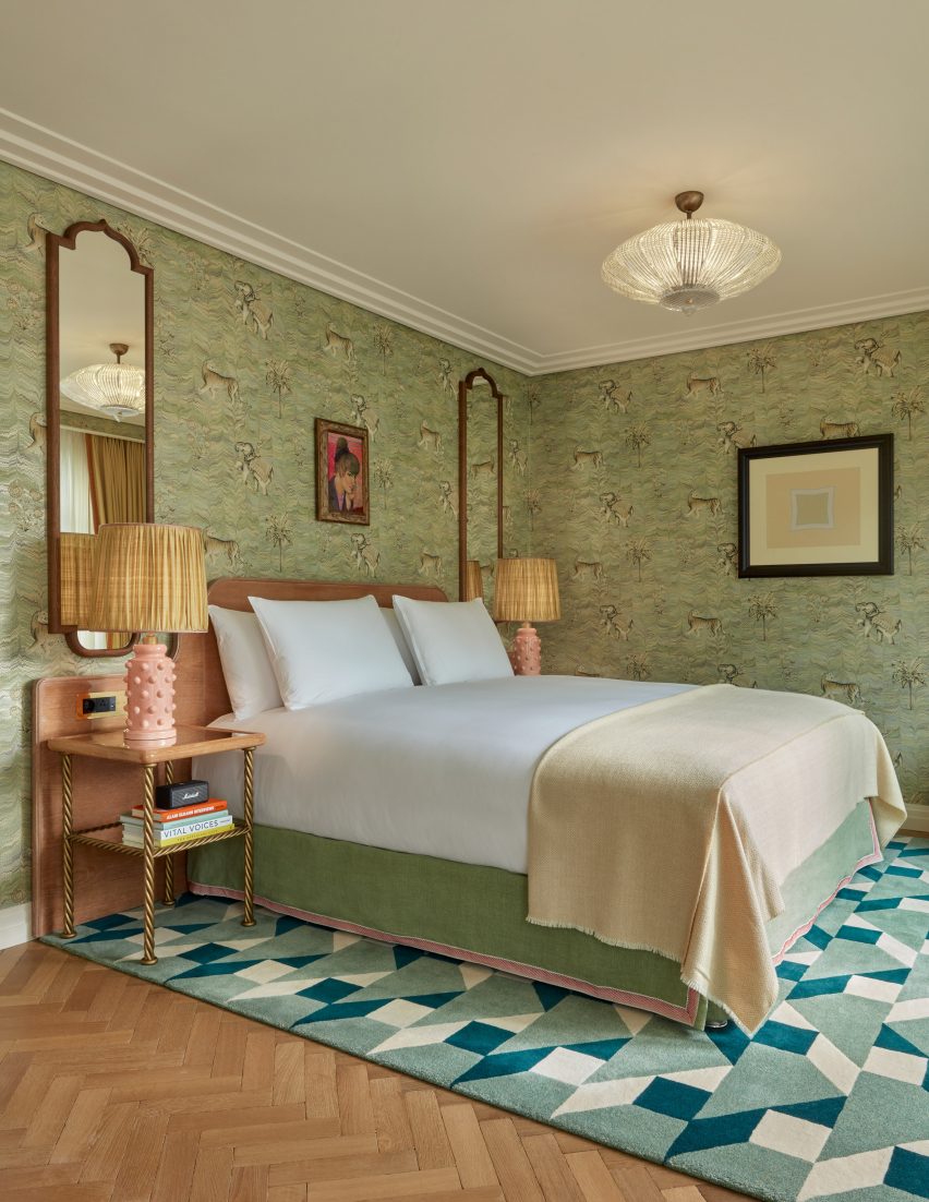
Elephant wallpaper at Broadwick Soho
Rooms feature decorative elephant wallpaper

In some of the guestrooms, walls were decorated with marbled wallpaper with a pattern of tigers and elephants. The elephant was chosen as a symbol for the hotel and was also turned into mini bars in the hotel’s suites.

“A huge amount of bespoke pieces were designed by the studio and produced by talented craftspeople across the world,” Brudnizki said.
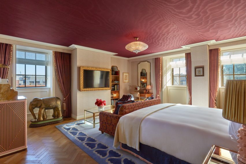
Elephant minibar in Soho hotel
Martin Brudnizki Design Studio had elephant minibars crafted in India

“The wonderful elephant mini bars in the suites were designed by the studio and crafted in India,” he added.

“We actually travelled to India to work with the craftspeople directly, ensuring each detail was as we envisioned.”
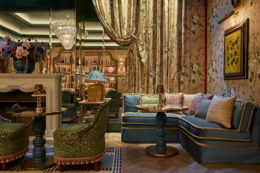
The Nook at Broadwick Soho
A vintage Murano glass chandelier hangs in The Nook

The studio also sourced a number of vintage pieces for the hotel, including a 1970s Murano glass chandelier that hangs from the ceiling of The Nook – Broadwick Soho’s residents-only ground-floor lounge.

MBDS also commissioned new Murano glass lamps that are scattered throughout the space.

“All of the Murano glass lights throughout the property have been made and developed by local artisans in the Venice region,” Brudnizki said.

“Lastly, there is a collection of antiques throughout the hotel that have been sourced from independent Italian and British antique dealers, auction houses and shops.”
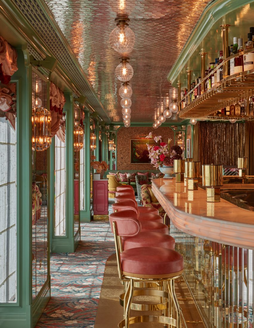
Flute bar in Soho
Rooftop bar Flute features a variety of polished materials

Broadwick Soho’s rooftop dining bar – named Flute after a 19th-century flute maker on Broadwick Street – is an example of how Brudnizki played with multiple colours and patterns to create a space that he describes as combining “cocooned comfort with maximalist glamour”.

Here, saturated green and pink pastel colours contrast gleaming marble and brass details, while contemporary art decorates the walls.
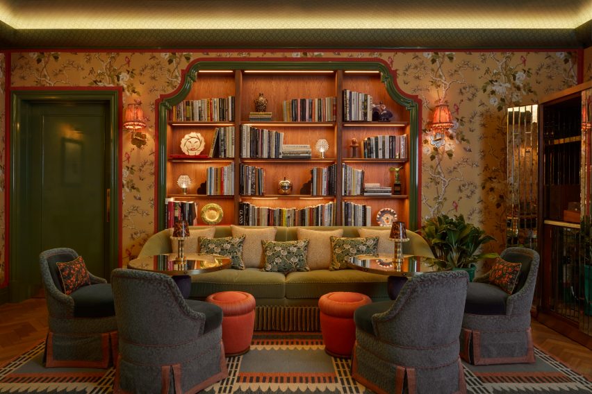
Reading area in Broadwick Soho
The Nook has a cosy reading area

The overall aim of the project was to create a hotel that would suit the context and history of Soho.

“We were conscious of ensuring that what we were designing felt authentic and true to the Soho context and neighbourhood,” Brudnizki concluded.

“It has such a strong and important cultural history, we were conscious we needed to draw this out and bring it to the forefront of our design concept.”

Previous London projects designed by Brudnizki, who was one of the judges for Dezeen Awards 2023, include a mythology-informed restaurant and the redesign of members’ club Annabel’s.

The photography is by James McDonald.

Reference

Youth Lab clinic by Nickolas Gurtler references 1970s Italian glamour
CategoriesInterior Design

Youth Lab clinic by Nickolas Gurtler references 1970s Italian glamour

Australian designer Nickolas Gurtler has drawn from the nightclubs of 1970s Milan and Florence to create the interior for a cosmetic clinic in Perth, Australia.

It is the third interior that Gurtler has created for Youth Lab, a clinic that offers a range of non-surgical cosmetic treatments that include anti-ageing procedures, hair removal and skin rejuvenation.

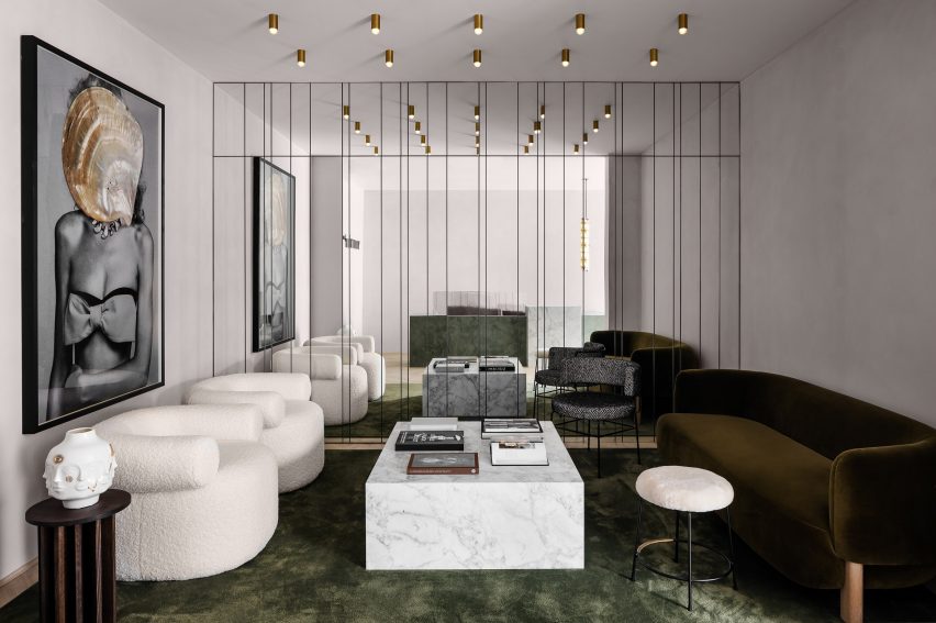
Waiting area with mirror wall in Youth Lab 3.0 clinic interior design by Nickolas Gurtler
The waiting area features a mirror wall, gold lights and a green silk carpet

Located in Joondalup, Youth Lab 3.0 is the brand’s most experimental space so far.

While the two other locations – in Claremont and West Perth – occupy heritage buildings, this one is set inside a commercial block from the 1990s. This meant Gurtler could be more daring in his approach.

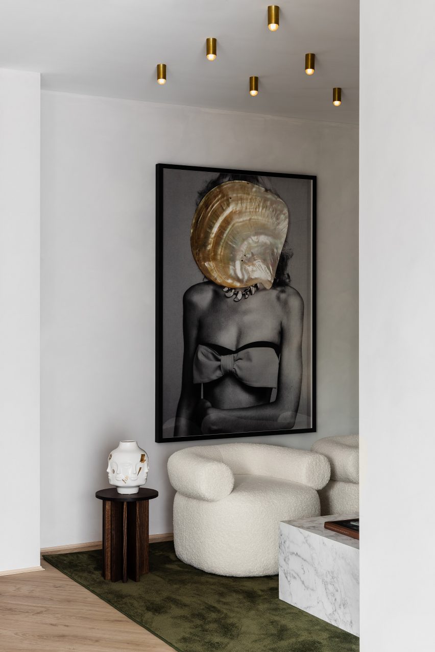
Youth Lab 3.0 clinic interior design by Nickolas Gurtler
A Dina Broadhurst artwork provides a focal point

While the design was partly informed by the brand’s minimalist identity, it also features playful details that include mirror walls and a grand geometric reception desk.

“There were some really outrageous and glamorous concepts that I really responded to and had filed away for the right project,” said Gurtler.

“When Youth Lab approached us again for their third clinic, I knew that this was the right time to bring them to life.”

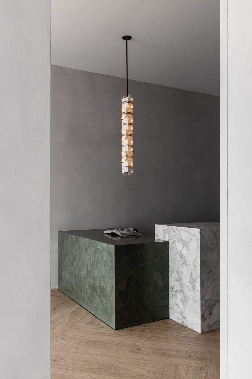
Marble reception desk in Youth Lab 3.0 clinic interior design by Nickolas Gurtler
The reception desk is formed of Arabescato marble and Venetian plaster

The starting point was the palette of forms and materials that Gurtler has worked with previously for the brand, which includes decorative marble, plush velvet and metal cabinetry.

While the Claremont space that Gurtler designed for the brand has a New York loft vibe, here these elements are paired with shades of olive green and gold to create a more retro Italian feel.

“This language is a kind of style guide for us on each project,” said Gurtler.

“Common elements such as mixed metals, monolithic forms, plush textures and rich colour are used in each of the clinics, but we translate these elements completely differently each time.”

Youth Lab 3.0 clinic interior design by Nickolas Gurtler
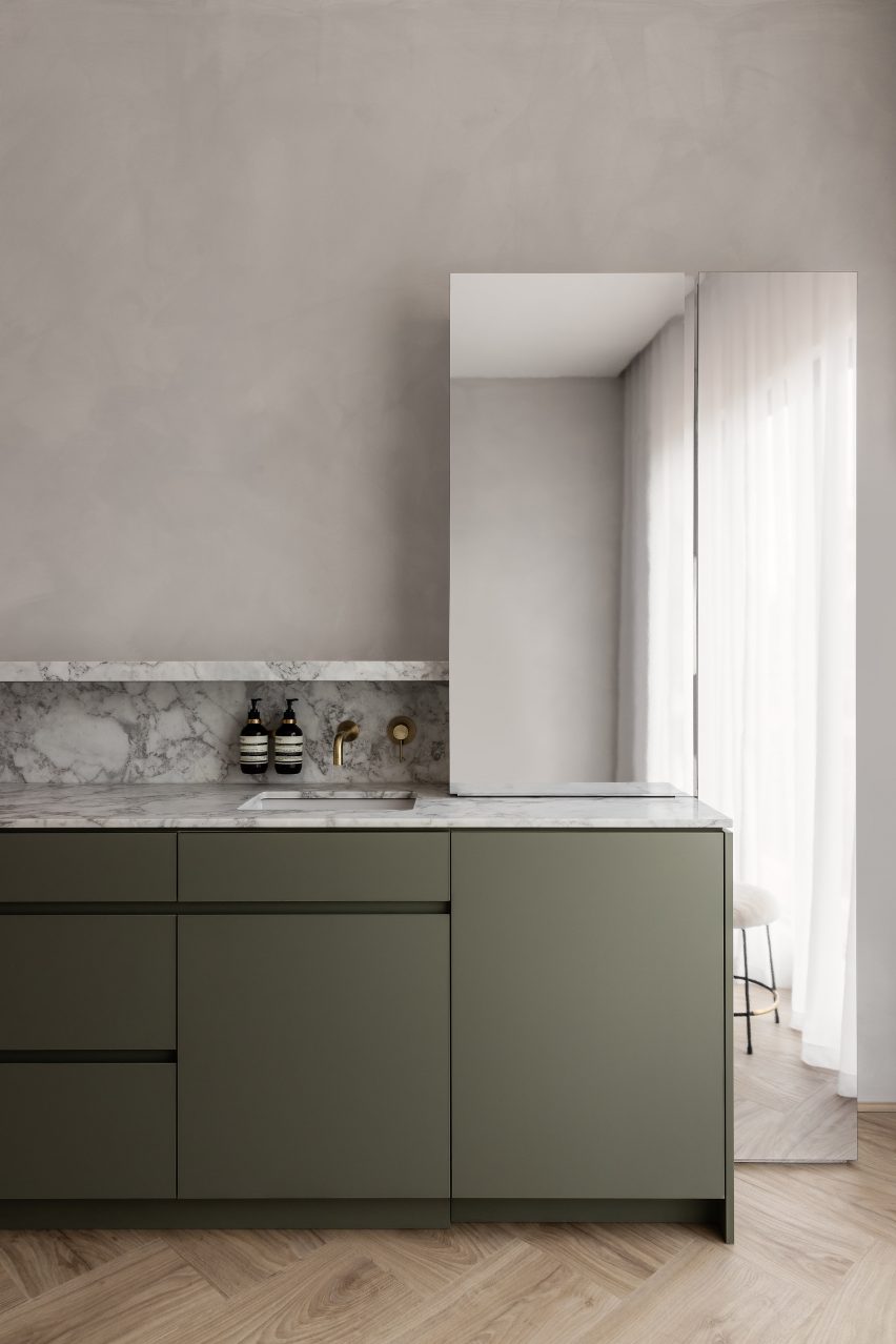
The colour palette centres around olive green and gold

Arabescato marble is combined with Venetian plaster and polished aluminium to create the cuboidal forms of the reception desk, which sits beneath a custom glass and brass lighting pendant by designer Lost Profile Studio.

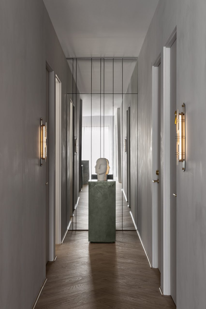
A large gridded mirror installation provides the backdrop to a waiting area furnished with a green silk carpet, a blocky marble coffee table and sculptural white armchairs.

Youth Lab 3.0 clinic interior design by Nickolas Gurtler
A sculpture by American potter Jonathan Adler sits in front of a second mirror wall

Rows of golden-hued ceiling lights are reflected in the mirrors, doubling their visual impact, and an artwork by Dina Broadhurst creates another focal point.

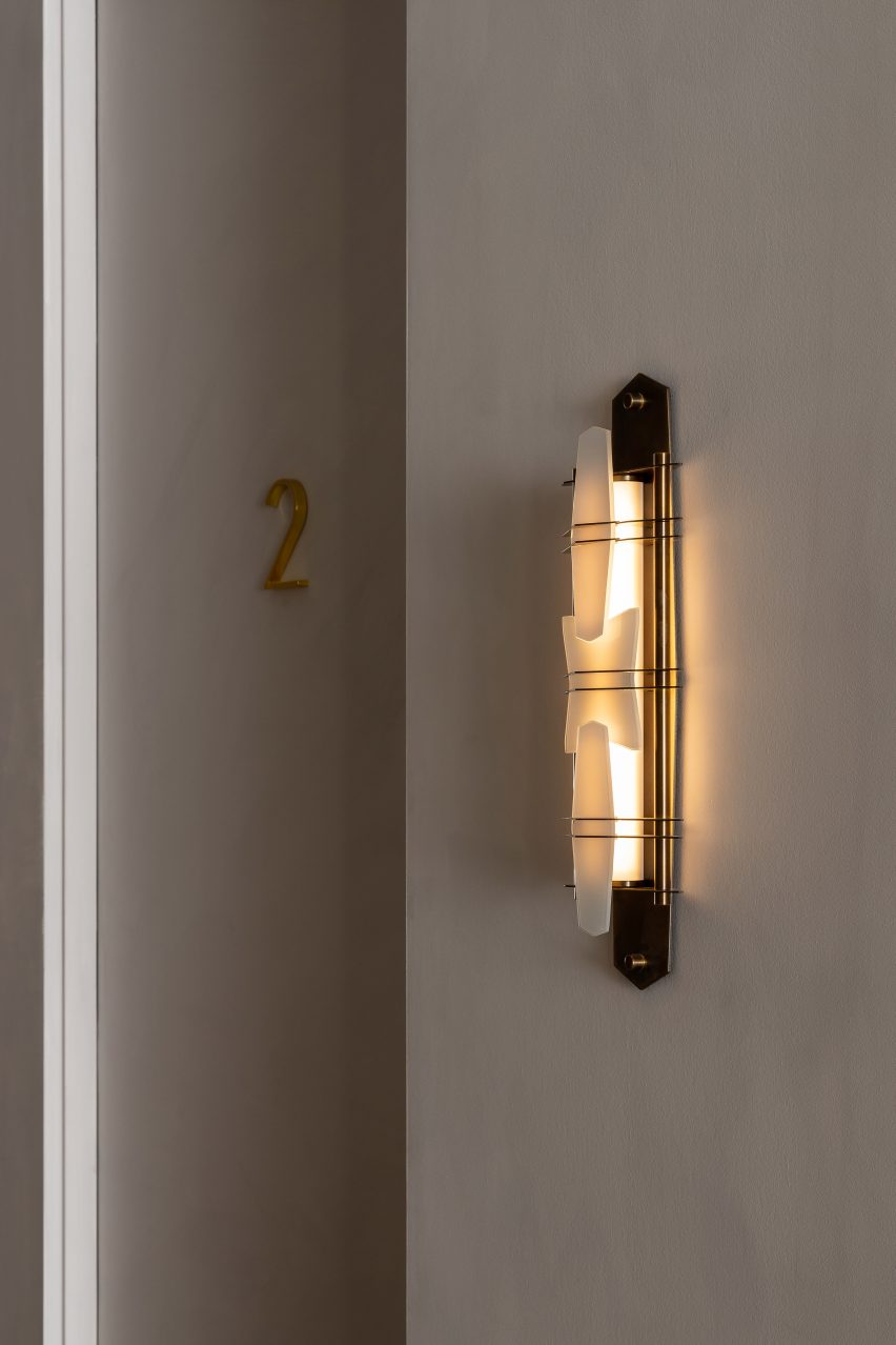
As customers are led through for treatment, they also encounter a second mirror wall, a ceramic by American potter Jonathan Adler, custom wall lights and brass door numbers.

Youth Lab 3.0 clinic interior design by Nickolas Gurtler
Custom lighting scones embellish the walls

Youth Lab 3.0 was longlisted for Dezeen Awards 2022 in the leisure and wellness interior category, along another of Gurtler’s designs, the Cole Hair Studio.

The designer hopes the space offers “an immersive and sensorial experience which is as much invigorating as it is calming”.

“The Youth Lab experience is a luxury and the interior reflects that,” he added.

The photography is by Timothy Kaye.

Reference