Architectural photography is dominated by empty, glossy, new buildings
Architectural photographer Jim Stephenson explains how The Architect Has Left The Building exhibition at RIBA aims to draw attention to how people use buildings, in this interview.
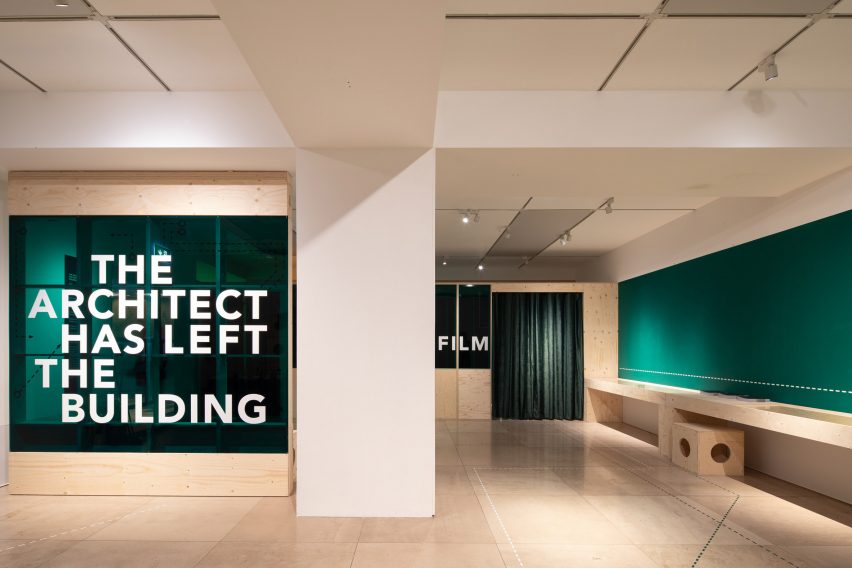
Despite taking place at the Architecture Gallery at the Royal Institute of British Architects’ central London HQ, Stephenson told Dezeen that the exhibition is not focused on buildings.
“The installation is about people watching,” he said. “Although it’s at the RIBA and in the architecture gallery, it’s not really about the buildings – they’re just the backdrop, they’re the stage set really.”
“We wanted to create a meditative, large scale film piece that was all about how people use (and misuse) space once the architect’s work is done,” he continued.

As the exhibition’s title suggests, the exhibition focuses on how buildings are used after the architect’s work is finished.
It aims to show buildings in use, in contrast to the majority of architectural photography that often portrays buildings empty, at their point of completion.
“When I used to work in architecture practices, we used to design everything around people and context,” explained Stephenson. “It felt like everything was dictated by those two things and then when we would get projects photographed we’d ask the photographer to omit those two things.”
“The buildings were empty objects – sculptures,” he continued. “It always jarred with me, so in our work we focus on people using space as much as possible.”
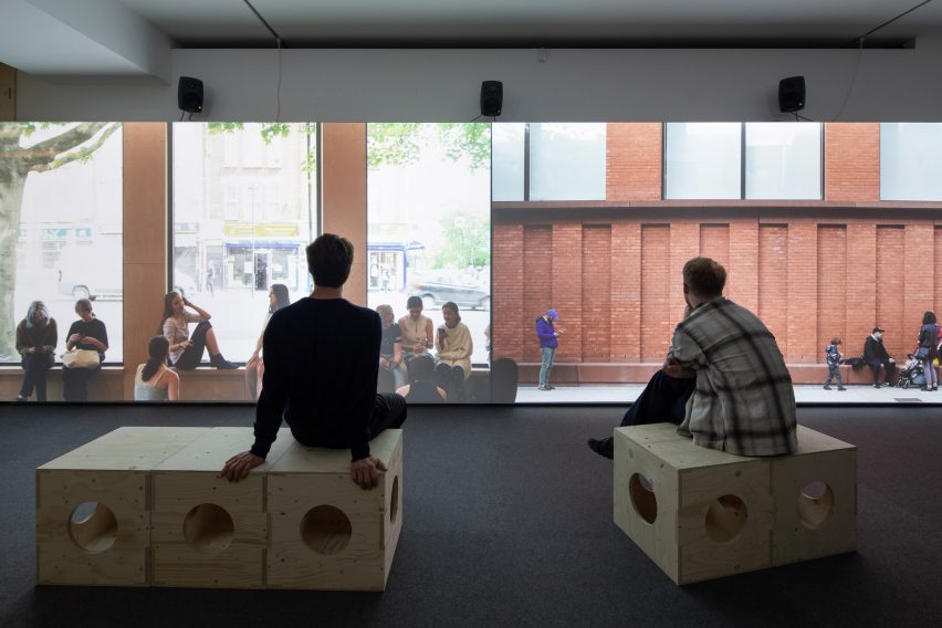
The exhibition include numerous photos taken by Stephenson, along with an enclosed screening room, where a film created for the exhibition was played on a dual screen.
“This film is all about the small interactions that occur in and around buildings – between individuals, groups of people and even between people and the buildings,” said Stephenson. “It’s all about the people!”
The film, which was created with artist Sofia Smith and has a soundtrack created by Simon James, contains numerous contemporary buildings from the past 15 years.
Among the buildings featured are Tintagel Castle Bridge by William Matthews Architects, Tate St Ives extension by Jamie Fobert, Sands End Arts and Community Centre by Mae Architects and London Bridge Station by Grimshaw, which were all shortlisted for the Stirling Prize.
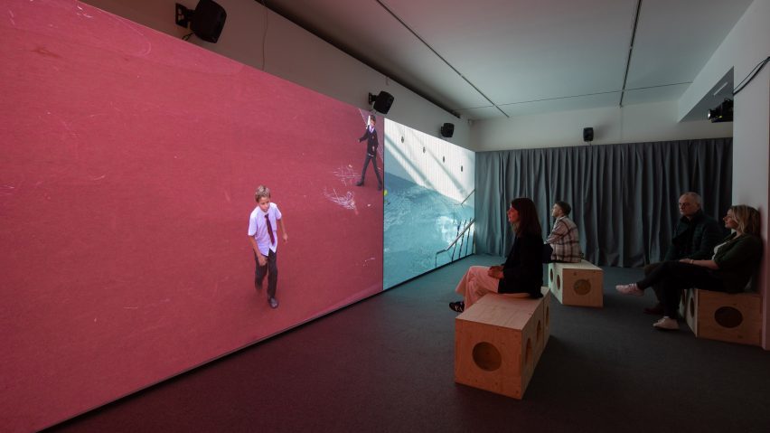
The film makes aims to makes people think about the connections between buildings and how people are connected to them.
“Watching Sofia make visual links between buildings that I hadn’t previously considered to have much in common was fascinating,” explained Stephenson.
“There’s a point in the film where we transition from Sands End Community Centre to Tintagel footbridge and it’s seamless – from a community centre in West London to a bridge over the sea in Cornwall!”
“And at London Bridge train station, Simon recorded not just the ambient sound that everyone can hear, but he also recorded the inner guts of the building with contact mics, as well as the sound in the electromagnetic spectrum,” he continued. “All those sounds get layered up in the show and I can’t go through that station now without thinking about them.”
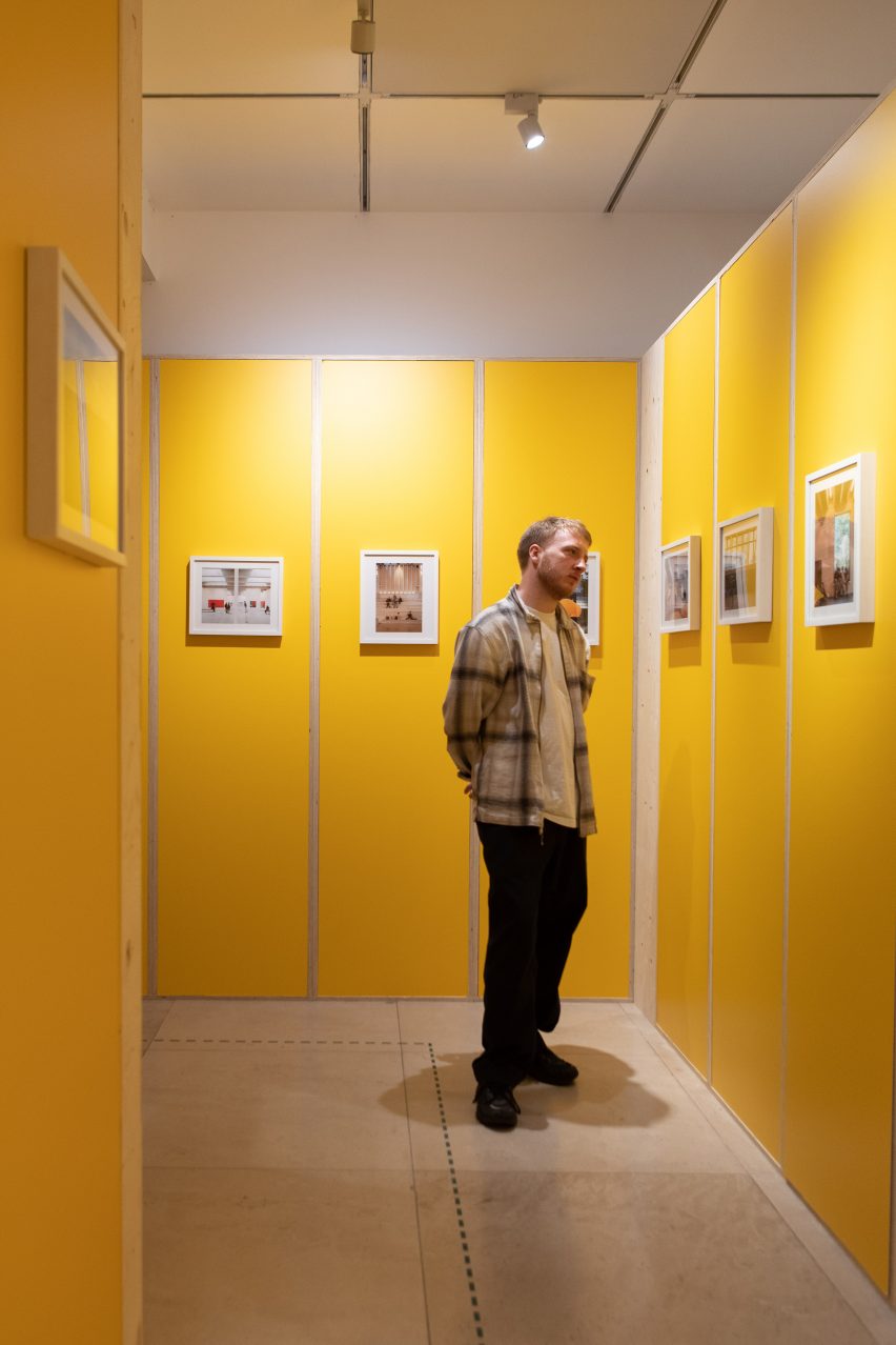
Stephenson hopes that the film will demonstrate how people improve architectural spaces and how they are recorded.
“The history of architectural photography is dominated by empty, glossy, new buildings, photographed before people have come in,” said Stephenson.
“I think there was a fear amongst architects that people ‘mess up their building’ and photographing them empty somehow showed the architecture in a more pure and distilled way,” he continued.
“I think that’s mad. If the people you designed the building for are ‘messing it up’ then maybe there’s something wrong with the building? I’m half joking, but I’ve never documented a space that wasn’t improved by people, or at the very least a sign of life.”
One of the UK’s best-known architectural photographers, Stephenson co-founded film production studio Stephenson& with Smith. Recent projects photographed by Stephenson include a wood-lined community space in east London, a rammed-earth yoga studio to the gardens of Somerset hotel and a rolling bridge in London.
Recent buildings captured on film by Stephenson& include a visitor centre at the UK’s largest sawmill and a school theatre by Jonathan Tuckey Design in London.
The photography is by Agnese Sanvito, unless stated. The film is by Jim Stephenson and Sofia Smith with soundtrack by Simon James.
The Architect Has Left The Building is at RIBA in London until 12 August 2023. See Dezeen Events Guide for an up-to-date list of architecture and design events taking place around the world.

