Brasserie des Pres draws on the vibrant history of Paris’s Latin Quarter
CategoriesInterior Design

Brasserie des Pres draws on the vibrant history of Paris’s Latin Quarter

The storied location of this brasserie in Paris inspired interior studio B3 Designers to fill the restaurant with tasselled chairs, disco balls and other flamboyant decor.

Brasserie des Pres is set in Paris’s Latin Quarter, which was a hub of creativity throughout the 19th and 20th centuries, its cafes filled with artists, publishers and prominent writers including Ernest Hemingway and Jean-Paul Sartre.
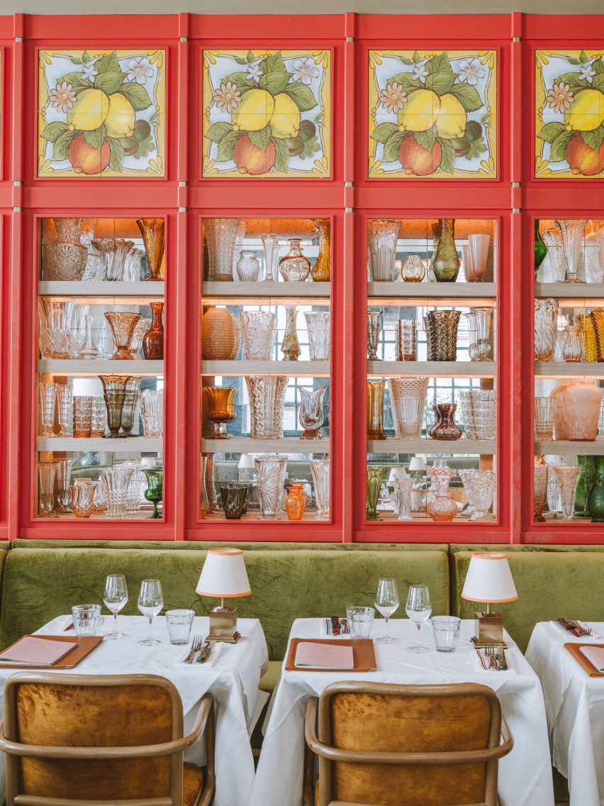
Interior of Brasserie des Pres restaurant in Paris by B3 DesignersInterior of Brasserie des Pres restaurant in Paris by B3 Designers
Brasserie des Pres’s ground-floor dining space features red-panelled walls with decorative tiling

London-based studio B3 Designers aimed to infuse this same buzzy ambience into the quarter’s latest eatery, undeterred by its awkwardly narrow interiors.

“Brasserie des Pres has a very unique floor print and we’ve used the existing architecture to create layers of dining experiences,” the studio said. “We’ve created a feeling of community and delight, a welcoming backdrop to the great food served here.”
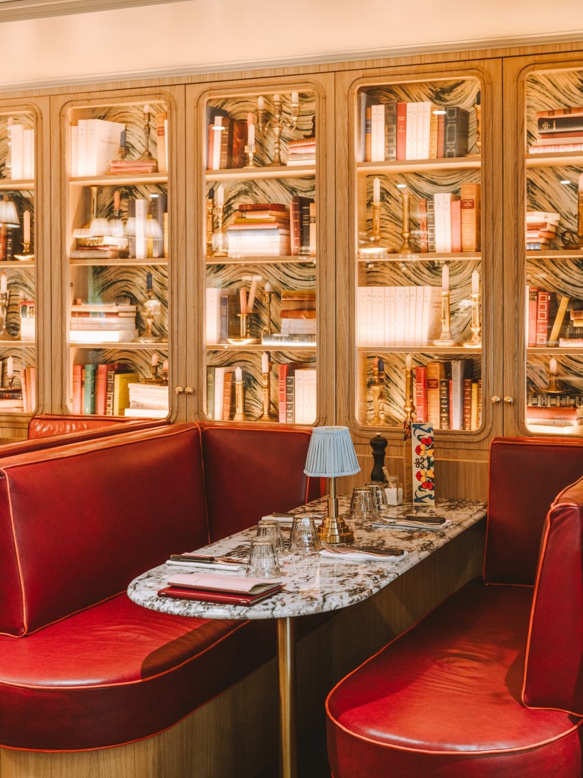
Interior of Brasserie des Pres restaurant in Paris by B3 DesignersInterior of Brasserie des Pres restaurant in Paris by B3 Designers
Built-in shelving transforms walls on the first floor into a cabinet of curiosities

Lush with greenery, the exterior of the restaurant features a striped orange awning and classic Parisian terrace seating.

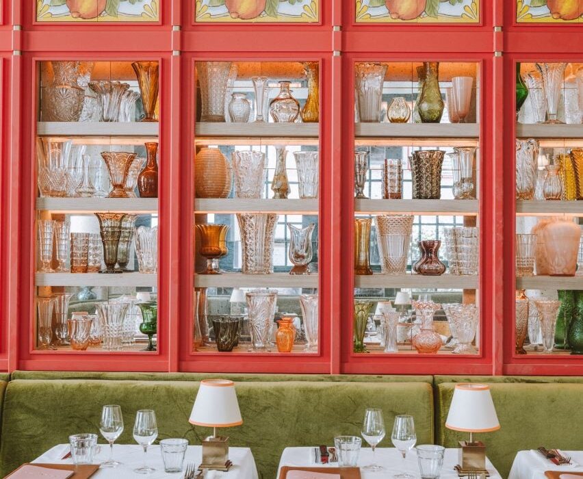
Once guests step inside, they find themselves in a large dining room with red-panelled walls, inset with mirrored shelves that display an assortment of shapely glass vessels.

Decorative tiles depicting limes, lemons and oranges are incorporated at the top of each panel.
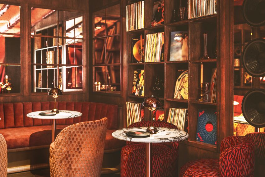
Interior of Brasserie des Pres restaurant in Paris by B3 DesignersInterior of Brasserie des Pres restaurant in Paris by B3 Designers
Guests can also relax in the top-floor lounge, which houses a rich selection of vinyl records

Tables throughout the room are dressed with white linen cloths and bijou brass lamps, nodding to the table set-up of the Latin Quarter’s traditional eateries.

Guests also have the option to sit at a high marble counter that directly overlooks Brasserie des Pres’s bustling kitchen or enjoy a drink at the bar, which is fronted by velvet-lined orange stools.

More dining space is provided on the first floor, where the shelves along the walls are filled with antique books and candelabras to mimic the worldly look of a cabinet of curiosities.

Finally, on the top floor of the restaurant is a lounge-style space where guests can relax while selecting tracks from the brasserie’s vinyl record library.
Interior of Brasserie des Pres restaurant in Paris by B3 DesignersInterior of Brasserie des Pres restaurant in Paris by B3 Designers
A crimson-red bar hides behind a curtained doorway

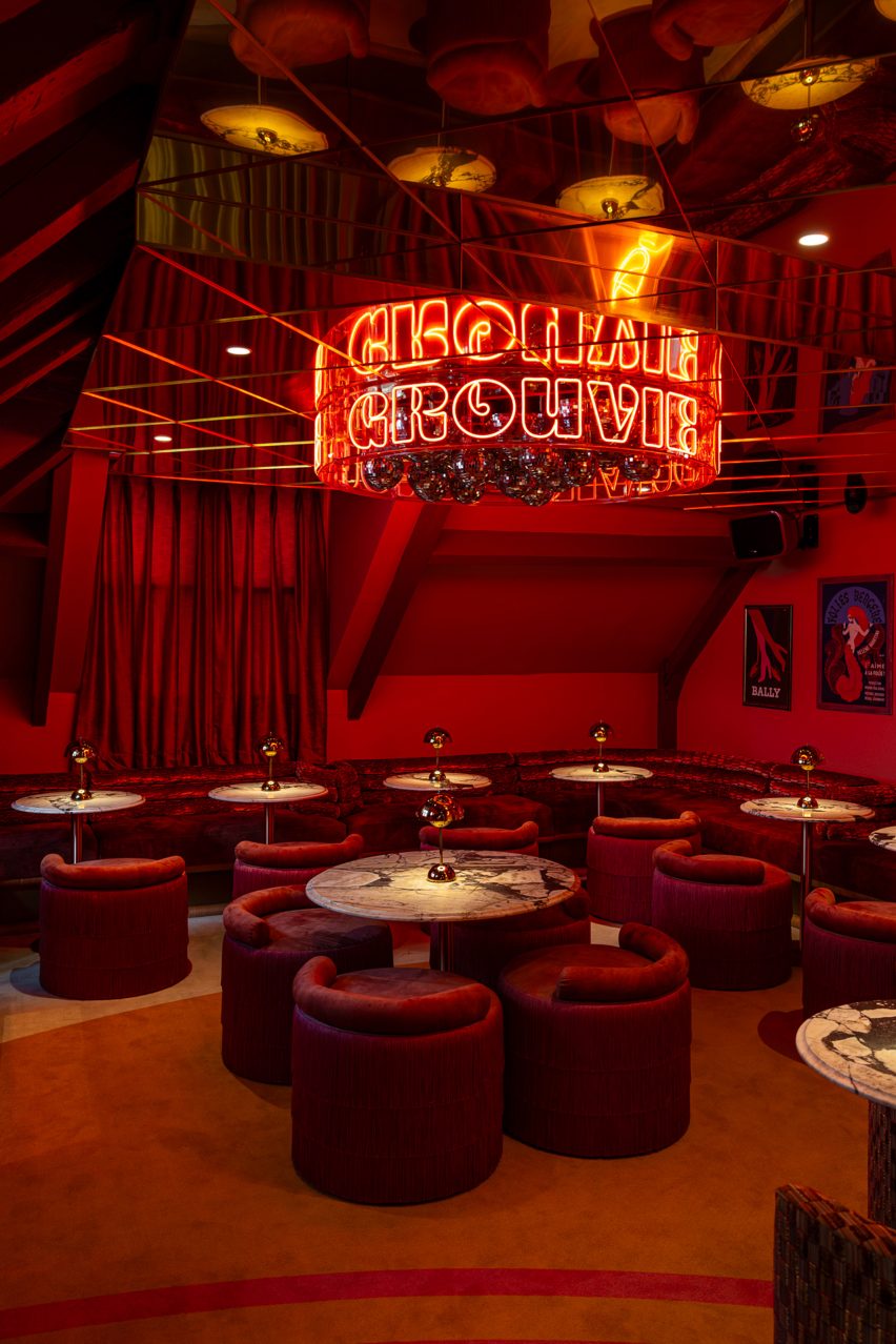
A curtained partition can be drawn back to reveal a secret bar, complete with a mirrored ceiling. From its centre hangs a cluster of disco balls, enclosed by a circular neon sign that spells the word groovy.

A plush, crimson banquet winds around the periphery of the space, accompanied by matching tassel-backed chairs and marble tables.

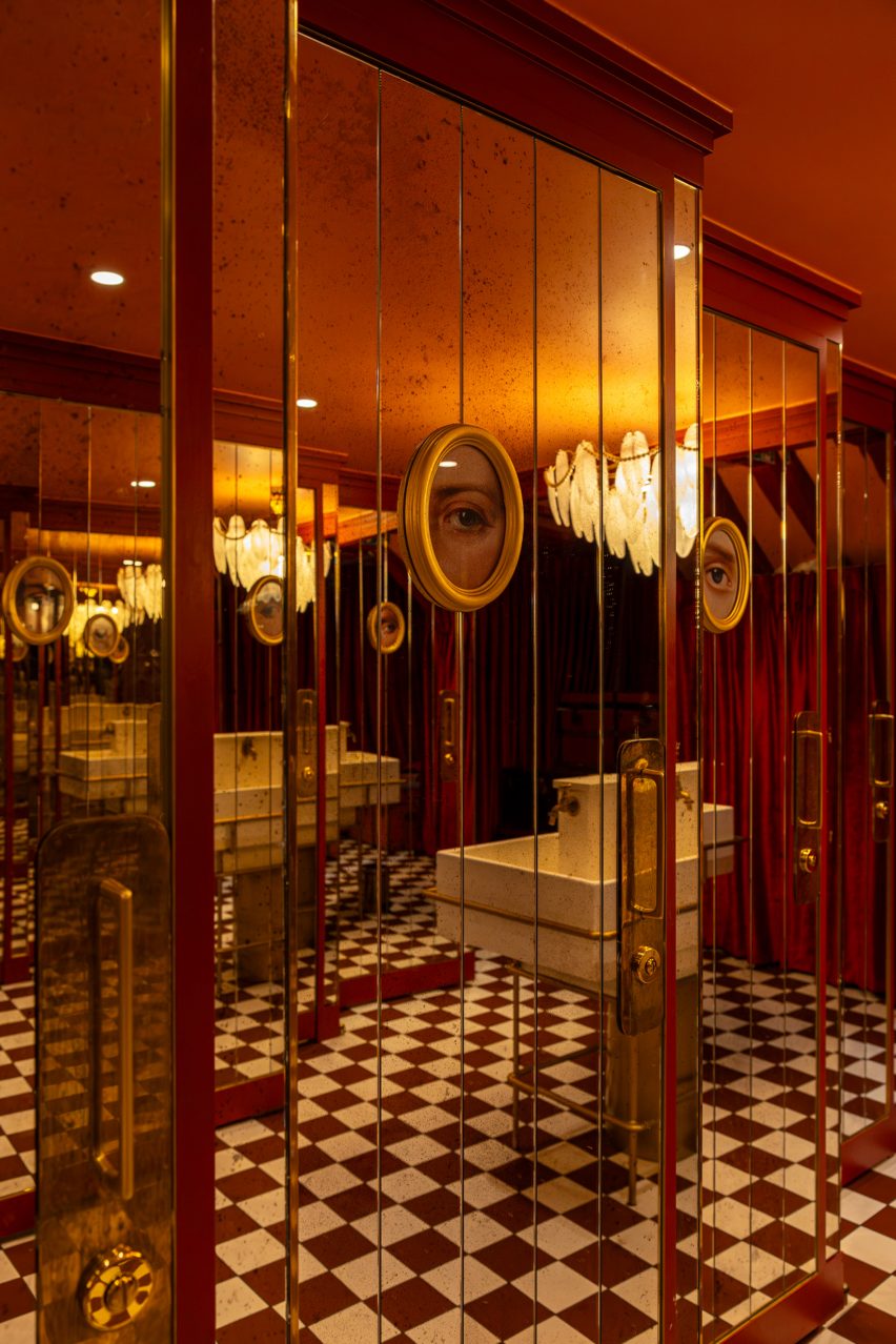
Even the toilets at this level are finished with eccentric details including a pearl-laden chandelier that droops above the washbasin  and surreal gold-framed paintings that depict the eyes of “unsung Parisian anti-heroes”, according to B3 Designers.
Interior of Brasserie des Pres restaurant in Paris by B3 DesignersInterior of Brasserie des Pres restaurant in Paris by B3 Designers
Surreal paintings and a pearl chandelier appear in the bathroom

Paris’s rich culinary scene is constantly expanding.

Other spots that have recently opened up around the city include Citrons et Huîtres, an oyster bar that’s designed to resemble a fishmonger, and Chinese restaurant Bao Express, which has a retro interior informed by Hong Kong diners of the 1970s.

The photography is by Vincent Remy and Joann Pai.

Reference

ALA draws on West Village history for Talea taproom interiors
CategoriesInterior Design

ALA draws on West Village history for Talea taproom interiors

New York studio Alda Ly Architecture has designed a taproom for female- and veteran-owned brewery Talea in the city’s West Village neighbourhood, which includes a place for groups to “scheme”.
Talea West Village is the beer company’s third outpost and its first Manhattan location, following two established in Brooklyn.

Bar area with stools surrounding a purple-fronted counterBar area with stools surrounding a purple-fronted counter
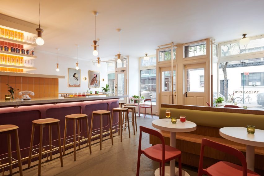
The main dining and drinking area at the Talea West Village taproom is anchored by a colourful bar

The space is located in a 1920s building on Christopher Street, an iconic thoroughfare that’s home to several landmarks, businesses and historic spaces associated with the LGBTQ+ rights movement.

“This new taproom on Christopher Street reclaims the masculine identity of a West Village saloon to celebrate voices of women and LGBTQ+ communities in the Village, all while serving Talea’s popular sour brews in an elevated, vibrant space,” said Alda Ly Architecture (ALA).

Bar with built-in seating on the left and counter on the rightBar with built-in seating on the left and counter on the right
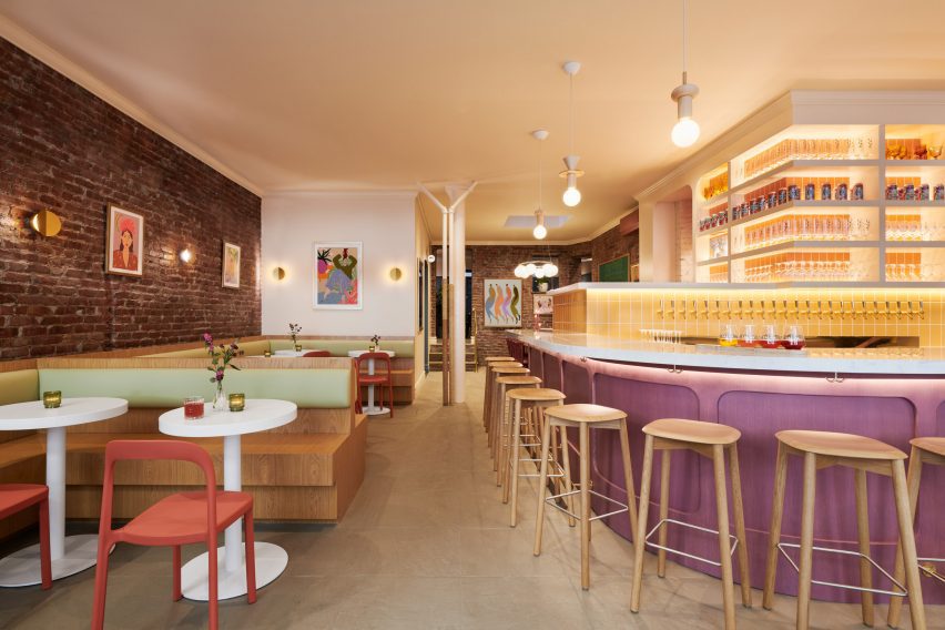
Bright hues chosen by ALA for the space include yellow for tiles, green seat backs and red dining chairs

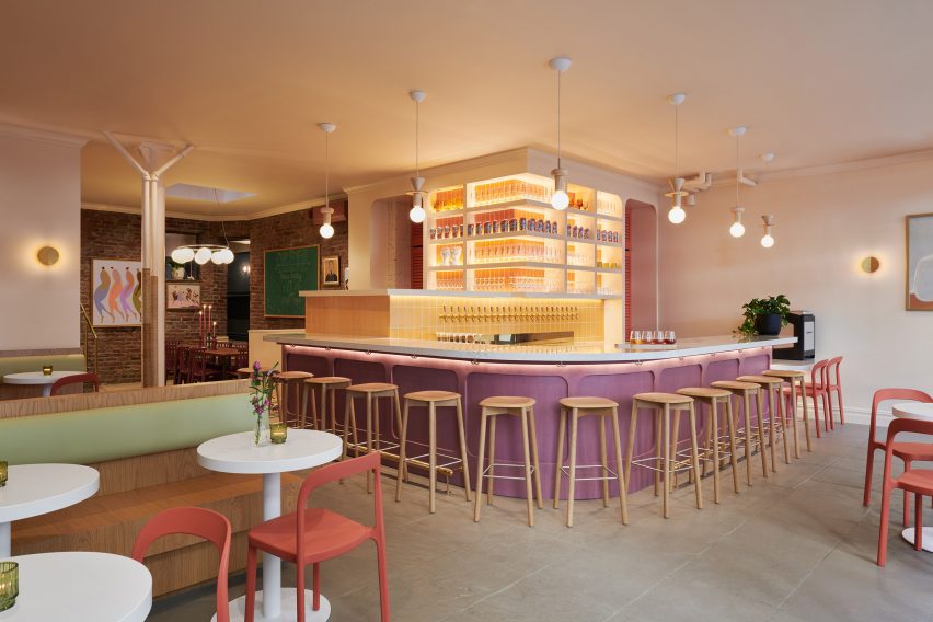
Flooded with natural light thanks to large windows along the street facade, the main space is anchored by a purple-fronted bar with a curved white quartz countertop in one corner.

Behind, numerous beer taps are mounted onto a yellow-tiled partition, while glassware and cans are displayed on shelves above.

View towards an exposed brick wall with seating in frontView towards an exposed brick wall with seating in front
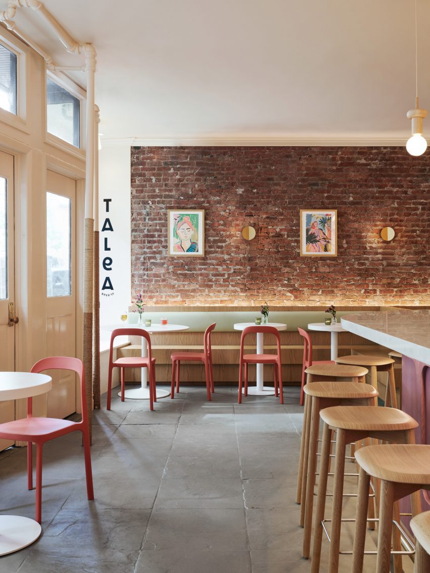
Exposed brick and stone floors allude to a saloon-style aesthetic

The bar is lit by Junit oak pendants from Schneid Studio and brass Dottie sconces by Visual Comfort are mounted around the perimeter.

“We opened up the space to provide as much open area for the front dining room, and brought the bar front and centre to highlight the taps with their extensive selection of beers,” said ALA founder Alda Ly.

Dining area and bar counter with street windows behindDining area and bar counter with street windows behind
The taproom was designed to celebrate its location in the West Village, which has played an important role in LGBTQ+ history

“We wanted the bar to be a welcoming beacon for all people in the neighborhood,” she added.

The other side features built-in, stained-oak seating and small circular tables against an exposed brick wall.

Brick-wrapped room with a skylight over a large tableBrick-wrapped room with a skylight over a large table
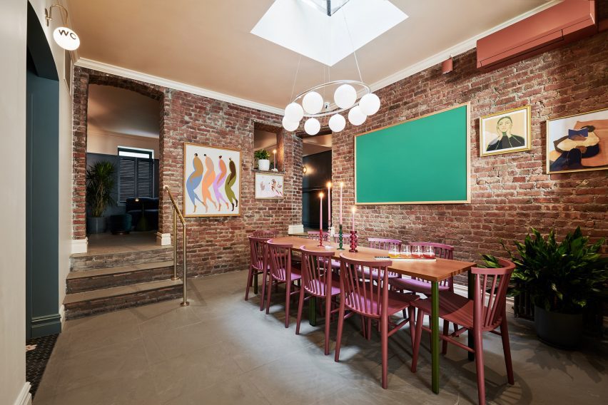
Behind the bar is The Revolution Room, intended for larger groups to gather

Pale green backrests and muted red Scroll dining chairs from Industry West continue the interior’s bright colour palette, which is also echoed in the works by local artists displayed on the walls.

“It was important to us to capture the spirit of Talea in a space that felt elevated but also very warm and welcoming,” said ALA project director Marissa Feddema.

Past the bar is a more intimate space called The Revolution Room, designed for groups of eight to 10 people to “scheme, hang and gather” according to the team.

A large table sits below a Nuura Miira 8 Oval chandelier that’s suspended from a skylight, and more brickwork is exposed to add to the saloon-like vibe.

Dimly lit room with dark walls and colourful furnitureDimly lit room with dark walls and colourful furniture
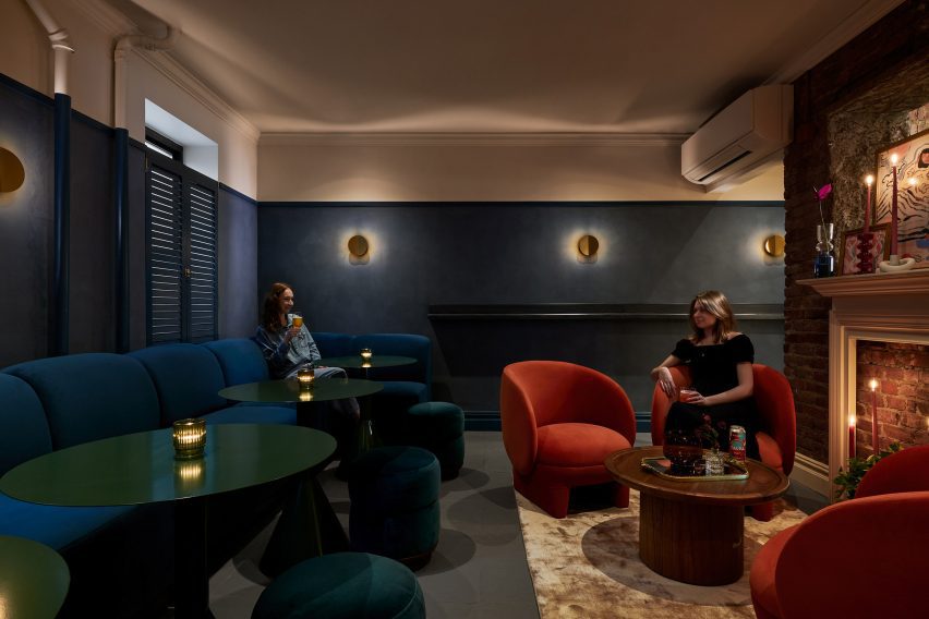
At the back is the Snug, a cosy space furnished with jewel-tone pieces

Further back still, patrons will find the Snug – a much darker and cosier room decorated with jewel-toned furniture, navy limewash painted walls and a vintage fireplace mantle.

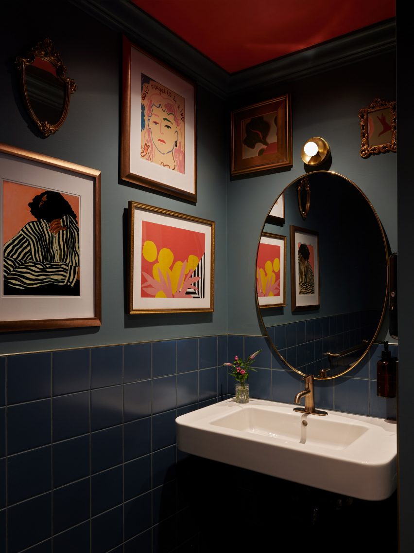
The moody bathrooms are adorned with images of prominent local residents and gender activists through the years, further emphasising the neighbourhood’s importance to the LGBTQ+ community.

Bathroom with dark blue tiles, paintings on the walls and an oval mirror above a sinkBathroom with dark blue tiles, paintings on the walls and an oval mirror above a sink
Images of prominent local residents and gender activists are displayed in the moody bathrooms

The West Village is packed with bars and restaurants, from upscale dining spots like Cecchi’s to casual cocktail places like Donna.

Close by, in the Union Square area, ALA has previously designed the interior for a doctor’s office and clinic with earthy and homey details.

The photography is by Brooke Holm.


Project credits:

Architect and interior designer: ALA (Alda Ly, Marissa Feddema, Sheridan Treadwell, Marlee Anderson)
MEP engineer: Tan Engineering
General contractor: Aerial Design & Build

Reference

Ten rustic Italian interiors that evoke the history of the Mediterranean
CategoriesInterior Design

Ten rustic Italian interiors that evoke the history of the Mediterranean

This lookbook collects 10 interiors in Italy with a distinctly rustic feel, including homes and hotels replete with wooden beams, cool stone and other rich textures.

As well as being known for its contemporary furniture and lighting design, Italy is home to some of Europe’s oldest buildings and has numerous historic cities and villages.

From a 17th-century house in Puglia to a hotel in a 1,000-year-old castle, below are 10 examples of projects that pay homage to the Mediterranean country’s history while catering to modern tastes.

This is the latest in our lookbooks series, which provides visual inspiration from Dezeen’s archive. For more inspiration see previous lookbooks featuring chequerboard floors, lime plaster walls and Mediterranean-style interiors.


Monteverdi Tuscany boutique hotel by Michael Cioffi and Ilaria Miani
Photo courtesy of Monteverdi Hotel

Monteverdi Hotel, Tuscany, by Ilaria Miani

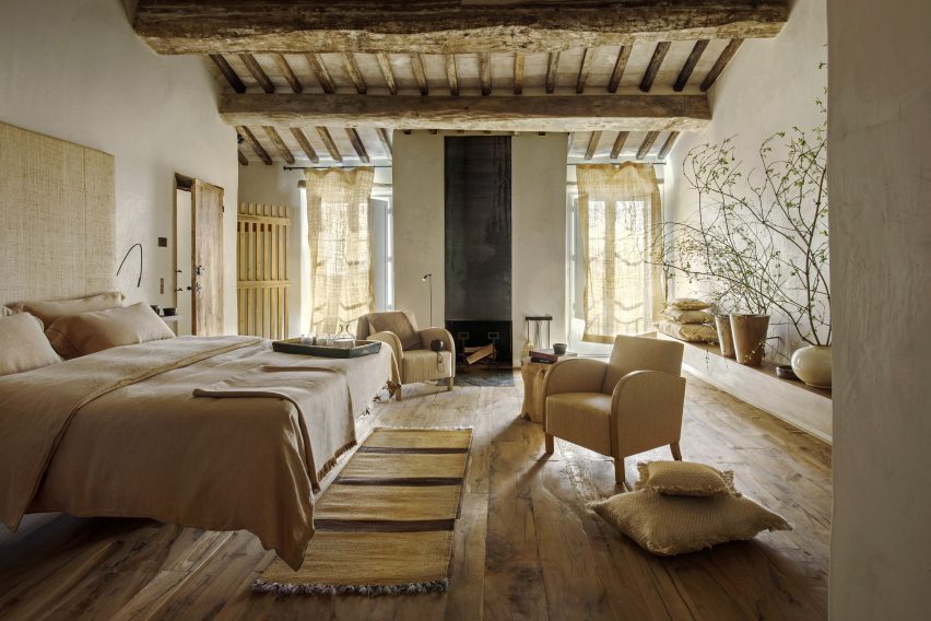
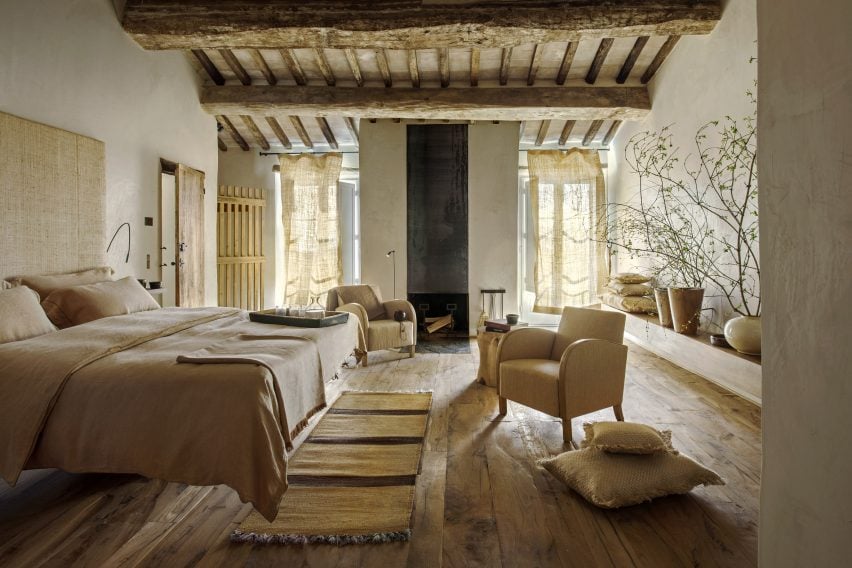
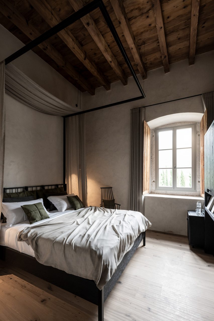
Restoration specialist and interior designer Ilaria Miani helped transform several crumbling buildings in Val d’Orcia into a boutique hotel that aims to balance the history of the area with contemporary design influences from Milan and Rome.

In the bedroom suites, chunky exposed beams made from salvaged wood are complemented by natural colours and textures, while nearly all the furniture is handmade by local artisans.

Find out more about Monteverdi Hotel ›


Cascina by Jonathan Tuckey Design
Photo by Francesca Iovene

Cascina, Piemonte, by Jonathan Tuckey Design

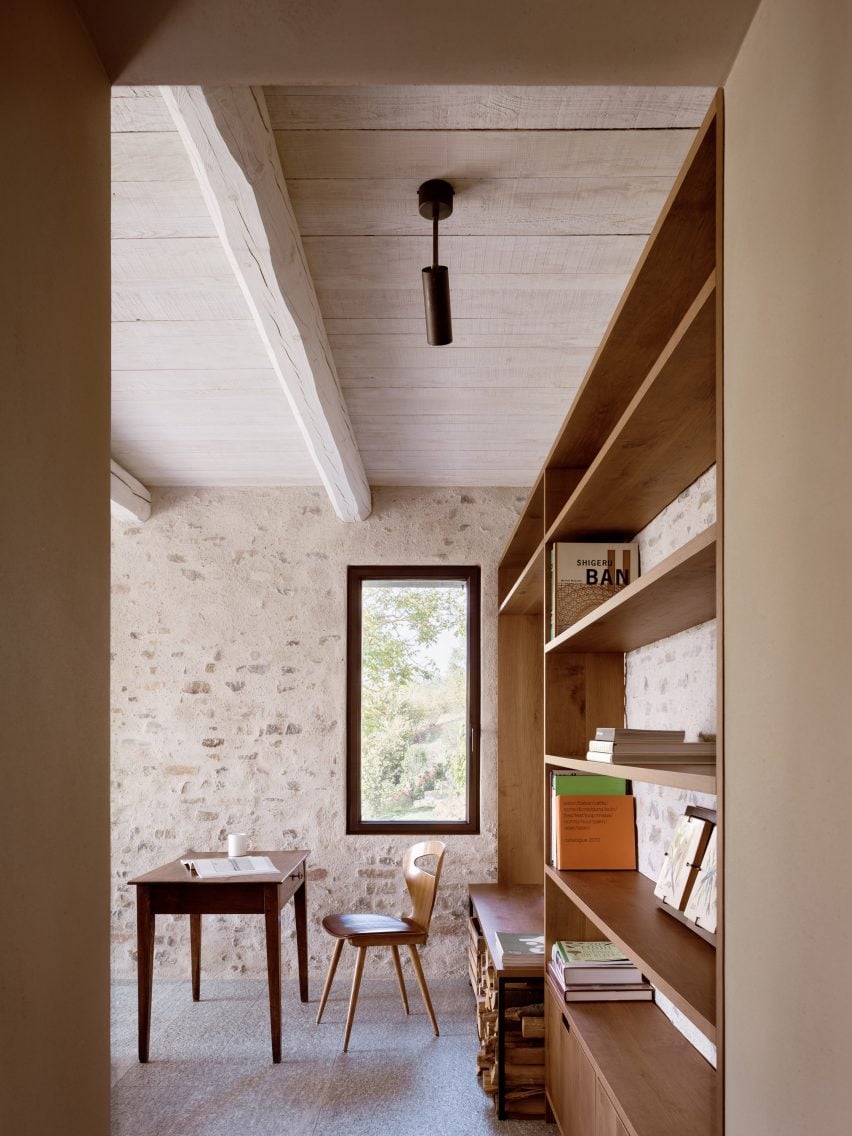
London-based Jonathan Tuckey Design was tasked with returning this 19th-century farmhouse in northern Italy to its original state following a heavy 1980s renovation.

Stone walls and wooden beams now feature prominently, with a cool chalky palette offset by brass lamps and chestnut panelling and furniture.

Find out more about Cascina ›


Casa Soleto living room
Photo by Salva López

Casa Soleto, Puglia, by Studio Andrew Trotter and Marcelo Martínez

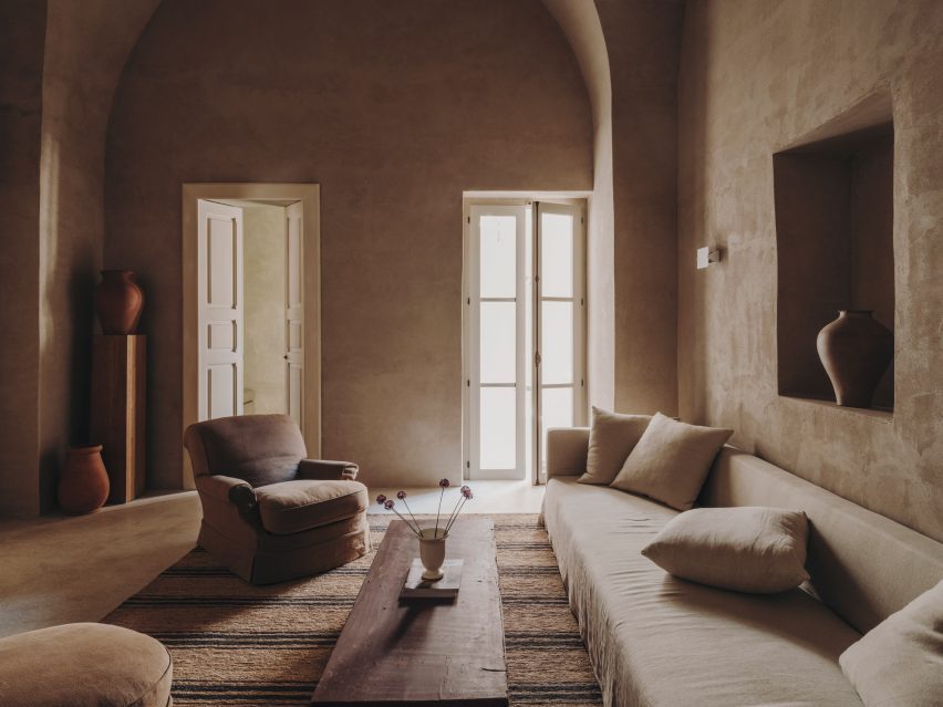
Parts of Casa Soleto in Puglia are more than 400 years old. Architecture firm Studio Andrew Trotter and its studio manager Marcelo Martínez renovated the building without making any structural changes, leaving the irregular walls in place.

To give the interiors an authentic, natural feel, the designers used lime plaster for the walls, linen fabrics for the sofas and curtains, jute rugs, terracotta ceramics and antique furniture.

Find out more about Casa Soleto ›


Monastero Arx Vivendi
Photo by Alex Filz

Monastero Arx Vivendi, Trentino-Alto Adige, by Network of Architecture

Network of Architecture applied rippled antique-effect plaster to the walls of this 17th-century ex-monastery near Lake Garda, which is now a hotel.

The plaster is complemented by pale wooden floors, black iron furniture and earth-toned fabrics, while the original doors have been retained and restored.

Find out more about Monastero Arx Vivendi ›


Interior of Casolare Scarani in Puglia by Studio Andrew Trotter
Photo by Salva López

Casolare Scarani, Puglia, by Studio Andrew Potter

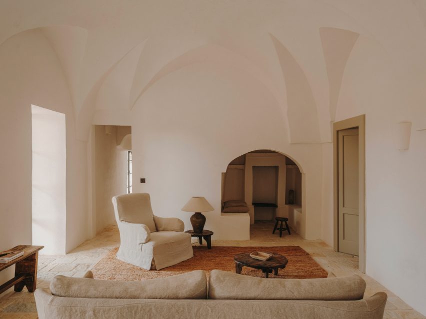
Casolare Scarani is a home created from the renovation of a long-abandoned girls’ school built in the style of a traditional Puglian villa – but still modest in size.

The vaulted ceilings were kept intact and covered in lime plaster, while the rooms were finished with earthy tones and traditional stone flooring.

Find out more about Casolare Scarani ›


Hotel Castello di Reschio
Photo courtesy of Hotel Castello di Reschio

Hotel Castello di Reschio, Umbria, by Count Benedikt Bolza

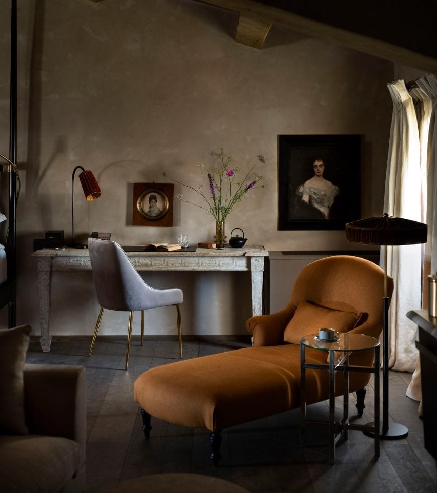
Hotel Castello di Reschio occupies a 1,000-year-old castle in the Umbrian hills that was transformed by count Benedikt Bolza and his family.

Rooms have been decorated with terracotta-brick or wooden floors, hand-stitched linen curtains, Italian fabrics and locally crafted marble and brass vanities alongside portraits sourced from nearby antique markets in a reference to the building’s rich history.

Find out more about Hotel Castello di Reschio ›


Appartamento Brolettuono by Archiplanstudio
Photo by Davide Galli Atelier

Brolettouno Apartment, Lombardy, by Archiplan

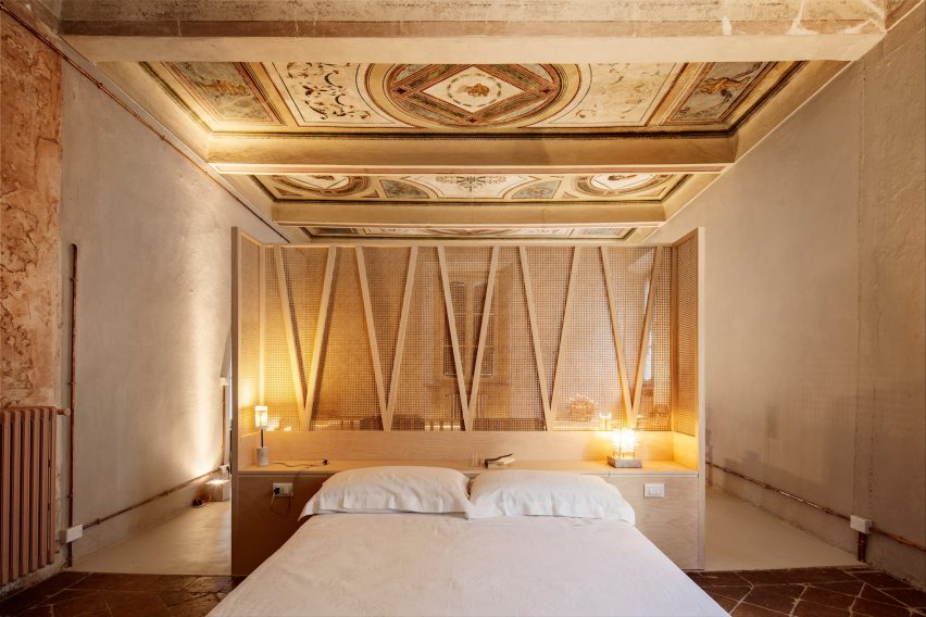
Located in a building in Mantua that dates back to the 15th century, this apartment was overhauled on a budget by local design studio Archiplan.

The studio decided to honour the interior’s timeworn aesthetic by retaining the distressed floor tiles and faded frescos, combining these features with functional light-hued wooden furniture.

Find out more about Brolettouno Apartment ›


Interior of Casa Maiora by Studio Andrew Trotter in Puglia
Photo by Salva López

Casa Maiora, Puglia, by Studio Andrew Trotter

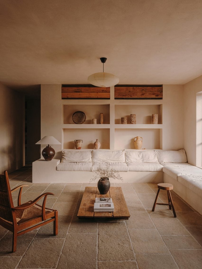
Another project from Studio Andrew Trotter, this villa is in fact a newly built project – but carries heavy rustic influences from traditional homes in the area.

Flagstone floors, lime-washed walls and locally sourced antiques combine to create a soothing, timeless feel.

Find out more about Casa Maiora ›


G-Rough hotel Rome
Photo by Serena Eller

G-Rough, Lazio, by Gabriele Salini

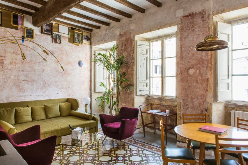
Features showcasing the building’s 400-year-old history were juxtaposed with contemporary art and mid-century furnishings at this boutique hotel in Rome, Italy’s capital.

The imperfections of age, particularly on the patina walls, combine with furniture inspired by modernist Italian designers like Ico Parisi, Giò Ponti and Piero Fornasetti for a rough-yet-refined aesthetic.

Find out more about G-Rough ›


Bedroom at the Vipp pop-up hotel
Photo by Irina Boersma César Machado

Palazzo Monti hotel, Lombardy, by Julie Cloos Mølsgaard and Vipp

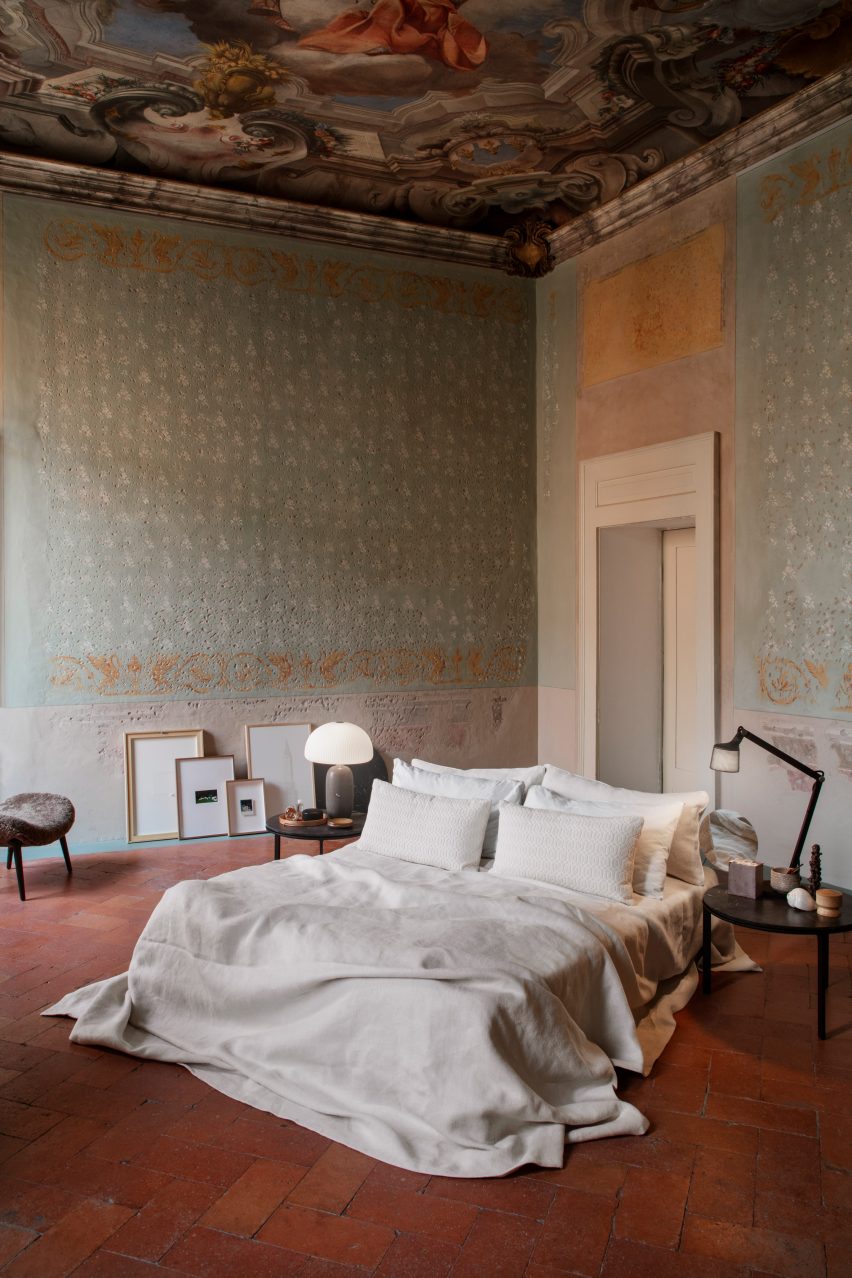
A collaboration with Danish homeware brand Vipp saw interior designer Julie Cloos Mølsgaard create a pop-up hotel in a 13-century palazzo in Brescia.

To keep the focus on the building’s many historic features, Mølsgaard took a minimalist approach to the furnishings, with mattresses sitting directly on the floor and artwork propped up against the walls.

Find out more about the Palazzo Monti hotel ›

This is the latest in our lookbooks series, which provides visual inspiration from Dezeen’s archive. For more inspiration see previous lookbooks featuring chequerboard floors, lime plaster walls and Mediterranean-style interiors.

Reference

MoMA exhibition examines history of environmental architecture
CategoriesArchitecture

MoMA exhibition examines history of environmental architecture

The Museum of Modern Art in New York has opened an exhibition focused on the relationship between environmentalism and architecture in the 20th century.

The exhibition, called Emerging Ecologies: Architecture and the Rise of Environmentalism, details work – built and conceptual – produced during the 20th century and features a number of drawings, photographs, models and interactive elements.

Organised by the Museum of Modern Art’s (MoMA) recently established Ambasz Institute, it is was created to expose the public to strains of thinking, including some that are relatively unknown to the broad public.

“The aim is to have, for the first time in a major museum, a platform where the fraught relationship between architecture and environment can really be discussed and researched and communicated to a wider public,” exhibition curator and Ambasz Institute director Carson Chan told Dezeen.

Carson Chan
Carson Chan is the director of the MoMA’s recently founded Ambasz Institute. Photo by Peter Ross

The show is largely historical, focusing mainly on the work done in the 1960s and ’70s, when environmentalist themes were being exposed to the general public on a massive scale, evidenced by the popularity of ideas like those in Rachel Carson’s book Silent Spring.

However, precursors to that moment, such as work by early twentieth-century modern architects such as Frank Lloyd Wright, with his organic architecture, and Richard Neutra’s “climate-sensitive architecture”, were also included.

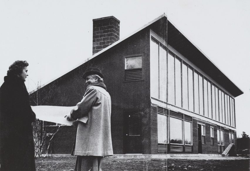
Women architects in front of built house
The exhibition featured documentation of built and conceptual work. Photo is of Eleanor Raymond and Mária Telkes at the Dover Sun House. 1948, courtesy of MoMA

Chan told Dezeen that this historical focus was presented to orient contemporary audiences to the roots of current movements.

“A lot of ideas have changed from that moment, half a century ago,” he said. “The show is looking at how far we’ve come from that moment, but also look at what we can learn from that moment to trying to understand where people were coming from, why they kind of the ambitions they had, why they wanted to do things, the things they wanted to do,” he continued.

“Assessing that moment is a big part of the show.”

Emilio Ambasz tree-lined building
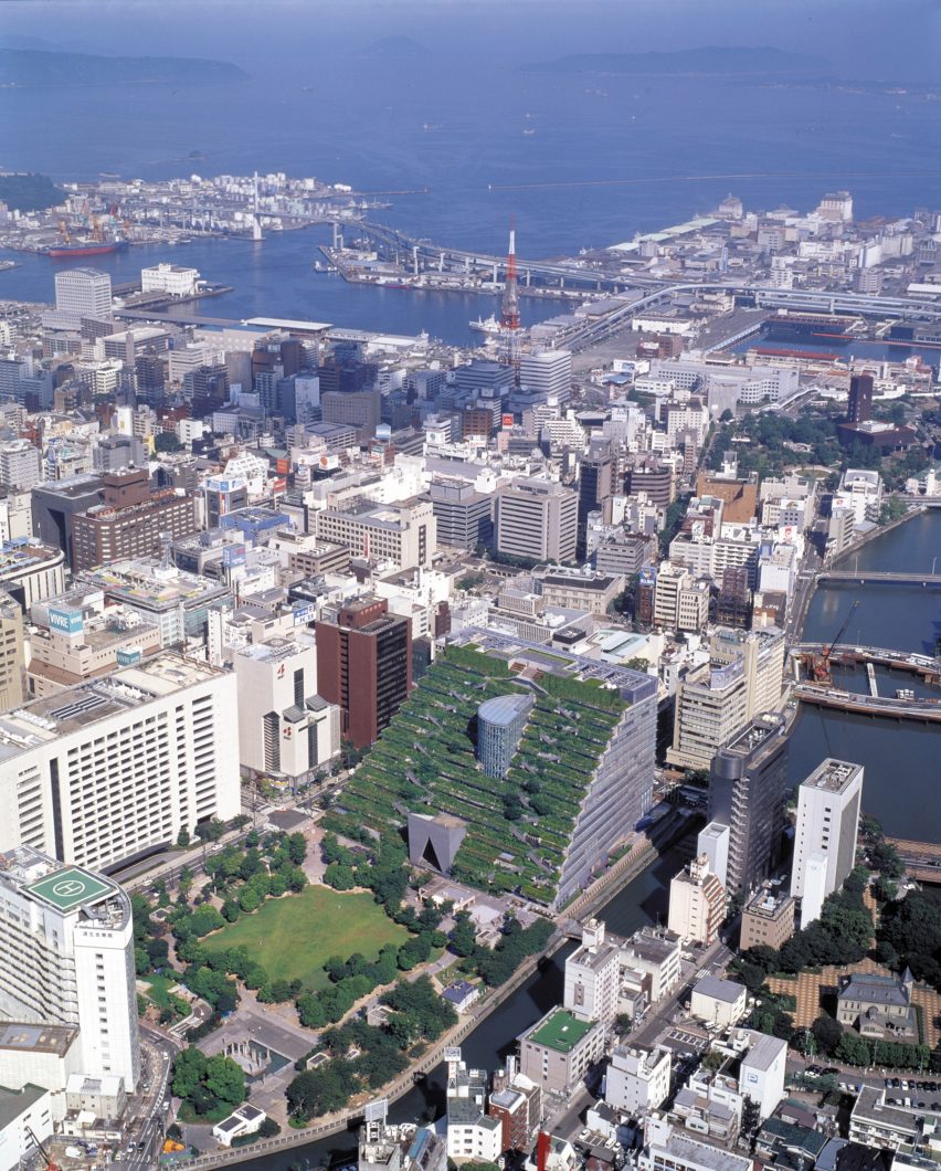
The exhibition focused on 20th-century environmentalist architecture. Photo is of Emilio Ambasz’s Prefectural International Hall, Fukuoka, Japan by Hiromi Watanabe, courtesy of MoMA

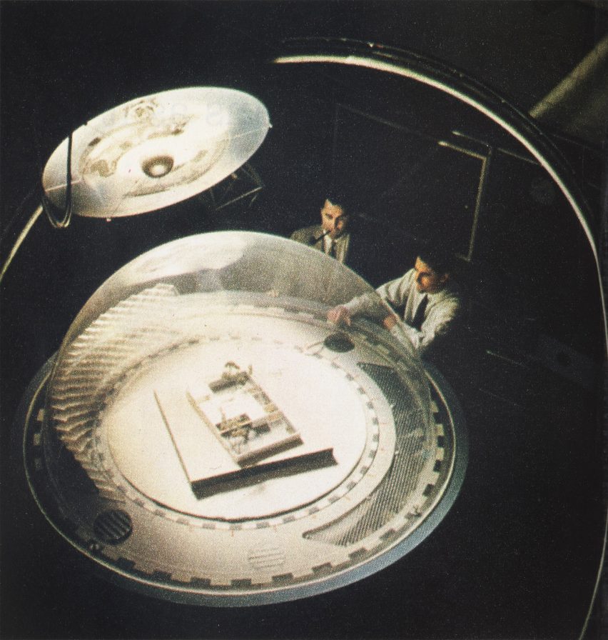
The works include a number of highly conceptual architectural projects such as American architect Buckminster Fuller’s proposed dome over Manhattan, Glen Small‘s sci-fi-inflected Biomorphic Biospheres and Malcolm Wells‘s underground architecture. The paintings of contemporary architect Eugene Tsuii also demonstrated biomorphic forms.

These works imagined radical infrastructures that accounted for changing environments and growing populations

Futuristic Architecture drawing
The exhibition showed precursors to current environmental thinking. Image is of Glen Small’s Biomorphic Biosphere, courtesy of MoMA

The exhibition also included built work including Michael Reynolds‘s waste-built Earthships and the New Alchemy Institute‘s self-sufficient ark buildings, as well as the tree-covered works of Argentine architect Emilio Ambasz, after whom the MoMA’s aforementioned institute was named.

There were also works of radical cartography that served to show the complexity of the landscape. These included American academic Ian McHarg’s detailed ecological maps of the Delaware Upper Estuary, which showed data-driven layers of ecological features such as soil conditions and sun conditions.

However, Chan was careful to note that these understandings of environments predated the environmental movement.

“Doing research or producing knowledge about the environment – or as I call it, producing ecological knowledge about the environment – did not start in the ’60s and ’70s,” he said. “There are communities of Indigenous people that have been tending to the land for generations.”

“The Delaware River Basin is the ancestral homeland of the Lenape people who possessed this very knowledge already. And we could have received it from them if they weren’t displaced in the first place,” he continued.

“Making structures requires money and requires people to be proximate to power. And so this is one reason why historically we haven’t seen a lot of structures by people of color, and by women.”

Dome for enviromental architecture
It reflects architecture’s changes in the face of environmental degradation. Photo is of Aladar Olgyay and Victor Olgyay’s Thermoheliodon by Guy Gillette, courtesy of MoMA

The inclusion of these groups mainly focused on activism. For example, a protest against a proposed dam on ancestral land by the Yavapai people showed how the stoppage of landscape-altering super projects is in itself a kind of architecture.

“Subtracting is also a way of making architecture,” said Chan.

In addition to the images and models in the exhibition, the curators also included a number of small audio devices that included commentary from contemporary architects and designers such as Jeanne Gang and Mai-Ling Lokko,  aimed at contextualising the historical work.

The Ambasz Institute was created to promote environmentalism in the architectural field and besides exhibitions, it will also carry out a number of community outreach projects and conferences.

Other exhibitions that examine architectural history include an exhibition showcasing the history and work of Vkhutemas, a Soviet avant-garde school of architecture at the Cooper Union in New York City.

The main image is of Cambridge Seven Associates’ Tsuruhama Rain Forest Pavilion, courtesy of MoMA.

Emerging Ecologies is on show at MoMA from 17 September 2023 to 20 January 2024. For more exhibitions, events and talks in architecture and design, visit the Dezeen Events Guide.

Reference

Boyy flagship in Milan reveals layers of the store’s history
CategoriesInterior Design

Boyy flagship in Milan reveals layers of the store’s history

Danish artist Thomas Poulsen, also known as FOS, has revamped the flagship store of accessories brand Boyy in Milan, keeping time-worn surfaces left over from the site’s former fit-outs.

This marks the third time that FOS has refreshed the space on Via Bagutta since 2021, as part of the artist’s plan to create a dynamic “evolving” store.

Interior of Boyy flagship store in Milan designed by FOS
FOS has redesigned Boyy’s flagship in Milan

In its first incarnation, the Boyy flagship had funhouse-style mirrors, walls draped in faded pink fabric and cobalt-blue carpets emblazoned with everyday objects.

This colour scheme was inverted for the second iteration of the store featuring blue walls and bubblegum-pink carpet. Elements of both of these schemes now remain in the store’s third and final form, which was left purposefully unfinished.

Interior of Boyy flagship store in Milan designed by FOS
Unpanelled sections of the wall reveal the store’s past fit-outs

“This space was an experiment in formulating a shared language for how Boyy could develop as a brand,” FOS explained.

“We started by creating an installation – the first rendition – then used that experience to create a second installation, and finally built upon the combined experience to create this final permanent space that we have now arrived at.”

“We always envisioned the third rendition as the final act,” added Boyy co-founder Jesse Dorsey.

Interior of Boyy flagship store in Milan designed by FOS
Accessories are displayed inside illuminated glass vitrines

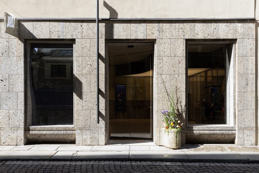
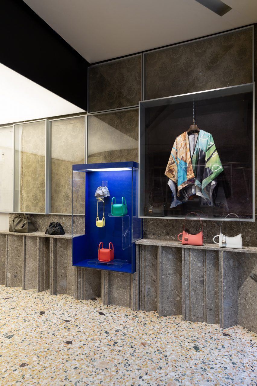
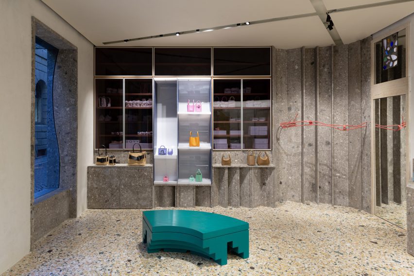
The Boyy flagship now has walls panelled with the same grey ceppo stone that clads the store’s facade.

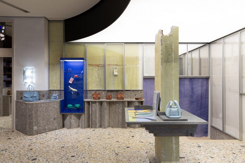
Some areas were left without panelling, revealing the aged, fabric-lined walls left behind by a previous occupant – a 50-year-old antique shop that sold quaint Americana-style objects for the home.

Blue fabric can also be seen hanging in the rear corner, saved from FOS’s second overhaul of the space.

These swathes of time-worn fabric were enclosed inside aluminium window frames, as were some of the store’s display units.

Elsewhere, Boyy’s selection of shoes and handbags can be showcased in several illuminated glass vitrines or on the ledge that runs around the periphery of the store.

Interior of Boyy flagship store in Milan designed by FOS
The store has been finished with terrazzo flooring

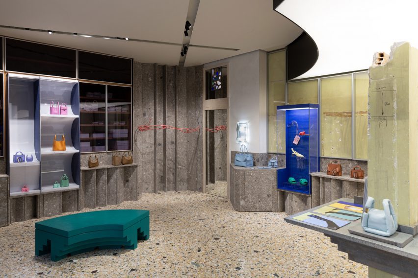
FOS also created a display shelf around a crumbling structural column that sits in the middle of the floor plan.

A couple of tiered, sea-green bench seats were dotted throughout the store as decoration, complementing the flecks of greens stone that are found in the terrazzo floor.

Interior of Boyy flagship store in Milan designed by FOS
Curved benches provide seating throughout the store

Milan is home to an abundance of visually striking retail spaces.

Others include the Moschino flagship, which was designed to reference the history of ancient Italy, and the Off-White store, which is decked out with natural materials like Patagonia granite.

Reference

Moschino store in Millan designed to reference the “history of ancient Italy”
CategoriesInterior Design

Moschino store in Millan designed to reference the “history of ancient Italy”

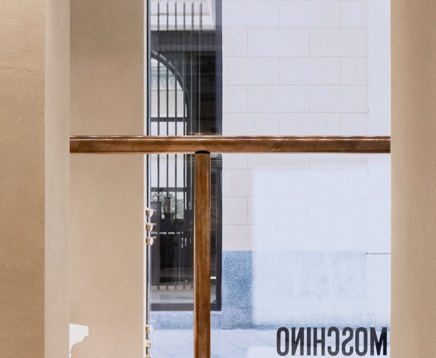
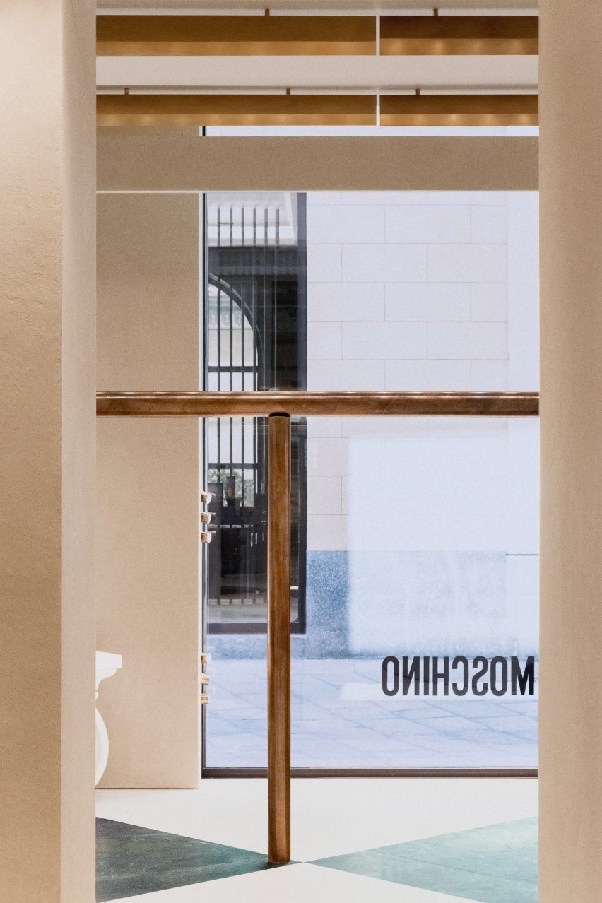
Italian studio Andrea Tognon Architecture has collaborated with former Moschino creative director Jeremy Scott to renovate the brand’s flagship store in Milan.

Located on Via della Spiga, one of Milan’s famed shopping streets, the store sits within the 18th-century Palazzo Perusati, which was recently transformed by real estate company Hines into a luxury retail development.

The store was designed by Andrea Tognon Architecture in collaboration with Scott who aimed to recreate and allude to the history of ancient Italy through a minimalist yet ornamental interior scheme.

Interior image of the Moschino flagship
The Moschino Milan store was designed by Andrea Tognon and Jeremy Scott

“I was inspired by the rich history of ancient Italy and the beauty and decadent opulence of its design,” said Scott.

“Sometimes we start to design from memories, sometimes from form, materials and colours,” added Andrea Tognon Architecture founder Andrea Tognon.

“For this project, I started only from words.”

Photo of the interior of the Moschino Milan store
It is located within a recently renovated retail hub

The Milan flagship spans two floors and covers 380 square metres.

Its ground floor is dedicated to the brand’s women’s ready-to-wear collections and accessories, while its first floor is dedicated to its men’s and kid’s collections.

Photo of the Moschino store
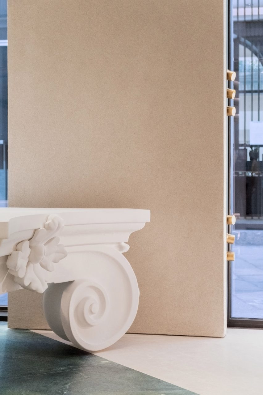
Oversized columns and capitals fill the store

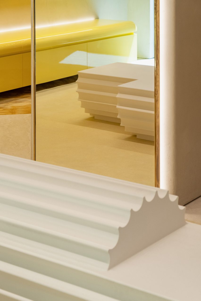
Throughout the interior, Andrea Tognon Architecture used rich materials that speak to Moschino’s baroque flair, which was also highlighted through decorative and oversized architectural elements.

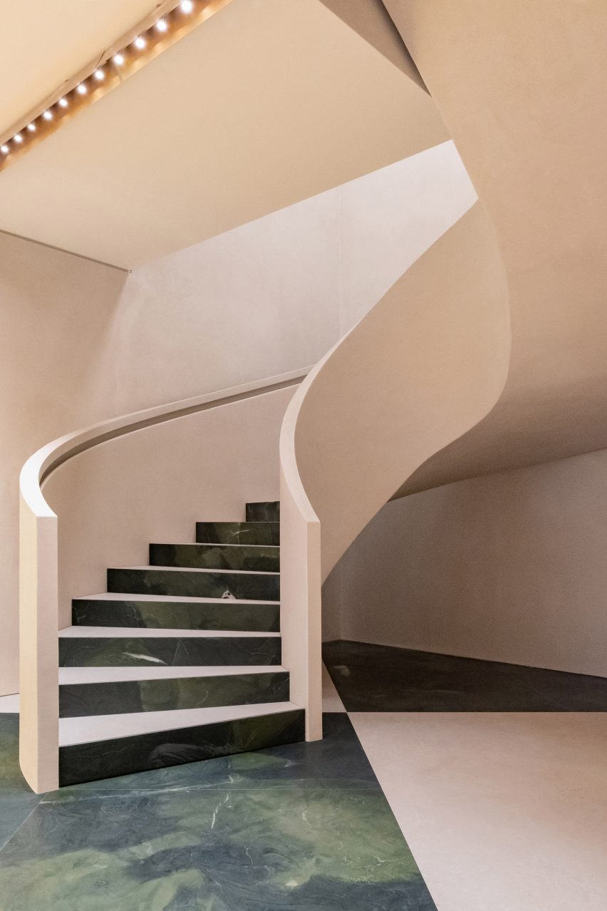
A checkered floor constructed from Botticino marble and green stone, sourced from Brazil, covers the ground floor retail area while the above floors were clad in yellow Siena marble.

A vast stone spiral staircase connects the two floors of retail space and forms a continuation of the oversized checkered floor – with the tread and rise of each step similarly clad in green stone and marble.

Patinated brass lighting stretches rhythmically in horizontal rows across the ceiling of the store. Curving tubular display rails line the boundaries of the interior and were constructed in the same brass finish.

Pale pink spiral staircase
Marble and stone cover the floors

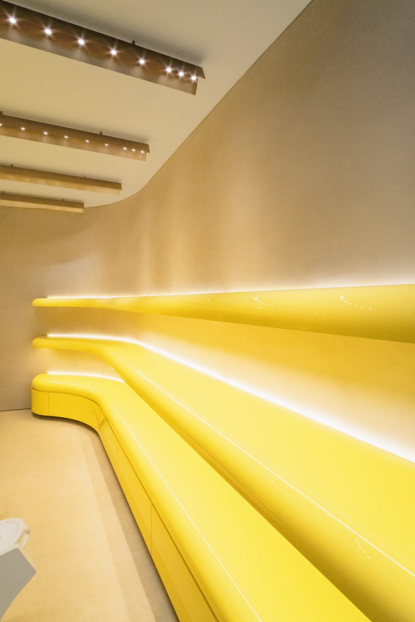
Pops of colour were introduced to the interior through bright yellow lacquered wood shelving that flank the walls of the store and follow its curving profile.

Oversized columns and capitals were placed throughout the interior and function as furniture and display areas for the brand’s products and accessories.

Interior photo of the Milan store
It was designed to reference the ancient history of Italy

Also scattered throughout the store are additional custom furniture pieces that were created by Scott in homage to Moschino’s founder Franco Moschino.

These tables combine two tables which were spliced in the middle, joined together and decorated with marble tops and gold leaf ornamentation.

Photo of shelving at the store
Pops of colours were incorporated throughout the store

Last week news broke that Jeremy Scott was leaving Moschino after a decade-long tenure at the Milanese fashion house. In 2020, Scott replaced models at his Spring Summer 2021 show with puppets that wore the brand’s womenswear collection.

Elsewhere in Milan, London design studios Brinkworth and The Wilson Brothers created a caravan-shaped artist studio for Marni’s flagship store in the Italian city.

The photography is by Adriano Mura.

Reference

Diébédo Francis Kéré Makes History as the 2022 Pritzker Prize Winner
CategoriesArchitecture

Diébédo Francis Kéré Makes History as the 2022 Pritzker Prize Winner

Have your say in which architects will take home Architizer’s prestigious A+Awards: Public Voting opens this spring. Interested in next year’s program? Subscribe to our newsletter for updates.  

Burkina Faso-born architect, educator and social activist Diébédo Francis Kéré has made history after being named the 2022 Pritzker Prize laureate. Known as Francis Kéré, the founder of Kéré Architecture is recognized for his “commitment to social justice and engagement, and intelligent use of local materials to connect and respond to the natural climate, he works in marginalized countries laden with constraints and adversity, where architecture and infrastructure are absent.” He is the first African and the first Black architect to win the prize since it began being awarded in 1979.

Trained first as a carpenter and later as an architect, his deep knowledge and concern for materiality is visible in his work. Though based in Berlin, his practice often gravitates towards works throughout the continent of Africa. From contemporary school institutions to health facilities, and professional housing to civic buildings and public spaces, his designs steer clear of simple categorizations: global vs. local, aesthetic vs. social, and so on.

As the Pritzker jury succinctly put it, “Francis Kéré’s entire body of work shows us the power of materiality rooted in place. His buildings, for and with communities, are directly of those communities – in their making, their materials, their programs and their unique characters. They are tied to the ground on which they sit and to the people who sit within them. They have presence without pretense and an impact shaped by grace.”

Though many architectural enthusiasts around the world may only now be acquainting themselves with his larger body of work, they are likely already familiar with his design for the 2017 Serpentine Pavilion — a timber structure accented with indigo blue that ingeniously connected different times and spaces and reinterpreted form of the massive tree at the heart of his home town.

His signature architectural vocabulary of double roofs, thermal mass, wind towers, indirect lighting, cross ventilation and shade chambers (replacing conventional windows, doors and columns), confounds attempts to separate practicality from poetry in design. Yet, while Kéré’s architectural reputation is strongly tied to the work’s built realization, yet, his working images and visualizations are also remarkable in their own right.

“Francis Kéré’s work also reminds us of the necessary struggle to change unsustainable patterns of production and consumption, as we strive to provide adequate buildings and infrastructure for billions in need,” the Jury noted. “He raises fundamental questions of the meaning of permanence and durability of construction in a context of constant technological changes and of use and re-use of structures. At the same time his development of a contemporary humanism merges a deep respect for history, tradition, precision, written and unwritten rules.”

Have your say in which architects will take home Architizer’s prestigious A+Awards: Public Voting opens this spring. Interested in next year’s program? Subscribe to our newsletter for updates.  


Reference