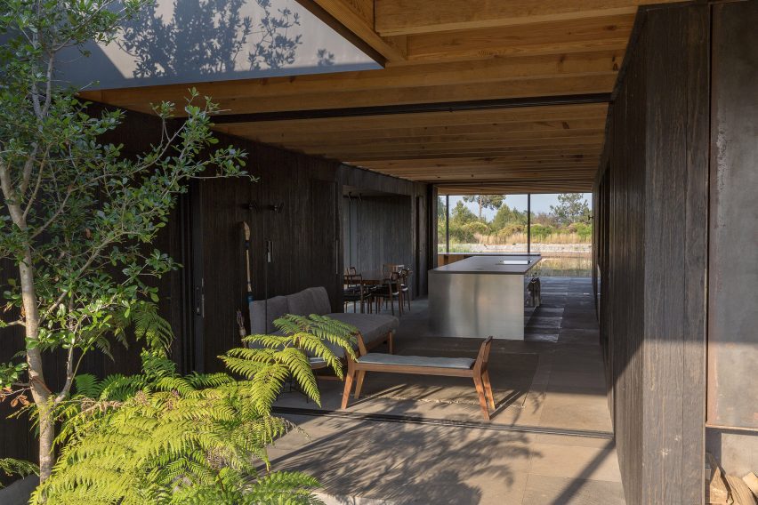
gosize melds external and internal spaces at ashiya s house
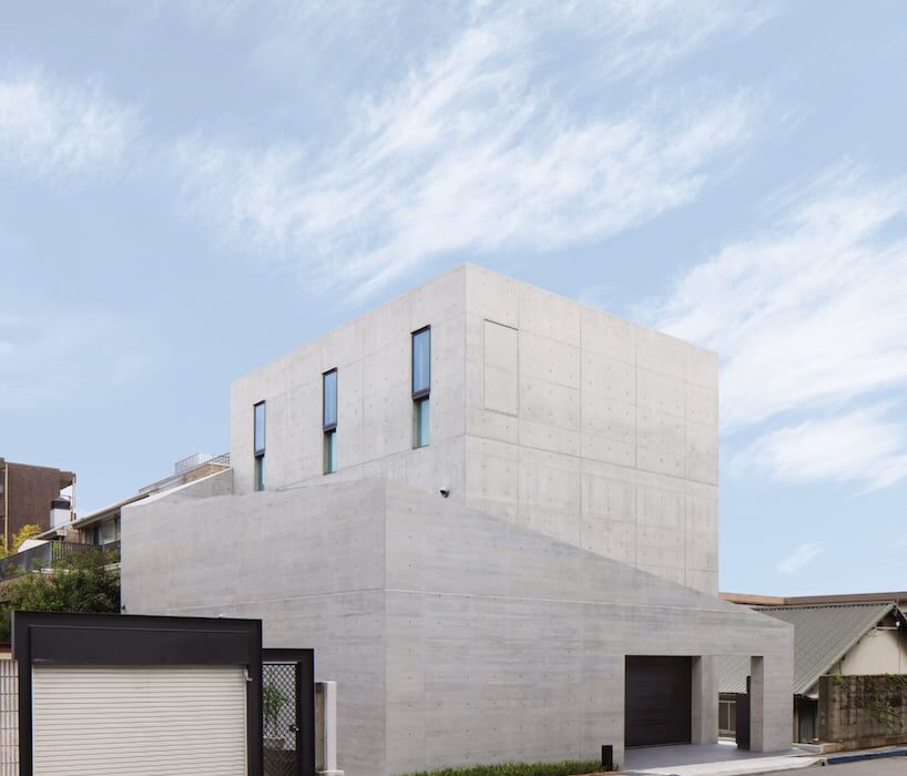
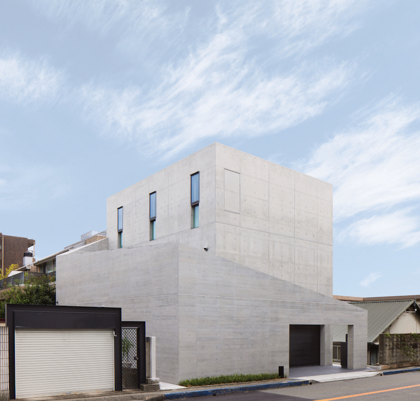
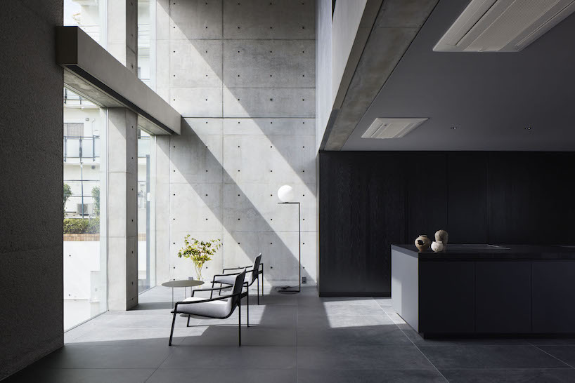
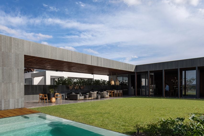
Amid an upscale residential neighborhood in Hyogo Prefecture, Japan, the Ashiya S House stands as a three-story block of concrete infused with a dynamic sequence of spaces. The home, conceived by Go Fujita of studio GOSIZE, fuses traditional Japanese perspectives with modern aesthetics, resulting in a space that blurs the boundaries between interior and exterior, motion and stillness, and yin and yang.
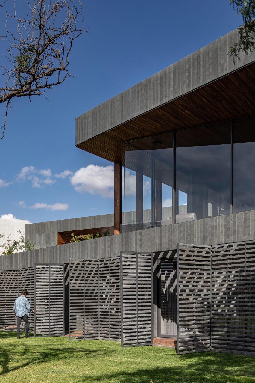
Situated in close proximity to neighboring apartment buildings and a busy road, the architects placed emphasis on blocking sightlines and noise, prioritizing privacy and tranquility for residents. The spatial solution devised a series of outer walls surrounding the building, each varying in height and strategically positioned to create an open space that fosters intimacy while inviting natural light and views inside.
height-changing walls envelop the building | all images courtesy of Go Fujita / GOSIZE
fusion of traditional japanese design with modern aesthetics
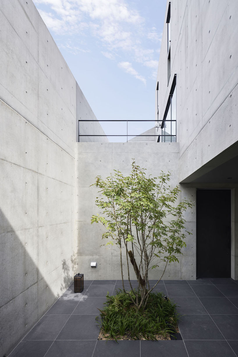
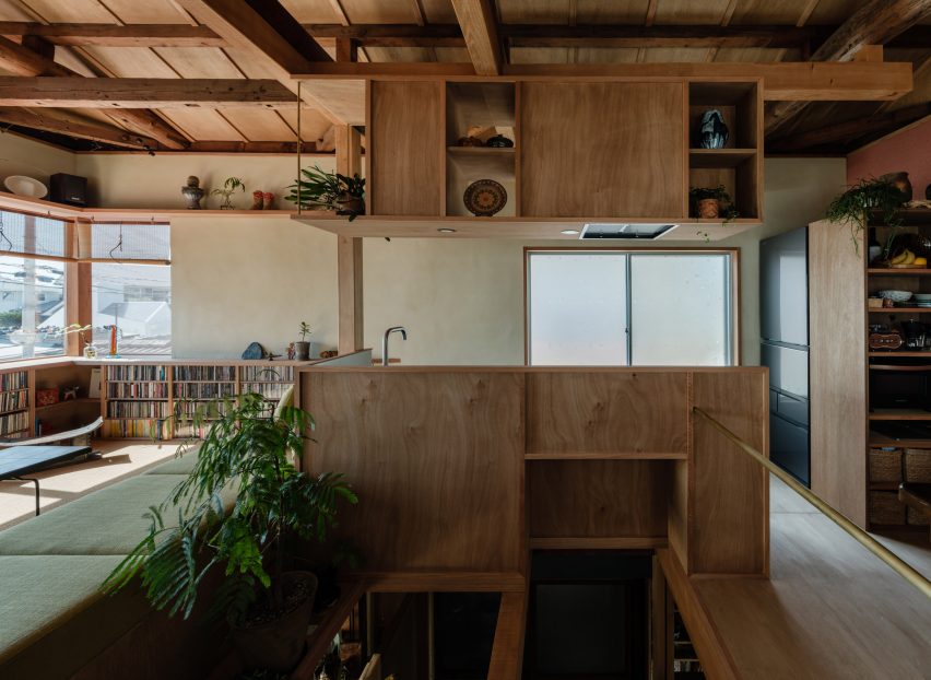
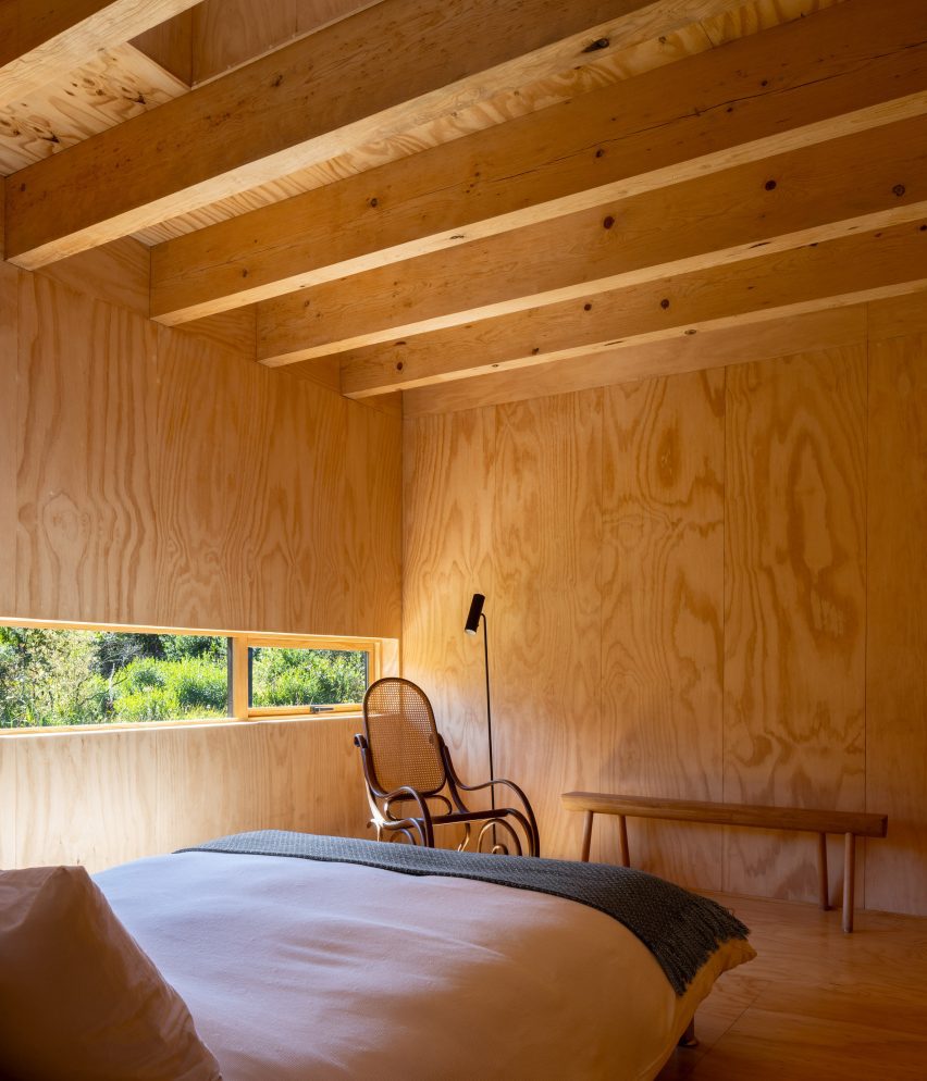
Approaching the entrance, residents are guided along a semi-external path formed by gaps between overlapping exterior walls, marking a transition from public to private. Stepping inside, rough yet delicate tatami-finished walls adorned with contemporary art fuse traditional and modern elements, creating a serene ambiance that sets the tone for the rest of the Ashiya S House.
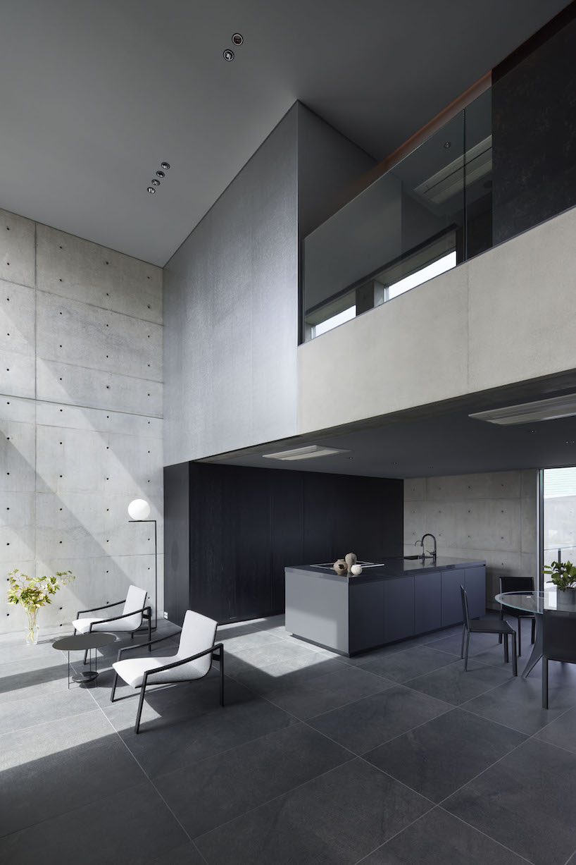
Ascending the stairs, guided by subtle indirect lighting, unveils a living area that exudes a sense of openness. The double-height windows allow sunlight to stream in, softly reflecting off the tin wallpaper and diffusing into every corner of the living space. The team at GOSIZE has carved these expansive openings into the thick walls to also serve as screens, framing the ever-changing views of the outside world, effectively merging the indoor and outdoor experiences.
a walled courtyard and porch marking a transition from exterior to exterior
GOSIZE’s design concept fuses traditional Japanese perspectives with modern aesthetics
the living space is infused with light and openness despite the home’s location in a bustling area
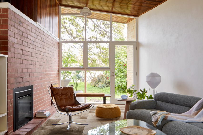
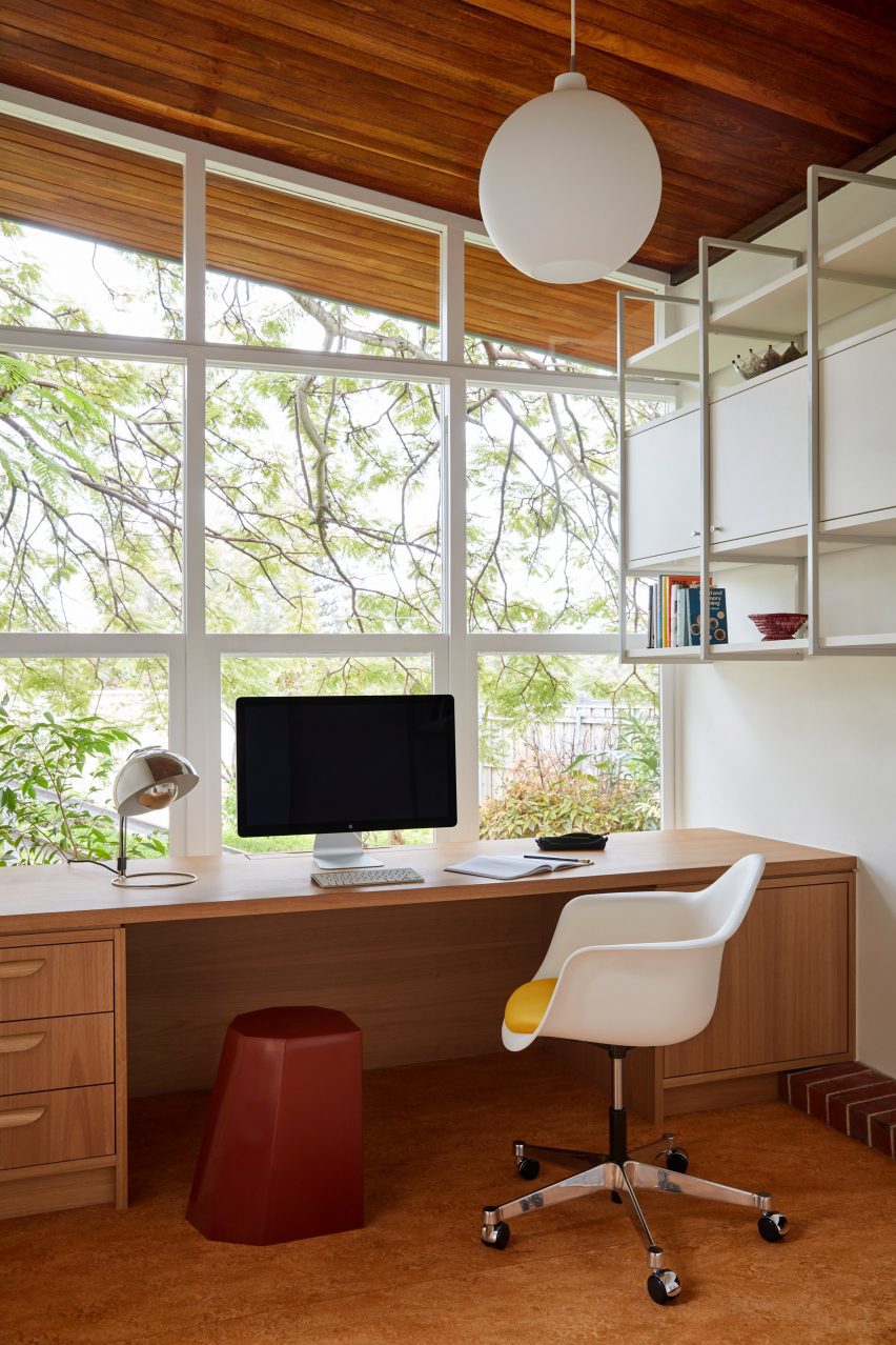
In the City Beach suburb of Perth in Western Australia, interiors studio Design Theory has updated a tired house from the 1960s while remaining true to the rich palette of natural materials in the original design.
The young client wanted a home where she could entertain friends and live with her dogs in a durable, easy-to-clean, pet-proof home with a reworked plan making space for three bedrooms and two bathrooms.
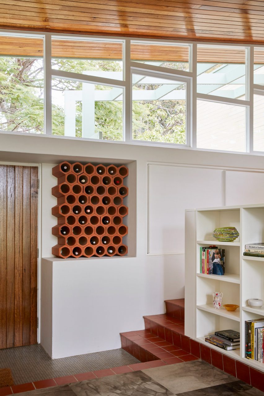
Design Theory has renovated a 1960s house in Perth
“The brief was, on the surface, simple: to update the home while keeping its considerable mid-century charm,” said Design Theory.
“While its strengths lay in its architectural form and south-facing windows, our innovative approach to the project was essential in bringing contemporary functionality and sustainability to the fore,” the studio added.
“By specifying with our client’s lifestyle in mind and considering every detail, she feels relaxed to use the house the way she wants to.”
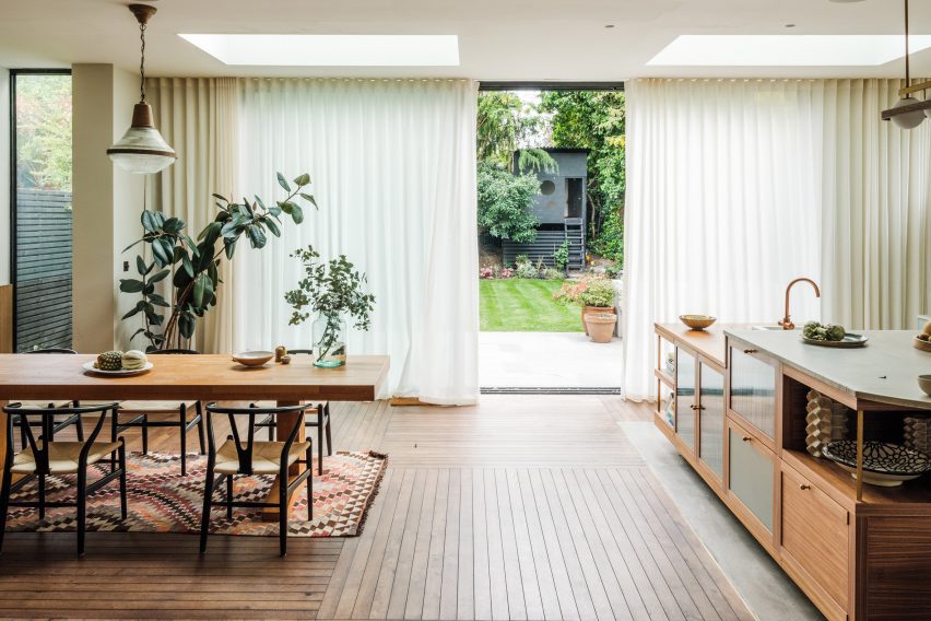
Carpet tiles bring tactility into the sunken lounge
Once the project was underway, Design Theory quickly discovered that the structure was largely rotten and had suffered significant termite damage, so extensive restoration work was required.
“We established an early rationale to restore base-building elements in keeping with the original architecture and interior elements,” the studio said.
“Joinery, finishes and furniture would be new, informed by mid-century design. This allowed the home to evolve yet respect the heritage of this special building.”
Yellow mosaic tiles feature across the kitchen counter
Otherwise, the house only needed sensitive restoration and a light touch to bring it up to date, according to the studio, due to its prescient emphasis on natural light, fresh air and modern, unpretentious living.
“Our design cues were taken from the era of the house’s original design, a time of humbler, honest materials and restrained detailing,” said Design Theory co-founder Lisa Reeves.
“Where cabinetry needed restoration, it was updated in respectful ways, always with a nod to what may have come before us.”
Design Theory introduced Blackbutt timber details to the interior
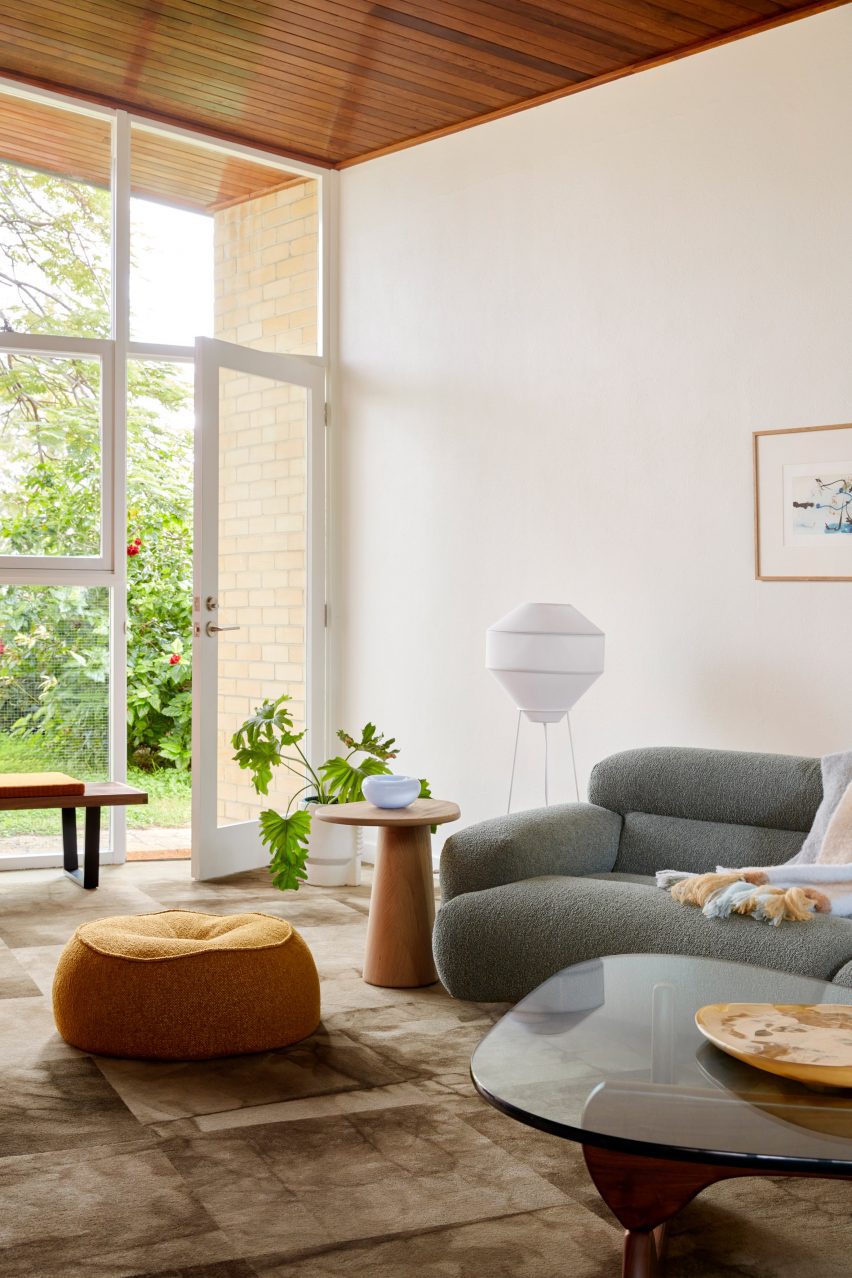
The material palette celebrates warm, earthy materials: exposed brick in terracotta tones, native Blackbutt timber and a cork-like Forbo Marmoleum on the floors.
In the sunken lounge area, carpet tiles bring an added element of comfort and a distinctive gridded visual effect.
The heavy use of richly toned timber and brick is balanced by the white of the painted wall sections, the grid-like window frames and low-hanging pendant lighting.
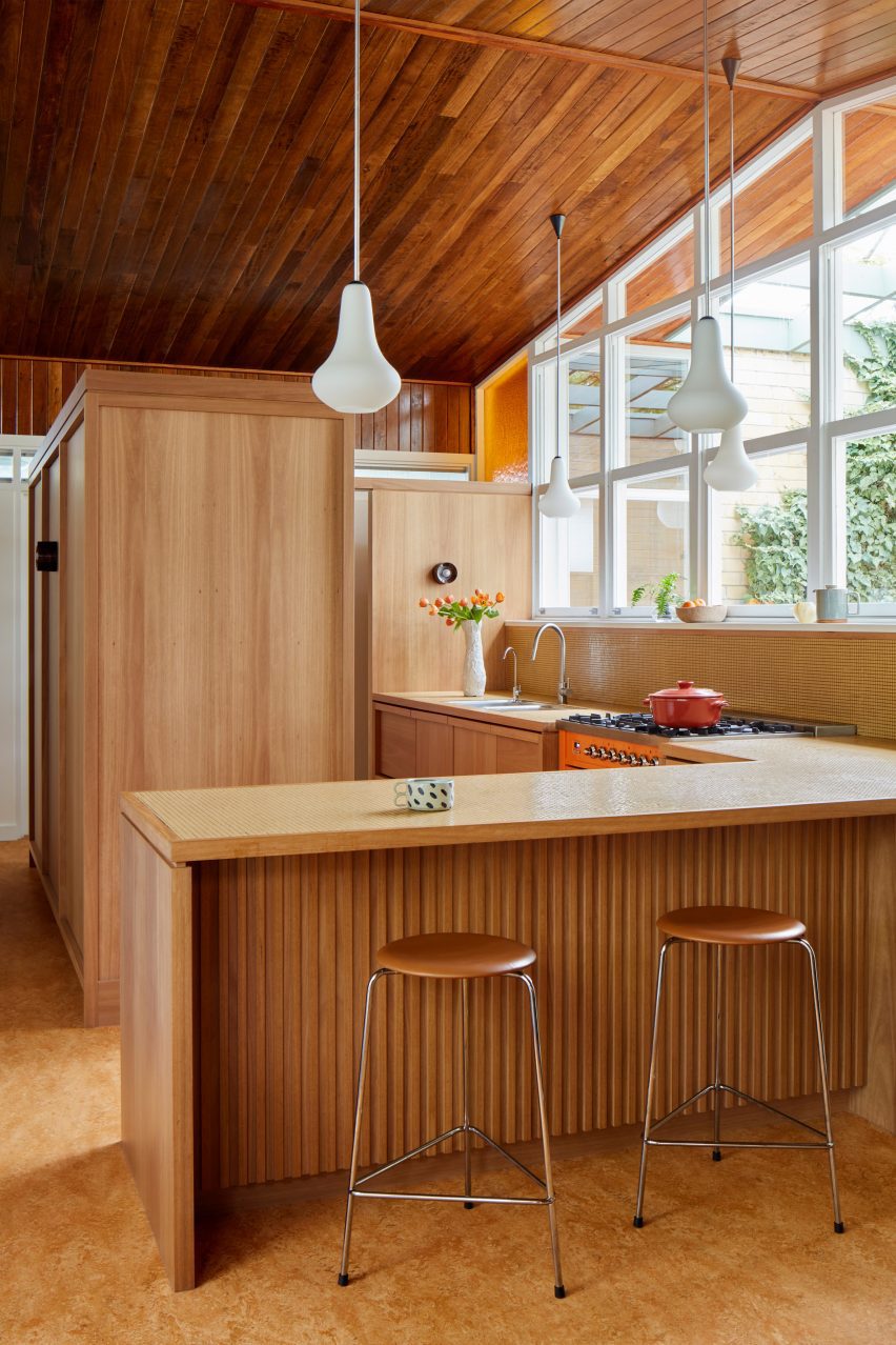
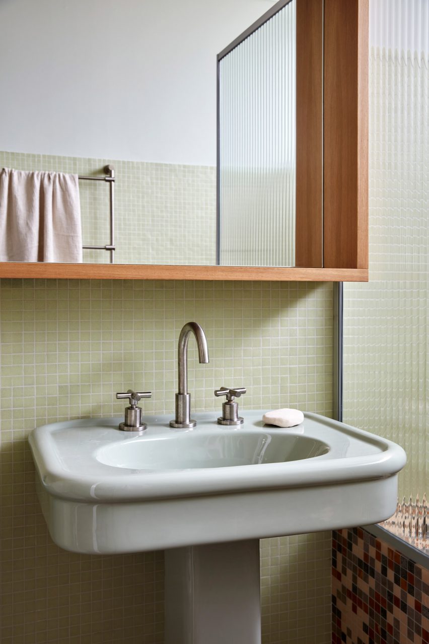
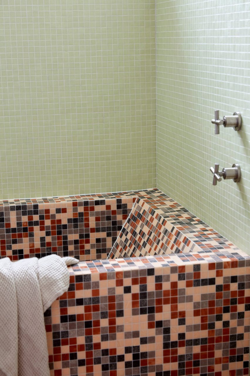
For the kitchen counters and the bathrooms, simple mosaic tiles continue the textural theme, while referencing the home’s early-60s origins.
“We embraced a quintessentially West Australia landscape-inspired palette of Eucalyptus greens, warm timbers and sunset oranges,” the studio said.
Forbo Marmoleum flooring was added for textural interest
In the kitchen, subtle detailing on the cabinetry such as the full-width handles adds visual interest without grabbing undue attention, while an orange range cooker adds a retro touch.
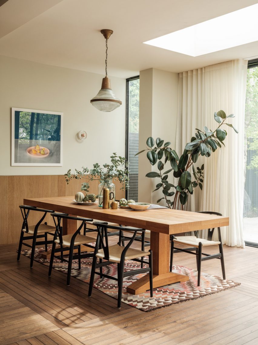
The client acquired several pieces of vintage furniture along with the house, which Design Theory was keen to retain and restore.
Mint green tiles feature throughout one of the two bathrooms
As a counterpoint to these mid-century elements, contemporary furniture in gently curving forms softens the rigorous lines of the original architecture and prevents the interiors from feeling like a period pastiche.
Key pieces of hardware such as original door furniture and pendant lighting were also refurbished and reinstated, “lending an authenticity to the home’s new life”, according to the studio.
The built-in bathtub is also made from multicoloured mosaic tiles
Other residential projects in Perth that have been featured on Dezeen include a family home formed from arched panels of precast concrete and a wood-and-brick extension for a couple of empty nesters.
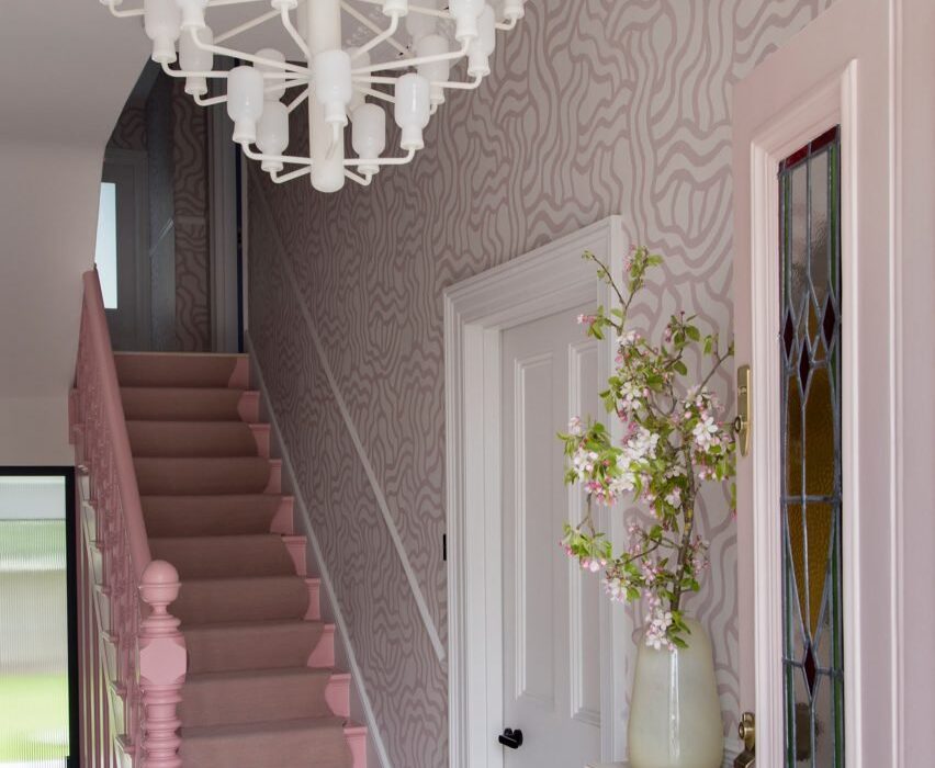
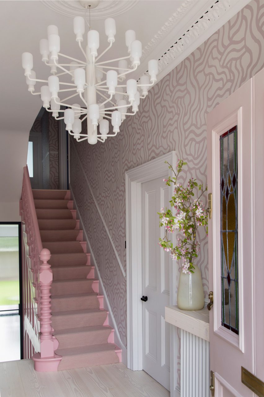
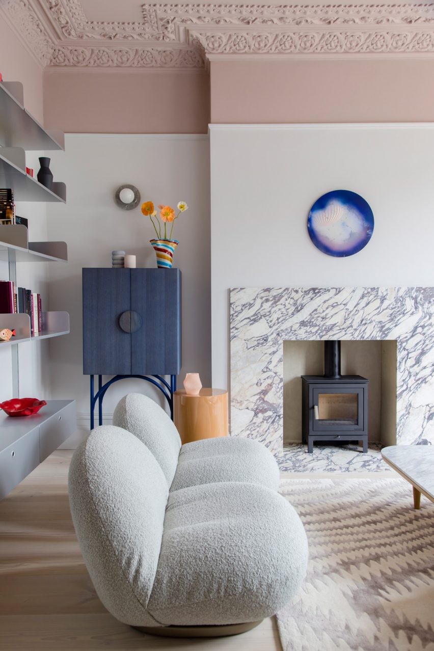
Ornately corniced ceilings were preserved and painted pastel inside this detached Edwardian house in southeast London, which local firm 2LG Studio has renovated for a returning client.
Set in the leafy residential area of Forest Hill, the house on Sunderland Road belongs to a couple who needed space for their three young children to grow and play.
2LG has completed Sunderland Road house in Forest Hill
“Having designed this couple’s previous home, we had a strong sense of their tastes and wanted to evolve that for them in this house,” 2LG Studio founders Jordan Cluroe and Russell Whitehead told Dezeen.
“We wanted to bring out their characters by emboldening their love of colour and finding ways to build pattern and joy into the materiality of the home,” the duo added.
“The intent here was to respect the period elements of the building, whilst reflecting the modern style of the family who live there.”
Hand-printed wallpaper by Custhom Studio features in the lounge and hallway
Throughout the house, playful elements are in balance with a more serious aesthetic.
Instead of treating the home’s elaborate ceiling mouldings separately – as tradition dictates – 2LG Studio applied a colour-block philosophy and painted them in the same pastel tones used across the upper walls and ceilings.
The studio drew on a range of references for the interior, from 1980s colours to Italian design elements such as marble and Murano glass lighting, all the way to the Scandinavian influences seen in the natural materials and minimalist approach to furnishing.
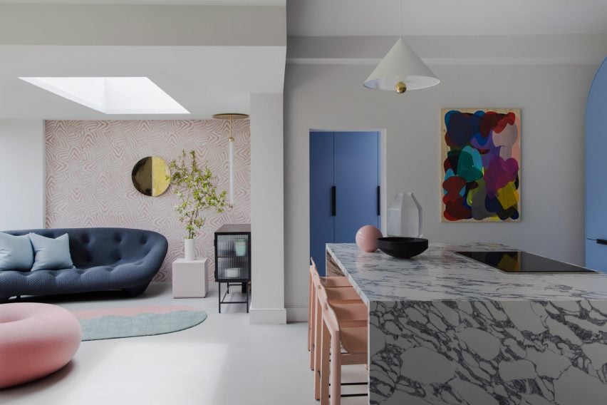
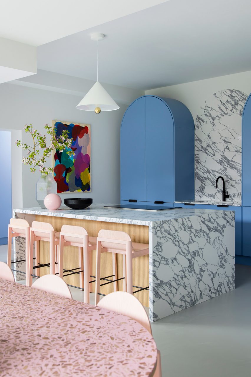
The kitchen is defined by sky-blue cabinetry and marble countertops
Creating impact in the entrance hall is a hand-printed wallpaper, designed by 2LG Studio with long-term collaborator Custhom Studio and used here in a bespoke calamine-pink colourway that’s repeated in the connecting spaces throughout the house, as well as in the rear living area.
“It creates a welcoming, human feel as soon as you enter,” the design team said.
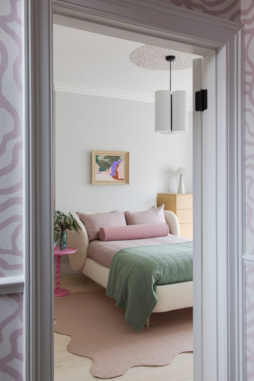
This ballet-slipper colour is paired with a brighter candy pink, bringing calm and warmth to the overall scheme.
2LG painted ceilings, mouldings and upper walls in pastel colours
Pink-heavy palettes have become a signature for 2LG, also reflected in the natural pink undertones of the extra-wide Douglas fir floorboards that feature throughout the house alongside a grey poured-resin floor in the kitchen.
“The floorboards set the tone with a nod to Scandi minimalism, adding a natural soul throughout that unites the bolder elements,” said 2LG Studio.
In the kitchen, sky-blue cabinetry is used alongside marble countertops and splashbacks, with arched forms uniting the two finishes while pink elements such as bar stools pop against this calm backdrop.
“The colours are a key part of the atmosphere and identity of this house,” said 2LG. “The blues gets deeper and bolder as you move upstairs into the study and the family bathroom.”
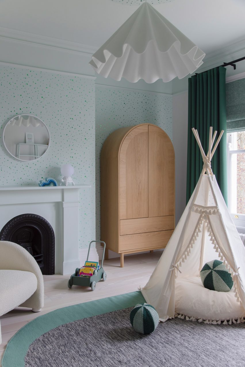
“Primary red details give structure to the colour palette in the living room. Pastel green in the baby’s room is serene and fresh, warmed up with a mix of wood tones and creams.”
Pink details feature throughout the home’s interiors
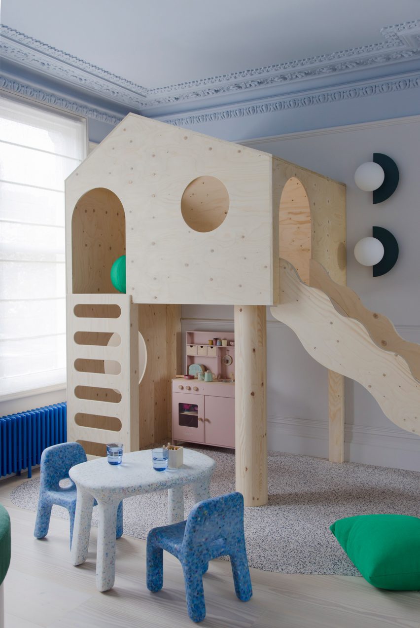
The project features bespoke joinery including a playhouse on stilts in one of the kids’ rooms alongside existing 2LG pieces such as the Luca bedhead in the loft bedroom and the Tilda sofa, both designed for London furniture company Love Your Home and upholstered here in Kvadrat x Raf Simons fabric.
“The fitted elements of the furniture give a sense of coherent design and function to the spaces whilst the classic design pieces bring a curated gallery feel, not unlike a contemporary luxury fashion store,” said 2LG Studio.
2LG designed custom joinery including a stilted playhouse
Various recycled materials provide textural interest throughout the house, among them the recycled plastic wall lights in the living room by Spark and Bell.
2LG Studio also added a pink Foresso top made using waste wood chips and resin to the dining table, while the bespoke bathroom cabinet was made using leftover Douglas fir floorboards with recycled plastic details by UK company Smile Plastics.
Pastel green was used to finish the baby’s room
Since Cluroe and Whitehead founded their design practice in 2014 under the name 2 Lovely Gays, the studio has completed a number of residential projects in the British capital.
Among them is the couple’s own home and office – to which they recently added a garden pavilion with a “touch of Beetlejuice” – and an equally colour-led renovation of a period property in the Heaver Estate conservation area.
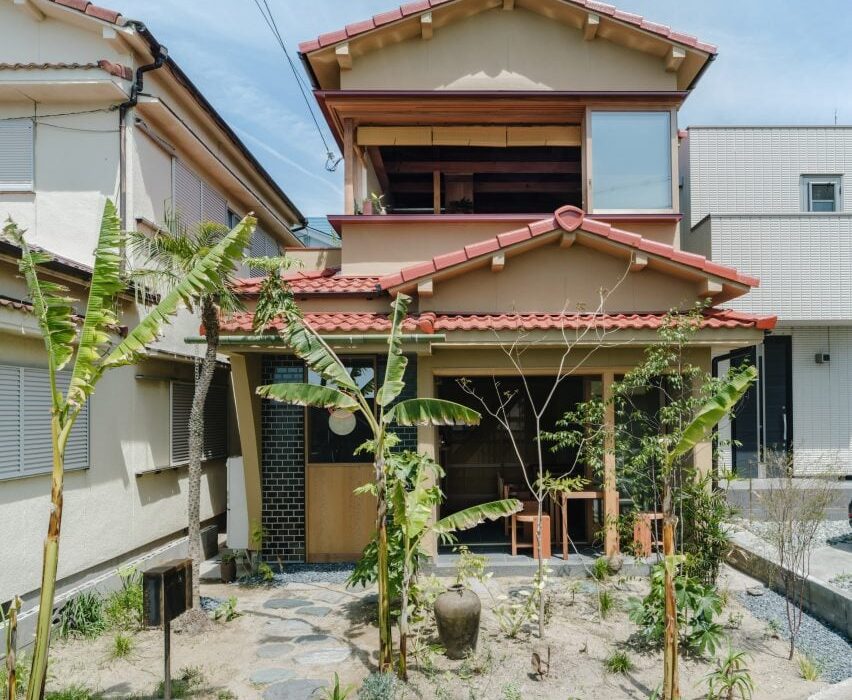
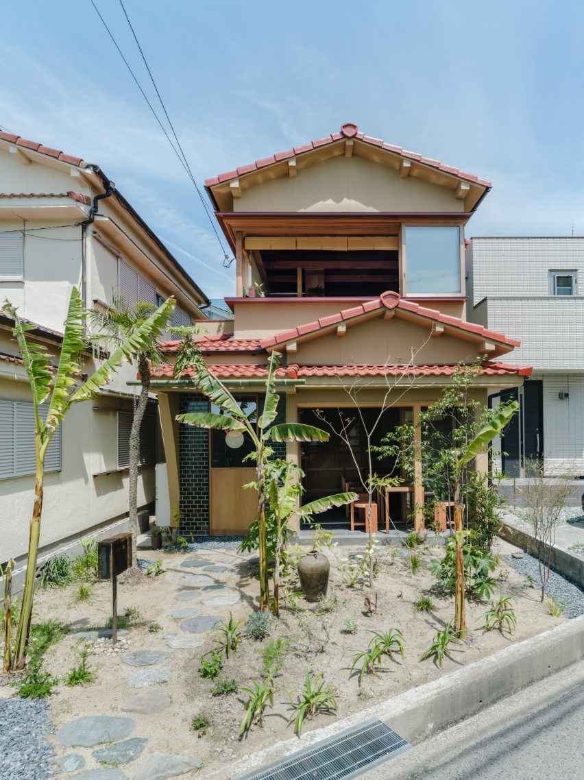
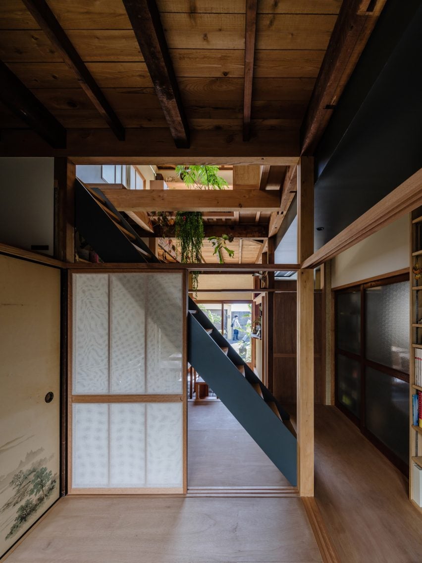
Japanese studio Akio Isshiki Architects has transformed an old wooden building into a warm-toned home and public restaurant named House in Hayashisaki Matsue Beach.
Located on a coastal street in Akashi in southern Japan, the mixed-use space was built within a 50-year-old building for a local designer and features a curry restaurant as well as residential and working spaces.
Designed to reflect traditional Japanese dwellings, the home and restaurant are contained within a wooden building that was previously dark and separated.
House in Hayashisaki Matsue Beach was designed by Akio Isshiki Architects
During the renovation, Akio Isshiki Architects aimed to pair existing elements with modern features to reflect the mixed-use nature of the project.
“The house was divided into small rooms, narrow and dark,” studio founder Akio Isshiki told Dezeen.
“It was very old and damaged, but fortunately the carpenter had done a good job, there were no leaks, and the structure was solid.”
It is located in Akashi
Accessed from the roadside, a series of circular stones form a path that leads through the planted front garden and curves to extend along the front of the building, providing access to the ground-floor restaurant.
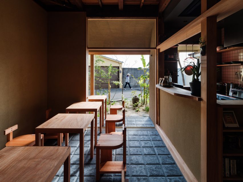
Here, a stepped sheltered porch features external seating and is separated from the interior space by a wide sliding glass door set in a timber frame, which offers views into the garden and can be fully opened to connect the dining space to the outside.
The structure contains a restaurant and a home
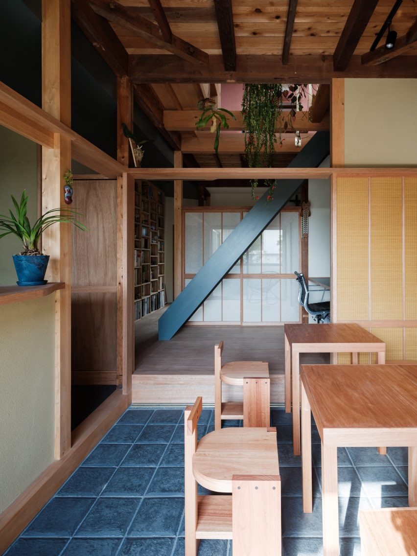
Inside, the floor has been coated with dark tiles informed by the history of the area, which was formerly a large tile producer.
“These tiles were handcrafted one by one by tile craftsmen in Awaji, with the image of lava stone pavements seen in cities in Central and South America superimposed on the texture and edge shape,” said the studio.
It draws on traditional Japanese homes
Wooden furnishings, including bespoke D-shaped chairs designed by the studio and created by a local woodworker, are arranged throughout the dining space at the front of the building.
“To ensure stability even on uneven floors, three legs are used as a base for the chairs, and the legs are made of a thick material so that they do not fit in the joints of the Kawara tiles,” said Isshiki.
“I aimed for a primitive design with an unknown nationality, with as simple and crude a composition as possible.”
Separated from the main space by an earth-toned counter, the kitchen is tucked into one side of the dining room and features walls clad in wooden panels and white tiles, along with a lighting fixture formed from two circles that hangs in the street-facing window.
A Japanese shoji screen at the end of the dining room is the first of a series of flexible partitions throughout the home that can be pulled out to provide separation between the spaces.
The upper floor contains private residential space
“Conscious of the tropics and nostalgia, we put nets that look like mosquito nets and sudare blinds on the shoji screens,” said the studio. “The graceful plans created by imperfect partitions such as shoji and fusuma are typical of ancient Japanese architecture.”
“In this house, where cultures, nationalities, times, and various other things are combined, I thought it would be appropriate to have the spaces partially mixed so that they could feel the presence of each other, rather than being permanently partitioned in terms of usage,” it continued.
Wood was used throughout the interior
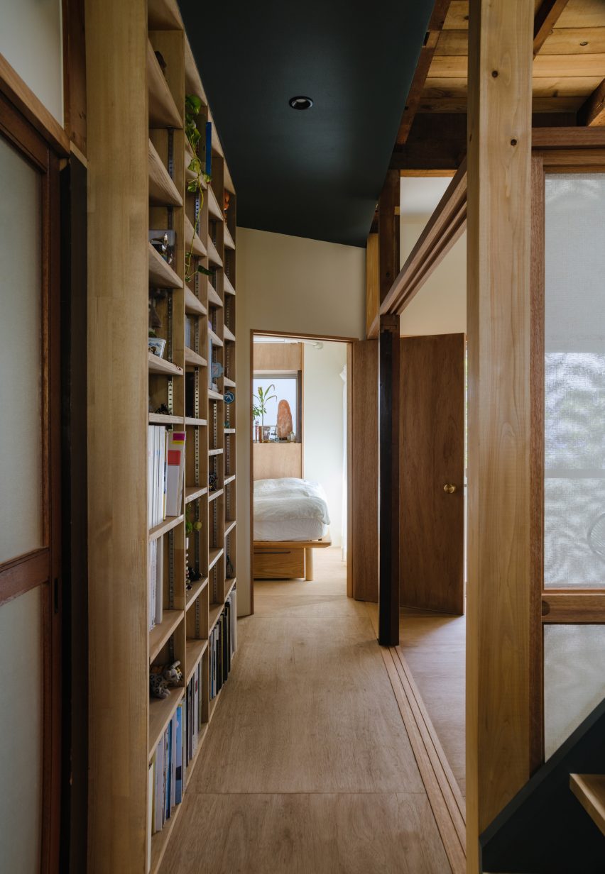
Built on a raised timber platform, the rest of the ground floor holds private rooms for the client, which are divided by shoji screens, including a traditional Japanese room that opens onto a garden.
A home office borders the dining space, where a central black ladder leads to the floor above, while a bedroom, bathroom and utility room branch from the other side of the corridor.
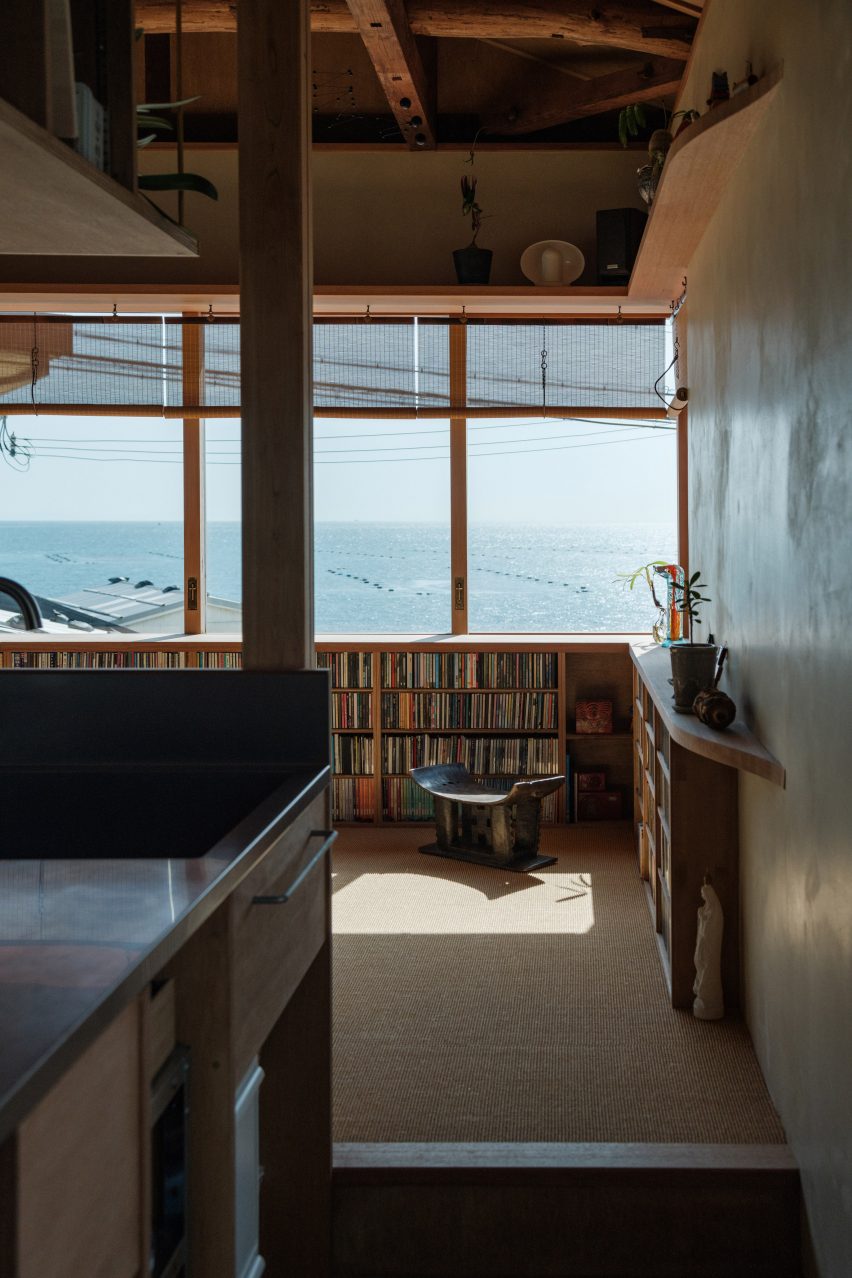
The residential space has views of the sea
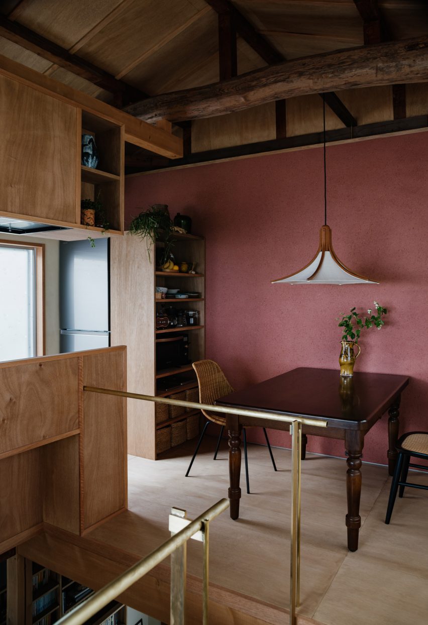
Upstairs, the studio added an open arrangement of dining and living spaces with warm-toned surfaces including a red wall and dark wooden beams that interact with the home’s original rustic roof structure.
“The wall on the second floor is a scraped wall mixed with red iron oxide and finished by a plasterer from Awaji,” said Isshiki. “This is an attempt to incorporate the colourful walls of each country into architecture in a Japanese context.”
The home has an open-plan living arrangement
Other Japanese homes recently featured on Dezeen include a Tokyo home spread across two stacked volumes and a concrete home supported by a single column on Japan’s Okinawa Island.
Spotted: Cooling technologies generated over 1 gigatonne of CO2 emissions in 2022. And at the same time, heating is responsible for over 4 gigatonnes of CO2-equivalent emissions every year. Huge change is needed to reach net zero, and more efficient insulation will play a big part in regulating temperatures inside as climate change makes extreme temperatures more commonplace.
One solution is Thermafleece, which utilises the natural benefits of sheep’s wool to allow homeowners to select a more durable, sustainable, and environmentally friendly insulation.
Thermafleece is 75 per cent coarse dark wool, a part of sheep’s wool that traditionally goes to waste, and 25 per cent recycled polyester. Because sheep eat plants that have absorbed CO2, wool, itself, also locks up that CO2 from the atmosphere, making Thermafleece’s insulation a form of carbon sequestration.
Additionally, the compact method by which Thermafleece is transported helps cut down on transport impacts by around 50 per cent, according to the company. The product then expands to normal size when unpacked. Thermafleece also has a house lifetime guarantee which means replacement and repair costs are all alleviated, and the company claims the insulation will pay for itself in saved energy costs in about 4 years.
Thermafleece is exclusively made in Britain and made with British wool. It is commercially available in various forms such as rolls or slabs, depending on the need of the customer, as well as a separate recycled plastic insulation.
Springwise has spotted other sustainable and alternative methods of home insulation in the archive, like a construction system made from volcanic glass and cellulose-based insulation made from cardboard.
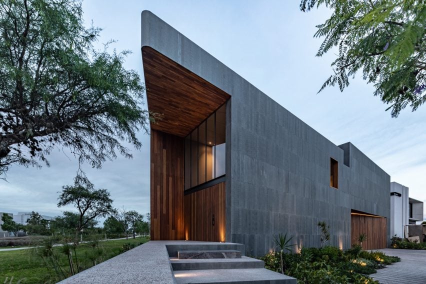
Local studio Reims 502 has unveiled an expansive residence in Querétaro, Mexico with warm walnut and dark basalt finishes and a rooftop pool and garden area.
Mexico-based designers Eduardo Reims and Andrea Maldonado, who work under the name Reims 502, completed the 1,000-square metre Casa Basaltica on a quarter-acre lot in 2023.
Warm walnut and dark basalt define the Mexican home
The house sits along a bike path that surrounds a lake. The challenge of the site was to create private interior space for the residents that did not sacrifice the view.
“The answer was simple,” the team told Dezeen, “Reverse the planting of the program compared to the neighboring houses.”
Private, recreation and family spaces are located on the ground floor
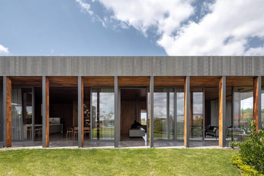
All of the private, recreation and family spaces are located on the ground floor, creating a foundation that comprises the site’s entire buildable footprint.
Four suites are lined along one side of the property, creating a layered sawtooth transition with a screened porch that runs down the slanted edge of the trapezoidal house.
Casa Basaltica sits on a quarter-acre lot
Movable shutters made out of thin basalt stone bars enclose the porch like blinds and serve as a thermal buffer that negates the need for air conditioning.
All of the public spaces – living room, dining room, kitchen and terrace – were placed on the top floor and arranged around a large garden and pool. The upper floor spaces are set back from the perimeter of the house on the park side to create another layer of privacy.
Reims 502 added a swimming pool to the garden
The service areas are located underground with a side courtyard for ventilation and natural lighting.
The home’s dark material palette is also a departure from the light-coloured schemas used for the neighbouring houses.
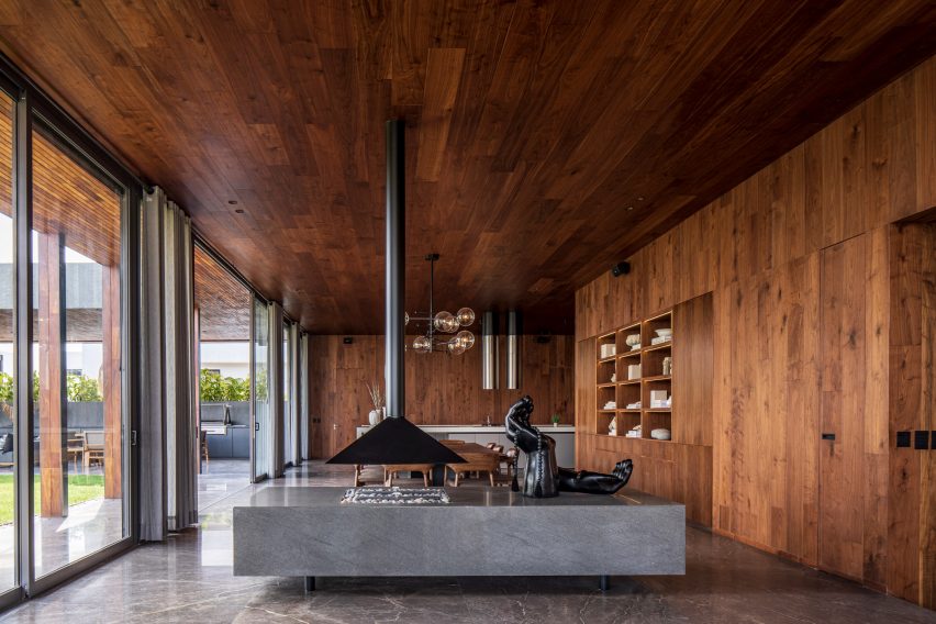
Walnut also features on the interior
The exterior is clad in bands of durable, resilient basalt stone, arranged in thin vertical panels. The material changes where the facade steps back from the build line, trading stone for multi-toned walnut planks at the garage and the rounded corner entryway.
The walnut staves continue to the interior “creating an atmosphere of warmth and timelessness inside.”
The top-floor public zones have a walnut-wrapped colonnade that creates a transition from the garden to the interior and shades the floor-to-ceiling glass, which maintains the views out to the park.
In addition to the cross ventilation that cools the top floor areas, solar panels for water heating and energy generation as well as a water recycling system were implemented to “contribute to its overall sustainable performance,” the studio explained.
Movable shutters made out of thin basalt stone bars enclose the porch
Rather than departing from Querétaro’s vernacular architecture like Reims 502 did, Gestalt Associates took cues from the area’s colonial roots with light, airy spaces in a brick and concrete home nearby.
Other projects that have basalt elements on the facade include a holiday home in Hawaii by Walker Warner Architects.
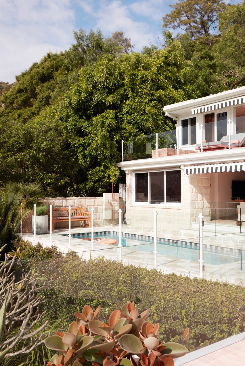
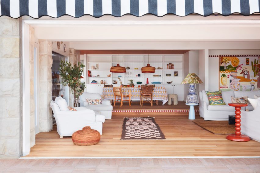
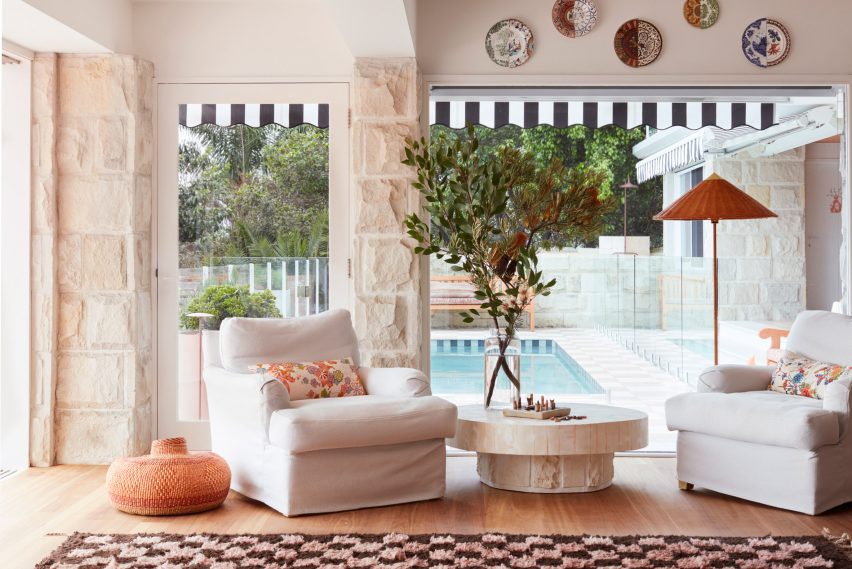
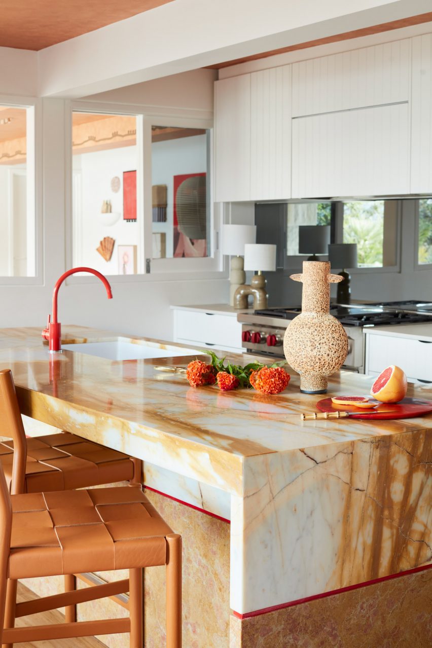
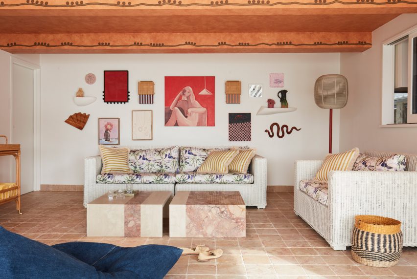
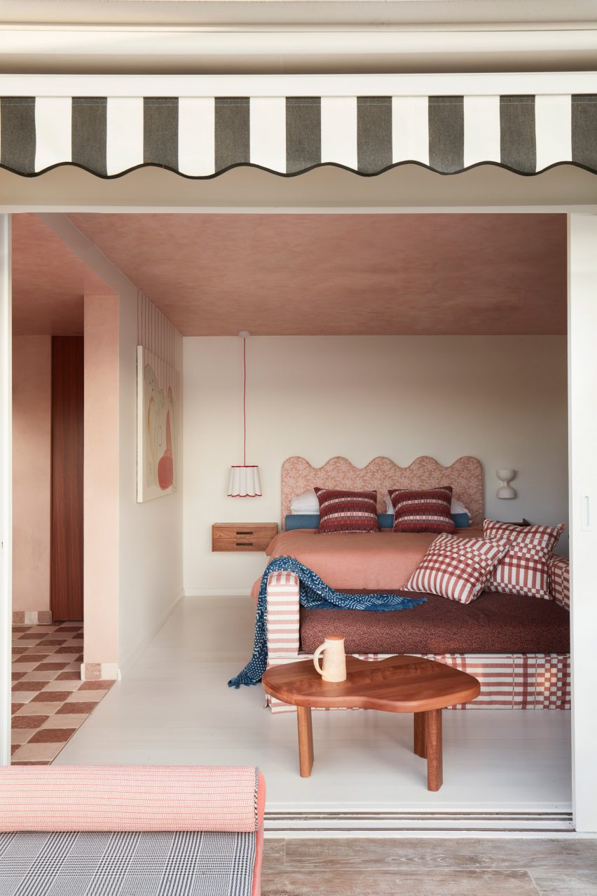
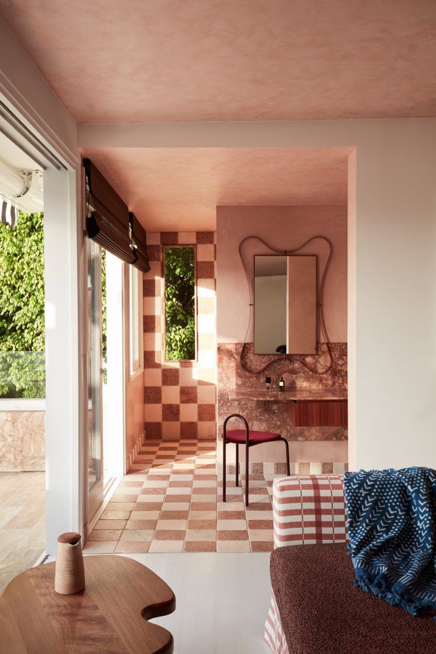
Australian interiors studio YSG has updated a holiday home in Sydney’s Palm Beach suburb, layering it with a maximalist mix of colours, patterns and textures.
The 400-square-metre house belongs to a young family who wanted a place to escape during the holidays while still providing space for remote working.
YSG renovated a holiday home in Sydney’s Palm Beach
The home’s original furnishings were included in the sale but the clients were less than enthused by the nautical colour palette, seashells and model yachts.
“The weathered features and cliched seaside tropes, amongst other things, deterred their visits,” said Yasmine Ghoniem, founder and director of YSG.
Its living and dining area are separated by a small step
YSG took cues from the rustic beach clubs of Ibiza and Cancun for the revamp, with a touch of French Riviera refinement to create “a palpably playful mood for entertaining”.
The house was given a full overhaul, with worn floorboards sanded back to reveal warmer timber accents while windows and doors were replaced with more slimline versions.
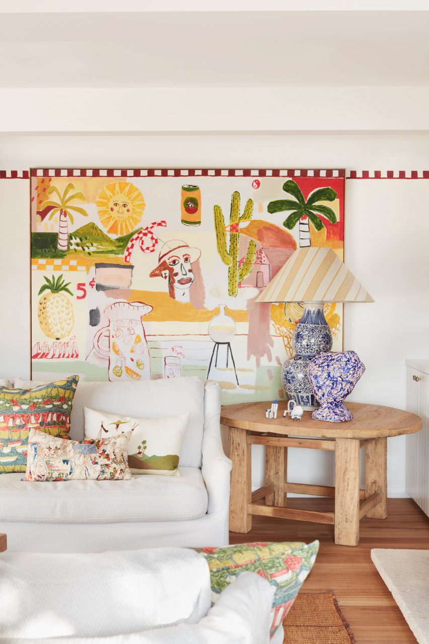
Details from a painting in the lounge were carried over onto the walls
In the sunroom, tongue-and-groove panelling was removed for a more contemporary look while a mirrored wall was taken out because it caused the room to overheat.
A new rose-tinted marble floor extends to skirting height, amplifying the sense of space while helping to keep the room cool. In the kitchen, YSG added a stone island “that recalls the ombre shades of a freshly poured tequila sunrise”.
Chequerboard tiles surround the pool
The couple also asked for a second master suite, so that they could each have their own retreat while working remotely.
“We designed integrated marble and timber desks, enabling both to simultaneously work privately from their rooms whilst enjoying views from the upper level,” Ghoniem said.
For the all-important exterior areas, which wrap around the house on each level, YSG provided a material refresh by removing the old heavy paving and weathered grey timber as they distracted from the views.
The pool area now features a chequerboard pattern of tumbled marble cobblestones while the dark blue pool tiles were replaced with a lighter finish and the chrome fence posts were powder-coated in a soft white tone to prevent glaring reflections.
The home’s stone kitchen island is made from thickly veined stone
YSG added a playful painting in the living room that acted as a starting point for the home’s entire interior scheme, including the colour palette of ochres, yellows, and reds.
Its motifs such as palm trees and fruit are repeated throughout the house across prints and cushions, as well as being hand-painted onto walls and doors.
The home also has a second lounge area
Even the painting’s chequered top border is continued as a hand-painted datum line across the living room to enliven the otherwise plain walls.
Ghoniem also repeated the same device on the side of the raised step that lead to the dining area, “artistically acknowledging a trip hazard”.
The bedrooms were designed to provide space for remote working
In the sunroom, hand-painted swirls soften the beams while in one of the master bedrooms, the vertical red lines of a nude painting were playfully continued onto the wall above the artwork.
The rich material palette features many types of marble, including Giallo, Toledo and Tiberio along with honed travertine and French wash walls, while the textiles include linen and kimono silk.
Chequerboard tiling also features in some of the bathrooms
YSG has completed a number of projects across Sydney, including another house in a coastal suburb with tactile finishes and a penthouse for a couple of empty nesters.
Robert Hutchison Architecture and Javier Sanchez Arquitectos include an extensive system for capturing and reusing stormwater for a family nature retreat in a mountainous region of Mexico.
The Rain Harvest Home, or Casa Cosecha de Lluvia, is located in the rural town of Temascaltepec, which lies about 140 kilometres west of Mexico City.
Top: The home is located in the mountains west of Mexico City. The photo is by Jamie Navarro. Above: It is one of three independent structures. The photo is by Rafael Gamo.
The retreat was designed by Seattle’s Robert Hutchison Architecture and Mexico City-based Javier Sanchez Arquitectos (JSa), which have collaborated on projects together in the past. The retreat was designed for JSa’s founder and his family, who plan to make it their permanent residence in the future.
The property consists of three independent structures – a main house, a bathhouse and an art studio.
A main house is included in the complex. Photo is by Jamie Navarro
Landscaping elements include bio-agriculture gardens, an orchard and a network of pathways.
Permaculture principles were used to “establish a holistic, integrated relationship between people and place”, the team said.
Permaculture – a portmanteau of permanent agriculture and permanent culture – is an approach to design and land management that takes cues from natural ecosystems.
The bathhouse is a round building. Photo is by Rafael Gamo
One of the main goals for the project was to be mindful of resource consumption, particularly water. In turn, all of the structures are designed to capture and reuse rainwater.
The harvesting system meets 100 per cent of the home’s water needs, according to the architects.
A standalone art studio also features at the site. Photo is by Laia Rius Solá
“Here, as in the surrounding region of Central Mexico, water has become an increasingly precious resource as temperatures rise and populations increase,” the team said.
The region has a robust rainy season, but rainwater harvesting is uncommon. Instead, water tends to be pumped in from faraway watersheds.
The home features various communal areas. Photo is by César Béjar
“Rain Harvest Home takes a different tack, proposing an integrated approach to designing regeneratively with water,” the team said.
Encompassing 1,200 square feet (111 square metres), the main house was envisioned as a pavilion for year-round use and features a large amount of covered outdoor space, with views of the landscape on all sides of the building.
The residence includes an open-plan kitchen. Photo is by Rafael Gamo
The home’s communal area consists of an open living room, dining area and kitchen. The private zones hold two bedrooms, a den, a small bathroom, a powder room and a storage/laundry space.
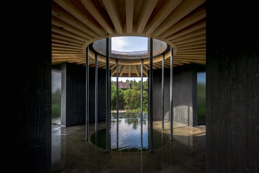
Nearby, the team placed the bathhouse, which totals 172 square feet (16 square metres). The building is designed to offer “a poetic dialogue with the experiential qualities of water”.
Circular in plan, the bathhouse has four chambers that surround a central pool. Photo is by César Béjar
Circular in plan, the bathhouse has four chambers that surround a central cold-plunge pool that is open to the sky. The chambers contain a hot bath, sauna, steam shower and washroom.
The final structure is the 206-square-foot (19-square-metre) art studio. The rectangular building has a main level and an “outdoor skyroom”.
All three buildings have wood framing and black-stained pine cladding. Concrete-slab foundations are topped with pavers made of recinto volcanic stone. Roofs are covered with vegetation.
In the main residence, slender steel columns support deep roof overhangs. Rising up from the roof are protruding light monitors sheathed with unfinished steel plates, which will develop a patina over time.
Interior finishes include plywood made of Southern yellow pine. Photo is by Rafael Gamo
Interior finishes include recinto stone and plywood made of Southern yellow pine.
All three buildings have strategies in place to capture rainwater. Moreover, bioswales in the landscape help direct water to the property’s above- and below-ground reservoir system, where water is stored and purified.
Recinto stone was used for the flooring in some places. Photo is by Laia Rius Solá
“The on-site water treatment system is completely self-contained and primarily gravity-fed, containing five cisterns that provide potable and treated water,” the team said.
“A chemical-free, blackwater treatment system treats all wastewater on-site, returning it to the site’s water cycle as greywater for use in toilets, and to irrigate the on-site orchard,” the team added.
In addition to water conservation, the architects were also mindful of energy production. A 10-kW photovoltaic array generates electricity for all three buildings.
Overall, the home is meant to be a model for how to integrate water conservation into home design.
The home is meant to be a model for how to integrate water conservation into home design. Photo is by Laia Rius Solá
“It stands as a testament to the potential of rainwater harvesting for off-grid, self-contained water systems that eliminate reliance on municipal water sources,” the team said.
“At the same time, the element of water contributes to the overall spatial and experiential quality of the project, reconnecting people with their environment by engaging the senses.”
Other rural homes in Mexico include a house with a cruciform-shaped plan and hefty stone walls by HW Studio Arquitectos, and a brutalist-style, concrete house in a pine forest that was designed by architect Ludwig Godefroy.
Architects: Robert Hutchison Architecture and JSa Project team: Robert Hutchison, Javier Sanchez, Sean Morgan, Berenice Solis Structural engineer: Bykonen Carter Quinn Mechanical engineer: TAF Alejandro Filloy General contractor: Mic Mac Estructuras Landscape architect: Helene Carlo Wood construction and fabrication: MicMac Estructuras (Johan Guerrero) Steel construction and fabrication: Rhometal Roberto Chavez Water systems consultant: Miguel Nieto Solar systems consultant: Teoatonalli (Oscar Matus) Kitchen consultant: Piacere Charly Trujillo
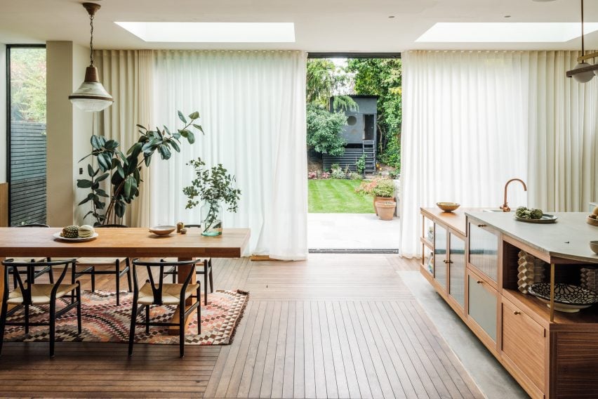
Interior design studio The Mint List has brought light, space and warmth to this Edwardian house in London with multiple extensions, a hidden playroom and plenty of tactile materials.
The renovated end-of-terrace house in Kensal Rise belongs to a film-industry couple that wanted a cosy family home with mid-century elements, in particular referencing the work of designers Charles and Ray Eames.
The Mint List has renovated and extended an Edwardian house in north London
“The clients had a leaning towards mid-century style but they didn’t want that to overwhelm the scheme,” The Mint List founder Camilla Kelly told Dezeen.
“The Eames House was a good mid-century reference in terms of encompassing warm, repurposed textures, a sense of scale and an abundance of light.”
A new rear extension houses the home’s kitchen and dining space
The brief was to open up this formerly dark and “unremarkable” home and create an improved sense of flow.
As well as adding two bedrooms and a small study in the newly converted loft, The Mint List created a rear extension to house the kitchen-dining space and absorbed the property’s former garage into the house, providing a mudroom, pantry and playroom.
The custom-built kitchen island has two levels
The playroom is cleverly concealed behind a bank of new storage in the hallway, which has also been enlarged by opening it up into the former porch.
“There was huge importance given to light in the design,” said Kelly. “Wherever possible, we created tall windows benefiting from the south-facing aspect.”
Bookshelves act as room dividers to form a hybrid library and snug
The house is full of custom-designed features and finishes at the request of the client.
The floor uses unusually slim lengths of oak, laid at right angles to each other in huge grids, while the thresholds were distinguished with slender fins of brass that add subtle visual interest.
The children’s playroom is hidden inside a wall of storage in the hallway
Drawing on the design language of mid-century furniture, the kitchen was completely custom-built for the space with a clean-lined, yet playfully asymmetric design.
“We centralised the assembly and used high windows on either side of the cabinets to emphasise the cubic nature of the design,” said Kelly. “The asymmetric cubes that form the cabinets were built using walnut, with cream-painted doors for the covered storage.”
The material mix includes walnut veneer, reeded glass, olive-coloured door fronts and antique brass detailing, as well as concrete and reclaimed iroko wood worktops.
“I’m averse to keeping things all in one colour,” the designer said. “It’s a missed opportunity to bring texture, colour and character to a space.”
The children’s bedroom is located on the first floor
The kitchen island was designed to account for the owners’ love of entertaining, with a section of the worktop raised to bar height to draw guests away from the cooking area.
“The island is even more asymmetric, with different levels, drawers, shelves and openings that served to show how the geometry of a design can sometimes be off-kilter and still look neatly intentioned, as long as it sits correctly within the scale of the space,” Kelly said.
A small study now occupies the loft alongside a primary bedrooms suite
The curved bar provides a visual link to the rounded steps that lead down into the kitchen area, as well as to other curved elements throughout the house.
“I like to include some curves in my projects through room openings, joinery and countertops,” Kelly said. “They help to soften spaces and improve flow from one area to the next.”
The main bathroom is held in pale blue and green tones
Adjoining the kitchen is a hybrid library and snug, which is partially enclosed with oak shelving finished in glass and raffia, that double up as room dividers and nod to the Eames House in California.
“We didn’t want this to be a dead space,” Kelly said. “It’s a quiet spot where you can curl up with a book or listen to music. And when the couple is entertaining, this is a soft space where you come to catch up with someone.”
Four bedrooms are spread across the home’s upper levels, including a shared children’s bedroom with bunk beds on the first floor and two added bedrooms in the converted loft.
A baby pink sink provides a pop of colour
Since founding The Mint List in 2011, Kelly has completed a number of interior projects in London.
Among them are the headquarters of music management company Everybody’s in Highbury, which she kitted out with mid-century-style movable furniture.
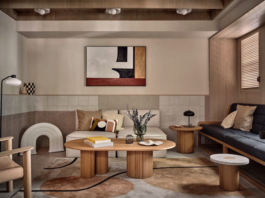
Shanghai-based interior studio Linehouse used natural materials and a muted colour palette to give the Ying’nFlo hotel in Wan Chai, Hong Kong, the feel of an inviting home.
The hotel occupies the podium of a 24-story tower on a hilly street in Hong Kong. Its ground floor holds a series of communal spaces that Linehouse designed to provide “home comfort” for guests.
The ground floor comprises a series of rooms referencing living rooms
The Collectors Room, which greets guests at the entrance of the hotel, has a neutral palette of hand-rendered walls, timber paneling, and linen cabinetry that display curated objects and artworks. A communal oak table serves as a counter where guests can interact.
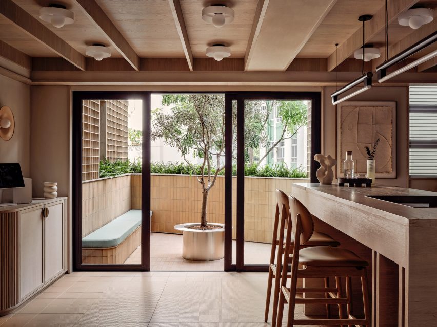
This room also connects to an outdoor terrace through sliding glazed doors. Built-in bench seating and an olive tree sit at the centre of the terrace and invite guests to relax and socialise.
A communal table and outdoor bench invite guests to socialise
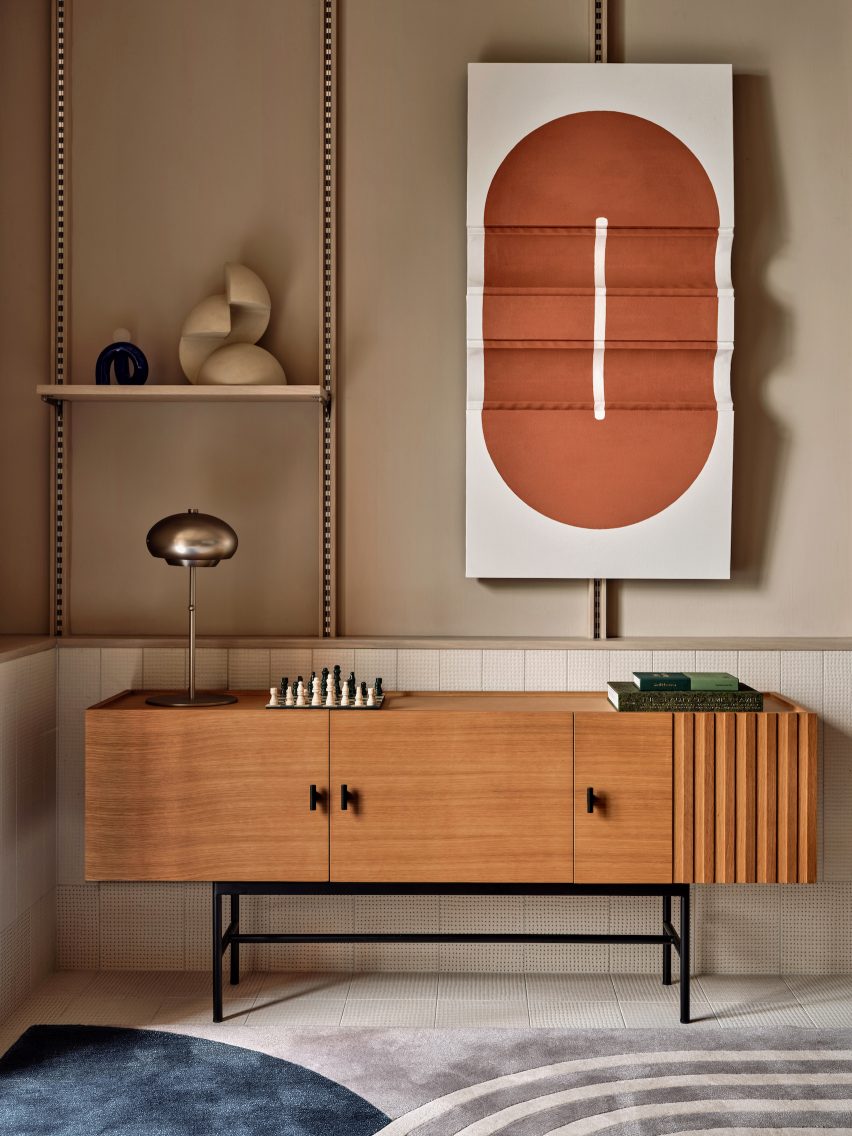
A gridded timber screen leads further into the space through to the lift lobby and the Arcade room, where guests can gather to relax and play.
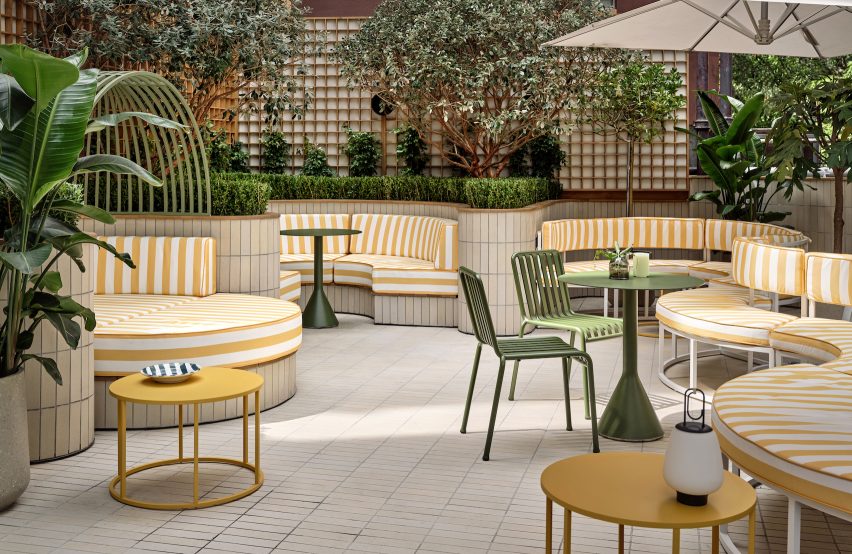
Soft-rendered walls, timber shutters and an eclectic mix of furniture create a sense of intimacy, while floor tiles in various geometrical motifs add a sense of playfulness.
The Music Room features ceramic tiles
Adjacent to the Arcade is the Music Room, the social hub of the hotel. Here, ceramic tiles, a bespoke oak shelving system, a custom sofa and curated art and lifestyle objects were added to evoke a sense of a residential living room.
The Music Room opens up to the Garden Terrace, where undulating greenery sits behind circular seating in yellow-striped fabric, a colourful contrast to the overall neutral colour palette of the Ying’nFlo hotel.
Yellow-striped fabric seating on the terrace adds playfulness
“The spaces are designed to have a warm, welcoming and familiar feel,” Linehouse said.
“Against this backdrop of curated simplicity is an edge of youthful attitude and local context, with vibrant elements giving the hotel its own unique flavour.”
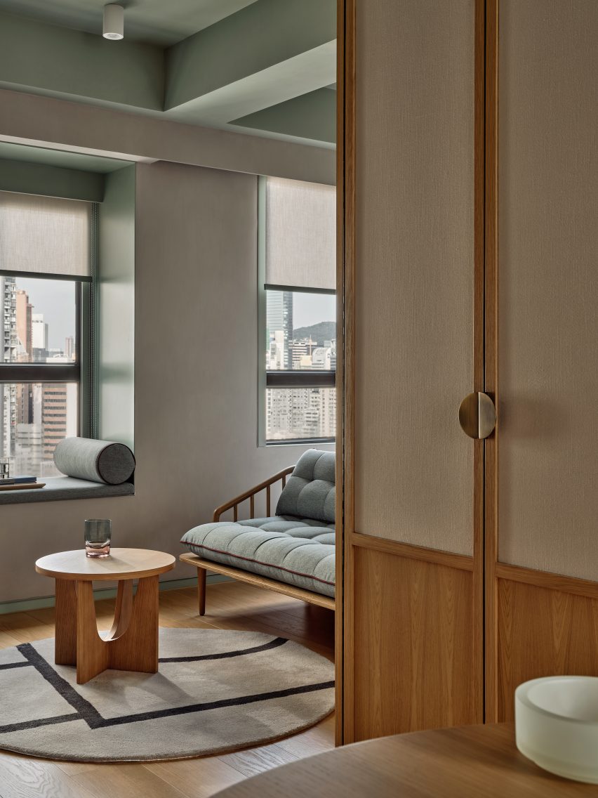
The guest rooms of the Ying’nFlo hotel are located on the upper floor and feature ceilings painted in a muted green hue, which the same green tone used to frame window seating nooks and for the hand-glazed tiles in the bathroom and kitchen.
A clean palette of plaster, wood, white-washed oak and canvas add texture to the rooms. Seating nooks and lounge furniture serve multiple functions as spaces where guests can work, relax or dine.
Muted green and selection of wood furniture create a warm feeling for the guest rooms
Linehouse was founded by Alex Mok and Briar Hickling in 2013 and the duo went on to win emerging interior designer of the year at the 2019 Dezeen Awards.
The studio has recently completed a Mediterranean restaurant with natural, tactile materials, as well as a space-themed cafe decorated with real meteorites, both in Shanghai.
The photography is by Jonathan Leijonhufvud.
Project credits:
Design principle: Briar Hickling Design team: Ricki-Lee Van Het Wout, Lara Daoud, Justin Cheung
Dezeen is on WeChat!
Click here to read the Chinese version of this article on Dezeen’s official WeChat account, where we publish daily architecture and design news and projects in Simplified Chinese.