Workshop Architects renovates and expands purple Mérida home
CategoriesArchitecture

Workshop Architects renovates and expands purple Mérida home

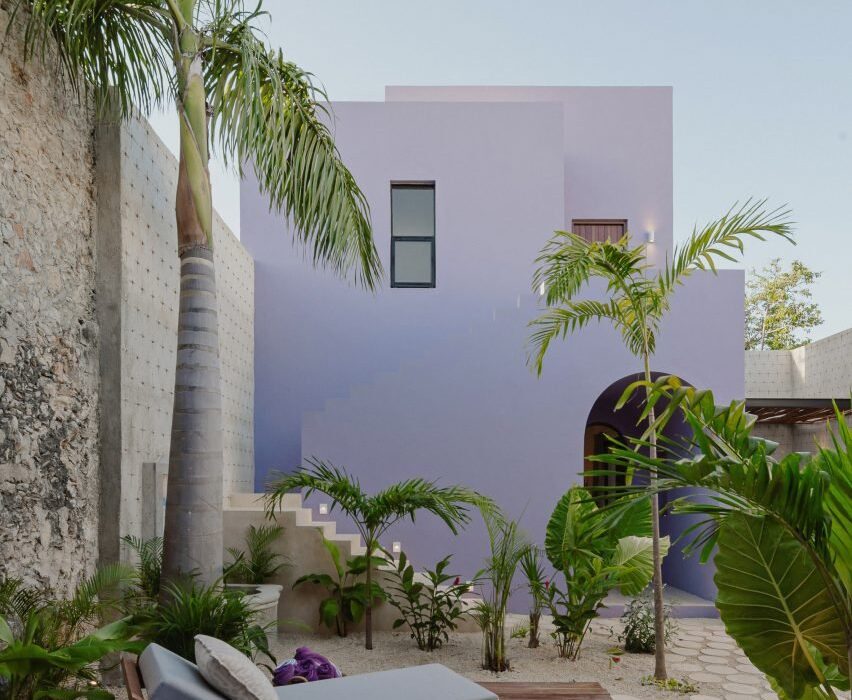
Local architecture studio Workshop Architects has renovated a Spanish colonial house in Mérida, Mexico, and added two concrete buildings in its garden.

Named Casa Pulpo, the 235-square-metre residential project is characterised by lilac-hued exterior walls and traditional pasta floor mosaic tiling in the interiors.
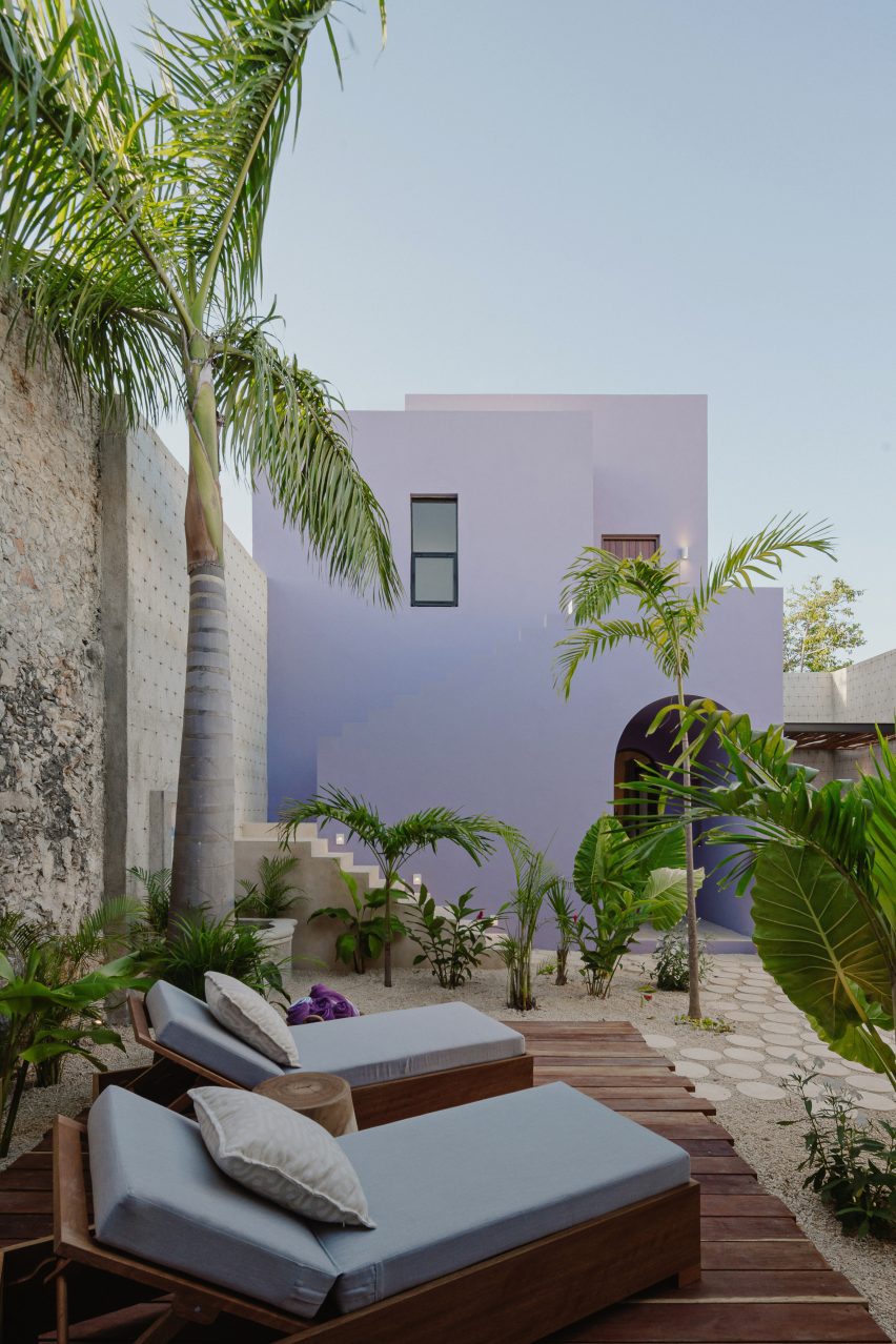
Purple two-storey cuboid house with sun lounges and palm trees
Casa Pulpo has three purple-coloured buildings

“The traditional architecture of Mérida uses pasta tile for the floors, and usually, each room has a different pattern,” said Workshop Architects co-founder Francisco Bernés.

“That is why in this project, every room has a unique design on the floors and a similar tone colour for the base of the walls.”
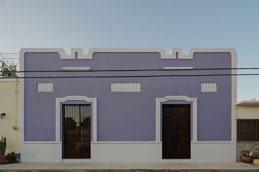
Front exterior of the existing house at Casa Pulpo by Workshop Architects
The studio renovated the existing Spanish colonial house

The studio renovated the existing house, preserving the high ceilings and exposed white metal beams with wooden joists in the bedroom and living room at the front of the property.

An archway in the living room leads to the kitchen, which features a wood and white quartz island and a corner breakfast area to add a sense of cosiness.
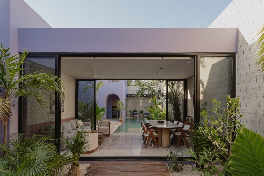
A one-storey purple building with glass sliding doors revealing a dining room and swimming pool beyond
Glass sliding doors in the central building connect the living space and swimming pool

Each space in the house features a different colour applied to the pasta floor tiles and painted on the lower sections of the walls.

Workshop Architects united the rooms by using a neutral colour on the upper part of the walls and adding white border tiles on the perimeter of the floors.
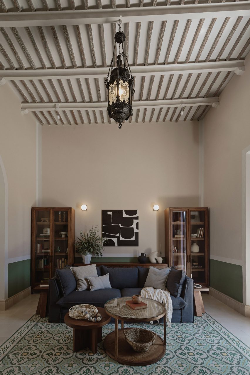
Interior of a living room with mosaic floor tiles, exposed ceiling joists and a blue sofa
Traditional Mexican pasta tiles decorate the floors

Large sliding glass doors connect the kitchen and outdoor space, letting natural light and ventilation into the interior.

A breakfast nook was also added to generate a “warm and cosy feeling”.

The studio added two separate concrete buildings to the site, using door proportions and wall heights and thickness that reference the original house.

One of the buildings is a one-storey structure in the middle of the site, accommodating a bedroom and dining and TV room with glass sliding doors open out to a swimming pool.

“This area, being independent of the rest of the house, allows, through the use of two sliding glass doors, to have visuals that flow towards the gardens and towards the pool area, giving the sensation of spaciousness and freshness,” said Workshop Architects.
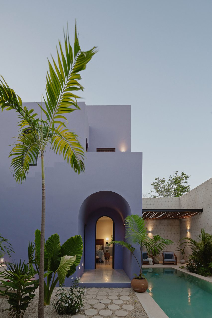
Exterior of a purple two-storey building with an arch entryway and swimming pool
Workshop Architects added an arched entryway to the building at the rear of the property

At the end of the garden is a two-storey structure containing a bedroom and ensuite on the ground floor, accessed by an arched entryway. An outdoor staircase leads to an additional bedroom and ensuite above.

“The third and last nucleus of the house has a more modern and purposeful volumetry with respect to the previous two, which are presented in a more conservative way,” said Workshop Architects.
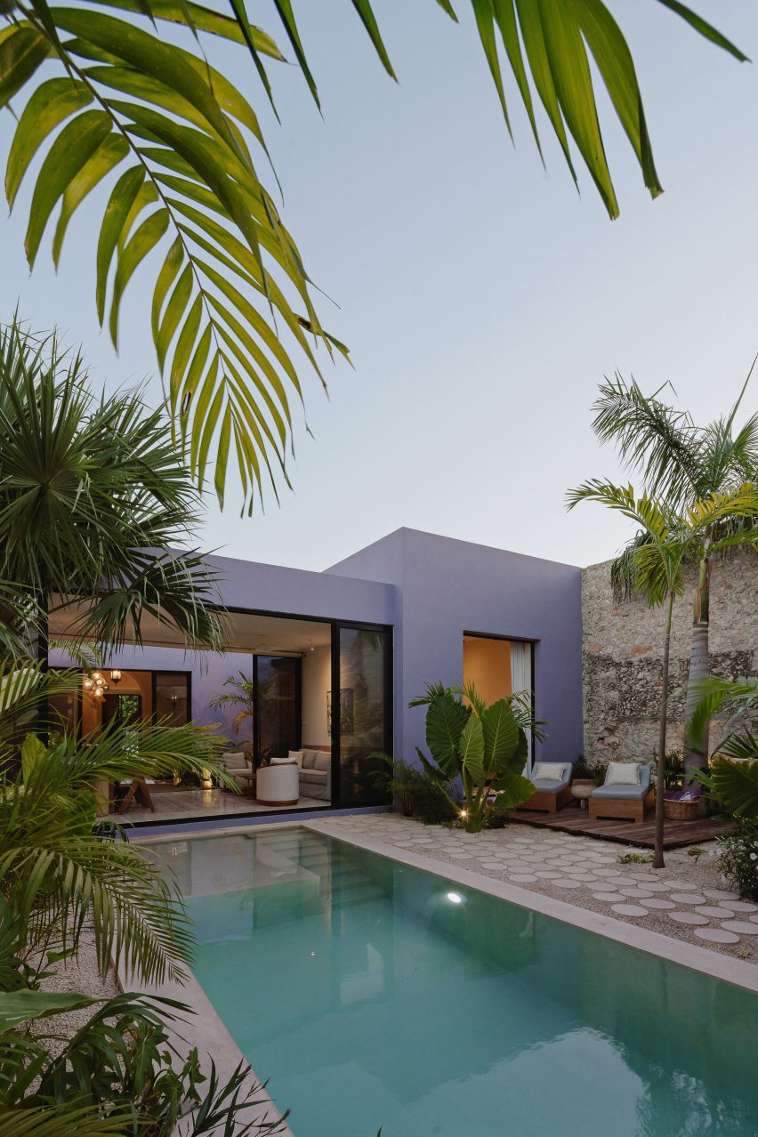
Purple rectangular one-storey building with a swimming pool and palm trees
Chukum was used for the swimming pool walls

Adjacent to the two-storey structure is a small terrace with a bajareque wooden roof that filters natural light and “projects an extraordinary play of light and shadow on the walls and floors”.

The swimming pool walls were made from the material chukum, which is created by boiling chukum tree bark and mixing it with concrete.
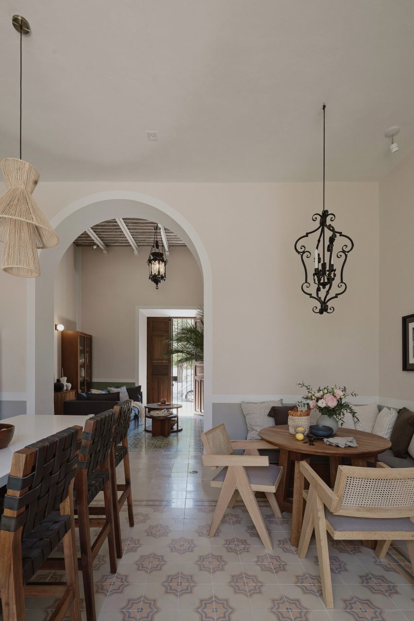
Interior of a kitchen with mosaic floor tiles, a corner breakfast area and archway leading to a living room
Different colours were used on the lower parts of the walls in each room

“Casa Pulpo seeks to create perfect atmospheres for the full enjoyment of each of its spaces through the use of different materials and textures throughout the property,” said Workshop Architects.

In 2020, the studio transformed a colonial house in Mérida into an art centre and workshop for the city’s annual festival of lights.

The photography is by Tamara Uribe.

Reference

Markus Benesch designs Alpine Rising home for tuntschi doll
CategoriesInterior Design

Markus Benesch designs Alpine Rising home for tuntschi doll

A vengeful doll from an Alpine folk tale was the imagined occupant of this colourful cabin-style home created by German designer Markus Benesch at Milan design week.

The maximalist Alpine Rising installation featured decorative Alpine-style furniture and multi-coloured wall coverings, all filled with references to life in the mountains.

Benesch developed the design after becoming fascinated by the fabled character of the “tuntschi” doll.

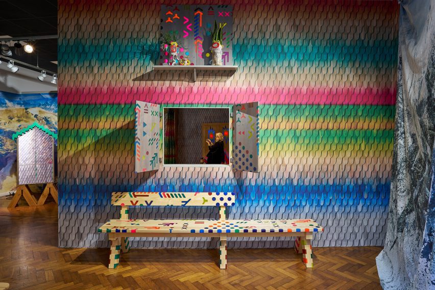
Bench in Alpine Rising exhibition by Markus Benesch
The exhibition featured Alpine-style furniture and multi-coloured wall coverings

According to the story, the tuntschi is fashioned out of wood, straw and cloth by herdsmen who spend the summer tending cattle on the mountain and crave female company.

The doll comes to life, yet the herdsmen continue to objectify her. So when the time comes for them to return home, she takes murderous revenge on one of them.

This got Benesch thinking about what happens after the story finishes.

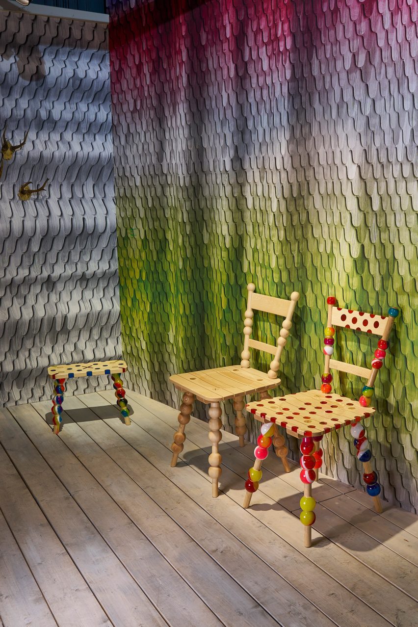
Chairs at Alpine Rising exhibition by Markus Benesch
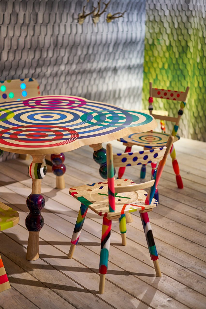
Stui dining chairs and Hockerl stools both combine ash wood with colourful resin

“I wondered, what is this doll doing when she is alone in the wintertime?” he told Dezeen. “I thought, maybe she has the time of her life.”

One of the starting points for the design was to think about the types of pastimes that the doll might enjoy.

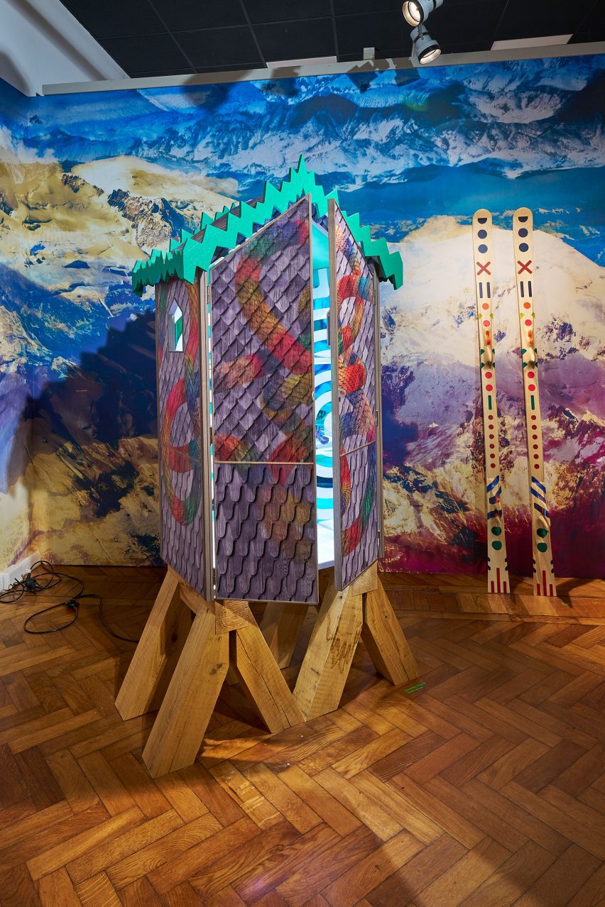
Cabinet in Alpine Rising exhibition by Markus Benesch
The Tuntschis Chapel cabinet is based on traditional Alpine architecture

One idea was that she might ski. This resulted in swirling motifs – reminiscent of snow tracks – that appeared throughout, plus a pair of bespoke skis.

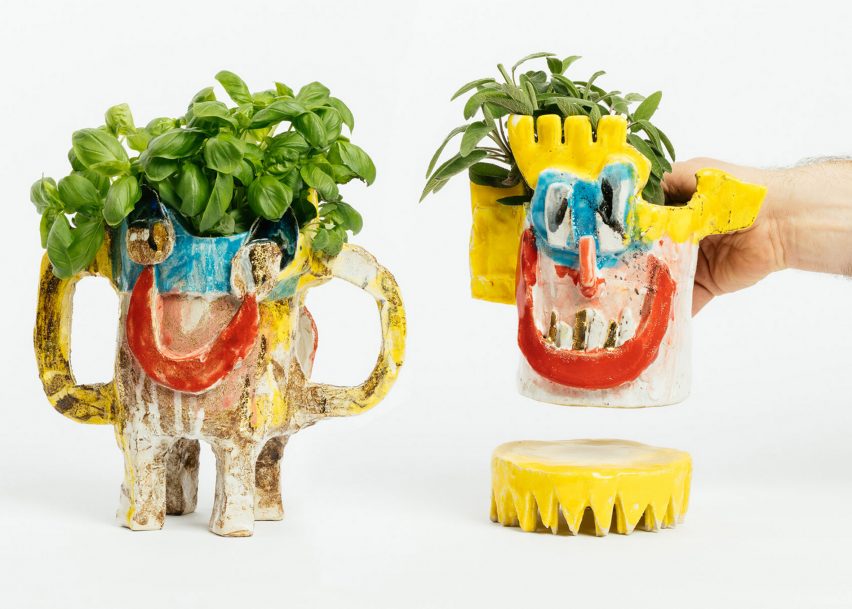
Benesch also thought the doll might take up pottery, which led him to the work of Austrian ceramicist Florian Tanzer, founder of Vienna-based studio Luma Launisch.

Tanzer’s rough and enigmatic ceramics often depict unusual characters.

For Alpine Rising, he created vases and vessels that integrate the face of the tuntschi. Some pieces had more than one face, in reference to her two-faced nature.
Dining table in Alpine Rising exhibition by Markus Benesch
The wallpaper combines images of wooden shingles with different colours and tones

Benesch and his small-production furniture, textile and wallpaper company Curious Boy created a completely custom interior for the tuntschi’s Alpine cabin.
Divided into rooms, it was filled with farmhouse-style furniture pieces that combined traditional Alpine woodcraft with colourful motifs typical of Benesch’s designs.

Benesch creates these patterns by inlaying wood with pigmented resin.

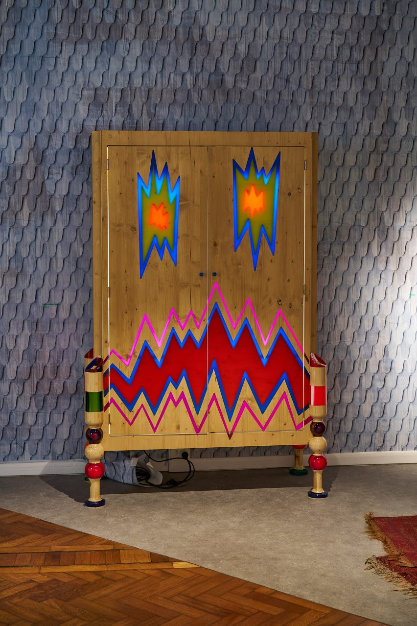
Wardrobe at Alpine Rising exhibition by Markus Benesch
The zigzag-patterned Hochzeitsschrank wardrobe was crafted from pine

In ash wood, designs on show included the cabin-style Tuntschis cabinet, the elaborate Himmibed and the playful Stui dining chairs.

Walnut was used for the amorphous Splügen lamp, while the zigzag-patterned Hochzeitsschrank wardrobe was crafted from pine.

Ceramics by Florian Tanzer
Florian Tanzer created ceramics that refer to the two-faced nature of the doll

For the wallpaper and textiles, Benesch created repeating patterns using images of wooden shingles that typically clad Alpine chalets, then overlaid them with various colours and tones.

Underlying the entire design was an idea about getting away from today’s digital world and the harmful effects it can have on mental health, and instead celebrating “an analogue lifestyle”.

Alpine Rising spoons
Benesch also produced hand-carved ash and walnut spoons

This idea was emphasised by hand-carved ash and walnut spoons and a pack of custom-designed playing cards.

“We want to disconnect from the crazy of our today’s world and reconnect more with ourselves in nature,” added Benesch.

The exhibition formed part of the 5Vie district during Milan design week, where other exhibitions included Artemest’s L’Appartamento, a 1930s apartment redesigned by six different studios.

Following Milan design week, we collected ten standout installations and projects on show during the week.

Alpine Rising was on show from 15 to 21 April 2023 as part of Milan design week. See Dezeen Events Guide for more architecture and design events around the world.

Exhibition and furniture photography is courtesy of Markus Benesch Creates. Ceramic photography is by Gregor Hofbauer.

Reference

Grass-topped home by RO_AR bridges “the urban and the natural”
CategoriesArchitecture

Grass-topped home by RO_AR bridges “the urban and the natural”

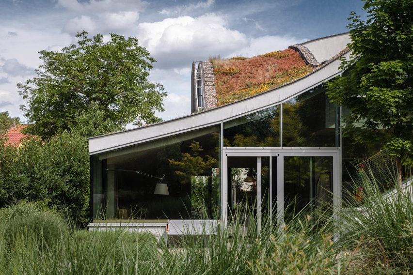
An undulating concrete roof topped with grass covers this house in the Czech Republic, designed by local architecture studio RO_AR.

Located alongside a wildlife corridor at the edge of the Hlubocepy district in Prague, the family home is designed to be a “bridge between the urban and the natural”.

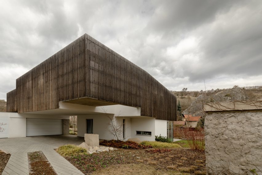
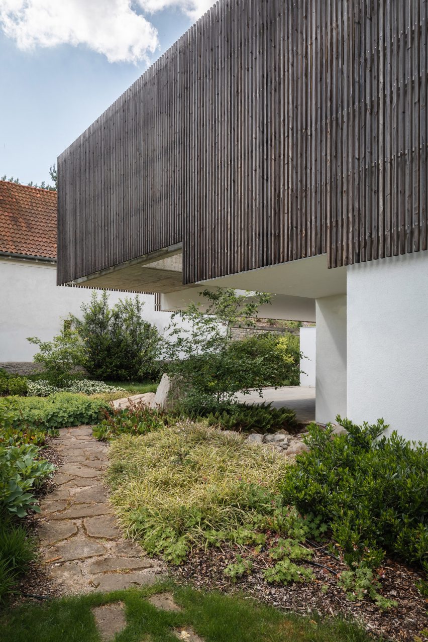
To achieve this, RO_AR designed the house as a “clash of two geometries”: a rectilinear form facing the city that is clad in thin oak slats and a hill-like, grass-topped form facing the garden and natural landscape beyond.

Exterior of house in the Czech Republic by RO_AR
Czech studio RO_AR has created a house in the Hlubocepy district

“Urban space surrounds the site on the south and east sides,” explained studio founder Szymon Rozwałka. “It is a chaotic and random development, often adversely affecting the value of the terrain.”

“We designed a building that was created by the method of land deformation. The terrain was to transition smoothly from the north-west side into an artificial ‘hill’ into which the house was to be placed,” he continued.

On approach, the ground floor has been carved out to create a garage and entrance sheltered by the overhanging first floor. Here, a paved path leads around the side of the home into the garden.

Home with glazed facade and green roof
It has an undulating concrete roof topped with grass

While the front of the dwelling is more austere, finished in white render and clad with oak battens for privacy, the rear opens onto the garden through fully-glazed facades beneath the curving roof.

“The home seeks to extend the natural context into the interior of the site and into the interiors,” said Rozwałka. “It becomes an abstract body that, through its form and scale, corresponds to the surrounding rocks in the background.”

A paved patio outside the living area overlooks a small pond, and on the first floor, one of the bedrooms opens onto a small terrace that is concealed from the adjacent properties by a section of concrete wall.

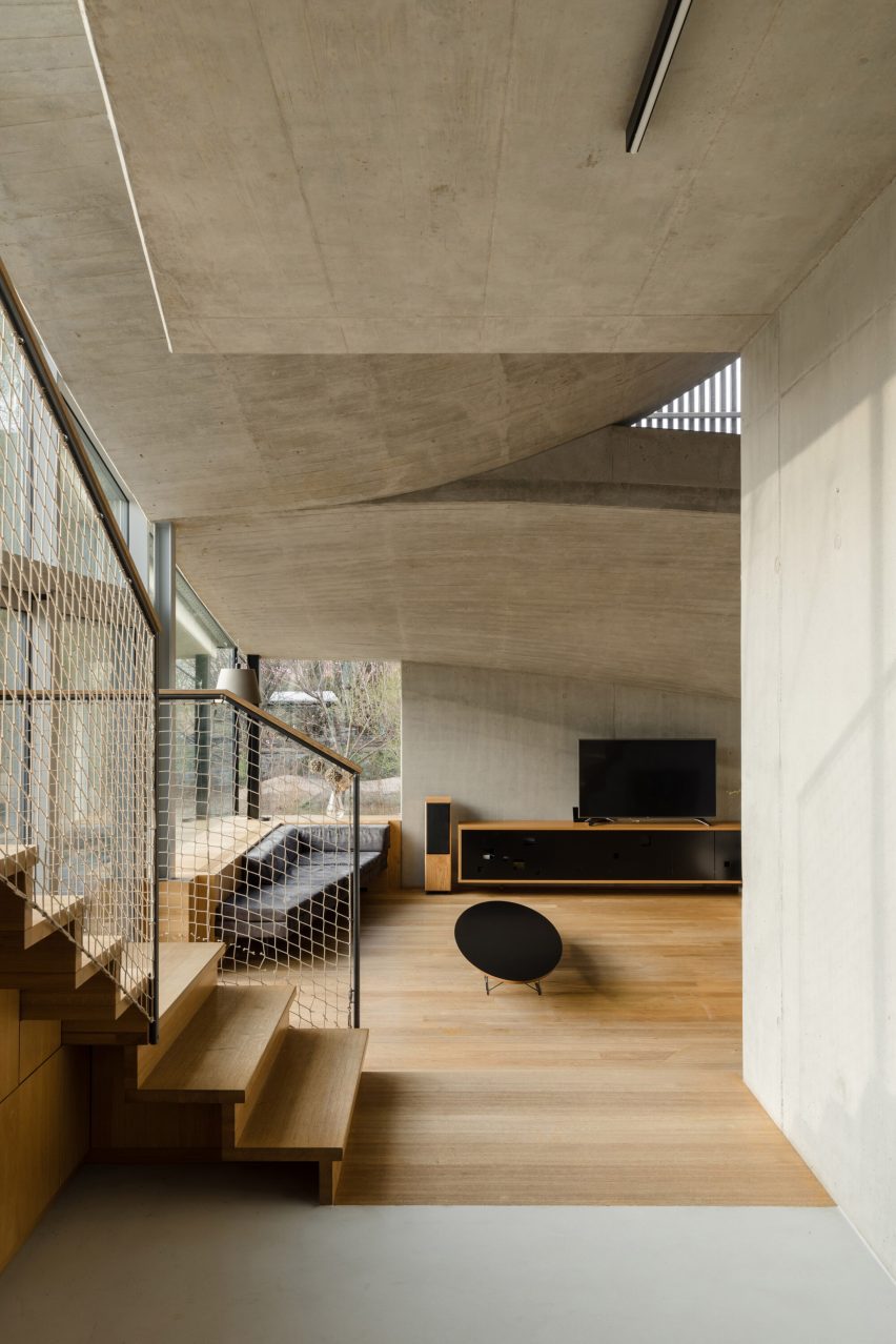
Internally, the home’s undulating roof is expressed as an exposed, board-marked concrete ceiling, with large skylights created in the areas where its curves intersect.

Entrance to family house in the Czech Republic by RO_AR
An overhanging first floor creates a sheltered entrance

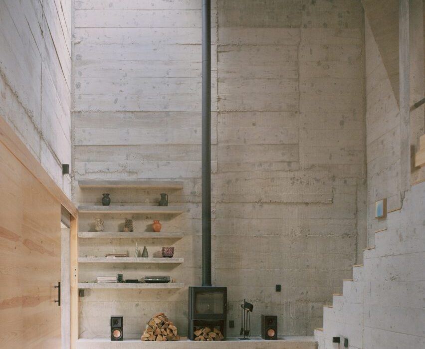
The concrete structure has also been left exposed for the internal walls, contrasted by wooden ceilings and staircases and black-metal frames, fittings and furniture.

Concrete interior of Czech house by RO_AR
The concrete structure has been left exposed

Based in Brno, RO_AR was founded in 2011 by Rozwałka and operates in both the Czech Republic and Poland.

Elsewhere in the Czech Republic, local studio Architektura recently completed a brightly coloured kindergarten that is intended to echo childhood playfulness.

Reference

Eight brutalist Mexican home interiors proving concrete isn’t always cold
CategoriesInterior Design

Eight brutalist Mexican home interiors proving concrete isn’t always cold

Raw concrete surfaces are softened by timber and plenty of daylight inside these Mexican houses, rounded up here as part of our latest lookbook.

Many of these brutalist interiors leave their concrete shells exposed and their cavernous rooms largely unadorned.

But freed of the constraints posed by frigid temperatures, they also create a greater connection to the outside, whether overlooking Puerto Escondido’s wave-swept beaches or nestled in the bustling metropolis of Mexico City.

Here, concrete surfaces help to create a sense of seamlessness between indoor and outdoor spaces – often separated only by removable partitions – while unfinished natural materials, such as wood or stone, are brought into the interior.

This is the latest in our lookbooks series, which provides visual inspiration from Dezeen’s archive. For more inspiration see previous lookbooks featuring homes with exposed services, primary-coloured living spaces and houses with outdoor showers.


Casa Alférez, Cañada De Alferes, by Ludwig Godefroy in roundup on brutalist Mexican houses
Photo by Rory Gardiner

Casa Alférez, Cañada De Alferes, by Ludwig Godefroy

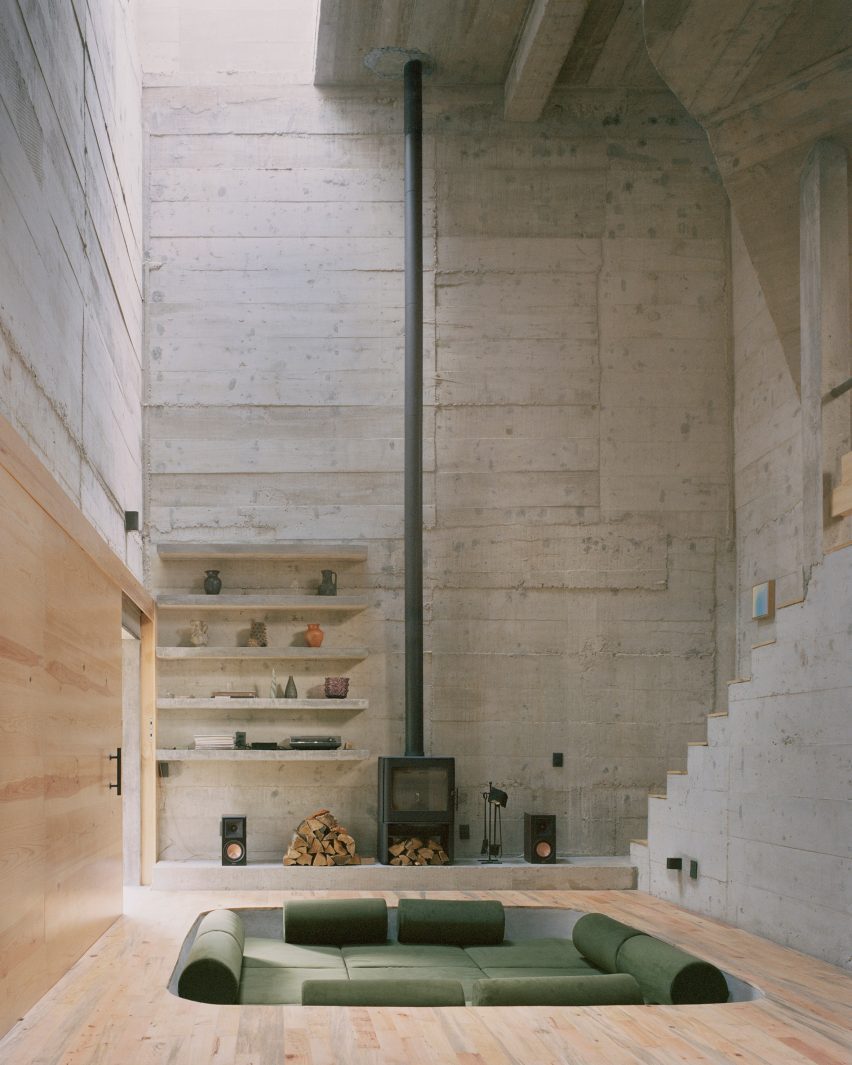
Tucked away in the forest outside Cañada De Alferes near Mexico City, this brutalist holiday home has a board-formed concrete shell.

This is left on display throughout its entire interior, all the way down to the bedrooms (top image) and the double-height lounge (above).

To bring a sense of homeliness to its otherwise spartan living spaces, architect Ludwig Godefroy added warm wooden floors and lush pops of green – as seen across upholstery and lighting fixtures.

Find out more about Casa Alférez ›


Casa del Sapo by Espacio 18 Arquitectura in Oaxaca, Mexico
Photo by Onnis Luque and Fabian Martinez

La Casa del Sapo, Playa Zapotengo, by Espacio 18 Arquitectura

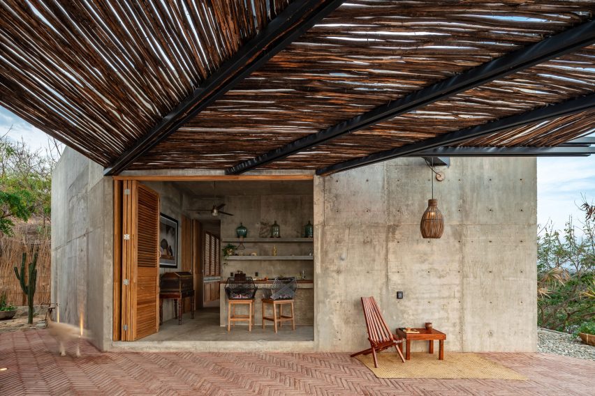
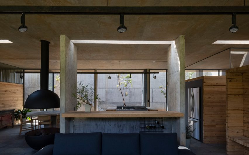
The kitchen of this seafront home – set right on Oaxaca’s Zapotengo beach – can be merged with its neighbouring patio using a wide wooden folding door.

All-around concrete helps to underline this fusion, while also serving a practical function in the form of a kitchen island and matching shelves.

Find out more about La Casa del Sapo ›


The Hill in Front of the Glen, Morelia, by HW Studio
Photo by César Béjar

The Hill in Front of the Glen, Morelia, by HW Studio

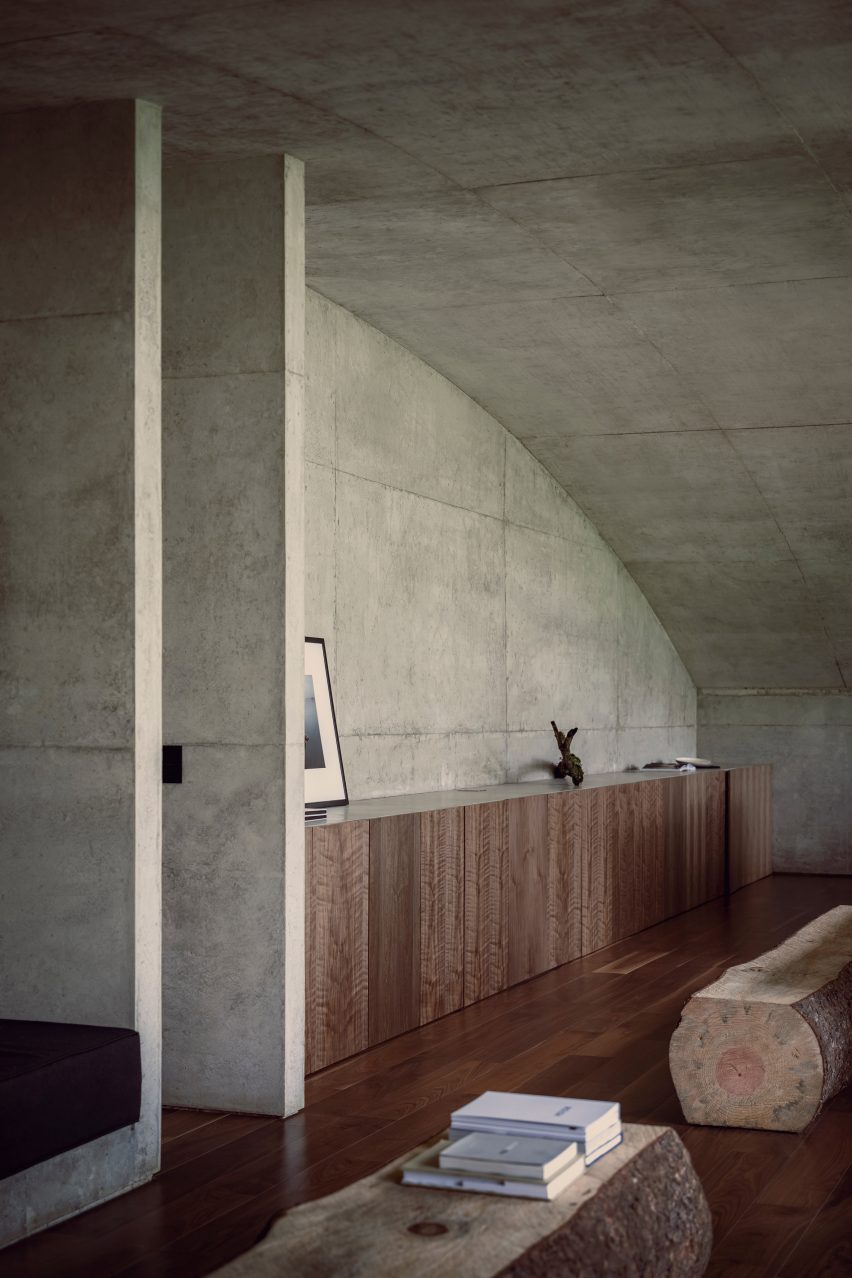
Reminiscent of the Hobbit houses in JRR Tolkien’s Lord of the Rings, this sunken home is nestled into a hillside in the forests of Michoacán in central Mexico.

The building’s interiors are defined by its concrete vaulted ceilings, which can be seen in every room, while log benches and full-height glazing provide a visual link to the woodland outside.

Find out more about The Hill in Front of the Glen ›


Casa Mérida by Ludwig Godefroy
Photo by Rory Gardiner

Casa Mérida, Mérida, by Ludwig Godefroy

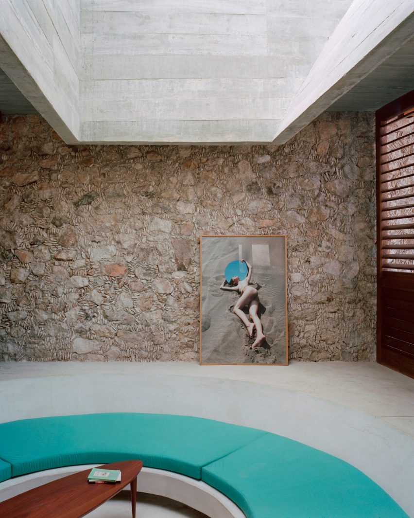
Mayan architecture and craftsmanship informed the design of this otherwise brutalist house in Yucatán state, which is considered the capital of the indigenous civilisation.

The home’s perimeter walls, for example, have joints covered in stone splinters that take cues from the design of Mayan pyramids and temples. These are left exposed on the interior alongside the concrete ceilings, creating a rich medley of architectural references.

Find out more about Casa Mérida ›


Pachua by PPAA from roundup on brutalist Mexican houses
Photo by Rafael Gamo

Pachuca Apartments, Mexico City, by PPAA

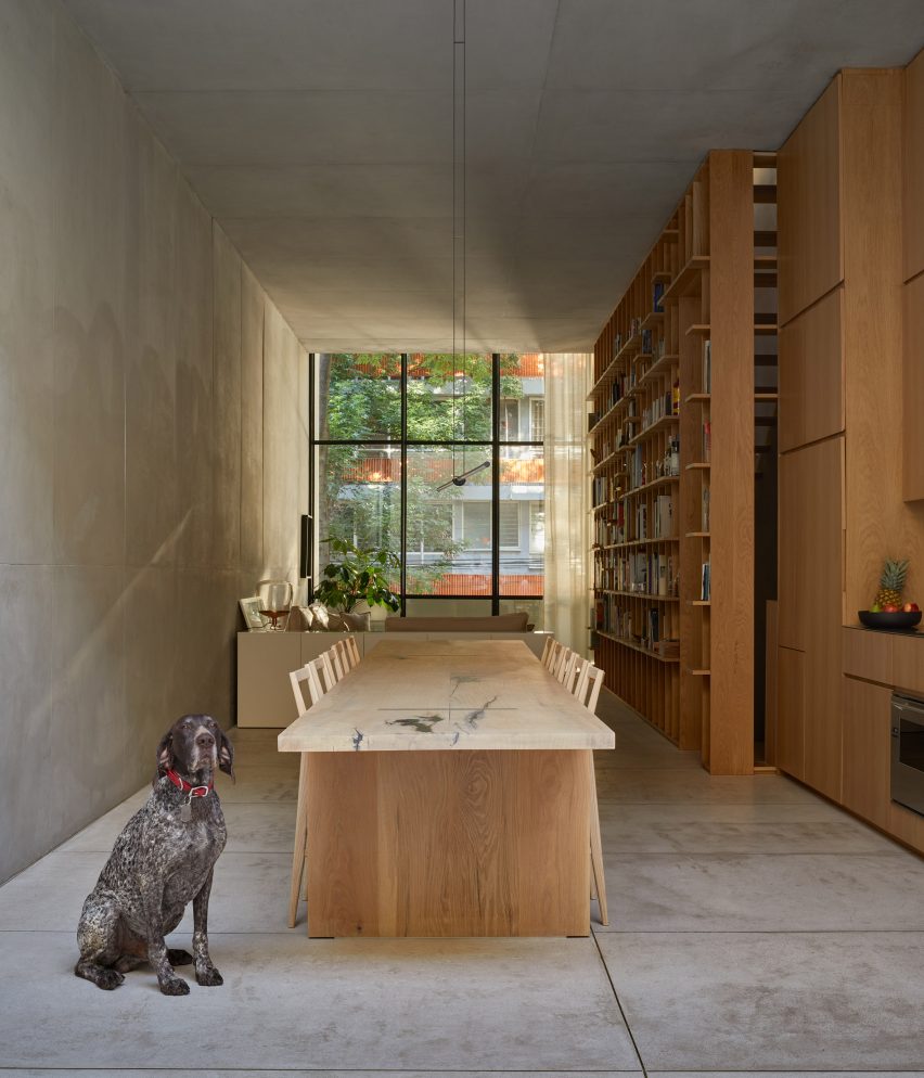
Concrete slabs pave both the patio and living spaces in this Mexico City house to create a sense of continuity, only separated by a full-height glass wall that can be completely pushed open.

On the interior, the rough concrete finishes are contrasted with details in American white oak, among them a long dining table as well as a staircase with treads that slot into a huge bookshelf.

Find out more about Pachuca Apartments ›


Casa UC, Morelia, by Daniela Bucio Sistos
Photo by Dane Alonso and Mariano Renteria Garnica

Casa UC, Morelia, by Daniela Bucio Sistos

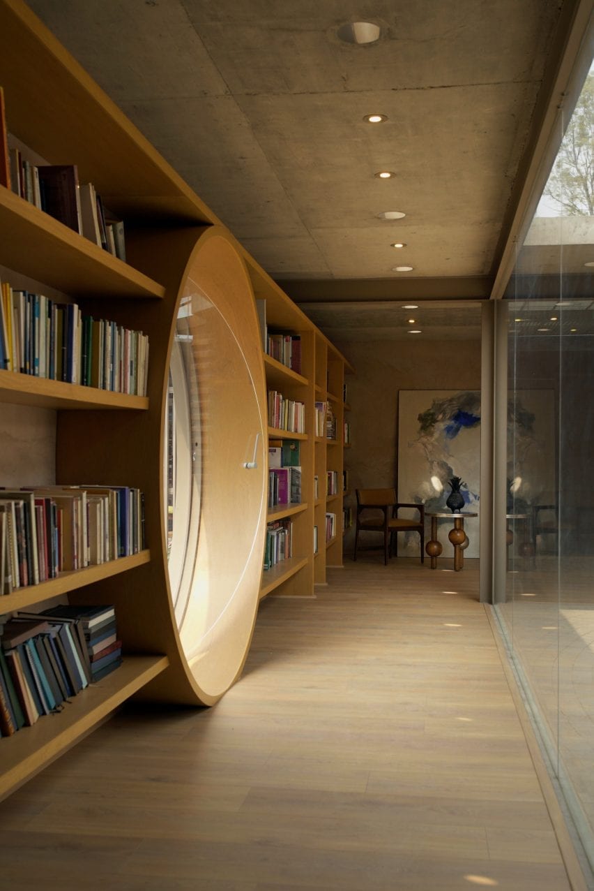
Neutral colours and tactile materials are found throughout this home in the city of Morelia, including raw concrete ceilings and floors finished in a honey-toned tropical timber called caobilla.

In the library, the same wood was also used to form integrated shelves and a huge porthole window that can be pivoted open and closed like a door.

Find out more about Casa UC ›


Casa Aguacates, Valle de Bravo, by Francisco Pardo
Photo by Sandra Pereznieto

Casa Aguacates, Valle de Bravo, by Francisco Pardo

Mexican architect Francisco Pardo repurposed the pinewood formwork used in the process of constructing this concrete house to form a series of partition walls throughout the home.

The resulting interior layout is simple and fluid and centres on an open-plan kitchen, dining area and living room that open up onto a sunken garden.

Find out more about Casa Aguacates ›


ZIcatela House by Ludwig Godefroy
Photo by Rory Gardiner

Zicatela, Puerto Escondido, by Emmanuel Picault and Ludwig Godefroy

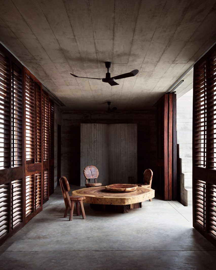
Set in the small surf town of Puerto Escondido, this weekend home accommodates its main living areas inside a covered patio and is made almost entirely of concrete.

The only exceptions are the doors and sliding louvred wood screens that can be used to open the space up to the gardens on either side, as well as a few sparse furnishings such as the low-slung dining table, which is made from a cross-sectioned tree trunk.

Find out more about Zicatela ›

This is the latest in our lookbooks series, which provides visual inspiration from Dezeen’s archive. For more inspiration see previous lookbooks featuring homes with exposed services, primary-coloured living spaces and houses with outdoor showers.

Reference

Of Architecture builds beachside home for surfer-and-artist couple
CategoriesInterior Design

Of Architecture builds beachside home for surfer-and-artist couple

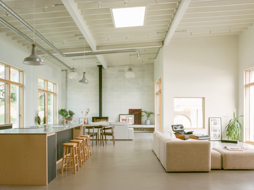
London practice Of Architecture has used a fuss-free colour and material palette to create this understated home for a young couple in the town of Newquay in Cornwall.

House by the Sea belongs to an artist and a surfer, who told Of Architecture that they wanted a home without extravagant finishes, instead preferring a living space that appears “simple, robust and utilitarian”.

Minimalist living room inside House by the Sea by Of Architecture
Of Architecture has designed House by the Sea for a couple in Cornwall

Though the brief was relatively straightforward, erecting the home proved tricky for the practice.

“The house is located by the cliff side of Pentire peninsula and has a very steep driveway, so transporting material was a big challenge for everyone on site,” the Of Architecture co-founder James Mak told Dezeen.

“We had to work with materials that could be carried by a small vehicle or by hand.”

Minimalist living room inside House by the Sea by Of Architecture
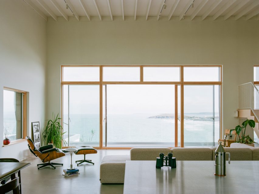
One of the sitting areas has uninterrupted views of Pentire Steps beach

Once the framework was in place, the house was finished with a “monolithic and modest” lime plaster facade.

Key rooms were dispersed across the home’s open-plan first floor, where walls are almost exclusively painted an off-white shade.

Prefabricated staircase inside House by the Sea by Of Architecture
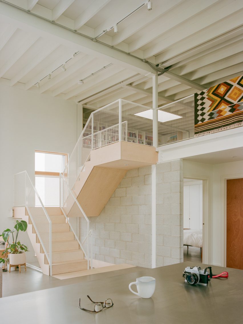
Prefabricated steps grant access to a cosy mezzanine

In one corner is the kitchen, which features black melamine plywood cabinetry and a large breakfast island topped with stainless steel.

Overhead hangs a couple of industrial-style pendant lamps.

Minimalist living room inside House by the Sea by Of Architecture
The space is filled with artworks and other trinkets

Adjacently lies a sitting area that directly overlooks Newquay’s picturesque Pentire Steps beach.

Fronted by expansive sliding windows, the space is dressed with a classic Eames lounge chair and an L-shaped sofa upholstered in beige marl fabric.

Another sitting area lies towards the rear of the first floor, facing a concrete blockwork wall.

Backed against the wall is a wood burner with a tall slender flue that stretches up to meet the four-metre-high ceiling.

Minimalist living room inside House by the Sea by Of Architecture
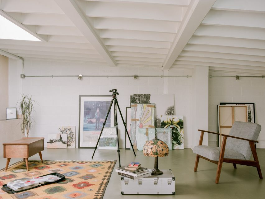
A skylight in the beam-lined roof helps brighten the mezzanine

Prefabricated plywood steps lead up to a mezzanine level tucked beneath the home’s sloping roof, which is held up by steel beams.

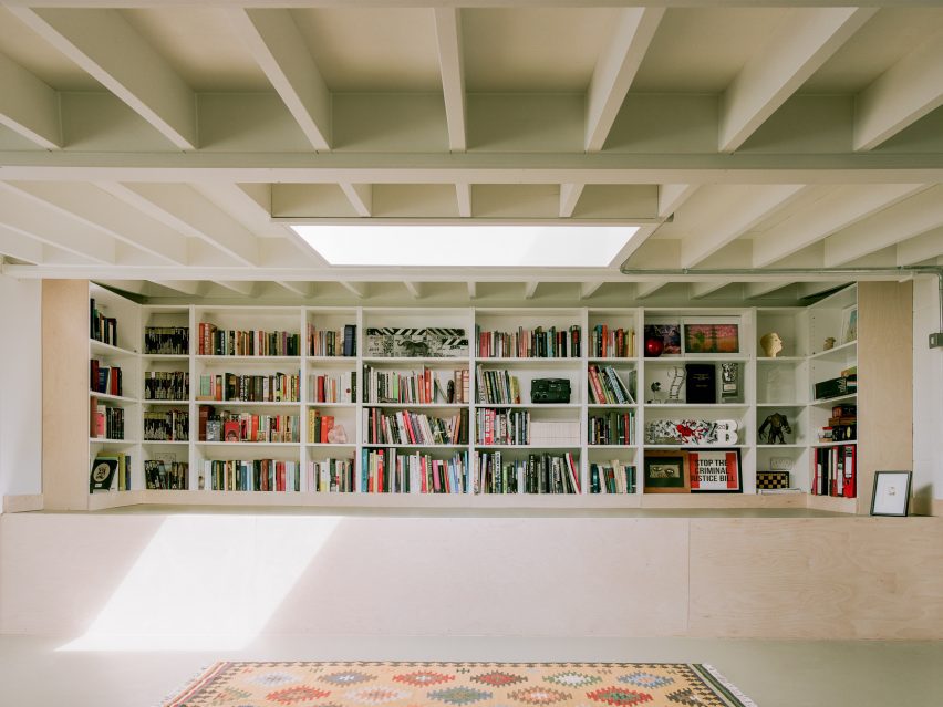
Intended to serve as a cosy retreat, the space is illuminated by a single skylight while artworks are casually leaned up against its walls and books are showcased on a wrap-around gridded shelf.

The minimalist aesthetic of the first floor then carries over onto the home’s ground floor, which accommodates two guest bedrooms – complete with their own en suites – a cloakroom and a utility room.

House by the Sea by Of Architecture
Rooms on the home’s ground floor are also pared back

A number of other architecturally striking homes can be found along the British coast.

Examples include RX Architects’ Seabreeze in East Sussex, which is coated in smooth pink concrete, and Mole Architects’ Marsh Hill House in Suffolk, which is shaped like a seagull’s wing.

The photography is by Lorenzo Zandri.

Reference

IKEA reflects on “the past, the present and the future” of the home
CategoriesInterior Design

IKEA reflects on “the past, the present and the future” of the home

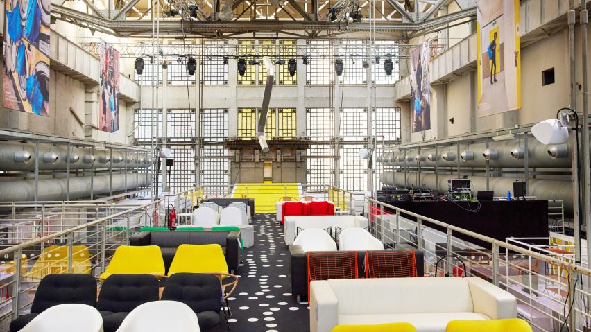
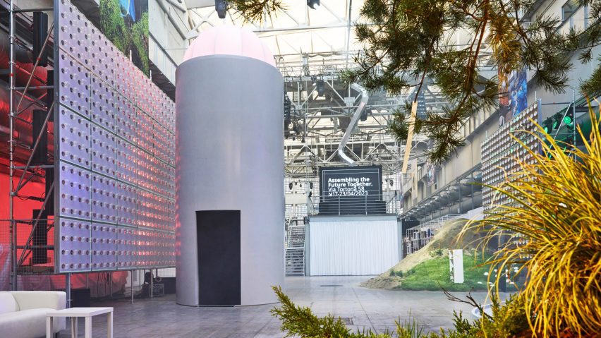
Swedish retailer IKEA marked its 80th anniversary at Milan design week with Assembling the Future Together, an immersive exhibition that charts the furniture company’s history and addresses its future.

Assembling the Future Together took place at Padiglione Visconti in Milan and explored the brand’s progression since the 1950s.

Colourful chairs within the IKEA installation at Milan design week
Assembling the Future Together is on display at Milan design week

“The whole exhibition is about the past, the present and the future,” said IKEA designer and chief creative officer Marcus Engman.

“So it’s a little bit like telling the story of IKEA furniture, things we have done and things that we will do even more,” he told Dezeen in Milan.

Chairs from the past at Assembling the Future Together by IKEA
Furniture from IKEA’s history is on display to reflect its past

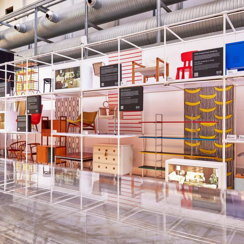
To reflect this idea, the space was divided into three main sections. One area dedicated to the past features designs from IKEA’s 80-year history displayed on geometric white shelving.

Among the pieces was furniture from the 1970s with bright fabrics and bold shapes, which were influenced by the increasing emergence of youth culture during this decade, according to the brand.

Chunky children’s furniture from IKEA’s Mammut series was also included. The line was first designed in the 1990s and has remained popular ever since.

Nytillverkad collection by IKEA
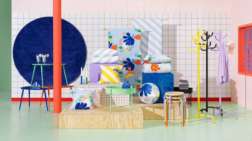
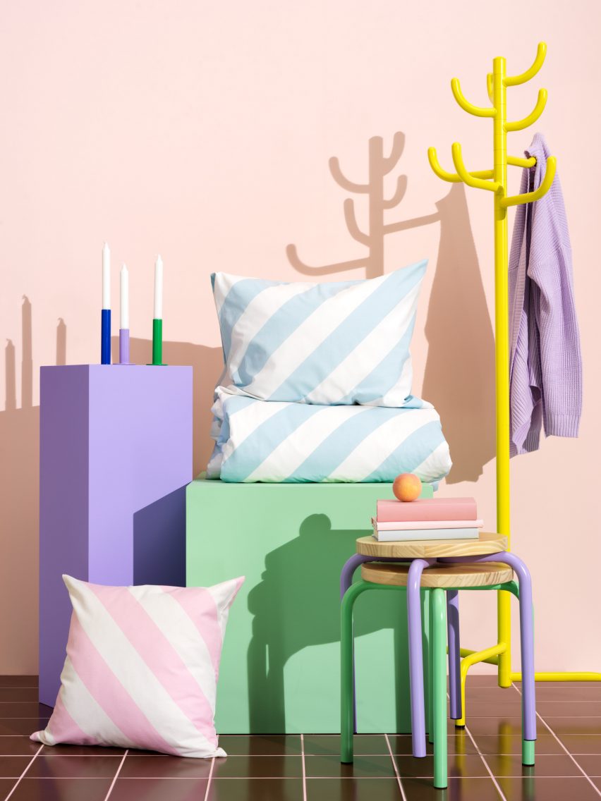
IKEA is also debuting its new Nytillverkad collection

For the present portion of the exhibition, the brand launched the first products in its new Nytillverkad collection.

Characterised by “simple, functional and playful” elements, the furniture, bedding and accessories intend to pay homage to past iconic IKEA pieces in line with the current wide-spread revival of interest in vintage designs, according to the brand.

Colourful
The colourful collection takes cues from previous IKEA designs

While the collection nods to IKEA’s roots, the brand used contemporary materials to create the pieces.

“It’s putting old things into a new perspective,” explained Engman.

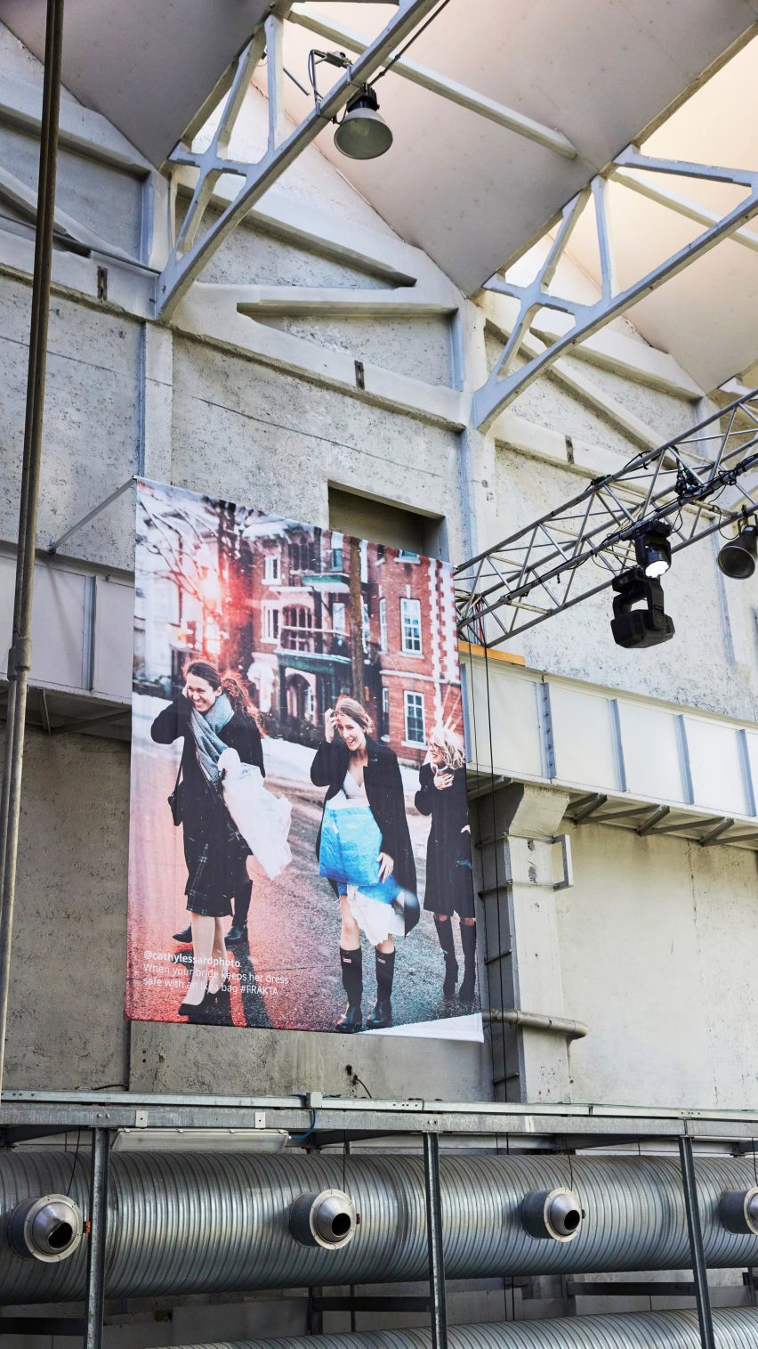
Wedding guests carrying IKEA's Frakta bag
Crowd-sourced images of people using the brand’s iconic Frakta bag are suspended in the space

Large-scale contemporary photographs, which showed members of the public sporting IKEA’s recognisable blue and yellow Frakta shopping bag in unexpected ways, were suspended from the ceiling throughout the venue

One image showed a bride protecting her dress inside one of the shoppers on her wedding day, while another has been adapted to transport a dog on the subway in New York.

“Even if we perceive our products as ‘ready design’, people see them a bit more like Lego pieces to play with,” acknowledged the designer. “People use the Frakta bag in so many ways we didn’t expect.”

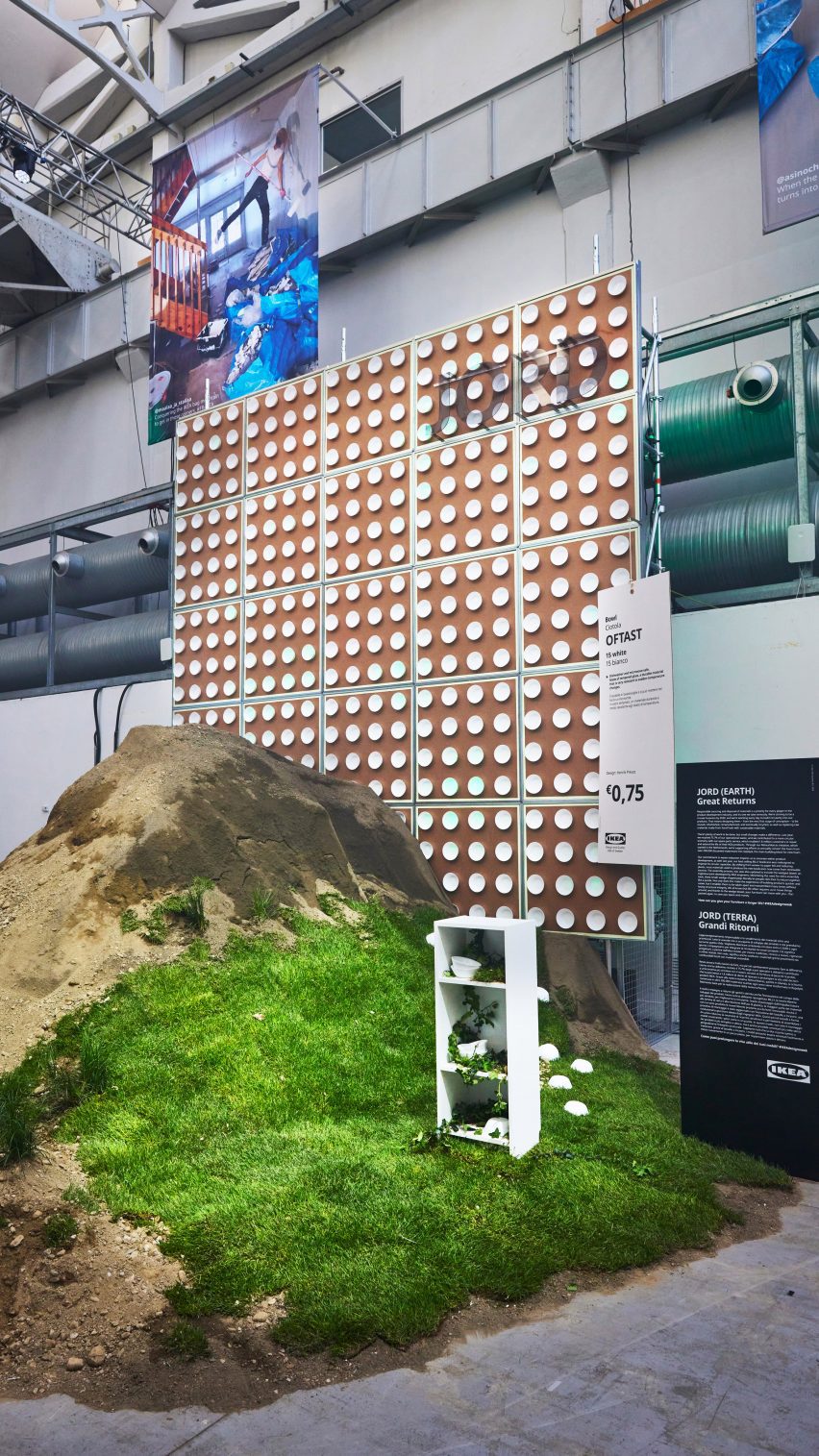
Installations referencing earth, wind, water and fire
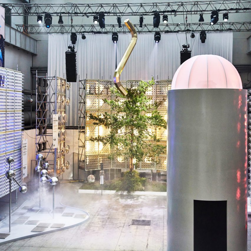
The ‘future’ section references the four elements with installations

The future area of the exhibition features four towering installations dedicated to the elements of fire, water, earth and wind, which include an illuminated tree and smoke dispensers.

“The future part is all about showing how we are using design and product development to nudge people’s behaviours into doing something that is good for people and the planet,” reflected Engman.

“It’s also where we try to challenge people to be part of this – not just wait for IKEA to do stuff, but actually ask, how can we do things together?”

“We have set out to be fully circular by 2030 so that affects everything that we do,” he continued.

IKEA Assembling the Future Together installations
IKEA intends to urge people to think about the role they can play in shaping the future of design

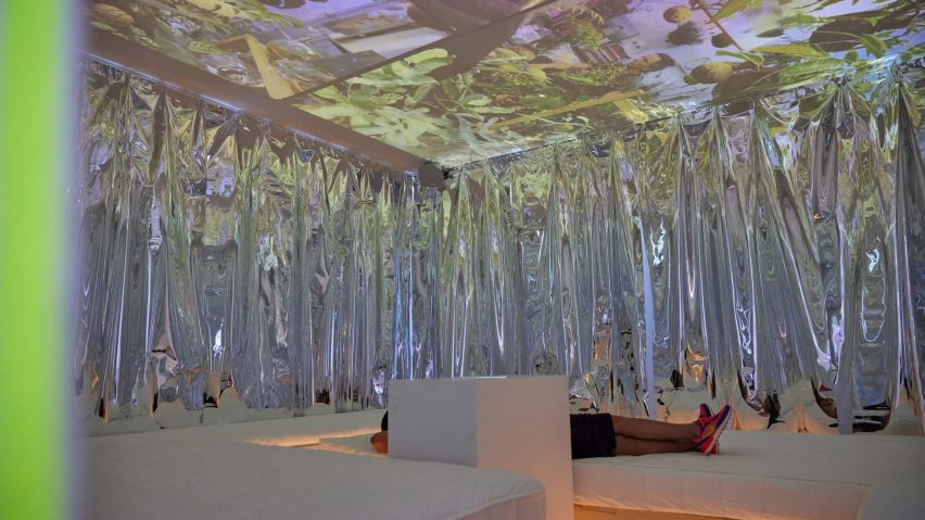
Designed as an inclusive, “down-to-earth” space that is open to all, the exhibition drew together many other experiences, such as a cinema zone showing portraits taken by photographer and IKEA’s first artist-in-residence Annie Leibovitz that document the “real lives” of people in their homes.

The project is part of IKEA’s annual Life at Home Report, where members of the brand’s team visit people in their living spaces and document their findings.

Person reclining within cinema space by IKEA at Milan design week
A cinema zone is showing portraits of people at home taken by Annie Leibovitz

Various talks and music events took place in the space throughout the week alongside a dedicated “record shop” and on-site IKEA cafe serving branded food and drinks.

The aim of incorporating music into the exhibition was to bring people together, according to Engman. Communicating the sacredness of the home is at the core of the IKEA exhibition, said the designer.

“This is something for us that we need to constantly work on – finding new ways of getting people to understand how important the home is,” he explained.

“I mean, the challenges during covid and now the cost of living crisis has been where we can help out even more.”

“Because people have had to spend more time at home – but how can we make the home also something that is really not just a functional thing, but an emotional thing?” he continued.

“So I think that’s our biggest thing, but making sure we do that in people- and planet-positive ways. Because that’s the only way forward.”

Immersive installation by IKEA
The exhibition was designed to be inclusive

Previously, IKEA donated its products and design services to create a series of United Nations-led refugee support centres in Eastern Europe to offer sanctuary to vulnerable groups displaced by Russia’s invasion of Ukraine. The brand’s research lab, Space10, developed a concept for connecting physical furniture to an ever-evolving NFT tree.

Assembling the Future Together is on show from 18 to 23 April 2023 at Padiglione Visconti, Via Tortona 58, Milan. See our Milan design week 2023 guide on Dezeen Events Guide for information about the many other exhibitions, installations and talks taking place throughout the week.


Reference

Eight home interiors that make a feature of exposed services
CategoriesInterior Design

Eight home interiors that make a feature of exposed services

Our latest lookbook showcases eight home interiors that make a visual statement by revealing their services, including wires, cables, ducts and plumbing.

Stripping back interiors can expose services including pipework that runs along walls and ceilings to provide heating, water, electricity and airflow to our homes.

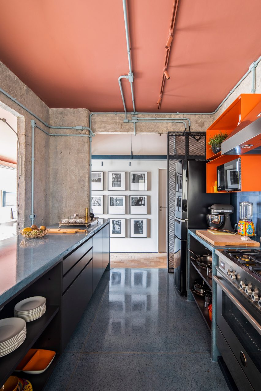
This roundup features homes with industrial and unfinished appearances that make a feature of exposed services, including a Parisian studio that uses copper pipework as hanging space and a stripped-back apartment in Brazil with blue-painted pipes.

This is the latest in our lookbooks series, which provides curated visual inspiration from Dezeen’s archive. For more inspiration see previous lookbooks featuring Milanese home and hotel interiors, living rooms decorated in the primary colours and terracotta-tiled kitchens.


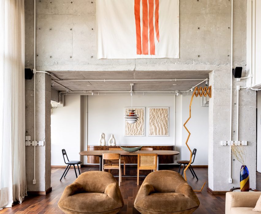
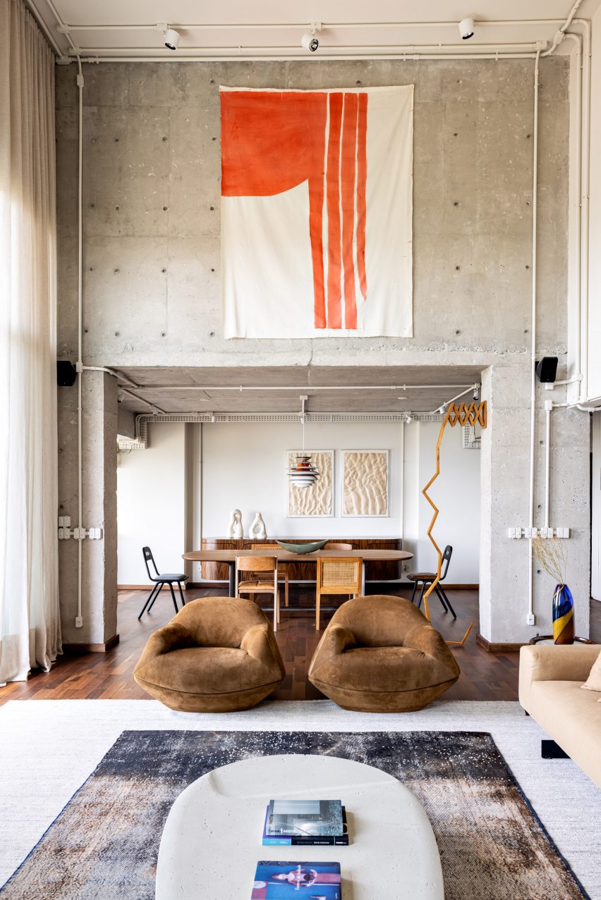
Gale Apartment living room with brown lounge chairs and concrete walls
Photo is by Fran Parente

Gale Apartment, Brazil, by Memola Estudio

Brazilian studio Memola Estudio renovated this São Paulo apartment to better suit the owner’s tastes, stripping back finishes on the walls and ceilings to expose the building’s concrete structure, piping, wiring and ductwork.

The studio contrasted the industrial look of the apartment with warm, earthy-toned furniture and contemporary artwork.

Find out more about Gale Apartment ›


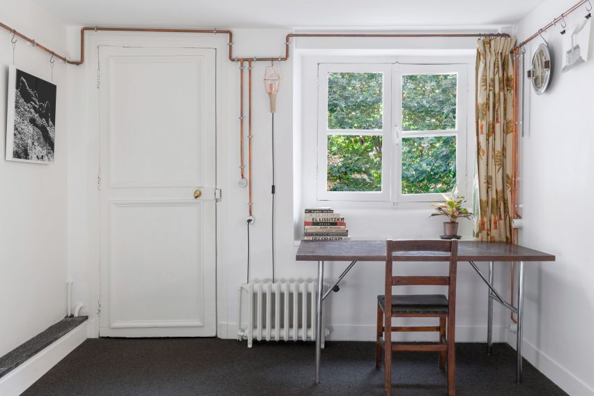
ARL008_Shaker Studio by Ariel Claudet with exposed copper wires
Photo is by Cyrille Lallement

Shakers Studio, France, by Ariel Claudet

A network of copper pipes snakes around the perimeter of this studio apartment in a 17th-century Parisian building, which architect Ariel Claudet added to make it stand out on Airbnb.

Informed by traditional Shaker peg rails, the pipes conceal electrical cables and double as a hanging rail to display ornaments and household items.

Find out more about Shakers Studio ›


Kitchen with exposed services at the RF Apartment by SuperLimão with peach ceilings and concrete walls
Photo is by Maíra Acayaba

RF Apartment, Brazil, by SuperLimão

Located inside a modernist São Paulo building completed in 1958, Brazilian studio SuperLimão exposed the pipes in the RF Apartment and painted them a pale shade of blue-green that was in keeping with the period the building was constructed.

SuperLimão also painted the ceiling a burnt pink colour and peeled back the edges of the entryways to reveal large chunks of plaster and brick.

Find out more about RF Apartment ›


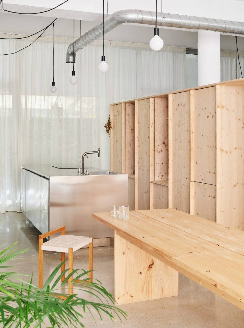
Interior of the open-plan kitchen with exposed services at NZ10 Apartment in Spain by Auba Studio with wood cabinets
Photo is by José Hevia

NZ10 Apartment, Spain, by Auba Studio

Spanish architecture firm Auba Studio transformed a former bakery in Palma into an apartment, stripping back the interior to reveal the building’s high ceilings and bare structure.

Auba Studio added a stainless steel kitchen island to complement the industrial look of the exposed ductwork and light fittings.

Find out more about NZ10 Apartment ›


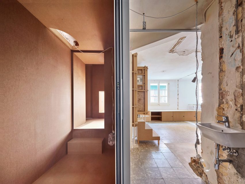
Exposed services, wiring, plumbing and plaster walls at the 10K House by Takk
Photo is by José Hevia

10K House, Spain, by Takk

10K House is a 50-square-metre Barcelona apartment that Spanish studio Takk renovated, adding rooms nestled inside one another to maximise insulation.

Water pipes and electrical fittings were left exposed to allow free passage between the Russian-doll-like rooms and to keep material costs down.

Find out more about 10K House ›


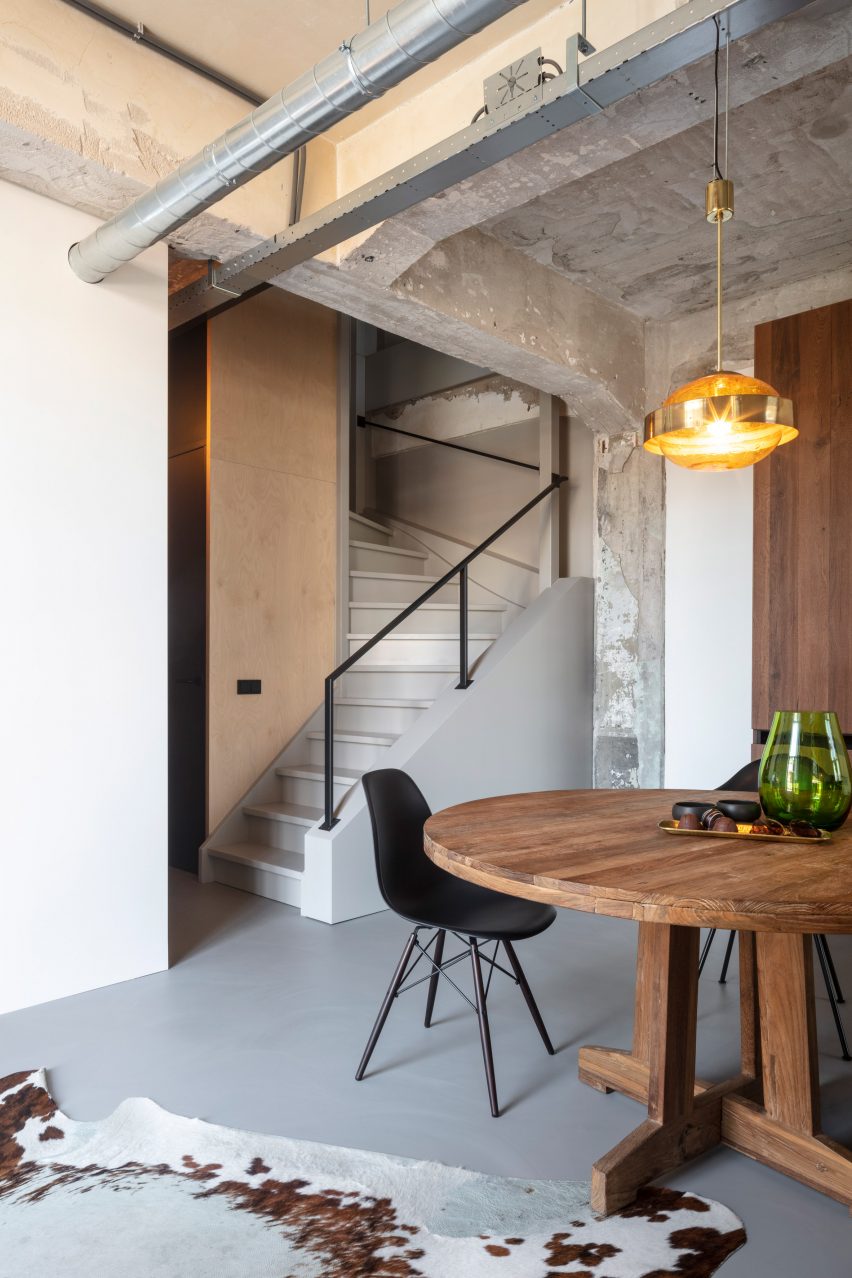
Wooden table and chair and exposed services inside the De Lakfabriek by Wenink Holtkamp Architecten
Photo is by Tim van de Velde

De Lakfabriek apartments, the Netherlands, by Wenink Holtkamp Architecten

Eidenhoven studio Wenink Holtkamp Architecten converted a 20th-century factory in Oisterwijk, the Netherlands, into apartments that maintain the industrial character of the building.

The apartments have an open-plan layout with the building’s raw concrete structure, metal ductwork and wiring left visible.

Find out more about De Lakfabriek apartments ›


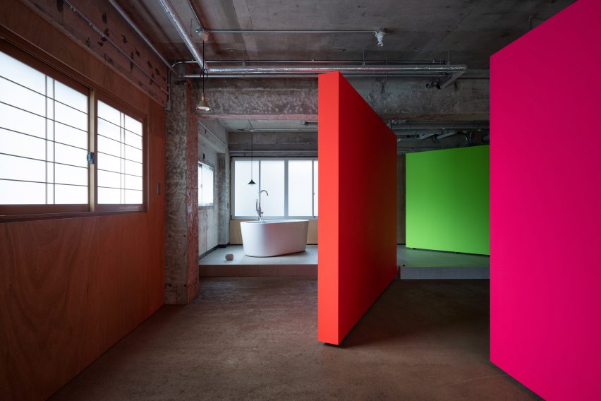
Fluorescent rotating partition walls revealing a freestanding bathtub in a concrete apartment
Photo is by Takumi Ota

Fishmarket, Japan, by Ab Rogers Design

Fishmarket is an artist’s studio and residence in Kanazawa, Japan, with an interior that was stripped back to its industrial shell by London-based studio Ab Rogers Design.

The studio added a series of fluorescent rotating partition walls that transform how the space is used and add bright pops of colour that stand in contrast against the grey concrete and metal pipework.

Find out more about Fishmarket ›


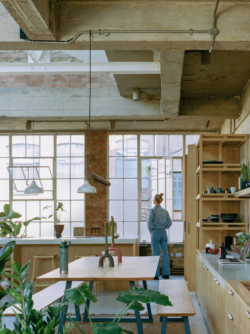
Open-plan kitchen with concrete ceiling and brick wall at Earthrise Studio by Studio McW
Photo is by Lorenzo Zandri

Earthrise Studio, UK, by Studio McW

London-based architecture practice Studio McW transformed this London warehouse into a studio and office that enhances the building’s original features.

The practice removed some of the redundant overhead services that were restricting the ceiling height. The remaining exposed services add to the industrial look of the property, while custom oak joinery adds warmth to the spaces.

Find out more about Earthrise Studio ›

This is the latest in our lookbooks series, which provides curated visual inspiration from Dezeen’s archive. For more inspiration see previous lookbooks featuring Milanese home and hotel interiors, living rooms decorated in the primary colours and terracotta-tiled kitchens.

Reference

Matt Gibson adds sculptural extension to Victorian Melbourne home
CategoriesArchitecture

Matt Gibson adds sculptural extension to Victorian Melbourne home

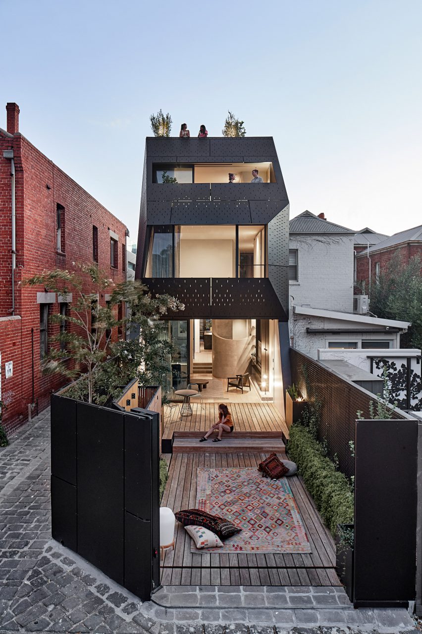
Australian studio Matt Gibson Architecture + Design has transformed a Victorian home in Melbourne’s suburbs with a faceted extension clad in black metal.

Located in the suburb of South Yarra, the house on St Martins Lane has been expanded with a three-storey rear extension to better accommodate the needs of the family living there.

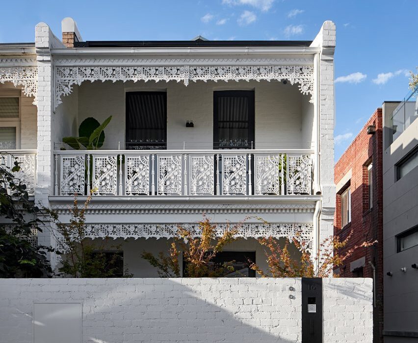
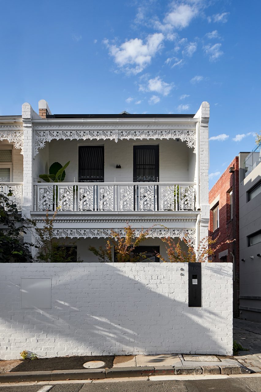
Exterior of Victorian house in Melbourne
Matt Gibson Architecture + Design has extended a Victorian home in Melbourne

The house occupies a long, thin site at the end of a row of Victorian terraces that are surrounded by low-rise warehouses and townhouses.

To preserve the heritage of the home, Matt Gibson Architecture + Design has retained several of its original elements including its street-facing Victorian facade.

Exterior of St Martins Lane extension in Melbourne by Matt Gibson Architecture + Design
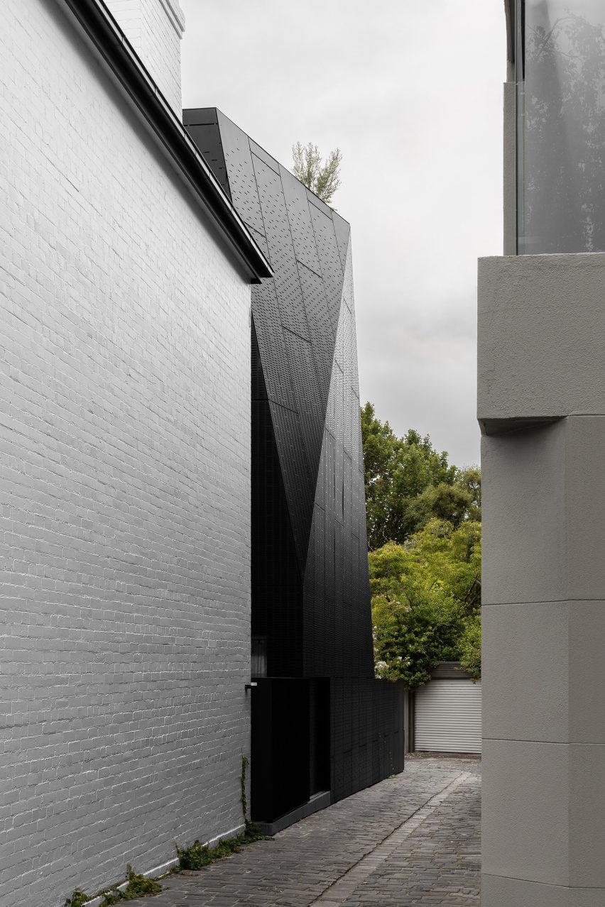
It has a faceted form clad in black metal

“[The house is] a case study in vertical family living on a confined site,” explained the studio.

“[It addresses] issues of densification and growing population demand whilst adaptively reusing and retaining key heritage fabric.”

Faceted black extension to white-brick house
A new entrance has been created on the adjacent lane

As part of the project, Matt Gibson Architecture + Design shifted the home’s main entrance from the street edge to a cobbled lane that runs down the side of the plot.

This new entry point sits towards the centre of the site and is marked internally with a glazed stair that bridges the existing house to the sculptural extension.

Monochrome kitchen by Matt Gibson Architecture + Design
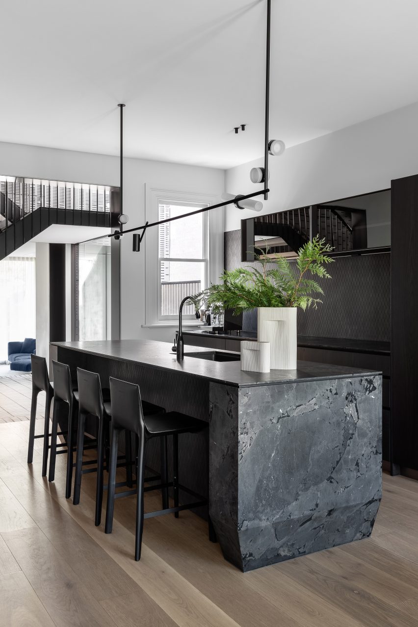
The old part of the house has been updated with a new kitchen

“The stair has full view of the laneway, activating it and providing a level of security and community connection,” said Matt Gibson Architecture + Design.

The placement of this staircase also divides the home into two wings – one old and one new.

Inside, the old part of the house has been updated with a new kitchen and a main bedroom suite, while the extension contains a living space, two bedrooms, a study and cascading terraces.

The two wings are distinguished externally by their contrasting material finishes, including white-painted brick and intricate wooden filigree on the old Victorian house, and the faceted black laser-cut metal facade of the extension.

Interior of St Martins Lane extension in Melbourne by Matt Gibson Architecture + Design
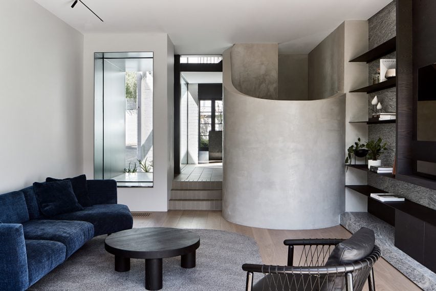
The extension contains the living space

Perforations in the metal make reference to the original architecture of the house and allow light and ventilation into the bedrooms while providing privacy.

A sliding gate reveals a path of mossy stones that lead from the cobbled lane to an enclosed porch of black metal and marble. The porch gives views through to the living space and garden beyond and contains a monolithic door that opens into a tiled hallway featuring the main staircase.

Enclosed garden
There are a series of outdoor spaces

The ground floor is given over to generous communal spaces. This includes a kitchen of blackened wood and dark marble in the old part of the house and a bright living room in the new wing with a sculptural concrete stair leading to a basement library.

Both the kitchen and living room are bookended by enclosed outdoor spaces with green borders.

Roof terrace in Melbourne
A rooftop deck crowns the home

On the upper floors of the home are the family’s bedrooms and the outdoor terraces overlooking the trees beyond the site. A warm wood-panelled stair from the second floor leads to a roof deck that crowns the extension.

“Through arranging the building vertically there is an increase in outdoor space coverage to now over 50 per cent of the site area,” said Gibson. “Previously [it was] 10 per cent.”

Matt Gibson Architecture + Design was founded in 2003. The studio has completed several other refurbishments and extensions across Melbourne, including a home with courtyards and glazed bridge and a redbrick extension with glazed undercroft.

The photography is by Shannon McGrath.

Reference

Green Concrete: The Foundation for a Sustainable Home
CategoriesSustainable News Zero Energy Homes

Green Concrete: The Foundation for a Sustainable Home

Concrete, the most widely used construction material on the planet, has a serious pollution problem. Accounting for about 7% of carbon emissions per year (approximately 2.8 gigatons of CO2), if concrete were a country it would rank third behind China and the United States in terms of total emissions. Concrete, used to construct roads, bridges, homes, and monuments for centuries, needs to change to mitigate the effects of climate change. Fortunately, a variety of new, green concrete options are emerging to lower the embodied carbon of homes and buildings and help achieve global climate goals.

Concrete carbon emissions come from cement

Concrete is made of cement, water, and aggregates (such as crushed stone, sand, and gravel), as well as chemical admixtures to increase durability, workability, or resilience to environmental factors.

The cement is usually made of clay, limestone, or iron ore and serves as the main binder of concrete. Portland cement, the most common type of cement, forms by heating limestone and clay to blistering temperatures, which produces clinker—a dense, hard substance that’s then ground into a fine powder to form cement. This formation process is extremely energy intensive and requires the burning of coal, oil, and other fossil fuels. Additionally, when limestone is heated, it produces quicklime, releasing CO2 as a byproduct. Altogether, this produces the equivalent of 0.98 tons of CO2 per ton of clinker, of which 0.46 tons are attributable to fuel combustion (source: EPA 2010). That’s gigatons of carbon emissions annually!

Reference

Home EV Charging Made Simple (But Do Hire an Electrician)
CategoriesSustainable News Zero Energy Homes

Home EV Charging Made Simple (But Do Hire an Electrician)

Level 2 is fine for home EV charging

All electric vehicles, except Teslas, use public and private L-2 chargers via a J1772 connector, also known as the J-plug. (Tesla vehicles come with the adapter that lets you use the J-plug.) An L-2 charger will typically take about 4-10 hours to fully charge an EV. For home EV charging, that usually works.

“Eighty percent of EV charging is done at home anyway, and they charge overnight,” Myers added. “The average mileage that an EV driver drives is around 30 miles a day. People really don’t need to go in and do a super-quick fill up at home.… You don’t run your cell phone until it’s completely empty and then run to go charge again. You use it during the day, and at night you plug it in and then it charges. That’s really how EVs are run. So we kind of have to get into that mentality [with our cars].”

Public DC fast chargers

Even so, sometimes we need a quick charge to get us home. “Where these [DC] fast chargers come in is along major highways, because that’s where you do need it if you’re traveling from here to here: to provide that 15-minute, half-hour stop,” Myers said. “You get some coffee or whatever, fill up and then be on your way.”

FYI: there are three types of DC fast chargers: CHAdeMO, CCS, and Tesla. Again, you’ll find these DCFC stations in public, but not for home EV charging.

  • CHAdeMO (the initialism for charge de move is pronounced CHAD-em-oh) has become the standard for manufacturers like Nissan and Mitsubishi.
  • The more common CCS, or combined charging system, is an open-source standard. In the US, all newly manufactured passenger EVs (except Tesla) will use the CCS connector.
  • Tesla vehicles utilize their own DC fast chargers, but vehicles come with adaptors for CCS.

Reference