Fourteen homes where cross-laminated timber creates cosy interiors
CategoriesInterior Design

Fourteen homes where cross-laminated timber creates cosy interiors

Our latest lookbook features cross-laminated timber interiors, including a colourful German vacation home and a tenement-style housing development in Edinburgh, and is part of Dezeen’s Timber Revolution series.

Architects looking to offset the carbon emissions of a building often choose cross-laminated timber (CLT), a type of mass-timber made from laminated timber sections that can be used as structural building materials.

The material, which is normally made from larch, spruce or pine, absorbs atmospheric carbon as it grows and subsequently retains it during its life in a building.

In interiors, CLT can create a luxurious effect even for projects with a tight budget and gives rooms a light, modern feel.

This is the latest in our lookbooks series, which provides visual inspiration from Dezeen’s archive. For more inspiration see previous lookbooks featuring interiors with split-level living areas, mix-and-match flooring and homes with cleverly hidden lifts.
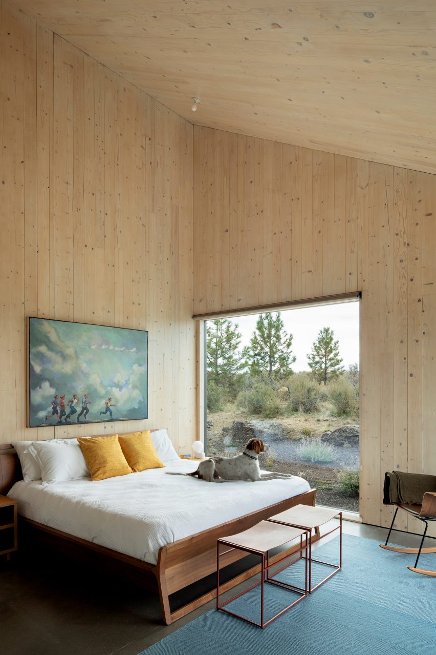

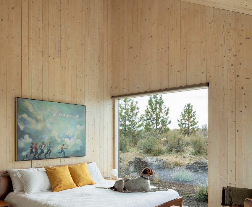
The interior of a bedroom in Octothorpe House
Photo is by Jeremy Bitterman / JBSA

Octothorpe House, US, by Mork-Ulnes Architects

The natural forms, custom furniture and organic colours and textures that appear throughout Octothorpe House were selected by studio Mork-Ulnes Architects for their resemblance to the surrounding Oregon desert landscape.

The cabin-cum-house was built using American-made CLT for a client that wanted an “environmentally progressive” and flexible design.

Find out more about Octothorpe House ›
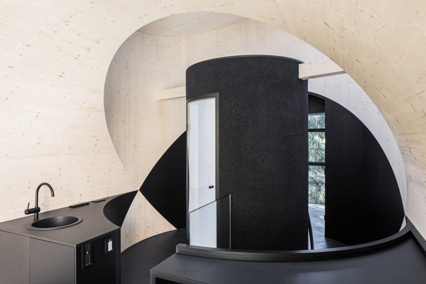

Interior of Bert treehouse by Precht
Photo is by Christian Flatscher

Bert, Austria, by Precht

Hidden in the woodland surrounding the Steirereck am Pogusch restaurant in the rural village of Pogusch, this playful tubular guest dwelling was informed by cartoon characters.

It was designed by Austrian architecture studio Precht to feel dark and cosy inside, with the structural CLT walls providing contrast against the black flooring and dark textiles.

Find out more about Bert ›
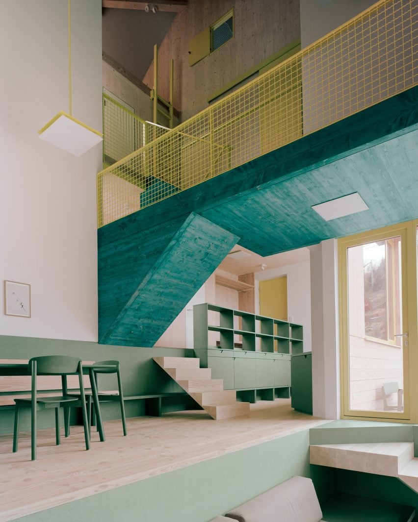

Kitchen and dining space in Haus am Hang by AMUNT
Photo is by Rasmus Norlander

Haus am Hang, Germany, by AMUNT

German architecture office AMUNT was drawn in particular to CLT’s sustainability credentials when creating this hillside vacation home in the Black Forest.

Designed for a client who wanted to promote sustainable travel, the home features surfaces and joinery finished in shades of green inspired by local tree species and its layout was organised to make the most of natural light.

Find out more about Haus am Hang ›
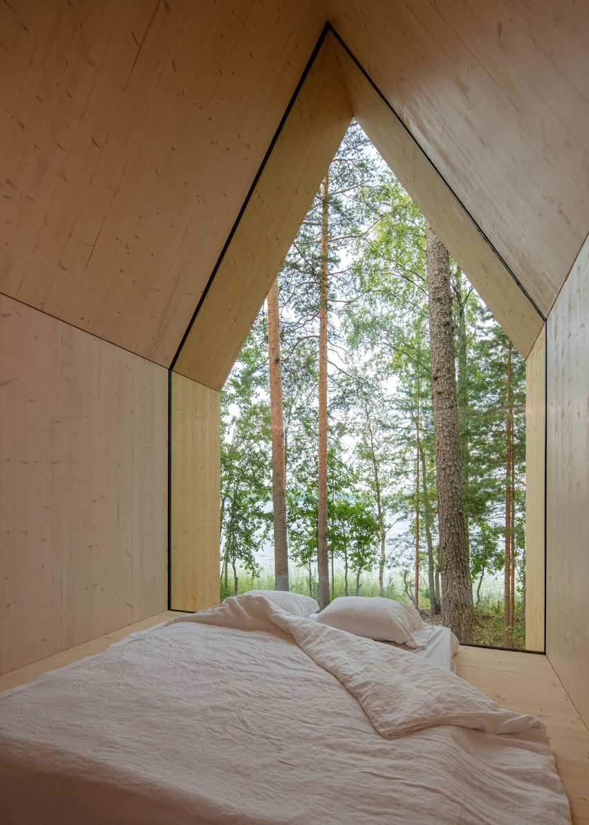

Kynttilä by Ortraum Architects
Photo is by Marc Goodwin

Kynttilä, Finland, by Ortraum Architects

Structural CLT was used to form the floor walls and angled roof of this 15-square-metre cabin on Lake Saimaa in Finland.

Its gabled form encloses a bedroom and a small kitchen, which feature natural CLT walls. A large bedroom window provides views of the forest outside the cabin.

Find out more about Kynttilä ›
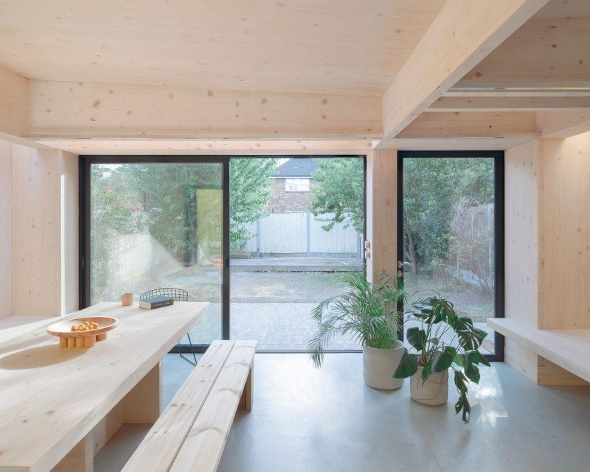

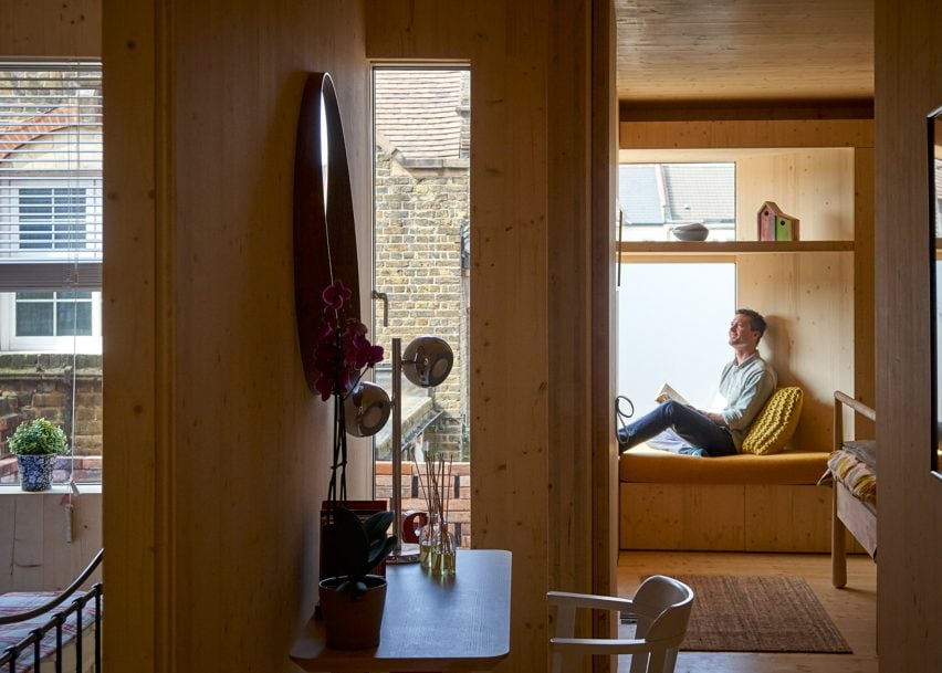
Interior of CLT House in London by Unknown Works
Photo is courtesy of Unknown Works

CLT House, UK, by Unknown Works

Named after its spruce CLT structure, CLT House is a semi-detached house in east London that architecture studio Unknown Works remodelled and extended to open up and improve its connection to the back garden.

On the ground floor, the timber walls, storage and seating areas create a minimal backdrop for the family’s musical and creative pursuits, parties and family gatherings.

A combined kitchen and dining space are housed in a bright yellow rear extension that opens onto the garden’s brick-paved patio.

Find out more about CLT House ›
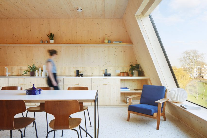

The Rye Apartments by Tikari Works
Photo is by Jack Hobhouse

Rye Apartments, UK, by Tikari Works

The four-storey Rye Apartments block in south London was designed by local studio Tikari Works, which used CLT for the structure and left it exposed across the majority of the apartments’ gabled walls and ceilings.

This was combined with spruce wood kitchen cabinetry, storage units and shelving. Terrazzo-style flooring with amber and cream-coloured flecks was added to compliment the timber finishes.

Find out more about Rye Appartments ›
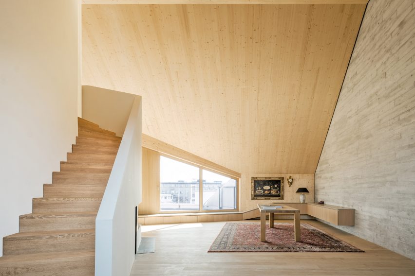

R11 loft extension by Pool Leber Architekten
Photo is by Brigida González

R11 loft extension, Germany, by Pool Leber Architekten

The R11 loft extension is a two-storey CLT extension that Pool Leber Architekten added to a 1980s housing block in Munich, creating a series of loft spaces.

Inside the lofts, the structural timber was left visible on the walls, ceilings and floors. The material was also used to create sculptural storage cabinets that double as window seating.

Find out more about Pool Leber Architekten


Barretts Grove by Amin Taha Architects
Photo is by Tim Soar

Barretts Grove, UK, Amin Taha Architects

Amin Taha Architects created this six-storey CLT block, which contains six apartments, between a pair of detached brick buildings in Stoke Newington, London.

“The ability of the CLT to serve as structure and finish removed the need for plaster-boarded walls, suspended ceilings, cornices, skirtings, tiling and paint; reducing by 15 per cent the embodied carbon of the building, its construction cost and time on site,” the studio said.

Find out more about Barretts Grove ›

A CLT split level interior
Photo is by Markus Linderoth

Twelve Houses, Sweden, by Förstberg Ling

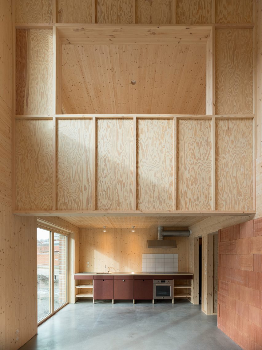
The CLT structure that forms the foundations of Twelve Houses by Förstberg Ling has been left exposed throughout the walls, floors and ceilings of the interior living areas, giving the space a warm and inviting feel.

A back bedroom on the first floor overlooks a double-height area of the living room, which has a concrete floor and reddish-brown wall panelling.

Find out more about Twelve Houses ›

Villa Korup kitchen interior
Photo is by Gabrielle Gualdi

Villa Korup, Denmark, by Jan Henrik Jansen Arkitekter

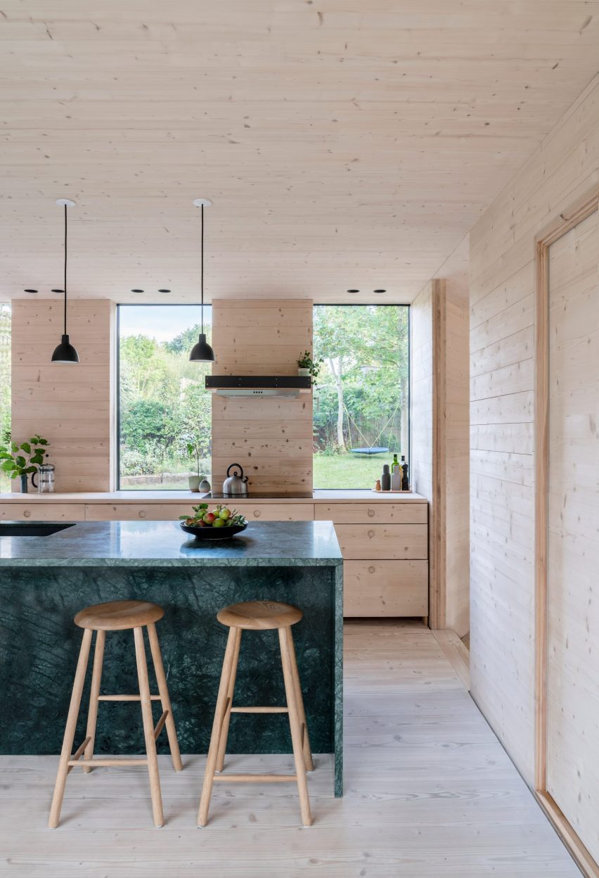
A CLT structure made from Baltic fir was used to construct this home on the Danish island of Fyn, which features exposed CLT panels throughout the interiors.

Designers Jan Henrik Jansen Arkitekter, Marshall Blecher and Einrum Arkitekter treated the material with soap and lye to lighten and protect the timber inside.

Find out more about Villa Korup ›

Interior of Simon Square apartments by Fraser/Livingstone
Photo is by Fredrik Frendin

Simon Square, UK, by Fraser/Livingstone

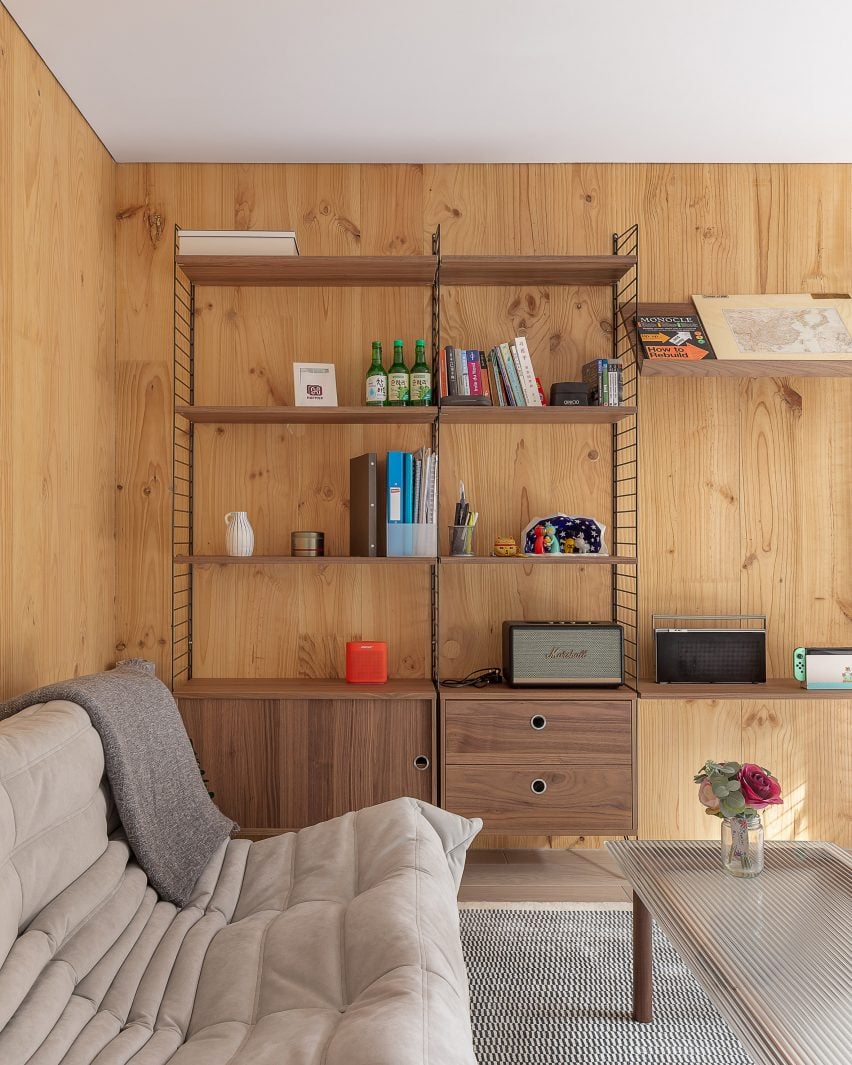
Comprised of six flats set within a mass-timber tenement-style housing development in Edinburgh, Simon Square has a structural timber frame that has been left exposed internally.

Architecture studio Fraser/Livingstone hoped that the presence of CLT indoors would improve the residents’ well-being. Potted plants and a neutral interior colour scheme provide an added sense of calm.

“When solid timber is exposed internally, the D-limonene the timber gives out has been shown to produce calm environments, with occupants’ hearts beating slower, and stress reduced,” project architect Ayla Riom told Dezeen.

Find out more about Simon Square ›

Interior of the Biv Punakaiki cabin by Fabric Architecture
Photo is by Nancy Zhou

Biv Punakaiki, New Zealand, by Fabric

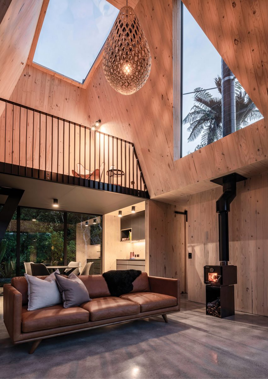
In an attempt to balance the high carbon levels of the cabin’s concrete floor and aluminium cladding, architecture studio Fabric chose to use CLT for the cabin’s structure, which was left exposed inside.

From the double-height living room, the residents can look up through large skylights that punctuate the ceiling and gaze at the stars above.

Find out more about Biv Punakaiki ›
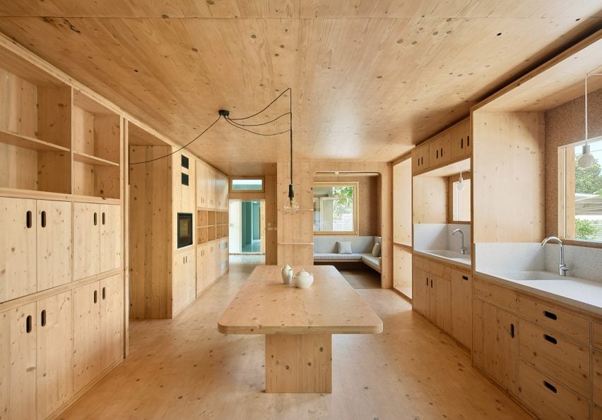

A cross laminated timber kitchen interior
Photo is by José Hevia

MAS JEC, Spain, by Aixopluc

Catalan architecture office Aixopluc used lightweight materials for this CLT extension, which it added to a traditional Catalan house in the city of Reus.

The building was prepared off-site and erected in just two weeks. Another advantage of using CLT is that the thermal mass of the exposed CLT interiors helps to ensure a comfortable internal temperature when the afternoon sun hits the building.

Find out more about MAS JEC ›
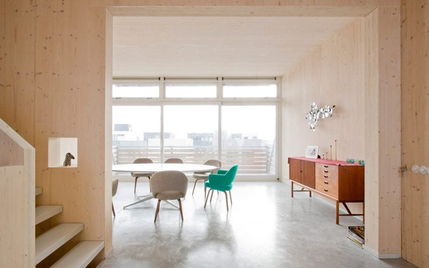

Houten Herenhuis by MAATworks

IJburg Townhouse the Netherlands, by MAATworks

This Amsterdam townhouse was designed to reference wooden Scandinavian homes.

Architecture studio MAATworks arranged it around an angular staircase made from cross-laminated pine wood, which was also used to create the wall and ceilings of the home.

Find out more about IJburg Townhouse ›

This is the latest in our lookbooks series, which provides visual inspiration from Dezeen’s archive. For more inspiration see previous lookbooks featuring interiors with split-level living areas, mix-and-match flooring and homes with cleverly hidden lifts.

Timber Revolution logo
Illustration by Yo Hosoyamada

Timber Revolution

This article is part of Dezeen’s Timber Revolution series, which explores the potential of mass timber and asks whether going back to wood as our primary construction material can lead the world to a more sustainable future.

Reference

Seven homes with discrete cleverly designed lifts
CategoriesInterior Design

Seven homes with discrete cleverly designed lifts

A converted showroom in London and a São Paulo penthouse with a wood-wrapped elevator are included in this lookbook of homes with smart residential lifts.

Lifts, also known as elevators, are mechanical shafts that carry people, cars and loads between multiple levels and are typically used in tall buildings.

But they can also be found in residential buildings, where they can be used to quickly move between floors and ensure that people with mobility issues can easily access the different levels of their homes.

This is the latest in our lookbooks series, which provides visual inspiration from Dezeen’s archive. For more inspiration see previous lookbooks featuring beige interiors, cosy cabins, space-saving pocket doors.


Syncline by Omar Ghandi Architect
Photo is by Ema Peter

Syncline, Canada, by Omar Gandhi Architect

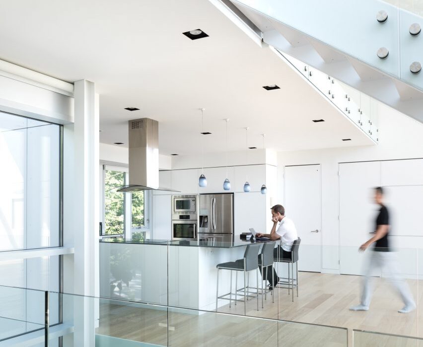
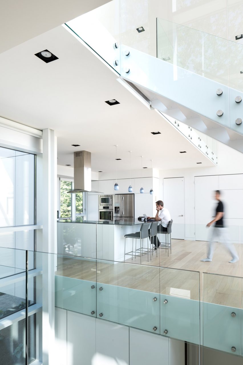
Canadian architecture firm Omar Gandhi Architects built this three-storey home in Halifax, Nova Scotia. The home was named after a syncline – a type of rock formation – and comprises two white volumes that flank a double-height glazed core at its centre.

A lift was added to the home and set within locally-sourced spruce housing. This elevator is located at the corner of the home and leads to its open-plan kitchen from behind a white door.

Find out more about Syncline ›


Espirit House by Apollo Architects & Associates
Photo is by Masao Nishikawa

Espirit House, Japan, by Apollo Architects & Associates 

Espirit House was designed by Japanese architecture studio Apollo Architects & Associates for a client who works in landscaping.

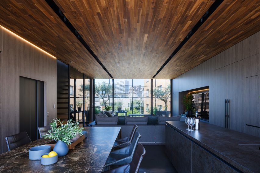
The main bulk of the home has a blocky concrete form and is suspended above a garage. An elevator leads to the interior of the home,  where it is located next to the staircase in the main dining area. Floor-to-ceiling windows flank each side of the home, bringing light to the wood-clad interior.

Find out more about Espirit House ›


Cole Valley Residence by Jensen Architects
Photo is by Joe Fletcher

Cole Valley Residence, US, by Jensen Architects

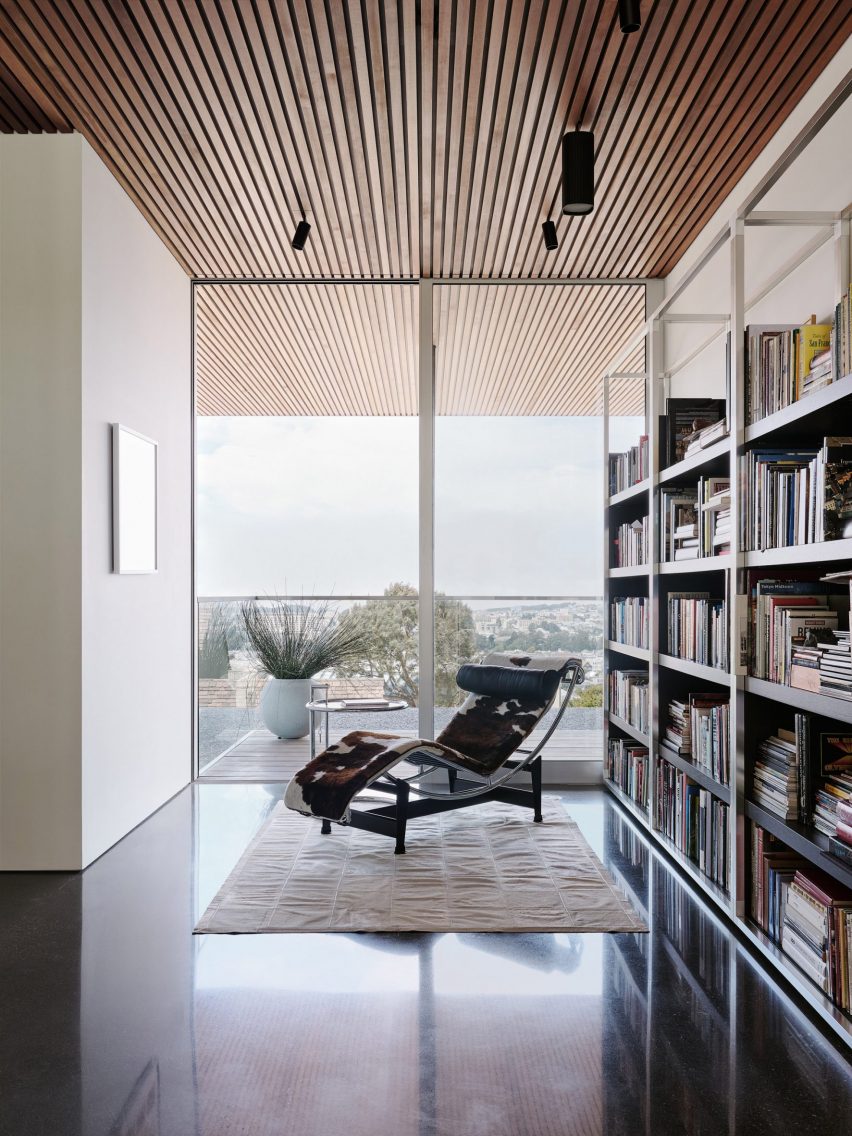
Completed by San Francisco-based practice Jensen Architects, this home was built for a couple who wanted a home with a serene feel that had views of San Francisco.

Totalling five storeys, the home is composed of a number of stacked boxes with cantilevered areas. Jensen Architects added a simplistic interior palette of white oak, plaster and polished concrete.

An elevator was added to the home so that its owners can enjoy the space and its views as they age. On the fourth floor, it is located within a white-painted volume and opens up towards an outdoor terrace.

Find out more about Cole Valley Residence ›


São Paulo penthouse by Tria Arquitectura
Photo is by Fran Parente

São Paulo penthouse, Brazil, by Tria Arquitectura

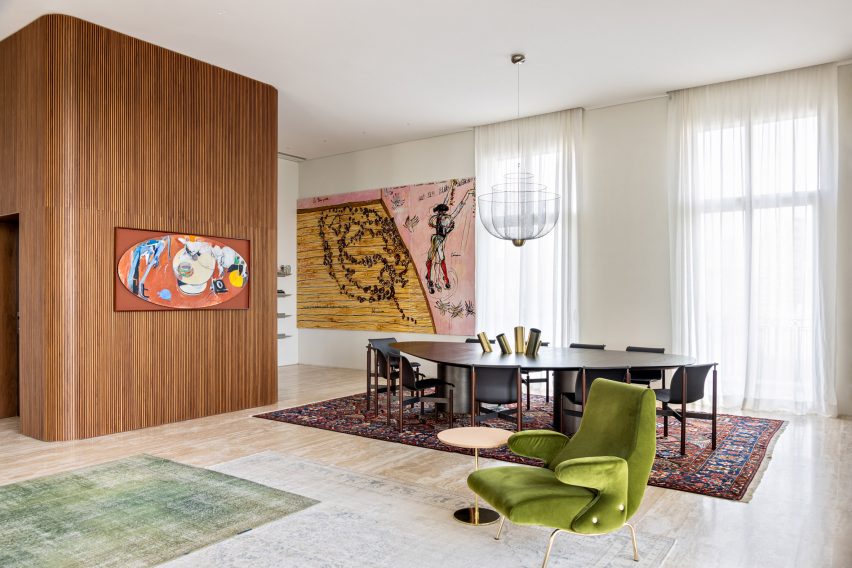
At this São Paulo penthouse, which was designed by Brazilian studio Tria Arquitectura, an elevator shaft was wrapped in vertical strips of slatted wood.

Other textural materials were used throughout the home, including travertine floors, fabric and wood-panelled walls, which contrast against the home’s stark white walls.

Find out more about São Paulo penthouse ›


Danish Mews House by Neil Dusheiko
Photo is by Rachael Smith

Danish Mews House, UK, by Neil Dusheiko

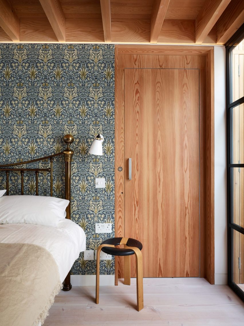
In this west London home that was converted from a showroom to a residence for its elderly owners, British architect Neil Duskeiko installed a lift so that its residents could gain access to the upper floors of the home with ease.

The elevator runs from the ground floor to the living area and finally to the primary bedroom, which was decorated with floral wallpaper. The elevator has a wooden door with a decorative grain that matches the ceiling.

Find out more about Danish Mews House ›


Case Room by Geoffrey von Oeyen
Photo is by Kyle Monk

Case Room, US, by Geoffrey von Oeyen

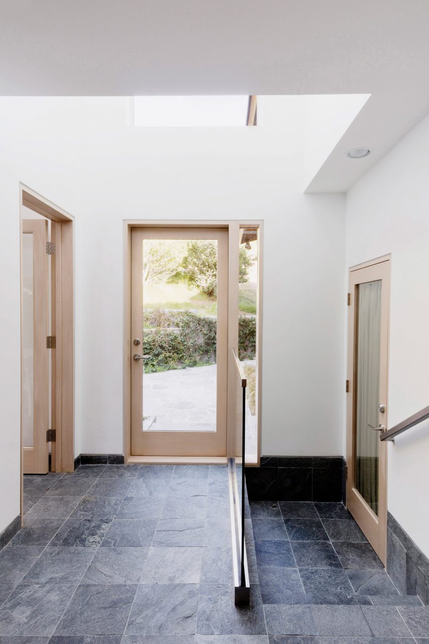
A glass door fronted elevator was added to the ground and first floor of this Malibu home that was designed by American designer Geoffrey von Oeyen.

Von Oeyen extended the home and incorporated a paired back interior palette that was comprised of light wood panelling, dark stone floors and white walls. The elevator, which is located to the right of the front entrance, allows visitors with limited mobility to easily access the home’s renovated media room.

Find out more about Case Room ›


Amsterdamsestraatweg Water Tower by Zecc Architecten
Photo is by Stijn Poelstra Fotografie

Amsterdamsestraatweg Water Tower, the Netherlands, by Zecc Architecten

A former water tower in Utrecht was converted into a series of apartments that have 360-degree views of the city. Dutch studio Zecc Architecten retrofitted the building and added the largest of its apartments, a six-level home, to its very peak.

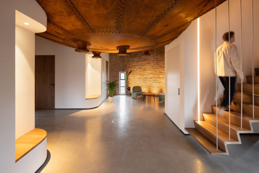
A private elevator, located within a white volume and beside a floating staircase, provides access to the six-floor apartment and opens out to an entrance space that features a rusted metal convexed ceiling constructed from the tower’s former water tank.

Find out more about Utrecht Water Tower ›

This is the latest in our lookbooks series, which provides visual inspiration from Dezeen’s archive. For more inspiration see previous lookbooks featuring beige interiors, cosy cabins, save-saving and pocket doors. 

Reference

Ten homes with pocket doors that disappear into the walls
CategoriesInterior Design

Ten homes with pocket doors that disappear into the walls

Our latest lookbook explores homes where pocket doors slide into gaps within the walls, as a way of saving space or giving a more open feel to an interior.

A pocket door is a specific type of sliding door designed to slot into a wall cavity. This means that when the door is open, it is completely hidden from view.

For homes where an open-plan layout is desirable but not practical, pocket doors offer a viable alternative. When open they are almost invisible, allowing adjacent rooms to feel more connected.

Pocket doors can also be used for rooms where there isn’t enough space for a door to open outwards, or for locations where it makes sense for the door to integrate into surrounding joinery.

Read on to see 10 different examples, in homes that include a courtyard house in Arizona and a renovated 1920s apartment in New York.

This is the latest piece in our lookbook series, which provides visual inspiration from Dezeen’s archive. Other recent editions showcase cabins with cosy interiors and homes that make the most of narrow spaces.


Pocket door in St John Street apartment

St John Street, UK, by Emil Eve Architects

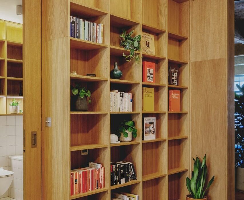
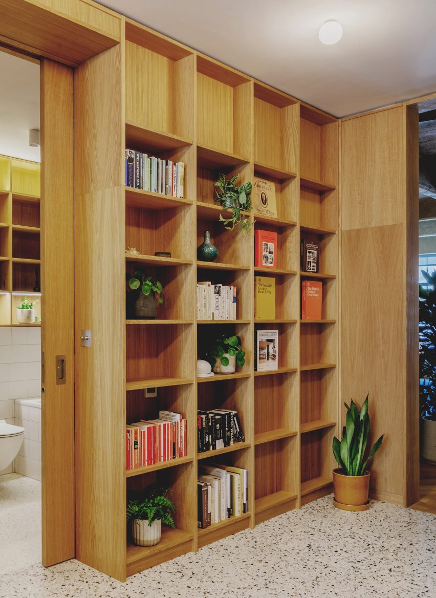
Pocket doors slot in behind bookcases in the entrance lobby of this converted loft apartment in London.

Emil Eve Architects designed various oak joinery elements to divide up the interior of the former industrial space. Pocket doors are made from the same wood, so they feel integrated.

Behind the doors are two bedroom spaces and a bathroom.

Find out more about St John Street ›


Pocket door in Riverside Apartment

Riverside Apartment, USA, by Format Architecture Office

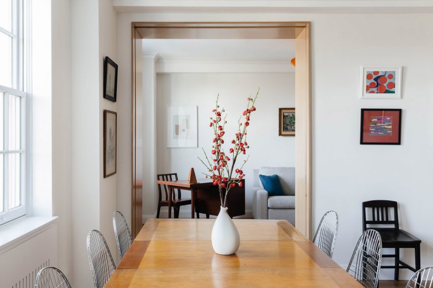
In this 1920s apartment in New York’s Upper West Side, recently renovated by Format Architecture Office, a pocket door separates the main lounge and dining room from an adjacent study.

This means that, when the study is not required as a quiet workspace, it can become an extension of the day-to-day living space.

The door sits within a deep frame made from Anigre wood – an African hardwood commonly used for furniture and cabinetry – which matches the design of the kitchen entrance opposite.

Find out more about Riverside Apartment ›


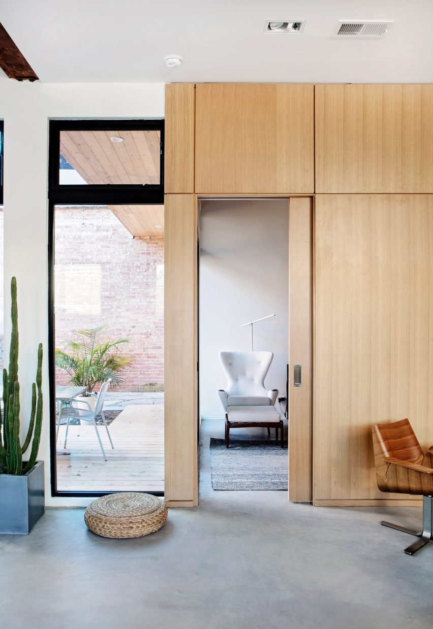
Pocket door in Moss home and studio

Logan Certified, USA, by Moss

This converted bodega in Chicago serves as the home and workplace of Matt Nardella, founder of architecture and design firm Moss, and his wife and colleague Laura Cripe.

The couple’s bedroom is located behind an oak-panelled wall. By installing a pocket door made from the same material, they have made the entrance feel more discrete.

Find out more about Logan Certified ›


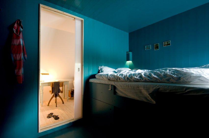
Pocket door in Apartment in Föhr by Karin Matz and Francesco Di Gregorio

Apartment in Föhr, Germany, by Karin Matz and Francesco Di Gregorio

Pocket doors lead through to cabin-style bedrooms in this converted attic apartment on the island of Föhr, designed by architects Francesco Di Gregorio and Karin Matz.

The doors are made from transluscent polycarbonate, giving them a soft glow that contrasts with the vivid blue-green colour of the walls.

Find out more about Apartment in Föhr ›


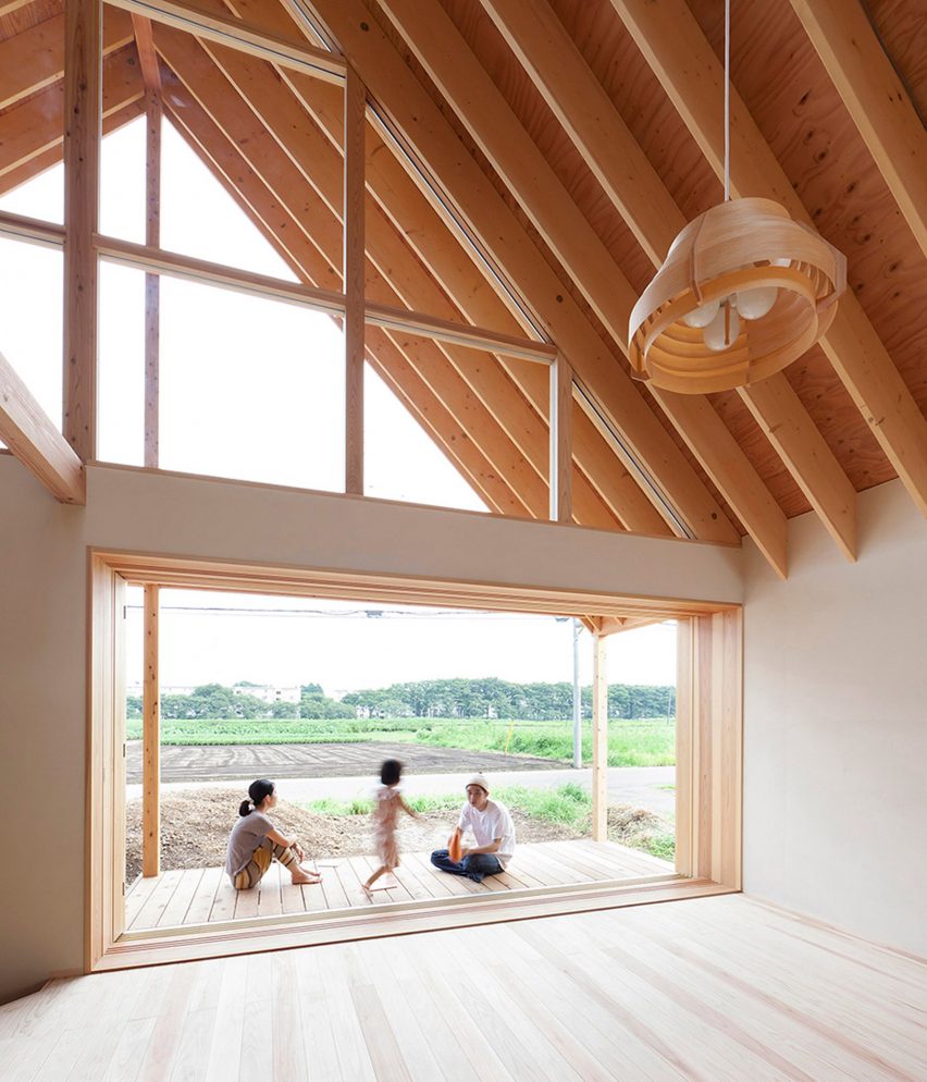
Pocket door in house by Tailored Design Lab

A Gabled Roof in Kawagoe, Japan, by Tailored Design Lab

A popular use of pocket doors is to make a patio deck feel like a continuation of the indoor living space, as Tailored Design Lab did at this family house in Saitama Prefecture.
The project features a three-panel pocket door system, allowing a four-metre-wide window to slot into a cavity that is significantly smaller.

Find out more about A Gabled Roof in Kawagoe ›


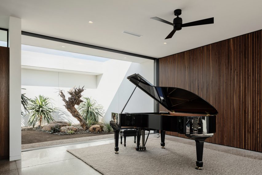
Pocket door in The Ranch Mine

O-asis, USA, by The Ranch Mine

This home for a musician in Arizona features a series of four glazed pocket doors that allow a combined living room, kitchen and piano room to be completely opened up to the elements.

Two of the doors connect the room with a secluded courtyard filled with desert plants, while the other two lead out to a sheltered terrace overlooking a swimming pool at the rear.

All four doors are full-height, making them feel more like moving walls.

Find out more about O-asis ›


Pocket door in Bank Street Apartment

Bank Street Apartment, USA, by MKCA

An unusually shaped pocket door was required for this renovation of an apartment in New York’s West Village, by Michael K Chen Architecture (MKCA).

The works included adding a continuous storage unit along one wall, extending from the lounge and kitchen into a small  home-office slotted in the corner.

The pocket door slots around this unit, thanks to a rectangular cutaway in one corner, meaning one of the owners could work from home without being disturbed by their partner.

Find out more about Bank Street Apartment ›


Writer’s Studio, USA, by Eric J Smith

Using a pocket door as a main entrance is less common but not impossible, as proved by this writing studio at the Connecticut home of poet John Barr.

The glass pocket door is set behind a stone facade, protected by a sliding panel made of distressed oak. It aligns with the owner’s desk, allowing the breeze to easily flow through.

Find out more about Writer’s Studio ›


Pocket door in Hipped House

Hipped House, UK, by Oliver Leech Architects

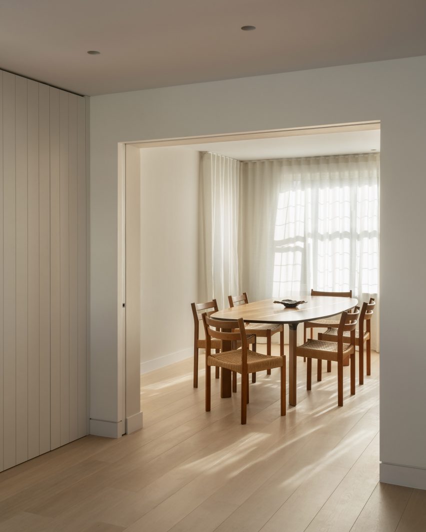
The dining room of this family home in Surrey is previously separate from the kitchen and living space.

In order to create more spacious, open living spaces, Oliver Leech Architects replaced the old door with a much larger opening. A pair of pocket doors mean it the room can still be closed up if required.

Find out more about Hipped House ›


Pocket door in apartment by Mas-aqui

Yurikago House, Spain, by Mas-aqui

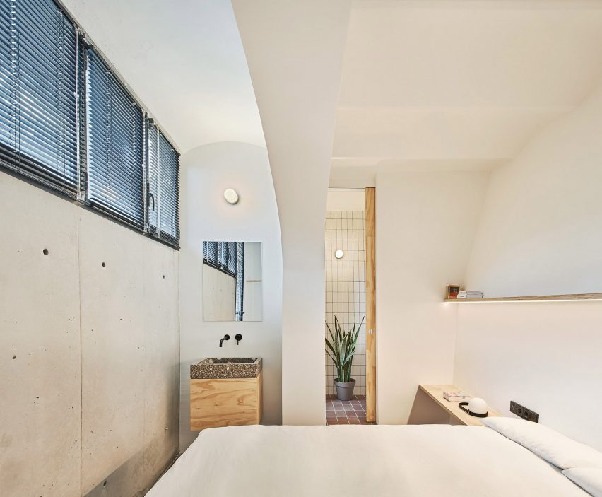
Pocket doors are a favourable solution for en-suite bathrooms, where a standard door might get in the way of a basin, toilet or shower.

In this house in Barcelona, the pocket door extends all the way up to the ceiling to enhance the sense of spaciousness when it is open.

Find out more about Yurikago House ›

Reference

Embodied Carbon: Reduce Your Home’s Hidden Carbon Footprint
CategoriesSustainable News Zero Energy Homes

Embodied Carbon: Reduce Your Home’s Hidden Carbon Footprint

Operational carbon is usually what we think of when energy costs are discussed. That is, carbon emissions that come from the energy used to power our homes, cars, etc. over their lifetime. Your home’s energy efficiency comes into play here. Generally, operational carbon emissions can be modeled and predicted, so you can compare one appliance or building product against another. Often, a label will show how much energy a certain appliance is likely to draw over a lifetime of operation, or how much a well insulated house will reduce your energy needs annually. But embodied carbon takes this modeling to a whole ’nother level.

Embodied carbon is the carbon footprint of a product, process, or service starting with the extraction of raw materials through the manufacturing process to market (cradle to gate) and then beyond to delivery and installation (cradle to site). Operational carbon is often considered separately, but adding the carbon embodied in a product’s end-of-life disposal (cradle to grave) or reuse or recycling (cradle-to-cradle) gives a complete lifecycle analysis. In other words, embodied carbon represents the total amount of greenhouse gases (including CO2) emitted during extraction, transportation, manufacture, delivery and deployment, and then end-of-life. Looking at both the embodied carbon and the operational carbon give you the true “carbon cost” of your product or project.

Let’s picture a new countertop for your kitchen. The embodied carbon of that countertop that you will enjoy in your home comprises the energy that goes into mining the stone, transporting the raw material from the mine to a facility for processing, its processing and preparation (cutting, strengthening, and polishing), transporting to a wholesaler, and then to your home where we include the energy emissions of cutting to size and setting it up in your kitchen. And finally its end-of-life, which hopefully includes reuse or recycling wherever possible.

Hardware store assortment, shelf with stainless steel mortise sinks, nobody. Building materials and tools choice in diy shop, rows of products on racks

Embodied carbon hides in your home

For homes, the biggest sources of embodied carbon are typically in materials. Many common materials used in construction, such as concrete, stone, steel, and lumber, tend to be high in embodied carbon either due to energy-intensive extraction or manufacturing processes. Even products made from rapidly renewable materials, or by a manufacturer that uses renewable energy, may waste a lot of water, or raw or finished materials. Or the product must travel overseas, or lasts only a short time before it heads for the landfill and must be replaced.

An exception to looking for the lowest carbon equation would be if the building materials are used for carbon sequestration. For instance, natural renewable materials such as wood from sustainable forests, or wool, or bamboo will hold carbon safely within the walls and furnishings of your home, while the natural source is replenished and continues to grow and pull more carbon from the atmosphere.

To reduce the embodied carbon in your home, as the saying goes, you can’t manage what you don’t measure. The most accurate analysis of the embodied carbon in extraction, transportation, and manufacturing is going to come from the product manufacturer. Eco-conscious companies often use environmental product declarations (EPDs) and post the data on their websites. These look beyond carbon and account for multiple environmental impacts. Further, they provide a lifecycle assessment (LCA), and include both embodied carbon through end-of-life and operational carbon.
Experts can help

Many software tools exist to help conduct LCAs. One of the best free tools out there is the Embodied Carbon in Construction Calculator (EC3). This tool can technically be used by anyone, but it is most efficient if used between your architectural, engineering, and construction professionals along with a trained sustainability professional or firm. Increasingly, the emphasis shifts to embodied carbon as building codes call for increased energy efficiency, and more homes and utility grids are powered by renewable energy—thus significantly lowering the carbon footprint of operational carbon emissions.

By looking at these issues, weighing pros and cons, we can help reduce the embodied carbon and thereby the total lifecycle carbon in our homes. Particularly in new construction and all-electric homes, just a few adjustments in key areas—insulation, cladding, and concrete—can make strides toward meeting our collective climate change commitments and averting the worst of the climate change catastrophes to come.


The Author: Sustainability Consultant Arnaldo Perez-Negron is an environmentalist and social entrepreneur based in the Tampa Bay area.


Energy Efficient Homes Zero Carbon renovation.

Reference

Cold Climate Heat Pumps Warm Homes on the Coldest Days
CategoriesSustainable News Zero Energy Homes

Cold Climate Heat Pumps Warm Homes on the Coldest Days

In the US, about 13% of total CO2 emissions come from heating residential and commercial buildings. Because so many buildings rely on natural gas and heating oil, significant opportunity for reducing heating emissions lies with electric heat pumps. Heat pumps have been popular in the South for decades, but there are a lot of questions about how well they work in colder climates.

“A huge portion of our global emissions come from heating buildings,” says Brian Stewart, co-founder of Electrify Now, a volunteer organization devoted to electrification. “Since our homes are a big part of that, it’s important for us to understand the options we have for zero-carbon heating.”

Recently, researchers from the University of California, Davis did the math on switching from a gas furnace to an electric heat pump. Even with the mix of fuels that currently powers the electrical grid, a heat pump will produce far fewer emissions than a gas furnace, no matter where in the US you live. As the grid gets cleaner, the difference between electric and gas heating emissions will only continue to grow.

“We know that electrification works from a decarbonization standpoint, and we know that these heat pumps work in many situations,” says Stewart. “But we still have so many people wondering: Will heat pumps work in cold temperatures?”

Heat pumps, not just for warm climates

“With a standard heat pump, you start to lose efficiency as temperatures dip below 40°F,” explained Shawn LeMons, Performance Construction Manager for Mitsubishi Electric Trane HVAC US. “So, the system needs more electric power to extract heat from colder air.”

That’s where cold climate heat pumps come in.

Also known as high-efficiency heat pumps, these high-tech systems are specially designed to operate at a higher heating capacity in lower temperatures. “Cold climate heat pumps may look similar to standard heat pumps, but their internal technology and computer programming are far more advanced,” LeMons added. “They’re specifically built to function at subzero temperatures, all while operating as efficiently as possible.”

Location, location, location

Cold climate heat pumps are purpose-built for heating comfort and ease of use in inclement weather. You can use them in any “heating-dominated” region where HVAC systems spend most of the time heating instead of cooling. This includes climates with frequent snow and ice, as well as coastal climates with cold rain and fog. As long as your system is operating properly, it should be able to handle prolonged subzero temperatures, even at elevations thousands of feet above sea level, explained LeMons.

Households in milder temperature zones may also prefer a cold climate heat pump when the weather outside starts to get snowy or icy. You may not necessarily need a cold climate heat pump year-round, but having one will give you added benefits and comfort during the cold winter months.

Buying a cold climate heat pump

“Generally, because of the special features and programming, cold climate heat pumps can cost around 20% to 30% more than standard heat pumps,” said Jonathan Moscatello, Business Development Manager for Daikin North America. That’s because you’re paying for the system’s ability to pump heat in colder temperatures, and that’s where cold climate heat pumps shine.

“Compared to traditional heat pumps, they produce more heat per dollar spent, making them a better value in the long run,” said Moscatello. And that’s before you consider the potential tax incentives you’ll get when you make the switch!

Take note: Some manufacturers put all their premium technology into their cold climate models, so you’re also paying for features unrelated to the cold climate performance, Moscatello pointed out. So don’t be afraid to shop around for the best value.

What should you look for when picking out a cold climate heat pump? It depends on whom you ask. Start with the EnergyStar and Northeast Energy Efficiency Partnerships (NEEP) published standards for cold climate heat pumps. Most utility and government rebate programs also use these specifications.

“Manufacturers also have their own standards for what qualifies a heat pump for cold climate operation,” added Moscatello. “Examples of this include Mitsubishi’s Hyper-Heat line and Daikin’s Aurora line.”

Ratings and features to look for

LeMons and Moscatello recommend the following guidelines when shopping for a cold climate heat pump:

  1. Rated performance at 47°F.
  2. Maximum performance at 5°F.
  3. Capacity ratio at 5°F. This is the ratio of #1 and #2 above; the closer this number is to 100%, the better it can handle very low temperatures.
  4. Coefficient of performance at 5°F You want this number to be below 2. The lower the number, the better the system’s heat efficiency.
  5. Published performance at very cold temperatures, such as -13°F, -15°F, or -22°F. Keep in mind that these numbers give an idea of how the heat pump will perform on the coldest days. Many systems continue to work well at even lower temperatures.

Some typical features to look for:

  • Inverter compressors and advanced motors for greater energy efficiency
  • Advanced programming for cold climate operations, such as hot discharge air temperatures and “just right” airflow
  • Intelligent defrost cycles and drain pan de-icing
  • Optional wind baffles for an outdoor unit

At the end of the day, you’re buying a heating appliance, and you want to make sure it’s purpose-built for cold winter comfort. So, definitely read reviews and ask around before you buy!

Infographic showing advantages of heat pumps optimized for cold climates

The US Department of Energy’s Residential Cold Climate Heat Pump Technology Challenge is working with manufacturers to develop next-generation electric heat pumps.

Busting heat pump myths

Myth #1: You need a backup system to handle the coldest winter temperatures.

“Dual fuel is a legitimate path, but it’s not really necessary with a cold climate heat pump,” explained Stewart. Sure, standard heat pumps may need an alternate heating source like a furnace or boiler to take over when temperatures drop below freezing. Cold climate heat pumps, on the other hand, are equipped to handle the most frigid winters.

Laura Martel, Research and Evaluation Manager for Efficiency Maine offered an example of cold climate heat pump performance. “Caribou is a town in northeast Maine that’s IECC zone 7, the coldest climate zone in the United States. Homes in Caribou need their heaters for 6,444 of the 8,760 hours in a year.”

According to data from Efficiency Maine, it’s cheaper and more efficient to heat a home in Caribou with a cold climate heat pump than with a dual fuel system, natural gas, propane, or oil. While natural gas or propane systems may become more efficient when outdoor temperatures drop below 0°F, that only accounts for around 500 total hours each year in Caribou. Therefore, natural gas is more efficient than heat pumps only 5% of the time. For propane, that number drops to 1%.

“When you look at annual operating costs for various systems, heat pumps save people between $1,000 and $3,000 or more per year. Even if you switch to natural gas or propane for the small fraction of time that they’re cheaper, you’d only save an additional $26 per year, max,” said Martel. So, even though cold climate heat pumps may cost around $2,500 more to install than boiler systems, the yearly cost savings can quickly add up to make up for that initial expense.

Myth #2: Turning down the heat at night saves energy.

“We’ve been told for decades that we should turn down our home heater systems when we’re sleeping to save energy. That works great for boilers and furnaces, but I wouldn’t recommend it with heat pumps,” says Martel.

While furnaces can quickly blast heat into your home, heat pumps take longer to raise the temperature. When you turn your heat down at night, you reduce the rate of heat output of your system, temporarily lowering your energy usage. But when you turn it back up in the morning, your heat pump has to work extra hard to get the temperature back up. It doesn’t help that it’s usually colder in the early morning.
“Turning the heat down or off at night just isn’t as efficient as picking a comfortable temperature, setting it, and leaving it alone,” she said.

Still have questions?

If you’re interested in learning more about heat pumps, check out Electrify Now’s electrification fact sheet. You can also use this savings calculator from Rewiring America to estimate the tax incentives you’d receive from installing a heat pump in your home. Note that this article springs from Electrify Now’s cold climate heat pumps webinar, so check out their YouTube channel for more eco-friendly tips and technologies.

By Catherine Poslusny

Reference

Precision-engineered, carbon-negative homes – Springwise
CategoriesSustainable News

Precision-engineered, carbon-negative homes – Springwise

Spotted: Construction is big business. Representing 5 per cent of the total GDP in developed countries with projected global revenues of $15 trillion (approximately €14.5 trillion) by 2025, the construction industry is also the single largest consumer of resources and raw materials. Accordingly, it’s a big producer of waste too, and over 30 per cent of materials delivered to construction sites end up discarded in landfill. California-based Aro Homes aims to make construction more time-efficient, with energy-optimised projects completed in as little as three months through carbon-negative, architect-designed homes.

Aro Homes’ algorithms and machine learning technology work alongside designers to maximise sight lines as well as privacy, all the while conforming with local zoning regulations. The precision-engineered structures have water-proofed exteriors, extremely high fire ratings, and are so well-insulated that they produce more energy than they use.

The homes also include electric heat pumps, low voltage lighting, and highly efficient solar panels to ensure that they are as green as possible. Compared to a traditionally built home, Aro homes use half as much energy; along with 6,000 fewer gallons of water per year. That translates into an annual reduction of 11.2 tonnes of carbon dioxide.

By maximising efficiency and sustainability within their homes, during construction and beyond, Aro ensures that costs and energy usage remain as low as possible for homeowners. The company’s approach could help to abate the endemic affordable housing crisis afflicting so many nations.

Aro recently closed a Series A funding round that raised $21 million (approximately €20.2 million) for further expansion of its methods into new locations.

Springwise has spotted many innovations hoping to make the construction industry more efficient and sustainable, including self-powered tiny homes and a carbon negative construction company.

Written By Keely Khoury

Reference

Ten homes with arched openings that add architectural interest
CategoriesInterior Design

Ten homes with arched openings that add architectural interest

In this lookbook, we’ve rounded up 10 home interiors that use archways to punctuate spaces and elevate the transition between rooms.

An arch is a curved structure that spans over an opening, typically to distribute the weight above it. Because of their structural effectiveness, arches were used as early as Roman times for the construction of bridges and aqueducts.

Arches have been reinterpreted throughout history and are often used to evoke classical or traditional architecture.

They can add charm and architectural detail to doorways, entrances and passageways in residential spaces, and are often framed with ornate mouldings to create a sense of grandeur.

Arched openings can also be used to mark transitions between rooms and punctuate otherwise plain walls in contemporary interiors.

This is the latest in our lookbooks series, which provides visual inspiration from Dezeen’s archive. For more inspiration see previous lookbooks featuring homes with statement balustrades, interiors that feature the Eames chair and living spaces with decorative use of tiles.


Conde Duque apartment by Sierra + De La Higuera
Photo is by German Sáiz

Conde Duque Apartment, Spain, by Sierra + De La Higuera

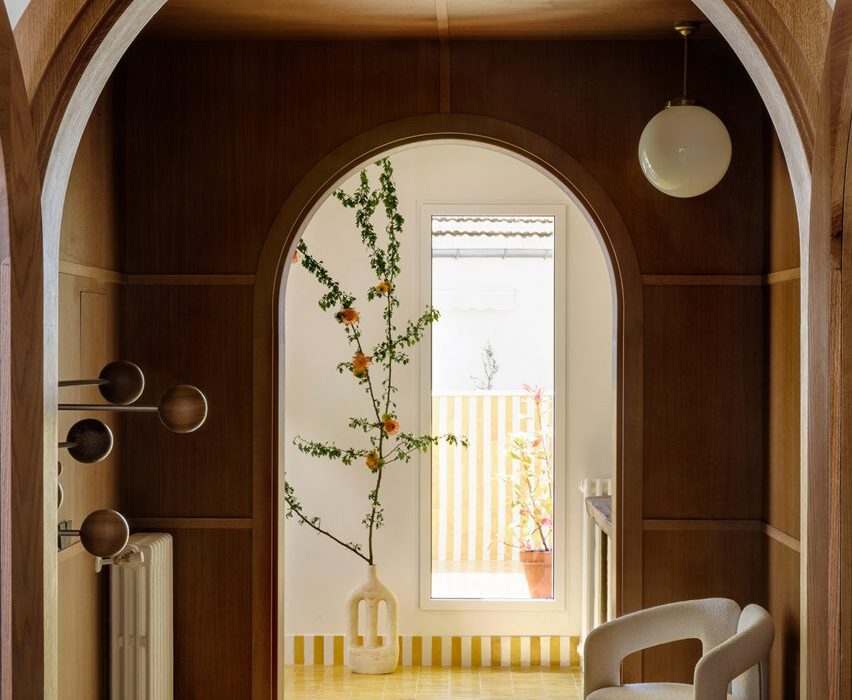
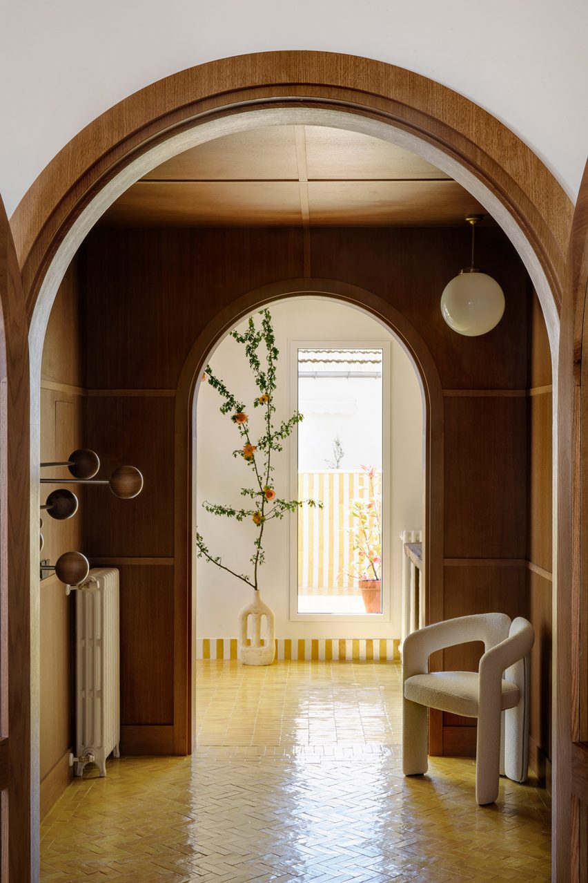
Spanish architecture studio Sierra + De La Higuera refurbished this Madrid apartment by organising open-plan living and dining areas on either side of a wood-panelled entrance hall.

The studio added two arched openings in wooden frames central to the hall, creating an intimate buffer zone in the open apartment.

Find out more about Conde Duque Apartment ›


A white curtain in front of a bedroom
Photo is by Andrew Snow

Broadview Loft, Canada, by StudioAC

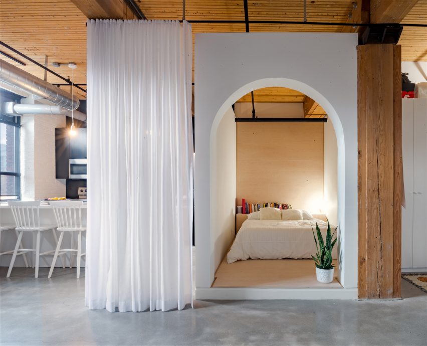
Canadian firm StudioAC inserted a millwork box with a large arched cutout into this open rectangular apartment in Toronto, separating the bedroom from the living space.

The impactful entry and lowered wall height of the box help to mark the transition from the open living space to the cosy sleeping nook.

Find out more about Broadview Loft ›


Diplomat's House in Rome by 02A
Photo is by Serena Eller

Diplomat’s Apartment, Italy, by 02A

This one-bed flat in Rome was designed by architecture and interiors studio 02A to adequately display the owner’s extensive collection of antique furniture and objects.

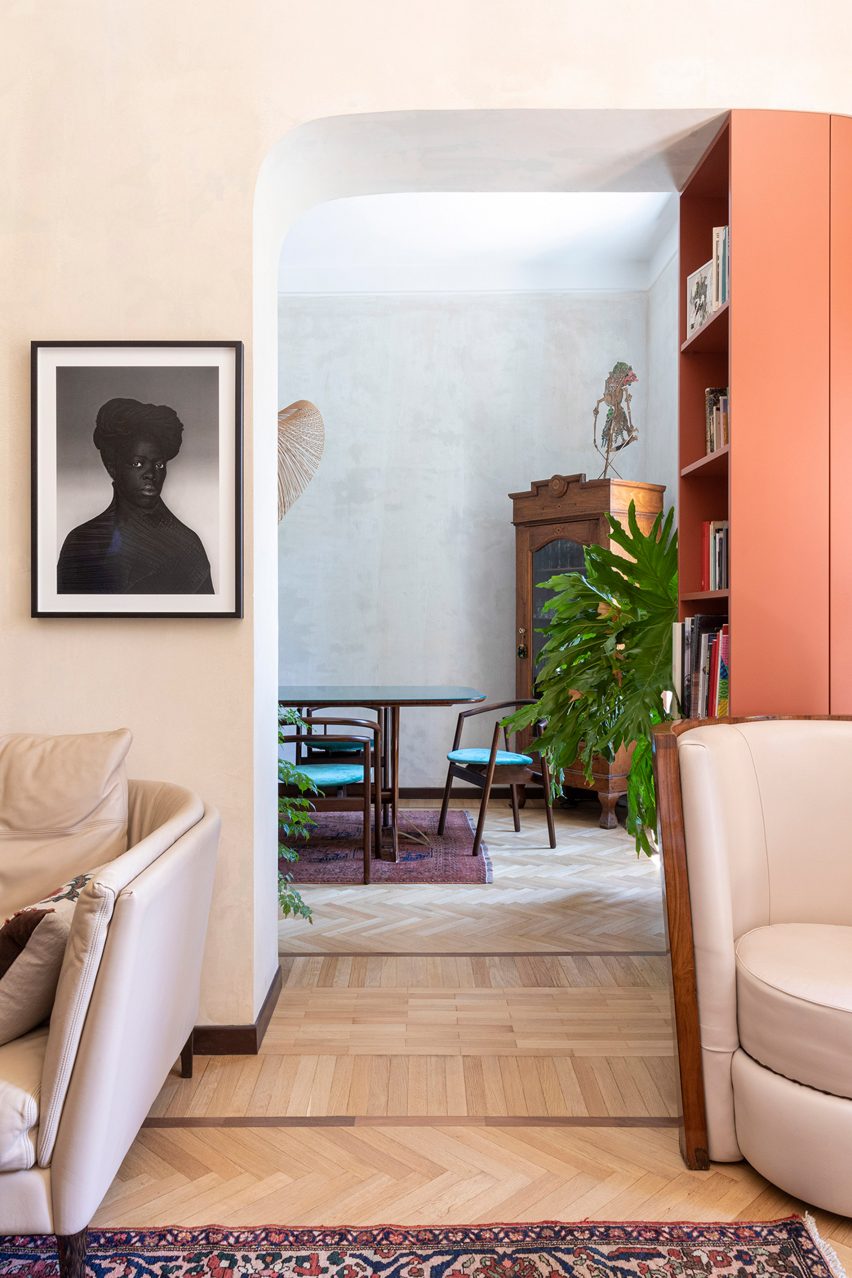
An arched passage with an integrated bookcase leads from the lounge to an intimate dining area. The change of space is also indicated by the change in pattern on the solid-oak parquet flooring.

Find out more about the Diplomat’s Apartment ›


Arched openings in Greetings from Rome apartment in Vilnius by 2XJ
Photo is by Darius Petrulaitis

Greetings from Rome, Lithuania, by 2XJ

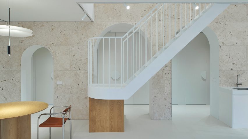
Three arches punctuate a structural stone wall that separates social and private spaces in this family apartment in the old town of Vilnius, designed by local architecture firm 2XJ.

The arches reminded the architects of the Colosseum in Rome, lending the project its tongue-in-cheek name – Greetings from Rome – and leading the studio to clad the wall in the material used for the landmark’s external walls, Italian travertine.

Find out more about Greetings from Rome ›


Casa Mille by Fabio Fantolino

Casa Mille, Italy, by Fabio Fantolino

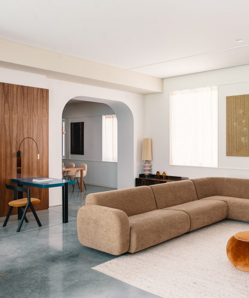
For his own apartment, Italian architect Fabio Fantolino overhauled the 1930s extension of a 19th-century palatial building in Turin by introducing accents of bright green and blue colours.

In the living room an opening with curved corners looks through to a dining area, which is complemented by the rounded corners of the taupe sofa.

Find out more about Casa Mille ›


Arched opening in bedroom of Upper Wimpole Street apartment by Jonathan Tuckey Design
Photo is by Ståle Eriksen

Upper Wimpole Street Apartment, UK, by Jonathan Tuckey Design

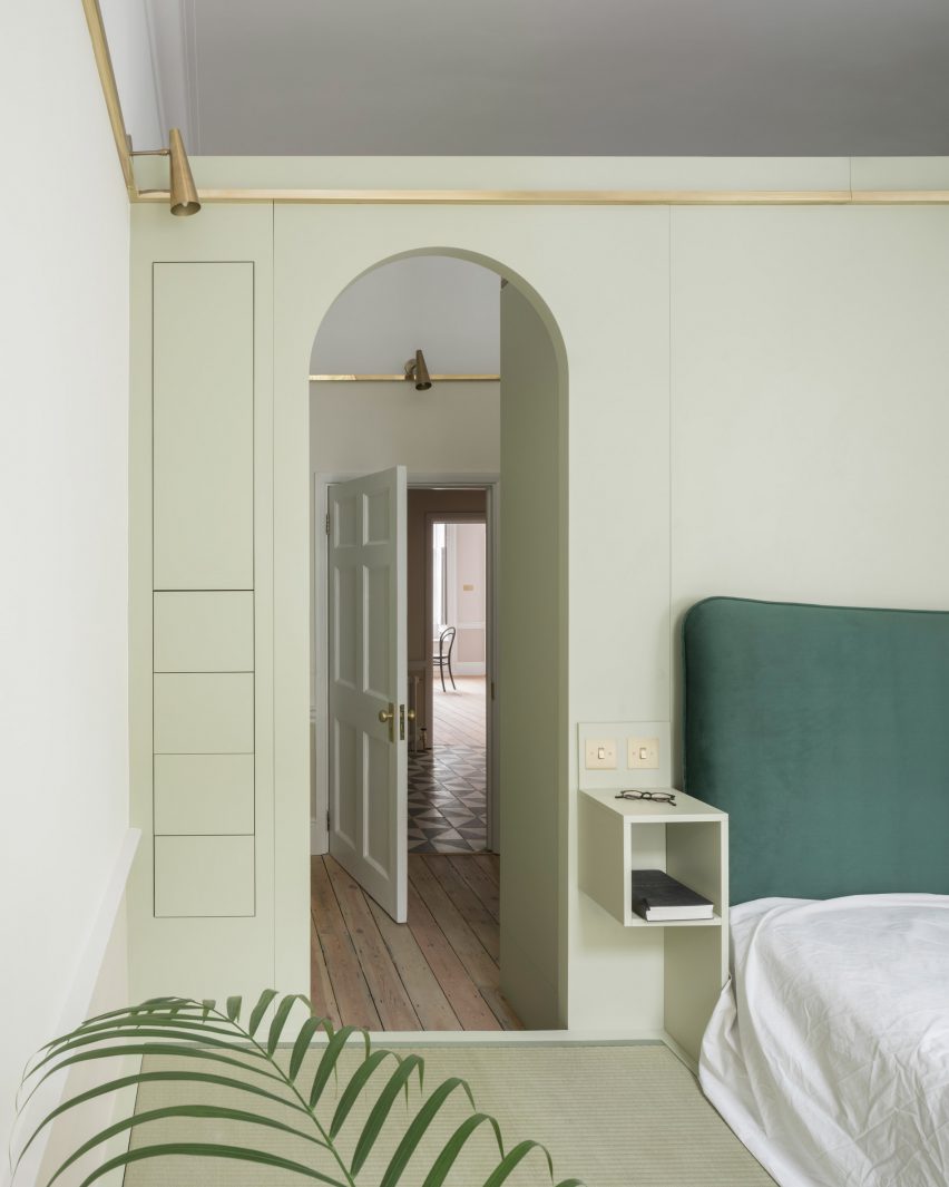
Architecture studio Jonathan Tuckey Design introduced MDF storage walls with built-in cupboards and arched niches to this townhouse apartment in London.

The studio also added tall arched openings into the joinery, which were informed by 15th-century oil paintings depicting biblical figures under soaring archways.

Find out more about Upper Wimpole Street Apartment ›


Interior of house in Akishima by Office M-SA
Photo is by Kazuhisa Kota

House in Akishima, Japan, Office M-SA

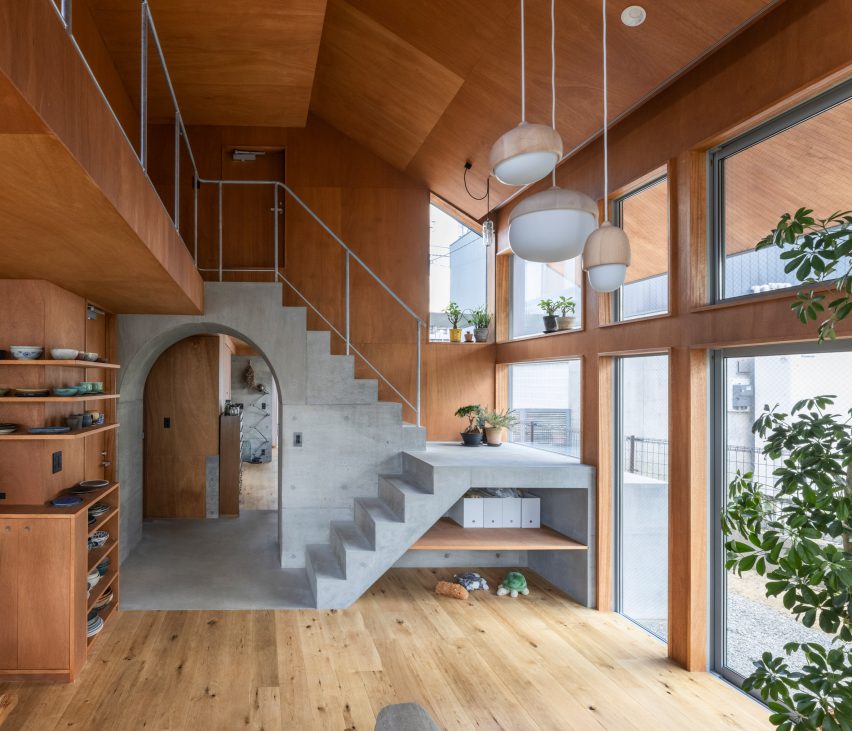
This house in Akishima, Tokyo, was arranged by Japanese architecture studio Office M-SA around a series of exposed concrete elements, including a staircase that runs over an archway that separates the kitchen and dining area from the study.

The concrete elements were designed to be permanent anchor points for the home’s timber wall construction, which can be altered or extended in the future to suit the owner’s needs.

Find out more about House in Akishima ›


Room for two by Studio Ben Allen
Photo is by Michael Sinclair

A Room for Two, UK, by Studio Ben Allen

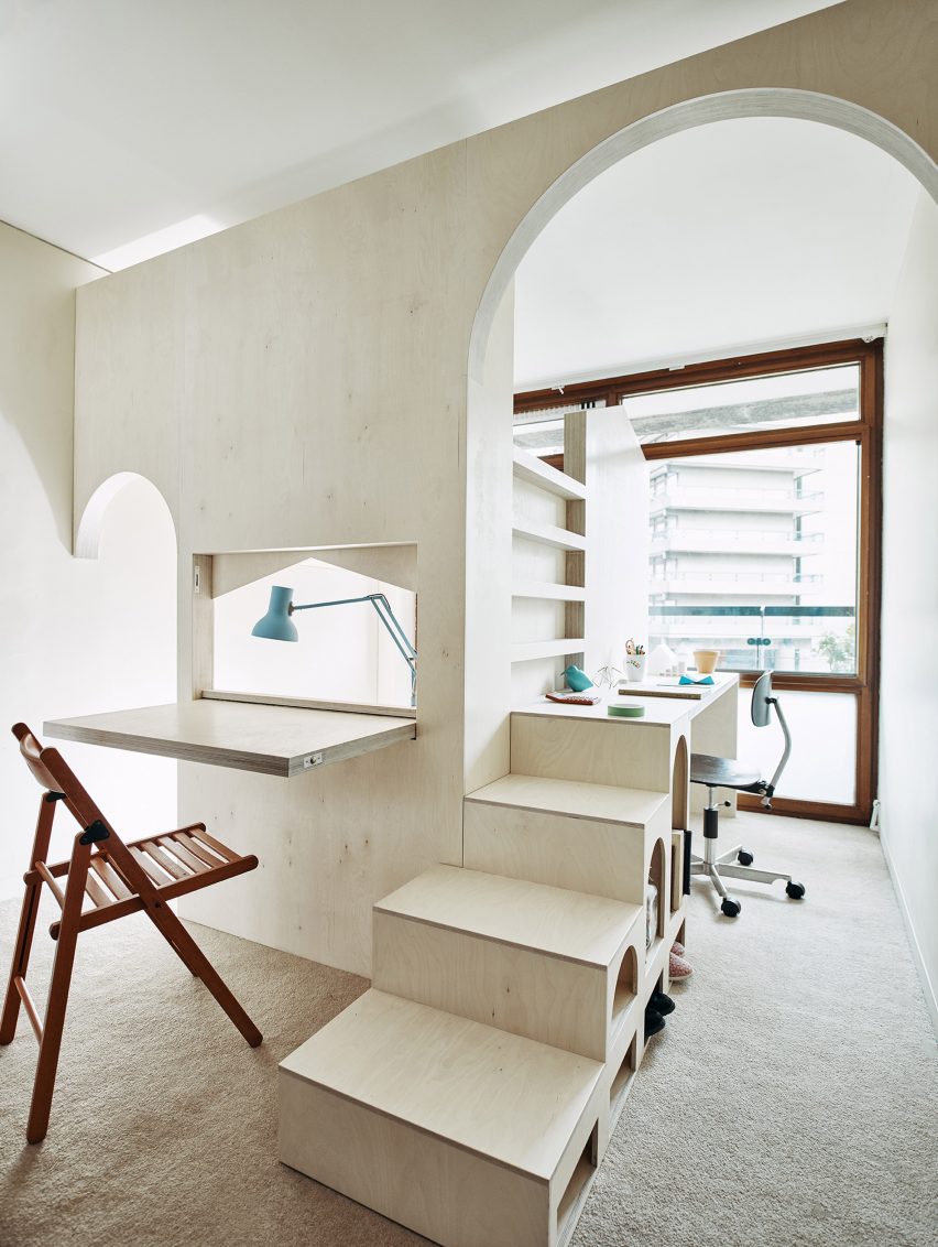
Built inside a flat in London’s Barbican Estate, this plywood structure designed by architecture firm Studio Ben Allen transforms the room into a pair of bedrooms and studies for two children.

The cut-out arches, which mimic the barrel-vaulted shape of the housing estate’s terrace apartments, indicate the entrances to each child’s space.

Find out more about A Room for Two ›


Arched opening in Maison à Colombages by 05AM Arquitectura
Photo is by Adrià Goula Sardà

Maison à Colombages, France, by 05 AM Arquitectura

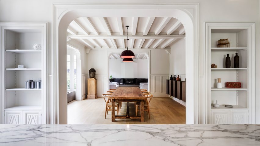
Spanish studio 05 AM Arquitectura aimed to incorporate a contemporary aesthetic while maintaining the traditional features of this 19th-century house located near Paris.

The studio removed partitions in the archways between the kitchen, dining and living spaces to connect the spaces and improve natural lighting while retaining the ornate wall mouldings that frame the openings.

Find out more about Maison à Colombages ›


Arched openings in interiors of penthouse apartment designed by PMAA
Photo is by José Hevia

Penthouse, Spain by PMAA

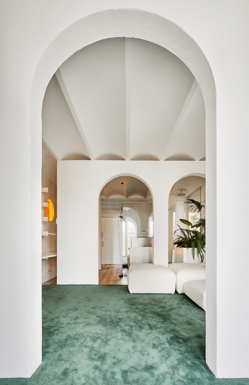
Architecture studio PMAA divided the living space of this Barcelona apartment with partition walls punctuated by a series of arched openings.

A large modular sofa dominates the living space and morphs around the columns of the archways. The geometric repetition of the arch was informed by the apartment’s vaulted ceiling and arched windows.

Find out more about Penthouse ›

This is the latest in our lookbooks series, which provides visual inspiration from Dezeen’s archive. For more inspiration see previous lookbooks featuring homes with statement balustrades, interiors that feature the Eames chair and living spaces with decorative use of tiles.

Reference

Ten energy-saving homes that meet Passivhaus standards
CategoriesSustainable News

Ten energy-saving homes that meet Passivhaus standards

As the cost of gas and electricity soars globally, we take a look at 10 highly-insulated Passivhaus homes that are designed to minimise energy consumption.

Passivhaus is an internationally recognised energy-performance standard that originated in Germany in the 1990s. It certifies low-energy buildings with high levels of insulation and airtightness.

Buildings of this kind often make use of triple glazing, solar heat gain and energy recovery ventilation systems. This means they can maintain an almost constant temperature, requiring little energy for heating and avoiding high energy bills.

In 2019, London studio Mikhail Riches and architect Cathy Hawley won the Stirling Prize for a social housing scheme in Norwich that helps tackle fuel poverty by meeting Passivhaus standards. At the time, sustainable architecture studio Architype said the win “puts Passivhaus in the spotlight – exactly where it needs to stay”.

Read on for 10 examples of Passivhaus homes:


Brick Passivhaus by McLean Quinlan
Photo is by Jim Stephenson

Devon Passivhaus, UK, by McLean Quinlan

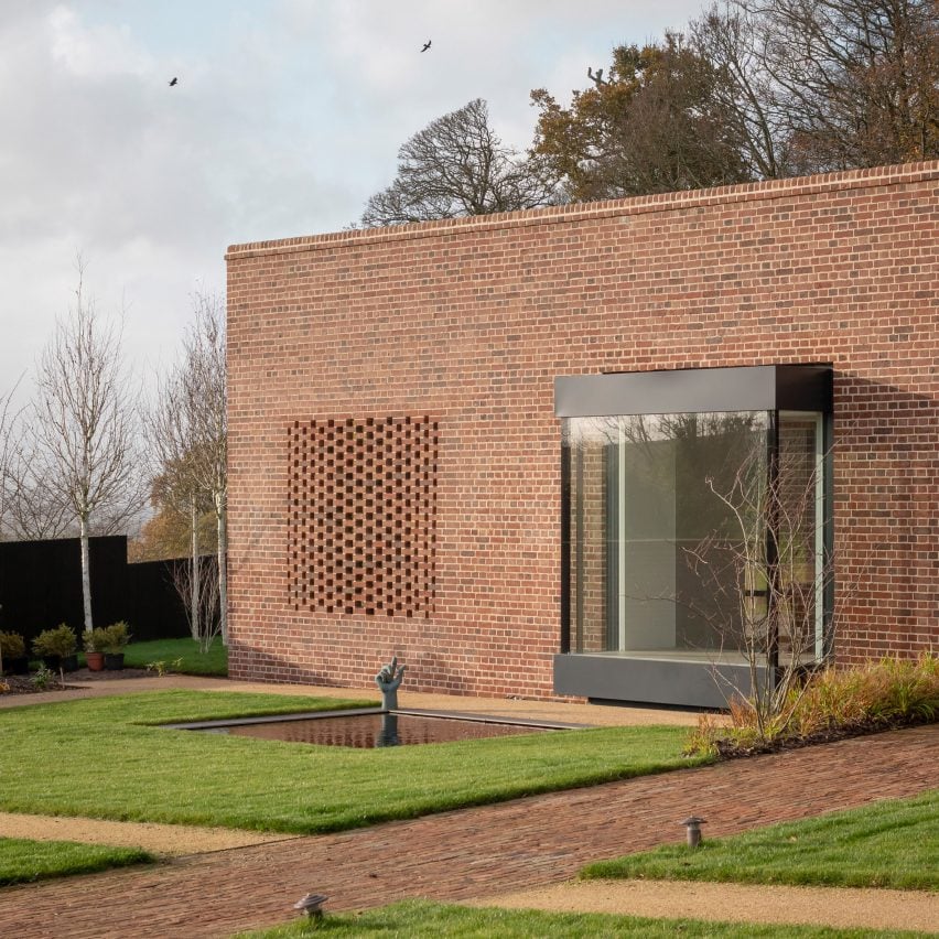
A linear red-brick wall distinguishes this low-rise Passivhaus home, which was designed by McLean Quinlan within a sloped walled garden in Devon.

It features substantial amounts of insulation and triple-glazing, as well as air source heat pumps, a heat recovery system, solar panels and battery storage that provide over 100 per cent of the required energy for the home.

Find out more about Devon Passivhaus ›


White exterior of Saltbox Passive House
Photo is by Raphaël Thibodeau

Saltbox Passive House, Canada, by L’Abri

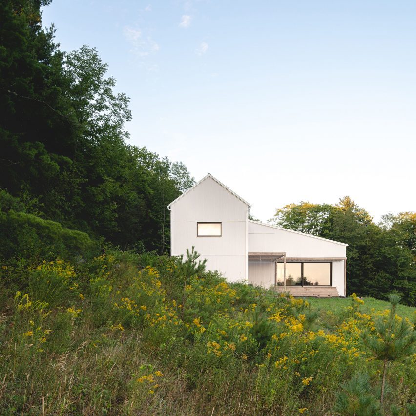
The vernacular architecture of Quebec informed the appearance of the Saltbox Passive House, which is the third house in the Canadian city to obtain Passivhaus certification.

It was designed by L’Abri to align with the standards of PHIUS, which is the largest Passivhaus certification system in North America. The studio also made use of wood siding and cellulose insulation to help lower the building’s embodied carbon.

Find out more about Saltbox Passive House ›


stained cedar-clad house in Utah
Photo is by Cityhome Collective and Kerri Fukui

TreeHaus, USA, by Chris Price

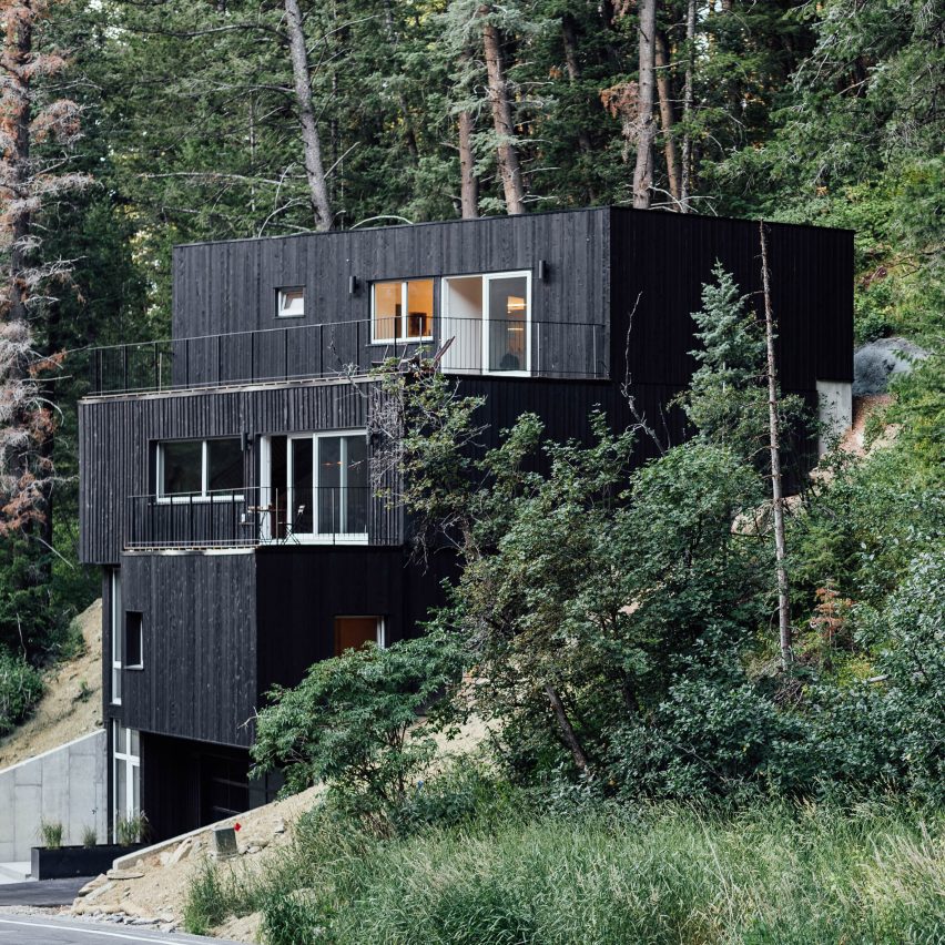
Architect Chris Price staggered a series of stained cedar-clad volumes down a slope in a Utah forest to create this Passivhaus residence for his own family.

The dwelling, aptly named TreeHaus, has a highly efficient envelope to ensure it stays warm during cold winter months when snowfall is frequent. Surrounding bedrock also helps to maintain warmth.

Find out more about TreeHaus ›


House clad in recycled spruce
Photo is by Adrià Goula

Casa GG, Spain, by Alventosa Morell Arquitectes

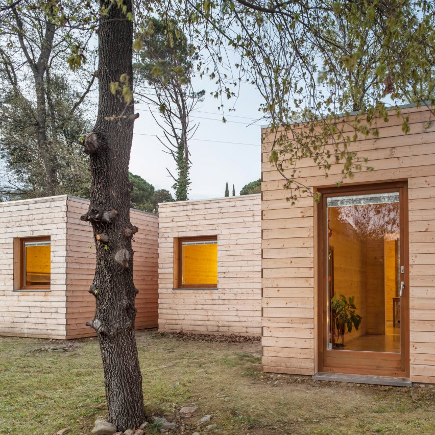
Casa GG is a prefabricated Passivhaus home near Barcelona that is covered in recycled spruce wood sourced from the surrounding landscape. It was built in just four months.

The home is divided into six modules, which Alventosa Morell Arquitectes aligned with the sun path to maximise solar heat gain. Its low-energy envelope means that it can be heated using a single radiator in colder seasons.

Find out more about Casa GG ›


Passivhaus home by Robert Arlt and Charles MacBride
Photo is by Vondelinde

PH01:BRK, USA, by Robert Arlt and Charles MacBride

This low-energy dwelling in South Dakota was created by architects Robert Arlt and Charles MacBride with a group of local architecture students to draw attention to the possibilities of sustainable construction.

According to the team, the PH01:BRK house is the first in the area to produce more energy than it consumes thanks to its energy-saving envelope and technologies including photovoltaic panels and a ventilation system that heats fresh air with the stale air leaving the house.

Find out more about PH01:BRK ›


Zinc-clad house by Paul Archer Design
Photo is by Andy Stagg

Day House, UK, by Paul Archer Design

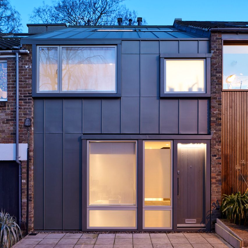
This zinc-clad mews house was designed by Paul Archer Design to replace a poorly insulated and leaky 1970s house in London.

The four-storey building, which looks like a two-storey home from the front, is super-insulated and complete with a heat recovery ventilation system that retains warmth to ensure it performs to Passivhaus standards.

Find out more about Day House ›


Old Water Tower home by Gresford Architects
Photo is by Quintin Lake

Old Water Tower, UK, by Gresford Architects

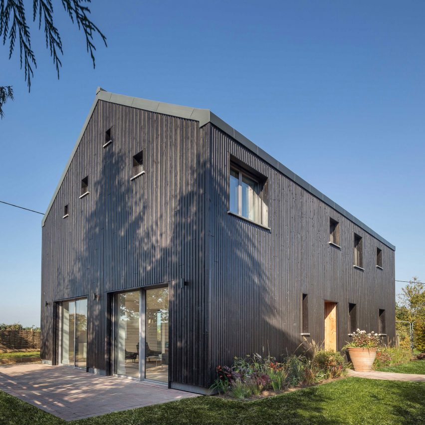
Located on the outskirts of a village in Berkshire, the barn-like Old Water Tower is a self-sufficient home designed and owned by Gresford Architects’ founder Tom Gresford.

Among its features are triple-glazed windows and external blinds that automatically close on the east, south and west elevations in hot weather to prevent overheating. The studio said its Passivhaus energy performance means it “costs virtually nothing to run”.

Find out more about Old Water Tower ›


cantilevered house in Spain
Photo is by Adrià Goula

Casa LLP, Spain, by Alventosa Morell Arquitectes

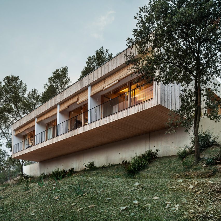
Another Passivhaus project by Alventosa Morell Arquitectes is this cantilevered residence that overlooks a mountain range near Barcelona.

Passive solar gain and highly insulated walls help keep the home warm and contribute to the building’s low energy consumption. Its space heating requirement is 9 kilowatt-hours per square metre – exceeding the level required to receive Passivhaus certification from the UK’s Passive House Organisation.

Find out more about Casa LLP ›


Wood-clad Forest Lodge by Pad Studio
Photo is by Nigel Rigden

Forest Lodge, UK, by Pad Studio

This low-energy prefabricated home in the New Forest was designed by Pad Studio to meet stringent planning regulations in the area, which aim to prevent damage to the site.

It performs to Passivhaus standards but is also largely self-sufficient, making use of rooftop solar panels, an air-source heat pump and on-site sewage treatment facilities.

Find out more about Forest Lodge ›


Student-designed Passivhaus in Kansas
Photo is by Studio 804

New York Street Passive House, USA, by Studio 804

Students in a design-and-build programme at the University of Kansas designed this house to offer “an example of the way housing can be done more responsibly in the future”.

The rectangular building is orientated to make use of passive solar gain and lined with insulation that performs nearly three times the minimum required by city code. It also makes use of eco-friendly materials and technologies including photovoltaic panels and an energy-recovery ventilator.

Find out more about New York Street Passive House ›

Reference

5 Ways Architects Can Combat Sterile Stereotypes of Elderly Care Homes
CategoriesArchitecture

5 Ways Architects Can Combat Sterile Stereotypes of Elderly Care Homes

Architizer is thrilled to announce that the 11th Annual A+Awards is officially open for entries! With an Early Entry Deadline of November 4th, 2022, the clock is ticking — get started on your submission today.

As the boomer generation grows old and cultural norms for caring for the elderly shift, retirement homes become increasingly important in our society. When we think of elderly care homes, a sterile and despondent image often comes to mind, one that typically lacks vitality, life and community. Retirement and nursing homes are complex spaces that facilitate a variety of tasks and undertakings. They do not only serve as living spaces; they are medical centers, social domains and spiritual places too. And such multiplex environments have proven to be complex design undertakings.

The architectural field plays an intrinsic role in the betterment of retirement communities. Through careful planning, a deep understanding of the elderly’s needs and a commitment to fostering community, elderly care homes can become places that nurture vibrant lifestyles for their aging population.

Encouraging Movement Through Accessible Floor Plans 

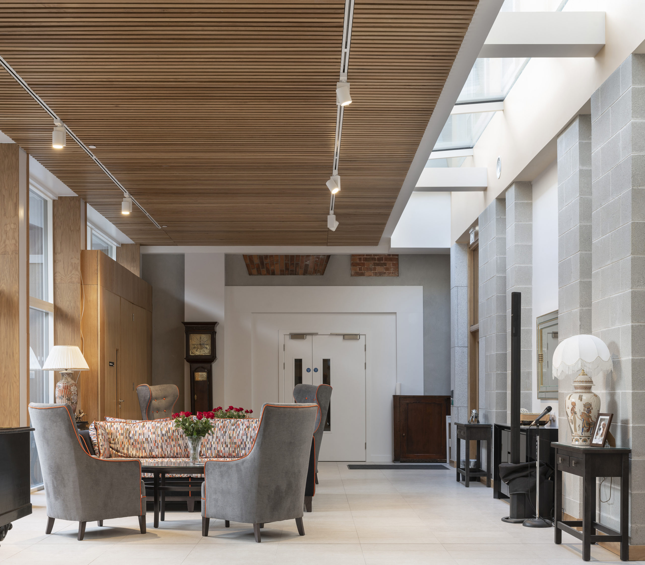
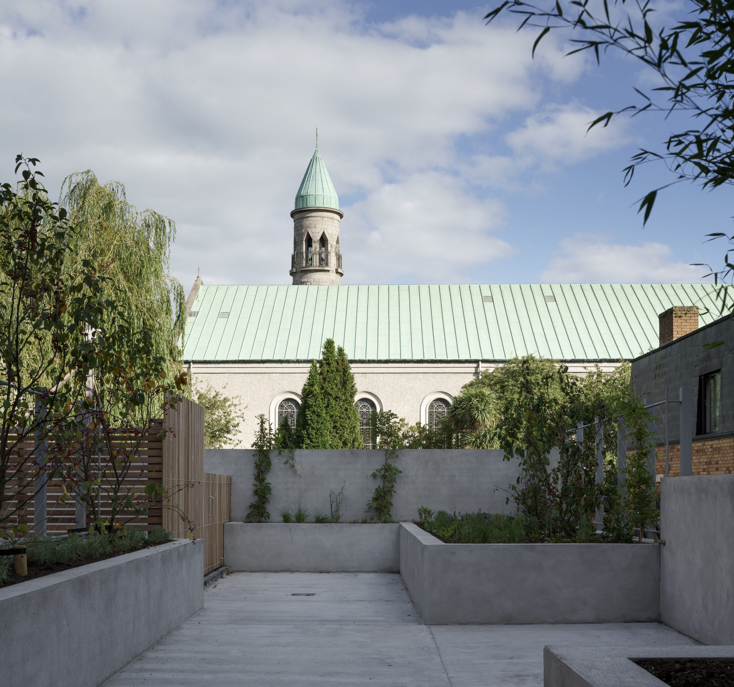
St John’s House Nursing Home by FKL architects, Dublin, Ireland, 2021

Physical mobility decreases with age, and it is imperative that elderly homes both limit and encourage movement. There is a fine line between accessible circulation and inaccessible movement, and architects can help encourage movement through well-devised and safe floor plans. The St John’s Nursing Home in Dublin, Ireland is a space that responds to elderly needs.

This renovation completely reconfigured its amenities in order to best serve its residents. The site’s original chapel was located in an inaccessible and non-central spot. The chapel was then relocated from its former position to a central spot that leads onto an external, enclosed structure. Centralizing this place of worship within the home makes for easier movement and as a result, encourages residents to engage in moments of devotion.

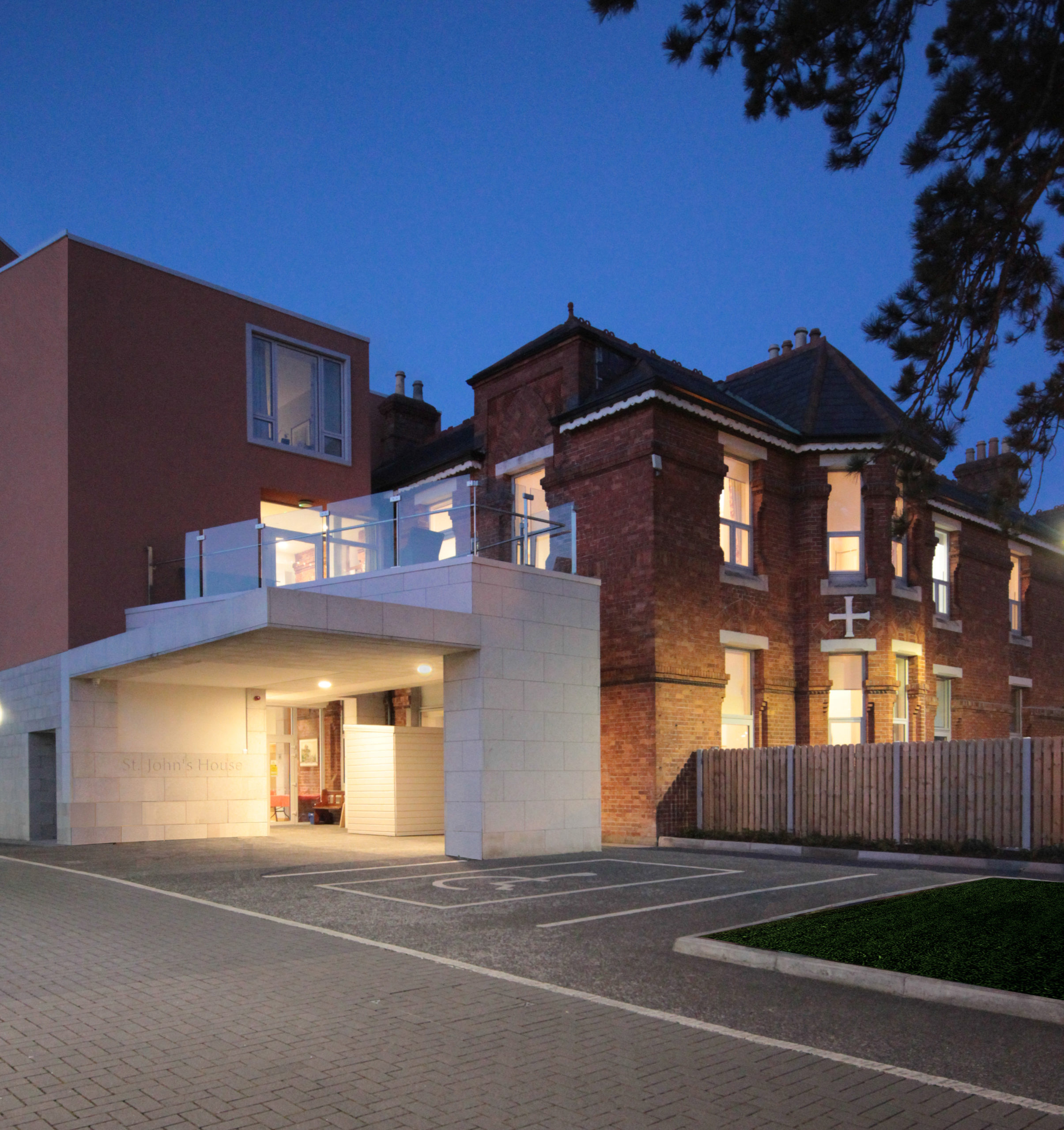
St John’s House Nursing Home by FKL architects, Dublin, Ireland, 2021.

At St John’s Nursing Home, a sheltered promenade was created to join the new building with the existing structure. Covered pathways are ideal for elderly residents as they encourage outdoor movement while protecting residents from extreme weather, such as heavy rainfall, which could cause slippery conditions. 

Moreover, herbs, vegetables and fruits were planted in the outdoor gardens, which create active outdoor spaces where residents can engage their senses through scents, textures and taste. The home’s interior design was carefully placed and boasts contrasting colors in order to remain accessible for residents with cognitive impairments. Thus, creating a space for accessible circulation and healthy movement. 

The Hainburg Nursing Home in Austria is another great example of accessible and tactical design. Inside, niches were implemented in front of each resident’s bedroom door, and thus turn the hallways into active spaces for circulation and gathering that are an extension of residents’ rooms. The interior surfaces are demarcated by their materiality: laminate and linoleum and wooden floors. Meanwhile, contrary to the anonymous and bland exteriors that lend a medical air to many nursing homes, this Austrian project is sheathed in a pattern of colored diamond-shaped Eternit-shingles, offering a unique expression of identity for the place that residents call home; which brings me to my next point.

Steering Away from Sterile Environments 

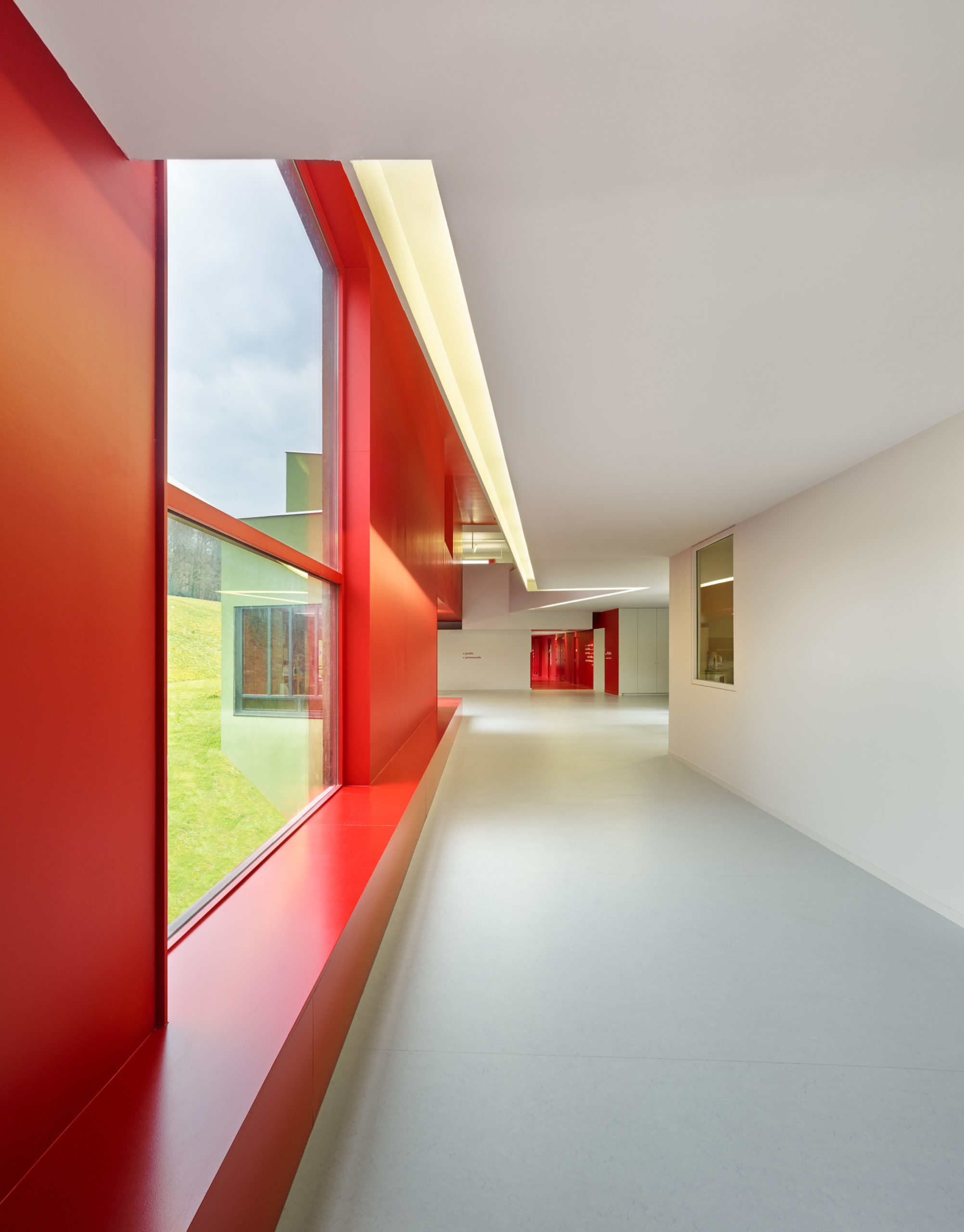
Home for Dependent Elderly People and Nursing Home by Dominique Coulon & Associés, Orbec, France. Photos by Eugeni Pons

Homes for the elderly encompass much more than a simple place to eat and rest. These spaces are typically equipped with large medical teams made up of doctors and nurses. More often than not, a pragmatic reality takes precedence over design creativity and as a result, sterile spaces are erected. 

However, there are ways to ensure that a caregiver’s work can be performed without a hitch while creating inviting and dynamic spaces. The simplest way to do so is through color. The Home for Dependent Eledery People and Nursing Home in Orbec, France chose unconventional colors for its design. The interior hallways are painted with a bright red and crisp white color, steering away from conventional medical palettes. Even the exterior’s green façade makes for an inviting space and connects the center to the surrounding landscape.

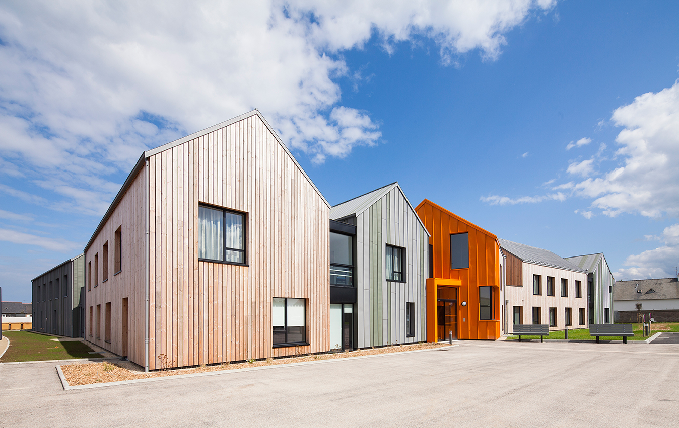
St Brieuc’s Elderly Establishment by Nomade Architectes, Saint-Brieuc, France | Photo by Mathieu Ducros

This bold use of color can be seen in additional homes, including the St Brieuc’s Elderly Establishment in France, which boasts a colorful interior and exterior purposefully done to energize the space. The design respects the area’s residential nature by breaking the program into nine small blocks and borrowing traditional architectural codes, such as double-pitched roof. The array of materials and color further differentiate units of the housing, reinforcing a sense of individuality for the residents in the community.

Encouraging Autonomy Through Separated Public and Private Spaces 

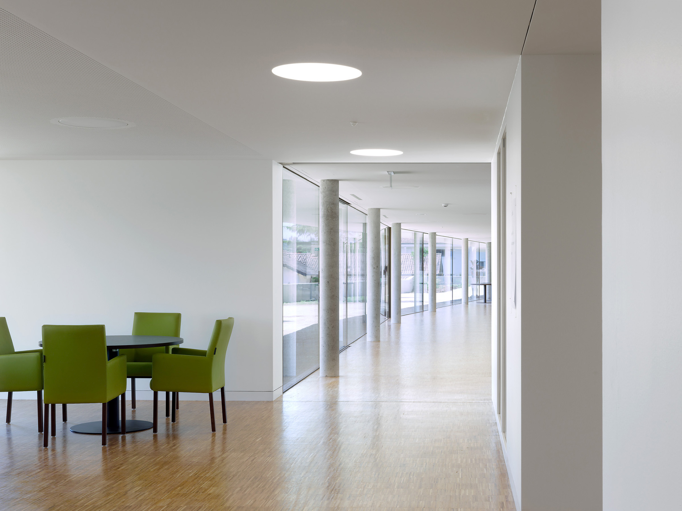
Indeed, balancing autonomy and independence can be a challenge when designing an old folk’s home, especially when most residents require assistance from staff. Separating public and private spaces in order to encourage independence — while not compromising community and efficient care — is key. The Old People’s and Nursing Home in Rolle, Switzerland finds a perfect balance between public and private spaces. Residents’ bedrooms are located on the upper floors while the main level is reserved for communal areas. Additional common spaces are added to upper floors, which encourages private gatherings and therefore, allow residents to socialize on their own terms. 

Old People’s and Nursing Home, Rolle by PIERRE-ALAIN DUPRAZ ARCHITECTE ETS FAS, Rolle, Switzerland, 2015.

Hospitality-Based Design

Some designers have approached the architecture of a senior’s home similarly to that of a hospitality space. The Nursing Home in Sceaux was informed by hotel designs and mimics a similar aesthetic through its thematic spaces. This home has three pronounced gardens, all of which boast a unique theme and create exploratory spaces for residents to discover.

Dining, lounging and media rooms are all separated to further encourage movement and exploration — just like one would in a hotel. Moreover, the entire façade is wrapped by wooden logs which create an enclosed passageway and provides an environment completely atypical of a nursing home but still safe for the elderly. 

Nursing Home in Sceaux by Philippe Dubus Architectes, Sceaux, France, 2013.

Hospitality-influenced design is equally see at the St Brieuc’s Eldery Establishment (mentioned earlier in this article) which has an in-house hair salon and delineated family reception area. These sorts of hospitality-focused spaces bridge the gap between the home and the outside world by providing a sense of ‘normal’ living. Residents can engage in mundane tasks such as visiting the hairdresser and hosting family. 

Improved Areas for Staff and Caregivers 

As important as it is to consider the residents’ needs when designing spaces for the elderly, it is equally paramount to take into consideration the very people that make these spaces possible — the staff. Caregivers have arguably one of the most challenging jobs and it is critical they are well-considered when designing nursing homes and retirement residences. Delineating clear environments where staff can perform their work, as well as look after themselves, help create an environment ideal for growing old.

Architizer is thrilled to announce that the 11th Annual A+Awards is officially open for entries! With an Early Entry Deadline of November 4th, 2022, the clock is ticking — get started on your submission today.

Reference

Act Now: List or Update Your Home in the Inventory of Zero Homes
CategoriesSustainable News Zero Energy Homes

Act Now: List or Update Your Home in the Inventory of Zero Homes

Did you know that as of the end of 2020, there were more than 17,000 zero energy housing units in North America? That’s a 26% increase over the previous year. Many more are in the pipeline for 2021. Other interesting facts: 75% of zero energy residences in North America are multifamily, and London, Ontario, Canada has more zero energy residences than any city in North America. This is the kind of information you can access from Team Zero’s Inventory of Zero Energy Homes

The Inventory of Zero Energy Homes provides a crucial metric to demonstrate the growth and viability of the zero energy movement. If you have designed, built, or purchased a zero energy home, be sure it is listed in the Inventory.  Because there are now new inventory data fields where you can provide more useful information on your home, if you already listed a home, please update your listing. You can add or update your listing here.

But act fast. Team Zero, EEBA, and the Zero Energy Project encourage builders, designers, and homeowners to submit new zero energy homes and update previously listed ones soon — so they’ll appear in the 2021 Inventory of Zero Homes report. 

The Inventory covers many categories: homes currently under construction, those in the design phase, and completed homes — whether they’re zero energy, positive energy/net producer homes, zero energy ready or passive homes. The 2021 Zero Home Inventory report will help build momentum for zero homes. Stand up and be counted by listing or updating your zero home in the Inventory now!


Reference