Eight hotel interiors characterised by eclectic designs
CategoriesInterior Design

Eight hotel interiors characterised by eclectic designs

From guest rooms filled with fashion designer Christian Louboutin’s personal antique collection to Ibiza’s oldest hotel where handmade masks are mounted on the walls, our latest lookbook features eight eclectic hotel interiors.

Eclectic design brings together objects and styles from a range of sources – often mixing contemporary and vintage pieces.

While many hotels are characterised by uniform luxury, others celebrate unlikely combinations of furniture, colours and patterns.

Here are eight eclectic hotel interiors from around the world defined by contrasts and clashes.

This is the latest in our lookbooks series, which provides visual inspiration from Dezeen’s archive. For more inspiration, see previous lookbooks featuring residential mezzanines, Mexican holiday homes and minimalist bathrooms.

Downtown LA ProperDowntown LA Proper
Photo courtesy of Kelly Wearstler

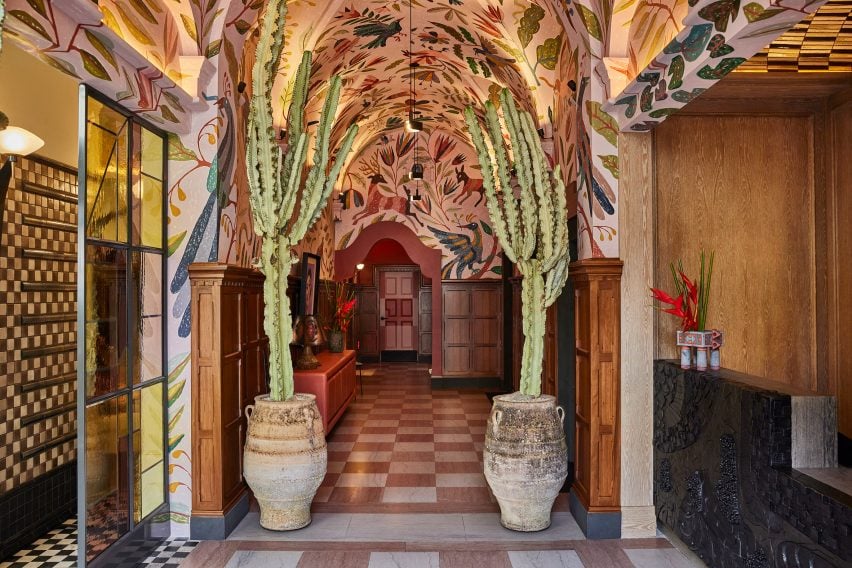
Downtown LA Proper, USA, by Kelly Wearstler

American designer Kelly Wearstler has created the interiors for all four of the Proper Hotel Group’s branches across North America.

The Downtown LA Proper is anchored by “bold and eclectic choices”, including a chunky graphite reception desk and a hand-painted archway flanked by leaning column-like cacti in rustic pots.

Find out more about Downtown LA Proper ›

Montesol Experimental hotel in Ibiza by Dorothée MeilichzonMontesol Experimental hotel in Ibiza by Dorothée Meilichzon
Photo by Karel Balas

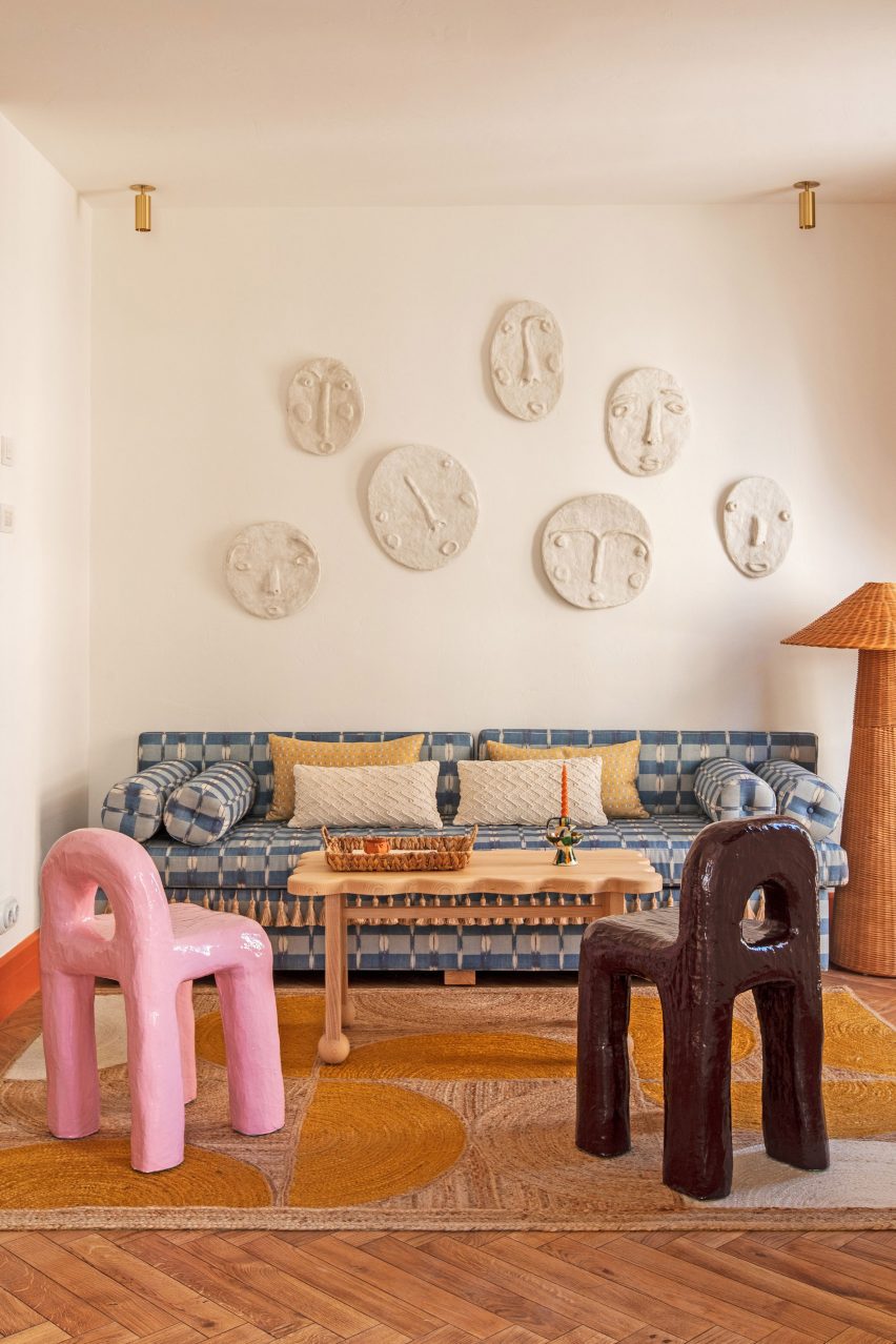
Montesol Experimental, Ibiza, by Dorothée Meilichzon

Dorothée Meilichzon of French interior design studio Chzon renovated Montesol – the oldest hotel in Ibiza, originally built in the 1930s.

Meilichzon transformed the renamed Montesol Experimental with “a bohemian overtone” that draws on the hotel’s rich history. Among its interior elements are lumpy Playdough Stools by artist Diego Faivre, hand-crafted masks and an abundance of tassels.

Find out more about Montesol Experimental ›

Monkey side table in Vermelho Hotel bedroomMonkey side table in Vermelho Hotel bedroom
Photo by Ambroise Tézenas

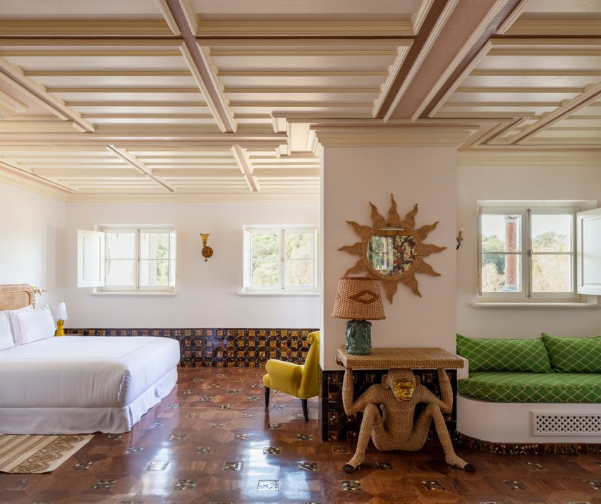
Vermelho, Portugal, by Christian Louboutin and Madalena Caiado

Louboutin filled his first hospitality project with furniture and materials from his personal antique collection.

The fashion designer worked with architect Madalena Caiado to create the Vermelho boutique hotel in the Portuguese village of Melides. The guest rooms feature unexpected elements such as a rattan monkey-shaped side table and striking hand-painted frescoes.

Find out more about Vermelho ›

Palm Heights Grand Cayman by Gabriella KhalilPalm Heights Grand Cayman by Gabriella Khalil
Photo by Brooke Shanesy

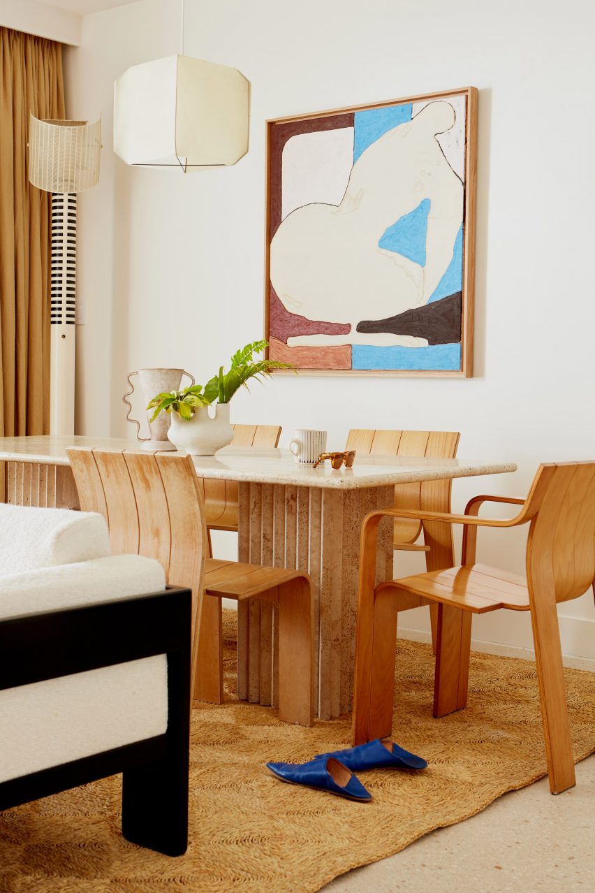
Palm Heights, Grand Cayman, by Gabriella Khalil

Collectible design pieces characterise Palm Heights in Grand Cayman, the island’s first boutique hotel.

Creative director Gabriella Khalil sought to style the project like a 1970s Caribbean mansion, selecting sandy yellows and bold blue hues to complement the many original artworks that adorn the walls.

Find out more about Palm Heights ›
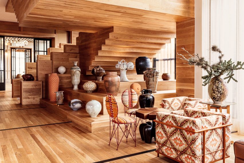

Kelly Wearstler-designed hotel in AustinKelly Wearstler-designed hotel in Austin
Photo by The Ingalls

Austin Proper Hotel and Residences, USA, by Kelly Wearstler

Among the Proper Hotel Group’s other locations is an Austin branch. Wearstler inserted a sculptural oak staircase into the lobby that doubles as a plinth for a varied collection of glazed earthenware pots and vases.

Locally sourced art and textiles characterise the hotel, which has cypress wood walls that were charred using the traditional Japanese technique of Shou Sugi Ban to create a tiger-striped effect.

Find out more about Austin Proper Hotel ›
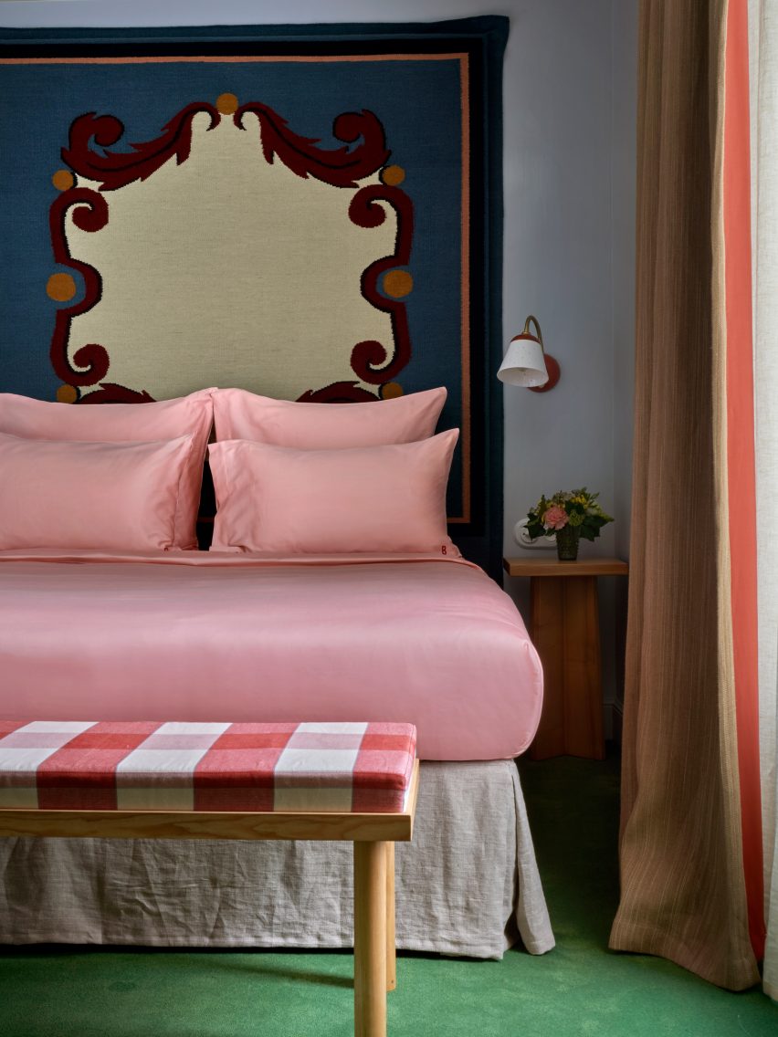

Bedroom with patterned headboardBedroom with patterned headboard
Photo by Simon Brown

Hôtel de la Boétie, France, by Beata Heuman

Swedish designer Beata Heuman created the Hôtel de la Boétie in Paris to be “a bit like a stage set”.

Heuman chose contrasting elements for the colour-drenched interiors. Bedrooms feature a mixture of dark-hued woven headboards and pale pink sheets, while downstairs, the reception area’s jumbo flower lamps balance the steely silver of the lounge walls.

Find out more about Hôtel de la Boétie ›
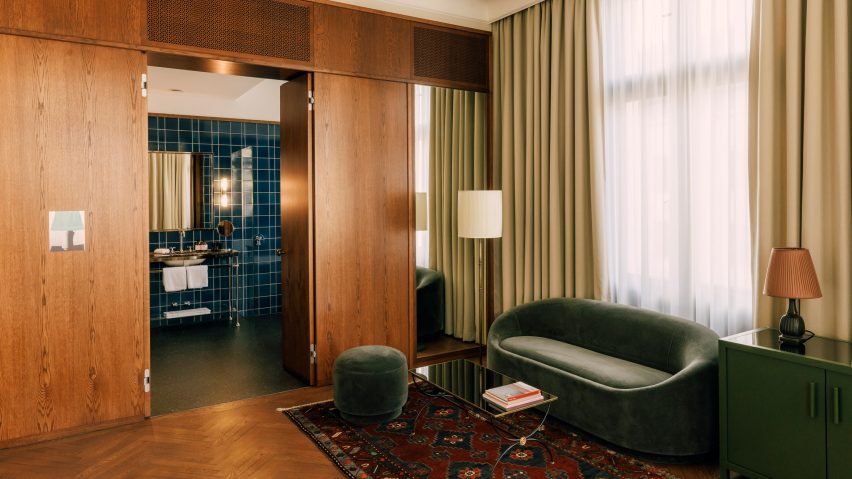

Château Royal hotel in Berlin by Irina Kromayer, Etienne Descloux and Katariina MinitsChâteau Royal hotel in Berlin by Irina Kromayer, Etienne Descloux and Katariina Minits
Photo by Felix Brueggemann

Château Royal, Germany, by Irina Kromayer

A series of eclectic spaces make up the Château Royal in Berlin, which references the heyday of the German capital at the turn of the 20th century.

Interior architect Irina Kromayer designed the hotel to be “authentic” rather than retro, choosing art noveau tiles and brass and nickel hardware in a nod to the finishes commonly found in Berlin’s historic buildings.

Find out more about Château Royal ›
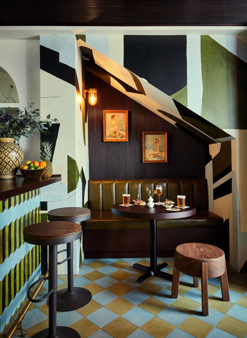

A green hotel barA green hotel bar
Photo by Christian Harder

Esme Hotel, USA, by Jessica Schuster Design

Plush velvet flooring, textural tassels and plants in wicker pots come together at the Esme Hotel in Miami, renovated by New York studio Jessica Schuster Design.

The interiors draw on the “bohemian grandeur” of the hotel’s 1920s history, with decadent alcoves clad with contrasting patterns.

Find out more about Esme Hotel ›

This is the latest in our lookbooks series, which provides visual inspiration from Dezeen’s archive. For more inspiration, see previous lookbooks featuring residential mezzanines, Mexican holiday homes and minimalist bathrooms.

Reference

Post Company imbues Mollie Aspen hotel interiors with earthy hues
CategoriesInterior Design

Post Company imbues Mollie Aspen hotel interiors with earthy hues

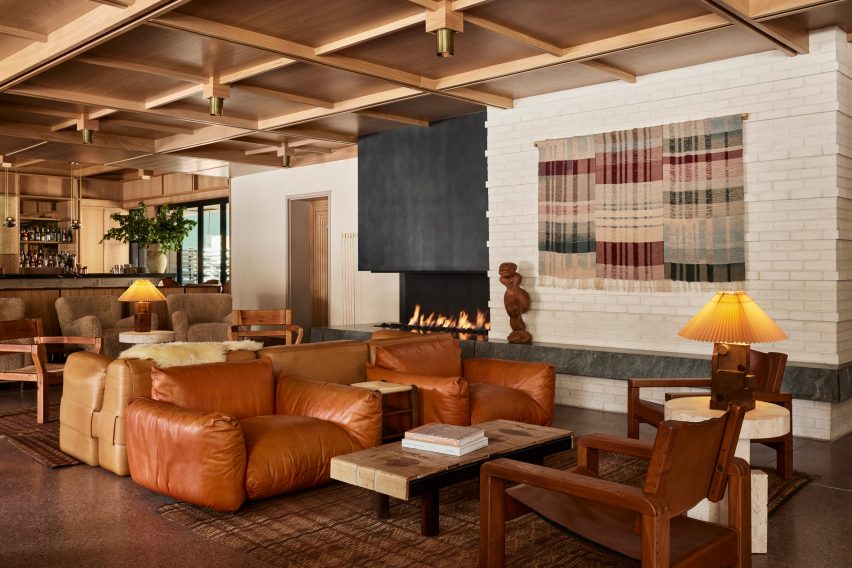
New York studio Post Company has designed warm, wood-filled interiors for a boutique hotel in Aspen, Colorado, which offers a pared-back take on the Arts and Crafts style.

Mollie Aspen occupies a new timber-clad building designed by CCY Architects and developed and operated by HayMax in the mountain city’s downtown area.

Lobby lounge at Mollie Aspen with earth-toned furniture and a gridded wood ceilingLobby lounge at Mollie Aspen with earth-toned furniture and a gridded wood ceiling
With an open fireplace as a backdrop, the lobby lounge at Mollie Aspen features earth-toned furniture and a gridded wood ceiling

Post Company was tasked with creating the interiors for the 68-room hotel, combining contemporary Scandinavian and Japanese design elements for a serene take on Rocky Mountain luxury.

“Mollie is designed for those with a natural curiosity and appreciation for connection and offers visitors a unique, welcoming respite in the bustling mountain town,” said the hotel’s team.

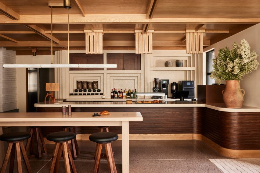
All-day cafe in the Mollie Aspen lobby All-day cafe in the Mollie Aspen lobby
An all-day cafe in the lobby serves pastries and beverages from a walnut-wrapped counter

An abundance of wood can be found throughout the different spaces, with numerous varieties creating a layered effect of different colours and grain patterns.

The timber is crafted into elements like gridded wall and ceiling panels with built-in lighting, which evoke an Arts and Crafts aesthetic, as well as fluted counterfronts and a range of furniture pieces.

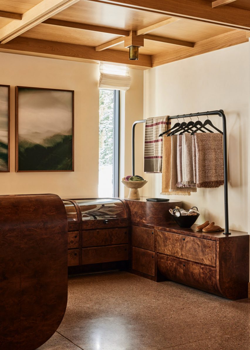
Burl wood counters and displays in a retail spaceBurl wood counters and displays in a retail space
Burl wood counters and displays present goods in the hotel’s retail space

The majority of the materials used in Mollie’s construction were sourced from the Western United States to reduce waste, according to the team.

Meanwhile, other accents like earthen ceramics, hand-dyed textiles and sand-casted brass add to the cosy atmosphere.

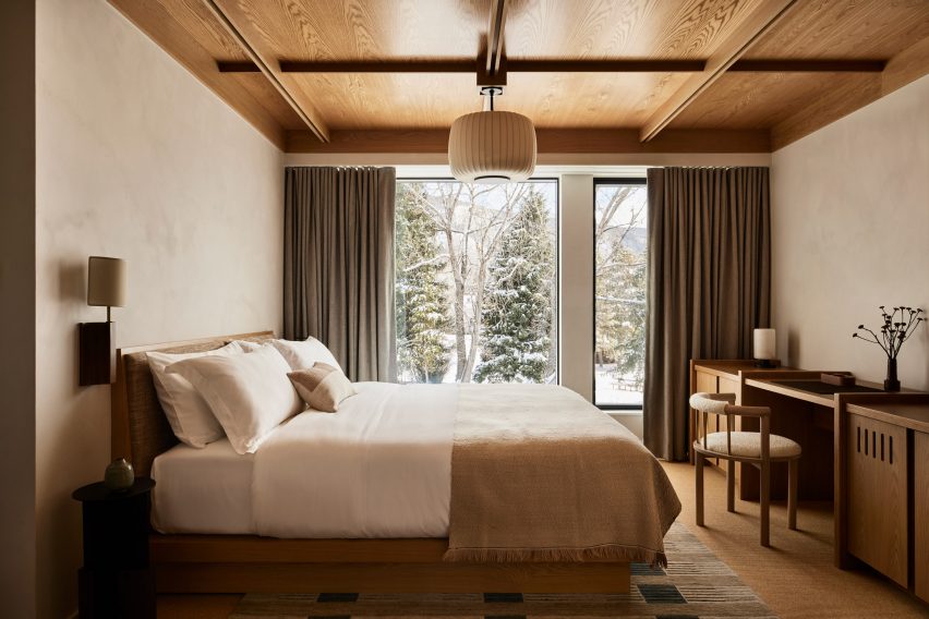
Guest room with neutral decorGuest room with neutral decor
Guest rooms offer an even more pared-back take on the neutral decor palette

“These materials are incorporated throughout the hotel to mimic the area’s rough-hewn mountains while large windows frame views of the surrounding landscape and bring an abundance of light into the hotel,” said the team.

The lobby lounge is designed as a cosy gathering space for guests and the public, with a large open fireplace providing a backdrop.

Beige plaster walls and textured carpet in a guest roomBeige plaster walls and textured carpet in a guest room
Beige plaster walls and textured carpets complement the wood ceilings in the guest rooms

Chunky leather, velvet and boucle sofas and armchairs in a range of earthy hues form comfy conversation nooks.

At one end of the room, the black-topped bar spans the full width and is illuminated by a row of globe-shaped pendant lights suspended from thin brass bars.

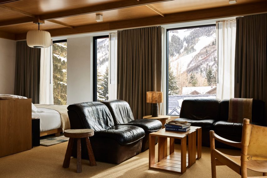
Guest suite with black leather furniture and snowy mountain viewsGuest suite with black leather furniture and snowy mountain views
Black leather furniture in the larger suites offers a contrast to the other furniture pieces and snowy mountain views

A repeated geometric pattern across the pale counter front is also found on door panels leading to other hotel areas.

An all-day cafe at the opposite end of the lobby serves pastries and an assortment of beverages from a walnut-wrapped counter, and the restaurant

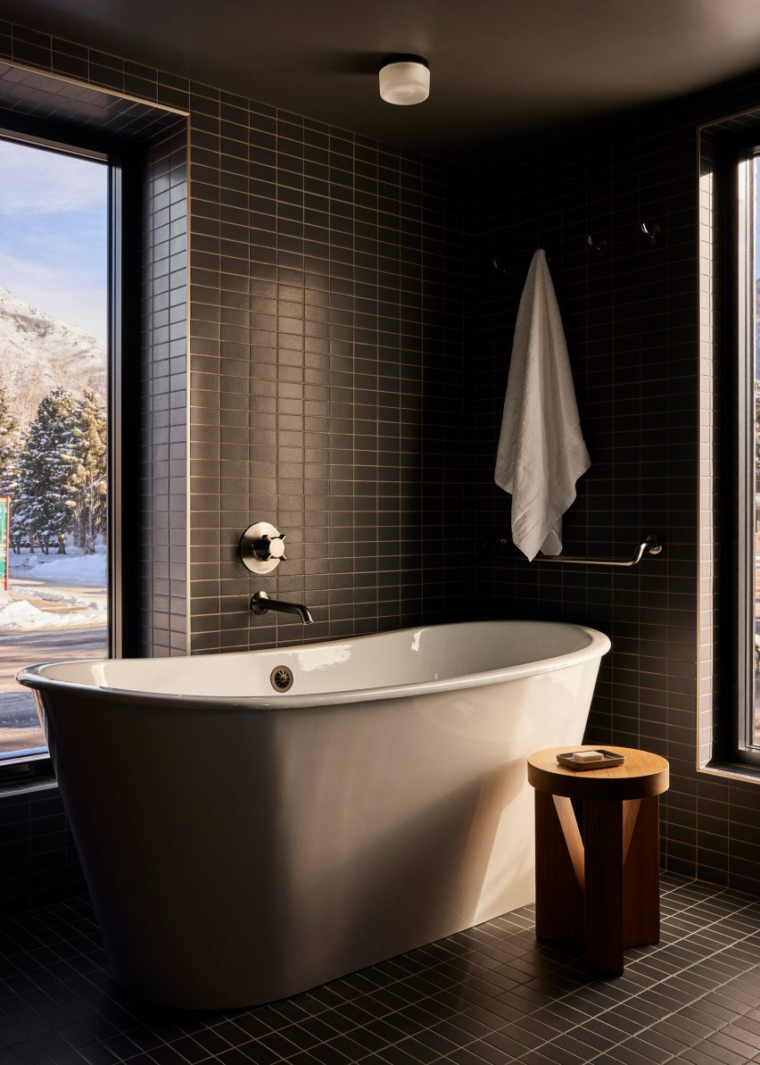
Bathroom with dark green tiles and freestanding white bathtubBathroom with dark green tiles and freestanding white bathtub
Dark green tiles in the bathrooms match the spruce trees outside

In the adjacent retail space, burl wood counters and displays with curved edges, some of which are topped with glass vitrines.

On the third floor is a roof terrace with a bar and a spa pool set to open in Spring 2024, while a fitness facility and flexible meeting space are located at ground level.

The guest rooms continue the soft, neutral palette in a more pared-back style.

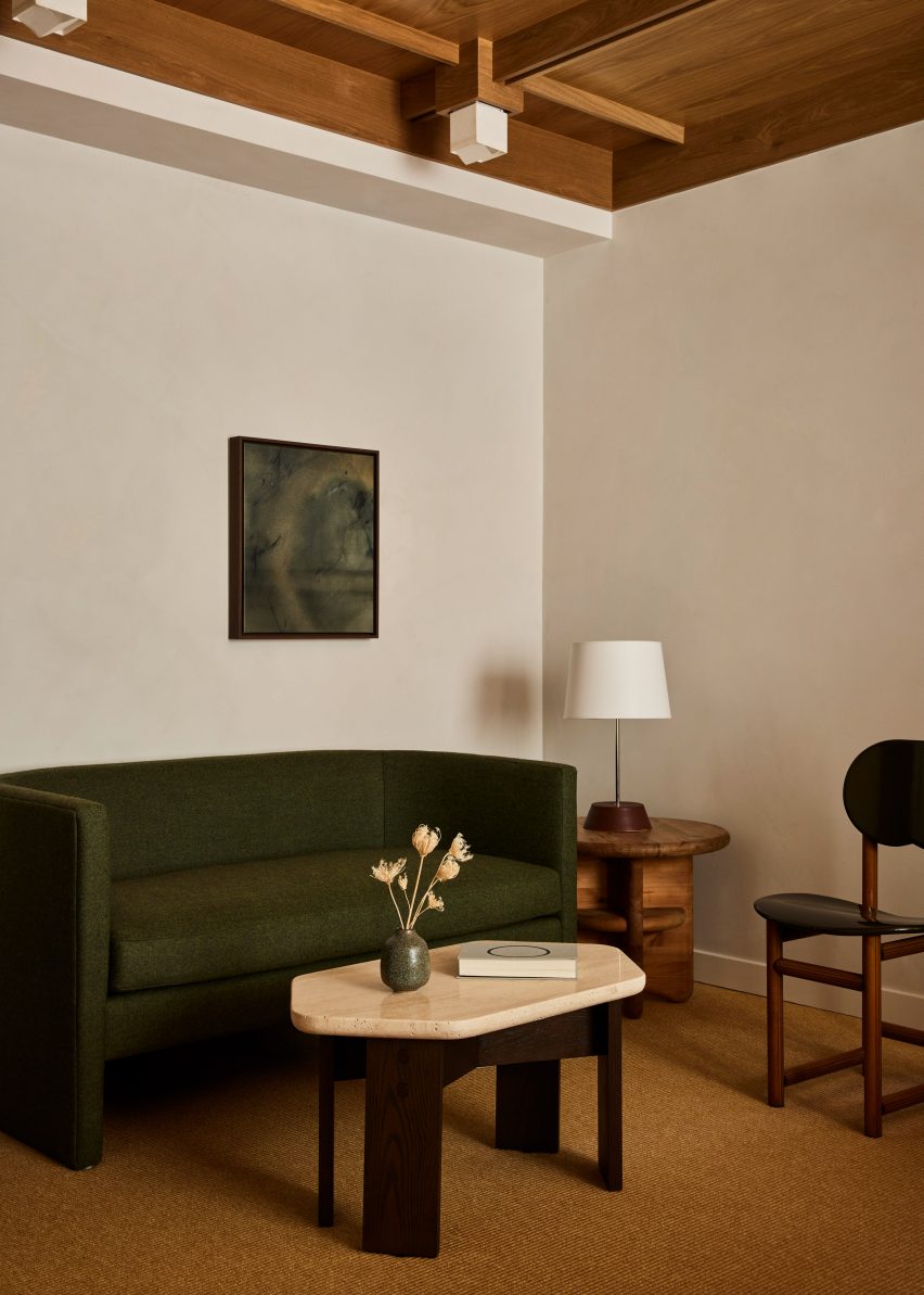
Beige plaster walls, textured carpets and green-grey curtains complement the wood ceilings and built-in furniture, while black leather chairs add contrast.

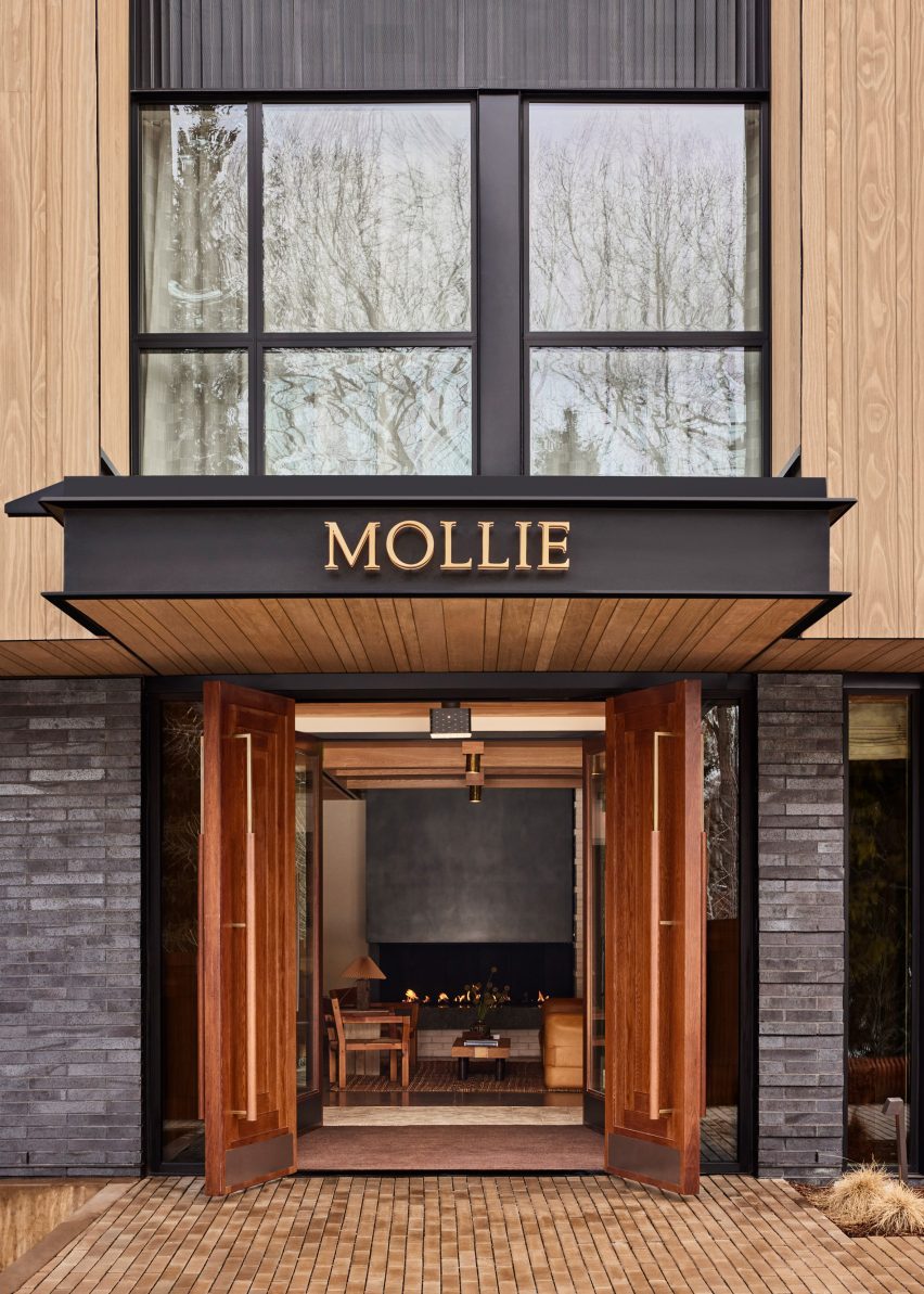
Mollie Apsen entrance with logo on the entrance canopyMollie Apsen entrance with logo on the entrance canopy
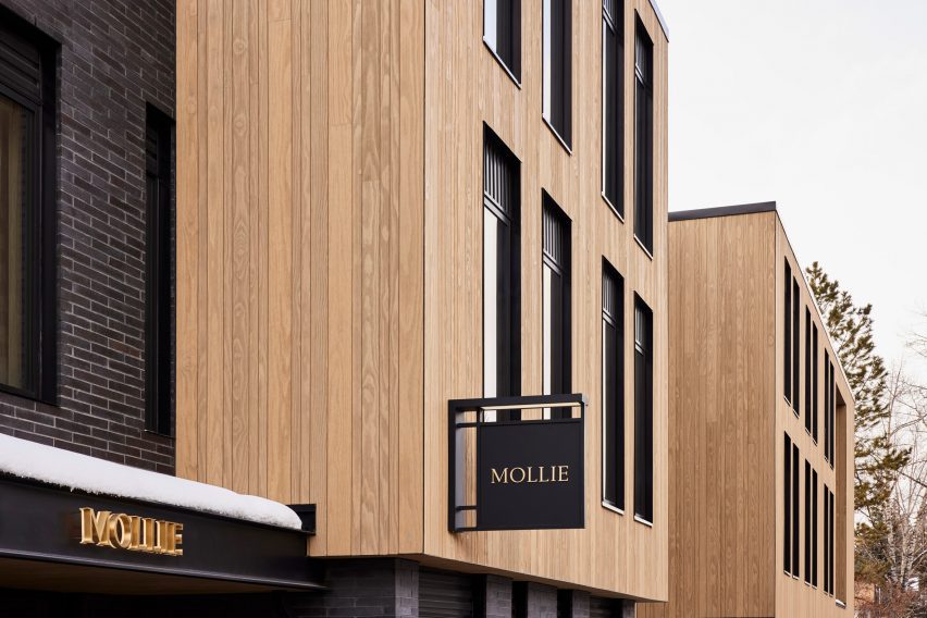
Mollie Aspen is located within a newly constructed building by CCY Architects

Dark green stacked tiles that line the bathrooms match the spruce trees outside and freestanding tubs beside the windows allow guests to enjoy the view while soaking.

“Guests are left with a sense of Aspen’s cultural and recreational history, providing a lens to appreciate its contemporary personality and influence,” the team said.

Mollie Aspen's wood-clad exteriorMollie Aspen's wood-clad exterior
The building was constructed largely from materials sourced from the Western US

Aspen is a renowned destination for winter sports and affluent vacationers, and CCY Architects has designed several private residences in and around the town – among them an extension to a Victorian house, a residence nestled in a grassy valley and a retreat that overlooks the dramatic mountainous scenery.

Formerly known as Studio Tack, Post Company’s previous hotel projects include the Anvil Hotel in Wyoming, The Sandman in California, and Scribner’s Catskill Lodge in New York.

The photography is by Nicole Franzen.

Reference

Archiloop converts Italian monastery into hotel Vocabolo Moscatelli
CategoriesInterior Design

Archiloop converts Italian monastery into hotel Vocabolo Moscatelli

A 12th-century monastery in Italy’s Umbria region has become a boutique hotel in the hands of Florence studio Archiloop, which aimed to retain the site’s “rustic simplicity” during its renovation.

Vocabolo Moscatelli sits in the countryside near the hamlet of Calzolaro, close to the Tuscan border, on a remote estate surrounded by woodland.

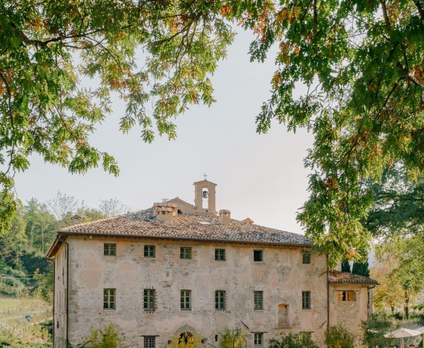
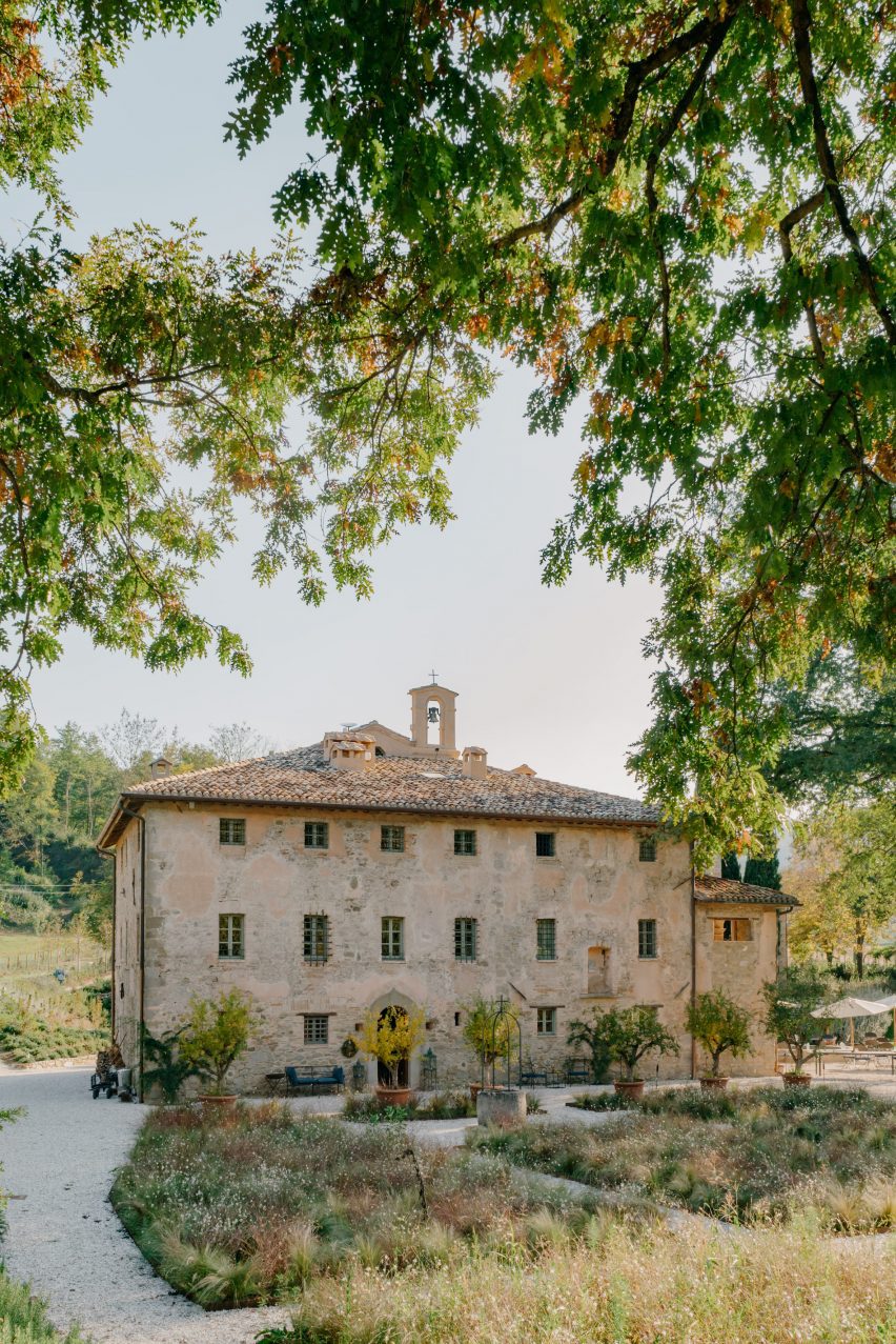
Exterior of converted monastery building with a bell tower, surrounded by landscapingExterior of converted monastery building with a bell tower, surrounded by landscaping
Vocabolo Moscatelli occupies a converted monastery in Umbria

The property was discovered by chef concierge Frederik Kubierschky and his partner Catharina Lütjens, who set about restoring the various 800-year-old stone buildings with the help of architect Jacopo Venerosi Pesciolini of Archiloop.

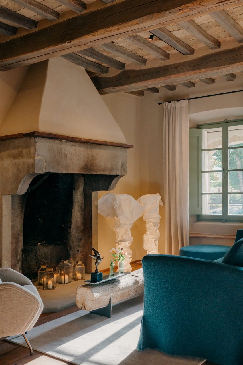
Aiming to retain the historic charm and as much of the original features as possible, the team kept the original wooden floors, exposed terracotta brickwork and ceiling beams, alongside brass, iron and stone details.

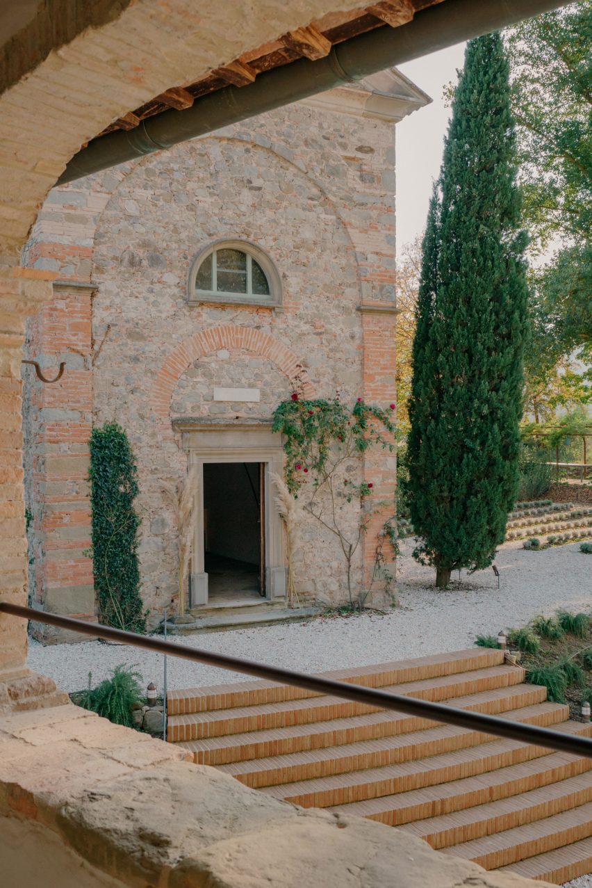
Stairs leading up to Vocabolo Moscatelli hotel in converted monasteryStairs leading up to Vocabolo Moscatelli hotel in converted monastery
The original brick and stone buildings were restored by Archiloop

They worked with local craftspeople on the restoration of these elements and incorporated new pieces by artists and designers from across the region, too.

“Vocabolo Moscatelli brings together the stone mason, blacksmith and woodworker with the artisan makers: ceramicists, tile makers and painters, creating a boutique style canvas that plays homage to the past while bringing in the design references of the now,” said the hotel team.

Seating area with fireplace inside Hotel Vocabolo Moscatelli in Umbria by ArchiloopSeating area with fireplace inside Hotel Vocabolo Moscatelli in Umbria by Archiloop
Timber ceiling beams are left exposed throughout the hotel

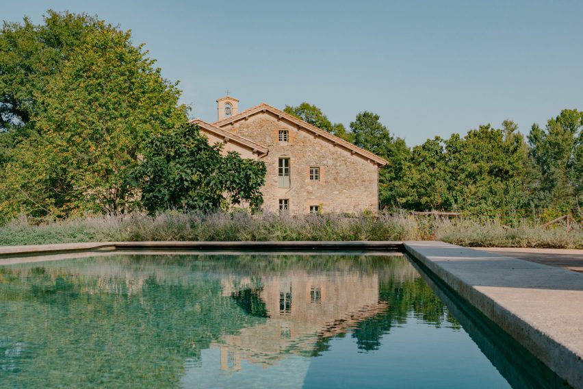
New additions to the site include a travertine swimming pool, coloured to match the surrounding woodland and Mediterranean landscaping by Fabiano Crociani.

“Threaded smoothly together, the effect is a template of rustic simplicity with heart,” the team said.

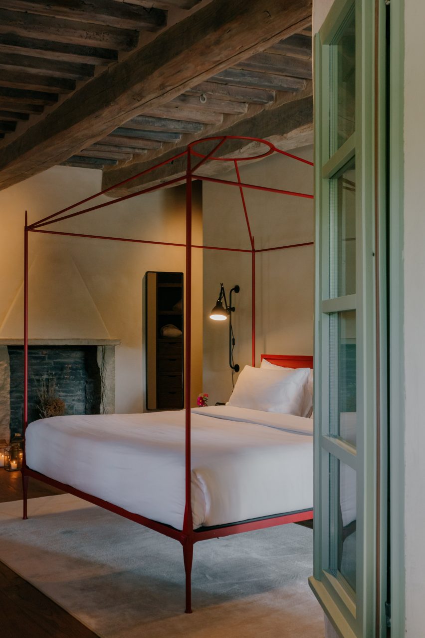
Bedroom with a red-framed, four-posted bedBedroom with a red-framed, four-posted bed
Each of the property’s 12 guest suites is unique and includes a custom bed frame

Vocabolo Moscatelli offers 12 spacious guest suites: eight in the main building and four more dotted around the landscaped grounds, all with a “monastic chic” style.

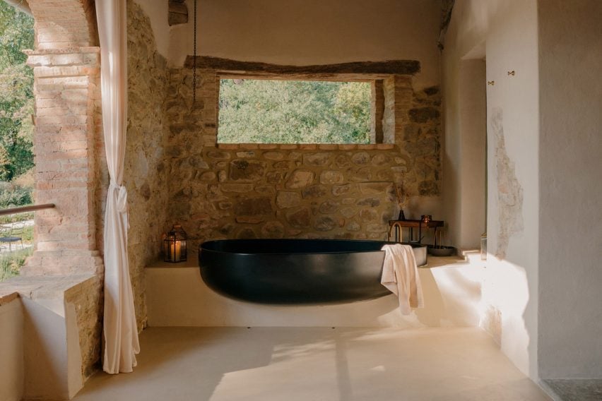
Each includes a unique colour palette and collection of design pieces, like a sculptural black two-person bathtub on one of the terraces and the various handmade beds.

The Bridal Suite includes a round canopy bed and a private garden, while the Spa Suite has its own sauna and jacuzzi.

Bathtub on a terraceBathtub on a terrace
Some of the suites have sculptural al fresco bathtubs

Furniture and products were sourced from Italian brands, such as outdoor furniture by Paola Lenti and lighting from Davide Groppi and Flos.

Handmade glazed tiles by local Umbrian company Cotto Etrusco adorn the bathrooms, contrasting the rough stonework of the building’s thick walls.

Vocabolo Moscatelli is part of hotel group The Aficionados, which brings together 90 design-led properties across Europe.

Swimming pool of Vocabolo Moscatelli by ArchiloopSwimming pool of Vocabolo Moscatelli by Archiloop
New additions to the estate include a travertine swimming pool

Many historic buildings across Umbria have been converted into guest accommodations, from remote holiday homes like the Torre di Moravola watchtower to sprawling rural estates like Castello di Reschio.

Several monasteries in Italy have also found new life as hotels, including the Monastero Arx Vivendi near Lake Garda.

The photography is by Fabio Semeraro.

Reference

Home Studios uses local materials to renovate Northern California hotel
CategoriesInterior Design

Home Studios uses local materials to renovate Northern California hotel

Brooklyn-based Home Studios has turned a conference centre in Northern California back into a luxury hotel, as originally intended by the property’s founder: the inventor of the radio.

The Lodge at Marconi sits on a 62-acre site next to Tomales Bay, within the picturesque Marconi State Historic Park – a 1.5-hour drive up Highway Route 1 from San Francisco.

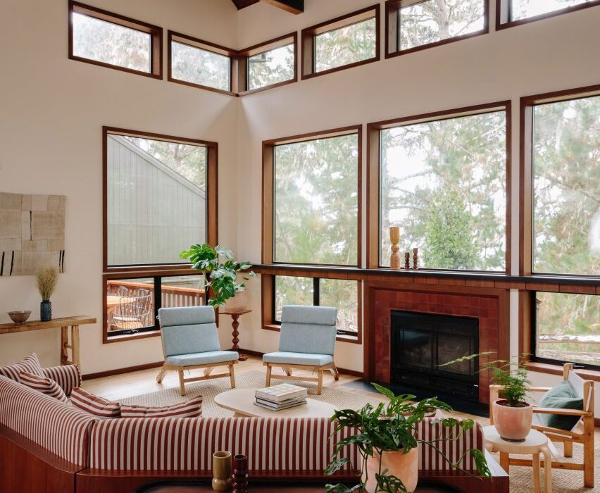
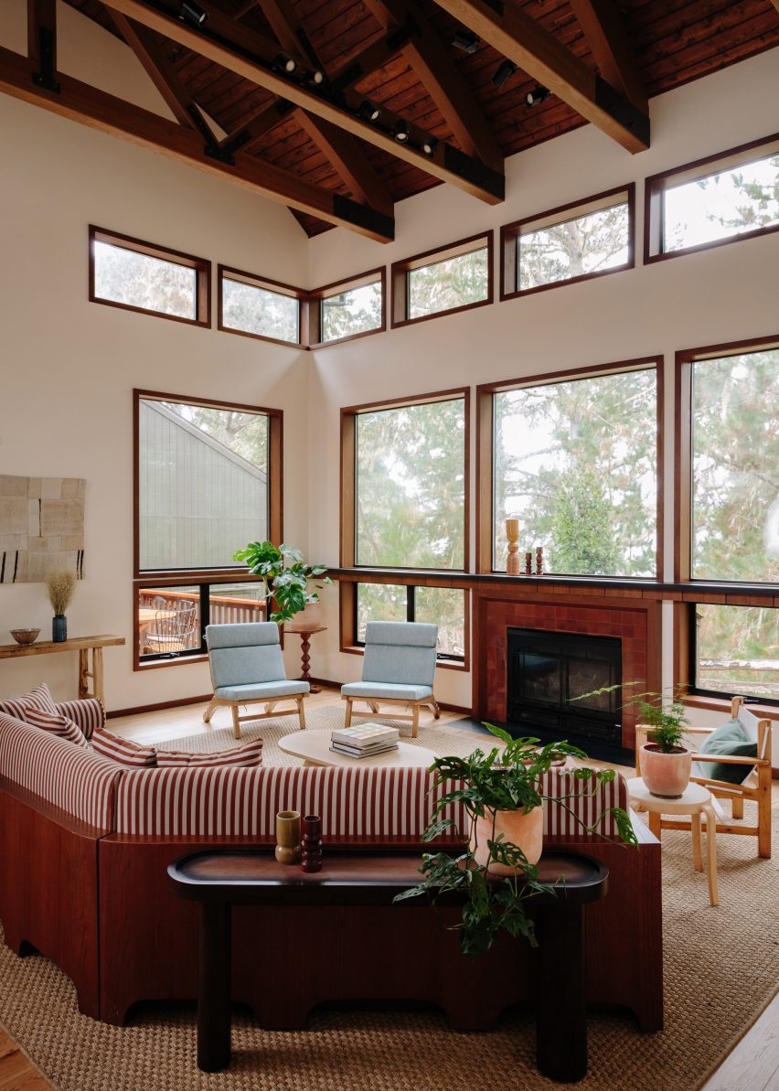
Double-height lounge space with large windows and a red striped sofaDouble-height lounge space with large windows and a red striped sofa
Home Studios created a variety of lounge areas across Lodge at Marconi to provide an informal atmosphere

Designed for Nashville-based company Oliver Hospitality, the hotel occupies a historic property that was first built by Guglielmo Marconi, an Italian physicist who invented the radio in 1896.

“Home Studios found inspiration in the property’s storied history – particularly in the pioneering spirit of Guglielmo Marconi, who worked with a New York-based engineering company to build the property’s initial building, a luxury hotel, in 1914,” said the design team, led by Oliver Haslegrave.

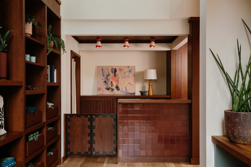
Hotel reception counter clad in oxblood-coloured tilesHotel reception counter clad in oxblood-coloured tiles
The reception counter is clad in oxblood-coloured tiles from Heath Ceramics

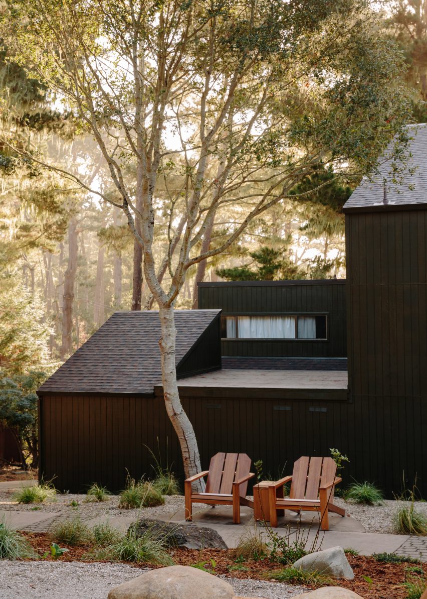
It took 17 months to overhaul the complex of blackened-wood buildings, which are topped with mono-pitched roofs of different heights and opposing directions.

The architecture is similar to that of The Sea Ranch Lodge further up the coast, which reopened in 2022 after its own extensive renovation.

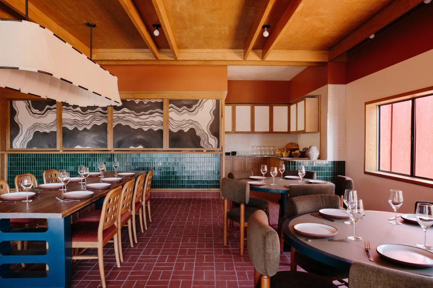
Dining room featuring brick flooring, blue-green tilework and eclectic contemporary furnitureDining room featuring brick flooring, blue-green tilework and eclectic contemporary furniture
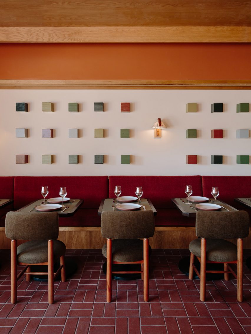
The Redwood Dining Hall features brick flooring, blue-green tilework and eclectic contemporary furniture

Home Studios looked to the iconic site – famed for its modernist style and sensitive land planning – for cues when developing the Lodge at Marconi’s 45 guest rooms and suites, which occupy freestanding buildings across the wooded site.

“Borrowing design language from Sea Ranch’s ‘living lightly on the land’ credo, the rooms blend into the environment and boast a tranquil and peaceful atmosphere,” the team said.

A series of coloured wooden cubes mounted on a wall above banquette seating and dining tablesA series of coloured wooden cubes mounted on a wall above banquette seating and dining tables
Artworks in the restaurant, including a series of coloured wooden cubes, were created in collaboration with Lukas Geronimas Giniotis

The hotel complex is made up of eight indoor and outdoor spaces, laid out “like a summer camp” to accommodate different activities in each area.

In the reception block, guests arrive to a series of lounges and other communal spaces that create a more informal setting than a traditional hotel lobby.

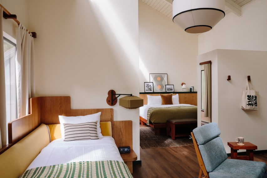
Bright guest suite with a double bed, day bed and blue lounge chairBright guest suite with a double bed, day bed and blue lounge chair
The bedrooms are bright and airy, with materials and colours that subtly reflect the hotel’s natural surroundings

A check-in counter is fronted with oxblood-coloured tiles by Heath Ceramics, which was founded in nearby Sausalito.

More of the company’s tiles, this time in blue-green hues, line the lower walls of the restaurant known as the Redwood Dining Hall.

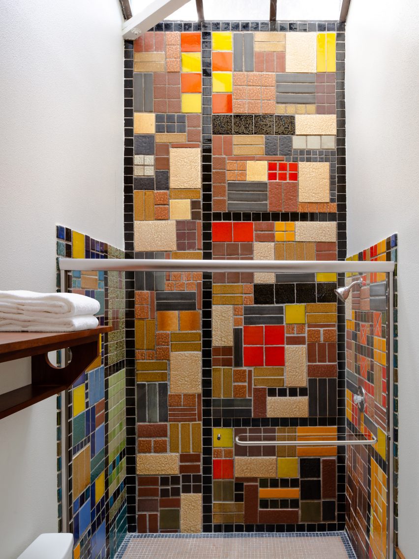
Shower with colourful patchwork of tiles from the 1960sShower with colourful patchwork of tiles from the 1960s
Three of the guest room bathrooms feature original tiles that date back to the 1960s

Red bricks are laid in a basketweave pattern across the floor, contrasting with the bright blue bases of the custom dining tables, while warm cedar panels and beams cover the ceiling.

A mural comprising four-panel linen screens and a series of wood cubes mounted on a wall was made in collaboration with California-based artist Lukas Geronimas Giniotis.

The guest rooms are bright and airy, with the colours of the natural surroundings subtly reflected in the furnishings.

Some have cosy loft spaces, while larger suites feature a dedicated workspace and sitting area.

Buildings clad in blackened wood and topped with monopitched roofsBuildings clad in blackened wood and topped with monopitched roofs
The accommodations are split across several buildings clad in blackened wood and topped with monopitched roofs

“Northern California’s rugged environment served as a design influence, and is reflected in the natural woods and earth-tone textiles that adorn each room and weave together a cohesive connection throughout the property,” Home Studios said.

“Three guest room bathrooms feature original tile dated to the 1960s when the hotel served as a rehabilitation facility known as Synanon.”

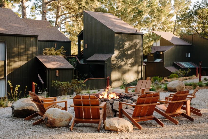
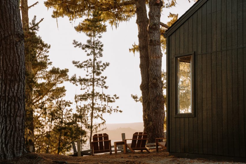
Wooden chairs surrounding a fire pit with blackened wood buildings in the backgroundWooden chairs surrounding a fire pit with blackened wood buildings in the background
The property includes multiple outdoor areas for gatherings and events

Across the property, the indoor spaces are afforded scenic views of the forest and the water through large windows.

A variety of gathering and event spaces are available to guests both inside and out, including wooden chairs positioned around fire pits among the landscape designed by Bay Area firm Dune Hai.

View through the trees to Tomales Bay at sunsetView through the trees to Tomales Bay at sunset
Lodge at Marconi sits atop a hill overlooking Tomales Bay in Northern California

This is Home Studios’ third hotel project, following the Mediterranean-influenced Alsace hotel in Los Angeles and the boutique Daunt’s Albatross motel in Montauk.

The firm’s other recent projects include a revamped bar and restaurant on Nantucket, an Italian eatery close to Harvard University and a townhouse renovation in Fort Greene, Brooklyn.

The photography is by Brian W Ferry.

Reference

The Rebello Hotel occupies former factory along Porto’s riverside
CategoriesInterior Design

The Rebello Hotel occupies former factory along Porto’s riverside

This hotel by architecture studio Metro Urbe occupies a series of former industrial buildings on the banks of the River Douro in Porto, Portugal, and features interiors by Quiet Studios.

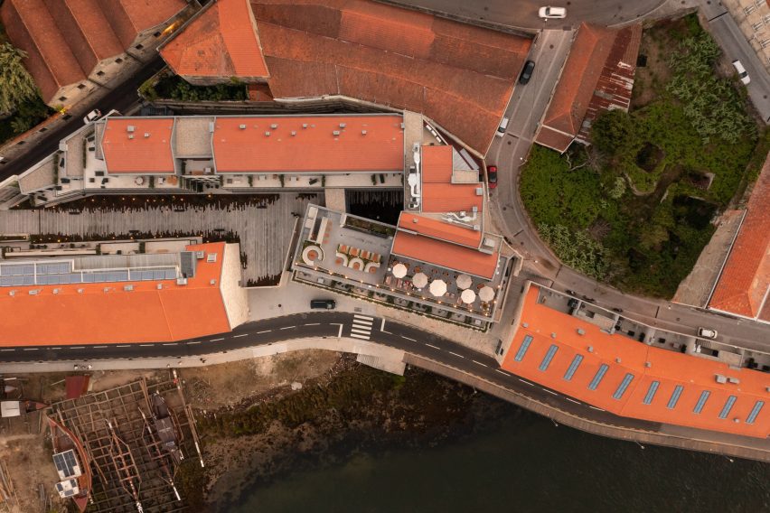
The Rebello Hotel is spread across several 19th-century buildings, which have been overhauled and adapted with new additions by Metro Urbe, in Vila Nova de Gaia – across the river from the city proper.

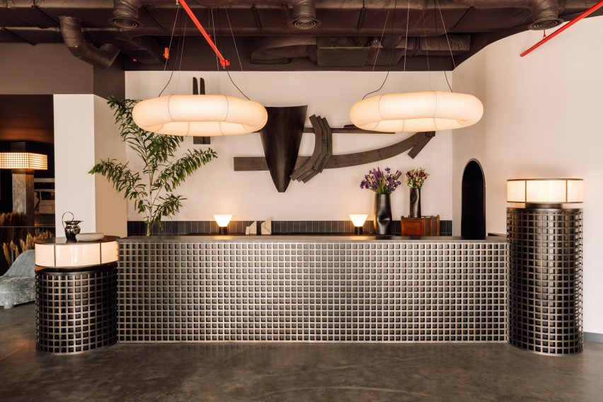
Reception desk with metal lattice front and hoop-shaped lights aboveReception desk with metal lattice front and hoop-shaped lights above
At The Rebello Hotel, nods to the site’s industrial past and Porto’s nautical history can be found in artworks and decor choices

Operated by Bomporto Hotels, which has two properties in Lisbon, the new addition to its portfolio was designed with a local approach and to take full advantage of its prime riverside location.

The Rebello is named after Porto’s famous rabelos – wooden boats that used to transport barrels of port wine down the river – and located beside the city’s only remaining boatyard.

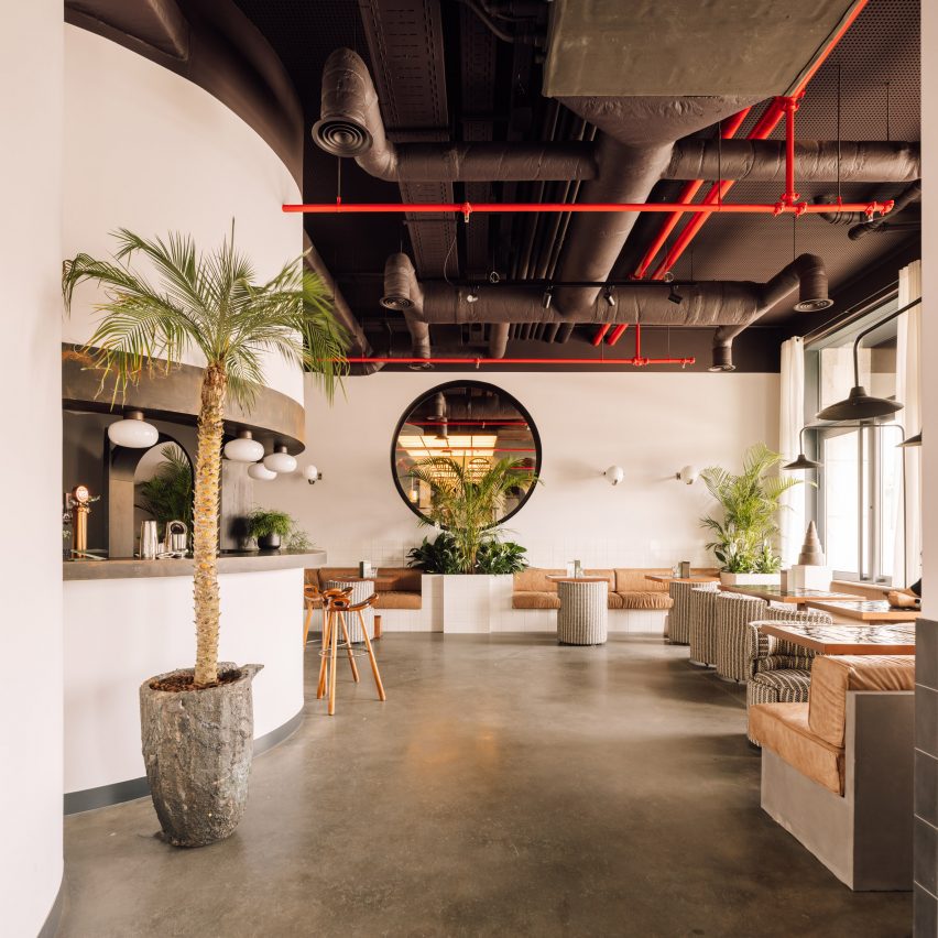
Bar and cafe area with polished concrete floors and exposed ceiling ductworkBar and cafe area with polished concrete floors and exposed ceiling ductwork
The lobby bar and cafe was designed for digital nomads to work and relax

The collection of buildings was once a kitchen utensil factory and had been unoccupied for some time before work began to reconfigure the site.

The team restored two long buildings that face onto the river, preserving their historic stone facades, and constructed two new volumes in the centre of the site that incorporate smaller original structures and resolve the sloping topography.

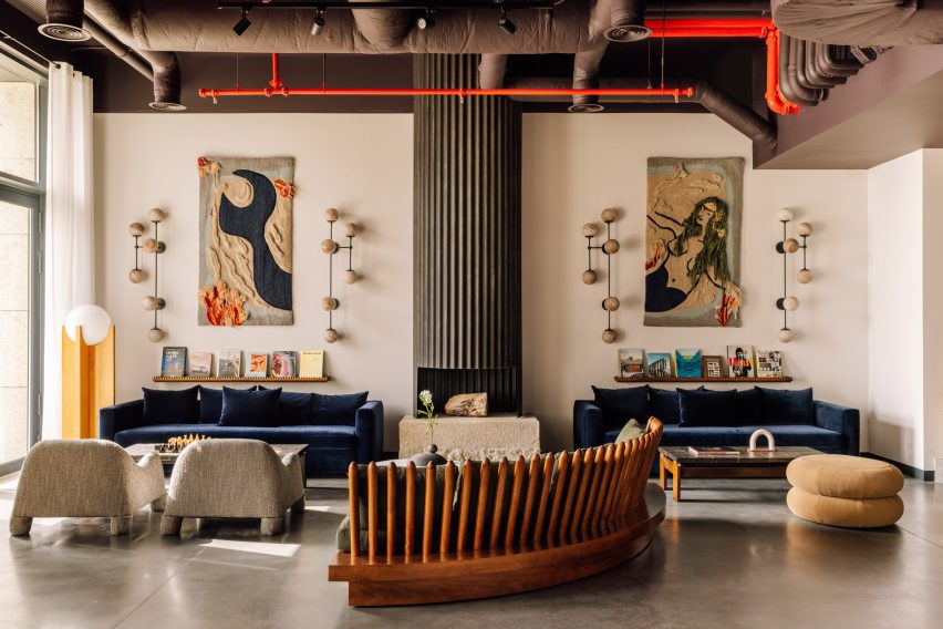
A variety of soft seating options in an industrial-style spaceA variety of soft seating options in an industrial-style space
A variety of soft seating options enliven the industrial-style interiors of the hotel’s communal spaces

Presented with a blank canvas, Spanish interior designer Daniela Franceschini – founder of Lisbon-based Quiet Studios – worked with local artists and creatives to transform the industrial spaces into warm and comfortable guest facilities.

Using vintage and contemporary objects, she based the interiors around four key elements: water, wine, wood and industry.

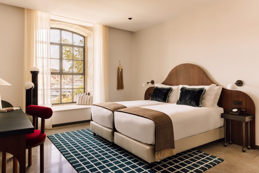
Bright bedroom with neutral decor and wavy walnut headboardBright bedroom with neutral decor and wavy walnut headboard
Bedrooms are bright and neutral, with splashes of colour introduced through contemporary furniture

“There’s a nautical feel to the colours, materials and textures,” said Franceschini. “That also comes through in the lighting, which is suggestive of floating and sailboats, and in the lamps with chains, the wooden shelves by Tomaz Viana, the ceramic nets by Fig Studio and the undulating mirrors that evoke the movement of the sea.”

Above the retro-style reception counter, fronted by a metal lattice, is an artwork crafted using reclaimed materials from the rabelos, which was designed by Studio Ther in collaboration with a local artisan.

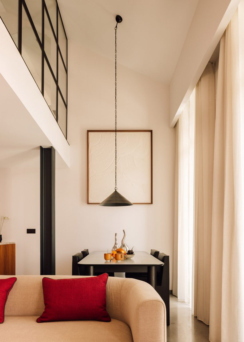
Double-height living and dining room with a long pendant lamp suspended over the tableDouble-height living and dining room with a long pendant lamp suspended over the table
Guest room types vary from studios to three-bedroom penthouse apartments

The lobby lounge and bar was designed for digital nomads to work or relax on a variety of comfortable soft seats, within a bright space that features polished concrete floors and exposed ceiling ductwork.

As a nod to the site’s history, the ground-floor Pot&Pan restaurant serves family-style dishes in large pots and pans within a space decorated with dark-toned walls and plants to create a casual atmosphere.

There’s also a cafe and store selling local produce and crafts, and meeting rooms that can be hired separately or combined for private events.

The Rebello Hotel’s 103 guest rooms and apartments are split into 11 different types, ranging from studios to three-bedroom penthouses that span 37 to 195 square metres.

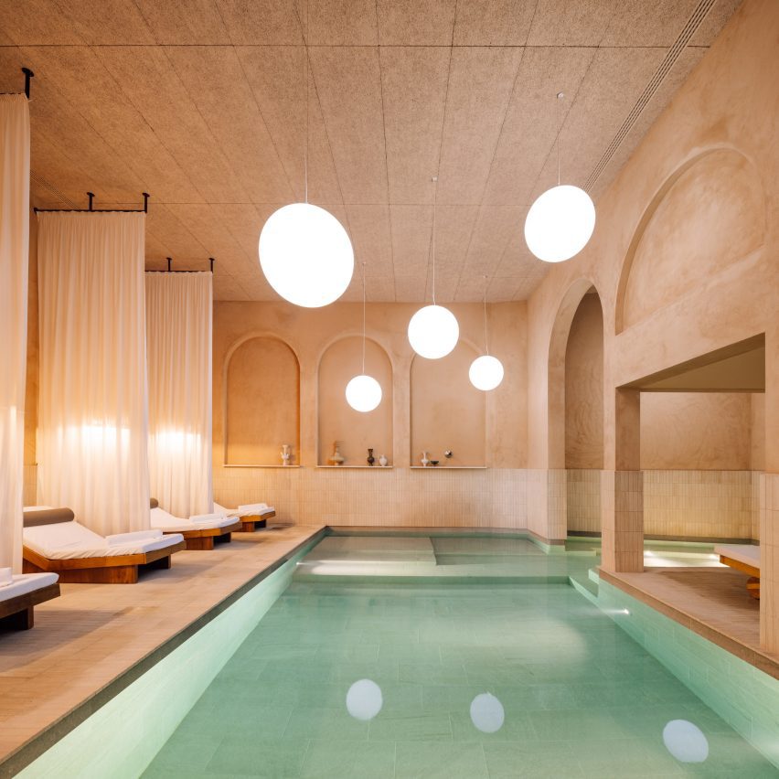
Spa with textured plaster walls, and globe-shaped lights over a large poolSpa with textured plaster walls, and globe-shaped lights over a large pool
The hotel’s spa is modelled on ancient Roman baths

The interiors of its light-filled suites have been decorated with walnut, steel, concrete and tiles, along with contemporary furniture that introduces splashes of bright colour to the otherwise neutral palette.

The bedrooms also include “tailor-made pieces influenced by nautical and industrial design, such as the sinks inspired by old water tanks and the organically styled bed headboards that resemble the rippling waters of the Douro”, according to the design team.

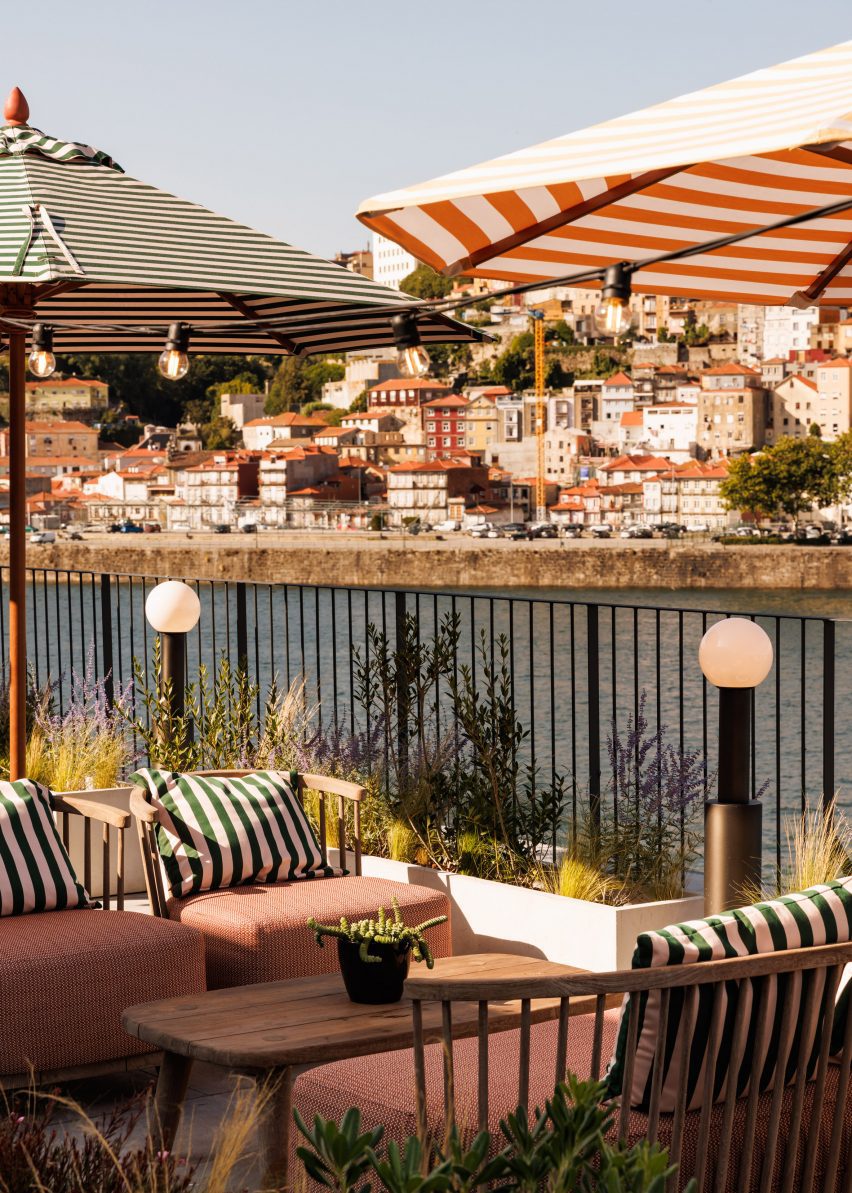
Lounge chairs under umbrellas overlooking the Douro RiverLounge chairs under umbrellas overlooking the Douro River
The fourth-floor rooftop bar offers views across the Douro River to the Porto skyline

The Rebello Hotel guests can enjoy a spa, modelled on ancient Roman baths and encompassing a heated pool, sauna, fitness centre and treatment rooms.

Finally, the Rooftop Bello bar on the fourth floor offers a spot for al fresco cocktails overlooking the river, with a view of the city’s terracotta-tiled skyline beyond.

Aerial view of The Rebello Hotel showing the layout of its terracotta-roofed buildingsAerial view of The Rebello Hotel showing the layout of its terracotta-roofed buildings
The riverside site, a former kitchen utensil factory, was converted and extended by architects Metro Urbe

Other interior design projects in Porto include a rustic restaurant interior designed by Space Copenhagen, which features a ceramic mural by Álvaro Siza, and a sushi bar by Paulo Merlini where 8,000 wooden chopsticks hang above diners.

The photography is by Francisco Nogueira.

Reference

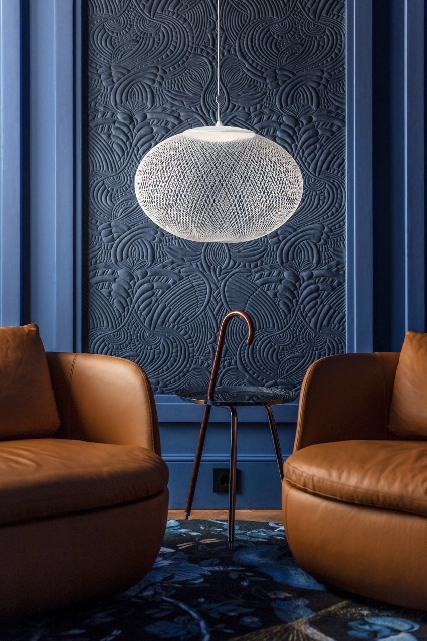
Moooi furnishings “tell a different story on every floor” of Art Legacy Hotel
CategoriesInterior Design

Moooi furnishings “tell a different story on every floor” of Art Legacy Hotel

Father and son architect duo Luís and Tiago Rebelo de Andrade explain how they furnished Lisbon’s Art Legacy Hotel entirely with Moooi products in this video produced by Dezeen for the Dutch furniture brand.

Lisbon practice Rebelo De Andrade designed the interiors of the five star Art Legacy Hotel, located in the Baixa-Chiado district in the city’s centre.

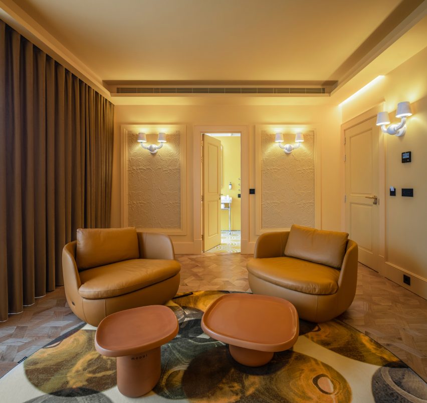
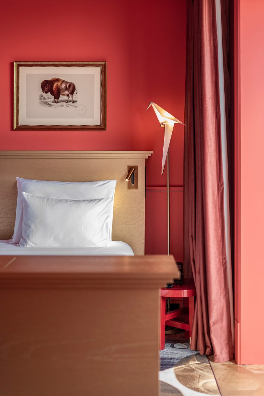
The hotel is notable for its exclusive use of Moooi products and rooms with bold primary colour schemes.

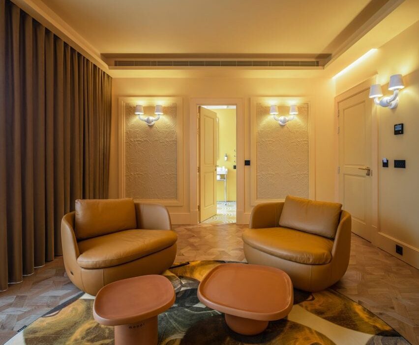
A suite with a yellow colour scheme in the Art Legacy Hotel in LisbonA suite with a yellow colour scheme in the Art Legacy Hotel in Lisbon
Art Legacy Hotel is a five star hotel in Lisbon

“Hospitality is always about image and stories,” said Luís Rebelo De Andrade, founder of the studio, in the exclusive Dezeen video interview. “We wanted the guests, when they come to this hotel, to have a completely unexpected experience.”

“So, we proposed to our client that we make a hotel with only Moooi products, to give it a very strong identity.”

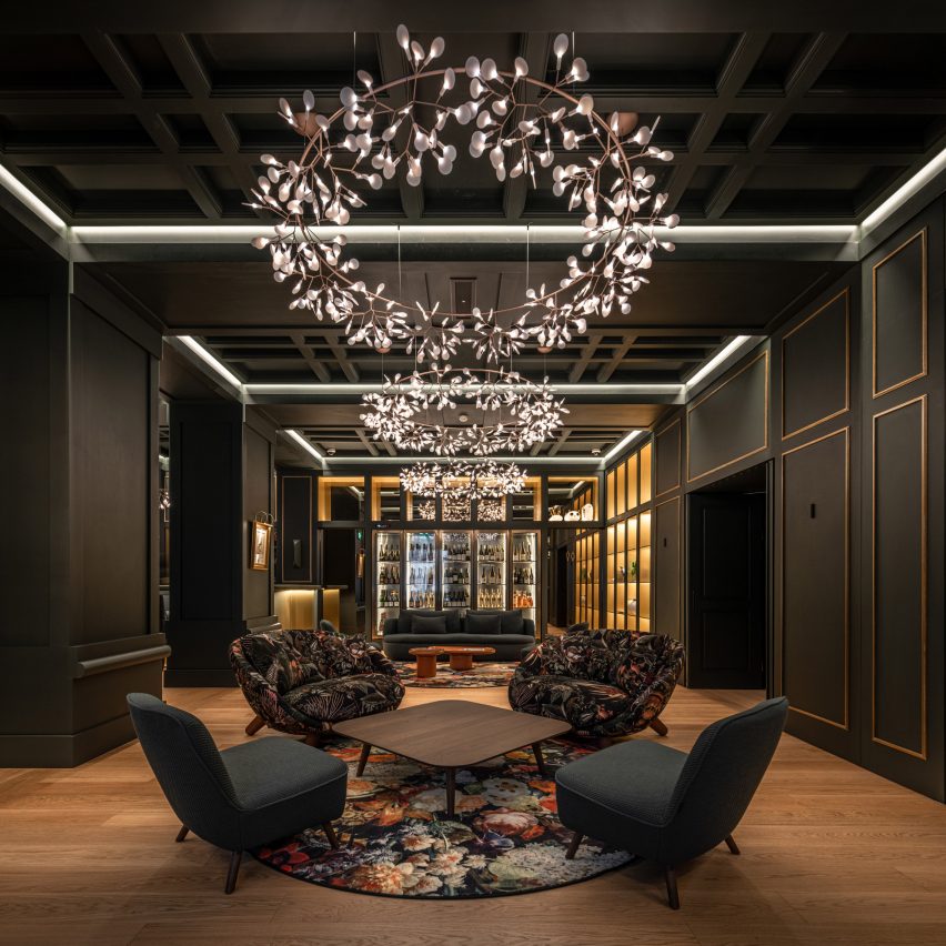
Moooi’s products were used throughout the hotel, including carpets, furniture, lighting, wall coverings and art pieces.

“Moooi is everywhere in the building,” said Tiago Rebelo De Andrade, who is partner and principal architect at the studio and Luís Rebelo De Andrade’s son. “When you enter the hotel, all the colours, all the textures, all the furniture from Moooi helps us to tell a different story in every floor.

A room with a red colour scheme and Moooi lighting in the Art Legacy HotelA room with a red colour scheme and Moooi lighting in the Art Legacy Hotel
Rebelo De Andrade furnished the Art Legacy Hotel entirely with Moooi products

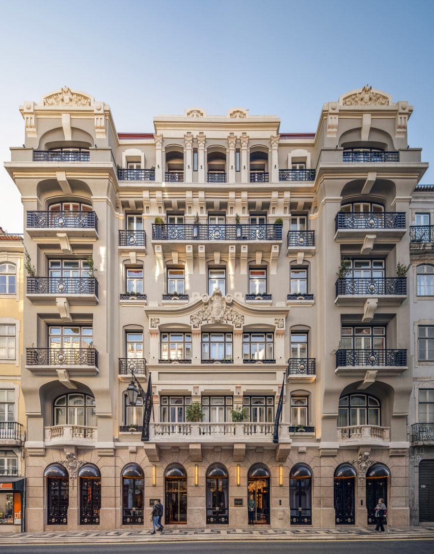
The project is a renovation of a historical office building. Alongside overhauling the hotel’s interior, Rebelo De Andrade also redesigned its facade.

According to Tiago Rebelo De Andrade, Moooi’s blend of modernity and classical references suited the studio’s approach to designing the hotel’s interiors.

“Moooi is classic but in a way that can also be modern,” he said. “It’s a modern-classic building.”

The facade of Art Legacy HotelThe facade of Art Legacy Hotel
Art Legacy Hotel is a renovation of a historic building in Lisbon’s centre

Luís Rebelo De Andrade decided to partner with Moooi on the hotel’s interiors after visiting the brand’s Museum of Extinct Animals exhibition at Milan design week in 2018.

Each room in the Art Legacy Hotel has either a blue, red, yellow or green colour scheme, with matching wall coverings, furniture and tiling in the bathrooms.
“When I first met Moooi’s products, I felt that it uses a lot of primary colours,” he said. “So I used primary colours in a very strong way in the hotel. They are colours that provoke you.”

Lobby of Art Legacy Hotel in LisbonLobby of Art Legacy Hotel in Lisbon
Moooi’s lighting, furniture, wall coverings and carpets are used throughout Art Legacy Hotel

In the video interview, the duo also discussed their working relationship.

“My son, he provokes me,” said Luís Rebelo De Andrade. “We had to educate ourselves on how to work together.”

“I offer my experience, he offers his youth in projects,” he continued. “So I think it’s a good mix.”

A room with a blue colour scheme and Moooi furnishings in Lisbon's Art Legacy HotelA room with a blue colour scheme and Moooi furnishings in Lisbon's Art Legacy Hotel
Rebelo De Andrade used primary colour schemes in Art Legacy Hotel’s rooms

“It’s difficult because it’s a father and son relationship,” added Tiago Rebelo De Andrade. “We are always arguing, but at the end of the day, we drink a bottle of wine so that we can make peace with each other.”

Other recent projects from Moooi include the IDEO-designed Pallana suspension lamp, made up of adjustable ring lights, and the rope-like Knitty Chair designed by Nika Zupanc.

The photography is by João Guimarães.

Partnership content

This video was produced by Dezeen for Moooi as part of a partnership. Find out more about Dezeen’s partnership content here.

Reference

Historic sanatorium in Greek mountain forest transformed into Manna hotel
CategoriesInterior Design

Historic sanatorium in Greek mountain forest transformed into Manna hotel

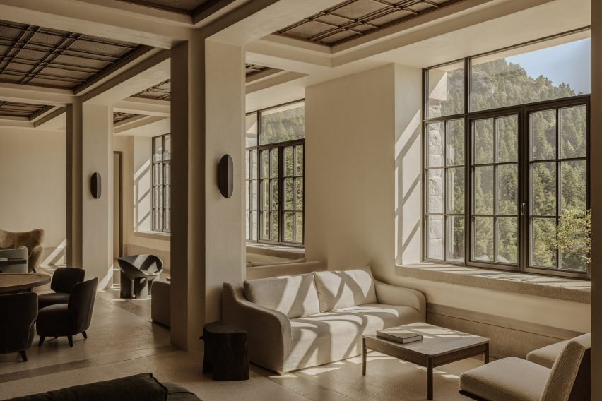
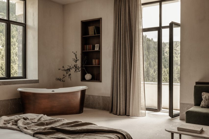
Greek architecture offices K-Studio and Monogon have converted the abandoned Manna Sanatorium in Arcadia, southern Greece, into a luxury forest hotel.

Originally built in the 1920s to give tuberculosis patients access to the healing power of nature, the historic structure is now a five-star wellness retreat.

Manna offers 32 rooms fitted out with natural materials and neutral tones, plus gym and spa facilities and a restaurant focused on local produce.

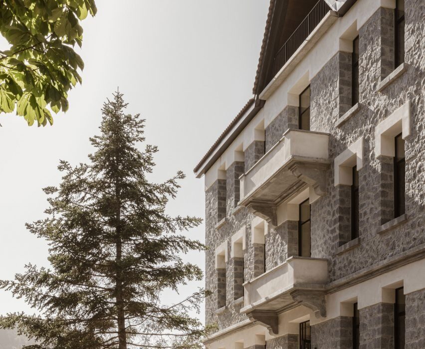
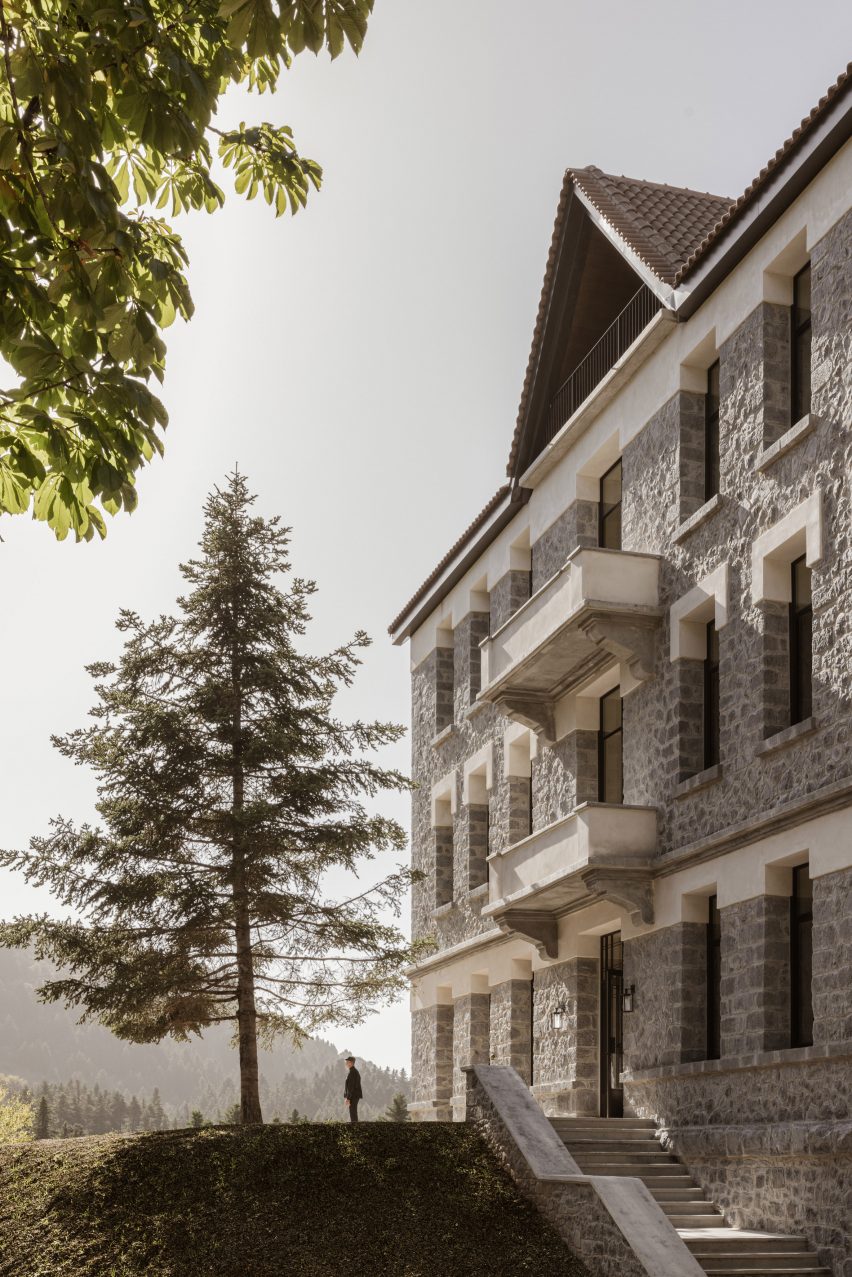
Stone facade of Manna hotel by K-Studio and MongonStone facade of Manna hotel by K-Studio and Mongon
Manna hotel is housed in a former sanatorium for tuberculosis patients

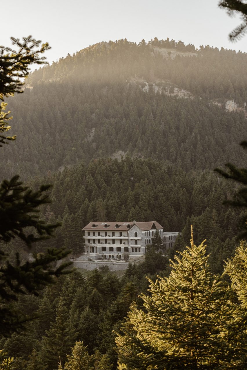
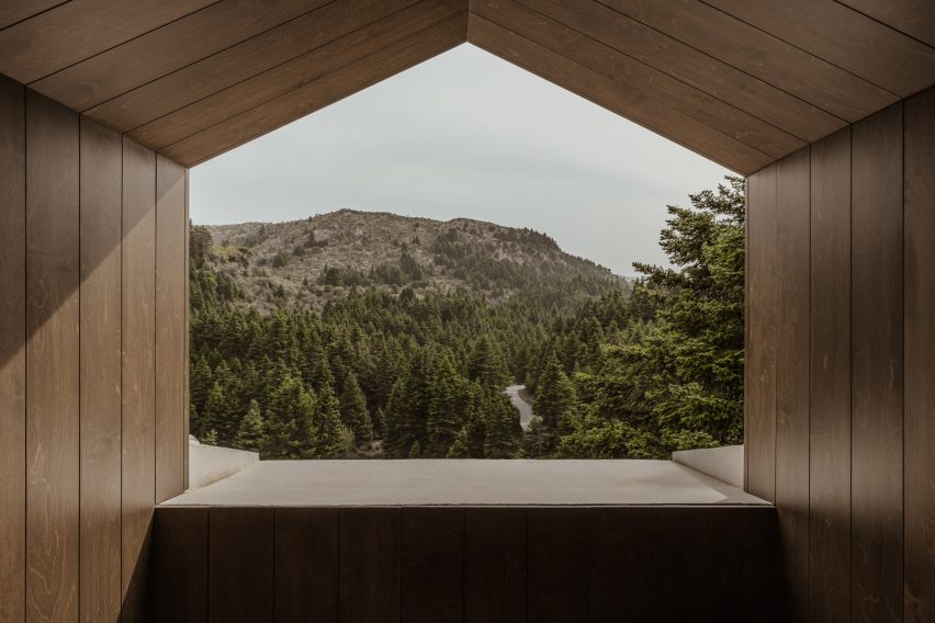
The building sits within a fir forest on Mount Mainalo, the tallest peak in the mountainous region.

The design vision set out by Athens-based K-Studio was to amplify the sense of sanctuary offered by the remote location and enhance the feeling of connection to nature.

Manna owner Stratis Batayas, a Greek entrepreneur who had spent his childhood summers in the area, wanted to create a year-round destination that stayed true to the building’s history.

Manna hotel in Arcadia by K-Studio and MongonManna hotel in Arcadia by K-Studio and Mongon
The building is set in a fir forest in Arcadia, a mountainous region of Greece

“The client’s ambition was to reinterpret the concept of a sanctuary in the mountains with contemporary terms,” reads K-Studio’s design statement.

“The hotel would have to be a place for isolation, as well as community-making and participation in the primary activities of everyday living.”

Lounge at Manna hotelLounge at Manna hotel
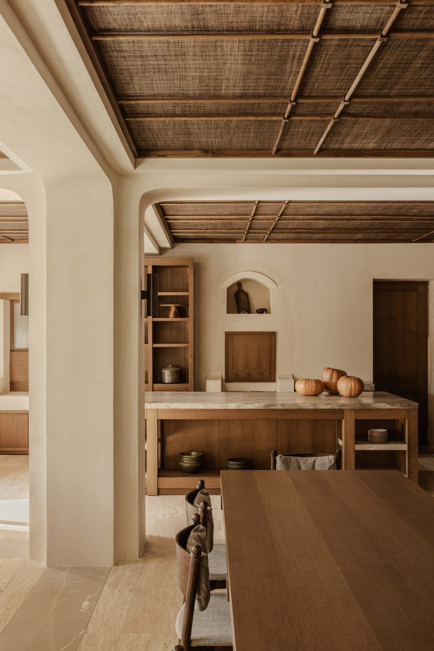
Design details include columns with curved corner reveals and ornate gridded ceilings

The renovation was overseen in collaboration with Athens-based Monogon and involved significant building work, including the reconstruction of a derelict rear wing and the installation of a new roof.

When the sanatorium closed – made obsolete following the introduction of penicillin in 1938 – the building had been emptied to prevent looting. Stone window sills were stripped out and relocated, while the original roof was removed and repurposed on a hospital in nearby Tripoli.

Concrete was used to replace the old sills, while the new timber roof was installed over rendered brickwork.

Bar at Manna hotelBar at Manna hotel
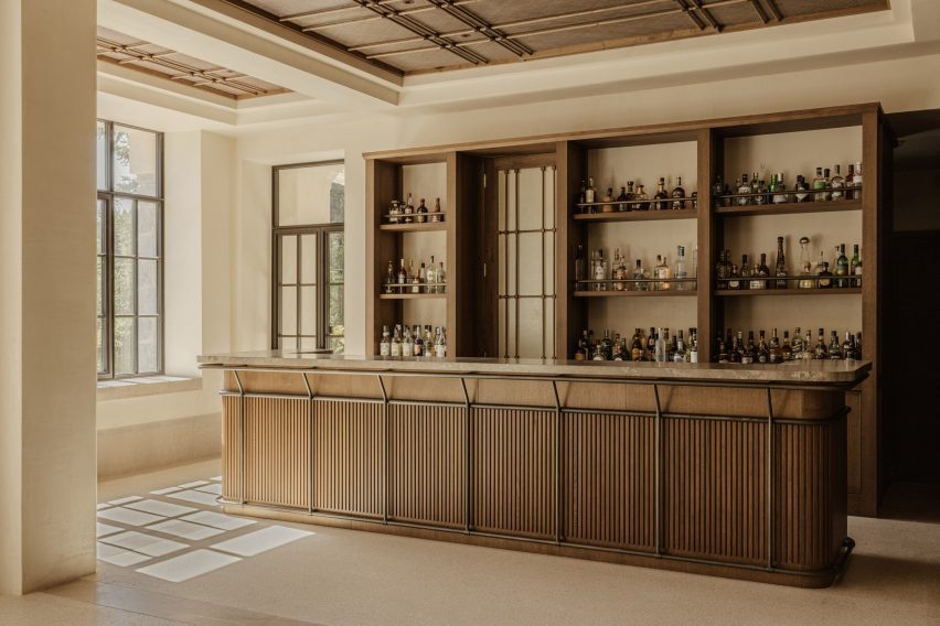
The bar features neatly crafted joinery

A reconfigured layout provides a new entrance on the side of the building.

This leads through into a series of elegant reception and lounge spaces where details include columns with curved corner reveals, ornate gridded ceilings and a herringbone-patterned fireplace.

Manna’s bar can also be found here, featuring neatly crafted joinery. Elsewhere, the restaurant run by chef Athinagoras Kostakos has a more casual feel thanks to an open kitchen.

Art is present throughout, with works by Greek artist Nikos Kanoglou, painter Joanna Burtenshaw and ceramicist Diane Alexandre.

Attic bedroom at MannaAttic bedroom at Manna
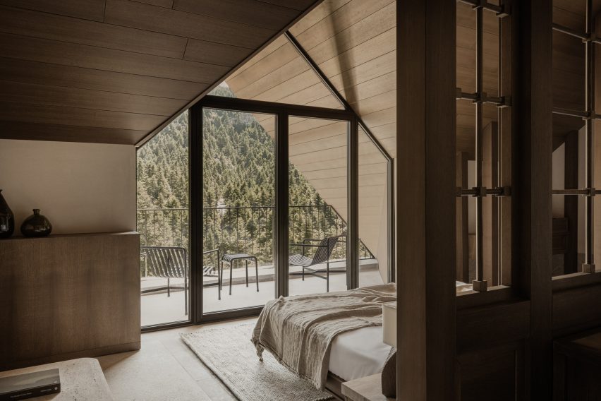
Attic bedrooms feature dormer balconies

Bedrooms are located on the upper floors of the main building, including a new attic level, and on all levels of the rebuilt northern wing.

Attic rooms offer the most modern feel, extending out to balconies set within large gable-ended dormers.

Bedroom furnitureBedroom furniture
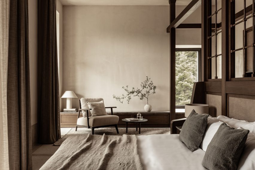
Interiors feature natural materials and neutral tones

The materials palette combines brushed timber with earth-toned textiles. Standout features include the elaborate privacy screens that form a backdrop to the beds.

Terrazzo flooring is inlaid with marble to define different zones, matching the stone used for wash basins. Room numbers are carved into the floor surfaces in front of each room entrance.

“Local craftsmen were involved in all construction phases, as they bear the knowhow of stoneworks, joinery and even the characteristic engraved grouting of the exterior stonewalls,” said K-Studio.

Bath in bedroom at MannaBath in bedroom at Manna
Terrazzo flooring is inlaid with marble to define zones

Manna opened its doors in the summer of 2023 and is represented by Design Hotels, a booking company that specialises in design-led retreats.

K-Studio co-founder Dimitris Karampataki presented the project at the 2023 edition of The Lobby, an annual hospitality conference in Copenhagen.

Manna restaurantManna restaurant
Manna’s restaurant features an open kitchen

He said the design for Manna “embraces the wear and tear, embraces the natural patina”.

“When we first arrived we saw something, which took about a century to make,” he said. “We didn’t want to clean it too much, to be selective of its heritage. It was more important for us to embrace the whole story.”

Balcony viewBalcony view
The design aims to reconnect people with nature

Other destination hotels to open recently include the Six Senses Rome, designed by Patricia Urquiola, and the Sanya Wellness Retreat in Hainan, China, designed by Neri&Hu.

The photography is by Ana Santl.


Project credits

Architectural concept: K-Studio
Technical design: Monogon, CS Architecture
On-site supervison: Monogon, K-Studio
FF&E: K-Studio, Monogon
Art curation: Joanna Burtenshaw
Branding design: MNP
Surveyor: Ioannis Charbilas
Structural engineer: Niki Psilla
Mechanical engineer: Gerasimos Vasilatos/Alexandra Zachopoulou & Partners
Lighting design: Eleftheria Deko and Associates Lighting Design
Sound consultant: Alpha Acoustiki
Kitchen consultant: Xenex
Landscape architects: H Pangalou & Associates
Main contractor: CT Construction


Reference

Serenity Framed: Waetcher Architecture’s Society Hotel Awarded Top Prize in 6th Best of LaCantina Competition
CategoriesArchitecture

Serenity Framed: Waetcher Architecture’s Society Hotel Awarded Top Prize in 6th Best of LaCantina Competition

A classic paradox in architecture is that, quite often, the buildings that get people talking most are those that are gloriously defined by silence.

The stunningly serene spa at the heart of the Society Hotel in Bingen, Washington, is a perfect example of this phenomena, and its elemental beauty has now been recognized with the prestigious “Best in Show” award as part of LaCantina Doors‘ much loved annual design contest, the 6th Annual Best of LaCantina Competition.

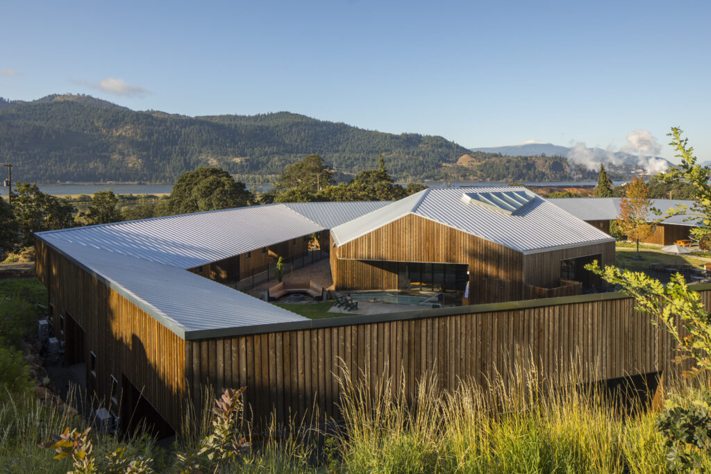
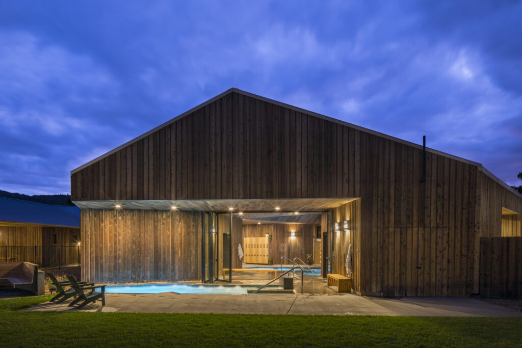
Designed by Oregon-based firm Waechter Architecture, this carefully crafted project involved the adaptive reuse of a historic school building into a boutique hotel, with the addition a ring of minimalist cedar cabins and a unique, polygonal bath house containing a series of relaxing pools, changing rooms, a sauna, a kitchen and two massage rooms.

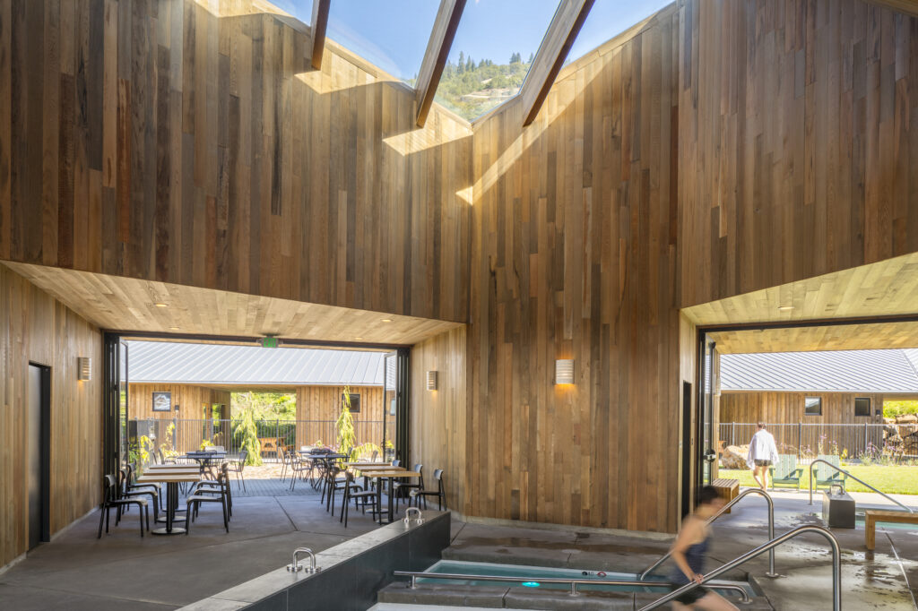
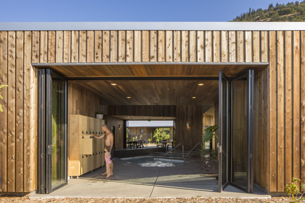
At the heart of the project, the community spa building serves as a feature gathering space with shared amenities for hotel visitors and guests. The spa employs a similar material palette of striated cedar as the surrounding cabins, yet has a distinctly volumetric form. Avoiding a singular front entrance, the building opens onto each side of the ring with dynamic apertures and floor-to-ceiling folding doors.

Within, the structure expands upward to a large skylight, which washes natural light over a series of pools below.

One of the most critical considerations for the spa’s design was how the interior and the exterior spaces could be seamlessly connected, providing shelter for visitors while also maintaining both a visual and a visceral connection with the hotel’s stunning natural surroundings.

In order to strike this balance, Waechter Architecture turned to LaCantina Doors. “We used a series of three custom-sized, six-panel Aluminum TC (Thermally Controlled) folding doors with a dark bronze anodized finish, all roughly 10′ high and 18′ in width,” explained the architects. “Two of the door systems were symmetrical 3L/3R configurations, and the last (in the highest-traffic area) was arranged as a 5L/1R configuration outfitted with panic hardware.”

The use of LaCantina doors were key to the success of the project, as Waechter explained: “In many ways, these doors were the most important single component of the entire project. After seeing the system and learning about other successful installations in this dynamic context and climate, they seemed to be an ideal choice.”

The architects continued: “We wanted the architecture of the spa to feel effortless and elemental, with as few materials and components as possible. The three openings between the cedar-clad ‘piers’ all wanted to open fully to the elements in good weather, and we also needed to protect against the snow and winds the Gorge is famous for at other times of the year.

“The La Cantina folding door system gave us the simplicity and solid construction we were seeking while providing an almost seamless connection to the landscape. It was the perfect fit for this challenging condition.”

The finished project is an exemplar in adaptive reuse architecture and spa design, creating a perfect destination for those looking for a scenic getaway in the Pacific Northwest. As the architects concluded: “Through its composition and pairing of historic and new architecture, the Society serves as a model for how buildings can reconcile the needs of a sensitive site, visitors, and the local community, and maximize connection to the surrounding landscape.”

To see every winner of the 6th Annual Best of LaCantina competition, click here, and learn more about LaCantina Doors here.

Project photography by Lara Swimmer

Reference

Bunkhouse and Reurbano convert Mexico City building into boutique hotel
CategoriesInterior Design

Bunkhouse and Reurbano convert Mexico City building into boutique hotel

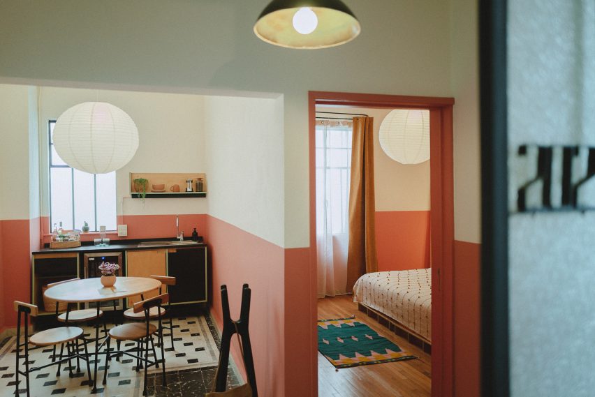
American hotel brand Bunkhouse and interior design studio Reurbano have used motifs derived from the history of a Mexico City structure when converting it into a boutique hotel.

Hotel San Fernando is located in the Condesa neighbourhood of Mexico City, a largely residential zone that in recent years has seen an influx of national and international travellers.

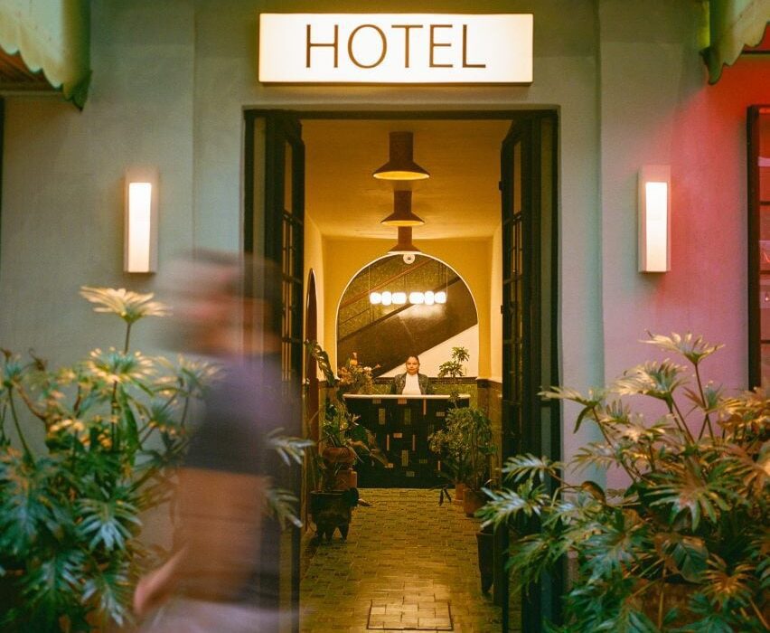
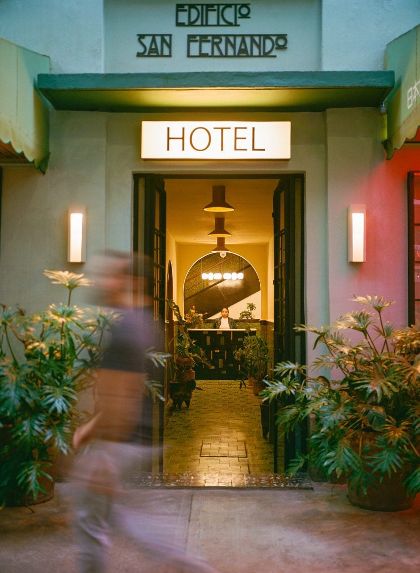
Hotel San Fernando with lettering and entrance corridorHotel San Fernando with lettering and entrance corridor
Bunkhouse and Reurbano have converted a 1940s apartment building into a boutique hotel in Mexico City

Bunkhouse worked with local interior design studio Reurbano to take a 1940s apartment building and convert it into a 19-room hotel, with finishes informed by the neighbourhood.

The face of the structure was restored and painted a light green, with darker green used on the awnings that provide coverage for seating attached to the hotel’s lobby and restaurant, which open to the street through glass-paned French doors.

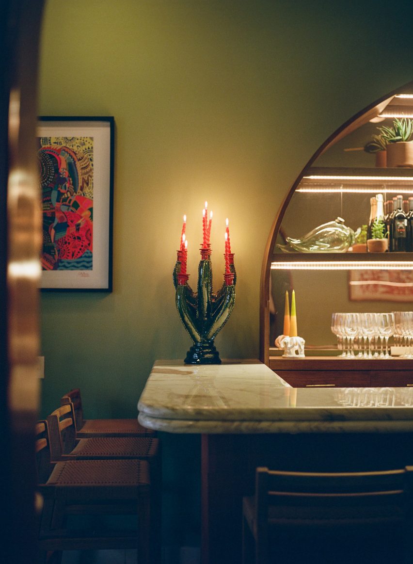
Chandelier on bar top Chandelier on bar top
It features renovated spaces that maintain details of the original structure

An art deco-style logo spells out the name of the hotel above the door. Saint Fernando is known as the patron saint of engineers, and the team wanted to highlight this by maintaining the name of the original building in the branding of the new structure.

“We wanted to honour this building,” said Bunkhouse senior vice president of design Tenaya Hills.

“We love the story and the history and like to imagine what it has been for people over the decades.”

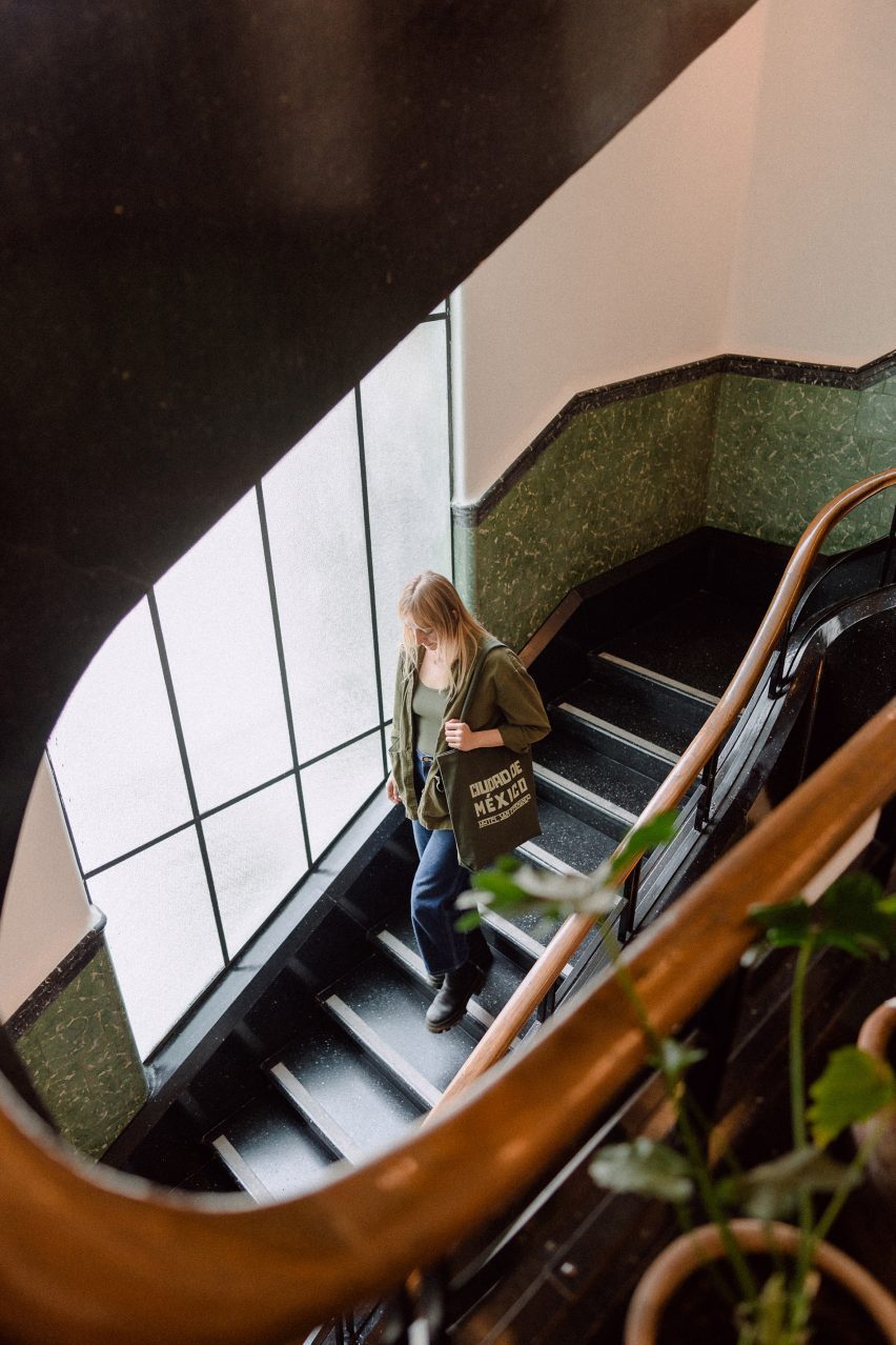
Woman on spiral staircase at Hotel San FernandoWoman on spiral staircase at Hotel San Fernando
A spiral staircase leads from the lobby to the rooftop

This primary entrance features a metal door with glass panes informed by the original stained glass of the building.

The entry corridor leads past a lobby lounge, with lighting by Oaxaca studio Oaxifornia and furnishings by local gallery Originario; and design studios Daniel Y Catalina, and La Metropolitana, which also created custom furniture for all of the guest suites.

At the far end of the lobby lounge is the restaurant’s bar, which features a large semi-circular cabinet with mirrored back to hold the spirits. A chandelier by local sculptor Rebeca Cors hangs above the clay-clad bar.

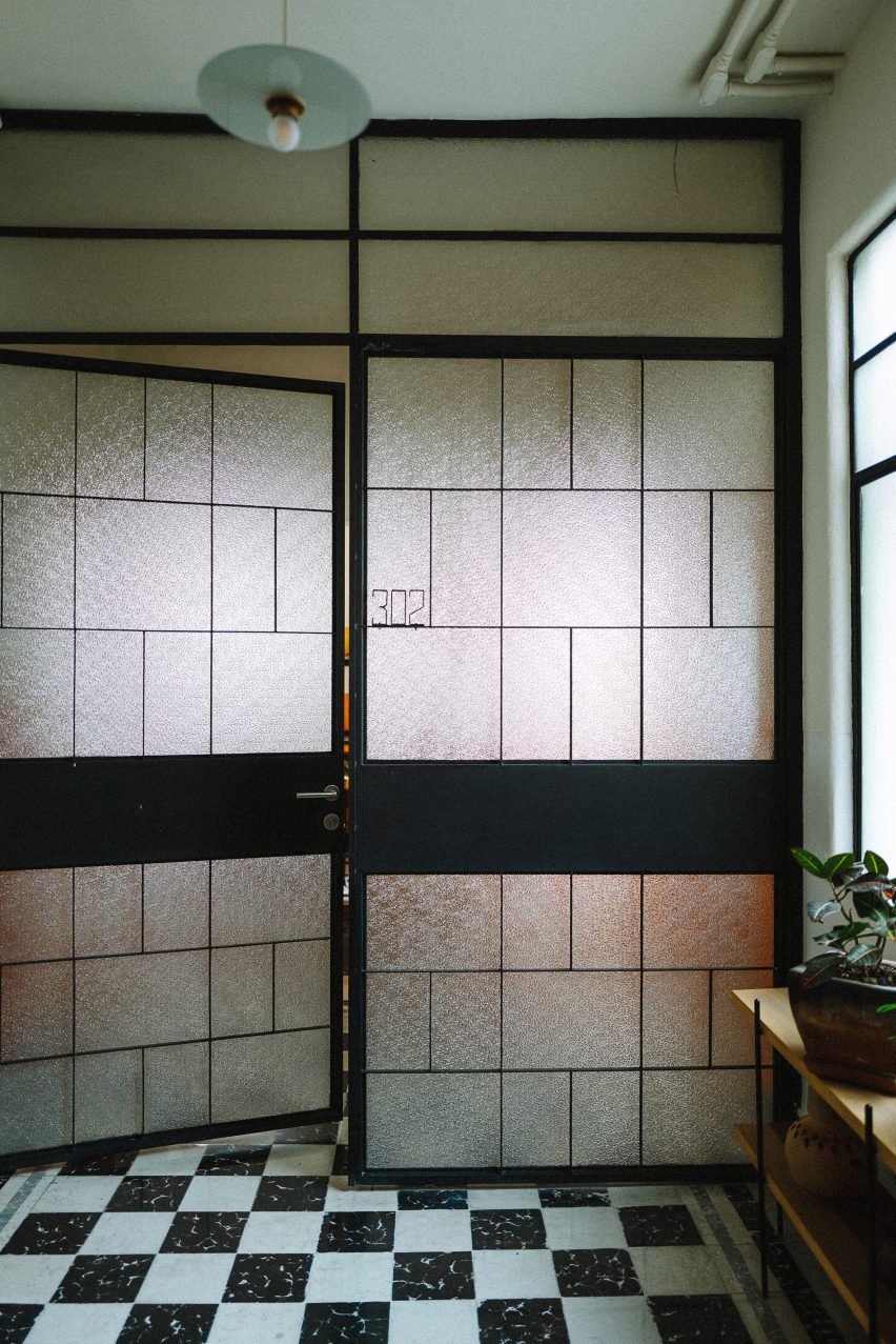
French doors with black and white tile flooringFrench doors with black and white tile flooring
French doors feature at the entrance and on some of the rooms

The entrance corridor has green encaustic concrete tiles from the original building. Other original details include the wainscotting and casement windows.

A reception area is located at the end of the corridor and behind it is a circular staircase with metal-and-wood railing that leads all the way up through the building, with landings on each of its five floors, terminating at a terrace on top of the building.

The guest rooms range from single-room setups to multi-room suites, the largest of which are accessed through French doors with opaque windows.

Here the studio departed from the greens used on the exterior and the lobby and utilised soft orange, pink and white paints.

Room at Hotel San FernandoRoom at Hotel San Fernando
Light colours and hand-crafted goods fill the rooms

Floors in the rooms are either tile or wood and furniture made from light-coloured wood is covered by locally derived textiles. Three rooms on the rooftop level feature furniture designed by Bunkhouse and fabricated by local design outfit B Collective Studio.

Pendant lamps and sconces by local ceramicist Anfora are found in the kitchens and bathrooms.

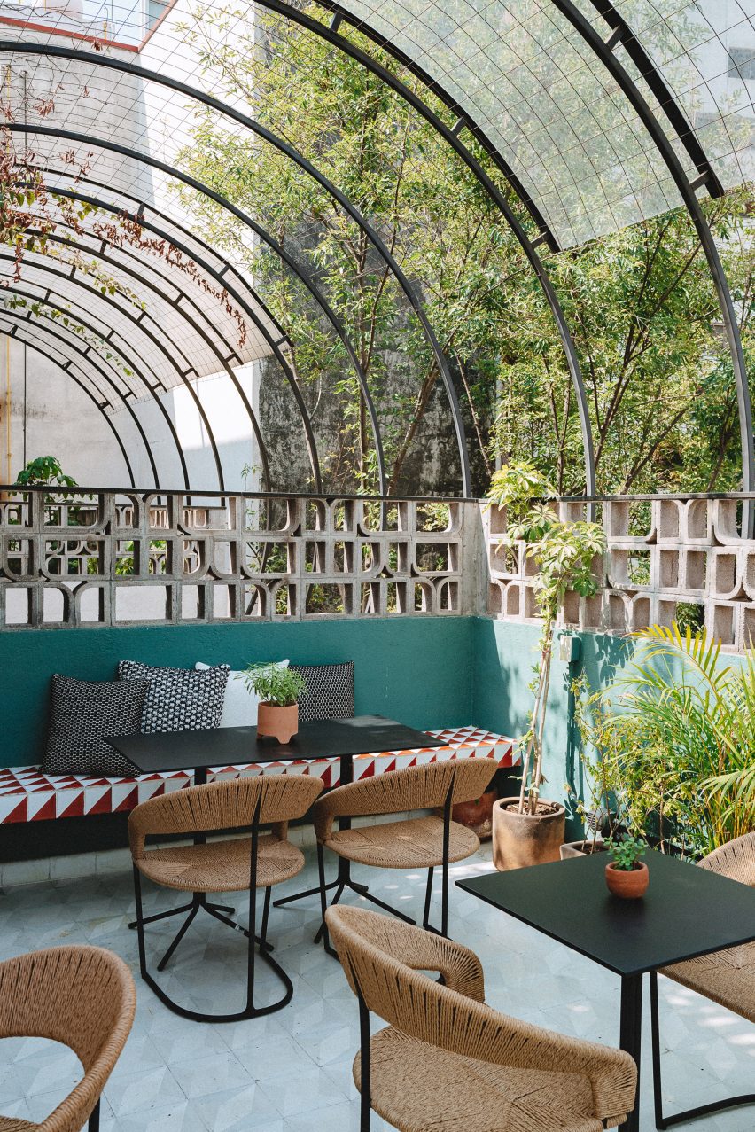
Sculptural breezeblocks on hotel terraceSculptural breezeblocks on hotel terrace
The rooftop features sculptural breeze blocks

The rooftop features a tiled dining and lounge area surrounded by sculptural breeze blocks, designed to mimic the original building’s patterned stained glass.
Mexican design studios Mexa and Comité de Proyectos contributed furniture pieces for the rooftop.
Other hotels in Mexico include a tile-clad structure in San Miguel de Allende by Productora and Esrawe Studio and a hotel in Mexico City with wooden lattices by PPAA.

The photography is by Chad Wadsworth. 


Reference

Martin Brudnizki designs Gilded Age-interiors for Fifth Avenue hotel
CategoriesInterior Design

Martin Brudnizki designs Gilded Age-interiors for Fifth Avenue hotel

Martin Brudnizki Design Studio has designed the interiors for a 1907 Renaissance-style palazzo building in New York, which has been turned into a luxury boutique hotel by architecture studio Perkins Eastman.

The Fifth Avenue Hotel sits on the site of what was once one of the last mansions of The Gilded Age.

Throughout the late 19th century, the home of Charlotte Goodridge at 250 Fifth Avenue hosted receptions and musical evenings as part of New York’s social season.

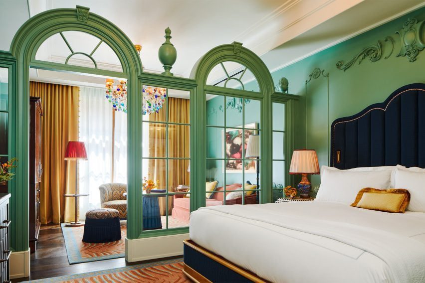
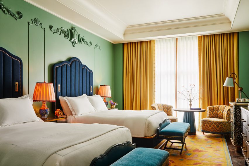
Green classical screen separates bedroom spacesGreen classical screen separates bedroom spaces
Classical fixtures contrast a contemporary colour palette in the hotel’s rooms

Perkins Eastman added a 24-storey glass tower, designed with PBDW Architects, to the five-storey brick and limestone building.

This was originally designed by McKim, Mead & White as the Second National Bank in 1907, replacing Goodridge’s 19th century home.

Drawing on the history of the neighbourhood and heritage of the building, Martin Brudnizki Design Studio (MBDS) aimed to create an aesthetic for the new hotel that would embrace “Bohemian romanticism and the glamour of the gilded age,” while maintaining contemporary styling.

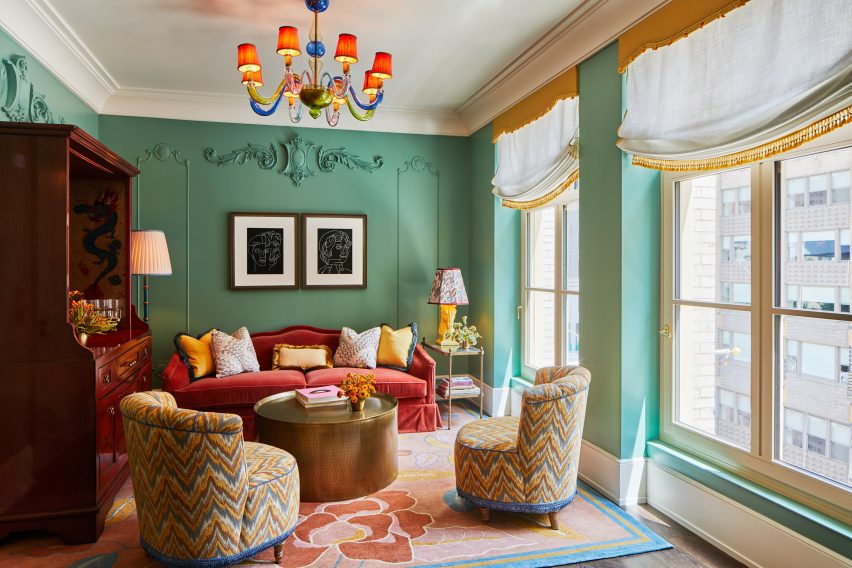
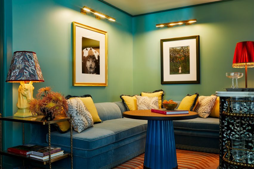
Green walls and ornate fittings and fixturesGreen walls and ornate fittings and fixtures
Martin Brudnizki has employed colour and texture to reflect global travels

“One of the biggest challenges was that we were working with both an existing and a new building at the same time, which each presented their own challenges architecturally,” studio founder Martin Brudnizki told Dezeen.

“We worked with the architects to marry the historic narrative with the contemporary tower addition, which reflects New York today, and the concept of the modern traveller,” he said.

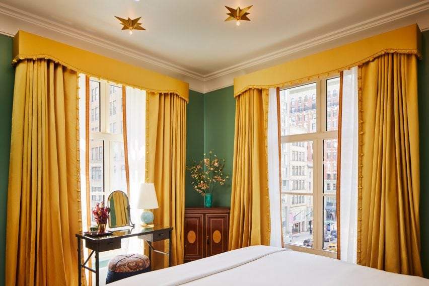
Yellow curtains in The FifthYellow curtains in The Fifth
A corner bedroom features yellow curtains

Rooms feature a rich colour palette of garden greens, buttercup yellow and peony pink with gold accents.

Bold patterns and textures jostle each other in a “harmonious and fun way, juxtaposing modernity with the classic finishings,” the designer said.

green walls and bespoke coffee tables at The Fifth Avenue hotelgreen walls and bespoke coffee tables at The Fifth Avenue hotel
The hotel’s walls host an extensive art collection

“The intersection of interiors with architecture is so important. The mansion is a much more classical response to the history and details of the building, whilst the tower enthuses a more modern touch,” Brudnizki explained.

“Both are unified by the choices of colours and certain furniture, fixtures and equipment that carry between the two sites.”

Bedrooms feature a global blend of references, including Pagoda-style table lamps, custom wardrobes informed by traditional Chinese cabinets, antique inlaid side tables, Murano glass chandeliers and star-like ceiling lights.

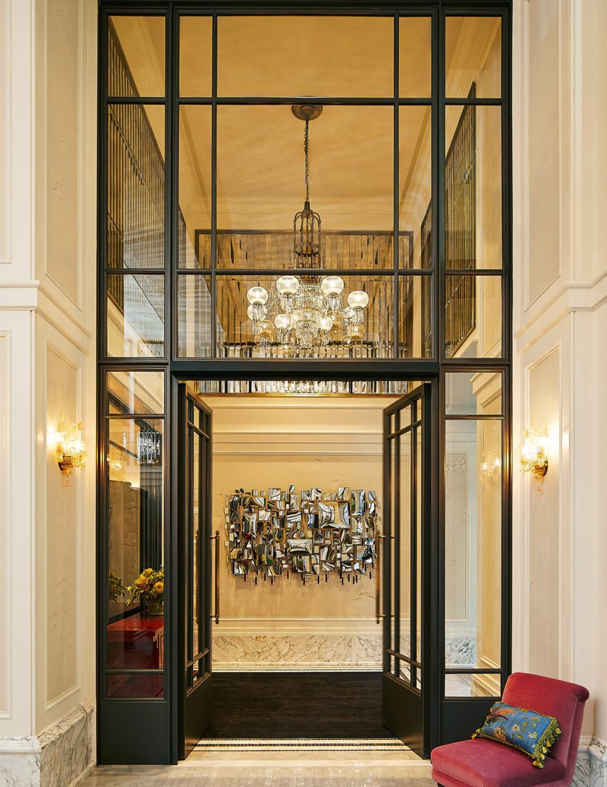
The double-height entrance lobby features walls panelled with faceted antique mirrors, marble floors and grand arched windows – which echo throughout the hotel bedrooms as room dividers between sleeping and sitting areas.

Rich colours evoke the gilded ageRich colours evoke the gilded age
Rooms have been designed to have a residential feel

“We loved the idea that all these great characters had once walked along the boulevard of Fifth Avenue and the fabulous parties hosted within the mansions of Fifth Avenue; the people and the conversations that took place,” said Brudnizki.

“We wanted to create a space that felt as though its interiors had been brought together over time, pulling items from our muse’s travels and adventures from across the globe.”

Double height lobby at The Fifth Avenue Hotel manhattanDouble height lobby at The Fifth Avenue Hotel manhattan
Antique glass panelling and modern mirrored artworks fill the double-height lobby

“It is a truly eclectic and layered project that is intended to feel as though it has been around since the days of The Gilded Age,” the designer concluded.

Other boutique hotels recently published on Dezeen include Christian Louboutin’s hotel Vermelho in Portugal and Trunk Hotel Yoyogi Park in Tokyo, by Keiji Ashizawa Design and Norm Architects.

Photography is by William Abranowicz.

Reference