Tara Bernerd fills Maroma hotel in Mexico with artisanal elements
CategoriesInterior Design

Tara Bernerd fills Maroma hotel in Mexico with artisanal elements

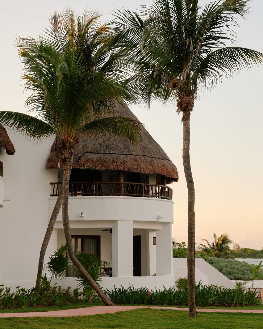
Interior designer Tara Bernerd worked with local artisans when dressing the cavernous rooms at the Maroma hotel in Riviera Maya, Mexico, which were renovated to reflect hacienda-style living.

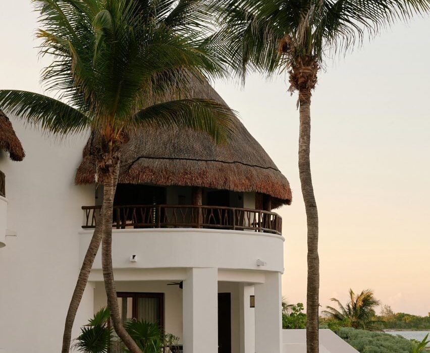
Housed within white stucco volumes arranged on a coastal plot between lush jungle and the Caribbean sea, the longstanding Maroma, A Belmond Hotel was renovated earlier this year but retained much of its traditional-style architecture.
Maroma hotel in Riviera Maya, MexicoMaroma hotel in Riviera Maya, Mexico
The Maroma hotel is housed within rounded stucco, palapa-topped volumes

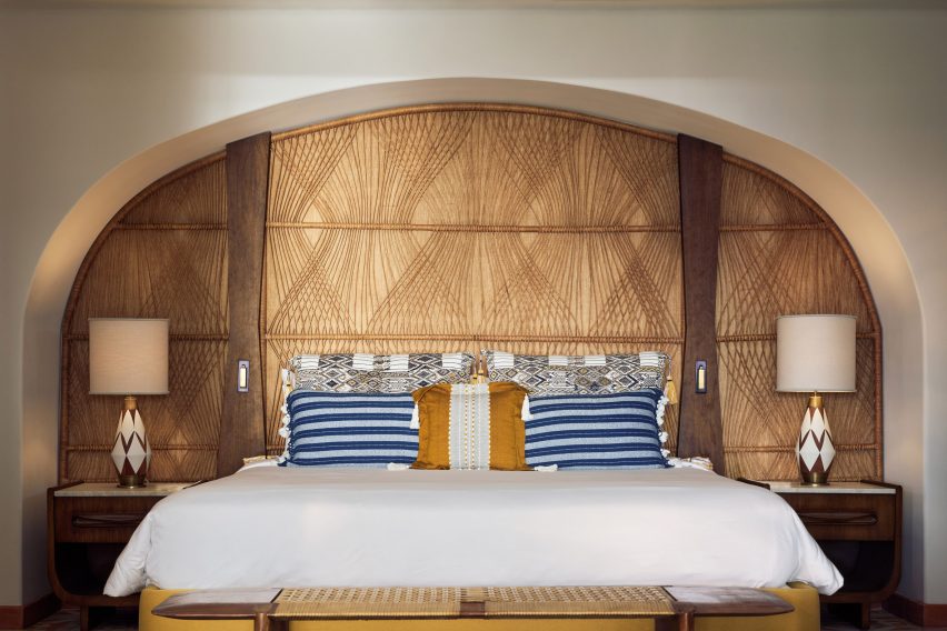
Bernerd and a team of local artisans conceived the eclectic interiors to reflect the palapa-topped structures, creating a range of bespoke curved furniture and ornaments.

“The buildings themselves are organic in shape and form and were originally positioned in response to the sacred Mayan geometry,” she told Dezeen.

“We sought to retain and enhance the beauty of the hotel’s original character.”
Guest room with a rounded alcoveGuest room with a rounded alcove
Tara Bernerd sought to reflect this “Mayan geometry” in the interior design

Among the custom pieces are over 700,000 tiles hand-painted and crafted by ceramicist José Noé Suro using clay from Mexico’s Jalisco region.

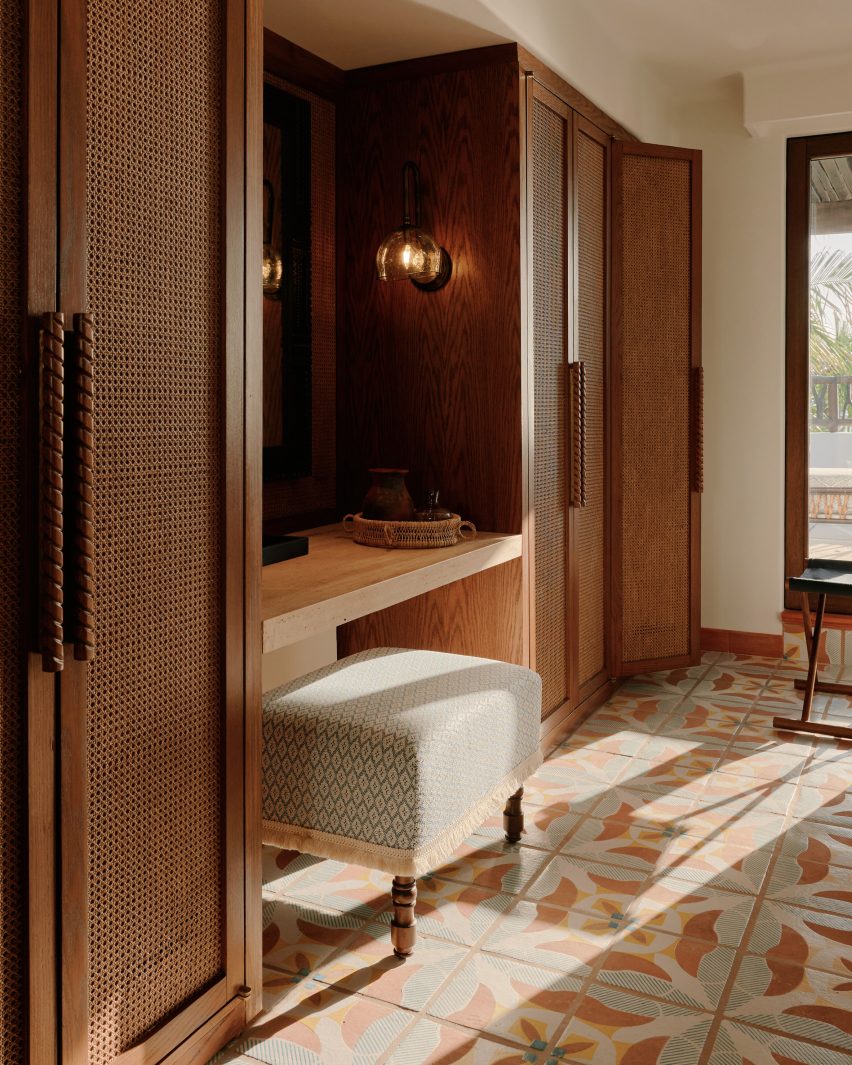
The tiles cover the floors in all of the 72 guest rooms, which are characterised by rattan wardrobes and amorphous timber furniture pieces – 80 per cent of which were hand-carved.
Rattan wardrobes at MaromaRattan wardrobes at Maroma
The guest rooms are characterised by rattan accents and blown glass

Artisan Max Kublailan blew bulbous glass sconce lights, which feature throughout the rooms and are reminiscent of glowing gemstones.

“It was a joy working with the local artisans who brought our designs to life and the process was more like a conversation between artisan and designer, with each inspiring and on occasion challenging the other,” reflected Bernerd.
Guest bathroom at MaromaGuest bathroom at Maroma
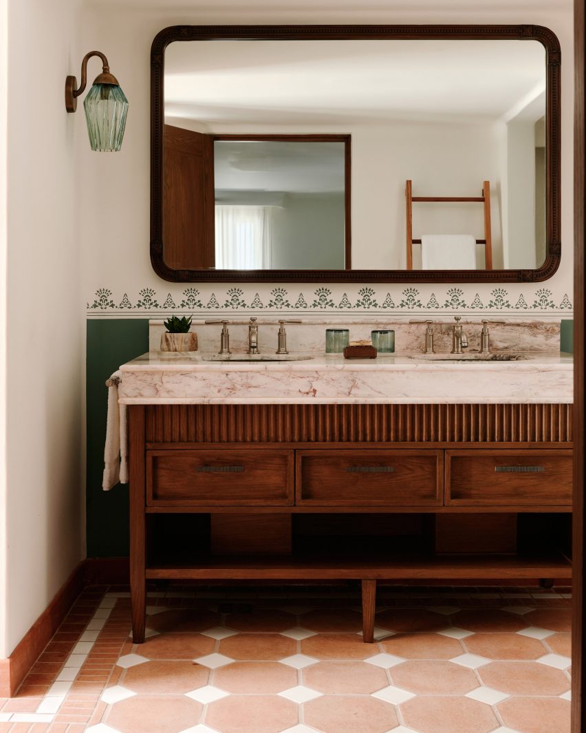
Eclectic design choices were also made for the guest bathrooms

The entrance to each guest room also features individual ceramic, painted signs informed by traditional Lotería cards, which are used to play a similar game to bingo in Mexico.

“We built up the layers of design within the spaces, with rich pops of colour being brought in through the tiled or mosaic floors, the use of decorative tiles in the walls and dado rail as well as cushions and fabrics,” explained Bernerd.
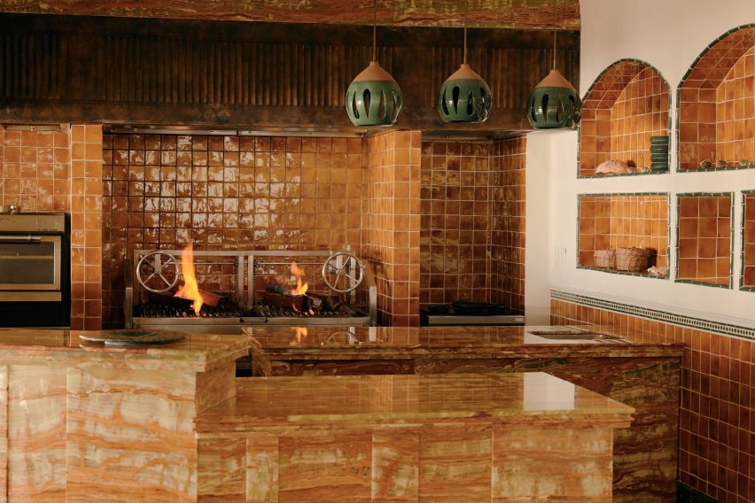
Open kitchen clad in ceramic tilesOpen kitchen clad in ceramic tiles
An open kitchen clad in glazed ceramic tiles features in one restaurant

Maroma’s two restaurants follow a similar design, with accents such as rattan pendant lights and tables featuring textured legs that give the appearance of tree trunks.

An open kitchen clad entirely in caramel-hued glazed ceramic tiles was tucked into a corner of the Woodend eatery while Casa Mayor includes clusters of hand-painted plant pots.
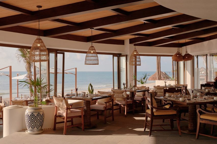
Painted pots and rattan lampshades in Casa MayorPainted pots and rattan lampshades in Casa Mayor
The other restaurant includes painted potted plants and oversized rattan lampshades

Throughout the hotel, cavernous alcoves were also dressed with custom interiors made up of stone, clay, wood and natural fibres.

“Location and layout were key and I am especially proud of how we have managed to reimagine previously under-utilised areas and have created a balance between unique, dramatic spaces and cosier, slightly hidden areas,” said Bernerd.

Traditional Yucatán doors with dense timber frames and chandeliers made from clusters of seashells were chosen to respond to Maroma’s setting.

The hotel’s central swimming pool was renovated with Sukabumi turquoise tiles handmade from volcanic stone to emulate the cenotes – water-filled sinkholes formed by the collapse of limestone – found in the Yucatán Peninsula.
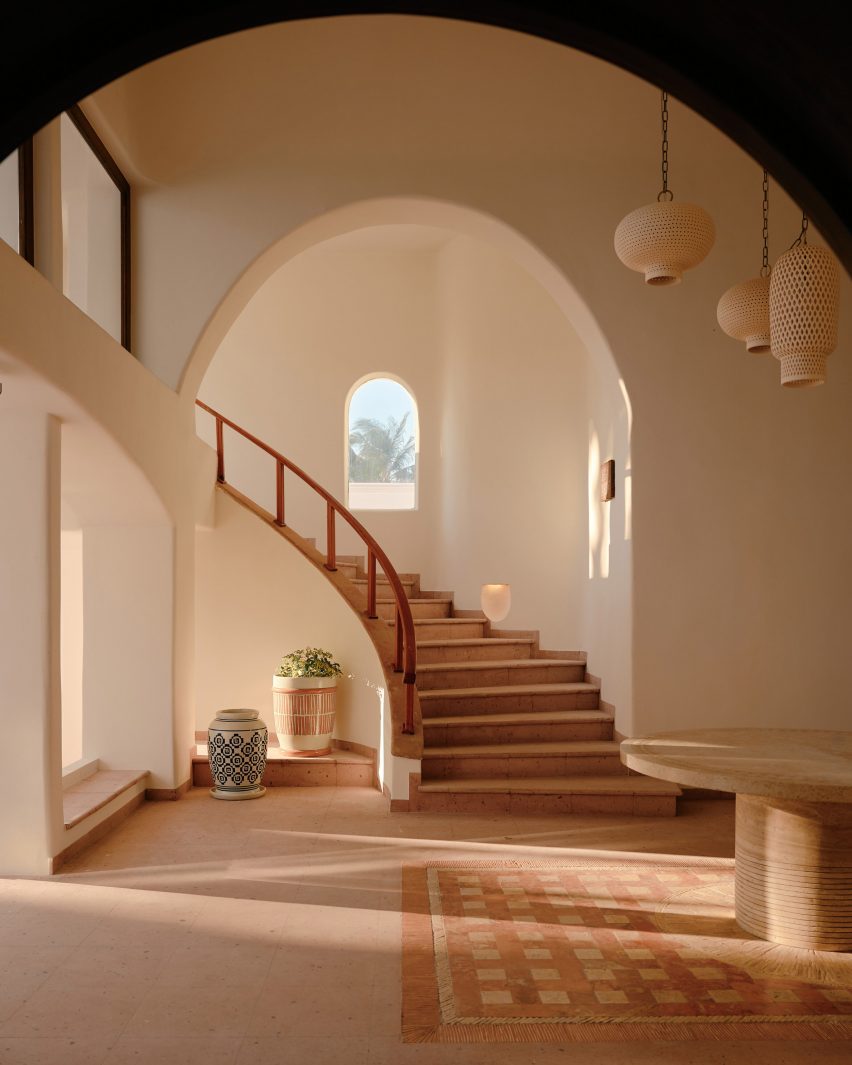
Cavernous corridor with a curved staircaseCavernous corridor with a curved staircase
Cavernous corridors reflect the hotel’s architecture

“In essence, we wanted to create something that was effortlessly serene and had the feeling of a chic home,” said the designer.

“So we also drew inspiration from traditional hacienda-style living to create a relaxed, almost residential vibe throughout the resort and evoke a sense of connection, unity and flow between all of the public area buildings,” she concluded.
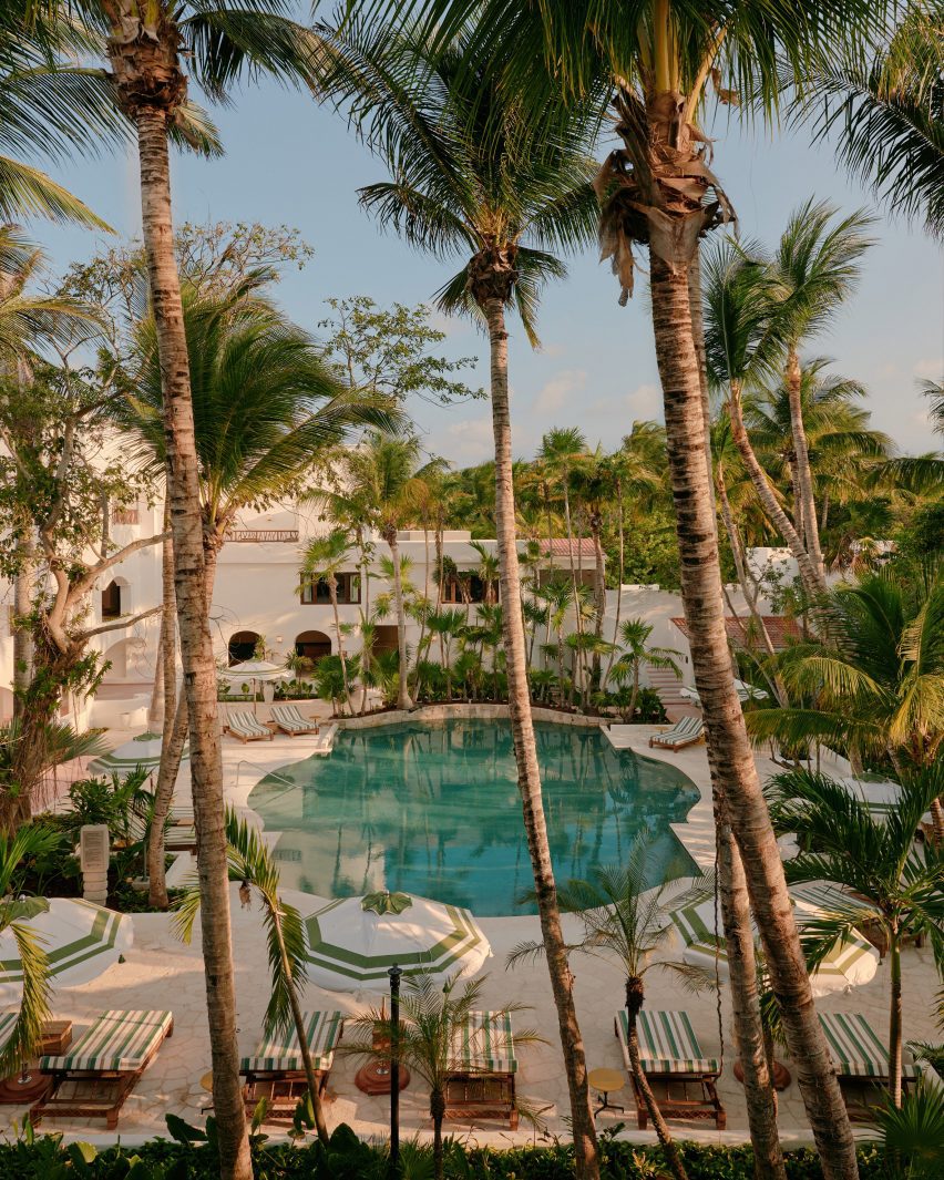
Cenote-style swimming poolCenote-style swimming pool
The central swimming pool was informed by cenotes

The British designer is the founder of the London-based architecture and interiors office Tara Bernerd & Partners.

Elsewhere in Mexico, local firms Productora and Esrawe Studio designed a San Miguel de Allende hotel with planes of green tile. Architect Alberto Kalach added a series of vaulted, brick arches to a resort in Oaxaca.

The photography is courtesy of Belmond. 


Reference

De Durgerdam hotel takes over 17th-century sailor’s inn on a dyke
CategoriesInterior Design

De Durgerdam hotel takes over 17th-century sailor’s inn on a dyke

Dutch hospitality company Aedes has pushed Amsterdam’s building restrictions to their limit to convert a heritage-listed tavern into an all-electric hotel.

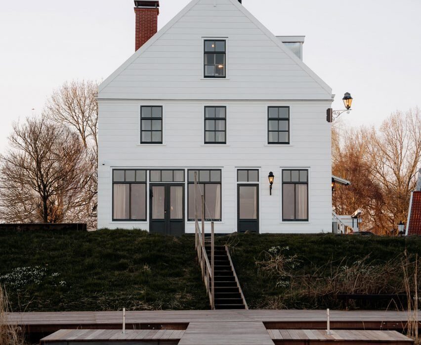
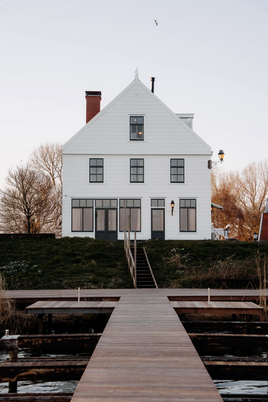
De Durgerdam hotel occupies one in a row of almost identical gabled buildings perched on a seawall on lake IJmeer, which together make up the small village of Durgerdam near Amsterdam.

Constructed in 1664, the building originally served as an inn for sailors and fishermen, its white-painted clapboard facade acting as a beacon for boats that could pull right up to its deck in the Zuiderzee bay of the North Sea.

Exterior of De Durgerdam hotel by AedesExterior of De Durgerdam hotel by Aedes
De Durgerdam hotel is set on a seawall outside Amsterdam

Due to recurring flooding, the village was cut off from the sea with the construction of a dam in 1932, turning the bay into a freshwater lake while the inn became a ferry terminal and later a cafe and restaurant.

Following a five-year restoration led by Aedes, the building reopened this year as a boutique hotel with 14 rooms and interiors designed by material research studio Buro Belén.

De Durgerdam, the first hotel to be owned and operated by the Aedes, provided an opportunity to see how far heritage restrictions could be stretched to make the building as sustainable as possible.

Front door of hotel with white weatherboarded facadeFront door of hotel with white weatherboarded facade
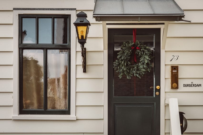
The hotel occupies a former inn with a white-painted clapboard facade

“What we have done in terms of sustainability is fairly innovative for a historic building of this kind,” said founder Paul Geertman. “We have pushed the boundaries as far as we could to reduce its environmental impact.”

The 17th-century building now runs on renewable energy – provided by 32 rooftop solar panels and a green energy supplier – and its operations are entirely gas-free.

This was made possible via meticulous insulation and four separate heat pumps, which cover all of the building’s heating and cooling needs in lieu of a traditional boiler.

Lounge area inside De Durgerdam hotel with interiors by Buro BelénLounge area inside De Durgerdam hotel with interiors by Buro Belén
The ground-floor restaurant integrates a small lounge area

With limited space in the old inn, the heat pumps are dotted across the garden where they are hidden in tiny outbuildings complete with gables and clapboards, which Aedes constructed especially to work around local building codes.

“A heat pump in Amsterdam normally has to be inside of your building, otherwise you just don’t get the licence,” Aedes head of sustainability Esther Mouwen told Dezeen. “So we had to build a house around them.”

The windows posed a similar struggle, as the municipality rarely allows the distinctive hand-blown glazing of heritage buildings to be changed.

But Aedes was able to source an energy-efficient triple-glazed model with a pattern of tiny dots across its surface, which creates the optical illusion of looking at rippled glass.

Seating area of De Mark restaurantSeating area of De Mark restaurant
An Ingo Maurer chandelier hangs above a vintage sharing table in the restaurant

The renovation itself was a balancing act between changing as little as possible about the building while ensuring that it could survive for another 500 years.

Although from the outside, the three-storey building looks almost exactly like it did when it was first constructed, large parts of its structure had to be carefully dismantled and reconstructed.

“The building had deteriorated over time and the structural integrity had been compromised in some areas,” said Aedes marketing manager Monica Hanlo.

“The interiors had to be carefully renovated and restructured, with beams and stones disassembled, inspected and either reused or replaced.”

Bedroom of De Durgerdam hotel by Buro BelénBedroom of De Durgerdam hotel by Buro Belén
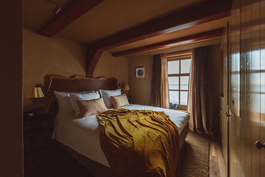
The bedrooms are finished in a moody colour palette

Where timber could no longer serve a structural function, it was converted into floorboards alongside reclaimed wood sourced from old church pews and demolished timber houses from Austria.

This wood was smoked for 18 hours to create a rich colour that permeates the timber rather than sitting on top like a stain, which would wear down over time and need re-upping.

“Normally, they do not smoke it that long,” explained Buro Belén co-founder Lenneke Langenhuijsen. “Now it will patina super beautifully because all throughout, it became this really dark wood.”

“It was important to us to make well-based decisions, maybe invest a bit more but it’s a long-lasting product that ages with the hotel and makes it even nicer over time.”

De Durgerdam marks the first time that Buro Belén has applied its material research approach to an entire hotel interior.

“We did a lot of research so that the hotel also feels very grounded in what it once was, in its place,” Langenhuijsen said. “And if you look at the Zuiderzee, it was a very important part of the Netherlands, all the villages around made their living from it.”

Layered throughout the hotel’s interior are references to this seafaring history, delivered via an eclectic mix of new, vintage and bespoke elements created by Buro Belén.

Fireplace in bedroom of hotel by AedesFireplace in bedroom of hotel by Aedes
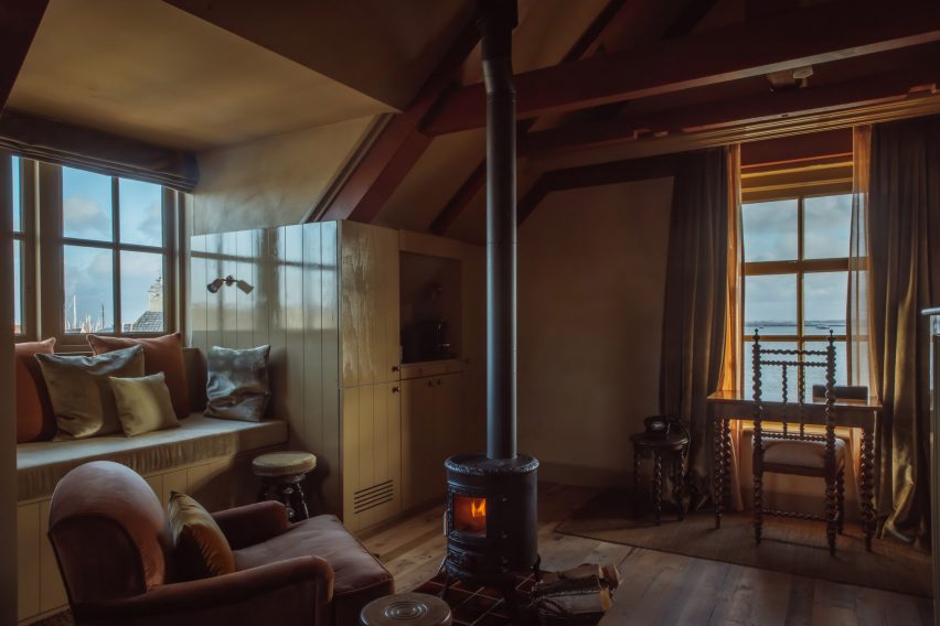
A rusty red colour was used to highlight the building’s beams

In the ground-floor restaurant De Mark, framed photos provide a glimpse of the inn’s evolution over the years.

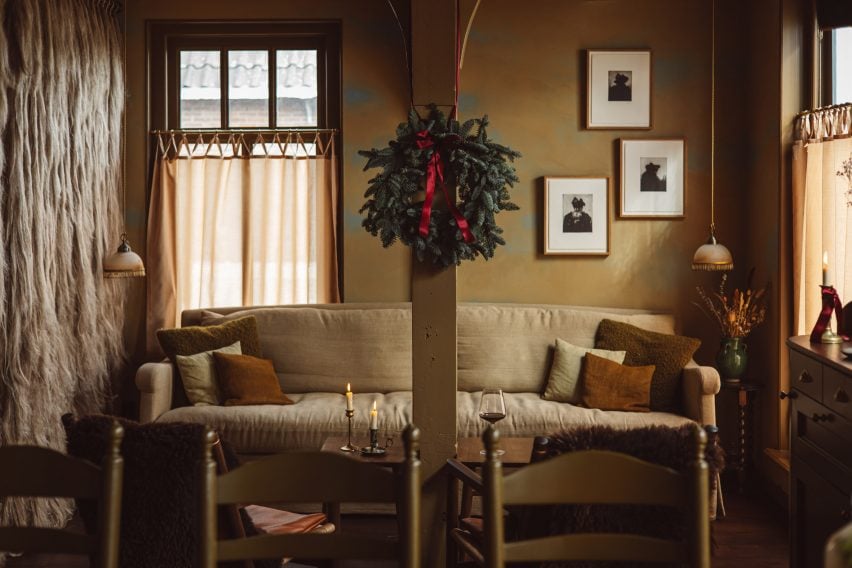
A shaggy curtain frames the lounge area near the entrance, made from traditional flax rope and raw flax fibres that were once used by local fishermen to make their nets.

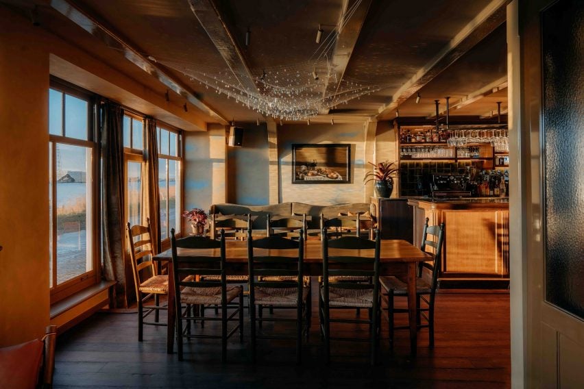
Weather permitting, patrons can dine outside on the jetty atop lake IJmeer or sit at a long sharing table that forms the centrepiece of the restaurant.

Bathroom of De Durgerdam hotel by Buro BelénBathroom of De Durgerdam hotel by Buro Belén
The same colour dominates the guest bathrooms

Overhead, Buro Belén suspended Ingo Maurer’s chandelier Lacrime del Pescatore – or “fisherman’s tears” – made of sparkling crystals that droop from a nylon net.

Its name, according to Langenhuijsen, acts as a subtle reference to the plight of the local fishers, who lost their livelihoods as the village was cut off from the sea.

Upstairs, the inn accommodates three suites and one room, accessed via the building’s untouched original staircase, which still shows the deep grooves that were worn into the wood by thousands of shoes over the centuries.

Garden annex of hotel by AedesGarden annex of hotel by Aedes
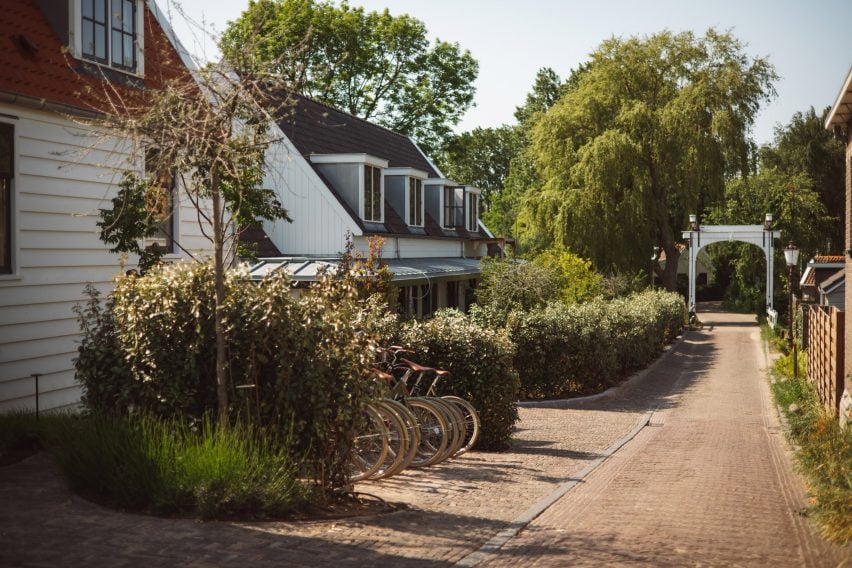
Ten of the hotel’s 14 rooms are housed in a garden annexe added in 2006

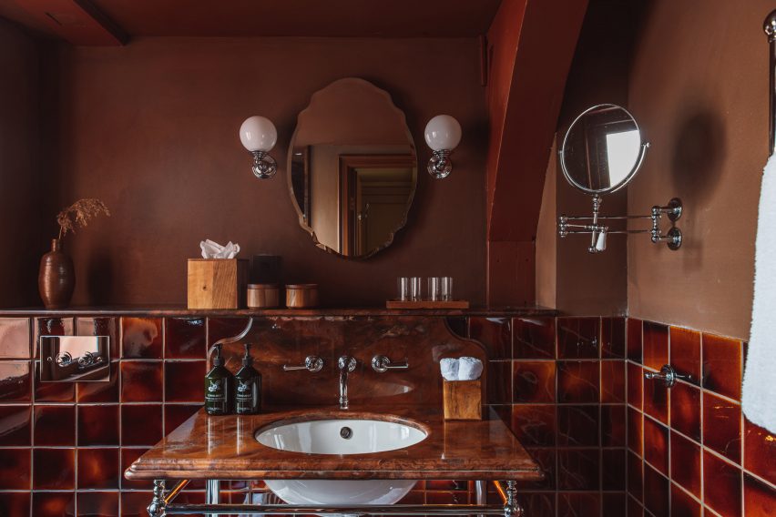
De Durgerdam’s remaining 10 rooms are housed in a garden annexe that was added to the building in 2006. All share a moody colour palette that was drawn from the craft and building traditions of the Zuiderzee.

A rusty red colour – reminiscent of sails treated with tree-bark tannins to prevent rot – was used to highlight key architectural features like the building’s timber beams and the monochrome bathrooms.

Similarly, the inside of the bedrooms’ Shaker-style built-in wardrobes was painted in a sky blue colour that nods to a traditional paint made from buttermilk, chalk and a particular blue pigment, historically used by locals across cupboards and box beds to repel insects.

Small gabled outbuilding outside garden annex of De Durgerdam hotel by Aedes Small gabled outbuilding outside garden annex of De Durgerdam hotel by Aedes
The hotel’s heat pumps are hidden in tiny gabled outbuildings

Even though construction is complete, Aedes is still working on reducing the hotel’s operational footprint, with the aim of getting 80 per cent of the way towards being zero waste by the end of next year.

The company is also looking into a reliable way of offsetting the building’s whole-life carbon emissions via a reforestation scheme but has so far struggled to find a reliable company that can guarantee measurable, traceable carbon removals.

“We’re not fans of offsetting, because we think we have to make sure we don’t create emissions,” Mouwensaid. “But it’s not possible yet.”

Aedes has previously converted Amsterdam’s art deco Bungehuis building into a Soho House members’ club.

The photography is by Chantal Arnts and Studio Unfolded.

Reference

Christian Louboutin’s Vermelho hotel in Portuguese village of Melides
CategoriesInterior Design

Christian Louboutin’s Vermelho hotel in Portuguese village of Melides

Fashion designer Christian Louboutin and architect Madalena Caiado’s 13-room boutique hotel in the village of Melides, south of Lisbon, celebrates craftsmanship and has been “designed at the scale of the hand”.

Named after the French designer’s signature colour, Vermelho, which is Portuguese for red, is Louboutin’s first hospitality project.

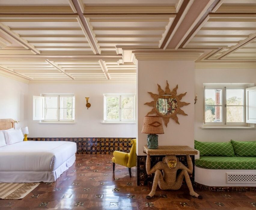
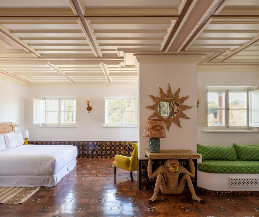
Monkey side table in Vermelho Hotel bedroom
Each room is furnished from Louboutin’s collection

The hotel features 13 rooms – all of them filled with the work of local craftsmen and a selection of materials and furniture from Louboutin’s personal collection.

“This project has allowed me to empty my storage full of antiques and objects I have purchased over many years!” Louboutin told Dezeen.

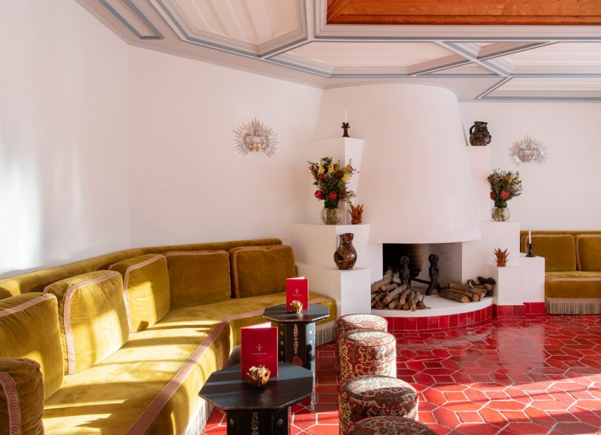
Golden velvet couches
Floor tiles are in Louboutin’s signature shade of red

At one point in the development of the project it looked like it might not be approved to operate as a hotel and so Louboutin decided “if it’s not going to be a hotel, I’m going to do it as my house”. As a result, each of the hotel’s rooms have been individually designed and have their own identity.

“If you build a house, you’re never going to design the same room,” the designer said. “I don’t know a house where you have the same room three times – it only exist in hotels.”

“Houses have feelings – they have different rules to hotels,” he continued. “You can’t have your house looking like a hotel”.

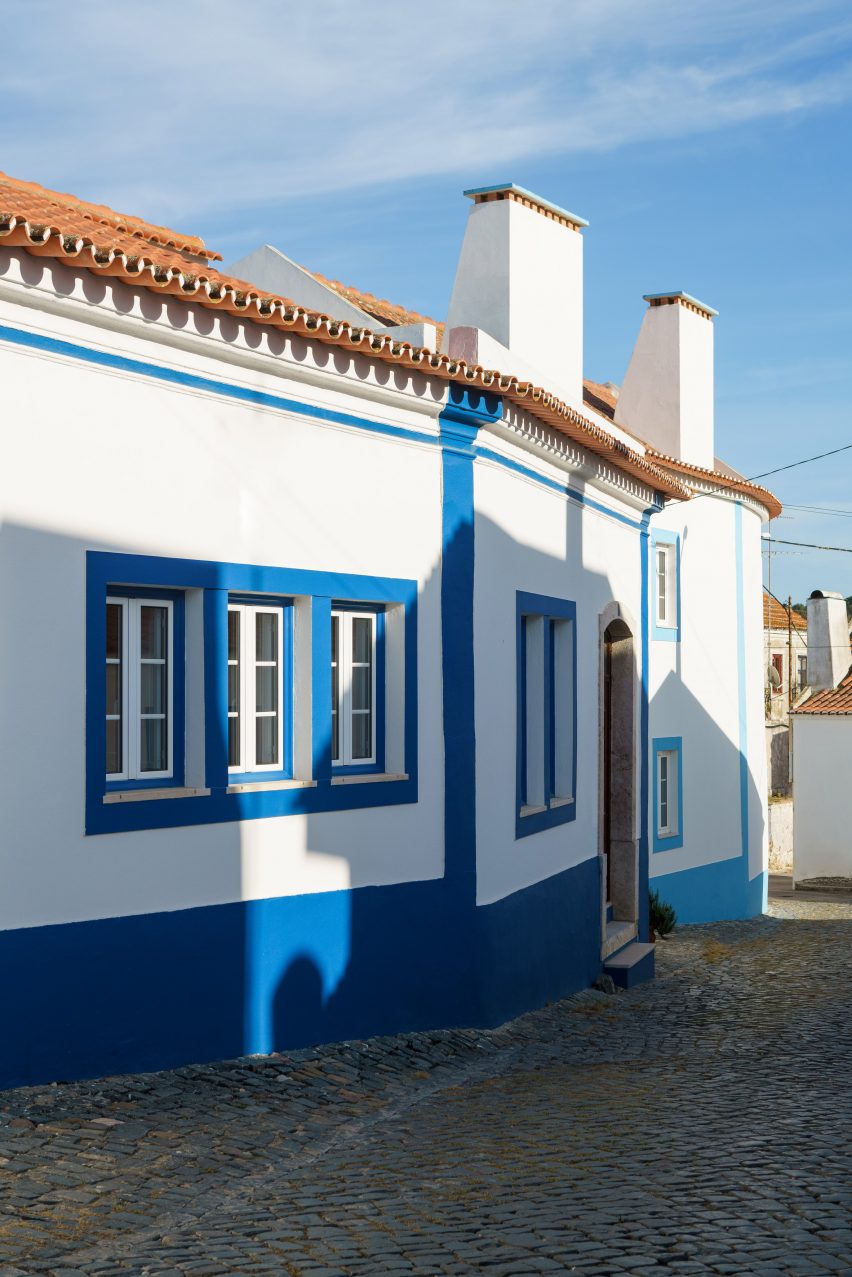
The hotel has been designed in the local architectural style

Vermelho was designed to be “well-integrated into the village” and it was important to Louboutin “that it really respects the area and environment”.

Working with Portuguese architect Caiado, the resulting hotel meets the street as a series of traditional buildings in the local architectural language: white render with blue plinth and window detailing, terracotta-tiled roofs and a scattering of chimneys punctuating the skyline.

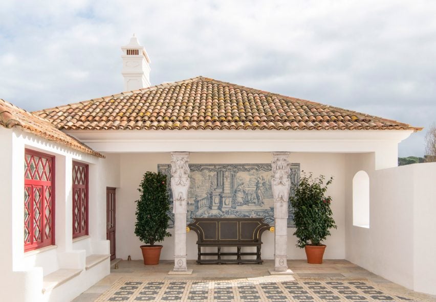
There was nothing on the site before work began

“We have tried to imagine a building that could have existed in that place, and that was part of the landscape,” Caiado told Dezeen.

“To achieve that, we made a project adapted to the topography, relating to the surrounding buildings, and re-discovering traditional construction systems and materials.”

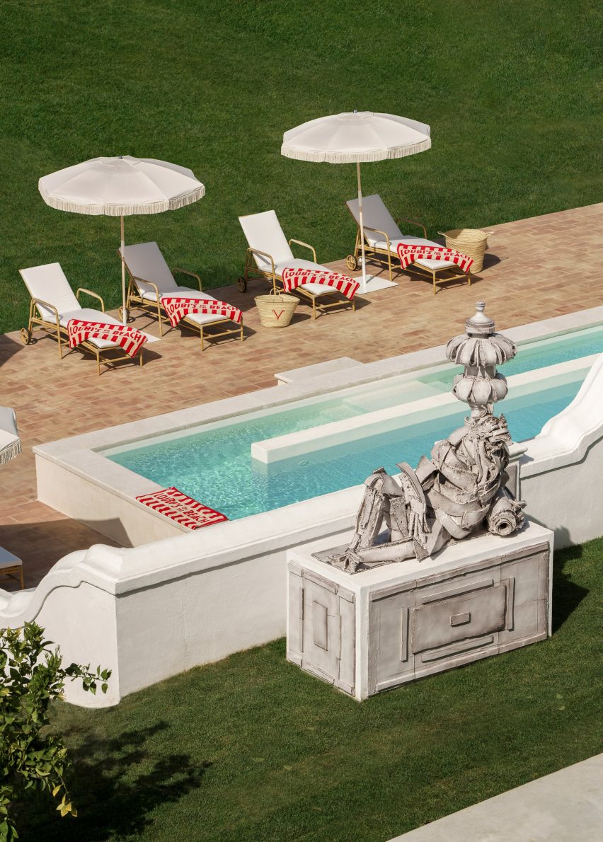
The hotel looks out onto a private garden and pool
The hotel looks onto a private garden and pool

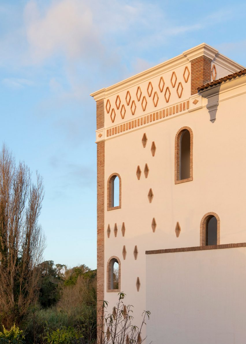
The site, which curves round a private garden and swimming pool that looks out to reed marshes, culminates in a tower, punctuated with playful window openings that hint at the internal character of the project.

Discreet from the street, the interior design and garden-facing facade is full of detail, colour and craftmanship.

Tower with diamond fenestration
The tower features unusual diamond punctuation

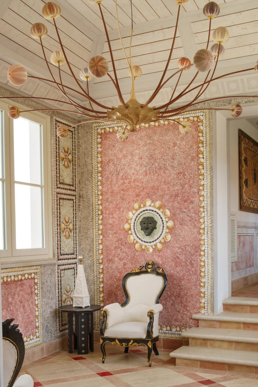
The hotel’s maximalist and eclectic style was intended as a reflection of Louboutin’s personal taste, while also celebrating Portuguese savoir-faire and the traditions of local craftspeople.

Having already worked with Caiado on his Lisbon house, Louboutin’s brief for Vermelho was to show Caiado an Indian bracelet from his collection, which from the outside looks like a simple gold bangle, but on its inside face was engraved with busy animal designs and set with diamonds.

Ornate interiors with bespoke lighting
The interiors are highly detailed

“I said to Madalena, the hotel should be like the bangle; from the outside, you don’t see anything,” Louboutin explained. “It’s to be a very simple, well-designed building that doesn’t give away much information about the inside,”

“But when you go inside, it should be this animal and diamond thing,” he continued.

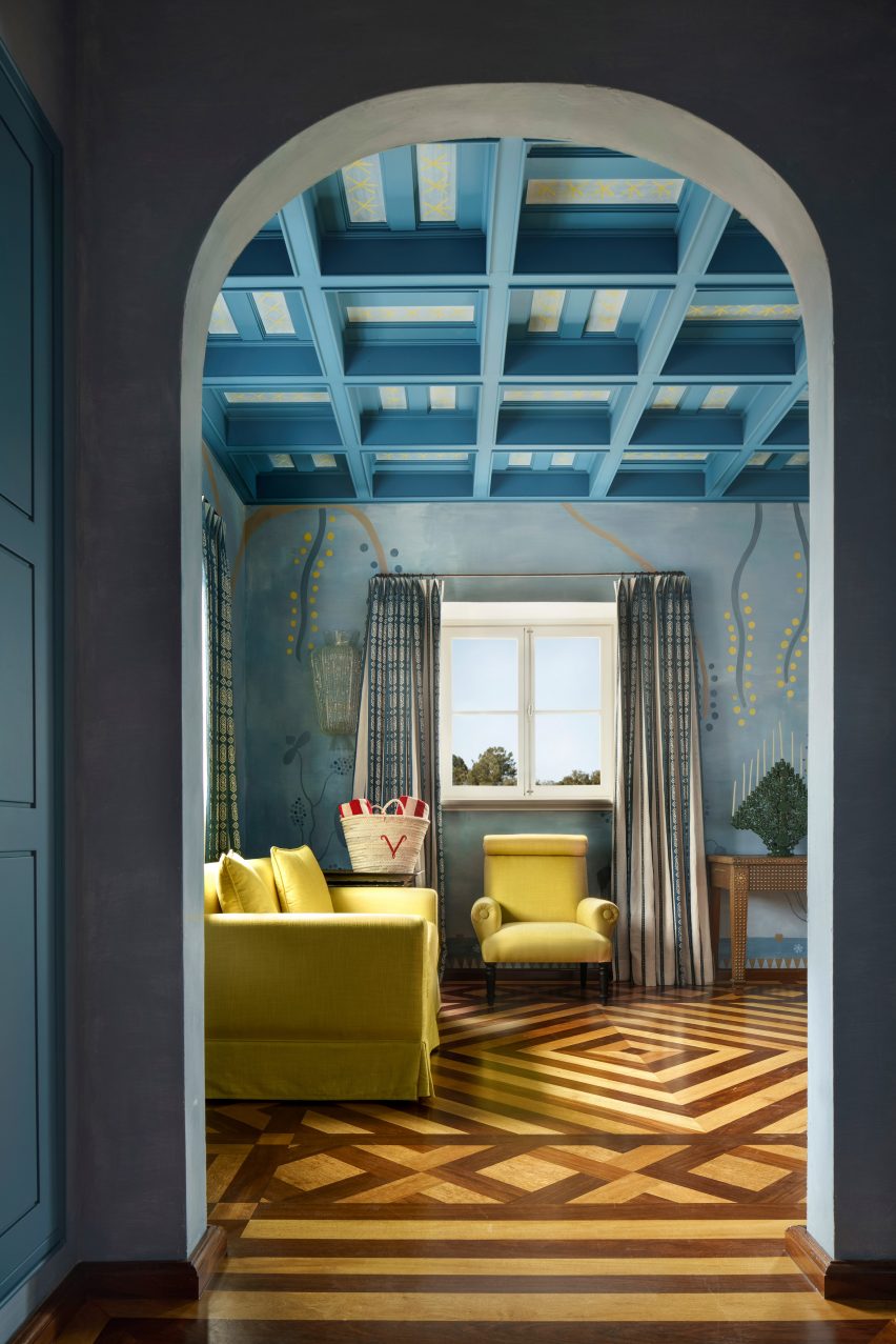
Parquet floor and coffered ceilings
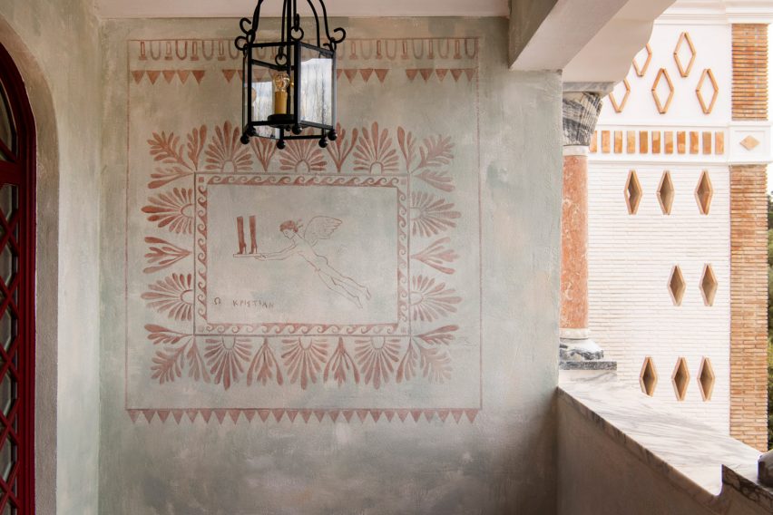
Bedrooms feature murals by Konstantin Kakanias

To achieve the highly decorative and detailed interior Louboutin collaborated with designer Carolina Irving, who acted as an advisor on textile creation and decoration, and ceramic tile designer and interiors consultant Patricia Medina.

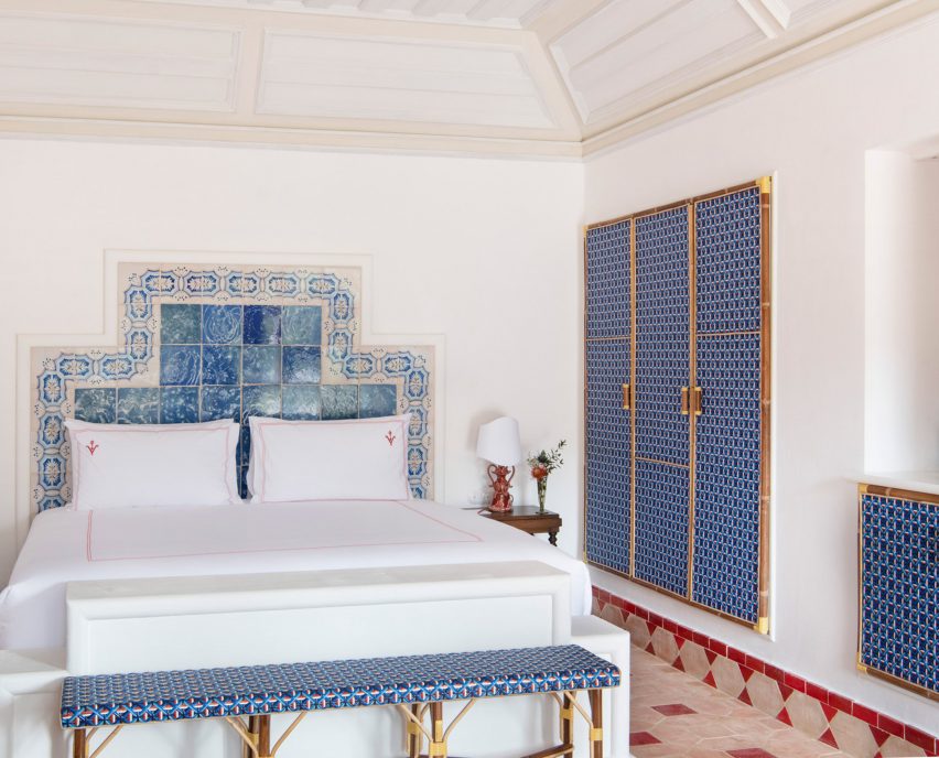
Hand-painted frescoes by Greek artist Konstantin Kakanias cover the walls, while bedrooms features wardrobes with Maison Gatti French latticework.

Murals adorn walls throughout the hotel
Playful murals adorn walls throughout the hotel

Bespoke woodwork and carpentry was completed by Spanish master craftsmen company Los Tres Juanes. Throughout the project Louboutin used Alentjo tiles, as well as giving the Italian artist Giuseppe Ducrot a blank slate to design sculptural ceramic details for the facade.

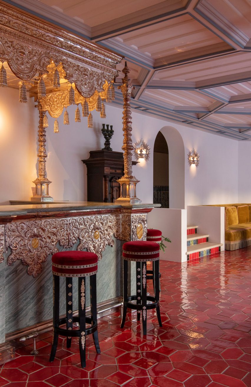
The hotel restaurant, called Xtian, features a Klove Studio mural chandelier and a bespoke bar covered in hammered silver leaf, which was made by Seville-based liturgical goldsmiths Orfebrería Villarreal.

Silver and gold bar
The bar is made from silver by Spanish goldsmiths

Speaking to Dezeen, Caiado described the project as “at the same time, the most extravagant and most traditional project I’ve ever done”.

“The biggest challenge was balancing the different constellations of ideas for each space, so that it results in a harmonious way,” she explained.

“Especially during construction, Christian was present and brought his own creative universe, but also a more tactile way of thinking and with an artistic component of searching for novelty, even when it came to traditional materials and techniques – almost as if the hotel was designed at the scale of the hand of those who built it.”

Lattice work cupboards
Local Atlentjo tiles are used throughout the project

Other recent boutique hotels featured on Dezeen include Dorothée Meilichzon’s revamp of Cowley Manor Experimental and Beata Heuman’s interiors for Hôtel de la Boétie in Paris.

Photography is by Ambroise Tézenas.


Reference

Martin Brudnizki draws on “gritty glamour” for Broadwick Soho hotel
CategoriesInterior Design

Martin Brudnizki draws on “gritty glamour” for Broadwick Soho hotel

Interior architect Martin Brudnizki has used Italian maiolica tiles and bespoke furniture from India to give London’s Broadwick Soho hotel an eclectic look.

The eight-floor hotel was designed by Martin Brudnizki Design Studio (MBDS) to evoke the history of Soho – the London neighbourhood that surrounds it.

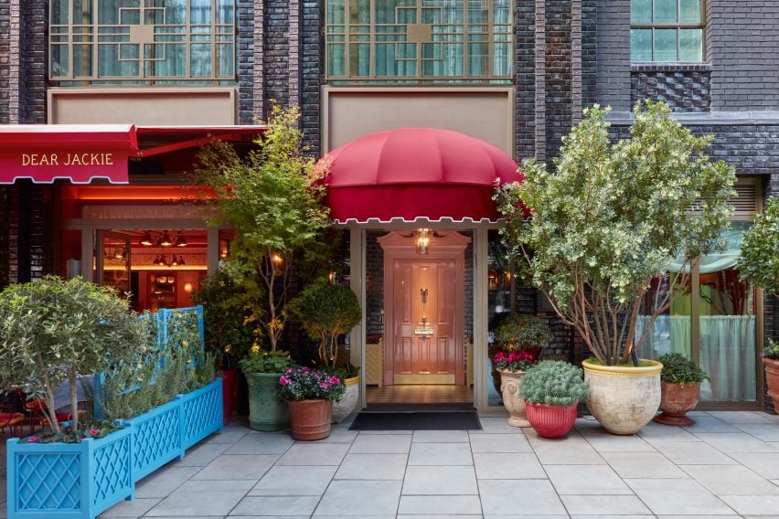
Exterior of Soho hotel
The hotel is located on Broadwick Street in London’s Soho area

“Inspired by ‘gritty glamour’ and the diverse history of Soho, MBDS’s design influences range from 1970s disco pop elements to British eccentricity,” studio founder Martin Brudnizki told Dezeen.

The hotel was also influenced by “the strong women who frequented Soho during the 1960s and 70s such as Mary Fedden, Molly Parkin and Muriel Belcher.”

Bar at Broadwick Soho
Maiolica tiles decorate the restaurant bar

Broadwick Soho is comprised of  57 rooms, which Brudnizki decorated in opulent colours and patterns. For the downstairs Italian restaurant, Dear Jackie, Brudnizki sourced materials and accessories that nod to its cuisine.

“A split-level restaurant, the communal dining takes centre stage with long counter-style tables featuring 1970s Formica tops and Memphis-inspired chandeliers suspended from coral lacquered ceilings,” he said.

Bar Jackie by Martin Brudnizki
Floral patterns cover the walls of the restaurant

“The bar features maiolica tiles in traditional southern Italian patterns,” Brudnizki added. “This compliments the maiolica wall covering adorned with Sicilian folk motifs of grapes and flowers.”

The handpainted ceramic tiles for the bar were developed by the studio itself together with a family business in Sicily.

Elephant wallpaper at Broadwick Soho
Rooms feature decorative elephant wallpaper

In some of the guestrooms, walls were decorated with marbled wallpaper with a pattern of tigers and elephants. The elephant was chosen as a symbol for the hotel and was also turned into mini bars in the hotel’s suites.

“A huge amount of bespoke pieces were designed by the studio and produced by talented craftspeople across the world,” Brudnizki said.

Elephant minibar in Soho hotel
Martin Brudnizki Design Studio had elephant minibars crafted in India

“The wonderful elephant mini bars in the suites were designed by the studio and crafted in India,” he added.

“We actually travelled to India to work with the craftspeople directly, ensuring each detail was as we envisioned.”

The Nook at Broadwick Soho
A vintage Murano glass chandelier hangs in The Nook

The studio also sourced a number of vintage pieces for the hotel, including a 1970s Murano glass chandelier that hangs from the ceiling of The Nook – Broadwick Soho’s residents-only ground-floor lounge.

MBDS also commissioned new Murano glass lamps that are scattered throughout the space.

“All of the Murano glass lights throughout the property have been made and developed by local artisans in the Venice region,” Brudnizki said.

“Lastly, there is a collection of antiques throughout the hotel that have been sourced from independent Italian and British antique dealers, auction houses and shops.”

Flute bar in Soho
Rooftop bar Flute features a variety of polished materials

Broadwick Soho’s rooftop dining bar – named Flute after a 19th-century flute maker on Broadwick Street – is an example of how Brudnizki played with multiple colours and patterns to create a space that he describes as combining “cocooned comfort with maximalist glamour”.

Here, saturated green and pink pastel colours contrast gleaming marble and brass details, while contemporary art decorates the walls.

Reading area in Broadwick Soho
The Nook has a cosy reading area

The overall aim of the project was to create a hotel that would suit the context and history of Soho.

“We were conscious of ensuring that what we were designing felt authentic and true to the Soho context and neighbourhood,” Brudnizki concluded.

“It has such a strong and important cultural history, we were conscious we needed to draw this out and bring it to the forefront of our design concept.”

Previous London projects designed by Brudnizki, who was one of the judges for Dezeen Awards 2023, include a mythology-informed restaurant and the redesign of members’ club Annabel’s.

The photography is by James McDonald.

Reference

Keiji Ashizawa Design and Norm Architects create Trunk Hotel in Tokyo
CategoriesInterior Design

Keiji Ashizawa Design and Norm Architects create Trunk Hotel in Tokyo

An exposed raw concrete facade fronts the Trunk Hotel Yoyogi Park, which Japanese studio Keiji Ashizawa Design and Danish firm Norm Architects conceived as a minimalist retreat in the heart of the city.

Marking the third location in a trio of Trunk hotels in Tokyo, the design of the boutique hotel was rooted in the concept of “urban recharge”, according to Trunk chief creative officer Masayuki Kinoshita.

The raw concrete facade of Trunk Hotel Yoyogi Park
Trunk Hotel Yoyogi Park features a raw concrete facade

The hotel group said the idea was to balance the opposing elements of tradition and modernity as well as nature and the city and the melding of both Japanese and European craft.

Keiji Ashizawa Design created a textured concrete aggregate facade for the seven-storey building, which is punctuated with steel-lined balconies and overlooks Yoyogi Park’s lush treetops.

Neutral bathroom within Tokyo's Trunk Hotel
Guest rooms feature a muted colour and material palette

The studio worked with Norm Architects to design the minimalist interior, accessed via a copper-clad entrance.

A total of 20 guest rooms and five suites were dressed in a muted colour and material palette featuring hardwood flooring and plush Hotta Carpet-designed rugs informed by traditional Japanese architecture.

Paper-cord chairs and washi pendant lights at Trunk Hotel in Tokyo
Paper-cord chairs and tapered washi pendant lights contribute to the minimalist design

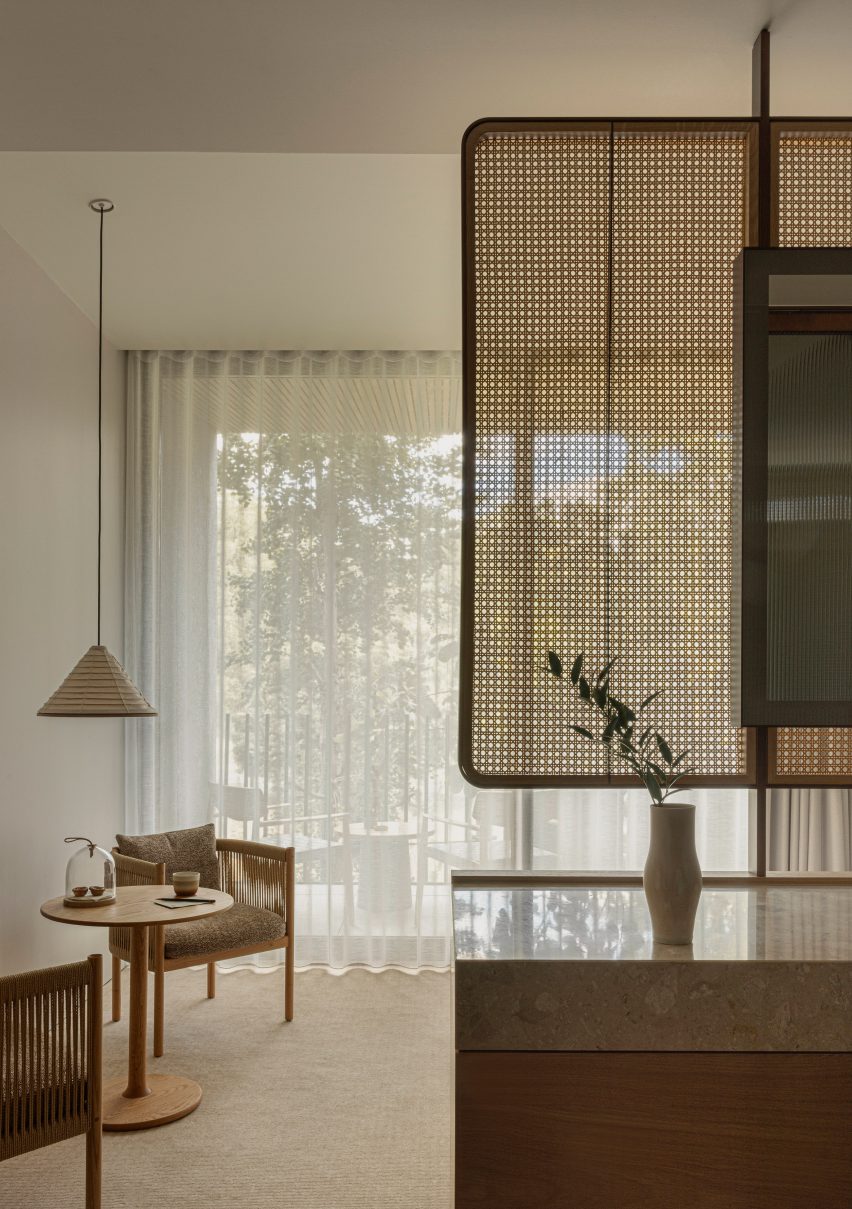
Delicate rattan partition walls delineate spaces within the rooms, which open out onto the building’s balconies that were fitted with slanted ceilings in order to encourage sunlight into each room “as if mimicking the gentle transitions of a day”.

“It’s been an interesting journey for us to find the right balance between a space that is relaxed and vibrant at the same time,” said Norm Architects co-founder Jonas Bjerre-Poulsen.

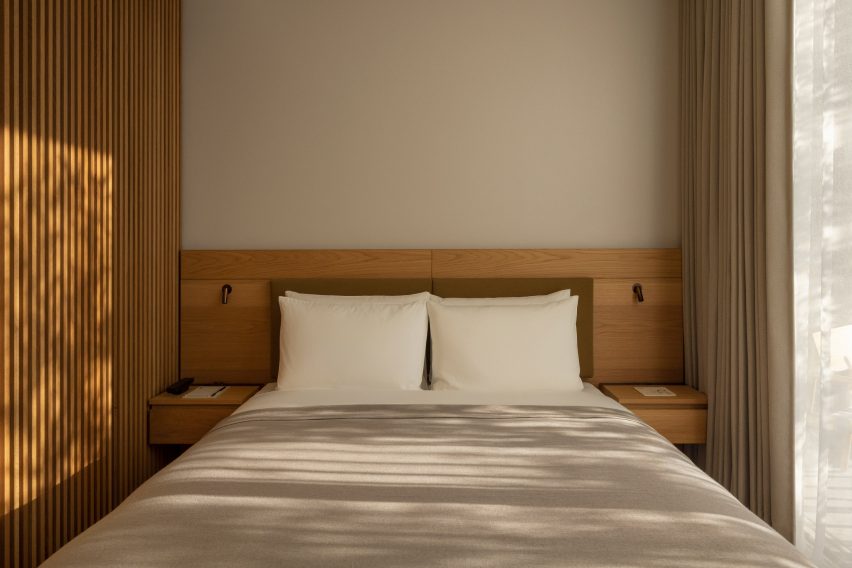
Minimalist neutral double bed within the Trunk Hotel in Tokyo
The interiors were designed to be both “relaxed and vibrant”

The rooms are also characterised by paper-cord chairs and tapered washi pendant lights as well as abstract artworks, amorphous vases and grainy floor-to-ceiling bathroom tiles.

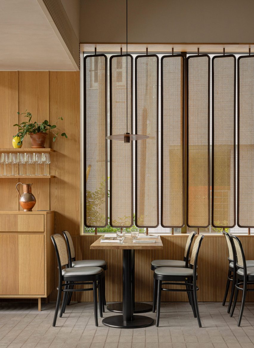
On the ground floor, oak seating designed by Norm Architects for Karimoku features in the hotel restaurant, which includes a striking copper-clad pizza oven and the same rattan accents that can be found in the guest rooms.

Rattan room dividers in the restaurant of Trunk Hotel
Rattan accents can also be found in the hotel restaurant

“It is a very unique and gratifying experience in the sense that the architecture, interior and furniture, as well as the attention to detail, have created a space with such a strong sense of unity,” said Keiji Ashizawa Design.

An open-air pool club is located on the sixth floor of the hotel.

Sand-blasted concrete flooring was paired with thin bluey-green tiles that make up the infinity swimming pool, which overlooks the park below.

A “glowing” firepit can also be set alight after dark, intended to create a soothing contrast with the bright Tokyo skyline.

Rooftop infinity pool overlooking Yoyogi Park
The Trunk Hotel features a rooftop infinity pool

The city’s first Trunk Hotel opened in Shibuya in 2017, while the second location is an offbeat one-room hotel in the metropolis’s Kagurazaka neighbourhood featuring its own miniature nightclub.

The photography is by Jonas Bjerre-Poulsen.

Reference

Patricia Urquiola converts historic palazzo into Six Senses Rome hotel
CategoriesInterior Design

Patricia Urquiola converts historic palazzo into Six Senses Rome hotel

Milan-based designer Patricia Urquiola has converted a palazzo in Rome into a hotel and spa, filled with circular elements and traditional Italian materials.

The Six Senses Rome is located within the Palazzo Salviati Cesi Mellini, close to historic sites like the Pantheon and the Trevi Fountain in the city centre.

Open lobby with pockets of seating between potted plants in Six Senses Rome hotel by Patricia Urquiola
The lobby of the Six Senses Rome is an open social space with multiple seating areas

Adjacent to the Church of San Marcello al Corso, the building was first constructed in the 15th century before being updated in the 18th-century baroque style by architect Tomaso De Marchis.

An impressive central staircase and the building’s main UNESCO-listed facade, which overlooks the bustling Via del Corso, are among the period details that were restored during the renovation works led by Studio Urquiola.

Lounge seating in front of restaurant counter
The Bivium restaurant connected to the lobby offers all-day dining

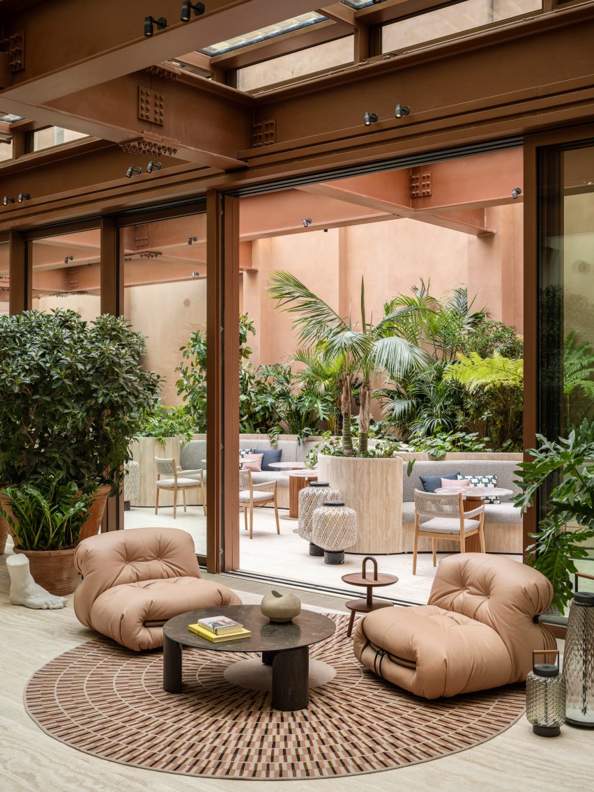
The entrance to the Six Senses Rome from Piazza di San Marcello leads into an open lobby and social area, furnished with a variety of sofas and lounge chairs from Urquiola’s oeuvre alongside classic Italian designs.

These are positioned in groupings with tables and decorative objects on circular rugs, between potted plants spread across the travertine floors.

Lounge seats on a circular rug, in front of an opened glass partition in Six Senses Rome hotel by Patricia Urquiola
Circular elements appear throughout the hotel, including rugs and tables in the lobby

“At every turn, the craftsmanship, the finishes, the materials and the graphics create a union with nature while staying true to both Roman classicism and Palazzo Salviati Cesi Mellini’s rich history,” said Urquiola.

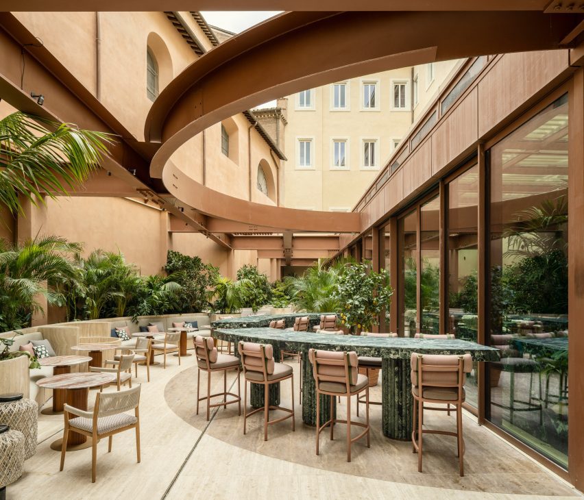
A curved green marble bar is positioned near the windows, forming an incomplete circle with the matching counters in the courtyard, which are visible through the glazing and follow the shape of earth-toned steelwork overhead.

Courtyard with green marble bar counter below steelwork in Six Senses Rome hotel by Patricia Urquiola
In the courtyard, a green marble bar counter continues from inside

The courtyard also features benches built into planters along the back wall and additional seating, where diners can enjoy food and drinks from the trattoria-style Bivium restaurant.

Circular forms and motifs continue throughout the hotel, including in the Six Senses Spa and Roman baths on the first floor.

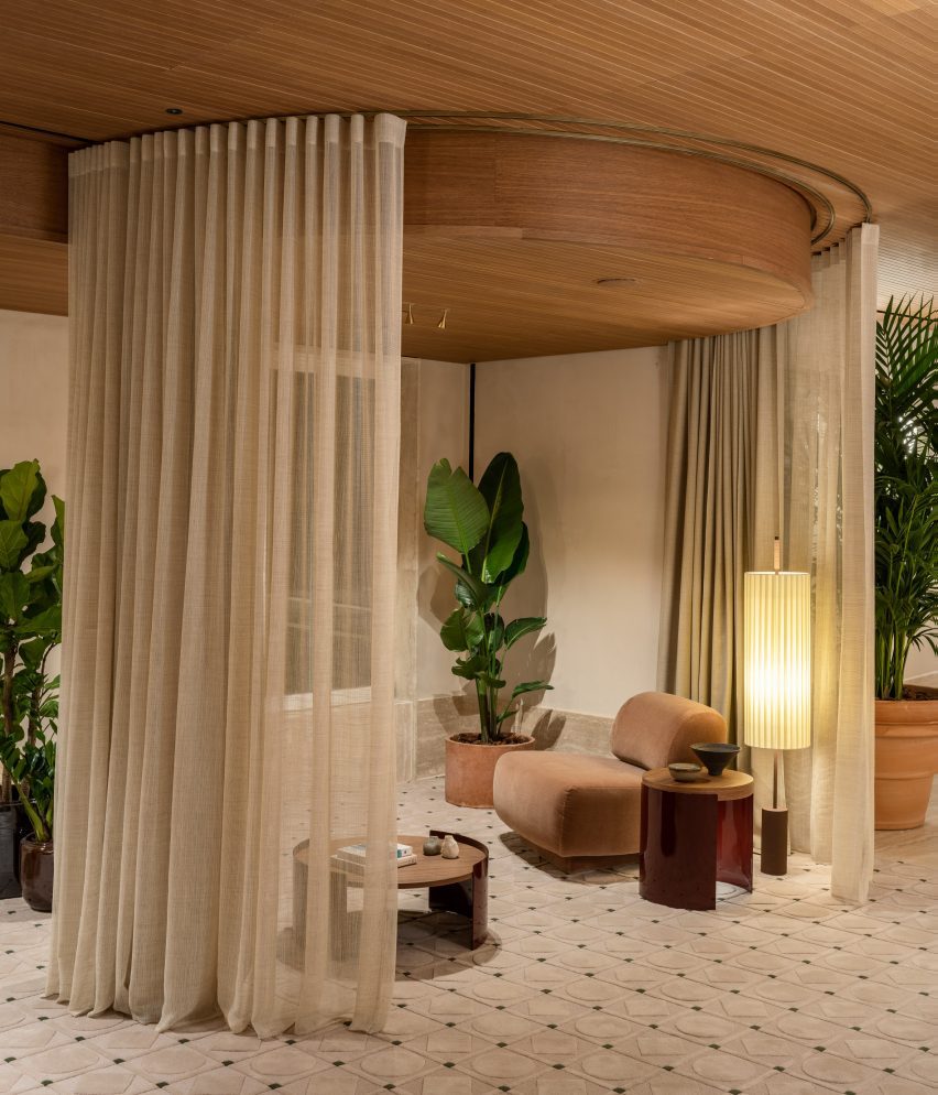
Spa waiting area featuring seating within sheer curtain enclosures
The spa waiting area features seating within sheer curtain enclosures

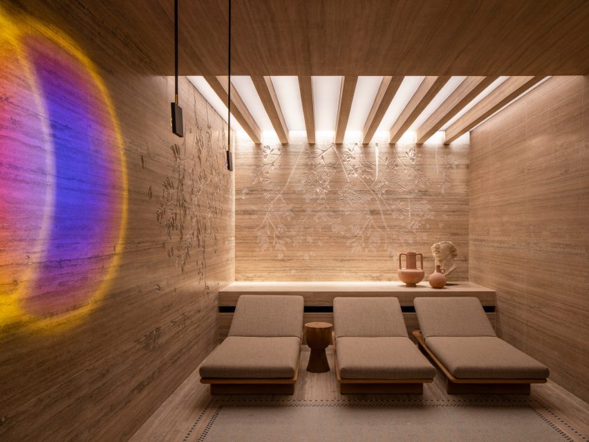
Here, sheer curtains encircle small seating areas for those waiting for treatments or preparing to enter the travertine-lined bathhouse, which offers multiple pools for soaking and relaxing.

Bedrooms across the central levels have “quirky” layouts and a soft neutral decor, including tambour panelling, patterned rugs and a variety of spherical light fixtures.

Travertine lines the walls and ceiling inside the spa and Roman baths in Six Senses Rome hotel by Patricia Urquiola
Travertine lines the walls and ceiling inside the spa and Roman baths

Several of Six Senses Rome’s 96 guest rooms and suites have balconies, and all enjoy either a courtyard or city view.

Plasterwork in the rooms is made from an ancient Roman material known as cocciopesto, which comprises fragments of earthenware or brick mixed with lime and sand.
“The legacy of antiquity is also honoured with the choice of cocciopesto, which decorates the plaster of the rooms and gives a nod to Roman architect Vitruvius,” said the studio.

The hotel also features a roof terrace and bar called Notos that offers views across the city and serves botanical cocktails and light bites.

Bedrooms with soft neutral decor
The bedrooms at the Six Senses Rome have a soft neutral decor

Artworks such as watercolours, sculptures, textile works and canvases throughout the interior are curated by art advisor Federica Sala and are all unique to the hotel.

Six Senses Rome is shortlisted in the hotel and short stay interior category of Dezeen Awards 2023, while Studio Urquiola is shortlisted for interior designer of the year.

Lounge area within a guest room suite in Six Senses Rome hotel by Patricia Urquiola
Plasterwork in the bedrooms and suites is made from cocciopesto

Originally from Spain, Urquiola is one of Europe’s most sought-after designers and has released furniture and product collections with brands like Moroso, Cassina, Kettal and Boffi among many more.

Other hotels designed by her studio include the Haworth Hotel in Michigan, the Hotel Il Sereno on the shores of Lake Como and the Room Mate Giulia in Milan.

The photography is by Luca Rotondo.


Project credits:

General contractor: CDS Holding
Architecture: Starching and professor Paolo Micalizzi
Interior design: Patricia Urquiola

Reference

Beata Heuman designs colour-drenched Hôtel de la Boétie in Paris
CategoriesInterior Design

Beata Heuman designs colour-drenched Hôtel de la Boétie in Paris

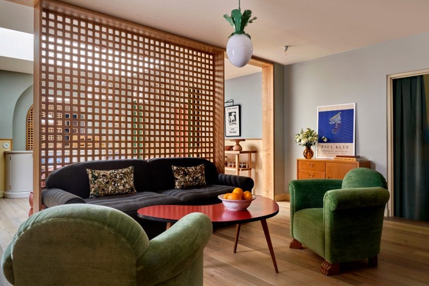
Saturated greens and blues contrast pale pink sheets and playful flower details at Hôtel de la Boétie in Paris, which Swedish designer Beata Heuman created to be “a bit like a stage set”.

Set in a 19th-century building, the 40-room hotel in Paris’ 8th arrondissement was designed with Heuman‘s signature colourful interior style.

Lounge at Hôtel de la Boétie
Beata Heuman’s Dodo Egg Light hangs in a lounge area at Hôtel de la Boétie

While it was a renovation of an existing hotel, the designer was able to make large changes to the interior as the building had been altered numerous times since it was completed.
“The building didn’t have any original features left and has been re-configured over the years,” Heuman told Dezeen. “We spun off the simplicity of the bones that were there, working with strong, simple ideas.”
Reception area at Hôtel de la Boétie
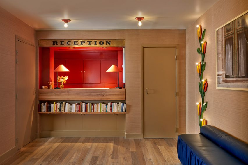
The hotel’s reception area has a warm red colour

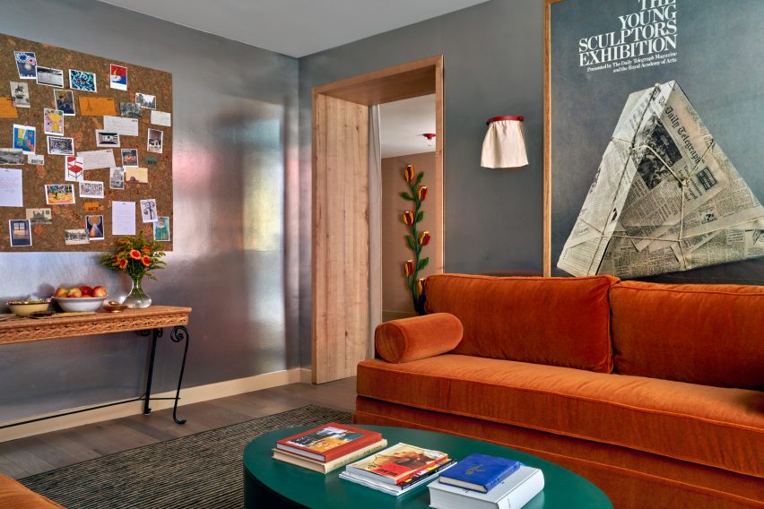
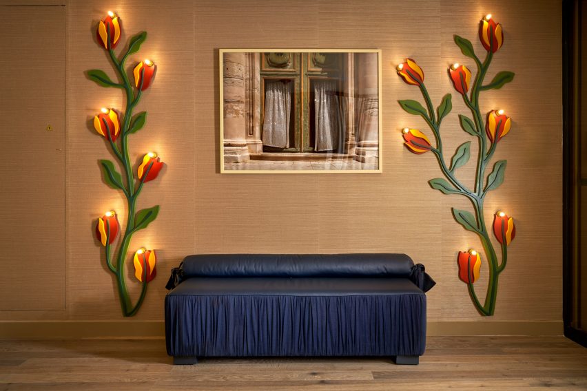
Guests are met by a reception room with a vibrant, bright-red nook for the front-of-house staff and two lamps designed like winding red-and-yellow flowers. A dark-blue leather seat complements the room.

Next to the reception area, Heuman created an all-silver lounge that was designed to have a theatrical feel and is brightened by an orange velvet sofa and a forest-green coffee table.

Silver lounge space at Hôtel de la Boétie
Guests can relax in a silver lounge area

The colour palette was very deliberately chosen by Heuman, who thought about the wider impact it would have on the space.

“It’s about contrast and balance,” the designer said. “When you work with rich colours my instinct is to off-set that using simpler materials around it to complement and enhance.”

Bedroom with patterned headboard
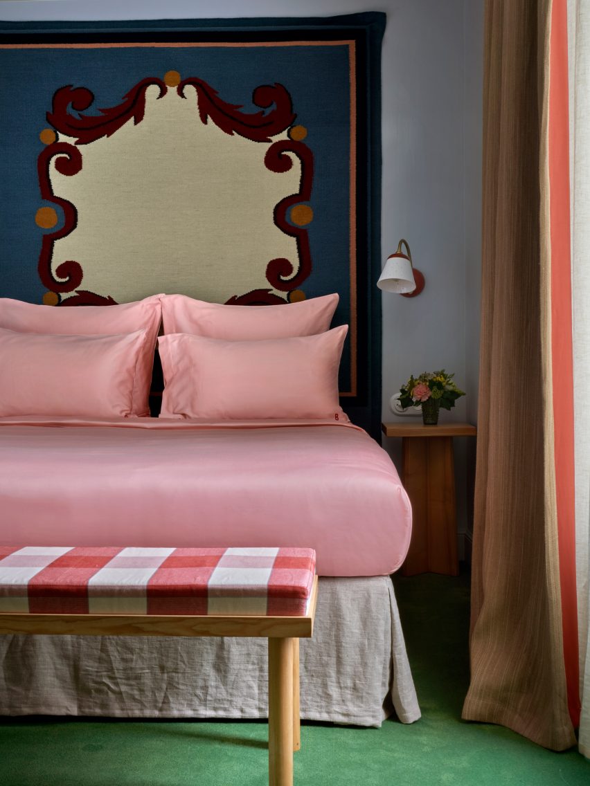
Woven headboards create striking centrepieces in the bedrooms

The bedrooms have a saturated colour scheme, with lower-level floors that feature dark blue walls, which change to shades of brown on the ascending floors.

The two top levels have pale, airy blue hues, with classic French cast-iron balconies providing views of central Paris from the top floor.

A grassy green carpet was used throughout the hotel to create a vibrant contrast to the blue and brown hues.

Bathroom at Parisian hotel
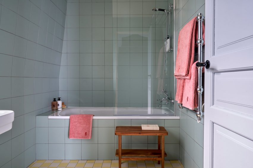
The bathrooms feature pale pastel colours

Some bedrooms have been decorated with oversized headboards that were woven as rugs and then upholstered, creating an unusual and eye-catching centrepiece.

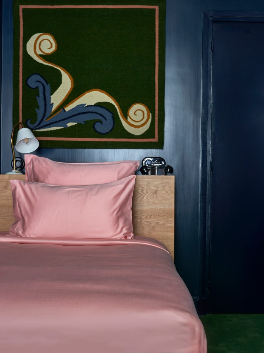
These were informed by the inlaid marble floor of the Medici Chapel in Florence and sit above the solid-ash beds, which have been made with pale-pink satin sheets that add to the vibrant feel of the room.

In the bathrooms, Heuman used pale blue and green pastel hues juxtaposed with pink towels to give the rooms a luxurious retro feel, while checkerboard-patterned tiles in yellow and green add a fun touch.

Pink satin sheets on bed in Paris hotel
bedrooms on the lower levels have dark-blue walls

The designer also used her own products to decorate the hotel, including her Dodo Egg Light – an egg-shaped light with green fittings designed to resemble planet leaves.

This decorates one of the ground floor lounge areas, which also features posters for art exhibitions by artists Pablo Picasso and Paul Klee.

The designer used mainly natural materials for the hotel, including wood and brass.

“The solid ash furniture used in all the rooms have a humble quality which anchors the more theatrical elements of the schemes such as the headboards, ensuring the expression stays true to the nature of the building,” she said.

Interior of Hôtel de la Boétie
Heuman aimed to use natural materials throughout the space

Heuman also created the branding for the hotel, which was made for French hotel group Touriste.

“A hotel is about having an experience for a day or two, which means that we have been able to explore a concept and a mood to a greater extent,” Heuman said.

“We can treat it a bit like a stage set, which is not the approach I would take when it comes to someone’s home.”

Reception at Parisian hotel
Flower lamps decorate the reception area

The project fulfilled a long-time dream for the designer, who had previously never designed a hotel and works more on private home interiors.

“I’ve been wanting to do a hotel for ages and it has been a fantastic experience,” Heuman said.  “I am drawn to the theatrical, although that is often not appropriate for a residential setting.”

“A hotel is an experience for a few nights, therefore you can exaggerate and do more of a ‘look’,” she added. “In a residential project the design is centred around the personal preferences of an individual client.”

Previous hotels by Touriste include Hotel Les Deux Gares in Paris, which has an interior that was created by British designer Luke Edward Hall. Also in Paris, local studio Uchronia created a colourful Haussmann-era apartment as a “chromatic jewellery box”.

The photography is by Simon Brown.

Reference

Renovated Ibizan finca retains rustic charm as Aguamadera hotel
CategoriesInterior Design

Renovated Ibizan finca retains rustic charm as Aguamadera hotel

A 19th-century farmhouse hidden away in the mountains of Ibiza has been converted into a hotel, where guests stay inside earthy, minimalist suites with interiors conceived by creative director Carlota Sarda Caralps.

The remote Aguamadera resort opened earlier this year and was designed as “a secluded hideaway home” with a focus on nature, wellness and food.

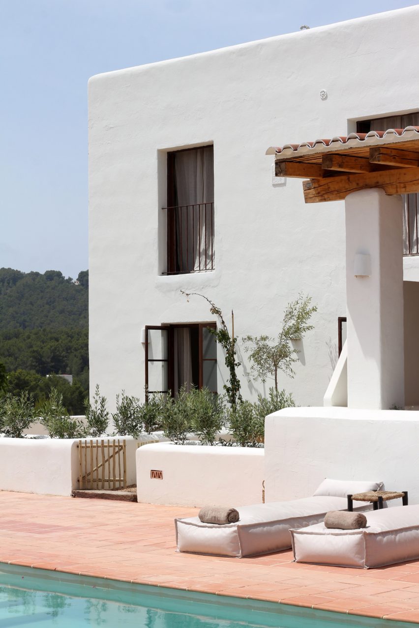
Two-storey whitewashed building with terracotta tiles terrace
A 19th-century farmhouse has been converted into a boutique hotel

The brainchild of Pacha Group co-founder Iria Urgell and hospitality entrepreneur Pablo Fernández-Valdés, the hotel was designed under the creative direction of Sarda Caralps.

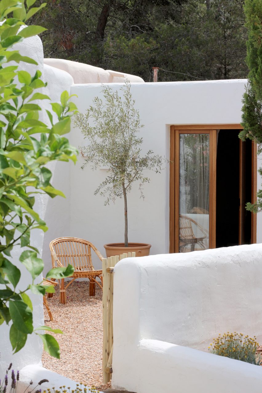
Positioned atop a hill near the beach resort of Cala Llonga, the finca – or farmhouse – and its outbuildings constructed in 1888 were converted to accommodate seven guest rooms and four suites.

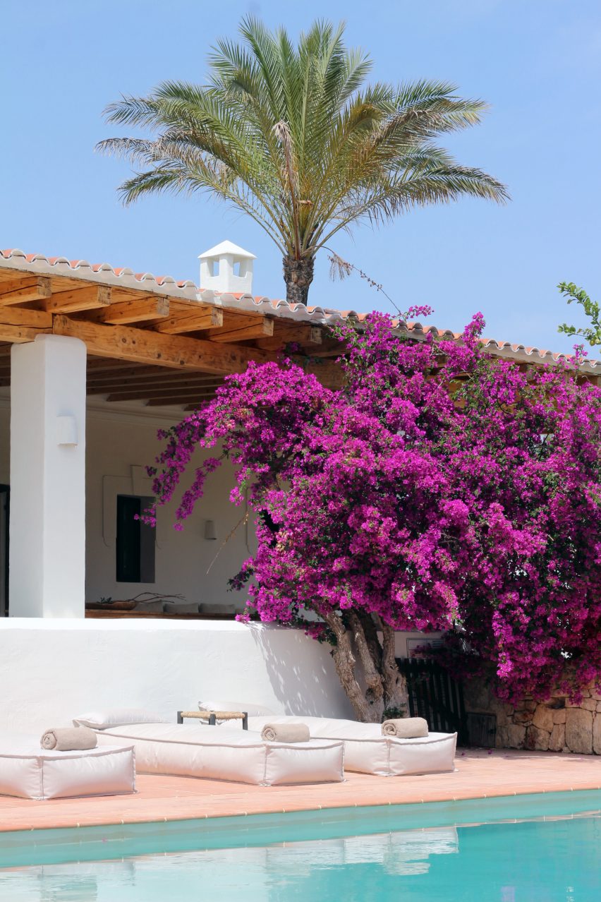
Renovated farmhouse with large bougainvillea tree in front, now the Aguamadera hotel in Ibiza
The pink flowers of a large bougainvillea tree contrast the whitewashed building

The renovated whitewashed structures sit among 27 acres of pine forests, olive groves and terraced agricultural land, from which much of the produce used in the hotel’s restaurant is sourced.

The name Aguamadera is derived from the Spanish words for water and wood, in a nod to the fact that the hotel hopes to promote healing through nature in its rural setting.

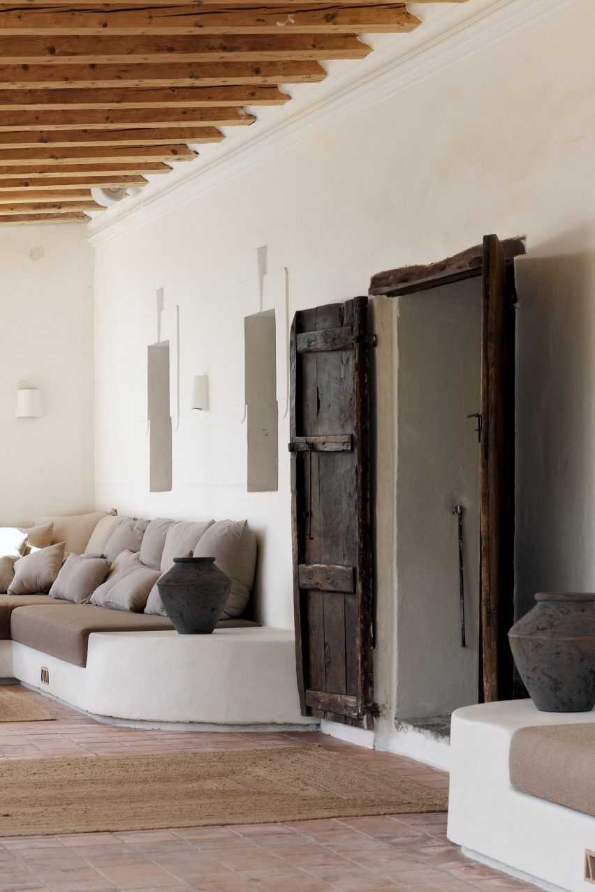
Covered porch with built-in seating and old wooden door
A covered porch features built-in seating for lounging

This translates into the design through the use of natural materials like clay plaster walls, wooden furniture, linen textiles and jute carpets.

Simplicity reigns throughout the resort. The textured plasterwork forms organically shaped surfaces and the cement floors complement the neutral palette.

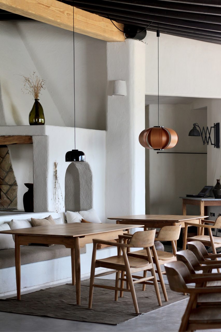
Dining area with wooden furniture and small pendant lights in Aguamadera hotel in Ibiza
Small pendant lights hang from the exposed ceiling beams in the casual dining area

The main building is minimally decorated with locally crafted furniture, objects and a rotating series of works by Ibizan artists.

“Our venue serves as a vessel between artists and guests,” said the operators.

“Aguamadera presents pieces of art for a limited time only where paintings, sculptures, environmental art and rare objects are integrated within the hotel experience.”

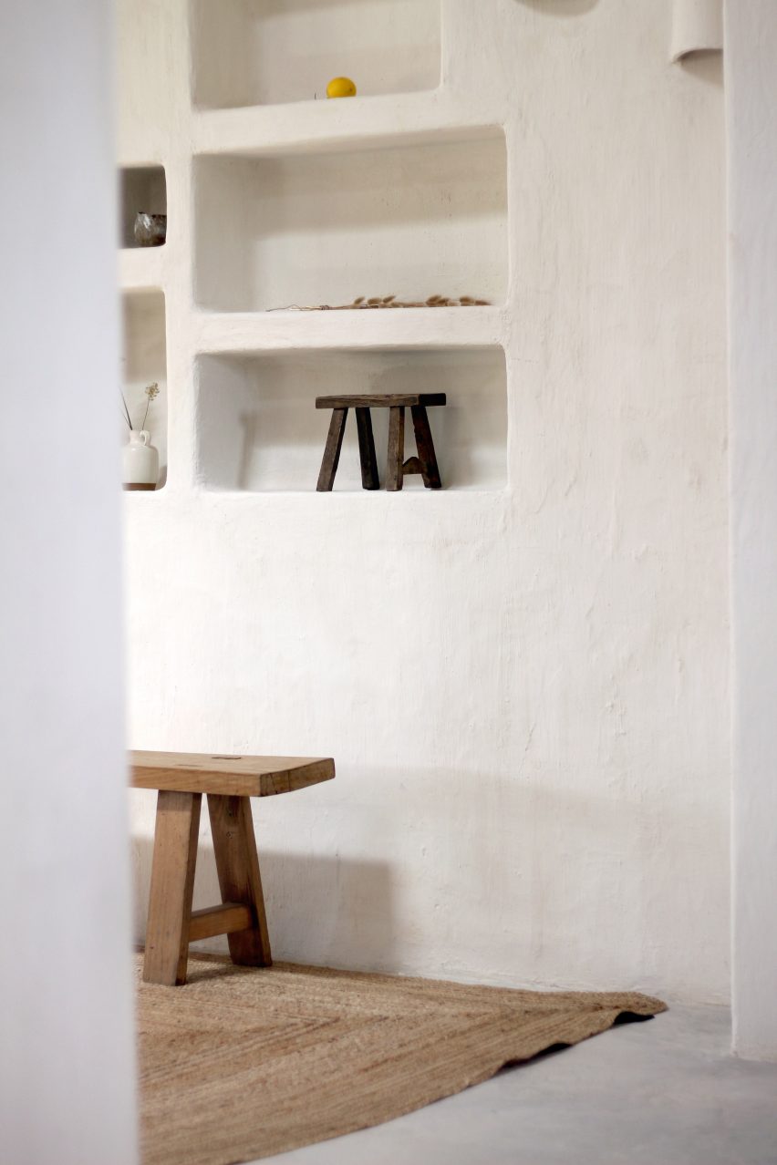
Built-in wall niches
Furniture, objects and works by local artists and artisans are displayed throughout

Towards the back is the restaurant, where the kitchen and its wood-fired oven are completely open to the casual dining area.

Small pendant lights suspended from the exposed wooden ceiling beams softly illuminate the tables, which are set with tableware by British artisan and artist Sarah Jerath.

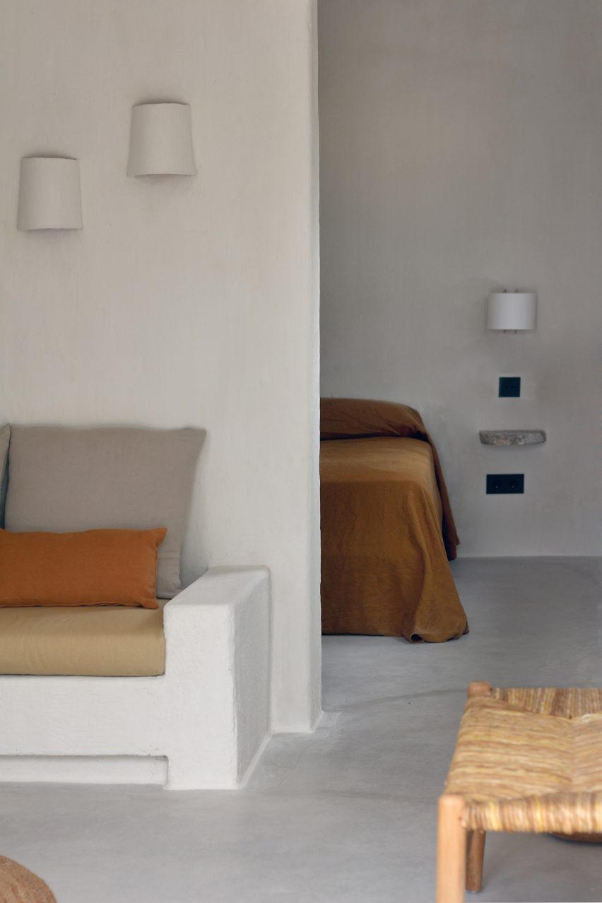
Guest room with plaster walls and earth-toned upholstery in Aguamadera hotel in Ibiza
The old farmhouse accommodates seven guest rooms

“Cosy, easy-going and fresh, the space allows you to explore the valley from within with sunset views,” the team said.

“In the essence of the winter season, a colossal fireplace evokes nostalgic charm.”

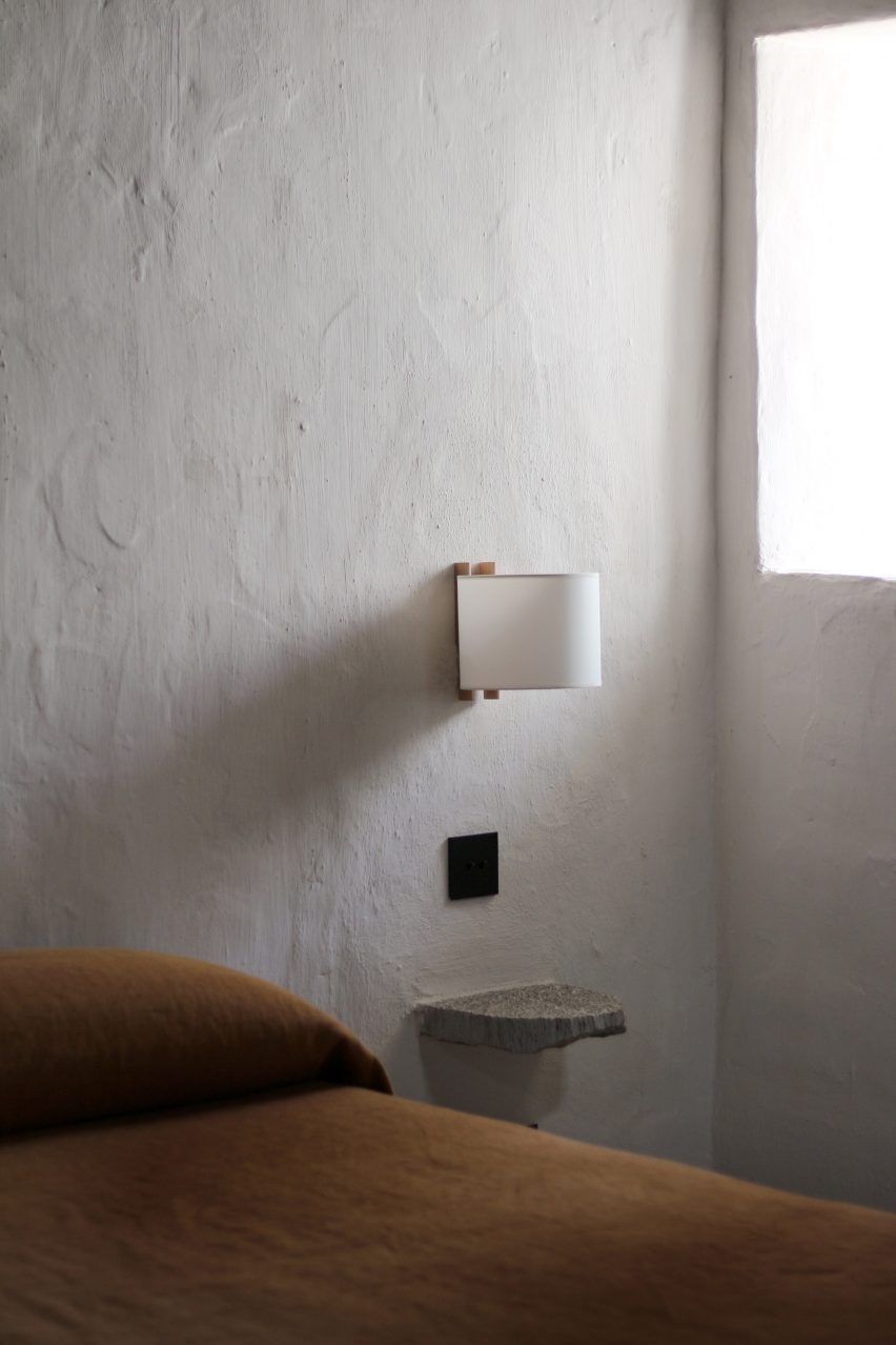
Close-up of rustic bedside table next to simple bed
The rooms have a monastic quality and are furnished with only the essentials

Spread over two floors, the guest rooms in the farmhouse have a monastic quality, with the earth-toned furnishings and decor elements reduced to only what’s necessary.

Larger multi-room suites are located in corrals – the outbuildings that formerly housed livestock – and have the same visual language as the other spaces.

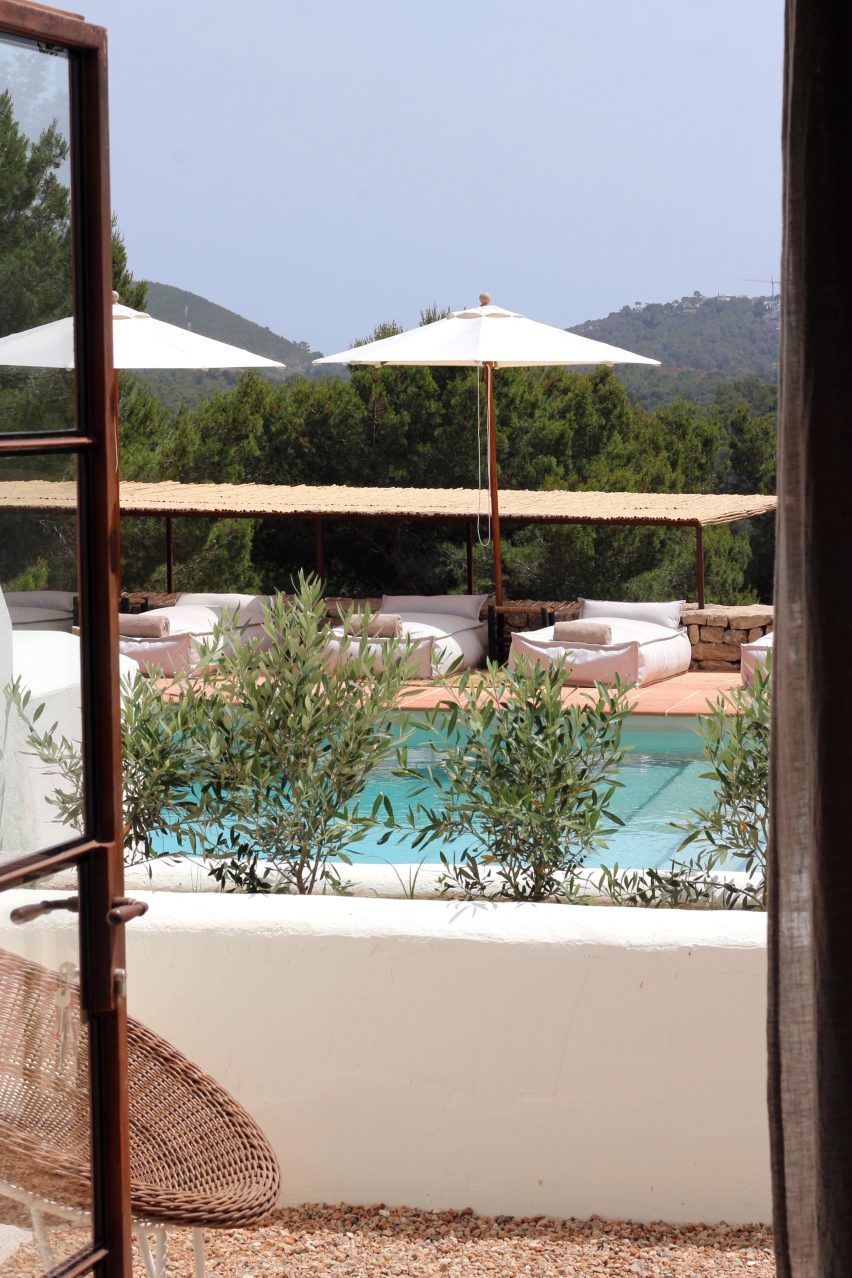
View through open doors of a swimming pool in Aguamadera hotel in Ibiza
Cushioned loungers surround the swimming pool, which overlooks the valley beyond

“Rustic wood finishes, built-in furniture, quality materials and soft textures are highlighted through sculptural silhouettes, the cornerstone of our design,” said the team.

Across the site, several terraces facing the surrounding valleys offer outdoor spaces for guests to eat, drink and relax.

A covered porch is lined with built-in seats for lounging and is further shaded by a bougainvillaea tree, whose pink flowers starkly contrast the building’s white walls.

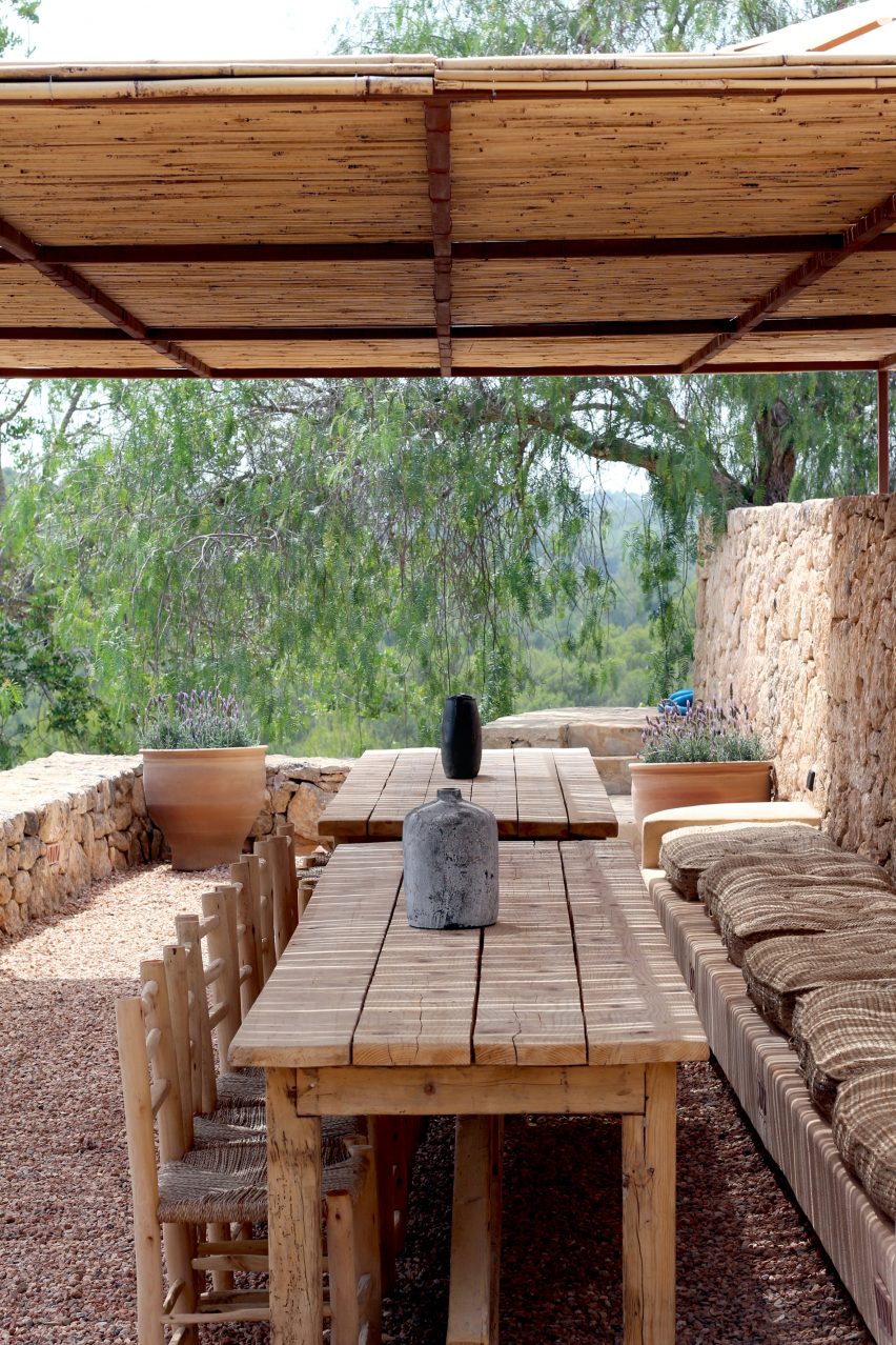
The pool terrace below features chunky cushioned loungers placed on terracotta tiles and is wrapped by a low dry-stone wall.

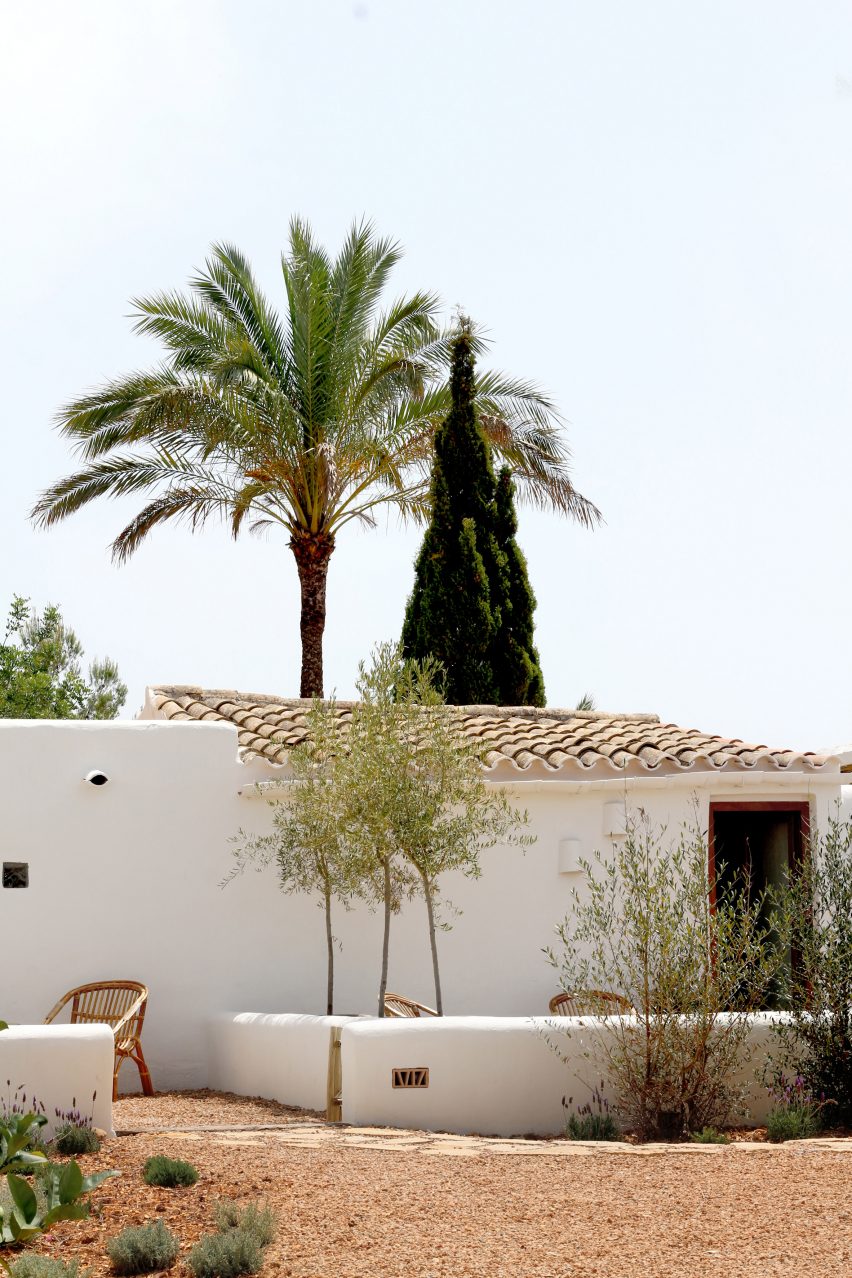
Whitewashed building with a tiled roof and palm tree behind
The hotel’s larger suites are housed in the outbuildings formerly used for livestock

Sunset is best enjoyed from cushions and mats placed under a huge tree on the opposite side of the building to the pool, where a large al fresco dining area is also located.

Details include hollow bricks with patterned faces embedded into the walls, which glow softly at night to help guests navigate around the site.

Outdoor courtyards with chairs and a potted tree in Aguamadera hotel in Ibiza
The suites have their own outdoor areas

Aguamadera hosts a variety of activities for guests and the local community, from exhibitions and workshops to wellness offerings such as sound meditations, rituals and ceremonies.

Ibiza is renowned the world over as a party destination but visitors are beginning to appreciate its natural beauty and rural charm, too.

Covered outdoor terrace with wooden dining tables and chairs
Multiple terraces wrapped by dry-stone walls can be used by guests

Several of the island’s old farmhouses have been converted into hotels or private villas, including a 200-year-old stone building that was turned into the members-only retreat La Granja.

The historic port city of Eivissa has also seen a recent renaissance, with locations from international groups The Standard and Experimental both opening within the past couple of years.

The photography is by Lekuona Studio. The main image is by Mateo Sánchez Garcia De La Cruz.

Reference

old japanese farmhouse transforms into modest hotel with U-shaped gardens
CategoriesArchitecture

old japanese farmhouse transforms into modest hotel with U-shaped gardens

Shotaro Oshima Design Studio restores a 1950s farmhouse


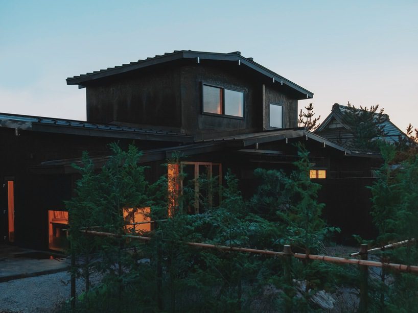
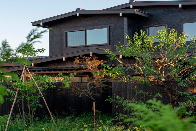
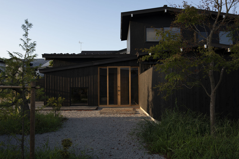
KOMORU Goshogawara by Shotaro Oshima Design Studio stands as a quaint hotel on the outskirts of Goshogawara in Aomori, Japan. Surrounded by the scenic Mount Bonjyu and the Iwaki River, the hotel embraces the vast Tsugaru Plain. The building, originally a 1950s farmhouse left vacant for five years, undergoes a sustainable transformation while preserving the existing timber structure. The renovation alters significantly the interior, arranging four guest rooms, a dining room, a kitchen, and ground-floor bathrooms, complemented by an additional guest room and staff space on the upper level.

old japanese timber farmhouse transforms into modest hotel with U-shaped gardens
all images by Yuki Motegi


KOMORU Goshogawara preserves the existing timber structure


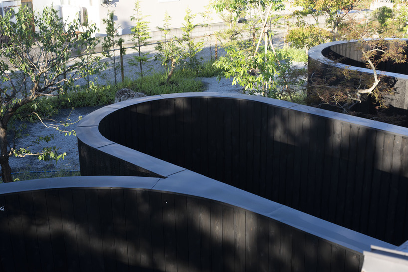
Retaining a mindful connection to history, the refurbishment maintains iconic architectural elements like the traditional Japanese alcove, ‘Tokonoma’, enriching the space with a narrative of the original building’s cultural heritage. The interventions extend to various facets, including the creation of U-shaped inner gardens, known as ‘Tsuboniwa’, providing serene outdoor experiences for each guest room.


The design concept expresses intimacy and sensitivity, intricately manifested in the small courtyard of ‘Tsuboniwa’. For KOMORU Goshogawara, the design studio engages in a new front garden design, incorporating local trees and stones to craft a welcoming ambiance for arriving guests. Guests are invited to embark on a spiritual journey, resonating with the harmonious blend of history, culture, and nature.

old japanese timber farmhouse transforms into modest hotel with U-shaped gardens
the project, retaining a mindful connection to history, maintains the original architectural elements

old japanese timber farmhouse transforms into modest hotel with U-shaped gardens
the sustainable transformation preserves the existing timber structure

old japanese timber farmhouse transforms into modest hotel with U-shaped gardens
the refurbishment includes the creation of U-shaped inner gardens

Reference

Productora and Esrawe Studio outfit Mexico hotel with planes of green tile
CategoriesInterior Design

Productora and Esrawe Studio outfit Mexico hotel with planes of green tile

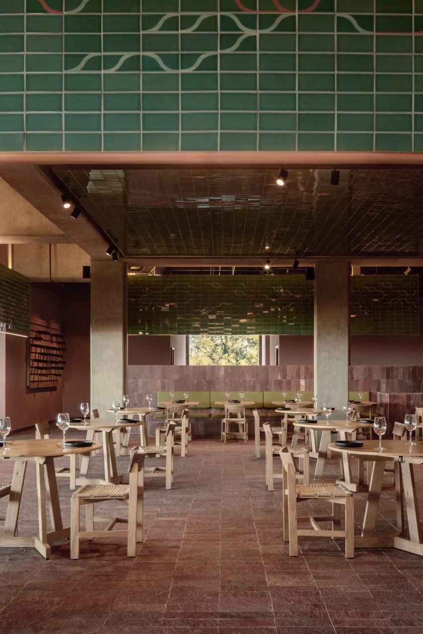
Local architecture studios Productora and Esrawe Studio have outfitted a Mexico hotel with planes of green tile suspended from the lobby ceiling.

Located on a hilly site in San Miguel de Allende, Mexico, the Albor Hotel is part of Hilton’s Tapestry Collection.

A hotel with a long stone facade
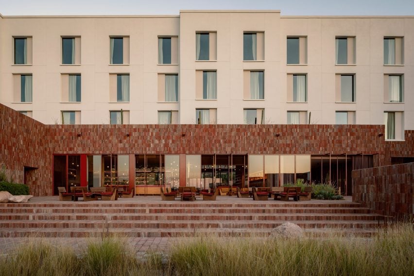
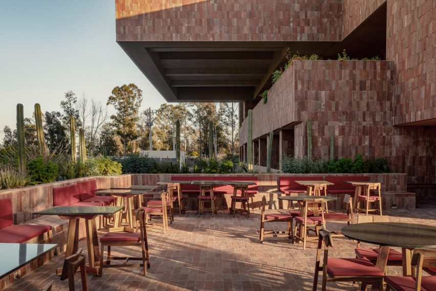
Productora and Esrawe Studio have wrapped a hotel in Mexico with local red stone

Completed in 2022, the 6,038 square metre project contains a lobby, restaurant, bar, gym, multipurpose room, and a pool area with a grill.

Productora and Esrawe Studio pulled from the mountainous surroundings for the design.

Green tiles with a leaf-like pattern of pink and white
The stone is carried into the building’s lobby and lower levels

“The hotel emerges naturally from the terrain, framing a beautiful view of the valley,” said the team.

“The hotel’s stone base is inspired by the mountain’s interior, featuring a textured and colourful appearance.”

A hotel lobby with wooden chairs and a canopy tiled in green
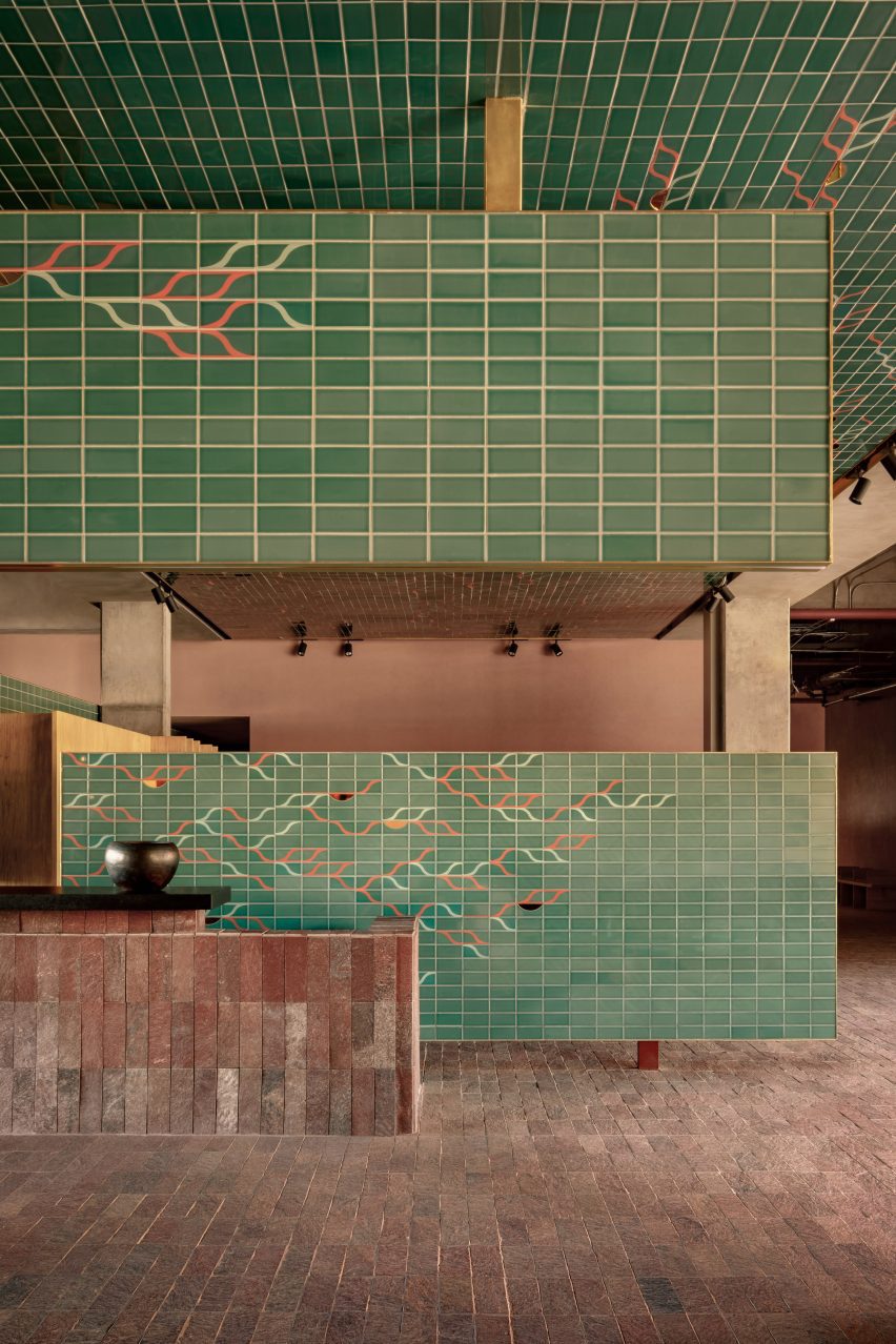
Planes of green tile are suspended from the ceiling

A natural red, textured stone was wrapped around the building’s first two levels, which steps up the hill on the site.

The top three levels contain the hotel’s private rooms and have an exterior clad in a simple white material, which contrasts the base.

A stone outdoor patio with brick facade
The tile features a graphic pattern by artist Omar Barquet

The lower levels, which contain the lobby, restaurant, bar and garden, run perpendicular to the site’s cobble-stone street, while the upper-floor volume runs parallel.

Guests enter into the hotel’s spacious lobby, where the same red stone was carried onto the floors, walls and bar elements.

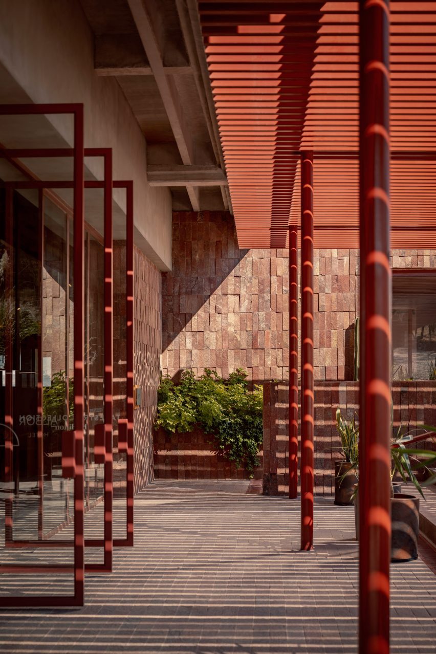
Red door frames open to the outdoors
The hotel contains a multi-leveled terrace and restaurant

The lobby’s double-height space is divided by planes of sea-foam green ceramic tile, which feature a leaf-like pattern by Mexican artist Omar Barquet.

Crafted by tile manufacturer Latitude, they cover dividing walls, ceiling planes and panels that are suspended from the ceiling.

The space is outfitted with wide, blocky wooden tables and chairs by Roberto González. Wood was also used for a large bookshelf that spans the length of the interior lobby.

A mixture of gray, green and red cushions were used to cover the seating, with the same red tone used to frame a series of sliding glass doors that lead onto the hotel’s sprawling patio.

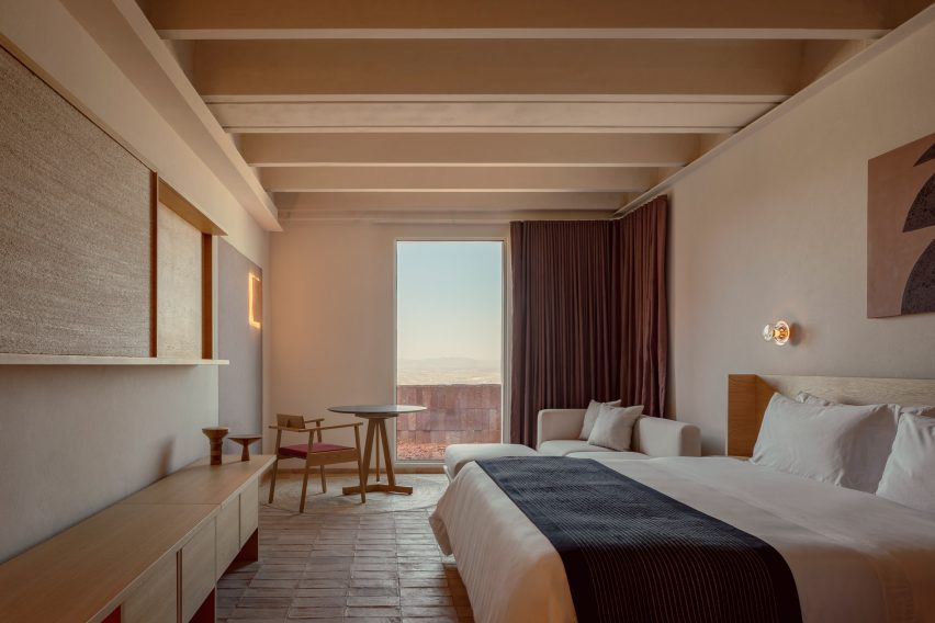
A bedroom outfitted with beige textiles and walls with accents of earthen tones
A natural red tone was carried throughout the hotel’s lower and upper levels

Rectangular volumes cantilever over the back patio, reflecting the same rectangular panels used to divide the lobby.

The patio sprawls across several levels, with large square planting beds installed with cacti and other local plants by PLANTA Botanical Design.

The hotel’s private rooms were kept minimalist, with the same wooden furniture echoed in seating areas, cabinetry and a bed frame.

“The rooms feature a natural colour palette and materials such as mineral clay, local crafts, wooden furniture and natural fabrics, providing a cosy and inviting atmosphere for guests,” said the team. 

An earthen red tone was also carried into the private bathrooms.

Productora recently completed a bright blue co-housing complex in Denver, Colorado, while Esrawe Studio renovated an apartment in Mexico City with an oak “skin”.

The photography is by César Béjar.


Reference