Electric Bowery arranges steel and wood cabins for Hudson Valley hotel
CategoriesArchitecture

Electric Bowery arranges steel and wood cabins for Hudson Valley hotel

California studio Electric Bowery has arrayed a series of wood or Corten steel-clad cabins in Upstate New York that are nestled among meadows and woodland.

Electric Bowery was responsible for the architectural design of Wildflower Farms, a rural retreat in the Hudson Valley operated by the Auberge Resorts group, while interiors were completed by New York studio Ward + Gray.

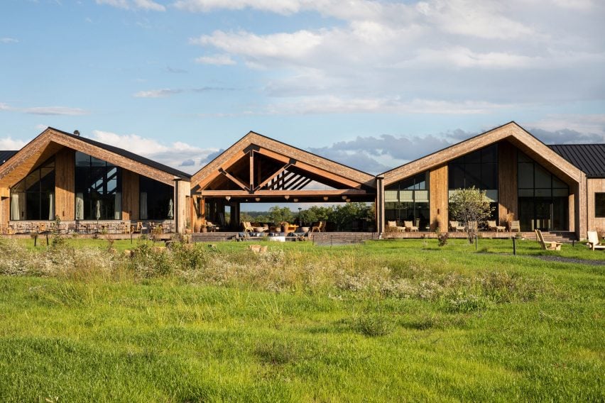
Row of wooden buildings with off-set gabled roofs
The buildings at Wildflower Farms are based on vernacular farmhouses and barns, but with modern European influences

Intended as an escape for reconnecting with nature, the site of the former Rosedale tree farm was transformed into a luxury getaway with hiking trails and a working farm with produce and animals.

The masterplan for the 140-acre site revolves around a central meadow, through which the winding paths connect various clusters of guest cabins with the communal buildings.
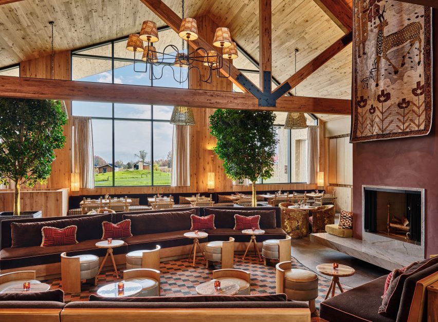
Restaurant dining room with high ceiling, exposed beams and warm colour palette
Interiors for the resort were completed by Ward + Gray, which chose a warm and textured palette for spaces including the restaurant

Views of the Shawangunk Ridge are framed through the Great Porch, a covered open-air lounge organised around a central fire pit.

To one side is the resort’s restaurant, Clay which uses many ingredients grown or produced on-site.
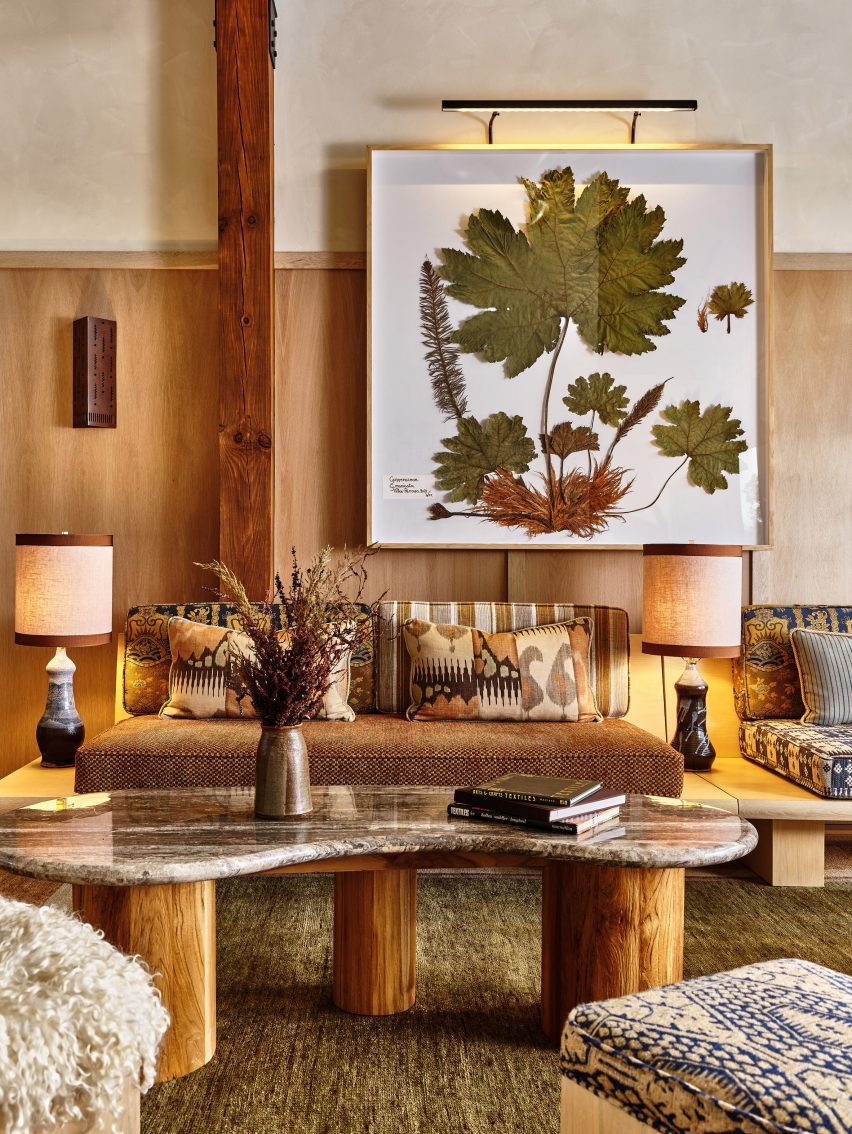
Framed pressed botanicals hang on a wall above earth-toned furniture
In the shop, curated by Gardenheir, pressed botanicals are framed on a wall above earth-toned furniture

The dining room interior features warm, textural earth tones, wood-framed furniture and large indoor trees, while outdoor tables overlook the meadow and mountains beyond.

The other side of the Great Porch houses the reception area and a store curated by Gardenheir that sells a variety of garden-themed products.
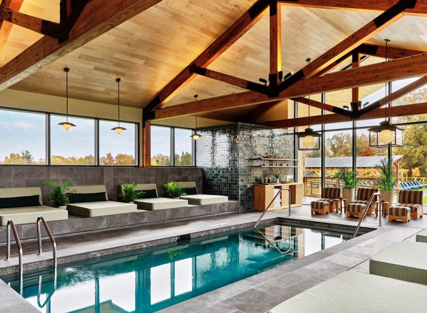
Indoor swimming pool with exposed timber trusses and slate floors
The indoor swimming pool sits below exposed timber trusses and features slate floors

The Thistle spa and an indoor pool are accessed beyond, decorated in a palette of buffed biscuit, mottled green and slate grey that complement the exposed beams.

Together, this row of large, timber-clad gabled structures anchors the resort, while the various guest accommodations are spread out around it.
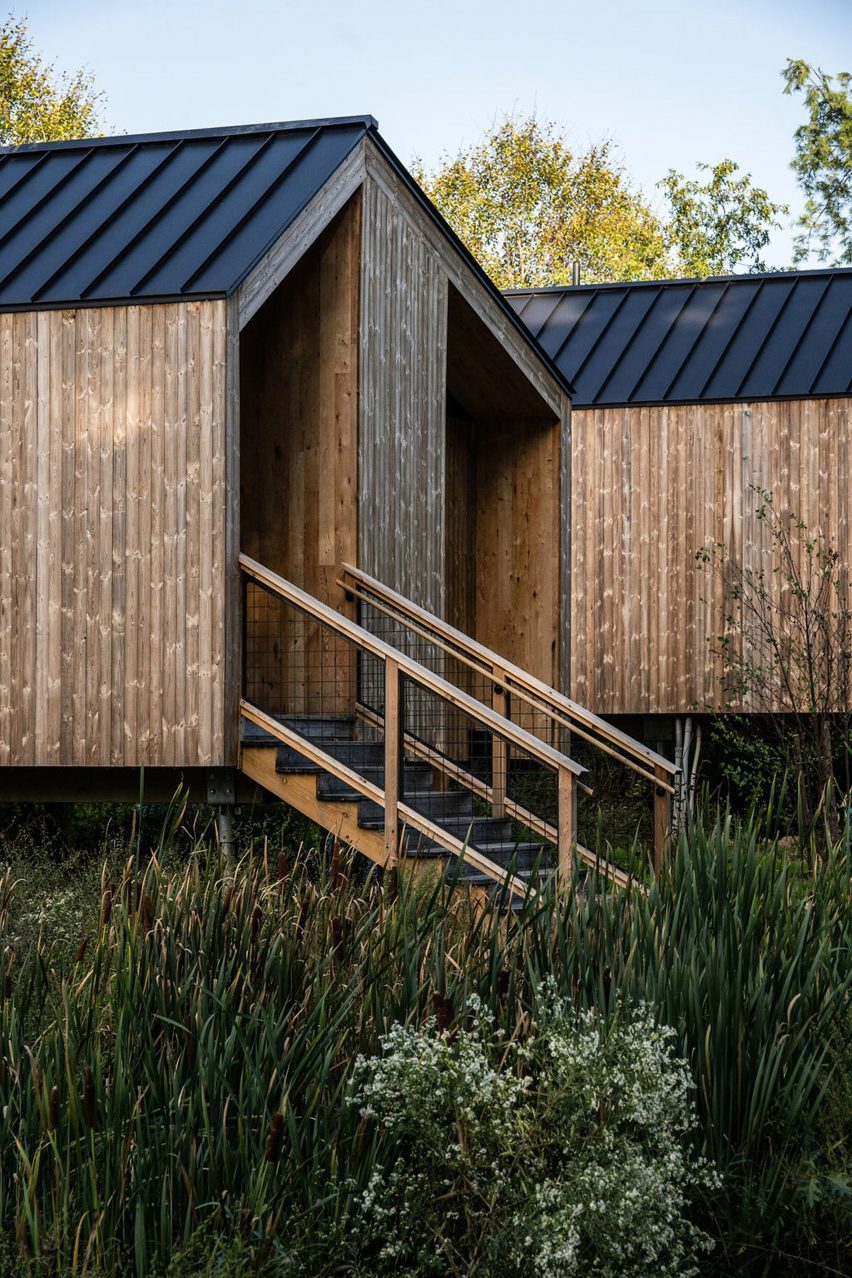
Cottages with reclaimed oak cladding and offset gabled roofs
Guest cottages also feature offset gabled roofs, and are clad in reclaimed oak

“With a more modern take on the vernacular building typologies of farmhouse and barn, inspired by modern European architects such as Peter Zumthor, the buildings were designed to frame the surrounding mountains, nestled harmoniously into the site,” said the studio.

Other amenities across the resort include an outdoor swimming pool and lounge area and a building dedicated to fitness that houses a gym and a yoga studio facing a pond.
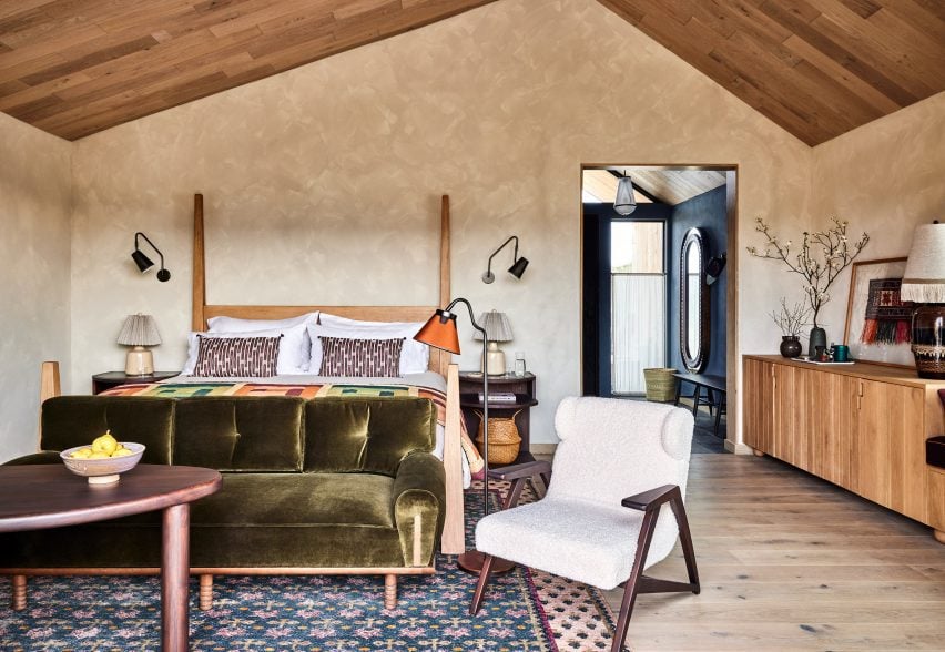
Guest bedroom with earthy colour palette
The guest bedrooms are cosy yet modern, with a colour palette borrowed from the natural surroundings

For the design of the 65 cabins and cottages, Electric Bowery co-founders Cayley Lambur and Lucia Bartholomew looked to several references including the lifestyle of their native state, and architects like Mickey Muennig.

“It was particularly important to convey the indoor-outdoor living experience that was borrowed from and inspired by west coast Californian architecture, using tall storefront glass in several locations with naturally weathered and repurposed wood-clad ceilings and fin walls visually extending from the interior to exterior,” said the architecture studio.
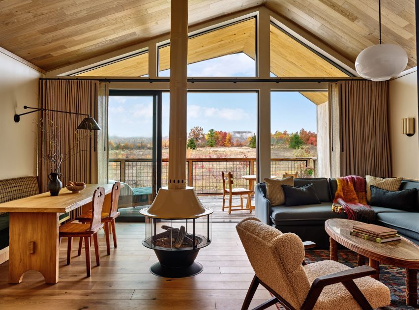
Guest room lounge with sliding glass doors that open onto porch
Sliding glass doors open the guest rooms to private porches

The oak-clad Ridge and Meadow cottages all have an offset gabled form, while the double-gable structures house the two-bedroom suites.

Sliding glass doors open onto private porches, which are each angled to block views from their neighbours.
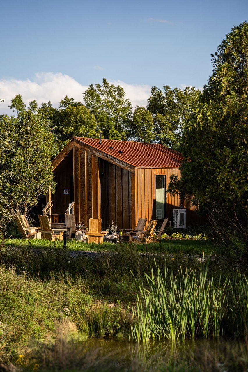
Cabin clad in Corten steel surrounded by trees
Nestled into the trees, the Bower Cabins are clad in weathering steel

Interiors are bright and modern, with bold colours borrowed from the natural surroundings and custom furniture paired with locally sourced antiques.

Tucked beneath the tree canopy, the Bower Cabins are a similar shape to the cottages, but clad in weathering steel.

These smaller rooms feature a darker, more intimate palette of dark blue walls and patterned textiles, and details including woven cabinet doors.

“The overall palette of the project is composed of an abundance of natural materials – stacked stone, slate, weathered wood finishes, naturally oxidized Corten steel, to name a few – that blend seamlessly with the landscape and provide warmth through texture and lack of uniformity, but also conform to the modern architectural lines of the buildings,” said the studio.
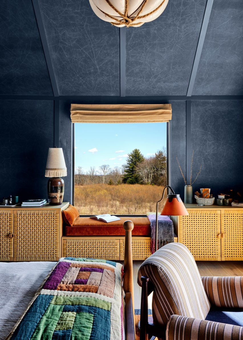
Bedroom interior with dark blue walls, woven cabinet fronts and patterned textiles
The smaller cabin interiors feature dark blue walls, woven cabinet fronts and patterned textiles

Lambur and Bartholomew founded Electric Bowery in 2013 after working together at Frank Gehry’s office, and now has offices in Los Angeles, Big Sur and New York City.

Their earlier projects include a house in Venice Beach with an off-centre pitched roof, which bears a resemblance to the cabins at Wildflower Farms.
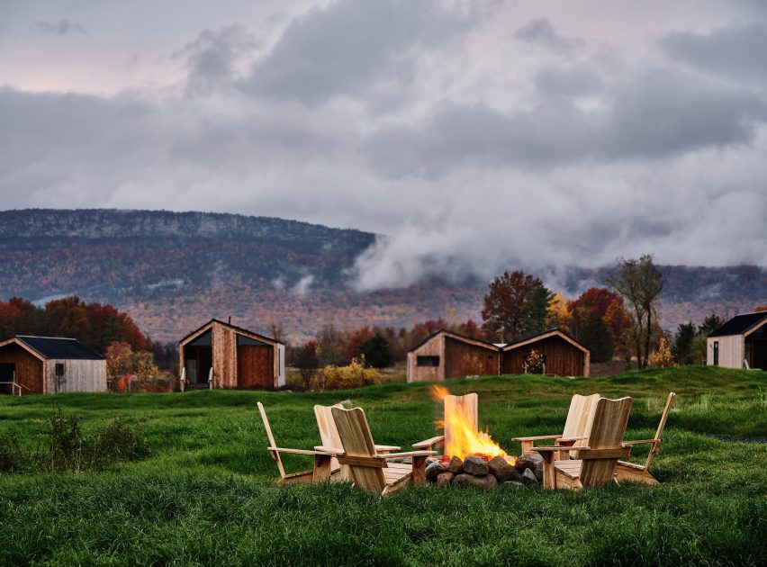
Chairs surrounding a fire pit with cabins and mountain ridge in the distance
Wildflower Farms occupies a 140-acre site and offers a rural escape 90 minutes from New York City

The Hudson Valley is a popular getaway destination for city dwellers craving a dose of nature, and its popularity increased further during the pandemic, when many New York City relocated there temporarily or permanently.

Among the myriad places to stay in the area are the boutique Hotel Kinsley in Kingston, and Troutbeck, a renovated English-style country house.

The photography is courtesy of Wildflower Farms.

Reference

Overtreders W secures hotel cabin with colourful straps
CategoriesSustainable News

Overtreders W secures hotel cabin with colourful straps

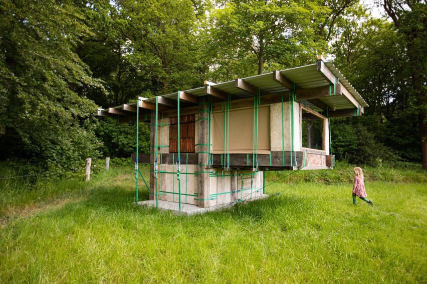
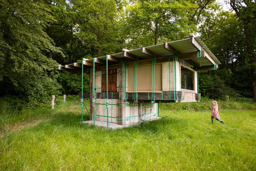
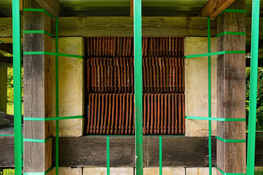
Dutch architecture studio Overtreders W has created Stable Stack, a temporary cabin hotel built using straps and borrowed materials, in Veenhuizen, the Netherlands.

The studio found the materials for the cabin in the village of Veenhuizen, sourcing concrete gutters and wood from carpenter Peter Kroes and roof tiles and paving slabs from Riedstra farm.

overtreder W built Stable Stack on a farm, by Overtreders W
Stable Stack features a strap-fastened structure built with borrowed materials

Instead of gluing, drilling or screwing, Overtreders W opted for tie-down straps to fasten the structure, so that the borrowed materials could be returned without damage and devaluation.

The studio also used the green straps as decorative elements and to add another layer of texture to the stable, “emphasising the versatile and innovative character of the structure,” it said.

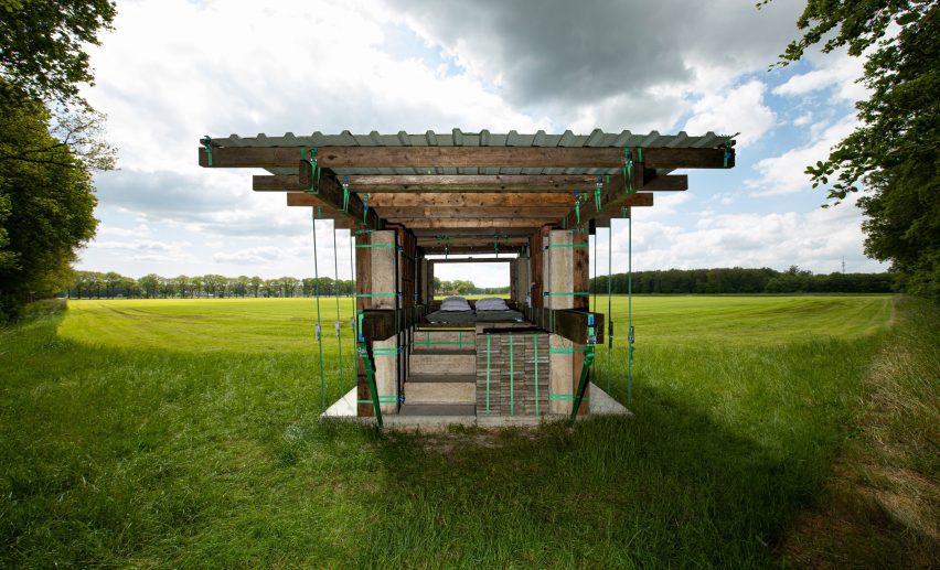
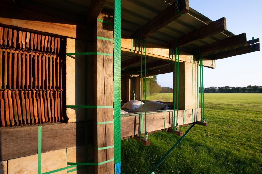
STABLE STACK is a temporary hotel room with a view of farmland, by Overtreders W
Stable Stack is a temporary hotel room with a view of farmland

The studio designed the temporary accommodation to highlight Veenhuizen’s craftsmanship, history and environment.

The village, which is now a World Heritage Site, was first built as a reform housing colony, Landbouwkolonie Veenhuizen [agricultural colony Veenhuiz] by the forced labour of homeless people 200 years ago.

“In line with the modest history of the place, where labour and life took place with limited resources, this cosy dwelling has been created,” said Overtreders W.

“Stable Stack showcases the beautiful possibilities that the combination of craftsmanship and sustainable handling of materials can offer.”

STABLE STACK's Components were stacked and secured with straps, by Overtreders W
Components were stacked and secured with straps

Stable Stack, which is located in a peat meadow landscape and overlooks farmland, forms part of Veen Huis Hotel.

This is a project that celebrates 200 years of the village by maker and thinker collective Ketter&Co and local hotel Bitter & Zoet.

Hotel cabin in Netherlands
Stable Stack is one of seven temporary accommodations

It comprises seven temporary accommodations, created in unconventional ways, and opens its door for guests from May to October 2023.

“With a revaluation of the relationship between man and landscape and an explosion of creativity, the Veen Huis Hotel inspires an urgent conversation about the future of Veenhuizen as an experimental agricultural colony,” said Ketter&Co.

STABLE STACK is a permeable accommodation, by Overtreders W
It was secured and decorated with green straps

Hester van Dijk and Reinder Bakker founded and head Overtreders W, a small Amsterdam architecture studio specialising in temporary structures.

At Dutch Design Week 2017, the studio collaborated with Bureau SLA and designed the People’s Pavilion with borrowed and reclaimed materials. The pavilion was the venue for Dezeen’s Good Design for a Bad World talk series.

More recently, the studio built a demountable exhibition pavilion with pink hempcrete and recycled timber.

The photography is courtesy of Overtreders W.

Reference

Hotel Genevieve in Louisville features colour-coordinated guest rooms
CategoriesInterior Design

Hotel Genevieve in Louisville features colour-coordinated guest rooms

Room types are organized by bold colours at this hotel in Louisville, Kentucky, which was designed by US hospitality group Bunkhouse and Philadelphia-based design studio Rohe Creative.

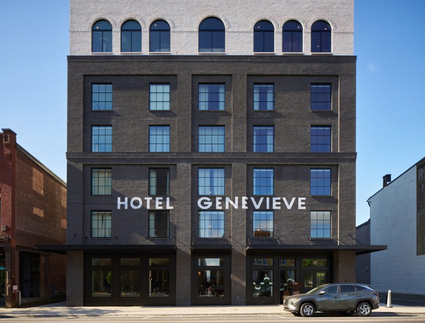
Located in Louisville’s East Market district, also known as NuLu (New Louisville), Hotel Genevieve occupies a new six-storey, black-brick building that’s within walking distance of some of the city’s biggest tourist attractions.

Lobby with pink terrazzo floor and matching plaster walls
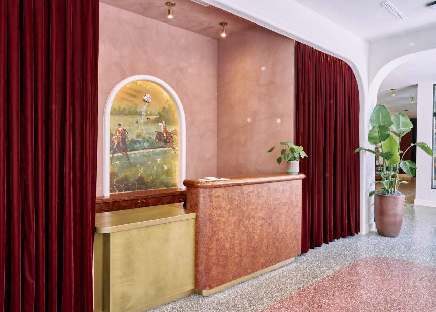
In the hotel’s lobby, pink terrazzo flooring matches the plasterwork behind the reception desk

The hotel takes its name from a regional type of limestone, Saint Genevieve, which is a key ingredient in local bourbon production and also prevalent in Texas, where operator Bunkhouse is based.

The company collaborated with Rohe Creative on the interiors, which are intended to reference Louisville’s history.

Dark bar lounge with a vaulted golden ceiling
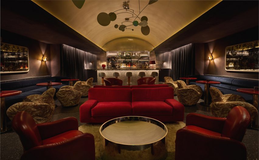
Communal spaces for guests include a speakeasy-style bar with a golden vaulted ceiling

In the lobby, pink tones of terrazzo flooring are echoed in the plasterwork behind the reception desk, surrounding an equestrian-themed mural.

Artworks are displayed on white walls and in front of red velvet curtains to form a gallery around the lobby seating areas and corridors.

Blue guest bedroom with large bed
The rooms are coloured by type and the smaller spaces feature a blue palette

The adjacent all-day restaurant, Rosettes, serves food made with local ingredients and is influenced by al fresco Parisian cafes and chef Ashleigh Shanti’s Southern background. This bright, brasserie-like space combines green-tiled floors with colourful dining chairs and retro light fixtures.

“Richly decorated, each design accent tells a story, from bold usages of colour to a playful mix of vintage and modern furniture, and a vivacious art program featuring local talent,” said the hotel team.

View through an arched opening into a blue bedroom
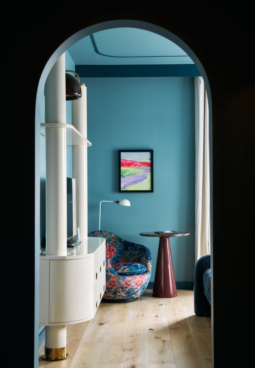
The chosen colour in each room extends across the wall and ceiling, as well as into the bathrooms

A mini market on the ground floor, which is “part convenience store, part pop art installation”, sells locally sourced provisions, handmade artisanal goods, and coffee and snacks to go.

There’s also a dark and moody speakeasy-style bar with lounge seats and a golden vaulted ceiling.

Terracotta-coloured hotel room with two queen beds
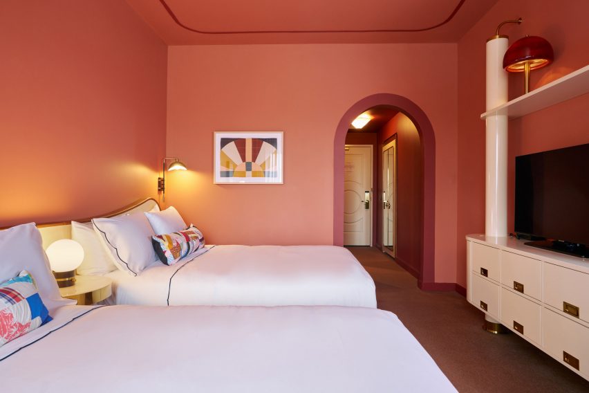
Double Queen rooms are decorated in a terracotta hue

“Luxurious and feminine architectural details bring life to the space and reference the city’s namesake, King Louis XVI, heavily featuring Louisville’s vibrant local flora and fauna, with goldenrod [plants] shining throughout the suites and ground-floor restaurant,” said the hotel team.

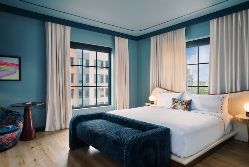
The hotel’s 122 guest rooms are each painted a distinct colour that correlates with their size or type. These hues cover the walls and ceilings, and also extend into the bathrooms via floor and shower tiles.

Yellow-coloured living room within a hotel room
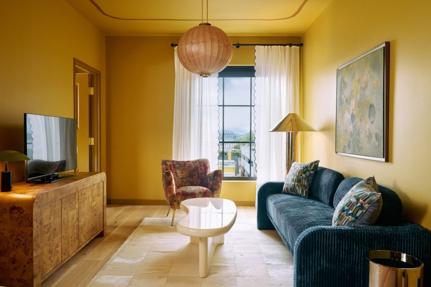
Four Suite Genevieve rooms have a separate living room and are coloured yellow

Smaller rooms, including the King Louie and Petite King categories, feature a blue palette, while the slightly larger Double Queens are decorated in a terracotta hue.

Four Grand King rooms accommodate a seating area and are also painted blue, while an additional four Suite Genevieve rooms have a separate living room and are coloured yellow.

All of the rooms boast custom features and fittings by ROHE, as well as paintings and prints by Kentucky-born artist John Paul Kesling.

The rooftop venue, Bar Genevieve, serves cocktails and French-Mediterranean food from an indoor space that opens to the outdoors.

Spacious bar area with teal accents
Bar Genevieve on the top floor features teal accents and can be hired for private events

The bar area is accented with deep teal colours across the counter, stool seats, arched window frames and floor-to-ceiling velvet curtains that can be used to divide up the room.

Hotel Genevieve has also partnered with local organisations Black Soil Kentucky, Louisville Orchestra, and the Olmsted Parks Conservancy for programming across its varied communal spaces.

Exterior view of black-brick building
The hotel occupies a new black-brick building in Louisville’s East Market district

Kentucky draws visitors for its bourbon production and horse racing heritage, and demand for high-end accommodation in the state appears to be on the rise: a new five-star hotel called The Manchester also recently opened in Lexington.

Bunkhouse operates multiple properties across North America, including the Austin Motel and nearby Hotel Magdalena, Phoenix Hotel in San Francisco and Hotel San Cristóbal in Los Cabos, Mexico.

The photography is by Nick Simonite.

Reference

Dorothée Meilichzon blends nautical and art deco inside Biarritz hotel
CategoriesInterior Design

Dorothée Meilichzon blends nautical and art deco inside Biarritz hotel

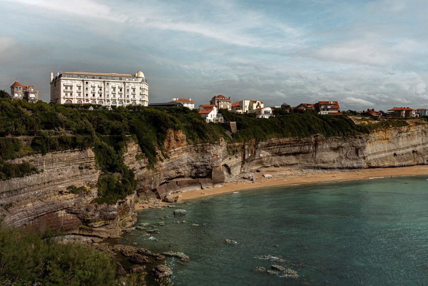
French interior designer Dorothée Meilichzon has renovated a Belle Epoque-era hotel in Biarritz, France, blending maritime and art deco motifs to add contemporary flair to the historic building.

The Regina Experimental sits on a clifftop overlooking the Bay of Biscay in the French seaside city, which was once a royal getaway and is now a popular surfing destination.

Corridor at Regina Experimental hotel
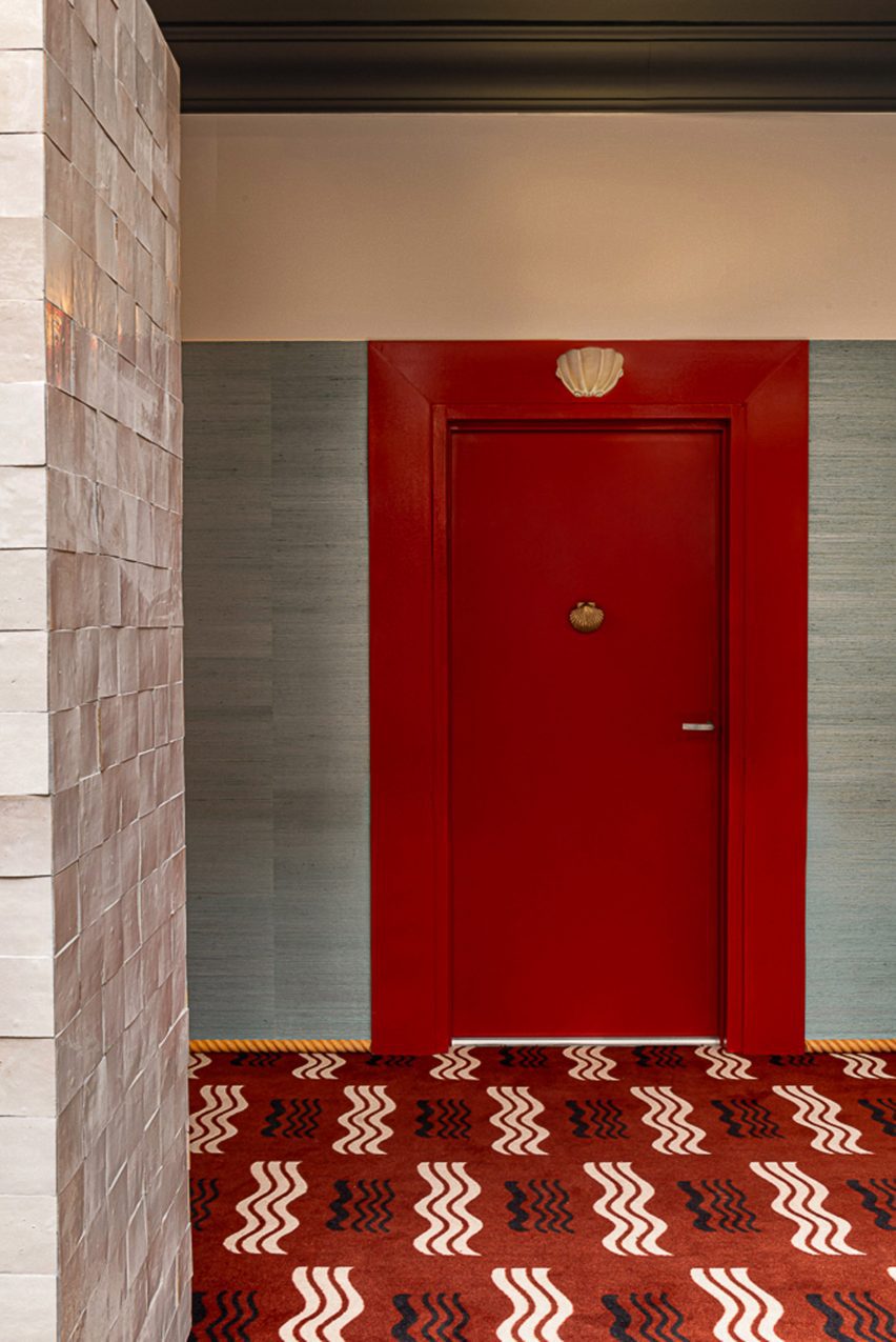
Nautical designs decorate the corridors

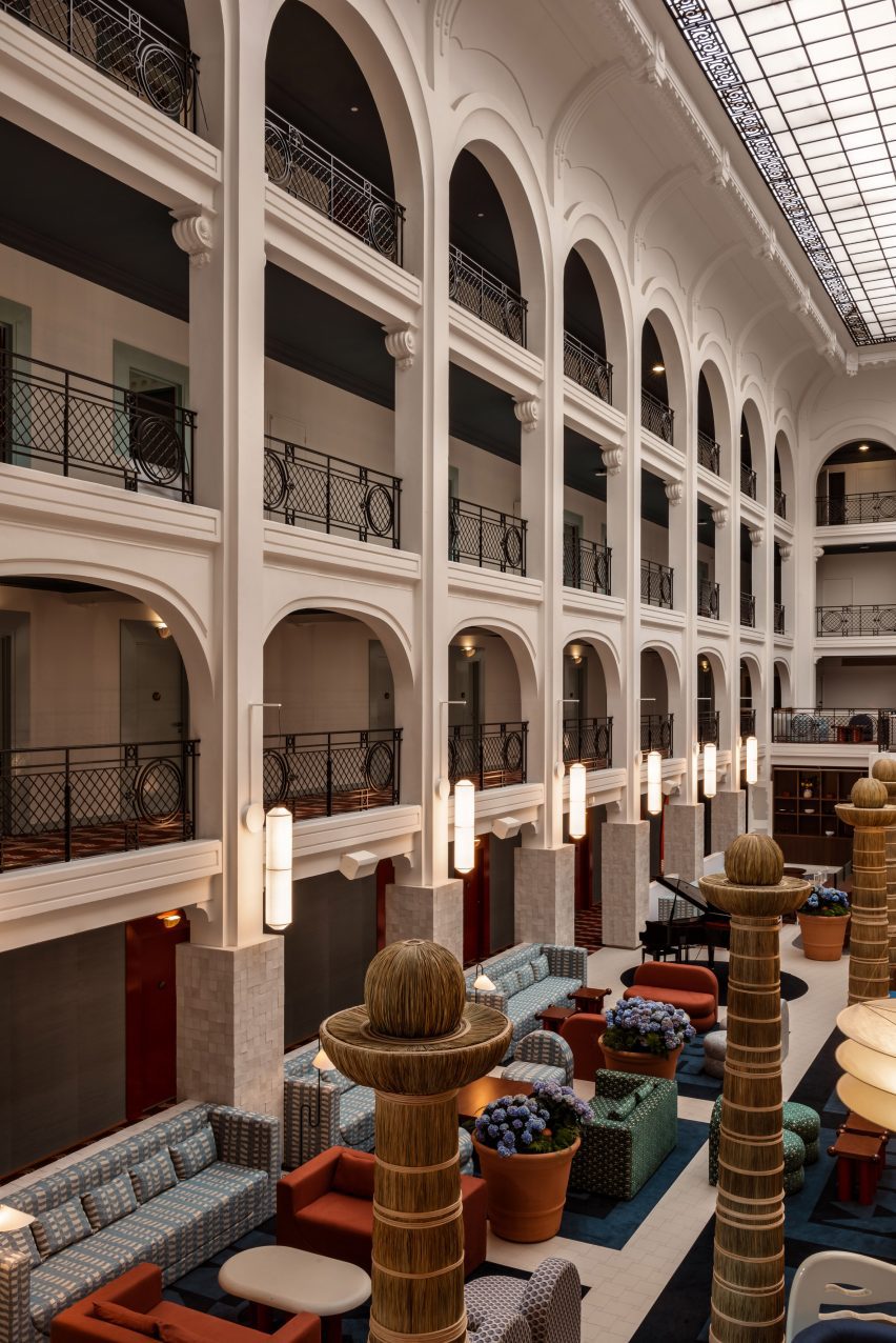
Constructed in 1907 by architect and landscape designer Henry Martinet, the grand building features a 15-metre-high atrium, large bay windows, a glass roof, and hints of art deco throughout.

The majority of its spaces were well preserved, so Meilichzon‘s input involved modernising the furnishings and decor – adding colour and pattern to enliven the spaces while playing on the hotel’s coastal location.

Atrium of Regina Experimental hotel
Totemic sculptures were used in the hotel’s atrium

In the light-filled atrium, dark red and green sofas were arranged to create intimate seating areas within the expansive room.

Totemic wicker sculptures form a line down the centre of the room, and cylindrical paper lanterns by designers Ingo Maurer and Anthony Dickens hang from the columns on either side.

Bedroom with art deco influenced headboard
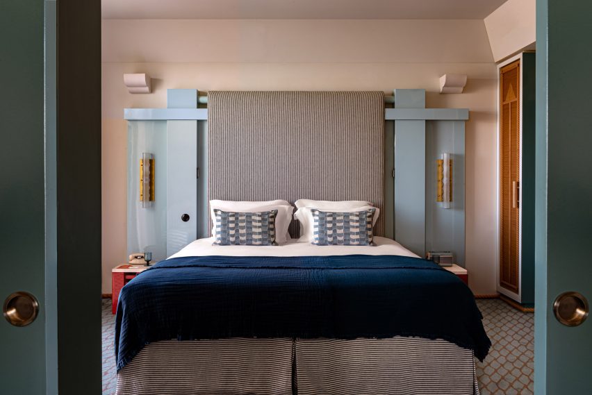
Guest rooms feature geometric, art deco-influenced headboards and striped upholstery

Guests in this space are served cocktails from a bar top shaped like an ocean liner, designed as an homage to modernist architect Eileen Gray, while listening to live piano music.

While the bar top nods to Gray’s designs, the sofas in the room play on the shapes of the Itsasoan footbridge in nearby Guétary.

Reflection of a bed in a rope-wrapped mirror
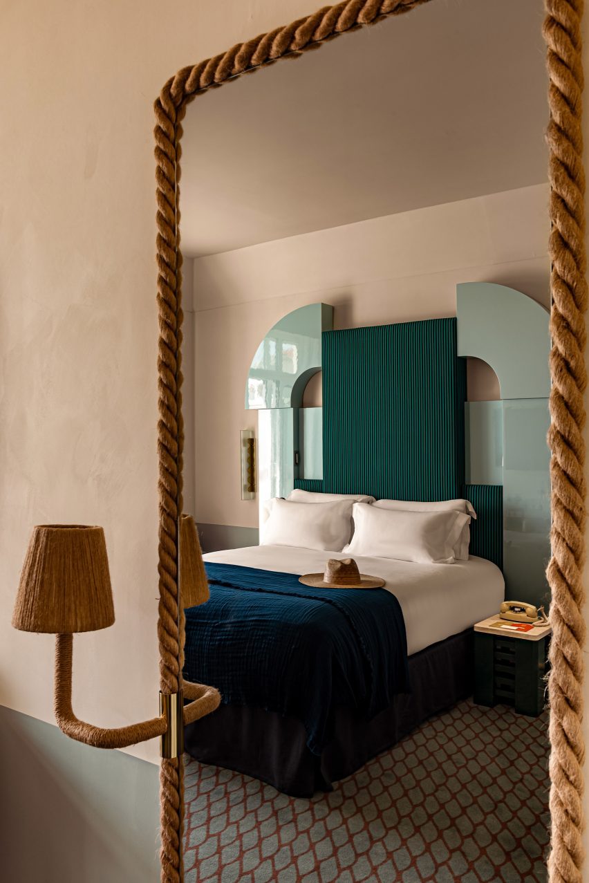
Mirrors wrapped in rope continue the maritime theme in the rooms

Carpet patterns vary between the different areas of the hotel – in the corridors, they carry a nautical motif, while the markings are reminiscent of fish scales in the guest rooms.
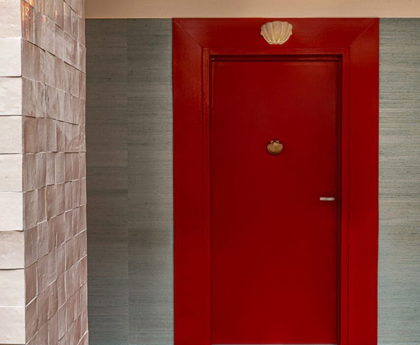
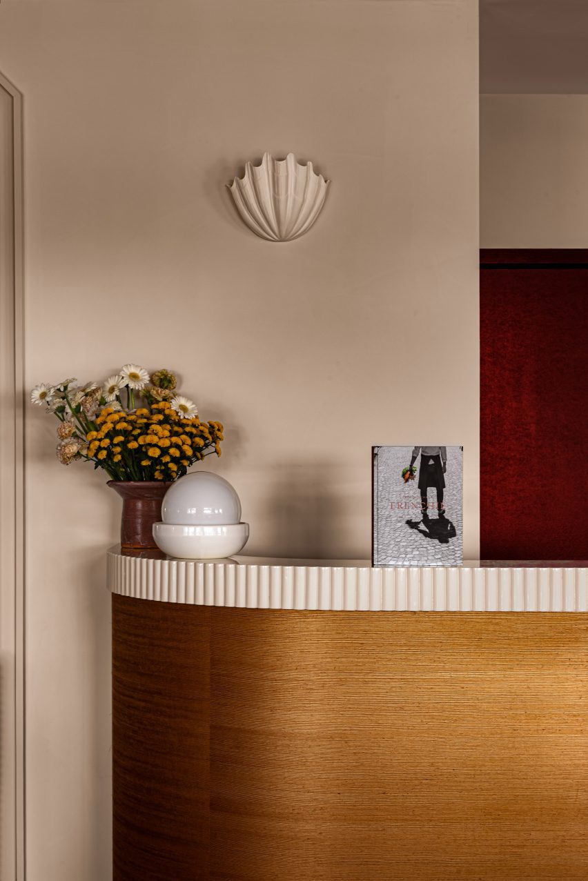
The hotel’s restaurant, Frenchie, offers Basque-inspired cuisine within a bright room that features more nautical references, such as rope-hung shelves and shell-shaped sconces.
Dining room of Regina Experimental
Shell-shaped sconces decorate the dining room

Highly patterned tiled floors and furniture contrast the restaurant’s neutral plaster walls and ceiling, which are punctuated by arched niches and curved plywood panels.
The dining area spills onto an outdoor terrace, populated by red cafe tables and chairs lined up against pale blue banquettes, around the corner from a swimming pool.

The hotel’s 72 guest rooms are accessible from corridors that wrap around the atrium, and face either the ocean or the Golf de Biarritz Le Phare golf course.

Shades of blue and green dominate the art deco-influenced bedrooms, which feature glossy geometric headboards and marine-striped upholstery.

Bathroom with teal-coloured tiles
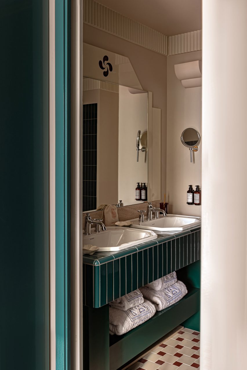
A cool palette of greens and blues is used in the bathrooms

Small lamps extend from rope frames that wrap around the mirrors, and red accents on smaller furniture pieces pop against the cooler hues.

“Bedrooms are awash with Japanese straw and rope combined with marine stripes and plaster frescoes with aquatic motifs,” said the hotel. “Evocative of an ocean liner, each bedroom incorporates curved forms and long horizontal lines.”

Hotel perched on a cliff overlooking the sea
Built in 1907, the hotel overlooks the Bay of Biscay from a clifftop

Meilichzon, founder of Paris-based design agency Chzon, is a frequent collaborator of the Experimental Group, and has designed the interiors for several of its properties.

Earlier this year, she gave a bohemian refresh to Ibiza’s first hotel, now called the Montesol Experimental, and previously completed the Hotel Il Palazzo Experimental in Venice.

The photography is by Mr Tripper.

Reference

Giannone Petricone Associates rescues Ontario hotel from ruin
CategoriesInterior Design

Giannone Petricone Associates rescues Ontario hotel from ruin

Toronto studio Giannone Petricone Associates has spent a decade restoring a dilapidated hotel in Ontario, linking the building’s past and present through regionally influenced design details.

Located in Picton, a town in Prince Edward County (PEC) that lies close to the shores of Lake Ontario, The Royal Hotel was in bad shape when the Sorbara family purchased it in 2013.

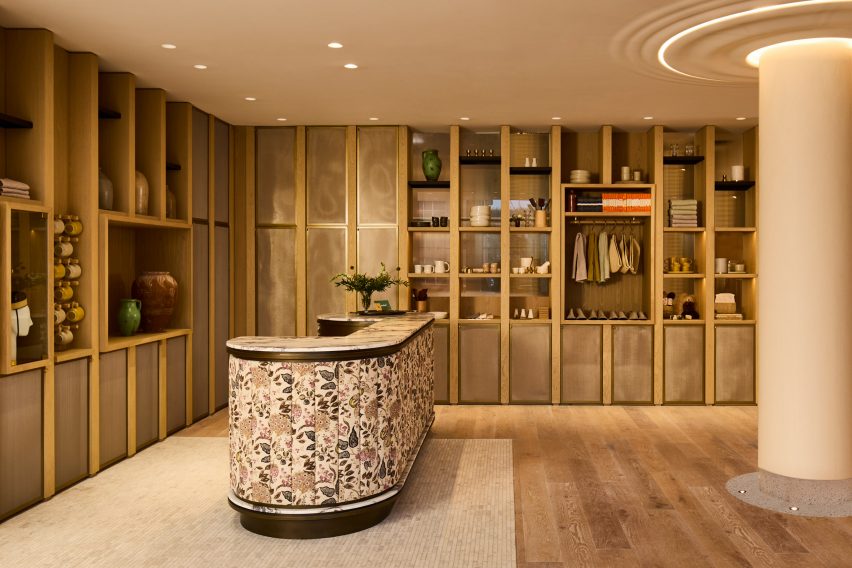
Hotel lobby with wood shelving and floral-wrapped reception desk
The Royal Hotel’s interiors draw upon a mix Victorian and contemporary influences, as seen in the reception area. Photo by Graydon Herriott

The new owners hired Giannone Petricone Associates (GPA) to save what they could of the existing building, which was first completed in 1879, and transform it into contemporary lodgings.

“Its central staircase was lined with a lush carpet of green moss, and early in the planning phase, the roof caved in,” said the hotel team.

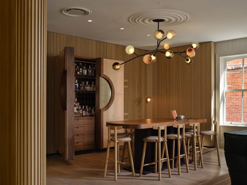
Bar surrounded by tambour panelling
One of four hotel bars is lined with tambour panelling

“But the family vowed to restore the property and bring it back to life as a nexus for both locals and guests of PEC’s burgeoning food and wine region.”

The architects were able to salvage three of the original brick walls, and within them created a cafe, three bars, a fine-dining restaurant; and a spa, gym and sauna.

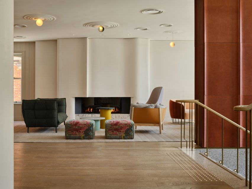
Lounge area in front of undulated plaster fireplace surround
Playful design elements include ceiling rosettes that mimic water ripples

A landscaped terrace overlooks a fourth bar and a brick patio with lounge seating, while an outdoor swimming pool flanked by a row of cabana beds lies beyond.

A total of 33 guest rooms are available: 28 in the main three-storey hotel building, and a further five suites in a rebuilt stable named The Royal Annex.

Cosy lounge with dark tambour fireplace surround
Another cosy lounge area features dark tambour panels around its fireplace

For the interiors, GPA played on tropes of Victorian railway hotels, mixing formal elements of British tradition with PEC’s more laid-back rural sensibility.

“The Royal is designed to be a transporting experience while deeply rooted in the local context,” said GPA principal Pina Petricone. “The experience benefits from the charged contrast between ‘genteel’ and ‘real’ elements.”

In the lobby, the reception desk is wrapped in a floral pattern and a wooden shelving system forms a boutique displaying items for sale.

Tambour panelling lines the adjacent bar area, which flows into a lounge where softly undulated plasterwork frames a fireplace.

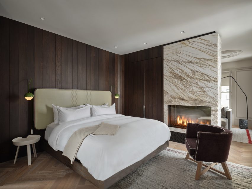
Bedroom with dark wood panelling and large marbled fireplace
The hotel offers 33 guest rooms, which feature details like cross-stitched headboards

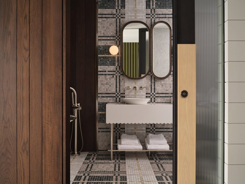
A variety of checkered and tartan patterns are found across hallway carpets, mosaic bathroom tiles and cross-stitched headboards. Ceiling rosettes throughout the spaces are designed to mimic mushrooms and water ripples.

“We wanted to have moments in the hotel that were a bit nonsensical,” Petricone said. “The Royal is about escapism, and our research into the hotel’s history demonstrated that it was always a pretty quirky place.”

Bathroom with checkered mosaic tiles
A variety of checkered patterns are found throughout the hotel, including in the mosaic bathroom tiles

Other recently opened hotels in Canada include the Ace Toronto, which boasts a suspended lobby and rooftop bar.

Last year, the 1 Hotel Toronto by Rockwell Group and The Drake Hotel Modern Wing by DesignAgency, also in the city, were longlisted in the Hotel and Short Stay Interiors category for the Dezeen Awards.

The photography is by Doublespace, unless stated otherwise. Main image is by Jeff McNeill.

Reference

W Budapest hotel occupies 19th-century Drechsler Palace
CategoriesInterior Design

W Budapest hotel occupies 19th-century Drechsler Palace

Interior design studios Bowler James Brindley and Bánáti + Hartvig have transformed a 140-year-old neo-Renaissance building in central Budapest into the latest outpost from hotel chain W Hotels.

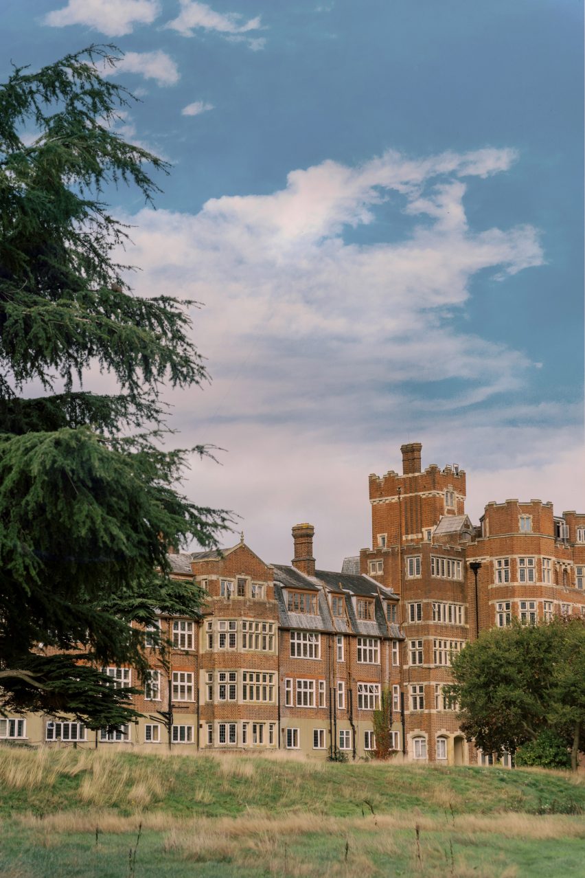
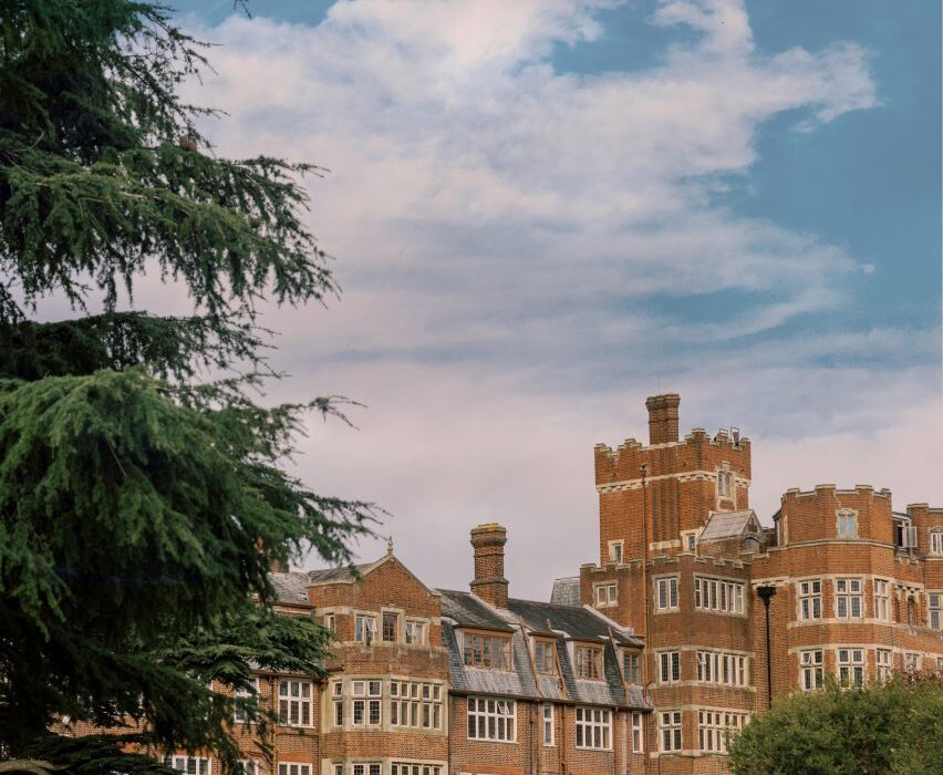
W Budapest is set inside the 1886 Drechsler Palace designed by architects Ödön Lechner and Gyula Pártos, previously home to a grand cafe and the headquarters of the Hungarian State Ballet Academy.

Bowler James Brindley transforms 19th-century palace into W Budapest
Bowler James Brindley and Bánáti + Hartvig have renovated Drechsler Palace

Working with local studio Bánáti + Hartvig, London-based Bowler James Brindley (BJB) wanted to draw out the glamorous history of the building, which had stood empty for 15 years before being acquired by W Hotels’ owner Marriott International.

BJB aimed to “playfully modernise” the interiors while drawing on the architecture of the surrounding area on Andrássy Avenue – a UNESCO World Heritage site that’s also home to the Hungarian State Opera House.

Bowler James Brindley transforms 19th-century palace into W Budapest
The building now houses the 151-room W Budapest hotel

Alongside 151 rooms and suites, the building now houses a restaurant, lounge, spa and speakeasy.

“The challenge from the outset was not to be overawed by the beauty and strength of the building,” BJB partner Ian Bayliss told Dezeen.

“Many original details of Drechsler Palace were studied and re-imagined, as were original colours and textures. Protected architecture has been carefully restored and celebrated, and original glazed tiles have been reused.”

Bowler James Brindley transforms 19th-century palace into W Budapest
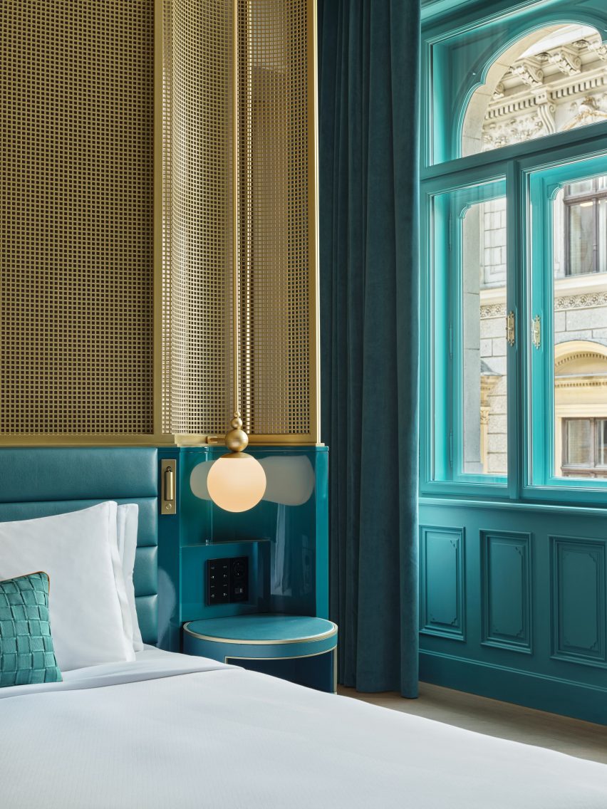
Gridded metal screens surround the beds in the guest rooms

Central to BJB’s conversion was the re-establishment of the palace’s two original entrances. This allowed the studio to free up the spaces bordering Andrassy Avenue and create a “living room” within the building’s light-filled inner courtyard, which has been enclosed by a glass roof.

Tasked with modernising the building’s interiors while adhering to heritage protection rules, BJB made what it calls “second skin” interventions, which included the creation of new “corridors” within the palace’s ornate arches using freestanding, fret-cut installations.

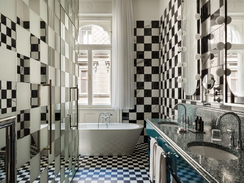
The bathrooms in W Budapest reference a chessboard
In the bathrooms, checkerboard tiles reference Hungary’s affiliation with chess

“We wanted to respect the fabric and ‘skin’ of Drechsler Palace so we set about designing spaces, which created a new atmosphere while not touching the beautifully restored fabric,” Bayliss explained.

The studio took the same approach to the restoration of the palace’s vaulted basement spa, which uses “Houdini-inspired” mirror illusions to create a feeling of never-ending space.

Curving bronze metal installations follow the vaulted ceilings, while dimly lit treatment rooms were inserted within the natural spaces left by existing columns.

“In homage to Houdini, the treatment rooms are completely mirror-clad and essentially disappear, literally reflecting the existing architecture and the new second-skin installations,” Bayliss said, referencing Hungarian-born magician Harry Houdini.

Bowler James Brindley transforms 19th-century palace into W Budapest
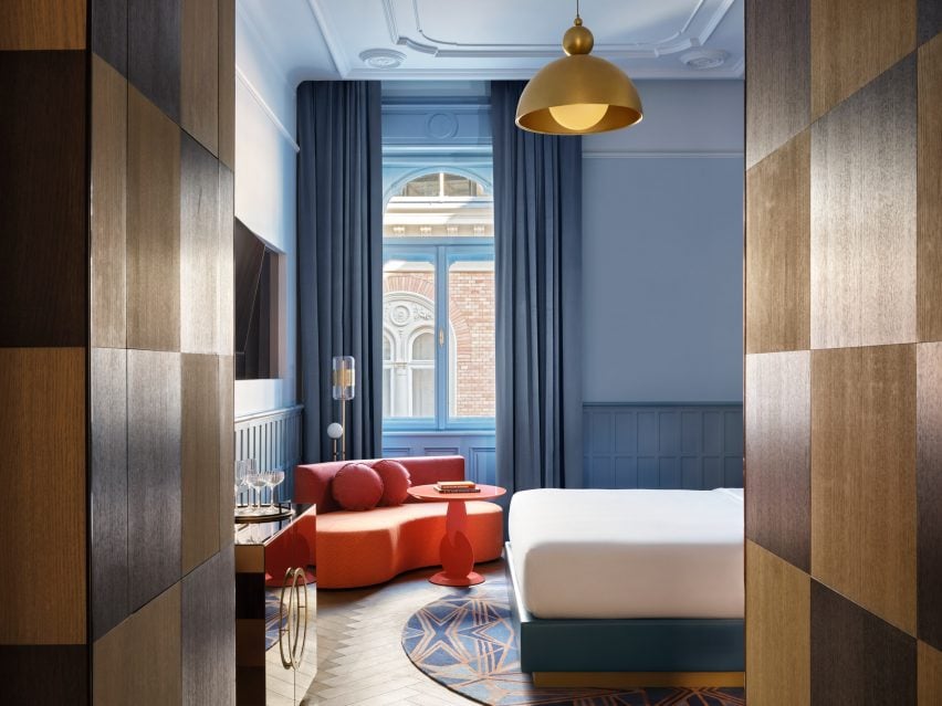
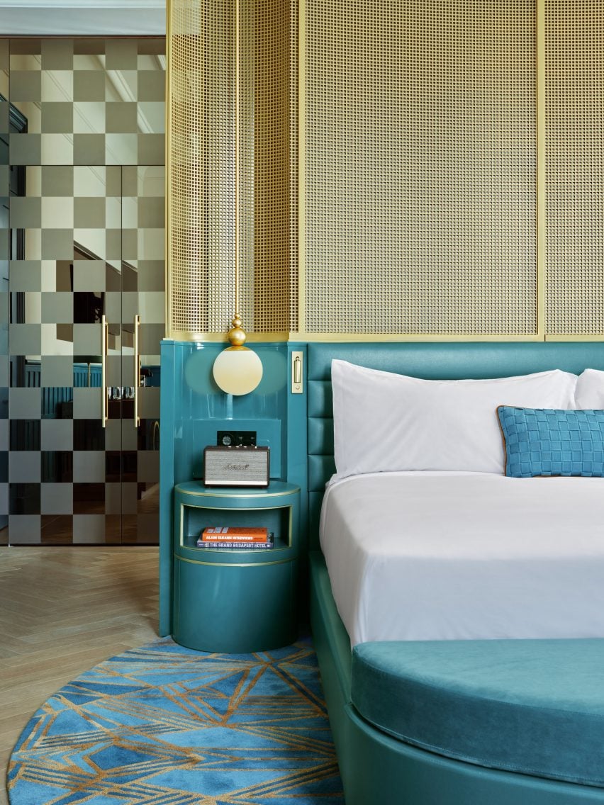
Turquoise wall panelling is contrasted with gold-toned details

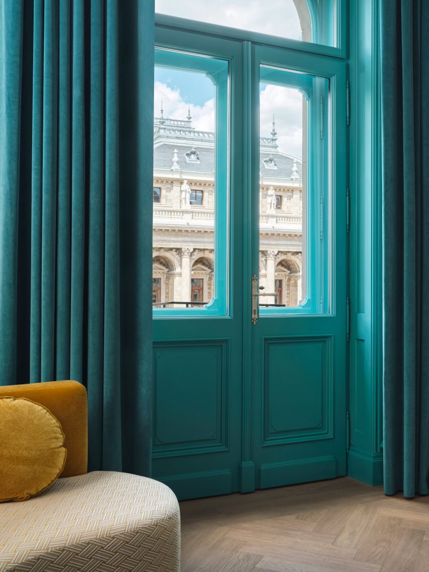
In the guest rooms, turquoise wall panelling is contrasted with the gold-toned screens that wrap the beds, while mirrored checkerboard doors with brass details nod to Hungary’s long ties to the game of chess.

The chess theme continues in the bathrooms, where monochrome checkerboard tiling is offset by handmade terrazzo-lined double sinks and lightbulb-framed Hollywood mirrors that pay tribute to Hungarian-American socialite Zsa Zsa Gabor.

“The combination of a beautiful free-standing French Renaissance-inspired building by a famous local architect with a modern, idiosyncratic interior inserted into it could only happen in Budapest,” Bayliss said.

The hotel opens later this month

Set to open later this month, W Budapest follows the opening of the brand’s Rome outpost in 2021.

Previous projects by Bowler James Brindley include several guest rooms at the W Barcelona and apartments on the lower levels of Herzog & de Meuron’s One Park Drive skyscraper in Canary Wharf.

Other hotels recently featured on Dezeen include a “thoughtfully designed” brutalist hotel in Mexico and Capella Hotels’ Sydney outpost, which is housed within a heritage-listed former government building.

The photography is courtesy of W Budapest. 

Reference

Birch Selsdon hotel takes over 19th-century Croydon mansion
CategoriesInterior Design

Birch Selsdon hotel takes over 19th-century Croydon mansion

British hotel chain Birch has opened an outpost in south London, with grounds rewilded by designer Sebastian Cox and interiors conceived by local studios A-nrd and Sella Concept.

Birch Selsdon is housed in a 19th-century mansion in the borough of Croydon and accommodates 181 rooms alongside a wellness space and lido, co-working facilities and a medley of restaurants and bars.

Birch Selsdon hotel occupies a 19th-century mansion
Birch Selsdon takes over a 19th-century mansion

The building was first turned into a hotel in the 1920s, with slapdash extensions and modifications added over the following century.

Local studios A-nrd and Sella Concept took a “restorative approach” to the interior works, stripping back much of the existing fit-out to allow the building’s original architecture to come to the fore.

Entrance lobby hotel by A-nrd and Sella Concept
The building’s original stone walls and bas-relief ceilings can be seen in the lobby

Restoration was also the focus for Sebastian Cox, who developed a woodland management plan for the hotel’s grounds as well as a rewilding strategy for its 18-hole golf course.

This will involve introducing grazing pigs and ponies, which can naturally distribute seeds and shape growing vegetation. The former fairways of the golf course will become wetlands, while the sandy bunkers will eventually attract small reptiles and other animals.

Entrance lobby of Birch Selsdon hotel
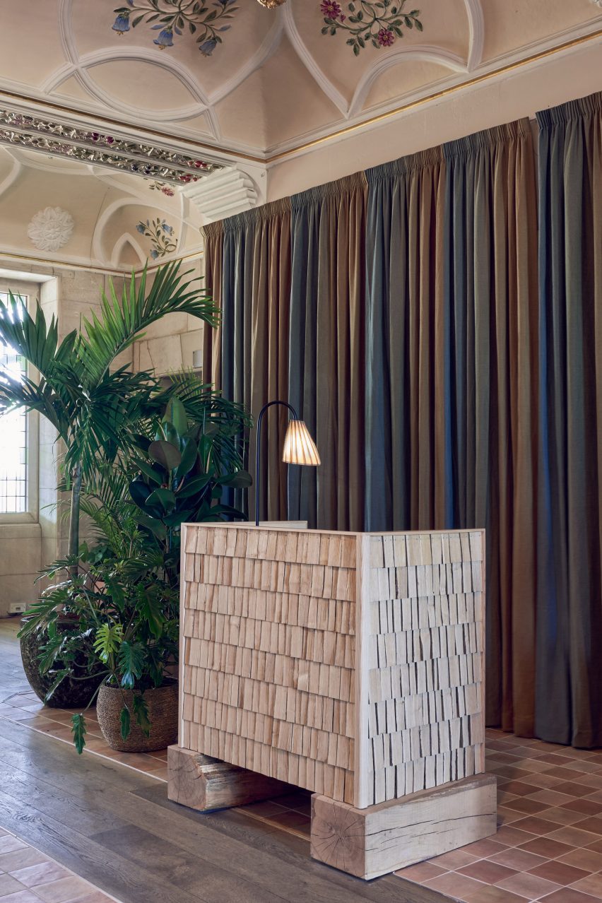
Timber from the grounds was used to create the shingled reception desks

Cox has also turned trees harvested from the grounds into a series of furnishings for the hotel, creating affordable, locally produced products while providing ecosystem benefits for the woodland.

“Managed woodlands have higher biodiversity because when you harvest the trees, light gets onto the woodland floor and other vegetation can grow,” Cox explained during a recent episode of Dezeen’s Climate Salon podcast.

“So we can categorically say that our furniture actually makes a net contribution. It doesn’t just harvest materials, it actually contributes to the spaces that the materials come from.”

Vervain restaurant inside hotel by A-nrd and Sella Concept
An arched nook discovered during the hotel’s renovation is now a dining space

Among Cox’s furniture contributions is a pair of shingled timber reception desks in the entrance lobby, backed by an ombre curtain that mirrors the shifting seasonal hues of the landscape around Birch Selsdon.

The lobby’s floral bas-relief ceiling was preserved alongside the original masonry walls, which peek out from behind the curtain.

Meadow Bar inside Birch Selsdon hotel
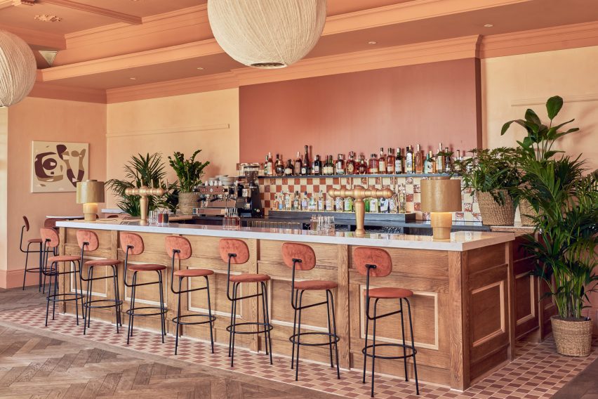
Peach-coloured surfaces appear in Birch Selsdon’s Meadow Bar

Dotted throughout the space are moss-green velvet sofas as well as wicker armchairs, potted plants and vintage petal-shaped pendant lamps made from Murano glass.

When guests are hungry, they can head to the hotel’s all-day restaurant Vervain, which serves a farm-to-table menu.

The space is anchored by two huge, arched banquettes featuring seat cushions upholstered in an abstract camouflage print and sawn-timber backrests, which were also sourced from the hotel’s woodland.

Oversized rice paper lanterns hang from the ceiling overhead, which is painted a rich apricot shade to highlight the existing ornate bas-relief.

The Snug inside hotel by A-nrd and Sella Concept
The hotel includes another bar called The Snug with wood-panelled walls

For drinks, guests can head to the hotel’s peachy-hued Meadow Bar or to the Snug, which has a slightly more grown-up aesthetic thanks to the dark, wood-panelled walls that are original to the building.

The space is dressed with vintage travertine coffee tables and an array of lounge chairs in sumptuous colours like ochre, olive green and damson purple.

The Orangery inside Birch Selsdon hotel
Chequerboard flooring in The Orangery nods to the Victorian period

To one side of the room lies a curved seating nook that was uncovered during the renovation works. Its interior was rendered in blush pink to foster a warm, intimate dining ambience.

There’s also the option to relax in The Orangery, a light-filled space centred by a wiggly cobalt-blue sofa. Terracotta tiles are arranged in a traditional checkerboard pattern across the floor in a nod to the building’s Victorian past.

Guest bedrooms inside hotel by A-nrd and Sella Concept
Bedrooms are filled with textural details like linen curtains and sisal rugs

The aesthetic of the hotel’s communal spaces is maintained in the guest bedrooms, which are finished with textural decorative elements like linen curtains and hand-blown glass lamps that cast dappled light across the limewashed walls.

Larger suites come complete with lounge areas, dressed with plump armchairs and sisal rugs.

Timber from the hotel’s woods was also used to produce 352 bedside tables for the rooms, all crafted in Cox’s Kent workshop.

Guest bedrooms inside Birch Selsdon hotel
The bedside tables are also made with timber from the hotel’s grounds

The launch of Birch Selsdon comes just three years after the opening of the inaugural Birch branch near Hertfordshire.

It was designed by architecture studio Red Deer to challenge the notion of a luxury hotel and features a series of pared-back rooms with quirky, unfinished details.

The photography is by Adam Lynk.

Reference

Ember Locke hotel channels Kensington’s decadent heyday
CategoriesInterior Design

Ember Locke hotel channels Kensington’s decadent heyday

Warm saturated colours and maximalist touches are combined inside Locke Hotels’ latest outpost in west London, designed by local studios Atelier Ochre and House of Dré.

Occupying an imposing Victorian mansion block in Kensington, the Ember Locke hotel was designed as a homage to some of the area’s historic architecture.

Bedroom and mirror in Ember Locke hotel
Atelier Ochre and House of Dré have designed the Ember Locke hotel

Among the references brought in by the designers were the art deco Kensington Roof Gardens and the now-defunct Biba department store, which rose to popularity in the Swinging Sixties.

“We wanted to create interiors that are an extension and interpretation of the neighbourhood, a space that reflects the cultural heritage of Kensington but also somewhere that shows the area’s evolution over time,” Atelier Ochre founder Pauline Dellemotte told Dezeen.

“We wanted to delve into the world of bold patterns, rich colours, eclectic furniture and art deco details, to tap into the sense of opulence that once dominated the Kensington scene.”

Kitchen and seating area in Kensington hotel by Atelier Ochre and House of Dré
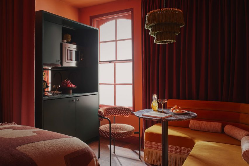
The hotel accommodates 121 serviced apartments

Instead of traditional guest rooms, Ember Locke accommodates 121 serviced apartments over eight floors, alongside a bakery, restaurant and conservatory cocktail bar, a stage for live performances, a co-working space, a gym and a garden.

Its interiors were designed to offer a contrast to the hotel’s location on bustling Cromwell Road – home to three of London’s most important museums including the V&A and the Natural History Museum.

Seating area of guest room in Ember Locke hotel
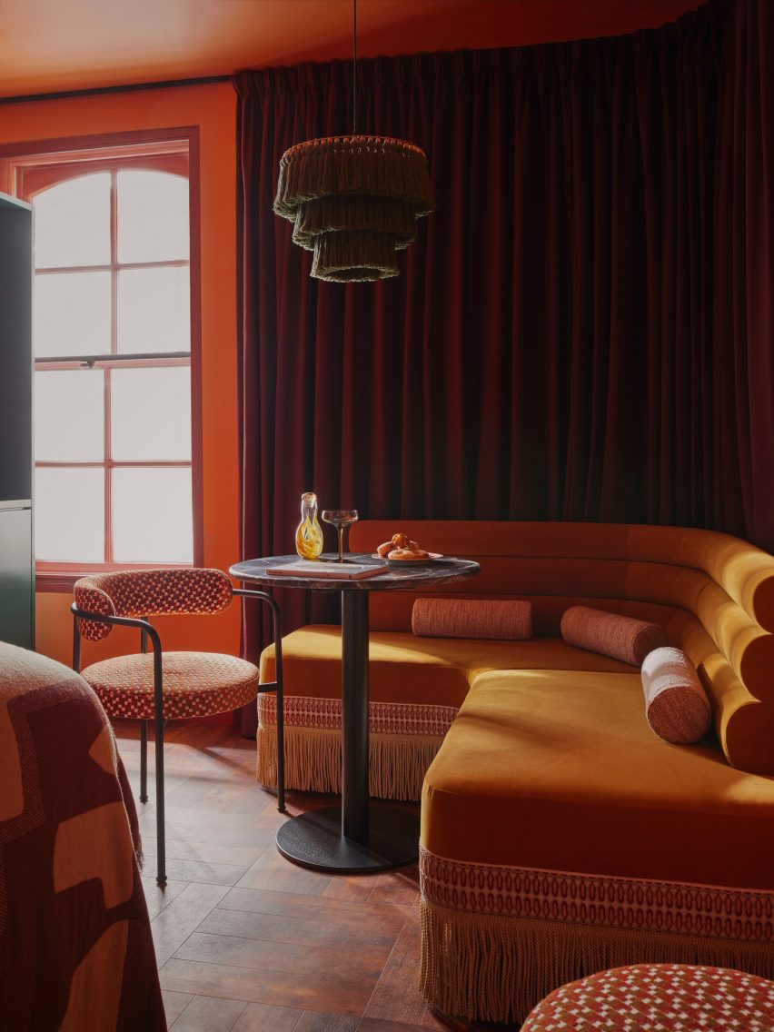
Velvet banquettes in the rooms are trimmed with ultra-long fringing

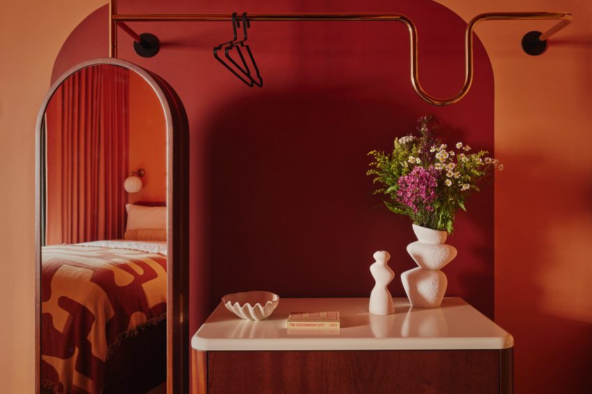
The building’s original arch-topped windows are mirrored in the arches and curves found in each room, from tubular-backed banquettes and chairs to the sculptural meandering clothes rail of the deconstructed wardrobe.

“The curved edges of the banquette, the rotating mirror and the wardrobe rail are attempts to combine the unlikely trio of playfulness, comfort and practicality,” said House of Dré founder Andreas Christodoulou.

“We’ve introduced some bold furniture and sculptural objects to spark a sense of curiosity and playfulness, and to allow guests to interact and reflect themselves within the space,” Dellemotte added.

Kitchenette in guest room of Kensington hotel by Atelier Ochre and House of Dré
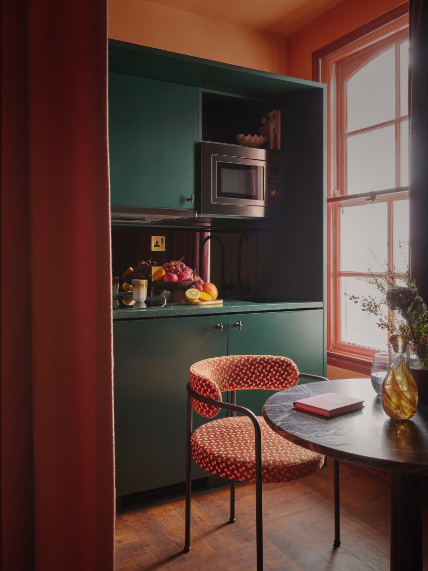
Each apartment also has a small kitchenette

The velvet banquettes are trimmed with ultra-long fringing, echoed by the fringed pendant lights that hang low above the circular table in each room to zone the seating area.

Brass detailing across coat hooks, wall lights and clothes rails adds to the sense of opulent modernity.

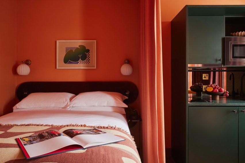
An intense colour palette, which layers red, orange and mustard tones, is offset by the deep green of the apartment kitchenettes, highlighting the more practical nature of this area.

“With the fringing and warm earthy colours, the rooms flirt with maximalism but still possess the calm and contemporary sophistication that one would expect from a Locke hotel,” said Christodoulou.

Bed and kitchen in Kensington hotel by Atelier Ochre and House of Dré
The bed is separated from the kitchen via a cotton curtain

Heavy recycled-cotton curtains in a claret colour, custom-created by London textile company Yarn Collective, track around the walls and create a flexible room divider, separating the bed and kitchen areas when needed.

Many of the communal spaces feature art by local and up-and-coming artists alongside specially created works by House of Dré.

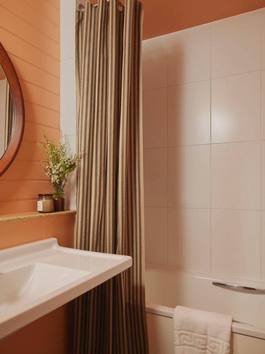
Bathroom with striped shower curtains in Ember Locke hotel
Striped shower curtains jazz up the bathrooms

The project was a close creative collaboration between Dellemotte and Christodoulou.

“We are old friends who met at a previous practice,” said Dellemotte. “Our friendship grew to include exciting collaborations across hospitality projects, where we combined our passions for design and art.”

“At Ember Locke, we’ve been given the opportunity to blend the interior aesthetics and art curation of the spaces with the overall branding of the hotel in a holistic way.”

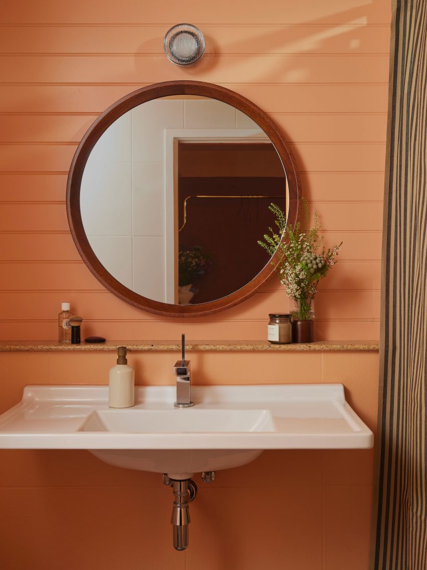
Bathroom sink in guest room of Kensington hotel by Atelier Ochre and House of Dré
Surfaces are finished in a salmony peach colour

Locke Hotels already has a number of other outposts in London. Among them is one in Bermondsey – with interiors designed by Holloway Li to echo sunny California deserts – and one near St Paul’s Cathedral that is housed in a converted 1970s office block.

The photography is by Kensington Leverne

Reference

Linehouse designs Hong Kong hotel to evoke the comfort of home
CategoriesInterior Design

Linehouse designs Hong Kong hotel to evoke the comfort of home

Shanghai-based interior studio Linehouse used natural materials and a muted colour palette to give the Ying’nFlo hotel in Wan Chai, Hong Kong, the feel of an inviting home.

The hotel occupies the podium of a 24-story tower on a hilly street in Hong Kong. Its ground floor holds a series of communal spaces that Linehouse designed to provide “home comfort” for guests.

Ying'nFlo Hong Kong by Linehouse
The ground floor comprises a series of rooms referencing living rooms

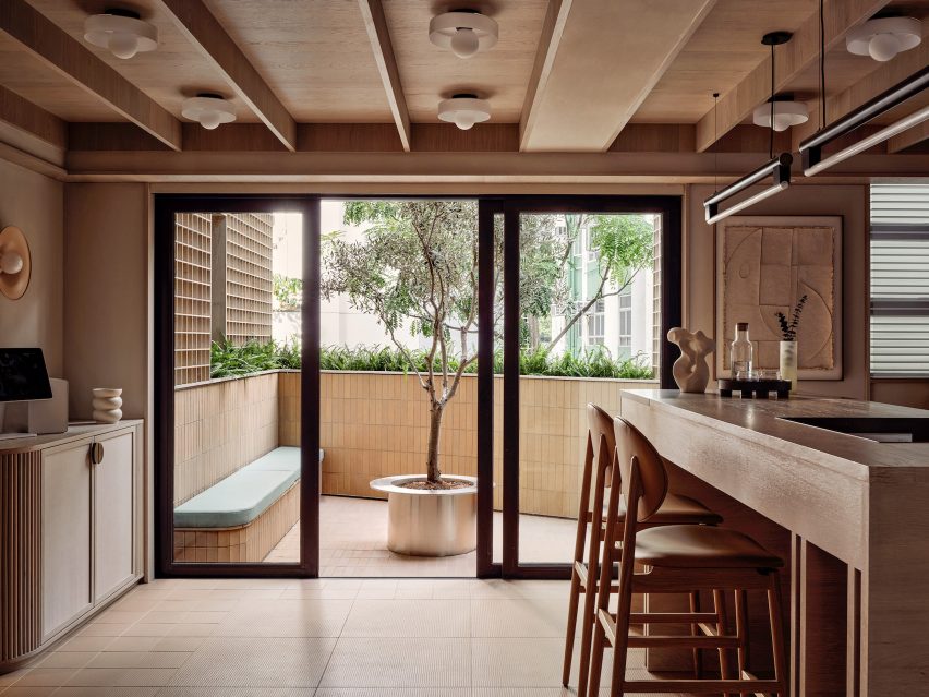
The Collectors Room, which greets guests at the entrance of the hotel, has a neutral palette of hand-rendered walls, timber paneling, and linen cabinetry that display curated objects and artworks. A communal oak table serves as a counter where guests can interact.

This room also connects to an outdoor terrace through sliding glazed doors. Built-in bench seating and an olive tree sit at the centre of the terrace and invite guests to relax and socialise.

Ying'nFlo Hong Kong by Linehouse
A communal table and outdoor bench invite guests to socialise

A gridded timber screen leads further into the space through to the lift lobby and the Arcade room, where guests can gather to relax and play.

Soft-rendered walls, timber shutters and an eclectic mix of furniture create a sense of intimacy, while floor tiles in various geometrical motifs add a sense of playfulness.

Ying'nFlo Hong Kong by Linehouse
The Music Room features ceramic tiles

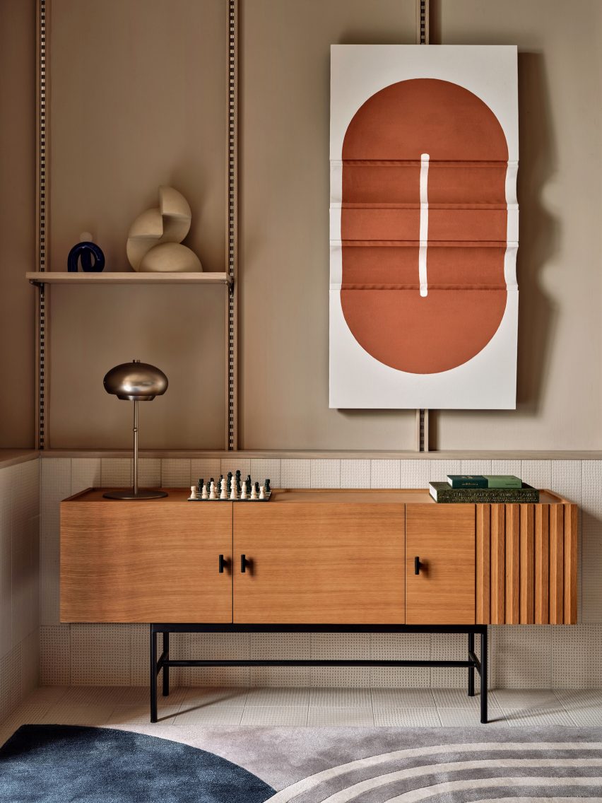
Adjacent to the Arcade is the Music Room, the social hub of the hotel. Here, ceramic tiles, a bespoke oak shelving system, a custom sofa and curated art and lifestyle objects were added to evoke a sense of a residential living room.

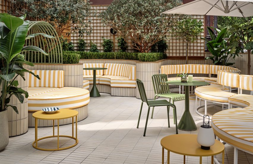
The Music Room opens up to the Garden Terrace, where undulating greenery sits behind circular seating in yellow-striped fabric, a colourful contrast to the overall neutral colour palette of the Ying’nFlo hotel.

Ying'nFlo Hong Kong by Linehouse
Yellow-striped fabric seating on the terrace adds playfulness

“The spaces are designed to have a warm, welcoming and familiar feel,” Linehouse said.

“Against this backdrop of curated simplicity is an edge of youthful attitude and local context, with vibrant elements giving the hotel its own unique flavour.”

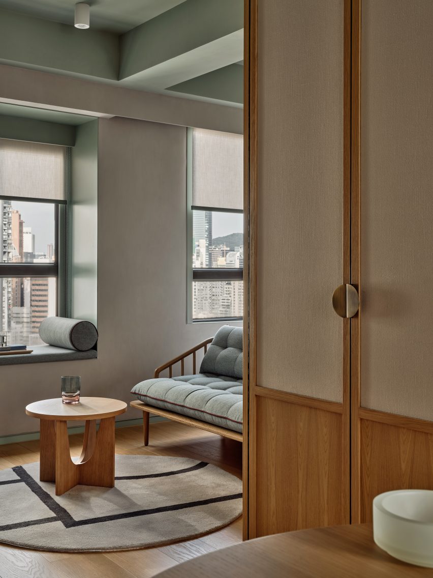
The guest rooms of the Ying’nFlo hotel are located on the upper floor and feature ceilings painted in a muted green hue, which the same green tone used to frame window seating nooks and for the hand-glazed tiles in the bathroom and kitchen.

A clean palette of plaster, wood, white-washed oak and canvas add texture to the rooms. Seating nooks and lounge furniture serve multiple functions as spaces where guests can work, relax or dine.

Ying'nFlo Hong Kong by Linehouse
Muted green and selection of wood furniture create a warm feeling for the guest rooms

Linehouse was founded by Alex Mok and Briar Hickling in 2013 and the duo went on to win emerging interior designer of the year at the 2019 Dezeen Awards.

The studio has recently completed a Mediterranean restaurant with natural, tactile materials, as well as a space-themed cafe decorated with real meteorites, both in Shanghai.

The photography is by Jonathan Leijonhufvud.


Project credits:

Design principle: Briar Hickling
Design team: Ricki-Lee Van Het Wout, Lara Daoud, Justin Cheung

Dezeen is on WeChat!

Click here to read the Chinese version of this article on Dezeen’s official WeChat account, where we publish daily architecture and design news and projects in Simplified Chinese.

Reference

Emma Martí celebrates Menorca’s architecture in Hevresac Hotel
CategoriesInterior Design

Emma Martí celebrates Menorca’s architecture in Hevresac Hotel

Spanish architect Emma Martí has converted an 18th-century townhouse on the Balearic island of Menorca into the intimate eight-bedroom Hevresac Hotel, taking over all of its five floors from basement to attic.

The building, which originally belonged to a local merchant and privateer, is set in the historic centre of Mahón – a former trade hub that still bears traces of French and English culture after spending many years under colonial rule.

Staircase of Hevresac Hotel
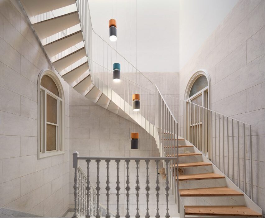
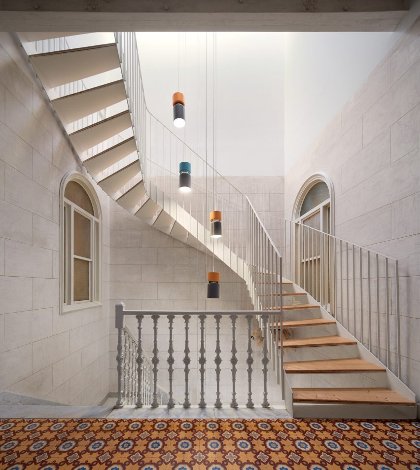
Emma Martí has converted a five-storey townhouse into the Hevresac Hotel

Hevresac owners Ignasi Truyol and Stephanie Mahé brought Martí on board for the renovation in part because she was an old friend, who they thought could be trusted to conserve and enhance the spirit and character of the building.

Martí’s aim for the project was to fill the building with light and life while preserving its wealth of existing architectural elements, from wooden beams and mosaic flooring to stucco walls and staircases.

“The aim of the project was to create a fresh and inspiring hotel that values the beauty of the existing architecture,” said the hotel’s owners.

Lounge of hotel in Menorca by Emma Martí Arquitectura
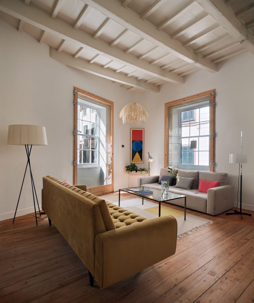
Original details such as parquet floors were retained throughout

Hevresac’s original floors, covered variously in wooden parquet and encaustic cement tiles, were carefully preserved.

In areas where it was not possible to retain the original elements, Martí chose a new design language using modern equivalents of these original materials, including micro-cement.

Guest room of Hevresac Hotel
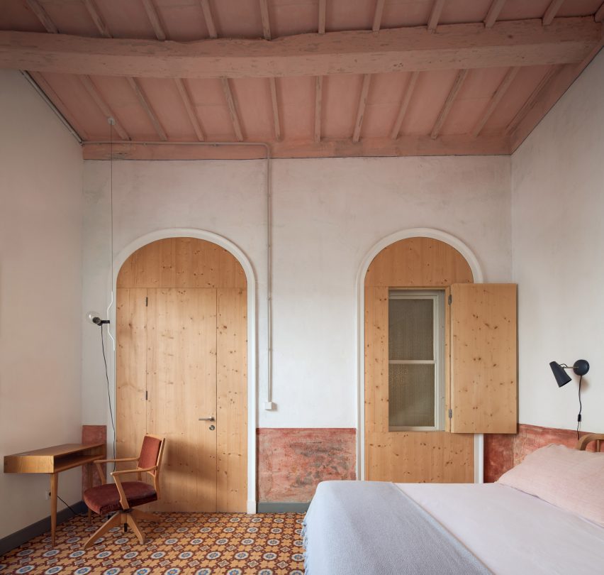
Hevresac Hotel has only eight guest rooms

The renovation process revealed both the stucco on the walls and the original paintwork on the beams, uncovering part of the building’s hidden history.

The original wrought iron columns in the living room are now a celebrated feature. Less noticeable but equally interesting is the Masonic symbolism on the wrought-iron railing of the marble staircase at the entrance.

Bathroom of hotel in Menorca by Emma Martí Arquitectura
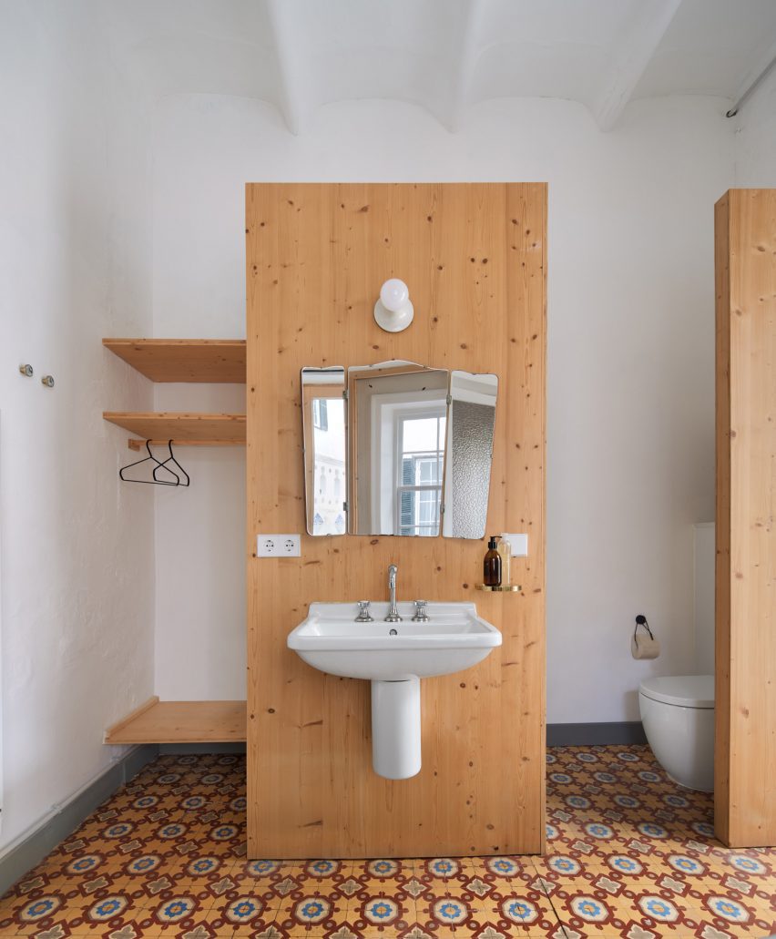
Solid timber was used to frame private bathrooms in each of the bedrooms

Martí also wanted to preserve the original room structure of the townhouse.

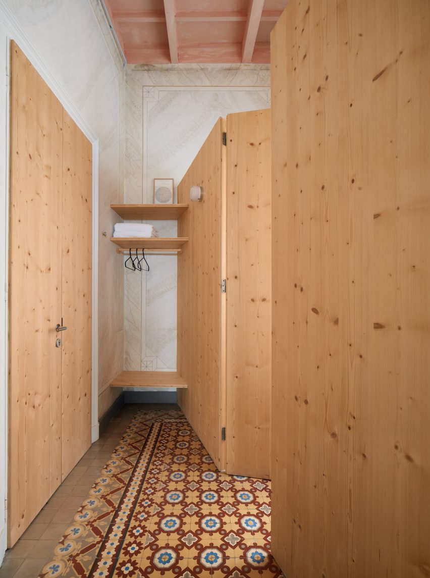
To allow for this, she added private bathrooms within each of the existing bedrooms using a lightweight timber framing system made of solid Flanders pine, while three-ply spruce boards form partitions, headboards and wardrobes in each bedroom.

“Martí’s intention is for the new materials to coexist and harmonise with the originals, providing a new language, lightness and contemporaneity,” the owners said.

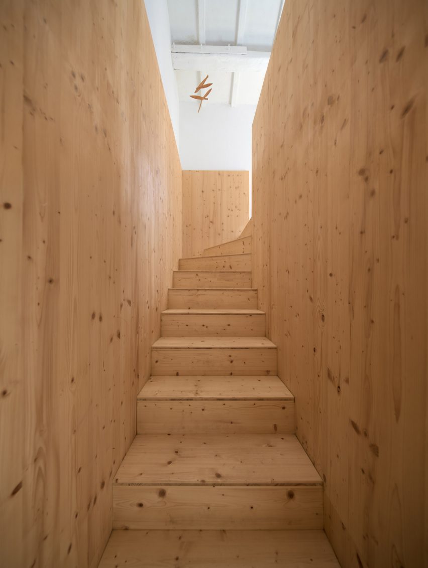
A new staircase – also utilising spruce ply – now coexists with the original staircase, providing an alternative route through the Hevresac Hotel.

The material is key to the contemporary language of the new insertions, which sit clearly differentiated alongside layers of the building’s past.

“I like to work with an honest and frank attitude towards the island’s architectural heritage,” Martí told Dezeen. “I wanted it to be clear what our intervention was, not to highlight it but to highlight the value of what existed in the building.”

Hallway of Hevresac Hotel
Three-ply spruce boards form partitions and wardrobes in each of the bedrooms

To fill the spaces with natural light, several skylights were added on the upper floor, with one above the main stairwell as well as three new openings in the facade.

In the basement, the vaulted ceiling made of local marés stone required an intervention to lighten the space.

Martí’s response was to remove a bay of the existing vault and install a new, more comfortable staircase to link the ground floor with the basement and flood the space with light.

Wooden staircase in hotel in Menorca by Emma Martí Arquitectura
Martí also added a new spruce ply staircase

Hevresac’s choice of furnishings reflects Mahón’s cosmopolitan history, including an eclectic assembly of antique, vintage and contemporary pieces from all over Europe.

Among them are Nanimarquina rugs, Achille Castiglioni lights and some of Marcel Breuer’s Cesca chairs, as well as items from Menorcan antique dealers including Alcolea & Kraus and Antics Antigüedades.

“It’s a kind of synergy,” the owners said. “Together, the components project a warm, creative and personal composition, which is more than the algebraical sum of those individual pieces.”

Terrace of Hevresac Hotel
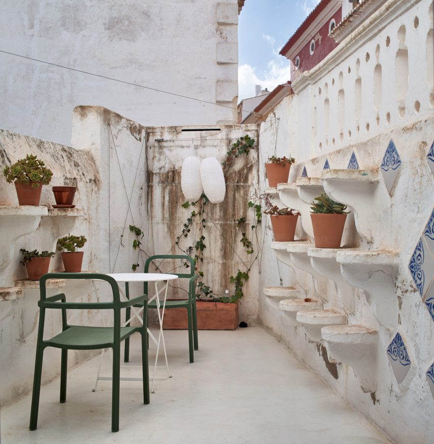
The hotel has a small terrace

Martí, who founded her self-titled studio Emma Martí Arquitectura in Menorca in 2013, has since completed a number of projects on the island.

Among them is a work retreat inside an abandoned girls’ school, with design-driven spaces where businesses can host meetings or team-building sessions.

The photography is by Pol Viladoms

Reference