Hidden Secret: How Energy Usage Was Transformed in Marcel Breuer’s Iconic Hotel
CategoriesArchitecture

Hidden Secret: How Energy Usage Was Transformed in Marcel Breuer’s Iconic Hotel

With climate change now firmly at the forefront of every architects’ mind, new innovations that help reduce carbon emissions are more critical than ever. While flashy façades and green roofs often take the headlines, it’s actually the hidden components of buildings — those elements concealed behind walls, in roof spaces, or within maintenance floors — where the most groundbreaking energy-efficient systems can be found.

Mitsubishi Electric’s Heat2O® Heat Pump Water Heater is a prime example. Through energy-efficient operation and reduction of on-site carbon emissions, this cutting-edge system significantly reduces the environmental impact of producing large volumes of Domestic Hot Water (DHW), a key consideration for hospitality, commercial and multi-unit residential projects.

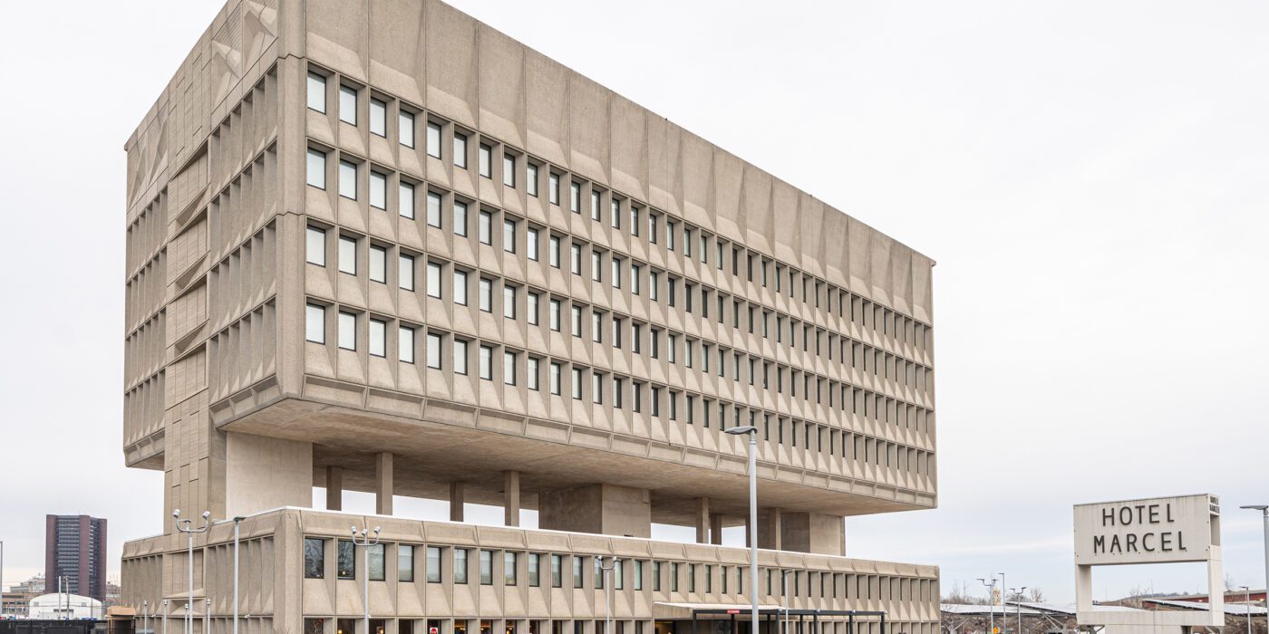
Thanks to its modular design, the Heat2O system can be harnessed for complex adaptive reuse and renovation projects as well as new constructions. Notably, the technology was put to use in the iconic Hotel Marcel, a $50 million adaptive reuse of the historic Pirelli building, designed by Marcel Breuer. With the goal of becoming the first net-zero hotel in the United States, the installation of Heat2O is helping the building secure its LEED® Platinum certification.
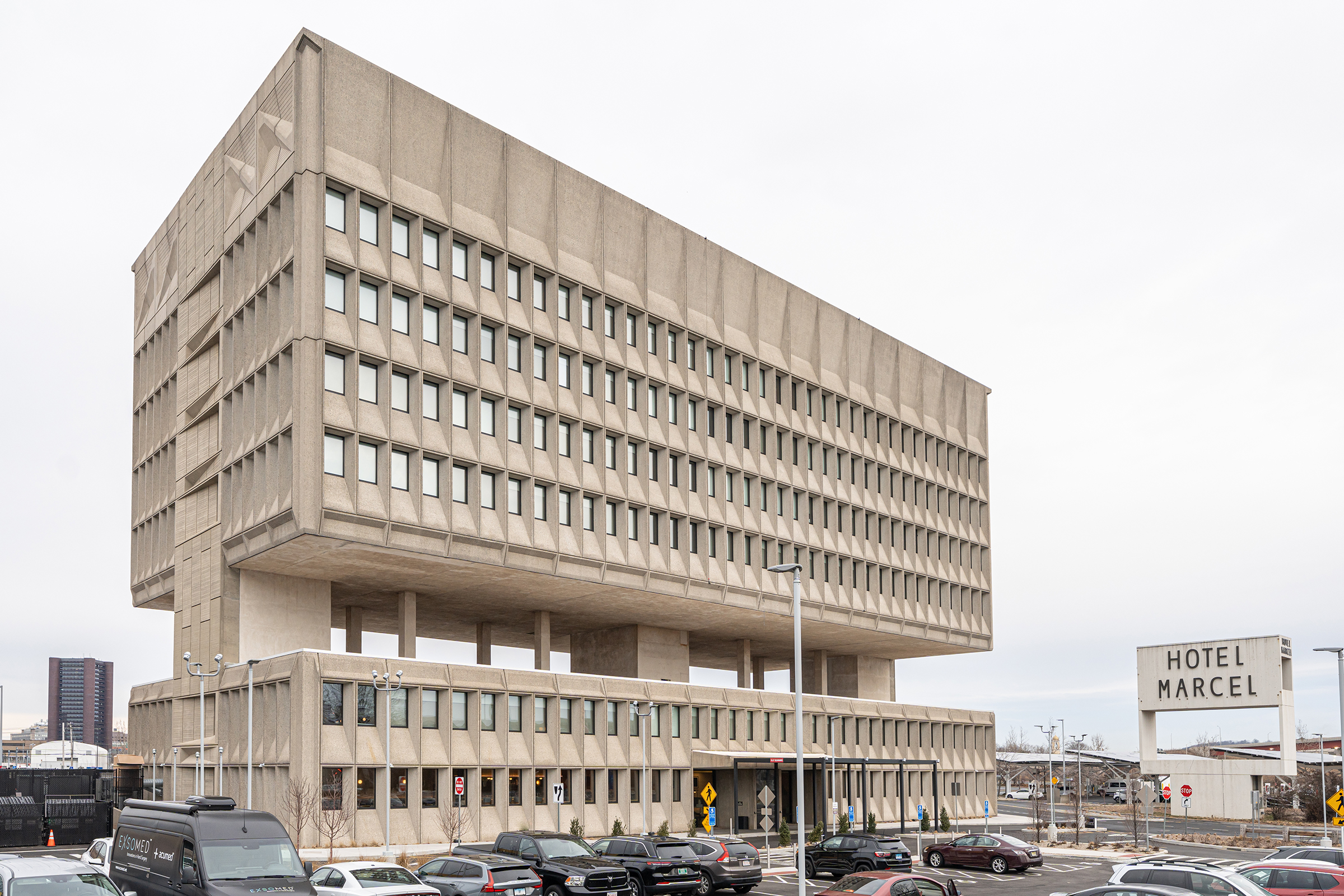
Hotel Marcel, formerly the Pirelli building, designed by Marcel Breuer

Architizer spoke with the bright minds behind Mitsubishi Electric’s latest systems to learn more about how the brand is innovating to meet the increasingly ambitious environmental goals of its clients.

Architizer Congratulations on winning a 2022 A+Product Award! What does winning this accolade mean to you and your brand? 

Mitsubishi Electric: As a company, Mitsubishi Electric Trane HVAC US works toward contributing to a more sustainable society by developing and promoting energy-saving all-electric products and systems that will reduce the use of fossil fuels in the heating and cooling industry. Being recognized for our efforts in this area is significant and means a great deal. Recognitions such as this confirm we’re on the right track and provide momentum in moving forward to reach our goals.

What inspired the design of your product?

Heat2O has been available overseas for several years. After witnessing its positive impact on a building’s energy efficiency and carbon footprint, we wanted to bring this technology to the U.S. market. Domestic Hot Water (DHW) required by multifamily buildings, hotels, hospitals, senior living facilities and other commercial spaces accounts for roughly 25% of these buildings’ annual energy usage. Until the introduction of Heat2O, the U.S. building industry lacked an energy-efficient solution to provide high-volume DHW for commercial buildings.

Tell us about the manufacturing process — What are the key stages involved and how do these help ensure a high quality end product?

To produce the Heat2O QAHV units, Mitsubishi Electric uses a “cell manufacturing process” whereby one person is responsible for each step of the assembly process. Each person is trained at a high level and has an electronic display to ensure they follow clear guidelines/instructions in the process.

Once the unit is assembled it goes through a full functionality test, including electrical safety and operational testing. All test data and unit information including the people who assembled the product are recorded and assigned to the serial number of the product. This ensures that an audit can be performed, and data retrieved post sale if required.

Mitsubishi Electric’s Heat2O® Heat Pump Water Heater

What detail of your product was most challenging to design, and why? How did you resolve it?

The most challenging aspect was the heat exchange between the CO2 refrigerant and water circuit. The heat exchanger is a unique and patented design and is called the “Twisted Spiral Gas Cooler.” The challenge was to provide the best possible efficiency while still maintaining a relatively small footprint. This was overcome by using a unique design and using a twisted coil approach, with six of the heat exchangers stacked above one another.

What makes your product unique and of great value to specifying architects?

The all-electric, cold-climate Heat2O Hot Water Heat Pump reduces the environmental impact of DHW through energy-efficient operation and using CO2 refrigerant. CO2, a natural and environmentally friendly refrigerant with a global warming potential (GWP) of one and an ozone depletion potential (ODP) of zero, helps commercial facilities qualify for rigorous sustainability certifications such as passive house status. Using Heat2O reduces on-site carbon emissions in the production of domestic hot water.
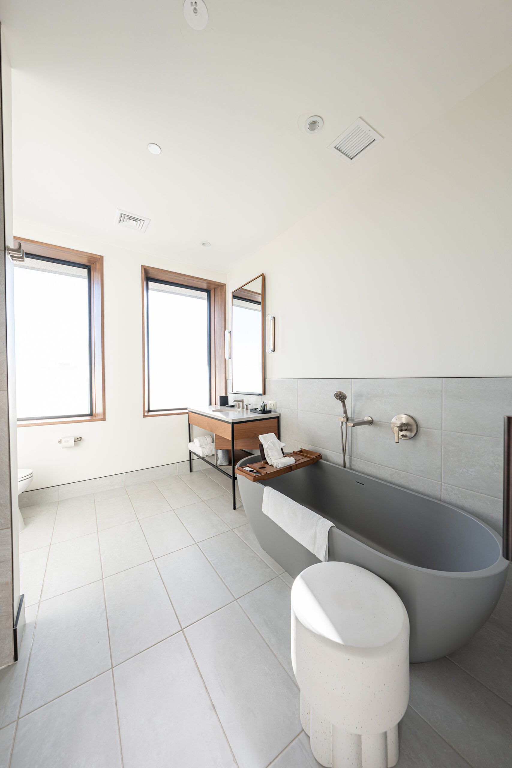
Bathroom in the new Hotel Marcel

What has the reception to your product been like from architects/clients/consumers?

We launched Heat2O in select markets. So far, the demand has been phenomenal. One of the most notable installations was in the $50 million adaptive reuse of the historic Pirelli building in New Haven, CT, into Hotel Marcel, which is projected to be the first net-zero hotel in the United States. Aiming for LEED® Platinum certification and a 60% increase in energy efficiency compared to code requirements, Heat2O was installed to achieve the project’s aggressive sustainability goals.

How do you see the product evolving in future?

Efficiency improvements will always be a driving factor and goal, together with evolving controls options. There are also many opportunities to combine QAHV with other future products in the Mitsubishi Electric portfolio.

To find out more about Mitsubishi Electric, visit MitsubishiComfort.com, and reach out to one of their experts to learn how to incorporate the Heat2O into your next project.

All photos courtesy of METUS

Reference

Blueberry Nights hotel makes “people feel like they’re inside a movie”
CategoriesInterior Design

Blueberry Nights hotel makes “people feel like they’re inside a movie”

Georgian architect Sandro Takaishvili has converted an apartment building in Tbilisi into a hotel, with interiors informed by his love of cinema and movie projectors in all 16 rooms.

Taking over three storeys above a restaurant in the capital’s Vera neighbourhood, the Blueberry Nights hotel features a theatrical colour scheme, Japanese furnishings and moody lighting.

A lobby interior inside Blueberry Nights hotel
Blueberry Nights is a 16-room hotel in Tbilisi

“The design of the hotel is the culmination of my entire life’s consumption of film,” the hotel’s co-founder Sandro Takaishvili told Dezeen.

“My intention is to make people feel like they’re inside a movie, where everything feels slightly familiar but otherworldly at the same time,” said the architect, who previously worked as a set designer, filmmaker and photographer.

A hallway interior inside a hotel
Its design references films by renowned film directors

The hotel was named after My Blueberry Nights – a film by Hong Kong director Wong Kar-Wai – and incorporates visual references to the work of other renowned directors including Stanley Kubrick.

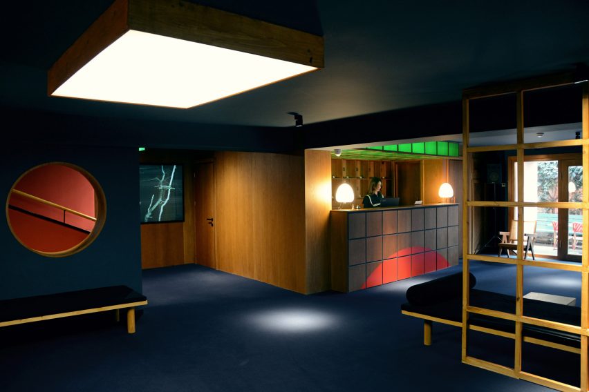
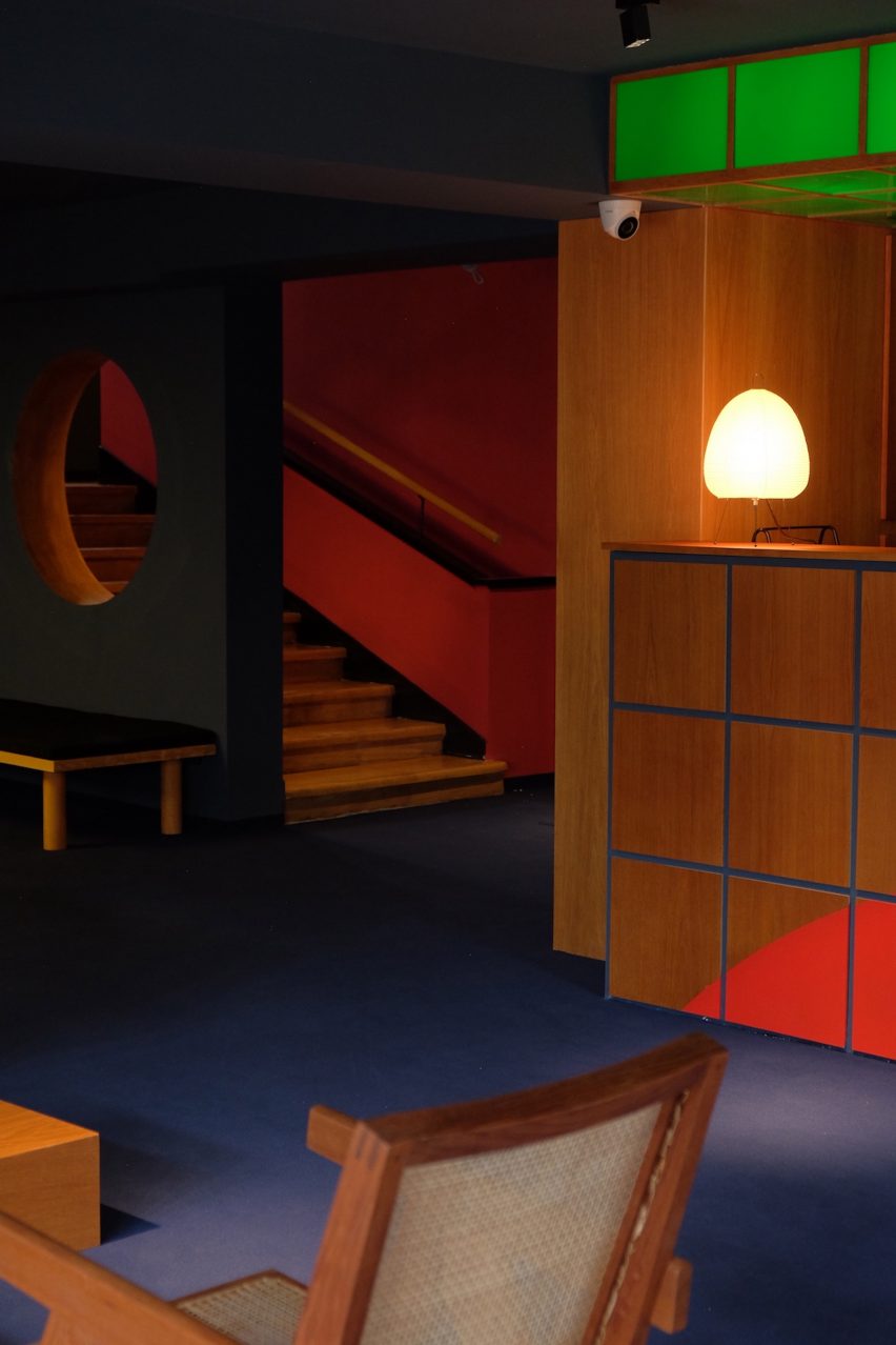
The main lobby was designed to look and feel like a cosy cinema foyer, complete with dark blue carpeting, walnut wood furniture and seating upholstered in velvet. Guests can check in at a large reception desk fronted in plexiglass that was inspired by retro-futuristic films.

The interior of a room in a Tbilisi hotel
The guestrooms are sparsely decorated with lights from Japan

“From the moment guests step through the doors, a moody cinematic journey begins with dark blue carpets, downlights and a soft soundtrack of noir movie dialogues playing in the lobby,” Takaishvili said.

As part of the renovation, Takaishvili transformed the building’s attic into two extra guestrooms, for a total of 16 rooms.

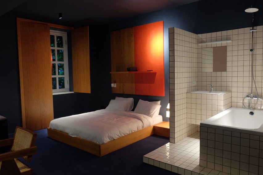
The bedrooms were designed to evoke the visual style of David Lynch, with custom-made low-slung beds and walnut-veneer cabinets. Room dividers punctured by large circular openings were used to mark different zones within the rooms.

The warm wooden furniture is offset by splashes of red – in the form of vintage phones, artwork and window shutters made from medium-density fibreboard (MDF) – as well as the white tiles used in the tiny en-suite bathrooms.

A cinematic-themed hotel room
Wooden furniture in the hotel rooms was locally produced

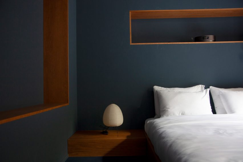
Other bedroom decor includes lamps with Noguchi-style paper shades, which Takaishvili imported from Japan, and teak-and-cane chairs by architect Pierre Jeanneret, which were sourced from London.

“The paper lights give off a soft luminescent effect that creates a cosy ambience,” the architect explained.

“Some of the simple geometric forms that I used definitely have a mid-century influence but I wasn’t trying to be trendy. I just wanted to achieve a cinematic effect without resorting to obvious movie gimmicks.”

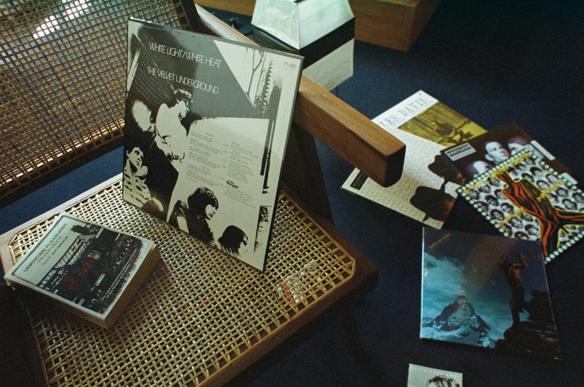
A selection of films on a rattan chair
The architects added vinyl players and records in each room

One wall was left blank in each room so that guests can watch movies via a smart projector, while music can be played via a selection of vinyl records.

Other interior projects in Tbilisi include a bookstore-cum-cafe by Georgian designer Lado Lomitashvili and the Stamba Hotel, which occupies the former headquarters of a Soviet printing press.

The photography is courtesy of Blueberry Nights.


Reference

Vipp transforms 13th-century Italian palazzo into pop-up hotel
CategoriesInterior Design

Vipp transforms 13th-century Italian palazzo into pop-up hotel

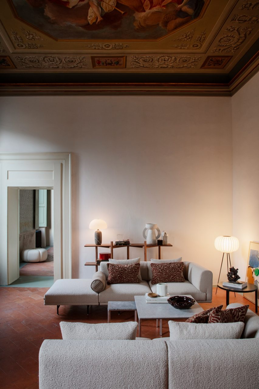
Interior designer Julie Cloos Mølsgaard has created a pop-up hotel filled with Italian frescos and modern Scandinavian furniture for Danish homeware brand Vipp within Palazzo Monti in Brescia, Italy.

The collaboration with Vipp saw the Palazzo Monti, which is an artist residency foundation hosted in a 13th-century palace, transformed into a hotel for guests to stay overnight.

Kitchen with black cabinets and green-tiled floor
Palazzo Monti was converted into a pop-up hotel

The space was redesigned into a hotel suites focused on showcasing Vipp products.

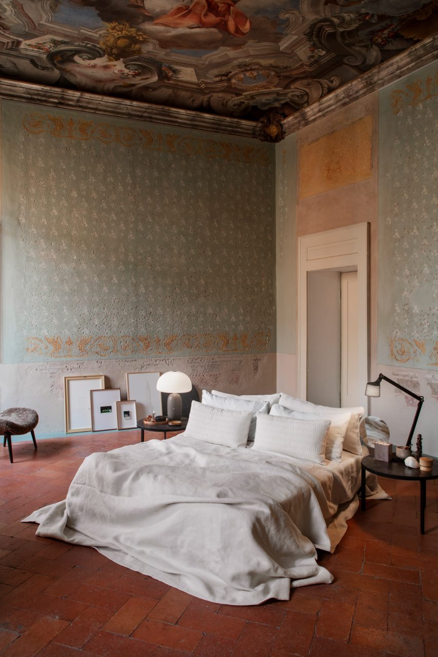
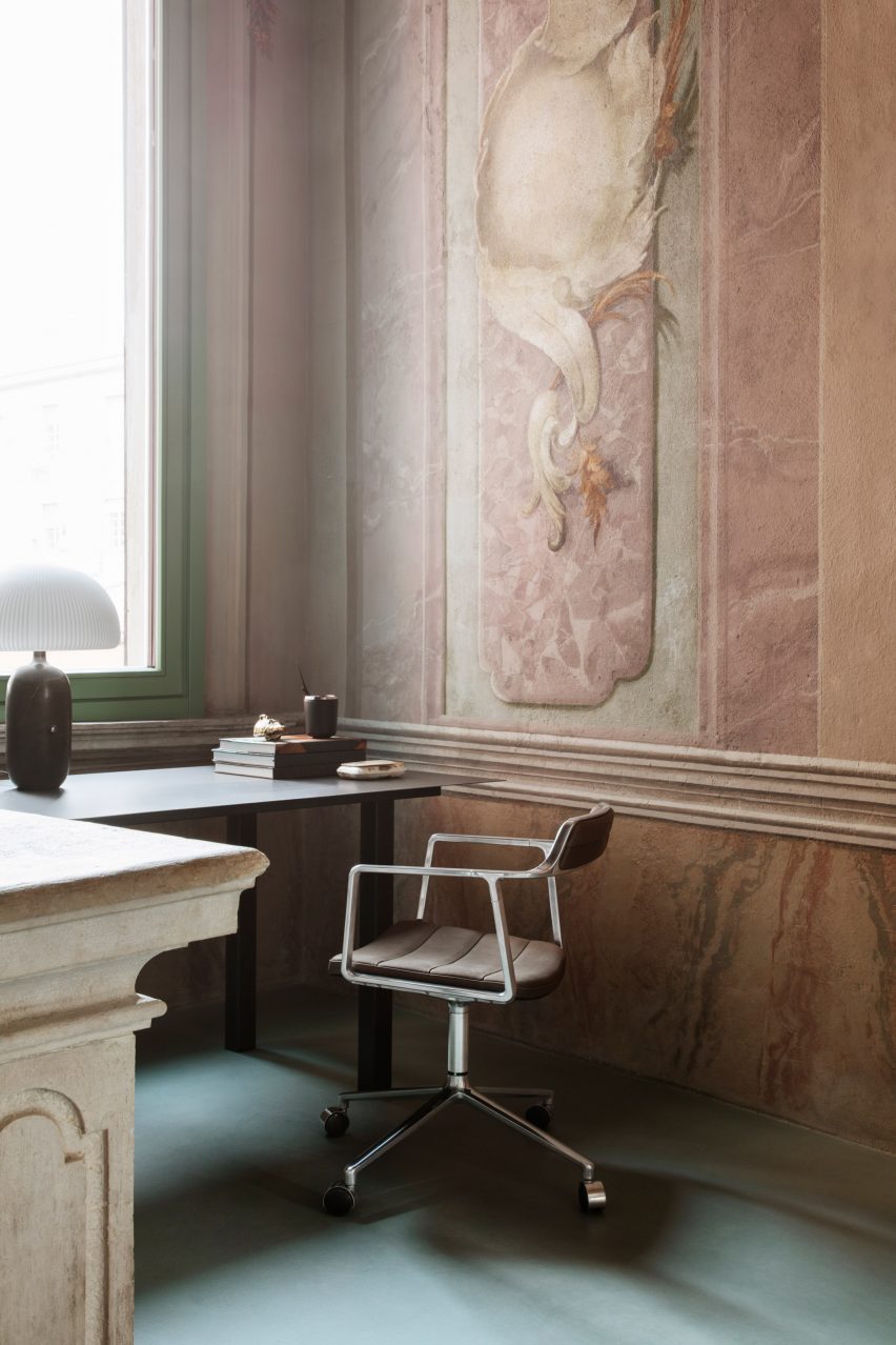
Mølsgaard added minimalist furniture and lighting by Vipp to the interior spaces, aiming to complement the historic building, which features Baroque paintings from 1750 on its walls and ceilings.

Bed on red-tiled floor of Palazzo Monti
The rooms were decorated with minimalist furniture

“Palazzo Monti showcases a broad array of art exhibitions,” said Palazzo Monti founder Edoardo Monti.

“For the first time, we will host a liveable installation curated by Vipp, where we invite guests to check into our residency,” he continued.

“Entering the opulent gates of the palazzo is like stepping into an old master’s painting.”

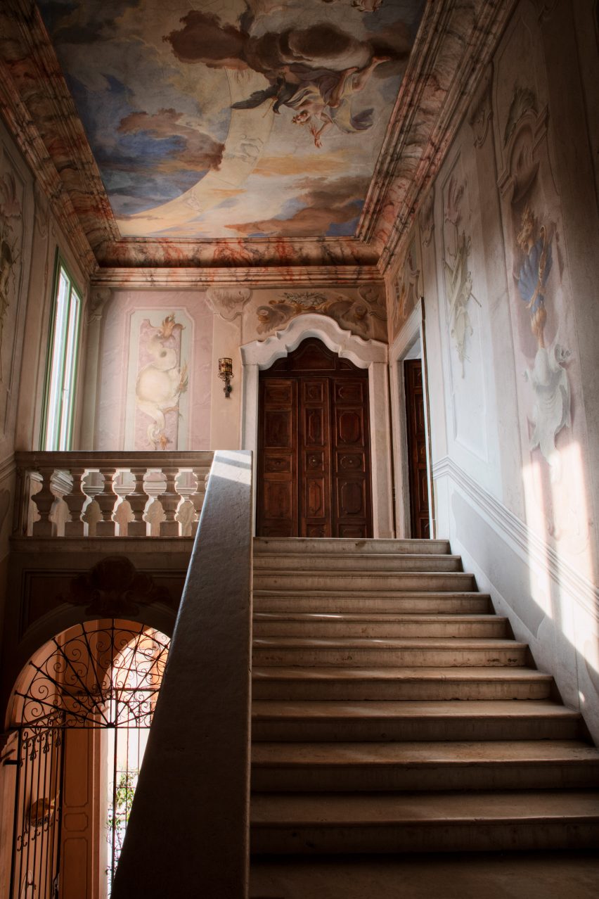
Staircase within Palazzo Monti with frescos
The staircase is surrounded by frescos on the walls and ceiling

“For the pop-up hotel at the palazzo, Mølsgaard had an ambition of building a bridge between the minimalist and the opulent,” said Vipp CEO Kasper Egelund.

“Vipp and Mølsgaard approached the interior design with a simple and minimalist mindset to respect and not compete with the surrounding richness.”

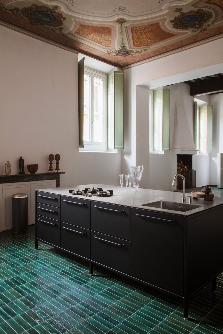
Black kitchen island counter with Italian palazzo
Green tiles cover the kitchen floor

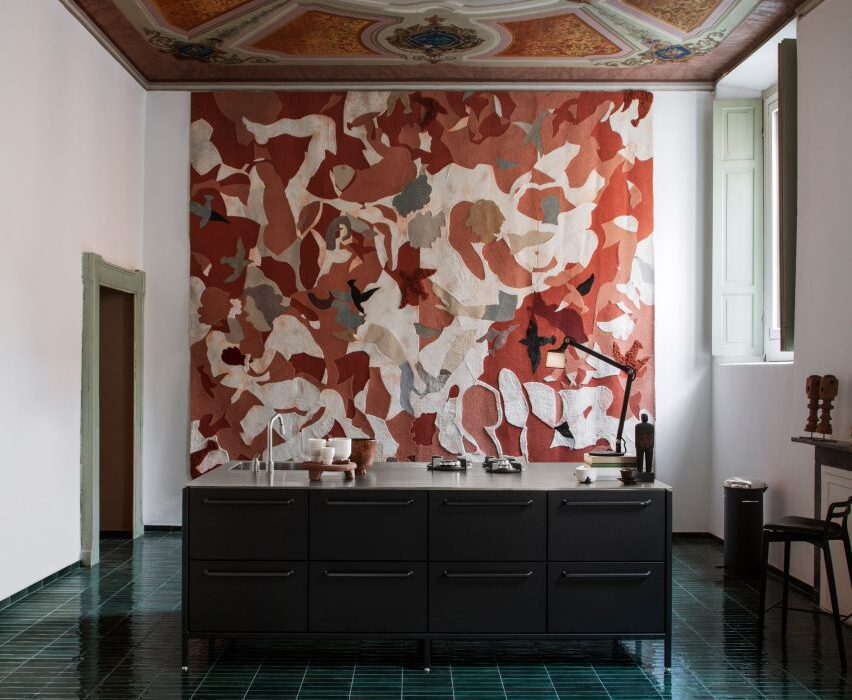
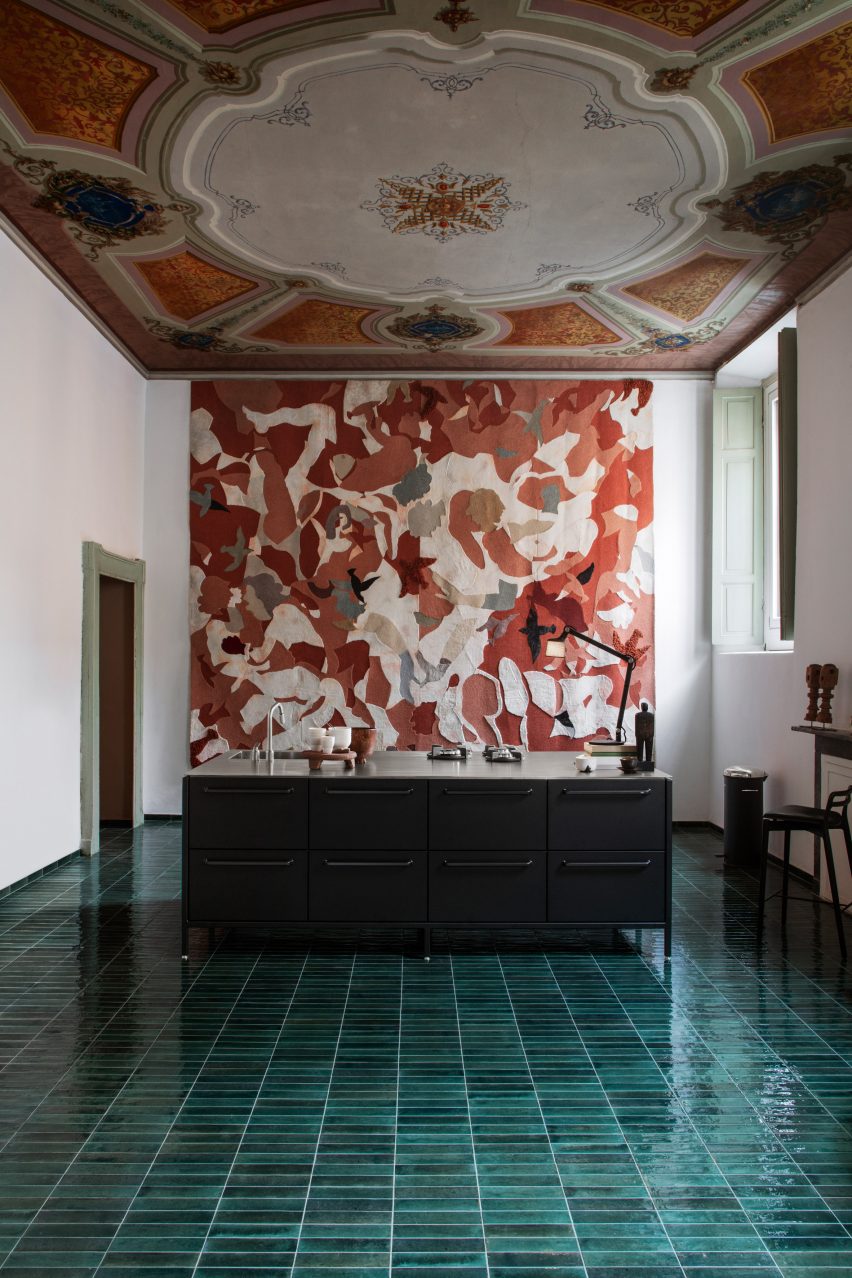
On the ground floor is a combined kitchen and dining area. Mølsgaard added an industrial-looking matte black kitchen island in the middle of the space, which sits under an ornate ceiling and atop a green-tiled floor.

A grand staircase surrounded by pastel frescoes leads visitors to the pop-up hotel on the first floor.

A succession of rooms – a hallway, salon and bedroom – were transformed into a suite decorated with Vipp furniture and lighting.

The furniture in the bedroom was intended to be simple and minimalist. The mattress sits on the floor without a bedframe, making the painted three-metre-high ceiling the main focus of the room.

“The idea is that guests should visit and explore the space,” Mølsgaard told Dezeen. “When you wake up under the frescoes, it’s impossible not to think, what kind of life must have been lived in this house?”

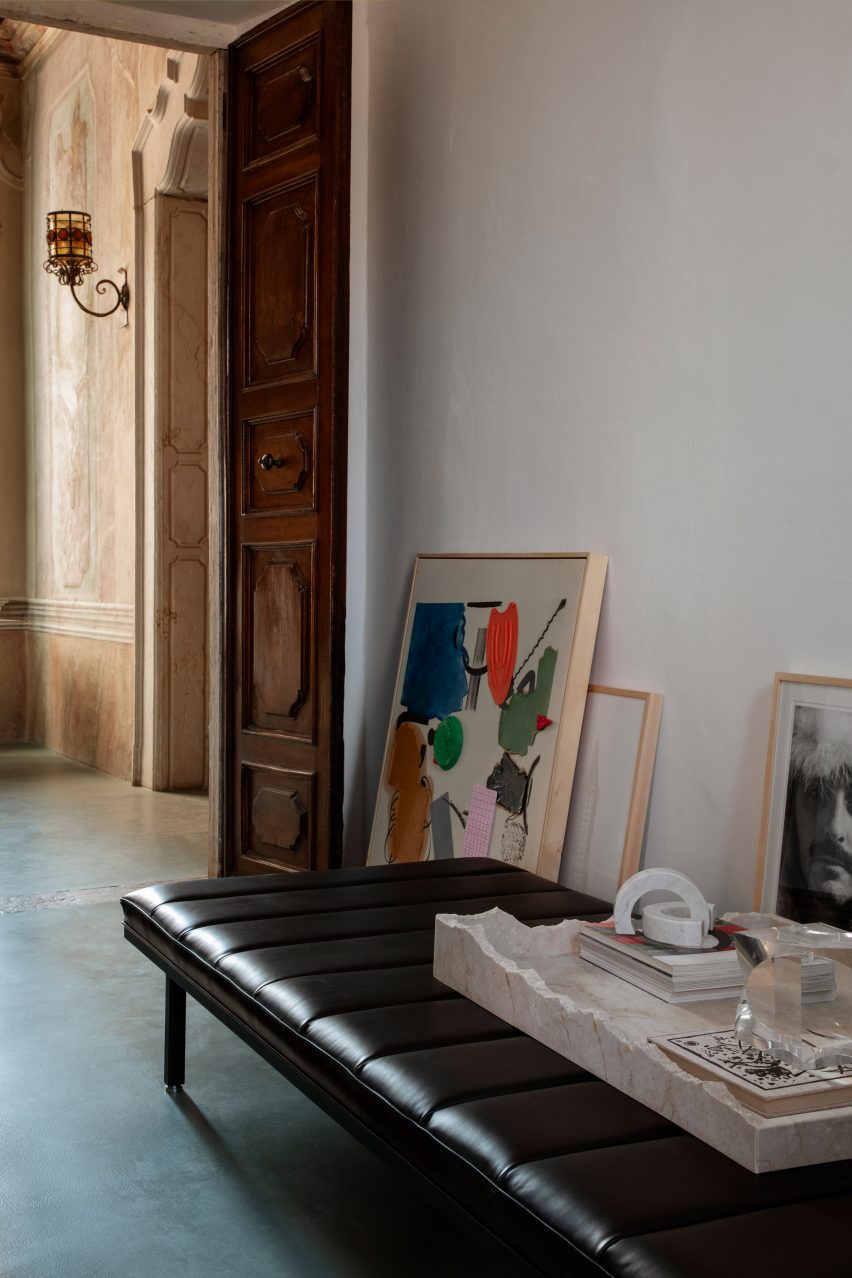
Hallway within Vipp pop-up hotel
Artwork was placed on the floor

Throughout the palazzo, artwork and picture frames were placed on the floor propped up against the walls, rather than being hung.

“We initially hung a lot of art on the walls, but it was making too much noise, so instead I have sought the purity of the history of the place and wanted to let it speak through the bare walls,” said Mølsgaard.

Living space in pop-up hotel with beige chez lounge in Palazzo Monti
Mølsgaard aimed to combine Scandinavian minimalism with Italian opulence

“The whole place is one big art piece,” she continued. “The staircase is a work of art, the doors are works of art, the shutters, the walls and the ceilings.”

“When you walk around the rooms, you simply experience so many things that you almost get overloaded, so there was something that had to be removed.”

Desk space with Monti Edition chair
Vipp launched a special edition chair for the pop-up

Artist workshops on the second floor of the building overlook Brescia, which is a UNESCO World Heritage Site.

To celebrate the pop-up hotel at Palazzo Monti, Vipp launched the Monti Edition chair, which sees the brand’s Swivel chair design upholstered in an Italian woven fabric created by textile company Torri Lana.

The pop-up hotel at Palazzo Monti opens on 18 April to coincide with Milan furniture fair Salone del Mobile and closes on 18 May 2023.

Vipp and Mølsgaard have previously collaborated on projects including a one-room hotel in a converted pencil factory and a pop-up supper club venue.

The photography is by Irina Boersma César Machado.


Reference

Green Solution House 2.0 is CLT-framed hotel designed by 3XN
CategoriesSustainable News

Green Solution House 2.0 is CLT-framed hotel designed by 3XN

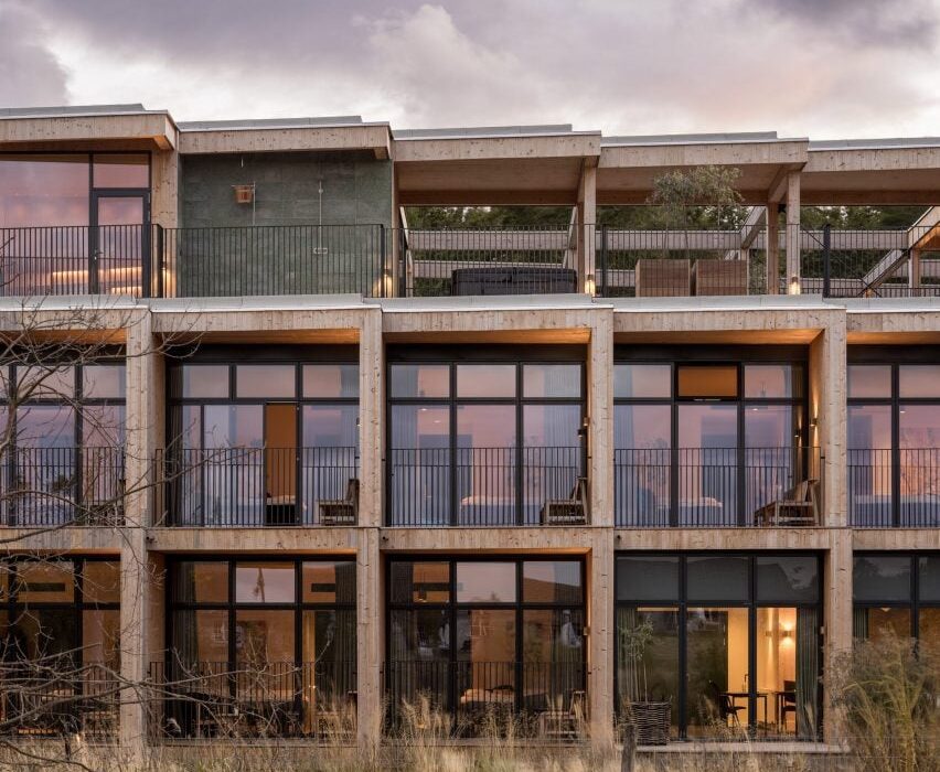
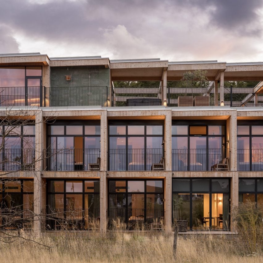
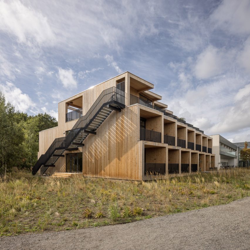
Timber provides almost all the building fabric of Green Solution House 2.0, a hotel on the Danish island of Bornholm completed by architecture studio 3XN.

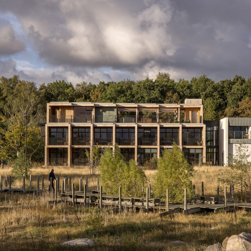
Located in the town of Rønne, the modular building consists of a structural frame of cross-laminated timber (CLT), an exterior of timber boards and a layer of wood fibre insulation.

Modular facade of Green Solution House 2.0 by 3XN
Green Solution House 2.0 has a modular CLT frame

The design was developed by 3XN with its sister studio GXN, which specialises in circular architecture, and is intended as a model for sustainable construction.

As well as specifying natural materials, the design team planned the hotel so that it could be built quickly and efficiently, with minimal waste.

Side view of timber-framed hotel by 3XN
Timber clads the exterior above a layer of wood fibre insulation

Its CLT frame was designed as a kit of parts and manufactured off-site. Material offcuts were carefully calculated and then used to create bespoke furniture elements within the building.

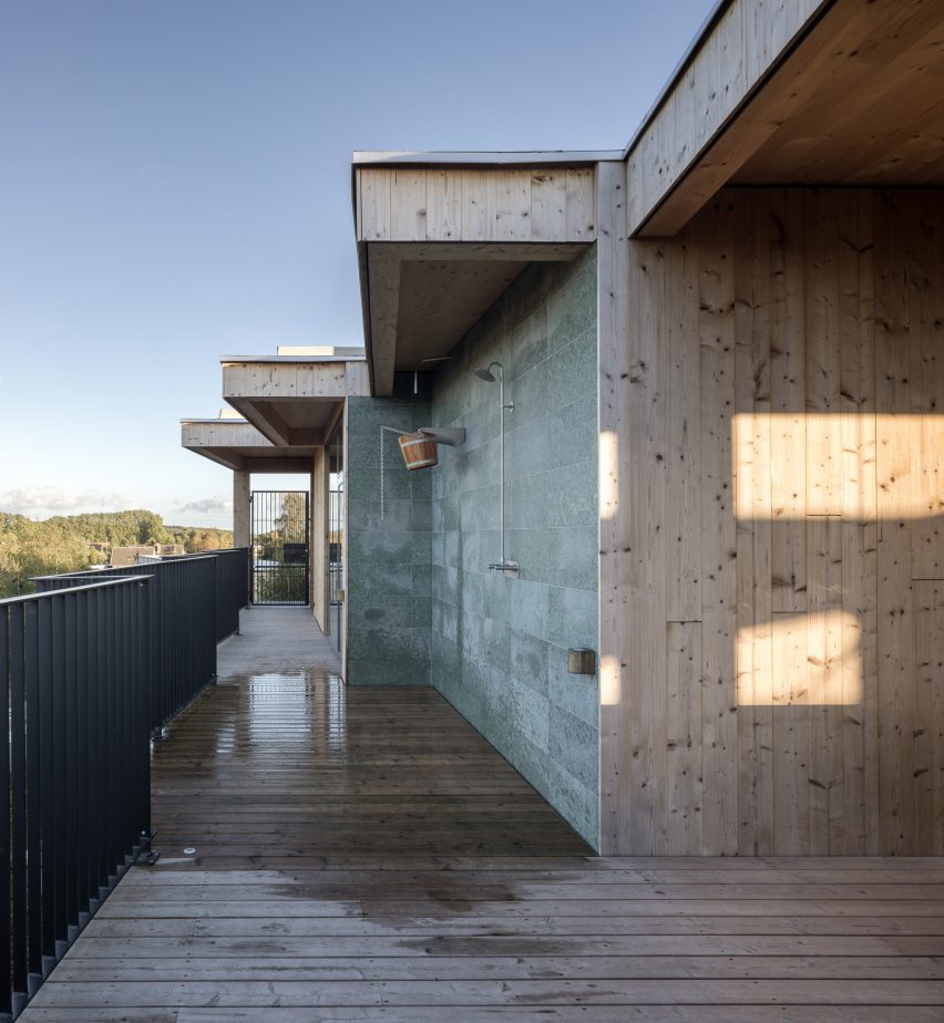
The building also incorporates granite surfaces made using waste material from local quarries.

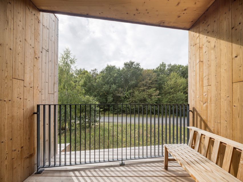
Balcony of Green Solution House 2.0 by 3XN
The structure was designed as a kit of parts and built off-site

“The widespread use of timber is both good for the climate and gives a particularly warm atmosphere,” said Lasse Lind, partner at GXN and project lead for Green Solution House 2.0.

“The building itself is an expression of the hotel’s ambition to make green solutions an attractive element for guests.”

Staircase and atrium of 3XN-designed hotel in Denmark
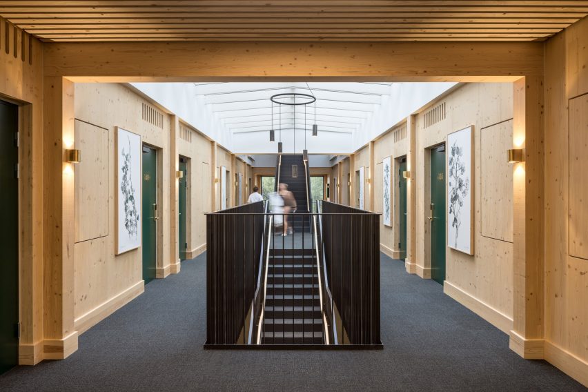
Hotel rooms sit on either side of a central atrium and staircase

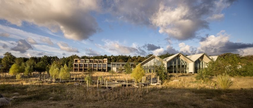
Green Solution House 2.0 is an extension of Hotel GSH, also designed by 3XN, which opened in 2015.

The three-storey building contains 22 single bedrooms, one double bedroom and two dedicated meeting rooms.

Its interior is organised around a linear atrium, sandwiched between two rows of rooms on the ground and first floors.

A generous staircase rises up through its centre, leading up to a terrace and spa on the uppermost floor.

Bedroom in Green Solution House 2.0 by 3XN
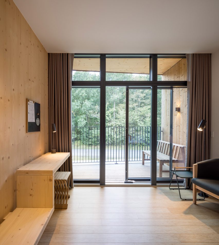
CLT offcuts were used to create bespoke furniture

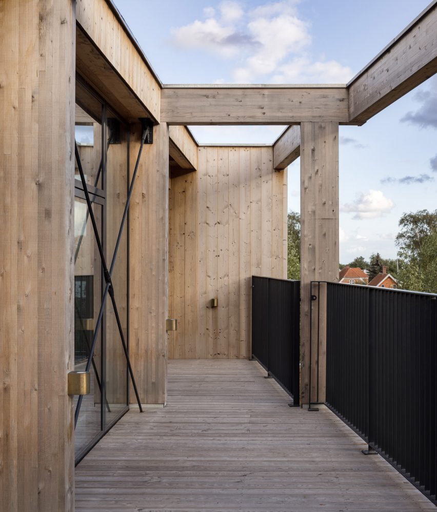
A sheltered balcony or terrace fronts each room, helping to naturally shade floor-to-ceiling glazing while also providing guests with private outdoor space.

Inside the rooms, the CLT structure is left exposed to create a warm cabin-like feel.

View from balcony of Denmark hotel
Each room has its own balcony or terrace

Modularity was key to minimising waste in Green Solution House 2.0.

The building is formed of repeating box-like modules, arranged in a staggered formation to capture as much natural daylight as possible.

This standardised approach meant that offcuts were of the same size and dimensions, making it easier to utilise them for multiple furniture elements.

Top floor of Green Solution House 2.0 by 3XN
A spa is located on the uppermost level

Timber is a recurring material in 3XN projects, with recent examples including the Klimatorium climate centre, also in Denmark, and the planned extension to the Ecole Polytechnique Fédérale de Lausanne in Switzerland.

The extensive use of the material for Green Solution House 2.0 has led to the project being named a 2022 winner of Årets Byggeri, a prestigious architectural award in Denmark. Hotel GSH received the same award in 2015.

Wooden facade of Denmark hotel by 3XN
The facade is staggered to maximise natural daylighting

“We are very proud to receive this award, which focuses on the impact that architecture can have on society,” said Lind.

“As an office, we seek to inspire through our projects, and we hope the Green Solution House 2.0 will inspire people to build with biogenic materials, use local and upcycled resources, and make holistic sustainability the main design driver.”

Facade of Green Solution House 2.0 by 3XN
Green Solution House 2.0 forms part of Hotel GSH in Rønne

The building also incorporates rooftop solar panels and water recycling to reduce its energy footprint.

The studio expects the building to have a very low carbon footprint across its lifespan.

The photography is by Adam Mørk.

Reference

Eight hotel interiors enriched by decadent jewel tones
CategoriesInterior Design

Eight hotel interiors enriched by decadent jewel tones

Plush velvet upholstery, Moroccan rugs and chinoiserie-style ottomans feature in this lookbook of hotel interiors that use saturated jewel colours to bridge the gap between cosiness and luxury.

Shades of ruby red, cobalt blue and emerald can help to create interiors that are rich in depth and dimension, especially when accompanied by tactile materials such as silk or leather.

Read on for eight hotel interiors that demonstrate how to translate this palette into modern interiors without it feeling stuffy.

This is the latest in our lookbooks series, which provides visual inspiration from Dezeen’s archive. For more inspiration see previous lookbooks featuring 70s-style interiors, biophilic homes and innovative stone furniture.


Jewel toned sitting room in The Chloe hotel in New Orleans
Photo by Paul Costello

The Chloe hotel, USA, by Sara Ruffin Costello

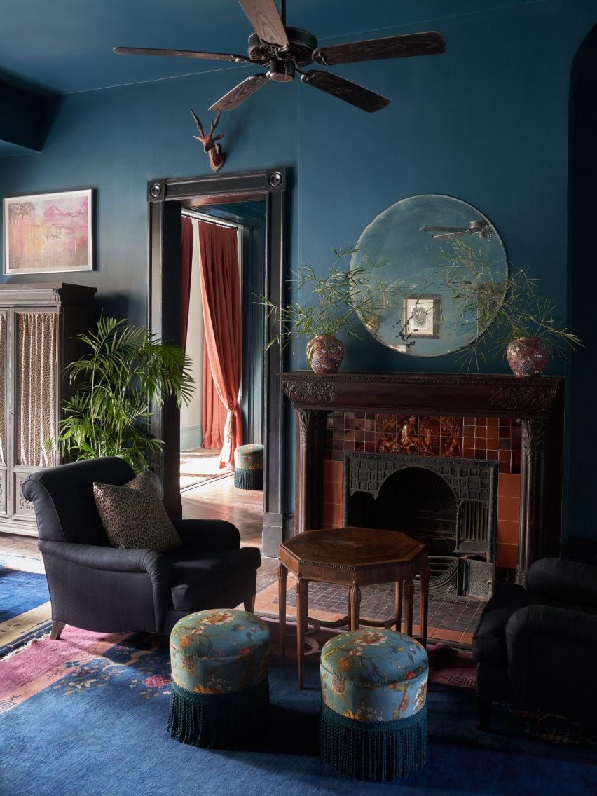
Interior designer Sara Ruffin Costello set out to emphasise the grand Southern Victorian architecture of this 1800s family mansion in New Orleans when converting it into The Chloe hotel (top and above).

Cobalt blue walls and matching chinoiserie ottomans help to complement the building’s original tall ceilings and dark wooden floors, as well as the burnt umber tiles that encircle the fireplace in the reception room.

“The Chloe is moody with dark, antique furniture, with an emphasis on Orientalism but updated and made culturally relevant through a very special art collection,” Costello told Dezeen.

Find out more about The Chloe hotel ›


Jewel toned carpet and couch in Nobu Hotel Barcelona, Spain, by Rockwell Group
Photo by Ricardo Labougle

Nobu Hotel Barcelona, Spain, by Rockwell Group

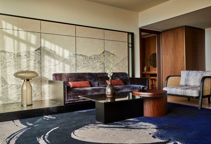
This Barcelona hotel by restaurant-turned-hospitality chain Nobu introduces elements of Japanese craft and design into the Catalan capital, with nods to traditional ink paintings, shoji screens and the gold-lacquer mending technique of kintsugi.

In the hotel’s moody suites, this is realised in the form of inky blue carpets and built-in millwork finished in saturated lacquer colours, while bathrooms feature traditional ofuro soaking tubs.

Find out more about Nobu Hotel Barcelona ›


Esme Hotel by Jessica Schuster Design
Photo by Christian Harder

Esme Hotel, USA, by Jessica Schuster Design

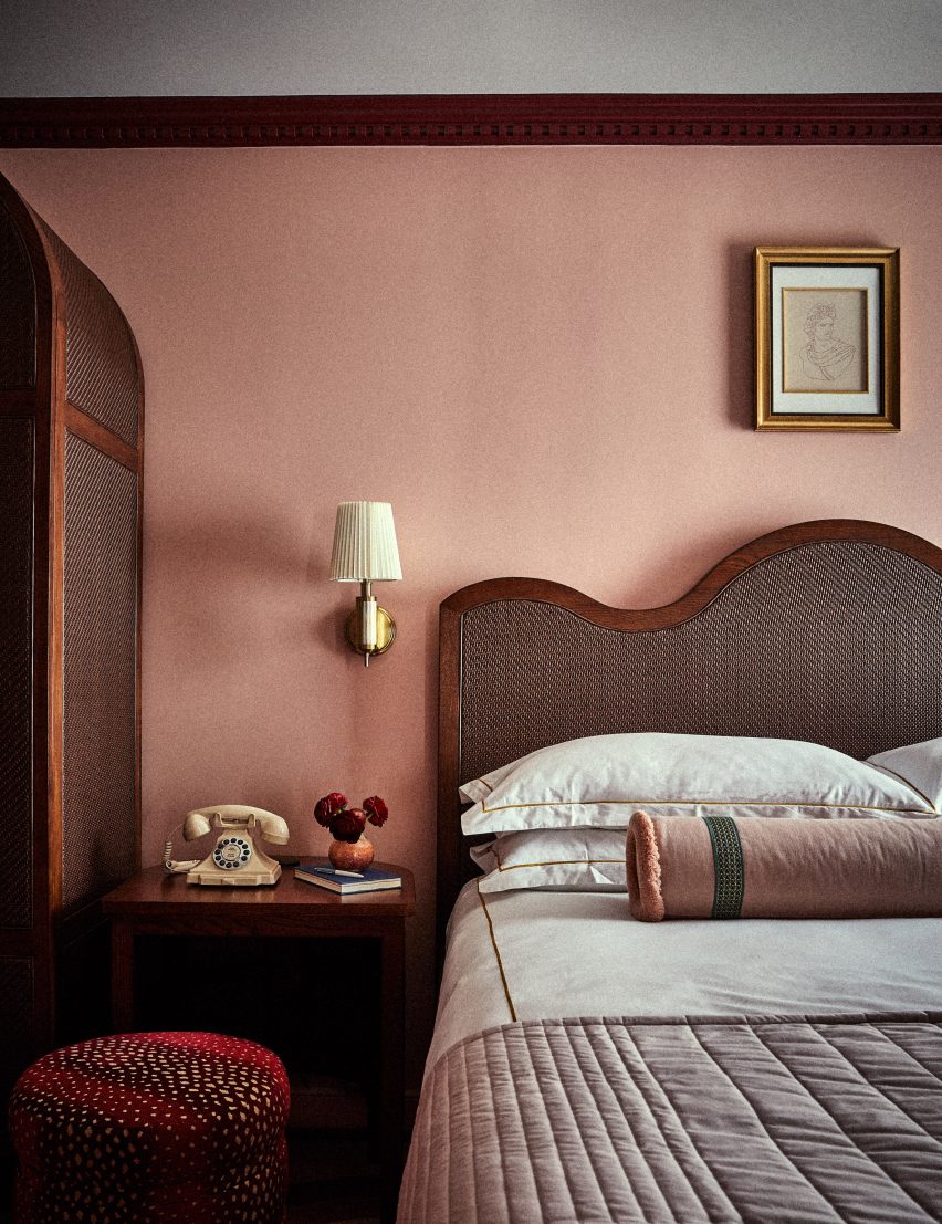
Interior designer Jessica Schuster worked with the Historic Preservation Board of Miami to revive the Mediterranean revival “grandeur” of this 1920s hotel in Miami, making liberal use of plaster and travertine. Pecky cypress, a type of cypress wood containing small holes, was used on the ceilings.

These are complemented by decadent furnishings, vibrantly clashing patterns and saturated colours, with bedrooms finished in either a rose quartz or emerald green colour scheme.

Find out more about Esme Hotel ›


Jewel toned guest room in Hotel Kinsley by Robert McKinley
Photo by Nicole Franzen

Hotel Kinsley, USA, by Studio Robert McKinley

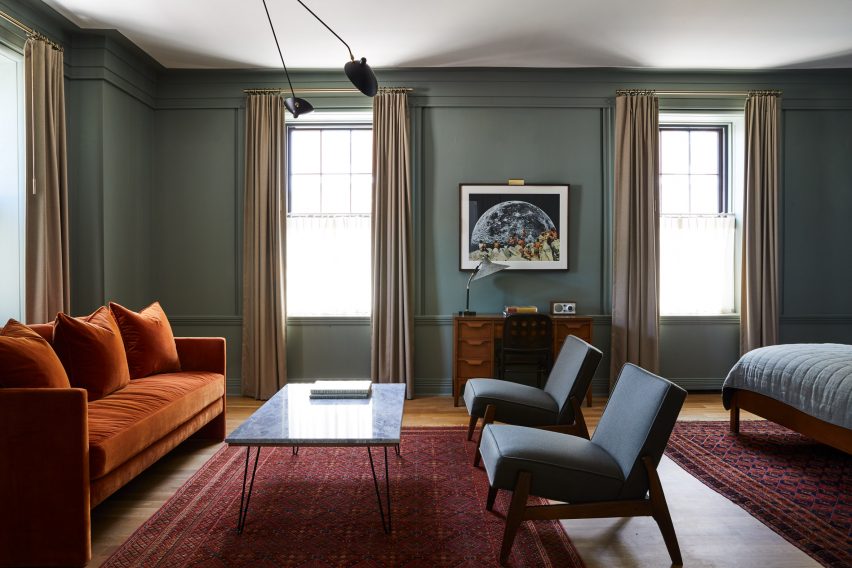
Interior designer Robert McKinley wanted to steer clear of the typical upstate New York aesthetic of “antlers or plaid” when designing Hotel Kinsley in the Hudson Valley.

Set over four historic buildings – including a former bank – the hotel instead draws on an unexpected material palette of boiled wool, intricate garnet-red Moroccan rugs and velvet upholstery in shades of mustard yellow and topaz.

Find out more about Hotel Kinsley ›


Jewel toned concierge counter at Maison De La Luz by Studio Shamshiri and Atelier Ace
Photo by Atelier Ace

Maison De La Luz, USA, by Atelier Ace and Studio Shamshiri

Housed inside the former annex to New Orleans’ town hall, this 67-room guest house offers a modern take on Southern hospitality by integrating furnishings and artworks that draw on the city’s uniquely multicultural heritage.

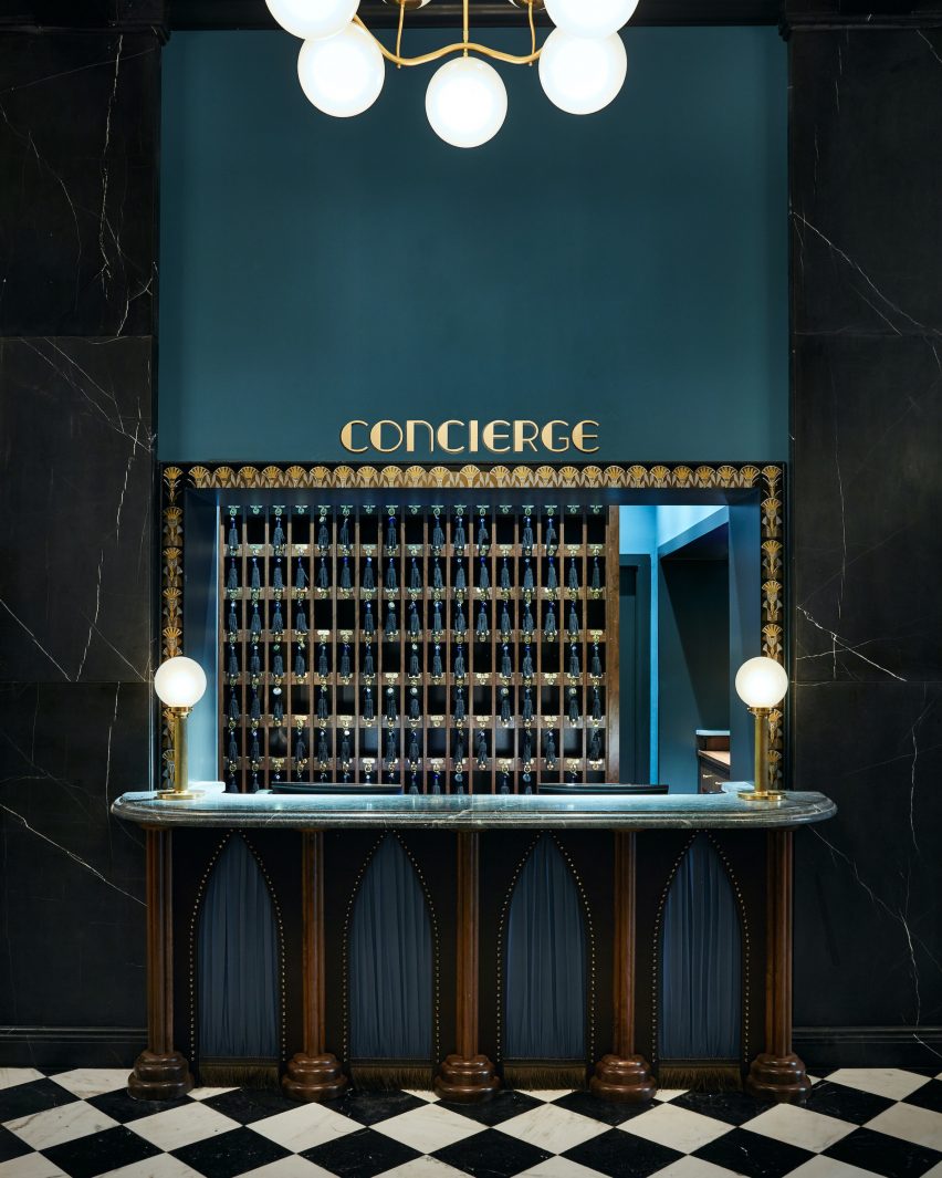
Among them are references to New Orleans as the home of America’s first pirate, alongside quirky details such as the sapphire-blue concierge desk, where guests can collect their tasselled keys.

Find out more about Maison De La Luz ›


Interiors of Chief members club in Chicago, designed by AvroKO

Chief Chicago, USA, by AvroKO

Down to the service ducts, every surface in the lobby of this Chicago members’ club is painted a rich shade of green, with matching tiles laid across the floor.

This serves to set the backdrop for a mix of eclectic furnishings and abstract artworks, which design firm AvroKO chose to provide an alternative interpretation of traditional old-world luxury.

“Saturated walls are intentionally bold, balanced by the warmth of plush upholstery and broken-in leather, creating approachability with an overall style that is fresh and enduring,” the studio said.

Find out more about Chief Chicago ›


Hotel Torni by Fyra
Photo by Riikka Kantinkoski

Hotel Torni, Finland, by Fyra

Originally built in 1931, Helsinki’s Hotel Torni once served as a meeting place for spies during world war two and was later favoured by artists, journalists and other cultural figures, including Finnish composer Jean Sibelius.

Now, local studio Fyra has renovated the building while preserving its “bohemian ambience”, sticking to a moody emerald-green colour palette and layering different styles of furniture, including modern pieces by Swedish designer Gustaf Westman alongside tubular steel seats that were typical of the time.

Find out more about Hotel Torni ›


A corner seating section at The Hoxton, Poblenou
Photo by Heiko Prigge

The Hoxton Poblenou, Spain, by Ennismore

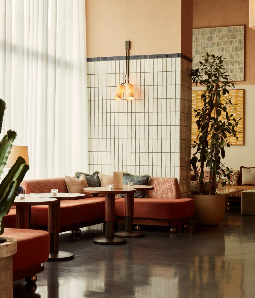
The Hoxton’s outpost in Barcelona proves that jewel tones can also work in sunnier climates, drawing on a slightly more muted palette of rust red, mustard yellow and aquamarine.

The scheme was informed by the distinctive colours and forms used by Spanish architect Ricardo Bofill, whose studio was located nearby.

Find out more about The Hoxton Poblenou ›

This is the latest in our lookbooks series, which provides visual inspiration from Dezeen’s archive. For more inspiration see previous lookbooks featuring 70s-style interiors, biophilic homes and innovative stone furniture.

Reference

Jaqui Seerman updates interiors of LA bank building to create Hotel Per La
CategoriesInterior Design

Jaqui Seerman updates interiors of LA bank building to create Hotel Per La

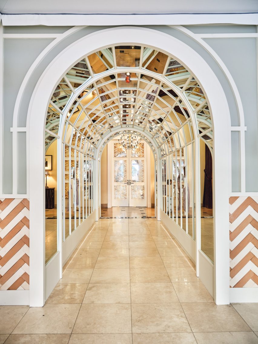
A new hotel occupies 1920s bank headquarters in Downtown LA, where Jaqui Seerman refreshed public spaces to include a botanical-themed lounge and a mirror-lined arched gallery.

Hotel Per La is housed in the neoclassical Giannini Building, built in 1922 as the headquarters for the Bank of Italy, and takes the place of the NoMad Los Angeles which closed its doors in March 2021.

Double-height lounge
Hotel Per La replaces the Nomad Los Angeles in the 1920s bank headquarters

Its 10,000 square feet (930 square metres) of public and event spaces have been refreshed by local interior designer Jaqui Seerman, who used the 12-storey property’s Italian connection to inform her updates.

“A nod to the building’s storied beginning as a bank for the people, the ‘Per La’ name translates to ‘for the’ in Italian,” said the hotel.

“[The bank’s] founder, Amadeo Pietro Giannini, believed in the dignity and abilities of those commonly overlooked, signifying the hotel’s inclusive spirit and name, essentially meaning ‘for Los Angeles, and people like you’.”

A mirror-lined arched gallery
A mirror-lined arched gallery opens into the main lobby

Demarcated by a pale blue awning, the hotel’s entrance has been relocated from 7th Street to Olive Street, leaving the doric columns across the grand facade fully visible.

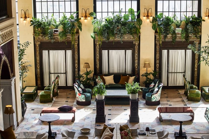
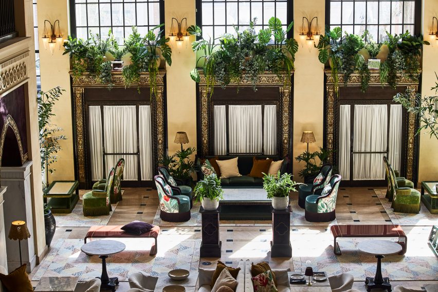
Through the doors, guests find themselves in a double-height lounge filled with plants and comfy chairs covered in botanical patterns.

Reception
The custom front desk is by Voila Creative Studio and the hand-painted tapestry behind is by Jessalyn Brooks

An arched gallery lined with mirrors leads to the lobby, situated in what was once the main banking hall.

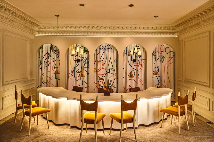
In the reception area, a custom-made curved plaster front desk influenced by linen fabric was designed by Voila Creative Studio, while a hand-painted tapestry that hangs in the niches behind was produced by LA muralist Jessalyn Brooks.

Purple games room
A purple games room features commissioned art and furniture from local artisans

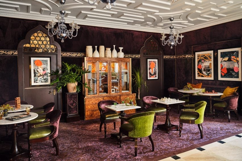
A rich purple lounge features a new game cabinet, as well as commissioned art and furniture sourced from local artisans.

Event spaces range from a second-floor courtyard for private outdoor dinners, to larger spaces for up to 850 people.

Dining table in outdoor courtyard
A second-floor courtyard hosts private outdoor dinners

Dining options within the hotel include Per L’Ora, which serves Italian cuisine and features a light colour palette across curvaceous design elements influenced by the early 2000s.

“The bar of the restaurant acts as a dramatic centerpiece, with a custom-made marble top in shades of green, grey, and white, and globe-shaped light fixtures, while custom white plasterwork on the front of the bar offers a new sense of texture,” said the hotel operators.

Adjacent to the restaurant is a casual cafe modelled on a Venetian coffee shop, serving beverages, pastries and snacks.

On the rooftop, Bar Clara offers cocktails for poolside lounging and hosts live performances with the LA skyline as a backdrop.

Guest room
Guest rooms are decorated to echo the ornate blue and gold ceiling in lobby

The 241 guest rooms and suites have retained much of the aesthetic created by French architect Jacques Garcia for the NoMad, referencing the restored gold and blue ceiling in the lobby.

Downtown LA, the city’s most walkable neighbourhood, has experienced a cultural renaissance over the past decade.

The hotel occupies the neoclassical Giannini Building
The hotel occupies the neoclassical Giannini Building in Downtown LA

The area is now home to several design-forward hotels including Kelly Wearstler’s Proper – which was just named hotel and short-stay interior of the year at the 2022 Dezeen Awards – a Soho House, and an Ace Hotel.

Per La is the latest hotel in the US to open in a converted bank building, following the likes of The Durham in North Carolina and The Quoin in Wilmington, Delaware.
The photography is by The Ingalls.


Reference

Thermory wood cladding forms backdrop to Grand Emily Hotel in Ukraine
CategoriesInterior Design

Thermory wood cladding forms backdrop to Grand Emily Hotel in Ukraine

Promotion: design agency YOD Group has designed the interior for the Grand Emily Hotel Lobby and Terra restaurant near Lviv, opting for Thermory’s rustic wood cladding throughout.

The hotel, which was completed this year despite Russia’s invasion of Ukraine, is located in the Ukrainian town of Vynnyky near Lviv. The hotel and restaurant form a part of the Emily Resort that YOD Group has designed with a natural, tactile aesthetic.

Hotel lobby of Emily Resort in Ukraine
YOD Group used Thermory products at the Emily Resort in Ukraine

Its aesthetic was achieved using a mix of natural and natural-looking materials, including material manufacturer Thermory‘s range of Drift cladding.

This saw YOD Group awarded the best interior project in the Thermory Design Awards Grand Prix competition, which was held by Thermory for its 25th anniversary.

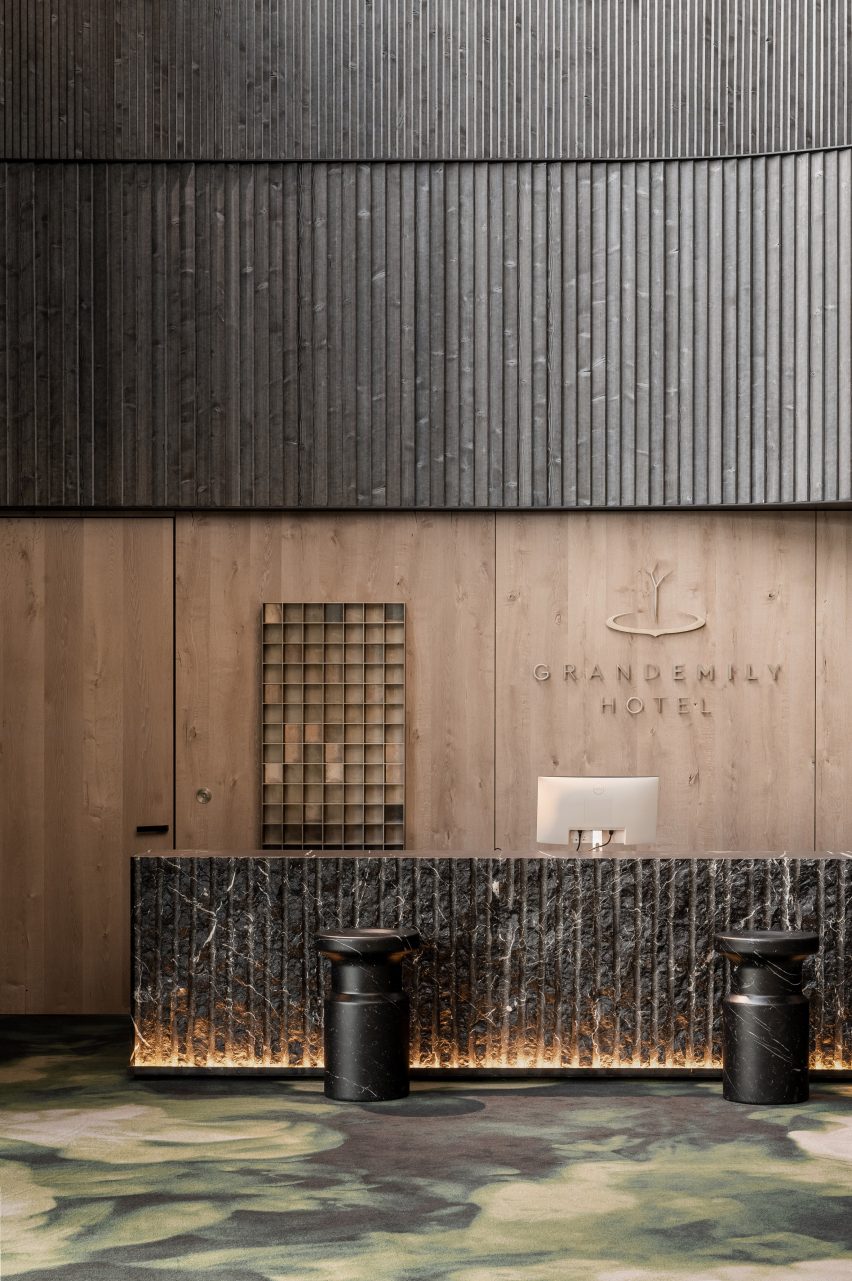
Thermory wood cladding above welcome desk
The agency created the interior for the Grand Emily Hotel Lobby

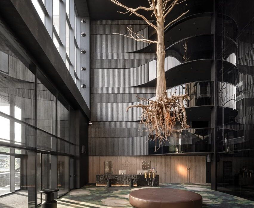
In the Grand Emily Hotel Lobby, the Thermory thermally modified Drift cladding is used across the walls.

It was selected for its worn, rustic appearance, which is intended to evoke reclaimed wood without sacrificing quality or durability.

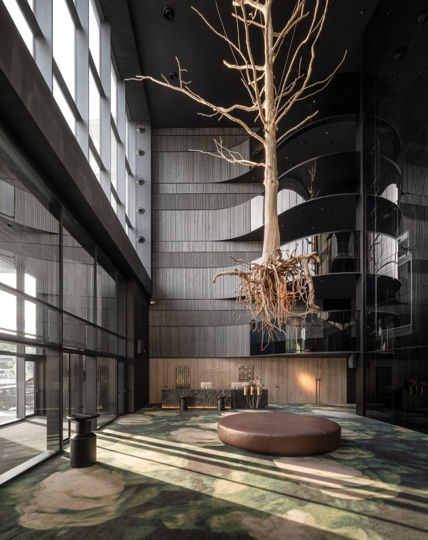
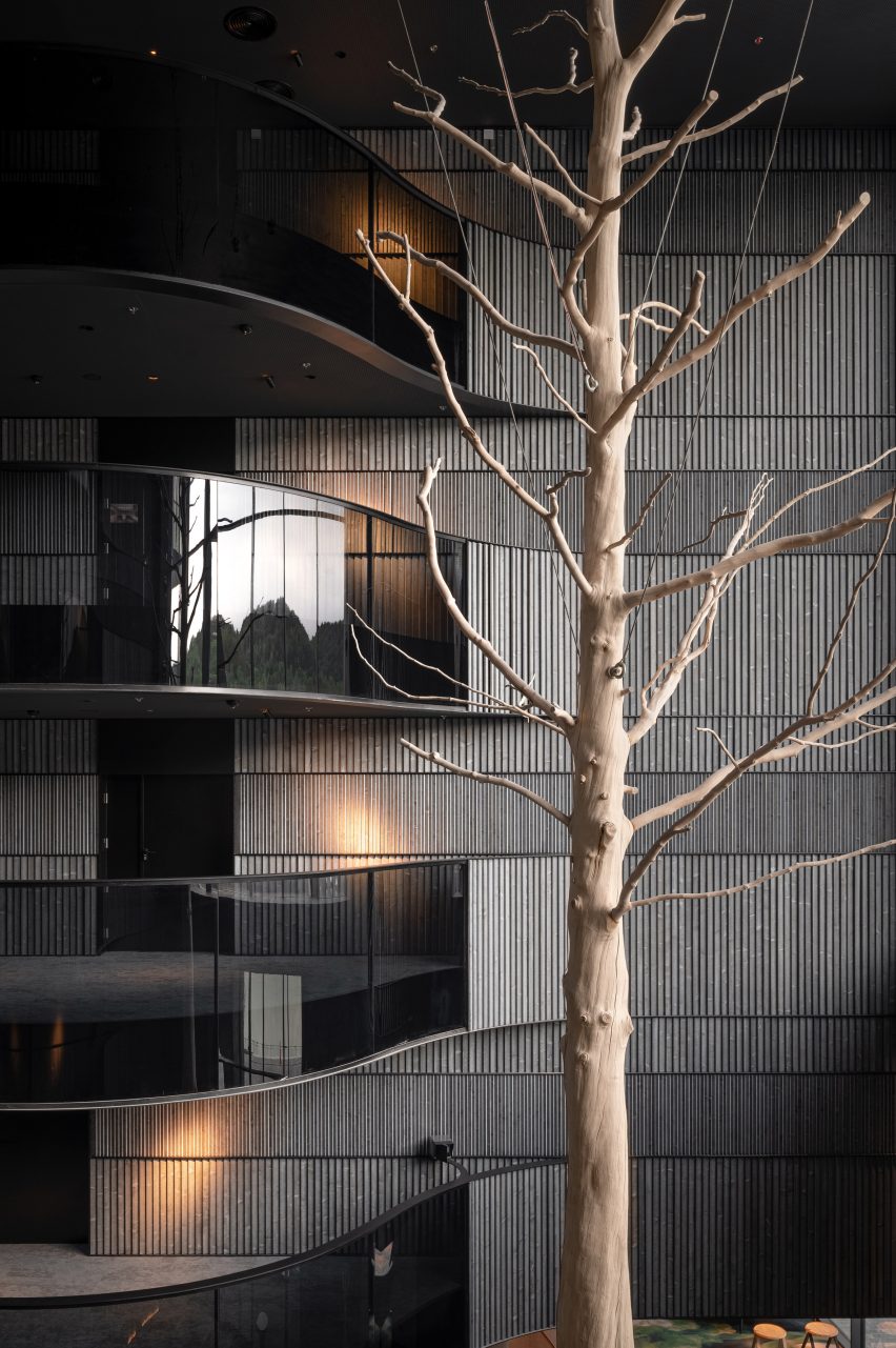
Tree suspended in Thermory wood-clad atrium
Thermory’s Drift cladding was used throughout

Selected in shades of Black Pearl and Smoked Brandy, the cladding provides the lobby with “touchable surfaces” that form a natural backdrop to the space.

“We aimed to get the visual lightness and tell the story about the morning breeze that passes on the lake surface and combs the reeds,” said YOD Group designer Volodymyr Nepiyvoda.

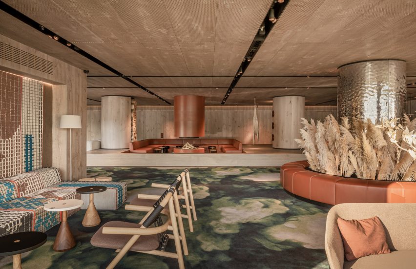
Interior of the Grand Emily Hotel Lobby in Ukraine
The wood gives the interiors a natural aesthetic

“We created this emotion by the structure of the boards that we used for the wall covering of the hall,” added Nepiyvoda.

The cladding also forms a suitable yet contrasting backdrop to a large sycamore tree that is suspended through the Grand Emily Hotel Lobby, forming its centrepiece.

Hammock in wood-lined Grand Emily Hotel Lobby
YOD Group’s aim was to give the hotel “touchable surfaces”

“We rejected the idea of a massive chandelier in the atrium in favour of a strongly meaningful installation,” explained Nepiyvoda.

“A tree means connection with roots and family values, growth, and development, strong bar, and flexible branches. It connects the earth and space.”

Terra restaurant interior by YOD Group
YOD Group also designed the resort’s Terra restaurant

Over in the Grand Emily Hotel’s Terra restaurant, Thermory Drift Cladding has also been used.

YOD Group used the material to help blur the boundary between the restaurant interior and a terrace outside that is lined with American sweet gum trees.

Terra restaurant terrace by YOD Group
The Thermory wood is also used in the adjoining terrace

According to Nepiyvoda, it is designed to encapsulate the landscape of western Ukraine.

“We reflect all of that in the interior of Terra restaurant,” they said. “Vast expanses, rich colours, textures and flavours, generous nature, lust for life, and existential joy.”

To find out more about Thermory products and how they are used, visit the brand’s website.

Partnership content

This article was written by Dezeen for Thermory as part of a partnership. Find out more about Dezeen partnership content here.

Reference

Z’scape adds grassy amphitheatre and wild garden to hotel in rural China
CategoriesArchitecture

Z’scape adds grassy amphitheatre and wild garden to hotel in rural China

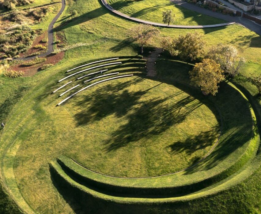
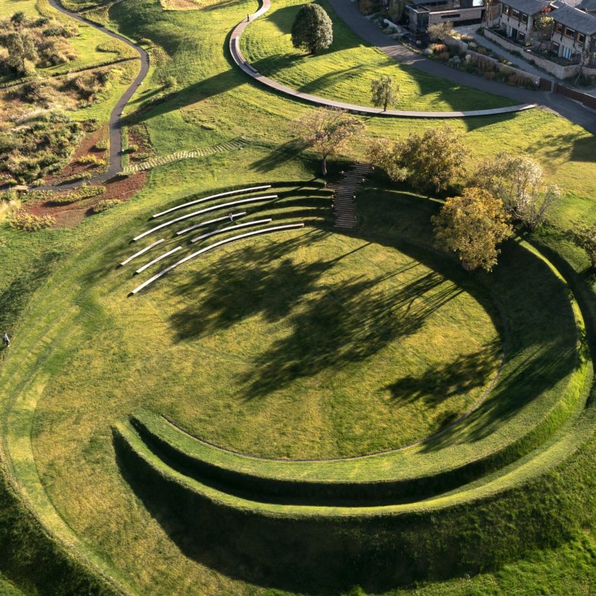
A winding wooden path leads to a natural amphitheatre created by rippling mounds of grass at this garden in Lijiang, China, which was designed by landscape studio Z’scape and has been shortlisted for the Dezeen Awards 2022.

Located at the Linjiang Hilla Vintage Hotel complex, the Wilderness Garden and Amphitheatre extends an existing landscape designed by the Beijing-based practice last year.

Path leading to grassy amphitheatre in Lijiang
Z’scape added a winding path and a natural amphitheatre to the site in Lijiang

The new additions have been shortlisted in the landscape project category of Dezeen Awards 2022.

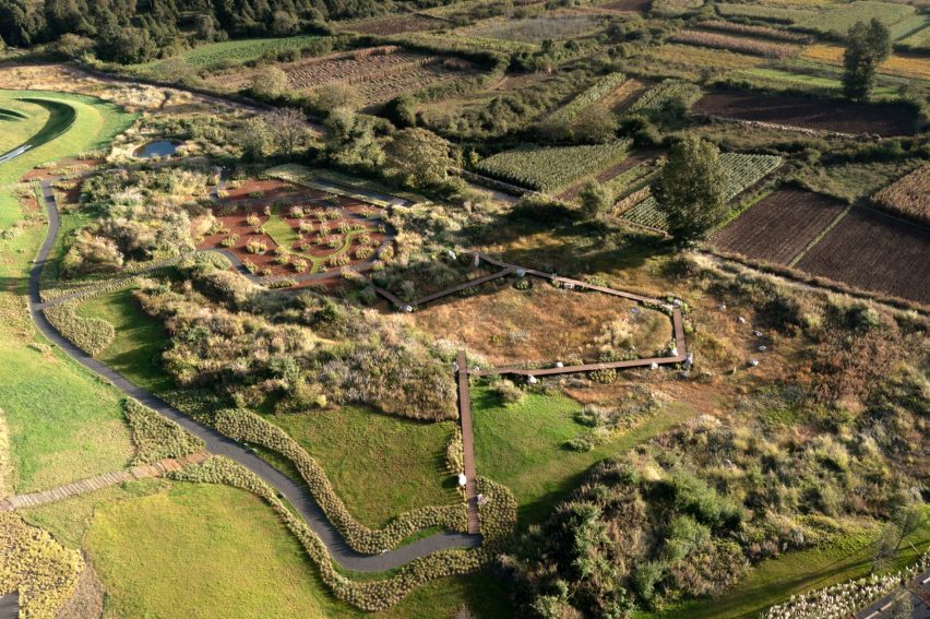
For the new area of wild grassland, Z’scape worked with a botanist and local villages to find native plant varieties that would naturally thrive without needing any maintenance or irrigation, introducing greater biodiversity to the site.

Amphitheatre and wild garden in China by Z'scape
A raised boardwalk allows animals and insects to move freely around the landscape

A wooden boardwalk, raised 60 centimetres to allow animals and insects to move underneath, cuts through this wild garden, with an elevated platform providing a lookout.

Areas of open grass, large rocks and two small wildlife ponds are interspersed throughout the garden and were also designed to help minimise the risk of wildfires spreading.

Benches in grassy amphitheatre by Z'scape in China
The amphitheatre is formed by mounds of grass in a sunken region of the site

“Providing a critical habitat that offers rich nutritional value and shelter, Wilderness Garden is a haven for wildlife,” said the practice.

“To strike a compelling dialogue, a zigzag boardwalk weaves its way through the grassland to give visitors an extraordinary experience with dramatic and intimate overlooks,” it continued.

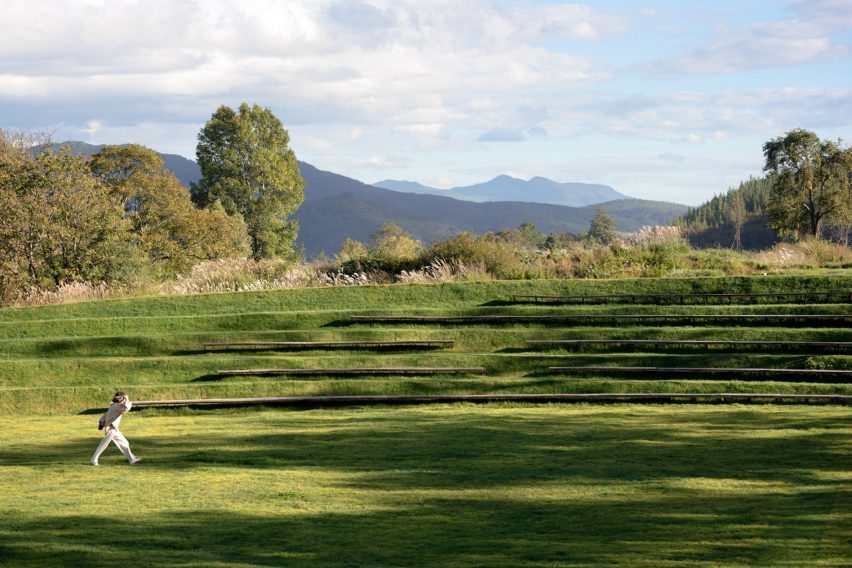
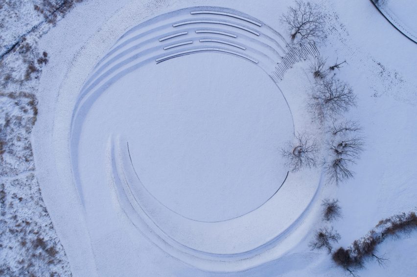
The wooden boardwalk leads to the new amphitheatre at the north of the site, making use of an existing sunken area in the landscape’s topography and defining it with concentric ridges that overlook a central performance lawn.

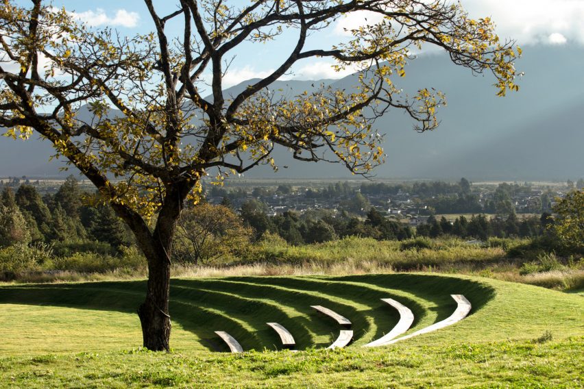
Recycled timber has been used to create simple benches that follow the contours of the amphitheatre’s ridges and are dotted with works by local sculptors.

As well as a space to watch performances, the amphitheatre looks out across a dramatic landscape, including the UNESCO heritage site of Baisha and Jade Dragon Snow Mountain.

Amphitheatre by Z'scape in Chinese landscape with views of mountains
Long benches in the amphitheatre offer spaces for children to play

“Natural play opportunities are embedded in the landform, where children can run, climb, jump, dance or roll,” said the practice.

“A series of long benches offer historic views to the snow mountain and the best views of the central performance lawn,” it continued.

Aerial view of amphitheatre by Z'scape with curved benches covered with snow
Long recycled timber benches wrap around the circular feature

The original landscape design incorporated the remains of an abandoned village built by the Naxi people, and every year a traditional torch festival creates an “immersive and interactive environment” for celebrating Naxi culture and craft.

Z’scape was founded by Zhou Liangjun and Zhou Ting, and has a particular focus on landscaping projects for cultural tourism projects, boutique hotels, urban spaces and residential developments.

Other projects that join the Wilderness Garden and Amphitheatre on the landscape project shortlist of Dezeen awards 2022 include a rural farm in Iran co-designed with local communities, and Heatherwick Studio’s Little Island in Manhattan.

The photography is by Holi Landscape Photography.

Reference

Jan Hendzel uses “special” London timbers to overhaul Town Hall Hotel
CategoriesInterior Design

Jan Hendzel uses “special” London timbers to overhaul Town Hall Hotel

Reclaimed architectural timber and wood from a felled street tree form the furnishings of two hotel suites that designer Jan Hendzel has revamped for London’s Town Hall Hotel in time for London Design Festival.

Suites 109 and 111 are set on the first floor of the Town Hall Hotel, which is housed in a converted Grade II-listed town hall in Bethnal Green dating back to 1910.

Each of the apartment-style suites features a living room with a kitchen alongside a bedroom and en-suite, which Hendzel has outfitted with bespoke furnishings. Like all of the furniture maker’s pieces, these are crafted exclusively from British timbers.

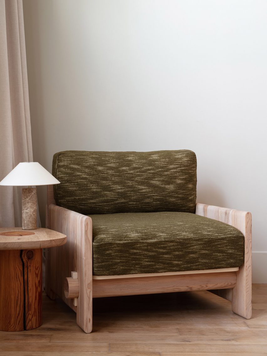
Green-upholsterd armchair by Jan Hendzel
Jan Hendzel has overhauled suites 109 (top) and 111 (above) of the Town Hall Hotel

But for his first interiors project, Hendzel took an even more hyper-local approach with the aim of finding all of the necessary products inside the M25 – the motorway that encircles the British capital.

“We started out with the idea that we could source everything within London,” he told Dezeen during a tour of the suites.

“Some timbers have come from Denmark Hill, some are reclaimed from Shoreditch. And we used Pickleson Paint, which is a company just around the corner, literally two minutes from here.”

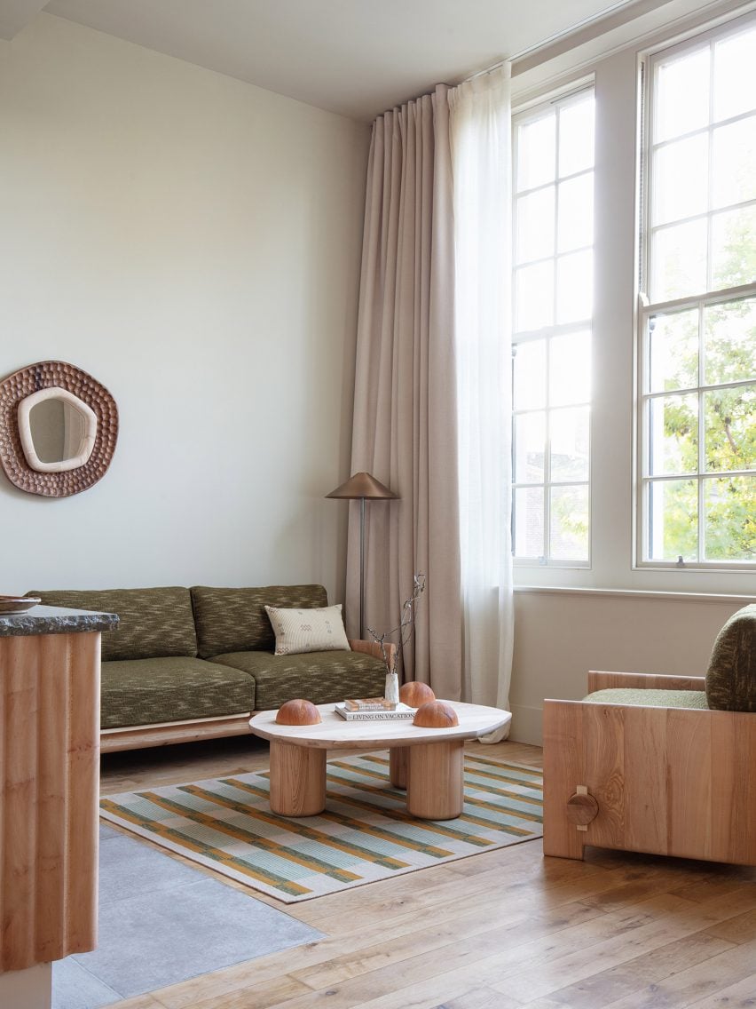
Living area of suite 111 in Town Hall Hotel
The living area of suite 111 features green upholstery by Yarn Collective

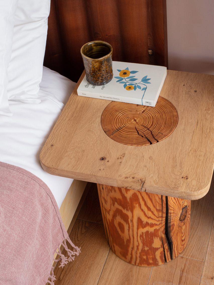
The reclaimed timber came in the form of pinewood roof joists and columns, which Hendzel found at an architectural salvage yard.

These had to be scanned with a metal detector to remove any nails or screws so they could be machined into side tables and tactile wire-brushed domes used to decorate the suites’ coffee tables.

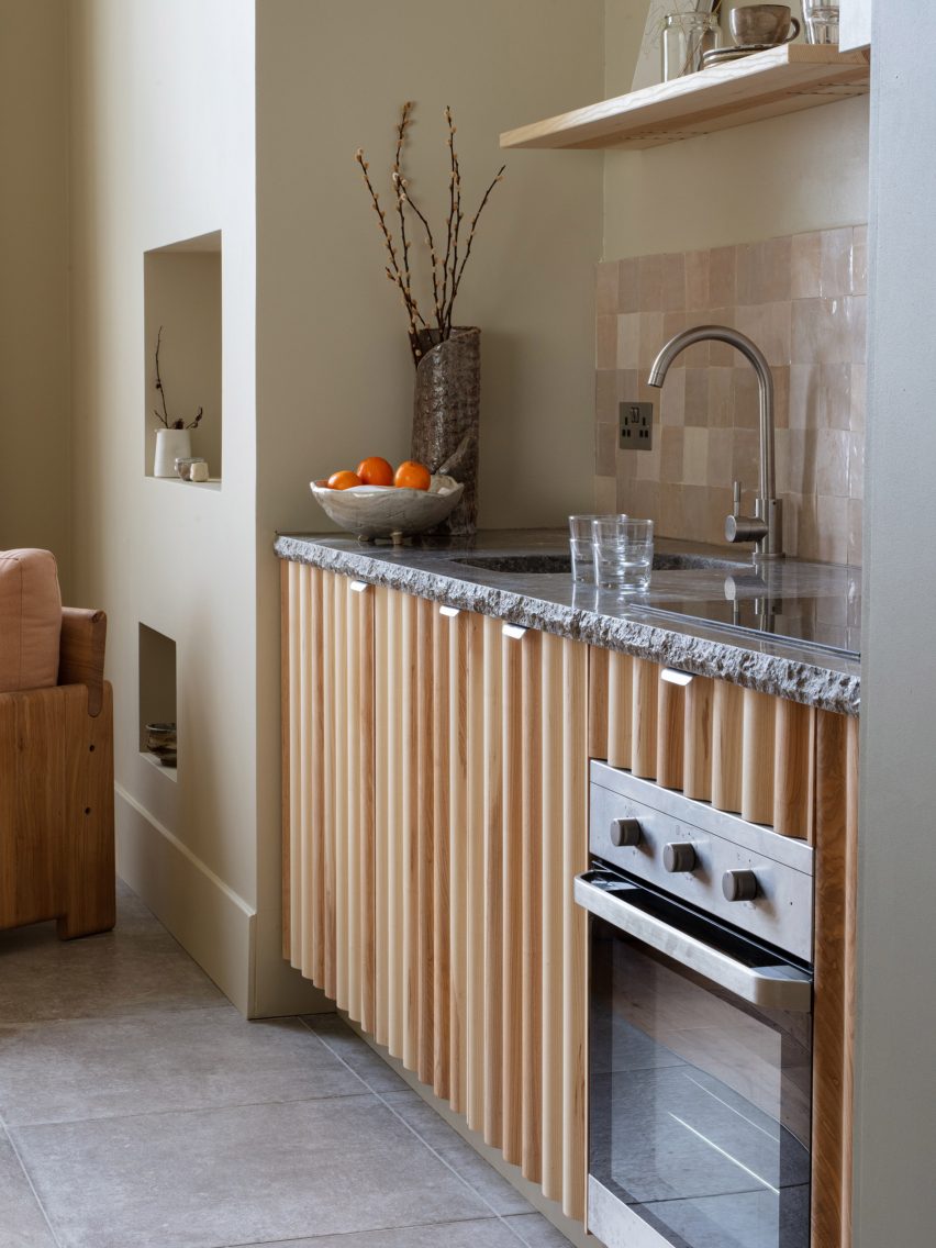
Kitchen with rippled wooden cupboards
Rippled wooden fronts finish the kitchen in both suites

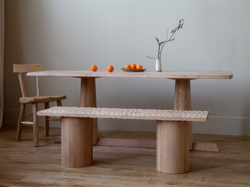
In Suite 111, both the dining table and the rippled kitchen fronts are made from one of the many plane trees that line the capital’s streets, giving them the nickname London plane.

“This London plane is super special because it has come from a tree that was taken up outside Denmark Hill train station in Camberwell,” Hendzel explained. “We couldn’t find timber from Bethnal Green but it’s the closest we could get.”

Dining table set up with rippled bench by Jan Hendzel
The dining table in suite 111 is made from London plane

For other pieces, materials had to be sourced from further afield – although all are either made in the UK or by UK-based brands.

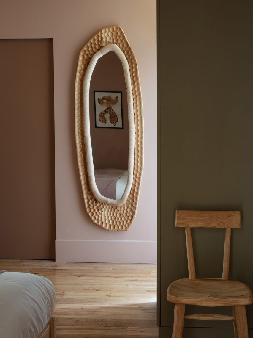
Hendzel used British ash and elm to craft mirrors and benches with intricate hand-carved grooves for the suites, while the patterned rugs in the living areas come from West London studio A Rum Fellow via Nepal.

“People in the UK don’t make rugs, so you have to go further afield,” Hendzel said. “Same with the upholstery fabrics. You could get them here but if they are quadruple your budget, it’s inaccessible.”

Hendzel’s aim for the interior scheme was to create a calm, pared-back version of a hotel room, stripping away all of the “extra stuff” and instead creating interest through rich textural contrasts.

This is especially evident in the bespoke furniture pieces, which will now become part of his studio’s permanent collection.

Among them is the Wharf coffee table with its reclaimed wooden domes, worked with a wire brush to expose the intricate graining of the old-growth timber and offset against a naturally rippled tabletop.

“It’s a genetic defect of the timber, but it makes it extra special and catches your eye,” Hendzel said.

Rippled mirror in Town Hall Hotel suites hotel room by Jan Hendzel
Grooves were hand-carved into the surfaces of mirrors and benches featured throughout the suites

The coffee table, much like the nearby Peng dining chair, is finished with faceted knife-drawn edges reminiscent of traditional stone carving techniques. But while the table has a matt finish, the chair is finished with beeswax so its facets will reflect the light.

Unexpected details such as loose-tongue joints, typically used to make tables, distinguish the Mowlavi sofa and armchair, while circular dowels draw attention to the wedge joint holding together their frames.

Chunky wooden side table in Town Hall Hotel suite 109
Reclaimed architectural timber was used to bedside tables in room 109

Alongside the bespoke pieces, Hendzel incorporated existing furniture pieces such as the dresser from his Bowater collection, presented at LDF in 2020. Its distinctive undulating exterior was also translated into headboards for the bedrooms and cabinet fronts for the kitchens.

These are paired with crinoid marble worktops from the Mandale quarry in Derby, with roughly-hewn edges offset against a perfectly smooth surface that reveals the fossils calcified within.

“It’s a kajillion years old and it’s got all these creatures from many moons ago that have fallen into the mud and died,” Hendzel said. “But then, when they get polished up, they look kind of like Ren and Stimpy.”

Bed with rippled wooden headboard in by Jan Hendzel at LDF
A rippled headboard features in both suites

Going forwards, the Town Hall Hotel plans to recruit other local designers to overhaul its remaining 94 rooms.

Other installations on show as part of LDF this year include a collection of rotating public seating made from blocks of granite by designer Sabine Marcelis and an exhibition featuring “sympathetic repairs” of sentimental objects as the V&A museum.

The photography is by Fergus Coyle.

London Design Festival 2022 takes place from 17-25 September 2022. See our London Design Festival 2022 guide on Dezeen Events Guide for information about the many other exhibitions, installations and talks taking place throughout the week.

Reference

The Peak – Boutique Hotel // studio symbiosis
CategoriesSustainable News

The Peak – Boutique Hotel // studio symbiosis

Text description provided by the architects.

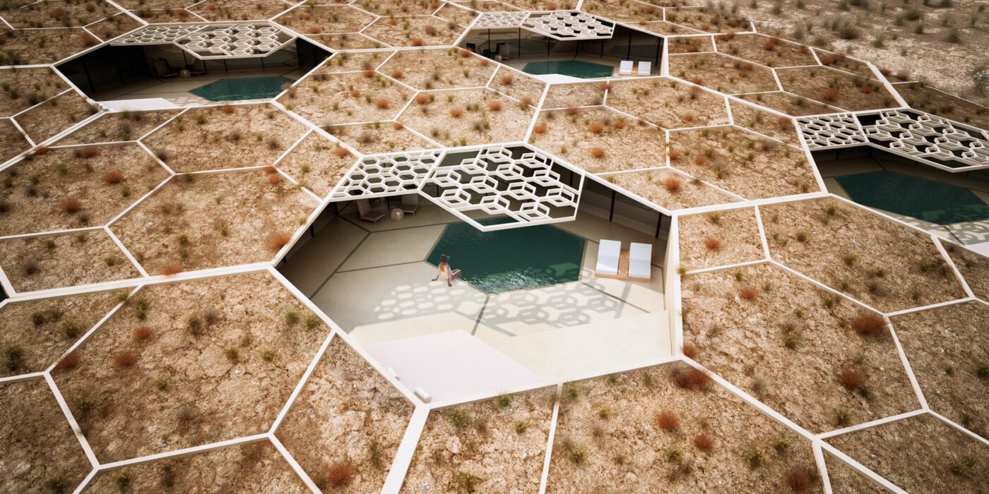
The Peak Resort and Spa, is located in the untouched serene landscape of Udaipur, Rajasthan, the desert kingdom of India. Designed as a destination to unwind and rejuvenate the property hosts, 8 pool villas, event space, Restaurant, Spa, Gym, star gazing platform and an outdoor pool.Cocoon villas nested in natureThe design concept amalgamates the untouched beauty of nature that engulfs the site, along with regional architecture of Rajasthan.

© studio symbiosis

© studio symbiosis

The idea of built and landscape is seen as an amalgamation in the design. The original contours of the site have been used as an interface to create architecture. Each villa is nested as a cocoon space in the landscape. These cocoon villas have been designed by excavating earth, to create minimum disruption to the natural beauty of the site.

© studio symbiosis

© studio symbiosis

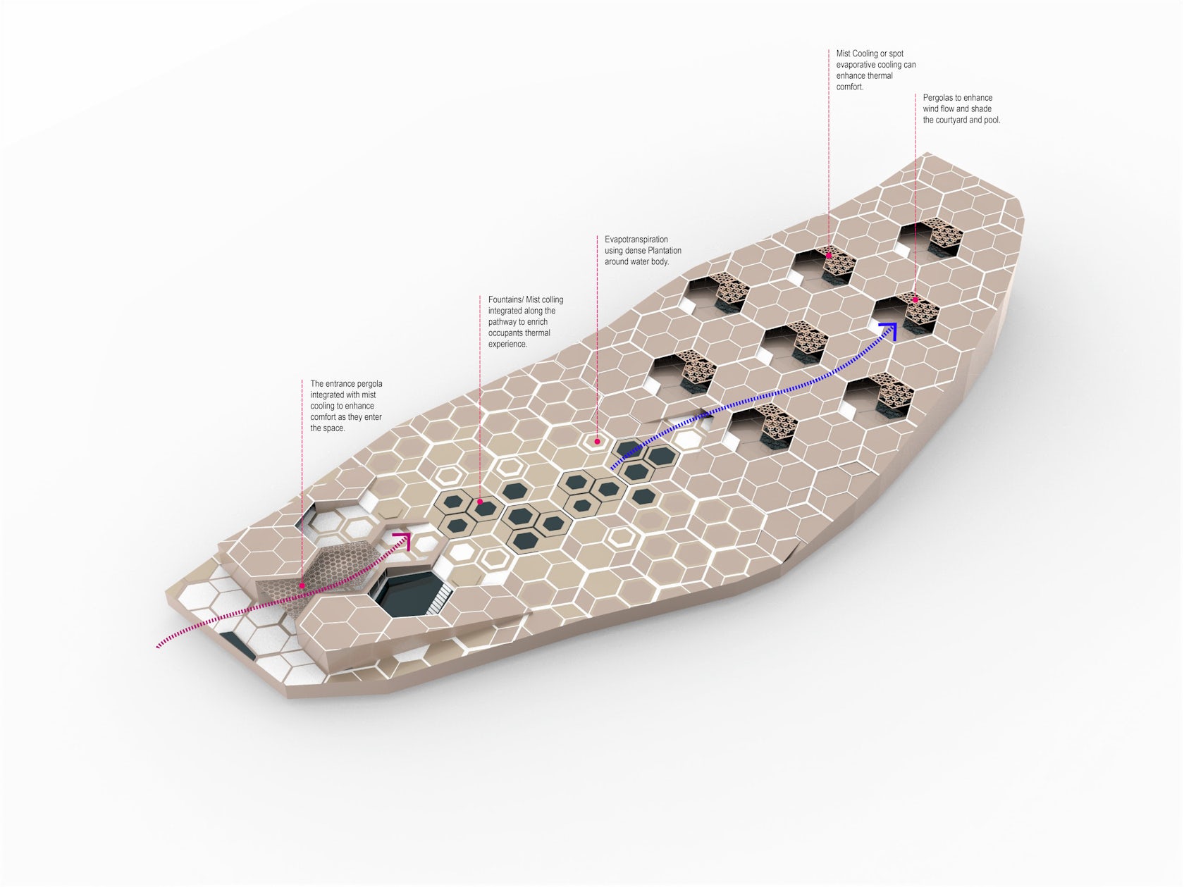
Local patterns were studied from the architecture of Rajasthan, and a “Hexagonal” pattern that is a common denominator in nature as well as the regional architecture has been used as a unifying element for the design. This hexagonal base pattern has been grafted on the site to create a system driven approach to design the landscape, entrance buildings, scooping of the villas, water bodies, etc.

© studio symbiosis

© studio symbiosis

to create a sense of harmony and symbiosis in the design.Design EvolutionHalf of the site terrain is almost flat and then it slopes drastically from the south towards the north. The dominant views from the site are mountains towards the south. This natural terrain of the site has been used as a design driver.

© studio symbiosis

© studio symbiosis

The flat part of the site that is adjacent to the approach road has been used for Drop-off, Reception, All day dining, and Spa and then further on an open event space. The design idea was to create a form nested in nature. The sloping part of the site has been used as an opportunity to excavate earth and nest villas within the topography.

© studio symbiosis

© studio symbiosis

This helps us in capturing the beautiful views of the south facing mountains. The natural topography of the site creates a height difference between the various villas, thereby giving them all complete privacy.Window to LandscapeArchitecture of Rajasthan boasts of intricate carving and Jharokha’s (Semi covered balconies with perorated windows all around).

© studio symbiosis

© studio symbiosis

The concept of a Jharokha has been translated in the design as the villas are scooped out from the terrain to create these “Jharokha’s” with outdoor pool, star gazing deck and sit-out space. Each villa is conceptually a window (Jharokha) to experience nature. Resource ConservationVillas have been nested in landscape, by excavating the earth of the site.

© studio symbiosis

© studio symbiosis

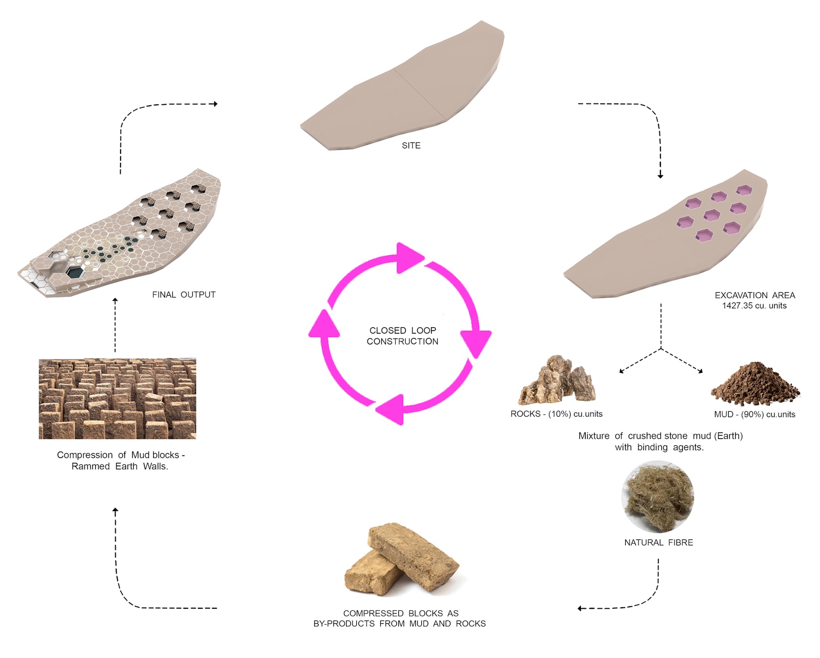
This excavation of 1427 cubic units gave us 142.7 cubic units of rocks and 90% is mud. As a part of the design process, we are using the excavated earth and rocks, by mixing natural fibres in them to strengthen and create compressed mud blocks. The retaining walls around the villas are being constructed from these mud blocks, where the raw material is coming from the site itself.

© studio symbiosis

© studio symbiosis

It’s an idea of a closed loop civil construction, where we take from mother earth and put it back on the site in a new form, in this case we take mud and rocks and graft back rammed earth walls. Rest of the materials are being locally sourced within 5 kms of the project site.

© studio symbiosis

© studio symbiosis

Given that Rajasthan is the stone hub of India, locally available stone has been used for the outdoor landscape as well as indoor finishes.Villas & earth breamingThe villas are designed for “leisure travellers” as well as for “work from destination”. The design brief looks at creating a home away from home with villas cocooned in nature.

© studio symbiosis

© studio symbiosis

Each villa is 140 sqm indoor and 130 sqm outdoor area. The villas are equipped with the outlook of a long stay traveller, with a master bedroom, living, dining, pantry, outdoor pool, star gazing platform and an outdoor deck.
Using regional patterns, a stone carved pergola has been designed for shading the outdoor decks of the villas.

© studio symbiosis

© studio symbiosis

This helps in shading from the direct sunlight and creates playful patterns of light and shadow on the deck. The villas are nested within earth, to create a heat sink and keep the villas naturally cooled in the scorching dessert heat during daytime, and keeps the villas warm during the night in the winters.

© studio symbiosis

© studio symbiosis

Since each villa is surrounded by earth, the heat gain and heat dissipation happens at a controlled rate. The outdoor terraces and the depth of the villa has been designed to ensure ample light inside the villa, without exposing the surface area of the built to the sun directly. Outdoor space and Shallow water bodiesThe wind direction on the site is from South which is the entrance of the site and travels along the depth of the site up towards north.

© studio symbiosis

© studio symbiosis

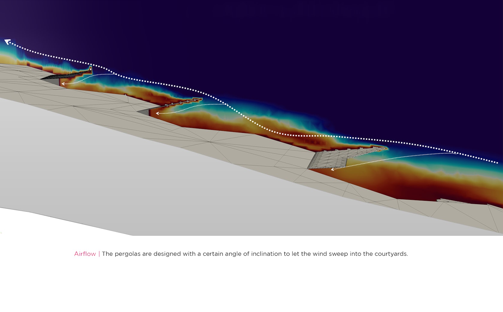
This wind movement has been channelized by creating two building flanking either side of the entrance that create a wind tunnel effect and compress and accelerates the wind. Further shallow water bodies have been designed along the path of the wind which cools it down. Given the villas are scooped out of an inclined surface, the wind coming in contact with the water bodies is cooled down and travels seamlessly along the sloped site and creates a cool breeze reaching the villas which is further pushed in the villas with the help of a pergola.
Using cfd, the inclination of the pergolas has been optimized, to direct the wind inside the villas.

© studio symbiosis

© studio symbiosis

Porosity of the pergola has been calculated to retain the wind pressure. The central plaza has been designed as a multifunctional space. This can have regional folk dance, puppet shows (regional to Rajasthan), breakout space for high tea, archery, pool deck, as well as event space.Sustainability Sustainable design solutions have been integrated in the design in various stages of design and construction.

The temperature in this region of Rajasthan can go up to 45-47 degrees. Design strategies have been introduced to reduce the cooling loads in the building and create a sustainable resort.
Natural topography of the site has been used to nest the villas by using earth berming to cool the villas and the outdoor spaces are shaded with pergolas to reduce direct heat from the sun.

The wind blowing on the site from the south has been accelerated by creating a wind tunnel by flanking buildings on either side of the entrance. This accelerated wind passes over shallow water bodies designed in the central plaza, thereby cooling the wind. The cooled wind moves up the inclination of the site and is pushed in the villas using pergolas, optimized by cfd.

Excavated earth from the site is transformed into mud blocks being used as retaining walls of the villas, with rest of the construction materials sourced from within 5 kms of the site.This project is driven by design moves to create a model of sustainable design in scorching heat of Rajasthan..

Reference