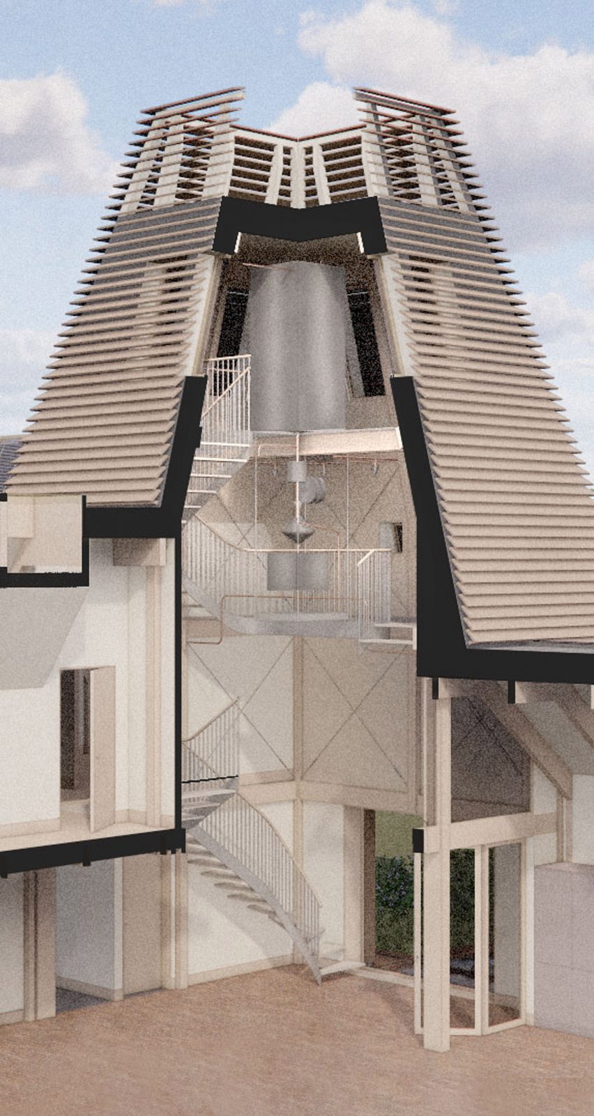
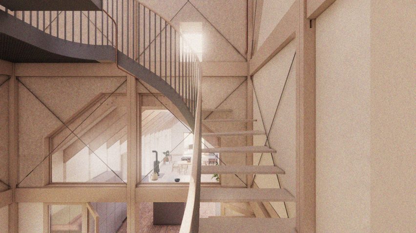
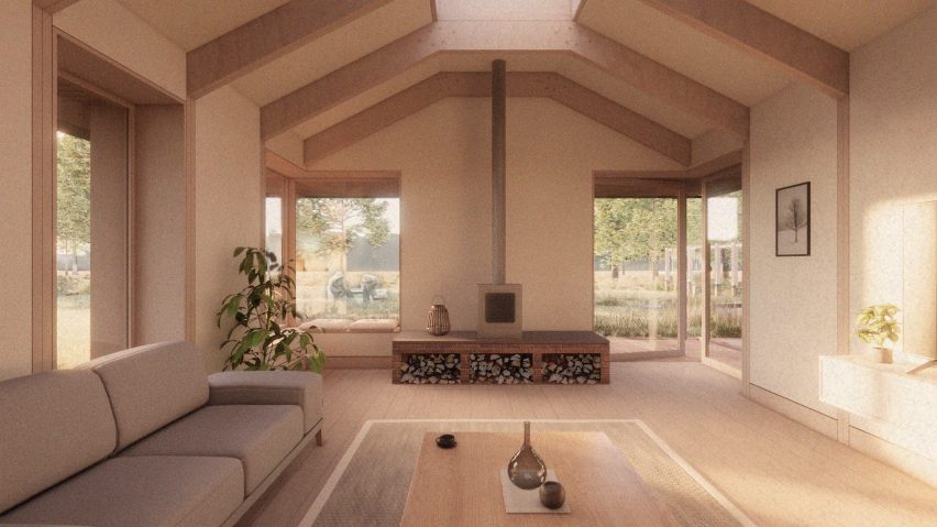
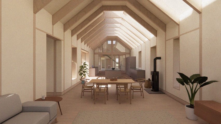
MNY Arkitekter completes “down-to-earth” house for two sisters in Finland
CategoriesArchitecture

MNY Arkitekter completes “down-to-earth” house for two sisters in Finland

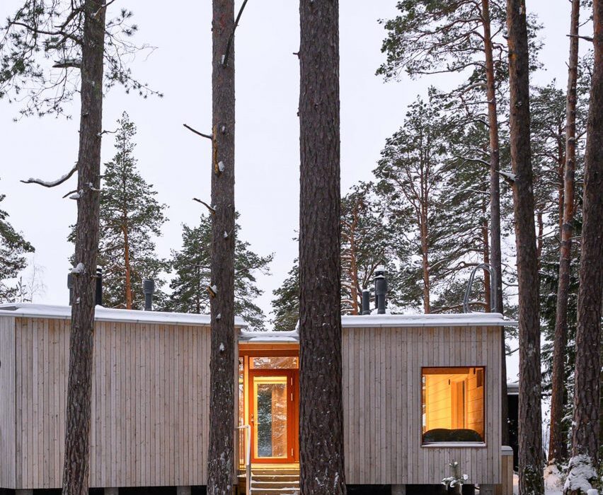
Finnish studio MNY Arkitekter has completed Two Sisters, a timber holiday home in Salo that is designed to allow two siblings to live “together separately”.

To create a dedicated space for each of the two sisters, MNY Arkitekter divided the home into two standalone units joined by a central terrace overlooking the surrounding rocks and pine trees on Finland’s west coast.
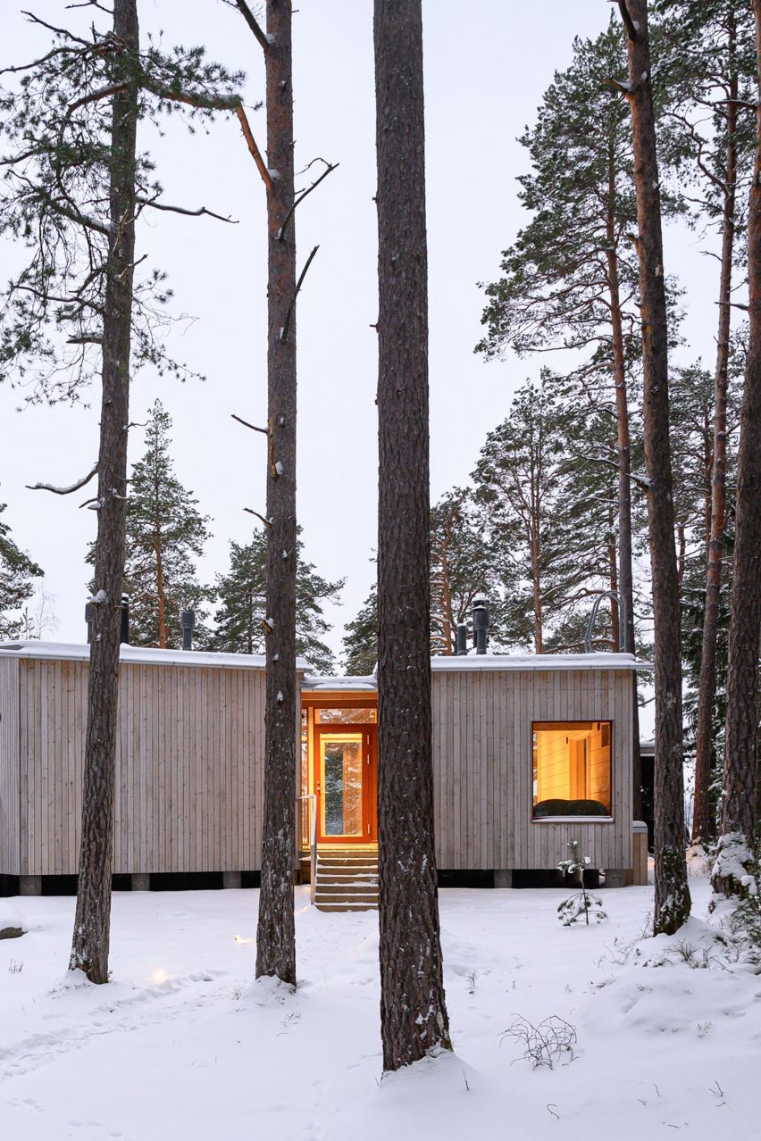
Timber exterior of Two Sisters holiday home in FinlandTimber exterior of Two Sisters holiday home in Finland
The two units are joined by a central terrace

“In many ways the site is one of typical Finnish inner archipelago terrain and vegetation, and one of the main goals was to preserve as many trees and visible rocks as possible,” MNY Arkitekter founder Mathias Nyström told Dezeen.

“Equality of the views from the two units was also important and had a significant impact on the layout.”
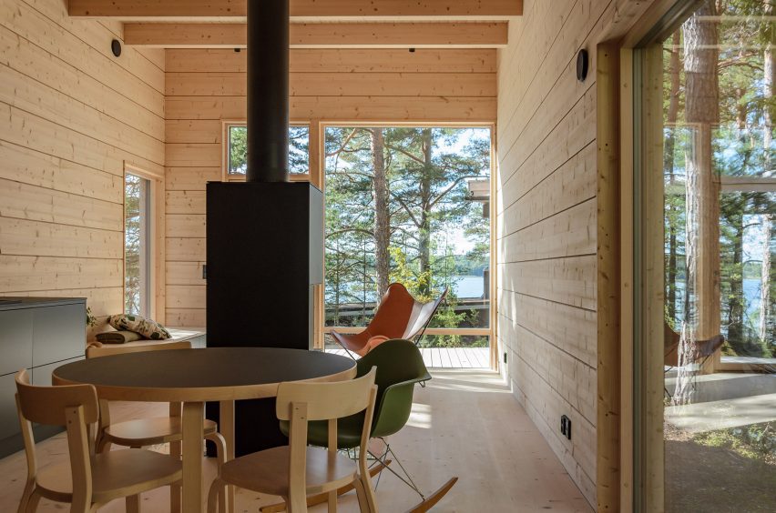
Living area within Two Sisters in FinlandLiving area within Two Sisters in Finland
Each unit has large windows. Photo by Mathias Nyström

The home’s two units “fan out” to provide privacy and avoid the surrounding trees, while making space for an existing sauna, utility room and overnight shelter on the site.

Each block features large windows at its western end, looking towards the sea and pine trees to the west. Openings facing the central terrace have been placed to minimise overlooking.
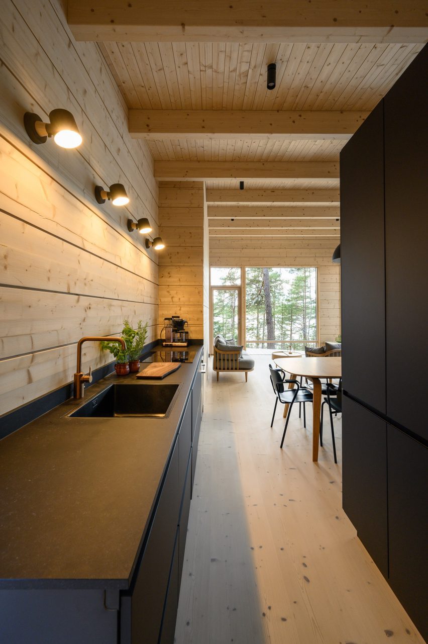
Kitchen interior of holiday home by MNY ArkitekterKitchen interior of holiday home by MNY Arkitekter
Black kitchen counters feature in each living space

“Being in one of the units you can only see the other from certain points, otherwise you mostly sense the existence of the other part,” said Nyström.

“You are on your own, but feel part of a bigger entity,” he added.

Each living space at Two Sisters has been finished with black kitchen counters, a dining table and a large freestanding fireplace. Built-in bench seating provides space to sit and look out over the landscape.

In the northern block, a bed is housed in a small nook off this living space backed by a full-height window, while to the south the slightly larger unit provides a double bedroom and two single bedrooms alongside the living space.
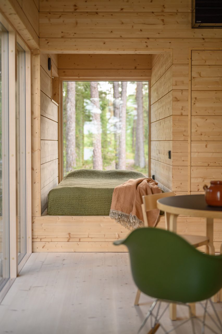
Bedroom interior within timber holiday home in Finland by MNY ArkitekterBedroom interior within timber holiday home in Finland by MNY Arkitekter
A small bed is backed by a full-height window in the larger unit

Two Sisters has a prefabricated structure of glue-laminated timber, finished externally with vertical planks of spruce. Internally, pale timber walls, floors and ceilings are treated with lye.

“The aim for the atmosphere was to create a uniform, serene space where nature plays a big part – the end result is very uplifting,” said Nyström.

“The weathered silver-grey wood will fuse the building in the landscape with rocks and pines. All in all it is a down to earth and subtle building,” he added.
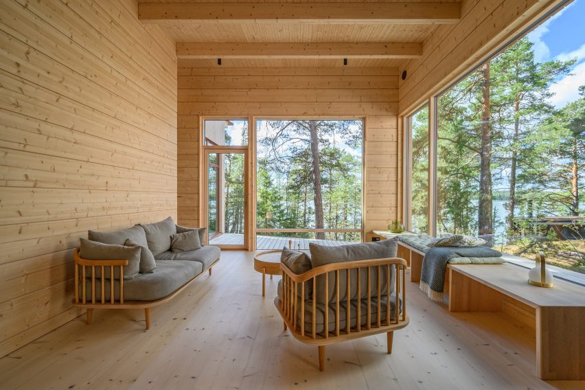
Living space interior within Two Sisters holiday homeLiving space interior within Two Sisters holiday home
The home is constructed from glued-laminated timber

Elsewhere in Finland, MNY Arkitekter created a home on the shoreline of a small lake in Tenala using seven different varieties of timber.

Other recent projects in the country include a sauna and restaurant on the edge of Lake Saimaa by Studio Puisto and the steel-clad Dance House by JKMM and ILO architects in Helsinki.

The photography is by Multifoto Ab unless otherwise stated.

Reference

christian kerez’s house okamura unfolds as circular brick columns in czechia
CategoriesArchitecture

christian kerez’s house okamura unfolds as circular brick columns in czechia

insnde the all-brick house okamura by christian kerez in prague


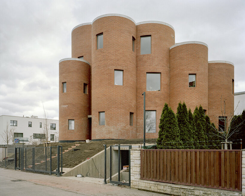
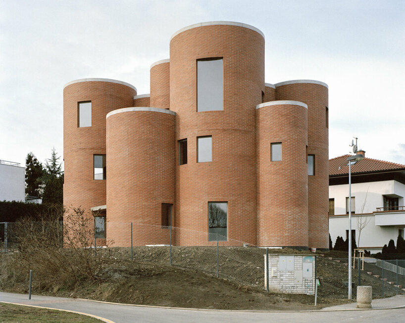
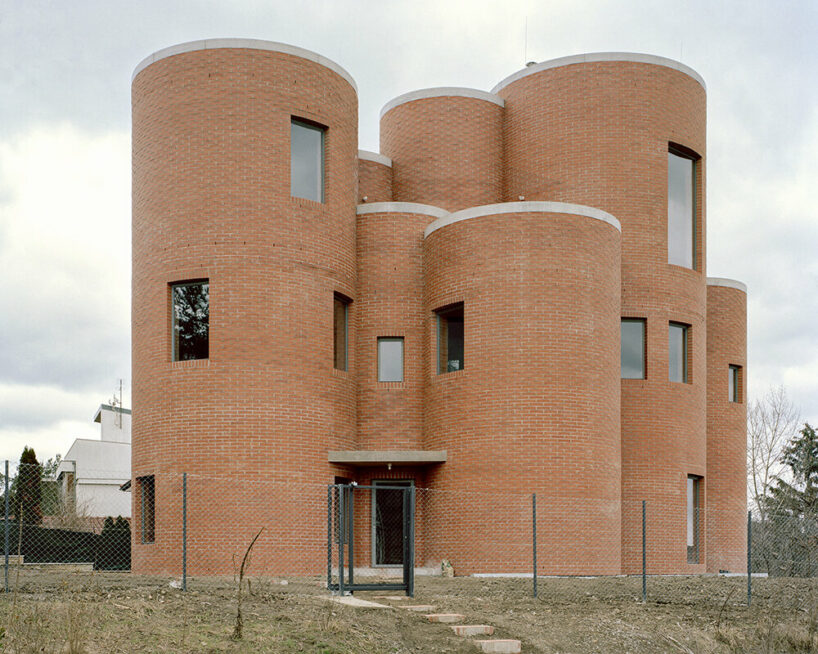
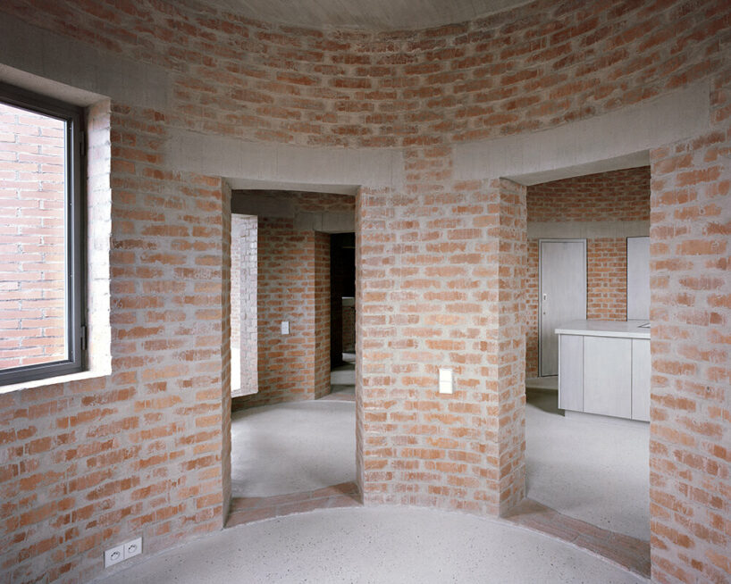
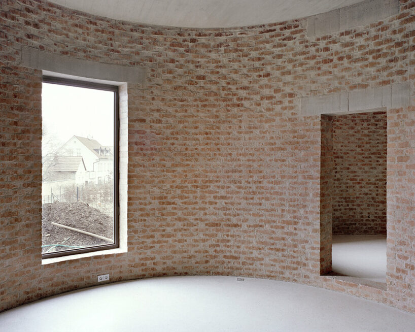
In Prague 6, within close proximity to Villa Müller by Adolf Loos, architect Christian Kerez completes House Okamura as a clear example of a very traditional, almost archaic method of constructing brick ‘circles’. The project, designed as an aggregate of column-like volumes, hosts three apartments with 39 rooms, combined. Kerez omitted dividing walls from the interior layout, making the outline of every single space visible from the outside. More so, thanks to their unique configuration, the apartments shift positions from floor to floor so that rooms in the vertical shafts belong to different owners. The rooms vary from 4 sqm to 18 sqm in size and 2.35 meters to 4.9 meters in height, with an additional 19 spaces in between the circular rooms, making it a total of 58 rooms.

christian kerez's house okamura unfolds as a cluster of circular brick volumes in czechia
all images © Maxime Delvaux


circular rooms with varying sizes, openings, and layouts


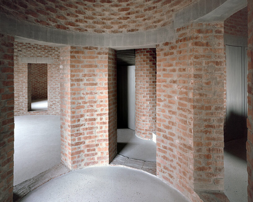
All spaces within one apartment of House Okamura are open to each other, with areas varying between 90 sqm and 110 sqm. As Christian Kerez (see more here) explains, the different sizes of the overlapping circular rooms create unpredictable changes in the direction of these openings. The latter seem to be randomly positioned and create a labyrinth-like movement. ‘It is a space that opens in on itself, generating an impression of expansion within actually limited boundaries, as intended by the rigorous geometrical arrangement. The layout of the circular rooms changes from one level to another,’ continues the Czechian architect. 

christian kerez's house okamura unfolds as a cluster of circular brick volumes in czechia
House Okamura in Prague 6


Meanwhile, the elevator, storage, and sanitary area are all tucked between the circular rooms of House Okamura. These intermediate spaces, which can be entirely closed off with doors, are minimal, fragmented, and convex, as opposed to the open, perfectly concave main zones. Concluding his thoughts, Christian Kerez highlights how the spatial concept of autonomous rooms aggregated to a sequence of spaces feels radical and new while the whole project resorts to traditional brick construction, which is easier to build on site than orthogonal spaces.

christian kerez's house okamura unfolds as a cluster of circular brick volumes in czechia
the project reveals a cluser of brick circles

christian kerez's house okamura unfolds as a cluster of circular brick volumes in czechia
the interiors host three apartments, with 39 rooms in total

christian kerez's house okamura unfolds as a cluster of circular brick volumes in czechia
circular living room with no dividing walls

christian kerez's house okamura unfolds as a cluster of circular brick volumes in czechia
the direction of openings constantly changes from room to room, and floor to floor

Reference

Portal House by Svima features brass details and curved oak ribbons
CategoriesInterior Design

Portal House by Svima features brass details and curved oak ribbons

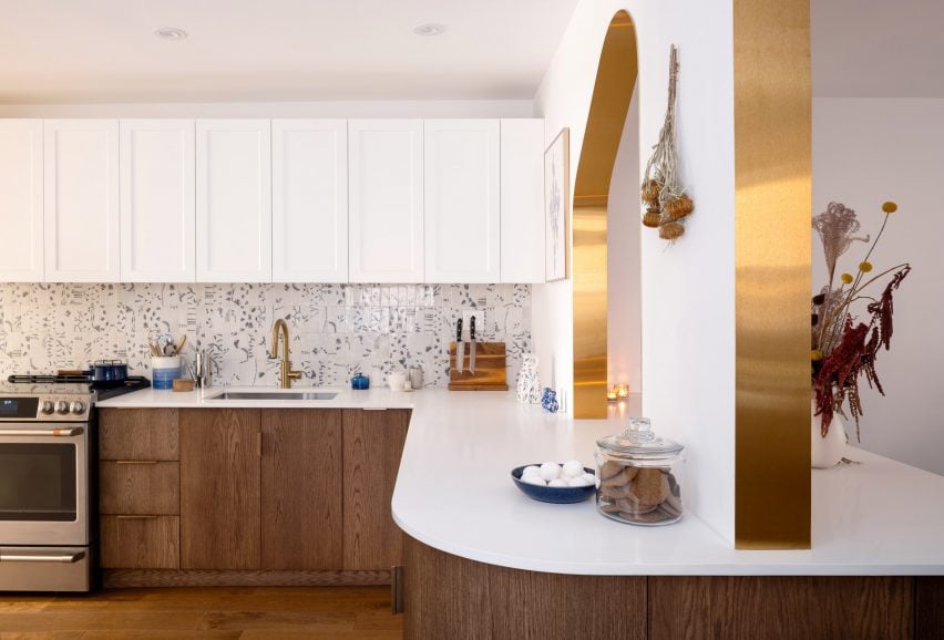
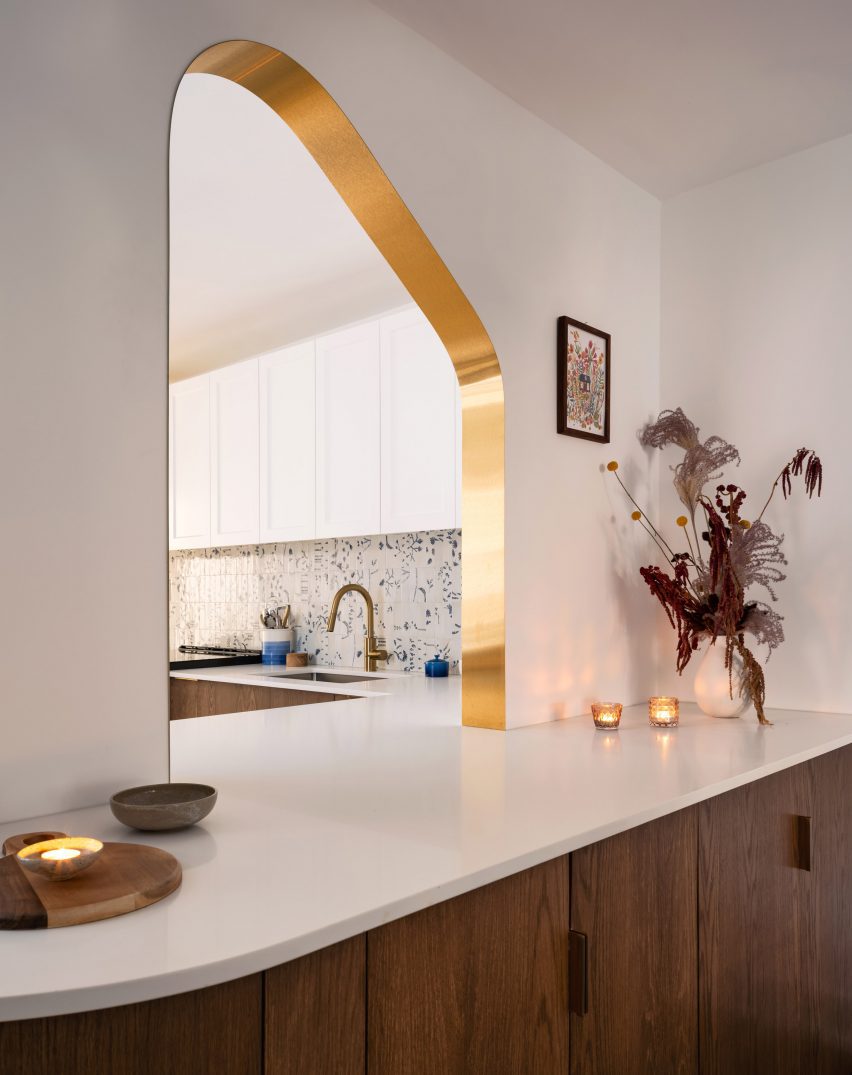
Brass ribbons line the asymmetric portals that connect the kitchen and dining room of this Toronto residence, renovated by local architecture and art studio Svima.

The Portal House was designed for a couple who had wanted to refresh their home for 10 years, but have very different aesthetic tastes.

Portal House by SvimaPortal House by Svima
Two portals connect the renovated kitchen and dining areas of this Toronto home

Toronto-based studio Svima found a compromise by combining his desire for “tenebrous minimalism” and her love of “bright French country kitchens” into the design.

The resulting “denlike cosiness” pairs dark oak across the lower half of the ground-floor spaces and clean white surfaces on the upper half.

Brass-edged asymmetric portal looking into a kitchenBrass-edged asymmetric portal looking into a kitchen
The curved, asymmetric portal over the deep counter acts as a pass-through

The snaked kitchen layout is tight, so Svima curved the corners of cabinetry and counter surfaces to steal extra space for circulation.

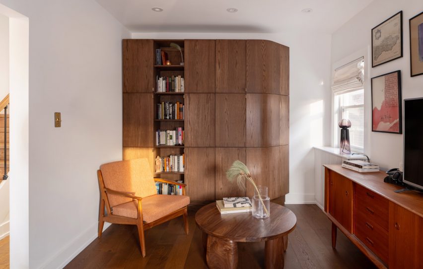
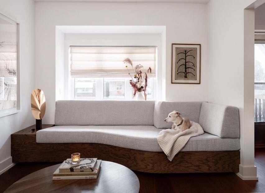
This theme continues to the living room millwork: a bookcase is filleted at the corner and meets the wall at an angle, while a built-in sofa beneath the window also softly angles inward.

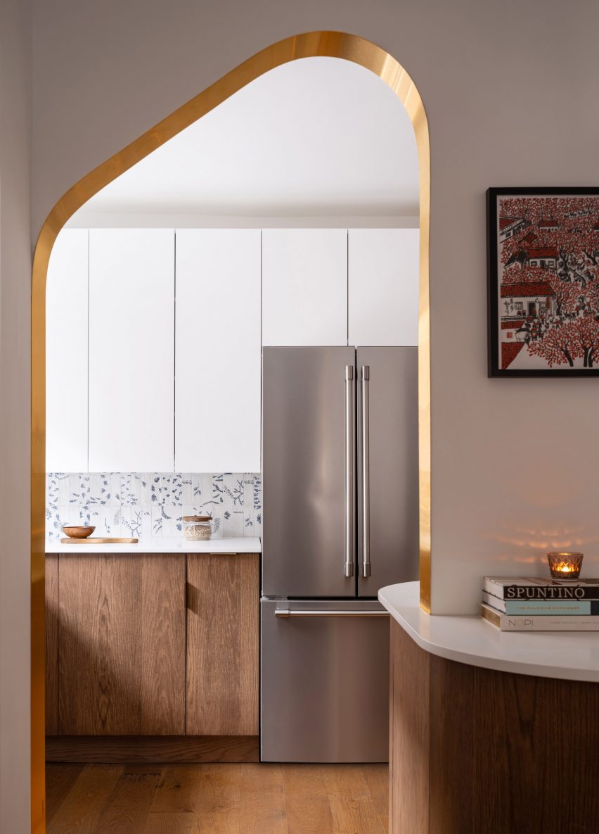
Open doorway with brass edges looking into the kitchenOpen doorway with brass edges looking into the kitchen
The other portal, mirrored in shape, forms a doorway between the two spaces

“The design hinges on ‘ribbons’ flowing through the space, guiding the motion through the rooms,” said Svima.

“The ribbons curve in areas where sharp corners would not fit, or would stop the flow of movement.”

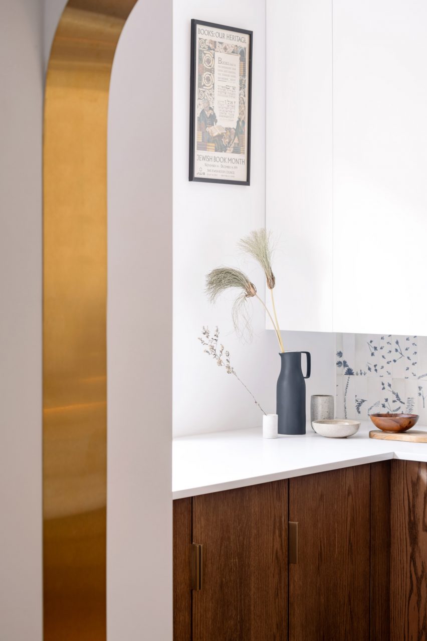
Detail of a brass-lined portal with a kitchen counter behindDetail of a brass-lined portal with a kitchen counter behind
Brass edges around the portals were artfully installed to perfectly fit the curved drywall

In the kitchen, the curved oak doors were handmade by a cabinetmaker who created a special jig to kerf-bend the oak into a radius.

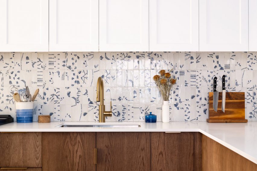
Tiles that offer a contemporary take on Dutch Delft porcelain form the backsplash, adding small touches of blue to the otherwise neutral space.

Kitchen with white upper cabinets, blue and white tiled backsplash, and dark oak lower cabinetsKitchen with white upper cabinets, blue and white tiled backsplash, and dark oak lower cabinets
To add touches of colour to the dark oak and bright white palette, tiles influenced by Delft porcelain were added to the backsplash

Two portals provide connections between the kitchen and adjacent dining room, both with a mirrored asymmetric shape and edged in brass.

One acts as a doorway, while the other over the deep counter is used as a pass-through for food, drinks and tableware.

“It was an artful process for the contractor to lay the brass into the wall, as it had to fit into the curved drywall perfectly with no tolerance for error,” the architects said.

The living room, located at the front of the house, was furnished with mid-century pieces such as a chair, a coffee table and a media console.

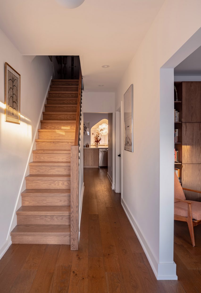
Hallway with dark oak flooring and a staircaseHallway with dark oak flooring and a staircase
Dark oak flooring throughout the home’s ground floor matches the other millwork

The closed and open shelving unit organises the family’s books and possessions, and its shape allows more light to enter from a side window.

Opposite, the built-in sofa helps to resolve an awkward space under a bay window and orients the sitter towards the TV to one side.

Living room featuring a dark oak storage unit with a filleted sideLiving room featuring a dark oak storage unit with a filleted side
In the living room, the curved kitchen cabinetry is translated as a storage unit with a filleted side

“The custom sofa sweeps into the space to provide seating at precisely the right sideways angle for viewing the media unit, for lounge reading, and for gathering,” Svima said.

The floors throughout the home match the other millwork, grounding the spaces with a rich dark hue.

A built-in sofa under a living room bay windowA built-in sofa under a living room bay window
A built-in sofa under the living room’s bay window similarly features softly curved angles

Svima, founded by architects Anamarija Korolj and Leon Lai, is not the only studio that’s had to get creative with a tight Toronto floor plan.

When Studio Vaaro overhauled a house in the city, the firm created a series of volumes with minimally detailed millwork to form kitchen cabinetry, the staircase and a feature bookcase in the living room.

The photography is by Scott Norsworthy.

Reference

mwworks hides longbranch house in the pacific northwest woods
CategoriesArchitecture

mwworks hides longbranch house in the pacific northwest woods

longbranch house: Architecture Embracing Nature


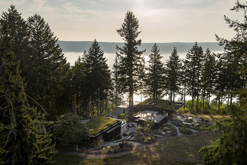
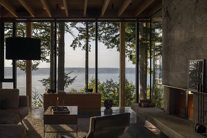
The Key Peninsula in Washington state sees a transformation on a once-neglected plot of land with this Longbranch House by architecture studio mwworks. Previously marred by a series of retaining walls and an outdated home, the site has been given a new lease on life with the clients’ long-standing love for the area. Having frequented a nearby beach cabin for thirty-five years, they dreamt of a new home that would accommodate their family, foster dogs, horses, and visiting loved ones. But their vision extended beyond simple construction — they desired a dwelling that harmonizes with the surrounding landscape.

mwworks longbranch houseimages © Andrew Pogue


mwworks opens the home onto the forest


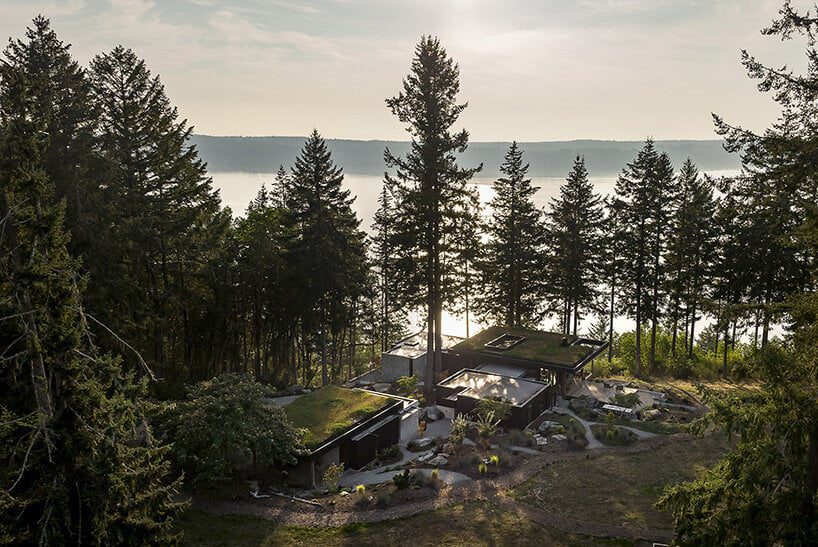
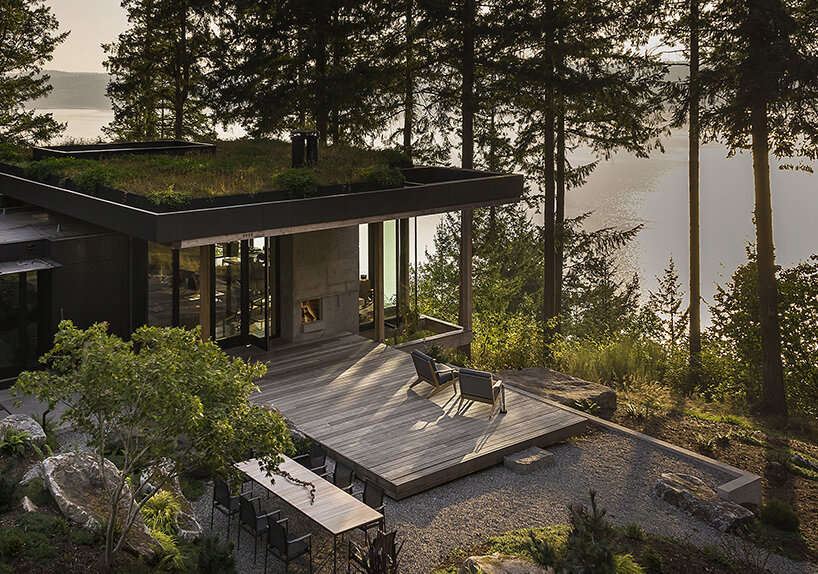
Following this vision, mwworks created a home that is anything but ostentatious. Approaching from the road, visitors are greeted by a gravel driveway that winds past an unassuming barn. The house itself remains concealed until the very last moment. Only a glimpse of its planted roof peeks through the rolling hills, mimicking the natural meadow and creating a sense of continuity. This subtle design prioritizes the landscape, allowing the natural world to take center stage.


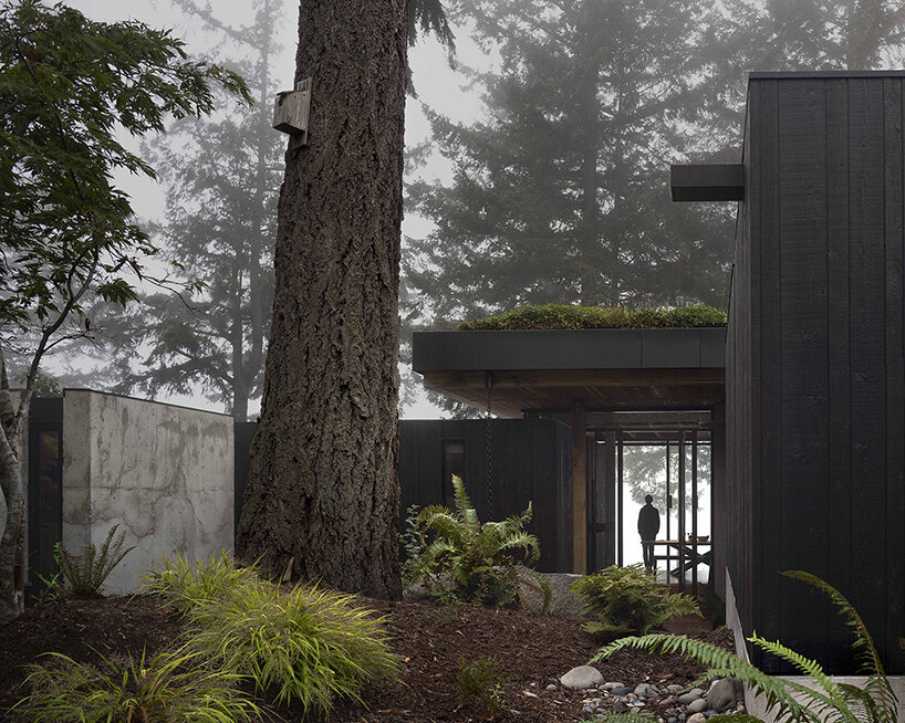
The architects took great care to ensure minimal disruption to the existing environment. Towering fir trees were incorporated into the design, acting as grand pillars at the entrance. The building itself rests on carefully positioned pin piles and grade beams, allowing the roots of these giants to flourish undisturbed. A bridge leading into the house further opens the interiors onto the forests and views beyond, emphasizing the intended harmony.

mwworks longbranch house
the Longbranch House by mwworks replaces an outdated home on a neglected plot in Key Peninsula


a contemporary frame for nature beyond


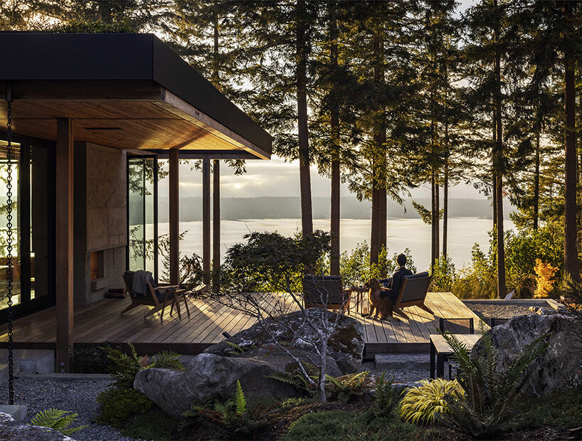
Stepping inside the Longbranch House is akin to stepping into a framed landscape vista. The open floor plan offers unobstructed views of the surrounding meadows and the Case Inlet beyond. Each room is designed to foster a unique connection with the outdoors, ranging from intimate nooks to expansive living spaces. The materials used throughout the house echo the natural surroundings. The main structure is cast from a rough concrete mix, mirroring the fluidity of the landscape. This contrasts with the dark-stained cedar cladding in private areas, while exposed Douglas Fir beams create a pavilion-like feel in the living space. Large windows are delicately framed, minimizing their visual impact and emphasizing the honest construction methods.

mwworks hides this longbranch house among the pacific northwest woods
designed for a family and their animals, the house prioritizes integration with the surrounding landscape


With the completion of the Longbranch House, the once-fragmented land has been brought back together. The forest and meadow now embrace the dwelling, creating a calming retreat in the woods. The use of natural materials and attention to detail further enhance the sense of timelessness. This way, the home exemplifies a successful relationship between built space and the beauty of the natural world.

mwworks longbranch house
a gravel driveway leads past a barn, revealing only glimpses of the house that blends with the meadow mwworks hides this longbranch house among the pacific northwest woods
towering fir trees are prominent features, with the house built around them to minimize disruption

Reference

Michael Hennessey Architecture clads renovated California house in cedar
CategoriesArchitecture

Michael Hennessey Architecture clads renovated California house in cedar

US studio Michael Hennessey Architecture has revitalised an ageing suburban house near San Francisco, adding black cladding and bright finishes to form a family home that bridges the past, present and future.

The residence is located in Mill Valley, a town just north of San Francisco that is known for its natural terrain and cultural offerings.

Black house by Michael Hennessey ArchitectureBlack house by Michael Hennessey Architecture
Michael Hennessey Architecture created Courtyard Hous

Designed for a couple with two young children, the budget-conscious project involved the renovation of a suburban-style house that was “in sore need of upgrades”.

The aim was to create a dwelling that supported the family’s current needs while being mindful of what might be needed in the future.

Courtyard House living spaceCourtyard House living space
The home is U-shaped in plan

“The home was thought not only as a shelter, but also as a bridge: from past to present, from one landscape condition to another, and from what a family wanted to what they could have,” said Michael Hennessey Architecture, which is based in San Francisco.

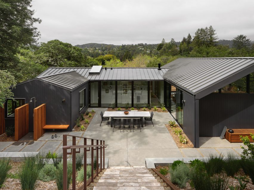
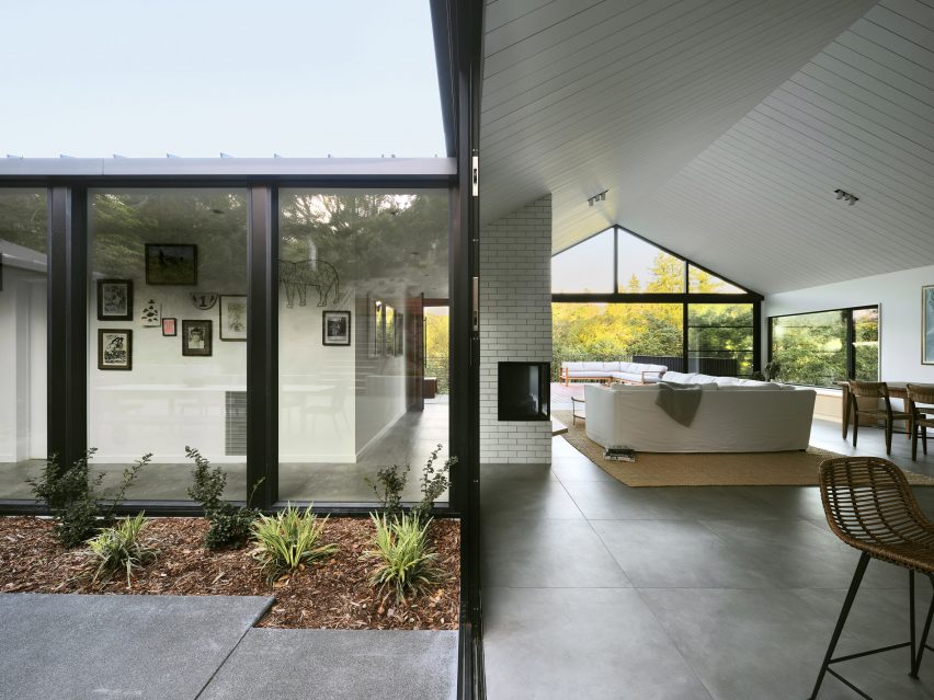
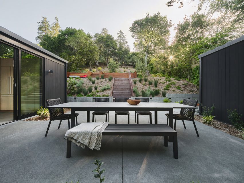
Built into a hillside, the home is U-shaped in plan, with gabled volumes organised around a central courtyard.

Vertical cedar sidingVertical cedar siding
Vertical cedar siding that adds a sense of gravitas

The team opted to preserve certain elements while adding contemporary interventions.

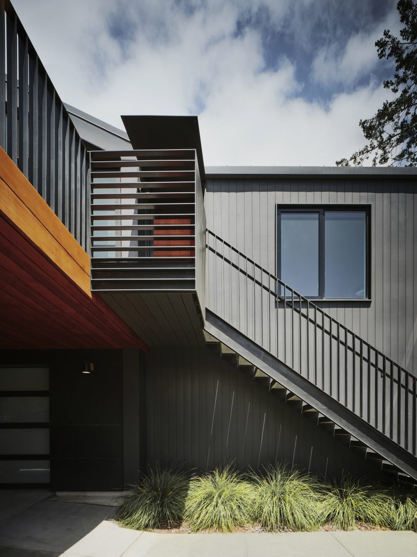
The building’s beige exterior was replaced with black, vertical cedar siding that adds a sense of gravitas, the studio said. The roof is covered in standing-seam metal.

Open-plan kitchen Open-plan kitchen
Inside there is a clear division between public and private zones

Inside, the 1,870-square-foot (174-square-metre) house features a clear division between public and private zones.

On the main level, one side holds an open-concept kitchen, dining area, and living room, while the other encompasses three bedrooms. The ground level contains a family room and a garage.

South-facing deckSouth-facing deck
A south-facing deck features outside

“Clearly delineated programmatic areas work in harmony with each other, the outside and the family’s needs,” the team said.

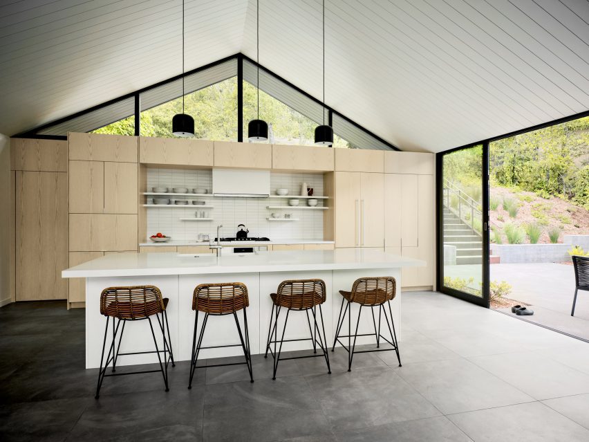
Interior finishes include ash cabinetry, large-format porcelain floor tiles, and ceramic tiles around the fireplace. Lofty ceilings and large stretches of glass provide an airy feel.

The outdoor spaces include a spacious, south-facing deck that receives bright sunlight. Softer light flows in through the courtyard on the north.

Proving a connection to the forested, hilly landscape was a guiding concern for the team.

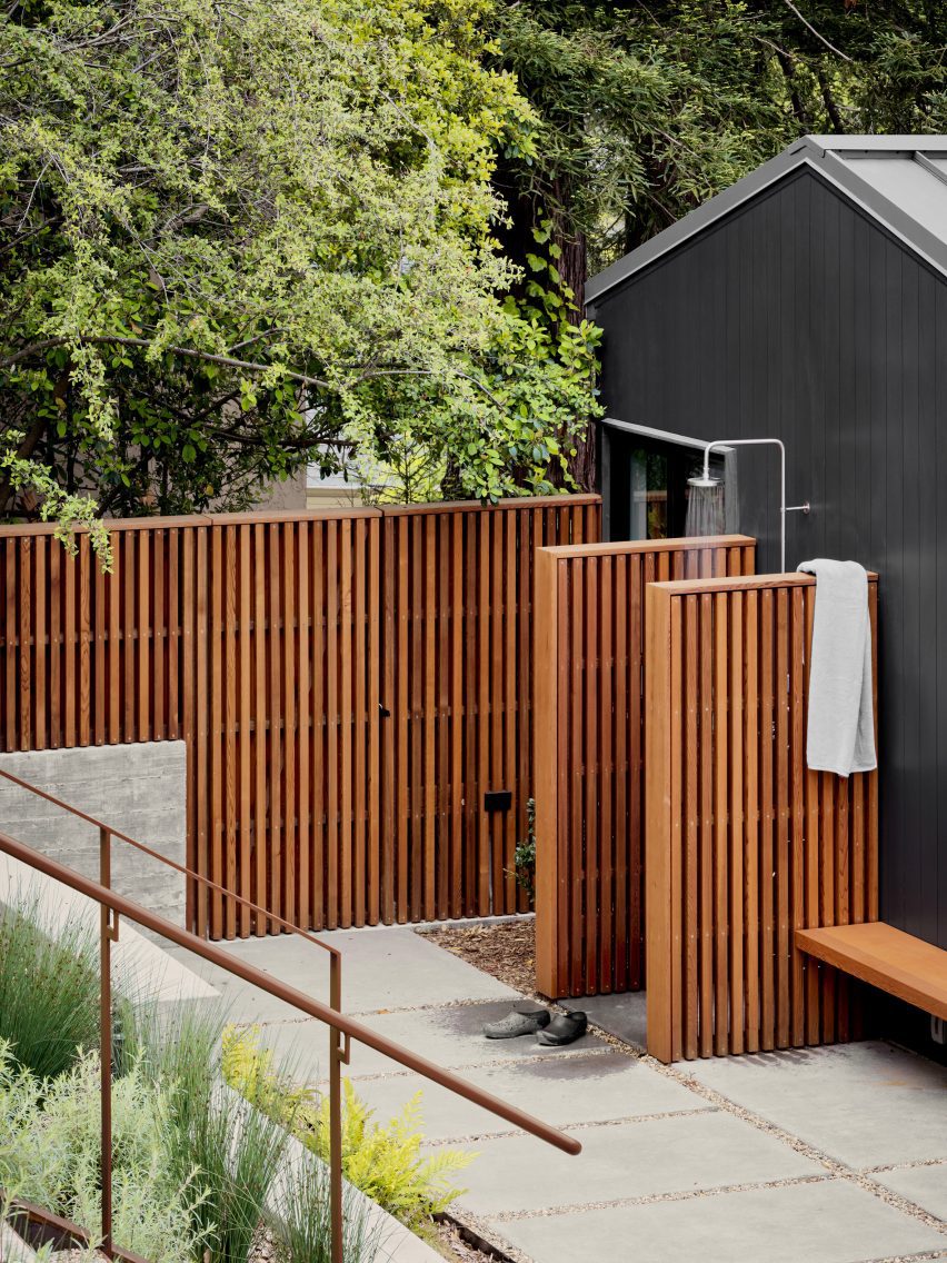
Outdoor showersOutdoor showers
Outdoor showers were also included in the design

“Every part of the house is oriented towards the landscape thanks to carefully framed views of the lush immediate vegetation, as well as the more distant valleys, resulting in a comprehensive, thoughtful and sensitive approach to creating an extraordinary daily life,” the team said.

Other projects by Michael Hennessey Architecture include a townhouse with modern bay windows that was designed to offer alternatives to “conventional building strategies” and the refurbishment of a 1960s house that was originally built by Joseph Eichler, known for his modernist housing subdivisions.

The photography is by Adam Rouse.


Project credits:

Architect: Michael Hennessey Architecture
Architecture team: Michael Hennessey, Claudia Merzario, Jason Laudat
Contractor: New Dimension Builders (Dirk Von Rueben)
Structural engineer: Berkeley Structural Design (Bill Lynch)
Landscape architect: George Loew
Title 24 consultant: EnergySoft, LLC (Hayley Monahan)
Sustainability consultant: Arcturus HD (Jeff Aalfs)

Reference

Studio Bark designs water-powered Breach House in UK countryside
CategoriesSustainable News

Studio Bark designs water-powered Breach House in UK countryside

London-based practice Studio Bark has unveiled plans for Breach House, a water-powered family home located in Leicestershire, UK.

Designed to enable the owners to “live off the land”, the proposal by Studio Bark will be powered by photovoltaic (PV) panels and micro-hydro energy, creating a home capable of running off-grid.

Render of water-powered home by Studio BarkRender of water-powered home by Studio Bark
Breach House will be powered by photovoltaic (PV) panels and micro-hydro energy

The 430-metre-square proposal will comprise the new home, along with the restoration of an existing agricultural barn and extensive landscaping.

Making use of the site’s location among a network of small brooks, streams and ponds, run-off water from the surrounding fields will be used to provide a portion of the home’s energy needs. It will also be harvested on-site and filtered for use within the house.

View of 'water tower' within Breach House by Studio BarkView of 'water tower' within Breach House by Studio Bark
The ‘water tower’ connects the home’s two wings

“The concept is a rural home which establishes a reciprocity between ecology and human needs through water,” studio director Tom Bennett told Dezeen.

“The massing echoes the typology of a traditional farmstead, blending contextual influences to create a contemporary building which resonates subtly with its setting.”

Interior render of Breach House in Leicestershire Interior render of Breach House in Leicestershire
The design references the typology of traditional farm buildings

Drawing on the local typologies, the home will be arranged in clusters complemented by courtyards and sheltered outdoor spaces formed by deep overhanging eaves.

A ‘water tower’, which will sit centrally on the site, will house ventilation and circulation functions as well as water filtration.

It will also hold a staircase and corridor to connect the home’s two wings and was designed to be a visual reference to the use of water throughout the scheme.

Low carbon and natural materials suggested for the proposal include reclaimed brick, UK-sourced timber and reclaimed tiles, which were chosen in response to the character and heritage of the surrounding landscape.

Renders of the proposal reveal a largely timber structure, with exposed beams interspersed with skylights featuring on the home’s interior.

On the exterior, trapezoidal-shaped roofs will be clad with decorative tiles and provide shelter for a balcony adjacent to the bedroom on the upper floor.

Render of living interior at water-powered home by Studio BarkRender of living interior at water-powered home by Studio Bark
Exposed timber beams and skylights will feature on the home’s interior

According to the studio, the residual carbon impact of the building is expected to be countered by landscaping proposals – including the planting of around 200 trees – that will accelerate carbon drawdown on the site.

Calculations undertaken by the studio suggest that these landscaping proposals will sequester roughly three times the amount of carbon that will be released over the building’s lifetime.

Render of living space within Breach House in LeicestershireRender of living space within Breach House in Leicestershire
Run-off water will be harvested and filtered for use within the home

“Proposed works include a new woodland area, wet meadow, enriched wildflower meadow, reinstated historical copse, successional tree planting, new ponds and reinstated field boundaries,” Bennett said.

“These measures will sequester carbon, greatly enhance the ecological value of the currently agricultural site, in addition to assisting with natural flood management in the locality.”

Proposed bedroom interior within Breach House by Studio BarkProposed bedroom interior within Breach House by Studio Bark
Breach House is expected to result in a 65 per cent biodiversity net gain

The proposal is anticipated to result in a 65 per cent biodiversity net gain, with additional habitat measures incorporated into the home set to include a bat attic.

Other architectural projects with a heavy focus on sustainability include the UK’s “most sustainable” and largest neighbourhood made from timber and a neighbourhood in Paris made up of limestone buildings.

The renders are courtesy of Studio Bark.


Project credits:

Architect: Studio Bark
Planning consultant/agent: Studio Bark
Client: Private Domestic
Structural engineer: Structure Workshop
Landscape architect: Studio 31
Energy consultant: Max Fordham
Hydrologist: Amber Planning
Ecologist: Elton Ecology
Arboriculturalist: RJ Tree Services
Highways: Create Consulting Engineers

Reference

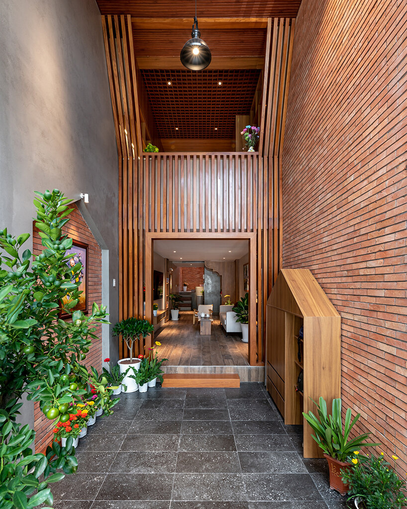
story architecture fronts narrow vietnam house with stacked terraces
CategoriesArchitecture

story architecture fronts narrow vietnam house with stacked terraces

a family home for ho chi minh city, vietnam


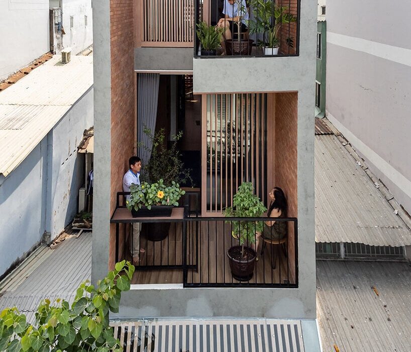
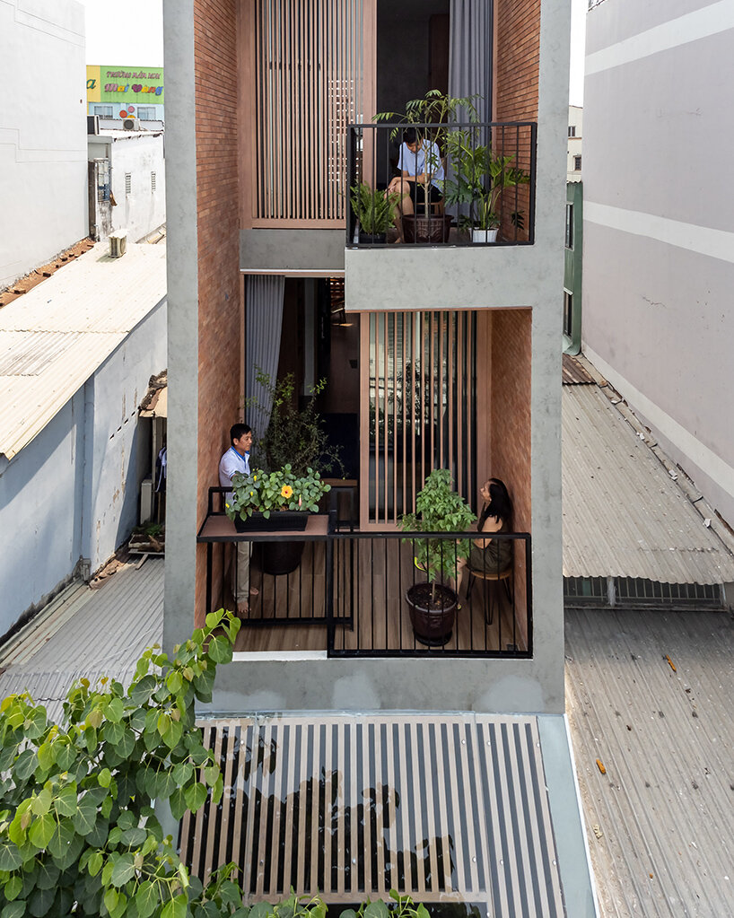
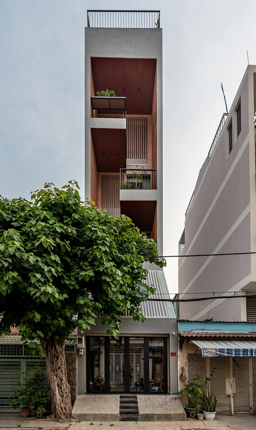
Ho Chi Minh City-based studio Story Architecture unveils ‘House 3.5 x 17,’ a sun-drenched family home in the Vietnam city’s District 7. Designed for a couple and their two sons, the dwelling seeks to balance individual pursuits with shared family moments. Recognizing the client’s transition to a home-based career, the architects prioritized relaxation and connection beyond the home office. However, the limited plot size of 59.5 square meters presented a significant challenge. Story Architecture needed ingenuity to incorporate the desired elements: a swimming pool, elevator, car parking, three en-suite bedrooms, and inviting living areas.

story architecture house vietnamimages © Lonton Studio


story architecture’s narrow townhouse


Story Architecture strategically organizes the functions of the home to overcome the constraints of its compact site in Ho Chi Minh City, Vietnam. The ground floor prioritizes practicality with car and motorbike parking. The living area integrates with a worship space, with a skylight bathing the prayer area in natural light. The stairs and elevator are located at the rear of the house to maximize usable space on each floor. The kitchen and dining area is found along a mezzanine which overlooks the ground level and entrance. The second, third, and fourth floors each house a bedroom with a private bathroom with glass walls. Each bedroom opens onto a balcony, each featuring potted plants and unique cut-outs to disrupt the facade and allow for communication between family members on different levels.

story architecture house vietnam
Story Architecture unveils ‘House 3.5 x 17’ in Ho Chi Minh City, Vietnam


the light-filtering facade


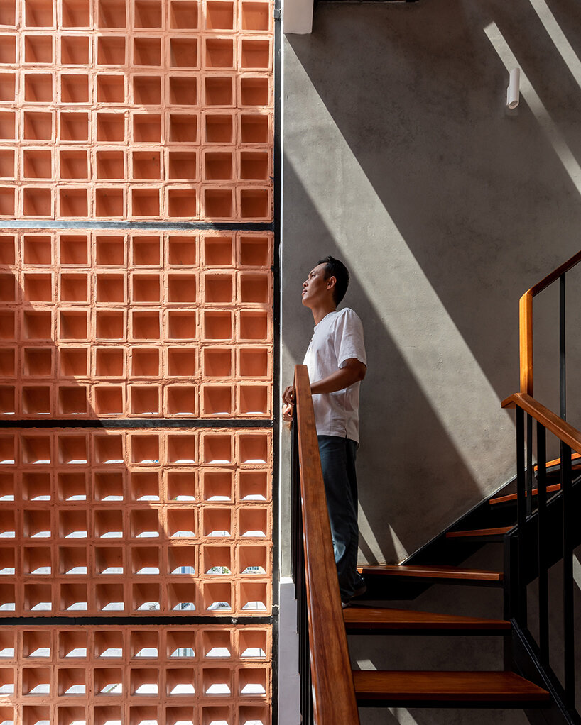
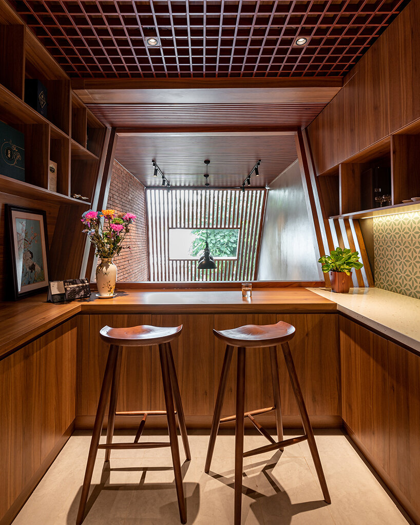
The back of the staircase features a screen of wind encaustic tiles, a unique design element common in Vietnam, which Story Architecture incorporates to ensure natural ventilation while offering protection from rain. Glass panels are thoughtfully integrated which allow sunlight to illuminate the space and create ‘windows’ looking up towards the sky. The facade’s atrium walls showcase a sustainable touch — reclaimed bricks salvaged from old houses. These bricks, carefully cut into thin slices, are re-tiled onto the new house. The remaining walls are finished with gray cement, while dark wood paneling infuses the interiors with a rustic and natural character. The warm, earthy tones extend to the flooring and interior elements, contributing to the house’s intimate and inviting atmosphere.

story architecture house vietnam
the house is designed as a relaxing retreat in the city for a family of four story architecture house vietnam
the living room integrates a worship space, with a skylight for natural light story architecture fronts this narrow house in vietnam with stacked terraces
the kitchen and dining areas are located on the mezzanine, offering a view of the entrance

Reference

​​Fran Silvestre Arquitectos references pathways for Sabater House in Spain
CategoriesArchitecture

​​Fran Silvestre Arquitectos references pathways for Sabater House in Spain

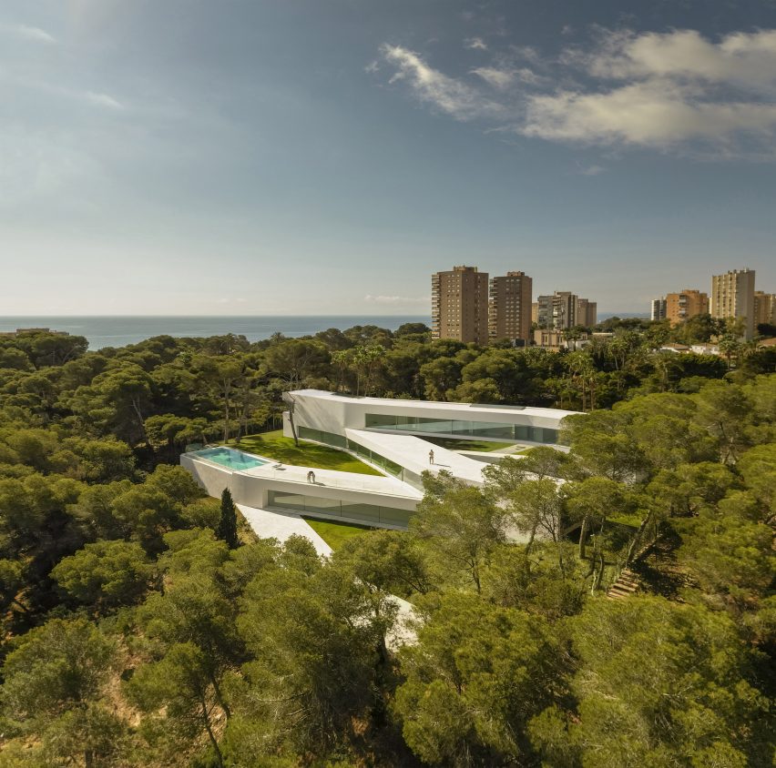
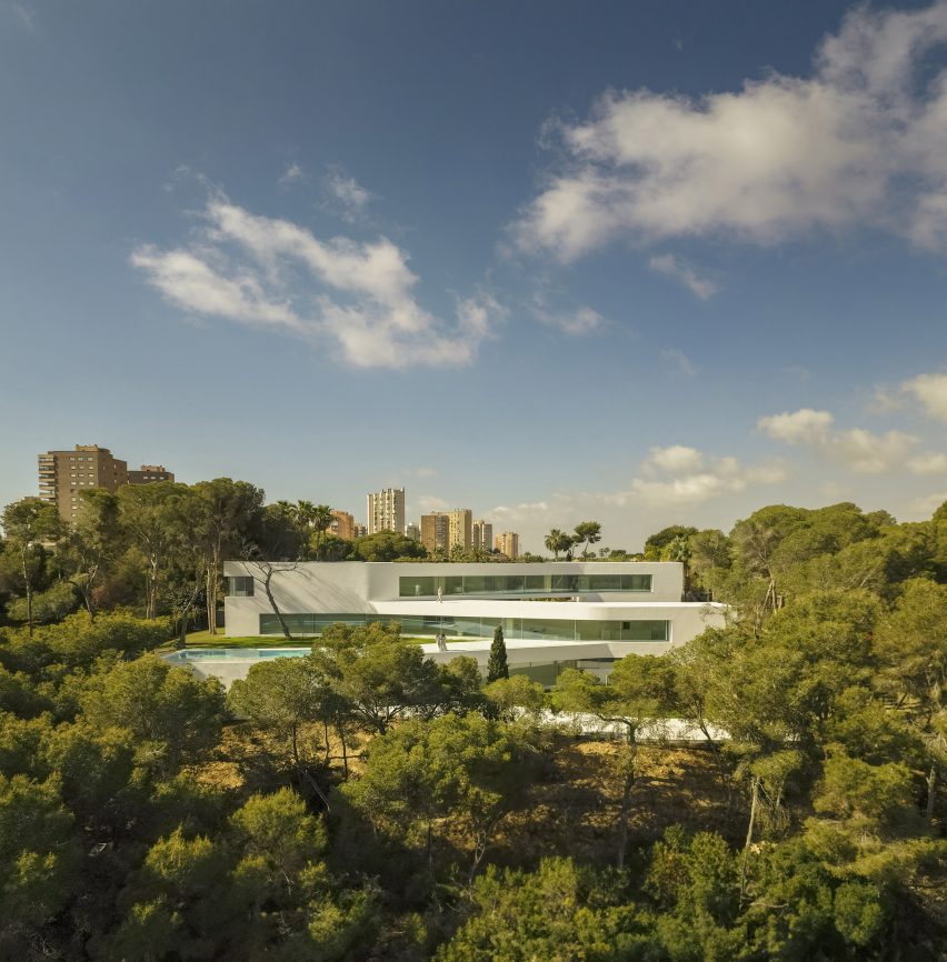
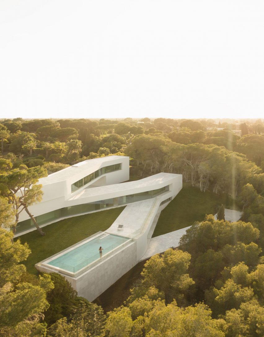
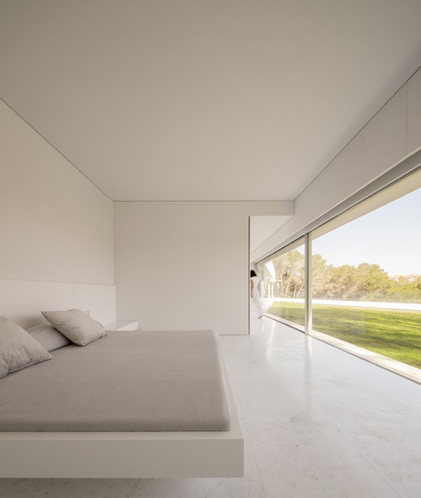
Spanish studio Fran Silvestre Arquitectos has created a minimalist white house in Alicante, which winds through the landscape to enhance its relationship with the outdoors.

Named Sabater House, the Spanish dwelling unfolds through a series of intersecting, elongated forms that ascend upwards over its 780-square-metre site.

Its slim volumes adapt to the site’s natural topography, navigating existing large trees and framing a series of terraces and courtyards.

Aerial view of Sabater House by Fran Silvestre ArquitectosAerial view of Sabater House by Fran Silvestre Arquitectos
Fran Silvestre Arquitectos has created a minimalist white house in Alicante

According to Fran Silvestre Arquitectos, the sprawling design takes cues from local pathways that are carved into the terrain and lead to a hermitage.

“We were struck by how these winding paths adapt to the terrain, generating a very interesting architecture,” Fran Silvestre Arquitectos told Dezeen.

“This was the starting point to develop a home on a plot with similar characteristics in terms of width and slope of the land.”

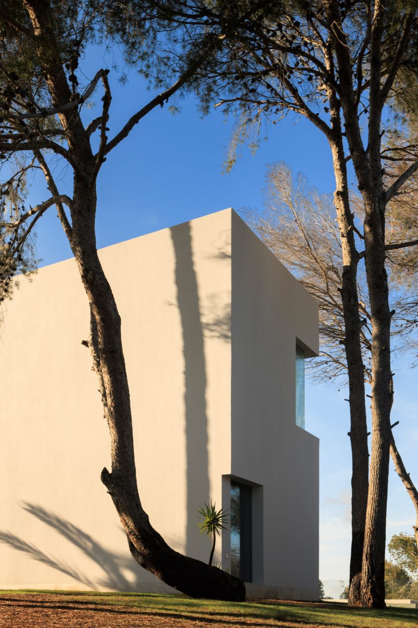
Facade of Sabater House by Fran Silvestre ArquitectosFacade of Sabater House by Fran Silvestre Arquitectos
Sabater House winds through the landscape

Sabater House is designed for a client who wanted a home to accommodate his large family while ensuring “enough independence to guarantee the privacy of all family members”.

To accomplish this, each floor of the home features a distinct programme.

Aerial view of white home in AlicanteAerial view of white home in Alicante
Each floor of the home features a distinct programme

The highest level, described as the “nighttime area” of the home, features five bedrooms and bathrooms oriented to look out to the sea above the tree line.

Meanwhile, the middle floors contain an open-plan kitchen, dining and living area with floor-to-ceiling windows framing views out to the garden and outdoor swimming pool.

Exterior of white house in Spain by Fran Silvestre ArquitectosExterior of white house in Spain by Fran Silvestre Arquitectos
The house winds around existing trees

The living spaces are stretched across the long and narrow floor plan in a bid to avoid compacting them and open them up to the outdoors.

“The project is drawn with a very clear geometry of straight elements that are joined by a soft radius of curvature,” said the studio. “Each piece has a relationship with the environment.”

Accommodated on the lower level are the pool basin, a wine cellar, storage facilities and additional sleeping quarters.

With each floor stacked at an angle to create a zigzagging floor plan, a series of courtyards, terraces and bridges are created, further opening the relationship with the outdoors.

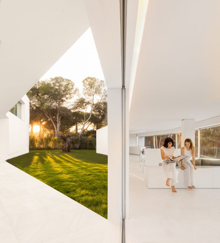
All-white interior of Spanish houseAll-white interior of Spanish house
The middle floor features open-plan living spaces

“Something unexpected about the house for us is the character of the interstitial spaces between the blocks and how they envelop you,” explained Fran Silvestre Arquitectos.

“The first acts as an access garden that directs you towards the entrance door, and the second as one of the main terraces. They are versatile spaces that allow you to make the most of the different orientations.”

Bedroom of Sabater House in AlicanteBedroom of Sabater House in Alicante
The top level contains the bedrooms

Fran Silvestre Arquitectos was founded in 2005 by architect Fran Silvestre. The studio is known for its minimalist style, which is applied throughout Sabater House.

Its previous projects that feature its signature pared-back style include an overhanging Hollywood Home and a residence with a T-shaped roof in Valencia.

The photography is by Fernando Guerra.

Reference

Barde vanVoltt gives historic Haarlem house a contemporary update
CategoriesInterior Design

Barde vanVoltt gives historic Haarlem house a contemporary update

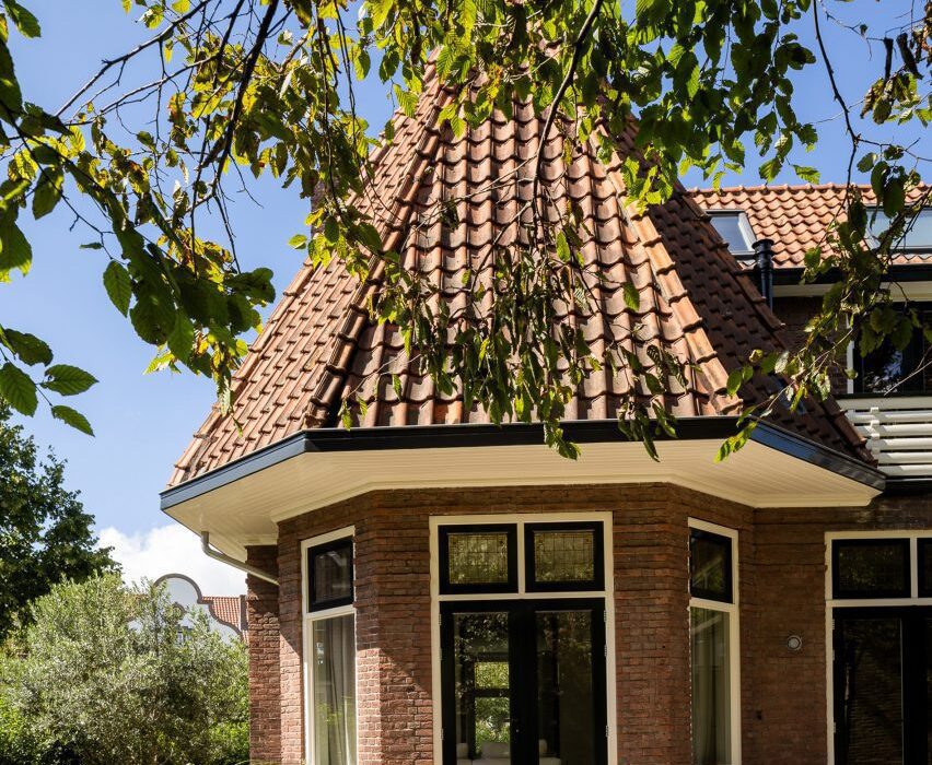
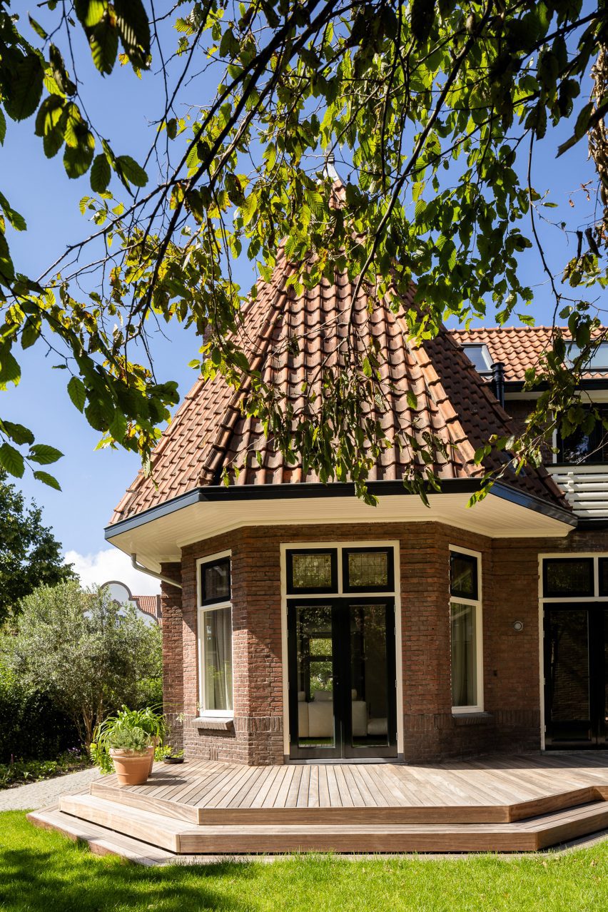
Interiors studio Barde vanVoltt has renovated this early 1900s house in the Dutch city of Haarlem to forge a strong connection between the building’s past and present, grounding the space with warm woods and tactile textures.

The owners – a young family of four – wanted a home that would stand the test of time while telling Dutch practice Barde vanVoltt to “surprise us”.

Exterior of Dutch home by Barde vanVolttExterior of Dutch home by Barde vanVoltt
Barde vanVoltt had overhauled an early 20th-century house in Haarlem

In answer, the studio worked to create an interior that fuses the past and the present.

“Stepping into this house is a journey through time, a reminder that architecture is a dialogue between generations,” the studio told Dezeen.

“Meticulously preserving its historical charm, the house’s design seamlessly integrates contemporary features, creating a harmonious blend that transcends eras.”

Extension of Haarlem House Extension of Haarlem House
The studio added an extension to the rear of the home

To address the narrow footprint of the house – a typically Dutch feature – internal walls were either removed, widened or replaced with glass panel doors.

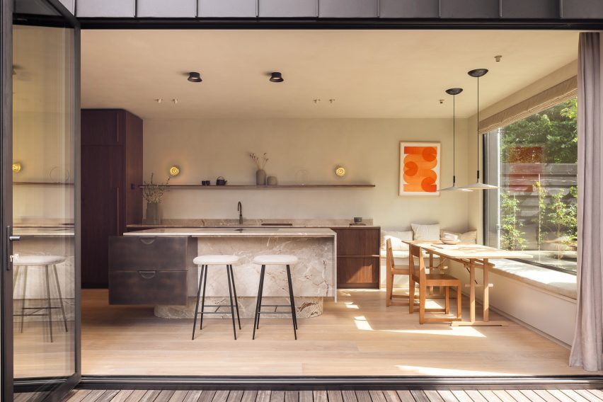
The back of the property was transformed with an extension and concertina glass doors to maximize the sense of light and space.

Kitchen of Dutch home by Barde vanVolttKitchen of Dutch home by Barde vanVoltt
The extension houses the kitchen and dining area

“With the extension on the ground floor, we wanted to create contrast with the original architecture,” said Barde vanVoltt. “The understated square modern architecture, due to its shape and angular position, blends perfectly with the past.”

“With the historic facade at the front, we took advantage of the space at the rear, extending the kitchen and living areas into the garden.”

Living room of Haarlem HouseLiving room of Haarlem House
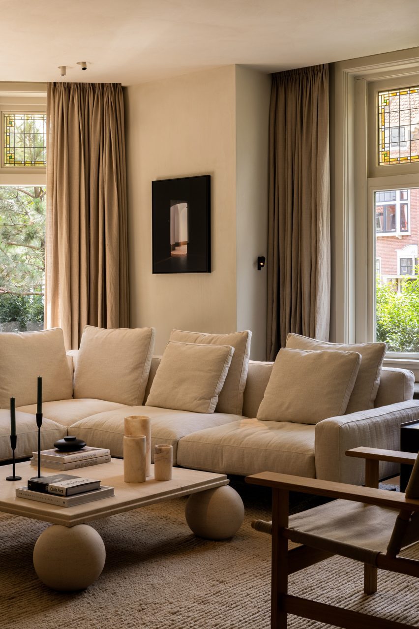
A vintage sandstone table centres the living room

The practice carefully aligned the new design elements with shapes drawn from the architectural features of the house, with the new full-height door openings echoing the proportions of the living room’s original windows.

In the attic, a guest room doubles as a playroom. Barde vanVoltt infused this once-dark space with natural light via a skylight, “allowing guests to sleep under the stars”.

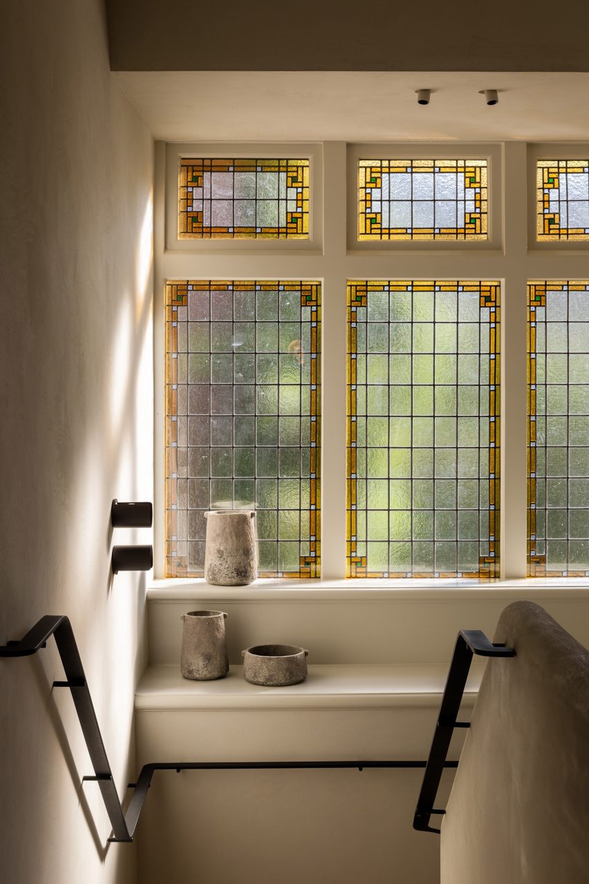
Hallway with stained glass windows inside Haarlem HouseHallway with stained glass windows inside Haarlem House
Barde vanVoltt retained Haarlem House’s original stained glass windows

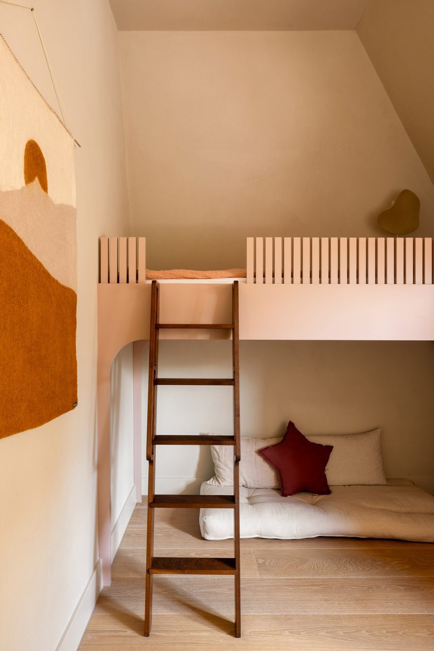
“Dutch houses are noted for their sloping attic roof lines,” the studio said. “For the children’s bedrooms, we followed this structural line and created custom bunk beds that combine sleep, storage, and space for play.”

The material palette includes a range of mid- and dark-toned timbers that bring a sense of warmth and tactility to the home.

These are complemented by natural materials including stone and linen.

“Our colour scheme always consists of earthy colours like moss green, a faded terracotta, grey concrete and off-whites,” the studio said. “For this residence, we brought them in line with the original colours from the existing tiles and stained glass.”

Children's bedroom inside Dutch home by Barde vanVolttChildren's bedroom inside Dutch home by Barde vanVoltt
Custom bunk beds feature in the children’s bedrooms

The furniture edit features Barde vanVoltt’s favoured mix of statement pieces alongside handmade and bespoke elements.

Selected pieces reflect the architectural style of the building such as the Lot table by Tecta in the study, as well as Gerrit Thomas Rietveld’s 1934 Zig Zag chair and his Steltman chair from 1963, which was the last chair ever created by the Dutch designer.

The playroom, dining area and bedroom all have specially-made seating upholstered in Kvadrat fabrics, while the bedrooms and study feature bespoke beds and closets.

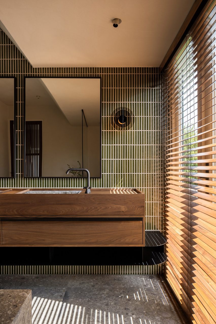
Bathroom inside Dutch home by Barde vanVolttBathroom inside Dutch home by Barde vanVoltt
Wooden blinds mirror the linear pattern of the bathroom tiles

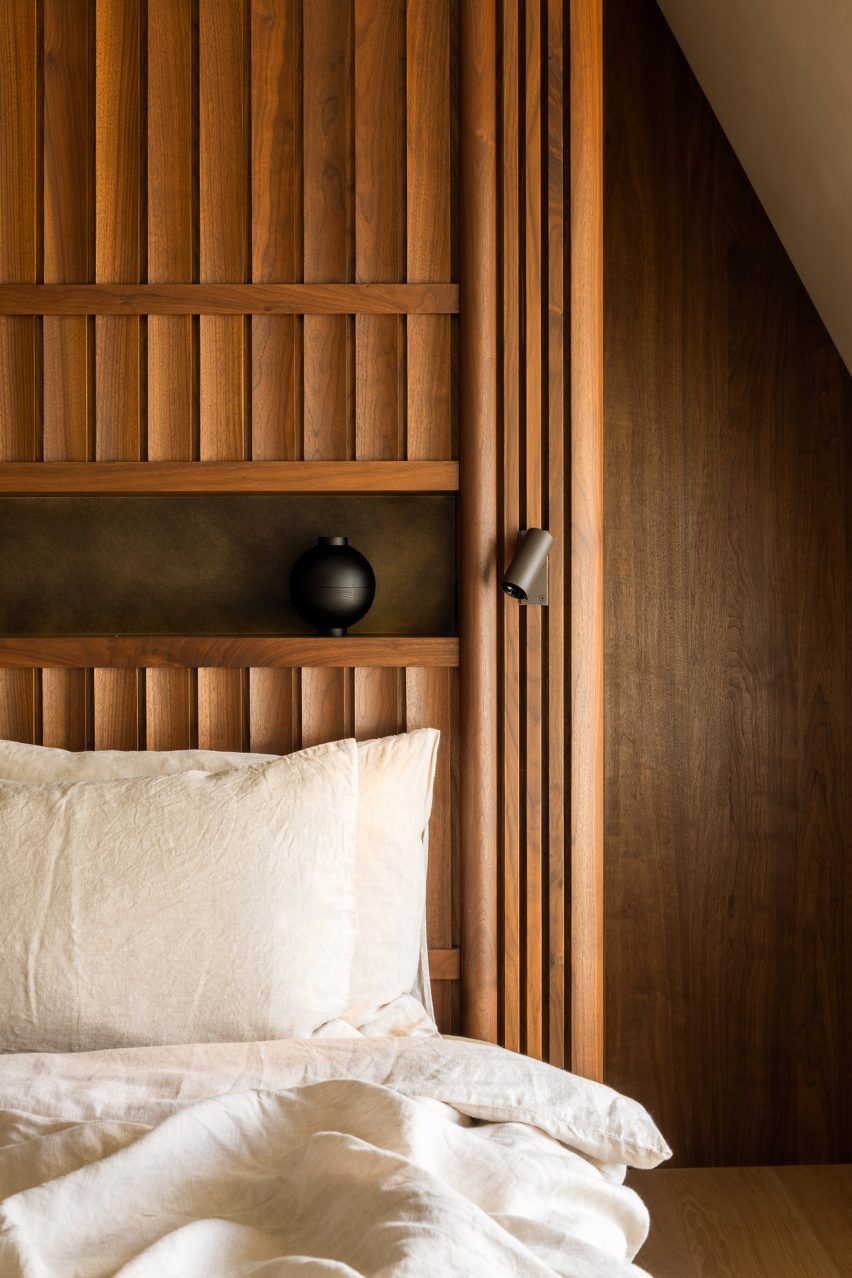
“We love creating interiors full of handmade, bespoke furniture pieces with refined details,” said Barde vanVoltt. “The headboard of the master bedroom is an art piece in itself. The walnut slats are slightly curved and give it a very sophisticated look.”

The square coffee table in the living room – made from a single piece of sandstone – is a vintage piece from Atelier Uma.

Bedroom inside Haarlem HouseBedroom inside Haarlem House
Barde vanVoltt created a custom headboard in the primary bedroom

For the lighting scheme, Barde vanVoltt set out to create the right balance between functional and decorative lighting, collaborating with lighting experts PSLab to create a “warm and cosy atmosphere.”

Other Dutch homes that have recently been featured on Dezeen include a house with a hexagonal footprint in Amsterdam and a Hobbit-style residence that is partially buried underground.

The photography is by Thomas de Bruyne.

Reference

eme 157’s domehome emerges from foliage-covered brick house in spain
CategoriesArchitecture

eme 157’s domehome emerges from foliage-covered brick house in spain

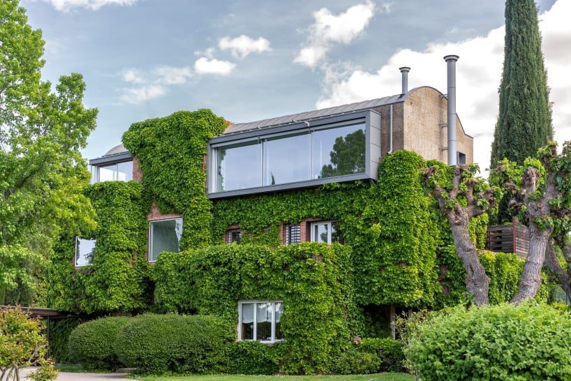
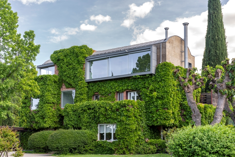
EME 157 Studio’s DOMEHOME expands existing house in Aravaca


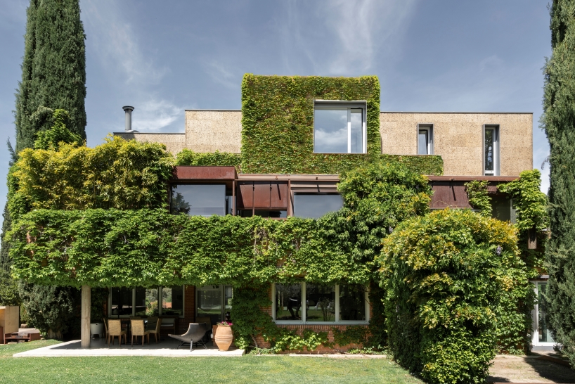
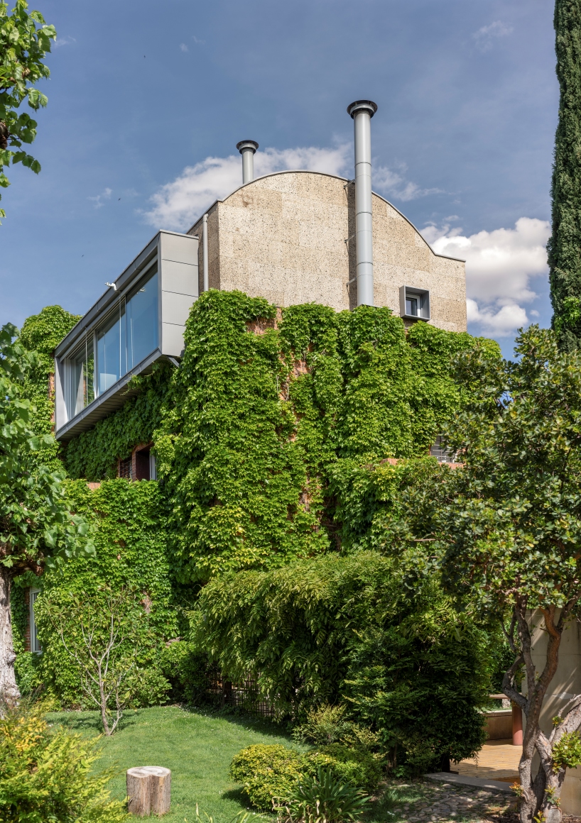
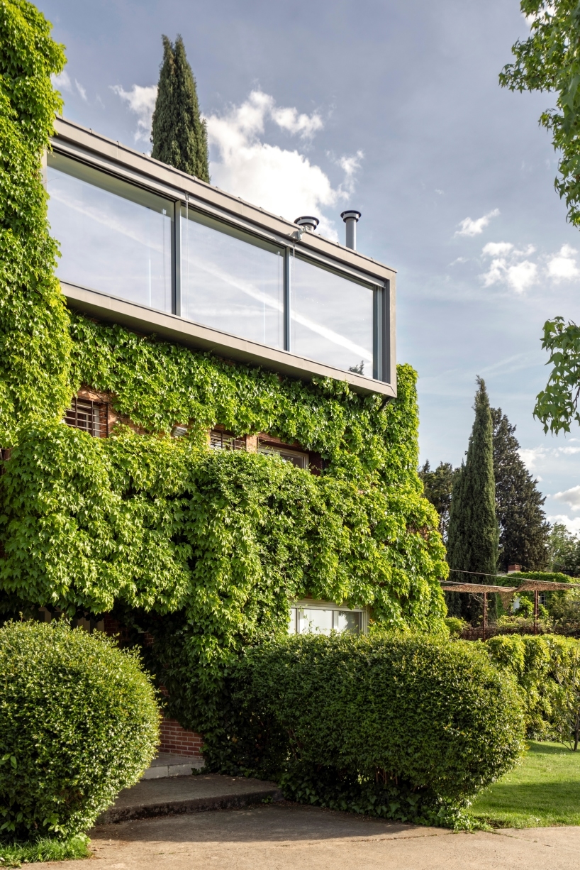
DOMEHOME project by EME 157 involves the expansion of a single-family home in Aravaca, Madrid, adding a new floor to accommodate an independent apartment for the family’s son. The renovation primarily focuses on transforming the previously unused terrace on the top floor into a habitable space. The design process begins with the consideration of the external appearance, emphasizing how to crown the existing brick house covered in vegetation. To maintain a balanced height without excessive increase, the design adopts a domed shape, allowing for increased internal height, spatial dignity, and reduced perception of height from the exterior.


The choice of cork for the new floor contributes to its distinctiveness, both in terms of materiality and insulation properties, contrasting with the solidity of the brick in the rest of the house. Zinc is employed for the vault, aligning with the overall design strategy. 

eme 157's domehome emerges from foliage-covered brick house in spain
all images by © Luis Asin


large circular skylight illuminates the house’s interior


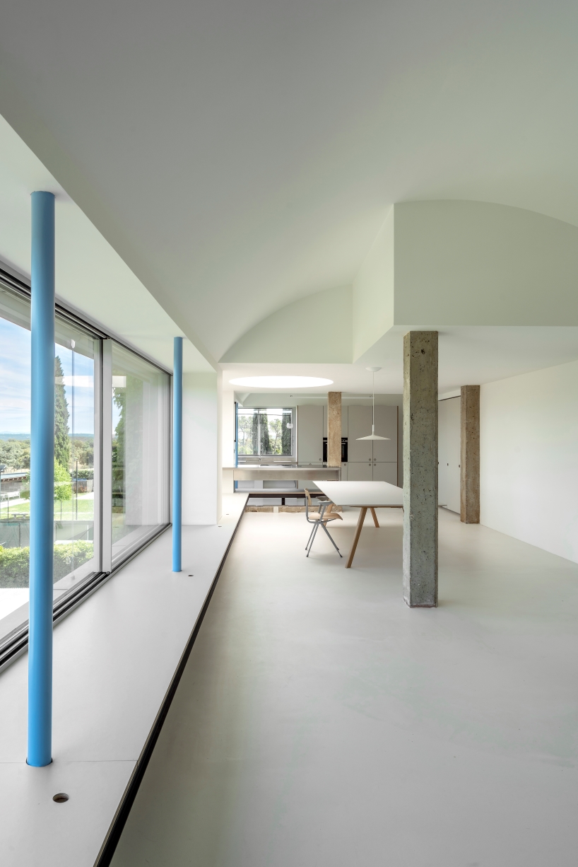
The interior layout, driven by the desire to prioritize panoramic views, comprises 50 sqm on the ground floor housing the entrance, a bedroom, and a bathroom. The upper floor, spanning 130 sqm, is divided into private and public areas. The private zone features a bedroom and bathroom, while the public space integrates an open kitchen, dining room, and living room with expansive north-facing windows. A large circular skylight, originally illuminating the stairwell, floods the room with natural light.


Material simplicity characterizes the interior, with mortar floors, polished stainless steel for countertops and showers, and plywood and linoleum board for furniture. The design team at EME 157 experiments with the contrast between cold and warm materials. Exposed original concrete beams and pillars create a contrast with the new slender circular metal pillars painted in sky blue, seamlessly blending with the breathtaking views outside.

eme 157's domehome emerges from foliage-covered brick house in spain
EME 157 transforms a home in Aravaca, Madrid, adding a new floor for an independent apartment

eme 157's domehome emerges from foliage-covered brick house in spain
the architects crown the brick house with a distinctive domed shape covered in vegetation

eme 157's domehome emerges from foliage-covered brick house in spain
the renovation converts the previously unused top-floor terrace into a functional living space

eme 157's domehome emerges from foliage-covered brick house in spain
the domed design maintains a balanced height, offering increased internal space

Reference