Sustainable Practice: 10 Marvelous Multi-Unit Residences Designed With Passive House Principles
CategoriesArchitecture

Sustainable Practice: 10 Marvelous Multi-Unit Residences Designed With Passive House Principles

Architizer’s 12th Annual A+Awards are officially underway! Sign up for key program updates and prepare your submission ahead of the Final Entry Deadline on January 26th.  

Picture a world where manmade towers not only house vibrant communities but do so with a commitment to energy efficiency and affordability. This may sound too good to be true, but such buildings already exist and are increasingly cropping up in diverse corners of the globe. Indeed, architects worldwide are already imagining a new model for sustainable urban living, where design innovation meets efficiency (energy, monetary and material) in the soaring heights of multiunit residential buildings.

Mitigating the most devastating consequences of our carbon addiction is the overarching challenge of 21st-century society; however, most countries also face housing crises, and affordability is urgent. Can passive house design — long associated with bespoke private single-family homes, both newly built and remodeled — be something of a panacea for affordable housing?

Indeed, the multi-pronged benefits of the following multi-unit projects seem almost too good to be true. Passive House design can reduce energy consumption by up to 90%, leading to substantial savings on energy bills for residents while providing tangible benefits as indoor air quality improves. Standing at the forefront of a green revolution and challenging conventional housing and construction norms, these apartment complexes employ airtight façades, energy recovery systems and innovative insulation, making these buildings pioneers and painting a picture of a future where sustainable architecture is accessible to a broader range of inhabitants.


Timber House

By MESH Architectures, Brooklyn, New York

Jury Winner, 11th Annual A+Awards, Sustainable Multiunit Residential Building
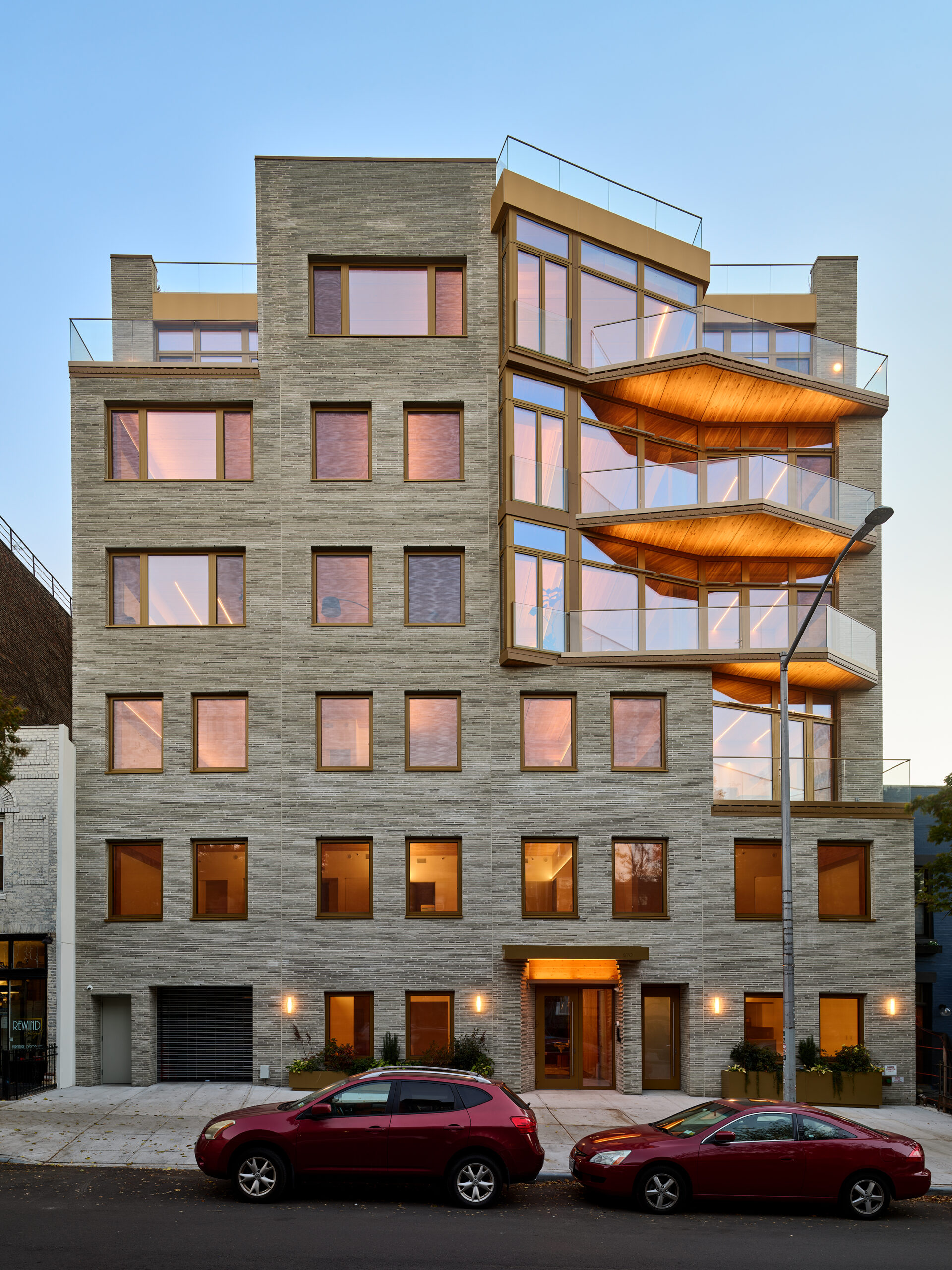

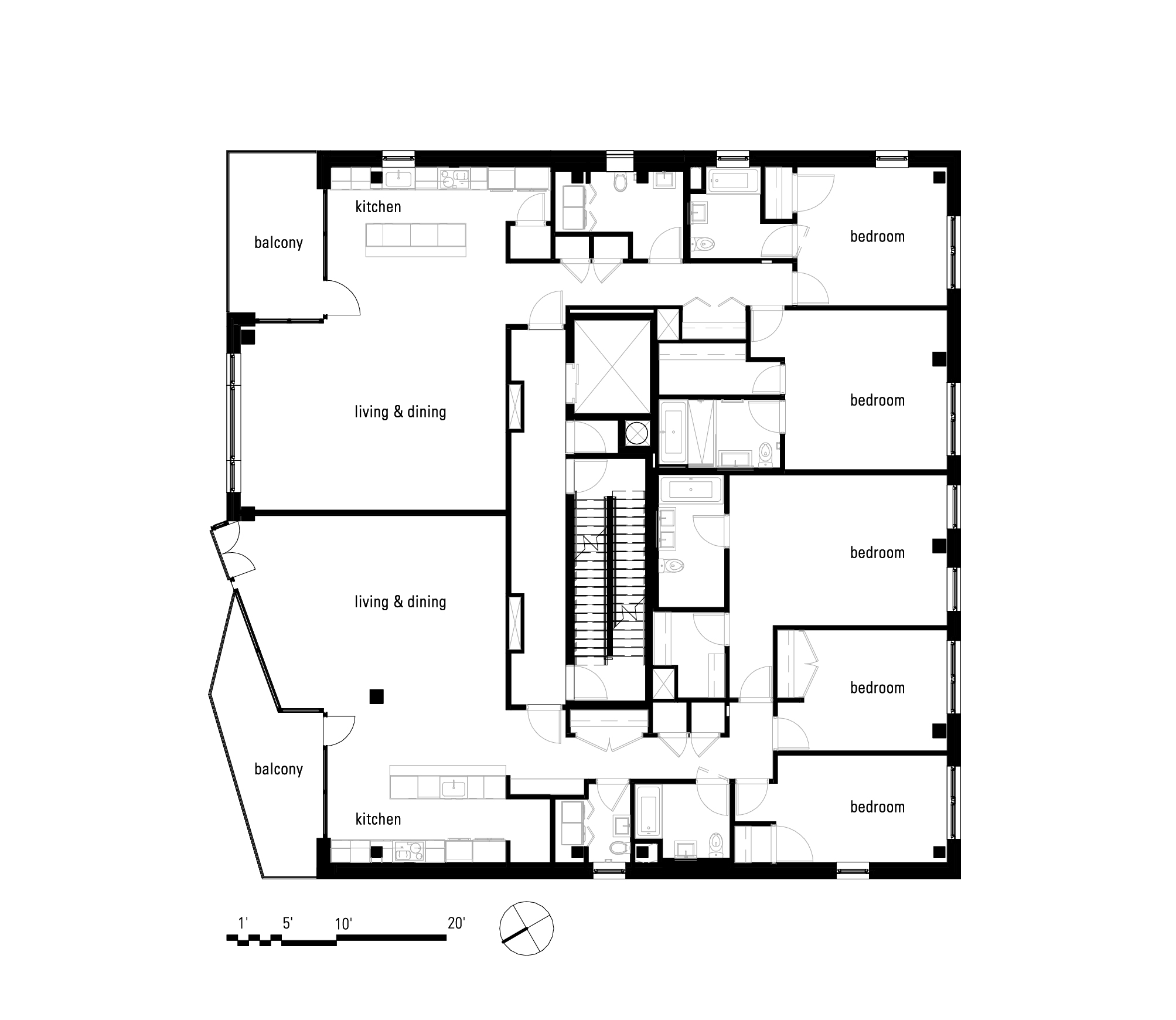
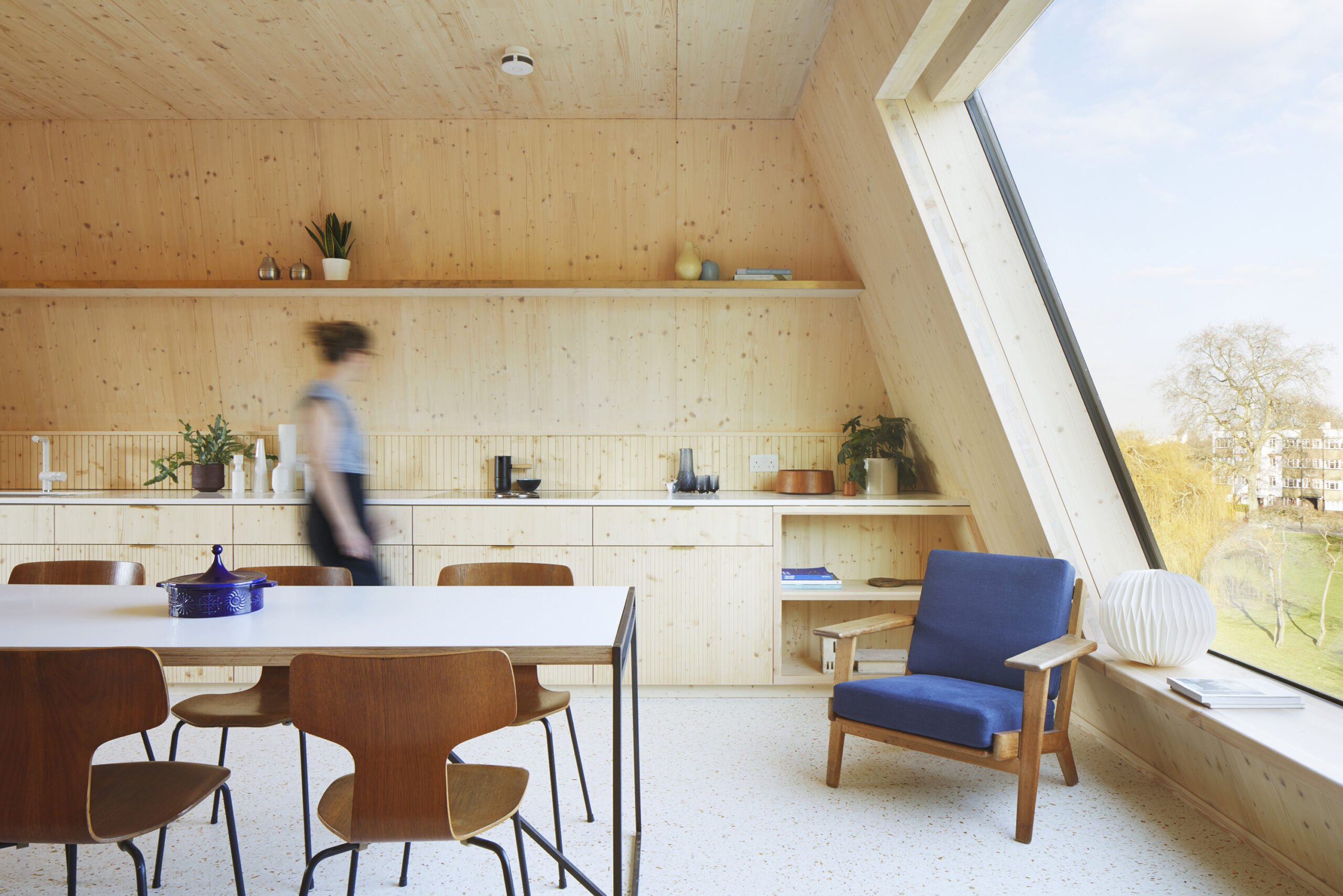
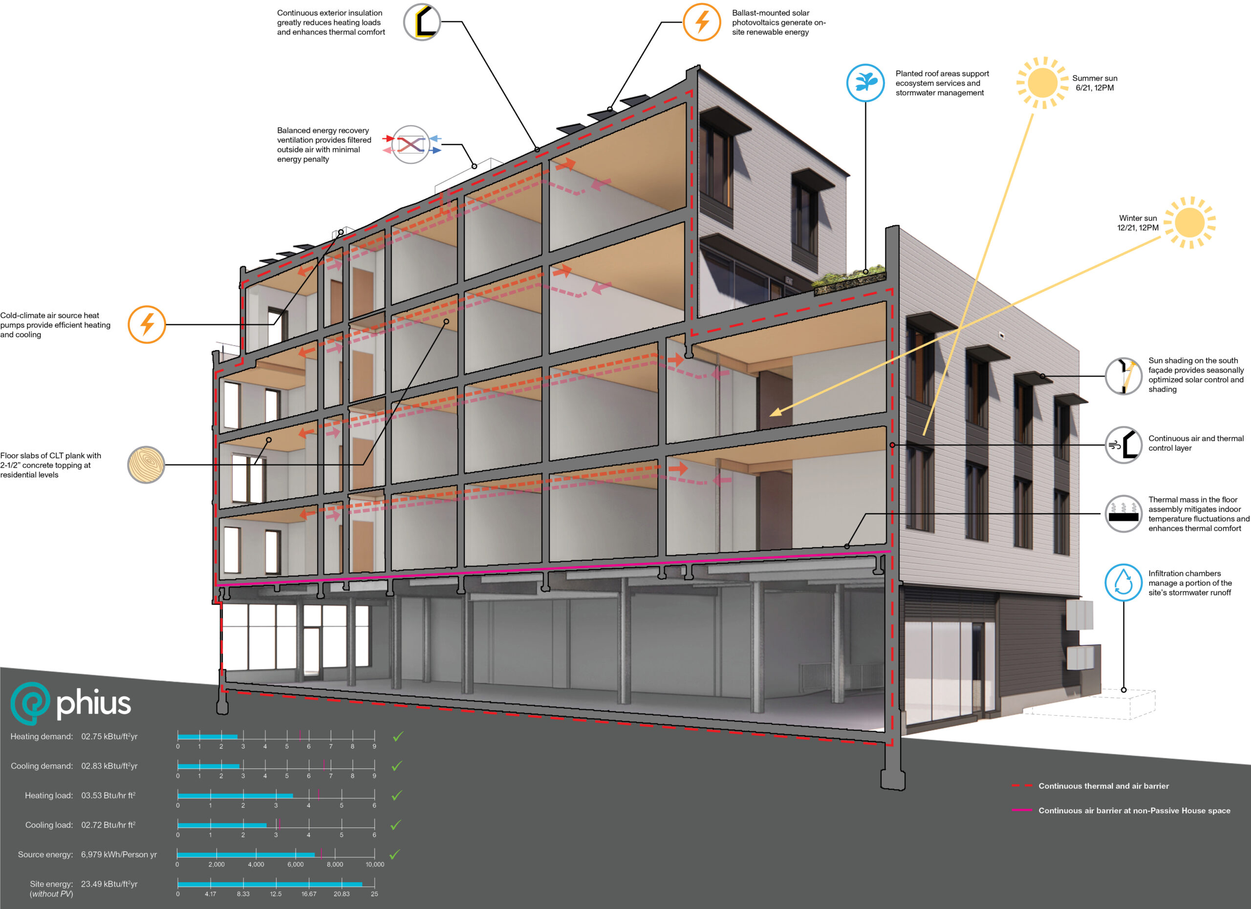
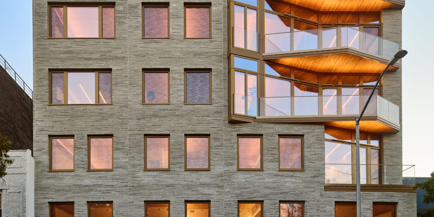
The design for Timber House, New York’s first mass-timber condominium, was principally driven by two things: a high-tech digital model (to generate the wooden components, which were subsequently delivered for assembly) and Passive House design principles. This sustainable haven sets a new standard, uniting nature-inspired aesthetics, energy efficiency and residential comfort in a six-story, fourteen-home marvel. The energy-efficient envelope — sealed with with intensive insulation, “smart” air sealing and triple-glazed windows — wraps around the ingenious structure, which consists of glue-laminated timber columns, beams and floor plates.

Meanwhile, the interior showcases the amazing aesthetic possibilities of specifying low-carbon materials — from hexagonal porcelain tiles to renewable softwoods — all illuminated in the natural light that pours in from multiple skylights. Perhaps most remarkably, the ingenuity of the design ensure that building only relies on the electrical grid (one that is generated by renewable sources) for heating, hot water and cooking.


Paseo Mallorca 15

By OHLAB / oliver hernaiz architecture lab, Palma, Spain
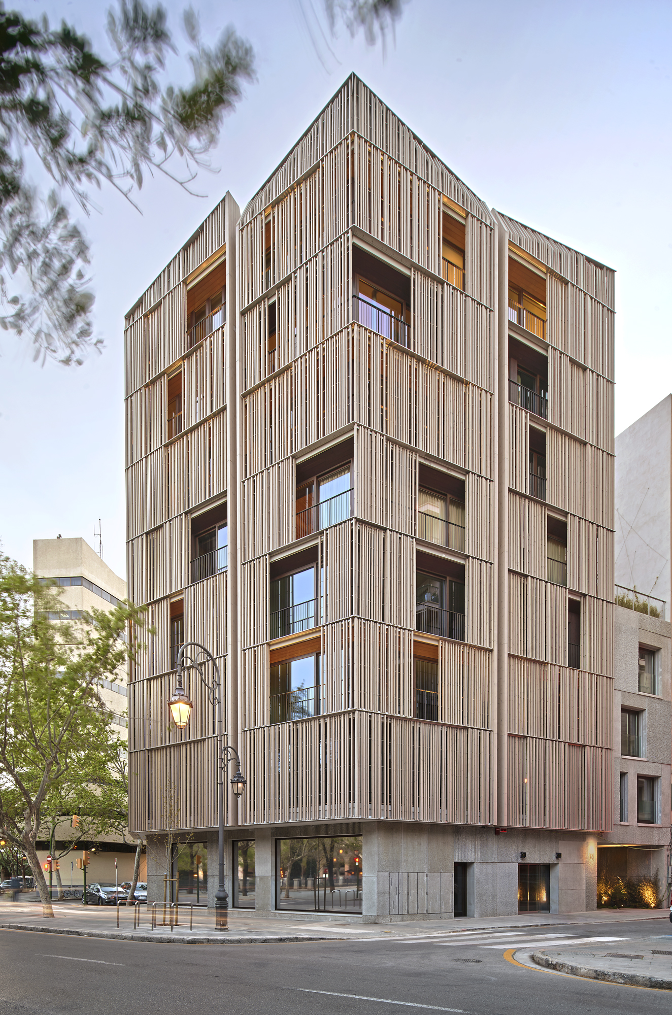
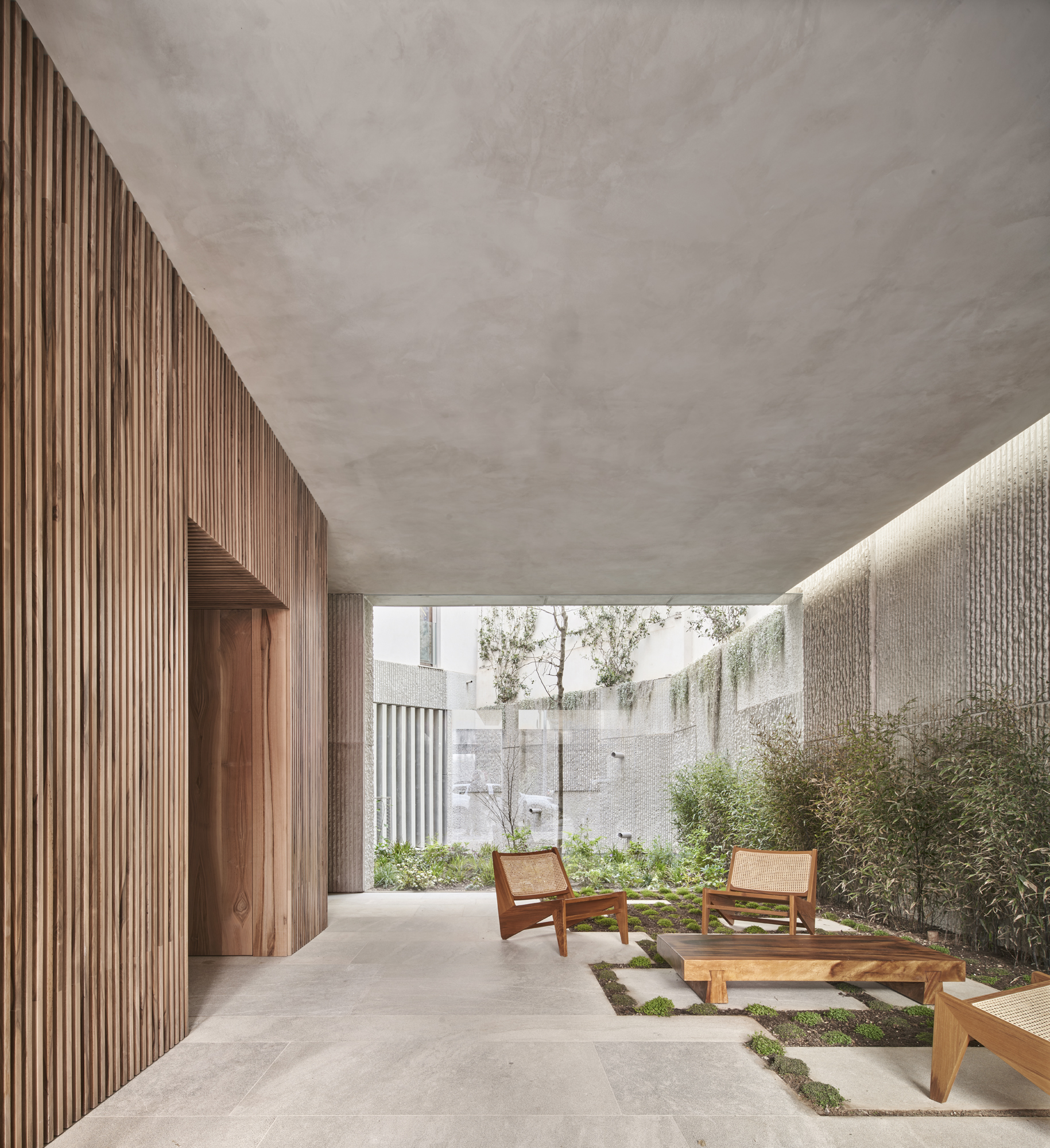
The city of Palma has a new landmark, and it isn’t what the general population might expect from the sun-soaked Mallorcan capital, known for the splendor and intricacy of its massive cathedral and the magnificent concentration of modernismo-style buildings (the Catalan equivalent of Art Nouveau). What sets this new residential complex apart isn’t simply its strikingly delicate façade and palpable material approach, but also the design’s dedication sustainability, energy-efficiency and urban integration.

Passive House standards were used to ensure achieve maximum energy savings; in fact, the design boasts a nearly 90% reduction of the air, heating and cooling requirements of conventional buildings in this area. In addition,  construction method falls within the nZEB (nearly zero energy building) standard for consumption. Sliding panels made of wooden slats are both practical and aesthetic: they filter the intense Mediterranean sunlight but also generate an ever-changing play of patterns inside. These are part of a distinct double façade, sheathing a solid stone envelope beneath.


The Rye Apartments

By Tikari Works, London, United Kingdom
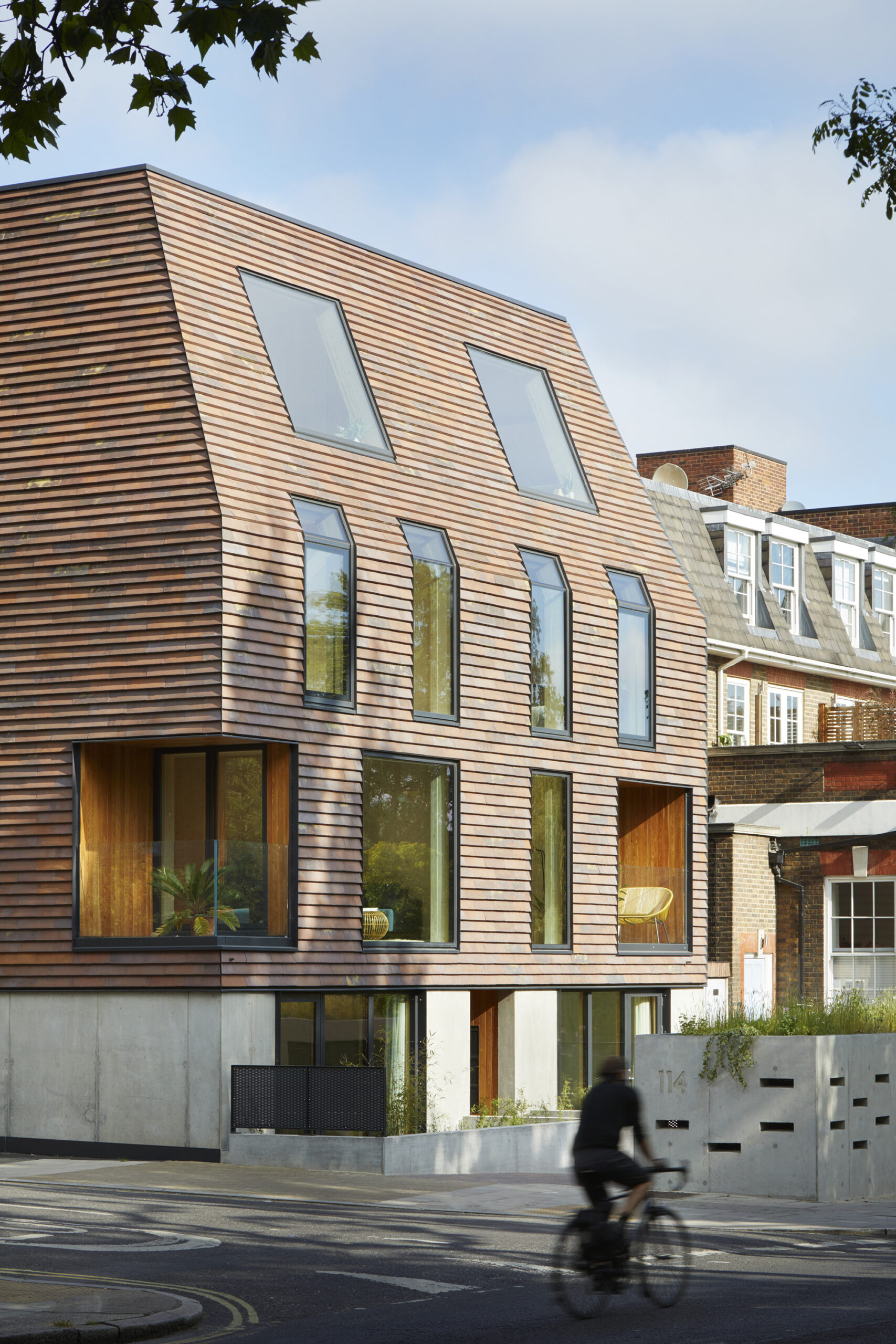
Like a beacon for the future of design, this ten-unit residential building is proudly perched on a highly visible corner in London. The design, which incorporates a variety of different apartment layouts for families of varying sizes, emerged through a rigorous analysis of privacy, daylight and neighboring building forms. The resulting architectural language complements the surrounding context and history. For example, red masonry shingles create an urban composition which is both reminiscent of the surroundings yet distinct.

Beyond aesthetics, the architects consistently sought to maximize the design’s efficiency, by minimizing material use and waste, embodied energy and cost. Such strategies include a Cross Laminated Timber (CLT) frame and numerous passive principals for energy reduction and saving, such as PV panels, whole-house heat recovery ventilation, and hi-performance solar control glazing, all set within a super air-tight envelope.


Vital Brookdale

By Dattner Architects, Brooklyn, New York
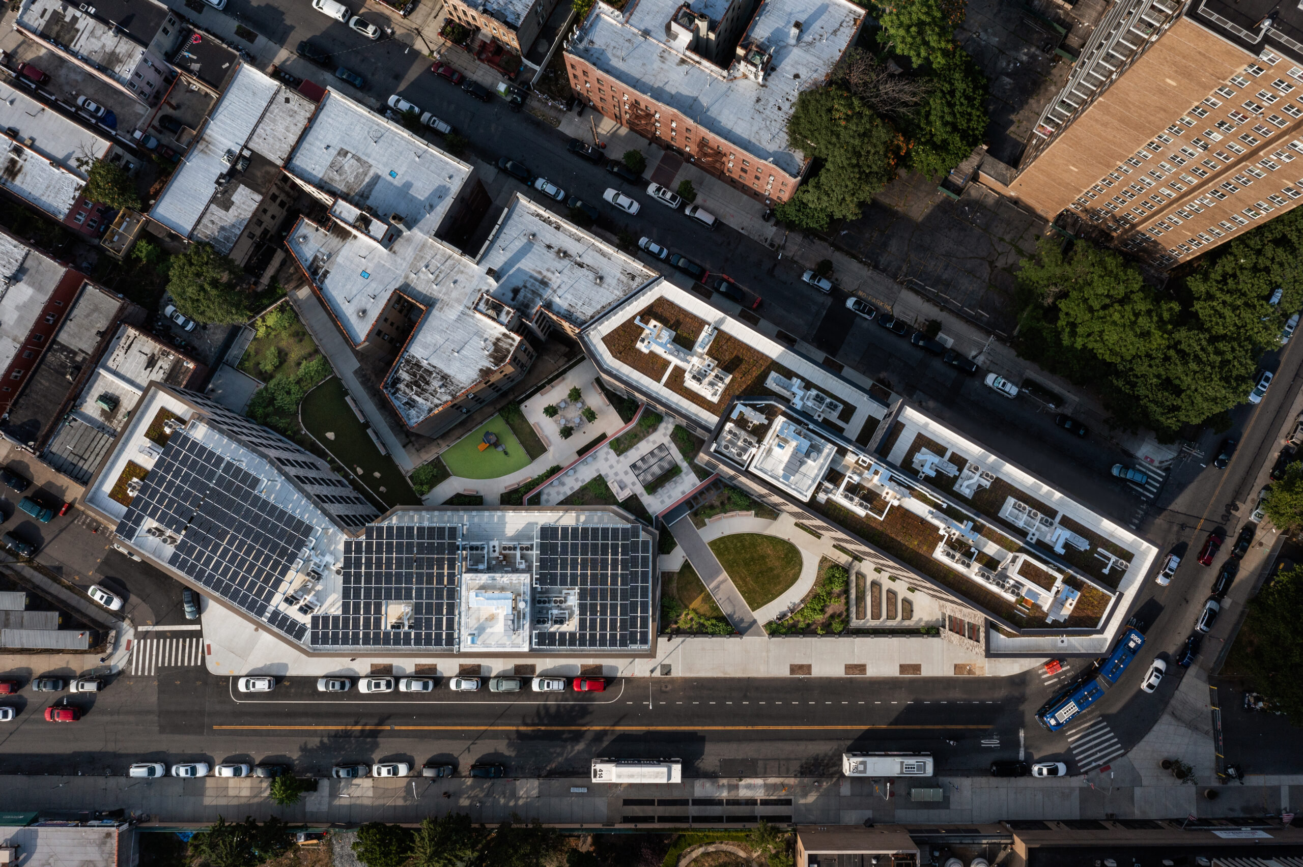
Vital Brookdale stands as a prime example of affordable Passive House and community-oriented housing, providing 160 affordable housing units and 25,000 square feet (2,320 square meters) of health-centric community space in Brooklyn’s Brownsville neighborhood. This initiative incorporates a 100kW solar photovoltaic system mounted on the roof, a green roof, advanced mechanical systems, top-tier insulation and windows, LED lighting, water fixtures with low flow, and various other energy-efficient features. Meanwhile, inside, materials were selected according to the ease of installation, cost, maintenance and their impact on resident health. The result is a resounding testament to the untapped power of Passive House design in multifamily housing.


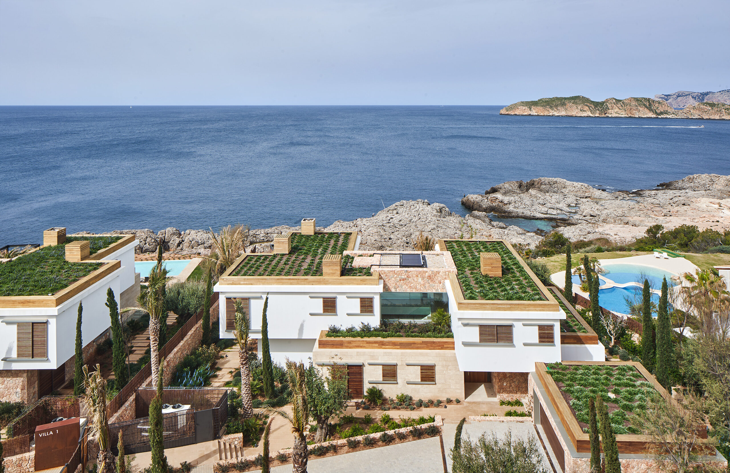
PUNTA PRIMA MALLORCA

By GRAS Reynés Arquitectos, Calvià, Spain
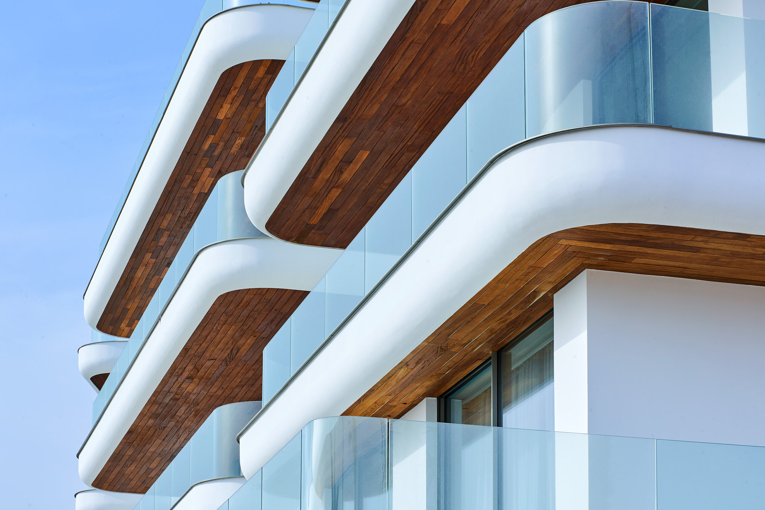
The challenge: a client’s demand for extensive construction on a limited plot, which left little space for nature. The solution: a strategic blend of architectural elements that minimize visual impact and enhance the natural values of the land, embracing Passive House design to do so.


154 Broadway

By Utile, Inc., Somerville, Massachusetts
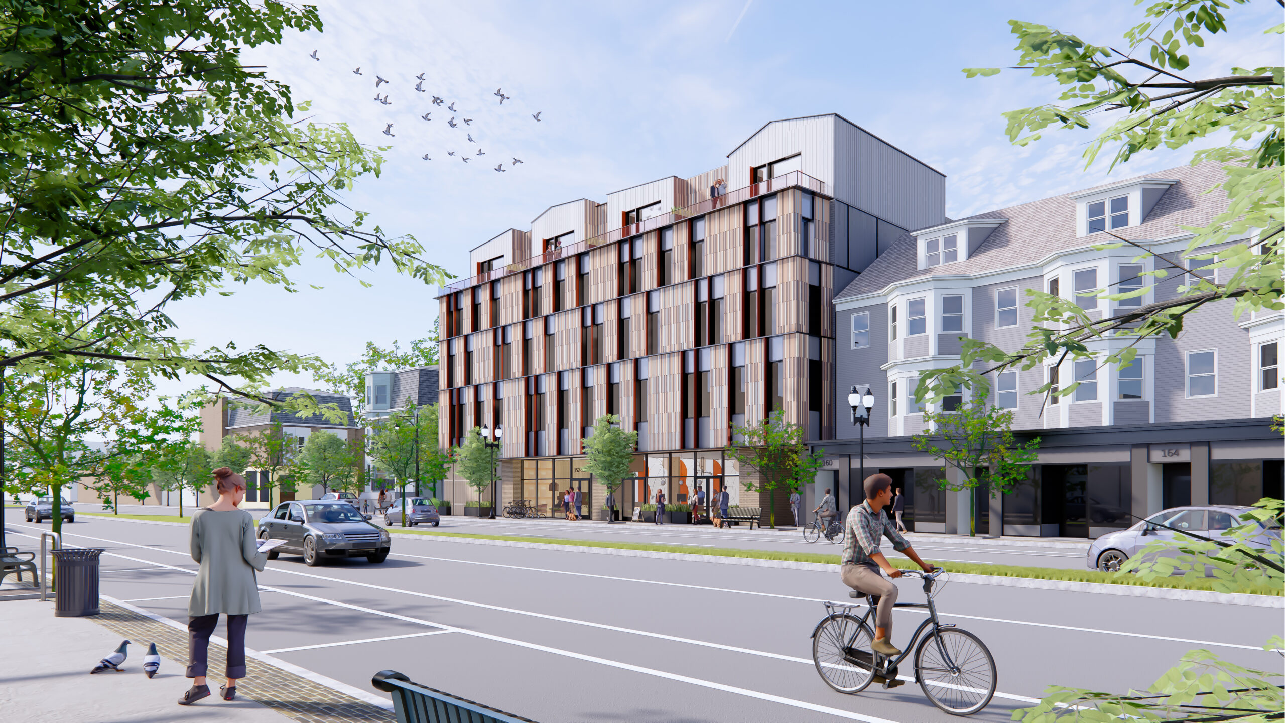
A five-story mixed-use development with commercial space on the ground floor and 45 rental units above, this project achieved Passive House certification, utilizes mass timber construction and is an all-electric, Net Zero Ready Building. The upper floors facing Broadway showcase a mosaic of rainscreen siding, reducing massing while providing shading and play of light through deep windows.

As an all-electric initiative, 154 Broadway eliminates on-site fossil fuel combustion and significantly reduces grid demand through an efficient, airtight envelope and advanced ventilation systems. The sizable design comprises 40 studios, 3 one-bedroom and 2 three-bedroom units, including 9 affordable units.


Sendero Verde

By Handel Architects, New York City, New York
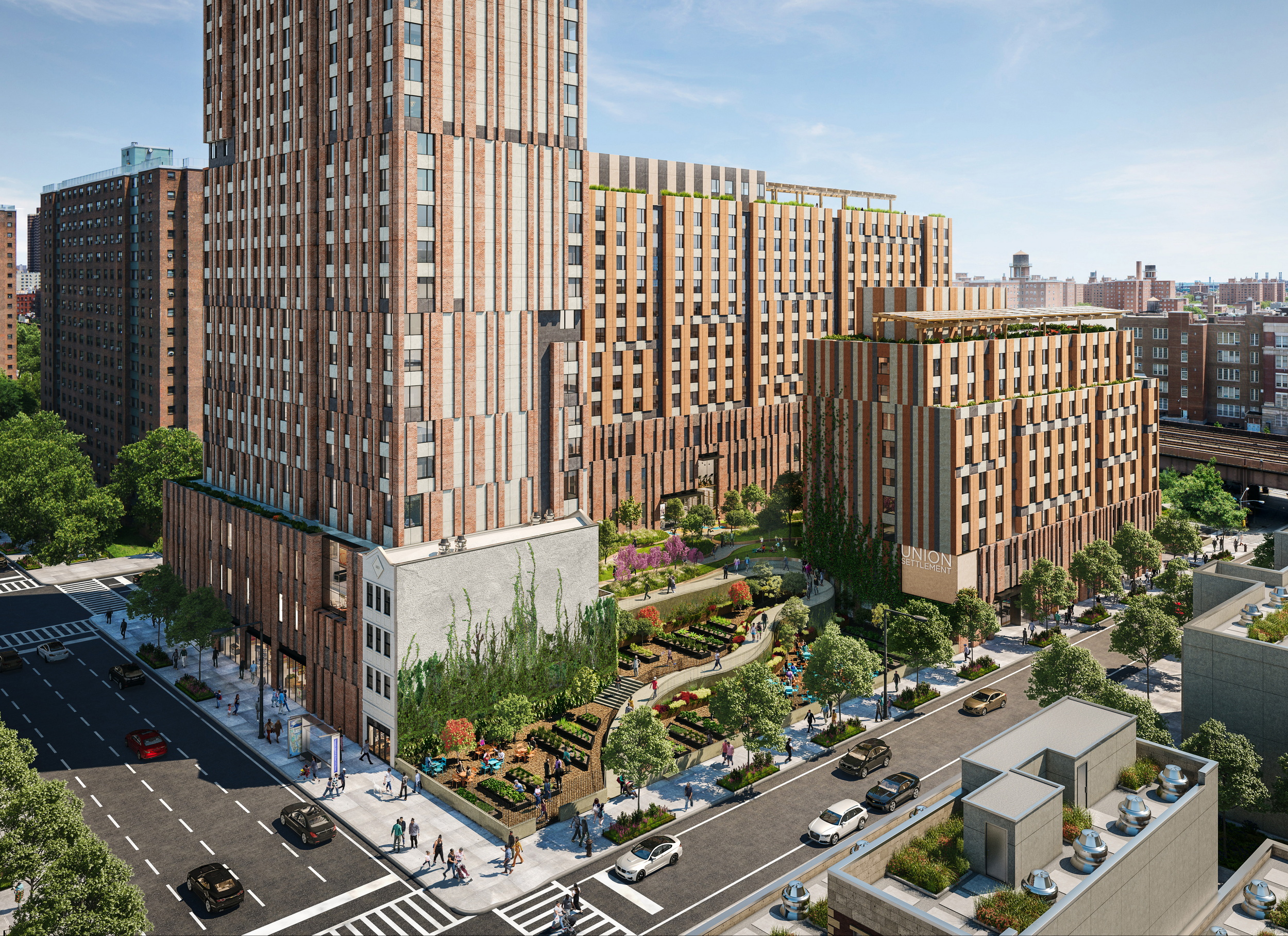
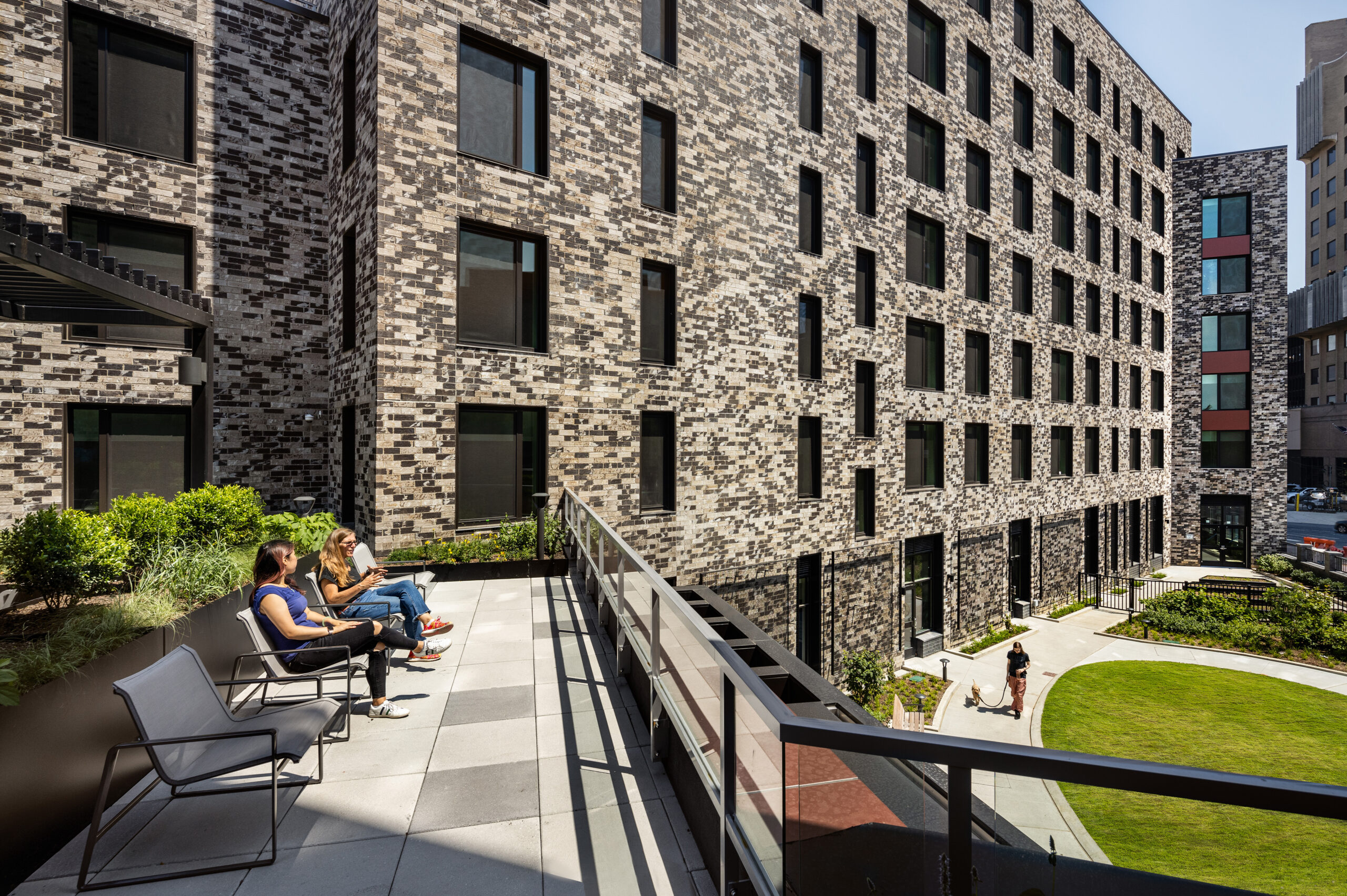
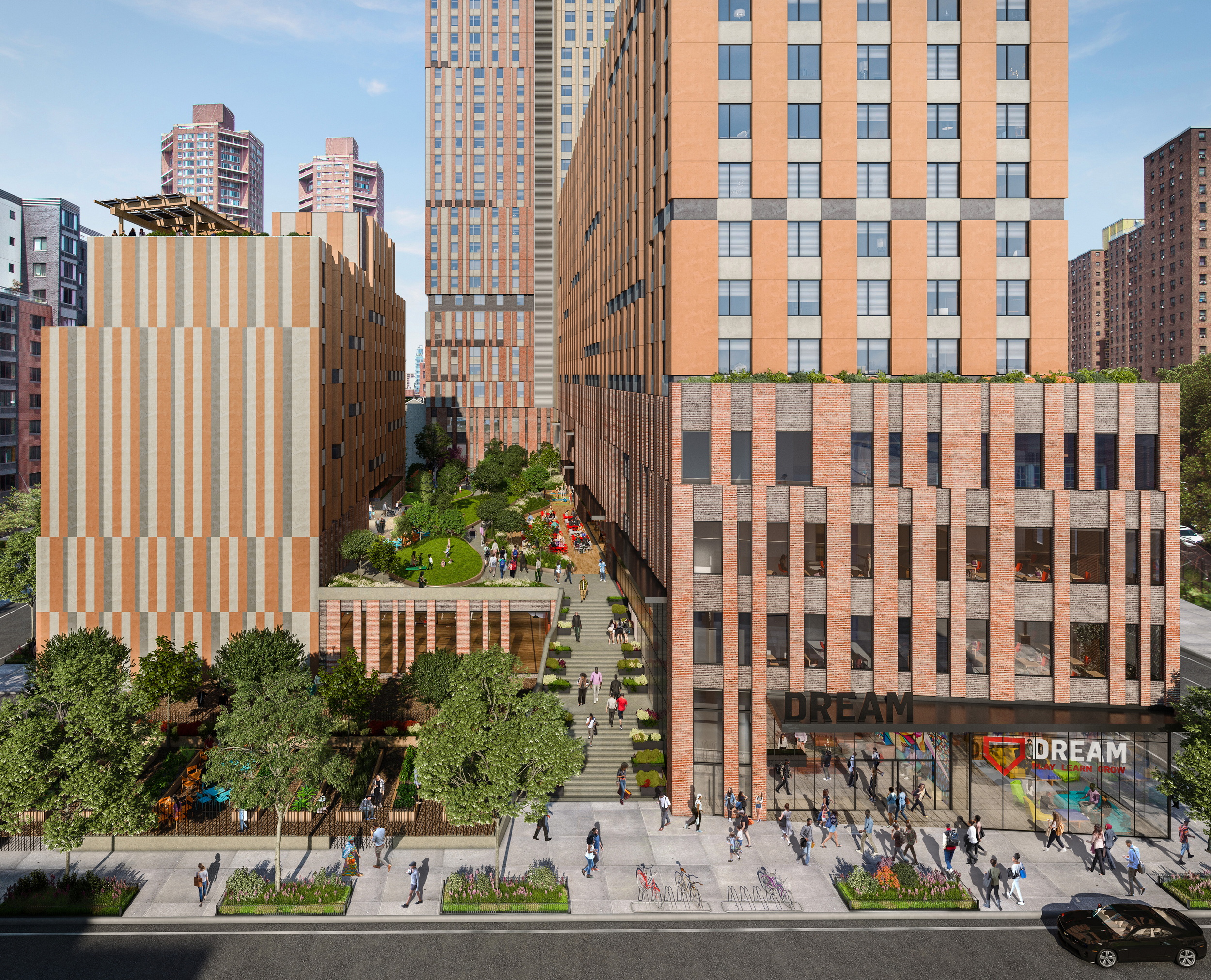
Located in East Harlem, the design for this massive housing complex, home to 709 affordable units, prioritizes Passive House principles without compromising on design excellence. Inspired by a historic trail that once traversed the location, the project organizes itself into three distinct volumes, which frame a central meandering landscaped path. that culminates in a captivating central courtyard. This dynamic space cascades across various levels, fostering the creation of individual community gardens.

Sendero Verde stands as a testament to the fusion of radical architecture and sustainability on a monumental scale. Upon completion, Sendero Verde is poised to redefine architectural boundaries as the world’s largest fully affordable Passive House building.


Quarter of Nations

By Gerber Architekten, Hamburg, Germany
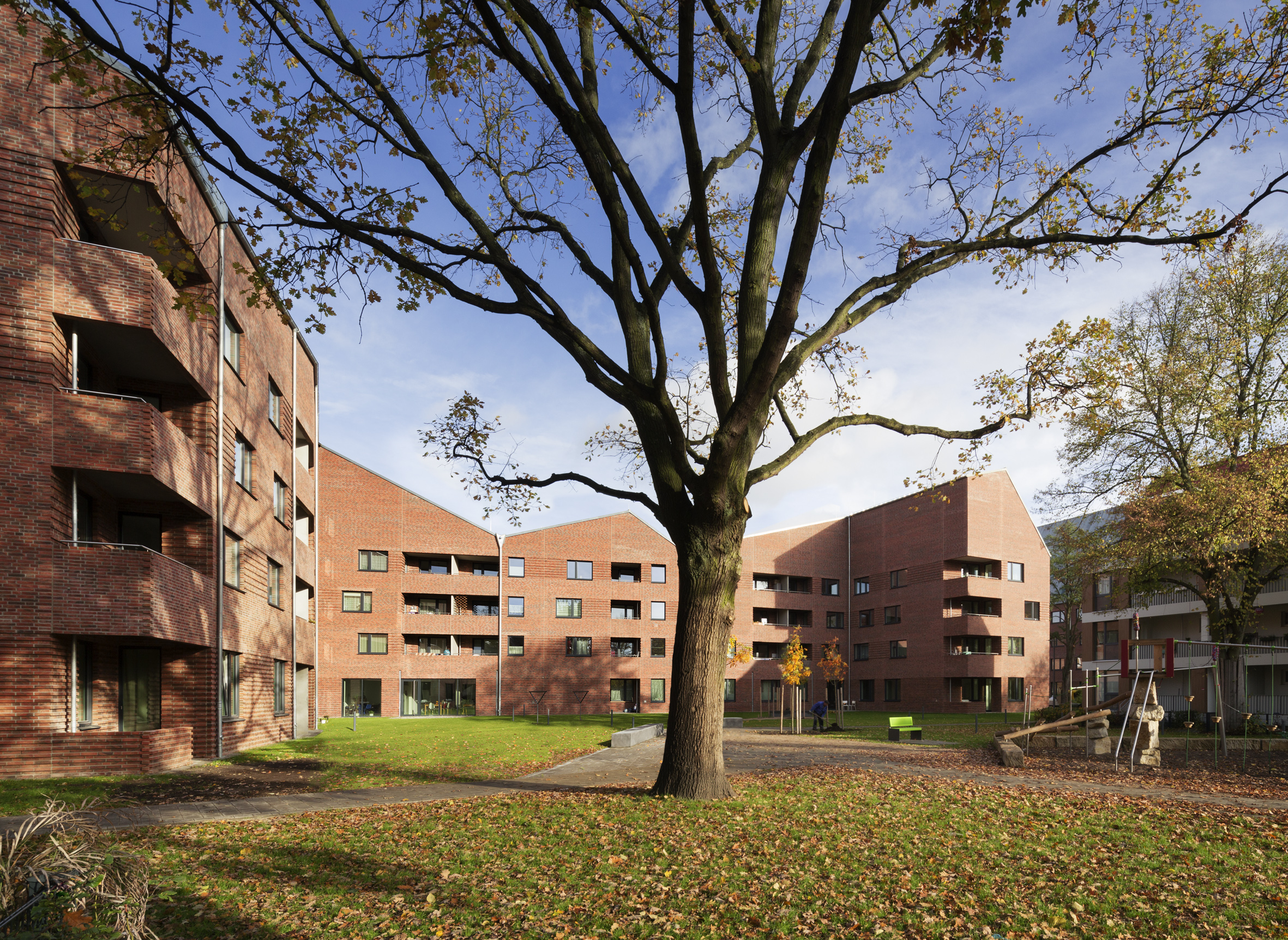
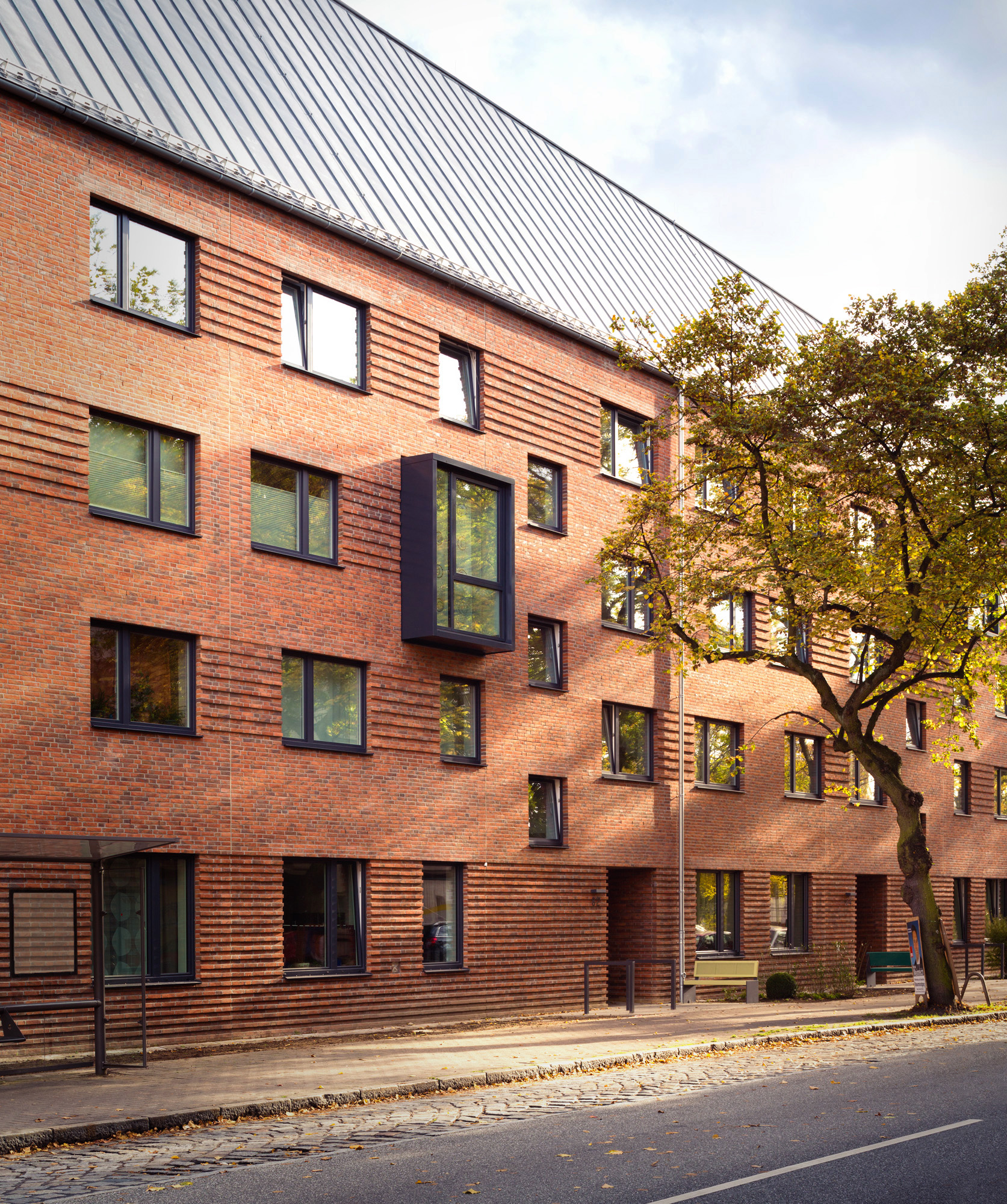
These two new sculptural buildings in Hamberg extend a traditional working class residential area, reinterpreting the original architectural language or the area while simultaneously reconciling them with the high energy efficiency requirements of a passive house building. The resulting complex adds seventy-five publicly funded housing units that vary in size and layout (for single persons, couples and families), thereby extending the principals of the surrounding urban fabric — IBA 2013, an intercultural housing project designed to house over 1,700 people from 30 different nations.


The SIX Veterans Housing

By Brooks + Scarpa Architects, Los Angeles, California
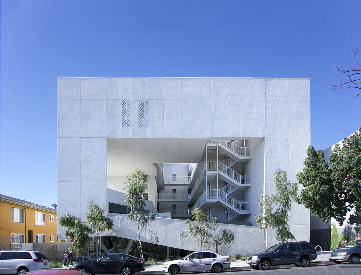
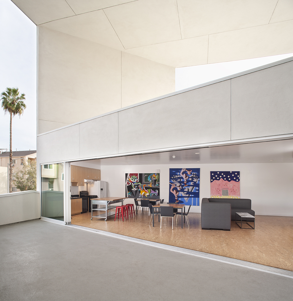
The SIX, a LEED Gold-certified affordable housing project, redefines shelter for previously homeless veterans in McArthur Park. Breaking from traditional layouts, it prioritizes public areas over private space: four levels of housing units surround a courtyard with green-roofed balconies, visually connecting to the street below.

What truly sets The SIX apart, however, is its commitment to Passive House principles, surpassing standard practices for energy efficiency. From solar control and natural ventilation to daylight optimization and low-flow fixtures, every aspect is meticulously planned. This results in a building 50% more efficient than conventional structures.


Ville Verdi

By ALBERT WIMMER ZT-GMBH, Vienna, Austria
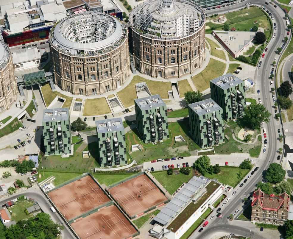
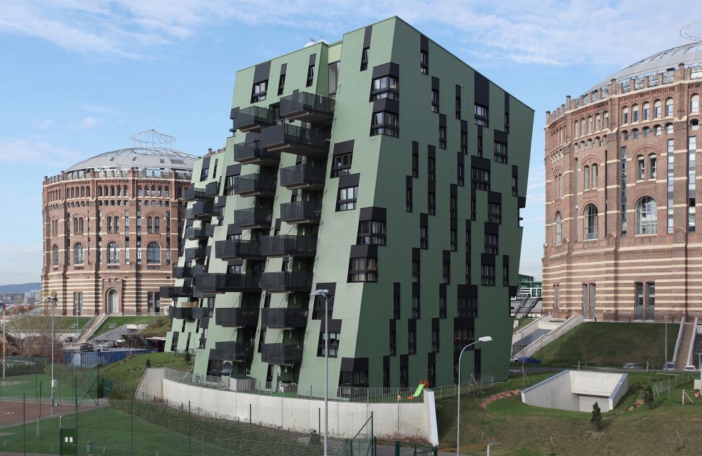
Ville Verdi transcends traditional housing, embracing passive house elements to form an eco-friendly haven. Comprising 5 villas with 34 residential units each, the design emphasizes barrier-free accessibility and communal spaces, fostering a sense of community.

The innovative eco-design incorporates a corrugated iron cladding contributes to the three-dimensional shapes while providing for a recyclable and virtually maintenance-free façade. This rear-ventilated façade prevents construction damages and the system can be extended to Passive House standard.


Knickerbocker Commons Passive House Apartment Building

By Chris Benedict R.A., New York City, New York
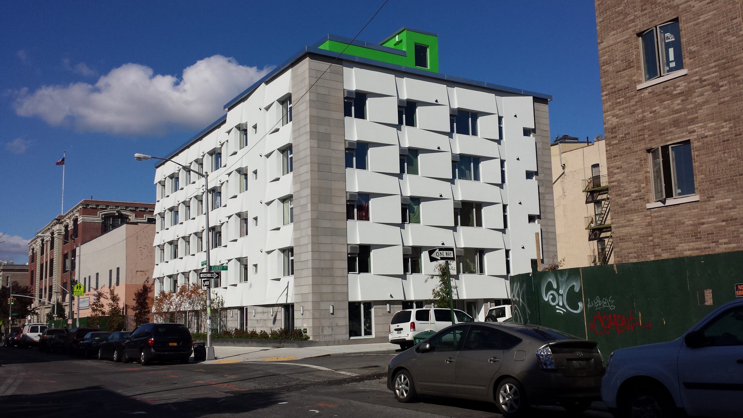
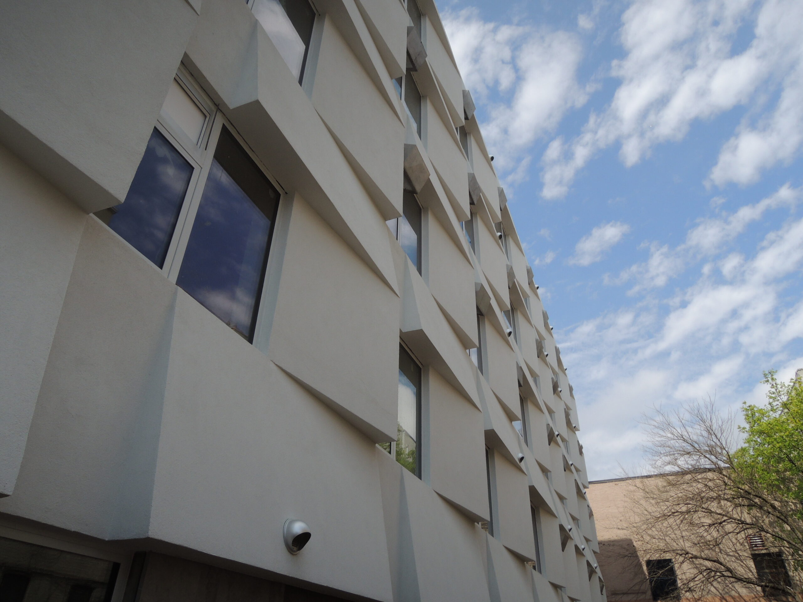
Designed to operate with an impressive 85 percent less energy than typical New York City apartment buildings, this groundbreaking six-story residential building in Bushwick was the country’s first mid-sized apartment complex adhering to Passive House design standards. Featuring 24 units of affordable housing, each rental residence incorporates individual ventilation systems, small radiators for heating and airtight window air conditioning units, meeting the stringent Passive House criteria. The triple-paned windows and a sculpted exterior facade utilizing STO EIFS insulation optimize energy performance by minimizing heat loss in winter and reducing solar heat gain in summer.

Architizer’s 12th Annual A+Awards are officially underway! Sign up for key program updates and prepare your submission ahead of the Final Entry Deadline on January 26th.  

Reference

CASE-REAL transforms 80-year-old traditional japanese house into craft beer brewery
CategoriesArchitecture

CASE-REAL transforms 80-year-old traditional japanese house into craft beer brewery

craft beer Brewery by CASE-REAL


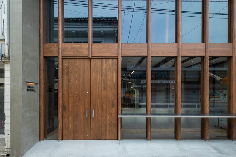
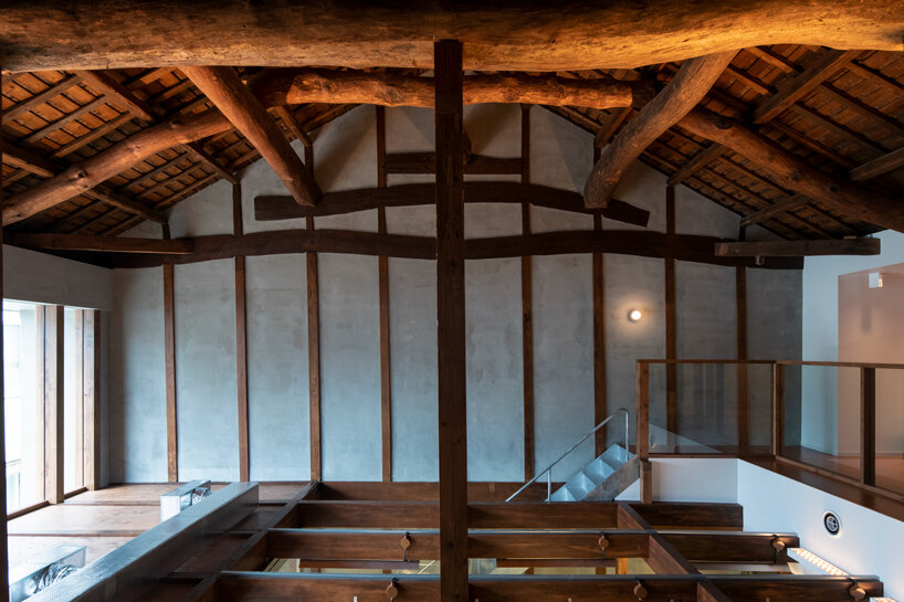
In Saga, Japan, a renovation project by CASE-REAL has transformed an 80-year-old traditional Japanese house into a craft beer brewery, named Whale Brewing. Yobuko, historically known for whaling during the Edo period and later famed for squid fishing, faces modern challenges like a declining population due to youth migration and numerous vacant houses. Given this context, the project was conceived with the aim of acting as a magnet for young people and rejuvenating the town. The chosen location for the brewery was an old traditional house along Yobuko Asaichi-dori, a street bustling with local seafood and goods stalls each morning. This aging house had been abandoned, suffering from leaks, facade deterioration, and structural issues. However, after the interior was dismantled, it revealed a sturdy structure, around nine meters tall, with hidden potential.

CASE-REAL transforms 80-year-old traditional japanese house into craft beer brewery
the goal of this project was to breathe new life into the town, all images by CASE-REAL


a New Landmark in Yobuko


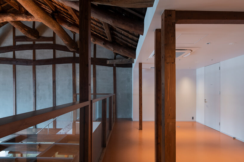
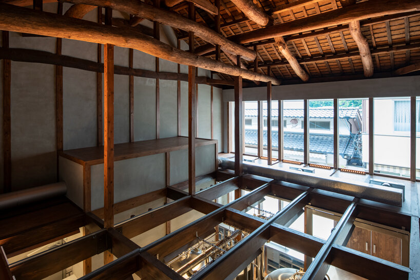
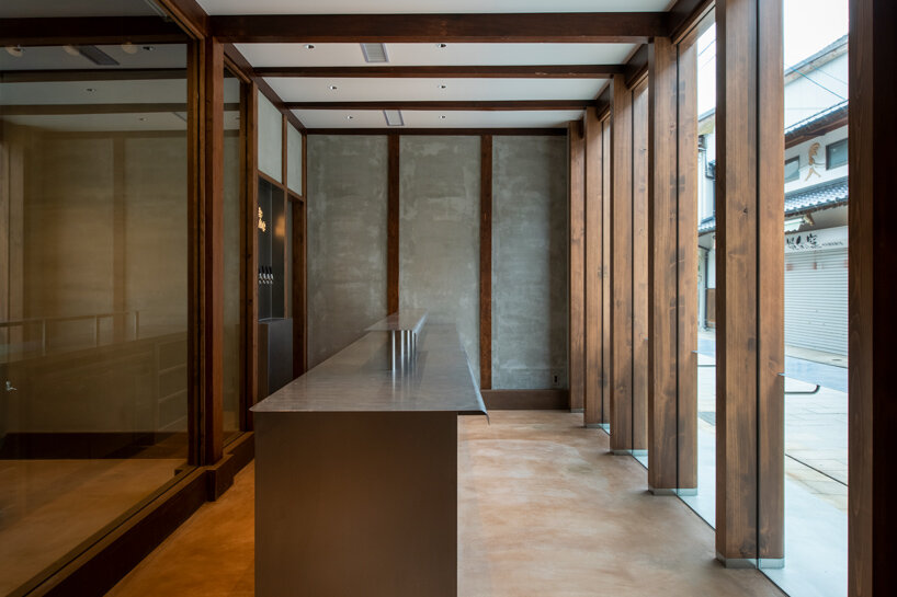
After extensive discussions with clients, the architects at CASE-REAL chose to incorporate the existing strengths of the house into the new brewery design. The building’s layout features a storefront area with a ceiling on the facade side, while the brewing space utilizes the generous height of the second floor through an open atrium. A continuous glass facade spans both levels, offering a view of the street that showcases the robust beams and the brewery ambiance, despite the ceiling variation in the store area. To accommodate ground conditions, the floor plan includes a sloped design that connects the elevated rear of the building. Stainless steel was selectively utilized for elements like the counter and handles, maintaining a cohesive material theme in line with the brewing tanks. Certain façade pillars, essential for support, were crafted from solid Japanese cypress, accentuating the space’s height and adding a distinctive touch. The incorporation of rounded shapes in the pillars and counter edges was intentional, aiming to introduce a sense of softness and effectively merge structural elements with the overall design.‘By combining the new functions of the brewery with the original characteristics of the building, we hope that this will become a new landmark in Yobuko, firmly rooted in the local community,’ shared the architects.
CASE-REAL transforms 80-year-old traditional japanese house into craft beer brewery

CASE-REAL transforms 80-year-old traditional japanese house into craft beer brewery
the brewing space utilizes the generous height of the second floor through an open atrium

CASE-REAL transforms 80-year-old traditional japanese house into craft beer brewery
the new structure blends the brewery’s functionalities with the house’s original features

CASE-REAL transforms 80-year-old traditional japanese house into craft beer brewery

Reference

Antonino Cardillo designs Elogio del Grigio house as “miniature palazzo”
CategoriesArchitecture

Antonino Cardillo designs Elogio del Grigio house as “miniature palazzo”

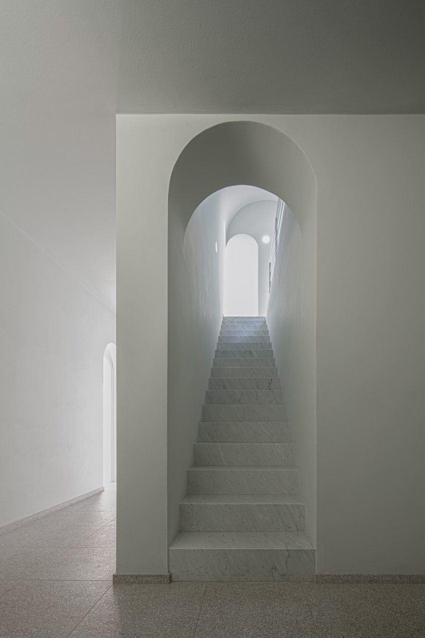
Italian architect Antonino Cardillo has completed a house near Lake Garda featuring steep ceilings, arched doorways and a palette of textured plaster and marble.

Located in Castiglione delle Stiviere, in Italy’s Lombardy region, the two-storey residence was designed by Cardillo in the spirit of “a miniature palazzo”.

Living room in Elogio del Grigio house by Antonino CardilloLiving room in Elogio del Grigio house by Antonino Cardillo
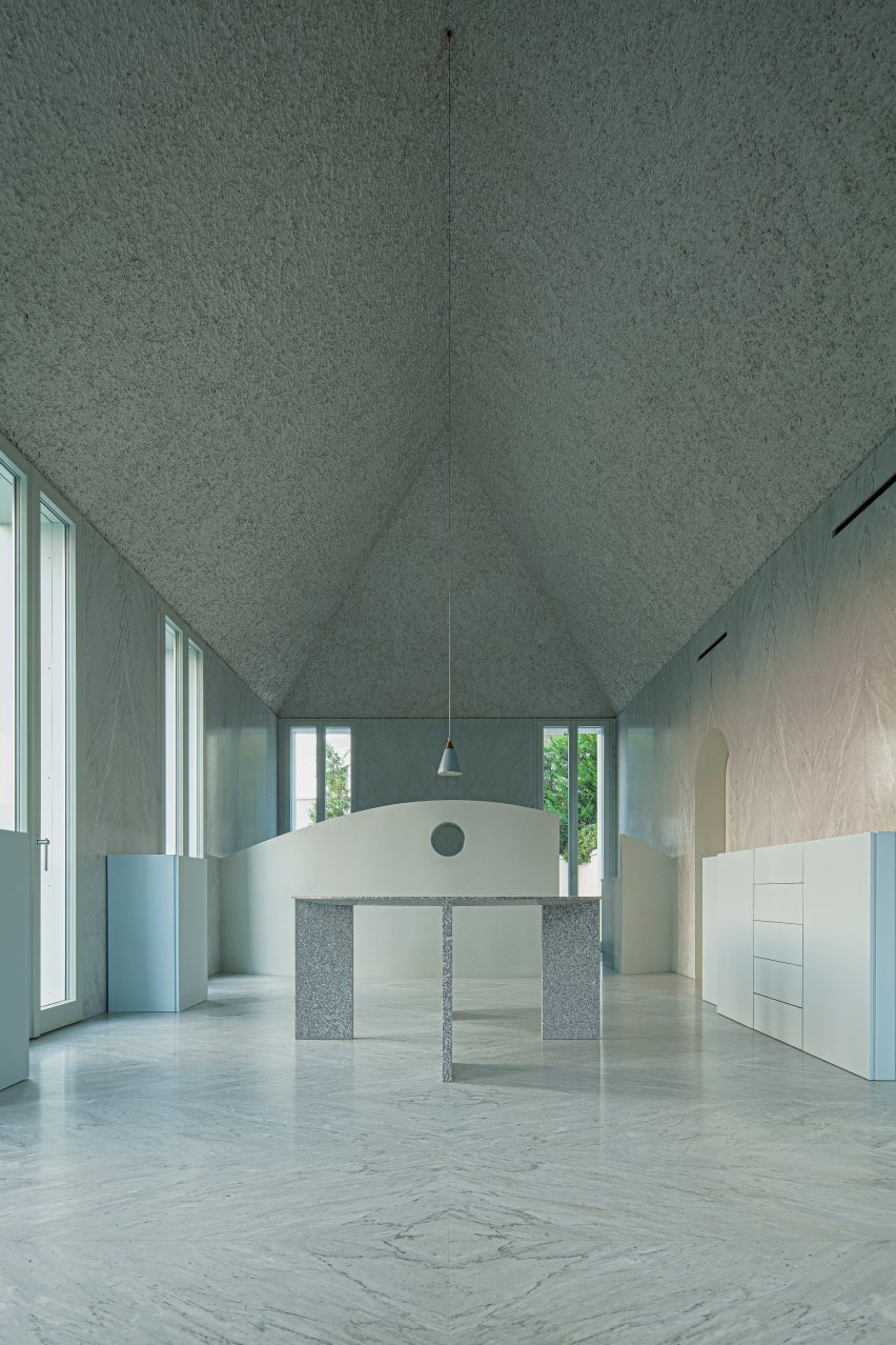
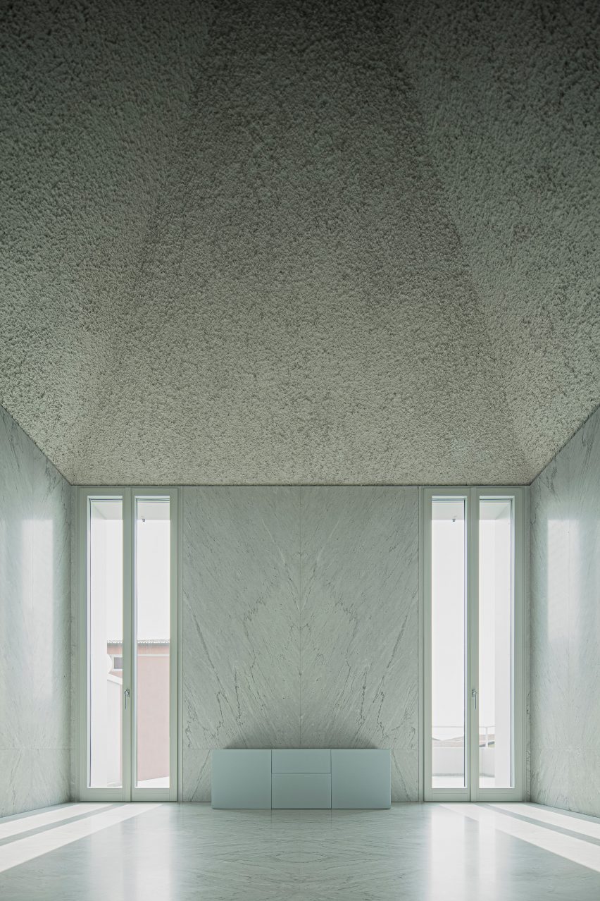
The design centres around a grand first-floor living room and kitchen

Called Elogio del Grigio, which means “praise of grey”, the house combines classic proportions with a minimalist design aesthetic.

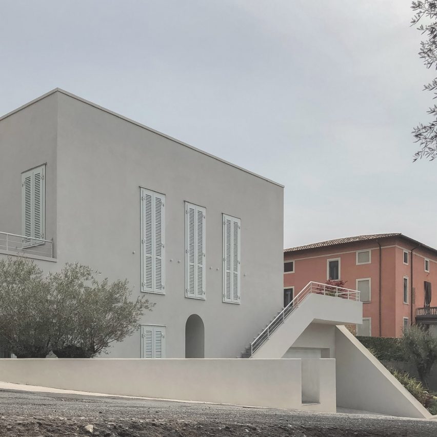
The building echoes the form of its red-walled neighbour, a typical northern Italian villa, but also incorporates references to traditional architecture from different parts of the Mediterranean.

Marble wall in Elogio del Grigio house by Antonino CardilloMarble wall in Elogio del Grigio house by Antonino Cardillo
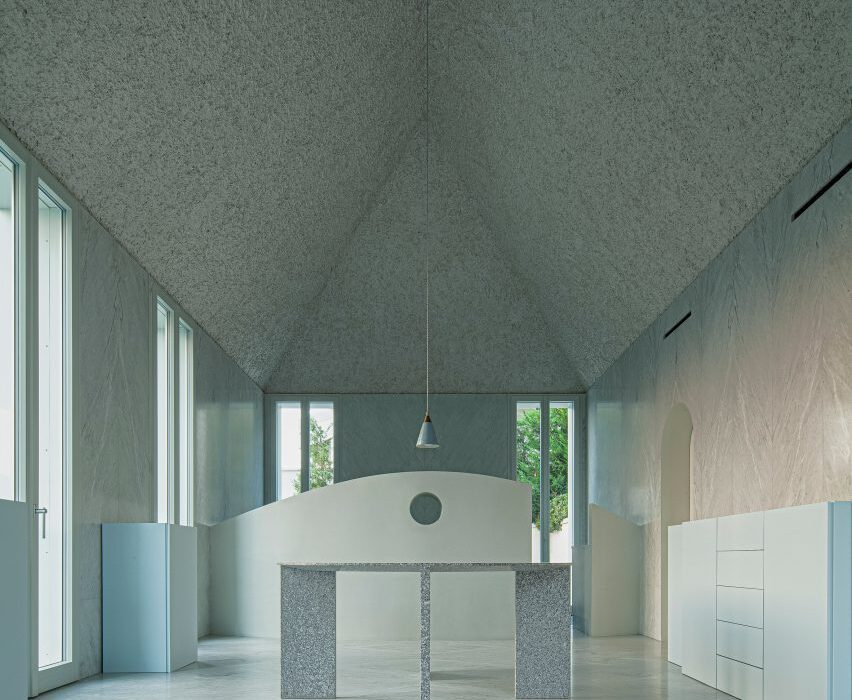
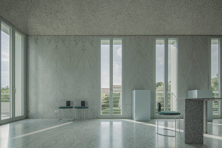
This room features marble walls and textured plaster ceilings

The layout centres around a grand first-floor living room described as “the soul of this house”.

Cardillo drew on “the rectangular cuspidate rooms of Marrakech” and “window panes somewhere between Venetian windows and the marble hammams of Istanbul” for the design.

Sloping ceiling in Elogio del Grigio house by Antonino CardilloSloping ceiling in Elogio del Grigio house by Antonino Cardillo
Full-height glass doors lead out to roof terraces

“The project seeks to recognise and integrate some of the contributions of civilisations which are largely forgotten in Western architecture,” he told Dezeen.

“It accepts Hegel’s invitation to learn to see the endless greys of realities,” he added, referencing the words of a 19th-century German philosopher.

Exterior of Elogio del Grigio house by Antonino CardilloExterior of Elogio del Grigio house by Antonino Cardillo
The building’s exterior is relatively modest

Elogio del Grigio is home to a couple and their young daughter.

After visiting Cardillo’s House of Dust, a Rome apartment featuring deep wall recesses and textured ceilings, the couple asked the architect to design them a family home.

The brief called for generous living and dining spaces on two levels, three bedrooms, two bathrooms, a roof terrace and a garage with space for two cars.

The building’s exterior is relatively modest, with a cool grey render finish and door shutters painted in a slightly brighter green-toned grey.

Marble bathroom in Elogio del Grigio house by Antonino CardilloMarble bathroom in Elogio del Grigio house by Antonino Cardillo
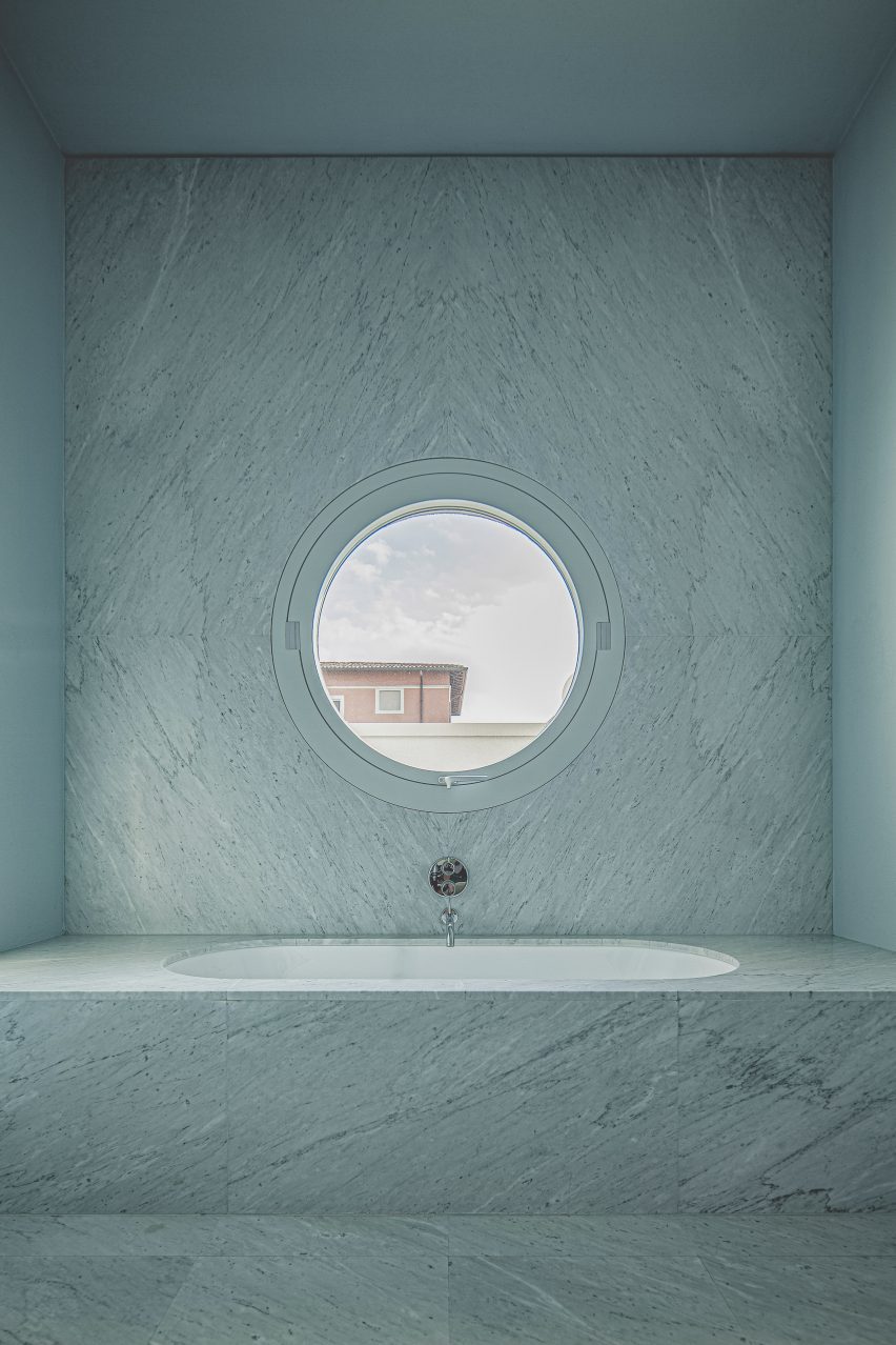
The first-floor bathroom features a porthole window

Inside, the materials palette becomes more luxurious.

Slabs of Carrara marble cover the walls and floors in the first-floor living room and bathroom, with a book-matching technique to create subtle repetition within the surface patterns.

The steeply sloping ceilings are coated with a plaster mix that includes volcanic ash, which was applied with a hand trowel to create the lumpy texture.

Hallway in Elogio del Grigio house by Antonino CardilloHallway in Elogio del Grigio house by Antonino Cardillo
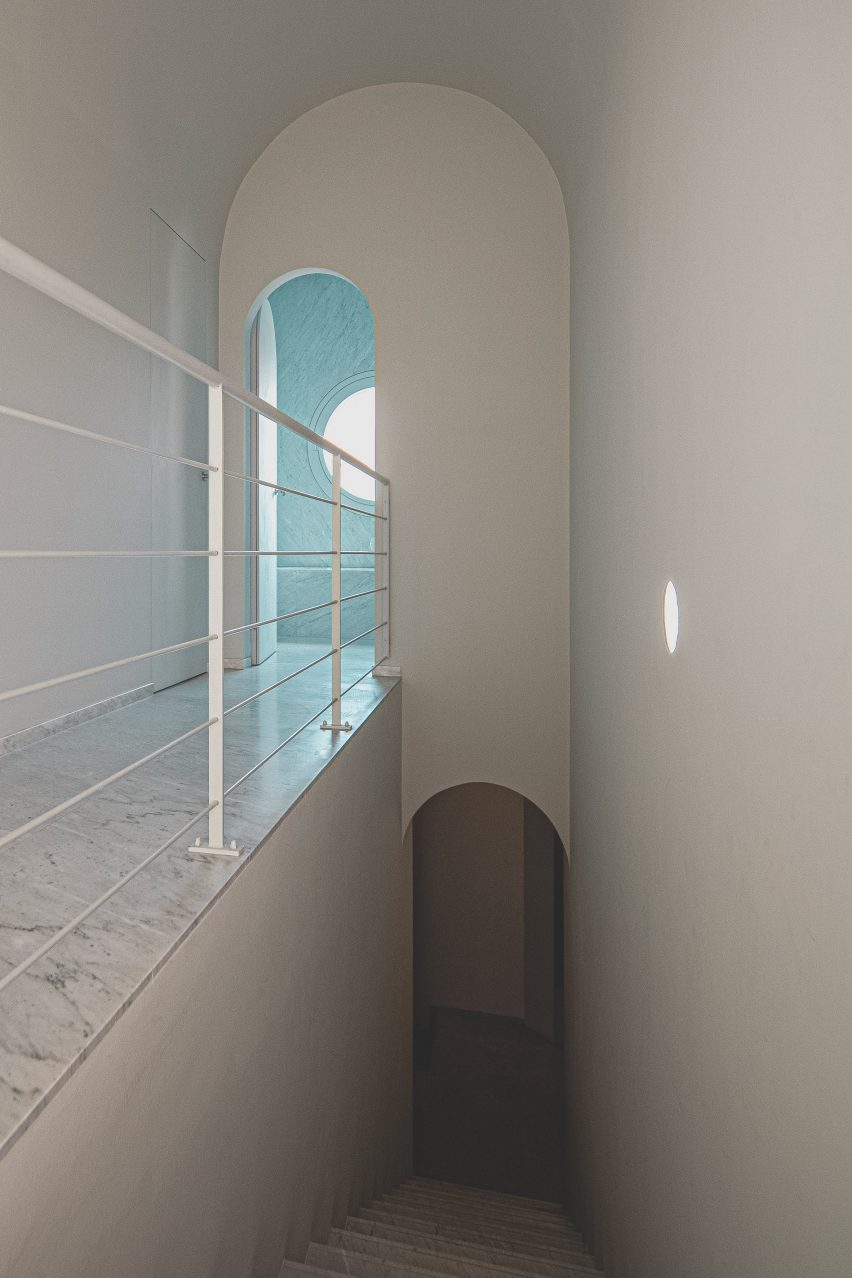
Arched doorways can be found throughout the house

The living room also features a custom-made granite table based on the one in House of Dust, created thanks to the support of stone contractor and previous collaborator, Daniele Ghirardi.

“Daniele had already supported my research by funding an exhibition of my sculptures at the Soane Museum in London a few years ago,” Cardillo said.

Staircase in Elogio del Grigio house by Antonino CardilloStaircase in Elogio del Grigio house by Antonino Cardillo
Granite provides flooring on the ground floor

Bedrooms are also located on the first floor, which is wrapped on three sides by terraces, while the lower level houses an office, the garage and the second kitchen and living space.

Other projects by Cardillo include a textured all-green gallery interior and a Sicilian grotto.

The photography is by Antonino Cardillo.


Project credits:

Architecture: Antonino Cardillo
Construction management: Giampaolo Piva
Quantity surveying: Massimo Maggi
Construction: Andrea Pennati, Giovanni Lancini, Giovanni Locatelli
Masonry: Stefano Camozzi, Marco Fontana, Osmanaj Jeton, Giuseppe Lancini, Carmelo Piterolo, Ramqaj Vehbi
Marbles and granites: Ghirardi
Windows: Wolf Fenster
Air system: Bonometti Graziano, Giacomo Averoldi

Reference

Natura Futura and Juan Carlos Bamba create floating house in Ecuador
CategoriesInterior Design

Natura Futura and Juan Carlos Bamba create floating house in Ecuador

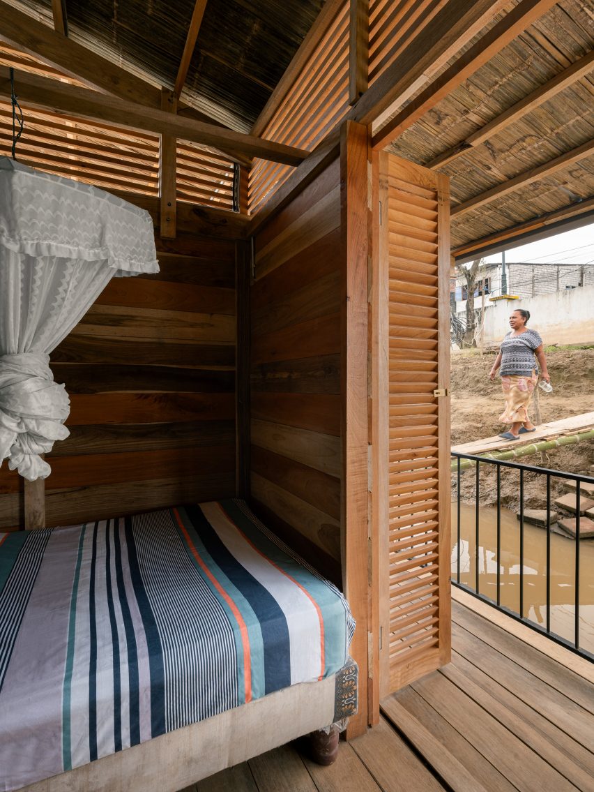
Architecture studio Natura Futura Arquitectura and architect Juan Carlos Bamba have created a floating house along the Babahoyo River in Ecuador.

Situated within a centuries-old floating village at risk of disappearing, La Balsanera is designed as a model for the preservation and sustainable redevelopment of the river’s depleting community.

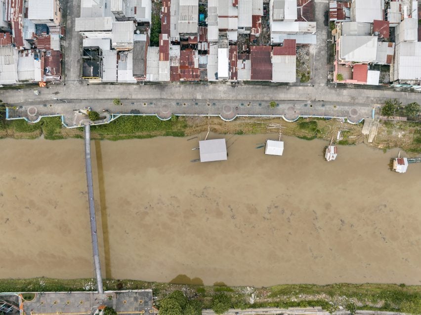
Aerial view of the La Balsanera
La Balsanera is a floating house along the Babahoyo River

Following the river’s current closure as a commercial fluvial route, the community saw the number of floating structures decrease from 200 to 25.

La Balsanera is hoped to help revive “the tradition of living on the river”, according to Natura Futura Arquitectura and Bamba.

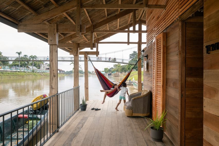
Terraces wrap around the house located along the Babahoyo River
It has a terrace with a colourful hammock

Built for a family of three, whose livelihoods include selling food to the local community and repairing wooden boats, the 70-square-metre design highlights the river as a vital socio-economic resource.

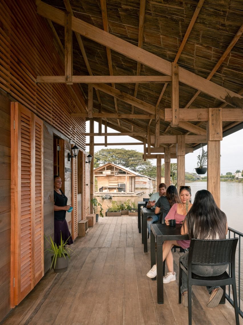
A two-metre-wide extension to an existing platform provides terraces for them to use as “productive environments”, such as a cafe seating area or anchor point for tourist boats.

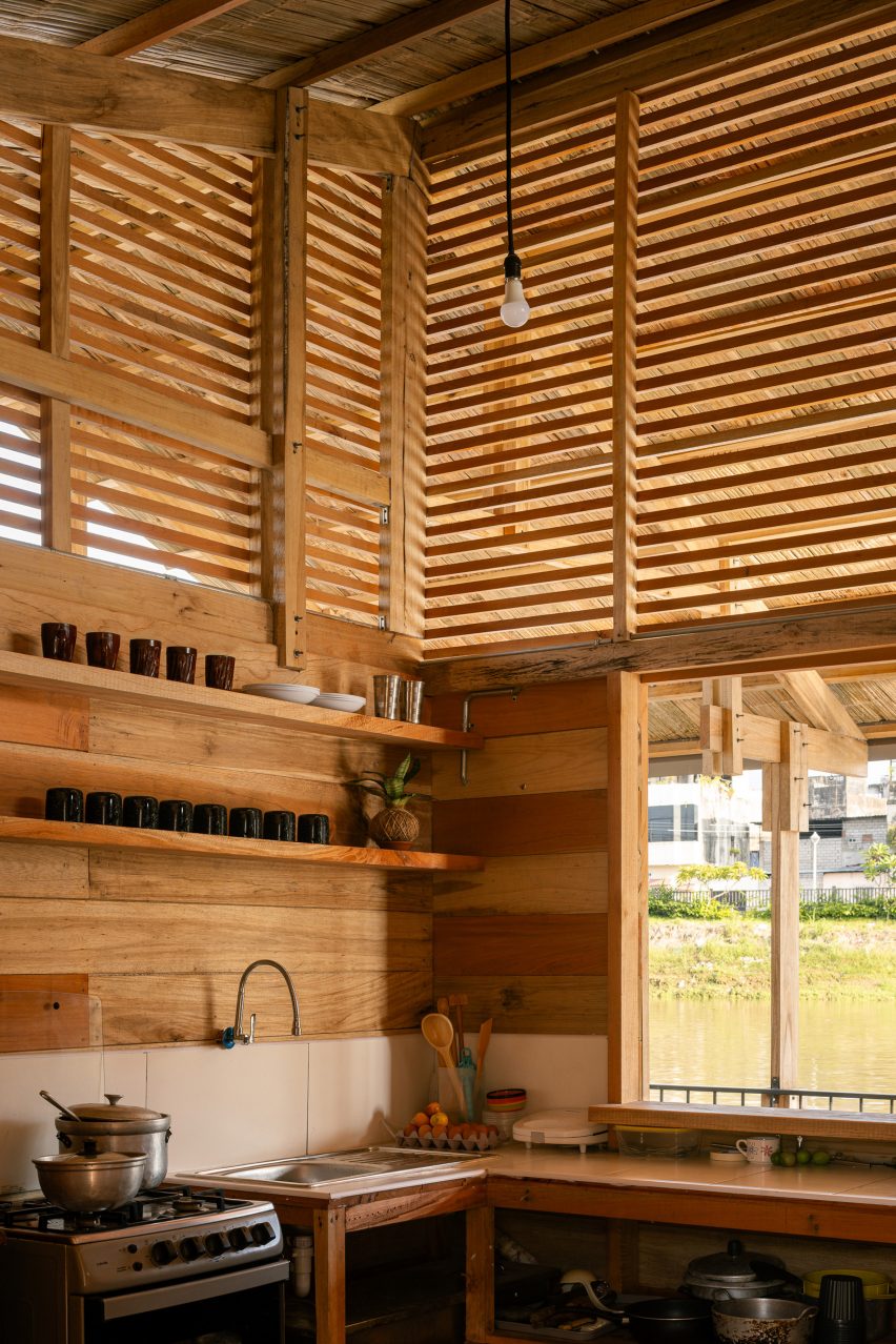
Kitchen area of house by Natura Futura and Juan Carlos Bamba
Slatted openings provide ventilation

La Balsanera explores possible floating solutions that recover local artisan techniques while promoting the active and productive participation of the occupants in vulnerable communities,” Bamba told Dezeen.

The home is built from wooden porticos constructed every two metres to form a gabled truss structure. This is topped by a corrugated roof that shelters the outdoor terraces and a colourful hammock.

A central space hosts a shared living room, dining area and kitchen along with two bedrooms, while two external strips at either end provide a toilet, shower, laundry space and boat workshop.

Slatted openings, known locally as “chazas”, have been made from recycled wood and help naturally ventilate and cool the interior.

View of bedroom spaces in floating house in Ecuador
A bridge made from bamboo and wood connect the home to the mainland

A bridge made from bamboo and planks of wood provides a walkway between the floating home and the mainland.

Meanwhile, shutter doors used throughout the design link the living spaces to the surrounding terraces.

Seating is provided on the terrace of La Balsanera
A seating area is provided on the river-facing terrace

Natura Futura Arquitectura and Bamba are based in Ecuador and Spain respectively.

Other projects completed by Natura Futura Arquitectura include a fitness centre featuring giant shutters and a mirrored viewing platform in the Ecuadorean countryside.

The photography is by Francesco Russo.

Reference

Stanaćev Granados divides levels of beach house with cargo net floor
CategoriesArchitecture

Stanaćev Granados divides levels of beach house with cargo net floor

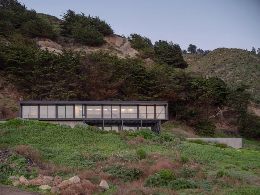
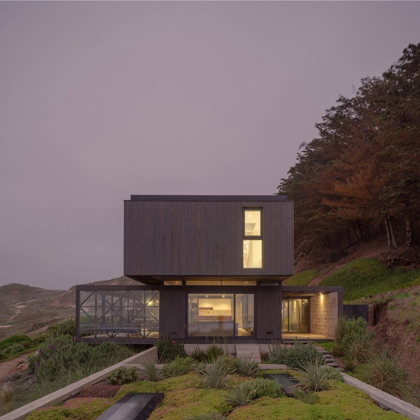
Chilean architecture studio Stanaćev Granados has created a seaside house with a concrete and wood-clad exterior and a cargo net in the floor in Chorrillos, Chile.

Known as the Primeriza House, the 2,750-square foot (256-square metre) residence was completed in 2020 in a small clearing in a cypress-filled hill that slopes steeply down to the Pacific Ocean.

Rectilinear house by Stanaćev Granados
Stanaćev Granados perched Primeriza House on a cypress-filled Chilean hill

Stanaćev Granados, a Santiago-based studio run by Nataša Stanaćev and Manu Granados, designed the home to make the most of outdoor living while creating multiple interior environments and nooks within the home.

According to the studio, these dual considerations created “many transitional spaces” within the house.

The home’s concrete base is set firmly into the slope

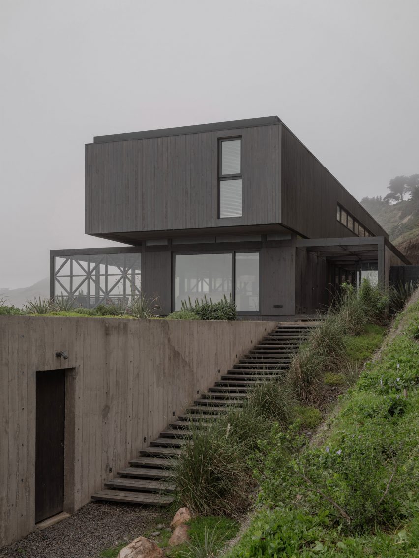
Two storeys constitute the main body of the home, with the top volume cantilevering over the bottom one at points, all clad in darkly stained wood. The concrete base is set firmly into the slope with a semi-buried garage and storage area.

As the slope drops away, the foundations become retaining walls at the far ends of the plan. A sunken landscape terrace covers the garage as it approaches the main house.

“Thanks to the orientation of the entire volume, the house itself acts as a shield for the southern winds whipping its posterior facade, while the
entire front of the house remains unaffected by them,” said the studio.

Mudroom at Primeriza House
A southside terrace and mudroom are protected from the wind by earth

A pedestrian entrance was “nested” between the exposed concrete wall and the landscaped hill. It was meant to be “camouflaged in the vegetation”.

The entry staircase leads to a southside terrace and mudroom that are protected from the wind by an earthen wall embedded into the space.

Primary open-plan floor with floor-to-ceiling glazing
Stanaćev Granados wrapped the primary open-plan floor in wood

This entry terrace is clad in glass that allows views through the entirety of the ground floor, out to the sea. The studio described this layout and the use of glass as “kaleidoscopic”.

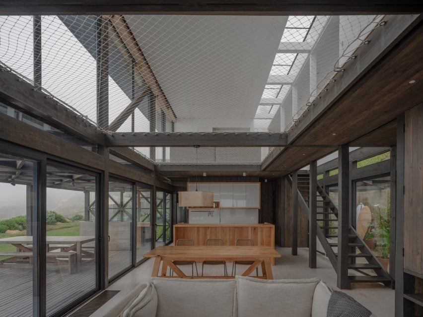
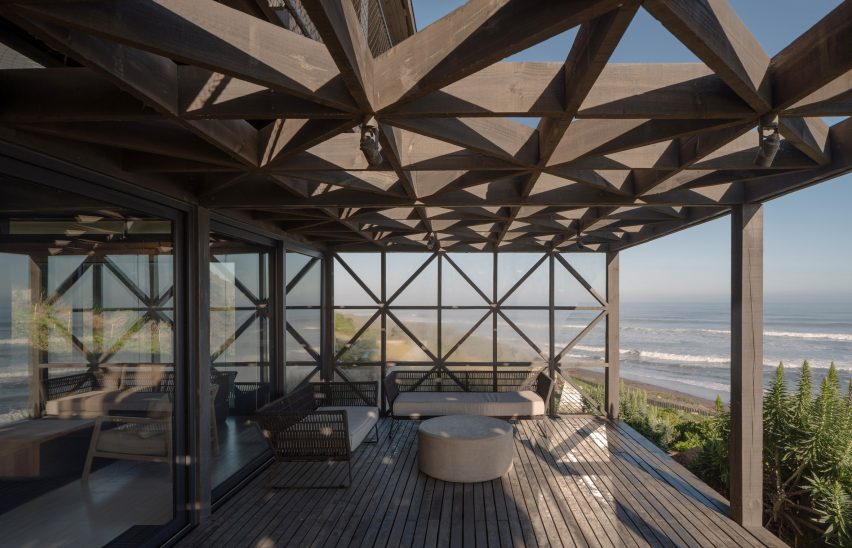
The primary floor – an open plan room with living, dining, and kitchen areas – is wrapped in wood and has floor-to-ceiling windows that open the space to a seaside north terrace.

Open weave cargo netting
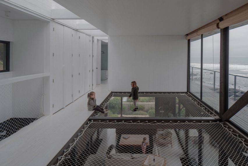
Open weave cargo netting serves as an overhead play space

The main floor transitions to the upper level through a double-height space.

Open weave cargo netting divides the volume and serves as an overhead play space.

Primeriza House
The sea-facing house is washed in dark wood

The safety netting appears again as the railing of the staircase.

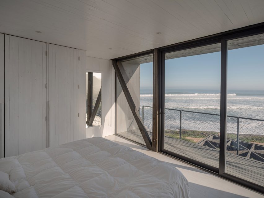
The ground floor has a similar wood cladding to the exterior, while the upper floor features wood that has been painted white.

All-white bedroom at Primeriza House by Stanaćev Granados
Each room opens to a linear balcony through sliding floor-to-ceiling glass doors

“While the first floor absorbs the light that washes its surfaces from all orientations, the second floor reflects the exterior colours – it turns absolute white on misty days, and when the weather is clear, it takes on the bluish tones of the sky and the horizon in the morning hours, and stains orange at sunset,” the studio said.

Upstairs, the primary ensuite is located on the eastern end of the rectangular plan and the children’s rooms and playroom hold the other edge.

Each room opens through sliding floor-to-ceiling glass doors to a linear balcony along the house.

A skylight runs down the length of the house bringing light into the white-washed interior.

Green roof on top of the garage
A sun terrace is tucked between the green roof on top of the garage and the living room

About 800 kilometres north of the Primeriza House sits another recent Stanaćev Granados design, a cube-shaped holiday house known as Casa Kuvo.

The photography is by Marcos Zegers.


Project credits:

Architecture: Stanaćev Granados (Nataša Stanaćev & Manu Granados)
Interior and furniture design: Stanaćev Granados
Lighting design: Stanaćev Granados
Landscaping: Vanessa Barrois (Landscaperschile) and Joaquín Lobato
Structural design: Alberto Ramírez
Construction: Claudio Lagos, Florent Dromard

Reference

Familien Kvistad designs colourful Yellow House in the Apple Garden
CategoriesInterior Design

Familien Kvistad designs colourful Yellow House in the Apple Garden

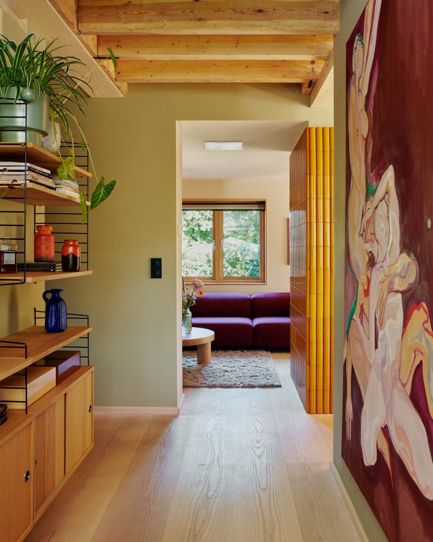
Vibrantly coloured tiles and textiles feature in this house renovation in Oslo, Norway, designed by locally based duo Familien Kvistad.

The Yellow House in the Apple Garden is a 1950s house in Oslo’s Voldsløkka area, home to a family of four and their cat, “the rambunctious Caspian”.

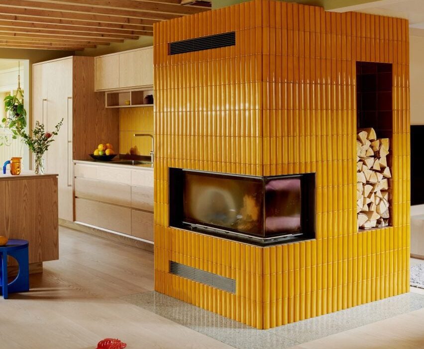
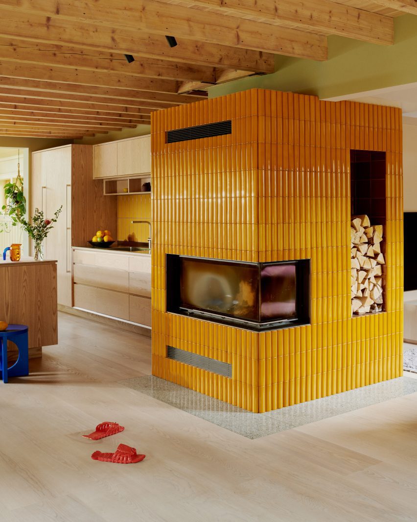
Fireplace with yellow tiles by Familien Kvistad
Familien Kvistad has renovated a Oslo home

Familien Kvistad founders, married couple Astrid and Ziemowit Kvistad, have completely remodelled the interior using a palette that also includes solid ash joinery and lightly speckled terrazzo surfaces.

“When they bought the house, the family envisioned painting some walls, moving the kitchen and building two new bathrooms,” the pair told Dezeen. “Over time, things naturally escalated, resulting in a complete change of layout, roof windows, new insulation, siding… absolutely everything was replaced.”

Kitchen with ask cabinets and yellow tile splashback and cat
The kitchen features solid ash cabinets

The three-storey house has an enviable setting in a large garden filled with fruit trees. It was this that primarily attracted the owners, rather than the building itself.

“The house was relatively old, not architecturally distinctive and outdated inside on all levels,” said the designers.

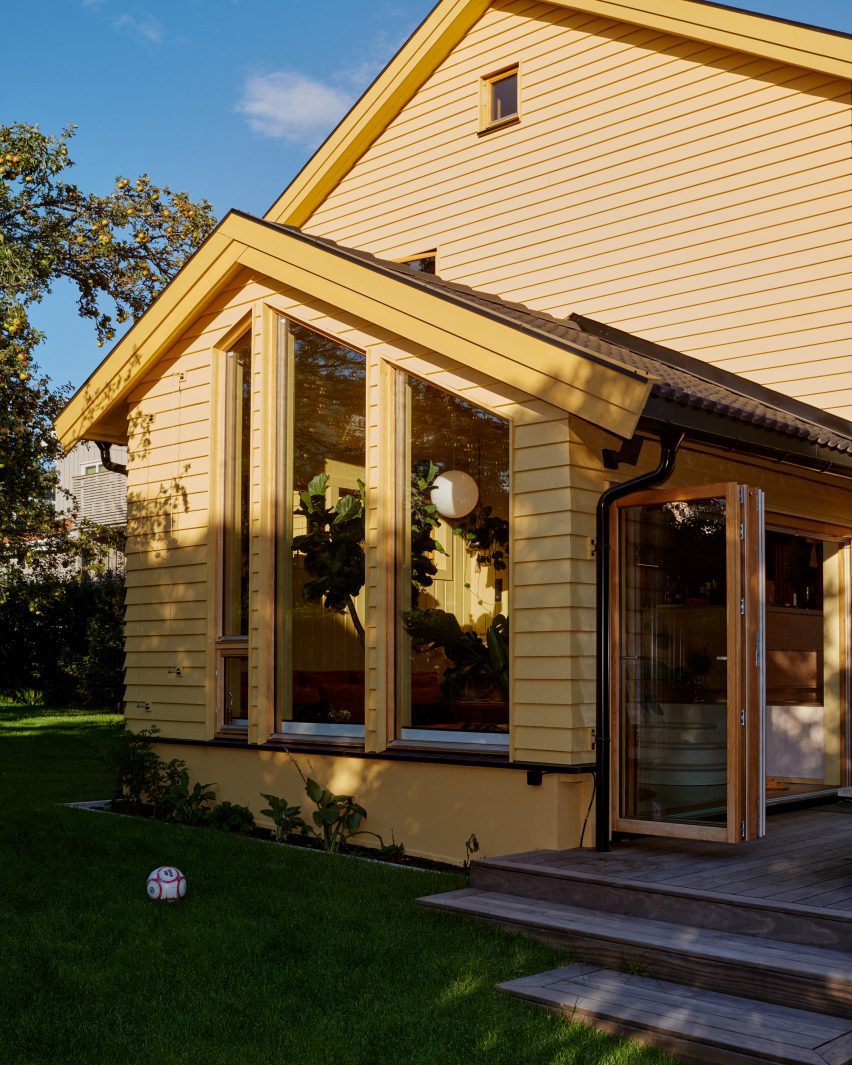
Yellow House in the Apple Garden by Familien Kvistad
The house was originally built in the 1950s

However, shortly after they bought the property, the council enforced new conservation zone restrictions that made it impossible to alter the building’s exterior in any way.

The task for Astrid and Ziemowit was to modernise the house without changing or extending its structure.

“This is obviously a costly project; it would have been cheaper to build a new house,” they explained.

“However, the outer structure had to remain.”

Conservatory in Yellow House in the Apple Garden
A terrazzo floor and ochre sofa are installed in the conservatory

The renovation removed many of the old internal partitions, creating a more open layout. This gives the ground floor a broken-plan feel, made up of various separate but connected living and dining spaces.

The old loft was also removed and replaced with small mezzanines, revealing the sloping roof beams and increasing the ceiling height in the first-floor bedrooms and bathroom to up to four metres.

Entrance lobby by Familien Kvistad
Wooden ceiling joists are exposed throughout

The colour scheme was based on “earthy shades” of the owners’ favourite colours.

On the ground floor, this resulted in a feature fireplace clad in mustard-yellow Kaufmann tiles, a lounge sofa upholstered in a plum-coloured Kvadrat textile and a storage bench topped by forest-green cushions.

Lounge in Yellow House in the Apple Garden
A storage bench topped with green cushions lines the main living space

An abundance of wood brings balance to this bold palette, with Douglas fir flooring from Dinesen and solid ash kitchen cabinets matching the exposed ceiling joists.

This level also includes a sunken conservatory featuring large plants, a terrazzo floor, an ochre-toned sofa and electric-blue cushions. On the wall, an expressive painting displays similar colours.

Bedroom with wall carpets by Familien Kvistad
Custom-designed wall carpets adorn the primary bedroom

“During the renovation, the family sold most of what they already owned,” said Astrid and Ziemowit. “This meant that all the furniture was purchased new.”

“However, they did have some art from before,” they added. “Much to our delight, they fit perfectly into both the colour palette and the style.”

Staircase doubles as a shelving unit
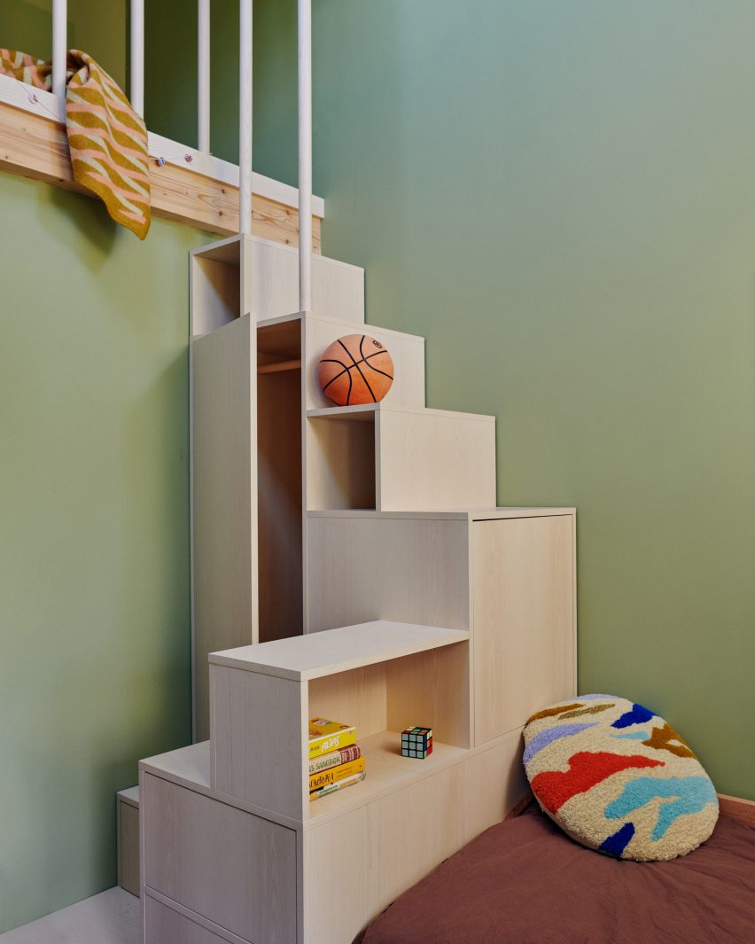
In one of the children’s rooms, a staircase doubles as a shelving unit

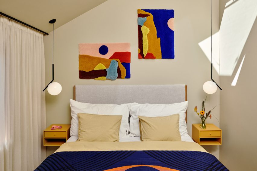
Upstairs, the primary bedroom features a pair of tufted wall carpets designed and made by Familien Kvistad, depicting abstract landscapes.

One of the two children’s bedrooms features a playful storage unit that doubles as a staircase, while the other has a ladder to provide access to the mezzanine loft above.

Bathroom with green tiles and terrazzo bath and basin
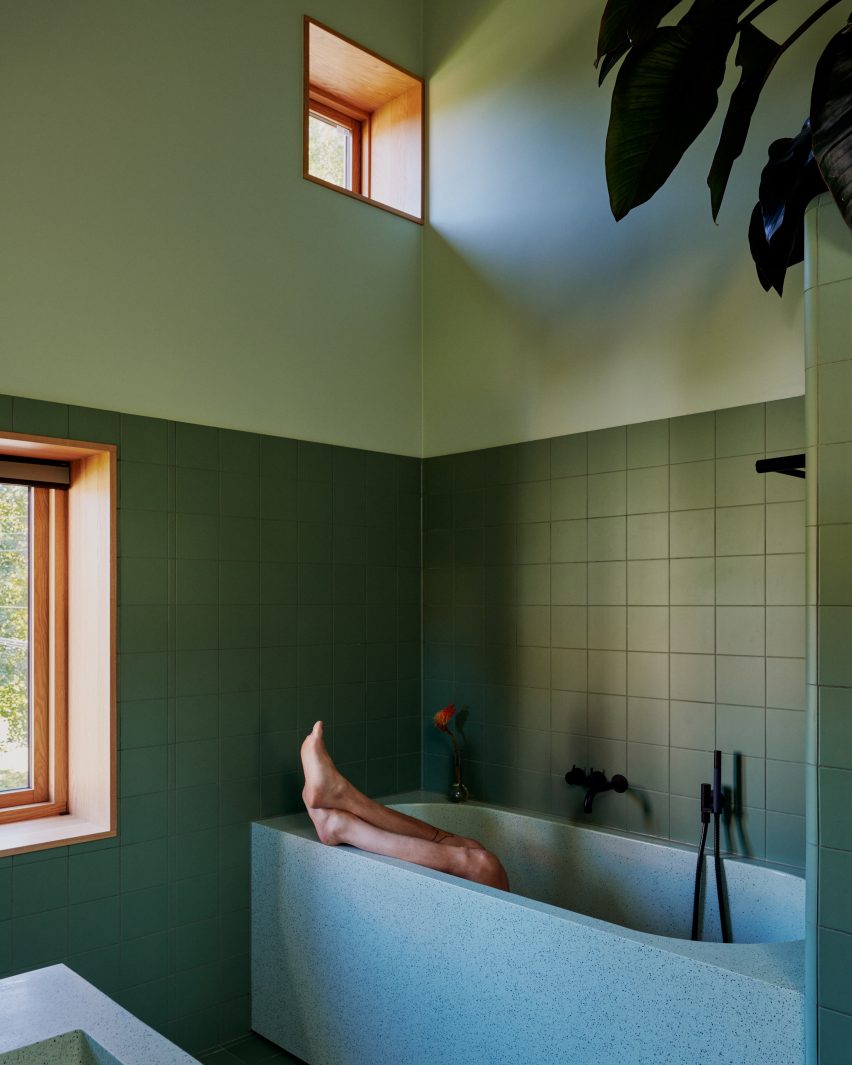
The family bathroom combines green tones with terrazzo

The bathroom has a more mellow character, combining terrazzo sanitaryware with calming green tones. The basement floor mainly serves as a utility area, although it does include an extra bathroom and a living room that doubles as a guest bedroom.

Other recently completed homes in Norway include a “house of offcuts” by Kolman Boye Architects and a villa on piloti by Saunders Architecture.

The photography is by Magnus Berger Nordstrand.

Reference

Schaum/Shieh conforms house “gently” to contours of steep Virginia site
CategoriesArchitecture

Schaum/Shieh conforms house “gently” to contours of steep Virginia site

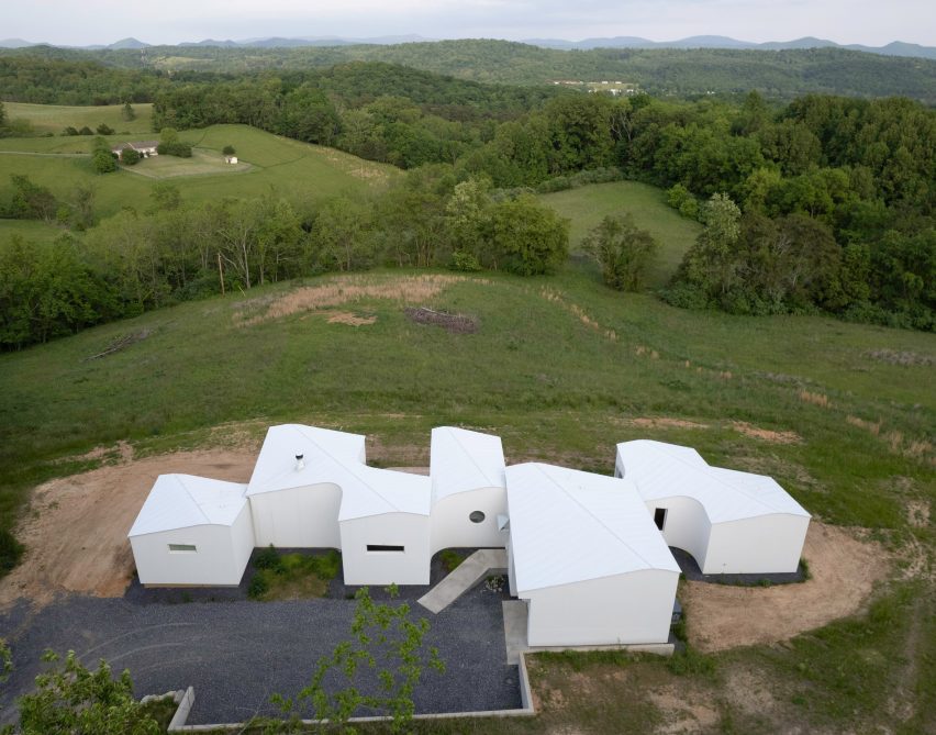
US architecture studio Schaum/Shieh has embedded a Virginia house with irregularly shaped volumes into the contours of a steep site.

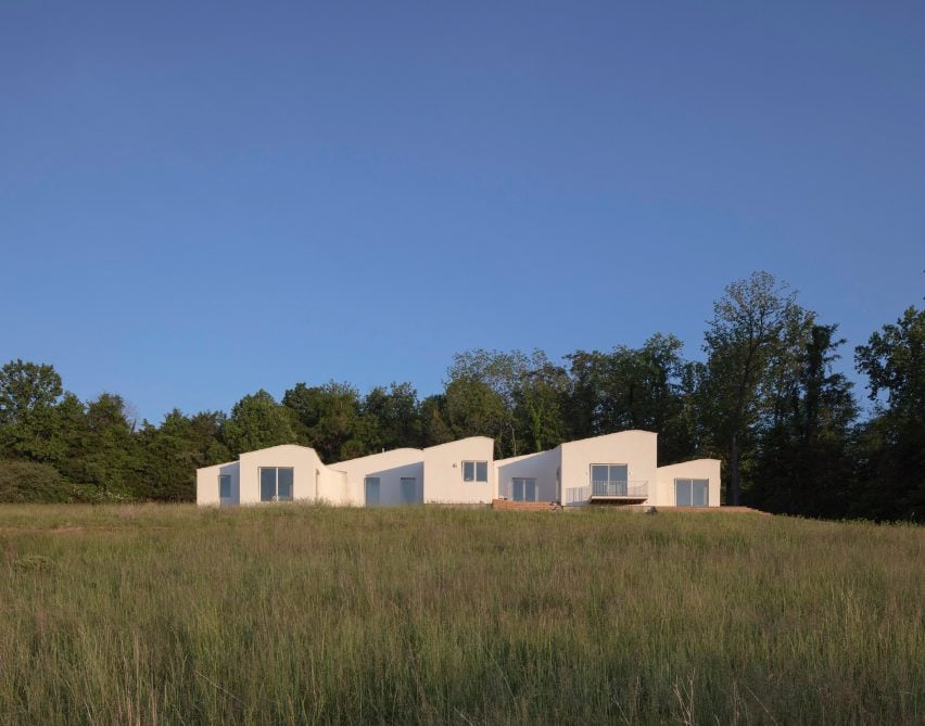
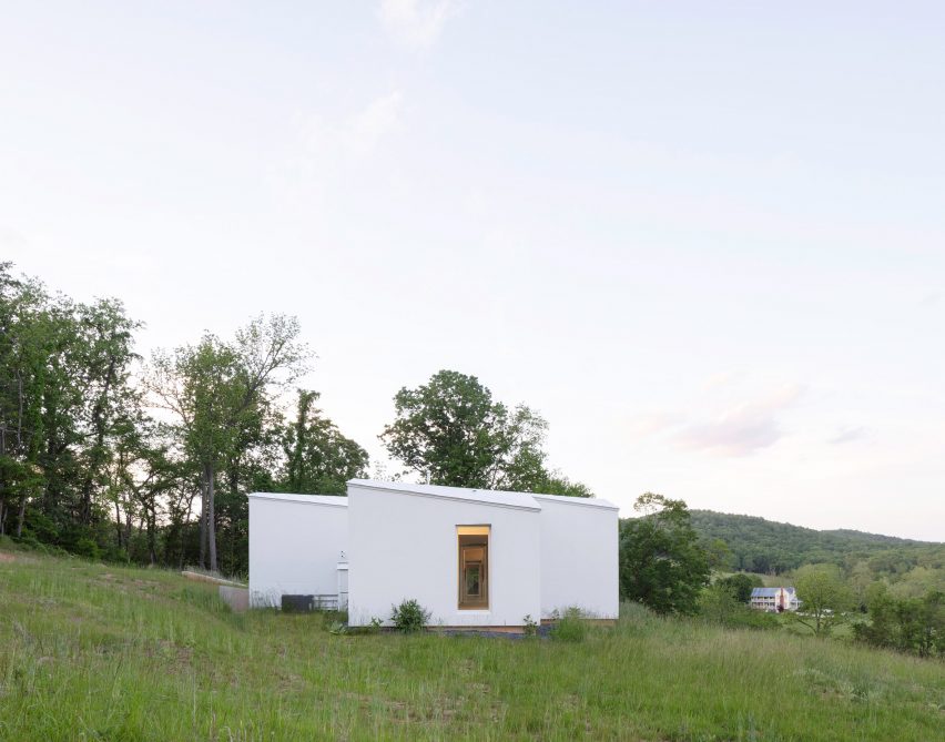
Located in the Allegheny Mountains, the 2,750 square foot (255 square metre) Shenandoah House conforms to the topography of its hillside site “gently”, as Schaum/Shieh neither wanted to add a cantilever nor flatten the topography.

A white home overlooking Virginia mountains
Schaum/Shieh has embedded a residence into a steep Virginia site

“We didn’t have the inclination to make dramatic use of the steepness with a cantilever, and we didn’t want to flatten any portion of the site to erase the slope, so we decided to build along the contours as much as we could,” said Schaum/Shieh co-principal Rosalyne Shieh.

The one-story home unfurls in a 120-foot-long (36-metre) horizontal line that runs parallel to the topography, with its front elevated to meet wooden terraces, and portions of the back sitting flat on the slope.

A long horizontal home made of various volumes
The studio wanted to avoid “dramatic” cantilevers

Along the footprint, three bedrooms, three bathrooms, a dining room, a living room, a study and a garage branch off a slim, central corridor in irregularly shaped volumes – or pods.

The spaces between each pod create room for gardens, outdoor nooks and wooden terraces along the house, while a parking area was carved out of the hillside at the back.

A white house in a meadow
The house is organized along one long horizontal line

The grey metal roof reflects the area’s rolling hills. Each individual volume is topped with a rounded gable roof that runs diagonally across its centre so that the profiles dip and rise with the surrounding environment

“We discovered that by doubling the ridgeline and rounding the peak we could create a softness that reflects the sloped surroundings,” said Schaum/Shieh co-principal Troy Schaum.

A large concrete fireplace in a white house with curved walls
Irregularly shaped volumes are connected by a slim central corridor

“It seemed appropriate on the hillside and took what was a simple, more functional logic and grounded it in the dynamic, undulating nature of the site.”

Rectangular windows on either end of the horizontal plan create an interrupted view through the centre of the house and large sliding glass doors and picture windows were installed on the facade.

A kitchen with light cabintry
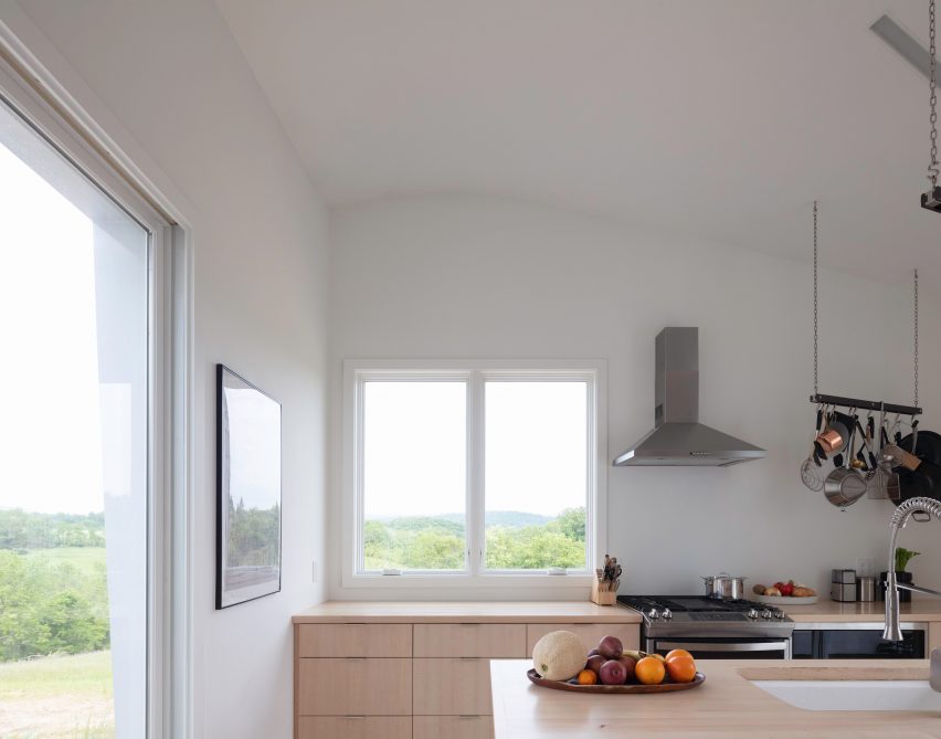
Rounded corners and integrated lighting bring softness to the interior

Small clerestory and porthole windows were placed on the uphill side.

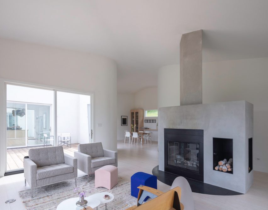
Rounded corners on the home’s exterior are reflected on the interior, further softening a largely white interior palette.

A wooden bed frame in the middle of a room
Concrete, wood and soapstone were used for furniture pieces

“Lighting was also subtly integrated to create interrupted lines throughout the house,” said the team.

“No lights or other features interrupt the ceilings; instead, lighting emerges through slots at the ceiling edge and on the quasi-furniture objects that provide texture across the home.”

These furniture elements include bespoke wooden cabinetry, a large island, a wooden bed frame and a central wood stove unit made of concrete and soapstone.

The house is finished with bamboo wood floors and insulated stucco.

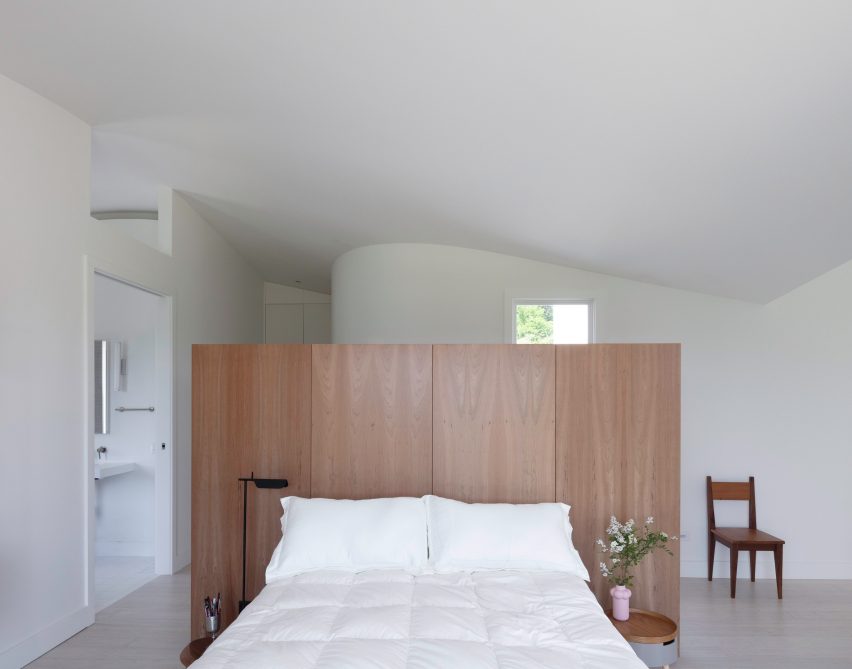
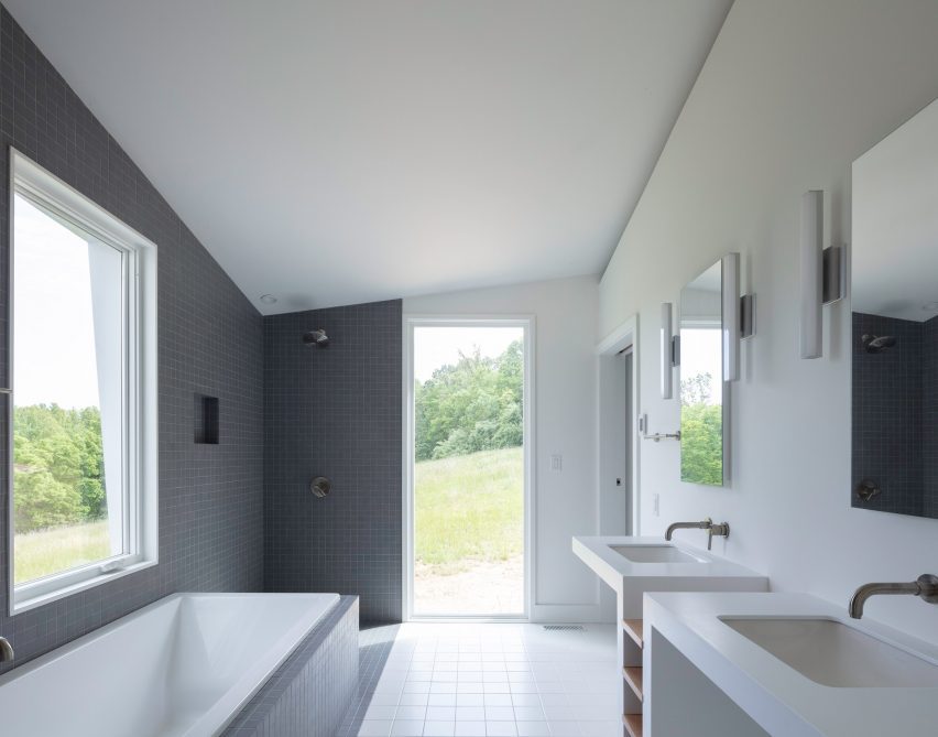
Gray tiles in bathroom
The house is clad in insulated stucco

“The hillside as an old problem in house design was a major motivator. Our clients knew many hilly sites from growing up in the area and their time in Greece. We wanted to intervene gently but opportunistically into the hill,” said Shieh.

“They wanted a house that fit organically but was not derived from the local vernacular materials or solutions in a straightforward way. We focused on the hill, the seasons, the distant view, and the intimate life of the site.”

Other recently completed projects by Schaum/Shieh include a Houston art galley covered in white sculptural panels and a concert venue designed to endure “rough handling”.

The photography is by Naho Kubota.


Project Credits: 

Architect: Schaum/Shieh
Design team: Troy Schaum, Rosalyne Shieh, Giorgio Angelini, Andrea Brennan, Tucker Douglas, Ane Gonzalez
Contractor: Blue Ridge Green – Jonathan Kuntz
Structural: Truesdell Engineering- Jordan Truesdell, PE


Reference

interconnected skipped floors outline compact toneyama house in japan
CategoriesArchitecture

interconnected skipped floors outline compact toneyama house in japan

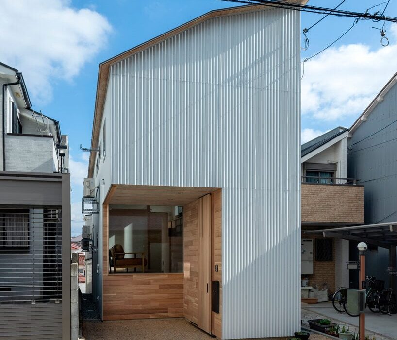
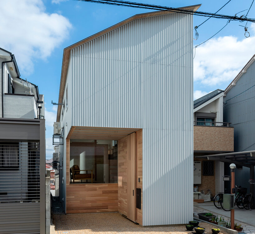
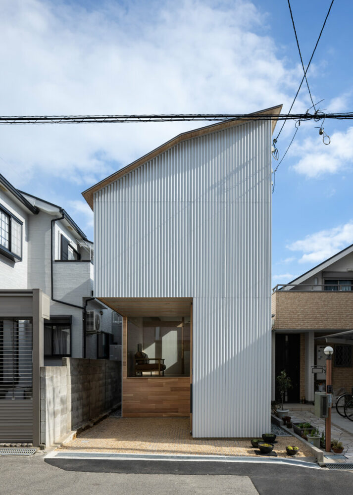
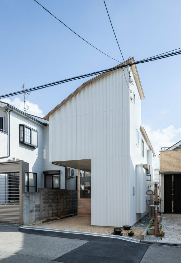
white metal sheets coat tiny Toneyama House’s facade


Takuya Takemoto Architects builds Toneyama House, a residence situated in Toyonaka City of Osaka Prefecture, Japan, showcasing innovative spatial design. The skip-floor structure covers a small lot of 76.72 sqm with a distinctive west-side access road. Facing constraints like a limited frontage, a long and narrow site shape from east to west, and a height difference from the neighboring land on the east side, the design embraces these challenges crafting a residence that defies the ordinary. Due to the restrictions imposed by the diagonal line on the north side, the ceiling height of the second floor cannot be sufficiently secured by standard design.

interconnected skipped floors outline the interior of compact toneyama house in japan
all images by Yohei Sasakura


Takuya Takemoto Architects sets up a skip-floor layout


The Toneyama House unfolds across fourteen interconnected spaces, cleverly linked by nine layers of skipped floors. This compact residence deviates from conventional layouts with stairwells and corridors, utilizing hanging floor and ceiling planes to liberate the building from height limitations. The design features several innovative elements, from the striking 2.13-meter cantilevered garage to the 3.64-meter column-free space with climbing beams. Vertical windows facing the stairwell and high sidelights cutting through the sky on the east facade add further layers of complexity and variety to the space. Takuya Takemoto Architects engages in an architecture that balances innovation and minimal design while maintaining a sense of everyday elegance.

interconnected skipped floors outline the interior of compact toneyama house in japan
Toneyama House pops up on a street in Toyonaka City

interconnected skipped floors outline the interior of compact toneyama house in japan
the structure boasts a striking exterior

interconnected skipped floors outline the interior of compact toneyama house in japan
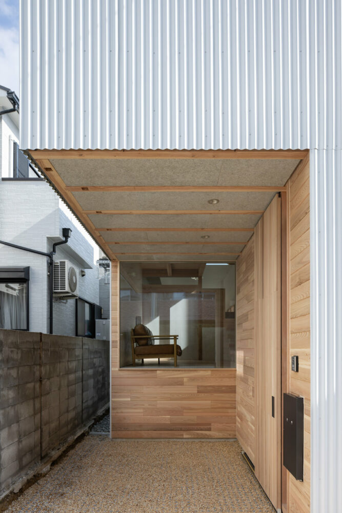
a recess in the volume forms the entrance

Reference

Estudio Estudio unveils “architectural treasures” in Mexico City house
CategoriesInterior Design

Estudio Estudio unveils “architectural treasures” in Mexico City house

Arched doorways and a rooftop studio feature in the Y.27 House, which has been overhauled by architecture firm Estudio Estudio in a way that honours the historic building’s original character.

Located on a 195-square-metre site in Mexico City’s Hipódromo Condesa neighbourhood, the project serves as a full-time residence for a client who is a social entrepreneur and collector of Mexican craftwork.

Y27 House by Estudio Estudio with an inbuilt studio
The house been overhauled to honour the historic building’s original character

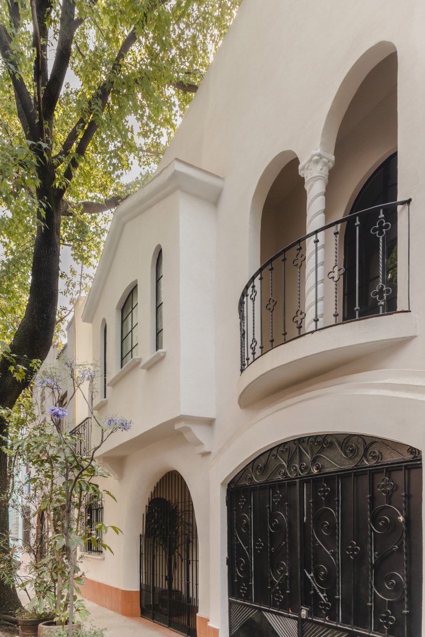
Originally built in the 1930s, the stucco-clad dwelling had endured years of neglect, said local firm Estudio Estudio.

The design team set out to revamp the home’s interior, aiming to restore its original charm while enhancing its functionality.

Revamped home interior design
Estudio Estudio set out to revamp the home’s interior

The project involved removing walls, reconfiguring the layout and making structural improvements, in addition to adding new finishes. Moreover, a small storage room on the roof was replaced with a 43-square-metre studio building.

“The main goal was to unveil the hidden architectural treasures beneath layers of past modifications, meticulously restoring them to their original state to reveal the essence of the time,” the team said.

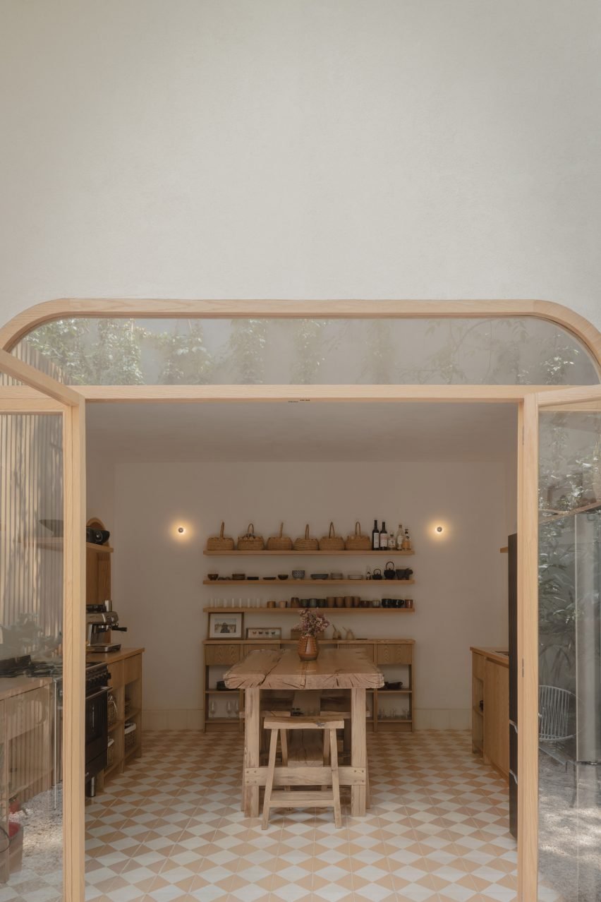
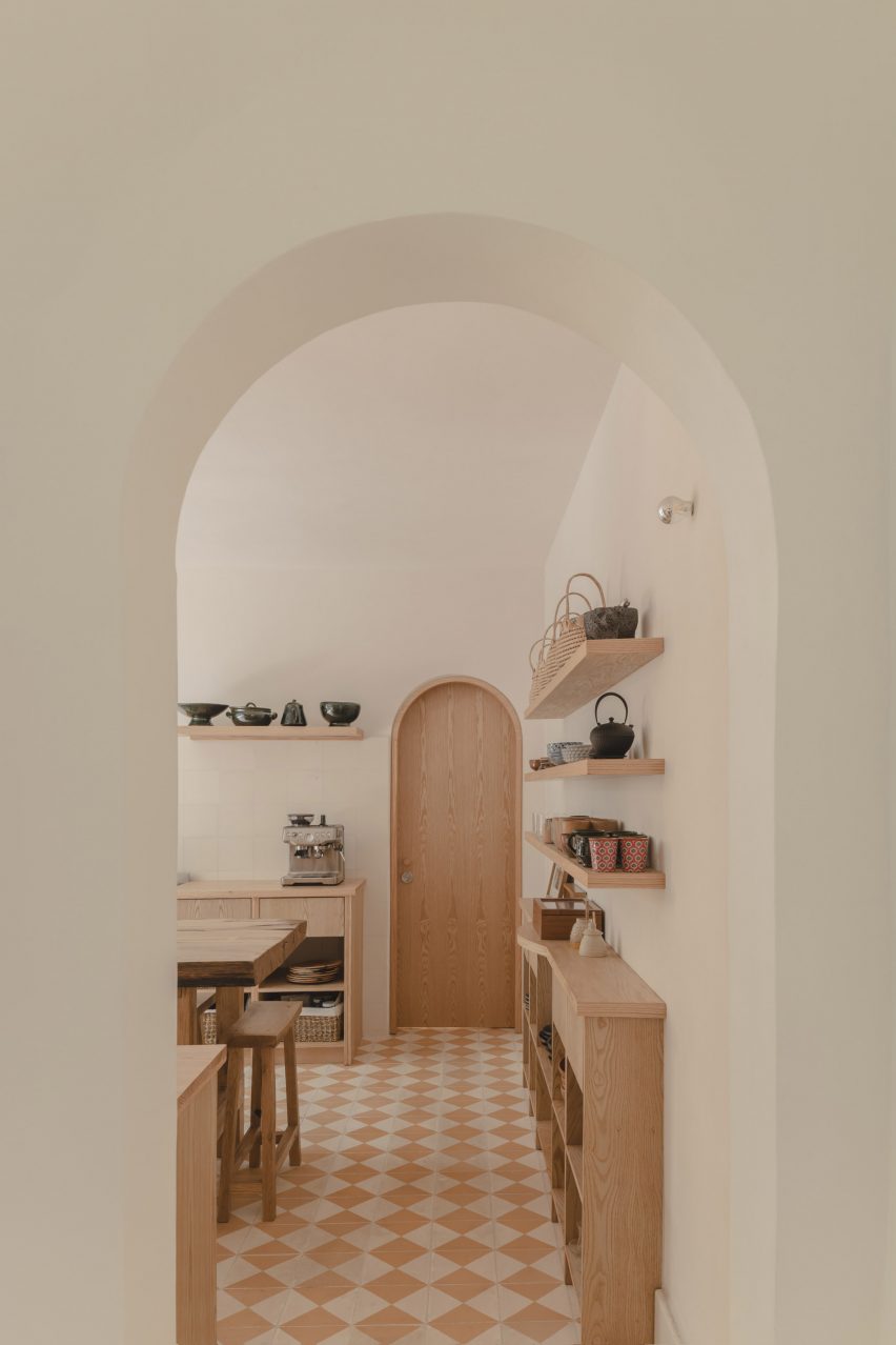
Kitchen entered via an arched doorway
In the rear, one finds a kitchen

“Architectural interventions aimed to preserve the authentic character of the house, rejuvenating ornamental elements while avoiding unnecessary embellishments.”

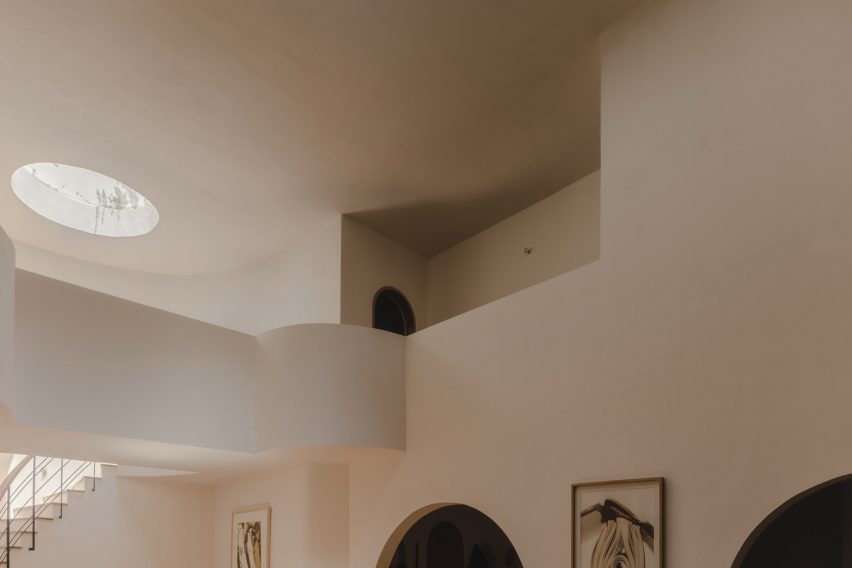
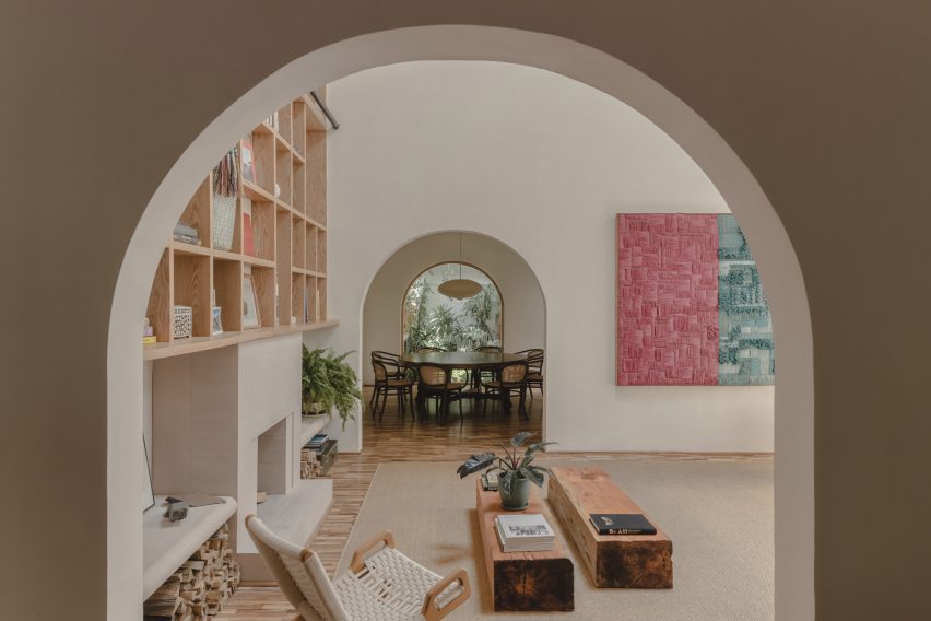
Rectangular in plan, the home has a mix of communal and private spaces spread across three levels. Curves and arches – many of them original – create a “harmonious flow”.

Rounded skylight that illuminates a staircase
Curves and arches create a “harmonious flow”

On the ground level, the layout “seamlessly integrates daily living requirements”. The front portion holds an entry hall, garage and office, while in the rear, one finds a kitchen, dining area, service rooms and a patio.

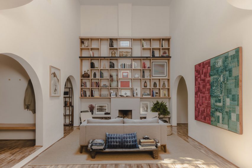
At the heart of the ground floor is an airy living room with a 5.9-metre-high ceiling. A tall shelving system with a metal-and-wood ladder acts as a focal point.

Tall shelving system
A tall shelving system acts as a focal point in the airy living room

A gently curved, skylit staircase leads to the first floor, where the team placed a primary bedroom, two bedrooms and a family room.

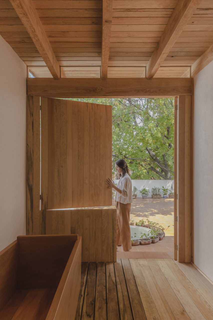
Atop the building is the new studio, which was constructed using pine. In addition to the studio, the building contains an onsen room with a barn-style door.

Barn-style door
The building contains an onsen room with a barn-style door

The studio opens onto a terrace with terracotta flooring. Rainwater is collected on the roof and channelled to a reservoir below.

“The roof terrace serves as a space to gather but also works as a rainwater collector, where rain travels throughout the house into a water reservoir and filter system beneath the back patio,” the team said.

Throughout the home, the team used earthy materials and neutral colours. The lighting design – created in collaboration with lighting expert Luca Salas – is meant to balance “ambiance, functionality and aesthetics”.

Notable finishes include oak parquet flooring and closets faced with cotton-canvas. Oak was used for window frames, kitchen cabinets and other elements.

Pisos de pasta flooring
Pisos de pasta flooring features in the kitchen

In the kitchen, the team took a sample of existing checkered tiles, made of pigmented concrete, to a local craftsman, who then replicated them.

This style of flooring – called pisos de pasta – is very common in older homes in Mexico City and southwest Mexico, said Estudio Estudio.

Stucco-clad building
The stucco-clad dwelling had endured years of neglect

Overall, the house is meant to balance historic elements with a contemporary lifestyle.

“This house proudly stands as a harmonious blend of past and present, inviting residents to embark on a captivating journey of refined and simple ways of living,” the team said.

Other projects in Mexico City’s Condesa district include a renovated house by Chloé Mason Gray that embraces its lack of natural light, and an apartment block covered in small, wooden squares that were inspired by vegetable crates.

The photography is by Zaickz Moz Studio.

Reference

Mork-Ulnes creates house in San Francisco that “breaks from tradition”
CategoriesArchitecture

Mork-Ulnes creates house in San Francisco that “breaks from tradition”

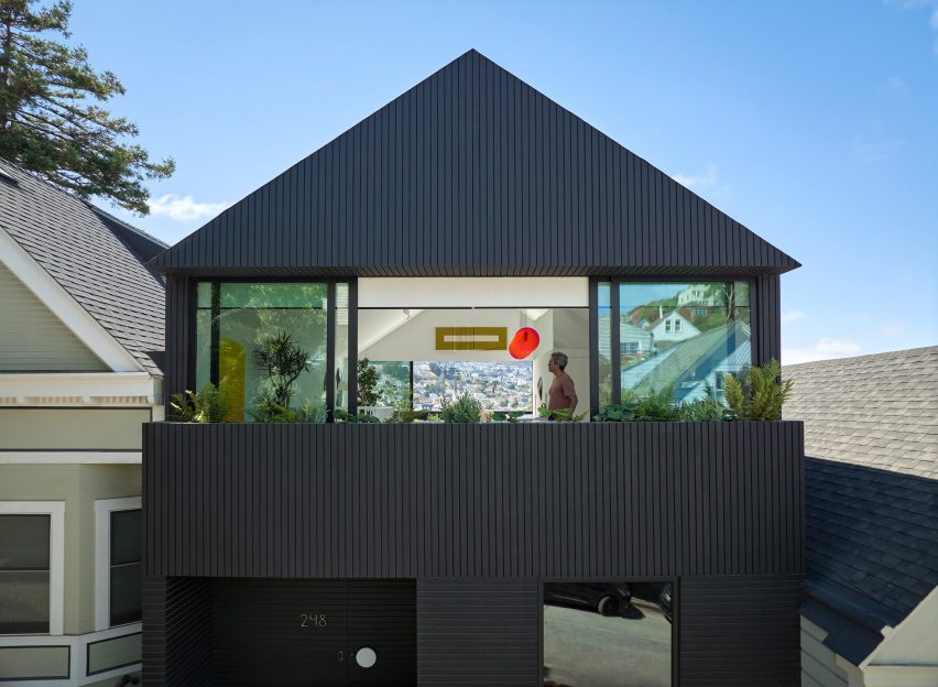
Mork-Ulnes Architects has completed the Silver Lining House, a crisp, gabled home clad in black-stained cedar that was designed for an architectural photographer and interior designer.

Located on a sloped site in San Francisco’s Bernal Heights neighbourhood, the house sits among Victorian and Edwardian homes that line the area’s hilly streets.

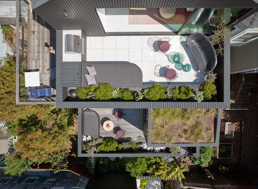
Aerial view of Silver Lining House
Silver Lining House is a black-stained cedar dwelling in San Francisco

The project was designed for architectural photographer Bruce Damonte and interior designer Alison Damonte, who have long been friends with architect Casper Mork-Ulnes, founder of Mork-Ulnes Architects.

The couple, who are avid collectors, desired a home that showcased their treasured belongings and supported their creative work.

Gabled home by Mork-Ulnes
Mork-Ulnes Architects designed the home with a gabled roof

“We knew from the outset that this project would be an interesting collaboration, balancing our reductive tendencies with the more exuberant and maximalist impulses of our client/friends, whose style we had always admired and wanted to celebrate,” said Casper Mork-Ulnes.

The architect and his team at Mork-Ulnes Architects – which has offices in San Francisco and Oslo – conceived a home for the Damontes that “conceptually functions as a container for their furniture and art collections and a laboratory for their work”.

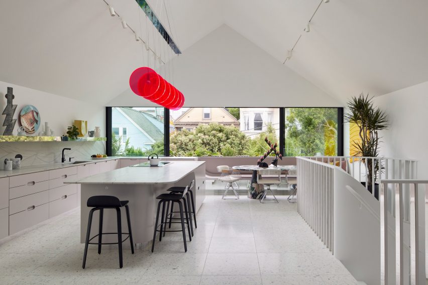
Penthouse-style white kitchen with gabled roof
The top level was envisioned as a penthouse-type space

Rectangular in plan, the home rises three levels and features a crisp, gabled form. Facades are clad in strips of black-stained cedar and are punctured with openings of varying sizes.

The architects took cues from the surrounding context when deciding on key design elements such as scale, massing and cladding – but they also strayed from the norm.

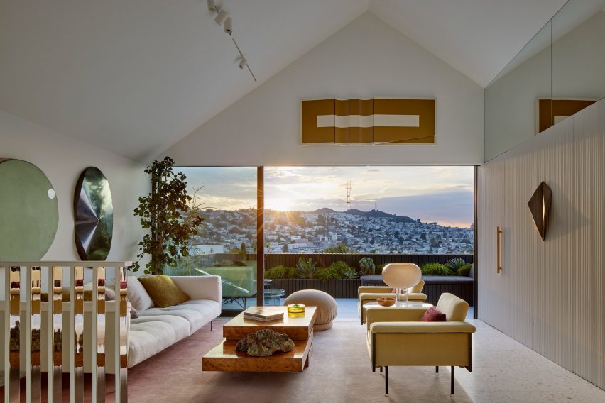
Living room interior design in San Francisco home by Mork-Ulnes
It feature a living space

“While replicating the roof forms, entry portal/stoop and massing of the Victorian homes, the new house also breaks from tradition with a black-painted facade and ribbon windows that visually connect the interior of the house to the neighbourhood,” the team said.

“Tradition is reinterpreted here with a decidedly contemporary perspective, where formal research and construction techniques are integral to creating an original and innovative outcome that engages its surroundings while also prompting further inquiry,” the team added.

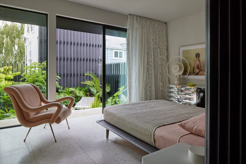
Primary bedroom suite
The ground level holds a primary bedroom suite

Totalling 2,818 square feet (261 square metres), the home has a “flipped floor plan”, in which private quarters are found on lower levels and communal spaces are placed up high.

The ground level holds a garage, primary bedroom suite, laundry room and sunken garden. The main entrance is found on the first floor, where the team placed a guest suite, a home office, two bathrooms and intimate spaces for relaxing and entertaining.

Rooftop terrace
A terrace offers sweeping views of the city

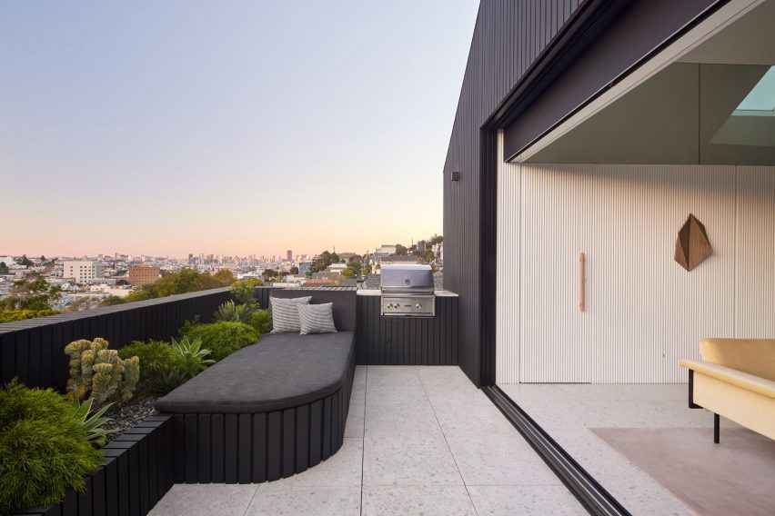
The top level – envisioned as a penthouse-type space – encompasses a kitchen, dining area, living room and powder room. A terrace offers sweeping views of the city.

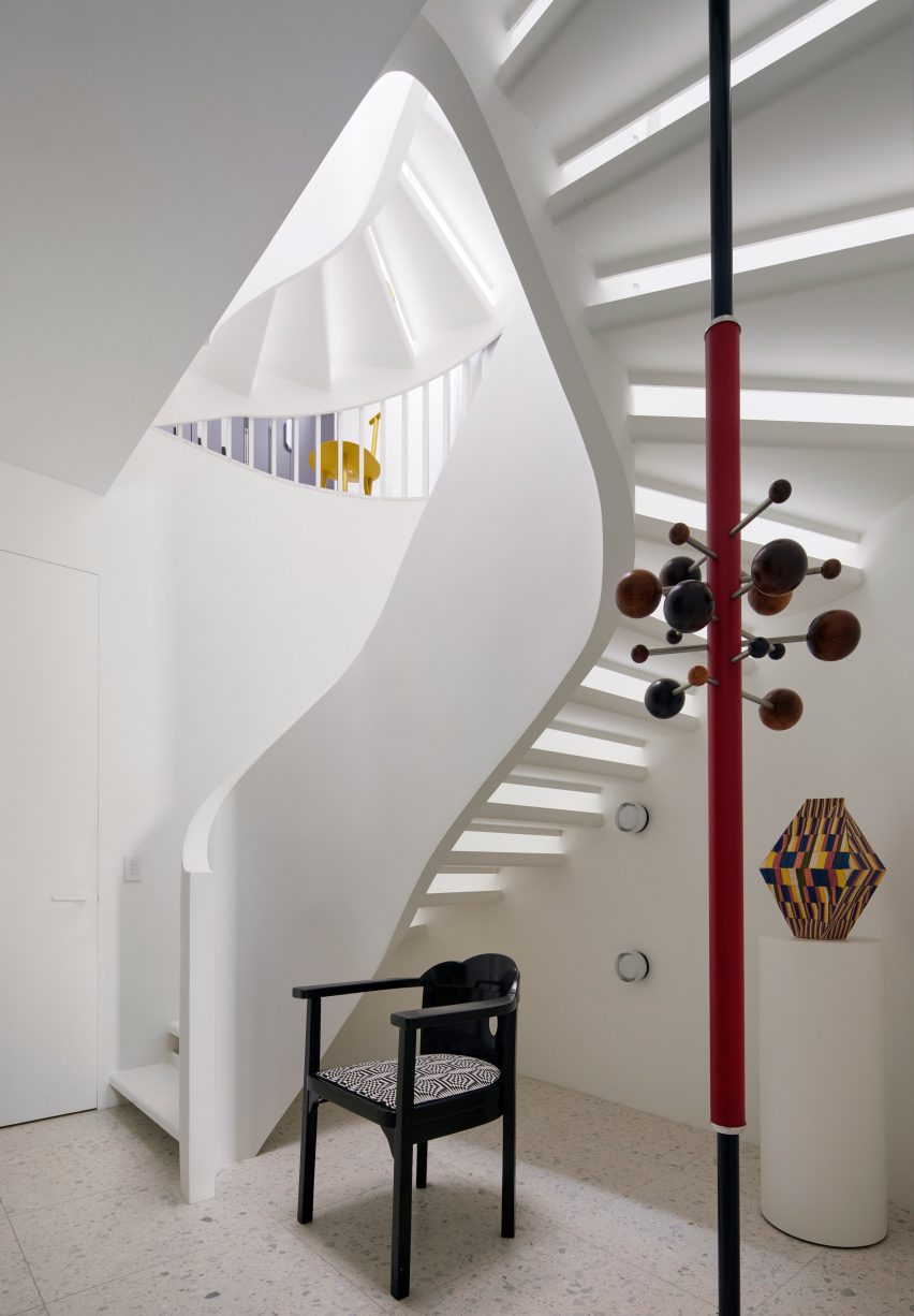
Floors are linked by a curved staircase topped with a skylight. Half-polished chrome slats bounce reflections around the stairwell, an effect meant to “mimic the experience of walking through a disco ball”.

Curved staircase topped with a skylight
Floors are linked by a curved staircase topped with a skylight

Mirrored surfaces are found in other parts of the house, lending a feeling of playfulness while also producing spacial and light-generating effects, the team said.

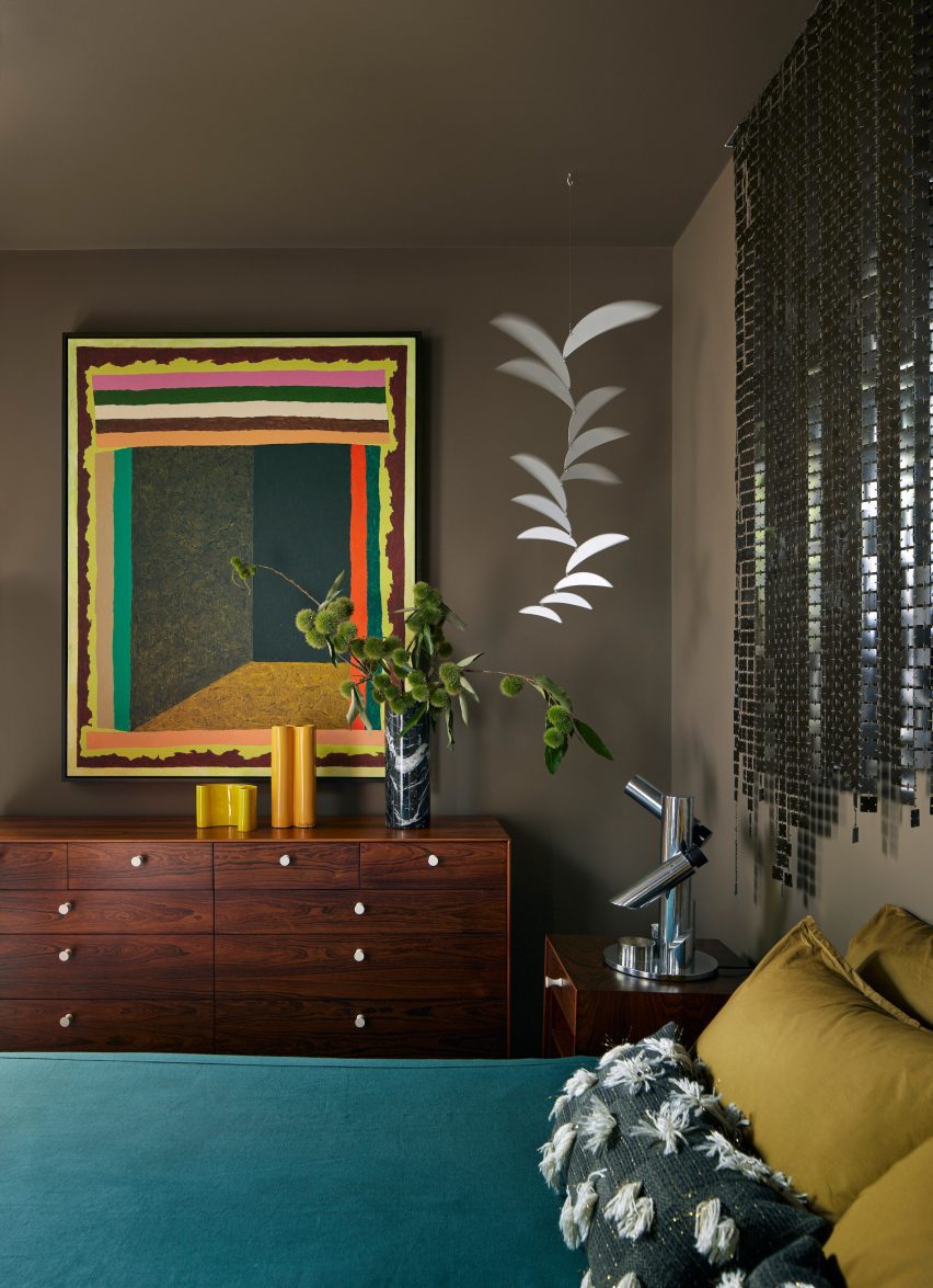
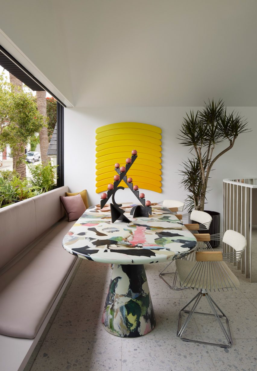
Overall, the home’s interior design – overseen by Alison Damonte – offers a mix of colours, textures and patterns that “reflect the owners’ collective creative spirit”, the team said.

Sustainability was in mind throughout the project, leading to the inclusion of elements such as high-performance windows, exterior solar shading and energy-efficient appliances.

Rooftop solar panels generate electricity that can be stored in a Powerwall battery system, and unused electricity is sent back to the power grid.

Interior design by Alison Damonte
The home’s interior design was overseen by Alison Damonte

The home’s completion marks the end of a journey spanning more than a decade.

In 2010, the Damontes purchased a modest residence in Bernal Heights dating to the early 1900s.

Colourful table inside Silver Lining House by Mork-Ulnes Architects
Silver Lining House includes various colourful accents

Several years later, they enlisted Mork-Ulnes to renovate the house, and just when plans were being finalized in 2017, the house caught fire and was partly destroyed.

The team salvaged what they could and reworked the design.

Silver Lining House by Mork-Ulnes Architects
The home’s completion marks the end of a journey spanning more than a decade

“While the incident forced a reevaluation of scope and scale of the redesign, the couple’s goal remained the same – to create a home that acted as a capsule of art and inspiration,” the team said.

Other projects by Mork-Ulnes include an eight-sided house in Oregon that was built using cross-laminated timber and a California residence clad in Corten steel to protect the building from wildfire.

The photography is by Bruce Damonte


Project credits:

Architect: Mork-Ulnes Architects
Project design team: Casper Mork-Ulnes, Lexie Mork-Ulnes, Phi Van Phan, Gregoriy Ladigin
Interior designer: Alison Damonte
Construction manager: Raffi Nazarian
Landscape architect: Terremoto
Structural engineer: Santos & Urritia
Lighting design: PritchardPeck
General contractor: Rico’s General Construction, Inc
Cabinetmaker: Hopebuilt

Reference