Light and Air opens up Z House in Brooklyn to the outdoors
CategoriesInterior Design

Light and Air opens up Z House in Brooklyn to the outdoors

Local studio Light and Air has introduced a light-filled void at the centre of a Brooklyn townhouse as part of a major reconfiguration and extension project.

The home in the leafy Clinton Hill neighbourhood was bought by a family of four with roots in India and required a complete gut renovation to open up the spaces to the outside.
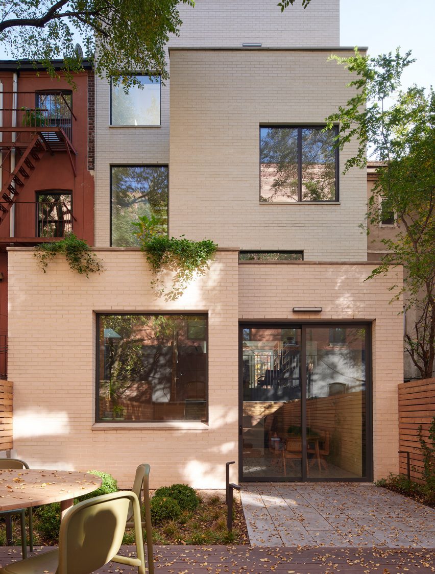
Townhouse rear extension with cube pale-brick volumes
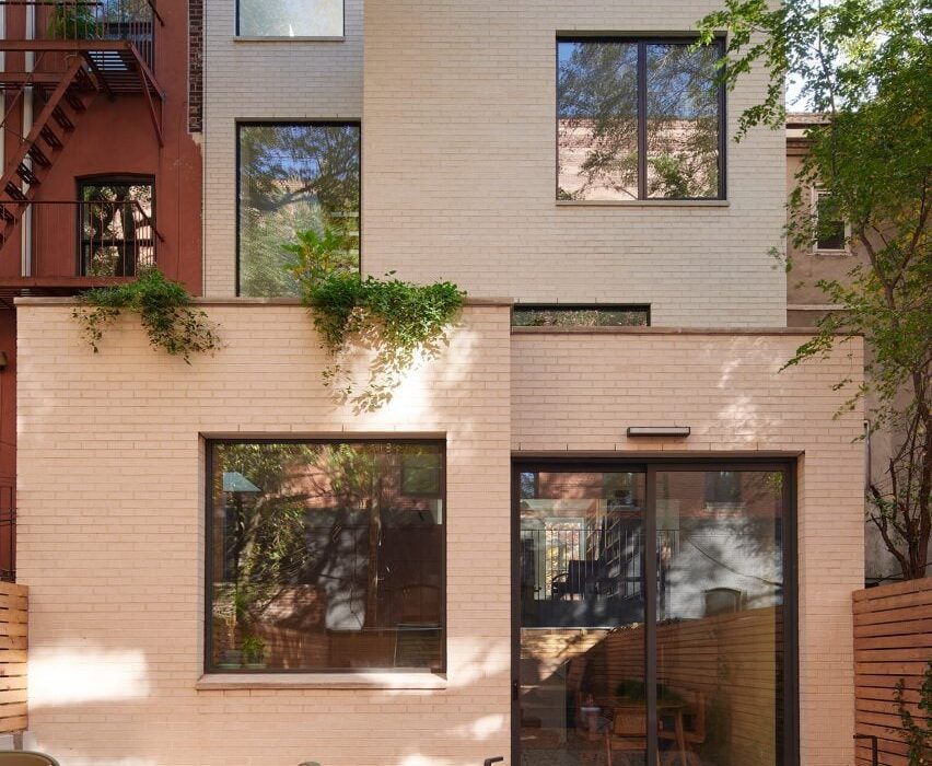
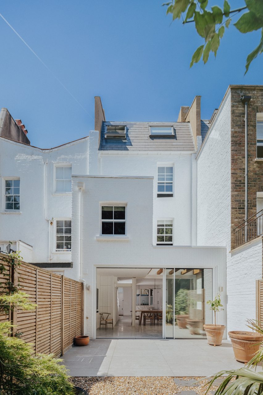
The overhaul of Z House involved a significant rear extension, comprising cube volumes clad in pale brick

“They wanted a house that exhibited a strong connection to nature, featuring a more seamless integration between inside and out,” said Light and Air.

The project involved extending the building one level vertically, bringing its total number of storeys to four, as well as pushing it out significantly at the back.
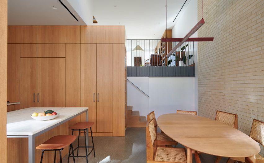
Kitchen and dining area with oak millwork and pale brick wall
The brick continues into the kitchen and dining area on the lower floor

While the historic front facade was carefully restored, the rear elevation now presents as a contemporary stack of pale-brick cube volumes.

The interior was completely reorganized to allow sightlines between the original spaces, the new extensions and the outdoors.
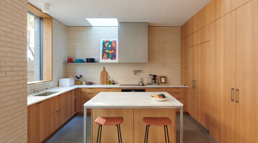
Kitchen with brick walls, oak millwork and a central island
Oak millwork in the kitchen continues through the minimal interiors

The most dramatic change involved swapping the stacked staircase with a switchback configuration – a similar approach taken by the studio at another Brooklyn townhouse in 2018.

This arrangement allows for improved visual connections between the levels and gave the project its name, Z House.
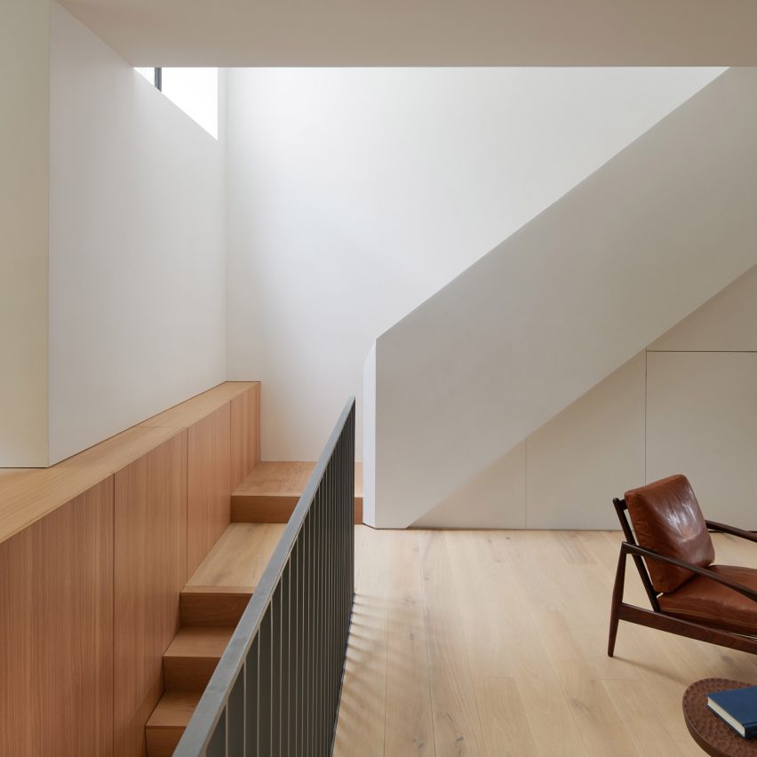
Wooden staircase that leads to perpendicular white staircase above
Reconfiguring the house involved swapping the stacked staircase for a switchback arrangement from the parlour level to the top floor

In addition, an angled skylight was added above the staircase void, bringing in light all the way down to the parlour 40 feet (12 metres) below.

“Filled by light and air, the stair’s drama is heightened by the placement of large windows punctuating the rear facade, allowing the vertical space to open to the exterior,” said the studio.
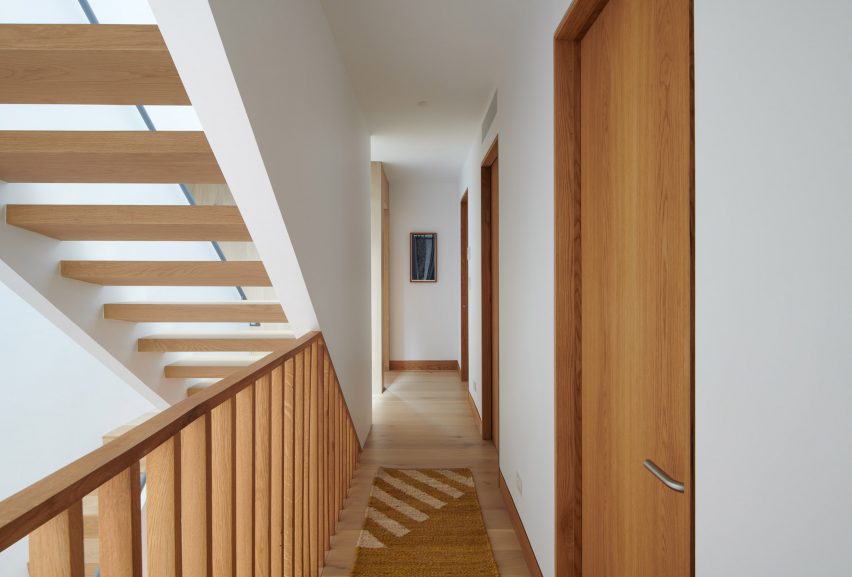
Switchback staircase beside a corridor with wooden doors
A skylight over the staircase void brings light down into the home

Of the home’s four storeys, the lower levels are occupied by the public spaces including the kitchen, dining, living and media rooms.

The top two levels are reserved for the children’s rooms and the primary suite respectively. The uppermost floor also accommodates a home office and provides access to a roof terrace created by the rear extension.

“This private, elevated, exterior space offers a unique domestic experience not typically found in most Brooklyn rowhouses,” Light and Air said.

Interiors throughout are clean and minimal, with white walls and custom oak millwork, built-ins and furniture.
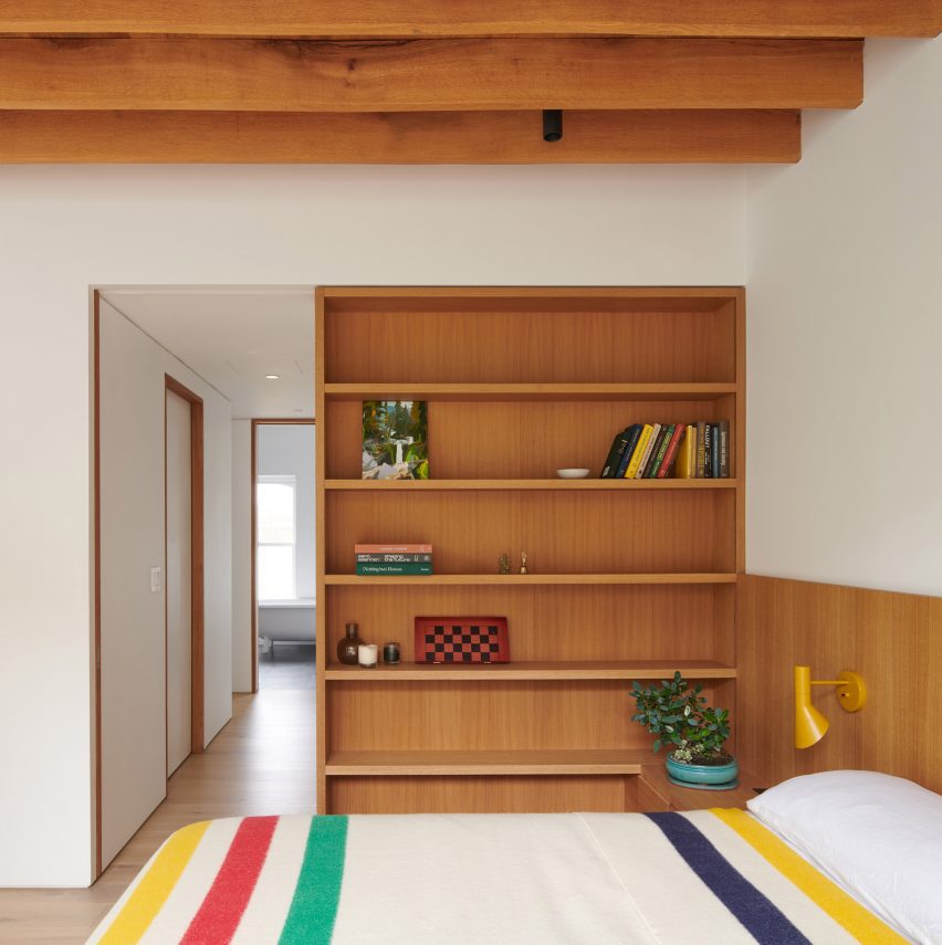
Bedroom with custom oak bed and built-ins
The primary bedroom on the top floor features a custom oak bed and built-ins

The pale brick of the rear facade is also expressed inside the double-height kitchen and dining area, which is open to the back patio.

“Located above the garden level addition is a green roof that buffers sightlines from the parlor floor, creating the effect of a floating garden beyond,” said Light and Air.
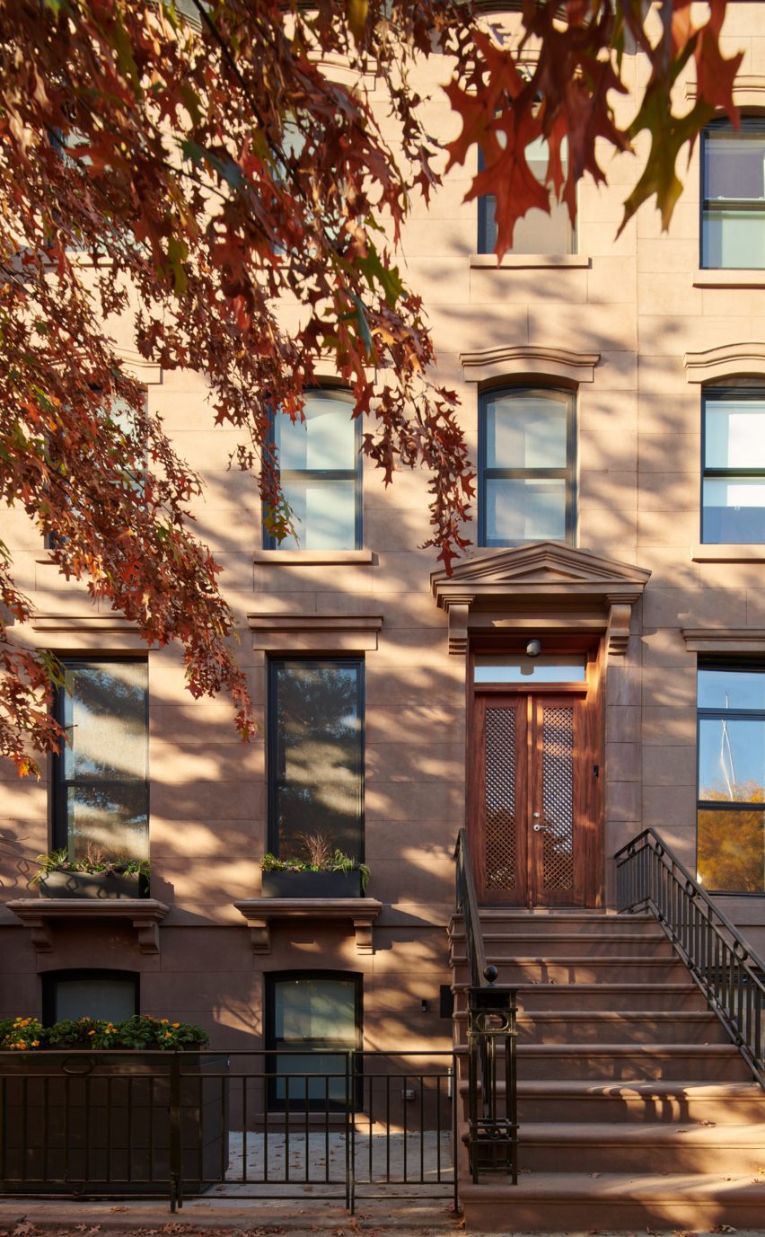
Historic townhouse facade in Clinton Hill, Brooklyn
The historic street facade of the Clinton Hill townhouse was also restored as part of the renovation

Founded by Shane Neufeld in 2017, the studio has completed a variety of interior design projects across New York City.

These include a Brooklyn apartment retrofitted with ample custom cabinetry and a spiral staircase and a Financial District loft where partitions were removed to create an open, inviting space.

The photography is by Kevin Kunstadt.

Reference

ATRA outfits Olson Kundig-designed house in West Hollywood
CategoriesInterior Design

ATRA outfits Olson Kundig-designed house in West Hollywood

This townhouse in Los Angeles by US firm Olson Kundig is outfitted by furniture brand ATRA with “the best that Mexico has to offer”.

The Garden House, which sits between West Hollywood and Beverley Hills, was designed as one of eight single-family homes that form the The Houses at 8899 Beverly development.
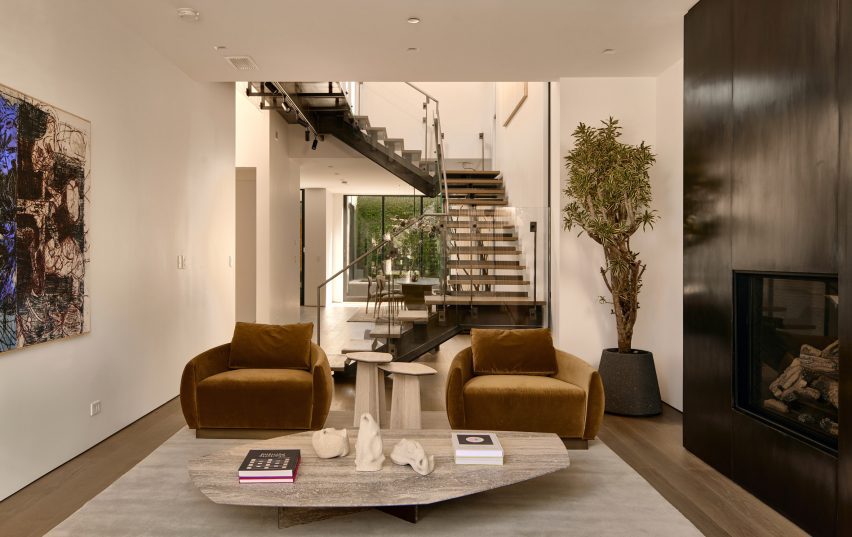
Living room with bronze fireplace, two armchairs and transparent staircase
The interior of the Garden House is divided into two areas by a central void, which contains the staircase

Each of the two-storey residences was designed by Olson Kundig with a unique look and layout while retaining a cohesive language across the set.
For this particular house, which is decorated for a fictional future client, Mexico City-based design studio and furniture brand ATRA used many of its own products to create an environment that complements the architecture.

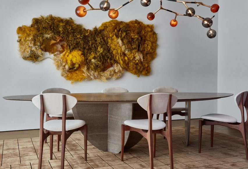
Sculptural dining table, branch-like chandelier and textured wall artwork
To decorate the house, ATRA used several of its own products including the dining table, along with pieces by Mexico-based artists and designers

“We wanted to sublime the minimalist architecture and the simplicity of the volumes by keeping the home versatile – imagining that the owner could be a young family as well as a Hollywood actor or a tech entrepreneur and that the design should not only fit but inspire all the above,” said the ATRA team.

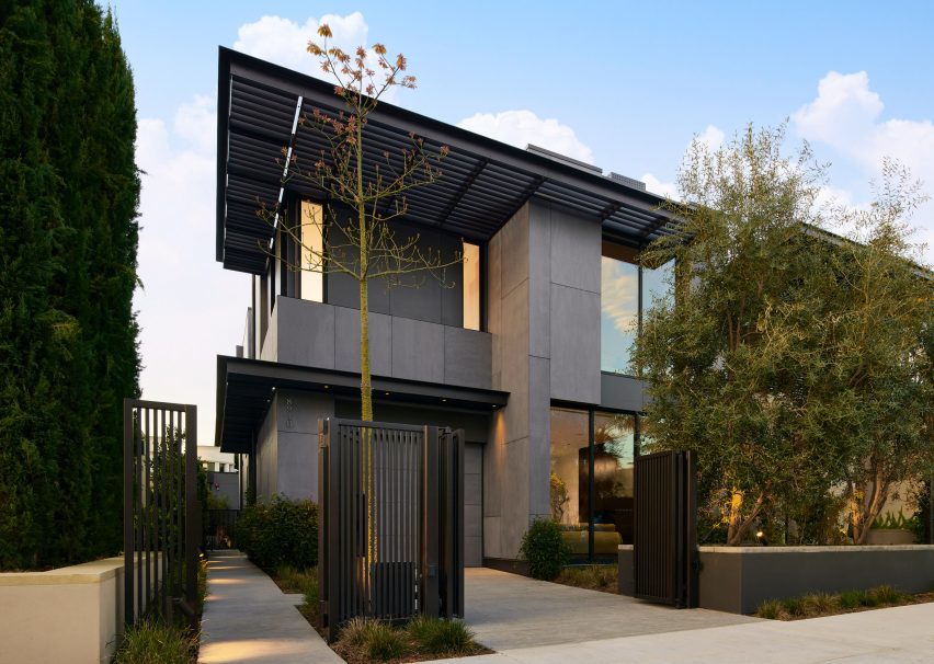
From the street, the house presents as austere – comprising dark cladding materials and emphasised horizontally by an extended flat roofline and porch cover.

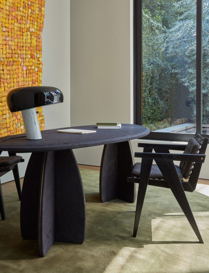
Volcanic stone desk
The volcanic stone desk in the study is also designed by ATRA

The building is entered into a double-height space from the side, effectively splitting the plan into north and south areas.

A staircase with open risers and glass balustrades rises up through the central void, its transparency allowing views from one side of the house to the other.

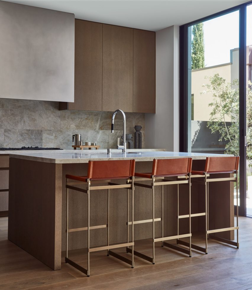
Kitchen with wooden cabinetry and thin metal stools against the island
Earth tones are used throughout the ground floor, including in the kitchen

The living room to the north is anchored by a large bronze feature that frames a fireplace, while ATRA’s Egge velvet sofa and pair of armchairs face one another across a low stone coffee table.

On the other side of the staircase is the dining room, where the brand’s sculptural Pebble dining table sits below a branch-like chandelier by Isabel Moncada, and beside a highly textured artwork by Julio Rizhi.

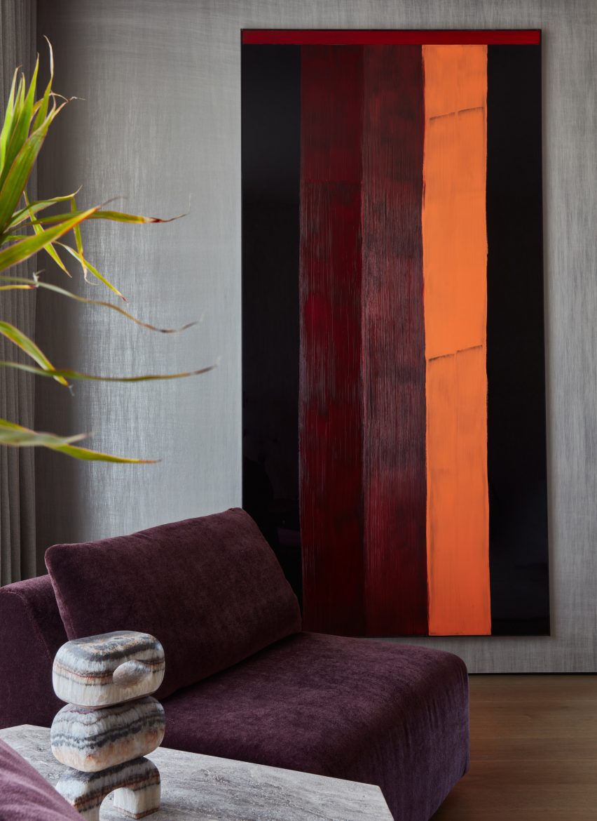
Vertical striped painting behind a burgundy-hued lounge chair
Upstairs, bolder colours are used to appear like “happy accidents”

“We curated the best that Mexico has to offer to enhance this house with unexpected artworks and thoughtful designs,” said Gabriella Kuti, ATRA’s lead designer.

Earth-toned furniture and textured finishes are used prominently throughout the ground floor, including a volcanic stone desk in the study and warm wood cabinetry in the kitchen.

A slightly different colour palette was employed upstairs, where grey sheen walls and burgundy-hued chairs are found in the primary bedroom.

“Some unusual warm and vibrant colors were introduced like a happy accident,” said ATRA.

Works by international artists in the home include a wall piece by Ghanaian artist Serge Attukwei Clottey made from a patchwork of yellow gallon containers, and bold-striped paintings by French artist Edouard Ng.

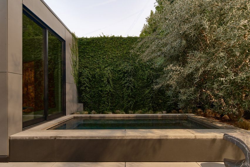
Private patio with plunge pool
A private patio at the back of the house features a plunge pool

Tucked out of view at the back of the property, a small outdoor patio features a square plunge pool and sculptures by Pablo Arellano.

The eventual owners of the house will also have access to the amenities of the adjacent residential tower 8899 Beverly, including a pool, a covered dining area and gardens, an indoor fitness centre and a yoga studio.

House exterior with dark cladding and flat roof
The architecture by Olson Kundig comprises dark materials and exaggerated horizontal planes

ATRA also provided furniture and decor for a show apartment in New York’s One Wall Street designed by FrenchCalifornia, and launched its Nerthus-Sofa modular system in 2020.

The company was founded by Alexander Díaz Andersson, who is also its creative director and works across furniture, sculpture, interiors and hospitality projects.

The photography is by Michael Clifford and Nils Timm.

Reference

saint of athens converts 1920s flat into eclectic ‘upper house’
CategoriesArchitecture

saint of athens converts 1920s flat into eclectic ‘upper house’

step inside saint of athens’ renovated upper house in kypseli


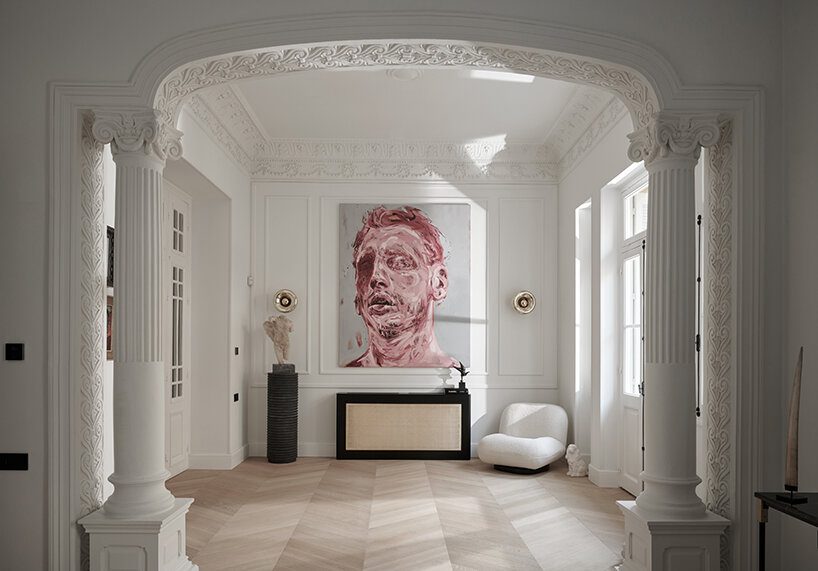
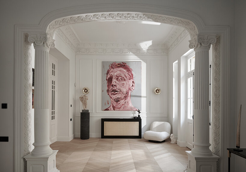
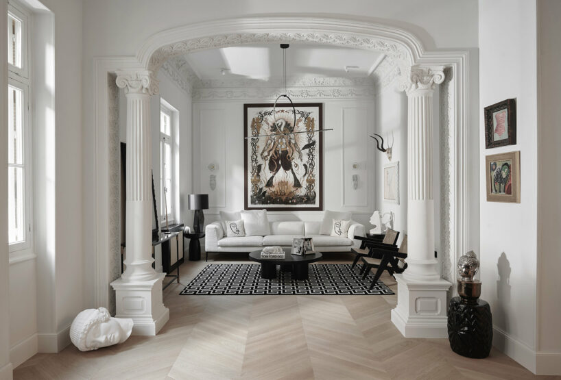
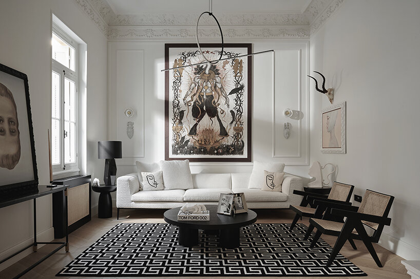
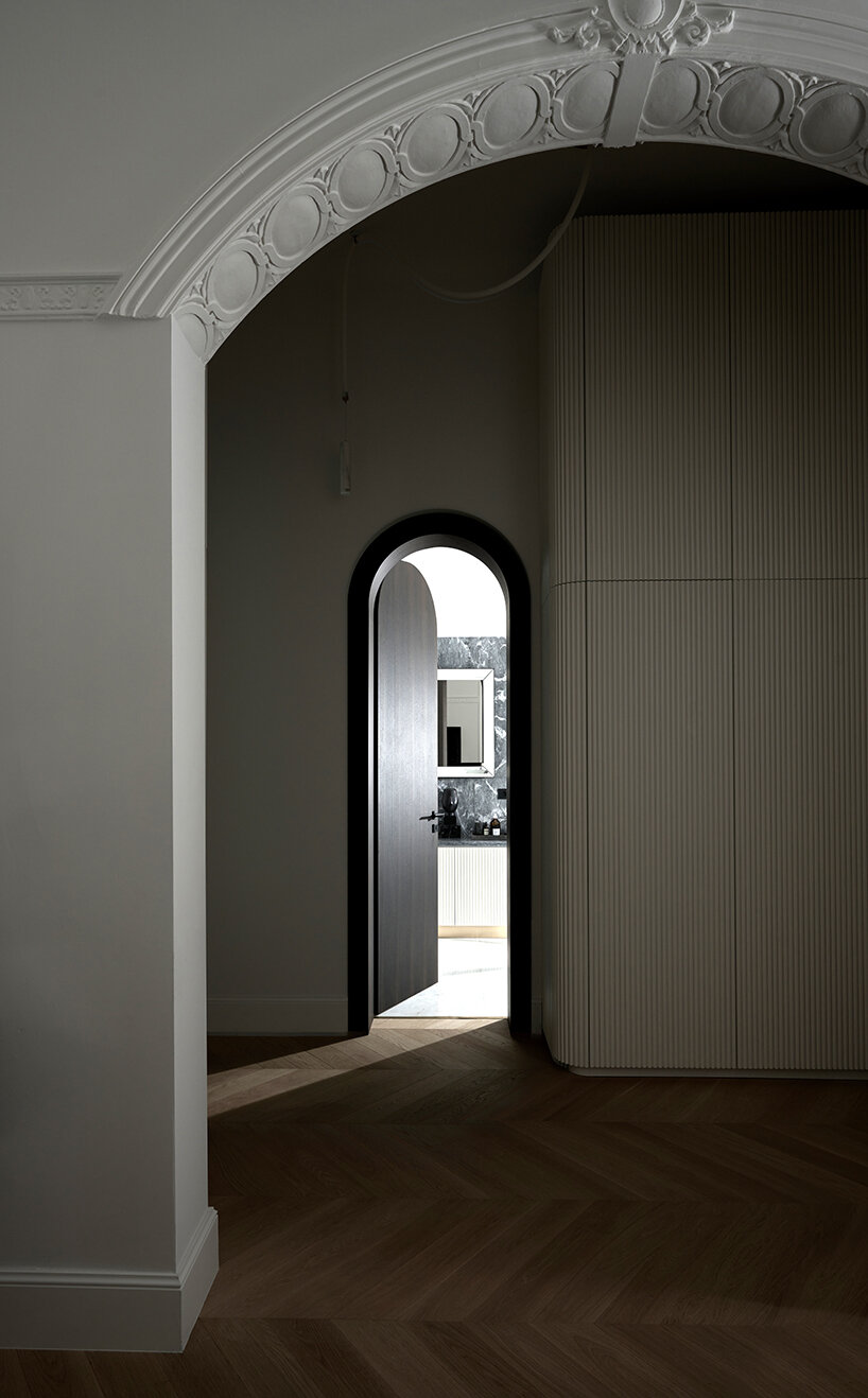
Located in the heart of Kypseli, one of Athens’s most historic urban areas, the floor-through Upper House apartment occupies the first level of an iconic building designed and constructed in the 1920s following the architectural style of eclecticism. Saint of Athens founder Nikos Palaiologos teamed up with A&O Architects to renovate his understatedly luxurious 220 sqm property, devising an interior space reminiscent of New York’s Upper East Side apartment houses of the aristocratic flats on the 7th arrondissement of Paris. The house was originally built for the family of a wealthy Greek industrialist of the previous century, which explains many of its rare and inherent features, such as the five-meter high ceilings, the intricate plaster motifs, and the genius overall layout offering easy access to all spaces and a soothing, flowing sense of comfort.

saint of athens converts 1920s apartment into the eclectic 'upper house' in kypseli
all images © Giagkos Papadopoulos


combining retro aesthetics and modern convenience.


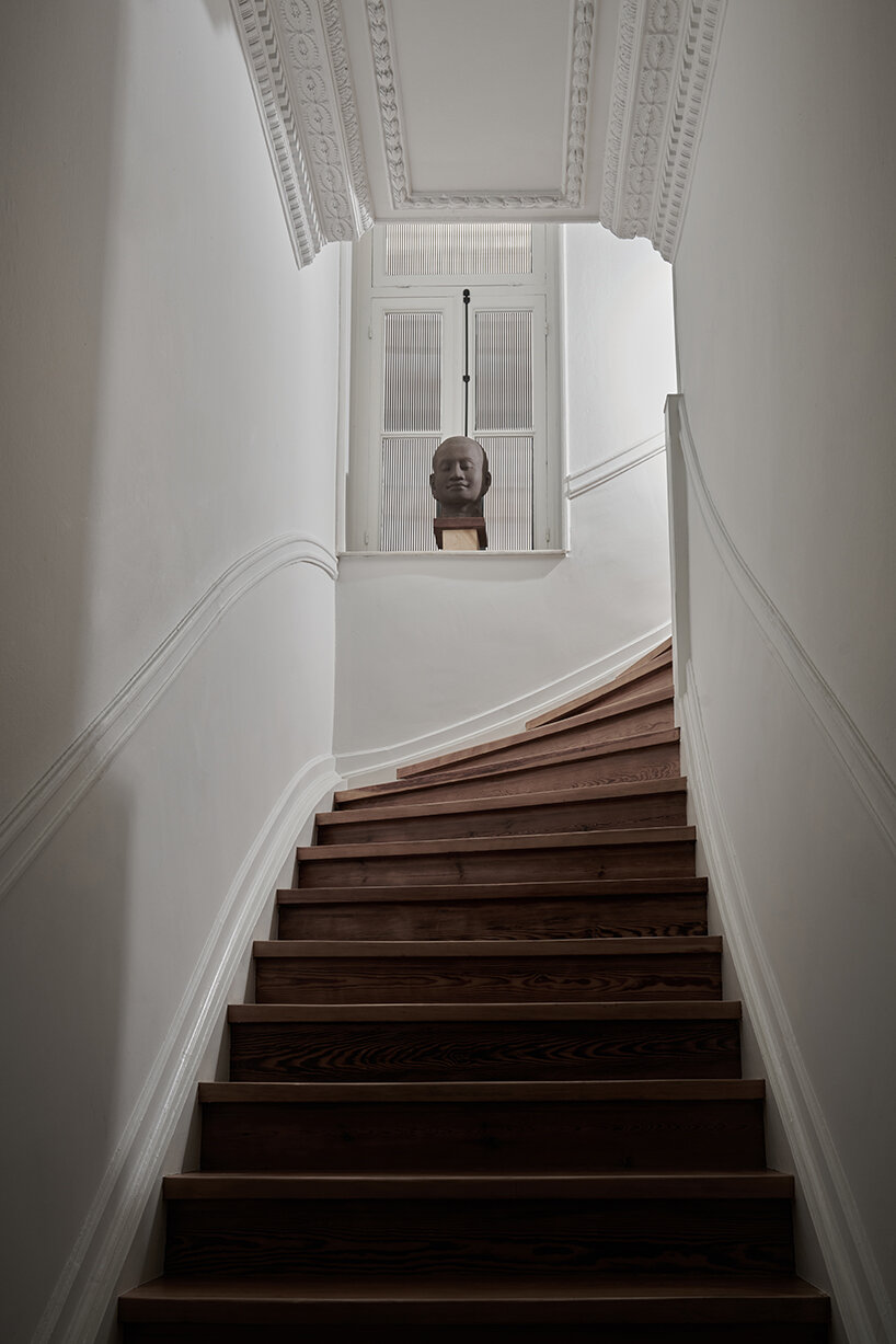
The Upper House apartment’s recent renovation by Saint of Athens (see more here) and A&O Architects (more here) joins together a selection of premium materials and appliances — chevron wood flooring, Greek marbles, Internet of Things (IoT), state-of-the-art heating and cooling technology — resulting in a sui generis combination of retro aesthetics and modern convenience. ‘A perfectly preserved one century-old wooden staircase, two reception rooms (living rooms), a dining area, a master bedroom with a walk-in bathroom, a guestroom and a guest bathroom, a library, a kitchen, and a pantry constitute parts of a functional home synthesis that blends practicality with fine craftsmanship and unique taste,’ writes Nikos Palaiologos. 

saint of athens converts 1920s apartment into the eclectic 'upper house' in kypseli
first reception room of the eclectic Upper House in Kypseli


Furthermore, the design team introduced upscale custom-made creations like the one-of-a-kind closet, the Japanese wallpaper, and the boiseries gracing the walls give the house an eye-pleasing added value, while lavish bits and pieces — from designer furniture and light fixtures to hip ceiling fans and memorabilia/works of art — bless every single space with a careful touch of arty elegance. ‘The Upper House is the epitome of a modern house experience grounded in the finest aesthetic principles of a glorious past,’ concludes Nikos Palaiologos. 

saint of athens converts 1920s apartment into the eclectic 'upper house' in kypseli
Saint of Athens teamed up with A&O Architects to renovate the 220 sqm property

saint of athens converts 1920s apartment into the eclectic 'upper house' in kypseli
preserving the historic aesthetic

saint of athens converts 1920s apartment into the eclectic 'upper house' in kypseli
preserved one century-old wooden staircase


Reference

Mid-century Zero House in London imbued with “Kubrick feel”
CategoriesInterior Design

Mid-century Zero House in London imbued with “Kubrick feel”

Timber ceilings and a fireplace clad in mahogany tiles feature in this London house, which its owners have renovated to honour the dwelling’s mid-century roots and nod to the colour palette of Stanley Kubrick films.

Located in north London’s Stanmore, Zero House belongs to recording artists Ben Garrett and Rae Morris, whose former home in Primrose Hill is the Dezeen Award-winning Canyon House designed by Studio Hagen Hall.

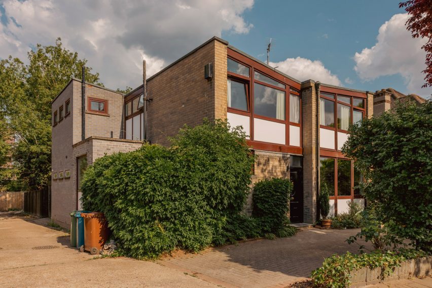
Zero House in Stanmore, London
Zero House in Stanmore was built between 1959 and 1961

Unlike their previous dwelling, Garrett and Morris updated Zero House themselves but adopted the same mid-century palette when creating its interiors.

“The house was built between 1959 and 1961 by a Hungarian architect,” said Garrett, who explained that the original design was informed by Californian Case Study Houses such as Charles and Ray Eames’s 1949 home and design studio.

Brick and timber details within mid-century renovation
The two-storey dwelling was renovated by its owners

“It’s a great example of a number of imaginative mid-century domestic houses dotted around metro-land,” he told Dezeen. “Our main aim was to freshen it up relatively in keeping with the time but not to feel like we were living in a total time capsule.”

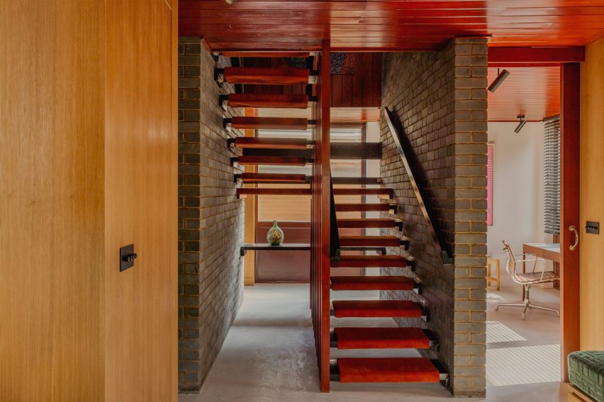
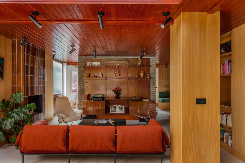
The pair maintained the matchbox timber ceilings that run throughout the two-storey home, which were stained with a dark reddish tone alongside stained wooden doors.

Floor-to-ceiling tiled fireplace in Zero House
Slim mahogany tiles clad the floor-to-ceiling fireplace

Slim mahogany tiles clad the floor-to-ceiling fireplace in the living room, which features the same micro-cement flooring found at Canyon House and opens out onto a lush garden.

Garrett and Morris also maintained the home’s many exposed brick walls and inserted geometric timber shelving that displays eclectic ornaments including amorphous vases and a colourful set of nesting dolls.

Timber-clad kitchen
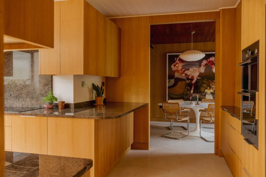
The kitchen was panelled in light-hued timber

Reeded 1970s-style glass was used to form various windows including a rectilinear opening in the kitchen that illuminates minimal timber cabinetry topped with grainy surfaces.

The pair transferred the tubular Marcel Breuer chairs and Tulip dining table by Eero Saarinen from their former home, as well as the same “heinous digital artwork” that decorated their previous living space.

Dark brown bedroom interiors in Zero House
Darker tones create a “horror film” feel upstairs

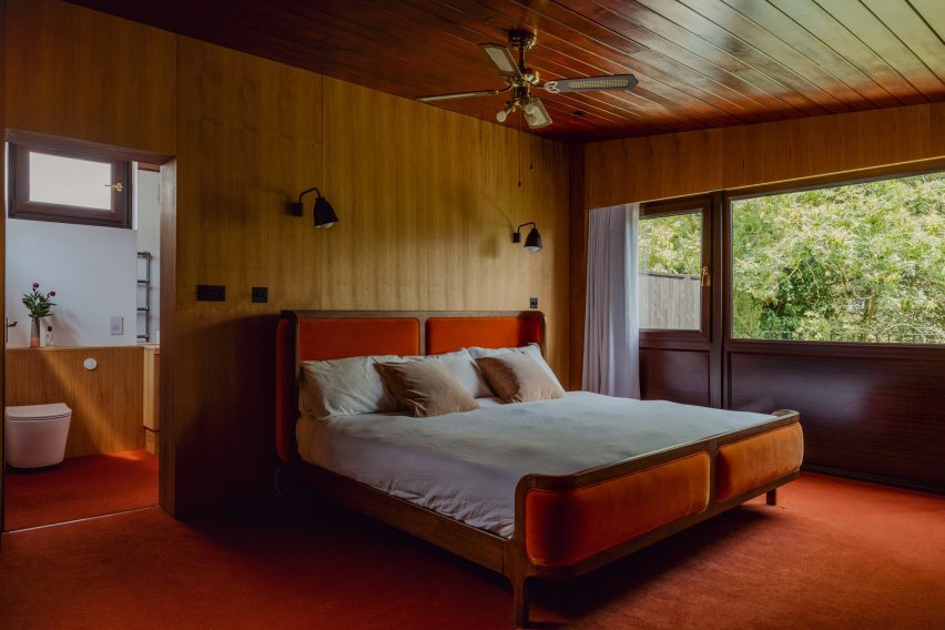
Upstairs, a moody mahogany carpet darkens the main bedroom, which features the same timber wall and ceiling panels as the communal areas.

“There’s a lot of dark reds and browns in the house,” said Garrett.

“We leaned into the horror film slash Kubrick feel of the upstairs and made a few more austere choices this time,” he added, referencing the late filmmaker, whose credits include the 1980 supernatural horror movie The Shining.

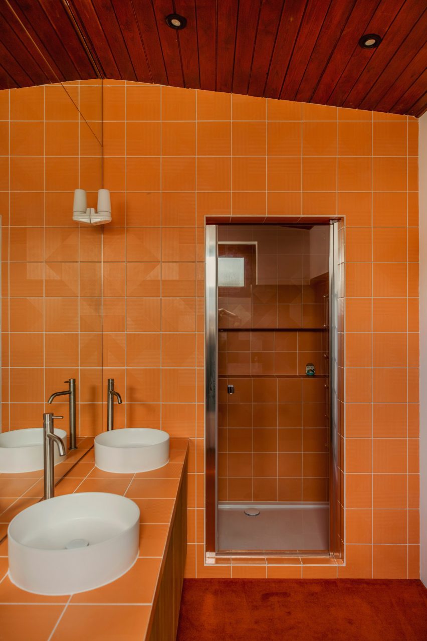
Coffee-hued cork was chosen to clad the exterior of the bathtub and the surrounding walls while another walk-in shower interrupts the dark wooden theme with bright orange tiles and deep white basins.

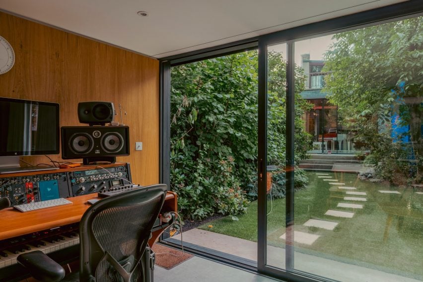
Zero House also holds a timber-panelled recording studio, which is located in a separate low-slung volume at the end of the garden and can be reached via a few stepping stones.

Bright orange walk-in shower
Bright orange tiles were chosen for a walk-in shower

Garrett and Morris left the structure of the property largely untouched. Instead, the duo chose to focus on dressing its mid-century interior.

“We didn’t have to be clever with this house as the space is abundant and the flow and design were incredibly well thought out in the early 60s,” he said. “So it was more of a cosmetic thing.”

Recording studio in Zero House
There is a standalone recording studio in a shed at the back of the garden

Other recent mid-century renovation projects saw Design Theory update a coastal home in Perth from the 1960s while Woods + Dangaran added a koi pond among other elements to a Los Angeles dwelling built by architect Craig Ellwood during the same decade.

The photography is by Mariell Lind Hansen.

Reference

PW Architecture Office brings “a little excitement” into mid-century house
CategoriesInterior Design

PW Architecture Office brings “a little excitement” into mid-century house

Australian firm PW Architecture Office has revived the fortunes of this mid-century house in Orange, New South Wales, with a sensitive renovation that respects the original building while taking design cues from its material palette.

Park Lane house was originally designed by noted Australian architect Neville Gruzman for the 1962 Carlingford Home Fair before being built in 1964 by construction company Kell & Rigby – known for its work on Sydney’s landmark Grace Building.

Covered pergolas of Park Lane house
PW Architecture Office has renovated a 1960s house by Neville Gruzman

When Paddy Williams, founder of PW Architecture Office, discovered that the house was on the market in 2022, the team went to take a look out of architectural curiosity.

The studio was immediately seduced by the sense of flow between the indoor and outdoor spaces of the 1964 house and the quality of the design, construction and materials, despite the fact that it had been through several unsympathetic renovations.

Covered pergola and seats of house in Orange, New South Wales, by PW Architecture Office
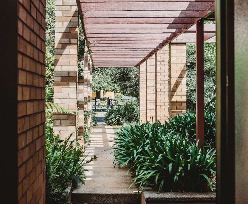
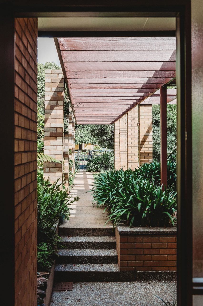
Pergolas frame the entrance to the house

“We loved the sense of arrival created by the pergolas and colonnade that lead you past the garden and pond into the entrance hall,” Williams said.

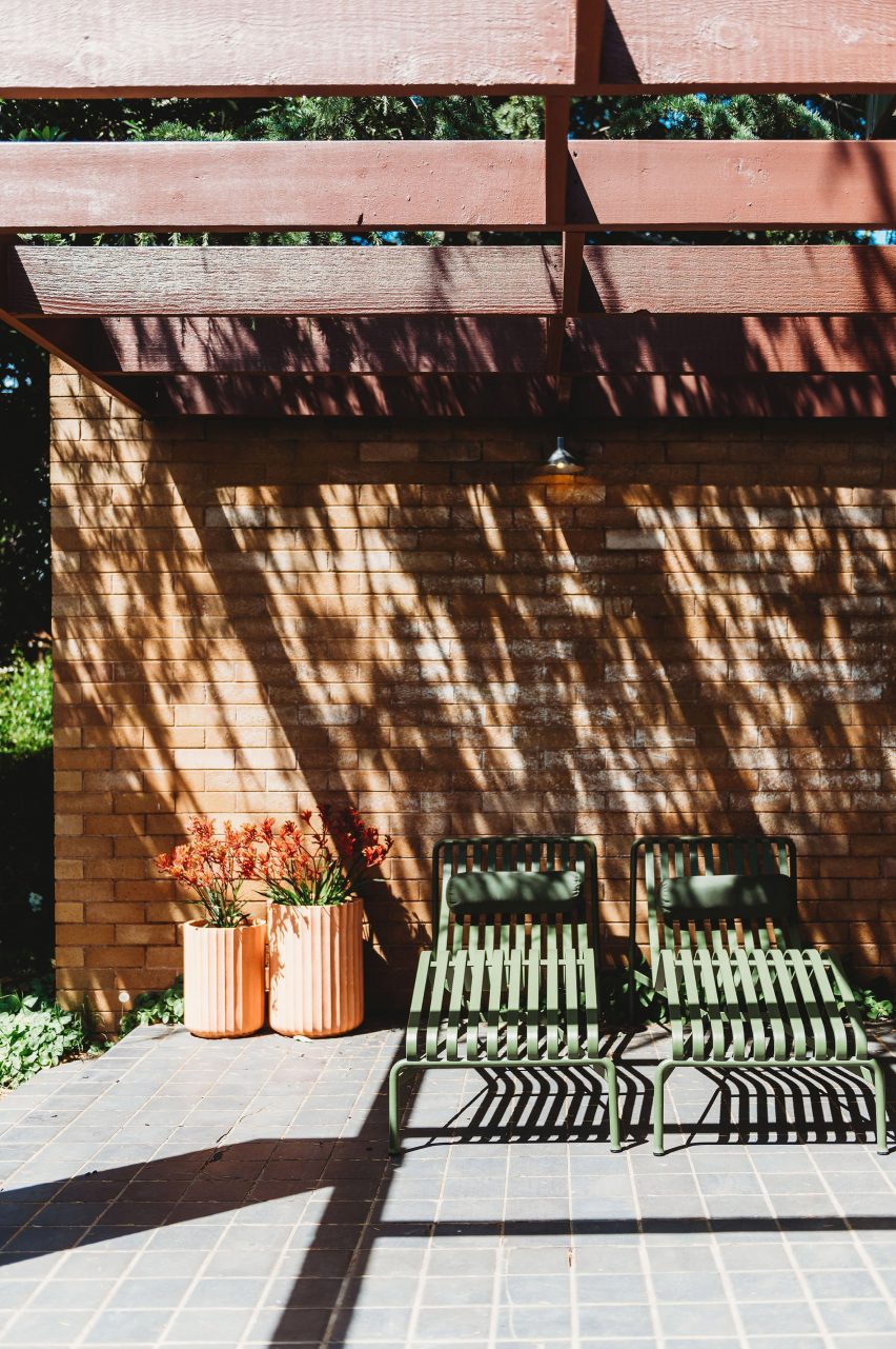
“Pavilion-style wings separate the shared spaces from the private and we loved the way the pergolas wrap around the house and terraces, framing different spaces in the garden.”

Living room of Park Lane house
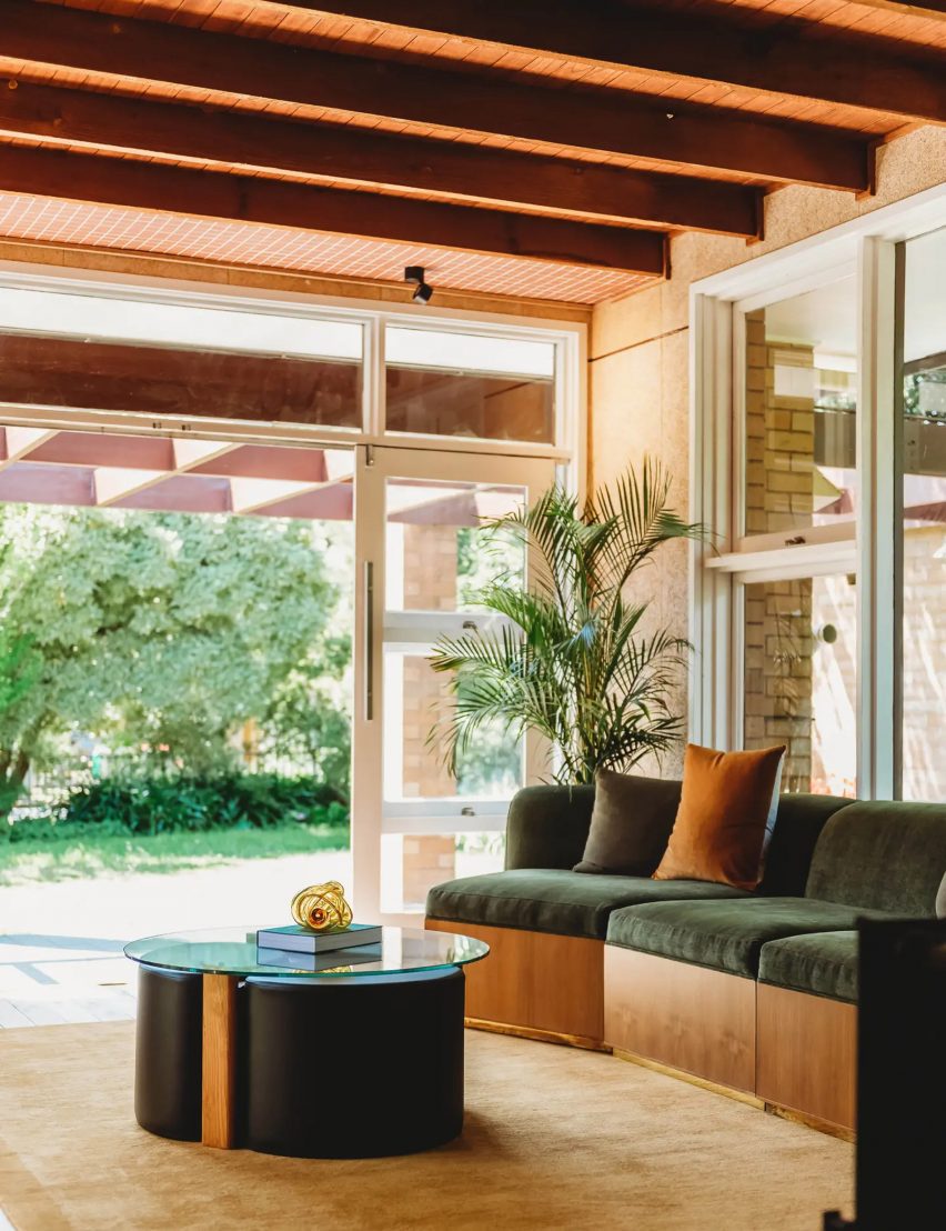
The home’s original Oregon timber beams were exposed

The practice ended up buying and renovating the house as a short-term rental for other modernist architecture lovers.

“We felt a real sense of responsibility to do the project justice and retain the elements of the plan and materials as they were intended,” Williams said.

“We wanted to bring a little excitement back into this mid-century marvel, as it would have had when it was first built.”

Living room of house in Orange, New South Wales, by PW Architecture Office
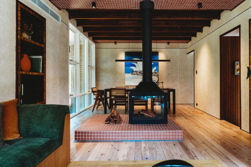
A double-sided fireplace divides the living and dining areas

Feeling that the floorplan still worked successfully, PW Architecture Office (PWAO) left it unchanged and set out to revive and celebrate the house’s original character while bringing it up to 21st-century living standards.

“We’ve designed it to be a modern take on the mid-century aesthetic, with an immediate sense of relaxation and peace through a refined palette and connection between house and gardens,” Williams told Dezeen.

Hallway of Park Lane house
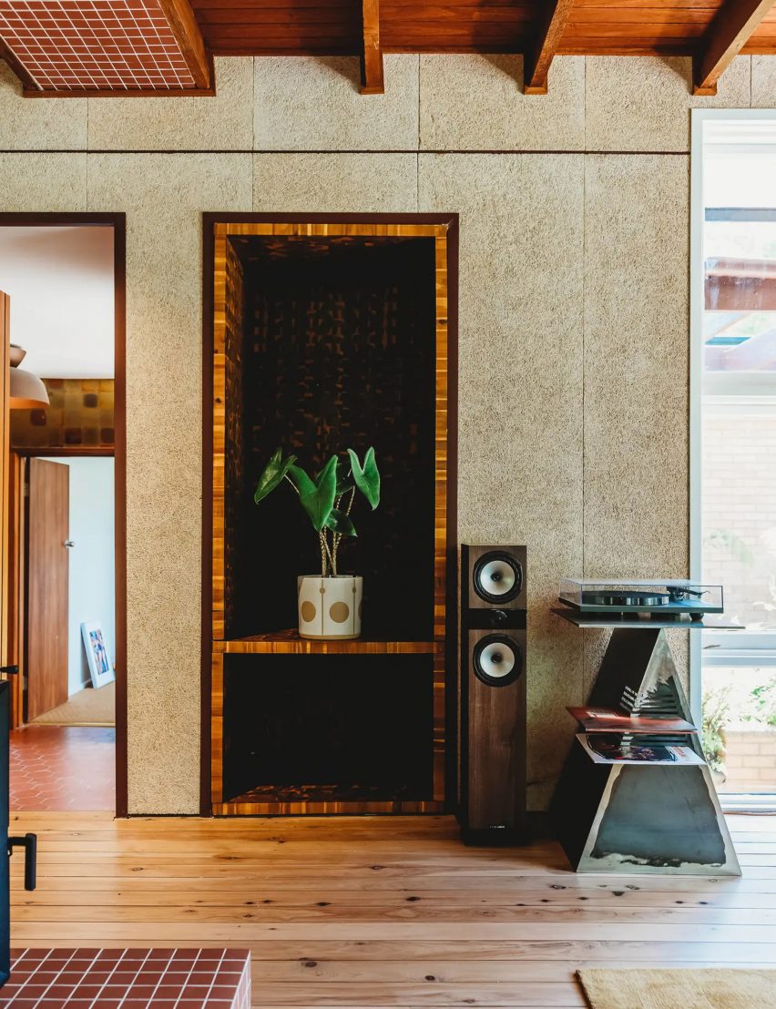
Textural wood wool panels clad the walls in the living room

Removing the worn-out carpets revealed the home’s original Australian cypress floorboards, which were sanded and polished to freshen them up.

Elsewhere, PWAO replaced vinyl flooring with “durable and low-maintenance” micro-cement in the smaller living room, kitchen and some bathrooms.

In the main living room, false ceilings were taken out to expose the original Oregon timber beams, now infilled with hardwood timber and tiled bulkheads.

“When we pulled down the badly damaged plasterboard, the beams were in such great condition and had a beautiful texture so we decided to keep them on show,” Williams said.

“This also allowed us to increase the height of the ceiling and play with the scale and rhythm of the beams.”

Dining area of Park Lane house
Micro-cement was used to finish some of the floors

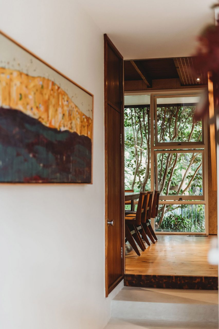
In the panelled entrance hall, the original native blackbean timber needed only a little care to restore its rich varied tones, also seen on the doors throughout the house.

Elsewhere PWAO used acacia as a feature timber for panelling and detailing across headboards, stair treads and integrated shelving.

“We’ve used these acacia elements in a playful pattern,” the studio said. “They’re in an ongoing conversation with the original blackbean timber used around the house.”

Kitchen of house in Orange, New South Wales, by PW Architecture Office
Terracotta tiles nod to the home’s original material palette

In the larger living space, a double-sided fireplace helps to zone the living and dining areas, while the walls were clad in textural wood wool panels – a composite made from recycled timber fibres.

“It is actually a thermal and acoustic panel, typically used for ceilings,” Williams said. “We thought it was a fabulous opportunity to provide texture on the walls.”

Bedroom of Park Lane house
Similar warm terracotta tones also feature in the bedroom

Throughout the house, terracotta tiles add to the sense of warm earthiness established through the material palette.

“The mosaic tiles were influenced by the original terracotta tiles in the entrance foyer,” the architect explained. “The smaller grids we’ve used are in contrast to the larger original terrace tiles, as well as the grid of the house itself, creating a play on scale.”

When the wiring was replaced, PWAO also had the opportunity to integrate the house with smart home technology, allowing the lights, heating, fans and irrigation to be controlled via an app, balancing modernist aesthetics with modern convenience.

Bathroom of house in Orange, New South Wales, by PW Architecture Office
The bathroom was designed to match

Dezeen recently rounded up eight other mid-century home renovations that marry period and contemporary details.

Among them was another 1960s Australian house with interiors updated by local studio Design Theory for a young client and her dog.

The photography is by Monique Lovick.

Reference

mixed-use wooden house showcases traditional japanese and global influences
CategoriesArchitecture

mixed-use wooden house showcases traditional japanese and global influences

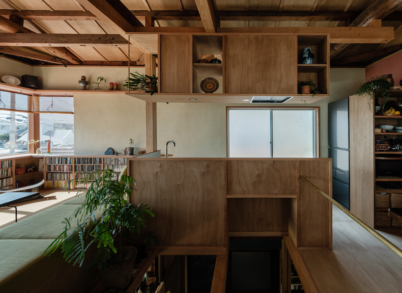
Akio Isshiki infuses three distinct functions into wooden house


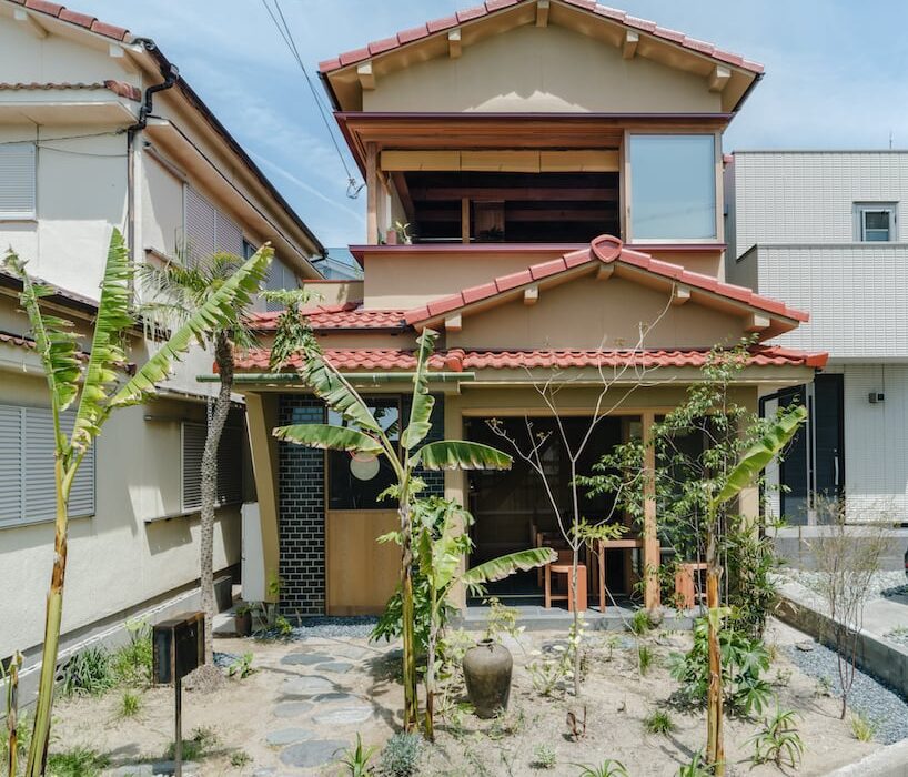
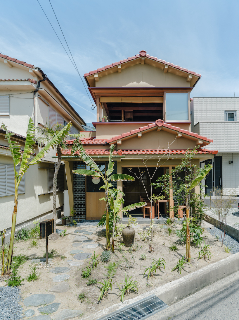
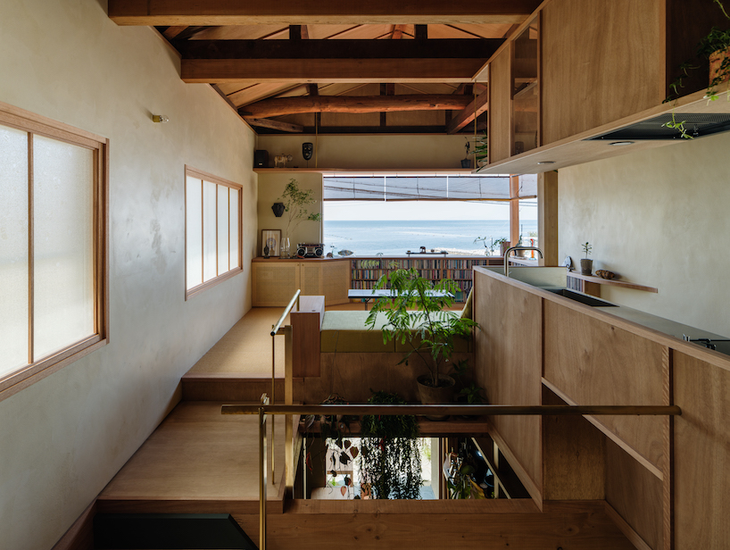
Akio Isshiki Architects renovates a wooden house near the beach in Akashi City, Hyogo Prefecture into the designer’s own residence and workplace, as well as a curry restaurant. Within this modest 73 sqm space, the coexistence of three distinct functions creates a unique environment in which notions of time and space, cultural elements, work, and living settings coexist. The design draws from traditional Japanese architecture and employs local materials and techniques while integrating global inspirations.


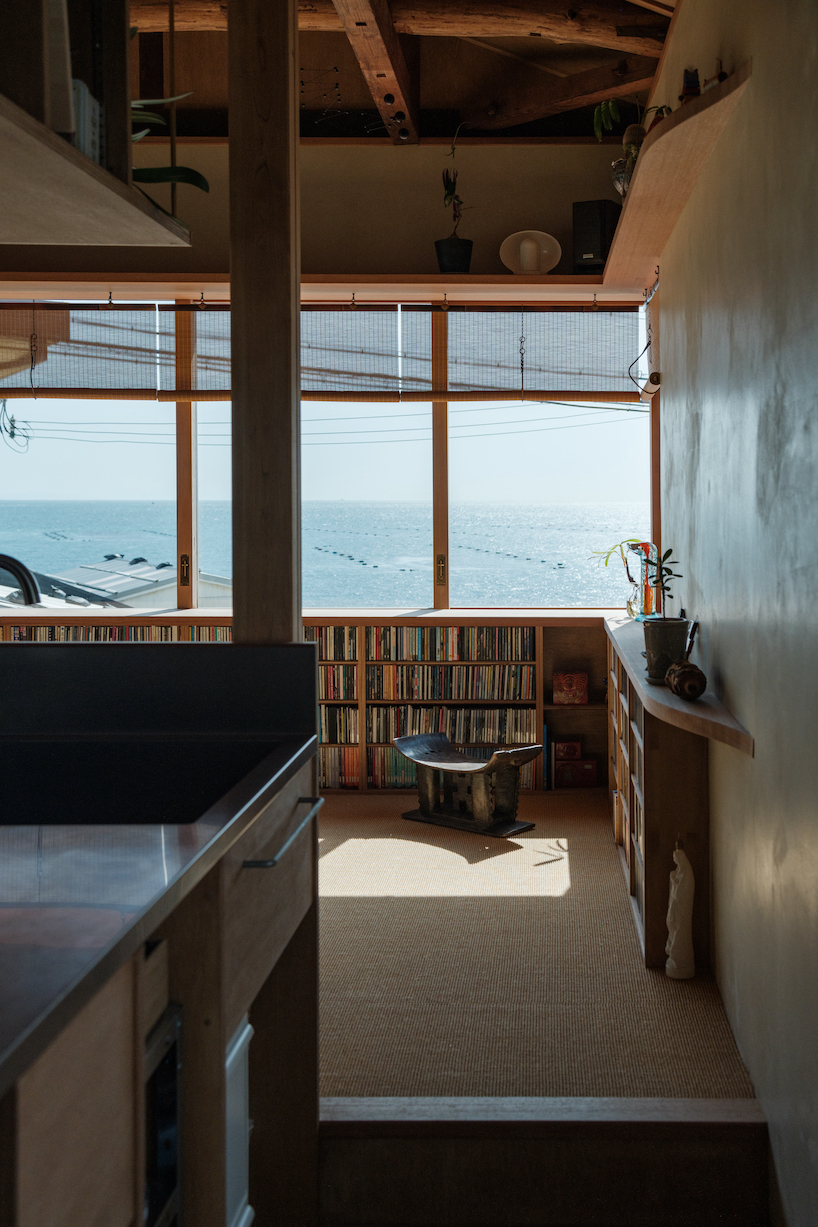
A noteworthy feature that pays homage to the region’s history of tile production is the flooring, where tiles coat the dirt ground surface. Handcrafted by Awaji’s skilled artisans, these tiles subtly echo the textures and shapes reminiscent of lava stone streets from Central and South American towns. The integration of partitions that resemble mosquito nets and Sudare blinds set against Shoji screens stand as a nod to ancient Japanese architecture. By intertwining spaces both horizontally and vertically, a gentle separation is achieved through the inclusion of native drooping plants. On the second floor, a wall facing the sea displays a scraped texture tinted with red iron oxide, skillfully completed by a local Awaji plasterer. This attempt incorporates vibrant hues of global architecture within a Japanese context. A large window cuts through the volume providing views of the sky and the sea.

mixed-use wooden house showcases traditional japanese and global influences
all images by Yosuke Ohtake


the architecture Integrates Original and Contemporary Elements


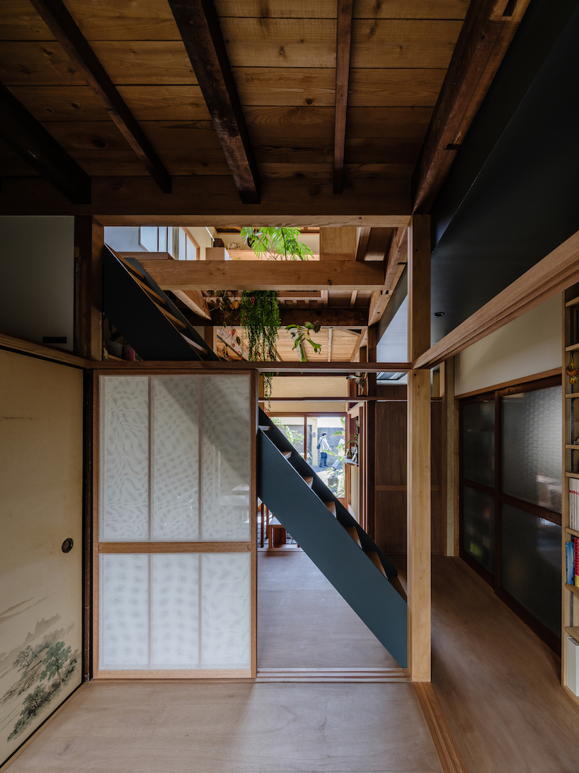
The harmony of various dimensions introduces a sense of depth into the space. Rather than accentuating contrasts between old and new, Akio Isshiki Architects‘ approach acknowledges historical materials and designs as important parts of the ensemble. The intent is to craft an environment that harmonically fuses both the original elements and newly incorporated features, creating a timeless and contemporary look. Existing structural elements such as pillars and beams blend with new architectural features, while new Shoji screens are layered to allow glimpses through the existing figured glass. A cypress pillar stands atop natural stones giving off a feeling of timelessness. Materials with various time axes are mixed and coexist.

mixed-use wooden house showcases traditional japanese and global influences
L-shaped windows allow views of the seascape

mixed-use wooden house showcases traditional japanese and global influences
the kitchen appears overhanging above the atrium

mixed-use wooden house showcases traditional japanese and global influences
the kitchen area seamlessly flows into the living room

mixed-use wooden house showcases traditional japanese and global influences
existing Fusuma doors are reused within the interior of the wooden house

Reference

machteld d’hollander’s ‘martelaar house’ is a tropical oasis in ghent
CategoriesArchitecture

machteld d’hollander’s ‘martelaar house’ is a tropical oasis in ghent

a garden house in belgium


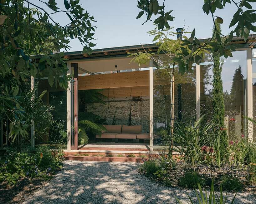
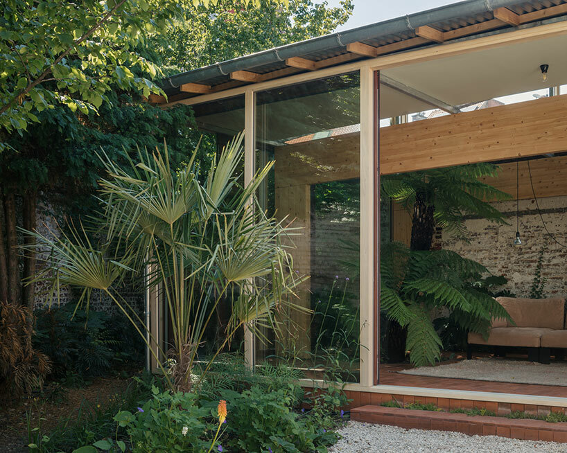
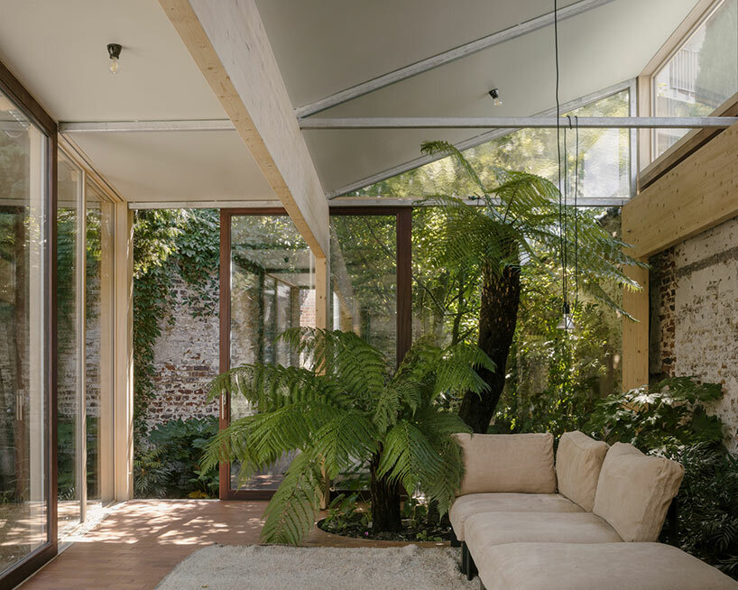
The Belgian city of Ghent is the unlikely backdrop for this Martelaar House, a lush oasis by local architect Machteld D’Hollander. The home stands in contrast to its urban surroundings — known for its medieval influences and dreary climate — as it is infused with a tropical, sunlit atmosphere and gardens which flourish from the outside-in.

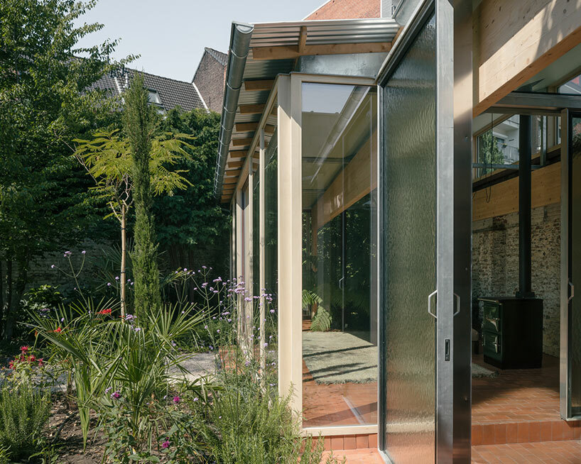
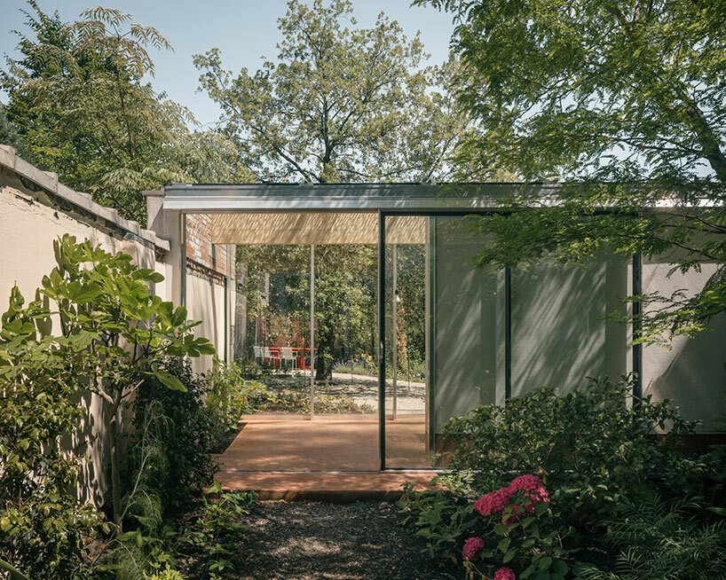
The renovation project includes the addition of two contemporary garden pavilions, with plants and trees thriving in place of a cramped structure. Still, the design team leaves a reminder of the dwelling’s industrial past with elements of the original structure, including some of its original derelict walls, left to shine between the foliage.

Martelaar House Machteld D'Hollanderimages © Stijn Bollaert@stijn_bollaert


a place for escape by machteld d’hollander


The Martelaar House is more than just a renovation — it is a transformation by Machteld D’Hollander of space and atmosphere. The conversion of a once-enclosed and cluttered industrial space into a verdant sanctuary lends an escape from the surrounding urban environment. With a keen understanding of the power of greenery, the architect teams up with landscape designers Bart & Pieter to emphasize this integration of nature into the built environment. Walls that once defined boundaries are replaced with a profusion of plants and trees, creating a harmonious coexistence of architecture and landscape.

Martelaar House Machteld D'Hollandernature grows inside and out the residential renovation
Martelaar House Machteld D'Hollander
landscape designers Bart & Pieter infuse the space with gardensMartelaar House Machteld D'Hollander
the renovation includes two new pavilionsMartelaar House Machteld D'Hollanderthe once-cluttered industrial building is opened up with full-height glass walls


Reference

Studio Varey Architects celebrates natural light in Notting Hill house
CategoriesInterior Design

Studio Varey Architects celebrates natural light in Notting Hill house

London firm Studio Varey Architects has simplified this Victorian terraced house to create a light-filled home in Notting Hill, with timber-framed skylights designed to catch the sun.

Set in the Westbourne Conservation Area, Huron House has belonged to its current owners for the last 25 years.

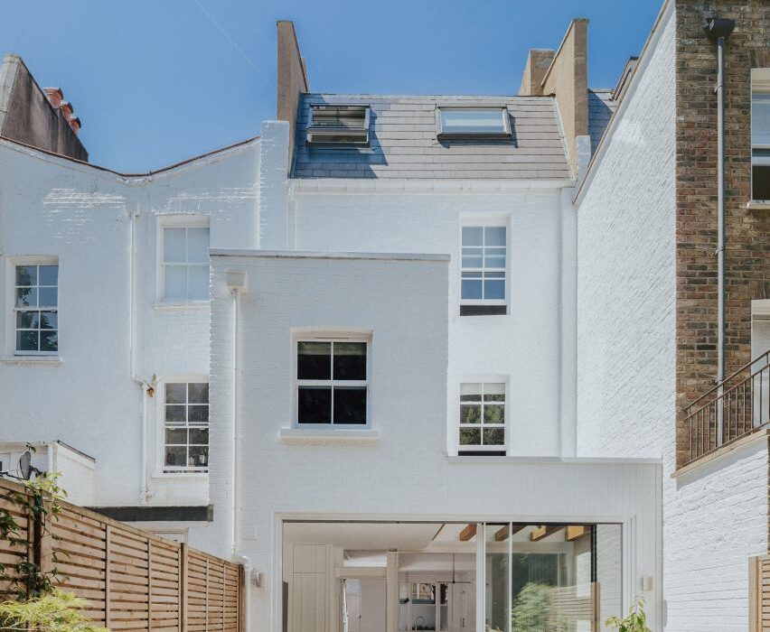
Exterior of house in London by Studio Varey Architects
Huron House is a renovated Victorian terrace in west London

The overhaul of the 19th-century building started as a simple ground-floor renovation to replace the kitchen and improve the connection between the house and its garden.

However, exploratory works showed the four-storey property to be in bad structural condition, which demanded major improvement works but also gave the owners an opportunity to reimagine their period home.

Dining area of Huron House
Decorative oak beams frame the skylight in the extension

The new brief to Studio Varey Architects included a full house renovation and interior design, with special emphasis on the bathrooms as well as custom joinery and the rebuilding of the 1990s rear extension to create a new open-plan kitchen and dining room.

“Our goal was to create an open-plan living space and bring lots of natural light into the ground floor, helping it to feel more inviting and better suited to entertaining friends and family,” the studio told Dezeen.

Stairwell of house in London by Studio Varey Architects
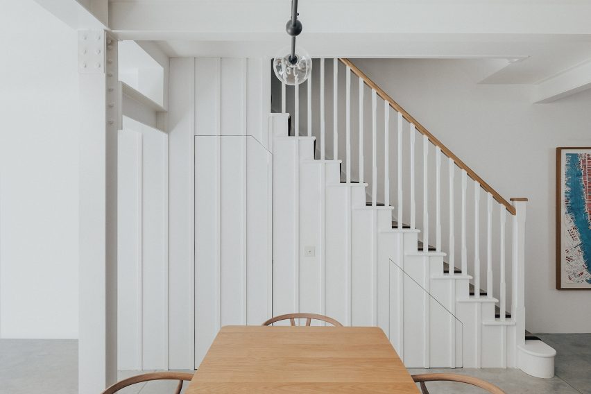
A simple white staircase leads upstairs

The property sits on a rough east-west axis, giving it the potential to achieve great light levels throughout the day, with the sun moving from the back of the house in the morning to the front in the afternoon.

“We wanted to ensure this natural light was captured through the architecture and design of the spaces,” the studio said.

On the ground floor, Studio Varey Architects removed a structural post that supported the building but divided the back wall.

Bathroom with light well in Huron House
A skylight illuminates the top-floor bathroom

This has been replaced with a steel frame, which allowed the studio to introduce slimline aluminium sliding doors that now run along the whole back of the property.

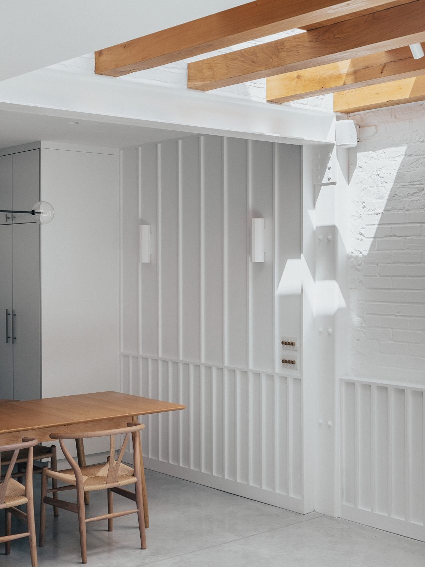
An existing skylight in the flat roof here was enlarged and framed with oak beams, pulling more light into the centre of the hybrid kitchen-dining space.

“Natural light cascades into the back of the house, while the introduction of oak beams created a feature that plays with the light as it travels through the property,” the studio said.

The whole staircase was replaced and positioned further away from the home’s large rear windows, creating a lightwell funnels sun into the lower floors.

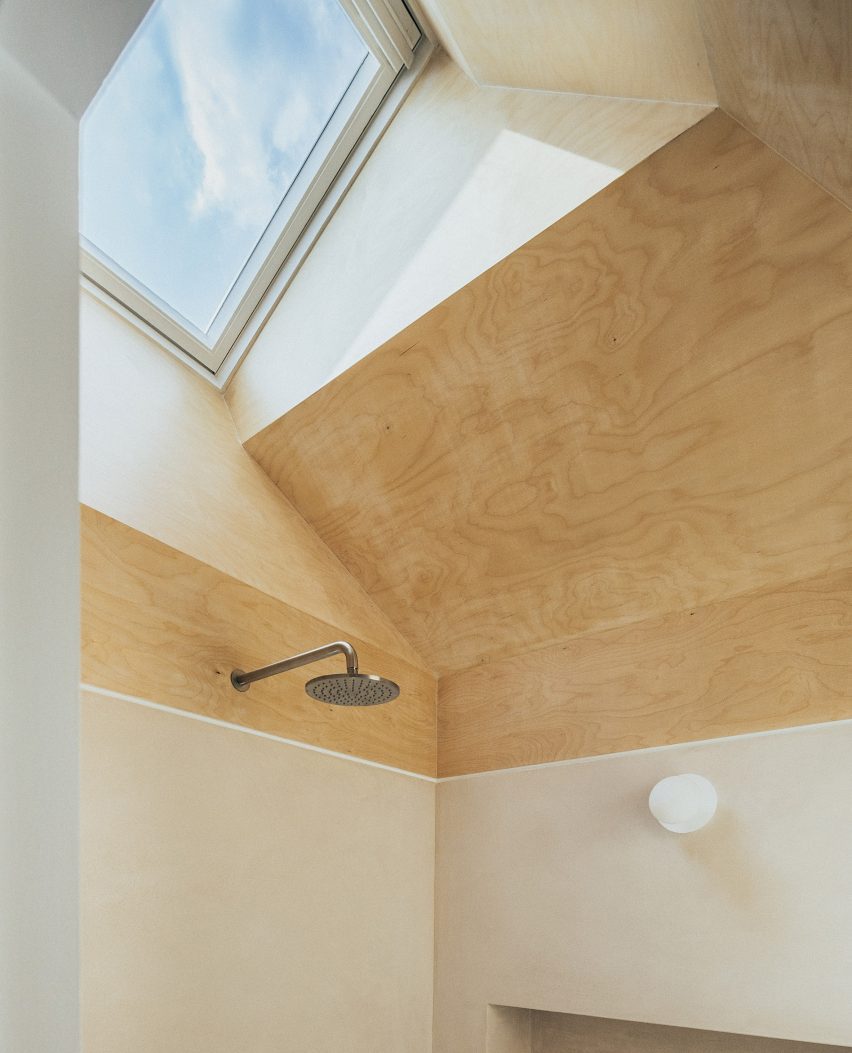
On the top floor, an existing bathroom was fully renovated. Situated in the middle of the top floor it featured no windows save for a small skylight, meaning that light levels were totally inadequate.

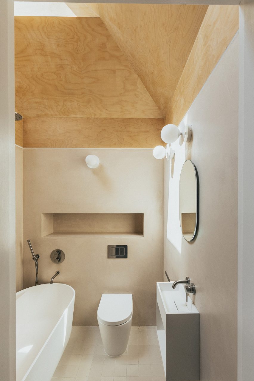
Here, Studio Varey Architects cut back the ceiling to create a multifaceted surface clad in birch plywood – its colour knocked back with a wash of soft white – to bounce light around the space.

Timber-clad light well in Huron House
The ceiling was cut back to allow more light into the interior

“We created a splayed ceiling that increased the height of the space, allowing for the playful integration of materials to emphasise the new angles,” the studio said.

“Naturally finished birch ply, leading from the skylight down into Tadelakt walls, beautifully captures sunlight creating a special warmth in the space.”

Living room of house in London by Studio Varey Architects
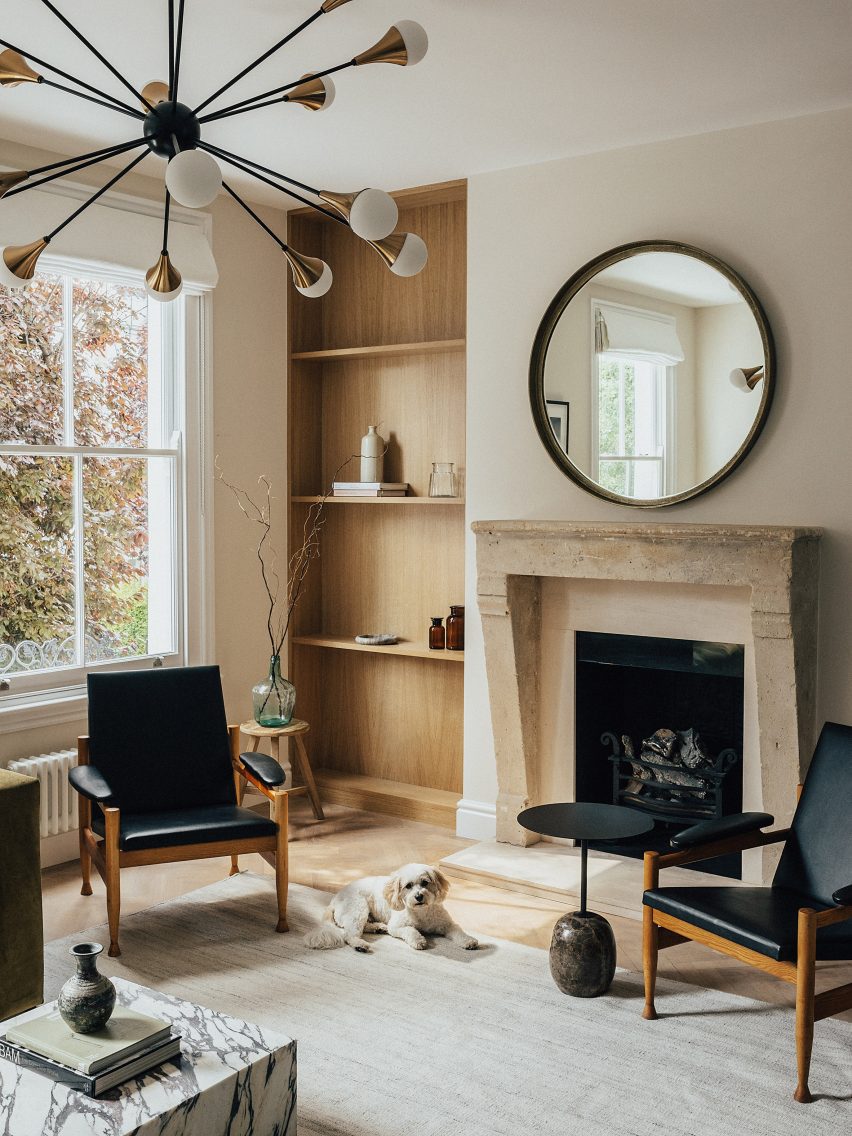
Oak forms bookcases in the sitting rom

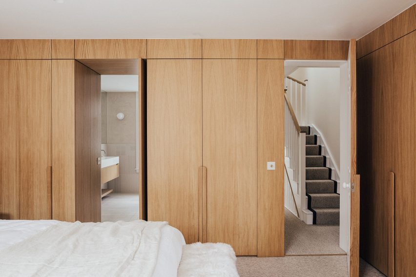
White oak can be found throughout the house in the form of built-in joinery from bookcases and wardrobes, as well as in the feature beams of the extension.

“We wanted to simplify the material palette and keep it light, both in appearance and number of elements we used,” the studio said.

“This was done to emphasise the quality of the materials themselves, highlight the craftsmanship of the work and establish a visual link between the interior spaces throughout the home.”

Bedroom of house in London by Studio Varey Architects
Oak joinery features in the primary bedroom

Polished concrete, used for the floor at ground level, is underlaid with underfloor heating and provides a durable surface that is easy to clean for the owners after walking their dog.

Other recently renovated houses in London include Sunderland Road House by 2LG, which features pastel-painted corniced ceilings, and Graphic House by Office S&M, which is defined by graphic shapes and bold hues.

The photography is by Taran Wilkhu.

Reference

Relogged house by Balbek Bureau reinterprets traditional log cabins
CategoriesInterior Design

Relogged house by Balbek Bureau reinterprets traditional log cabins

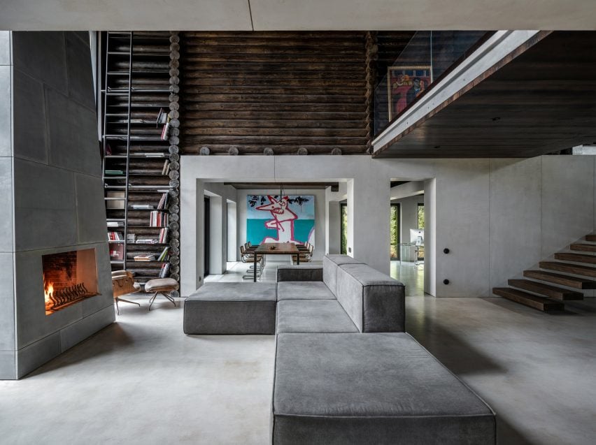
Architecture studio Balbek Bureau has revamped a house in Ukraine using stainless steel and concrete to create a modern interpretation of a log cabin.

The three-bedroom cabin was built from horizontally stacked logs, which the designers kept on display throughout the interior.

Photograph showing large sofa in living area looking into dining area
Horizontally-laid logs clad both the exterior and interior

The Kyiv-based studio aimed to deviate from conventional cabin interiors, instead creating an industrial, utilitarian scheme informed by the style of American fashion designer Rick Owens.

“The pre-existing interior was in a classic log cabin style,” Balbek Bureau told Dezeen. “The logs were a lighter shade, closer to the natural wood colour – the furniture was mostly made of wood as well with traditional country-style shapes dominating the interior.”

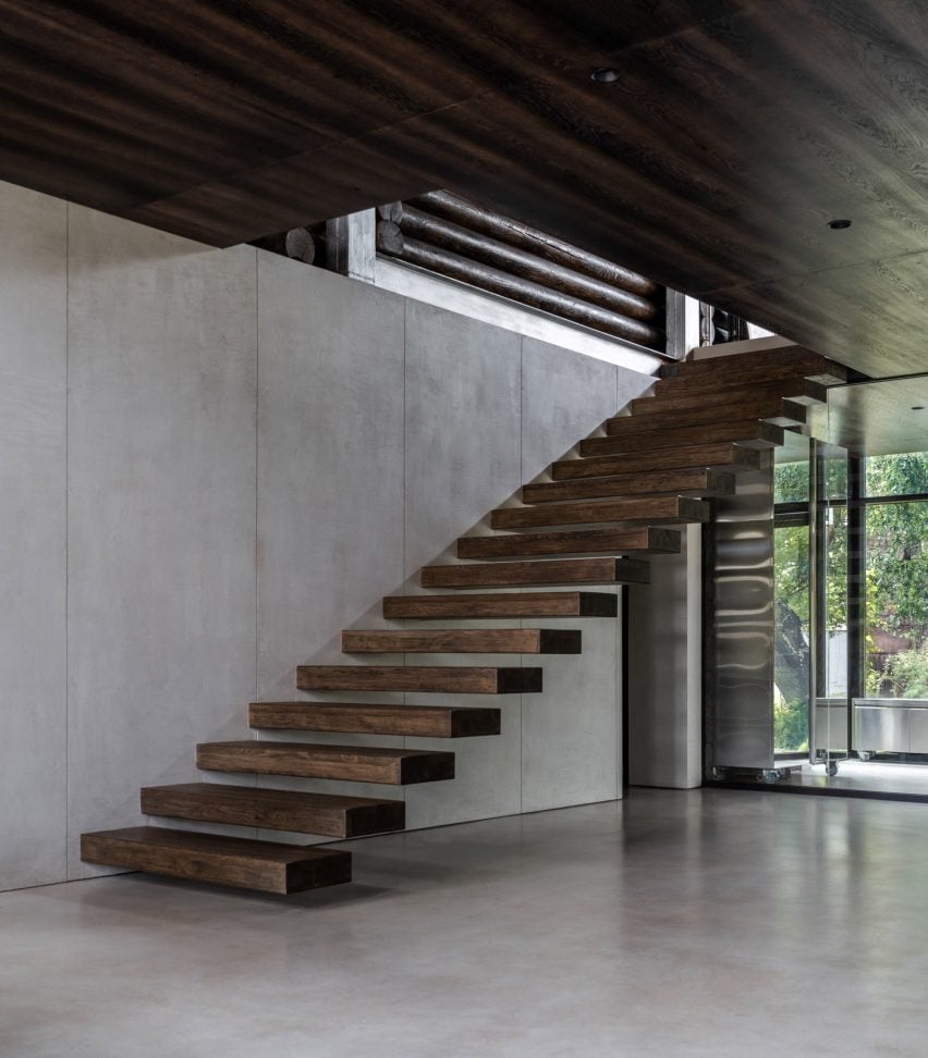
Photograph of cantilevered staircase
The stairs have cantilevered steps that appear to float

In order to lend itself to a more industrial finish, the studio trimmed the interior of surplus logs and timber.

“Our goal was to achieve a clean geometry of the space with as little extra lines as possible,” said the studio.

“That is why we removed part of the log beams that were not load-bearing – we did the same with non-bearing walls to create an open space on the first floor.”

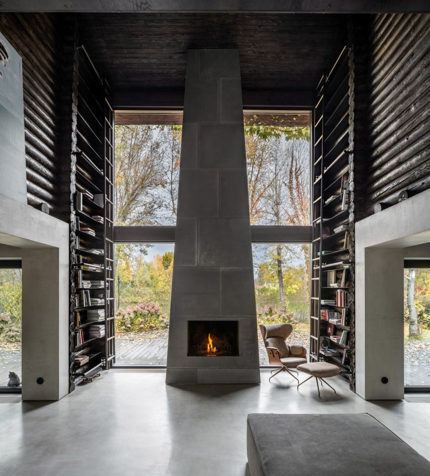
Photograph of double-height fireplace
A towering fireplace dominates the living space

Microcement flooring and project-bespoke furniture pieces such as stainless steel consoles were added to the spaces to contrast the traditional log walls.

Vintage lounge and dining chairs from the owner’s own collection were added to character to the spaces, which were hung with paintings belonging to the client.

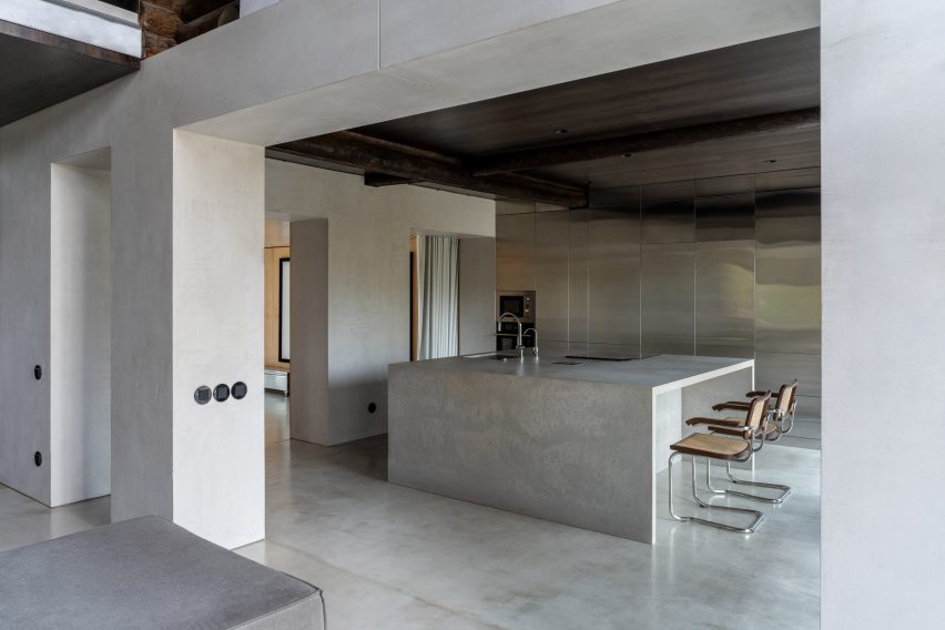
Photograph of concrete and stainless steel kitchen
Log beams juxtapose industrial finishes in the kitchen

The glass-fronted entryway contains a staircase comprising timber planks cantilevered out from wall. Beyond, the kitchen, dining room, home office and living room are contained within one fluid space.

The cabin’s construction is most apparent in the double-height living space, where logs form tall bookcases accessed by a sliding metal ladder. These flank a tapered fireplace made from concrete blocks, at the foot of which sits a large sofa.

The use of concrete continues in the kitchen, which is dominated by a monolithic kitchen island flanked by floor-to-ceiling stainless steel cabinets.

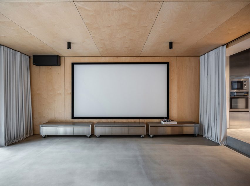
Plywood panelling replaces logs in the curtain lined theatre room leading off of the kitchen.

Photograph of home theatre space
Metal consoles on casters sit below the screen

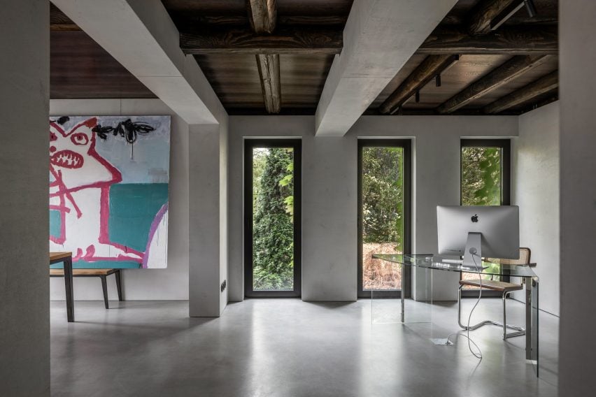
Modern, black-framed windows were installed throughout the building, with vertical windows added in the home office and dining room to bring more sunlight into the space.

Original ceiling beams were left exposed to highlight the cabin’s original construction.

Photograph of office space through from dining area
A clear desk contrasts the wooden dining room furniture

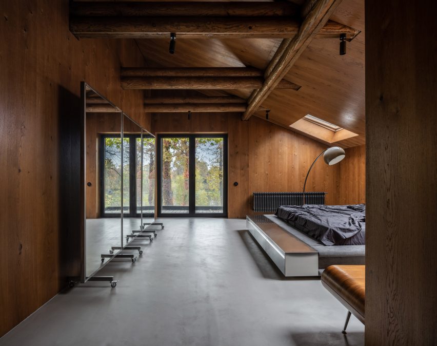
Recalling the sofas downstairs, the master bedroom features a sprawling custom-made bed that sits low to the floor. Its upholstered sides were bolstered by stainless steel consoles similar to those in the theatre room.

Retro lamps were added as a playful touches including a bulbous standing lamp that arches over the bed.

Bed in wood-panelled bedroom with retro lighting
The main bedroom utilises warmer-toned wood

A moveable mirror-panelled screen on castors sits against one wall, and a wooden mid-century console references the warm-toned timber-clad walls.

Throughout the house black radiators, ceiling lights, window frames and power outlets punctuate the rooms.

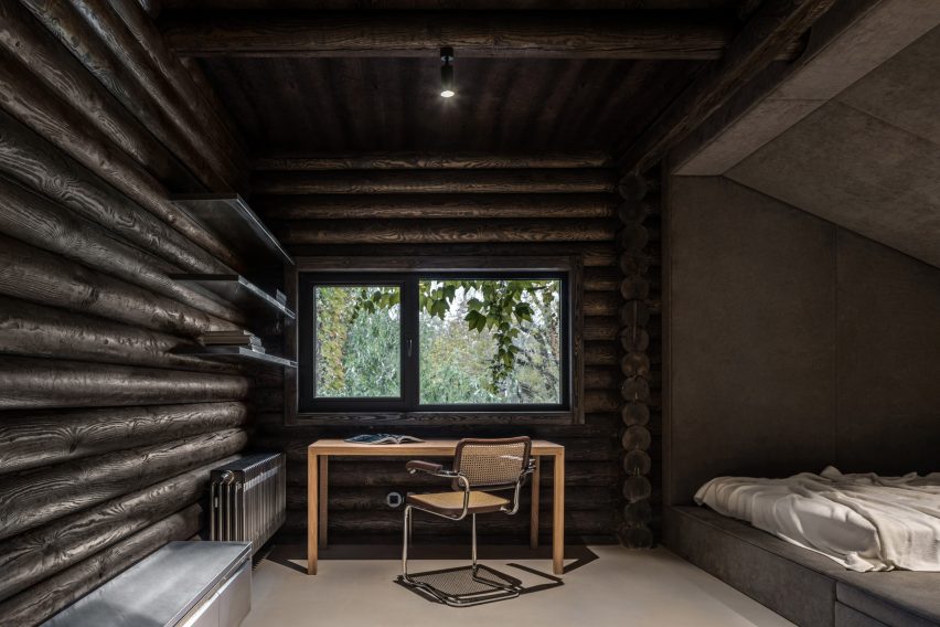
Photograph of desk in children's room
Upholstered sleeping nooks create a cosy atmosphere

The two bedrooms on the other side of the cabin retain the dark-toned log walls of the living room, adjoined by steel shelves and contrasted by soft, padded sleeping nooks.

Both of the bathrooms are a stark contrast from the rest of the interiors, with almost no wooden finishes at all and housing white fixtures.

Photograph of grey bathroom
Concrete covers the bathroom walls, floors and ceilings

“[Relogged] allowed us to work on rethinking the rather established and traditional form of a log cabin,” concluded the studio.

Other cabins featured on Dezeen include A-frame cabins in a remote Canadian forest by Atelier l’Abri and a cabin clad in ash wood on a rocky outcrop in Norway by Line Solgaard Arkitekter.

The photography is by Andrey Bezuglov and Maryan Beresh.

Reference

Montalba Architects prioritises nature at Manhattan Beach House
CategoriesArchitecture

Montalba Architects prioritises nature at Manhattan Beach House

A slender pool lined with a “vertical garden” features in an oceanfront home in southern California designed by US studio Montalba Architects.

The house is located within a dense, beachside neighbourhood in Manhattan Beach outside of Los Angeles. Designed for a couple who are long-time residents of the area, the dwelling is imbued with a sense of calm and a connection to the outdoors.

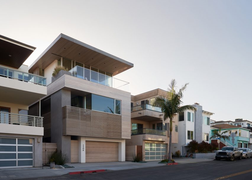
Exterior of a multi-storey home in California by Montalba Architects
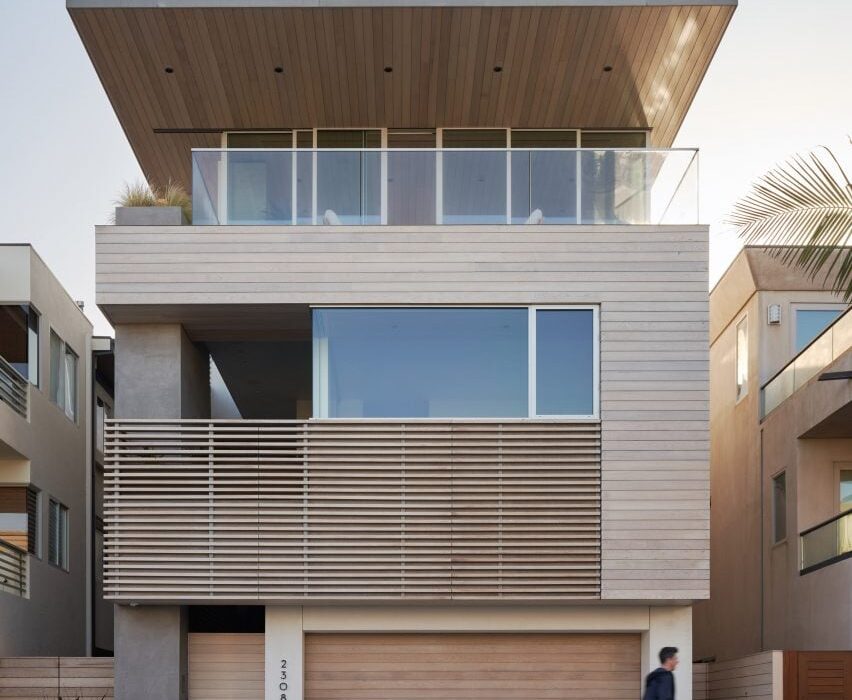
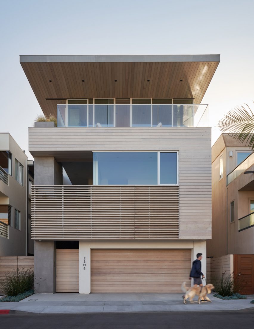
Facades were covered in stucco and western cedar

“Manhattan Beach House is intended to provide a spacious, peaceful feeling, offering an experience close to nature throughout the interior of the building itself,” said Los Angeles-based studio Montalba Architects

Situated on a narrow, sloped lot, the home rises three levels and encompasses 6,000 square feet (557 square metres).

Courtyard with a planted tree in a Californian home by Montalba Architects
Montalba Architects aimed to provide a connection to nature in the home

Facades are clad in smooth-troweled stucco and western cedar. Along the front elevation, a cedar and aluminium screen provides privacy and acts as a guardrail.

The slatted screen wraps around the north side of the home, where the main entrance is located. The screen adds definition to an entry courtyard while also providing visual continuity between the front and side facades.

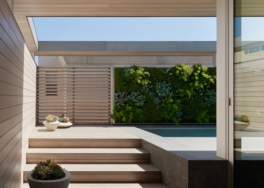
Steps leading to an outdoor swimming pool with a green wall
A green wall sits beside an outdoor swimming pool

The front elevation looks west, toward the ocean, while the rear side faces an alley. To form sight lines and usher in daylight, the team focused on creating openings on both the exterior and within the house.

“Behind the street front, the volume of the house dissolves, with glimpses through openings between floors and between distant rooms.”

On the ground level, the team placed a four-car garage, gym, laundry room and guest quarters. The first floor holds the primary bedroom suite and a pair of offices, along with a two-car garage that is accessed via the alley.

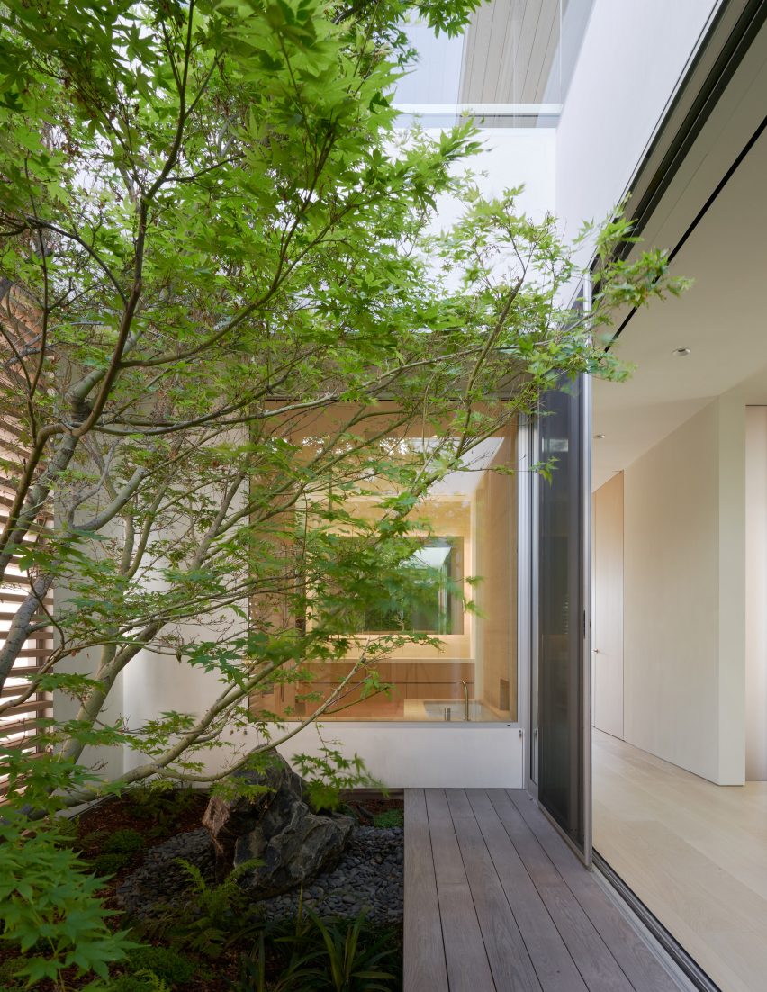
A double-height courtyard on the first floor showcases a maple tree that is meant to be “a reminder of natural time and the seasons”.

“The courtyard is visible throughout the house, whether moving along the length of the house or up to the third floor,” the team said.

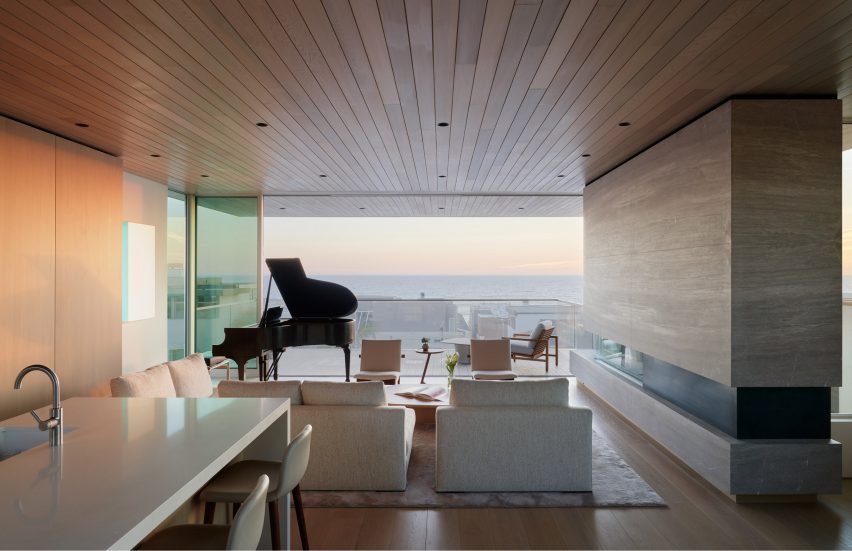
Living room in a Californian home with seating, a piano, and glass sliding doors with views of the city skyline
Glass doors on the top floor lead to a balcony

The top floor encompasses a kitchen, dining area, living room and media room. Glazed doors provide access to a balcony and a pool terrace.

The pool is lined with a “vertical garden” filled with drought-tolerant plants, including hardy geraniums, creeping Jenny and blue chalksticks.

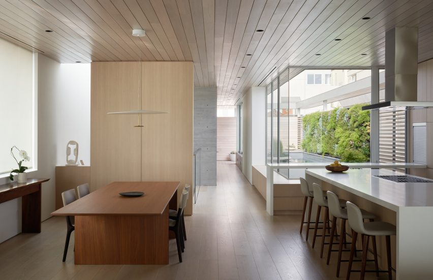
Open-plan kitchen and dining room with large windows looking onto an outdoor swimming pool
Cedar covers the ceilings while oak lines the floors

“To maintain the living wall, the gardener is suspended over the adjacent pool on a rolling platform, which is stored on-site,” the team said.

Throughout the home, the team used earthy finishes such as cedar ceilings and white oak flooring and millwork.

Exterior of a multi-storey home in California by Montalba Archietcts
The home was designed for a couple living in Manhattan Beach

The kitchen is fitted with oak cabinetry and Caesarstone countertops, and the fireplace surround is made of silver travertine.

Other recent projects by Montalba Architects include the renovation of a 1960s Los Angeles building by Edward Durrell Stone and the completion of a hillside home in Santa Monica that features ample glazing and a clever siting strategy.

The photography is by Kevin Scott.


Project credits:

Architect: Montalba Architects
Landcape design: Pamela Burton
Living wall: Habitat Horticulture

Reference