John Friedman and Alice Kimm include crane in Los Angeles house
CategoriesArchitecture

John Friedman and Alice Kimm include crane in Los Angeles house

Architects John Friedman and Alice Kimm have stacked a white concrete mass with sinuous cutouts into a hillside as a home for their family in Los Angeles, complete with a yellow crane in the kitchen and a pink accessory dwelling unit.

Named the JArzm house – using the first initial of each family member – the home is set into a 60-foot slope in Los Angeles’ Silver Lake neighborhood.

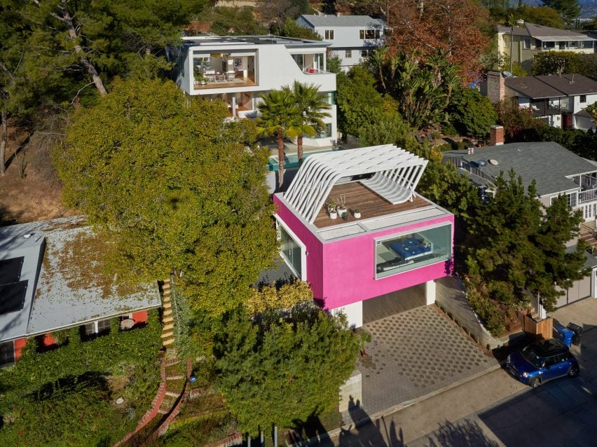
Pink accessory dwelling unit in Los Angeles
The JArzm house features a pink accessory dwelling unit

The 3,725-square foot (346-square metre) residence is “intensely livable and playful, as well as architecturally inventive, open, and highly crafted” according to the architecture studio.

John Friedman Alice Kimm Architects (JFAK) completed the house – and 540-square foot (50-square metre) accessory dwelling unit (ADU) – in November 2021.
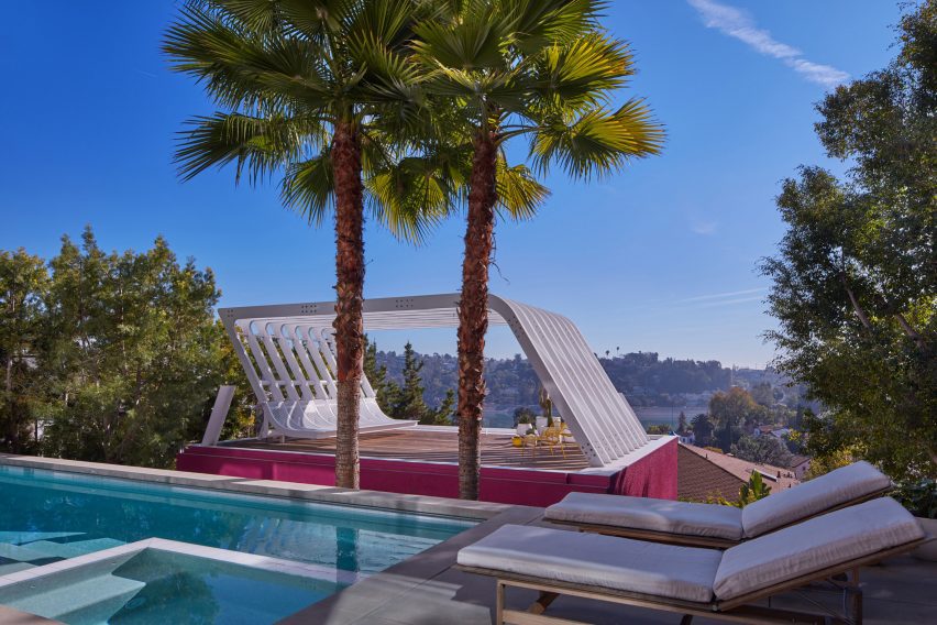
ADU with curved roof structure
It is set into a slope in Los Angeles’ Silver Lake area

The white cement plaster envelope is “neither box nor blob” with curved cutouts and large expanses of glass removed from a flat cube combining the arched influences of Alvaro Siza (for whom Friedman worked in the late 1980s) and the crisp detailing of Richard Neutra, Rudolph Schindler and John Lautner (whose designs are scattered throughout the neighbourhood).

Accessed from the top of the slope, the house is inverted and sits below the street level preserving views out to the Silver Lake Reservoir and Dodger Stadium for the surrounding homes.
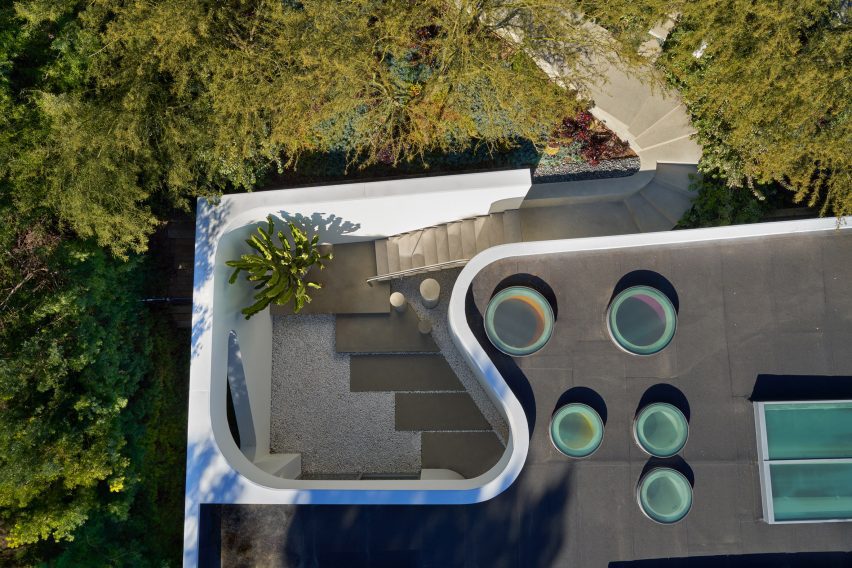
Curving concrete steps
The entry’s curving concrete steps transition to a stainless steel staircase

The entry’s curving concrete steps transition to a stainless steel staircase that leads down into the open living, kitchen and dining area, as well as two children’s bedrooms.

“Designing our own house was great because we didn’t have to ask permission,” Friedman told Dezeen. “We could do whatever we want, and we did in fact integrate some ideas and elements that other clients turned down for their particular houses.”
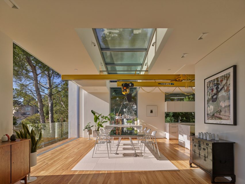
Yellow construction crane above the dining space
A yellow construction crane was mounted into a linear skylight in the dining area

The studio included a yellow construction crane mounted into a linear skylight above the kitchen and dining room that lifts the mirrored aluminium dining table, extends it out over the balcony and lowers it to the pool deck two storeys below.

A large central staircase with open teak treads, a glass railing and a powder-coated aluminium bookcase wall connects all three levels.
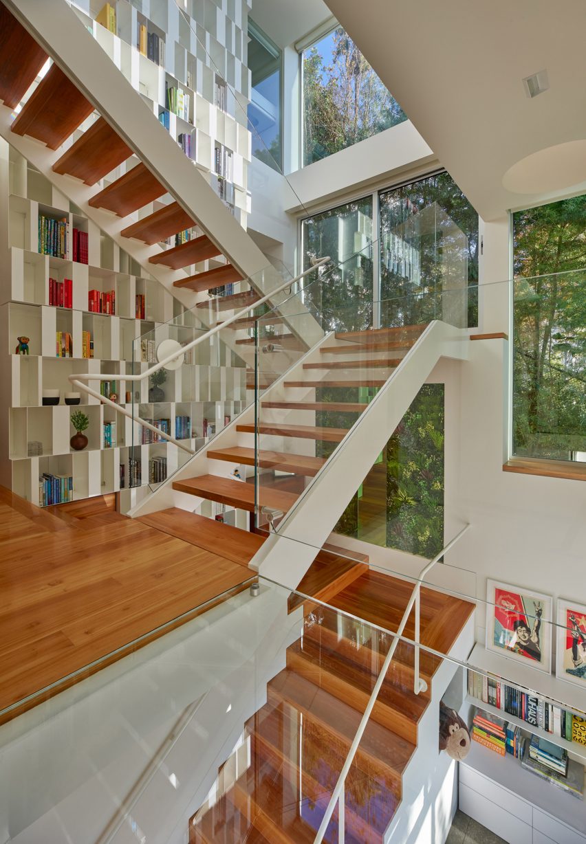
Large central staircase with teak treads
All three levels are connected by a large central staircase

The middle floor contains the primary suite, laundry room, two home offices, and the third child’s bedroom, which is separated from the rest of the house by a small glass bridge that spans a triple-height light well adjacent to the staircase.

The ground floor includes a multipurpose family room that leads out to the pool deck, which is set at the same height as the roof of the pink accessory dwelling unit (ADU).
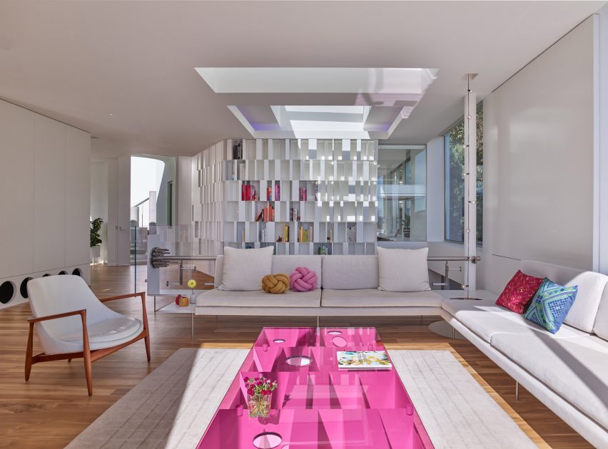
Colourful interiors within LA hillside house
Large windows open the various rooms to the forest-like landscape

The ADU sits atop an embedded garage and is topped by an urban roof garden with a sinuous aluminium sunshade structure.

“The pool deck and roof garden together create a ‘middle ground’ suspended between the streets at the site’s top and bottom,” the team explained.

Because the house is lowered in the steep terrain, it doesn’t align with the neighbouring properties.

Large windows open the various rooms to the forest-like landscape on each side of the house, while skylights and interior glazing allow sunlight to reach deep into the plan.
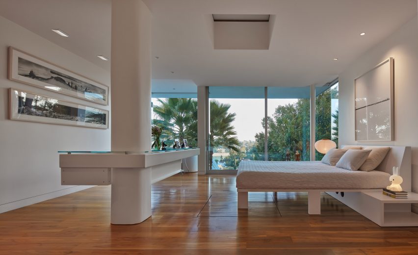
Bedroom with sliding glass walls
Sliding glass walls dissolve the transition between interior and exterior

Disappearing sliding glass walls dissolve the transition between interior and exterior.

The studio said that “functional domesticity” was a key requirement for the home.

“The functional and workaday are the foundation for achieving artfulness and architectural innovation,” said the studio. “[These traits] are hallmarks of JArzm House that place it firmly within the rich lineage of experimental Southern California domestic architecture.”
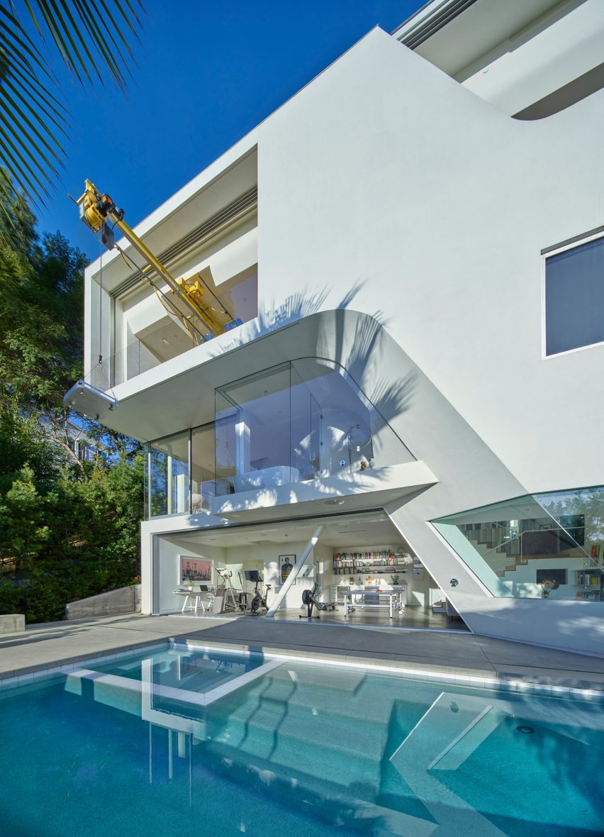
White house with curved openings
The house does not align with neighbouring properties

Established in 1996, JFAK Architects is the only studio to receive two Rudy Bruner Silver Medals for Urban Excellence and was longlisted for the website of the year in the 2021 Dezeen Awards.

Nearby in Los Angeles, Anonymous Architects recently embedded a concrete house into a hillside with a two-storey pool.

The photography is by Benny Chan.


Project team:

Architect: John Friedman Alice Kimm Architects, John Friedman FAIA (lead)
General contractor: Bonomo Development
Landscape contractor: Pablin Arevalo
Special fabrications: Chris Berkson, BerksonFab
Cabinetry: Evan Pohlmeier
Structural engineer: Parker Resnick
Landscape architecture: Kathleen Ferguson Landscapes, Matson Walter
Civil engineer: JMC-2

Reference

Viruta Lab blankets compact house in Valencia with chequerboard tiles
CategoriesInterior Design

Viruta Lab blankets compact house in Valencia with chequerboard tiles

Spanish interiors studio Viruta Lab has renovated a compact house in El Cabanyal, Valencia’s traditional fishing neighbourhood, using geometric blue-and-white tiling for an understated nautical aesthetic.

Built in 1946, the humble two-storey building once belonged to the grandparents of the current owner but had been boarded up for many years.

Entrance of Casa Cabanyal
Viruta Lab has renovated a former fisherman’s house in Valencia

Viruta Lab was brought on board to transform the small 85-square-metre home into a modern holiday residence while respecting its great sentimental value to the family.

“Emotion was a very important starting point,” the studio told Dezeen.

Kitchen of Valencia house by Viruta Lab
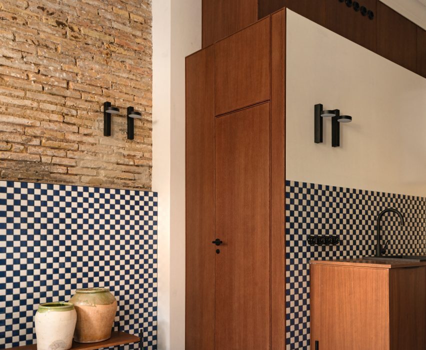
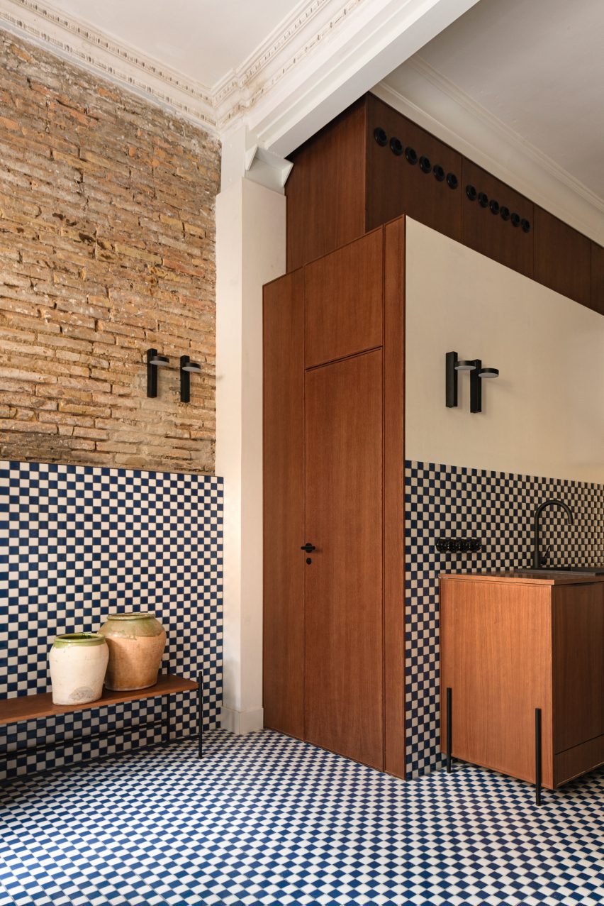
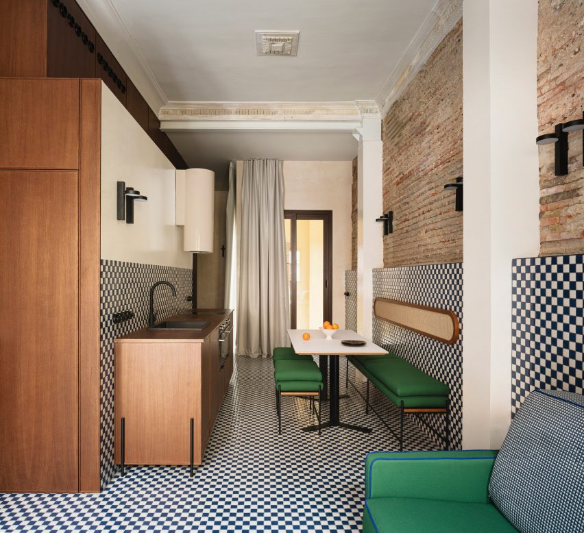
The interior is dominated by chequerboard tiles

“The house is a family legacy and the image they have of it is very deep, so it was necessary for any intervention to be as respectful as possible and with a language that they understood and took as their own,” Viruta Lab continued.

“We understood that the architecture already had a value, that we only had to beautify it, preserve it.”

Dining area of Casa Cabanyal
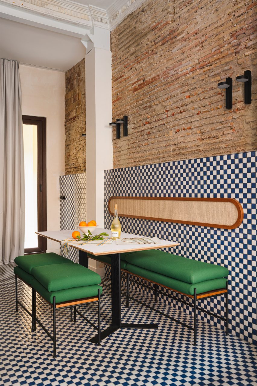
Green upholstery provides a contrast with the blue-and-white colour scheme

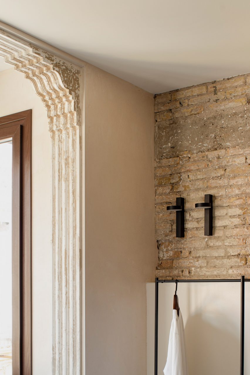
Viruta Lab uncovered the building’s original brick walls from under layers of peeling paint and carefully repaired the pre-existing mouldings “to give height and nostalgic value to the interior design”.

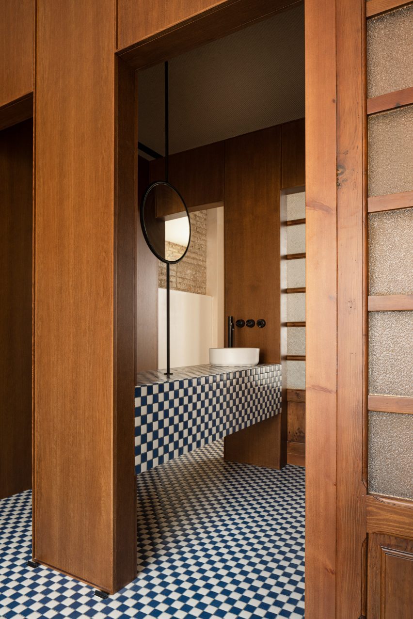
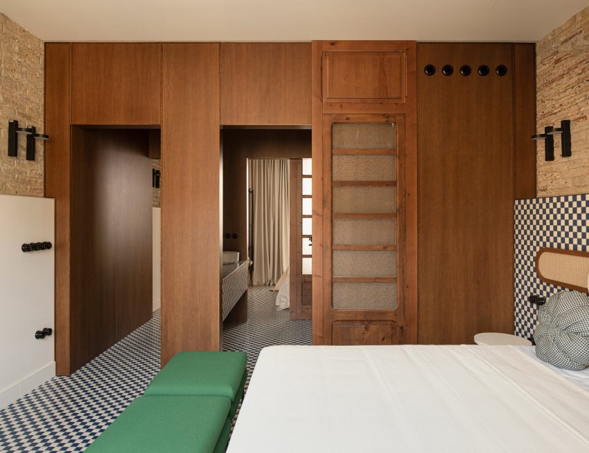
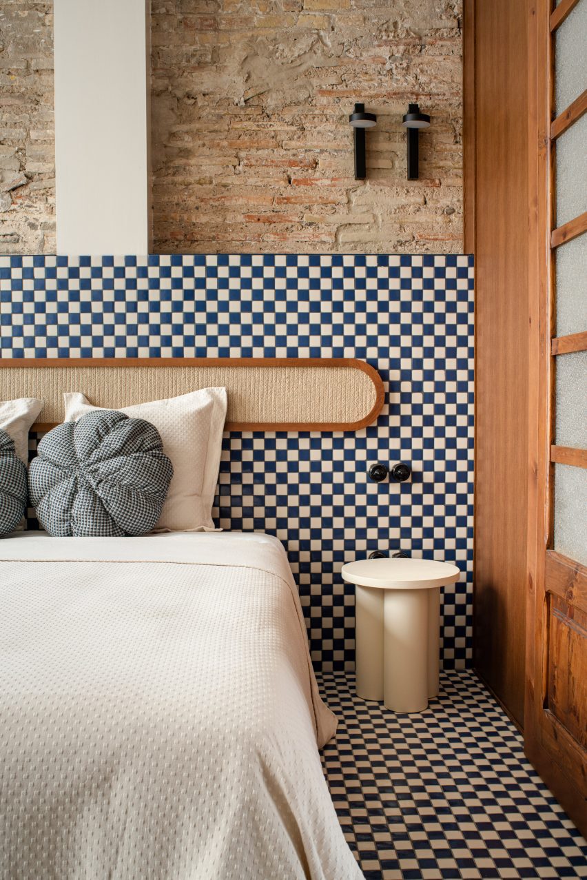
Liberal chequerboard tiling provides a contrast to these traditional design details, featured throughout all the rooms from the kitchen to the sleeping quarters.

Mouldings inside house in Valencia by Viruta Lab
Viruta Lab restored the home’s original mouldings

In a suitably nautical palette of navy and off-white, the tiles reference the great variety of tiled facades found in the El Cabanyal neighbourhood.

“The dominant colours on the facades of the Cabanyal are white, blue and green, which are associated with a lifestyle linked to the resources offered by the sea,” the studio said.

“It was clear that we had to respect the local traditions, the architecture and the essence of the house and give it a maritime aesthetic, reinterpreting the Mediterranean style to adapt it to the tradition of the neighbourhood using its own materials.”

Green shows up throughout the interior in the form of simple upholstered furniture – including a sofa, pouffe, benches and stools – all custom-designed by Viruta Lab for this compact space.

Bathroom inside Casa Cabanyal
European oak was used to form joinery details

The interior woodwork in European oak was stained to resemble Canaletto walnut, matching the tones of the two remaining original interior doors that were painstakingly restored and repurposed as sliding doors.

“We wanted the woodwork to provide a quality counterpoint to the cold tones of the blues and greens, with an imprint and weight,” the studio said.

Bedroom inside house in Valencia by Viruta Lab
The remaining interior doors were restored and repurposed as sliding doors

Another key local material – esparto grass fibre – is less noticeable than the tiles but pops up throughout the house to add textural interest.

Traditionally used to make ropes, baskets, mats and espadrille sandals, the flexible natural material was repurposed to form headboards and backrests, and even clad the suspended ceilings in the bathrooms.

Bedroom inside Casa Cabanyal
Esparto grass was used to from headboards and backrests

“This material has been used because of its roots in the traditions and life in the Mediterranean area, especially in the Valencian community,” the studio said.

“For Viruta Lab, the legacy comes from its use by men of the countryside and the sea, by the original residents of the Cabanyal, those men who used to wear espadrilles.”

Courtyard inside house in Valencia by Viruta Lab
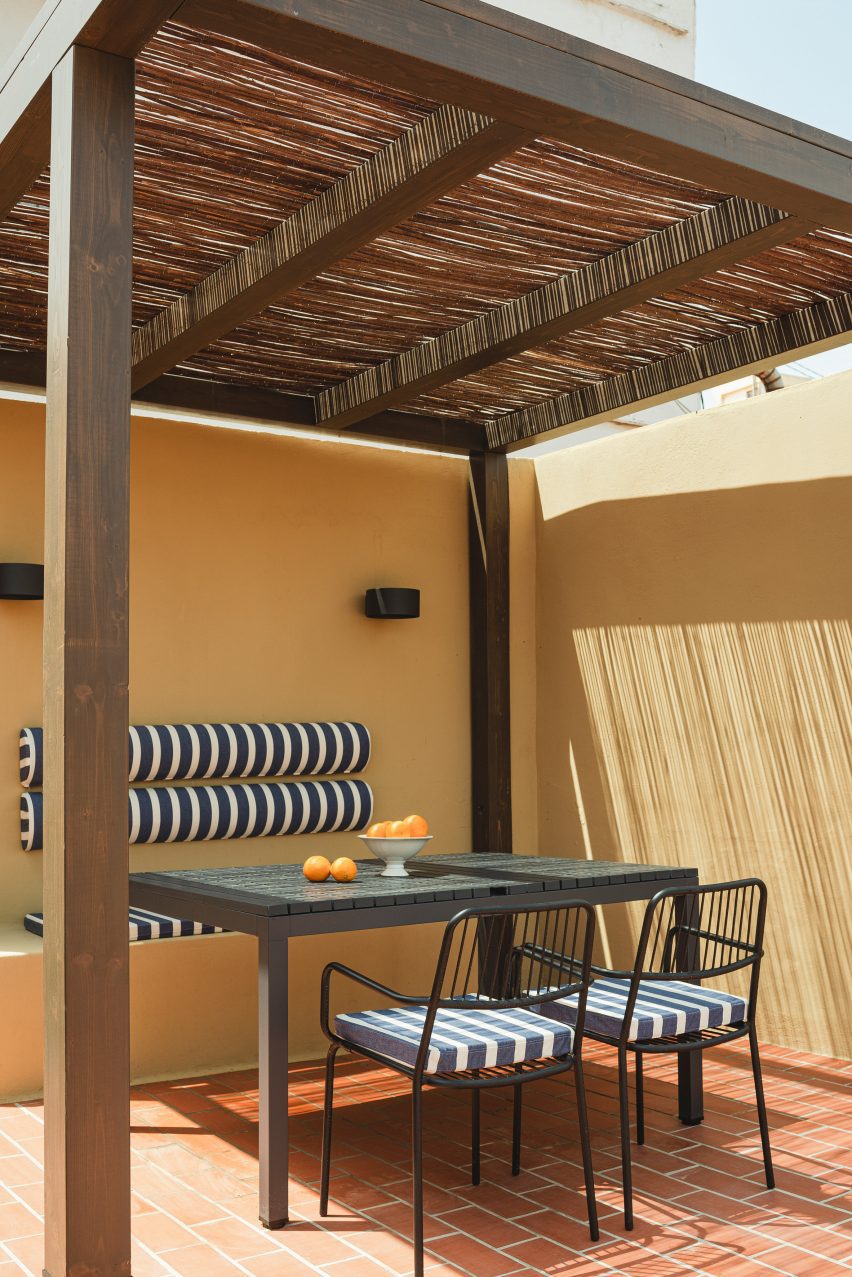
The house has a shaded outdoor dining area on the roof

As well as a clay-tiled roof terrace with a shaded outdoor dining area, the house also features a sensitively restored inner courtyard, complete with a stone water trough where the owner’s grandfather once dried his fishing nets at the end of a day’s work.

Other projects that celebrate Valencia’s historic architecture include a 1920s penthouse that was renovated to celebrate its original mosaic floors and an octogenarian home in El Cabanyal that was updated using traditional construction techniques and local materials.

The photography is by David Zarzoso.

Reference

PPAA submerges bedrooms underneath A-Frame house in Mexico City
CategoriesArchitecture

PPAA submerges bedrooms underneath A-Frame house in Mexico City

Local studio Pérez Palacios Arquitectos Asociados has completed a wooden A-Frame house with underground bedrooms in a forested area outside Mexico City.

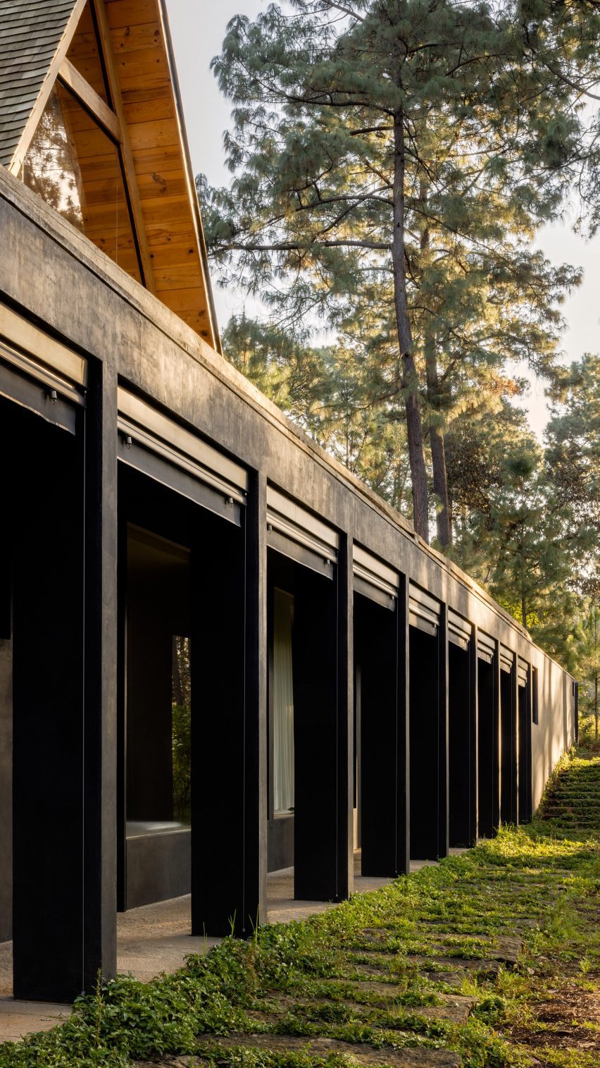
Nestled in the forest of Valle de Bravo, the residence has two volumes stacked on top of one another, with public areas above ground and private ones below.

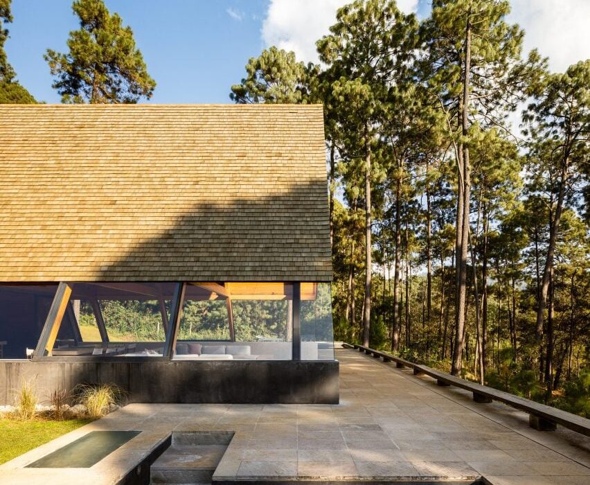
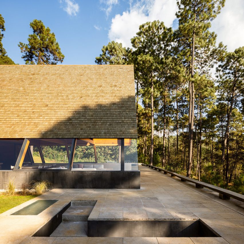
An A-Frame with a terrace overlooking the forest
Pérez Palacios Arquitectos Asociados has designed an A-Frame house with underground bedrooms outside of Mexico City

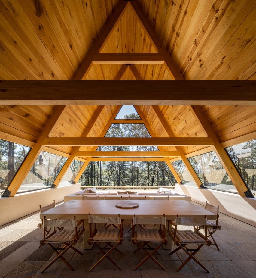
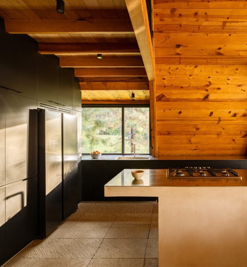
On the ground level, the A-Frame structure contains a semi-open living and dining room, kitchen, and family room, with a minimal footprint to create space for a terrace. The A-Frame structure consists of pre-fabricated elements brought to the site.

The top and sides of the A-Frame are enclosed in glass, as is the space at the back of the structure.  An outdoor pool and lounge area were placed on the terrace to bring occupants closer to the surrounding forest and to take advantage of the large base where the underground aspects are located.

A large dining table underneath an A-frame structure
The residence is made of two perpendicularly stacked volumes

“The main goal of this project was to give more importance to the surroundings present and to the open space given, embracing the idea of emptiness even with the possibility of having the architecture disappear,” Pérez Palacios Arquitectos Asociados (PPAA) founder Pablo Pérez Palacios told Dezeen.

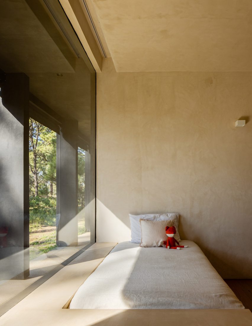
A submerged staircase on the terrace leads to the lower level, which contains three bedrooms, each with a private bath, and a small study.

A kitchen with a large black cabinet unit
The A-Frame structure contains the house’s public areas like a kitchen and living room

The sleeping areas were buried into the ground, with windows facing out and privacy offered by the surrounding trees.

“This design method gives you the possibility to really disconnect while enjoying your own solitude in the surrounding nature, gently forcing you to have that moment of relationship with the site, even if you’re just going to bed,” said Pérez Palacios

A long rectangular structure placed beneath an A-Frame
The rectangular structure beneath the A-Frame contains the house’s private sleeping areas

The black finish on the exterior of the lower volume and the dark roof tiles were selected to help the home blend into the environment.

“The palette focuses on one core material – certified timber – to convey a sense of admiration and respect for the home’s surroundings,” said Pérez Palacios.

“Whilst the stainless steel, onyx joinery and hand-finished walls are used to evoke an unpretentious sensibility and as I would say ‘give prominence to the forest’.”

Rainwater is collected from the pitched roof, which is then ushered into an open water deposit for reuse.

In addition to rainwater collection, the open-air A-Frame structure also works to filter light and passively ventilate the house.

To further reduce the impact on site, the studio only removed one tree which it repurposed as a handrail on the terrace.

A bed in a room with a large window and light wood paneled walls
The underground bedrooms were designed to feel enclosed by the surrounding forest

The interiors were adorned in natural materials in neutral tones, with certified wood used also on the interior walls.

Other residential projects around Mexico City include a home with a dramatic cantilever by LBR&A and an expansive holiday home with a sunken living room by Romero de la Mora.

The photography is by Rafael Gamo.

Reference

Whittaker Parsons crowns London mews house with “bolthole” extension
CategoriesInterior Design

Whittaker Parsons crowns London mews house with “bolthole” extension

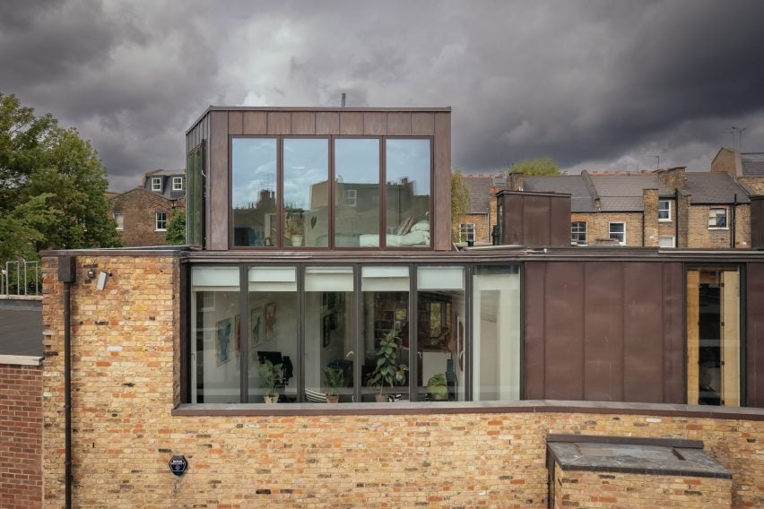
Using a combination of copper, larch and structural insulated panels, architecture firm Whittaker Parsons has added an additional storey to a contemporary mews house in Stoke Newington to house a bedroom suite.

Originally built in 2005, the property belongs to a couple with two older children, who have lived here for the last decade.

Exterior of Larch Loft extension
Whittaker Parsons added an additional storey to a London mews house

The family asked Whittaker Parsons to provide more space with the addition of a loft, as well as to revamp the lower floors including the studio on the second floor, which was reconfigured to create a well-proportioned workspace complete with its own library.

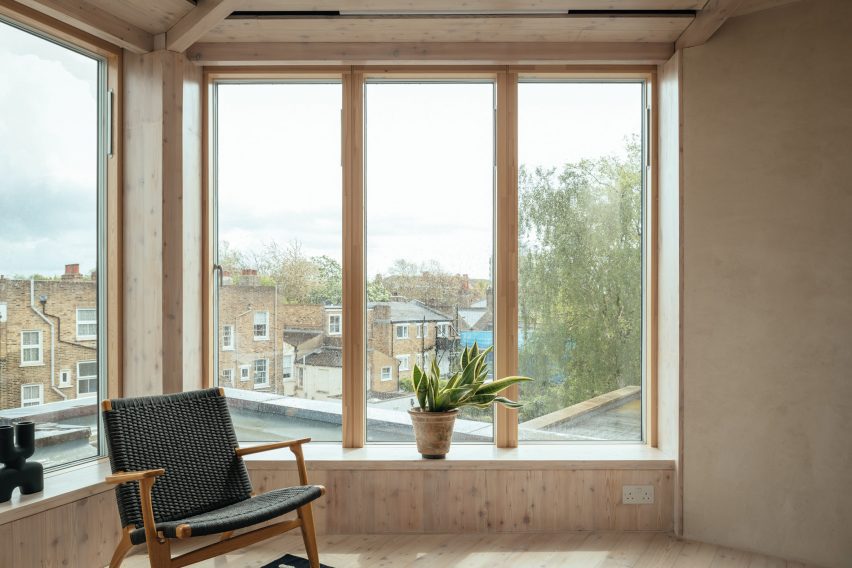
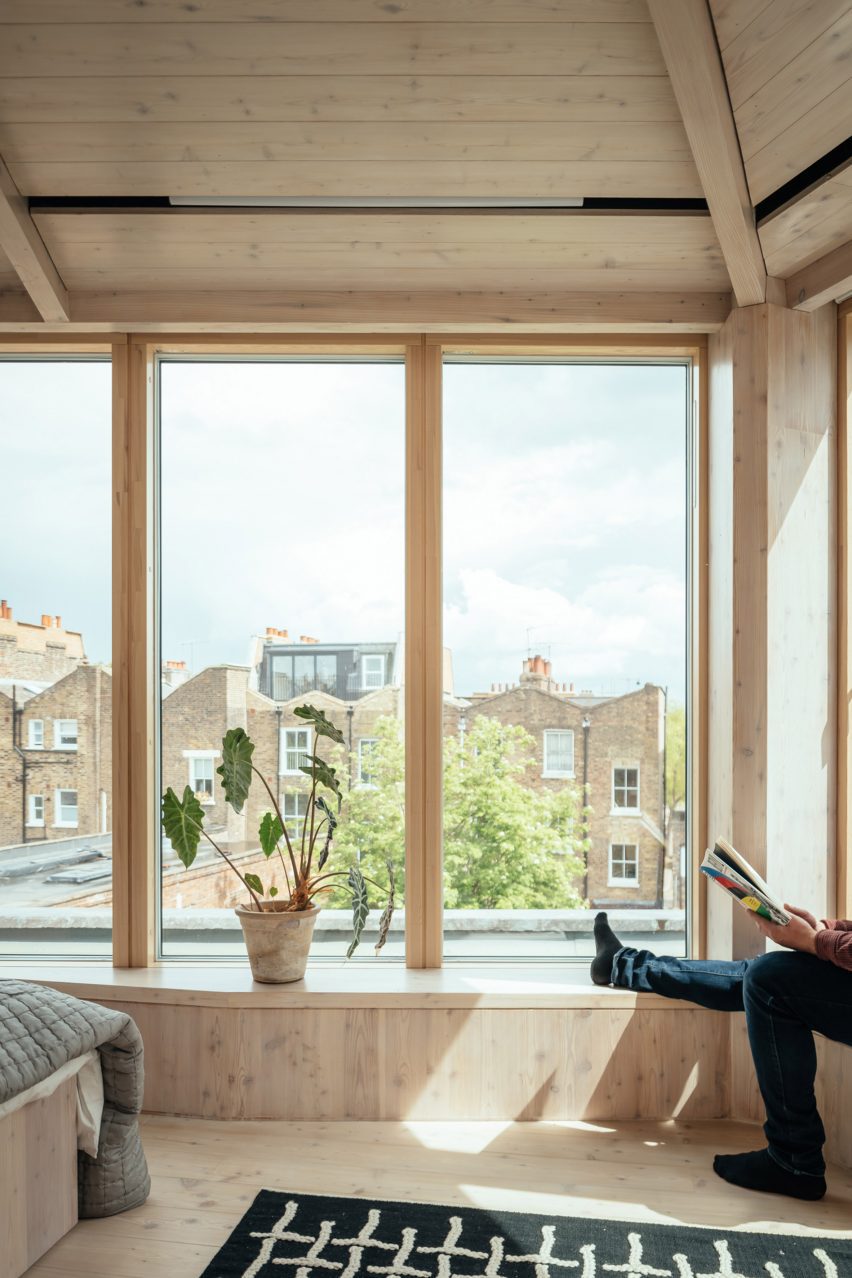
Daylight floods the new third storey, bouncing off lime-plastered walls while carefully positioned windows provide views of tree canopies and across rear gardens from window seats and the bespoke bed.

“We set out to design a beautiful, healthy, serene retreat, in which the homeowners could immerse themselves in the beauty of natural materials, a bolthole in the middle of north London,” Whittaker Parsons told Dezeen.

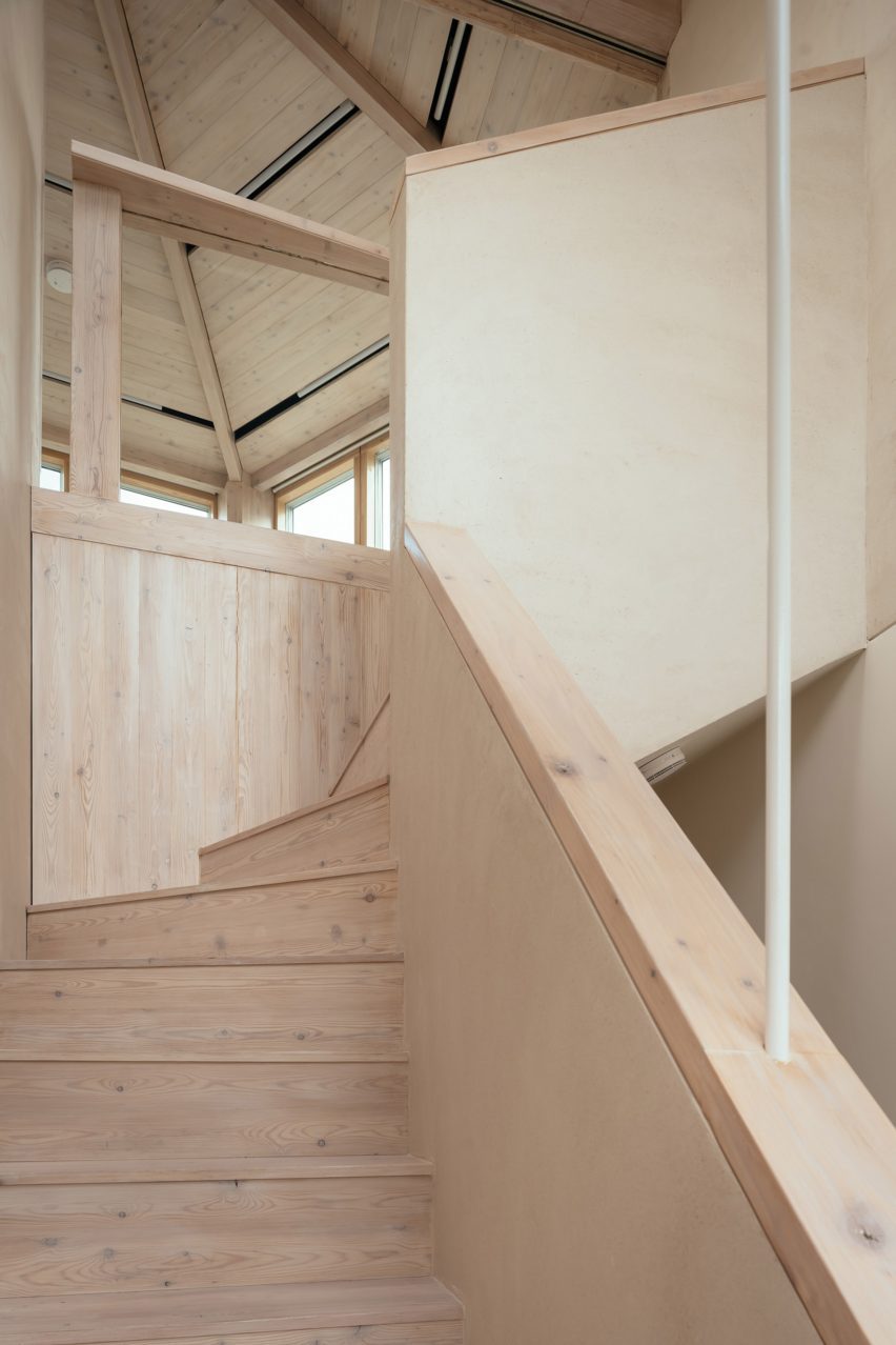
Larch staircase leading up to Larch Loft extension in London
The extension is accessed via a larch-clad staircase

With efficiency and quality in mind, the studio used prefabricated structural insulated panels (SIPs) to construct the additional storey, with the aim of minimising waste and saving time.

“Compared to standard timber construction, it is simpler to control the quality of onsite workmanship and achieve a more robust, air-tight building envelope,” the team explained.

Larch Loft extension in London by Whittaker Parsons
Generous windows provide views of the surrounding area

Externally, the extension is set back from the street elevation and finished in materials that mirror the surrounding architecture, including black-stained timber cladding, brick slips and patinated copper to tie in with the copper facade on the second floor below.

Internally, the triangular arrangement of the larch beams was developed to work with the load path of the existing building and the irregular form of the loft.

“The intention was to make visible and celebrate the structural effort that went into creating this new space,” Whittaker Parsons explained.

Man sitting on window seat of London extension by Whittaker Parsons
Integrated window seats provide a place to rest

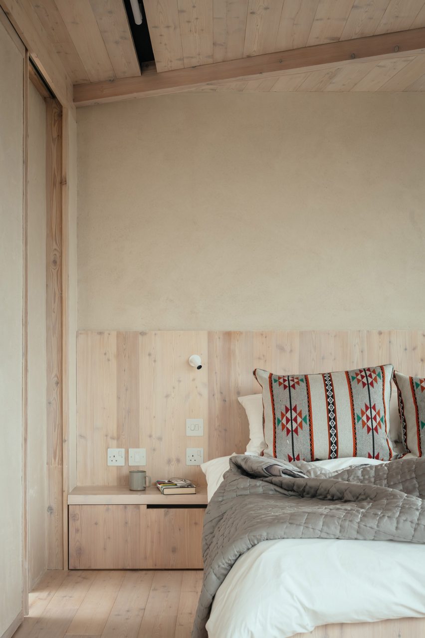
The practice created a tranquil master bedroom with a larch-clad and lime-rendered interior, bespoke larch bed frame and walk-in wardrobe made from low-formaldehyde furniture board.

As the unsealed lime plaster wall finish cures, the lime will absorb almost as much carbon as was emitted in its production, the studio claims.

“Lime render is a calming tactile material, characterful and soft,” said Whittaker Parsons. “It is a low-carbon alternative to gypsum plaster. It’s also a hygroscopic material, so it naturally moderates the moisture level in the bedroom.”

Used alongside the render, white oiled larch panelling spans the spaces between the exposed larch beams, improving acoustic absorption.

“Often in bedrooms, the ceiling is the most important yet neglected surface,” the studio said. “The larch adds a sense of warmth, calm, and character to the space, creating an articulated ceiling at the top of the house – almost a reward for climbing all those stairs.”

Custom larch bed by Whittaker Parsons
Whittaker Parsons also created a custom larch-wood bed for the interior

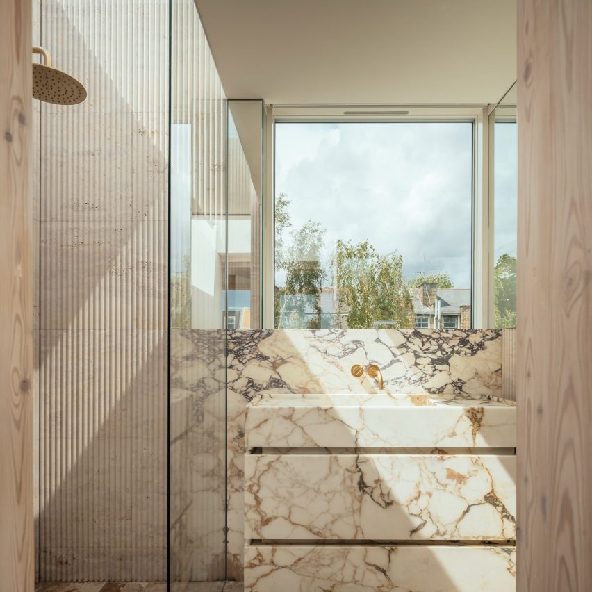
In the adjoining skylit shower room, fluted travertine tiles line the walls, enveloping the shower area and complementing the travertine floor tiles.

“The roof light to the shower oversails the fluted travertine tiles, creating the impression that one is showering outside under the sky,” said Whittaker Parsons.

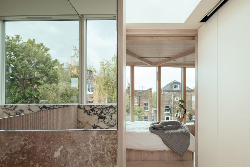
The basin, splashback and vanity unit are formed from unsealed Calacatta Rosato marble, which according to the studio provides a lower-carbon alternative to fired tiles.

Marble bathroom in Larch Loft extension
The vanity in the adjoining bathroom is formed from Calacatta Rosato marble

Overall, Whittaker Parsons says the project is “exceptionally low-carbon”, with the bulk of its embodied emissions coming from the triple glazing, thermal insulation and a single steel beam used to create the opening for the staircase.

Founded by Matthew Whittaker and Camilla Parsons in 2015, Whittaker Parsons has completed a number of projects in the British capital including The Naked House, which was longlisted for sustainable interior of the year at the 2021 Dezeen Awards.

View from bathroom to bedroom in Larch Loft extension
The marble is paired with fluted travertine tiles

Other sustainably-minded extensions in London include Low Energy House in Muswell Hill, designed by local studio Architecture for London founder for its founder Ben Ridley.

The photography is by Jim Stephenson.

Reference

Timber and hempcrete form patchwork facade of London mews house
CategoriesArchitecture

Timber and hempcrete form patchwork facade of London mews house

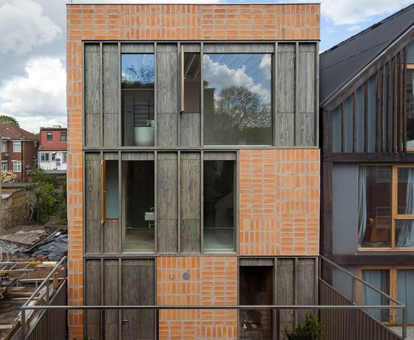
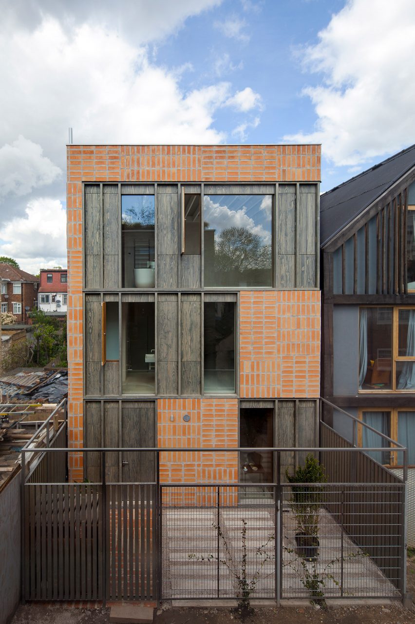
Hempcrete walls and a patchwork facade characterise Hempcrete Mewshouse, a three-storey home that local studio Cathie Curran has added to a derelict site in east London.

Located in Forest Gate, the home was built around a gridded structure made from steel and timber and features a variety of natural materials, including oak, accoya, hempcrete and terracotta. It replaces a derelict single-storey garage on a small mews site.

“The single storey lock-up had been unused for some time, the structure was unsound and there was a huge pit in the makeshift floor slab for working on car engines,” studio founder Cathie Curran told Dezeen.

Front elevation of Hempcrete Mewshouse by Cathie Curran
Hempcrete walls and a patchwork facade characterise Hempcrete Mewshouse

Expressing the home’s structural grid, the street-facing facade is clad in a patchwork-like pattern of materials, including panels of dark accoya wood planks, which can be opened in places for ventilation.

In other places, hempcrete blocks are waterproofed with a lime render and covered in terracotta tiles, which have been placed in alternating directions.

“The facade is an expression of the steel and timber tartan grid hybrid structure,” explained Curran. “The brief required maximum adaptability and an unobstructed plan at ground level, so a steel frame was employed to delineate circulation and service areas and define the main spaces.”

Kitchen with hempcrete walls
The home features a variety of natural materials

To enclose the home from the rest of the mews, the studio built a series of screens around the site, creating a semi-private front courtyard bordered by dark grey gates and fences.

Accessed through an accoya door built into the grid of the facade, the home’s entrance hall features a ceiling and walls clad entirely in oiled oak, while a textural concrete floor draws on the industrial past of the site.

Stairwell with wooden walls
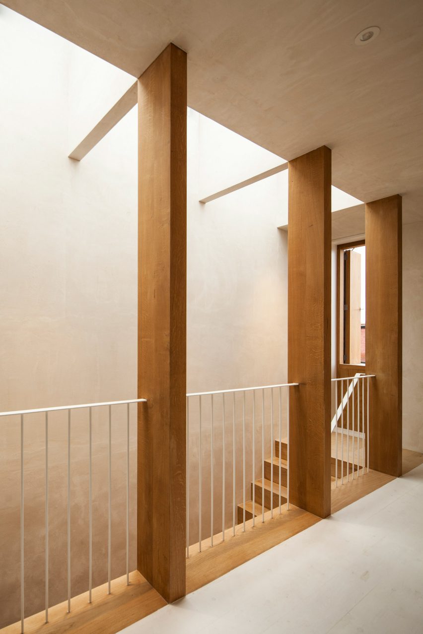
A full-height stairwell sits on one side of the entrance hall

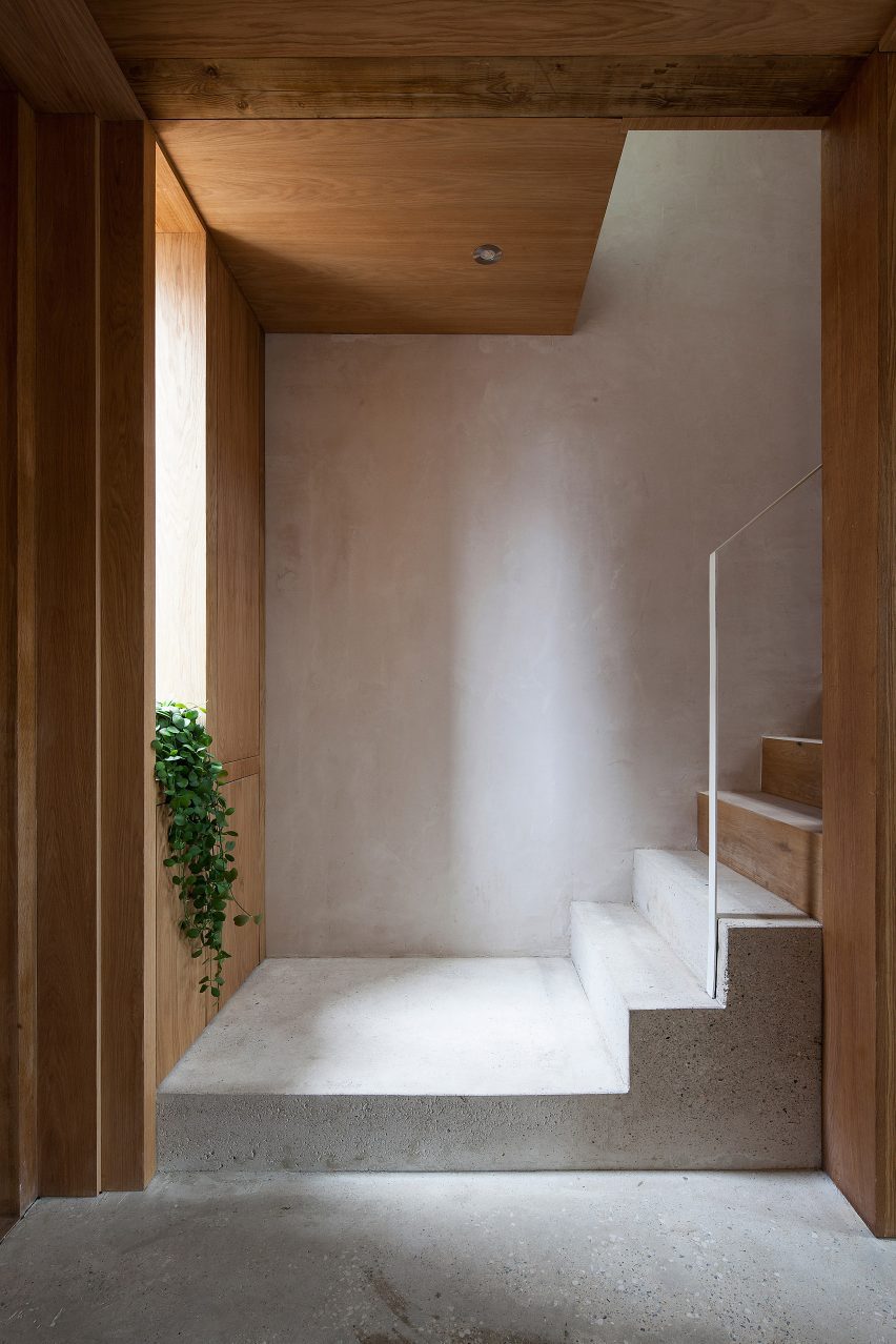
A full-height stairwell to one side of the entrance hall stretches between all three floors of the home and is lit by a skylight. While the staircase is mainly made from oak, the base and two lowest steps are made from concrete, softening the transition between the stairs and the light concrete floor below.

“The oak offers a soothing, organic contrast to the hard mineral atmosphere of the lane,” said Curran. “The top-lit entrance space is mysterious, a decompression chamber to emphasise the transition from chaos to calm.”

Stairwell of Hempcrete Mewshouse by Cathie Curran
The stairwell is lit by a skylight

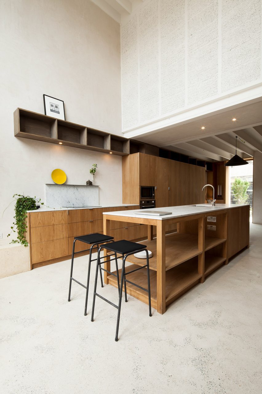
Beyond the lobby, open living spaces featuring oak joinery and furnishings have been arranged across the ground floor, punctuated by oak-clad columns.

With a wall of glazing set in oak frames and doors that open onto the back garden, the double-height space at the end of the kitchen showcases the hempcrete panels that enclose the upper levels of the home.

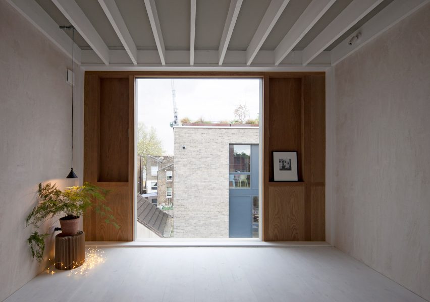
The top floors of Hempcrete Mewshouse comprise bedrooms and bathrooms along with a first-floor study which overlooks the kitchen and can be separated from the space below by shutters.

Finished with warm-toned joinery, the bathrooms feature walls and floors covered in terracotta tiles, as well as openable oak wall panels and full-height windows.

“Ancient materials such as lime plaster, oak, terracotta, marble, and pale ground concrete contrast with the industrial tone of the street, evoking a gentler time and place,” said Curran.

Interior of London home with exposed wood ceiling
The top floors of Hempcrete Mewshouse comprise bedrooms and bathrooms

When designing the home, London-based studio Cathie Curran arranged the rooms to allow for future separation of the home into two apartments, each with separate access from the street.

“The timber beams and joists can be redeployed to subdivide the house into a pair of apartments, likewise non-load-bearing timber stud hempcrete partitions can be easily removed,” said the studio.

“The structure will permit easy conversion into two separate units, each with independent street access, if desired. Multigenerational occupancy, co-living or social care provision, even commercial activity, could all be accommodated.”

Terracotta-tiled bathroom of Hempcrete Mewshouse by Cathie Curran
The bathrooms feature walls and floors covered in terracotta tiles

Elsewhere in London, Office S&M transformed an Edwardian home with bright colours and graphic shapes while Unknown Works used pink concrete walls to add a terraced landscape to a Victorian townhouse.

The photography is by Chris Daly.

Reference

yoshichika takagi tops hokkaido house with ‘greenhouse’ kitchen
CategoriesArchitecture

yoshichika takagi tops hokkaido house with ‘greenhouse’ kitchen

hokkaido dwelling opened with loft spaces


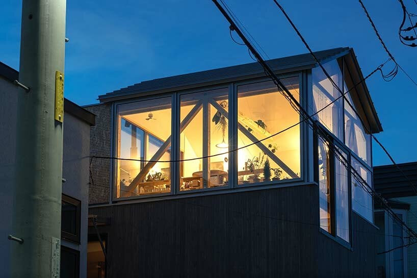
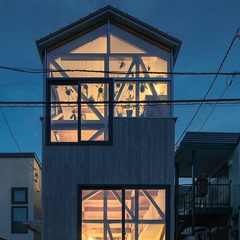
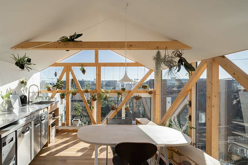
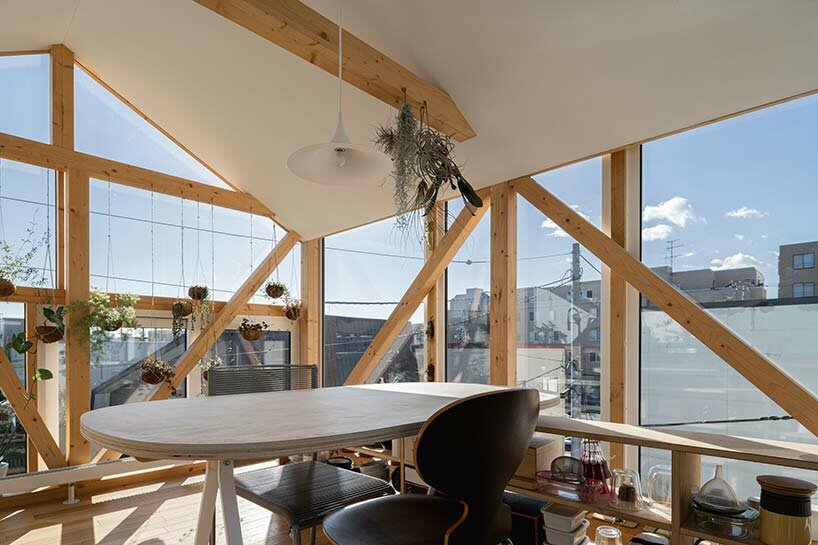
A typical 1975-built row house in Hokkaido has been renovated by Yoshichika Takagi + Associates to introduce a pair of modern, sunlit student dwellings and studio spaces. With its contemporary intervention, the architects sought to open up the existing structure, which long stood with dark interiors, low ceilings, and a light layout which included four cramped living units. The team notes that the structure had even been extended against local building code, which needed to be corrected. Thus, a section of the house was cut back while a rooftop ‘shed’ was added to houses a stairwell and spacious bedroom loft.

yoshichika takagi hokkaido houseimages © Yoshichika Takagi


yoshichika takagi makes the most of a compact site


One of the primary goals of Yoshichika Takagi’s renovation in Hokkaido was to reduce the number of households from four to two while updating the entire house to provide a modern lifestyle despite its compact size. The team considered the site’s proximity to a streetcar line and aimed to create a structure that could be adaptable for future conversions. Although the building was situated in a densely populated residential area, the east side offered an open garden across the street.


The architects decided to capitalize on this borrowed landscape by incorporating glass walls to actively connect the interior with the garden. On the west side, the building boasted views of Mt. Moiwa, a prominent symbol of Sapporo, inspiring the architects to design spaces that could make the most of the strong western sunlight that left a lasting impression.

yoshichika takagi hokkaido house


Balancing Privacy and Connectivity in Design


Considering the potential conversion of the first floor into a SOHO (Small Office/Home Office), the architects at Yoshichika Takagai + Associates  designed the front portion of the ground floor to be open and connected to the street while ensuring privacy in the further back areas. To maintain a balance between openness and privacy, the large windows were positioned higher up, offering a connection to the city while also considering external lines of sight.


Embracing Hokkaido’s traditional approach to creating a warm and stable environment for harsh winters, the first floor followed these practices. In contrast, the second floor featured three rooms with different environmental characteristics arranged in series, providing a flexible and nomadic living space that can be adapted according to the climate.

yoshichika takagi hokkaido house


Design Elements Inspired by Scandinavian Winter Living


Drawing inspiration from Scandinavian winter living rooms, which offer comfort and safety even during severe cold waves, this renovated house also incorporated a ‘winter living room’ on its west side. With high insulation performance and limited openings, this space ensured a stable indoor environment. Adjacent to the winter living room was the ‘summer living room,’ a private space enclosed by walls. While not insulated, it was protected from the wind and rain by a tarp, primarily used during mild seasons and even in winter, when people gathered for events and barbecues, donning appropriate clothing.


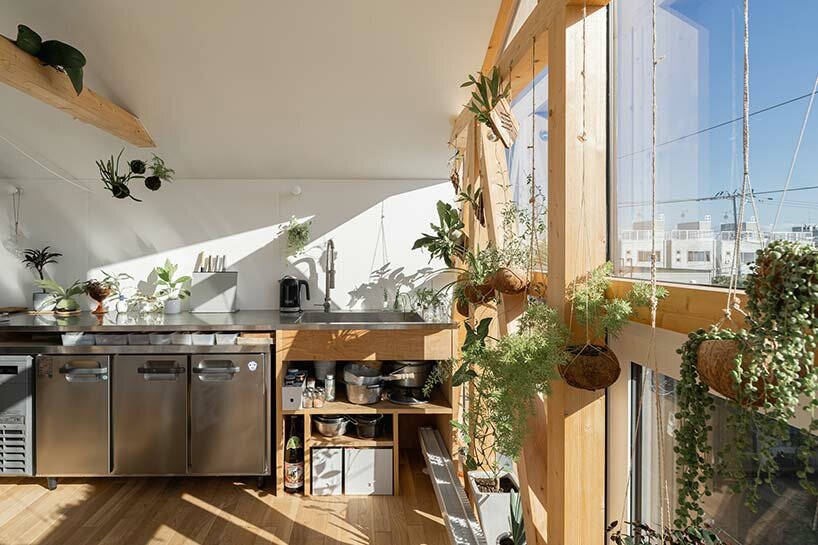
Another unique feature was the ‘greenhouse kitchen,’ which faced the city through a glass wall, creating a living-on-the-street feel. This space, however, experienced significant temperature fluctuations due to sunlight, making it challenging to control the indoor climate. Nevertheless, the evergreen appearance throughout winter and the ability to witness the beauty of a blizzard from within the space provided a joyful living experience that transcended minor inconveniences.

yoshichika takagi hokkaido house yoshichika takagi hokkaido house

Reference

KoningEizenberg lines secluded island house with expressive columns
CategoriesArchitecture

KoningEizenberg lines secluded island house with expressive columns

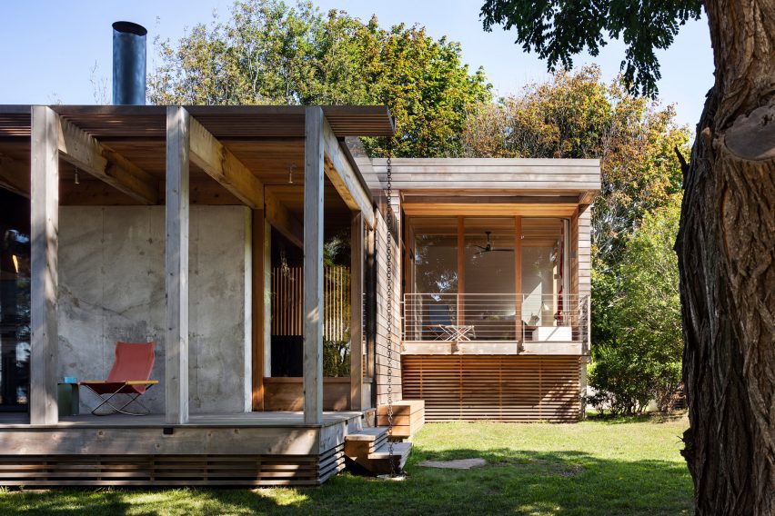
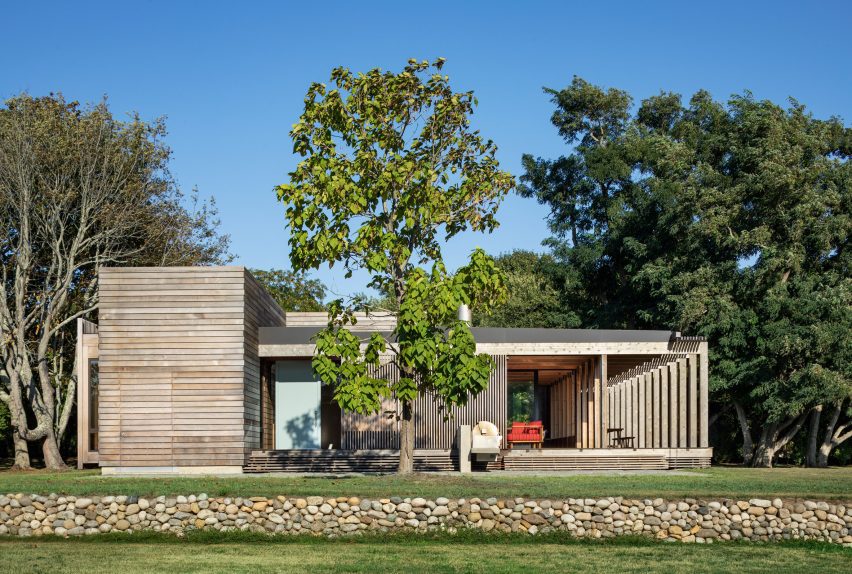
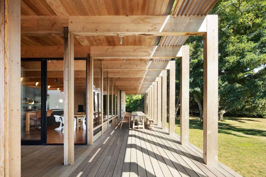
Cedar siding wraps the exterior of the Shelter Island House, which was designed by KoningEizenberg Architecture to exhibit a sense of “deliberate informality”.

Los Angeles studio KoningEizenberg Architecture designed the beach house for a couple that architect Julie Eizenberg has known for years, and for whom she designed an apartment in New York City in 2009.

Shelter Island House by Koning Eizenberg Architecture
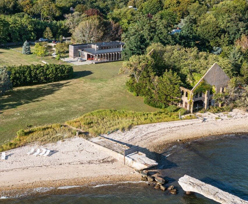
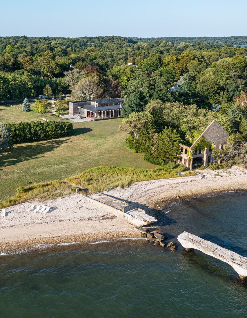
Shelter Island House looks toward the water and an abandoned, overgrown boathouse

The home is located on Shelter Island, which sits between the North and South Forks of the Long Island peninsula. The island has a year-round population of 2,300 and is only accessible by boat.

For the secluded site – which formerly held a caretaker’s cottage – KoningEizenberg Architecture conceived a “modern cabin” that is meant to complement the landscape.

KoningEizenberg Architecture conceived a “modern cabin”

The Shelter Island project was envisioned as a casual retreat for the parents – one is an academic, the other is a psychoanalyst – and their two children.

“The clients’ must-have list included ample shade, as well as an outdoor shower, big fireplaces and good ventilation,” the team said.

Wood-lined interior of house by KoningEizenberg Architecture
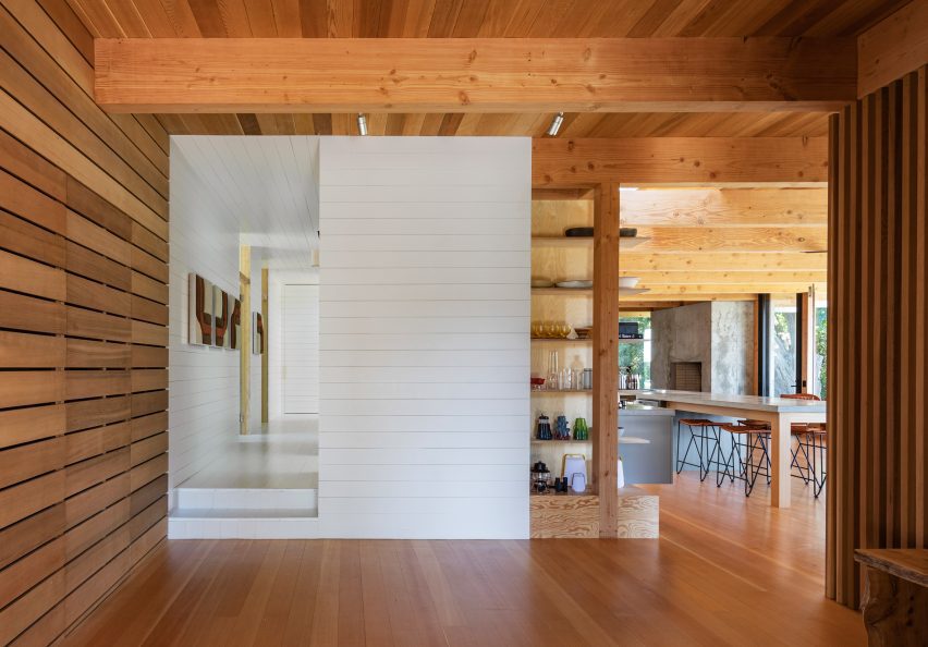
Inside, there is a clear division between public and private areas

“The architecture has a deliberate informality,” the architects said.

The 2,500-square-foot (232-square-metre) building consists of a single-storey volume attached to a slightly taller box, with the main entrance placed between them.

Cedar-clad rectilinear home on Long Island
Facades are wrapped in cedar siding

Facades are wrapped in cedar siding that will weather over time.

“The cedar rain-screen siding is quickly turning gray, and it will continue to gather more character as it ages,” the team said.

The home is approached from the north, where trees and a mostly solid facade “create an edge to the property to increase privacy without adding fences”.

The home opens up on the south, where it looks toward the water and an abandoned, overgrown boathouse.

Long, covered porch by KoningEizenberg Architecture
Stretching across the home’s southern elevation is a long, covered porch

Stretching across the home’s southern elevation is a long, covered porch that recalls a similar feature in the former cottage.

The porch offers a comfortable spot to engage in family activities and enjoy the scenery. A row of columns was incorporated for practical and aesthetic purposes.

“Columns create a bold visual effect and add a sense of rhythm and texture while protecting the house from the elements and bringing light into the interior,” the team said.

Within the home, there is a clear division between public and private areas. The communal space occupies the lower portion of the house, while the sleeping zone is found in the taller volume.

Glazed-brick blue backsplash in wood-lined kitchen
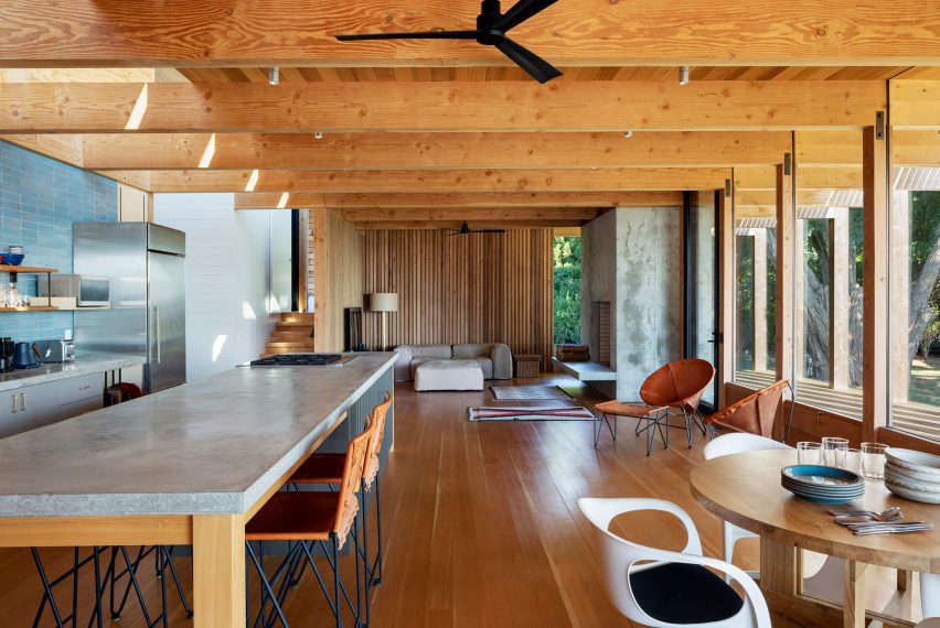
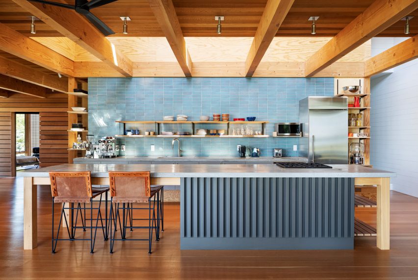
A glazed-brick backsplash features in the kitchen

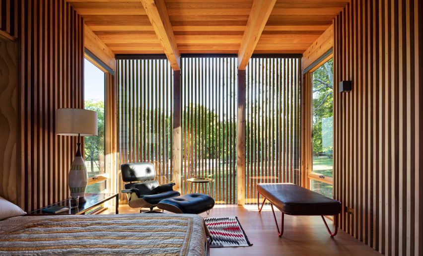
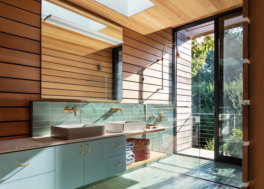
The interior features ample use of wood, including cedar wall slats and Douglas fir structural beams and columns.

In the kitchen, the team incorporated a glazed-brick backsplash, birch plywood cabinetry and concrete countertops. A clerestory brings in soft daylight.

Wood-lined bedroom by KoningEizenberg Architecture
Slatted wood on the facade creates dramatic shadows inside

Sustainability was a concern for the team. Photovoltaic panels were placed on the roof to generate energy and reduce the use of fossil fuels. On the south wall, wooden vent flaps supplement airflow.

To improve drainage and protect from flooding, the ground was raised up and graded in a way that directs water away from the house.

Wood-lined bathroom interior
The interior features ample use of wood

Other projects on Shelter Island include a General Assembly-designed pool house that has blackened timber cladding and a central pergola, and a concrete dwelling with a micro vineyard that architect Vibeke Lichten created for her family.

The photography is by Michael Moran.

Reference

membrane roof casts a soft glow over two-story house in tokyo
CategoriesArchitecture

membrane roof casts a soft glow over two-story house in tokyo

house with a membrane roof in tokyo, japan 


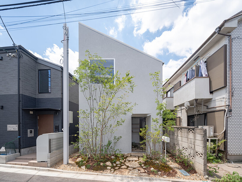
House with a Membrane Roof is a private dwelling located in a dense residential area of Tokyo. Designed for an owner with a nomadic lifestyle, the project takes on a camping-like aesthetic with adaptive functions and spaces. Yuko Nagayama & Associates teamed up with Shohei Yoshida + Associates and architect Asuka Fujita to complete the 60 sqm residence enclosed by surrounding buildings on all sides except for the narrow frontage facing the street. These site conditions restrict from having large openings in the exterior walls, pushing the trio to introduce natural light from above through a tubular membrane roof. As a result, a diffused glow engulfs the roof volume before pouring into the second floor and atrium, reaching as far down as the ground floor.


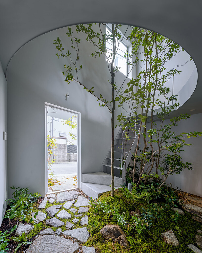
Bathed in ample daylight, the second floor serves as a lively public area, whereas the ground floor shelters private quarters like the bedroom and bathroom, which, although basking in subduded lighting, provide a serene sanctuary akin to a tranquil cave, ideal for unwinding and slumbering peacefully. To optimize the site’s limited space, an indoor garden, complete with a flourishing tree, graces the skylit atrium, replacing the conventional outdoor garden. ‘By incorporating it  indoors, the owner enjoys an immersive experience, directly engaging with nature rather than merely observing it through a window,’ notes the team. 

tubular membrane roof casts a soft glow over this two-story house in tokyo
all images © Satoshi Takae


changing lights inform about outdoor conditions


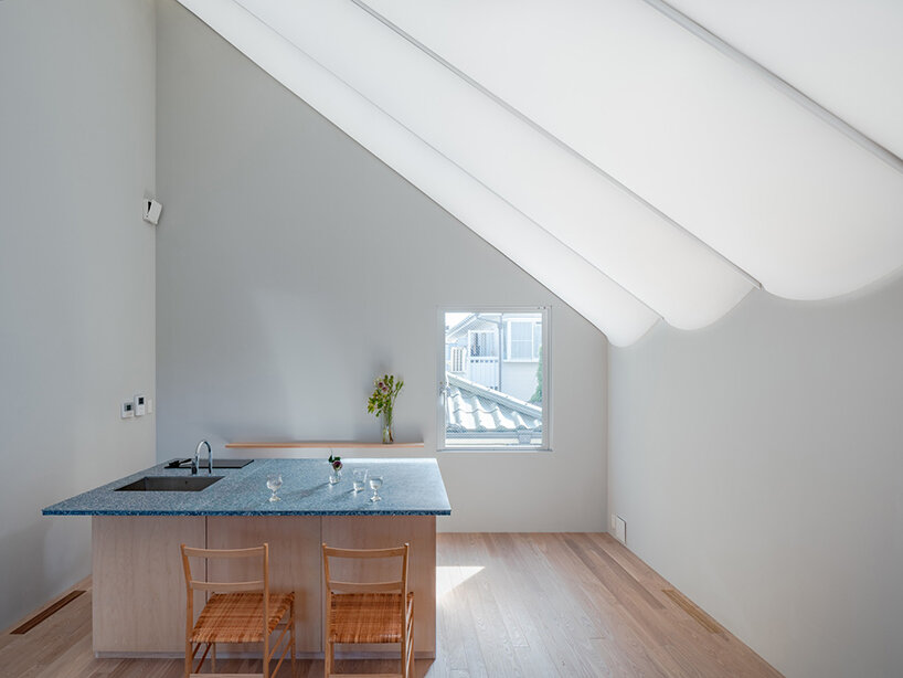
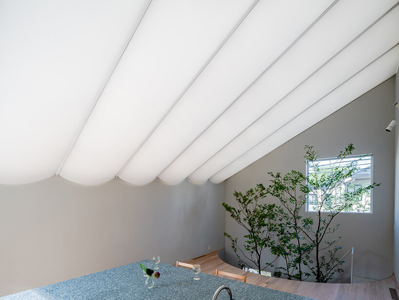
The Yuko Nagayama Associates team collaborated with Fujita and Shohei Yoshida + Associates (more here) to incorporate a flexible membrane material onto the roof, allowing it to take on a visually striking contorted shape. It consists of a dual-layer structure, with an upper and lower membrane enclosing the structural components and thermal insulation. The lower membrane follows a graceful catenary curve, attaching to T-shaped structural beams, resulting in a ceiling adorned with semi-circular light tubes. Meanwhile, the airspace within the roof serves as an insulating layer and facilitates natural ventilation. This allows air to circulate from bottom to top, ensuring a comfortable indoor environment.


While the sky is not directly visible through the membrane roof, the changing light conditions give cues about the surrounding environment. At sunrise, the space gradually brightens, and warm light tinges the area with a reddish hue during the evening. The brightness also varies depending on whether it is sunny or cloudy. ‘In this way, the roof acts as a skin-like layer, transmitting the exterior changes to the interior and transforming one’s sensory experience,’ reflects Yugo Nagayama. The House with a Membrane Roof took two years to complete. 

tubular membrane roof casts a soft glow over this two-story house in tokyo
a skylight at the entrance of House with a Membrane Roof

tubular membrane roof casts a soft glow over this two-story house in tokyo
the membrane material introduces a soft glow to the interiors

tubular membrane roof casts a soft glow over this two-story house in tokyo
attaching semi-circular light tubes to the lower membrane

Reference

studeny architekti embeds concrete shell house into hillside of pernek, slovakia
CategoriesArchitecture

studeny architekti embeds concrete shell house into hillside of pernek, slovakia

an underground mountain house


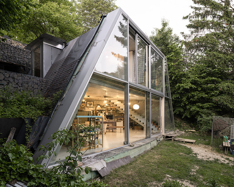
Design studio Studeny Architekti has recently completed a contemporary house in the scenic village of Pernek, Slovakia. Embedded into the earth a vast plot of land surrounded by the pristine beauty of the Small Carpathians, the Family House in Pernek embodies the studio’s vision of a simple dwelling existing in dialogue with its natural surroundings.


The primary objective of this project was to create a residence that makes use of the contours of the land but also harmonizes with the environment. By strategically placing the concrete house beneath a slope below the road, the architects ensured that the residents would have unobstructed views of the opposite forest, allowing them to connect with nature effortlessly. This underground placement also freed up the flat portion of the plot, which was reserved for a wide, open front yard.

studeny architekti embeds concrete shell house into a hillside in pernek, slovakiaimages © Alex Shoots Buildings @alex.shoots.buildings


the concrete shell structure by studeny architekti


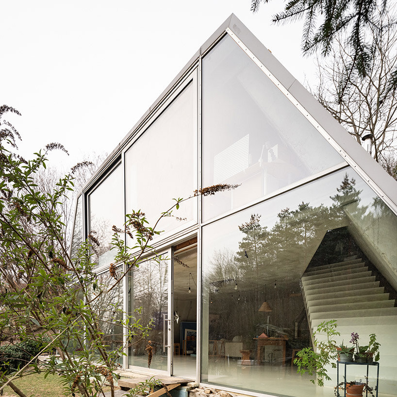
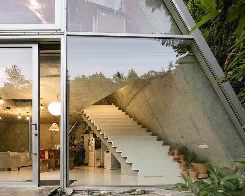
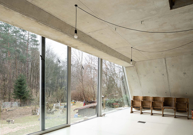
Studeny Architekti constructs its Family House in Pernek with a unique design element — a monolithic concrete shell without internal supports. This choice not only adds structural integrity to the building but also contributes to its aesthetic appeal. Inside the house, the concrete shell remains exposed, creating a distinct visual feature. However, the facade opening out toward the south is defined by its large glass wall, opening the interior spaces broadly outward to gaze onto the wooded mountains beyond.

studeny architekti house pernek


inside the family house in pernek


Studeny Architekti organizes the floor plan of its Family House in Pernek in the shape of an isosceles trapezoid, mirroring its longitudinal profile. This unique layout results in an interior space that feels open and free-flowing. The house consists of two floors interconnected by a stylish staircase.


The ground floor, in direct contact with the garden, encompasses a multifunctional area housing the living room, a work corner, the parents’ bedroom, a kitchen with a dining room, and the technical facilities of the house. On the upper floor, two children’s bedrooms, a bathroom, and an entrance area can be found. All the living spaces benefit from ample natural light and are oriented towards the garden and the forest through expansive windows.

studeny architekti house pernek
the house is built as a concrete shell with no internal supports studeny architekti house pernek
full height glazing opens onto the forest beyond through a trapezoidal frame studeny architekti house perneksliding glass doors fills the underground home with natural breezes and sunlight


Reference

a tapestry-like facade weaves across paperfarm’s veil house
CategoriesArchitecture

a tapestry-like facade weaves across paperfarm’s veil house

veil house: challenging public/private of compact urban living 


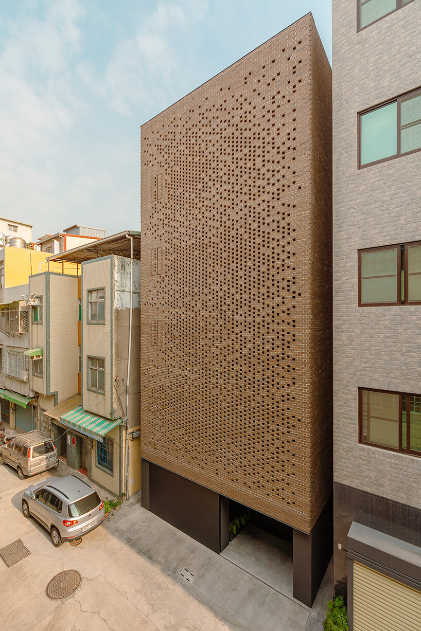
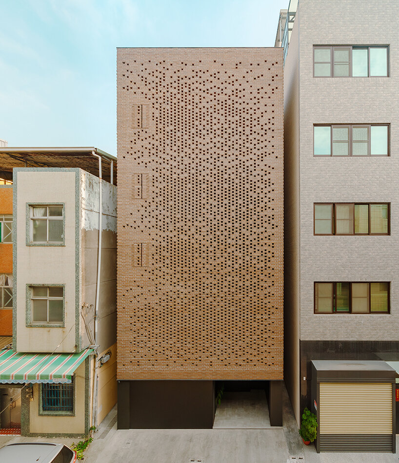
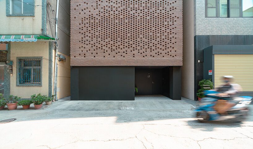
Situated near the historic ‘Taiwan-Renga’ (台灣煉瓦) brick kiln from 1899 that prospered in this working-class district in Kaohsiung, Taiwan, the Veil House by Paperfarm revisits this history by weaving a modern, tapestry-like facade using floating clay bricks. In such an area with very narrow streets, and a hyperactive social fabric, privacy is often compromised. To maintain boundaries, windows are often shaded throughout the day; outdoor spaces, such as balconies and terraces, are left largely unused. The project challenges this public/private dynamic of compact urban living, creating a peaceful retreat that redefines this neighborhood’s typical house character: a perforated brick facade liberates the need for window treatments, still allowing filtered light into all the living spaces and bedrooms.

a tapestry-like facade made of clay bricks weaves across paperfarm's veil house in taiwan
all images © Daniel Yao


using clay bricks to create a breathable, permeable facade 


The impetus for security and privacy reimagines the home as a body with a breathable, permeable skin. Like skin’s pores, perforation density is devised according to the functional needs behind the enclosures. With cored bricks secured by rebars, shelf angles, and steel channels, the brick veil is designed to withstand the local challenges of earthquakes and typhoons. There are also three emergency exits, engineered with saw-tooth pivots, seamlessly inserted onto the facade,’ explains Paperfarm (see more here).


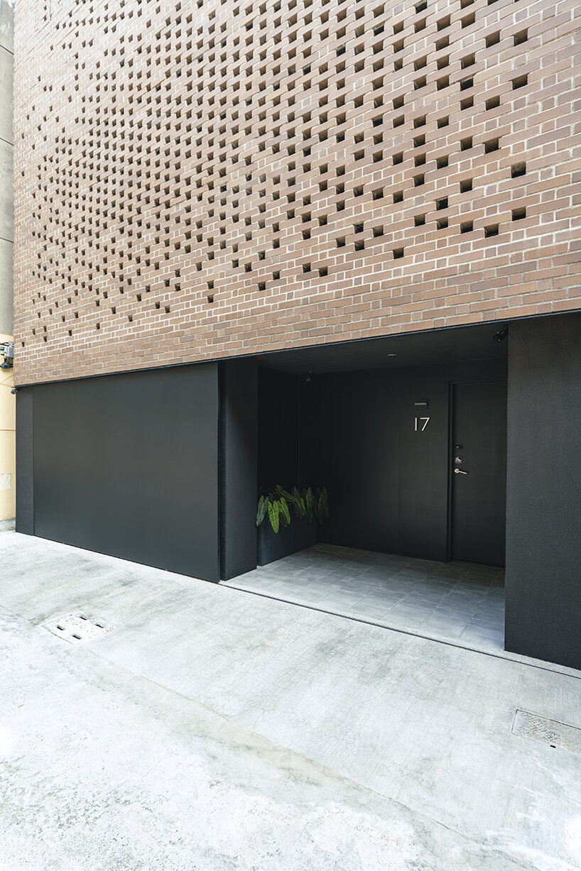
On the street level, automobile storage is provided without visually distracting pedestrian entry. The powder-coated stainless-steel door is 12 ft by 7 ft (366 cm by 214 cm) in size and is two inches thick. The door and its mechanical track are hung from above, installed behind five courses of veneer bricks with a guide rail below. The entry, through an interior garden, helps quiet the transition from the bustling city streets and provides a deep threshold into the heart of the Veil House, thus acting as a type of perforation

a tapestry-like facade made of clay bricks weaves across paperfarm's veil house in taiwan
challenging the public/private dynamic of compact urban living


paperfarm defines veil house around an atrium + rich materials


The residents circle an open atrium clad with 2×6 vertical aluminum louvers to enter the main living area on the second floor. This materiality pays homage to another Taiwanese vernacular of protected fenestrations while enhancing the home’s verticality. Programmatically, this atrium is the engine of the house: an urban garden on the ground floor; a light well introducing natural illuminance into the rooms on the bedroom’s balconies; an airshaft for cross-ventilation with the brick veil at the front facade; and a connector that ties circulation and program together across multiple floors. Behind the veil, this shifting perspective and the vertical stratification of the program accentuate public versus private relationships. This forms the central discourse on the introverted approach to the Veil House by Paperfarm.

a tapestry-like facade made of clay bricks weaves across paperfarm's veil house in taiwan
using floating clay bricks to create a breathable facade


Throughout the Veil House interior, custom-designed terrazzo flooring defines spaces within the larger, open-plan living floors, while full-length, custom white-oak millwork conceals the kitchen and the entertainment and storage spaces. The reductive use of materials enhances the focus on the brick veil and the respite gained in the quiet, minimal interior. ‘Ultimately, the defining characteristic of the Veil House is the desire to build a cozy, airy lifestyle behind an urban façade that successfully withdraws from the frenetic street life,’ concludes Daniel Yao from Paperfarm. 

a tapestry-like facade made of clay bricks weaves across paperfarm's veil house in taiwan
entrance to the Veil House by Paperfarm

Reference