climate-resilient great barrier reef house by JDA takes cues from surrounding marine life
CategoriesArchitecture

climate-resilient great barrier reef house by JDA takes cues from surrounding marine life

the house at lizard island by JDA Co.


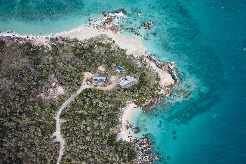
Australian architecture practice JDA Co. constructs a climate-resilient residence on the rugged fringes of Queensland’s Great Barrier Reef. Located on Lizard Island, the project emerged from the client’s aspiration to build ‘the greatest reef house in the world’. Employing a design that harmonizes with the surroundings, the house showcases a resilient exterior crafted from board-formed concrete. This robust material protects against extreme weather conditions while maintaining a gentle impact on the environment. Perforated copper blades lining the exterior act as debris shields that can withstand powerful cyclonic winds synonymous with the reef location.

climate-resilient great barrier reef house by JDA takes cues from surrounding marine life
the house is located on the Lizard Island on the Great Barrier Reef | all images by Peter Bennetts


JDA introduces SITE-RESPONSIVE AND CLIMATE-RESILIENT design


In the challenging environmental context of its location, the construction of the house demanded ingenuity. Collaborating closely with the builder, JDA Co. (find more here) achieved a delicate balance between minimizing disturbance to the environment and creating a durable structure that stands the test of time.


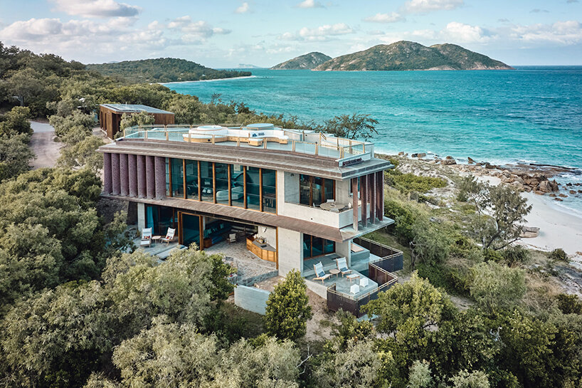
The house is inspired by the rich geology and marine life on Lizard Island. The architectural plan is reminiscent of the stingrays. Narrow slit windows to the south and west act as ‘gills’ and are placed to direct prevailing breezes and allow the house to breathe on hot days. Every detail of the residence is meticulously crafted to create a shelter and a protective haven when needed. The exterior design seamlessly combines functionality and visual appeal with its robust concrete construction. This carefully chosen material ensures resilience in the face of the region’s winds, offering strength and stability. Enhancing the concrete exterior, perforated copper blades serve as dependable shields, capable of withstanding the strong winds that may arise.
climate-resilient great barrier reef house by JDA takes cues from surrounding marine life
the house is inspired by the rich geology and marine life on Lizard Island


360-degree views of the great barrier reef


A central, curved stairwell serves as the heart of the house, seamlessly connecting its levels. As users ascend the stairs, they can gaze upward to find an oculus, allowing them to track the sun and moon’s patterns. The house is completed by a roof terrace and spa, offering panoramic 360-degree views of the surrounding landscape. Each of the three bedrooms is individually designed to capture vistas of nearby and distant scenic locations.


To bring warmth to the residence and showcase the vibrant natural environment, Rosewood timber, and copper materials are utilized. A large curving Emerald Quartzite kitchen bench, reminiscent of a conch, adds a touch of subtle green tones that harmonize with the hues of the landscape and reef beyond. The material selection is deliberately restrained, allowing the surroundings to take center stage.
climate-resilient great barrier reef house by JDA takes cues from surrounding marine life
narrow slit windows to the south and west act as ‘gills’ directing breezes and allowing the house to breathe


JDA’s 3D LASER technology


To ensure the project harmoniously integrates with the landscape, it was crucial for JDA Co. to understand the challenging rock bed formation on-site. Before detailed design and construction, the design team utilized their in-house 3D laser technology, Spatial Ops, to explore, walk through, and seamlessly incorporate the landscape, even from off-site. This technology also documented the construction progress, accurately capturing building elements like the spiral stair formwork for contractors.


Fabricating most building elements off-site and shipping them to the island required a precise digital model, achieved through laser scanning. JDA’s experience on Lizard Island showcases the benefits of Spatial Ops technology, enabling the scanning of objects and places worldwide. It minimizes on-site time and facilitates data analysis within days of the site visit. The scanning technology and processes eliminate the need for travel to and from inaccessible locations, streamlining the entire project.

Reference

House of Shila designs industrial yet sultry interiors for Mona Athens
CategoriesInterior Design

House of Shila designs industrial yet sultry interiors for Mona Athens

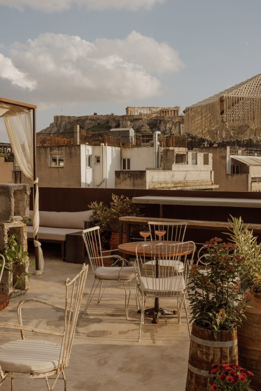
The ancient Acropolis of Athens is in full view from the rooftop of this boutique hotel, which design studio House of Shila has housed in a former factory building.

Mona Athens is located in the city’s lively Psirri district, within an eight-storey 1950s building that once served as a textile factory.

Lobby lounge at Mona Athens hotel
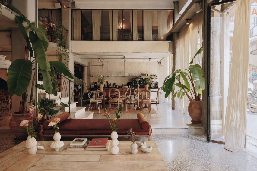
The Mona Athens lobby features an eclectic mix of furniture and decor

House of Shila, led by New York-based entrepreneur Shai Antebi and Greek photographer and creative director Eftihia Stefanidi, chose to keep as much of the building’s bones as possible when converting it into a 20-key hotel.

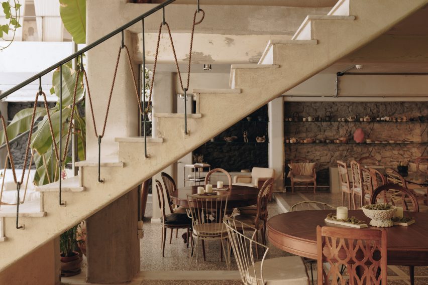
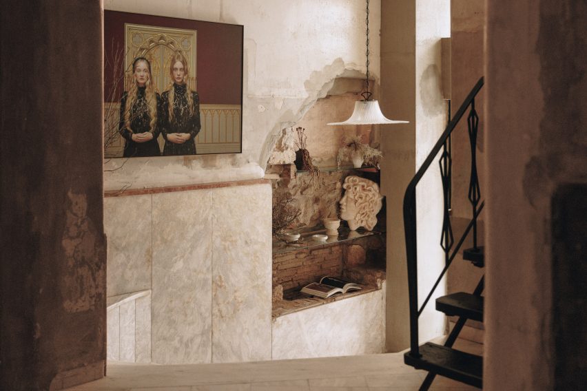
This meant retaining its original dramatic iron staircase, terrazzo flooring, metal window frames and marble facade.

Staircase in communal area of hotel by House of Shila
The spilt-level communal space houses a lounge and cafe

“We designed Mona with great respect for the building’s 1950s architecture,” said Stefanidi.

“The structure itself remains unchanged, revealing 70 years of history. Emphasis was given to preserving original features.”

Iron staircase in the lobby of Mona Athens
House of Shila retained as many of the building’s original details as possible

Layering over industrial materials like exposed concrete and weathering steel, the team added wooden furniture and textured fabrics to bring warmth and tactility to the spaces throughout.

Accessed from the street, the 200-square-metre split-level lobby serves as a lounge and a cafe that can host pop-up events and installations.

Guest room with exposed concrete walls in hotel by House of Shila
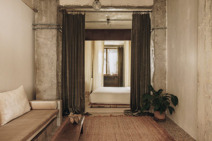
A variety of textured materials are layered over the building’s industrial bones

An eclectic mix of furniture and decor populate the space, which can be opened to the outside via full-height folding glass doors.

The hotel’s six different room categories range from intimate rooms of around 16 to 20 square metres all the way up to the 55-square-metre penthouses and Mona’s Suite, with some of the larger rooms providing access to private balconies and patios.

Guest room at Mona Athens
Wash areas are open to the sleeping quarters in many of the rooms

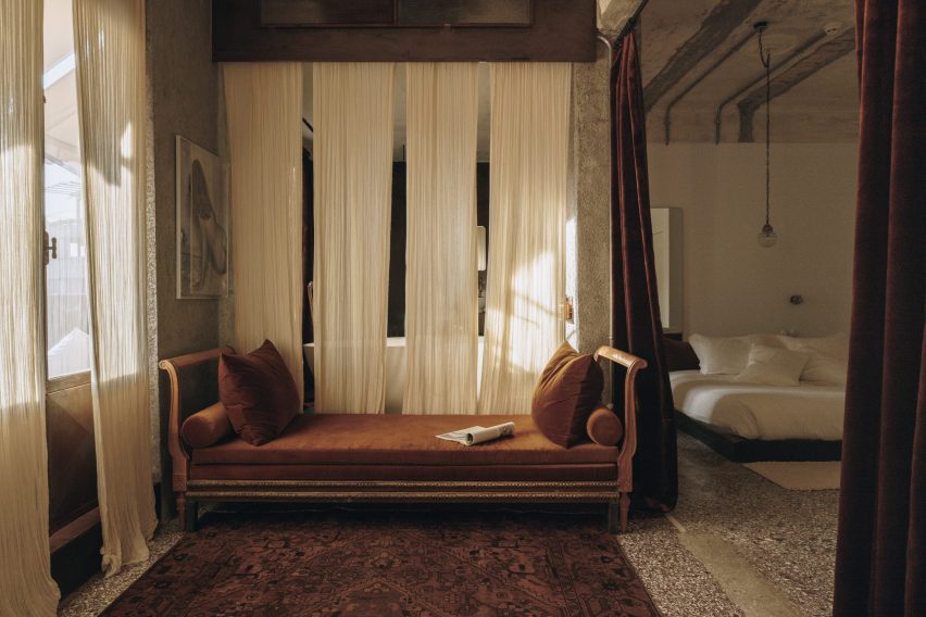
All feature a similar sultry-meets-industrial aesthetic, which House of Shila compares to a “sensual refuge”, characterised by curtains of sheer cotton and richly-coloured velvet, low minimalist beds, custom-knitted carpets and soft lighting from bespoke fixtures.

In the majority of the guest rooms, the washing areas are open to the sleeping quarters – with separate water closets for privacy – and some feature comfy lounge seating.

Bathroom in suite at hotel by House of Shila
Larger suites have access to porches, balconies and patios

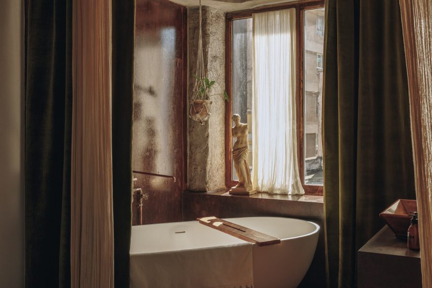
White freestanding Corian bathtubs and industrial-style rain showers are shrouded by translucent curtains, creating a “certain balance of comfort and drama”, according to the design studio.

The open rooftop offers a direct view of the Parthenon and other structures atop the Acropolis, the UNESCO-listed epicentre of Ancient Greece, while the tourist entrance to the site is a 15-minute walk from the hotel.

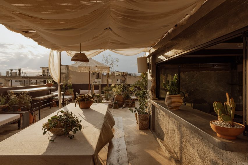
Reserved for Mona Athens guests and members, this outdoor space includes a long glass-and-metal communal table, cushioned sofas, outdoor showers, lush planting and a bar that serves cocktails and “eclectic fare” with ingredients sourced from the local food market.

There’s also a speakeasy venue in the basement, where pop-up exhibitions and private events can take place.

Corian bathtub in Mona Athens guest room
Freestanding Corian bathtubs are set against weathering steel

All of the decorative items in the rooms are available for guests to purchase, from the organic cotton bedsheets to the ceramic coffee cups.

Antebi’s background is in real estate development while Stefanidi was previously the creative director for immersive entertainment company Secret Cinema.

rooftop bar in hotel by House of Shila
The rooftop is reserved for hotel guests and members

The duo founded House of Shila after working together on their first hospitality project Shila – another boutique hotel-cum-arts venue in Athens’ Kolonaki neighbourhood.

Once a quick stopover for tourists on the way to the Greek islands, the capital is becoming a popular destination for city breaks in its own right, thanks to its rich history, growing culinary scene, year-round fair weather and relative affordability.

Acropolis view from Mona Athens rooftop
A prime view of the Acropolis can be enjoyed from the roof

The owner of Carwan Gallery described Athens as “the new Berlin” when the contemporary design gallery relocated there from Beirut in 2020.

Several boutique hotels have opened or undergone renovation in the downtown area over the past few years, including the neo-modernist Perianth Hotel and the Evripidis Hotel, which received a new rooftop bar and breakfast room.

The photography is by Ana Santl.

Reference

yabashi architects stacks minimalist house and café in japan
CategoriesArchitecture

yabashi architects stacks minimalist house and café in japan

ezu house and café: multi-uses in harmony


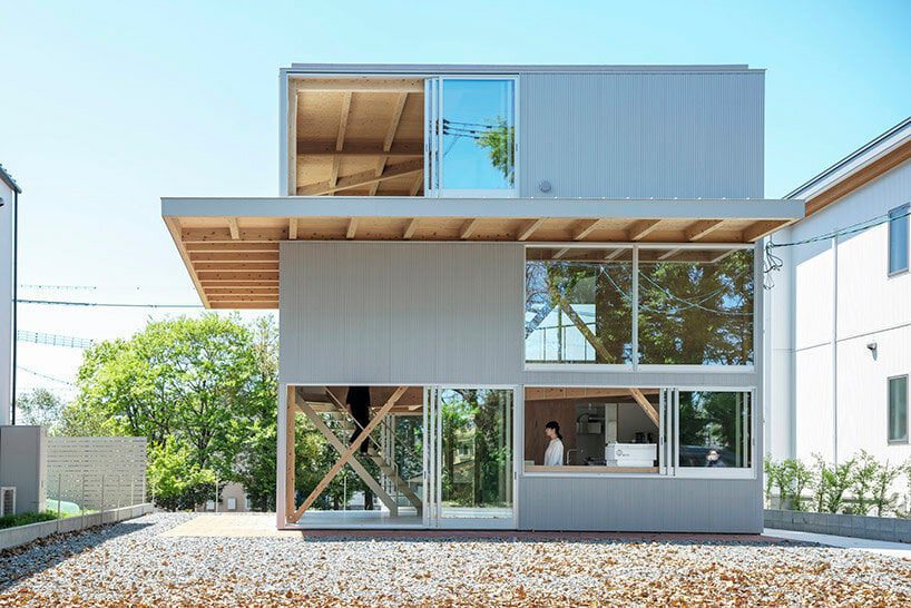
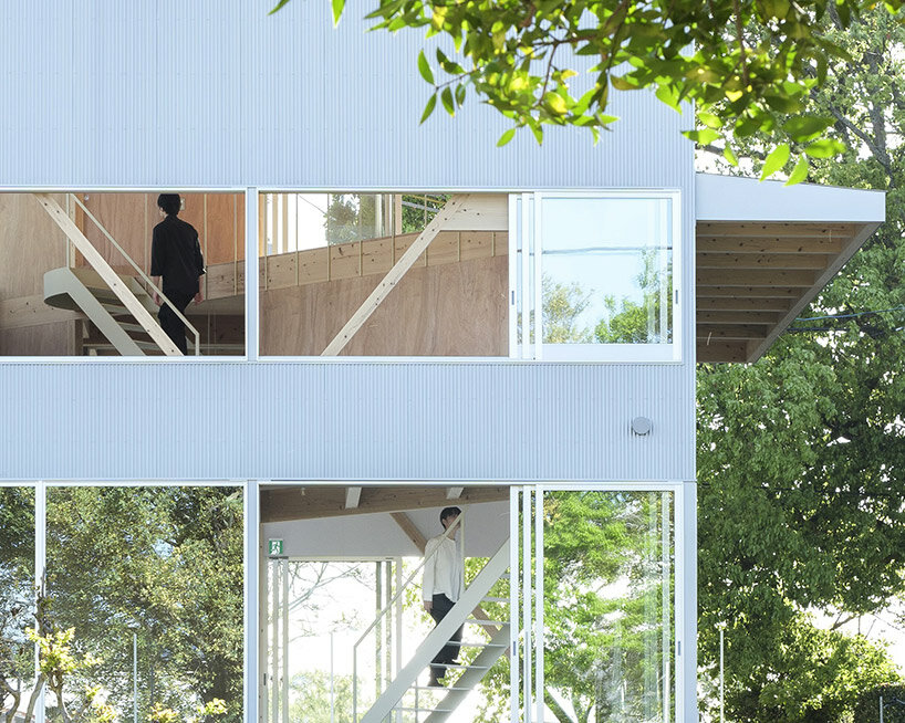
Nestled in a tranquil corner of a lakeside residential area in Kumamoto, Japan, the recently completed ‘EZU House and Café‘ stands as a testament to innovative architectural design, crafted by Yabashi Architects and Associates (YAA). this structure opens broadly out toward its surroundings to provide a unique experience for its occupants. The site’s terrain, with its stepped landscape along the lakeside, offers breathtaking views of nearby gardens, private house roofs, and distant mountains. By skillfully incorporating these elements into the design, the architects have created a multi-layered structure that fosters a sense of harmony between its retail and residential programs.

yabashi architects ezu houseimages © Yashiro Photo Office


the Vertical Spiral Movement


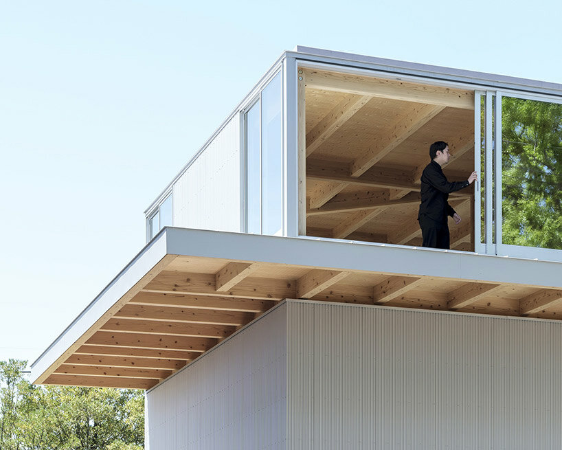
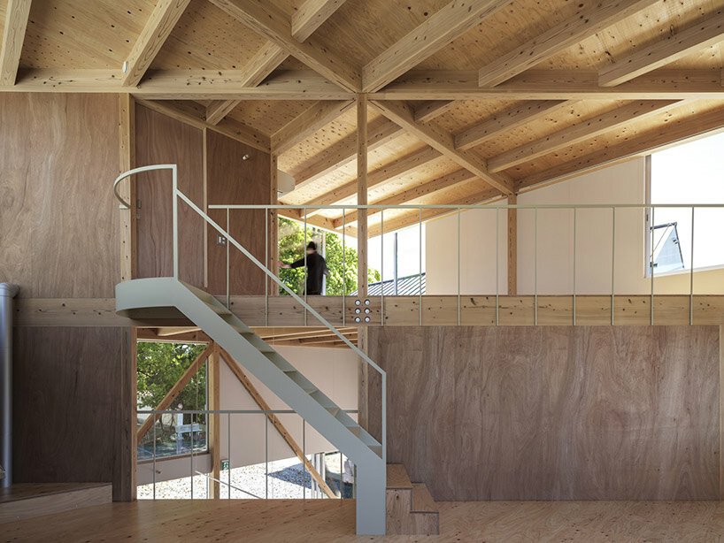
At the core of the design philosophy is a square plan that encompasses the site. The upper floors of the building are ingeniously divided diagonally, establishing a dynamic interplay of spaces. By shifting the floors to increase the parameter with the ground and connecting them through a spiral vertical movement, the architects have achieved a three-layered structure that presents an array of viewpoints at every turn. This deliberate arrangement allows for a varied experience on each floor, with minimal necessary functions, furniture, and plants. The result is a space that transcends conventional definitions, offering an open canvas for inhabitants to freely create their own personalized environments.

yabashi architects ezu house


Seamless Integration of Functions


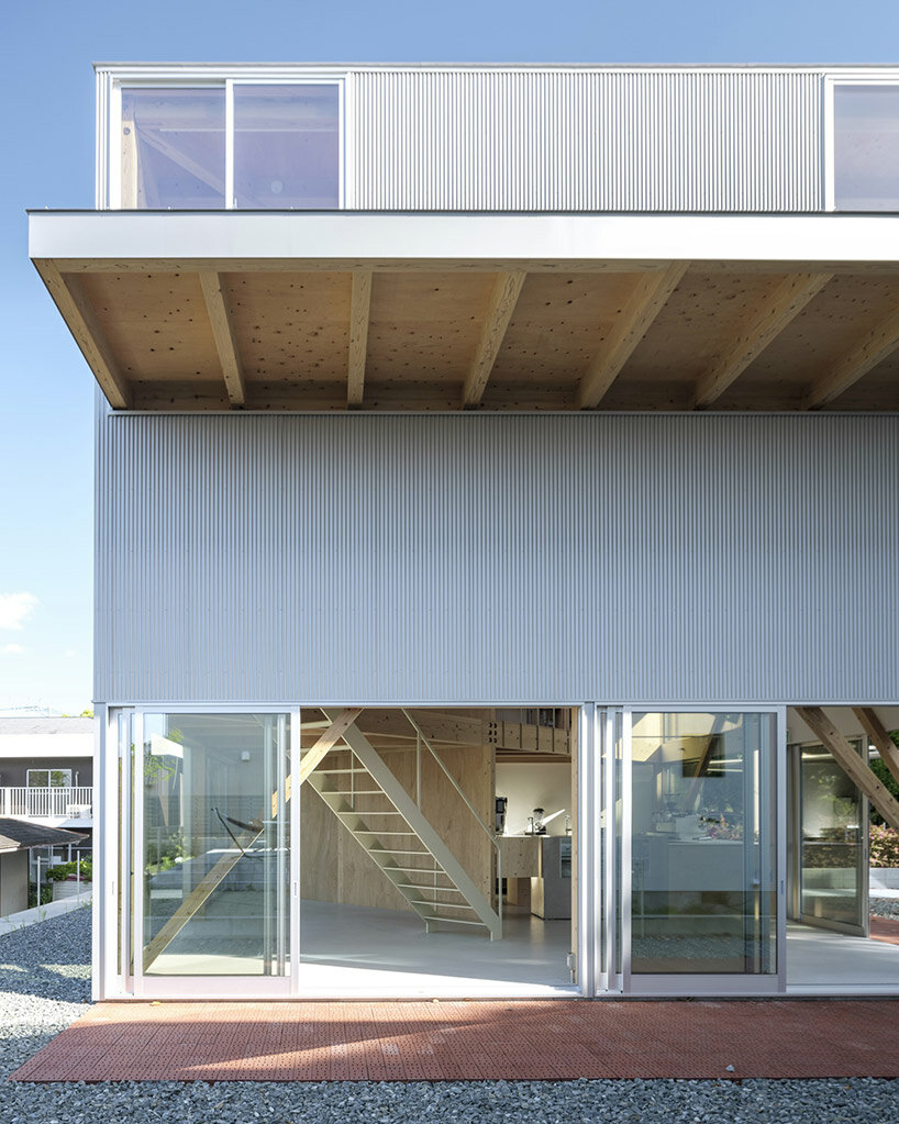
The ground floor of the EZU House and Café serves as a retail area, seamlessly transitioning into the residential space on the upper floor. The distinction between these two sections is purposefully fragmented, employing diagonal load-bearing walls that create a continuous three-dimensional living space. This approach fosters a sense of connectedness and flow throughout the entire structure. Furthermore, the architects have emphasized the integration with the natural surroundings by incorporating a double structure. This design envelops the earthquake-resistant framework with elements dedicated to wind resistance and heat insulation, while the outer skin of the building serves as a gateway to the outdoor environment.

yabashi architects ezu house


Unobstructed Views by yabashi architects


The absence of partitions between spaces is a deliberate choice that enhances the occupants’ experience of the surrounding environment. Depending on one’s body position and movement, glimpses of the sky, verdant greenery, or sudden visual breaks may appear through the windows on adjacent floors. This design creates a spatial experience that emphasizes the inherent richness of the location and the generosity of life itself. In essence, the EZU House and Café may appear as a mere assembly of floors, outer panels, and openings. However, it transcends its utilitarian nature, transforming into a powerful tool that allows individuals to perceive the external environment as an integral part of the internal space.

yabashi architects ezu house
a double structure wraps earthquake-resistant elements with wind resistance and heat insulation yabashi architects ezu housethe multi-use space is flexible with a spiral vertical movement and minimal necessary functions
Reference

cochi architects builds ‘house in shikenbaru’ for an okinawa farmer
CategoriesArchitecture

cochi architects builds ‘house in shikenbaru’ for an okinawa farmer

a harmonious blend of architecture and agriculture


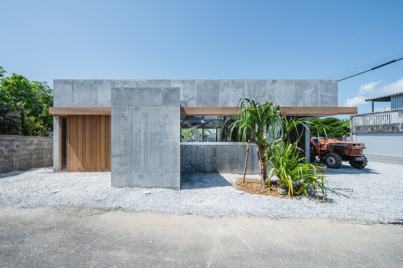
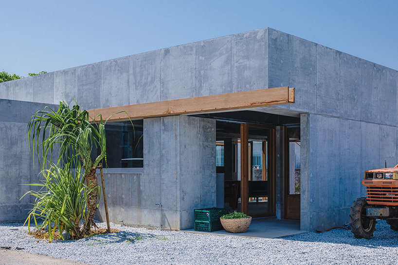
The House in Shikenbaru, designed by Studio Cochi Architects, is a residential structure located in the village of Nanjo, Japan. Situated near the sea in southern Okinawa, this concrete house serves as a home for a couple and their four children. It is not merely a dwelling but also a space that seamlessly integrates with the local farming activities and the natural environment of Okinawa. The architecture of the house takes into account the region’s unique characteristics, such as its temperate climate and abundant agricultural opportunities. This essay explores the innovative design and features of the House in Shikenbaru, highlighting its harmonious integration of farm work, spatial layout, and environmental considerations.

house shikenbaru cochi architectsimages © Ooki Jingu @ookijingu


Sustainable Farming and Local Context


The owner of the Studio Cochi Architects-designed ‘House in Shikenbaru’ is a farmer, cultivating a variety of vegetables including okra, green beans, and papaya. With a focus on sustainability, the architects consider the owner’s farming activities and aim to provide a conducive environment for his work. The site’s location near fields and the absence of snow or frost in Okinawa enables year-round vegetable cultivation, which influenced the architectural decisions. The house becomes a vital element in supporting the owner’s farming endeavors, allowing for efficient operations and seamless transitions between indoor and outdoor work areas.

house shikenbaru cochi architects


Spatial Considerations and Layout


To create a functional and adaptable living space, the layout and volume of the House in Shikenbaru were carefully planned, taking into account the surrounding environment and prevailing wind direction. Given the spacious site, the decision was made to construct a single-story house. The removal of the original block wall facilitated easy access for tractors and cultivators from any direction, creating a versatile environment conducive to agricultural activities. Additionally, a vacant lot was designated around the building, providing storage space for farming tools and ensuring a smooth workflow that integrates both indoor and outdoor tasks.

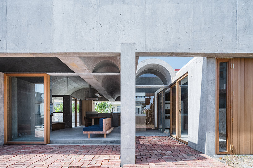
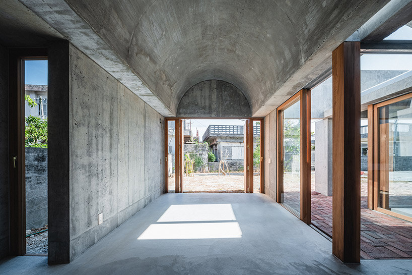
house shikenbaru cochi architectsdeep overhangs shelter semi-outdoor spaces


Seamless Integration of Interior and Exterior


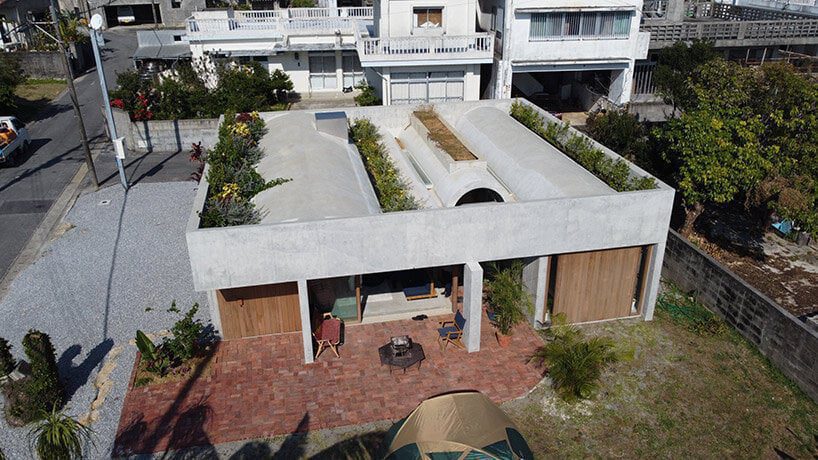
The architectural design of the House in Shikenbaru employs a simplistic yet elegant approach to seamlessly blend the interior and exterior spaces. A continuous vaulted ceiling, varying in height, unifies the indoor and outdoor areas. Stretching from north to south, this vault crosses the boundaries between the interior and the garden, forming a semi-outdoor intermediate space.


With deep eaves, this area serves as a hall for daytime farming activities and fosters a connection between the occupants and the surrounding natural environment. The rhythm of the continuous east-west vaulted ceiling creates a sense of visual harmony within the simple plan, while the interplay of natural light through the roof and wall gaps produces a subtle and captivating gradation of light and shadow.

house shikenbaru cochi architects
the interiors and exteriors are united by a continuous vaulted ceiling of varying heights


Environmental Adaptations


The House in Shikenbaru effectively adapts to the demanding Okinawan climate through innovative architectural choices. The valley at the top of the vaulted ceiling is filled with soil, providing insulation against the intense sunlight. This strategic design element helps regulate the indoor temperature, ensuring comfort for the residents and protecting delicate crops.


Furthermore, the entire surface of the vaulted roof is covered with vibrant ivy plants, such as passion fruit and bougainvillea. This living roof not only enhances the aesthetic appeal of the house but also contributes to environmental sustainability and acts as a testament to the owner’s commitment to cultivating fruits and vegetables in diverse soil depths.

house shikenbaru cochi architectsthe house opens up with seamless, gradual transitions between the interiors and exteriors


The House in Shikenbaru exemplifies the successful integration of architecture, farming, and the natural environment in southern Okinawa. Studio Cochi Architects have skillfully crafted a residence that caters to the needs of a farming family while honoring the local context and sustainable practices. Through the layout, seamless blending of spaces, and environmental adaptations, the house creates a harmonious environment that embraces the rhythm of farm work and facilitates a deep connection with the surrounding landscape. The House in Shikenbaru stands as a testament to the power of architecture to enrich lives, promote sustainable practices, and create spaces that resonate with their inhabitants.


Reference

Top Policies That Propel Passive House in North America
CategoriesSustainable News Zero Energy Homes

Top Policies That Propel Passive House in North America

To further understand the policy structures and mechanisms driving Passive House adoption across North America, the Passive House Network (PHN) studied what, where, and how Passive House policies succeed. Beginning in 2017, a research team inventoried Certified Passive House projects and professionals, and then analyzed Passive House–focused (or Passive House–related) local policies. Three frontrunner regions shone through. And the final report examines how specific policies operating in those regions harness the power of voluntary standards, like Passive House, that are already delivering high performance; and the key patterns or mechanisms they share. Scaling and replicating these patterns has proven incredibly successful both here and abroad.

Passive House Network leader Bronwyn Barry is an architect and principal of Passive House BB. Her webinar presentation with green building resource Rate it Green deep dives into the Policy That Works report. According to Barry, “Our goal is to have everybody look at how to implement these patterns and use them in their own policies.”

Watch the 2022 video presentation on the report’s implications


The Passive House framework offers tools and training that target buildings’ operational energy use, aiming to create a long-lived built environment that is regenerative and restorative. Passive House strategies are proven to produce reliable, low energy-use intensity. And after years in practice, Passive House buildings actually cost less to build than code-compliant buildings.

The report identified New York, Pennsylvania, and British Columbia as having both a critical mass of trained Passive House professionals and a significant lead in terms of Passive House project numbers and square footage. The data confirmed that Passive House adoption in North America is primarily being driven by large, multi-family buildings.

Connecting policy to projects

The PHN research discovered a layered mix of cities, states, and utilities driving high-performance energy policies in these accelerated regions, most being state-mandated, utility-funded programs. These policies and programs were competitively run; included tiered incentives and options and/or stepped implementation; and required reporting and monitoring, so data was captured to inform further policy.

The report then distills specific features that these policies have in common:

  1. They all included training subsidies to achieve a critical mass of well-trained building professionals and civil service employees.
  2. They all included carrots: project subsidies that help to remove the risk burden of the developer and owner community.
  3. They all clearly identified, up front, the end goal.

Interestingly, the researchers determined that all three of these drivers must be in place for successful implementation at scale. They also found, in all of the frontrunner regions, a local community of advocates and practitioners who supported policymakers implementing these programs: a local, grassroots community of activists.

Further accelerating Passive House adoption, policies connected one area of regulatory framework with others. In addition, most of the frontrunner regions had removed roadblocks within the baseline code, allowing Passive House pathways to compliance.

Finally, required monitoring and cost reporting circularly fed back into either reach codes or baseline code adoption, or back into the existing incentive program to reconfigure and refine the next iteration.

Exterior image Passive House Multifamily - photo by Triplecaña

Working cooperatively

Starting the energy code process with an explicitly and clearly defined end goal helps to structure the interim steps (a back-casting structure, as contrasted with an iterative code update process). A stepped energy code can also replace a multitude of reach codes in different municipalities.

In the webinar, Barry points out that at the city, state, and utility level, all of these successful policies connect. They were “quilted together” to work effectively. Each civic entity developed programs that supported programs and incentives run by fellow entities.

As an example, Barry highlighted a Vancouver program that connected zoning variances to certified passive house projects. Vancouver’s zero-emissions building plan issued in 2016 includes training of municipal staff, for an integrated approach. Bary emphasized training repeatedly as an oft-overlooked but essential component of successful programs.

British Columbia also provided up to $80,000 to incentivize manufacturers to develop Passive House Certified windows. The local building codes and incentives then created the market for them, producing a “virtuous feedback loop.”

New York City required their public works buildings to be Certified Passive House: fire stations, school retrofits, affordable housing, etc. NYC also implemented a benchmarking law (all the large buildings must measure and report energy consumption) and then set carbon caps, driving emissions gradually toward net zero carbon. This goal-oriented approach motivates owners to leap ahead when retrofitting and to plan for net zero in new buildings.

Barry then highlighted New York State’s Buildings of Excellence Program, a competitive award that funds early design explorations. The feedback that tracks modeling methodologies is encouraging innovation, because it removes some of the developers’ risk.

Pennsylvania linked their affordable housing tax credits to high-performance buildings, giving far more points for Passive House Certification. “See how policies, programs, and incentives actually can quilt together with policies similarly operating, and make each of them work better together. [The] additional points make it more likely to get financing through the state-run financing program.” explained Barry. “And lo and behold, after three years of running this program, the Passive House buildings performed reliably and ended up costing less money per square foot than the baseline code-compliant buildings. Because the professional community figured out ways to do this cost effectively.”

Reference

Paire House by Rodolfo Cañas provides shelter for a Chilean family
CategoriesArchitecture

Paire House by Rodolfo Cañas provides shelter for a Chilean family

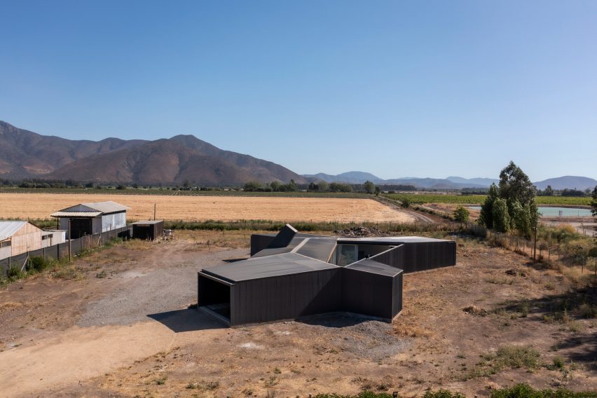
The tale of Jonah and the Whale informed the design of this house in Chile, which architect Rodolfo Cañas shaped around two gardens.

In the rural town of Pomaire, less than an hour southwest of Santiago, Cañas designed the single-family home to shelter its inhabitants from the elements and the surroundings.

Paire House and rural surroundings viewed from above
Viewed from above, the Paire House looks like an abstract body with limbs that stick out in different directions

The architect likened the shielding quality of the house to the whale that swallowed the prophet Jonah in the biblical story.

“In some ways, the Paire House can be comparable to the whale that protected Jonah during the storm,” said the architect. “In a rural, dry, rugged environment and also close to a highway with a heavy traffic flow, this house works as a container; a protective body, which separates its inhabitants from the hostile environment and makes them look towards a more sheltered interior.”

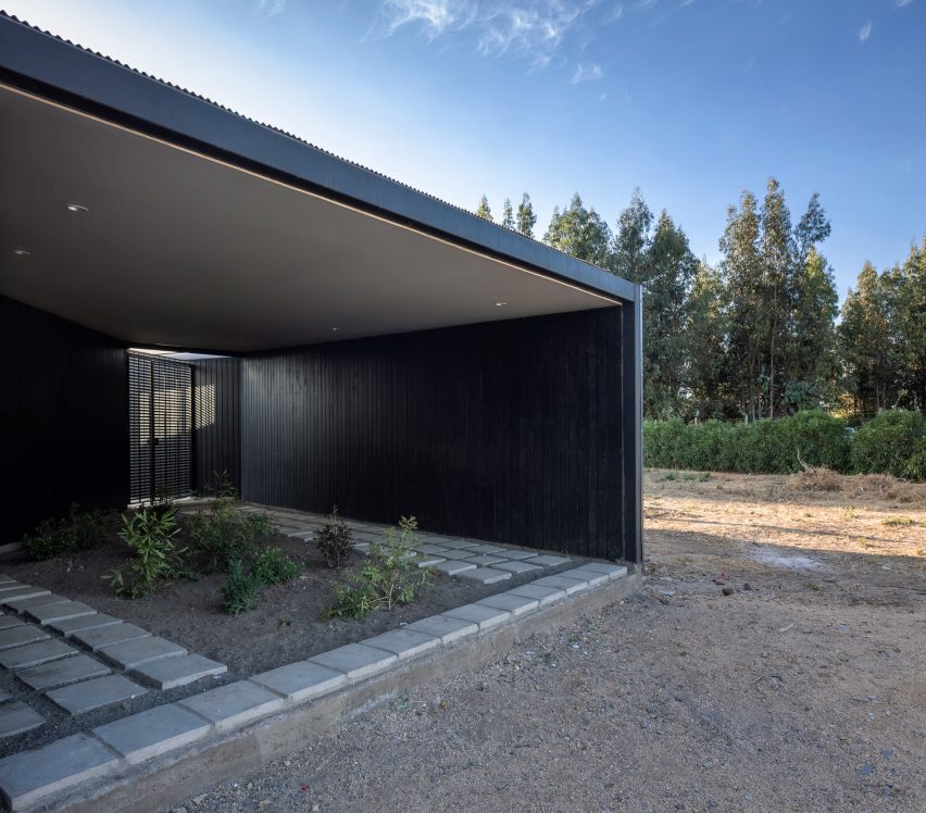
Entrance through a garden under a canopy
Entry to the home is via a shaded garden

Viewed from above, the house is shaped like an abstract human body with four limbs that protrude at different angles.

Two parallel circulation routes – one public and one private – and a desire to orient rooms towards specific views dictated this unusual layout.

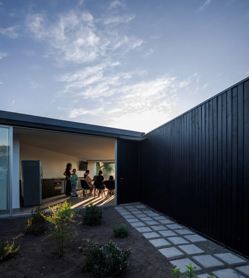
Living room opens on to enclosed garden
A second enclosed garden sits at the centre of the house

Entrance to the property is via a garden to the north, which is shaded by a canopy and landscaped to funnel visitors towards one gate, and the residents to another.

“This forms the cut between the rugged exterior and the sheltered interior of the house,” said Cañas. “It is a covered garden and considers a more controlled natural lighting in order to generate the cut coming from the outside.”

Kitchen and dining room
An open-plan kitchen, dining room and lounge occupies one of the building’s “legs”

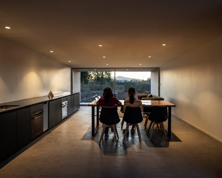
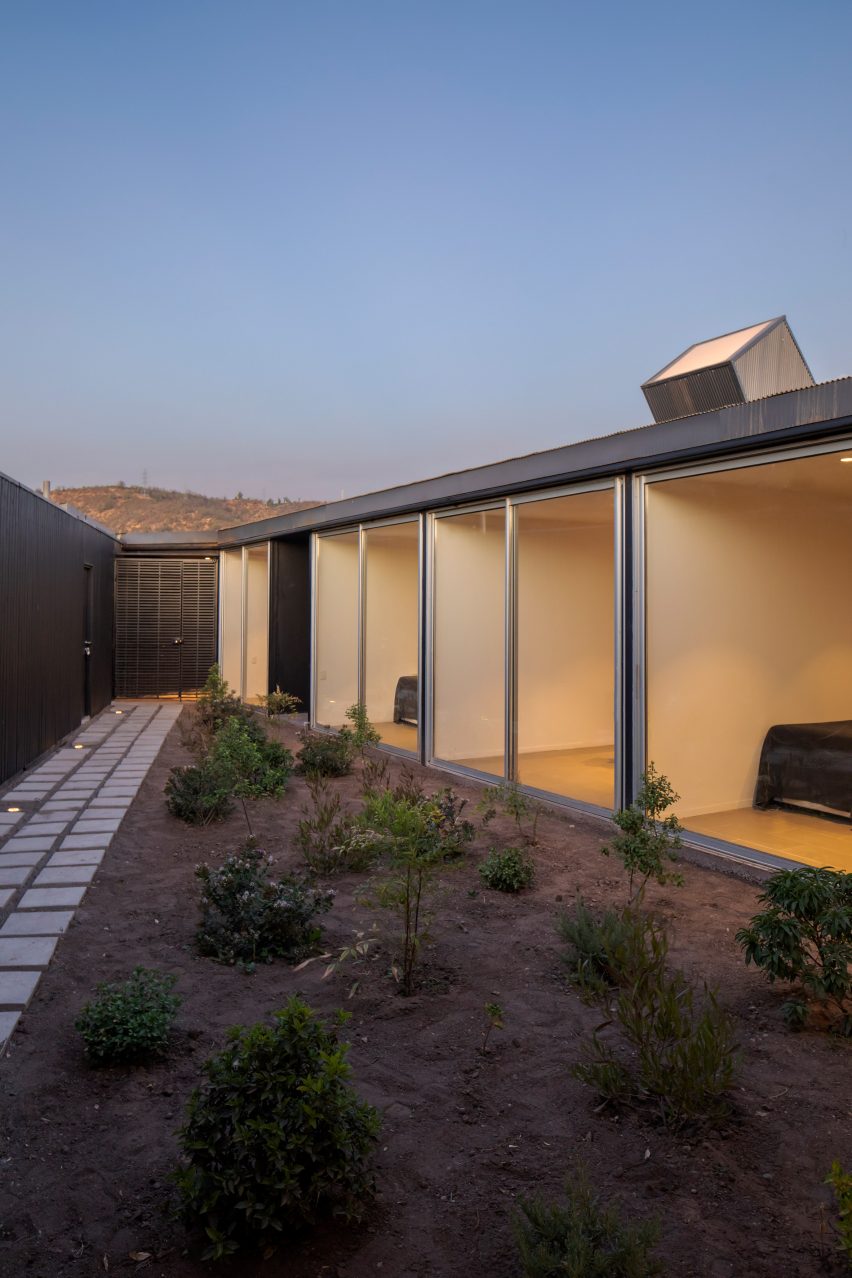
The “body” of the house contains a row of four bedrooms that all face an enclosed garden through floor-to-ceiling glass doors.

Guests pass through the garden on their way to the living spaces, while the family can traverse an interior corridor that passes behind the bedrooms.

Bedrooms facing onto garden
Bedrooms face the central garden through floor-to-ceiling glass doors

Light is brought into this passageway via a skylight that protrudes at an angle above the low roofline.

Overlooking the central garden, an open-plan kitchen, dining and lounge area occupies the building’s southwest “leg”.

The primary suite is located in the other, facing southeast. Both open onto terraces that face carefully chosen views of trees in the foreground and hills in the distance.

“The trees are a little misleading when you’re inside, hinting that the outside is wooded and less hostile than it really is,” Cañas explained. “Meanwhile, the nearby hills speak of the real context: a wild and dry environment.”

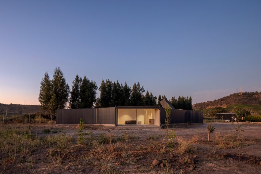
Paire House at dusk
The home’s layout was dictated by a desire to orient rooms towards particular views

Off the central outdoor space, close to the entry, is another small appendage that contains a games room.

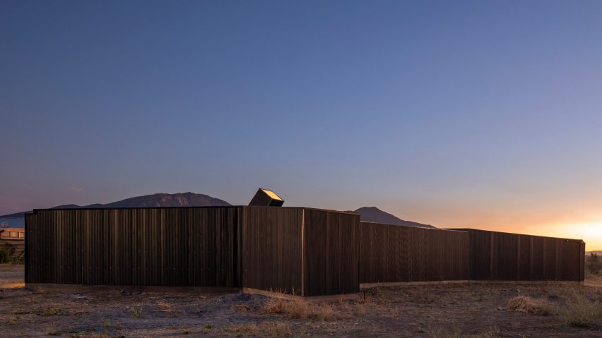
Largely devoid of windows, the exterior walls and internal gardens are wrapped in blackened wood, while interior spaces are minimally decorated and furnished.

Paire House at dusk
The home is clad almost entirely in blackened wood

Charred timber appears to be a popular choice of cladding material for Chilean houses.

Other examples of its use in the country include a home sheathed entirely in blackened pine, an angular mountain cabin and a beach residence comprising stacked volumes.

The photography is by Aryeh Kornfeld.


Project credits:

Architect: Rodolfo Cañas
Builder: Mauricio Fuenzalida
Drawings: Samuel Riveros

Reference

Studio Vaaro reconfigures House M using built-in storage volumes
CategoriesInterior Design

Studio Vaaro reconfigures House M using built-in storage volumes

For the renovation of a house in Toronto’s West End, local firm Studio Vaaro added minimally detailed millwork to form kitchen cabinetry, the staircase and a feature bookcase in the living room.

Studio Vaaro‘s overhaul of House M, a three-storey detached property that had been renovated and extended multiple times over the years, involved reconfiguring the layout to remove the awkward subdivided spaces.

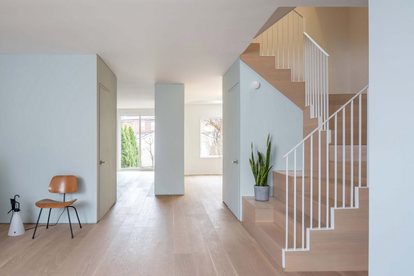
Ground floor divided by pale blue storage volumes
The ground floor of House M is partitioned by storage volumes laid out in a diamond formation

“Our clients were a professional couple with two young children, who were looking for flexible and resilient spaces that could accommodate their home offices, overnight guests, and the changing needs of their growing children,” said the studio.

“We, therefore, developed a spatial concept based on ‘functional volumes’, in which well-proportioned spaces are partitioned by blocks of storage and service functions.”

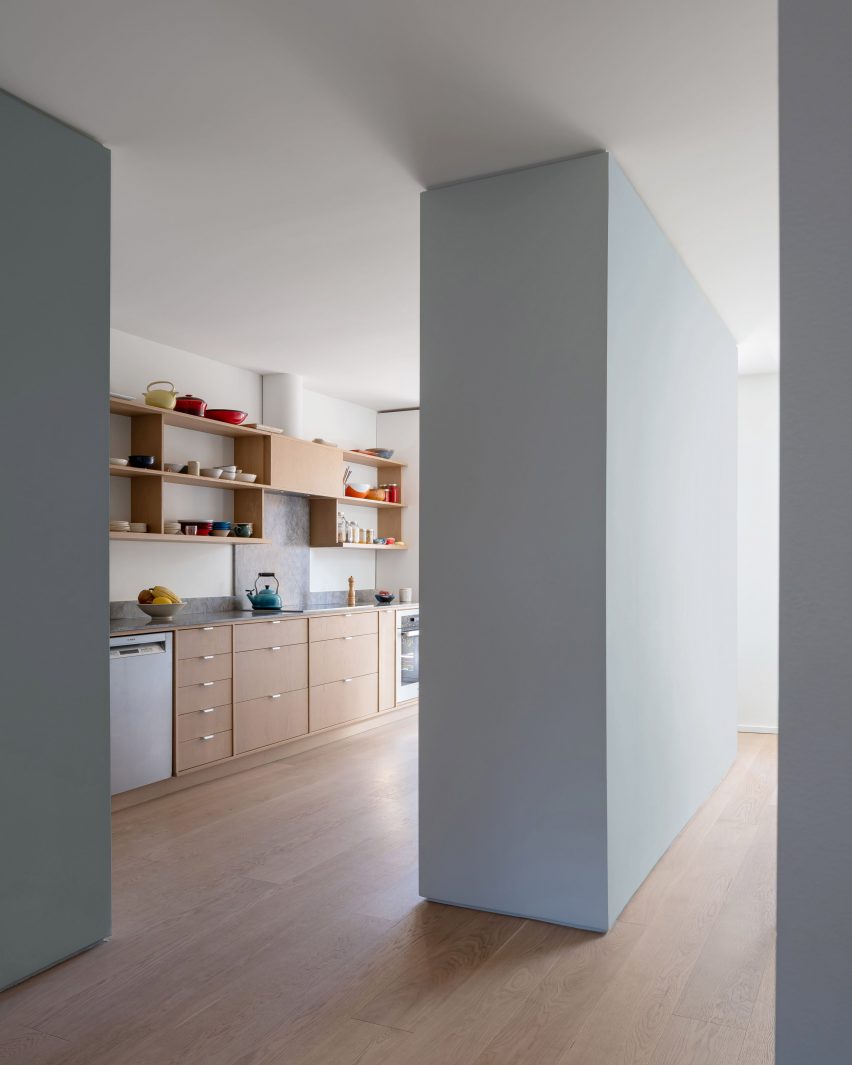
Kitchen separated from dining room by pale blue partition
The pale blue-grey volumes provide additional storage space for the kitchen

These built-in storage blocks partially partition four rooms on the ground floor while keeping an open flow between them.

Laid out in a diamond formation, all are coloured pale blue-grey to highlight their function against the otherwise white walls.

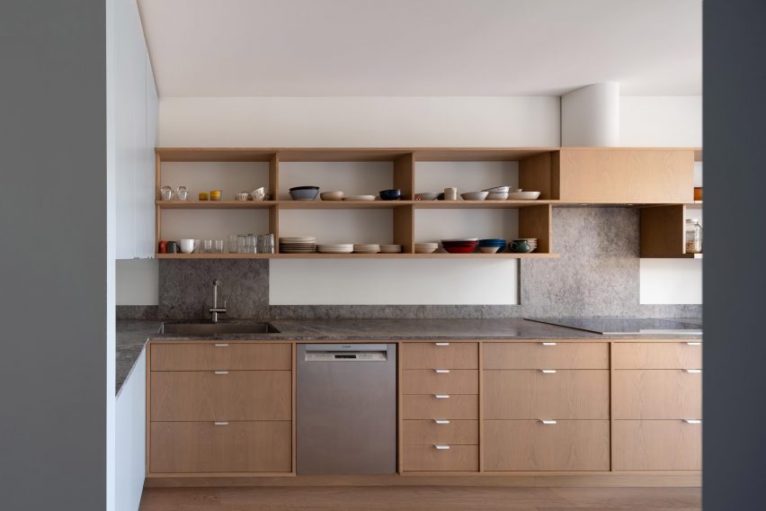
Kitchen with oak cabinetry and marble countertops
In the kitchen, oak cabinetry contrasts with the marble countertops

“The large amount of built-in storage ensures the rooms themselves are free of clutter and ready for use,” said Studio Vaaro. “In line with the family’s personalities, colour and playful details abound.”

In the entryway is a coat closet that hides the view of the living room behind, where an oak bookcase sat atop a teal powder-coated fireplace covers almost an entire wall.

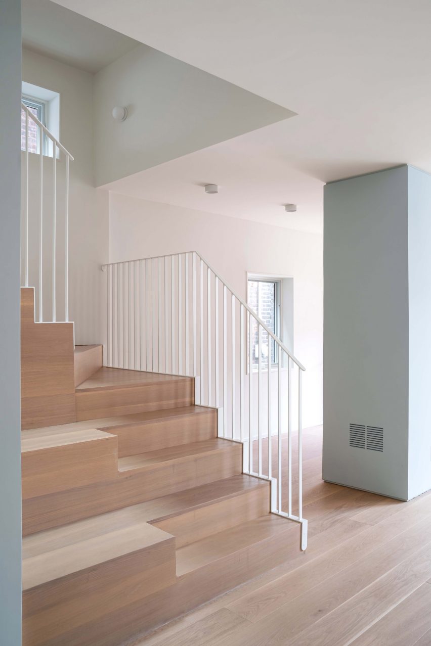
Oak staircase with built-in bleachers and white guardrails
Bleachers are built into the oak staircase, offering a display area or extra seating

A powder room is placed between this space and the kitchen, also forming additional cabinet and counter space within its volume.

Further kitchen storage sits in front of the dining room, and another closet is tucked under the doglegging staircase.

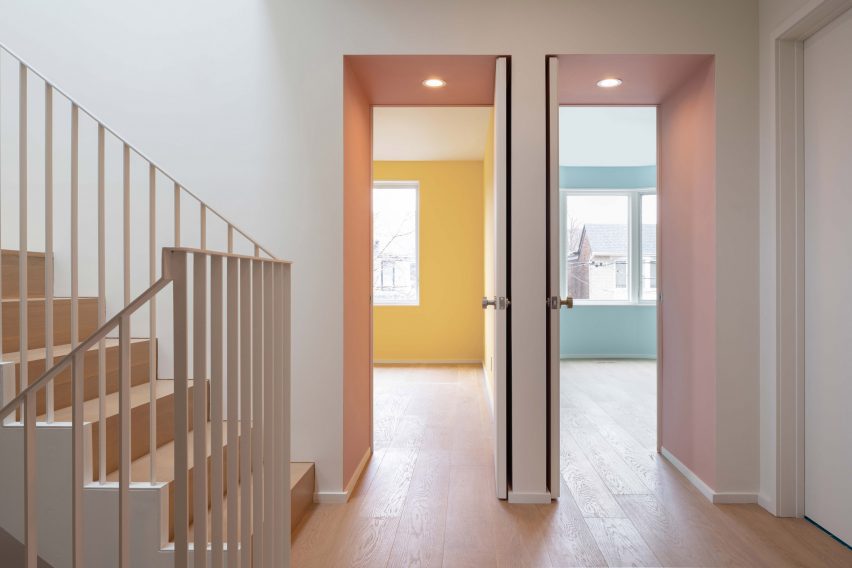
Bedrooms viewed through deep portal doorways coloured dusty pink
On the first floor, the bedrooms are accessed through deep portal doorways

“A ‘mixing bowl’ at the centre of the plan, at the base of the stairs, visually and physically connects all four spaces,” the studio said.

Both the entry and the dining room volumes are pulled away from the home’s exterior walls, allowing additional views between rooms.

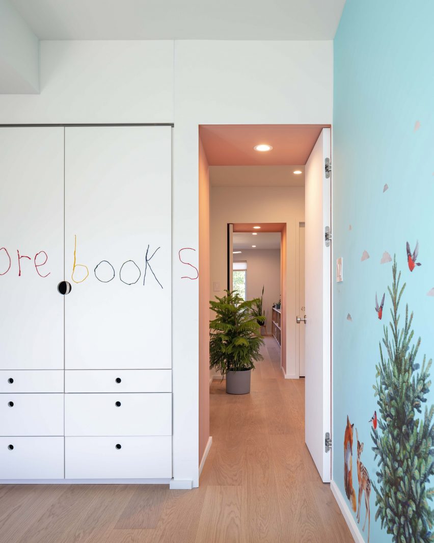
Kid's room with patterned wallpaper and writing on a closet door
The portals are coloured dusty pink and the kids rooms are also colourful

The remaining built-in furniture is oak to match the flooring that runs throughout, including kitchen millwork and the staircase, which incorporates oversized bleachers for displaying kids’ artwork or creating extra seating during a party.

A white metal “picket” guardrail, softened with rounded details, allows light to pass down from the upper levels.

On the first floor, two parallel volumes separate the children’s rooms at the front of the house and the primary suite at the back from the central corridor.

These create both storage for the rooms, and deep doorway portals that are highlighted in dusty pink.

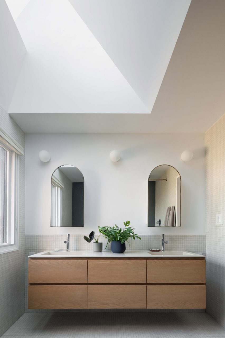
Bathroom vanity with an angled skylight above
Skylights in the stepped angled roofs bring extra light into rooms at the rear, including the primary bathroom

Carefully considered details include recesses for the door handles, allowing the doors to open the full 90 degrees without banging into the wall.

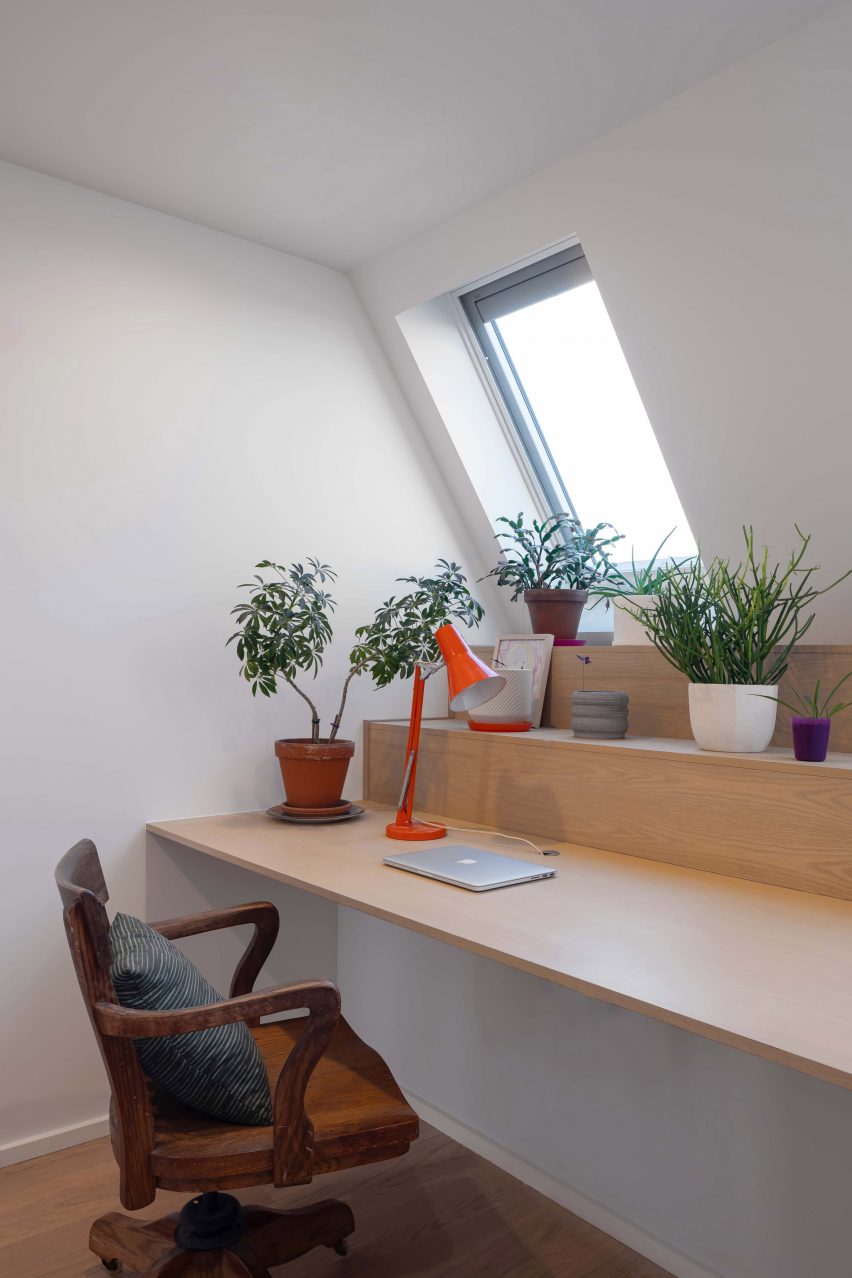
Work and study spaces in the attic are minimally furnished, though feature built-in desks that step up to form shelves behind.

Study area with built-in oak desk
Study spaces in the attic also feature built-in furniture

Skylights in the stepped, angled roof planes on all three floors bring extra light into the dining room, primary bathroom, and the stairwell.

Other Toronto homes that have undergone extensive renovations to make them better suited for their occupants include a 14-foot-wide house where pale woodwork forms storage to make more space, and another “disguised as a gallery” – both designed by StudioAC.

The photography is by Scott Norsworthy.


Project credits:

Team: Aleris Rodgers, Francesco Valente-Gorjup, Shengjie Qiu.

Reference

wooden house in yagota by airhouse floats in the japanese forest 
CategoriesArchitecture

wooden house in yagota by airhouse floats in the japanese forest 

airhouse unveils hovering house in yagoto 


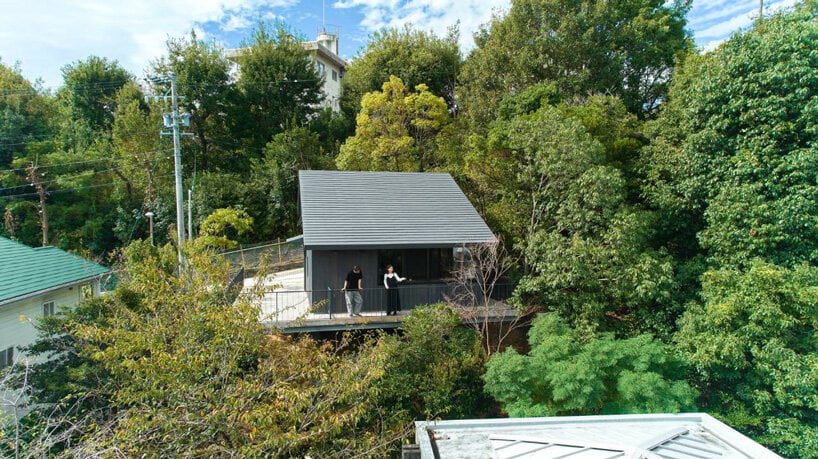
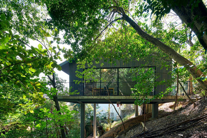
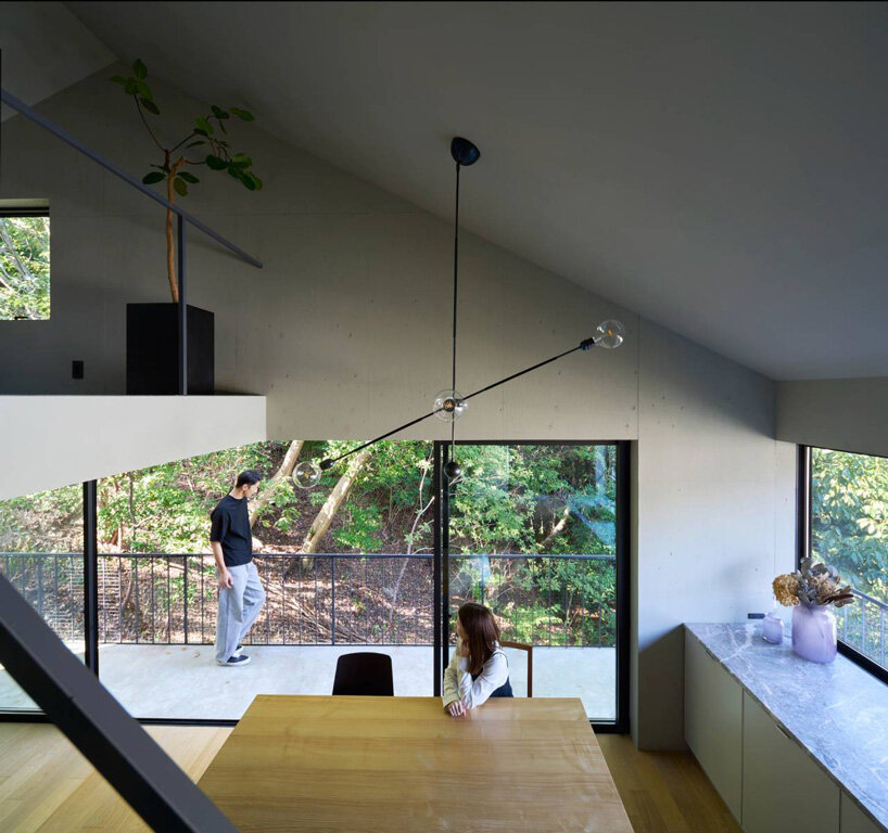
In a hilly residential area in Nagoya City, Japan, Airhouse has nestled a small Aichi Prefecture, residence into a slope engulfed in greenery. The House in Yagoto perches above a steep incline, surrounded by a thick curtain of trees and a forest to its northern edge. Resolving this challenging typology while minimizing cost and impact to the environment, the architects’ design solution conceives a construction foundation of only four steel columns, reducing the building’s ground contact area with a cantilevering reinforced concrete floor atop which a dark cedar-clad home appears to delicately float.

airhouse's wooden home floats above a steep slope in the japanese forest 
all images by Toshiyuki Yano


a serene mountain villa emerges in the japanese forest


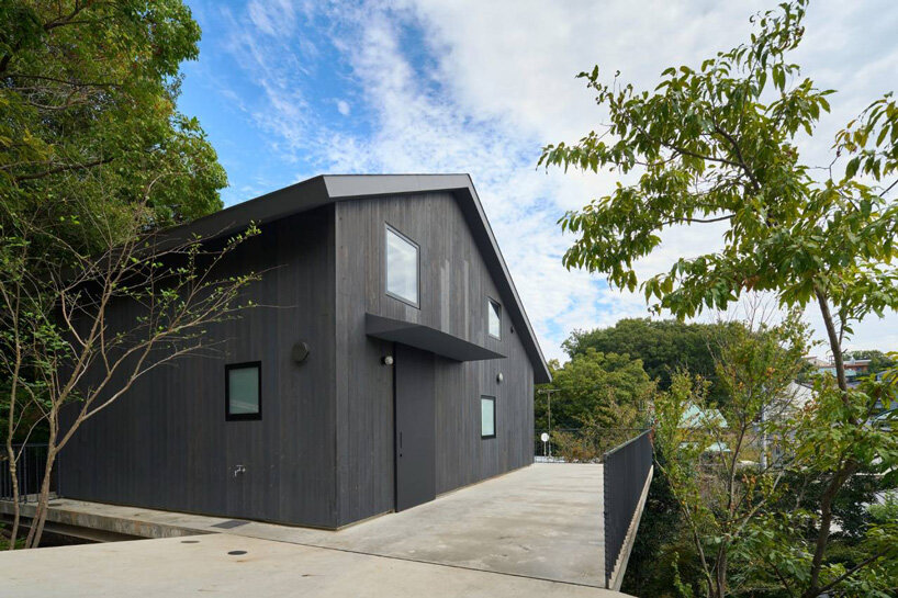
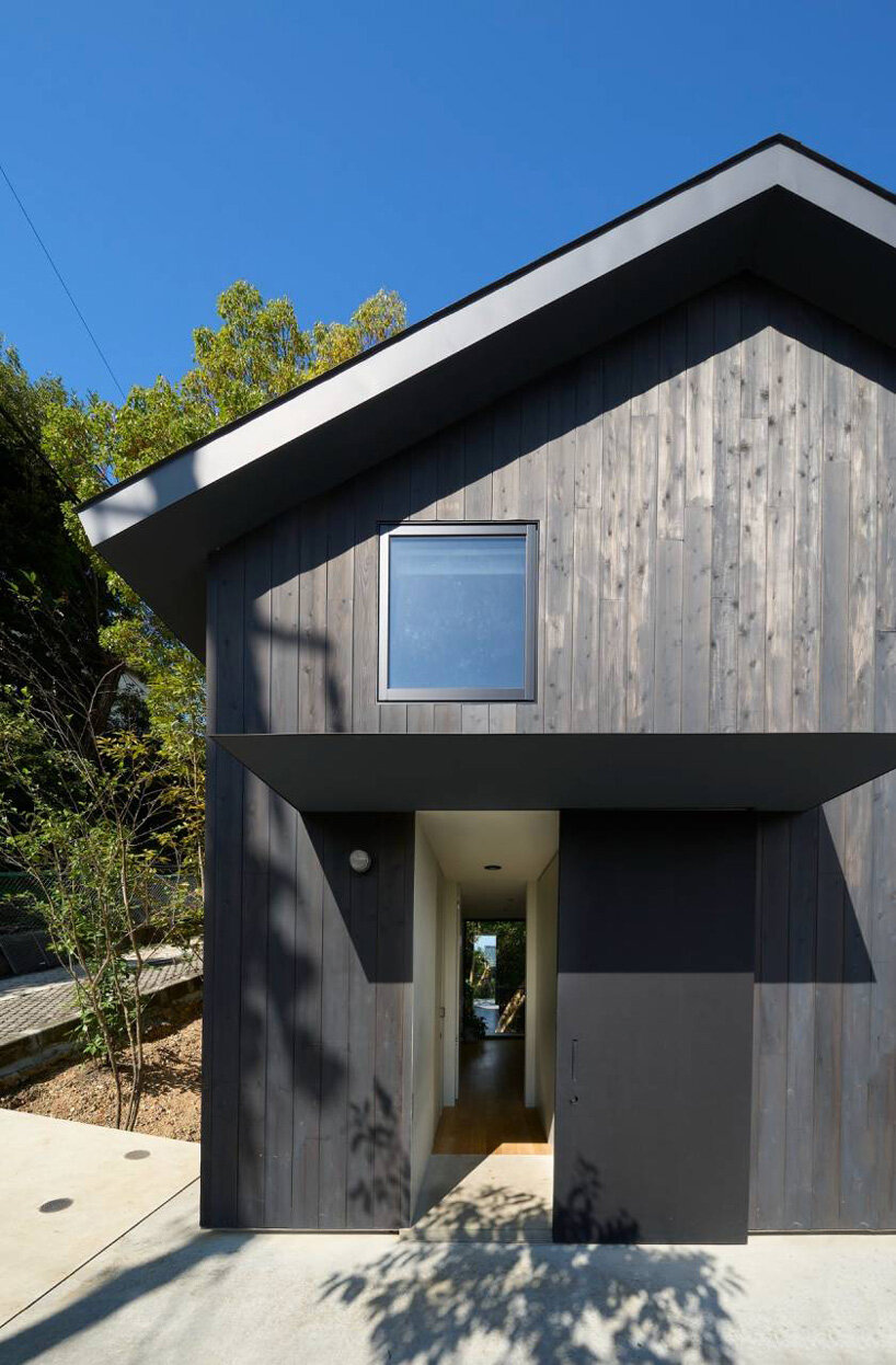
The cantilevered floor serves as the foundation for the House in Yagoto which emerges as a seemingly hovering volume emerging above the landscape and steep slope. Its dark form sits in stark contrast to its context as its outer walls clad in cedar create the appearance of a serene mountain villa. With minimal impact on the natural surroundings, the team at Airhouse was able to economically construct the structure without cutting a confined, flat base in the ground and large retaining walls. ‘As a result, by thinking about the foundation of the building, we were able to build a house economically even on a sloping land, and we believe that we were able to create a rich living environment that floats in the forest,’ notes the Japanese architecture office.


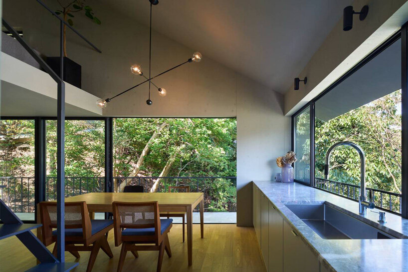
Stepping inside the home, residents are greeted with a serene living experience immersed in nature. Airhouse has devised an airy interior completed with natural materials and open spaces that engages in continual dialogue with its natural context. From the cedar exterior to the carefully calculated height of the platform and structure and large opening in the direction of the forest, the concept seeks to weave views of the outdoors inside for an uplifting getaway.

airhouse's wooden home floats above a steep slope in the japanese forest 
Airhouse’s House in Yagoto emerges from a hillside in Japan

airhouse's wooden home floats above a steep slope in the japanese forest 
the home perches atop a reinforced concrete platform

airhouse's wooden home floats above a steep slope in the japanese forest 
the cedar-clad exterior creates the appearance of a serene mountain villa

airhouse's wooden home floats above a steep slope in the japanese forest 
a lofty, airy interior with industrial and natural finishes

airhouse's wooden home floats above a steep slope in the japanese forest 
large windows bring views of the adjacent forest inside

Reference

Design Ni Dukaan builds “citadel-like” concrete house in India
CategoriesArchitecture

Design Ni Dukaan builds “citadel-like” concrete house in India

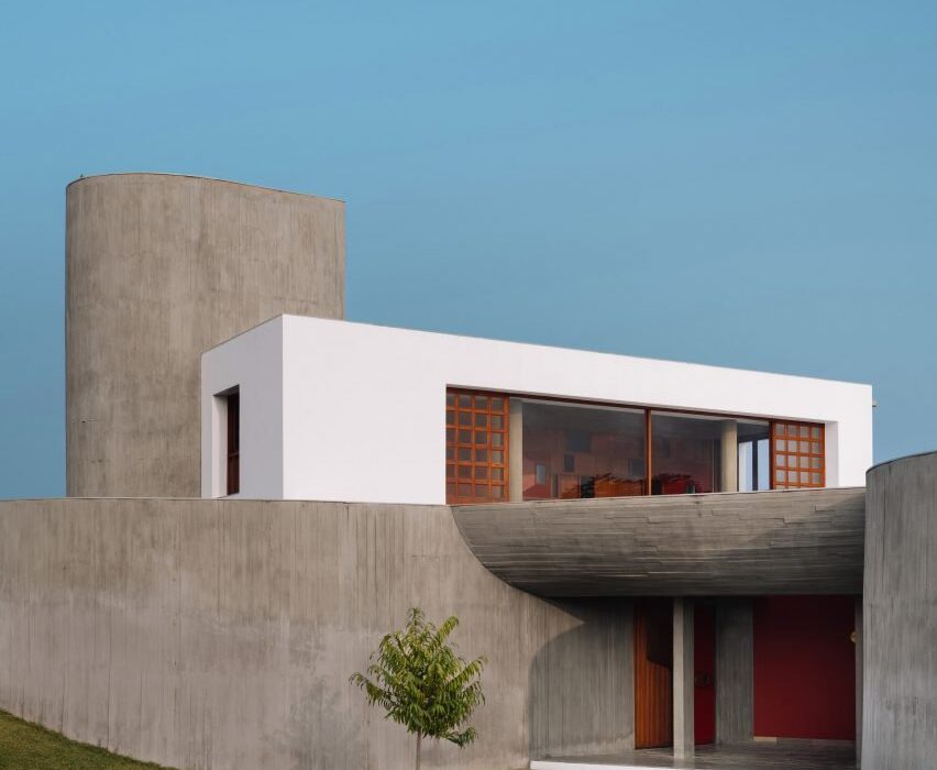
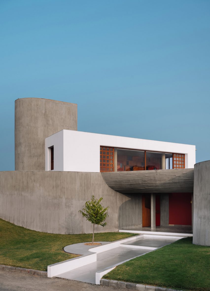
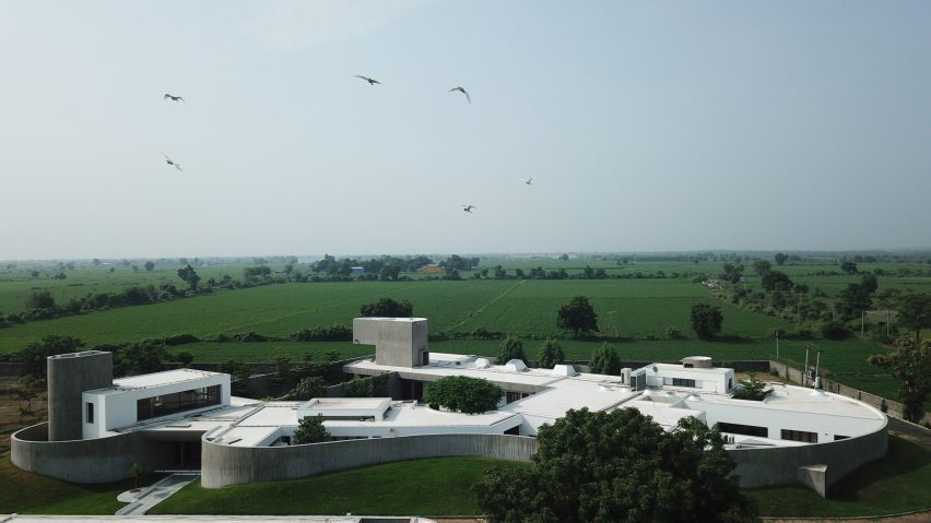
Multidisciplinary studio Design ni Dukaan has completed a house in Gujarat, India, with a board-formed concrete exterior walls that wrap the home and define courtyard spaces.

Located on a remote site in the municipality of Himmatnagar, the studio designed the undulating enclosing walls as a “second skin” informed by the spaces within.

Entrance to the concrete Enclosure house by Design Ni Dukan with concrete canopy and grass lawn
Board-formed concrete walls wrap the home

“Situated on a mound, the citadel-like compound is bound by peripheral walls comprising two curved and two straight surfaces that are disjointed at their intersections to create points of entry or subtle exits into the adjacent landscape,” said Design ni Dukaan.

“In the absence of a strong context, we relied on the client’s brief to inspire the design, but his complete disinterest in how the house would look from the outside prompted us to question the very basis of built forms,” it continued. “This caused a shift in our perception that resulted in an inside-out approach to the design, wherein the experience of space from within took precedence over the external form.”

Wide shot of the exterior of the Enclosure concrete house complex by Design Ni Dukaan
The enclosing wall curves towards the main entrance

Two concrete walls curve towards a main entrance that is covered by a concrete canopy and leads to a central courtyard space.

The kitchen, formal living and dining room, secondary kitchen and dining room, two main bedroom suites and three additional bedroom suites are arranged around this central open space.

Set back from the courtyard are two additional bedroom suites, a gym and a lounge room next to an outdoor swimming pool.

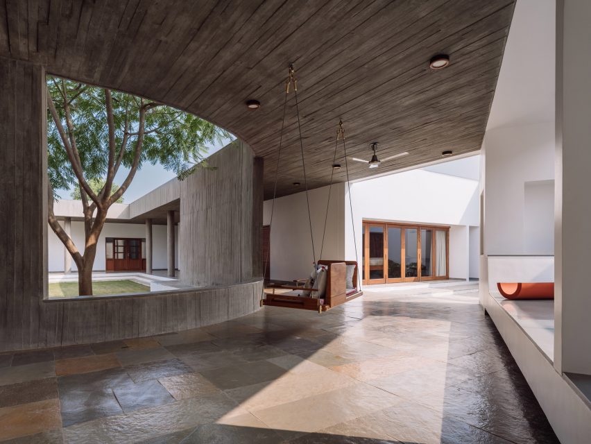
Covered concrete walkway with a swing seat in front of an opening the the wall that overlooks a courtyard
A covered walkway separates interior spaces from the outdoor courtyard

A covered walkway creates a buffer between the outdoor courtyard and indoor spaces, protecting the interior from the harsh tropical sun and hot winds while letting in natural light and ventilation.

Design ni Dukaan added “frames” throughout the home, including a swing seat placed by a large opening that overlooks the courtyard.

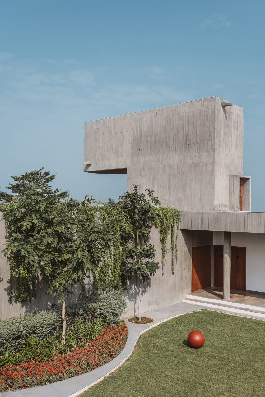
At three points in the home, volumes rise above the height of the enclosing wall to second-floor level and accommodate an artist’s loft, attic room for the family’s grandson and a water tank.

“We imagined them as three sentinels in conversation, floating above a seamless sea of green once the vegetation had reclaimed the concrete,” said Design ni Dukaan.

A grass lawn and trees surrounded by a concrete home
Greenery was added to complement the concrete

The studio merged indoor and outdoor spaces using a material palette of textured concrete, white-plastered walls, Kota stone and greenery.

“When the vegetation eventually grows over this backdrop of grey, the boundaries between inside and outside will further dissolve and diminish any notion of form,” said Design ni Dukaan.

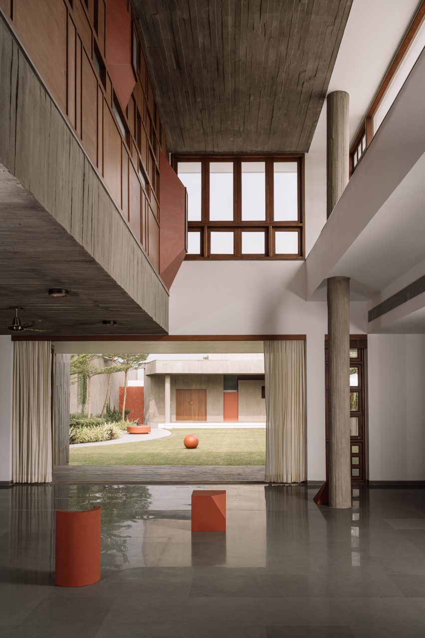
Double-height living space with concrete walls, wooden-framed windows and and opening leading to a courtyard lawn
The central courtyard lets natural light into the home

The texture of the concrete walls was created by unbolted wooden formwork and the imperfections in its finish informed material choices elsewhere in the house.

“The unpredictable but beautiful texture caused by the shifting and warping of unbolted wooden formwork was fascinating,” said the studio.

“We decided to embrace these ‘anticipated imperfections’ as part of the construction process, even extending this choice to the use of other materials such as the flooring in the corridors, which utilises strips of leftover stone from the interiors to mimic the pattern of the concrete walls.”
A living room with polished concrete floors, wood-panelled walls and a grey L-shaped sofa
The home was designed to entertain guests

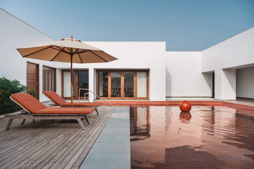
The neutral colours of the concrete, stone and white walls are punctuated by terracotta-coloured accents, including swimming pool tiles, seating and sculptural objects.

More playful colours were used in some of the bathrooms, which have monochrome green, blue or golden finishes.

Swimming pool with red pool tiles and timber decking in front of a white house
The studio added terracotta-coloured accents

The home was designed for the residents to entertain guests, with a formal lounge opening onto a lawn and a movie theatre in the basement. The house also has a mandir with a depiction of the deity Shreenathji engraved in black granite.

Other examples of concrete homes in India that use central courtyards to keep interior spaces cool in the hot summers include a house in Bharuch designed by Samira Rathod Design Atelier and a home in Chennai by Matharoo Associates.

The photography is by Ishita Sitwala, The Fishy Project.


Project credits:

Principal architect: Ar Veeram Shah
HVAC consultants: Anjaria associates
Structural consultants: Saunrachna Strucon Pvt
Contractor: Vastu Engineers

Reference

Chatsworth House exhibition is a “collision of past and present”
CategoriesInterior Design

Chatsworth House exhibition is a “collision of past and present”

An exhibition at Chatsworth House including designers including Michael Anastassiades, Faye Toogood and Formafantasma, features in this video produced by Dezeen for the stately home.

Called Mirror Mirror: Reflections on Design at Chatsworth, the exhibition brings together a collection of furniture and objects displayed throughout and responding to Chatsworth House and its gardens.

In total, 16 international designers and artists created pieces that respond to the interiors of the building.
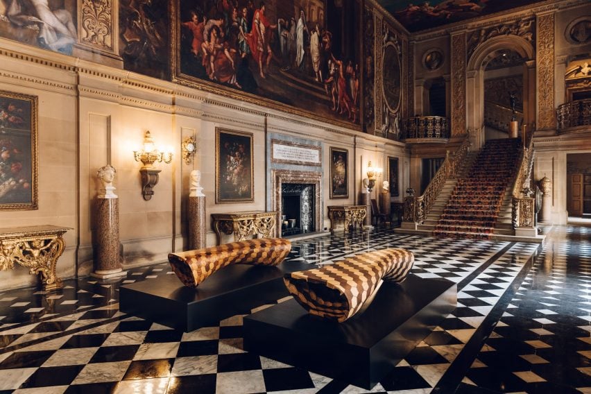
Interior of Chatsworth House featuring staircase and benches
The exhibition introduces new art pieces and objects into the house and garden

Some responded by sourcing materials from the property itself, while others focussed on themes and ideas taken from decorations within the interiors.

“The designers of the exhibition have responded to Chatsworth in all sorts of fascinating ways,” said co-curator of the exhibition Glenn Adamson.

“Throughout you really see this kind of conversation between the present and the past.”

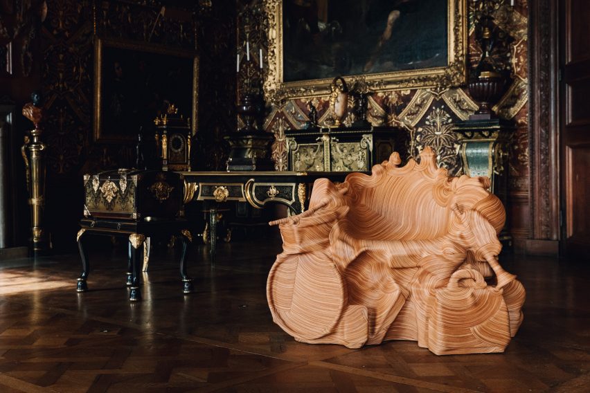
Jay Sae Jung Oh's throne-like seat wrapped in leather made from musical instruments
Jay Sae Jung Oh designed a throne using musical instruments

The exhibition continues Chatsworth House’s 500-year-long history of working with leading artists and designers and collecting an extensive collection of art and objects.

“An artist’s new work can create a new way of looking at these spaces,” said Chatsworth House Trust director Jane Marriott.

“It can capture their imaginations and hopefully inspire them to explore Chatsworth in a different light.”

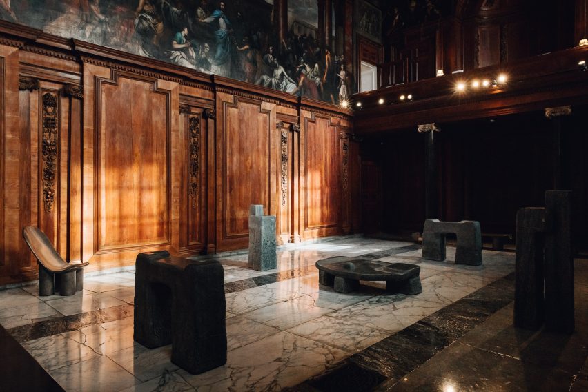
Faye Toogood's monolithic stone furniture in the chapel space
Toogood’s monolithic furniture creates a pensive space within the exhibition

British designer Toogood took over Chatsworth’s chapel and adjoining Oak Room. As a nod to the historical use of the space as a place of worship and gathering, she created an installation of monolithic furniture made from bronze and stone.

The sculptural forms were designed to evoke ecclesiastical structures and to reflect the local landscape.

“These objects give a sense of meditative calm, a sense of massiveness or monumentality that feels appropriate to the space,” Adamson said.

Joris Laarman's benches situated in the gardens of Chatsworth House
Dutch designer Joris Laarman designed a series of benches for the exhibition

Two stone benches by Dutch designer Joris Laarman made from locally sourced gritstone , which was the material used to build the house itself, were placed in Chatsworth House’s gardens.

The surfaces of the benches were carved with undulating patterns in which moss and lichen have been planted and will continue to grow over time.

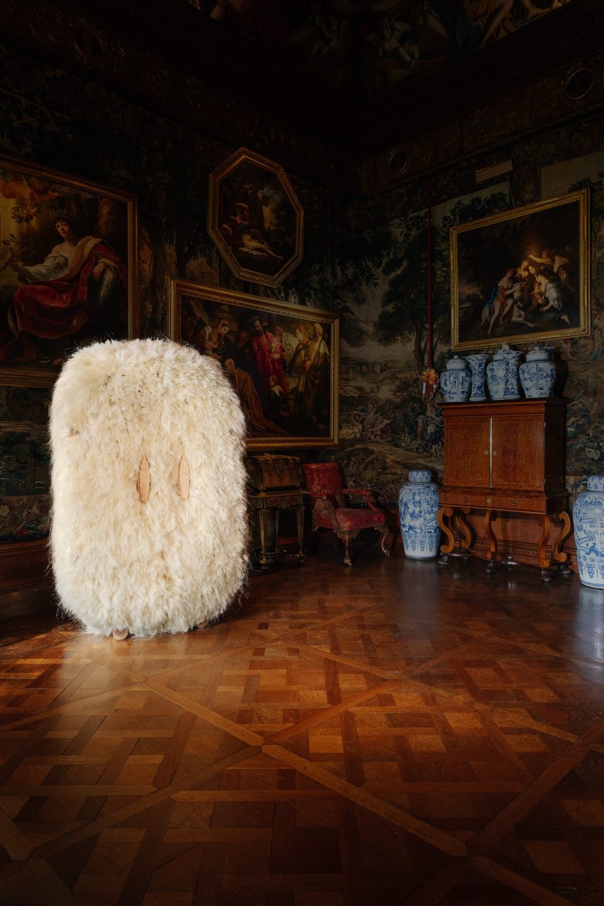
Other objects in the exhibition include a throne-like seat wrapped in leather made from musical instruments by Jay Sae Jung Oh, a fibrous cabinet designed by Fernando Laposse, and sinuous steam-wood sculptures by Irish furniture maker Joseph Walsh.

Agave cabinet by Fernando Laposse
Laposse’s fluffy cabinet is made from agave plant fibres

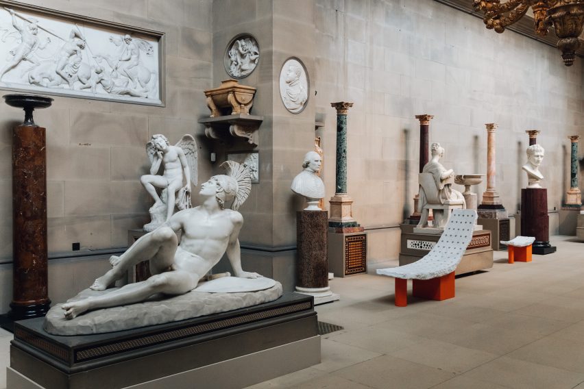
Another section of the exhibition, which occupy Chatsworth’s Sculpture Gallery built in the early 19th century, features pieces by British designer Samuel Ross.

Ross’s pieces were designed to echo the surrounding sculptures, mimicking their form to invite viewers to imagine the body that would recline on them. The designer has used a material palette of stone and marble to further reflect the sculptures within the gallery.

Samuel Ross's sculptural objects
Chatsworth’s collection contains art and design pieces spanning 4,000 years

“It’s a kind of collision of past and present, of the artisanal with the technological, the classical with the industrial,” Adamson said.

“It’s a great example of how the show in general tries to talk across generations, across centuries.”

Mirror Mirror: Reflections on Design at Chatsworth is on display at Chatsworth House in Derbyshire until 1 October 2023. See Dezeen Events Guide for an up-to-date list of architecture and design events taking place around the world.

Photography is courtesy of the Chatsworth House Trust.

Partnership content

This video was produced by Dezeen for Chatsworth House as part of a partnership. Find out more about Dezeen’s partnership content here.

Reference